note 6: orchestration and...
TRANSCRIPT

Computer Science and Software Engineering
University of Wisconsin - Platteville
Note 6: Orchestration
and Flow
Yan Shi Lecture Notes for SE 3330
UW-Platteville
Based on About Face 3: Chapter 10
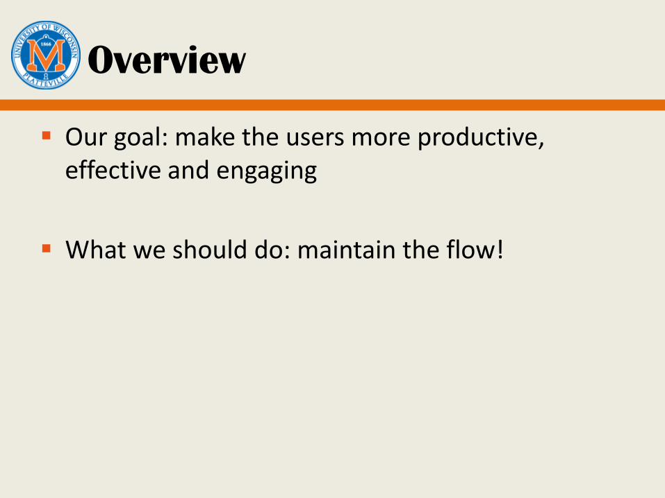
Overview
Our goal: make the users more productive, effective and engaging
What we should do: maintain the flow!
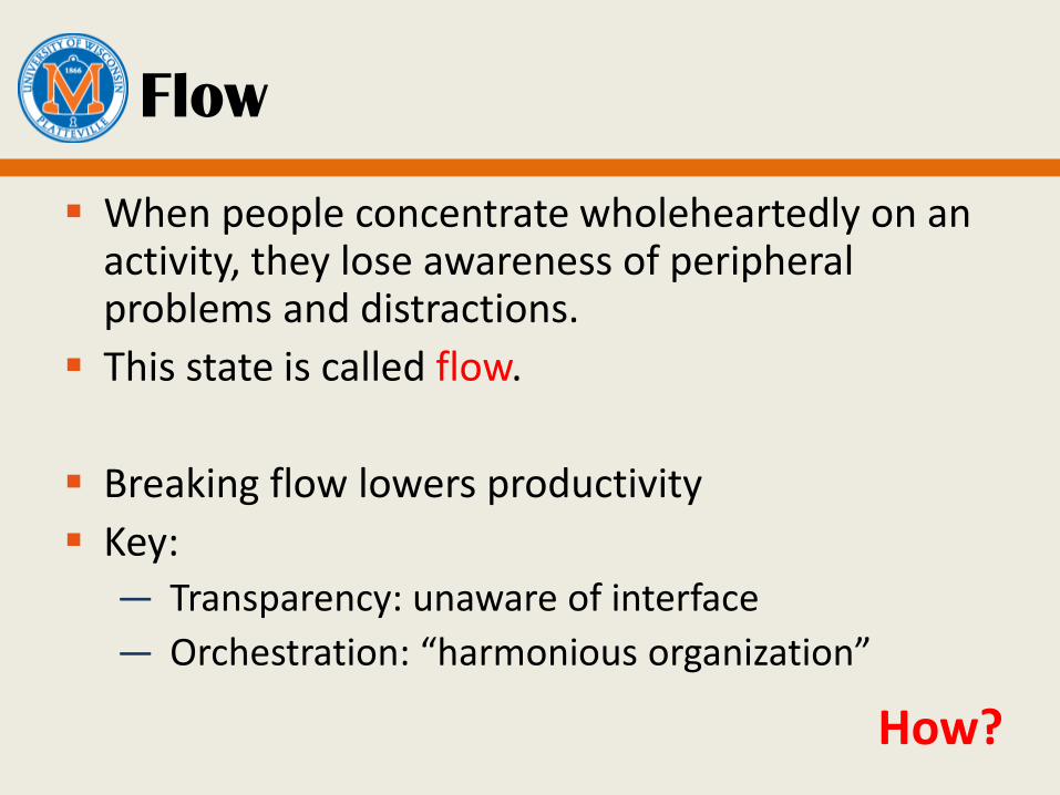
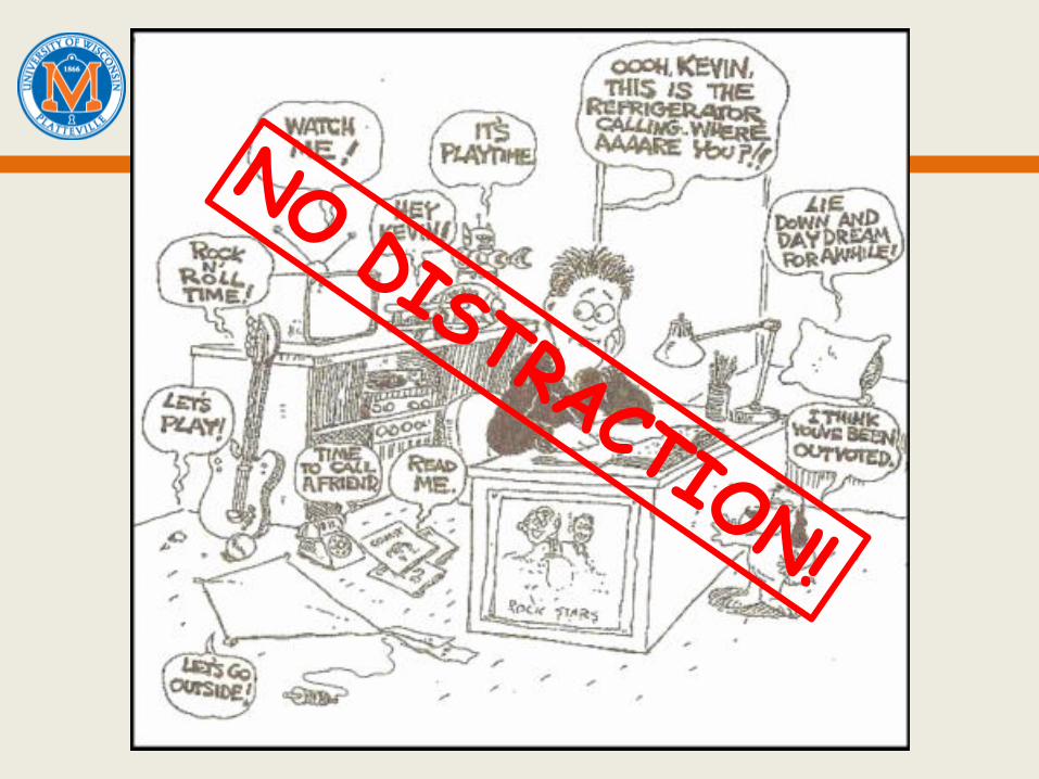
Flow
When people concentrate wholeheartedly on an activity, they lose awareness of peripheral problems and distractions.
This state is called flow.
Breaking flow lowers productivity
Key: — Transparency: unaware of interface
— Orchestration: “harmonious organization”
How?
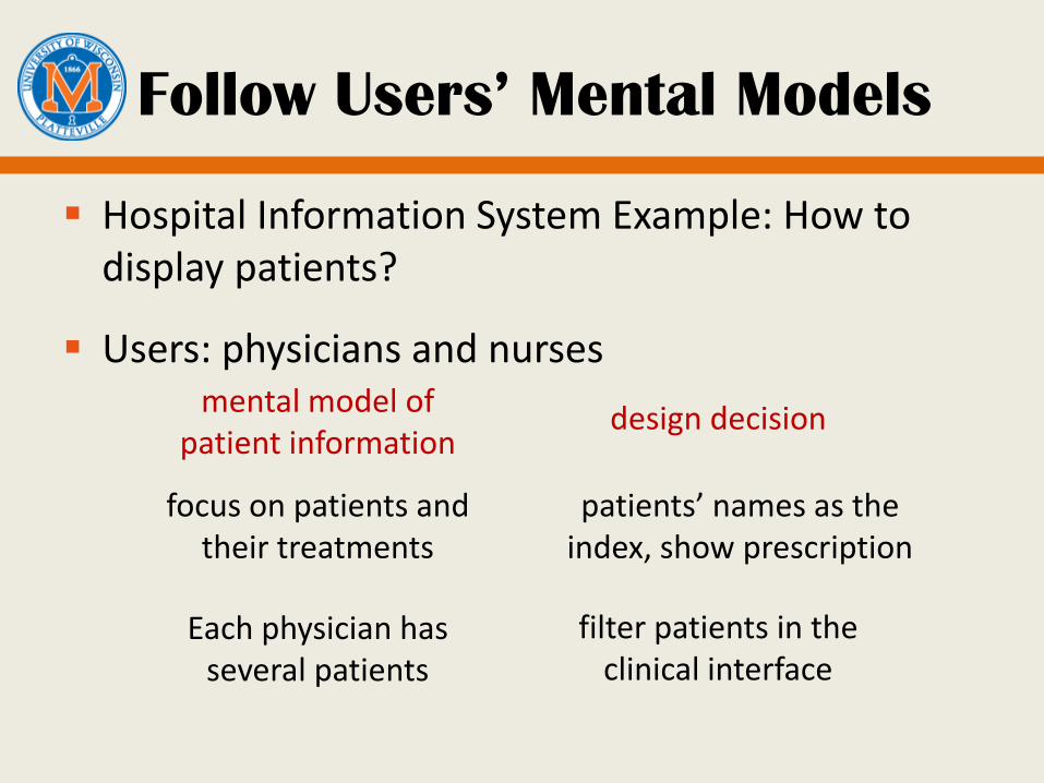
Follow Users’ Mental Models
Hospital Information System Example: How to display patients?
Users: physicians and nurses
mental model of patient information
focus on patients and their treatments
design decision
patients’ names as the index, show prescription
Each physician has several patients
filter patients in the clinical interface
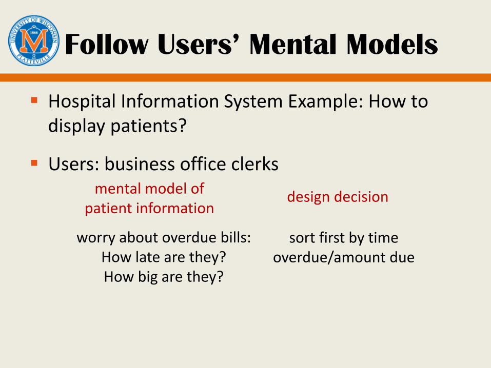
Follow Users’ Mental Models
Hospital Information System Example: How to display patients?
Users: business office clerks
mental model of patient information
worry about overdue bills: How late are they? How big are they?
design decision
sort first by time overdue/amount due
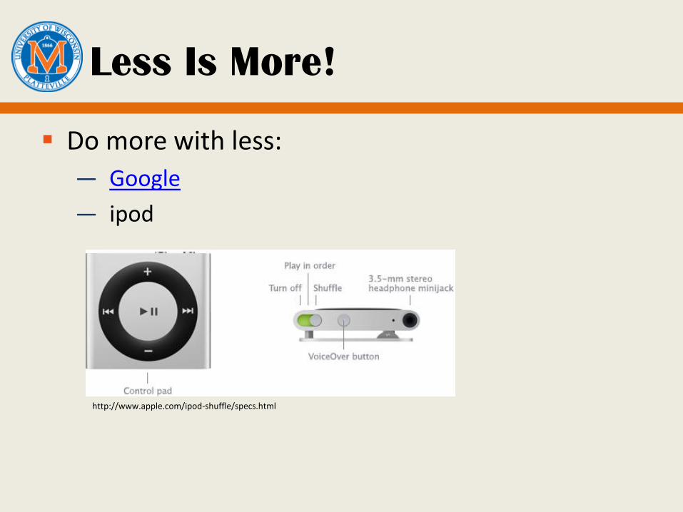
Less Is More!
Do more with less:
— ipod
http://www.apple.com/ipod-shuffle/specs.html
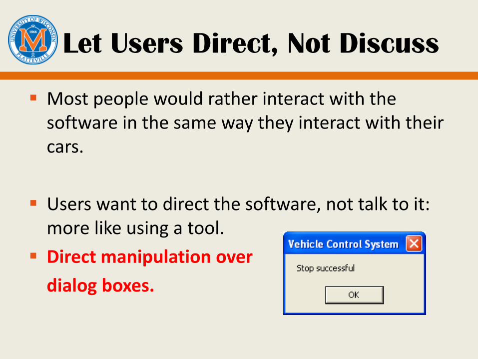
Let Users Direct, Not Discuss
Most people would rather interact with the software in the same way they interact with their cars.
Users want to direct the software, not talk to it: more like using a tool.
Direct manipulation over
dialog boxes.
Keep Tools Close At Hand.
Most applications are too complex for one mode of direct manipulation to cover all their features.
— Offer a set of different tools to users.
Tools introduce modes of interaction – minimize
Finding tools: breaks concentration
Common tools must be easy to access
— toolbars for beginners and intermediates
— keyboard shortcuts for experts
Don’t require user to put away tools
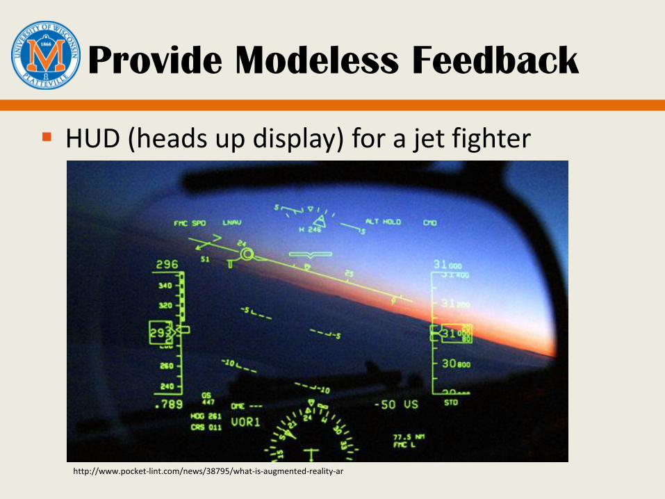
Provide Modeless Feedback
HUD (heads up display) for a jet fighter
http://www.pocket-lint.com/news/38795/what-is-augmented-reality-ar
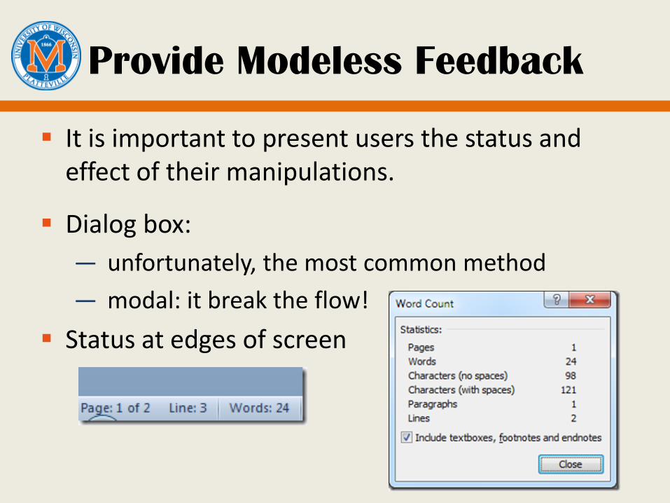
Provide Modeless Feedback
It is important to present users the status and effect of their manipulations.
Dialog box:
— unfortunately, the most common method
— modal: it break the flow!
Status at edges of screen
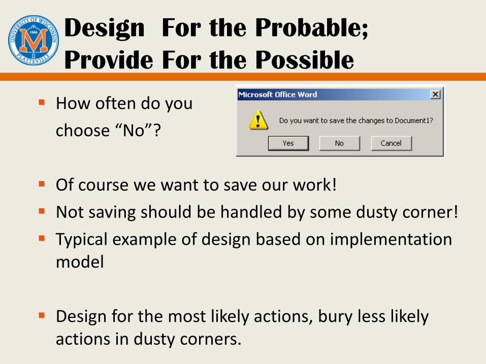
Design For the Probable;
Provide For the Possible
How often do you
choose “No”?
Of course we want to save our work!
Not saving should be handled by some dusty corner!
Typical example of design based on implementation model
Design for the most likely actions, bury less likely actions in dusty corners.
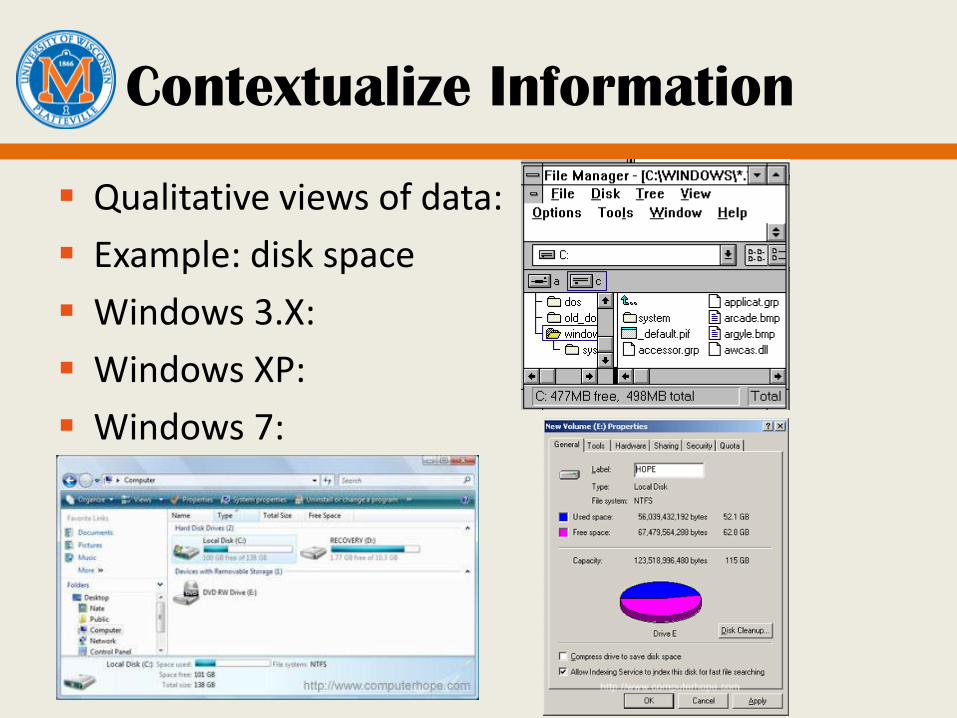
Contextualize Information
Qualitative views of data:
Example: disk space
Windows 3.X:
Windows XP:
Windows 7:
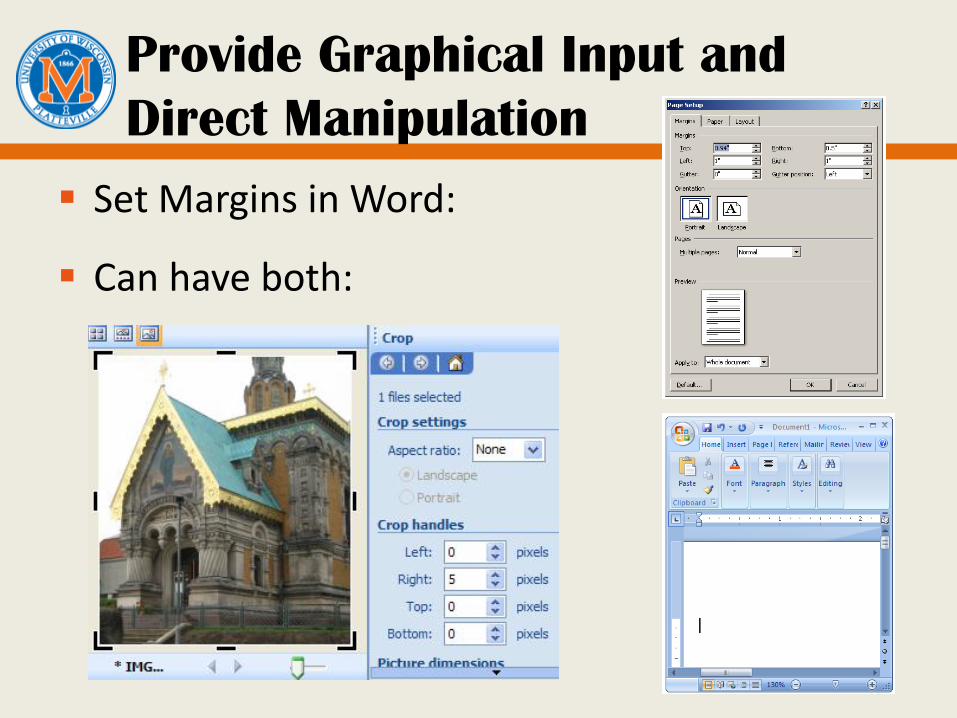
Provide Graphical Input and
Direct Manipulation
Set Margins in Word:
Can have both:
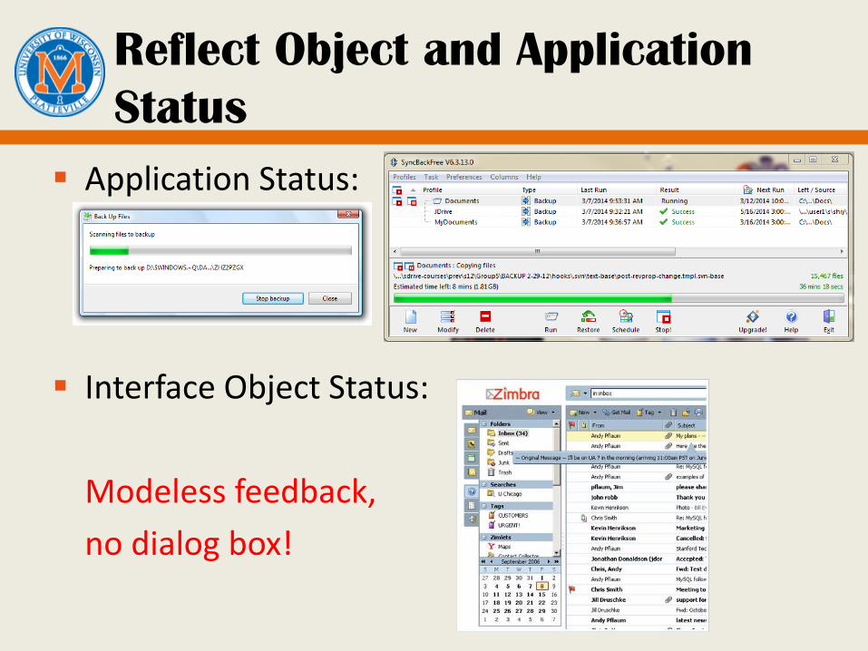
Reflect Object and Application
Status
Application Status:
Interface Object Status:
Modeless feedback,
no dialog box!
Avoid Unnecessary Reporting
“connecting…primary server offline…connected to secondary…end transaction”
— Confusing at best
— Written for debugging!
Don’t use dialogs to report normal status
Don’t interrupt user with non-serious problems
— Make “good” choice, let user refine
— Example: web browser response to missing image
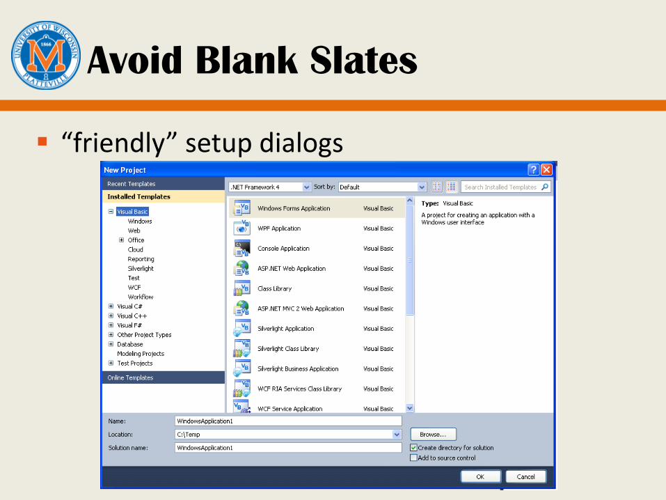
Avoid Blank Slates
“friendly” setup dialogs
Avoid Blank Slates
Normal users are not always comfortable or capable of explaining what they want.
Preset object reasonably, then let the user refine.
— It’s easier to refine than start from scratch
— Example: Word starts with preset margins, styles
— Use past history!
Ask For Forgiveness, Not Permission
Applications should make their own choices to:
— Design for the probable
— Avoid unnecessary reporting
— Avoid blank slates
What if applications made the wrong choice?
Ask for forgiveness, but still do it: it is appropriate statistically.
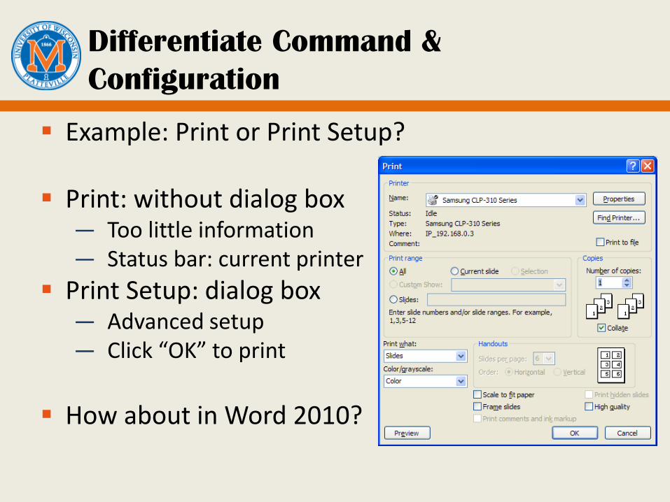
Differentiate Command &
Configuration
Example: Print or Print Setup?
Print: without dialog box — Too little information — Status bar: current printer
Print Setup: dialog box — Advanced setup — Click “OK” to print
How about in Word 2010?
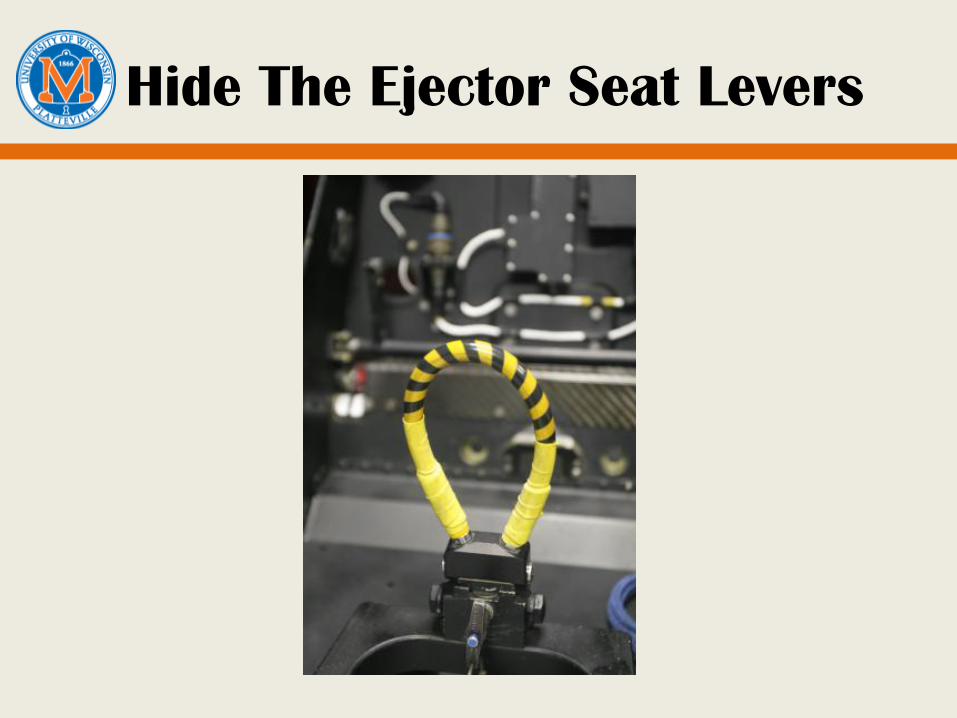
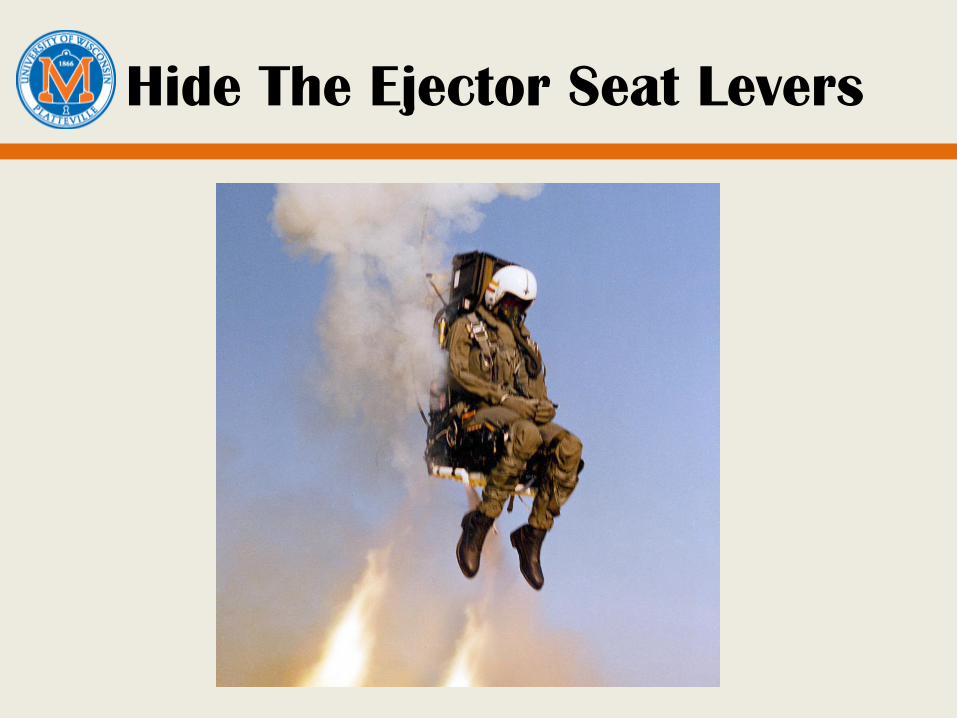
Hide The Ejector Seat Levers
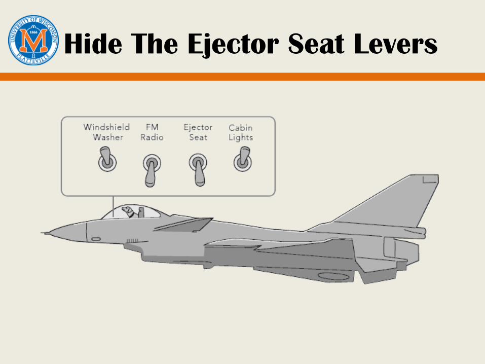
Hide The Ejector Seat Levers
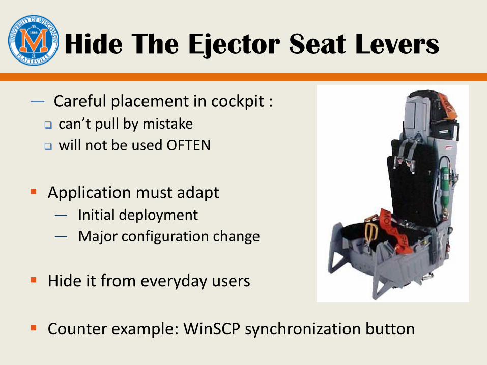
Hide The Ejector Seat Levers
Hide The Ejector Seat Levers
— Careful placement in cockpit : can’t pull by mistake
will not be used OFTEN
Application must adapt — Initial deployment
— Major configuration change
Hide it from everyday users
Counter example: WinSCP synchronization button
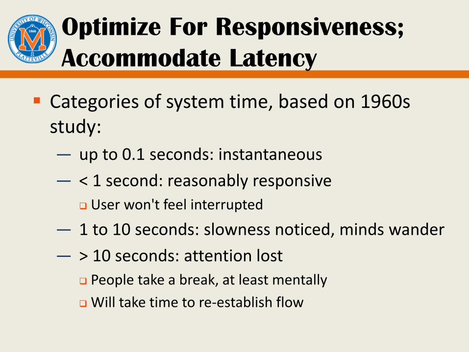
Optimize For Responsiveness;
Accommodate Latency
Categories of system time, based on 1960s study:
— up to 0.1 seconds: instantaneous
— < 1 second: reasonably responsive
User won't feel interrupted
— 1 to 10 seconds: slowness noticed, minds wander
— > 10 seconds: attention lost
People take a break, at least mentally
Will take time to re-establish flow
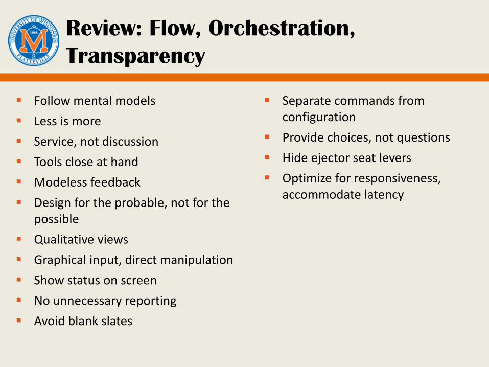
Review: Flow, Orchestration,
Transparency
Follow mental models
Less is more
Service, not discussion
Tools close at hand
Modeless feedback
Design for the probable, not for the possible
Qualitative views
Graphical input, direct manipulation
Show status on screen
No unnecessary reporting
Avoid blank slates
Separate commands from configuration
Provide choices, not questions
Hide ejector seat levers
Optimize for responsiveness, accommodate latency
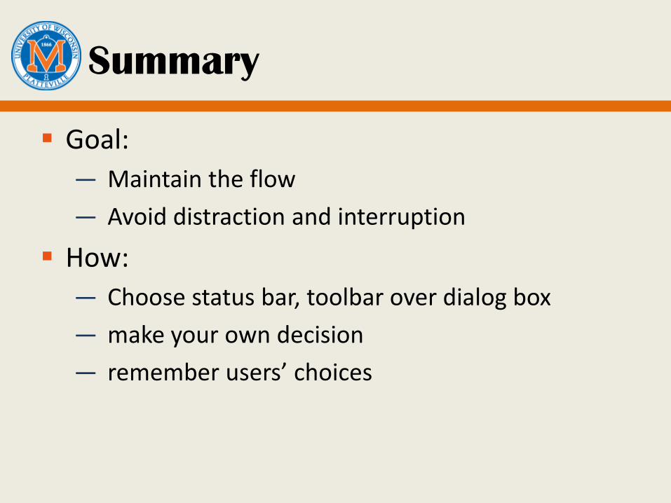
Summary
Goal:
— Maintain the flow
— Avoid distraction and interruption
How:
— Choose status bar, toolbar over dialog box
— make your own decision
— remember users’ choices