now i see what you mean: an experiment in photography-as-research
TRANSCRIPT

NOW I SEE WHAT YOU MEAN! An experiment in photography-as-research
Dr Nick Coates, Creative Consulting Director, C Space Kevin McLean, MD, Wardle McLean Fiona Hall, Head of Insight, Akzo Nobel
ESOMAR Congress Dublin 2015
1

ALL PHOTOS IN THIS PAPER ARE ORIGINAL ©Kevin McLean & Nick Coates 2015

WHY PHOTOGRAPHY…? Let’s start with an old joke… Patient: “Doctor, doctor, I just swallowed a film.”…Doctor: “Well, let’s wait and see what develops”. This reeks of another era; when getting to see what you’d taken might take days, even weeks. In 2015 it would simply make no sense.


THE VISUAL AGE The point is that we live in a Digital Age, a Visual Age, an Instant Age, the Age of Instagram, Flickr, Facebook, YouTube, Pinterest, and of course, …the selfie stick etc. More images have been taken in the 12 months than in the whole of history, 300 million photos are uploaded to Facebook every day, 2.7 trillion photos stored in 2014. So, visuals are arguably now the dominant cultural medium.


RESEARCH IN THE LINGUISTIC AGE But research is still very much in the Linguistic Age. As an industry we are rather word-bound. Our visual muscle is much weaker than our linguistic muscle. Sure, we use visuals, but often in a rather lazy, post-production way (grabbing stills from Google Images), to support what we SAY. We would say that in the average research project, at least 80-90% of our time and attention is devoted to words and only 10 or 20% to images (usually last-minute, to pep up the ppt).


EXPERIMENTAL CHALLENGE So, we decided to take a photographic approach to research to find out what would happen if we devoted as much attention to pictures as we normally do to words. (We set ourselves other challenges. For example, we are using only our own photographs in this pdf.)


BUSINESS VALUE But, would a photographic approach have value to clients, ie what is the potential business value of photography-as-research? Fiona Hall at Akzo Nobel had an interest in this experiment. Colour is particularly important to Akzo Nobel. So our objective for this research was to understand how certain people view colour, how they choose colour, what colour means to them.


THE COLOUR CHALLENGE We focused on one particular customer segment, ‘Creatives’, a small minority of AN’s total audience who are confident around colour and creative matters. We wanted to take a closer look at them to see what we could learn about them and also about how a wider audience relates to colour. So we had 2 questions How do ‘Creatives’ curate colour? Does having a photographer’s approach and mindset help in research?


MULTI-VISIT IN-HOME We had a sample of four ‘Creatives’ and visited each one twice - spending far longer with each person than is customary in research. This allowed us to get to know them better and to get input from them on pictures we’d taken. So it was an iterative and interactive process.


THE ‘SEEING INTERVIEW’ This was a new, hybrid approach we’ve called the Seeing Interview. It is a combination of ethnography (observing, in situ) and an interview. We were looking and listening, following what we saw and what we heard. We chose not to use a discussion guide, with its logical, ‘funnel’ structure. Instead we adopted a fluid, person-led, fragmentary approach. We followed the image to create the narrative. (The direction was lateral, not literal.)


CO-DISCOVERY & PLAYBACK We showed photos to our subjects in the course of our visits. We were trying out ways of expressing things WITH our participants, trying to explore colour choices in a deeper way, to see connections, see ideas.

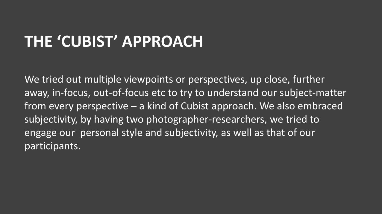
THE ‘CUBIST’ APPROACH We tried out multiple viewpoints or perspectives, up close, further away, in-focus, out-of-focus etc to try to understand our subject-matter from every perspective – a kind of Cubist approach. We also embraced subjectivity, by having two photographer-researchers, we tried to engage our personal style and subjectivity, as well as that of our participants.


MEET OUR CREATIVES Here is a mini, visual profile of some of our participants


CATHY Cathy from Kentish Town. Single mum, lives with her irrepressible 10-year old son. Loves the colour green
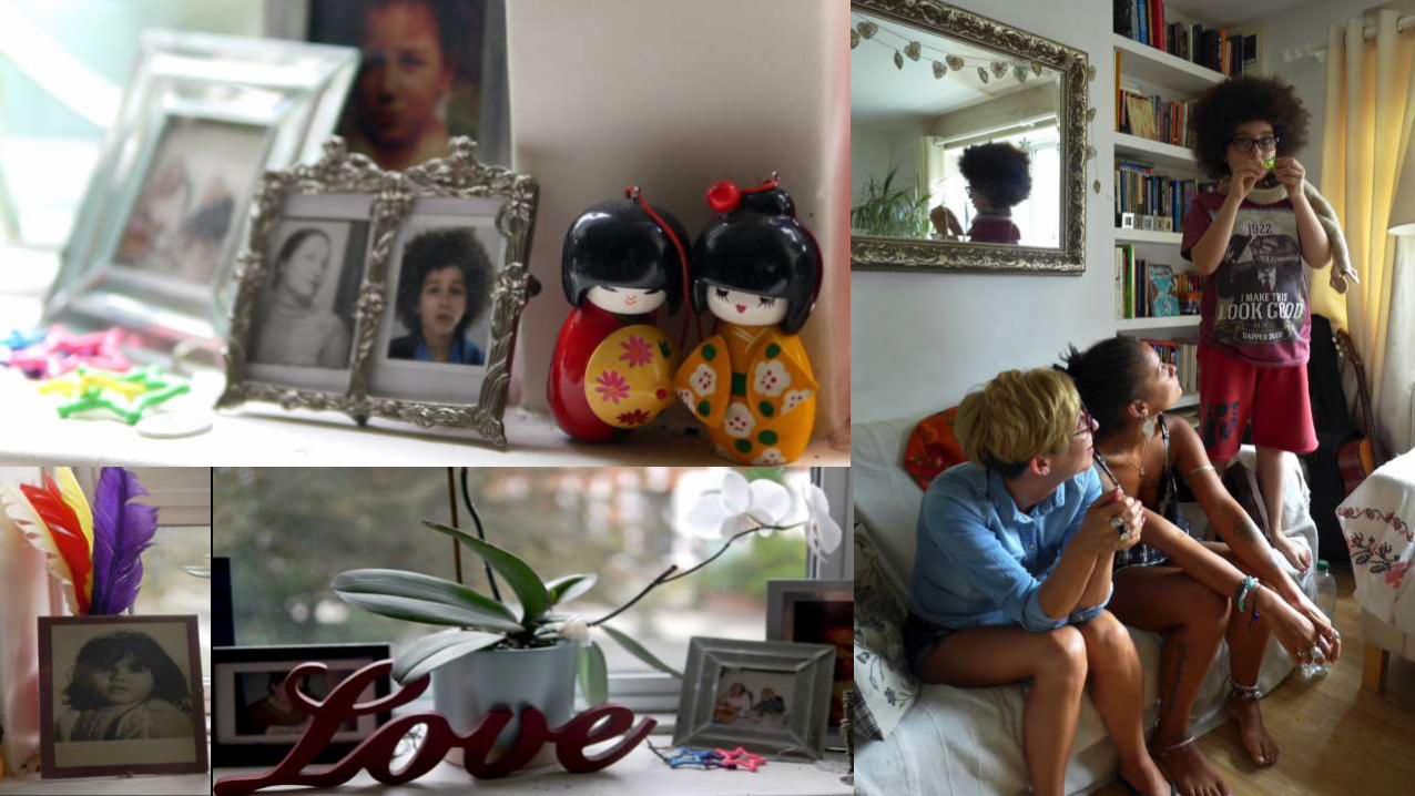

HEIDI Heidi from Islington. Business consultant by day. Candle obsessive at night.


KAREN Hampstead Karen, the jewellery importer, all flowing dresses and 1960s values.


WHAT ARE THEY LIKE? What did we learn about them …? Well we thought that they would be a world apart, in need of no help when it comes to decoration, confident, exuberant, wacky, unconventional ….


WHAT ARE THEY LIKE? … maybe even borderline pretentious? The kind of people who’d keep something like this in their kitchen!


WHAT ARE THEY LIKE? What we discovered, by contrast… is that while they are confident with the stuff they can control and love using bold and expressive colours in other things they curate – clothes, objets d’art, jewellery, art, furnishings…


WHAT ARE THEY LIKE? …and although they are pretty confident when it comes to using colour…


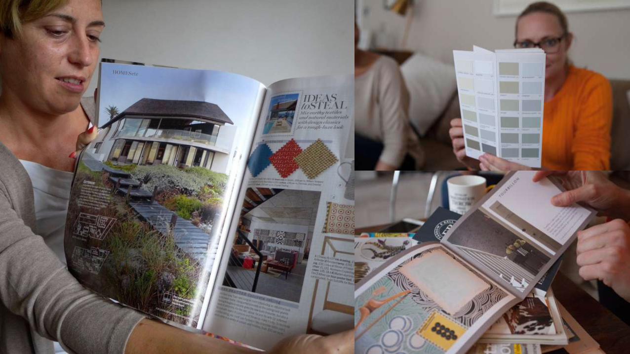
WHAT ARE THEY LIKE? … they’re not that confident when it comes to paint. Paint is highly technical and full of challenges that samplers, swatches and the like only begin to address. (For Creatives, life is art and their homes are imagined or fantasised as works of art. The home is a talking point and a place to display and manifest home as life as art: visual art reference cropped up in each. Frida Kahlo, Egon Schiele…) But they also follow conventions (just like the rest of us) …


WHAT ARE THEY LIKE? … and are very sensitive to the cultural references and language used to promote colour and objects (references to brochures, F&B, Crown, Dulux). They don’t want to choose from 1 million colours. They love branded / named paint and they love help.

COLOUR = IDENTITY But we also learned a few things about colour more generally. Firstly COLOUR IS IDENTITY. It’s a technology of the self. It both reflects our world and allows us to project aspects of ourselves and make them manifest.


WHAT ARE THEY LIKE? Of course colour is highly subjective, everyone sees colour differently. Did you know that between 7 and 10% of all men have a form of colour vision deficiency (CVD), but only 0.5% of women? So we can’t take it as read, colour choices take a little unpacking…


WHAT ARE THEY LIKE? Take Karen the jewellery dealer, for example. How did her colour choice reflect her identity? Well, she wants to project subtle sophistication combined with confidence and strength. The jewellery she deals in is mirrored in her life, through her clothes, the art on her walls and in the way she talks about light, colour, materials, textures….


WHAT ARE THEY LIKE? Heidi, being more buttoned up, projects her philosophy of style and luxury through muted tones, combined with quirky objects and splashes (she calls it “country hotel with soul”). She hates pink, unless used ironically (so what better place than a bathroom?).


COLOUR = PLACE Secondly colour is about PLACE. Colours are what surround us, what we repeatedly see.


WHAT ARE THEY LIKE? Not only where we are now but also places we have been to. This is Dudley the donkey from a holiday in Santorini.


COLOUR = MEMORY Thirdly colour is MEMORY, it acts as an an aide-memoire. Colours trigger moments in time – as in this prized photo Karen has of her family watching an African sunset.

WHAT ARE THEY LIKE? Colours in our own personal memories morph into our imagination, our dreams our deeper feelings, our shared experiences.


COLOUR = FEELING Fourthly and perhaps most tellingly of all, colour is FEELING. In a practical sense, people obviously use colour to create a distinct feeling or atmosphere in a room. They want it to be their own atmosphere, something they are authors of, in this case the ‘country hotel with soul’ we mentioned earlier.


WHAT ARE THEY LIKE? Colour is also pure feeling, pure emotion, abstract, a direct channel (compare a fragrance, a piece of music). It can transport you. This image was created using a zoom burst to try and evoke the particular feeling that Karen called “fizzy” – a specific vibrancy, dynamism/movement or excitement which mattered to her. When she saw the shot she said “that is exactly what I was trying to describe”.


COLOUR = DIMENSIONAL Finally, like harmonics in music, colour is ‘dimensional’ meaning there
is colour within colour. When we see a “flat” colour, we subliminally
reference the other colour it “contains”, like these grasses - layered.


WHAT ARE THEY LIKE? For Karen being a multidimensional person demands dimensional colour (reds in greys, red with pinks and oranges). We took this deliberately blurry photo together to try to show how a shade of pink might evoke layers and dimensions that lie beneath the surface and suggest depth.


WHAT ARE THEY LIKE? And as part of ‘dimensionality’ of colour you cannot separate colour
from TEXTURE. Because textures reflect light differently finish dictates
how colour is experienced.

WHAT ARE THEY LIKE? And textures also suggest feelings, they make vision tactile, and suggest visual pleasure.


A THEORY OF COLOUR So we ended up with a bit of a theory about how colour works. There are 4 levels. Level 1 is RGB values, the science of colour, wavelengths on a spectrum, pantone reference etc. Quite tricky, but fascinating stuff.


WHAT ARE THEY LIKE? Take green for example, one of our sample’s favourite colours. We have twice as many photoreceptors in our eyes for the colour green than any other colour. So we see more shades of green than any other colour. There’s probably an evolutionary benefit behind this. Also, green and blue are next to each other on the spectrum. But are they different colours or different shades of the same colour (which they are in some languages)? Is this why blue and green must never be seen …?


WHAT ARE THEY LIKE? Speaking of colours’ names, this is more important and more complex than it might seem. Everybody (who is not CVD) can name all the basic colours, of course, but can quite quickly get stuck naming hues between the main colours. Given that our eyes can detect up to 2.4 million hues, this is perhaps not surprising.


WHAT ARE THEY LIKE? In decorating the names of colours really matter. Colour names can be literal (like rust) of connotative (like these two names). The name and the colour together of course evoke feelings, which are key when it comes to choosing and marketing colours. It’s all about emotion. So a shade of blue evokes calm, ‘Elephant’s Breath’ evokes feeling posh.


WHAT ARE THEY LIKE? Most people talk at the levels of names and feelings, especially feelings. But it is out here in the more distant realm of associations, memories, dreams where most of our colour choices are made, we suspect - our unconscious palette. The thing is, photography can access all areas. It does RGBs and it can get into our dreams. It allows us to be both descriptive and expressive. It helps capture memory-as-snapshot, it creates link between seeing and feeling.


WHAT DID AKZO NOBEL GET OUT OF ALL THIS?
Colour choice for your home is an emotion-based decision and it is hard to capture the nuances of
this decision making in words. So exploring this in a more creative, visual way was an exciting
prospect.. It was insightful to get into people’s homes and see them, up close and personal, in situ –
and spend longer with them. It helped us to see how they had designed their colour schemes, what
it meant to them, how it was a 3-D process, foreground and background. We could see how texture
and finish played as important a part as colour itself. Observing their reactions to collateral such as
brochures and colour swatches showed how we could learn a lot more about what works with these
forms of inspiration. Especially people’s reactions to the colour names, and how in some cases these
seemed as important as the colours themselves! Reservations? quite a labour-intensive process, a
lot of time spent on only four participants, so it could be pretty expensive as a research method. But
an experiment worth doing. It’s been very exciting to do ‘visual research’ in this way for a creative
category. I would be keen to conduct more research understanding what they see, as well as what
they hear, to understand how inspiration can be turned into colour choice. And how these Creatives
react in the store environment, with its very rational merchandising.


A VISUAL MANIFESTO What we believe is that greater visual attention adds to research, speaking from a wider context than our small study into colour/decoration … so it’s not that a picture is worth 1000 words … a word can trigger 1000 images… pictures and words work well together, especially when the pictures are given more attention, when there is more of a partnership, rather than a ‘master-slave relationship’, between words and pictures.

A VISUAL MANIFESTO

PHOTOS MAKE US LOOK MORE An obvious point, but the act of taking a photo (and looking at a photo?) requires you to look, look again, look more carefully. And look from a different perspective. Looking from a photographer’s POV means knowing that the same thing can look very different from different angles and in different lights. Because for us the camera was our way of documenting, not the notebook, we saw things we’d have missed otherwise.

#1 Photos make us look more

PHOTOS HELP US LISTEN BETTER Less obvious this, but looking and taking photos can actually help you to listen. Maybe because we were not in ‘interrogation mode’, we were doing ‘in/out’ listening , like Ruby Wax’s interviewing technique. Following the object not the guide allowed us to see in the physical environment things that mirrored and helped make sense of what we were hearing.

#1 Photos make us look more
#2 Looking helps us listen better
FRAMING HELPS US SEE DIFFERENTLY You have to identify and isolate an image. Prioritise. Choose an angle. Then you invite someone else to view it that way. This helps us see things differently.

#1 Photos make us look more #2 Looking helps us listen better
#3 Framing = seeing differently

SEEING DIFFERENTLY CREATES CONNECTIONS We are all trying to ‘see something’ in our research, to understand more. Photography is about what is there on the surface and what lies beneath. Using photography helps you to see more connections between the two.

#1 Photos make us look more #2 Looking helps us listen better #3 Framing = seeing differently
#4 Seeing creates connections

NEW CONNECTIONS LEAD TO INSIGHTS We’d say, by making more connections makes you better placed to gain insights. Which is what we all want. And every one of us has all the tools we need in our smartphones to do what we’ve done. It’s just a matter of learning how to look and how to see more and see differently.

#1 Photos make us look more #2 Looking helps us listen better #3 Framing = seeing differently #4 Seeing creates connections #5 Connections = insights

Thanks for listening
and looking
Thanks for listening
… and looking