oaf component reference guide release 12.1.3
DESCRIPTION
OAF Component Reference Guide Release 12.1.3 for EBS DevelopmentTRANSCRIPT

1
Oracle Application Framework (OAF) Component Reference Guide.
Release 12.1.3

2
Table of Contents
OA COMPONENT REFERENCE GUIDE RELEASE 12.1.3............................. 5
package ...............................................................................................................5
page ....................................................................................................................6
attributeSet ..........................................................................................................7
REGION STYLES ....................................................................................... 8
advancedSearch ....................................................................................................8
advancedTable .................................................................................................... 10
bulletedList ......................................................................................................... 37
cellFormat .......................................................................................................... 44
contentContainer ................................................................................................. 51
contentFooter ..................................................................................................... 57
defaultDoubleColumn .......................................................................................... 62
defaultFormStack ................................................................................................ 67
defaultSingleColumn ............................................................................................ 72
defaultStack ........................................................................................................ 77
flexibleContent .................................................................................................... 82
flexibleLayout ..................................................................................................... 90
flowLayout .......................................................................................................... 97
footer ............................................................................................................... 105
Gantt ............................................................................................................... 110
graphTable ....................................................................................................... 121
graph ............................................................................................................... 125
graphData ........................................................................................................ 130
header ............................................................................................................. 133
HGrid ............................................................................................................... 140
hideShow ......................................................................................................... 147
hideShowHeader ............................................................................................... 154
labeledFieldLayout ............................................................................................. 161
listOfValues ...................................................................................................... 168
messageComponentLayout ................................................................................ 173

3
messageLayout ................................................................................................. 178
navigationBar .................................................................................................... 180
pageButtonBar .................................................................................................. 186
pageLayout ....................................................................................................... 190
popUp .............................................................................................................. 198
query ............................................................................................................... 201
rowLayout ........................................................................................................ 213
shuttle .............................................................................................................. 221
stackLayout ...................................................................................................... 227
subTabLayout ................................................................................................... 235
switcher ........................................................................................................... 242
table ................................................................................................................ 249
tableLayout ....................................................................................................... 257
train ................................................................................................................. 264
tree .................................................................................................................. 269
ITEM STYLES ....................................................................................... 282
attachmentImage .............................................................................................. 282
attachmentLink ................................................................................................. 289
attachmentTable ............................................................................................... 296
button .............................................................................................................. 304
exportButton ..................................................................................................... 310
flex .................................................................................................................. 314
formParameter .................................................................................................. 319
formattedText ................................................................................................... 322
formValue ......................................................................................................... 328
image ............................................................................................................... 332
Description ....................................................................................................... 332
Properties ......................................................................................................... 332
link .................................................................................................................. 339
list ................................................................................................................... 344
messageCheckBox ............................................................................................. 349
messageChoice ................................................................................................. 357
messageDownload ............................................................................................ 366

4
messageFileUpload ............................................................................................ 374
messageInlineAttachment .................................................................................. 379
messageLovChoice ............................................................................................ 386
messageLovInput .............................................................................................. 396
messageRadioButton ......................................................................................... 407
messageRadioGroup .......................................................................................... 414
messageRichTextEditor ...................................................................................... 423
messageStyledText............................................................................................ 429
messageTextInput ............................................................................................. 438
rawText ............................................................................................................ 447
resetButton ....................................................................................................... 452
richContainer .................................................................................................... 455
richTextEditor ................................................................................................... 458
selectionButton ................................................................................................. 464
separator .......................................................................................................... 468
servletInclude ................................................................................................... 470
spacer .............................................................................................................. 472
staticStyledText................................................................................................. 474
styledText......................................................................................................... 479
submitButton .................................................................................................... 483
tip .................................................................................................................... 489
urlInclude ......................................................................................................... 492

5
OA Component Reference Guide Release 12.1.3
package
Description
A package file contains attributeSets. AttributeSets are a collection of properties that can be re-used in OA components.
Properties
Name Description
Type Default Value
Personalizable
Translatable
XML Attribute
Comments
Comments
string null null no comment
Documentation Comment
Formatted text for use with Javadoc.
string from template file
null no not applicable
File Version
The version of the file.
string null null no file-version
OA Extension Version
The Oracle Applications Extension version with which the file was created or updated.
jrad:version
null null no version

6
page
Description
A top-level container that enables the user interface to your application.
Properties
Name Description
Type Default Value
Personalizable
Translatable
XML Attribute
Attribute Set
The attribute set for the component.
jrad:attributeSetRef
null null no use
Comments
Comments.
string null null no comment
File Version
The version of the file.
string null null no file-version
OA Extension Version
The Oracle Applications Extension version with which the file was created or updated.
jrad:version
null null no version

7
attributeSet
Description
Attribute sets are named, reusable collections of properties (prompt, maximum display length, data type and so on as appropriate for the attribute set type) that can be used by any type of OA component, including regions, items, and other attribute sets. They are designed to facilitate the reuse of these components throughout Oracle Applications, which yields a significant cost savings to both Oracle and its customers. In general terms, attribute sets are organized into OA component packages (individual XML package files), where you have one package file per database table in your application. Refer to the Attribute Sets section in the Oracle Applications Framework Developer's Guide, included in the Help, for complete information on using attribute sets.
Properties
The list of properties that an attribute set can assume is not limited to those in the list below; it includes the union of all properties available on all components. Document Name
The name of the component
jrad:refName
null null no docName
Scope The Base Packages which are allowed to reuse this component.
jrad:scope
. (public) null no scope

8
Region Styles
advancedSearch
Description
The advancedSearch region extends UIX's StackLayoutBean. This is a very complicated layout used for rendering search pages which allow an end-user to specify a criteria for performing a search. Metadata for advancedSearch region implementation consists of three parts: Static Text Criteria Rows Button Bar
The XML schema for advancedSearch defines three groupings: staticText, criteria, and buttonBar. The staticText grouping contains a set of messageStyledText beans. The critera grouping will contain criteriaRow elements. The buttonBar grouping will contain a set of submit beans. The metadata for criteriaRow shows only two elements -- a messageStyledText element for displaying the label, and an input (messageTextInput, messageLovInput, messageChoice) element. Internally, the framework creates a messageChoice bean that gets rendered between the label and the input element. So, the messageStyledText bean, the messageChoice bean, and the input element form a critera row. Corresponding web bean: OAAdvancedSearchBean
Properties
The advancedSearch region inherits all the attributes from stackLayout. No additional attributes specific to this region style are required. See the section on stackLayout for a list of attributes and child elements available for the stackLayout element.
Child Elements
In addition to inheriting the named children defined for the OA Extension, the extension will have the following groupings: Name Descripti Type Default Personali Translata XML

9
on Value zable ble AttributeIntermedia Style
Indicates if the advanced search will use intermedia style queries.
boolean false null no intermediaStyle
Element Children Name Quantity Description buttonBar 0 through 1 This element contains
a group of buttons that are rendered at the bottom of the search region. A developer can add as many buttons inside this container as he wishes.
criteria 1 This is a container for unbounded number of rowLayout elements.
staticText 0 through 1 Describes the text before the radioButtons.

10
advancedTable
Description
The advancedTable region style is used to display tabular data. It supports selection (both single and multiple), sorting, record navigation, totaling and detail-disclosure. advancedTable also provides declarative support for grouping of column headers. This includes support for column formats, column header, column header data and column header formats. Support for both column bean and column group beans is provided. These are container beans with the ability to hold other regions and items. Support for formValue beans is also provided. See the section on formValue for a list of attributes and child elements available on the formValue element. advancedTable supports column beans and columnGroup beans only as indexed children; the mix of both is not supported. Declarative specification is possible for the following advancedTable features/components/attributes: Number of rows to be displayed for the table The header text for the individual table columns Whether sorting is to be enabled on the table, and if the table is
to be rendered with the intial sorts on at most three columns Whether a column can be totaled Single selector and multiple selector named children Detail disclosure named child Row headers Wrap settings ColumnBean and ColumnGroupBean as indexed children Any bean as an indexed child of the selector Around the table insertion, whether the table should render the
"Add Another Row"; whether row insertion should be auto-handled by the OA Framework and if so, the number of rows to be inserted in one go
Table formats - tableBanding, bandingInterval Column formats - columnDataFormat, cellNoWrapFormat, width,
displayGrid, bandingShade Column header formats - cellNoWrapFormat Row formats - displayGrid Row header formats - cellNoWrapFormat Whether a value will be submitted with a form - formValue

11
Corresponding web bean: OAAdvancedTableBean
Properties
Name Description
Type Default Value
Personalizable
Translatable
XML Attribute
Additional Text
Additional help text.
string null admin yes shortDesc
Admin Personalization
Indicates if an Administrator can personalize this component.
boolean true admin no adminCustomizable
AM Definition
The fully-qualified class name for the application module.
string null null no amDefName
AM Instance
The instance name of an application module.
string null null no amUsageName
Attribute Set
The attribute set for the component.
jrad:attributeSetRef
null null no use
Banding Interval
The number of rows or columns to group
unsignedInt
1 user no bandingInterval

12
with the same shade.
Banding Type
The type of banding on the table.
ui:tableBandingRule
noBanding
user no tableBanding
Child View Attribute
The name of the child view attribute.
string null null no childViewAttrName
Comments
Comments
string null null no comment
Controller Class
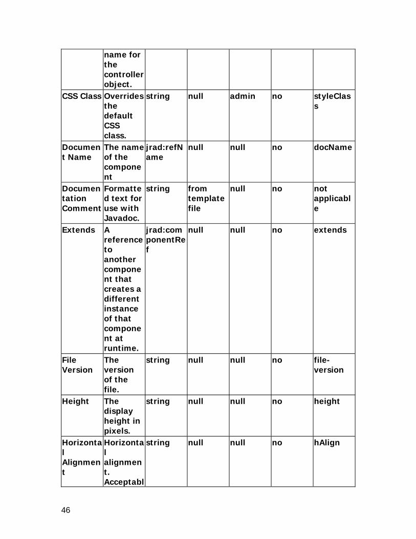
The fully-qualified class name for the controller object.
string null admin no controllerClass
Detail View Attribute
The view attribute that determines if that particular row is to be stamped with the detail child.
string null null no detailViewAttr
Dirty Row Sort Enabled
Indicates if middle-tier sort should be performed on the table.
boolean false null no dirtyRowSortEnabled
Disable Client
Indicates if
boolean false null no unvalidated

13
Side Validation
validation should not occur on the web tier during a form submit.
Document Name
The name of the component
jrad:refName
null null no docName
Documentation Comment
Formatted text for use with Javadoc.
string from template file
null no not applicable
Empty Table Text
The text to display inside an empty table.
string null null no alternateText
Extends A reference to another component that creates a different instance of that component at runtime.
jrad:componentRef
null null no extends
File Version
The version of the file.
string null null no file-version
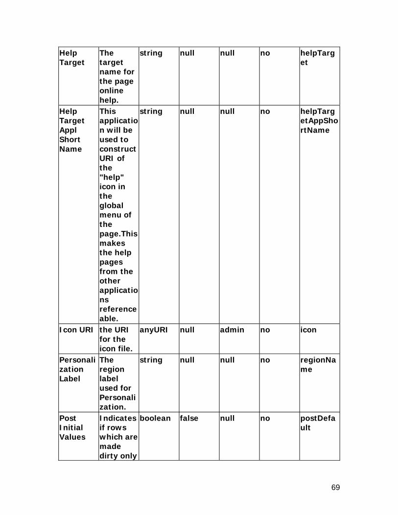
Help Target
The target name for the page online
string null null no helpTarget

14
help. Help Target Appl Short Name
This application will be used to construct URI of the "help" icon in the global menu of the page.This makes the help pages from the other applications referenceable.
string null null no helpTargetAppShortName
ID The unique name of this component.
Name null null no id
OA Extension Version
The Oracle Applications Extension version with which the file was created or updated.
jrad:version
null null no version
Personali The string null null no regionNa

15
zation Label
region label used for Personalization.
me
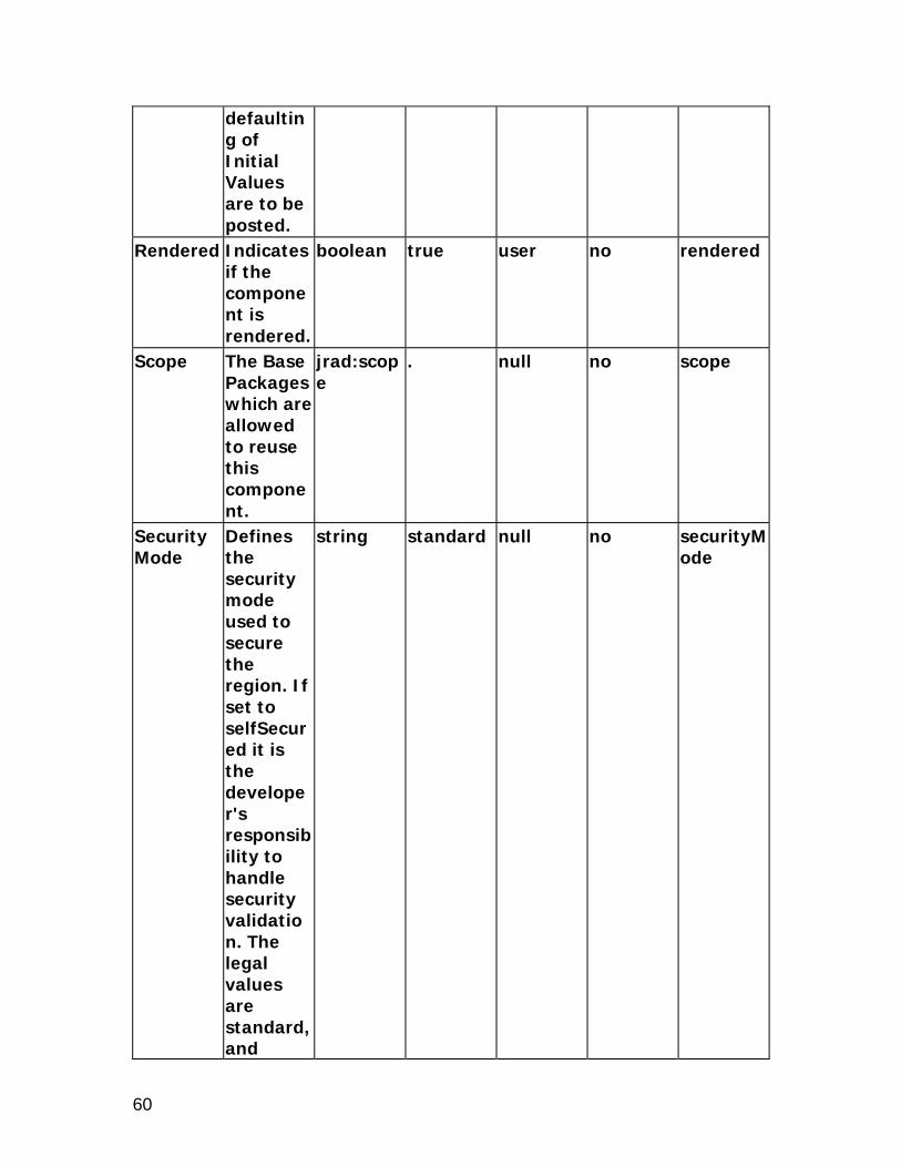
Post Initial Values
Indicates if rows which are made dirty only by the defaulting of Initial Values are to be posted.
boolean false null no postDefault
Record History Enabled
Indicates if Record History feature is enabled.
boolean false admin no recordHistoryEnabled
Records Displayed
The maximum number of rows to display.
unsignedInt
10 admin no blockSize
Rendered Indicates if the component is rendered.
boolean true user no rendered
Row Header Col
Indicates if Scope attribute is to be added to Table.
unsignedInt
null admin no rowheadercol
Row Header View
The view attribute for the
string null null no rowHeaderViewAttr

16
Attribute row header.
Scope The Base Packages which are allowed to reuse this component.
jrad:scope
. null no scope
Security Mode
Defines the security mode used to secure the region. If set to selfSecured it is the developer's responsibility to handle security validation. The legal values are standard, and selfSecured.
string standard null no securityMode
Standalone
Indicates if this region can be rendered on its
boolean false null no standalone

17
own. Text The text
label for the component.
string null admin no text
User Personalization
Indicates if a user can personalize this component.
boolean false admin no userCustomizable
View Instance
The name of the view object instance.
string null null no viewName
View Link Instance
The name of the View Link Instance establishing master-detail relationship between outer and inner repeating containers.
string null null no viewLinkName
Width Indicates the width in pixels or as a percentage (if the % sign is included).
string null null no width

18
xml:lang Identifies the language contained within this component.
optional null null no xml:lang
Element Children Name Quantity Description detail 0 through 1 Node to stamp below
every row which is disclosed.
footer 0 through 1 Node used to render the table footer.
tableActions 0 through 1 Component used for performing table actions that are independent of row selection.
tableSelection 0 through 1 SingleSelectionBean or MultipleSelectionBean to render with the table.
columnGroup Name Descripti
on Type Default
ValuePersonalizable
Translatable
XML Attribute
Admin Personalization
Indicates if an Administrator can personalize this component.
boolean true admin no adminCustomizable
Attribute Set
The attribute set for the component.
jrad:attributeSetRef
null null no use

19
Comments
Comments
string null null no comment
Document Name
The name of the component
jrad:refName
null null no docName
Extends A reference to another component that creates a different instance of that component at runtime.
jrad:componentRef
null null no extends
Rendered Indicates if the component is rendered.
boolean null user no rendered
Scope The Base Packages which are allowed to reuse this component.
jrad:scope
. null no scope
User Personalization
Indicates if a user can personalize this component. Valid only when used in table
boolean false admin no userCustomizable

20
region.xml:lang Identifies
the language contained within this component.
optional null null no xml:lang
Column Name Descripti
on Type Default
ValuePersonalizable
Translatable
XML Attribute
Admin Personalization
Indicates if an Administrator can personalize this component.
boolean true admin no adminCustomizable
Alignment
columnDataFormat
ui:tableColumnDataFormat
textFormat
user no columnDataFormat
Attribute Set
The attribute set for the component.
jrad:attributeSetRef
null null no use
Banding Shade
The shade of banding used for the column. The legal values are none, dark, and light.
string none user no bandingShade
Comments
Comments
string null null no comment

21
Document Name
The name of the component
jrad:refName
null null no docName
Extends A reference to another component that creates a different instance of that component at runtime.
jrad:componentRef
null null no extends
Grid Displayed
Indicates if a gridline before the column should appear.
boolean true user no displayGrid
No Wrap Indicates if cell contents should be wrapped. Valid only when used in table region.
boolean false user no cellNoWrapFormat
Rendered Indicates if the component is rendered.
boolean null user no rendered
Scope The Base Packages which are
jrad:scope
. null no scope

22
allowed to reuse this component.
Total Value
Indicates if an additional field should be displayed to show the total of this column.
boolean false user no totalValue
User Personalization
Indicates if a user can personalize this component. Valid only when used in table region.
boolean false admin no userCustomizable
Width column width.
string null user no width
xml:lang Identifies the language contained within this component.
optional null null no xml:lang
sortableHeader Name Descripti
on Type Default
ValuePersonalizable
Translatable
XML Attribute
Abbreviation
The value for this
string null null no abbreviation

23
property acts as an abbreviation for the column header text, and is read whenever a value for the column is read out. Use this property to avoid long table headings being read repetitively by a screen reader.
Additional Text
Additional help text.
string null admin yes shortDesc
Admin Personalization
Indicates if an Administrator can personalize this component.
boolean true admin no adminCustomizable
Attribute Set
The attribute set for the compone
jrad:attributeSetRef
null null no use

24
nt. Comments
Comments
string null null no comment
CSS Class Overrides the default CSS class.
string null admin no styleClass
Document Name
The name of the component
jrad:refName
null null no docName
Extends A reference to another component that creates a different instance of that component at runtime.
jrad:componentRef
null null no extends
Initial Sort Sequence
Indicates the initial sort sequence for each search. The legal values are none, first, second, and third.
string none null no initSortSeq
No Wrap Indicates if cell contents should be wrapped. Valid only
boolean false null no cellNoWrapFormat

25
when used in table region.
Prompt The text label for the component.
string null admin yes prompt
Rendered Indicates if the component is rendered.
boolean null user no rendered
Required Indicator
Indicates if the required indicator is shown on the column header. Valid values are "no," "uiOnly," "validaterOnly" and "yes."
ui:required
no admin no required
Scope The Base Packages which are allowed to reuse this component.
jrad:scope
. null no scope
Sort Allowed
Indicates if the user can sort this column. Valid only
string no admin no sortState

26
when used in table region. The legal values are yes, no, ascending, and descending.
Sort By View Attribute
The alternate view attribute name for use when sorting. Valid only when used in table region.
string null user no sortByViewAttr
User Personalization
Indicates if a user can personalize this component. Valid only when used in table region.
boolean false admin no userCustomizable
xml:lang Identifies the language contained within this compone
optional null null no xml:lang

27
nt.
tableFooter Name Descripti
on Type Default
ValuePersonalizable
Translatable
XML Attribute
Admin Personalization
Indicates if an Administrator can personalize this component.
boolean true admin no adminCustomizable
Attribute Set
The attribute set for the component.
jrad:attributeSetRef
null null no use
Comments
Comments
string null null no comment
Controller Class
The fully-qualified class name for the controller object.
string null admin no controllerClass
Document Name
The name of the component
jrad:refName
null null no docName
Extends A reference to another component that creates a different instance of that compone
jrad:componentRef
null null no extends

28
nt at runtime.
Personalization Label
The region label used for Personalization.
string null null no regionName
Post Initial Values
Indicates if rows which are made dirty only by the defaulting of Initial Values are to be posted.
boolean false null no postDefault
Rendered Indicates if the component is rendered.
boolean null user no rendered
Scope The Base Packages which are allowed to reuse this component.
jrad:scope
. null no scope
Security Mode
Defines the security mode used to secure the region. If set to selfSecur
string standard null no securityMode

29
ed it is the developer's responsibility to handle security validation. The legal values are standard, and selfSecured.
xml:lang Identifies the language contained within this component.
optional null null no xml:lang
addTableRow Name Descripti
on Type Default
ValuePersonalizable
Translatable
XML Attribute
Add Rows Label
Overrides the default text of the Add Rows button.
string null admin true text
Additional Text
Additional help text.
string null admin yes shortDesc
Admin Personalization
Indicates if an Administrator can
boolean true admin no adminCustomizable

30
personalize this component.
Attribute Set
The attribute set for the component.
jrad:attributeSetRef
null null no use
Comments
Comments
string null null no comment
Document Name
The name of the component
jrad:refName
null null no docName
Extends A reference to another component that creates a different instance of that component at runtime.
jrad:componentRef
null null no extends
Insert Rows Automatically
Indicates if rows will be added automatically when the Add Rows button is pressed, or if the developer must
boolean true null no autoInsertion

31
respond to the event.
Rendered Indicates if the component is rendered.
boolean null user no rendered
Rows to Add
The number of rows to add when the button is pressed.
unsignedInt
null admin no rows
Scope The Base Packages which are allowed to reuse this component.
jrad:scope
. null no scope
xml:lang Identifies the language contained within this component.
optional null null no xml:lang
totalRow Name Descripti
on Type Default
ValuePersonalizable
Translatable
XML Attribute
Additional Text
Additional help text.
string null admin yes shortDesc
Admin Personalization
Indicates if an Administrator can personali
boolean true admin no adminCustomizable

32
ze this component.
Attribute Set
The attribute set for the component.
jrad:attributeSetRef
null null no use
Comments
Comments
string null null no comment
Disable Total Recalculation
Indicates if the button used to update totals should not be rendered.
boolean false admin no readOnly
Document Name
The name of the component
jrad:refName
null null no docName
Extends A reference to another component that creates a different instance of that component at runtime.
jrad:componentRef
null null no extends
Recalculate Totals Label
Overrides the default text of the Update
string null admin true text

33
Totals button.
Rendered Indicates if the component is rendered.
boolean true user no rendered
Scope The Base Packages which are allowed to reuse this component.
jrad:scope
. null no scope
xml:lang Identifies the language contained within this component.
optional null null no xml:lang
lovActionButton Name Descripti
on Type Default
ValuePersonalizable
Translatable
XML Attribute
Additional Text
Additional help text.
string null admin yes shortDesc
Admin Personalization
Indicates if an Administrator can personalize this component.
boolean true admin no adminCustomizable
Attribute Set
The attribute set for the compone
jrad:attributeSetRef
null null no use

34
nt. Comments
Comments
string null null no comment
CSS Class Overrides the default CSS class.
string null admin no styleClass
Document Name
The name of the component
jrad:refName
null null no docName
Extends A reference to another component that creates a different instance of that component at runtime.
jrad:componentRef
null null no extends
External LOV
The name of the external List of Values region.
jrad:componentRef
null null no externalListOfValues
Prompt The text label for the component.
string null admin true prompt
Rendered Indicates if the component is rendered.
boolean null user no rendered
Scope The Base Packages
jrad:scope
. null no scope

35
which are allowed to reuse this component.
xml:lang Identifies the language contained within this component.
optional null null no xml:lang
lovActionMap Name Descripti
on Type Default
ValuePersonalizable
Translatable
XML Attribute
Additional Text
Additional help text.
string null admin yes shortDesc
Attribute Set
The attribute set for the component.
jrad:attributeSetRef
null null no use
LOV Region Item
The name of the item in the List Of Values region.
jrad:localRefString
null null no lovItem
Rendered Indicates if the component is rendered.
boolean null user no rendered
Return Item
The name of the item in the base page that
jrad:localRef
null null no resultTo

36
receives the result from the LOV Region Item.

37
bulletedList
Description
The bulletedList region ouputs each visible indexed child in a list with a bullet next to it. A visible indexed child is a child whose RENDERED_ATTR has not been set to false. The list can be split into columns. This is done by setting the Height attribute. This is the multiple of indexed children at which to add another column. For example, if the Height attribute is set to 6, and there are 1-6 visible indexed children, there would be one column. If there are 7 to 12 visible indexed children there would be 2 columns, and if there are 13+ visible indexed children, they would be shown in 3 columns. The maximum number of columns is 3, so if there are 100 visible indexed children, there will still be only 3 columns. The default split is set to 10. The split is based solely on the number of visible indexed children and not on their size. The bulletedList region extends the UIX counterpart <uix:bulletedList> and inherits all the attributes and the named children. The only child that <uix:bulletedList> supports is the standard contents element for the indexed children. Corresponding web bean: OABulletedListBean
Properties
Add Indexed Children
Indicates if indexed children will be automatically added to this UI node tree.
boolean true null no addChildren
Admin Personalization
Indicates if an Administrator can
boolean true admin no adminCustomizable

38
personalize this component.
AM Definition
The fully-qualified class name for the application module.
string null null no amDefName
AM Instance
The instance name of an application module.
string null null no amUsageName
Attribute Set
The attribute set for the component.
jrad:attributeSetRef
null null no use
Child View Attribute
The name of the child view attribute.
string null null no childViewAttrName
Child View Instance
Renders an instance of the object for each row in the View Instance.
string null null no childViewUsageName
Comments
Comments
string null null no comment
Controller Class
The fully-qualified
string null admin no controllerClass

39
class name for the controller object.
CSS Class Overrides the default CSS class.
string null admin no styleClass
Document Name
The name of the component
jrad:refName
null null no docName
Documentation Comment
Formatted text for use with Javadoc.
string from template file
null no not applicable
Extends A reference to another component that creates a different instance of that component at runtime.
jrad:componentRef
null null no extends
File Version
The version of the file.
string null null no file-version
Height The display height in characters.
string null null no height
Help Target
The target name for
string null null no helpTarget

40
the page online help.
Help Target Appl Short Name
This application will be used to construct URI of the "help" icon in the global menu of the page.This makes the help pages from the other applications referenceable.
string null null no helpTargetAppShortName
ID The unique name of this component.
Name null null no id
OA Extension Version
The Oracle Applications Extension version with which the file was created or
jrad:version
null null no version

41
updated. Personalization Label
The region label used for Personalization.
string null null no regionName
Post Initial Values
Indicates if rows which are made dirty only by the defaulting of Initial Values are to be posted.
boolean false null no postDefault
Rendered Indicates if the component is rendered.
boolean true user no rendered
Scope The Base Packages which are allowed to reuse this component.
jrad:scope
. null no scope
Security Mode
Defines the security mode used to secure the region. If set to selfSecured it is
string standard null no securityMode

42
the developer's responsibility to handle security validation. The legal values are standard, and selfSecured.
Standalone
Indicates if this region can be rendered on its own.
boolean false null no standalone
View Link Instance
The name of the View Link Instance establishing master-detail relationship between outer and inner repeating containers.
string null null no viewLinkName
xml:lang Identifies the language contained within
optional null null no xml:lang

43
this component.

44
cellFormat
Description
The cellFormat region is used to format cells in a Row Layout region. The UIX UINode element <uix:cellFormat> defines attributes such as columnSpan, rowSpan, hAlign, vAlign, height, width, etc. cellFormat is a container of other layout elements which allow its contents to take additional formatting such as width, colspan, or vertical alignment. cellFormat extends the UIX counterpart <uix:cellFormat> and inherits all the attributes and the named children. The only named child that <uix:cellFormat> supports is the standard contents element for the indexed children. Corresponding web bean: OACellFormatBean
Properties
Add Indexed Children
Indicates if indexed children will be automatically added to this UI node tree.
boolean true null no addChildren
Admin Personalization
Indicates if an Administrator can personalize this component.
boolean true admin no adminCustomizable
AM Definition
The fully-qualified class name for
string null null no amDefName

45
the application module.
AM Instance
The instance name of an application module.
string null null no amUsageName
Attribute Set
The attribute set for the component.
jrad:attributeSetRef
null null no use
Child View Attribute
The name of the child view attribute.
string null null no childViewAttrName
Child View Instance
Renders an instance of the object for each row in the View Instance.
string null null no childViewUsageName
Column Span
The number of columns spanned by the cell.
string (if not set): 1
null no columnSpan
Comments
Comments
string null null no comment
Controller Class
The fully-qualified class
string null admin no controllerClass
46
name for the controller object.
CSS Class Overrides the default CSS class.
string null admin no styleClass
Document Name
The name of the component
jrad:refName
null null no docName
Documentation Comment
Formatted text for use with Javadoc.
string from template file
null no not applicable
Extends A reference to another component that creates a different instance of that component at runtime.
jrad:componentRef
null null no extends
File Version
The version of the file.
string null null no file-version
Height The display height in pixels.
string null null no height
Horizontal Alignment
Horizontal alignment. Acceptabl
string null null no hAlign

47
e values are "center", "left", "right", "start", and "end".
ID The unique name of this component.
Name null null no id
OA Extension Version
The Oracle Applications Extension version with which the file was created or updated.
jrad:version
null null no version
Personalization Label
The region label used for Personalization.
string null null no regionName
Post Initial Values
Indicates if rows which are made dirty only by the defaulting of Initial Values are to be
boolean false null no postDefault

48
posted. Rendered Indicates
if the component is rendered.
boolean true user no rendered
Row Span
The number of rows spanned by the cell.
string (if not set): 1
null no rowSpan
Scope The Base Packages which are allowed to reuse this component.
jrad:scope
. null no scope
Security Mode
Defines the security mode used to secure the region. If set to selfSecured it is the developer's responsibility to handle security validation. The legal values are
string standard null no securityMode

49
standard, and selfSecured.
Vertical Alignment
Vertical aligmnet. Acceptable values are "middle", "top", and "bottom".
string null null no vAlign
View Link Instance
The name of the View Link Instance establishing master-detail relationship between outer and inner repeating containers.
string null null no viewLinkName
Width Indicates the width in pixels or as a percentage (if % sign included).
string null null no width
xml:lang Identifies the language containe
optional null null no xml:lang

50
d within this component.

51
contentContainer
Description
The contentContainer region is used to place ancillary information on a page, offset by a certain color. contentContainer extends <uix:contentContainer> and inherits all the attributes and the named children from it. Corresponding web bean: OAContentContainerBean
Properties
Add Indexed Children
Indicates if indexed children will be automatically added to this UI node tree.
boolean true null no addChildren
Admin Personalization
Indicates if an Administrator can personalize this component.
boolean true admin no adminCustomizable
AM Definition
The fully-qualified class name for the application module.
string null null no amDefName

52
AM Instance
The instance name of an application module.
string null null no amUsageName
Attribute Set
The attribute set for the component.
jrad:attributeSetRef
null null no use
Background Shade
The background shade of the content container. It should be one of "light", "medium", "dark", or "transparent".
ui:backgroundType
null null no background
Child View Attribute
The name of the child view attribute.
string null null no childViewAttrName
Child View Instance
Renders an instance of the object for each row in the View Instance.
string null null no childViewUsageName
Comment Comment string null null no comment

53
s s Controller Class
The fully-qualified class name for the controller object.
string null admin no controllerClass
CSS Class Overrides the default CSS class.
string null admin no styleClass
Document Name
The name of the component
jrad:refName
null null no docName
Documentation Comment
Formatted text for use with Javadoc.
string from template file
null no not applicable
Extends A reference to another component that creates a different instance of that component at runtime.
jrad:componentRef
null null no extends
File Version
The version of the file.
string null null no file-version
Icon URI the URI for the icon file.
anyURI null admin no icon
ID The unique
Name null null no id

54
name of this component.
OA Extension Version
The Oracle Applications Extension version with which the file was created or updated.
jrad:version
null null no version
Personalization Label
The region label used for Personalization.
string null null no regionName
Post Initial Values
Indicates if rows which are made dirty only by the defaulting of Initial Values are to be posted.
boolean false null no postDefault
Rendered Indicates if the component is rendered.
boolean true user no rendered
Scope The Base Packages which are allowed
jrad:scope
. null no scope

55
to reuse this component.
Security Mode
Defines the security mode used to secure the region. If set to selfSecured it is the developer's responsibility to handle security validation. The legal values are standard, and selfSecured.
string standard null no securityMode
Text The text label for the component.
string null admin no text
View Link Instance
The name of the View Link Instance establishing master-detail
string null null no viewLinkName

56
relationship between outer and inner repeating containers.
Width Indicates the width in pixels or as a percentage (if % sign included).
string null null no width
xml:lang Identifies the language contained within this component.
optional null null no xml:lang

57
contentFooter
Description
The contentFooter region is used to create a horizontal separator with a curved corner to distinguish page level action/navigation buttons from the page content. This component is always embedded directly inside the top level pageLayout component. contentFooter extends <uix:contentFooter> and inherits all the attributes and the named children from it. Corresponding web bean: OAContentFooterBean Note: contentFooter is deprecated as a style. You should use page buttons instead.
Properties
Admin Personalization
Indicates if an Administrator can personalize this component.
boolean true admin no adminCustomizable
AM Definition
The fully-qualified class name for the application module.
string null null no amDefName
AM Instance
The instance name of an application module.
string null null no amUsageName
Attribute Set
The attribute set for
jrad:attributeSetRef
null null no use

58
the component.
Child View Attribute
The name of the child view attribute.
string null null no childViewAttrName
Child View Instance
Renders an instance of the object for each row in the View Instance.
string null null no childViewUsageName
Comments
Comments
string null null no comment
Controller Class
The fully-qualified class name for the controller object.
string null admin no controllerClass
CSS Class Overrides the default CSS class.
string null admin no styleClass
Document Name
The name of the component
jrad:refName
null null no docName
Documentation Comment
Formatted text for use with Javadoc.
string from template file
null no not applicable
Extends A reference to another
jrad:componentRef
null null no extends

59
component that creates a different instance of that component at runtime.
File Version
The version of the file.
string null null no file-version
ID The unique name of this component.
Name null null no id
OA Extension Version
The Oracle Applications Extension version with which the file was created or updated.
jrad:version
null null no version
Personalization Label
The region label used for Personalization.
string null null no regionName
Post Initial Values
Indicates if rows which are made dirty only by the
boolean false null no postDefault
60
defaulting of Initial Values are to be posted.
Rendered Indicates if the component is rendered.
boolean true user no rendered
Scope The Base Packages which are allowed to reuse this component.
jrad:scope
. null no scope
Security Mode
Defines the security mode used to secure the region. If set to selfSecured it is the developer's responsibility to handle security validation. The legal values are standard, and
string standard null no securityMode

61
selfSecured.
View Link Instance
The name of the View Link Instance establishing master-detail relationship between outer and inner repeating containers.
string null null no viewLinkName
xml:lang Identifies the language contained within this component.
optional null null no xml:lang

62
defaultDoubleColumn
Description
The defaultDoubleColumn region lays out region items in two columns, first across then down. The labels are aligned to the end and the input fields are aligned to the start. This is similar but not identical to UIX's labeledFieldLayout. Since OADefaultDoubleColumnBean extends OAHeaderBean, the defaultDoubleColumn element extends the header element. defaultDoubleColumn extends header and inherits all the attributes and named children. See the section on header for a list of attributes and child elements available on the header element. Corresponding web bean: OADefaultDoubleColumnBean Note: defaultDoubleColumn is deprecated as a style. You should use messageComponentLayout instead.
Properties
Admin Personalization
Indicates if an Administrator can personalize this component.
boolean true admin no adminCustomizable
AM Definition
The fully-qualified class name for the application module.
string null null no amDefName
AM Instance
The instance name of an application module.
string null null no amUsageName
Attribute Set
The attribute
jrad:attributeSetR
null null no use

63
set for the component.
ef
Child View Attribute
The name of the child view attribute.
string null null no childViewAttrName
Child View Instance
Renders an instance of the object for each row in the View Instance.
string null null no childViewUsageName
Comments
Comments
string null null no comment
Controller Class
The fully-qualified class name for the controller object.
string null admin no controllerClass
CSS Class Overrides the default CSS class.
string null admin no styleClass
Extends A reference to another component that creates a different instance of that compone
jrad:componentRef
null null no extends

64
nt at runtime.
Help Target
The target name for the page online help.
string null null no helpTarget
Help Target Appl Short Name
This application will be used to construct URI of the "help" icon in the global menu of the page.This makes the help pages from the other applications referenceable.
string null null no helpTargetAppShortName
Hide Header
Indicates if the region header is rendered.
boolean false null no headerDisabled
Icon URI the URI for the icon file.
anyURI null admin no icon
Personalization Label
The region label used for
string null null no regionName

65
Personalization.
Post Initial Values
Indicates if rows which are made dirty only by the defaulting of Initial Values are to be posted.
boolean false null no postDefault
Record History Enabled
Indicates if Record History feature is enabled.
boolean false admin no recordHistoryEnabled
Rendered Indicates if the component is rendered.
boolean null user no rendered
Security Mode
Defines the security mode used to secure the region. If set to selfSecured it is the developer's responsibility to handle security validatio
string standard null no securityMode

66
n. The legal values are standard, and selfSecured.
Standalone
Indicates if this region can be rendered on its own.
boolean false null no standalone
Text The text label for the component.
string null admin yes text
View Link Instance
The name of the View Link Instance establishing master-detail relationship between outer and inner repeating containers.
string null null no viewLinkName

67
defaultFormStack
Description
The defaultFormStack region extends header and inherits all the attributes and named children. See the section on header for a list of attributes and child elements available on the header element. Since OADefaultFormStackBean extends OAHeaderBean, defaultFormStack element extends the header element. Corresponding web bean: OADefaultFormStackBean Note: defaultFormStack is deprecated as a style. You should use messageComponentLayout instead.
Properties
Admin Personalization
Indicates if an Administrator can personalize this component.
boolean true admin no adminCustomizable
AM Definition
The fully-qualified class name for the application module.
string null null no amDefName
AM Instance
The instance name of an application module.
string null null no amUsageName
Attribute Set
The attribute set for the
jrad:attributeSetRef
null null no use

68
component.
Child View Attribute
The name of the child view attribute.
string null null no childViewAttrName
Child View Instance
Renders an instance of the object for each row in the View Instance.
string null null no childViewUsageName
Comments
Comments
string null null no comment
Controller Class
The fully-qualified class name for the controller object.
string null admin no controllerClass
CSS Class Overrides the default CSS class.
string null admin no styleClass
Extends A reference to another component that creates a different instance of that component at runtime.
jrad:componentRef
null null no extends
69
Help Target
The target name for the page online help.
string null null no helpTarget
Help Target Appl Short Name
This application will be used to construct URI of the "help" icon in the global menu of the page.This makes the help pages from the other applications referenceable.
string null null no helpTargetAppShortName
Icon URI the URI for the icon file.
anyURI null admin no icon
Personalization Label
The region label used for Personalization.
string null null no regionName
Post Initial Values
Indicates if rows which are made dirty only
boolean false null no postDefault

70
by the defaulting of Initial Values are to be posted.
Record History Enabled
Indicates if Record History feature is enabled.
boolean false admin no recordHistoryEnabled
Rendered Indicates if the component is rendered.
boolean true user no rendered
Security Mode
Defines the security mode used to secure the region. If set to selfSecured it is the developer's responsibility to handle security validation. The legal values are standard, and selfSecur
string standard null no securityMode

71
e. Standalone
Indicates if this region can be rendered on its own.
boolean false null no standalone
Text The text label for the component.
string null admin yes text
View Link Instance
The name of the View Link Instance establishing master-detail relationship between outer and inner repeating containers.
string null null no viewLinkName
72
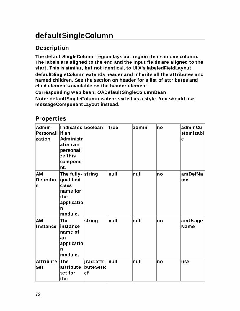
defaultSingleColumn
Description
The defaultSingleColumn region lays out region items in one column. The labels are aligned to the end and the input fields are aligned to the start. This is similar, but not identical, to UIX's labeledFieldLayout. defaultSingleColumn extends header and inherits all the attributes and named children. See the section on header for a list of attributes and child elements available on the header element. Corresponding web bean: OADefaultSingleColumnBean Note: defaultSingleColumn is deprecated as a style. You should use messageComponentLayout instead.
Properties
Admin Personalization
Indicates if an Administrator can personalize this component.
boolean true admin no adminCustomizable
AM Definition
The fully-qualified class name for the application module.
string null null no amDefName
AM Instance
The instance name of an application module.
string null null no amUsageName
Attribute Set
The attribute set for the
jrad:attributeSetRef
null null no use

73
component.
Child View Attribute
The name of the child view attribute.
string null null no childViewAttrName
Child View Instance
Renders an instance of the object for each row in the View Instance.
string null null no childViewUsageName
Comments
Comments
string null null no comment
Controller Class
The fully-qualified class name for the controller object.
string null admin no controllerClass
CSS Class Overrides the default CSS class.
string null admin no styleClass
Extends A reference to another component that creates a different instance of that component at runtime.
jrad:componentRef
null null no extends

74
Help Target
The target name for the page online help.
string null null no helpTarget
Help Target Appl Short Name
This application will be used to construct URI of the "help" icon in the global menu of the page.This makes the help pages from the other applications referenceable.
string null null no helpTargetAppShortName
Hide Header
Indicates if the region header is rendered.
boolean false null no headerDisabled
Icon URI The URI for the icon file.
string null admin no icon
Personalization Label
The region label used for Personalization.
string null null no regionName

75
Post Initial Values
Indicates if rows which are made dirty only by the defaulting of Initial Values are to be posted.
boolean false null no postDefault
Record History Enabled
Indicates if Record History feature is enabled.
boolean false admin no recordHistoryEnabled
Rendered Indicates if the component is rendered.
boolean true user no rendered
Security Mode
Defines the security mode used to secure the region. If set to selfSecured it is the developer's responsibility to handle security validation. The legal
string standard null no securityMode

76
values are standard, and selfSecured.
Standalone
Indicates if this region can be rendered on its own.
boolean false null no standalone
Text The text label for the component.
string null admin yes text
View Link Instance
The name of the View Link Instance establishing master-detail relationship between outer and inner repeating containers.
string null null no viewLinkName

77
defaultStack
Description
The defaultStack region extends header and inherits all the attributes and named children. See the section on header for a list of attributes and child elements available on the header element. Corresponding web bean: OADefaultStackLayoutBean Note: defaultStack is deprecated as a style. You should use messageComponentLayout instead.
Properties
Admin Personalization
Indicates if an Administrator can personalize this component.
boolean true admin no adminCustomizable
AM Definition
The fully-qualified class name for the application module.
string null null no amDefName
AM Instance
The instance name of an application module.
string null null no amUsageName
Attribute Set
The attribute set for the component.
jrad:attributeSetRef
null null no use
Child The name string null null no childView

78
View Attribute
of the child view attribute.
AttrName
Child View Instance
Renders an instance of the object for each row in the View Instance.
string null null no childViewUsageName
Comments
Comments
string null null no comment
Controller Class
The fully-qualified class name for the controller object.
string null admin no controllerClass
CSS Class Overrides the default CSS class.
string null admin no styleClass
Documentation Comment
Formatted text for use with Javadoc.
string from template file
null no not applicable
Extends A reference to another component that creates a different instance of that component at
jrad:componentRef
null null no extends

79
runtime. Help Target
The target name for the page online help.
string null null no helpTarget
Help Target Appl Short Name
This application will be used to construct URI of the "help" icon in the global menu of the page.This makes the help pages from the other applications referenceable.
string null null no helpTargetAppShortName
Icon URI The URI for the icon file.
string null admin no icon
Personalization Label
The region label used for Personalization.
string null null no regionName
Post Initial Values
Indicates if rows which are made
boolean false null no postDefault

80
dirty only by the defaulting of Initial Values are to be posted.
Record History Enabled
Indicates if Record History feature is enabled.
boolean false admin no recordHistoryEnabled
Rendered Indicates if the component is rendered.
boolean true user no rendered
Security Mode
Defines the security mode used to secure the region. If set to selfSecured it is the developer's responsibility to handle security validation. The legal values are standard, and selfSecur
string standard null no securityMode

81
ed. Standalone
Indicates if this region can be rendered on its own.
boolean false null no standalone
Text The text label for the component.
string null admin yes text
View Link Instance
The name of the View Link Instance establishing master-detail relationship between outer and inner repeating containers.
string null null no viewLinkName

82
flexibleContent
Description
The flexibleContent region is used to identify content that can be placed in a flexibleLayout region. The content can also be specified by referring to it. It represents available content which may or may not be made use of; and thus acts as a resource to the page designer. Corresponding web bean: OAFlexibleContentBean
Properties
Name Description
Type Default Value
Personalizable
Translatable
XML Attribute
Admin Operations
Indicates the personalization operations an administrator can perform on the component if Admin Personalization is set to True. The legal values are: null and remove. If set to remove, an Administrator can remove flexibleContent so
string remove null no adminOperations

83
that it does not render on the page, when personalizing the page. If set to null, no flexibleContent can be removed.
Admin Personalization
Indicates if an Administrator can personalize this component.
boolean true null no adminCustomizable
AM Definition
The fully-qualified class name for the application module.
string null null no amDefName
AM Instance
The instance name of an application module.
string null null no amUsageName
Attribute Set
The attribute set for the component.
jrad:attributeSetRef
null null no use

84
Comments
Comments
string null null no comment
Description
A short description of the items contained in the element. This attribute is translatable and will be listed/used in Resource Catalog. A search based on description may be performed by the user.
string null admin true description
Disclosed The initial disclosure state. When not-disclosed, only an outline of the component is shown along with an icon to restore to
boolean true null no disclosed

85
the disclosed state.
Document Name
The name of the component
jrad:refName
null null no docName
Documentation Comment
Formatted text for use with Javadoc.
string from template file
null no not applicable
Extends A reference to another component that creates a different instance of that component at runtime.
jrad:componentRef
null null no extends
Flexible Layout Reference
A reference to the oa:flexibleLayout that the flexibleContent will be rendered in. No value indicates that the flexibleContent will not be rendered
string null null no flexibleLayoutRef

86
anywhere in the page even if rendered="true" is set. The difference between rendered="false" and flexibleLayoutRef="" is that flexibleContent(s) with flexibleLayoutRef="" will only be listed in the catalog as content that can be added.
ID Inherited from <uix:base>. The page-wide unique client ID of this node.
Name null null no id
Rendered Whether the flexibleC
boolean true admin no rendered

87
ontent is rendered.
Show Border
Whether the border around the layout is shown.
boolean false null no showBorder
Show Header
Whether the header of this layout is shown.
boolean true null no showHeader
Title The title to display above the flexible content.
string null null no title
User Operations
Indicates the personalization operations a user can perform on the component, if User Personalization is set to True. The legal values are: (Default) and disclose. If set to
string null user no userOperations

88
(Default), the collapse/disclose operation cannot be performed by the user on this flexibleContent. If set to disclose, the user can either disclose or collapse the flexibleContent region in the rendered page.
User Personalization
Indicates if a user can personalize this component.
boolean true user no userCustomizable
View Source Region ID
Specifies ID of the region (within the flexibleContent) on which personali
string null null no viewSourceRegionId

89
zation views have been defined.
View Target Region ID
Specifies ID of the region on which the personalization view should be applied.
string null null no viewTargetRegionId

90
flexibleLayout
Description
The flexibleLayout region is used to define a customizable layout, separate from content, where content will be placed. flexibleLayout regions can be nested to form a customizable layout and can be positioned anywhere in the page. A page can have a number of 'top-level' flexibleLayouts; they do not have to be nested. Corresponding web bean: OAFlexibleLayoutBean
Properties
Name Description
Type Default Value
Personalizable
Translatable
XML Attribute
Admin Operations
Indicates the personalization operations an administrator can perform on the component if Admin Personalization is set to True. The legal values are: null and add. If set to add, an Administrator can add predefined flexibleC
string add null no adminOperations

91
ontent to the flexibleLayout region when personalizing the page. If set to null, no flexible content can be added to this flexible layout during personalization.
Admin Personalization
Indicates if an Administrator can personalize this component.
boolean true null no adminCustomizable
AM Definition
The fully-qualified class name for the application module.
string null null no amDefName
AM Instance
The instance name of an application
string null null no amUsageName

92
module. Attribute Set
The attribute set for the component.
jrad:attributeSetRef
null null no use
Columns The number of columns the flexibleLayout will have. Use layoutStyle=horizontal to horizontally layout the contents.
string 1 null no columns
Comments
Comments
string null null no comment
Disclosed The initial disclosure state. When not-disclosed, only an outline of the component is shown along with an icon to restore to the disclosed
boolean true null no disclosed

93
state. Document Name
The name of the component
jrad:refName
null null no docName
Documentation Comment
Formatted text for use with Javadoc.
string from template file
null no not applicable
Extends A reference to another component that creates a different instance of that component at runtime.
jrad:componentRef
null null no extends
Height The pixels or percentage 'hint' to the browser for the flexibleLayout.
string null null no height
ID Inherited from <uix:base>. The page-wide unique client ID of this node.
Name null null no id
Layout Style
The Content
string vertical null no layoutStyle

94
layout style. The legal values are vertical, and horizontal. If vertical, contents will be laid out vertically. If "horizontal" contents will be laid out horizontally.
Rendered Whether the flexibleLayout is rendered.
boolean true admin no rendered
Rows The number of rows the flexibleLayout will have. Use layoutStyle=vertical to vertically lay out the contents.
string 1 null no rows
Show Border
Whether the
boolean false null no showBorder

95
border around the layout is shown.
Show Header
Whether the header of this layout is shown.
boolean false null no showHeader
Title The title to display above the flexible layout.
string null null no title
User Operations
Indicates the personalization operations a user can perform on the component, if User Personalization is set to True. The legal values are: (Default) and disclose. If set to (Default), the collapse/disclose operation
string null user no userOperations

96
cannot be performed by the user on this flexible layout. If set to disclose, the user can either disclose or collapse the flexibleLayout region in the rendered page.
User Personalization
Indicates if a user can personalize this component.
boolean true user no userCustomizable
Width Provides a width hint to the browser.
string null admin no width

97
flowLayout
Description
The flowLayout region lays out its indexed children horizontally, wrapping as needed. Each pair of adjacent children will be separated by an optional separator child. When a flowLayout region is created under a footer named child of a messageComponent region, the flowLayout region can only include button and spacer items. Corresponding web bean: OAFlowLayoutBean
Properties
Add Indexed Children
Indicates if indexed children will be automatically added to this UI node tree.
boolean true null no addChildren
Admin Personalization
Indicates if an Administrator can personalize this component.
boolean true admin no adminCustomizable
AM Definition
The fully-qualified class name for the application module.
string null null no amDefName
AM The string null null no amUsage

98
Instance instance name of an application module.
Name
Attribute Set
The attribute set for the component.
jrad:attributeSetRef
null null no use
Child View Attribute
The name of the child view attribute. Valid only when used in table region.
string null null no childViewAttrName
Child View Instance
Renders an instance of the object for each row in the View Instance. Valid only when used in table region.
string null null no childViewUsageName
Comments
Comments
string null null no comment
Controller Class
The fully-qualified class name for the
string null admin no controllerClass

99
controller object.
CSS Class Overrides the default CSS class.
string null admin no styleClass
Document Name
The name of the component
jrad:refName
null null no docName
Documentation Comment
Formatted text for use with Javadoc.
string from template file
null no not applicable
Extends A reference to another component that creates a different instance of that component at runtime.
jrad:componentRef
null null no extends
File Version
The version of the file.
string null null no file-version
Help Target
The target name for the page online help.
string null null no helpTarget
Help Target Appl Short Name
This application will be used to construct
string null null no helpTargetAppShortName

100
URI of the "help" icon in the global menu of the page.This makes the help pages from the other applications referenceable.
ID The unique name of this component.
Name null null no id
Initial Sort Sequence
Indicates the initial sort sequence for each search. The legal values are none, first, second, and third.
string none null no initSortSeq
No Wrap Indicates if cell contents should be wrapped. Valid only when used in
boolean false null no cellNoWrapFormat

101
table region.
OA Extension Version
The Oracle Applications Extension version with which the file was created or updated.
jrad:version
null null no version
Personalization Label
The region label used for Personalization.
string null null no regionName
Post Initial Values
Indicates if rows which are made dirty only by the defaulting of Initial Values are to be posted.
boolean false null no postDefault
Prompt The text label for the component.
string null admin true prompt
Rendered Indicates if the component is rendered.
boolean true user no rendered
Scope The Base jrad:scop . null no scope

102
Packages which are allowed to reuse this component.
e
Security Mode
Defines the security mode used to secure the region. If set to selfSecured it is the developer's responsibility to handle security validation. The legal values are standard, and selfSecured.
string standard null no securityMode
Sort Allowed
Indicates if the user can sort this column. Valid only when used in table region.
string no admin no sortState

103
The legal values are yes, no, ascending, and descending.
Sort By View Attribute
The alternate view attribute name for use when sorting. Valid only when used in table region.
string null user no sortByViewAttr
Standalone
Indicates if this region can be rendered on its own.
boolean false null no standalone
User Personalization
Indicates if a user can personalize this component. Valid only when used in table region.
boolean false admin no userCustomizable
xml:lang Identifies the language containe
optional null null no xml:lang

104
d within this component.

105
footer
Description
The footer region is designed to contain the copyright, privacy information, and any other content that should be at the bottom of the page. footer extends <uix:footer> and inherits all the attributes and the named children defined for it. This element is embedded directly in a pageLayout element. Corresponding web bean: OAFooterBean
Properties
Admin Personalization
Indicates if an Administrator can personalize this component.
boolean true admin no adminCustomizable
AM Definition
The fully-qualified class name for the application module.
string null null no amDefName
AM Instance
The instance name of an application module.
string null null no amUsageName
Attribute Set
The attribute set for the component.
jrad:attributeSetRef
null null no use
Comment Comment string null null no comment

106
s s Controller Class
The fully-qualified class name for the controller object.
string null admin no controllerClass
CSS Class Overrides the default CSS class.
string null admin no styleClass
Document Name
The name of the component
jrad:refName
null null no docName
Documentation Comment
Formatted text for use with Javadoc.
string from template file
null no not applicable
Extends A reference to another component that creates a different instance of that component at runtime.
jrad:componentRef
null null no extends
File Version
The version of the file.
string null null no file-version
ID The unique name of this compone
Name null null no id

107
nt. OA Extension Version
The Oracle Applications Extension version with which the file was created or updated.
jrad:version
null null no version
Personalization Label
The region label used for Personalization.
string null null no regionName
Post Initial Values
Indicates if rows which are made dirty only by the defaulting of Initial Values are to be posted.
boolean false null no postDefault
Rendered Indicates if the component is rendered.
boolean true user no rendered
Scope The Base Packages which are allowed to reuse this compone
jrad:scope
. null no scope

108
nt. Security Mode
Defines the security mode used to secure the region. If set to selfSecured it is the developer's responsibility to handle security validation. The legal values are standard, and selfSecured.
string standard null no securityMode
xml:lang Identifies the language contained within this component.
optional null null no xml:lang
Element Children Name Quantity Description copyright 0 through 1 Node to use as a
copyright statement. privacy 0 through 1 Node to use as a
privacy statement.

109

110
Gantt
Description
The Gantt region can be used to create a Gantt chart that retrieves data from BC4J objects. Gantt charts are used for visualizing project planning and scheduling information; The Gantt style is used for rendering Gantt charts within a web application. oa:gantt extends oa:hGrid and inherits all the properties from it; note that the Width property in HGrid cannot be set in Gantt. Please refer to the HGrid section for more information on all HGrid properties. Corresponding web bean: OAGanttBean
Properties
Name Descripti
on Type Default
Value Personalizable
Translatable
XML Attribute
Actual End Date View Attribute
The view attribute for the actual end date of the task for the Variance bar Type.
string null null no actualFinishViewAttr
Actual Start Date View Attribute
The view attribute for the actual start date of the task for the Variance bar Type.
string null null no actualStartViewAttr
Additional Text
Additional help text.
string null admin yes shortDesc

111
Admin Personalization
Indicates if an Administrator can personalize this component.
boolean true admin no adminCustomizable
AM Definition
The fully-qualified class name for the application module.
string null null no amDefName
AM Instance
The instance name of an application module.
string null null no amUsageName
Attribute Set
The attribute set for the component.
jrad:attributeSetRef
null null no use
Auto Scale
Indicates if the Gantt chart will scale the axis units depending on the time-period specified.
boolean true user no autoScale
Axis End Date View
The view attribute for the
string null null no endTimeViewAttr

112
Attribute end date of the Gantt chart horizontal axis.
Axis Major Scale
The major unit of time for the Gantt chart horizontal axis. The legal values are years, halfyears, quarters, months, weeks, and days.
string months user no majorScale
Axis Minor Scale
The minor unit of time for the Gantt chart horizontal axis. The legal values are years, halfyears, quarters, months, weeks, and days.
string weeks user no minorScale
Axis Start Date
The view attribute
string null null no startTime

113
View Attribute
for the start date of the Gantt chart horizontal axis.
ViewAttr
Bar Type View Attribute
The view attribute indicating the bar type.
string null null no barTypeViewAttr
Baseline End Date View Attribute
The view attribute for the baseline end date of the task for the Variance Bar Type.
string null null no baseFinishViewAttr
Baseline Start Date View Attribute
The view attribute for the baseline start date of the task for the Variance bar Type.
string null null no baseStartViewAttr
Comments
Comments
string null null no comment
Completed Through View Attribute
The view attribute for the current 'completed through' date of the task.
string null null no completedThroughViewAttr

114
Controller Class
The fully-qualified class name for the controller object.
string null admin no controllerClass
CSS Class Overrides the default CSS class.
string null admin no styleClass
Disable Client Side Validation
Indicates if validation should not occur on the web tier during a form submit.
boolean false null no unvalidated
Extends A reference to another component that creates a different instance of that component at runtime.
jrad:componentRef
null null no extends
Help Target
The target name for the page online help.
string null null no helpTarget
Help Target
This applicatio
string null null no helpTargetAppSho

115
Appl Short Name
n will be used to construct URI of the "help" icon in the global menu of the page.This makes the help pages from the other applications referenceable.
rtName
Left Text View Attribute
The view attribute for the text label to the left of the task.
string null null no leftTextViewAttr
Percent Complete View Attrbute
The view attribute for the completion percentage of the task.
string null null no percentCompleteViewAttr
Personalization Label
The region label used for Personalization.
string null null no regionName
Post Indicates boolean false null no postDefa

116
Initial Values
if rows which are made dirty only by the defaulting of Initial Values are to be posted.
ult
Predecessor Accessor
Accessor Name for the predecessor's rowset for the current task.
string null null no predecessorAccessor
Predecessor View Attribute
View Attribute Name for the predecessor task ID.
string null null no predecessorViewAttr
Record Set Size
The maximum number of records that can be displayed under each node.
string null null no childBlockSize
Render Description Columns
Indicates if the description
boolean true user no descChildrenVis

117
columns should always be rendered.
Rendered Indicates if the component is rendered.
boolean true user no rendered
Right Text View Attribute
The view attribute for the text label to the right of the task.
string null null no rightTextViewAttr
Search Controller Class
The fully-qualified class name for the controller object associated with the search results table.
string null admin no searchControllerClass
Search View Usage
The view usage to be used for running queries on the hGrid.
string null null no searchViewName
Security Mode
Defines the security mode used to
string standard null no securityMode

118
secure the region. If set to selfSecured it is the developer's responsibility to handle security validation. The legal values are standard, and selfSecured.
Show Bubble Text
Indicates if Bubble Text will be shown for the task.
boolean true user no showTooltip
Show Current Date
Indicates if a line is drawn to indicate the current date.
boolean true user no showCurrentDate
Show Dependency Lines
Indicates if dependency lines are visible.
boolean false user no showDependencyLines
Standalone
Indicates if this
boolean false null no standalone

119
region can be rendered on its own.
Task End Date View Attribute
The view attribute for the end date of the task.
string null null no barFinishViewAttr
Task ID View Attribute
View Attribute Name for the unique task ID.
string null null no taskIdViewAttr
Task Start Date View Attribute
The view attribute for the start date of the task.
string null null no barStartViewAttr
User Personalization
Indicates if a user can personalize this component.
boolean false admin no userCustomizable
View Instance Name
The name of the view object instance.
string null null no viewName
Element Children Name Quantity Description descriptionColumns 0 through 1 Description columns.tableActions 0 through 1 Component used for
performing table

120
actions that are independent of row selection.
tableSelection 0 through 1 SingleSelectionBean or MultipleSelectionBean to render with the table.
viewInHierarchy 0 through 1 Column stamp for the 'View In Hierarchy' column in the search results table.

121
graphTable
Description
The graphTable region is used to layout graphs that are essentially BI Beans and a UIX table by extending tableLayout. So, graphTable inherits all the attributes and children from tableLayout. See the section on tableLayout for a list of attributes and child elements available on the tableLayout element. graphTable contains two grouping elements called graphs and tabularFormat. The graphs grouping contains one or more graph elements. The tabularFormat grouping contains a table. Corresponding web bean: OAGraphTableBean
Properties
Name Description
Type Default Value
Personalizable
Translatable
XML Attribute
Add Indexed Children
Indicates if indexed children will be automatically added to this UI node tree.
boolean true null no addChildren
Admin Personalization
Indicates if an Administrator can personalize this component.
boolean true admin no adminCustomizable
AM Definition
The fully-qualified class name for the
string null null no amDefName

122
application module.
AM Instance
The instance name of an application module.
string null null no amUsageName
Attribute Set
The attribute set for the component.
jrad:attributeSetRef
null null no use
Comments
Comments
string null null no comment
Controller Class
The fully-qualified class name for the controller object.
string null admin no controllerClass
CSS Class Overrides the default CSS class.
string null admin no styleClass
Extends A reference to another component that creates a different instance of that component at runtime.
jrad:componentRef
null null no extends

123
Graph Render Style
Indicates which components of the graph are rendered. The legal values are both, and graph.
string graph null no renderStyle
Graphs per Row
Number of graphs to be displayed on each row.
unsignedInt
null null no graphsPerRow
Help Target
The target name for the page online help.
string null null no helpTarget
Help Target Appl Short Name
This application will be used to construct URI of the "help" icon in the global menu of the page.This makes the help pages from the other applicatio
string null null no helpTargetAppShortName

124
ns referenceable.
Personalization Label
The region label used for Personalization.
string null null no regionName
Post Initial Values
Indicates if rows which are made dirty only by the defaulting of Initial Values are to be posted.
boolean false null no postDefault
Rendered Indicates if the component is rendered.
boolean true user no rendered
Security Mode
Defines the security mode used to secure the region. If set to selfSecured it is the developer's responsibility to handle
string standard null no securityMode

125
security validation. The legal values are standard, and selfSecured.
Standalone
Indicates if this region can be rendered on its own.
boolean false null no standalone
View Link Instance
The name of the View Link Instance establishing master-detail relationship between outer and inner repeating containers.
string null null no viewLinkName
Element Children Name Quantity Description graphs 1 Graphs based on the
table. tabularFormat 0 through 1 Table for graphs are to
be rendered.
graph

126
Name Description
Type Default Value
Personalizable
Translatable
XML Attribute
Aggregate Function
The aggregate function to apply to the data. The legal values are sum, avg, max, min, and none.
string none admin no aggregateFunction
Allow Combination Graph
Indicates if a combination graph is allowed.
boolean false user no combo
AM Definition
The fully-qualified class name for the application module.
string null null no amDefName
AM Instance
The instance name of an application module.
string null null no amUsageName
Attribute Set
The attribute set for the component.
jrad:attributeSetRef
null null no use
Comment Comment string null null no comment

127
s s CSS Class Overrides
the default CSS class.
string null admin no styleClass
Data Axis Label
The Data Axis label for the graph.
string null admin true yAxisLabel
Data Axis scale from zero
Determines whether the lower limit for Data Axis is zero or the lowest data value.
boolean true admin no yAxisScaleFromZero
Destination URI
The Destination URI.
string null null no drillDownUrl
Display Data Bubble Text
Indicates if Bubble Text is displayed for the Data Points.
boolean true null no displayBubbleText
Display Data Markers
Indicates if the data markers should be plotted.
boolean false admin no displayDataMarkers
Display Secondary Y-Axis
Indicates if this graph has a secondary Y-axis.
boolean false user no dualYAxis

128
Document Name
The name of the component
jrad:refName
null null no docName
Extends A reference to another component that creates a different instance of that component at runtime.
jrad:componentRef
null null no extends
Graph Type
The type of the graph. The legal values are absolute area, absolute line, horizontal clustered bar, horizontal percent bar, horizontal stacked bar, percent area, percent line, pie, point, scatter, stacked
string vertical clustered bar
admin no graphType

129
area, stacked line, vertical clustered bar, vertical high-low-close stock, vertical percent bar, and vertical stacked bar.
Height Graph's height in pixels, applicable only if size="custom".
string null null no height
Rendered Indicates if the component is rendered.
boolean true user no rendered
Scope The Base Packages which are allowed to reuse this component.
jrad:scope
. null no scope
Secondary Data Axis Label
The label for the secondary data axis.
string null user true secYAxisLabel
Size The size of the
string small user no size

130
graph. The legal values are very-small, small, medium, large, and custom.
Title The title of the graph.
string null admin true title
Width Graph's width in pixels, applicable only if size="custom".
string null null no width
X-Axis Label
The X-Axis label for the graph.
string null admin true xAxisLabel
xml:lang Identifies the language contained within this component.
optional null null no xml:lang
Element Children Name Quantity Description dataMap 1 Lists a bunch of
graphData elements.
graphData Name Descripti
on Type Default
ValuePersonalizable
Translatable
XML Attribute
Attribute Set
The attribute
jrad:attributeSetR
null null no use

131
set for the component.
ef
Combination Graph Type
The type of graph for a combination graph. The legal values are bar, line, area, and none.
string none null no comboGraphType
Comments
Comments.
string null null no comment
Prompt Prompt to be used in legend label. Used only when style='data'.
string null admin true prompt
Purpose in Graph
Specifies the purpose of the graph data element. The legal values are data, groupLabels, and seriesLabels.
string data null no graphAs
Secondary Axis
Indicates if this
boolean false user no assignedToY2

132
graphData is plotted on the secondary axis.
Stock Value Type
The Stock Type Value to use for the graph. The legal values are high, low, close, and none.
string none null no stockValue
View Attribute
The name of the view attribute.
string null null no viewAttr
View Instance
The name of the view object instance.
string null null no viewName

133
header
Description
The header region places a label and optional icon at the top of a section. This control can be used to provide important messaging information. The types of messages are: Error, Information, Warning, and Confirmation. header extends <uix:header> and inherits all the attributes and named children defined for it. This element does not support the "styleClass" attribute. Corresponding web bean: OAHeaderBean
Properties
Add Indexed Children
Indicates if indexed children will be automatically added to this UI node tree.
boolean true null no addChildren
Admin Personalization
Indicates if an Administrator can personalize this component.
boolean true admin no adminCustomizable
AM Definition
The fully-qualified class name for the application module.
string null null no amDefName

134
AM Instance
The instance name of an application module.
string null null no amUsageName
Attribute Set
The attribute set for the component.
jrad:attributeSetRef
null null no use
Child View Attribute
The name of the child view attribute.
string null null no childViewAttrName
Child View Instance
Renders an instance of the object for each row in the View Instance.
string null null no childViewUsageName
Comments
Comments
string null null no comment
Controller Class
The fully-qualified class name for the controller object.
string null admin no controllerClass
CSS Class Overrides the default CSS class.
string null admin no styleClass
Document Name
The name of the
jrad:refName
null null no docName

135
component
Documentation Comment
Formatted text for use with Javadoc.
string from template file
null no not applicable
Extends A reference to another component that creates a different instance of that component at runtime.
jrad:componentRef
null null no extends
File Version
The version of the file.
string null null no file-version
Help Target
The target name for the page online help.
string null null no helpTarget
Help Target Appl Short Name
This application will be used to construct URI of the "help" icon in the global menu of the page.This
string null null no helpTargetAppShortName

136
makes the help pages from the other applications referenceable.
Icon URI The URI for the icon file.
string null admin no icon
ID The unique name of this component.
Name null null no id
OA Extension Version
The Oracle Applications Extension version with which the file was created or updated.
jrad:version
null null no version
Personalization Label
The region label used for Personalization.
string null null no regionName
Post Initial Values
Indicates if rows which are made dirty only by the defaultin
boolean false null no postDefault
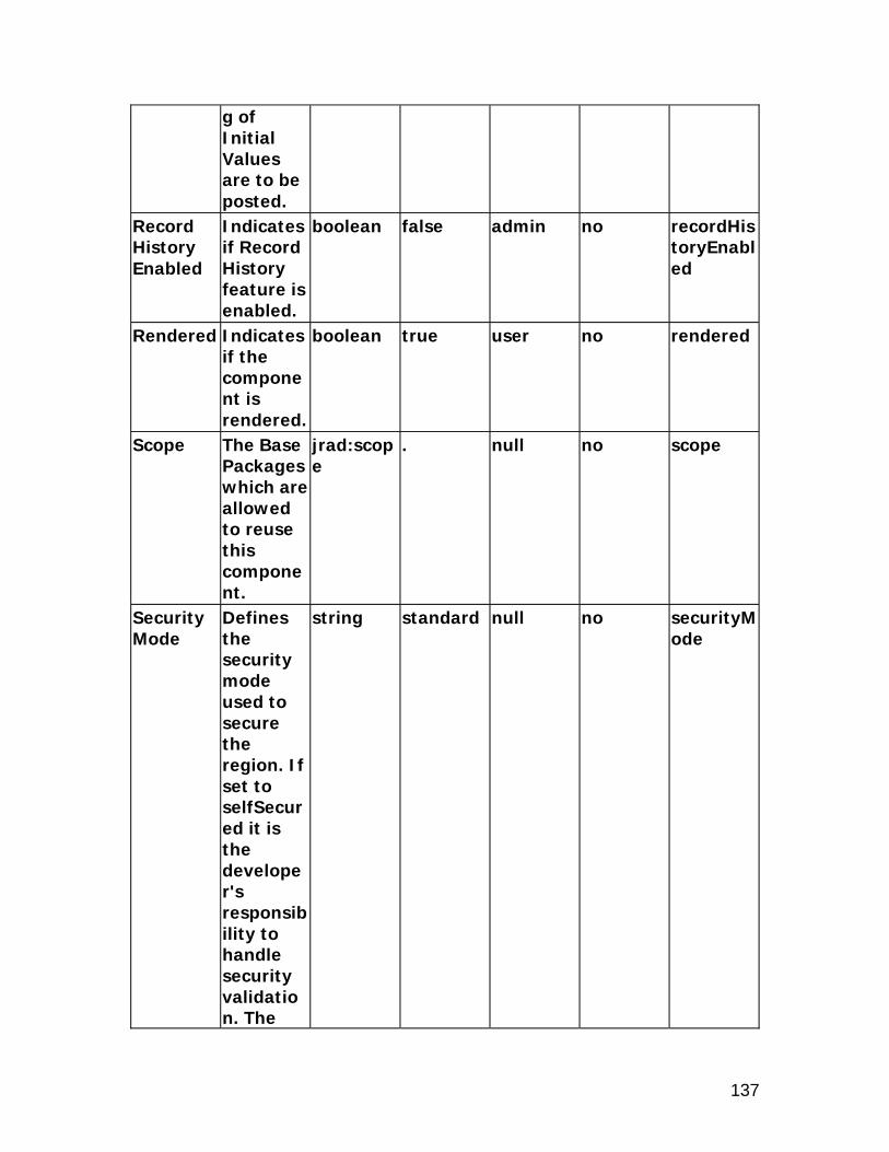
137
g of Initial Values are to be posted.
Record History Enabled
Indicates if Record History feature is enabled.
boolean false admin no recordHistoryEnabled
Rendered Indicates if the component is rendered.
boolean true user no rendered
Scope The Base Packages which are allowed to reuse this component.
jrad:scope
. null no scope
Security Mode
Defines the security mode used to secure the region. If set to selfSecured it is the developer's responsibility to handle security validation. The
string standard null no securityMode

138
legal values are standard, and selfSecured.
Standalone
Indicates if this region can be rendered on its own.
boolean false null no standalone
Text The text label for the component.
string null admin yes text
View Link Instance
The name of the View Link Instance establishing master-detail relationship between outer and inner repeating containers.
string null null no viewLinkName
xml:lang Identifies the language contained within this component.
optional null null no xml:lang

139

140
HGrid
Description
The HGrid region can be used to display tree structured data, in a format similar to a table element. Unlike the TreeBean, the HGridBean is suitable for use with massive trees, since it supports focusing in and out of subtrees. The HGrid region is used to display objects in a hierarchical format, much like the Tree region. HGrid renders like a Table; each row corresponds to a tree node. It has two special columns: the focus column and the object hierarchy column. The object hierarchy column identifies the current tree node and allows the user to expand (view the children of) or collapse (hide the children of) this node. The focus column is used to select a new root for the tree. This allows users to zoom into subtrees of a massive tree. The HGrid element renders bread crumbs to allow the user to focus out (or zoom out) of the current subtree. HGrid also renders links to allow the user to quickly expand or collapse all the nodes under the current focus root. Corresponding web bean: OAHGridBean
Properties
Name Description
Type Default Value
Personalizable
Translatable
XML Attribute
Additional Text
Additional help text.
string null admin yes shortDesc
Admin Personalization
Indicates if an Administrator can personalize this component.
boolean true admin no adminCustomizable
AM Definition
The fully-qualified class name for the application
string null null no amDefName

141
module. AM Instance
The instance name of an application module.
string null null no amUsageName
Attribute Set
The attribute set for the component.
jrad:attributeSetRef
null null no use
Comments
Comments
string null null no comment
Controller Class
The fully-qualified class name for the controller object.
string null admin no controllerClass
CSS Class Overrides the default CSS class.
string null admin no styleClass
Disable Client Side Validation
Indicates if validation should not occur on the web tier during a form submit.
boolean false null no unvalidated
Document Name
The name of the component
jrad:refName
null null no docName
Documen Formatte string from null no not

142
tation Comment
d text for use with Javadoc.
template file
applicable
Extends A reference to another component that creates a different instance of that component at runtime.
jrad:componentRef
null null no extends
File Version
The version of the file.
string null null no file-version
Help Target
The target name for the page online help.
string null null no helpTarget
Help Target Appl Short Name
This application will be used to construct URI of the "help" icon in the global menu of the page.This makes the help pages
string null null no helpTargetAppShortName

143
from the other applications referenceable.
ID Maps to the Item Name property of the nested region that points to the HGrid region.
Name null null no id
OA Extension Version
The Oracle Applications Extension version with which the file was created or updated.
jrad:version
null null no version
Personalization Label
The region label used for Personalization.
string null null no regionName
Post Initial Values
Indicates if rows which are made dirty only by the defaulting of
boolean false null no postDefault

144
Initial Values are to be posted.
Record Set Size
The maximum number of records that can be displayed under each node.
string null null no childBlockSize
Rendered Indicates if the component is rendered.
boolean true user no rendered
Scope The Base Packages which are allowed to reuse this component.
jrad:scope
. null no scope
Search Controller Class
The fully-qualified class name for the controller object associated with the search results table.
string null admin no searchControllerClass
Search The view string null null no searchVie

145
View Usage
usage to be used for running queries on the hGrid.
wName
Security Mode
Defines the security mode used to secure the region. If set to selfSecured it is the developer's responsibility to handle security validation. The legal values are standard, and selfSecured.
string standard null no securityMode
Standalone
Indicates if this region can be rendered on its own.
boolean false null no standalone
User Personali
Indicates if a user can
boolean false admin no userCustomizable

146
zation personalize this component.
Width Indicates the width in pixels or as a percentage (if % sign included).
string null null no width
xml:lang Identifies the language contained within this component.
optional null null no xml:lang
Element Children Name Quantity Description tableActions 0 through 1 Component used for
performing table actions that are independent of row selection.
tableSelection 0 through 1 SingleSelectionBean or MultipleSelectionBean to render with the table.
viewInHierarchy 0 through 1 Column stamp for the 'View In Hierarchy' column in the search results table.

147
hideShow
Description
The hideShow region provides a means of toggling a group of UINodes between being disclosed or undisclosed. A hideShow element should be used to: hide or show an entire section or a part of a section of
information within the contents of a page such as: show more information/hide more information, show details/hide details, show "section name"/hide "section name", show graph/hide graph, etc.
hide or show functionality such as simple/advance search hide or show details of a table row
hideShow extends <uix:hideShow> and inherits all the attributes and children. Corresponding web bean: OADefaultHideShowBean
Properties
Add Indexed Children
Indicates if indexed children will be automatically added to this UI node tree.
boolean true null no addChildren
Additional Text
Additional help text. Note: If a hideShow region is created under advanced
string null admin yes shortDesc

148
Table then the Additional Text property is not displayed.
Admin Personalization
Indicates if an Administrator can personalize this component.
boolean true admin no adminCustomizable
AM Definition
The fully-qualified class name for the application module.
string null null no amDefName
AM Instance
The instance name of an application module.
string null null no amUsageName
Attribute Set
The attribute set for the component.
jrad:attributeSetRef
null null no use
Comments
Comments
string null null no comment
Controller Class
The fully-qualified class name for
string null admin no controllerClass

149
the controller object.
CSS Class Overrides the default CSS class.
string null admin no styleClass
Disable Client Side Validation
Indicates if validation should not occur on the web tier during a form submit.
boolean false null no unvalidated
Disable Server Side Validation
Indicates if validation should not occur on the business tier during a form submit.
boolean false null no serverUnvalidated
Disclosed Text
The text to display when the children are shown.
string null admin no disclosedText
Disclosed The initial disclosure state.
boolean false user no disclosed
Document Name
The name of the component
jrad:refName
null null no docName

150
Documentation Comment
Formatted text for use with Javadoc.
string from template file
null no not applicable
Extends A reference to another component that creates a different instance of that component at runtime.
jrad:componentRef
null null no extends
File Version
The version of the file.
string null null no file-version
Help Target
The target name for the page online help.
string null null no helpTarget
Help Target Appl Short Name
This application will be used to construct URI of the "help" icon in the global menu of the page.This makes the help
string null null no helpTargetAppShortName

151
pages from the other applications referenceable.
ID The unique name of this component.
Name null null no id
OA Extension Version
The Oracle Applications Extension version with which the file was created or updated.
jrad:version
null null no version
Personalization Label
The region label used for Personalization.
string null null no regionName
Post Initial Values
Indicates if rows which are made dirty only by the defaulting of Initial Values are to be posted.
boolean false null no postDefault

152
Rendered Indicates if the component is rendered.
boolean true user no rendered
Scope The Base Packages which are allowed to reuse this component.
jrad:scope
. null no scope
Security Mode
Defines the security mode used to secure the region. If set to selfSecured it is the developer's responsibility to handle security validation. The legal values are standard, and selfSecured.
string standard null no securityMode
Standalone
Indicates if this region
boolean false null no standalone

153
can be rendered on its own.
Undisclosed Text
The text to display when the children are hidden.
string null admin no undisclosedText
User Personalization
Indicates if a user can personalize this component.
boolean false admin no userCustomizable
View Attribute
The name of the view attribute.
string null null no viewAttr
View Instance
The name of the view object instance.
string null null no viewName
xml:lang Identifies the language contained within this component.
optional null null no xml:lang

154
hideShowHeader
Description
The hideShowHeader region provides a means of toggling the contents under a header between being disclosed (shown) or undisclosed (hidden). hideShowHeader extends <uix:hideShowHeader> and inherits all the attributes and children. Corresponding web bean: OAHideShowHeaderBean
Properties
Add Indexed Children
Indicates if indexed children will be automatically added to this UI node tree.
boolean true null no addChildren
Admin Personalization
Indicates if an Administrator can personalize this component.
boolean true admin no adminCustomizable
AM Definition
The fully-qualified class name for the application module.
string null null no amDefName
AM Instance
The instance
string null null no amUsageName

155
name of an application module.
Attribute Set
The attribute set for the component.
jrad:attributeSetRef
null null no use
Comments
Comments
string null null no comment
Controller Class
The fully-qualified class name for the controller object.
string null admin no controllerClass
CSS Class Overrides the default CSS class.
string null admin no styleClass
Disable Client Side Validation
Indicates if validation should not occur on the web tier during a form submit.
boolean false null no unvalidated
Disable Server Side Validation
Indicates if validation should not occur on the business tier
boolean false null no serverUnvalidated
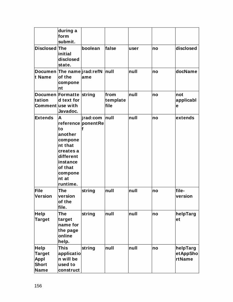
156
during a form submit.
Disclosed The initial disclosed state.
boolean false user no disclosed
Document Name
The name of the component
jrad:refName
null null no docName
Documentation Comment
Formatted text for use with Javadoc.
string from template file
null no not applicable
Extends A reference to another component that creates a different instance of that component at runtime.
jrad:componentRef
null null no extends
File Version
The version of the file.
string null null no file-version
Help Target
The target name for the page online help.
string null null no helpTarget
Help Target Appl Short Name
This application will be used to construct
string null null no helpTargetAppShortName

157
URI of the "help" icon in the global menu of the page.This makes the help pages from the other applications referenceable.
Icon URI The URI for the icon file.
string null admin no icon
ID The unique name of this component.
Name null null no id
OA Extension Version
The Oracle Applications Extension version with which the file was created or updated.
jrad:version
null null no version
Personalization Label
The region label used for
string null null no regionName

158
Personalization.
Post Initial Values
Indicates if rows which are made dirty only by the defaulting of Initial Values are to be posted.
boolean false null no postDefault
Rendered Indicates if the component is rendered.
boolean true user no rendered
Scope The Base Packages which are allowed to reuse this component.
jrad:scope
. null no scope
Security Mode
Defines the security mode used to secure the region. If set to selfSecured it is the developer's responsibility to
string standard null no securityMode

159
handle security validation. The legal values are standard, and selfSecured.
Standalone
Indicates if this region can be rendered on its own.
boolean false null no standalone
Text The text label for the component.
string null admin yes text
View Attribute
The name of the view attribute.
string null null no viewAttr
View Instance
The name of the view object instance.
string null null no viewName
xml:lang Identifies the language contained within this component.
optional null null no xml:lang

160

161
labeledFieldLayout
Description
The labeledFieldLayout region lays out its indexed children in a series of columns, one set for the "labels" and the other set for the "fields", with a gap in between. The children are laid out across and down, with the first child in each row in the "label" position and the second in the "field" position. The contents of each row are centered in the available space, with the "labels" right aligned, and the "fields" left aligned. With multiple columns, the children continue to be layed out across and down. For example, with two columns, the third child will be used as the label for the first row and second column. Although designed for labeled text fields, this layout can be used with any UINodes. It also has special support for all of the inline messaging beans. Each inline messaging bean will automatically occupy both a "label" and "field" position. Corresponding web bean: OALabeledFieldLayoutBean Note: The labeledFieldLayout component has been deprecated; use the messageComponentLayout component instead. Please refer to the messageComponentLayout section for information about messageComponentLayout.
Properties
Add Indexed Children
Indicates if indexed children will be automatically added to this UI node tree.
boolean true null no addChildren
Admin Personalization
Indicates if an Administrator can personalize this
boolean true admin no adminCustomizable

162
component.
AM Definition
The fully-qualified class name for the application module.
string null null no amDefName
AM Instance
The instance name of an application module.
string null null no amUsageName
Attribute Set
The attribute set for the component.
jrad:attributeSetRef
null null no use
Child View Attribute
The name of the child view attribute.
string null null no childViewAttrName
Child View Instance
Renders an instance of the object for each row in the View Instance.
string null null no childViewUsageName
Columns The number of columns to display in the
unsignedInt
1 null no columns

163
layout. Comments
Comments
string null null no comment
Controller Class
The fully-qualified class name for the controller object.
string null admin no controllerClass
CSS Class Overrides the default CSS class.
string null admin no styleClass
Document Name
The name of the component
jrad:refName
null null no docName
Documentation Comment
Formatted text for use with Javadoc.
string from template file
null no not applicable
Extends A reference to another component that creates a different instance of that component at runtime.
jrad:componentRef
null null no extends
File Version
The version of the file.
string null null no file-version
Help Target
The target name for
string null null no helpTarget

164
the page online help.
Help Target Appl Short Name
This application will be used to construct URI of the "help" icon in the global menu of the page.This makes the help pages from the other applications referenceable.
string null null no helpTargetAppShortName
ID The unique name of this component.
Name null null no id
Item Width
Indicates the width of the item in pixels or as a percentage (if % sign included).
string null null no fieldWidth

165
OA Extension Version
The Oracle Applications Extension version with which the file was created or updated.
jrad:version
null null no version
Personalization Label
The region label used for Personalization.
string null null no regionName
Post Initial Values
Indicates if rows which are made dirty only by the defaulting of Initial Values are to be posted.
boolean false null no postDefault
Prompt Width
Indicates the width of the prompt in pixels or as a percentage (if % sign included).
string null null no labelWidth
Rendered Indicates if the
boolean true user no rendered

166
component is rendered.
Scope The Base Packages which are allowed to reuse this component.
jrad:scope
. null no scope
Security Mode
Defines the security mode used to secure the region. If set to selfSecured it is the developer's responsibility to handle security validation. The legal values are standard, and selfSecured.
string standard null no securityMode
Standalone
Indicates if this region can be rendered on its
boolean false null no standalone

167
own. View Link Instance
The name of the View Link Instance establishing master-detail relationship between outer and inner repeating containers.
string null null no viewLinkName
Width Indicates the width in pixels or as a percentage (if % sign included).
string null null no width
xml:lang Identifies the language contained within this component.
optional null null no xml:lang

168
listOfValues
Description
A listOfValues region is rendered in a separate modal dialog containing a complex list of possible values that can be selected as a valid value for an entry field on a transaction page or a field within a table. Refer to the messageLovInput section for information on the properties of messageLovInput. Corresponding web bean: OAListOfValuesBean
Properties
Admin Personalization
Indicates if an Administrator can personalize this component.
boolean true admin no adminCustomizable
Advanced Search Allowed
Indicates if the Advanced Search region is Enabled for the List Of Values.
boolean false admin no advancedSearchAllowed
AM Definition
The fully-qualified class name for the application module.
string null null no amDefName
AM Instance
The instance name of an application
string null null no amUsageName

169
module. Attribute Set
The attribute set for the component.
jrad:attributeSetRef
null null no use
Comments
Comments
string null null no comment
Controller Class
The fully-qualified class name for the controller object.
string null admin no controllerClass
CSS Class Overrides the default CSS class.
string null admin no styleClass
Document Name
The name of the component
jrad:refName
null null no docName
Documentation Comment
Formatted text for use with Javadoc.
string from template file
null no not applicable
Extends A reference to another component that creates a different instance of that component at runtime.
jrad:componentRef
null null no extends
File The string null null no file-

170
Version version of the file.
version
OA Extension Version
The Oracle Applications Extension version with which the file was created or updated.
jrad:version
null null no version
Personalization Label
The region label used for Personalization.
string null null no regionName
Post Initial Values
Indicates if rows which are made dirty only by the defaulting of Initial Values are to be posted.
boolean false null no postDefault
Rendered Indicates if the component is rendered.
boolean true user no rendered
Scope The Base Packages which are allowed to reuse
jrad:scope
. null no scope

171
this component.
Security Mode
Defines the security mode used to secure the region. If set to selfSecured it is the developer's responsibility to handle security validation. The legal values are standard, and selfSecured.
string standard null no securityMode
xml:lang Identifies the language contained within this component.
optional null null no xml:lang
Element Children Name Quantity Description searchInstructions 0 through 1 Short instructional text
which will display in

172
the search block of the LOV window.

173
messageComponentLayout
Description
The messageComponentLayout region lays out components in multiple columns. The prompts of the components line up, and right align; and the associated data entry areas of each of the components also line up, left aligning with one another within a column. The children of this bean are restricted to message components. Corresponding web bean: OAMessageComponentLayoutBean
Properties
Name Description
Type Default Value
Personalizable
Translatable
XML Attribute
Add Indexed Children
Indicates if indexed children will be automatically added to this UI node tree.
boolean true null no addChildren
Admin Personalization
Indicates if an Administrator can personalize this component.
boolean true admin no adminCustomizable
AM Definition
The fully-qualified class name for the application module.
string null null no amDefName

174
AM Instance
The instance name of an application module.
string null null no amUsageName
Attribute Set
The attribute set for the component.
jrad:attributeSetRef
null null no use
Columns The number of columns to display in the layout.
unsignedInt
null null no columns
Comments
Comments
string null null no comment
Controller Class
The fully-qualified class name for the controller object.
string null admin no controllerClass
CSS Class Overrides the default CSS class.
string null admin no styleClass
Document Name
The name of the component
jrad:refName
null null no docName
Documentation Comment
Formatted text for use with Javadoc.
string from template file
null no not applicable

175
Extends A reference to another component that creates a different instance of that component at runtime.
jrad:componentRef
null null no extends
Field Width
Overrides the preferred width of the fields in pixels or as a percentage (if % sign included).
string null admin no fieldWidth
File Version
The version of the file.
string null null no file-version
ID The unique name of this component.
Name null null no id
OA Extension Version
The Oracle Applications Extension version with which the
jrad:version
null null no version

176
file was created or updated.
Personalization Label
The region label used for Personalization.
string null null no regionName
Post Initial Values
Indicates if rows which are made dirty only by the defaulting of Initial Values are to be posted.
boolean false null no postDefault
Prompt Width
Indicates the width of the prompt in pixels or as a percentage (if % sign included).
string null null no labelWidth
Rendered Indicates if the component is rendered.
boolean true user no rendered
Scope The Base Packages which are allowed to reuse
jrad:scope
. null no scope

177
this component.
Search Region
Indicates if this component is used as a search region. Setting this to True overrides settings for the Width, Prompt Width and Field Width.
boolean false null no searchRegion
Security Mode
Defines the security mode used to secure the region. If set to selfSecured it is the developer's responsibility to handle security validation. The legal values are
string standard null no securityMode

178
standard, and selfSecured.
Width Indicates the width in pixels or as a percentage (if % sign included).
string null null no width
xml:lang Identifies the language contained within this component.
optional null null no xml:lang
messageLayout Name Descripti
on Type Default
ValuePersonalizable
Translatable
XML Attribute
Admin Personalization
Indicates if an Administrator can personalize this component.
boolean true admin no adminCustomizable
Attribute Set
The attribute set for the component.
jrad:attributeSetRef
null null no use
Comments
Comments
string null null no comment
Prompt The text label for
string null admin yes prompt

179
the component.
Rendered Indicates if the component is rendered.
boolean true user no rendered

180
navigationBar
Description
The navigationBar style implements a locator element. It can be used for both step-by-step navigation and record navigation. Corresponding web bean: OANavigationBarBean
Properties
Add Indexed Children
Indicates if indexed children will be automatically added to this UI node tree.
boolean true null no addChildren
Admin Personalization
Indicates if an Administrator can personalize this component.
boolean true admin no adminCustomizable
AM Definition
The fully-qualified class name for the application module.
string null null no amDefName
AM Instance
The instance name of an applicatio
string null null no amUsageName

181
n module.
Attribute Set
The attribute set for the component.
jrad:attributeSetRef
null null no use
Comments
Comments
string null null no comment
Controller Class
The fully-qualified class name for the controller object.
string null admin no controllerClass
CSS Class Overrides the default CSS class.
string null admin no styleClass
Disable Client Side Validation
Indicates if validation should not occur on the web tier during a form submit.
boolean false null no unvalidated
Disable Server Side Validation
Indicates if validation should not occur on the business tier during a form submit.
boolean false null no serverUnvalidated

182
Document Name
The name of the component
jrad:refName
null null no docName
Documentation Comment
Formatted text for use with Javadoc.
string from template file
null no not applicable
Extends A reference to another component that creates a different instance of that component at runtime.
jrad:componentRef
null null no extends
File Version
The version of the file.
string null null no file-version
First Step The number of the first step in a multi-step navigation.
unsignedInt
1 null no minValue
Last Step The number of the last step in a multi-step navigation.
unsignedInt
-1 null no maxValue

183
OA Extension Version
The Oracle Applications Extension version with which the file was created or updated.
jrad:version
null null no version
Personalization Label
The region label used for Personalization.
string null null no regionName
Post Initial Values
Indicates if rows which are made dirty only by the defaulting of Initial Values are to be posted.
boolean false admin no postDefault
Records Displayed
The maximum number of rows to display.
unsignedInt
-1 user no blockSize
Rendered Indicates if the component is rendered.
boolean true user no rendered
Scope The Base jrad:scop . null no scope

184
Packages which are allowed to reuse this component.
e
Show All Indicates if the user can view any attachment for the current object, regardless of category.
string no null no showAll
Security Mode
Defines the security mode used to secure the region. If set to selfSecured it is the developer's responsibility to handle security validation. The legal values are standard, and selfSecur
string standard null no securityMode

185
ed. xml:lang Identifies
the language contained within this component.
optional null null no xml:lang

186
pageButtonBar
Description
The pageButtonBar style lays out a set of buttons that operate over the scope of the entire page. Corresponding web bean: OAPageButtonBarBean
Properties
Add Indexed Children
Indicates if indexed children will be automatically added to this UI node tree.
boolean true null no addChildren
Admin Personalization
Indicates if an Administrator can personalize this component.
boolean true admin no adminCustomizable
Attribute Set
The attribute set for the component.
jrad:attributeSetRef
null null no use
Comments
Comments
string null null no comment
Controller Class
The fully-qualified class name for the
string null admin no controllerClass

187
controller object.
CSS Class Overrides the default CSS class.
string null admin no styleClass
Document Name
The name of the component
jrad:refName
null null no docName
Documentation Comment
Formatted text for use with Javadoc.
string from template file
null no not applicable
Extends A reference to another component that creates a different instance of that component at runtime.
jrad:componentRef
null null no extends
File Version
The version of the file.
string null null no file-version
OA Extension Version
The Oracle Applications Extension version with which the file was created or
jrad:version
null null no version

188
updated. Personalization Label
The region label used for Personalization.
string null null no regionName
Post Initial Values
Indicates if rows which are made dirty only by the defaulting of Initial Values are to be posted.
boolean false null no postDefault
Rendered Indicates if the component is rendered.
boolean true user no rendered
Scope The Base Packages which are allowed to reuse this component.
jrad:scope
. null no scope
Security Mode
Defines the security mode used to secure the region. If set to selfSecured it is
string standard null no securityMode

189
the developer's responsibility to handle security validation. The legal values are standard, and selfSecured.
xml:lang Identifies the language contained within this component.
optional null null no xml:lang

190
pageLayout
Description
The pageLayout region is a high-level layout element that is a template for the entire page. It supports several navigation and content areas for the creation of pages. Corresponding web bean: OAPageLayoutBean
Properties
Admin Personalization
Indicates if an Administrator can personalize this component.
boolean true admin no adminCustomizable
AM Definition
The fully-qualified class name for the application module.
string null null no amDefName
AM State Required
Indicates if an error will be displayed when navigating to the page and an Application Module is not found.
boolean false null no amStateRequired
Application Menu
The menu to
string null null no appMenu

191
render with the page.
Attribute Set
The attribute set for the component.
jrad:attributeSetRef
null null no use
Auto Footer
Indicates if standard copyright and privacy named children are added automatically.
boolean true null no autoFooter
Comments
Comments
string null null no comment
Controller Class
The fully-qualified class name for the controller object.
string null admin no controllerClass
CSS Class Overrides the default CSS class.
string null admin no styleClass
Document Name
The name of the component
jrad:refName
null null no docName
Documentation Comment
Formatted text for use with Javadoc.
string from template file
null no not applicable

192
Extends A reference to another component that creates a different instance of that component at runtime.
jrad:componentRef
null null no extends
File Version
The version of the file.
string null null no file-version
Form Indicates if all child elements are embedded inside an HTML form element.
boolean true null no addForm
Function Name
The function that secures the region.
string null null no function
Global Menu
The name of the Global Menu.
string null null no globalMenu
Help Target
The target name for the page online help.
string null admin no helpTarget
Help This string null admin no helpTarg

193
Target Appl Short Name
application will be used to construct URI of the "help" icon in the global menu of the page.This makes the help pages from the other applications referenceable.
etAppShortName
ID The unique name of this component.
Name null null no id
OA Extension Version
The Oracle Applications Extension version with which the file was created or updated.
jrad:version
null null no version
Page Menu
The menu name for
string null null no pageMenu

194
the page. Personalization Label
The region label used for Personalization.
string null null no regionName
Post Initial Values
Indicates if rows which are made dirty only by the defaulting of Initial Values are to be posted.
boolean false null no postDefault
Rendered Indicates if the component is rendered.
boolean true user no rendered
Scope The Base Packages which are allowed to reuse this component.
jrad:scope
. null no scope
Security Mode
Defines the security mode used to secure the region. If set to selfSecured it is
string standard null no securityMode

195
the developer's responsibility to handle security validation. The legal values are standard, and selfSecured.
Show Quick Links
Indicates if Quick Links within the page are rendered automatically.
boolean false null no quickLinksShown
Title The title of the region.
string null null no title
Warn About Changes
Warns the user if there are pending changes that will be lost, and allows them to cancel the current action or discard
boolean false null no warnAboutChanges

196
the changes and continue with the current action.
Window Title
The title of the window.
string null admin true windowTitle
xml:lang Identifies the language contained within this component.
optional null null no xml:lang
Element Children Name Quantity Description contentFooter 0 through 1 The content footer
region of the page. copyright 0 through 1 Node to use as a
copyright statement. corporateBranding 0 through 1 The corporate
branding region of the page. This section typically contains a medium size image of the logo of the company owning the page.
flexibleContents 0 through 1 Flexible contents. footnote 0 through 1 The footnote region.
This region provides a location for page-level status that is ancillary to the user's task.
inContextBranding 0 through 1 The inContext

197
branding region of the page. This section typically contains formatted text indicating that one context exists between the persistent tabs.
location 0 through 1 The locator region of the page.
pageStatus 0 through 1 The page-level status and/or key notation region. This region provides a location for page-level status that is important to the user's task.
privacy 0 through 1 Node to use as a privacy statement.
productBranding 0 through 1 The product branding region of the page. This section typically contains an image of the product logo.
quickSearch 0 through 1 The quick search region of the page.
returnNavigation 0 through 1 The "return to" link at the bottom of the page.
userInfo 0 through 1 The user information region.

198
popUp
Description
The popUp region style is used to create a small window that allows a user to display and update contextual information. A pop-up window can render any OA Framework region. There are two types of pop-ups: Embedded pop-up - The pop-up is embedded within the base
page web bean hierarchy. It is an extension of the base page, sharing the same page state. Its contents are pre-fetched as part of the base page request.
Parameterized pop-up - The pop-up is a separate standalone region that is not embedded within the base page. Its contents are fetched and rendered on demand.
Pop-ups are available on the following OA components: messageStyledText image link button
popUp extends flowlayout and inherits all the attributes from it. See the section on flowlayout for a list of attributes available on the flowlayout element. Corresponding web bean: OAPopupBean
Properties
Additional Text
Additional help text.
string null admin yes shortDesc
Admin Personalization
Indicates if an Administrator can personalize this component.
boolean true admin no adminCustomizable
Attribute Set
The attribute
jrad:attributeSetR
null null no use

199
set for the component.
ef
Comments
Comments
string null null no comment
Height The display height in pixels.
string null admin no height
ID The unique name of this component.
Name null null no id
Parameters
The parameters of the pop-up.
string null admin no popupParameters
Read Only
Indicates if the value can be changed.
boolean false admin no readOnly
Region Indicates the region where the pop-up occurs.
string null admin no popupRegion
Title Indicates the title for the pop-up
string null admin no popupTitle
Type Indicates the pop-up type.
string EmbeddedPopup
admin no popupType
View Instance
The name of the view
string null null no viewName

200
object instance.
Width Indicates the width in pixels or as a percentage (if % sign included).
string null admin no width

201
query
Description
The query region extends UIX's StackLayoutBean. A query region is an extension of the stackLayout region. A query region can contain a simple search panel, an advanced search panel, a results table, and other elements as indexed children. The simple search panel is represented as an optional named child that can contan any of the default renderers -- defaultSingleColumn, defaultDoubleColumn, defaultStack, and defaultFormStack elements. Similarly, the advanced search panel is represented in the metadata as an optional named child that can contain an advancedSearch element. The results of a query are rendered using either a HGrid or a table. The table or HGrid elements are added as indexed children of the query region. For a query region, there are three types of search panels that can be displayed. They are: Simple Advanced Customize
Query region runs in three modes: Default mode, Results Based Search (RBS) mode, and Auto Customization Criteria (ACC) mode. In the default mode, the developer is responsible for defining the search panels and binding the results of the search to the results table/HGrid. In the RBS mode, the search panel is created dynamically using the queryable property of the region items inside the nested table or HGrid indexed children. In the ACC mode, you have the flexibility of defining your own UI for the search panels, but the binding is powered by the framework as long as items on the panels are mapped to items in the results table/HGrid. If you want to support user-personalizable searches which are surfaced in a Views panel, you must set the User Personalization property of the table/hgrid region (under the query region) to True. See the OA Framework Developer's Guide for more information. Corresponding web bean: OAQueryBean
Properties
Query inherits all the attributes from stackLayout. See the section on stackLayout for a list of attributes and child elements available on the stackLayout element.

202
Name Description
Type Default Value
Personalizable
Translatable
XML Attribute
Admin Personalization
Indicates if an Administrator can personalize this component.
boolean true admin no adminCustomizable
Advanced Button Label
Overrides the default text for the button that navigates to the advanced search panel.
string null null true advSearchPanelButtonLabel
Advanced Panel Instructions
Overrides the default text for the advanced search panel instruction text.
string null null true advancedSearchInstrTexts
AM Definition
The fully-qualified class name for the application module.
string null null no amDefName
AM Instance
The instance name of
string null null no amUsageName

203
an application module.
Attribute Set
The attribute set for the component.
jrad:attributeSetRef
null null no use
Comments
Comments
string null null no comment
Construction Mode
Indicates the level of automatic panel and search construction. 'autoCustomizationCriteria' is the most automatic level; 'resultsBasedSearch' is a semi-automatic level, and 'none' implies manual construction. The legal values are none, resultsBa
string none null no mode

204
sedSearch, and autoCustomizationCriteria.
Controller Class
The fully-qualified class name for the controller object.
string null admin no controllerClass
CSS Class Overrides the default CSS class.
string null admin no styleClass
Data Type
The type of data. Valid only when used in table region. The legal values are VARCHAR2, DATE, DATETIME, NUMBER, BIGDECIMAL, BOOLEAN, and CLOB.
string VARCHAR2
null no dataType
Extends A reference to another component that
jrad:componentRef
null null no extends

205
creates a different instance of that component at runtime.
Help Target
The target name for the page online help.
string null null no helpTarget
Help Target Appl Short Name
This application will be used to construct URI of the "help" icon in the global menu of the page.This makes the help pages from the other applications referenceable.
string null admin no helpTargetAppShortName
Hide Personalize
Indicates if the Personalize button is hidden.
boolean false admin no hidePersonalize
Hide Save
Indicates if the
boolean false admin no hideSaveSearch

206
Search Save Search button is hidden.
Include Advanced Panel
Indicates if the advanced search panel is available to the user.
boolean false null no dispAdvanced
Include Simple Panel
Indicates if the simple search panel is available to the user.
boolean false null no dispSimple
Include Views Panel
Indicates if the Views panel is available to the user.
boolean false null no dispCustomized
Initial Panel
The initial panel to render. The legal values are simple, advanced, and customized.
string simple user no defaultPanel
Initial Sort Sequence
Indicates the initial sort sequence
string none null no initSortSeq

207
for each search. The legal values are none, first, second, and third.
No Wrap Indicates if cell contents should be wrapped. Valid only when used in table region.
boolean false null no cellNoWrapFormat
Personalization Label
The region label used for Personalization.
string null null no regionName
Post Initial Values
Indicates if rows which are made dirty only by the defaulting of Initial Values are to be posted.
boolean false null no postDefault
Rendered Indicates if the component is rendered.
boolean true user no rendered
Save Search
Overrides the
string null null true saveSearchButton

208
Button Text
default text for the Save Search button.
Text
Security Mode
Defines the security mode used to secure the region. If set to selfSecured it is the developer's responsibility to handle security validation. The legal values are standard, and selfSecured.
string standard null no securityMode
Show Views Panel Controls
Indicates if the Views Panel controls will be displayed.
boolean true null no showCustomizePanelControls
Simple Button Label
Overrides the default text for
string null null true simpleSearchPanelButtonLa

209
the button that navigates to the simple search panel.
bel
Simple Panel Instructions
Overrides the default text for the Simple Search Panel instruction text.
string null null true simpleSearchInstrTexts
Sort Allowed
Indicates if the user can sort this column. Valid only when used in table region. The legal values are yes, no, ascending, and descending.
string no admin no sortState
Sort By View Attribute
The alternate view attribute name for use when sorting. Valid only
string null user no sortByViewAttr

210
when used in table region.
Standalone
Indicates if this region can be rendered on its own.
boolean false null no standalone
Store Views on Shared Region
Indicates if the views are stored on the shared region.
boolean false null no storeViewsOnSharedRegion
User Personalization
Indicates if a user can personalize this component. Valid only when used in table region.
boolean false admin no userCustomizable
View Instance
The name of the view object instance. Valid only when used in table region.
string null null no viewName
Views Button Label
Overrides the default
string null null true viewConfPanelButtonLabel

211
text for the button that navigates to the Views panel.
Views Panel Instructions
Overrides the default text for the Views panel instruction text.
string null null true customizeInstrTexts
Views Panel Title
Overrides the default text for the Views panel title.
string null null true customizePanelTitle
Element Children Name Quantity Description advancedSearchMappings
0 through 1 Contains mappings between criteria items on dvanced search panel and result tables(or hGrids).
advancedSearchPanel 0 through 1 Named child for holding an advanced search panel.
simpleSearchMappings 0 through 1 Contains mappings between criteria items on simple search panel and result tables(or hGrids).
simpleSearchPanel 0 through 1 Named child for holding a simple

212
search panel. queryCriteriaMap Name Descripti
on Type Default
ValuePersonalizable
Translatable
XML Attribute
Attribute Set
The attribute set for the component.
jrad:attributeSetRef
null null no use
Comments
Comments.
string null null no comment
Results Item
The ID of the item in the results table or hGrid.
jrad:componentRef
null null no resultsItem
Search Item
The ID of the item in the search panel.
jrad:componentRef
null null no criteriaItem
In addition to inheriting the named children from stackLayout, query has three more named children associated with it. They are simpleSearchPanel, advancedSearchPanel, and results.
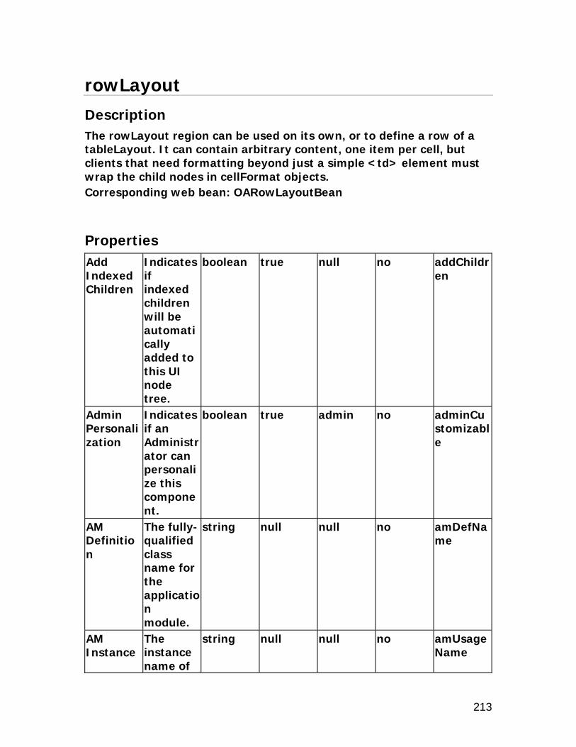
213
rowLayout
Description
The rowLayout region can be used on its own, or to define a row of a tableLayout. It can contain arbitrary content, one item per cell, but clients that need formatting beyond just a simple <td> element must wrap the child nodes in cellFormat objects. Corresponding web bean: OARowLayoutBean
Properties
Add Indexed Children
Indicates if indexed children will be automatically added to this UI node tree.
boolean true null no addChildren
Admin Personalization
Indicates if an Administrator can personalize this component.
boolean true admin no adminCustomizable
AM Definition
The fully-qualified class name for the application module.
string null null no amDefName
AM Instance
The instance name of
string null null no amUsageName

214
an application module.
Attribute Set
The attribute set for the component.
jrad:attributeSetRef
null null no use
Child View Attribute
The name of the child view attribute. Valid only when used in table region.
string null null no childViewAttrName
Child View Instance
Renders an instance of the object for each row in the View Instance. Valid only when used in table region.
string null null no childViewUsageName
Comments
Comments
string null null no comment
Controller Class
The fully-qualified class name for the controller object.
string null admin no controllerClass

215
CSS Class Overrides the default CSS class.
string null admin no styleClass
Document Name
The name of the component
jrad:refName
null null no docName
Documentation Comment
Formatted text for use with Javadoc.
string from template file
null no not applicable
Extends A reference to another component that creates a different instance of that component at runtime.
jrad:componentRef
null null no extends
File Version
The version of the file.
string null null no file-version
Horizontal Alignment
Horizontal alignment. Acceptable values are "center", "left", "right", "start", and "end".
string null null no hAlign

216
ID The unique name of this component.
Name null null no id
Initial Sort Sequence
Indicates the initial sort sequence for each search. The legal values are none, first, second, and third.
string none null no initSortSeq
No Wrap Indicates if cell contents should be wrapped. Valid only when used in table region.
boolean false null no cellNoWrapFormat
OA Extension Version
The Oracle Applications Extension version with which the file was created or updated.
jrad:version
null null no version
Personalization Label
The region label
string null null no regionName

217
used for Personalization.
Post Initial Values
Indicates if rows which are made dirty only by the defaulting of Initial Values are to be posted.
boolean false null no postDefault
Prompt The text label for the component.
string null admin true prompt
Rendered Indicates if the component is rendered.
boolean true user no rendered
Scope The Base Packages which are allowed to reuse this component.
jrad:scope
. null no scope
Security Mode
Defines the security mode used to secure the region. If set to selfSecur
string standard null no securityMode

218
ed it is the developer's responsibility to handle security validation. The legal values are standard, and selfSecured.
Sort Allowed
Indicates if the user can sort this column. Valid only when used in table region. The legal values are yes, no, ascending, and descending.
string no admin no sortState
Sort By View Attribute
The alternate view attribute name for use when sorting. Valid only when
string null user no sortByViewAttr

219
used in table region.
User Personalization
Indicates if a user can personalize this component. Valid only when used in table region.
boolean false admin no userCustomizable
Vertical Alignment
Vertical alignment. Acceptable values are "middle", "top", and "bottom".
string null null no vAlign
Width Indicates the width in pixels or as a percentage (if % sign included).
string null null no width
xml:lang Identifies the language contained within this component.
optional null null no xml:lang

220

221
shuttle
Description
The shuttle region provides a mechanism for moving items between two lists and reordering one of these lists. Often the shuttle will be used to select items from one list by placing them in the other. However, the shuttle can be used to operate on lists in other ways as well. Corresponding web bean: OAShuttleBean
Properties
Add Indexed Children
Indicates if indexed children will be automatically added to this UI node tree.
boolean true null no addChildren
Admin Personalization
Indicates if an Administrator can personalize this component.
boolean true admin no adminCustomizable
AM Definition
The fully-qualified class name for the application module.
string null null no amDefName
AM Instance
The instance
string null null no amUsageName

222
name of an application module.
Attribute Set
The attribute set for the component.
jrad:attributeSetRef
null null no use
Available Header
The header for the available (first) list.
string null null no leadingHeader
Comments
Comments
string null null no comment
Controller Class
The fully-qualified class name for the controller object.
string null admin no controllerClass
CSS Class Overrides the default CSS class.
string null admin no styleClass
Document Name
The name of the component
jrad:refName
null null no docName
Documentation Comment
Formatted text for use with Javadoc.
string from template file
null no not applicable
Extends A reference to another
jrad:componentRef
null null no extends

223
component that creates a different instance of that component at runtime.
File Version
The version of the file.
string null null no file-version
Help Target
The target name for the page online help.
string null null no helpTarget
Help Target Appl Short Name
This application will be used to construct URI of the "help" icon in the global menu of the page.This makes the help pages from the other applications referenceable.
string null null no helpTargetAppShortName
ID The Name null null no id

224
uniquename of this component.
OA Extension Version
The Oracle Applications Extension version with which the file was created or updated.
jrad:version
null null no version
Ordering Allowed
Indicates if the contents of the selected (second) list can be ordered.
boolean true null no reorderable
Personalization Label
The region label used for Personalization.
string null null no regionName
Post Initial Values
Indicates if rows which are made dirty only by the defaulting of Initial Values are to be
boolean false null no postDefault

225
posted. Rendered Indicates
if the component is rendered.
boolean true user no rendered
Scope The Base Packages which are allowed to reuse this component.
jrad:scope
. null no scope
Security Mode
Defines the security mode used to secure the region. If set to selfSecured it is the developer's responsibility to handle security validation. The legal values are standard, and selfSecured.
string standard null no securityMode
Selected Header
The header
string null null no trailingHeader

226
for the selected (second) list.
Standalone
Indicates if this region can be rendered on its own.
boolean false null no standalone
xml:lang Identifies the language contained within this component.
optional null null no xml:lang
Element Children Name Quantity Description leading 0 through 1 The leading list of the
shuttle. leadingFooter 0 through 1 The footer of
buttons/images under the leading list.
trailing 0 through 1 The trailing list of the shuttle.
trailingFooter 0 through 1 The footer of buttons/images under the trailing list.

227
stackLayout
Description
The stackLayout region is a layout element that lays out each of its children vertically. Corresponding web bean: OAStackLayoutBean
Properties
Add Indexed Children
Indicates if indexed children will be automatically added to this UI node tree.
boolean true null no addChildren
Admin Personalization
Indicates if an Administrator can personalize this component.
boolean true admin no adminCustomizable
AM Definition
The fully-qualified class name for the application module.
string null null no amDefName
AM Instance
The instance name of an applicatio
string null null no amUsageName

228
n module.
Attribute Set
The attribute set for the component.
jrad:attributeSetRef
null null no use
Child View Attribute
The name of the child view attribute. Valid only when used in table region.
string null null no childViewAttrName
Child View Instance
Renders an instance of the object for each row in the View Instance. Valid only when used in table region.
string null null no childViewUsageName
Comments
Comments
string null null no comment
Controller Class
The fully-qualified class name for the controller object.
string null admin no controllerClass
CSS Class Overrides the
string null admin no styleClass

229
default CSS class.
Document Name
The name of the component
jrad:refName
null null no docName
Documentation Comment
Formatted text for use with Javadoc.
string from template file
null no not applicable
Extends A reference to another component that creates a different instance of that component at runtime.
jrad:componentRef
null null no extends
File Version
The version of the file.
string null null no file-version
Help Target
The target name for the page online help.
string null null no helpTarget
Help Target Appl Short Name
This application will be used to construct URI of the "help" icon in
string null null no helpTargetAppShortName

230
the global menu of the page.This makes the help pages from the other applications referenceable.
ID The unique name of this component.
Name null null no id
Initial Sort Sequence
Indicates the initial sort sequence for each search. The legal values are none, first, second, and third.
string none null no initSortSeq
No Wrap Indicates if cell contents should be wrapped. Valid only when used in table region.
boolean false null no cellNoWrapFormat
OA The jrad:versi null null no version

231
Extension Version
Oracle Applications Extension version with which the file was created or updated.
on
Personalization Label
The region label used for Personalization.
string null null no regionName
Post Initial Values
Indicates if rows which are made dirty only by the defaulting of Initial Values are to be posted.
boolean false null no postDefault
Prompt The text label for the component.
string null admin true prompt
Rendered Indicates if the component is rendered.
boolean true user no rendered
Scope The Base Packages which are allowed
jrad:scope
. null no scope

232
to reuse this component.
Security Mode
Defines the security mode used to secure the region. If set to selfSecured it is the developer's responsibility to handle security validation. The legal values are standard, and selfSecured.
string standard null no securityMode
Sort Allowed
Indicates if the user can sort this column. Valid only when used in table region. The legal values are yes,
string no admin no sortState

233
no, ascending, and descending.
Sort By View Attribute
The alternate view attribute name for use when sorting. Valid only when used in table region.
string null user no sortByViewAttr
Standalone
Indicates if this region can be rendered on its own.
boolean false null no standalone
User Personalization
Indicates if a user can personalize this component. Valid only when used in table region.
boolean false admin no userCustomizable
xml:lang Identifies the language contained within this compone
optional null null no xml:lang

234
nt.

235
subTabLayout
Description
The subTabLayout region has a named child called "subTabs" that takes a subTabBar bean. subTabBar contains link elements as its indexed children. subTabBar is rendered once on top and once on the bottom. The indexed children of the subTabLayout are rendered in between. The number of indexed children of subTabBar, which are the link elements, should be equal to the number of indexed children of the parent subTabLayout. The link elements are used to switch between the indexed children of the subTabLayout. subTabLayout extends the UIX counterpart <uix:subTabLayout> and inherits all the attributes and the children. Corresponding web bean: OASubTabLayoutBean
Properties
Name Description
Type Default Value
Personalizable
Translatable
XML Attribute
Add Indexed Children
Indicates if indexed children will be automatically added to this UI node tree.
boolean true null no addChildren
Admin Personalization
Indicates if an Administrator can personalize this component.
boolean true admin no adminCustomizable
AM Definition
The fully-qualified class
string null null no amDefName
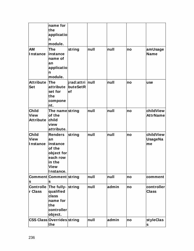
236
name for the application module.
AM Instance
The instance name of an application module.
string null null no amUsageName
Attribute Set
The attribute set for the component.
jrad:attributeSetRef
null null no use
Child View Attribute
The name of the child view attribute.
string null null no childViewAttrName
Child View Instance
Renders an instance of the object for each row in the View Instance.
string null null no childViewUsageName
Comments
Comments
string null null no comment
Controller Class
The fully-qualified class name for the controller object.
string null admin no controllerClass
CSS Class Overrides the
string null admin no styleClass

237
default CSS class.
Document Name
The name of the component
jrad:refName
null null no docName
Documentation Comment
Formatted text for use with Javadoc.
string from template file
null no not applicable
Extends A reference to another component that creates a different instance of that component at runtime.
jrad:componentRef
null null no extends
File Version
The version of the file.
string null null no file-version
ID The unique name of this component.
Name null null no id
Initial Subtab
The initially selected subtab.
nonNegativeInteger
0 null no selectedIndex
OA Extension Version
The Oracle Applications Extensio
jrad:version
null null no version

238
n version with which the file was created or updated.
Personalization Label
The region label used for Personalization.
string null null no regionName
Post Initial Values
Indicates if rows which are made dirty only by the defaulting of Initial Values are to be posted.
boolean false null no postDefault
Rendered Indicates if the component is rendered.
boolean true user no rendered
Scope The Base Packages which are allowed to reuse this component.
jrad:scope
. null no scope
Security Mode
Defines the security mode used to
string standard null no securityMode

239
secure the region. If set to selfSecured it is the developer's responsibility to handle security validation. The legal values are standard, and selfSecured.
xml:lang Identifies the language contained within this component.
optional null null no xml:lang
Element Children Name Quantity Description subTabs 0 through 1 Rendered twice per
bean render, once before indexed children and once after.
subTabBar Name Descripti
on Type Default
ValuePersonalizable
Translatable
XML Attribute
Additiona Additiona string null admin yes shortDes

240
l Text l help text.
c
Admin Personalization
Indicates if an Administrator can personalize this component.
boolean true admin no adminCustomizable
Attribute Set
The attribute set for the component.
jrad:attributeSetRef
null null no use
Comments
Comments
string null null no comment
CSS Class Overrides the default CSS class.
string null admin no styleClass
Document Name
The name of the component
jrad:refName
null null no docName
Extends A reference to another component that creates a different instance of that component at runtime.
jrad:componentRef
null null no extends
Rendered Indicates if the compone
boolean null user no rendered

241
nt is rendered.
Scope The Base Packages which are allowed to reuse this component.
jrad:scope
. null no scope
xml:lang Identifies the language contained within this component.
optional null null no xml:lang

242
switcher
Description
The switcher region is used to dynamically decide which UINode subtree needs to be rendered. It has a property, "childName", that is used to render the named child under this name. Indexed children of this bean are not rendered at all. The "childName" is bound as an attribute to a VO. So, you never set it declaratively. Instead, you specify the viewName and viewAttr attributes on a switcher. Corresponding web bean: OASwitcherBean
Properties
Admin Personalization
Indicates if an Administrator can personalize this component.
boolean true admin no adminCustomizable
AM Definition
The fully-qualified class name for the application module.
string null null no amDefName
AM Instance
The instance name of an application module.
string null null no amUsageName
Attribute Set
The attribute set for the compone
jrad:attributeSetRef
null null no use

243
nt. Comments
Comments
string null null no comment
Controller Class
The fully-qualified class name for the controller object.
string null admin no controllerClass
CSS Class Overrides the default CSS class.
string null admin no styleClass
Data Type
The type of data. Valid only when used in table region. The legal values are VARCHAR2, DATE, DATETIME, BIGDECIMAL, NUMBER, BOOLEAN, and CLOB.
string VARCHAR2
null no dataType
Document Name
The name of the component
jrad:refName
null null no docName
Documentation Comment
Formatted text for use with Javadoc.
string from template file
null no not applicable

244
Export View Attribute
The alternate view attribute for use when exporting. Valid only when used in table region.
string null admin no exportByViewAttr
Extends A reference to another component that creates a different instance of that component at runtime.
jrad:componentRef
null null no extends
File Version
The version of the file.
string null null no file-version
ID The unique name of this component.
Name null null no id
Initial Sort Sequence
Indicates the initial sort sequence for each search. The legal
string none null no initSortSeq

245
values are none, first, second, and third.
No Wrap Indicates if cell contents should be wrapped. Valid only when used in table region.
boolean false null no cellNoWrapFormat
OA Extension Version
The Oracle Applications Extension version with which the file was created or updated.
jrad:version
null null no version
Personalization Label
The region label used for Personalization.
string null null no regionName
Post Initial Values
Indicates if rows which are made dirty only by the defaulting of Initial Values
boolean false null no postDefault

246
are to be posted.
Prompt The text label for the component.
string null admin true prompt
Rendered Indicates if the component is rendered.
boolean true user no rendered
Scope The Base Packages which are allowed to reuse this component.
jrad:scope
. null no scope
Security Mode
Defines the security mode used to secure the region. If set to selfSecured it is the developer's responsibility to handle security validation. The legal values are
string standard null no securityMode

247
standard, and selfSecured.
Sort Allowed
Indicates if the user can sort this column. Valid only when used in table region. The legal values are yes, no, ascending, and descending.
string no admin no sortState
Sort By View Attribute
The alternate view attribute name for use when sorting. Valid only when used in table region.
string null user no sortByViewAttr
User Personalization
Indicates if a user can personalize this component. Valid only when used in
boolean false admin no userCustomizable

248
table region.
View Attribute
The name of the view attribute.
string null null no viewAttr
View Instance
The name of the view object instance. Valid only when used in table region.
string null null no viewName
xml:lang Identifies the language contained within this component.
optional null null no xml:lang
Element Children Name Quantity Description case 1 or more Used with the
SwitcherBean to decide which child must be rendered.

249
table
Description
The table region is used to display tabular data. It also supports selection (both single and multiple), sorting, record navigation, totalling and detail-disclosure. Note that totalling can be enabled for any column except for the first column in a table. Corresponding web bean: OATableBean
Properties
Name Description
Type Default Value
Personalizable
Translatable
XML Attribute
Additional Text
Additional help text.
string null admin yes shortDesc
Admin Personalization
Indicates if an Administrator can personalize this component.
boolean true admin no adminCustomizable
AM Definition
The fully-qualified class name for the application module.
string null null no amDefName
AM Instance
The instance name of an application module.
string null null no amUsageName

250
Attribute Set
The attribute set for the component.
jrad:attributeSetRef
null null no use
Child View Attribute
The name of the child view attribute.
string null null no childViewAttrName
Comments
Comments
string null null no comment
Controller Class
The fully-qualified class name for the controller object.
string null admin no controllerClass
CSS Class Overrides the default CSS class.
string null admin no styleClass
Detail View Attribute
The view attribute that determines if that particular row is to be stamped with the detail child.
string null null no detailViewAttr
Disable Client Side Validation
Indicates if validation should not occur on the
boolean false null no unvalidated

251
web tier during a form submit.
Disable Server Side Validation
Indicates if validation should not occur on the business tier during a form submit.
boolean false null no serverUnvalidated
Document Name
The name of the component
jrad:refName
null null no docName
Documentation Comment
Formatted text for use with Javadoc.
string from template file
null no not applicable
Extends A reference to another component that creates a different instance of that component at runtime.
jrad:componentRef
null null no extends
File Version
The version of the file.
string null null no file-version
Help Target
The target name for
string null null no helpTarget

252
the page online help.
Help Target Appl Short Name
This application will be used to construct URI of the "help" icon in the global menu of the page.This makes the help pages from the other applications referenceable.
string null null no helpTargetAppShortName
ID The unique name of this component.
Name null null no id
Message Appl Short Name
The application short name that owns the message.
string null admin no messageAppShortName
Message Name
The name of the message.
string null admin no messageName
OA The jrad:versi null null no version

253
Extension Version
Oracle Applications Extension version with which the file was created or updated.
on
Personalization Label
The region label used for Personalization.
string null null no regionName
Post Initial Values
Indicates if rows which are made dirty only by the defaulting of Initial Values are to be posted.
boolean false null no postDefault
Record History Enabled
Indicates if Record History feature is enabled.
boolean false admin no recordHistoryEnabled
Records Displayed
The maximum number of rows to display.
unsignedInt
10 user no blockSize
Rendered Indicates if the
boolean true user no rendered

254
component is rendered.
Row Header Col
Indicates if Scope attribute is to be added to Table.
unsignedInt
null admin no rowheadercol
Row Header View Attribute
The view attribute for the row header.
string null null no rowHeaderViewAttr
Scope The Base Packages which are allowed to reuse this component.
jrad:scope
. null no scope
Security Mode
Defines the security mode used to secure the region. If set to selfSecured it is the developer's responsibility to handle security validation. The legal
string standard null no securityMode

255
values are standard, and selfSecured.
Standalone
Indicates if this region can be rendered on its own.
boolean false null no standalone
Text The text label for the component.
string null admin no text
User Personalization
Indicates if a user can personalize this component.
boolean false admin no userCustomizable
View Link Instance
The name of the View Link Instance establishing master-detail relationship between outer and inner repeating containers.
string null null no viewLinkName
Width Indicates the width
string null null no width

256
in pixels or as a percentage (if % sign included).
xml:lang Identifies the language contained within this component.
optional null null no xml:lang
Element Children Name Quantity Description detail 0 through 1 Node to stamp below
every row which is disclosed.
tableActions 0 through 1 Component used for performing table actions that are independent of row selection.
tableSelection 0 through 1 SingleSelectionBean or MultipleSelectionBean to render with the table.

257
tableLayout
Description
The tableLayout region is a thin wrapper around the HTML's table element. It contains a series of rowLayout elements. Corresponding web bean: OATableLayoutBean
Properties
Add Indexed Children
Indicates if indexed children will be automatically added to this UI node tree.
boolean true null no addChildren
Admin Personalization
Indicates if an Administrator can personalize this component.
boolean true admin no adminCustomizable
AM Definition
The fully-qualified class name for the application module.
string null null no amDefName
AM Instance
The instance name of an applicatio
string null null no amUsageName

258
n module.
Attribute Set
The attribute set for the component.
jrad:attributeSetRef
null null no use
Child View Attribute
The name of the child view attribute.
string null null no childViewAttrName
Child View Instance
Renders an instance of the object for each row in the View Instance.
string null null no childViewUsageName
Comments
Comments
string null null no comment
Controller Class
The fully-qualified class name for the controller object.
string null admin no controllerClass
CSS Class Overrides the default CSS class.
string null admin no styleClass
Document Name
The name of the component
jrad:refName
null null no docName
Documentation Comment
Formatted text for use with
string from template file
null no not applicable

259
Javadoc. Extends A
reference to another component that creates a different instance of that component at runtime.
jrad:componentRef
null null no extends
File Version
The version of the file.
string null null no file-version
Help Target
The target name for the page online help.
string null null no helpTarget
Help Target Appl Short Name
This application will be used to construct URI of the "help" icon in the global menu of the page.This makes the help pages from the other
string null null no helpTargetAppShortName

260
applications referenceable.
Horizontal Alignment
Horizontal alignment. The acceptable values are "center", "left", "right", "start", and "end".
string center null no hAlign
ID The unique name of this component.
Name null null no id
OA Extension Version
The Oracle Applications Extension version with which the file was created or updated.
jrad:version
null null no version
Personalization Label
The region label used for Personalization.
string null null no regionName
Post Initial
Indicates if rows
boolean false null no postDefault

261
Values which are made dirty only by the defaulting of Initial Values are to be posted.
Rendered Indicates if the component is rendered.
boolean true user no rendered
Scope The Base Packages which are allowed to reuse this component.
jrad:scope
. null no scope
Security Mode
Defines the security mode used to secure the region. If set to selfSecured it is the developer's responsibility to handle security validation. The legal
string standard null no securityMode

262
values are standard, and selfSecured.
Standalone
Indicates if this region can be rendered on its own.
boolean false null no standalone
View Link Instance
The name of the View Link Instance establishing master-detail relationship between outer and inner repeating containers.
string null null no viewLinkName
Width Indicates the width in pixels or as a percentage (if % sign included).
string null null no width
xml:lang Identifies the language contained within
optional null null no xml:lang

263
this component.

264
train
Description
The train region is used to indicate the current page of a multi-page process. The highlighted "step" indicates the currently active page. The train has one property, "selectedIndex", which is the index of the selected "step". Corresponding web bean: OATrainBean
Properties
Admin Personalization
Indicates if an Administrator can personalize this component.
boolean true admin no adminCustomizable
Allow Interaction
Indicates if each train stop should be rendered as a link.
boolean false null no formSubmitted
Attribute Set
The attribute set for the component.
jrad:attributeSetRef
null null no use
Comments
Comments
string null null no comment
Controller Class
The fully-qualified class name for the controller object.
string null admin no controllerClass

265
CSS Class Overrides the default CSS class.
string null admin no styleClass
Disable Client Side Validation
Indicates if validation should not occur on the web tier during a form submit.
boolean false null no unvalidated
Document Name
The name of the component
jrad:refName
null null no docName
Documentation Comment
Formatted text for use with Javadoc.
string from template file
null no not applicable
Extends A reference to another component that creates a different instance of that component at runtime.
jrad:componentRef
null null no extends
File Version
The version of the file.
string null null no file-version
ID The unique name of
Name null null no id

266
this component.
OA Extension Version
The Oracle Applications Extension version with which the file was created or updated.
jrad:version
null null no version
Personalization Label
The region label used for Personalization.
string null null no regionName
Post Initial Values
Indicates if rows which are made dirty only by the defaulting of Initial Values are to be posted.
boolean false null no postDefault
Rendered Indicates if the component is rendered.
boolean true user no rendered
Scope The Base Packages which are allowed to reuse
jrad:scope
. null no scope
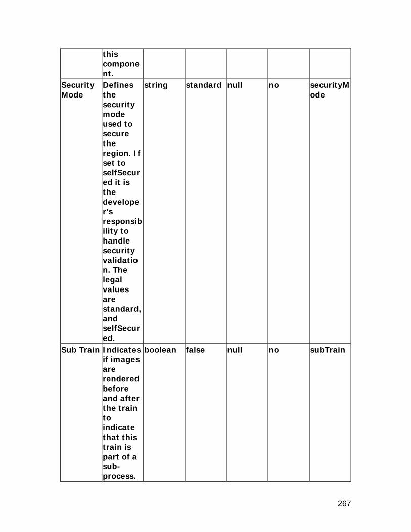
267
this component.
Security Mode
Defines the security mode used to secure the region. If set to selfSecured it is the developer's responsibility to handle security validation. The legal values are standard, and selfSecured.
string standard null no securityMode
Sub Train Indicates if images are rendered before and after the train to indicate that this train is part of a sub-process.
boolean false null no subTrain

268
xml:lang Identifies the language contained within this component.
optional null null no xml:lang

269
tree
Description
The tree region is used to display objects in a hierarchical format. It factors data into child/leaf nodes and parent nodes which are either expanded or collapsed. The purpose of the tree control is to allow users to quickly browse through complex sets of hierarchical objects and access detailed information for a record by highlighting it in the tree. The visual representation of the hierarchy using the tree is also intended to show the relationship between a set of objects with respect to one another. Corresponding web bean: OATreeBean
Properties
Name Description
Type Default Value
Personalizable
Translatable
XML Attribute
Admin Personalization
Indicates if an Administrator can personalize this component.
boolean true admin no adminCustomizable
AM Definition
The fully-qualified class name for the application module.
string null null no amDefName
AM Instance
The instance name of an application module.
string null null no amUsageName
Attribute The jrad:attri null null no use

270
Set attribute set for the component.
buteSetRef
Comments
Comments
string null null no comment
Controller Class
The fully-qualified class name for the controller object.
string null admin no controllerClass
CSS Class Overrides the default CSS class.
string null admin no styleClass
Disable Client Side Validation
Indicates if validation should not occur on the web tier during a form submit.
boolean null null no unvalidated
Document Name
The name of the component
jrad:refName
null null no docName
Documentation Comment
Formatted text for use with Javadoc.
string from template file
null no not applicable
Extends A reference to another component that
jrad:componentRef
null null no extends

271
creates a different instance of that component at runtime.
File Version
The version of the file.
string null null no file-version
Help Target
The target name for the page online help.
string null null no helpTarget
Help Target Appl Short Name
This application will be used to construct URI of the "help" icon in the global menu of the page.This makes the help pages from the other applications referenceable.
string null null no helpTargetAppShortName
ID Maps to the Item Name
Name null null no id

272
property of the Default Tree region-item.
OA Extension Version
The Oracle Applications Extension version with which the file was created or updated.
jrad:version
null null no version
Personalization Label
The region label used for Personalization.
string null null no regionName
Post Initial Values
Indicates if rows which are made dirty only by the defaulting of Initial Values are to be posted.
boolean false null no postDefault
Rendered Indicates if the component is rendered.
boolean true user no rendered
Scope The Base Packages
jrad:scope
. null no scope

273
which are allowed to reuse this component.
Security Mode
Defines the security mode used to secure the region. If set to selfSecured it is the developer's responsibility to handle security validation. The legal values are standard, and selfSecured.
string standard null no securityMode
Standalone
Indicates if this region can be rendered on its own.
boolean false null no standalone
Text The text label for the compone
string null admin true text

274
nt. xml:lang Identifies
the language contained within this component.
optional null null no xml:lang
Element Children Name Quantity Description members 1 Grouping used for
specifying tree's members
nodeDef Name Descripti
on Type Default
ValuePersonalizable
Translatable
XML Attribute
Action Type
The action type to fire for the component. It should be either "fireAction" or "none."
string none null no primaryClientAction
Admin Personalization
Indicates if an Administrator can personalize this component.
boolean true admin no adminCustomizable
Attribute Set
The attribute set for the
jrad:attributeSetRef
null null no use

275
component.
Child Object Type
Object Type of child nodes, used when displaying record set navigation controls.
string null null true childTypeText
Comments
Comments
string null null no comment
CSS Class Overrides the default CSS class.
string null admin no styleClass
Data Type
The type of data. The legal values are VARCHAR2, DATE, DATETIME, BIGDECIMAL, NUMBER, BOOLEAN, and CLOB.
string VARCHAR2
null no dataType
Destination Function
The function to invoke.
string null admin no invokeFunc
Destination URI
The Destination URI.
anyURI null admin no destination

276
Disable Client Side Validation
Indicates if validation should not occur on the web tier during a form submit.
boolean null null no unvalidated
Disable Server Side Validation
Indicates if validation should not occur on the business tier during a form submit.
boolean false null no serverUnvalidated
Document Name
The name of the component
jrad:refName
null null no docName
Event Name of the event.
string null null no event
Extends A reference to another component that creates a different instance of that component at runtime.
jrad:componentRef
null null no extends
Icon URI the URI for the
anyURI null admin no icon

277
icon file. Parameters
A list of parameter names and values to be submitted by the action.
name-value pair
null null no parameters
Record Set Size
The maximum number of records that can be displayed under each node.
ui:nonNegativeIntegerExpressionType
null null no childBlockSize
Rendered Indicates if the component is rendered.
boolean null user no rendered
Scope The Base Packages which are allowed to reuse this component.
jrad:scope
. null no scope
Submit Indicates if the action will cause a form submit
boolean null null no formSubmitted
Target The name string null null no targetFra

278
Frame of the target frame for the link.
me
View Attribute
The name of the view attribute.
string null null no viewAttr
View Instance
The name of the view object instance.
string null null no viewName
Warn About Changes
Warns the user if there are pending changes that will be lost, and allows them to cancel the current action or discard the changes and continue with the current action.
boolean true null no warnAboutChanges
xml:lang Identifies the language contained within this compone
optional null null no xml:lang

279
nt.
childNode Name Descripti
on Type Default
ValuePersonalizable
Translatable
XML Attribute
Additional Text
Additional help text.
string null admin yes shortDesc
Admin Personalization
Indicates if an Administrator can personalize this component.
boolean true admin no adminCustomizable
AM Definition
The fully-qualified class name for the application module.
string null null no amDefName
AM Instance
The instance name of an application module.
string null null no amUsageName
Ancestor Node
Optionally set only on the leaf level <childNode> element to recursively point to one of the
jrad:localRef
null null no ancestorNode

280
ancestor nodes.
Attribute Set
The attribute set for the component.
jrad:attributeSetRef
null null no use
Comments
Comments
string null null no comment
CSS Class Overrides the default CSS class.
string null admin no styleClass
Document Name
The name of the component
jrad:refName
null null no docName
Extends A reference to another component that creates a different instance of that component at runtime.
jrad:componentRef
null null no extends
Personalization Label
The region label used for Personalization.
string null null no regionName
Rendered Indicates if the component is rendered.
boolean null user no rendered

281
Scope The Base Packages which are allowed to reuse this component.
jrad:scope
. null no scope
View Link Accessor
The name of the View Link Accessor for the child data.
string null null no viewLinkAccessorName
View Link Instance
The name of the View Link Instance for the child data.
string null null no viewLink
xml:lang Identifies the language contained within this component.
optional null null no xml:lang
Element Children Name Quantity Description members 0 through 1 Grouping used for
specifying tree's members.

282
Item Styles
attachmentImage
Description
An attachmentImage item style is used to display multi-row attachments that are represented as icons. An attachment image uses a Switcher bean internally to switch between one of two image beans. attachmentImage is an extension of <ui:base>. All attributes supported by <ui:base> are inherited by attachmentImage. Corresponding web bean: OAAttachmentImageBean
Properties
Name Description
Type Default Value
Personalizable
Translatable
XML Attribute
Admin Personalization
Indicates if an Administrator can personalize this component.
boolean true admin no adminCustomizable
Attribute Set
The attribute set for the component.
jrad:attributeSetRef
null null no use
Automatic Save
Indicates if automatic save is enabled.
boolean false null no autoCommitEnabled
Comments
Comments
string null null no comment
CSS Class Overrides the default
string null admin no styleClass

283
CSS class.
Document Name
The name of the component
jrad:refName
null null no docName
Disable Client Side Validation
Indicates if validation should not occur on the web tier during a form submit.
boolean true null no unvalidated
Disable Server Side Validation
Indicates if validation should not occur on the business tier during a form submit.
boolean true null no serverUnvalidated
Enable Document Catalog
Indicates if the Document Catalog is enabled for the component.
boolean true admin no enableDocumentCatalog
Export View Attribute
The alternate view attribute for use when exporting
string null admin no exportByViewAttr

284
. Extends A
reference to another component that creates a different instance of that component at runtime.
jrad:componentRef
null null no extends
Inline Attachment Enabled
Indicates whether inline attachment capability is enabled or not.
boolean (Default) admin no inlineAttachmentEnabled
No Wrap Indicates if cell contents should be wrapped.
boolean false null no cellNoWrapFormat
Prompt The text label for the component.
string Attachments
admin true prompt
Render Search Region
Indicates if the search region is rendered.
boolean true null no searchRegionRendered
Rendered Indicates if the component is rendered.
boolean true user no rendered

285
Scope The Base Packages which are allowed to reuse this component.
jrad:scope
. null no scope
User Personalization
Indicates if a user can personalize this component.
boolean false admin no userCustomizable
View Instance
The name of the view object instance.
string null null no viewName
Virus Scan Enabled
Indicates if Virus Scan is enabled on file attachments.
boolean false admin no virusScanEnabled
xml:lang Identifies the language contained within this component.
optional null null no xml:lang
Element Children Name Quantity Description entityMappings 1 Defines the entity and
item relationships.
entityMap Name Descripti Type Default Personali Translata XML

286
on Value zable ble AttributeAttribute Set
The attribute set for the component.
jrad:attributeSetRef
null null no use
Comments
Comments.
string null null no comment
Delete Allowed
Indicates if the user can delete attachments from the current object.
boolean true null no deleteAllowed
Entity The name of the attachment entity which defines the primary key relationships.
string null null no entityId
Insert Allowed
Indicates if new attachments can be created for this entity.
boolean true null no insertAllowed
Show All Indicates if the user can view any attachment for the
boolean false null no showAll

287
current object, regardless of category.
Update Allowed
Indicates if the user can edit the attachment content.
boolean true null no updateAllowed
Element Children Name Quantity Description categoryMappings 0 through 1 Defines the entity and
category relationships.primaryKeys 0 through 1 Defines the primary
keys.
categoryMap Name Descripti
on Type Default
ValuePersonalizable
Translatable
XML Attribute
Attribute Set
The attribute set for the component.
jrad:attributeSetRef
null null no use
Category The attachment category name.
string null null no categoryName
Comments
Comments.
string null null no comment
Secured Indicates if the object is secured by grants model.
boolean false admin no secured

288
primaryKey Name Descripti
on Type Default
ValuePersonalizable
Translatable
XML Attribute
Attribute Set
The attribute set for the component.
jrad:attributeSetRef
null null no use
Comments
Comments.
string null null no comment
View Attribute
The name of the view attribute.
string null null no viewAttr

289
attachmentLink
Description
An attachmentLink item style is used to display single-row attachments. attachmentLink is an extension of messageStyledText. All attributes supported by messageStyledText are inherited by attachmentLink. See the section on messageStyledText for a list of attributes available on the messageStyledText element. Corresponding web bean: OAMessageAttachmentLinkBean
Properties
Name Description
Type Default Value
Personalizable
Translatable
XML Attribute
Admin Personalization
Indicates if an Administrator can personalize this component.
boolean true admin no adminCustomizable
Attribute Set
The attribute set for the component.
jrad:attributeSetRef
null null no use
Automatic Save
Indicates if automatic save is enabled.
boolean false null no autoCommitEnabled
Comments
Comments
string null null no comment
CSS Class Overrides the default CSS class.
string null admin no styleClass
Documen The name jrad:refN null null no docName

290
t Name of the component
ame
Disable Client Side Validation
Indicates if validation should not occur on the web tier during a form submit.
boolean true null no unvalidated
Disable Server Side Validation
Indicates if validation should not occur on the business tier during a form submit.
boolean true null no serverUnvalidated
Enable Document Catalog
Indicates if the Document Catalog is enabled for the component.
boolean true admin no enableDocumentCatalog
Extends A reference to another component that creates a different instance of that
jrad:componentRef
null null no extends

291
component at runtime.
Inline Attachment Enabled
Indicates whether inline attachment capability is enabled or not.
boolean (Default) admin no inlineAttachmentEnabled
Link Text The Text for the attachment link.
string View null true text
Long Tip Region
The fully-qualified reference to the long tip region.
jrad:refName
null admin no longTipRegion
Prompt The Prompt for the attachment link.
string Attachments
user true prompt
Render Search Region
Indicates if the search region is rendered.
boolean true null no searchRegionRendered
Rendered Indicates if the component is rendered.
boolean true user no rendered
Scope The Base Packages which are allowed to reuse this
jrad:scope
. null no scope

292
component.
Tip Message Appl Short Name
The application short name that owns the tip message.
string null admin no tipMessageAppShortName
Tip Message Name
The name of the tip message.
string null admin no tipMessageName
Tip Type The type of tip. The legal values are dateFormat, longMessage, shortTip, and none.
string none admin no tipType
View Instance
The name of the view object instance.
string null null no viewName
Virus Scan Enabled
Indicates if Virus Scan is enabled on file attachments.
boolean false admin no virusScanEnabled
xml:lang Identifies the language contained within this
optional null null no xml:lang

293
component.
Element Children Name Quantity Description entityMappings 1 Defines the entity and
item relationships.
entityMap Name Descripti
on Type Default
ValuePersonalizable
Translatable
XML Attribute
Attribute Set
The attribute set for the component.
jrad:attributeSetRef
null null no use
Comments
Comments.
string null null no comment
Delete Allowed
Indicates if the user can delete attachments from the current object.
boolean true null no deleteAllowed
Entity The name of the attachment entity which defines the primary key relationships.
string null null no entityId
Insert Allowed
Indicates if new attachments can
boolean true null no insertAllowed

294
be created for this entity.
Show All Indicates if the user can view any attachment for the current object, regardless of category.
boolean false null no showAll
Update Allowed
Indicates if the user can edit the attachment content.
boolean true null no updateAllowed
Element Children Name Quantity Description categoryMappings 0 through 1 Defines the entity and
category relationships.primaryKeys 0 through 1 Defines the primary
keys.
categoryMap Name Descripti
on Type Default
ValuePersonalizable
Translatable
XML Attribute
Attribute Set
The attribute set for the component.
jrad:attributeSetRef
null null no use
Category The attachment category
string null null no categoryName

295
name.Comments
Comments.
string null null no comment
Secured Indicates if the object is secured by grants model.
boolean false admin no secured
primaryKey Name Descripti
on Type Default
ValuePersonalizable
Translatable
XML Attribute
Attribute Set
The attribute set for the component.
jrad:attributeSetRef
null null no use
Comments
Comments.
string null null no comment
View Attribute
The name of the view attribute.
string null null no viewAttr

296
attachmentTable
Description
An attachmentTable item style is used to display attachments in regions that typically show just one row in a view, such as header and flow layout. attachmentTable is an extension of header. All attributes supported by header are inherited by attachmentTable. See header for additional information about the header element. Corresponding web bean: OAAttachmentTableBean
Properties
Name Description
Type Default Value
Personalizable
Translatable
XML Attribute
Admin Personalization
Indicates if an Administrator can personalize this component.
boolean true true no adminCustomizable
Attribute Set
The attribute set for the component.
jrad:attributeSetRef
null null no use
Automatic Save
Indicates if automatic save is enabled.
boolean false null no autoCommitEnabled
Comments
Comments
string null null no comment
CSS Class Overrides the default CSS class.
string null admin no styleClass
Disable Indicates boolean true null no unvalidat
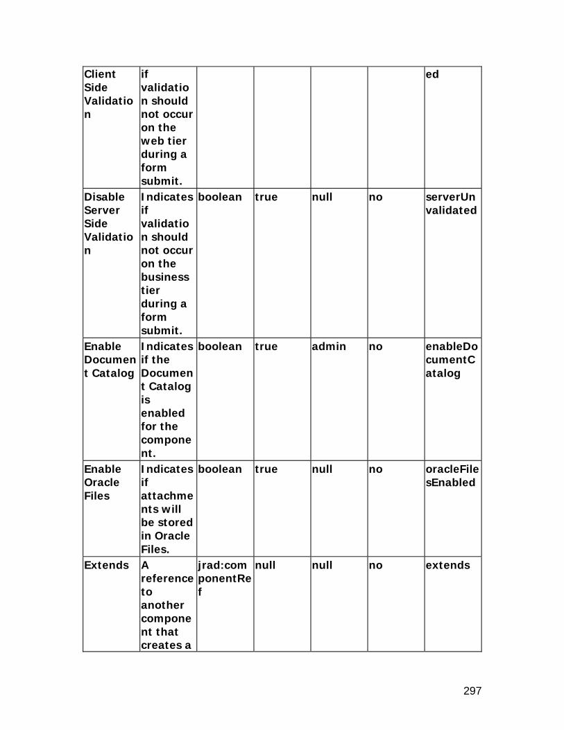
297
Client Side Validation
if validation should not occur on the web tier during a form submit.
ed
Disable Server Side Validation
Indicates if validation should not occur on the business tier during a form submit.
boolean true null no serverUnvalidated
Enable Document Catalog
Indicates if the Document Catalog is enabled for the component.
boolean true admin no enableDocumentCatalog
Enable Oracle Files
Indicates if attachments will be stored in Oracle Files.
boolean true null no oracleFilesEnabled
Extends A reference to another component that creates a
jrad:componentRef
null null no extends

298
different instance of that component at runtime.
Help Target Appl Short Name
This application will be used to construct URI of the "help" icon in the global menu of the page.This makes the help pages from the other applications referenceable.
string null admin no helpTargetAppShortName
Icon URI The URI for the icon file.
string null admin no icon
Inline Attachment Enabled
Indicates whether inline attachment capability is enabled or not.
boolean (Default) admin no inlineAttachmentEnabled
Personalization
The region
string null null no regionName

299
Label label used for Personalization.
Post Initial Values
Indicates if rows which are made dirty only by the defaulting of Initial Values are to be posted.
boolean false admin no postDefault
Record History Enabled
Indicates if Record History feature is enabled for this option.
boolean false admin no recordHistoryEnabled
Rendered Indicates if the component is rendered.
boolean true user no rendered
Render Search Region
Indicates if the search region is rendered.
boolean true null no searchRegionRendered
Text The text label for the component.
string null admin yes text
View Instance
The name of the view object instance.
string null null no viewName

300
Virus Scan Enabled
Indicates if Virus Scan is enabled on file attachments.
boolean false admin no virusScanEnabled
Element Children Name Quantity Description entityMappings 1 Defines the entity and
item relationships.
entityMap Name Descripti
on Type Default
ValuePersonalizable
Translatable
XML Attribute
Approval Function Name
Function Name for the approval process.
string null null no approvalFunctionName
Approval View Attribute
View Attribute to determine if approval process is required.
string null null no approvalViewAttr
Attribute Set
The attribute set for the component.
jrad:attributeSetRef
null null no use
Comments
Comments.
string null null no comment
Delete Allowed
Indicates if the user can delete attachments from
boolean true null no deleteAllowed

301
the current object.
Entity The name of the attachment entity which defines the primary key relationships.
string null null no entityId
Insert Allowed
Indicates if new attachments can be created for this entity.
boolean true null no insertAllowed
Show All Indicates if the user can view any attachment for the current object, regardless of category.
boolean false null no showAll
Update Allowed
Indicates if the user can edit the attachment content.
boolean true null no updateAllowed
Element Children Name Quantity Description

302
categoryMappings 0 through 1 Defines the entity and category relationships.
primaryKeys 0 through 1 Defines the primary keys.
categoryMap Name Descripti
on Type Default
ValuePersonalizable
Translatable
XML Attribute
Attribute Set
The attribute set for the component.
jrad:attributeSetRef
null null no use
Category The attachment category name.
string null null no categoryName
Comments
Comments.
string null null no comment
Secured Indicates if the object is secured by grants model.
boolean false admin no secured
primaryKey Name Descripti
on Type Default
ValuePersonalizable
Translatable
XML Attribute
Attribute Set
The attribute set for the component.
jrad:attributeSetRef
null null no use
Comments
Comments.
string null null no comment
View Attribute
The name of the
string null null no viewAttr

303
view attribute.

304
button
Description
A button item style creates a push button, which allows the user to trigger some action in response to a click. The button fires an "onclick" event when it is activated. Buttons will not render any child nodes. Corresponding web bean: OAButtonBean
Properties
Access Key
The character used for quick keyboard navigation or activation.
string null admin no accessKey
Action Type
The action type to fire for the component. It should be either "fireAction", "firePartialAction" or "none."
string none null no primaryClientAction
Additional Text
Additional help text.
string null admin yes shortDesc
Admin Personalization
Indicates if an Administrator can
boolean true admin no adminCustomizable

305
personalize this component.
Attribute Set
The attribute set for the component.
jrad:attributeSetRef
null null no use
Comments
Comments
string null null no comment
CSS Class Overrides the default CSS class.
string null admin no styleClass
Data Type
The type of data. The legal values are VARCHAR2, DATE, DATETIME, BIGDECIMAL, NUMBER, BOOLEAN, and CLOB.
string VARCHAR2
null no dataType
Destination Function
The function to invoke.
string null admin no invokeFunc
Destination URI
The destination URI.
uriReference
null null no destination
Disable Server Side Validatio
Indicates if validation should
boolean false null no serverUnvalidated
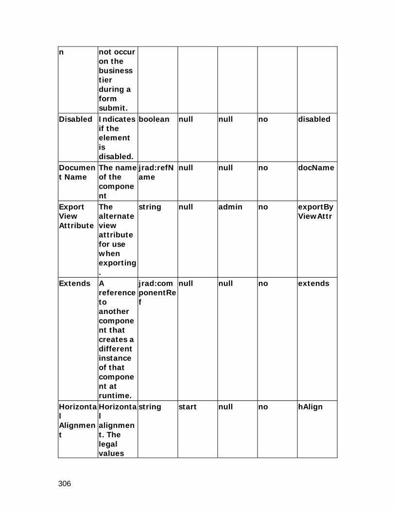
306
n not occur on the business tier during a form submit.
Disabled Indicates if the element is disabled.
boolean null null no disabled
Document Name
The name of the component
jrad:refName
null null no docName
Export View Attribute
The alternate view attribute for use when exporting.
string null admin no exportByViewAttr
Extends A reference to another component that creates a different instance of that component at runtime.
jrad:componentRef
null null no extends
Horizontal Alignment
Horizontal alignment. The legal values
string start null no hAlign

307
are center, left, right, start, and end.
ID The unique name of this component.
Name null null no id
Popup Enabled
Indicates whether the pop-up is enabled.
boolean false admin no popupEnabled
Popup ID The unique name of the pop-up.
string null admin no popupId
Popup Render Event
Indicates on what action type the event is to be rendered for the pop-up.
string onClick admin no popupRenderEvent
Prompt The text label for the component.
string null admin true prompt
Rendered Indicates if the component is rendered.
boolean true user no rendered
Scope The Base Packages
jrad:scope
. null no scope

308
which are allowed to reuse this component.
Target Frame
The name of the target frame for the link.
string null admin yes targetFrame
Text The text label for the component.
string null admin yes text
View Attribute
The name of the view attribute.
string null null no viewAttr
View Instance
The name of the view object instance.
string null null no viewName
Warn About Changes
Warns the user if there are pending changes that will be lost, and allows them to cancel the current action or discard the changes
boolean true null no warnAboutChanges

309
and continue with the current action.
xml:lang Identifies the language contained within this component.
optional null null no xml:lang

310
exportButton
Description
The exportButton item style is used to export the displayed data of either a region or all regions on a page to a comma separated value (csv) file. Only the beans that are rendered will be exported. Each region on the exported file will have a row of column names followed by the results. In Windows, clicking on the export button will open a dialog that asks you to either open or save the exported file. You could view the Excel file either by opening it directly or saving and then opening it. exportButton can be used as follows: Exporting the data of all regions on a page.
To do this, create a contentFooter region under the pageLayout region of that specific page. Then add an "Export Button" to the contentFooter region. If more than one button needs to be added to the contentFooter, then they should be put under a flowLayout region, which should then be added to the contentFooter.
Exporting data of a specific region on a page. To do this, create an "Export Button" under the region whose
data you want to export. Then, in the container object, position this export button and set a view usage name for this export button. The data of this VO will be exported.
Corresponding web bean: OAExportBean
Properties
oa:exportButton extends oa:submitButton and inherits all the properties from it. Please refer to the submitButton section for more information on all submitButton properties. Additional Text
Additional help text.
string null admin yes shortDesc
Admin Personalization
Indicates if an Administrator can personalize this
boolean true admin no adminCustomizable

311
component.
Attribute Set
The attribute set for the component.
jrad:attributeSetRef
null null no use
Comments
Comments
string null null no comment
CSS Class Overrides the default CSS class.
string null admin no styleClass
Disable Client Side Validation
Indicates if validation should not occur on the web tier during a form submit.
boolean false null no unvalidated
Disable Server Side Validation
Indicates if validation should not occur on the business tier during a form submit.
boolean false null no serverUnvalidated
Disabled Indicates if the element is disabled.
boolean false null no disabled
Export All Rows
Indicates if all rows
boolean false null no exportAllRows

312
will be exported, ignoring the maximum fetch size.
Extends A reference to another component that creates a different instance of that component at runtime.
jrad:componentRef
null null no extends
Horizontal Alignment
Horizontal alignment. The legal values are center, left, right, start, and end.
string start null no hAlign
No Wrap Indicates if cell contents should be wrapped.
boolean false null no cellNoWrapFormat
Rendered Indicates if the component is rendered.
boolean true user no rendered
Text The text string null admin yes text

313
label for the component.
View Instance
The name of the view object instance.
string null null no viewName

314
flex
Description
There are two types or styles of flex item styles: descriptive flex field and key flex field. Descriptive flex fields provide customizable "expansion space" which can be used to track additional information, important and unique to a customer's business, which would not otherwise be captured by the form. For example, it can be a placeholder for additional information or a link to another web page. Key flex fields are "intelligent keys" made up of meaningful segments identifying such business entities as general ledger accounts, part numbers, etc. Corresponding web beans: OADescriptiveFlexBean, OAKeyFlexBean
Properties
Additional Text
Additional help text.
string null admin yes shortDesc
Admin Personalization
Indicates if an Administrator can personalize this component.
boolean true admin no adminCustomizable
Appl Short Name
The application short name that owns the Flexfield.
string null null no flexFieldAppShortName
Attribute Set
The attribute set for the component.
jrad:attributeSetRef
null null no use

315
Comments
Comments
string null null no comment
CSS Class Overrides the default CSS class.
string null admin no styleClass
Display Context Field
Indicates if the context field is displayed.
boolean true null no displayContextField
Document Name
The name of the component
jrad:refName
null null no docName
Extends A reference to another component that creates a different instance of that component at runtime.
jrad:componentRef
null null no extends
Name The name of the Flexfield.
string null null no flexName
Prompt The text label for the flexfield, used in the personalization window.
string null admin true prompt
Read Indicates boolean false admin no readOnly

316
Only if the value can be changed.
Rendered Indicates if the component is rendered.
boolean true user no rendered
Scope The Base Packages which are allowed to reuse this component.
jrad:scope
. null no scope
Segment List
The limited list of flexfield segments.
string null admin no segmentList
Type The type of the Flexfield. The legal values are key, and descriptive.
string descriptive
null no flexStyle
User Personalization
Indicates if a user can personalize this component.
boolean false admin no userCustomizable
View Instance
The name of the view object
string null null no viewName

317
instance. xml:lang Identifies
the language contained within this component.
optional null null no xml:lang
Element Children Name Quantity Description flexMaps 1 Defines the external
references for a flexfield.
flexMap Name Descripti
on Type Default
ValuePersonalizable
Translatable
XML Attribute
Attribute Set
The attribute set for the component.
jrad:attributeSetRef
null null no use
Comments
Comments.
string null null no comment
Name Specify the name.
string null null no name
Reference Value
Value to be set on the named parameter.
string null null no referenceValue
Refers Context
Indicates whether the value refers to the context field.
boolean false null no refersContext

318

319
formParameter
Description
The formParameter item style serves as a placeholder for submission parameters. It differs from formValue in two important ways. First, formParameter does not support a "value" attribute. Instead, the value is set only at form submission time. Second, a formParameter with a given name can be added repeatedly to a form without ill effects; only one instance will appear. This is markedly different from the formValue, where reuse causes the same value to appear multiple times in the form submission. Corresponding web bean: OAFormParameterBean
Properties
Admin Personalization
Indicates if an Administrator can personalize this component.
boolean true admin no adminCustomizable
Attribute Set
The attribute set for the component.
jrad:attributeSetRef
null null no use
Comments
Comments
string null null no comment
Document Name
The name of the component
jrad:refName
null null no docName
Extends A reference to another component that
jrad:componentRef
null null no extends

320
creates a different instance of that component at runtime.
ID The unique name of this component.
Name null null no id
Rendered Indicates if the component is rendered.
boolean true user no rendered
Scope The Base Packages which are allowed to reuse this component.
jrad:scope
. null no scope
Security Mode
Defines the security mode used to secure the region. If set to selfSecured it is the developer's responsibility to handle
string standard null no securityMode

321
security validation. The legal values are standard, and selfSecured.
xml:lang Identifies the language contained within this component.
optional null null no xml:lang

322
formattedText
Description
The formattedText item style accepts a string in its "text" attribute containing a very limited set of HTML markup and outputs formatted results. It is not intended as anything near to a generic HTML output engine, and will never be such. Developers needing this functionality must use the rawText bean. For example, this bean does not support the use of HTML tables or HTML links, so developers needing those should either use the tableLayout and link beans or use just the rawText bean. What this bean does provide is a limited ability to use a single source for translated or user-provided formatted text without further parsing or filtering or dangerous constructs (e.g., Javascript), and with some hope of successful output to non-HTML displays. It also supports more attributes than the rawText bean; for example, it supports styleClass. This component supports the following HTML markup: <br> <hr> <li>,<ol>,<ul> <p> <b> <i> <tt> <big> <small> <pre> <span> <a>
and the following entities: < > & ® © "
In addition, the CSS attributes ("class" and "style") and "href" are supported; all others are ignored. Other elements or entities will be ignored.

323
Corresponding web bean: OAFormattedTextBean
Properties
Additional Text
Additional help text.
string null admin yes shortDesc
Admin Personalization
Indicates if an Administrator can personalize this component.
boolean true admin no adminCustomizable
Attribute Set
The attribute set for the component.
jrad:attributeSetRef
null null no use
Comments
Comments
string null null no comment
CSS Class Overrides the default CSS class.
string null admin no styleClass
Data Type
The type of data. The legal values are VARCHAR2, DATE, DATETIME, BIGDECIMAL, NUMBER, BOOLEAN, and
string VARCHAR2
null no dataType

324
CLOB. Document Name
The name of the component
jrad:refName
null null no docName
Export View Attribute
The alternate view attribute for use when exporting.
string null admin no exportByViewAttr
Extends A reference to another component that creates a different instance of that component at runtime.
jrad:componentRef
null null no extends
ID The unique name of this component.
Name null null no id
Initial Sort Sequence
Indicates the initial sort sequence for each search. The legal values are none, first, second,
string none null no initSortSeq

325
and third. Label labelTitleNo Wrap Indicates
if cell contents should be wrapped.
boolean false null no cellNoWrapFormat
Rendered Indicates if the component is rendered.
boolean true user no rendered
Scope The Base Packages which are allowed to reuse this component.
jrad:scope
. null no scope
Search Allowed
Indicates if the item will be shown in the search panels.
boolean false admin no queryable
Sort Allowed
Indicates if the user can sort this column. The legal values are yes, no, ascending, and descending.
string no admin no sortState
Sort By View Attribute
The alternate view
string null null no sortByViewAttr

326
attribute name for use when sorting.
Text The text label for the component.
string null admin yes text
Total Value
Indicates if an additional field should be displayed to show the total of this column.
boolean false user no totalValue
User Personalization
Indicates if a user can personalize this component.
boolean false admin no userCustomizable
View Attribute
The name of the view attribute.
string null null no viewAttr
View Instance
The name of the view object instance.
string null null no viewName
xml:lang Identifies the language contained within this component.
optional null null no xml:lang

327

328
formValue
Description
The formValue item style adds a value that will be submitted with a form, but not displayed to the user. The value submitted with the form comes from the associated formValue element attributes "viewName" and "viewAttr". The inherited UIX attribute, "value", is used only if there are no associated viewName/viewAttr attributes. Corresponding web bean: OAFormValueBean
Properties
Admin Personalization
Indicates if an Administrator can personalize this component.
boolean true admin no adminCustomizable
Attribute Set
The attribute set for the component.
jrad:attributeSetRef
null null no use
Comments
Comments
string null null no comment
Data Type
The type of data. The legal values are VARCHAR2, DATE, DATETIME, BIGDECIMAL, NUMBER, BOOLEAN
string VARCHAR2
null no dataType

329
, and CLOB.
Document Name
The name of the component
jrad:refName
null null no docName
Encrypt Indicates if the contents is encrypted in the HTML source.
boolean false null no encrypted
Extends A reference to another component that creates a different instance of that component at runtime.
jrad:componentRef
null null no extends
ID The unique name of this component.
Name null null no id
Prompt The text label for the component.
string null admin true prompt
Rendered Indicates if the component is rendered.
boolean true user no rendered

330
Scope The Base Packages which are allowed to reuse this component.
jrad:scope
. null no scope
Search Allowed
Indicates if the item will be shown in the search panels.
boolean false null no queryable
Security Mode
Defines the security mode used to secure the region. If set to selfSecured it is the developer's responsibility to handle security validation. The legal values are standard, and selfSecured.
string standard null no securityMode
Selective Indicates boolean false admin no selective

331
Search Criteria
if the item is part of a group of items, one of which must be included in the search.
SearchCriteria
User Personalization
Indicates if a user can personalize this component.
boolean false admin no userCustomizable
View Attribute
The name of the view attribute.
string null null no viewAttr
View Instance
The name of the view object instance.
string null null no viewName
xml:lang Identifies the language contained within this component.
optional null null no xml:lang

332
image
Description
The image item style creates an HTML image tag. Corresponding web bean: OAImageBean
Properties
Access Key
The character used for quick keyboard navigation or activation.
string null admin no accessKey
Action Type
The action type to fire for the component. It should be either "fireAction" or "none."
string none null no primaryClientAction
Additional Text
Additional help text.
string null admin true shortDesc
Admin Personalization
Indicates if an Administrator can personalize this component.
boolean true admin no adminCustomizable
Attribute The jrad:attri null null no use

333
Set attribute set for the component.
buteSetRef
Comments
Comments
string null null no comment
CSS Class Overrides the default CSS class.
string null admin no styleClass
Data Type
The type of data. The legal values are VARCHAR2, DATE, DATETIME, BIGDECIMAL, NUMBER, BOOLEAN, and CLOB.
string VARCHAR2
null no dataType
Destination Function
The function to invoke.
string null admin no invokeFunc
Destination URI
The destination URI.
uriReference
null null no destination
Disable Server Side Validation
Indicates if validation should not occur on the business tier during a
boolean false null no serverUnvalidated

334
form submit.
Document Name
The name of the component
jrad:refName
null null no docName
Export View Attribute
The alternate view attribute for use when exporting.
string null admin no exportByViewAttr
Extends A reference to another component that creates a different instance of that component at runtime.
jrad:componentRef
null null no extends
Height Indicates the height in pixels or as a percentage (if % sign included).
ui:stringExpressionType
null null no imageHeight
ID The unique name of this component.
Name null null no id

335
Image URI
The URI for the image file.
uriReference
null null no source
Initial Sort Sequence
Indicates the initial sort sequence for each search. The legal values are none, first, second, and third.
string none null no initSortSeq
No Wrap Indicates if cell contents should be wrapped.
boolean false null no cellNoWrapFormat
Popup Enabled
Indicates whether the pop-up is enabled.
boolean false admin no popupEnabled
Popup ID The unique name of the pop-up.
string null admin no popupId
Popup Render Event
Indicates on what action type the event is to be rendered for the pop-up.
string onClick admin no popupRenderEvent
Prompt The text label for the
string null admin true prompt

336
component.
Rendered Indicates if the component is rendered.
boolean true user no rendered
Scope The Base Packages which are allowed to reuse this component.
jrad:scope
. null no scope
Sort Allowed
Indicates if the user can sort this column. The legal values are yes, no, ascending, and descending.
string no admin no sortState
Sort By View Attribute
The alternate view attribute name for use when sorting.
string null null no sortByViewAttr
User Personalization
Indicates if a user can personalize this component.
boolean false admin no userCustomizable
View The name string null null no viewAttr

337
Attribute of the view attribute.
View Instance
The name of the view object instance.
string null null no viewName
Warn About Changes
Warns the user if there are pending changes that will be lost, and allows them to cancel the current action or discard the changes and continue with the current action.
boolean true null no warnAboutChanges
Width On SpacerBean: Indicates the width in pixels. On others: Indicates the width in pixels or as a percenta
ui:stringExpressionType
null null no imageWidth

338
ge (if % sign included).
xml:lang Identifies the language contained within this component.
optional null null no xml:lang

339
link
Description
The link item style creates an HTML link tag. Corresponding web bean: OALinkBean
Properties
Access Key
The character used for quick keyboard navigation or activation.
string null admin no accessKey
Action Type
The action type to fire for the component. It should be either "fireAction", "firePartialAction" or "none."
string none null no primaryClientAction
Admin Personalization
Indicates if an Administrator can personalize this component.
boolean true admin no adminCustomizable
Attribute The jrad:attri null null no use

340
Set attribute set for the component.
buteSetRef
Comments
Comments
string null null no comment
CSS Class Overrides the default CSS class.
string null admin no styleClass
Destination Function
The function to invoke.
string null admin no invokeFunc
Destination URI
The destination URI.
uriReference
null null no destination
Disable Server Side Validation
Indicates if validation should not occur on the business tier during a form submit.
boolean false null no serverUnvalidated
Document Name
The name of the component
jrad:refName
null null no docName
Extends A reference to another component that creates a different instance
jrad:componentRef
null null no extends
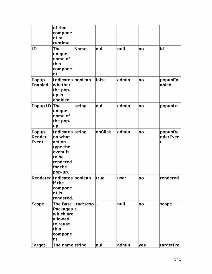
341
of that component at runtime.
ID The unique name of this component.
Name null null no id
Popup Enabled
Indicates whether the pop-up is enabled.
boolean false admin no popupEnabled
Popup ID The unique name of the pop-up.
string null admin no popupId
Popup Render Event
Indicates on what action type the event is to be rendered for the pop-up.
string onClick admin no popupRenderEvent
Rendered Indicates if the component is rendered.
boolean true user no rendered
Scope The Base Packages which are allowed to reuse this component.
jrad:scope
. null no scope
Target The name string null admin yes targetFra

342
Frame of the target frame for the link.
me
Text The text label for the component.
string null admin yes text
User Personalization
Indicates if a user can personalize this component.
boolean false admin no userCustomizable
View Attribute
The name of the view attribute.
string null null no viewAttr
View Instance
The name of the view object instance.
string null null no viewName
Warn About Changes
Warns the user if there are pending changes that will be lost, and allows them to cancel the current action or discard the changes
boolean true null no warnAboutChanges

343
and continue with the current action.
xml:lang Identifies the language contained within this component.
optional null null no xml:lang

344
list
Description
The list item style creates a control which allows the user to select one or more values from a list of items. The list control contains any number of option elements, each of which represents an available option that the user may select. Corresponding web bean: OAListBean
Properties
Additional Text
Additional help text.
string null admin yes shortDesc
Admin Personalization
Indicates if an Administrator can personalize this component.
boolean true admin no adminCustomizable
Attribute Set
The attribute set for the component.
jrad:attributeSetRef
null null no use
Comments
Comments
string null null no comment
CSS Class Overrides the default CSS class.
string null admin no styleClass
Data Type
The type of data. The legal values are VARCHAR
string VARCHAR2
null no dataType

345
2, DATE, DATETIME, BIGDECIMAL, NUMBER, BOOLEAN, and CLOB.
Disabled Indicates if the element is disabled.
boolean false null no disabled
Document Name
The name of the component
jrad:refName
null null no docName
Export View Attribute
The alternate view attribute for use when exporting.
string null admin no exportByViewAttr
Extends A reference to another component that creates a different instance of that component at runtime.
jrad:componentRef
null null no extends
ID The unique name of this
Name null null no id

346
component.
List Height
The display height in characters.
unsignedInt
null null no size
Multi-Select Allowed
Indicates if the list allows multiple selections.
boolean false null no multiple
No Wrap Indicates if cell contents should be wrapped.
boolean false null no cellNoWrapFormat
Picklist Description Attribute
The view attribute that serves as the description of choices.
string null null no pickListViewDescription
Picklist Display Attribute
The view attribute that serves as the displayed value of choices.
string null null no pickListDispAttr
Picklist Value Attribute
The view attribute that serves as the internal value of choices.
string null null no pickListValAttr
Picklist The fully- string null null no pickListVi

347
View Definition
qualified view object name for the picklist, cached at the JVM level.
ewDef
Picklist View Instance
The view instance name for the picklist.
string null null no pickListViewName
Read Only
Indicates if the value can be changed.
boolean false admin no readOnly
Rendered Indicates if the component is rendered.
boolean true user no rendered
Scope The Base Packages which are allowed to reuse this component.
jrad:scope
. null no scope
Security Mode
Defines the security mode used to secure the region. If set to selfSecured it is
string standard null no securityMode

348
the developer's responsibility to handle security validation. The legal values are standard, and selfSecured.
View Attribute
The name of the view attribute.
string null null no viewAttr
View Instance
The name of the view object instance.
string null null no viewName
xml:lang Identifies the language contained within this component.
optional null null no xml:lang

349
messageCheckBox
Description
The messageCheckBox item style is a combination of the checkBox and inlineMessage controls. Corresponding web bean: OAMessageCheckBoxBean
Properties
Access Key
The character used for quick keyboard navigation or activation.
string null admin no accessKey
Action Type
The action type to fire for the component. It should be either "fireAction", "firePartialAction" or "none."
string none null no primaryClientAction
Additional Text
Additional help text.
string null admin yes shortDesc
Admin Personalization
Indicates if an Administrator can personali
boolean true admin no adminCustomizable

350
ze this component.
Attribute Set
The attribute set for the component.
jrad:attributeSetRef
null null no use
Checked Value
The value when checked.
string null null no checkedValue
Comments
Comments
string null null no comment
CSS Class Overrides the default CSS class.
string null admin no styleClass
Data Type
The type of data. The legal values are VARCHAR2, DATE, DATETIME, BIGDECIMAL, NUMBER, BOOLEAN, and CLOB.
string VARCHAR2
null no dataType
Destination Function
The function to invoke.
string null admin no invokeFunc
Disable Server Side Validation
Indicates if validation should not occur
boolean false null no serverUnvalidated

351
on the business tier during a form submit.
Disabled Indicates if the element is disabled.
boolean false null no disabled
Document Name
The name of the component
jrad:refName
null null no docName
Export View Attribute
The alternate view attribute for use when exporting.
string null admin no exportByViewAttr
Extends A reference to another component that creates a different instance of that component at runtime.
jrad:componentRef
null null no extends
ID The unique name of this component.
Name null null no id
Initial Indicates string none null no initSortS

352
Sort Sequence
the initial sort sequence for each search. The legal values are none, first, second, and third.
eq
Initial Value
The initial (default) value of the item.
string null admin no defaultValue
Initially Checked
The initial (default) state of the item.
boolean null null no checked
Long Tip Region
The fully-qualified reference to the long tip region.
jrad:refName
null admin no longTipRegion
No Wrap Indicates if cell contents should be wrapped.
boolean false null no cellNoWrapFormat
Prompt The text label for the component.
string null admin yes prompt
Read Only
Indicates if the value can be changed.
boolean false admin no readOnly
Rendered Indicates boolean true user no rendered

353
if the component is rendered.
Required Indicates if the user must enter a value and how that appears to the user. Three values are allowed: "yes", "no", and "default".
ui:required
no admin no required
Scope The Base Packages which are allowed to reuse this component.
jrad:scope
. null no scope
Search Allowed
Indicates if the item will be shown in the search panels.
boolean false admin no queryable
Selective Search Criteria
Indicates if the item is part of a group of items, one of
boolean false admin no selectiveSearchCriteria

354
which must be included in the search.
Sort Allowed
Indicates if the user can sort this column. The legal values are yes, no, ascending, and descending.
string no admin no sortState
Sort By View Attribute
The alternate view attribute name for use when sorting.
string null null no sortByViewAttr
Tip Message Appl Short Name
The application short name that owns the tip message.
string null admin no tipMessageAppShortName
Tip Message Name
The name of the tip message.
string null admin no tipMessageName
Tip Type The type of tip. The legal values are dateFormat,
string none admin no tipType

355
longMessage, shortTip, and none.
Unchecked Value
The value when unchecked.
string null null no unCheckedValue
User Personalization
Indicates if a user can personalize this component.
boolean false admin no userCustomizable
Vertical Alignment
Vertical alignment. Acceptable values are "middle", "top", and "bottom".
string null null no vAlign
View Attribute
The name of the view attribute.
string null null no viewAttr
View Instance
The name of the view object instance.
string null null no viewName
Warn About Changes
Warns the user if there are pending changes that will
boolean true null no warnAboutChanges

356
be lost, and allows them to cancel the current action or discard the changes and continue with the current action.
xml:lang Identifies the language contained within this component.
optional null null no xml:lang

357
messageChoice
Description
The messageChoice item style is a combination of the choice and inlineMessage controls. Corresponding web bean: OAMessageChoiceBean
Properties
Access Key
The character used for quick keyboard navigation or activation.
string null admin no accessKey
Action Type
The action type to fire for the component. It should be either "fireAction", "firePartialAction" or "none."
string none null no primaryClientAction
Add Blank Value
Adds an empty value to the choice list if it is not Required
boolean true admin no allowBlankValue

358
Additional Text
Additional help text.
string null admin yes shortDesc
Admin Personalization
Indicates if an Administrator can personalize this component.
boolean true admin no adminCustomizable
Attribute Set
The attribute set for the component.
jrad:attributeSetRef
null null no use
Comments
Comments
string null null no comment
CSS Class Overrides the default CSS class.
string null admin no styleClass
Data Type
The type of data. The legal values are VARCHAR2, DATE, DATETIME, BIGDECIMAL, NUMBER, BOOLEAN, and CLOB.
string VARCHAR2
null no dataType
Destination Function
The function to invoke.
string null admin no invokeFunc

359
Disable Server Side Validation
Indicates if validation should not occur on the business tier during a form submit.
boolean false null no serverUnvalidated
Disabled Indicates if the element is disabled.
boolean false null no disabled
Document Name
The name of the component
jrad:refName
null null no docName
Export View Attribute
The alternate view attribute for use when exporting.
string null admin no exportByViewAttr
Extends A reference to another component that creates a different instance of that component at runtime.
jrad:componentRef
null null no extends
ID The unique
Name null null no id

360
name of this component.
Initial Sort Sequence
Indicates the initial sort sequence for each search. The legal values are none, first, second, and third.
string none null no initSortSeq
Initial Value
The initial (default) value of the item.
string null admin no defaultValue
Long Tip Region
The fully-qualified reference to the long tip region.
jrad:refName
null admin no longTipRegion
No Wrap Indicates if cell contents should be wrapped.
boolean false null no cellNoWrapFormat
Picklist Display Attribute
The view attribute that serves as the displayed value of choices.
string null null no pickListDispAttr
Picklist Value Attribute
The view attribute that
string null null no pickListValAttr

361
serves as the internal value of choices.
Picklist View Definition
The fully-qualified view object name for the picklist, cached at the JVM level.
string null null no pickListViewDef
Picklist View Instance
The view instance name for the picklist.
string null null no pickListViewName
Prompt The text label for the component.
string null admin yes prompt
Read Only
Indicates if the value can be changed.
boolean false admin no readOnly
Rendered Indicates if the component is rendered.
boolean true user no rendered
Required Indicates if the user must enter a value and how that appears
string no admin no required

362
to the user. Two values are allowed: "yes", "no".
Scope The Base Packages which are allowed to reuse this component.
jrad:scope
. null no scope
Search Allowed
Indicates if the item will be shown in the search panels.
boolean false admin no queryable
Security Mode
Defines the security mode used to secure the region. If set to selfSecured it is the developer's responsibility to handle security validation. The legal values
string standard null no securityMode

363
are standard, and selfSecured.
Selective Search Criteria
Indicates if the item is part of a group of items, one of which must be included in the search.
boolean false admin no selectiveSearchCriteria
Sort Allowed
Indicates if the user can sort this column. The legal values are yes, no, ascending, and descending.
string no admin no sortState
Sort By View Attribute
The alternate view attribute name for use when sorting.
string null null no sortByViewAttr
Tip Message Appl Short Name
The application short name that owns the
string null admin no tipMessageAppShortName

364
tip message.
Tip Message Name
The name of the tip message.
string null admin no tipMessageName
Tip Type The type of tip. The legal values are dateFormat, longMessage, shortTip, and none.
string none admin no tipType
Total Value
Indicates if an additional field should be displayed to show the total of this column.
boolean false user no totalValue
User Personalization
Indicates if a user can personalize this component.
boolean false admin no userCustomizable
Vertical Alignment
Vertical alignment. Acceptable values are "middle", "top", and
string null null no vAlign

365
"bottom".
View Attribute
The name of the view attribute.
string null null no viewAttr
View Instance
The name of the view object instance.
string null null no viewName
Warn About Changes
Warns the user if there are pending changes that will be lost, and allows them to cancel the current action or discard the changes and continue with the current action.
boolean true null no warnAboutChanges
xml:lang Identifies the language contained within this component.
optional null null no xml:lang

366
messageDownload
Description
The messageDownload item style enables downloading of a file from the middle tier to a client machine. The messageDownload component appears as linked text on a page. The messageDownload item style extends messageStyledText. Please refer to the messageStyledText section for more information on all messageDownload properties. Corresponding web bean: OAMessageDownloadBean
Properties
Access Key
The character used for quick keyboard navigation or activation.
string null admin no accessKey
Admin Personalization
Indicates if an Administrator can personalize this component.
boolean true admin no adminCustomizable
Attribute Set
The attribute set for the component.
jrad:attributeSetRef
null null no use
Comments
Comments
string null null no comment
Data Type
The type of data. The legal
string VARCHAR2
null no dataType

367
values are VARCHAR2, DATE, DATETIME, BIGDECIMAL, NUMBER, BOOLEAN, CLOB, and BLOB.
Destination Function
The function to invoke.
string null admin no invokeFunc
Document Name
The name of the component
jrad:refName
null null no docName
Export View Attribute
The alternate view attribute for use when exporting.
string null admin no exportByViewAttr
Extends A reference to another component that creates a different instance of that component at runtime.
jrad:componentRef
null null no extends
File The string null null no fileConte

368
MIME Type
MIME type of the File.
ntType
File Name Override
The File Name to use instead of the view attribute text when saving the file.
string null null no downloadFileName
File View Attribute
The view attribute for the file content.
string null null no contentViewAttributeName
Height The display height of the Search item in characters.
unsignedInt
null null no rows
Initial Sort Sequence
Indicates the initial sort sequence for each search. The legal values are none, first, second, and third.
string none null no initSortSeq
Long Tip Region
The fully-qualified reference to the
jrad:refName
null admin no longTipRegion

369
long tip region.
Maximum Length
The number of characters a user can enter as search criteria for this field in a results-based (automatic) search.
unsignedInt
null admin no maximumLength
No Wrap Indicates if cell contents should be wrapped.
boolean false null no cellNoWrapFormat
Prompt The text label for the component.
string null admin yes prompt
Rendered Indicates if the component is rendered.
boolean true user no rendered
Required Indicates if the user must enter a value and how that appears to the user. Three
ui:required
no admin no required

370
values are allowed: "yes", "no", "default".
Scope The Base Packages which are allowed to reuse this component.
jrad:scope
. null no scope
Search Allowed
Indicates if the item will be shown in the search panels.
boolean false admin no queryable
Selective Search Criteria
Indicates if the item is part of a group of items, one of which must be included in the search.
boolean false admin no selectiveSearchCriteria
Sort Allowed
Indicates if the user can sort this column. The legal values are yes, no, ascendin
string no admin no sortState

371
g, and descending.
Sort By View Attribute
The alternate view attribute name for use when sorting.
string null null no sortByViewAttr
Tip Message Appl Short Name
The application short name that owns the tip message.
string null admin no tipMessageAppShortName
Tip Message Name
The name of the tip message.
string null admin no tipMessageName
Tip Type The type of tip. The legal values are dateFormat, longMessage, shortTip, and none.
string none admin no tipType
User Personalization
Indicates if a user can personalize this component.
boolean false admin no userCustomizable
Vertical Alignment
Vertical alignment.
string null null no vAlign

372
View Attribute
The name of the view attribute.
string null null no viewAttr
View Instance
The name of the view object instance.
string null null no viewName
Warn About Changes
Warns the user if there are pending changes that will be lost, and allows them to cancel the current action or discard the changes and continue with the current action.
boolean true null no warnAboutChanges
Width The display length of the Search item in characters.
unsignedInt
null null no columns
xml:lang Identifies the language
optional null null no xml:lang

373
contained within this component.

374
messageFileUpload
Description
The messageFileUpload item style is a combination of the fileUpload and inlineMessage controls. The fileUpload control adds a widget that can be used to upload a file. Any form that contains this control must have attribute "usesUpload" set to true. Corresponding web bean: OAMessageFileUploadBean
Properties
Access Key
The character used for quick keyboard navigation or activation.
string null admin no accessKey
Additional Text
Additional help text.
string null admin yes shortDesc
Admin Personalization
Indicates if an Administrator can personalize this component.
boolean true admin no adminCustomizable
Attribute Set
The attribute set for the component.
jrad:attributeSetRef
null null no use
Comments
Comments
string null null no comment
CSS Class Overrides the
string null admin no styleClas

375
default CSS class.
s
Data Type
The type of data. The legal values are VARCHAR2, DATE, DATETIME, BIGDECIMAL, NUMBER, BOOLEAN, CLOB, and BLOB.
string VARCHAR2
null no dataType
Document Name
The name of the component
jrad:refName
null null no docName
Extends A reference to another component that creates a different instance of that component at runtime.
jrad:componentRef
null null no extends
ID The unique name of this component.
Name null null no id
Length The unsigned null null no columns

376
display length in characters.
Int
Long Tip Region
The fully-qualified reference to the long tip region.
jrad:refName
null admin no longTipRegion
No Wrap Indicates if cell contents should be wrapped.
boolean false null no cellNoWrapFormat
Prompt The text label for the component.
string null admin yes prompt
Rendered Indicates if the component is rendered.
boolean true user no rendered
Required Indicates if the user must enter a value and how that appears to the user. Three values are allowed: "yes", "no", and "default".
ui:required
no admin no required
Scope The Base jrad:scop . null no scope

377
Packages which are allowed to reuse this component.
e
Tip Message Appl Short Name
The application short name that owns the tip message.
string null admin no tipMessageAppShortName
Tip Message Name
The name of the tip message.
string null admin no tipMessageName
Tip Type The type of tip. The legal values are dateFormat, longMessage, shortTip, and none.
string none admin no tipType
User Personalization
Indicates if a user can personalize this component.
boolean false admin no userCustomizable
Vertical Alignment
Vertical alignment. Acceptable values are
string null null no vAlign

378
"middle", "top", and "bottom".
View Attribute
The name of the view attribute.
string null null no viewAttr
View Instance
The name of the view object instance.
string null null no viewName
xml:lang Identifies the language contained within this component.
optional null null no xml:lang

379
messageInlineAttachment
Description
The messageInlineAttachment item style is used to display attachments in a message bean. Corresponding web bean: OAMessageInlineAttachmentBean
Properties
Name Description
Type Default Value
Personalizable
Translatable
XML Attribute
Admin Personalization
Indicates if an Administrator can personalize this component.
boolean true admin no adminCustomizable
Attribute Set
The attribute set for the component.
jrad:attributeSetRef
null null no use
Automatic Save
Indicates if automatic save is enabled.
boolean false null no autoCommitEnabled
Comments
Comments.
string null null no comment
CSS Class Overrides the default CSS class.
string null admin no styleClass
Disable Client Side Validatio
Indicates if validation should
boolean true null no unvalidated

380
n not occur on the web tier during a form submit.
Disable Server Side Validation
Indicates if validation should not occur on the business tier during a form submit.
boolean true null no serverUnvalidated
Enable Document Catalog
Indicates if the Document Catalog is enabled for the component.
boolean true admin no enableDocumentCatalog
Extends A reference to another component that creates a different instance of that component at runtime.
jrad:componentRef
null null no extends
ID The unique name of this
Name null null no id

381
component.
Inline Attachment Enabled
Indicates whether inline attachment capability is enabled or not.
boolean null admin no inlineAttachmentEnabled
Links Displayed
The number of attachments links displayed inline. Default value is 5 if not defined.
nonNegativeInteger
5 admin no numberAttachmentsDisplayed
Long Tip Region
The fully-qualified reference to the long tip region.
jrad:refName
null admin no longTipRegion
Prompt The text label for the component.
string Attachments
admin yes prompt
Render Search Region
Indicates if the search region is rendered.
boolean true null no searchRegionRendered
Rendered Indicates if the component is rendered.
boolean true user no rendered

382
Required Indicates if the user must enter a value and how that appears to the user. Three values are allowed: "yes", "no", and "default".
ui:required
no admin no required
Tip Message Appl Short Name
The application short name that owns the tip message.
string null admin no tipMessageAppShortName
Tip Message Name
The name of the tip message.
string null admin no tipMessageName
Tip Type The type of tip. The legal values are dateFormat, longMessage, shortTip, and none.
string none admin no tipType
View Instance
The name of the view
string null null no viewName

383
object instance.
Element Children Name Quantity Description entityMappings 1 Defines the entity and
item relationships.
entityMap Name Descripti
on Type Default
ValuePersonalizable
Translatable
XML Attribute
Approval Function Name
Function Name for the approval process.
string null null no approvalFunctionName
Approval View Attribute
View Attribute to determine if approval process is required.
string null null no approvalViewAttr
Attribute Set
The attribute set for the component.
jrad:attributeSetRef
null null no use
Comments
Comments.
string null null no comment
Delete Allowed
Indicates if the user can delete attachments from the current object.
boolean true null no deleteAllowed
Entity The name of the
string null null no entityId

384
attachment entity which defines the primary key relationships.
Insert Allowed
Indicates if new attachments can be created for this entity.
boolean true null no insertAllowed
Show All Indicates if the user can view any attachment for the current object, regardless of category.
boolean false null no showAll
Update Allowed
Indicates if the user can edit the attachment content.
boolean true null no updateAllowed
Element Children Name Quantity Description categoryMappings 0 through 1 Defines the entity and
category relationships.primaryKeys 0 through 1 Defines the primary
keys.

385
categoryMap Name Descripti
on Type Default
ValuePersonalizable
Translatable
XML Attribute
Attribute Set
The attribute set for the component.
jrad:attributeSetRef
null null no use
Category The attachment category name.
string null null no categoryName
Comments
Comments.
string null null no comment
Secured Indicates if the object is secured by grants model.
boolean false admin no secured
primaryKey Name Descripti
on Type Default
ValuePersonalizable
Translatable
XML Attribute
Attribute Set
The attribute set for the component.
jrad:attributeSetRef
null null no use
Comments
Comments.
string null null no comment
View Attribute
The name of the view attribute.
string null null no viewAttr

386
messageLovChoice
Description
The messageLovChoice item style is a hybrid between a messageLovInput and a messageChoice. Please refer to the messageLovInput and messageChoice sections for more information on all messageLovChoice properties. Corresponding web bean: OAMessageLovChoiceBean
Properties
Name Description
Type Default Value
Personalizable
Translatable
XML Attribute
Access Key
The character used for quick keyboard navigation or activation.
string null admin no accessKey
Action Type
The action type to fire for the component. It should be either "fireAction", "firePartialAction" or "none."
string none null no primaryClientAction
Additional Text
Additional help text.
string null admin yes shortDesc
Admin Indicates boolean true admin no adminCu

387
Personalization
if an Administrator can personalize this component.
stomizable
Attribute Set
The attribute set for the component.
jrad:attributeSetRef
null null no use
Comments
Comments
string null null no comment
CSS Class Overrides the default CSS class.
string null admin no styleClass
Data Type
The type of data. The legal values are VARCHAR2, DATE, DATETIME, NUMBER, BIGDECIMAL, BOOLEAN, and CLOB.
string VARCHAR2
null no dataType
Destination Function
The function to invoke.
string null admin no invokeFunc
Disable Validation
Indicates if validation should
boolean false null no unvalidated

388
not occur on the web tier during a form submit.
Disabled Indicates if the element is disabled.
boolean false null no disabled
Export View Attribute
The alternate view attribute for use when exporting.
string null admin no exportByViewAttr
External LOV
The name of the external List of Values region.
jrad:componentRef
null null no externalListOfValues
Initial Sort Sequence
Indicates the initial sort sequence for each search. The legal values are none, first, second, and third.
string none null no initSortSeq
Initial Value
The initial (default) value of the item.
string null admin no defaultValue
List Indicates boolean false null no userEdita

389
Personalization
if the user can personalize the LOV Choice list.
bleList
No Wrap Indicates if cell contents should be wrapped.
boolean false null no cellNoWrapFormat
Picklist Display Attribute
The view attribute that serves as the displayed value of choices.
string null null no pickListDispAttr
Picklist Value Attribute
The view attribute that serves as the internal value of choices.
string null null no pickListValAttr
Prompt The text label for the component.
string null admin yes prompt
Read Only
Indicates if the value can be changed.
boolean false admin no readOnly
Rendered Indicates if the component is rendered.
boolean true user no rendered

390
Required Indicates if the user must enter a value and how that appears to the user. Two values are allowed: "yes", "no".
string no admin no required
Search Allowed
Indicates if the item will be shown in the search panels.
boolean false admin no queryable
Selective Search Criteria
Indicates if the item is part of a group of items, one of which must be included in the search.
boolean false admin no selectiveSearchCriteria
Sort Allowed
Indicates if the user can sort this column. The legal values are yes, no,
string no admin no sortState

391
ascending, and descending.
Sort By View Attribute
The alternate view attribute name for use when sorting.
string null null no sortByViewAttr
Tip Message Appl Short Name
The application short name that owns the tip message.
string null admin no tipMessageAppShortName
Tip Message Name
The name of the tip message.
string null admin no tipMessageName
Tip Type The type of tip. The legal values are dateFormat, longMessage, shortTip, and none.
string none admin no tipType
Total Value
Indicates if an additional field should be displayed to show the total of this
boolean false user no totalValue

392
column. User Personalization
Indicates if a user can personalize this component.
boolean false admin no userCustomizable
Vertical Alignment
Vertical alignment. Acceptable values are "middle", "top", and "bottom".
string null null no vAlign
View Attribute
The name of the view attribute.
string null null no viewAttr
View Instance
The name of the view object instance.
string null null no viewName
Warn About Changes
Warns the user if there are pending changes that will be lost, and allows them to cancel the current action or
boolean true null no warnAboutChanges

393
discard the changes and continue with the current action.
xml:lang Identifies the language contained within this component.
optional null null no xml:lang
lovMap Name Descripti
on Type Default
ValuePersonalizable
Translatable
XML Attribute
Attribute Set
The attribute set for the component.
jrad:attributeSetRef
null null no use
Comments
Comments.
string null null no comment
Criteria Item
The ID of the item in the base page that provides the criteria for the LOV.
jrad:localRef
null null no criteriaFrom
LOV Region Item
The name of the item in the List Of Values
jrad:localRefString
null null no lovItem

394
region.Programmatic Query
Indicates if the Criteria Item value will not be automatically applied to the LOV.
boolean false null no programmaticQuery
Required Indicates if the item specified in the Criteria Item property must have a value.
boolean false null no requiredForLOV
Return Item
The name of the item in the base page that receives the result from the LOV Region Item.
jrad:localRef
null null no resultTo
Use for Validation
Indicates if the return item will always contain a value if a row from the LOV
string default null no useForValidation

395
is selected. The legal values are default, yes, and no.

396
messageLovInput
Description
The messageLovInput item style is a combination of the lovInput and inlineMessage controls. Please refer to the listOfValues section for more information on LOVs. Note: messageLovInput can have two or more lovMaps created under it, and each of those lovMaps can have the Criteria Item property set. However if you set the Criteria Item property on more than one lovMap, at runtime when the user invokes an LOV, selects a value from the LOV, and then re-invokes it, both the entered criteria are used. In this case, deleting the value from the search item will not enable the user to query all records from the LOV table's view objects. Corresponding web bean: OAMessageLovInputBean
Properties
Name Description
Type Default Value
Personalizable
Translatable
XML Attribute
Access Key
The character used for quick keyboard navigation or activation.
string null admin no accessKey
Additional Text
Additional help text.
string null admin yes shortDesc
Admin Personalization
Indicates if an Administrator can personalize this component.
boolean true admin no adminCustomizable
Attribute Set
The attribute
jrad:attributeSetR
null null no use

397
set for the component.
ef
Comments
Comments
string null null no comment
CSS Class Overrides the default CSS class.
string null admin no styleClass
Data Type
The type of data. The legal values are VARCHAR2, DATE, DATETIME, NUMBER, BIGDECIMAL, BOOLEAN, and CLOB.
string VARCHAR2
null no dataType
Disable Validation
Indicates if validation should not occur on the web tier during a form submit.
boolean false null no unvalidated
Disabled Indicates if the element is disabled.
boolean false null no disabled
Document Name
The name of the
jrad:refName
null null no docName

398
component
Export View Attribute
The alternate view attribute for use when exporting.
string null admin no exportByViewAttr
Extends A reference to another component that creates a different instance of that component at runtime.
jrad:componentRef
null null no extends
External LOV
The name of the external List of Values region.
jrad:componentRef
null null no externalListOfValues
Height The display height in characters.
unsignedInt
1 null no rows
ID The unique name of this component.
Name null null no id
Initial Sort Sequence
Indicates the initial sort
string none null no initSortSeq

399
sequence for each search. The legal values are none, first, second, and third.
Initial Value
The initial (default) value of the item.
string null admin true translatableDefaultValue
Length The display length in characters.
unsignedInt
null null no columns
Long Tip Region
The fully-qualified reference to the long tip region.
jrad:refName
null admin no longTipRegion
Look Ahead Enabled
Whether look-ahead capability is enabled or not.
boolean null admin no lookAheadEnabled
Look Ahead Records Displayed
Maximum number of records displayed in the look ahead window.
unsignedInt
50 admin no lookAheadRecordsDisplayed
Look The unsigned 10 admin no lookAhea

400
Ahead Records Visible
maximum number of records visible to a user in the look ahead window at any point in time.
Int dRecordsVisible
Look Ahead Search Type
Type of search to be performed.
anySimpleType
startsWith
admin no lookAheadSearchType
Look Ahead Selection Event Enabled
Whether server-side event to be generated on value selection.
boolean true null no lookAheadSelectionEventEnabled
Maximum Length
The maximum number of characters per line that can be entered.
unsignedInt
null null no maximumLength
Minimum Characters For Look Ahead
Minimum number of characters required
unsignedInt
null admin no lookAheadMinChars

401
to initiate look ahead.
No Wrap Indicates if cell contents should be wrapped.
boolean false null no cellNoWrapFormat
Prompt The text label for the component.
string null admin yes prompt
Read Only
Indicates if the value can be changed.
boolean false admin no readOnly
Rendered Indicates if the component is rendered.
boolean true user no rendered
Required Indicates if the user must enter a value and how that appears to the user. Three values are allowed: "yes", "no", and "validaterOnly".
ui:required
no admin no required
Scope The Base Packages
jrad:scope
. null no scope

402
which are allowed to reuse this component.
Search Allowed
Indicates if the item will be shown in the search panels.
boolean false admin no queryable
Selective Search Criteria
Indicates if the item is part of a group of items, one of which must be included in the search.
boolean false admin no selectiveSearchCriteria
showRequired
boolean false null no showRequired
Sort Allowed
Indicates if the user can sort this column. The legal values are yes, no, ascending, and descending.
string no admin no sortState
Sort By View Attribute
The alternate view
string null null no sortByViewAttr

403
attribute name for use when sorting.
Tip Message Appl Short Name
The application short name that owns the tip message.
string null admin no tipMessageAppShortName
Tip Message Name
The name of the tip message.
string null admin no tipMessageName
Tip Type The type of tip. The legal values are dateFormat, longMessage, shortTip, and none.
string none admin no tipType
User Personalization
Indicates if a user can personalize this component.
boolean false admin no userCustomizable
Vertical Alignment
Vertical alignment. Acceptable values are "middle", "top", and
string null null no vAlign

404
"bottom".
View Attribute
The name of the view attribute.
string null null no viewAttr
View Instance
The name of the view object instance.
string null null no viewName
Warn About Changes
Warns the user if there are pending changes that will be lost, and allows them to cancel the current action or discard the changes and continue with the current action.
boolean true null no warnAboutChanges
xml:lang Identifies the language contained within this component.
optional null null no xml:lang
lovMap

405
Name Description
Type Default Value
Personalizable
Translatable
XML Attribute
Attribute Set
The attribute set for the component.
jrad:attributeSetRef
null null no use
Comments
Comments.
string null null no comment
Criteria Item
The ID of the item in the base page that provides the criteria for the LOV.
jrad:localRef
null null no criteriaFrom
LOV Region Item
The name of the item in the List Of Values region.
jrad:localRefString
null null no lovItem
Programmatic Query
Indicates if the Criteria Item value will not be automatically applied to the LOV.
boolean false null no programmaticQuery
Required Indicates if the item specified in the Criteria
boolean false null no requiredForLOV

406
Item property must have a value.
Return Item
The name of the item in the base page that receives the result from the LOV Region Item.
jrad:localRef
null null no resultTo
Use for Validation
Indicates if the return item will always contain a value if a row from the LOV is selected. The legal values are default, yes, and no.
string default null no useForValidation

407
messageRadioButton
Description
The messageRadioButton item style is a combination of the radioButton and inlineMessage controls. Corresponding web bean: OAMessageRadioButtonBean
Properties
Access Key
The character used for quick keyboard navigation or activation.
string null admin no accessKey
Action Type
The action type to fire for the component. It should be either "fireAction", "firePartialAction" or "none."
string none null no primaryClientAction
Additional Text
Additional help text.
string null admin yes shortDesc
Admin Personalization
Indicates if an Administrator can personali
boolean true admin no adminCustomizable

408
ze this component.
Attribute Set
The attribute set for the component.
jrad:attributeSetRef
null null no use
Checked Value
The value when checked.
string null null no checkedValue
Comments
Comments
string null null no comment
CSS Class Overrides the default CSS class.
string null admin no styleClass
Data Type
The type of data. The legal values are VARCHAR2, DATE, DATETIME, BIGDECIMAL, NUMBER, BOOLEAN, and CLOB.
string VARCHAR2
null no dataType
Destination Function
The function to invoke.
string null admin no invokeFunc
Disable Server Side Validation
Indicates if validation should not occur
boolean false null no serverUnvalidated

409
on the business tier during a form submit.
Disabled Indicates if the element is disabled.
boolean false null no disabled
Document Name
The name of the component
jrad:refName
null null no docName
Extends A reference to another component that creates a different instance of that component at runtime.
jrad:componentRef
null null no extends
Group Name
The name of the Radio Group.
string null null no name
ID The unique name of this component.
Name null null no id
Initial Value
The initial (default) value of the item.
string null admin no defaultValue

410
Long Tip Region
The fully-qualified reference to the long tip region.
jrad:refName
null admin no longTipRegion
Prompt The text label for the component.
string null admin yes prompt
Read Only
Indicates if the value can be changed.
boolean false admin no readOnly
Rendered Indicates if the component is rendered.
boolean true user no rendered
Required Indicates if the user must enter a value, and how that appears to the user. Three values are allowed: "yes", "no", and "default".
ui:required
no admin no required
Scope The Base Packages which are allowed
jrad:scope
. null no scope

411
to reuse this component.
Selective Search Criteria
Indicates if the item is part of a group of items, one of which must be included in the search.
boolean false admin no selectiveSearchCriteria
Tip Message Appl Short Name
The application short name that owns the tip message.
string null admin no tipMessageAppShortName
Tip Message Name
The name of the tip message.
string null admin no tipMessageName
Tip Type The type of tip. The legal values are dateFormat, longMessage, shortTip, and none.
string none admin no tipType
Unchecked Value
The value when unchecked.
string null null no unCheckedValue

412
Vertical Alignment
Vertical alignment. Acceptable values are "middle", "top", and "bottom".
string null null no vAlign
View Attribute
The name of the view attribute.
string null null no viewAttr
View Instance
The name of the view object instance.
string null null no viewName
Warn About Changes
Warns the user if there are pending changes that will be lost, and allows them to cancel the current action or discard the changes and continue with the current action.
boolean true null no warnAboutChanges

413
xml:lang Identifies the language contained within this component.
optional null null no xml:lang

414
messageRadioGroup
Description
The messageRadioGroup item style is a combination of the radioGroup and inlineMessage controls. Corresponding web bean: OAMessageRadioGroupBean
Properties
Access Key
The character used for quick keyboard navigation or activation.
string null admin no accessKey
Action Type
The action type to fire for the component. It should be either "fireAction", "firePartialAction" or "none."
string none null no primaryClientAction
Additional Text
Additional help text.
string null admin yes shortDesc
Admin Personalization
Indicates if an Administrator can personali
boolean true admin no adminCustomizable

415
ze this component.
Attribute Set
The attribute set for the component.
jrad:attributeSetRef
null null no use
Comments
Comments
string null null no comment
CSS Class Overrides the default CSS class.
string null admin no styleClass
Data Type
The type of data. The legal values are VARCHAR2, DATE, DATETIME, BIGDECIMAL, NUMBER, BOOLEAN, and CLOB.
string VARCHAR2
null no dataType
Destination Function
The function to invoke.
string null admin no invokeFunc
Disable Server Side Validation
Indicates if validation should not occur on the business tier
boolean false null no serverUnvalidated

416
during a form submit.
Disabled Indicates if the element is disabled.
boolean false null no disabled
Document Name
The name of the component
jrad:refName
null null no docName
Export View Attribute
The alternate view attribute for use when exporting.
string null admin no exportByViewAttr
Extends A reference to another component that creates a different instance of that component at runtime.
jrad:componentRef
null null no extends
ID The unique name of this component.
Name null null no id
Initial Sort Sequence
Indicates the initial sort sequence
string none null no initSortSeq

417
for each search. The legal values are none, first, second, and third.
Initial Value
The initial (default) value of the item.
string null admin no defaultValue
Long Tip Region
The fully-qualified reference to the long tip region.
jrad:refName
null admin no longTipRegion
No Wrap Indicates if cell contents should be wrapped.
boolean false null no cellNoWrapFormat
Picklist Display Attribute
The view attribute that serves as the displayed value of choices.
string null null no pickListDispAttr
Picklist Value Attribute
The view attribute that serves as the internal value of choices.
string null null no pickListValAttr
Picklist View Definitio
The fully-qualified view
string null null no pickListViewDef

418
n object name for the picklist, cached at the JVM level.
Picklist View Instance
The view instance name for the picklist.
string null null no pickListViewName
Prompt The text label for the component.
string null admin yes prompt
Read Only
Indicates if the value can be changed.
boolean false admin no readOnly
Rendered Indicates if the component is rendered.
boolean true user no rendered
Required Indicates if the user must enter a value and how that appears to the user. Two values are allowed: "yes", "no".
string no admin no required
Scope The Base jrad:scop . null no scope
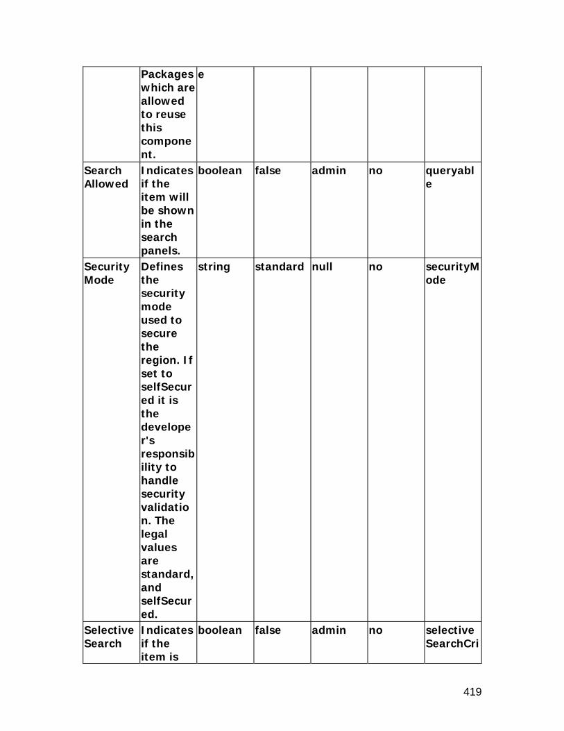
419
Packages which are allowed to reuse this component.
e
Search Allowed
Indicates if the item will be shown in the search panels.
boolean false admin no queryable
Security Mode
Defines the security mode used to secure the region. If set to selfSecured it is the developer's responsibility to handle security validation. The legal values are standard, and selfSecured.
string standard null no securityMode
Selective Search
Indicates if the item is
boolean false admin no selectiveSearchCri

420
Criteria part of a group of items, one of which must be included in the search.
teria
Sort Allowed
Indicates if the user can sort this column. The legal values are yes, no, ascending, and descending.
string no admin no sortState
Sort By View Attribute
The alternate view attribute name for use when sorting.
string null null no sortByViewAttr
Tip Message Appl Short Name
The application short name that owns the tip message.
string null admin no tipMessageAppShortName
Tip Message Name
The name of the tip message.
string null admin no tipMessageName
Tip Type The type of tip. The legal
string none admin no tipType

421
values are dateFormat, longMessage, shortTip, and none.
User Personalization
Indicates if a user can personalize this component.
boolean false admin no userCustomizable
Vertical Alignment
Vertical alignment. Acceptable values are "middle", "top", and "bottom".
string null null no vAlign
View Attribute
The name of the view attribute.
string null null no viewAttr
View Instance
The name of the view object instance.
string null null no viewName
Warn About Changes
Warns the user if there are pending changes that will
boolean true null no warnAboutChanges

422
be lost, and allows them to cancel the current action or discard the changes and continue with the current action.
xml:lang Identifies the language contained within this component.
optional null null no xml:lang

423
messageRichTextEditor
Description
The messageRichTextEditor item style provides rich text editing capability within the OA Framework. It can be placed within any region except search regions or tables. The component allows users to author, edit and view rich text content in a browser that supports IFRAMEs. The messageRichTextEditor item style extends messageTextInput and can be used to provide rich text editing capabilities where they are required. Please refer to the messageTextInput section for more information on all messageRichTextEditor properties. Corresponding web bean: OAMessageRichTextEditorBean
Properties
Additional Text
Additional help text.
string null admin yes shortDesc
Admin Personalization
Indicates if an Administrator can personalize this component.
boolean true admin no adminCustomizable
Alignment Icons
Indicates if the left, center, and right alignment icons are displayed.
boolean false null no alignmentGroup
Attribute Set
The attribute set for the component.
jrad:attributeSetRef
null null no use

424
Bullet Icons
Indicates if the bullet icons are displayed.
boolean true null no bulletGroup
ClickThru Destination URI
The URI launched from the "Click Thru Destination" icon. If empty, no icon is shown.
string null null no clickThruDestinationUri
Comments
Comments
string null null no comment
Create Hyperlink Icon
Indicates if the create hyperlink icon is displayed.
boolean false null no hyperlinkButton
Data Type
The type of data. The legal values are VARCHAR2, and CLOB.
string VARCHAR2
null no dataType
Disable Server Side Validation
Indicates if validation should not occur on the business tier during a form
boolean false null no serverUnvalidated

425
submit. Edit Icons
Indicates if the cut, copy and paste icons are displayed.
boolean true null no editGroup
Extends A reference to another component that creates a different instance of that component at runtime.
jrad:componentRef
null null no extends
Font Bar Indicates if the font bar is displayed.
boolean false null no fontBar
Image Upload URl
The URI launched from the insert image icon. If empty, no icon is shown.
string null null no imageUploadUri
Indentation Icons
Indicates if the indentation icons are displayed.
boolean false null no indentationGroup
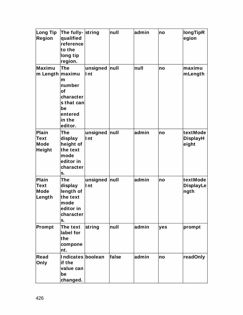
426
Long Tip Region
The fully-qualified reference to the long tip region.
string null admin no longTipRegion
Maximum Length
The maximum number of characters that can be entered in the editor.
unsignedInt
null null no maximumLength
Plain Text Mode Height
The display height of the text mode editor in characters.
unsignedInt
null admin no textModeDisplayHeight
Plain Text Mode Length
The display length of the text mode editor in characters.
unsignedInt
null admin no textModeDisplayLength
Prompt The text label for the component.
string null admin yes prompt
Read Only
Indicates if the value can be changed.
boolean false admin no readOnly

427
Rendered Indicates if the component is rendered.
boolean true user no rendered
Required Indicates if the user must enter a value, and how that appears to the user.
string no admin no required
Rich Text Mode Height
The display height of the rich text editor in pixels or % of the container.
string null admin no richTextModeDisplayHeight
Rich Text Mode Length
The display length of the rich text editor in pixels or % of the container.
string null admin no richTextModeDisplayLength
showRequired
boolean false null no showRequired
Style Icons
Indicates if the bold, italic and underline
boolean true null no styleGroup

428
icons are displayed.
Tip Message Appl Short Name
The application short name that owns the tip message.
string null admin no tipMessageAppShortName
Tip Message Name
The name of the tip message.
string null admin no tipMessageName
Tip Type The type of tip.
string none admin no tipType
User Personalization
Indicates if a user can personalize this component.
boolean false admin no userCustomizable
Vertical Aligment
Vertical alignment
string null null no vAlign
View Attribute
The name of the view attribute.
string null null no viewAttr
View Instance
The name of the view object instance.
string null null no viewName

429
messageStyledText
Description
The messageStyledText region style is a combination of the styledText and inlineMessage controls. Corresponding web bean: OAMessageStyledTextBean
Properties
Access Key
The character used for quick keyboard navigation or activation.
string null admin no accessKey
Action Type
The action type to fire for the component. It should be either "fireAction" or "none."
string none null no primaryClientAction
Additional Text
Additional help text.
string null admin true shortDesc
Admin Personalization
Indicates if an Administrator can personalize this component.
boolean true admin no adminCustomizable

430
Attribute Set
The attribute set for the component.
jrad:attributeSetRef
null null no use
Comments
Comments
string null null no comment
CSS Class Overrides the default CSS class.
string null admin no styleClass
Data Type
The type of data. The legal values are VARCHAR2, DATE, DATETIME, BIGDECIMAL, NUMBER, BOOLEAN, and CLOB.
string VARCHAR2
null no dataType
Destination Function
The function to invoke.
string null admin no invokeFunc
Destination URI
The destination URI.
uriReference
null null no destination
Disable Server Side Validation
Indicates if validation should not occur on the business tier
boolean false null no serverUnvalidated

431
during a form submit.
Document Name
The name of the component
jrad:refName
null null no docName
Export View Attribute
The alternate view attribute for use when exporting.
string null admin no exportByViewAttr
Extends A reference to another component that creates a different instance of that component at runtime.
jrad:componentRef
null null no extends
Height The display height of the Search item in characters.
unsignedInt
null null no rows
ID The unique name of this component.
Name null null no id
Initial Indicates string none null no initSortS

432
Sort Sequence
the initial sort sequence for each search. The legal values are none, first, second, and third.
eq
Long Tip Region
The fully-qualified reference to the long tip region.
jrad:refName
null admin no longTipRegion
Maximum Length
The number of characters a user can enter as search criteria for this field in a results-based (automatic) search.
unsignedInt
null admin no maximumLength
No Wrap Indicates if cell contents should be wrapped.
boolean false null no cellNoWrapFormat
Popup Enabled
Indicates whether the pop-up is enabled.
boolean false admin no popupEnabled
Popup ID The string null admin no popupId

433
unique name of the pop-up.
Popup Render Event
Indicates on what action type the event is to be rendered for the pop-up.
string onClick admin no popupRenderEvent
Prompt The text label for the component.
string null admin yes prompt
Rendered Indicates if the component is rendered.
boolean true user no rendered
Required Indicates if the user must enter a value and how that appears to the user. Three values are allowed: "yes", "no", "default".
ui:required
no admin no required
Scope The Base Packages which are
jrad:scope
. null no scope

434
allowed to reuse this component.
Search Allowed
Indicates if the item will be shown in the search panels.
boolean false admin no queryable
Selective Search Criteria
Indicates if the item is part of a group of items, one of which must be included in the search.
boolean false admin no selectiveSearchCriteria
Sort Allowed
Indicates if the user can sort this column. The legal values are yes, no, ascending, and descending.
string no admin no sortState
Sort By View Attribute
The alternate view attribute name for use when
string null null no sortByViewAttr

435
sorting. Tip Message Appl Short Name
The application short name that owns the tip message.
string null admin no tipMessageAppShortName
Tip Message Name
The name of the tip message.
string null admin no tipMessageName
Tip Type The type of tip. The legal values are dateFormat, longMessage, shortTip, and none.
string none admin no tipType
Total Value
Indicates if an additional field should be displayed to show the total of this column.
boolean false user no totalValue
User Personalization
Indicates if a user can personalize this component.
boolean false admin no userCustomizable
Vertical Alignmen
Vertical alignmen
string null null no vAlign
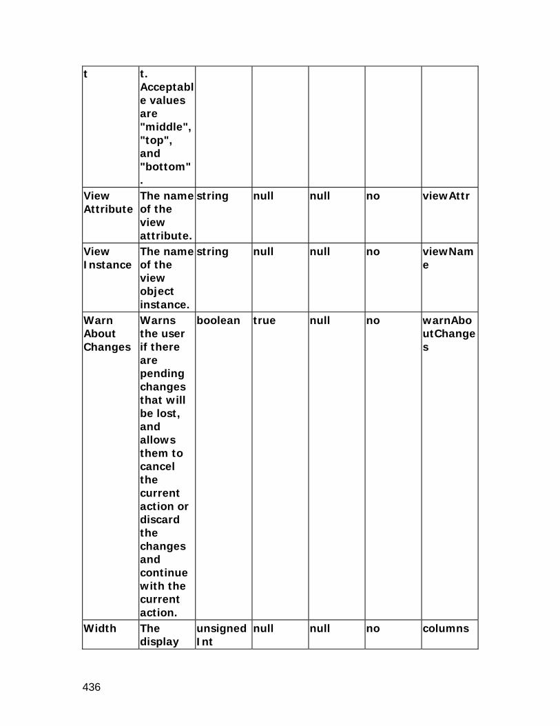
436
t t. Acceptable values are "middle", "top", and "bottom".
View Attribute
The name of the view attribute.
string null null no viewAttr
View Instance
The name of the view object instance.
string null null no viewName
Warn About Changes
Warns the user if there are pending changes that will be lost, and allows them to cancel the current action or discard the changes and continue with the current action.
boolean true null no warnAboutChanges
Width The display
unsignedInt
null null no columns

437
length of the Search item in characters.
xml:lang Identifies the language contained within this component.
optional null null no xml:lang

438
messageTextInput
Description
The messageTextInput item style is a combination of the textInput and inlineMessage controls. Corresponding web bean: OAMessageTextInputBean
Properties
Access Key
The character used for quick keyboard navigation or activation.
string null admin no accessKey
Action Type
The action type to fire for the component. It should be either "fireAction", "firePartialAction" or "none."
string none null no primaryClientAction
Additional Text
Additional help text.
string null admin yes shortDesc
Admin Personalization
Indicates if an Administrator can personali
boolean true admin no adminCustomizable

439
ze this component.
Attribute Set
The attribute set for the component.
jrad:attributeSetRef
null null no use
Comments
Comments
string null null no comment
CSS Class Overrides the default CSS class.
string null admin no styleClass
Data Type
The type of data. The legal values are VARCHAR2, DATE, DATETIME, BIGDECIMAL, NUMBER, BOOLEAN, and CLOB.
string VARCHAR2
null no dataType
Destination Function
The function to invoke.
string null admin no invokeFunc
Disable Server Side Validation
Indicates if validation should not occur on the business tier
boolean false null no serverUnvalidated

440
during a form submit.
Disabled Indicates if the element is disabled.
boolean false null no disabled
Document Name
The name of the component
jrad:refName
null null no docName
Export View Attribute
The alternate view attribute for use when exporting.
string null admin no exportByViewAttr
Extends A reference to another component that creates a different instance of that component at runtime.
jrad:componentRef
null null no extends
Height The display height in characters.
unsignedInt
1 null no rows
ID The unique name of this compone
Name null null no id

441
nt. Initial Sort Sequence
Indicates the initial sort sequence for each search. The legal values are none, first, second, and third.
string none null no initSortSeq
Initial Value
The initial (default) value of the item.
string null admin true translatableDefaultValue
Length The display length in characters.
unsignedInt
null admin no columns
Long Tip Region
The fully-qualified reference to the long tip region.
jrad:refName
null admin no longTipRegion
Maximum Length
The maximum number of characters per line that can be entered.
unsignedInt
null null no maximumLength
No Wrap Indicates if cell contents should be
boolean false null no cellNoWrapFormat

442
wrapped. Prompt The text
label for the component.
string null admin yes prompt
Read Only
Indicates if the value can be changed.
boolean false admin no readOnly
Rendered Indicates if the component is rendered.
boolean true user no rendered
Required Indicates if the user must enter a value and how that appears to the user. Three values are allowed: "yes", "no", and "validaterOnly".
ui:required
no admin no required
Scope The Base Packages which are allowed to reuse this component.
jrad:scope
. null no scope
Search Indicates boolean false admin no queryabl

443
Allowed if the item will be shown in the search panels.
e
Secret Indicates if the value is visually concealed.
boolean false no no secret
Selective Search Criteria
Indicates if the item is part of a group of items, one of which must be included in the search.
boolean false admin no selectiveSearchCriteria
showRequired
boolean false null no showRequired
Sort Allowed
Indicates if the user can sort this column. The legal values are yes, no, ascending, and descending.
string no admin no sortState
Sort By View Attribute
The alternate view attribute
string null null no sortByViewAttr

444
name for use when sorting.
Tip Message Appl Short Name
The application short name that owns the tip message.
string null admin no tipMessageAppShortName
Tip Message Name
The name of the tip message.
string null admin no tipMessageName
Tip Type The type of tip. The legal values are dateFormat, longMessage, shortTip, and none.
string none admin no tipType
Total Value
Indicates if an additional field should be displayed to show the total of this column.
boolean false user no totalValue
User Personalization
Indicates if a user can personalize this component.
boolean false admin no userCustomizable

445
Vertical Alignment
Vertical alignment. Acceptable values are "middle", "top", and "bottom".
string null null no vAlign
View Attribute
The name of the view attribute.
string null null no viewAttr
View Instance
The name of the view object instance.
string null null no viewName
Warn About Changes
Warns the user if there are pending changes that will be lost, and allows them to cancel the current action or discard the changes and continue with the current action.
boolean true null no warnAboutChanges

446
xml:lang Identifies the language contained within this component.
optional null null no xml:lang

447
rawText
Description
The rawText item style supports output of unescaped text. Use of this class means assuming full responsibility for generating proper HTML. Clients should strongly consider using elements in the HTML namespace instead of this class. In particular, this class does not attempt to encode or escape characters for NLS or HTML compliance. Corresponding web bean: OARawTextBean
Properties
Admin Personalization
Indicates if an Administrator can personalize this component.
boolean true admin no adminCustomizable
Attribute Set
The attribute set for the component.
jrad:attributeSetRef
null null no use
Comments
Comments
string null null no comment
CSS Class Overrides the default CSS class.
string null admin no styleClass
Data Type
The type of data. The legal values are VARCHAR2, DATE, DATETIM
string VARCHAR2
null no dataType

448
E, BIGDECIMAL, NUMBER, BOOLEAN, and CLOB.
Document Name
The name of the component
jrad:refName
null null no docName
Export View Attribute
The alternate view attribute for use when exporting.
string null admin no exportByViewAttr
Extends A reference to another component that creates a different instance of that component at runtime.
jrad:componentRef
null null no extends
ID The unique name of this component.
Name null null no id
Initial Sort Sequence
Indicates the initial sort sequence for each
string none null no initSortSeq

449
search. The legal values are none, first, second, and third.
No Wrap Indicates if cell contents should be wrapped.
boolean false null no cellNoWrapFormat
Prompt The text label for the component.
string null admin true prompt
Rendered Indicates if the component is rendered.
boolean true user no rendered
Scope The Base Packages which are allowed to reuse this component.
jrad:scope
. null no scope
Search Allowed
Indicates if the item will be shown in the search panels.
boolean false admin no queryable
Sort Allowed
Indicates if the user can sort this column. The legal
string no admin no sortState

450
values are yes, no, ascending, and descending.
Sort By View Attribute
The alternate view attribute name for use when sorting.
string null null no sortByViewAttr
Text The text label for the component.
string null admin yes text
Total Value
Indicates if an additional field should be displayed to show the total of this column.
boolean false user no totalValue
User Personalization
Indicates if a user can personalize this component.
boolean false admin no userCustomizable
View Attribute
The name of the view attribute.
string null null no viewAttr
View Instance
The name of the view
string null null no viewName

451
object instance.
xml:lang Identifies the language contained within this component.
optional null null no xml:lang

452
resetButton
Description
The resetButton item style creates a push button which will reset the content of a form. Corresponding web bean: OAResetButtonBean
Properties
Action Type
The action type to fire for the component. It should be either "fireAction", "firePartialAction" or "none."
string null null no primaryClientAction
Additional Text
Additional help text.
string null admin yes shortDesc
Admin Personalization
Indicates if an Administrator can personalize this component.
boolean true admin no adminCustomizable
Attribute Set
The attribute set for the component.
jrad:attributeSetRef
null null no use

453
Comments
Comments
string null null no comment
CSS Class Overrides the default CSS class.
string null admin no styleClass
Disable Server Side Validation
Indicates if validation should not occur on the business tier during a form submit.
boolean false null no serverUnvalidated
Document Name
The name of the component
jrad:refName
null null no docName
Extends A reference to another component that creates a different instance of that component at runtime.
jrad:componentRef
null null no extends
Horizontal Alignment
Horizontal alignment. The legal values are center,
string start null no hAlign

454
left, right, start, and end.
ID The unique name of this component.
Name null null no id
Rendered Indicates if the component is rendered.
boolean true user no rendered
Scope The Base Packages which are allowed to reuse this component.
jrad:scope
. null no scope
Text The text label for the component.
string null admin yes text
xml:lang Identifies the language contained within this component.
optional null null no xml:lang

455
richContainer
Description
The richContainer item style is used to create a container to hold external rich content. Examples of external content include embedded analytics from Oracle Business Intelligence Applications (OBIA), Adobe Flex or third-party Oracle-compatible widgets. The richContainer can accept either an URL or URI of the rich content. The rich content may be embedded within an OA Framework page directly, or enclosed within an iFrame depending on the rich content source. The richContainer exposes a set of parameters that can be set by the root OA Framework application and passed to the rich content URL, allowing context-sensitive content. richContainer extends flowlayout and inherits all the attributes from it. See the section on flowLayout for a list of attributes available on the flowLayout element. Corresponding web bean: OARichContainerBean
Properties
Admin Personalization
Indicates if an Administrator can personalize this component.
boolean true admin no adminCustomizable
Attribute Set
The attribute set for the component.
jrad:attributeSetRef
null null no use
Comments
Comments
string null null no comment
Content Type
Indicates the type
anySimpleType
OBIEE admin no richContentType

456
of content to embed.
Destination Function
The developer name of the FND function used to secure the embedded content or widget.
anyURI null admin no invokeFunc
Height The display height in pixels.
string null admin no height
ID The unique name of this component.
Name null null no id
Name The display name of the content.
string null admin yes name
Parameters
The parameters that can be passed to the embedded content as a list of comma-separate
string null admin yes richParameters

457
d, name-value pairs.
View Instance
The name of the view object instance.
string null null no viewName
Width Indicates the width in pixels or as a percentage (if % sign included).
string null null no width

458
richTextEditor
Description
Note: The richTextEditor item style has been deprecated; use messageRichTextEditor instead. The richTextEditor item style provides rich text editing capability within the OA Framework. It can be placed within any region except search regions or tables. The component allows users to author, edit and view rich text content in a browser that supports IFRAMEs. The richTextEditor item style extends messageTextInput and can be used to provide rich text editing capabilities where they are required. Please refer to the messageTextInput section for more information on all richTextEditor properties. Corresponding web bean: OARichTextEditorBean
Properties
Additional Text
Additional help text.
string null admin yes shortDesc
Admin Personalization
Indicates if an Administrator can personalize this component.
boolean true admin no adminCustomizable
Alignment Icons
Indicates if the left, center, and right alignment icons are displayed.
boolean false null no alignmentIcons
Attribute Set
The attribute set for the
jrad:attributeSetRef
null null no use

459
component.
Bullet Icons
Indicates if the bullet icons are displayed.
boolean true null no bulletIcons
ClickThru Destination URI
The URI launched from the "Click Thru Destination" icon. If empty, no icon is shown.
string null null no clickThruDestinationUri
Comments
Comments
string null null no comment
Create Hyperlink Icon
Indicates if the create hyperlink icon is displayed.
boolean false null no hyperlinkIcon
Data Type
The type of data. The legal values are VARCHAR2, and CLOB.
string VARCHAR2
null no dataType
Edit Icons
Indicates if the cut, copy and paste icons are displayed.
boolean true null no editIcons
Extends A jrad:com null null no extends

460
reference to another component that creates a different instance of that component at runtime.
ponentRef
Font Bar Indicates if the font bar is displayed.
boolean false null no fontBar
Image Upload URl
The URI launched from the insert image icon. If empty, no icon is shown.
string null null no imageUploadUri
Indentation Icons
Indicates if the indentation icons are displayed.
boolean false null no indentationIcons
Initial Value
The initial (default) value of the item.
string null admin yes translatableDefaultValue
Long Tip Region
The fully-qualified reference to the
string null admin no longTipRegion

461
long tip region.
Maximum Length
The maximum number of characters that can be entered in the editor.
unsignedInt
null null no maximumLength
Plain Text Mode Height
The display height of the text mode editor in characters.
unsignedInt
null null no textModeDisplayHeight
Plain Text Mode Length
The display length of the text mode editor in characters.
unsignedInt
null null no textModeDisplayLength
Read Only
Indicates if the value can be changed.
boolean false admin no readOnly
Rendered Indicates if the component is rendered.
boolean true user no rendered
Required Indicates if the user must
string no admin no required

462
enter a value, and how that appears to the user.
Rich Text Mode Height
The display height of the rich text editor in pixels or % of the container.
string null null no richTextModeDisplayHeight
Rich Text Mode Length
The display length of the rich text editor in pixels or % of the container.
string null null no richTextModeDisplayLength
showRequired
boolean false null no showRequired
Style Icons
Indicates if the bold, italic and underline icons are displayed.
boolean true null no styleIcons
Tip Message Appl Short Name
The application short name that owns the
string null admin no tipMessageAppShortName

463
tip message.
Tip Message Name
The name of the tip message.
string null admin no tipMessageName
Tip Type The type of tip.
string none admin no tipType
Vertical Aligment
Vertical alignment
string null null no vAlign
View Attribute
The name of the view attribute.
string null null no viewAttr
View Instance
The name of the view object instance.
string null null no viewName

464
selectionButton
Description
The selectionButton item style creates specific submit buttons. It can be created only under a singleSelection or multipleSelection named child in a table region. Please refer to the submitButton section for more information on all submitButton properties. Corresponding web bean: OASelectionButtonBean
Properties
Action Type
The action type to fire for the component. It should be either "fireAction", "firePartialAction" or "none."
string none null no primaryClientAction
Additional Text
Additional help text.
string null admin yes shortDesc
Admin Personalization
Indicates if an Administrator can personalize this component.
boolean true admin no adminCustomizable
Attribute Set
The attribute set for
jrad:attributeSetRef
null null no use

465
the component.
Comments
Comments
string null null no comment
CSS Class Overrides the default CSS class.
string null admin no styleClass
Data Type
The type of data. The legal values are VARCHAR2, DATE, DATETIME, BIGDECIMAL, NUMBER, BOOLEAN, and CLOB.
string VARCHAR2
null no dataType
Destination Function
The function to invoke.
string null admin no invokeFunc
Disable Client Side Validation
Indicates if validation should not occur on the web tier during a form submit.
boolean false null no unvalidated
Disable Server Side Validatio
Indicates if validation should
boolean false null no serverUnvalidated

466
n not occur on the business tier during a form submit.
Disabled Indicates if the element is disabled.
boolean false null no disabled
Document Name
The name of the component
jrad:refName
null null no docName
Extends A reference to another component that creates a different instance of that component at runtime.
jrad:componentRef
null null no extends
Horizontal Alignment
Horizontal alignment. The legal values are center, left, right, start, and end.
string start null no hAlign
ID The unique
Name null null no id

467
name of this component.
No Wrap Indicates if cell contents should be wrapped.
boolean false null no cellNoWrapFormat
Rendered Indicates if the component is rendered.
boolean true user no rendered
Scope The Base Packages which are allowed to reuse this component.
jrad:scope
. null no scope
Text The text label for the component.
string null admin yes text
User Personalization
Indicates if a user can personalize this component.
boolean false admin no userCustomizable

468
separator
Description
The separator item style creates a horizontal separator. Corresponding web bean: OASeparatorBean
Properties
Admin Personalization
Indicates if an Administrator can personalize this component.
boolean true admin no adminCustomizable
Attribute Set
The attribute set for the component.
jrad:attributeSetRef
null null no use
Comments
Comments
string null null no comment
CSS Class Overrides the default CSS class.
string null admin no styleClass
Document Name
The name of the component
jrad:refName
null null no docName
Extends A reference to another component that creates a different
jrad:componentRef
null null no extends
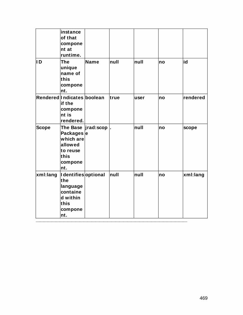
469
instance of that component at runtime.
ID The unique name of this component.
Name null null no id
Rendered Indicates if the component is rendered.
boolean true user no rendered
Scope The Base Packages which are allowed to reuse this component.
jrad:scope
. null no scope
xml:lang Identifies the language contained within this component.
optional null null no xml:lang

470
servletInclude
Description
The servletInclude item style allows you to includes HTML content loaded from a local Servlet or JSP under the parent region. Corresponding web bean: OAServletIncludeBean
Properties
Admin Personalization
Indicates if an Administrator can personalize this component.
boolean true admin no adminCustomizable
Attribute Set
The attribute set for the component.
jrad:attributeSetRef
null null no use
Comments
Comments
string null null no comment
Extends A reference to another component that creates a different instance of that component at runtime.
jrad:componentRef
null null no extends
ID The unique name of
Name null null no id

471
this component.
Rendered Indicates if the component is rendered.
boolean true user no rendered
Source URI
The relative servlet URI.
uriReference
null admin no source
xml:lang Identifies the language contained within this component.
optional null null no xml:lang

472
spacer
Description
The spacer item style inserts empty space in a page. SpacerBeans occupy a fixed amount of space in an HTML layout. Corresponding web bean: OASpacerBean
Properties
Admin Personalization
Indicates if an Administrator can personalize this component.
boolean true admin no adminCustomizable
Attribute Set
The attribute set for the component.
jrad:attributeSetRef
null null no use
Comments
Comments
string null null no comment
CSS Class Overrides the default CSS class.
string null admin no styleClass
Document Name
The name of the component
jrad:refName
null null no docName
Extends A reference to another component that creates a different instance
jrad:componentRef
null null no extends

473
of that component at runtime.
Height The display height in pixels.
string 1 null no height
ID The unique name of this component.
Name null null no id
Rendered Indicates if the component is rendered.
boolean true user no rendered
Scope The Base Packages which are allowed to reuse this component.
jrad:scope
. null no scope
Width Indicates the width in pixels.
string null null no width
xml:lang Identifies the language contained within this component.
optional null null no xml:lang

474
staticStyledText
Description
The staticStyledText item style extends styledText. All attributes supported by styledText are inherited by staticStyledText. See the section on styledText for a list of attributes available on the styledText element. Corresponding web bean: OAStaticStyledTextBean
Properties
Action Type
The action type to fire for the component. It should be either "fireAction" or "none."
string none null no primaryClientAction
Admin Personalization
Indicates if an Administrator can personalize this component.
boolean true admin no adminCustomizable
Attribute Set
The attribute set for the component.
jrad:attributeSetRef
null null no use
Comments
Comments
string null null no comment
CSS Class Overrides the
string null admin no styleClass

475
default CSS class.
Data Type
The type of data. The legal values are VARCHAR2, DATE, DATETIME, BIGDECIMAL, NUMBER, BOOLEAN, and CLOB.
string VARCHAR2
null no dataType
Destination Function
The function to invoke.
string null admin no invokeFunc
Destination URI
The destination URI.
uriReference
null null no destination
Disable Server Side Validation
Indicates if validation should not occur on the business tier during a form submit.
boolean false null no serverUnvalidated
Export View Attribute
The alternate view attribute for use when exporting
string null admin no exportByViewAttr

476
. Extends A
reference to another component that creates a different instance of that component at runtime.
jrad:componentRef
null null no extends
ID The unique name of this component.
Name null null no id
Initial Sort Sequence
Indicates the initial sort sequence for each search. The legal values are none, first, second, and third.
string none null no initSortSeq
Message Appl Short Name
The application short name that owns the message.
string null admin no messageAppShortName
Message Name
The name of the message.
string null admin no messageName
No Wrap Indicates boolean false null no cellNoWr

477
if cell contents should be wrapped.
apFormat
Prompt The text label for the component.
string null admin true prompt
Search Allowed
Indicates if the item will be shown in the search panels.
boolean false admin no queryable
Sort Allowed
Indicates if the user can sort this column. The legal values are yes, no, ascending, and descending.
string no admin no sortState
Total Value
Indicates if an additional field should be displayed to show the total of this column.
boolean false user no totalValue
User Personalization
Indicates if a user can personali
boolean false admin no userCustomizable

478
ze this component.
Warn About Changes
Warns the user if there are pending changes that will be lost, and allows them to cancel the current action or discard the changes and continue with the current action.
boolean true null no warnAboutChanges

479
styledText
Description
The styledText item style supports styled text and links. Corresponding web bean: OAStyledTextBean
Properties
Additional Text
Additional help text.
string null admin yes shortDesc
Admin Personalization
Indicates if an Administrator can personalize this component.
boolean true admin no adminCustomizable
Attribute Set
The attribute set for the component.
jrad:attributeSetRef
null null no use
Comments
Comments
string null null no comment
CSS Class Overrides the default CSS class.
string null admin no styleClass
Data Type
The type of data. The legal values are VARCHAR2, DATE, DATETIME,
string VARCHAR2
null no dataType

480
BIGDECIMAL, NUMBER, BOOLEAN, and CLOB.
Destination Function
The function to invoke.
string null admin no invokeFunc
Destination URI
The destination URI.
uriReference
null null no destination
Document Name
The name of the component
jrad:refName
null null no docName
Extends A reference to another component that creates a different instance of that component at runtime.
jrad:componentRef
null null no extends
ID The unique name of this component.
Name null null no id
Initial Sort Sequence
Indicates the initial sort sequence for each search. The legal
string none null no initSortSeq

481
values are none, first, second, and third.
Rendered Indicates if the component is rendered.
boolean null user no rendered
Scope The Base Packages which are allowed to reuse this component.
jrad:scope
. null no scope
Sort Allowed
Indicates if the user can sort this column. The legal values are yes, no, ascending, and descending.
string no admin no sortState
Sort By View Attribute
The alternate view attribute name for use when sorting.
string null null no sortByViewAttr
Text The text label for the component.
string null admin yes text

482
Total Value
Indicates if an additional field should be displayed to show the total of this column.
boolean false user no totalValue
View Attribute
The name of the view attribute.
string null null no viewAttr
View Instance
The name of the view object instance.
string null null no viewName
xml:lang Identifies the language contained within this component.
optional null null no xml:lang

483
submitButton
Description
The submitButton item style creates a push button which allows submission of forms. The "destination" attribute of a submit button is ignored. Instead, the destination of the form is used. Corresponding web bean: OASubmitButtonBean
Properties
Name Description
Type Default Value
Personalizable
Translatable
XML Attribute
Access Key
The character used for quick keyboard navigation or activation.
string null admin no accessKey
Action Type
The action type to fire for the component. It should be either "fireAction", "firePartialAction" or "none."
string none null no primaryClientAction
Additional Text
Additional help text.
string null admin yes shortDesc
Admin Personali
Indicates if an
boolean true admin no adminCustomizabl

484
zation Administrator can personalize this component.
e
Attribute Set
The attribute set for the component.
jrad:attributeSetRef
null null no use
Comments
Comments
string null null no comment
CSS Class Overrides the default CSS class.
string null admin no styleClass
Data Type
The type of data. The legal values are VARCHAR2, DATE, DATETIME, BIGDECIMAL, NUMBER, BOOLEAN, and CLOB.
string VARCHAR2
null no dataType
Destination Function
The function to invoke.
string null admin no invokeFunc
Disable Client Side Validation
Indicates if validation should not occur
boolean false null no unvalidated

485
on the web tier during a form submit.
Disable Server Side Validation
Indicates if validation should not occur on the business tier during a form submit.
boolean false null no serverUnvalidated
Disabled Indicates if the element is disabled.
boolean false null no disabled
Document Name
The name of the component
jrad:refName
null null no docName
Event Name of the event.
string null null no event
Extends A reference to another component that creates a different instance of that component at runtime.
jrad:componentRef
null null no extends
Horizontal
Horizontal
string start null no hAlign

486
Alignment
alignment. The legal values are center, left, right, start, and end.
ID The unique name of this component.
Name null null no id
No Wrap Indicates if cell contents should be wrapped.
boolean false null no cellNoWrapFormat
Prompt The text label for the component.
string null admin true prompt
Rendered Indicates if the component is rendered.
boolean true user no rendered
Scope The Base Packages which are allowed to reuse this component.
jrad:scope
. null no scope
Text The text label for the compone
string null admin yes text

487
nt. User Personalization
Indicates if a user can personalize this component.
boolean false admin no userCustomizable
View Instance
The name of the view object instance.
string null null no viewName
Warn About Changes
Warns the user if there are pending changes that will be lost, and allows them to cancel the current action or discard the changes and continue with the current action.
boolean false null no warnAboutChanges
xml:lang Identifies the language contained within this compone
optional null null no xml:lang

488
nt.

489
tip
Description
The tip item style provides page or section level hints to the user. Typically, the only indexed child of the tip will be a TextNode, but as many children as necessary can be added and will be laid out as with a flowLayout. Corresponding web bean: OATipBean
Properties
Admin Personalization
Indicates if an Administrator can personalize this component.
boolean true admin no adminCustomizable
Attribute Set
The attribute set for the component.
jrad:attributeSetRef
null null no use
Comments
Comments
string null null no comment
CSS Class Overrides the default CSS class.
string null admin no styleClass
Document Name
The name of the component
jrad:refName
null null no docName
Extends A reference to another
jrad:componentRef
null null no extends

490
component that creates a different instance of that component at runtime.
ID The unique name of this component.
Name null null no id
Rendered Indicates if the component is rendered.
boolean true user no rendered
Scope The Base Packages which are allowed to reuse this component.
jrad:scope
. null no scope
Text The text label for the component.
string null admin true text
Tip Message Appl Short Name
The application short name that owns the tip message.
string null admin no tipMessageAppShortName
Tip Message
The name of the tip
string null admin no tipMessageName

491
Name message. xml:lang Identifies
the language contained within this component.
optional null null no xml:lang

492
urlInclude
Description
The urlInclude item style allows you to includes HTML content loaded from an external source under the parent region. Corresponding web bean: OAUrlIncludeBean
Properties
Admin Personalization
Indicates if an Administrator can personalize this component.
boolean true admin no adminCustomizable
Attribute Set
The attribute set for the component.
jrad:attributeSetRef
null null no use
Comments
Comments
string null null no comment
Extends A reference to another component that creates a different instance of that component at runtime.
jrad:componentRef
null null no extends
ID The unique name of
Name null null no id

493
this component.
Rendered Indicates if the component is rendered.
boolean true user no rendered
Source URI
The relative/absolute URI.
uriReference
null admin no source
xml:lang Identifies the language contained within this component.
optional null null no xml:lang