*ohnenjamins0ublishing#ompanydoi: 10.1075/idj.23.2.09don!ese visualizations result from computer...
TRANSCRIPT

This is a contribution from Information Design Journal 23:2© 2017. John Benjamins Publishing Company
This electronic file may not be altered in any way.The author(s) of this article is/are permitted to use this PDF file to generate printedcopies to be used by way of offprints, for their personal use only.Permission is granted by the publishers to post this file on a closed server which isaccessible only to members (students and faculty) of the author's/s' institute. It is notpermitted to post this PDF on the internet, or to share it on sites such as Mendeley,ResearchGate, Academia.edu.Please see our rights policy on https://benjamins.com/content/customers/rightsFor any other use of this material prior written permission should be obtained from thepublishers or through the Copyright Clearance Center (for USA: www.copyright.com).Please contact [email protected] or consult our website: www.benjamins.com
Maria Giulia Dondero
The semiotics of design in media visualizationMereology and observation strategies
Keywords: semiotics, cultural analytics, media visualization, scientific visualization, diagram
This paper investigates the analytical visualizations of archived images produced by the Russian art historian and computer scientist Lev Manovich and his team, the
‘Cultural Analytics Lab’. The observer’s point of view in these visualizations will be studied in the methodological framework of post-Greimasian semiotics. Whilst these visualizations have scientific purposes, some of them are considered as aesthetically relevant objects, and their transformation from scientific tools into aesthetic objects will be analyzed through Peircean Theory of diagrams.
1. Introduction
The purpose of our paper is to discern in what ways the semiotic methods of the Post-Greimasian French struc-turalist and the American Peircian traditions can enrich the study of contemporary methods of computational analysis of culture, particularly in the field of Cultural Analytics as understood and implemented by the Russian art historian and computer scientist Lev Manovich and his team at CUNY Graduate Center.¹
These semiotic approaches will be helpful in under-standing what kinds of visualizations are being generated
for use in Cultural Analytics, and what kinds of opera-tions the observer must perform in order to experiment with scientific visualizations of this information.
The visualization design of Manovich belongs to a special kind of information design. It concerns visualiza-tions with scientific purpose: according to Manovich, Computer Graphics is to be understood as a method of scientific research, not only as a constructed tool to orientate judgment and identify trends.²
The use of images as sources of insight into past and present culture is what exemplifies Manovich’s approach; images are also the preferred media used for these visualizations. What this means is that Manovich’s visualizations of culture do not use numeri-cal data or language data as their sources of inquiry, as is usual in Infographics; instead they use actual visual corpora, yielding a visualization of visual data (Media Visualization).³
In contrast to other cases where syncretic or visual data is visualized, such as in dance or theater, where syncretic texts are archived and reworked to produce new performances,⁴ Manovich produces visualizations in order to analyze the whole set of images comprising the selected corpus. Manovich analyzes a corpus of images by “embodying” it in a visualization, which means that the visualization assumes an analytical role (dividing, separating, distributing, classifying, etc.).
208
Information Design Journal 23(2), 208–218© 2017 John Benjamins Publishing Company
D O I : 10.1075/idj.23.2.09don
These visualizations result from computer manipula-tions of image collections. These computer manipula-tions are done in a series of different stages; first of all, visual properties are extracted from the collection of images, then quantified, and finally compressed to yield new visualizations which both contain, manipulate and filter the collection.⁵ Computer extraction and quantification techniques are performed on quantifiable visual parameters such as hue, saturation and brightness (chromatic categories); position and the size of shapes (topologic categories); contours of shapes (eidetic categories) and so on. The techniques used in Media Visualization take archived image sets (paintings, comics, films, photos, etc.), and apply computer mapping and statistical tools to them for the purpose of analyzing the selected corpus diachronically. The goal might be to produce a single image representing the evolution of a pictorial style, for instance, or to show the transforma-tions in intensity of gray in a manga collection, or the trends in brightness within an art movement.
Multiple visualizations can be produced from the same corpus. Different visualizations make it possible to “leverage” the corpus, because they present multiple experiments on the same corpus, each of which cor-responds to the parameters selected as pertinent. What allows us to assert that Manovich’s process is indeed scientific, with more validity than a purely statistical approach, is the fact that the number of combinations of analytical parameters allows us to perform cross-verifications. What’s more, the number of parameters used to frame and exploit the corpus can even be greater than the number of texts in the corpus, yielding a multifaceted and exhaustive comprehension of it. On this point Manovich notes that:
So while, for example, Vincent van Gogh only created about 900 paintings, these paintings can be described on thousands of separate dimensions. (…)
In other words, instead of long data we can have wide data—very large and potentially endless number of variables describing a set of cases. Note that if we have more variables than cases, such representation would go against the common sense of both social science and data science. The latter refers to the process of making a large number of variables more manageable as dimension reduction. But for us “wide data” offers an opportunity to rethink fundamental assumptions about what is society and how to study it. (…) “wide data analysis” (…) help us question our common sense view of things, where certain dimensions are taken for granted. And this is one example of general Cultural Analytics method: estrangement (ostranenie), making strange our basic cultural concepts and ways or organiz-ing and understanding cultural datasets. Using data and techniques for manipulating it to question how we think, see, and ultimately act on our knowledge (2015b: 13).
Combining multiple analytic visualizations (that function as “tests”) is the same process Charles Sanders Peirce (1931–1958) identified as characteristic of diagrammatic visualization. Diagrammatic visualization is said to lead to an expansion of knowledge when the tests achieve commensurability, finally creating a configuration—a “shape”—which stabilizes the phenom-enon in question.⁶
The “wide data” strategy makes it possible not only to compare and combine visualizations from the same corpus, but also, according to Manovich, to go back to the origins of cultural norms that have stabilized (certain parameters of artistic judgment, for example), and from there to understand how a style or a work of art emerged from other styles or works.
We can see that using cross-parameterization to analyze the same corpus from many angles is a strategy that can ultimately produce a qualitative characterization of the images in the study collection. The quantitative
209
Maria Giulia Dondero • The semiotics of design in media visualization idj 23(2), 2017, 208–218
© 2017. John Benjamins Publishing CompanyAll rights reserved
method has proven useful for studying the unique and singular text, providing multiple characterizations by recombining analytical results—which are in fact obtain-able only by computational and statistical strategies.
In a word, with Manovich’s method one can obtain qualitatively relevant results through variations on the repetition of quantitative experiments.
2. Analytical visual methods. A panorama
As we already stated, the novelty in the approach of Media Visualization is the way of studying images as reflection of Culture, through their visual qualities, where visual consideration of the visual is foremost, and entirely independent of verbal language. Manovich is aware of the pitfalls of using verbal descriptions for images, taken from standard metadata and the themes represented; thus he proposes an alternative approach directed at examining image corpora through the plastic characteristics of the images. The descriptors are not metadata, then, but attributes of visual language, such as mutual placement (topologic category), types of lines used (straight, curved, and so on—eidetic category), hue intensities, and shading (chromatic category).
Painting collections are a case in point, as the relevant information is spread over a continuous space and not very discretizable. One cannot rely on the recurrence of fixed units (objects represented and themes) and must instead rely on translocal forms/formations. Think about energy differentials (like light and color), for instance, which are measured for intensity and extent, and which are not necessarily contained within shapes or figurative devices. Manovich calls these translocal forms patterns (Manovich & Douglass 2009 and Manovich, Douglass & Zepel 2011).
By studying patterns, one can make hypotheses about the development of artistic movements, or perhaps the characteristics of styles in cinematography.⁷ For example,
by visualizing the complete works of an artist, one can understand how certain works emerged from others; by visualizing the works of different artists, one can understand the cases where deviations from the norms occurred. In short, the study of patterns informs us about general trends, but also tells us how a singularity appeared at a particular time, thus providing impetus to the project of reconstructing an archeology of culture through computational and visual methods.
2.1 Mereology and modes of existence
Now we are seeking to understand the semiotic strate-gies used to produce a visualization as a whole: which compositional strategies are at work, how do the con-nections between parts work, and how are they unified to present an adequate form of scientific information on the collection of images? These parts can be identified with whole images or with parts of images contained in the collection, or with intensity averages when the image is not counted in its entirety, but broken up into measurable values.⁸
In computer graphics things work quite differently. This is because the creator of a visualization must translate numerical or language data more or less arbitrarily,⁹ whereas in Media Visualization, a visualiza-tion must reassemble images that make up a collection.¹⁰ In order to understand how a collection of images is assembled/reassembled into an analytic visualization, we will draw on two semiotic theories: 1. Bordron’s theory of rhetoric as mereology (Bordron 2010) and 2. the theory of enunciation, especially the strategies of observation formulated by Fontanille (2003) and Basso Fossali (2018).
Mereology studies the relation between the whole and the parts (Groupe µ 1992, Bordron 1991, Bordron 2011). In our case, it is the relation between the final visualization and the multitude of images that it contains, filters, or manipulates that will be analyzed.
210
Maria Giulia Dondero • The semiotics of design in media visualization idj 23(2), 2017, 208–218
© 2017. John Benjamins Publishing CompanyAll rights reserved
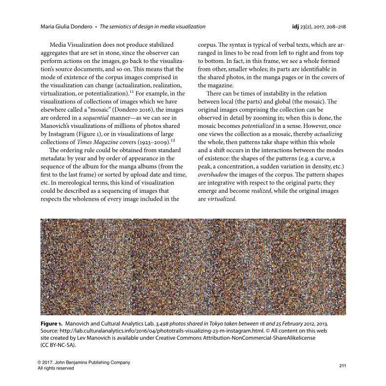
Media Visualization does not produce stabilized aggregates that are set in stone, since the observer can perform actions on the images, go back to the visualiza-tion’s source documents, and so on. This means that the mode of existence of the corpus images comprised in the visualization can change (actualization, realization, virtualization, or potentialization).¹¹ For example, in the visualizations of collections of images which we have elsewhere called a “mosaic” (Dondero 2016), the images are ordered in a sequential manner—as we can see in Manovich’s visualizations of millions of photos shared by Instagram (Figure 1), or in visualizations of large collections of Times Magazine covers (1923–2009).¹²
The ordering rule could be obtained from standard metadata: by year and by order of appearance in the sequence of the album for the manga albums (from the first to the last frame) or sorted by upload date and time, etc. In mereological terms, this kind of visualization could be described as a sequencing of images that respects the wholeness of every image included in the
corpus. The syntax is typical of verbal texts, which are ar-ranged in lines to be read from left to right and from top to bottom. In fact, in this frame, we see a whole formed from other, smaller wholes; its parts are identifiable in the shared photos, in the manga pages or in the covers of the magazine.
There can be times of instability in the relation between local (the parts) and global (the mosaic). The original images comprising the collection can be observed in detail by zooming in; when this is done, the mosaic becomes potentialized in a sense. However, once one views the collection as a mosaic, thereby actualizing the whole, then patterns take shape within this whole and a shift occurs in the interactions between the modes of existence: the shapes of the patterns (e.g. a curve, a peak, a concentration, a sudden variation in density, etc.) overshadow the images of the corpus. The pattern shapes are integrative with respect to the original parts; they emerge and become realized, while the original images are virtualized.
Figure 1. Manovich and Cultural Analytics Lab. 3,498 photos shared in Tokyo taken between 18 and 25 February 2012, 2013. Source: http://lab.culturalanalytics.info/2016/04/phototrails-visualizing-23-m-instagram.html. © All content on this web site created by Lev Manovich is available under Creative Commons Attribution-NonCommercial-ShareAlikelicense (CC BY-NC-SA).
211
Maria Giulia Dondero • The semiotics of design in media visualization idj 23(2), 2017, 208–218
© 2017. John Benjamins Publishing CompanyAll rights reserved
2.2 Observation strategies 1: cumulating and particularizing
The example in Figure 1 shows that mosaic visualizations offer different kinds of observation strategies. This is not just for technological reasons, such as the real possibility of zooming in and out, but it is due to a common perceptual Gestalt of the relation between figure and ground: in the general visualization of the collection, the original images function as a ground for the patterns, which emerge as figures.
What is important in these visualizations is that the viewer can juggle different modes of existence, and also different visual syntaxes, by alternating between different ways of arranging the parts and the whole.
In the mosaic montage, where the sequencing of images respects the wholeness of every image included in the corpus and the syntax is typical of verbal texts, which are arranged in lines to be read from left to right and from top to bottom, a cumulative observation strategy is emphasized.
The cumulative strategy includes the possibility of perusing the different aspects of the image collection bit by bit, so as to arrive at an exhaustive knowledge of the corpus. On the other hand, by zooming in one meets with an observation strategy that we can define as particularizing.¹³ It is somewhat “myopic”, because the observer focuses on one part of the collection which, by necessity, is neither exemplary nor representative of the collection—the collection is ordered by chronological rules. In this kind of visualization the emergence of patterns is all that matters, and this emergence is pos-sible when using unfixed observation settings, shifting between a cumulative strategy (a global point of view) and a particularizing strategy (a local point of view).
These mosaic visualizations, which show us the work of an artist or a designer “from a distance”, offer a very different perspective from that of the artist himself or of
the audience of his time. These mosaic techniques give us the ability to see the complete works of an artist or a designer all at once, making it possible to contextualize all the variations/revolutions that were introduced, whereas the artist’s vision at the time was necessarily limited, and focused on each unique work. As Pierluigi Basso Fossali observes (personal communication), the artist’s attention is always focused on strategies of langage, whereas in statistical visualizations of his complete works, what is presented is an overview of the material/substance of the artist’s work—which reveals a program or progression that the artist may have followed unconsciously. Statistical visualizations can show us tendencies that were not necessarily mastered in advance by the artist, which are visible only from a comprehensive and distant perspective of his entire works. In some ways, his choices are revealed after the fact,¹⁴ when one is confronted with his artwork as a holistic entity that has taken (another) form.
2.3 Observation strategies 2: encompassing and electing
According to Manovich there are other observation strategies at work in two visualizations that he calls
“Style Space Visualizations” (2011) (Figure 2).The two visualizations represent the work Van Gogh
produced during his time in Paris (2a), compared with the work he produced during his time in Arles (2b). Each of them creates a whole which has painting as a structure of possibilities as its relevant field, with Van Gogh’s work occupying a limited area.
The placement of the images in the encompassing visualization was done by mapping a relation between two variables (brightness and saturation dimensions) onto a space encompassing the existence of pictorial activity. This is once again a whole, as in the case of mosaic montage, but this time it is a whole that also depicts a space outside the object of study (the works
212
Maria Giulia Dondero • The semiotics of design in media visualization idj 23(2), 2017, 208–218
© 2017. John Benjamins Publishing CompanyAll rights reserved
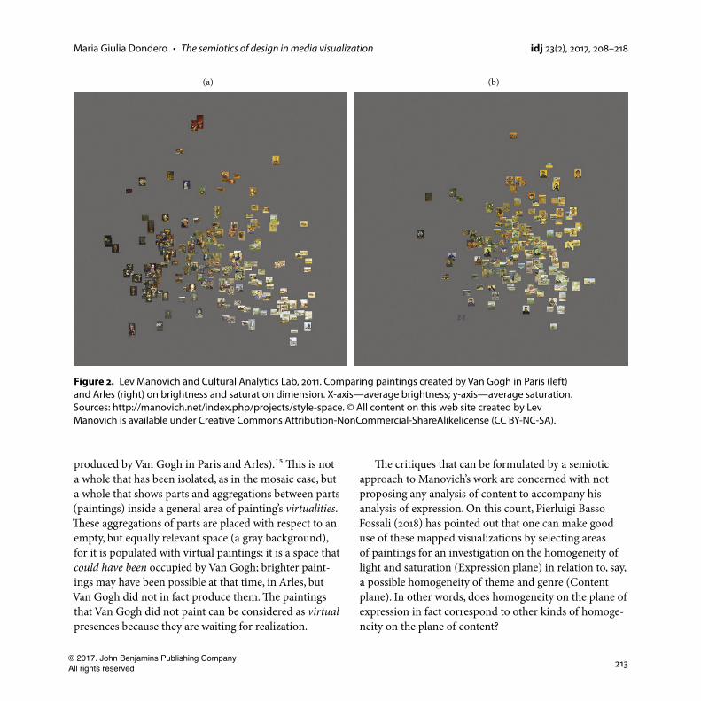
produced by Van Gogh in Paris and Arles).¹⁵ This is not a whole that has been isolated, as in the mosaic case, but a whole that shows parts and aggregations between parts (paintings) inside a general area of painting’s virtualities. These aggregations of parts are placed with respect to an empty, but equally relevant space (a gray background), for it is populated with virtual paintings; it is a space that could have been occupied by Van Gogh; brighter paint-ings may have been possible at that time, in Arles, but Van Gogh did not in fact produce them. The paintings that Van Gogh did not paint can be considered as virtual presences because they are waiting for realization.
The critiques that can be formulated by a semiotic approach to Manovich’s work are concerned with not proposing any analysis of content to accompany his analysis of expression. On this count, Pierluigi Basso Fossali (2018) has pointed out that one can make good use of these mapped visualizations by selecting areas of paintings for an investigation on the homogeneity of light and saturation (Expression plane) in relation to, say, a possible homogeneity of theme and genre (Content plane). In other words, does homogeneity on the plane of expression in fact correspond to other kinds of homoge-neity on the plane of content?
Figure 2. Lev Manovich and Cultural Analytics Lab, 2011. Comparing paintings created by Van Gogh in Paris (left) and Arles (right) on brightness and saturation dimension. X-axis—average brightness; y-axis—average saturation. Sources: http://manovich.net/index.php/projects/style-space. © All content on this web site created by Lev Manovich is available under Creative Commons Attribution-NonCommercial-ShareAlikelicense (CC BY-NC-SA).
213
Maria Giulia Dondero • The semiotics of design in media visualization idj 23(2), 2017, 208–218
© 2017. John Benjamins Publishing CompanyAll rights reserved
As far as the encompassing visualizations are concerned, the information is no more presented as exhaustive and totalizing as in mosaic montage, where the cumulative strategy was alternated/interchanged with the particularizing strategy. This kind of visualization depicts a mapping effort that concerns new observa-tion strategies.
The visualization is not centered on a sequencing of images arranged in lines to be read from left to right and from top to bottom, but in sorting and distribution operations that I called screening operations (Dondero 2016) because they lend unification through selection.¹⁶
From the standpoint of Fontanille’s schematic of observation strategies (2003), this type of visualization,
“Style Space”, is governed by two other visual syntaxes, the encompassing strategy (a global point of view) and the elective strategy (a local point of view).
The encompassing strategy is used to build a coherent whole from the works in the corpus, positioning the works by criteria that are motivated and justified in the context of visual mapping. The placement is said to be “motivated” due to the fact that the images are distributed using descriptors that are solely visual (the brightness and saturation dimensions); using verbal or general descriptors (such as the date) would never have produced a motivated—and thus pertinent—placement of the parts within the whole.
This strategy gives an overview of the corpus by monitoring the relations between the paintings actually produced and the pictorial potentials. It is in alternation with another strategy that we call elective: it is possible to focus on images/parts selected according to their position within the shape created by the distribution operations. Thanks to the encompassing strategy used in assembling the whole, the observer can approach each image with advance information on it, because the distribution operations give each image a place in a network that explicitly directs the focus of the observer
in his exploration. This exploration can also be defined as an approach targeting the selection of one image in particular (exemplary and representative). The system by which the images are arranged within the whole ensures that this opportunity exists, and the whole possesses a power to classify the corpus, a power not demonstrated in the mosaic montage.
The four observation strategies we have identified—i.e. cumulative, encompassing, particularizing, and elective—reveal two basic tendencies: control and monitoring approaches predominate in the two strate-gies used to grasp the cumulative or the encompassing whole, whereas penetrative and integrative approaches come to the fore in the particularizing and elective strategies. These two approaches are revealed as equally operational in Basso Fossali’s screen culture (2018), where he asserts that the screen fulfills two antagonistic
“dreams”: the dream of going into the image, merg-ing with it and incorporating it, and the dream of scrutinizing the world from a detached, omniscient perspective, using an autonomous interface that allows total control, which entails a duplication of the world. In other words, a desire to merge, which conceives the image as a prosthesis, versus a desire to monitor and control, using a visualization that functions as an anonymizing interface:
The screen provides the mechanism that can articulate/incorporate these two traditional dreams, although the viewing syntax supported by it is even broader and more complete. Indeed, in screen culture there is a push to surpass these two mythical imaginary projections in order to explore viewing systems that can alternate or blend completely opposed viewing conditions: a contemplation constrained to at most a frame or a detail, versus unfixed observation in which the sole advantage is the ability to amass insights (Basso Fossali, 2018).
214
Maria Giulia Dondero • The semiotics of design in media visualization idj 23(2), 2017, 208–218
© 2017. John Benjamins Publishing CompanyAll rights reserved
3. Between statistics and esthetics: from visualization to icon
Manovich’s visualizations are to a great extent interactive; they are tools that can be used to test different levels of depth of view and to explore diverse data patterns. Moreover, as stated at the beginning of this paper, each visual corpus is explored using different parameters in what we called a “diagrammatic” approach according to peircian theory. After an exploratory testing of different parameters of analysis (cross-verifications) to give insight into the corpus, Manovich selects for publication the visualizations of the most heuristic parameters—those which confirm or invalidate an existing theory, especially in history of art. While these visualizations are initially the most explicit or the most useful for acquiring new insights about the corpus, once they are separated from all the other visualizations produced from the same corpus, they lose their scientific, experimental value. In fact, the selected visualization hypostasizes a view of the collection that, once isolated, is not really useful for diagrammatic exploration.
Those scientific images worthy of the name are the ones that are “active”, meaning the ones that enable diagrammatic operations to be performed, such as cross-verifications of the parameters. Conversely, a visualization that is presented as the only one to characterize an object will ultimately reify it and make it fit for popular dissemi-nation—or aestheticization.¹⁷ The same thing happens to the images Manovich presents as the only ones that give insight into the corpus; they are no longer participating in a dynamic of exploration/falsification. These visualiza-tions are often worthy of a title (think of ‘The Cloud’),¹⁸ showing that the information has acquired aesthetic value. ‘The Cloud’ is passed around in the media and displayed in museum facilities as an aesthetically relevant image.
Having reduced the characteristics of the millions of manga pages to little black and white dots, ‘The Cloud’
delivers a ‘shape’, which could be described as a portrait of the collection. Rather than plotting and distributing positions, this is a process of watching shapes emerge from manga pages. The shape emerging from the collection could be described as a zone of attraction, concentration, and coagulation of data, and even a zone of stability and iconization (Bordron 2011). The visualization concentrates and stabilizes properties around a region of space; this concentration produces a shape and not just patterns: ‘The Cloud’ is identified as an independent whole as it happens in art domain.
The manga pages belonging to the collection are still visible with a different pixel definition (observable by zooming in), but what is relevant is the information as a whole. The aesthetic value can be justified from a mereological perspective: the comprehensive shape transcends its components, turning the information into an individual entity of its own. From a pragmatic perspective, ‘The Cloud’ goes through a process of isolation/separation, which dislodges it from its status as a visualization to grant it status as an image or icon, having its own value. The individual manga pages and the parameters chosen to study them are no longer pertinent: the shape of data is the only pertinent value.
In Peirce’s model, the success of a proof or dem-onstration goes hand in hand with the perception of a new totality produced by a series of diagrammatic experiments; likewise, beauty can be understood as the locus where the parts come together into an indivisible whole (Thom 2006). Totality is said to be one perceptual equivalent of a successful proof (Chauviré 2008), but it is also an aesthetic achievement (Dondero 2012). The process of popular dissemination involves separa-tion/aestheticization/sacralization, where Manovich’s diagrammatic visualizations are superseded by icons—which are motionless and auratic—and the shapes overshadow the patterns in the manipulated data.
215
Maria Giulia Dondero • The semiotics of design in media visualization idj 23(2), 2017, 208–218
© 2017. John Benjamins Publishing CompanyAll rights reserved
4. Conclusion
As our discussion concludes, the roles played by the two semiotic traditions we cited at the outset can now be un-derstood, and what is more, their complementarity is also evident. The post-structuralist semiotic tradition and the theory of enunciation as reformulated by Fontanille have given us a way to describe the observation strategies af-forded by Manovich’s interactive visualizations, including the mosaic visualizations and the “distributive” visualiza-tions (such as Style Spaces). The observation strategies highlighted the interplay of focusing globally and/or locally on the study collection and its parts (units, areas, zones, and the like). By drawing from Bordron’s theory of mereology we were able to characterize these images as scientific visualizations, based on the experimental interactions between the whole and the parts. Peirce’s theory of the diagram also deals with issues of mereology, in that the diagram is conceived as a kind of visualiza-tion that invites or activates various manipulations meant to test the composition of an object, be it abstract or concrete. The diagram is a device that “responds” to manipulations and indicates the direction of future experimentation. The manipulations stabilize once these
“responses” form a shape, as happens with “The Cloud” and other visualizations where the results of experiments gel into a definitive shape, which is then offered up for other purposes, such as esthetic contemplation.
Submission date: 18 December, 2016Accepted date: 3 May, 2017
Notes
1. Lev Manovich is a new media theorist whose research focuses on database art and culture (Manovich 2001). He is the creator of Sofware Culture (2013). For a general presentation of his
research on analytical visualisation, see Manovich (2015a), and for a presentation of Cultural Analytics in contrast to computer science and digital humanities, see Manovich (2015b).
2. See Manovich & Douglass (2009). On relations between knowledge and visualization, see also Tufte (1990, 1998, 2001). For a general theoretical framework on relationships between Semiotics and Infrographics, see Festi (2018).
3. On the metavisual caracteristic of Manovich’s work, see Dondero (2016).
4. See Bardiot (2015).
5. Theses visualizations are produced with programs such as ImageJ and QT Image Processing, which are meant to function as analytical tools aided by statistical techniques.
6. On diagram as a tool for achieving new knowledge, see Chauviré (2008) and Stjernfelt (2007). On form and diagrammati-cal reasoning, see the reformulation of Peircian Theory in Bordron (2013), in Dondero (2009) and in Dondero & Fontanille (2012) as a process of indicialization, iconization and symbolization.
7. On the visualization of the relationship between realism, post-impressionism and abstraction in paintings and on the dif-ferences between shot lenghts in Russian, French and American in twentieth-century cinema, see Manovich & Douglass (2009).
8. The examples of dimensions that can be measured include contrast, presence of texture and fine details, number of lines and their curvature, number of type of edges, size and positions of shapes, and so on. In the case of color images, it is also possible to measure the colors of all pixels (hue, satura-tion, brightness).
9. On arbitrariness of infographics strategies, see Festi (2018): “arbitrariness distinguishes (Infographics) from other scientific images that are first and foremost motivated by the mode of production of a specific device, causing some traces to be main-tained in the final picture”. The idea that traces are mainteined through different stages of scientific experiments is due to Latour’s theory of scientific work (1999). As Manovich stated in various works, contrary to scientific visualizations, Infographic pages are not really modular: they cannot be decomposed or split into exportable parts, so that they do not nourish any kind of scientific tracing activity.
216
Maria Giulia Dondero • The semiotics of design in media visualization idj 23(2), 2017, 208–218
© 2017. John Benjamins Publishing CompanyAll rights reserved
10. In Manovich's work one does not find the arbitrariness that is typical in Infographics: there is a significant constraint between the corpus and the parameters selected for its analysis.
11. See Fontanille (2003).
12. http://manovich.net/index.php/exhibitions/timeline
13. On cumulative and particularizing strategies, see Fontanille (2003).
14. See Latour (2012) and Rastier (2016) for perspectives on artwork and texts as objects producing the artist’s identity.
15. This example shows the difference between the reference corpus and the study corpus, according to Rastier's distinction (2010). The mosaic montage implied a closed information model, in which the entire set of parts coincides with the space made relevant to the inquiry, whereas this visualization depicts a larger relevant space than that occupied by the corpus under study.
16. The term "screen" used here has nothing to do with the display screen used to post visual information. In this context "screening" means a process of blocking or stopping a flow of information, an operation used to select and redistribute the information in some other way, following specific parameters.
17. On the relation between dissemination and aesteticization, see Dondero & Fontanille (2012).
18. See Manovich, Douglass and Zepel (2011). Other analytical visualizations turned into artistic objects, see the list of Manovich’s exhibitions here: http://manovich.net/content/03-exhibitions/LM_exhibitions_list_01.pdf.
References
Bardiot, C. (2015). Rekall. An environment for notation / annota-tion / denotation. Performance Research, 20(6): 82–86. DOI: 10.1080/13528165.2015.1111058
Basso Fossali, P. (2018). L’image du devenir: le monde en chiffre et la passion du monitorage. Signata Annales des sémiotiques/Annals of Semiotics, 10, in press.
Basso Fossali, P. & Dondero, M.G. (2011). Sémiotique de la photographie. Limoges: Pulim.
Bordron, J.-F. (1991). L’objet en parties (esquisse d’ontologie matérielle). Langages, 103, 51–65. DOI: 10.3406/lgge.1991.1607
Bordron, J.-F. (2010). Rhétorique et économie des images. Protée, 38, 1, 27–40. DOI: 10.7202/039700ar
Bordron, J.-F. (2011). L’iconicité et ses images. Études sémiotiques. Paris: PUF. DOI: 10.3917/puf.bord.2011.01
Bordron, J.-F. (2013). Image et vérité. Essais sur la dimension iconique de la connaissance. Liège: PULg.
Chauviré, C. (2008). L’œil mathématique: essai sur la philosophie mathématique de Peirce. Paris: Vrin.
Dondero, M.G. (2009). The Semiotics of Scientific Image: from production to manipulation. The American Journal of Semiotics, 25, 1–19. DOI: 10.5840/ajs2009253/411
Dondero, M.G. (2012). Diagrammatic experiment in Mathematics and in Works of Art. In Haworth, Hogue & Sbrocchi (eds). Semiotics 2011 The Semiotics of Worldviews. Semiotics Society of America Proceedings. Ottawa: Legas Publishing, 297–307.
Dondero, M.G. (2016). Using Images to Analyze Images. Semiotics meets Cultural Analytics. Proceedings of the Computer Art Congress 5: Archiving and Questioning Immateriality, E. Reyes-García, P. Châtel-Innocenti, K. Zreik (eds), Paris, Europia Production, 91–107.
Dondero, M.G. & Fontanille, Jacques (2012). The Semiotic Challenge of Scientific Images. A Test Case for Visual Meaning. Ottawa: Legas Publishing (2014).
Festi, G. (2018). Infographics between figures and figurative language. A semiotic investigation of data visualization. Signata. Annales des sémiotiques/Annals of Semiotics, 10, in press.
Fontanille, J. (2003). Semiotics of Discourse. New York: Peter Lang.Groupe µ (1992). Traité du signe visuel. Pour un rhétorique de
l’image. Paris: Seuil.Latour, B. (1999). Pandora’s Hope: An Essay on the Reality of Science
Studies, Cambridge Mass: Harvard University Press.Latour, B. (2012). An Inquiry Into Modes of Existence. Cambridge,
Mass.: Harvard University Press.Manovich, L. (2001). The Language of New Media. Cambridge MA:
MIT Press.Manovich, L. (2013). Software Takes Command. New York:
Bloomsbury Academic.Manovich, L. (2011). Style Space: How to compare image sets
and follow their evolution. http://manovich.net/content/04-projects/073-style-space/70_article_2011.pdf.
217
Maria Giulia Dondero • The semiotics of design in media visualization idj 23(2), 2017, 208–218
© 2017. John Benjamins Publishing CompanyAll rights reserved
Manovich, L. (2015a). Data Science and Digital Art History. International Journal for Digital Art History, 1, 13–35.
Manovich, L. (2015b). The Science of Culture? Social Computing, Digital Humanities and Cultural Analytics. The Datafied Society. Studying Culture through Data. Schäfer & van Es (Eds.), AUP, 2017. http://manovich.net/content/04-projects/087-cultural-analytics-social-computing/cultural_analytics_arti-cle_final.pdf.
Manovich, L. & Douglass, J. (2009). Visualizing Temporal Patterns in Visual Media. http://softwarestudies.com/cultural_analyt-ics/visualizing_temporal_patterns.pdf.
Manovich, L., Douglass, J., Zepel, T. (2011). How to Compare One Million Images? In D. Berry (Ed), Understanding Digital Humanities. Palgrave Macmillan. http://softwarestudies.com/cultural_analytics/2011.How_To_Compare_One_Million_Images.pdf.
Peirce, C. S. (1931–1958). Collected Papers of Charles Sanders Peirce (i 1866–1913), Vols. I–VI, ed. C. Hartshorne & P. Weiss, 1931–1935, Vols. VII–VIII, ed. by A. W. Burks, 1958. Cambridge (Mass.): The Belknap Press, Harvard University Press.
Rastier, F. (2010). Sémiotique et linguistique de corpus. Signata Annales des sémiotiques/Annals of Semiotics, 1, 9–34.
Rastier, F. (2016). Créer: Image, Langage, Virtuel. Paris: Casimiro.Stjernfelt, F. (2007). Diagrammatology. An Investigation on the
Borderlines of Phenomenology, Ontology, and Semiotics, series Synthesis Library vol. 336, Springer Netherlands.
Thom, René. (2006). Morfologia del semiotico. Rome: Meltemi.Tufte, E. R. (1990). Envisioning Information, Cheshire (USA, CT):
Graphics Press.Tufte, E. R. (1998). Visual Explanations: Images and Quantities,
Evidence and Narrative, Cheshire (USA, CT): Graphics Press.Tufte, E. R. (2001). The Visual Display of Quantitative Information.
Cheshire (USA, CT): Graphics Press.
About the author
Maria Giulia Dondero is a Senior Research Associate of the National Belgian Fund for Scientific Research (FNRS) and teaches Visual Semiotics at the University of Liège. She is the author of three books: The Semiotic Challenge of Scientific Images. A Test Case for Visual Meaning (with J. Fontanille, 2014); Sémiotique de la photog-raphie (with P. Basso, 2011); Le sacré dans l’image photographique (2009). She has published around 70 peer-reviewed articles in French, Italian, English, Portuguese, Spanish and Polish. She has directed 15 collective works and special issues on photography, scientific images and enunciation theory. She is Co-founder and Director of the peer-reviewed Journal Signata and Co-director of the ‘Sigilla’ collection (PULg).
E-Mail address: [email protected]
218
Maria Giulia Dondero • The semiotics of design in media visualization idj 23(2), 2017, 208–218
© 2017. John Benjamins Publishing CompanyAll rights reserved