aesthetics and inspiration for visualization design...
TRANSCRIPT
models. Practitioners in the arts and design communities are confronting these issues but from different perspectives. Graphic designers have developed guidelines (related to modes of perception) for the use of type, form, and colour to optimize visual communication. Architects have used 3D visualization to aid in the design and conceptualization of space. Interaction designers and media artists are work-ing in the digital domain, experimenting with animation, interactivity, 3D, and data visualization. InfoVis could tap into the ideas and experiments in the arts to help expand the repertoire of visualization strategies. Another challenge in infoVis is the development of ap-propriate and comprehensible modes of abstracting and representing the complexity of information structures. An already explored strategy has been to use metaphors from other areas such as cartography or the natural environment. These metaphors are useful because they are structurally complex but universally familiar; users are familiar with the symbolic relationships between visual or interaction el-ements before they begin using the system. Cartographic style visualizations have been developed (i.e. webmap.com, maps.map.net) because users already know how to read the maps and can translate the spatial metaphor to an informa-tional one. The natural and cultural environment is another excellent source of metaphors for abstracting complexity. It has over millions of years evolved robust ecological sys-tems for the survival and adaptation of its elements. This paper introduces a selection of examples from algo-rithmic art, architecture, computational complexity, and na-ture; the purpose is to provide a pointer to potential sources of aesthetic and conceptual inspiration. The examples explore the aesthetics, representation, or spatialization of complexity.
2. Algorithmic art
An interactive visualization is an interface to a complex data space. Between the data layer and the graphic layer lies software code; the programming of algorithmic behaviours to map data into the visual domain. Increasingly visible
Abstract
Most information visualization research and design is being performed in computer science and engineering labs by technically trained individuals. Within the digital arts and design communities, on the other hand, there is a parallel discourse regarding artistic visualization aesthet-ics and interaction design experimentation. Unfortunately, there has been limited exchange and collaboration between infoVis researchers and artists. This paper provides point-ers to resources which can provide aesthetic and concep-tual inspiration for visualization design in order to bridge the gap in visualization discourse between science, art, technology, and design. The examples given, intended to generate ideas for visualization metaphors and interaction models, are drawn from experiments in algorithmic art, ar-chitecture, artificial life, and the natural environment.
1. Introduction
Information visualization is an emerging scientific field, with journals, textbooks, websites and conferences being initiated within the last few years. The discourse within the infoVis community is mostly centred on research be-ing produced in technically-oriented computer science and engineering labs. Within the digital arts community, on the other hand, there is a parallel discourse regarding visual-ization aesthetics and interaction design experimentation. This artistic community consists largely of individuals with a background in graphic design, typography, architecture, interaction design, and visual or media art. Unfortunately, there has been limited exchange and collaboration between InfoVis scientists and designers or artists. Both scientific and artistic research communities could greatly benefit from bridging the gap and opening a multi-perspectival dis-cursive space for collaboration and exchange. Several key research challenges in information visual-ization might be advanced by looking into strategies from other areas. An example is the improvement of the clarity of visual communication and the coherence of interaction
Aesthetics and Inspiration for Visualization Design:Bridging the Gap between Art and Science
Greg JudelmanInternational School of New Media, Universität zu Lübeck, Germany
Collective Intelligence Lab Fellow, University of Ottawa, [email protected], http://isnm.de/~gjudelma
on the internet, there is a growing community of interdis-ciplinary experimenters, often coming from universities or multimedia design studios, that are discussing visualization and the use of code for its construction. This domain is sometimes referred to as “algorithmic” or “generative” art, other times considered a sub-specialty of interaction design. Practitioners use various program-ming platforms in which to experiment with creative modes of visual interaction. These include Macromedia Flash and Director (www.macromedia.com), in which web-based ap-plications can be accessed by anyone with the free plugin software needed for viewing the content. Many visualiza-tions are programmed in Java and viewable as applets in a web browser. An increasingly popular platform for coding Java applet visualizations is the non-proprietary “Process-ing” (processing.org), a visual sketchbook for digital artists. Other individuals are working with 3D graphics, producing real-time works in VRML or game engine environments (udn.epicgames.com/Main/WebHome) or non-interactive video work using ray tracing software (povray.org). There is a growing group of artists integrating creative visualiza-tion into live performance, using audiovisual processing environments such as Jitter (cycling74.com) or Keyworx (keyworx.org) to produce stunning visuals.
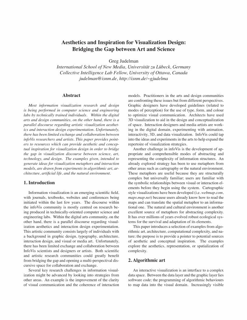
This is an exciting area for artistic experimentation; the possibilities of the technology are just beginning to be ex-plored. An exhibition called “Abstraction Now” was held in Vienna in 2003 to exhibit the “current tendencies of non-representative art under special consideration of audio-visual media and interdisciplinary approaches” (www.ab-straction-now.at). On this website there are links to many prominent algorithmic artists ̓and their work. To provide a pointer and visual reference to individuals working in this area, below at left are screen shots and links to artists ̓work (fig. 1).
3. Architecture
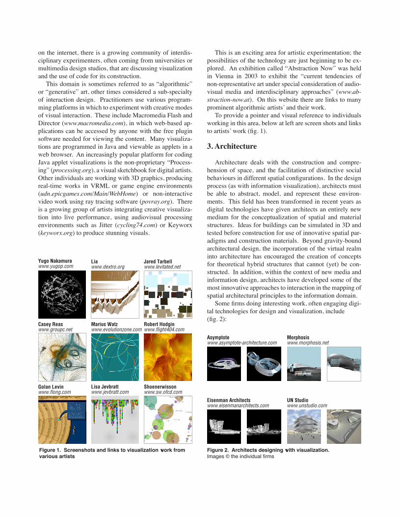
Architecture deals with the construction and compre-hension of space, and the facilitation of distinctive social behaviours in different spatial configurations. In the design process (as with information visualization), architects must be able to abstract, model, and represent these environ-ments. This field has been transformed in recent years as digital technologies have given architects an entirely new medium for the conceptualization of spatial and material structures. Ideas for buildings can be simulated in 3D and tested before construction for use of innovative spatial par-adigms and construction materials. Beyond gravity-bound architectural design, the incorporation of the virtual realm into architecture has encouraged the creation of concepts for theoretical hybrid structures that cannot (yet) be con-structed. In addition, within the context of new media and information design, architects have developed some of the most innovative approaches to interaction in the mapping of spatial architectural principles to the information domain. Some firms doing interesting work, often engaging digi-tal technologies for design and visualization, include(fig. 2):
Casey Reaswww.groupc.net
Marius Watzwww.evolutionzone.com
Robert Hodginwww.flight404.com
Yugo Nakamurawww.yugop.com
Lia www.dextro.org
Jared Tarbellwww.levitated.net
Golan Levinwww.flong.com
Lisa Jevbrattwww.jevbratt.com
Shoenerwissonwww.sw.ofcd.com
Figure 1. Screenshots and links to visualization work from various artists
Asymptotewww.asymptote-architecture.com
Morphosis www.morphosis.net
Eisenman Architects www.eisenmanarchitects.com
UN Studio www.unstudio.com
Figure 2. Architects designing with visualization. Images © the individual firms
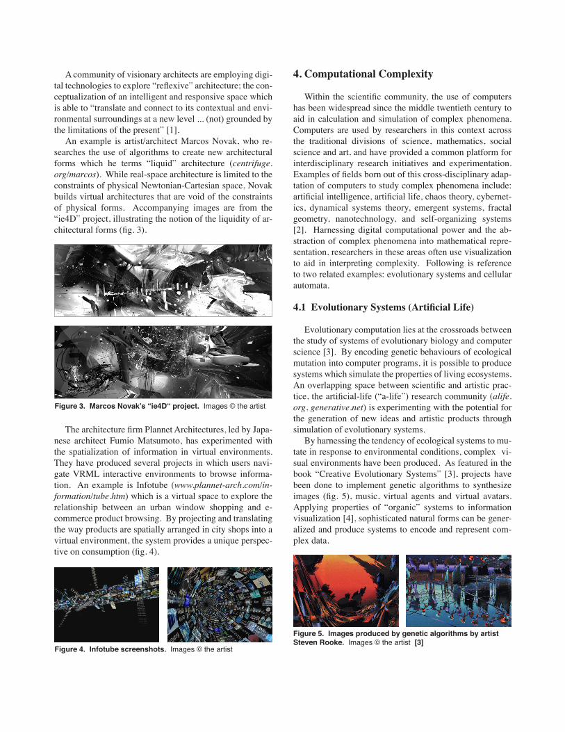
A community of visionary architects are employing digi-tal technologies to explore “reflexive” architecture; the con-ceptualization of an intelligent and responsive space which is able to “translate and connect to its contextual and envi-ronmental surroundings at a new level ... (not) grounded by the limitations of the present” [1]. An example is artist/architect Marcos Novak, who re-searches the use of algorithms to create new architectural forms which he terms “liquid” architecture (centrifuge.org/marcos). While real-space architecture is limited to the constraints of physical Newtonian-Cartesian space, Novak builds virtual architectures that are void of the constraints of physical forms. Accompanying images are from the “ie4D” project, illustrating the notion of the liquidity of ar-chitectural forms (fig. 3).
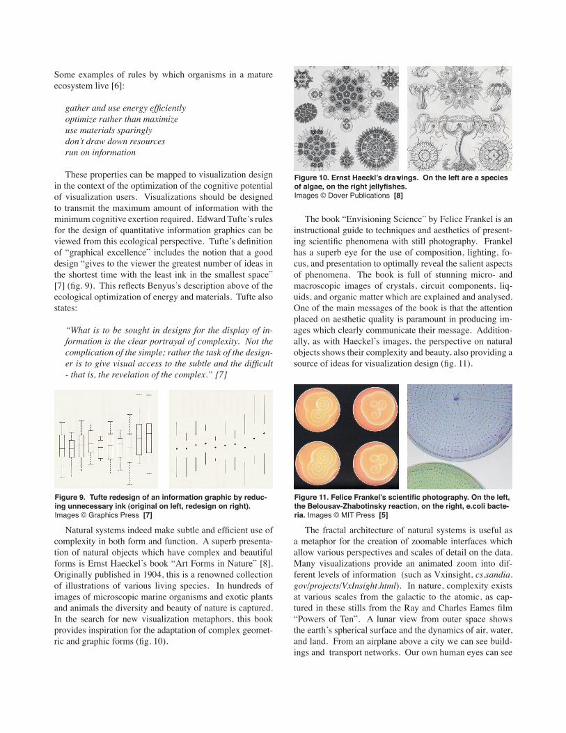
The architecture firm Plannet Architectures, led by Japa-nese architect Fumio Matsumoto, has experimented with the spatialization of information in virtual environments. They have produced several projects in which users navi-gate VRML interactive environments to browse informa-tion. An example is Infotube (www.plannet-arch.com/in-formation/tube.htm) which is a virtual space to explore the relationship between an urban window shopping and e-commerce product browsing. By projecting and translating the way products are spatially arranged in city shops into a virtual environment, the system provides a unique perspec-tive on consumption (fig. 4).
4. Computational Complexity
Within the scientific community, the use of computers has been widespread since the middle twentieth century to aid in calculation and simulation of complex phenomena. Computers are used by researchers in this context across the traditional divisions of science, mathematics, social science and art, and have provided a common platform for interdisciplinary research initiatives and experimentation. Examples of fields born out of this cross-disciplinary adap-tation of computers to study complex phenomena include: artificial intelligence, artificial life, chaos theory, cybernet-ics, dynamical systems theory, emergent systems, fractal geometry, nanotechnology, and self-organizing systems [2]. Harnessing digital computational power and the ab-straction of complex phenomena into mathematical repre-sentation, researchers in these areas often use visualization to aid in interpreting complexity. Following is reference to two related examples: evolutionary systems and cellular automata.
4.1 Evolutionary Systems (Artificial Life)
Evolutionary computation lies at the crossroads between the study of systems of evolutionary biology and computer science [3]. By encoding genetic behaviours of ecological mutation into computer programs, it is possible to produce systems which simulate the properties of living ecosystems. An overlapping space between scientific and artistic prac-tice, the artificial-life (“a-life”) research community (alife.org, generative.net) is experimenting with the potential for the generation of new ideas and artistic products through simulation of evolutionary systems. By harnessing the tendency of ecological systems to mu-tate in response to environmental conditions, complex vi-sual environments have been produced. As featured in the book “Creative Evolutionary Systems” [3], projects have been done to implement genetic algorithms to synthesize images (fig. 5), music, virtual agents and virtual avatars. Applying properties of “organic” systems to information visualization [4], sophisticated natural forms can be gener-alized and produce systems to encode and represent com-plex data.
Figure 3. Marcos Novakʼs “ie4D“ project. Images © the artist
Figure 4. Infotube screenshots. Images © the artist
Figure 5. Images produced by genetic algorithms by artist Steven Rooke. Images © the artist [3]

4.2 Cellular Automata
Stephen Wolfram is a physicist and mathematician, and developer of the Mathematica software. His recent (and ostentatiously titled) book “A New Kind of Science” [2] ex-plains the use of simple computer programs to set a frame-work for the understanding of complexity in nature. An example is the visualization of cellular automata to produce images which highlight regularities in complex systems. Cellular automata have been present in computer science discourse since the research of John von Neumann in the 1950ʼs and popularized with J.H. Conwayʼs Game of Life in 1970 [2]. These are lattices of cells in which each cell has a particular state determined by the state of its neigh-bouring cells. The lattice configuration is given an initial parametrization and a set of rules and the states of the cells are determined step-by-step. These systems are allowed to evolve and are visualized to see patterns within the com-plex lattice. The principles explored by Wolfram and others in us-ing computable systems to gain insight into nature contain strategies for encoding and visualizing complexity, poten-tially useful for the design of information visualizations. The following are images generated by cellular automata programs (fig. 6).
5. Nature
The previous section on computational complexity high-lighted a few examples of artificial systems that can be used for inspiration in visualization design. The most complex, dynamic, and adaptive system, of course, is nature herself, and many ideas can be drawn from the ecological principles and visual characteristics of nature. The natural environ-ment we inhabit has always been a source of inspiration to artists, documented since the earliest prehistoric cave draw-
ings of Chauvet [5]. Natureʼs systems have evolved over billions of years to facilitate ecological survival through highly complex structures, processes, cycles, and flows. Trees, mountains, stars, rivers, flowers, insects, and moons exist in a subtle but complex equilibrium and provide an enormous wealth of inspiration for design (fig. 7).
Nature has adapted through an evolutionary process and learned which designs function and which donʼt, and which systems are sustainable within their ecological context. Inventors, artists, engineers, and designers have always looked to nature for ideas; from the copying of beaver dams in dyke engineering to the mimicking of birdʼs wings to build an airplane. There is a growing movement in contem-porary design and engineering practices for the imitation of biological systems to solve human problems (such as food supply, energy generation, industrial production). In info-Vis, examples of visualizations which use natural elements as a metaphor include: StarryNight and Spiral (rhizome.org/interface), ThemeRiver (www.pnl.gov/infoviz/technologies.html#themeriver), and DataCloud (datacloud2.v2.nl).
Janine Benyusʼs book “Biomimicry” gives many such examples from engineering research, such as the use of the tree leaf structure as inspiration for the design of a solar cell. Benyus lists as a guideline the properties of natural systems which have enabled survival through millions of years and drastic changes in environmental conditions.
Figure 6. Cellular automata based on different rule condi-tions. Images © Wolfram Media Inc. [9]
Figure 7. Nature photography from the series “Earth from Above” by Yann Arthus-Bertrand. Images © the artist
Figure 8. Flowers exhibit natureʼs diversity of design. They also display mathematical growth processes (i.e. seeds in Fibonacci series). Images © Skira Editore [10]
Some examples of rules by which organisms in a mature ecosystem live [6]:
gather and use energy efficientlyoptimize rather than maximizeuse materials sparinglydon t̓ draw down resourcesrun on information
These properties can be mapped to visualization design in the context of the optimization of the cognitive potential of visualization users. Visualizations should be designed to transmit the maximum amount of information with the minimum cognitive exertion required. Edward Tufteʼs rules for the design of quantitative information graphics can be viewed from this ecological perspective. Tufteʼs definition of “graphical excellence” includes the notion that a good design “gives to the viewer the greatest number of ideas in the shortest time with the least ink in the smallest space” [7] (fig. 9). This reflects Benyusʼs description above of the ecological optimization of energy and materials. Tufte also states:
“What is to be sought in designs for the display of in-formation is the clear portrayal of complexity. Not the complication of the simple; rather the task of the design-er is to give visual access to the subtle and the difficult - that is, the revelation of the complex.” [7]
Natural systems indeed make subtle and efficient use of complexity in both form and function. A superb presenta-tion of natural objects which have complex and beautiful forms is Ernst Haeckelʼs book “Art Forms in Nature” [8]. Originally published in 1904, this is a renowned collection of illustrations of various living species. In hundreds of images of microscopic marine organisms and exotic plants and animals the diversity and beauty of nature is captured. In the search for new visualization metaphors, this book provides inspiration for the adaptation of complex geomet-ric and graphic forms (fig. 10).
The book “Envisioning Science” by Felice Frankel is an instructional guide to techniques and aesthetics of present-ing scientific phenomena with still photography. Frankel has a superb eye for the use of composition, lighting, fo-cus, and presentation to optimally reveal the salient aspects of phenomena. The book is full of stunning micro- and macroscopic images of crystals, circuit components, liq-uids, and organic matter which are explained and analysed. One of the main messages of the book is that the attention placed on aesthetic quality is paramount in producing im-ages which clearly communicate their message. Addition-ally, as with Haeckelʼs images, the perspective on natural objects shows their complexity and beauty, also providing a source of ideas for visualization design (fig. 11).
The fractal architecture of natural systems is useful as a metaphor for the creation of zoomable interfaces which allow various perspectives and scales of detail on the data. Many visualizations provide an animated zoom into dif-ferent levels of information (such as Vxinsight, cs.sandia.gov/projects/VxInsight.html). In nature, complexity exists at various scales from the galactic to the atomic, as cap-tured in these stills from the Ray and Charles Eames film “Powers of Ten”. A lunar view from outer space shows the earthʼs spherical surface and the dynamics of air, water, and land. From an airplane above a city we can see build-ings and transport networks. Our own human eyes can see
Figure 9. Tufte redesign of an information graphic by reduc-ing unnecessary ink (original on left, redesign on right). Images © Graphics Press [7]
Figure 10. Ernst Haecklʼs drawings. On the left are a species of algae, on the right jellyfishes. Images © Dover Publications [8]
Figure 11. Felice Frankelʼs scientific photography. On the left, the Belousav-Zhabotinsky reaction, on the right, e.coli bacte-ria. Images © MIT Press [5]
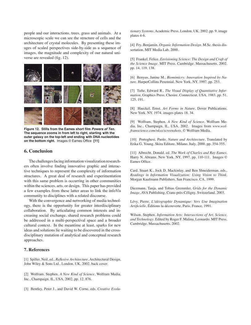
people and our interactions, trees, grass and animals. At a microscopic scale we can see the structure of cells and the architecture of crystal molecules. By presenting these im-ages of scaled perspectives side-by-side as a sequence of images, the magnitude and complexity of our natural uni-verse are revealed (fig. 12).
6. Conclusion
The challenges facing information visualization research-ers often involve finding innovative graphic and interac-tive techniques to represent the complexity of information structures. A great deal of research and experimentation with this same problem is occurring in other communities within the sciences, arts, or design. This paper has provided a few examples from these latter areas to link the infoVis community to disciplines with a related discourse. With the convergence and networking of media technol-ogy, there is the opportunity for greater interdisciplinary collaboration. By articulating common interests and in-creasing social exchange, shared research problems could be addressed in a multi-perspectival space and a broader cultural context. In the meantime at least, sparks for new ideas and solutions lie waiting to be discovered in the cross-disciplinary mutation of analytical and conceptual research approaches.
7. References
[1] Spiller, Neil, ed., Reflexive Architecture, Architectural Design, John Wiley & Sons Ltd., London, UK, 2002, back cover.
[2] Wolfram, Stephen, A New Kind of Science, Wolfram Media, Inc., Champaign, IL, USA, 2002, pp. 12, 876.
[3] Bentley, Peter J., and David W. Corne, eds, Creative Evolu-
tionary Systems, Academic Press, London, UK, 2002, pp. 9, image plates 4-6.
[4] Fry, Benjamin, Organic Information Design. M.Sc. thesis dis-sertation, MIT Media Lab, 2000.
[5] Frankel, Felice, Envisioning Science: The Design and Craft of the Science Image. MIT Press, Cambridge, Massachusetts, 2002, pp. 14, 119, 138.
[6] Benyus, Janine M., Biomimicry: Innovation Inspired by Na-ture. HarperCollins Perennial, New York, NY, 1997, pp. 253.
[7] Tufte, Edward R., The Visual Display of Quantitative Infor-mation, Graphics Press, Chesire, Connecticut, USA, 1983, pp. 51, 125, 191.
[8] Haeckel, Ernst, Art Forms in Nature, Dover Publications, New York, NY, 1974, images plates 18, 34.
[9] Wolfram, Stephen, A New Kind of Science, Wolfram Me-dia, Inc., Champaign, IL, USA, 2002. Images from www.wol-framscience.com/nksx/screenshots, © Wolfram Media.
[10] Portoghesi, Paolo, Nature and Architecture, Translated by Erika G. Young, Skira Editore, Milano, Italy, 2000, pp. 354-355.
[11] Albrecht, Donald, ed, The Work of Charles and Ray Eames, Harry N. Abrams, New York, NY, 1997, pp. 110-111. Images © Eames Office.
Card, Stuart K., Jock D. Mackinlay, and Ben Shneiderman, eds., Readings in Information Visualization: Using Vision to Think, Morgan Kaufmann Publishers, San Francisco, CA, 1999.
Diezmann, Tanja, and Tobias Gremmler, Grids for the Dynamic Image, AVA Publishing, Crans-près-Céligny, Switzerland, 2003.
Lévy, Pierre, Lʼidéographie Dynamique: Vers Une Imagination Artificielle, Éditions la découverte, Paris, France, 1991.
Wilson, Stephen, Information Arts: Intersections of Art, Science, and Technology. Edited by Roger F. Malina, Leonardo. MIT Press, Cambridge, Massachusetts, 2002.
Figure 12. Stills from the Eames short film Powers of Ten. The sequence zooms in from left to right, starting with the outer galaxy on the top-left and ending with DNA nucleotides on the bottom right. Images © Eames Office [11]