introduction to data visualization - boise state...
TRANSCRIPT
Visualization Process
Alark Joshi

Task-specific Visualization Design
• LA Treinish, Task-specific visualization design, IEEE Computer Graphics and Applications, 1999
• Generalized visualization systems are less suitable for environments with specific tasks and user needs
• Prototypes help with defining/refining user needs
• Iterative process of developing novel techniques to converge on meeting user needs
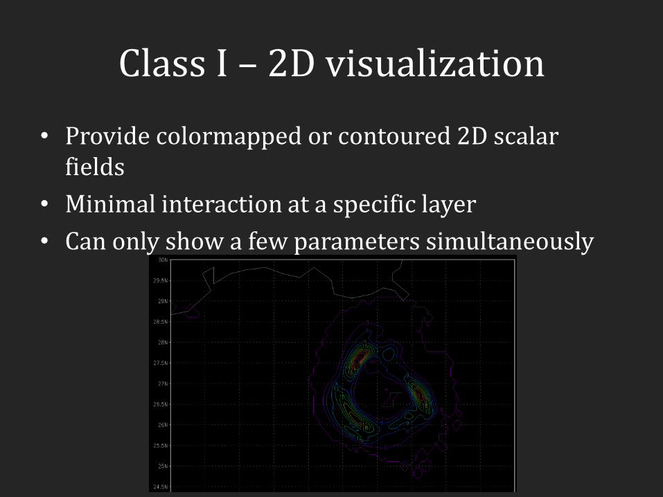
Class I – 2D visualization
• Provide colormapped or contoured 2D scalar fields
• Minimal interaction at a specific layer
• Can only show a few parameters simultaneously

Class II - 2D and 2.5D analysis
Precipitable water as a surface
- Precipitable water as the height - Pseudo-colored by temperature - Arrows indicate wind direction and
speed is encoded in terms of color - Local coastline (black) - State boundaries (white) - River map (blue)

Class III – 3D browsing - Cartographically projected true height of the terrain - Coastline (black) - State boundaries (white) - Blue puddles show regions of heavy
rainfall - Vector arrows show surface wind
velocity color-coded with speed
- Visualization used to predict rainfall for the closing ceremony of the Atlanta Olympics in 1996

Class IV – 3D analysis - Pseudo-colored Precipitation
(Surface variable) - Relative humidity (Upper air
variable) shown as a translucent white surface
- Temperature shown as a vertical slice
- Coastline (black) - State boundaries (white) - Vector arrows encode speed
and direction of wind velocity

Sequence illustrating typical use

Blog comments
• Eddie – “The application of design principles based on user needs to visualization certainly stands to reason… provides a concrete example”
• Danny – “ This paper argues that one size of software does not fit all.”
• Tim – “proposed design process can and should be applied to the development of all visualization tools, whether the user audience is very large or very small.”

Overview of the Process

Demo
• Voreen
• Colorbrewer
• Map of the Market

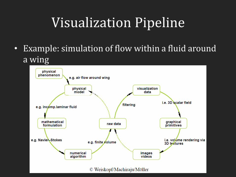
Visualization Pipeline
Simulation
Database
Acquisition (scanners, sensors, …)
Raw Data Filtered
Data Mapping Visualize
Filtering Rendering

Filtering
• Data input -> Data output
• Data format conversion
• Clipping/cropping/denoising
• Slicing
• Resampling
• Interpolation/approximation
• Classification/segmentation

Mapping
• Data input -> Graphical Primitives
• Scalar field -> Surface, Lines
• Vector field -> Vectors/Arrows/Streamlines
• Tensor field -> Tensor glyphs/Ellipsoids
• 3D Field -> volume visualization
• High dimensional data -> Map to 2D/3D
Image credits: SCI Utah, Daniel Weiskopf
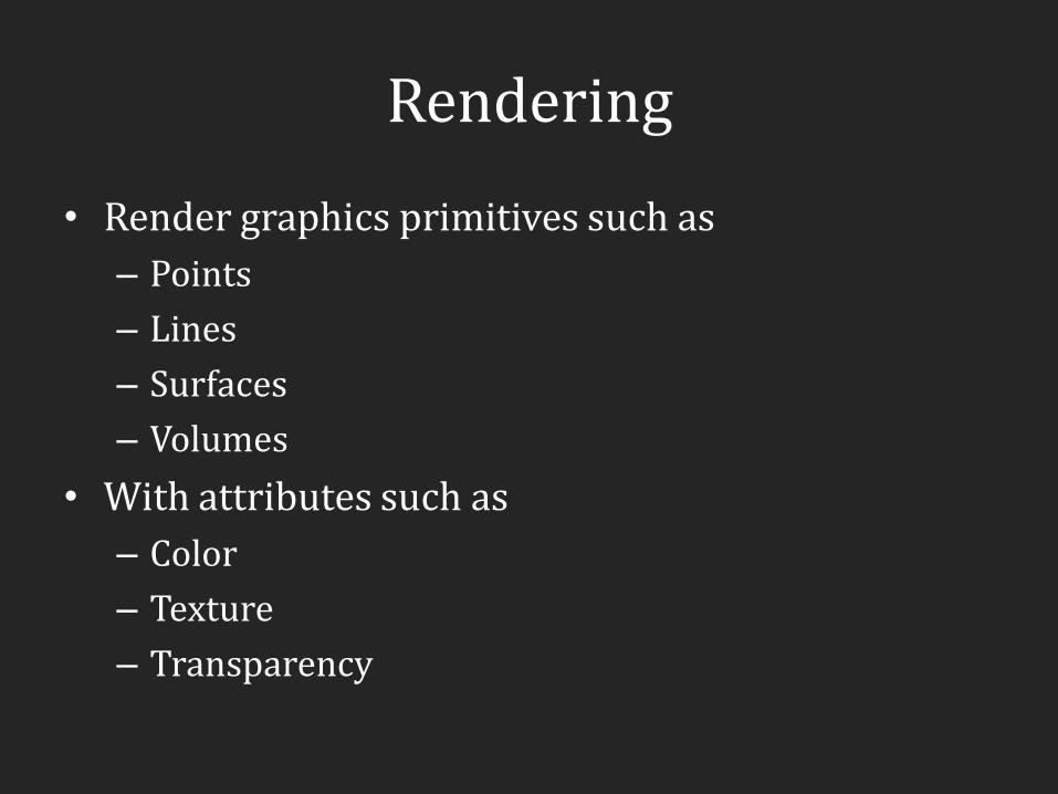
Rendering
• Render graphics primitives such as
– Points
– Lines
– Surfaces
– Volumes
• With attributes such as
– Color
– Texture
– Transparency

Visualization Pipeline
Image credits: Voreen
Visualization Pipeline
• Example: simulation of flow within a fluid around a wing

Cyclical Model
Image credits: van Wijk, Value of Visualization
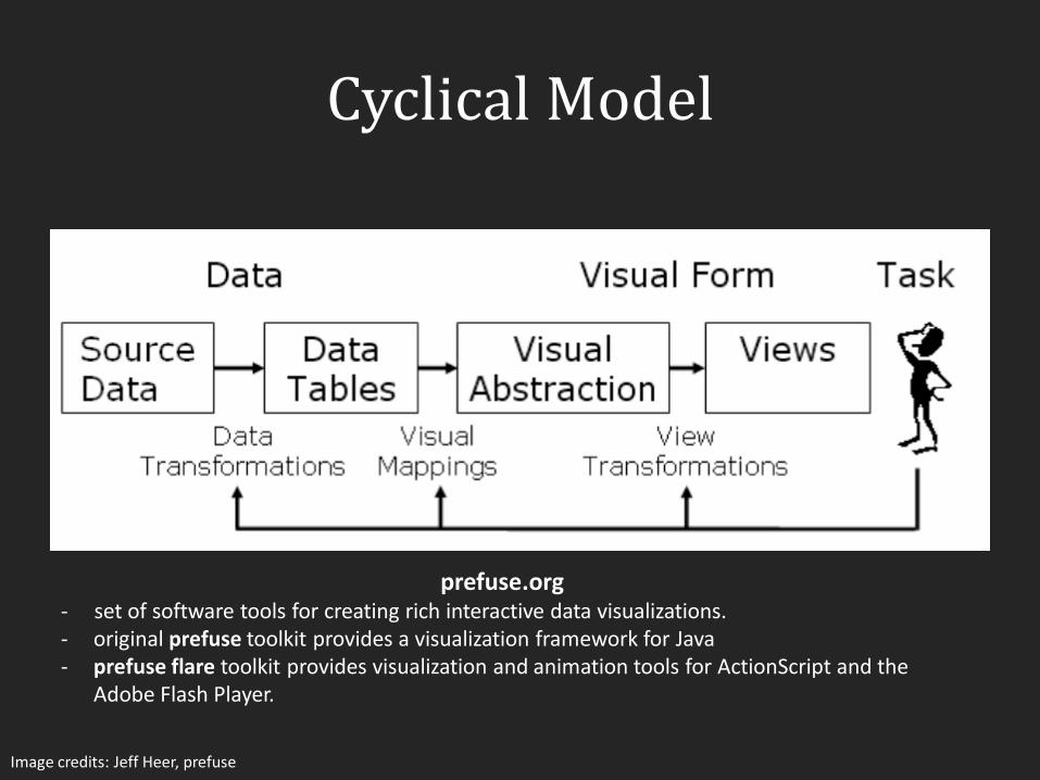
Cyclical Model
Image credits: Jeff Heer, prefuse
prefuse.org - set of software tools for creating rich interactive data visualizations. - original prefuse toolkit provides a visualization framework for Java - prefuse flare toolkit provides visualization and animation tools for ActionScript and the
Adobe Flash Player.

Cyclical Model

Scenarios
• Video/Movie mode
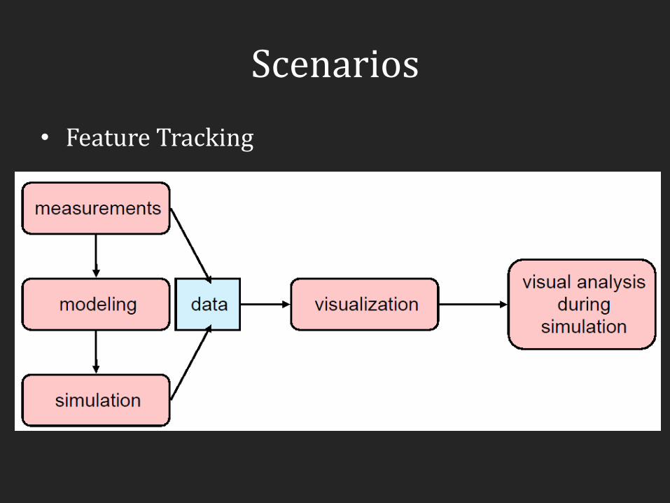
Scenarios
• Feature Tracking

Scenarios
• Interactive post processing/visualization

Scenarios
• Interactive computational steering
Value of Visualization
• Jarke J. van Wijk, "The Value of Visualization," IEEE Visualization, 2005.
• How to assess the value of visualization?
• We all agree that a visualization should be “effective” and “efficient”
• Van Wijk provides an economic model of visualization where he discusses the value in terms of associated costs and gains

Economic Model of Visualization
Image credits: van Wijk, Value of Visualization
D – Data V – Visualization S - Specification
P – Perception/Cognition of the user (mental model) K – Knowledge E – Exploration through interaction

Discussion
• Technology – Innovation
• Art – Does it merely serve as art? Should we be learning from the field of art?
• Science – Is there a Science of Visualization?

Blog comments
• Josh – “Negative Knowledge … occurs when a visualization misleads a user to gaining false or "negative" knowledge”
• Bill – “If Visualization is considered Tech should the bulk of the funding be going to applications that have the promise of becoming mainstream technology? Shouldn’t we be starting more companies?”
Blog comments
• Peter – “… does not present a consistent set of ideas that lead to a conclusion or conclusions. … raises many interesting questions regarding the value of visualization. … personally have a hard time believing that it can be effectively assessed.”
• Archana – “Too much interaction will make the visualization more subjective and customization can be misleading.”
• Danny liked the comment in the paper – “the purpose of vis is funding, not insight”