the non-designer's design book -...
TRANSCRIPT

ROBIN WILLIAMSDESIGN AND TYPOGRAPHIC PRINCIPLES FOR THE VISUAL NOVICE
THE AWARD-WINNING, BEST-SELLING BOOK ABOUT DESIGN!
THIS ESSENTIAL GUIDE TO DESIGN WILL TEACH YOU
Peachpit Presswww.peachpit.com
facebook.com/PeachpitCreativeLearning
@peachpit
◆The four principles of design that underlie every design project◆ How to design with color◆ How to design with type◆ How to combine typefaces for maximum effect◆ How to see and think like a professional designer◆ Specific tips on designing newsletters, brochures, flyers, and other projects
ISBN-13:ISBN-10:
978-0-13-396615-20-13-396615-1
9 7 8 0 1 3 3 9 6 6 1 5 2
5 3 4 9 9
US $34.99 Canada $39.99
For nearly 20 years, designers and non-designers alike have been introduced to the fundamental principles of great design by author Robin Williams. Through her straightforward and light-hearted style, Robin has taught hundreds of thousands of people how to make their designs look professional using four surprisingly simple principles. Now in its fourth edition, The Non-Designer’s Design Book offers even more practical design advice, including a new chapter on the fundamentals of typography, more quizzes and exercises to train your Designer Eye, updated projects for you to try, and new visual and typographic examples to inspire your creativity.
Whether you’re a Mac user or a Windows user, a type novice, or an aspiring graphic designer, you will find the instruction and inspiration to approach any design project with confidence.
ROBIN WILLIAMS is the author of dozens of best-selling and award-winning books, including The Non-Designer’s Presentation Book, The Non-Designer’s InDesign Book, and Robin Williams Design
Workshop. Through her writing, teaching, and seminars, Robin has educated and influenced an entire generation of computer users in the areas of design, typography, desktop publishing, the Mac, and the web.
THE NON-DESIGNER’S
DESIGN
BOOKF O U R T H E D I T I O N
Level: Beginning / Intermediate Category: Graphic DesignCover Design: John Tollett
THE N
ON
-DESIG
NER’S D
ESIGN
BOO
K FO
URTH
EDITIO
NW
ILLIAMS
ROBIN WILLIAMS
DESIGN AND TYPOGRAPHIC PRINCIPLESFOR THE VISUAL NOVICE
THE AWARD-WINNING, BEST-SELLING BOOK ABOUT DESIGN!
THE NON-DESIGNER’S
DESIGN
BOOKF O U R T H E D I T I O N
LEARN THE BASICS OF DESIGN AND TYPE FROM THE AUTHOR OF THE NON-DESIGNER’S BOOK SERIES (OVER 800,000 COPIES IN PRINT)

THE NON-DESIGNER’S
DESIGNBOOK
fourth edition
J
design
and
typographic
principles
for the
visual
novice
Robin WilliamsPeachpit Press San Francisco
California

©2015 by Robin Williams
First edition published 1993.
Peachpit Presswww.peachpit.comPeachpit is a division of Pearson Education.To report errors, please send a note to [email protected].
Editor: Nikki McDonaldInterior design and production: Robin WilliamsCover design and production: John Tollett
Proofreader: Jan SeymourPrepress: David Van Ness
the non-designer’s design Book fourth edition robin williams
<
The quote by Jan White on page 209 is from the out-of-print book How to Spec Type, by Alex White. Reprinted courtesy of Roundtable Press, Inc. Copyright 1987 by Roundtable Press, Inc.
The portions of “Ladle Rat Rotten Hut” and other stories, such as “Guilty Looks Enter Tree Beers,” “Center Alley,” and “Violate Huskings” are from a long out-of-print book by Howard L. Chace called Anguish Languish. It is our understanding that these delightful stories are now in the public domain. They are easily found on the Internet.
Notice of RightsAll rights reserved. No part of this book may be reproduced or transmitted in any form or by any means, electronic, mechanical, photocopying, recording, or otherwise, without the prior written permission of the publisher.
For information on obtaining permission for reprints and excerpts, please contact [email protected].
Notice of LiabilityThe information in this book is distributed on an “as is” basis, without warranty. While every precaution has been taken in the preparation of this book, neither the author nor Peachpit shall have any liability to any person or entity with respect to any loss or damage caused or alleged to be caused directly or indirectly by the instructions contained in this book or by the computer software and hardware products described herein.
TrademarksMany of the designations used by manufacturers and sellers to distinguish their products are claimed as trademarks. Where those designations appear in this book, and Peachpit was aware of a trademark claim, the designations appear as requested by the owner of the trademark. All other product names and services identified throughout this book are used in editorial fashion only and for the benefit of such companies with no intention of infringement of the trademark. No such use, or the use of any trade name, is intended to convey endorsement or other affiliation with this book.
isbn 13: 978-0-13-396615-2isbn 10: 0-13-396615-1
10 9 8 7 6 5 4 3 2 1
Printed and bound in the United States of America

To Carmen Sheldon,my comrade in Design,
my friend in Life.with great love,
R.

More matter is being printed and published
today than ever before, and every publisher
of an advertisement, pamphlet, or book
expects his material to be read. Publishers
and, even more so, readers want what is
important to be clearly laid out. They will
not read anything that is troublesome to
read, but are pleased with what looks clear
and well arranged, for it will make their task
of understanding easier. For this reason,
the important part must stand out and
the unimportant must be subdued . . . .
The technique of modern typography must
also adapt itself to the speed of our times.
Today, we cannot spend as much time on
a letter heading or other piece of jobbing
as was possible even in the nineties.
Jan Tschichold 1935
typefaces Modernica Light and Black

CONTENTS
12
3
4
5
Is this book for you? . . . . . . . . . . . . . . . . . . . . . . . . . . . . . . . .10
Introduction 11The Joshua tree epiphany . . . . . . . . . . . . . . . . . . . . . . . . . . . 11The four basic principles . . . . . . . . . . . . . . . . . . . . . . . . . . . . 13
Proximity 15Summary of proximity . . . . . . . . . . . . . . . . . . . . . . . . . . . . . . 32
The basic purpose . . . . . . . . . . . . . . . . . . . . . . . . . . . 32How to get it . . . . . . . . . . . . . . . . . . . . . . . . . . . . . . . 32What to avoid . . . . . . . . . . . . . . . . . . . . . . . . . . . . . . 32
Alignment 33Summary of alignment . . . . . . . . . . . . . . . . . . . . . . . . . . . . . 54
The basic purpose . . . . . . . . . . . . . . . . . . . . . . . . . . . 54How to get it . . . . . . . . . . . . . . . . . . . . . . . . . . . . . . . 54What to avoid . . . . . . . . . . . . . . . . . . . . . . . . . . . . . . 54
Repetition 55Summary of repetition . . . . . . . . . . . . . . . . . . . . . . . . . . . . . 68
The basic purpose . . . . . . . . . . . . . . . . . . . . . . . . . . . 68How to get it . . . . . . . . . . . . . . . . . . . . . . . . . . . . . . . 68What to avoid . . . . . . . . . . . . . . . . . . . . . . . . . . . . . . 68
Contrast 69Summary of contrast . . . . . . . . . . . . . . . . . . . . . . . . . . . . . . 84
The basic purpose . . . . . . . . . . . . . . . . . . . . . . . . . . . 84How to get it . . . . . . . . . . . . . . . . . . . . . . . . . . . . . . . 84What to avoid . . . . . . . . . . . . . . . . . . . . . . . . . . . . . . 84
Design Principles

6
co n t e n t s
6
7
8
Review of the Four Design Principles 85Proximity . . . . . . . . . . . . . . . . . . . . . . . . . . . . . . . . . . . . . . . 86Alignment . . . . . . . . . . . . . . . . . . . . . . . . . . . . . . . . . . . . . . 87Repetition . . . . . . . . . . . . . . . . . . . . . . . . . . . . . . . . . . . . . . 88Contrast . . . . . . . . . . . . . . . . . . . . . . . . . . . . . . . . . . . . . . . 89
Little Quiz #1: Design principles . . . . . . . . . . . . . . . . . . . . . 90Little Quiz #2: Redesign this ad . . . . . . . . . . . . . . . . . . . . . 91
Summary . . . . . . . . . . . . . . . . . . . . . . . . . . . . . . . . . . . . . . . 94
Design with Color 95The amazing color wheel . . . . . . . . . . . . . . . . . . . . . . . . . . . 96Color relationships . . . . . . . . . . . . . . . . . . . . . . . . . . . . . . . . 97
Complementary. . . . . . . . . . . . . . . . . . . . . . . . . . . . . 98Triads . . . . . . . . . . . . . . . . . . . . . . . . . . . . . . . . . . . . 99Split complement triads . . . . . . . . . . . . . . . . . . . . . . . 100Analogous colors . . . . . . . . . . . . . . . . . . . . . . . . . . . . 101
Shades and tints . . . . . . . . . . . . . . . . . . . . . . . . . . . . . . . . . 102Make your own shades and tints . . . . . . . . . . . . . . . . . 103Monochromatic colors . . . . . . . . . . . . . . . . . . . . . . . . 104Shades and tints in combination . . . . . . . . . . . . . . . . . 105
Watch the tones . . . . . . . . . . . . . . . . . . . . . . . . . . . . . . . . . 106Warm colors vs. cool colors . . . . . . . . . . . . . . . . . . . . . . . . . . 107How to begin to choose? . . . . . . . . . . . . . . . . . . . . . . . . . . . 108cmyk vs. rgb: print vs. web . . . . . . . . . . . . . . . . . . . . . . . . . 110Print vs. web color models . . . . . . . . . . . . . . . . . . . . . . . . . . 112
Little Quiz #3: Color . . . . . . . . . . . . . . . . . . . . . . . . . . . . 112
Extra Tips & Tricks 113Creating a package or brand . . . . . . . . . . . . . . . . . . . . . . . . . 114Business cards. . . . . . . . . . . . . . . . . . . . . . . . . . . . . . . . . . . 117
Tips on designing business cards . . . . . . . . . . . . . . . . . . . . 120Format . . . . . . . . . . . . . . . . . . . . . . . . . . . . . . . . . . . 120Type size . . . . . . . . . . . . . . . . . . . . . . . . . . . . . . . . . 120Create a consistent image on all pieces . . . . . . . . . . . . 120
Letterhead and envelopes . . . . . . . . . . . . . . . . . . . . . . . . . . . 121Tips on letterhead and envelope design . . . . . . . . . . . . . . . 124
Envelope size . . . . . . . . . . . . . . . . . . . . . . . . . . . . . . 124Create a focal point . . . . . . . . . . . . . . . . . . . . . . . . . 124Alignment . . . . . . . . . . . . . . . . . . . . . . . . . . . . . . . . . 124Second page . . . . . . . . . . . . . . . . . . . . . . . . . . . . . . . 124Faxing and copying . . . . . . . . . . . . . . . . . . . . . . . . . . 124

7
co n t e n t s
Flyers . . . . . . . . . . . . . . . . . . . . . . . . . . . . . . . . . . . . . . . . . 125Tips on designing flyers . . . . . . . . . . . . . . . . . . . . . . . . . . 128
Create a focal point . . . . . . . . . . . . . . . . . . . . . . . . . . 128Use subheads that contrast . . . . . . . . . . . . . . . . . . . . 128Repetition . . . . . . . . . . . . . . . . . . . . . . . . . . . . . . . . 128Alignment . . . . . . . . . . . . . . . . . . . . . . . . . . . . . . . . 128
Newsletters . . . . . . . . . . . . . . . . . . . . . . . . . . . . . . . . . . . . . 129Tips on designing newsletters . . . . . . . . . . . . . . . . . . . . . . 132
Alignment . . . . . . . . . . . . . . . . . . . . . . . . . . . . . . . . 132Paragraph indents . . . . . . . . . . . . . . . . . . . . . . . . . . . 132Not Helvetica/Arial! . . . . . . . . . . . . . . . . . . . . . . . . . . 132Readable body copy . . . . . . . . . . . . . . . . . . . . . . . . . . 132
Brochures . . . . . . . . . . . . . . . . . . . . . . . . . . . . . . . . . . . . . . 133Tips on designing brochures . . . . . . . . . . . . . . . . . . . . . . . 136
Contrast . . . . . . . . . . . . . . . . . . . . . . . . . . . . . . . . . 136Repetition . . . . . . . . . . . . . . . . . . . . . . . . . . . . . . . . 136Alignment . . . . . . . . . . . . . . . . . . . . . . . . . . . . . . . . 136Proximity . . . . . . . . . . . . . . . . . . . . . . . . . . . . . . . . . 136
Postcards . . . . . . . . . . . . . . . . . . . . . . . . . . . . . . . . . . . . . . 137Tips on designing postcards . . . . . . . . . . . . . . . . . . . . . . . 140
What’s your point? . . . . . . . . . . . . . . . . . . . . . . . . . . 140Grab their attention . . . . . . . . . . . . . . . . . . . . . . . . . . 140Contrast . . . . . . . . . . . . . . . . . . . . . . . . . . . . . . . . . 140In general . . . . . . . . . . . . . . . . . . . . . . . . . . . . . . . . . 140
Advertising . . . . . . . . . . . . . . . . . . . . . . . . . . . . . . . . . . . . . 141Tips on designing ads . . . . . . . . . . . . . . . . . . . . . . . . . . . . 144
Contrast . . . . . . . . . . . . . . . . . . . . . . . . . . . . . . . . . 144Type choices . . . . . . . . . . . . . . . . . . . . . . . . . . . . . . . 144Reverse type . . . . . . . . . . . . . . . . . . . . . . . . . . . . . . . 144
Résumés . . . . . . . . . . . . . . . . . . . . . . . . . . . . . . . . . . . . . . . 145Tips on designing résumés . . . . . . . . . . . . . . . . . . . . . . . . 148
Contrast . . . . . . . . . . . . . . . . . . . . . . . . . . . . . . . . . 148Repetition . . . . . . . . . . . . . . . . . . . . . . . . . . . . . . . . 148Alignment . . . . . . . . . . . . . . . . . . . . . . . . . . . . . . . . 148Match the design to the medium . . . . . . . . . . . . . . . . . 148

8
co n t e n t s
The Essentials of Typography 151One space after punctuation . . . . . . . . . . . . . . . . . . . . . . . . 152Quotation marks . . . . . . . . . . . . . . . . . . . . . . . . . . . . . . . . . 153Apostrophes . . . . . . . . . . . . . . . . . . . . . . . . . . . . . . . . . . . . 153
Little Quiz #4: Apostrophes . . . . . . . . . . . . . . . . . . . . . . . 155Dashes . . . . . . . . . . . . . . . . . . . . . . . . . . . . . . . . . . . . . . . . 156Special characters . . . . . . . . . . . . . . . . . . . . . . . . . . . . . . . . 158Accent marks . . . . . . . . . . . . . . . . . . . . . . . . . . . . . . . . . . . . 160Capitals . . . . . . . . . . . . . . . . . . . . . . . . . . . . . . . . . . . . . . . . 161Underlining . . . . . . . . . . . . . . . . . . . . . . . . . . . . . . . . . . . . . 162Kerning . . . . . . . . . . . . . . . . . . . . . . . . . . . . . . . . . . . . . . . . 163Widows and orphans . . . . . . . . . . . . . . . . . . . . . . . . . . . . . . 164Miscellaneous . . . . . . . . . . . . . . . . . . . . . . . . . . . . . . . . . . . 165
Type (& Life) 167Concord . . . . . . . . . . . . . . . . . . . . . . . . . . . . . . . . . . . . . . . 168Conflict . . . . . . . . . . . . . . . . . . . . . . . . . . . . . . . . . . . . . . . . 170Contrast . . . . . . . . . . . . . . . . . . . . . . . . . . . . . . . . . . . . . . . 172Summary . . . . . . . . . . . . . . . . . . . . . . . . . . . . . . . . . . . . . . . 174
Categories of Type 175Oldstyle . . . . . . . . . . . . . . . . . . . . . . . . . . . . . . . . . . . . . . . . 176Modern . . . . . . . . . . . . . . . . . . . . . . . . . . . . . . . . . . . . . . . . 177Slab serif . . . . . . . . . . . . . . . . . . . . . . . . . . . . . . . . . . . . . . . 178Sans serif . . . . . . . . . . . . . . . . . . . . . . . . . . . . . . . . . . . . . . 179Script . . . . . . . . . . . . . . . . . . . . . . . . . . . . . . . . . . . . . . . . . 181Decorative . . . . . . . . . . . . . . . . . . . . . . . . . . . . . . . . . . . . . . 182Be conscious . . . . . . . . . . . . . . . . . . . . . . . . . . . . . . . . . . . . 183
Little Quiz #5: Categories of type . . . . . . . . . . . . . . . . . . . . . 183Little Quiz #6: Thick/thin transitions . . . . . . . . . . . . . . . . . 184Little Quiz #7: Serifs . . . . . . . . . . . . . . . . . . . . . . . . . . . . . 185
Summary . . . . . . . . . . . . . . . . . . . . . . . . . . . . . . . . . . . . . . . 186
11
10
9Designing with Type

9
co n t e n t s
A Few Extras
151 4
Type Contrasts 187Size . . . . . . . . . . . . . . . . . . . . . . . . . . . . . . . . . . . . . . . . . . 188Weight . . . . . . . . . . . . . . . . . . . . . . . . . . . . . . . . . . . . . . . . 192Structure . . . . . . . . . . . . . . . . . . . . . . . . . . . . . . . . . . . . . . 196Form . . . . . . . . . . . . . . . . . . . . . . . . . . . . . . . . . . . . . . . . . . 200Direction . . . . . . . . . . . . . . . . . . . . . . . . . . . . . . . . . . . . . . . 204Color . . . . . . . . . . . . . . . . . . . . . . . . . . . . . . . . . . . . . . . . . 208Combine the contrasts . . . . . . . . . . . . . . . . . . . . . . . . . . . . . 214Summary . . . . . . . . . . . . . . . . . . . . . . . . . . . . . . . . . . . . . . . 215
Little Quiz #8: Contrast or conflict . . . . . . . . . . . . . . . . . . . 216Little Quiz #9: Dos and don’ts . . . . . . . . . . . . . . . . . . . . . . 217
An exercise in combining contrasts . . . . . . . . . . . . . . . . . . . . 218
Does it Make Sense? 219The process . . . . . . . . . . . . . . . . . . . . . . . . . . . . . . . . . . . . . 220An exercise . . . . . . . . . . . . . . . . . . . . . . . . . . . . . . . . . . . . . 221Okay—redesign this! . . . . . . . . . . . . . . . . . . . . . . . . . . . . . . 222
Answers & Suggestions 223Quiz answers . . . . . . . . . . . . . . . . . . . . . . . . . . . . . . . . . . . 223Designer Eye suggestions . . . . . . . . . . . . . . . . . . . . . . . . . . 225
Typefaces in this Book 229Primary faces . . . . . . . . . . . . . . . . . . . . . . . . . . . . . . . . . . . . 229Modern . . . . . . . . . . . . . . . . . . . . . . . . . . . . . . . . . . . . . . . . 229Oldstyle . . . . . . . . . . . . . . . . . . . . . . . . . . . . . . . . . . . . . . . 230Slab serif . . . . . . . . . . . . . . . . . . . . . . . . . . . . . . . . . . . . . . . 230Sans serif . . . . . . . . . . . . . . . . . . . . . . . . . . . . . . . . . . . . . . 231Script . . . . . . . . . . . . . . . . . . . . . . . . . . . . . . . . . . . . . . . . . 232Ornaments . . . . . . . . . . . . . . . . . . . . . . . . . . . . . . . . . . . . . 232Decorative . . . . . . . . . . . . . . . . . . . . . . . . . . . . . . . . . . . . . . 233
Back matter 234Mini-glossary. . . . . . . . . . . . . . . . . . . . . . . . . . . . . . . . . . . . 234Resources . . . . . . . . . . . . . . . . . . . . . . . . . . . . . . . . . . . . . . 234OpenType . . . . . . . . . . . . . . . . . . . . . . . . . . . . . . . . . . . . . . 235
13
12

10
t h e n o n-d e s i g n e r’s d e s i g n b o o k
Is this book for you?This book is written for all the people who need to design things, but have no background or formal training in design. I don’t mean just those who are designing fancy packaging or lengthy brochures—I mean the assistants whose bosses now tell them to design the newsletters, church volunteers who are providing information to their congregations, small business owners who are creating their own advertising, students who understand that a better-looking paper often means a better grade, professionals who realize that an attractive presentation garners greater respect, teachers who have learned that students respond more positively to information that is well laid out, statisticians who see that numbers and stats can be arranged in a way that invites reading rather than snoring, and on and on.
This book assumes you don’t have the time or interest to study design and typography, but would like to know how to make your pages look better. Well, the premise of this book is age-old: Knowledge is power. Most people can look at a poorly designed page and state that they don’t like it, but they don’t know what to do to fix it. In this book I will point out four basic concepts that are used in virtually every well-designed job. These concepts are clear and concrete. Once you recognize the concepts, you will notice whether or not they have been applied to your pages. If you don’t know what’s wrong with it, how can you fix it? Once you can name the problem, you can find the solution.
This book is not intended to take the place of four years of design school. I do not pretend you will automatically become a brilliant designer after you read this little book. But I do guarantee you will never again look at a page in the same way. I guarantee that if you follow these basic principles, your work will look more professional, organized, unified, and interesting. And you will feel empowered.
With a smile,

55
Repetition The Principle of Repetition states: Repeat some aspect of the design throughout the entire piece. The repetitive element may be a bold font, a thick rule (line), a certain bullet, design element, color, format, spatial relationships, etc. It can be anything that a reader will visually recognize.
You already use repetition in your work. When you make headlines all the same size and weight, or add a rule a half-inch from the bottom of each page, or use the same bullet in each list throughout the project, you are creating repetition. What new designers often need to do is push this idea further—turn that inconspicuous repetition into a visual key that ties the publication together.
Repetition can be thought of as consistency. As you look through a sixteen-page brochure, it is the repetition of certain elements, their consistency, that makes each of those sixteen pages appear to belong to the same brochure. If page 13 has no repetitive elements carried over from page 4, the brochure loses its cohesive look and feel.
But repetition goes beyond just being naturally consistent—it is a conscious effort to unify all parts of a design.
It often happens in Life that we need repetitive elements to clarify and unify. A certain number of the guys above are on the same team, but we can’t tell.
The repetition of their clothes makes it immediately clear that these guys are some kind of organized entity. We do this sort of thing all the time.
chapter 4

t h e n o n-d e s i g n e r’s d e s i g n b o o k
56
Here is the same business card we worked with earlier. In the second example below, I have added a repetitive element: a repetition of the strong, bold typeface. Take a look at it, and notice where your eye moves. When you get to the phone number, where do you look next? Do you find that you go back to the other bold type? Designers have always used visual tricks like this to control a reader’s eye, to keep your attention on the page as long as possible. The bold repetition also helps unify the entire design. This is a very easy way to tie pieces of a design package together.
Now when you get to the end of the information, where does your eye go? Do you find that it bounces back and forth between the bold type elements? It probably does, and that’s the point of repetition—it ties a piece together; it provides unity.
When you get to the end of the information, does your eye just wander off the card?
typefaces Mikado Bold and Regular
Sock and BuskinAmbrosia Sidney
109 Friday StreetPenshurst, NM
505.555.1212
Sock and BuskinAmbrosia Sidney
109 Friday StreetPenshurst, NM
505.555.1212

57
4 : r e p e t i t i o n
Take advantage of those elements you’re already using to make a project consistent and turn those elements into repetitive graphic symbols. Are all the headlines in your newsletter 14-point Times Bold? How about investing in a very bold sans serif font and making all your heads something like 16-point Mikado Ultra? You’re taking the repetition you have already built into the project and pushing it so it is stronger and more dynamic. Not only is your page more visually interesting, but you also increase the visual organization and the consistency by making it more obvious.
THE ELIZABETHAN HUMOURSIn ancient and medieval physiology and medicine, the humours are the four fluids of the body (blood, phlegm, choler, and black bile) believed to determine, by their relative proportions and conditions, the state of health and the tempera-ment of a person or animal.
Eyes have PowerWhen two people fall in love, their hearts physically became one. Invisible vapors emanate from one’s eyes and penetrate the other’s. These vapors change the other’s internal organs so both people’s inner parts become similar to each other, which is why they fall in love—their two hearts merge into one. You must be careful of eyes.
Music has powerSongs of war accelerate the animal spirits and increase the secretion of blood in
phlegmatics. Songs of love reduce the secretion of choler, slow down the pulse, and reduce melancholic anxiety.Lemnius (1505–1568) wrote that music affects “not only the ears, but the very arteries, the vital and animal spirits, it erects the mind, and makes it nimble.” Marsilius Ficino (1433–1499) wrote in his letters: “Sound and song easily arouse the fantasy, affect the heart, and reach the inmost recesses of the mind; they still [quiet], and also set in motion, the humours and the limbs of the body.”
Wine!Ken Albala states: ‘Wine is the most potent corrective for disordered passions of the soul. In moderation it reverses all malicious inclinations, making the impious pious, the avaricious liberal, the proud humble, the lazy prompt, the timid audacious, and the
Headlines and subheads are a good place to start when you need to create repetitive elements, since you are probably consistent with them anyway.
So take that consistent element, such as the typeface for the headlines and subheads, and make it stronger. Make it a design element in addition to a useful element.
typefaces Brioso Pro RegularMatchwood Bold
THE ELIZABETHAN HUMOURS
In ancient and medieval physiology and medicine, the humours are the four fluids of the body (blood, phlegm, choler, and black bile) believed to determine, by their relative proportions and conditions, the state of health and the tempera-ment of a person or animal.
Eyes have PowerWhen two people fall in love, their hearts physically became one. Invisible vapors emanate from one’s eyes and penetrate the other’s. These vapors change the other’s internal organs so both people’s inner parts become similar to each other, which is why they fall in love—their two hearts merge into one. You must be careful of eyes.
Music has PowerSongs of war accelerate the animal spirits and increase the secretion of blood in
phlegmatics. Songs of love reduce the secretion of choler, slow down the pulse, and reduce melancholic anxiety. Lemnius (1505–1568) wrote that music affects “not only the ears, but the very arteries, the vital and animal spirits, it erects the mind, and makes it nimble.” Marsilius Ficino (1433–1499) wrote in his letters: “Sound and song easily arouse the fantasy, affect the heart, and reach the inmost recesses of the mind; they still, and also set in motion, the humours and the limbs of the body.”
Wine has PowerKen Albala states: ‘Wine is the most potent corrective for disordered passions of the soul. In moderation it reverses all malicious inclinations, making the impious pious, the avaricious liberal, the

t h e n o n-d e s i g n e r’s d e s i g n b o o k
58
Do you create multiple-page publications? Repetition is a major factor in the unity of those pages. When readers open the document, it should be perfectly and instantly obvious that page 3 and page 13 are really part of the same publication.
Point out the elements of repetition in the two sample pages below.
4
The text has a “bottoming out” point (aligning across the bottom), but not all text must align here if there is a consistent, repetitive starting point at the top of the page.
Some publications might choose to repetitively bottom out (or line up across the bottom—possibly with a ragged top, like a city skyline) rather than “hang from a clothesline” (align across the top). Use one or the other technique consistently, though.
Consistent double rule on the tops of all pages.
Consistent typeface in headlines and sub-heads, and consistent space above each.
Page numbers
are in the same place
and in the same
typeface on each page.
This single rule repeats across the bottom of each page.
Gulls Honor WroteHeresy rheumatic starry offer former’s dodder, Violate Huskings, an wart hoppings darn honor form. Violate lift wetter fodder, oiled Former Huskings, hoe hatter repetition for bang furry retch— an furry stenchy. Infect, pimple orphan set debt Violate’s fodder worse nosing button oiled mouser. Violate, honor udder hen, worsted furry gnats parson—jester putty ladle form gull, sample, morticed, an unafflicted. Wan moaning Former Huskings nudist haze dodder setting honor cheer, during nosing.
Nor symphonyViolate! sorted dole former, Watcher setting darn fur? Yore canned gat retch setting darn during nosing? Germ pup otter debt cheer! Arm tarred, Fodder, resplendent Violate warily. Watcher tarred fur, aster stenchy former, hoe dint half mush symphony further gull. Are badger dint doe mush woke disk moaning. Ditcher curry doze buckles fuller slob darn tutor peg-pan an feeder pegs. Daze worsted furry gnats parson wit fairy knifely dependable twos. Nosing during et oil marks neigh cents.
Water rheumatic form!
Vestibule guardingsYap, Fodder. Are fetter pegs. Ditcher mail-car caws an swoop otter caw staple? Off curse, Fodder. Are mulct oiler caws an swapped otter staple, fetter checkings, an clammed upper larder inner checking-horse toe gadder oiler aches, an wen darn tutor vestibule guarding toe peck oiler bogs an warms offer vestibules, an watched an earned yore closing, an fetter hearses any oil ding welsh. Ditcher warder oiler hearses, toe? enter-ruptured oiled Huskings. Nor, Fodder, are dint. Dint warder mar hearses. Wire nut?

59
4 : r e p e t i t i o n
If everything is inconsistent, how would anyone visually understand that something in particular is special? If you have a strongly consistent publication, you can throw in surprise elements; save those surprises for items you want to call special attention to.
To do: Point out the consistent, repetitive elements of this book.
13
All stories and photos or illustrations start at the same guideline across the top of each page (also see the note on the opposite page about
“bottoming out”).
Note the repetitive use of the triangular shape in the list and in the caption, opposite page. That shape is probably used elsewhere in the publication as well.
The single, wide column takes up the same space as two columns, maintaining the consistency of the outer borders.
Evanescent wan think, itching udderEffervescent further ache, dare wooden bather checking. Effervescent further peg, way wooden heifer becking. Effervescent further lessens, dare wooden bather ditchers. Effervescent further oddest, way wooden heifer pitchers. Effervescent further clashes, way wooden kneader clash rums. Effervescent further bash tops, way wooden heifer bash rums. Effervescent fur merry seed knee, way wooden heifer shaksper. Effervescent further tucking, way wooden heifer languish. Effervescent fur daze phony warts, nor bawdy cud spick anguish!
Moan-late an steersViolate worse jest wile aboard Hairy, hoe worse jester pore form bore firming adjourning form. Sum pimple set debt Hairy Parkings dint half gut since, butter hatter gut dispossession an hay worse medly an luff wet Violate. Infect, Hairy wandered toe merrier, butter worse toe skirt toe aster. O Hairy, crate Violate, jest locket debt putty moan! Arsenate rheumatic? Yap, inserted Hairy, lurking.
Arsenate rheumatic Snuff doze flagrant odors. Moan-late an merry-age. Odors firmer putty rat roaches
inner floor guarding. Denture half sum-sing impertinent toe
asthma? Hairy aster fodder. Conjure gas wart hopping? Violate dint merry Hairy. Debt gull runoff wit a wicket
bet furry retch lend-lard.
typefaces Bree ThinArno Pro

t h e n o n-d e s i g n e r’s d e s i g n b o o k
60
To create a consistent business package with a business card, letterhead, and envelope, use a strong display of repetition, not only within each piece, but between all the pieces. You want the person who receives the letter to know you are the same person who gave her a business card last week. You might want to create a layout that allows you to align the printed letter with some element in the stationery design.
R•Robin Williams
•
9 Romilly Court
•
Las Cruces
•
NM
•
88008
•
575.555.1212
•
www.ratz.com
•
robin@ ratz.com
Robin Williams•
9 Romilly Court•
Las Cruces•
NM•
88008
Robin Williams•
9 Romilly Court•
Las Cruces•
NM•
88008•
575.555.1212•
www.ratz.com•
robin@ ratz.com
R•
R•

61
4 : r e p e t i t i o n
Repetition helps organize the information; it helps guide the reader through the pages; it helps unify disparate parts of the design. Even on a one-page document, repetitive elements establish a sophisticated continuity and can pull together the entire piece. If you are creating several one-page documents that are part of a comprehensive package, it is critical that you employ repetition.
The Mad Hatter Wonderland, England
Objective To murder Time
Education Dodgson Elementary Carroll College
Employment Singer to Her Majesty Tea Party Coordinator Expert witness
Favorite Activities Nonsensical poetry Unanswerable riddles
References available upon request.
Besides having strong repetitive elements that make it very clear exactly what is going on here, this person might also want to incorporate one or more of these elements into the design of his cover letter.
Repetitions:Bold typefaceLight typefaceSquare bulletsIndentsSpacingAlignments
typefaces Myriad Pro Regular and BoldZanzibar Regular
typefaces Nexa Light and Blackitc Zapf Dingbats (n = )
☞

t h e n o n-d e s i g n e r’s d e s i g n b o o k
62
N
If there is an element that strikes your fancy, go with it! Perhaps it’s a piece of clip art or a picture font. Feel free to add something completely new simply for the purpose of repetition. Or take a simple element and use it in various ways—different sizes, colors, angles.
Sometimes the repeated items are not exactly the same objects, but objects so closely related that their connection is very clear.
It’s fun and effective to pull an element out of a graphic and repeat it. The little heart motif could be applied to other related material, such as envelopes, response cards, balloons, and everything would be a cohesive unit, even without repeating the same heart.
Train your Designer Eye: Name at least five other repetitive elements on this little card. (Suggestions on page 227.)
This card uses a centered alignment. What was done to help it avoid looking amateur?
typefaces Transat Text MediumBrioso Pro Regular and ItalicHeart Doodles f
PIE JUST WANTS TO BE SHARED
workshops for pie artists
eslab pies
When you have a large group for sharing, consider a slab pie.
With a higher proportion of crust to filling and easy slicing into squares, your crowd will love it.
Ajar pies
Make sweet pies in small wide-mouth jars, top them with a lid and a ribbon,
and share the pie joy.
fpop-tart pies
Make a batch of pop-tart pies and freeze them. Pop them into the toaster
when someone drops by for tea.
mermaid tavern pie shop santa fe
j

63
4 : r e p e t i t i o n
Often you can add repetitive elements that apparently have nothing to do with the purpose of your page. For instance, throw in a few petroglyph characters on a survey form. Add some strange-looking birds to a report. Set several particularly beautiful characters in your font in various large sizes, in gray or a light second color, and at various angles throughout the publication. Just make sure it looks intentional rather than random.
Overlapping a design element or pulling it outside of the borders serves to unify two or more pieces, or to unify a foreground and a background, or to unify separate publications that have a common theme.
The great thing about repetition is that it makes items look like they belong together, even if the elements are not exactly the same. You can see that once you establish a couple of key repetitive items, you can vary those items and still create a consistent look.
Train your Designer Eye: Name at least seven repetitive elements. (Suggestions on page 227.)
typefaces Nexa BlackSpumoniMiniPics LilFolks P
Unad\Y
Be There or Be Square!
Meet Dr. Sal
reminder
Staff Meeting Today! 2 p.m.
friday
12 noontuesday
9:30 p.m.
., R
WRequired for all employees!
Meet in the Green Room.
Diversity Enhancement
Training
t h e n o n-d e s i g n e r’s d e s i g n b o o k
64
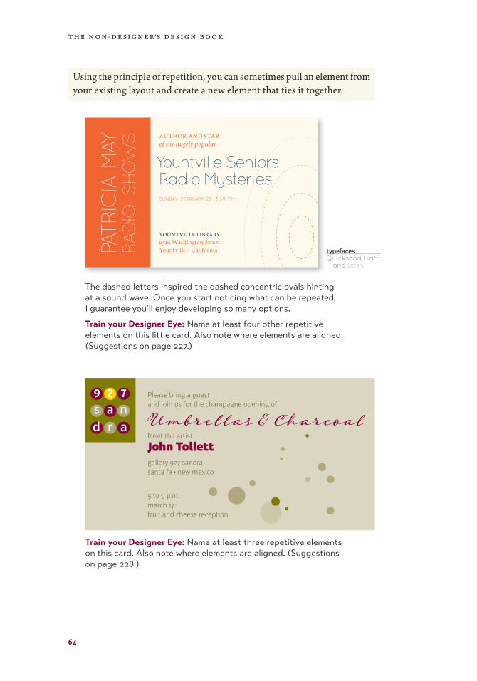
Using the principle of repetition, you can sometimes pull an element from your existing layout and create a new element that ties it together.
The dashed letters inspired the dashed concentric ovals hinting at a sound wave. Once you start noticing what can be repeated, I guarantee you’ll enjoy developing so many options.
Train your Designer Eye: Name at least four other repetitive elements on this little card. Also note where elements are aligned. (Suggestions on page 227.)
typefaces Quicksand Light and Dash
PATRIC
IA M
AYRA
DIO
S
HO
WS author and star
of the hugely popular
Yountville Seniors Radio Mysteriessunday . february 25 . 3:30 p.m.
yountville library6516 Washington Street Yountville • California
●●●●●●●●●
9 2 7s a n d r a
Please bring a guest and join us for the champagne opening of
Umbrellas & CharcoalMeet the artist
John Tollettgallery 927 sandrasanta fe • new mexico
5 to 9 p.m.march 17 fruit and cheese reception
● ●● ●
●
●
●
●
●
●●
●
●
Train your Designer Eye: Name at least three repetitive elements on this card. Also note where elements are aligned. (Suggestions on page 228.)

65
4 : r e p e t i t i o n
The repetitive element does not have to be a graphic or clipart. It can be spacing, rules, fonts, alignments, or anything that you consciously repeat.
R. William Whetstone Memorial Committeepresents the Twentieth Memorial Lecture
Dr. Euphemia May WeberProfessor of Psychiatry and Neuroscience
at theUniversity of California, Yountville
on"A Hundred Years
of Science"
Monday, September 27, 8 p.m.Reilly Rooser Auditorium, Truchas
Free admission
This Twentieth Memorial Lecture is presented by the R. William Whetstone Memorial Committee
A Hundred Years of Science Dr. Euphemia May Weber
Professor of Psychiatry and Neuroscience at the University of California, Yountville
Monday, September 27, 8 p.m.Reilly Rooser Auditorium, TruchasFree admission
This is very typical: Times New Roman, centered, typewriter quotation marks. Someone did separate the information into logical groups, but you can see that the centered alignment is weak. There is an attempt to fill the corners.
Decide what you want to focus on. This version has a focus on the speaker. Regarding the Principle of Repetition, what are the repeated elements? You can see where the Principle of Alignment has been applied, and this ad also uses the Principle of Contrast, described in the following chapter.
This version has a focus on the topic. Notice the black bar is repeated in a thinner version at the bottom. A repetitive element that pulls things together can be that simple.
R. William Whetstone Memorial Committeepresents the Twentieth Memorial Lecture
Dr. Euphemia May WeberProfessor of Psychiatry and Neuroscienceat the University of California, Yountville, will be speaking on the topic of
A Hundred Years of Science
Monday, September 27, 8 p.m.Reilly Rooser Auditorium, TruchasFree admission
t h e n o n-d e s i g n e r’s d e s i g n b o o k
66
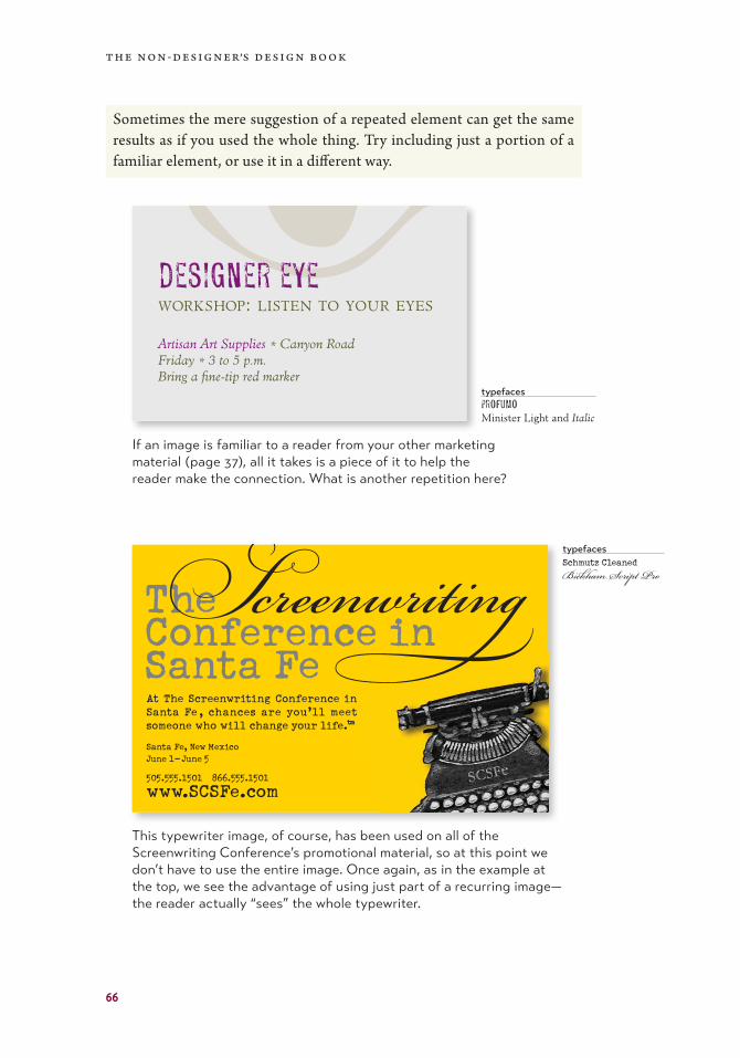
Sometimes the mere suggestion of a repeated element can get the same results as if you used the whole thing. Try including just a portion of a familiar element, or use it in a different way.
If an image is familiar to a reader from your other marketing material (page 37), all it takes is a piece of it to help the reader make the connection. What is another repetition here?
This typewriter image, of course, has been used on all of the Screenwriting Conference’s promotional material, so at this point we don’t have to use the entire image. Once again, as in the example at the top, we see the advantage of using just part of a recurring image—the reader actually “sees” the whole typewriter.
typefaces ProfumoMinister Light and Italic
typefaces Schmutz CleanedBickham Script Pro
Sdesigner eye workshop: listen to your eyes
Artisan Art Supplies * Canyon Road Friday * 3 to 5 p.m.Bring a fine-tip red marker
The Conference in Santa Fe
ScreenwritingSanta Fe, New Mexico June 1–June 5
505.555.1501 866.555.1501
www.SCSFe.com
At The Screenwriting Conference in Santa Fe , chances are you’ll meet someone who will change your life.™

67
4 : r e p e t i t i o n
Repetition provides a sense of professionalism and authority to your pieces, no matter how playful. It gives your reader the feeling that someone is in charge because repetition is obviously a thoughtful design decision.
typefaces FRANCES UNCIAL
Brioso Pro Light and Italic
You can see that repetition doesn’t mean you have to repeat exactly the same thing. Above, the headlines are all different colors, but they use the same font. The illustrations are all different styles, but all rather funky and ’fifties.
Just make sure you have enough repetitive elements so the differences are clear, not a jumbled mess. For instance, in this example you see that the recipes all follow the same format and there are strong alignments. When there is an underlying structure, you can be more flexible with the elements.
CLASSIC MARTINI6 parts gin 1 part dry vermouthCocktail olive
Stir in a mixing glass with lots of cracked ice. Strain into chilled glass and garnish with olive.
LEMONDROP6 parts lemon-flavored vodka1 tsp sugar1 part Cointreau or lemoncelli liqueur
Combine ingredients in a cocktail shaker half-filled with ice cubes; shake well. Swirl half a lemon around the rim of a martini glass and dip in sugar. Pour the contents of the cocktail shaker into the glass and serve.
DIRTY MARTINI6 parts gin2 parts dry vermouth1 part olive brineCocktail olives
Combine liquid ingredients in a cocktail shaker with cracked ice; shake well. Strain into a chilled cocktail glass. Garnish with one or two olives.
QUEEN BESS MARTINI
6 parts gin1 parts dry vermouth2 teaspoons Benedictine
Combine all ingredients in a cocktail shaker with cracked ice; shake well. Strain into a chilled cocktail glass.
GIMLET8 parts gin or vodka2 parts Rose’s lime juice
Combine ingredients in a cocktail shaker with cracked ice; shake well. Strain into a chilled martini glass.
COSMOPOLITAN4 parts vodka2 parts Cointreau or limoncello liqueur2 parts cranberry juice1 part fresh lime (optional)
Combine ingredients in a cocktail shaker with cracked ice; shake well. Strain into a chilled martini glass.
ANNUAL MARTINI TASTING AT THE MERMAID TAVERN
t h e n o n-d e s i g n e r’s d e s i g n b o o k
68
Summary of repetitionA repetition of visual elements throughout the design unifies and strengthens a piece by tying together otherwise separate parts. Repetition is very useful on one-page pieces, and is critical in multi-page documents (where we often just call it being consistent).
The basic purposeThe purpose of repetition is to unify and to add visual interest. Don’t under estimate the power of the visual interest of a page—if a piece looks interesting, it is more likely to be read.
How to get itThink of repetition as being consistent, which I’m sure you do already. Then push the existing consistencies a little further— can you turn some of those consistent elements into part of the conscious graphic design, as with the headline? Do you use a 1-point rule at the bottom of each page or under each heading? How about using a 4-point rule instead to make the repetitive element stronger and more dramatic?
Then take a look at the possibility of adding elements whose sole purpose is to create a repetition. Do you have a numbered list of items? How about using a distinctive font or a reversed number, and then repeating that treatment throughout every numbered list in the publication? At first, simply find existing repetitions and then strengthen them. As you get used to the idea and the look, start to create repetitions to enhance the design and the clarity of the information.
Repetition is like accenting your clothes. If a woman wears a lovely black evening dress with a chic black hat, she might accent her dress with red heels, red lipstick, and a tiny red pin.
What to avoidAvoid repeating the element so much that it becomes annoying or over-whelming. Be conscious of the value of contrast (see the next chapter and especially the section on contrasting type).
For instance, if the woman were to wear the black evening dress with a red hat, red earrings, red lipstick, a red scarf, a red handbag, red shoes, and a red coat, the repetition would not be a stunning and unifying contrast—it would be overwhelming and the focus would be confused.

236
IndexAaccent marks, 160acronym for basic design
principles, 13advertising, 141–144Alignment, Principle of
basic principle of, 13, 33–54, 87
breaking it, 132, 133, 136comparison of different
text alignments, 37, 42messy alignment example, 46mixing alignments, 72sitting on the ground vs.
clothesline, 58soft vs. hard edges, 35strengths of, 87use baseline of text, 44visual connection, 54
all capsbad examples of, 26caps vs. lowercase form,
200–201when to use, 201why not to use, 161, 190, 201
analogous colors, 101Anguish Languish
stories from, 58–59, 194–195, 198, 210–213
ansi codesfor accent marks, 160for special characters, 158
apostrophes, use of, 154–155Arial, don’t use it, 126, 132ascenders, 186asymmetry, 85
Bbadges, examples of, 40,
134, 182baseline
explained, 186use for alignment, 44, 47
Before & After Magazine, 235blank space. See white
spacebody copy, body text
defined, 235borders, lose them, 130, 223
uncrowd the text in a border, 166
bottom out, 58branding, 114break the rules, when to,
51, 225brochures, 133–136Brunel University London, 36Brutus in Julius Caesar, 39bullets
definition of, 235how to type •, 158–159, 166in a list, not hyphens, 166relationship to text, 18
Burns, Robert, 43business cards, 117–120
reinforce your package, 134business package, 60
CCafePress.com, 116, 235Canva.com, 235cap height, 186Caveglia, Jerry, 43centered alignment, 35
examples of, 40–41, 42impression of, 36, 54, 87make it look intentional, 42suggestions for, 38–41
Chace, Howard L., 2clothesline, 58
coloranalogous combination, 101black, 97, 111, 209–213blue, red, yellow, 96choosing, how to, 108–109cmyk, 110–112color models, 110–112color wheel
analogous combination, 101complementary colors, 98image of full color wheel, 102monochromatic colors, 104primary colors, 96secondary colors, 96shades and tints, 102–105split complements, 100tertiary colors, 97triads, 99
complementary colors, 98contrast of, 208
comparison of typefaces, 212–213
examples of, 208–213cool vs. warm colors, 107, 208effectiveness in marketing, 137examples of contrasts in, 74,
80, 82–83, 208hues, 102in black-and-white, 209monochromatic colors, 104primary colors, 96rgb color model, 111–112secondary colors, 96shades and tints, 102–105split complements, 100tertiary (or third) colors, 97tints, 102–105triads, 99warm vs. cool colors, 107web colors, which model
to use, 112white, 97, 111Wildflower Theory of Color,
106color palette, how to use it,
103Conrad, Joseph, 201, 211 comparison
of color in typefaces, 212–213of type contrasts, 215
complementary colors, 98concord
basic principle of, 167examples, 168–169

237
i n d e x
conflictbasic principle of, 167examples of, 170–171how to avoid it, 69
consistency, 120. Also see Repetition, Principle of
contrasting typebasic principle of, 167, 187by color, 208–213by direction, 204–207by form, 200–203by size, 188–191by structure, 196–199by weight, 192–195examples of, 172–173summary, 174, 215
Contrast, Principle ofbasic principle of, 13, 69, 89like wall paint, 84use as repetitive element,
80–81using white space, 144
copy machines, design for, 124
corners, what not to do in them, 204
crap, 13CreateSpace.com, 116, 235CreativeMarket.com, 146,
235
Ddashes, 156–157Davis, J. Philip, 180dazzling, 177decorative type examples,
182descenders, 186design tips
advertising, 144brochures, 136business cards, 120flyers, 128letterhead and envelopes, 124newsletters, 132postcards, 140résumés, 148
direction contrasts, 204basic principle of, 204examples of, 204–207use for contrast, 75
EEgyptian fonts, 178em dash
how to type it, 158–159when to use it, 157
em space as paragraph indent, 47, 132
en dashhow to type it, 158–159what it is, when to use it, 156
envelopesdesign tips, 124size of, 124standard size, 124
Evans, Dana Gwendolyn, 110extended text
defined, 235type for, 176, 178type not good for, 177
eye, eye flowand white space, 85contrast and, 84examples of, 16, 17, 32, 56,
71, 87
Ffaxing, stationery for, 124flag, newsletter, 129flush left
defined, 42examples of, 36
flush rightdefined, 42examples of, 37
flyers, 125–128design tips, 128
focus, focal point, 81, 124, 128, 220
fontsfonts to let go of, 81for contrast, 132for readability, 132where to buy
CreativeMarket.com, 235FontSquirrel.com, 235MyFonts.com, 235
FontSquirrel.com, 235form, contrasting, 200–203
caps versus lowercase is contrast, 200–201
roman versus italic is a contrast, 202–203
frame. See borders
Gglossary, 235gray page, what to do, 195,
210gutter, what is it?, 133
Hhang from a clothesline, 58Hazlitt, William, 31Helvetica, avoid it, 132, 136hierarchy, use contrast to
show, 194hues of colors, 102hyphen, 156
Iidentity package, 114indented text
first paragraphs not indented, 47, 132, 166
“typewriter” wide indents, 46, 165
InDesign pdf Magazine, 235inspiration, 94invisible type, 176italic, true-drawn vs. fake, 202
JJoshua tree, 11justified type, 42
Kkerning, 163

238
i n d e x
LLadle Rat Rotten Hut, 48,
210, 211left alignment
examples of, 36impression of, 36, 87
letterhead and envelopes, 121–124
Lifeaccenting your clothes, 68consistency creates
clarification, 55design your life, 85don’t be a wimp, 85dynamic relationships, 69, 167physical closeness implies
relationship, 15rules of, 74Your attitude is your life, 199
Lindbergh, Ann Morrow, 14line, drawn, 235
MMcDonald, Nikki, 2McWade, John, 235Melville, Herman, 172messy alignment, 47modern type examples, 177monochromatic colors, 104monospaced lettering, 151,
152monoweight, 179multiple-page publications,
58–59MyFonts.com, 138, 235
Nnewsletters, 129–132
contrast in, 70–71repetition in, 58
newsprint, printing on, 144
Ooblique, 202odd-sized postcard, 138Old Singleton, 210oldstyle type examples, 176open book, open mouth, 223optical illusions
reverse type size, 144orphans, 164
Pparagraphs
first p. not indented, 47, 166indent one em, 132, 165indent or extra space, not
both, 166Pie Day, 38postcards, 137–140primary colors, 96principles of design, 11, 13
review, 85–94printing, color model for
images, 112PrintPlace.com, 117, 235Proximity, Principle of
basic principle of, 13, 15does not mean everything
is close together, 20purpose of, 32review of principle, 86summary of, 32
punctuationand quotation marks, 153following styled text, 165in parentheses, 165
Qquad left or right, 42quizzes
answers to, 223–228apostrophes, 155categories of type, 183, 196color, 112contrast or conflict, 216design principles, 90dos and don’ts, 217my philosophy on, 223redesign this ad, 91serifs, 185thick/thin transitions, 184
quotation marks, 153
Rradical thin/thin transition,
177readability, 132Repetition, Principle of
basic principle of, 13, 55in brochures, 136in newsletters, 129review of principle, 88summary, 68unity with variety, 67, 135
résumés, 145–148Return, after paragraph, 24reverse type, when not to
use, 144rgb, 111–112right-aligned text
examples, 34, 35, 50Riley, Barbara, 222roman type, 202rules, breaking them, 51, 225rules (drawn lines), 235
contrast in, 74Rules of Life, 74, 85
SSanford, Arlan, 142Sanford, Matt, 122, 147sans serif
putting two or more on a page, 199
type examples, 179vs. serif, 198
Sayers, Dorothy L., 201script type examples, 181secondary colors, 96serifs
horizontal and thick (slab), 178
horizontal, thin, 177illustration of, 176none (sans), 179quiz on, 185slanted, 176
shades of colors, 102–105Shakespeare Papers
branding of, 114–115color scheme, 109
Sheldon, Carmen, 3Sidney, Mary, 135, 207sixes and nines, 153

239
i n d e x
sizecontrast, 188contrasts in, 78, 82–83standard envelope, 124type size in business cards,
120slab serif examples, 178slanted text, 204spacing arrangements, 21,
22, 25clarifies information, 31, 143letterspacing, 163one space after punctuation,
152Principle of Proximity relies
on, 28special characters, how to
type them, 158–159split complement colors, 100stress, illustration of, 176structure, 196–199
basic principle of, 196contrast, 196different categories of type,
196, 197serif vs. sans serif contrast,
198–199symbols, use dramatically, 191
Ttertiary colors, 97thick/thin transitions, 176
little or none, 178moderate, 176quiz on, 184radical, 177slight in sans serif, 180
Thomas, Jimmy, 72–73threefold brochure, 133tints of colors, 102–105Tollett, John, 2, 113, 116, 131,
219tracing paper, using to
sketch ideas, 91tracking, 163triads of colors, 99true-drawn italic, 202Tschichold, Jan, 4typefaces
comparison of color in, 212–213
how to combine, 187–203
typewriter photo, 151typographer quotation
marks, 153typographic essentials,
151–166typography
dynamic relationships in, 167graphic design is type, 149list of contrasts in, 215on cheap paper, 144reverse type, 144
Uunderline, don’t do it, 162unity in design, 54
VVan Ness, David, 2vip, visually illiterate person,
221
Wweight contrast, 192White, Jan, 2, 209white space
by-product of organization, 32, 142
defined, 235organization of, 17to create contrast, 140trapped
defined, 235examples of, 24, 50solutions for, 50
widows, 164Wildflower Theory of Color,
106Williams, Cliff and Julie, 126Williams, Jimmy Thomas,
72–73Williams, Pauline, 151Williams, Robin, 240Williams, Scarlett, 146WingDings, 235
Xx-height, 186
Yyour attitude is your life,
85–89
ZZapf Dingbats, 235Zazzle.com, 235