pen and paint: the painting technique in gerard de
TRANSCRIPT
Volume 12, Issue 1 (Winter 2020)
Pen and Paint: The Painting Technique in Gerard de Lairesse’s Bacchus and Ariadne as Compared to the Principles Expounded in His Groot Schilderboek
Vera [email protected]
Recommended Citation:
Vera Blok, “Pen and Paint: The Painting Technique in Gerard de Lairesse’s Bacchus and Ariadne as Compared to the Principles Expounded in His Groot Schilderboek,” Journal of Historians of Neth-erlandish Art 12:1 (Winter 2020) DOI: 10.5092/jhna.2020.12.1.7Available at https://jhna.org/articles/painting-technique-gerard-de-lairesses-bacchus-and-ari-adne-as-compared-principles-groot-schilderboek
Published by Historians of Netherlandish Art: https://hnanews.org/Republication Guidelines: https://jhna.org/republication-guidelines/
Notes: This PDF is provided for reference purposes only and may not contain all the functionality or features of the original, online publication. This PDF provides paragraph numbers as well as page numbers for citation purposes.
ISSN: 1949-9833
JHNA 12:1 (Winter 2020) 1
The article illuminates a research into several aspects of Gerard de Lairesse’s (1640–1711) painting technique. Ariadne and Bacchus was part of a series of decorative paintings for Soestdijk Palace, commissioned by Stadholder Willem III between 1676 and 1678. As part of an extensive restoration treatment of the painting during 2005 and 2006, descriptions in Lairesse’s Groot Schilderboek (1707) were studied. Two aspects of the writings were compared with the painting techniques, supported by paint sampling. The first aspect to be examined was the flesh colors of the figures Bacchus and Ariadne, because of their prominence in the picture. The second was atmospheric and color perspective, which raised questions about some parts of the picture.
Pen and Paint: The Painting Technique in Gerard de Lairesse’s Bacchus and Ariadne as Compared to the Principles Expounded in His Groot Schilderboek
Vera Blok
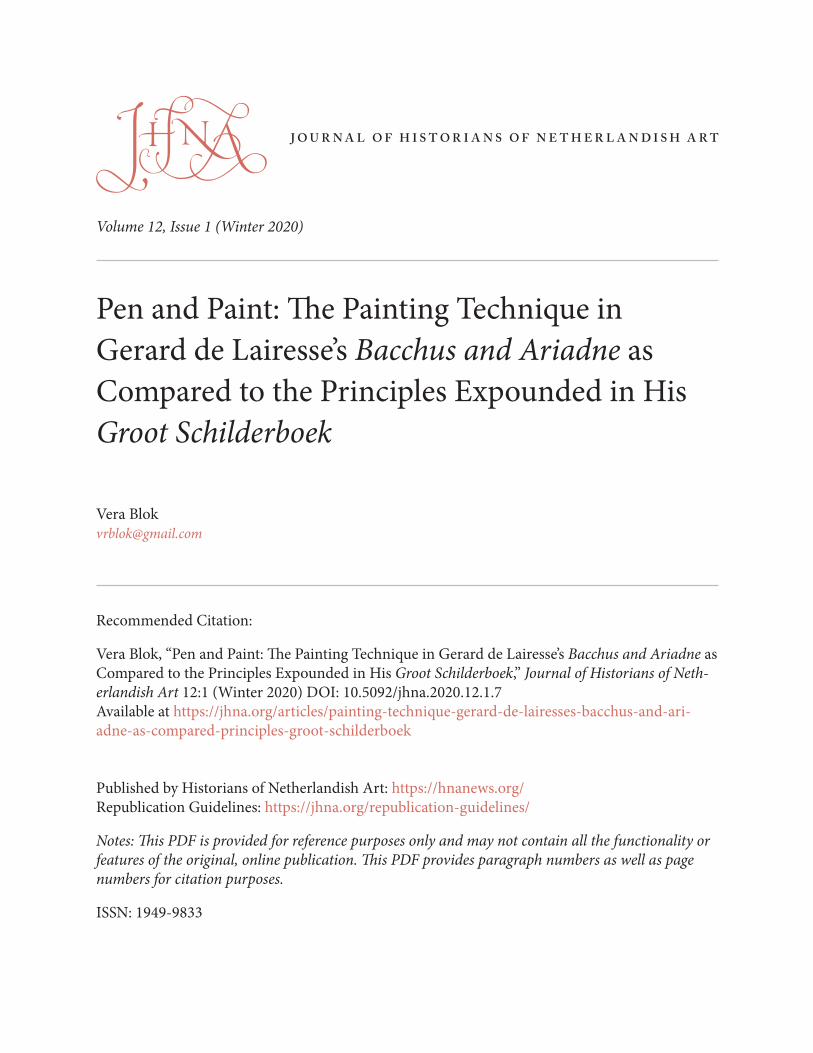
1 Between 1674 and 1678 Gerard de Lairesse (Liéges 1640–1711 Amsterdam) executed a series of decorative paintings for Soestdijk Palace, commissioned by Stadholder Willem III (1650–1702). These works now belong to the collections of the Rijksmuseum and the Mauritshuis. In 2005 the restoration of Bacchus and Ariadne,1 one of the paintings in this series, prompted a research project on Lairesse’s painting technique (fig. 1).2
This study relies to a large extent on the Groot Schilderboek, which the artist wrote in 1707.3 In order to form a clear idea of the consistency of his own painting practice with the principles expounded in the treatise, several specific aspects are compared, including flesh colors and the use of atmospheric and color perspective. Lairesse dwells at length on these pictorial aspects of painting, while other matters—such as the support and the final varnish—receive little if any attention.
Although it is difficult to extract all the technical descriptions from the book, Lairesse fortunately describes the execution of a painting in a number of basic steps that recur throughout the book:
2
3
JHNA 12:1 (Winter 2020) 2
4
“dead coloring,” “the second layer,” and “revision or retouching.”4 This threefold division was used to shed light on Lairesse’s painting technique, with the wider objective of improving our ability to interpret his paintings and to preserve them for the future.
Certain passages on technique in the book have been compared to the artist’s practical execution. This comparison includes other works in the same series as well as Bacchus and Ariadne. The study of the paint surface, the way the paint layers are built up, and the composition of the paint were all important for the purposes of this study.
In the descriptions and interpretations that are given below, additions and changes resulting from restorations have been left out of consideration, as far as is possible.
Soestdijk PalaceIn 1674, Stadholder Willem III of Orange purchased a farmstead in Soestdijk from Jacob de Graeff. Between 1674 and 1678 he had the building converted into a hunting lodge by Maurits Post. Lairesse painted a series of mythological scenes for the apartments of the stadholder’s wife, Mary Stuart.5 They included several paintings for the bedroom of “Her Majesty”: a ceiling painting, two supraportes, and an overmantel painting. In addition in the study adjacent to the bedroom hung a supraporte and an overmantel painting by Lairesse (“een stuk schildrij voor de scheersteen van Larisse”). In view of the dimensions that are given, the latter must have been Bacchus and Ariadne.6
Since the stadholder purchased the land for his hunting lodge in 1674 and Lairesse was paid in 1678, we can assume that the entire series was painted in that four-year period.7
Mary Stuart’s apartments, which were on the ground floor in the central part of the front of the
5
Fig. 1 Gerard de Lairesse, Bacchus and Ariadne, ca. 1680, canvas, 175.5 x 93cm. Amsterdam, Rijksmuseum, inv. SK-C-170683 (on loan from the Mauritshuis, inv. 83) (artwork in the public domain; photo: Mauritshuis, Photography Department)
6
7
8

JHNA 12:1 (Winter 2020) 3
building, were altered between 1815 and 1821 as part of the renovation of the palace carried out by Jan de Greef (1784–1834). The study where Bacchus and Ariadne had hung was combined with the adjoining bedroom to form what is now the Waterloo Chamber.8 In consequence, we cannot learn from the site itself how or where the paintings hung. Old floor plans of the palace show the difference between the original room divisions and the later changes. The study had only a single window on the east of the front facade (figs. 2–3).9
We know that the walls of consequential rooms and halls were decorated. The wainscoting, added in the second half of the seventeenth century, extended to approximately 75 cm above the floor.10 Above it, large canvas paintings were inserted into the walls, which were architecturally articulat-ed. Lairesse devotes a separate chapter of his book to this subject: “On making Wall paintings for interior spaces,”11 in which he compares the different roles of wall and ceiling paintings. Since the ceiling was associated with the soul, it was important to focus there on the spirit, which is ruled by Heaven. The subjects depicted on the walls, on the other hand, related to bodily existence and morality, which are governed by the faculty of reason.12 The choice of iconography depended on the intended location. Lairesse considers it essential for a viewer to be able to deduce this intend-ed use from the decorations of each room or chamber. Besides the play of light and vantage point,
9
Fig. 2 Map of Soestdijk Palace, architect Maurits Post, 1674–78. Royal House Archives. Red indicates Mary Stuart’s apartment (photo: Royal House Archives)
Fig. 3 Map of Soestdijk Palace, architect J. de Greef, 1815–1. Royal House Archives. Red indicates Waterloo Hall, formerly Mary Stuart’s apartment (photo: Royal House Archives)
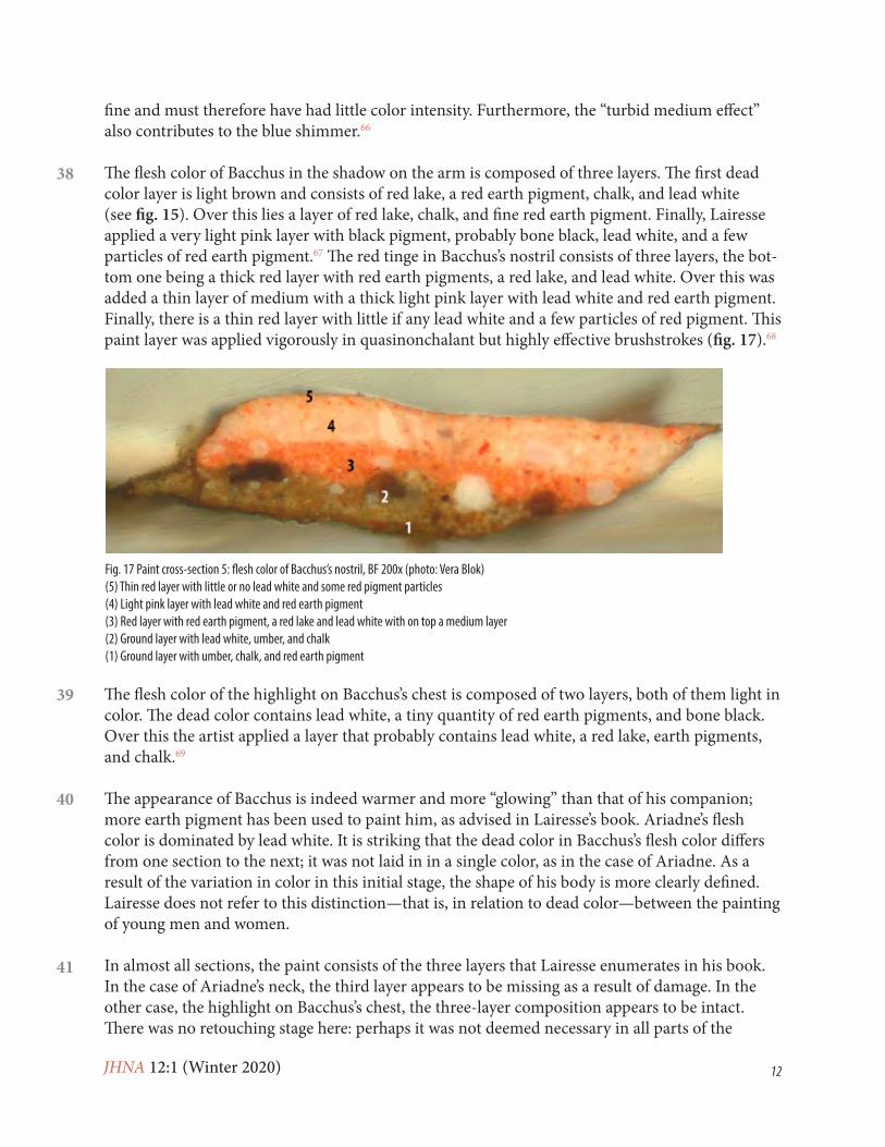
JHNA 12:1 (Winter 2020) 4
10
the artist must also take the room’s architecture into consideration. Lairesse accords a prominent role to the overmantel painting:
Because the painting over the fireplace is the most important one of the room, I plan a figural composition in that place. A landscape would be inappropriate there, its horizon being outside the painting; far below it, even, which would mean that one could see nothing but the sky in that prominent place.13
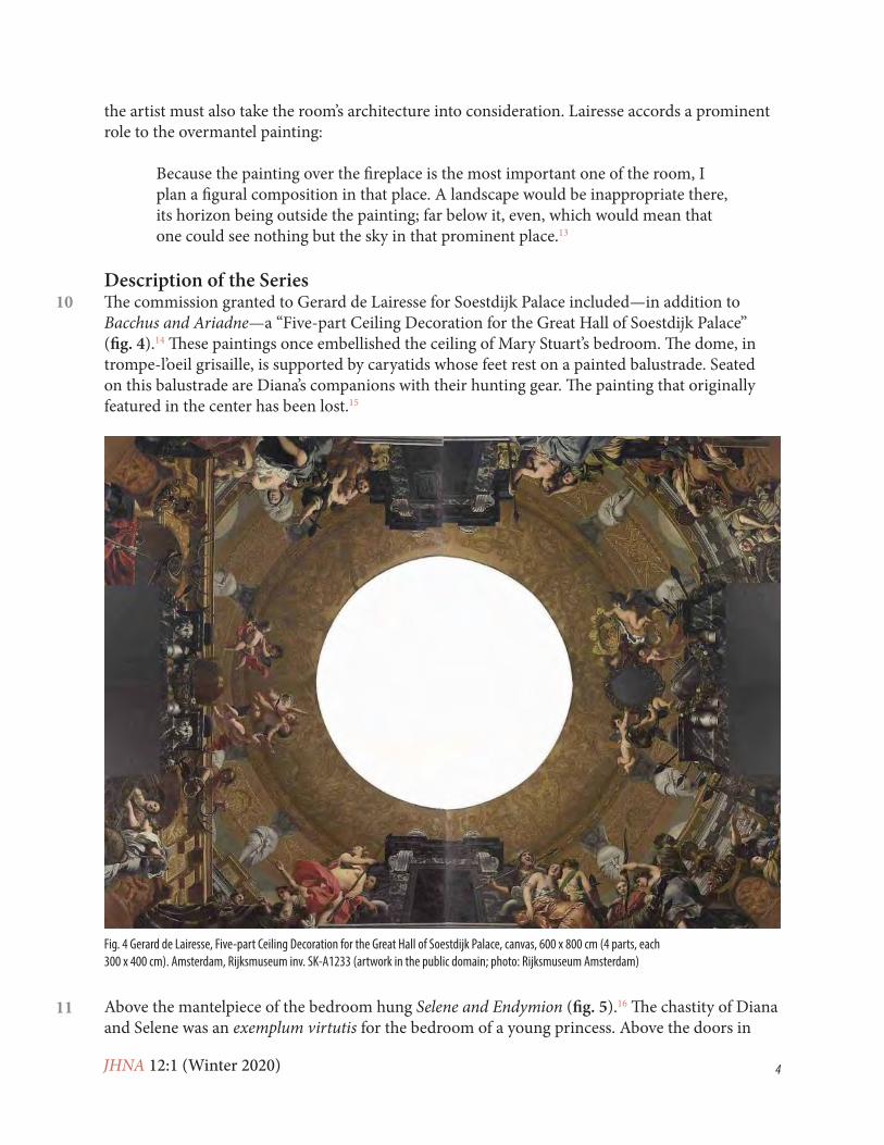
Description of the SeriesThe commission granted to Gerard de Lairesse for Soestdijk Palace included—in addition to Bacchus and Ariadne—a “Five-part Ceiling Decoration for the Great Hall of Soestdijk Palace” (fig. 4).14 These paintings once embellished the ceiling of Mary Stuart’s bedroom. The dome, in trompe-l’oeil grisaille, is supported by caryatids whose feet rest on a painted balustrade. Seated on this balustrade are Diana’s companions with their hunting gear. The painting that originally featured in the center has been lost.15
Above the mantelpiece of the bedroom hung Selene and Endymion (fig. 5).16 The chastity of Diana and Selene was an exemplum virtutis for the bedroom of a young princess. Above the doors in
11
Fig. 4 Gerard de Lairesse, Five-part Ceiling Decoration for the Great Hall of Soestdijk Palace, canvas, 600 x 800 cm (4 parts, each 300 x 400 cm). Amsterdam, Rijksmuseum inv. SK-A1233 (artwork in the public domain; photo: Rijksmuseum Amsterdam)
JHNA 12:1 (Winter 2020) 5
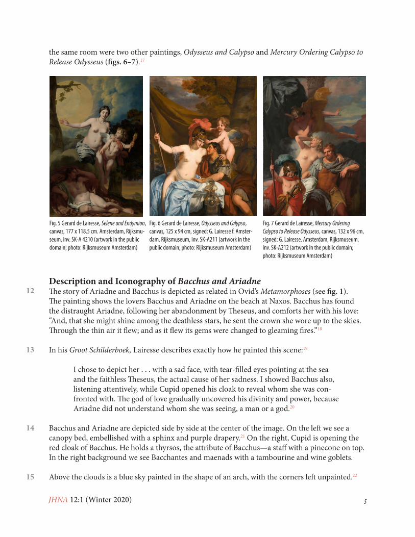
12
the same room were two other paintings, Odysseus and Calypso and Mercury Ordering Calypso to Release Odysseus (figs. 6–7).17
Description and Iconography of Bacchus and AriadneThe story of Ariadne and Bacchus is depicted as related in Ovid’s Metamorphoses (see fig. 1). The painting shows the lovers Bacchus and Ariadne on the beach at Naxos. Bacchus has found the distraught Ariadne, following her abandonment by Theseus, and comforts her with his love: “And, that she might shine among the deathless stars, he sent the crown she wore up to the skies. Through the thin air it flew; and as it flew its gems were changed to gleaming fires.”18
In his Groot Schilderboek, Lairesse describes exactly how he painted this scene:19
I chose to depict her . . . with a sad face, with tear-filled eyes pointing at the sea and the faithless Theseus, the actual cause of her sadness. I showed Bacchus also, listening attentively, while Cupid opened his cloak to reveal whom she was con-fronted with. The god of love gradually uncovered his divinity and power, because Ariadne did not understand whom she was seeing, a man or a god.20
Bacchus and Ariadne are depicted side by side at the center of the image. On the left we see a canopy bed, embellished with a sphinx and purple drapery.21 On the right, Cupid is opening the red cloak of Bacchus. He holds a thyrsos, the attribute of Bacchus—a staff with a pinecone on top. In the right background we see Bacchantes and maenads with a tambourine and wine goblets.
Above the clouds is a blue sky painted in the shape of an arch, with the corners left unpainted.22
Fig. 5 Gerard de Lairesse, Selene and Endymion, canvas, 177 x 118.5 cm. Amsterdam, Rijksmu-seum, inv. SK-A 4210 (artwork in the public domain; photo: Rijksmuseum Amsterdam)
Fig. 6 Gerard de Lairesse, Odysseus and Calypso, canvas, 125 x 94 cm, signed: G. Lairesse f. Amster-dam, Rijksmuseum, inv. SK-A211 (artwork in the public domain; photo: Rijksmuseum Amsterdam)
Fig. 7 Gerard de Lairesse, Mercury Ordering Calypso to Release Odysseus, canvas, 132 x 96 cm, signed: G. Lairesse. Amsterdam, Rijksmuseum, inv. SK-A212 (artwork in the public domain; photo: Rijksmuseum Amsterdam)
13
14
15

JHNA 12:1 (Winter 2020) 6
Like the other paintings in the series, this work must originally have hung in a frame or have been inserted into paneling that was semicircular at the top.23 On this subject Lairesse remarks: “There should be something under each beam, either a pilaster or a herm. If not, the painting should be arched at the top.”24
The foreshortening of the lower part of Bacchus’s body is probably intentional, with a view to the painting being hung high up above the mantelpiece. Ariadne’s upper body is turned at a slight angle in relation to the lower part of her body. Pentimenti are visible in both the ring finger of Bacchus’s hand and a finger of Ariadne’s left hand (fig. 8). Lairesse was evidently trying to find the right position of the hands.25 In the Groot Schilderboek, he describes the rules for positioning the hands: “The hands should always make contrasting movements. When the one shows its inside, the other one should be seen from the outside; when one is hanging down, the other one is drawn up.”26 The variation that Lairesse seeks to achieve in the hands – open and closed, turned and extended – explains why he eventually depicts the hand of Bacchus bent, above Ariadne’s hand with her fingers outstretched.27 Furthermore, it corresponds to the crown being cast upwards and slightly to the rear.28
Research into the Painting Technique of Bacchus and AriadneIn the Prologue (Voorreden), Lairesse explains that the book serves as an instrument that will help someone without proper training to learn the art of painting. Even so, the book is not easy to consult. The text jumps back and forth between practical tips and useful knowledge for art con-noisseurs and interested lay readers. Furthermore, it should be borne in mind when interpreting the texts of the Groot Schilderboek that Lairesse wrote the book after he had gone blind. His direct relationship with the practice of his art might have weakened with the years.29
To illuminate Lairesse’s painting technique, diverse research methods were used.30 The painting is described in the same order in which it was created, starting with the support and ending with the paint layers.
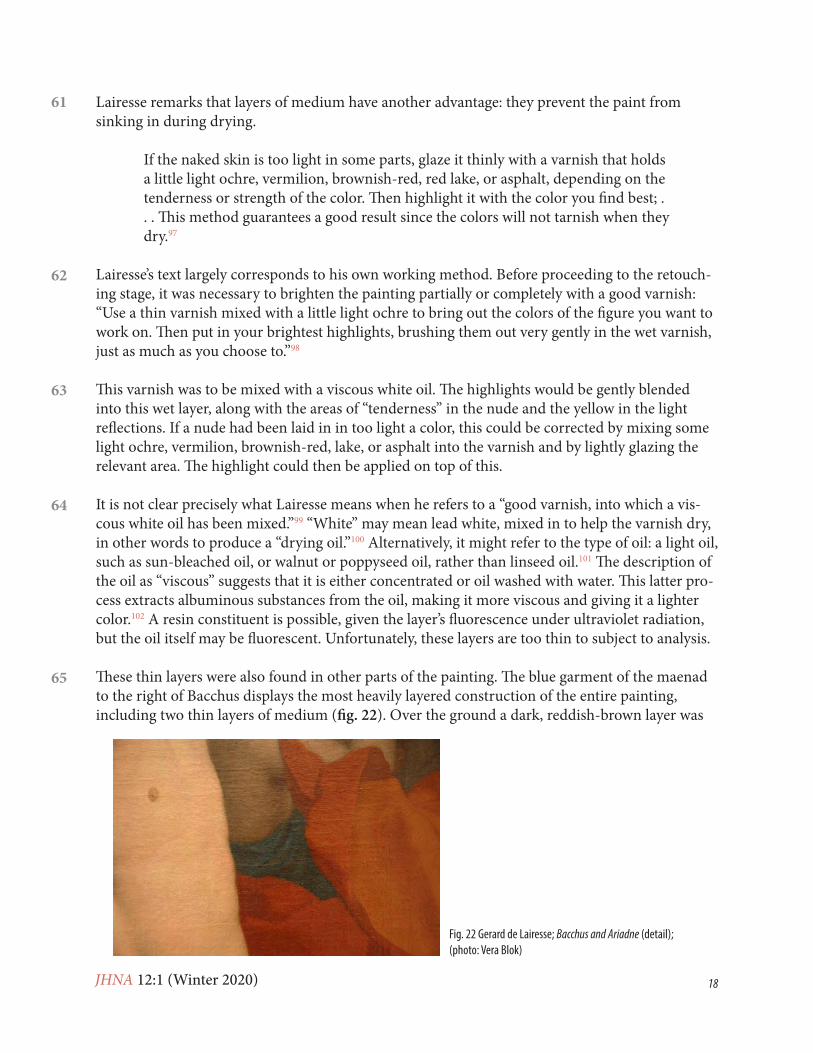
SupportLairesse’s Groot Schilderboek pays no attention to the quality of the supports of the pictorial work.
16
18
Fig. 8 Gerard de Lairesse, Bacchus and Ariadne (detail), pentimento in hand of Bacchus (photo: Vera Blok)
17
19
JHNA 12:1 (Winter 2020) 7
20
Bacchus and Ariadne was painted on a single canvas with a fine, dense plain weave.31 Both the left and right sides of the canvas have remnants of a selvedge. From this it can be concluded that the canvas came from a roll presumably measuring 97 cm in width.32
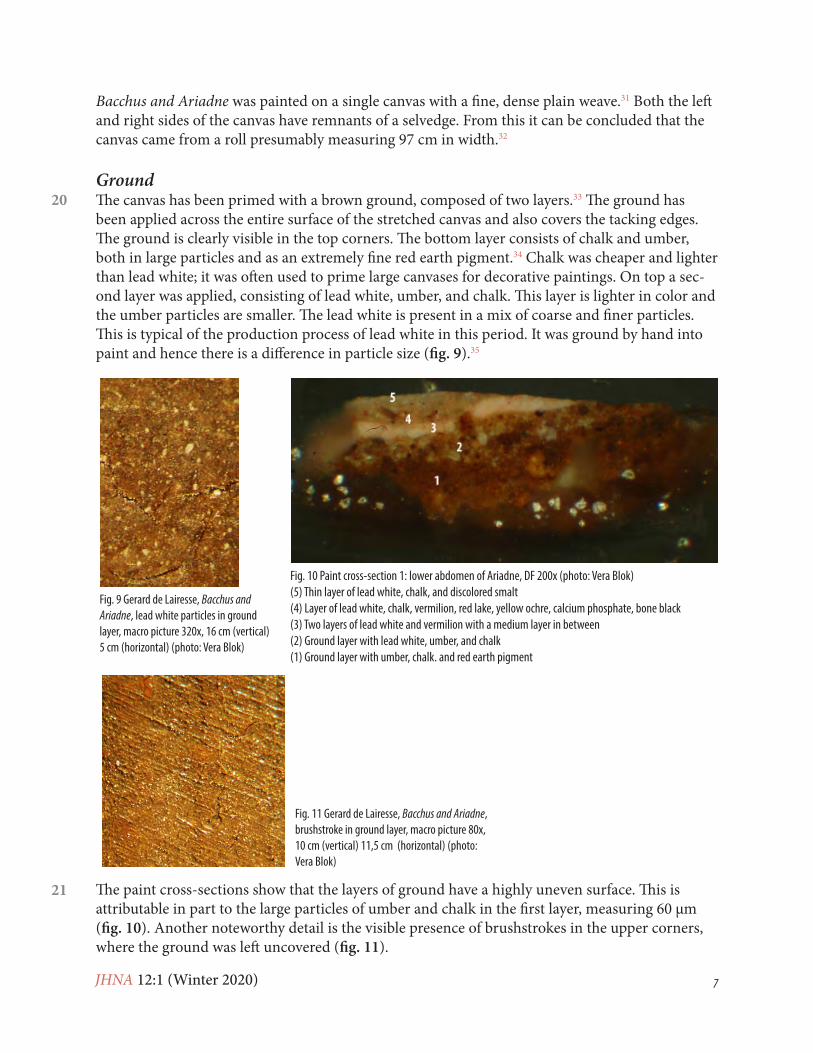
GroundThe canvas has been primed with a brown ground, composed of two layers.33 The ground has been applied across the entire surface of the stretched canvas and also covers the tacking edges. The ground is clearly visible in the top corners. The bottom layer consists of chalk and umber, both in large particles and as an extremely fine red earth pigment.34 Chalk was cheaper and lighter than lead white; it was often used to prime large canvases for decorative paintings. On top a sec-ond layer was applied, consisting of lead white, umber, and chalk. This layer is lighter in color and the umber particles are smaller. The lead white is present in a mix of coarse and finer particles. This is typical of the production process of lead white in this period. It was ground by hand into paint and hence there is a difference in particle size (fig. 9).35
The paint cross-sections show that the layers of ground have a highly uneven surface. This is attributable in part to the large particles of umber and chalk in the first layer, measuring 60 μm (fig. 10). Another noteworthy detail is the visible presence of brushstrokes in the upper corners, where the ground was left uncovered (fig. 11).
Fig. 9 Gerard de Lairesse, Bacchus and Ariadne, lead white particles in ground layer, macro picture 320x, 16 cm (vertical) 5 cm (horizontal) (photo: Vera Blok)
Fig. 10 Paint cross-section 1: lower abdomen of Ariadne, DF 200x (photo: Vera Blok)(5) Thin layer of lead white, chalk, and discolored smalt(4) Layer of lead white, chalk, vermilion, red lake, yellow ochre, calcium phosphate, bone black(3) Two layers of lead white and vermilion with a medium layer in between(2) Ground layer with lead white, umber, and chalk(1) Ground layer with umber, chalk. and red earth pigment
Fig. 11 Gerard de Lairesse, Bacchus and Ariadne, brushstroke in ground layer, macro picture 80x, 10 cm (vertical) 11,5 cm (horizontal) (photo: Vera Blok)
21

JHNA 12:1 (Winter 2020) 8
In his Groot Schilderboek, Lairesse advises artists to adapt the preparation of the ground to match the intended color of the final work of art. He distinguishes between priming for landscapes, rooms and other interiors, and night scenes. For the second category he advises a priming with umber. Depending on the composition of the painting, colors can be slightly modified.36 He continues to emphasize the qualities of a good priming:
When it is thoroughly dry, a priming [ground] of this kind has three positive qual-ities. Firstly, it is convenient, because it is even and dull, which makes the paint bind immediately, however thin it may be. It allows working tidily, which is much more difficult and time consuming on a smooth or shiny ground layer. Secondly, it is durable, because of its similarity to the gradations of darkness and colors put on top of it. They will keep their full beauty and strength, which is impossible when the priming has a different color or a different degree of darkness, such as white on black, light blue on dark yellow or red, et cetera. In the course of time the ground color will shine through more and more in those cases, however thickly the top layer may have been laid on. Thirdly, as I said before, it expedites the completion of your concept when your hand is steady and your brush is swift. Otherwise this would be impossible without dead coloring.37
Lairesse was not entirely consistent in his use of terminology, sometimes using the words for “ground” and “dead coloring”—the first layer of color—interchangeably.
In any case, Lairesse asserts that the ground must above all be opaque and provide grip for the paint layers to be applied afterward. This certainly applied in the case of the ground of Bacchus and Ariadne, the relatively coarse structure of which enabled the paint layers to adhere well.
UnderdrawingThe painting was examined using infrared reflectography to check for the presence of any un-derdrawing or undermodeling with carbonaceous material.38 This technique (IR-2) revealed the beginnings of an arch shape on the left in the sky section (fig. 12). A paint cross-section taken from this point revealed that a thin, very slightly fluorescent layer had been applied over the ground here, with fine black, red, and a little blue and extremely fine white pigment.39 The slight fluorescence may have been caused by the medium, or—if the fine white pigment is lead white—by the pigment itself. This layer is identical to that found in a paint cross-section taken from the purple draperies above the bed.40 This is also visible under infrared (IR-2) in the shape of a faint line (fig. 13). Here it is known that bone black and lead white were used.41
Aside from the places referred to above, no underdrawing or undermodeling is discernible. Nor indeed does Lairesse ever refer to such a practice in his treatise.42 On the basis of the two discov-eries made in the sky section and the purple draperies, these appear rather to have belonged to the stage of dead coloring, which he included under the heading of “paint layers.”
Paint LayersThe paint has the appearance of oil paint. Although only the binding medium used in the sky sec
22
23
24
25
26
27

JHNA 12:1 (Winter 2020) 9
tion was analyzed, it is a reasonable assumption that the entire work was executed in paint based on linseed oil.43 The paint was applied thinly, wet-in-wet, in opaque and semitransparent layers. The artist rarely used impasto, with the exception of very minimal applications, as in the high-lights of the wooden sphinx adorning the bed (fig. 14) He favored thin brushes for details such as the faces of the figures, and somewhat thicker ones for the draperies. In his book Lairesse refers to a soft vispenseel, a brush made from the whiskers of an otter, which he used for the scumbling and brushing out of highlights and shadows.44
In building up the representation in a painting, Lairesse distinguishes three stages: dead coloring, applying the second layer, and revision or retouching. From his description of the first stage, we can infer that different colors were used with the aim of producing an initial arrangement of the scene.45
To prevent that you labor in vain, you should give due attention to the overall houding.46 This means that the colors and their shades are arranged in accordance with depth and distance and, consequently, that the painting shows a perfect welstand47 and appropriate qualities when seen from a distance. Thus putting in
28
Fig. 12 Gerard de Lairesse, Bacchus and Ariadne (detail), IR-2, accentuation of arch at left in sky area (photo: Mauritshuis, Photography Department)
Fig. 13 Gerard de Lairesse, Bacchus and Ariadne (detail), IR-2, the vague vertical line in the contour of dark shadow in the purple drapery corresponds with carbon-containing dead coloring layer (photo: Mauritshuis, Photography Department)
Fig. 14 Gerard de Lairesse, Bacchus and Ariadne (detail), impasto in wooden sphinx (photo: Vera Blok)

JHNA 12:1 (Winter 2020) 10
the second paint layer is made much easier.48
When it comes to “putting in the second layer,” Lairesse emphasizes the advantage of having the dead coloring executed properly beforehand. This enables the artist to devote his full attention to the next stage of painting. Here his technique is to start with the background and then to work toward the foreground: “In this phase the best method is to begin at the background, . . . the sky, working forward from there. This will always leave a suitably moist background behind the figures, which offers a chance to fuse their contours with the background.”49
The artist evidently worked in a wet lower layer. In Bacchus and Ariadne it is discernible that the brushstrokes were laid in and spread smoothly in a wet paint layer.
Once the right houding, color, and wyking50 of the images had been achieved, all that remained was to add the extreme highlights and shadows:
The right method is to brighten your painting with a good, thin varnish, mixed with a little viscous white oil, either completely or partly but no more than you can handle before the varnish gets dry; this will bring out the colors. Then add your highlights to the lighted parts, brushing them out softly and thinly.51
What Lairesse describes in the above quotations corresponds closely to his own practice,52 which, it should be added, was highly conventional at the time. He used this practice to achieve the desired artistic effects, given that houding, welstand, and wyking are all crucial to the suggestion of pictorial depth. It is through these elements that he creates the desired pictorial results.53
Flesh ColorsLairesse dwells at length on the painting of human skin.54 In total, his book lists nine mixtures for flesh color. There are colors for healthy, sick, and dead nudes, and each of these is differentiated according to whether the person is a child, man, or woman. The color to be used for a healthy man is gloeijend,55 while a healthy woman requires a white hue. The softness of young women called for large amounts of white, while men’s skin needed a little ochre.
The skin of a fair and delicate woman is dead-colored with white and [brown-ish-red]; for the second layer white and a little vermilion should be used. The same is used for a young man, but with the admixture of a little light ochre for the warm, intense effect.56
The beeld is then enhanced using a thin varnish, blended with a little light ochre, rather more for a man than for a woman.57 This is also the moment at which any essential corrections can be made.
If the naked skin is too light in some parts, glaze it thinly with a varnish that holds a little light ochre, vermilion, brownish-red, lake, or asphalt, depending on the tenderness or strength of the color. Then highlight it with the color you find best.58
The bluish tone, which Lairesse associated with “tenderness” (tederheid), is diffused when the
29
30
31
32
33
34
35

JHNA 12:1 (Winter 2020) 11
final highlights are executed in the wet paint. This requires using paint into which a large amount of pure smalt has been mixed; Lairesse adds that no white should be blended into it and contin-ues: “Then take a soft fitch to apply this blue paint, brushing it out and scumbling it over the most delicate parts. You will notice that this delicate hue produces a natural color that is different in each case.”59
The flesh color used for Ariadne, in the highlights of the arm, is composed of three paint layers (fig. 15). The dead color is pink and contains a great deal of lead white and vermilion. Over this, a light pink layer of medium has been applied, with more lead white and less vermilion.60 Over the final paint layer another small layer of medium has been applied, followed by a light pink layer like the one below.61 The shadow of Ariadne’s chin is composed of two layers, of which the dead color layer is the same as that of the highlight. The layer applied over this has a grayish color and contains lead white and vermilion, a red lake and black pigment, probably bone black.62 The paint surface in Ariadne’s neck appears slightly damaged. The transition from the dark paint in the shadow of the neck to the white paint of her upper torso is quite abrupt (fig. 16). It seems likely that some retouching was added here, giving the transition a more natural appearance, and that this layer of retouching was lost at a later stage, when varnish was removed.
A bluish light appears to hover over Ariadne’s lower abdomen. Could this relate to the “ten-derness” to which Lairesse refers? Here as in the other two sections, we see the pink dead color composed of a large amount of lead white and vermilion, over which is a thin layer of medium followed by an extremely thin layer of vermilion. For the uppermost layer of paint, the artist used a beige paint of lead white, chalk, vermilion, red lake, yellow ochre, calcium phosphate (bone white), and bone black. Finally, a thin layer of lead white, chalk, and smalt was applied.63 Smalt is potassium glass containing cobalt, in which the cobalt ion produces the color; when smalt is mixed with oil it is unstable.64 The low potassium content in the pigment particles in this top paint layer is indicative of discoloration.65 The area of “tenderness” was probably not much bluer than now to begin with, since it was an extremely thin layer and the glass particles were crushed very
36
Fig. 15 Gerard de Lairesse, Bacchus and Ariadne (detail), highlight of Ariadne’s arm (photo: Mauritshuis, Photography Department)
Fig. 16 Gerard de Lairesse, Bacchus and Ariadne (detail), damaged paint layer in shadow area of Ariadne’s arm (photo: Vera Blok)
37
JHNA 12:1 (Winter 2020) 12
fine and must therefore have had little color intensity. Furthermore, the “turbid medium effect” also contributes to the blue shimmer.66
The flesh color of Bacchus in the shadow on the arm is composed of three layers. The first dead color layer is light brown and consists of red lake, a red earth pigment, chalk, and lead white (see fig. 15). Over this lies a layer of red lake, chalk, and fine red earth pigment. Finally, Lairesse applied a very light pink layer with black pigment, probably bone black, lead white, and a few particles of red earth pigment.67 The red tinge in Bacchus’s nostril consists of three layers, the bot-tom one being a thick red layer with red earth pigments, a red lake, and lead white. Over this was added a thin layer of medium with a thick light pink layer with lead white and red earth pigment. Finally, there is a thin red layer with little if any lead white and a few particles of red pigment. This paint layer was applied vigorously in quasinonchalant but highly effective brushstrokes (fig. 17).68
The flesh color of the highlight on Bacchus’s chest is composed of two layers, both of them light in color. The dead color contains lead white, a tiny quantity of red earth pigments, and bone black. Over this the artist applied a layer that probably contains lead white, a red lake, earth pigments, and chalk.69
The appearance of Bacchus is indeed warmer and more “glowing” than that of his companion; more earth pigment has been used to paint him, as advised in Lairesse’s book. Ariadne’s flesh color is dominated by lead white. It is striking that the dead color in Bacchus’s flesh color differs from one section to the next; it was not laid in in a single color, as in the case of Ariadne. As a result of the variation in color in this initial stage, the shape of his body is more clearly defined. Lairesse does not refer to this distinction—that is, in relation to dead color—between the painting of young men and women.
In almost all sections, the paint consists of the three layers that Lairesse enumerates in his book. In the case of Ariadne’s neck, the third layer appears to be missing as a result of damage. In the other case, the highlight on Bacchus’s chest, the three-layer composition appears to be intact. There was no retouching stage here: perhaps it was not deemed necessary in all parts of the
Fig. 17 Paint cross-section 5: flesh color of Bacchus’s nostril, BF 200x (photo: Vera Blok)(5) Thin red layer with little or no lead white and some red pigment particles(4) Light pink layer with lead white and red earth pigment(3) Red layer with red earth pigment, a red lake and lead white with on top a medium layer(2) Ground layer with lead white, umber, and chalk(1) Ground layer with umber, chalk, and red earth pigment
38
39
40
41

JHNA 12:1 (Winter 2020) 13
painting.
Atmospheric and Color PerspectiveThere is considerable contrast in color and tone in and around the two protagonists. They are both bathed in light, and the draperies ripple convincingly. As a ceiling painter, Lairesse had to take account of the atmosphere when depicting the sky or the heavens. Few of his sky scenes have any architecture or other earthly items. They contain clouds, sunbeams, numerous “flying” or hovering figures, and above all a great deal of sky. Linear perspective is ineffective here, and the painter necessarily has recourse to other techniques, such as atmospheric and color perspective. The atmosphere between a viewer and an object some distance away creates visual effects that a painter can use in suggesting space. Objects in the distance are less well defined and have fainter contours than those closer to the viewer. The details within these forms are similarly more blurred and softer. Objects in the distance appear lighter in tone than those of the same color that are closer, and in general, contrasts between light and shade appear less extreme from a distance. All these effects are clearer close to the horizon than they are higher up, since the density of the inter-vening atmosphere increases closer to the ground. This is because the atmosphere contains more dust particles and moisture close to the earth than higher up, near the ozone layer.70 As were other contemporary artists, such as Van Hoogstraten, Lairesse was well aware of all these visual effects.71 He describes these differences at length, giving practical examples, and was clearly familiar with the subject. “It is evident that close to the earth, the air is coarser and denser. But the higher it ascends, the more it becomes rarefied and transparent.”72
Like atmospheric perspective, color perspective too emphasizes the difference between fore-ground, middle distance, and background. Classic color theory is based on the observation that warm colors appear to advance while cool ones recede. Light waves with a shorter wavelength, such as blue light, undergo far greater refraction as they move through the atmosphere than those with a long wavelength. In consequence, blue light waves are largely scattered in the atmosphere, making the sky appear blue. The quantity of blue atmosphere increases in proportion to the distance between observer and object. As a result, an object will appear bluer as this distance increases. At the same time, the grayish influence of the moisture and dust particles in the air also influence the perception of color. Together with the blue atmosphere, this effect makes objects in the distance appear grayish-blue. Lairesse’s comments on color perspective include the following advice:
In the art of painting, the colors give life to everything . . . They can make things disappear into thin air and make other things come forward forcefully from their background . . . It is of great importance to notice that objects not just grow small-er with distance, but also lose their color proportionally, becoming more and more grayish. Nature instructs us about this phenomenon.73
By depicting objects in the background with more muted colors, less tonal contrast, and less pronounced dividing lines, Lairesse achieves a convincing suggestion of depth on the flat surface of the painting. This makes the cool highlights in the purple draperies in the left foreground all the more noteworthy (fig. 18). Furthermore, the dark purple shadow of the draperies, the pur-ple-brown clouds, and the brown rocks all display little variation in color, seemingly at odds with
42
43
44

JHNA 12:1 (Winter 2020) 14
the rules of perspective. This is probably attributable to changes in the paint layers as a result of discoloration and darkening.
Lairesse has the following to say about painting purple draperies:
When he74 had to paint the portrait of someone dressed in purple or black, he laid the clothes evenly in a uniform dark purple or unmixed black, without indicating any folds. When he then had to complete the work, he put in the highlights and the deepest shadows only. Thus it was finished expeditiously.75
As Lairesse counsels, the first layer applied for the purple draperies is dead color consisting of bone black and lead white. For the highlights, a purple layer is applied over this, consisting of a purple and a red lake with red ochre and lead white—the upper paint layer. Over this lies a layer of medium, on which is added the highlight in the form of a cool gray layer with particles of a discolored lake, bone black, and lead white.76 The lake in the top layer, which has lost much of its color, was originally a more vivid red or purple, making it warmer in tone.
The shadows of the purple draperies are built up in two layers. The bottom layer consists of lead white, a fine red pigment, and black. Applied over this is a thin layer of medium together with a somewhat thicker layer containing a very fine black pigment, possibly lamp black, a scarlet earth pigment, lead white, and a red lake.77
The purple cloud at upper left is likewise composed of two layers. First the artist applied a gray layer with lead white, a brown earth pigment, and a black pigment—probably bone black. Over this he applied a reddish-gray layer with a fine red earth pigment, lead white, and a brown earth pigment.78 The dark brown rocks at upper right are also composed of two layers: a blackish-red layer below, and over this a red layer with lead white and a scarlet earth pigment.79 It will be noted that the shadows of the draperies, the purple-brown clouds, and the brown rocks on the right are all built up in a very similar way. The minimal difference in composition is scarcely visible in the image. This may be because of some darkening of the layers.80 Since these sections are composed of only two thin paint layers, mixed with relatively little lead white, there is more of a tendency here for the dark bottom layer to shine through.
Fig. 18 Gerard de Lairesse, Bacchus and Ariadne (detail), cool highlights of purple drapery (pho-to: Mauritshuis, Photography Department)
45
46
47
48

JHNA 12:1 (Winter 2020) 15
The effect of depth must originally have been stronger, with the draperies—which initially had a higher red content—coming more to the foreground and with more distinctions, if subtle ones, between the clouds and the rocks.
SkiesIt can be inferred from the skies in Bacchus and Ariadne that the painting must have been hung on a wall that was to the left of the window, with the light coming from the right. This is compat-ible with the play of light on the figures. The painting hung above a wooden mantelpiece in either paneling or a frame that was rounded at top, concealing from sight the unpainted corners of the canvas.81 Mary Stuart’s study had only one wall with neither a window nor a door, which was indeed to the left of the window. There was enough space here to accommodate a mantelpiece and a painting. The symmetrical design of the building’s interior makes it likely that the mantelpiece was in the center of this wall (fig. 19).
For the skies above the clouds, the artist used indigo mixed with lead white, a little chalk, and a tiny amount of vermilion.82 The blue paint was applied directly over the ground in the shape of an arch, leaving the ground uncovered in the corners (fig. 20). In some parts, where the indigo paint was applied more thickly, it is opaque and more vivid. A dark strip is visible along the top and the right half of the arch, which widens toward the bottom. Here, the paint contains relatively more indigo than in the rest of the sky, as well as a little black pigment.83 Lairesse’s intentions here are unclear.
Fig. 19 Map of Soestdijk Palace, architect Maurits Post, 1674–78, Royal House Archives. Red indicates location of Bacchus and Ariadne in the cabinet (photo: Royal House Archives)
Fig. 20 Gerard de Lairesse, Bacchus and Ariadne (detail), arched blue sky area (photo: Mauritshuis, Photography Department)
49
50
51

JHNA 12:1 (Winter 2020) 16
The sky is a little transparent in places, where the blue paint was applied extremely thinly, but otherwise appears to be in good condition. Although this also applies to many other parts of the painting, it is striking with respect to indigo. The discoloration of indigo paint is a common feature of seventeenth-century Dutch oil painting and has led to paintings displaying lighter and less intense blue colors. In many cases, the lower paint layers are no longer completely covered, and the painting is marred by the exposure of a yellowed oil medium.84
The good condition of the indigo paint in the sky of this painting can be attributed in part to the use of coarse particles of lead white and a darker ground.85 The main factor contributing to the stability of this indigo paint, however, is the purity of the pigment.86 Where the layer is thicker, it is also more intense in color, but most of the section is painted quite thinly. Still, it is questionable whether Lairesse applied this technique consciously with the object of increasing the stability of his indigo paint. Indeed, this seems implausible, since the sole reference to indigo in his book re-lates to its suitability for use in underpainting: “For this priming, no fine and expensive pigments should be used, but common ones, provided they have a great consistency, covering well. Indigo and white should be used for a blue priming.”87
Other than might be expected from his recommendations, Lairesse used indigo paint in Bacchus and Ariadne for the top layer in the sky section. Indeed, he also used it for the top layer in his ceiling paintings in the series.88
Lairesse used two types of blue in his painting—indigo and smalt, both of which have some-times proved to be unstable pigments. That smalt is likely to undergo discoloration with time was already known in the seventeenth century. Theodore de Mayerne attributed this flaw to the yellowing of the oil.89 In spite of this, Lairesse both recommends and uses smalt in the top layers. He frequently refers to smalt in his book, whereas, as already noted, he mentions indigo just once, in the context of underpainting. Until the mid-seventeenth century, most painters thought indigo unsuitable for oil paintings because of its poor stability; it was mostly used for preparatory layers. Toward the second half of the century, a more positive view of the pigment started to emerge, partly because painters had discovered ways of purifying it, and partly because of new, more advanced painting techniques. Indigo started being used in more prominent parts of the painting, and in the top layers, where it was exposed to light.90
While the virtual disregard for indigo in Lairesse’s treatise is in line with the prevailing practice of painters in the first half of the seventeenth century, his own practice seems rather to be in step with the new developments.[note]As far as is known, Frans Hals (1581/85–1666) was the first painter to use indigo in this way for major commissions. In 1627 he painted the portraits of two civic militias: St George and St Adrian. Eikema Hommes, Changing Pictures, 137 and 139.[/note] It is also possible that achieving an enduring color may not always have been the decisive factor in the choice of material.
Layer of Binding MediumWritten sources indicate that it was customary to moisten the dried paint surface in between the successive stages of painting.92 Binding mediums of varying composition were suggested: mis-cellaneous kinds of varnish, often mixed with a solvent or with linseed, walnut, or poppyseed oil.
53
52
54
55
56
57

JHNA 12:1 (Winter 2020) 17
These thin layers of medium were used to resaturate paint that had become matte and unsaturated after drying, or to prevent the upper paint layers from sinking too much into those below. An-other advantage of a layer of binding medium, mentioned in treatises, is that it helps to achieve a smooth surface, making it possible to apply paint at greater speed when using a rapid technique.93 It is much easier to blend paint or glaze on an oiled surface. Some painters worked in the wet in-termediate layer, while others preferred to wait until the layer of medium had dried sufficiently. In both cases, treatises advise artists to keep the layer as thin as possible, since a surplus of medium may lead the paint to become discolored. We often see thin layers of medium of this kind in paint cross-sections of seventeenth-century paintings.94
Lairesse too used thin layers of medium between his paint layers. He discusses the subject in his book under the heading “Retouching or Revision.”95 This is the final phase of painting, in which the last paint layers and highlights are applied. It is clear from the paint cross-sections taken from Bacchus and Ariadne that the layers of medium were seldom applied directly to the ground, but rather on and between the paint layers above. In some cases, we even find two in the same section, for instance in areas of flesh color and in garments.96 Such a layer is not found throughout the painting: in other words, it was not applied systematically to the entire surface but quite deliberately in some places and not in others. The layers are extremely thin, measuring only approximately 1 micron in depth.
As described above, the areas of flesh color of Bacchus and Ariadne were built up with the aid of such thin layers of medium. When viewed under ultraviolet radiation, these layers show up in the paint cross-sections, because they are clearly fluorescent (fig. 21). They occur most in the sections with highlights and are not found in areas of shadow. From this it may be inferred that saturation was not in fact the main object, since this is particularly important in dark areas.
Fig. 21 Paint cross-section 16: blue drapery of maenad with two thin fluorescing layers, UV 200x (photo: Vera Blok).(8) Residue of varnish(7) Indigo with probably lead white and some chalk(6) Red layer(5) Thin brown red layer(4) Dark brown layer with on top a medium layer(3) Dark red brown layer with on top a medium layer(2) Ground layer with lead white, umber, and chalk(1) Ground layer with umber, chalk, and red earth pigment
58
59
60
JHNA 12:1 (Winter 2020) 18
Lairesse remarks that layers of medium have another advantage: they prevent the paint from sinking in during drying.
If the naked skin is too light in some parts, glaze it thinly with a varnish that holds a little light ochre, vermilion, brownish-red, red lake, or asphalt, depending on the tenderness or strength of the color. Then highlight it with the color you find best; . . . This method guarantees a good result since the colors will not tarnish when they dry.97
Lairesse’s text largely corresponds to his own working method. Before proceeding to the retouch-ing stage, it was necessary to brighten the painting partially or completely with a good varnish: “Use a thin varnish mixed with a little light ochre to bring out the colors of the figure you want to work on. Then put in your brightest highlights, brushing them out very gently in the wet varnish, just as much as you choose to.”98
This varnish was to be mixed with a viscous white oil. The highlights would be gently blended into this wet layer, along with the areas of “tenderness” in the nude and the yellow in the light reflections. If a nude had been laid in in too light a color, this could be corrected by mixing some light ochre, vermilion, brownish-red, lake, or asphalt into the varnish and by lightly glazing the relevant area. The highlight could then be applied on top of this.
It is not clear precisely what Lairesse means when he refers to a “good varnish, into which a vis-cous white oil has been mixed.”99 “White” may mean lead white, mixed in to help the varnish dry, in other words to produce a “drying oil.”100 Alternatively, it might refer to the type of oil: a light oil, such as sun-bleached oil, or walnut or poppyseed oil, rather than linseed oil.101 The description of the oil as “viscous” suggests that it is either concentrated or oil washed with water. This latter pro-cess extracts albuminous substances from the oil, making it more viscous and giving it a lighter color.102 A resin constituent is possible, given the layer’s fluorescence under ultraviolet radiation, but the oil itself may be fluorescent. Unfortunately, these layers are too thin to subject to analysis.
These thin layers were also found in other parts of the painting. The blue garment of the maenad to the right of Bacchus displays the most heavily layered construction of the entire painting, including two thin layers of medium (fig. 22). Over the ground a dark, reddish-brown layer was
Fig. 22 Gerard de Lairesse; Bacchus and Ariadne (detail); (photo: Vera Blok)
61
62
63
64
65
JHNA 12:1 (Winter 2020) 19
first applied, then a thin layer of medium, a dark brown layer followed by another thin layer of medium, then a thin brownish-red layer, a red layer, and finally the blue layer of indigo.103 The reason for this complex paint construction is unclear. The layers under the blue are not related to the adjoining sections—that is, the flesh color of Bacchus, the maenad, and the red drapery. It is possible that Lairesse changed his mind regarding the color of the robe while painting it, seeking to achieve the right balance.
Lairesse probably used the intervening varnish to enhance the visibility of the lower layers and to make it possible to blend his paint into a wet layer, to obtain the smooth brushwork that is so characteristic of his paintings. In addition, he was well aware of the adverse effect of porous lower layers and paint sinking into them and sought to avoid this problem in his work.
Although Lairesse discusses varnish in his book, he does so in the context of the retouching phase rather than that of a final varnish.104 These layers of varnish should therefore not be seen as “varnish” in the sense of a final protective saturating layer that was applied over the entire surface of the painting, but as a part of the construction of the paint layers.105
Thin layers of medium were also found in the ceiling painting for Soestdijk Palace. There, as in Bacchus and Ariadne, Lairesse started with the background and worked forward, leaving relatively few blank spaces to be filled in later. Over the ground he first painted the architectural elements: the balustrade, the column, the caryatid, the vases, and the vault. He left some blank space for the protagonists, but many of the other figures, the angels, drapery, and garments were painted over the architecture.106 It is therefore possible that large parts of the scene were first painted and later partly or entirely overpainted. There is a clear example of this in a paint cross-section from the red draperies. The architecture was painted over the ground, and on top of this a red piece of drapery was painted. This resulted in a construction consisting of five layers of paint and two thin layers of medium. The artist started off by painting a green copper pigment mixed with lead white over the ground. Then came the blackish-blue layer of the balustrade, consisting of a mixture of lead white and black. This was followed by the layers of the red cloak: a transparent paint layer of a purple-red lake; a thin layer of medium; a layer of red lake with vermilion; another thin layer of medium; and finally a layer of vermilion.107 This is the kind of painting technique that one would usually expect to find in paintings of a smaller format. It would not have been surprising for him to employ such a technique at the beginning of his career as a decorative painter of large works of art, having initially been trained in easel painting, but even after years of experience working on a large scale, he evidently saw no advantage in saving paint. Lairesse clearly worked according to a preconceived plan.
ConclusionThis study, with conclusions based on evidence such as paint cross-sections, illuminates the paint-ing technique of Gerard de Lairesse in the Soestdijk series and the manner and extent to which it corresponds to the principles expounded in the Groot Schilderboek.
In his treatise, Lairesse sets out to illustrate the relationship between the practice of painting and the theory he puts forward. He views them as inseparable: theory must guide the choices that a painter makes when practising his art, and conversely, his practice must demonstrate that the
66
67
68
69
70
JHNA 12:1 (Winter 2020) 20
theory works. In Lairesse’s view, the ideal art was the representation of lofty subjects. His instruc-tions for iconography are therefore linked to the practice of designing a composition.108 Lairesse considers it essential that a viewer can deduce from decorations the room for which they were intended. The choice of subjects for the Soestdijk paintings were preeminently suited to their intended locations and modified to harmonize with the interior.The artistic concepts that Lairesse uses in the relevant passages, such as houding, welstand, wyking, gloeijend, and tederheid, refer to effects that he seeks to achieve. The systematic construction that he advises to achieve these effects—dead coloring, the second layer, and finally revision or re-touching—prove to have been applied almost throughout the painting studied here. In almost all parts of the flesh color of Bacchus and Ariadne, the paint consists of these three layers. Bacchus does indeed radiate a more gloeijend (warmer) appearance than his companion; Lairesse has used more earth pigment here, as he advises in his book. Ariadne’s flesh color is dominated by lead white. There is a difference in the dead coloring of the flesh color of Bacchus between the shadow and the lighter sections; this was not applied in a single color, as in the case of Ariadne. As a result of the variation in color at this initial stage, the shape of his body is more clearly defined. How-ever, Lairesse does not mention any such distinction in dead coloring between young men and women in his book. He wanted his images to possess as much verisimilitude as possible, with the aim of conveying the moral message more convincingly to viewers.
It is clear from the book, and from some parts of his painting, that Lairesse was well informed about the rules of atmospheric and color perspective. This makes the cool tone and sharp contrast in the purple draperies in the foreground all the more noteworthy. These turned out to be attrib-utable not to any flaw in the artist’s skill but to the discoloration of the uppermost layer of lake. The same applies to the bluish-white sheet on the bed, the smalt in which has become discolored. The deterioration of the paint has had the effect of dulling the original gradations between shade and light, and these sections have lost a certain depth as a result. The purple-brown clouds and the rocks on the right appear darker than was originally intended. The thin, dark layers in these sections contain scarcely any lead white, as a result of which they are less opaque and allow the darker layer below to shimmer through. The effect of depth in the painting must originally have been stronger, with the draperies occupying a more prominent place in the foreground and more, albeit subtle, color distinctions in the clouds and rocks.
The original blue-sky section, painted in indigo, is in good condition. This is striking, since the discoloration of indigo paint is a well-known phenomenon in seventeenth-century Dutch oil paintings and has often led to paintings with light and less intense blue colors. Few if any traces of impurities have been found in the indigo paint used in Bacchus and Ariadne. The greatest factor in its stability was the pigment’s purity. That Lairesse made use of unstable pigments such as indigo and smalt suggests that obtaining an enduring color may not always have been the decisive factor in his choice of material. It is interesting to note that while the comments in Lairesse’s trea-tise are in line with the prevailing practice of painters in the first half of the seventeenth century, his own practice seems rather to be in step with the new developments.
71
72

JHNA 12:1 (Winter 2020) 21
AcknowledgmentsI should like to express my gratitude to my former colleagues at the Mauritshuis, Carol Pottasch, Paintings Conservator; Petria Noble, Head of Conservation (now at the Rijksmuseum), and Sabrina Meloni, Paintings Conservator, for their guidance during the extensive conservation treatment and research of the painting discussed here. The Rijksmuseum kindly permitted the use of documents from its collection, as did the Royal Collections of the Netherlands. The analyses would not have been possible without the expertise and assistance of Annelies van Loon and Jaap Boon from the FOM Institute AMOLF and Matthijs de Keijzer from the Cultural Heritage Agency of the Netherlands. In addition, I wish to express my gratitude to Margriet van Eikema Hommes, Associate Professor, Delft University of Technology; Lyckle de Vries; Professor Arie Wallert (ret.), University of Amsterdam; Maartje Stols-Witlox, Assistant Professor of Paintings Conservation, University of Amsterdam; and Ige Verslype, Paintings Conservator, Rijksmuseum. A special thanks also to the Stichting Restauratie Atelier Limburg, the place where it all began. I should like to thank Beverley Jackson for her translation of this article. The translations from the Groot Schilderboek are by Lyckle de Vries.
Vera Blok is a paintings conservator based in Amsterdam, the Netherlands. She obtained an MA in Art History at the University of Amsterdam (2001) and subsequently studied conservation of paintings at the post-graduate program of the Limburg Con-servation Institute in Maastricht, the Netherlands. She graduated in 2006 with a thesis on Gerard de Lairesse in the Mauritshuis, the Hague.
At present, her work consists of private conservation practice and lecturing at the masters program in Conservation and Restoration of Cultural Heritage at the University of Amsterdam. Her area of expertise is modern paintings. She has taken part in various research and conservation projects at several institutions including the Stedelijk Museum Amsterdam, Van Gogh Museum, Cobra Museum, Amsterdam Museum, and Concertgebouw.
List of Illustrations
Fig. 1 Gerard de Lairesse, Bacchus and Ariadne, ca. 1680, canvas, 175.5 x 93cm. Amsterdam, Rijksmuseum, inv. SK-C-170683 (on loan from the Mauritshuis, inv. 83) (artwork in the public domain; photo: Mauritshuis, Photography Department)
Fig. 2 Map of Soestdijk Palace, architect Maurits Post, 1674–78. Royal House Archives. Red indicates Mary Stuart’s apartment (photo: Royal House Archives)
Fig. 3 Map of Soestdijk Palace, architect J. de Greef, 1815–1. Royal House Archives. Red indicates Waterloo Hall, formerly Mary Stuart’s apartment (photo: Royal House Archives)

JHNA 12:1 (Winter 2020) 22
Fig. 4 Gerard de Lairesse, Five-part Ceiling Decoration for the Great Hall of Soestdijk Palace, canvas, 600 x 800 cm (4 parts, each 300 x 400 cm). Amsterdam, Rijksmuseum inv. SK-A1233 (artwork in the public domain; photo: Rijksmuseum Amsterdam)
Fig. 5 Gerard de Lairesse, Selene and Endymion, canvas, 177 x 118.5 cm. Amsterdam, Rijksmuse-um, inv. SK-A 4210 (artwork in the public domain; photo: Rijksmuseum Amsterdam)
Fig. 6 Gerard de Lairesse, Odysseus and Calypso, canvas, 125 x 94 cm, signed: G. Lairesse f.Am-sterdam, Rijksmuseum, inv. SK-A211 (artwork in the public domain; photo: Rijksmuseum Am-sterdam)
Fig. 7 Gerard de Lairesse, Mercury Ordering Calypso to Release Odysseus, canvas, 132 x 96 cm, signed: G. Lairesse. Amsterdam, Rijksmuseum, inv. SK-A212 (artwork in the public domain; photo: Rijksmuseum Amsterdam)
Fig. 8 Gerard de Lairesse, Bacchus and Ariadne (detail), pentimento in hand of Bacchus (photo: Vera Blok)
Fig. 9 Gerard de Lairesse, Bacchus and Ariadne, lead white particles in ground layer, macro picture 320x, 16 cm 5 cm ← (photo: Vera Blok)
Fig. 10 Paint cross-section 1: lower abdomen of Ariadne, DF 200x (photo: Vera Blok)(5) Thin layer of lead white, chalk, and discolored smalt(4) Layer of lead white, chalk, vermilion, red lake, yellow ochre, calcium phosphate, bone black(3) Two layers of lead white and vermilion with a medium layer in between(2) Ground layer with lead white, umber, and chalk(1) Ground layer with umber, chalk. and red earth pigment
Fig. 11 Gerard de Lairesse, Bacchus and Ariadne, brushstroke in ground layer, macro picture 80x, 10 cm 11,5 cm ← (photo: Vera Blok)
Fig. 12 Gerard de Lairesse, Bacchus and Ariadne (detail), IR-2, accentuation of arch at left in sky area (photo: Mauritshuis, Photography Department)
Fig. 13 Gerard de Lairesse, Bacchus and Ariadne (detail), IR-2, the vague vertical line in the contour of dark shadow in the purple drapery corresponds with carbon-containing dead coloring layer (photo: Mauritshuis, Photography Department)
Fig. 14 Gerard de Lairesse, Bacchus and Ariadne (detail), impasto in wooden sphinx (photo: Vera Blok)
Fig. 15 Gerard de Lairesse, Bacchus and Ariadne (detail), highlight of Ariadne’s arm (photo: Mauritshuis, Photography Department)
Fig. 16 Gerard de Lairesse, Bacchus and Ariadne (detail), damaged paint layer in shadow area of

JHNA 12:1 (Winter 2020) 23
Ariadne’s arm (photo: Vera Blok)
Fig. 17 Paint cross-section 5: flesh color of Bacchus’s nostril, BF 200x (photo: Vera Blok)(5) Thin red layer with little or no lead white and some red pigment particles(4) Light pink layer with lead white and red earth pigment(3) Red layer with red earth pigment, a red lake and lead white with on top a medium layer(2) Ground layer with lead white, umber, and chalk(1) Ground layer with umber, chalk, and red earth pigment
Fig. 18 Gerard de Lairesse, Bacchus and Ariadne (detail), cool highlights of purple drapery (pho-to: Mauritshuis, Photography Department)
Fig. 19 Map of Soestdijk Palace, architect Maurits Post, 1674–78, Royal House Archives. Red indicates location of Bacchus and Ariadne in the cabinet (photo: Royal House Archives)
Fig. 20 Gerard de Lairesse, Bacchus and Ariadne (detail), arched blue sky area (photo: Mauritshu-is, Photography Department)
Fig. 21 Paint cross-section 16: blue drapery of maenad with two thin fluorescing layers, UV 200x (photo: Vera Blok).(8) Residue of varnish(7) Indigo with probably lead white and some chalk(6) Red layer(5) Thin brown red layer(4) Dark brown layer with on top a medium layer(3) Dark red brown layer with on top a medium layer(2) Ground layer with lead white, umber, and chalk(1) Ground layer with umber, chalk, and red earth pigment
Fig. 22 Gerard de Lairesse; Bacchus and Ariadne (detail); (photo: Vera Blok)
BiblographyBate, John. The Mysteries of Nature and Art. London, 1634. Reproduced in Portrait Painting in England: Studies in the Technical Literature before 1700, by Mansfield Kirby Talley. London: Paul Mellon Centre for Studies in British Art, 1981.
BINAS: Informatieboek in de natuurwetenschappen. Groningen: Noordhoff, 1992.
Blok, Vera. “Bacchus en Ariadne: Onderzoek naar en behandeling van een interieurstuk van Ge-rard de Lairesse.” The Hague: Royal Picture Gallery Mauritshuis Foundation, 2006 (unpublished).
Boon, J. J., et al. “Imaging Microspectroscopic, Secondary Ion Mass Spectrometric and Electron Microscopic Studies on Discolored and Partially Discolored Smalt in Cross-sections of 16th-cen-

JHNA 12:1 (Winter 2020) 24
tury Paintings.” CHIMIA 55, no. 11 (2001): 952–60.
Broos, Ben. Liefde, List en Lijden: Historiestukken in het Mauritshuis. The Hague: Mauritshuis/Ghent: Snoeck-Ducaju & Zoon, 1993.
Drossaers, S. W. A. and Th.H. Lunsingh Scheurleer. Inventarissen van de inboedels van de verbli-jven van de Oranjes en daarmede gelijk te stellen stukken. 1567–1795. 3 vols. The Hague, 1974–76.Eikema Hommes, Margriet van. Changing Pictures: Discoloration in 15th–17th-century Oil Paint-ings. London: Archetype, 2004.
Eikema Hommes, M. van, T. van Run, K. Keune, I. Verslype, A. Wallert, M. den Leeuw, and I. de Jongh. “Discoveries during the Technical Investigation of Gerard de Lairesse’s Earliest Known Ceiling Painting (1672).” In Painting Techniques, History, Materials and Studio Practice, 145–52. 5th International Symposium, Rijksmuseum, Amsterdam, September 18–20, 2013.
Graaf, J. A. van de. Het De Mayerne manuscript als bron voor de schildertechniek van de Barok, British Museum, Sloane 2052. Mijdrecht: Verweij, 1958.
Hoogstraten, Samuel van. Inleyding tot de Hooge Schoole der Schilderkonst: Anders de Zichtbaere Werelt. 1678. Facsimile. N.p.: Davaco Publishers, 1969.
Lairesse, Gerard de. Groot Schilderboek. 2 vols. Haarlem: Johannes Marshoorn, 1740. Reprint. Doornspik: Davaco Publishers, 1969.
Lebrun, Pierre. Recueil des essais des merveilles de la peinture, or Brussels Manuscript: Ms. 15,552. In Medieval and Renaissance Treatises on the Arts of Painting, transcribed by Mary P. Merrifield, 890. London: John Murray, 1849. Reprint. 1999. Lehmann, A. S. “Vleeskleuren.” Kunstschrift 5 (1998): 10–22.
Moes, E. W., and E. van Biema. De Nationale Konst-Gallery en het Koninklijk Museum. Amster-dam, 1909.
Moormann, E. M., and W. Uitterhoeve. Van Achilleus tot Zeus: Thema’s uit de klassieke mythologie in literatuur, muziek, beeldende kunst en theater. Nijmegen: SUN, 1990.
Ovid. Metamorphoses. Books 1–8. Translated by Frank Justus Miller. Loeb Classical Library 42. Cambridge, Mass.: Harvard University Press, 1993.
Rem, P. H., and M. B. W. Broekema. “Soestdijk, lustlot voor de held van Waterloo: Een nadere beschouwing van de stilistische en iconografische aspecten van een vorstelijk verblijf.” Jaarboek Oud-Utrecht (1989): 96–108.
Rietschoten, E. van, M. Staal, P. Eurlings, I. Kneepkens, and T. van Run. “Paintings by the Rules of Art: The Groot Schilderboek on Technique; Lievens and De Lairesse Compared.” In Painting Techniques, History, Materials and Studio Practice,138–44. 5th International Symposium,

JHNA 12:1 (Winter 2020) 25
Rijksmuseum, Amsterdam, September 18–20, 2013
Roy, Alain. Gérard de Lairesse (1640–1711) Paris: Arthena, 1992.
Sluijter, Eric Jan. De ‘heydensche fabulen’ in de schilderkunst van de Gouden Eeuw: Schilderijen met verhalende onderwerpen uit de klassieke mythologie in de Noordelijke Nederlanden, circa 1590–1670. Leiden: Primavera Press, 2000.
Snoep, Derk P. “Gerard Lairesse als plafond- en kamerschilder.” Bulletin van het Rijksmuseum 18, no. 4 (1970): 159–220.
Stols-Witlox, Maartje. “‘By no means a trivial matter’: The Influence of the Color of Ground Lay-ers on Artists’ Working Methods and on the Appearance of Oil Paintings, According to Historical Recipes from North West Europe c. 1550–1900.” Oud Holland 128, no. 4 (2015): 171–86.
Stols-Witlox, Maartje. “Final Varnishes for Oil Paintings in Holland, 1600–1900: Evidence from Written Sources.” Zeitschrift für Kunsttechnologie und Konservierung 19, no. 1 (2001): 241–85.
Stols-Witlox, Maartje. A Perfect Ground: Preparatory Layers for Oil Paintings 1550–1900. London: Archetype Publications, 2017.
Tromp, Heimerick. Het Koninklijke Paleis Soestdijk historisch gezien. Zutphen: De Walburg Pers, 1987.
Vries, Lyckle de. Gerard de Lairesse: An Artist between Stage and Studio. Amsterdam: Amsterdam University Press, 1998.
Vries, Lyckle de. How to Create Beauty: De Lairesse on the Theory and Practice of Making Art. Leiden: Primavera Press, 2011 (includes CD-ROM containing the English translation of volume 1 of Gerard de Lairesse’s Groot Schilderboek).
Wetering, Ernst van de. Rembrandt: The Painter at Work. Amsterdam: Amsterdam University Press, 2000.
1 This painting’s provenance differs from that of the other pieces in the series. This is described in detail by Ben Broos, Liefde, List en Lijden: Historiestukken in het Mauritshuis (The Hague: Mauritshuis/Ghent: Snoeck-Ducaju & Zoon, 1993): Soestdijk Palace, 1674–1799; Nationale Konst-Gallery, Huis ten Bosch, The Hague, 1800–1805; Nationaal Kabinet (Koninklijk Museum), ‘Besogne-Kamer en Gallerij Willem V,’ The Hague, 1806–1822; Royal Picture Gallery Mauritshuis, The Hague, 1822–2012; on loan to the Rijksmuseum from 2012.2 The research and treatment were conducted as part of an internship for a Postgraduate Diplo-ma in Easel Paintings at the Stichting Restauratie Atelier Limburg (SRAL). The research and treatment were conducted in the Mauritshuis. This article is an abridged version of the resulting

JHNA 12:1 (Winter 2020) 26
thesis: Vera Blok, “Bacchus en Ariadne: Onderzoek naar en behandeling van een interieurstuk van Gerard de Lairesse,” (The Hague: royal Picture Gallery Mauritshuis Foundation, 2006). The thesis discusses the conservation history of Bacchus and Ariadneand the restoration carried out in 2006. The conservation history was reconstructed in order to understand the background of a specific radical change to the painting: an overpainting of the sky section with Prussian blue in 1799–1800. The present article deals with a different issue; it does not discuss the conservation history, the recent treatment, and the final removal of the overpainting, since these are dealt with at length in the thesis. However, without the knowledge gained from this earlier study, it would have been impossible to present a well-founded interpretation of Lairesse’s painting technique.3 Although Lairesse completed the Groot Schilderboek in 1707, it was not published until 1740.4 Doodverven, opschilderen, and nazien or retocqueeren. NB All English translations from the Groot Schilderboekin this article are by Lyckle de Vries and are taken from the CD-ROM that accompanies Lyckle de Vries, How to Create Beauty: De Lairesse on the Theory and Practice of Making Art (Leiden: Primavera Press, 2011.5 Accounts dating from 1678 record that Lairesse was paid 2,300 guilders for unspecified paint-ings. These were probably the six paintings that were still hanging in Mary Stuart’s apartments in Soestdijk Palace in 1699. Broos, Liefde, List en Lijden, 182; S. W. A. Drossaers and Th.H. Lunsingh Scheurleer, Inventarissen van de inboedels van de verblijven van de Oranjes en daarmede gelijk te stellen stukken. 1567–1795 (The Hague, 1974–-76), pt. 1, p. 622nn 24 and 28.6 Besides the above-mentioned series, the Soestdijk inventories also list works painted in col-laboration by Lairesse and the landscape painter Jan Glauber. Drossaers, Inventarissen van de inboedels, 1:621–22.7 On the basis of stylistic considerations, Alain Roy dates the pieces later, to between 1676 and 1682. Alain Roy, Gérard de Lairesse (1640–1711) (Paris: Arthena, 1992), 290.8 P. H. Rem and M. B. W. Broekema, “Soestdijk, lustlot voor de held van Waterloo: Een nadere beschouwing van de stilistische en iconografische aspecten van een vorstelijk verblijf,” Jaarboek Oud-Utrecht (1989): 97–98.9 Heimerick Tromp, Het Koninklijke Paleis Soestdijk historisch gezien (Zutphen: De Walburg Pers, 1987), 62–63.10 Derk P. Snoep, “Gerard Lairesse als plafond- en kamerschilder,” Bulletin van het Rijksmuseum 18, no. 4 (1970): 189.11 “Beschilderen der Vertrekken,” in Gerard de Lairesse, Groot Schilderboek, 1740 (repr. Doornspik: Davaco Publishers, 1969), 1:373, 375; 2:71, 72.12 Snoep, “Gerard Lairesse als plafond,” 218.13 Lairesse, Groot Schilderboek, 1:375: “Dat ik een Beeldstuk op de schoorsteen ordineer, is om dat dezelve het voornaamste van de kamer is: want wat eigenschap kan daar een Landschap hebben, welkers horizont buiten, ja verre beneeden het schildery moet weezen; waarom men dan op die voornaame plaats niet als een enkele lucht zou beschouwen?”14 Originally Soestdijk Palace, 1799; National Museum, 1808.15 In the eighteenth century a new central scene was painted: Apollo Hunting the Night. This piece was long attributed to Lairesse, with (as was thought) eighteenth-century overpainting. A re-search project conducted in 1982 disproved the attribution and showed that the work was in fact painted in the eighteenth century. Besides Bacchus and Ariadne, another supraporte in the side room is mentioned in the “Catalogus Kunst-galery 1801.” It is listed as Zephyrus and Flora and was sold in 1828. Its current whereabouts are unknown. See E. W. Moes, and E. van Biema, De

JHNA 12:1 (Winter 2020) 27
Nationale Konst-Gallery en het Koninklijk Museum (Amsterdam, 1909), 38.16 Originally Soestdijk Palace, 1799; National Museum, 1808. The myth of Endymion is told by Pliny the Elder and Alexander of Aphrodisias.17 Originally Soestdijk Palace, 1799; National Museum, 1808. Both scenes are based on descrip-tions in Homer’s Odyssey.18 Ovid, Metamorphoses, trans. Frank Justus Miller, Loeb Classical Library 42 (Cambridge, Mass.: Harvard University Press, 1993), bk. 8, p. 196.19 According to Broos, this description refers to the painting in question. Broos, Liefde, List en Lijden, 181.20 Lairesse, Groot Schilderboek, 1:96: “ik heb haar met een droef gelaat vertoond, wyzende met de oogen vol traanen Zeewaard in, na de trouwlooze Theseus, de beweegende oorzaak haarer droefheid, verder was Bacchus aandachtig daar by, welkers mantel door Cupido oopen geslaagen wierd, om daar meede te kennen te geeven, dat vermids Ariadne onbewust was, wie zy voor had, een mens of een God, daarom de Liefde allengs zyn goddelykheid ontblooten, en zyn vermoogen haar te kennen gaf.”21 According to versions other than Ovid’s, Theseus leaves Ariadne sleeping on the beach. She is therefore often depicted lying on a bed. See E. M. Moormann and W. Uitterhoeve, Van Achilleus tot Zeus: Thema’s uit de klassieke mythologie in literatuur, muziek, beeldende kunst en theater (Nijmegen, SUN, 1990), 55.22 This became visible only after the removal of the nonoriginal blue overpainting. The overmantel painting Selene and Endymion was examined using infrared reflectography, without revealing any evidence of an arched top. Neither of the supraportes (which were not examined using infrared) shows any indication of an arched top in the sky sections. However, these had not been expected to yield any new discoveries, both being heavily overpainted. Since Bacchus and Ariadne was the only painting in the study adjoining Mary Stuart’s bedroom, the difference is not surprising.23 In 2005 the painting was given its present pine frame with a plain profile; the wood is stained and is adorned with gilded decorative acanthus foliage molding. Dimensions 200 x 117.5 x 5.4 cm.24 Lairesse, Groot Schilderboek, 1:374. “Onder elke balk moet wat zijn, of pilaster of term; of, in plaats van die, moest het Stuk boven rond lopen als een boog.”25 Calypso’s hand in Mercury Ordering Calypso to Release Odysseus from the same series shows a similar pentimento.26 Lairesse, Groot Schilderboek, 1:29. “De handen moeten altoos een ongelyke beweeging hebben, ziet men de een van binnen, de andere zal men van buyten vertoonen, de een hangende, de andere opgetild: het onderste deel des arms verkort zynde.”27 Lairesse, Groot Schilderboek, 1:67–69.28 Eric Jan Sluijter, De ‘heydensche fabulen’ in de schilderkunst van de Gouden Eeuw: Schilderijen met verhalende onderwerpen uit de klassieke mythologie in de Noordelijke Nederlanden, circa 1590–1670 (Leiden: Primavera Press, 2000), 80, 144.29 Lyckle de Vries, Gerard de Lairesse: An Artist between Stage and Studio (Amsterdam: Am-sterdam University Press, 1998), 98. De Vries assesses the meaning of Lairesse’s texts in a broad context.30 The paintings were examined by the naked eye as well as by raking light, ultraviolet radiation, infrared (IR-1 and IR-2), and microscope. Paint cross-sections were studied using light micros-copy in natural light and by ultraviolet radiation. The analysis of paint samples and cross-sections

JHNA 12:1 (Winter 2020) 28
was conducted using SEM/EDX and DTMS at the FOM Institute AMOLF by Annelies van Loon and Jaap Boon. For further details, see the appendices in Blok, “Bacchus en Ariadne.”31 Samuel van Hoogstraten, Inleyding tot de Hooge Schoole der Schilderkonst: Anders de Zichtbaere Werelt, 1678 (facsimile, n.p.: Davaco Publishers, 1969), 339. Van Hoogstraten mentions that linen, gauze, or ticking is most suitable for large size pieces. “Lywaet, gaes, of tijk, is bequaemst voor groote stukken.”32 The canvas has approximately 18 threads per cm in the warp direction (vertical, parallel to selvedge), and 16 threads per cm in the weft direction (horizontal). With its width and weave it corresponds to the practice of seventeenth-century Dutch painting. See Ernst van de Wetering, Rembrandt: The Painter at Work (Amsterdam: Amsterdam University Press, 2000), 96 and 123–24. The canvas is lined with wax resin. For further references, see Blok, “Bacchus en Ariadne.”33 Lairesse’s three-part painting on canvas The Triumph on Peace, 1672 (The Hague, Peace Palace), also has a (grayish-) brown colored ground consisting of two layers. M. van Eikema Hommes, T. van Run, K. Keune, I. Verslype,, A. Wallert, M. den Leeuw, I. de Jongh, “Discoveries during the Technical Investigation of Gerard de Lairesse’s Earliest Known Ceiling Painting (1672),” in Paint-ing Techniques, History, Materials and Studio Practice(5th International Symposium, Rijksmuse-um, Amsterdam, September 18–20, 2013), 147. Most northwest European seventeenth-century canvas preparation recipes advised grayish ground colors, next to white and ochre, flesh colored, or even orange grounds. Such colors could play an important role in the finished paintings. See Maartje Stols-Witlox, “‘By no means a trivial matter’: The Influence of the Color of Ground Layers on Artists’ Working Methods and on the Appearance of Oil Paintings, According to Historical Recipes from North West Europe c. 1550–1900,” Oud Holland 128, no. 4 (2015): 172.34 Almost all paint cross-sections display two ground layers, a dark one below and a lighter one on top. Paint cross-sections 1 and 18 were analyzed with SEM/EDX to illuminate the components. In the first layer Fe and Ca indicate umber and chalk. In the second layer Fe, Pb, and Ca indicate umber, lead white, and chalk. Since all the ground layers in the other paint cross-sections corre-spond morphologically, it can be concluded that they have the same composition.35 The other paintings in the series display similar coarse particles in the ground.36 Maartje Stols-Witlox, A Perfect Ground: Preparatory Layers for Oil Paintings 1550–1900 (Lon-don: Archetype Publications, 2017), 136. No other eighteenth- or nineteenth-century authors offer such specific advice on ground colors for different subjects.37 Lairesse, Groot Schilderboek, 1:331: “Deze grond, aldus bereid en hard droog zynde, heeft drie wenschelyke hoedanigheden: voor eerst gemakkelyk, omdat ze gelyk en dof is; weshalven de ver-wen, hoe dun die ook zyn, ten eersten vatten; net welk een gladde of blinkende grond niet toelaat, ten tweden, bestendig, door haare overeenkomste met de tinten en koleur die men daar over heen strykt, welke hunne volkomene schoonheid van kracht behouden; hetgeen niet geschieden kan wanneer de grond van een andere koleur of tint is, gelyk wit op zwart, lichtblauw op donker-geel of rood, en zo voort; schynende door de lankheid van tyd meer en meer door, al ware het nog zo vet in de verw aangelegt: en ten darden, vaardig, gelyk ik zeg, voor die een vaste hand en vlug penceel heeft, om zyn Concept met den eersten te voltooijen; ’t welk anders, zonder het eerst te doodverwen, niet kan geschieden.”38 An Artist Camera is used, with a range of 750–1200 nm; IR-1 up to 950 nm and IR-2 from 950 to 1200 nm.39 Paint cross-section 13.40 Paint cross-section 18 was examined using SEM/EDX.

JHNA 12:1 (Winter 2020) 29
41 Paint cross-section 18 of this layer, when examined by SEM/EDX, revealed the presence of P, Ca, and Pb.42 Eikema Hommes, et al., “Discoveries,” 148 and 149. Lairesse used a “rough scratch” (loose sketch) for designing ceiling paintings. Until now there is no account of obvious traces of such sketching phase in small-scale (easel) paintings.43 Paint sample (12) deriving from the blue-sky section was analyzed using DTMS and reveals linseed oil (m/z 91).44 Lairesse, Groot Schilderboek, 1:36: “hoogsels en diepsels” . . . “schommelde en verdreef.”45 Lairesse, Groot Schilderboek, 2:36 and 1:16.46 Houding: contribution of colors to the suggestion of three-dimensionality. De Vries, How to Create Beauty, 208.47 Welstand: optimal quality, resulting from coherence and interaction of all components of a work of art. De Vries, How to Create Beauty, 216.48 Lairesse, Groot Schilderboek, 1:12 and 13: “Om nu niet vergeefs te arbeiden, zo moetmen voor-namelyk in acht neemen, dat de algemeene houding, wel waargenomen word: dat de tinten en verwen zodanig geschikt zyn, dat na vereis der wyking en afstand, en het stuk uit der hand gezien werdende, alles een volkomen welstand heeft, en zyn behoorlyke eigenschappen bezit: dan zal er weinig moeiten tot het opmaaken vereist worden.”49 Lairesse, Groot Schilderboek, 1:13 and 14: “Hier moetmen, om de beste manier te volgen, van achter beginnen, te weeten de lucht, en dus allengs na vooren toe, zo behoud men altoos een be-kwame en vogtige grond achter de Beelden, om den uitersten omtrek daarin te doen verdwynen, het welk, anders begonnen, ondoenelyk is.”50 Wyking: suggestion of distance through color perspective. De Vries, How to Create Beauty, 216.51 Lairesse, Groot Schilderboek,1:14.52 This method corresponds to the results of the examinations of the other paintings in the series, as discussed below.53 De Vries, How to Create Beauty, 34–39.54 Treatises and manuals on painting devoted attention to the rendering of human skin from the Middle Ages onward. See A. S. Lehmann, “Vleeskleuren,” Kunstschrift 5 (1998): 10–22.55 Gloeijend (of a color): having warmth and intensity. De Vries, How to Create Beauty, 207.56 Lairesse, Groot Schilderboek, 1:38: “Een blank en teder vrouwenbeeld wordt met wit en bruyn-rood gedoodverwd, in ’t opschilderen wit en een weinig vermilioen gebruykt. Voor een jongeman, desgelijks, doch men mengd een weinig lichte ooker daaronder.”57 Beeld: representation of a human figure in art. De Vries, How to Create Beauty, 204.58 Lairesse, Groot Schilderboek, 1:14 and 15: “Indien nu, hier of daar, het naakt te licht mogt zyn, zo mengd een weinig ligten ooker, Vermiljoen, Bruyn rood, Lak of Aspalt, na de koleur teder of robust is, onder de Vernis, en Lakseerd het dunnetjes over.”59 Lairesse, Groot Schilderboek, 1:36 and 39: “Steek daar een zagte vispenseel in, schommeld dan met uw blaauw op de tederste partyen, al verdryvende, zo zal men bevinden dat de gemelde tederheid, in ider een byzondere, en natuurlyke koleur zal voortbrengen.”60 This layer is discussed in more detail in the section Binding Medium below.61 Paint cross-section 2.62 Paint cross-section 3.63 Paint cross-section 1 was examined using SEM/EDX. In the second layer Hg indicates vermil-ion, Ca and P indicate bone white, Al indicates an aluminium substrate, Pb and Ca indicate lead

JHNA 12:1 (Winter 2020) 30
white and chalk, Al and Si indicate yellow ochre, P, Ca, and Pb indicate bone black.64 Research has demonstrated that potassium migrates from the smalt particles to the binding medium. In consequence, the structure of the glass alters, causing the glass to corrode. In these conditions the color changes from blue to light pink. The discoloration increases the layer’s transparency, revealing the paint layers below. This could result in gray or brown tones. See J. J. Boon, et al., “Imaging Microspectroscopic, Secondary Ion Mass Spectrometric and Electron Microscopic Studies on Discolored and Partially Discolored Smalt in Cross-sections of 16th-cen-tury Paintings,” CHIMIA 55, no. 11 (2001): 952–60. SEM/EDX analysis reveals a relatively small quantity of potassium.65 The ratio between Si and K is indicative of the discoloration of smalt particles. Intact smalt has a ratio of approx. 4:1. With SEM/EDX the proportion of potassium was measured in paint cross-section 1 (wt%, semi-quantitative): Si 69.49, As 8.16, Al 1.41, K 2.46, Ca 2.41, Fe 7.31 and Co 8.76.66 The “turbid medium effect” refers to the phenomenon whereby a lower layer of color, covered by a semiopaque light or white layer, results in a blue, cool tone.67 Paint cross-section 4 was examined using SEM/EDX. In the top layer Al indicates (red) lake on aluminum substrate, Ca indicates chalk, Pb (a.o.) indicates earth pigment.68 Paint cross-section 5. 69 Paint cross-section 6.70 BINAS: Informatieboek in de natuurwetenschappen (Groningen: Noordhoff, 1992), table 32: “Gegevens over de atmosfeer van de aarde.”71 Van Hoogstraten’s treatise Zichtbaere Werelt (1678) was an important example as well as an influential source for Lairesse’s Schilderboek. Whereas Van Hoogstraten discusses practical mat-ters rather briefly, Lairesse adds some practical advice. De Vries, Gerard de Lairesse, 80 and 81. On atmospheric and color perspective Van Hoogstraten offers a rather theoretical description. Hoogstraten, Inleyding tot de Hooge Schoole der Schilderkonst, 264 and 265: “De verhindering, die de gemeene dikte der lucht, of eenigen mist, nevel of rook geeft, bezwalpt ook de verwen. En men ziet dat de koleuren der dingen ook vermindert worden door het verre af zijn, voornamentlijk, in de ope lucht; want die vermindering in een besloten gebouw, geschiet veel meer door het verre af zijn van het licht, en verdonkering, als door de dikte der locht, die, hoe klaer weder het is, echter de dingen, die ver af zijn, belet en belemmert, omze zoo klaer, als van naby, in haere verwe te onder scheyden. Het schijnt dat de locht zelf in een kleyne wijtte een lichaem maekt, en zich met Hemel verwe bekleedende alleen of meest aen de verlichte dingen toelaet zich te vertoonen.”72 Lairesse, Groot Schilderboek, 1:251: “Het is ook een blykelyke zaak, dat, hoe digter de lucht zich aan het aardryk bevind, hoe grover en dikker dezelve is: en na maate ze naar boven trekt, verdunt zy zich, en word doorluchtiger.”73 Lairesse, Groot Schilderboek, 1:207 and 214: “De koleuren geeven, ten opzichte der schilderconst het leeven aan alle dingen. Zij doen de dingen in de dunne lucht verdwijnen, en andere met geweld uit de gronden te voorschijn komen. . . . Verder is zeer nodig op te merken, dat, gelijk de voorwerpen in een groote distantie verkleenen, desgelijks na maate der zelve koleuren moeten verminderen, en allengs grauwer werden. De natuur leert ons het zelve.”74 Lairesse is referring here to Bartholet Flémal.75 Lairesse, Groot Schilderboek, 1:332: “als hy een Conterfeitsel zoude schilderen met een purper of zwart kleed, het zelve kleed vlak aanleide met een eenpaarig donker purper, of enkeld zwart, zonder eenige plooijen: en daar na, als hy het zoude opmaaken, hoogde en diepte hy alleenlyk.

JHNA 12:1 (Winter 2020) 31
Dus doende wierd het ten eersten opgeschilderd.”76 Paint cross-section 18 was examined using SEM/EDX. In the third layer Pb, P, and Ca indicate bone black and lead white, Pb, Fe, and Si indicate lead white and (red) ochre, in the fourth layer Al indicates (red) lake on aluminum substrate, in the fifth layer P and Ca indicate bone black, Al indicates (red) lake on aluminum substrate.77 Paint cross-section 19.78 Paint cross-section 20. 79 Paint cross-section 21.80 This may be attributable to the darkened ground, although the wax resin components in the lining may also have played a role.81 Rem and Broekema, “Soestdijk, lustlot voor de held van Waterloo,” 98.82 Paint cross-sections 10, 11, and 12 were examined using SEM/EDX. Pb indicates lead white, Ca indicates chalk and Hg indicates vermilion. DTMS to analyze indigo in a pigment scraping (12). In the mass spectrum, peaks 234 and 262 (m/z) demonstrate the presence of indigo.83 Paint cross-section 14.84 Margriet van Eikema Hommes, Changing Pictures: Discoloration in 15th–17th-century Oil Paintings(London: Archetype, 2004), 91–169.85 Coarse particles have a lower surface/volume ratio than fine particles, therefore causing less light scattering.86 Eikema Hommes, Changing Pictures, 128, 129.87 Lairesse, Groot Schilderboek,1:331: “Tot deze gronden zal men geen fyne en kostelyke verwen gebruiken, maar gemeene, als zy slechts lyvig zyn en wel dekken. Tot het blaauw zal men nemen Indigo en wit.”88 Indigo paint was found in paint cross-sections 1207-15 and 1207-19 of Lairesse’s ceiling paint-ings. It was identified by Matthijs de Keijzer, on the basis of its morphology.89 J. A. van de Graaf, Het De Mayerne manuscript als bron voor de schildertechniek van de Barok, British Museum, Sloane 2052 (Mijdrecht: Verweij, 1958), 42 and 43.90 Eikema Hommes, Changing Pictures, 128 and 129.91 As far as is known, Frans Hals (1581/85–1666) was the first painter to use indigo in this way for major commissions. In 1627 he painted the portraits of two civic militias: St George and St Adri-an. Eikema Hommes, Changing Pictures, 137 and 139.92 Eikema Hommes, Changing Pictures, 24. Besides Lairesse, instructions on this specific use are given by De Mayerne (1620) and Smith (1692).93 Contemporary practical treatises such as John Bate’s (1634) and Pierre Lebrun’s (1635) offer recipes related to applying paint at greater speed. John Bate, The Mysteries of Nature and Art (London, 1634), reproduced in Portrait Painting in England: Studies in the Technical Literature before 1700, by Mansfield Kirby Talley (London: Paul Mellon Centre for Studies in British Art, 1981), 168: “Mixture of fat oil and linseed oil dries quickly and is used when painter has haste: Divers painters there are, who having haste of work, do use to temper their colors with one part of fat oyl, and two of common linseed oyl, and by this meanes they make the colors dry the sooner: this fat oyl is only linseed oyl exposed to the weather, and so it becomes thicker, yet sometimes you shall see it so thick, that you may almost cut it like butter.” Pierre Lebrun, Recueil des essais des merveilles de la peintureor Brussels Manuscript: Ms. 15,552, in Medieval and Renaissance Treatises on the Arts of Painting, transcribed by Mary P. Merrifield (London: John Murray, 1849; repr. 1999), 820: “Parchment glue and oil priming are ground together and applied to the canvas.
JHNA 12:1 (Winter 2020) 32
The author states that this mixture hardens instantly, which is very convenient for those in haste.”94 Eikema Hommes, Changing Pictures, 24.95 Lairesse, Groot Schilderboek, 1:14 and 15.96 Paint cross-sections 2 and 16. 97 Lairesse, Groot Schilderboek, 1:15: “Indien nu, hier of daar het naakt te licht mogt zijn, zo gemengd een weinig ligten ooker, Vermilioen, Bruyn rood, Lak of Aspalt, na de koleur teder of robust is, onder de Vernis, en lakseerd het dunnetjes over: dan daar op gehoogd met zodanig een koleur als men bekwaam oordeeld . . . en op deze wyze, mag men zich verzekerd houden, dat het wel zal uitvallen, behoevende alsdan niet bekommerd te zijn dat de verwen, in het droogen, zullen inschieten.”98 Lairesse, Groot Schilderboek, 1:39: “Het beeld, dat gy gezind zyt te voltooijen, haald hetzelve dunnetjes uit met vernis, door welke gy een weing lichten ooker getemperd zuld hebben: zet dan uwe uiterfte hoogzels daar op, en verdryfd dezelve heel zagjens in het nat, zo verre als gy begeerd.”99 Maartje Stols-Witlox kindly provided me with several possible recipes, and suggested their various uses, on the basis of expertise gained in the De Mayerne programme. Maartje Stols-Wit-lox, “Final Varnishes for Oil Paintings in Holland, 1600–1900: Evidence from Written Sources,” Zeitschrift für Kunsttechnologie und Konservierung 19, no. 1 (2001): 241–85.100 De Mayerne instructs as follows: “driers for oil: Ceruse or lead white whitens the oil as well as litharge, but makes it more fat and thick; minium is better.” Graaf, Het De Mayerne manuscript, 162, no. 38.101 De Mayerne instructs as follows: “Drying oil of litharge: Take nut oil as much as you wish and the same amount of fresh water; put it in a pot, where there is powdered gold litharge 2 ounces per pound. Put everything on a slow fire, stir with a spatula until it boil. Cease to stir and leave boiling slowly for at least half an hour. A little more is okay, does not become thick. Pour off like varnish, & is clear as water.” Graaf, Het De Mayerne manuscript, 187, no. 115.102 De Mayerne instructs as follows: “To make your oil beautifully white and clear as water: Take lytharge of gold very pure 1/2 ounce, minium 2 Drachmen, nutoil an English pint, make it boil to-gether on a slow fire for one hour. Sometimes the oil thickens so much that you could cut it with a knife, . . . it becomes clear and liquid. Sometimes it does not thicken at all. Having separated it from impurities put it in a glass jar in the sun. And it bleaches and clears your oil extremely. N.B. March sun is the best of all the year for this effect and bleaches most. April and May are not bad, and better than the whole of the following year.” Graaf, Het De Mayerne manuscript, 186, no. 111.103 Paint cross-section 16. 104 Lairesse, Groot Schilderboek, 1:39.105 Before the start of the conservation treatment in 2005, the painting was covered with a thick, yellow varnish layer. This layer proved not to be by Lairesse. The paint cross-sections show that the present varnish was applied when cracks appeared in the paint layers.106 E. van Rietschoten, M. Staal, P. Eurlings, I. Kneepkens, and T. van Run, “Paintings by the Rules of Art: The Groot Schilderboek on Technique; Lievens and Lairesse Compared,” in Painting Techniques, History, Materials and Studio Practice (5th International Symposium, Rijksmuseum, Amsterdam, September 18–20, 2013), 141.107 Paint cross-section 1207-12 was examined using SEM/EDX.108 De Vries, Gerard de Lairesse, 98.

JHNA 12:1 (Winter 2020) 33
Recommended Citation:
Vera Blok, “Pen and Paint: The Painting Technique in Gerard de Lairesse’s Bacchus and Ariadne as Compared to the Principles Ex-pounded in His Groot Schilderboek,” Journal of Historians of Netherlandish Art 12:1 (Winter 2020) DOI: 10.5092/jhna.2020.12.1.7

Appendices
I Paint samples of Bacchus and Ariadne II SEM/EDX analysis III DTMS analysis IV Paint samples of Five-part Ceiling Decoration for the Great Hall of Soestdijk Palace

Appendix I Paint samples of Bacchus and Ariadne
Location of paint sampling
2
6
1
3
4
5
13
18 20
14
21
12x 12s 11 10
19
16
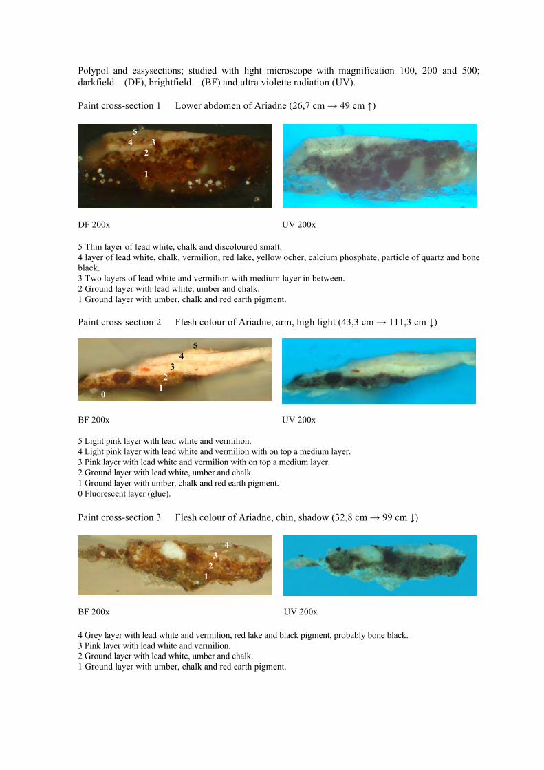
Polypol and easysections; studied with light microscope with magnification 100, 200 and 500; darkfield – (DF), brightfield – (BF) and ultra violette radiation (UV). Paint cross-section 1 Lower abdomen of Ariadne (26,7 cm → 49 cm ↑)
DF 200x UV 200x 5 Thin layer of lead white, chalk and discoloured smalt. 4 layer of lead white, chalk, vermilion, red lake, yellow ocher, calcium phosphate, particle of quartz and bone black. 3 Two layers of lead white and vermilion with medium layer in between. 2 Ground layer with lead white, umber and chalk. 1 Ground layer with umber, chalk and red earth pigment. Paint cross-section 2 Flesh colour of Ariadne, arm, high light (43,3 cm → 111,3 cm ↓)
BF 200x UV 200x 5 Light pink layer with lead white and vermilion. 4 Light pink layer with lead white and vermilion with on top a medium layer. 3 Pink layer with lead white and vermilion with on top a medium layer. 2 Ground layer with lead white, umber and chalk. 1 Ground layer with umber, chalk and red earth pigment. 0 Fluorescent layer (glue). Paint cross-section 3 Flesh colour of Ariadne, chin, shadow (32,8 cm → 99 cm ↓)
BF 200x UV 200x 4 Grey layer with lead white and vermilion, red lake and black pigment, probably bone black. 3 Pink layer with lead white and vermilion. 2 Ground layer with lead white, umber and chalk. 1 Ground layer with umber, chalk and red earth pigment.
5 4 3 2 1
5 4 3 2 1
4 3 2 1
0
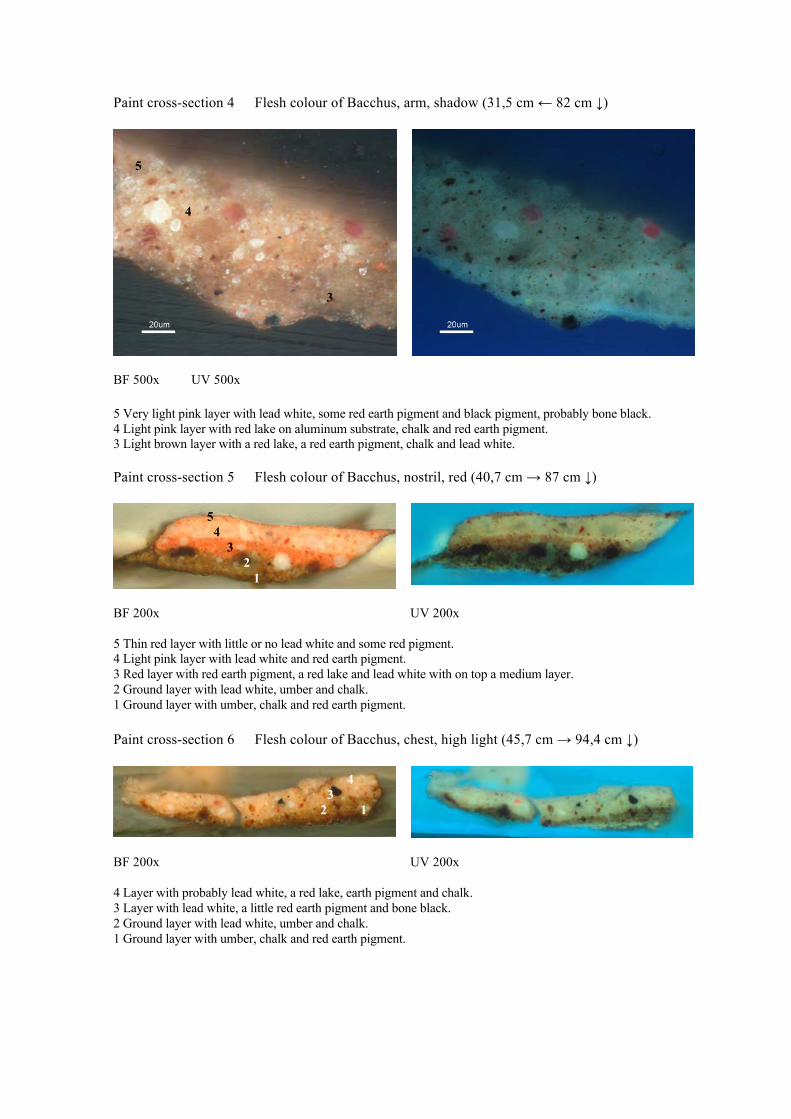
Paint cross-section 4 Flesh colour of Bacchus, arm, shadow (31,5 cm ← 82 cm ↓)
BF 500x UV 500x 5 Very light pink layer with lead white, some red earth pigment and black pigment, probably bone black. 4 Light pink layer with red lake on aluminum substrate, chalk and red earth pigment. 3 Light brown layer with a red lake, a red earth pigment, chalk and lead white. Paint cross-section 5 Flesh colour of Bacchus, nostril, red (40,7 cm → 87 cm ↓)
BF 200x UV 200x 5 Thin red layer with little or no lead white and some red pigment. 4 Light pink layer with lead white and red earth pigment. 3 Red layer with red earth pigment, a red lake and lead white with on top a medium layer. 2 Ground layer with lead white, umber and chalk. 1 Ground layer with umber, chalk and red earth pigment. Paint cross-section 6 Flesh colour of Bacchus, chest, high light (45,7 cm → 94,4 cm ↓)
BF 200x UV 200x 4 Layer with probably lead white, a red lake, earth pigment and chalk. 3 Layer with lead white, a little red earth pigment and bone black. 2 Ground layer with lead white, umber and chalk. 1 Ground layer with umber, chalk and red earth pigment.
5 4
3
5 4 3 2 1
4 3 2 1

Paint cross-section 10 Blue, transparent overpaint on arch (34,2 cm → 14,9 cm ↓)
DF 500x UV 500x 6 Varnish 5 Fluorescent transparent layer with Prussian blue. 4 Fluorescent layer (varnish). 3 Indigo with lead white, some chalk and a particle of vermilion. 2 Ground layer with lead white, umber and chalk. 1 Ground layer with umber, chalk and red earth pigment. 0 Fluorescent layer (glue). Paint cross-section 11 Blue, transparent overpaint on arch, less concentrated (32 cm → 13 cm ↓)
BF 500x UV 500x 5 Fluorescent transparent layer of Prussian blue. 4 Fluorescent layer (varnish). 3 Indigo with lead white, some chalk and a particle of vermilion. 2 Ground layer with lead white, umber and chalk.
6 5 4 3 2
1
5 4 3
2
0

Paint cross-section 12 Blue sky in the arch, original (37,3 cm → 11 cm ↓)
BF 500x UV 500x 3 Indigo with lead white, some chalk and a particle of vermilion. 2 Ground layer with lead white, umber and chalk. 1 Ground layer with umber, chalk and red earth pigment. Paint cross-section 13 Area left from the blue arch (18,2 cm → 5,1 ↓)
BF 500x UV 500x 3 Grey layer with white, black, red and blue (indigo?) pigment. 2 Ground layer with lead white, umber and chalk. 1 Ground layer with umber, chalk and red earth pigment. Paint cross-section 14 Area to the right of indigo, dark sign (32,7 cm ← 6,3 cm ↓)
BF 500x UV 500x 3 Indigo with lead white, some chalk, vermilion and some black pigment. 2 Ground layer with lead white, umber and chalk. 1 Ground layer with umber, chalk and red earth pigment.
3 2 1
3 2
1

Paint cross-section 16 Blue garment of maenad to the right of Bacchus (23,5 cm ← 78 cm ↑)
DF 200x UV 200x 8 Residue of varnish. 7 Indigo with probably lead white and some chalk. 6 Red layer. 5 Thin brown red layer. 4 Dark brown layer with on top a medium layer. 3 Dark red brown layer with on top a medium layer. 2 Ground layer with lead white, umber and chalk. 1 Ground layer with umber, chalk and red earth pigment. Paint cross-section 18 Purple garment top left, high light (3 cm → 35 cm ↓)
BF 500x UV 500 5 Grey layer with particles of discoloured lake, some bone black and lead white. 4 Purple layer with purple and red lake with red ocher and lead white with on top a medium layer. 3 Grey layer with bone black and lead white. 2 Ground layer with lead white, umber and chalk. 1 Ground layer with umber, chalk and red earth pigment. Paint cross-section 19 Purple garment, dark area (17 cm → 74 cm ↓)
BF 500x UV 500x 4 Layer with a very fine black pigment, probably lamp black, bright red earth pigment, lead white and a red lake. 3 Layer with lead white, a red pigment and black with on top a medium layer. 2 Ground layer with lead white, umber and chalk. 1 Ground layer with umber, chalk and red earth pigment. 0 Fluorescent layer (glue).
4 3 2 1
8 7 5 6
5 3 4
1 1
4 2 3 1 0

Paint cross-section 20 Purple cloud top left (12 cm → 27,5 cm ↓)
BF 500x UV 500x 4 Red grey layer with red earth pigment, lead white and a brown earth pigment. 3 Grey layer with lead white, brown earth pigment and a black pigment, probably bone black. 2 Ground layer with lead white, umber and chalk. 1 Ground layer with umber, chalk and red earth pigment. 0 Fluorescent layer (glue). Paint cross-section 21 Brown rock top right (32,3 cm ← 25,4 cm ↓)
BF 500x UV 500x 4 Red layer with lead white and a bright red earth pigment. 3 Layer with black pigment, fine red pigment and lead white. 2 Ground layer with lead white, umber and chalk. 1 Ground layer with umber, chalk and red earth pigment.
4 3 2 1 0
4 3 2 1

Appendix II SEM/EDX analysis Scanning electron microscopy combined with energy-dispersive X-ray micro-analysis (SEM/EDX). Backscatter images and EDX spot and area measurements. The SEM-EDX measurements are executed on a SFEG XL30 electron microscope of FEI (Eindhoven) with EDX detector and EDAX software (Tilburg) (AMOLF). On the basis of the morphology of the parts in the backscatter image together with the composition of the elements, most 17-century pigments can be analysed.

1. Ground layer
Image 3 Image 7
EDX-spectrum of Area 1: Fe, Mn, Si, Pb, Al, Mg, Na, P, Cl, K, Ca Paint cross-section 18, SEM/EDX backscatter images, overall measurements and spottings. Area 1: large brown particle in first ground layer: Fe, Mn, Si, Pb, Al, Mg, Na, P, Cl, K, Ca Umber Area 2: large brown particle in first ground layer: Fe, Si, Pb, Ca, Mn, Al, Mg, (P, K, Cl) Umber Area 3: matrix between large umber particle and first ground layer: Ca, Si, Pb, Fe, Mg, Al, P, K, Mn Chalk and umber Area 4: second ground layer overall: Pb, Ca, Fe, Mn, Si, Al, Mg, (K, P) Lead white, chalk and umber Area 5: transparent particle in second ground layer: Ca, (Pb), C, O Chalk Spot 1: white particle in second ground layer: Pb, C, O Lead white Area 6: brown particle in second ground layer: Pb, Fe, Si, Ca, Mn, Al, Mg Umber Area 11: large transparent particle in first ground layer: Ca, C, O Chalk
Spot 1 Area 1 en 2 Area 3
Area 11
Area 5 Area 6 Area 4
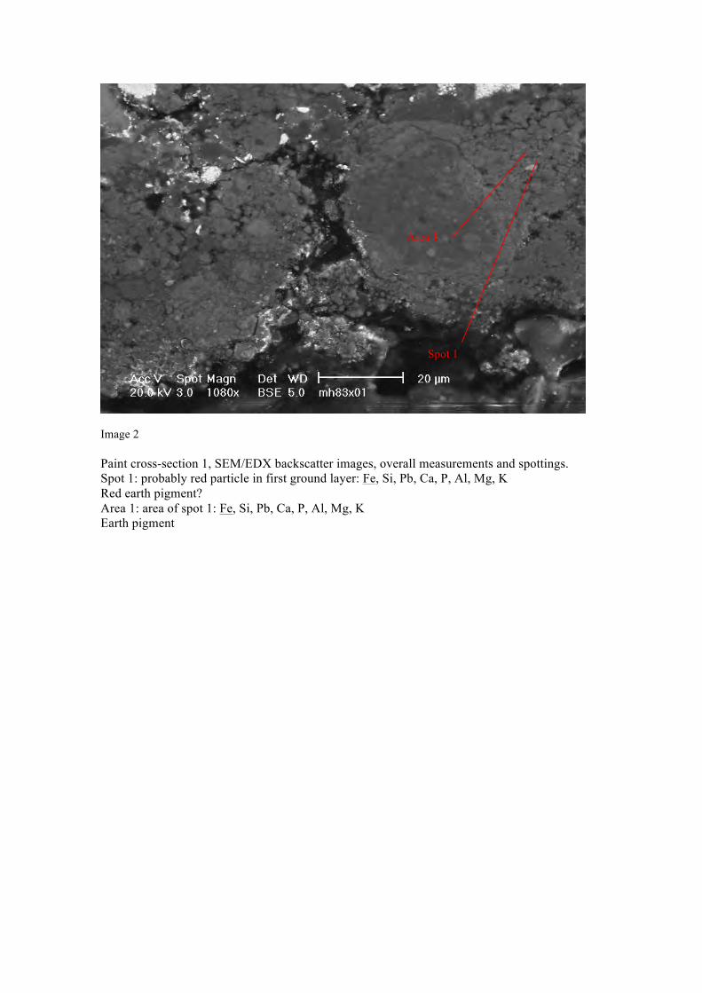
Image 2 Paint cross-section 1, SEM/EDX backscatter images, overall measurements and spottings. Spot 1: probably red particle in first ground layer: Fe, Si, Pb, Ca, P, Al, Mg, K Red earth pigment? Area 1: area of spot 1: Fe, Si, Pb, Ca, P, Al, Mg, K Earth pigment
Area 1
Spot 1

2. Pigments in the flesh colour of Bacchus
Image 2 Image 4
EDX-spectrum of Area 2: Ca, Pb Paint cross-section 4, SEM/EDX backscatter images, overall measurements and spottings. Area 1: pink red particle in top pink flesh colour layer: Al, Pb/S, K, Ca Red lake on aluminum substrate Area 2: transparent particle in top pink flesh colour layer: Ca, Pb Chalk Area 3: brown particle in bottom pink flesh colour layer: Pb, Al, Si, K, Ca, Fe (Mg, Na, Cl) Earth pigment Area 4: red particle in top pink flesh colour layer: Pb, Al, Si, Ca, Fe (K) Earth pigment Spot 1: brown particle in top pink flesh colour layer (as in area 3): Pb, Ca, Fe, Al, Si, K, Mg Earth pigment Spot 2: transparent particle in bottom pink flesh colour layer (links): Pb, C Saponified lead white particle?
Spot 2
Spot 1
Area 4
Area 3
Area 1 Area 2

3. Pigments in the flesh colour of Ariadne
Image 3 Image 4 Paint cross-section 1, SEM/EDX backscatter images, overall measurements and spottings. Area 2: a red particle in the second layer: Hg, S, (Pb, Ca) Vermilion Area 3: red particle in the second layer: Hg, S, (Pb, Ca) Vermilion Area 4: red particle in the second layer: Hg, S, (Pb, Ca) Vermilion Area 5: transparent particle in the second layer: Ca, P Calcium phosphate/bone white Area 6: transparent particle in the second layer: Si, O Silicate/Quartz particle. Filling? Area 7: red particle in the second layer: Al, Pb/(S), K, (Ca) Red lake on aluminum substrate Area 8: flesh colour overall second layer: Pb, Ca, Al, Si, K, Ti, Fe Lead white and chalk Area 9: flesh colour top layer: Pb, Si, Ca, (K, Fe, Co, As, Al) Lead white and chalk Area 10: particle in top layer: Si, Pb, As, Al, K, Ca, Fe, Co, (Ni) Discoloured: low K% Area 11: yellow particle in the second layer: Al, Si, Pb, K, Ca, Fe Yellow ocher Area 12: black particle in the second layer: P, Ca, Pb, (Mg, Al, Si, Fe, K) Bone black Area 13: under paint flesh colour – red particle in lead white matrix: Hg, S, Pb Vermilion and lead white
Area 4
Area 3 Area 6
Area 2
Area 12
Area 5 Area 11
Area 8
Area 7
Area 4 Area 10
Area 9
EDX-spectrum of Area 2: Hg, S, (Pb, Ca) EDX-spectrum of Area 10: Si, Pb, As, Al, K, Ca, Fe,
Co, (Ni)

4. Discoloration of purple garment
Image 3 Image 11 Paint cross-section 18, SEM/EDX backscatter images, overall measurements and spottings. Area 7: black particle in layer 3: Pb, P, Ca, Mg Bone black and lead white Area 8: red particle in layer 4: Pb, Si, Al, Fe, Ca Red ocher, lead white Area 9: transparent pink red particle in layer 4: Al, Pb/S, K (no S?) Red lake on aluminum substrate Area 10: transparent pink red particle in layer 4: Pb/S, Al, K Area 12: black particle in layer 5: P, Ca, Pb, Mg Bone black Area 13: transparent pink red particle in layer 5: Al, Pb/S (P, K, Ca) Red lake on aluminum substrate 7. Transparent blue overpaint
Image 1 Paint cross-section 11, SEM/EDX backscatter images, spotting. Area 2: blue particle in transparent blue overpaint: Al, Fe, Si, P, Pb, K, Ca, N
Area 7 Area 8 Area 9 Area 10
Area 12
Area 13
Area 2

Prussian blue with alum substrate and lead white. The N of the cyan group (CN) of Prussian blue is visible in the spectrum.

8. Original blue layer in sky area
Image 3 Paint cross-section 10, SEM/EDX backscatter images, overall measurements. Area 1: blue layer overall: Pb, Ca, Si, Fe, Al Lead white, little chalk, probably indigo Area 2: large transparent particle in blue layer: Ca, C, O Chalk
Image 5 Paint cross-section 12, SEM/EDX backscatter images, overall measurements. Area 1: blue paint layer overall: Pb, Ca, Fe Mostly lead white, little chalk, probably indigo Area 2; blue paint layer top: Pb, Si, Ca, Fe Silicium derives probably from polishing
Area 1
Area 2
Area 1
Area 2

Image 2 EDX-spectrum of Area 2 Paint cross-section 11, SEM/EDX backscatter image, overall measurement. Area 1: red particle in the indigo layer: Hg, S, Pb Vermilion
Area 1

Appendix III DTMS analysis Direct Temperature-resolved Massa Spectrometry (DTMS) is used to indicate indigo. DTMS is an analytical method for the characteristics of organic compounds. A JEOL JMS-SX/SX102A 4 sector double focusing mass spectrometer is used. It is a quick method to indicate oils, resins, carbohydrates and proteins. Sample MH 83B2706 VB Oil components: free fatty acids (m/z 256 and 284) and oil network (m/z 91, 105) Resin components: triterpenes (m/z 143 indicates dammar, area between m/z 400 and 450) and diterpenes (dehydro)abietic acids, could be colophony or (Venetian) turpentine used as solvent in mixture with triterpenes) Beeswax: m/z 592, 620, 648, 676, 704, 732 probably deriving from wax-resin lining? M/z 262 is indicative for indigo. FOM Instituut AMOLF Jaap Boon, March 31, 2006 Annelies van Loon, May 15, 2006

Massa spectrum of pigment scraping 12

Massa chromatogram of pigment scraping 12
Appendix IV Paint samples of Five-part Ceiling Decoration for the Great Hall of Soestdijk Palace SEM/EDX executed at the Cultural Heritage Agency of the Netherlands, Ministry of Education, Culture and Science by Matthijs de Keijzer with a JSM 5910 Low Vacuum Device by JEOL with a detector by Thermonoran, vantage system. Sample 1207-12 Layer 2: black blue paint layer, overall: Pb lead white, organic black Layer 4: transparent violet red paint layer, overall: Al Pb K organic violet red on alum Matthijs de Keijzer February 2006

Five-part Ceiling Decoration for the Great Hall of Soestdijk Palace Paint cross-section 1207-12 Dark red garment
BF 500x UV 500x 7 Layer of vermilion. 6 Layer of red lake with vermilion with on top a medium layer. 5 Transparent purple red paint layer of a purple red lake with on top a medium layer. 4 Black blue layer of the balustrade with lead white and black pigment. 3 Layer with a green copper pigment (probably Atacamite) mixed with lead white. 2 Light brown ground layer with umber, leadmenie and lead white. 1 Dark brown ground layer with umber. Paint cross-section 1207-15 Dark green of woman with lance
BF 200x UV 200x 4 Thin green layer with fine red pigment. 3 Indigo with lead white (and chalk?). 2 Light brown ground layer with umber, leadmenie and lead white. 1 Dark brown ground layer with umber.
7 6 5 3 4 2 1
4 3 2 1

Paint cross-section 1207-19 Blue garment of woman with lance
BF 500x UV 500X 6 Overpaint with Prussian blue. 5 Fluorescent layer (varnish). 4 Indigo. 3 Discoloured smalt. 2 Light brown ground layer with umber, leadmenie and lead white. 1 Dark brown ground layer with umber.
5 6 4 3 2 1