percorsi paths - officine delle arti · brings together the works of a select group of italian...
TRANSCRIPT

PERCORSI | PATHSARTISTI ITALIANI IN PORTOGALLO | ITALIAN ARTISTS IN PORTUGAL
A CURA DI | CURATED BYNELLO BASILI
TESTI | TEXTSNELLO BASILI
MIMMO DI BENEDETTODARIO ORPHEÈ LA MENDOLA
DANIELE MENDOLIAGIANNA PANICOLA
Soltanto l’arte è capace di rappresentare sogni e ideali, dando colore e luce, fecondandoli di bellezza, subli-mandoli in immagini che sono rappresentazioni del mondo e metafore della vita. Con la mostra “PERCORSI”, che riunisce nel segno della sperimentazione e dello scambio di idee e visioni le opere di un gruppo selezionato di artisti italiani,la Galleria-Atelier Geraldes da Silva testimonia la sua apertura ai valori della creatività e del confronto.
Only art is able to represent dreams and ideals, through color and light, fertilizing them with beauty, sublimating them into images that are representations of the world and metaphors of life. With the exhibition “PATHS”, which brings together the works of a select group of Italian artists in the sign of experimentation and exchange of ideas and visions, the Gallery-Atelier Geraldes da Silva witnesses its openness to the values of creativity and comparison.
NELLO BASILI
Rua Santo Ildefonso, 225/229
P O R T OP O R T U G A L
01 | 08 SETTEMBRE 2018
PERCORSI | PATHSARTISTI ITALIANI IN PORTOGALLO | ITALIAN ARTISTS IN PORTUGAL

Nel magmatico ribollire del colore, ansima, prendendo forma, il tumulto espressivo di Maurizia Braga, in arte Regizia, la quale, attraverso la fotografia, esplora universi che nella trasposizione dal micro al macro-cosmo e viceversa, sembrano orientarsi verso una astrazione di origine naturale che permette di stabilire punti di avvio per una evoluzione non prevedibile: ogni sua opera crea fantasmagorie cangianti dal mo-vimento sinuoso, fissato nell’istante dello scatto. Tutto ci parla di questo: di come la materia sia mutevole, di come ogni cosa rischi per tutto il tempo della sua esistenza di ritornare ad un caos primordiale, indefini-bile, dove ciò che è può diventare ciò che è stato. In ogni opera dell’artista coesistono spazio e materia in una singolare dimensione astratta che ci pone nell’impossibilità di riconoscere il soggetto. Avviene uno stravolgimento del reale a favore degli elementi emotivi, generando visioni di materie che coniugano il sentimento e lo sguardo. Un mondo immaginario che attraverso il medium fotografico, trasforma ogni particolare in acqua e terra, carne e cielo: così lo spazio si moltiplica, non è più un luogo ma molti luoghi contemporaneamente. Luoghi dello spazio e della mente.
MAU
RIZIA
BRA
GA “R
EGIZI
A”
In the magmatic seethe of color, the expressive uproar of Maurizia Braga, aka Regiza, takes shape, and through photography, explores universes that in transposing from the micro to the macrocosm and vice versa, seem to be oriented towards an abstraction of natural origin that allows you to establish starting points for an unpredictable evolution: each of her works create iridescent phantasmagorias with a sinuous movement, fixed at the moment of the shooting. Everything talks about this: of how matter is changeable, how everything risks for all the time of its existence to return to a primordial, indefinable chaos, where what is can become what has been. In every work of the artist coexist space and matter in a singular abstract dimension that makes us unable to recognize the subject. An upheaval of reality takes place in favor of the emotional elements, generating visions of materials that combine sentiment and gaze. An imaginary world that, through the photographic medium, transforms every detail into water and earth, flesh and sky: in this way space multiplies, it is no longer a place but many places at the same time. Places of space and mind.
MIMMO DI BENEDETTO
SERIE “DELL’ANIMA”: EMOZIONE 16 | 2018stampa digitale su plexiglass | digital printing on plexiglass, cm 50x70
SERIE “DELL’ANIMA”: EMOZIONE 14 | 2018stampa digitale su plexiglass | digital printing on plexiglass, cm 50x70
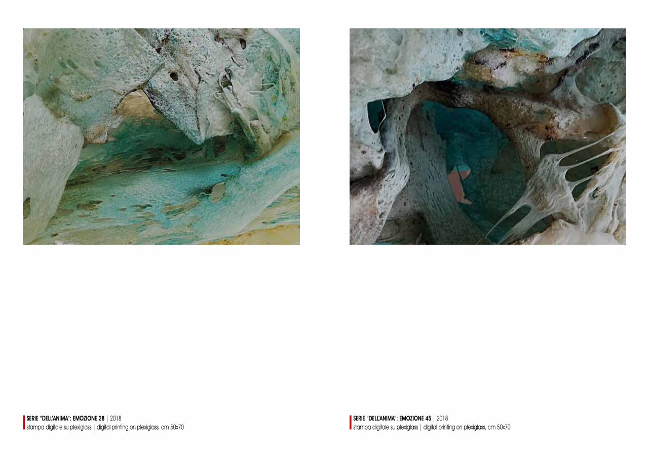
SERIE “DELL’ANIMA”: EMOZIONE 45 | 2018stampa digitale su plexiglass | digital printing on plexiglass, cm 50x70
SERIE “DELL’ANIMA”: EMOZIONE 28 | 2018stampa digitale su plexiglass | digital printing on plexiglass, cm 50x70

C’è un’incisione di Albrecht Dürer che, come al solito, riesce a comunicare più di quanto le forme pos-sano fare. E soprattutto nel tempo. Eccola. Un disegnatore - in piedi, a destra - osserva il soggetto da ritrarre - seduto, a sinistra - attraverso uno spioncino, montato su un tavolo, a pochi centimetri dalla tavola sulla quale traccia dei solchi con il bulino. La scena ha dell’onirico, e sembra ovattata dalla perfezione prospettica e la cura dedicata ai dettagli (e all’illustrazione dei simboli, sparsi per il disegno). Lo psico-logo dell’arte Rudolf Arnheim, fine osservatore, citò l’incisione a riguardo di un discorso sullo spazio e la prospettiva centrale, per l’appunto; scrivendo: «Paradossalmente, la prospettiva centrale è allo stesso tempo anche il modo di gran lunga più realistico di rendere lo spazio ottico, e si penserebbe quindi che non fosse una raffinatezza esoterica, riservata a pochi privilegiati, ma il metodo offerto a tutti nel modo più naturale dall’evidenza dell’esperienza visiva». Vien da chiedersi, trattando di prospettiva, se tutto il nostro linguaggio (verbale, gestuale, figurativo, ecc.) risenta delle influenze delle “dimensioni” a cui siamo sottoposti. O meglio, se ogni espressione linguistica sia soltanto una forma specifica, da noi unicamente “confezionata”, di ciò che è presente in germe nell’ambiente, e non un prodotto della nostra autonoma capacità di comprendere le cose (e beh, sarebbe tanto diverso). Trascendendo queste parole, non è un azzardo affermare che chi disegna sia, insomma, come l’artista nell’incisione di Dürer: che scruta il mondo da uno spioncino al fine di, prospettiva centrale o meno, catturare il mondo stesso; e cioè che scruta, perché ha necessità di farlo. Daniela Costa, in pitture che hanno l’eleganza del disegno più puro, e spesso in dittici speculari e formalmente ciclici, illustra questo scrutare ontologico, in giochi percettivi e nella variabilità delle impressioni ottiche.
DANI
ELA
COST
A
There is an engraving by Albrecht Dürer that, as usual, is able to communicate more than shapes can do. And above all in time. Here it is. A designer - standing, on the right - observes the subject to portray - sitting, on the left - through a peephole, mounted on a table, a few centimeters from the table on which he traces the grooves with the chisel. The scene is oneiric, and seems muffled by the perspective perfection and the care dedicated to details (and to the illustration of the symbols, scattered around the drawing). The art psychologist Rudolf Arnheim, a keen observer, cited the engraving on the subject of a discourse on space and the central perspective, precisely; writing: “Paradoxically, the central perspective is at the same time the far more realistic way of making optical space, and one would therefore think that it was not an esoteric refinement, reserved for the privileged few, but the method offered to everyone in the way more natural from the evidence of visual experience “. One wonders, dealing with perspective, if all our language (ver-bal, gestural, figurative, etc.) is influenced by the “dimensions” to which we are subjected. Or rather, if every linguistic expression is only a specific form, which we only “package”, of what is present in the environment, and not a product of our autonomous ability to understand things (and well, it would be so different ). Tran-scending these words, it is not a gamble to say that the designer is, in short, like the artist in Dürer’s engraving: that he searches the world through a peephole in order to capture the world itself; that is, that he scrutinizes, because he needs to do it.Daniela Costa, in paintings that have the elegance of the purest design, and often in specular and formally cyclic diptychs, illustrates this ontological scrutiny, in perceptual games and in the variability of optical impressions.
DARIO ORPHEÈ LA MENDOLA
SEGNI DEL TEMPO | 2012xilografia policroma | polychrome xylographyfoglio | sheet, cm 50x35 x 2
SEGNI DEL TEMPO | 2012xilografia policroma | polychrome xylographyfoglio | sheet, cm 50x35 x 2
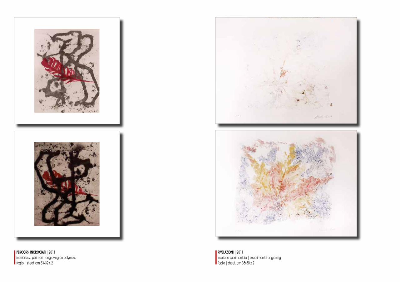
PERCORSI INCROCIATI | 2011incisione su polimeri | engraving on polymersfoglio | sheet, cm 33x32 x 2
RIVELAZIONI | 2011incisione sperimentale | experimental engravingfoglio | sheet, cm 35x50 x 2
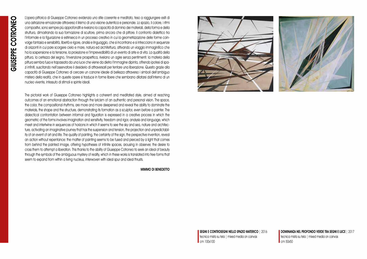
L’opera pittorica di Giuseppe Cotroneo evidenzia uno stile coerente e meditato, teso a raggiungere esiti di una astrazione emozionale attraverso il lirismo di una visione autentica e personale. Lo spazio, il colore, i ritmi compositivi, sono sempre più approfonditi e rivelano la capacità di dominio dei materiali, della forma e della struttura, dimostrando la sua formazione di scultore, prima ancora che di pittore. Il confronto dialettico tra l’informale e la figurazione si estrinseca in un processo creativo in cui la geometrizzazione delle forme coin-volge fantasia e sensibilità, libertà e rigore, analisi e linguaggio, che si incontrano e si intrecciano in sequenze di orizzonti in cui pare scorgere cielo e mare, natura ed architettura, attivando un viaggio immaginifico che ha la sospensione e la tensione, la proiezione e l’imprevedibilità di un evento di arte e di vita. La qualità della pittura, la certezza del segno, l’invenzione prospettica, rivelano un agire senza pentimenti: la materia della pittura sembra fusa e trapassata da una luce che viene da dietro l’immagine dipinta, offrendo ipotesi di spa-zi infiniti, suscitando nell’osservatore il desiderio di attraversarli per tentare una liberazione. Questo grazie alla capacità di Giuseppe Cotroneo di cercare un canone ideale di bellezza attraverso i simboli dell’ambiguo mistero della realtà, che in queste opere si traduce in forme libere che sembrano dilatarsi dall’interno di un nucleo vivente, intessuto di stimoli e spinte ideali.
GIUS
EPPE
COT
RONE
O
The pictorial work of Giuseppe Cotroneo highlights a coherent and meditated style, aimed at reaching outcomes of an emotional abstraction through the lyricism of an authentic and personal vision. The space, the color, the compositional rhythms, are more and more deepened and reveal the ability to dominate the materials, the shape and the structure, demonstrating its formation as a sculptor, even before a painter. The dialectical confrontation between informal and figuration is expressed in a creative process in which the geometric of the forms involves imagination and sensitivity, freedom and rigor, analysis and language, which meet and intertwine in sequences of horizons in which it seems to see the sky and sea, nature and architec-ture, activating an imaginative journey that has the suspension and tension, the projection and unpredictabil-ity of an event of art and life. The quality of painting, the certainty of the sign, the perspective invention, reveal an action without repentance: the matter of painting seems to be fused and pierced by a light that comes from behind the painted image, offering hypotheses of infinite spaces, arousing in observer, the desire to cross them to attempt a liberation. This thanks to the ability of Giuseppe Cotroneo to seek an ideal of beauty through the symbols of the ambiguous mystery of reality, which in these works is translated into free forms that seem to expand from within a living nucleus, interwoven with ideal spur and ideal thrusts.
MIMMO DI BENEDETTO
SEGNI E CONTROSEGNI NELLO SPAZIO MATERICO | 2016tecnica mista su tela | mixed media on canvascm 100x100
DOMINANZA NEL PROFONDO VERDE TRA SEGNI E LUCE | 2017tecnica mista su tela | mixed media on canvascm 50x50
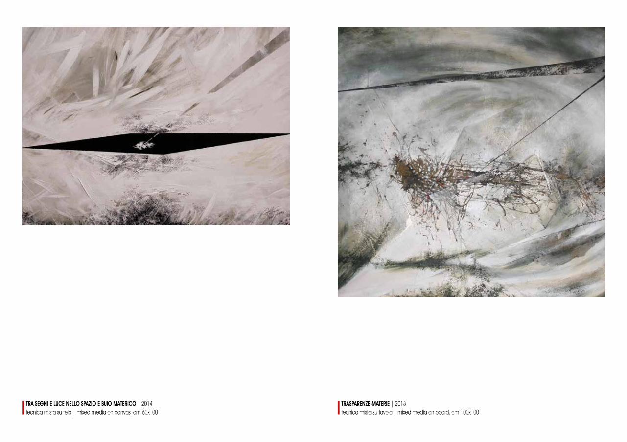
TRA SEGNI E LUCE NELLO SPAZIO E BUIO MATERICO | 2014tecnica mista su tela | mixed media on canvas, cm 60x100
TRASPARENZE-MATERIE | 2013tecnica mista su tavola | mixed media on board, cm 100x100
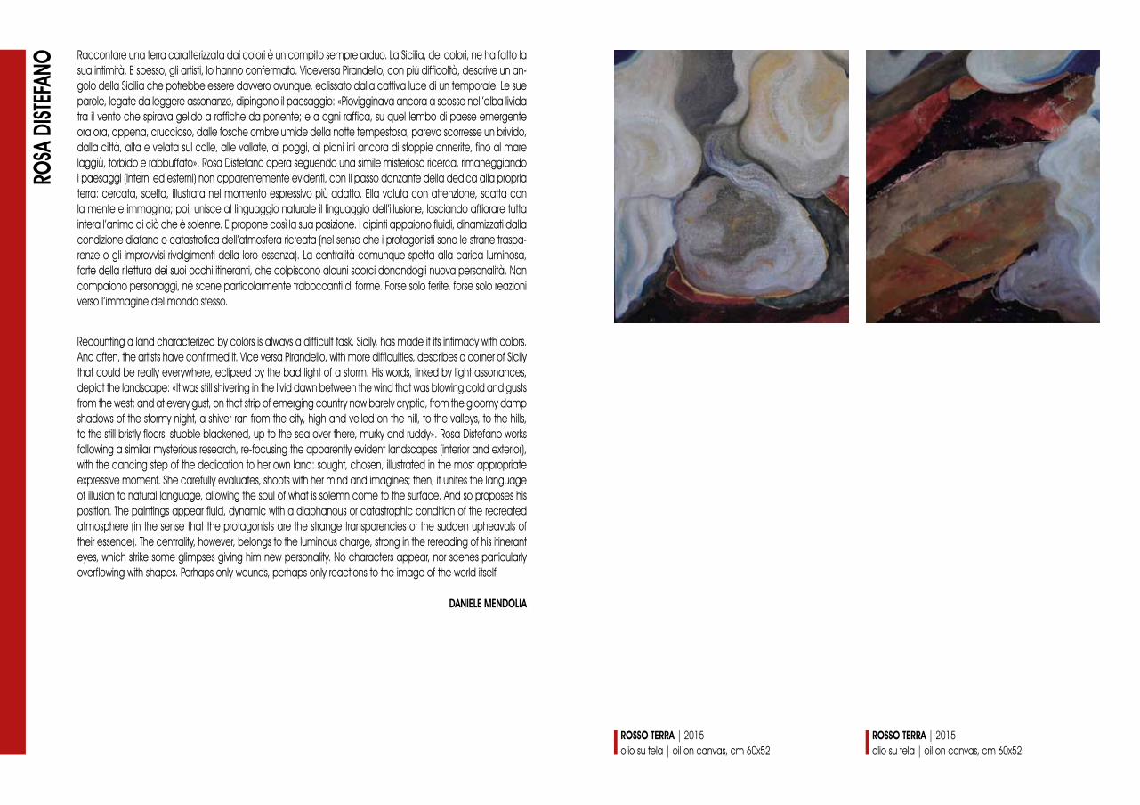
Raccontare una terra caratterizzata dai colori è un compito sempre arduo. La Sicilia, dei colori, ne ha fatto la sua intimità. E spesso, gli artisti, lo hanno confermato. Viceversa Pirandello, con più difficoltà, descrive un an-golo della Sicilia che potrebbe essere davvero ovunque, eclissato dalla cattiva luce di un temporale. Le sue parole, legate da leggere assonanze, dipingono il paesaggio: «Piovigginava ancora a scosse nell’alba livida tra il vento che spirava gelido a raffiche da ponente; e a ogni raffica, su quel lembo di paese emergente ora ora, appena, cruccioso, dalle fosche ombre umide della notte tempestosa, pareva scorresse un brivido, dalla città, alta e velata sul colle, alle vallate, ai poggi, ai piani irti ancora di stoppie annerite, fino al mare laggiù, torbido e rabbuffato». Rosa Distefano opera seguendo una simile misteriosa ricerca, rimaneggiando i paesaggi (interni ed esterni) non apparentemente evidenti, con il passo danzante della dedica alla propria terra: cercata, scelta, illustrata nel momento espressivo più adatto. Ella valuta con attenzione, scatta con la mente e immagina; poi, unisce al linguaggio naturale il linguaggio dell’illusione, lasciando affiorare tutta intera l’anima di ciò che è solenne. E propone così la sua posizione. I dipinti appaiono fluidi, dinamizzati dalla condizione diafana o catastrofica dell’atmosfera ricreata (nel senso che i protagonisti sono le strane traspa-renze o gli improvvisi rivolgimenti della loro essenza). La centralità comunque spetta alla carica luminosa, forte della rilettura dei suoi occhi itineranti, che colpiscono alcuni scorci donandogli nuova personalità. Non compaiono personaggi, né scene particolarmente traboccanti di forme. Forse solo ferite, forse solo reazioni verso l’immagine del mondo stesso.
ROSA
DIST
EFAN
O
Recounting a land characterized by colors is always a difficult task. Sicily, has made it its intimacy with colors. And often, the artists have confirmed it. Vice versa Pirandello, with more difficulties, describes a corner of Sicily that could be really everywhere, eclipsed by the bad light of a storm. His words, linked by light assonances, depict the landscape: «It was still shivering in the livid dawn between the wind that was blowing cold and gusts from the west; and at every gust, on that strip of emerging country now barely cryptic, from the gloomy damp shadows of the stormy night, a shiver ran from the city, high and veiled on the hill, to the valleys, to the hills, to the still bristly floors. stubble blackened, up to the sea over there, murky and ruddy». Rosa Distefano works following a similar mysterious research, re-focusing the apparently evident landscapes (interior and exterior), with the dancing step of the dedication to her own land: sought, chosen, illustrated in the most appropriate expressive moment. She carefully evaluates, shoots with her mind and imagines; then, it unites the language of illusion to natural language, allowing the soul of what is solemn come to the surface. And so proposes his position. The paintings appear fluid, dynamic with a diaphanous or catastrophic condition of the recreated atmosphere (in the sense that the protagonists are the strange transparencies or the sudden upheavals of their essence). The centrality, however, belongs to the luminous charge, strong in the rereading of his itinerant eyes, which strike some glimpses giving him new personality. No characters appear, nor scenes particularly overflowing with shapes. Perhaps only wounds, perhaps only reactions to the image of the world itself.
DANIELE MENDOLIA
ROSSO TERRA | 2015olio su tela | oil on canvas, cm 60x52
ROSSO TERRA | 2015olio su tela | oil on canvas, cm 60x52
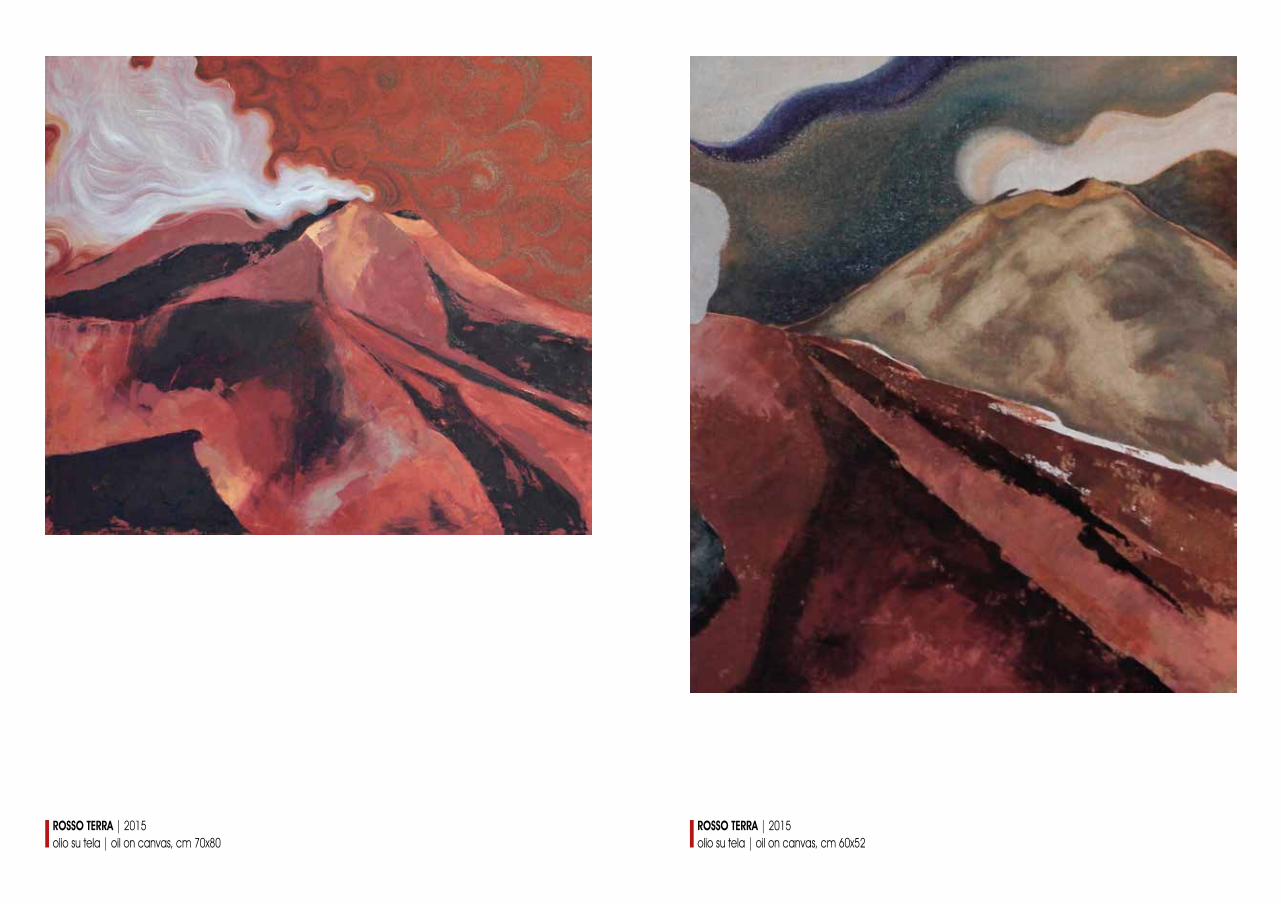
ROSSO TERRA | 2015olio su tela | oil on canvas, cm 60x52
ROSSO TERRA | 2015olio su tela | oil on canvas, cm 70x80
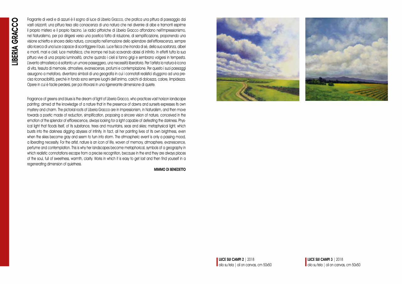
Fragrante di verdi e di azzurri è il sogno di luce di Liberia Gracco, che pratica una pittura di paesaggio dai vasti orizzonti; una pittura tesa alla conoscenza di una natura che nel divenire di albe e tramonti esprime il proprio mistero e il proprio fascino. Le radici pittoriche di Liberia Gracco affondano nell’Impressionismo, nel Naturalismo, per poi dirigersi verso una poetica fatta di riduzione, di semplificazione, proponendo una visione schietta e sincera della natura, concepita nell’emozione dello splendore dell’efflorescenza, sempre alla ricerca di una luce capace di sconfiggere il buio. Luce fisica che inonda di sé, della sua sostanza, alberi e monti, mari e cieli; luce metafisica, che irrompe nel buio scavando abissi di infinito. In effetti tutta la sua pittura vive di una propria luminosità, anche quando i cieli si fanno grigi e sembrano volgersi in tempesta. L’evento atmosferico è soltanto un umore passeggero, una necessità liberatoria. Per l’artista la natura è icona di vita, tessuta di memorie, atmosfere, evanescenze, profumi e contemplazione. Per questo i suoi paesaggi assurgono a metafora, diventano simboli di una geografia in cui i connotati realistici sfuggono ad una pre-cisa riconoscibilità, perché in fondo sono sempre luoghi dell’anima, carichi di dolcezza, calore, limpidezza. Opere in cui è facile perdersi, per poi ritrovarsi in una rigenerante dimensione di quiete.
LIBER
IA G
RACC
O
Fragrance of greens and blues is the dream of light of Liberia Gracco, who practices vast horizon landscape painting; aimed at the knowledge of a nature that in the presence of dawns and sunsets expresses its own mystery and charm. The pictorial roots of Liberia Gracco are in Impressionism, in Naturalism, and then move towards a poetic made of reduction, simplification, proposing a sincere vision of nature, conceived in the emotion of the splendor of efflorescence, always looking for a light capable of defeating the darkness. Phys-ical light that floods itself, of its substance, trees and mountains, seas and skies; metaphysical light, which bursts into the darkness digging abysses of infinity. In fact, all her painting lives of its own brightness, even when the skies become gray and seem to turn into storm. The atmospheric event is only a passing mood, a liberating necessity. For the artist, nature is an icon of life, woven of memory, atmosphere, evanescence, perfume and contemplation. This is why her landscapes become metaphorical, symbols of a geography in which realistic connotations escape from a precise recognition, because in the end they are always places of the soul, full of sweetness, warmth, clarity. Works in which it is easy to get lost and then find yourself in a regenerating dimension of quietness.
MIMMO DI BENEDETTO
LUCE SUI CAMPI 2 | 2018olio su tela | oil on canvas, cm 50x50
LUCE SUI CAMPI 3 | 2018olio su tela | oil on canvas, cm 50x50
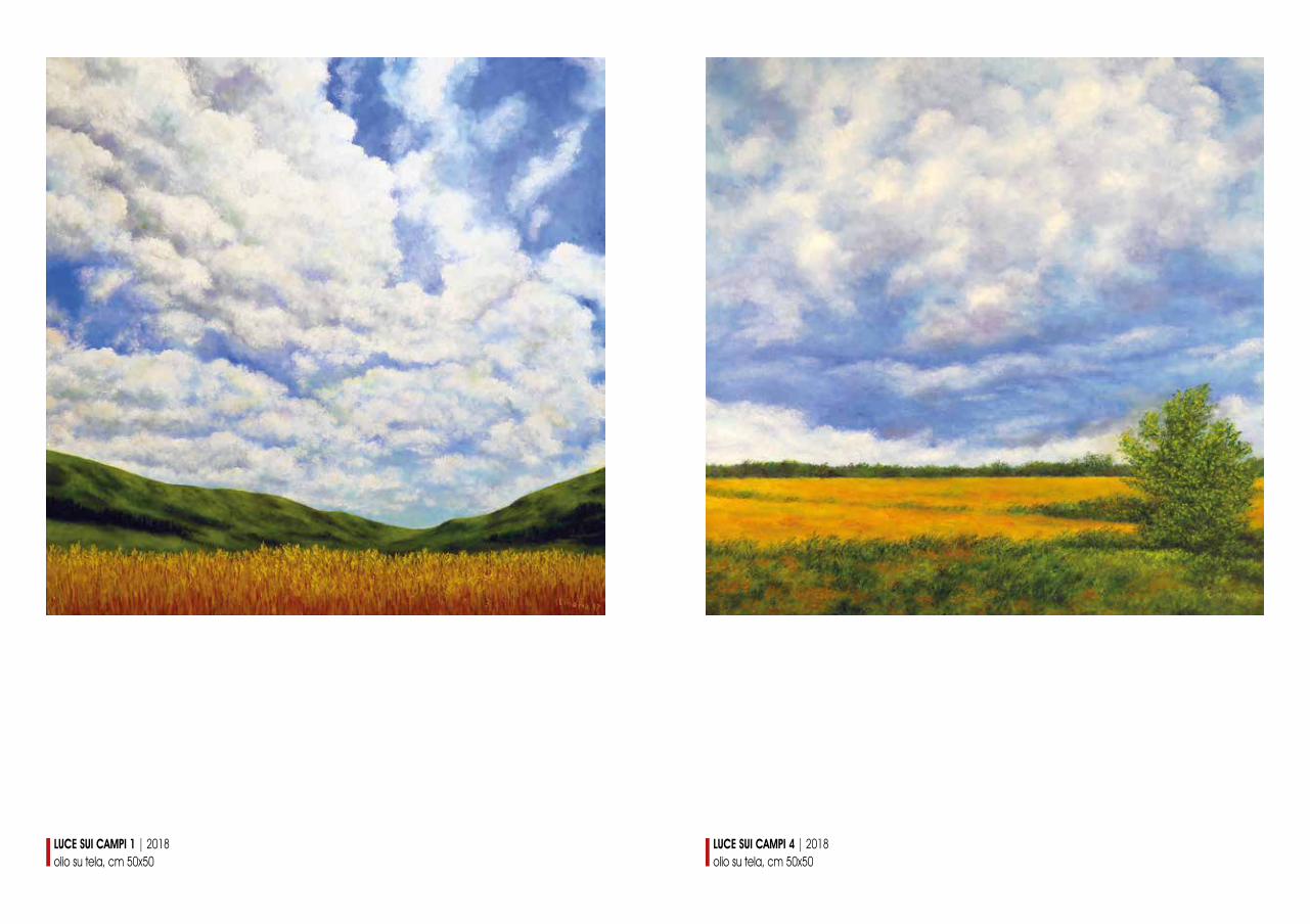
LUCE SUI CAMPI 4 | 2018olio su tela, cm 50x50
LUCE SUI CAMPI 1 | 2018olio su tela, cm 50x50
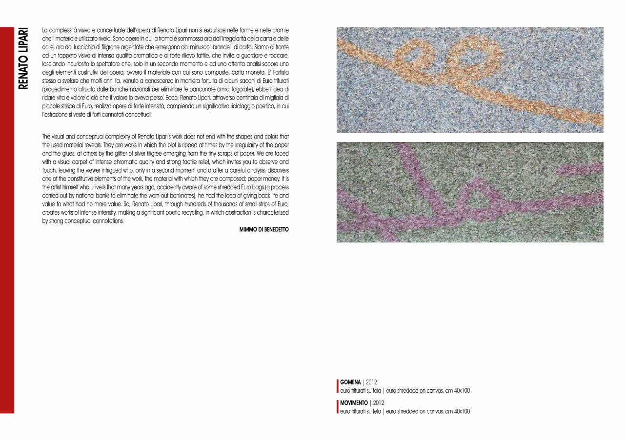
La complessità visiva e concettuale dell’opera di Renato Lipari non si esaurisce nelle forme e nelle cromie che il materiale utilizzato rivela. Sono opere in cui la trama è sommossa ora dall’irregolarità della carta e delle colle, ora dal luccichio di filigrane argentate che emergono dai minuscoli brandelli di carta. Siamo di fronte ad un tappeto visivo di intensa qualità cromatica e di forte rilievo tattile, che invita a guardare e toccare, lasciando incuriosito lo spettatore che, solo in un secondo momento e ad una attenta analisi scopre uno degli elementi costitutivi dell’opera, ovvero il materiale con cui sono composte: carta moneta. E’ l’artista stesso a svelare che molti anni fa, venuto a conoscenza in maniera fortuita di alcuni sacchi di Euro triturati (procedimento attuato dalle banche nazionali per eliminare le banconote ormai logorate), ebbe l’idea di ridare vita e valore a ciò che il valore lo aveva perso. Ecco, Renato Lipari, attraverso centinaia di migliaia di piccole strisce di Euro, realizza opere di forte intensità, compiendo un significativo riciclaggio poetico, in cui l’astrazione si veste di forti connotati concettuali.
RENA
TO LI
PARI
The visual and conceptual complexity of Renato Lipari’s work does not end with the shapes and colors that the used material reveals. They are works in which the plot is ripped at times by the irregularity of the paper and the glues, at others by the glitter of silver filigree emerging from the tiny scraps of paper. We are faced with a visual carpet of intense chromatic quality and strong tactile relief, which invites you to observe and touch, leaving the viewer intrigued who, only in a second moment and a after a careful analysis, discovers one of the constitutive elements of the work, the material with which they are composed: paper money. It is the artist himself who unveils that many years ago, accidently aware of some shredded Euro bags (a process carried out by national banks to eliminate the worn-out banknotes), he had the idea of giving back life and value to what had no more value. So, Renato Lipari, through hundreds of thousands of small strips of Euro, creates works of intense intensity, making a significant poetic recycling, in which abstraction is characterized by strong conceptual connotations.
MIMMO DI BENEDETTO
MOVIMENTO | 2012euro triturati su tela | euro shredded on canvas, cm 40x100
GOMENA | 2012euro triturati su tela | euro shredded on canvas, cm 40x100

FIGURE ED EMERSIONI | 2011euro triturati su tela | euro shredded on canvas, cm 50x50
EMERSIONI | 2012euro triturati su tela | euro shredded on canvas, cm 50x50
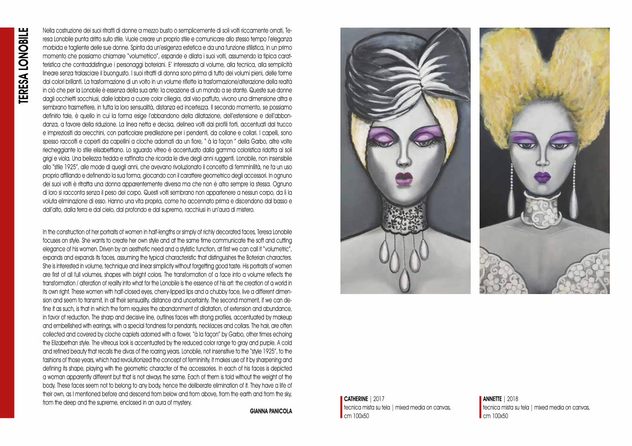
Nella costruzione dei suoi ritratti di donne a mezzo busto o semplicemente di soli volti riccamente ornati, Te-resa Lonobile punta dritto sullo stile. Vuole creare un proprio stile e comunicare allo stesso tempo l’eleganza morbida e tagliente delle sue donne. Spinta da un’esigenza estetica e da una funzione stilistica, in un primo momento che possiamo chiamare “volumetrico”, espande e dilata i suoi volti, assumendo la tipica carat-teristica che contraddistingue i personaggi boteriani. E’ interessata al volume, alla tecnica, alla semplicità lineare senza tralasciare il buongusto. I suoi ritratti di donna sono prima di tutto dei volumi pieni, delle forme dai colori brillanti. La trasformazione di un volto in un volume riflette la trasformazione/alterazione della realtà in ciò che per la Lonobile è essenza della sua arte: la creazione di un mondo a se stante. Queste sue donne dagli occhietti socchiusi, dalle labbra a cuore color ciliegia, dal viso paffuto, vivono una dimensione altra e sembrano trasmettere, in tutta la loro sensualità, distanza ed incertezza. Il secondo momento, se possiamo definirlo tale, è quello in cui la forma esige l’abbandono della dilatazione, dell’estensione e dell’abbon-danza, a favore della riduzione. La linea netta e decisa, delinea volti dai profili forti, accentuati dal trucco e impreziositi da orecchini, con particolare predilezione per i pendenti, da collane e collari. I capelli, sono spesso raccolti e coperti da capellini a cloche adornati da un fiore, “ à la façon ” della Garbo, altre volte riecheggiante lo stile elisabettiano. Lo sguardo vitreo è accentuato dalla gamma coloristica ridotta ai soli grigi e viola. Una bellezza fredda e raffinata che ricorda le dive degli anni ruggenti. Lonobile, non insensibile allo “stile 1925”, alle mode di quegli anni, che avevano rivoluzionato il concetto di femminilità, ne fa un uso proprio affilando e definendo la sua forma, giocando con il carattere geometrico degli accessori. In ognuno dei suoi volti è ritratta una donna apparentemente diversa ma che non è altro sempre la stessa. Ognuno di loro si racconta senza il peso del corpo. Questi volti sembrano non appartenere a nessun corpo, da lì la voluta eliminazione di esso. Hanno una vita propria, come ho accennato prima e discendono dal basso e dall’alto, dalla terra e dal cielo, dal profondo e dal supremo, racchiusi in un’aura di mistero.
TERE
SA LO
NOBIL
E
In the construction of her portraits of women in half-lengths or simply of richly decorated faces, Teresa Lonobile focuses on style. She wants to create her own style and at the same time communicate the soft and cutting elegance of his women. Driven by an aesthetic need and a stylistic function, at first we can call it “volumetric”, expands and expands its faces, assuming the typical characteristic that distinguishes the Boterian characters. She is interested in volume, technique and linear simplicity without forgetting good taste. His portraits of women are first of all full volumes, shapes with bright colors. The transformation of a face into a volume reflects the transformation / alteration of reality into what for the Lonobile is the essence of his art: the creation of a world in its own right. These women with half-closed eyes, cherry-lipped lips and a chubby face, live a different dimen-sion and seem to transmit, in all their sensuality, distance and uncertainty. The second moment, if we can de-fine it as such, is that in which the form requires the abandonment of dilatation, of extension and abundance, in favor of reduction. The sharp and decisive line, outlines faces with strong profiles, accentuated by makeup and embellished with earrings, with a special fondness for pendants, necklaces and collars. The hair, are often collected and covered by cloche caplets adorned with a flower, “à la façon” by Garbo, other times echoing the Elizabethan style. The vitreous look is accentuated by the reduced color range to gray and purple. A cold and refined beauty that recalls the divas of the roaring years. Lonobile, not insensitive to the “style 1925”, to the fashions of those years, which had revolutionized the concept of femininity, it makes use of it by sharpening and defining its shape, playing with the geometric character of the accessories. In each of his faces is depicted a woman apparently different but that is not always the same. Each of them is told without the weight of the body. These faces seem not to belong to any body, hence the deliberate elimination of it. They have a life of their own, as I mentioned before and descend from below and from above, from the earth and from the sky, from the deep and the supreme, enclosed in an aura of mystery.
GIANNA PANICOLA
CATHERINE | 2017tecnica mista su tela | mixed media on canvas, cm 100x50
ANNETTE | 2018tecnica mista su tela | mixed media on canvas,cm 100x50

CARMELA | 2018tecnica mista su tela | mixed media on canvas, cm 100x50
ROSALIA | 2018tecnica mista su tela | mixed media on canvas, cm 80x100

L’astrazione segna la ricerca di Dina Montesu, artista sarda dal forte temperamento, capace di infondere nella sua opera idee, passioni, rabbia e conquiste. Siamo di fronte ad una pittura segnica e gestuale dal colore intriso di poesia, che sembra trovare nella natura i punti di avvio per una evoluzione non prevedibile, proprio perché l’iter della sua creatività obbedisce ad impeti ed emozioni. La pittura di Dina Montesu incon-tra e fonde in un unico linguaggio tutte le pratiche astratte e materiche, rivisitate per dare vita ad uno stile proprio. Nascono così tele in cui la pittrice compone mondi in cui rossi, grigi, azzurri e verdi, si mescolano in una scansione martellata di macchie e di tratti, dando vita ora a candidi sogni ora a vortici di rabbia o di passione. Carezze, amplessi, formano la trama di una poesia che sussurra il perché dell’attrazione che fonde esseri opposti. Una fusione che non elimina le individualità ma che le esalta. Qui sta il lato più interessante della poetica di Dina Montesu, in questo continuo scontro-incontro tra segni, tra i singoli e le masse, gene-rando ipotesi cromatiche in continuo movimento che stanno alla radice di opere che rifuggono la staticità. Staticità che per l’artista non è mai quiete serena, ma morte come fine di tutto.
DINA
MON
TESU
Abstraction marks the search for Dina Montesu, a Sardinian artist with a strong temperament, capable of in-spire ideas, passions, anger and conquests into her work. We are dealing with a sign and gesture painting with a color drenched with poetry, which seems to find in nature the starting points for an unpredictable evolution, precisely because the process of its creativity obeys to impetus and emotions. Dina Montesu’s painting meets and merges in a single language all the abstract and material practices, revisited to give life to a style of its own. Thus are born canvases in which the painter composes worlds in which reds, grays, blues and greens, are mixed in a hammered scan of spots and features, giving life now to candid dreams now to whirls of anger or passion. Caresses, embraces, form the plot of a poem that whispers the reason for the attraction that fuses opposing beings. A fusion that does not eliminate individualities but exalts them. Here is the most interesting side of the poetics of Dina Montesu, in this continuous clash-meeting between signs, between individuals and the masses, generating chromatic hypotheses in constant movement that are at the root of works that avoid the static. Static, that for the artist is never a serene quietness, but death as the end of everything.
NELLO BASILI
VIAGGIO IN CIELO | 2018acrilico su tela | acrylic on canvas, cm 60x60
SIAMO SOTTO LO STESSO CIELO | 2018acrilico su tela | acrylic on canvas, cm 60x60
PEZZI DI CIELO INFRANTO II | 2014acrilico su tela | acrylic on canvas, cm 60x100
PEZZI DI CIELO INFRANTO I | 2014acrilico su tela | acrylic on canvas, cm 60x100
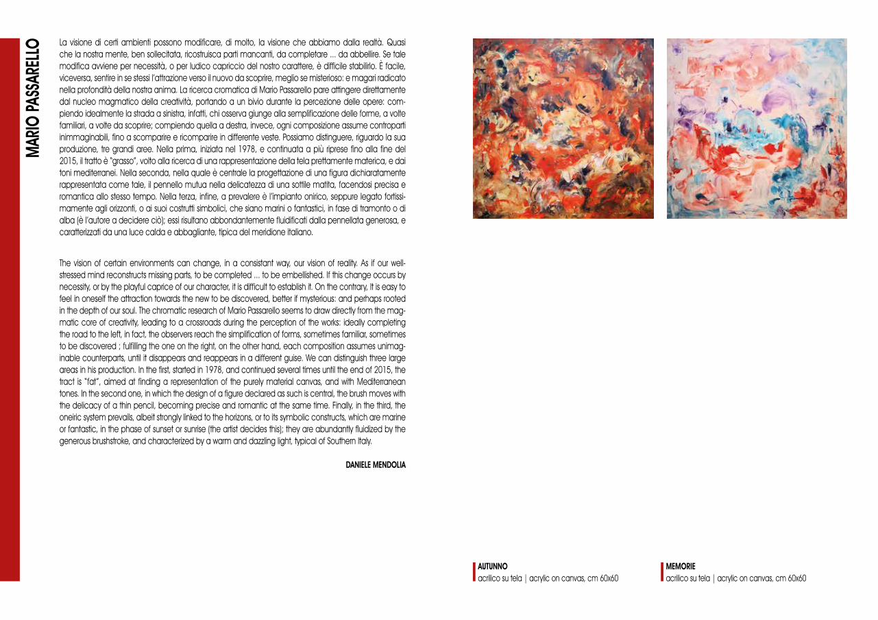
La visione di certi ambienti possono modificare, di molto, la visione che abbiamo dalla realtà. Quasi che la nostra mente, ben sollecitata, ricostruisca parti mancanti, da completare ... da abbellire. Se tale modifica avviene per necessità, o per ludico capriccio del nostro carattere, è difficile stabilirlo. È facile, viceversa, sentire in se stessi l’attrazione verso il nuovo da scoprire, meglio se misterioso: e magari radicato nella profondità della nostra anima. La ricerca cromatica di Mario Passarello pare attingere direttamente dal nucleo magmatico della creatività, portando a un bivio durante la percezione delle opere: com-piendo idealmente la strada a sinistra, infatti, chi osserva giunge alla semplificazione delle forme, a volte familiari, a volte da scoprire; compiendo quella a destra, invece, ogni composizione assume controparti inimmaginabili, fino a scomparire e ricomparire in differente veste. Possiamo distinguere, riguardo la sua produzione, tre grandi aree. Nella prima, iniziata nel 1978, e continuata a più riprese fino alla fine del 2015, il tratto è “grasso”, volto alla ricerca di una rappresentazione della tela prettamente materica, e dai toni mediterranei. Nella seconda, nella quale è centrale la progettazione di una figura dichiaratamente rappresentata come tale, il pennello mutua nella delicatezza di una sottile matita, facendosi precisa e romantica allo stesso tempo. Nella terza, infine, a prevalere è l’impianto onirico, seppure legato fortissi-mamente agli orizzonti, o ai suoi costrutti simbolici, che siano marini o fantastici, in fase di tramonto o di alba (è l’autore a decidere ciò); essi risultano abbondantemente fluidificati dalla pennellata generosa, e caratterizzati da una luce calda e abbagliante, tipica del meridione italiano.
MAR
IO PA
SSAR
ELLO
The vision of certain environments can change, in a consistant way, our vision of reality. As if our well-stressed mind reconstructs missing parts, to be completed ... to be embellished. If this change occurs by necessity, or by the playful caprice of our character, it is difficult to establish it. On the contrary, It is easy to feel in oneself the attraction towards the new to be discovered, better if mysterious: and perhaps rooted in the depth of our soul. The chromatic research of Mario Passarello seems to draw directly from the mag-matic core of creativity, leading to a crossroads during the perception of the works: ideally completing the road to the left, in fact, the observers reach the simplification of forms, sometimes familiar, sometimes to be discovered ; fulfilling the one on the right, on the other hand, each composition assumes unimag-inable counterparts, until it disappears and reappears in a different guise. We can distinguish three large areas in his production. In the first, started in 1978, and continued several times until the end of 2015, the tract is “fat”, aimed at finding a representation of the purely material canvas, and with Mediterranean tones. In the second one, in which the design of a figure declared as such is central, the brush moves with the delicacy of a thin pencil, becoming precise and romantic at the same time. Finally, in the third, the oneiric system prevails, albeit strongly linked to the horizons, or to its symbolic constructs, which are marine or fantastic, in the phase of sunset or sunrise (the artist decides this); they are abundantly fluidized by the generous brushstroke, and characterized by a warm and dazzling light, typical of Southern Italy.
DANIELE MENDOLIA
AUTUNNOacrilico su tela | acrylic on canvas, cm 60x60
MEMORIE acrilico su tela | acrylic on canvas, cm 60x60

MOMENTIacrilico su tela | acrylic on canvas, cm 60x60
RITORNO AL ROSSOacrilico su tela | acrylic on canvas, cm 60x60

Una pittura d’impeto, eppure di estrema eleganza formale, è quella di Mariella Tissone, in cui il vigore del segno definisce emersioni naturali o visioni astratte che si sedimentano sul supporto dell’opera attraverso varie stratificazioni di colore su cui un deciso intervento della mano scava segni, alfabeti immaginari vissuti nell’intensità del momento. Tutta la produzione di Mariella Tissone, che oscilla tra astrazione e figurazione, è uniformata da una speciale vibrazione cromatica che ne definisce lo stile, cioè quel personalissimo “marchio” che le permette di ottenere una specifica riconoscibilità nel confuso panorama della pittura contemporanea. Ora disposto in movimenti circolari, ora in traiettorie orizzontali e verticali, il segno descri-ve entità emozionali che sono alla base di ogni dipinto. Sono pentagrammi, gesti carichi di musicalità, indicazioni coreografiche, in quanto sembrerebbero suggerire frenetiche danze; ma sono anche voli di farfalle, di uccelli o di api, che ci affascinano per i loro misteriosi significati. Ecco allora che la pittura diventa espressione della natura, capace di rappresentare e fermare, nel limitato perimetro di una tela, il fremito dell’universo.
MAR
IELLA
TISS
ONE
A painting of impetus, yet of extreme formal elegance, is that of Mariella Tissone, in which the vigor of the sign defines natural emersions or abstract visions that settle on the support of the work through various layers of color on which a decisive intervention of the hand digs signs, imaginary alphabets lived in the intensity of the moment. The entire production of Mariella Tissone, which oscillates between abstraction and figuration, is standardized by a special chromatic vibration that defines its style, that is, that very personal “brand” that allows her to obtain a specific recognition in the confused panorama of contem-porary painting. Now arranged in circular movements, now in horizontal and vertical trajectories, the sign describes emotional entities that underlie each painting. They are pentagrams, gestures full of musicality, choreographic indications, as they would seem to suggest frenetic dances; but they are also flights of but-terflies, birds or bees, that fascinate us for their mysterious meanings. That painting becomes an expression of nature, capable of representing and arrest, in the limited perimeter of a canvas, the thrill of the universe.
MIMMO DI BENEDETTO
GRAFFI / CALORE | 2018acrilico su tela | acrylic on canvas, cm 90x65
GRAFFI / GHIACCIO | 2018acrilico su tela | acrylic on canvas, cm 90x65

VORTICOSAMENTE | 2018acrilico su tela | acrylic on canvas, cm 70x50
GRAFFI / AMAZZONIA | 2018acrilico su tela | acrylic on canvas, cm 70x50

L’ultimo secolo di arte contemporanea ci ha abituati alla sua scomparsa. Il suo unico movimento è stato eliminare i concetti del passato, rendendo l’attualità asciutta di contenuti. La confusione creata ha portato tanti artisti a un lirismo parecchio fastidioso; e cioè alla continua narrazione biografica di intuizioni. Il quadro generale, seppure non eccessivamente drammatico, ci pone dei vuoti che si irradiano senza sosta in ogni direzione. Chissà se sussistono, oggi, degli elementi utili in grado di valutarla. Che sia il suo impulso, che sia la sua estetica? Che sia la sua moltiplicazione, che sia nulla? Di certo il tempo concretizzerà le risposte a queste domande, alle quali i più grandi studiosi non sembrano saper porre una fine. L’opera pittorica dell’ar-tista lombarda Tiziana Trezzi, che ha cominciato a disegnare fin da bambina, perfezionando il suo percorso professionale presso l’Accademia di Belle Arti di Brera e con il corso di cromatologia dell’astrattista Luigi Ve-ronesi, presenta nelle sue opere l’eco delle forme dell’arte classica, gli studi intrapresi in arte terapia e tutti i quesiti di cui sopra abbiamo accennato, con la gentilezza di una pennellata sapiente. Temi ricorrenti sono i profili di donne, mutuati dall’arte greca, ma riproposti in chiave contemporanea, dotati di una sensualità mia volgare e spesso sintesi della femminilità occidentale. Poi, ovviamente, sono di scena gli spazi: dagli interni di architettura minimalista contemporanea, finemente illustrati, agli esterni, sempre delicatamente romantici.
TIZIA
NA TR
EZZI
The last century of contemporary art has accustomed us to its disappearance. His only movement has been to eliminate the concepts of the past, making the actuality of contents dry. The confusion created has led many artists to a very annoying lyricism; and that is the continuous biographical narration of intuitions. The general picture, although not excessively dramatic, puts us some gaps that radiate incessantly in every direc-tion. Who knows if today there are useful elements that can evaluate it. What is his impulse, what is his aesthet-ic? What is its multiplication, which is nothing? Certainly time will concretize the answers to these questions, to which the greatest scholars do not seem to know how to put an end. The pictorial work of the Lombard artist Tiziana Trezzi, who began drawing as a child, perfecting his professional career at the Academy of Fine Arts of Brera and with the course of chromatics of the abstract artist Luigi Veronesi, presents in his works the echo of the forms of classical art, the studies undertaken in art therapy and all the questions mentioned above, with the kindness of a skillful brush stroke. Recurring themes are the profiles of women, borrowed from Greek art, but re-proposed in a contemporary key, endowed with a vulgar sensuality and often a synthesis of Western femininity. Then, of course, the spaces are on stage: from the interiors of contemporary minimalist architec-ture, finely illustrated, to the exteriors, always delicately romantic.
DANIELE MENDOLIA
AL BIVIO | 2018acrilico su tela | acrylic on canvas, cm 100x100
VERSO IL CENTRO | 2015acrilico su tela | acrylic on canvas, cm 100x100
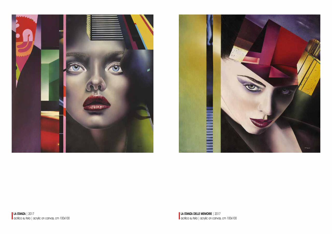
LA STANZA | 2017acrilico su tela | acrylic on canvas, cm 100x100
LA STANZA DELLE MEMORIE | 2017acrilico su tela | acrylic on canvas, cm 100x100
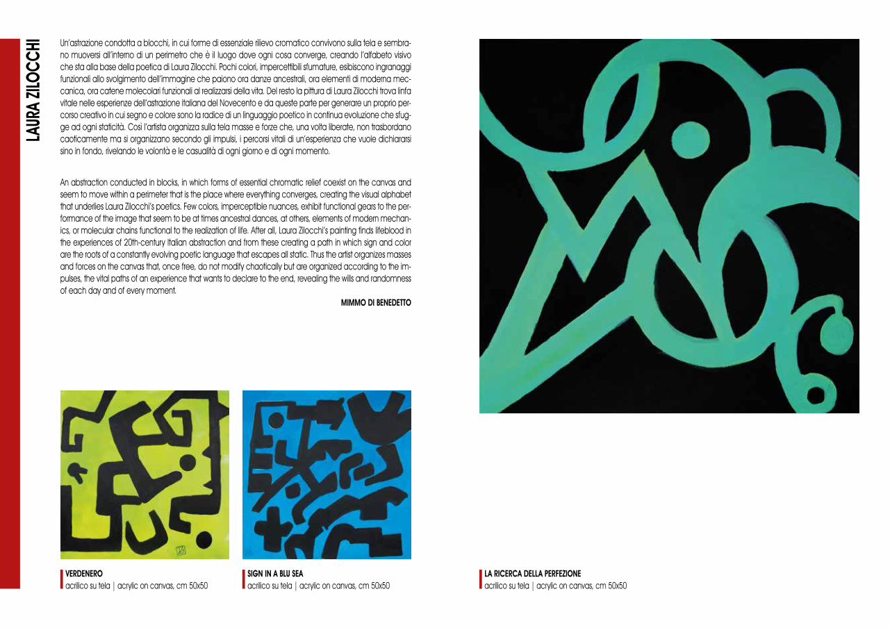
Un’astrazione condotta a blocchi, in cui forme di essenziale rilievo cromatico convivono sulla tela e sembra-no muoversi all’interno di un perimetro che è il luogo dove ogni cosa converge, creando l’alfabeto visivo che sta alla base della poetica di Laura Zilocchi. Pochi colori, impercettibili sfumature, esibiscono ingranaggi funzionali allo svolgimento dell’immagine che paiono ora danze ancestrali, ora elementi di moderna mec-canica, ora catene molecolari funzionali al realizzarsi della vita. Del resto la pittura di Laura Zilocchi trova linfa vitale nelle esperienze dell’astrazione italiana del Novecento e da queste parte per generare un proprio per-corso creativo in cui segno e colore sono la radice di un linguaggio poetico in continua evoluzione che sfug-ge ad ogni staticità. Così l’artista organizza sulla tela masse e forze che, una volta liberate, non trasbordano caoticamente ma si organizzano secondo gli impulsi, i percorsi vitali di un’esperienza che vuole dichiararsi sino in fondo, rivelando le volontà e le casualità di ogni giorno e di ogni momento.
LAUR
A ZIL
OCCH
I
An abstraction conducted in blocks, in which forms of essential chromatic relief coexist on the canvas and seem to move within a perimeter that is the place where everything converges, creating the visual alphabet that underlies Laura Zilocchi’s poetics. Few colors, imperceptible nuances, exhibit functional gears to the per-formance of the image that seem to be at times ancestral dances, at others, elements of modern mechan-ics, or molecular chains functional to the realization of life. After all, Laura Zilocchi’s painting finds lifeblood in the experiences of 20th-century Italian abstraction and from these creating a path in which sign and color are the roots of a constantly evolving poetic language that escapes all static. Thus the artist organizes masses and forces on the canvas that, once free, do not modify chaotically but are organized according to the im-pulses, the vital paths of an experience that wants to declare to the end, revealing the wills and randomness of each day and of every moment.
MIMMO DI BENEDETTO
LA RICERCA DELLA PERFEZIONEacrilico su tela | acrylic on canvas, cm 50x50
VERDENEROacrilico su tela | acrylic on canvas, cm 50x50
SIGN IN A BLU SEAacrilico su tela | acrylic on canvas, cm 50x50
edizione a cura del Centro Studi EratoAgrigento
in collaborazione conOfficine delle Arti | Trimestrale d’artewww.officinedellearti.com
progetto grafico e impaginazionewww.081grafica.itNapoli
traduzioniP. Elizabeth Mazzu
stampato nel mese di agosto 2018