photo manipulation for magazine
TRANSCRIPT
Photo Manipulation for
Magazine
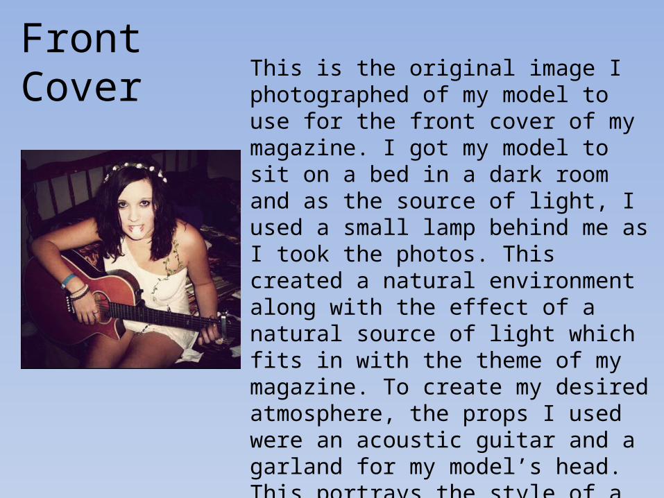
This is the original image I photographed of my model to use for the front cover of my magazine. I got my model to sit on a bed in a dark room and as the source of light, I used a small lamp behind me as I took the photos. This created a natural environment along with the effect of a natural source of light which fits in with the theme of my magazine. To create my desired atmosphere, the props I used were an acoustic guitar and a garland for my model’s head. This portrays the style of a natural and pure character, created by the white dress and flowers round her neck. As my magazine is about raw, acoustic artists, I feel that this is a very appropriate image.
Front Cover
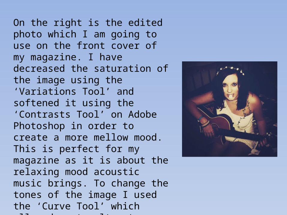
On the right is the edited photo which I am going to use on the front cover of my magazine. I have decreased the saturation of the image using the ‘Variations Tool’ and softened it using the ‘Contrasts Tool’ on Adobe Photoshop in order to create a more mellow mood. This is perfect for my magazine as it is about the relaxing mood acoustic music brings. To change the tones of the image I used the ‘Curve Tool’ which allowed me to alter to lighting of the picture and the different colours within the image in order to keep it within the colour scheme I decided to use of sepia tones.
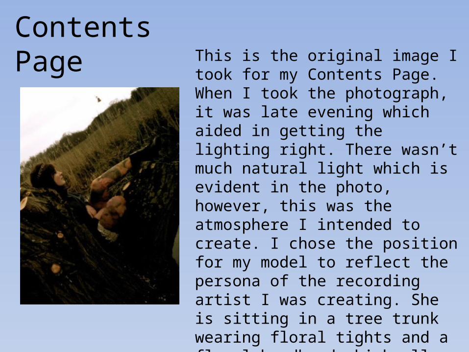
Contents PageThis is the original image I took for my Contents Page.When I took the photograph, it was late evening which aided in getting the lighting right. There wasn’t much natural light which is evident in the photo, however, this was the atmosphere I intended to create. I chose the position for my model to reflect the persona of the recording artist I was creating. She is sitting in a tree trunk wearing floral tights and a floral headband which allows her to fit in with her surroundings creating a character who is pure and ‘in touch with nature’. She is not looking at the camera as it avoids a harsh connection to the reader
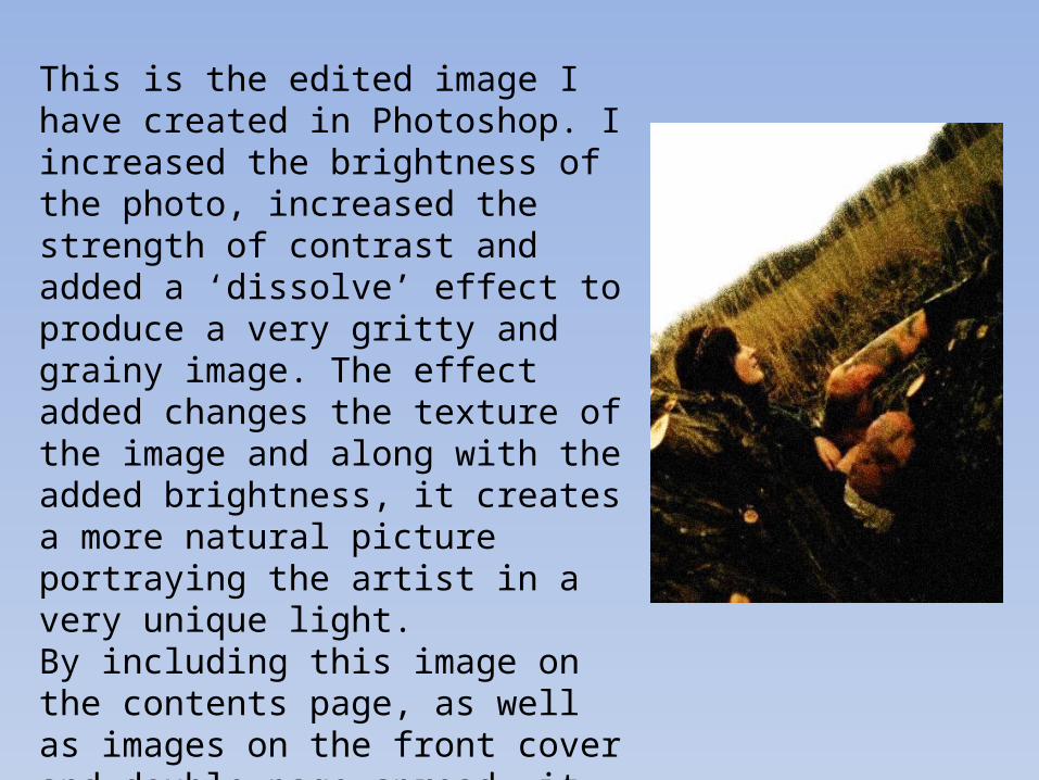
This is the edited image I have created in Photoshop. I increased the brightness of the photo, increased the strength of contrast and added a ‘dissolve’ effect to produce a very gritty and grainy image. The effect added changes the texture of the image and along with the added brightness, it creates a more natural picture portraying the artist in a very unique light. By including this image on the contents page, as well as images on the front cover and double page spread, it allows the reader to have an insight into what type of character this new artist is. It helps with the build up of my magazine
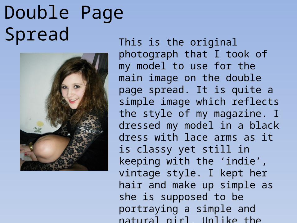
Double Page Spread This is the original photograph that I
took of my model to use for the main image on the double page spread. It is quite a simple image which reflects the style of my magazine. I dressed my model in a black dress with lace arms as it is classy yet still in keeping with the ‘indie’, vintage style. I kept her hair and make up simple as she is supposed to be portraying a simple and natural girl. Unlike the previous two images, I used a head on shot with the modelling smiling to show a different side to the artist being created.
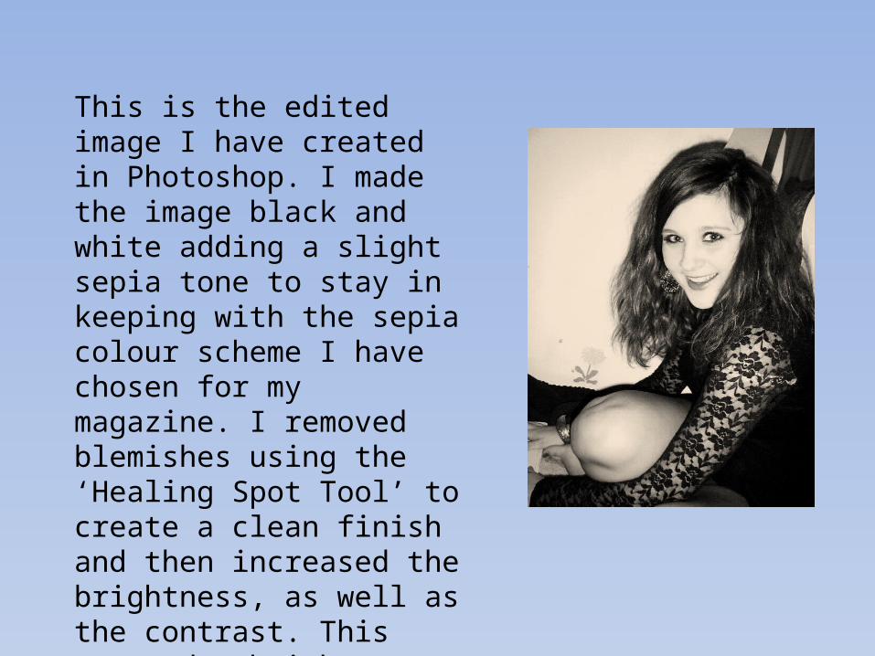
This is the edited image I have created in Photoshop. I made the image black and white adding a slight sepia tone to stay in keeping with the sepia colour scheme I have chosen for my magazine. I removed blemishes using the ‘Healing Spot Tool’ to create a clean finish and then increased the brightness, as well as the contrast. This created a brighter, more fresh looking image
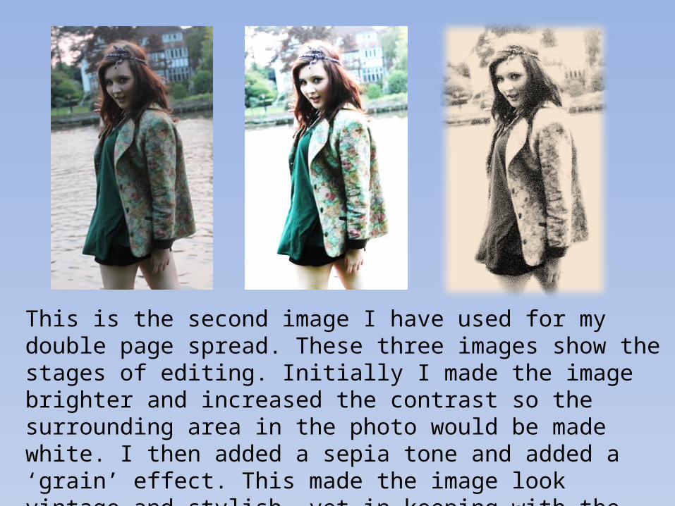
This is the second image I have used for my double page spread. These three images show the stages of editing. Initially I made the image brighter and increased the contrast so the surrounding area in the photo would be made white. I then added a sepia tone and added a ‘grain’ effect. This made the image look vintage and stylish, yet in keeping with the character. To enhance the quality of the photo, I dissolved the edges to create texture and depth