photo manipulation - roberto blake graphic...
TRANSCRIPT

PHOTOMANIPULATION
Raven Dawn Raven Dawn is one of my more popular photo-manipulations. This
particular stock image has been used quite often by designers, but
I decided to try and do something a bit different with it. Many of my
digital artworks try to approach familiar concepts or themes in ways
that are refreshing and new.

Pony Girl

Lady Huntress of AutumnLady Huntress of Autumn is a photo-manipulation I worked on shortly after another seasonal piece for winter called, “Lady Snowflake”. Often I draw inspira-tion for my fantasy manipulations from the large collection of novels on my shelves, or from movies or music. In the case of Lady Huntress of Autumn my artwork was partly inspired by the cover artwork and title of the David Gemmell Novel “The Hawk Eternal”.
Cloud ChaserCloud Chaser, was probably the image I enjoyed working on the most this year in my portfolio. This photo montage al-lowed me use a lot of different elements and effects in combination. During my time developing this piece I was loop-ing “Dedicated” by Linkin Park. I would have to say that contributed to the “en-ergy” of the piece. Ultimately the overall elements/themes were based around my own love of eagles and hawks.
Rhythm Emotion Rhythm Emotion much like Cloud Chas-er, is an earlier piece from the beginning of the year. With this piece I wanted to convey the feeling one experiences when they are so involved and emotion-ally in tune with a song that everything else subtly fades away.
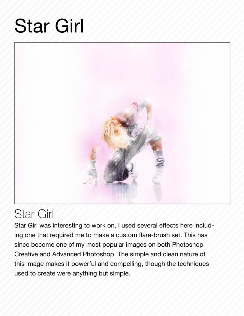
Star Girl Star Girl was interesting to work on, I used several effects here includ-
ing one that required me to make a custom flare-brush set. This has
since become one of my most popular images on both Photoshop
Creative and Advanced Photoshop. The simple and clean nature of
this image makes it powerful and compelling, though the techniques
used to create were anything but simple.
Star Girl

Cherry Crush The photo-manipulation Cherry Crush demonstrates an
effective use of selective color, as well as retouch work to
elimnate the models blemishes. Inspired in part by Frank
Miller’s “Sin City”, style of images, this is one of my favorite
pieces of digital artwork.

Fan Girl Using the same model from “Cherry Crush”, Fan Girl is it’s
total opposite. This vivid image was created using the “under-
painting” technique as well as several color effects and blend
modes, while the textures were built up through manual brush
work using a wacom tablet.

Star Girl IIThe inspiration for this image was mostly a desire to revisit things that I
have done in the past that worked well, but with a fresh eye. I wanted a
comparison to demonstrate my growth as an artist, not to mention I origi-
nally wanted to do a series of graphics around the Star Girl concept but
just never got around to it. The main idea was to create a very strong, dy-
namic visual image, while still being simple and clean.

DIVINE RHYTHMDivine Rhythm is about balance , subtlty and beauty. I wanted to
explore textures and colors that would compliment the model.
As I’ve mentioned before a good deal of my general design pro-cess involves being inspired by music.Usually ideas come more from the lyrics of songs, but mostly I try to focus on the emotions that the music cre-ates in me. Often this leads to the creation of some of my best digital artwork and designs.
Inspired By MUSIC
I feel that music allows me to channel a range of emotions into my artwork rather than them being dull and lifeless. With Divine Rhythm I specifi-cally wanted to paint this image with light and subtle but unde-nyable energy. I needed to con-vey the feeling of being lost in the music in the same way per-son might be lost in meditation.

CLUB FLYER: HADEZ PARTY FLYER: Couture/Pradaria
CLUB FLYER: Step Your Game Up!
Designing Club Flyers, is always an
interesting and fun experience, as
well as something I would look for-
ward to doing more of in the near
future. Each flyer has a unique and
different approach it requires, and
it’s own style, not unlike the clubs
themselves. My favorite piece out
of these is the flyer for Club HADEZ,
mostly because I designed it in the
style of an album cover.

Poker FaceMore often than not I get the creative inspiration for my artwork from music, movies, or books. In this case I was inspired by watching the music video “Poker Face” by Lady Gaga. I found the colors, objects and symbols that re-peated throughout the video (mostly associated with cards and gambling), to be a great source of design inspiration.

The Summoner

PSA: Responsibility

Lady Snow FlakeThis image was entered into Photoshop Creative Magazine’s contest for images representing “Seasons”. Lady Snow Flake as piece was an other experiment in contrast. I used the concept of a “winter beauty”, while keep-ing her warm and appealing rather than creating a “frigid ice queen”.
So Very Broken Utilizing the artistic nude stock of Marcus J Ranum, this digital painting was developed to con-vey feelings of intense sadness while contrasting it with warm and vibrant colors.So Very Broken has been fea-tured in issue 54 of Photoshop Creative Magazine with two other pieces of my work.
DIGITAL PAINTINGDigital Painting is a skill I developed much later in my design career. With my oldest background being that of a traditional illustrator I found the transition was not very difficult for me. My work in this particular area was done mostly for submissions to various digital art magazines. For my digital paintings
I make use of a Wacom tablet and custom brushes as my primary tools. I spend hours creating the right blend of colors and building up textures from scratch.Primairly when working on these pieces I always try to communicate a series of underlying emotions in a unique and interesting way.

Light Bringer This was yet another instance where I used stock produced by
Marcus J Ranum (angel on the right). This image became a very popular desktop background as download from my website.
Go DeepThis image was one that I spent a great deal of time and detail on. Ultimately I wanted to create a surreal underwater world in which the subject is exploring. The stock photo used here for the model comes from Marcus J Ranum and his amazing portfo-lio of stock images. One of the challenges was creat-ing the illussion of the dive, then there was the lighting. I was very satisfied with how the overall image came out.

ButtercupThe inspiration for this image was the main female lead in the movie
“The Princess Bride”. In addition to music and books, movies serve
as a constant source of inspiration for me. This was one of my early
transitions into mostly painting a composition. By utilizing a wacom
tablet to manually build up several layers of texture, I was able to
give this a very natural feel. Using retouching techniques I had al-
ready learned I was able to make the eyes the focal point of this im-
age, despite all the other elements that were present.

Typography is an essential skill for any designer to have, though it is one that many in the creative industry tend to overlook in favor of more glamorous aspects, like digital illustration and photo manipulation. Some designers forget that the goal of design is to communicate ideas and concepts visually. While focusing on the “visual”, many forget about the “communication aspect, which primar-ily is the difference between art and design, and is taken for granted.A perfectly good design can be ruined by a poor understading of typography. You can open magazines or browse a bookshelf and find multiple examples of this, where a designer has chosen to use five different fonts arbitrarily, in multiple colors that don’t balance each other or the primary image.
The Helvetica ProjectThis project was one that I was very excited about. As a designer Helvetica is one of my favorite typefaces to use, its clean, professional, and still feels artistic, and has a history in design.I’ve included a few samples of this par-ticular project in portfolio to demon-strated my typographic skills and style. When working with type specifically, many of my decisions are influenced by modern constructivism, mostly in the vien of Piet Mondrian. For this reason I lean toward utlizing primary colors, and using vertical and horizontal lines and simple geometry. The Helvetica typeface is one that lends itself very strongly to this style of typographic design.
Helvetica: so much more than a typeface
SEO: Learn It, Love It, Live With It

Helvetica A Graphic Designers Best Friend

Helvetica Loves You
Helvetica Blues

Sound
O
LOGO DESIGNAs a Logo Designer, I set out to establish immedi-ate recognition, inspiring trust, admiration, loyalty and an implied superiority through a clients logo. The very things one needs to promote themselves or their brand.

Album Cover:Bear WitnessRecently I developed a new al-bum cover for a gospel rap art-ist. Developing this ablum cover was an interesting challenge. It required me to consider an audicance that had not recently designed for, while still creating something visually interesting and functional.
One of the first things I did with this design was layout the ty-pography. The title of the album was so “loaded” that I wanted to take advantage of that and do as much with just those words as possible.
To balance the impact the type would have on a “religious” au-dience I felt that the main image had to contrast the emphasis on the word “DEVIL” so that people wouldn’t become con-fused or be detered from buy-ing the album. That was were the decision to use the image of a saint protecting children came into play.
The inside cover was originally close to unreadable, I made a particular effort to address that fact. Keeping the themes and elements established on the front cover in mind, I designed the inside cover to reinforce that approach. The result was a consistant look and feel for the over all product that looks professional and is visually compelling.

SOFTWAREAdobe Photoshop
Adobe Photoshop Lightroom
Adobe Dreamweaver
Adobe InDesign
Adobe Flash
Adobe Fireworks
Adobe Premier
Microsoft Office
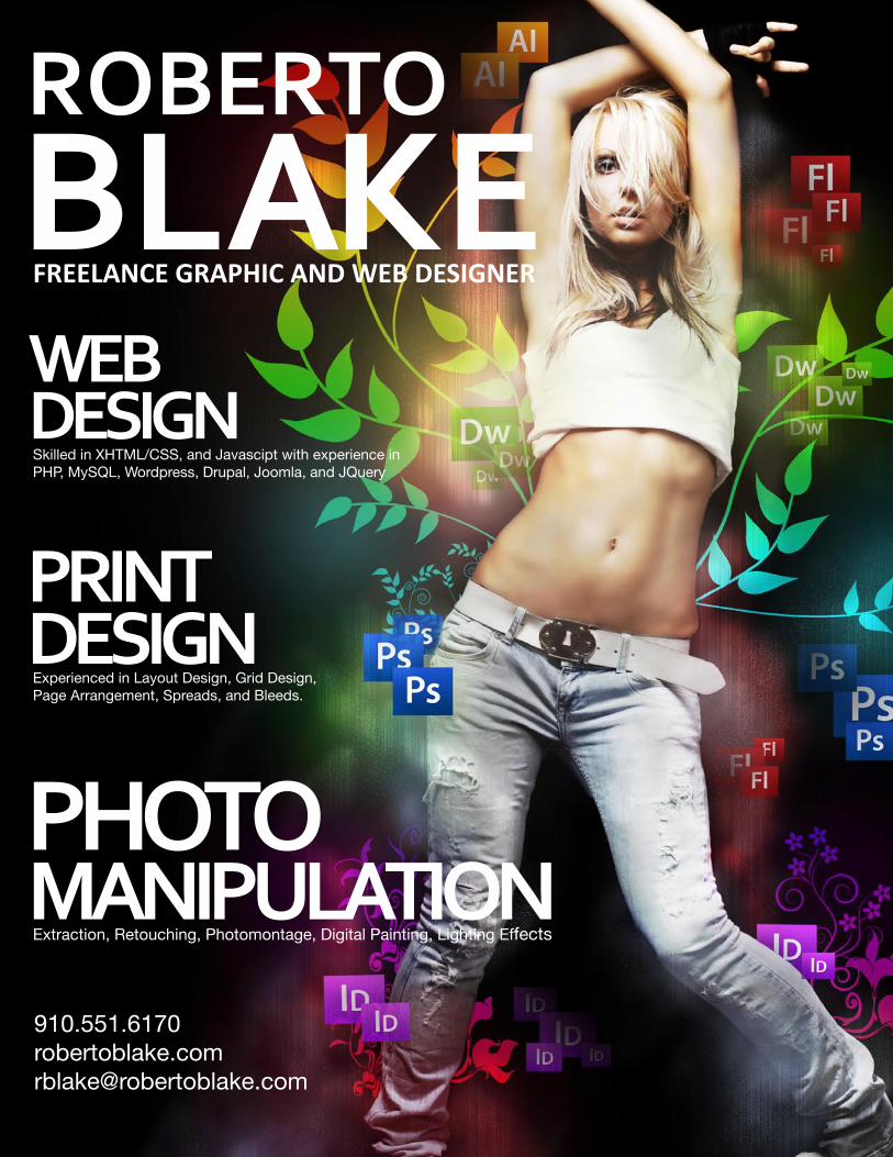
DESIGN SKILLSWeb Design
Search Engine Optimization
Print/Layout Design
Identity and Branding
Typography
Digital Illustration
Vector Illustration
Photo-manipulation
Photo Retouching
Photography
Copy Writing
Video Editing
CODING & CMSXHTML/CSS/JAVASCRIPT
PHP/MYSQL
ACTIONSCRIPT 2 & 3
WORDPRESS/JOOMLA/
SMARTY/JQUERY/
Detailed oriented team player. Organized, flexible and capable of meeting deadlines in a fast paced environment.
EXPERIENCE03.2007-09.2009 Advanced Internet Technologies
Graphic and Web Designer
08.2006-06.2009 Sears Portrait Studios
Digital Photographer and Sales Associate
EDUCATION2003-07 Faytteville Technical Community College
Advertising and Graphic Design
2000-02 Jack Britt High School
1998-00 Douglas Byrd Senior High School
Diploma and College Tech Prep Dual Certification
FREELANCE2009-Current Self Managed Freelancer
Graphic/Web Design and Photography
2005-2008 Freelance Media
Photography and Photo Retouching
2001-2002 Charlesway Bridal
Photography and Videography Assistant
CONTACT INFORMATIONPhone: 1.910.551.6170
E-mail: [email protected]
Web: www.robertoblake.com