pols 7000x statistics in political science class 2 brooklyn college – cuny shang e. ha...
TRANSCRIPT
POLS 7000XSTATISTICS IN POLITICAL SCIENCE
CLASS 2
BROOKLYN COLLEGE – CUNYSHANG E. HA
Leon-Guerrero and Frankfort-Nachmias, Essentials of Statistics for a Diverse Society, Chapter 2
Leon-Guerrero/Frankfort-Nachmias: Essentials of Social Statistics for a Diverse Society© 2012 SAGE Publications
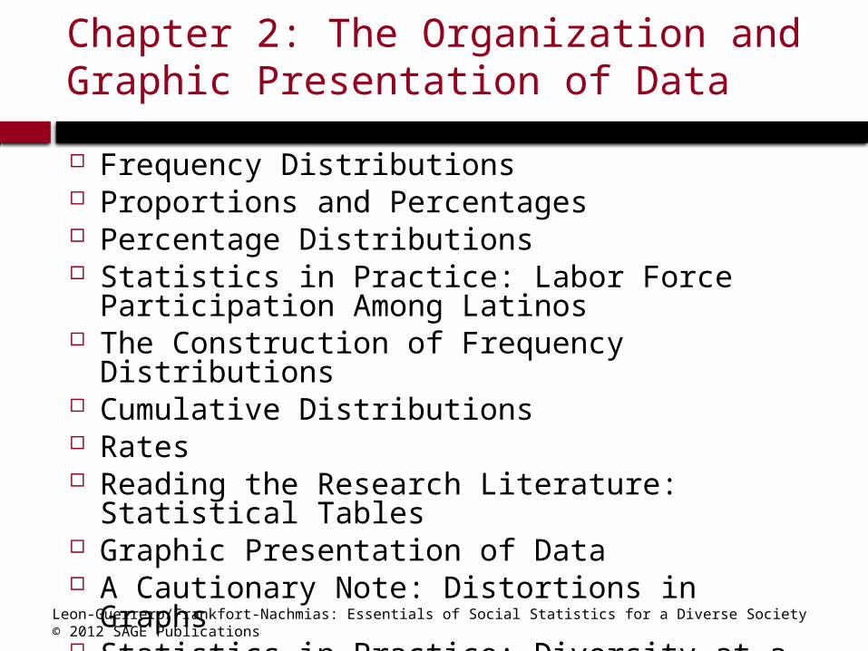
Chapter 2: The Organization and Graphic Presentation of Data
Frequency Distributions Proportions and Percentages Percentage Distributions Statistics in Practice: Labor Force Participation
Among Latinos The Construction of Frequency Distributions Cumulative Distributions Rates Reading the Research Literature: Statistical
Tables Graphic Presentation of Data A Cautionary Note: Distortions in Graphs Statistics in Practice: Diversity at a Glance
Leon-Guerrero/Frankfort-Nachmias: Essentials of Social Statistics for a Diverse Society© 2012 SAGE Publications
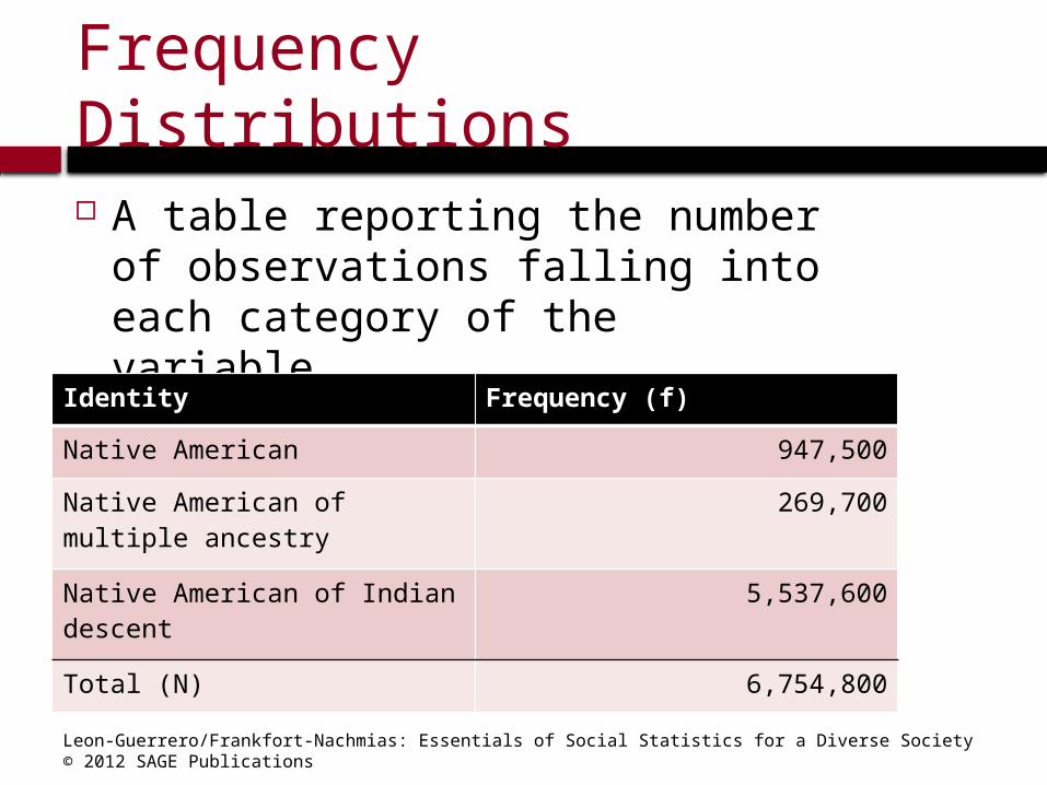
Frequency Distributions
A table reporting the number of observations falling into each category of the variable.
Identity Frequency (f)
Native American 947,500
Native American of multiple ancestry
269,700
Native American of Indian descent
5,537,600
Total (N) 6,754,800
Leon-Guerrero/Frankfort-Nachmias: Essentials of Social Statistics for a Diverse Society© 2012 SAGE Publications
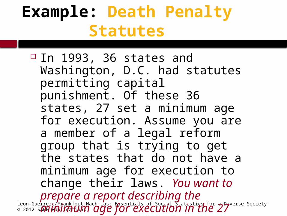
Example: Death Penalty Statutes
In 1993, 36 states and Washington, D.C. had statutes permitting capital punishment. Of these 36 states, 27 set a minimum age for execution. Assume you are a member of a legal reform group that is trying to get the states that do not have a minimum age for execution to change their laws. You want to prepare a report describing the minimum age for execution in the 27 states have an established minimum age for execution. (The data are on the following slide.)

Leon-Guerrero/Frankfort-Nachmias: Essentials of Social Statistics for a Diverse Society© 2012 SAGE Publications
Death Penalty Statutes
Source: Kathleen Maguire and Ann L. Pastore, eds., Sourcebook of Criminal Justice Statistics. 1994. U.S. Department of Justice, Bureau of Justice Statistics. Washington, D.C.: U.S. Government Printing Office, 1995, pp. 115-116.
StateMinimumAge State
MinimumAge
Arkansas 14 Texas 17
Virginia 15 California 18
Alabama 16 Colorado 18
Delaware 16 Connecticut 18
Indiana 16 Illinois 18
Kentucky 16 Louisiana 18
Mississippi 16 Maryland 18
Missouri 16 Nebraska 18
Nevada 16 New Jersey 18
Oklahoma 16 New Mexico 18
Wyoming 16 Ohio 18
Georgia 17 Oregon 18
New Hampshire 17 Tennessee 18
North Carolina 17

Leon-Guerrero/Frankfort-Nachmias: Essentials of Social Statistics for a Diverse Society© 2012 SAGE Publications
Creating a Frequency Distribution
Minimum Age
Frequency
14 1
15 1
16 9
17 4
18 12
Total (N) 27
Leon-Guerrero/Frankfort-Nachmias: Essentials of Social Statistics for a Diverse Society© 2012 SAGE Publications
N
fP
)100((%) P
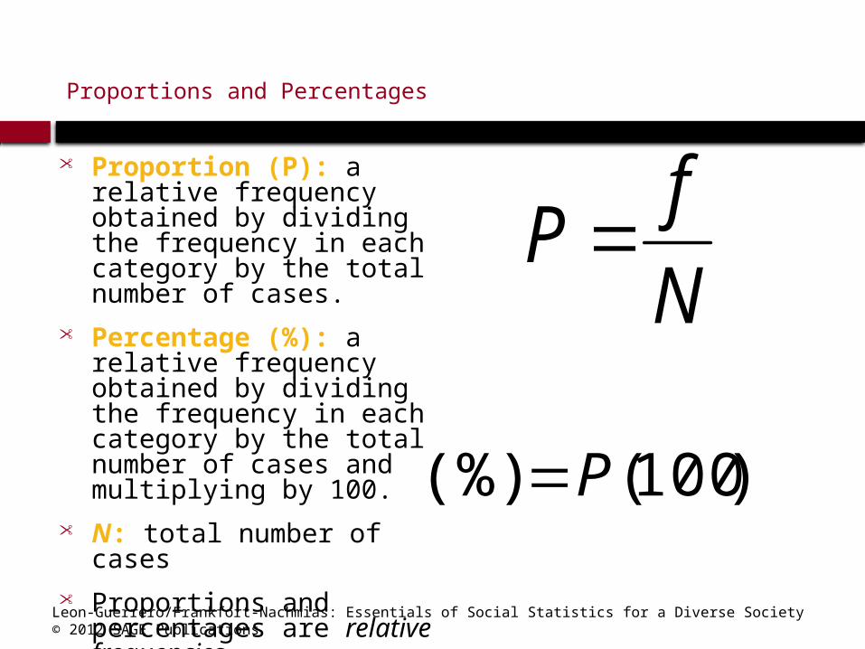
Proportions and Percentages
• Proportion (P): a relative frequency obtained by dividing the frequency in each category by the total number of cases.
• Percentage (%): a relative frequency obtained by dividing the frequency in each category by the total number of cases and multiplying by 100.
• N: total number of cases • Proportions and
percentages are relative frequencies
Leon-Guerrero/Frankfort-Nachmias: Essentials of Social Statistics for a Diverse Society© 2012 SAGE Publications
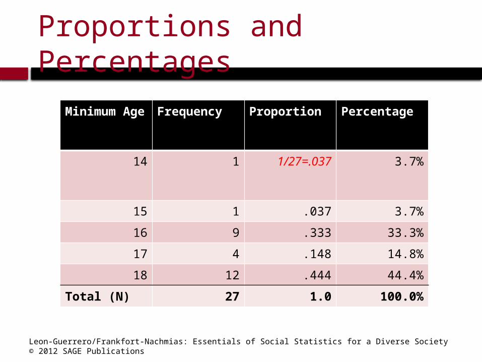
Proportions and Percentages
Minimum Age
Frequency Proportion Percentage
14 1 1/27=.037 3.7%
15 1 .037 3.7%
16 9 .333 33.3%
17 4 .148 14.8%
18 12 .444 44.4%
Total (N) 27 1.0 100.0%

Leon-Guerrero/Frankfort-Nachmias: Essentials of Social Statistics for a Diverse Society© 2012 SAGE Publications
Percentage Distributions
A table showing the percentage of observations falling into each category of the variable.
Minimum Age
Frequency Percentage
4 1 3.7
15 1 3.7
16 9 33.3
17 4 14.8
18 12 44.4
Total N 27 100.0

Leon-Guerrero/Frankfort-Nachmias: Essentials of Social Statistics for a Diverse Society© 2012 SAGE Publications
Frequency Distributions for Nominal Variables
Gender Tallies Frequency Percentage
Male IIIIIIIIIIIIIII 15 37.5
Female IIIIIIIIIIIIIIIIIIIIIIIII
25 62.5
Total (N) 40 100.0
Note: The categories for nominal variables (e.g., gender: male, female) need not be listed in any particular order.
Leon-Guerrero/Frankfort-Nachmias: Essentials of Social Statistics for a Diverse Society© 2012 SAGE Publications
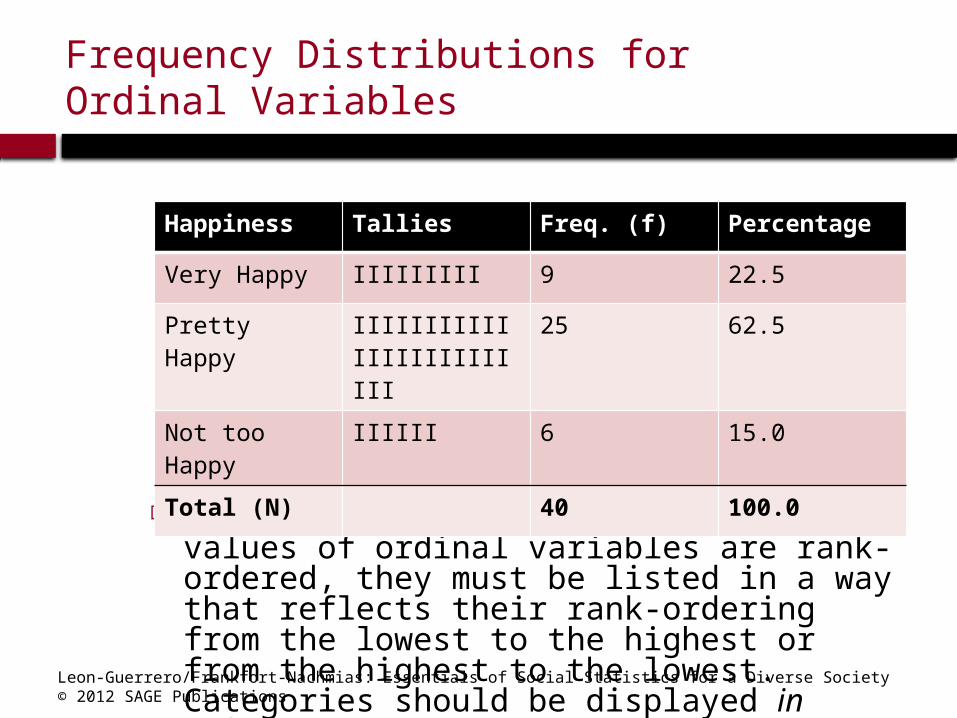
Frequency Distributions for Ordinal Variables
Note: Because the categories or values of ordinal variables are rank-ordered, they must be listed in a way that reflects their rank-ordering from the lowest to the highest or from the highest to the lowest. Categories should be displayed in order.
Happiness Tallies Freq. (f) Percentage
Very Happy IIIIIIIII 9 22.5
Pretty Happy IIIIIIIIIIIIIIIIIIIIIIIII
25 62.5
Not too Happy
IIIIII 6 15.0
Total (N) 40 100.0

Leon-Guerrero/Frankfort-Nachmias: Essentials of Social Statistics for a Diverse Society© 2012 SAGE Publications
Employment Status Example

Leon-Guerrero/Frankfort-Nachmias: Essentials of Social Statistics for a Diverse Society© 2012 SAGE Publications
Employment Status Example

Leon-Guerrero/Frankfort-Nachmias: Essentials of Social Statistics for a Diverse Society© 2012 SAGE Publications
Frequency Distributions for Interval-Ratio Variables
Number of Children
Freq. (f) Percentage (%)
0 5 12.5
1 10 25.0
2 10 25.0
3 5 12.5
4 5 12.5
5 1 2.5
6 2 5.0
7 or more 2 5.0
Total (N) 40 100.0

Leon-Guerrero/Frankfort-Nachmias: Essentials of Social Statistics for a Diverse Society© 2012 SAGE Publications
Cumulative Distributions Sometimes we are interested in
locating the relative position of a given score in a distribution.
Cumulative frequency distribution: a distribution showing the frequency at or below each category (class interval or score) of the variable.
Cumulative percentage distribution: a distribution showing the percentage at or below each category (class interval or score) of the variable.
Leon-Guerrero/Frankfort-Nachmias: Essentials of Social Statistics for a Diverse Society© 2012 SAGE Publications
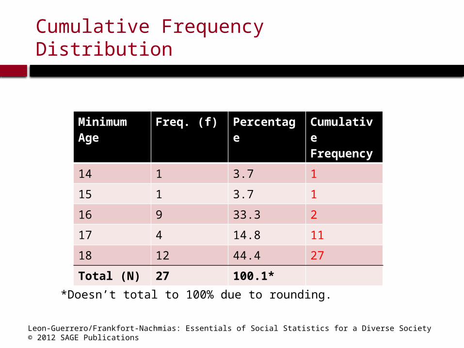
Cumulative Frequency Distribution
Minimum Age
Freq. (f) Percentage
Cumulative Frequency
14 1 3.7 1
15 1 3.7 1
16 9 33.3 2
17 4 14.8 11
18 12 44.4 27
Total (N) 27 100.1*
*Doesn’t total to 100% due to rounding.

Leon-Guerrero/Frankfort-Nachmias: Essentials of Social Statistics for a Diverse Society© 2012 SAGE Publications
Cumulative Percentage Distribution
Minimum Age
Freq. (f) Percentage
Cumulative Percentage
1 1 3.7 3.7
15 1 3.7 7.4
16 9 33.3 40.7
17 4 14.8 55.5
18 12 44.4 99.9*
Total (N) 27 100.1*
*Does not total 100% due to rounding
Leon-Guerrero/Frankfort-Nachmias: Essentials of Social Statistics for a Diverse Society© 2012 SAGE Publications
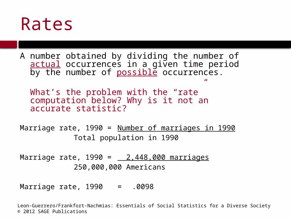
Rates
A number obtained by dividing the number of actual occurrences in a given time period by the number of possible occurrences.
What’s the problem with the “rate” computation below? Why is it not an accurate statistic?
Marriage rate, 1990 = Number of marriages in 1990Total population in 1990
Marriage rate, 1990 = 2,448,000 marriages250,000,000 Americans
Marriage rate, 1990 = .0098

Leon-Guerrero/Frankfort-Nachmias: Essentials of Social Statistics for a Diverse Society© 2012 SAGE Publications
Reading Statistical TablesBasic principles for understanding
what the researcher is trying to tell you:
What is the source of the table? How many variables are presented?
What are their names? What is represented by the numbers
presented in the first column? In the second column?

Leon-Guerrero/Frankfort-Nachmias: Essentials of Social Statistics for a Diverse Society© 2012 SAGE Publications
Graphic Presentation
The Pie Chart The Bar Graph The Histogram The Line Graph Times Series Charts Distortions in Graphs
It is important to choose the appropriate graphs to make statistical information coherent.

Leon-Guerrero/Frankfort-Nachmias: Essentials of Social Statistics for a Diverse Society© 2012 SAGE Publications
The Pie Chart: The Race and Ethnicity of the Elderly
Pie chart: a graph showing the differences in frequencies or percentages among categories of a nominal or an ordinal variable. The categories are displayed as segments of a circle whose pieces add up to 100 % of the total frequencies.

Leon-Guerrero/Frankfort-Nachmias: Essentials of Social Statistics for a Diverse Society© 2012 SAGE Publications
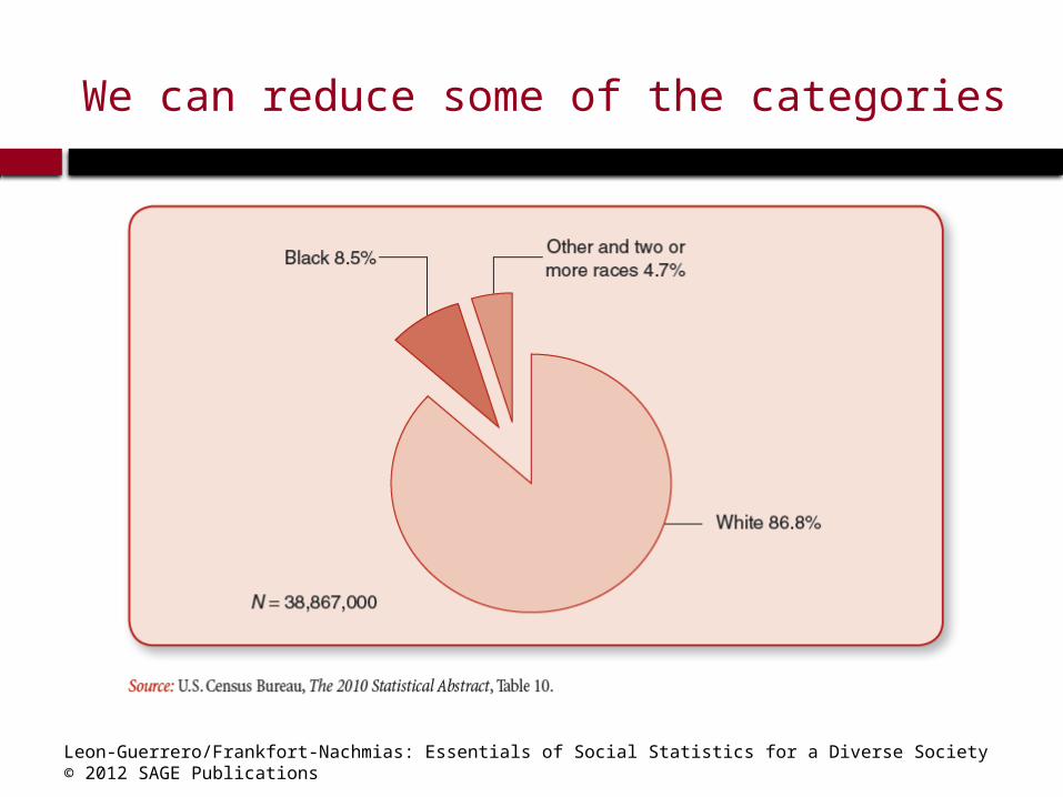
Too many categories can be messy!
Leon-Guerrero/Frankfort-Nachmias: Essentials of Social Statistics for a Diverse Society© 2012 SAGE Publications
We can reduce some of the categories

Leon-Guerrero/Frankfort-Nachmias: Essentials of Social Statistics for a Diverse Society© 2012 SAGE Publications
The Bar Graph: The Living Arrangements and Labor Force Participation of the Elderly
Bar graph: a graph showing the differences in frequencies or percentages among categories of a nominal or an ordinal variable. The categories are displayed as rectangles of equal width with their height proportional to the frequency or percentage of the category.

Leon-Guerrero/Frankfort-Nachmias: Essentials of Social Statistics for a Diverse Society© 2012 SAGE Publications
The Bar Graph: The Living Arrangements and Labor Force Participation of the Elderly

Leon-Guerrero/Frankfort-Nachmias: Essentials of Social Statistics for a Diverse Society© 2012 SAGE Publications
Can Display More Info by Splitting Sex
Leon-Guerrero/Frankfort-Nachmias: Essentials of Social Statistics for a Diverse Society© 2012 SAGE Publications
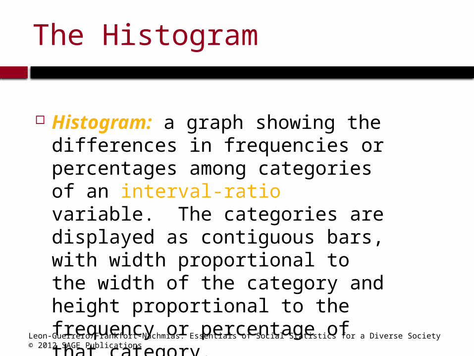
The Histogram
Histogram: a graph showing the differences in frequencies or percentages among categories of an interval-ratio variable. The categories are displayed as contiguous bars, with width proportional to the width of the category and height proportional to the frequency or percentage of that category.
Leon-Guerrero/Frankfort-Nachmias: Essentials of Social Statistics for a Diverse Society© 2012 SAGE Publications
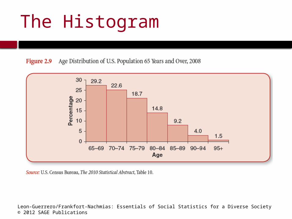
The Histogram

Leon-Guerrero/Frankfort-Nachmias: Essentials of Social Statistics for a Diverse Society© 2012 SAGE Publications
The Line Graph
Line Graph: A graph showing the differences in frequencies or percentages among categories of an interval-ratio variable. Points representing the frequencies of each category are placed above the midpoint of the category and are joined by a straight line.

Leon-Guerrero/Frankfort-Nachmias: Essentials of Social Statistics for a Diverse Society© 2012 SAGE Publications
The Line Graph
Leon-Guerrero/Frankfort-Nachmias: Essentials of Social Statistics for a Diverse Society© 2012 SAGE Publications
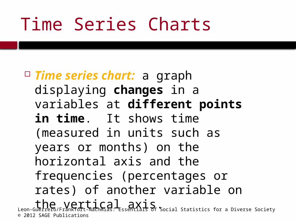
Time Series Charts
Time series chart: a graph displaying changes in a variables at different points in time. It shows time (measured in units such as years or months) on the horizontal axis and the frequencies (percentages or rates) of another variable on the vertical axis.
Leon-Guerrero/Frankfort-Nachmias: Essentials of Social Statistics for a Diverse Society© 2012 SAGE Publications
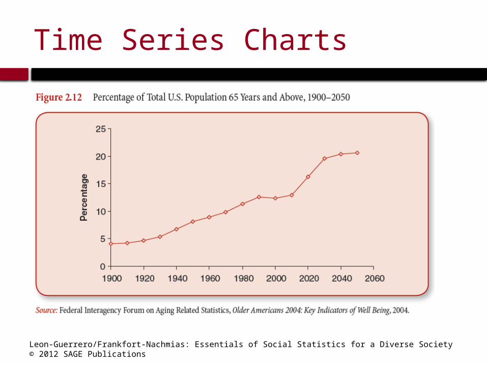
Time Series Charts
Leon-Guerrero/Frankfort-Nachmias: Essentials of Social Statistics for a Diverse Society© 2012 SAGE Publications
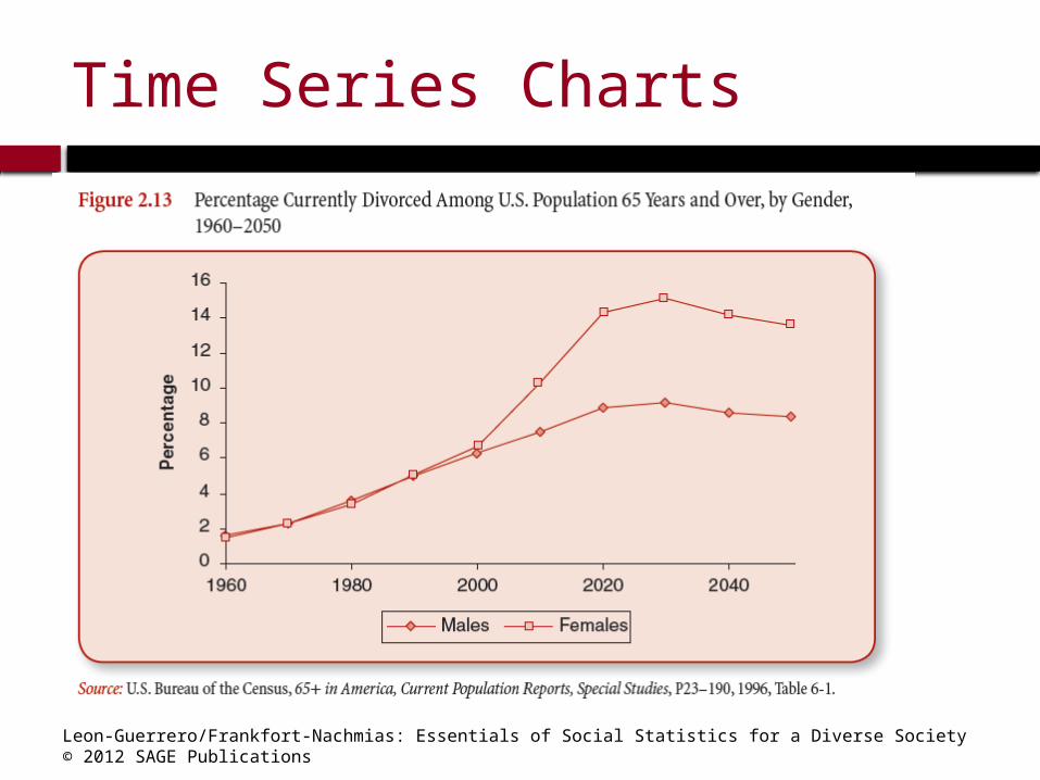
Time Series Charts

Leon-Guerrero/Frankfort-Nachmias: Essentials of Social Statistics for a Diverse Society© 2012 SAGE Publications
Distortions in Graphs
Graphs not only quickly inform us; they can quickly deceive us. Because we are often more interested in general impressions than in detailed analyses of the numbers, we are more vulnerable to being swayed by distorted graphs.
What are graphical distortions?
How can we recognize them?

Leon-Guerrero/Frankfort-Nachmias: Essentials of Social Statistics for a Diverse Society© 2012 SAGE Publications
Shrinking and Stretching the Axes: Visual Confusion

Leon-Guerrero/Frankfort-Nachmias: Essentials of Social Statistics for a Diverse Society© 2012 SAGE Publications
Statistics in Practice
The following graphs are particularly suitable for making comparisons among groups:
- Bar chart- Line graph- Time series chart

Leon-Guerrero/Frankfort-Nachmias: Essentials of Social Statistics for a Diverse Society© 2012 SAGE Publications
Why use charts and graphs?– What do you lose?
– ability to examine numeric detail offered by a table– potentially the ability to see additional
relationships within the data– potentially time: often we get caught up in
selecting colors and formatting charts when a simply formatted table is sufficient
– What do you gain?– ability to direct readers’attention to one aspect
of the evidence– ability to reach readers who might otherwise be
intimidated by the same data in a tabular format– ability to focus on bigger picture rather than
perhaps minor technical details