portfolio by kaitlin mckenna
DESCRIPTION
This is a portfolio that contains my work from my Visual Design class. Enjoy!TRANSCRIPT

Portfolio
Kaitlin M
cKen
na

Montage
Photodesign
Business Car and Stationery
Brochure
Event Ad
Website
Logos
Flier
Photos
Table of contentsContactKaitlin McKenna
65 South 1st West APT #107Rexburg, ID 83440
940.391.9775

This is a montage project created in Photoshop.
As I was looking for inspiration for this project, I came across the image of the old woman and I automatically knew what I wanted to do for my project. I found the picture of the younger women and placed the photo of the older woman on top with a mask. I changed the lighting on the mask to a harsh light so that it only appeared on the image of the younger women. I applied a fi lter to the background of the image to add texture.
My message is one of maturity and earthiness.
This is directed toward people who relate with having old souls.
I learned how to moderate an area of selection to make sure that only what I truly want selected will be chosen.
Montage
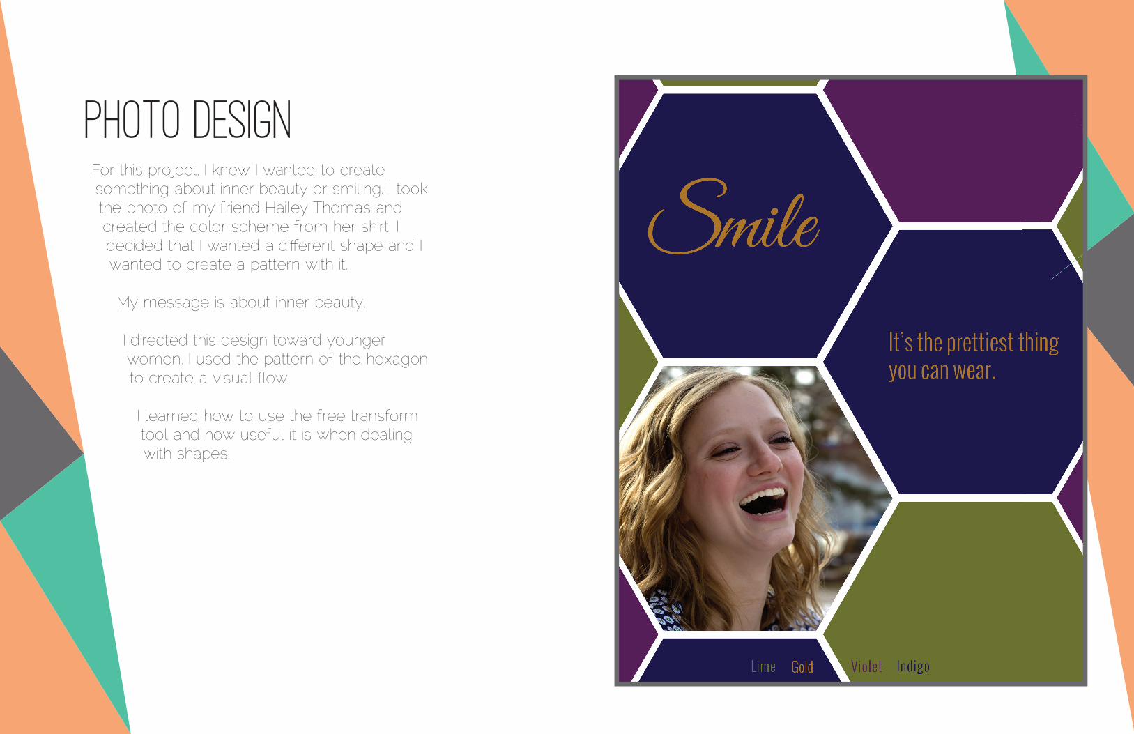
For this project, I knew I wanted to create something about inner beauty or smiling. I took the photo of my friend Hailey Thomas and created the color scheme from her shirt. I decided that I wanted a diff erent shape and I wanted to create a pattern with it.
My message is about inner beauty.
I directed this design toward younger women. I used the pattern of the hexagon to create a visual fl ow.
I learned how to use the free transform tool and how useful it is when dealing with shapes.
Photo Design

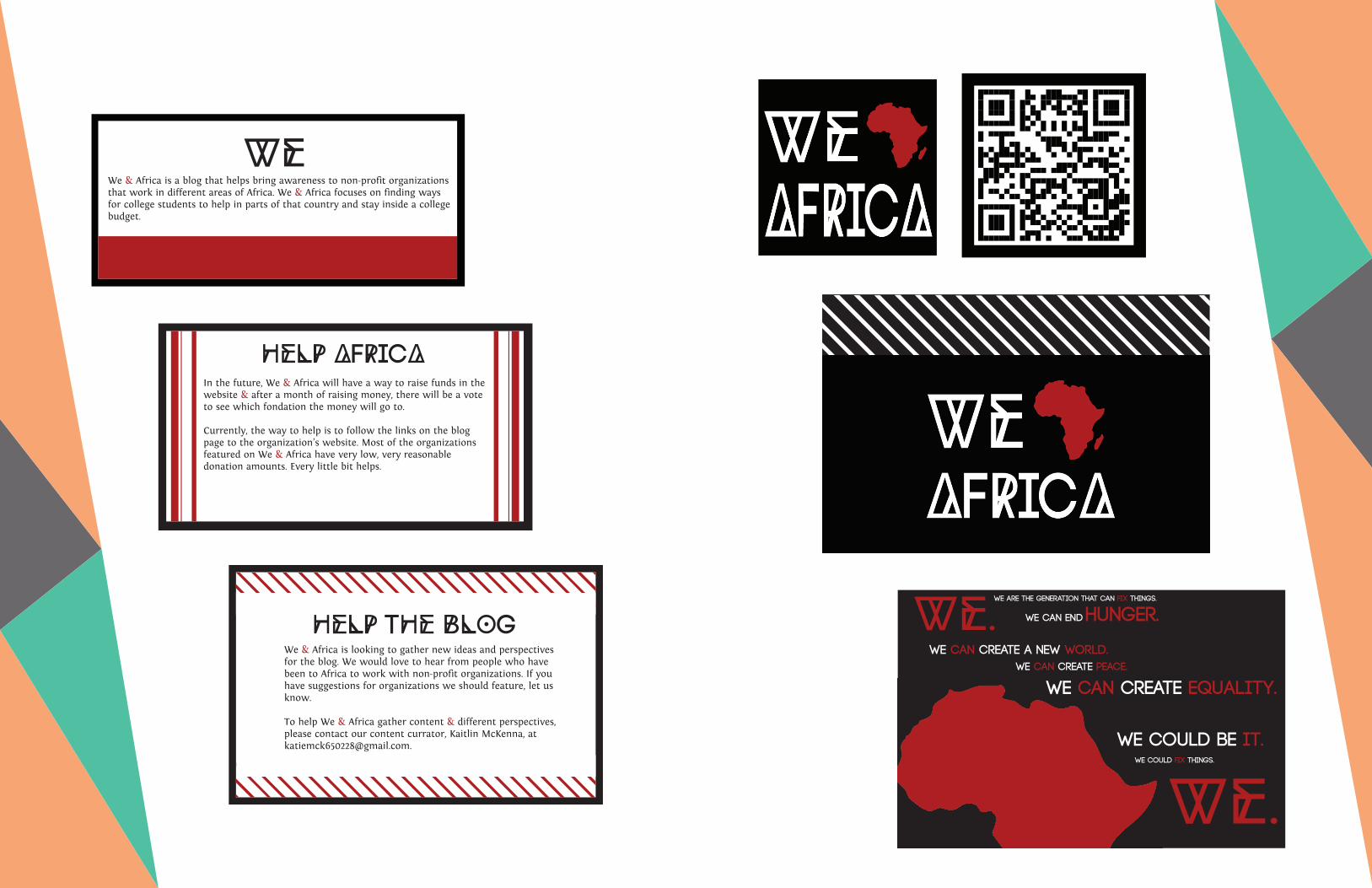
This is a brochure that I created to advertise my blog that I created last year.
I created the the logo in Illustrator by drawing the shape of Africa and then adding the text. I then transferred it into InDesign and started creating the envelop. I set rulers to make sure the folds would be even. Then I created the pocket and the pages individually.
The purpose of this brochure is to inspire to people to help in Africa and to visit my blog.
I had a little problem with printing this project. I found that you have to change your prefernces in Indesign so that it will show you your true blacks or they will not print the correct color.
Brochure WE AFRICA&
Help the blogWe & Africa is looking to gather new ideas and perspectives for the blog. We would love to hear from people who have been to Africa to work with non-profi t organizations. If you have suggestions for organizations we should feature, let us know.
To help We & Africa gather content & different perspectives, please contact our content currator, Kaitlin McKenna, at [email protected].
HElp AfRICAIn the future, We & Africa will have a way to raise funds in the website & after a month of raising money, there will be a vote to see which fondation the money will go to.
Currently, the way to help is to follow the links on the blog page to the organization’s website. Most of the organizations featured on We & Africa have very low, very reasonable donation amounts. Every little bit helps.
WEWe & Africa is a blog that helps bring awareness to non-profi t organizations that work in different areas of Africa. We & Africa focuses on fi nding ways for college students to help in parts of that country and stay inside a college budget.
Contains:We - An explanation of the blogHelp Africa - How to help using the blogHelp the Blog - How to help us create contentQR Code - How to get thereSticker - How to remember us
Help the blogWe & Africa is looking to gather new ideas and perspectives for the blog. We would love to hear from people who have been to Africa to work with non-profi t organizations. If you have suggestions for organizations we should feature, let us know.
To help We & Africa gather content & different perspectives, please contact our content currator, Kaitlin McKenna, at [email protected].
HElp AfRICAIn the future, We & Africa will have a way to raise funds in the website & after a month of raising money, there will be a vote to see which fondation the money will go to.
Currently, the way to help is to follow the links on the blog page to the organization’s website. Most of the organizations featured on We & Africa have very low, very reasonable donation amounts. Every little bit helps.
WEWe & Africa is a blog that helps bring awareness to non-profi t organizations that work in different areas of Africa. We & Africa focuses on fi nding ways for college students to help in parts of that country and stay inside a college budget.
We.
We.We are the generation that can � x things.
We can create a new worlD.
We can end hunger.
We can create equality.We can create Peace.
We Could be it.We could � x things.

This is a Charity Concert ad that I designed for Musicians Without Borders.
I used word for this design. I actually started with a completely diff erent design. I had planned out several diff erent designs around this one concept that just wasn’t working out so I moved everything off the page and started over. The message is one of unity. The photo inside the image of Africa asserts the idea of no borders. I directed this event and ad toward people who like Indie style music. I directed it toward people who care about music and care about Africa.
While desiging this project, I had to completly start over because the design I was using was not working. I feel that this taught me a vaulable lesson in adapting to the circumstances.
Event ad
Mumford and Sons • The Str!ke • Maroon 5• The Decemberists • Grouplove • AJR • The Naked and Famous • Benjamin Dunn and Friends • Florence and the Machine • Vance Joy
All proceeds from this concert will go to Musicians Without Borders for their work in Rwanda and Tanzania. Every ticket purchased will go toward helping children overcome war with music.
June 5, 2015 4:00 pm-12:00 a.m. Suwanee Town Center, Suwanee, GA
Tickets will go on sale May 1, 2015 at 12:00 pm MST • $200
Mumford and Sons • The Str!ke •Maroon 5 The Decemberists
Featuring

This is an example of a stationery and business card I created for a record shop in Long Beach, California.
I created the logo in Illustrator by replicating circles and then erasing parts of the circles. I then saved the image as a .png fi le and placed them onto the stationery and the business card. I created the QR code in InDesign and placed it in the center of the logo.
I wanted to create a logo that had a vintage feel but looked modern. I wanted to use a QR code and turn the business cards on it’s side to create a unique feel.
This project is directed toward young people who like using records.
I feel the most important skill I learned in this project was how to create QR codes in InDesign.
Business card and statoinery
678.910.1234
75 w Ocean DriveLong Beach, California
90802
Willy Rose
Willy Rose
[email protected] w Ocean DriveLong Beach, California 90802

This is a website I designed using CSS and HTML to display a logo that I created.
I used TextWrangler and Notepad++ to create this website. I altered h1 to create the border across the top and I created the background image in Photoshop. I embedded the fonts Oswald and Droid Serif into the website using google fonts so that the font will show up where the user has the font or not.
From a base code, I added the background image, centered the image, created the h1 header, and created a note explaining how to center the image for future reference. I changed the font, font size, and kerning for the h2 and changed the font and font color of the body copy.
The intended message is explain how I created this logo and to show what I learned about CSS and HTML.
This design is created for people interested in design, future employers and teachers.
I learned a lot about HTML and CSS this week but the most important thing I learned is how to create the border on the top.
website

These are logos I created for my photography business. I wanted these logos to show a clean, modern style similar to what I display in my photography.
For this project I used Adobe Illustrator. I used mostly the pen tool to create shapes and objects.
These designs are meant to appeal to professionals as well as future clients.
I feel that the most important skill I learned while creating these logos is how to change pen strokes into objects and then manipluate them.
Logos
Photo
graph
y
Photog
raphy
K
M
Photography
KM Photography

This is a flier that I designed using Adobe InDesign. The flier is for a company called Vouant Commincation and it is advertising their leadership conference for graduating seniors.
As mentioned above, I used Adobe InDesign to create this flier. I first sketched my design out with pen and paper. I tried to think of who I would direct this flier to and what I wanted it to be. I knew I wanted a clean design with nice flow that would make the information seem less intimidating. I used the pen tool to create the black and white shapes along the left-hand side of the flier.
My message is focused on Leadership and gaining the competitive edge.
The audience I am gearing towards is a slightly elegant one. I chose the Great Vibe font for the title along with the shape down the side to gain an elegance that would appeal to classy, motivated seniors.
Don’t give up on a design, no matter how hard it is. It took me almost two hours to get the shape in the left hand side just how I wanted it.
Flier

These are photos that I really enjoy, that have been in juried shows, and have recieved awards.
Photos


This photo received an honorable mention at a county wide juried show and was accepted into the Georgia All-State Art Symposium.