portfolio project - hudson responsive mobile site
TRANSCRIPT

Hudson is a global talent solutions company. Established for 13 years, they work in recruitment and tal-ent management, focusing on professional services such as Law, Accountancy and HR.
They approached us because they wanted to better understand the way job seekers operate, particular-ly on mobile devices so that they can improve the job search and application experience for candidates visiting their site.
Currently they see very high bounce rates and very short visit times along with very low use of search filters. They hope that by making job search quicker and easier this traffic data will improve and they will see more job applications and more job-alert sign-ups.
Hudson Job SearchResponsive mobile website
A three-week design sprint working in a team of four to design and prototype a new job search and application experience for job-seekers with the recruitment agency Hudson.
8 min. read
Team members Project DurationMy responsibilities Tools used
The Problem
Current traffic data indicates that the mobile job search and application experience is poor on the Hudson site. Hudson want to improve this by learning what mobile job-seekers need and expect, and
updating the design to accommodate this.
-Hudson Responsive Mobile Site | Benjamin Strak 2016
User Interviews
Participatory Design
Task Analysis
Interaction Design
Persona Creation
Prototyping
Competitive Analysis
Guerrilla Testing
Visual Design
Camera
Omnigraffle
Sketch
Invision
Keynote
Two WeeksBenjamin Strak
Fiona Warner
Guy Simpson
Jem Musa
Brief + Project Context
Requirements Gathering

User Research
There was lots we needed to understand at the beginning of the project, both about the usage of the existing site, how people used their mobile devices during a job search, and how they were using re-cruitment agencies like Hudson.
We made use of the full suite of user research techniques including guerrilla testing, contextual inquiry, interviews, surveys and task analysis. In all we tested the existing site on 17 people, we interviewed 25 people and had 51 survey respondents.
Our main findings from testing the existing site were as follows:
• Keyword search was not easy to discover and most people didn’t want to use it anyway – pre-ferring to start their search broad so as not to miss anything and then filter down after.
• However on mobile, filters were hidden at the bottom of each page, meaning if people didn’t see a job they liked immediately they just gave up.
• The interface was poorly optimised for mobile. People were put off by unreadable text and confusing page breaks.
• Content was also poorly optimised – too long and poorly broken down for shorter mobile use patterns.
From top; Guerilla testing the exisiting site in local cafes, search and advert screen on exisitng site.

An experience map showing the journey to getting a job. The major pain point is during the job search and assessment phase when job-seekers must spend a lot of
time lookg for roles and assessing their suitability.
-Hudson Responsive Mobile Site | Benjamin Strak 2016
Our key takeaways about the mobile job search process from our interviews and task analysis were the following:
• A growing number of people use their mobile devices during their job search.• Typically however people are using their mobile devices to browse rather than apply, they pre-
fer to get their cover letter and CV together on a laptop or desktop where there is more space.• Job search is thus a multi-session process, across time and devices
We also discovered the following about people’s attitudes to recruitment agencies:
• Job-seekers are generally mistrustful of recruiters, and tend to feel ignored or used by them.• They are however attracted in principle to the idea of personalised job-matching.

Personas
Competitive Landscape
-Hudson Responsive Mobile Site | Benjamin Strak 2016
Using interview trends and Hudson site traffic data, we were able to devise three typical user personas.These range in age, gender and career stage, and also from more casual users to those conducting fo-cused searches regularly.
Our first persona is Yemi – ’The Career Jumper’ – Young, changing career direction and looking for a company who shares her values. Yemi is currently Hudson’s highest candidate audience.
Our second persona is Sandeep – ’The Ambitious Mid-career advancer’ – Has a family to support and wants to advance his career in both responsibility and salary. He is more of a ‘pro’ user but as a busy man still needs job search to be as quick and easy as possible.
Our third persona is Richard – ’The Specialist Seeker’ – Older and more experienced, with specific needs and search criteria. Richard is a frequent user as he changes roles more regularly, but is also likely to use his own network.
We made Sandeep as our primary persona as he represented the type of high-value candidate Hudson wants to attract.
User research had indicated that candidate expectations in the job search process were changing. We did some analysis of the competitive landscape to better understand this.
Our key findings were:
• The rise of LinkedIn, job boards such as reed.co.uk and rating sites like Glassdoor have lead to greater candidate expectations of transparency during the job search process.
• This is part of a general trend towards more a more candidate-driven experience as job search has gone online.

The Design Opportunity
-Hudson Responsive Mobile Site | Benjamin Strak 2016
Proposed Design Solution
An updated responsive mobile site with an improved search and filter interface, beautifully optimised advert content and an account system to allow for job searches and applications across devices.
There were three clear themes emerging from our research to address in our redesign:
• Simplify and personalise the search process - Make search easy to tweak with filters, and give candidates control about how to pursue or dismiss the results they see.
• Improve advert content - to better reflect casual, brief mobile usage.• Allow for continuity across devices - an account system would allow users to save jobs to pick
up later elsewhere and unlock more personalised features for the user.
We realised it wasn’t a question of reinventing the wheel, rather of making lots of small adjustments to make the existing awkward functionality better reflect actual job-seeker behaviour and feel more friendly.
When it came to existing mobile competitors however, there was still much work to be done for this ex-perience to feel truly candidate-focused:
• Applying filters on many mobile sites often felt unnecessarily difficult.• Sites did a mixed job of optimising advert content for mobile. • Some apps such reed.co.uk as manage to offer a more personal experience by offering an ac-
count system for continuity across job search sessions.
From left; Job Board Reed’s mobile app, Recruiter Michael Page’s responsive mobile site, and Glassdoor’s mobile app.

Initial Design Studio
Early sketches of search, results and job advert pages.
-Hudson Responsive Mobile Site | Benjamin Strak 2016
We began design work by defining the key flows that a user like Sandeep would need to accomplish whilst using the mobile website; searching, applying filters, saving jobs and so on.
To start testing interface ideas for these flows we ran a design studio with five members of the Hudson team. Sketching together was a great way to build consesnsus about what the search, results and adverts pages should include:
• A simpler and friendlier search start page was a must.• Easy access to filters from collapsible drawers at the top of the results page.• An enticing single sentence ‘hero’ byline in search results and a short 50-word summary at the
top each advert to make job adverts more appealing, with other content categorised and hid-den
• A ‘Not for Me’ button – giving job-seekers the ability to refine search results by getting rid of jobs they don’t also like as well as ones they do.

Iterations of mid-fidelity wireframes for a job advert page (final design shown far right).
“I’d use the account, but wouldn’t have thought to look for it there.”
Alex, Liverpool Street Station
-Hudson Responsive Mobile Site | Benjamin Strak 2016
We combined the ideas into a consistent set of screens, which we photographed and made into a tappa-ble prototype using Invision. We could then take this out on to the streets of London to test on business people – in total 26 individuals over several rounds.
Feedback we got from the initial round was surprisingly positive, with the simplified search interface quick for people to get the hang of. Some people were reluctant to set up an account to save jobs how-ever so it was clear that we would need to explain the benefits of doing so clearly and up front.
We moved to mid-fidelity fairly promptly as many of our ideas about how to better present the content required a greater degree of visual fidelity to test. We got a huge amount of feedback at this stage rang-ing from ‘Not for Me’ button placement to where to locate the account area.
Prototyping
Visual Design
-Hudson Responsive Mobile Site | Benjamin Strak 2016
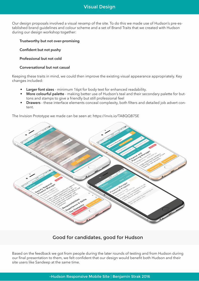
Our design proposals involved a visual revamp of the site. To do this we made use of Hudson’s pre-es-tablished brand guidelines and colour scheme and a set of Brand Traits that we created with Hudson during our design workshop together:
Trustworthy but not over-promising
Confident but not pushy
Professional but not cold
Conversational but not casual
Keeping these traits in mind, we could then improve the existing visual appearance appropriately. Key changes included:
• Larger font sizes - minimum 16pt for body text for enhanced readability.• More colourful palette - making better use of Hudson’s teal and their secondary palette for but-
tons and stamps to give a friendly but still professional feel• Drawers - these interface elements conceal complexity, both filters and detailed job advert con-
tent.
The Invision Prototype we made can be seen at: https://invis.io/TA8QQ87SE
Based on the feedback we got from people during the later rounds of testing and from Hudson during our final presentation to them, we felt confident that our design would benefit both Hudson and their site users like Sandeep at the same time.
Good for candidates, good for Hudson

Next Steps
Desktop and tablet versions of the redesigned site.
-Hudson Responsive Mobile Site | Benjamin Strak 2016
The improvements to interaction design, interface and content would, by making the experience smoother and more natural for candidates, resulting in more applications and alert sign-ups for Hud-son. Features like ‘not for me’ also offered the possibility of gathering useful data about what job adverts were not working and needed looking into.
• Develop account functionality - Introduce candidate registration without a job application and allow them to keep tabs on application status.
• Implement detailed content strategy - to ensure better consistency across all adverts and raise the overall quality.
• Fully build out desktop & tablet versions - to ensure the experience is as smooth and consistent as possible across all devices.
• Improve advert creation process - as part of the content strategy to improve the UX of how recruiters actually upload new adverts at the backend.
“Now I can catch up with the latest jobs on the train home. Any I save are waiting for me on my laptop after I’ve put the kids to bed.”
Sandeep, Primary Persona