poster analysis
TRANSCRIPT
Poster AnalysisBy Eibhilin Mckerr

Codes and Conventions
Tagline
Directors Name
Unique Selling Point
Billing Block
WebsiteSocial Media
Release Date
Movie Title
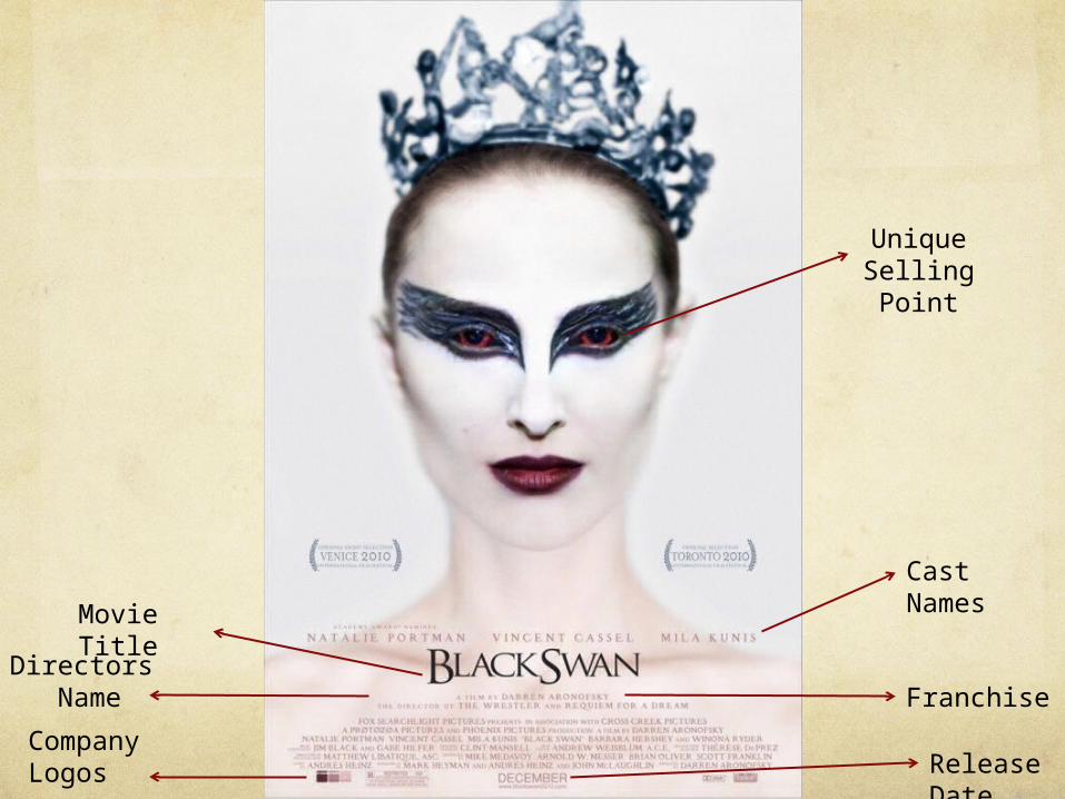
Cast Names
Franchise
Release Date
Movie Title
Directors Name
Company Logos
Unique SellingPoint

Comparison
I used Black Swan as my inspiration for it’s layout. I
originally intended to have my main images positioned like on the Black Swan. On my earlier
drafts I attempted this but I decided to change as I thought this way looked better. What I
kept the same of my inspiration is the layout of text
as the billing block is at the bottom and the name is
placed in the same position. I wanted to use this as my inspiration as I thought it looked simple and it has
aspects from the main film which I interpreted into my
poster.
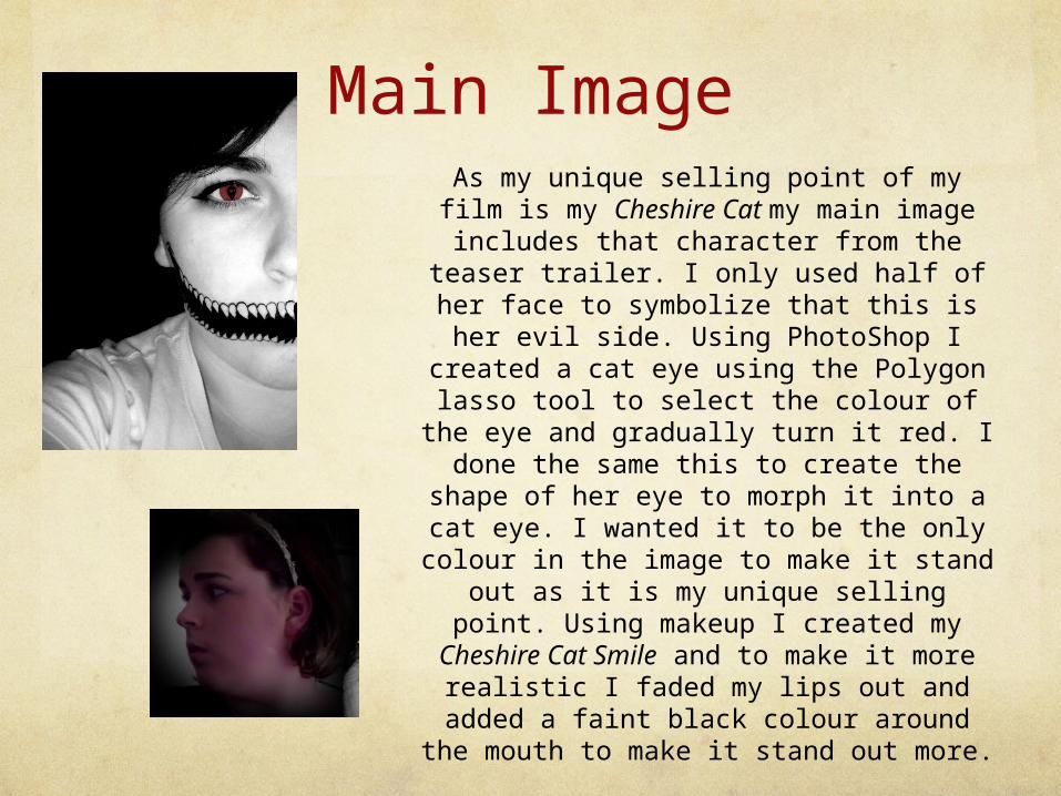
Main ImageAs my unique selling point of my film is my Cheshire Cat my main image includes that
character from the teaser trailer. I only used half of her face to symbolize that this is her evil side. Using PhotoShop I created a cat eye using the Polygon lasso tool to
select the colour of the eye and gradually turn it red. I done the same this to create the shape of her eye to morph it into a cat eye. I wanted it to be the only colour in the
image to make it stand out as it is my unique selling point. Using makeup I
created my Cheshire Cat Smile and to make it more realistic I faded my lips out and added a faint black colour around the
mouth to make it stand out more.
At the side of my main I faded another image in which is supposed to portray the good side of her. This is showed by that
she isn’t wearing any makeup and her hair pulled back.

Written ContentMy title is The Cat Whispers which is in the same font as the only I used in my teaser trailer but this time it’s in red instead of white as it is the colour scheme I had previously decided to follow. 4 other texts are in the same colour red as I want those to stand out from my greyscale main image. My billing block is in black as I didn’t want to use too much red as it looks more professional red. At the top of the poster it says DIRECTED BY EIBHILIN MCKERR and WOULD YOU LET ANYBODY CHANGE YOU? I put the directors name in white to make it stand out from the tagline as it looks sleek and professional.
At the bottom of the images I included social networking sites and to link viewers to our Facebook, Twitter and Tumblr website by including hashtags to search online for the movie trailer to appear and also including the movie website.