presentation1 10 things i hate about you
TRANSCRIPT
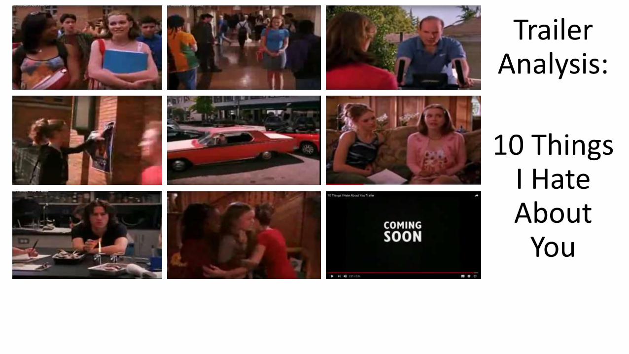
Trailer Analysis:
10 Things I Hate About
You
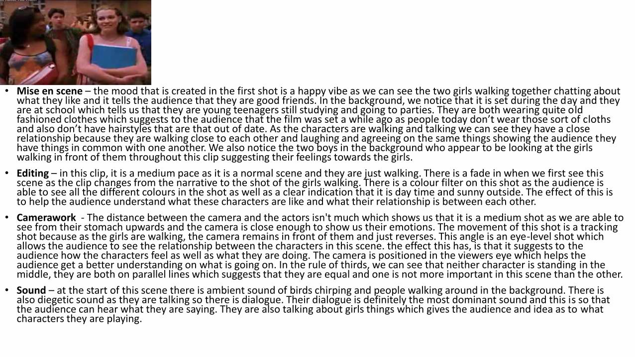
• Mise en scene – the mood that is created in the first shot is a happy vibe as we can see the two girls walking together chatting about what they like and it tells the audience that they are good friends. In the background, we notice that it is set during the day and they are at school which tells us that they are young teenagers still studying and going to parties. They are both wearing quite old fashioned clothes which suggests to the audience that the film was set a while ago as people today don’t wear those sort of cloths and also don’t have hairstyles that are that out of date. As the characters are walking and talking we can see they have a closerelationship because they are walking close to each other and laughing and agreeing on the same things showing the audience theyhave things in common with one another. We also notice the two boys in the background who appear to be looking at the girls walking in front of them throughout this clip suggesting their feelings towards the girls.
• Editing – in this clip, it is a medium pace as it is a normal scene and they are just walking. There is a fade in when we first see this scene as the clip changes from the narrative to the shot of the girls walking. There is a colour filter on this shot as the audience is able to see all the different colours in the shot as well as a clear indication that it is day time and sunny outside. The effect of this is to help the audience understand what these characters are like and what their relationship is between each other.
• Camerawork - The distance between the camera and the actors isn't much which shows us that it is a medium shot as we are able to see from their stomach upwards and the camera is close enough to show us their emotions. The movement of this shot is a trackingshot because as the girls are walking, the camera remains in front of them and just reverses. This angle is an eye-level shot which allows the audience to see the relationship between the characters in this scene. the effect this has, is that it suggests to the audience how the characters feel as well as what they are doing. The camera is positioned in the viewers eye which helps the audience get a better understanding on what is going on. In the rule of thirds, we can see that neither character is standing in the middle, they are both on parallel lines which suggests that they are equal and one is not more important in this scene than the other.
• Sound – at the start of this scene there is ambient sound of birds chirping and people walking around in the background. There is also diegetic sound as they are talking so there is dialogue. Their dialogue is definitely the most dominant sound and this is so that the audience can hear what they are saying. They are also talking about girls things which gives the audience and idea as to what characters they are playing.
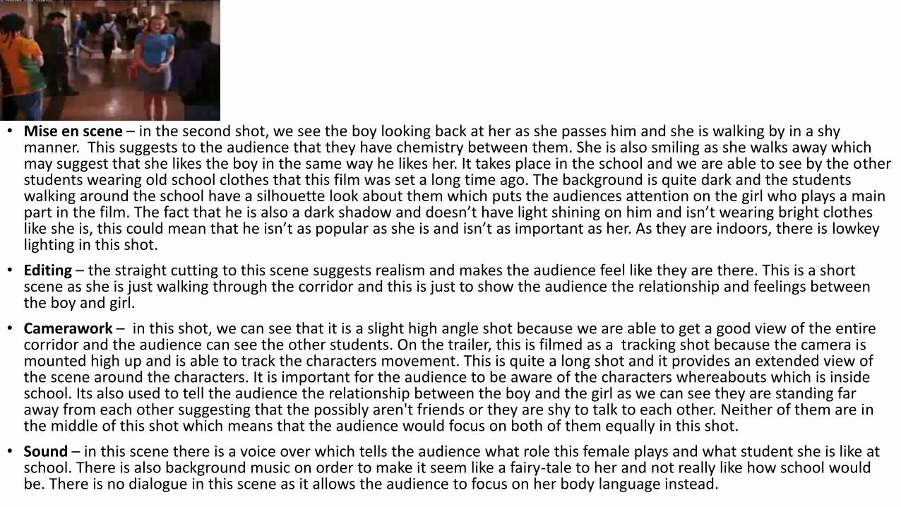
• Mise en scene – in the second shot, we see the boy looking back at her as she passes him and she is walking by in a shy manner. This suggests to the audience that they have chemistry between them. She is also smiling as she walks away which may suggest that she likes the boy in the same way he likes her. It takes place in the school and we are able to see by the other students wearing old school clothes that this film was set a long time ago. The background is quite dark and the students walking around the school have a silhouette look about them which puts the audiences attention on the girl who plays a main part in the film. The fact that he is also a dark shadow and doesn’t have light shining on him and isn’t wearing bright clothes like she is, this could mean that he isn’t as popular as she is and isn’t as important as her. As they are indoors, there is lowkey lighting in this shot.
• Editing – the straight cutting to this scene suggests realism and makes the audience feel like they are there. This is a short scene as she is just walking through the corridor and this is just to show the audience the relationship and feelings betweenthe boy and girl.
• Camerawork – in this shot, we can see that it is a slight high angle shot because we are able to get a good view of the entire corridor and the audience can see the other students. On the trailer, this is filmed as a tracking shot because the camera is mounted high up and is able to track the characters movement. This is quite a long shot and it provides an extended view of the scene around the characters. It is important for the audience to be aware of the characters whereabouts which is inside school. Its also used to tell the audience the relationship between the boy and the girl as we can see they are standing far away from each other suggesting that the possibly aren't friends or they are shy to talk to each other. Neither of them are in the middle of this shot which means that the audience would focus on both of them equally in this shot.
• Sound – in this scene there is a voice over which tells the audience what role this female plays and what student she is like at school. There is also background music on order to make it seem like a fairy-tale to her and not really like how school would be. There is no dialogue in this scene as it allows the audience to focus on her body language instead.
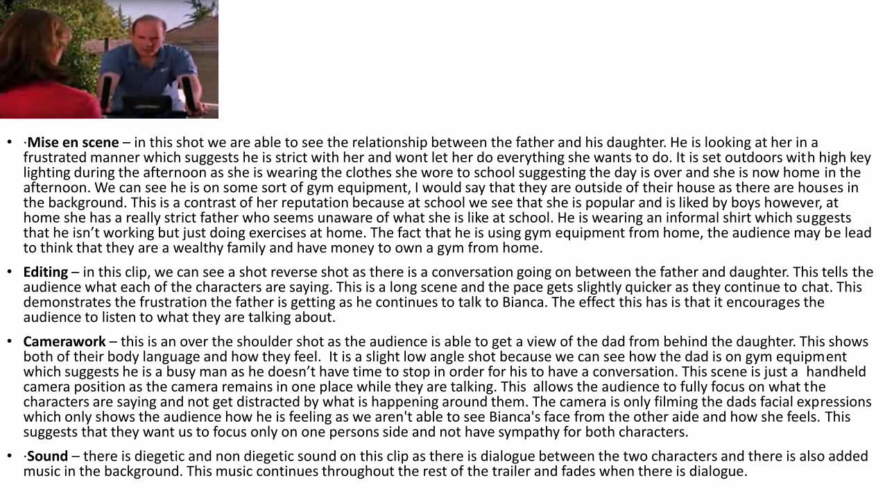
• ·Mise en scene – in this shot we are able to see the relationship between the father and his daughter. He is looking at her in a frustrated manner which suggests he is strict with her and wont let her do everything she wants to do. It is set outdoors with high key lighting during the afternoon as she is wearing the clothes she wore to school suggesting the day is over and she is now home in the afternoon. We can see he is on some sort of gym equipment, I would say that they are outside of their house as there are houses in the background. This is a contrast of her reputation because at school we see that she is popular and is liked by boys however, at home she has a really strict father who seems unaware of what she is like at school. He is wearing an informal shirt which suggests that he isn’t working but just doing exercises at home. The fact that he is using gym equipment from home, the audience may be lead to think that they are a wealthy family and have money to own a gym from home.
• Editing – in this clip, we can see a shot reverse shot as there is a conversation going on between the father and daughter. This tells theaudience what each of the characters are saying. This is a long scene and the pace gets slightly quicker as they continue to chat. This demonstrates the frustration the father is getting as he continues to talk to Bianca. The effect this has is that it encourages the audience to listen to what they are talking about.
• Camerawork – this is an over the shoulder shot as the audience is able to get a view of the dad from behind the daughter. This shows both of their body language and how they feel. It is a slight low angle shot because we can see how the dad is on gym equipmentwhich suggests he is a busy man as he doesn’t have time to stop in order for his to have a conversation. This scene is just a handheld camera position as the camera remains in one place while they are talking. This allows the audience to fully focus on what the characters are saying and not get distracted by what is happening around them. The camera is only filming the dads facial expressions which only shows the audience how he is feeling as we aren't able to see Bianca's face from the other aide and how she feels. This suggests that they want us to focus only on one persons side and not have sympathy for both characters.
• ·Sound – there is diegetic and non diegetic sound on this clip as there is dialogue between the two characters and there is also addedmusic in the background. This music continues throughout the rest of the trailer and fades when there is dialogue.
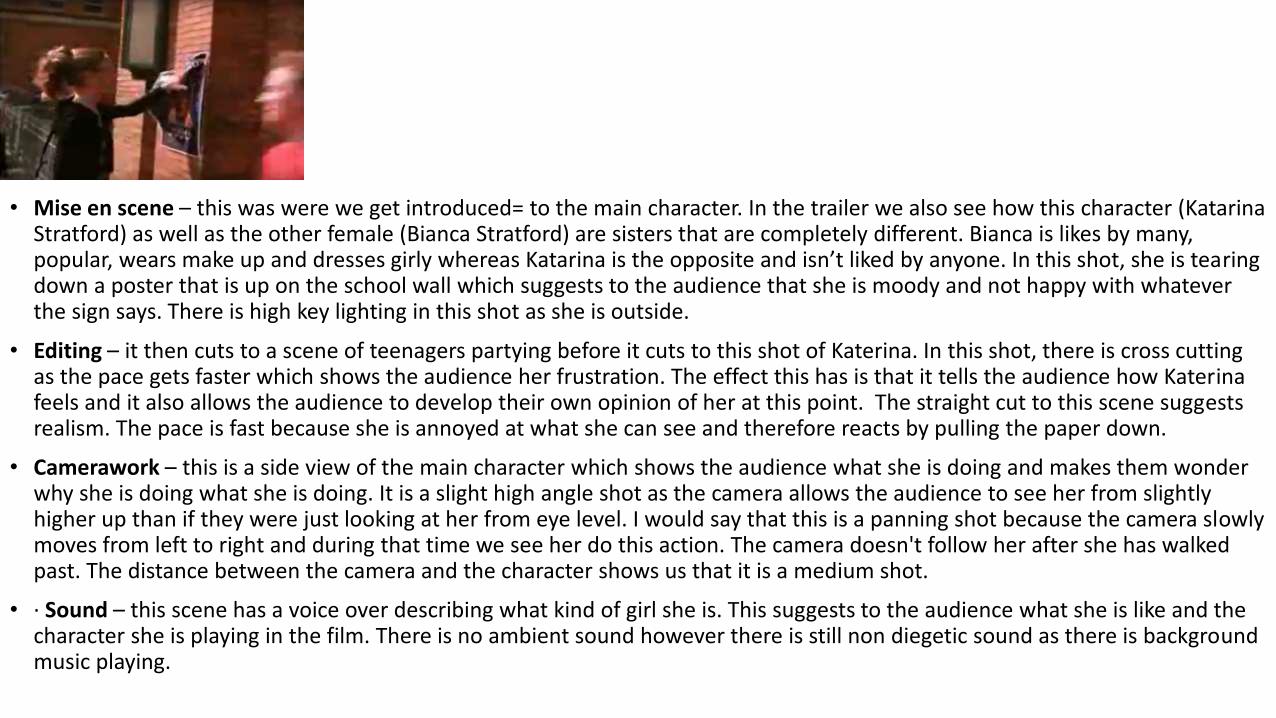
• Mise en scene – this was were we get introduced= to the main character. In the trailer we also see how this character (Katarina Stratford) as well as the other female (Bianca Stratford) are sisters that are completely different. Bianca is likes by many,popular, wears make up and dresses girly whereas Katarina is the opposite and isn’t liked by anyone. In this shot, she is tearing down a poster that is up on the school wall which suggests to the audience that she is moody and not happy with whatever the sign says. There is high key lighting in this shot as she is outside.
• Editing – it then cuts to a scene of teenagers partying before it cuts to this shot of Katerina. In this shot, there is cross cutting as the pace gets faster which shows the audience her frustration. The effect this has is that it tells the audience how Katerinafeels and it also allows the audience to develop their own opinion of her at this point. The straight cut to this scene suggests realism. The pace is fast because she is annoyed at what she can see and therefore reacts by pulling the paper down.
• Camerawork – this is a side view of the main character which shows the audience what she is doing and makes them wonder why she is doing what she is doing. It is a slight high angle shot as the camera allows the audience to see her from slightlyhigher up than if they were just looking at her from eye level. I would say that this is a panning shot because the camera slowly moves from left to right and during that time we see her do this action. The camera doesn't follow her after she has walked past. The distance between the camera and the character shows us that it is a medium shot.
• · Sound – this scene has a voice over describing what kind of girl she is. This suggests to the audience what she is like and the character she is playing in the film. There is no ambient sound however there is still non diegetic sound as there is backgroundmusic playing.
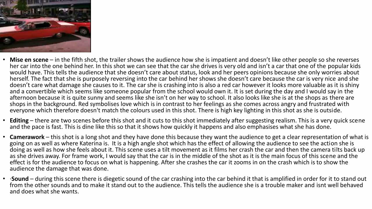
• Mise en scene – in the fifth shot, the trailer shows the audience how she is impatient and doesn’t like other people so she reverses her car into the one behind her. In this shot we can see that the car she drives is very old and isn’t a car that one of the popular kids would have. This tells the audience that she doesn’t care about status, look and her peers opinions because she only worries about herself. The fact that she is purposely reversing into the car behind her shows she doesn’t care because the car is very nice and she doesn’t care what damage she causes to it. The car she is crashing into is also a red car however it looks more valuable as it is shiny and a convertible which seems like someone popular from the school would own it. It is set during the day and I would say in theafternoon because it is quite sunny and seems like she isn’t on her way to school. It also looks like she is at the shops as there are shops in the background. Red symbolises love which is in contrast to her feelings as she comes across angry and frustrated with everyone which therefore doesn't match the colours used in this shot. There is high key lighting in this shot as she is outside.
• Editing – there are two scenes before this shot and it cuts to this shot immediately after suggesting realism. This is a very quick scene and the pace is fast. This is dine like this so that it shows how quickly it happens and also emphasises what she has done.
• Camerawork – this shot is a long shot and they have done this because they want the audience to get a clear representation of what is going on as well as where Katerina is. It is a high angle shot which has the effect of allowing the audience to see the action she is doing as well as how she feels about it. This scene uses a tilt movement as it films her crash the car and then the camera tilts back up as she drives away. For frame work, I would say that the car is in the middle of the shot as it is the main focus of this scene and the effect is for the audience to focus on what is happening. After she crashes the car it zooms in on the crash which is to show the audience the damage that was done.
• ·Sound – during this scene there is diegetic sound of the car crashing into the car behind it that is amplified in order for it to stand out from the other sounds and to make it stand out to the audience. This tells the audience she is a trouble maker and isnt well behaved and does what she wants.
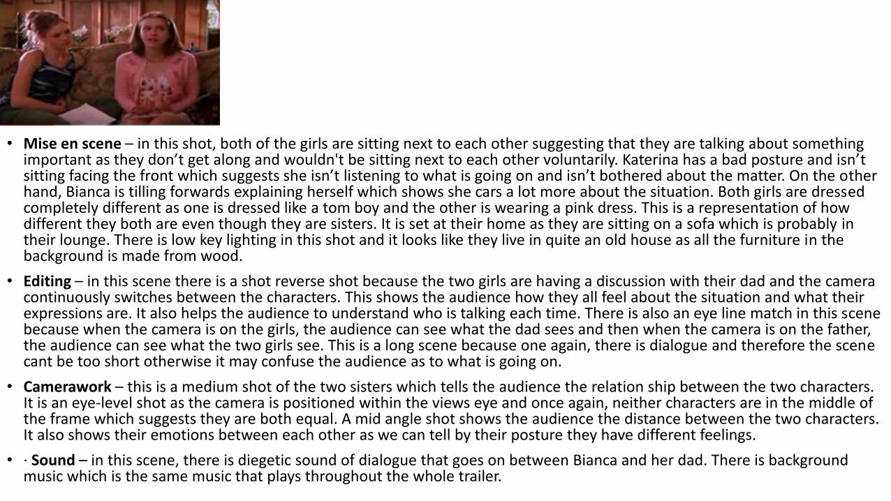
• Mise en scene – in this shot, both of the girls are sitting next to each other suggesting that they are talking about something important as they don’t get along and wouldn't be sitting next to each other voluntarily. Katerina has a bad posture and isn’t sitting facing the front which suggests she isn’t listening to what is going on and isn’t bothered about the matter. On the other hand, Bianca is tilling forwards explaining herself which shows she cars a lot more about the situation. Both girls are dressed completely different as one is dressed like a tom boy and the other is wearing a pink dress. This is a representation of how different they both are even though they are sisters. It is set at their home as they are sitting on a sofa which is probably intheir lounge. There is low key lighting in this shot and it looks like they live in quite an old house as all the furniture in the background is made from wood.
• Editing – in this scene there is a shot reverse shot because the two girls are having a discussion with their dad and the camera continuously switches between the characters. This shows the audience how they all feel about the situation and what their expressions are. It also helps the audience to understand who is talking each time. There is also an eye line match in this scene because when the camera is on the girls, the audience can see what the dad sees and then when the camera is on the father, the audience can see what the two girls see. This is a long scene because one again, there is dialogue and therefore the scene cant be too short otherwise it may confuse the audience as to what is going on.
• Camerawork – this is a medium shot of the two sisters which tells the audience the relation ship between the two characters. It is an eye-level shot as the camera is positioned within the views eye and once again, neither characters are in the middle ofthe frame which suggests they are both equal. A mid angle shot shows the audience the distance between the two characters. It also shows their emotions between each other as we can tell by their posture they have different feelings.
• · Sound – in this scene, there is diegetic sound of dialogue that goes on between Bianca and her dad. There is background music which is the same music that plays throughout the whole trailer.
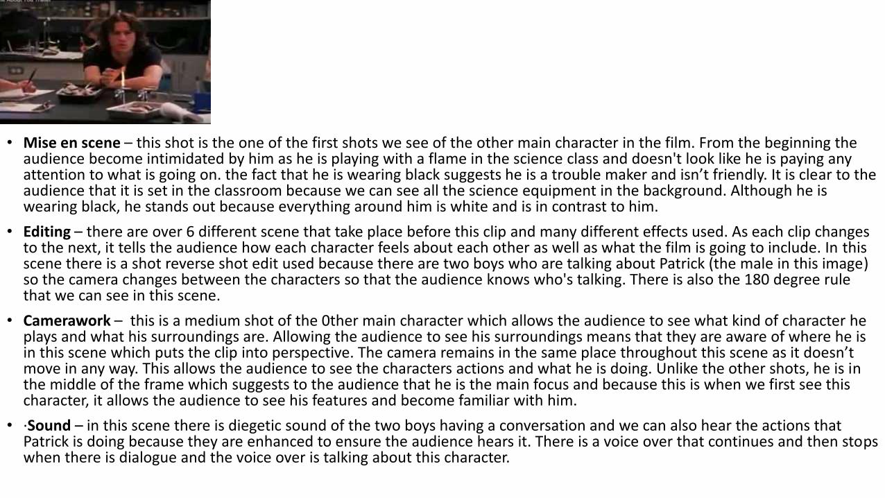
• Mise en scene – this shot is the one of the first shots we see of the other main character in the film. From the beginning the audience become intimidated by him as he is playing with a flame in the science class and doesn't look like he is paying any attention to what is going on. the fact that he is wearing black suggests he is a trouble maker and isn’t friendly. It is clear to the audience that it is set in the classroom because we can see all the science equipment in the background. Although he is wearing black, he stands out because everything around him is white and is in contrast to him.
• Editing – there are over 6 different scene that take place before this clip and many different effects used. As each clip changes to the next, it tells the audience how each character feels about each other as well as what the film is going to include. In this scene there is a shot reverse shot edit used because there are two boys who are talking about Patrick (the male in this image) so the camera changes between the characters so that the audience knows who's talking. There is also the 180 degree rule that we can see in this scene.
• Camerawork – this is a medium shot of the 0ther main character which allows the audience to see what kind of character he plays and what his surroundings are. Allowing the audience to see his surroundings means that they are aware of where he is in this scene which puts the clip into perspective. The camera remains in the same place throughout this scene as it doesn’t move in any way. This allows the audience to see the characters actions and what he is doing. Unlike the other shots, he is in the middle of the frame which suggests to the audience that he is the main focus and because this is when we first see this character, it allows the audience to see his features and become familiar with him.
• ·Sound – in this scene there is diegetic sound of the two boys having a conversation and we can also hear the actions that Patrick is doing because they are enhanced to ensure the audience hears it. There is a voice over that continues and then stops when there is dialogue and the voice over is talking about this character.
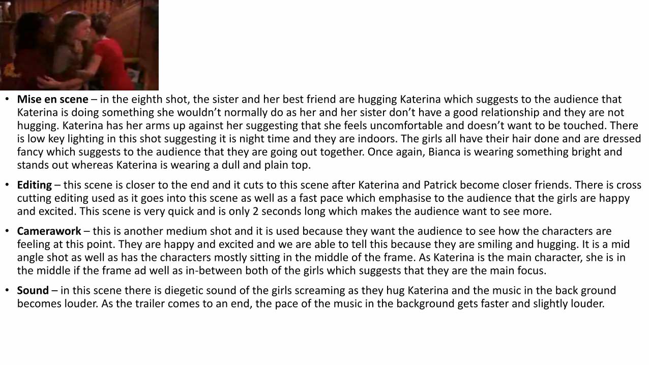
• Mise en scene – in the eighth shot, the sister and her best friend are hugging Katerina which suggests to the audience that Katerina is doing something she wouldn’t normally do as her and her sister don’t have a good relationship and they are not hugging. Katerina has her arms up against her suggesting that she feels uncomfortable and doesn’t want to be touched. There is low key lighting in this shot suggesting it is night time and they are indoors. The girls all have their hair done and are dressed fancy which suggests to the audience that they are going out together. Once again, Bianca is wearing something bright and stands out whereas Katerina is wearing a dull and plain top.
• Editing – this scene is closer to the end and it cuts to this scene after Katerina and Patrick become closer friends. There is cross cutting editing used as it goes into this scene as well as a fast pace which emphasise to the audience that the girls are happy and excited. This scene is very quick and is only 2 seconds long which makes the audience want to see more.
• Camerawork – this is another medium shot and it is used because they want the audience to see how the characters are feeling at this point. They are happy and excited and we are able to tell this because they are smiling and hugging. It is a midangle shot as well as has the characters mostly sitting in the middle of the frame. As Katerina is the main character, she is inthe middle if the frame ad well as in-between both of the girls which suggests that they are the main focus.
• Sound – in this scene there is diegetic sound of the girls screaming as they hug Katerina and the music in the back ground becomes louder. As the trailer comes to an end, the pace of the music in the background gets faster and slightly louder.
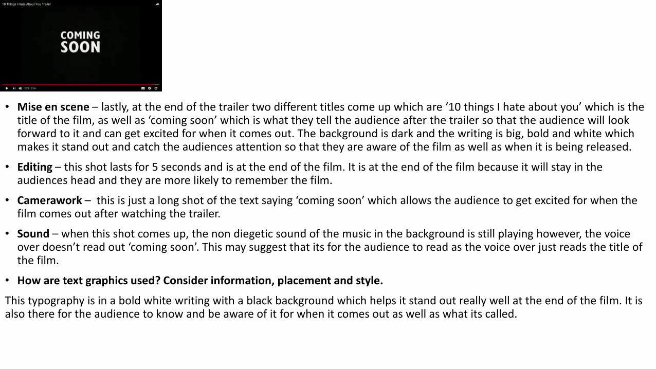
• Mise en scene – lastly, at the end of the trailer two different titles come up which are ‘10 things I hate about you’ which is the title of the film, as well as ‘coming soon’ which is what they tell the audience after the trailer so that the audience will look forward to it and can get excited for when it comes out. The background is dark and the writing is big, bold and white which makes it stand out and catch the audiences attention so that they are aware of the film as well as when it is being released.
• Editing – this shot lasts for 5 seconds and is at the end of the film. It is at the end of the film because it will stay in the audiences head and they are more likely to remember the film.
• Camerawork – this is just a long shot of the text saying ‘coming soon’ which allows the audience to get excited for when the film comes out after watching the trailer.
• Sound – when this shot comes up, the non diegetic sound of the music in the background is still playing however, the voice over doesn’t read out ‘coming soon’. This may suggest that its for the audience to read as the voice over just reads the title of the film.
• How are text graphics used? Consider information, placement and style.
This typography is in a bold white writing with a black background which helps it stand out really well at the end of the film. It is also there for the audience to know and be aware of it for when it comes out as well as what its called.
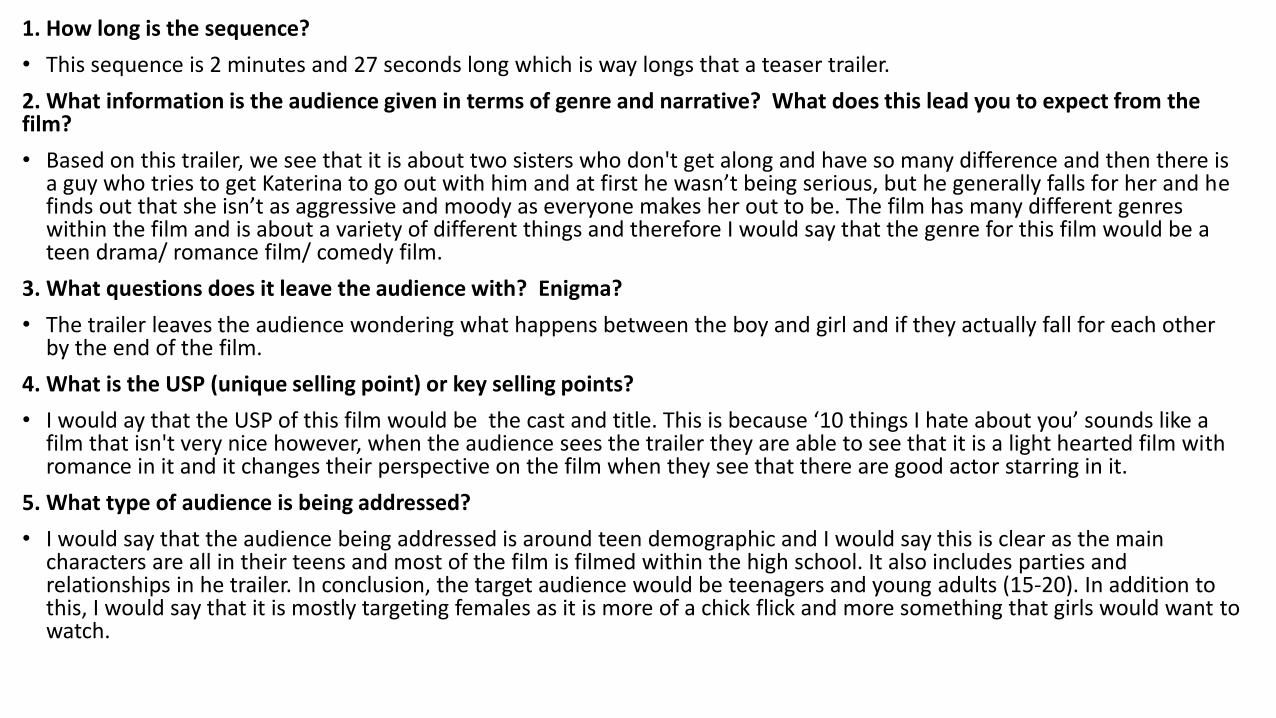
1. How long is the sequence?
• This sequence is 2 minutes and 27 seconds long which is way longs that a teaser trailer.
2. What information is the audience given in terms of genre and narrative? What does this lead you to expect from the film?
• Based on this trailer, we see that it is about two sisters who don't get along and have so many difference and then there is a guy who tries to get Katerina to go out with him and at first he wasn’t being serious, but he generally falls for her and he finds out that she isn’t as aggressive and moody as everyone makes her out to be. The film has many different genres within the film and is about a variety of different things and therefore I would say that the genre for this film would be a teen drama/ romance film/ comedy film.
3. What questions does it leave the audience with? Enigma?
• The trailer leaves the audience wondering what happens between the boy and girl and if they actually fall for each other by the end of the film.
4. What is the USP (unique selling point) or key selling points?
• I would ay that the USP of this film would be the cast and title. This is because ‘10 things I hate about you’ sounds like afilm that isn't very nice however, when the audience sees the trailer they are able to see that it is a light hearted film with romance in it and it changes their perspective on the film when they see that there are good actor starring in it.
5. What type of audience is being addressed?
• I would say that the audience being addressed is around teen demographic and I would say this is clear as the main characters are all in their teens and most of the film is filmed within the high school. It also includes parties and relationships in he trailer. In conclusion, the target audience would be teenagers and young adults (15-20). In addition to this, I would say that it is mostly targeting females as it is more of a chick flick and more something that girls would want towatch.
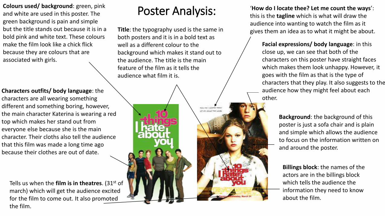
Poster Analysis:Colours used/ background: green, pink and white are used in this poster. The green background is pain and simple but the title stands out because it is in a bold pink and white text. These colours make the film look like a chick flick because they are colours that are associated with girls.
Characters outfits/ body language: the characters are all wearing something different and something boring, however, the main character Katerina is wearing a red top which makes her stand out from everyone else because she is the main character. Their cloths also tell the audience that this film was made a long time ago because their clothes are out of date.
Title: the typography used is the same in both posters and it is in a bold text as well as a different colour to the background which makes it stand out to the audience. The title is the main feature of the film as it tells the audience what film it is.
‘How do I locate thee? Let me count the ways’: this is the tagline which is what will draw the audience into wanting to watch the film as it gives them an idea as to what it might be about.
Facial expressions/ body language: in this close up, we can see that both of the characters on this poster have straight faces which makes them look unhappy. However, it goes with the film as that is the type of characters that they play. It also suggests to the audience how they might feel about each other.
Background: the background of this poster is just a sofa chair and is plain and simple which allows the audience to focus on the information written on and around the poster.
Tells us when the film is in theatres. (31st of march) which will get the audience excited for the film to come out. It also promoted the film.
Billings block: the names of the actors are in the billings block which tells the audience the information they need to know about the film.