preview now - worth publishers
TRANSCRIPT

Economists use graphs to illustrate both ideas and data. In this appendix, we review commonly used graphs, explain how to read them, and give you a few tips on how you can make graphs using Microsoft Excel or similar software.
Graphs Express IdeasIn economics, graphs are used to express ideas. The most common graphs we use throughout this book plot two variables on a coordinate system. One vari-able is plotted on the vertical or y-axis, while the other variable is plotted on the horizontal or x-axis.
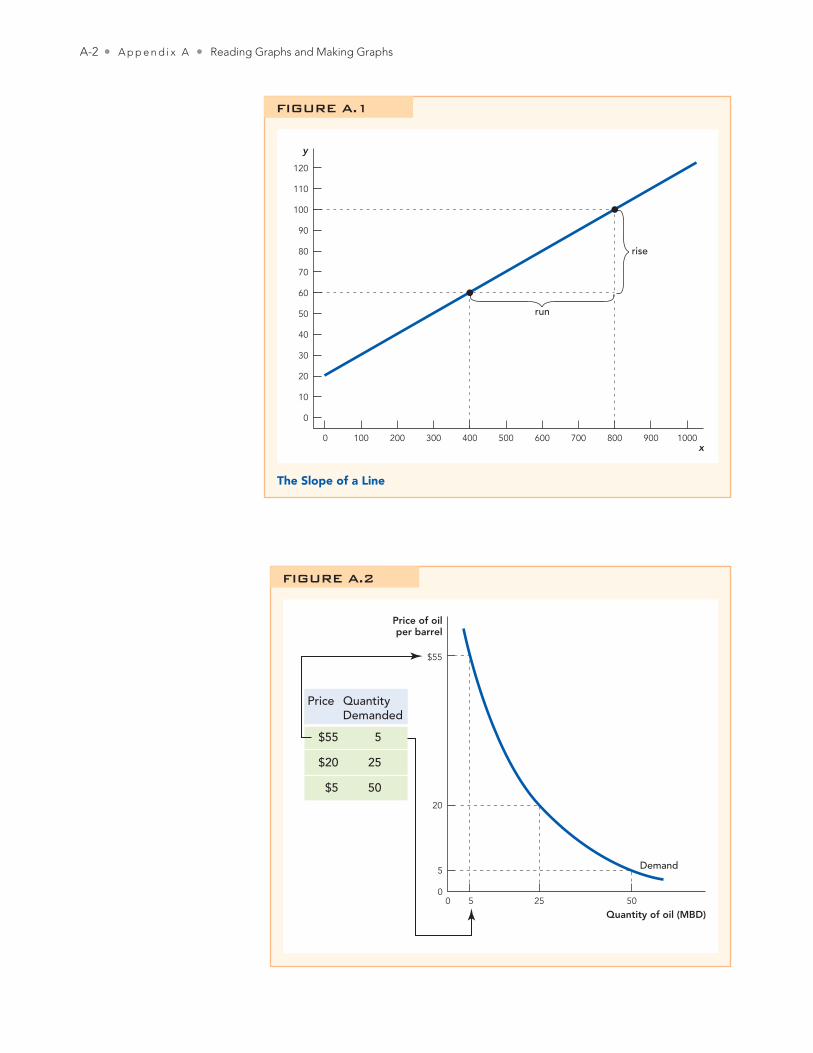
In Figure A.1, for example, we plot a very generic graph of variable Y against variable X. Starting on the vertical axis at Y = 100, you read across to the point at which you hit the graph and then down to find X = 800. Thus, when Y = 100, X = 800. In this case, you can also see that when X = 800, then Y = 100. Simi-larly, when Y = 60, you can read from the graph that X = 400, and vice versa. As you may recall, the slope of a straight line is defined as the rise over the run or rise/run. In this case, when Y rises from 60 to 100, a rise of 40, then X runs from 400 to 800, a run of 400, so the slope of the line is 40/400 = 0.1. The slope is positive, indicating that when Y increases so does X.
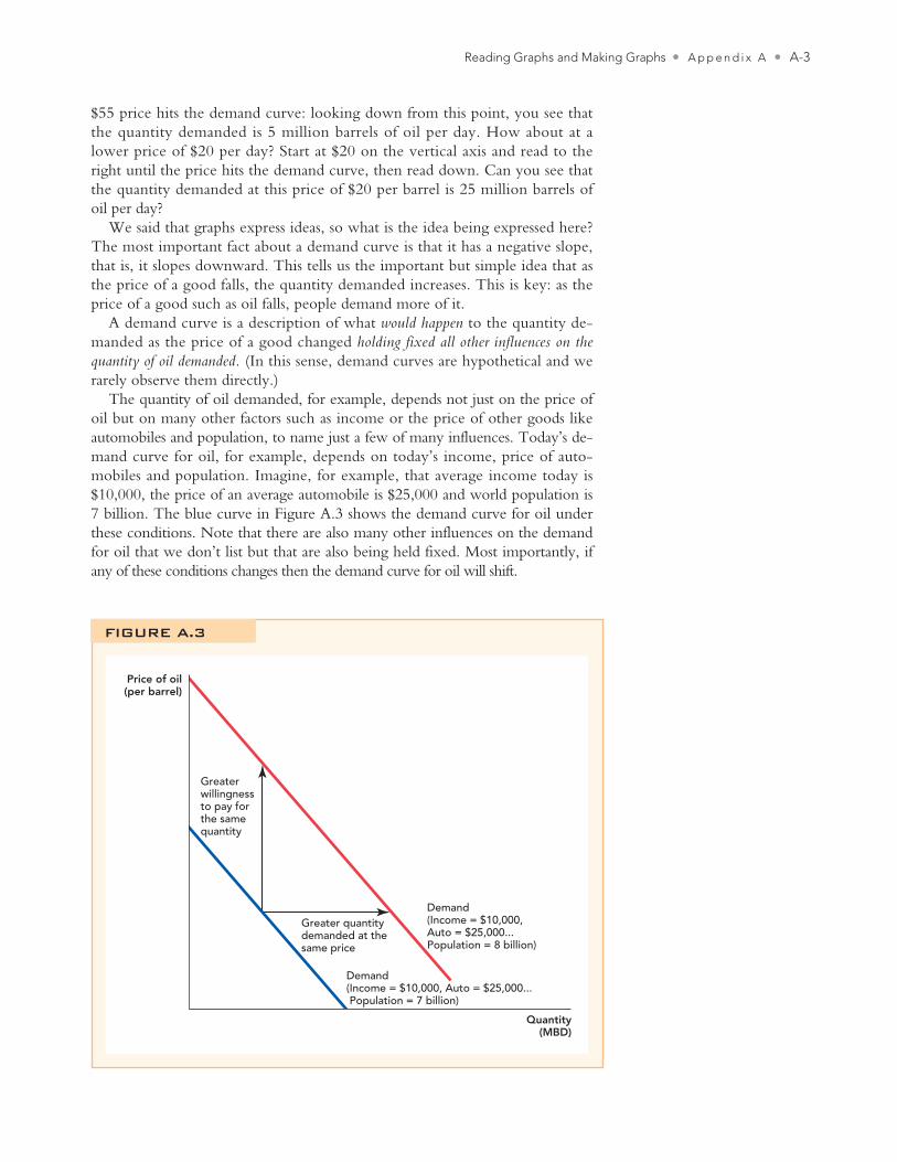
Let’s now apply the idea of a graph to some economic concepts. In Chapter 3, we show how a demand curve can be constructed from hypothetical data on the price and quantity demanded of oil. We show this here as Figure A.2.
The table on the left of the figure shows that at a price of $55 per barrel buyers are willing and able to buy 5 million barrels of oil a day (MBD), or more simply at a price of $55, the quantity demanded is 5 MBD. You can read this information off the graph in the following way. Starting on the vertical axis, locate the price of $55. Then look to the right for the point where the
Reading Graphs and Making Graphs
Appendix A
A-1
Cowen2e_APP_A.indd A-1Cowen2e_APP_A.indd A-1 8/30/11 8:12 AM8/30/11 8:12 AM
A-2 • A p p e n d i x A • Reading Graphs and Making Graphs
0
10
20
30
40
50
60
70
80
90
100
110
120
y
1000 200 300 400 500x
run
rise
600 700 800 900 1000
The Slope of a Line
FIGURE A.1
Price of oilper barrel
$55
20
5
050 5025
Price QuantityDemanded
$55 5
$20 25
$5 50
Quantity of oil (MBD)
Demand
FIGURE A.2
Cowen2e_APP_A.indd A-2Cowen2e_APP_A.indd A-2 8/30/11 8:12 AM8/30/11 8:12 AM
Reading Graphs and Making Graphs • A p p e n d i x A • A-3
$55 price hits the demand curve: looking down from this point, you see that the quantity demanded is 5 million barrels of oil per day. How about at a lower price of $20 per day? Start at $20 on the vertical axis and read to the right until the price hits the demand curve, then read down. Can you see that the quantity demanded at this price of $20 per barrel is 25 million barrels of oil per day?
We said that graphs express ideas, so what is the idea being expressed here? The most important fact about a demand curve is that it has a negative slope, that is, it slopes downward. This tells us the important but simple idea that as the price of a good falls, the quantity demanded increases. This is key: as the price of a good such as oil falls, people demand more of it.
A demand curve is a description of what would happen to the quantity de-manded as the price of a good changed holding fixed all other influences on the quantity of oil demanded. (In this sense, demand curves are hypothetical and we rarely observe them directly.)
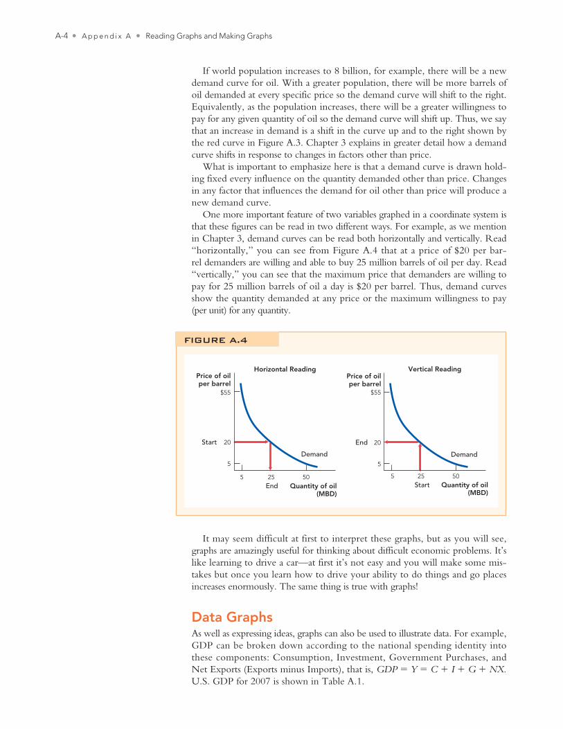
The quantity of oil demanded, for example, depends not just on the price of oil but on many other factors such as income or the price of other goods like automobiles and population, to name just a few of many influences. Today’s de-mand curve for oil, for example, depends on today’s income, price of auto -mobiles and population. Imagine, for example, that average income today is $10,000, the price of an average automobile is $25,000 and world population is 7 billion. The blue curve in Figure A.3 shows the demand curve for oil under these conditions. Note that there are also many other influences on the demand for oil that we don’t list but that are also being held fixed. Most importantly, if any of these conditions changes then the demand curve for oil will shift.
Price of oil(per barrel)
Greater willingnessto pay for the samequantity
Greater quantitydemanded at thesame price
Demand(Income = $10,000, Auto = $25,000... Population = 8 billion)
Demand(Income = $10,000, Auto = $25,000... Population = 7 billion)
Quantity(MBD)
FIGURE A.3
Cowen2e_APP_A.indd A-3Cowen2e_APP_A.indd A-3 8/30/11 8:12 AM8/30/11 8:12 AM
A-4 • A p p e n d i x A • Reading Graphs and Making Graphs
If world population increases to 8 billion, for example, there will be a new demand curve for oil. With a greater population, there will be more barrels of oil demanded at every specific price so the demand curve will shift to the right. Equivalently, as the population increases, there will be a greater willingness to pay for any given quantity of oil so the demand curve will shift up. Thus, we say that an increase in demand is a shift in the curve up and to the right shown by the red curve in Figure A.3. Chapter 3 explains in greater detail how a demand curve shifts in response to changes in factors other than price.
What is important to emphasize here is that a demand curve is drawn hold-ing fixed every influence on the quantity demanded other than price. Changes in any factor that influences the demand for oil other than price will produce a new demand curve.
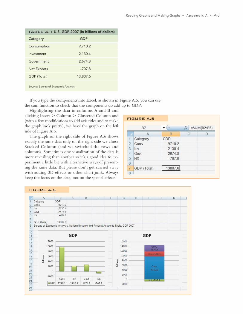
One more important feature of two variables graphed in a coordinate system is that these figures can be read in two different ways. For example, as we mention in Chapter 3, demand curves can be read both horizontally and vertically. Read “horizontally,” you can see from Figure A.4 that at a price of $20 per bar-rel demanders are willing and able to buy 25 million barrels of oil per day. Read “vertically,” you can see that the maximum price that demanders are willing to pay for 25 million barrels of oil a day is $20 per barrel. Thus, demand curves show the quantity demanded at any price or the maximum willingness to pay (per unit) for any quantity.
It may seem difficult at first to interpret these graphs, but as you will see, graphs are amazingly useful for thinking about difficult economic problems. It’s like learning to drive a car—at first it’s not easy and you will make some mis-takes but once you learn how to drive your ability to do things and go places increases enormously. The same thing is true with graphs!
Data GraphsAs well as expressing ideas, graphs can also be used to illustrate data. For example, GDP can be broken down according to the national spending identity into these components: Consumption, Investment, Government Purchases, and Net Exports (Exports minus Imports), that is, GDP = Y = C + I + G + NX. U.S. GDP for 2007 is shown in Table A.1.
Quantity of oil(MBD)
Price of oilper barrel
$55
20Start
5
5 5025End
Demand
Horizontal Reading
FIGURE A.4
Quantity of oil(MBD)
Price of oilper barrel
$55
20End
5
5 5025Start
Demand
Vertical Reading
Cowen2e_APP_A.indd A-4Cowen2e_APP_A.indd A-4 8/30/11 8:12 AM8/30/11 8:12 AM
Reading Graphs and Making Graphs • A p p e n d i x A • A-5
If you type the components into Excel, as shown in Figure A.5, you can use the sum function to check that the components do add up to GDP.
Highlighting the data in columns A and B and clicking Insert > Column > Clustered Column and (with a few modifications to add axis titles and to make the graph look pretty), we have the graph on the left side of Figure A.6.
The graph on the right side of Figure A.6 shows exactly the same data only on the right side we chose Stacked Column (and we switched the rows and columns). Sometimes one visualization of the data is more revealing than another so it’s a good idea to ex-periment a little bit with alternative ways of present-ing the same data. But please don’t get carried away with adding 3D effects or other chart junk. Always keep the focus on the data, not on the special effects.
Category GDP
Consumption 9,710.2
Investment 2,130.4
Government 2,674.8
Net Exports –707.8
GDP (Total) 13,807.6
Source: Bureau of Economic Analysis
TABLE A.1 U.S. GDP 2007 (in billions of dollars)
FIGURE A.5
FIGURE A.6
Cowen2e_APP_A.indd A-5Cowen2e_APP_A.indd A-5 8/30/11 8:12 AM8/30/11 8:12 AM
A-6 • A p p e n d i x A • Reading Graphs and Making Graphs
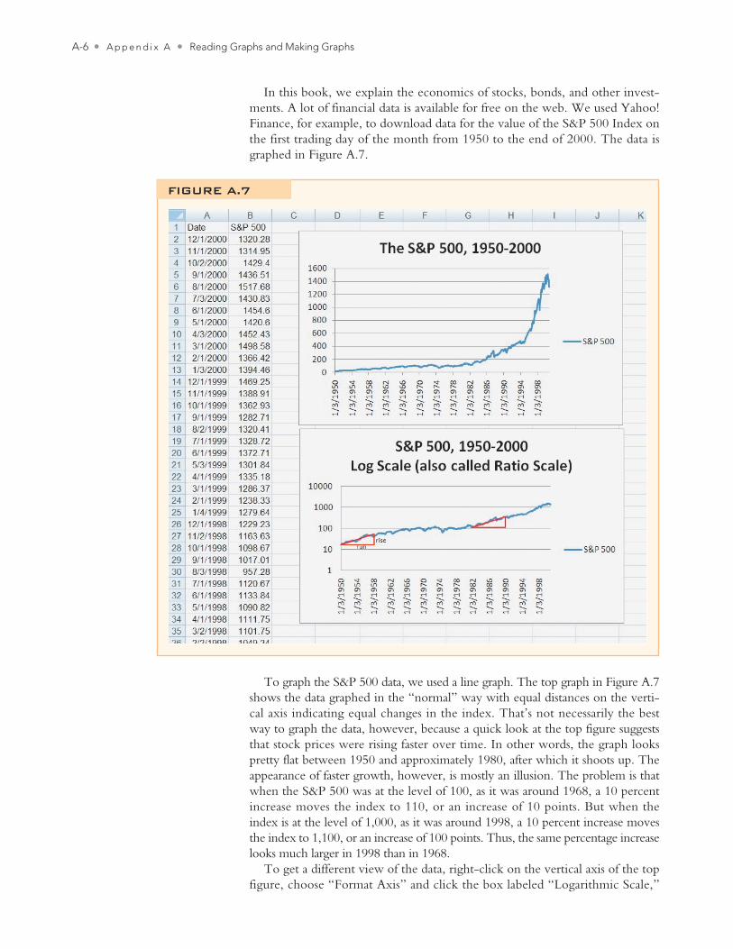
In this book, we explain the economics of stocks, bonds, and other invest-ments. A lot of financial data is available for free on the web. We used Yahoo! Finance, for example, to download data for the value of the S&P 500 Index on the first trading day of the month from 1950 to the end of 2000. The data is graphed in Figure A.7.
To graph the S&P 500 data, we used a line graph. The top graph in Figure A.7 shows the data graphed in the “normal” way with equal distances on the verti-cal axis indicating equal changes in the index. That’s not necessarily the best way to graph the data, however, because a quick look at the top figure suggests that stock prices were rising faster over time. In other words, the graph looks pretty flat between 1950 and approximately 1980, after which it shoots up. The appearance of faster growth, however, is mostly an illusion. The problem is that when the S&P 500 was at the level of 100, as it was around 1968, a 10 percent increase moves the index to 110, or an increase of 10 points. But when the index is at the level of 1,000, as it was around 1998, a 10 percent increase moves the index to 1,100, or an increase of 100 points. Thus, the same percentage increase looks much larger in 1998 than in 1968.
To get a different view of the data, right-click on the vertical axis of the top figure, choose “Format Axis” and click the box labeled “Logarithmic Scale,”
FIGURE A.7
Cowen2e_APP_A.indd A-6Cowen2e_APP_A.indd A-6 8/30/11 8:12 AM8/30/11 8:12 AM
Reading Graphs and Making Graphs • A p p e n d i x A • A-7
which produces the graph in the bottom of Figure A.7 (without the red trian-gles, which we will explain shortly).
Notice on the bottom figure that equal distances on the vertical axis now indicate equal percentage increases or ratios. The ratio 100/10, for example, is the same as the ratio 1,000/100. You can now see at a glance that if stock prices move the same vertical distance over the same length of time (as measured by the horizontal distance) then the percentage increase was the same. For exam-ple, we have superimposed two identical red triangles to show that the per-centage increase in stock prices between 1950 and 1958 was about the same as between 1982 and 1990. The red triangles are identical so over the same 8-year period, given by the horizontal length of the triangle, the run, the S&P 500 rose by the same vertical distance, the rise. Recall that the slope of a line is given by the rise/run. Thus, we can also say that on a ratio graph, equal slopes mean equal percentage growth rates.
The log scale or ratio graph reveals more clearly than our earlier graph that stock prices increased from 1950 to the mid-1960s but were then flat throughout the 1970s and did not begin to rise again until after the recession in 1982. We use ratio graphs for a number of figures throughout this book to better identify patterns in the data.
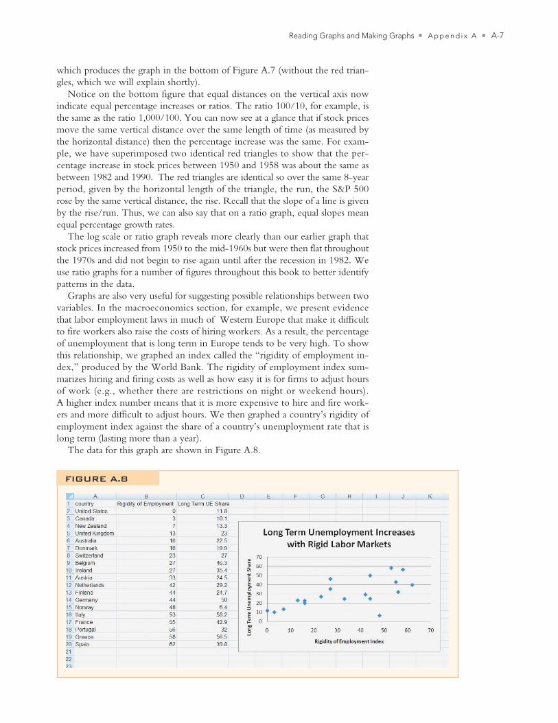
Graphs are also very useful for suggesting possible relationships between two variables. In the macroeconomics section, for example, we present evidence that labor employment laws in much of Western Europe that make it difficult to fire workers also raise the costs of hiring workers. As a result, the percentage of unemployment that is long term in Europe tends to be very high. To show this relationship, we graphed an index called the “rigidity of employment in-dex,” produced by the World Bank. The rigidity of employment index sum-marizes hiring and firing costs as well as how easy it is for firms to adjust hours of work (e.g., whether there are restrictions on night or weekend hours). A higher index number means that it is more expensive to hire and fire work-ers and more difficult to adjust hours. We then graphed a country’s rigidity of employment index against the share of a country’s unemployment rate that is long term (lasting more than a year).
The data for this graph are shown in Figure A.8.
FIGURE A.8
Cowen2e_APP_A.indd A-7Cowen2e_APP_A.indd A-7 8/30/11 8:12 AM8/30/11 8:12 AM
A-8 • A p p e n d i x A • Reading Graphs and Making Graphs
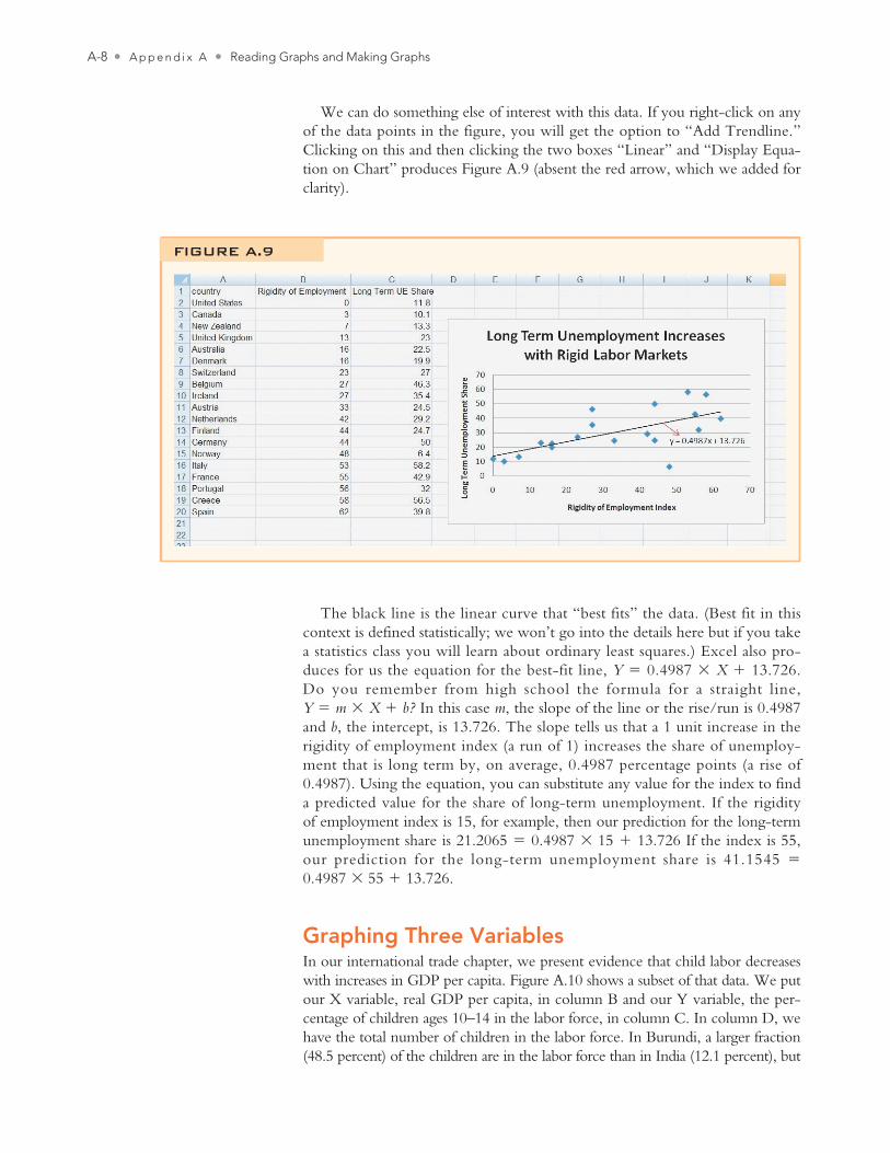
We can do something else of interest with this data. If you right-click on any of the data points in the figure, you will get the option to “Add Trendline.” Clicking on this and then clicking the two boxes “Linear” and “Display Equa-tion on Chart” produces Figure A.9 (absent the red arrow, which we added for clarity).
FIGURE A.9
The black line is the linear curve that “best fits” the data. (Best fit in this context is defined statistically; we won’t go into the details here but if you take a statistics class you will learn about ordinary least squares.) Excel also pro-duces for us the equation for the best-fit line, Y = 0.4987 × X + 13.726. Do you remember from high school the formula for a straight line, Y = m × X + b? In this case m, the slope of the line or the rise/run is 0.4987 and b, the intercept, is 13.726. The slope tells us that a 1 unit increase in the rigidity of employment index (a run of 1) increases the share of unemploy-ment that is long term by, on average, 0.4987 percentage points (a rise of 0.4987). Using the equation, you can substitute any value for the index to find a predicted value for the share of long-term unemployment. If the rigidity of employment index is 15, for example, then our prediction for the long-term unemployment share is 21.2065 = 0.4987 × 15 + 13.726 If the index is 55, our prediction for the long-term unemployment share is 41.1545 = 0.4987 × 55 + 13.726.
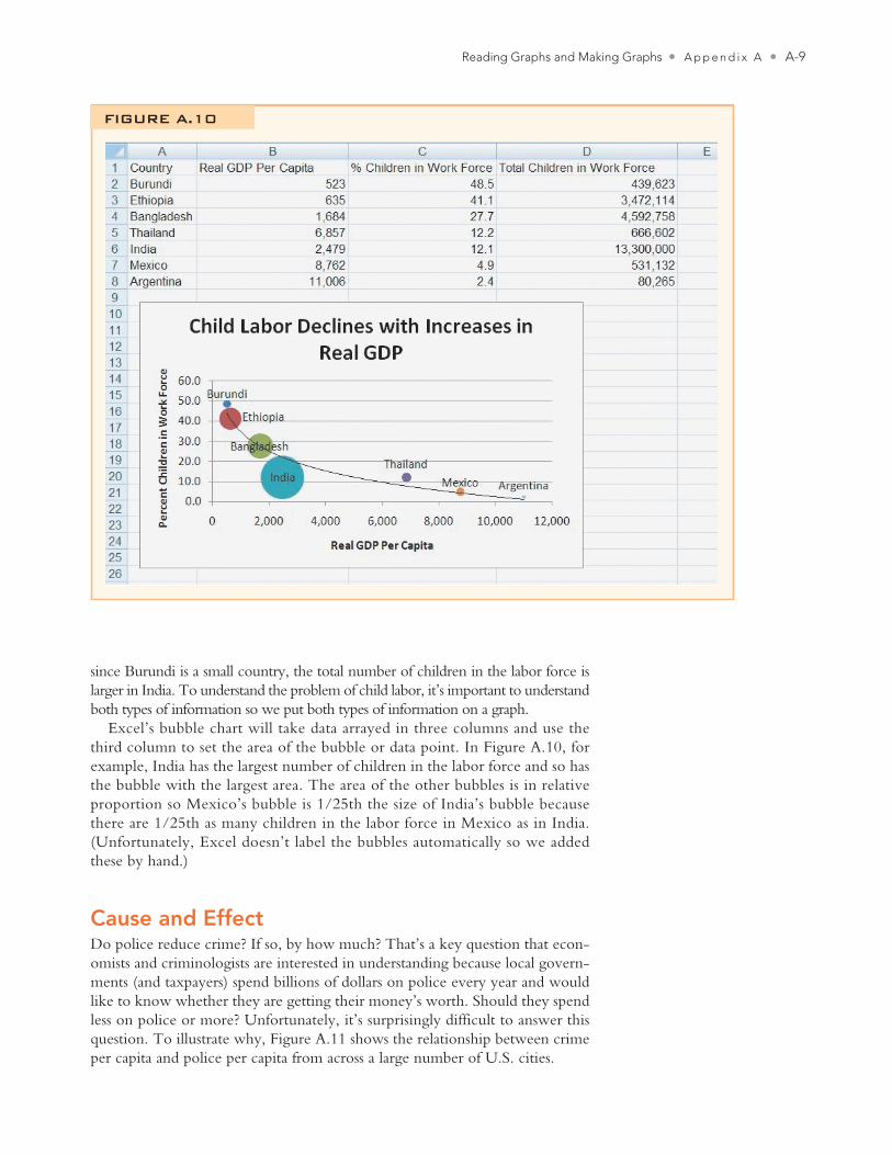
Graphing Three VariablesIn our international trade chapter, we present evidence that child labor decreases with increases in GDP per capita. Figure A.10 shows a subset of that data. We put our X variable, real GDP per capita, in column B and our Y variable, the per-centage of children ages 10–14 in the labor force, in column C. In column D, we have the total number of children in the labor force. In Burundi, a larger fraction (48.5 percent) of the children are in the labor force than in India (12.1 percent), but
Cowen2e_APP_A.indd A-8Cowen2e_APP_A.indd A-8 8/30/11 8:12 AM8/30/11 8:12 AM
Reading Graphs and Making Graphs • A p p e n d i x A • A-9
since Burundi is a small country, the total number of children in the labor force is larger in India. To understand the problem of child labor, it’s important to understand both types of information so we put both types of information on a graph.
Excel’s bubble chart will take data arrayed in three columns and use the third column to set the area of the bubble or data point. In Figure A.10, for example, India has the largest number of children in the labor force and so has the bubble with the largest area. The area of the other bubbles is in relative proportion so Mexico’s bubble is 1/25th the size of India’s bubble because there are 1/25th as many children in the labor force in Mexico as in India. (Unfortunately, Excel doesn’t label the bubbles automatically so we added these by hand.)
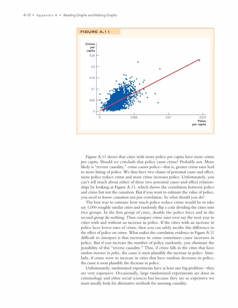
Cause and EffectDo police reduce crime? If so, by how much? That’s a key question that econ-omists and criminologists are interested in understanding because local govern-ments (and taxpayers) spend billions of dollars on police every year and would like to know whether they are getting their money’s worth. Should they spend less on police or more? Unfortunately, it’s surprisingly difficult to answer this question. To illustrate why, Figure A.11 shows the relationship between crime per capita and police per capita from across a large number of U.S. cities.
FIGURE A.10
Cowen2e_APP_A.indd A-9Cowen2e_APP_A.indd A-9 8/30/11 8:12 AM8/30/11 8:12 AM
A-10 • A p p e n d i x A • Reading Graphs and Making Graphs
Figure A.11 shows that cities with more police per capita have more crime per capita. Should we conclude that police cause crime? Probably not. More likely is “reverse causality,” crime causes police—that is, greater crime rates lead to more hiring of police. We thus have two chains of potential cause and effect, more police reduce crime and more crime increases police. Unfortunately, you can’t tell much about either of these two potential cause-and-effect relation-ships by looking at Figure A.11, which shows the correlation between police and crime but not the causation. But if you want to estimate the value of police, you need to know causation not just correlation. So what should you do?
The best way to estimate how much police reduce crime would be to take say 1,000 roughly similar cities and randomly flip a coin dividing the cities into two groups. In the first group of cities, double the police force and in the second group do nothing. Then compare crime rates over say the next year in cities with and without an increase in police. If the cities with an increase in police have lower rates of crime, then you can safely ascribe this difference to the effect of police on crime. What makes the correlation evidence in Figure A.11 difficult to interpret is that increases in crime sometimes cause increases in police. But if you increase the number of police randomly, you eliminate the possibility of this “reverse causality.” Thus, if crime falls in the cities that have random increases in police, the cause is most plausibly the increase in police. Simi-larly, if crime were to increase in cities that have random decreases in police, the cause is most plausibly the decrease in police.
Unfortunately, randomized experiments have at least one big problem—they are very expensive. Occasionally, large randomized experiments are done in criminology and other social sciences but because they are so expensive we must usually look for alternative methods for assessing causality.
0
0
0.05
0.1
0.15
0.2
0.25
0.005 0.01 0.015
Crimesper
capita
Policeper capita
FIGURE A.11
Cowen2e_APP_A.indd A-10Cowen2e_APP_A.indd A-10 8/30/11 8:12 AM8/30/11 8:12 AM
Reading Graphs and Making Graphs • A p p e n d i x A • A-11
If you can’t afford a randomized experiment, what else can you do? One possibility is to look for what economists call quasi-experiments or natural experiments. In 1969, for example, police in Montreal, Canada, went on strike and there were 50 times more bank robberies than normal.1 If you can think of the strike as a random event, not tied in any direct way to increases or decreases in crime, then you can be reasonably certain that the increase in bank robberies was caused by the decrease in police.
The Montreal experiment tells you it’s probably not a good idea to eliminate all police, but it doesn’t tell you whether governments should increase or decrease police on the street by a more reasonable amount, say 10 percent to 20 percent. Jonathan Klick and Alex Tabarrok use another natural experiment to address this question.2 Since shortly after 9/11, the United States has had a terror alert system run by the Department of Homeland Security. When the terror alert level rises from “elevated” (yellow) to “high” (orange) due to intelli-gence reports regarding the current threat posed by terrorist organizations, the Washington, D.C. Metropolitan Police Department reacts by increasing the number of hours each officer must work. Because the change in the terror alert system is not tied to any observed or expected changes in Washington crime patterns, this provides a useful quasi-experiment. In other words, whenever the terror alert system shifts from yellow to orange—a random decision with respect to crime in Washington—the effective police presence in Washington increases. Klick and Tabarrok find that during the high terror alert periods when more police are on the street, the amount of crime falls. Street crime such as stolen automobiles, thefts from automobiles, and burglaries decline especially sharply. Overall, Klick and Tabarrok estimate that a 10 percent increase in police reduces crime by about 3 percent. Using these numbers and figures on the cost of crime and of hiring more police, Klick and Tabarrok argue that more police would be very beneficial.
Economists have developed many techniques for assessing causality from data and we have only just brushed the surface. We can’t go into details here. We want you to know, however, that in this textbook when we present data that suggests a causal relationship—such as when we argue in the international trade chapter that higher GDP leads to lower levels of child labor—that a significant amount of statistical research has gone into assessing causality, not just correlation. If you are interested in further details, we have provided you with the references to the original papers.
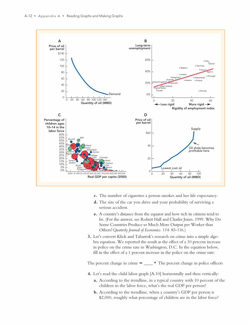
Appendix A Questions 1. We start with a simple idea from algebra: Which of the graphs at the top
of the next page have a positive slope and which have a negative slope?
2. When social scientists talk about social and economic facts, they usually talk about a “positive relationship” or a “negative relationship” instead of “positive slope” or “negative slope.” Based on your knowledge, which of the following pairs of variables tend to have a “positive relationship” (a positive slope when graphed), and which have a negative relationship? (Note: “Negative relationship” and “inverse relationship” mean the same thing. Also, in this question, we’re only talking about correlation, not causation.)
a. A professional baseball player’s batting average and his annual salary.
b. A professional golfer’s average score and her average salary.
Cowen2e_APP_A.indd A-11Cowen2e_APP_A.indd A-11 8/30/11 8:12 AM8/30/11 8:12 AM
A-12 • A p p e n d i x A • Reading Graphs and Making Graphs
c. The number of cigarettes a person smokes and her life expectancy.
d. The size of the car you drive and your probability of surviving a serious accident.
e. A country’s distance from the equator and how rich its citizens tend to be. (For the answer, see Robert Hall and Charles Jones. 1999. Why Do Some Countries Produce so Much More Output per Worker than Others? Quarterly Journal of Economics. 114: 83-116.)
3. Let’s convert Klick and Tabarrok’s research on crime into a simple alge-bra equation. We reported the result as the effect of a 10 percent increase in police on the crime rate in Washington, D.C. In the equation below, fill in the effect of a 1 percent increase in the police on the crime rate:
The percent change in crime � ____ * The percent change in police officers
4. Let’s read the child labor graph [A.10] horizontally and then vertically:
a. According to the trendline, in a typical country with 10 percent of the children in the labor force, what’s the real GDP per person?
b. According to the trendline, when a country’s GDP per person is $2,000, roughly what percentage of children are in the labor force?
$140
120
100
80
60
40
20
0140120100806040200
Demand
Quantity of oil (MBD)
Price of oilper barrel
A
Lowest cost oil
Oil shale becomesprofitable here
00
20
40
$60
20 40 60 80 100
Supply
Price of oilper barrel
Quantity of oil (MBD)
DC
$5000%5%
10%15%20%25%30%35%40%45%50%
$1,000 $1,500 $2,500 $5,000 $10,000 $20,000 $40,000
Real GDP per capita (2000)
MaliBurundi
55%60%
Percentage ofchildren ages10–14 in the
labor force
Ethiopia NepalKenya
BangladeshGuinea
Pakistan
China
India
BrazilThailand
TurkeyMexico
ColombiaEgypt
Philippines
Nigeria
YemenZambia
Ghana
Tanzania
B
60%
40%
20%
0%
0 20Less rigid More rigid
40 60
Long-termunemployment
Rigidity of employment index
Norway
Denmark
CanadaUnited States
New Zealand
Austria Finland
NetherlandsPortugal
Germany
ItalyGreece
Belgium
Ireland
AustraliaUnited Kingdom
Switzerland
SpainFrance
Cowen2e_APP_A.indd A-12Cowen2e_APP_A.indd A-12 8/30/11 8:12 AM8/30/11 8:12 AM
Reading Graphs and Making Graphs • A p p e n d i x A • A-13
5. Let’s take another look at the ratio scale, and compare it to a normal scale.
a. In Figure A.7, which one is presented in ratio scale and which in normal scale?
b. In the top graph, every time the S&P 500 crosses a horizontal line, how many points did the S&P rise?
c. In the bottom graph, every time the S&P 500 crosses a horizontal line, how many times higher is the S&P?
6. As a scientist, you have to plot the following data: The number of bacteria you have in a large petri dish, measured every hour over the course of a week. (Note: E. coli bacteria populations can double every 20 minutes) Should this data be plotted on a ratio scale and why?
7. Educated people are supposed to point out (correctly) that “correlation isn’t proof of causation.” This is an important fact—which explains why economists, medical doctors, and other researchers spend a lot of time trying to look for proof of causation. But sometimes, correlation is good enough. In the following examples, take the correlation as a true fact, and explain why the correlation is, all by itself, useful for the task presented in each question.
a. Your task is to decide what brand of car to buy. You know that Brand H usually gets higher quality ratings than Brand C. You don’t know what causes Brand H to get higher ratings—maybe Brand H hires bet-ter workers, maybe Brand H buys better raw materials. All you have is the correlation.
b. Your task is to hire the job applicant who appears to be the smartest.Applicant M has a degree from MIT, and applicant S has a degree from a typical state university. You don’t know what causes MIT grad-uates to be smarter than typical state university graduates—maybe they start off smarter before they get to MIT, maybe their professors teach them a lot, maybe having smart classmates for four years gives them constant brain exercise.
c. Your task is to decide which city to move to, and you want to move to the city that is probably the safest. For some strange reason, the only fact you have to help you with your decision is the number of police per person.
8. If you haven’t practiced in a while, let’s calculate some slopes. In each case, we give two points, and you can use the “rise over run” formula to get the right answer.
a. Point 1: x = 0, y = 0. Point 2: x = 3, y = 6
b. Point 1: x = 6, y = −9. Point 2: x = 3, y = 6
c. Point 1: x = 4, y = 8. Point 2: x = 1, y = 12
9. We mentioned that a demand curve is a hypothetical relationship: It answers a “what if” question: “What if today’s price of oil rose (or fell), but the average consumer’s income, beliefs about future oil prices, and the prices of everything else in the economy stayed the same?” When some of those other features change, then the demand curve isn’t fixed any more: It shifts up (and right) or left (and down). In Figure A.3, we showed one shift graphically: Let’s make some changes in algebra:
Cowen2e_APP_A.indd A-13Cowen2e_APP_A.indd A-13 8/30/11 8:12 AM8/30/11 8:12 AM
A-14 • A p p e n d i x A • Reading Graphs and Making Graphs
The economy of Perovia has the following demand for oil:
Price = B − M × Quantity
When will B tend to be a larger number:
a. When population in Perovia is high or when it is low?
b. When the price of autos in Perovia is high or when it is low?
c. When Perovian income is high or when it is low?
10. Using the raw data from this chapter, use Excel to replicate simple versions of any two of our graphs. Figures A.6, A.7, A.9, and A.10 all provide the data you’ll need. If you’re adventurous, feel free to search out the newest GDP data and S&P 500 data on the Bureau of Economic Analysis (BEA) website and Yahoo! Finance, respectively.
Cowen2e_APP_A.indd A-14Cowen2e_APP_A.indd A-14 8/30/11 8:12 AM8/30/11 8:12 AM