principles of data visualization
TRANSCRIPT

Principles of Data
Visualization
URL to download file: https://goo.gl/eMRHOU

Today, we’ll cover….
What is data visualization?
Why would I use it?
Guiding principles
Different types of charts and graphs
Tools
Planning your visualization: a process template
Charts available in Excel and when to use what
Nuts and bolts of making charts

What is data visualization?

http://blog.visual.ly/wp-content/uploads/2013/10/DefilippoValentina_poppiesViz.jpg

http://www.theblaze.com/stories/2015/04/15/this-single-chart-proves-the-pro-marjiuana-side-isnt-just-
winning-the-debate-its-dominating/

http://www.informationisbeautiful.net/visualizations/non-fiction-books-everyone-should-read/

http://epicgraphic.com/data-viz-gets-physical/
http://charity.lovetoknow.com/Fundraising_Thermometer

Why would I use it?

To tell a story
http://ceegee-viewfromahill.blogspot.com/2015_06_01_archive.html

To inspire action
http://www.houselogic.com/blog/saving-energy/home-energy-audit-
drafty-old-house/

To better understand data you
have

Guiding principles

Focus on a message


We don’t innately understand
visualizations.

Pick the right visual for the job

Numbers can be visual!

Heatmap (as a table)
http://stackoverflow.com/questions/8784095/r-ggplot-heatmap-using-geom-tile-how-to-sort-by-
year-and-show-all-years-in-y

Bar chart
http://www.theblaze.com/stories/2015/04/15/this-single-chart-proves-the-pro-marjiuana-side-isnt-just-
winning-the-debate-its-dominating/
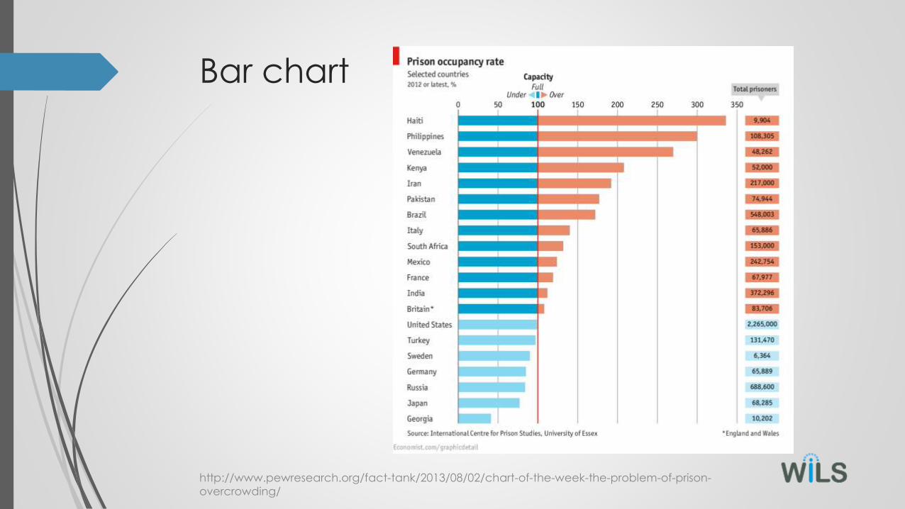
Bar chart
http://www.pewresearch.org/fact-tank/2013/08/02/chart-of-the-week-the-problem-of-prison-
overcrowding/

Stacked horizontal bar chart
http://www.people-press.org/2014/05/19/for-2016-hopefuls-
washington-experience-could-do-more-harm-than-good/5-16-2014-12-
22-25-pm/

Line chart
http://fortune.com/2015/01/14/why-so-few-women-ceos/

Pie chart
http://americanlibrariesmagazine.org/blogs/the-scoop/pew-charts-the-
motivations-of-library-lovers-and-distant-admirers/

Map
https://www.washingtonpost.com/blogs/govbeat/wp/2014/11/21/the-undocumented-immigrant-population-explained-in-7-maps/

Map (with Bubbles)
http://peltiertech.com/map-bubble-chart-of-store-closings/

Scatter plot

Scatter plot

Be careful how you use color
http://stackoverflow.com/questions/8784095/r-ggplot-heatmap-using-geom-tile-how-to-sort-by-
year-and-show-all-years-in-y

Don’t do 3D.
http://chandoo.org/wp/2013/04/12/why-3d-pie-charts-are-
evil/Conference Name, Date, and Location

Make everything count……or take it out

Legends
0
5
10
15
20
25
30
35
40
45
50
Market 1 Market 2 Market 3
Thing 1
Thing 10
5
10
15
20
25
30
35
40
45
50
Market 1 Market 2 Market 3
Thing 1

Lines
0
5
10
15
20
25
30
35
40
45
50
Market 1 Market 2 Market 3
Thing 1
0
5
10
15
20
25
30
35
40
45
50
Market 1 Market 2 Market 3
Thing 1

Axes
0
5
10
15
20
25
30
35
40
45
50
Market 1 Market 2 Market 3
Thing 1
30
44
17
Market 1 Market 2 Market 3
Thing 1

Color
30
44
17
Market 1 Market 2 Market 3
Thing 1
30
44
17
Market 1 Market 2 Market 3
Thing 1

Title
30
44
17
Market 1 Market 2 Market 3
Thing 1
30
44
17
Market 1 Market 2 Market 3
Thing 1 sells best in Market 2

30
44
17
Market 1 Market 2 Market 3
Thing 1 sells best in Market 2
0
5
10
15
20
25
30
35
40
45
50
Market 1 Market 2 Market 3
Thing 1
Thing 1
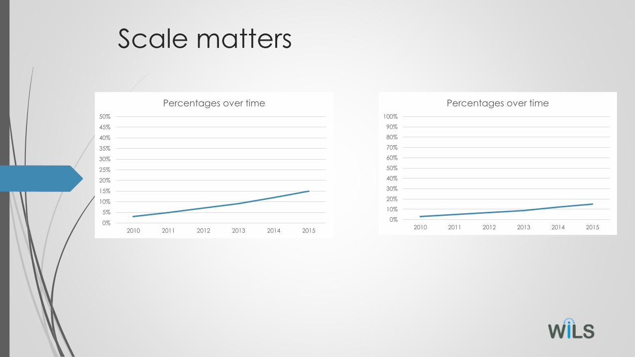
Scale matters
0%
5%
10%
15%
20%
25%
30%
35%
40%
45%
50%
2010 2011 2012 2013 2014 2015
Percentages over time
0%
10%
20%
30%
40%
50%
60%
70%
80%
90%
100%
2010 2011 2012 2013 2014 2015
Percentages over time

Be kind to your viewers

Learn your tool

Tools to create visualizations
Visualizations:
• Excel
• Tableau (Thank you, Techsoup!)
• QlikView/Qliksense
Infographics:
• Piktochart
• Easel.ly
• Infogr.am
Comparison: thornleyfallis.com/tool-of-the-week-infographic-makers/

Your turn!

Your turn (again!)

This is the inside of your library
https://www.flickr.com/photos/gibsonsgolfer/6793949719/

This is the inside of your library
https://www.flickr.com/photos/christchurchcitylibraries/3134272707

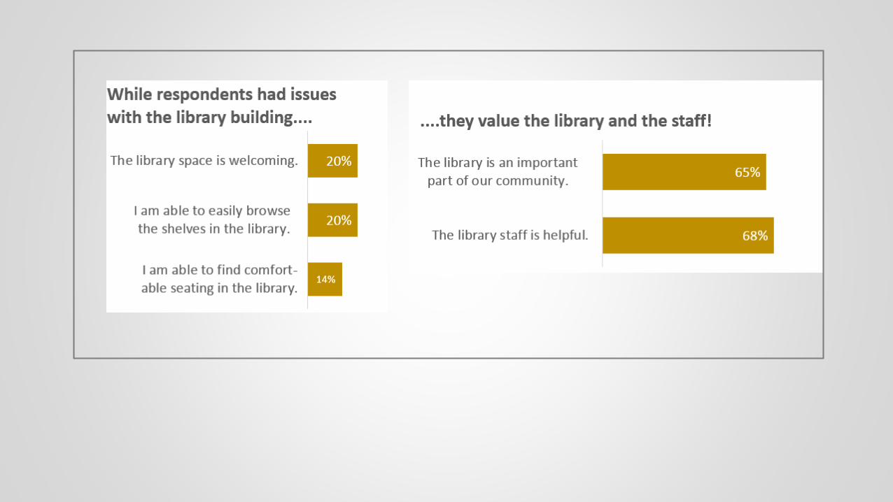
14% agreed or strongly agreed that they are able
to find comfortable seating in the library.
20% agreed or strongly agreed that the library
space is welcoming.
20% agreed or strongly agreed that they are, “able
to easily browse the shelves in the library”
65% agreed or strongly agreed that the library is an
important part of our community
68% agreed or strongly agreed that the library staff
is helpful.

Dealer’s Choice!
4 possibilities:
1. Make a new visualization from our discussion of the
visualization template
2. Try Exercise 2 with circulation by hour data as a line graph
3. Play around with “circulation activity by item location
template” and make a visualization with that data
4. Make a new visualization based on your own data
Show and tell if we have time!!
Send them to [email protected]

Resources
Data Visualization for the Rest of Us (Linda Hofschire, Presentation at RIPL
2015): http://ripl.lrs.org/2015/session/data-viz/
Storytelling with Data: A Data Visualization Guide for Business Professionals
(http://www.amazon.com/gp/product/B016DHQSM2)
Which chart or graph is right for you?
http://www.tableau.com/sites/default/files/media/which_chart_v6_final_0.