project evaluation activity in support of partnership for ... · project evaluation activity in...
TRANSCRIPT

Project Evaluation Activity in Support of Partnership for Patients
Interim Evaluation Report–Appendices, Final
September 2015
Revised 12/29/2015
Centers for Medicare and Medicaid Innovation
Contract No. GS-10F-0166R
Task Order: HHSM-500-2014-00440G

PfP PEC: Interim Evaluation Report–Appendices Final–Revised 12/29/2015 Partnership for Patients (PfP) September 2015 Page | i
Contents
A. Appendix A: HENs and State-Level Distribution ............................................................................. A-1
Hospital Engagement Network (HEN) Acronyms ............................................................................. A-1
HEN Distribution by State ................................................................................................................ A-2
B. Appendix B: Secondary Data Sources ............................................................................................ B-1
HEN Data ........................................................................................................................................ B-1
Hospital Engagement Network (HEN) Data Validation .................................................................... B-3
Medicare Data ................................................................................................................................. B-6
Medicaid Data ................................................................................................................................. B-7
Vital Statistics Data ....................................................................................................................... B-14
Analyses with Medicare Patient Safety Monitoring System (MPSMS) Data ................................... B-15
Other National Sources of Measure Rates .................................................................................... B-25
C. Appendix C: PfP Learning Community’s Work Toward Reduction in Harms ................................... C-1
Research Objectives for Qualitative Analysis of Survey and Interview Data .................................... C-1
Research-Based Frameworks to Guide Qualitative Analysis of PfP Implementation ....................... C-2
Survey of Participation in Patient Safety Activities ......................................................................... C-18
Hospital Survey on the Prevention of Adverse Events and Reduction of Readmissions ................ C-30
D. Appendix D: Detailed Methodologies .............................................................................................. D-1
Difference-in-Differences Comparison Group Analyses ................................................................... D-2
Difference-in-Differences Comparison Group Analyses Methodology.............................................. D-6
Bayesian Difference-In-Differences Analysis Methodology ............................................................ D-58
Estimation of Costs Averted from National Trend in Harms ........................................................... D-63
Estimation of Costs Averted Due to Hospital Engagement Networks (HENs) Methodology ........... D-77
Interrupted Time Series (ITS) Methodology ................................................................................... D-93
Statistical Process Control (SPC) Chart Methodology ................................................................... D-99
Vital Records Analysis Methodology ........................................................................................... D-103
Hospital Engagement Analysis Methodology ............................................................................... D-114
Dose-Response Methodology ..................................................................................................... D-117
Analysis of Medicare Patient Safety Monitoring System (MPSMS) Data Methodology ................ D-127
Survey Analysis Removing Spillover Methodology ...................................................................... D-129
Quality Improvement Organization (QIO)/Partnership for Patients (PfP) Trends Data Sources ... D-131

PfP PEC: Interim Evaluation Report–Appendices Final–Revised 12/29/2015 Partnership for Patients (PfP) September 2015 Page | ii
Interrupted Time Series (ITS) Cluster Analysis Methodology ....................................................... D-133
Hospital Engagement Network (HEN)-Level Data File Methodology............................................ D-135
Repeated Measures Analysis of the Association between HEN Activities and Partnerships and
Common Measure Outcomes Methodology................................................................................. D-139
E. Appendix E: Supplemental Tables and Results .............................................................................. E-1
Partnership for Patients (PfP) Focus Area Context Tables (Chapter 2) ........................................... E-2
Quality Improvement Organization (QIO)/Partnership for Patients (PfP) Trend Analysis Supplemental
Tables (Chapter 2) ........................................................................................................................ E-13
Learning Community Design and Support for Hospital-Level Changes (Chapter 3) ....................... E-21
Hospitals’ Engagement and Perceptions of PfP (Chapter 3) .......................................................... E-40
Hospitals’ Implementation of Operational Changes (Chapter 3) .................................................... E-50
Factors Affecting HENs’ Ability to Spread Best Practices (Chapter 3) ........................................... E-55
Bayesian Difference-in-Differences Estimation of the Effect of the Hospital Engagement Network (HEN)
Component of the Partnership for Patients (PfP) on Adverse Event Outcomes (Chapter 4) .......... E-62
Difference-In-Differences Analysis of Composite Measure of Harms from Medicare Patient Safety
Monitoring System (MPSMS) (Chapter 4) ..................................................................................... E-79
Vital Records (Chapter 4) .............................................................................................................. E-92
Repeated Measures Analysis of the Association between HEN Activities and Partnerships and
Common Measure Outcomes (Chapter 4) ..................................................................................... E-97
Hospital Engagement Network (HEN)-Level Statistical Process Control (SPC) Chart (Chapter 5)E-103
Relationship Between Level of Hospital Engagement with Hospital Engagement Network (HEN) and
Outcome Trends (Dose-Response) (Chapter 5) .......................................................................... E-110
Interrupted Time Series (ITS) Cluster Analysis (Chapter 5) ......................................................... E-121
Interrupted Time Series (ITS) Stratified by Hospital Engagement Network (HEN) Activity Dosage
(Chapter 5) .................................................................................................................................. E-130
Interrupted Time Series (ITS) By Hospital Engagement Network (HEN) (Chapter 5) ................... E-142
Descriptive Statistics of Medicare Expenditures (Chapter 6) ....................................................... E-172
Recommendation (Chapter 8) ..................................................................................................... E-183

PfP PEC: Interim Evaluation Report–Appendices Final–Revised 12/29/2015 Partnership for Patients (PfP) September 2015 Page | A-1
A. Appendix A: HENs and State-Level Distribution
Hospital Engagement Network (HEN) Acronyms
HEN full and abbreviated names used in this report are listed below in Table A-1.
Table A-1—HEN Acronyms
HEN Name Acronym
American Hospital Association/Health Research and Educational Trust AHA/HRET
Ascension Health Ascension
Carolinas HealthCare System Carolinas
Dallas-Fort Worth Hospital Council Foundation DFW
Dignity Health (formerly Catholic Healthcare West) Dignity
Essential Hospitals Engagement Network EHEN
Georgia Hospital Association Research and Education Foundation Georgia
Intermountain Healthcare Intermountain
Iowa Healthcare Collaborative Iowa
Joint Commission Resources JCR
LifePoint Hospitals LifePoint
Michigan Health & Hospital Association Michigan
Minnesota Hospital Association Minnesota
Nevada Hospital Association Nevada
New Jersey Hospital Association/Health Research and Educational Trust of New Jersey New Jersey
New York State PfP (Healthcare Association of New York State [HANYS] and Greater New
York Hospital Association [GNYHA]) New York
North Carolina Virginia Regional HEN NoCVA
Ohio Children’s Hospitals’ Solutions for Patient Safety Ohio Children’s
Ohio Hospital Association Ohio
Hospital Association of Pennsylvania Pennsylvania
Premier Healthcare Alliance Premier
Tennessee Hospital Association Tennessee
Texas Center for Quality and Patient Safety TCQPS
University Health System Consortium UHC
VHA Inc. VHA
Washington State Hospital Association Washington

PfP PEC: Interim Evaluation Report–Appendices Final–Revised 12/29/2015 Partnership for Patients (PfP) September 2015 Page | A-2
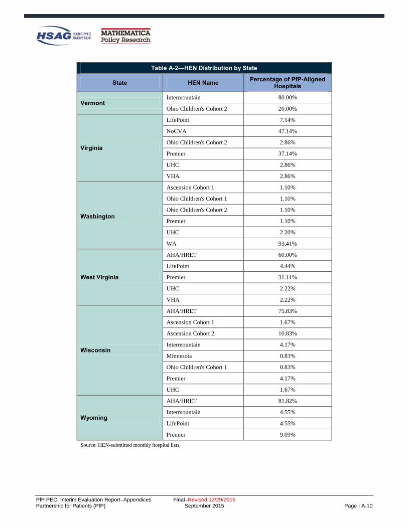
HEN Distribution by State
Table A-2 provides the state-level distribution for Partnership for Patients (PfP) aligned hospitals. The
interrupted time series (ITS) results for the state hospital associations (SHAs) that were HENs are provided
in Chapter 4 and Chapter 5 of the main body of this report. Additionally, the qualitative results by HEN and
SHA can be found in Chapter 3 and Appendix E.
Table A-2—HEN Distribution by State
State HEN Name Percentage of PfP-Aligned
Hospitals
Alabama
AHA/HRET 49.18%
Ascension Cohort 1 8.20%
JCR Cohort 1 3.28%
LifePoint 8.20%
Ohio Children's Cohort 2 1.64%
Premier 6.56%
UHC 1.64%
VHA 21.31%
Alaska
AHA/HRET 81.25%
Premier 6.25%
VHA 12.50%
Arizona
AHA/HRET 31.37%
Ascension Cohort 1 5.88%
Dignity 5.88%
EHEN 1.96%
Intermountain 1.96%
JCR Cohort 1 1.96%
LifePoint 3.92%
Ohio Children's Cohort 2 1.96%
Premier 27.45%
UHC 1.96%
VHA 1.96%
Arkansas
AHA/HRET 79.17%
JCR Cohort 1 2.08%
Tennessee 2.08%
VHA 16.67%

PfP PEC: Interim Evaluation Report–Appendices Final–Revised 12/29/2015 Partnership for Patients (PfP) September 2015 Page | A-3
Table A-2—HEN Distribution by State
State HEN Name Percentage of PfP-Aligned
Hospitals
California
AHA/HRET 55.91%
Dignity 11.81%
EHEN 3.15%
Intermountain 7.87%
Ohio Children's Cohort 1 1.18%
Ohio Children's Cohort 2 1.97%
Premier 12.20%
UHC 3.54%
VHA 2.36%
Colorado
AHA/HRET 76.19%
Intermountain 2.38%
LifePoint 2.38%
Ohio Children's Cohort 1 2.38%
Premier 11.90%
UHC 2.38%
VHA 2.38%
Connecticut
AHA/HRET 83.33%
Ascension Cohort 1 3.33%
JCR Cohort 1 3.33%
Ohio Children's Cohort 2 6.67%
VHA 3.33%
District of Columbia
AHA/HRET 28.57%
Ascension Cohort 1 14.29%
EHEN 14.29%
Ohio Children's Cohort 1 14.29%
Premier 14.29%
UHC 14.29%
Delaware Ohio Children's Cohort 1 100.00%

PfP PEC: Interim Evaluation Report–Appendices Final–Revised 12/29/2015 Partnership for Patients (PfP) September 2015 Page | A-4
Table A-2—HEN Distribution by State
State HEN Name Percentage of PfP-Aligned
Hospitals
Florida
AHA/HRET 53.38%
Ascension Cohort 1 3.76%
Ascension Cohort 2 0.75%
Intermountain 0.75%
JCR Cohort 1 1.50%
LifePoint 0.75%
Ohio Children's Cohort 2 2.26%
Premier 22.56%
UHC 1.50%
VHA 12.78%
Georgia
Georgia 83.33%
LifePoint 0.76%
Ohio Children's Cohort 1 0.76%
Premier 7.58%
VHA 7.58%
Hawaii Ohio Children's Cohort 2 5.00%
Premier 95.00%
Idaho
AHA/HRET 71.43%
Ascension Cohort 1 7.14%
Intermountain 7.14%
Premier 7.14%
VHA 7.14%
Illinois
AHA/HRET 66.21%
Ascension Cohort 1 1.38%
EHEN 1.38%
Iowa 2.76%
JCR Cohort 1 5.52%
JCR Cohort 2 4.83%
Ohio Children's Cohort 2 1.38%
Premier 8.28%
UHC 2.76%
VHA 5.52%

PfP PEC: Interim Evaluation Report–Appendices Final–Revised 12/29/2015 Partnership for Patients (PfP) September 2015 Page | A-5
Table A-2—HEN Distribution by State
State HEN Name Percentage of PfP-Aligned
Hospitals
Indiana
AHA/HRET 77.78%
Ascension Cohort 1 11.90%
Ascension Cohort 2 0.79%
EHEN 0.79%
LifePoint 0.79%
Ohio Children's Cohort 1 0.79%
UHC 2.38%
VHA 4.76%
Iowa
Iowa 98.28%
JCR Cohort 1 0.86%
UHC 0.86%
Kansas
AHA/HRET 89.29%
Ascension Cohort 2 6.25%
LifePoint 0.89%
Premier 0.89%
UHC 0.89%
VHA 1.79%
Kentucky
AHA/HRET 79.07%
LifePoint 10.47%
Premier 6.98%
UHC 2.33%
VHA 1.16%
Louisiana
AHA/HRET 76.04%
LifePoint 5.21%
Ohio Children's Cohort 2 1.04%
Premier 2.08%
UHC 1.04%
VHA 14.58%
Maine VHA 100.00%
Maryland
Ascension Cohort 1 4.35%
JCR Cohort 2 4.35%
Premier 52.17%
UHC 34.78%
VHA 4.35%

PfP PEC: Interim Evaluation Report–Appendices Final–Revised 12/29/2015 Partnership for Patients (PfP) September 2015 Page | A-6
Table A-2—HEN Distribution by State
State HEN Name Percentage of PfP-Aligned
Hospitals
Massachusetts
AHA/HRET 41.67%
Ohio Children's Cohort 1 2.78%
Ohio Children's Cohort 2 2.78%
Premier 16.67%
UHC 33.33%
VHA 2.78%
Michigan
Ascension Cohort 1 10.43%
JCR Cohort 1 0.87%
LifePoint 0.87%
Michigan Cohort 1 59.13%
Michigan Cohort 2 23.48%
Ohio Children's Cohort 1 1.74%
UHC 2.61%
VHA 0.87%
Minnesota
Ascension Cohort 2 0.79%
Intermountain 3.97%
Minnesota 89.68%
Ohio Children's Cohort 1 0.79%
Ohio Children's Cohort 2 2.38%
UHC 0.79%
Mississippi
AHA/HRET 40.00%
JCR Cohort 1 4.44%
LifePoint 2.22%
Premier 24.44%
Tennessee 11.11%
UHC 2.22%
VHA 15.56%
Missouri
AHA/HRET 77.78%
Ascension Cohort 1 1.85%
EHEN 1.85%
JCR Cohort 1 1.85%
JCR Cohort 2 3.70%
Ohio Children's Cohort 1 1.85%
Premier 8.33%
UHC 2.78%

PfP PEC: Interim Evaluation Report–Appendices Final–Revised 12/29/2015 Partnership for Patients (PfP) September 2015 Page | A-7
Table A-2—HEN Distribution by State
State HEN Name Percentage of PfP-Aligned
Hospitals
Montana
AHA/HRET 74.29%
Intermountain 8.57%
Premier 2.86%
VHA 5.71%
Nebraska
AHA/HRET 73.08%
Iowa 15.38%
JCR Cohort 1 1.92%
Ohio Children's Cohort 2 1.92%
Premier 1.92%
UHC 1.92%
VHA 1.92%
Nevada
Dignity 10.00%
LifePoint 3.33%
Nevada 80.00%
Premier 3.33%
UHC 3.33%
New Hampshire
AHA/HRET 88.89%
Intermountain 7.41%
Ohio Children's Cohort 2 3.70%
New Jersey
NJ 87.32%
Premier 4.23%
UHC 5.63%
VHA 2.82%
New Mexico
AHA/HRET 55.56%
Intermountain 16.67%
LifePoint 5.56%
UHC 2.78%
New York
Ascension Cohort 1 1.75%
EHEN 0.58%
New York 88.30%
Ohio Children's Cohort 1 0.58%
Ohio Children's Cohort 2 2.34%
Premier 4.09%
UHC 2.34%

PfP PEC: Interim Evaluation Report–Appendices Final–Revised 12/29/2015 Partnership for Patients (PfP) September 2015 Page | A-8
Table A-2—HEN Distribution by State
State HEN Name Percentage of PfP-Aligned
Hospitals
North Carolina
Carolinas 20.00%
LifePoint 2.73%
NoCVA 70.00%
Premier 7.27%
North Dakota
AHA/HRET 77.27%
JCR Cohort 1 6.82%
VHA 11.36%
Ohio
EHEN 0.78%
JCR Cohort 1 0.78%
Ohio 53.13%
Ohio Children's Cohort 1 6.25%
Premier 30.47%
UHC 2.34%
VHA 6.25%
Oklahoma
AHA/HRET 62.67%
Ascension Cohort 2 8.00%
Premier 2.67%
VHA 24.00%
Oregon
AHA/HRET 64.00%
Intermountain 16.00%
Premier 4.00%
WA 16.00%
Pennsylvania
JCR Cohort 1 0.68%
Ohio Children's Cohort 1 1.36%
Ohio Children's Cohort 2 2.04%
Pennsylvania 76.19%
Premier 6.12%
UHC 3.40%
VHA 10.20%
Puerto Rico AHA/HRET 100.00%
Rhode Island
AHA/HRET 66.67%
Ohio Children's Cohort 2 8.33%
UHC 25.00%

PfP PEC: Interim Evaluation Report–Appendices Final–Revised 12/29/2015 Partnership for Patients (PfP) September 2015 Page | A-9
Table A-2—HEN Distribution by State
State HEN Name Percentage of PfP-Aligned
Hospitals
South Carolina
Carolinas 9.52%
Ohio Children's Cohort 2 4.76%
Premier 82.54%
UHC 3.17%
South Dakota
AHA/HRET 70.83%
JCR Cohort 1 2.08%
Premier 14.58%
VHA 4.17%
Tennessee
Ascension Cohort 1 4.44%
EHEN 1.11%
JCR Cohort 1 1.11%
LifePoint 8.89%
Ohio Children's Cohort 1 1.11%
Ohio Children's Cohort 2 4.44%
Premier 7.78%
Tennessee 61.11%
VHA 10.00%
Texas
Ascension Cohort 1 6.18%
DFW 11.80%
EHEN 2.81%
Intermountain 7.30%
JCR Cohort 1 1.69%
JCR Cohort 2 1.12%
LifePoint 1.69%
Ohio Children's Cohort 1 1.12%
Ohio Children's Cohort 2 0.56%
Premier 15.17%
TCQPS 42.13%
UHC 3.37%
VHA 5.06%
Utah
Intermountain 84.00%
LifePoint 8.00%
Ohio Children's Cohort 1 4.00%
UHC 4.00%
PfP PEC: Interim Evaluation Report–Appendices Final–Revised 12/29/2015 Partnership for Patients (PfP) September 2015 Page | A-10
Table A-2—HEN Distribution by State
State HEN Name Percentage of PfP-Aligned
Hospitals
Vermont Intermountain 80.00%
Ohio Children's Cohort 2 20.00%
Virginia
LifePoint 7.14%
NoCVA 47.14%
Ohio Children's Cohort 2 2.86%
Premier 37.14%
UHC 2.86%
VHA 2.86%
Washington
Ascension Cohort 1 1.10%
Ohio Children's Cohort 1 1.10%
Ohio Children's Cohort 2 1.10%
Premier 1.10%
UHC 2.20%
WA 93.41%
West Virginia
AHA/HRET 60.00%
LifePoint 4.44%
Premier 31.11%
UHC 2.22%
VHA 2.22%
Wisconsin
AHA/HRET 75.83%
Ascension Cohort 1 1.67%
Ascension Cohort 2 10.83%
Intermountain 4.17%
Minnesota 0.83%
Ohio Children's Cohort 1 0.83%
Premier 4.17%
UHC 1.67%
Wyoming
AHA/HRET 81.82%
Intermountain 4.55%
LifePoint 4.55%
Premier 9.09%
Source: HEN-submitted monthly hospital lists.

PfP PEC: Interim Evaluation Report–Appendices Final–Revised 12/29/2015 Partnership for Patients (PfP) September 2015 Page | B-1
B. Appendix B: Secondary Data Sources
This appendix provides detailed information about the Hospital Engagement Network (HEN) data and
national data used in the analyses included in the report.
HEN Data
HEN-Level Data (Source: HEN-Submitted Monthly Reports)
HEN-level data were collected for a total of 1,940 distinct measures from several different data sources. This
included run chart data the HENs submitted in their November 2014 monthly reports, as well as more than
300 measures obtained by the Evaluation Contractor from national sources, including the Center for
Medicare & Medicaid Services (CMS), Medicare, the Centers for Disease Control and Prevention’s (CDC’s)
National Healthcare Safety Network (NHSN), and the National Database of Nursing Quality Indicators®
(NDNQI®).B-1 For further discussion, see Appendix D.
HEN Monthly Z-5 Spreadsheets
HENs submitted monthly spreadsheets that reported each aligned hospital’s engagement and harm reduction
progress in each of the Partnership for Patients (PfP) focus areas using a “Z-5” scale. In addition, the HEN
classified each hospital (“Yes,” “No,” or “Unknown”) on five process metrics for patient and family
engagement (PFE) and four metrics for leadership. Twenty-six HENs’ data were used in analyses, and any
hospital that appeared in the HENs’ list of aligned hospitals for any month was included. Changes in HEN-
aligned hospital lists over time were incremental and included hospitals dropping off the list (often due to
organizational change) or newly appearing (also due to organizational change, or to newly joining PfP). All
hospitals nationwide that are not part of a HEN’s list are considered “non-aligned,” and belong to the pool of
potential comparison hospitals. The list of hospitals was merged to the American Hospital Association
(AHA) survey at the hospital level to obtain data regarding hospital characteristics.
PfP HEN Major Initiatives and Partnership Timeline (HEN Timeline Data)
In fall 2014, the Evaluation Contractor asked each HEN to list the timing and content of all major initiatives
and partnerships the HEN had implemented or created over the course of the campaign in pursuit of the PfP
goals. The HENs were provided with an Excel template including instructions on how to select relevant
initiatives and partnerships and how to organize their responses. A major initiative was defined as “[T]hose
activities or sets of activities that, when viewed as a group over time, represent a significant focus of
attention by the HEN on influencing hospital practices and behaviors on a HEN-wide basis.” A partnership
was defined as “Collaboration between the HEN and another organization in which activity is oriented
toward the spread of practices and policies that are expected to have a direct impact on patient harm
reduction.”
B-1 NDNQI® is a registered trademark of the American Nurses Association (ANA). NDNQI® data were supplied by ANA. The ANA
disclaims responsibility for any analyses, interpretations, or conclusions.

PfP PEC: Interim Evaluation Report–Appendices Final–Revised 12/29/2015 Partnership for Patients (PfP) September 2015 Page | B-2
All HENs returned completed timeline templates and supporting documents to the Evaluation Contractor.
However, the Minnesota HEN’s data was incomplete and not used in analyses.
The timeline data were coded, with at least two analytic staff reviewing each coding choice. Each initiative
was classified as either “coaching,” “education and training,” “leadership development,” or “tool
development and dissemination.” Each partnership was classified as “Federal Partner,” “National Private
Partner,” “State and Local Health Organization,” “State and Local Private Organization,” “State Hospital
Association,” “Subject Matter Expert,” “Other HENs,” or “Other.” Some initiatives and partnerships were
explicitly targeted at specific AEAs or measures, while others, such as those promoting a general culture of
safety, were presented as “cross-cutting.”
HENs provided begin date, end date, and frequency of activity or involvement for each initiative and
partnership. This information was used to calculate the number of activities and partnerships of each type
active during each month and quarter for each AEA within each HEN, beginning in January 2012 and ending
in December 2014.

PfP PEC: Interim Evaluation Report–Appendices Final–Revised 12/29/2015 Partnership for Patients (PfP) September 2015 Page | B-3
Hospital Engagement Network (HEN) Data Validation
Overview of the Data Validation Analyses
The HEN-submitted data were self-reported by Partnership for Patients (PfP) campaign participants. To
ensure the quality of the data being analyzed, the Evaluation Contractor examined the quality and
consistency of the HENs’ data submitted during the PfP campaign against external sources of data. The
Evaluation Contractor conducted the following assessments in a two-pronged approach:
Compared the rates and trends calculated during PfP from data submitted by 12 HENs to those
calculated from external HEN-specific data sources.
Assessed the reasonableness of the HENs’ recognition of 527 hospitals as high performing (by
giving them Z-5 scores of “4” or “5”) by calculating the hospitals’ measure rates from an external
data source.B-2
The Evaluation Contractor submitted two briefs, which presented these analyses.B-3,B-4 Taken together, the
results indicate an encouraging degree of reasonableness and validity in the data reported by the HENs
throughout the PfP campaign. This appendix provides a summary of the results submitted to Center for
Medicare & Medicaid Services (CMS).
HEN-Reported Measure Rates were Consistent with Rates Calculated from Independent Data Sources
The Evaluation Contractor examined the trends of adverse events and readmissions for PfP-aligned hospitals
as reported by 12 of the 26 HENs during the course of PfP, and compared them to the HENs’ trends obtained
from other national databases. This analysis was not designed to establish the validity or accuracy of the
HEN data, but rather to check the reasonableness of the data and to evaluate its quality and consistency
against external data sources.
Consistency among various data sources was determined by asking the following research questions:
Were the slope and direction of the calculated trend lines from the different data sources similar?
Were the measurement rates consistently reported at approximately the same level?
Data were gathered from the HENs for seven outcome measures representing five core adverse event areas
(AEAs), plus 30-day, all-cause readmissions. These measures were selected because they were the same as
or similar to measures reported in external databases available to the Evaluation Contractor. The measure
rates examined were catheter-associated urinary tract infection (CAUTI) per 1,000 catheter days, central line-
associated blood stream infection (CLABSI) per 1,000 medical and surgical discharges, surgical site
infection (SSI)-colon surgery standardized infection ratio (SIR), SSI-abdominal hysterectomy SIR, pressure
ulcers (Patient Safety Indicators [PSI]-03), venous thromboembolism (VTE) postoperative pulmonary
embolism (PE) or deep vein thrombosis (DVT) per 1,000 surgical discharges (PSI-12), and 30-day, all-cause
readmissions.
B-2 The July 2014 Hospital List: http://www.healthcarecommunities.org/SearchResults.aspx?sb-
search=pfp+July+2014+hospital+list&sb-inst=3_dnn_avtSearch&sb-logid=2542-mdw4k9cwtdyqk1va. B-3 “The Data Validation Brief.” Report submitted to CMS. Phoenix: Health Services Advisory Group, Inc. May 2015 (Revised). B-4 “Data Validation: An Assessment of Mentor Hospital Designations in the PfP Campaign.” Report submitted to CMS. Phoenix:
Health Services Advisory Group, Inc. June 2015.

PfP PEC: Interim Evaluation Report–Appendices Final–Revised 12/29/2015 Partnership for Patients (PfP) September 2015 Page | B-4
Results
For all 12 HENs, the slope and direction of trends for the seven outcome measures were consistent regardless
of the data source. A different pattern was observed for the 30-day, all-cause readmissions rates, but was
similar across all 12 contributing HENs. The readmission rates from the HEN monthly reports and the HEN-
submitted hospital-level data were mutually consistent. However, both were lower than the rate calculated
from the CMS data. This could be simply explained by the potential differences in measure specifications
(e.g., all–payer versus Medicare) and not necessarily an indication that the HEN-submitted rates were not
reasonable.B-5
Hospitals Identified by the HENs as High-Performing Had Very Low Rates of Patient Harm
The Evaluation Contractor examined the reasonableness of a second type of HEN-submitted data, the Z-5
scores HENs assigned to participating hospitals. HENs were asked to identify those hospitals that were high
performing or mentor hospitals (high-performing hospitals) by awarding scores of “4” or “5,” respectively,
on the Z-5 scale.B-6 The reasonableness of these scores was assessed by calculating the high-performing
hospitals’ rates for four specific measures calculated from Medicare claims data, an independent data source.
If HENs accurately identified high performing hospitals it should be reflected in low rates of patient harms
visible in the Medicare claims data. To allow for the normal lag in processing Medicare claims data, the
hospitals scored as high performing in the July 2014 Hospital Lists were used in the analysis.
Four measures, representing adverse event areas (AEAs) addressed in the PfP campaign, were selected for
this analysis and were CAUTI hospital-acquired condition (HAC): hospital-acquired urinary tract infections
(UTI) in patients with indwelling urinary catheter per 1,000 device days, central venous catheter-related
blood stream infections (CRBSI) (PSI-07): hospital-acquired infections due to central venous catheter per
1,000 medical and surgical discharges, pressure ulcers (PSI-03): hospital-acquired stage III or higher pressure
ulcer per 1,000 medical and surgical discharges, and VTE PE/DVT (PSI-12): postoperative PE or DVT per
1,000 surgical dischargesB-7,B-8,B-9
The analysis suggested that the HENs appropriately identified hospitals as high performing, since the
Evaluation Contractor confirmed through an independent examination that those hospitals exhibited low
rates of patient harm. This was demonstrated by the high number of quarters without any patient harms and
the high number of quarters with rates equal to or better than benchmarks.
B-5 All trend graphs were provided in the following brief: “The Data Validation Brief.” Report submitted to the Centers for Medicare &
Medicaid Services. Phoenix: Health Services Advisory Group, Inc. May 2015 (Revised). B-6 For complete discussion of the Z-5 scoring criteria, see PfP PEC: Hospital List Scoring Criteria and HEN-Wide Performance
Benchmarks, April 2014.
http://www.healthcarecommunities.org/SearchResults/ViewDocument.aspx?EntryId=78514&CategoryID=45041. B-7 CRBSI rate, found at:
http://www.qualityindicators.ahrq.gov/Downloads/Modules/PSI/V44/TechSpecs/PSI%2007%20Central%20Venous%20Catheter-
Related%20Blood%20Stream%20Infection.pdf. B-8 Pressure ulcer rate, found at:
http://www.qualityindicators.ahrq.gov/Downloads/Modules/PSI/V44/TechSpecs/PSI%2003%20Pressure%20Ulcer%20Rate.pdf. B-9 VTE perioperative PE or DVT rate technical specifications, found at:
http://www.qualityindicators.ahrq.gov/Downloads/Modules/PSI/V50/TechSpecs/PSI_12_Perioperative_Pulmonary_Embolism_or_D
eep_Vein_Thrombosis_Rate.pdf.
PfP PEC: Interim Evaluation Report–Appendices Final–Revised 12/29/2015 Partnership for Patients (PfP) September 2015 Page | B-5
Results
The population of unique hospitals identified as high performing in the four AEAs was 527. The Evaluation
Contractor confirmed that the HENs had correctly applied the criteria for awarding a score of “4” or “5.” B-10
Overall, the results indicate a high degree of concordance between the HEN designation as a high-
performing hospital and observed rates of patient harm from the Medicare claims data. High-performing
hospitals’ Z-5 scores were supported by external data sources at 90.00 percent and above for CAUTI,
CRBSI, and pressure ulcers (90.55 percent, 93.38 percent, and 96.30 percent, respectively). VTE was
supported at 78.61 percent by external data sources.
The analysis confirmed that hospitals identified as high performing had very low rates of patient harms. An
overall average of 60 percent of the hospitals were completely free from patient harm related to these four
measures throughout the time period studied. Among those hospitals that reported any harm, the number of
harm-free quarters greatly exceeded the number of quarters in which harms were reported.
B-10 Hospitals met the criteria if they met one of two criteria: sustained high performance for an AEA for at least 3 months, or a zero rate
for the previous 12 months.

PfP PEC: Interim Evaluation Report–Appendices Final–Revised 12/29/2015 Partnership for Patients (PfP) September 2015 Page | B-6
Medicare Data
To conduct analysis of change in readmissions and inpatient harms for Medicare beneficiaries, the
Evaluation Contractor used the Inpatient Standard Analytic 100 Percent File (Part A Medicare claims),
limiting the file to fee-for-service (FFS) enrollees. Patient characteristics and diagnosis codes were identified
using the Agency for Healthcare Research and Quality’s (AHRQ’s) patient safety indicator (PSI) algorithm,
which allowed for integration of risk adjustments in the analyses. Center for Medicare & Medicaid Services
(CMS) certification numbers (CCNs) and American Hospital Association (AHA identifiers were used to link
the claims data to the AHA survey data set to provide additional details on hospital characteristics.
The Production and Implementation of Hospital Outcome and Efficiency Measures (PIHOEM) contract with
CMS created inpatient analytic files, and after receiving permission from CMS, the Evaluation Contractor
also used fully and partially constructed PIHOEM data files. To supplement data obtained from PIHOEM
and obtain more recent administrative data, the Evaluation Contractor also used the Chronic Condition
Warehouse’s Virtual Research Data Center (CCW/VRDC).

PfP PEC: Interim Evaluation Report–Appendices Final–Revised 12/29/2015 Partnership for Patients (PfP) September 2015 Page | B-7
Medicaid Data
The following sections first provide an overview of the processes that were implemented to determine which
states’ data to include in Medicaid analyses and to develop analytic files from raw Medicaid inpatient claims
and eligibility data, and second, list the outcome measures that were created.
Developing Medicaid Analysis Files and Methods: Overview
State Selection
The Medicaid analyses were developed using individual states’ Medicaid Statistical Information System
(MSIS) and the Children’s Health Insurance Program (CHIP) files. The Evaluation Contractor initially
selected 27 states who met either of the following conditions: 1) the state had at least four quarters of 2012
inpatient (IP) and eligibility data available as of October 2013 (states included Alabama [AL], Alaska [AK],
Arkansas [AR], California [CA], Connecticut [CT], Delaware [DE], Georgia [GA], Iowa [IA], Kentucky
[KY], Maryland [MD], Michigan [MI], Missouri [MO], Mississippi [MS], Montana [MT], Oregon [OR],
Pennsylvania [PA], South Dakota [SD], Tennessee [TN], Virginia [VA], and Wyoming [WY]) or 2) the state
did not have data through 2012, but contained hospitals that might participate in analyses of obstetric and
neonatal care based on medical record abstraction, for whom MSIS claims data were required to facilitate
medical record abstraction work (these states included Arizona [AZ], Illinois [IL], Indiana [IN], Louisiana
[LA], North Carolina [NC], Vermont [VT], and Washington [WA]).
Ten states were subsequently excluded as follows:
AK, CA, KY, MS, TN, VA, and WA: In these states, analysts were unable to match at least 75
percent of claims to an AHA identification number (AHA ID) through the National Provider
Identification (NPI) or MSIS legacy identification numbers found on the claims. The AHA ID links to
data on participation status in Partnership for Patients (PfP) (i.e., Hospital Engagement Network
[HEN]-aligned vs. non-aligned), and without this information, a considerable share of claims could
not be assigned to the intervention or comparison group.
AZ and NC: Relatively few IP claims (50 to 75 percent) could be matched to eligibility records over
multiple quarters during the analysis period; eligibility data were needed to assign beneficiaries’
claims to the correct demographic categories (i.e., age, sex, race and ethnicity, and Medicaid
eligibility) for the regression models. In contrast, the match rate of IP claims to eligibility records in
other states was 97 to 100 percent for all available quarters.
DE: This state showed a relatively large decline in the share of IP claims that were fee-for-service
(FFS) between 2009 and 2013, and a corresponding increase in encounter claims, suggesting most
beneficiaries were moving from fee-for-service into managed care. The encounter claims in this state
contained fewer diagnosis codes than the FFS claims in all quarters, suggesting the shift to managed
care could bias results because of less complete diagnosis data in the encounter records. In addition,
the share of encounter claims that matched to AHA ID varied from 3 to 98 percent over the study
period.
The final set of 17 states included in these analyses include: AL, AR, CT, GA, IA, IL, IN, LA, MD, MI, MO,
MT, OR, PA, SD, VT, and WY.

PfP PEC: Interim Evaluation Report–Appendices Final–Revised 12/29/2015 Partnership for Patients (PfP) September 2015 Page | B-8
State-Specific Analysis Periods and Claim Types Included
To determine each state’s analysis period, each IP claim made was matched (from the first calendar quarter
of 2009 through the most recent calendar quarter) to eligibility data. The number of IP records that matched
to an eligibility record for the month of the hospitalization (or if not eligible during the month of
hospitalization to an eligibility record anytime within the preceding or subsequent 12 months) was
assessed.B-11 In addition to Medicaid eligibility status, the eligibility files contain key variables used for many
analyses, including date of birth, date of death, sex, race, and ethnicity. State-quarters where fewer than 97
percent of IP records could be matched to an eligibility record at any time during the year before or after
hospitalization were excluded from the analyses; in addition, regardless of whether the IP data met the 97
percent match threshold, the Evaluation Contractor excluded the last quarter of IP claims data for each state
to account for the fact that there are often delays in IP claims submissions from providers, so that the last
quarter may not have complete data.
In the states with Medicaid managed care programs, the Evaluation Contractor reviewed previous research
on the quality and completeness of encounter data to determine whether the encounter data could be used.B-12
The Evaluation Contractor also spoke with one of Mathematica Policy Research’s (Mathematica’s) experts
on state managed care data to better understand potential issues with encounter data in the selected states, as
well as any changes in the quality of encounter data since the most recent publication on the topic (personal
communication with Vivian Byrd, October 8, 2013).
Table B-1 below summarizes the quarters available for analysis for each of the 17 states. It also denotes
whether each state’s Medicaid IP files included FFS and/or managed care claims as well as the types of
claims included in these analyses.
Table B-1—Quarters of Medicaid Data Available for Analysis in 17 States Included in Study
State Calendar Quarters
Included in Analyses
Percent of Claims:
FFS
Percent of Claims:
Encounter Records
Claim Type(s) Included in Analyses
Alabama Q1 2009 - Q1 2013 73 27 FFS Onlya
Arkansas Q1 2009 – Q4 2012 100 0 FFS Only
Connecticut Q1 2009 – Q4 2012 46 54 FFS Onlya
Georgia Q1 2010 – Q1 2013b 58 42 FFS and Encounter
Iowa Q1 2009 – Q4 2012 95 5 FFS Onlya
Illinois Q1 2009 – Q2 2012 99 1 FFS Onlya
Indiana Q1 2009 – Q3 2012 49 51 FFS and Encounter
Louisiana Q1 2009 – Q1 2012 98 2 FFS Onlya
Maryland Q1 2009 – Q2 2012 44 56 FFS Onlyc
Michigan Q1 2010 – Q4 2012d 37 63 FFS and Encounter
Missouri Q1 2009 – Q4 2012 98 2 FFS Onlye
Montana Q1 2009 – Q4 2012 100 0 FFS Only
B-11 The Evaluation Contractor uses the term “claim” in this appendix to encompass both fee-for-service claims and managed care
encounter records. B-12 Byrd VLH and Hedley DA. Assessing the Usability of Encounter Data for Enrollees in Comprehensive Managed Care Across MAX
2007-2009. MAX Medicaid Policy Brief; Mathematica Policy Research, Brief 15, December 2012.

PfP PEC: Interim Evaluation Report–Appendices Final–Revised 12/29/2015 Partnership for Patients (PfP) September 2015 Page | B-9
Table B-1—Quarters of Medicaid Data Available for Analysis in 17 States Included in Study
State Calendar Quarters
Included in Analyses
Percent of Claims:
FFS
Percent of Claims:
Encounter Records
Claim Type(s) Included in Analyses
Oregon Q1 2009 – Q3 2012 37 63 FFS Onlyc
Pennsylvania Q1 2009 – Q4 2012 100 0 FFS Only
South Dakota Q1 2009 – Q4 2012 100 0 FFS Only
Vermont Q1 2009 – Q1 2012 100 0 FFS Only
Wyoming Q1 2009 – Q3 2012 100 0 FFS Only aEncounter data were excluded from these states’ analysis files (AL, CT, IA, IL, and LA) based on previous research and discussions with a
Mathematica subject matter expert on the quality of encounter data in these states. bThe Evaluation Contractor excluded 2009 data from GA’s analysis file, as 23 percent of all claims were encounter records in 2009. The
share of encounter records jumped in 2010 and remained relatively stable through the rest of the analysis period, comprising approximately
50 percent in 2010 – 2013. Because the encounter data were generally less complete than the FFS claims in this state (e.g., the median
number of diagnoses on encounter records is 4 versus 8 on FFS claims), the Evaluation Contractor did not want to artificially bias results
towards fewer adverse events caused by less complete data over time by including incomplete 2009 data. cEncounter data were excluded from MD and OR analysis files because no encounter records matched to an AHA ID. dThe Evaluation Contractor excluded 2009 data from MI’s analysis file, as 31 percent of all claims were encounter records in 2009. The
share of encounter records jumped in 2010 and remained relatively stable through the rest of the analysis period, comprising approximately
67 percent of all claims in 2010-2103. Because the encounter data were generally less complete than the FFS claims in this state (e.g., the
median number of diagnoses was 5 on encounter records compared to 7 or 8 on FFS claims, depending on year), the Evaluation Contractor
did not want to artificially bias results towards fewer adverse events caused by less complete data over time by including the 2009 data. eThe Evaluation Contractor excluded MO encounter data because of variation in the share of encounter records that matched to an AHA ID
over the analysis period (range: 0 to 93 percent).
Data Cleaning and Preparation
As described in the sections above, the Evaluation Contractor matched the AHA ID variable to the IP claims
by NPI or legacy Medicaid ID to determine whether each claim was associated with a HEN-aligned of non-
HEN-aligned hospital. The Evaluation Contractor also matched IP claims to eligibility data to obtain key
demographic and Medicaid eligibility data. Both of these steps helped identify the states, timeframes and
claim types to include in the analyses. The Evaluation Contractor conducted additional data cleaning and
preparation to develop analytic files. Briefly, key steps in this process included the following:
1. Develop and apply code for business rules to IP data. The purpose of this step was to correct known
problems in state IP files based on state-specific information provided by Mathematica’s internal
experts who develop Medicaid Analytic eXtract (MAX) files from state MSIS files
2. Develop and apply code for adjudicating IP data. The purpose of this step is to adjudicate claims to
ensure that the analysis files contain only final-action claims.
3. Apply Medicare Severity-Diagnosis-related group (MS-DRG) grouper to all claims. While some
states submit DRG data in their IP file, they often use non-MS-DRG groupers. The Evaluation
Contractor needed MS-DRGs on all claims in order to run software to flag adverse event outcomes.
4. Run software to flag adverse events outcomes. This step included use of patient safety indicators
(PSI) software (Agency for Healthcare Research and Quality [AHRQ] version 4.5), pediatric quality
indicators (PDI) software (AHRQ version 4.5) and hospital-acquired conditions (HAC) code
developed by Mathematica programmers.
5. Develop and apply code to flag obstetric deliveries and newborn claims, as well as all other control
variables. These flags were developed from diagnosis and procedure codes as well as eligibility data.

PfP PEC: Interim Evaluation Report–Appendices Final–Revised 12/29/2015 Partnership for Patients (PfP) September 2015 Page | B-10
6. Drop specific claims from analysis files. The Evaluation Contractor deleted any claims for non-
inpatient services (e.g., sterilizations, abortions and religious non-medical health care institutions) as
well as claims for psychiatric and rehabilitation stays. The Evaluation Contractor also excluded
claims for dual-eligible beneficiaries, unless they were related to obstetric hospitalizations, since most
dual eligible stays will be included in Medicare analyses.
7. Develop and apply code to roll-up claims to the stay level. Some hospitalizations were associated
with multiple claims for various reasons (e.g., states allow some hospitals to submit interim claims or
due to long length of stay). The Evaluation Contractor rolled these stays up to one claim per
hospitalization, including all relevant outcome and control variables on the claim.
8. Modify existing code for readmissions developed for Medicare analyses, as needed, to flag
readmissions in Medicaid claims. This step involved flagging transfers as well as treating all
obstetric-related admissions as planned admissions, effectively excluding care during pregnancy from
readmissions analyses.B-13
Data Issues and Anomalies
Through the data cleaning and preparation process, the Evaluation Contractor identified some key data
anomalies that might affect results. These include the following:
Present on Admission. There are no present on admission variables in Medicaid MSIS files. However, these
data are required for a number of outcome measures. The Evaluation Contractor created present on
admission variables on the claims data and set all values equal to “not present on admission.” As a result, the
Evaluation Contractor flags all claims with diagnoses indicative of an adverse event as an adverse event,
regardless of whether the relevant diagnoses were present on admission or not. As long as the rate of present
on admission remains constant over the analysis period, any observed declines in outcome variables in the
Medicaid data will be driven by reductions in actual in-hospital adverse events. However, readers should be
aware that adverse event rates may be over-stated in Medicaid data.
Joint claims for obstetric deliveries and neonates. In several states, claims for both obstetric deliveries and
neonates were included on the same claim. This affects all PDI outcome measures that include neonates (e.g.,
birth trauma rate - injury to neonate (PDI-17) because most joint claims are filed under the mother’s MSIS
ID, and the joint claim matches to the mother’s eligibility record, which contains the mother’s age. The
injury to neonate algorithm only includes claims for children younger than 29 days or claims for children
with age equal to zero years and an admission type or diagnosis code for newborn. Joint claims for neonates
who would otherwise meet the inclusion criteria for central venous catheter-related blood stream infections
(CRBSI) (PDI-12) may also be excluded, since the software only includes claims for patients ages 17 and
under. If joint claims are predominately submitted for deliveries and neonates without complications, the
exclusion of these claims from the adverse event denominators may artificially inflate event rates. In
addition, the Evaluation Contractor excluded all infants under one year of age from readmissions analyses
because of the joint claims; specifically, the Evaluation Contractor cannot identify readmissions for neonates
if the initial birth claim is associated with the mother’s MSIS ID and any readmissions are filed under the
child’s new MSIS ID.
B-13 However, all deliveries count as index admissions so a readmission post-delivery could count as a readmission.

PfP PEC: Interim Evaluation Report–Appendices Final–Revised 12/29/2015 Partnership for Patients (PfP) September 2015 Page | B-11
State-specific data issues. The Evaluation Contractor also found several issues in individual state files that
might affect adverse event rates in these states. In particular:
Claims in AR contained a maximum of two diagnosis codes. There are nine diagnosis fields on the
MSIS claims and many states submitted claims that contained nine diagnoses. In the AR file, only
one or two diagnosis fields contained data. Given that many of the adverse events are based on
presence of specific diagnoses, there are fewer opportunities for claims in AR to meet the adverse
event inclusion criteria, and AR had lower rates of adverse events compared to other states on most
measures (data not shown). The lower rate of adverse events in AR may pull down the average
adverse event rate across the states included in these analyses.
A larger share of claims in AL and GA were ungroupable. In AL and GA, the MS-DRG grouper
could not group 19 and 13 percent of claims, respectively. In contrast, the share of claims that was
ungroupable in other states ranged between 0.1 and 1.3 percent. This suggests that the data on
inpatient claims required by the grouper were less complete than in other states. Claims that were
ungroupable and did not get categorized into an MS-DRG were excluded from the denominator of the
PSI, PDI and HAC measures by the respective software programs. The direction of any bias from this
issue is unknown.
IL, MI and PA had relatively higher share of claims for elderly, non-dual eligible beneficiaries. As
noted above, the Evaluation Contractor excluded all dual-eligible claims, except for those related to
obstetric deliveries to avoid double-counting adverse events across Medicare and Medicaid analyses.
In most states, this resulted in few to no Medicaid claims for beneficiaries over the age of 65.
However, in IL, MI and PA, the Evaluation Contractor found a relatively larger share of claims for
beneficiaries over age 65 that did not indicate that the beneficiary was dual-eligible (i.e., that the
claim was a cross-over claim). Most of these claims had Medicaid payment amounts that were three
to five times greater than claims flagged as cross-over claims, and the Evaluation Contractor believes
they are appropriately included in the analyses, although it is possible that these are mislabeled claims
for dual eligibles and the Evaluation Contractor potentially double-counted adverse events in these
states.

PfP PEC: Interim Evaluation Report–Appendices Final–Revised 12/29/2015 Partnership for Patients (PfP) September 2015 Page | B-12
Outcome Measures for HACs and Adverse Event Areas (AEAs): Catheter-Associated Urinary
Tract Infection (CAUTI), Hospital-Acquired Urinary Tract Infections (HAUTI), Pressure Ulcers,
CRBSI, Other Obstetrical Adverse Events (OB-Other), Venous Thromboembolism (VTE)
The files resulting from the steps above comprise the analytic files used for all Medicaid analyses. Table B-2
below lists the adverse event area outcome measures that were considered for the Medicaid analyses and
notes several variables that were extremely rare, causing them to be dropped.
Table B-2—Medicaid Data Measures Considered for the Analyses of Outcome Trends (with Notes on Whether Included or Not)
Measure Sample
Restriction Notes
HAC AEAs, Adult Discharges
CAUTI (HAC) events per 1,000 adult discharges,
Medicaid claims Age ≥18a Included in analyses
HAUTI (HAC) events per 1,000 adult discharges,
Medicaid claims Age ≥18a Included in analyses
Surgical Site Infection (SSI) HAC following certain
orthopedic procedures rate, adult discharges Age ≥18a
Omitted from analyses because the event was rare (80
events in 3.3 million at-risk discharges)
SSI HAC mediastinitis following coronary artery bypass
graft rate, adult discharges Age ≥18a
Omitted from analyses because the event was rare (3
events in 3.3 million at-risk discharges)
SSI HAC following bariatric surgery for obesity rate,
adult discharges Age ≥18a
Omitted from analyses because the event was rare (12
events in 3.3 million at-risk discharges)
SSI HAC Composite Rates rate, adult discharges Age ≥18a Omitted from analyses because the event was rare (95
events in 3.3 million at-risk discharges)
HAC AEAs, Child Discharges
CAUTI (HAC) events per 1,000 child discharges,
Medicaid claims Age <18a
Omitted from analyses because the event was rare (30
events in 1.6 million at-risk discharges)
HAUTI (HAC) events per 1,000 child discharges,
Medicaid claims Age <18a Included in analyses
SSI HAC following certain orthopedic procedures rate,
child discharges Age <18a
Omitted from analyses because the event was rare (7
events in 1.6 million at-risk discharges)
SSI HAC mediastinitis following coronary artery bypass
graft rate, child discharges Age <18a
Omitted from analyses because the event was rare (0
events in 1.6 million at-risk discharges)
SSI HAC following bariatric surgery for obesity rate,
child discharges Age <18a
Omitted from analyses because the event was rare (0
events in 1.6 million at-risk discharges)
SSI HAC composite rate, child discharges Age <18a Omitted from analyses because the event was rare (7
events in 1.6 million at-risk discharges)
PSI AEAs, Adult Discharges
Pressure Ulcers (AHRQ PSI-03) per 1,000 adult
discharges, Medicaid claims Age ≥18a Included in analyses
CRBSI (AHRQ PSI-07) per 1,000 adult discharges,
Medicaid claims Age ≥18a Included in analyses
Post-operative hip fracture (AHRQ PSI-08) per 1,000
adult discharges, Medicaid claims Age ≥18a
Omitted from analyses because the event was rare (40
events in 312 thousand at-risk discharges)

PfP PEC: Interim Evaluation Report–Appendices Final–Revised 12/29/2015 Partnership for Patients (PfP) September 2015 Page | B-13
Table B-2—Medicaid Data Measures Considered for the Analyses of Outcome Trends (with Notes on Whether Included or Not)
Measure Sample
Restriction Notes
VTE (AHRQ PSI-12) per 1,000 adult discharges,
Medicaid claims Age ≥18a Included in analyses
OB-related PSIs and PDIs
Obstetric trauma per 1,000 instrumented deliveries
(AHRQ PSI-18), Medicaid claims Age ≥13a Included in analyses
Obstetric trauma per 1,000 non-instrumented deliveries
(AHRQ PSI-19), Medicaid claims Age ≥13a Included in analyses
Injury to neonate (AHRQ PSI-17) per 1,000 births,
Medicaid claims Age <18a Included in analyses
PDIs, Child Discharges
Pressure Ulcers (AHRQ PDI-02) per 1,000 child
discharges, Medicaid claims Age <18a
Omitted from analyses because the event was rare (77
events in 188 thousand at-risk discharges)
CRBSI (AHRQ PDI-12) per 1,000 child discharges,
Medicaid claims Age <18a Included in analyses
aAs mentioned in the text, Medicaid-Medicare crossover claims were also excluded

PfP PEC: Interim Evaluation Report–Appendices Final–Revised 12/29/2015 Partnership for Patients (PfP) September 2015 Page | B-14
Vital Statistics Data
To analyze the impact of Hospital Engagement Networks (HENs) on obstetrical early elective deliveries
(OB-EED) and other birth outcomes, the Evaluation Contractor used data on births from the Centers for
Disease Control and Prevention (CDC) National Vital Statistics System (NVSS) natality files for calendar
years 2009 through 2013. In order to identify the state and county where the birth occurred, the Evaluation
Contractor obtained the restricted-use NVSS files from the CDC. These files do not contain the name of the
hospital where the birth occurred and therefore, even though the analyses implement data at the birth level,
the level of aggregation to estimate the effect of interest is at the county level.
The United States (U.S.) Standard Birth Certificate was enhanced in 2003 and, for the states that have
adopted the new version; the Vital Records data now contain much more information than was previously
available. Table B-3 shows the states and U.S. territories using the revised birth certificate in each year, by
HEN-alignment status. Thirty states plus Washington, D.C., used the revised birth certificate during the
entire period; 5, 4, 1, and 12 states/territories adopted the new birth certificate in 2010, 2011, 2012, and 2013
or later, respectively (Table B-3).
Table B-3—Availability of Revised Birth Certificate 2009–2013
2009 and Earlier
California (CA), Colorado (CO), Delaware (DE), District Columbia (DC)*, Florida
(FL), Georgia (GA), Idaho (ID), Indiana (IN), Iowa (IA), Kansas (KS), Kentucky
(KY), Michigan (MI), Montana (MT), Nebraska (NE), Nevada (NV)*, New Hampshire
(NH), New Mexico (NM), New York (NY), North Dakota (ND), Ohio (OH),
Oklahoma (OK)*, Oregon (OR), Pennsylvania (PA), Puerto Rico (PR), South Carolina
(SC), South Dakota (SD), Tennessee (TN), Texas (TX), Utah (UT), Vermont (VT),
Washington (WA), Wyoming (WY)
2010 Illinois (IL), Louisiana (LA)*, Maryland (MD), Missouri (MO), North Carolina (NC)*
2011 Guam (GU)*, Massachusetts (MA)*, Minnesota (MN)*, Wisconsin (WI)
2012 Virginia (VA)*
2013 or Later Alaska (AK), Alabama (AL), Arkansas (AR), American Samoan (AS), Connecticut
(CT), Hawaii (HI), Maine (ME)*, Mississippi (MS), New Jersey (NJ), Rhode Island
(RI), Virgin Islands (VI), West Virginia (WV)
Source: User Guide to the 2013 Natality Public Use File, Documentation Table C and the Evaluation Contractor’s Analyses of
NVSS natality files for the 50 states, Washington, D.C., and U.S. territories (AS, VI, PR, and GU). * This state or territory adopted the revised birth certificate after January 1, so data from the 2003 revised birth certificate are only
available during the latter part of the year.

PfP PEC: Interim Evaluation Report–Appendices Final–Revised 12/29/2015 Partnership for Patients (PfP) September 2015 Page | B-15
Analyses with Medicare Patient Safety Monitoring System (MPSMS) Data
Data Sources and Patient Characteristics
The main data for these analyses were the MPSMS, in which inpatient adverse events, the key outcomes of
interest, were identified through abstraction of hospital medical records. The MPSMS data were merged to
American Hospital Association (AHA) Annual Survey data to obtain hospital characteristics, and hospitals’
Hospital Engagement Network (HEN)-alignment was determined as described above.
MPSMS is a nationwide federal surveillance project sponsored by the Agency for Healthcare Quality
Research (AHRQ). MPSMS measures rates of specific adverse events in hospitalized patients by abstracting
a national sample of hospital medical charts. The inpatient medical records are those that were sampled as
part of the Centers for Medicare & Medicaid Services’ (CMS’) Inpatient Quality Reporting (IQR) Program
for calendar years 2009 through 2013.B-14
The MPSMS sample is one of the largest chart abstraction databases of adverse events in the nation. The IQR
program sample includes hospitalized patients 18 years of age and older, covered by any insurance plan, who
were hospitalized for one or more of four categories of medical conditions: (1) congestive heart failure (HF),
(2) acute myocardial infarction (AMI), (3) pneumonia (PN), and (4) a subset of major surgical procedures
listed under CMS’ Surgical Care Improvement Project (SCIP). Hospitals were selected randomly, as were
charts of patient discharged with the four categories; the same hospitals were not necessarily selected year to
year. The sample in 2009 included more hospitals (but only about 4 patients per hospital), and the remaining
years included fewer hospitals per year with more patients per hospital (about 25 patients per hospital per
year). A small fraction of the MPSMS patients (1.1 percent) were dropped from this analysis because they
could not be linked to the hospital-level data. The final numbers of patient records and hospitals each year
were as follows (see Table B-4):
Table B-4—Numbers of Hospitals and Patient Records in the MPSMS Data Used for this Report, By Year
Calendar Year Number of Discharges Number of Hospitals
2009 17,685 4,235
2010 33,372 1,368
2011 33,698 1,372
2012 27,051 1,081
2013 17,526 705
2009-2013 Combined 129,332 4,268
Source: The Evaluation Contractor’s analysis of MPSMS 2009-2013 data.
Table B-5 provides descriptive statistics for the patients in the MPSMS sample. These variables were also
used as control variables in the regression adjusted difference-in-differences impact analyses described later,
and in the regression adjusted time trends; however not all control variables were used for each outcome, as
explained in the detailed footnotes to Table B-5. The sample reflects the MPSMS sampling design, with
approximately one fourth of the sample having each of the four targeted conditions: AMI, CHF, PN, and
SCIP. Consequently, about 62 percent of the patients were covered by Medicare and the majority were 65
years or older. Most were admitted for a medical diagnosis related group (DRG), and over 80 percent were
admitted for diagnoses related to the circulatory system (44 percent), respiratory system (24 percent), or
B-14 Analyses are risk-adjusted using patient and hospital characteristics, which allows the inclusion of 2009 data.

PfP PEC: Interim Evaluation Report–Appendices Final–Revised 12/29/2015 Partnership for Patients (PfP) September 2015 Page | B-16
musculoskeletal system (13 percent). The MPSMS sampling strategy aims to roughly draw patients from a
random sample of hospitals each year, not to draw a random sample of patients. Therefore smaller hospitals
and rural hospitals are over-represented in the data (compared to the analyses with Medicare claims). In the
MPSMS data, 78 percent of patients were discharged from HEN-aligned hospitals, and 22 percent from non-
aligned hospitals.
Table B-5—Characteristics of Patients and Hospitals in the MPSMS Data (Control Variables)
Percentage of Patients (Unless Otherwise Noted)
All Patients
Adverse Event Payer
Patients with One or More
Adverse Events
Patients without an Adverse
Event
Medicare Patients
Non-Medicare Patients
Number of discharges 125,896 17,773 108,123 77,838 48,058
Year
2009 14% 14% 14% 14% 14%
2010 26% 27% 26% 26% 25%
2011 26% 26% 26% 25% 27%
2012 21% 20% 21% 21% 21%
2013 14% 12% 14% 14% 13%
Patient Characteristics
Payera
Medicare 62% 72% 60% 100% 0%
Other 38% 28% 40% 0% 100%
Conditionb
AMI 21% 24% 20% 20% 21%
CHF 21% 19% 21% 25% 13%
PN 29% 30% 29% 32% 25%
SCIP 29% 27% 30% 22% 41%
Gendera
Male 46% 48% 46% 46% 47%
Female 54% 52% 54% 54% 53%
Agec
18 to 44 years old 9% 4% 10% 2% 21%
45 to 54 years old 12% 8% 13% 4% 26%
55 to 64 years old 18% 16% 18% 8% 34%
65 to 74 years old 22% 24% 22% 30% 9%
75 to 84 years old 22% 28% 21% 32% 7%
85 or older 17% 20% 16% 25% 4%
Race-Ethnicityd
White, non-Hispanic 73% 74% 73% 78% 66%
Minority 20% 21% 19% 16% 25%
Hispanic 6% 6% 5% 4% 8%

PfP PEC: Interim Evaluation Report–Appendices Final–Revised 12/29/2015 Partnership for Patients (PfP) September 2015 Page | B-17
Table B-5—Characteristics of Patients and Hospitals in the MPSMS Data (Control Variables)
Percentage of Patients (Unless Otherwise Noted)
All Patients
Adverse Event Payer
Patients with One or More
Adverse Events
Patients without an Adverse
Event
Medicare Patients
Non-Medicare Patients
Black, non-Hispanic 11% 12% 11% 9% 14%
Other, non-Hispanic 3% 3% 3% 2% 3%
Unknown 7% 5% 8% 6% 9%
DRGe
Categoryb
Medical 61% 55% 62% 70% 47%
Surgical 39% 45% 38% 30% 53%
Major Diagnostic Category (MDC)b,d
Respiratory System (MDC 04) 24% 20% 24% 26% 20%
Circulatory System (MDC 05) 44% 49% 43% 48% 37%
Digestive System (MDC 06) 6% 8% 6% 5% 8%
Musculoskeletal System (MDC 08) 13% 10% 13% 12% 14%
Female Reproductive System (MDC 13) 5% 1% 6% 1% 12%
Infectious (MDC 18) 6% 11% 5% 7% 5%
Unknown 2% 2% 2% 1% 4%
Elixhauser comorbidity score (mean)f 4.65 6.43 4.36 5.81 2.78
Admission on a weekenda,g 33% 36% 32% 34% 30%
Admission on a holidaya,g 2% 3% 2% 2% 2%
Hospital Characteristics
Region/Divisiond
Northeast 16% 18% 15% 16% 15%
New England 4% 5% 4% 5% 4%
Mid Atlantic 11% 13% 11% 11% 11%
Midwest 25% 24% 25% 26% 23%
East North Central 16% 16% 16% 16% 15%
West North Central 9% 8% 9% 9% 8%
South 41% 41% 40% 41% 40%
South Atlantic 17% 18% 16% 17% 16%
East South Central 9% 9% 9% 10% 8%
West South Central 15% 14% 15% 14% 16%
West 19% 19% 19% 17% 22%
Mountain 7% 6% 7% 6% 8%
Pacific 12% 12% 12% 11% 14%
Metro typea
Metro 46% 50% 45% 44% 50%

PfP PEC: Interim Evaluation Report–Appendices Final–Revised 12/29/2015 Partnership for Patients (PfP) September 2015 Page | B-18
Table B-5—Characteristics of Patients and Hospitals in the MPSMS Data (Control Variables)
Percentage of Patients (Unless Otherwise Noted)
All Patients
Adverse Event Payer
Patients with One or More
Adverse Events
Patients without an Adverse
Event
Medicare Patients
Non-Medicare Patients
Division 19% 22% 19% 18% 21%
Rural 35% 28% 36% 38% 29%
Rural referral centera 10% 10% 10% 11% 8%
AHA member a 80% 81% 79% 81% 78%
Hospitals belongs to health care systema 64% 66% 63% 63% 64%
Hospitals belongs to a networka 32% 34% 32% 32% 32%
Ownership typea
Private 22% 22% 22% 21% 24%
Nonprofit 62% 64% 62% 63% 61%
Government 16% 14% 16% 16% 16%
Hospital sizea
>400 beds (non-critical access hospital
[CAH]) 14% 18% 13% 13% 15%
200-399 beds (non-CAH) 27% 32% 26% 26% 27%
100-199 beds (non-CAH) 28% 27% 28% 28% 28%
<100 beds (non-CAH) or CAH 32% 23% 33% 33% 30%
Teaching hospitala 31% 36% 30% 30% 33%
Intensivist, as percentage of total physiciansa
Less than 08% 37% 33% 37% 38% 35%
08% to 20% 15% 18% 15% 15% 16%
Greater than 2% 15% 17% 15% 15% 16%
Unknown 32% 31% 33% 32% 33%
Electronic health records (EHR) categoriesa
No EHR 7% 7% 7% 7% 7%
Has EHR (Partially) 47% 48% 47% 48% 46%
Has EHR (Fully) 20% 21% 20% 19% 20%
Unknown 26% 25% 26% 26% 26%
Hospital Participation in PfP
HEN-aligned 78% 80% 78% 79% 78%
HEN type
Complex 27% 26% 27% 27% 26%
Hospital Association 25% 26% 25% 26% 24%
System HEN 5% 5% 5% 5% 5%
Other HEN 22% 23% 22% 21% 23%
HEN size

PfP PEC: Interim Evaluation Report–Appendices Final–Revised 12/29/2015 Partnership for Patients (PfP) September 2015 Page | B-19
Table B-5—Characteristics of Patients and Hospitals in the MPSMS Data (Control Variables)
Percentage of Patients (Unless Otherwise Noted)
All Patients
Adverse Event Payer
Patients with One or More
Adverse Events
Patients without an Adverse
Event
Medicare Patients
Non-Medicare Patients
<50 hospitals 5% 5% 4% 4% 5%
50-99 hospitals 17% 18% 17% 17% 17%
100-400 hospitals 30% 31% 30% 30% 30%
>1,000 hospitals 27% 26% 27% 27% 26%
Non-aligned 22% 20% 22% 21% 22%
Source: The Evaluation Contractor’s analysis of MPSMS 2009-2013 data.
Notes: Percentages may not total to 100 percent due to rounding. In addition to these patient characteristics, the regression analyses of composition
outcome measures also included an array of dummy variables for being at-risk for each of the measures that contributed to the composite. AMI = acute
myocardial infarction, CAH = Critical access hospital, CHF = congestive heart failure, PN = pneumonia, and SCIP = major surgery as defined by CMS’
Surgical Care Improvement Project SCIP a Patient or hospital characteristics used as control variables for all outcome measures. b Condition indicators, a surgery flag, and major diagnostic category (MDC) code indicators (for the relatively common MDC codes 4, 5, 6 8, 13, and
18) were used as control variables for all outcome measures except four outcomes where the MPSMS measure’s denominators were limited to a select
population. Those four conditions were adverse events associated with hip joint replacements, adverse events associated with knee joint replacements,
adverse events associated with femoral artery puncture for catheter angiographic procedures, and contrast nephropathy associated with catheter
angiography. c Age was used as control variables for all outcome measures, except for one measure (adverse drug events associated with dioxin) where an “over 75
years” dummy was used instead. d Race-ethnicity and census division were used as control variables for all outcome measures except four outcome measures with small sample sizes ([1]
adverse drug events associated with digoxin, [2] adverse drug events hospital acquired antibiotic associated clostridium difficile, [3] hospital acquired
methicillin-resistant staphylococcus aureus, and [4] hospital acquired vancomycin resistant enterococcus). For those four outcomes, the regressions
controlled for minority (instead of a full array of race-ethnicity variables) and for census region (instead of census division), and did not control for
MDC codes. Therefore, the percentages of different race-ethnicity variables do not sum to 100 percent. In addition, the South Atlantic division includes
a small number of patients from Puerto Rico for these four outcome measures. e All patients in the MPSMS were assigned to diagnosis-related groups (DRG, a classification system that groups patients with similar clinical conditions
(diagnoses) and procedures during the hospital stay. The DRGs were created by entering the principal diagnosis code, the eight secondary diagnosis
codes, and the six procedure codes from the claims data for each record into DRG the Medicare Severity diagnosis-related groups (MS-DRG) grouping
software (version 29). The MPSMS file lacked the present on admission (POA) indicator for the International Classification of Diseases (ICD)-9
diagnosis codes, so all diagnoses were treated as not POA in the DRG grouping software. The DRG codes were in turn grouped into a smaller number of
modified DRG (MDRG) codes, and these were then grouped into an even smaller number of MDC codes. Discharges were also classified as surgical or
non-surgical. f The evaluation team calculated the continuous comorbidity score developed by van Walraven et al (2009). The score, in turn, relies on a series of 30
different comorbidity indicators, such as congestive heart failure, chronic pulmonary obstructive disease, diabetes, and so on, developed by Elixhauser et
al. (1998). SAS software available from AHRQ’s Healthcare Cost and Utilization Project (HCUP) website (AHRQ 2015) was used to create the
Elixhauser comorbidity indicators. Each of these 30 indicators were then weighted according to van Walraven et al. (2009) and summed to create a
single continuous comorbidity score for each patient. For example CHF has a weight of 7, liver disease a weight of 11, and valvular heart disease has a
weight of -1. van Walraven and Elixhauser’s work was originally aimed at improving risk adjustment in analyses of mortality in administrative data, but
the comorbidity indicators and score have since been successfully used for analyses of administrative data on a wide variety of outcomes besides
mortality (for example, Farley et al. 2006 and Schneeweiss and Maclure 2000). g A number of studies have demonstrated that weekends and holidays, when hospital staffing is low and there are more handoffs and cross-coverage, are
periods of higher risk for adverse events (Klass 2015; Goldstein et al. 2014; Bell et al. 2001; and Peberdy et al. 2008). These two dummy variables
indicate whether the patient was admitted on a weekend day or on a holiday.

PfP PEC: Interim Evaluation Report–Appendices Final–Revised 12/29/2015 Partnership for Patients (PfP) September 2015 Page | B-20
Outcome Variables
In developing the MPSMS data, trained abstractors from a CMS contractor (the Clinical Data Abstraction
Center [CDAC]), performed the chart abstractions using specialized structured abstraction and data entry
software. The abstraction process identified twenty-one adverse events in four categories—(1) adverse drug
events, (2) post-procedural adverse events, (3) general adverse events, and (4) hospital acquired
infections.B-15 In addition, the evaluation contractor created five binary “any” variables—one for each of the
four categories above, plus a fifth for any adverse event at all. Table B-6 lists the 21 adverse events, plus the
“any” variables, grouped into the appropriate categories. Finally, a count of the number of adverse events for
each patient was calculated (which could potentially range from 0 to 21).
Unadjusted adverse event rates for each of these measures, overall and for select subgroups, are reported in
Table B-6. Among all patients in the MPSMS, 14.12 percent experienced one or more of the 21 adverse
events. Some discharges had more than one adverse event, so there were 188.93 adverse events per 1,000
cases, on average. A few of the 21 adverse event measures contribute heavily to the overall adverse event
rate. Adverse drug events were the most common type of adverse events (34.97 percent of all adverse
events), followed by general adverse events (29.71 percent), post procedural adverse events (15.89 percent),
and then hospital acquired infections (11.81 percent). Hospital acquired pressure ulcers were the most
common of the 21 adverse event measures (25.16 percent of all adverse events), followed by adverse drug
event associated with hypoglycemic agent (18.27 percent). Medicare beneficiaries were, on average, more
likely to have one or more adverse events than other patients (16.46 versus 10.34 percent). The rate was
higher for patients with AMI (16.18 percent) than for the other three conditions.
Table B-6—Prevalence of Adverse Events in the MPSMS Data (Unadjusted)
Measure
Percentage of At-Risk Cases with Adverse Event (Unless Otherwise Noted)
Number of Cases At-Risk in Parentheses Percentage of all
Adverse Events All
Patients
Payer Condition
Medicare Non-
Medicare AMI CHF PN SCIP
Any adverse event a 14.12
(129,332)
16.46
(79,844)
10.34
(49,488)
16.18
(26,687)
13.27
(26,643)
14.46
(38,063)
12.93
(37,939) --
Number of adverse eventsb
(per 1,000 cases)
188.93
(129,332)
219.32
(79,844)
139.91
(49,488)
220.52
(26,687)
158.32
(26,643)
183.98
(38,063)
193.18
(37,939) 100.0
Adverse Drug Event Measures
Adverse drug event
associated with Digoxin
0.73
(5,590)
0.80
(4,513)
0.46
(1,077)
1.45
(895)
0.43
(2,533)
0.89
(1,683)
0.42
(479) 0.17
Hospital-Acquired
Antibiotic-Associated
Clostridium difficile (C.
difficile)
0.49
(98,332)
0.59
(60,305)
0.33
(38,027)
0.53
(9,970)
0.38
(13,227)
0.68
(37,662)
0.33
(37,473) 1.98
Adverse drug event
associated with
Hypoglycemic Agent
9.84
(45,374)
10.60
(30,674)
8.27
(14,700)
9.05
(10,191)
11.57
(11,725)
10.99
(13,805)
6.93
(9,653) 18.27
B-15 Following AHRQ’s analyses (AHRQ 2014a, b), the postoperative venous thromboembolic event adverse event measure includes all
cases with confirmed deep vein thrombosis.

PfP PEC: Interim Evaluation Report–Appendices Final–Revised 12/29/2015 Partnership for Patients (PfP) September 2015 Page | B-21
Table B-6—Prevalence of Adverse Events in the MPSMS Data (Unadjusted)
Measure
Percentage of At-Risk Cases with Adverse Event (Unless Otherwise Noted)
Number of Cases At-Risk in Parentheses Percentage of all
Adverse Events All
Patients
Payer Condition
Medicare Non-
Medicare AMI CHF PN SCIP
Adverse Drug Event
associated with
intravenous therapy (IV)
Heparin
11.57
(11,302)
12.60
(6,707)
10.08
(4,595)
8.93
(8,209)
11.71
(1,076)
19.96
(1,007)
24.55
(1,010) 5.35
Adverse Drug Event
associated with Low
Molecular Weight Heparin
and Factor Xa Inhibitor
4.65
(51,029)
5.03
(32,539)
3.99
(18,490)
4.35
(11,737)
2.45
(9,488)
3.86
(14,627)
7.04
(15,177) 9.72
Adverse Drug Events
Associated with Warfarin
5.44
(19,231)
5.81
(13,822)
4.49
(5,409)
6.40
(1,891)
3.59
(5,960)
8.04
(4,205)
5.20
(7,175) 4.28
Any adverse drug eventa 7.04
(121,307)
8.13
(74,978)
5.30
(46,329)
8.91
(22,761)
8.03
(23,034)
6.72
(37,874)
5.64
(37,638) 34.97
General Adverse Event Measures
Hospital Acquired Pressure
Ulcers
4.75
(129,332)
6.08
(79,844)
2.61
(49,488)
3.48
(26,6487)
4.47
(26,643)
7.30
(38,063)
3.29
(37,939) 25.16
In-hospital Patient Falls 0.98
(129,332)
1.17
(79,844)
0.68
(49,488)
0.75
(26,687)
1.15
(26,643)
1.15
(38,063)
0.86
(37,939) 5.19
Any general adverse eventa 5.61
(129,332)
7.10
(79,844)
3.21
(49,488)
4.15
(26,687)
5.53
(26,643)
8.25
(38,063)
4.05
(37,939) 29.71
Post Procedural Adverse Event Measures
Adverse Events Associated
with Femoral Artery
Puncture for Catheter
Angiography
2.16
(14,427)
2.27
(7,276)
2.04
(7,151)
2.34
(11,944)
0.90
(1,227)
1.72
(232)
1.56
(1,024) 1.27
Adverse Events Associated
with Hip Joint
Replacements
7.09
(6,134)
8.92
(3,845)
4.02
(2,289)
60.00
(5)
0.00
(1)
27.3
(11)
7.01
(6,117) 1.78
Adverse Events Associated
with Knee Joint
Replacements
4.04
(9,293)
4.57
(5,187)
3.36
(4,106)
--
(0)
--
(0)
--
(0)
4.04
(9,293) 1.53
Contrast Nephropathy
Associated with Catheter
Angiography
11.92
(15,047)
14.16
(7,336)
9.78
(7,711)
10.60
(12,449)
13.56
(1,246)
21.24
(226)
22.74
(1,126) 7.34
Mechanical Complications
Associated with Central
Venous Catheters
3.54
(17,336)
3.65
(10,767)
3.35
(6,569)
3.40
(3,647)
4.03
(1,788)
4.15
(5,876)
2.87
(6,025) 2.51
Postoperative
Cardiac/Non-cardiac
Arrest Events
0.97
(39,492)
1.33
(18,387)
0.66
(21,005)
4.13
(1,648)
1.53
(131)
5.41
(333)
0.79
(37,380) 1.57
Postoperative Venous
Thromboembolic Event
0.61
(39,494)
0.77
(18,388)
0.47
(21,106)
1.09
(1,648)
1.53
(131)
1.20
(333)
0.58
(37,382) 0.98

PfP PEC: Interim Evaluation Report–Appendices Final–Revised 12/29/2015 Partnership for Patients (PfP) September 2015 Page | B-22
Table B-6—Prevalence of Adverse Events in the MPSMS Data (Unadjusted)
Measure
Percentage of At-Risk Cases with Adverse Event (Unless Otherwise Noted)
Number of Cases At-Risk in Parentheses Percentage of all
Adverse Events All
Patients
Payer Condition
Medicare Non-
Medicare AMI CHF PN SCIP
Any post procedural
adverse event a
6.41
(60,554)
7.86
(30,379)
4.95
(30,175)
12.05
(14,125)
8.71
(2,881)
5.21
(6,087)
4.31
(37,461) 15.89
Hospital Acquired Infection Measures
Blood Stream Infection
Associated with Central
Venous Catheter
1.16
(9,288)
1.20
(5,424)
1.11
(3,864)
0.79
(2,928)
0.70
(1,150)
1.72
(407)
1.46
(4,803) 0.44
Catheter Associated
Urinary Tract Infections
3.17
(58,522)
4.09
(34,187)
1.87
(24,335)
5.09
(7,719)
4.99
(8,653)
3.82
(9,876)
2.02
(32,274) 7.58
Hospital Acquired
Methicillin-resistant
Staphylococcus Aureus
0.06
(125,637)
0.07
(77,102)
0.03
(48,535)
0.04
(26,196)
0.04
(26,002)
0.07
(35,852)
0.06
(37,587) 0.29
Hospital Acquired
Vancomycin Resistant
Enterococcus
0.03
(128,772)
0.04
(79,420)
0.03
(49,352)
0.00
(26,634)
0.02
(26,534)
0.06
(37,738)
0.05
(37,866) 0.18
Postoperative Pneumonia 2.06
(38,604)
2.93
(17,876)
1.32
(20,740)
5.62
(1,529)
4.67
(107)
31.69
(142)
1.79
(36,826) 3.26
Ventilator Associated
Pneumonia
10.83
(2,567)
10.34
(1,577)
11.62
(990)
9.76
(779)
7.10
(183)
13.12
(770)
10.54
(835) 1.14
Any hospital acquired
infectiona
2.23
(129,258)
2.59
(79,794)
1.65
(49,464)
2.05
(26,679)
1.76
(26,631)
1.43
(38,009)
3.50
(37,939) 11.81
Source: The Evaluation Contractor’s analysis of MPSMS 2009-2013 data.
Notes: Adverse event rates are not regression adjusted. a Binary composite measure for having one or more adverse events. Composite measures include cases at-risk for one or more of the contributing measures. b Continuous composite measure with number of adverse events per 1,000 patients.
AMI = acute myocardial infarction, HF = heart failure, PN = pneumonia, and SCIP = major surgery as defined by CMS’ Surgical Care Improvement Project

PfP PEC: Interim Evaluation Report–Appendices Final–Revised 12/29/2015 Partnership for Patients (PfP) September 2015 Page | B-23
The evaluation team also calculated national time trends for each outcome; these generally aligned with the
analysis conducted by AHRQ and its partners, reported elsewhere (AHRQ 2014 a, b; Wang et al. 2014).
There was a decline in the regression-adjusted composite adverse event rate from 16.10 percent of discharges
in 2009 to 12.74 percent of discharges in 2013, reflecting a decrease in the adverse events rates for 15 of the
21 individual MPSMS outcome measures (data not shown).
The chart-based adverse event measures in the MPSMS data detect adverse events with substantially more
sensitivity and specificity than claims-based adverse measures that are used in the Evaluation Contractor’s
claims-based analyses. To examine the differences between the two sources, the Evaluation Contractor
linked the MPSMS data for Medicare FFS patients to their inpatient Medicare claims for the same hospital
discharge.B-16 Then, using traditional 2x2 contingency tables, the chart-based (MPSMS) adverse event
measures were compared for each discharge to the corresponding Patient Safety Indicators (PSI) and
hospital-acquired condition (HAC) adverse event measure created from diagnostic and procedure codes in
the Medicare claims data. As shown in Table B-7, the detection of adverse events through chart abstraction
in MPSMS was substantially and significantly more sensitive and specific than detection in Medicare claims
data.
B-16 The MPSMS data were linked to Medicare claims using patients’ social security numbers, the dates of patients’ hospital stays,
Medicare hospital identification numbers (the hospital CMS certification numbers or CCNs) for discharging hospitals, whether the
patient was covered by Medicare fee-for-service (FFS), and hospital insurance claim (HIC) numbers for these Medicare patients. The
linkage only includes patients from the MPSMS who were covered by FFS Medicare; patients covered by other insurers could not be
linked.

PfP PEC: Interim Evaluation Report–Appendices Final–Revised 12/29/2015 Partnership for Patients (PfP) September 2015 Page | B-24
Table B-7—Comparison of the MPSMS and Claims-Based Adverse Event Measures
MPSMS Measure
Claims- Based
Measure
Cases At-Risk for Both Measuresa Number of Cases
Number of True
Positives
Number of True
Negatives
Number of False
Positives
Number of False
Negatives
Sensitivity (TP/
(TP+FN)
Specificity (TN/
(FP+TN)
Precision (TP/
(TP+FP) Kappab
At-Risk for Both
Measures
Not At-Risk
for MPSMS Measure
Not At-Risk
for Claims- Based
Measure
Totalc
CAUTI CAUTI (HAC)
events
9
(0.03%)
27,038
(95.98%)
4
(0.01%)
1,118
(3.97%) 0.80 99.99 69.23
0.0149
(0.001**)
Slight
agreement
28,169 37,767
[3d] 0 65,936
CAUTI
Hospital
Acquired
Urinary Tract
Infection
(HAUTI)
(HAC) events
338
(1.20%)
26,913
(95.54%)
129
(0.46%)
789
(2.80%) 29.99 99.52 72.38
0.4103
(0.005**)
Moderate
agreement
28,169 37,767
[308d] 0 65,936
CVC-BSI CRBSI
(AHRQ PSI-07)
2
(0.06%)
3,083
(98.78%)
4
(0.13%)
32
(1.03%) 5.88 99.87 33.33
0.0127
(0.012**)
Slight
agreement
3,121 45,444
[4d]
1,219
[22e] 49,784
Pressure
Ulcers
Pressure Ulcers
(AHRQ PSI-03)
2
(0.01%)
21,210
(89.13%) 0
2,585
(10.86%) 0.08 100 100
0.0014
(0.0003**)
Slight
agreement
23,797 0 42,139
[1,442e] 65,936
Falls
Post-operative
hip fracture
(AHRQ PSI-08)
0 10,091
(98.71%) 0
132
(1.29%) 0 100 -
0
Poor
agreement
10,223 0 55,713
[665e] 65,936
VTE VTE
(AHRQ PSI-12)
39
(0.26%)
14,816
(99.06%)
61
(0.41%)
41
(0.27%) 59.80 99.74 61.00
0.6013
(0.008**)
Moderate
agreement
14,957 4,077
[11d]
184
[6e] 19,218
Source: The Evaluation Contractor’s analysis of MPSMS 2009-2013 data for all patients who were linked to the Medicare 2009-2013 claims data. a These statistics are from a 2x2 contingency table, where the MPSMS measure is treated as the benchmark measure (“gold standard”) for comparisons with the claims-based measure (HAC or PSI). The statistics include only the patients at-risk for both the
MPSMS measure and the claims-based measure. b The kappa statistic adjusts for agreement that would be observed on the basis of chance. The kappa-statistic measure of agreement is scaled to be 0 when the amount of agreement is what would be expected to be observed by chance and 1 when there is
perfect agreement. For intermediate values, Landis and Koch (1977a, 165) suggest the following interpretations: below 0.0 = Poor; 0.00 – 0.20 = Slight; 0.21 – 0.40 = Fair; 0.41 – 0.60 = Moderate; 0.61 – 0.80 = Substantial; 0.81 – 1.00 = Almost perfect.
Standard errors for the kappa statistic are in parentheses. c Number of cases at-risk according to the MPSMS measure, the claims-based measure, or both. d Number in brackets is the number of patients not at-risk in the MPSMS measure who had an adverse event according to the claims-based measure. e Number in brackets is the number of patients not at-risk for the claims-based measure who had an adverse event according to the MPSMS measure. * p < 0.05, ** p < 0.01

PfP PEC: Interim Evaluation Report–Appendices Final–Revised 12/29/2015 Partnership for Patients (PfP) September 2015 Page | B-25
Other National Sources of Measure Rates
The Agency for Healthcare Research and Quality (AHRQ) National Scorecard (Source: AHRQ)
The AHRQ-estimated cost reductions for each hospital-acquired condition (HAC) included in this report are
based on AHRQ national scorecard estimates of the incidence of adverse events. The Scorecard data are
drawn from a nationwide sample of inpatient charts (the Centers for Medicare & Medicaid Services [CMS]
Inpatient Quality Reporting [IQR] sample), from estimates of surgical site infection (SSI) from the Centers
for Disease Control and Prevention (CDC) surveillance data, and from all-payer claims data for obstetrical
(OB) events and for a number of other HACs that are not focus areas for the Partnership for Patients
(PfP).B-17
Medicare Claims (Source: CMS)
Central Line-Associated Blood Stream Infections (CLABSI), Pressure Ulcers, Venous
Thromboembolism (VTE), and 30-Day All-Cause Readmissions
The Patient Safety Indicator (PSI) measures for CLABSI (PSI-07), pressure ulcers (PSI-03), and VTE (PSI-
12) are generated by the Health Policy and Data Analysis Group in the Office of Enterprise Management at
CMS, for Medicare fee-for-service (FFS) beneficiaries discharged from Hospital Engagement Network
(HEN)-aligned and non-HEN-aligned hospitals, through Q1 2014. All national hospitals (e.g., Inpatient
Prospective Payment System [IPPS] hospitals, critical access hospital [CAH], Maryland and Puerto Rico
hospitals, and cancer hospitals) are included in these data; however, the data were restricted to those
hospitals with adequate present-on-admission (POA) reporting. A hospital’s data for a quarter were excluded
if more than 5 percent of the hospital’s diagnoses that were not exempt from reporting POA codes had
inappropriate POA values.B-18,B-19 The baseline period for the patient safety indicators (PSI) measures
excludes Q1 2011. There were problems in that quarter with miscoding of POA indicators, which
compromised the integrity of the PSI rates. In Q1 2011, the number of diagnosis codes that IPPS hospitals
were required to report changed from 9 to 25; without special adjustment the data prior to Q2 2011 are non-
comparable.
Thirty-day all-cause readmissions data are also generated by the Health Policy and Data Analysis Group in
the Office of Enterprise Management at CMS, for Medicare FFS beneficiaries discharged from HEN-aligned
and non-HEN-aligned hospitals, January 2009 through March 2014. Readmission rates are generated from
claims for beneficiaries who were enrolled in FFS Medicare Part A during the month of the index admission
and are limited to acute care hospitals. A readmission will also count as a new index admission. A Medicare
claim is not final until a few months after it is first received and has undergone processing and adjudication.
Thus, results obtained from non-final claims data may vary slightly from those obtained from final data;
however, CMS has developed a model that uses non-final data to project the readmission rates (with
B-17 Annual PfP HACs Data, Draft for Presentation January 15, 2014, Noel Eldridge, AHRQ Center for Quality Improvement and Safety.
The nature of the MPSMS sample that is the source of most of the 2010-2013 national HACs estimated by AHRQ is described in
“Methods To Estimate the Baseline 2010 PFP National Hospital-Acquired Condition Rate,” available at
http://www.ahrq.gov/professionals/quality-patient-safety/pfp/pfphac.pdf. This document also explains and demonstrates how the
national rates were estimated from the available non-representative sample, in combination with other data. B-18 Every year CMS publishes a list of diagnoses that are exempt from reporting POA codes. B-19 Inappropriate POA values included blank, invalid, or those wrongly indicating that the diagnosis is exempt from reporting POA
values.

PfP PEC: Interim Evaluation Report–Appendices Final–Revised 12/29/2015 Partnership for Patients (PfP) September 2015 Page | B-26
associated confidence intervals) that will be seen in the final data, thus, data through March 2014 are
included in the analysis.
National Healthcare Safety Network (NHSN) (Source: CDC)
Catheter-Associated Urinary Tract Infections (CAUTI), CLABSI, and Surgical Site Infection
(SSI)
The CDC provides quarterly data from the NHSN. The data extend through Q1 2014 and include both HEN-
aligned hospitals (including those aligned with Indian Health Services [IHS]) and non-HEN-aligned
hospitals.
The data periods vary by measure, corresponding to the periods when hospitals receiving inpatient
prospective payment for Medicare services were required by Medicare to report NHSN measures for their
ICU. Given hospitals’ requirement to report, the NHSN data provide a strong representation of program
progress on the measures for the periods available, for PfP as a whole and for most HENs.B-20 Since CAHs
were excluded from the Medicare NHSN reporting requirement, the data for these hospitals are less
complete. The data periods are:
CY 2011 through Q1 2014 for CLABSI standardized infection ratio (SIR).
Q1 2011 through Q1 2014 for central line utilization ratio (UR) (PfP-aligned hospitals only).
Q1 2012 through Q1 2014 for facility-wide SSI-colon surgery and SSI-abdominal hysterectomy SIRs.
Q1 2012 through Q1 2014 for CAUTI SIR.
Q1 2012 through Q1 2014 for catheter UR (PfP-aligned hospitals only).
Statistical analyses using NHSN data are not presented because the standard errors used to calculate p-values
do not account for correlation in the probability of infection between patients within a given hospital.
Typically, this correlation is addressed by clustering the standard errors at the hospital level. This calculation
requires data at either the patient or hospital level, but such data are not available to the Evaluation
Contractor. Clustered standard errors are typically substantially larger than their unclustered counterparts. It
is possible, therefore, that some of the estimated performance differences between HEN-aligned and non-
HEN-aligned hospitals would no longer be statistically significant if clustered standard errors were
implemented in the analyses. For example, the clustered standard errors from some of the Evaluation
Contractor’s difference-in-differences analyses using Medicare data were significantly larger than the
unclustered standard errors. The end effect is that results that appear statistically significant when using
unclustered standard errors may not be statistically significant if correct standard errors were available and
used for analysis.
B-20 In addition, many states also require hospitals to report healthcare associated infections, typically through the NHSN system.

PfP PEC: Interim Evaluation Report–Appendices Final–Revised 12/29/2015 Partnership for Patients (PfP) September 2015 Page | B-27
National Database of Nursing Quality Indicators (NDNQI®) (Source: American Nursing Association [ANA])/Collaborative Alliance for Nursing Outcomes (CALNOC) Data (Source: CALNOC)
CAUTI, CLABSI, Falls, Pressure Ulcers, and Ventilator-Associated Pneumonia (VAP)
The NDNQI® is an ANA database that is housed at and administered by the University Of Kansas School Of
Nursing. As of November 2013, 1,941 hospitals within the 50 states and the District of Columbia were
members of the NDNQI. Hospitals paying a membership fee to NDNQI submit information on nursing-
sensitive process, outcome, and structural measures at the hospital unit level on a quarterly basis. CALNOC
is a database of nurse-sensitive measures collected from 300 hospitals in the Western Region. Data from a
group of about 100 additional hospitals that do not submit data to NDNQI but submit data on the same
measures to CALNOC are also included in the analysis for falls and pressure ulcers. Data through Q1 2014 is
included in this report, with the exception of VAP where data are presented through Q4 2013. CDC changed
the VAP measure definition effective January 2013. Consequently, hospital reporting has declined, and no
other sufficiently broad data are currently available for VAP. Reporting on VAP is currently voluntary and
less complete, and there is some evidence that reporting hospitals are higher-performing than non-reporting
hospitals.
Data received from NDNQI include CAUTI, CLABSI, falls, hospital-acquired pressure ulcers (HAPU), and
VAP rates. All measures use a baseline of calendar year 2011 and a follow up period of Q1 2014, with the
exception of VAP, which has a follow up period of Q4 2013. To ensure that the trends represent a real
change in the measure among reporting hospitals, rather than a change in the mix of hospitals, data include
only hospitals reporting both in the current period (Q1 2014) and in at least 80 percent of the nine previous
quarters (Q4 2011 through Q4 2013).
Favorable trends among NDNQI-reporting hospitals likely overstate the success achieved nationally, since it
is likely that hospitals that have been willing to pay to participate in NDNQI since 2011 are achieving better
results than the average hospital not participating in the NDNQI.
American Hospital Association (AHA) Annual Survey
The data source for hospital characteristics for analyses in this report is the 2010 AHA Annual Survey. The
survey contains information on 6,334 hospitals, including basic demographics (e.g., type of hospital,
geographic location, ownership, number of beds, teaching status, etc.), affiliations and hospital networks,
services offered, staffing, and annual utilization. The survey may change slightly over time, but much of the
information found at this link will have applied for the 2010 survey as well as the 2013 survey:
http://www.ahadataviewer.com/book-cd-products/AHA-Survey/
Limitations of the Measures Constructed From the Data Sources
Obviously, as there is no single data source of adverse events and patient harms that covers all patients, all
healthcare payers, all acute care hospitals, and all regions in the entire U.S., the data sources used for the PfP
evaluation, and the measures derived from them, all necessarily have limitations, summarized in the Table
B-8.

PfP PEC: Interim Evaluation Report–Appendices Final–Revised 12/29/2015 Partnership for Patients (PfP) September 2015 Page | B-28
Table B-8—Limitations of Measures Useda
Adverse Event Area
(AEA)–Measure
Name (Source)
Note Here if Only a
Subset of Care in the
Area is Measured
Length of Trend:
Number of Quarters Covered
Claims-Based
Measure, Likely to Under-Count Harms
Note if Medicare
Only (Otherwise All-Payer)
Completeness: Number of Hospitals
Included, of 5,196 U.S.
Short-Term Acute Care Hospitals (Current Period)
Voluntary Subset of Hospitals Subject
to Potential
Bias?
Stronger Measures
for the AEA,
Where Multiple
Measures Exist
Why Stronger?
CAUTI -
CAUTI per
1,000
Catheter
Days, All
Tracked Units
(NDNQI)
13 687 Yes
CAUTI
(HAC) Events
per 1,000
Adult
Discharges
(Medicaid
Claims)
Data from 17
states 16
Hospital
Acquired
Urinary Tract
Infection
(HAUTI)
Events per
1,000 Adult
Discharges
(Medicaid
Claims)
Data from 17
states 17
HAUTI
Events per
1,000
Pediatric
Discharges
(Medicaid
Claims)
Data from 17
states 17
CAUTI -
CAUTI SIR
(Observed/Ex
pected)
(ICUs)
(NHSN)
ICU only 9 3,106 Stronger
More
complete;
mandatory
for IPPS
hospitals

PfP PEC: Interim Evaluation Report–Appendices Final–Revised 12/29/2015 Partnership for Patients (PfP) September 2015 Page | B-29
Table B-8—Limitations of Measures Useda
Adverse Event Area
(AEA)–Measure
Name (Source)
Note Here if Only a
Subset of Care in the
Area is Measured
Length of Trend:
Number of Quarters Covered
Claims-Based
Measure, Likely to Under-Count Harms
Note if Medicare
Only (Otherwise All-Payer)
Completeness: Number of Hospitals
Included, of 5,196 U.S.
Short-Term Acute Care Hospitals (Current Period)
Voluntary Subset of Hospitals Subject
to Potential
Bias?
Stronger Measures
for the AEA,
Where Multiple
Measures Exist
Why Stronger?
CLABSI -
CLABSI per
1,000 Central
Line Days,
All Tracked
Units
(NDNQI)
13 1,181 Yes
CLABSI -
CLABSI SIR,
ICUs (NHSN)
ICU only 13 3,081 Stronger
More
complete;
mandatory
for IPPS
hospitals
CLABSI –
Central
Venous
Catheter-
Related Blood
Stream
Infections
(CRBSI) per
1,000
Discharges
(AHRQ PSI-
07) (Medicare
Claims)
CRBSI
narrower
diagnosis
than CLABSI
12 Yes Medicare
CLABSI -
CRBSI per
1,000
Discharges
(AHRQ PSI-
07) (Medicaid
Claims)
Data from 17
states 16
CRBSI
(AHRQ PDI-
12) per 1,000
Pediatric
Discharges
(Medicaid
Claims)
Data from 17
states 17
Falls - Falls
per 1,000
Patient Days
(NDNQI)
13 1,389 Yes
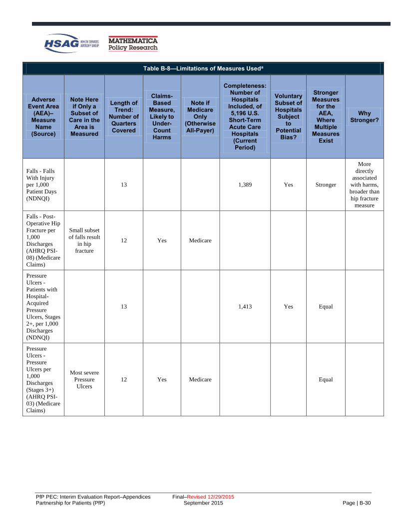
PfP PEC: Interim Evaluation Report–Appendices Final–Revised 12/29/2015 Partnership for Patients (PfP) September 2015 Page | B-30
Table B-8—Limitations of Measures Useda
Adverse Event Area
(AEA)–Measure
Name (Source)
Note Here if Only a
Subset of Care in the
Area is Measured
Length of Trend:
Number of Quarters Covered
Claims-Based
Measure, Likely to Under-Count Harms
Note if Medicare
Only (Otherwise All-Payer)
Completeness: Number of Hospitals
Included, of 5,196 U.S.
Short-Term Acute Care Hospitals (Current Period)
Voluntary Subset of Hospitals Subject
to Potential
Bias?
Stronger Measures
for the AEA,
Where Multiple
Measures Exist
Why Stronger?
Falls - Falls
With Injury
per 1,000
Patient Days
(NDNQI)
13 1,389 Yes Stronger
More
directly
associated
with harms,
broader than
hip fracture
measure
Falls - Post-
Operative Hip
Fracture per
1,000
Discharges
(AHRQ PSI-
08) (Medicare
Claims)
Small subset
of falls result
in hip
fracture
12 Yes Medicare
Pressure
Ulcers -
Patients with
Hospital-
Acquired
Pressure
Ulcers, Stages
2+, per 1,000
Discharges
(NDNQI)
13 1,413 Yes Equal
Pressure
Ulcers -
Pressure
Ulcers per
1,000
Discharges
(Stages 3+)
(AHRQ PSI-
03) (Medicare
Claims)
Most severe
Pressure
Ulcers
12 Yes Medicare Equal
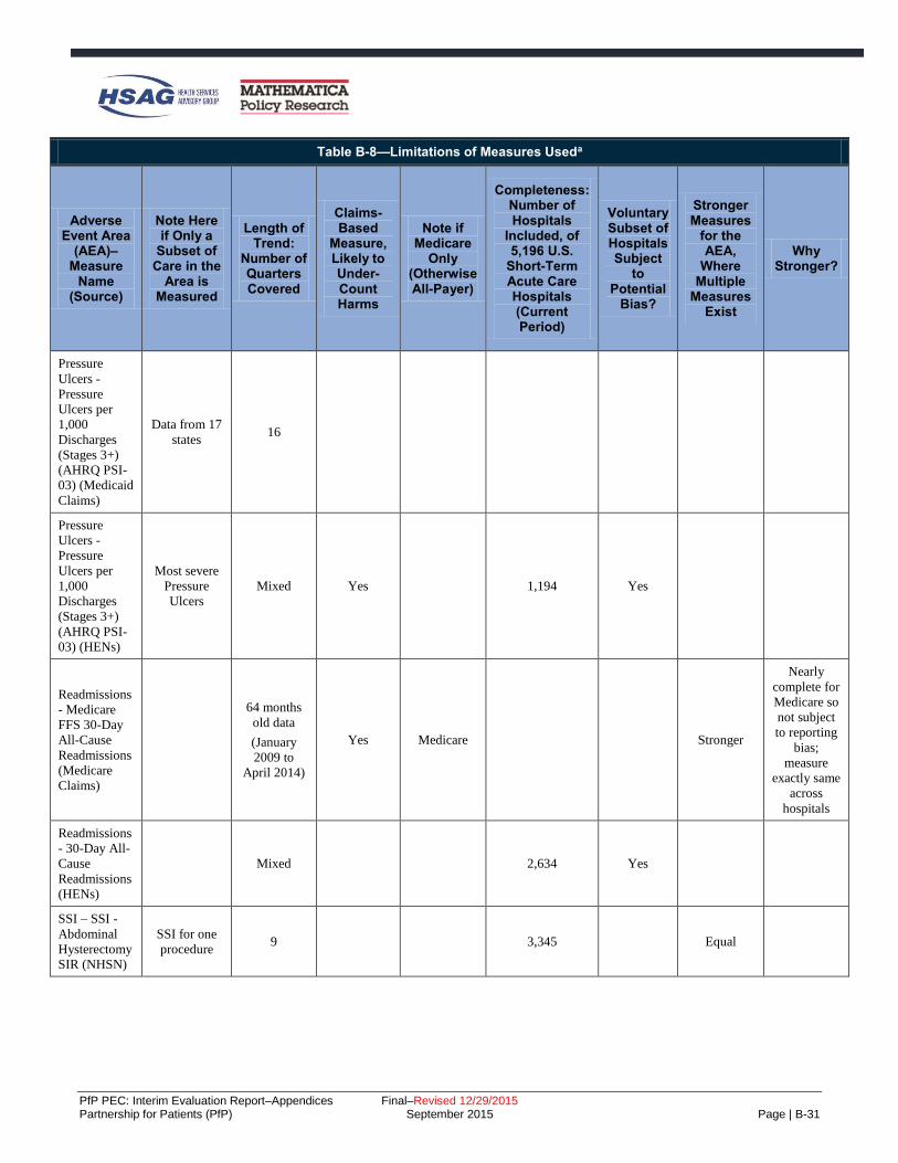
PfP PEC: Interim Evaluation Report–Appendices Final–Revised 12/29/2015 Partnership for Patients (PfP) September 2015 Page | B-31
Table B-8—Limitations of Measures Useda
Adverse Event Area
(AEA)–Measure
Name (Source)
Note Here if Only a
Subset of Care in the
Area is Measured
Length of Trend:
Number of Quarters Covered
Claims-Based
Measure, Likely to Under-Count Harms
Note if Medicare
Only (Otherwise All-Payer)
Completeness: Number of Hospitals
Included, of 5,196 U.S.
Short-Term Acute Care Hospitals (Current Period)
Voluntary Subset of Hospitals Subject
to Potential
Bias?
Stronger Measures
for the AEA,
Where Multiple
Measures Exist
Why Stronger?
Pressure
Ulcers -
Pressure
Ulcers per
1,000
Discharges
(Stages 3+)
(AHRQ PSI-
03) (Medicaid
Claims)
Data from 17
states 16
Pressure
Ulcers -
Pressure
Ulcers per
1,000
Discharges
(Stages 3+)
(AHRQ PSI-
03) (HENs)
Most severe
Pressure
Ulcers
Mixed Yes 1,194 Yes
Readmissions
- Medicare
FFS 30-Day
All-Cause
Readmissions
(Medicare
Claims)
64 months
old data
(January
2009 to
April 2014)
Yes Medicare Stronger
Nearly
complete for
Medicare so
not subject
to reporting
bias;
measure
exactly same
across
hospitals
Readmissions
- 30-Day All-
Cause
Readmissions
(HENs)
Mixed 2,634 Yes
SSI – SSI -
Abdominal
Hysterectomy
SIR (NHSN)
SSI for one
procedure 9 3,345 Equal

PfP PEC: Interim Evaluation Report–Appendices Final–Revised 12/29/2015 Partnership for Patients (PfP) September 2015 Page | B-32
Table B-8—Limitations of Measures Useda
Adverse Event Area
(AEA)–Measure
Name (Source)
Note Here if Only a
Subset of Care in the
Area is Measured
Length of Trend:
Number of Quarters Covered
Claims-Based
Measure, Likely to Under-Count Harms
Note if Medicare
Only (Otherwise All-Payer)
Completeness: Number of Hospitals
Included, of 5,196 U.S.
Short-Term Acute Care Hospitals (Current Period)
Voluntary Subset of Hospitals Subject
to Potential
Bias?
Stronger Measures
for the AEA,
Where Multiple
Measures Exist
Why Stronger?
Ventilator
Associated
Event (VAE)
- VAP per
1,000
Ventilator
Days
(NDNQI)b
12 544 Yes
VTE –
Perioperative
PE or DVT
per 1,000
Surgical
Discharges
(AHRQ PSI-
12) (Medicare
Claims)
Only
perioperative
VTE
12 Yes Medicare 3,656 Stronger
Nearly
complete for
Medicare, so
not subject
to reporting
bias;
measure
exactly same
across
hospitals
VTE –
Perioperative
PE or DVT
per 1,000
Surgical
Discharges
(AHRQ PSI-
12) (Medicaid
Claims)
Data from 17
states
Only
perioperative
VTE
13
VTE –
Perioperative
PE or DVT
per 1,000
Surgical
Discharges
(AHRQ PSI-
12) (HENs)
Only
perioperative
VTE
Mixed 2,368 Yes
OB-EED -
Early Elective
Delivery Rate
(TJC PC-01)
(HENs)
Mixed 1,871 Yes

PfP PEC: Interim Evaluation Report–Appendices Final–Revised 12/29/2015 Partnership for Patients (PfP) September 2015 Page | B-33
Table B-8—Limitations of Measures Useda
Adverse Event Area
(AEA)–Measure
Name (Source)
Note Here if Only a
Subset of Care in the
Area is Measured
Length of Trend:
Number of Quarters Covered
Claims-Based
Measure, Likely to Under-Count Harms
Note if Medicare
Only (Otherwise All-Payer)
Completeness: Number of Hospitals
Included, of 5,196 U.S.
Short-Term Acute Care Hospitals (Current Period)
Voluntary Subset of Hospitals Subject
to Potential
Bias?
Stronger Measures
for the AEA,
Where Multiple
Measures Exist
Why Stronger?
OB-Other -
Injury to
Neonate
(AHRQ PSI-
17) (HENs)
Subset of
obstetric
harms
Mixed Yes 1,503 Yes Equal
OB-Other -
Injury to
Neonate
(AHRQ PSI-
17) (Medicaid
Claims)
Data from 17
states 17
OB-Other -
Obstetrical
Trauma
(AHRQ PSI-
18) (HENs)
Subset of
obstetric
harms
Mixed Yes 1,652 Yes Equal
OB-Other -
Obstetrical
Trauma
(AHRQ PSI-
18) (Medicaid
Claims)
Data from 17
states 16
OB-Other -
Obstetrical
Trauma
(AHRQ PSI-
19) (HENs)
Subset of
obstetric
harms
Mixed Yes 1,757 Yes Equal
OB-Other -
Obstetrical
Trauma
(AHRQ PSI-
19) (Medicaid
Claims)
Data from 17
states 16
Source: Evaluation Contractor. aMeasures from the AHRQ National Scorecard are not included in this table; more information on those measures can be obtained by contacting
[email protected]. bConcerns about the definition of VAP used in this measure resulted in a change in the CDC's definition; however, data for the new definition are not yet available.

PfP PEC: Interim Evaluation Report–Appendices Final–Revised 12/29/2015 Partnership for Patients (PfP) September 2015 Page | C-1
C. Appendix C: PfP Learning Community’s Work Toward Reduction in Harms
Research Objectives for Qualitative Analysis of Survey and Interview Data
To examine the learning community structure created by the Partnership for Patients (PfP) and to investigate
the implementation strategies Hospital Engagement Networks (HENs) used to carry out harm reduction
activities, the Evaluation Contactor examined multiple data sources as described below to address the
following research questions:
1. How was the learning community structure of PfP used to spread best practices?
2. What were hospitals’ levels of engagement with PfP and perceptions of it?
3. What level and types of operational changes did hospitals make to prevent harm and reduce
readmissions?
4. What factors affected the HENs’ ability to spread best practices?
5. What unintended consequences did HENs and visited hospitals observe?
Because the AHA/HRET HEN was very large, and operated through 31 state hospital associations (SHAs)
which varied in their environments and their approaches to working with their hospitals, the Evaluation
Contractor studied both HENs and the SHAs working with the AHA/HRET HEN. The methods discussed
below, used to accomplish this purpose, were:
Interviews and inquiries to HENs to obtain HEN views on the learning community and other PfP
design features, summer 2014.
Interviews with HENs and SHAs working with the AHA/HRET HEN, fall 2014.
Review and follow-up on written descriptions of federal partner organizations’ contributions to PfP.
Interviews with non-federal partners.
Site visits to 12 hospitals.
Survey of HEN-aligned hospitals’ participation in patient safety activities.
Hospital survey on prevention of adverse events and reduction of readmissions.
Prior to discussing each of these methods, the appendix provides an overview of the research-based
frameworks used to guide the qualitative analysis. The last section in the appendix discusses how the
research question regarding unintended consequences was addressed, using data cutting across sources.

PfP PEC: Interim Evaluation Report–Appendices Final–Revised 12/29/2015 Partnership for Patients (PfP) September 2015 Page | C-2
Research-Based Frameworks to Guide Qualitative Analysis of PfP Implementation
The Evaluation Contractor used several research-based frameworks to guide the qualitative analysis of the
implementation of PfP. In order to address the complex design of the campaign, the Evaluation Contractor
identified theory-based constructs from three frameworks to support a systematic evaluation of the
implementation of the PfP learning community model and factors that impacted implementation of the
HENs’ strategies to spread best practices to reduce patient harm in their aligned hospitals.
PfP Learning Community Model
Developed through a review of factors described in the literature on diffusion of innovations in the healthcare
industry, the Blueprint for the Dissemination of Evidence-Based Practices in Health Care provided a
framework for evaluation of the implementation of the PfP learning community model.C-1 Based on the
experience of four national quality campaigns (Institute for Healthcare Improvement [IHI] 100,000 Lives
Campaign and 5 Million Lives Campaign, the American College of Cardiology’s [ACA’s] Door to Balloon
[D2B] Alliance, and the Medicare Home Health Quality Improvement National Campaign), the Blueprint
identifies eight strategies for effective dissemination of evidence-based practices through national quality
campaigns. These eight strategies include the following:
1. Highlight the evidence base and relative simplicity of recommended practices.
2. Align the campaign with the strategic goals of the adopting organizations.
3. Increase recruitment by integrating opinion leaders into the enrollment process and employing a nodal
organizational structure.
4. Form a coalition of credible campaign sponsors.
5. Generate a threshold of participating organizations that maximizes network exchanges.
6. Develop practical implementation tools and guides for key stakeholder groups.
7. Create networks to foster learning opportunities.
8. Incorporate milestones and monitoring of milestones and goals.
HEN Strategies to Spread Best Practices
To examine the implementation strategies used by HENs and SHAs, the Evaluation Contractor developed an
interview protocol that was informed by the Consolidated Framework for Implementation Research (CFIR),
which provides a comprehensive taxonomy of constructs that have been shown to influence implementation
of complex programs.C-2 Through the interviews, HENs described their dissemination and implementation
strategies to facilitate harm reduction efforts among their hospitals; for example, ranging from efforts to
make available evidence-based tools and resources to more hands-on efforts to help hospitals transform
processes of care. To compare HENs’ implementation strategies with evidence from the literature on
implementation science, the Evaluation Contractor incorporated aspects of Yuan et al. (2010, presented
above) and the following:
C-1 Yuan CT, Nembhard IM, Stern MF, et al. Blueprint for the Dissemination of Evidence-Based Practices in Health Care.
Commonwealth Fund. 2010: 86. C-2 Damschroder LJ, Aron DC, Keith RE, et al. Fostering Implementation of Health Services Research Findings into Practice: A
Consolidated Framework for Advancing Implementation Science. Implementation Science. 2009: 4:50.

PfP PEC: Interim Evaluation Report–Appendices Final–Revised 12/29/2015 Partnership for Patients (PfP) September 2015 Page | C-3
A 2004 systematic review of research studies regarding the diffusion of innovations in health services
settings, presenting a conceptual model of determinations of diffusion, dissemination, and
implementation of innovations in health services settings.C-3
A 2005 literature review of implementation research, presenting best practices in implementation.C-4
The 2005 Dissemination Planning Tool developed on behalf of the Agency for Healthcare Research
and Quality (AHRQ).C-5
A 2011 review of the literature on knowledge transfer and exchange in healthcare, presenting
evidence-based strategies for effective dissemination.C-6
A 2012 literature review of strategies for implementing clinical innovations in health and mental
health.C-7
A 2013 literature scan of large-scale spread efforts in hospitals and healthcare settings to examine the
primary drivers of implementation strategy effectiveness.C-8
To guide the analysis of facilitators and barriers impacting HEN and SHA harm reduction efforts during PfP,
the Evaluation Contractor identified common domains from two research-based frameworks. First, the CFIR,
as described above, presents a framework for understanding implementation of evidence-based practices in
healthcare settings and describes a number of factors, such as internal organizational characteristics, that may
influence implementation effectiveness. Second, Brian Mittman, an implementation science expert, identified
a set of key factors that influence the success of scale-up and spread efforts, including characteristics of the
innovation, features of target adopters, environmental conditions, innovation champions, and dissemination
strategies.C-9 Applying this research to the PfP model, the Evaluation Contractor identified factors in four
domains related to HEN and SHA efforts to disseminate best practices and encourage adoption of harm
reduction interventions in their aligned hospitals for analysis. These domains include the following:
External Factors—payment incentives and policies, mandatory reporting programs, patient needs and
expectations.
Internal Factors (HENs)—organizational resources, history of working with hospitals and partners
prior to PfP.
Target Adopter Factors (Hospitals)—resources/capacity for change, organizational factors.
Innovation Factors—feasibility, adoptability of harm reduction efforts in adverse event areas (AEAs).
C-3 Greenhalgh T, Robert G, Macfarlane F, et al. Diffusion of Innovations in Service Organizations: Systematic Review and
Recommendations. Milbank Quarterly. 2004; 4:581–629. C-4 Fixsen DL, Naoom S, Blase KA, et al. Implementation Research: A Synthesis of the Literature. Tampa, FL: University of South
Florida, Louis de la Parte Florida Mental Health Institute, National Implementation Research Network; 2005. C-5 Carpenter D, Nieva V, Albaghal T, et al. Development of a Planning Tool to Guide Research Dissemination. Advances in Patient
Safety: From Research to Implementation. 2005: 4. C-6 Pentland D, Forsyth D, Maciver M, et al. Key Characteristics of Knowledge Transfer and Exchange in Healthcare: Integrative
Literature Review. Journal of Advanced Nursing. 2001:7:1408–1425.
C-7 Powell BJ, McMillen JC, Proctor EK, et al. A Compilation of Strategies for Implementing Clinical Innovations in Health and Mental
Health. Medical Care Research and Review. 2012:69:123–157. C-8 Perla RJ, Bradbury E, Gunther-Murphy C. Large-Scale Improvement Initiatives in Healthcare: A Scan of the Literature. Journal of
Healthcare Quality. 2013: 35:30–40. C-9 Mittman, B. Factors that Influence the Scale Up and Spread of Innovations. Available at:
https://innovations.ahrq.gov/perspectives/factors-influence-scale-and-spread-innovations. Accessed on: April 6, 2015.

PfP PEC: Interim Evaluation Report–Appendices Final–Revised 12/29/2015 Partnership for Patients (PfP) September 2015 Page | C-4
Interviews and Inquiries to Obtain HEN Views on the Learning Community and Other PfP Design Features, Summer 2014
In summer 2014, the Evaluation Contractor requested that each HEN respond to key questions either through
interviews or through submitting a written response to the questions. Of the 26 HENs, 18 HENs chose the
telephone interview, and 8 HENs chose to respond via written response. Near-verbatim notes documentation
from the interviews was analyzed together with the written responses.
There were five topics for discussion, and the fifth asked HENs to comment on the following features of PfP:
Goals—The Partnership’s ambitious goals.
Targets—Interim PfP targets.
Focused Initiatives—Specific “pushes” within the campaign as were done for catheter-associated
urinary tract infection (CAUTI), obstetrical early elective delivery (OB-EED), and readmissions.
National Content Developer’s (NCD’s) Role—NCD pacing events and other NCD supports.
Patient and Family Engagement (PFE) Activities—Patient and family engagement master classes,
resources, and speakers from the PFE Contractor (PFEC).
Reporting—Monthly feedback reports including ACT (Alignment of Measures with 40 percent/20
percent Goals, Completeness of Data, and Trend or Benchmark) reports and all-HEN data displays on
HENs’ progress.
Measurement Strategies—HENs’ and the Partnership’s.
HEN responses were grouped by whether the HEN reported that each PfP design feature or support on the
above list was beneficial to the HEN’s progress and whether it provided minimal or no benefit; themes were
noted if cited by three or more HENs.
HEN/SHA Interviews, Fall 2014
Data Collection Approach
The Evaluation Contractor conducted interviews with each of the 26 HENs and 24 of 31 SHAs working as
subcontractors to the AHA/HRET HEN between October 2014 and December 2014; the rest of the
AHA/HRET SHAs responded to an email request for responses to the interview questions with varying
levels of detail. The interviews lasted 90 to 120 minutes. Interviewees provided consent to being audio
recorded to ensure accuracy of notes. In total, the Evaluation Contractor had four lead interviewers and seven
note takers, and one interviewer and note taker attended each call, along with additional project team
members who listened. Interviewers followed a semi-structured interview protocol covering the topics listed
below. In addition to participation in the interviews, HENs were asked to complete and submit a workbook
listing their initiatives and partnerships in each AEA and overall. All HENs and SHAs participating in
interviews submitted these workbooks (referred to as “Intervention Spreadsheets”); interviewers reviewed
them prior to the interview, and both HENs/SHAs and interviewers referred to them during the interviews.
Topics covered during the interviews were:
Timing of emphasis on the AEAs.
HENs’/SHAs’ history working with their hospitals on patient safety.
HENs’/SHAs’ history working with partners on harm reduction.
Hospital experience working on patient safety prior to PfP.
Lessons learned about effective partnerships.

PfP PEC: Interim Evaluation Report–Appendices Final–Revised 12/29/2015 Partnership for Patients (PfP) September 2015 Page | C-5
Communication strategies HENs/SHAs used with their hospitals.
Internal and external factors that may have influenced HEN/SHA progress.
Unintended consequences of PfP work.
Detailed discussion of HEN/SHA implementation strategies, highlighting hospital engagement
patterns and major milestones in their strategies, for each AEA and overall (across areas, where
HENs/SHAs used cross-cutting strategies).
Detailed discussion of HEN/SHA implementation strategies and implementation processes for
readmissions.
Analysis
Note takers completed near-transcript style notes. To prepare for analysis, the Evaluation Contractor
qualitatively coded the notes and workbooks using Atlas.ti, a qualitative coding software. Coding is an
approach to qualitative data analysis that aids in managing the data and simplifying the data for analysis.
Codes are used to both tag text and identify themes. The Atlas database includes all of the interview notes
and intervention spreadsheets. It groups documentation based on HEN characteristics, such as geographic
spread (single state, multiple states), ownership (hospital association, system, or other), and size (< 50, 50–
99, 100+). In this way, the database can aid future analyses examining variation in HEN implementation
strategies based on HEN characteristics.
Three researchers collaboratively developed, piloted, and refined a code list to apply to the HEN interview
notes and workbooks. The code list was generated subsequent to the HEN interviews and was based on both
the protocol questions and emergent themes. The code list was reviewed by other senior researchers on the
evaluation team before implementation. The code list is presented in Table C-1. In addition to the codes
listed in the table, each protocol question for the readmission section had its own code to facilitate analysis of
all of the answers to the same question in this section.
Two lead researchers trained a team of four coders in the code definitions and application of the code list. A
lead researcher reviewed and edited each set of coded notes so that each set was reviewed by two people.
The coding team met once weekly over the course of the coding process to discuss substantive issues related
to coding; for example, discussions of code definitions or conventions for coding, such as length of text to
code. Using the coded text, three lead researchers (those who developed the code list) analyzed the data
looking for themes and indications of variation across HENs or AEAs in terms of implementation strategies
and facilitators and barriers that may have affected progress.

PfP PEC: Interim Evaluation Report–Appendices Final–Revised 12/29/2015 Partnership for Patients (PfP) September 2015 Page | C-6
Table C-1—Code List Applied to HEN Interview Data and Intervention Spreadsheets
Codes Definitions
Factors Affecting Progress
External Factors
Any indication of factors external to the HEN or its hospitals playing a role in their strategy or
harm reduction results achieved.
Examples include incentives and policies, areas of concern in the community or state, public
reporting, and so forth.
Readmission
PenaltiesC-10
Captures references to the Centers for Medicare & Medicaid Services (CMS) payment penalties
for readmissions for certain conditions.
Hospital-Acquired Condition (HAC) Reduction Program
Captures references to the CMS HAC reduction program or penalties associated with this
program.
Value-Based Purchasing (VBP)
Captures references to the general movement toward VBP, away from volume-based payment or
toward quality of care and away from quantity of care.
Internal Factors Any reference to factors internal to the HEN or to its hospitals.
Apply the high-level code when the sub-codes do not apply but the HEN refers to other factors
that are specific to the network or network hospitals that may have influenced results achieved.
HEN History Working with Hospitals
Captures answers to the protocol question about HEN history of working with network hospitals
on quality or patient safety issues prior to PfP; this is distinct from “hospital experience in PfP
areas,” which is about network hospitals’ experience working in PfP AEAs (not necessarily in
collaboration with the HEN).
HEN History Working with Partners
Captures references to HENs’ history of working with partners on patient safety prior to PfP.
Hospital Experience in PfP Areas
Captures references to HEN hospitals' experience addressing the 11 adverse event areas
addressed in PfP prior to the start of PfP.
HEN Structural Characteristics
Captures characteristics at the HEN level, such as organizational characteristics.
Hospital Structural Characteristics
Captures hospital characteristics that are structural in nature, such as pertaining to personnel/staff
(including quality improvement staff, leadership, frontline, etc.), organizational characteristics,
tools/resources, and infrastructure.
EHR Issues Captures references to electronic health record (EHR) issues that are cited as facilitators or
barriers or otherwise factors in the HEN harm reduction achievements.
Staff Turnover Captures references to staff turnover at the hospital level as a factor in implementation
effectiveness.
Intervention Characteristics
Captures reactions to or descriptions of interventions used within AEAs; higher level code is for
more general observations and references that do not pertain to the complexity of the
interventions.
May include references to instances where the intervention was well established/already in use
and part of routine practice.
Look for mentions of evidence base, availability of clearly defined/nationally recognized
measures, clear path forward vs. less clear path forward, nature of care team or involvement of
patients.
Complexity Captures descriptions of perceived difficulty of implementation—or perceived ease of
implementation (absence of difficulty); intended to capture reflections or views on the nature of
the interventions in a given AEA and indications that these perceptions influenced progress.
C-10 Indented codes indicate sub-codes to higher-level codes; these codes are conceptually related, where sub-codes are intended to
capture more detail or tag particular references.

PfP PEC: Interim Evaluation Report–Appendices Final–Revised 12/29/2015 Partnership for Patients (PfP) September 2015 Page | C-7
Table C-1—Code List Applied to HEN Interview Data and Intervention Spreadsheets
Codes Definitions
Lesson Learned/General Insight
Captures references to general insights or lessons learned, where HEN did not refer specifically
to facilitators or barriers/challenges but indicates some learning process or some lessons learned
that impacted or would impact how they carry out harm reduction work.
Facilitator
Captures references to HEN-identified facilitators or factors that made implementation of harm
reduction work easier—HEN does not have to use the word “facilitator.”
Key words include: “critical,” “made a difference,” “expedited,” “directly impacted,” or
otherwise enabled change/progress.
Barrier/Challenges
Captures references to barriers/challenges to harm reduction work identified by the HEN and
should capture descriptions of challenges followed by solutions.
HEN does not have to use the words barriers or challenges.
Key words include: “confusion,” “difficulty,” “lack of buy-in or commitment,” “tough nut to
crack,” or other phrases indicating some sort of challenge or barrier to progress that needed to be
overcome or remains a challenge/not yet addressed or resolved.
HEN Implementation Strategies
Adaptation of Interventions Captures descriptions of HEN efforts to aid in hospital adaptation of interventions, such as tools
or bundles, or other resources or otherwise encouraging hospitals to adapt or customize
interventions or tools based on their local needs.
Alignment with Concurrent Initiatives
Captures descriptions of HENs’ deliberate efforts to align with concurrent initiatives in the local,
state, or national environment, or specific efforts to address local problems or priorities.
Collaboratives Captures descriptions of intensive workgroups or immersion groups of hospitals working
together toward a focused goal convened by the HEN.
Commitment
Captures references to HENs’ requiring hospital or leadership commitments to PfP, at a
specifically referenced point in time.
Can also include references to pledges hospitals take; for example, to implement hard stop
policies to address EED.
Communication
Captures HENs’ descriptions of their communication strategies, including efforts to target
specific hospitals or audiences and customize communications for specific hospitals or
audiences; includes references to mode/medium, frequency, messaging, and audience.
Also use for HENs’ observations about lessons learned about effective communication.
Customization Captures descriptions of HENs’ efforts to tailor communication tactics or messages to audiences,
such as hospital leadership or frontline staff.
Consultation/Coaching
Captures descriptions of HENs’ coaching or consultation to hospitals on an individual or small
group basis on specific processes, measurement issues, opportunities for improvement, and so
forth; coaching may be in person or via phone.
Key words include “one-on-one,” “face-to-face,” or other indications that the HEN staff worked
directly with hospitals or a subset of hospitals on issues specific to those hospitals (e.g., after
reviewing their data).
Site Visits Captures descriptions of HENs’ on-site visits to hospitals to support improvement efforts.
Includes who conducted the visits, what was accomplished during the visits.
Cross-cutting Strategy Captures references to HENs’ overall approaches that affect all or many AEAs.
Culture Captures references to efforts to address culture in general.
Patient and Family Engagement
Captures references to efforts to engage patients and families.
Leadership Engagement
Captures references to hospital leadership engagement.

PfP PEC: Interim Evaluation Report–Appendices Final–Revised 12/29/2015 Partnership for Patients (PfP) September 2015 Page | C-8
Table C-1—Code List Applied to HEN Interview Data and Intervention Spreadsheets
Codes Definitions
Safety Across the Board
Captures references to cultivating culture of safety across the board within hospitals.
Data-Driven Strategies Captures descriptions of HENs’ use of data to identify areas of opportunity, areas for
improvement, or other potential uses of data that helped to focus the HEN strategy and approach.
Data Monitoring/ Performance Feedback
Captures HENs’ efforts to monitor hospital data on an ongoing basis to continue to identify
opportunities or places where there may be promising practices because of reductions in rates.
Captures references to HENs’ efforts to provide data back to the hospitals—feedback on patient
safety performance—through reporting, dashboards, consultation, or other mechanism, but the
key is the feedback loop. Not only is the HEN viewing the data, but it is also reviewing,
benchmarking, and reflecting back to individual hospitals or units within hospitals on
performance.
Development/Selection of Interventions
Captures descriptions regarding how HENs developed or selected interventions to promote
across their networks within each AEA; examples include HEN not developing tools but making
use of other tools/resources such as those provided by the NCD; HEN using an existing tool or
bundle off-the-shelf, without modifications; HEN modifying a tool or bundle—for example,
based on updated literature or consultation with local experts; HEN developing its own tool or
bundle or synthesizing the literature or other resources such as subject matter experts' input to
develop an intervention, tool, or resource.
Captures any effort to develop or identify tools that function as part of the actual intervention—
such as checklists, bundles, or protocols.
Appropriate to use when HEN encouraged selection of interventions by hospitals (for example,
selection of tools based on local factors).
Discover and Spread
Captures descriptions of HENs leveraging hospital experience to identify a promising practice
that the HEN then spreads network-wide; this approach is more bottom-up or hospital-driven,
where HEN plays key role in spreading the practice across the network rather than in defining
the actual intervention.
Evolution of Implementation Strategy
Captures HEN indications that their implementation strategies changed or evolved over time,
often after identifying better approaches or learning from others. The key is some indication of
change—although indications of iterating on the plan or approach are also permissible.
Gap Analysis/Needs Assessment/Root Cause Analysis
Captures references to efforts to identify gaps, needs, opportunities, or sources of harm at the
hospital level. Examples include gap analysis, needs assessment, surveying of hospitals (e.g.,
Organizational Assessment Tool [OAT] survey), and root cause analysis.
Hospital Engagement
Captures HENs’ descriptions of hospital engagement in AEA or overall; should be applied any
time references to hospital engagement are made but in particular during discussion of
intervention strategies in each AEA; should also include references to hospital participation in
events or interventions and general observations about how engaged hospitals were in a
particular AEA.
References to lack of participation or engagement should also be coded.
Should also capture references to hospital take-up or adoption of practices or interventions.
Networking Opportunities
Captures opportunities for hospitals to share harm reduction experiences and learn from one
another, facilitated by the HEN.
Examples of these activities include webinars where HENs explicitly noted that hospitals shared
experiences, face-to-face regional meetings to facilitate hospital interaction and ring of practices.
HEN Connects Hospitals to Each Other
Captures references to HENs’ connecting mentor or successful/high-performing hospitals to
hospitals with identified room for improvement or hospitals struggling in a particular area.
Other Education/Tools/
Resources
Captures HENs’ provision of education aside from skills training (which has its own code), such
as webinars and national speakers; resources, such as tools and bundles; processes to prevent
harm or to support outcomes measurement; and tools and resources to support harm reduction
work.

PfP PEC: Interim Evaluation Report–Appendices Final–Revised 12/29/2015 Partnership for Patients (PfP) September 2015 Page | C-9
Table C-1—Code List Applied to HEN Interview Data and Intervention Spreadsheets
Codes Definitions
Partnerships Captures references to partners and partnerships, particularly regarding the role of partnerships in
carrying out harm reduction work, and lessons learned regarding effective partnerships.
Association for Professionals in Infection Control and Epidemiology (APIC)
Intended to flag references to APIC as a partner.
Other HENs Intended to flag references to other HENs as partners.
Quality Improvement Organization (QIO)
Intended to flag references to partnerships with the local QIO.
State Health Department
Intended to flag references to partnerships with state health departments.
Skills Training Captures explicit references to the provision of skills training to hospitals or hospital staff.
Sub-codes are intended to flag specific types of skills training.
TeamSTEPPS Specifically references to TeamSTEPPS training.
Comprehensive Unit-based Safety Program (CUSP)
Specifically references to CUSP training.
Lean Specifically references to Lean training.
Six Sigma Specifically references to Six Sigma training.
Stakeholder Engagement
Captures references to efforts to engage relevant stakeholders (e.g., quality staff, preventionists,
hospital leadership, patients and families, physicians, nurses, pharmacists, frontline staff, and
community organizations) in harm reduction work.
Also includes references to engagement of individuals who could influence others; for example,
champions and key opinion leaders.
Also includes references to convening of multidisciplinary councils or workgroups that oversee
harm reduction strategies in a given area and help to carry out harm reduction activities.
Standardization Captures deliberate HEN efforts to standardize processes or deploy standardized tools network
wide.
Targeting
Captures references to interventions or approaches to specific hospitals; for example, on the basis
of hospital characteristics or performance.
Note: Intended to be used in conjunction with codes under Other Descriptive Codes that identify
specific types of hospitals, such as Critical Access Hospitals (CAHs)/rural, high impact/high
volume, low performers, and high performers, as applicable.
Low Performers Flags references to targeting low performers or hospitals with opportunity for improvement.
High Performers Flags references to targeting high performers or hospitals with success.
High Impact/High Volume
Flags references to targeting hospitals that make a significant impact to HEN rates—defer to
HEN description of hospitals as high impact or high volume.
Test and Spread
Captures references to HENs’ use of piloting or testing an intervention and then rolling it out
network-wide as a strategy. Strategy is more top down or HEN-defined; for example, immersion
groups that test an intervention or identify strategies with the intention of spreading network-
wide.
Timing/Clustering of AEAs
Captures descriptions of how the HEN managed the 11 adverse event areas.
May most often come up in response to question in Part I regarding timing of the AEAs but may
also come out during discussions of implementation strategies by AEA.
Includes references to areas of top priority or references to how the HEN prioritized areas.

PfP PEC: Interim Evaluation Report–Appendices Final–Revised 12/29/2015 Partnership for Patients (PfP) September 2015 Page | C-10
Table C-1—Code List Applied to HEN Interview Data and Intervention Spreadsheets
Codes Definitions
Other Descriptive Codes
AEA Codes (ADE, CAUTI, Central Line-Associated Blood Stream Infection [CLABSI], Falls, OB-EED, Other Obstetrical Adverse Events [OB-Other] Pressure Ulcers, Surgical Site Infections [SSI], Ventilator-Associated Event [VAE], Venous Thromboembolism [VTE], Readmissions)
Tags to identify AEAs.
AHA/HRET
Use for interviews to designate specific interventions or strategies coming from AHA/HRET
HEN, rather than from SHA (relevant to coding of AHA/HRET State Hospital Association
[SHA] notes).C-11
CAH/Rural Captures references to small hospitals, CAHs, or rural hospitals using this code.
Disparities
Captures descriptions of HENs or hospitals identifying different rates of harm or observing
different issues for certain patients based on factors related to socio-economic factors, Medicaid
or dual-eligible status, income levels, language, race/ethnicity, or other characteristics. HEN does
not have to use the word “disparities” but instead could point to differences across
subpopulations in rates of patient harm, outcomes, access, or other issues.
Hospital Level Use when the HEN is describing hospital-level activities or strategies and the role of the HEN is
unclear; in other words, the HEN describes a strategy in use in its network but not its role in
prescribing or carrying the strategy out.
Hospital Participation in AHA HEN versus SHA
Captures answers to the question about hospital participation in AHA/HRET HEN activities as
compared to SHA activities.
LEAPT
Captures references to Leading Edge Advance Practice Topics (LEAPT):
– Severe Sepsis and Septic Shock (mandatory)
– Clostridium Difficile (C. difficile)
– Hospital Acquired Acute Renal Failure
– Airway Safety
– Iatrogenic Delirium
– Procedural Harm
– Undue Exposure to Radiation
– Failure to Rescue
– Results beyond 40/20 AIMs
– Hospital Culture of Safety
– Cost Savings Calculations for Hospital Acquired Conditions
Milestone Captures HEN-described milestones in implementation strategy, includes references to specific
dates and major aspects of their strategy that then led to results achieved.
Spillover Effects
Captures any indication of the HEN harm reduction efforts reaching or affecting non-aligned
hospitals; for example, non-aligned hospitals' attendance at HEN events or use of HEN-provided
resources.
References, for example, to “all hospitals in the state” should be coded as spillover effects.
C-11 Interviews with the AHA/HRET state hospital associations are not included in this report but were coded and will be reported on in
the Interim Evaluation Report.

PfP PEC: Interim Evaluation Report–Appendices Final–Revised 12/29/2015 Partnership for Patients (PfP) September 2015 Page | C-11
Table C-1—Code List Applied to HEN Interview Data and Intervention Spreadsheets
Codes Definitions
Unintended Consequences Captures answers to the question about unintended consequences associated with HEN
participation in PfP; consequences could be positive or negative.
Federal Partners Analysis
The purpose of this analysis was to develop a description of the extent to which federal organizations worked
alongside or in partnership with PfP on PfP focus areas, identify any influence PfP had on the organizations
and vice versa, and assess the reach of these efforts relative to PfP to the extent we have information.
The evaluation contractor reviewed summaries submitted by the following organizations to the federal
partners retreat held in November 2014, in answer to PfP leadership’s question “List/Describe your
contributions to PfP over the course of the last 3 years:”
AHRQ
Centers for Disease Control and Prevention (CDC)
Human Resources and Services Administration (HRSA)
Office of the Assistant Secretary for Health(OASH)/Office of Disease Prevention and Health
Promotion (ODPHP)
United States Department of Veterans Affairs (VA)
QIO program
The Administration of Community Living (ACL)
United States Department of Defense (DoD)
Office of Personnel Management (OPM)
Follow-up contacts (by email or telephone) were used to clarify points in the written summaries.
Non-Federal Partners Interviews
Data Collection Approach
To understand the nature of the shared learning community and the degree of partnership or alignment with
private partners at the PfP campaign level, the Evaluation Contractor also conducted a series of interviews
with non-federal organizations. Organizations were identified based on their historical work to address
patient safety and readmissions or due to recommendations by CMS staff for inclusion. An initial list of
interview candidates was based on the list of major initiatives or potential influences presented in the Project
Evaluation Activity in Support of Partnership for Patients: Evaluation Progress Report I, December 2014,
and identified by a combination of review of HEN monthly reports, input from the NCD, and additions from
a sample of members of the affinity groups which included some private partner organizations as well as
CMS staff, HENs, and others. CMS reviewed the initial list of interview candidates and suggested several
additions.
Between March 19, 2015, and May 4, 2015, 22 interviews representing 19 organizations were conducted.
Table C-2 presents a summary of the acceptances, non-responses, and declines. The Evaluation Contractor
contacted individuals at those organizations who were affiliated with the PfP campaign, where relevant, or
organizational leadership. Many of the contacts were members of the National Quality Forum (NQF) Patient
Safety Collaboration, a multi-stakeholder effort convened by the NQF with funding from the Center for

PfP PEC: Interim Evaluation Report–Appendices Final–Revised 12/29/2015 Partnership for Patients (PfP) September 2015 Page | C-12
Medicare & Medicaid Innovation (CMMI) to advance the goals of PfP.C-12 All interviewees were recruited
via an email describing the purpose of the interview and topics for discussion.
Table C-2—Non-Federal Partner Contacts, Interviews Conducted, Non-Responses, and Declines
Number of Organizations
Contacted (Number of Individuals)
Number of Interviews Conducted
(Organizations)C-13
Number of Non-Responses (By
Organizations)C-14
Number of Declines (By Organizations)C-15
22 (33) 22 1 1
Source: The Evaluation Contractor’s analysis of non-federal partner interviews.
Note: In some cases, the Evaluation Contractor invited multiple individuals at the same organization to participate, and in a few
cases, contacted individuals referred the interview request to others with more relevant knowledge.
Interviews addressed the following topics:
The organization’s activities to address patient harm and readmissions (as relevant) from late 2011
through 2014, and the reach of these activities among hospitals, clinicians, and other stakeholders.
The nature of the organization’s activities related to the PfP campaign and any efforts to deliberately
coordinate activities or align with the campaign.
The degree to which the PfP campaign influenced the organization’s activities to address patient harm
and readmissions (if at all).
Any feedback regarding perceived advantages or disadvantages related to PfP.
Interviews were attended by one lead interviewer, a note taker, and 1–2 other team members. Interviews
were not recorded, but notes were taken. To ensure accuracy of the notes, the lead interviewer and note taker
debriefed after each interview to review key points from the discussion.
Analysis
Interviews were reviewed examining the following:
The formality of the relationship between the organization and PfP campaign.
The types of activities the organization participated in as they pertain to PfP (for example,
consultation with the HENs).
The degree to which alignment of activities occurred deliberately versus naturally (as many
interviewees cited natural alignment).
The broader context—for example, other activities going on to address patient harm and readmissions
that were either in place prior to the PfP campaign or occurred independently of the PfP campaign,
according to interviewees.
C-12 Three action teams addressing OB-EED, readmissions, and PFE were convened to develop best practices and guidance for
hospitals in these areas. C-13 Organizations represented in the interviews included: American Board of Internal Medicine Foundation (2 separate interviews);
American Case Management Association; American College of Surgeons; American Nurses Association; American Pharmacist
Association; American Society of Health System Pharmacists; Association of State and Territorial Health Officials; Association
of Women’s Health, Obstetric, and Neonatal Nurses; California Maternal Quality Care Collaborative; Center to Advance
Palliative Care; Childbirth Connection; Institute for Healthcare Improvement (2 separate interviews); The Joint Commission (2
separate interviews); The Leapfrog Group; March of Dimes; Pacific Business Group on Health; Planetree; Safe Care
Campaign/The Healthcare and Patient Partnership Institute; and Society of Hospital Medicine. C-14 Two individuals were contacted at a non-federal partner organization via email and did not respond. C-15 Reason for declining: lack of familiarity with PfP campaign.

PfP PEC: Interim Evaluation Report–Appendices Final–Revised 12/29/2015 Partnership for Patients (PfP) September 2015 Page | C-13
The nature of engagement and activities supporting the PfP campaign were categorized, and organizations
describing formal partnership, informal partnership, and substantial contributions to the campaign were
counted.
Site Visits to 12 Hospitals
Purpose
To understand what changes hospitals made during 2012 through 2014 to improve patient safety and reduce
readmissions, why and how they made these changes, and the role PfP and other factors played in these
changes.
Research Questions
1. What changes did site visit hospitals make during 2012 to 2014 to improve patient safety and reduce
readmissions?
2. How did patient safety culture or infrastructure change in the visited hospitals during this time
period? (e.g., leadership involvement, PFE, staff roles and norms in safety, use of data)
3. What role did PfP and other factors, such as market pressures, payment incentives, and public
reporting play in influencing hospitals to make changes to improve patient safety?
a. To improve patient safety culture or infrastructure?
4. Where hospitals were motivated to improve, what role did PfP and other factors play in accelerating
change or enabling successful implementation of improvement strategies?
a. To what extent were the improvement strategies that were used evidence-based vs. developed
through other means, such as in-house experience or reported experience from a peer hospital?
5. To what extent have the visited hospitals measured reductions in harm and readmissions during 2011-
2014?
a. Have the hospitals analyzed the relationship between their process changes and outcome trends?
6. What factors, beyond specific process-of-care changes, may have played a role in the hospital’s harm
reduction outcomes during this period?
Hospital Selection
To support the site visits component of the PfP evaluation, a sample of 12 hospitals was drawn. The pool of
hospitals for the study was developed from the analytic file created for the Hospital Survey on Prevention of
Adverse Events and Readmissions, and included 1,136 hospitals. Table C-3 shows the available, targeted,
selected, and visited hospitals, by characteristic as identified by matching the hospital with data from the
2010 AHA Annual Survey. The survey file was used for the frame because of the need to select hospitals at
different levels of engagement with PfP, a variable only available for hospitals responding to the survey. The
objective was to construct a sample that reflected diversity on the following dimensions of interest:
1. Engagement with a HENC-16
a. No engagement with a HEN (3 hospitals)
b. Among those with engagement, different levels of engagement (9 hospitals)
2. Hospital type and size
C-16 At the time the sample was drawn, only hospitals aligned with a HEN as of June 2012 were considered as HEN-aligned; “late joiner”
hospitals were not included as HEN-aligned hospitals. However, we learned from the visits that two of the non-aligned hospitals had
joined PfP later, one in 2013 and one in 2014, so they are shown with the HEN-aligned group.

PfP PEC: Interim Evaluation Report–Appendices Final–Revised 12/29/2015 Partnership for Patients (PfP) September 2015 Page | C-14
a. CAH (3 hospitals)
b. Hospital size (number of beds) (up to 3 levels of hospital size)
3. Geographic variation
a. Geographic region (4 regions: East, West, South and Midwest)
b. Urbanicity (rural and non-rural)
Because of the number of dimensions of interest, minimum counts for each of these dimensions were
established and an allocation was developed across the dimensions. Not all crosses of the dimensions could
be represented in the sample of 12 hospitals, so the sample was randomly allocated to some crosses of the
dimensions such that the allocation to a dimension was achieved. For hospitals aligned with a HEN, the
requirements were:
1. 3 hospitals from each of 3 levels of engagement with a HEN
2. 2 hospitals were to be CAHs
3. 2 or 3 hospitals from each of 4 levels of hospital size (less than 100, between 100 and 199 beds,
between 200 and 299 beds, 300 or more beds)
4. Proportional number of hospitals across geographic region
5. Proportional number of hospitals across urbanicity
The selection process entailed the controlled allocation across the three levels of engagement with a HEN of
the sample of 9 hospitals by CAH hospital and among hospitals that were not CAHs, by four hospital size
levels. After the sample was allocated across levels of engagement and hospital type and size, the sample was
randomly allocated to region and then randomly allocated to urban and rural within the region.
Among HEN-aligned hospitals, the final sample of hospitals (see Table C-3) included:
1. 1 CAH hospital with a low engagement score in a rural area of the Midwest
2. 1 CAH hospital with a high engagement score in a rural area of the South
3. 1 hospital with 100 to 199 beds and a low engagement score in an urban area of the West
4. 1 hospital with 300 or more beds and a low engagement score in an urban area of the South
5. 1 hospital with less than 100 beds and a medium engagement score in a rural area of the Midwest
6. 1 hospital with 100 to 199 beds and a medium engagement score in an urban area of the South
7. 1 hospital with 200 to 299 beds and a medium engagement score in a rural area of the South
8. 1 hospital with 200 to 299 beds and a high engagement score in a rural area of the East
9. 1 hospital with 300 or more beds and a high engagement score in an urban area of the Midwest
For hospitals not engaged with a HEN (242 hospitals), the Evaluation Contractor sought 1 CAH hospital, 1
hospital with less than 100 beds and 1 hospital with more than 100 beds. Only 1 hospital could be selected in
any region and a proportional number of hospitals was required across urbanicity.
Among the non-aligned hospitals, the final sample of hospitals included:
1. 1 CAH hospital in a rural area of the Midwest
2. 1 hospital with less than 100 beds in an urban area of the West
3. 1 hospital with 100 or more beds in an urban area of the South
The distribution of the hospitals responding to the survey, the expected sample, and the visited hospitals for
the various dimensions are given in Table C-3.

PfP PEC: Interim Evaluation Report–Appendices Final–Revised 12/29/2015 Partnership for Patients (PfP) September 2015 Page | C-15
Table C-3—Summary of Hospitals and Selections by Hospital Alignment, Engagement with HEN, Hospital Type and Size, Geographic Region and Urbanicity
Available Expected Selections Visited
Aligned Hospitals 848 9 11 (2 late joiners)
Hospital Type and Size
CAH 253 2.7 3
Not CAH, Less than 100
beds 178 1.9 1
Not CAH, 100 to 199
beds 148 1.6 2
Not CAH, 200 – 399 beds 180 1.9 4
Not CAH, 400 or more
beds 79 0.8 1
Engagement Score Tertiles
First (lowest) 283 3.0 4
Second 284 3.1 4
Third (highest) 271 2.9 3
Region
Northeast 106 1.1 1
Midwest 328 3.5 4
South 252 3.8 5
West 152 1.6 1
Urbanicity
Rural 382 4.1 6
Non-rural 456 4.9 5
Non-Aligned Hospitals
242 3 1
Hospital Type and Size
CAH 70 0.9
Not CAH, Less than 100
beds 83 1.0 1
Not CAH, 100 to 199
beds 89 1.1
Region
Northeast 22 0.3
Midwest 77 1.0
South 110 1.4
West 33 0.4 1
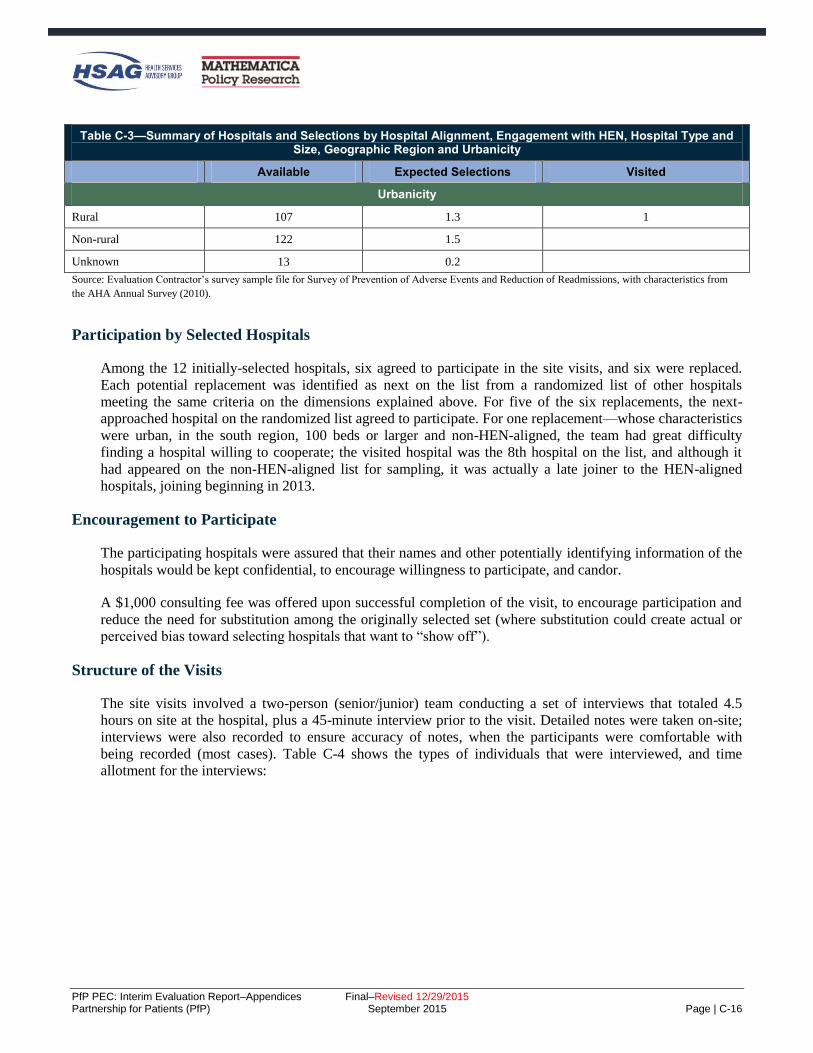
PfP PEC: Interim Evaluation Report–Appendices Final–Revised 12/29/2015 Partnership for Patients (PfP) September 2015 Page | C-16
Table C-3—Summary of Hospitals and Selections by Hospital Alignment, Engagement with HEN, Hospital Type and Size, Geographic Region and Urbanicity
Available Expected Selections Visited
Urbanicity
Rural 107 1.3 1
Non-rural 122 1.5
Unknown 13 0.2
Source: Evaluation Contractor’s survey sample file for Survey of Prevention of Adverse Events and Reduction of Readmissions, with characteristics from
the AHA Annual Survey (2010).
Participation by Selected Hospitals
Among the 12 initially-selected hospitals, six agreed to participate in the site visits, and six were replaced.
Each potential replacement was identified as next on the list from a randomized list of other hospitals
meeting the same criteria on the dimensions explained above. For five of the six replacements, the next-
approached hospital on the randomized list agreed to participate. For one replacement—whose characteristics
were urban, in the south region, 100 beds or larger and non-HEN-aligned, the team had great difficulty
finding a hospital willing to cooperate; the visited hospital was the 8th hospital on the list, and although it
had appeared on the non-HEN-aligned list for sampling, it was actually a late joiner to the HEN-aligned
hospitals, joining beginning in 2013.
Encouragement to Participate
The participating hospitals were assured that their names and other potentially identifying information of the
hospitals would be kept confidential, to encourage willingness to participate, and candor.
A $1,000 consulting fee was offered upon successful completion of the visit, to encourage participation and
reduce the need for substitution among the originally selected set (where substitution could create actual or
perceived bias toward selecting hospitals that want to “show off”).
Structure of the Visits
The site visits involved a two-person (senior/junior) team conducting a set of interviews that totaled 4.5
hours on site at the hospital, plus a 45-minute interview prior to the visit. Detailed notes were taken on-site;
interviews were also recorded to ensure accuracy of notes, when the participants were comfortable with
being recorded (most cases). Table C-4 shows the types of individuals that were interviewed, and time
allotment for the interviews:

PfP PEC: Interim Evaluation Report–Appendices Final–Revised 12/29/2015 Partnership for Patients (PfP) September 2015 Page | C-17
Table C-4—Interviews Scheduled and Time Allotments
Individual to be Interviewed Time Request Research Questions to be Addressed
(Numbers used are those above)
Chief executive officer (CEO) if possible, or other C-
suite representative 30 minutes All six, high level
Chief medical officer (CMO) 30 minutes All six, high level
Chief nursing officer (CNO) 30 minutes All six, high level
Patient safety officer(s)/Quality director(s)/key staff
responsible for leading patient safety improvement
(overall) and team leads for improvement efforts
conducted during 2011-2014
90 minutes All six, detail except for 5 (measurement), save
readmissions for readmission-specific interview
Front-line staff: nurse and aid working in a
department affected by changes 30 minutes
1 and 2 (changes in processes and infrastructure), in
detail, and a version of 3 and 4 (influencing and
supporting factors) specific to the story of changes
affecting them
Patient and family engagement lead 20 minutes 1-4, PFE focus (not measurement, not external
factors affecting outcomes)
Lead for care transitions work 45 minutes All six, detail except for 5 (measurement), specific
to readmissions
Quality/safety measurement staff 45 minutes (by phone, in
advance of the site visit)
5 (measurement), in detail, and 2 in terms of
infrastructure changes related to measurement and
use of data
Analysis
The analysis consisted of a qualitative synthesis across sites, focused on supplementing and complementing
the quantitative information available from other sources, integrated into report sections as appropriate.
Method for Analysis of Unintended Consequences
The primary data source for this analysis was the interviews conducted with 26 HENs and 24 AHA/HRET
SHAs in fall 2014, during which we asked participants about unintended consequences – both positive and
negative – that they thought hospitals participating in PfP may have experienced (“Have you seen any
“unintended consequences” from your work with the hospitals?”). Building on our extensive analyses of this
interview data set, we looked for corroborating evidence regarding the potential consequences raised by the
HENs and SHAs in other sections of the HEN/SHA interview notes as well as in data from other primary
collection efforts, specifically, interviews conducted in winter-spring 2015 with national organizations
(referred to as the non-federal partners interviews, interview method described above) and site visits to
eleven hospitals participating in PfP. While neither of these other data collection efforts asked explicitly
about unintended consequences, the subject was raised in some cases, providing additional insight into the
responses given by the HENs and SHAs.

PfP PEC: Interim Evaluation Report–Appendices Final–Revised 12/29/2015 Partnership for Patients (PfP) September 2015 Page | C-18
Survey of Participation in Patient Safety Activities
The Evaluation Contractor administered a national web-based survey of HEN-aligned hospitals to hospital
staff—the Survey of Participation in Activities to Improve Patient Safety—in order to gather information not
available through other sources regarding hospitals’ participation in different types of patient safety-related
activities sponsored by their HENs or the AHA/HRET HEN’s SHAs. Respondents were also asked whether
participation in patient safety-related activities resulted in changes within specific units, or hospital-wide.
The survey collected information about participation in the following activities:
Skills training
Value-added—networking with other hospitals
Virtual consultation or coaching
On-site visits
Feedback on patient safety performance data
Other education and resources
Survey Content
A copy of the Web survey is provided below, with the number of responses to each question annotated.
Given that, it was a Web survey, the presentation of the survey to respondents differed from that shown here.
SURVEY OF PARTICIPATION IN ACTIVITIES TO IMPROVE PATIENT SAFETY
NAME:
EMAIL: @ .com
HOSPITAL NAME:
HEN:
Your hospital name should replace the red box. This only occurs once in the survey.
The name of the HEN (or state hospital association if aligned with the AHA/HRET).

PfP PEC: Interim Evaluation Report–Appendices Final–Revised 12/29/2015 Partnership for Patients (PfP) September 2015 Page | C-19
QUESTION 1
Number of Responses for Question 1
N
CAUTI 1,311
CLABSI 941
SSI 783
VAP 499
VTE 713
Falls 1,179
Pressure Ulcers 856
Early Elective Delivery 654

PfP PEC: Interim Evaluation Report–Appendices Final–Revised 12/29/2015 Partnership for Patients (PfP) September 2015 Page | C-20
Number of Responses for Question 1
N
Other Obstetrical Events 370
Adverse Drug Events 882
Readmissions 1,235
Safety-Across-the-Board 798
Hospital did not participate 482
QUESTION 2
Number of Responses for Question 2
N
CAUTI 1,518
CLABSI 1,099
SSI 915
VAP 581
VTE 854
Falls 1,371
Pressure Ulcers 988
Early Elective Delivery 797
Other Obstetrical Events 460
Adverse Drug Events 966
Readmissions 1,492
Safety-Across-the-Board 928
Hospital did not participate 301

PfP PEC: Interim Evaluation Report–Appendices Final–Revised 12/29/2015 Partnership for Patients (PfP) September 2015 Page | C-21
QUESTION 3
Number of Responses for Question 3
N
CAUTI 1,344
CLABSI 943
SSI 826
VAP 565
VTE 815
Falls 1,234
Pressure Ulcers 893
Early Elective Delivery 680
Other Obstetrical Events 423
Adverse Drug Events 951
Readmissions 1,281
Safety-Across-the-Board 887
Hospital did not participate 484
QUESTION 4
Number of Responses for Question 4
N
CAUTI 1,044
CLABSI 747
SSI 693

PfP PEC: Interim Evaluation Report–Appendices Final–Revised 12/29/2015 Partnership for Patients (PfP) September 2015 Page | C-22
Number of Responses for Question 4
N
VAP 489
VTE 680
Falls 1,003
Pressure Ulcers 725
Early Elective Delivery 537
Other Obstetrical Events 334
Adverse Drug Events 737
Readmissions 1,071
Safety-Across-the-Board 869
Hospital did not participate 676
QUESTION 5
Number of Responses for Question 5
N
CAUTI 1,836
CLABSI 1,561
SSI 1,380
VAP 1,063
VTE 1,422
Falls 1,815
Pressure Ulcers 1,556
Early Elective Delivery 1,149
Other Obstetrical Events 673
Adverse Drug Events 1,367
Readmissions 1,781
Safety-Across-the-Board 952
Hospital did not participate 177

PfP PEC: Interim Evaluation Report–Appendices Final–Revised 12/29/2015 Partnership for Patients (PfP) September 2015 Page | C-23
QUESTION 6
Number of Responses for Question 6
N
CAUTI 1,387
CLABSI 1,063
SSI 958
VAP 724
VTE 996
Falls 1,369
Pressure Ulcers 1,076
Early Elective Delivery 813
Other Obstetrical Events 569
Adverse Drug Events 1,114
Readmissions 1,421
Safety-Across-the-Board 1,032
Hospital did not participate 451
QUESTION 7
Number of Responses for Question 7
N
CAUTI 1,420
CLABSI 912
SSI 721
VAP 424
VTE 815

PfP PEC: Interim Evaluation Report–Appendices Final–Revised 12/29/2015 Partnership for Patients (PfP) September 2015 Page | C-24
Number of Responses for Question 7
N
Falls 1,368
Pressure Ulcers 830
Early Elective Delivery 672
Other Obstetrical Events 304
Adverse Drug Events 853
Readmissions 1,341
Safety-Across-the-Board 755
QUESTION 8
Number of Responses for Question 8
N
CAUTI 1,151
CLABSI 726
SSI 564
VAP 432
VTE 579
Falls 1,101
Pressure Ulcers 649
Early Elective Delivery 807
Other Obstetrical Events 426
Adverse Drug Events 553
Readmissions 885
Safety-Across-the-Board 493

PfP PEC: Interim Evaluation Report–Appendices Final–Revised 12/29/2015 Partnership for Patients (PfP) September 2015 Page | C-25
QUESTION 9
Number of Responses for Question 9
N
CAUTI 572
CLABSI 502
SSI 554
VAP 341
VTE 569
Falls 711
Pressure Ulcers 524
Early Elective Delivery 379
Other Obstetrical Events 269
Adverse Drug Events 451
Readmissions 649
Safety-Across-the-Board 426
QUESTION 10
Number of Responses for Question 10
N
CAUTI 403
CLABSI 650
SSI 412
VAP 789
VTE 321
Falls 198
Pressure Ulcers 615
Early Elective Delivery 311
Other Obstetrical Events 231
Adverse Drug Events 289
Readmissions 160

PfP PEC: Interim Evaluation Report–Appendices Final–Revised 12/29/2015 Partnership for Patients (PfP) September 2015 Page | C-26
Number of Responses for Question 10
N
Safety-Across-the-Board 83
QUESTION 11
Sample and Survey Administration
HENs and AHA/HRET’s SHAs were asked to provide, for each participating hospital, the name, email
address, and phone number for the person who could answer questions about the hospital’s participation in
HEN-sponsored activities. The Evaluation Contractor received lists from 17 HENs and 26 AHA/HRET’s
SHAs, containing the names of 1,672 and 1,317 individuals, respectively. An additional 5 HENs and 1
AHA/HRET SHA opted to administer the survey anonymously to 400 individuals. The total sample across
all HENs and AHA/HRET’s SHAs included 3,389 individuals.
The Web survey was administered between January 2015 and March 2015. An invitation email was sent to
each sample member for whom contact information had been provided. Seven reminder emails were sent to
non-responders. During the last four weeks of data collection, reminder phone calls were made to non-
responders.
For those for whom contact information was lacking, the HENs and AHA/HRET’s SHAs sent an invitation
email on behalf of the Evaluation Contractor. Two reminder emails were sent to hospitals upon the
Evaluation Contractor’s request.
Response Rate
Among hospitals through which contact information was made available, the response rate was 75 percent.
Among the 400 hospitals that received the Web survey for participation anonymously, the response rate was
50 percent. The response rate across all hospitals was 72 percent. There was no significant difference
between HEN and AHA/HRET SHA hospitals with regard to response rate (71 percent and 72 percent,
respectively) (Table C-5).
Table C-5—Survey of Participation in Patient Safety Activities
Contact Information Total Number of
Surveys Sent Number of Responses
Response Rate
Hospitals with Contact Information 2,989 2,231 75.0%
Hospitals without Contact Information 400 201 50.0%
Total 3,389 2,432 72.0%
Source: Evaluation Contractor’s Survey Database.

PfP PEC: Interim Evaluation Report–Appendices Final–Revised 12/29/2015 Partnership for Patients (PfP) September 2015 Page | C-27
Analysis
The Evaluation Contractor used the survey data to conduct several statistical analyses regarding HEN
characteristics, hospital participation, and hospital operational changes in response to PfP. Prior to
descriptive and statistical analyses, the analytic file was cleaned to eliminate a small number of duplicates
and ensure only eligible hospitals remained, such that the final number of hospitals in the analytic file was
2,355.C-17 These analyses address the following research questions:
Does hospital participation in HEN activities vary based on HEN characteristics?
Are hospitals in certain types of HENs more likely to have made changes due to PfP than others?
Are hospitals that participated in certain types of HEN activities more likely to have made changes
due to PfP than others?
For these analyses, at the hospital level, adverse event areas were marked as not applicable, or treated as
missing data, for the following two reasons:
The hospital did not provide relevant healthcare services (e.g., obstetrics or central lines).
The hospital marked the AEA in response to the following survey question: “In what areas were
changes NOT needed because harm in the area was so low in your hospital already due to work prior
to 2012;” removing these areas from analysis helps to ensure that participation and indications of
making changes due to PfP are in areas where changes were still needed during the PfP campaign
time period.
Hospitals from HENs with less than 70 percent response rates were dropped, to ensure adequate
representation of HENs in the survey analysis of HEN characteristics.
To explore whether hospital participation varied based on characteristics of HENs and SHAs participating
through AHA/HRET, the Evaluation Contractor conducted a one-way ANOVA analysis of variance in HEN
characteristics (ownership, size, and rural composition) compared to the average number of HEN activities
hospitals participated in. HEN characteristics were defined as follows:
Ownership (system, state hospital association, and other): based on publicly available descriptions of
HENs and the Evaluation Contractor’s knowledge of the HENs.
Size (<50, 50-99, 100+): based on the November 2014 hospital list of eligible HEN participating
hospitals reported by each HEN and each SHA participating through AHA/HRET.
Rural composition (0-30 percent, more than 30 percent): based on the November 2014 hospital list of
eligible HEN participating hospitals reported by each HEN and each SHA participating through
AHA/HRET.
C-17 Ineligible hospitals are hospitals other than CAHs, acute care, and children’s hospitals, including long-term care and psychiatric
hospitals that were permitted to attend HEN activities, but were not included in evaluation analyses. The qualitative analysis of
hospitals’ open-ended comments was done prior to the data cleaning and was not re-considered after cleaning due to the likelihood of
little change and the time necessary to repeat this analysis.
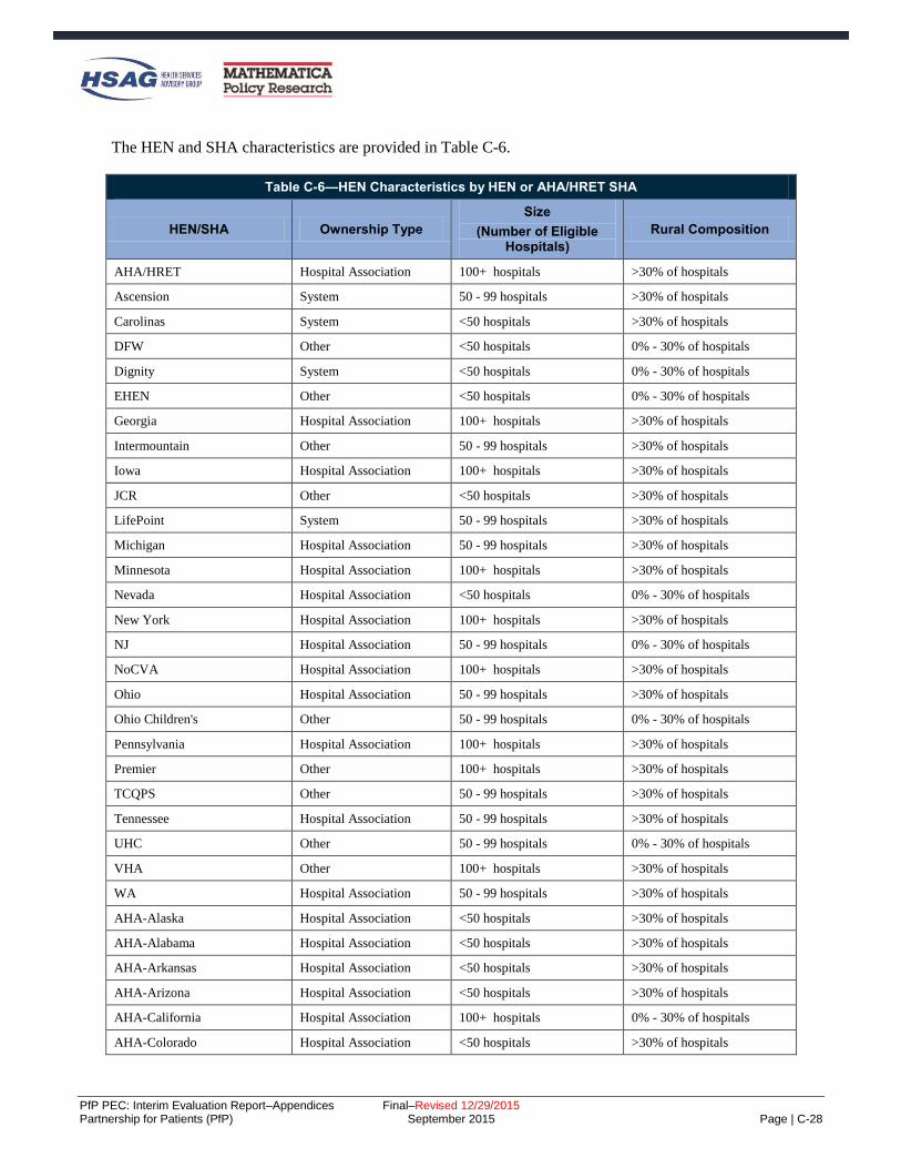
PfP PEC: Interim Evaluation Report–Appendices Final–Revised 12/29/2015 Partnership for Patients (PfP) September 2015 Page | C-28
The HEN and SHA characteristics are provided in Table C-6.
Table C-6—HEN Characteristics by HEN or AHA/HRET SHA
HEN/SHA Ownership Type
Size
(Number of Eligible Hospitals)
Rural Composition
AHA/HRET Hospital Association 100+ hospitals >30% of hospitals
Ascension System 50 - 99 hospitals >30% of hospitals
Carolinas System <50 hospitals >30% of hospitals
DFW Other <50 hospitals 0% - 30% of hospitals
Dignity System <50 hospitals 0% - 30% of hospitals
EHEN Other <50 hospitals 0% - 30% of hospitals
Georgia Hospital Association 100+ hospitals >30% of hospitals
Intermountain Other 50 - 99 hospitals >30% of hospitals
Iowa Hospital Association 100+ hospitals >30% of hospitals
JCR Other <50 hospitals >30% of hospitals
LifePoint System 50 - 99 hospitals >30% of hospitals
Michigan Hospital Association 50 - 99 hospitals >30% of hospitals
Minnesota Hospital Association 100+ hospitals >30% of hospitals
Nevada Hospital Association <50 hospitals 0% - 30% of hospitals
New York Hospital Association 100+ hospitals >30% of hospitals
NJ Hospital Association 50 - 99 hospitals 0% - 30% of hospitals
NoCVA Hospital Association 100+ hospitals >30% of hospitals
Ohio Hospital Association 50 - 99 hospitals >30% of hospitals
Ohio Children's Other 50 - 99 hospitals 0% - 30% of hospitals
Pennsylvania Hospital Association 100+ hospitals >30% of hospitals
Premier Other 100+ hospitals >30% of hospitals
TCQPS Other 50 - 99 hospitals >30% of hospitals
Tennessee Hospital Association 50 - 99 hospitals >30% of hospitals
UHC Other 50 - 99 hospitals 0% - 30% of hospitals
VHA Other 100+ hospitals >30% of hospitals
WA Hospital Association 50 - 99 hospitals >30% of hospitals
AHA-Alaska Hospital Association <50 hospitals >30% of hospitals
AHA-Alabama Hospital Association <50 hospitals >30% of hospitals
AHA-Arkansas Hospital Association <50 hospitals >30% of hospitals
AHA-Arizona Hospital Association <50 hospitals >30% of hospitals
AHA-California Hospital Association 100+ hospitals 0% - 30% of hospitals
AHA-Colorado Hospital Association <50 hospitals >30% of hospitals

PfP PEC: Interim Evaluation Report–Appendices Final–Revised 12/29/2015 Partnership for Patients (PfP) September 2015 Page | C-29
Table C-6—HEN Characteristics by HEN or AHA/HRET SHA
HEN/SHA Ownership Type
Size
(Number of Eligible Hospitals)
Rural Composition
AHA-Connecticut Hospital Association <50 hospitals 0% - 30% of hospitals
AHA-District of Columbia Hospital Association <50 hospitals 0% - 30% of hospitals
AHA-Florida Hospital Association 50 - 99 hospitals 0% - 30% of hospitals
AHA-Idaho Hospital Association <50 hospitals >30% of hospitals
AHA-Illinois Hospital Association 50 - 99 hospitals >30% of hospitals
AHA-Indiana Hospital Association 50 - 99 hospitals >30% of hospitals
AHA-Kansas Hospital Association 100+ hospitals >30% of hospitals
AHA-Kentucky Hospital Association 50 - 99 hospitals >30% of hospitals
AHA-Louisiana Hospital Association 50 - 99 hospitals >30% of hospitals
AHA-Massachusetts Hospital Association <50 hospitals 0% - 30% of hospitals
AHA-Missouri Hospital Association 50 - 99 hospitals >30% of hospitals
AHA-Mississippi Hospital Association <50 hospitals >30% of hospitals
AHA-Montana Hospital Association <50 hospitals >30% of hospitals
AHA-North Dakota Hospital Association <50 hospitals >30% of hospitals
AHA-Nebraska Hospital Association <50 hospitals >30% of hospitals
AHA-New Hampshire Hospital Association <50 hospitals >30% of hospitals
AHA-New Mexico Hospital Association <50 hospitals >30% of hospitals
AHA-Oklahoma Hospital Association <50 hospitals >30% of hospitals
AHA-Oregon Hospital Association <50 hospitals >30% of hospitals
AHA-Puerto Rico Hospital Association 50 - 99 hospitals 0% - 30% of hospitals
AHA-Rhode Island Hospital Association <50 hospitals 0% - 30% of hospitals
AHA-South Dakota Hospital Association <50 hospitals >30% of hospitals
AHA-Wisconsin Hospital Association 50 - 99 hospitals >30% of hospitals
AHA-West Virginia Hospital Association <50 hospitals >30% of hospitals
AHA-Wyoming Hospital Association <50 hospitals >30% of hospitals
Source: HEN monthly reports submitted to CMS, November, 2014.
To investigate any associations between HEN characteristics and hospitals’ indications that they made
changes due to PfP (either hospital wide or unit-specific), the Evaluation Contractor conducted a simple
logistical regression. The independent variable was each HEN characteristic outlined above, analyzed
separately, and the dependent variable was defined as “hospitals made changes due to PfP overall,” where
hospital made changes in at least three adverse event areas. Three areas were required, because descriptive
statistics pointed to this threshold as capturing the majority of hospital respondents (68 and 60 percent of
hospital respondents made changes in at least three adverse event areas in one unit or hospital wide,
respectively).

PfP PEC: Interim Evaluation Report–Appendices Final–Revised 12/29/2015 Partnership for Patients (PfP) September 2015 Page | C-30
To explore whether there was variation in hospitals’ operational response to PfP due to participation in
certain HEN activities, the Evaluation Contractor conducted a simple logistical regression. For all applicable
adverse event areas at the hospital level, the independent variable was defined as hospital participation in
each of six HEN activities in each adverse event area, and the dependent variable was defined as hospitals’
indication of making changes (hospital wide or unit specific) due to PfP in the same area, resulting in 11 sets
of results. The reference group for each comparison was hospitals that did not receive the HEN activity either
because the HEN did not offer the activity or because the HEN offered the activity but the hospital did not
participate in it.
Hospital Survey on the Prevention of Adverse Events and Reduction of Readmissions
The Evaluation Contractor administered a national web-based survey to hospital staff—the Hospital Survey
on the Prevention of Adverse Events and Reduction of Readmissions—in order to gather information not
available through other sources on hospitals’ efforts and capacity to track and improve outcomes focused on
by PfP. The survey collected information on the following:
Hospital participation in PfP
Improvement efforts
Influences, beyond PfP, on hospitals’ efforts to reduce or prevent adverse events
Care transitions
Sufficiency of resources and knowledge to reduce or prevent adverse events
Hospital culture and patient care practices related to specific adverse events
The first round of the survey was administered in spring 2012 and the second round in spring 2014.C-18 For
round 1, a random sample of 2,570 hospitals from a pool of 5,078 acute care hospitals—including critical
access and children’s hospitals—was identified using the 2009 AHA survey database.C-19 Most specialty
facilities, including long-term care, rehabilitation, and psychiatric hospitals, were excluded. After drawing
the sample, an additional 118 hospitals were determined to be ineligible because they had closed, were
Veteran Affairs hospitals, or were military hospitals, leaving 2,452 in the survey sample. Among the 2,452
sample members invited to participate, 1,719 completed it, yielding a response rate of 70 percent. For round
2, all 1,719 respondents to round 1 were asked to complete the survey. During data collection, 13 hospitals
were identified as having closed or merged since 2012. These hospitals were excluded from the sample
resulting in a final eligible round 2 sample of 1,706. A total of 1,136 of the 1,706 eligible hospitals
completed the survey, yielding a response rate of 67 percent. Overall, 1,136 individuals among 2,439 eligible
cases completed both rounds of the survey, yielding a combined round 1-round 2 response rate of 47 percent.
Sampling weights and non-response adjustment weights were used in the survey analysis as follows:
Sampling Weights: The survey sample was drawn using a stratified random sampling design. The sample
frame file contained a total of 5,078 hospitals. The strata were defined by hospital type, children’s hospitals
and non-children’s hospitals. There were 88 children’s hospitals and 4,990 non-children’s hospitals. The
Evaluation Contractor selected all 88 children’s hospitals and 2,482 non-children’s hospitals for a total of
C-18 The survey was fielded by Mathematica Policy Research, subcontractor to Health Services Advisory Group, which together comprise
the PfP Evaluation Contractor. C-19 Although the analyses use 2010 AHA data, the sample frame was created using the 2009 data because the 2010 data had not become
available to the evaluation contractor by the time of the creation of the frame.

PfP PEC: Interim Evaluation Report–Appendices Final–Revised 12/29/2015 Partnership for Patients (PfP) September 2015 Page | C-31
2,570 hospitals. The probability of selection is equal for all hospitals within each stratum. Therefore, the
sampling weights for the selected hospitals were calculated as follows.
If hospital h is a children’s hospital, Wh = 1
If hospital h is a non-children’s hospital, Wh = 4,990/2,482 = 2.0105
Non-Response Adjustment: Sampling weights were adjusted for HEN-aligned and non-HEN-aligned
hospitals (separately) to obtain non-response adjusted weights. The purpose of this adjustment was to reduce
the bias that would result if analyses incorporated no weights or only the sampling weights. After adjusting
the sample weights for non-response, a non-response bias analysis was performed to compare the estimates
before and after non-response adjustment (Table C-7 through Table C-9). Consistent with the goal, non-
response bias was greatly reduced after the Evaluation Contractor did the non-response adjustment. For the
full sample, when comparing sample frame variables using only the sampling weights, 7 out of the 19
comparisons were significant, indicating potentially severe bias. When using the non-response adjusted
weights, only one out of the 19 comparisons was significant.
Table C-7—Non-Response Bias Analysis for Hospital Survey on the Prevention of Adverse Events and Reduction of Readmissions: Overall
Before Adjustments to the Weight (Sampling Weighta)
After Adjustments to the Weight (Non-Response Adjusted Weightb)
Full Sample Respondent
Non-Respondent Estimated
Biasc Relative
Biasd
Respondent Sample Mean
Estimated Biase
Relative Biasd Data Item
(Unit) N Mean N Mean N Mean
Bed Size/Type
CAH 650 26.98 337 30.11 313 24.28 3.12* 11.56 27.55 0.56 2.08
<100 Beds,
Non-CAH 627 25.28 281 24.56 346 25.90 -0.72 -2.83 25.37 0.09 0.37
100-199 Beds,
Non-CAH 478 19.45 198 17.37 280 21.25 -2.07* -10.67 18.67 -0.78 -4.00
200-399 Beds,
Non-CAH 459 18.53 222 19.34 237 17.84 0.80 4.34 19.31 0.77 4.18
400+ Beds,
Non-CAH 238 9.76 98 8.62 140 10.74 -1.14 -11.64 9.11 -0.65 -6.67
Ownership Type
Government 543 22.52 267 23.85 276 21.37 1.33 5.91 23.33 0.81 3.58
Non-Profit 1,448 58.42 708 61.86 740 55.44 3.43* 5.87 58.16 -0.26 -0.45
For-Profit 447 18.47 154 13.67 293 22.65 -4.81* -26.02 17.75 -0.73 -3.94
Missing 14 0.58 7 0.63 7 0.54 0.04 7.59 0.77 0.18 31.72
Region
East 281 11.48 138 12.10 143 10.93 0.63 5.45 11.12 -0.36 -3.13
West 566 23.14 281 24.79 285 21.71 1.65 7.11 23.24 0.09 0.41
Midwest 1,114 45.41 520 45.73 594 45.13 0.32 0.71 47.14 1.73* 3.81
South 491 19.97 197 17.37 294 22.22 -2.59* -12.98 18.50 -1.47 -7.35

PfP PEC: Interim Evaluation Report–Appendices Final–Revised 12/29/2015 Partnership for Patients (PfP) September 2015 Page | C-32
Table C-7—Non-Response Bias Analysis for Hospital Survey on the Prevention of Adverse Events and Reduction of Readmissions: Overall
Before Adjustments to the Weight (Sampling Weighta)
After Adjustments to the Weight (Non-Response Adjusted Weightb)
Full Sample Respondent
Non-Respondent Estimated
Biasc Relative
Biasd
Respondent Sample Mean
Estimated Biase
Relative Biasd Data Item
(Unit) N Mean N Mean N Mean
System Member
Yes 1,331 54.40 582 51.32 749 57.08 -3.08* -5.67 55.11 0.71 1.31
No 1,121 45.60 554 48.68 567 42.92 3.08* 6.76 44.89 -0.71 -1.56
Children's Hospital
Yes 86 1.78 33 1.47 53 2.04 -0.31 -17.43 1.78 0.00 0.00
No 2,366 98.22 1,103 98.53 1,263 97.96 0.31 0.32 98.22 0.00 0.00
Teaching Hospital
Yes 599 23.47 271 23.09 328 23.80 -0.38 -1.63 23.27 -0.20 -0.84
No 1,853 76.53 865 76.91 988 76.20 0.38 0.50 76.73 0.20 0.26
Alignment Status
Aligned
Hospitals 1,738 71.32 894 79.01 844 64.64 7.69* 10.79 71.32 0.00 0.00
Non-Aligned
Hospitals 714 28.68 242 20.99 472 35.36 -7.69* -26.82 28.68 0.00 0.00
Source: Evaluation Contractor’s analysis of response data from the Hospital Survey on the Prevention of Adverse Events and Reduction of Readmissions and hospital
characteristics from the AHA Annual Survey of Hospitals, 2010.
Note: aEstimates were calculated with the sampling weights. bEstimates were calculated with respondent sample using non-response adjusted weights. cEstimated bias is calculated as the weighted non-response rate times the difference in the weighted respondent and non-respondent means. A value marked with an
asterisk (*) identifies a bias that is significantly different from zero with statistical significance ≤ 0.05. Bias estimates without an asterisk are labeled as negligible. dThe relative bias is calculated as the estimated bias divided by the (before adjustments) overall mean. eEstimated bias is calculated as the difference in the weighted overall mean before adjustment and the respondent sample mean calculated using the non-response
adjusted weight. A value marked with an asterisk (*) identifies a bias that is significantly different from zero with statistical significance ≤ 0.05. Bias estimates without
an asterisk are labeled as negligible.

PfP PEC: Interim Evaluation Report–Appendices Final–Revised 12/29/2015 Partnership for Patients (PfP) September 2015 Page | C-33
Table C-8—Non-Response Bias Analysis for Hospital Survey on the Prevention of Adverse Events and Reduction of Readmissions: HEN-Aligned Hospitals
Before Adjustments to the Weight (Sampling Weighta)
After Adjustments to the Weight (Non-Response Adjusted Weightb)
Full Sample Respondent
Non-Respondent Estimated
Biasc Relative
Biasd
Respondent Sample Mean
Estimated Biase
Relative Biasd Data Item
(Unit) N Mean N Mean N Mean
Bed Size/Type
CAH 448 26.08 267 30.19 181 21.72 4.11* 15.76 26.91 0.84 3.21
<100 Beds,
Non-CAH 358 20.58 198 22.05 160 19.02 1.47 7.14 20.87 0.30 1.44
100-199 Beds,
Non-CAH 355 20.40 157 17.58 198 23.39 -2.82* -13.83 19.44 -0.97 -4.73
200-399 Beds,
Non-CAH 370 21.04 187 20.69 183 21.41 -0.35 -1.67 22.03 0.99 4.68
400+ Beds,
Non-CAH 207 11.90 85 9.50 122 14.46 -2.41* -20.22 10.75 -1.15 -9.68
Ownership Type
Government 368 21.42 213 24.08 155 18.60 2.66* 12.42 22.39 0.97 4.53
Non-Profit 1,160 66.38 594 66.14 566 66.64 -0.25 -0.37 66.25 -0.13 -0.20
For-Profit 210 12.2 87 9.78 123 14.76 -2.42* -19.8 11.36 -0.84 -6.88
Missing 0 0 0 0 0 0 0 0 0 0 0
Region
East 223 12.86 116 13.06 107 12.66 0.19 1.51 12.75 -0.11 -0.88
West 433 24.94 236 26.46 197 23.34 1.51 6.07 24.66 -0.28 -1.14
Midwest 706 40.63 378 42.17 328 38.99 1.54 3.79 41.94 1.31 3.22
South 376 21.57 164 18.32 212 25.01 -3.25* -15.07 20.65 -0.91 -4.23
System Member
Yes 992 57.22 462 51.72 530 63.05 -5.49* -9.60 57.25 0.03 0.05
No 746 42.78 432 48.28 314 36.95 5.49* 12.84 42.75 -0.03 -0.06
Children's Hospital
Yes 40 1.16 19 1.07 21 1.25 -0.09 -7.74 1.16 0.00 0.00
No 1,698 98.84 875 98.93 823 98.75 0.09 0.09 98.84 0.00 0.00

PfP PEC: Interim Evaluation Report–Appendices Final–Revised 12/29/2015 Partnership for Patients (PfP) September 2015 Page | C-34
Table C-8—Non-Response Bias Analysis for Hospital Survey on the Prevention of Adverse Events and Reduction of Readmissions: HEN-Aligned Hospitals
Before Adjustments to the Weight (Sampling Weighta)
After Adjustments to the Weight (Non-Response Adjusted Weightb)
Full Sample Respondent
Non-Respondent Estimated
Biasc Relative
Biasd
Respondent Sample Mean
Estimated Biase
Relative Biasd Data Item
(Unit) N Mean N Mean N Mean
Teaching Hospital
Yes 475 26.63 228 24.87 247 28.49 -1.76 -6.60 26.59 -0.04 -0.13
No 1,263 73.37 666 75.13 597 71.51 1.76 2.39 73.41 0.04 0.05
Source: Evaluation Contractor’s analysis of response data from the Hospital Survey on the Prevention of Adverse Events and Reduction of Readmissions and hospital
characteristics from the AHA Annual Survey of Hospitals, 2010.
Note: aEstimates were calculated with the sampling weights. bEstimates were calculated with respondent sample using non-response adjusted weights. cEstimated bias is calculated as the weighted non-response rate times the difference in the weighted respondent and non-respondent means. A value marked with an
asterisk (*) identifies a bias that is significantly different from zero with statistical significance ≤ 0.05. Bias estimates without an asterisk are labeled as negligible. dThe relative bias is calculated as the estimated bias divided by the (before adjustments) overall mean. eEstimated bias is calculated as the difference in the weighted overall mean before adjustment and the respondent sample mean calculated using the non-response
adjusted weight. A value marked with an asterisk (*) identifies a bias that is significantly different from zero with statistical significance ≤ 0.05. Bias estimates without
an asterisk are labeled as negligible.
Table C-9—Non-Response Bias Analysis for Hospital Survey on the Prevention of Adverse Events and Reduction of Readmissions: Non-HEN-Aligned Hospitals
Before Adjustments to the Weight (Sampling Weighta)
After Adjustments to the Weight (Non-Response Adjusted Weightb)
Full Sample Respondent
Non-Respondent Estimated
Biasc Relative
Biasd
Respondent Sample Mean
Estimated Biase
Relative Biasd Data Item
(Unit) N Mean N Mean N Mean
Bed Size/Type
CAH 202 29.24 70 29.79 132 28.95 0.55 1.89 29.12 -0.12 -0.42
<100 Beds,
Non-CAH 269 36.97 83 34.04 186 38.48 -2.93 -7.93 36.56 -0.42 -1.13
100-199 Beds,
Non-CAH 123 17.08 41 16.59 82 17.32 -0.48 -2.82 16.77 -0.31 -1.82
200-399 Beds,
Non-CAH 89 12.30 35 14.25 54 11.29 1.95 15.89 12.55 0.25 2.03
400+ Beds,
Non-CAH 31 4.41 13 5.32 18 3.95 0.90 20.49 5.01 0.60 13.58
Ownership Type
Government 175 25.26 54 22.98 121 26.43 -2.27 -9.01 25.66 0.40 1.58
Non-Profit 288 38.63 114 45.74 174 34.97 7.11* 18.40 38.04 -0.59 -1.53
For-Profit 237 34.09 67 28.3 170 37.07 -5.78* -16.97 33.63 -0.45 -1.32
Missing 14 2.03 7 2.98 7 1.54 0.95 47.02 2.67 0.64 31.72

PfP PEC: Interim Evaluation Report–Appendices Final–Revised 12/29/2015 Partnership for Patients (PfP) September 2015 Page | C-35
Table C-9—Non-Response Bias Analysis for Hospital Survey on the Prevention of Adverse Events and Reduction of Readmissions: Non-HEN-Aligned Hospitals
Before Adjustments to the Weight (Sampling Weighta)
After Adjustments to the Weight (Non-Response Adjusted Weightb)
Full Sample Respondent
Non-Respondent Estimated
Biasc Relative
Biasd
Respondent Sample Mean
Estimated Biase
Relative Biasd Data Item
(Unit) N Mean N Mean N Mean
Region
East 58 8.03 22 8.51 36 7.79 0.48 5.93 7.06 -0.97 -12.06
West 133 18.67 45 18.51 88 18.75 -0.16 -0.85 19.70 1.03 5.54
Midwest 408 57.31 142 59.15 266 56.36 1.84 3.21 60.09 2.78 4.85
South 115 15.99 33 13.83 82 17.10 -2.16 -13.51 13.15 -2.85 -17.79
System Member
Yes 339 47.39 120 49.79 219 46.16 2.39 5.05 49.81 2.41 5.10
No 375 52.61 122 50.21 253 53.84 -2.39 -4.55 50.19 -2.41 -4.59
Children's Hospital
Yes 46 3.31 14 2.96 32 3.49 -0.35 -10.51 3.31 0.00 0.00
No 668 96.69 228 97.04 440 96.51 0.35 0.36 96.69 0.00 0.00
Teaching Hospital
Yes 124 15.62 43 16.38 81 15.23 0.76 4.84 15.02 -0.60 -3.82
No 590 84.38 199 83.62 391 84.77 -0.76 -0.90 84.98 0.60 0.71
Source: Evaluation Contractor’s analysis of response data from the Hospital Survey on the Prevention of Adverse Events and Reduction of Readmissions and hospital
characteristics from the AHA Annual Survey of Hospitals, 2010.
Note: aEstimates were calculated with the sampling weights. bEstimates were calculated with respondent sample using non-response adjusted weights. cEstimated bias is calculated as the weighted non-response rate times the difference in the weighted respondent and non-respondent means. A value marked with an
asterisk (*) identifies a bias that is significantly different from zero with statistical significance ≤ 0.05. Bias estimates without an asterisk are labeled as negligible. dThe relative bias is calculated as the estimated bias divided by the (before adjustments) overall mean. eEstimated bias is calculated as the difference in the weighted overall mean before adjustment and the respondent sample mean calculated using the non-response
adjusted weight. A value marked with an asterisk (*) identifies a bias that is significantly different from zero with statistical significance ≤ 0.05. Bias estimates without
an asterisk are labeled as negligible.
The survey instrument, with annotations, is included below.
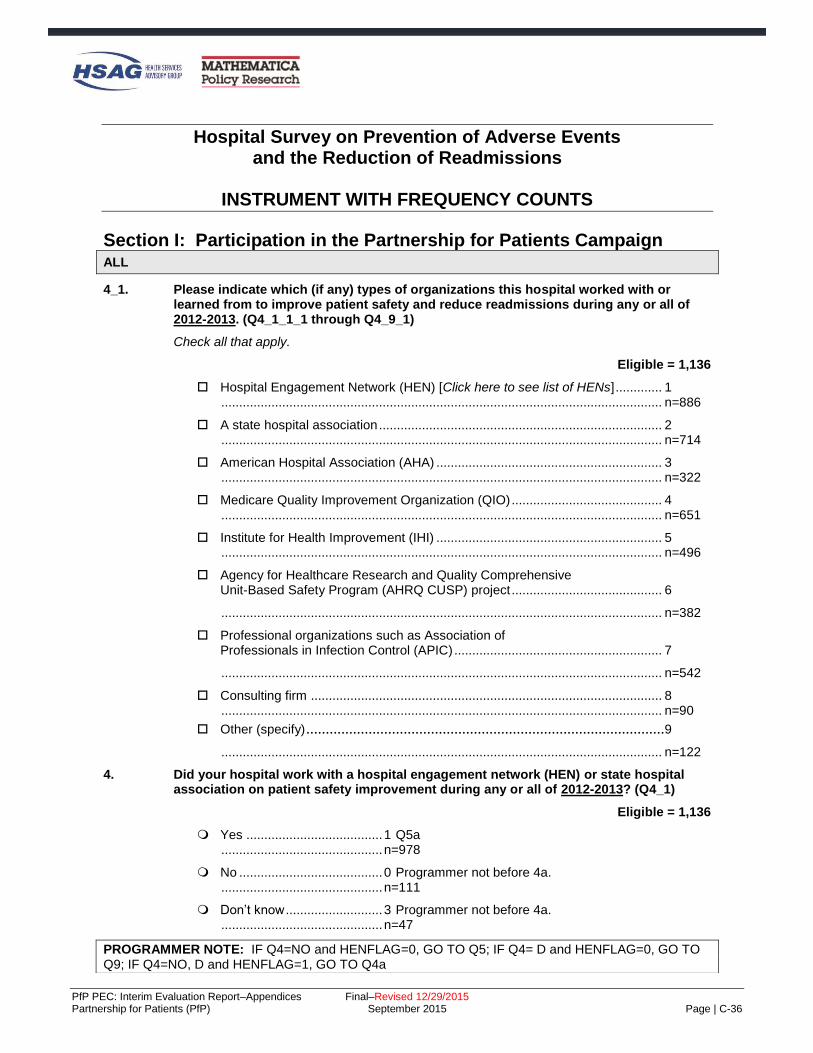
PfP PEC: Interim Evaluation Report–Appendices Final–Revised 12/29/2015 Partnership for Patients (PfP) September 2015 Page | C-36
Hospital Survey on Prevention of Adverse Events and the Reduction of Readmissions
INSTRUMENT WITH FREQUENCY COUNTS
Section I: Participation in the Partnership for Patients Campaign ALL
4_1. Please indicate which (if any) types of organizations this hospital worked with or learned from to improve patient safety and reduce readmissions during any or all of 2012-2013. (Q4_1_1_1 through Q4_9_1)
Check all that apply.
Eligible = 1,136
Hospital Engagement Network (HEN) [Click here to see list of HENs] ............. 1 ........................................................................................................................... n=886
A state hospital association ............................................................................... 2 ........................................................................................................................... n=714
American Hospital Association (AHA) ............................................................... 3 ........................................................................................................................... n=322
Medicare Quality Improvement Organization (QIO) .......................................... 4 ........................................................................................................................... n=651
Institute for Health Improvement (IHI) ............................................................... 5 ........................................................................................................................... n=496
Agency for Healthcare Research and Quality Comprehensive Unit-Based Safety Program (AHRQ CUSP) project .......................................... 6
........................................................................................................................... n=382
Professional organizations such as Association of Professionals in Infection Control (APIC) .......................................................... 7
........................................................................................................................... n=542
Consulting firm .................................................................................................. 8 ........................................................................................................................... n=90
Other (specify) ............................................................................................9
........................................................................................................................... n=122
4. Did your hospital work with a hospital engagement network (HEN) or state hospital association on patient safety improvement during any or all of 2012-2013? (Q4_1)
Eligible = 1,136
Yes ...................................... 1 Q5a ............................................. n=978
No ........................................ 0 Programmer not before 4a. ............................................. n=111
Don’t know ........................... 3 Programmer not before 4a. ............................................. n=47
PROGRAMMER NOTE: IF Q4=NO and HENFLAG=0, GO TO Q5; IF Q4= D and HENFLAG=0, GO TO Q9; IF Q4=NO, D and HENFLAG=1, GO TO Q4a

PfP PEC: Interim Evaluation Report–Appendices Final–Revised 12/29/2015 Partnership for Patients (PfP) September 2015 Page | C-37
4a. Our records indicate that this hospital was on the roster as working with [HEN name or AHA/HRET/state hosp association name] as of June 2012. Please help us reconcile your answer with our records, if possible, by indicating if any of these are true: (Q4a_1)
ELIGIBLE = 9
This hospital stopped participating with [HEN name or state hospital association name] ...................................................... 1 Q4b n=0
This hospital never participated in patient safety activities with [HEN name or state hospital association name], and you believe you would know if they did .............................................................................................. 2 Q5 n=1
“No” was your best guess, but you are not really sure. ..................... 3 Q4c n=8
Q4b. What month and year did this hospital stop participating with [HEN name or AHA/HRET/state hosp association name]? (q4b_1_1, q4b_year_1)
ELIGIBLE = 0
Month: Jan thru Dec Year: 2014, 2013, 2012, 2011, Not sure
Q4c. Is there someone else who may be able to complete the survey? This would be someone
who is aware of patient safety activities the hospital participated in with [HEN name or AHA/HRET/state hosp association name] (Q4c_1)
ELIGIBLE = 8
Yes .......................................................................... 1 Q4c_contact n=0
No ............................................................................ 0 Q5a n=5
Don’t know ............................................................... 3 Q5a n=3
(Q4=0 & HENFLAG=0) OR Q4A=2 OR Q4C=0, 3
5. Why did this hospital not work with a hospital engagement network (HEN) or state hospital
association as part of Partnership for Patients during 2012-2013? (Q5_1)
ELIGIBLE = 105
No such opportunity presented............................................... 1 Q9 n=32
Seemed redundant with other efforts we are involved in ....... 2 Q9 n=27
No resources to participate in another effort .......................... 3 Q9 n=29
Other (specify) ........................................................................ 4 Q9 n=5
High-level decision ................................................................. 5 Q9 n=4
Piggyback ............................................................................... 6 Q9 n=2
No need .................................................................................. 7 Q9 n=6
Q4=1 or Q4a

PfP PEC: Interim Evaluation Report–Appendices Final–Revised 12/29/2015 Partnership for Patients (PfP) September 2015 Page | C-38
5a. What hospital engagement network (HEN) and/or state hospital association did this hospital work with in any or all of 2012-2013? (Q5a_1)
PROGRAMMER NOTE: Fill hospital association name based on sample data. Eligible = 978
1 American Hospital Association (AHA/HRET/HOSP ASSOC NAME) 397
2 Ascension Health 23
3 Carolinas Health Care System 10
5 Catholic Healthcare West 11
4 Dallas-Fort Worth Hospital Council Foundation 3
14 Essential Hospitals Engagement Network (EHEN), formerly National Public Health and Hospital Institute (NPHHI)
7
6 Georgia Hospital Association Research and Education Foundation 27
7 Hospital Association of Pennsylvania 27
8 Intermountain Healthcare 18
9 Iowa Healthcare Collaborative 36
10 Joint Commission Resources 19
11 LifePoint Hospitals 14
12 Michigan Health & Hospital Association (MHA) 24
13 Minnesota Hospital Association 27
15 Nevada Hospital Association 7
16 New Jersey Hospital Association/ Health Research and Educational Trust of NJ 13
17 North Carolina Virginia Regional HEC (NoCVA) 18
18 New York State PfP (HANYS and GNYHA) 41
19 Ohio Children's Hospitals' Solutions for Patient Safety (OCHSPS) 19
20 Ohio Hospital Association (OHA) 17
21 Premier Healthcare Alliance 75
22 Tennessee Hospital Association 12
23 Texas Hospital Association Foundation/ Texas Center for Quality & Patient Safety 27
24 University HealthSystem Consortium (UHC) 17
25 VHA Inc 38
26 Washington State Hospital Association 22
27 Some other HEN or state hospital association (specify) 17
28 State Hospital Association not affiliated with HEN 9
29 Indian Health Service 3
Q4 = 1 OR Q4A=1

PfP PEC: Interim Evaluation Report–Appendices Final–Revised 12/29/2015 Partnership for Patients (PfP) September 2015 Page | C-39
6. Which of the following types of assistance did this hospital receive from [HEN name or AHA/HRET/state hosp association name] in 2012-2013? (Q6_1_1 through Q6_7_1)
Check all that apply.
ELIGIBLE = 978
1 Someone from this hospital attended in-person or virtual collaborative meetings of hospitals to share progress and lessons learned on patient safety topics .............................................................................................................. n=835
2 Received information about effective measurement approaches, tools, or processes to prevent harms ....................................... n=875
3 Worked with a [HEN name or AHA/HRET/state hosp association name] improvement advisor to plan improvements in patient safety ............................................................... n=608
4 Because of a connection made through someone from the [HEN name or AHA/HRET/state hosp association name], this hospital shared information on patient safety processes or measurement with another hospital that needed this. .................................................................. n=544
5 Because of a connection made through someone from the [HEN name or AHA/HRET/state hosp association name], this hospital, received information on patient safety processes or measurement from another hospital. ............................................................. n=634
6 Received feedback on patient safety performance data for this hospital ...................................................................................... n=736
7 Other (specify) ............................................................................................... n=9
8 Skills training .................................................................................................. n=3
9 Received information ...................................................................................... n=10
10 Access to resources ....................................................................................... n=3
Q4 = 1 OR Q4A=1

PfP PEC: Interim Evaluation Report–Appendices Final–Revised 12/29/2015 Partnership for Patients (PfP) September 2015 Page | C-40
6a. In each of the following areas, please mark the response that best describes your hospital’s level of engagement in patient safety activities sponsored or led by [HEN name or AHA/HRET/state hosp association name] in 2012-2013. (Q6a_1 through Q6a_12)
ELIGIBLE = 978
Missing
Fully Engaged
Moderately Engaged
Minimally Engaged
Not at all Engaged
1. Adverse drug events 50 401 217 204 106
2. Catheter-associated urinary tract infections (CAUTI)
28 645 167 96 42
3. Central line-associated blood stream infections (CLABSI)
42 571 160 91 114
4. Injuries from falls and immobility
34 621 178 105 40
5. Early elective deliveries 85 424 104 63 302
6. Other obstetrical (OB) adverse
events 99 270 155 109 345
7. Pressure ulcers 46 488 188 166 90
8. Surgical site infections 46 557 148 99 128
9. Venous thromboembolism (VTE)
52 476 199 146 105
10. Ventilator-associated events 70 391 146 118 253
11. All cause harm 77 414 204 142 141
12. Readmissions 30 598 210 102 38
Any item at 6a in (2, 3 4)
6b. Which best describes the reason(s) why this hospital was not fully engaged in the patient safety work with [HEN name or AHA/HRET/state hosp association name]? (Q6b_1_1 through Q6_9_1)
Check all that apply.
ELIGIBLE=791
The hospital did not need the support of HEN name or AHA/HRET/state hosp association name] ................................................. 1 n=118
The areas are not applicable to this hospital ................................................ 2 n=326
The areas do not need improvement because the hospital sustains zero rates of harm in these areas ...................................... 3 n=129
We had all the improvement support needed within this hospital or health system ......................................................................... 4 n=182
We preferred to work with another organization outside the hospital ........................................................................................ 5 n=41
Management decision .................................................................................... 6 n=78
Sub-optimal quality of resources or programming by [HEN name or AHA/HRET/state hosp association name] .......................................................................................... 7 n=21
Inconvenient scheduling of learning events by [HEN name or AHA/HRET/state hosp association name] ....................................... 8 n=48
Other (specify)................................................................................................ 9 n=44

PfP PEC: Interim Evaluation Report–Appendices Final–Revised 12/29/2015 Partnership for Patients (PfP) September 2015 Page | C-41
Programmer note: If Q6b=3 and more than one item is Q6 is marked as low engagement or not at all engaged, then Q6b_other_1. Else, programmer note after Q6b_other_1.
Q6B=3
6b_other_1. In which area(s) did this hospital sustain zero rates of harm?
(Q6b_1_1_1 through Q6b_1_11_1)
Check all that apply. ELIGIBLE = 124
Adverse drug events ............................................................... 1 n=14
Catheter-associated urinary tract infections (CAUTI) ............. 2 n=35
Central line-associated blood stream infections (CLABSI) ..... 3 n=65
Injuries from falls and immobility ............................................. 4 n=11 Early elective deliveries .......................................................... 5 n=31
Other obstetrical (OB) adverse events ................................... 6 n=27 Pressure ulcers ....................................................................... 7 n=56 Surgical site infections ............................................................ 8 n=24 Venous thromboembolism (VTE) ............................................ 9 n=23
Ventilator-associated events ................................................. 10 n=69
All cause harm ...................................................................... 11 n=2
Readmissions ....................................................................... 12 n=3
Q4=1 OR Q4A=1
7. As a result of assistance received from [HEN name or AHA/HRET/state hosp association name] in 2012-2013, did this hospital make changes to care processes aimed at reducing the rate of preventable adverse events in any of the following areas? (Q7_1_1 through Q7_12_1)
Check all that apply. ELIGIBLE = 978
Adverse drug events ......................................................................... 1 n=356
Catheter-associated urinary tract infections (CAUTI) ....................... 2 n=605
Central line-associated blood stream infections (CLABSI) ............... 3 n=412
Injuries from falls and immobility ....................................................... 4 n=547 Early elective deliveries .................................................................... 5 n=370
Other obstetrical (OB) adverse events ............................................. 6 n=187 Pressure ulcers ................................................................................. 7 n=332
Surgical site infections ...................................................................... 8 n=364 Venous thromboembolism (VTE) ...................................................... 9 n=405
Ventilator-associated events ........................................................... 10 n=225
All cause harm ................................................................................ 11 n=261
Readmissions ................................................................................. 12 n=621
Q4=1 OR Q4A=1

PfP PEC: Interim Evaluation Report–Appendices Final–Revised 12/29/2015 Partnership for Patients (PfP) September 2015 Page | C-42
8. Please indicate the extent to which you agree with the following statements about the hospital’s patient safety work with [HEN name or AHA/HRET/state hosp association name].
(Q8_1 through Q8_8) Select one per row.
ELIGIBLE = 978
Missing Strongly
Agree Agree
Neither Agree
nor Disagree
Disagree Strongly Disagree
1. The work with [HEN name or AHA/HRET/state hosp association name] has been a major opportunity for the hospital to improve patient safety and readmissions with the support of outside resources
10 416 388 123 37 4
2. The topic areas covered by the work were well-aligned with other patient safety and readmission initiatives I’m familiar with
11 500 405 53 8 1
3. Meaningful measures of patient safety and readmissions were used in the work
27 411 433 90 11 6
4. [HEN name or AHA/HRET/state hosp association name] provided the right expertise to assist us to improve patient safety and readmissions
17 401 402 132 20 6
5. Important patient safety and readmissions learning opportunities were made available to us
22 474 398 70 11 3

PfP PEC: Interim Evaluation Report–Appendices Final–Revised 12/29/2015 Partnership for Patients (PfP) September 2015 Page | C-43
Missing Strongly
Agree Agree
Neither Agree
nor Disagree
Disagree Strongly Disagree
6. Opportunities to convene with and learn from other hospitals were highly valuable to our improvement effort
19 408 372 150 23 6
7. The ambitious goals of the work with [HEN name or AHA/HRET/state hosp association name] helped further our success
20 365 387 171 28 7
8. The work with [HEN name or AHA/HRET/state hosp association name] was well-tailored to the needs of this hospital
18 347 365 196 40 12
ALL
9. To what extent were Partnership for Patients (PfP) adverse event focus areas among this hospital’s top priorities for quality and safety improvement in 2012-2013? (Q9_1)
‘PfP adverse events’ are as follows: Adverse drug events, catheter-associated urinary tract infections (CAUTI), central line-associated blood stream infections (CLABSI), injuries from falls and immobility, early elective deliveries, other OB events, pressure ulcers, surgical site infections, venous thromboembolism, ventilator-associated events, all-cause harm, and readmissions
. Eligible = 1,136 All or almost all the focus areas of the Partnership for Patients were among this hospital’s top priorities for quality and safety improvement ............................................. 1 n=589 Several of the focus areas of Partnership for Patients were among this hospital’s top priorities for quality and safety improvement ............................................. 2 n=469 There were other clinical areas we needed to focus on and so the Partnership for Patients focus areas, although important, were not among the top priorities for quality and safety improvement ............................................. 3 n=69 NO RESPONSE ............................................. M n=9
ALL

PfP PEC: Interim Evaluation Report–Appendices Final–Revised 12/29/2015 Partnership for Patients (PfP) September 2015 Page | C-44
10. Did the existence of Partnership for Patients (PfP) as a national effort influence this hospital’s decision to pursue changes in the PfP adverse event focus areas or the intensity with which it pursued or is pursuing them? (Q10_1)
Eligible=1,136
Yes ........................................................................................................... 1 n=561
No ............................................................................................................. 0 Q12 n=387
Don’t know ................................................................................................ 3 Q12 n=183
NO RESPONSE ............................................................................................. M Q12 n=5
Q10=1
10a. When did this hospital begin to pursue change as a result of the existence of Partnership for Patients? (Q10a_1_1)
ELIGIBLE = 561 2011 ........................ n=87 2012 ........................ n=226 2013 ........................ n=98 2014 ........................ n=11 Not Sure .................. n=128 Missing .................... n=11
Q4=1 OR Q4A=1
12. When answering the following, think about all the times you have accessed [HEN name or AHA/HRET/state hosp association name] or other Partnership for Patients (PfP) patient safety or readmissions learning resources to date—including any that the [HEN name or AHA/HRET/state hosp association name] (if applicable) may have pointed you to, even if they were not developed by the Partnership for Patients (PfP)or [HEN name or AHA/HRET/state hosp association name]. (Q12_1 through Q12_3)
Taken together, how useful have the resources been in: PROGRAMMER: CODE ONE PER ROW ELIGIBLE = 978
Missing
Very Useful
Somewhat Useful
Not very
Useful
Not at all
Useful
1. increasing knowledge of how to reduce harms in this hospital?
12 515 409 38 4
2. reinforcing or enhancing commitment to reduce harms in this hospital?
16 542 372 43 5
3. enabling this hospital to take new or different action to reduce adverse events?
17 466 423 66 6
Q4=1 or Q4a=1
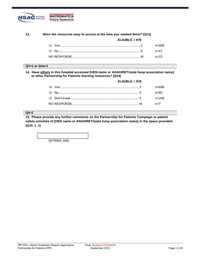
PfP PEC: Interim Evaluation Report–Appendices Final–Revised 12/29/2015 Partnership for Patients (PfP) September 2015 Page | C-45
13. Were the resources easy to access at the time you needed them? (Q13)
ELIGIBLE = 978
Yes ........................................................................................... 1 n=909
No ............................................................................................ 0 n=47
NO RESPONSE ............................................................................. M n=22
Q4=1 or Q4a=1
14. Have others in this hospital accessed [HEN name or AHA/HRET/state hosp association name] or other Partnership for Patients learning resources? (Q14)
ELIGIBLE = 978
Yes ......................................................................................... 1 n=698
No .......................................................................................... 0 n=65
Don’t know ............................................................................. 3 n=208
NO RESPONSE ........................................................................... M n=7
Q4=1
15. Please provide any further comments on the Partnership for Patients Campaign or patient
safety activities of [HEN name or AHA/HRET/state hosp association name] in the space provided.
(Q15_1_1)
(STRING 400)

PfP PEC: Interim Evaluation Report–Appendices Final–Revised 12/29/2015 Partnership for Patients (PfP) September 2015 Page | C-46
Section II: Improvement Efforts ALL
16. During the past 12 months, how much effort has been made in each of the following aspects
of quality improvement (QI) / patient safety? (Q16_1 through Q16_6)
PROGRAMMER: CODE ONE PER ROW Eligible= 1,136
Missing
Major Effort
1 2 3
4
No Effort
5
1. Training front-line staff in patient safety skills or specific safe practices.
10 423 463 203 34 3
2. Development of QI leadership or staff in more advanced QI and patient safety improvement techniques.
6 408 462 185 59 16
3. Measuring or gathering data to measure the adverse event types that are the focus of the Partnership for Patients.
7 556 416 123 25 9
4 Addressing the adverse event types that are the focus of the Partnership for Patients.
8 490 447 148 27 16
5. Working with information system support personnel to improve QI and patient safety measurement capability.
14 387 398 229 81 27
6 Working with information system support personnel to improve clinical decision supports or to “hard-wire” important care guidelines.
12 413 375 214 81 41
ALL
17. For each of the following, please indicate if you provide the service in your hospital.
(Q17_1 through Q17_4) PROGRAMMER: Require a response on each row.
Eligible, 1,136
Service Yes No a. Obstetrical services n=711 n=425
b. Central line placement n=983 n=153 c. Inpatient surgery n=978 n=158 d. Ventilator support n=845 n=291

PfP PEC: Interim Evaluation Report–Appendices Final–Revised 12/29/2015 Partnership for Patients (PfP) September 2015 Page | C-47
Section III: Progress
ALL
17_4. Did your hospital implement process improvement efforts in 2012-2013 aimed at any of the following adverse event areas? (Q17_4_1 through Q17_4_12) Some rows may be grayscaled based on responses to prior questions.
Eligible Missing Yes No
1. Adverse drug events 1,136 39 811 286 2. Catheter-associated urinary tract infections (CAUTI) 1,136 16 968 152 3. Central line-associated blood stream infections (CLABSI)
983 21 751 211
4. Injuries from falls and immobility 1,136 22 993 121 5. Early elective deliveries 711 24 592 95 6. Other obstetrical (OB) adverse events 711 35 445 231 7. Pressure ulcers 1,136 48 746 342 8. Surgical site infections 978 30 812 136 9. Venous thromboembolism (VTE) 1,136 30 873 233 10. Ventilator-associated events 845 35 563 247 11. All cause harm 1,136 71 681 384 12. Readmissions 1,136 25 974 137
PROGRAMMER: If Q17_4 all 0 or all blank, go to Q17_6.
Q17_4 = 1 for at least one item.
17_5. Was the process improvement effort implemented in 2012-2013 focused on specific units or
was it focused on all applicable units hospital-wide? (Q17_5_1 through Q17_5_12) Some rows may be grayscaled based on responses to prior questions. PROGRAMMER: GRAYSCALE ROWS WHERE 17_4=0 or blank.
Focused
on specific units
Focused on all
applicable units hospital-wide
Eligible Missing
1. Adverse drug events 811 17 81 713 2. Catheter-associated urinary tract infections (CAUTI)
968 12 222 734
3. Central line-associated blood stream infections (CLABSI)
751 10 191 550
4. Injuries from falls and immobility 993 13 128 852 5. Early elective deliveries 592 8 465 119 6. Other obstetrical (OB) adverse
events 445 7 345 93
7. Pressure ulcers 746 9 100 637 8. Surgical site infections 812 12 237 563 9. Venous thromboembolism (VTE) 873 12 102 759 10. Ventilator-associated events 563 6 347 210 11. All cause harm 681 13 38 630 12. Readmissions 974 13 181 780

PfP PEC: Interim Evaluation Report–Appendices Final–Revised 12/29/2015 Partnership for Patients (PfP) September 2015 Page | C-48
ALL
17_9. For those adverse event areas with initiatives implemented in 2012-2013, please indicate if
your hospital achieved a small (<10% reduction), moderate (10% to 39% reduction), or large (40% or more reduction) degree of improvement in 2012-2013. (Q17_9_1_1 through Q17_9_12_1)
Some rows may be grayscaled based on responses to prior questions.
Degree of Improvement Achieved
Eligible Missing
Small to None
(e.g. <10% reduction)
Moderate (e.g. 10-39%
reduction)
Large (e.g.
40% or more
reduction)
Don’t Track/ Don’t Know
1. Adverse drug events 811 53 378 234 61 85 2. Catheter-associated urinary tract infections (CAUTI)
968 57 437 271 162 41
3. Central line-associated blood stream infections (CLABSI)
751 45 311 207 154 34
4. Injuries from falls and immobility
993 44 425 346 130 48
5. Early elective deliveries
592 41 149 157 219 26
6. Other obstetrical (OB) adverse events
445 34 144 141 63 63
7. Pressure ulcers
746 32 355 195 116 48
8. Surgical site infections
812 55 389 226 108 34
9. Venous thromboembolism (VTE)
873 55 392 240 106 80
10. Ventilator-associated events
563 34 235 154 109 31
11. All cause harm 681 45 250 221 79 86 12. Readmissions 974 45 432 361 89 47
Q4=1 AND Q17_9 IN (1, 2, OR 3) FOR AT LEAST ONE ROW; FILL [HEN] FROM Q5A.

PfP PEC: Interim Evaluation Report–Appendices Final–Revised 12/29/2015 Partnership for Patients (PfP) September 2015 Page | C-49
23. You indicated improvement occurred in the following adverse event areas. For each, please indicate if assistance from [HEN name or AHA/HRET/state hosp association name] was important to achieving the level of improvement that was accomplished. (Q23_1_1 through Q23_12_1)
Some rows may be grayscaled based on responses to prior questions.
Assistance was
important to improvement in
this area?
Missing Yes No
1. Adverse drug events 18 350 305
2. Catheter-associated urinary tract infections (CAUTI)
18 559 293
3. Central line-associated blood stream infections (CLABSI)
15 383 274
4. Injuries from falls and immobility 23 532 346
5. Early elective deliveries 10 319 196
6. Other obstetrical (OB) adverse events 14 187 147
7. Pressure ulcers 14 328 324
8. Surgical site infections 22 363 338
9. Venous thromboembolism (VTE) 24 393 321
10. Ventilator-associated events 17 224 257
11. All cause harm 15 345 190
12. Readmissions 18 626 238
ALL
26. Has the hospital publicly released improvement goals in the following areas?
(Q26_1 through Q26_2) Select one per row.
Eligible = 1,136
Missing Yes No
Don’t know
1. Patient safety (adverse events) 85 219 599 233
2. Readmissions 43 238 615 240

PfP PEC: Interim Evaluation Report–Appendices Final–Revised 12/29/2015 Partnership for Patients (PfP) September 2015 Page | C-50
Section IV: Influences on Hospital Activity beyond PfP ALL
27. During the past 12 months, have any of the following influenced your hospital to take better- shaped or more aggressive action to prevent harms in any of the PfP adverse event areas (including readmissions)? (Q27_1_1 through Q27_14_1) Check all that apply.
Eligible = 1,136
Reporting to NHSN .......................................................................... 1 n=689
Other reporting requirements .......................................................... 2 n=509
Payment policies - Medicare ........................................................... 3 n=667
Payment policies - Medicaid............................................................ 4 n=429
Payment policies – private sector insurance ................................... 5 n=359
Joint Commission ............................................................................ 6 n=550
Quality Improvement Organizations’ work ...................................... 7 n=558
Institute for Healthcare Improvement .............................................. 8 n=321
Community-Based Care Transitions Program ................................ 9 n=223
State hospital association-sponsored effort .................................... 10 n=467
VHA Health Care Safety Network ................................................... 11 n=69
NAPH-NPSF Patient Safety Initiative .............................................. 12 n=73
Other regional, state, or local initiative ............................................ 13 n=232
Hospital system-level initiative ........................................................ 14 n=708
Q27=1 for any item

PfP PEC: Interim Evaluation Report–Appendices Final–Revised 12/29/2015 Partnership for Patients (PfP) September 2015 Page | C-51
28. You indicated that the following has/have influenced your hospital: (Q28_1_1 through Q28_12_1)
[LIST ITEMS CHECKED AT Q27]
Which of the following adverse event areas have been impacted by one or more of these policies, entities, or associations?
Adverse drug events ......................................................................... 1 n=464
Catheter-associated urinary tract infections (CAUTI) ....................... 2 n=836
Central line-associated blood stream infections (CLABSI) ............... 3 n=669
Injuries from falls and immobility ....................................................... 4 n=703 Early elective deliveries .................................................................... 5 n=486
Other obstetrical (OB) adverse events ............................................. 6 n=245 Pressure ulcers ................................................................................. 7 n=512 Surgical site infections ...................................................................... 8 n=626 Venous thromboembolism (VTE) ...................................................... 9 n=627
Ventilator-associated events ........................................................... 10 n=406
All cause harm ................................................................................ 11 n=410
Readmissions ................................................................................. 12 n=861
Section V: Care Transitions
ALL
29. Is your hospital participating in the Community-Based Care Transitions Program
(CCTP)? (Q29_1)
ELIGIBLE = 1,136
Yes ............................................................................................. 1 n=230
No .............................................................................................. 0 n=567
Don’t know ................................................................................. 3 n=334
NO RESPONSE ............................................................................... M n=5 32. How often does your hospital provide a summary of care record for the next provider
when a patient is discharged? (Q32_1) ELIGIBLE = 1,136
None of the time ................................................................................ 1 n=39
Less than 50% of the time ................................................................. 2 n=87
50% or more but less than 75% of the time ...................................... 3 n=118
75% or more of the time .................................................................... 4 n=691
Don’t know ......................................................................................... 5 n=191
NO RESPONSE ....................................................................................... M n=10
ALL

PfP PEC: Interim Evaluation Report–Appendices Final–Revised 12/29/2015 Partnership for Patients (PfP) September 2015 Page | C-52
32a. Do all patients undergo standardized medication reconciliation at the time of discharge to home or transfer to another facility? (Q32a_1)
ELIGIBLE = 1,136
Yes ..................................................................................................... 1 n=1084
No ...................................................................................................... 0 n=30
Don’t know ......................................................................................... 3 n=13
NO RESPONSE ....................................................................................... M n=9
ALL
32b. Prior to discharge, do all patients undergo a risk assessment for readmission? (Q32b_1)
ELIGIBLE = 1,136
Yes ........................................................................................ 1 n=316
No ......................................................................................... 0 Q33 n=659
Don’t know ............................................................................ 3 Q33 n=153
NO RESPONSE .......................................................................... M Q33 n=8
IF 32B=1
32c. Prior to discharging a patient at high risk of readmission, is a face-to-face follow-up visit
scheduled within 48 hours of discharge? (Q32c_1)
ELIGIBLE = 316
Yes ..................................................................................................... 1 n=126
No ...................................................................................................... 0 n=149
Don’t know ......................................................................................... 3 n=41
IF 32B=1
32d. Prior to discharging a patient at moderate risk of readmission, is a follow-up phone call
scheduled within 48 hours of discharge? (Q32d_1)
ELIGIBLE = 316
Yes ..................................................................................................... 1 n=209
No ...................................................................................................... 0 n=74
Don’t know ......................................................................................... 3 n=33
ALL

PfP PEC: Interim Evaluation Report–Appendices Final–Revised 12/29/2015 Partnership for Patients (PfP) September 2015 Page | C-53
33. During the past 12 months, how often have hospital staff communicated with other hospitals
and other care settings (such as skilled nursing facilities [SNFs], home health agencies,
physician practices, etc.) about care transition initiatives for purposes of information sharing
and improving care transition for patients? (Q33_1)
ELIGIBLE = 1,136
Four or more times during the past year ........................................... 1 n=659
Two or three times during the past year ............................................ 2 n=290
Once during the past year ................................................................. 3 n=82
Not at all during the past year............................................................ 4 n=71
NO RESPONSE ....................................................................................... M n=34
ALL
34. During the past 12 months, how often have hospital staff communicated with other hospitals
about patient safety initiatives for purposes of information sharing and improving each
other’s initiatives? (Q34_1)
ELIGIBLE = 1,136
Four or more times during the past year ........................................... 1 n=580
Two or three times during the past year ............................................ 2 n=312
Once during the past year ................................................................. 3 n=85
Not at all during the past year............................................................ 4 n=125
NO RESPONSE ....................................................................................... M n=34
Section VI: Sufficiency of Resources and Knowledge
ALL
35. Do you know what your hospital can do to improve patient safety in all 10 PfP adverse event areas? (Q35)
ELIGIBLE = 1,136
Yes ..................................................................................................... 1 n=801
No ...................................................................................................... 0 n=314
NO RESPONSE ....................................................................................... M n=21
ALL

PfP PEC: Interim Evaluation Report–Appendices Final–Revised 12/29/2015 Partnership for Patients (PfP) September 2015 Page | C-54
36. Please indicate the extent to which you agree with the following statement. (Q36_1) ELIGIBLE = 1,136
Missing Strongly
Agree Agree
Neither Agree
nor Disagree
Disagree Strongly Disagree
1. This hospital’s information system supports measuring progress on key patient safety indicators associated with the focus areas
12 163 443 265 195 58
ALL
37. Did your hospital have enough staff, time, and financial resources to make major improvements in patient safety in 2012-2013 in the PfP adverse event areas? (Q37_1)
ELIGIBLE = 1,136
Yes, for all or most of the PfP adverse event areas................ 1 n=387
Yes, for less than half of the PfP adverse event areas ........... 2 n=447
No ............................................................................................ 3 n=280
NO RESPONSE ............................................................................ M n=22
Section VII: Unmet Needs ALL
39. What tools and resources is your hospital lacking that would be helpful in pursuing
reductions in adverse events and readmissions? (Q39_1_1 through Q39_3_1) Please list up to three.

PfP PEC: Interim Evaluation Report–Appendices Final–Revised 12/29/2015 Partnership for Patients (PfP) September 2015 Page | C-55
Section VIII: Hospital Culture ALL
40. Is your hospital owned by or affiliated with a larger hospital system? (Q40)
Eligible = 1,136
Yes .................................................................................................... 1 n=628
No ...................................................................................................... 0 n=508
ALL
41. Please indicate the extent to which you agree with each of the following statements.
(Q41_1 through Q41_11) Some rows may be grayscaled based on responses to prior questions. PROGRAMMER: CODE ONE PER ROW PROGRAMMER NOTE: GRAYSCALE ROW C and D IF Q40=0, blank
Eligible = 1,136
Missing Strongly
Agree Agree
Neither Agree
nor Disagree
Disagree Strongly Disagree
1. The hospital’s board has identified reductions
in adverse events and hospital readmission rates as a priority, and often discusses hospital performance on these topics.
15 495 381 179 56 10
2. The hospital devotes resources to improvement and safety consistent with achieving national benchmark performance and it is clear from the support that achieving these benchmarks is a key part of the hospital’s strategic plan.
11 448 467 158 47 5

PfP PEC: Interim Evaluation Report–Appendices Final–Revised 12/29/2015 Partnership for Patients (PfP) September 2015 Page | C-56
Missing Strongly
Agree Agree
Neither Agree
nor Disagree
Disagree Strongly Disagree
3. [If Q40=1] Patient safety activities at this hospital are largely determined by system-level priorities and programs.
11 199 294 85 34 5
4. [If Q40=1] System-level quality improvement staff frequently provides learning opportunities, resources and information that are used to improve our patient safety efforts.
12 211 260 92 43 10
5. All hospital employees in clinical positions understand and embrace their important role in improving and ensuring patient safety and quality.
17 263 581 195 75 5
6. All hospital employees in non-clinical positions understand and embrace their important role in improving and ensuring patient safety and quality.
13 153 509 335 117 9
7. Reporting an adverse event or a near miss will not result in negative repercussions for the person reporting it.
11 660 400 47
16
2
8. The hospital’s focus on safety makes it easy for staff to learn from others’ mistakes.
10 319 551 214 38 4
9. Top clinical managers know where each department is in terms of key quality and safety measures.
15 354 501 173 84 9
10. Clinical leaders communicate messages of urgency to improve in targeted areas of quality and patient safety.
11 350 543 182 43 7
11. Top clinical managers lead or actively support improvement efforts.
16 413 544 116 41 6

PfP PEC: Interim Evaluation Report–Appendices Final–Revised 12/29/2015 Partnership for Patients (PfP) September 2015 Page | C-57
41_a1. Does this hospital have a master TeamSTEPPs trainer? (Q41_a1_1)
Information on TeamSTEPPs can be found here: http://teamstepps.ahrq.gov/ ELIGIBLE = 1,136
Yes ..................................................................................................... 1 n=206
No ...................................................................................................... 0 n=849
Don’t know ......................................................................................... 2 n=73
NO RESPONSE ....................................................................................... M n=8
ALL
41a. Which of the following is true about patients in your hospital and their families?
(Q41a_1_1 through Q41a_6_1)
Check all that apply.
ELIGIBLE = 1,136
They take part in advisory councils .......................................................... 1 n=367
They are invited to take part in multidisciplinary rounds .......................... 2 n=290
They are partners in monitoring compliance with safety practices .......... 3 n=250
They actively participate on patient safety committees .......................... 4 n=165
They participate in root cause analysis ................................................... 5 n=46
They serve as members on the hospital’s board .................................... 6 n=558
41b. As compared to two years ago, has there been improvement in the extent to which patients and families’ perspectives are heard and considered in ways important to the safety of patient care? (Q41b_1)
ELIGIBLE = 1,136
Yes, greatly improved .............................................................................. 1 n=220
Yes, somewhat improved ......................................................................... 2 n=438
Yes, slightly improved .............................................................................. 3 n=337
No, not improved ...................................................................................... 4 n=124
NO RESPONSE ............................................................................................. M n=17
We would like to highlight hospitals that have strong patient and family engagement strategies and/or patient advocates so that other hospitals can improve their patient and family engagement strategies. 41c. In your opinion, does this hospital have strong engagement strategies and/or
patient advocates? (Q41c_1)
ELIGIBLE = 1,136
Yes ..................................................................................................... 1 n=480
No ...................................................................................................... 0 Q43 n=492
Don’t know ......................................................................................... 3 Q43 n=146
NO RESPONSE ....................................................................................... M Q43 n=18

PfP PEC: Interim Evaluation Report–Appendices Final–Revised 12/29/2015 Partnership for Patients (PfP) September 2015 Page | C-58
41d. Are you willing to discuss your hospital’s patient and family engagement strategies and/or patient advocates with the Partnership for Patients’ Patient and Family Engagement Contractor? (Q41d)
ELIGIBLE = 480
Yes .................................................................................................... 1
No ...................................................................................................... 0
NO RESPONSE ....................................................................................... M
Section VIII: Patient Safety Practices
ADVERSE DRUG EVENTS
ALL
43. To minimize errors, has your hospital limited the variety of insulin products on its formulary? (Q43_1)
ELIGIBLE = 1,136
Yes .................................................................................................... 1 n=944
No ...................................................................................................... 0 n=46
Don’t know ......................................................................................... 3 n=139
NO RESPONSE ....................................................................................... M n=7
ALL
44. Does your hospital require standardized protocols and formats for prescribing insulin for
all units? (Q44_1)
ELIGIBLE = 1,136
Yes .................................................................................................... 1 n=840
No ...................................................................................................... 0 n=180
Don’t know ......................................................................................... 3 n=109
NO RESPONSE ....................................................................................... M n=7
ALL
45. How often are patients on all units who are on hypoglycemic drugs monitored for
hypoglycemia? (Q45_1)
ELIGIBLE = 1,136
At least four times a day .................................................................... 1 n=540
1 – 3 times a day ............................................................................... 2 n=305
Less than once per day ..................................................................... 3 n=4
Monitoring varies across units or there is no routine monitoring ....... 4 n=217
NO RESPONSE ....................................................................................... M n=70
ALL

PfP PEC: Interim Evaluation Report–Appendices Final–Revised 12/29/2015 Partnership for Patients (PfP) September 2015 Page | C-59
46. How long would it take to obtain a list of patients hospitalized over a certain time period
who had an International Normalized Ratio (INR) greater than some threshold (for example,
an INR>5)? (Q46_1)
By ‘over a certain time period’ we mean within the past 3-months, within past 6-months, etc.
ELIGIBLE = 1,136
Within minutes electronically ............................................................. 1 n=635
Within 1-2 weeks from lab electronic data ........................................ 2 n=308
Would have to be obtained from chart review ................................... 3 n=123
No feasible way to find this data ....................................................... 4 n=23
NO RESPONSE ...................................................................................... M n=47
ALL
47. In what year did your hospital last complete the ISMP Medication Safety Self-Assessment
for Hospitals? (Q47_1_1)
ELIGIBLE = 1,136
1 Never completed ........................................... n=50
2 Prior to 2007 .................................................. n=253
3 2007 .............................................................. n=155
4 2008 .............................................................. n=66
5 2009 .............................................................. n=44
6 2010 .............................................................. n=16
7 2011 ............................................................. n=13
8 2012 .............................................................. n=12
9 2013 .............................................................. n=50
10 2014 .............................................................. n=252
Missing ................................................................. n=225
CATHETER-ASSOCIATED URINARY TRACT INFECTIONS (CAUTI)
ALL
48. Please respond yes or no to each of the following questions about practices related to
patient catheter use and catheterization-related activities. (Q48_1 through Q48_8)
ELIGIBLE = 1,136
Missing Yes No
1. Does your hospital require specialized training for nurses on the
appropriate placement and management of urinary catheters and
keep records on those who have and have not received training? 37 674 425
2. Does your hospital require documentation of the indications for the
indwelling urinary catheter at the time of insertion? 30 847 259
3. In your hospital, are there routine automatic stop orders or nurse
protocols for urinary catheter removal for all patients on all units? 27 542 567

PfP PEC: Interim Evaluation Report–Appendices Final–Revised 12/29/2015 Partnership for Patients (PfP) September 2015 Page | C-60
Missing Yes No
4. In surgical patients, are all urinary catheters removed post-
operatively within 24-48 hours unless there are appropriate
indications for continued use?
76 935 125
5. Do nurses on all units routinely use bladder ultrasound scanners
(e.g. to guide intermittent catheterization or catheter irrigation)? 46 552 538
6. Are all patients with catheters reviewed daily for continued need
for a catheter? 25 944 167
7. Does your hospital monitor urinary catheter days? 31 102
2
83
8. Does your hospital monitor CAUTI rates per 1000 catheter days
using NHSN definitions? 22
104
3 71
FALLS
ALL
49. Please respond yes or no to each of the following questions about activities focused on
determination of fall risk and fall reduction. (Q49_1 through Q49_3)
ELIGIBLE = 1,136
Missing Yes No
1. Do all newly admitted patients undergo a standardized fall
assessment? 6 1123 7
2. Do all patients at risk of fall or injury routinely have visual
indicators (e.g. colorful socks, colored wrist bands and/or
blankets, or stickers or signs outside and inside the room) to
quickly communicate their fall risk with the care team?
12 1074 50
3. Are patients who have fallen while hospitalized always offered
facilitated environmental home assessments upon discharge? 35 173 928
ALL
50. How often does staff perform comfort rounds to assess and address patient needs for pain
relief,
toileting, and positioning? (Q50_1)
ELIGIBLE = 1,136
Hourly ................................................................................................ 1 n=849
Every two hours................................................................................. 2 n=236
During shift changes ......................................................................... 3 n=15
Only when patients call for assistance .............................................. 4 n=21
NO RESPONSE ...................................................................................... M n=15
OBSTETRICAL ADVERSE EVENTS
If Q17_a=1, missing

PfP PEC: Interim Evaluation Report–Appendices Final–Revised 12/29/2015 Partnership for Patients (PfP) September 2015 Page | C-61
51. Please respond yes or no to each of the following questions about obstetrical care in your
hospital. (Q51_1 through Q51_4)
ELIGIBLE = 711
Missing Yes No
1. Does your hospital require the use of a checklist-driven
protocol or bundle for the induction of labor (e.g.
Hospital Corporation of America’s Pre-Oxytocin
checklist)?
53 437 221
2. Does your hospital require the use of a checklist-driven
protocol or bundle for the augmentation of labor (e.g.
Hospital Corporation of America’s Pre-Oxytocin
checklist)?
61 394 256
3. Does your hospital allow scheduling C-section or other
elective delivery prior to 39 weeks? 31 92 588
4. Does your hospital have an active program to track and
reduce elective deliveries prior to 39 weeks? 21 656 34
If Q17_a=1, missing
52. Does your hospital have a protocol governing the timing of and conditions for elective
deliveries? (Q52)
ELIGIBLE = 711
Yes .......................................................................................... 1 n=624
No ............................................................................................ 0 n=87
Q52=1
52a. How often is adherence to the elective delivery protocol monitored? (Q52a_1)
ELIGIBLE = 624
Monthly .................................................................................... 1 n=507
Quarterly .................................................................................. 2 n=84
Semi-annually.......................................................................... 3 n=4
Annually ................................................................................... 4 n=8
Less than annually .................................................................. 5 n=6
NO RESPONSE ............................................................................ M n=15
Q52=1

PfP PEC: Interim Evaluation Report–Appendices Final–Revised 12/29/2015 Partnership for Patients (PfP) September 2015 Page | C-62
52b. Is compliance with the elective delivery protocol considered as part of re-granting
privileges for physicians? (Q52b)
ELIGIBLE = 624
Yes ......................................................................................... 1 n=210
No ........................................................................................... 0 n=383
NO RESPONSE ........................................................................... M n=31
If Q17_a=1, missing
53. Which of the following is available in your hospital to ensure a uniform team management
of shoulder dystocia? (Q53_1_1 through Q53_5_1)
Check all that apply.
ELIGIBLE = 711
Drills .................................................................................................... 1 n=353 Continuing medical education ............................................................ 2 n=355
Interactive online courses and protocols that clarify the duties of each team member ............................................. 3 n=151
A system (e.g. checklist) to ensure appropriate documentation of the maneuvers utilized and avoided in the management of shoulder dystocia .................................................... 4 n=262
None of the above .............................................................................. 5 n=111
PRESSURE ULCERS
ALL
54. Please respond yes or no to each of the following questions about the prevention of
pressure ulcers among your hospitalized patients. (Q54_1 through Q54_4)
ELIGIBLE = 1,136
Missing Yes No
1. Does your hospital require a system (e.g. checklists) to
ensure that pressure ulcer risk assessment is conducted
within 4 hours of admission for all patients?
31 852 253
2. Do nurses use a standard pressure ulcer risk assessment
tool (e.g. Braden scale)? 13 1093 30
3. Are patients and families routinely educated about pressure
ulcer prevention and is the education documented in the
chart?
51 616 469
4. Does your hospital routinely monitor rates of patients at-risk
for pressure ulcers who are receiving full pressure ulcer
preventive care?
33 773 330
SURGICAL SITE INFECTION
Q17_c=1 or missing

PfP PEC: Interim Evaluation Report–Appendices Final–Revised 12/29/2015 Partnership for Patients (PfP) September 2015 Page | C-63
55. How soon are failures to meet the targets for the following measures communicated back
to the responsible physicians? (Q55_1 through Q55_3)
ELIGIBLE = 978
Missing
Within
24
hours
After
24
hours
Not
communicated
1. Recommended timing of initiation of
perioperative prophylactic antibiotic (that
is, administration within 1 hour of
surgical incision)
23 375 532 48
2. Perioperative antibiotic selection 27 348 553 50
3. Discontinuation of prophylactic antibiotic
(that is, discontinuation within 24 hours
after end of surgery or 48 hours after
end of cardiac surgery)
30 355 544 49
POST-SURGICAL VENOUS THROMBOEMBOLISM (VTE)
ALL
56. Does your organization have a hospital-wide written thromboprophylaxis policy? (Q56)
ELIGIBLE = 1,136
Yes ................................................................................................. 1 n=804
No ................................................................................................... 0 n=281
NO RESPONSE ................................................................................... M n=51
ALL
57. How often does this hospital provide information about the risk of VTE and its prevention
to patients? (Q57_1)
ELIGIBLE = 1,136
To almost all admitted patients (80% or more) ................................. 1 n=530
To at least 50% of patients ................................................................ 2 n=247
Patients do not receive information on VTE risk and prevention ......................................................................................... 3 n=274
NO RESPONSE ...................................................................................... M n=85
VENTILATOR ASSOCIATED EVENTS
Q17_d=1 or missing

PfP PEC: Interim Evaluation Report–Appendices Final–Revised 12/29/2015 Partnership for Patients (PfP) September 2015 Page | C-64
58. Please respond yes or no to each of the following questions about patients on mechanical
ventilation, in your hospital. (Q58_1 through Q58_4)
ELIGIBLE = 845
Missing Yes No
1. Is there always a bedside visual cue (e.g. tape on the wall or bed frame) to identify when the head of the bed is elevated at 30 to 45 degrees?
65 518 262
2. Do patients undergo daily “sedative interruption” and assessment of readiness to extubate?
70 685 90
3. Do patients have their teeth brushed every 12 hours? 72 684 89
4. Do patients undergo oral suctioning as needed? 53 785 7
5. Do patients have at least daily oral application of chlorhexidine?
83 603 159
HAND HYGIENE
ALL
59. Does this hospital routinely monitor workers' hand-hygiene adherence (as the number of
hand-hygiene episodes performed by personnel/number of hand-hygiene opportunities)
by ward or service and provide feedback to personnel? (Q59)
ELIGIBLE = 1,136
Yes .......................................................................................... 1 n=1402
No ............................................................................................ 0 n=85
NO RESPONSE ............................................................................ M n=79
ALL
60. Does this hospital routinely assess that direct patient care staff are not wearing artificial
nails? (Q60)
Yes .......................................................................................... 1 n=850
No ............................................................................................ 0 n=263
NO RESPONSE ............................................................................ M n=23

PfP PEC: Interim Evaluation Report–Appendices Final–Revised 12/29/2015 Partnership for Patients (PfP) September 2015 Page | C-65
Section XI: Demographics and Contact Information This next section gathers information about you and your training and experience.
Question 61 through 65 removed for confidentiality reasons.
66. Did you complete the 2012 Hospital Survey on Prevention of Adverse Events and
Reduction of Readmissions? (Q66_1) ELIGIBLE = 1,136
Yes, I completed it ................................................ 1 n=599
No, someone else at this hospital completed it ... 2 n=227
Don’t know ........................................................... 3 n=288
NO RESPONSE ............................................................. M n=22
67. When did you begin working at this hospital? (Q67_year_1) ELIGIBLE = 227
Before 2010 .................................................................... n=128
2010 to 2012 ................................................................. n=38
After 2012 ....................................................................... n=58
Missing ........................................................................... n=3

PfP PEC: Interim Evaluation Report–Appendices Final–Revised 12/29/2015 Partnership for Patients (PfP) September 2015 Page | D-1
D. Appendix D: Detailed Methodologies
The results in the report are based on the following topics and analytic approaches:
Difference-in-Differences Comparison Group Analyses Methodology
Bayesian Difference-In-Difference Analysis Methodology
Estimates of Averted Costs from National Reduction in Adverse Events Methodology
Estimation of Costs Averted Due to Hospital Engagement Networks (HENs) Methodology
Interrupted Time Series (ITS) Methodology
Statistical Process Control (SPC) Chart Methodology
Vital Records Analysis Methodology
Hospital Engagement Analysis Methodology
Dose-Response Analysis Methodology
Analysis of Medicare Patient Safety Monitoring System (MPSMS) Methodology
Survey Analysis Removing Spillover Methodology
ITS Cluster Analysis Methodology
HEN-Level Data File Methodology
Repeated Measures Analysis of the Association between HEN Activities and Partnerships and
Common Measure Outcomes Methodology
The sections below provide detail on each of the analytic approaches used.

PfP PEC: Interim Evaluation Report–Appendices Final–Revised 12/29/2015 Partnership for Patients (PfP) September 2015 Page | D-2
Difference-in-Differences Comparison Group Analyses
Overview of Difference-in-Differences Comparison Group Analyses
Impact Analyses of Hospital Engagement Network (HEN)-Aligned and Non-HEN-aligned
Hospitals
In order to compare the amount of improvement that occurred in HEN-aligned hospitals to the amount of
improvement that might have been expected had those hospitals not worked with a HEN, the Evaluation
Contractor constructed a comparison group of non-HEN-aligned hospitals and compared change in the
outcomes between the two groups before and after the Partnership for Patients (PfP). The HEN-aligned
hospitals were those reported by HENs as HEN-aligned in their June 2012 monthly report. These hospitals
are considered to be “treated,” while non-HEN-aligned hospitals form the untreated “comparison” group.
The comparison group excludes hospitals that were “late joiners” to PfP between June 2012 and December
2013. The comparison group was created using propensity score reweighting, where non-HEN-aligned
hospitals with observable characteristics more similar to HEN-aligned hospitals are given higher weights.
Regression-based difference-in-differences analyses were used to compare changes between the groups. The
sections below describe the propensity score reweighting and difference-in-differences approaches used by
the Evaluation Contractor.
There are two caveats to the comparison group analyses. First, as discussed in the report, the HENs’ work is
only one of the elements used to achieve PfP goals; thus the comparison group analyses only address the
HEN component of PfP. Second, to the extent that non-HEN-aligned as well as HEN-aligned hospitals
received benefits from PfP, the comparison method may underestimate the true impact of PfP.
Propensity Score Reweighting
Calculation of Propensity Scores
For purposes of understanding the effect of HENs’ efforts, it is important to assemble a comparison group
that is similar to the group of HEN-aligned hospitals in order to understand how different HEN-aligned
hospitals would have been had the hospitals not worked with a HEN. A simple comparison of observed
improvement in HEN-aligned versus non-HEN-aligned hospitals will not serve that purpose because
hospitals that elected to work with a HEN differ in important ways from those that did not, and differences in
outcomes might result from underlying differences in hospital mix rather than from the effects of PfP.
Using a statistical technique called propensity score reweighting, the Evaluation Contractor created a
comparison group from the pool of non-HEN-aligned hospitals. Propensity score reweighting produces a
comparison group of non-HEN-aligned hospitals that are similar to HEN-aligned hospitals on observable
characteristics of hospitals and their patients, by assigning different weights to non-HEN-aligned hospitals
depending on their similarity to HEN-aligned hospitals, giving more weight to non-HEN-aligned hospitals
that are more similar to HEN-aligned hospitals and less weight to non-HEN-aligned hospitals that are less
similar.
The propensity score reweighting approach used in this evaluation consisted of two steps. First, the approach
called for estimating a propensity score model in which participation in PfP is a function of relevant hospital
characteristics. Second, weights were constructed from the estimated propensity scores to weight the non-
HEN-aligned (comparison group) hospitals in order to make the hospitals similar to treatment (HEN-aligned)
hospitals on observable characteristics (Hirano and Imbens 2001; Guo and Fraser 2010; Busso et al. 2014).

PfP PEC: Interim Evaluation Report–Appendices Final–Revised 12/29/2015 Partnership for Patients (PfP) September 2015 Page | D-3
The Evaluation Contractor estimated a logistic (logit) regression model using the predictor variables
described in detail in Chen et al. 2014. The baseline hospital characteristics used to create the weights were
drawn from data from the 2010 American Hospital Association (AHA) Annual Survey and Medicare claims
from the pre-campaign years (2009 and 2010). The claims data provided data on level and trend in the
adverse event and readmission rates before the start of PfP, as well as the demographic composition of the
patients served. Other variables drawn from the AHA survey, such as region, urbanicity, and hospital size
were characteristics included as broad differentiators of hospitals and their contexts. A further set of items
was included based on having been found to predict HEN alignment in the Evaluation Contractor’s baseline
analysis. Examples include teaching hospitals or the percentage of physicians who are intensivists. The
predictor variables were entered into the logit model as predictors of treatment status, defined as a binary
dependent variable that equaled one for HEN-aligned (treatment) hospitals and zero for non-HEN-aligned
hospitals. Separate propensity models were estimated for each adverse event area (AEA) and for
readmissions. To maintain continuity with the impact regressions (in which discharges are the unit of
analysis and thus hospitals implicitly are weighted by the number of relevant discharges), hospitals were
weighted by the number of discharges in the measure denominator in 2010.
The estimated coefficients from the logit model were used to calculate a propensity score for each hospital,
which was the predicted probability that a hospital with its characteristics would choose to participate in the
program. These propensity scores were then used to construct a weight for each hospital. HEN-aligned
hospitals received a weight of one, and non-HEN-aligned hospitals (the comparison group) received a weight
equal to p/(1-p), where p is the estimated propensity score (Busso et al. 2014; Guo and Fraser 2010; Nichols
2008). This formula assigns greater weight to comparison group hospitals that are similar to the treatment
group hospitals and lower weights to comparison group hospitals that are not similar to treatment hospitals.
The Centers for Medicare & Medicaid Services (CMS) has expressed a preference for using propensity score
reweighting rather than propensity score matching to create the comparison group for the impact analysis of
HEN activities under PfP. Propensity score reweighting differs from propensity score matching in that (1) all
non-treatment observations are retained in the comparison group (though possibly with weights approaching
zero), and (2) those non-treatment observations are not matched to particular treated observations. Propensity
score reweighting offers some advantages over matching. First, reweighting is simpler to implement, not
requiring subjective analytic decisions about how to create matches. Second, standard errors are easily
calculated, which is not always the case for matching estimators. Third, the power to detect impacts can be
higher than with matching (Busso et al. 2014). Earlier work has found, however, that reweighting may
perform worse than matching in creating well-balanced treatment and comparison groups if the pool of non-
treatment observations differs greatly from treatment group observations (Busso et al. 2014).

PfP PEC: Interim Evaluation Report–Appendices Final–Revised 12/29/2015 Partnership for Patients (PfP) September 2015 Page | D-4
Balance Testing
The Evaluation Contractor examined the similarity between the HEN-aligned and non-HEN-aligned groups
before and after propensity score reweighting. In order for the propensity score reweighting to perform well,
the two groups should demonstrate some degree of balance before reweighting. That is, a substantial subset
of non-HEN-aligned hospitals should exist that possess characteristics similar to those of treatment group
hospitals—though the two groups as a whole may differ on average. For example, although the aligned and
non-HEN-aligned groups may differ in the proportion of hospitals that are large, concern would be warranted
if all or nearly all large hospitals were HEN-aligned and very few or no large hospitals were available in the
non-HEN-aligned group as potential comparisons. After creating the propensity score reweighted
comparison group, the Evaluation Contractor assessed the extent to which reweighting improved the balance
between the groups.
The Evaluation Contractor assessed balance between the groups in several ways. First, the propensity score
distributions were graphically analyzed, both before and after weighting (figures not displayed). For each
propensity score model, the Evaluation Contractor examined histograms of the distribution of propensity
scores for the HEN and non-HEN-aligned hospitals before and after reweighting. If the two groups were
identical in their distribution of propensity scores, the histograms would be mirror images of one another. For
each outcome, the Evaluation Contractor found that before reweighting the comparison group typically had a
much longer tail to the left (more low propensity scores), whereas the treatment group has scores more
densely concentrated at the upper end (more high propensity scores). However, there were comparison group
hospitals that had high propensity scores, and those hospitals received larger weights when the comparison
group was created. After reweighting, the Evaluation Contractor found that the dissimilarities between the
groups were greatly reduced in all cases.
A second analysis examined the improvement in balance (treatment/comparison similarity) achieved between
groups through reweighting on individual characteristics included as predictors in the model. The Evaluation
Contractor examined the degree of similarity between the HEN-aligned hospitals and the pool of nonaligned
hospitals on those characteristics before and after reweighting. The analysis measured similarity by using
standardized difference (SD)—a measure of the number of standard deviations by which groups differ.D-1 A
difference of greater than 0.25 standard deviations is commonly considered meaningfully large.D-2
The balance tables below, show in greater detail how the groups compared on individual characteristics of
interest after reweighting for each of the separate analyses where propensity score reweighting was used.
There is one table for the analysis sample for each propensity score model. Each table shows mean values of
each variable for non-HEN-aligned hospitals (before and after matching), mean values of each variable for
HEN-aligned hospitals, the difference between the matched non-HEN-aligned and HEN-aligned hospitals,
the p-value of the difference, and the standardized difference. A dagger (†) identifies variables whose
absolute value of the SD (the absolute standardized difference [ASD]) exceeds the 0.25 threshold. Given the
large sample size, even small differences will be statistically significant and, given the large number of
D-1 The SD statistic compares means of covariates (𝑥) between treatment and comparison hospitals, standardized by the pooled standard
deviation of the treated and comparison hospitals. For the standardized difference before matching, the difference is computed
between the sample means in the full sample of HEN-aligned and non-HEN-aligned hospitals. The SD after reweighting is the
difference between the sample means in the matched treated hospitals and reweighted comparisons.
SD (before) = �̅�𝐴 − �̅�𝑁
√(𝑉𝐴 (𝑥)− 𝑉𝑁 (𝑥))/2 and
SD (after) = �̅�𝐴𝑀 − �̅�𝑁𝑀
√(𝑉𝐴 (𝑥)− 𝑉𝑁 (𝑥))/2
D-2 For instance, the standard used by the U.S. Department of Education’s What Works Clearinghouse systematic evidence review for
considering groups to be equivalent is a standardized difference less than 0.25 standard deviations (What Works Clearinghouse
2010).

PfP PEC: Interim Evaluation Report–Appendices Final–Revised 12/29/2015 Partnership for Patients (PfP) September 2015 Page | D-5
variables, some statistically significant differences will emerge just by chance. Consequently, the Evaluation
Contractor views the ASD as a more meaningful indicator than statistical significance of whether the
dissimilarities in the last columns of the tables raise concerns for the validity of the analyses. The tables show
that it is rare for the groups to differ by more than a quarter of a standard deviation on any measure, and
differences between groups in pre-intervention level and trend for the outcome measures never exceed that
threshold for most analyses.
Another gauge of covariate balance involves examining the goodness of fit of the propensity score regression
before and after reweighting by re-estimating the propensity score model with the propensity score weights.
Before reweighting, the variables in the model predict participation; as would be expected given that the
variables were selected in part for their ability to predict participation. A low pseudo-R2 and/or failure to
reject the hypothesis that the variables do not (jointly) predict participation using a log-likelihood ratio test
obtained after reweighting would indicate success of the propensity score reweighting in balancing the
characteristics of the HEN-aligned and non-HEN-aligned hospitals. That is, if the covariates in the model no
longer predict participation after reweighting, the HEN-aligned and constructed (reweighted or matched)
comparison group hospitals do not differ statistically on those characteristics.
The Evaluation Contractor also checked for covariate balance across the treatment and matched comparison
beneficiaries in each hospital by using a single “omnibus” test statistic. The omnibus test is based on the t-
tests for the difference in means between treatment and matched comparison beneficiaries across the set of
covariates. After performing each t-test (using a linear regression of the covariate on a treatment dummy),
the estimation results—parameter estimates and associated covariance matrices—are combined into a one
parameter vector and simultaneous covariance matrix of the sandwich/robust type. After estimating the
covariance matrix of the multivariate normal distribution of the estimators of the models, the Evaluation
Contractor checks that the treatment dummies are jointly equal to zero. The advantage of the omnibus test is
that it generates a single probability statement through one p-value capturing whether or not the groups differ
statistically across all of the variables as a whole.
The measures that assess differences across the full distribution of covariates—mean ASD, median ASD,
pseudo-R2, the chi2 p-value from the likelihood ratio test, and the chi2 and p-value from the omnibus test—all
show improvement in balance of the covariates after propensity score reweighting relative to the balance
before reweighting; however, the pseudo-R2 and the chi2 are statistically significant in several cases. The low
ASD indicates that the magnitude of the differences between groups is small, and that the pseudo-R2 and the
chi2 and results are attributable to the large sample sizes, which allow even small differences to be
statistically significant. Nonetheless, readers should be aware that propensity score reweighting, though
successful in greatly improving similarity between the groups, does not eliminate all differences.

PfP PEC: Interim Evaluation Report–Appendices Final–Revised 12/29/2015 Partnership for Patients (PfP) September 2015 Page | D-6
Difference-in-Differences Comparison Group Analyses Methodology
The Evaluation Contractor compared change over time among HEN-aligned and comparison group hospitals
using a regression-based difference-in-differences approach. This approach removes biases in estimated
impacts that could result from any time-invariant differences between the treatment and comparison groups
that remain after propensity score reweighting or from any factors unrelated to the HENs’ work with
hospitals that affect changes in patient safety and readmissions for both groups (such as other CMS quality
improvement efforts underway at the same time as PfP).D-3
The difference-in-differences analyses using adverse event measures from Medicare claims were conducted
with patient discharges as the unit of analysis. For each outcome, the sample was limited to hospital
discharges that were applicable (“at risk”) for the given adverse event—that is, the “denominator” for
estimating a particular adverse event rate. For analyses with Medicare claims, discharges in HEN-aligned
hospitals received a weight of one, and discharges in comparison group hospitals received the propensity
score–based weight assigned to the hospital where the discharge occurred.
Medicare Analyses—Difference-in-Differences Regression Specification for Adverse Event Outcomes
For adverse event outcomes, the difference-in-differences regression specification for the Medicare analyses
has the following form:
𝑦𝑖 = 𝛿𝑦𝑟 (𝑃𝐹𝑃ℎ ∗ 1(𝑦𝑟 = 𝑌))+ 𝛾𝑡𝑡2013𝑦𝑟=2009 + 𝜑𝑤𝑖 + 𝜃𝑥𝑖 + 𝛽𝑧ℎ + 휀𝑖
(1)
where the outcome variable, yi, is measured for a hospital discharge (i) occurring in quarter t in hospital h.
The variable PFPh is a dummy variable for whether or not the hospital where the discharge occurred was
aligned with a HEN as of June 2012; Y is the year of the hospital discharge and “1(yr = Y)” is an indicator
function that is used to allow the incremental effect of PfP interventions to vary over each year; tt is a vector
of quarterly dummy variables indicating the quarter in which the observation took place; and the estimated
coefficients (γ = [γ1,γ2,…,γT]) control for secular trends in the outcome variable. The regression model also
includes patient-level covariates that control for demographics, patient risk factors, and characteristics of the
hospital where the discharge occurred. The patient demographics (wi) are age, gender, and race/ethnicity.
The patient risk factors (xi) are comorbidities specific for each outcome variable and were chosen in
accordance with the risk factors used by the patient safety indicators (PSI) algorithm for calculating risk-
adjusted adverse event rates.D-4
The regression model also includes hospital-level characteristics as a vector of hospital dummies (zh)—also
known as hospital fixed effects—to control for all hospital-specific observed and unobserved factors that are
stable over time. Finally, εi is an error term with the usual properties. Equation (1) was estimated with linear
probability models. Compared to nonlinear models, the linear probability model offers three advantages:
D-3 Time-invariant characteristics include factors such as region or ownership type. To the extent that patient populations served by
hospitals tend to remain relatively stable over time, those differences in those populations will also be adjusted for. D-4 Controls do not include variables that are potentially endogenous. For example, the Evaluation Contractor did not include large arrays
of dummy variables for diagnosis or procedure codes because an adverse event may cause the need for a “cascade” of diagnoses or
follow-up procedures to reduce harm or sustain life. Thus, the Evaluation Contractor used patient-specific control variables that (1)
are present on admission, (2) represent procedures originally planned or the cause of the admission, and/or (3) otherwise are not
added to the claim in the case of an adverse event.

PfP PEC: Interim Evaluation Report–Appendices Final–Revised 12/29/2015 Partnership for Patients (PfP) September 2015 Page | D-7
permitting the use of hospital fixed effects, allowing the marginal effect of the interaction terms to be
interpreted without making distributional assumptions, and reducing the computational run times.D-5
The estimated coefficient reported in difference-in-differences impact results tables is given by δ2013.D-6 This
is the regression-adjusted difference between the HEN-aligned and non-HEN-aligned hospitals in 2013
compared to the baseline of 2011. It captures how the change in an outcome among hospitals that signed up
to work with a HEN differs from the change in that outcome among non-HEN-aligned hospitals in 2013
relative to 2011, while holding constant differences between hospitals’ outcomes at baseline, differences in
the characteristics of patients served, and differences in hospital characteristics. For the subgroup analyses,
the 𝑃𝐹𝑃ℎ ∗ 1(𝑌 = 𝑦𝑟)) indicators are being interacted with a variable denoting each subgroup category.
Medicare Analyses—Difference-in-Differences Regression Specification for Readmission Outcomes
The difference-in-differences Medicare readmission measure used hospital-level data constructed from
claims but was otherwise similar to the adverse event analyses. The sample consisted of one observation for
each hospital for each year. Observations for HEN-aligned hospitals received a weight of one, and
comparison group hospitals received the propensity score–based weight. The difference-in-differences
regression specification had the following form:
𝑦ℎ𝑡 = 𝛿𝑡(𝑃𝐹𝑃ℎ ∗ 1(𝑡 = 𝜏)) + 𝛼𝑦𝑟𝑡2013𝑡=2009 + 𝜑�̅�ℎ𝑡 + 𝜃�̅�ℎ𝑡 + 𝛽𝑧ℎ + 휀ℎ𝑡 (2)
where the outcome variable, yht, is measured for a hospital (h) in each year (t). The variable PFPh is a dummy
variable denoting whether a hospital was aligned with a HEN as of June 2012, as defined previously and yrt
is an indicator for the year of the hospital discharge. The Evaluation Contractor controlled for patient
demographics and comorbidities by aggregating them to the hospital-level each year (�̅�ℎ𝑡 and �̅�ℎ𝑡 respectively). The Evaluation Contractor continued to include a vector of hospital dummies (zh). εht is an
error term with the usual properties.
As with the Medicare analysis for adverse events discussed above, the coefficient δ2013 is the impact estimate
for the PfP campaign in 2013 and is presented in the tables of the difference-in-differences estimates.
Balance Tables
This section provides the tables showing the results of the balance tests described above, comparing
characteristics of the HEN-aligned and reweighted comparison groups for each analysis: Bayesian analysis,
survey analysis removing spillover, analysis of the relationship between hospital engagement (survey) and
outcomes (Medicare fee-for-service [FFS] claims), and analysis of costs averted due to HENs.
D-5 The Evaluation Contractor used Stata’s robust standard errors (SEs) in all models to account for repeated measures within hospitals
and heteroskedasticity. D-6 There is no uninteracted HEN-alignment indicator, 𝑃𝐹𝑃ℎ, because it would be collinear with the hospital fixed effects.

PfP PEC: Interim Evaluation Report–Appendices Final–Revised 12/29/2015 Partnership for Patients (PfP) September 2015 Page | D-8
Bayesian Analysis
Table D-1—Comparison of HEN-Aligned and Non-HEN-Aligned Hospitals Before the PfP Intervention Began—PSI-07: Central
Venous Catheter-Related Blood Stream Infection (CRBSI)
Panel A—Comparison of Groups on Basic Hospital Characteristics
Characteristics
Mean (or Percent) Difference Between
Comparison and
Treatment
P-Value of Difference
Standardized Difference
Pre-Matching Comparison Group Mean
(n=977)
Matched Comparison Group Mean
(n=977)
Treatment Group Mean
(n=3,269)
Hospital is a Critical Access
Hospital (CAH) 4.9 2.8 2.7 0.1 0.796 -0.01
Hospital Size (Percent)
Fewer than 100 beds (non-
CAH) 16.9 9.5 7.4 2.0 0.002 -0.07
100–199 beds (non-CAH) 24.7 22.1 18.6 3.5 0.000 -0.09
200–399 beds (non-CAH) 34.5 36.5 36.5 0.0 0.978 0.00
400 beds or more (non-CAH) 19.0 29.1 34.7 -5.6 0.000 0.12
Ownership (Percent)
Government, federal 0.0 0.1 0.0 0.1 0.031 -0.05
Government, nonfederal 9.3 14.9 12.4 2.6 0.002 -0.07
Nongovernment for-profit 42.4 11.3 9.8 1.4 0.050 -0.05
Nongovernment not-for-profit 48.3 73.6 77.8 -4.1 0.000 0.10
Region (Percent)
New England 9.0 5.5 5.0 0.5 0.368 -0.02
Mid Atlantic 1.5 11.4 16.4 -5.0 0.000 0.14
South Atlantic 32.6 16.4 20.1 -3.6 0.000 0.09
East North Central 14.7 19.8 17.2 2.6 0.005 -0.07
East South Central 6.7 8.0 8.8 -0.8 0.203 0.03
West North Central 3.2 5.1 7.9 -2.8 0.000 0.11
West South Central 20.6 10.8 9.4 1.4 0.055 -0.05
Mountain 3.5 4.9 4.9 0.0 0.991 -0.00
Pacific 8.1 16.9 9.9 7.0 0.000 -0.21
Associated areas 0.0 1.2 0.4 0.8 0.000 -0.09
Race/Ethnicitya
Hispanic 3.3 2.3 2.1 0.2 0.057 -0.05
White (non-Hispanic) 80.5 81.9 82.5 -0.6 0.168 0.03
Black (non-Hispanic) 13.5 11 12.4 -1.4 0.000 0.09
Other (non-Hispanic) 2.7 4.8 3.1 1.7 0.000 -0.19
Other Hospital Characteristics
Rural 20.8 23.4 18.3 5.1 0.000 -0.13

PfP PEC: Interim Evaluation Report–Appendices Final–Revised 12/29/2015 Partnership for Patients (PfP) September 2015 Page | D-9
Table D-1—Comparison of HEN-Aligned and Non-HEN-Aligned Hospitals Before the PfP Intervention Began—PSI-07: Central
Venous Catheter-Related Blood Stream Infection (CRBSI)
Panel A—Comparison of Groups on Basic Hospital Characteristics
Characteristics
Mean (or Percent) Difference Between
Comparison and
Treatment
P-Value of Difference
Standardized Difference
Pre-Matching Comparison Group Mean
(n=977)
Matched Comparison Group Mean
(n=977)
Treatment Group Mean
(n=3,269)
Member of hospital system 67.4 60.9 66.5 -5.6 0.000 0.12
Member of hospital network 25.7 30.6 41.3 -10.6 0.000 0.22
Teaching hospital 33.7 45.4 50.2 -4.7 0.000 0.10
Hospital part of Inpatient
Prospective Payment Systems
(IPPS)
86.2 88.8 96.3 -7.5 0.000 0.29
Other Case Mix Characteristics
Femalea 44.1 44.7 44.3 0.4 0.000 -0.09
Ageb 72.7 72.5 72.7 -0.3 0.001 0.08
ASD Logit Model Omnibus Test
Mean Median Pseudo R2 Chi2 p-value Chi2 (d.f) p-value
0.09 0.09 0.083 810.6 0.000 74.0 (26) 0.000
Panel B—Comparison of Groups on Pre-Intervention Outcome Measure Level and Change
Variable
Mean (or percent) Difference Between
Treatment and Matched Comparison
Means
P-Value of Difference
Standardized Difference
Pre-Matching Comparison Group Mean
Matched Comparison Group Mean
(n=977)
Treatment Group Mean
(n=3,269)
2011 CRBSI rate (events per
1,000 at risk)c 0.119 0.214 0.247 -0.033 0.000 0.11
2010 CRBSI rate minus 2009
CRBSI rate (events per 1,000 at
risk)c
-0.057 -0.100 -0.136 0.036 0.000 -0.08
2011 CRBSI rate minus 2010
CRBSI rate (events per 1,000 at
risk)c
-0.034 -0.035 0.044 -0.080 0.000 0.17
ASD Logit Model Omnibus Test
Mean Median Pseudo R2 Chi2 p-value Chi2 (d.f) p-value
0.12 0.11 0.008 74.7 0.000 7.4 (3) 0.061
Source: Analysis of hospital rosters, AHA Survey (fiscal year [FY] 2010), and Medicare claims, 2009–2012.
Note: Means (or percentages) are weighted by the product of the number of patients at risk for CRBSI and the weight obtained from a propensity score model
with 2009, 2010, and 2011 rates and change in the rates for CRBSI from Medicare claims as independent variables. The variables listed in Panel B were not
included in the propensity score model as listed, but hospital categories, and various interaction terms were included in the models. Any discrepancies between
the sample means and the difference column are due to rounding. aWeighted mean of the percentage of at-risk patients across hospitals. bWeighted mean of the average age of at-risk Medicare patients across hospitals. cThe adverse event rates were Winsorized at the 95th percentile of the distribution of adverse event rates among hospitals with positive rates.

PfP PEC: Interim Evaluation Report–Appendices Final–Revised 12/29/2015 Partnership for Patients (PfP) September 2015 Page | D-10
Table D-2—Comparison of HEN-Aligned and Non-HEN-Aligned Hospitals Before the PfP Intervention Began—PSI-03:
Pressure Ulcers (Stage III, IV, and Unstageable)
Panel A—Comparison of Groups on Basic Hospital Characteristics
Characteristics
Mean (or Percent) Difference Between
Treatment and Matched Comparison
Means
p-Value of Difference
Standardized Difference
Pre-Matching
Comparison Group Mean
Matched Comparison Group Mean
(n=949)
Treatment Group Mean
(n=3,246)
Hospital is a CAH 4.1 1.7 1.6 0.2 -0.574 -0.01
Hospital Size (Percent)
Fewer than 100 beds (non-
CAH) 18.0 8.2 5.7 2.4 0.00 -0.10
100–199 beds (non-CAH) 23.0 20.6 17.4 3.2 0.001 -0.08
200–399 beds (non-CAH) 33.7 35.1 36.6 -1.5 0.187 0.03
400 beds or more (non-CAH) 21.2 34.4 38.7 -4.3 0.000 0.09
Ownership (Percent)
Government, federal 0.0 0.1 0.0 0.1 0.116 -0.04
Government, nonfederal 8.5 12.8 12.3 0.5 0.514 -0.02
Nongovernment for-profit 45.1 11.0 9.6 1.3 0.070 -0.04
Nongovernment not-for-
profit 46.4 76.2 78.1 -1.9 0.058 0.05
Region (Percent)
New England 7.6 5.5 4.8 0.7 0.185 -0.03
Mid Atlantic 1.4 10.5 18.3 -7.7 0.000 0.22
South Atlantic 32.3 19.5 21.1 -1.6 0.089 0.04
East North Central 13.1 21 16.1 4.9 0.000 -0.13
East South Central 5.9 8.9 8.6 0.3 0.622 -0.01
West North Central 8.4 4.3 6.7 -2.4 0.000 0.11
West South Central 20.5 10.7 10.0 0.7 0.34 -0.02
Mountain 2.8 4.8 4.3 0.5 0.334 -0.02
Pacific 8.0 12.7 9.5 3.1 0.000 -0.10
Associated areas 0.0 2.1 0.5 1.6 0.000 -0.14
Race/Ethnicitya
Hispanic 3.4 2.6 2.3 0.3 0.034 -0.05
White (non-Hispanic) 79.9 80.9 81 -0.1 0.772 0.01
Black (non-Hispanic) 14.0 12.8 13.5 -0.7 0.054 0.05
Other (non-Hispanic) 2.7 3.7 3.2 0.6 0.001 -0.08
Other Hospital Characteristics
Rural 22.2 19.9 15.3 4.6 0.000 -0.12

PfP PEC: Interim Evaluation Report–Appendices Final–Revised 12/29/2015 Partnership for Patients (PfP) September 2015 Page | D-11
Table D-2—Comparison of HEN-Aligned and Non-HEN-Aligned Hospitals Before the PfP Intervention Began—PSI-03:
Pressure Ulcers (Stage III, IV, and Unstageable)
Panel A—Comparison of Groups on Basic Hospital Characteristics
Characteristics
Mean (or Percent) Difference Between
Treatment and Matched Comparison
Means
p-Value of Difference
Standardized Difference
Pre-Matching
Comparison Group Mean
Matched Comparison Group Mean
(n=949)
Treatment Group Mean
(n=3,246)
Member of hospital system 65.1 64.7 66.3 -1.6 0.166 0.03
Member of hospital network 24.6 34.3 42.3 -8.0 0.000 0.17
Teaching hospital 33.9 47.8 53.0 -5.2 0.000 0.10
Hospital part of IPPS 87.2 87.1 97.2 -10.1 0.000 0.38
Other Case Mix Characteristics
Femalea 43.5 44.8 44.5 0.3 0.004 -0.07
Ageb 72.4 72.2 72.6 -0.4 0.000 0.11
ASD Logit Model Omnibus Test
Mean Median Pseudo R2 Chi2 p-value Chi2(d.f) p-value
0.08 0.06 0.091 876.0 0.000 76.4 (26) 0.00
Panel B—Comparison of Groups on Pre-Intervention Outcome Measure Level and Change
Variable
Mean (or Percent) Difference Between
Treatment and Matched Comparison
Means
P-Value of Difference
Standardized Difference
Pre-Matching
Comparison Group Mean
Matched Comparison Group Mean
(n=949)
Treatment Group Mean
(n=3,246)
2011 pressure ulcer rate (events
per 1,000 at risk)c 0.055 0.076 0.136 -0.060 0.000 0.25
2010 pressure ulcer rate minus
2009 pressure ulcer rate
(events per 1,000 at risk)c
-0.017 -0.011 -0.011 -0.000 1.000 -0.00
2011 pressure ulcer rate minus
2010 pressure ulcer rate (events
per 1,000 at risk)c
0.002 -0.030 0.018 -0.048 0.360 0.17
ASD Logit Model Omnibus Test
Mean Median Pseudo R2 Chi2 p-value Chi2 (d.f.) p-value
0.14 0.17 0.020 191.2 0.000 25.6 (3) 0.00
Source: Analysis of hospital rosters, AHA Survey (FY 2010), and Medicare claims, 2009–2012.
Note: Means (or percentages) are weighted by the product of the number of patients at risk for pressure ulcers and the weight obtained from a propensity score
model with 2009, 2010, and 2011 rates and change in the rates for pressure ulcers from Medicare claims as independent variables. The variables listed in Panel
B were not included in the propensity score model as listed, but hospital categories, and various interaction terms were included in the models. Any
discrepancies between the sample means and the difference column are due to rounding. a Weighted mean of the percentage of at-risk patients across hospitals. b Weighted mean of the average age of at-risk Medicare patients across hospitals. c The adverse event rates were Winsorized at the 95th percentile of the distribution of adverse event rates among hospitals with positive rates.

PfP PEC: Interim Evaluation Report–Appendices Final–Revised 12/29/2015 Partnership for Patients (PfP) September 2015 Page | D-12
Table D-3—Comparison of HEN-Aligned and Non-HEN-Aligned Hospitals Before the PfP Intervention Began—PSI-12: Venous Thromboembolism (VTE)
Panel A—Comparison of Groups on Basic Hospital Characteristics
Characteristics
Mean (or Percent) Difference Between
Treatment and Matched
Comparison Means
p-Value of Difference
Standardized Difference
Pre-Matching Comparison Group Mean
Matched Comparison Group Mean
(n=809)
Treatment Group Mean
(n=3,063)
Hospital is a CAH 37.9 8.3 13.9 -5.6 0.000 0.18
Hospital Size (Percent)
Fewer than 100 beds (non-
CAH) 20.6 6.4 6.6 -0.2 0.718 0.01
100–199 beds (non-CAH) 10.6 25.8 12.9 12.9 0.000 -0.33
200–399 beds (non-CAH) 18.3 32.9 30.5 2.3 0.019 -0.05
400 beds or more (non-CAH) 12.7 26.7 36.1 -9.5 0.000 0.21
Ownership (Percent)
Government, federal 0.0 0.1 0.0 0.1 0.104 -0.04
Government, nonfederal 15.9 16.5 15.5 1.0 0.207 -0.03
Nongovernment for-profit 32.2 9.5 11.2 -1.6 0.014 0.05
Nongovernment not-for-profit 51.9 73.9 73.4 0.5 0.567 -0.01
Region (Percent)
New England 4.2 3.7 4.0 -0.3 0.534 0.01
Mid Atlantic 0.5 13.5 13.2 0.3 0.702 -0.01
South Atlantic 26.3 18.9 20.3 -1.4 0.108 0.03
East North Central 11.8 18.9 14.1 4.8 0.000 -0.13
East South Central 14.5 6.0 9.9 -3.9 0.000 0.14
West North Central 11.7 10.2 12.4 -2.1 0.002 0.07
West South Central 17.6 14.4 11.4 3 0.000 -0.09
Mountain 4.9 2.9 5.0 -2.1 0.000 0.11
Pacific 8.5 8.3 9.2 -0.8 0.161 0.03
Associated areas 0.0 3.1 0.6 2.5 0.000 -0.18
Race/Ethnicitya
Hispanic 1.8 2.6 1.8 0.8 0.000 -0.17
White (non-Hispanic) 83.9 76.1 82.4 -6.2 0.000 0.32
Black (non-Hispanic) 12.0 18 12.9 5.1 0.000 -0.27
Other (non-Hispanic) 2.3 3.3 3.0 0.3 0.013 -0.05
Other Hospital Characteristics
Rural 50.7 18.4 23.0 -4.7 0.000 0.12
Member of hospital system 41.7 68.6 64.7 3.9 0.000 0.08
Member of hospital network 19.7 38.5 41.7 -3.2 0.003 0.06

PfP PEC: Interim Evaluation Report–Appendices Final–Revised 12/29/2015 Partnership for Patients (PfP) September 2015 Page | D-13
Table D-3—Comparison of HEN-Aligned and Non-HEN-Aligned Hospitals Before the PfP Intervention Began—PSI-12: Venous Thromboembolism (VTE)
Panel A—Comparison of Groups on Basic Hospital Characteristics
Characteristics
Mean (or Percent) Difference Between
Treatment and Matched
Comparison Means
p-Value of Difference
Standardized Difference
Pre-Matching Comparison Group Mean
Matched Comparison Group Mean
(n=809)
Treatment Group Mean
(n=3,063)
Teaching hospital 24.0 49.1 50.4 -1.3 0.228 0.03
Hospital part of IPPS 57.9 81.5 85.1 -3.6 0.000 0.10
Other Case Mix Characteristics
Femalea 41.9 44.7 44.5 0.2 0.015 -0.05
Ageb 74.2 72.7 73.2 -0.4 0.000 0.12
ASD Logit Model Omnibus Test
Mean Median Pseudo R2 Chi2 p-value Chi2 (d.f.) p-value
0.10 0.08 0.101 1215.6 0.000 57.8 (26) 0.00
Panel B—Comparison of Groups on Pre-Intervention Outcome Measure Level and Change
Variable
Mean (or percent) Difference Between
Treatment and Matched
Comparison Means
P-Value of Difference
Standardized Difference
Pre-Matching Comparison Group Mean
Matched Comparison Group Mean
(n=809)
Treatment Group Mean
(n=3,063)
2011 VTE rate (events per 1,000
at risk)c 0.219 0.221 0.246 -0.026 0.003 0.06
2010 VTE rate minus 2009 VTE
rate (events per 1,000 at risk)c -0.012 0.028 -0.028 0.056 0.000 -0.13
2011 VTE rate minus 2010 VTE
rate (events per 1,000 at risk)c 0.030 -0.067 0.011 -0.079 0.000 0.18
ASD Logit Model Omnibus Test
Mean Median Pseudo R2 Chi2 p-value Chi2 (d.f.) p-value
0.13 0.13 0.010 114.4 0.000 7.3 (3) 0.06
Source: Analysis of hospital rosters, AHA Survey (FY 2010), and Medicare claims, 2009–2012.
Note: Means (or percentages) are weighted by the product of the number of patients at risk for VTE and the weight obtained from a propensity score model with
2009, 2010, and 2011 rates and change in the rates for VTE from Medicare claims as independent variables. The variables listed in Panel B were not included in
the propensity score model as listed, but hospital categories, and various interaction terms were included in the models. Any discrepancies between the sample
means and the difference column are due to rounding. aWeighted mean of the percentage of at-risk patients across hospitals. bWeighted mean of the average age of at-risk Medicare patients across hospitals. cThe adverse event rates were Winsorized at the 95th percentile of the distribution of adverse event rates among hospitals with positive rates.

PfP PEC: Interim Evaluation Report–Appendices Final–Revised 12/29/2015 Partnership for Patients (PfP) September 2015 Page | D-14
Table D-4—Comparison of HEN-Aligned and Non-HEN-Aligned Hospitals Before the PfP Intervention Began—Readmissions
Panel A—Comparison of Groups on Basic Hospital Characteristics
Characteristics
Mean (or Percent) Difference Between
Treatment and Matched Comparison
Means
p-Value of Difference
Standardized Difference
Pre-Matching
Comparison Group Mean
Matched Comparison Group Mean
(n=1,051)
Treatment Group Mean
(n=3,463)
Hospital is a CAH 5.5 3.4 2.9 0.5 0.213 -0.03
Hospital Size (Percent)
Fewer than 100 beds (non-
CAH) 16.1 8.7 6.8 1.9 0.003 -0.07
100–199 beds (non-CAH) 23.6 21.1 17.6 3.5 0.000 -0.09
200–399 beds (non-CAH) 35.1 35.5 36.0 -0.5 0.649 0.01
400 beds or more (non-CAH) 19.7 31.4 36.7 -5.4 0.000 0.11
Ownership (Percent)
Government, federal 0.0 0.1 0.0 0.1 0.150 -0.03
Government, nonfederal 9.5 12.6 12.6 0.1 0.940 0.00
Nongovernment for-profit 41.8 10.8 9.4 1.3 0.058 -0.04
Nongovernment not-for-profit 48.7 76.5 78.0 -1.4 0.138 0.03
Region (Percent)
New England 8.8 6.1 4.9 1.2 0.019 -0.05
Mid Atlantic 1.4 12.9 16.1 -3.2 0.000 0.09
South Atlantic 32.1 17.0 19.9 -2.9 0.001 0.08
East North Central 15.2 20.9 17.3 3.6 0.000 -0.09
East South Central 6.6 8.1 8.5 -0.5 0.468 0.02
West North Central 3.4 5.7 8.3 -2.6 0.000 0.10
West South Central 20.7 10.9 9.6 1.3 0.061 -0.04
Mountain 3.6 4.7 5.0 -0.3 0.534 0.01
Pacific 8.3 12.9 10.1 2.8 0.000 -0.09
Associated areas 0.0 0.8 0.3 0.5 0.001 -0.07
Race/Ethnicitya
Hispanic 0.6 0.8 0.6 0.2 0.057 -0.04
White (non-Hispanic) 80.7 82.7 82.1 0.6 0.105 -0.04
Black (non-Hispanic) 13.4 12.0 12.7 -0.7 0.047 0.05
Other (non-Hispanic) 5.3 4.5 4.6 -0.1 0.575 0.01
Other Hospital Characteristics
Rural 20.5 24.3 17.6 6.7 0.000 -0.17
Member of hospital system 67.2 62.0 66.6 -4.7 0.000 0.10

PfP PEC: Interim Evaluation Report–Appendices Final–Revised 12/29/2015 Partnership for Patients (PfP) September 2015 Page | D-15
Table D-4—Comparison of HEN-Aligned and Non-HEN-Aligned Hospitals Before the PfP Intervention Began—Readmissions
Panel A—Comparison of Groups on Basic Hospital Characteristics
Characteristics
Mean (or Percent) Difference Between
Treatment and Matched Comparison
Means
p-Value of Difference
Standardized Difference
Pre-Matching
Comparison Group Mean
Matched Comparison Group Mean
(n=1,051)
Treatment Group Mean
(n=3,463)
Member of hospital network 26.0 33.2 41.9 -8.7 0.000 0.18
Teaching hospital 34.6 43.9 52.1 -8.2 0.000 0.16
Hospital participates in
Community-based Care
Transitions Program (CCTP)
11.2 16.1 19.8 -3.7 0.000 0.10
Hospital part of IPPS 85.5 87.3 95.8 -8.5 0.000 0.31
Other Case Mix Characteristics
Female (2011)a 44.1 44.9 44.5 0.4 0.000 -0.09
Age (2011)b 72.7 72.3 72.7 -0.3 0.000 0.09
ASD Logit Model Omnibus Test
Mean Median Pseudo R2 Chi2 p-value Chi2 (d.f.) p-value
0.08 0.07 0.079 808.0 0.000 86.9 (27) 0.00
Panel B—Comparison of Groups on Pre-Intervention Outcome Measure Level and Change
Variable
Mean (or Percent) Difference Between
Treatment and Matched Comparison
Means
P-Value of Difference
Standardized Difference
Pre-Matching
Comparison Group Mean
Matched Comparison Group Mean
(n=1,051)
Treatment Group Mean
(n=3,463)
30-day all-cause readmission
rate (2010) 16.9 19.0 19.1 -0.2 0.031 0.05
30-day all-cause readmission
rate (2011) 16.7 18.8 19.0 -0.2 0.005 0.07
Change from 30-day all-cause
readmission rate from 2010 to
2011
-0.3 -0.2 -0.1 -0.2 0.185 0.03
30-day readmission rate for
Myocardial Infarction (MI)
patients (2010)
15.2 20.8 21.3 -0.5 0.040 0.05
30-day readmission rate for MI
patients (2011) 13.2 20.9 20.9 -0.0 0.922 0.00
Change from 30-day
readmission rate for MI patients
from 2010 to 2011
-2.1 0.2 -0.3 0.5 0.088 -0.04
30-day readmission rate for
Heart Failure (HF) patients
(2010)
20.7 25.6 26.3 -0.7 0.000 0.11

PfP PEC: Interim Evaluation Report–Appendices Final–Revised 12/29/2015 Partnership for Patients (PfP) September 2015 Page | D-16
Table D-4—Comparison of HEN-Aligned and Non-HEN-Aligned Hospitals Before the PfP Intervention Began—Readmissions
Panel A—Comparison of Groups on Basic Hospital Characteristics
Characteristics
Mean (or Percent) Difference Between
Treatment and Matched Comparison
Means
p-Value of Difference
Standardized Difference
Pre-Matching
Comparison Group Mean
Matched Comparison Group Mean
(n=1,051)
Treatment Group Mean
(n=3,463)
30-day readmission rate for HF
patients (2011) 21.2 25.7 25.7 -0.0 0.802 -0.01
Change from 30-day
readmission rate for HF patients
from 2010 to 2011
0.2 0.1 -0.6 0.7 0.000 -0.11
30-day readmission rate for
Pneumonia (PN) patients (2010) 15.9 18.8 19.4 -0.6 0.000 0.11
30-day readmission rate for PN
patients (2011) 14.7 18.9 19.1 -0.2 0.039 0.05
Change from 30-day
readmission rate for PN patients
from 2010 to 2011
-1.0 0.1 -0.2 0.3 0.006 -0.06
ASD Logit Model Omnibus Test
Mean Median Pseudo R2 Chi2 p-value Chi2 (d.f.) p-value
0.06 0.05 0.005 51.0 0.000 5.4 (12) 0.94
Source: Analysis of hospital rosters, AHA Survey (FY 2010), and Medicare claims, 2009–2012.
Note: Means (or percentages) are weighted by the product of the number of patients at risk for readmission and the weight obtained from a propensity score
model with 2009, 2010, and 2011 rates and change in the rates for readmission from Medicare claims as independent variables. The variables listed in Panel B
were not included in the propensity score model as listed, but hospital categories, and various interaction terms were included in the models. Any discrepancies
between the sample means and the difference column are due to rounding. aWeighted mean of the percentage of at-risk patients across hospitals. bWeighted mean of the average age of at-risk Medicare patients across hospitals. cThe adverse event rates were Winsorized at the 95th percentile of the distribution of adverse event rates among hospitals with positive rates.
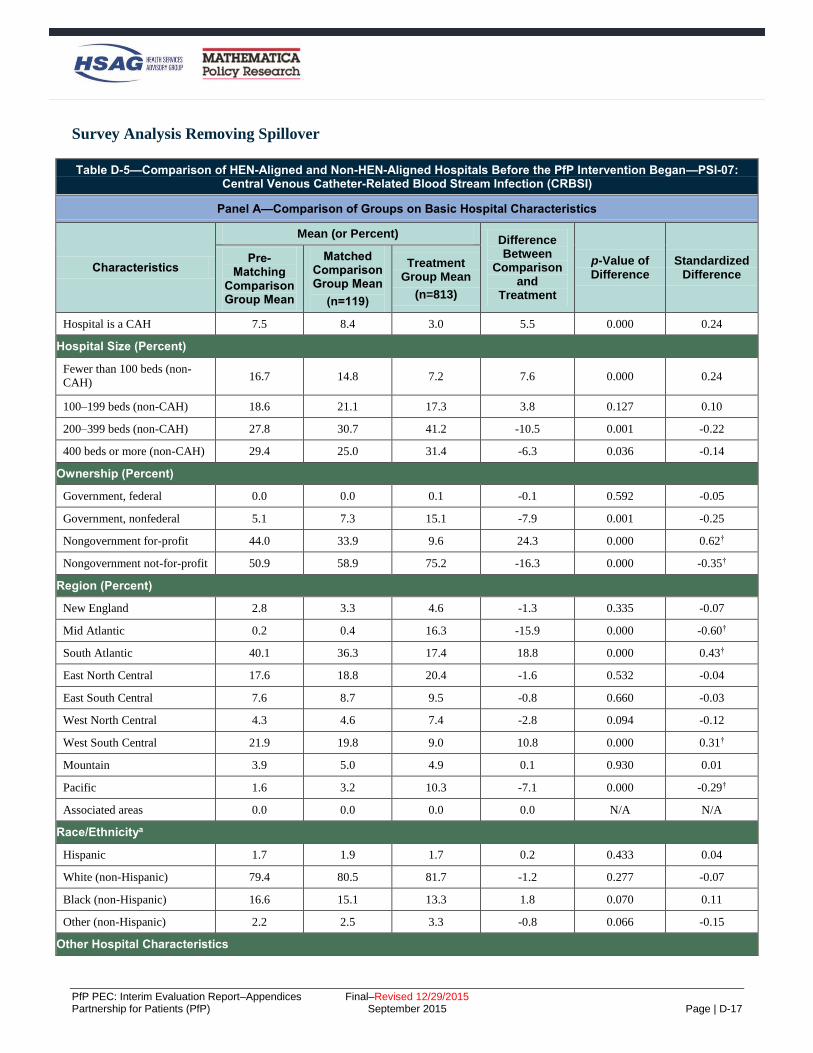
PfP PEC: Interim Evaluation Report–Appendices Final–Revised 12/29/2015 Partnership for Patients (PfP) September 2015 Page | D-17
Survey Analysis Removing Spillover
Table D-5—Comparison of HEN-Aligned and Non-HEN-Aligned Hospitals Before the PfP Intervention Began—PSI-07: Central Venous Catheter-Related Blood Stream Infection (CRBSI)
Panel A—Comparison of Groups on Basic Hospital Characteristics
Characteristics
Mean (or Percent) Difference Between
Comparison and
Treatment
p-Value of Difference
Standardized Difference
Pre-Matching
Comparison Group Mean
Matched Comparison Group Mean
(n=119)
Treatment Group Mean
(n=813)
Hospital is a CAH 7.5 8.4 3.0 5.5 0.000 0.24
Hospital Size (Percent)
Fewer than 100 beds (non-
CAH) 16.7 14.8 7.2 7.6 0.000 0.24
100–199 beds (non-CAH) 18.6 21.1 17.3 3.8 0.127 0.10
200–399 beds (non-CAH) 27.8 30.7 41.2 -10.5 0.001 -0.22
400 beds or more (non-CAH) 29.4 25.0 31.4 -6.3 0.036 -0.14
Ownership (Percent)
Government, federal 0.0 0.0 0.1 -0.1 0.592 -0.05
Government, nonfederal 5.1 7.3 15.1 -7.9 0.001 -0.25
Nongovernment for-profit 44.0 33.9 9.6 24.3 0.000 0.62†
Nongovernment not-for-profit 50.9 58.9 75.2 -16.3 0.000 -0.35†
Region (Percent)
New England 2.8 3.3 4.6 -1.3 0.335 -0.07
Mid Atlantic 0.2 0.4 16.3 -15.9 0.000 -0.60†
South Atlantic 40.1 36.3 17.4 18.8 0.000 0.43†
East North Central 17.6 18.8 20.4 -1.6 0.532 -0.04
East South Central 7.6 8.7 9.5 -0.8 0.660 -0.03
West North Central 4.3 4.6 7.4 -2.8 0.094 -0.12
West South Central 21.9 19.8 9.0 10.8 0.000 0.31†
Mountain 3.9 5.0 4.9 0.1 0.930 0.01
Pacific 1.6 3.2 10.3 -7.1 0.000 -0.29†
Associated areas 0.0 0.0 0.0 0.0 N/A N/A
Race/Ethnicitya
Hispanic 1.7 1.9 1.7 0.2 0.433 0.04
White (non-Hispanic) 79.4 80.5 81.7 -1.2 0.277 -0.07
Black (non-Hispanic) 16.6 15.1 13.3 1.8 0.070 0.11
Other (non-Hispanic) 2.2 2.5 3.3 -0.8 0.066 -0.15
Other Hospital Characteristics

PfP PEC: Interim Evaluation Report–Appendices Final–Revised 12/29/2015 Partnership for Patients (PfP) September 2015 Page | D-18
Table D-5—Comparison of HEN-Aligned and Non-HEN-Aligned Hospitals Before the PfP Intervention Began—PSI-07: Central Venous Catheter-Related Blood Stream Infection (CRBSI)
Panel A—Comparison of Groups on Basic Hospital Characteristics
Characteristics
Mean (or Percent) Difference Between
Comparison and
Treatment
p-Value of Difference
Standardized Difference
Pre-Matching
Comparison Group Mean
Matched Comparison Group Mean
(n=119)
Treatment Group Mean
(n=813)
Rural 27.2 29.5 18.8 10.7 0.000 0.25
Member of hospital system 72.4 71.2 65.9 5.3 0.088 0.11
Member of hospital network 23.1 25.2 41.5 -16.2 0.000 -0.35†
Teaching hospital 21.0 24.3 50.1 -25.8 0.000 -0.55†
Other Case Mix Characteristics
Femalea 43.8 43.6 44.4 -0.8 0.001 -0.21
Ageb 73.1 72.9 72.6 0.3 0.176 0.09
ASD Logit Model Omnibus Test
Mean Median Pseudo R2 Chi2 p-value Chi2 (d.f) p-value
0.22 0.18 0.184 344.9 0.000 168.8 (24) 0.000
Panel B—Comparison of Groups on Pre-Intervention Outcome Measure Level
Variable
Mean (or Percent) Difference Between
Treatment and Matched Comparison
Means
p-Value of Difference
Standardized Difference
Pre-Matching
Comparison Group Mean
Matched Comparison Group Mean
Treatment Group Mean
2011 CRBSI rate (events per
1,000 at risk) c 0.397 0.383 0.468 -0.085 0.013 -0.18
Source: Analysis of 2014 Survey on Prevention of Adverse Events and Readmissions, AHA Survey (FY 2010), and Medicare claims (2011–2012).
Note: Means (or percentages) are weighted by the product of the number of patients at risk for CRBSI and the weight obtained from a propensity score model with
the 2011 CRBSI rate from Medicare claims as independent variables. Any discrepancies between the sample means and the difference column are due to rounding. † SD is larger than 0.25 standard deviations. a Weighted mean of the percentage of at-risk patients across hospitals. b Weighted mean of the average age of at-risk Medicare patients across hospitals. c The 2011 adverse event rates were Winsorized at the 95th percentile of the distribution of adverse event rates among hospitals with positive rates.
N/A = not applicable

PfP PEC: Interim Evaluation Report–Appendices Final–Revised 12/29/2015 Partnership for Patients (PfP) September 2015 Page | D-19
Table D-6—Comparison of HEN-Aligned and Non-HEN-Aligned Hospitals Before the PfP Intervention Began—PSI-03: Pressure Ulcers (Stage III, IV, and Unstageable)
Panel A—Comparison of Groups on Basic Hospital Characteristics
Characteristics
Mean (or Percent) Difference Between
Comparison and
Treatment
p-Value of Difference
Standardized Difference
Pre-Matching
Comparison Group Mean
Matched Comparison Group Mean
(n=113)
Treatment Group Mean
(n=913)
Hospital is a CAH 3.3 5.8 2.2 3.5 0.001 0.18
Hospital Size (Percent)
Fewer than 100 beds (non-
CAH) 32.0 12.2 5.5 6.7 0.000 0.24
100–199 beds (non-CAH) 13.4 20.4 15.4 4.9 0.050 0.13
200–399 beds (non-CAH) 23.2 33.1 40.5 -7.4 0.029 -0.15
400 beds or more (non-CAH) 28.1 28.6 36.3 -7.8 0.019 -0.17
Ownership (Percent)
Government, federal 0.0 0.0 0.1 -0.1 0.637 -0.04
Government, nonfederal 2.6 5.5 14.7 -9.2 0.000 -0.31†
Nongovernment for-profit 51.4 34.0 8.9 25.1 0.000 0.64†
Nongovernment not-for-profit 46.0 60.5 76.3 -15.8 0.000 -0.34†
Region (Percent)
New England 1.6 2.7 4.4 -1.7 0.224 -0.09
Mid Atlantic 0.1 0.4 18.8 -18.4 0.000 -0.66†
South Atlantic 34.6 39.1 18.7 20.4 0.000 0.46†
East North Central 14.6 17.2 20.2 -3.0 0.281 -0.08
East South Central 6.1 9.0 8.4 0.6 0.768 0.02
West North Central 9.0 3.6 6.4 -2.9 0.089 -0.13
West South Central 30.8 21.7 9.1 12.6 0.000 0.35†
Mountain 2.0 3.6 4.4 -0.9 0.535 -0.04
Pacific 1.0 2.8 9.5 -6.7 0.001 -0.28†
Associated areas 0.0 0.0 0.0 0.0 N/A N/A
Race/Ethnicitya
Hispanic 1.7 2.0 1.8 0.2 0.483 0.04
White (non-Hispanic) 78.8 79.2 80.4 -1.2 0.310 -0.07
Black (non-Hispanic) 17.6 16.2 14.4 1.8 0.104 0.11
Other (non-Hispanic) 1.8 2.6 3.4 -0.8 0.103 -0.14
Other Hospital Characteristics
Rural 24.2 26.2 15.4 10.8 0.000 0.27†
Member of hospital system 73.6 73.2 65.8 7.4 0.023 0.16

PfP PEC: Interim Evaluation Report–Appendices Final–Revised 12/29/2015 Partnership for Patients (PfP) September 2015 Page | D-20
Table D-6—Comparison of HEN-Aligned and Non-HEN-Aligned Hospitals Before the PfP Intervention Began—PSI-03: Pressure Ulcers (Stage III, IV, and Unstageable)
Panel A—Comparison of Groups on Basic Hospital Characteristics
Characteristics
Mean (or Percent) Difference Between
Comparison and
Treatment
p-Value of Difference
Standardized Difference
Pre-Matching
Comparison Group Mean
Matched Comparison Group Mean
(n=113)
Treatment Group Mean
(n=913)
Member of hospital network 17.1 24.3 43.6 -19.3 0.000 -0.42†
Teaching hospital 17.6 25.3 53.4 -28.2 0.000 -0.60†
Other Case Mix Characteristics
Femalea 42.6 43.8 44.5 -0.8 0.003 -0.20
Ageb 71.5 72.8 72.5 0.2 0.299 0.07
ASD Logit Model Omnibus Test
Mean Median Pseudo R2 Chi2 p-value Chi2 (d.f) p-value
0.23 0.16 0.213 365.6 0.000 185.5 (24) 0.000
Panel B—Comparison of Groups on Pre-Intervention Outcome Measure Level
Variable
Mean (or Percent) Difference Between
Treatment and Matched Comparison
Means
p-Value of Difference
Standardized Difference
Pre-Matching
Comparison Group Mean
Matched Comparison Group Mean
Treatment Group Mean
2011 pressure ulcer rate (events
per 1,000 at risk)c 0.181 0.228 0.264 -0.035 0.248 -0.09
Source: Analysis of 2014 Survey on Prevention of Adverse Events and Readmissions, AHA Survey (FY 2010), and Medicare claims (2011–2012).
Note: Means (or percentages) are weighted by the product of the number of patients at risk for pressure ulcers and the weight obtained from a propensity score
model with the 2011 pressure ulcer rate from Medicare claims as independent variables. Any discrepancies between the sample means and the difference column are
due to rounding. † SD is larger than 0.25 standard deviations. a Weighted mean of the percentage of at-risk patients across hospitals. b Weighted mean of the average age of at-risk Medicare patients across hospitals. c The 2011 adverse event rates were Winsorized at the 95th percentile of the distribution of adverse event rates among hospitals with positive rates.
N/A = not applicable

PfP PEC: Interim Evaluation Report–Appendices Final–Revised 12/29/2015 Partnership for Patients (PfP) September 2015 Page | D-21
Table D-7—Comparison of HEN-Aligned and Non-HEN-Aligned Hospitals Before the PfP Intervention Began—PSI-12: Venous Thromboembolism
Panel A—Comparison of Groups on Basic Hospital Characteristics
Characteristics
Mean (or Percent) Difference Between
Comparison and
Treatment
p-Value of Difference
Standardized Difference
Pre-Matching
Comparison Group Mean
Matched Comparison Group Mean
(n=103)
Treatment Group Mean
(n=827)
Hospital is a CAH 40.3 29.2 32.9 -3.7 0.209 -0.08
Hospital Size (Percent)
Fewer than 100 beds (non-
CAH) 40.4 15.9 5.0 10.8 0.000 0.36†
100–199 beds (non-CAH) 4.6 14.2 15.8 -1.6 0.478 -0.05
200–399 beds (non-CAH) 6.7 19.4 23.8 -4.4 0.099 -0.11
400 beds or more (non-CAH) 8.1 21.4 22.5 -1.2 0.653 -0.03
Ownership (Percent)
Government, federal 0.0 0.0 0.0 0.0 0.839 -0.02
Government, nonfederal 33.6 23.6 21.4 2.2 0.381 0.05
Nongovernment for-profit 12.1 21.7 6.3 15.4 0.000 0.46†
Nongovernment not-for-profit 54.4 54.7 72.3 -17.7 0.000 -0.37†
Region (Percent)
New England 0.2 0.9 4.2 -3.3 0.007 -0.21
Mid Atlantic 0.0 0.0 9.5 -9.4 0.000 -0.46†
South Atlantic 9.8 24.9 16.4 8.5 0.000 0.21
East North Central 3.5 10.0 13.6 -3.6 0.092 -0.11
East South Central 38.0 13.8 12.1 1.7 0.408 0.05
West North Central 4.2 13.5 22.7 -9.1 0.000 -0.24
West South Central 42.7 30.5 10.7 19.8 0.000 0.50†
Mountain 1.3 5.0 4.5 0.6 0.664 0.03
Pacific 0.2 1.3 6.3 -5.1 0.001 -0.27†
Associated areas 0.0 0.0 0.0 0.0 N/A N/A
Race/Ethnicitya
Hispanic 0.9 1.6 1.1 0.5 0.007 0.13
White (non-Hispanic) 88.8 86.4 86.4 0.1 0.947 0.00
Black (non-Hispanic) 9.4 10.0 10.1 -0.0 0.954 -0.00
Other (non-Hispanic) 0.9 1.9 2.4 -0.5 0.086 -0.13
Other Hospital Characteristics
Rural 79.6 48.4 48.9 -0.5 0.881 -0.01
Member of hospital system 26.9 61.7 51.0 10.6 0.001 0.21

PfP PEC: Interim Evaluation Report–Appendices Final–Revised 12/29/2015 Partnership for Patients (PfP) September 2015 Page | D-22
Table D-7—Comparison of HEN-Aligned and Non-HEN-Aligned Hospitals Before the PfP Intervention Began—PSI-12: Venous Thromboembolism
Panel A—Comparison of Groups on Basic Hospital Characteristics
Characteristics
Mean (or Percent) Difference Between
Comparison and
Treatment
p-Value of Difference
Standardized Difference
Pre-Matching
Comparison Group Mean
Matched Comparison Group Mean
(n=103)
Treatment Group Mean
(n=827)
Member of hospital network 7.9 28.2 41.5 -13.3 0.000 -0.28†
Teaching hospital 4.6 15.2 34.8 -19.7 0.000 -0.47†
Other Case Mix Characteristics
Femalea 39.5 43.5 43.8 -0.4 0.208 -0.07
Ageb 76.5 75.8 74.2 1.6 0.000 0.37†
ASD Logit Model Omnibus Test
Mean Median Pseudo R2 Chi2 p-value Chi2 (d.f) p-value
0.19 0.13 0.244 544.2 0.000 162.8 (24) 0.000
Panel B—Comparison of Groups on Pre-Intervention Outcome Measure Level
Variable
Mean (or Percent) Difference Between
Treatment and Matched Comparison
Means
p-Value of Difference
Standardized Difference
Pre-Matching
Comparison Group Mean
Matched Comparison Group Mean
Treatment Group Mean
2011 VTE rate (event per 1,000
at risk) c 0.044 0.124 0.184 -0.059 0.004 -0.20
Source: Analysis of 2014 Survey on Prevention of Adverse Events and Readmissions, AHA Survey (FY 2010), and Medicare claims (2011–2012).
Note: Means (or percentages) are weighted by the product of the number of patients at risk for VTE and the weight obtained from a propensity score model with the
2011 VTE rate from Medicare claims as independent variables. Any discrepancies between the sample means and the difference column are due to rounding. † SD is larger than 0.25 standard deviations. a Weighted mean of the percentage of at-risk patients across hospitals. b Weighted mean of the average age of at-risk Medicare patients across hospitals. c The 2011 adverse event rates were Winsorized at the 95th percentile of the distribution of adverse event rates among hospitals with positive rates.
N/A = not applicable

PfP PEC: Interim Evaluation Report–Appendices Final–Revised 12/29/2015 Partnership for Patients (PfP) September 2015 Page | D-23
Table D-8—Comparison of HEN-Aligned and Non-HEN-Aligned Hospitals Before the PfP Intervention Began—Readmissions
Panel A—Comparison of Groups on Basic Hospital Characteristics
Characteristics
Mean (or Percent) Difference Between
Comparison and
Treatment
p-Value of Difference
Standardized Difference
Pre-Matching
Comparison Group Mean
Matched Comparison Group Mean
(n=168)
Treatment Group Mean
(n=857)
Hospital is a CAH 5.0 5.0 3.2 1.8 0.095 0.09
Hospital Size (Percent)
Fewer than 100 beds (non-
CAH) 12.5 9.0 6.6 2.4 0.108 0.09
100–199 beds (non-CAH) 21.1 21.8 16.1 5.8 0.009 0.15
200–399 beds (non-CAH) 41.9 40.6 39.1 1.5 0.617 0.03
400 beds or more (non-CAH) 19.5 23.7 35.1 -11.4 0.000 -0.25
Ownership (Percent)
Government, federal 0.1 0.0 0.0 0.0 0.218 0.03
Government, nonfederal 6.9 6.1 16.1 -10.0 0.000 -0.32
Nongovernment for-profit 30.0 19.5 8.6 10.9 0.000 0.32
Nongovernment not-for-profit 63.0 74.3 75.3 -1.0 0.694 -0.02
Region (Percent)
New England 8.4 11.0 3.5 7.4 0.000 0.29
Mid Atlantic 0.1 0.3 17.9 -17.6 0.000 -0.64
South Atlantic 32.0 31.6 16.8 14.8 0.000 0.35
East North Central 22.3 17.3 20.7 -3.4 0.154 -0.09
East South Central 6.7 5.0 9.9 -4.9 0.005 -0.19
West North Central 2.6 2.7 8.3 -5.5 0.001 -0.24
West South Central 17.7 16.8 7.9 8.9 0.000 0.27
Mountain 5.8 8.0 4.8 3.2 0.015 0.13
Pacific 4.4 7.4 10.2 -2.8 0.117 -0.10
Associated areas 0.0 0.0 0.0 0.0 N/A N/A
Race/Ethnicitya
Hispanic 1.0 1.0 0.7 0.4 0.021 0.11
White (non-Hispanic) 77.8 80.8 82.5 -1.7 0.081 -0.10
Black (non-Hispanic) 18.1 14.7 13.0 1.8 0.042 0.11
Other (non-Hispanic) 3.1 3.5 3.9 -0.5 0.274 -0.07
Other Hospital Characteristics
Rural 20.4 18.2 18.3 -0.1 0.958 -0.00
Member of hospital system 65.0 69.3 65.5 3.8 0.177 0.08

PfP PEC: Interim Evaluation Report–Appendices Final–Revised 12/29/2015 Partnership for Patients (PfP) September 2015 Page | D-24
Table D-8—Comparison of HEN-Aligned and Non-HEN-Aligned Hospitals Before the PfP Intervention Began—Readmissions
Panel A—Comparison of Groups on Basic Hospital Characteristics
Characteristics
Mean (or Percent) Difference Between
Comparison and
Treatment
p-Value of Difference
Standardized Difference
Pre-Matching
Comparison Group Mean
Matched Comparison Group Mean
(n=168)
Treatment Group Mean
(n=857)
Member of hospital network 25.7 34.1 42.2 -8.1 0.006 -0.17
Teaching hospital 23.9 30.7 53.3 -22.6 0.000 -0.47
Hospital part of IPPS 83.9 81.2 95.0 -13.8 0.000 -0.44
Other Case Mix Characteristics
Femalea 43.9 44.0 44.4 -0.4 0.070 -0.11
Ageb 72.7 72.9 72.6 0.3 0.112 0.10
ASD Logit Model Omnibus Test
Mean Median Pseudo R2 Chi2 p-value Chi2 (d.f) p-value
0.18 0.11 0.196 416.6 0.000 196.9 (26) 0.000
Panel B—Comparison of Groups on Pre-Intervention Outcome Measure Level and Change
Variable
Mean (or Percent) Difference Between
Treatment and Matched Comparison
Means
p-Value of Difference
Standardized Difference
Pre-Matching
Comparison Group Mean
Matched Comparison Group Mean
Treatment Group Mean
30-day all-cause readmission
rate, 2010c 19.4 18.7 19.1 -0.5 0.014 -0.13
30-day all-cause readmission
rate, 2009 c 19.7 18.8 19.2 -0.4 0.035 -0.11
Change in 30-day all-cause
readmission rate from 2009 to
2010c
-0.3 -0.2 -0.1 -0.1 0.420 -0.04
ASD Logit Model Omnibus Test
Mean Median Pseudo R2 Chi2 p-value Chi2 (d.f) p-value
0.12 0.11 0.006 12.8 0.005 2.5 (3) 0.473
Source: Analysis of 2014 Survey on Prevention of Adverse Events and Readmissions, AHA Survey (FY 2010), and Medicare claims (2011–2012).
Note: Means (or percentages) are weighted by the product of the number of patients at risk for readmission and the weight obtained from a propensity score
model with the 2009 and 2010 readmission rate from Medicare claims as independent variables. Any discrepancies between the sample means and the difference
column are due to rounding. † SD is larger than 0.25 standard deviations. a Weighted mean of the percentage of at-risk patients across hospitals. b Weighted mean of the average age of at-risk Medicare patients across hospitals. c The 2009 and 2010 adverse event rates were Winsorized at the 95th percentile of the distribution of adverse event rates among hospitals with positive rates.
N/A = not applicable

PfP PEC: Interim Evaluation Report–Appendices Final–Revised 12/29/2015 Partnership for Patients (PfP) September 2015 Page | D-25
Analysis of Relationship Between Hospital Engagement (Survey Data) and Outcomes (Medicare
FFS Claims)
Table D-9—Comparison of Minimally Engaged HEN-Aligned and Non-HEN-Aligned/Non-Engaged Hospitals Before the PfP Intervention Began—PSI-07: Central Venous Catheter-Related Blood Stream Infection (CRBSI)
Panel A—Comparison of Groups on Basic Hospital Characteristics
Characteristics
Mean (or Percent) Difference Between
Comparison and
Treatment
p-Value of Difference
Standardized Difference
Pre-Matching
Comparison Group Mean
Matched Comparison Group Mean
(n=146)
Treatment Group Mean
(n=784)
Hospital is a CAH 5.6 5.6 5.5 0.1 0.989 0.00
Hospital Size (Percent)
Fewer than 100 beds (non-
CAH) 9.7 11.7 7.0 4.7 0.363 0.16
100–199 beds (non-CAH) 18.3 26.4 30.7 -4.4 0.577 -0.10
200–399 beds (non-CAH) 38.6 25.3 32.3 -7.0 0.373 -0.15
400 beds or more (non-CAH) 27.9 31.1 24.5 6.6 0.399 0.15
Ownership (Percent)
Government, federal/non-
federal 9.5 8.7 20.3 -11.5 0.052 -0.33†
Nongovernment for-profit 19.0 6.1 2.5 3.6 0.321 0.18
Nongovernment not-for-profit 71.5 85.1 77.2 7.9 0.239 0.20
Region (Percent)
New England 6.3 5.7 0.9 4.8 0.145 0.27†
Mid Atlantic 15.9 3.5 5.7 -2.2 0.536 -0.11
South Atlantic 23.3 16.1 10.5 5.6 0.351 0.16
East North Central 20.3 22.9 31.2 -8.3 0.282 -0.19
East South Central 5.0 2.7 1.4 1.3 0.608 0.09
West North Central 4.8 15.4 23.9 -8.5 0.212 -0.21
West South Central 12.2 10.8 2.1 8.7 0.052 0.36†
Mountain 6.9 7.5 3.8 3.7 0.374 0.16
Pacific 5.4 15.4 20.5 -5.0 0.448 -0.13
Associated areas 0.0 0.0 0.0 0.0 N/A N/A
Race/Ethnicitya
Hispanic 1.6 1.6 1.2 0.3 0.529 0.11
White (non-Hispanic) 79.1 85.5 87.3 -1.8 0.455 -0.13
Black (non-Hispanic) 16.5 9.1 8.1 1.0 0.628 0.09
Other (non-Hispanic) 2.8 3.8 3.3 0.5 0.545 0.10
Other Hospital Characteristics

PfP PEC: Interim Evaluation Report–Appendices Final–Revised 12/29/2015 Partnership for Patients (PfP) September 2015 Page | D-26
Table D-9—Comparison of Minimally Engaged HEN-Aligned and Non-HEN-Aligned/Non-Engaged Hospitals Before the PfP Intervention Began—PSI-07: Central Venous Catheter-Related Blood Stream Infection (CRBSI)
Panel A—Comparison of Groups on Basic Hospital Characteristics
Characteristics
Mean (or Percent) Difference Between
Comparison and
Treatment
p-Value of Difference
Standardized Difference
Pre-Matching
Comparison Group Mean
Matched Comparison Group Mean
(n=146)
Treatment Group Mean
(n=784)
Rural 20.2 29.5 29.0 0.5 0.954 0.01
Member of hospital system 66.0 70.2 51.8 18.4 0.028 0.38†
Member of hospital network 33.4 31.7 32.2 -0.5 0.949 -0.01
Teaching hospital 34.6 43.2 49.7 -6.5 0.458 -0.13
Other Case Mix Characteristics
Femalea 44.3 44.6 44.9 -0.3 0.641 -0.08
Ageb 72.7 72.6 72.4 0.12 0.838 0.04
ASD Logit Model Omnibus Test
Mean Median Pseudo R2 Chi2 p-value Chi2 (d.f) p-value
0.15 0.13 0.15 27.89 0.220 34.36 (23) 0.060
Panel B—Comparison of Groups on Pre-Intervention Outcome Measure Level
Variable
Mean (or Percent) Difference Between
Treatment and Matched Comparison
Means
p-Value of Difference
Standardized Difference
Pre-Matching
Comparison Group Mean
Matched Comparison Group Mean
Treatment Group Mean
2011 CRBSI rate (events per
1,000 at risk)c 0.400 0.459 0.484 -0.02 0.842 -0.03
Source: Analysis of 2014 Survey on Prevention of Adverse Events and Readmissions, AHA Survey (FY 2010), and Medicare claims (2011–2012).
Note: Means (or percentages) are weighted by the product of the number of patients at risk for CRBSI and the weight obtained from a propensity score model with
the 2011 CRBSI rate from Medicare claims as independent variables. Any discrepancies between the sample means and the difference column are due to rounding. † SD is larger than 0.25 standard deviations. a Weighted mean of the percentage of at-risk patients across hospitals. b Weighted mean of the average age of at-risk Medicare patients across hospitals. c The adverse event rates were Winsorized at the 95th percentile of the distribution of adverse event rates among hospitals with positive rates.
N/A = not applicable

PfP PEC: Interim Evaluation Report–Appendices Final–Revised 12/29/2015 Partnership for Patients (PfP) September 2015 Page | D-27
Table D-10—Comparison of Moderately Engaged HEN-Aligned and Non-HEN-Aligned/Non-Engaged Hospitals Before the PfP Intervention Began—PSI-07: Central Venous Catheter-Related Blood Stream Infection (CRBSI)
Panel A—Comparison of Groups on Basic Hospital Characteristics
Characteristics
Mean (or Percent) Difference Between
Comparison and
Treatment
p-Value of Difference
Standardized Difference
Pre-Matching
Comparison Group Mean
Matched Comparison Group Mean
(n=146)
Treatment Group Mean
(n=784)
Hospital is a CAH 5.6 3.9 4.8 -0.9 0.680 -0.04
Hospital Size (Percent)
Fewer than 100 beds (non-
CAH) 9.7 9.8 5.8 4.0 0.171 0.15
100–199 beds (non-CAH) 18.3 23.1 23.4 -0.3 0.943 -0.01
200–399 beds (non-CAH) 38.6 32.4 46.1 -13.8 0.008 -0.28†
400 beds or more (non-CAH) 27.9 30.9 19.9 11.0 0.020 0.25
Ownership (Percent)
Government, federal/non-
federal 9.5 17.9 13.8 4.1 0.299 0.11
Nongovernment for-profit 19.0 10.5 5.7 4.7 0.114 0.17
Nongovernment not-for-profit 71.5 71.6 80.4 -8.8 0.056 -0.21
Region (Percent)
New England 6.3 5.2 1.7 3.4 0.096 0.19
Mid Atlantic 15.9 12.2 17.3 -5.1 0.171 -0.14
South Atlantic 23.3 16.7 15.5 1.2 0.762 0.03
East North Central 20.3 18.2 40.1 -21.9 0.000 -0.50†
East South Central 5.0 8.7 2.3 6.4 0.012 0.28†
West North Central 4.8 8.2 9.5 -1.3 0.674 -0.04
West South Central 12.2 19.2 6.2 13.0 0.000 0.40†
Mountain 6.9 4.5 3.9 0.6 0.776 0.03
Pacific 5.4 7.1 3.5 3.6 0.146 0.16
Associated areas 0.0 0.0 0.0 0.0 N/A N/A
Race/Ethnicitya
Hispanic 1.6 1.3 1.1 0.2 0.555 0.06
White (non-Hispanic) 79.1 81.3 82.3 -1.0 0.594 -0.06
Black (non-Hispanic) 16.5 13.8 14.0 -0.2 0.902 -0.01
Other (non-Hispanic) 2.8 3.6 2.6 1.0 0.029 0.24
Other Hospital Characteristics
Rural 20.2 19.2 25.1 -6.0 0.173 -0.14
Member of hospital system 66.0 75.6 64.0 11.6 0.017 0.25

PfP PEC: Interim Evaluation Report–Appendices Final–Revised 12/29/2015 Partnership for Patients (PfP) September 2015 Page | D-28
Table D-10—Comparison of Moderately Engaged HEN-Aligned and Non-HEN-Aligned/Non-Engaged Hospitals Before the PfP Intervention Began—PSI-07: Central Venous Catheter-Related Blood Stream Infection (CRBSI)
Panel A—Comparison of Groups on Basic Hospital Characteristics
Characteristics
Mean (or Percent) Difference Between
Comparison and
Treatment
p-Value of Difference
Standardized Difference
Pre-Matching
Comparison Group Mean
Matched Comparison Group Mean
(n=146)
Treatment Group Mean
(n=784)
Member of hospital network 33.4 32.0 48.8 -16.8 0.001 -0.35†
Teaching hospital 34.6 41.1 41.0 0.1 0.983 0.00
Other Case Mix Characteristics
Femalea 44.3 45.1 45.2 -0.1 0.921 -0.01
Ageb 72.7 72.3 72.2 0.04 0.932 0.09
ASD Logit Model Omnibus Test
Mean Median Pseudo R2 Chi2 p-value Chi2 (d.f) p-value
0.15 0.14 0.129 64.09 0.000 26.23 (23) 0.290
Panel B—Comparison of Groups on Pre-Intervention Outcome Measure Level
Variable
Mean (or Percent) Difference Between
Treatment and Matched Comparison
Means
p-Value of Difference
Standardized Difference
Pre-Matching
Comparison Group Mean
Matched Comparison Group Mean
Treatment Group Mean
2011 CRBSI rate (events per
1,000 at risk)c 0.400 0.310 0.452 -0.142 0.007 -0.29†
Source: Analysis of 2014 Survey on Prevention of Adverse Events and Readmissions, AHA Survey (FY 2010), and Medicare claims (2011–2012).
Note: Means (or percentages) are weighted by the product of the number of patients at risk for CRBSI and the weight obtained from a propensity score model with
the 2011 CRBSI rate from Medicare claims as independent variables. Any discrepancies between the sample means and the difference column are due to rounding. † SD is larger than 0.25 standard deviations. a Weighted mean of the percentage of at-risk patients across hospitals. b Weighted mean of the average age of at-risk Medicare patients across hospitals. c The adverse event rates were Winsorized at the 95th percentile of the distribution of adverse event rates among hospitals with positive rates.
N/A = not applicable

PfP PEC: Interim Evaluation Report–Appendices Final–Revised 12/29/2015 Partnership for Patients (PfP) September 2015 Page | D-29
Table D-11—Comparison of Fully Engaged HEN-Aligned and Non-HEN-Aligned/Non-Engaged Hospitals Before the PfP Intervention Began—PSI-07: Central Venous Catheter-Related Blood Stream Infection (CRBSI)
Panel A—Comparison of Groups on Basic Hospital Characteristics
Characteristics
Mean (or Percent) Difference Between
Comparison and
Treatment
p-Value of Difference
Standardized Difference
Pre-Matching
Comparison Group Mean
Matched Comparison Group Mean
(n=146)
Treatment Group Mean
(n=784)
Hospital is a CAH 5.6 3.6 4.5 -0.9 0.389 -0.04
Hospital Size (Percent)
Fewer than 100 beds (non-
CAH) 9.7 9.2 12.1 -2.9 0.068 -0.09
100–199 beds (non-CAH) 18.3 19.2 17.9 1.3 0.536 0.03
200–399 beds (non-CAH) 38.6 30.9 36.9 -6.0 0.015 -0.13
400 beds or more (non-CAH) 27.9 37.1 28.5 8.6 0.001 0.18
Ownership (Percent)
Government, federal/non-
federal 9.5 13.2 13.5 -0.3 0.849 -0.01
Nongovernment for-profit 19.0 17.2 9.1 8.1 0.000 0.24
Nongovernment not-for-profit 71.5 69.7 77.4 -7.7 0.001 -0.18
Region (Percent)
New England 6.3 5.7 8.2 -2.4 0.067 -0.09
Mid Atlantic 15.9 10.0 16.1 -6.1 0.000 -0.18
South Atlantic 23.3 16.4 21.1 -4.7 0.021 -0.12
East North Central 20.3 13.5 17.4 -3.9 0.037 -0.11
East South Central 5.0 8.8 10.5 -1.8 0.253 -0.06
West North Central 4.8 7.7 5.8 1.9 0.163 0.07
West South Central 12.2 22.9 8.3 14.5 0.000 0.41†
Mountain 6.9 5.6 3.6 2.0 0.078 0.09
Pacific 5.4 9.4 9.0 0.5 0.758 0.02
Associated areas 0.0 0.0 0.0 0.0 N/A N/A
Race/Ethnicitya
Hispanic 1.6 2.1 1.3 0.7 0.001 0.18
White (non-Hispanic) 79.1 80.0 84.0 -3.9 0.000 -0.24
Black (non-Hispanic) 16.5 13.0 11.1 1.9 0.013 0.13
Other (non-Hispanic) 2.8 4.8 3.6 1.3 0.001 0.17
Other Hospital Characteristics
Rural 20.2 17.7 25.7 -8.0 0.000 -0.19
Member of hospital system 66.0 75.4 54.8 20.6 0.000 0.44†

PfP PEC: Interim Evaluation Report–Appendices Final–Revised 12/29/2015 Partnership for Patients (PfP) September 2015 Page | D-30
Table D-11—Comparison of Fully Engaged HEN-Aligned and Non-HEN-Aligned/Non-Engaged Hospitals Before the PfP Intervention Began—PSI-07: Central Venous Catheter-Related Blood Stream Infection (CRBSI)
Panel A—Comparison of Groups on Basic Hospital Characteristics
Characteristics
Mean (or Percent) Difference Between
Comparison and
Treatment
p-Value of Difference
Standardized Difference
Pre-Matching
Comparison Group Mean
Matched Comparison Group Mean
(n=146)
Treatment Group Mean
(n=784)
Member of hospital network 33.4 29.0 44.4 -15.4 0.000 -0.32†
Teaching hospital 34.6 55.2 43.3 12.0 0.000 0.24
Other Case Mix Characteristics
Femalea 44.3 44.5 43.5 1.1 0.000 0.29
Ageb 72.7 72.1 73.4 -1.2 0.000 -0.40†
ASD Logit Model Omnibus Test
Mean Median Pseudo R2 Chi2 p-value Chi2 (d.f) p-value
0.17 0.17 0.102 205.89 0.000 28.47 (23) 0.198
Panel B—Comparison of Groups on Pre-Intervention Outcome Measure Level
Variable
Mean (or Percent) Difference Between
Treatment and Matched Comparison
Means
p-Value of Difference
Standardized Difference
Pre-Matching
Comparison Group Mean
Matched Comparison Group Mean
Treatment Group Mean
2011 CRBSI rate (events per
1,000 at risk)c 0.400 0.321 0.371 -0.05 0.031 -0.11
Source: Analysis of 2014 Survey on Prevention of Adverse Events and Readmissions, AHA Survey (FY 2010), and Medicare claims (2011–2012).
Note: Means (or percentages) are weighted by the product of the number of patients at risk for CRBSI and the weight obtained from a propensity score model with
the 2011 CRBSI rate from Medicare claims as independent variables. Any discrepancies between the sample means and the difference column are due to rounding. † SD is larger than 0.25 standard deviations. a Weighted mean of the percentage of at-risk patients across hospitals. b Weighted mean of the average age of at-risk Medicare patients across hospitals. c The adverse event rates were Winsorized at the 95th percentile of the distribution of adverse event rates among hospitals with positive rates.
N/A = not applicable

PfP PEC: Interim Evaluation Report–Appendices Final–Revised 12/29/2015 Partnership for Patients (PfP) September 2015 Page | D-31
Table D-12—Comparison of Minimally Engaged HEN-Aligned and Non-HEN-Aligned/Non-Engaged Hospitals Before the PfP Intervention Began—PSI-03: Stage III, IV, and Unstageable Pressure Ulcers
Panel A—Comparison of Groups on Basic Hospital Characteristics
Characteristics
Mean (or Percent) Difference Between
Comparison and
Treatment
p-Value of Difference
Standardized Difference
Pre-Matching
Comparison Group Mean
Matched Comparison Group Mean
(n=142)
Treatment Group Mean
(n=876)
Hospital is a CAH 3.1 3.3 2.7 0.6 0.786 0.03
Hospital Size (Percent)
Fewer than 100 beds (non-
CAH) 15.0 5.8 5.8 0.0 0.981 0.00
100–199 beds (non-CAH) 15.1 13.7 18.7 -5.0 0.263 -0.14
200–399 beds (non-CAH) 36.3 45.6 49.5 -3.9 0.528 -0.08
400 beds or more (non-CAH) 30.6 31.6 23.3 8.3 0.140 0.19
Ownership (Percent)
Government, federal/non-
federal 8.5 12.2 19.0 -6.8 0.118 -0.19
Nongovernment for-profit 23.1 7.6 10.7 -3.1 0.375 -0.11
Nongovernment not-for-profit 68.4 80.2 70.3 9.9 0.058 0.23
Region (Percent)
New England 4.7 2.4 1.8 0.6 0.739 0.04
Mid Atlantic 17.6 20.5 4.6 15.9 0.000 0.49†
South Atlantic 22.9 19.5 15.8 3.7 0.437 0.10
East North Central 19.0 21.3 22.0 -0.6 0.901 -0.02
East South Central 4.4 5.8 9.6 -3.8 0.229 -0.14
West North Central 5.7 4.6 14.9 -10.3 0.002 -0.35†
West South Central 15.8 15.0 15.2 -0.2 0.960 -0.01
Mountain 4.7 4.4 2.4 2.0 0.384 0.11
Pacific 5.1 6.6 13.9 -7.3 0.040 -0.24
Associated areas 0.0 0.0 0.0 0.0 N/A N/A
Race/Ethnicitya
Hispanic 1.7 1.4 1.8 -0.4 0.416 -0.10
White (non-Hispanic) 77.6 74.6 84.0 -9.4 0.000 -0.52†
Black (non-Hispanic) 18.1 20.9 11.6 9.3 0.000 0.52†
Other (non-Hispanic) 2.6 3.1 2.6 0.5 0.361 0.12
Other Hospital Characteristics
Rural 17.3 15.3 13.9 1.4 0.755 0.04
Member of hospital system 66.1 72.5 56.8 15.7 0.007 0.33†

PfP PEC: Interim Evaluation Report–Appendices Final–Revised 12/29/2015 Partnership for Patients (PfP) September 2015 Page | D-32
Table D-12—Comparison of Minimally Engaged HEN-Aligned and Non-HEN-Aligned/Non-Engaged Hospitals Before the PfP Intervention Began—PSI-03: Stage III, IV, and Unstageable Pressure Ulcers
Panel A—Comparison of Groups on Basic Hospital Characteristics
Characteristics
Mean (or Percent) Difference Between
Comparison and
Treatment
p-Value of Difference
Standardized Difference
Pre-Matching
Comparison Group Mean
Matched Comparison Group Mean
(n=142)
Treatment Group Mean
(n=876)
Member of hospital network 30.3 37.7 42.1 -4.4 0.465 -0.09
Teaching hospital 33.6 53.5 43.3 10.1 0.102 0.20
Other Case Mix Characteristics
Femalea 44.1 44.9 45.1 -0.1 0.757 -0.04
Ageb 72.1 72.2 72.2 0.04 0.917 0.01
ASD Logit Model Omnibus Test
Mean Median Pseudo R2 Chi2 p-value Chi2 (d.f) p-value
0.16 0.11 0.20 74.0 0.000 42.7 (23) 0.007
Panel B—Comparison of Groups on Pre-Intervention Outcome Measure Level
Variable
Mean (or Percent) Difference Between
Treatment and Matched Comparison
Means
p-Value of Difference
Standardized Difference
Pre-Matching
Comparison Group Mean
Matched Comparison Group Mean
Treatment Group Mean
2011 Pressure Ulcer rate
(events per 1,000 at risk)c 0.247 0.273 0.263 0.01 0.842 -0.02
Source: Analysis of 2014 Survey on Prevention of Adverse Events and Readmissions, AHA Survey (FY 2010), and Medicare claims (2011–2012).
Note: Means (or percentages) are weighted by the product of the number of patients at risk for pressure ulcer and the weight obtained from a propensity score model
with the 2011 pressure ulcer rate from Medicare claims as independent variables. Any discrepancies between the sample means and the difference column are due to
rounding. † SD is larger than 0.25 standard deviations. a Weighted mean of the percentage of at-risk patients across hospitals. b Weighted mean of the average age of at-risk Medicare patients across hospitals. c The adverse event rates were Winsorized at the 95th percentile of the distribution of adverse event rates among hospitals with positive rates.
N/A = not applicable

PfP PEC: Interim Evaluation Report–Appendices Final–Revised 12/29/2015 Partnership for Patients (PfP) September 2015 Page | D-33
Table D-13—Comparison of Moderately Engaged HEN-Aligned and Non-HEN-Aligned/Non-Engaged Hospitals Before the PfP Intervention Began—PSI-03: Stage III, IV, and Unstageable Pressure Ulcers
Panel A—Comparison of Groups on Basic Hospital Characteristics
Characteristics
Mean (or Percent) Difference Between
Comparison and
Treatment
p-Value of Difference
Standardized Difference
Pre-Matching
Comparison Group Mean
Matched Comparison Group Mean
(n=142)
Treatment Group Mean
(n=876)
Hospital is a CAH 3.1 3.5 2.5 1.0 0.571 0.06
Hospital Size (Percent)
Fewer than 100 beds (non-
CAH) 15.0 7.0 5.4 1.6 0.495 0.07
100–199 beds (non-CAH) 15.1 19.6 24.7 -5.2 0.203 -0.12
200–399 beds (non-CAH) 36.3 55.9 46.2 9.7 0.048 0.19
400 beds or more (non-CAH) 30.6 14.0 21.1 -7.1 0.055 -0.19
Ownership (Percent)
Government, federal/non-
federal 8.5 27.0 15.9 11.1 0.006 0.27†
Nongovernment for-profit 23.1 9.1 7.8 1.3 0.640 0.05
Nongovernment not-for-profit 68.4 63.9 76.3 -12.4 0.006 -0.27†
Region (Percent)
New England 4.7 2.9 6.3 -3.4 0.091 -0.16
Mid Atlantic 17.6 22.1 23.4 -1.2 0.762 -0.03
South Atlantic 22.9 17.1 13.8 3.3 0.362 0.09
East North Central 19.0 19.0 33.2 -14.2 0.001 -0.33†
East South Central 4.4 5.1 1.1 4.0 0.024 0.23
West North Central 5.7 4.1 8.0 -3.9 0.087 -0.17
West South Central 15.8 13.7 7.3 6.4 0.036 0.21
Mountain 4.7 11.7 5.2 6.5 0.019 0.24
Pacific 5.1 4.3 1.7 2.6 0.131 0.15
Associated areas 0.0 0.0 0.0 0.0 N/A N/A
Race/Ethnicitya
Hispanic 1.7 1.5 2.1 -0.6 0.218 -0.12
White (non-Hispanic) 77.6 76.0 82.6 -6.6 0.000 -0.35†
Black (non-Hispanic) 18.1 19.9 12.8 7.1 0.000 0.40†
Other (non-Hispanic) 2.6 2.6 2.5 0.1 0.842 0.02
Other Hospital Characteristics
Rural 17.3 16.6 21.4 -4.8 0.208 -0.12
Member of hospital system 66.1 67.2 64.0 3.2 0.493 0.07
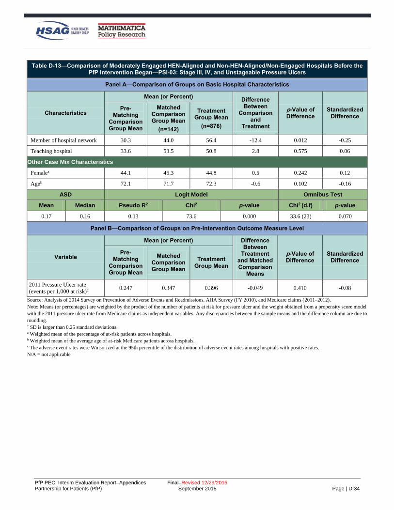
PfP PEC: Interim Evaluation Report–Appendices Final–Revised 12/29/2015 Partnership for Patients (PfP) September 2015 Page | D-34
Table D-13—Comparison of Moderately Engaged HEN-Aligned and Non-HEN-Aligned/Non-Engaged Hospitals Before the PfP Intervention Began—PSI-03: Stage III, IV, and Unstageable Pressure Ulcers
Panel A—Comparison of Groups on Basic Hospital Characteristics
Characteristics
Mean (or Percent) Difference Between
Comparison and
Treatment
p-Value of Difference
Standardized Difference
Pre-Matching
Comparison Group Mean
Matched Comparison Group Mean
(n=142)
Treatment Group Mean
(n=876)
Member of hospital network 30.3 44.0 56.4 -12.4 0.012 -0.25
Teaching hospital 33.6 53.5 50.8 2.8 0.575 0.06
Other Case Mix Characteristics
Femalea 44.1 45.3 44.8 0.5 0.242 0.12
Ageb 72.1 71.7 72.3 -0.6 0.102 -0.16
ASD Logit Model Omnibus Test
Mean Median Pseudo R2 Chi2 p-value Chi2 (d.f) p-value
0.17 0.16 0.13 73.6 0.000 33.6 (23) 0.070
Panel B—Comparison of Groups on Pre-Intervention Outcome Measure Level
Variable
Mean (or Percent) Difference Between
Treatment and Matched Comparison
Means
p-Value of Difference
Standardized Difference
Pre-Matching
Comparison Group Mean
Matched Comparison Group Mean
Treatment Group Mean
2011 Pressure Ulcer rate
(events per 1,000 at risk)c 0.247 0.347 0.396 -0.049 0.410 -0.08
Source: Analysis of 2014 Survey on Prevention of Adverse Events and Readmissions, AHA Survey (FY 2010), and Medicare claims (2011–2012).
Note: Means (or percentages) are weighted by the product of the number of patients at risk for pressure ulcer and the weight obtained from a propensity score model
with the 2011 pressure ulcer rate from Medicare claims as independent variables. Any discrepancies between the sample means and the difference column are due to
rounding. † SD is larger than 0.25 standard deviations. a Weighted mean of the percentage of at-risk patients across hospitals. b Weighted mean of the average age of at-risk Medicare patients across hospitals. c The adverse event rates were Winsorized at the 95th percentile of the distribution of adverse event rates among hospitals with positive rates.
N/A = not applicable

PfP PEC: Interim Evaluation Report–Appendices Final–Revised 12/29/2015 Partnership for Patients (PfP) September 2015 Page | D-35
Table D-14—Comparison of Fully Engaged HEN-Aligned and Non-HEN-Aligned/Non-Engaged Hospitals Before the PfP Intervention Began—PSI-03: Stage III, IV, and Unstageable Pressure Ulcers
Panel A—Comparison of Groups on Basic Hospital Characteristics
Characteristics
Mean (or Percent) Difference Between
Comparison and
Treatment
p-Value of Difference
Standardized Difference
Pre-Matching
Comparison Group Mean
Matched Comparison Group Mean
(n=142)
Treatment Group Mean
(n=876)
Hospital is a CAH 3.1 3.1 2.6 0.4 0.642 0.03
Hospital Size (Percent)
Fewer than 100 beds (non-
CAH) 15.0 7.2 8.6 -1.4 0.355 -0.05
100–199 beds (non-CAH) 15.1 12.2 15.5 -3.3 0.076 -0.10
200–399 beds (non-CAH) 36.3 49.1 35.5 13.6 0.000 0.28†
400 beds or more (non-CAH) 30.6 28.4 37.7 -9.3 0.000 -0.20
Ownership (Percent)
Government, federal/non-
federal 8.5 14.5 14.6 -0.1 0.955 -0.00
Nongovernment for-profit 23.1 5.9 9.1 -3.2 0.027 -0.12
Nongovernment not-for-profit 68.4 79.6 76.4 3.3 0.148 0.08
Region (Percent)
New England 4.7 6.3 4.7 1.6 0.206 0.07
Mid Atlantic 17.6 33.1 21.2 11.9 0.000 0.27†
South Atlantic 22.9 12.3 21.4 -9.1 0.000 -0.25
East North Central 19.0 13.5 16.2 -2.7 0.170 -0.08
East South Central 4.4 4.1 9.7 -5.6 0.000 -0.22
West North Central 5.7 3.7 7.0 -3.3 0.007 -0.15
West South Central 15.8 11.2 7.3 4.0 0.013 0.14
Mountain 4.7 8.7 3.5 5.2 0.000 0.22
Pacific 5.1 7.1 9.0 -1.9 0.202 -0.07
Associated areas 0.0 0.0 0.0 0.0 N/A N/A
Race/Ethnicitya
Hispanic 1.7 1.5 1.4 0.1 0.571 0.03
White (non-Hispanic) 77.6 71.7 82.9 -11.2 0.000 -0.55†
Black (non-Hispanic) 18.1 23.6 12.6 11.1 0.000 0.56†
Other (non-Hispanic) 2.6 3.2 3.2 0.0 0.957 0.00
Other Hospital Characteristics
Rural 17.3 13.9 22.1 -8.2 0.000 -0.22
Member of hospital system 66.1 74.6 63.9 10.7 0.000 0.23

PfP PEC: Interim Evaluation Report–Appendices Final–Revised 12/29/2015 Partnership for Patients (PfP) September 2015 Page | D-36
Table D-14—Comparison of Fully Engaged HEN-Aligned and Non-HEN-Aligned/Non-Engaged Hospitals Before the PfP Intervention Began—PSI-03: Stage III, IV, and Unstageable Pressure Ulcers
Panel A—Comparison of Groups on Basic Hospital Characteristics
Characteristics
Mean (or Percent) Difference Between
Comparison and
Treatment
p-Value of Difference
Standardized Difference
Pre-Matching
Comparison Group Mean
Matched Comparison Group Mean
(n=142)
Treatment Group Mean
(n=876)
Member of hospital network 30.3 42.2 43.3 -1.1 0.698 -0.02
Teaching hospital 33.6 62.9 54.3 8.7 0.001 0.18
Other Case Mix Characteristics
Femalea 44.1 45.6 44.0 1.6 0.000 0.42†
Ageb 72.1 72.0 73.1 -1.1 0.000 -0.33†
ASD Logit Model Omnibus Test
Mean Median Pseudo R2 Chi2 p-value Chi2 (d.f) p-value
0.18 0.15 0.16 289.7 0.000 39.1 (23) 0.019
Panel B—Comparison of Groups on Pre-Intervention Outcome Measure Level
Variable
Mean (or Percent) Difference Between
Treatment and Matched Comparison
Means
p-Value of Difference
Standardized Difference
Pre-Matching
Comparison Group Mean
Matched Comparison Group Mean
Treatment Group Mean
2011 Pressure Ulcer rate
(events per 1,000 at risk)c 0.247 0.310 0.216 0.095 0.000 0.24
Source: Analysis of 2014 Survey on Prevention of Adverse Events and Readmissions, AHA Survey (FY 2010), and Medicare claims (2011–2012).
Note: Means (or percentages) are weighted by the product of the number of patients at risk for pressure ulcer and the weight obtained from a propensity score model
with the 2011 pressure ulcer rate from Medicare claims as independent variables. Any discrepancies between the sample means and the difference column are due to
rounding. † SD is larger than 0.25 standard deviations. a Weighted mean of the percentage of at-risk patients across hospitals. b Weighted mean of the average age of at-risk Medicare patients across hospitals. c The adverse event rates were Winsorized at the 95th percentile of the distribution of adverse event rates among hospitals with positive rates.
N/A = not applicable

PfP PEC: Interim Evaluation Report–Appendices Final–Revised 12/29/2015 Partnership for Patients (PfP) September 2015 Page | D-37
Table D-15—Comparison of Minimally Engaged HEN-Aligned and Non-HEN-Aligned/Non-Engaged Hospitals Before the PfP Intervention Began—PSI-12: Venous Thromboembolism (VTE)
Panel A—Comparison of Groups on Basic Hospital Characteristics
Characteristics
Mean (or Percent) Difference Between
Comparison and
Treatment
p-Value of Difference
Standardized Difference
Pre-Matching
Comparison Group Mean
Matched Comparison Group Mean
(n=126)
Treatment Group Mean
(n=788)
Hospital is a CAH 51.1 11.8 40.0 -28.2 0.000 -0.68†
Hospital Size (Percent)
Fewer than 100 beds (non-
CAH) 16.6 11.8 22.9 -11.1 0.000 -0.30†
100–199 beds (non-CAH) 6.1 27.3 7.9 19.4 0.000 0.53†
200–399 beds (non-CAH) 13.9 22.9 17.1 5.8 0.068 0.15
400 beds or more (non-CAH) 12.3 26.2 12.1 14.1 0.000 0.36†
Ownership (Percent)
Government, federal/non-
federal 39.7 9.4 35.3 -26.2 0.000 -0.66†
Nongovernment for-profit 6.9 23.5 13.2 10.3 0.001 0.27†
Nongovernment not-for-profit 53.4 67.2 51.3 15.9 0.000 0.33†
Region (Percent)
New England 2.3 20.0 13.4 6.6 0.027 0.18
Mid Atlantic 7.4 0.7 1.2 -0.5 0.514 -0.05
South Atlantic 10.9 12.0 6.1 5.9 0.010 0.21
East North Central 28.4 6.3 8.5 -2.2 0.297 -0.08
East South Central 15.3 2.4 3.5 -1.2 0.376 -0.07
West North Central 12.6 23.9 37.3 -13.4 0.000 -0.29†
West South Central 18.3 17.6 14.3 3.3 0.262 0.09
Mountain 3.3 5.3 10.7 -5.4 0.012 -0.20
Pacific 1.6 11.9 5.1 6.8 0.002 0.35†
Associated areas 0.0 0.0 0.0 0.0 N/A N/A
Race/Ethnicitya
Hispanic 0.9 2.9 1.9 1.0 0.021 0.19
White (non-Hispanic) 89.0 86.5 91.5 -5.0 0.000 -0.44†
Black (non-Hispanic) 8.2 6.7 4.9 1.8 0.024 0.18
Other (non-Hispanic) 1.9 4.0 1.7 2.2 0.000 0.61†
Other Hospital Characteristics
Rural 68.2 32.9 65.2 -32.3 0.000 -0.68†
Member of hospital system 31.8 67.6 33.7 33.9 0.000 0.72†

PfP PEC: Interim Evaluation Report–Appendices Final–Revised 12/29/2015 Partnership for Patients (PfP) September 2015 Page | D-38
Table D-15—Comparison of Minimally Engaged HEN-Aligned and Non-HEN-Aligned/Non-Engaged Hospitals Before the PfP Intervention Began—PSI-12: Venous Thromboembolism (VTE)
Panel A—Comparison of Groups on Basic Hospital Characteristics
Characteristics
Mean (or Percent) Difference Between
Comparison and
Treatment
p-Value of Difference
Standardized Difference
Pre-Matching
Comparison Group Mean
Matched Comparison Group Mean
(n=126)
Treatment Group Mean
(n=788)
Member of hospital network 22.1 64.2 56.6 7.7 0.049 0.16
Teaching hospital 18.6 41.0 20.6 20.4 0.000 0.45†
Other Case Mix Characteristics
Femalea 40.5 42.7 44.9 -2.2 0.000 -0.64†
Ageb 75.8 74.3 75.6 -1.3 0.000 -0.34†
ASD Logit Model Omnibus Test
Mean Median Pseudo R2 Chi2 p-value Chi2 (d.f) p-value
0.34 0.29 0.405 354.78 0.000 77.3 (23) 0.000
Panel B—Comparison of Groups on Pre-Intervention Outcome Measure Level
Variable
Mean (or Percent) Difference Between
Treatment and Matched Comparison
Means
p-Value of Difference
Standardized Difference
Pre-Matching
Comparison Group Mean
Matched Comparison Group Mean
Treatment Group Mean
2011 VTE rate (events per
1,000 at risk)c 0.110 0.273 0.102 0.171 0.000 0.57†
Source: Analysis of 2014 Survey on Prevention of Adverse Events and Readmissions, AHA Survey (FY 2010), and Medicare claims (2011–2012).
Note: Means (or percentages) are weighted by the product of the number of patients at risk for VTE and the weight obtained from a propensity score model with the
2011 VTE rate from Medicare claims as independent variables. Any discrepancies between the sample means and the difference column are due to rounding.
† SD is larger than 0.25 standard deviations.
a Weighted mean of the percentage of at-risk patients across hospitals.
b Weighted mean of the average age of at-risk Medicare patients across hospitals.
c The adverse event rates were Winsorized at the 95th percentile of the distribution of adverse event rates among hospitals with positive rates.
N/A = not applicable.
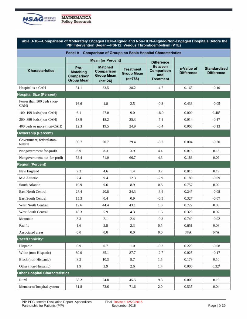
PfP PEC: Interim Evaluation Report–Appendices Final–Revised 12/29/2015 Partnership for Patients (PfP) September 2015 Page | D-39
Table D-16—Comparison of Moderately Engaged HEN-Aligned and Non-HEN-Aligned/Non-Engaged Hospitals Before the PfP Intervention Began—PSI-12: Venous Thromboembolism (VTE)
Panel A—Comparison of Groups on Basic Hospital Characteristics
Characteristics
Mean (or Percent) Difference Between
Comparison and
Treatment
p-Value of Difference
Standardized Difference
Pre-Matching
Comparison Group Mean
Matched Comparison Group Mean
(n=126)
Treatment Group Mean
(n=788)
Hospital is a CAH 51.1 33.5 38.2 -4.7 0.165 -0.10
Hospital Size (Percent)
Fewer than 100 beds (non-
CAH) 16.6 1.8 2.5 -0.8 0.433 -0.05
100–199 beds (non-CAH) 6.1 27.0 9.0 18.0 0.000 0.48†
200–399 beds (non-CAH) 13.9 18.2 25.3 -7.1 0.014 -0.17
400 beds or more (non-CAH) 12.3 19.5 24.9 -5.4 0.068 -0.13
Ownership (Percent)
Government, federal/non-
federal 39.7 20.7 29.4 -8.7 0.004 -0.20
Nongovernment for-profit 6.9 8.3 3.9 4.4 0.015 0.18
Nongovernment not-for-profit 53.4 71.0 66.7 4.3 0.188 0.09
Region (Percent)
New England 2.3 4.6 1.4 3.2 0.015 0.19
Mid Atlantic 7.4 9.4 12.3 -2.9 0.180 -0.09
South Atlantic 10.9 9.6 8.9 0.6 0.757 0.02
East North Central 28.4 20.8 24.3 -3.4 0.245 -0.08
East South Central 15.3 0.4 0.9 -0.5 0.327 -0.07
West North Central 12.6 44.4 43.1 1.3 0.722 0.03
West South Central 18.3 5.9 4.3 1.6 0.320 0.07
Mountain 3.3 2.1 2.4 -0.3 0.749 -0.02
Pacific 1.6 2.8 2.3 0.5 0.651 0.03
Associated areas 0.0 0.0 0.0 0.0 N/A N/A
Race/Ethnicitya
Hispanic 0.9 0.7 1.0 -0.2 0.229 -0.08
White (non-Hispanic) 89.0 85.1 87.7 -2.7 0.025 -0.17
Black (non-Hispanic) 8.2 10.3 8.7 1.5 0.179 0.10
Other (non-Hispanic) 1.9 3.9 2.6 1.4 0.000 0.32†
Other Hospital Characteristics
Rural 68.2 54.8 45.5 9.3 0.009 0.19
Member of hospital system 31.8 73.6 71.6 2.0 0.535 0.04

PfP PEC: Interim Evaluation Report–Appendices Final–Revised 12/29/2015 Partnership for Patients (PfP) September 2015 Page | D-40
Table D-16—Comparison of Moderately Engaged HEN-Aligned and Non-HEN-Aligned/Non-Engaged Hospitals Before the PfP Intervention Began—PSI-12: Venous Thromboembolism (VTE)
Panel A—Comparison of Groups on Basic Hospital Characteristics
Characteristics
Mean (or Percent) Difference Between
Comparison and
Treatment
p-Value of Difference
Standardized Difference
Pre-Matching
Comparison Group Mean
Matched Comparison Group Mean
(n=126)
Treatment Group Mean
(n=788)
Member of hospital network 22.1 59.4 56.1 3.3 0.353 0.07
Teaching hospital 18.6 39.6 40.3 -0.8 0.829 -0.02
Other Case Mix Characteristics
Femalea 40.5 43.0 45.3 -2.2 0.000 -0.63†
Ageb 75.8 75.0 75.6 -0.6 0.071 -0.12
ASD Logit Model Omnibus Test
Mean Median Pseudo R2 Chi2 p-value Chi2 (d.f) p-value
0.14 0.09 0.250 278.2 0.000 54.9 (23) 0.000
Panel B—Comparison of Groups on Pre-Intervention Outcome Measure Level
Variable
Mean (or Percent) Difference Between
Treatment and Matched Comparison
Means
p-Value of Difference
Standardized Difference
Pre-Matching
Comparison Group Mean
Matched Comparison Group Mean
Treatment Group Mean
2011 VTE rate (events per
1,000 at risk)c 0.110 0.252 0.204 0.047 0.077 0.13
Source: Analysis of 2014 Survey on Prevention of Adverse Events and Readmissions, AHA Survey (FY 2010), and Medicare claims (2011–2012).
Note: Means (or percentages) are weighted by the product of the number of patients at risk for VTE and the weight obtained from a propensity score model with the
2011 VTE rate from Medicare claims as independent variables. Any discrepancies between the sample means and the difference column are due to rounding. † SD is larger than 0.25 standard deviations. a Weighted mean of the percentage of at-risk patients across hospitals. b Weighted mean of the average age of at-risk Medicare patients across hospitals. c The adverse event rates were Winsorized at the 95th percentile of the distribution of adverse event rates among hospitals with positive rates.
N/A = not applicable

PfP PEC: Interim Evaluation Report–Appendices Final–Revised 12/29/2015 Partnership for Patients (PfP) September 2015 Page | D-41
Table D-17—Comparison of Fully Engaged HEN-Aligned and Non-HEN-Aligned/Non-Engaged Hospitals Before the PfP Intervention Began—PSI-12: Venous Thromboembolism (VTE)
Panel A—Comparison of Groups on Basic Hospital Characteristics
Characteristics
Mean (or Percent) Difference Between
Comparison and
Treatment
p-Value of Difference
Standardized Difference
Pre-Matching
Comparison Group Mean
Matched Comparison Group Mean
(n=126)
Treatment Group Mean
(n=788)
Hospital is a CAH 51.1 23.8 41.2 -17.3 0.000 -0.38†
Hospital Size (Percent)
Fewer than 100 beds (non-
CAH) 16.6 3.0 3.1 -0.1 0.889 -0.01
100–199 beds (non-CAH) 6.1 29.8 19.0 10.8 0.000 0.25
200–399 beds (non-CAH) 13.9 12.8 19.2 -6.4 0.000 -0.17
400 beds or more (non-CAH) 12.3 30.6 17.5 13.0 0.000 0.31†
Ownership (Percent)
Government, federal/non-
federal 39.7 7.9 18.0 -10.1 0.000 -0.31†
Nongovernment for-profit 6.9 4.3 4.5 -0.2 0.805 -0.01
Nongovernment not-for-profit 53.4 87.8 77.5 10.4 0.000 0.28†
Region (Percent)
New England 2.3 4.7 2.6 2.1 0.012 0.11
Mid Atlantic 7.4 5.5 6.8 -1.3 0.207 -0.05
South Atlantic 10.9 23.7 18.0 5.8 0.001 0.14
East North Central 28.4 10.9 12.8 -1.9 0.171 -0.06
East South Central 15.3 12.5 18.3 -5.8 0.000 -0.16
West North Central 12.6 17.8 19.6 -1.8 0.289 -0.05
West South Central 18.3 12.2 14.3 -2.1 0.160 -0.06
Mountain 3.3 1.8 2.1 -0.3 0.607 -0.02
Pacific 1.6 10.8 5.5 5.4 0.000 0.20
Associated areas 0.0 0.0 0.0 0.0 N/A N/A
Race/Ethnicitya
Hispanic 0.9 1.2 0.7 0.5 0.000 0.22
White (non-Hispanic) 89.0 83.9 87.5 -3.6 0.000 -0.24
Black (non-Hispanic) 8.2 10.8 9.9 0.9 0.137 0.06
Other (non-Hispanic) 1.9 4.0 1.9 2.1 0.000 0.42†
Other Hospital Characteristics
Rural 68.2 48.8 60.2 -11.5 0.000 -0.23
Member of hospital system 31.8 63.5 40.4 23.1 0.000 0.48†

PfP PEC: Interim Evaluation Report–Appendices Final–Revised 12/29/2015 Partnership for Patients (PfP) September 2015 Page | D-42
Table D-17—Comparison of Fully Engaged HEN-Aligned and Non-HEN-Aligned/Non-Engaged Hospitals Before the PfP Intervention Began—PSI-12: Venous Thromboembolism (VTE)
Panel A—Comparison of Groups on Basic Hospital Characteristics
Characteristics
Mean (or Percent) Difference Between
Comparison and
Treatment
p-Value of Difference
Standardized Difference
Pre-Matching
Comparison Group Mean
Matched Comparison Group Mean
(n=126)
Treatment Group Mean
(n=788)
Member of hospital network 22.1 40.5 29.3 11.2 0.000 0.24
Teaching hospital 18.6 40.5 26.5 14.0 0.000 0.30†
Other Case Mix Characteristics
Femalea 40.5 42.3 42.6 -0.3 0.219 -0.05
Ageb 75.8 74.3 74.3 0.0 0.992 0.00
ASD Logit Model Omnibus Test
Mean Median Pseudo R2 Chi2 p-value Chi2 (d.f) p-value
0.18 0.17 0.191 563.7 0.000 56.7 (23) 0.000
Panel B—Comparison of Groups on Pre-Intervention Outcome Measure Level
Variable
Mean (or Percent) Difference Between
Treatment and Matched Comparison
Means
p-Value of Difference
Standardized Difference
Pre-Matching
Comparison Group Mean
Matched Comparison Group Mean
Treatment Group Mean
2011 VTE rate (events per
1,000 at risk)c 0.110 0.155 0.150 0.004 0.734 0.01
Source: Analysis of 2014 Survey on Prevention of Adverse Events and Readmissions, AHA Survey (FY 2010), and Medicare claims (2011–2012).
Note: Means (or percentages) are weighted by the product of the number of patients at risk for VTE and the weight obtained from a propensity score model with the
2011 VTE rate from Medicare claims as independent variables. Any discrepancies between the sample means and the difference column are due to rounding. † SD is larger than 0.25 standard deviations. a Weighted mean of the percentage of at-risk patients across hospitals. b Weighted mean of the average age of at-risk Medicare patients across hospitals. c The adverse event rates were Winsorized at the 95th percentile of the distribution of adverse event rates among hospitals with positive rates.
N/A = not applicable

PfP PEC: Interim Evaluation Report–Appendices Final–Revised 12/29/2015 Partnership for Patients (PfP) September 2015 Page | D-43
Table D-18—Comparison of Minimally Engaged HEN-Aligned and Non-HEN-Aligned/Non-Engaged Hospitals Before the PfP Intervention Began—Readmissions
Panel A—Comparison of Groups on Basic Hospital Characteristics
Characteristics
Mean (or Percent) Difference Between
Comparison and
Treatment
p-Value of Difference
Standardized Difference
Pre-Matching
Comparison Group Mean
Matched Comparison Group Mean
(n=139)
Treatment Group Mean
(n=863)
Hospital is a CAH 3.9 7.6 4.6 3.0 0.407 0.12
Hospital Size (Percent)
Fewer than 100 beds (non-
CAH) 9.0 10.3 6.2 4.0 0.328 0.15
100–199 beds (non-CAH) 19.9 27.0 21.7 5.3 0.412 0.12
200–399 beds (non-CAH) 40.7 26.6 43.3 -16.7 0.017 -0.35†
400 beds or more (non-CAH) 26.5 28.5 24.1 4.4 0.503 0.10
Ownership (Percent)
Government, federal/non-
federal 5.9 15.5 15.5 0.0 0.998 -0.00
Nongovernment for-profit 21.8 9.7 10.5 -0.8 0.859 -0.03
Nongovernment not-for-profit 72.2 74.8 74.0 0.8 0.901 0.02
Region (Percent)
New England 3.8 12.2 8.0 4.2 0.352 0.14
Mid Atlantic 17.9 16.4 19.6 -3.2 0.572 -0.08
South Atlantic 21.7 5.6 14.9 -9.3 0.034 -0.31†
East North Central 20.4 7.3 10.6 -3.3 0.437 -0.11
East South Central 7.0 7.9 7.7 0.1 0.975 0.00
West North Central 2.0 4.9 12.3 -7.4 0.069 -0.26†
West South Central 12.5 32.6 13.5 19.1 0.002 0.46†
Mountain 9.6 8.5 5.0 3.5 0.354 0.14
Pacific 5.2 4.5 8.3 -3.8 0.284 -0.16
Associated areas 0.0 0.0 0.0 0.0 N/A N/A
Race/Ethnicitya
Hispanic 0.8 2.8 1.1 1.7 0.012 0.38†
White (non-Hispanic) 79.4 85.8 79.7 6.1 0.012 0.36†
Black (non-Hispanic) 16.1 9.2 14.8 -5.7 0.012 -0.37†
Other (non-Hispanic) 3.7 2.3 4.4 -2.1 0.005 -0.40†
Other Hospital Characteristics
Rural 17.8 28.1 23.4 4.7 0.469 0.11
Member of hospital system 65.6 58.2 51.2 7.0 0.343 0.14

PfP PEC: Interim Evaluation Report–Appendices Final–Revised 12/29/2015 Partnership for Patients (PfP) September 2015 Page | D-44
Table D-18—Comparison of Minimally Engaged HEN-Aligned and Non-HEN-Aligned/Non-Engaged Hospitals Before the PfP Intervention Began—Readmissions
Panel A—Comparison of Groups on Basic Hospital Characteristics
Characteristics
Mean (or Percent) Difference Between
Comparison and
Treatment
p-Value of Difference
Standardized Difference
Pre-Matching
Comparison Group Mean
Matched Comparison Group Mean
(n=139)
Treatment Group Mean
(n=863)
Member of hospital network 27.4 38.4 39.9 -1.5 0.838 -0.03
Teaching hospital 36.7 49.3 36.2 13.2 0.073 0.27†
Other Case Mix Characteristics
Femalea 44.1 42.4 44.9 -2.5 0.000 -0.62†
Ageb 73.1 73.8 71.9 1.9 0.000 0.62†
ASD Logit Model Omnibus Test
Mean Median Pseudo R2 Chi2 p-value Chi2 (d.f) p-value
0.22 0.14 0.36 92.46 0.000 77.68 (24) 0.000
Panel B—Comparison of Groups on Pre-Intervention Outcome Measure Level
Variable
Mean (or Percent) Difference Between
Treatment and Matched Comparison
Means
p-Value of Difference
Standardized Difference
Pre-Matching
Comparison Group Mean
Matched Comparison Group Mean
Treatment Group Mean
2010 30-day readmission rate c 19.3 18.3 19.2 0.9 0.134 0.22
Source: Analysis of 2014 Survey on Prevention of Adverse Events and Readmissions, AHA Survey (FY 2010), and Medicare claims (2011–2012).
Note: Means (or percentages) are weighted by the product of the number of patients at risk for readmissions and the weight obtained from a propensity score model
with the 2010 readmission rate from Medicare claims as independent variables. Any discrepancies between the sample means and the difference column are due to
rounding. † SD is larger than 0.25 standard deviations. a Weighted mean of the percentage of at-risk patients across hospitals. b Weighted mean of the average age of at-risk Medicare patients across hospitals. c The adverse event rates were Winsorized at the 95th percentile of the distribution of adverse event rates among hospitals with positive rates.
N/A = not applicable

PfP PEC: Interim Evaluation Report–Appendices Final–Revised 12/29/2015 Partnership for Patients (PfP) September 2015 Page | D-45
Table D-19—Comparison of Moderately Engaged HEN-Aligned and Non-HEN-Aligned/Non-Engaged Hospitals Before the PfP Intervention Began—Readmissions
Panel A—Comparison of Groups on Basic Hospital Characteristics
Characteristics
Mean (or Percent) Difference Between
Comparison and
Treatment
p-Value of Difference
Standardized Difference
Pre-Matching
Comparison Group Mean
Matched Comparison Group Mean
(n=139)
Treatment Group Mean
(n=863)
Hospital is a CAH 3.9 9.5 2.8 6.8 0.002 0.28†
Hospital Size (Percent)
Fewer than 100 beds (non-
CAH) 9.0 9.2 5.6 3.7 0.138 0.14
100–199 beds (non-CAH) 19.9 22.9 10.7 12.3 0.000 0.33†
200–399 beds (non-CAH) 40.7 29.7 38.4 -8.7 0.055 -0.18
400 beds or more (non-CAH) 26.5 28.6 42.6 -14.0 0.002 -0.30†
Ownership (Percent)
Government, federal/non-
federal 5.9 17.0 14.6 2.3 0.502 0.06
Nongovernment for-profit 21.8 10.3 5.7 4.5 0.076 0.17
Nongovernment not-for-profit 72.2 72.8 79.6 -6.9 0.089 -0.16
Region (Percent)
New England 3.8 7.2 2.3 4.9 0.014 0.23
Mid Atlantic 17.9 9.2 23.9 -14.7 0.000 -0.40†
South Atlantic 21.7 12.3 12.6 -0.3 0.931 -0.01
East North Central 20.4 14.6 29.3 -14.7 0.000 -0.36†
East South Central 7.0 11.6 6.1 5.5 0.040 0.19
West North Central 2.0 5.0 9.7 -4.7 0.060 -0.18
West South Central 12.5 21.1 4.2 16.8 0.000 0.52†
Mountain 9.6 10.2 3.7 6.5 0.006 0.26†
Pacific 5.2 8.8 8.2 0.7 0.801 0.02
Associated areas 0.0 0.0 0.0 0.0 N/A N/A
Race/Ethnicitya
Hispanic 0.8 2.2 0.7 1.5 0.001 0.32†
White (non-Hispanic) 79.4 85.2 82.4 2.8 0.043 0.19
Black (non-Hispanic) 16.1 9.9 13.2 -3.3 0.013 -0.24
Other (non-Hispanic) 3.7 2.8 3.8 -1.0 0.014 -0.24
Other Hospital Characteristics
Rural 17.8 27.7 12.4 15.3 0.000 0.39†
Member of hospital system 65.6 61.8 65.1 -3.3 0.466 -0.07

PfP PEC: Interim Evaluation Report–Appendices Final–Revised 12/29/2015 Partnership for Patients (PfP) September 2015 Page | D-46
Table D-19—Comparison of Moderately Engaged HEN-Aligned and Non-HEN-Aligned/Non-Engaged Hospitals Before the PfP Intervention Began—Readmissions
Panel A—Comparison of Groups on Basic Hospital Characteristics
Characteristics
Mean (or Percent) Difference Between
Comparison and
Treatment
p-Value of Difference
Standardized Difference
Pre-Matching
Comparison Group Mean
Matched Comparison Group Mean
(n=139)
Treatment Group Mean
(n=863)
Member of hospital network 27.4 32.3 45.1 -12.8 0.006 -0.26†
Teaching hospital 36.7 52.2 61.8 -9.6 0.041 -0.20
Other Case Mix Characteristics
Femalea 44.1 42.8 44.9 -2.1 0.000 -0.60†
Ageb 73.1 73.7 72.6 1.1 0.000 0.35†
ASD Logit Model Omnibus Test
Mean Median Pseudo R2 Chi2 p-value Chi2 (d.f) p-value
0.25 0.24 0.24 149.88 0.000 59.67 (24) 0.000
Panel B—Comparison of Groups on Pre-Intervention Outcome Measure Level
Variable
Mean (or Percent) Difference Between
Treatment and Matched Comparison
Means
p-Value of Difference
Standardized Difference
Pre-Matching
Comparison Group Mean
Matched Comparison Group Mean
Treatment Group Mean
2010 30-day readmission rate c 19.3 17.9 19.4 -1.4 0.000 -0.40†
Source: Analysis of 2014 Survey on Prevention of Adverse Events and Readmissions, AHA Survey (FY 2010), and Medicare claims (2011–2012).
Note: Means (or percentages) are weighted by the product of the number of patients at risk for readmissions and the weight obtained from a propensity score model
with the 2010 readmission rate from Medicare claims as independent variables. Any discrepancies between the sample means and the difference column are due to
rounding. † SD is larger than 0.25 standard deviations. a Weighted mean of the percentage of at-risk patients across hospitals. b Weighted mean of the average age of at-risk Medicare patients across hospitals. c The adverse event rates were Winsorized at the 95th percentile of the distribution of adverse event rates among hospitals with positive rates.
N/A = not applicable

PfP PEC: Interim Evaluation Report–Appendices Final–Revised 12/29/2015 Partnership for Patients (PfP) September 2015 Page | D-47
Table D-20—Comparison of Fully Engaged HEN-Aligned and Non-HEN-Aligned/Non-Engaged Hospitals Before the PfP Intervention Began—Readmissions
Panel A—Comparison of Groups on Basic Hospital Characteristics
Characteristics
Mean (or Percent) Difference Between
Comparison and
Treatment
p-Value of Difference
Standardized Difference
Pre-Matching
Comparison Group Mean
Matched Comparison Group Mean
(n=139)
Treatment Group Mean
(n=863)
Hospital is a CAH 3.9 9.5 4.3 5.1 0.001 0.20
Hospital Size (Percent)
Fewer than 100 beds (non-
CAH) 9.0 13.6 9.2 4.4 0.018 0.14
100–199 beds (non-CAH) 19.9 25.7 27.5 8.2 0.001 0.20
200–399 beds (non-CAH) 40.7 21.1 39.5 -18.3 0.000 -0.41†
400 beds or more (non-CAH) 26.5 30.2 29.6 0.006 0.818 0.01
Ownership (Percent)
Government, federal/non-
federal 5.9 18.8 16.4 2.4 0.281 0.06
Nongovernment for-profit 21.8 8.5 9.3 -0.8 0.620 -0.03
Nongovernment not-for-profit 72.2 72.7 74.2 -1.6 0.540 -0.04
Region (Percent)
New England 3.8 9.2 5.8 3.4 0.030 0.13
Mid Atlantic 17.9 5.6 11.4 -5.9 0.000 -0.21
South Atlantic 21.7 11.8 20.2 -8.4 0.000 -0.23
East North Central 20.4 10.6 22.8 -12.2 0.000 -0.33†
East South Central 7.0 13.5 8.7 4.8 0.010 0.15
West North Central 2.0 4.8 9.5 -4.7 0.002 -0.18
West South Central 12.5 29.5 9.0 20.5 0.000 0.54†
Mountain 9.6 5.8 3.6 2.2 0.080 0.10
Pacific 5.2 9.3 9.0 0.3 0.856 0.01
Associated areas 0.0 0.0 0.0 0.0 N/A N/A
Race/Ethnicitya
Hispanic 0.8 2.7 0.7 2.0 0.000 0.42†
White (non-Hispanic) 79.4 84.3 83.2 1.1 0.215 0.07
Black (non-Hispanic) 16.1 10.3 12.2 -1.9 0.023 -0.13
Other (non-Hispanic) 3.7 2.6 3.8 -1.2 0.001 -0.19
Other Hospital Characteristics
Rural 17.8 34.0 22.7 11.3 0.000 0.25
Member of hospital system 65.6 61.2 62.9 -1.7 0.542 -0.04

PfP PEC: Interim Evaluation Report–Appendices Final–Revised 12/29/2015 Partnership for Patients (PfP) September 2015 Page | D-48
Table D-20—Comparison of Fully Engaged HEN-Aligned and Non-HEN-Aligned/Non-Engaged Hospitals Before the PfP Intervention Began—Readmissions
Panel A—Comparison of Groups on Basic Hospital Characteristics
Characteristics
Mean (or Percent) Difference Between
Comparison and
Treatment
p-Value of Difference
Standardized Difference
Pre-Matching
Comparison Group Mean
Matched Comparison Group Mean
(n=139)
Treatment Group Mean
(n=863)
Member of hospital network 27.4 30.2 41.5 -11.4 0.000 -0.24
Teaching hospital 36.7 51.5 46.4 5.1 0.080 0.10
Other Case Mix Characteristics
Femalea 44.1 42.6 44.2 -1.6 0.000 -0.40†
Ageb 73.1 73.6 72.8 0.8 0.000 0.25
ASD Logit Model Omnibus Test
Mean Median Pseudo R2 Chi2 p-value Chi2 (d.f) p-value
0.19 0.19 0.18 286.2 0.000 65.1 (24) 0.000
Panel B—Comparison of Groups on Pre-Intervention Outcome Measure Level
Variable
Mean (or Percent) Difference Between
Treatment and Matched Comparison
Means
p-Value of Difference
Standardized Difference
Pre-Matching
Comparison Group Mean
Matched Comparison Group Mean
Treatment Group Mean
2010 30-day readmission rate c 19.3 18.2 19.0 -0.7 0.000 -0.22
Source: Analysis of 2014 Survey on Prevention of Adverse Events and Readmissions, AHA Survey (FY 2010), and Medicare claims (2011–2012).
Note: Means (or percentages) are weighted by the product of the number of patients at risk for readmissions and the weight obtained from a propensity score model
with the 2010 readmission rate from Medicare claims as independent variables. Any discrepancies between the sample means and the difference column are due to
rounding. † SD is larger than 0.25 standard deviations. a Weighted mean of the percentage of at-risk patients across hospitals. b Weighted mean of the average age of at-risk Medicare patients across hospitals. c The adverse event rates were Winsorized at the 95th percentile of the distribution of adverse event rates among hospitals with positive rates.
N/A = not applicable

PfP PEC: Interim Evaluation Report–Appendices Final–Revised 12/29/2015 Partnership for Patients (PfP) September 2015 Page | D-49
Analysis of Costs Averted Due to HEN
Table D-21—Balance Test Results for the Total Expenditures Analysis (90 Days)
Panel A—Comparison of Groups on Basic Hospital Characteristics
Characteristics
Mean (or Percent) Difference Between
Comparison and
Treatment
p-Value of Difference
Standardized Difference
Pre-Matching
Comparison Group Mean
(n=546)
Matched Comparison Group Mean
(n=546)
Treatment Group Mean
(n= 2,298)
Hospital Size (Percent)
Fewer than 100 beds 18.2 11.8 9.1 2.7 0.000 -0.09
100–199 beds (non-CAH) 20.4 20.2 16.5 3.7 0.000 -0.10
200–399 beds (non-CAH) 37.7 36.9 35.7 1.1 0.000 -0.02
400 beds or more (non-CAH) 23.7 31.1 38.7 -7.6 0.000 0.16
Ownership (Percent)
Government, federal 0.0 0.0 0.0 0.0 0.000 0.01
Government, non-federal 9.3 13.8 12.6 1.2 0.000 -0.04
Nongovernment for-profit 31.1 9.2 6.5 2.7 0.00 -0.10
Nongovernment not-for-profit 59.6 77.0 80.9 -3.8 0.00 0.09
Electronic Health Record (EHR) (Percent)
Has Full EHR 25.4 35.4 35.2 0.2 0.000 0.00
Has Partial EHR 59.2 53.0 57.1 -4.1 0.000 0.08
Has No EHR 12.2 8.2 4.7 3.5 0.000 0.14
Missing 3.2 3.4 3.0 0.4 0.000 -0.2
Region (Percent)
New England 10.1 6.7 5.2 1.5 0.000 -0.07
Mid Atlantic 0.4 4.6 15.2 -10.5 0.000 0.36†
South Atlantic 25.0 14.6 19.9 -5.3 0.000 0.14
East North Central 18.7 28.3 19.3 9.0 0.000 -0.21
East South Central 4.3 7.3 7.1 0.2 0.000 -0.01
West North Central 3.0 10.4 8.9 1.5 0.000 -0.05
West South Central 27.7 11.0 11.1 -0.1 0.004 0.00
Mountain 3.4 3.9 4.5 -0.6 0.000 0.03
Pacific 7.4 13.0 8.7 4.3 0.000 -0.14
Associated areas 0.0 0.1 0.0 0.0 0.000 -0.02
Race/Ethnicitya
Hispanic 3.1 1.7 1.7 0.1 0.000 -0.02
White (non-Hispanic) 82.0 83.3 84.0 -0.7 0.000 0.04

PfP PEC: Interim Evaluation Report–Appendices Final–Revised 12/29/2015 Partnership for Patients (PfP) September 2015 Page | D-50
Table D-21—Balance Test Results for the Total Expenditures Analysis (90 Days)
Panel A—Comparison of Groups on Basic Hospital Characteristics
Characteristics
Mean (or Percent) Difference Between
Comparison and
Treatment
p-Value of Difference
Standardized Difference
Pre-Matching
Comparison Group Mean
(n=546)
Matched Comparison Group Mean
(n=546)
Treatment Group Mean
(n= 2,298)
Black (non-Hispanic) 12.3 12.0 11.5 0.5 0.000 -0.03
Other (non-Hispanic) 2.6 3.0 2.8 0.2 0.000 -0.03
Obstetrical (OB) Care Beds as Percent of Total
Discrete Group 1 21.4 13.1 11.0 2.0 0.000 -0.06
Discrete Group 2 48.2 54.5 58.8 -4.3 0.000 0.09
Discrete Group 3 30.4 32.5 30.2 2.3 0.000 -0.05
Intensivist as Percent of Total
Discrete Group 1 51.7 39.2 34.1 5.2 0.000 -0.11
Discrete Group 2 28.3 27.1 34.3 -7.1 0.000 0.16
Discrete Group 3 20.0 33.6 31.7 2.0 0.000 -0.04
Other Hospital Characteristics
Rural 18.5 19.5 17.0 2.5 0.000 -0.06
Member of hospital system 67.2 61.3 65.4 -4.1 0.000 0.09
Member of hospital network 34.1 33.9 45.9 -12.1 0.000 0.25
Teaching hospital 43.1 53.7 56.0 -2.3 0.000 0.05
Rural Referral Center 2.7 8.9 10.8 -1.9 0.000 0.07
Maryland Hospital (Not
IPPS/CAH) 11.3 1.8 1.1 0.7 0.000 -0.06
AHA Member 85.4 88.3 91.7 -3.4 0.000 0.11
Other Case Mix Characteristics
Femalea 56.9 56.5 56.2 0.3 0.000 -0.07
Ageb 73.5 73.2 73.4 -0.2 0.000 0.06
ASD Logit Model Omnibus Test
Mean Median Pseudo R2 Chi2 p-value Chi2 (d.f) p-value
0.08 0.06 0.074 800,605.9 0.000 132.1 (34) 0.000

PfP PEC: Interim Evaluation Report–Appendices Final–Revised 12/29/2015 Partnership for Patients (PfP) September 2015 Page | D-51
Table D-21—Balance Test Results for the Total Expenditures Analysis (90 Days)
Panel B—Baseline Values
Variable
Mean (or Percent) Difference Between
Treatment and Matched Comparison
Means
p-Value of Difference
Standardized Difference
Pre-Matching
Comparison Group Mean
(n=546)
Matched Comparison Group Mean
(n=546)
Treatment Group Mean
(n=2,298)
2010 Average Total
Expenditures 19,992.9 20,970.7 20,766.9 203.9 0.000 -0.04
Difference from 2009 to 2010
in Average Total Expenditures 129.5 -127.2 9.6 -136.8 0.000 0.13
Standardized Difference Logit Model Omnibus Test
Mean Median Pseudo R2 Chi2 p-value Chi2 (d.f) p-value
0.09 0.059 0.003 37,464.3 0.000 2.2 (2) 0.328
Source: Analysis of hospital rosters submitted by HENs in June 2012, AHA Survey (FY 2010), and Medicare claims, 2009–2010.
Note: Means (or percentages) are weighted by the product of the number of index discharges and the weight obtained from a propensity score model with 2009
and 2010 average expenditures and change in the average expenditures from Medicare claims as independent variables. The variables listed in Panel A are a
subset of all the hospital characteristics included in the propensity score model. The variables listed in Panel B were not included in the propensity score model
as listed, but hospital categories, and various interaction terms were included in the models. Any discrepancies between the sample means and the difference
column are due to rounding. † SD is larger than 0.25 standard deviations. a Weighted mean of the percentage of Medicare patients across hospitals. b Weighted mean of the average age of Medicare patients across hospitals.

PfP PEC: Interim Evaluation Report–Appendices Final–Revised 12/29/2015 Partnership for Patients (PfP) September 2015 Page | D-52
Table D-22—Balance Test Results for Index Discharge Expenditures Analysis (90 days)
Panel A—Comparison of Groups on Basic Hospital Characteristics
Characteristics
Mean (or Percent) Difference Between
Comparison and
Treatment
p-Value of Difference
Standardized Difference
Pre-Matching
Comparison Group Mean
(n=546)
Matched Comparison Group Mean
(n=546)
Treatment Group Mean
(n= 2,298)
Hospital Size (Percent)
Fewer than 100 beds 18.2 12.0 9.1 3.0 0.000 -0.10
100–199 beds (non-CAH) 20.4 20.3 16.5 3.7 0.000 -0.10
200–399 beds (non-CAH) 37.7 35.5 35.7 -0.2 0.000 0.00
400 beds or more (non-CAH) 23.7 32.2 38.7 -6.5 0.000 0.14
Ownership (Percent)
Government, federal 0.0 0.0 0.0 0.0 0.000 0.01
Government, nonfederal 9.3 13.8 12.6 1.2 0.000 -0.04
Nongovernment for-profit 31.1 8.7 6.5 2.2 0.000 -0.08
Nongovernment not-for-profit 59.6 77.5 80.9 -3.4 0.000 0.08
Electronic Health Record (Percent)
Has Full EHR 25.4 31.1 35.2 -4.1 0.000 0.09
Has Partial EHR 59.2 57.8 57.1 0.7 0.000 -0.01
Has No EHR 12.2 7.8 4.7 3.1 0.000 -0.13
Missing 3.2 3.3 3.0 -0.3 0.000 -0.02
Region (Percent)
New England 10.1 6.2 5.2 1.0 0.000 -0.04
Mid Atlantic 0.4 4.6 15.2 -10.6 0.000 0.36†
South Atlantic 25.0 16.8 19.9 -3.1 0.000 0.08
East North Central 18.7 25.9 19.3 6.6 0.000 -0.16
East South Central 4.3 7.1 7.1 -0.1 0.000 0.00
West North Central 3.0 11.7 8.9 2.8 0.000 -0.09
West South Central 27.7 10.5 11.1 -0.6 0.000 0.02
Mountain 3.4 3.7 4.5 -0.8 0.000 0.04
Pacific 7.4 13.5 8.7 4.8 0.000 -0.15
Associated areas 0.0 0.0 0.0 0.0 0.000 -0.01
Race/Ethnicitya
Hispanic 3.1 1.8 1.7 0.1 0.000 -0.03
White (non-Hispanic) 82.0 82.7 84.0 -1.3 0.000 -0.08
Black (non-Hispanic) 12.3 12.4 11.5 -0.9 0.000 -0.06

PfP PEC: Interim Evaluation Report–Appendices Final–Revised 12/29/2015 Partnership for Patients (PfP) September 2015 Page | D-53
Table D-22—Balance Test Results for Index Discharge Expenditures Analysis (90 days)
Panel A—Comparison of Groups on Basic Hospital Characteristics
Characteristics
Mean (or Percent) Difference Between
Comparison and
Treatment
p-Value of Difference
Standardized Difference
Pre-Matching
Comparison Group Mean
(n=546)
Matched Comparison Group Mean
(n=546)
Treatment Group Mean
(n= 2,298)
Other (non-Hispanic) 2.6 3.1 2.8 -0.3 0.000 -0.06
OB Care Beds as Percent of Total
Discrete Group 1 21.4 12.4 11.0 1.4 0.000 -0.04
Discrete Group 2 48.2 55.1 58.8 -3.7 0.000 0.07
Discrete Group 3 30.4 32.5 30.2 2.3 0.000 -0.05
Intensivist as Percent of Total
Discrete Group 1 51.7 37.8 34.1 3.8 0.000 -0.08
Discrete Group 2 28.3 27.1 34.3 -7.2 0.000 0.16
Discrete Group 3 20.0 35.1 31.7 3.4 0.000 -0.07
Other Hospital Characteristics
Rural 18.5 19.1 17.0 2.1 0.000 -0.05
Member of hospital system 67.2 61.5 65.4 -3.9 0.000 0.08
Member of hospital network 34.1 33.3 45.9 -12.6 0.000 0.26†
Teaching hospital 43.1 53.6 56.0 -2.4 0.000 0.05
Rural Reference Center 2.7 8.6 10.8 -2.2 0.000 0.07
Maryland Hospital (Not
IPPS/CAH) 11.3 1.5 1.1 0.4 0.000 -0.04
AHA Member 85.4 88.0 91.7 -3.8 0.000 0.13
Other Case Mix Characteristics
Femalea 56.9 56.5 56.2 0.3 0.000 -0.07
Ageb 73.5 73.2 73.4 -0.2 0.000 0.07
ASD Logit Model Omnibus Test
Mean Median Pseudo R2 Chi2 p-value Chi2 (d.f) p-value
0.08 0.07 0.071 778,359.0 0.000 126.9 (34) 0.000
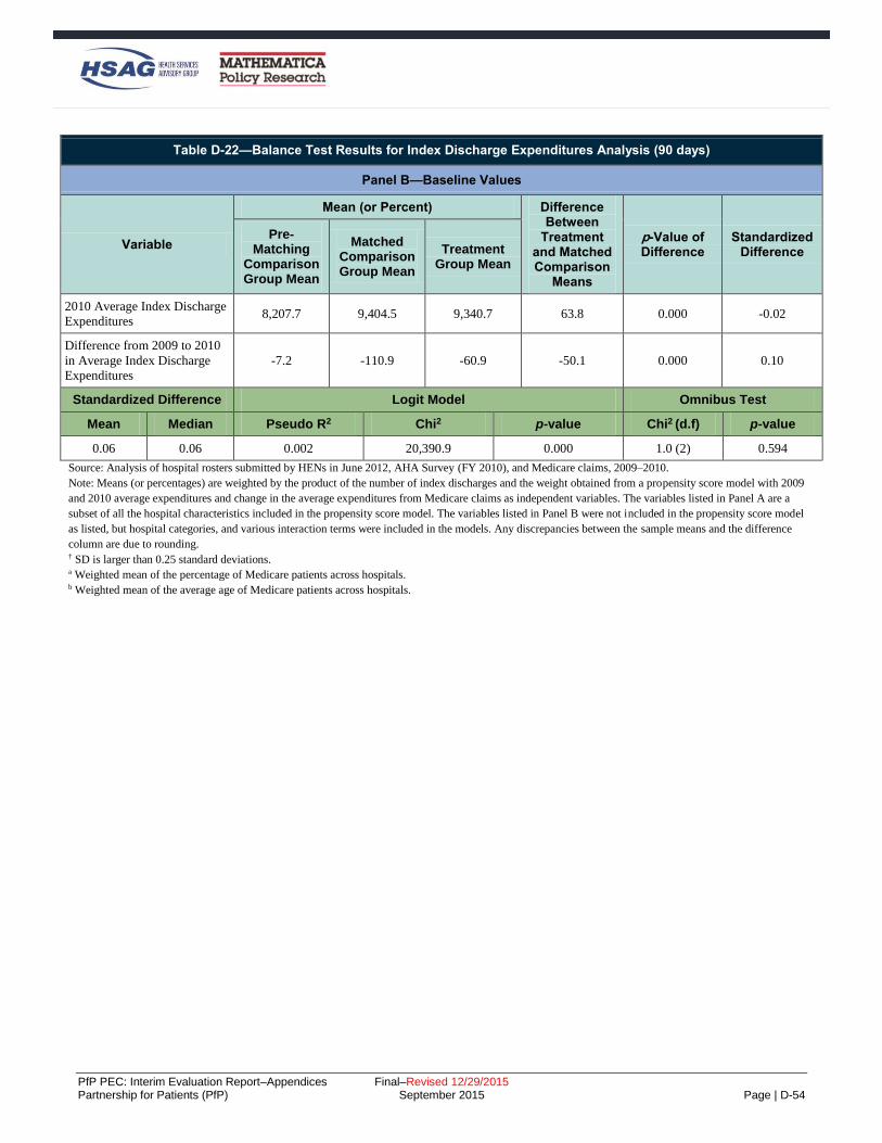
PfP PEC: Interim Evaluation Report–Appendices Final–Revised 12/29/2015 Partnership for Patients (PfP) September 2015 Page | D-54
Table D-22—Balance Test Results for Index Discharge Expenditures Analysis (90 days)
Panel B—Baseline Values
Variable
Mean (or Percent) Difference Between
Treatment and Matched Comparison
Means
p-Value of Difference
Standardized Difference
Pre-Matching
Comparison Group Mean
Matched Comparison Group Mean
Treatment Group Mean
2010 Average Index Discharge
Expenditures 8,207.7 9,404.5 9,340.7 63.8 0.000 -0.02
Difference from 2009 to 2010
in Average Index Discharge
Expenditures
-7.2 -110.9 -60.9 -50.1 0.000 0.10
Standardized Difference Logit Model Omnibus Test
Mean Median Pseudo R2 Chi2 p-value Chi2 (d.f) p-value
0.06 0.06 0.002 20,390.9 0.000 1.0 (2) 0.594
Source: Analysis of hospital rosters submitted by HENs in June 2012, AHA Survey (FY 2010), and Medicare claims, 2009–2010.
Note: Means (or percentages) are weighted by the product of the number of index discharges and the weight obtained from a propensity score model with 2009
and 2010 average expenditures and change in the average expenditures from Medicare claims as independent variables. The variables listed in Panel A are a
subset of all the hospital characteristics included in the propensity score model. The variables listed in Panel B were not included in the propensity score model
as listed, but hospital categories, and various interaction terms were included in the models. Any discrepancies between the sample means and the difference
column are due to rounding. † SD is larger than 0.25 standard deviations. a Weighted mean of the percentage of Medicare patients across hospitals. b Weighted mean of the average age of Medicare patients across hospitals.

PfP PEC: Interim Evaluation Report–Appendices Final–Revised 12/29/2015 Partnership for Patients (PfP) September 2015 Page | D-55
Table D-23—Balance Test Results for the Post-Discharge Expenditures Analysis (90 days)
Panel A—Comparison of Groups on Basic Hospital Characteristics
Characteristics
Mean (or Percent) Difference Between
Comparison and
Treatment
p-Value of Difference
Standardized Difference
Pre-Matching
Comparison Group Mean
(n=546)
Matched Comparison Group Mean
(n=546)
Treatment Group Mean
(n= 2,298)
Hospital Size (Percent)
Fewer than 100 beds 18.2 13.4 9.1 4.4 0.000 -0.14
100–199 beds (non-CAH) 20.4 20.3 16.5 3.7 0.000 -0.10
200–399 beds (non-CAH) 37.7 35.8 35.7 0.0 0.454 0.00
400 beds or more (non-CAH) 23.7 30.5 38.7 -8.1 0.000 0.17
Ownership (Percent)
Government, federal 0.0 0.0 0.0 0.0 0.000 0.01
Government, nonfederal 9.3 12.7 12.6 -0.1 0.000 0.00
Nongovernment for-profit 31.1 9.6 6.5 3.1 0.000 -0.11
Nongovernment not-for-profit 59.6 77.6 80.9 -3.3 0.000 0.08
Electronic Health Record (Percent)
Has Full EHR 25.4 31.1 35.2 -4.1 0.000 0.09
Has Partial EHR 59.2 57.5 57.1 0.4 0.000 -0.01
Has No EHR 12.2 8.7 4.7 4.0 0.000 -0.16
Missing 3.2 2.7 3.0 -0.3 0.000 0.02
Region (Percent)
New England 10.1 6.7 5.2 1.5 0.000 -0.06
Mid Atlantic 0.4 5.5 15.2 -9.7 0.000 0.32
South Atlantic 25.0 16.7 19.9 -3.2 0.000 0.08
East North Central 18.7 25.0 19.3 5.7 0.000 -0.14
East South Central 4.3 8.0 7.1 0.9 0.000 -0.03
West North Central 3.0 10.1 8.9 1.2 0.000 -0.04
West South Central 27.7 11.1 11.1 0.0 0.112 0.00
Mountain 3.4 4.1 4.5 -0.4 0.000 0.02
Pacific 7.4 12.9 8.7 4.1 0.000 -0.13
Associated areas 0.0 0.0 0.0 0.0 0.641 0.0
Race/ Ethnicitya
Hispanic 3.1 1.8 1.7 0.1 0.000 -0.02
White (non-Hispanic) 82.0 82.3 84.0 -1.7 0.000 -0.10
Black (non-Hispanic) 12.3 12.6 11.5 1.1 0.000 -0.07

PfP PEC: Interim Evaluation Report–Appendices Final–Revised 12/29/2015 Partnership for Patients (PfP) September 2015 Page | D-56
Table D-23—Balance Test Results for the Post-Discharge Expenditures Analysis (90 days)
Panel A—Comparison of Groups on Basic Hospital Characteristics
Characteristics
Mean (or Percent) Difference Between
Comparison and
Treatment
p-Value of Difference
Standardized Difference
Pre-Matching
Comparison Group Mean
(n=546)
Matched Comparison Group Mean
(n=546)
Treatment Group Mean
(n= 2,298)
Other (non-Hispanic) 2.6 3.3 2.8 0.5 0.000 -0.08
OB Care Beds as Percent of Total
Discrete Group 1 21.4 13.9 11.0 2.9 0.000 -0.08
Discrete Group 2 48.2 54.0 58.8 -4.8 0.000 0.10
Discrete Group 3 30.4 32.1 30.2 1.9 0.000 -0.04
Intensivist as Percent of Total
Discrete Group 1 51.7 40.1 34.1 6.0 0.000 -0.13
Discrete Group 2 28.3 26.1 34.3 -8.2 0.000 0.18
Discrete Group 3 20.0 33.8 31.7 2.1 0.000 0.05
Other Hospital Characteristics
Rural 18.5 20.7 17.0 3.7 0.000 -0.09
Member of hospital system 67.2 61.3 65.4 -4.1 0.000 0.09
Member of hospital network 34.1 32.0 45.9 -14.0 0.000 0.29†
Teaching hospital 43.1 52.7 56.0 -3.2 0.000 0.07
Rural Reference Center 2.7 9.6 10.8 -1.2 0.000 0.04
Maryland Hospital (Not
IPPS/CAH) 11.3 1.6 1.1 -0.5 0.000 -0.04
AHA Member 85.4 87.5 91.7 -4.3 0.000 0.14
Other Case Mix Characteristics
Femalea 56.9 56.8 56.2 0.6 0.000 -0.14
Ageb 73.5 73.3 73.4 -0.1 0.000 0.04
ASD Logit Model Omnibus Test
Mean Median Pseudo R2 Chi2 p-value Chi2 (d.f) p-value
0.09 0.08 0.075 817,859.5 0.000 129.0 (34) 0.000

PfP PEC: Interim Evaluation Report–Appendices Final–Revised 12/29/2015 Partnership for Patients (PfP) September 2015 Page | D-57
Table D-23—Balance Test Results for the Post-Discharge Expenditures Analysis (90 days)
Panel B—Baseline Values
Variable
Mean (or percent) Difference Between
Treatment and Matched Comparison
Means
p-Value of Difference
Standardized Difference
Pre-Matching
Comparison Group Mean
(n=546)
Matched Comparison Group Mean
(n=546)
Treatment Group Mean
(n= 2,298)
2010 Average Post-Discharge
Expenditures 11,785.3 11,604.9 11,426.2 178.7 0.000 -0.08
Difference from 2009 to 2010
in Average Post-Discharge
Expenditures
136.7 4.0 70.4 -66.4 0.000 0.09
Standardized Difference Logit Model Omnibus Test
Mean Median Pseudo R2 Chi2 p-value Chi2 (d.f) p-value
0.08 0.08 0.002 27.1 0.000 1.4 (2) 0.506
Source: Analysis of hospital rosters submitted by HENs in June 2012, AHA Survey (FY 2010), and Medicare claims, 2009–2010.
Note: Means (or percentages) are weighted by the product of the number of index discharges and the weight obtained from a propensity score model with 2009
and 2010 average expenditures and change in the average expenditures from Medicare claims as independent variables. The variables listed in Panel A are a
subset of all the hospital characteristics included in the propensity score model. The variables listed in Panel B were not included in the propensity score model
as listed, but hospital categories, and various interaction terms were included in the models. Any discrepancies between the sample means and the difference
column are due to rounding. † SD is larger than 0.25 standard deviations. a Weighted mean of the percentage of Medicare patients across hospitals. b Weighted mean of the average age of Medicare patients across hospitals.

PfP PEC: Interim Evaluation Report–Appendices Final–Revised 12/29/2015 Partnership for Patients (PfP) September 2015 Page | D-58
3BBayesian Difference-In-Differences Analysis Methodology
The Evaluation Contractor estimated the impact of the Hospital Engagement Network (HEN) component of
the Partnership for Patients (PfP) campaign with a Bayesian difference-in-differences model. The Bayesian
model is analogous to a traditional difference-in-differences linear probability model but deviates from the
conventional approach in several key ways. This appendix focuses on the methods used for the Bayesian
difference-in-differences model.
20BBayesian Difference-in-Differences Estimation of the Effect of the HEN Component of the PfP on Adverse Event Outcomes and Readmissions
Using a Bayesian framework, the Evaluation Contractor estimated the impacts of HEN alignment on three
adverse event outcomes—venous thromboembolisms (VTE), pressure ulcers, central venous catheter-related
blood stream infection (CRBSI)—as well as 30-day hospital readmissions. The Bayesian analysis diverges
from a traditional difference-in-differences regression in three ways:
The model estimates not only a PfP-wide impact of HEN alignment, but also investigates
heterogeneity in that impact across groups defined by HEN and by hospital characteristics. In
particular, the Bayesian model allows variation in the impact of HEN activities by categorizing HENs
based on their intensity (high/low), use of collaboratives (yes/no), and organization type (hospital
association, health care system, or other). For more details on the classification of HENs into groups,
please see Appendix E. The model also takes into account several hospital characteristics that might
influence the impact of participation in the HEN campaign, defining hospital groups by critical access
hospital (CAH) status, ownership (private for-profit, private non-profit, or government), and number
of beds (< 100, 100-199, 200-399, 400+). To enable the incorporation of these hospital-specific
covariates, The Evaluation Contractor used random rather fixed hospital-specific intercepts. As
shown in Cheh et al. (2015), the results are functionally equivalent to those obtained using fixed
effects.
Assigning a “prior distribution” to each model parameter translates the model into the Bayesian
framework. A prior distribution describes the analyst’s beliefs about a parameter before any data are
taken into account.
– In this model, most priors assign equal probability to all possible values of a parameter,
equivalent to making no prior assumptions at all. Doing so reaps the benefits of the Bayesian
framework without compromising objectivity, allowing the data, rather than subjective
assumptions, to drive inference. In particular, and most importantly, the parameter describing the
PfP-wide impact of the HEN component of the campaign is given a flat prior.
– Not all priors were non-informative though. Consider, for example, the effect of HEN alignment
in each of the groups defined by hospital characteristics. These effects are assumed to derive from
a common normal distribution. This assumption, called a “shrinkage” prior, allows the model to
“borrow strength” from other types of hospitals when calculating HEN alignment’s impact in any
given type of hospital. Another recommendation of the shrinkage prior for these parameters is
that it generates the natural Bayesian correction for multiple comparisons, facilitating the study of
heterogeneity of treatment effects that requires analyses of many types of hospitals. Analogous to
the normal prior that induces shrinkage across types of hospitals, The Evaluation Contractor also
specified a normal prior that induces shrinkage across types of HENs. This produces the same
benefits of (a) allowing the model to borrow strength across types of HENs and (b) obviating the
need for a post-hoc multiple comparisons correction, despite estimating the impact of HEN
alignment in many types of HENs. The intuition behind these two advantages of the Bayesian
approach is described more fully in Chapter 4.

PfP PEC: Interim Evaluation Report–Appendices Final–Revised 12/29/2015 Partnership for Patients (PfP) September 2015 Page | D-59
The Evaluation Contractor further modified the traditional difference-in-differences model to make
Bayesian computation feasible. These modifications were adopted purely as a computational
convenience and are not inherently Bayesian; a traditional impact estimation framework could also
adopt this approach.
– Rather than fitting a single, unified model at the discharge level as in the frequentist analysis, the
model was fit using a two-stage formulation. The first-stage model is a discharge-level
propensity-score-weighted risk adjustment fit using linear regression. The goal of the first stage
analysis is to (a) aggregate discharges to the hospital-quarter level and (b) risk adjust outcomes to
enable comparisons across hospitals and quarters that differ in their case mix. The risk-adjusted
hospital-quarter-level output from stage 1 is used as data in stage 2, which estimates the impact of
HEN alignment in a Bayesian difference-in-differences framework.
– Prior to analysis, discharges were divided at random into subsamples until all observations were
allocated to a subsample, with all discharges from a given hospital-quarter included in the same
subsample. The stage-1 regression models were then fit separately to each subsample. Since the
observations in each subsample were selected at random, the relationships between the outcome
variable and the risk-adjustment covariates should be comparable across subsamples. For
example, age and race should have the same relationship with the likelihood of 30-day
readmission in all subsamples. As a result, risk adjusting in this way is expected to produce
comparable results to a risk-adjustment model estimated on the entire data set, the strategy
adopted in the frequentist analyses presented in Cheh et al. (2015).
63BThe Bayesian Model
Additional details about the computationally feasible two-stage procedure are given below. This procedure is
equivalent to a unified model that accomplishes impact estimation and risk adjustment simultaneously
through a linear probability model of the following form.
(1)
𝑦𝑖ℎ𝑞 = 𝛽𝐷𝑋𝑖
𝐷 + 𝛽𝐻𝑋ℎ𝑞𝐻 + 𝛾𝑞 +𝜔ℎ +𝜔𝑘[ℎ]
𝐾 + 𝛼ℎ𝑞 + 𝛼𝑘[ℎ]𝑞𝐾 + 𝑧ℎ(𝜙 + 𝜙𝑗[ℎ]
𝐽 + 𝜙𝑘[ℎ]𝐾 + 𝜃𝑦[𝑞] + 𝜃𝑗[ℎ]𝑦[𝑞]
𝐽
+ 𝜃𝑘[ℎ]𝑦[𝑞]𝐾 ) + 휀𝑖ℎ𝑞
In this model, the subscripts and superscripts are many, but their meaning is easy to intuit: i indexes
discharges, h hospitals, and q quarters. Superscripts D and H denote discharge- and hospital-level terms,
respectively. The groups defined by HEN and by hospital characteristics are denoted by subscripts j and k,
respectively, and by superscripts J and K. Square brackets are used to indicate group membership such that
y[q] is the year y to which quarter q belongs, j[h] is the group of HENs j to which hospital h belongs, and
k[h] is the group of hospitals k to which hospital h belongs.
Each of the terms in the model will now be described in turn. First, yihq=1 denotes an occurrence of the
adverse event outcome or readmission; yihq=0 denotes no adverse event or readmission.
The parameters 𝛽𝐷 describe the effects of 𝑋𝑖𝐷, the risk-adjustment characteristics of discharge i. Similarly,
𝛽𝐻 describe the effects of 𝑋ℎ𝑞𝐻 , the covariates describing hospital h in quarter q. These include binary
variables describing electronic health record use, bed size, teaching status, participation in a health care
delivery system, participation in the Community Care Transitions Program (CCTP), geographic region, rural
status, whether the hospital treats solely patients with cancer, and whether the hospital treats a high
proportion of Medicaid patients. Not all covariates appear in the analysis for all outcomes; covariates

PfP PEC: Interim Evaluation Report–Appendices Final–Revised 12/29/2015 Partnership for Patients (PfP) September 2015 Page | D-60
correlated with other variables present in the model with a correlation coefficient of 0.55 or greater are
dropped to avoid redundancy. Covariate coefficients that could not be defined in a linear regression
framework because of high correlations were also removed from the model.
The parameters 𝛾𝑡 control for PfP-wide secular time trends. The random effects 𝜔ℎ and 𝜔𝑘𝐾 are specific to
hospital h and to hospital type k, respectively; they control for consistent differences between the PfP-wide
outcome and the outcome at each hospital and each hospital type. The random effects 𝛼ℎ𝑞 and 𝛼𝑘𝑞𝐾 are
specific to hospital h in quarter q and to hospital type k in quarter q, respectively; they allow secular time
trends to vary by hospital and hospital type. Apart from the error term, 휀𝑖ℎ𝑞, all remaining model parameters
are multiplied by 𝑧ℎ, a binary variable indicating whether hospital ℎ is affiliated with a HEN. This implies
that all remaining model parameters only apply to discharges from HEN-aligned hospitals. The parameters
𝜙, 𝜙𝑗𝐽, and 𝜙𝑘
𝐾 describe the baseline (time-invariant, main-effect) association with HEN alignment at the
PfP-wide level, for HEN type j, and for hospital type k, respectively. Analogous to a traditional difference-
in-differences model, the intervention’s impact is captured by an interaction term between HEN alignment
and time. These parameters of interest, describing the impact of HEN alignment in year y at the PfP-wide
level, for HEN type j, and for hospital type k, are 𝜃𝑦, 𝜃𝑗𝑦𝐽
, and 𝜃𝑘𝑦𝐾 .
Each set of random effects is assumed to come from a normal distribution with mean zero and with its own
variance. As described above, it is the normal priors for the 𝜃𝑗𝑦𝐽
and 𝜃𝑘𝑦𝐾 impact parameters that induce
shrinkage in the estimates of HEN alignment’s impact across types of HENs and types of hospitals,
respectively. This allows the model to borrow strength across HEN and hospital types and also obviates the
need for post-hoc multiple comparisons corrections, despite estimating the impact of HEN alignment in
many types of HENs and hospitals. All other parameters, including the square root of each variance
parameter, have flat, uninformative priors.
64BThe Data
The analysis used Medicare claims data for acute care hospitals in the country (except pediatric and
psychiatric) that were targeted by HENs and (1) that consistently reported present-on-admission indicators,
and (2) for which data on hospital characteristics were available for propensity score matching. For these
hospitals, all discharges for Medicare fee-for-service (FFS) beneficiaries were included in the analysis. The
HEN aligned hospitals include those that have joined the program through June 2012. Hospitals that joined
late (after June 2012) are excluded, that is, they a not regarded as either HEN-aligned or not HEN-aligned.
Hospitals that did not join the intervention are used as comparisons.
The data set included Medicare claims from Q1 2009 through Q1 2014, with the start of the intervention in
Q1 2012. For the analysis presented in this report, the Evaluation Contractor estimated impacts of the HEN
component from Q1 2012 through Q1 2014 on VTE, pressure ulcers stages 3 and higher (Patient Safety
Indicator [PSI]-03) rates, CRBSI (PSI-07) rates, and 30-day readmission rates, using Q1 2011 through Q4
2011 as a baseline. Discharges associated with hospitals that had more than 5 percent invalid present on
admission (POA) indicators in a given quarter were excluded from the sample in that quarter. Creation of
adverse event outcomes followed the Agency for Healthcare Research and Quality (AHRQ) PSI algorithm,
using the first nine diagnosis codes recorded on the inpatient claims. Adverse event outcomes were
constructed using the first 9 diagnosis codes available on the claim. Even though 25 diagnoses codes were
available starting in 2011, the Evaluation Contractor chose to use 9 diagnosis codes to enable both a closer
propensity score match and the use of two additional years of pre-intervention data (2009 and 2010) to
improve estimation of the variability in these outcomes over time and across hospitals. Impact analyses using
outcomes based on 25 diagnosis codes were conducted and showed no meaningful difference between
impact estimates when using outcomes based on 9 diagnosis codes. The availability of additional pre-

PfP PEC: Interim Evaluation Report–Appendices Final–Revised 12/29/2015 Partnership for Patients (PfP) September 2015 Page | D-61
intervention data strengthened the analysis by allowing the model to account for more detailed, long-term
trends in outcomes and the corresponding impacts. Additional detail about Medicare data used for this and
other analyses is presented in Appendix B.
65BStage 1—Risk-Adjustment to Estimate a Hospital-Level File
The first stage took as input a discharge-level data set and ran linear regressions that produce risk-adjusted
estimates of the three adverse events and readmission rates and their standard errors for each hospital and
quarter. The model included hospital-level propensity score weights, which are essential at this stage to ensure
that the standard errors around the stage 1 estimates reflect the relationship between patient mix and risk of
adverse events at HEN-aligned hospitals and the most similar comparison hospitals.
The Evaluation Contractor fit stage-1 regressions separately for 16 random subsamples of each discharge-level
data set, ensuring that all observations from a given hospital-quarter appear in the same subsample. The 16
random subsamples included all the observations in the data set; that is, even though random subsampling was
used, every observation in the dataset appeared in one of the 16 subsamples. By properties of random sampling,
the relationship between the outcome variable and each risk-adjustment covariate is expected to remain
consistent across samples, analogous to the AHRQ risk-adjustment approach.
For each subsample, the stage 1 regression has the form:
𝑦𝑖ℎ𝑞 = 𝛽𝐷𝑋𝑖
𝐷 + 𝛼ℎ𝑞 + 휀𝑖ℎ𝑞, (2)
All notation is as described for equation (1). Recall that the outcome 𝑦𝑖ℎ𝑞 is a binary event indicator for
discharge i from hospital h in quarter q. The parameters 𝛽𝐷 describe the effects of 𝑋𝑖𝐷, the risk-adjustment
characteristics of discharge i. The 𝑋𝑖𝐷 are centered so that the mean of each covariate is 0.This facilitates
computation and allows interpretation of regression coefficients as effects relative to the mean of each
covariate. The hospital-quarter-specific effect 𝛼ℎ𝑞 is treated as fixed in this stage because its random-effects
variance will be estimated in stage 2.
The Evaluation Contractor then estimated an “offset” for each hospital h in quarter q, denoted 𝑅ℎ𝑞. The offset
is calculated as:
𝑅ℎ𝑞 = �̂�ℎ𝑞 (3)
where �̂�ℎ𝑞 represents the estimated fixed effect for hospital h in quarter q. Because the stage-1 model was a
linear probability model and the subsamples were random, 𝑅ℎ𝑞 represents the expected probability of an
adverse event or readmission at hospital ℎ in quarter q if the patients it treated were as risky as the national
average. These estimated offsets were used as the dependent variable in the stage-2 Bayesian model. Their
squared standard errors were used as inverse weights. This allows the propensity score weight and the
uncertainty of stage-1 estimation to propagate through to the final inference on the impact of HEN alignment.
Furthermore, it reflects the uncertainty associated with the sample size in each hospital; that is, hospitals with
fewer discharges have larger estimated standard errors and thus contribute less to the final impact estimates.
66B

PfP PEC: Interim Evaluation Report–Appendices Final–Revised 12/29/2015 Partnership for Patients (PfP) September 2015 Page | D-62
Stage 2—Bayesian Estimation Using a Difference-in-Differences Regression Model
In stage 2, the 𝑅ℎ𝑞 offset for hospital h in quarter q (output from the stage 1 risk-adjustment model) becomes
the outcome variable of a fully Bayesian difference-in differences impact estimation model:
(4)
𝑅ℎ𝑞 = 𝛽𝐻𝑋ℎ𝑞
𝐻 + 𝛾𝑞 +𝜔ℎ +𝜔𝑘[ℎ]𝐾 + 𝛼𝑘[ℎ]𝑞
𝐾 + 𝑧ℎ(𝜙 + 𝜙𝑗[ℎ]𝐽
+ 𝜙𝑘[ℎ]𝐾 + 𝜃𝑦[𝑞] + 𝜃𝑗[ℎ]𝑦[𝑞]
𝐽+ 𝜃𝑘[ℎ]𝑦[𝑞]
𝐾 ) + 𝑒ℎ𝑞
All notation is again as described for equation (1). Recall that 𝛽𝐻 describe the effects of 𝑋ℎ𝑞𝐻 , the covariates
describing hospital h in quarter q. The parameters 𝛾𝑡 control for global secular time trends. The random effects
𝜔ℎ and 𝜔𝑘𝐾 are specific to hospital h and to hospital type k, respectively. The random effects 𝛼ℎ𝑞 and 𝛼𝑘𝑞
𝐾 are
specific to hospital h in quarter q and to hospital type k in quarter q, respectively. The parameters 𝜙, 𝜙𝑗𝐽, and
𝜙𝑘𝐾 describe the baseline association with HEN alignment at the PfP-wide level, for HEN type j, and for
hospital type k, respectively. The parameters describing the impact of HEN alignment in year y at the PfP-
wide level, for HEN type j, and for hospital type k, are 𝜃𝑦, 𝜃𝑗𝑦𝐽
, and 𝜃𝑘𝑦𝐾 .
Applying a Bayesian model in the second stage reaps all the benefits of a difference-in-differences approach
while simultaneously permitting probabilistic statements about the impact of HEN alignment. As in the
frequentist paradigm, the difference-in-differences impact estimate captures the magnitude and direction of
any change in an outcome among hospitals that signed up to work with a HEN compared to the magnitude and
direction of changes in that outcome among non-HEN-aligned hospitals—holding constant differences
between hospitals’ outcomes at baseline, differences in the characteristics of patients served, differences in
potentially time-varying observed hospital characteristics, and external factors that might influence changes
over time in outcomes across hospitals in both groups.
67BImpact Estimation
Consider hospitals of type k in post-intervention year y. The impact of alignment with a HEN of type j is
denoted 𝛩𝑗𝑘𝑦. This impact is the difference in differences between outcomes at hospitals of type k that were
aligned with a HEN of type j and those that were not aligned with a HEN, in year y, compared to the year 2011:
𝛩𝑗𝑘𝑦 = 𝜃𝑦 + 𝜃𝑗𝑦𝐽 + 𝜃𝑘𝑦
𝐾 − (𝜃2011 + 𝜃𝑗 2011𝐽 + 𝜃𝑘 2011
𝐾 ) (5)
The PfP-wide impact of HEN alignment in year y, denoted 𝛩𝑦∗, is a weighted average of the impact estimates
𝛩𝑗𝑘𝑦’s across hospital and HEN types:
𝛩𝑦∗ = 𝑝𝑗𝑘𝛩𝑗𝑘𝑦𝑗,𝑘 (6)
So that hospitals with more discharges contribute more to the final impact estimates, the weights p are
determined not by the number of hospitals in each group, but rather by the standard errors of the hospital-
quarter offsets estimated in stage 1. In particular, 𝑝𝑗𝑘 is proportional to the inverse of the sum of the squared
standard errors of all hospital-quarter offsets ascribed to a hospital belonging to HEN type j and hospital type
k.
Impacts of HEN alignment for a particular type of HEN or in a particular type of hospital are calculated
analogously, as weighted averages of the 𝛩𝑗𝑘𝑦’s of that type.

PfP PEC: Interim Evaluation Report–Appendices Final–Revised 12/29/2015 Partnership for Patients (PfP) September 2015 Page | D-63
4BEstimation of Costs Averted from National Trend in Harms
The methods used by the Agency for Healthcare Research and Quality (AHRQ) and the Evaluation
Contractor for estimating costs averted from the national decrease in harm were explained in Chapter 6. The
tables below provide additional details related to the two estimates:
Table D-24 shows AHRQ’s sources for the cost per event estimates.
Table D-25 through Table D-27 show AHRQ’s estimates of events averted and costs averted broken
down by year.
Table D-28 shows the Evaluation Contractor’s sources for the cost per event estimates.
The tables are followed by a description of the methods used to create original cost estimates for the
Evaluation Contractor’s cost per event estimates for obstetrical (OB) adverse events and venous
thromboembolism (VTE) from Healthcare Cost Utilization Project (HCUP) data, and the use literatures to
derive a per-event cost estimate for OB-early elective delivery (OB-EED) neonatal intensive care unit
(NICU) stays.
Tables with Additional Details on the Costs Averted Estimate
Table D-24—Sources for Cost per Event Used in AHRQ Estimate of Cost Savings
Condition Cost per Adverse Event Source
Central Line-Associated Bloodstream
Infection (CLABSI) $17,000
The Centers for Disease Control and
Prevention (CDC) Vital Signs-CLABSI-
United States (U.S.) 2001, 2008, 2009.
March 3, 2011 MMWR (e-release March 1,
2011).
http://www.cdc.gov/mmwr/preview/mmwrht
ml/mm6008a4.htm?s_cid=mm6008a4_w
VTE (post-surgery) $8,000
Spyropoulos AC, Lin J. Direct medical costs
of venous thromboembolism and subsequent
hospital readmission rates: an administrative
claims analysis from 30 managed care
organizations. J Manag Care Pharm. 2007
Jul-Aug; 13(6):475-86.
http://www.ncbi.nlm.nih.gov/pubmed/17672
809
Maynard G, Stein J. Preventing hospital-
acquired venous thromboembolism: A guide
for effective quality improvement. Prepared
by the Society of Hospital Medicine. AHRQ
Publication No. 08-0075. Rockville, MD:
Agency for Healthcare Research and
Quality. August 2008.
http://www.ahrq.gov/qual/vtguide/
Pressure Ulcer $17,000
Kandilov A, Dalton K, Coomer N. Analysis
Report: Estimating the Incremental Costs of
Hospital-Acquired Conditions (HACs).
Final Report. Research Triangle Park, NC:
RTI International. October 2011.

PfP PEC: Interim Evaluation Report–Appendices Final–Revised 12/29/2015 Partnership for Patients (PfP) September 2015 Page | D-64
Table D-24—Sources for Cost per Event Used in AHRQ Estimate of Cost Savings
Condition Cost per Adverse Event Source
Surgical Site Infection (SSI) $21,000
CDC (Scott, RD), The Direct Medical Costs
of Healthcare-Associated Infections in U.S.
Hospital and the Benefits of Prevention.
March 2009. Available at
http://www.cdc.gov/ncidod/dhqp/pdf/Scott_
CostPaper.pdf
Ventilator-Associated Pneumonia (VAP) $21,000
CDC (Scott, RD), The Direct Medical Costs
of Healthcare-Associated Infections in U.S.
Hospital and the Benefits of Prevention.
March 2009. Available at
http://www.cdc.gov/ncidod/dhqp/pdf/Scott_
CostPaper.pdf
Catheter-Associated Urinary Tract Infection
(CAUTI) $1,000
CDC (Scott, RD), The Direct Medical Costs
of Healthcare-Associated Infections in U.S.
Hospital and the Benefits of Prevention.
March 2009. Available at
http://www.cdc.gov/ncidod/dhqp/pdf/Scott_
CostPaper.pdf
Adverse Drug Event (ADE) $5,000
Bates DW, Cullen DJ, Laird N, et al.
Incidence of adverse drug events and
potential adverse drug events. JAMA 1995;
274:29-34.
http://www.ncbi.nlm.nih.gov/pubmed/77912
55
OB Adverse Event $3,000
AHRQ estimate after consultation with
researcher Dr. Stanley Davis of Fairview
Health System
Injury from Fall $7,234
Kandilov A, Dalton K, Coomer N. Analysis
Report: Estimating the Incremental Costs of
Hospital-Acquired Conditions (HACs).
Final Report. Research Triangle Park, NC:
RTI International. October 2011.
All Other HACs $17,000 Health and Human Services (HHS)
computation based on costs above
Source: See column 3.

PfP PEC: Interim Evaluation Report–Appendices Final–Revised 12/29/2015 Partnership for Patients (PfP) September 2015 Page | D-65
Table D-25—AHRQ’s Calculation of Cost Savings for 2011
PfP HAC Estimated Cost
per HAC
2010 Count of HACs
(Rounded)
2011 Normalized
Count of HACs (Rounded)
Reduction in HACs (2010 to
2011) (Rounded)
Estimated Cost Savings (2010-
2011) (Not-Rounded)
ADE $5,000 1,621,000 1,594,000 27,000 $135,000,000
CAUTI $1,000 400,000 370,000 30,000 $30,000,000
CLABSI $17,000 18,000 17,000 1,000 $17,000,000
Falls $7,234 260,000 260,000 0 0
OB Adverse Events $3,000 82,000 82,000 0 0
Pressure Ulcers $17,000 1,320,000 1,320,000 0 0
SSI $21,000 96,000 82,000 14,000 $294,000,000
VAP $21,000 38,000 35,000 3,000 $63,000,000
VTE $8,000 28,000 24,000 4,000 $32,000,000
All Other HACs $17,000 894,000 875,000 19,000 $323,000,000
Totals (based on unrounded numbers)
4,757,000 4,659,000 98,000 $894,000,000
Source: AHRQ publications found at http://www.ahrq.gov/professionals/quality-patient-safety/pfp/index.html#methods and
http://www.ahrq.gov/professionals/quality-patient-safety/pfp/hacrate2011-12.html and http://www.ahrq.gov/professionals/quality-patient-
safety/pfp/interimhacrate2013.html.
Table D-26—AHRQ’s Calculation of Cost Savings for 2012
PFP HAC PFP Cost per
HAC
2010 Count of HACs
(Rounded)
2012 Normalized
Count of HACs
(Rounded)
Reduction in HACs
(2010 to 2012 Rounded)
Reduction in Costs (2010 to 2012 not
rounded)
ADE $5,000 1,621,000 1,372,000 249,000 $1,245,000,000
CAUTI $1,000 400,000 350,000 50,000 $50,000,000
CLABSI $17,000 18,000 17,000 1,000 $17,000,000
Falls $7,234 260,000 230,000 30,000 $217,020,000
OB Adverse Events $3,000 82,000 77,000 5,000 $15,000,000
Pressure Ulcers $17,000 1,320,000 1,300,000 20,000 $340,000,000
SSI $21,000 96,000 82,000 14,000 $294,000,000
VAP $21,000 38,000 34,000 4,000 $84,000,000

PfP PEC: Interim Evaluation Report–Appendices Final–Revised 12/29/2015 Partnership for Patients (PfP) September 2015 Page | D-66
Table D-26—AHRQ’s Calculation of Cost Savings for 2012
PFP HAC PFP Cost per
HAC
2010 Count of HACs
(Rounded)
2012 Normalized
Count of HACs
(Rounded)
Reduction in HACs
(2010 to 2012 Rounded)
Reduction in Costs (2010 to 2012 not
rounded)
VTE $8,000 28,000 32,000 -4,000 -$32,000,000
All Other HACs $17,000 894,000 843,000 51,000 $867,000,000
Totals (based on unrounded numbers)
4,757,000 4,337,000 420,000 $3,097,020,000
Source: AHRQ publications found at http://www.ahrq.gov/professionals/quality-patient-safety/pfp/index.html#methods and
http://www.ahrq.gov/professionals/quality-patient-safety/pfp/hacrate2011-12.html and http://www.ahrq.gov/professionals/quality-patient-
safety/pfp/interimhacrate2013.html.
Table D-27—AHRQ’s Calculation of Cost Savings for 2013
PFP HAC PFP Cost per
HAC
2010 Count of HACs
(Rounded)
2013 Normalized
Count of HACs
(Rounded)
Reduction in HACs (2010 to
2013 Rounded)
Reduction in Costs
(2010 to 2013 not rounded)
ADE $5,000 1,621,000 1,320,000 301,000 $1,505,000,000
CAUTI $1,000 400,000 290,000 110,000 $110,000,000
CLABSI $17,000 18,000 9,200 8,800 $149,600,000
Falls $7,234 260,000 240,000 20,000 $144,680,000
OB Adverse Events $3,000 82,000 77,000 5,000 $15,000,000
Pressure Ulcers $17,000 1,320,000 1,060,000 260,000 $4,420,000,000
SSI $21,000 96,000 79,000 17,000 357,000,000
VAP $21,000 38,000 37,000 1,000 $21,000,000
VTE $8,000 28,000 23,000 5,000 $40,000,000
All Other HACs $17,000 894,000 822,000 72,000 $1,224,000,000
Totals (based on unrounded numbers)
4,757,000 3,957,200 799,800 $7,986,280,000
Source: AHRQ publications found at http://www.ahrq.gov/professionals/quality-patient-safety/pfp/index.html#methods and
http://www.ahrq.gov/professionals/quality-patient-safety/pfp/hacrate2011-12.html and http://www.ahrq.gov/professionals/quality-patient-
safety/pfp/interimhacrate2013.html, and data provided by Noel Eldridge. Center for Quality Improvement and Patient Safety, AHRQ.

PfP PEC: Interim Evaluation Report–Appendices Final–Revised 12/29/2015 Partnership for Patients (PfP) September 2015 Page | D-67
Table D-28—Estimated Cost per Event Used by Evaluation Contractor to Estimate Cost Savings from Averting Adverse Events
Adverse Event Area Estimated Cost
per Event (In 2014 Dollars)*
Source
CAUTI $989
Zimlichman ED, Henderson O, Tamir C, et al. Health Care–Associated
Infections: A Meta-analysis of Costs and Financial Impact on the US Health Care
System. JAMA Intern Med. 2013; 173:2039-2046.
CLABSI $50,568
Zimlichman ED, Henderson O, Tamir C, et al. Health Care–Associated
Infections: A Meta-analysis of Costs and Financial Impact on the US Health Care
System. JAMA Intern Med. 2013; 173:2039-2046.
OB-EED
$9,762 for OB-
EEDs resulting in
NICU; number of
NICU stays
estimated to equal
0.0996 x number of
OB-EEDs
1. Bailit JL, Gregory KD. Maternal and neonatal outcomes by labor onset type
and gestational age. American Journal of Obstetrics and Gynecology, 202:
245.e1-12. (Average NICU length of stay [LOS] for all early deliveries at 37 to
38 weeks gestational age)
2. March of Dimes. “Special Care Nursery Admissions.”
http://www.marchofdimes.com/peristats/
pdfdocs/nicu_summary_final.pdf. Accessed April 17, 2013 (Average charge for a
NICU stay for babies 37 to 38 gestational weeks)
3. Anderson GF. From ‘Soak The Rich’ To ‘Soak The Poor’: Recent Trends in
Hospital Pricing. Health Affairs, 2007; 26, 3; 780-789. (Cost-to-charge ratio)
4. Ehrenthal DB, Hoffman MK, Jiang X, et al. Neonatal Outcomes After
Implementation of Guidelines Limiting Elective Delivery Before 39 Weeks of
Gestation. Obstetrics and Gynecology, 2011; 118: 5, 1047-1055. (Estimated
fraction of OB-EEDs that lead to a NICU stay)
5. Friedman B, La Mare J, Andrews R, et al. “Practical options for estimating cost
of hospital inpatient stays. Journal of Health Care Finance. 2002; 29, 1, 1-13.
6. Zhan C, Miller MR. Excess Length of Stay, Charges, and Mortality
Attributable to Medical Injuries During Hospitalization. JAMA. 2003; 290: 14,
1868-1874.
Falls with Fracture $12,965
Kandilov, AM, NM Coomer, and K Dalton. “The Impact of Hospital-Acquired
Conditions on Medicare Program Payments.” Medicare & Medicaid Research
Review, 2014, vol. 4, no. 4. pp. E1-E23.
Pressure Ulcers $12,565 Jon Shreve et al., “The Economic Measurement of Medical Errors,” Milliman,
June 2010.
PSI-12—VTE
$17,666
(Medicare)
$27,691
(Non-Medicare)
Analysis by the Evaluation Contractor of the difference in Medicare and Non-
Medicare hospital costs during the index stay between those with and without an
adverse event, using a matched sample from the 2009 to 2011 HCUP data that
were available at the time of analysis for 12 states.
Note: HCUP data include only hospital cost, not physician cost. It is likely that
the cost implications of this event would be greater if physician costs were
included.

PfP PEC: Interim Evaluation Report–Appendices Final–Revised 12/29/2015 Partnership for Patients (PfP) September 2015 Page | D-68
Table D-28—Estimated Cost per Event Used by Evaluation Contractor to Estimate Cost Savings from Averting Adverse Events
Adverse Event Area Estimated Cost
per Event (In 2014 Dollars)*
Source
PSI-17—Injuries to Neonate $1,145
Analysis by the Evaluation Contractor of the difference in all-payer hospital
costs during the index stay between those with and without an adverse event,
using a matched sample from the 2009 to 2011 HCUP data that were available
at the time of analysis for 12 states.
Note: HCUP data include only hospital cost, not physician cost or costs incurred
outside the hospital setting. It is likely that the cost implications of this event
would be greater if these other costs were included.
PSI-18—Obstetric Trauma-Vaginal Delivery with Instrument
$114
Analysis by the Evaluation Contractor of the difference in all-payer hospital
costs during the index stay between those with and without an adverse event,
using a matched sample from the 2009 to 2011 HCUP data that were available
at the time of analysis for 12 states.
Note: HCUP data include only hospital cost, not physician cost. It is likely that
the cost implications of this event would be greater if physician costs were
included.
PSI-19—Obstetric Trauma-Vaginal Delivery without Instrument
$197
Analysis by the Evaluation Contractor of the difference in all-payer hospital
costs during the index stay between those with and without an adverse event,
using a matched sample from the 2009 to 2011 HCUP data that were available
at the time of analysis for 12 states.
Note: HCUP data include only hospital cost, not physician cost. It is likely that
the cost implications of this event would be greater if physician costs were
included.
Readmissions
$15,477
(Medicare)
$13,311
(Non-Medicare)
Hines, Al, Barrett ML, Jiang J, Steiner C., “Conditions With the Largest
Number of Adult Hospital Readmissions by Payer, 2011.” Healthcare Cost and
Utilization Project, AHRQ, Statistical Brief, April 2014.
SSI $22,942
Zimlichman ED, Henderson O, Tamir C, et al. Health Care–Associated
Infections: A Meta-analysis of Costs and Financial Impact on the US Health
Care System. JAMA Intern Med. 2013; 173:2039-2046.
VAP $44,310
Zimlichman ED, Henderson O, Tamir C, et al. Health Care–Associated
Infections: A Meta-analysis of Costs and Financial Impact on the US Health
Care System. JAMA Intern Med. 2013; 173:2039-2046.
Source: See column 3 for the source.
Method for Deriving Evaluation Contractor’s Per-Event Cost Estimates for OB Trauma, Birth Trauma, and VTE
Using the HCUP’s State Inpatient Databases (SID), the cost of hospital stays for patients who experience
medical harms was compared to the costs of similar stays where a medical harm did not occur. The cost figures
derived from the method described below were adjusted for inflation to 2014 dollars using the CPI-U.

PfP PEC: Interim Evaluation Report–Appendices Final–Revised 12/29/2015 Partnership for Patients (PfP) September 2015 Page | D-69
Data
All analyses were conducted using the HCUP SID, a group of health care databases that are available through
a Federal-State-Industry partnership. The SID is composed of inpatient discharge abstracts that, in total,
encompass almost 90 percent of all U.S. hospital discharges. The SID contains clinical and nonclinical
information on all patients regardless of payer. Forty-eight organizations submit annual data to HCUP on state
specific timelines. Given this, there is variation in the data lag experienced by each of the states’ datasets.
While most of the variables are uniform across all datasets, there are state-specific data elements such as
hospital identifiers and present on admission variables. Given the need for the state-specific data elements and
desire for a minimal data lag, data from 12 states from 2009 to 2011 were used. (Data for 2011 were unavailable
for 2 of the 12 states. See Table D-29 for a list of all of the states and years). Using a subsample of states limits
the generalizability of our results; however, the population of states used includes at least one state from eight
of the ten United States’ Department of Health and Human Services regions (there are no data from regions
five and eight). The Evaluation Contractor also linked the HCUP SID datasets to the American Hospital
Association’s (AHA’s) 2010 hospital survey to obtain hospital characteristics.
Table D-29—States Included in The Analysis, By Year
State HHS Region 2009 2010 2011
Arkansas 6 Yes Yes Yes
Arizona 9 Yes Yes Yes
California 9 Yes Yes Yes
Florida 4 Yes Yes Yes
Iowa 7 Yes Yes Yes
Kentucky 4 Yes Yes Yes
Massachusetts 1 Yes Yes
Maryland 3 Yes Yes Yes
New Jersey 2 Yes Yes Yes
Nevada 9 Yes Yes
New York 2 Yes Yes Yes
Washington 10 Yes Yes Yes
Source: Analysis of HCUP-SID data.
Note: There are no states from HHS regions five and eight. States included in region five include: Illinois, Indiana, Michigan,
Minnesota, Ohio and Wisconsin. States included in region eight include: Colorado, Montana, North Dakota, South Dakota,
Utah, and Wyoming.
HHS = United States’ Department of Health and Human Services.
The sample was limited according to the criteria listed in Table D-30.

PfP PEC: Interim Evaluation Report–Appendices Final–Revised 12/29/2015 Partnership for Patients (PfP) September 2015 Page | D-70
Table D-30—Included Discharges, by Criteria
Inclusion Criteria VTE Birth
Trauma
OB Trauma –
No Instrument
OB Trauma –
With Instrument
In HCUP Data 44,006,083 44,006,083 44,006,083 44,006,083
From acute care hospitals with a
length of stay between 0 and 365
daysa
42,759,458 42,759,458 42,759,458 42,759,458
Were not duplicates 42,755,614 42,755,614 42,755,614 42,755,614
Primary diagnosis was not for
rehabilitation or mental healthb 41,561,653 41,561,653 41,561,653 41,561,653
Not overlapping with another
discharge 41,530,210 41,530,210 41,530,210 41,530,210
Not part of a transfer bundle or a
transfer discharge that extended less
than 0 or more than 365 days, or did
not die more than oncec
41,036,160 41,036,160 41,036,160 41,036,160
Not missing all diagnosis codes 41,035,639 41,035,639 41,035,639 41,035,639
Between ages 18 and 123 34,158,661 N/A N/A N/A
Not missing cost data for any part of
their index stayd 33,058,111 39,649,322 39,649,322 39,649,322
At risk for the harm, didn't have the
harm present on admission, and did
not have a missing or invalid POA
indicator for an influential diagnosis
code
8,342,952 4,131,006 197,371 2,530,941
Had non-missing index stay costs
over $100 8,342,499 4,126,023 197,370 2,530,904
Source: Analysis of HCUP-SID data.
Note: See Table D-31 for measure definitions. aDischarges from (1) hospitals in the Inpatient Prospective Payment System, (2) Critical Access Hospitals, (3)
Children’s hospitals, and (4) Maryland hospitals were included in the analysis. Hospitals not included in the AHA
survey were excluded from the dataset as information from the AHA survey was needed to complete the analysis. bDischarges were excluded that had a primary diagnosis for a mental or behavioral health issue that were
transferred to a non-hospital health care facility. Discharges with a primary diagnosis for rehabilitation were also
excluded from the data. cDischarges that were part of a transfer string were rolled up into one discharge, therefore the individual
discharges that were rolled up into one complete discharge were excluded from the dataset. dDischarges that were missing cost information for any segment of their transfer or overlapping stay were
excluded.

PfP PEC: Interim Evaluation Report–Appendices Final–Revised 12/29/2015 Partnership for Patients (PfP) September 2015 Page | D-71
Measures
AHRQ’s PSI-12, -17, -18, and -19 were the measures of inpatient harms (Table D-31). The first 9 diagnosis
codes, the first 6 procedure codes, and all available E-codes were used to produce the measures.D-7 The
analysis accounted for inconsistent reporting of the POA indicators in SID data when developing the medical
harm indicators.
Table D-31—Measures Used of Inpatient Harms
Inpatient Harm Description PSI
VTE Perioperative Pulmonary Embolism (PE) or Deep Vein Thrombosis (DVT) PSI-12
Birth Trauma Birth Trauma – Injury to Neonate PSI-17
Obstetric Trauma (with instrument) Obstetric Trauma Rate – Vaginal Delivery with Instrument PSI-18
Obstetric Trauma (without instrument) Obstetric Trauma Rate – Vaginal Delivery without Instrument PSI-19
Source: AHRQ’s website provides more detailed definitions. http://www.qualityindicators.ahrq.gov/modules/PSI_TechSpec.aspx.
Cost Measures
This study focuses on the costs of the hospital index stay, which include total charges reported in the HCUP-
SID data. These charges generally do not include professional fees or non-covered charges. Emergency
department charges incurred prior to admission to the hospital may be included—Medicare requires a
bundled bill and other payers may or may not have similar billing preferences. The cost variables were
created by multiplying the charges by hospital-specific cost-to-charge ratios.D-8 These cost-to-charge ratios
were obtained from HCUP. Additional state-specific details on the cost variables can be found on the HCUP-
SID website. The Evaluation Contractor analyzed Perioperative PE or DVT (PSI-12) separately for Medicare
patients and patients with other payers besides Medicare; the Evaluation Contractor examined costs for the
other inpatient harms for all payers together.
Hospital stays were excluded from the analyses if charges were missing or were less than $100, as these data
were believed to be inaccurate. Stays for patients that transferred among facilities were bundled into one
single stay. If cost information for any piece of the transfer process was missing, the bundled stay was not
included in the analyses.
Comparison Group Selection
In order to estimate the cost of each medical harm, it is necessary to have a counterfactual measure of what
the hospital costs would have been had the patients not experienced the harm. In this study, a comparison
group of hospital stays was constructed where the patients who did not experience a harm but had observed
characteristics similar to those of patients who experienced a medical harm. The comparison group was
created using coarsened exact matching on pre-selected criteria (Iacus, King, and Porro 2011).D-9
The matching process was done separately for each type of medical harm. VTE was also done separately for
Medicare and non-Medicare patients. During the first round of matching, the Evaluation Contractor exact-
matched on the year of hospitalization, hospital, base diagnosis related group (DRG), age categories, gender,
D-7 In the first quarter of 2011, Medicare regulations were revised to allow 25 rather than 9 diagnoses to be recorded on a claim. To
maintain consistency, the first 9 diagnosis codes were used to construct outcome measures for all analyses. D-8 Group-specific cost-to-charge ratios where used when hospital-specific ratios were not available. D-9 A HAC CAUTI is a particular type of hospital-acquired urinary tract infection (HAUTI). For the CAUTI analyses the potential
comparison pool consisted only of patients who did not experience any type of HAUTI.

PfP PEC: Interim Evaluation Report–Appendices Final–Revised 12/29/2015 Partnership for Patients (PfP) September 2015 Page | D-72
race categories, whether the patient died, payer type, and admission source.D-10 Any stays without a medical
harm were selected as a comparison unit for a stay with a medical harm if they matched exactly on all these
variables (that is, if they fell into the same matching “cell”). If the Evaluation Contractor was unable to find a
match in the first round, another round of matching was conducted in which the criteria were relaxed— one
or more criterion were either loosened or dropped. This iterative process continued, with the matching
criteria being relaxed in each subsequent round. Comparison observations were matched with replacement.
The criteria used in each round is shown in Table D-32. The matching was completed in nine rounds for each
type of medical harms, and in each case matches were found for virtually all discharges who experienced a
medical harm. Depending on the medical harm measure, between 66 and 98 percent of the discharges who
experienced a medical harm were matched in the first round, when matching criteria were most strict, and
over 99 percent of the discharges who experienced a medical harm were matched to discharges in the same
hospital (Table D-33).
Table D-32—Criteria Used for Matching in Each Round
Characteristic Round
1 2 3 4 5 6 7 8 9
Individual Characteristics
Year X X X X X X X X X
Base DRG code X X X X X X X X X
Age category X X X X X X X X
Female X X X X X X X X
Race (all categories) X X X X X X
Race (white/not white) X X
Died X X
Payer type X X
Admission source X X
Hospital Characteristics
Hospital identification X X X X
Teaching hospital X X X
State X X X X X
Metro type X X X
Ownership type X X X
Critical access hospital
(CAH) X X X
Number of beds X X X
AHA member X X
Rural referral center X X
D-10 The base DRG code is the DRG code that has been collapsed to remove distinctions of conditions that occurred with or without a
complication. For example, a “seizure with complications” and a “seizure without complications” is treated as one diagnosis. This
process collapses the original 746 DRG codes into 335 base codes. Base codes were used instead of DRG codes due to the concern
that an adverse event may cause a discharge to be marked as having a complication when no complications would have been noted if
the adverse event had not occurred. However, the Evaluation Contractor may have missed cases where a medical harm causes a stay
to be assigned to a different DRG altogether.

PfP PEC: Interim Evaluation Report–Appendices Final–Revised 12/29/2015 Partnership for Patients (PfP) September 2015 Page | D-73
Table D-32—Criteria Used for Matching in Each Round
Characteristic Round
1 2 3 4 5 6 7 8 9
Individual Characteristics
Inpatient Prospective
Payment Systems (IPPS)
hospital X X
Belongs to health care
system X X
Belongs to network X X
Electronic health records
(EHR) X X
Percent intensivists
(dummy variables) X X
Source: The Evaluation Contractor’s analysis.
Note: The base DRG code is the DRG code that has been collapsed to get rid of distinctions of conditions that occurred with or without a complication. For
example, a seizure with complications and a seizure without complications is treated as one diagnosis. This process collapses the original 746 DRG codes
into 335 new codes.
Table D-33—Matching Results of Discharges with Inpatient Harm
Inpatient Harm
Number of Discharges with Inpatient Harm
Average Matching
Ratio
Number Matched to One or More Comparison Group Discharges Number
Not Matched
Matching Round Total
1 2 3 4 5 6 7 8 9
VTE (Medicare) 15,748 1,703 630 2,323 12 2 115 176 10 20,719 46 1:30
VTE (non-
Medicare) 8,896 3,489 969 3,050 6 7 39 174 18 16,648 79 1:13
Birth Trauma 8,307 311 75 45 0 0 8 1 0 8,747 7 1:64.6
Obstetric
Trauma (with
instrument)
21,372 1,653 782 868 22 8 54 45 1 24,805 5 1:18.8
Obstetric
Trauma (without
instrument)
53,922 766 234 135 0 1 1 1 0 55,060 1 1:213
Source: Analysis of HCUP-SID data.
Note: See Table D-29for list of included states and years. See Table D-31 for inpatient harm measure definitions.
Once the Evaluation Contractor selected patients for the comparison group, the Evaluation Contractor
conducted balance tests to assess whether the characteristics of patients who experience a medical harm were
similar to those of the comparison group in the matched sampled. Standardized biases—the number of
standard deviations by which the two sample means differ—decreased for all patient characteristics and
hospital characteristics after matching. After matching, for each type of medical harm and cost measure, the
standardized bias was less than 25 percent of one standard deviation for all of the characteristics included in
the matching process (the 0.25 target is an industry standard). Due to the large number of covariates used
in the matching process, the Evaluation Contractor was unable to present the change in the standardized bias
for each covariate; however, Table D-34 shows the mean standardized bias across covariates for each type of
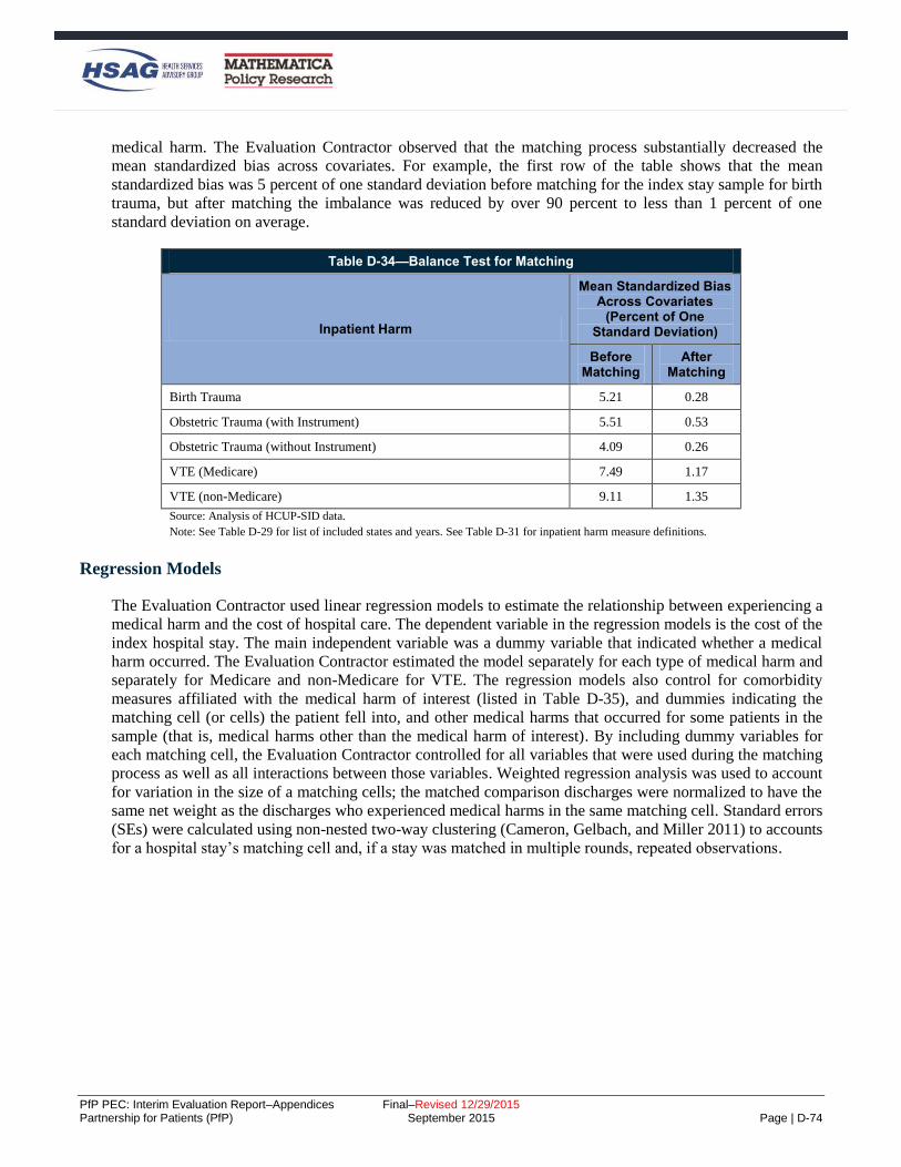
PfP PEC: Interim Evaluation Report–Appendices Final–Revised 12/29/2015 Partnership for Patients (PfP) September 2015 Page | D-74
medical harm. The Evaluation Contractor observed that the matching process substantially decreased the
mean standardized bias across covariates. For example, the first row of the table shows that the mean
standardized bias was 5 percent of one standard deviation before matching for the index stay sample for birth
trauma, but after matching the imbalance was reduced by over 90 percent to less than 1 percent of one
standard deviation on average.
Table D-34—Balance Test for Matching
Inpatient Harm
Mean Standardized Bias Across Covariates
(Percent of One Standard Deviation)
Before Matching
After Matching
Birth Trauma 5.21 0.28
Obstetric Trauma (with Instrument) 5.51 0.53
Obstetric Trauma (without Instrument) 4.09 0.26
VTE (Medicare) 7.49 1.17
VTE (non-Medicare) 9.11 1.35
Source: Analysis of HCUP-SID data.
Note: See Table D-29 for list of included states and years. See Table D-31 for inpatient harm measure definitions.
Regression Models
The Evaluation Contractor used linear regression models to estimate the relationship between experiencing a
medical harm and the cost of hospital care. The dependent variable in the regression models is the cost of the
index hospital stay. The main independent variable was a dummy variable that indicated whether a medical
harm occurred. The Evaluation Contractor estimated the model separately for each type of medical harm and
separately for Medicare and non-Medicare for VTE. The regression models also control for comorbidity
measures affiliated with the medical harm of interest (listed in Table D-35), and dummies indicating the
matching cell (or cells) the patient fell into, and other medical harms that occurred for some patients in the
sample (that is, medical harms other than the medical harm of interest). By including dummy variables for
each matching cell, the Evaluation Contractor controlled for all variables that were used during the matching
process as well as all interactions between those variables. Weighted regression analysis was used to account
for variation in the size of a matching cells; the matched comparison discharges were normalized to have the
same net weight as the discharges who experienced medical harms in the same matching cell. Standard errors
(SEs) were calculated using non-nested two-way clustering (Cameron, Gelbach, and Miller 2011) to accounts
for a hospital stay’s matching cell and, if a stay was matched in multiple rounds, repeated observations.

PfP PEC: Interim Evaluation Report–Appendices Final–Revised 12/29/2015 Partnership for Patients (PfP) September 2015 Page | D-75
Table D-35—Comorbidity Measures Associated with Inpatient Harm
VTE Birth Trauma Obstetric Trauma
Transfer from acute care facility
Congestive heart failure
Valvular disease
Pulmonary circulation disease
Peripheral vascular disease
Hypertension
Paralysis
Other neurological disorders
Chronic pulmonary disease
Diabetes without chronic
complications
Hypothyroidism
Renal failure
Acquired immune deficiency
syndrome
Lymphoma
Metastatic cancer
Solid tumor without metastasis
Obesity
Weight loss
Chronic blood loss anemia
Deficiency Anemias
Alcohol abuse
Drug abuse
Psychoses
Depression
Alcohol abuse
Drug abuse
Depression
Other neurological
disorders
Hypertension
Alcohol abuse
Drug abuse
Psychoses
Depression
Other neurological disorders
Hypertension
Pregestational or gestational diabetes
Preeclampsia
Chronic hypertension
Gestational hypertension
Preeclampsia or eclampsia
superimposed on pre-existing
hypertension
Preterm labor or delivery
Source: The Evaluation Contractor’s analysis.
Note: The majority of the comorbidity measures are created in the PSI algorithm. The Evaluation Contractor developed six
extra measures (gestational hypertension, hypertension, preeclampsia, preeclampsia or eclampsia superimposed on pre-existing
hypertension, pregestational or gestational diabetes, and preterm labor or delivery) using diagnosis and present on admission
codes in the dataset to serve as additional controls in the analysis.
Method for Deriving Literature-Based Estimate of OB-EED NICU Stays
The Evaluation Contractor’s method for deriving a per-event cost estimate for OB-EED-related NICU stay
costs relies on existing research literature on:
How NICU rates change when efforts are made to reduce OB-EEDs.
Costs of NICU stays for early term births (as opposed to the many NICU stays that follow births at
other gestational ages, including pre-term births).
Relative length of NICU stays for elective early term births compared to NICU stays for all early term
births.

PfP PEC: Interim Evaluation Report–Appendices Final–Revised 12/29/2015 Partnership for Patients (PfP) September 2015 Page | D-76
Ratios of hospital charges to hospital costs.D-11
Since the estimate was for NICU stays, to complete the calculation of costs averted from OB-EEDs, the
number of OB-EED-related NICU stays must be estimated. This was done by multiplying the number of OB-
EEDs averted by .0996, a value derived from Ehrenthal et al. (2011).D-12
Note that the resulting estimate is very rough. Even if the Evaluation Contractor assumes that the results of
existing studies are internally valid (that is, results are not biased or erroneous because of some design flaw),
they may lack external validity because the particular samples used in those studies may not be
representative of the Partnership for Patients (PfP) hospitals that are reporting data, so the relationships found
in those studies may not hold exactly in other hospitals.
Table D-36—Steps in OB-EED-Related NICU Stays Cost-Per-Event Calculation
Item Amount Source
(1)Hospital charge per NICU
stay, 37-38 weeks births $37,137 March of Dimesa
(2) Cost per NICU stay, 37-38
weeks elective $7,875
Adjust (1) by the ratio of average length of NICU stay for
elective 37-38 week deliveries to those of all 37-38 week
deliveries ($23,865),b and multiply by a 0.33 hospital cost-to-
charge ratioc
Source: See third column.
Note: This calculation assumes that the cost of NICU stays among births in which an OB-EED was averted remain the same as they would have
been if the birth had ended in an OB-EED and been followed by a NICU stay. aMarch of Dimes. “Special Care Nursery Admissions.” http://www.marchofdimes.com/peristats/pdfdocs/nicu_summary_final.pdf. Accessed
April 17, 2013. This document presents hospital charges. bAverage length of stay by gestational age and labor onset type is taken from: Bailit, J. L., Gregory, K. D., Reddy, U. M., Gonzalez-Quintero, V.
H., Hibbard, J. U., Ramirez, M. M., ... & Zhang, J. (2010). Maternal and neonatal outcomes by labor onset type and gestational age. American
Journal of Obstetrics and Gynecology, 202(3), 245-e1. cIn the absence of detailed data on the ratio of hospital costs to charges specifically for NICU services, a preliminary ratio of 0.33 is used. This
ratio may understate the costs averted, since using 2004 data, Anderson et al. report a charge to cost ratio of 3.07 for all hospitals for all
“Medicare-allowable costs” (or a cost to charge ratio of slightly less than 0.33) (Medicare-allowable costs are costs determined by CMS to be the
costs associated with care for all patients, not just Medicare patients; Anderson, G.F. “From ‘Soak the Rich’ to ‘Soak the Poor’: Recent Trends in
Hospital Pricing.” Health Affairs, vol. 36, no. 3, May/June 2007, pp. 780-789), and using 2010 data, MedPAC reports a charge to cost ratio of
3.18 (or a cost to charge ratio of 0.315) for “Medicare services” (not otherwise specified; MedPAC. “A Data Book: Health Care Spending and the
Medicare Program.” chart 6-23, June 2012, http://www.medpac.gov/chapters/Jun12DataBookSec6.pdf).
The resulting estimate for cost savings per OB-EED-related NICU stay averted ($7,875) is then update for
inflation to 2014 dollars, using the CPI-U, to provide the $9,762 figure shown in Table D-28.
D-11 Hospital charges—what hospitals charge—are typically higher than the costs actually expended by hospitals for patient care, and
higher than what health care payers generally pay hospitals. D-12 Ehrenthal, D. B., Hoffman, M. K., Jiang, X., & Ostrum, G. (2011). Neonatal outcomes after implementation of guidelines limiting
elective delivery before 39 weeks of gestation. Obstetrics & Gynecology, 118(5), 1047-1055. This evaluation of a policy limiting
elective deliveries prior to 39 weeks gestation at a large academic center found that “early term” deliveries (those at 37 or 38 weeks
gestation) fell from 33.1 percent to 26.4 percent of all births. In turn, the percent of term births (all births at 37 weeks gestation or
later) with NICU stays fell from 9.29 percent to 8.55 percent, which translates to a reduction in NICU stays as a percentage of all
births falling from 8.38 percent to 7.71 percent. From that, changes in NICU stays per OB-EED averted is calculated as: (0.0771-
0.0838)/(0.264-0.331) = 0.0996. Roughly one NICU stay is averted for every 10 OB-EEDs averted. Note that because of the
particular sample, there may be concerns with generalizing the results to PfP hospitals.

PfP PEC: Interim Evaluation Report–Appendices Final–Revised 12/29/2015 Partnership for Patients (PfP) September 2015 Page | D-77
Estimation of Costs Averted Due to Hospital Engagement Networks (HENs) Methodology
This section provides details about the methods used to analyze the HENs’ role in cost reduction.
Data
Medicare claims data (January 2009 through March 2014) from the inpatient Research Identifiable Files
(RIFs), the carrier RIFs, the Home Health Agency (HHA) RIFs, Hospice RIFs, outpatient RIFs, Skilled
Nursing Facility (SNF) RIFs, and the Durable Medical Equipment (DME) RIFs were used to construct the
Medicare expenditure variables. Duplicate claims were removed and overlapping claims were identified
based on the dates of care, the diagnosis codes, and the provider. The following table (Table D-37) provides
a detailed description of the components that make up each expenditure category as well as the Medicare
RIFs used.
Table D-37—Definitions of Expenditure Measures
Measure Source Expenditure Components
Total expenditures All RIF files The sum of expenditures from the inpatient index discharge and the post-discharge
expenditures.
Index discharges Inpatient and Carrier
RIF files
The sum of expenditures from the inpatient acute hospital stay amount and the carrier
amount during the index stay.
Post-discharge All RIF files
The sum of expenditures from the post-discharge inpatient amount; the post-discharge
carrier amount; the home health amount; the hospice amount; the outpatient amount; the SNF amount; and the DME amount.
Post-discharge Inpatient (IP)
Inpatient RIF files
The sum of expenditures from the post-discharge acute care hospital amount; long
term care hospital amount; rehabilitation hospital amount; psychiatric hospital
amount; and other inpatient hospital amount.
Outpatient Outpatient RIF files
The sum of all outpatient expenditures in the post-discharge period. This includes
payment amounts for Emergency Department (ED) visits, observations stays, and
other outpatient amounts.
DME DME RIF files The sum of all DME expenditures in the post-discharge period.
HHA HHA RIF files The sum of HHA expenditures in the post-discharge period.
SNF SNF RIF files The sum of all SNF expenditures in the post-discharge period.
Hospice Hospice RIF files The sum of Hospice expenditures in the post-discharge period.
Professionals (i.e., carrier)
Carrier RIF Files The sum of all Professional (i.e., carrier) expenditures in the post-discharge period.
Notes: These expenditures breakdowns are derived from Medicare fee-for-service (FFS) claims. In the analyses, all expenditures are deflated to adjust for
price inflation unless otherwise noted.

PfP PEC: Interim Evaluation Report–Appendices Final–Revised 12/29/2015 Partnership for Patients (PfP) September 2015 Page | D-78
4BSample
The analysis sample consists of all index discharges that took place between 1/1/2009 and 12/31/2013 at
short-term acute-care hospitals.D-13 Medicare beneficiaries must have FFS Part A during the index stay to be
included in the analysis, as well as FFS Parts A and B throughout the entire post-discharge period.
25BIdentifying Index Discharge Admissions
As noted above, only admissions to short-term acute care hospitals were considered as an index discharge.
That is, inpatient admissions to other types of hospitals were never considered as index discharges in this
analysis (e.g., long term care; rehabilitation; psychiatric).
Although Medicare claims data are available from January 2009 through March 2014, the Evaluation
Contractor restricted the analysis to individuals whose index discharge occurred early enough to allow a
complete lookout period to be covered. For example, to construct the 90 day expenditure variables, a
beneficiary must have had an index discharge at a short-term acute-care hospital before January 1st 2014; to
construct the 180 day expenditure variables, the index discharge must have occurred 180 days prior to March
31st 2014.
Two sets of index discharges were identified, one defined with a 90-day post-discharge lookout period and
one with a 180-day post-discharge lookout period. The first discharge for any beneficiary during the sample
period was considered an index discharge for both the 90-day definition and the 180-day definition. Inpatient
discharges that took place within the lookout period of an index discharge were not considered as index
discharges themselves and these inpatient expenditures were allocated to the post-discharge period.
26BVariable Construction
Index admission expenditures were calculated using payment information from the inpatient RIFs and the
carrier RIF claims that overlap the index stay period. To calculate post-discharge expenditures, payment
information from all RIF files above was used. All inpatient discharges at short-term acute care hospitals
were included in the analysis, either as an index discharge or as part of the expenditures in the lookout period
following an index discharge. Admissions to all hospital types are included in the calculation of post-
discharge inpatient expenditures if they fell in the post-discharge period.D-14 Similarly, all outpatient, SNF,
Hospice, HHA, DME, and carrier claims were allocated to the post-discharge period if they fell within the
window of 90 or 180 days following the index discharge date.
Since claims show the total payment amounts over the entire service period of the claim, if care extended
beyond the post-discharge period, then the payment amounts were pro-rated to only include the lookout
period. For example, if a beneficiary had a Hospice visit that took place from days 80 to 100 after the index
discharge, then the total amount for this claim was divided by two for the 90 day look out period (since half
the days fell in the 90 day lookout period and half fell outside of it) and only half of the total payment
amount was allocated to the post-discharge period.
D-13 Hospitalizations with length of stay longer than 365 were excluded from the analysis. D-14 For example, admissions to long-term care providers, rehab hospitals, psychiatric hospitals are all considered for calculating post-
discharge expenditures.

PfP PEC: Interim Evaluation Report–Appendices Final–Revised 12/29/2015 Partnership for Patients (PfP) September 2015 Page | D-79
27BMethods
68BGenerating Propensity Score Weights
Baseline hospital characteristics were selected from the Medicare claims data and the American Hospital
Association (AHA) survey data for potential inclusion in the propensity score analyses: (1) hospital
demographic information, (2) hospital characteristics information, and (3) baseline measures of Medicare
expenditure outcomes. Propensity score analyses should include all available traits that predict participation
in an intervention, particularly if they are also likely to be related to the outcomes of interest. This may
include a large number of characteristics. The trade-off for including many, rather than few, characteristics is
that although the matching may produce a comparison group that is more similar to the treatment group
broadly speaking, the average balance between the treatment group and the reweighted comparison group
across the characteristics included in the particular model will be lower than if only a few characteristics are
included.D-15
To select relevant variables to be used in the model, a two-step selection procedure was used:
1. The Evaluation Contractor used a method from Hirano and Imbens (2001) to assess whether each
variable was independently correlated with PfP participation. Using a t-test, any variables that were
not associated with program participation at the 95 percent confidence level were dropped.
Continuous variables were transformed into four quartiles with the raw score cut at the 25th, 50th,
and 75th percentiles and represented as dummy variables.D-16 For categorical variables and continuous
variables, variables were kept if at least one of the categories/quartiles was associated with
participation.
2. Some hospital characteristics were highly correlated and it was possible that some hospital
characteristics under consideration would be unrelated to HEN alignment after controlling for other
hospital characteristics. Thus, the Evaluation Contractor estimated a logit model in which all the
candidate variables were used to predict treatment status. A variable was selected if the null
hypothesis of no association between the variable and HEN alignment could not be rejected
(conditional on other hospital characteristics) at the 20 percent confidence level for a two-tailed test.
Tests of joint significance (Wald tests) were used for measures with multiple mutually exclusive
categories (categorical variables and the quartiles of continuous variables) in order to capture whether
the concept measured by these variables was statistically significantly associated with HEN
alignment.
Liberal variable inclusion criteria allowed a broad understanding of the factors that influenced participation
and permited the identification of potential challenges to creating a comparison group from the non-HEN-
aligned pool of hospitals that was comparable to those that were HEN-aligned. See Table D-38 for a full list
of the variables included in the propensity score analysis. These variables were included in matching for all
expenditure outcomes.
D-15 At the extreme, if the propensity model includes only one independent variable, perfect balance can be achieved on that
characteristic, though the groups will likely be poorly balanced on the characteristics not included in the model. As more measures
are added to the model, it improves balance across the wider range of characteristics as a whole, but achieving perfect balance on any
given measure is no longer likely. D-16 In some cases, the distribution of a continuous variable was highly skewed or multimodal and thus alternate cutoff points were used
to create the dummies for each category (e.g., zero, low, or high).

PfP PEC: Interim Evaluation Report–Appendices Final–Revised 12/29/2015 Partnership for Patients (PfP) September 2015 Page | D-80
The estimated propensity scores were then used to construct the sampling weights (i.e., inverse propensity
score weights) which were employed in the impact regression analysis. In the difference-in-differences
analysis, observations from HEN-aligned hospitals received a weight of one, and observations from non-
HEN-aligned hospitals received the propensity score-based weight for each outcome.
Table D-38—Variables Included in the Propensity Score Models for Inverse Weight Calculation
Hospital Characteristics
Bed Size
Bed size: <100 beds; 100-199; 200-399; 400+
Ownership Type
Investor-owned (for-profit); Public; Nonprofit nongovernmental
Has Electronic Health System (EHR)
Fully has EHR; partially has EHR; no EHR; EHR indicator missing
Census Region
New England; Mid-Atlantic; South Atlantic; East North Central; East South Central; West North Central; West South Central;
Mountain; Pacific; Associated areas
Rural Indicator
Hospital Does Belong to a Network
Hospital Does Belong to a System
Other Hospital Characteristics
AHA member; teaching hospital; rural referral center
Obstetric Care Beds, as a Percent of Total
Obstetric care beds: Tercile 1; Tercile 2; Tercile 3
Intensivists, as a Percent of Total Physicians
Intensivists: Tercile 1; Tercile 2; Tercile 3
Patient Case Mix Characteristics (Hospital Level)
Mean patient age; percentage of patients who are female
Race/Ethnic Composition of Inpatient Population, Percent of Beneficiaries
White (non-Hispanic); black (non-Hispanic); Hispanic; other (non-Hispanic)
Pre-Intervention Outcomes
2010 Expenditures; Difference in expenditures between 2009 and 2010; Quantiles of 2010 expenditures; Quantile of difference in
expenditures between 2009 and 2010
Source: Medicare Claims, AHA Hospital Files.

PfP PEC: Interim Evaluation Report–Appendices Final–Revised 12/29/2015 Partnership for Patients (PfP) September 2015 Page | D-81
28BBalance Tests
The similarity between the HEN-aligned and non-HEN-aligned groups before reweighting was analyzed. The
Evaluation Contractor assessed the balance between the groups in several ways. First, the propensity score
distributions were graphically analyzed, looking for overlap in the propensity scores for the HEN-aligned and
non-HEN-aligned hospitals. Second, the Evaluation Contractor examined the improvement in balance
achieved between groups through reweighting; the similarity between the HEN-aligned hospitals and the
pool of non-HEN-aligned hospitals on characteristics in the propensity score model was examined. The
extent that the similarity is greater after implementing propensity score reweighting was assessed by
comparing HEN-aligned hospitals to the reweighted comparison group of non-HEN-aligned hospitals. Tables
showing results of this analysis were provided in the balance tables (Table D-21 through Table D-23), above.
29BThe Difference-in-Differences Analysis of Cost Averted Due to HENs
An overview of the analytic approach was provided in Chapter 6. A more detailed description of the
difference-in-differences model for the expenditure analysis is discussed here. For each expenditure
outcome, a difference-in-differences model was fit relating individual discharge outcomes (e.g., total
expenditures; index discharge expenditures; post-discharge expenditures) to HEN alignment and a set of
demographic and other control variables. The Evaluation Contractor estimated difference-in-differences
models as follows:
𝑦𝑖ℎ𝑡 = 𝛿𝑡 𝑃𝐹𝑃ℎ ∗ 𝑡𝑡 + 𝛾 𝑡𝑡 + 𝜙 𝑤𝑖 + 𝜃 𝑥𝑖 + 𝛽 𝑧ℎ + 휀𝑖ℎ𝑡 , (1)
where the outcome variable, yiht, is measured for a hospital discharge (i) occurring in hospital h in year t. The
variable PFPh is a dummy variable for whether or not the hospital where the discharge occurred was HEN-
aligned as reported in the June 2012 roster. The coefficient 𝛿𝑡 estimates the effect in year t of hospital
alignment with a HEN. tt is a vector of yearly dummy variables indicating the year in which the index
discharge took place, and the estimated coefficients (γ = [γ1,γ2,…,γT]) control for secular trends in the
outcome variable. The regression model also includes patient-level covariates that control for demographics,
patient medical factors, and characteristics of the hospital where the index discharge occurred. The patient
demographics (wi) are age, gender, and race/ethnicity. The patient risk factors (xi) are indicators for the 30
chronic condition flags outlined in Elixhauser (1998), as well as an index derived from each of these flags.
The regression model also includes hospital-level characteristics as a vector of hospital dummies (zh)—also
known as hospital fixed effects—to control for all hospital-specific observed and unobserved factors that are
stable over time.D-17 Finally, εiht is an error term. The same covariates were included for all expenditure
categories and for both 90 and 180 days. Equation 1 follows the approach used for the difference-in-
differences comparison group analyses, lookout periods described in detail above. In addition to examining
results separately for 2012 and 2013, results for 2012 and 2013 combined were also examined.
As a reminder, in the difference-in-differences models, observations from HEN-aligned hospitals received a
weight of one, and observations from non-HEN-aligned hospitals received the propensity score-based weight
for each outcome.
To assess the robustness of the results, the Evaluation Contractor also performed the analysis on finer
expenditure categories; using nominal expenditures (rather than inflation-adjusted); using a different baseline
year (2010 rather than 2011); and collapsing the years into pre versus post intervention periods.
D-17 It should be noted that since all difference-in-differences regression-adjusted models include hospital fixed effects, individual
hospital characteristics (e.g., ownership; beds; rural indicator; hospital type) drop out of the analysis and are only included for the
adjusted trend graphs shown in Appendix E, Figures E-11 through E-16.
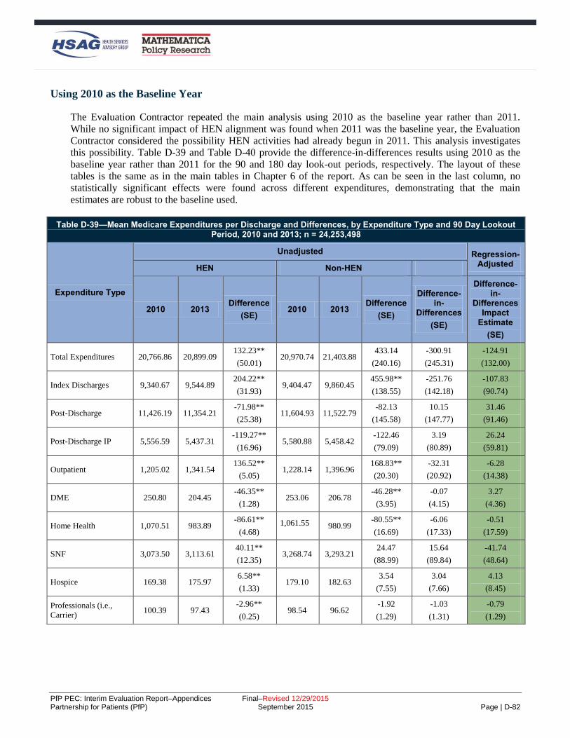
PfP PEC: Interim Evaluation Report–Appendices Final–Revised 12/29/2015 Partnership for Patients (PfP) September 2015 Page | D-82
69BUsing 2010 as the Baseline Year
The Evaluation Contractor repeated the main analysis using 2010 as the baseline year rather than 2011.
While no significant impact of HEN alignment was found when 2011 was the baseline year, the Evaluation
Contractor considered the possibility HEN activities had already begun in 2011. This analysis investigates
this possibility. Table D-39 and Table D-40 provide the difference-in-differences results using 2010 as the
baseline year rather than 2011 for the 90 and 180 day look-out periods, respectively. The layout of these
tables is the same as in the main tables in Chapter 6 of the report. As can be seen in the last column, no
statistically significant effects were found across different expenditures, demonstrating that the main
estimates are robust to the baseline used.
Table D-39—Mean Medicare Expenditures per Discharge and Differences, by Expenditure Type and 90 Day Lookout Period, 2010 and 2013; n = 24,253,498
Expenditure Type
Unadjusted Regression-Adjusted
HEN Non-HEN
2010 2013 Difference
(SE) 2010 2013
Difference
(SE)
Difference-in-
Differences
(SE)
Difference-in-
Differences Impact
Estimate
(SE)
Total Expenditures 20,766.86 20,899.09 132.23**
(50.01) 20,970.74 21,403.88
433.14
(240.16)
-300.91
(245.31)
-124.91
(132.00)
Index Discharges 9,340.67 9,544.89 204.22**
(31.93) 9,404.47 9,860.45
455.98**
(138.55)
-251.76
(142.18)
-107.83
(90.74)
Post-Discharge 11,426.19 11,354.21 -71.98**
(25.38) 11,604.93 11,522.79
-82.13
(145.58)
10.15
(147.77)
31.46
(91.46)
Post-Discharge IP 5,556.59 5,437.31 -119.27**
(16.96) 5,580.88 5,458.42
-122.46
(79.09)
3.19
(80.89)
26.24
(59.81)
Outpatient 1,205.02 1,341.54 136.52**
(5.05) 1,228.14 1,396.96
168.83**
(20.30)
-32.31
(20.92)
-6.28
(14.38)
DME 250.80 204.45 -46.35**
(1.28) 253.06 206.78
-46.28**
(3.95)
-0.07
(4.15)
3.27
(4.36)
Home Health 1,070.51 983.89 -86.61**
(4.68) 1,061.55 980.99
-80.55**
(16.69)
-6.06
(17.33)
-0.51
(17.59)
SNF 3,073.50 3,113.61 40.11**
(12.35) 3,268.74 3,293.21
24.47
(88.99)
15.64
(89.84)
-41.74
(48.64)
Hospice 169.38 175.97 6.58**
(1.33) 179.10 182.63
3.54
(7.55)
3.04
(7.66)
4.13
(8.45)
Professionals (i.e.,
Carrier) 100.39 97.43
-2.96**
(0.25) 98.54 96.62
-1.92
(1.29)
-1.03
(1.31)
-0.79
(1.29)

PfP PEC: Interim Evaluation Report–Appendices Final–Revised 12/29/2015 Partnership for Patients (PfP) September 2015 Page | D-83
Table D-39—Mean Medicare Expenditures per Discharge and Differences, by Expenditure Type and 90 Day Lookout Period, 2010 and 2013; n = 24,253,498
Expenditure Type
Unadjusted Regression-Adjusted
HEN Non-HEN
2010 2013 Difference
(SE) 2010 2013
Difference
(SE)
Difference-in-
Differences
(SE)
Difference-in-
Differences Impact
Estimate
(SE)
Source: Mathematica Policy Research analyses of Medicare claims data.
Notes: Each row corresponds to a separate difference-in-differences regression model using index discharge-level data, with discharges weighted using
propensity-score based weights. For all 10 outcomes, expenditures are price-adjusted and are expressed in January 2010 dollars. The first six columns of
estimates present mean expenditures in 2010 and 2013, as well as the change from 2010 to 2013 for HEN-aligned and comparison hospitals using raw, or
unadjusted, expenditures. The next column provides the difference in the change from 2010 to 2013 between HEN-aligned and comparison hospitals using
raw, unadjusted, expenditures. The top number in the final column presents the main impact estimate, adjusting for patient characteristics, patient risk
factors, and hospital fixed effects. The coefficient shows the average effect of HEN alignment in the 2013 period. The main impact estimates were calculated
by using linear regression models. Appendix D provides the full list of controls included in the regression. Robust SEs, clustered by hospital, are provided in
parentheses. *Difference-in-differences treatment-comparison impact estimate significantly different from zero at the .05 level, two-tailed test. **Difference-in-differences treatment-comparison impact estimate significantly different from zero at the .01 level, two-tailed test.
Table D-40—Mean Medicare Expenditures per Discharge and Differences, by Expenditure Type and 180 Day Lookout Period, 2010 and 2013, n = 19,441,206
Unadjusted Regression-
Adjusted
Expenditure Type
HEN Non-HEN Difference-
in-Differences
(SE)
Difference-in-
Differences Impact
Estimate
(SE)
2010 2013 Difference
(SE) 2010 2013
Difference
(SE)
Total
Expenditures 24,748.40 24,528.03
-220.36**
(56.49) 25,001.13 25,192.16
191.03
(256.35)
-411.39
(262.50)
-205.10
(175.30)
Index
Discharges 9,299.33 9,383.65
84.32**
(30.93) 9,357.85 9,720.60
362.75*
(147.70)
-278.43
(150.90)
-119.13
(106.73)
Post-Discharge 15,449.07 15,144.38 -304.69**
(34.91) 15,884.70 15,594.91
-289.79
(181.58)
-14.89
(184.91)
6.81
(126.80)
Post-Discharge
IP 7,506.46 7,241.61
-264.84**
(22.86) 7,533.76 7,317.43
-216.33*
(109.75)
-48.52
(112.10)
-10.28
(92.23)
Outpatient 2,040.09 2,264.48 224.38**
(8.10) 2,062.96 2,348.30
285.34**
(35.19)
-60.96
(36.11)
-21.24
(26.47)
DME 430.27 350.87 -79.40**
(2.16) 440.17 358.14
-82.03**
(7.56)
2.63
(7.86)
6.31
(8.15)
Home Health 1,516.32 1,375.48 -140.84**
(6.79) 1,523.65 1,404.88
-118.77**
(23.77)
-22.07
(24.73)
-15.40
(26.12)
SNF 3,584.51 3,531.45 -53.06**
(14.28) 3,847.63 3,750.62
-97.01
(123.34)
43.94
(124.16)
-51.48
(49.87)

PfP PEC: Interim Evaluation Report–Appendices Final–Revised 12/29/2015 Partnership for Patients (PfP) September 2015 Page | D-84
Table D-40—Mean Medicare Expenditures per Discharge and Differences, by Expenditure Type and 180 Day Lookout Period, 2010 and 2013, n = 19,441,206
Unadjusted Regression-
Adjusted
Expenditure Type
HEN Non-HEN Difference-
in-Differences
(SE)
Difference-in-
Differences Impact
Estimate
(SE)
2010 2013 Difference
(SE) 2010 2013
Difference
(SE)
Hospice 268.63 281.05 12.42**
(2.42) 294.82 288.23
-6.60
(13.72)
19.02
(13.93)
21.60
(15.11)
Professionals
(i.e., Carrier) 102.78 99.44
-3.34**
(0.29) 100.43 97.91
-2.52
(1.68)
-0.82
(1.70)
-0.70
(1.78)
Source: Mathematica Policy Research analyses of Medicare claims data.
Notes: Each row corresponds to a separate difference-in-differences regression model using index discharge-level data, with discharges weighted using
propensity-score based weights. For all 10 outcomes, expenditures are price-adjusted and are expressed in January 2010 dollars. The first six columns of estimates present mean expenditures in 2010 and 2013, as well as the change from 2010 to 2013 for HEN-aligned and comparison hospitals using raw, or
unadjusted, expenditures. The next column provides the difference in the change from 2010 to 2013 between HEN-aligned and comparison hospitals using
raw, unadjusted, expenditures. The top number in the final column presents the main impact estimate, adjusting for patient characteristics, patient risk factors, and hospital fixed effects. The coefficient shows the average effect of HEN alignment in the 2013 period. The main impact estimates were calculated
by using linear regression models. Appendix D provides the full list of controls included in the regression. Robust SEs, clustered by hospital, are provided in
parentheses. *Difference-in-differences treatment-comparison impact estimate significantly different from zero at the .05 level, two-tailed test. **Difference-in-differences treatment-comparison impact estimate significantly different from zero at the .01 level, two-tailed test.
Other Expenditure Categories
The Evaluation Contractor repeated the main analysis on a set of finer expenditures which all contribute to
the larger expenditure categories presented in the main tables. While no significant impact of HEN alignment
was found on the broader categories, the Evaluation Contractor considered the possibility that a component
of an individual category might have been affected but was masked by the broader results. This analysis
investigates this possibility. Table D-41 and Table D-42 provide the difference-in-differences results for
these expenditure subgroups for the 90 and 180 day look-out periods, respectively. The layout of these tables
is the same as in the main tables in Chapter 6 of the report. As can be seen in the last column, no statistically
significant effects were found across different expenditures, suggesting that the more aggregated groupings
were not masking significant effects in the finer categories.

PfP PEC: Interim Evaluation Report–Appendices Final–Revised 12/29/2015 Partnership for Patients (PfP) September 2015 Page | D-85
Table D-41—Mean Medicare Expenditures per Discharge and Differences, by Expenditure Type and 90 days Lookout Period, 2011 and 2013, n = 24,253,498
Expenditure Type
Unadjusted Regression-Adjusted HEN Non-HEN
Difference-in-
Difference 2011 2013 Difference 2011 2013 Difference
Difference-in-
Differences Impact
Estimate
IP Acute Hospital Stay Expenditure
8,970.88 9,379.76 408.88**
(26.54) 9,151.14 9,701.46
550.32**
(114.94)
-141.44
(117.96)
-30.79
(77.40)
Professional (Carrier) Index Discharge Expenditure
170.25 165.13 -5.13**
(0.57) 167.82 163.21
-4.61*
(2.18)
-0.51
(2.25)
-1.05
(2.21)
IP Acute Hospital Post Expenditure
4,083.18 3,994.63 -88.55**
(11.49) 4,119.15 4,049.42
-69.73
(57.41)
-18.82
(58.55)
24.33
(44.36)
IP Rehab Post Expenditure
808.72 846.20 37.48**
(6.59) 757.10 768.87
11.77
(43.63)
25.71
(44.13)
40.87
(58.51)
IP Long Term Care (LTC) Hospital Post Expenditure
468.52 469.37 0.86
(5.83) 526.38 516.43
-9.95
(29.24)
10.81
(29.81)
26.36
(27.15)
Psych Post Discharge Expenditure
127.93 126.52 -1.40
(1.52) 138.15 127.75
-10.40
(7.67)
9.00
(7.82)
6.23
(6.90)
Other Hospital Post Discharge Expenditure
0.98 0.59 -0.39*
(0.19) 0.44 1.67
1.23
(1.02)
-1.61
(1.04)
-1.56
(1.04)
Outpatient (OP) Emergency Room (ER) Post Expenditure
87.17 103.97 16.80**
(0.42) 95.76 115.02
19.26**
(1.65)
-2.46
(1.70)
-0.83
(1.46)
OP Other Post Expenditure
1,146.35 1,235.54 89.19**
(3.86) 1,172.35 1,276.42
104.07**
(15.70)
-14.88
(16.17)
4.60
(12.73)
Source: The Evaluation Contractor’s analyses of Medicare claims data.
Notes: Each row corresponds to a separate difference-in-differences regression model using index discharge-level data, with discharges weighted by
propensity-score based weights. For all nine outcomes, expenditures are price-adjusted and are expressed in Jan 2010 dollars. The first six columns of
estimates present mean expenditures in 2011 and 2013, as well as the change from 2011 to 2013 for HEN-aligned and comparison hospitals using raw, or
unadjusted, expenditures. The next column provides the difference in the change from 2011 to 2013 between HEN-aligned and comparison hospitals using
raw, unadjusted, expenditures. The top number in the final column presents the main impact estimate, adjusting for patient characteristics, patient risk
factors, and hospital fixed effects. The coefficient shows the average effect of HEN alignment in the 2013 period. The main impact estimates were calculated
by using linear regression models. Appendix D describes the controls included in the regression. Robust SEs, clustered by hospital, are provided in
parentheses. * Difference-in-differences treatment-comparison impact estimate significantly different from 0 at the 0.05 level, two-tailed test. ** Difference-in-differences treatment-comparison impact estimate significantly different from 0 at the 0.01 level, two-tailed test.

PfP PEC: Interim Evaluation Report–Appendices Final–Revised 12/29/2015 Partnership for Patients (PfP) September 2015 Page | D-86
Table D-42—Mean Medicare Expenditures per Discharge and Differences, by Expenditure Type and 180 days Lookout Period, 2011 and 2013, n = 19,441,206
Expenditure Type
Unadjusted Regression-
Adjusted HEN Non-HEN
Difference-in-
Differences 2011 2013 Difference 2011 2013 Difference
Difference-in-
Differences Impact
Estimate
IP Acute Hospital Stay Expenditure
8,926.20 9,213.11 286.91**
(25.67) 9,100.37 9,549.79
449.42**
(125.16)
-162.51
(127.76)
-37.37
(92.12)
Professional (carrier) Index Discharge Expenditure
176.69 170.54 -6.14**
(0.61) 174.21 169.72
-4.48
(2.32)
-1.66
(2.40)
-1.89
(2.30)
IP Acute Hospital Post Expenditure
5,762.09 5,589.23 -172.86**
(16.50) 5,749.41 5,637.83
-111.59
(97.92)
-61.28
(99.30)
3.00
(85.05)
IP Rehab Post Expenditure
942.30 959.68 17.38*
(7.48) 890.00 870.75
-19.25
(55.86)
36.63
(56.36)
42.21
(62.45)
IP LTC Hospital Post Expenditure
510.21 505.39 -4.82
(6.18) 576.43 566.25
-10.19
(32.69)
5.36
(33.27)
15.33
(30.51)
Psych Post Discharge Expenditure
187.18 186.27 -0.91
(2.23) 211.41 197.86
-13.55
(10.49)
12.64
(10.73)
7.62
(8.81)
Other Hospital Post Discharge Expenditure
1.47 1.05 -0.42
(0.27) 0.51 2.50
2.00
(1.20)*
-2.41
(1.23)
-2.36
(1.22)
OP ER Post Expenditure
134.19 157.21 23.02**
(0.60) 144.05 169.02
24.97**
(2.12)
-1.95
(2.20)
-0.29
(1.97)
OP Other Post Expenditure
1,982.24 2,104.12 121.88**
(6.42) 2,051.01 2,181.14
130.13**
(23.60)
-8.25
(24.46)
25.72
(23.17)
Source: The Evaluation Contractor’s analyses of Medicare claims data.
Notes: Each row corresponds to a separate difference-in-differences regression model using index discharge-level data, with discharges weighted by
propensity-score based weights. For all nine outcomes, expenditures are price-adjusted and are expressed in Jan 2010 dollars. The first six columns of
estimates present mean expenditures in 2011 and 2013, as well as the change from 2011 to 2013 for HEN-aligned and comparison hospitals using raw, or
unadjusted, expenditures. The next column provides the difference in the change from 2011 to 2013 between HEN-aligned and comparison hospitals using
raw, unadjusted, expenditures. The top number in the final column presents the main impact estimate, adjusting for patient characteristics, patient risk
factors, and hospital fixed effects. It shows the average effect of HEN alignment in the 2013 period. The main impact estimates were calculated by using
linear regression models. Appendix D describes the controls included in the regression. Robust SEs, clustered by hospital, are provided in parentheses. * Difference-in-differences treatment-comparison impact estimate significantly different from 0 at the 0.05 level, two-tailed test. ** Difference-in-differences treatment-comparison impact estimate significantly different from 0 at the 0.01 level, two-tailed test.

PfP PEC: Interim Evaluation Report–Appendices Final–Revised 12/29/2015 Partnership for Patients (PfP) September 2015 Page | D-87
70BUsing Nominal Expenditures
The Evaluation Contractor also repeated the main analysis using nominal expenditures rather than price-
adjusted expenditures. To do this, propensity weights for each nominal expenditure outcome for each
hospital were generated in the same manner as the main analysis. The difference-in-differences analysis on
the nominal expenditures was performed using these propensity weights. In Table D-43 and Table D-44, the
difference-in-differences estimates are shown for the same expenditure categories as in Chapter 6, Table 6-2
and Table 6-3. As can be seen, the estimates are fairly similar to the estimates derived using the real
expenditures, and, again, there are no statistically significant effects.
Table D-43—Mean Medicare Expenditures per Discharge and Differences, by Expenditure Type and 90 days Lookout Period, 2011 and 2013 (Nominal), n=24,253,498
Expenditure Type
Unadjusted Regression-
Adjusted
HEN Non-HEN Difference-
in-Differences
Difference-in-
Differences Impact
Estimate
2011 2013 Difference 2011 2013 Difference
Total Expenditures 21,392.54 22,473.86 1,081.33**
(45.93) 21,818.61 23,018.27
1,199.66**
(242.98)
-118.33
(247.28)
27.86
(141.38)
Index Discharges 9,492.74 10,263.88 771.13**
(30.03) 9,675.57 10,606.94
931.37**
(131.66)
-160.24
(135.05)
-45.62
(89.69)
Post-Discharge 11,899.80 12,209.99 310.19**
(22.51) 12,195.41 12,402.30
206.89
(150.21)
103.30
(151.89)
130.73
(95.77)
Post-Discharge IP 5,701.10 5,847.59 146.49
(15.56) 5,744.03 5,872.47
128.44
(75.65)
18.05
(77.24)
44.85
(56.47)
Outpatient 1,282.74 1,442.94 160.19**
(4.43) 1,318.19 1,502.11
183.93**
(19.15)
-23.73
(19.65)
1.78
(14.21)
DME 243.80 219.92 -23.88**
(1.23) 247.45 222.19
-25.26**
(3.16)
1.38
(3.39)
4.82
(3.48)
HHA 1,029.87 1,058.14 28.26**
(3.76) 1,021.99 1,054.69
32.70
(17.12)
-4.44
(17.53)
1.30
(16.51)
SNF 3,355.83 3,347.32 -8.51
(11.14) 3,665.33 3,540.29
-125.04
(106.21)
116.53
(106.79)
63.79
(56.45)

PfP PEC: Interim Evaluation Report–Appendices Final–Revised 12/29/2015 Partnership for Patients (PfP) September 2015 Page | D-88
Table D-43—Mean Medicare Expenditures per Discharge and Differences, by Expenditure Type and 90 days Lookout Period, 2011 and 2013 (Nominal), n=24,253,498
Expenditure Type
Unadjusted Regression-
Adjusted
HEN Non-HEN Difference-
in-Differences
Difference-in-
Differences Impact
Estimate
2011 2013 Difference 2011 2013 Difference
Hospice 182.17 189.28 7.12**
(1.30) 193.69 196.49
2.80
(7.21)
4.32
(7.33)
6.97
(8.32)
Professionals (i.e., Carrier)
104.28 104.80 0.52*
(0.24) 101.40 103.91
2.51
(1.40)
-1.99
(1.42)
-1.64
(1.38)
Source: The Evaluation Contractor’s analyses of Medicare claims data.
Notes: Each row corresponds to a separate difference-in-differences regression model using index discharge-level data, with discharges weighted by
propensity-score based weights. For all ten outcomes, expenditures are not price-adjusted (i.e. nominal dollars). The first six columns of estimates present
mean expenditures in 2011 and 2013, as well as the change from 2011 to 2013 for HEN-aligned and comparison hospitals using raw, or unadjusted,
expenditures. The next column provides the difference in the change from 2011 to 2013 between HEN-aligned and comparison hospitals using raw,
unadjusted, expenditures. The top number in the final column presents the main impact estimate, adjusting for patient characteristics, patient risk factors, and
hospital fixed effects. The coefficient shows the average effect of HEN alignment in the 2013 period. The main impact estimates were calculated by using
linear regression models. Appendix D describes the controls included in the regression. Robust SEs, clustered by hospital, are provided in parentheses. * Difference-in-differences treatment-comparison impact estimate significantly different from 0 at the 0.05 level, two-tailed test. ** Difference-in-differences treatment-comparison impact estimate significantly different from 0 at the 0.01 level, two-tailed test.
Table D-44—Mean Medicare Expenditures per Discharge and Differences, by Expenditure Type and 180 days Lookout Period, 2011 and 2013 (Nominal), n=19,441,206
Expenditure Type
Unadjusted Regression-
Adjusted
HEN Non-HEN Difference-
in-Differences
Difference-in-
Differences Impact
Estimate
2011 2013 Difference 2011 2013 Difference
Total Expenditures 25,485.77 26,367.49 881.72**
(52.67) 26,035.19 27,091.51
1,056.32**
(274.41)
-174.60
(279.42)
-20.99
(189.93)
Index Discharges 9,452.45 10,086.92 634.47**
(28.77) 9,626.50 10,450.06
823.56**
(140.03)
-189.08
(142.95)
-64.62
(103.31)
Post-discharge 16,033.33 16,280.58 247.25**
(32.02) 16,614.82 16,774.04
159.21
(195.68)
88.04
(198.29)
105.73
(125.18)
Post-Discharge IP 7,688.76 7,785.21 96.45
(21.60) 7,689.47 7,875.99
186.52
(123.32)
-90.08
(125.20)
-49.66
(103.55)
Outpatient 2,200.63 2,434.93 234.29**
(7.26) 2,273.00 2,526.88
253.88**
(26.31)
-19.58
(27.29)
17.74
(22.45)
DME 422.21 377.24 -44.97**
(2.14) 429.11 385.35
-43.76**
(9.68)
-1.21
(9.91)
2.91
(10.24)
HHA 1,459.80 1,478.81 19.01**
(5.16) 1,475.78 1,510.61
34.83
(23.00)
-15.82
(23.57)
-8.32
(23.06)

PfP PEC: Interim Evaluation Report–Appendices Final–Revised 12/29/2015 Partnership for Patients (PfP) September 2015 Page | D-89
Table D-44—Mean Medicare Expenditures per Discharge and Differences, by Expenditure Type and 180 days Lookout Period, 2011 and 2013 (Nominal), n=19,441,206
Expenditure Type
Unadjusted Regression-
Adjusted
HEN Non-HEN Difference-
in-Differences
Difference-in-
Differences Impact
Estimate
2011 2013 Difference 2011 2013 Difference
SNF 3,860.95 3,795.29 -65.66**
(12.76) 4,240.18 4,036.59
-203.58
(136.42)
137.93
(137.02)
54.75
(59.38)
Hospice 294.87 302.18 7.31**
(2.39) 316.50 309.96
-6.54
(16.83)
13.85
(17.00)
18.90
(18.83)
Professionals (i.e., Carrier)
106.10 106.92 0.82**
(0.27) 103.37 105.30
1.93
(1.32)
-1.11
(1.34)
-0.84
(1.32)
Source: The Evaluation Contractor’s analyses of Medicare claims data.
Notes: Each row corresponds to a separate difference-in-differences regression model using index discharge-level data, with discharges weighted by
propensity-score based weights. For all ten outcomes, expenditures are not price-adjusted (i.e. nominal dollars). The first six columns of estimates present
mean expenditures in 2011 and 2013, as well as the change from 2011 to 2013 for HEN-aligned and comparison hospitals using raw, or unadjusted,
expenditures. The next column provides the difference in the change from 2011 to 2013 between HEN-aligned and comparison hospitals using raw,
unadjusted, expenditures. The top number in the final column presents the main impact estimate, adjusting for patient characteristics, patient risk factors, and
hospital fixed effects. The coefficient shows the average effect of HEN alignment in the 2013 period. The main impact estimates were calculated by using
linear regression models. Appendix D describes the controls included in the regression. Robust SEs, clustered by hospital, are provided in parentheses. * Difference-in-differences treatment-comparison impact estimate significantly different from 0 at the 0.05 level, two-tailed test. ** Difference-in-differences treatment-comparison impact estimate significantly different from 0 at the 0.01 level, two-tailed test.

PfP PEC: Interim Evaluation Report–Appendices Final–Revised 12/29/2015 Partnership for Patients (PfP) September 2015 Page | D-90
71BUsing Pre and Post Periods
An additional robustness check collapsed the years into either the pre or post Partnership for Patients (PfP)
period. In particular, index discharges in calendar years 2009 to 2011 are grouped into the pre-period, while
discharges in calendar years 2012 and 2013 are grouped into the post period. This analysis detects the
average impact of HEN alignment after PfP was initiated. In Table D-45 and Table D-46, the difference-in-
differences estimates for the same expenditure categories as shown in Chapter 6, Table 6-2 and Table 6-3.
Again, across all types of expenditures, no significant effects are found, though the coefficients change
slightly compared to the main analysis.
Table D-45—Mean Medicare Expenditures per Discharge and Differences, by Expenditure Type and 90 days Lookout Period, Pre and Post, n=24,253,498
Expenditure Type
Unadjusted Regression-
Adjusted
HEN Non-HEN Difference-
in-Differences
Difference-in-
Differences Impact
Estimate
Pre Post Difference Pre Post Difference
Total Expenditures 20,698.61 20,657.05 -41.56
(37.11) 21,004.92 21,109.18
104.26
(217.80)
-145.83
(220.94)
-52.37
(105.68)
Index Discharges 9,285.26 9,358.04 72.78**
(23.75) 9,387.02 9,637.01
249.99*
(109.75)
-177.21
(112.30)
-54.60
(72.53)
Post-Discharge 11,413.35 11,299.01 -114.34**
(18.96) 11,636.84 11,474.35
-162.50
(136.85)
48.15
(138.16)
31.44
(68.22)
Post-Discharge IP 5,575.55 5,448.78 -126.76**
(12.82) 5,617.66 5,459.72
-157.93*
(71.15)
31.17
(72.29)
32.80
(46.17)
Outpatient 1,205.71 1,318.42 112.72**
(3.80) 1,240.11 1,372.15
132.04**
(17.20)
-19.33
(17.62)
-2.34
(12.73)
DME 246.41 217.45 -28.95**
(0.93) 249.94 221.66
-28.28**
(3.17)
-0.68
(3.30)
1.77
(3.32)
HHA 1,038.91 984.12 -54.79**
(3.69) 1,028.29 977.25
-51.05**
(13.23)
-3.74
(13.73)
2.35
(13.70)
SNF 3,077.00 3,054.72 -22.29*
(9.27) 3,314.30 3,238.34
-75.96
(84.68)
53.67
(85.18)
-17.88
(33.55)

PfP PEC: Interim Evaluation Report–Appendices Final–Revised 12/29/2015 Partnership for Patients (PfP) September 2015 Page | D-91
Table D-45—Mean Medicare Expenditures per Discharge and Differences, by Expenditure Type and 90 days Lookout Period, Pre and Post, n=24,253,498
Expenditure Type
Unadjusted Regression-
Adjusted
HEN Non-HEN Difference-
in-Differences
Difference-in-
Differences Impact
Estimate
Pre Post Difference Pre Post Difference
Hospice 170.24 177.10 6.87**
(0.94) 178.64 182.81
4.18
(4.94)
2.69
(5.03)
2.22
(5.67)
Professionals (i.e., Carrier)
99.53 98.40 -1.13**
(0.19) 97.52 96.57
-0.96
(1.01)
-0.17
(1.03)
0.04
(1.02)
Source: The Evaluation Contractor’s The Evaluation Contractor’s analyses of Medicare claims data.
Notes: Each row corresponds to a separate difference-in-differences regression model using index discharge-level data, with discharges weighted by
propensity-score based weights. For all ten outcomes, expenditures are price-adjusted and are expressed in Jan 2010 dollars. The first six columns of
estimates present mean expenditures in the pre and post PfP period, as well as the change from the pre-PfP period to the post-PfP period for HEN-aligned
and comparison hospitals using raw, or unadjusted, expenditures. The next column provides the difference in the change from the pre-PfP to the post-PfP
periods between HEN-aligned and comparison hospitals using raw, unadjusted, expenditures. The top number in the final column presents the main impact
estimate, adjusting for patient characteristics, patient risk factors, and hospital fixed effects. The coefficient shows the average effect of HEN alignment in
the 2012 - 2013 period. The main impact estimates were calculated by using linear regression models. Appendix D describes the controls included in the
regression. Robust SEs, clustered by hospital, are provided in parentheses. * Difference-in-differences treatment-comparison impact estimate significantly different from 0 at the 0.05 level, two-tailed test. ** Difference-in-differences treatment-comparison impact estimate significantly different from 0 at the 0.01 level, two-tailed test.
Table D-46—Mean Medicare Expenditures per Discharge and Differences, by Expenditure Type and 180 days Lookout Period, Pre and Post, n=19,441,206
Expenditure Type
Unadjusted Regression-
Adjusted
HEN Non-HEN Difference-
in-Differences
Difference-in-
Differences Impact
Estimate
Pre Post Difference Pre Post Difference
Total Expenditures 24,729.94 24,422.22 -307.72**
(41.56) 25,106.27 25,014.64
-91.63
(222.69)
-216.09
(226.54)
-101.03
(132.44)
Index Discharges 9,245.28 9,244.53 -0.76
(22.88) 9,336.50 9,531.84
195.33
(113.79)
-196.09
(116.07)
-58.99
(79.27)
Post-Discharge 15,484.65 15,177.69 -306.96**
(25.65) 15,977.96 15,630.58
-347.37*
(163.72)
40.41
(165.72)
11.58
(87.04)
Post-Discharge IP 7,572.61 7,311.19 -261.42**
(16.87) 7,592.41 7,359.65
-232.76**
(85.63)
-28.67
(87.28)
-20.12
(66.50)
Outpatient 2,058.93 2,231.87 172.94**
(6.10) 2,105.95 2,317.30
211.35**
(26.79)
-38.42
(27.47)
-14.73
(22.23)
DME 428.88 376.29 -52.58**
(1.51) 439.83 380.33
-59.50**
(4.15)
6.92
(4.42)
9.73*
(4.96)

PfP PEC: Interim Evaluation Report–Appendices Final–Revised 12/29/2015 Partnership for Patients (PfP) September 2015 Page | D-92
Table D-46—Mean Medicare Expenditures per Discharge and Differences, by Expenditure Type and 180 days Lookout Period, Pre and Post, n=19,441,206
Expenditure Type
Unadjusted Regression-
Adjusted
HEN Non-HEN Difference-
in-Differences
Difference-in-
Differences Impact
Estimate
Pre Post Difference Pre Post Difference
HHA 1,484.27 1,383.59 -100.69**
(5.45) 1,491.85 1,401.07
-90.77**
(17.79)
-9.91
(18.61)
-2.35
(19.23)
SNF 3,564.65 3,492.02 -72.63**
(10.47) 3,858.75 3,702.34
-156.41
(112.64)
83.78
(113.12)
-21.59
(37.32)
Hospice 274.09 282.57 8.48**
(1.69) 295.96 294.06
-1.90
(9.06)
10.38
(9.22)
10.06
(9.86)
Professionals (i.e., Carrier)
101.22 100.17 -1.05**
(0.19) 99.05 98.33
-0.73
(1.14)
-0.32
(1.16)
-0.12
(1.21)
Source: The Evaluation Contractor’s analyses of Medicare claims data.
Notes: Each row corresponds to a separate difference-in-differences regression model using index discharge-level data, with discharges weighted by
propensity-score based weights. For all ten outcomes, expenditures are price-adjusted and are expressed in Jan 2010 dollars. The first six columns of
estimates present mean expenditures in the pre and post PfP period, as well as the change from the pre-PfP period to the post-PfP period for HEN-aligned
and comparison hospitals using raw, or unadjusted, expenditures. The next column provides the difference in the change from the pre-PfP to the post-PfP
periods between HEN-aligned and comparison hospitals using raw, unadjusted, expenditures. The top number in the final column presents the main impact
estimate, adjusting for patient characteristics, patient risk factors, and hospital fixed effects. The coefficient shows the average effect of HEN alignment in
the 2012 - 2013 period. The main impact estimates were calculated by using linear regression models. Appendix D describes the controls included in the
regression. Robust SEs, clustered by hospital, are provided in parentheses. * Difference-in-differences treatment-comparison impact estimate significantly different from 0 at the 0.05 level, two-tailed test. ** Difference-in-differences treatment-comparison impact estimate significantly different from 0 at the 0.01 level, two-tailed test.

PfP PEC: Interim Evaluation Report–Appendices Final–Revised 12/29/2015 Partnership for Patients (PfP) September 2015 Page | D-93
5BInterrupted Time Series (ITS) Methodology
30BIntroduction
Every measure collected by the 26 Hospital Engagement Networks (HENs) which met inclusion criteria for
the various analyses was assessed for the significance of the magnitude and timing of changes in trends in
order to fully characterize the changes which occurred over the course of the Partnership for Patients (PfP)
campaign. The subset of measures that had significant changes in trends during the campaign was identified.
Additionally, the HEN activities were catalogued and organized to characterize the number and type of
initiatives that were ongoing at every point of the campaign. Preliminary results are presented in the May
2015 Evaluation Progress Report, and the complete analysis of the relationship between trend changes and
HEN activities is presented in this Interim Evaluation Report.
72BCriteria for Categorizing Measures as Widely Reported
With a total of 1,940 measures reported in PfP, measures were grouped into different subsets for analysis.
Chapter 4, of the report presents a summary of campaign achievements for those measures deemed to have
the most consistent and strongest data sets.
Measures were classified into widely-reported or less widely-reported based on the percentage of hospitals
within the HEN contributing data to the measure. If 60 percent of the eligible hospitals reported the measure
in at least 50 percent of the observations for the series, then the measure is deemed to be a widely-reported
measure. If not, the measure is deemed to be a less widely-reported measure.
Measures were classified into consistently-reported or inconsistently-reported based upon the variations in
the number of hospitals contributing data to the measure. If the reporting hospital count did not vary by more
than 15 percent from the maximum hospital count during the series, then the measure is deemed to be a
consistently-reported measure.
In the event that a measure had an observation where the hospital count fluctuated by more than 15 percent
of the maximum hospital count during the series, the measure was evaluated to determine if the changes in
hospital counts were systematically related to the measure rate. To decide if the rate had been affected due to
fluctuating hospital counts, an ordinary least square (OLS) regression was performed that included a dummy
variable for observations with a suspect hospital count. If the dummy variable for hospital counts greater than
15 percent was significant (p < .05), then this was evidence that the hospital count was systematically related
to the measure rate, and the measure was declared an inconsistently-reported measure. In contrast, if the
hospital count was not significant, then the measure was placed in the consistently-reported group because
the hospital counts did not exhibit any systematic relationship to the measure rate.

PfP PEC: Interim Evaluation Report–Appendices Final–Revised 12/29/2015 Partnership for Patients (PfP) September 2015 Page | D-94
73BMeasuring Reductions in Patient Harms
The first step in assessing the relationship between HEN activities and harms reduction was to quantify
which measures improved, and by how much. Overall improvement was assessed by comparing the baseline
value with the measure rate across the last 3 reporting months using a z-test for the difference in two sample
proportions. In cases where no data were collected prior to January 2012 (the first full month of HEN
activities), the baseline was defined as either the HEN-reported baseline, if it was reported as an annual or
semi-annual rate, or as the rate for the first 3 months of the series. Data were categorized such that measures
were defined as improved if the change in rates were statistically significant in the desired direction
(generally, rates for outcome measures were expected to decrease and rates for process measures were
expected to increase, with some exceptions). In contrast, measures that changed significantly in the undesired
direction were defined as worsened. Measures were defined as unchanged if there was no significant
difference between the baseline value and the rate over the final 3 months of data collected. The significance
threshold used in the analysis was α < .05.
𝑧 =Last3 − BL
√(p(1 − p)Last3Dr
) + (p(1 − p)BLDr
)
(1)
p =Last3Nr + 𝐵𝐿𝑁𝑟Last3Dr +𝐵𝐿𝐷𝑟
where
BL = baseline rate
Last3 = average rate over the final 3 months of data collection
𝐵𝐿𝑁𝑟= aggregated baseline numerator
𝐵𝐿𝐷𝑟= aggregated baseline denominator
Last3Nr= aggregated numerator over the final 3 months of data collection
Last3Dr= aggregated denominator over the final 3 months of data collection
There were several types of measures for which the z-test described above could not be estimated. These
measures included:
Standardized infection ratios (SIRs)
Average days, lengths of stay, etc.
Count measures
Device Utilization Ratios
Measures that do not have denominators
For those measures that could not be assessed using the z-test, an OLS regression was estimated to determine
if the overall trend (slope) of the series was in the expected direction (negative for outcome measures and
positive for process measures) and if the parameter estimate of slope was significant (p < 0.05)

PfP PEC: Interim Evaluation Report–Appendices Final–Revised 12/29/2015 Partnership for Patients (PfP) September 2015 Page | D-95
The general form of the OLS model is the following:
TimeRate 10 (2)
where
Rate = the measure value
β0 = the intercept of the line
β1 = the slope of the line
Time = a linear trend variable
ε = random error
Measures that exhibited slope coefficients (β1) in the expected direction of change, that were statistically
significant were defined as improved measures. Measures that exhibited significant trends in the direction
opposite of improvement were defined as worsening. Measures that did not exhibit a statistically significant
slope in the above equation were defined as not changing.
74BMeasuring Changes in Trends
The ITS design is a strong quasi-experimental research design and has been widely used in assessing the
effects of health services and policy interventions.D-18 The ITS design has two parameters of interest: the
intercept (i.e., level change) and slope (i.e., trend change and/or month-to-month variation.) Given these
parameters, one can quantify and/or assess the effect of an intervention by testing the change in either the
intercept and/or the slope. To distinguish intervention effects from effects of other co-interventions requires
use of a comparison group that is not exposed to the intervention.
The ITS regression is a method for determining whether a time series is described better by a single
regression line or by two (or more) separate regression lines. Briefly, two linear regression lines are
calculated corresponding to the time periods (a) before the event at time t, and (b) after the event. Two
parameters, the level and the trend, define each segment of the time series. The level is the value of the series
at the beginning of the interval and the trend is the slope of the segment. A change in level after the
intervention indicates an abrupt effect, while a change in the slope represents a gradual change in outcomes
during the segment. The general form of the model is in the following formula:
Ratet = β0 + β1* timet + β2 * segmentt + β3 * timet*segmentt + AR(1)t + εt , (3)
where
Ratet is the measure value at time t,
β0 is the intercept of the first segment,
β1 is the slope of the first segment,
β2 is the intercept of the second segment,
β3 is the incremental change in the slope for the second segment relative to the first, segmentt is a dummy
variable with value of 0 when t is before intervention and 1 when t is on or after the intervention,
AR (1)t is the first-order autocorrelation term, and
εt is random error.
D-18 See, e.g., Penfold, Robert B. PhD and Fang Zhang, PhD 2013; Use of Interrupted Time Series Analysis in Evaluating Health Care
Quality Improvements. Academic Pediatrics, 2013 13: No. 6S. S38—S44; Wagner, A. K., S. B. Soumerai, Zhang and D. Ross-
DegnanSegmented regression analysis of interrupted time series studies in medication use research. Journal of Clinical Pharmacy
and Therapeutics 2002; 27: 299–309.

PfP PEC: Interim Evaluation Report–Appendices Final–Revised 12/29/2015 Partnership for Patients (PfP) September 2015 Page | D-96
Traditionally, a break point analysis would be done by testing whether an intervention is associated with a
change in the intercept or trend when the intervention occurred. However, this was not possible due to the
multiplicity and contemporaneity of interventions. The HENs reported multiple ongoing activities that
covered time frames from a single month up to the entire 3 years of the campaign. During most months, these
overlapped with one-time events, introduction of tools, and “as-needed” interventions such as coaching with
individual hospitals. In most cases, there was at least one activity going on during every potential break
point. Therefore, the Evaluation Contractor utilized a two-stage approach to ITS. In the first step, every
potential break point (each separate month or quarter of data) between January 2012 and December 2014 was
assessed using a Chow test. Significant change points were identified for future comparison with the pattern
of the number and type of concurrent HEN activities (see the cluster analysis and repeated measures analysis
in this report).
The Chow test has a null hypothesis that the two trend lines have the same slope and intercept (level).
Rejecting the Chow test is evidence that the event at time t is associated with a change in the trend and
identified as a change point. The general form of the Chow test is as follows:
knRSSRSS
kRSSRSSRSSF c
2/
/)(
21
21
, (4)
where
RSS = Residual Sum of Squares for the linear regression models
c = the complete model over all time points,
1 = time points in segment 1, and
2 = time points in segment 2
n = total number of time points
k = number of time points in segment 1
F follows the F-distribution with (n, n-2k) degrees of freedom.
75BEffect of Monthly versus Quarterly Reporting
Although monthly reporting of measure data has been described as a burden by many hospitals, there are
significant advantages to retaining the level of detail inherent in monthly reporting. A statistically robust ITS
model should have at least 25 data points (time periods) per time segment tested, although researchers have
argued that having at least eight points before and eight points after an intervention can provide a viable
analysis.D-19,D-20,D-21 For this analysis, the Evaluation Contractor relaxed that requirement considerably in
order to allow for the short baseline and follow-up periods demanded by the PfP campaign design, setting the
minimum number of required data points for this analysis at eight, or four data points for pre-intervention
and four for post-intervention performance. Many of the quarterly reported measures could not be analyzed
with ITS since the measures had fewer than eight data points, or at least two years of data. In contrast, if data
are reported monthly, only eight months would be sufficient to support the ITS analysis. Additionally, a
minimum segment length of four data points is equivalent to 12 months of quarterly reporting, such that
break points within the first or last year of the PfP campaign could not be evaluated for measures with rates
D-19 Wagner AK, Soumerai SB, Zhang, F, et al. Segmented regression analysis of interrupted time series studies in medication use
research. Journal of Clinical Pharmacy and Therapeutics. 2002; 27:299-309. D-20 Zhang F, Wagner AK, Ross-Degnan D. Simulation-based power calculation for designing interrupted time series analyses of health
policy interventions. Journal of Clinical Epidemiology. 2011; 64(11):1252-1261. D-21 Penfold RB, Zhang F. Use of interrupted time series analysis in evaluating healthcare quality improvements. Academic Pediatrics.
2013. 13(6S):S38 – S44.

PfP PEC: Interim Evaluation Report–Appendices Final–Revised 12/29/2015 Partnership for Patients (PfP) September 2015 Page | D-97
reported on a quarterly basis. A final consideration is that monthly reporting allows for more precise
estimates of error terms, leading to increased statistical power to detect existing differences.
Quarterly measures were more likely to be excluded from the analysis due to having an insufficient number
of data points, and were less likely to have significant break points. Of all the measures reported by the
HENs, 6.60 percent of the quarterly measures were excluded for having fewer than eight data points, while
only 6.08 percent of the measures reported monthly were excluded for having too few data points.
The impact of quarterly reporting can be illustrated by converting monthly data points into quarterly rates. In
many cases, a significant change point could not be detected from quarterly data due to the inability to test
for change points in the first or last measurement year with quarterly data. Figure D-1 and Figure D-2
illustrate a measure with a significant change point when analyzed using monthly data (top panel), compared
to result obtained if data were reported quarterly (bottom panel). In this case, the change point was in the
middle of the run chart so it could be tested using both monthly and quarterly rates. However, the significant
change point identified using monthly data was no longer significant when the data were aggregated to
quarterly rates due to the loss of precision and power. The Chow test p-value was p = .077 for quarterly data,
indicating that no significant change in trend was detected.
Figure D-1—Number of Falls with Injury (per 1,000 Patient Days), Monthly Reporting
Source: The Evaluation Contractor’s calculations based on results obtained from the ITS analysis of HEN-submitted run chart
data from November 2014.

PfP PEC: Interim Evaluation Report–Appendices Final–Revised 12/29/2015 Partnership for Patients (PfP) September 2015 Page | D-98
Figure D-2—Number of Falls with Injury (per 1,000 Patient Days), Quarterly Reporting
Source: The Evaluation Contractor’s calculations based on results obtained from the ITS analysis of HEN-submitted run chart data
from November 2014.

PfP PEC: Interim Evaluation Report–Appendices Final–Revised 12/29/2015 Partnership for Patients (PfP) September 2015 Page | D-99
6BStatistical Process Control (SPC) Chart Methodology
The trend charts presented in several sections of the report include characteristics of SPC charts, such as
estimated center lines and upper and lower control limits. The SPC charts provide a method for assessing
whether the processes generating the data share common cause variation (i.e., rates that share similar
underlying characteristics), or exhibit special cause variation, a range of variation so different, it is likely the
result of a different cause, suggesting a change in the underlying process. For example, if all the data points
in a given measure randomly straddle the center line without extremely high or low data points, then the data
share common cause variation. However, if some of the data points exhibit certain characteristics, such as
eight or more data points falling above or below the center line or points that fall above or below the defined
control limits, then there is evidence of special cause variation. Further detail of what constitutes special
cause variation is provided below in the 35BCriteria for Special Cause Variation section.
Center lines represent calculations of the average rate over time, and the control limits represent boundaries
driven by variation in the rate over time. Center lines and control limits were calculated differently
depending on the number of data points available in the series. For measures with fewer than 20 data points,
center lines and control limits were derived using all of the available data. For measures with 20 or more data
points, center lines and control limits were derived using the first 15 data points.D-22 SPC charts for measures
with fewer than eight data points were not generated.D-23
The control limits and data series were then examined for evidence indicating that a phase shift was
necessary. A phase shift is warranted if 8 or more consecutive data points fall either above or below the
center line of the original control chart. The point of the shift is identified as the first point in the run of data
above or below the center line. If evidence of a phase shift was observed, the center lines and control limits
were recalculated for both phases of the series. The rule of using the first 15 data points as opposed to the full
series was applied to each phase. Overdispersion – a parameter comparing observed variation in the rate to
expected variation on the U or U’ chart type – was also reassessed once a phase shift was observed.
Importantly, Shewhart charts are an effective tool for assessing changes in trends that are unlikely to be due
to random fluctuations in the data generating processes. However, Shewhart charts alone are not capable of
providing attribution of changes to specific interventions in a complex environment such as a healthcare
system, unless careful attention is paid to control the influence of other interventions and external factors on
the data series under examination. Instead, Shewhart charts are most effective in providing a method for
assessing when non-random variation occurs, and determining the timeframes that researchers should focus
on for identifying the sources of special cause variation.
The SPC charts take one of three forms. U charts are used to present control limits for rates in which the
underlying data are represented as a proportion, and have denominator values that vary over time. U′ charts
D-22 For the Medicare 30-Day All-Cause fee-for-service (FFS) Readmissions rate there was more data available, and the initial center line
was calculated using data from January 2009 to December 2011. D-23 The SPC methodology for calculating center lines and control limits requires the assumptions that there are sufficient data points to
reliably estimate the mean level of performance (represented by the center line) and the natural variability in the process (represented
by the control limits). As the number of data points available in a series is reduced, the reliability of the estimates becomes less stable
and the addition of one or more future data points may have a substantive impact on the overall estimates. In contrast, with a longer
data series, the reliability of the estimate and additional data points are less likely to change the estimates substantively unless special
cause variation exists. In situations where data collection is expensive, long periods exist between data points, or large effects are
anticipated, then data series may contain fewer than 10 data points. However, if the analysis is attempting to identify quality
improvements of a moderate scale in data that is collected with some regularity, having 11 – 50 data points is desirable (Provost,
Lloyd P., and Sandra Murray. 2011. The Health Care Data Guide: Learning from Data for Improvement. San Francisco: Jossey-
Bass). To balance these desires with monthly or quarterly data, the Evaluation Contractor chose a minimum criteria of 8 observations
for graphing with SPC chart methodology.

PfP PEC: Interim Evaluation Report–Appendices Final–Revised 12/29/2015 Partnership for Patients (PfP) September 2015 Page | D-100
extend U charts by also accounting for overdispersion when detected in the data. XmR charts are used for
measures in which the underlying data are represented as an average or a ratio that is not bounded by 0 and
1.D-24 XmR charts are used for measures such as National Healthcare Safety Network (NHSN) catheter-
associated urinary tract infection (CAUTI) and central line-associated blood stream infection (CLABSI)
standardized infection ratios (SIRs), while U and U’ charts are used for measures such as the Centers for
Medicare & Medicaid Services (CMS) pressure ulcers and National Database of Nursing Quality Indicators®
(NDNQI®) falls.D-25 Additionally, an XmR chart may be used in instances where numerator and denominator
data are unavailable for a U or U’ chart (e.g., SIRs, or average lengths of stay).
31BXmR Chart
The average and moving range chart (XmR) was used to generate control limits for SIRs obtained through the
NHSN and other measures not suitable for use with a U chart.
Where XmR charts are used, the value of the center line (CL) is the average of the measure over the data
points used for the control limits. These time frames vary by measure, and are noted in the footnote for each
chart.
tt nxX (1)
In Equation 1, xt is an observation of an adverse event occurring during a baseline time period t, and nt is the
sample size during a baseline time period t. For SIRs obtained through NHSN, an average value of individual
cases was not calculated first. Rather the SIRs were used directly to calculate the center line and control
limits. The upper control limit (UCL) and lower control limit (LCL) then take the following form for the
NHSN data:
MRX 66.2 (2)
In Equation 2, the average moving range ( MR ) is calculated as the average difference between pairs of
values used to compute the center line of the measure:
1
2
1
T
xx
MR
T
t
tt
(3)
D-24 Provost, Lloyd P., and Sandra Murray. 2011. The Health Care Data Guide: Learning from Data for Improvement. San Francisco:
Jossey-Bass; Wheeler, Donald J., and David S. Chambers. 2010. Understanding Statistical Process Control, 3rd Edition. Knoxville,
TN: SPC Press; Laney, David B. 2002. Improved Control Charts for Attributes. Quality Engineering 14(4):531-537. D-25 NDNQI® is a registered trademark of the American Nurses Association (ANA). NDNQI® data were supplied by ANA. The ANA
disclaims responsibility for any analyses, interpretations, or conclusions.

PfP PEC: Interim Evaluation Report–Appendices Final–Revised 12/29/2015 Partnership for Patients (PfP) September 2015 Page | D-101
32BU and U′ Chart
Charts based on other data sources aside from NHSN were generated using either U or U′ charts. U charts are
appropriate when the data follow a Poisson process (i.e., counts) and have unequal sample sizes over time.
CL for a U chart is calculated as follows:
tt nxU (4)
Where xt is an observation of an adverse event occurring during a baseline time period t, and nt is the sample
size during a baseline time period t. For The UCL and LCL are then calculated with the following formula:
tn
UU 3 (5)
Count data often exhibit overdispersion, or a state in which the variation is greater than would be expected
given the average count over time. When a process exhibits overdispersion, it is necessary to adjust the
control limits to take into account this additional variability from one period to the next. To do so, counts are
transformed into z-scores by the following formula:
t
tt
nU
Uuz
(6)
After transforming the counts into z-scores, the average moving range of the z-scores is divided by 1.128 to
estimate the degree of overdispersion, using the following formula:
128.1
zz
MR (7)
To obtain the UCL and LCLs of the overdispersion-adjusted U chart, equation 6 is multiplied by the result of
equation 8. This generates the U′ chart:
z
tn
UU
3 (8)
The U′ chart is used when the estimate of z is greater than 1. Otherwise, a U chart is used.

PfP PEC: Interim Evaluation Report–Appendices Final–Revised 12/29/2015 Partnership for Patients (PfP) September 2015 Page | D-102
33BMedicaid-Based U Charts
Charts developed from Medicaid claims are U or U’ charts, for which the data series rates undergo a
regression-adjustment procedure prior to inclusion in the control chart. Specifically, a logistic regression
model is used to predict the number of hospital-acquired conditions (HAC) events, controlling for differences
in the states contributing data over time, and the populations included in the sample (e.g., fee-for-service
[FFS] only, or all encounters) for each quarter. The regression-adjusted rates were then used to generate
either U or U’ charts, with control limits based on the sample sizes used in the regression equation.
34BCenter Lines and Shifts
For all charts, center lines were first calculated assuming a single center line. After reviewing the charts, the
presence of a shift was determined by assessing the trend for a series of 6 or more data points above or below
the center line for series with fewer than 20 data points. For series with 20 or more data points, a shift was
observed when there are 8 or more data points above or below the center line. The presence of a shift
required recalculating the center line for multiple phases of the control chart, using the data points that were
associated with each phase.
35BCriteria for Special Cause Variation
After constructing the Shewhart charts, the Evaluation Contractor examined the data to determine if there
was evidence of special cause variation, specifically, whether evidence suggested that the process generating
the measure rates changed in substantively meaningful ways. There are four criteria used to determine
whether special cause variation was evident:
1. One or more points occur outside the upper or lower control limits.
2. With 20 or more data points, a run containing 8 or more data points above or below the center line is
evidence of a shift. With less than 20 data points, a run containing 6 or 7 data points suggests a shift.
3. Six or more consecutive points increase or decrease.
4. Two or more data points fall between the +/-2σ line and the upper or lower control limit, respectively.
A chart meeting any of these criteria is declared to exhibit evidence of non-random variation in the rate.
Therefore, common cause variation is ruled out as being a likely cause of the changes, and special cause
variation is the more likely cause.

PfP PEC: Interim Evaluation Report–Appendices Final–Revised 12/29/2015 Partnership for Patients (PfP) September 2015 Page | D-103
7BVital Records Analysis Methodology
The data sources for the vital records analysis were (1) the Centers for Disease Control and Prevention
(CDC) National Vital Statistics System (NVSS) natality files for calendar years 2009 through 2013, and (2)
the American Hospital Association (AHA) Annual Survey data for 2010 (See Appendix B).
The AHA survey provides a critical link between the roster of aligned hospitals and the Vital Records data
because it contains two key data fields:
The state and county of the hospital.D-26
The number of births per year per hospital.
Rosters of Aligned Hospitals
The Evaluation Contractor used rosters that identify the hospitals that were aligned with a Hospital
Engagement Network (HEN) as of June 2012 to calculate the level of HEN penetration in counties.
Specifically, the treatment group was comprised of counties where 90 percent or more of births occurred in
HEN-aligned hospitals (as of June 2012). The comparison group was comprised of counties where 50
percent or less of births occurred in HEN-aligned hospitals (as of January 2014).
Analytic Sample
The analyses excluded 147 counties with births that appeared in the NVSS or AHA data, but not both. In the
sample, 104 counties with births in the NVSS files that do not have any eligible hospitals listed in the AHA
survey were dropped (0.40 percent of NVSS births dropped), as well as 23 counties where all hospitals in the
county reported having zero births in the 2010 AHA survey but had both non-HEN-aligned and HEN-aligned
hospitals, making it impossible to calculate the fraction of births occurring in HEN-aligned counties (0.02
percent of NVSS births dropped). There were also 15 counties that appeared in the AHA with more than one
birth reported, but because no births were found in the NVSS, these counties are not included in the analyses.
Finally, there were five counties that appeared in both AHA and NVSS data; however, in the AHA data,
these counties were marked as ineligible and had zero births, so these counties were excluded from the final
analysis (0.038 percent of NVSS births dropped). A description of the analytic sample is included in Table
D-47.
D-26 The modified county code from the AHA survey was used. This variable was created by the survey administrators in order to account
for independent cities (e.g., St. Louis and Baltimore).

PfP PEC: Interim Evaluation Report–Appendices Final–Revised 12/29/2015 Partnership for Patients (PfP) September 2015 Page | D-104
Table D-47—Number of Counties and Births Included in The Analysis with NVSS Data, 2009-2013
Description Number of Countiesa
Number of Birthsb
Treatment and Comparison Groups Included in The Main Analysis
Included in the analysis 2,133 18,265,786
Greater than (or equal to) 90 percent of births in HEN-aligned hospitals 1,635 11,860,740
Less than (or equal to) 50 percent of births in HEN-aligned hospitals 398 2,014,319
Between 50 and 90 percent of births in HEN-aligned hospitals 100 4,390,727
Source: Evaluation Contractor’s calculations from Vital Records data merged with hospital data a Counties with any hospitals eligible for Partnership for Patients (PfP) (including those that are aligned or not aligned with a HEN). b Births in the NVSS occurring in hospitals.
Without individual hospital identification in the NVSS files, the Evaluation Contractor was able to estimate
the fraction of births that occurred in a HEN-aligned hospital only when a county has only one hospital, all
the hospitals in the county are HEN-aligned, or all hospitals are non-HEN-aligned.D-27 In counties where a
subset of hospitals are aligned with a HEN, the Evaluation Contractor estimated the fraction of births
occurring in HEN-aligned hospitals in the county by dividing the sum of births occurring in HEN-aligned
hospitals in the county by the total number of hospital births in the county. That is, the Evaluation Contractor
calculated the fraction of births in each county that occurred in a HEN-aligned hospital as follows:
(1)
Percent Aligned=(# births in HEN-aligned hospitals)
(# births in HEN-aligned hospitals) + (# births in non-HEN-aligned hospitals)
Using this calculation, counties were classified into treatment counties—those with 90 percent or more of
births in HEN-aligned hospitals—and comparison counties—those with 50 percent or fewer of births in
HEN-aligned hospitals (Table D-47). The Evaluation Contractor did not limit comparison of counties to
counties with no births in HEN-aligned hospitals because the proportion of hospitals working with HENs is
so high that few such counties exist.D-28
Substantial variation in the number of births occurring in HEN-aligned hospitals was found across
states/territories, suggesting that there was substantial room for Partnership for Patients (PfP) interventions to
assist states and healthcare providers in reducing the occurrence of obstetrical early elective deliveries (OB-
EEDs), particularly in states that had high rates and/or did not experience improvements prior to the
beginning of PfP’s focus on OB-EED. Table D-48 provides the distribution of births in counties by the
percentage of births in the county in a HEN-aligned hospital and total number of births per year by state.
D-27 The Evaluation Contractor excluded hospitals ineligible for PfP (reported to have had zero births), most of which are specialty
facilities such as long-term care, rehabilitation, and psychiatric hospitals. D-28 The definition of PfP participation, based on HEN alignment at the beginning of the PfP initiative, is analogous to an “intent to treat”
analysis in a randomized trial. This approach has the advantage that it is likely to be less prone to selection bias than a definition of
PfP participation status based on actual participation behavior. It is also clearer to define than other potential indicators. This
definition is conservative because it does not exclude hospitals from the treatment group that may have not been exposed to a HEN’s
OB-EED-related efforts.

PfP PEC: Interim Evaluation Report–Appendices Final–Revised 12/29/2015 Partnership for Patients (PfP) September 2015 Page | D-105
Table D-48—Number of Counties by The Number of Births Occurring in HEN-Aligned Hospitals and The Number of Births Per State (or Territory), 2009-2013
State
Number of Counties with More Than One Birtha
Percentage of Births in
HEN-Aligned
Hospitalsa
Number of Births in The Analysesb Percentage of Birth in The County That Occur
in a HEN-Aligned Hospital
0 Percent
0.1 Percent-
50 Percent
50.1 Percent-
89.9 Percent
90 Percent-
99.9 Percent
100 Percent
Total 2009 2010 2011 2012 2013
AK 2 0 2 1 9 14 82.1% 7,991 7,582 7,168 6532 8424
AL 13 1 1 0 39 54 74.0% 41,892 40,389 40,755 39441 38729
AR 9 2 0 0 40 51 79.8% 31,207 29,892 30,398 29810 29675
AS 1 0 0 0 0 1 0.0% 0 0 0 0 0
AZ 1 2 5 0 5 13 71.7% 71,372 65,436 70,949 72102 71477
CA 2 2 11 3 35 53 87.9% 376,034 367,038 368,910 373546 374132
CO 3 0 0 1 38 42 92.6% 55,820 54,410 53,067 52219 52262
CT 0 0 0 0 8 8 100.0% 33,494 32,489 31,276 30576 30590
DC 0 0 1 0 0 1 86.4% 10,105 10,000 10,398 10959 10851
DE 2 0 1 0 0 3 17.0% 9,514 9,235 9,360 8922 8809
FL 17 6 9 2 19 53 56.2% 146,701 139,669 141,662 146228 149240
GA 1 0 2 0 92 95 98.6% 52,131 53,907 59,072 64263 63988
GU 1 0 0 0 0 1 0.0% 2,088 2,113 0 0 0
HI 0 0 1 0 3 4 88.8% 13,061 13,881 14,169 14518 14543
IA 0 0 0 0 80 80 100.0% 33,890 32,647 32,281 32038 31933
ID 16 1 1 0 10 28 39.7% 19,105 18,774 18,120 18647 18249
IL 21 5 5 0 26 57 55.3% 113,574 113,255 113,964 112062 109737
IN 0 0 0 0 74 74 100.0% 71,023 69,402 69,645 69993 69847
KS 10 2 1 1 51 65 81.9% 25,940 25,497 25,358 25986 25228
KY 0 1 1 0 70 72 98.8% 41,352 39,886 41,206 41632 41823
LA 4 0 4 4 26 38 85.6% 47,988 44,998 48,896 49108 49162
MA 1 1 6 2 4 14 78.7% 62,095 60,904 58,992 59521 58311
MD 13 2 0 1 5 21 32.3% 59,101 56,802 55,263 55500 52097

PfP PEC: Interim Evaluation Report–Appendices Final–Revised 12/29/2015 Partnership for Patients (PfP) September 2015 Page | D-106
Table D-48—Number of Counties by The Number of Births Occurring in HEN-Aligned Hospitals and The Number of Births Per State (or Territory), 2009-2013
State
Number of Counties with More Than One Birtha
Percentage of Births in
HEN-Aligned
Hospitalsa
Number of Births in The Analysesb Percentage of Birth in The County That Occur
in a HEN-Aligned Hospital
0 Percent
0.1 Percent-
50 Percent
50.1 Percent-
89.9 Percent
90 Percent-
99.9 Percent
100 Percent
Total 2009 2010 2011 2012 2013
ME 10 0 2 0 3 15 29.9% 10,817 10,475 10,096 10137 10221
MI 19 2 3 0 39 63 66.8% 52,010 50,600 50,921 50,784 50,924
MN 1 0 1 0 59 61 97.6% 52,506 52,384 52,544 54,905 55,231
MO 6 0 2 0 58 66 89.7% 57,275 57,454 55,881 55,589 56,514
MS 20 1 3 0 34 58 62.6% 29,523 27,851 28,092 26,981 26,970
MT 6 0 0 0 21 27 77.8% 8,103 8,546 8,837 8,568 9,072
NC 2 1 2 0 71 76 95.8% 87,827 87,605 92,705 92,753 93,858
ND 2 0 0 0 17 19 89.5% 7,626 7,581 7,929 8,126 8,770
NE 16 0 2 0 34 52 67.5% 21,604 20,730 20,488 20,029 19,828
NH 0 0 0 0 10 10 100.0% 10,270 9,822 9,858 9,769 9,956
NJ 0 0 0 0 21 21 100.0% 89,790 87,246 96,057 85,830 85,252
NM 2 0 0 0 18 20 90.0% 7,674 7,232 7,177 7,090 6,820
NV 2 0 0 1 6 9 77.3% 21,066 20,641 20,791 20,752 21,153
NY 0 0 3 2 49 54 99.0% 201,865 201,813 199,718 201,224 197,379
OH 13 0 3 3 47 66 79.0% 96,949 94,099 96,297 96,116 99,746
OK 13 0 3 2 39 57 75.6% 41,195 38,815 37,345 37,307 37,482
OR 2 1 2 0 24 29 89.6% 36,014 34,851 34,478 34,116 34,537
PA 3 0 1 1 53 58 94.4% 96,602 94,292 94,792 93,890 93,173
PR 0 0 2 1 17 20 97.8% 35,347 33,167 0 0 0
RI 0 0 0 0 4 4 100.0% 8,749 8,560 8,247 8,180 8,353
SC 2 0 0 1 35 038 94.7% 45,112 43,324 42,368 41,330 41,035
SD 4 0 0 0 26 30 86.7% 9,984 9,831 10,160 10,355 10,451
TN 20 0 3 0 47 70 70.3% 55,876 53,216 51,168 51,963 52,470
TX 66 8 9 1 52 136 45.9% 270,186 258,787 253,566 25,7715 261,137

PfP PEC: Interim Evaluation Report–Appendices Final–Revised 12/29/2015 Partnership for Patients (PfP) September 2015 Page | D-107
Table D-48—Number of Counties by The Number of Births Occurring in HEN-Aligned Hospitals and The Number of Births Per State (or Territory), 2009-2013
State
Number of Counties with More Than One Birtha
Percentage of Births in
HEN-Aligned
Hospitalsa
Number of Births in The Analysesb Percentage of Birth in The County That Occur
in a HEN-Aligned Hospital
0 Percent
0.1 Percent-
50 Percent
50.1 Percent-
89.9 Percent
90 Percent-
99.9 Percent
100 Percent
Total 2009 2010 2011 2012 2013
UT 8 1 4 0 10 23 57.0% 44,212 42,863 42,487 43,090 42,522
VA 7 2 1 0 48 58 85.1% 81,194 77,850 76,483 75,580 75,803
VI 2 0 0 0 0 2 0.0% 955 884 0 0 0
VT 8 0 0 0 3 11 27.3% 2,839 2,790 2,725 2,745 2,750
WA 0 0 3 0 28 31 96.9% 66,527 65,009 64,931 67,042 66,463
WI 2 1 0 0 57 60 95.5% 54,071 52,988 51,796 50,337 50,234
WV 0 0 0 0 31 31 100.0% 16,481 16,132 16,026 16,244 16,315
WY 3 0 0 0 13 16 81.3% 5,110 4,864 5,238 5,168 5,230
Total 356 42 100 27 1,608 2,133 41.28% 2,950,837 2,870,508 2,850,110 2,857,318 2,858,756
Source: Evaluation Contractor’s analysis of 2010 AHA survey and NVSS Vital Records data. a Number of births from the 2010 AHA hospital survey that were included in the data set. b Number of births from the 2009–2013 NVSS natality files that were not excluded from the “early induction or early Cesarean section (C-section)” outcome measure.

PfP PEC: Interim Evaluation Report–Appendices Final–Revised 12/29/2015 Partnership for Patients (PfP) September 2015 Page | D-108
36BDefinitions of Outcome Variables and Control Variables
The outcome measures were constructed using different fields from the birth certificate; some birth
certificates, however, have missing data for some fields. Analyses were conducted with birth certificates
where the data for each particular outcome variable were not missing. Thus, a birth certificate may be
included in the analyses for some outcome variables but not others, depending on whether the particular birth
certificate is missing certain fields. Certain outcomes are unavailable for counties in states that have not
adopted the new revision of the birth certificate. Those include the OB-EED, NICU admissions, and assisted
ventilation rates, but early induction or early C-section, low birth weight, and low APGAR score measures
are available for counties in all states.
Table D-49 lists the six key birth outcome measures implemented in the analyses. The definition of each
measure is provided in the second column and the third column defines the sample included in analyses with
the measures. Table D-50 lists all independent variables that were included in the regression models
(indicated with check marks in the last two columns). The table also defines each variable and indicates the
data source.
Table D-49—Definitions of Perinatal Delivery and Health Outcomes
Outcome Definition Inclusion Criteria
Early Induction or Early C-Section Births with induction of labor or
C-section, and gestational age less than
39 weeks
Births (1) where gestational age is non-
missing and greater than 36 weeks,a (2)
that are singleton births, (3) that occur in
a hospital, (4) where birth weight is
consistent with the gestational ageb or is
missing, and (5) where induction and
delivery method are non-missing.
Non-Medically Indicated Early Term Singleton Birth (OB-EEDs; Based on The Medicaid Medical Directors Network [MMDN] Measure)
Births with the following three
conditions:
(1) gestational age is 37 or 38 weeks.
(2) one of the following:
Induction of labor and not medically
indicated.
C-section and not medically indicated
and no trial of labor.
Induction of labor and not medically
indicated and
C-section
Note: In (2), “medically indicated” is one
or more of the following:
Prolonged labor
Fetal intolerance
Premature rupture of membrane
Chorioamnionitis
Births (1) where gestational age is non-
missing and greater than 36 weeks,a (2)
that are singleton births, (3) that occur in
a hospital, (4) where birth weight is
consistent with the gestational ageb or is
non-missing, (5) have data based on the
revised birth certificate and (6) have
none of the following:
Hypertension Pre-pregnancy
Gestational Hypertension
Hypertension/Eclampsia
Pre-pregnancy Diabetes
Gestational Diabetes
Non-Vertex Presentation
Other - Fetal Presentation at Birth
Anencephaly
Meningomyelocele/Spina Bifida
Down Syndrome
Suspected Chromosomal Disorder
Cyanotic Congenital Heart Disease
Diaphragmatic Hernia
Omphalocele
Gastroschisis
Other Previous Poor Pregnancy Outcome

PfP PEC: Interim Evaluation Report–Appendices Final–Revised 12/29/2015 Partnership for Patients (PfP) September 2015 Page | D-109
Table D-49—Definitions of Perinatal Delivery and Health Outcomes
Outcome Definition Inclusion Criteria
APGAR Score 0–6 Births with APGAR score 0–6 assessed
at 5 minutes.
In denominator for early induction or
early C-section (row 3) and APGAR
score is non-missing.
Assisted Ventilation Required Immediately Following Deliveryc
Births with assisted ventilation required
immediately following delivery.
In denominator for early induction or
early C-section (row 3) and assisted
ventilation is non-missing.
Admission to NICUc Births with admission to NICU.
In denominator for early induction or
early C-section (row 3) and NICU
admission is non-missing.
Low Birth Weight at 37+ Weeks (< 2,500g)
Birth weight less than 2,500g.
Births (1) where gestational age is non-
missing and greater than 36 weeks,a (2)
that are singleton births, (3) that occur in
a hospital, (4) where birth weight is non-
missing and consistent with the
gestational agec.
Source: Definitions developed by the Evaluation Contractor, based on the data available in 2009 Birth Data Files from the CDC, National Center
for Health Statistics, Division of Vital Statistics, User Guide to the 2009 Natality Public Use File, available at
[http://www.cdc.gov/nchs/data_access/Vitalstatsonline.htm]. National rates for 2009 were calculated with the 2009 U.S. births public-use file. a Gestational age is measured as the interval between the first day of the mother’s last normal menstrual period and the date of birth. Births where
gestational age is missing (imputed) are excluded, even if a clinical estimate is provided, except in Arizona in 2011 where there was a data anomaly
with the flag that identified imputed gestational ages. b Very high (implausible) birth weight–gestational age combinations are not uncommon in Vital Records data; they are believed to be caused by
miscoding of gestational age. Births are excluded that have inconsistent weight for gestational age according to the criteria published by Alexander
et al. (1996, Table 1). c Rate can be calculated only in states that have adopted the 2003 Revision of the U.S. Standard Certificate of Live Birth (33 states as of January 1,
2010).
Table D-50—Definitions of Control Variables from the NVSS Files Used in the Regression Analyses
Variable Definition Rolled Up to County
Level
Included as Birth-Level Covariate
Hospital Characteristics (Variables from the 2010 AHA Survey)
Bed size or critical
access hospitals (CAH)
CAHs; fewer than 100 beds (non-CAH); 100–199 beds (non-CAH), 200–399
beds (non-CAH); or 400 or more beds (non-CAH).
Ownership type
Ownership types included investor-owned (for-profit), non-government not-
for-profit, federal government, and non-federal government. Given the smaller
hospital samples included in the analyses, the variable for federal government
ownership was not included in the falls models.
Has electronic health
record (EHR) system
Full, partial, or no adoption of electronic health records. This variable was
missing for a substantial portion of the sample. A “missing data” indicator was
used in the model to avoid dropping the entire case from the regression model.
Census region
Census regions and their component states are: Pacific (CA, OR, WA),
Mountain (AZ, CO, ID, MT, NM, NV, UT, WY), West South Central (AR,
LA, OK, TX), East South Central (AL, KY, MS, TN), South Atlantic (DE,
DC, FL, GA, MD, NC, SC, VA, WV), West North Central (IA, KS, MN, MI,
NE, ND, SD), East North Central (IN, IL, MI, OH, WI), Mid Atlantic (NJ,
NY, PA), and New England (CT, MA, ME, NH, RI, VT). U.S. territories
located outside the 50 U.S. states and DC are categorized as “Associated
Areas.”

PfP PEC: Interim Evaluation Report–Appendices Final–Revised 12/29/2015 Partnership for Patients (PfP) September 2015 Page | D-110
Table D-50—Definitions of Control Variables from the NVSS Files Used in the Regression Analyses
Variable Definition Rolled Up to County
Level
Included as Birth-Level Covariate
Urban/rural type
Whether the hospital was located in a rural county was determined by the
Rural-Urban Commuting Area (RUCA) code. For hospitals not in rural areas,
the type (size) of urban area was determined by the Core Based Statistical
Area (CBSA) code (found in the AHA survey). With that approach, hospital
location was identified as rural, metropolitan, micropolitan, or division.
Teaching hospital
Race/ethnicity was categorized into four mutually exclusive, collectively
exhaustive categories: Hispanic, black non-Hispanic, white non-Hispanic, and
other non-Hispanic.
Hospital belongs to a
network Binary indicators for yes; no†
Hospital belongs to
healthcare system Binary indicators for yes; no†
Rural referral center Binary indicators for yes; no†
Intensivist, as
percentage of total
physicians
Binary indicators for yes; no†
Birth-Level Characteristics (Variables from the NVSS Natality File)
Age of mother Binary indicators for ≤ 17 Years, 18–19 Years, 20–34 Years†, and ≥ 35 Years.
Race of mother Binary indicators for White†, Black, American Indian/Alaskan Native,
Asian/Pacific Islander, other (PR only), or Unknown/other.
Mother’s Hispanic
origin Binary indicators for Non-Hispanic†, Hispanic, or unknown.
Mother’s marital status Binary indicators for Yes†, No, or unknown.
Mother’s education
Less than 12th grade with no diploma; high school graduate or GED
completed; some college or associate degree; bachelor’s degree or higher; or
unknown.
Adequacy of prenatal
care—APNCU-2M
index
Binary indicators if the VanderWeele et al (2009) Adequacy of Prenatal Care
Utilization (APNCU) modified measure APNCU-2M index is “adequate” or
“adequate plus” †; “inadequate” and “intermediate” categories; or Unknown or
missing.
Any cigarette smoking
during pregnancy Binary indicators for yes; no†; or unknown.

PfP PEC: Interim Evaluation Report–Appendices Final–Revised 12/29/2015 Partnership for Patients (PfP) September 2015 Page | D-111
Table D-50—Definitions of Control Variables from the NVSS Files Used in the Regression Analyses
Variable Definition Rolled Up to County
Level
Included as Birth-Level Covariate
Diabetes Binary indicators for yes; no†; or unknown.
Chronic Hypertension Binary indicators for yes; no†; or unknown.
Pregnancy Associated
Hypertension Binary indicators for yes; no†; or unknown.
Eclampsia Binary indicators for yes; no†; or unknown.
Plurality Binary indicators for Singleton†; Twin; Other multiple; unknown.
Revised/Unrevised
Birth Certificate
Binary indicators for data based on the 2003 revision of the U.S. Standard
Birth Certificate (Revised)†; or Data based on the 1989 revision of the U.S.
Standard Birth Certificate (Unrevised).
Quarter in year Quarter in year (1†/2/3/4).
Pre-Intervention Outcomes
Early induction or
early C-section 2011 ratea
Early induction of
labor or C-section 2011 ratea
Non-Medically
Indicated Early Term
Singleton Birth
2011 ratea
Early term singleton
delivery 2011 ratea
APGAR score 0–6 2011 ratea
Assisted ventilation
required immediately
following delivery
Trend between 2009 and 2013a
Admission to NICU Trend between 2009 and 2013a
Low birth weight at
37+ weeks Trend between 2009 and 2013a

PfP PEC: Interim Evaluation Report–Appendices Final–Revised 12/29/2015 Partnership for Patients (PfP) September 2015 Page | D-112
Table D-50—Definitions of Control Variables from the NVSS Files Used in the Regression Analyses
Variable Definition Rolled Up to County
Level
Included as Birth-Level Covariate
Early induction or
early C-section Trend between 2009 and 2013a
Early induction of
labor or C-section Trend between 2009 and 2013a
Non-Medically
indicated early term
singleton birth
Trend between 2009 and 2013a
Early term singleton
delivery Trend between 2009 and 2013a
Assisted ventilation
required immediately
following delivery
Trend between 2009 and 2013a
Admission to NICU Trend between 2009 and 2013a
Low birth weight at
37+ weeks Trend between 2009 and 2013a
Source: Developed by the Evaluation Contractor based on 2010 AHA survey and 2009–2013 NVSS Vital Records data.
† The “base” category for indicator variables in the birth-level analyses. a For each measure, counties were categorized into one group based on their quartile. A dummy variable for each of these categories was entered into the
model and interacted with the 2011 rate. In addition, the trend slope for each county between 2009 and 2013 was calculated and the counties were divided
into four categories.
37BMethods
76BEstimating Trends
Regressions were used to estimate national time trends of the outcome measures that adjusted for patient
demographics, risk factors, seasonality, measurement variation, and hospital characteristics (see Table D-50)
for a complete list of variables and definitions). The regression-adjusted rates in each period were
standardized based on demographics of the births in 2011 using linear probability regression models. The
models were fitted to the data using ordinary least squares (OLS) estimation, with standard errors corrected
for heteroskedasticity and clustered at the county level to correct for possible between-patient associations
related to shared factors at the county level.
A difference-in-differences model was used for the impact evaluation. The difference-in-differences general
econometric specification was of the following form (equation 1):
yi = δ (PFPc ∗ Postt)+ γ tt + θ xi + β zc + εi
(1)
where 𝑦𝑖 is the outcome of interest for a birth occurring in county c in quarter t; the variable 𝑃𝐹𝑃𝑐 is a
dummy variable indicating the treatment group; 𝑃𝑜𝑠𝑡𝑡 is a dummy variable indicating if the observation took
place after PfP’s Strong Start efforts began; 𝑡𝑡 is a vector of quarterly dummy variables indicating the quarter
in which the birth took place and that controls for seasonality effects; 𝑥𝑖 is a vector of birth-level control
variables that adjust for patient demographics, risk factors, and measurement variation; 𝑧𝑐 is a vector of

PfP PEC: Interim Evaluation Report–Appendices Final–Revised 12/29/2015 Partnership for Patients (PfP) September 2015 Page | D-113
county fixed effects to control for all county-specific observed and unobserved factors that are stable over
time; and ect is the error term. The coefficient is the coefficient of interest—the difference-in-differences
estimate, which provides a statistical test for the differential effect of the PfP intervention on 𝑦𝑖 between pre-
and post-periods of PfP initiation.

PfP PEC: Interim Evaluation Report–Appendices Final–Revised 12/29/2015 Partnership for Patients (PfP) September 2015 Page | D-114
8BHospital Engagement Analysis Methodology
38BRelationship Between Hospital Engagement with Their Hospital Engagement Network (HEN) and Outcomes (Survey Data and Medicare Claims)
This appendix section provides more detail about the sample, propensity score reweighting, and analytic
method used in the analysis of the relationship between hospitals’ engagement with Partnership for Patients
(PfP) and outcomes as measured using survey data (for engagement) and Medicare fee-for-service (FFS)
claims (for outcomes). The results of the analysis were presented in Chapter 5.
39BSample
In spring 2012 and spring 2014, the Evaluation Contractor administered a national web-based survey to
hospital staff—the Hospital Survey on the Prevention of Adverse Events and Reduction of Readmissions—in
order to gather information not available through other sources on hospitals’ efforts to improve outcomes
focused on by PfP(see Appendix C for details).
For the engagement analysis, several exclusions were applied to the 2014 Survey sample prior to merging the
sample with the Medicare claims. All children’s hospitals that responded to the 2014 Survey were excluded
from the sample because there are no (or negligible) Medicare claims data for these hospitals. For the central
venous catheter-related blood stream infection (CRBSI) outcome, hospitals were excluded if they reported
that they do not provide central line placement. Hospitals that responded to the survey but could not be
merged to Medicare claims were also excluded from this analysis. The total number of hospitals, and
associated discharges for the Patient Safety Indicators (PSI) outcomes, that were included in the analysis for
each outcome are displayed in Chapter 5.
All HEN-aligned hospitals responded to the following question separately for relevant adverse event areas:
“In each of the following areas, please mark the response that best describes your hospital’s level of
engagement in patient safety activities sponsored or led by [auto-filled with HEN name or
AHA/HRET/state hosp association name] in 2012-2013.”
HEN-aligned hospitals were characterized based on their responses to the question for readmissions and each
of the three adverse event outcome areas examined in this analysis. A 4-category engagement variable was
created and included the following categories: (0) not at all engaged; (1) minimally engaged; (2) moderately
engaged; (3) fully engaged. Non-HEN-aligned hospitals were coded as “0-Not at all engaged.” Separate
dummy variables for each category of engagement were also created: “Fully engaged” was equal to 1 if the
hospital was fully engaged and equal to 0 otherwise; “Moderately engaged” was equal to 1 if the hospital
was moderately engaged and equal to 0 otherwise; and “Minimally engaged” was equal to 1 if the hospital
was minimally engaged and equal to 0 otherwise.
40BPropensity Score Reweighting
The propensity score reweighting approach used for the analysis consisted of two steps. The first step was to
estimate a propensity score model in which a hospital’s level of engagement in HEN activities was a function
of relevant hospital characteristics. Second, weights were constructed from the estimated propensity scores.

PfP PEC: Interim Evaluation Report–Appendices Final–Revised 12/29/2015 Partnership for Patients (PfP) September 2015 Page | D-115
For the propensity score model, the Evaluation Contractor estimated the probability p (generalized
propensity score) of a hospital’s level of engagement (full, moderate, minimal, or none) in HEN activities as
a function of observable hospital characteristics measured during the pre-PfP period using a multinomial
logit model.D-29 The pre-PfP characteristics included hospital characteristics from the 2010 American
Hospital Association (AHA) Annual Survey such as urbanicity, size, ownership type, and teaching status, as
well as patient demographics and baseline rates in the outcome measures from 2011 Medicare claims data.
These characteristics are the same as those that were used for the main Medicare impact analyses and are
described above in this appendix. Because the sample used for this engagement analysis was based on the
2014 Survey sample, the survey non-response adjusted weight was also included in the propensity score
model (DuGoff et al. 2014). All of these predictor variables were entered into the multinomial logit model as
predictors of the level of engagement. Separate propensity score models were estimated for each of the four
outcomes (FFS 30-day all-cause readmissions, CRBSI [PSI-07], pressure ulcer [PSI-03], and venous
thromboembolism (VTE) [PSI-12]) examined in this analysis. To maintain continuity with the impact
regressions for the PSI outcomes (in which discharges are the unit of analysis and thus hospitals implicitly
are weighted by the number of relevant discharges), hospitals were weighted by the number of discharges in
the measure denominator in 2011.
The estimated coefficients from the multinomial logit model are used to calculate propensity scores for each
hospital, which are the predicted probabilities that a hospital with its characteristics chooses a particular level
of engagement. The inverse of the generalized propensity scores are then used as weights. In the multi-
treatment model, the inverse of the generalized propensity score p for the actual treatment is defined as a
sampling weight. Each hospital is assigned a weight for full, moderate, and minimal engagement.
41BDifference-in-Differences Analyses
The Evaluation Contractor compared change over time among hospitals with different levels of engagement
in HEN activities using a regression-based difference-in-differences approach. This approach removes biases
in estimated impacts that could result from any time-invariant differences between the treatment and
comparison groups that remain after propensity score reweighting or from any factors unrelated to the HENs’
activities that affect changes in patient safety and readmissions for both groups.
After creating the propensity score weights for each hospital in the sample, the Evaluation Contractor
estimated difference-in-differences models as follows:
(1)
𝑦𝑖 = 𝜔1 (𝐹𝑢𝑙𝑙ℎ ∗ 𝑃𝑜𝑠𝑡𝑦𝑒𝑎𝑟𝑡) + 𝜏1(𝑀𝑜𝑑𝑒𝑟𝑎𝑡𝑒ℎ ∗ 𝑃𝑜𝑠𝑡𝑦𝑒𝑎𝑟𝑡) + 𝜎1 (𝑀𝑖𝑛𝑖𝑚𝑎𝑙ℎ ∗ 𝑃𝑜𝑠𝑡𝑦𝑒𝑎𝑟𝑡) + 𝛾 𝑡𝑡+ 𝜙 𝑤𝑖 + 𝜃𝑥𝑖 + 𝛽𝑧ℎ + 휀𝑖
where the outcome variable, yi, is measured for a hospital discharge (i) occurring in quarter t in hospital h.
The variable Fullh is a dummy variable for whether the hospital where the discharge occurred reported being
fully engaged in HEN activities for the outcome area on the 2014 Survey on Prevention of Adverse Events
and Readmissions; Moderateh is a dummy variable for whether the hospital where the discharge occurred
reported being moderately engaged in HEN activities for the outcome area; Minimalh is a dummy variable
for whether the hospital where the discharge occurred reported being minimally engaged in HEN activities
D-29 The propensity score reweighting technique is designed for interventions that have various doses (or levels) of interventions that
include multiple treatment arms (Imbens 2000, Cattaneo 2010).

PfP PEC: Interim Evaluation Report–Appendices Final–Revised 12/29/2015 Partnership for Patients (PfP) September 2015 Page | D-116
for the outcome area; Postyeart is a dummy variable for whether or not the discharge occurred in 2012 or
2013 which allowed separate estimates for 2012 and 2013; tt is a vector of quarterly dummy variables
indicating the quarter in which the observation took place; and the estimated coefficients (γ = [γ1,γ2,…,γT])
control for secular trends in the outcome variable. The regression model also includes patient-level covariates
that control for demographics, patient risk factors, and characteristics of the hospital where the discharge
occurred. The patient demographics (wi) are age, gender, race/ethnicity. The patient risk factors (xi) are
comorbidities specific for each outcome variable and were chosen in accordance with the risk factors used by
the PSI algorithms. The regression model also includes hospital-level characteristics as a vector of hospital
dummies (zh)—also known as hospital fixed effects—to control for all hospital-specific observed and
unobserved factors that are stable over time. Finally, εi is an error term. The equation above is specified for
the multi-treatment model, but it follows the approach used for the main Medicare impact analyses described
in detail in this appendix.
The equation above is specified for the discharge-level outcomes (CRBSI, pressure ulcer, and VTE), but the
Evaluation Contractor used a hospital-level model for the readmissions outcome. In this hospital-level model,
there was one observation for each hospital for each year and the outcome variable ranged from zero to one.
The patient demographics and comorbidities were aggregated to the hospital-level for each year, but
otherwise the analyses were similar to those for the discharge-level outcomes.
The difference-in-differences model was estimated three times for each outcome to weight for full, moderate,
and minimal engagement. Because the hospitals responding to the Evaluation Contractor’s survey were used
for these analyses, the survey non-response adjusted weights were also used as weights in the regression
models (DuGoff et al. 2014).
The coefficient on the interaction term (Fullh*Postyear) from the equation above from the model weighting
for full engagement captures the estimated effect of HEN activities for fully engaged hospitals, relative to
non-engaged/non-HEN-aligned hospitals, for each outcome, after controlling for fixed differences between
groups and secular trends. The coefficient on the interaction term (Moderateh*Postyear) from the equation
above from the model weighting for moderate engagement captures the estimated effect of HEN activities for
moderately engaged hospitals, relative to non-engaged/non-HEN-aligned hospitals. Likewise, the coefficient
on the interaction term (Minimalh*Postyear) from the model weighting for minimal engagement captures any
relative effect of minimal engagement.

PfP PEC: Interim Evaluation Report–Appendices Final–Revised 12/29/2015 Partnership for Patients (PfP) September 2015 Page | D-117
9BDose-Response Methodology
Over the course of the Partnership for Patients (PfP) campaign, the Hospital Engagement Networks (HENs)
strove to deliver resources, services, connections, and support to aligned hospitals in order to increase patient
safety and reduce harms. The efforts of the HENs, however, could only have an impact on patient outcomes
if aligned hospitals participated in the intervention activities the HENs provided. Chapter 5 uses a dose-
response metaphor to conceptualize the relationship between hospital participation in HEN-sponsored patient
safety activities (the “dose”) and HEN-level patient outcomes (the “response”). More specifically, the report
section addresses the question: “Were higher levels of hospital participation associated with larger or faster
reductions in adverse events?”
Reductions in adverse events were assessed using three metrics:
The percentage of PfP outcome measures that met campaign harm reduction goals
The average percentage improvement in PfP outcome measures
The time required to meet campaign goals
This appendix section provides details on the research methods used to assess the relationship between
hospital participation and these three metrics of improvement.
42BData Sources
The primary data sources for this section were the Survey of Hospital Participation in Patient Safety
Activities and the Evaluation Contractor’s cross-sectional and longitudinal HEN-level data files. See
Appendix B for background information on these data sources.
43BThe “Dose”: Calculating the Proportion of Hospitals Participating in Patient Safety Activities
The “dose” portion of the Dose-Response analyses—the percentage of hospitals in a HEN participating in
each of six types of patient safety activities with respect to an adverse event area (AEA)—was computed
from the responses of aligned hospitals to the Survey of Hospital Participation in Patient Safety Activities.
The percentages of hospitals participating in patient safety activities in each HEN cohort/AEA combination
were calculated for the following activities:D-30
Skills training
Value-added networking with other hospitals
Virtual consultation or coaching
On-site visits
Feedback on patient safety performance data
Other education and resources
To ensure that analyses were conducted with reliable measures of dosage, a minimum HEN/cohort response
rate threshold of 65 percent was adopted.
D-30 These survey items were administered in a checklist format. If a hospital respondent did not check at least one AEA or supplementary
list item (where “Hospital did not participate in skills training or no such activity or resource was offered” was included as a response
option), they were regarded as having “skipped the page,” an indicator of nonresponse.

PfP PEC: Interim Evaluation Report–Appendices Final–Revised 12/29/2015 Partnership for Patients (PfP) September 2015 Page | D-118
The overall survey response rate is discussed in Appendix C. For the Dose-Response analyses, response rates
were calculated at the cohort level for the HENs that reported their data by cohort (Ascension, JCR,
Michigan, and Ohio Children's HENs), and at the HEN level for all others. The hospital list compiled by the
Evaluation Contractor for November 2014 was used to determine the number of PfP-eligible hospitals in
each HEN and cohort and to determine the PfP eligibility of all responding hospitals. Hospitals with
unknown PfP eligibility were included in response rate calculations.
As shown in Table D-51, 21 of 30 HENs and cohorts were included in the Dose-Response analyses. Of the
remaining 9 HENs and cohorts, 4 were excluded because of low response rates and 5 were excluded because
the HENs chose not to participate in the survey. Because 9 of 30 HENs and cohorts were excluded from the
analyses described below, the corresponding results may not be representative of the PfP campaign as a
whole.
Table D-51—Survey Response Rate, Inclusion in Dose-Response Analyses, and AEAs with Unknown Eligibility, By HEN
HEN Response Rate Included in Analyses AEAs with Unknown Eligibility
AHA/HRET 69.37 (See Notes)
Ascension Cohort 1 78.26
Ascension Cohort 2 82.76
Carolinas 82.14
DFW 57.14 No
Dignity 69.44
EHEN 95.65 Central Line-Associated Blood Stream Infection
(CLABSI)
Georgia 82.73
Iowa 76.98
JCR Cohort 1 75.00
JCR Cohort 2 92.86
Intermountain - No
LifePoint 72.22 CLABSI
Michigan Cohort 1 75.00
Michigan Cohort 2 - No
Minnesota 73.68
CLABSI, obstetrical early elective deliveries
(OB-EED), other obstetrical adverse events (OB-
Other), surgical site infections (SSI), ventilator-
associated pneumonia (VAP)/ventilator-
associated event (VAE)

PfP PEC: Interim Evaluation Report–Appendices Final–Revised 12/29/2015 Partnership for Patients (PfP) September 2015 Page | D-119
Table D-51—Survey Response Rate, Inclusion in Dose-Response Analyses, and AEAs with Unknown Eligibility, By HEN
HEN Response Rate Included in Analyses AEAs with Unknown Eligibility
Nevada 75.00
New Jersey 67.74
New York 70.86 CLABSI
NoCVA - No
Ohio 73.53 CLABSI, OB-EED, OB-Other, SSI, VAP/VAE
Ohio Children's Cohort 1 - No
Ohio Children's Cohort 2 - No
Pennsylvania 26.61 No
Premier 72.24
TCQPS 17.33 No
Tennessee 60.66 No
UHC 69.89
VHA 72.47
Washington 73.12
Source: Evaluation Contractor’s Survey of Hospital Participation in Patient Safety Activities, January-March 2015.
Notes: The response rate for HENs that did not participate in the survey was listed as “-”. The percentage base for AHA/HRET was the full count of aligned
hospitals without respect to state hospital association (SHA) membership. Hospitals aligned with the Alaska State Hospital & Nursing Home Association
responded (n = 13) but did not provide hospital identifiers, so eligibility was unknown for CLABSI, OB-EED, OB-Other, SSI, and VAP/VAE. Hospitals
from the Alaska SHA did not contribute to estimates in that set of AEAs.
The hospital list maintained by the Evaluation Contractor included information about hospital eligibility to
contribute data for each AEA.D-31 A small number of HENs administered the survey on behalf of the
Evaluation Contractor to protect the confidentiality of aligned hospitals and limited the ability of the
Evaluation Contractor to link responding hospitals to their information in the hospital list. When this
occurred, it was not possible to determine hospital eligibility to contribute data to certain AEAs. Survey
responses regarding hospital participation in activities with respect to a specific AEA were disregarded if the
hospital’s eligibility for the AEA was unknown.
All PfP-eligible hospitals in the November 2014 list were eligible to contribute data on adverse drug events
(ADEs), catheter-associated urinary tract infection (CAUTI), falls, pressure ulcers, and readmissions.
However, the EHEN, LifePoint, and New York HENs regularly submitted deidentified hospital lists that
prevented determination of their hospitals’ eligibility to submit data on infection CLABSI. Because aligned
D-31 A hospital with a Z-5 score of 0 or above for an AEA was considered eligible to contribute data for that AEA.

PfP PEC: Interim Evaluation Report–Appendices Final–Revised 12/29/2015 Partnership for Patients (PfP) September 2015 Page | D-120
hospitals’ eligibility to contribute data on CLABSI was unknown, their survey responses on activities
respecting CLABSI were disregarded.
Two additional HENs—Minnesota and Ohio—administered the survey on behalf of the Evaluation
Contractor, resulting in data submissions without the hospital identifiers necessary to determine eligibility.
Aligned hospitals’ eligibility to contribute to CLABSI, OB-EED, OB-Other, SSI, and VAP/VAE could not
be determined, and therefore their survey responses regarding activities for those AEAs were disregarded. As
noted in Table D-51, eligibility for these AEAs could not be determined for a small number of AHA
hospitals as well.
While the percentages of hospitals participating in HEN activities represents one measure of dosage with
respect to the administration of a “treatment”, another possible dosage measure is the percentage of hospitals
that made changes to the process of delivering health care. This measure captures the dosage of the treatment
that makes it to the patient. The percentages of hospitals that reported taking action or changing policies in
order to improve patient safety were also calculated from the Survey of Hospital Participation in Patient
Safety Activities. These survey items, however, were not constructed in a way that allowed detection of
nonresponse, so no nonresponse adjustments were made to the denominators. D-32
44BThe “Response”: Improvement Metrics
As mentioned previously, reductions in adverse events for calculating the response were assessed using three
metrics:
The percentage of PfP outcome measures that met campaign harm reduction goals
The average percentage improvement in PfP outcome measures
The time required to meet campaign goals
These metrics of improvement were computed as detailed below.
Note that, as described in Appendix B, all measures were classified into one of two reporting statuses: widely
reported and consistent, and less-widely-reported or inconsistent. All analyses were conducted separately for
each reporting status; only the results for widely-reported and consistent measures were presented in detail in
that section.
77BImprovement Metrics Computed at the HEN/AEA Level
The HEN-level cross-sectional file described in Appendix B was used for the analyses of the first two
improvement metrics: the percentage of PfP outcome measures that met campaign harm reduction goals and
the average percentage improvement in PfP outcome measures.
The percentage of measures meeting goal was calculated for two different sets of goals: the 17.6 percent/10
percent goals of 17.6 percent reduction in inpatient adverse events and a 10 percent reduction in
readmissions, and the 40 percent/20 percent goals of a 40 percent reduction in inpatient adverse events and a
20 percent reduction in readmissions. To calculate the percentage of measures meeting 17.6 percent/10
percent or 40 percent/20 percent goals, target rates for each measure were calculated relative to the baseline
rates provided in the cross-sectional file. For all PfP outcome measures, the direction of improvement is
negative, so
D-32 Failure to check any items is interpreted as “no changes were made.”

PfP PEC: Interim Evaluation Report–Appendices Final–Revised 12/29/2015 Partnership for Patients (PfP) September 2015 Page | D-121
𝑡𝑎𝑟𝑔𝑒𝑡 𝑟𝑎𝑡𝑒 =(100−𝑟𝑒𝑑𝑢𝑐𝑡𝑖𝑜𝑛 𝑡𝑎𝑟𝑔𝑒𝑡)
100× 𝑏𝑎𝑠𝑒𝑙𝑖𝑛𝑒 𝑟𝑎𝑡𝑒 (1)
where the reduction target is 17.6 percent or 40 percent for inpatient adverse event measures and 10 percent
or 20 percent for readmission measures. If the current rate for a measure as defined in the cross-sectional file
was less than or equal to the target rate, the measure met the goal.D-33 For example, a readmissions measure
met the 40 percent/20 percent goals if 𝑐𝑢𝑟𝑟𝑒𝑛𝑡 𝑟𝑎𝑡𝑒 ≤ (. 80 × 𝑏𝑎𝑠𝑒𝑙𝑖𝑛𝑒 𝑟𝑎𝑡𝑒).
The percentage of measures meeting goal was then calculated within groups of measures defined by HEN
cohorts, AEA, and reporting status. For example, if 3 of 6 widely-reported ADE measures and 1 of 3 less-
widely-reported ADE measures from the AHA/HRET HEN had met 17.6 percent/10 percent goals, the
percentage meeting goal for the former would be 50.00 percent and the percentage meeting goal for the latter
would be 33.33 percent.
The percentage improvement in a single measure was calculated as
𝑝𝑒𝑟𝑐𝑒𝑛𝑡𝑎𝑔𝑒 𝑖𝑚𝑝𝑟𝑜𝑣𝑒𝑚𝑒𝑛𝑡 = 100 ×𝑐𝑢𝑟𝑟𝑒𝑛𝑡 𝑟𝑎𝑡𝑒
𝑏𝑎𝑠𝑒𝑙𝑖𝑛𝑒 𝑟𝑎𝑡𝑒 (2)
The average percentage improvement in measures was calculated by averaging the individual measures by
HEN, AEA, and reporting status.
78BImprovement Metrics Computed at the Measure Level
The HEN-level longitudinal file was used to calculate the third improvement metric: time to goal. Time to
goal in months was established using a regression method described below. As with the percentage of
measures meeting goal, time to goal was computed for both 17.6 percent /10 percent goals and 40 percent /20
percent goals.
The longitudinal file contain fewer measures than the cross-sectional file because the longitudinal file
includes only measures with at least 8 current observations.
Using ordinary least squares (OLS) regression, the measure rate for each measure was individually regressed
on time (in months) with the first current month = 1, using the regression equation
𝑟𝑎𝑡𝑒𝑖 = 𝛽0 + 𝛽1𝑡𝑖𝑚𝑒𝑖 + 𝑒𝑖 (3)
where i is the individual measure. The target rate for each measure was calculated using equation 1 above.
If the predicted measure rate for the end of the measure series was at or below the target rate, the measure
was considered to have met goal. Time to goal for measures that met goal was calculated by rearranging
equation 3 and setting rate = target rate:
𝑡𝑖𝑚𝑒 𝑡𝑜 𝑔𝑜𝑎𝑙 =𝑡𝑎𝑟𝑔𝑒𝑡 𝑟𝑎𝑡𝑒−𝛽0
𝛽1 (4)
Equation 4 was solved and time to goal was rounded up to the next full month.
D-33 For historical reasons, the post-baseline period is referred to as the “current period” and the calculated rate for the final 60-90 days of
the measure series is referred to as the “current rate.”

PfP PEC: Interim Evaluation Report–Appendices Final–Revised 12/29/2015 Partnership for Patients (PfP) September 2015 Page | D-122
Two special cases were identified and handled as follows: First, if the measure rate was improving over time
(decreasing) and the predicted time to goal was less than 1 month, the time to goal was set to 1 month.
Second, if the measure rate began below the goal rate calculated from the baseline, was worsening over time
but the predicted rate never exceeded the target rate, the measure was considered to have met goal and the
time to goal was set to 1 month.
45BMeasures and Observations
The analyses of the percentage of measures meeting goal and the average percentage change in measures
were based on summaries for all measures in an AEA within a HEN, calculated separately by reporting
status. While there are 330 possible HEN-AEA combinations for each reporting status (with 26 HENs and 4
additional cohorts and with 11 AEAs, there are 30 × 11 = 330 combinations), a number of combinations do
not appear in the data because not all HENs reported PfP outcome measures for all AEAs, and even for those
HENs that did report measures in all AEAs, some reported only measures that fell in one reporting status or
the other. As can be seen in Table D-52, there were only 274 HEN/AEA combinations representing 844
widely-reported measures in the cross-sectional data. After dropping measures due to HEN-level
nonresponse and the unknown eligibility of hospitals for specific AEAs, only 175 HEN/AEA combinations
representing 564 widely-reported measures were analyzed for percentage of measures meeting goals.
For the analyses of time to goal, longitudinal data were used and analyzed at the measure level rather than
the HEN/AEA level. Of 740 widely-reported PfP outcome measures in the longitudinal data, 519 were
analyzed for time to goal. The 29.86 percent drop in measures between the available data and those analyzed
was, as above, due to survey nonresponse and unknown eligibility of hospitals for certain AEAs.
Table D-52—Measures and HEN/AEA Summary Observations
Widely Reported and Consistent Measures
Less-Widely Reported or Inconsistent Measures
HEN/AEA Combinations
Measures HEN/AEA
Combinations Measures
Possible HEN/AEA Combinations 330
330
Cross-Sectional Data 274 844 202 639
Analyzed for Percentage Meeting
Goal 175 564 132 463
Longitudinal Data
740
525
Analyzed for Time to Goal
519
417
Source: Evaluation Contractor analysis of HEN-level data submitted by HENs, Centers for Medicare & Medicaid (CMS)/Medicare, National
Healthcare Safety Network (NHSN), and National Database of Nursing Quality Indicators® (NDNQI®).D-34
Notes: Longitudinal data were not summarized at the HEN/AEA level for the time to goal analyses and therefore the number of HEN/AEA
combinations are not reported.
D-34 NDNQI® is a registered trademark of the American Nurses Association (ANA). NDNQI® data were supplied by ANA. The ANA
disclaims responsibility for any analyses, interpretations, or conclusions.

PfP PEC: Interim Evaluation Report–Appendices Final–Revised 12/29/2015 Partnership for Patients (PfP) September 2015 Page | D-123
79BRegression Analyses: Improvement Metrics Computed at the HEN/AEA Level
For the analyses of the percentage of measures meeting goals, generalized least squares (GLS) regression
was used. GLS allows adjustment of standard errors to account for clustering of observations. Adjustments
were made for clustering at the HEN level. In addition, observations were weighted by the number of PfP
outcome measures reported by the HEN for the AEA in the reporting status. Each observation was an AEA
within a HEN for a reporting status. For the percentage of measures meeting goals, the regression model
takes the following form:
1
1
1
1
0
H
h
ijhh
A
a
aapijpij XXXy (5)
where
ijy is the percentage of outcome measures meeting the goals (17.6 percent/10 percent or 40 percent/20
percent) for AEA i and HEN j.
0 is the percentage of measures meeting the goals for the Georgia HEN in the OB-Other AEA (these
reference categories were selected because they were consistently near the middle of the distribution
across outcome variables and reporting statuses) when the percentage of hospitals participating in
activity p equals 0.
p is the change in the percentage of measures meeting the goals associated with a 1 percentage point
change in hospitals participating in activity p .
a is the difference in the percentage of measures meeting the goals associated with AEA a relative to
OB-Other AEA.
h is the difference in the percentage of measures meeting the goals for HEN h relative to the Georgia
HEN.
pijX is the percentage of eligible hospitals that reported participating in activity p in HEN i and AEA j.
aX is a dummy variable indicating the observation is associated with AEA i.
hX is a dummy variable indicating the observation is associated with HEN j.
ij is an error term distributed N ~ (0, σ).
The model presented in Equation 4 allows for estimation of the association between HEN activities (p) and
the proportion of measures exhibiting reductions that meet goals. The key coefficients from Equation 1 are
the βp, which represent the elasticity between hospital participation rates and the percentage of measures
meeting interim goals.
For each model specification, DFBETAs were computed in order to identify highly influential outliers for the
percentage of hospitals participating in activity p. These were computed using Weighted Least Squares
(WLS) regression with weights for the number of measures included but without clustering adjustments. A
threshold of ±0.2 was used to identify highly influential observations (slightly more conservative than the
conventional threshold for DFBETAS of ±2 √𝑛⁄ ). Roughly 5-7 observations were removed per model,
which was then refit with GLS as described above.

PfP PEC: Interim Evaluation Report–Appendices Final–Revised 12/29/2015 Partnership for Patients (PfP) September 2015 Page | D-124
The same procedures were used for the average percentage improvement in measures metric. The interpretation
of regression coefficients is equivalent.
Multicollinearity
In initial bivariate analyses, the Evaluation Contractor found that most of the measures of measures of hospital
participation in patient safety activities were at least moderately correlated with each other. Plans to test the
joint association of these variables with outcome improvement metrics hinged on tests of multicollinearity
among these predictors. The variance inflation factor (VIF) diagnostic was used as an indicator of
multicollinearity in models with two or more indicators of hospital activity p using specifications similar to
equation (4) above. VIFs for these variables in tested models were high. For example, in a model with
percentage meeting 17.6 percent/10 percent goals as the dependent variable, controlling for HEN and AEA
and examining widely-reported measures only, the VIFs ranged from 13.84 for other education and resources
to 25.90 for virtual consultation or coaching. Levels of VIF higher than 3.0 are typically seen as needing
attention and levels higher than 10.0 are interpreted as indicating problematic levels of multicollinearity. In
addition, when included in a single regression model, multiple measures of hospital participation in patient
safety activities showed marked indications of multicollinearity such as reversed signs relative to models with
single predictors. Given the high degree of multicollinearity, the Evaluation Contractor decided to fit models
separately with each individual measure of hospital participation in patient safety activities.
Regression Analyses: Time to Goal
For the time to goal improvement metric, Cox proportional hazards models were fit. Robust standard errors
were computed using a “sandwich” estimator for the covariance matrix. These models were of the form:
1
1
1
1
0 exp)()(H
h
hh
A
a
aapipi XXXtth
(6)
where
)(thi is the hazard of meeting goal at time t for measure i.
)(0 t is the baseline hazard function for the time-to-goal.
p is the log hazard ratio associated with a 1 percentage point change in hospitals participating in activity
p. Because this is a continuous covariate, the estimated percentage change in the hazard of meeting goal
associated with a 1 percentage point change in hospitals participating in activity p is 100 × (𝑒𝛽𝑝 − 1).
a is the log hazard ratio associated with a measure in AEA a relative to the OB-Other AEA reference
category. That is, 𝑒𝛽𝑎 is the ratio of the estimated hazard of meeting for a measure in AEA a to the
estimated hazard of meeting goal for a measure in the OB-Other AEA.
h is the log hazard ratio associated with a measure in HEN h relative to the Georgia HEN reference
category.

PfP PEC: Interim Evaluation Report–Appendices Final–Revised 12/29/2015 Partnership for Patients (PfP) September 2015 Page | D-125
piX is the percentage of eligible hospitals that reported participating in activity p in the HEN and AEA
associated with measure i.
aX is a dummy variable indicating the observation is associated with AEA a.
hX is a dummy variable indicating the observation is associated with HEN h.
There is no intercept or error term. All other terms are as described in the previous section.
For each model fit, DFBETAS diagnostics were computed in order to identify highly influential outliers for
the percentage of hospitals participating in activity p. Using the conventional threshold for DFBETAS of
±2 √𝑛⁄ , none were found.
To test for violations of the proportional hazards assumption with regard to the percentage of hospitals
participating in activity p, the models shown in equation 5 were fit, separately for each reporting status, and
Schoenfeld residuals were computed for the percentage of hospitals participating in activity p. The
correlation of the residuals with linear term t and quadratic term t2 were computed and tested for statistical
significance (α = .05). When a significant result was found for an activity p for a specific reporting status,
two additional models were fit; one with a linear interaction term and one with both a linear and a quadratic
interaction term. Terms for linear and quadratic time t and t2 were not entered into the models. The full
model with linear and quadratic interaction terms is:
1
1
1
1
2
0 2exp)()(H
h
hh
A
a
aapiptpiptpipi XXXttXXtth
(7)
where p , pt, and
2pt
are each components of the implicit time-dependent function P(t).
The coefficients cannot be interpreted independently or each other or time; rather, the estimated change in the
hazard of reaching goal associated with an X percentage point increase in the proportion of hospitals
participating in activity p at time t is:
100 × (exp(𝛽𝑝𝑋+𝛽𝑝𝑡𝑡 + 𝛽𝑝𝑡2𝑡2𝑋) − 1) (8)
Models were only fit for instances where the correlation test indicated a significant interaction. Quadratic
terms were only retained if the corresponding coefficient was statistically significant (α = .05) and
Schwartz’s Bayesian Criterion (SBC) was at least 2 points lower for the full model than the models with only
a linear term and the model without interaction terms. If the Quadratic term was not significant but the linear
term was, the linear term was retained if the SBC for the model with the linear interaction was at least 2
points lower than for the model without interactions.
All measures analyzed were reported either monthly or quarterly throughout the current period. This analysis
was conducted in terms of months to goal, regardless of the periodicity of the underlying measure.

PfP PEC: Interim Evaluation Report–Appendices Final–Revised 12/29/2015 Partnership for Patients (PfP) September 2015 Page | D-126
46BLimitations
The analyses reported in Chapter 5 have a number of limitations that may affect interpretation of their
results. First, although the “dose”—the participation of each hospital in six types of activities—was
measured in the Survey of Hospital Participation in Patient Safety Activities at the hospital level, the
improvement metrics were measured at the HEN level. If the metrics had been available at the hospital level,
it would have been possible to directly assess the relationship between the hospital’s behaviors and its
outcomes. Instead, using aggregate activity data, these analyses assess the relationship between the overall
activity of the HEN and overall outcomes for the HEN in a given AEA.
Second, the way the “dose” was measured placed additional limits on the types of analyses that could be
conducted. One of the primary limitations regarded timing: hospitals identified only whether they
participated in six types of activities, not when they began or stopped participating. Omission of the time
element precluded analyses linking timing of activities to timing of outcomes.
Information about timing could have made multicollinearity less of a problem. The multicollinearity detected
among the “dose” variables is a result of the tendency of the hospitals within a HEN as a whole to engage in
multiple activities in an AEA if they engaged in any activities in that AEA at all. That there were moderate-
to-high correlations between the percentages of hospitals participating in each type of activity is positive
from the perspective that aligned hospitals should use all available resources to make patient safety
improvements. On the other hand, when there are statistically significant associations between participation
in two or more activity types and an improvement metric, the multicollinearity precludes an assessment of
whether the association is accounted for mainly by one of the activity types or by all of them together. If the
hospitals had engaged in these activities at different times, however, and if the timing was known, a time
series analysis would be better suited to disentangled the relationships of the variables to improvement
metric.
As noted above, because reliable survey data were not available for 9 of 30 HENs and cohorts and because
difficulties with determining eligibility prevented the use of measures from specific AEAs within certain
HENs, the results of the Dose-Response analyses may not be representative of the PfP campaign as a whole.
Whether the lack of data for these HENs and AEAs biases results in any particular direction is unknown. It is
known, however, that had data been available for all HENs and AEAs, the power of these analyses to detect
associations between hospital participation in patient safety activities and improvement metrics would have
been higher.
As discussed above and in Chapter 5, the regression models fit for this section were sensitive to model
specification and to the particular observations included in the analysis. For some of the models, the
difference between a moderately large coefficient with a significant p-value and a smaller coefficient with a
non-significant p-value was a handful of influential observations. The sensitivity of the models and the small
degree of consistency between results for widely-reported measures and results for other measures suggest
that measurement problems have reduced the extent to which it is possible to draw conclusions about the
relationship between dose and response.

PfP PEC: Interim Evaluation Report–Appendices Final–Revised 12/29/2015 Partnership for Patients (PfP) September 2015 Page | D-127
10BAnalysis of Medicare Patient Safety Monitoring System (MPSMS) Data Methodology
The Evaluation Contractor compared change over time among Hospital Engagement Network (HEN)-aligned
and comparison group hospitals using a regression-based difference-in-differences approach. The difference-
in-differences analyses with MPSMS data were conducted with patient discharges as the unit of analysis. For
each outcome, the sample was limited to hospital discharges that were applicable (“at risk”) for the given
adverse event—that is, the “denominator” for estimating a particular adverse event rate varied from outcome
to outcome.
For adverse event outcomes, the difference-in-differences (logit) regression specification for the MPSMS
analysis has the following form:
Pr(𝑦𝑖 = 1) = 𝐹(𝛿(𝑃𝐹𝑃ℎ ∗ 𝑃𝑜𝑠𝑡𝑡) + 𝜇 𝑃𝐹𝑃ℎ + 𝛾 𝑡𝑡 + 𝜃 𝑥𝑖 + 𝛽 𝑧ℎ) (1)
where the outcome variable, yi, is measured for a hospital discharge (i) occurring in quarter t in hospital h.
The variable PFPh is a dummy variable for whether or not the hospital where the discharge occurred was
aligned with a HEN as of June 2012 ; Postt is a dummy for whether or not the discharge occurred after
December 31, 2011; tt is a vector of quarterly dummy variables indicating the quarter in which the
observation took place; and the estimated coefficients (γ = [γ1,γ2,…,γT]) control for secular trends in the
outcome variable.D-35 The remaining variables (xi and zh) are control variables, which are listed in Appendix
B, Table B-5. It was important to control for patient and hospital characteristics because the sample of
hospitals and patients varies from year to year—MPSMS includes a different set of hospitals in each year,
and a small sample of patients are then randomly selected within each hospital. Patient–level control
variables used in the analysis (xi) included basic patient demographics (age, gender, race, and ethnicity),
insurance (Medicare or other), and the date of discharge. Other variables characterizing the hospital stay
included indicators for which of the four categories of conditions (Acute Myocardial Infarction [AMI], Heart
Failure [HF], Pneumonia [PN], or Surgical Care Improvement Project [SCIP]) the hospital chart was
sampled for MPSMS, medical or surgical stay, major diagnostic category, comorbidities (through the
Elixhauser comorbidity score), and the date of admission (see the footnotes to Appendix B, Table B-5 for
further details). For the composite outcome measures, the patient-level controls (xi) also included an array of
dummy variables that indicated whether a patient was considered “at-risk” for each of the contributing
adverse event measures. Several hospital characteristics (zh), such as region in the country, urban or rural
location, membership in a health care system, and so on, were used as control variables in the analysis. This
hospital-level information was obtained by merging the American Hospital Association (AHA) survey data
(Appendix B).
Because the hospitals included in the MPSMS varied from year-to-year, there are two major differences
between the MPSMS analyses and the (frequentist) analyses with Medicare claims. First, the Evaluation
Contractor did not employ inverse propensity weighting for the analyses with MPSMS. Each discharge
received a weight of one. Second, hospital fixed effects were not included in the primary regression model
(although they were included in one of the robustness checks). Because fixed effects were not included in the
D-35 Due to the rare occurrence four outcome variables, annual dummies were used instead of quarterly dummies, for the corresponding
four outcome variables. Of these four variables were adverse drug events associated with digoxin, adverse drug events hospital
acquired antibiotic associated clostridium difficile, hospital acquired methicillin-resistant staphylococcus aureus, and hospital
acquired vancomycin resistant enterococcus.

PfP PEC: Interim Evaluation Report–Appendices Final–Revised 12/29/2015 Partnership for Patients (PfP) September 2015 Page | D-128
regression and because the MPSMS sample sizes were relatively small, the Evaluation Contractor was able
to use logit models to fit these regression models.D-36
The coefficient on the first interaction term (PFPh * Postt) leads to the impact estimate. This coefficient, δ,
captures how the change in an outcome among hospitals that signed up to work with a HEN differs from the
change in that outcome among non-HEN-aligned hospitals—holding constant differences between hospitals’
outcomes at baseline, differences in the characteristics of patients served, differences in stable hospital
characteristics that could influence change in outcomes, and external factors that could influence changes
over time in outcomes across hospitals in both groups. To present the main findings, the Evaluation
Contractor calculated mean marginal effects by averaging each patient’s difference-in-differences estimate
across the patients with PFPh = Postt =1 (that is, an average treatment effect on the treated patients was
calculated). To account for repeated measures within hospitals and heteroskedasticity, the Delta Method was
used to calculate robust standard errors, clustered by hospital. Subgroup analyses were conducted by
introducing interaction terms.
D-36 In a logit model, 𝐹(𝑢) = exp(𝑢) /(1 − 𝑒𝑥𝑝(𝑢)). For the outcome “number of adverse events,” a linear model was used instead
(𝐹(𝑢) = 𝑢).
PfP PEC: Interim Evaluation Report–Appendices Final–Revised 12/29/2015 Partnership for Patients (PfP) September 2015 Page | D-129
11BSurvey Analysis Removing Spillover Methodology
This appendix section provides more detail about the sample, propensity score reweighting, and analytic
method used in the analysis of survey data removing spillover, whose results were presented in Chapter 4.
47BSample
Appendix C provided details about the Hospital Survey on the Prevention of Adverse Events and Reduction
of Readmissions, and Appendix B provided information about the Medicare fee-for-service (FFS) claims
data, the two data sources used in this analysis. For the spillover analysis, a number of exclusions were
applied to the 2014 Survey sample prior to merging the sample with the Medicare claims. All children’s
hospitals that responded to the 2014 Survey were excluded from the sample because there are no (or
negligible) Medicare claims data for these hospitals. For all outcomes, non- Hospital Engagement Network
(HEN)-aligned survey respondents were excluded from the comparison group if they responded that they
were influenced by the Partnership for Patients (PfP) campaign. For the central venous catheter-related blood
stream infection (CRBSI) outcome, hospitals were excluded if they reported that they do not provide central
line placement. Hospitals that responded to the survey but could not be merged to Medicare claims were also
excluded from this analysis. Chapter 4, Table 4-7, displayed the total number of hospitals, and associated
discharges for the patient safety indicator (PSI) outcomes, which were included in the analysis for each
outcome.
48BPropensity Score Reweighting
The propensity score reweighting approach used for the analysis consisted of two steps. The first step was to
estimate a propensity score model in which being HEN-aligned was a function of relevant hospital
characteristics. Second, weights were constructed from the estimated propensity scores to weight the non-
HEN-aligned (comparison group) hospitals in order to make the hospitals similar to treatment (HEN-aligned)
hospitals on observable characteristics.
For the propensity score model, the Evaluation Contractor estimated a logistic (logit) regression model to
predict HEN-alignment as a function of observable hospital characteristics measured during the pre-PfP
period. The pre-PfP characteristics included hospital characteristics from the 2010 American Hospital
Association (AHA) Annual Survey such as urbanicity, size, ownership type, and teaching status, as well as
patient demographics and baseline rates in the outcome measures from 2011 Medicare claims data. These
characteristics are the same as those that were used for the main Medicare impact analyses and are described
above in this appendix, Section 1. Because the sample used for the spillover analysis was based on the 2014
Survey sample, the survey non-response adjusted weight was also included in the propensity score model
(DuGoff et al. 2014). All of these predictor variables were entered into the logit model as predictors of HEN-
alignment, defined as a binary dependent variable that equals one for HEN-aligned hospitals and zero for
non-HEN-aligned hospitals. Separate propensity score models were estimated for each of the four outcomes
examined in the spillover analysis. To maintain continuity with the impact regressions for the PSI outcomes
(in which discharges are the unit of analysis and thus hospitals implicitly are weighted by the number of
relevant discharges), hospitals were weighted by the number of discharges in the measure denominator in
2011.
The estimated coefficients from the logit model are used to calculate a propensity score for each hospital,
which is the predicted probability that a hospital with its characteristics chooses to participate in the program.
These propensity scores are then used to construct a weight for each hospital. HEN-aligned hospitals receive
a weight of one, and non-HEN-aligned hospitals (the comparison group) receive a weight equal to p/(1-p),

PfP PEC: Interim Evaluation Report–Appendices Final–Revised 12/29/2015 Partnership for Patients (PfP) September 2015 Page | D-130
where p is the estimated propensity score. This formula assigns greater weight to comparison group hospitals
that are similar to the treatment group hospitals and lower weights to comparison group hospitals that are not
similar to treatment hospitals.
49BDifference-in-Differences Analyses
The Evaluation Contractor compared change over time among HEN-aligned and non-HEN-aligned hospitals
using a regression-based difference-in-differences approach. This approach removes biases in estimated
impacts that could result from any time-invariant differences between the treatment and comparison groups
that remain after propensity score reweighting or from any factors unrelated to the HENs’ work with
hospitals that affect changes in patient safety and readmissions for both groups.
After creating the propensity score weights for each hospital in the sample, the Evaluation Contractor
estimated difference-in-differences models as follows:
𝑦𝑖 = 𝛿 (𝑃𝐹𝑃ℎ ∗ 𝑃𝑜𝑠𝑡𝑦𝑒𝑎𝑟𝑡) + 𝛾 𝑡𝑡 + 𝜙 𝑤𝑖 + 𝜃𝑥𝑖 + 𝛽𝑧ℎ + 휀𝑖 (1)
where the outcome variable, yi, is measured for a hospital discharge (i) occurring in quarter t in hospital h.
The variable PFPh is a dummy variable for whether or not the hospital where the discharge occurred was
HEN-aligned as reported on the 2014 Survey on Prevention of Adverse Events and Readmissions; Postyeart
is a dummy for whether or not the discharge occurred in 2012 or 2013 which allowed separate estimates for
2012 and 2013; tt is a vector of quarterly dummy variables indicating the quarter in which the observation
took place; and the estimated coefficients (γ = [γ1,γ2,…,γT]) control for secular trends in the outcome
variable. The regression model also includes patient-level covariates that control for demographics, patient
risk factors, and characteristics of the hospital where the discharge occurred. The patient demographics (wi)
are age, gender, race/ethnicity. The patient risk factors (xi) are comorbidities specific for each outcome
variable and were chosen in accordance with the risk factors used by the PSI algorithms. The regression
model also includes hospital-level characteristics as a vector of hospital dummies (zh)—also known as
hospital fixed effects—to control for all hospital-specific observed and unobserved factors that are stable
over time. Finally, εi is an error term.
The equation above is specified for the discharge-level outcomes (CRBSI, pressure ulcer, and venous
thromboembolism [VTE]), but the Evaluation Contractor used a hospital-level model for the readmissions
outcome. In this hospital-level model, there was one observation for each hospital for each year and the
outcome variable ranged from zero to one. The patient demographics and comorbidities were aggregated to
the hospital-level for each year, but otherwise the analyses were similar to those for the discharge-level
outcomes.
In the difference-in-differences models, observations from HEN-aligned hospitals received a weight of one,
and observations from non-HEN-aligned hospitals received the propensity score–based weight for each
outcome. Because the hospitals responding to the Evaluation Contractor’s survey were used for these
analyses, the survey non-response adjusted weights were also used as weights in the regression models
(DuGoff et al. 2014).
The coefficient on the interaction term (PFPh*Postyeart) from the equation above captures the estimated
effect of PfP interventions by year for HEN-aligned hospitals, relative to non-HEN-aligned hospitals, for
each outcome, after controlling for fixed differences between groups and secular trends.

PfP PEC: Interim Evaluation Report–Appendices Final–Revised 12/29/2015 Partnership for Patients (PfP) September 2015 Page | D-131
12BQuality Improvement Organization (QIO)/Partnership for Patients (PfP) Trends Data Sources
The data used in the analyses comparing PfP data to QIO data were derived from three sources. The quality
improvement organization (QIO) participation data were obtained from Health Services Advisory Group
(HSAG), the QIO for the states of California, Arizona, Florida, and Ohio. The measure rates used in the
analysis were obtained through calculations from Medicare claims data. Finally, the Partnership for Patients
(PfP) participation list was obtained from the November 2014 hospital list developed by the Evaluation
Contractor, and based on the Hospital Engagement Networks (HENs) identification of hospitals participating
in the PfP campaign.
50BMethodology
The methodology used by the Evaluation Contractor would ideally examine hospital-level trends in rates of
patient harms, and allow for differentiation based on facility-level characteristics. In the current research, the
analysis focuses on the quality improvement program affiliation of the hospitals in the sample: PfP-only,
QIO-only, or both or neither. The section below describes the analytic strategy used for the analyses.
82BHierarchical Generalized Linear Model (HGLM)
The descriptive analyses presented in Chapter 2 are based on a comparison of the weighted average rates for
each outcome across the relevant group of hospitals. The rates are implicitly weighted, in that the rate for
each group in each period is constructed by summing the numerators and denominators across hospitals first,
and then calculating the rate from the summations. However, further analyses comparing the rates across
groups would suffer from two drawbacks. First, comparison based on the group averages alone effectively
assumes that all hospitals within each group exhibited the same trends. This assumption may not be true, but
can be empirically verified. Second, if the analysis were restricted to only using the average group trends,
then the amount of data for analysis would be very limited (i.e., in this case between 12 and 16 data points
for each group depending on the measure). By focusing on the hospital-level trends, the Evaluation
Contractor is able to increase the statistical power of the analysis by using all of the data for each individual
hospital.
The analyses were optimized to make use of all of the available data, capture all of the variability in hospital-
level outcome trends, and test for differences in group-level trends. Additionally, given the rarity of the
outcome events (i.e., as low as 0.31 per 1,000 discharges) the analytic strategy should be capable of
modeling outcomes based on counts of discrete events over time. For this reason, the analytic strategy chosen
was a two-level hierarchical generalized linear growth-curve model using a negative binomial sampling
distribution.D-37 Formally the model for the HGLM is:
ititii
k
kitkitiitiitiiit eTimeuuTimePfPTimePfP
20
6
4
3210 *ln (1)
where the outcome count, yit is distributed: , ~| ititit BinomialNegativeey (2)
and the error term is distributed: 2,0 i.i.d. eit Ne (3)
D-37 Raudenbush, Stephen W. and Anthony S. Bryk. 2002. Hierarchical Linear Models: Applications and Data Analysis Methods.
Thousand Oaks, CA: Sage.

PfP PEC: Interim Evaluation Report–Appendices Final–Revised 12/29/2015 Partnership for Patients (PfP) September 2015 Page | D-132
In Equation 1, the count of events is modeled using the denominator number of cases as an offset variable,
with its coefficient constrained equal to 1. The variable PfPit is a dummy variable indicating that a hospital
participated in the PfP campaign only, and participation with a QIO only is the reference category. The
Evaluation Contractor restricted analyses to these two groups initially in order to assess whether the group
trends differed absent any potential confounding of treatment effects. The variable Timeit is a linear trend
used to estimate the trend in the outcome for hospitals that worked only with a QIO. The interaction term
PfP*Timeit is used to assess the difference in trends exhibited by hospitals that only participated in PfP
relative to those that only worked with a QIO. The vector of δ variables represents a series of dummy
variables controlling for the state where the hospital is located, with California serving as the reference
category. The error term is decomposed into three parts: u0i is the deviation of hospital i from the grand mean
outcome rate for California hospitals working with the QIO, u2i is the hospital-specific deviation from the
average time trend associated with QIO hospitals, and eit is the usual normally distributed error term.
After estimating the model presented in Equation 1, the intercept β0i represents the natural log of the average
measure rate, λit, for hospitals that worked only with a QIO. The coefficients β4i through β6i represent the
change in the logged rates associated with a 1-unit change in the relevant covariate. Thus, the coefficient β1i
represents the increment or decrement to the log of the average rate associated with a hospital’s participation
with the PfP campaign. Therefore, hospitals participating in the PfP campaign will be estimated to have
average measure rate [exp(β1i – 1)*100] percentage points higher or lower than those working with the QIO
program.
In addition to estimating the average level and trend in measure rates for PfP hospitals relative to QIO
hospitals, the model estimated in Equation 1 also contains a random intercept for each hospital, u0i, and a
random slope for the time trend for each hospital, u2i. The random intercept is assumed N(0, τ00), and the
random Time slope is assumed N(0, τ11). The variance of the random effects is examined to determine
whether or not there is significant variation in either the initial level of the measure or the trend in the
measure across hospitals.

PfP PEC: Interim Evaluation Report–Appendices Final–Revised 12/29/2015 Partnership for Patients (PfP) September 2015 Page | D-133
13BInterrupted Time Series (ITS) Cluster Analysis Methodology
51BOverview
Clustering refers to a broad set of techniques used for identifying patterns or subgroups in a data set.
Observations are clustered into groups such that the observations within each cluster are similar across a
number of metrics. Observations in different clusters are quite different from each other.D-38 For this analysis,
a bottom-up hierarchical algorithm was used to cluster observations into similar groups.
In this analysis, hospital engagement network (HEN)-level measures are treated as the observations. Data
provided by each HEN on the timing and nature of activities it engaged in during the Partnership for Patients
(PfP) campaign were merged with the outcome variables in their respective adverse event areas (AEAs).
Because the time period for each activity was provided, the Evaluation Contractor was able to align the HEN
activities with the observations for each outcome, and calculate how many activities occurred in a given
month or quarter reported for an outcome. To further refine the analysis, trained reviewers with backgrounds
in clinical quality improvement examined the HEN activity data and classified the activities each into one of
4 categories: tool dissemination, education, one-on-one coaching, and leadership transformation.
The outcome measures used for this analysis are the number of structural breaks identified by the interrupted
time series (ITS) analysis, and the overall percentage improvement in patient safety indicators. The
hierarchical clustering algorithm used for this analysis – Ward’s Method – is described below.
52BData
The data used in this analysis consist of a listing of activities that each HEN engaged in for a given AEA and
when the HEN engaged in the activity. The lists of activities were provided by the HENs and varied in
nature. For instance, a one-time webinar or call may be classified under coaching as an activity. Similarly, a
monthly review of protocols over a 2 year time span may also be counted at the same level as daily feedback
to physicians. These data were aggregated to provide a snapshot of the number of activities that each HEN
engaged in at a given point in time for a specific AEA. An activity that took place monthly over a 2 year time
period would count as one activity for each data point during that 2 year time period. In addition to the HEN
submitted activity data, results from the ITS analysis were used as outcomes in order to help identify any
association between number of activities and outcomes. Specifically, the Evaluation Contractor used the
number of breaks found in the ITS and the overall percentage change in the rate from the baseline period to
an average of the last three data points.
53BBottom-Up Hierarchical Clustering – Ward’s Method:
The algorithm proceeds as follows:
Each of the n measures is treated as its own cluster and the distance between each cluster is
calculated. Note: There are n clusters at this stage.
This analysis uses the sum of squares between clusters as the distance metric (Ward’s method), where
the distance is calculated using the HEN activity measures described below.
The two clusters that have the smallest distance (minimum sum of squares) are merged into a single
cluster so that there are now n – 1 clusters.
D-38 Aldenderfer, Mark S., and Roger K. Blashfield. 1988. Cluster Analysis. Thousand Oaks, CA: Sage Publications.

PfP PEC: Interim Evaluation Report–Appendices Final–Revised 12/29/2015 Partnership for Patients (PfP) September 2015 Page | D-134
The distance between each of the n – 1 clusters is calculated.
The two clusters that have the smallest distance are merged into a cluster so that there are now n – 2
clusters.
The algorithm continues this process until all observations belong to a single cluster.
For purposes of this analysis, the Evaluation Contractor chose an R-squared threshold of 0.7 to define
clusters. This threshold was chosen because many of the measures exhibited a fair amount of separation near
that threshold and defined a low number of clusters.
83BVariables Used in Clustering
The Evaluation Contractor used eight variables to define clusters. Two variables for each of four broad
activities (Tools, Education, Coaching, and Leadership) were computed for each HEN-measure combination.
For each activity, the Evaluation Contractor computed the number of months a HEN engaged in the activity,
and the percentage of data points that each HEN engaged the activity relative to the total number of data
points. Table D-53 presents the descriptive statistics across all HENs and measures.
Table D-53—Descriptive Statistics for HEN Activity Exposure Variables
Variable N Mean Standard Deviation
Minimum Maximum
Tools (Percent of Data Points) 1,557 46.6 37.5 0.0 97.1
Education (Percent of Data Points) 1,557 51.6 32.9 0.0 97.1
Coaching (Percent of Data Points) 1,557 36.9 37.1 0.0 97.1
Leadership (Percent of Data Points) 1,557 24.7 30.9 0.0 97.1
Tools (Number of Months) 1,557 14.0 13.4 0.0 53.0
Education (Number of Months) 1,557 16.4 11.9 0.0 54.0
Coaching (Number of Months) 1,557 12.5 13.2 0.0 51.0
Leadership (Number of Months) 1,557 11.1 14.4 0.0 50.0
Source: The Evaluation Contractor’s Analysis of HEN Monthly Report Data, November 2014 and HEN timeline data, fall 2014.
HENs were grouped, or clustered, together using these eight metrics of activity exposure for each common
measure. After the clustering algorithm is implemented, the Evaluation Contractor examined two metrics of
outcomes: (1) the total number of breakpoints from the interrupted time series model, and (2) the change in
rates from the baseline period (first 3 months) to the ending period (last 3 months). For each group of
measures identified as a cluster due to their similarity in exposure to HEN activities, the two outcome metrics
were averaged to form the cluster average number of breaks, and average improvement. By examining these
two outcome metrics both within and across clusters, it was possible to identify any associations between
outcomes and exposure to HEN activities. Associations between the HEN activity exposure and outcome
metrics would be observed if the relative levels of activity exposure and outcome metrics could be ordered
from largest to smallest in the same pattern across clusters.

PfP PEC: Interim Evaluation Report–Appendices Final–Revised 12/29/2015 Partnership for Patients (PfP) September 2015 Page | D-135
14BHospital Engagement Network (HEN)-Level Data File Methodology
54BConstructing the HEN-Level Data File
HEN-level data were collected for a total of 1,940 distinct measures from several different data sources. This
included data the HENs submitted in their November 2014 monthly reports, as well as more than 300
measures extracted by the Evaluation Contractor from national sources, including the Centers for Medicare
& Medicaid Services (CMS)/Medicare, National Healthcare Safety Network (NHSN), and National Database
of Nursing Quality Indicators® (NDNQI®).D-39
The Evaluation Contractor constructed a common analytic data set for use in multiple analyses based on the
following basic criteria:
Definition of baseline and current data: The measure baseline was defined as a 90 day minimum
period of data collection, usually prior to January 2012. If no data prior to that date was provided, the
first 90 day time period reported was counted as the baseline period, and the remaining data points
were treated as current (HEN-era) data. Measures without at least 60 days of current data were
excluded. One baseline rate was calculated for the entire baseline period regardless of its length, and a
final rate was calculated for the final 60-90 days of the current period, depending on data
availability.D-40
Periodicity corrections: Where necessary, monthly data were aggregated to quarterly data to allow for
appropriate comparison over time.
Overlapping data periods: 26 measures were identified that had a single lengthy baseline observation
including periods that overlapped with other current data (i.e., 2012 or later). For example, a single
baseline may cover the period from January 2011 through March 2012, while monthly data reporting
starting with January 2012. The portion of the data that overlapped the baseline was identified, where
possible, and excluded to prevent double counting. Special procedures were applied to 19 measures
reported by the TCQPS HEN, for which a single baseline data point overlapped a single current data
point. Since overlapping data could not be identified and removed, the Evaluation Contractor elected
to err on the side of including the HEN’s data in the analysis despite some indeterminable amount of
temporal overlap.
Duplicate measure data were identified and excluded to prevent double counting.
The data for the analysis were cleaned and used to generate two analytical data sets. The first data set did not
include the time series aspects of each measure, including only the baseline and more recent 90 day period.
This data set was used to calculate overall percentage change scores and determine whether improvements
were significant or not. The second data set consisted of the subset of measures that had at least 8 post-
baseline data points available for analysis. This longitudinal data set was used for constructing HEN-level
statistical process control (SPC) charts and performing interrupted time series (ITS) analyses.
During the data cleaning process, several measures were excluded for a variety of reasons related to the
quality of the data. Figure D-3 provides a description of exclusions and the number of measures excluded
from the analysis for these reasons. Measures were excluded for the following reasons: missing denominators
D-39 NDNQI® is a registered trademark of the American Nurses Association (ANA). NDNQI® data were supplied by ANA. The ANA
disclaims responsibility for any analyses, interpretations, or conclusions. D-40 For some measures, 2 years or more of baseline data were supplied. To calculate raw baseline and final rates, the sum of all
numerators were divided by the sum of all denominators for all included observations. Where denominators were not available,
numerators were summed and then divided by the number of observations. These rates were then adjusted to the selected reporting
scale for the measure, if necessary.
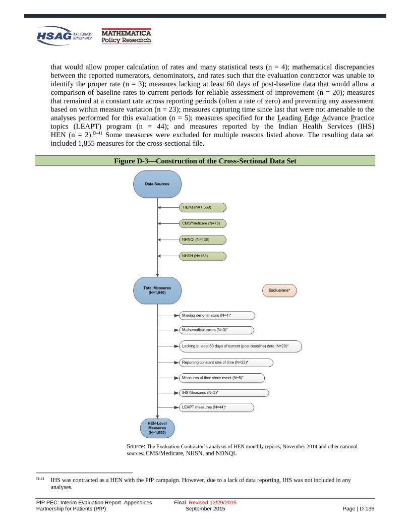
PfP PEC: Interim Evaluation Report–Appendices Final–Revised 12/29/2015 Partnership for Patients (PfP) September 2015 Page | D-136
that would allow proper calculation of rates and many statistical tests (n = 4); mathematical discrepancies
between the reported numerators, denominators, and rates such that the evaluation contractor was unable to
identify the proper rate (n = 3); measures lacking at least 60 days of post-baseline data that would allow a
comparison of baseline rates to current periods for reliable assessment of improvement (n = 20); measures
that remained at a constant rate across reporting periods (often a rate of zero) and preventing any assessment
based on within measure variation (n = 23); measures capturing time since last that were not amenable to the
analyses performed for this evaluation (n = 5); measures specified for the Leading Edge Advance Practice
topics (LEAPT) program (n = 44); and measures reported by the Indian Health Services (IHS)
HEN (n = 2).D-41 Some measures were excluded for multiple reasons listed above. The resulting data set
included 1,855 measures for the cross-sectional file.
Figure D-3—Construction of the Cross-Sectional Data Set
Source: The Evaluation Contractor’s analysis of HEN monthly reports, November 2014 and other national
sources: CMS/Medicare, NHSN, and NDNQI.
D-41 IHS was contracted as a HEN with the PfP campaign. However, due to a lack of data reporting, IHS was not included in any
analyses.

PfP PEC: Interim Evaluation Report–Appendices Final–Revised 12/29/2015 Partnership for Patients (PfP) September 2015 Page | D-137
55BIdentification of Widely and Consistently Reported Measures
With 1,855 measures, the Evaluation Contractor identified a subset of the measures with the most robust data
for independent analysis. Two criteria were used to identify the most reliable measures:
Measures were classified as widely reported or less widely reported based on the proportion of
eligible hospitals in the HEN/AEA that supplied data for the measure. If 60 percent or more of the
eligible hospitals reported the measure at least 50 percent of the time in the measure series, the
measure is deemed to be a widely reported measure. The remaining measures are deemed less-widely
reported measures.
Measures were classified as consistently reported or inconsistently reported based upon the existence
of large fluctuations in hospital counts. If the reported hospital count did not differ by more than 15
percent from the maximum hospital count reported during the series, the measure was deemed to be
consistently reported. Measures where any hospital count differed by more than 15 percent from the
maximum were subjected to a regression test to assess whether the fluctuations in the series affected
the measure rate over time. If there were at least 4 current observations in the measure series, the
measure rate was regressed on time and an indicator variable for observations that differed from the
maximum hospital count by more than 15 percent. If the p-value for the indicator variable was
statistically significant (p < .05), the measure was deemed inconsistent. Measures with fewer than 4
current observations were also deemed inconsistent (n = 12).
Figure D-4 illustrates the proportions of outcome and process measures that met (or did not meet) these
standards for reporting and consistency.
Figure D-4—Defining Widely-Reported and Consistent Measures
Source: The Evaluation Contractor’s analysis of HEN monthly reports, November 2014 and other national sources:
CMS/Medicare, NHSN, and NDNQI.

PfP PEC: Interim Evaluation Report–Appendices Final–Revised 12/29/2015 Partnership for Patients (PfP) September 2015 Page | D-138
56BConstruction of Longitudinal Data Set
Beginning with the 1,855 measures identified for inclusion in the cross-sectional data set described above, a
longitudinal data set was created for use in many of the time series-based analyses. Any measures with less
than 8 current data points were excluded. The longitudinal file was used to prepare SPC charts, and ITS
models by AEA, by HEN, and stratified by HEN activity level. It was used in the cluster analysis of
outcomes, substantial portions of the dose response time to goal analysis, and the repeated measures
regression of common measures.
For some analyses, these measures were also divided into those that were widely and consistently reported
and those that were not, as displayed in Figure D-5.
Figure D-5—Construction of the Longitudinal Data Set
Source: The Evaluation Contractor’s analysis of HEN monthly reports, November 2014 and other national sources: CMS/Medicare, NHSN,
and NDNQI.
Application of the exclusions resulted in a longitudinal data set including 1,567 measures; 740 of those
measures were widely and consistently reported outcome measures.

PfP PEC: Interim Evaluation Report–Appendices Final–Revised 12/29/2015 Partnership for Patients (PfP) September 2015 Page | D-139
Repeated Measures Analysis of the Association between HEN Activities and Partnerships and Common Measure Outcomes Methodology
In the effort to attribute reductions in patient harms among HEN-aligned hospitals to the PfP campaign, an
association between HEN activities and partnerships (hereafter referred to as HEN activities) and patient
harm outcome measures must exist. To establish this relationship, the Evaluation Contractor examined the
relationship over time between HEN activities and patient harms. For any single HEN, the number of
outcome observations is frequently too few (i.e., less than 50) for reliable assessment of the independent
relationships between the 4 activity and 8 partnership types measured. Therefore, it is desirable to pool the
data together where HENs reported measures with the same or highly consistent specifications, also known as
common measures.
For each common measure and data source, the Evaluation Contractor used the pooled data to estimate a
repeated measures mixed model. The repeated measures aspect of the analysis acknowledges that the data
represent repeated observations on the outcome from specific HEN cohorts. The formula for the mixed model
takes the following form:
itiiiitk
j
ijtjtiit TimeuuHospitalsActivityTimey
10
12
1
10
(1)
where, ity is the outcome rate of harm for HEN-cohort i in time t, i0 is a random intercept for HEN-
cohort i with a residual HEN-cohort specific deviation from the grand mean iu0 distributed N(0,τ00), 1 is a
random average quarterly change in outcome rates across all HEN-cohorts with a residual HEN-cohort
specific deviation from the grand mean iu1 distributed N(0,τ10), k is the average change in outcome rates
associated with a 1 unit change in reporting hospital counts, j represents the average change in outcome
rates associated with a 1 unit increase in 1 of 4 types of HEN activities or 8 types of partnerships, and it is
a residual error term for HEN-cohort i in time t distributed N(0, σ2).
Equation 1 estimates and average level and trend for the common measure outcome ity , across the HEN-
cohorts submitting data. The model captures variation across HEN-cohorts in their average levels and trends
of patient harms through the use of random intercepts and slopes ( iu0 and iu1 ) that represent HEN-cohort
specific variations from the average.D-421 Thus, the model effectively estimated the level and trend in patient
harm for each contributing HEN-cohort. The most important coefficients estimated in Equation X are the j ,
which represent the relationship between HEN activities and rate of patient harms. For each mixed model, 12
coefficients are estimated for which the expected sign is negative, representing a reduction in patient harms
associated with a 1 unit increase in the specific HEN activity. If the j is not significant, the activity is not
interpreted to have an association with the patient harm captured by the common measure. Finally, positive
and significant coefficients for j are not expected, but would imply that additional HEN activities are related
to increase in patient harms over time.
D-42 Raudenbush, Stephen W. and Anthony S. Bryk. 2002. Hierarchical Linear Models: Applications and Data Analysis Methods, 2nd
Edition. Thousand Oaks, CA: Sage.

PfP PEC: Interim Evaluation Report–Appendices Final–Revised 12/29/2015 Partnership for Patients (PfP) September 2015 Page | E-1
E. Appendix E: Supplemental Tables and Results
This appendix provides supplemental tables and results for several of the chapters found in the main body of
the report. The following sections are included in this appendix:
National trends in inpatient harms (Chapter 2)
– Context tables for each of the Partnership for Patients (PfP) focus areas
– Quality Improvement Organization (QIO)/PfP trend supplemental results
PfP learning community’s work toward reductions in harms (Chapter 3)
– Qualitative learning supplemental results
Quantitative analysis of the overall Hospital Engagement Network (HEN) component impact on
observed outcomes (Chapter 4)
– Bayesian difference-in-differences estimation of the effect of the HEN component of PfP on
adverse event outcomes
– Interrupted Time Series (ITS) detailed results and supplementary analyses
– Difference-in-Differences Analysis of Composite Measure of Harms from Medicare Patient
Safety Monitoring System (MPSMS)
– Repeated Measures Analysis of the Association between HEN Activities and Partnerships and
Common Measure Outcomes
Harm among different subgroups of HENs and hospitals (Chapter 5)
– Additional details on the survey data analyses
Estimation of costs averted as a result of the HEN component of PfP (Chapter 6)
– Two different estimates of healthcare cost savings and the number of adverse events averted

PfP PEC: Interim Evaluation Report–Appendices Final–Revised 12/29/2015 Partnership for Patients (PfP) September 2015 Page | E-2
Partnership for Patients (PfP) Focus Area Context Tables (Chapter 2)
Table E-1 through Table E-11 present a list of the key actions by the “three engines” of the Partnership: the
Center for Medicare & Medicaid Innovation (CMMI) investment engine, federal partners, and the private
sector, that may have contributed to the reduction in patient harms.
Table E-1—Summary of Strategies to Reduce Harm Used by PfP and Partners–Obstetrical Early Elective Deliveries (OB-EED)
CMMI Investment Federal Partners Private Partners
Hospital Engagement Networks (HENs)
Sought commitments from hospital
chief executive officers (CEOs) for
“hard-stop” policies.
Highlighted strategies of successful
hospitals and celebrated their
success.
Provided hospitals with tools and
information in partnership with
private and federal partners.
Provided comparative feedback on
OB-EED rates.
CMMI with PfP support contractors
Facilitated sharing of best practices
among HENs.
Actively recognized HENs and
hospitals with large, early
decreases.
Mapped progress, highlighting
areas of success and those needing
improvement. CMMI funded
National Quality Forum (NQF) to
convene “maternal action team,”
which developed a “Playbook” to
assist late adopters in reducing OB-
EED.
Aligned Medicaid program payment
policies in many states.
Strong Start public communications
campaign (with the American Congress of
Obstetricians and Gynecologists [ACOG],
the March of Dimes, and other partners).
The Centers for Medicare & Medicaid
Services’ (CMS') requirement to report
OB-EED rates publicly beginning 2013
with payment implications for 2015.
March of Dimes’ “Less than 39 Weeks
Toolkit” and banner recognition programs
for hospitals adopting hard stop policies.
Joint Commission included OB-EED rate
(PC-01) as a core measure for hospital
accreditation beginning 2013.
Association of Women’s Health, Obstetric,
and Neonatal Nurses (AWHONN)
conducted “Don’t Rush Me!” Reducing
Early Elective Deliveries and Go the Full
40 consumer education campaigns.
Leapfrog included hospital reporting of
OB-EED rates in its annual hospital safety
survey, beginning 2010, and reports results
publicly.
Public-private collaborations including goal
of reduced OB-EED were identified in at
least 21 states in 2012.
ACOG conducted educational efforts to
support reduction of early elective delivery.
California Maternal Quality Care
Collaborative (CMQCC) developed PC-01
toolkit, provided consultation to hospitals
on OB-EED reduction.
NQF Maternity Action Team developed the
Playbook for Successful Elimination of
Early Elective Deliveries, 2014.
Source: Evaluation Contractor’s list of major initiatives or potential influences, as identified by a combination of review of HEN monthly reports; input
from the National Content Developer (NCD); input from federal partners including the Agency for Healthcare Research & Quality (AHRQ), the Centers
for Disease Control & Prevention’s (CDC), and the Administration for Community Living (ACL); and additions from a convenience sample of members
of the affinity groups which include some private partner organizations as well as CMS staff, HENs, and others. Veterans’ administration partnership
efforts may have existed but are not listed here because Veterans Affairs (VA) hospitals are not included in the data trends analyzed.

PfP PEC: Interim Evaluation Report–Appendices Final–Revised 12/29/2015 Partnership for Patients (PfP) September 2015 Page | E-3
Table E-2—Summary of Strategies to Reduce Harm Used by PfP and Partners–Readmissions
CMMI Investment Federal Partners Private Partners
HENs
Working with their hospitals and
community partners to implement
numerous intervention strategies
to prevent readmissions, including
risk assessments, care
coordination and case
management, discharge planning,
and medication reconciliation.
Community-based Care Transitions
Program (CCTP)
Funded 101 Community-Based
Organizations (CBOs), involving
around 475 hospitals, to
implement innovative models for
care transitions to prevent
readmissions.
Readmissions affinity group
The affinity group (convened by
the NCD) collaborated with the
medication safety and rural
affinity groups to identify ways to
improve medication management
in care transitions and is currently
working to identify readmission
prevention strategies used by
high-performing hospitals to share
with other HENs and hospitals.
Patient and Family Engagement
Contractor (PFEC)
Worked to bring the patient voice
into all PfP pacing events, and to
encourage HENs to include
patient engagement in efforts to
prevent readmissions.
CMS Readmissions Reduction Program
financial penalties.
ACL funding for local care transitions
partnerships between hospitals and Aging
and Disability Resource Centers (ADRC)
(2010) (about 386 hospitals involved).
AHRQ Project RED (Re-Engineered
Discharge) toolkit and technical
assistance.
Quality Improvement Organizations’
(QIOs’) work with hospitals and other
healthcare facilities to improve care
coordination and prevent readmissions.
NQF-led patient and family engagement
(PFE) Action Team and Readmissions
Action Team” (2014).
The American Case Management
Association (ACMA) educates case
managers in INTERACT and other
strategies
The Society of Hospital Medicine (SHM)
worked with hospitals and the
readmissions affinity group to reduce
readmissions related to glycemic
management.
Medication Management in Care
Transitions Initiative, a collaboration
between the American Pharmacists
Association and the American Society of
Health-System Pharmacists, published a
list of best practices in medication
management during care transitions to
prevent readmissions (2013).
Planetree regional and national-level
education and consultation strategies for
hospitals on patient and family
engagement to reduce readmissions
The Joint Commission’s (TJC) Center for
Transforming Healthcare project to
improve caregiver hand-off
communications and related toolkit
(2009).
American Nurses Association (ANA)
collaborated with PfP leadership to spread
awareness among nurses of national care
transition goals.
Source: Evaluation Contractor’s list of major initiatives or potential influences, as identified by a combination of review of HEN monthly reports;
input from the NCD; input from federal partners including AHRQ, the CDC, and the ACL; and additions from a convenience sample of members of
the affinity groups which include some private partner organizations as well as CMS staff, HEN staff, and others. Veterans’ administration partnership
efforts may have existed but are not listed here because VA hospitals are not included in the data trends analyzed.

PfP PEC: Interim Evaluation Report–Appendices Final–Revised 12/29/2015 Partnership for Patients (PfP) September 2015 Page | E-4
Table E-3—Summary of Strategies to Reduce Harm Used by PfP and Partners–Adverse Drug Events (ADE)
CMMI Investment Federal Partners Private Partners
HENs
Data feedback to increase
awareness.
Engaging pharmacists.
Developing and sharing
prevention tools and resources.
CMMI staff organized a session at a
national conference of the American
Society of Health-System Pharmacists
on use of International Normalized
Ratio (INR) and glucose lab values to
help prevent inpatient adverse drug
events (December 2011).
NCD
Convened a medication safety
affinity group, which hosted
webinars and “office hours” for
hospitals to help accelerate
sharing of best practices related
to prevention of adverse drug
events (2012).
Supported readmissions and
rural hospital affinity groups in
collaboration to develop
crosscutting harm strategies
related to care transitions and
medication management (2012).
PfP policy
CMS clarified that all HENs
were expected to be tracking and
working on three specific areas
of inpatient ADE:
hypoglycemia, glucose control,
and opioids; the NCD hosted a
series of webinars and “office
hours” specifically on ADE
topics.
AHRQ Medications at Transitions and
Clinical Handoffs (MATCH) Toolkit for
Medication Reconciliation.
CMS requirement that Inpatient
Prospective Payments Systems (IPPS)
hospitals report Clostridium difficile (C.
difficile) to the National Healthcare
Safety Network (NHSN) (2013).
Health and Human Services (HHS) draft
National Action Plan for ADE
Prevention (2013).
TJC
Center for Transforming
Healthcare project to identify
and spread practices to promote
the safe and effective use of
insulin (2012)
National Patient Safety Goals
for hospitals include the safe use
of medications.
The Medication Management in Care
Transitions Initiative (a collaboration
between the American Pharmacists
Association and the American Society
of Health-System Pharmacists): a
published list of best practices for
hospitals to use to prevent ADEs.
ANA collaboration with PfP leadership
to spread awareness of hospital-acquired
conditions (HAC) reduction goals
among nurses.
Source: Evaluation Contractor’s list of major initiatives or potential influences, as identified by a combination of review of HEN monthly
reports; input from the NCD; input from federal partners including AHRQ, the CDC, and the ACL; and additions from a convenience sample of
members of the affinity groups which include some private partner organizations as well as CMS staff, HEN staff, and others. Veterans’
administration partnership efforts may have existed but are not listed here because VA hospitals are not included in the data trends analyzed.

PfP PEC: Interim Evaluation Report–Appendices Final–Revised 12/29/2015 Partnership for Patients (PfP) September 2015 Page | E-5
Table E-4—Summary of Strategies to Reduce Harm Used by PfP and Partners–Venous Thromboembolism (VTE)
CMMI Investment Federal Partners Private Partners
HENs
Assisting their hospitals to
implement best practice bundles,
standardized risk assessments
and order sets, process of care
audits, inclusion of medical as
well as surgical patients in
measurement and prevention,
and establishing mentor
connections between better and
worse performing hospitals.
NCD
Convened a procedural harm
affinity group to educate HENs
on best practices to prevent
surgical harm including VTE
and provides opportunities for
HENs to share prevention
strategies.
CMS HAC reduction program financial
penalties (2014).
AHRQ resources including a guide to
preventing VTEs, a safe surgery toolkit,
and a guide to the safe use of
anticoagulants.
The CDC data analysis and VTE
prevention webinars
The National Blood Clot Alliance (an
advocacy organization) educational
events and resources on VTE
prevention.
Leapfrog’s hospital safety scorecard
presenting a composite outcome
measure including PSI 12, starting in
2012.
The Society of Hospital Medicine
promoted resources including an AHRQ
toolkit (2008) and guidelines from the
American College of Chest Physicians
released between 2004 and 2012.
ANA collaborated with PfP leadership
to spread awareness of HAC reduction
goals among nurses.
Source: Evaluation Contractor’s list of major initiatives or potential influences, as identified by a combination of review of HEN monthly
reports; input from the NCD; input from federal partners including AHRQ, the CDC, and the ACL; and additions from a convenience sample of
members of the affinity groups which include some private partner organizations as well as CMS staff, HEN staff, and others. Veterans’
administration partnership efforts may have existed but are not listed here because VA hospitals are not included in the data trends analyzed.

PfP PEC: Interim Evaluation Report–Appendices Final–Revised 12/29/2015 Partnership for Patients (PfP) September 2015 Page | E-6
Table E-5—Summary of Strategies to Reduce Harm Used by PfP and Partners–Ventilator-Associated Pneumonia/Ventilator-Associated Events (VAP/VAE)
CMMI Investment Federal Partners Private Partners
HENs
Worked with hospitals to
implement VAP prevention
bundles.
Tracking process measures to
monitor compliance with
interventions.
The NCD convened a healthcare-
associated infections (HAI) affinity group
to promote sharing among HENs and
hospitals of strategies to prevent infections
including VAP.
CDC new measure definitions to
encourage broader measurement of VAE
to improve surveillance compared to the
narrower VAP measure (2013).
HHS 2013 National Action Plan to
Prevent Health Care-Associated Infections
roadmap for preventing HAIs (including
VAP) in acute care hospitals as well as
other settings.
QIOs’ work with hospitals to prevent
HAIs and collaborate with the CDC to use
data to target VAE prevention activities.
The CDC funding for state health
departments to hire and train staff for HAI
prevention, increase reporting for HAI,
and participate in collaborative projects
focused on preventing HAIs including
VAP (2010).
AHRQ Comprehensive Unit-based Safety
Program (CUSP) for Mechanically
Ventilated Patients and VAP program,
which includes toolkits for hospitals to use
to reduce VAE (2013-2014).
ANA collaborated with PfP leadership to
spread awareness of HAC reduction goals
among nurses.
Source: Evaluation Contractor’s list of major initiatives or potential influences, as identified by a combination of review of HEN monthly reports;
input from the NCD; input from federal partners including AHRQ, the CDC, and the ACL; and additions from a convenience sample of members of
the affinity groups which include some private partner organizations as well as CMS staff, HEN staff, and others. Veterans’ administration partnership
efforts may have existed but are not listed here because VA hospitals are not included in the data trends analyzed.

PfP PEC: Interim Evaluation Report–Appendices Final–Revised 12/29/2015 Partnership for Patients (PfP) September 2015 Page | E-7
Table E-6—Summary of Strategies to Reduce Harm Used by PfP and Partners–Catheter-Associated Urinary Tract Infections (CAUTI)
CMMI Investment Federal Partners Private Partners
HENs
Working with hospitals to
implement interventions aligned
with Institute for Healthcare
Improvement (IHI) guidelines for
preventing CAUTI
Leveraging safety culture and PFE
for prevention.
The NCD convened a HAI affinity group to
provide opportunities for HENs and
hospitals to share strategies to prevent
infections including CAUTI.
CMMI in response to national data from
NHSN that showed little improvement in
CAUTI rates in intensive care units (ICUs),
CMMI with PfP support contractors
convened several educational events in
2013 focused on “reversing the trend” in
CAUTI.
Facilitated sharing of best practices
among HENs.
Actively recognized HENs and
hospitals with large, early
decreases.
Mapped progress, highlighting
areas of success and those needing
improvement.
CMS HAC reduction program financial
penalties (2014).
CMS mandated reporting of HAIs,
including CAUTI, to the CDC’s NHSN
(2012).
QIOs’ work with hospitals to prevent
CAUTI, including linking hospitals with
AHRQ’s CUSP for CAUTI, and technical
assistance with data reporting.
AHRQ’s CUSP for CAUTI, which involves
over 850 hospitals across 37 states.
QIOs and the CDC collaboration to help
QIOs use data to target CAUTI prevention
activities.
CDC technical assistance to hospitals and
HENs to analyze their HAI data and
implement best practices.
HAI prevention programs through state
health departments include CDC funding
Wound, Ostomy, and Continence Nurses
(WOCN) fact sheet to increase awareness
and knowledge of CAUTI prevention
strategies to prevent CAUTI and
encouragement of members to adopt these
evidence-based practices (2009).
Leapfrog’s hospital safety scorecard
presenting a composite outcome measure
including CAUTI, starting in 2012.
ANA collaborated with PfP leadership to
spread awareness of HAC reduction goals
among nurses with explicit focus on
CAUTI and developed and piloted in
partnership with two HENs a streamlined
evidence-based tool for CAUTI reduction.
Source: Evaluation Contractor’s list of major initiatives or potential influences, as identified by a combination of review of HEN monthly reports; input
from the NCD; input from federal partners including AHRQ, the CDC, and the ACL; and additions from a convenience sample of members of the affinity
groups which include some private partner organizations as well as CMS staff, HEN staff, and others. Veterans’ administration partnership efforts may
have existed but are not listed here because VA hospitals are not included in the data trends analyzed.

PfP PEC: Interim Evaluation Report–Appendices Final–Revised 12/29/2015 Partnership for Patients (PfP) September 2015 Page | E-8
Table E-7—Summary of Strategies to Reduce Harm Used by PfP and Partners–Central Line-Associated Blood Stream Infections (CLABSI)
CMMI Investment Federal Partners Private Partners
HENs
Assisting their hospitals to
consistently use insertion and
maintenance bundles in
accordance with IHI guidelines.
Tracking and data feedback.
The NCD convened an HAI affinity group
to provide opportunities for HENs and
hospitals to share strategies to prevent
infections including CLABSI (2012).
CMS HAC reduction program financial
penalties (2014). Hospitals are not
reimbursed for instances of the CMS HAC
for central venous catheter-related blood
stream infections (CRBSI).
CMS-mandated reporting of HAIs,
including CLABSI-ICU, to the CDC’s
NHSN database (2011).
QIOs’ work with hospitals to implement
evidence-based guidelines, such as
AHRQ’s CUSP and to assist with data
reporting.
AHRQ’s CUSP for CLABSI: Includes
over 1,000 hospitals across 44 states.
The CDC technical assistance to hospitals
and HENs to analyze their HAI data and
implement best practices.
ANA collaborated with PfP leadership to
spread awareness of HAC reduction goals
among nurses (2012).
Leapfrog’s hospital safety scorecard
presenting a composite outcome measure
including CLABSI, starting in 2012.
Source: Evaluation Contractor’s list of major initiatives or potential influences, as identified by a combination of review of HEN monthly reports;
input from the NCD; input from federal partners including AHRQ, the CDC, and the ACL; and additions from a convenience sample of members of
the affinity groups which include some private partner organizations as well as CMS staff, HEN staff, and others. Veterans’ administration partnership
efforts may have existed but are not listed here because VA hospitals are not included in the data trends analyzed.

PfP PEC: Interim Evaluation Report–Appendices Final–Revised 12/29/2015 Partnership for Patients (PfP) September 2015 Page | E-9
Table E-8—Summary of Strategies to Reduce Harm Used by PfP and Partners–Falls
CMMI Investment Federal Partners Private Partners
HENs
Working with hospitals to
implement numerous interventions
to avoid falls, including risk
assessments and ensuring
communication between members
of patient care teams, patients, and
families. The Pennsylvania HEN
convenes a group of HENs
specifically around the topic of falls,
to share lessons learned and
generate improved effectiveness in
falls prevention (2014).
CMS HAC reduction program financial
penalties on hospitals with high rates of
PSI-08, post-operative hip fracture (2014).
IPPS hospitals are not reimbursed for the
CMS HAC for falls and trauma.
AHRQ “Preventing Falls in Hospitals”
toolkit (shared with HENs via webinar in
2012 and publicly released January 2013).
TJC launched a project focused on
preventing falls with injury (2011).
TJC requires accredited hospitals to conduct
fall risk assessments for hospitalized
patients to identify risk for falls in order to
implemented prevention measures in the
plan of care (2013)
Leapfrog’s hospital safety scorecard
presenting a composite outcome measure
including falls, starting in 2012.
ANA collaborated with PfP leadership to
spread awareness of HAC reduction goals
among nurses, with explicit focus on falls.
ANA’s National Database of Nursing
Quality Indicators® (NDNQI®) includes
measures of falls and fall-related injuries,
and reports provide comparisons of rates for
facilities with similar bed size, teaching
status, and other characteristics.E-1
Source: Evaluation Contractor’s list of major initiatives or potential influences, as identified by a combination of review of HEN monthly reports; input from
the NCD; input from federal partners including AHRQ, the CDC, and the ACL; and additions from a convenience sample of members of the affinity groups
which include some private partner organizations as well as CMS staff, HEN staff, and others. Veterans’ administration partnership efforts may have existed
but are not listed here because VA hospitals are not included in the data trends analyzed.
E-1 NDNQI® is a registered trademark of the ANA. NDNQI® data were supplied by ANA. The ANA disclaims responsibility for any
analyses, interpretations, or conclusions.

PfP PEC: Interim Evaluation Report–Appendices Final–Revised 12/29/2015 Partnership for Patients (PfP) September 2015 Page | E-10
Table E-9—Summary of Strategies to Reduce Harm Used by PfP and Partners–Other Obstetrical Adverse Events (OB-Other)
CMMI Investment Federal Partners Private Partners
HENs
Many HENs have focused on
reducing injury to neonates and OB
trauma.
In 2013, at CMS’ request, HENs
expanded their harm reduction focus
to include preeclampsia and OB
hemorrhage.
The NCD convened a maternal affinity group
(2012), which invites speakers to share
prevention strategies with affinity group
members and engages with national
organizations to encourage national dialog.
The group also did a deep-dive into the PC-02
cesarean section (C-section) measure required
by TJC beginning in 2014.
CMMI funded the NQF to convene a
“maternal action team” focused on reducing
EED and C-section rates (2011).
AHRQ shared OB safety resources with
HENs and hospitals, including the Perinatal
Safety Intervention Program (PSIP).
CDC supports State Perinatal Quality
Collaboratives (PQCs) to promote perinatal
safety, including hemorrhage and C-section
prevention.
TJC expanded mandatory reporting
requirements for accreditation to perinatal
care core measure set for all hospitals with at
least 1,100 births annually (2014).
AWHONN several perinatal safety toolkits,
national and local education seminars, and
support to nurses leading local improvement
efforts.
The Pacific Business Group on Health
(PBGH), in partnership with the CMQCC and
California Maternal Data Center: coaching
and technical assistance to reduce C-section
rates in commercially insured populations.
CMQCC national advocacy on focusing on
preeclampsia and hemorrhage as two highest
causes of maternal mortality
The National Partnership for Maternal Safety:
developing Patient Safety Bundles to prevent
obstetric hemorrhage, hypertension, and VTE
prevention. The hemorrhage bundle is
currently available, and the Partnership’s goal
is to have all birthing facilities to have all
three bundles in place by 2016.
ANA collaborated with PfP leadership to
spread awareness of HAC reduction goals
among nurses (2012).
Source: Evaluation Contractor’s list of major initiatives or potential influences, as identified by a combination of review of HEN monthly reports; input from the
NCD; input from federal partners including AHRQ, the CDC, and the ACL; and additions from a convenience sample of members of the affinity groups which
include some private partner organizations as well as CMS staff, HEN staff, and others. Veterans’ administration partnership efforts may have existed but are not
listed here because VA hospitals are not included in the data trends analyzed.

PfP PEC: Interim Evaluation Report–Appendices Final–Revised 12/29/2015 Partnership for Patients (PfP) September 2015 Page | E-11
Table E-10—Summary of Strategies to Reduce Harm Used by PfP and Partners–Pressure Ulcers
CMMI Investment Federal Partners Private Partners
HENs
Assist their hospitals to implement
many interventions recommended
by the IHI, including pressure ulcer
risk assessments, skin inspections,
nutrition management, and
minimizing pressure.
Evaluation Contractor’s point-scoring
method encouraged HENs to expand
measurement of pressure ulcers to include
pressure ulcers stage 2 or higher, not just
those that are most severe (2013).
CMS HAC reduction program financial
penalties (2014). IPPS hospitals are not
reimbursed for instances of the CMS HAC
for pressure ulcers.
AHRQ pressure ulcer prevention toolkit
(presented to HENs via webinar in 2012).
ANA’s NDNQI includes measures of
pressure ulcers incidence and prevalence,
and reports provide comparisons of rates for
facilities with similar bed size, teaching
statues, and other characteristics.
ANA collaborated with PfP leadership to
spread awareness among nurses of HAC
reduction goals, with explicit focus on
pressure ulcers.
Leapfrog’s hospital safety scorecard
presenting a composite outcome measure
including pressure ulcers, starting in 2012.
WOCN Society and Sage Products Partners
in Prevention program, which provides
nurses with the tools they need to prevent
HACs through various initiatives, including
a webinar series, designed to help WOCN
nurses further their knowledge in advancing
and supporting the prevention of pressure
ulcers (2014).
The National Pressure Ulcer Advisory Panel
(NPUAP) hosted webinars and conferences
focused on pressure ulcer measurement and
prevention during 2011-2014.
Source: Evaluation Contractor’s list of major initiatives or potential influences, as identified by a combination of review of HEN monthly reports; input from
the NCD; input from federal partners including AHRQ, the CDC, and the ACL; and additions from a convenience sample of members of the affinity groups
which include some private partner organizations as well as CMS staff, HEN staff, and others. Veterans’ administration partnership efforts may have existed
but are not listed here because VA hospitals are not included in the data trends analyzed.

PfP PEC: Interim Evaluation Report–Appendices Final–Revised 12/29/2015 Partnership for Patients (PfP) September 2015 Page | E-12
Table E-11—Summary of Strategies to Reduce Harm Used by PfP and Partners–Surgical Site Infections (SSIs)
CMMI Investment Federal Partners Private Partners
HENs
Assisting their hospitals with
numerous interventions such as use
of surgical safety checklists, full and
reliable/audited implementation of
all surgical care improvement
project (SCIP) processes, focusing
on perioperative normothermia,
improving surgical team culture
(such as with TeamSTEPPs
training), and targeting deep-dive
assistance to hospitals with higher
rates of SSIs.
HAI and procedural harm affinity group:
NCD convened HAI and procedural harm
affinity groups to help HENs and hospitals
share strategies to prevent infections,
including SSI. The affinity groups invite
experts to speak to participants and present
prevention strategies. The procedural harm
affinity group also created a matrix of tools
to prevent SSIs across the care continuum,
and hosted a series of workshops on
sustaining results.
CMS-mandated reporting of abdominal
hysterectomy and colon surgery SSIs to
NHSN (maintained by the CDC) (2012).
HHS project JOINTS (Joining
Organizations IN Tackling SSIs), through
which the IHI provided participating
hospitals with free tools, resources and
supports to reduce SSIs (2011-2013).
HHS 2013 National Action Plan to Prevent
Health Care-Associated Infections roadmap
for preventing HAIs in acute care hospitals,
ambulatory surgical centers, end-stage renal
disease facilities, and long-term care
facilities.
The CDC funding for state health
departments to hire and train staff for HAI
prevention, to increase reporting for HAI,
and to participate in collaborative projects
focused on preventing HAIs (2010).
The CDC technical assistance to hospitals
and HENs to analyze their HAI data and
implement best practices.
AHRQ’s Surgical Unit-Based Safety
Program (SUSP), which was also shared
with HENs through webinars in 2012
(around 250 hospitals in 37 states have
participated since 2011).
QIOs’ work to assist hospitals to implement
evidence-based guidelines to prevent HAIs.
American College of Surgeons’ National
Surgical Quality Improvement Program
(ACS NSQIP), which manages data
feedback to about 400 hospitals, based on
their chart-review data, provides tools,
analyses, and reports to prevent surgery-
related infection including SSI.
Leapfrog’s hospital safety scorecard
presenting a composite outcome measure
including SSI for colon surgery, starting in
2012.
TJC’s National Patient Safety Goals include
goals for SSI prevention activities. TJC
implementation guide with best practices to
reduce SSIs.
ANA collaborated with PfP leadership to
spread awareness of HAC reduction goals
among nurses (2012).
Source: Evaluation Contractor’s list of major initiatives or potential influences, as identified by a combination of review of HEN monthly reports; input from
the NCD; input from federal partners including AHRQ, the CDC, and the ACL; and additions from a convenience sample of members of the affinity groups
which include some private partner organizations as well as CMS staff, HEN staff, and others. Veterans’ administration partnership efforts may have existed
but are not listed here because VA hospitals are not included in the data trends analyzed.

PfP PEC: Interim Evaluation Report–Appendices Final–Revised 12/29/2015 Partnership for Patients (PfP) September 2015 Page | E-13
Quality Improvement Organization (QIO)/Partnership for Patients (PfP) Trend Analysis Supplemental Tables (Chapter 2)
As Table E-12 shows, results for the selected measures vary widely, indicating a highly skewed distribution
in the average hospital rates for the three Patient Safety Indicators (PSIs) in all treatment groups. For
instance, the average pressure ulcer rate for hospitals participating in PfP-only was 0.68, with some hospitals
exhibiting rates as high as 19.23 per 1,000 discharges. Readmissions rates were substantially less skewed
than the PSI rates, with a tighter range of variability in all four treatment groups. Table E-12 summarizes the
corresponding descriptive statistics for each area assessed.
Table E-12—Descriptive Statistics of Hospital Rates, Q1 2010 – Q1 2014a
Measure Treatment Group Average Standard Deviation
Minimum Maximum
Central Venous Catheter (CVC) Infection Rates (per 1,000 discharges)
PfP-Only 0.38 0.39 0.00 6.41
QIO-Only 0.50 0.42 0.00 2.77
PfP and QIO 0.56 0.52 0.00 4.69
Neither PfP nor QIO 0.31 0.45 0.00 5.59
Total 0.44 0.47 0.00 6.41
Postoperative Pulmonary Embolism (PE)/Deep Vein Thrombosis (DVT) Rates (per 1,000 discharges)
PfP-Only 5.86 3.48 0.00 28.37
QIO-Only 5.25 2.80 0.00 19.23
PfP and QIO 6.76 3.56 0.00 17.18
Neither PfP nor QIO 4.98 3.48 0.00 23.81
Total 5.99 3.51 0.00 28.37
Pressure Ulcer Rates (per 1,000 discharges)
PfP-Only 0.68 1.23 0.00 19.23
QIO-Only 0.45 0.65 0.00 12.74
PfP and QIO 0.47 0.79 0.00 7.94
Neither PfP nor QIO 0.46 1.08 0.00 12.50
Total 0.54 1.01 0.00 19.23
30-Day All-Cause Readmissions Rates
PfP-Only 0.18 0.03 0.04 0.40
QIO-Only 0.19 0.05 0.04 0.38
PfP and QIO 0.20 0.03 0.06 0.32
Neither PfP nor QIO 0.19 0.04 0.00 0.41
Total 0.19 0.04 0.00 0.41
Source: Health Services Advisory Group (HSAG) analysis of QIO participation and Medicare claims data. a The time period for the 30-day, all-cause readmissions rate extends quarterly from Q1 2010 through Q1 2014. For the
remaining measures, the time periods extend quarterly from Q2 2011 through Q1 2014.
Note: The full regression model results tables can be found in Appendix E.

PfP PEC: Interim Evaluation Report–Appendices Final–Revised 12/29/2015 Partnership for Patients (PfP) September 2015 Page | E-14
Table E-13 provides the hierarchical generalized linear model (HGLM) model results for the four measures
in this analysis. The upper panel of the model presents the fixed effects, or the estimated coefficients
describing the observed levels and trends across the two groups of hospitals and controlling for unobserved
state effects. The lower panel in the table presents the random effects or the variability across hospitals in
their initial levels and trends over time. The intercept is the log of the expected count in the first quarter for a
hospital in California (CA) that worked only with the QIO. The intercepts can be converted into predicted
rates by using the average denominator count for this group of hospitals, resulting in predicted rates of 1.06
CVC-related blood stream infections per 1,000 discharges, 0.67 pressure ulcers per 1,000 discharges, 4.49
PE/DVT per 1,000 discharges, and a 20.01 percent readmission rate.E-2 The coefficients for the states
represent the increment or decrement to the intercept value for QIO hospitals in those states. Thus, in Florida
(FL) the average QIO hospital has a CVC infection rate per 1,000 discharges that is [exp(.306) – 1]*100 =
35.80 percent higher than in CA (approximately 1.44 per 1,000), while the non-significant coefficients for
Arizona (AZ) and Ohio (OH) indicate that QIO hospitals in these states have statistically equivalent CVC
infection rates to those in CA.
The coefficient for the Time variable represents the average quarterly change from the initial point of the
intercept. For CVC infections, the average quarterly change among QIO hospitals in CA is [exp(-.093) –
1]*100 = -8.88 percent. The only other measure exhibiting a significant trend, either upward or downward, is
readmissions. The Time coefficient of -0.006 for readmissions indicates that on average, QIO hospitals in
CA saw their readmission rates change by [exp(-0.006) – 1]*100 = -0.60 percent each quarter.
The estimate for the PfP-only indicator represents the average rate compared to QIO-only hospitals at the
beginning of the time period. For example, the estimate of -0.114 for readmissions suggests that, on average,
PfP-only hospitals started with a rate that was [exp(-0.114) – 1]*100 = -10.77 percent lower than QIO-only
hospitals in Q1 2010. For CVC infection rates, PfP-only hospitals began the series on average, 43.39 percent
lower than QIO-only hospitals. No significant differences were found between the PfP-only hospitals and
QIO-only hospitals at the beginning of the series for pressure ulcers or PE/DVT rates.
Table E-13—HGLM Solution for Fixed and Random Effects Among PfP-Only and QIO-Only Hospitals
Estimate (Standard Error)
CVC Infection Count
PE/DVT Count Pressure Ulcer
Count 30-Day All-Cause
Readmissions Count
Fixed Effects
Intercept -6.846***
(0.294)
-5.405***
(0.158)
-7.311***
(0.451)
-1.609***
(0.031)
PfP-Only Indicator -0.569*
(0.331)
0.110
(0.171)
-0.336
(0.496)
-0.114***
(0.032)
Time -0.093***
(0.025)
-0.005
(0.011)
-0.037
(0.038)
-0.006***
(0.001)
PfP-Only Indicator x Time 0.023
(0.029)
-0.016
(0.012)
0.050
(0.042)
0.001
(0.001)
AZ -0.042
(0.279)
0.022
(0.174)
-0.455
(0.427)
-0.180***
(0.049)
E-2 The formula to convert the intercept into a predicted rate is [exp(β0i + ln(n))/n], multiplied by 1,000 for each of the PSIs and by 100
for the readmissions rate. As an example, the intercept for readmissions is converted into a predicted rate using the average quarterly
denominator observed in CA hospitals of 641.96: [exp(-1.609 + ln(641.96))/641.96]*100 = 20.01 percent. For CVC infections,
pressure ulcers, and PE/DVT the relevant denominators are 372.50, 197.69, and 158.02.

PfP PEC: Interim Evaluation Report–Appendices Final–Revised 12/29/2015 Partnership for Patients (PfP) September 2015 Page | E-15
Table E-13—HGLM Solution for Fixed and Random Effects Among PfP-Only and QIO-Only Hospitals
Estimate (Standard Error)
CVC Infection Count
PE/DVT Count Pressure Ulcer
Count 30-Day All-Cause
Readmissions Count
FL 0.306**
(0.147)
0.147
(0.101)
-0.538**
(0.222)
0.052
(0.034)
OH -0.141
(0.148)
0.230**
(0.093)
-1.104***
(0.234)
0.064**
(0.030)
Random Effects
Intercept Variance 0.323*** 0.267*** 0.681*** 0.053***
Time Variance 0.000455 0.000000 0.002558*** 0.000024***
Source: HSAG’s analysis of QIO participation and Medicare claims data. Note: Estimates are solutions for fixed effects. Standard errors are displayed in parenthesis and italicized. *p < 0.10, **p < 0.05, ***p < 0.01
Table E-14 through Table E-16 provides the full results for models to identify differences in trends for
hospitals aligned with both PfP and QIO. Each table presents the fixed effects, which are the estimated
coefficient estimates describing the observed levels and trends across the two groups of hospitals and
controlling for unobserved state effects. The lower panel in each table presents the random effects or the
variability across hospitals in their initial levels and trends over time. These results are interpreted the same
way that the results presented in Table E-13 are interpreted. The intercept is the log of the expected count in
the first quarter for a hospital in CA that was a member of the PfP and QIO group.
The intercepts can be converted into predicted rates by using the average denominator count for the reference
group.E-3 The coefficients for the states represent the increment or decrement to the intercept value for QIO
hospitals in those states.
E-3 The formula to convert the intercept into a predicted rate is [exp(β0i + ln(n))/n], multiplied by 1,000 for each of the PSIs and by 100
for the readmissions rate. As an example for Table E-14, the intercept for readmissions is converted into a predicted rate using the
average quarterly denominator observed in PfP or QIO California hospitals of 878.49: [exp(-1.614 + ln(878.49))/ 878.49]*100 =
19.90 percent. The relevant denominators include the following: CVC Infections = 482.38, pressure ulcers = 264.82, PE/DVT =
227.77, and readmissions = 878.49.

PfP PEC: Interim Evaluation Report–Appendices Final–Revised 12/29/2015 Partnership for Patients (PfP) September 2015 Page | E-16
Table E-14—HGLM Solution for Fixed Effects Among Neither PfP Nor QIO Compared to PfP and QIO
Estimate (Standard Error)
CVC Infection Count (per 1,000
Discharges)
PE/DVT Count (per 1,000 Discharges)
Pressure Ulcer Count (per 1,000
Discharges)
30-Day All-Cause Readmissions Count
Fixed Effects
Intercept -6.558***
(0.182)
-5.195***
(0.090)
-7.362***
(0.299)
-1.614***
(0.024)
Neither PfP nor QIO -1.027***
(0.289)
-0.315**
(0.137)
-0.738*
(0.409)
-0.031
(0.025)
Time -0.111***
(0.015)
-0.009
(0.006)
-0.071***
(0.026)
-0.005***
(0.001)
Neither PfP nor QIO x
Time
0.039
(0.025)
0.001
(0.010)
0.063*
(0.034)
0.001
(0.001)
AZ -0.222
(0.202)
0.003
(0.113)
0.092
(0.291)
-0.092**
(0.038)
FL 0.141
(0.136)
0.136
(0.084)
-0.346
(0.212)
0.059**
(0.029)
OH -0.723***
(0.203)
0.003
(0.109)
-0.224
(0.276)
-0.097***
(0.034)
Random Effects
Intercept Variance 0.466*** 0.236*** 0.757*** 0.063***
Time Variance 0.000851* 0.000061 0.003983*** 0.000035***
Source: HSAG’s analysis of QIO participation and Medicare claims data.
Note: Estimates are solutions for fixed effects. Standard errors are displayed in parenthesis and italicized. * p < 0.10, ** p < 0.05, *** p < 0.01
Table E-15—HGLM Solution for Fixed Effects Among PfP-Only Compared to PfP and QIO
Estimate (Standard Error)
Estimate (Standard Error)
Estimate (Standard Error)
Estimate (Standard Error)
Estimate (Standard Error)
Fixed Effects
Intercept -6.611***
(0.172)
-5.250***
(0.084)
-7.391***
(0.277)
-1.630***
(0.019)
PfP Indicator -0.751***
(0.230)
-0.019
(0.107)
-0.426
(0.331)
-0.090***
(0.020)
Time -0.107***
(0.014)
-0.008
(0.005)
-0.066***
(0.023)
-0.005***
(0.001)
PfP Indicator x Time 0.039**
(0.020)
-0.014*
(0.008)
0.074***
(0.027)
0.000
(0.001)
AZ -0.267
(0.201)
0.052
(0.121)
0.031
(0.314)
-0.120***
(0.035)
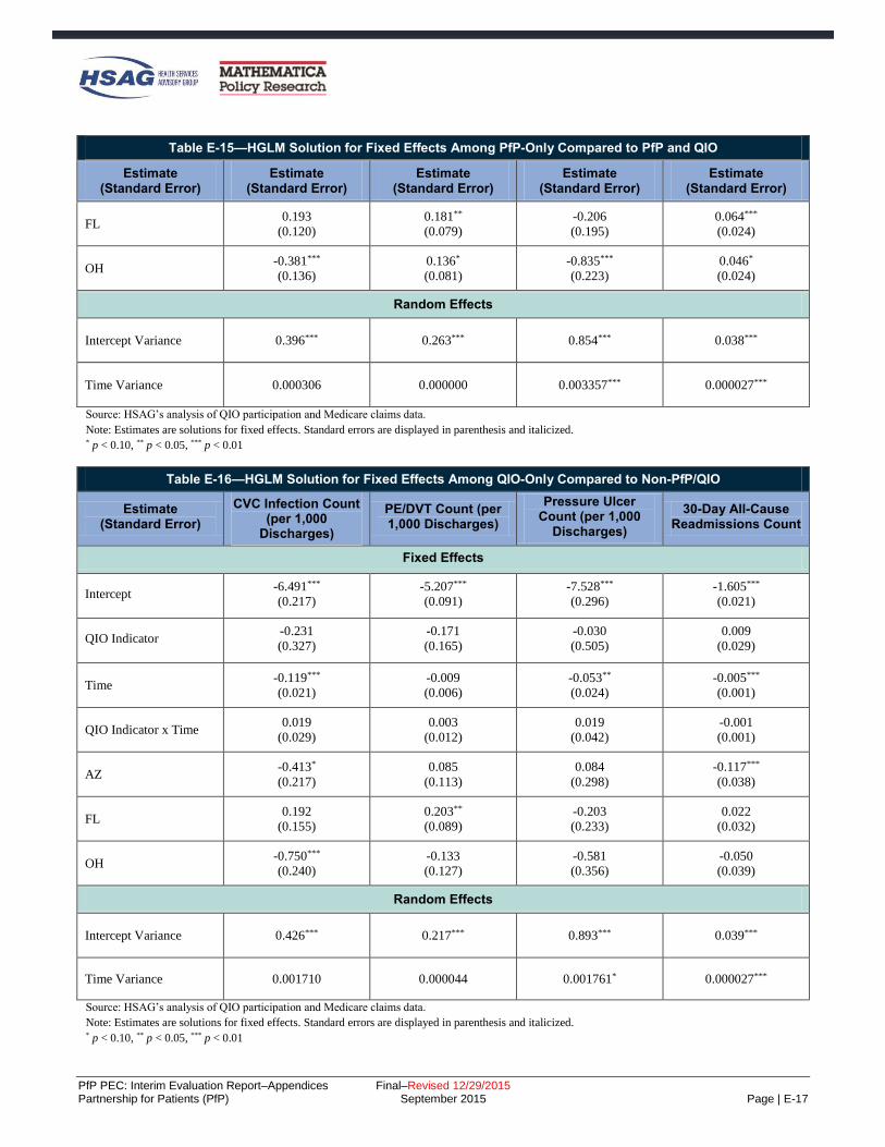
PfP PEC: Interim Evaluation Report–Appendices Final–Revised 12/29/2015 Partnership for Patients (PfP) September 2015 Page | E-17
Table E-15—HGLM Solution for Fixed Effects Among PfP-Only Compared to PfP and QIO
Estimate (Standard Error)
Estimate (Standard Error)
Estimate (Standard Error)
Estimate (Standard Error)
Estimate (Standard Error)
FL 0.193
(0.120)
0.181**
(0.079)
-0.206
(0.195)
0.064***
(0.024)
OH -0.381***
(0.136)
0.136*
(0.081)
-0.835***
(0.223)
0.046*
(0.024)
Random Effects
Intercept Variance 0.396*** 0.263*** 0.854*** 0.038***
Time Variance 0.000306 0.000000 0.003357*** 0.000027***
Source: HSAG’s analysis of QIO participation and Medicare claims data.
Note: Estimates are solutions for fixed effects. Standard errors are displayed in parenthesis and italicized. * p < 0.10, ** p < 0.05, *** p < 0.01
Table E-16—HGLM Solution for Fixed Effects Among QIO-Only Compared to Non-PfP/QIO
Estimate (Standard Error)
CVC Infection Count (per 1,000
Discharges)
PE/DVT Count (per 1,000 Discharges)
Pressure Ulcer Count (per 1,000
Discharges)
30-Day All-Cause Readmissions Count
Fixed Effects
Intercept -6.491***
(0.217)
-5.207***
(0.091)
-7.528***
(0.296)
-1.605***
(0.021)
QIO Indicator -0.231
(0.327)
-0.171
(0.165)
-0.030
(0.505)
0.009
(0.029)
Time -0.119***
(0.021)
-0.009
(0.006)
-0.053**
(0.024)
-0.005***
(0.001)
QIO Indicator x Time 0.019
(0.029)
0.003
(0.012)
0.019
(0.042)
-0.001
(0.001)
AZ -0.413*
(0.217)
0.085
(0.113)
0.084
(0.298)
-0.117***
(0.038)
FL 0.192
(0.155)
0.203**
(0.089)
-0.203
(0.233)
0.022
(0.032)
OH -0.750***
(0.240)
-0.133
(0.127)
-0.581
(0.356)
-0.050
(0.039)
Random Effects
Intercept Variance 0.426*** 0.217*** 0.893*** 0.039***
Time Variance 0.001710 0.000044 0.001761* 0.000027***
Source: HSAG’s analysis of QIO participation and Medicare claims data.
Note: Estimates are solutions for fixed effects. Standard errors are displayed in parenthesis and italicized. * p < 0.10, ** p < 0.05, *** p < 0.01

PfP PEC: Interim Evaluation Report–Appendices Final–Revised 12/29/2015 Partnership for Patients (PfP) September 2015 Page | E-18
Table E-17 through Table E-19 provide the full results for models to identify differences in trends for
hospitals aligned with neither PfP nor QIO. Each table presents the fixed effects, which are the estimated
coefficient estimates describing the observed levels and trends across the two groups of hospitals and
controlling for unobserved state effects. The lower panel in each table presents the random effects or the
variability across hospitals in their initial levels and trends over time. These results are interpreted the same
way that the results presented in Table E-13 are interpreted. The intercept is the log of the expected count in
the first quarter for a hospital in CA that was a member of the neither PfP nor QIO group.
Table E-17—HGLM Solution for Fixed Effects Among PfP and QIO Compared to Non-PfP/QIO
Estimate (Standard Error)
CVC Infection Count (per 1,000
Discharges)
PE/DVT Count (per 1,000 Discharges)
Pressure Ulcer Count (per 1,000
Discharges)
30-Day All-Cause Readmissions Count
Fixed Effects
Intercept -7.585***
(0.278)
-5.510***
(0.132)
-8.100***
(0.384)
-1.645***
(0.022)
PfP and QIO Indicator 1.027***
(0.289)
0.315**
(0.137)
0.738*
(0.409)
0.031
(0.025)
Time -0.072***
(0.023)
-0.008
(0.009)
-0.008
(0.032)
-0.005***
(0.001)
PfP and QIO Indicator x
Time
-0.039
(0.025)
-0.001
(0.010)
-0.063*
(0.034)
-0.001
(0.001)
AZ -0.222
(0.202)
0.003
(0.113)
0.093
(0.291)
-0.092**
(0.038)
FL 0.141
(0.136)
0.136
(0.084)
-0.345
(0.212)
0.059**
(0.029)
OH -0.723***
(0.203)
0.003
(0.109)
-0.224
(0.276)
-0.097***
(0.034)
Random Effects
Intercept Variance 0.443*** 0.236*** 0.756*** 0.063***
Time Variance 0.000851* 0.000061 0.003987*** 0.000035
Source: HSAG’s analysis of QIO participation and Medicare claims data.
Note: Estimates are solutions for fixed effects. Standard errors are displayed in parenthesis and italicized. * p < 0.10, ** p < 0.05, *** p < 0.01

PfP PEC: Interim Evaluation Report–Appendices Final–Revised 12/29/2015 Partnership for Patients (PfP) September 2015 Page | E-19
Table E-18—HGLM Solution for Fixed Effects Among PfP-Only Compared to Non-PfP/QIO
Estimate (Standard Error)
CVC Infection Count (per 1,000
Discharges)
PE/DVT Count (per 1,000 Discharges)
Pressure Ulcer Count (per 1,000
Discharges)
30-Day All-Cause Readmissions Count
Fixed Effects
Intercept -7.662***
(0.287)
-5.551***
(0.129)
-7.793***
(0.364)
-1.670***
(0.022)
PfP Indicator 0.327
(0.295)
0.269*
(0.140)
0.199
(0.398)
-0.045*
(0.024)
Time -0.080***
(0.024)
-0.007
(0.009)
-0.008
(0.030)
-0.005***
(0.001)
PfP Indicator x Time -0.002
(0.026)
-0.015
(0.010)
0.008
(0.033)
-0.001
(0.001)
AZ 0.309
(0.262)
-0.146
(0.167)
-0.357
(0.390)
-0.117***
(0.042)
FL 0.269*
(0.144)
0.096
(0.091)
-0.663***
(0.199)
0.081***
(0.029)
OH -0.245
(0.151)
0.223***
(0.086)
-0.806***
(0.209)
0.001
(0.029)
Random Effects
Intercept Variance 0.443*** 0.277*** 0.618*** 0.070***
Time Variance 0.001447** 0.000000 0.004048*** 0.000034***
Source: HSAG’s analysis of QIO participation and Medicare claims data. Note: Estimates are solutions for fixed effects. Standard errors are displayed in parenthesis and italicized. * p < 0.10, ** p < 0.05, *** p < 0.01
Table E-19—HGLM Solution for Fixed Effects Among QIO-Only Compared to Non-PfP/QIO
Estimate (Standard Error)
CVC Infection Count (per 1,000
Discharges)
PE/DVT Count (per 1,000 Discharges)
Pressure Ulcer Count (per 1,000
Discharges)
30-Day All-Cause Readmissions Count
Fixed Effects
Intercept -7.670***
(0.314)
-5.508***
(0.147)
-7.651***
(0.411)
-1.643***
(0.028)
QIO Indicator 0.829**
(0.385)
0.152
(0.191)
0.486
(0.556)
0.044
(0.041)
Time -0.080***
(0.026)
-0.008
(0.010)
-0.003
(0.034)
-0.004***
(0.001)
QIO Indicator x Time -0.019
(0.034)
0.003
(0.014)
-0.038
(0.048)
-0.002
(0.001)

PfP PEC: Interim Evaluation Report–Appendices Final–Revised 12/29/2015 Partnership for Patients (PfP) September 2015 Page | E-20
Table E-19—HGLM Solution for Fixed Effects Among QIO-Only Compared to Non-PfP/QIO
Estimate (Standard Error)
CVC Infection Count (per 1,000
Discharges)
PE/DVT Count (per 1,000 Discharges)
Pressure Ulcer Count (per 1,000
Discharges)
30-Day All-Cause Readmissions Count
AZ 0.070
(0.272)
-0.019
(0.152)
-0.351
(0.336)
-0.117**
(0.052)
FL 0.307*
(0.183)
0.088
(0.112)
-0.924***
(0.233)
0.052
(0.040)
OH -0.420
(0.264)
0.145
(0.141)
-0.508*
(0.297)
-0.113**
(0.045)
Random Effects
Intercept Variance 0.443*** 0.223*** 0.333 0.091***
Time Variance 0.001416* 0.000081 0.003202*** 0.000035***
Source: HSAG’s analysis of QIO participation and Medicare claims data.
Note: Estimates are solutions for fixed effects. Standard errors are displayed in parenthesis and italicized. * p < 0.10, ** p < 0.05, *** p < 0.01

PfP PEC: Interim Evaluation Report–Appendices Final–Revised 12/29/2015 Partnership for Patients (PfP) September 2015 Page | E-21
Learning Community Design and Support for Hospital-Level Changes (Chapter 3)
Design of Partnership for Patients (PfP)
In a brief published by The Commonwealth Fund, Yuan et al. identified best practices based on a review of
published literature regarding large-scale quality improvement campaigns and developed a blueprint for
future campaigns. Table E-20 shows how design features of PfP align with the blueprint.
Table E-20—Alignment of PfP Campaign Strategy with Best Practices Blueprint
Healthcare Blueprint for Dissemination of Best Practices
PfP Campaign Strategy
Align campaign goals with strategic goals
of adopting organizations
The Centers for Medicare & Medicaid Services (CMS) aligned PfP harm reduction
goals with financial incentives/other programs, which gave PfP a good chance to
align with hospitals’ strategic goals. Survey data from a national sample of
hospitals early in the campaign confirmed a high degree of alignment.a
Highlight evidence base and relative
simplicity of recommended practices
Ten focus areas were selected for PfP based on the existence of evidence-based
practices for improvement that could be spread. CMS chose not to recommend
specific interventions, and the degree to which the evidence-based practices are
simple varied.
Develop practical implementation tools
and guides for key stakeholder groups
CMS used two support contractors, the National Content Developer (NCD) and the
Patient and Family Engagement Contractor (PFEC), to help share existing practical
tools and resources and address emerging needs within the learning network, and to
facilitate Hospital Engagement Networks (HENs) sharing additional tools and
guides with each other. There was no single recommended set of tools and guides.
Increase recruitment and engagement by
integrating opinion leaders and local
organizations into enrollment process and
employing a nodal organizational structure
CMS contracted with HENs, organizations with existing ties to large groups of
hospitals, opinion leaders, and local partners, to recruit hospitals to PfP and serve
as a nodal structure for implementation.
Form coalition of credible campaign
sponsors
Selection of HENs to be organizations with existing ties, often hospital associations
and including the American Hospital Association (AHA), was one way to achieve
credible sponsorship. A second way was to work with well-respected federal and
non-federal partner organizations such as the Centers for Disease Control and
Prevention (CDC), the American Nurses Association (ANA), and the March of
Dimes, and to support the National Quality Forum (NQF) to reach out to private-
sector organizations that could align their efforts.
Generate threshold of participating
organizations that maximizes network
exchanges
CMS allowed measurement flexibility to encourage participation by many hospitals
not willing or able to devote resources to produce standardized measures; CMS
also emphasized to HENs the importance of recruiting all possible hospitals to join
HENs and participate in PfP, including a second try in year 3 to add any willing
hospitals from the list of non-aligned hospitals. Organizing the learning community
to operate at both the national and local levels was another means to maximize
network exchanges.
Create networks to foster learning
opportunities
Using a support contractor at the national level and HENs at the local level, CMS
sponsored networks that engaged in virtual events, in-person events, affinity
groups, listservs, and assistance making peer-to-peer connections to foster learning
opportunities.

PfP PEC: Interim Evaluation Report–Appendices Final–Revised 12/29/2015 Partnership for Patients (PfP) September 2015 Page | E-22
Table E-20—Alignment of PfP Campaign Strategy with Best Practices Blueprint
Healthcare Blueprint for Dissemination of Best Practices
PfP Campaign Strategy
Incorporate monitoring and evaluation of
milestones and goals
Through the Evaluation Contractor, CMS performed monthly monitoring with
formative evaluation reports and related presentations. CMS also directly
monitored progress, including “leadership huddles” between PfP leaders and each
HEN’s leadership, and by conducting formal interim HEN assessments in the
summers of 2013 and 2014.
Sources: Yuan et al., “Blueprint for the Dissemination of Evidence-Based Practices in Health Care.” Commonwealth Fund Issue Brief, May
2010; Evaluation Contractor’s ongoing observation and documentation of PfP implementation, recorded in monthly formative feedback reports
submitted to CMS February 2012 through December 2014. aBased on a survey fielded by the Evaluation Contractor in summer 2012, over 90 percent of HEN-aligned hospitals agreed or strongly agreed
that PfP was well-aligned with their hospital’s strategic goals. “Project Evaluation Activity in Support of PfP: Formative Evaluation First Annual
Report,” September 2012.
Two summary tables (Table E-21 and Table E-22) show the views of HENs that (1) found each aspect of the
PfP learning community and design had a positive influence, and (2) reported each aspect had no positive
influence.
Table E-21—HEN-Reported Positive Influence of PfP Learning Community and Design Features on HEN Progress
Learning Community or Design Feature
Number of HENs Reporting This
Positively Affected Their Progress (Of Number
Commenting)
Common Themes (Each Bullet Point Paraphrases Comments Made by at Least 3 HENs, and Are the Most Common Types of Statements Made by the
Group)
Support Contractors’ Work
NCD learning events and
personalized assistance 21 (of 26)
High-quality content and speakers for the
learning events.
Content was shared with hospitals and
committees.
NCD provided support when requested.
Wished for more support early in the contract.
Would tweak some aspects of the learning events
—wished they were not so packed with speakers,
had more practical detail and time for questions.
PFEC master classes and materials 21 (of 25)
High-quality master classes, speakers, and depth
of content.
Support increased as PfP continued.
Evaluation Contractor monthly
feedback reports 21 (of 26)
Used to compare their progress against other
HENs.
Used to identify which HENs were meeting
targets in specific areas so they could reach out
to them for assistance.
Used the reports and data visuals to update
internal and external stakeholders on their
program’s status.
PfP Design Features
Bold aims 20 (of 25)
Source of motivation, creating urgency and focus
around efforts to improve patient safety.
Critical to generating engagement from hospitals
and hospital leadership.

PfP PEC: Interim Evaluation Report–Appendices Final–Revised 12/29/2015 Partnership for Patients (PfP) September 2015 Page | E-23
Table E-21—HEN-Reported Positive Influence of PfP Learning Community and Design Features on HEN Progress
Learning Community or Design Feature
Number of HENs Reporting This
Positively Affected Their Progress (Of Number
Commenting)
Common Themes (Each Bullet Point Paraphrases Comments Made by at Least 3 HENs, and Are the Most Common Types of Statements Made by the
Group)
Interim targets and related
assessments 18 (of 25)
Allowed them to gauge their progress toward the
overall 40 percent/20 percent goals, keeping
hospitals on track in their improvement efforts.
Generated greater hospital engagement than the
40/20 goals due to their greater feasibility.
Focused “pushes” on early elective
delivery (OB-EED), readmissions,
and catheter-associated urinary tract
infection (CAUTI) within the
overall campaign
18 (of 25)
Helped them to focus on high-priority areas and
added a sense of urgency that resulted in more
intensive programs for OB-EED, readmissions,
and CAUTI.
Measurement flexibility 5 (of 16)
Allowed HENs and hospitals to use measures
that best suited their needs and helped to
encourage hospitals’ participation and data
submission.
Source: HEN interviews conducted by the Evaluation Contractor, summer 2014.
Table E-22—HENs Reporting No Positive Influence of PfP Learning Community and Design Features on HEN Progress
Learning Community or Design Feature
Number of HENs Reporting This Did NOT
Affect Their Progress
Common Themes (Each Bullet Point Paraphrases Comments
Made by at Least 1 HEN)
Support Contractors’ Work
NCD learning events and
personalized assistance 5 (of 26)
Significant time commitment for events was
drain on resources.
Low attendance from hospitals although the
HEN encouraged their participation.
PFEC master classes and materials 4 (of 25)
Low attendance from hospitals within the HEN.
Desire for more detailed explanations of how
successes were achieved.
Evaluation Contractor monthly
feedback reports 5 (of 26)
Reports viewed as too complicated.
Quarterly rather than monthly would have
sufficed.
PfP Design Features
Bold aims 5 (of 25)
Discouraged the participation of hospitals that
did not have the resources necessary to achieve
the targets.
Infeasible to achieve for those high-performing
hospitals already sustaining low rates in the
adverse event areas.
Interim targets and related
assessments 7 (of 25)
Distracted focus from their work toward the
overall goals of the Partnership.

PfP PEC: Interim Evaluation Report–Appendices Final–Revised 12/29/2015 Partnership for Patients (PfP) September 2015 Page | E-24
Table E-22—HENs Reporting No Positive Influence of PfP Learning Community and Design Features on HEN Progress
Learning Community or Design Feature
Number of HENs Reporting This Did NOT
Affect Their Progress
Common Themes (Each Bullet Point Paraphrases Comments
Made by at Least 1 HEN)
Focused “pushes” on OB-EED,
readmissions, and CAUTI within
the overall campaign
7 (of 25)
Interrupted their flow of work.
Not naturally aligned with their HEN activities.
Already had robust activities planned for the
areas targeted by the pushes.
Measurement flexibility 11 (of 16) Noted that the later shift to encourage reporting
on common measures was frustrating and caused
additional work.
Source: HEN interviews conducted by the Evaluation Contractor, summer 2014.
The Composition of the National-Level Learning Community
The national-level PfP learning community involved federal partners, non-federal partners, patients and
families, and HENs and hospitals. This section provides more detail than in the body of the report about how
each of these groups played an important role in PfP.
Federal Partners
PfP leadership convened weekly meetings of federal partners and several in-person, full-day meetings. The
in-person meetings were well-attended, while attendance varied on the weekly meetings. Table E-23
highlights the main contributions of the federal partners.
Table E-23—Main Contributions of PfP Federal Partners to PfP at the National Level
Federal Partner Main Contributions to PfP
Agency for Healthcare
Research and Quality
(AHRQ)
Developed a way to measure the national rate of hospital-acquired conditions, which
served to articulate and mark progress toward PfP goals; then provided updated data
on the measure and its components as data became available.
Provided connections to practical tools and methods for preventing harm, developed
by AHRQ, including Comprehensive Unit-Based Safety Program (CUSP) and
TeamSTEPPS, which were widely promoted by HENs.
Health Resources and
Services Administration
(HRSA), Office of Rural
Health Policy
Conducted outreach using existing relationships and networks to recruit over 900
rural hospitals (including critical access hospitals [CAHs]) into PfP.
Worked with support contractor to form and support a Rural Affinity Group within
PfP, including an in-person and multiple virtual events.
Shared best practice models, patient safety toolkits, and other relevant materials
developed by HRSA.
Office of the Assistant
Secretary for Health,
Office of Disease
Prevention and Health
Promotion
Development of the National Action Plan for adverse drug events (ADEs) prompted
PfP’s year 3 focus within adverse drug events on three critical topic areas:
anticoagulants, hypoglycemic agents, and opioids.
CMS—Office of Clinical
Standards and Quality
(CCSQ) (Quality
Improvement
Organization [QIO]
Program)
HEN and QIO contracts included overlap in topic areas, with the expectation that the
two types of healthcare improvement organizations would work together to avoid
duplication of effort while maximizing national-scale harm reduction.
Three annual QualityNet conferences convened the QIOs and HENs together with
shared programming and encouraged additional partnering and strategizing.

PfP PEC: Interim Evaluation Report–Appendices Final–Revised 12/29/2015 Partnership for Patients (PfP) September 2015 Page | E-25
Table E-23—Main Contributions of PfP Federal Partners to PfP at the National Level
Federal Partner Main Contributions to PfP
CDC
Provided subject matter expertise on healthcare-associated infections (HAIs) and
medication safety through faculty for learning events.
Provided assistance to the HENs to access and use National Healthcare Safety
Network (NHSN) data with their hospitals for tracking and promoting progress.
Provided national and HEN-level data to the Evaluation Contractor for rapid-cycle
feedback reports and presentations.
In year 3, worked with several HENs to use NHSN data to target facilities and units
where there appears to be greatest opportunity for prevention (“Targeted Assessment
for Prevention”).
U.S. Department of
Veterans Affairs (VA)
Provided faculty for PfP learning events.
Involvement of one VA expert extensively shaped HEN strategies regarding falls
prevention.
Office of Personnel
Management Encouraged hard stop policies and other contractual measures to reduce OB-EED by
insurance carriers covering federal employees.
Administration for
Community Living,
Office of Policy Analysis
and Development, Center
for Disability and Aging
Policy
Provided care transitions-focused faculty for the readmissions affinity group and
other PfP meetings.
Provided resources and information to the PFEC.
Source: “Federal Partners Retreat Pre-Work,” provided by the NCD in November 2014, containing federal partner organization
representatives’ responses to the question “List/describe your contributions to PfP over the course of the last 3 years;” Federal partner
representatives’ responses to Evaluation Contractor follow-up emails for clarity and completeness.
Other federal efforts, while not part of PfP, were well-aligned with and complemented PfP. These include:
CMS financial incentive policies, including the Readmissions Reduction, Value-Based Purchasing
(VBP), and Hospital-Acquired Condition (HAC) Reduction Programs.
United States (U.S.) Department of Defense (DoD) and VA patient safety programs, which targeted
many of the same harm areas within those health systems.
Non-Federal Partners
A key component of the shared learning community led by the Center for Medicare & Medicaid Innovation
(CMMI) was the engagement of national organizations and stakeholders addressing patient harm and
readmissions (“non-federal partners”). Organizations were identified based on their historical work to
address patient safety and readmissions, prior affiliations with the PfP campaign, or due to recommendations
by CMS staff for inclusion. To get a better understanding of the nature of these partnerships and alignment of
focus, the team interviewed 22 representatives from 19 national-level organizations in March and May 2015
(see Appendix C for methodology).
Overall, representatives from 13 national-level organizations described activities to contribute to the
PfP campaign.E-4 Such activities included disseminating information with constituents about the
E-4 This count is based on organizations who engaged directly with HENs or their organizational constituents, such as hospitals and
clinicians. This count does not include those individuals involved in the NQF Patient Safety Collaboration, although there is some
overlap between individuals who participated in that work and who contributed to campaign-related activities.

PfP PEC: Interim Evaluation Report–Appendices Final–Revised 12/29/2015 Partnership for Patients (PfP) September 2015 Page | E-26
campaign, partnering with HENs to carry out dissemination campaigns and pilot interventions, and
functioning as consultants to HENs.E-5
Natural alignment was more common than deliberate alignment and formal collaboration.
Overall, one organization—a health professional association with large-scale, national-level reach—
characterized its involvement in PfP as a formal partnership with CMMI leadership, describing
standing meetings and strategizing with leadership on paths to take.
Several (7) organizations participated in informal partnership activities, such as meetings and
information-sharing with CMMI leadership. Some of these involved multiple touch-points over time,
while one involved early period meetings only.
Many (11) of the organizations have partnered with or provided expertise and consultation to the
HENs. Two organizations deliberately aligned with the campaign in carrying out their activities,
while over half of the organizations (14) had a natural alignment with the PfP campaign due to shared
goals.
The majority of organizations included in the interviews (16 of 19) participated in the NQF Patient Safety
Collaboration. The collaboration, funded by PfP, was a multi-stakeholder activity to develop best practices
and guidance for hospitals addressing OB-EED, readmissions, and patient and family engagement (PFE).
Table E-24 presents the ways in which the organizations reported contributing toward PfP goals.
Table E-24—Contributions of National-Level Non-Federal Partner Organizations toward PfP Goals, December 2011 Through December 2014
Focus of Organizations’ Activities Ways Organizations Contributed toward PfP Goals
(Natural or Deliberate Alignment)
ADEs and HAIs
Developed intervention tools
Disseminated information about the campaign and the adverse event areas (AEAs) to
constituents
Advocated direct engagement of constituents in harm reduction as campaign strategy
Collaborated with HENs on venous thromboembolism (VTE) and anticoagulation
Collaborated with HENs on CAUTI, focusing on promoting culture of safety
Participated in PfP pacing events
Reported on hospital safety
Provided consultation and education on ADEs
Consulted on the role of pharmacists
Developed and disseminated patient safety and quality measures, tools, bundles, and
other resources
E-5 The Evaluation Contractor interviewed representatives from the following 19 organizations who were identified as working on
patient safety improvement during the time of PfP. Due to confidentiality, the scope and substance of contributions are not identified
in the report: American Board of Internal Medicine Foundation (ABIM) (2 separate interviews); American Case Management
Association (ACMA); American College of Surgeons (ACS); American Nurses Association (ANA); American Pharmacist
Association (APhA); American Society of Health System Pharmacists (ASHP); Association of State and Territorial Health Officials
(ASTHO); Association of Women’s Health, Obstetric, and Neonatal Nurses (AWHONN); California Maternal Quality Care
Collaborative (CMQCC); Center to Advance Palliative Care (CAPC); Childbirth Connection; Institute for Healthcare Improvement
(IHI) (2 separate interviews); The Joint Commission (TJC) (2 separate interviews); The Leapfrog Group; March of Dimes; Pacific
Business Group on Health (PBGH); Planetree; Safe Care Campaign/The Healthcare and Patient Partnership Institute (H2Pi); and
Society of Hospital Medicine (SHM).

PfP PEC: Interim Evaluation Report–Appendices Final–Revised 12/29/2015 Partnership for Patients (PfP) September 2015 Page | E-27
Table E-24—Contributions of National-Level Non-Federal Partner Organizations toward PfP Goals, December 2011 Through December 2014
Focus of Organizations’ Activities Ways Organizations Contributed toward PfP Goals
(Natural or Deliberate Alignment)
OB-EED and Other Obstetrical Adverse
Events (OB-Other)
Influenced focus on OB-EED, hemorrhage, and preeclampsia by providing evidence of
harm, position statements, and recommendations
Engaged constituents and other stakeholders in eliminating non-medically necessary
OB-EEDs (including hospitals and clinicians)
Provided patient education campaign and materials
Partnered with HENs and other organizations to carry out public awareness raising
campaigns and pilot bundles and other tools
Consulted with HENs on implementing interventions to address OB-EED and OB and
neonatal harms
Developed and disseminated patient safety and quality measures, tools, bundles, and
other resources
Reported on OB-EED rates among hospitals
Built partnerships and multi-stakeholder collaborations
Participated in PfP pacing events
Readmissions and Care Transitions
Piloted readmissions interventions in three states with HEN presence
Partnered with HEN to convene collaborative to address readmissions
Pushed for the involvement of patient advocates at hospitals participating in PfP
Provided evidence-based tools around palliative care and care transitions
PFE
Developed and disseminated PFE guides for various target audiences
Partnered with HENs to pilot process for establishing a patient and family advisory
committee in hospitals
Disseminated patient and consumer brochures about unnecessary treatments
Disseminated patient education materials specific to AEAs; for example, OB-EED and
surgical site infections (SSI)
Garnered public attention through public reporting of patient safety measures or
developed quality measures to enhance quality improvement efforts
Safety-Across-the-Board and Leadership
Engagement
Partnered with HENs to conduct leadership training
Provided consultation on measurement
Source: Evaluation Contractor interviews with 20 individuals from 18 organizations in spring 2015 (see Appendix C for method).
Non-federal partners interviewed by the Evaluation Contractor in winter 2015 expressed the following
opinions about PfP. Most non-federal partner participants perceived that the PfP campaign provided
momentum and energy toward reducing patient harm and readmissions. Representatives from nine (of 19)
organizations pointed to the visibility of the campaign, and two of these representatives noted the value of
having the national campaign and federal alignment with their agenda as they worked to engage their
members or constituents. As one participant said, “How else do you get that kind of synergy to focus on the
same thing no matter what else is going on in the environment?” Five representatives said that the campaign
increased their reach to their constituents and members (including hospitals) and helped to propel their work
(e.g., distribution of their toolkits and protocols, use of their patient safety measures).
Two interviewees noted that bringing national attention to OB-Other was novel, and PfP played a substantial
role in doing so: “From the national OB perspective, what was really great was the fact that for the first time
on a national level, hospital leadership saw OB harm as something that needed to be addressed. People
recognized this need for the first time. There wasn’t significant attention or resources devoted to this before.”
Another participant perceived PfP as being equitable through the availability of resources so that small and
critical access hospitals, which previously may have been unable to afford hands-on technical assistance,

PfP PEC: Interim Evaluation Report–Appendices Final–Revised 12/29/2015 Partnership for Patients (PfP) September 2015 Page | E-28
now had access to quality improvement (QI) resources through HENs. Another noted that PfP has resulted in
significant collaboration among providers.
Many saw value in the multi-stakeholder collaboration through the NQF Patient Safety Collaboration and
action teams, and those involved in developing the OB-EED Playbook viewed it favorably. However, two
people involved in the NQF work viewed it as ineffective and only a starting point.
One person characterized PfP as disruptive to their work as they were running a pilot in one of the targeted
AEAs and had built regional collaborations that were then fragmented due to participation in different HENs.
This person also noted that readmissions greatly differed from the other AEAs due to the complexity of the
problem—that reducing readmissions requires efforts beyond individual hospitals’ control. One organization
would have liked to have seen more public reporting in PfP, and several participants noted disappointment in
the lack of standardized measurement across the HENs.
Regarding the future of PfP, two participants noted the need to hardwire changes, continue to address
cultural issues, and move into other focus areas of harm.
Patients and Families
Patients and families of patients who had been harmed in the hospital were active advisers to the PfP learning
network. Individuals willing to play this role were identified and supported by the PFEC and a patient-
focused consultant to the NCD. They were invited and encouraged to share their stories as motivation for the
group, and to listen to the learning sessions and meetings and share their perspectives with the group in order
to keep the focus of the campaign on the patient. Nearly every national-level learning event, including in-
person meetings, from December 2012 forward included a patient perspective.
HENs and HospitalsE-6
HENs, as the organizations funded to provide critical assistance to hospitals, and hospitals themselves
routinely participated in the national-level learning community as both faculty and audience, due to the “all-
teach, all-learn” core tenet of PfP. Learning community events occurred on an approximately weekly
schedule. During April 2013 through April 2014, for example, a total of 31 weekly pacing events (virtual
learning events) occurred. Of these, over three-fourths had attendance of at least 100 telephone lines.E-7
Nineteen of the 26 HENs attended at least 75 percent of the events.
Although the weekly events were open to both HENs and hospitals, events designed specifically for hospitals
were scheduled approximately monthly. During the period April 2013 through April 2014, for example, 10
hospital events each drew between 400 and 818 participating lines. The topics included ADEs, readmissions,
medication reconciliation post-discharge, generating physician and leadership engagement, reversing the
CAUTI trend, and ensuring pediatric safety in general hospitals.
The weekly pacing events were only one part of HENs’ participation in the national-level learning
community. Three other components of the learning community that involved person-to-person networking
by HENs were affinity groups, HEN house calls, and office hours.
E-6 The source for participation data cited in this section is NCD, “Pacing Attendance_HEN_2013_2014_v2,” spreadsheet providing
attendance detail for pacing events from April 1, 2013, through April 1, 2014. E-7 The method available for tracking participation does not allow for separation of hospital versus HEN or other participants, nor does it
provide the ability to determine whether one telephone line included multiple individuals.

PfP PEC: Interim Evaluation Report–Appendices Final–Revised 12/29/2015 Partnership for Patients (PfP) September 2015 Page | E-29
Affinity Groups. Affinity groups were led by HEN staff and supported by the NCD, and were
composed of a mix of HENs, advocacy and professional organizations interested in the topic, and
hospitals interested in the topic. Affinity groups held meetings approximately monthly and worked to
identify leaders in their areas to highlight key issues and potential solutions for the broader group.
HEN House Calls. HENs set up a routine communication vehicle for the learning community that
included only HEN staff (no CMMI, no support contractors)—weekly “HEN house” calls that,
anecdotally, appear to have been well-attended and were valued by the HENs enough that they made
plans to continue these after PfP ended.
Office Hours. PfP leadership hosted weekly office hours, where HENs called in at the scheduled time
for open and informal communication with PfP leadership (no agenda). Most HENs attended the
office hours, this is apparent because CMS took attendance. Although line interference was not
uncommon due to the large attendance and open mic policy, often PfP leadership was able to respond
to questions from the HENs and/or generate discussion around a point of interest to them.
HENs and hospitals also participated in the learning community through the Community of Practice (CoP)
website and listservs, both supported by the NCD. The CoP website allowed for sharing of tools and
resources within the group, and housed archived webinars and slide sets from the learning events. The NCD
used listservs to push out links and resources to individuals who had signed up for specific topic areas or for
general information from PfP.
HENs also received routine, monthly feedback on their progress from the Evaluation Contractor, in formats
that evolved over PfP but always provided full transparency at the HEN level, with data displays showing
progress HEN-by-HEN in ways that visually identified the leaders.

PfP PEC: Interim Evaluation Report–Appendices Final–Revised 12/29/2015 Partnership for Patients (PfP) September 2015 Page | E-30
Spread of Best Practices Through HEN-Led Learning Communities
Overview of HENs’ Major Activities as Reported to the Evaluation Contractor
HENs conducted a wide range of activities to spread best practices and provide support to hospitals in harm
reduction. These activities broadly fall into several major categories, presented in Table E-25.
Table E-25—HEN Activity Types
Activity Timing Examples Number reported
Education One-time, Quarterly, Monthly, Weekly,
Continuous, As needed
Training; Materials on HEN websites;
Conference calls; Webinars 2,227
Tools One-time (dissemination of tool to
hospitals), As needed
Common scheduling forms; Hard Stop Policy;
Protocols; Checklists; Materials (hemorrhage
carts, disinfection caps)
944
Coaching One-time, As needed Data collection on-site training; Tools training;
Site visits 417
Leadership One-time, Quarterly, Monthly, Weekly,
Continuous
Review of campaign results; Regional meetings
of hospital leadership; Clinical leaders meetings 525
Partnerships One-time, Monthly, Quarterly, Annually,
As needed
Collaboration with outside agencies such as
AHRQ, State hospital associations, QIOs, State
health departments, Physician practices, etc.
1,271
Total 5,384
Source: Analysis conducted by Evolution Contractor of the 26 intervention spreadsheets submitted by HENs to the Evaluation Contractor as part of the fall
2014 interviews
Note: The HEN-reported activities were reviewed by two independent reviewers to assign each activity to one of five categories. The HENs reported 109
activities that they considered as “cross-cutting,” meaning that they applied to all of the PfP focus areas. Other HENs reported these kinds of activities
separately, by focus area. Therefore, items reported as cross-cutting were included as an activity in each focus area for those HENs.
HEN Implementation Strategies
For PfP to achieve its goals, HENs, as facilitators of change, needed to implement effective strategies. The
Evaluation Contractor conducted interviews with the HENs in fall 2014 to understand the nature of the
implementation strategies they used and to assess concordance with key elements of implementation
strategies identified in the literature on implementation and quality improvement in health service settings
(see Appendix C for details). This section examines how HENs worked with hospitals to carry out harm
reduction efforts based on HENs’ descriptions of their implementation strategies.
Based on a synthesis of the evidence regarding quality improvement initiatives and the adoption of evidence-
based practices in health services settings, derived from eight reviews or syntheses of the literature, the
Evaluation Contractor examined the HEN strategies for the following characteristics:E-8
Multi-faceted strategies; for example, addressing cultural and infrastructure-related issues as well as
changes to processes of care.
E-8 A larger literature review of dissemination and implementation in health and healthcare informed the identification of these
references as being most relevant.

PfP PEC: Interim Evaluation Report–Appendices Final–Revised 12/29/2015 Partnership for Patients (PfP) September 2015 Page | E-31
Attention to context; for example, by encouraging adaptation of interventions to local patient
population needs, organizational settings, and other environmental factors, and tailoring strategies
given contextual factors and organizational characteristics.
Planning and management of the implementation process.
Capacity building, including skills training and education.
Engagement of key influencers such as prominent organizations, champions, and subject matter
experts who could motivate participation of key stakeholders.
Engagement of leadership that can commit to the goals of the initiative.
Engagement of stakeholders, particularly frontline staff and clinicians.
Facilitation of peer-to-peer learning.
Provision of technical assistance and consultation with use of interventions and in process changes.
Use of data to drive process improvement and to evaluate and refine strategies.
Partnership with organizations that can expand reach and align efforts.
Other key points in this section include:
The variation in the intensity and breadth of work carried out by the HENs becomes apparent when
their strategies and tactics are arrayed.
Beyond high-level similarities, HEN strategies varied substantially by HEN and by focus area.
Prior experiences and partnerships were an important factor shaping HEN strategies.
HEN implementation strategies frequently evolved, in a cycle of improvement based on experience
and data.
Concordance with Literature-Based Principles of Effective Implementation
HENs’ approaches were generally consistent with several principles of effective implementation identified in
the literature, as summarized in Table E-26.
In addition to the literature-based elements in the table below and the HEN interview data that are
summarized, the literature also highlights the importance of the quality of facilitation and support provided
during large-scale quality improvement initiatives. The Evaluation Contractor’s national survey of hospitals
in summer 2014 (reported in Chen et al. 2014) found that hospitals self-reported high usefulness of the
HENs’ support, perhaps the best indication of quality. Specifically, they reported the resources they were
provided or linked to because of the HENs were useful in:
Reinforcing or enhancing their commitment to harm reduction (57 percent very useful, 95 percent
somewhat or very useful).
Increasing their knowledge of how to reduce harms (53 percent very useful, 95 percent somewhat or
very useful).
Enabling new or different actions to reduce adverse events (49 percent very useful, 92 percent
somewhat or very useful).

PfP PEC: Interim Evaluation Report–Appendices Final–Revised 12/29/2015 Partnership for Patients (PfP) September 2015 Page | E-32
Table E-26—Alignment of HENs’ Implementation Strategies with Key Elements of Implementation
Key Elements of Implementation
Description of HENs’ Implementation Strategies
Use of multi-faceted strategies
(Fixsen et al. 2005; Powell et al.
2012; Damschroder et al. 2009)
All HENs provided education (accompanied by tools and resources), skills
training, coaching and consultation, and monitoring and data feedback.
Communications from the HENs to hospitals were also multipronged, including
weekly emails pushed to the main contacts; printed data reports sent directly to
chief executive officers (CEOs); listservs; interactive dashboards, group and
individual telephone meetings; and webinars.
HENs also described strategies to address hospital patient safety culture, such as
conducting culture surveys, providing educational and training offerings focused
on culture, and engendering accountability across the hospital for harm
reduction.
Attention to context through
adaptation and tailoring of strategies
(Damschroder et al. 2009;
Greenhalgh et al. 2004; Fixsen et al.
2005)
More than half of HENs (16) aided hospitals in adapting interventions, most
often through engagement of local leadership or on-the-ground consultation.
Most of the rest (8 additional HENs) recognized the need for adaptation and
expected or allowed for it.
Planning and management of the
process (Damschroder et al. 2009;
Perla et al. 2013)E-9
Most HENs (25) used data-driven strategies, conducting gap analyses or surveys
of hospitals at various points in the campaign to assess needs, current practices,
and opportunities for improvement.
Most HENs (21) also described mining data or used assessment tools such as
Plan-Do-Study-Act to drive strategies and focus efforts—engaging in a rapid
cycle, continuous quality improvement cycle.
HENs also described refining their strategies over the course of the campaign.
Capacity building, including skills
training and education (Perla et al.
2013; Greenhalgh et al. 2004)
All HENs provided education, skills training, and consultation or coaching.
HENs used various modes for education and conducted varied types of skills
training for different target audiences, including leadership, clinicians, frontline
staff, and patients and families.
Engagement of key influencers
(Perla et al. 2013; Greenhalgh et al.
2004; Fixsen et al. 2005;
Damschroder et al. 2009)
Almost all HENs engaged subject matter experts (SMEs) and champions to
encourage engagement of others.
In some cases, SMEs or champions provided on-site consultation and feedback
to hospitals.
Many HENs held up a subset of influential entities that adopted an intervention
to encourage others to adopt in some way—some through intensive collaborative
work with a small subset of hospitals, which then shared their experience with
the broader group. Many HENs described leveraging data to identify pockets of
success and then asking those hospitals what they were doing, and sharing that
information with the group.
Engagement of leadership
(Greenhalgh et al. 2004; Perla et al.
2013)
All HENs engaged hospital leadership, although they used different tactics; for
example, direct communications and data feedback reports targeted to hospital
leadership.
HENs also described engagement of leaders at multiple levels; for example,
hospital boards, the C-suite, clinician leadership, and nurse leadership.
E-9 This element includes efforts to plan the implementation strategy, carry out the implementation strategy, and monitor and refine the
strategy. The literature discusses use of a theory or model of change to inform strategies; however, this element was not explored in
the HEN interviews.

PfP PEC: Interim Evaluation Report–Appendices Final–Revised 12/29/2015 Partnership for Patients (PfP) September 2015 Page | E-33
Table E-26—Alignment of HENs’ Implementation Strategies with Key Elements of Implementation
Key Elements of Implementation
Description of HENs’ Implementation Strategies
Engagement of stakeholders
(Greenhalgh et al. 2004; Pentland et
al. 2011)
All HENs engaged multiple stakeholders, including leadership, clinicians and
staff, and patients and families, among others.
Most HENs targeted communications and performance feedback reports to
hospital leadership.
Most HENs required an explicit commitment from their hospital leadership,
sometimes including chief medical and chief nursing officers, related to
participation in PfP or to reduction in patient harm and readmissions.
HENs engaged clinicians through physician champions and clinician advisory
committees. HENs also developed or promoted the development of
multidisciplinary care teams, for example to address ADE and readmissions.
HENs also engaged frontline staff, which consisted of skills training such as
TeamSTEPPS and nurse-driven protocols, and by making safety-across-the-
board everyone’s goal and responsibility.
Facilitation of peer-to-peer learning
(Yuan et al. 2010; Perla et al. 2013;
Greenhalgh et al. 2004)
All HENs served in a convener and facilitator role, linking hospitals for shared
learning opportunities and using their networks to spread promising practices,
frequently featuring hospital representatives as faculty in the learning sessions.
Half (13) indicated that they linked hospitals, such as those struggling in a
particular area, to high performing hospitals or hospitals with similar
characteristics; for example, linking more advanced small or critical access
hospitals with similar hospitals that were less advanced.
Provision of technical assistance and
consultation with use of
interventions and in process changes
(Yuan et al. 2010; Greenhalgh et al.
2004; Perla et al. 2013)
All HENs provided some form of consultation and coaching. Most HENs (22)
provided on-site consultation and in many cases this consultation consisted of
hands-on support with use of a tool or intervention.
Use of data to drive process
improvement and to evaluate and
refine strategies (Yuan et al. 2010;
Perla et al. 2013)
All HENs worked with hospitals to develop data-monitoring capabilities and to
collect data for monitoring patient safety and readmissions at the HEN level.
Most HENs described using audit tools, gap analysis, and root cause analysis to
drive performance improvements and identify areas needing improvement.
Most HENs similarly targeted their approaches to areas of high need; for
example, by working more directly with low-performing hospitals.
Partnership with organizations that
can expand reach and align efforts
(Greenhalgh et al. 2004; Fixsen et
al. 2005; Carpenter et al. 2005)
All HENs partnered with organizations to help carry out the work of harm
reduction or to engage key stakeholder groups.
Source: Fall 2014 HEN interview data and HEN self-reported intervention spreadsheets describing cross-cutting and area-specific
interventions, strategies, and partnerships and cited literature.

PfP PEC: Interim Evaluation Report–Appendices Final–Revised 12/29/2015 Partnership for Patients (PfP) September 2015 Page | E-34
Variation in HEN Implementation Strategies
Consistent with the design of PfP (Figure 1-1 in the main body of the report), HENs’ implementation
strategies for spreading best practices consisted of the primary mechanisms foundational to the campaign:
capacity building, shared learning, coaching and consultation, rapid-cycle feedback, and alignment of focus
through stakeholder engagement, including leadership and patient and family engagement. In addition, many
HENs sought to meet hospitals where they were in their progress toward addressing patient safety and in
doing so provided a variety of educational offerings and evidence-based tools and resources that the hospitals
could participate in or adopt as appropriate. Beyond these basic commonalities, HENs varied substantially in
the configuration and nature of their strategies. Key points regarding this variation include the following:
Most but not all HENs conducted site visits (22) in addition to virtual learning events and other
activities. The visits varied in frequency and protocol, but variously included observation of care
processes and feedback, working with hospital staff to address barriers to change, review of data and
opportunities for improvement, and engaging with hospital leadership.
A smaller subset of HENs (9) developed individualized plans with hospitals, typically beginning with
a systematic needs assessment.
HENs varied their emphasis on adaptation and standardization. While nearly all HENs recognized the
need for adaptation of at least some interventions, and for standardization of at least some processes,
16 actually provided hands-on assistance to hospitals working to adapt better care processes, and
many HENs (19)—often those that were also health delivery systems—emphasized more than others
the need for standardized adoption of practices across staff or units within hospitals or across
hospitals.
While nearly all HENs targeted their assistance to some degree (25), the nature and extent of targeted
assistance varied. For example, many but not all HENs specifically identified low performers, or
“high-impact hospitals” (hospitals with high numbers of harms, often larger hospitals), and offered
more intensive outreach and assistance to those hospitals.
How HENs Chose Strategies and How They Evolved
PfP differed from most tests of implementation in that there was not a single, defined set of interventions that
the campaign pushed in order to achieve results. Due to this flexibility, along with the variation in HEN
strategies described above, it is important to understand what drove the differences in implementation
strategies and interventions that the HENs undertook.
Building on prior experience and partner activities where possible. Many HENs (21) built their efforts onto
previous experience and momentum within their network as well as partner activities or state policies. Since
HENs had varying levels of experience and partner activities, some began PfP further ahead than others both
in terms of hospitals’ readiness to work on specific areas of harm reduction, and the HEN’s own readiness to
provide quickly appropriate resources to support the next step in harm reduction. For example, one HEN
(NY) described:
“In 2012, the Department of Health had planned to expand their work and spread lessons learned in an
EED Collaborative throughout the state. It was very fortuitous that the partnership was gearing up at this
time, and [the HEN] worked with Department of Health to align their work. Together, we formed the
[state] Perinatal Collaborative across the state. I think it’s because of that partnership that we’ve had
such tremendous success. It has helped create statewide focus and reduced other distractions from the
perspective of our hospitals. We’ve been able to work together as one unit moving forward.”

PfP PEC: Interim Evaluation Report–Appendices Final–Revised 12/29/2015 Partnership for Patients (PfP) September 2015 Page | E-35
In another example, a HEN noted that it had been working on falls for a number of years:
“It started statewide in 2007. We already had an established policy in place. Due to statewide reporting
laws, we have detailed data. We were able to bring that data back to our initiative to know what to focus
on.”
On the other hand, HENs did not have experience or partners to build on in every area. One HEN expressed
disappointment that the national learning community did not provide neat packages of interventions selected
as best, right at the start of PfP. Many HENs spent considerable time and effort during 2012 reviewing
existing interventions, working with their advisory groups, and conducting needs assessments with their
hospitals, before recommending or strongly highlighting particular interventions for some of the PfP focus
areas. Seeing this need, several HENs built change packages for each area; for example, AHA/HRET change
packages were released in 2013 and 2014.E-10
Using data to drive evolution of strategies. Most HENs (21) described mining data or using assessment
tools, for example Plan-Do-Study-Act, to drive strategies and focus efforts—engaging in a rapid-cycle,
continuous quality improvement cycle. Some HENs described a process of allowing for more flexibility
among hospitals up front in the selection and use of interventions locally, but then moved to
standardization—specifying the interventions to use for the hospitals—or to hands-on support in adaptation.
External factors also drove the evolution of HENs’ implementation strategies, such as emerging evidence or
measurement changes. As one HEN described how the change from ventilator-associated pneumonia (VAP)
to ventilator-associated event (VAE) motivated movement toward an interdisciplinary team approach:
“[The definition change] was a good thing to happen because it defined the way we were measuring
VAEs. It wasn’t so subjective, but based more on data and trending of patients’ physiologic function. That
was one of best things that could happen. It’s gone beyond preventing pneumonia and has grown into
being more about the care and safety of intensive care unit (ICU) patients, also. That overlaps into
CAUTI, so it’s spread across HACs.”
Thus, a number of factors shaped HENs’ strategies, and over time these strategies were adjusted to meet the
needs of their hospitals and contextual factors.
Varying their strategy to fit characteristics/needs of the focus area. The characteristics of the specific focus
areas also helped shape HEN strategies. For example:
Several HENs expressed that the intervention needed to address OB-EEDs was more straightforward
than what was required to address HAIs (SSI, CAUTI, central line-associated blood stream infection
[CLABSI], and VAP). Many HENs implored adoption of “hard stop policies” network-wide, whereby
hospitals would set scheduling policy such that early elective deliveries would not be scheduled
(unless medically indicated). Such relatively simple fixes were not available for other focus areas.
Also, because of widespread national momentum for OB-EED reduction, many HENs readily formed
partnerships with the American Congress of Obstetricians and Gynecologists (ACOG) and March of
Dimes, along with other influential organizations.
HENs appeared to use patient and family engagement strategies most often for OB-EED, falls,
pressure ulcers, and readmissions. For example, in readmissions, many interventions focused on
teach-back during discharge, addressing patient needs, and working with community services. In OB-
EED, about half of the HENs partnered with March of Dimes to co-brand and distribute patient
educational materials to increase patient knowledge about the risks of early delivery.
E-10 For example, the most current version of the AHA/HRET HEN change packages are found by clicking on “resources” within each
topic at this website: http://www.hret-hen.org/.

PfP PEC: Interim Evaluation Report–Appendices Final–Revised 12/29/2015 Partnership for Patients (PfP) September 2015 Page | E-36
Standardization of processes was a more common focus for strategies aimed at reducing health care-
acquired infections (especially CLABSI), while adaptation was a nearly universal feature of strategies
for reducing readmissions, due to local population differences. Tools such as root cause analysis and
patient risk assessments were key to most readmission reduction strategies to aid in identification of
issues and adaptation of interventions on an as-needed basis. Even HENs that standardized
interventions network-wide in other areas allowed for or aided in adaptation of interventions for
readmission reduction. As one HEN that is also a health delivery system said:
“My job was to create the global system strategy and then help them deploy that strategy.
Initially, we wanted people to just use the evidence and stick with Better Outcomes for Older
Adults through Safe Transitions (BOOST) or RED, but then I realized it didn’t suit all of our
facilities, and it made sense to create hybrids.”
Partnerships were relevant to all AEAs, but particularly ADE, OB-EED, OB-Other, and readmissions.
In the area of readmission reduction, community partnerships and engagement of providers across the
care continuum was another major strategy that HENs either directly engaged in or encouraged their
hospitals to do so. For example, a few HENs invited community-based providers to their events to
address readmissions.
Role of Partnerships in HEN Implementation Strategies
Partnerships at the HEN level with a variety of organizations playing a varied set of roles were common and
frequently important to the HENs’ work. HENs varied in the extent to which they partnered as a core part of
their strategy.
Frequency of partnerships. Establishment or strengthening of partnerships was a highly prevalent strategy
among HENs. All HENs cited some form of partnership; most HENs (19) noted newly formed partnerships,
while half (13) indicated they strengthened existing relationships during the HEN work period. Almost all
(24) described a two-way partnership, and almost half (12) described collaboratives or multi-organizational
partnerships—for example, statewide. Consistent with the literature, partnership is another critical aspect of
effective dissemination and implementation because partners can reach new audiences, lend credibility as
trusted sources of information, and provide insight into target audiences such as clinicians and patients and
families (Napoles et al. 2013; Kreuter et al. 2014; Greenhalgh et al. 2004). As is described above in this
appendix about partnership at the campaign level, many national organizations were involved in PfP through
HEN-level commitments.
Types of organizations serving as partners. Table E-27 presents the types of organizations HENs partnered
with and the nature of the partnerships, as reported by HENs (Appendix C provides more detail). More HENs
indicated high persistence or value for the partnerships with county or state health departments and QIOs
than for other types of partners. Partnerships were particularly valuable for the areas of ADE, CAUTI, OB-
EED, SSI, and readmissions (Table E-28). Some partners were paid by HENs, while others were not.

PfP PEC: Interim Evaluation Report–Appendices Final–Revised 12/29/2015 Partnership for Patients (PfP) September 2015 Page | E-37
Table E-27—Types of Partner Organizations and Role of Partnerships in Harm Reduction Across HENs
Type of Partner Organization (Examples)
Number (%) of HENs Partnering
with Organization
Most Common PfP Focus Areas
Addressed by Partnerships (Examples)
Degree of Integration between HEN and Partnera (Percent of HENs Citing)
Persistence of Partner Contributionb (Percent of HENs Citing)
Value of PartnershipC (Percent of HENs Citing)
Loose Integration
Moderate Integration
Tight Integration
Low Persistence
Medium Persistence
High Persistence
Minimal Value
Moderate Value
Critical Value
QIOs 18
(69.2%)
ADE, CAUTI,
Readm 33.3% 55.6% 44.4% 44.4% 55.6% 50.0% 27.8% 66.7% 50.0%
County/State Health
Departments
11
(42.3%)
CAUTI,
CLABSI, OB-
Other 45.5% 81.8% 63.6% 27.3% 54.5% 63.6% 0.0% 63.6% 63.6%
Other HENs 10
(38.5%)
CAUTI,
CLABSI 40.0% 70.0% 40.0% 30.0% 60.0% 40.0% 20.0% 70.0% 30.0%
March of Dimes 9
(34.6%)
OB-EED, OB-
Other 44.4% 44.4% 22.2% 11.1% 55.6% 22.2% 22.2% 44.4% 44.4%
Association for
Professionals in
Infection Control and
Epidemiology
(APIC)
8
(30.8%)
CAUTI,
CLABSI 12.5% 75.0% 25.0% 12.5% 50.0% 37.5% 12.5% 75.0% 25.0%
ACOG 6
(23.1%)
OB-EED, OB-
Other 50.0% 33.3% 16.7% 40.0% 20.0% 20.0% 20.0% 60.0% 20.0%
State Hospital
Associations (SHAs)
(for the 13 HENs that
were not an SHA)
5
(19.2%) ADE 20.0% 40.0% 80.0% 20.0% 20.0% 60.0% 20.0% 60.0% 40.0%
Other 20
(76.9%)
CAUTI, OB-
EED, Readm 45.0% 75.0% 70.0% 50.0% 75.0% 65.0% 25.0% 80.0% 60.0%
Source: Spreadsheets submitted by 26 HENs describing initiatives and partnerships and rating partnerships in terms of degree of integration, persistence of partner contribution, and value of partnership. aLoosely integrated: little coordination across the organizations of messaging and effort to disseminate.
Moderately integrated: some coordination cross multiple organizations in messaging and an average level of outreach effort to disseminate information.
Tightly integrated: strong coordination with major contributions by multiple organization partners and intense outreach efforts. bLow: Partner participated in less than 30 percent of recurring events, such as webinars or monthly meetings.
Medium: Partner participated in 30-70 percent of recurring events, such as webinars or monthly meetings.
High: Partner participated in more than 70 percent of recurring events, such as webinars or monthly meetings. cMinimal: Partner in name only, and/or providing a lack of consistent contribution to the effort.
Valuable: Partner added value but was less than critical.
Critical: Partner contribution was either essential to the effort or harm reduction would likely have been much less without this partner.
Note: Percentages in columns “Degree of Integration between HEN and Partner,” “Persistence of Partner Contribution,” and “Value of Partnership” are percentages of HENs reporting at least one partnership meeting the
column criteria; therefore, a single HEN with 10 partnerships might be counted in all columns if at least one of its partnerships was characterized as described. Therefore, columns do not add up to 100 percent within
categories.

PfP PEC: Interim Evaluation Report–Appendices Final–Revised 12/29/2015 Partnership for Patients (PfP) September 2015 Page | E-38
Table E-28—Percentage of HENs Indicating Partnerships Were Valuable or Critical to Harm Reduction, Overall and by PfP Focus Area
Overalla ADEb CAUTI CLABSI Falls OB-EED
OB-Other
Pressure Ulcers
SSI VAE VTE Readm
Percent of HENs Citing
Partnerships as Valuable or
Critical to Harm Reduction
100.0% 61.5% 61.5% 50.0% 38.5% 57.7% 50.0% 38.5% 57.7% 53.8% 34.6% 65.4%
Source: All 26 HEN completed spreadsheets describing initiatives and partnerships and rating partnerships in terms of degree of integration, persistence of partner contribution, and value of partnership. “Critical”
partnerships were defined as either essential to the effort or harm reduction would likely have been much less without partner. “Valuable” partnerships were defined as partner added value but were less than critical. aSix HENs completed spreadsheets describing partnerships that were relevant across several or all PfP focus areas. Six is the denominator for the “Overall” percentage column. bAll 26 HENs completed focus area-specific spreadsheets describing initiatives and partnerships. Twenty-six is the denominator for each PfP focus area column.
Roles played by partners. Partners played a variety of roles, including participating in educational sessions and conferences; providing on-site consultation to
hospitals; helping HENs carry out dissemination campaigns; helping to reach key stakeholder groups (for example, through their constituent members);
collaborating with HENs on implementation strategies; engaging with HENs in information-sharing and strategic planning; providing local expertise; and
bringing increased credibility to HEN work. One HEN with many partnerships said:
“Having bigger organizations and large stakeholders endorse our work helped with credibility.”
Variation in extent of HEN partnerships. The ability to partner locally varied across HENs, depending on HEN characteristics. For example, HENs that
spanned geographic regions and states may not have had formal partnerships at the local level but instead encouraged hospitals to engage local partners, local
chapters of large organizations, QIOs, and the Community-Based Care Transition Programs (CCTPs). HENs engaged in regional collaboratives among non-
hospital providers and encouraged hospitals to develop partnerships across the care continuum and with community-based organizations to address patient
harm and readmissions in particular. In a few cases, HENs engaged community organizations alongside hospitals (for example, at regional conferences).
Benefits and lessons learned. HENs noted a number of benefits due to their partnerships. Partnerships helped HENs maximize efficiency and generate
momentum across the AEAs. One HEN described the mutually beneficial relationship:
“The Department of Health has long-term care, hospital physicians, and the statutory stuff in the state. But they have difficulty engaging the provider
community and that’s where we come in. We have developed this symbiotic relationship with the Department of Public Health. They own the strategy, and
we work with them to develop a statewide task force and help them run the strategy.”
Partnerships also opened up opportunities. One HEN described the result of working with partners closely on OB-EED:
“Later as PfP expanded, we worked on preeclampsia. Because of the work done with EED and those partners, it gave us the opportunity to delve into
other topics we would not have had the opportunity to work on….”

PfP PEC: Interim Evaluation Report–Appendices Final–Revised 12/29/2015 Partnership for Patients (PfP) September 2015 Page | E-39
HENs reported learning that mutual willingness to share data, a commitment to transparency, open
communication, and shared goals were keys to strong partnerships. As one HEN described,
“We learned that partnerships can drive change more effectively and rapidly. Having a common aim helped
focus everyone. That common aim was crucial.”
Strategies HENs Found Most Effective
HENs shared a variety of lessons learned on their implementation strategies. HENs noted the following
strategies as being important for hospital engagement and achievement results:
Hospital-specific, individualized consultation and technical assistance—whether through virtual or
on-site consultation (13 HENs)E-11
Partnership with other organizations—whether newly formed or strengthened (12 HENs)
Transparency of data reporting and sharing across the HEN’s network to promote movement toward
open sharing among hospitals (9 HENs)
Stakeholder engagement, specifically leadership and patient and family engagement (9 HENs)
Presentation of evidence to encourage adoption (8 HENs)
Peer-to-peer learning and networking facilitated by the HEN, centered on implementing best practices
and addressing barriers (7 HENs)
SHAs in AHA/HRET HEN
As the largest HEN composed of 31 SHA, AHA/HRET played a large role in the HEN component of PfP.
Due to its large role, the Evaluation Contractor interviewed and collected implementation strategy
information from 31 SHAs participating through AHA/HRET in fall 2014, consistent with the process for
interviewing the HENs.
The AHA/HRET SHAs used many of the implementation strategies observed among the 26 HENs, with
emphasis on several key strategies. Like the 26 HENs, AHA/HRET SHAs described providing consultation
and coaching, skills training, making networking opportunities available, aligning and partnering with other
organizations such as March of Dimes, state perinatal collaboratives, or state Medicaid agencies, and data
monitoring and feedback.
The majority of SHAs in AHA/HRET HEN used implementation strategies that aligned with the national
HEN’s programming and strategies to reduce patient harm. AHA/HRET’s approach to reducing harm
consisted of improvement drivers (resources and tools, coaching and sharing of best practices, and building
improvement capacity) and a combination of national and state strategies (collaboratives and improvement
leader fellowships). AHA/HRET HEN also outlined crosscutting foundational topics: (1) shared
commitments, transparency, and executive and physician engagement (2) small ball strategy (targeted
improvement coaching); (3) boot camps and SHA CEO engagement; (4) site visits and state-level meetings;
(4) measurement; (5) safety culture, teamwork, and communication; and (6) patient, family, and leadership
engagement (The AHA/HRET HEN 2013).
Based on the interview data, 27 SHAs indicated that they used AHA/HRET materials, including change
packages, top 10 strategy lists, and driver diagrams. Skills training was emphasized in the AHA/HRET
E-11 “At least” as many HENs as indicated in this series of bullet points raised these points, because other HENs may have agreed this was
important but not specifically mentioned it in the interviews.

PfP PEC: Interim Evaluation Report–Appendices Final–Revised 12/29/2015 Partnership for Patients (PfP) September 2015 Page | E-40
network.E-12 For example, 23 SHAs described CUSP for CAUTI or CLABSI. Additionally, at least 12 SHAs
noted participation of member hospitals in the Improvement Leadership Fellowship training program for
hospital leadership, and 15 SHAs described use of AHA/HRET’s boot camps – a type of skills training – in
certain AEAs. Ten SHAs described use of improvement advisors, dedicated to individual hospital support,
and 28 described site visits as a strategy. Finally, partnership and alignment with local and state initiatives
was also a predominant strategy among AHA/HRET’s SHAs; most (26) described relying on partnerships
and many describe concerted efforts among partners to align incentives for change, for example, through
partnership with state Medicaid agencies to address OB-EED.
Overall, AHA/HRET SHAs leveraged the HEN-wide activities undertaken by the AHA/HRET HEN;
however, nine SHAs also emphasized the importance of local expertise and adaptation. For example, one
state indicated far more reliance on local programming and expertise across PfP focus areas than on the
AHA/HRET HEN infrastructure, while others described a mix of use of HEN-level and local resources.
Hospitals’ Engagement and Perceptions of PfP (Chapter 3)
Hospitals’ Comments on PfP, in Optional Comment Space on Survey of Participation in Patient Safety Activities
Survey respondents had the opportunity to write open-ended comments regarding PfP at the end of the
questionnaire. Approximately 40 percent of the 2,432 respondents took the time to write comments about the
campaign, with positive remarks far outnumbering criticisms (Figure E-1).
Figure E-1—Percentage of the 971 Open-Ended Comments that Were Positive, Negative, or Mixed
Source: Survey on Hospital Participation in Safety Activities, winter 2014.
E-12 Of 31 total; however, this information could not be determined for four SHAs that did not participate in the interviews and provided
supplemental documentation in lieu of participating in the interview that did not contain this information.

PfP PEC: Interim Evaluation Report–Appendices Final–Revised 12/29/2015 Partnership for Patients (PfP) September 2015 Page | E-41
Positive: Across all respondents, 34 percent took the time to write positive comments about PfP. These
comments typically fell into one or more of the following categories:
Resources/information: Forty-six percent of survey respondents offering positive comments
commended PfP’s dissemination of resources and information, including toolkits, webinars,
comparative data, dashboards, coaching sessions, websites/repositories, and funding. Examples
include:
– All the input from the webinars, in-person seminars, and hospital visits from [our HEN] played
an integral part in the improvement measures that were identified and implemented at our
facility.
– Being a small CAH, it would not have been possible to have access to all the evidence-based
information we received. We were given resources and education that really did make a
difference in our patients’ safety.
– [Our HEN] was immensely helpful and provided significant value-added resources. The website
was exceptional and was very user friendly in the methods used to provide feedback reports. It
made it remarkably easy to access performance data we could use in house. The “Harm Across
the Board” tool was excellent. It allowed those doing the ground work to report to the C-suite
and other leaders the progress and importance of what was being done. It made it easy for
resources to be devoted to patient safety activities because it so clearly identified value and
return on investment.
HEN or staff helpfulness/support: Forty-five percent of those offering positive comments commended
their HEN’s or PfP’s staff helpfulness or supportiveness, many calling out specific individuals by
name. Examples include:
– [Our HEN] has given small rural hospitals a voice.
– I love working with [our HEN] on projects; they are very helpful and always available when
needed.
– [Our HEN] is a wonderful organization to work with. They are very proactive in ensuring that all
of their member hospitals are successful in keeping patients safe.
Collaboration/networking opportunities: Thirty percent of those offering positive comments
recognized the collaboration and networking opportunities afforded by PfP. Examples include:
– The networking with the other hospitals is extremely helpful since it provides an opportunity to
share ideas and processes implemented by others to improve patient outcomes and safety.
– I cannot express how valuable this program has been to me and my facility. I have never had an
opportunity to sit with so many other facilities to discuss processes and practices without fear of
competition type issues. Being able to share and learn from others without that fear was
priceless.
– It was so helpful to have not only the coaching and networking, but such a plethora of
educational resources available, [especially] knowing that they aligned with Joint Commission
standards.
General praise: Twenty-two percent of those offering positive comments praised the campaign
generally. Examples include:
– I applaud CMS for this initiative. Remarkable work hard-wiring processes that are age old but
were not part of a culture of safety. This has truly been a remarkable experience. We actually did
something that made a real difference in healthcare. Thank you.
– Participation in [our HEN] was extremely beneficial [for] our facility to make change and
improve outcomes.

PfP PEC: Interim Evaluation Report–Appendices Final–Revised 12/29/2015 Partnership for Patients (PfP) September 2015 Page | E-42
A small subset of survey respondents with positive comments mentioned the skills-based training they were
able to take advantage of through the campaign. Specifically, they mentioned Lean Six Sigma education,
TeamSTEPPS and leadership training, and Certified Professional in Healthcare Quality (CPHQ)/Certified
Professional in Patient Safety (CPPS) certifications.
Negative: The much smaller portion of survey participants who wrote negative comments about the
campaign (2 percent of all respondents) primarily commented that the campaign either provided nothing new
relative to resources or perspectives they already had, was burdensome or time-consuming to participate in,
or was not applicable to their hospitals. Of those providing negative comments:
Redundant: Twenty-nine percent of those respondents making negative comments felt the campaign
was redundant or did not provide anything new. Their hospitals were already involved in
improvement activities and/or data collection efforts, so they felt that their HENs were simply
documenting ongoing work and/or detracting from time that could have been spent engaged in pre-
existing initiatives.
Not applicable or confusing to understand requirements: Thirty-one percent of those submitting
negative comments complained that the campaign was irrelevant to their hospitals, or had
requirements that were difficult to understand. In particular, they cited the fact that data- reporting
mandates and measure definitions changed over time, creating confusion and necessitating extra
work.
Burdensome: Thirty-nine percent of those making negative comments felt PfP was burdensome or
“time-consuming to participate in.” Thirty-two percent of those citing “burden” as an issue also cited
the redundancies described above.
A much smaller subset of negative commenters (8 percent) indicated other pitfalls: disorganized
communication and dissemination of information, too few meetings with HEN representatives, and lack of
metric standardization.
Mixed: Only 3.5 percent of survey respondents wrote “mixed” comments, in which they both complimented
the program and disapproved of some aspect of it.

PfP PEC: Interim Evaluation Report–Appendices Final–Revised 12/29/2015 Partnership for Patients (PfP) September 2015 Page | E-43
Perceptions of Usefulness of HEN Activities by Hospitals Receiving Site Visits
Table E-29 summarizes comments made about PfP activities, by type, by the staff interviewed by the
evaluation contractor at 12 hospitals that received site visits, while Table E-30 summarizes for each visited
hospital how PfP and other factors contributed to influencing or supporting their operational changes.
Table E-29—Hospital-Reported Value of PfP Campaign
PfP Campaign Features
Number of Hospitals
Reporting This was Valuable to
Their Work
Summary of Comments
HEN educational sessions (webinars,
group meetings, conferences, etc.) 8 (of 11)
Sharing of best practices allowed hospitals to come away with new
ideas and strategies to implement in their facilities. Examples of
strategies/processes implemented included multidisciplinary
rounding, safety chaperones, bedside reporting, and Project RED.
Sharing of successful strategies from other hospitals was helpful.
High-quality speakers.
Content addressed issues that some of the hospitals were already
working on, but helped to support and reinforce the work they were
already doing.
Networking opportunities with other
HEN hospitals 8 (of 11)
Helpful to hear about challenges that other hospitals have
encountered in their work to improve patient safety.
Hospitals have been able to implement successful strategies used by
other hospitals in their own harm reduction work.
Training and boot-camps (including
skills training) 4 (of 11)
Hospital staff participated in skills training through the HEN -
training programs included CUSP, TeamSTEPPS, Lean, and Six
Sigma.
Funding for training was particularly helpful for small, rural
hospitals who otherwise would not have had the resources to attend.
Data monitoring and benchmarking 8 (of 11)
Allowed hospitals to gauge their progress towards improving
patient safety and reducing readmissions.
Benchmarking across other HEN hospitals or hospitals in the state
helped identify opportunities for improvement and new areas of
focus.
Benchmarking allowed hospitals to identify high performers with
whom they could network about successful strategies.
Some hospitals wished for greater standardization in measurement,
allowing for easier comparisons to other hospitals.
Sharing of resources and tools 8 (of 11)
Checklists, toolkits, and learning modules have helped hospitals to
identify best practices.
Tools were modified to meet the needs of individual hospitals.
Increased focus and awareness around
patient safety 4 (of 11)
Motivated hospitals to continue to make positive changes to
improve patient safety and reduce readmissions.
Source: Evaluation Contractor summary of site visit interviews with 12 hospitals, conducted spring 2015

PfP PEC: Interim Evaluation Report–Appendices Final–Revised 12/29/2015 Partnership for Patients (PfP) September 2015 Page | E-44
Table E-30—Role of PfP and Other Factors Influencing Operational Changes to Improve Patient Safety at Site-Visited Hospitals
Visited Hospital (these
hospitals participated
with 7 different HENs)
PfP Role in Influencing Operational Changes:
Major:
Based on the interviews, without PfP this
hospital’s changes would have been much
different and/or occurred to a much lesser
extent.
Contributing:
Based on the interviews, PfP contributed to
operational changes by the hospital made to
improve patient safety, to a lesser extent than
“major.”
Possibly Contributing:
Some interviews suggested likelihood that PfP
contributed to the hospital’s changes, but there
were critical comments as well, and/or a lack
of examples of the influence.
No Identified Role:
The site visitors were unable to identify any
role by PfP in the hospital’s changes.
Other Factors Influencing Change:
Distinguishing internal and external factors is
consistent with the research framework used
for qualitative analysis and were part of the
interview protocol (see Appendix C).
Internal Factors:
Sub-headings describe the nature of the
internal factor. The most common internal
factors concerned strategy, leadership, and
structure. A few related to relationship with
another hospital, the hospital’s system, and the
hospital’s operations.
External Factors:
These were more numerous and varied then
internal factors so are simply listed, sometimes
with an explanatory note as available and
needed for clarity.
A (Rural critical access
hospital [CAH])
Major:
Major level of improvement activity; most
tools used for change came from the HEN or
the Rural Healthcare Association, and those
two organizations work together.
Funding by HEN of training for LEAN six
sigma and TeamSTEPPS was particularly
helpful.
Internal Factors:
Strategy:
As a CAH, want to do everything the larger
hospitals do, to be able to easily change back
to an acute care hospital should the opportunity
make sense.
Relationships with Other Hospitals:
Referral hospital for OB reviews all OB charts
and provides specific feedback on their quality
External Factors/Sources:
Meaningful use, Joint Commission, QIO’s
website, state Rural Health Association
B (medium-sized
children’s hospital)
Major:
HEN subcontract with Patient Safety
Organization has allowed new, legally
protected sharing among hospitals around
specific adverse events, which allowed the
hospital to prevent harms before they were
experienced within its walls.
HEN caused hospital to shift its goal from
being satisfied when it achieved benchmark
levels, to aim toward zero harm.
HEN-facilitated sharing among like hospitals
(children’s hospitals) enabled the children’s
hospital to refine its initiatives more effectively
than with information available for general
hospitals.
Internal Factors:
Strategy:
Commitment to sustaining Magnet status for
excellence in nursing
External Factors/Sources:
Medicaid policy with penalties for high
readmissions rate
National Patient Safety Foundation (materials
and conference), American College of
Graduate Medical Education requirements,
Children’s Hospital Association, Patient Safety
Organization

PfP PEC: Interim Evaluation Report–Appendices Final–Revised 12/29/2015 Partnership for Patients (PfP) September 2015 Page | E-45
Table E-30—Role of PfP and Other Factors Influencing Operational Changes to Improve Patient Safety at Site-Visited Hospitals
C (large urban hospital)
Contributing:
HEN programming and resources were
relevant and high quality, and
reinforced/supported their ongoing work
Hospital learned about the Licensure,
Accreditation, Certification, and Education
(LACE) tool (the hospital’s “greatest success
story”) from the HEN
Hospital found the PfP benchmarking helpful;
it had already established measurement and
data collection but didn’t have specific goals,
PfP gave them that.
Internal Factors:
Leadership:
New chief marketing officer (CMO)
established overall strategy focused on six
domains
Strategy:
Commitment to Magnet status for excellence
in nursing
External Factors/Sources:
Readmission penalties, value-based
purchasing, Delivery System Reform Incentive
payments, public reporting, QIO
D (small rural hospital)
Contributing:
HEN consultation helped them establish a
Patient and Family Advisory Committee
HEN-provided checklists helped them identify
gaps in processes
Learning from a webinar enabled them to
dramatically reduce catheter use
Online modules on patient safety and
readmissions were found helpful
“The HEN makes you think about certain
things, but you’re pulling from multiple
sources to make it all work.”
Internal Factors:
Leadership:
New CMO and Quality Director changed the
culture and got safety and quality organized.
Commitment to extensive training on LEAN
Six Sigma (8 green belts to date). A hospital
nurse is president of the local Association of
Operating Room Nurses, which brings lots of
networking to improve OR care
Structure:
Integrated physician group allows for aligned
implementation
Relationship with other hospital:
Tight relationship with a large, “cutting-edge”
hospital whereby that hospital’s clinical
leaders teach safety practices
External Factors/Sources:
Market structure:
Market structure: No significant hospital
competitors, one nursing home and one home
health organization; allows them to address
issues in a coordinated way for prevention of
readmissions
Other:
Other: Insurer incentive for using teach-back
technique with patients, member of National
Surgical Quality Improvement Program
(NSQIP)

PfP PEC: Interim Evaluation Report–Appendices Final–Revised 12/29/2015 Partnership for Patients (PfP) September 2015 Page | E-46
Table E-30—Role of PfP and Other Factors Influencing Operational Changes to Improve Patient Safety at Site-Visited Hospitals
E (CAH)
Contributing:
A majority of information and interventions
used by the hospital to improve patient safety
came from meetings with the HEN or QIO or a
state-based coalition of CAHs.
The HEN was reported to have increased the
hospital’s focus on certain areas of harm.
The hospital learned about a modified PACE
tool through the HEN, that it is about to begin
using to help monitor those at risk for
readmissions.
Internal Factors:
Structure:
With an attached nursing home, the hospital’s
doctors can see their residents to help avoid
readmissions, and there is a local organization
that helps with ensuring home environment
meets needs
External Factors/Sources:
QIO, CAH quality network, financial
incentives, meaningful use
“Google is my best friend.”
Interventions by another hospital system in the
area:
“They have what we call ‘cans…’ they come
up with the stuff at the corporate level, they
‘can it out,’ and they spoon feed it to you in
your small facility and you do it. So it’s kind of
good sometimes because they’re always on
that bleeding edge. I can see kind of what
they’re doing and do it.”
F (small rural hospital)
Contributing:
“[HEN] resources and webinars are important
for our quality and safety.”
Especially valuable are educational sessions,
lending library, and ability to benchmark to
track progress and compare to other similar
facilities
Staff are receiving CUSP and TeamSTEPPS
training from the HEN
Internal Factors:
System:
Their system provides a lot of support and
influence, including bringing on patient safety
consultants; most interventions and
improvements appear to come from the system
External Factors/Sources:
Statewide perinatal collaborative, statewide
health exchange network for benchmarking,
clinical risk management incentive program
with incentive for falls reduction, QIO

PfP PEC: Interim Evaluation Report–Appendices Final–Revised 12/29/2015 Partnership for Patients (PfP) September 2015 Page | E-47
Table E-30—Role of PfP and Other Factors Influencing Operational Changes to Improve Patient Safety at Site-Visited Hospitals
G (large urban hospital)
Possibly Contributing :
Positive comments:
The most compelling thing about participation
was the approach the HEN taught: how to take
your data, understand the contributing causes,
follow up, and then sustain the improvement
Industrial engineer (IE) from the HEN along
with their own IEs performed observations of
care that helped pinpoint process issues for
improvement
Participation “keeps your attention,” the
meetings and on-site visits were reported to
make them more accountable
HEN benchmarking often showed them “at the
wrong end.” Through the HEN they had the
opportunity to find out what others were doing
that had better outcomes. (For example, heard
about safety chaperones on a HEN webinar
[related to falls prevention] and are getting
ready to use them now.)
Critical comments (CMO):
“I was disappointed that that energy [that was
there in the beginning of the HEN], the voice
of the bed-side nurses somewhere along the
way tapered off.”
“It’s good to have people come in to hold you
accountable but if you’re doing the best you
can and you’re still floundering, it would be
good to have a little more guidance.”
Internal Factors:
Leadership:
Hospital’s board has high expectations and
good understanding of quality and safety –
they attend the Governance Institute
conference which has a heavy quality and
safety focus.
Safety is one of four “pillars” of the
organization and has significant incentives for
executives associated with outcomes.
Strategy: Commitment to sustaining Magnet
status for excellence in nursing.
External Factors/Sources:
Public reporting:
State-level public reporting which showed they
had worst heart failure readmissions rate in
their state
Meaningful use, value-based purchasing and
readmission penalties from CMS, Joint
Commission Disease-Specific Accreditations,
Patient Safety Organization, state hospital
association (which was not their HEN)

PfP PEC: Interim Evaluation Report–Appendices Final–Revised 12/29/2015 Partnership for Patients (PfP) September 2015 Page | E-48
Table E-30—Role of PfP and Other Factors Influencing Operational Changes to Improve Patient Safety at Site-Visited Hospitals
H (medium-sized urban
hospital)
Possibly Contributing :
Positive comments:
“If you needed any help… the help was there,
the information was there, and the support was
there.”
“Once we see an issue brewing, usually we
jump on it…and we augment it with the data
from Partnership for Patients, whether it was
webinars about infection control, or we’ve had
on-site visits where [HEN] discussed
specifically some of the trends and practices
going on. So we can take pieces and parts of
that, take pieces and parts from other
[hospitals in their system] best practices, and
the regionalization of our hospital system, and
then put our specific plan together.”
Critical comments:
HEN provided many resources, but some
indicated they needed more hand-on support as
well as leadership commitment to make and
sustain change
Although goals were aligned at the high level,
targets and benchmarks were not aligned by
the system with the HEN at the detail level,
creating some confusion: “[Hospital’s system]
itself had targets for all these different areas,
the CAUTIs, the SSIs, but then you had a
different benchmark with a different number
with the [HEN] group, so you might have a
green on one scorecard and a red on a different
scorecard.”
Internal Factors:
Operations:
Running at very high capacity; decreasing
overall census by reducing readmissions would
create better throughput for the team.
Structure:
Strong system-level support, priorities, culture.
Patient safety goals set at corporate level,
leadership performance is evaluated based on
these.
Strategy:
Commitment to sustaining Magnet status for
excellence in nursing.
External Factors/Sources:
Public reporting:
“It seems like every insurance company has a
report card now. Everybody wants to build a
better mousetrap.”
Financial penalties, Medicare Shared Savings
Program, state nursing association, Joint
Commission alerts, QIO, Anthem, IHI safety
training, March of Dimes
I (medium-sized urban)
Possibly Contributing
Positive comments:
Alignment of goals between PfP, QIO, Blue
Cross Blue Shield (BCBS), Joint Commission,
heightened efforts to track and address low-
performing areas.
HEN site visits, hospital networking
opportunities, and reporting and benchmarking
system supported their readmissions work.
One staff completed the leadership fellowship
training with the HEN and considered it
valuable, and others are now being sent for the
training. Data benchmarking, site visits, and
networking were described as helpful.
Critical comments:
In general, this hospital preferred to research
best practices on its own, particularly for falls
and readmissions, it considered the HEN
resources less useful than its own research.
Internal Factors:
Leadership:
Strong executive leadership commitment;
“permission to fail” promoted innovation and
teamwork to try new strategies; commitment to
“customer service” to establish strong, patient-
centered culture.
Strategy:
Nursing adopted a shared governance model
with a focus on transparency and shared
learning from successes and failures
External Factors/Sources:
State-wide quality forum sponsored by BCBS
and the hospital association, including QIO,
which has met in person semi-annually and
virtually semi-annually for about 10 years.
Goal alignment heightened efforts to track and
reduce harm.
Readmission penalties, value-based
purchasing, Joint Commission policies

PfP PEC: Interim Evaluation Report–Appendices Final–Revised 12/29/2015 Partnership for Patients (PfP) September 2015 Page | E-49
Table E-30—Role of PfP and Other Factors Influencing Operational Changes to Improve Patient Safety at Site-Visited Hospitals
J (medium-sized rural
hospital)
Possibly Contributing, Readmissions Only:
Positive comments:
Participating for readmissions reduction “kept
us moving,” and the regular sharing that
occurred with other hospitals around
challenges and attempted interventions was
helpful to their work.
Critical comments:
However, “we didn’t really learn anything
through participation with the HEN, except
with regard to readmissions.”
The hospital had started working with the
HEN on PFE, however, “The person who was
the champion for that left the HEN. They
didn’t replace her. That was going strong for a
year, and then it all fell apart.”
External Factors/Sources:
CMS complaint investigation was a key
motivator for change
Multiple consultants regarding patient safety,
including one for leadership, and the Diligent
program for falls and pressure ulcers
Participates in grant-funded LEAN program
for rural hospitals (Duke Endowment). LEAN
projects have involved improving patient
safety-related processes.
K (CAH, aligned with
their HEN in 2014)
No Identified Role (Joined in 2014):
Complicated organizational relationships
between QIO, HEN, and another organization
makes it impossible to distinguish HEN role,
although this hospital’s participation to date
has been low. Regarding HEN participation:
“I think it was presented as one big entity. We
participated in one and it dominoes into
others.”
External Factors/Sources:
QIO
Participates in a study on falls with an
Academic Medical Center, using
TeamSTEPPS
Participates in a network of 41 hospitals, that
provides education, shared services, best
practices (“that network influences us the
most”)
Receives benchmarking reports that “spur us
on.”
L (small urban hospital,
never aligned with a
HEN)
No Identified Role:
Although not aligned with a HEN for PfP, this
hospital describes their longstanding working
relationship with the state hospital association,
which is an SHA with the AHA/HRET HEN:
“They have the most incredible people there.
They have been so helpful. There’s a program
coming up, a safety symposium. They come up
with very targeted programs that are very
relevant to our issues. They offer webinars.
They’re an incredible source for experts. They
give you things to take home and use to make
changes to policy or education.”
Internal Factors:
Strategy:
Physician financial incentives for performance
on safety metrics; nursing shared governance
model
External Factors/Sources:
Perinatal trust organization (state level) helped
establish EED policies, along with ACOG
Hospital worked with a regional committee on
antibiotic resistance regarding C. difficile and
methicillin-resistant staphylococcus aureus
(MRSA).
Joint Commission patient safety goals and
sentinel alerts, public reporting, value-based
purchasing, benchmarking reports
Source: Evaluation Contractor’s analysis of site visit interviews to 12 hospitals, conducted spring 2015 (see Appendix C).

PfP PEC: Interim Evaluation Report–Appendices Final–Revised 12/29/2015 Partnership for Patients (PfP) September 2015 Page | E-50
Hospitals’ Implementation of Operational Changes (Chapter 3)
Changes in Specific Patient Safety-Related Care Processes
A majority of specific patient safety processes queried showed more extensive implementation nationally by
2014 relative to 2012. Survey data show significant improvement in hospitals’ implementation of specific
patient safety processes for 26 of 44 processes queried of all hospitals in 2012 and 2014 (see Appendix C, for
the relevant survey items). At least half the queried processes significantly improved for CAUTI, OB-EED,
OB-Other, readmissions, SSI) and hand hygiene, pressure ulcer, and falls (Table E-31).E-13 None of the
queried processes were less prevalent in 2014 than in 2012. The queried processes were a subset of processes
that comprised the Organizational Assessment Tool (OAT), a survey instrument that was implemented by
HENs with their hospitals during 2012, and the hospital’s score on the survey was often used as a way for
HENs to discuss with the hospitals what patient safety improvements the hospitals may want to consider.
Therefore, improvements on these processes are not surprising.
Table E-31—Portion of Queried Patient Safety Processes Asked of All Hospitals Improved Between 2012 and 2014
Adverse Event Area Number with Significant
Improvement (p < 0.05)/Number Queried
OB-Other 1/1
CAUTI 7/8
OB-EED 5/7
SSI/Hand Hygiene 3/5
Falls 2/4
Pressure Ulcers 2/4
Readmissions 2/3
VAE 2/5
ADE 1/5
VTE 1/2
Total 26/44 (59%)
Source: Survey on Prevention of Adverse Events and Reduction of Readmissions, spring 2012 and
2014.
E-13 Consistent with this, a composite score, where hospitals were scored on a 0-10 scale regarding the portion of queried patient safety
processes they implemented by focus area, showed significant improvement across all areas except hand hygiene and VAE. The
score was calculated by awarding one point per “yes” divided by the number of queried practices for that area and multiplied by 10.

PfP PEC: Interim Evaluation Report–Appendices Final–Revised 12/29/2015 Partnership for Patients (PfP) September 2015 Page | E-51
Changes to Patient and Family Engagement
The figures below provide additional details on survey results that are summarized in Chapter 3 (Figure E-2
and Figure E-3).
Figure E-2—Percentage of All Hospitals Including Patients and Families for Greater Safety at the Point of
Care, 2012-2014
Source: Survey on Prevention of Adverse Events and Reduction of Readmissions, spring 2012 and 2014. ** p < 0.05, *** p < 0.01
Figure E-3—Percentage of All Hospitals Including Patients and Families in Hospital Structures for Safety
Improvement, 2012-2014
Source: Survey on Prevention of Adverse Events and Reduction of Readmissions, spring 2012 and 2014. * p < 0.10, ** p < 0.05, *** p < 0.01

PfP PEC: Interim Evaluation Report–Appendices Final–Revised 12/29/2015 Partnership for Patients (PfP) September 2015 Page | E-52
Association Between Participation in HEN Activity Types and Having Made Operational Changes due to PfP
Table E-32 shows among hospitals receiving a given HEN activity in a given applicable focus area, the percentage of hospitals that made operational changes
to reduce harm in that area. On average, a higher percentage of hospitals that received skills training, value-added networking with other hospitals, and virtual
consultation or coaching also made changes due to PfP than hospitals receiving other types of HEN activities.
Table E-32—Percentage of Hospitals Participating in a HEN Activity that Made Changes Due to PfP in the Focus Area
HEN Activity Type ADE CAUTI CLABSI Falls OB-EED OB-Other Pressure
Ulcers SSI VAE VTE Readm
Average Percent
Skills Training 69.40% 89.18% 81.50% 85.87% 87.74% 75.74% 73.31% 71.13% 73.30% 75.00% 81.64% 78.53%
Value-Added
Networking with
Other Hospitals
68.37% 86.20% 80.62% 83.58% 89.37% 70.32% 73.68% 68.92% 73.24% 72.88% 79.46% 76.97%
Virtual Consultation or Coaching
64.61% 87.08% 80.96% 83.17% 87.47% 69.86% 71.11% 69.47% 74.63% 73.85% 81.68% 76.72%
Other Education and Resources
61.27% 83.74% 75.40% 77.42% 86.07% 63.11% 65.34% 63.87% 62.81% 66.66% 77.37% 71.19%
On-Site Visits 60.80% 80.84% 75.89% 77.18% 83.37% 65.69% 64.95% 62.33% 61.99% 66.01% 78.37% 70.67%
Feedback on Patient
Safety Performance Data
57.92% 80.18% 69.19% 73.64% 74.64% 59.45% 59.47% 55.53% 55.44% 58.22% 71.93% 65.06%
Source: Evaluation Contractor’s Survey of Hospital Participation in Patient Safety Activities, January–March 2015.
Note: Denominator for each cell is the number of hospitals for which the focus area is applicable and they received the activity for that PfP focus area; the numerator is the number of hospitals in the denominator who made
changes due to PfP in the same area.
Color Legend:
Yellow: Up to 70 percent of hospitals receiving HEN activity type also made changes due to participation in HEN activities in applicable areas.
Blue: Between 70 and 85 percent of hospitals receiving HEN activity type also made changes due to participation in HEN activities in applicable areas. Green: More than 85 percent of hospitals receiving HEN activity type also made changes due to participation in HEN activities in applicable areas.

PfP PEC: Interim Evaluation Report–Appendices Final–Revised 12/29/2015 Partnership for Patients (PfP) September 2015 Page | E-53
Table E-33 presents summary results from logistic regressions examining participation in a given HEN
activity in a PfP focus area and having made changes due to participation in HEN activities in that area; the
odds ratios presented show the odds of making changes due to participation in HEN activities among
hospitals receiving the HEN activity compared to hospitals not receiving the HEN activity. In nine focus
areas, hospitals receiving value-added networking had the highest odds of making changes due to
participation in HEN activities, compared to hospitals not receiving the HEN activity type, among the other
HEN activity types, and skills training had the highest odds ratios among activity types in the other two areas
(CAUTI and OB-EED).
Relative risk ratios were also calculated for two reasons. First, the outcome of interest (making changes due
to participation in HEN activities) was prevalent, making relative risk ratios more appropriate than odds
ratios. Second, relative risk ratios ease interpretation of results, since relative risk conveys the probability of
the outcome happening given participation in a given HEN activity type. The relative risk ratios for the
relationship between participation in HEN activity types and the outcome of making changes due to
participation in HEN activities can be found in Chapter 3.
Table E-33—Odds Ratios for Making Changes Due to Participation in HEN Activities, by Type and PfP Focus Area
PfP Focus Area
Odds Ratios (OR),
Confidence Intervals (CI), and p-values
HEN Activity Type
Skills Training
Value-Added Networking with Other Hospitals
Virtual Coaching and Consultation
Other Education
and Resources
Onsite Visits
Feedback on Patient Safety
Data Performance
ADE
OR 7.27 8.15 5.78 5.71 3.39 6.82
CI 5.90 6.62 4.73 4.68 2.77 5.48
8.95 10.03 7.07 6.98 4.16 8.49
p-value <0.0001 <0.0001 <0.0001 <0.0001 <0.0001 <0.0001
CAUTI
OR 8.53 7.92 6.71 4.46 2.41 5.50
CI 6.68 6.30 5.32 3.59 1.93 4.35
10.89 9.96 8.46 5.55 3.00 6.94
p-value <0.0001 <0.0001 <0.0001 <0.0001 <0.0001 <0.0001
CLABSI
OR 8.43 10.63 7.44 4.89 3.58 8.04
CI 6.46 8.14 5.64 3.82 2.75 5.94
11.00 13.89 9.58 6.25 4.67 10.90
p-value <0.0001 <0.0001 <0.0001 <0.0001 <0.0001 <0.0001
Falls
OR 7.76 7.96 6.22 3.85 2.71 5.14
CI 6.23 6.46 5.06 3.17 2.22 4.13
9.67 9.81 7.66 4.67 3.31 6.39
p-value <0.0001 <0.0001 <0.0001 <0.0001 <0.0001 <0.0001
OB-EED
OR 9.72 15.65 9.31 10.21 4.61 5.96
CI 7.04 11.31 6.78 7.58 3.37 4.49
13.42 21.68 12.79 13.75 6.30 7.90
p-value <0.0001 <0.0001 <0.0001 <0.0001 <0.0001 <0.0001
OB-Other
OR 13.85 12.34 10.31 9.66 6.68 9.84
CI 9.98 9.16 7.63 7.28 4.90 7.38
19.23 16.62 13.92 12.81 9.10 13.10
p-value <0.0001 <0.0001 <0.0001 <0.0001 <0.0001 <0.0001

PfP PEC: Interim Evaluation Report–Appendices Final–Revised 12/29/2015 Partnership for Patients (PfP) September 2015 Page | E-54
Table E-33—Odds Ratios for Making Changes Due to Participation in HEN Activities, by Type and PfP Focus Area
PfP Focus Area
Odds Ratios (OR),
Confidence Intervals (CI), and p-values
HEN Activity Type
Skills Training
Value-Added Networking with Other Hospitals
Virtual Coaching and Consultation
Other Education
and Resources
Onsite Visits
Feedback on Patient Safety
Data Performance
Pressure
Ulcers
OR 6.96 9.40 5.83 4.70 3.10 5.84
CI 5.55 7.48 4.66 3.81 2.47 4.60
8.73 11.82 7.28 5.81 3.89 7.42
p-value <0.0001 <0.0001 <0.0001 <0.0001 <0.0001 <0.0001
SSI
OR 7.18 7.60 6.49 5.17 3.19 5.18
CI 5.64 5.98 5.11 4.11 2.52 3.98
9.14 9.66 8.23 6.51 4.02 6.74
p-value <0.0001 <0.0001 <0.0001 <0.0001 <0.0001 <0.0001
VAE
OR 10.49 12.532 12.278 7.19 4.227 8.405
CI 7.53 9.02 8.78 5.32 3.07 5.99
14.62 17.42 17.17 9.73 5.81 11.79
p-value <0.0001 <0.0001 <0.0001 <0.0001 <0.0001 <0.0001
VTE
OR 7.36 8.11 7.83 6.04 3.84 5.74
CI 5.87 6.55 6.30 4.94 3.10 4.64
9.28 10.04 9.73 7.39 4.76 7.11
p-value <0.0001 <0.0001 <0.0001 <0.0001 <0.0001 <0.0001
Readmissions
OR 6.92 9.00 7.58 5.80 4.08 6.39
CI 5.65 7.32 6.19 4.76 3.34 5.12
8.49 11.06 9.29 7.05 4.97 7.98
p-value <0.0001 <0.0001 <0.0001 <0.0001 <0.0001 <0.0001
Source: Survey on Participation in Patient Safety Activities, January to March 2015.
Yellow: Hospitals receiving HEN activity type have up to five higher odds of making changes due to participation in HEN activities than hospitals who did
not receive HEN activity type.
Blue: hospitals receiving HEN activity type have between 5 and 10 higher odds of making changes due to participation in HEN activities than hospitals who
did not receive HEN activity type.
Green: Hospitals receiving HEN activity type have more than 10 higher odds of making changes due to participation in HEN activities than hospitals who
did not receive HEN activity type.
Note: The number of included hospitals ranges from 907 (VAE) to 2,023 (Readmissions).

PfP PEC: Interim Evaluation Report–Appendices Final–Revised 12/29/2015 Partnership for Patients (PfP) September 2015 Page | E-55
Factors Affecting HENs’ Ability to Spread Best Practices (Chapter 3)
HENs encountered both facilitators and barriers in their work to spread best practices and reduce patient
harm in their aligned hospitals. A variety of factors have been shown to be important determinants of
program implementation effectiveness and scale up and spread of best practices in healthcare.E-14 The
Evaluation Contractor applied common domains from these research-based frameworks to guide analysis of
facilitators and barriers impacting HEN harm reduction efforts during PfP as shown in Table E-34 (Appendix
C provides more detail about the frameworks used).
Table E-34—Domains and Factors for Analysis of HEN Implementation Facilitators and Barriers
Domain PfP Factors
External Factors
(external pressures, regulations, incentives)
Payment incentives and policies
Mandatory reporting programs
Patient needs and expectations
Internal Factors (HEN)
(organization, infrastructure, resources)
HEN infrastructure
HEN history working with hospitals
HEN history working with partners
Target Adopter Factors (Hospitals)
(resources and capacity for change)
Hospital resources
Hospital organizational factors
Hospital electronic health records
(EHR) implementation
Hospital patient safety work prior to PfP
Intervention Factors
(benefits, feasibility, adoptability) AEA factors
Source: Evaluation Contractor’s application of multiple frameworks to PfP (see Appendix C for details).
E-14 Damschroder, L.J., D.C. Aron, R.E. Keith, S.R. Kirsh, J.A. Alexander, and J.C. Lowery. “Fostering Implementation of Health
Services Research Findings into Practice: a Consolidated Framework for Advancing Implementation Science.” Implementation
Science, 4:50, August 2009; Yuan, C.T., I.M. Nembhard, M.F. Stern, J.E. Brush, H.M. Krumholz, and E.H. Bradley. “Blueprint for
the Dissemination of Evidence-Based Practices in Health Care.” Commonwealth Fund, Pub. 1399, Vol. 86, May 2010; Mittman, B.
“Factors that Influence the Scale Up and Spread of Innovations.” Available at: https://innovations.ahrq.gov/perspectives/factors-
influence-scale-and-spread-innovations. Accessed April 6, 2015.

PfP PEC: Interim Evaluation Report–Appendices Final–Revised 12/29/2015 Partnership for Patients (PfP) September 2015 Page | E-56
HEN-reported facilitators and barriers impacting their harm reduction progress during PfP are shown in
Figure E-4 and Figure E-5 and further explained below.
Figure E-4—Facilitators of HEN Spread of Best Practices
Source: Evaluation Contractor interviews with HENs, fall 2014.
Figure E-5—Barriers to HEN Spread of Best Practices
Source: Evaluation Contractor interviews with HENs, fall 2014

PfP PEC: Interim Evaluation Report–Appendices Final–Revised 12/29/2015 Partnership for Patients (PfP) September 2015 Page | E-57
External Factors
Payment Incentive Programs and Policies
HENs and hospitals participating in PfP conducted their patient safety work within an environment of
payment policy changes aimed at encouraging hospitals to reduce readmissions and harm events. HENs
leveraged both federal and state payment policies to motivate their aligned hospitals and focus their patient
safety improvement efforts.
CMS Medicare incentive payment programs. Many HENs (21) reported that CMS payment incentives had a
positive impact on driving change in their hospitals, generating a sense of urgency and accelerating hospitals’
adoption of safety improvements. Under the 2010 Patient Protection and Affordable Care Act (ACA), CMS
established three incentive payment programs: (1) the Hospital Readmissions Reduction Program, which
reduces payment to Inpatient Prospective Payment System (IPPS) hospitals with excess readmissions
effective October 2012; (2) the HAC Reduction Program, which reduces payment to hospitals in the bottom
quartile of performance in preventable conditions effective October 2014; and (3) the Hospital VBP
Program, which adjusts payments to hospitals based on performance using a set of quality of care measures
effective October 2012.
Notably, eight HENs felt the overall impact of CMS payment penalties was limited in some ways. First, non-
IPPS hospitals and non-Medicare patients are not eligible for penalties, so HENs needed to focus on other
strategies to motivate many rural hospitals and CAHs to participate in improvement activities. Alternative
strategies included developing the business case for change and highlighting the need to adapt to a value-
based health care delivery environment. Second, hospitals’ responses to payment incentives varied. For
example, two HENs shared that some hospitals calculated a greater risk to their reimbursement from
preventing readmissions than their penalty risk under the Hospital Readmissions Reduction Program.
Consequently, while hospital leaders believe it’s the right thing to do, allocating resources to reduce
preventable readmissions proves challenging to justify financially. Third, several HENs emphasized that
improving care and reducing readmissions is part of an overarching goal to build a better care model for the
future, and while alignment with the federal agenda is helpful, penalties are secondary in driving change.
“Let’s not underestimate the impact that payment policy reforms made on reductions and really put the
spotlight on harm and strategies to reduce harm as well as reduce readmissions. It helped accelerate the
improvement activities around harm events as well as reduction in readmissions and pace of change.”
(HEN)
“What we’ve tried to do strategically is help organizations understand that regardless of the finances,
from a business model perspective, it makes sense to begin thinking about caring for patients outside the
walls of the hospital. Regardless of what’s happening with readmission penalties and revenue from
readmissions, you have to start thinking that way to manage your healthcare system in this new world or
you will get left behind.” (HEN)
State Medicaid policies. Several HENs (4) reported that alignment with state Medicaid policies helped drive
improvement in one area targeted by PfP: OB-EED. Medicaid non-payment for OB-EED helped engage
hospitals and encourage implementation of hard stop policies, which disallow scheduling of deliveries prior
to 39 weeks unless medically justified. One HEN, concerned about the effect of a Medicaid non-
reimbursement policy on access to care, worked with a statewide group to compel hospitals to participate in
the HEN’s work and put hard stop policies in place as an alternative approach to reduce OB-EED.

PfP PEC: Interim Evaluation Report–Appendices Final–Revised 12/29/2015 Partnership for Patients (PfP) September 2015 Page | E-58
Commercial payer incentive programs. Some HENs (6) reported that commercial payers and pay-for-
performance programs have quality goals that are well aligned with the aims of PfP. These payer incentives
have provided levers for HENs to engage hospitals and increase commitment to focus on reducing harm and
readmissions. Further, these programs provide incentives to improve care in hospitals and patient populations
that are not eligible for CMS payment incentive programs. For example, one HEN described a commercial
payer program designed to incentivize rural hospitals and CAHs to focus improvement activities on
conditions relevant for their patient populations (e.g., ADE, falls, and readmissions).
State Mandatory Reporting
Six HENs reported state mandatory reporting programs initiated prior to PfP had increased awareness and
interest in harm reduction in their aligned hospitals on topics that were the focus of the mandate. Topic areas
impacted by mandatory reporting requirements included HAIs (CAUTI, CLABSI, and SSI) as well as
pressure ulcers, falls, and VAP. One HEN described mandatory reporting as supporting harm reduction
efforts by helping to engage key leaders, increase commitment to achieve goals, and obtain resources.
Patient Needs and Expectations
Characteristics of patient populations have presented challenges in spreading best practices and reducing
harm in HEN-aligned hospitals (18 HENs). Racial and ethnic diversity and varying levels of health literacy
require organizations to tailor interventions to accommodate different languages and cultural preferences (6
HENs). Aging patients and patients with chronic conditions and mental health issues are at a higher risk for
events such as falls, medication issues, and readmissions and often have needs that demand attention beyond
hospital boundaries (5 HENs). Many (11) HENs reported that patient socioeconomic factors present a
significant barrier for hospitals, particularly related to reducing readmissions. High poverty, homelessness,
and food deserts contribute to poor health among patient populations. Further, uninsured, Medicaid, and
dual-eligible patients often lack access to care after discharge and have higher rates of readmission. One
HEN highlighted the complexity of these issues for hospitals aiming to reduce readmissions:
“Some of the key challenges include mental health [without] good support systems in place in the
community and dental health need, [and] there is a real lack of access to care after discharge, especially
for the Medicaid population. In order to address these challenges, some hospitals developed clinics to
target the at-risk population. This costs money. Plus, it reduces their revenue that would be generated
from repeat admissions.”
Two HENs shared a different perspective on the impact of patient population characteristics on harm
reduction and readmission prevention work in their aligned hospitals. One HEN reported some pressure
directly from patients has facilitated efforts to reduce readmissions. Another HEN described a positive
impact of strong connections between hospitals and communities in non-urban areas. Hospital sponsorship
and participation in community events to promote health, wellness, and safety have helped raise community
expectations for delivery of high quality outcomes.
“[We] had to get intimate with facilities to understand their patients, challenges, and language issues to
configure types of programs that would be helpful to them and would garner the most success. When you
start people on the road and they started owning it, it made a big difference.” (HEN)
“There’s clear and convincing evidence with regard to readmissions that social determinants have a
significant impact on readmissions. So it’s not one of those harm events that’s easily ameliorated with
protocols.” (HEN)

PfP PEC: Interim Evaluation Report–Appendices Final–Revised 12/29/2015 Partnership for Patients (PfP) September 2015 Page | E-59
“Five years ago, a hospital said that we treat the patient only within the four walls of our hospital. Now
hospitals think more broadly and think about what happens beyond those four walls. Readmissions is a
key example. Patients go back to different socio-economic environments.” (HEN)
HEN Factors
HEN Infrastructure. Many (18) HENs capitalized on existing infrastructure to support their harm reduction
work during the PfP campaign. Key HEN resources included strong clinical leaders, topic area experts, and
advisory councils already in place and experienced with working with aligned hospitals (6 HENs), as well as
infrastructure to facilitate data sharing and progress toward standardizing metrics (2 HENs). One HEN
highlighted this advantage, “We already had that structure in place. It was clear how to roll out these
initiatives and make it standard across the system.”
Various organizational structures also provided advantages as reported by some HENs (5 HENs). A system
HEN pointed out the benefits of its organization’s relationships with hospitals in promoting networking and
implementation of best practices, including having the ability to enforce hospital compliance with adopting
interventions. Two state hospital association HENs reported advantages in working with their aligned
hospitals, citing their role as a trusted entity to support improvement efforts as well as helping hospitals in a
broader way through advocacy policy work. One HEN reported that its structure as a freestanding 501(c)3
organization helped support its work with hospitals through a provider-led statewide collaborative with
common goals. Finally, one HEN attributed its harm reduction progress in part to its structure as a publicly
traded operating organization with a high degree of transparency and results-oriented focus. The focus on
achievement includes progress toward meeting patient safety goals as evident in the organization’s incentive
compensation program that ties leadership compensation to performance on both safety and financial
metrics.
HEN History Working with Aligned Hospitals. Nearly all HENs (24) had a history of working with their
aligned hospitals on patient safety improvement projects prior to PfP, and this experience has facilitated their
work in reducing harm during the campaign. Trust and relationships with hospitals developed through prior
work allowed these HENs to achieve strong buy-in and commitment from hospitals at the start of PfP. HENs
had also built a foundation through earlier projects, including established processes, committed resources,
and data reporting systems. In addition, they gained knowledge and experience from implementing
interventions to reduce harm. This existing foundation allowed HENs to expand the scale of their work and
accelerate harm reduction progress during PfP. While earlier work often involved a subset of aligned
hospitals and focused on a few areas of harm, HENs had already gained familiarity with best practices and
achieved some success in reducing harm in areas targeted by PfP. One HEN pointed out the value of prior
collaboratives in developing collegial relationships between hospitals that worked to achieve common goals
and emerged from projects wanting to continue to work together. In addition, several HENs (3) reported that
they had already identified both areas of excellence and opportunities for continued improvement in their
networks through their previous experience working with hospitals.
HEN History Working with Partners. The majority of HENs (19) had a history of working with
organization partners on patient safety improvement projects prior to participating in PfP. HENs reported a
variety of ways in which relationships and prior work with partners facilitated their progress in reducing
harm during the campaign. Examples included increased access to data, enhanced harm reduction progress
through coordination of multiple stakeholders to achieve new common goals, and leveraging knowledge
gained from prior work to develop successful strategies to tackle new topic areas.

PfP PEC: Interim Evaluation Report–Appendices Final–Revised 12/29/2015 Partnership for Patients (PfP) September 2015 Page | E-60
Hospital Factors
Hospital Resources. Nearly half of HENs (12) reported hospital financial and resource constraints impacted
their work. HENs encountered lack of hospital resources to support all areas of harm targeted by PfP and
competing priorities, especially in many CAHs. Specifically, allocating staff to reduce readmissions through
changes aimed at improving processes that occur beyond the walls of the hospital presented challenges to
hospitals already struggling internally to deliver care with limited resources (3 HENs). Other challenges
included hospitals pulling resources from other performance improvement efforts to meet readmission targets
(1 HEN), availability of equipment to support interventions (1 HEN), and variation in hospital staff training
and preparation required to implement improvement changes (1 HEN).
“Some of the best practices that we shared we did not provide the resources for. It was a challenge for
small hospitals to implement things like home health visits. They knew it was the right thing to do, but it
also reduced readmissions. It went all the way to their board to decide if it was good business and good
patient care.” (HEN)
Hospital Organizational Factors. Hospital consolidation and staff turnover presented barriers to harm
reduction progress in many HENs (16). Hospital mergers and reorganization of health systems resulted in
changes in hospital leadership and staff. Consequently, HENs had to engage new leaders, train new quality
improvement staff, and build new working relationships to restart interventions in hospitals impacted by
these transitions. Organizational changes also disrupted data collection (3 HENs) and resulted in adjustments
in priorities and availability of resources to support patient safety improvement work (3 HENs). One HEN
described the turnover of quality staff as especially challenging in small hospitals given strong staff
dependencies.
EHR Implementation. A majority of HENs (20) encountered barriers in spreading best practices in their
aligned hospitals related to EHR implementation. While aligned hospitals implemented a new EHR, data
reporting was often disrupted and staff attention was temporarily diverted from harm reduction work. HENs
reported specific challenges related to EHRs in their aligned hospitals, including difficulty adding new
measures and reports to existing EHRs in light of competing hospital information technology (IT) priorities
(7 HENs) (particularly affecting ADE measures); lack of data sharing across multiple platforms (5 HENs);
difficulty extracting data to track performance (2 HENs); and difficulty implementing standard alerts and
standing orders (2 HEN). One HEN mentioned the challenge of implementing a transition of care component
in hospital EHRs because other providers (e.g., skilled nursing facilities, home health agencies) do not
always have EHRs, which limits the ability to communicate with their system.
Importantly, some HENs (4) also highlighted how EHRs facilitated their harm reduction work. Their
experience reflected the usefulness of EHRs in supporting measurement and implementation of patient safety
interventions when common barriers are overcome. Developing the capacity to extract data across different
systems and platforms increased data access (1 HEN), and correcting electronic documentation issues
resulted in documentation that is now more meaningful to patients (1 HEN). Other HENs (2) reported
success in standardizing interventions when hospitals incorporated features in their EHRs to assist frontline
staff in implementing best practices consistently.
“[EHR] technology has had a significant impact on our hospitals. So much of the work we do and the
best practices we use are being implemented into the EHRs we use. If we could get the vendors to
implement this, it would be great.” (HEN)

PfP PEC: Interim Evaluation Report–Appendices Final–Revised 12/29/2015 Partnership for Patients (PfP) September 2015 Page | E-61
“[EHR implementation] was good and bad. A negative consequence was the disruption in workflow as
new initiatives were launched. Some of the paper models they were used to did not carry over in
electronic records. Some systems you thought would help them in their reporting capabilities and
identifying risk factors were not always helpful….EHRs did create more potential for information
communication. Some EHR systems did have good ways of identifying risk factors and stratifying
patients. Some had drill down capabilities to enable a higher level root cause analysis. Another thing that
has been really helpful is the ability to put in prompts for front line staff. Nurses could be prompted to
provide certain types of education.” (HEN)
Hospitals’ Patient Safety Work Prior to PfP. HENs’ and hospitals’ prior work to improve patient safety in
the targeted areas allowed HENs to build on hospitals’ improvement efforts during the PfP campaign. Some
HENs had greater depth of experience on which to build: 13 HENs had been working with their aligned
hospitals to reduce harm in five or more of the PfP target areas. Similarly, some PfP focus areas were better
positioned than others to build on experience: 10 or more HENs reported prior work in their hospitals
included CLABSI, SSI, readmissions, and CAUTI. In contrast, ADE, OB-Other, and VTE received less
focus with 4 or fewer HENs reporting prior work in these areas.
HENs identified opportunities to leverage this experience, including working to address variation in
intervention implementation across hospitals and streamline processes (2 HENs), spreading lessons learned
in small groups of hospitals participating in early improvement projects to all hospitals in their network (1
HEN), doing a deeper dive to refine harm reduction strategies (1 HEN), and refocusing attention on areas
where hospitals had achieved success previously and discontinued improvement work (1 HEN).
Factors Specific to Each Area of Harm
HEN needs and strategies for improvement varied within each area of harm targeted by PfP, and, not
surprisingly, HENs reported different challenges in spreading best practices and reducing rates of harm
within each area. Yet, HENs faced some common challenges related to specific issues within some areas of
harm:
Readmissions: Reducing readmissions presented a complex challenge for many HENs (16). HEN-
reported barriers to progress included a wide range of evidence-based best practice prevention
strategies in the research literature (with no accepted standard), no standard protocols to ameliorate
the impact of patient socio-economic factors on readmissions, a need for multidisciplinary solutions
that go beyond the hospital setting, and cost implications of allocating resources to reduce
readmissions and experiencing decreased revenue from readmissions.
VAE: Many HENs (16) reported being affected by the change in measuring VAP to using the CDC’s
VAE measures in the final year of the campaign. Interestingly, however, while this change required
HENs to help their hospitals learn the new measure definitions and revise data collection processes,
some HENs (3) reported that they saw increased participation in improvement work in VAE after the
definition change and increased attention to objective criteria for measuring harm in this area.
ADE: Lack of standard measures for ADE created measurement and data collection difficulties for
HENs (5) and hospitals and delayed harm reduction progress in this area.
OB-EED: Most HENs (21) reported strong facilitation of their work by national efforts in OB-EED
with guidance and support from the March of Dimes and ACOG as well as consensus around hard
stop policies helping to focus their efforts in this area and encourage implementation of OB-EED
interventions in their aligned hospitals.

PfP PEC: Interim Evaluation Report–Appendices Final–Revised 12/29/2015 Partnership for Patients (PfP) September 2015 Page | E-62
Bayesian Difference-in-Differences Estimation of the Effect of the Hospital Engagement Network (HEN) Component of the Partnership for Patients (PfP) on Adverse Event Outcomes (Chapter 4)
This appendix presents the results of HEN alignment on Medicare beneficiaries’ adverse event outcomes for
subgroups of hospitals and HENs. To identify types of hospitals for which HEN alignment may have been
more or less successful, the Evaluation Contractor applied a Bayesian model that increases the precision of
impact estimates for each subgroup by drawing on information from other subgroups. Hospital types are
defined based on three characteristics: critical access hospital (CAH) status, ownership (private for-profit,
private non-profit, and government), and number of beds (less than 100, 100 to 199, 200 to 399, 400 and
over). Considering these three characteristics simultaneously creates 13 subgroups as shown in Chapter 4 of
the main text of this report. Despite the considerable range of characteristics these subgroups represent in
patient mix, staffing, and operations, the results suggest few significant differences in the effect of the HEN
component of PfP by hospital or HEN type.
For each outcome, even-numbered tables ranging from Table E-35 through Table E-80 present the point
estimates, standard errors, and uncertainty intervals for HEN alignment’s impact on each subgroup and HEN
group in the post-intervention period (2012-2013). A Bayesian uncertainty interval defines the range within
which the true parameter lies with 95 percent probability. The bounds of the uncertainty interval are
estimated as the 2.5 and 97.5 percentiles of the posterior probability distribution.
Odd-numbered tables ranging from Table E-36 through Table E-81 present probabilities of observing
impacts of several magnitudes in each subgroup or HEN group in the post-intervention period (2012-2013).
Highlighted green are 75 percent or larger probabilities of a decrease in adverse events or readmissions,
intended to draw attention to likely improvements in outcomes. Conversely, highlighted orange are 75
percent or larger probabilities of an increase in adverse events or readmissions.

PfP PEC: Interim Evaluation Report–Appendices Final–Revised 12/29/2015 Partnership for Patients (PfP) September 2015 Page | E-63
Table E-35—Estimated Impacts of HEN Alignment on Venous Thromboembolism (VTE) Rate in 2012-2013 by Subgroup of Hospitals Based on CAH Status, Bed Size, and Ownership
Point Estimates and Standard Errors for Each Subgroup
CAH
(N=691)
Govt,
<100
(N=191)
Govt, 100-199
(N=114)
Govt, 200-399
(N=100)
Govt, ≥400
(N=72)
Non-profit,
<100
(N=461)
Non-profit,
100-199
(N=549)
Non-profit,
200-399
(N=628)
Non-profit,
≥400
(N=335)
Private, <100
(N=321)
Private, 100-199
(N =233)
Private, 200-399
(N=140)
Private,
≥400
(N=32)
Estimate -0.232 -0.090 -0.271 -0.121 -0.117 -0.082 -0.219 -0.231 -0.150 -0.278 -0.155 -0.109 -0.197
Standard Error 0.342 0.348 0.337 0.337 0.338 0.336 0.338 0.283 0.329 0.354 0.323 0.329 0.332
Uncertainty Intervals for Each Subgroup
Uncertainty Interval
(-0.907,
0.436)
(-0.730,
0.633)
(-0.952,
0.386)
(-0.757,
0.549)
(-0.751,
0.583)
(-0.728,
0.585)
(-0.879,
0.451)
(-0.785,
0.319)
(-0.788,
0.539)
(-0.984,
0.426)
(-0.789,
0.508)
(-0.740,
0.554)
(-0.829,
0.480)
Source: Analysis of 2014 Survey on Prevention of Adverse Events and Readmissions, American Hospital Association (AHA) Survey (FY 2010), and Medicare claims data.
Notes: Subgroup labels refer to a combination of ownership type (private for-profit, government, or non-profit) and bed size. The Bayesian uncertainty interval is roughly analogous to the frequentist confidence interval.
The endpoints of the uncertainty interval are calculated as the 2.5 and 97.5 percentiles of the posterior probability distribution.

PfP PEC: Interim Evaluation Report–Appendices Final–Revised 12/29/2015 Partnership for Patients (PfP) September 2015 Page | E-64
Table E-36—Probabilities of HEN Alignment’s Impact on VTE Rate in 2012-2013 by Subgroup of Hospitals Based on CAH Status, Bed Size, and Ownership
Change in VTE Rate
CAH
(N=691)
Govt, <100
(N=191)
Govt, 100-199
(N=114)
Govt,
200-399
(N=100)
Govt, ≥400
(N=72)
Non-profit,
<100
(N=461)
Non-profit,
00-199
(N=549)
Non-profit,
200-399
(N=628)
Non-profit,
≥400
(N=335)
Private,
<100
(N=321)
Private,
100-199
(N =233)
Private,
200-399
(N=140)
Private,
≥400
(N=32)
<0 0.758 0.618 0.792 0.642 0.646 0.596 0.754 0.792 0.693 0.792 0.687 0.634 0.737
≤-2% 0.672 0.524 0.715 0.553 0.556 0.506 0.663 0.704 0.593 0.713 0.596 0.540 0.644
≤-5% 0.526 0.380 0.580 0.410 0.407 0.363 0.523 0.536 0.437 0.582 0.440 0.390 0.495
≤-10% 0.302 0.176 0.334 0.206 0.190 0.162 0.282 0.262 0.207 0.352 0.217 0.175 0.253
≤-25% 0.012 0.002 0.017 0.002 0.005 0.003 0.010 0.003 0.004 0.021 0.004 0.002 0.007
>0 0.242 0.382 0.208 0.358 0.354 0.403 0.246 0.208 0.307 0.208 0.313 0.366 0.263
≥2% 0.176 0.289 0.146 0.276 0.265 0.315 0.177 0.132 0.226 0.144 0.225 0.276 0.190
≥5% 0.098 0.185 0.075 0.174 0.165 0.196 0.101 0.059 0.130 0.086 0.126 0.165 0.108
≥10% 0.029 0.078 0.022 0.063 0.061 0.072 0.035 0.012 0.047 0.028 0.045 0.056 0.037
≥25% 0.000 0.004 0.000 0.000 0.002 0.001 0.000 0.000 0.002 0.001 0.000 0.002 0.000
Source: Analysis of 2014 Survey on Prevention of Adverse Events and Readmissions, AHA Survey (FY 2010), and Medicare claims data.
Notes: Change in the VTE rate is relative to the baseline (2011) value of the comparison group of 4.08 per 1,000 discharges. Subgroup labels refer to a combination of ownership type (private for-profit, government, or
non-profit) and bed size. Highlighted green are 75 percent or larger probabilities of a decrease in adverse events or readmissions. Conversely, highlighted red are 75 percent or larger probabilities of an increase in adverse
events.

PfP PEC: Interim Evaluation Report–Appendices Final–Revised 12/29/2015 Partnership for Patients (PfP) September 2015 Page | E-65
Table E-37—Estimated Impacts of HEN Alignment on VTE Rate in 2012-2013 by HEN Group
Point Estimates and Standard Errors for Each HEN Group
Hosp Assn-High
(N=1,081)
Hosp Assn-High-Collab
(N=91)
Hosp Assn-Low (N=669)
Hosp Assn-Low-Collab
(N=229)
Other-High-Collab
(N=25)
Other-Low
(N=720)
Other-Low-Collab
(N=71)
Other
(N=4)
System HEN
(N=169)
Estimate -0.147 -0.144 -0.250 -0.153 -0.155 -0.173 -0.270 -0.352 -0.169
Standard Error 0.278 0.362 0.290 0.313 0.388 0.311 0.380 0.432 0.318
Uncertainty Intervals for Each HEN Group
Uncertainty Interval
(-0.693,
0.404)
(-0.853,
0.602)
(-0.816,
0.315)
(-0.763,
0.468)
(-0.905,
0.609)
(-0.773,
0.449)
(-1.014,
0.476)
(-1.207,
0.503)
(-0.798,
0.475)
Source: Analysis of 2014 Survey on Prevention of Adverse Events and Readmissions, AHA Survey (FY 2010), and Medicare claims data.
Notes: HEN-group labels refer to a combination of organization (for example, hospital association), intensity (high/low), and collaboration (no/yes). The Bayesian uncertainty interval is roughly analogous to the
frequentist confidence interval. The endpoints of the uncertainty interval are calculated as the 2.5 and 97.5 percentiles of the posterior probability distribution.

PfP PEC: Interim Evaluation Report–Appendices Final–Revised 12/29/2015 Partnership for Patients (PfP) September 2015 Page | E-66
Table E-38—Probabilities of HEN Alignment’s Impact on VTE Rate in 2012-2013 by HEN Group
Change in VTE Rate
Hosp Assn-High
(N=1,081)
Hosp Assn- High-Collab
(N=91)
Hosp Assn- Low (N=669)
Hosp Assn- Low Collab
(N=229)
Other-High-Collab
(N=25)
Other-Low
(N=720)
Other-Low- Collab
(N=71)
Other
(N=4)
System HEN
(N=169)
<0 0.705 0.662 0.807 0.692 0.665 0.720 0.765 0.797 0.705
≤-2% 0.598 0.581 0.719 0.587 0.584 0.628 0.692 0.743 0.612
≤-5% 0.417 0.434 0.563 0.436 0.454 0.474 0.580 0.640 0.461
≤-10% 0.180 0.224 0.289 0.204 0.257 0.219 0.360 0.448 0.225
≤-25% 0.000 0.009 0.005 0.002 0.014 0.004 0.024 0.059 0.004
>0 0.295 0.338 0.193 0.308 0.335 0.280 0.235 0.203 0.295
≥2% 0.203 0.255 0.121 0.223 0.264 0.203 0.175 0.150 0.206
≥5% 0.102 0.160 0.055 0.123 0.176 0.116 0.102 0.095 0.118
≥10% 0.024 0.067 0.012 0.036 0.073 0.034 0.038 0.039 0.036
≥25% 0.000 0.002 0.000 0.000 0.002 0.000 0.001 0.002 0.000
Source: Analysis of 2014 Survey on Prevention of Adverse Events and Readmissions, AHA Survey (FY 2010), and Medicare claims data.
Notes: Change in the VTE rate is relative to the baseline (2011) value of the comparison group of 4.08 per 1,000 discharges. HEN-group labels refer to a combination of organization (for example, hospital association),
intensity (high/low), and collaboration (no/yes). Highlighted green are 75 percent or larger probabilities of a decrease in adverse events or readmissions. Conversely, highlighted red are 75 percent or larger probabilities of
an increase in adverse events.

PfP PEC: Interim Evaluation Report–Appendices Final–Revised 12/29/2015 Partnership for Patients (PfP) September 2015 Page | E-67
Table E-39—Estimated Impacts of HEN Alignment on Pressure Ulcer Rate in 2012-2013 by Subgroup of Hospitals Based on CAH Status, Bed Size, and Ownership
Point Estimates and Standard Errors for Each Subgroup
CAH
(N=959)
Govt, <100
(N=212)
Govt, 100-199
(N=120)
Govt, 200-399
(N=101)
Govt, ≥400
(N=75)
Non-profit, <100
(N=477)
Non-profit,
100-199
(N=554)
Non-profit,
200-399
(N=631)
Non-profit, ≥400
(N=336)
Private, <100
(N=322)
Private, 100-199
(N =235)
Private, 200-399
(N=140)
Private, ≥400
(N=32)
Estimate -0.019 -0.052 -0.039 -0.050 -0.051 -0.062 -0.035 -0.053 -0.045 -0.034 -0.042 -0.036 -0.035
Standard Error 0.044 0.042 0.043 0.044 0.043 0.041 0.043 0.040 0.043 0.047 0.036 0.044 0.043
Uncertainty Intervals for Each Subgroup
Uncertainty Interval
(-0.107,
0.068)
(-0.135,
0.029)
(-0.124,
0.047)
(-0.137,
0.036)
(-0.135,
0.033)
(-0.142,
0.018)
(-0.120,
0.049)
(-0.132,
0.022)
(-0.129,
0.039)
(-0.124,
0.060)
(-0.111,
0.027)
(-0.120,
0.049)
(-0.118,
0.049)
Source: Analysis of 2014 Survey on Prevention of Adverse Events and Readmissions, AHA Survey (FY 2010), and Medicare claims data.
Notes: Subgroup labels refer to a combination of ownership type (private for-profit, government, or non-profit) and bed size. The Bayesian uncertainty interval is roughly analogous to the frequentist confidence interval.
The endpoints of the uncertainty interval are calculated as the 2.5 and 97.5 percentiles of the posterior probability distribution.

PfP PEC: Interim Evaluation Report–Appendices Final–Revised 12/29/2015 Partnership for Patients (PfP) September 2015 Page | E-68
Table E-40—Probabilities of HEN Alignment’s Impact on Pressure Ulcer Rate in 2012-2013 by Subgroup of Hospitals Based on CAH Status, Bed Size, and Ownership
Change in
Pressure Ulcer Rate
CAH
(N=959)
Govt, <100
(N=212)
Govt, 100-199
(N=120)
Govt,
200-399
(N=101)
Govt, ≥400
(N=75)
Non-profit,
<100
(N=477)
Non-profit,
100-199
(N=554)
Non-profit,
200-399
(N=631)
Non-profit, ≥400
(N=336)
Private, <100
(N=322)
Private, 100-199 (N =235)
Private, 200-399
(N=140)
Private, ≥400
(N=32)
<0 0.668 0.892 0.822 0.872 0.882 0.936 0.792 0.909 0.862 0.767 0.873 0.788 0.798
≤-2% 0.652 0.882 0.810 0.862 0.872 0.930 0.776 0.902 0.847 0.754 0.858 0.772 0.786
≤-5% 0.625 0.866 0.788 0.847 0.859 0.919 0.756 0.887 0.826 0.730 0.840 0.750 0.762
≤-10% 0.580 0.838 0.756 0.813 0.829 0.896 0.716 0.861 0.787 0.693 0.803 0.710 0.720
≤-25% 0.419 0.718 0.603 0.696 0.709 0.800 0.564 0.748 0.665 0.554 0.645 0.579 0.577
>0 0.332 0.108 0.178 0.128 0.118 0.064 0.208 0.091 0.138 0.233 0.127 0.212 0.202
≥2% 0.314 0.100 0.165 0.117 0.108 0.056 0.194 0.083 0.128 0.220 0.114 0.199 0.185
≥5% 0.288 0.086 0.145 0.103 0.094 0.048 0.173 0.071 0.112 0.199 0.093 0.180 0.168
≥10% 0.247 0.064 0.121 0.086 0.074 0.039 0.142 0.056 0.090 0.170 0.067 0.150 0.141
≥25% 0.143 0.027 0.069 0.042 0.031 0.016 0.070 0.018 0.042 0.094 0.024 0.076 0.071
Source: Analysis of 2014 Survey on Prevention of Adverse Events and Readmissions, AHA Survey (FY 2010), and Medicare claims data.
Notes: Change in the pressure ulcer rate is relative to the baseline (2011) value of the comparison group of 0.11 per 1,000 discharges. Subgroup labels refer to a combination of ownership type (private for-profit,
government, or non-profit) and bed size. Highlighted green are 75 percent or larger probabilities of a decrease in adverse events or readmissions. Conversely, highlighted red are 75 percent or larger probabilities of an
increase in adverse events.

PfP PEC: Interim Evaluation Report–Appendices Final–Revised 12/29/2015 Partnership for Patients (PfP) September 2015 Page | E-69
Table E-41—Estimated Impacts of HEN Alignment on Pressure Ulcer Rate in 2012-2013 by HEN Group
Point Estimates and Standard Errors for Each HEN Group
Hosp Assn- High
(N=1,077)
Hosp Assn- High-Collab
(N=254)
Hosp Assn- Low
(N=575)
Hosp Assn- Low-Collab
(N=328)
Other-High
(N=361)
Other-High-Collab
(N=25)
Other-Low
(N=380)
Other-Low- Collab
(N=69)
Other
(N=6)
System HEN
(N=171)
Estimate -0.034 -0.049 -0.057 -0.049 -0.045 -0.044 -0.047 -0.077 -0.043 -0.036
Standard Error 0.038 0.048 0.042 0.045 0.050 0.056 0.045 0.055 0.060 0.045
Uncertainty Intervals for Each HEN Group
Uncertainty Interval
(-0.112,
0.039)
(-0.140,
0.048)
(-0.140,
0.026)
(-0.138,
0.039)
(-0.142,
0.055)
(-0.152,
0.065)
(-0.135,
0.040)
(-0.188,
0.033)
(-0.161,
0.077)
(-0.124,
0.052)
Source: Analysis of 2014 Survey on Prevention of Adverse Events and Readmissions, AHA Survey (FY 2010), and Medicare claims data.
Notes: HEN-group labels refer to a combination of organization (for example, hospital association), intensity (high/low), and collaboration (no/yes). The Bayesian uncertainty interval is roughly analogous to the
frequentist confidence interval. The endpoints of the uncertainty interval are calculated as the 2.5 and 97.5 percentiles of the posterior probability distribution.

PfP PEC: Interim Evaluation Report–Appendices Final–Revised 12/29/2015 Partnership for Patients (PfP) September 2015 Page | E-70
Table E-42—Probabilities of HEN Alignment’s Impact on Pressure Ulcers in 2012-2013 by HEN Group
Change in Pressure
Ulcer Rate
Hosp Assn- High
(N=1,077)
Hosp Assn- High-Collab
(N=254)
Hosp Assn- Low (N=575)
Hosp Assn- Low-Collab
(N=328)
Other-High
(N=361)
Other-High-Collab
(N=25)
Other-Low
(N=380)
Other-Low-Collab
(N=69)
Other
(N=6)
System HEN
(N=171)
<0 0.814 0.846 0.920 0.866 0.810 0.791 0.852 0.926 0.764 0.792
≤-2% 0.800 0.835 0.911 0.856 0.798 0.779 0.843 0.920 0.754 0.778
≤-5% 0.773 0.822 0.896 0.835 0.781 0.762 0.826 0.909 0.738 0.752
≤-10% 0.731 0.792 0.867 0.804 0.748 0.730 0.790 0.892 0.706 0.709
≤-25% 0.570 0.685 0.768 0.685 0.634 0.614 0.672 0.821 0.598 0.576
>0 0.186 0.154 0.080 0.134 0.190 0.209 0.147 0.074 0.237 0.209
≥2% 0.169 0.142 0.074 0.124 0.176 0.199 0.141 0.071 0.224 0.193
≥5% 0.147 0.131 0.067 0.108 0.164 0.184 0.122 0.063 0.208 0.171
≥10% 0.119 0.101 0.052 0.083 0.136 0.158 0.098 0.051 0.184 0.144
≥25% 0.053 0.059 0.023 0.042 0.078 0.098 0.048 0.030 0.117 0.080
Source: Analysis of 2014 Survey on Prevention of Adverse Events and Readmissions, AHA Survey (FY 2010), and Medicare claims data.
Notes: Change in the pressure ulcer rate is relative to the baseline (2011) value of the comparison group of 0.11 per 1,000 discharges. HEN-group labels refer to a combination of organization (for example, hospital
association), intensity (high/low), and collaboration (no/yes). Highlighted green are 75 percent or larger probabilities of a decrease in adverse events or readmissions. Conversely, highlighted red are 75 percent or larger
probabilities of an increase in adverse events.

PfP PEC: Interim Evaluation Report–Appendices Final–Revised 12/29/2015 Partnership for Patients (PfP) September 2015 Page | E-71
Table E-43—Estimated Impacts of HEN Alignment on Central Venous Catheter-Related Blood Stream Infection (CRBSI) Rate in 2012-2013 by Subgroup of Hospitals Based on CAH Status, Bed Size, and Ownership
Point Estimates and Standard Errors for Each Subgroup
CAH
(N=975)
Govt,
<100
(N=215)
Govt, 100-199
(N=122)
Govt, 200-399
(N=103)
Govt, ≥400
(N=76)
Non-profit, <100
(N=482)
Non-profit,
100-199
(N=555)
Non-profit,
200-399
(N=631)
Non-profit, ≥400
(N=336)
Private, <100
(N=343)
Private, 100-199 (N =325)
Private, 200-399
(N=141)
Private, ≥400
(N=32)
Estimate -0.050 -0.005 -0.023 -0.028 -0.044 -0.016 -0.053 -0.006 -0.097 -0.018 0.010 -0.033 -0.023
Standard Error 0.055 0.056 0.056 0.058 0.057 0.055 0.059 0.050 0.060 0.061 0.051 0.059 0.054
Uncertainty Intervals for Each Subgroup
Uncertainty Interval
(-0.162,
0.055)
(-0.116,
0.102)
(-0.130,
0.085)
(-0.141,
0.084)
(-0.154,
0.069)
(-0.126,
0.089)
(-0.172,
0.063)
(-0.103,
0.093)
(-0.218,
0.018)
(-0.141,
0.102)
(-0.091,
0.109)
(-0.150,
0.084)
(-0.130,
0.081)
Source: Analysis of 2014 Survey on Prevention of Adverse Events and Readmissions, AHA Survey (FY 2010), and Medicare claims data.
Notes: Subgroup labels refer to a combination of ownership type (private for-profit, government, or non-profit) and bed size. The Bayesian uncertainty interval is roughly analogous to the frequentist confidence interval.
The endpoints of the uncertainty interval are calculated as the 2.5 and 97.5 percentiles of the posterior probability distribution.

PfP PEC: Interim Evaluation Report–Appendices Final–Revised 12/29/2015 Partnership for Patients (PfP) September 2015 Page | E-72
Table E-44—Probabilities of HEN Alignment’s Impact on CRBSI Rate in 2012-2013 by Subgroup of Hospitals Based on CAH Status, Bed Size, and Ownership
Change in CRBSI
Rate
CAH
(N=975)
Govt, <100
(N=215)
Govt, 100-199
(N=122)
Govt, 200-399
(N=103)
Govt, ≥400
(N=76)
Non-profit, <100
(N=482)
Non-profit,
100-199
(N=555)
Non-profit,
200-399
(N=631)
Non-profit, ≥400
(N=336)
Private, <100
(N=343)
Private, 100-199
(N =325)
Private, 200-399
(N=141)
Private, ≥400
(N=32)
<0 0.830 0.539 0.666 0.690 0.788 0.612 0.818 0.544 0.951 0.622 0.423 0.711 0.660
≤-2% 0.798 0.502 0.634 0.651 0.754 0.576 0.796 0.504 0.941 0.587 0.385 0.681 0.627
≤-5% 0.751 0.442 0.575 0.600 0.705 0.521 0.753 0.439 0.926 0.537 0.328 0.630 0.574
≤-10% 0.674 0.348 0.478 0.513 0.624 0.424 0.675 0.344 0.882 0.451 0.240 0.543 0.475
≤-25% 0.386 0.140 0.220 0.258 0.352 0.182 0.408 0.118 0.698 0.219 0.069 0.286 0.218
>0 0.170 0.461 0.334 0.310 0.212 0.388 0.182 0.456 0.049 0.377 0.577 0.289 0.340
≥2% 0.150 0.426 0.304 0.280 0.188 0.352 0.153 0.410 0.041 0.342 0.542 0.258 0.306
≥5% 0.119 0.376 0.253 0.239 0.152 0.301 0.125 0.351 0.029 0.298 0.481 0.216 0.254
≥10% 0.078 0.294 0.186 0.175 0.102 0.225 0.087 0.259 0.017 0.234 0.378 0.158 0.178
≥25% 0.015 0.104 0.057 0.050 0.027 0.062 0.023 0.076 0.003 0.086 0.139 0.051 0.047
Source: Analysis of 2014 Survey on Prevention of Adverse Events and Readmissions, AHA Survey (FY 2010), and Medicare claims data.
Notes: Change in the CRBSI rate is relative to the baseline (2011) value of the comparison group of 0.26 per 1,000 discharges. Subgroup labels refer to a combination of ownership type (private for-profit, government, or
non-profit) and bed size. Highlighted green are 75 percent or larger probabilities of a decrease in adverse events or readmissions. Conversely, highlighted red are 75 percent or larger probabilities of an increase in adverse
events.

PfP PEC: Interim Evaluation Report–Appendices Final–Revised 12/29/2015 Partnership for Patients (PfP) September 2015 Page | E-73
Table E-45—Estimated Impacts of HEN Alignment on CRBSI Rate in 2012-2013 by HEN Group
Point Estimates and Standard Errors for Each HEN Group
Hosp Assn- High
(N=1,376)
Hosp Assn- High-Collab
(N=333)
Hosp Assn- Low
(N=183)
Hosp Assn- Low-Collab
(N=356)
Other-High
(N=459)
Other-High-Collab
(N=25)
Other-Low
(N=291)
Other-Low-Collab
(N=69)
Other
(N=6)
System HEN
(N=171)
Estimate -0.021 -0.085 -0.038 -0.032 -0.051 -0.035 -0.058 -0.102 -0.029 -0.038
Standard Error 0.047 0.054 0.061 0.058 0.063 0.078 0.062 0.077 0.082 0.059
Uncertainty Intervals for Each HEN Group
Uncertainty Interval
(-0.115,
0.069)
(-0.191,
0.021)
(-0.162,
0.080)
(-0.144,
0.081)
(-0.177,
0.070)
(-0.186,
0.117)
(-0.177,
0.064)
(-0.252,
0.043)
(-0.192,
0.133)
(-0.152,
0.078)
Source: Analysis of 2014 Survey on Prevention of Adverse Events and Readmissions, AHA Survey (FY 2010), and Medicare claims data.
Notes: HEN-group labels refer to a combination of organization (for example, hospital association), intensity (high/low), and collaboration (no/yes). The Bayesian uncertainty interval is roughly analogous to the
frequentist confidence interval. The endpoints of the uncertainty interval are calculated as the 2.5 and 97.5 percentiles of the posterior probability distribution.

PfP PEC: Interim Evaluation Report–Appendices Final–Revised 12/29/2015 Partnership for Patients (PfP) September 2015 Page | E-74
Table E-46—Probabilities of HEN Alignment’s Impact on CRBSI Rate in 2012-2013 by HEN Group
Change in CRBSI Rate
Hosp Assn- High
(N=1,376)
Hosp Assn- High-Collab
(N=333)
Hosp Assn- Low (N=183)
Hosp Assn- Low-Collab
(N=356)
Other-High
(N=459)
Other-High-Collab
(N=25)
Other-Low
(N=291)
Other-Low- Collab
(N=69)
Other
(N=6)
System HEN
(N=171)
<0 0.672 0.946 0.743 0.712 0.785 0.671 0.824 0.909 0.638 0.736
≤-2% 0.630 0.933 0.711 0.679 0.760 0.650 0.802 0.895 0.612 0.709
≤-5% 0.568 0.911 0.666 0.630 0.720 0.612 0.768 0.876 0.574 0.657
≤-10% 0.451 0.867 0.578 0.548 0.652 0.550 0.702 0.837 0.511 0.584
≤-25% 0.172 0.632 0.320 0.274 0.408 0.351 0.450 0.686 0.331 0.326
>0 0.328 0.054 0.257 0.288 0.215 0.329 0.176 0.091 0.362 0.264
≥2% 0.289 0.045 0.229 0.257 0.189 0.310 0.154 0.080 0.339 0.235
≥5% 0.229 0.034 0.194 0.213 0.156 0.271 0.125 0.067 0.302 0.196
≥10% 0.152 0.017 0.140 0.154 0.112 0.219 0.088 0.043 0.250 0.138
≥25% 0.029 0.002 0.047 0.046 0.031 0.102 0.024 0.015 0.123 0.041
Source: Analysis of 2014 Survey on Prevention of Adverse Events and Readmissions, AHA Survey (FY 2010), and Medicare claims data.
Notes: Change in the CRBSI rate is relative to the baseline (2011) value of the comparison group of 0.26 per 1,000 discharges. HEN-group labels refer to a combination of organization (for example, hospital association),
intensity (high/low), and collaboration (no/yes). Highlighted green are 75 percent or larger probabilities of a decrease in adverse events or readmissions. Conversely, highlighted red are 75 percent or larger probabilities of
an increase in adverse events.

PfP PEC: Interim Evaluation Report–Appendices Final–Revised 12/29/2015 Partnership for Patients (PfP) September 2015 Page | E-75
Table E-47—Estimated Impacts of HEN Alignment on Readmission Rate in 2012-2013 by Subgroup of Hospitals Based on CAH Status, Bed Size, and Ownership
Point Estimates and Standard Errors for Each Subgroup
CAH
(N=1,246)
Govt, <100
(N=341)
Govt, 100-199
(N=141)
Govt, 200-399
(N=32)
Govt, ≥400
(N=235)
Non-profit,
<100
(N=215)
Non-profit,
100-199
(N=102)
Non-profit,
200-399
(N=76)
Non-profit, ≥400
(N=122)
Private,
<100
(N=482)
Private, 100-199
(N =632)
Private,
200-399
(N=336)
Private,
≥400
(N=554)
Estimate 1.101 1.695 2.405 1.168 0.432 1.425 2.215 2.007 0.765 1.676 2.575 1.993 2.178
Standard Error 1.409 1.502 1.357 1.492 1.379 1.396 1.357 1.402 1.465 1.301 1.132 1.126 1.174
Uncertainty Intervals for Each Subgroup
Uncertainty Interval
(-1.790,
3.788)
(-1.435,
4.543)
(-0.183,
5.055)
(-1.818,
4.051)
(-2.453,
2.984)
(-1.339,
4.109)
(-0.414,
4.967)
(-0.649,
4.802)
(-2.228,
3.591)
(-0.944,
4.160)
(0.380,
4.814)
(-0.232,
4.239)
(-0.089,
4.452)
Source: Analysis of 2014 Survey on Prevention of Adverse Events and Readmissions, AHA Survey (FY 2010), and Medicare claims data.
Notes: Subgroup labels refer to a combination of ownership type (private for-profit, government, or non-profit) and bed size. The Bayesian uncertainty interval is roughly analogous to the frequentist confidence interval.
The endpoints of the uncertainty interval are calculated as the 2.5 and 97.5 percentiles of the posterior probability distribution.

PfP PEC: Interim Evaluation Report–Appendices Final–Revised 12/29/2015 Partnership for Patients (PfP) September 2015 Page | E-76
Table E-48—Probabilities of HEN Alignment’s Impact on Readmission Rate in 2012-2013 by Subgroup of Hospitals Based on CAH Status, Bed Size, and Ownership
CAH
(N=1,246)
Govt, <100
(N=341)
Govt, 100-199
(N=141)
Govt, 200-399
(N=32)
Govt, ≥400
(N=235)
Non-profit,
<100
(N=215)
Non-profit,
100-199
(N=102)
Non-profit,
200-399
(N=76)
Non-profit, ≥400
(N=122)
Private,
<100
(N=482)
Private, 100-199
(N =632)
Private,
200-399
(N=336)
Private,
≥400
(N=554)
<0 0.206 0.122 0.036 0.214 0.362 0.148 0.050 0.072 0.294 0.101 0.009 0.040 0.028
≤-2% 0.001 0.001 0.000 0.001 0.003 0.000 0.000 0.000 0.002 0.000 0.000 0.000 0.000
≤-5% 0.000 0.000 0.000 0.000 0.000 0.000 0.000 0.000 0.000 0.000 0.000 0.000 0.000
≤-10% 0.000 0.000 0.000 0.000 0.000 0.000 0.000 0.000 0.000 0.000 0.000 0.000 0.000
≤-25% 0.000 0.000 0.000 0.000 0.000 0.000 0.000 0.000 0.000 0.000 0.000 0.000 0.000
>0 0.794 0.878 0.964 0.786 0.638 0.852 0.950 0.928 0.706 0.899 0.991 0.960 0.972
≥2% 0.026 0.077 0.164 0.038 0.003 0.043 0.125 0.110 0.016 0.050 0.148 0.055 0.083
≥5% 0.000 0.000 0.000 0.000 0.000 0.000 0.000 0.000 0.000 0.000 0.000 0.000 0.000
≥10% 0.000 0.000 0.000 0.000 0.000 0.000 0.000 0.000 0.000 0.000 0.000 0.000 0.000
≥25% 0.000 0.000 0.000 0.000 0.000 0.000 0.000 0.000 0.000 0.000 0.000 0.000 0.000
Source: Analysis of 2014 Survey on Prevention of Adverse Events and Readmissions, AHA Survey (FY 2010), and Medicare claims data.
Notes: Change in the readmission rate is relative to the baseline (2011) value of the comparison group of 188.9 per 1,000 discharges. Subgroup labels refer to a combination of ownership type (private for-profit,
government, or non-profit) and bed size. Highlighted green are 75 percent or larger probabilities of a decrease in adverse events or readmissions. Conversely, highlighted red are 75 percent or larger probabilities of an
increase in adverse events.

PfP PEC: Interim Evaluation Report–Appendices Final–Revised 12/29/2015 Partnership for Patients (PfP) September 2015 Page | E-77
Table E-49—Estimated Impacts of HEN Alignment on Readmission Rate in 2012-2013 by HEN Group
Point Estimates and Standard Errors for Each HEN Group
Hosp Assn- High
(N=1,588)
Hosp Assn- High-Collab
(N=401)
Hosp Assn- Low (N=95)
Hosp Assn- Low-Collab
(N=164)
Other-High
(N=35)
Other-High-Collab
(N=391)
Other-Low
(N=346)
Other-Low- Collab
(N=71)
Other
(N=201)
System HEN
(N=171)
Estimate 1.794 2.203 2.181 2.289 3.185 1.619 2.548 1.750 2.271 2.091
Standard Error 1.086 1.423 1.795 1.533 1.809 1.824 1.454 1.913 1.817 1.383
Uncertainty Intervals for Each HEN Group
Uncertainty Interval
(-0.304,
3.894)
(-0.621,
4.983)
(-1.343,
5.700)
(-0.710,
5.381)
(-0.352,
6.702)
(-1.903,
5.353)
(-0.325,
5.456)
(-2.037,
5.569)
(-1.260,
5.802)
(-0.644,
4.739)
Source: Analysis of 2014 Survey on Prevention of Adverse Events and Readmissions, AHA Survey (FY 2010), and Medicare claims data.
Notes: HEN-group labels refer to a combination of organization (for example, hospital association), intensity (high/low), and collaboration (no/yes). The Bayesian uncertainty interval is roughly analogous to the
frequentist confidence interval. The endpoints of the uncertainty interval are calculated as the 2.5 and 97.5 percentiles of the posterior probability distribution.

PfP PEC: Interim Evaluation Report–Appendices Final–Revised 12/29/2015 Partnership for Patients (PfP) September 2015 Page | E-78
Table E-50—Probabilities of HEN Alignment’s Impact on Readmission Rate in 2012-2013 by HEN Group
Change in Readmission
Rate
Hosp Assn- High
(N=1,588)
Hosp Assn- High-Collab
(N=401)
Hosp Assn- Low (N=95)
Hosp Assn- Low-Collab
(N=164)
Other-High
(N = 35)
Other-High-Collab
(N=391)
Other-Low
(N=346)
Other-Low-Collab
(N=71)
Other
(N=201)
System HEN
(N=171)
<0 0.049 0.062 0.110 0.068 0.038 0.188 0.041 0.180 0.106 0.070
≤-2% 0.000 0.000 0.000 0.000 0.000 0.001 0.000 0.002 0.002 0.000
≤-5% 0.000 0.000 0.000 0.000 0.000 0.000 0.000 0.000 0.000 0.000
≤-10% 0.000 0.000 0.000 0.000 0.000 0.000 0.000 0.000 0.000 0.000
≤-25% 0.000 0.000 0.000 0.000 0.000 0.000 0.000 0.000 0.000 0.000
>0 0.951 0.938 0.890 0.932 0.962 0.812 0.959 0.820 0.894 0.930
≥2% 0.034 0.129 0.179 0.154 0.372 0.113 0.193 0.144 0.197 0.114
≥5% 0.000 0.000 0.000 0.000 0.000 0.000 0.000 0.000 0.000 0.000
≥10% 0.000 0.000 0.000 0.000 0.000 0.000 0.000 0.000 0.000 0.000
≥25% 0.000 0.000 0.000 0.000 0.000 0.000 0.000 0.000 0.000 0.000
Source: Analysis of 2014 Survey on Prevention of Adverse Events and Readmissions, AHA Survey (FY 2010), and Medicare claims data.
Notes: Change in the readmission rate is relative to the baseline (2011) value of the comparison group of 188.9 per 1,000 discharges. HEN-group labels refer to a combination of organization (for example, hospital
association), intensity (high/low), and collaboration (no/yes). Highlighted green are 75 percent or larger probabilities of a decrease in adverse events or readmissions. Conversely, highlighted red are 75 percent or larger
probabilities of an increase in adverse events.

PfP PEC: Interim Evaluation Report–Appendices Final–Revised 12/29/2015 Partnership for Patients (PfP) September 2015 Page | E-79
Difference-In-Differences Analysis of Composite Measure of Harms from Medicare Patient Safety Monitoring System (MPSMS) (Chapter 4)
Table E-51 presents regression-adjusted difference-in-differences results for the six composite measures and
all 21 individual measures. (The main report presented the results for the 6 composite measures in Chapter 4,
Table 4-9.) Table E-52 below provides support of the finding of no impacts for the composite outcome
variables. This table shows regression-adjusted trends for HEN-aligned hospitals and non-aligned hospitals
for each outcome. It can be seen that the occurrence of any of the 21 adverse events was trending downwards
essentially equally for both non-HEN– and HEN– aligned hospitals alike. Table E-53 shows the unadjusted
trends for both groups. Table E-54 tests the robustness of the main difference-in-differences results for the
five binary composite outcomes using four alternative models: (1) unadjusted difference-in-differences, (2)
linear regression models that controlled for hospital fixed effects (the data was limited to the subset of
hospitals with data before and after January 1, 2012), (3) logit models that controlled for hospital random
effects, and (4) models that excluded 2012 discharges. As reported in Chapter 5, results for all of these
robustness checks turned out to be roughly similar to the main findings. Table E-54 presents the subgroup
impact estimates for hospital adverse events for hospitals in different subgroups of patients and subgroups of
hospitals. In addition, the bottom panel of the table presents impact estimates separately for selected
categories of HENs.

PfP PEC: Interim Evaluation Report–Appendices Final–Revised 12/29/2015 Partnership for Patients (PfP) September 2015 Page | E-80
Table E-51—Difference-in-Differences Impact Analyses for Composite Adverse Event Outcomes and the 21 Individual MPSMS Adverse Event Measures
Measure
Unadjusted Regression-
Adjusted Difference-
in- Differences
Number of
Observations
Power to Detect a 5 Percent Effecta
Non-Aligned Hospitals HEN-Aligned Hospitals Difference-
in- Differences
Pre 2009-2011
Post 2012-2013
Difference Pre
2009-2011
Post 2012-2013
Difference
Any adverse eventb 13.74 11.92 -1.81
(0.58)** 14.79 13.47
-1.33
(0.27)**
0.49
(0.63)
0.44
(0.53) 125,004 25.1
Number of adverse eventsc (per 1,000
discharges) 183.41 157.15
-26.26
(9.29)** 199.57 177.71
-21.87
(4.14)**
4.39
(10.17)
-4.02
(8.92) 125,004 17.5
Adverse Drug Events (ADE) Measures
Hospital-Acquired Antibiotic-Associated
Clostridium difficile (C. difficile) 0.33 0.37
0.04
(0.11) 0.49 0.58
0.09
(0.06)
0.05
(0.12)
0.00
(0.16) 94,901 3.2
ADE associated with Hypoglycemic Agent 10.82 9.27 -1.54
(0.81) 10.41 8.41
-2.00
(0.34)**
-0.45
(0.88)
-0.80
(0.83) 43,911 9.5
ADE Associated with IV Heparin 11.72 10.52 -1.20
(1.73) 11.96 10.67
-1.29
(0.73)
-0.08
(1.88)
-0.43
(1.87) 10,950 5.0
ADE Associated with Low Molecular
Weight Heparin and Factor Xa Inhibitor 4.86 4.29
-0.57
(0.50) 4.93 4.00
-0.93
(0.22)**
-0.36
(0.54)
-0.57
(0.54) 49,460 6.6
ADEs Associated with Warfarin 5.57 4.86 -0.71
(0.84) 5.50 5.27
-0.23
(0.39)
0.48
(0.93)
0.47
(0.93) 18,655 4.8
Any ADE eventb 6.85 6.09 -0.75
(0.41) 7.45 6.50
-0.95
(0.19)**
-0.20
(0.45)
-0.20
(0.42) 117,234 12.5
General Adverse Event Measures
Hospital Acquired Pressure Ulcers (HAPU) 4.48 4.09 -0.38
(0.32) 5.00 4.55
-0.45
(0.16)**
-0.07
(0.36)
-0.36
(0.41) 125,004 7.9
In-Hospital Patient Falls 1.04 0.61 -0.44
(0.12)** 1.04 0.90
-0.14
(0.06)*
0.29
(0.14)*
0.32
(0.16) 125,004 5.1
Any General Adverse Eventb 5.44 4.63 -0.80
(0.34)* 5.89 5.36
-0.53
(0.17)**
0.27
(0.38)
0.04
(0.43) 125,004 9.3

PfP PEC: Interim Evaluation Report–Appendices Final–Revised 12/29/2015 Partnership for Patients (PfP) September 2015 Page | E-81
Table E-51—Difference-in-Differences Impact Analyses for Composite Adverse Event Outcomes and the 21 Individual MPSMS Adverse Event Measures
Measure
Unadjusted Regression-
Adjusted Difference-
in- Differences
Number of
Observations
Power to Detect a 5 Percent Effecta
Non-Aligned Hospitals HEN-Aligned Hospitals Difference-
in- Differences
Pre 2009-2011
Post 2012-2013
Difference Pre
2009-2011
Post 2012-2013
Difference
Post-Procedural Adverse Event Measures
Adverse Events Associated with Femoral
Artery Puncture for Catheter Angiographic 1.69 1.69
0.00
(0.58) 2.27 2.24
-0.03
(0.30)
-0.03
(0.65)
0.07
(0.73) 14,011 3.3
Adverse Events Associated with Hip Joint
Replacements 7.51 3.96
-3.54
(1.30)** 7.55 6.44
-1.10
(0.79)
2.44
(1.52)
3.09
(1.67) 5,960 4.1
Adverse Events Associated with Knee Joint
Replacements 3.50 2.88
-0.62
(0.79) 4.81 3.30
-1.50
(0.51)**
-0.88
(0.94)
-0.22
(1.11) 9,025 3.6
Contrast Nephropathy Associated with
Catheter Angiography 13.44 11.33
-2.11
(1.54) 11.81 11.52
-0.29
(0.61)
1.82
(1.66)
1.44
(1.60) 14,628 6.2
Mechanical Complications Associated with
Central Venous Catheters 3.76 2.11
-1.65
(0.65)* 3.60 3.65
0.05
(0.33)
1.70
(0.73)*
1.80
(0.89)* 16,817 4.0
Postoperative Cardiac/Non-cardiac Arrest
Events 0.67 0.66
-0.01
(0.19) 1.05 1.09
0.04
(0.13)
0.05
(0.22)
-0.11
(0.32) 38,177 3.2
Postoperative Venous Thromboembolic
(VTE) Event 0.39 0.51
0.12
(0.16) 0.63 0.68
0.05
(0.10)
-0.07
(0.19)
-0.12
(0.27) 38,179 2.9
Any Post Procedural Adverse Eventb 5.76 4.59 -1.17
(0.50)* 6.79 6.35
-0.44
(0.25)
0.73
(0.56)
0.99
(0.56) 58,663 7.5
Hospital-Acquired Infection (HAI) Measures
Blood Stream Infection Associated with
Central Venous Catheter 1.73 1.53
-0.20
(0.76) 1.16 0.84
-0.33
(0.23)
-0.13
(0.79)
-0.17
(0.92) 8,674 3.1
Catheter-Associated Urinary Tract Infections
(CAUTI) 3.27 2.98
-0.29
(0.38) 3.32 2.94
-0.38
(0.18)*
-0.09
(0.42)
-0.15
(0.46) 56,568 5.5
Hospital-Acquired Vancomycin Resistant
Enterococcus 0.07 0.03
-0.05
(0.03) 0.03 0.03
0.00
(0.01)
0.05
(0.03)
0.02
(0.03) 124,462 3.2

PfP PEC: Interim Evaluation Report–Appendices Final–Revised 12/29/2015 Partnership for Patients (PfP) September 2015 Page | E-82
Table E-51—Difference-in-Differences Impact Analyses for Composite Adverse Event Outcomes and the 21 Individual MPSMS Adverse Event Measures
Measure
Unadjusted Regression-
Adjusted Difference-
in- Differences
Number of
Observations
Power to Detect a 5 Percent Effecta
Non-Aligned Hospitals HEN-Aligned Hospitals Difference-
in- Differences
Pre 2009-2011
Post 2012-2013
Difference Pre
2009-2011
Post 2012-2013
Difference
Postoperative Pneumonia 1.81 1.38 -0.42
(0.30) 2.21 2.06
-0.15
(0.18)
0.28
(0.35)
0.47
(0.42) 37,323 4.1
Ventilator-Associated Pneumonia (VAP) 11.45 10.07
-1.38
(3.04) 10.98 10.56
-0.42
(1.41)
0.96
(3.35)
0.73
(2.99) 2,498 3.9
Any HAIb 2.39 2.08 -0.30
(0.22) 2.31 2.09
-0.22
(0.10)*
0.08
(0.24)
0.02
(0.25) 124,933 7.0
Source: The Evaluation Contractor’s analysis of MPSMS 2009-2013 data.
Note: Unadjusted rates were not regression-adjusted. Regression-adjusted difference-in-differences analyses were adjusted using the characteristics as described in Appendix D. Robust standard errors, clustered at the
hospital level, are in parenthesis. *p < 0.05, **p < 0.01
Each model included all at-risk patients in MPSMS sample. a “Power to detect a difference,” or the statistical power, is the probability of concluding that the program had a statistically significant effect when the true effect was of the specified size. The power calculation is based on
actual standard errors from analysis. For example, in the first row, a 5 percent effect on the “any adverse event” rate would be a change of 0.7 percentage points. Given the standard error of 0.53 from the regression model, the
Evaluation Contractor would only be able to detect a statistically significant result 25.1 percent of the time if the impact was truly 0.7 percentage points, assuming a two-sided statistical test at the p < 0.05 significance level. b Binary composite measure for having one or more adverse events. Composite measures include cases at risk for one or more of the contributing measures. c Continuous composite measure with number of adverse events per 1,000 discharges.

PfP PEC: Interim Evaluation Report–Appendices Final–Revised 12/29/2015 Partnership for Patients (PfP) September 2015 Page | E-83
Table E-52—Trends in the Regression-Adjusted Adverse Event Rates, by HEN-Alignment
Measure HEN-Aligned Hospitals Non-Aligned Hospitals Difference
2009 2010 2011 2012 2013 2009 2010 2011 2012 2013 2009 2010 2011 2012 2013
Any Adverse Eventa 16.04 14.70 14.86 13.94 12.75 16.86 14.53 15.26 13.53 12.96 -0.82
(0.70)
0.17
(0.51)
-0.40
(0.57)
0.41
(0.54)
-0.21
(0.79)
Number of Adverse Eventsb (per 1,000 cases) 227.91 206.99 206.40 188.87 160.69 226.05 209.19 208.25 187.01 176.61 1.86
(10.21)
-2.20
(8.16)
-1.84
(8.50)
1.87
(9.29)
-15.92
(12.56)
ADE Measures
Hospital-Acquired Antibiotic-Associated C.
difficile 0.53 0.50 0.54 0.58 0.59 0.48 0.35 0.56 0.53 0.51
0.05
(0.18)
0.15
(0.11)
-0.02
(0.14)
0.05
(0.16)
0.08
(0.23)
ADE Associated with Hypoglycemic Agent 12.05 10.25 10.33 8.55 8.20 12.14 10.11 11.20 9.31 9.69 -0.09
(1.13)
0.13
(0.78)
-0.86
(0.87)
-0.76
(0.95)
-1.49
(1.10)
ADE Associated with IV Heparin 13.20 12.29 11.75 10.81 10.49 14.76 11.02 10.45 10.51 9.60 -1.55
(2.91)
1.26
(1.74)
1.30
(1.83)
0.29
(1.83)
0.89
(2.44)
ADE Associated with Low Molecular Weight
Heparin and Factor Xa Inhibitor 5.77 4.99 4.92 4.49 3.27 5.22 4.81 4.81 4.79 3.64
0.54
(0.70)
0.18
(0.47)
0.11
(0.52)
-0.30
(0.56)
-0.37
(0.56)
ADE Associated with Warfarin 4.56 6.02 6.48 5.42 5.04 5.66 5.56 6.53 4.58 5.53 -1.10
(1.17)
0.46
(0.88)
-0.06
(1.06)
0.85
(0.96)
-0.49
(1.29)
Any ADEa 8.21 7.47 7.64 6.72 6.18 8.44 7.18 8.00 6.87 6.65 -0.23
(0.57)
0.29
(0.38)
-0.36
(0.43)
-0.15
(0.44)
-0.46
(0.57)
General Adverse Event Measures
HAPU 6.21 5.08 5.20 4.96 3.92 6.03 5.01 5.01 5.08 4.21 0.19
(0.49)
0.07
(0.35)
0.19
(0.36)
-0.12
(0.39)
-0.29
(0.51)
In-Hospital Patient Falls 1.46 0.96 0.96 0.90 0.89 1.42 1.10 0.96 0.60 0.70 0.03
(0.24)
-0.14
(0.16)
-0.00
(0.15)
0.31
(0.14)*
0.19
(0.18)
Any General Adverse Eventa 7.43 5.90 6.02 5.76 4.74 7.42 5.97 5.83 5.51 4.88 0.01
(0.54)
-0.08
(0.37)
0.20
(0.39)
0.25
(0.40)
-0.13
(0.52)
Post Procedural Adverse Event Measures
Adverse Events Associated with Femoral Artery
Puncture for Catheter Angiographic 2.86 2.17 2.08 2.61 1.75 2.82 2.07 1.23 1.45 2.46
0.04
(1.13)
0.09
(0.70)
0.85
(0.56)
1.17
(0.72)
-0.71
(1.08)

PfP PEC: Interim Evaluation Report–Appendices Final–Revised 12/29/2015 Partnership for Patients (PfP) September 2015 Page | E-84
Table E-52—Trends in the Regression-Adjusted Adverse Event Rates, by HEN-Alignment
Measure HEN-Aligned Hospitals Non-Aligned Hospitals Difference
2009 2010 2011 2012 2013 2009 2010 2011 2012 2013 2009 2010 2011 2012 2013
Adverse Events Associated with Hip Joint
Replacements 6.99 7.58 8.43 6.84 5.78 7.68 10.31 7.97 4.82 3.41
-0.69
(2.16)
-2.73
(1.99)
0.46
(2.01)
2.02
(1.46)
2.36
(1.64)
Adverse Events Associated with Knee Joint
Replacements 2.89 5.61 5.20 3.68 2.62 4.60 4.82 4.36 3.89 2.29
-1.72
(1.31)
0.79
(1.30)
0.85
(1.12)
-0.22
(1.13)
0.33
(1.20)
Contrast Nephropathy Associated with Catheter
Angiography 12.01 11.31 11.93 11.67 11.35 9.25 13.45 13.59 10.63 12.19
2.76
(1.85)
-2.14
(1.42)
-1.67
(1.65)
1.05
(1.73)
-0.84
(1.92)
Mechanical Complications Associated with Central
Venous Catheters 4.42 3.18 3.85 3.85 3.33 3.61 3.71 4.47 2.22 2.26
0.81
(1.18)
-0.53
(0.76)
-0.62
(0.86)
1.63
(0.74)*
1.07
(0.87)
Postoperative Cardiac/Non-cardiac Arrest Events 1.05 1.09 1.25 1.25 0.83 1.13 0.73 0.86 0.85 0.95 -0.08
(0.40)
0.36
(0.24)
0.39
(0.29)
0.41
(0.29)
-0.12
(0.41)
Postoperative VTE Event 0.56 0.79 0.56 0.67 0.69 0.81 0.73 0.57 1.05 0.39 -0.25
(0.35)
0.05
(0.28)
-0.01
(0.23)
-0.38
(0.35)
0.31
(0.31)
Any Post Procedural Adverse Event a 6.40 6.60 7.03 6.61 5.98 5.96 6.97 7.07 5.62 5.20 0.45
(0.65)
-0.37
(0.56)
-0.04
(0.56)
0.99
(0.57)
0.78
(0.70)
HAI Measures
Blood Stream Infection Associated with Central
Venous Catheter 1.30 1.16 1.36 1.08 0.42 1.62 0.99 2.03 1.74 0.56
-0.32
(0.90)
0.17
(0.57)
-0.67
(0.79)
-0.66
(0.80)
-0.14
(0.60)
CAUTI 3.44 3.55 3.14 2.99 2.87 3.89 3.40 3.94 3.43 3.49 -0.45
(0.60)
0.15
(0.43)
-0.80
(0.44)
-0.44
(0.44)
-0.62
(0.68)
Hospital Acquired Vancomycin Resistant
Enterococcus 0.04 0.05 0.02 0.02 0.05 0.04 0.10 0.09 0.03 0.05
0.00
(0.05)
-0.05
(0.05)
-0.07
(0.05)
-0.01
(0.03)
0.00
(0.05)
Postoperative Pneumonia 2.06 2.31 2.43 2.28 1.70 1.95 2.93 2.12 1.65 1.81 0.11
(0.52)
-0.62
(0.44)
0.32
(0.40)
0.63
(0.40)
-0.12
(0.52)
VAP 6.57 11.74 11.86 10.48 10.68 6.68 10.53 12.96 8.58 12.65 -0.11
(4.18)
1.22
(3.09)
-1.10
(3.85)
1.90
(3.38)
-1.97
(5.25)
Any HAIa 2.31 2.50 2.28 2.17 1.95 2.37 2.60 2.68 2.28 2.32 -0.06
(0.30)
-0.10
(0.23)
-0.39
(0.24)
-0.11
(0.23)
-0.37
(0.36)

PfP PEC: Interim Evaluation Report–Appendices Final–Revised 12/29/2015 Partnership for Patients (PfP) September 2015 Page | E-85
Table E-52—Trends in the Regression-Adjusted Adverse Event Rates, by HEN-Alignment
Measure HEN-Aligned Hospitals Non-Aligned Hospitals Difference
2009 2010 2011 2012 2013 2009 2010 2011 2012 2013 2009 2010 2011 2012 2013
Source: The Evaluation Contractor’s analysis of MPSMS 2009-2013 data.
Notes: Adverse event rates were regression-adjusted using the characteristics as described in Appendix D. Robust standard errors, clustered at the hospital level, are in parenthesis. a Binary composite measure for having one or more adverse events. Composite measures include cases at risk for one or more of the contributing measures. b Continuous composite measure with number of adverse events per 1,000 patients.
Table E-53—Trends in the Unadjusted Adverse Event Rates, by HEN-Alignment
Measure HEN-Aligned Hospitals Non-Aligned Hospitals Difference
2009 2010 2011 2012 2013 2009 2010 2011 2012 2013 2009 2010 2011 2012 2013
Any Adverse Eventa 14.96 14.83 14.67 13.99 12.67 14.14 14.02 13.26 12.11 11.62 0.82
(0.71)
0.81
(0.64)
1.42
(0.68)*
1.88
(0.70)**
1.06
(0.93)
Number of Adverse Eventsb (per 1,000 cases) 205.69 198.88 197.13 186.16 164.82 182.56 191.60 176.43 161.39 150.10 23.13
(10.76)*
7.28
(9.96)
20.70
(10.37)*
24.77
(10.95)*
14.72
(14.49)
ADE Measures
Hospital-Acquired Antibiotic-Associated C.
difficile 0.44 0.50 0.52 0.57 0.60 0.31 0.28 0.39 0.37 0.37
0.13
(0.12)
0.22
(0.09)*
0.13
(0.10)
0.20
(0.12)
0.23
(0.17)
ADE Associated with Hypoglycemic Agent 11.55 10.17 10.11 8.51 8.26 11.60 10.33 10.85 9.12 9.51 -0.05
(1.08)
-0.16
(0.79)
-0.74
(0.81)
-0.61
(0.94)
-1.26
(1.10)
ADE Associated with IV Heparin 13.59 11.77 11.49 11.31 9.86 15.59 11.65 9.95 11.44 9.22 -2.00
(3.01)
0.12
(1.82)
1.54
(1.85)
-0.13
(1.99)
0.64
(2.45)
ADE Associated with Low Molecular Weight
Heparin and Factor Xa Inhibitor 5.79 4.76 4.71 4.47 3.29 5.11 4.99 4.61 4.79 3.39
0.68
(0.70)
-0.23
(0.52)
0.10
(0.52)
-0.32
(0.60)
-0.10
(0.59)
ADE Associated with Warfarin 4.16 5.55 6.16 5.51 4.91 5.43 5.48 5.75 4.58 5.32 -1.27
(1.10)
0.07
(0.91)
0.41
(1.05)
0.93
(0.97)
-0.41
(1.34)
Any ADEa 7.39 7.43 7.49 6.63 6.31 6.87 6.95 6.74 6.14 6.02 0.53
(0.51)
0.49
(0.43)
0.75
(0.45)
0.49
(0.48)
0.29
(0.63)

PfP PEC: Interim Evaluation Report–Appendices Final–Revised 12/29/2015 Partnership for Patients (PfP) September 2015 Page | E-86
Table E-53—Trends in the Unadjusted Adverse Event Rates, by HEN-Alignment
Measure HEN-Aligned Hospitals Non-Aligned Hospitals Difference
2009 2010 2011 2012 2013 2009 2010 2011 2012 2013 2009 2010 2011 2012 2013
General Adverse Event Measures
HAPU 5.32 4.86 4.98 4.95 3.94 4.80 4.61 4.18 4.41 3.57 0.52
(0.41)
0.25
(0.33)
0.81
(0.34)*
0.54
(0.39)
0.37
(0.48)
In-Hospital Patient Falls 1.46 0.94 0.93 0.90 0.89 1.35 1.03 0.87 0.57 0.66 0.10
(0.22)
-0.09
(0.15)
0.06
(0.14)
0.33
(0.13)*
0.23
(0.17)
Any General Adverse Eventa 6.54 5.67 5.79 5.75 4.76 6.12 5.53 4.95 4.87 4.23 0.42
(0.47)
0.13
(0.36)
0.83
(0.36)*
0.88
(0.41)*
0.52
(0.50)
Post Procedural Adverse Event Measures
Adverse Events Associated with Femoral
Artery Puncture for Catheter Angiographic 2.89 2.19 2.06 2.65 1.72 2.50 1.85 1.09 1.32 2.19
0.39
(1.01)
0.34
(0.62)
0.97
(0.49)*
1.32
(0.66)*
-0.47
(0.98)
Adverse Events Associated with Hip Joint
Replacements 6.77 7.35 8.18 6.97 5.59 7.58 9.00 6.25 4.41 3.30
-0.81
(2.11)
-1.65
(1.83)
1.93
(1.64)
2.56
(1.41)
2.29
(1.61)
Adverse Events Associated with Knee Joint
Replacements 3.09 5.49 5.24 3.77 2.51 3.92 3.66 3.20 3.47 1.78
-0.84
(1.13)
1.83
(1.03)
2.05
(0.87)*
0.29
(0.99)
0.73
(0.99)
Contrast Nephropathy Associated with
Catheter Angiography 12.22 11.54 11.92 11.59 11.44 9.63 14.56 14.13 11.06 11.71
2.59
(1.95)
-3.02
(1.48)*
-2.21
(1.75)
0.54
(1.82)
-0.26
(1.99)
Mechanical Complications Associated with
Central Venous Catheters 4.10 3.17 3.82 3.78 3.44 3.28 3.42 4.34 2.04 2.20
0.82
(1.07)
-0.26
(0.69)
-0.52
(0.81)
1.74
(0.69)*
1.23
(0.85)
Postoperative Cardiac/Non-cardiac Arrest
Events 0.92 1.08 1.10 1.22 0.87 0.80 0.66 0.60 0.66 0.67
0.12
(0.29)
0.41
(0.22)
0.51
(0.23)*
0.56
(0.25)*
0.20
(0.31)
Postoperative VTE Event 0.52 0.79 0.53 0.66 0.71 0.48 0.44 0.30 0.66 0.22 0.03
(0.22)
0.35
(0.18)
0.23
(0.14)
0.00
(0.22)
0.49
(0.22)*
Any Post Procedural Adverse Event a 6.35 6.92 6.90 6.38 6.31 5.13 6.58 5.39 4.54 4.67 1.22
(0.64)
0.34
(0.60)
1.51
(0.55)**
1.84
(0.57)**
1.64
(0.76)*

PfP PEC: Interim Evaluation Report–Appendices Final–Revised 12/29/2015 Partnership for Patients (PfP) September 2015 Page | E-87
Table E-53—Trends in the Unadjusted Adverse Event Rates, by HEN-Alignment
Measure HEN-Aligned Hospitals Non-Aligned Hospitals Difference
2009 2010 2011 2012 2013 2009 2010 2011 2012 2013 2009 2010 2011 2012 2013
HAI Measures
Blood Stream Infection Associated with
Central Venous Catheter 1.30 1.09 1.17 1.11 0.40 1.93 1.29 2.13 2.21 0.54
-0.63
(1.01)
-0.20
(0.70)
-0.96
(0.92)
-1.11
(0.90)
-0.14
(0.58)
CAUTI 3.08 3.65 3.13 2.91 3.00 3.20 3.36 3.22 2.88 3.15 -0.13
(0.50)
0.29
(0.43)
-0.09
(0.40)
0.03
(0.40)
-0.15
(0.64)
Hospital Acquired Vancomycin Resistant
Enterococcus 0.03 0.04 0.02 0.02 0.05 0.03 0.11 0.06 0.02 0.04
0.00
(0.03)
-0.06
(0.05)
-0.05
(0.04)
-0.00
(0.02)
0.02
(0.04)
Postoperative Pneumonia 1.93 2.32 2.28 2.24 1.75 1.39 2.60 1.43 1.34 1.46 0.54
(0.39)
-0.28
(0.40)
0.85
(0.32)**
0.89
(0.35)*
0.30
(0.48)
VAP 7.14 11.85 11.94 10.36 10.88 7.14 11.02 13.73 9.09 12.00 -0.00
(4.30)
0.83
(3.04)
-1.79
(3.93)
1.27
(3.54)
-1.12
(4.79)
Any HAIa 2.27 2.45 2.19 2.23 1.86 2.03 2.63 2.36 2.09 2.07 0.24
(0.28)
-0.18
(0.24)
-0.18
(0.24)
0.14
(0.24)
-0.21
(0.35)
Source: The Evaluation Contractor’s analysis of MPSMS 2009-2013 data.
Notes: Adverse event rates were regression-adjusted using the characteristics as described in Appendix D. Robust standard errors, clustered at the hospital level, are in parenthesis. a Binary composite measure for having one or more adverse events. Composite measures include cases at risk for one or more of the contributing measures. b Continuous composite measure with number of adverse events per 1,000 patients.

PfP PEC: Interim Evaluation Report–Appendices Final–Revised 12/29/2015 Partnership for Patients (PfP) September 2015 Page | E-88
Table E-54—Difference-in-Differences Robustness Checks
Measure
Controlling for Hospital Fixed Effects
Controlling for Hospital Random Effects
Model Excluded 2012 Dischargesa
Adjusted Difference-
in- Differences
Nb
Adjusted Difference-
in- Differences
N
Adjusted Difference-
in- Differences
Nb
Any Adverse Eventc 0.22
(0.60) 80,332
6.70
(5.35) 125,004
0.07
(0.81) 98,895
Number of Adverse
Eventsd (per 1,000
discharges)
-1.45
(9.97) 80,332
4.75
(10.21) 125,004
-15.56
(13.18) 98,895
Any ADEc -0.24
(0.47) 75,291
-0.85
(7.36) 117,234
-0.39
(0.61) 92,635
Any General Adverse
Eventc
0.12
(0.45) 80,332
7.99
(7.88) 125,004
-0.18
(0.57) 98,895
Any Post-Procedural
Adverse Eventc
0.71
(0.62) 38,348
19.55
(11.11) 58,663
0.93
(0.81) 46,072
Any HAIc -0.08
(0.28) 80,290
3.82
(11.12) 124,933
-0.16
(0.38) 98,838
Source: The Evaluation Contractor’s analysis of MPSMS 2009-2013 data.
Notes: “Adjusted” difference-in-differences analyses were regression-adjusted using the characteristics as described in Appendix D. Robust standard errors,
clustered at the hospital level, are in parenthesis. *p < 0.05, **p < 0.01 a To address the concern that the PfP campaign had barely started in 2012, and that including 2012 in the post-period would “dilute” impacts, the evaluation
contractor performed an additional check in which hospital discharges occurring in 2012 were dropped from the sample. The main model from Table E-51
was then re-run with discharges in 2009 through 2011 (the pre-PfP period) and 2013 alone (the post-PfP period). b The models with hospital-fixed effects were limited to hospitals that were included in the MPSMS data in both the baseline and intervention periods. c Binary composite measure for having one or more adverse events. Composite measures include cases at risk for one or more of the contributing measures. d Continuous composite measure with number of adverse events per 1,000 patients.
Table E-55—Difference-in-Differences Impact Analyses, by Subgroup
Subgroup Any
Adverse Event
Any Adverse
Drug Event
Any General Adverse
Event
Any Post-Procedural
Adverse Event
Any HAI
All Patients/Subgroups
All Patients/Subgroups 0.44
(0.53)
-0.20
(0.42)
0.04
(0.43) 0.99
(0.56)
0.02
(0.25)
Subgroups of Patients
Patient’s Payer
Non-Medicare -1.11
(0.88)
-1.65
(0.74)*
-0.91
(0.80) 0.40
(0.79)
0.09
(0.38)
Medicare 1.14
(0.65)
0.49
(0.50)
0.36
(0.48) 1.43
(0.77)
-0.04
(0.31)
Patient’s Condition
Acute myocardial infarction
(AMI)
0.14
(1.35)
-1.18
(0.96)
0.98
(0.89) 0.71
(1.13)
-1.07
(0.87)

PfP PEC: Interim Evaluation Report–Appendices Final–Revised 12/29/2015 Partnership for Patients (PfP) September 2015 Page | E-89
Table E-55—Difference-in-Differences Impact Analyses, by Subgroup
Subgroup Any
Adverse Event
Any Adverse
Drug Event
Any General Adverse
Event
Any Post-Procedural
Adverse Event
Any HAI
Heart Failure (HF) 1.26
(1.44)
0.02
(0.98)
0.02
(0.91) 1.28
(3.00)
0.48
(1.06)
Pneumonia (PN) 0.09
(0.88)
-0.14
(0.75)
-0.38
(0.66) 0.63
(1.69)
-0.19
(0.53)
Surgical Care Improvement
Project (SCIP)
0.61
(0.80)
0.21
(0.72)
0.35
(0.84) 1.00
(0.73)
0.19
(0.26)
Subgroups of Hospitals
Hospital Ownership Type
Private -0.47
(0.88)
-1.34
(0.71)
0.67
(0.69)
0.87
(0.88)
-0.09
(0.41)
Non-profit 0.63
(0.91)
0.30
(0.66)
-0.07
(0.73)
0.61
(0.97)
-0.09
(0.37)
Government 2.22
(1.36)
0.94
(1.13)
0.09
(1.14)
-0.21
(1.66)
1.18
(0.63)
Hospital Size
>400 beds (non-critical access
hospital [CAH])
-2.01
(1.42)
0.57
(1.22)
-2.20
(1.62)
-2.19
(1.85)
-0.94
(0.89)
200-399 beds (non-CAH) -0.11
(1.13)
-1.67
(0.85)
-0.85
(0.95)
1.50
(1.15)
-0.11
(0.57)
100-199 beds (non-CAH) 0.35
(0.99)
0.66
(0.77)
-0.32
(0.87)
1.70
(0.97)
0.28
(0.49)
<100 beds (non-CAH) or CAH 1.34
(0.84)
-0.03
(0.66)
0.99
(0.54)
-0.10
(1.14)
0.26
(0.39)
Teaching Hospital
Non-teaching hospital 0.40
(0.62)
-0.27
(0.48)
0.17
(0.48)
1.42
(0.67)*
-0.02
(0.29)
Teaching Hospital 0.41
(0.99)
0.07
(0.86)
-0.28
(0.86) -0.02
(1.14)
0.23
(0.54)
Region
Northeast 2.75
(1.58)
2.26
(1.29)
0.62
(1.33) 3.21
(1.51)*
0.57
(0.93)
Midwest -0.34
(1.25)
-0.46
(0.96)
0.00
(0.90) -1.60
(1.36)
0.38
(0.52)
South -0.17
(0.71)
-1.06
(0.58)
-0.11
(0.58) 1.60
(0.67)*
-0.42
(0.33)
West 0.19
(1.39)
0.99
(0.99)
-1.16
(1.18) -0.54
(1.64)
0.73
(0.58)
Rural or Urban
Urban 0.30
(0.63)
-0.21
(0.48)
-0.44
(0.53) 0.87
(0.60)
0.10
(0.29)

PfP PEC: Interim Evaluation Report–Appendices Final–Revised 12/29/2015 Partnership for Patients (PfP) September 2015 Page | E-90
Table E-55—Difference-in-Differences Impact Analyses, by Subgroup
Subgroup Any
Adverse Event
Any Adverse
Drug Event
Any General Adverse
Event
Any Post-Procedural
Adverse Event
Any HAI
Rural 0.85
(1.01)
-0.18
(0.85)
1.17
(0.68) 1.55
(1.40)
-0.43
(0.53)
Medicaid Patients (as a percentage of all patients at baseline)
Over 25% 1.49
(1.21)
-0.24
(1.06)
0.70
(0.99) 2.12
(1.28)
0.19
(0.43)
Below 25% 0.20
(0.59)
-0.22
(0.46)
-0.05
(0.47) 0.73
(0.62)
0.00
(0.29)
HEN Categories
HEN Type
Complex HEN 0.71
(0.63)
-0.47
(0.49)
0.29
(0.50) 1.12
(0.66)
0.09
(0.30)
Hospital Association HEN 0.68
(0.63)
0.31
(0.51)
0.05
(0.49) 1.13
(0.65)
-0.17
(0.29)
System HEN -1.09
(1.00)
-1.09
(0.63)
0.44
(0.79) -1.02 (1.03)
-0.02
(0.41)
Other HEN 0.48
(0.67)
-0.15
(0.51)
-0.08
(0.53) 1.13
(0.67)
0.18
(0.30)
HEN size
<50 hospitals 0.75
(1.14)
-0.07
(0.72)
1.85
(0.90)* 1.31
(1.13)
-0.25
(0.43)
50-99 hospitals 0.40
(0.71)
-0.29
(0.55)
0.05
(0.53) 0.96
(0.68)
-0.16
(0.30)
100-400 hospitals 0.43
(0.61)
0.16
(0.48)
-0.21
(0.49) 0.92
(0.64)
0.13
(0.29)
>1,000 hospitals 0.72
(0.63)
-0.46
(0.49)
0.29
(0.50) 1.14
(0.66)
0.10
(0.30)
Source: The Evaluation Contractor’s analysis of MPSMS 2009-2013 data.
Notes: Difference-in-differences analyses were regression-adjusted adjusted using the characteristics as described in Appendix D. Robust standard errors,
clustered at the hospital level, are in parenthesis. *p < 0.05, **p < 0.01
These analyses included all at-risk patients in MPSMS sample.
The five outcome variables are all binary composite measures for having one or more adverse events. Composite measures include cases at-risk for one or
more of the contributing measures.

PfP PEC: Interim Evaluation Report–Appendices Final–Revised 12/29/2015 Partnership for Patients (PfP) September 2015 Page | E-91
Table E-56—Details on Subgroup Impact Estimates in Table E-55 that are Statistically Significant at the 5 Percent Level
Measure Subgroup
Non-Aligned Hospitals HEN-Aligned Hospitals Difference-
in- Differences
Pre 2009-2012
Post 2012-2013
Difference Pre
2009-2012
Post 2012-2013
Difference
Any Adverse Drug
Event
Patients not covered by
Medicare 5.68 6.98 1.30 6.52 6.18 -0.34
-1.65
(0.74)*
Any Post-Procedure
Event
Non-teaching hospitals 7.50 5.44 -2.06 7.15 6.50 -0.65 1.42
(0.67)*
Hospitals in the
northeast region 7.66 3.52 -4.14 8.07 7.14 -0.93
3.21
(1.51)*
Hospitals in the south
region 5.30 4.92 -0.38 4.66 5.89 1.22
1.60
(0.67)*
Any General Adverse
Event
HENs with <50
hospitals 7.78 5.27 -2.51 7.19 6.53 -0.66
1.85
(0.90)*
Source: The Evaluation Contractor’s analysis of MPSMS 2009-2013 data and Table E-55 above.
Notes: The five statistically significant results from Table E-55were selected for inclusion in Table E-56. For those results, this table presents additional
information—means and first differences for the Non-aligned hospitals and HEN-aligned hospitals—to provide context for the magnitude of the impact
estimates within each subgroup.
Difference-in-differences analyses were regression-adjusted adjusted using the characteristics as described in Appendix D. Robust standard errors, clustered
at the hospital level, are in parenthesis. *p < 0.05, **p < 0.01
These analyses included all at-risk patients in MPSMS sample.
The outcome variables are all binary composite measures for having one or more adverse events. Composite measures include cases at risk for one or more
of the contributing measures.

PfP PEC: Interim Evaluation Report–Appendices Final–Revised 12/29/2015 Partnership for Patients (PfP) September 2015 Page | E-92
Vital Records (Chapter 4)
This section presents results for additional analyses of the six key birth outcomes. Table E-57 presents
subgroup regression analyses for rural and urban counties. It is followed by supplemental graphical
presentations of the difference-in-differences estimates of Hospital Engagement Network (HEN) alignment
on the six key outcomes presented in Chapter 4. Also presented are results of a correlation analysis of vital
records data for obstetrical early-elective delivery (OB-EED) and other obstetrical adverse event (OB-Other)
outcomes.
Table E-57—Subgroup Analyses: Regression-Adjusted (with County Fixed Effects) Estimated Impacts of HEN-Alignment on Six Key Outcomes for Rural and Urban Counties, 2009-2013
Subgroup
Difference-in-Differences Estimate (SE)
Early Induction or
Cesarean Section
(C-Section)
Non-Medically Indicated
Early Term Singleton
Birth (OB-EED)
APGAR Score 0-6
Assisted Ventilation Required
Immediately Following Delivery
Admission to Neonatal
Intensive Care Unit
(NICU)
Low Birth Weight at
37+ Weeks (<2.500g)
Urban Counties 0.64
(0.40)
1.12
(0.40)**
- 0.05
(0.11)
- 0.03
(0.57)
0.16
(0.24)
0.03
(0.06)
Mixed: Urban/Rural
Counties
- 0.49
(0.76)
0.69
(1.43)
- 0.36
(0.15)**
- 0.15
(0.16)
- 0.07
(0.33)
- 0.08
(0.14)
Rural Counties - 0.28
(0.37)
- 0.28
(0.38)
- 0.06
(0.09)
- 0.13
(0.45)
0.20
(0.16)
- 0.00
(0.07)
Source: Evaluation Contractor’s analysis of 2010 AHA survey and 2009–2013 NVSS Vital Records.
Note: Robust standard errors, clustered by county, are in parentheses. ** p < 0.01.

PfP PEC: Interim Evaluation Report–Appendices Final–Revised 12/29/2015 Partnership for Patients (PfP) September 2015 Page | E-93
Supplemental Graphical Representations of Results
This section displays a selected set of visual representations of the results either listed in the tables or related
to them, as presented in Chapter 4. Figure E-6 through Figure E-8 show the regression-adjusted (using
county fixed effects) rate trends for the six key outcomes by HEN alignment, 2009–2013.
Regression-Adjusted Trends for HEN-Aligned and Non-HEN-Aligned Counties, 2009–2013
Figure E-6—Regression-Adjusted Rate Trends for Early Induction or C-Section and OB-EEDs by
Treatment Group, 2009-2013
Source: Evaluation Contractor’s calculations from Vital Records data.

PfP PEC: Interim Evaluation Report–Appendices Final–Revised 12/29/2015 Partnership for Patients (PfP) September 2015 Page | E-94
Figure E-7—Regression-Adjusted Rate Trends for Assisted Ventilation Required Immediately Following
Delivery and Admission to NICU, 2009-2013
Source: Evaluation Contractor’s calculations from Vital Records data.
Figure E-8—Regression-Adjusted Rate Trends for APGAR Scores 0-6 and Low Birth Weight at 37+
Weeks (<2,500g)
Source: Evaluation Contractor’s calculations from Vital Records data.

PfP PEC: Interim Evaluation Report–Appendices Final–Revised 12/29/2015 Partnership for Patients (PfP) September 2015 Page | E-95
Correlation Analysis of Key Birth Outcomes
The underlying assumption behind the “hard stop” policy implementation is that adverse birth outcomes such
as poor APGAR scores, NICU admissions, assisted ventilation, and low birth weight would improve if there
is a decrease in the OB-EED (and early induction or C-section) rates. Accordingly, the Evaluation Contractor
investigated this assumption. Table E-58 shows the county-level correlation matrix for the six key birth
outcomes in year 2013. Results from this exercise show a very low level of association between the
variables.
Table E-58—Six Key Birth Outcomes County-Level Correlation Matrix, 2013
Early Induction or
Early C-Section
OB-EED APGAR
Scores 0-6 Assisted
Ventilation Admission to
NICU Low Birth
Weight
Early Induction or Early C-Section
1.00
OB-EED 0.90* 1.00
APGAR Scores 0-6 0.04* 0.02* 1.00
Assisted Ventilation 0.01* - 0.06* 0.13* 1.00
Admission to NICU - 0.06* - 0.13* 0.01* 0.14* 1.00
Low Birth Weight 0.36*a 0.29* 0.15* 0.00* 0.05* 1.00
Source: Evaluation Contractor’s calculations of Vital Records data.
Note: Weighted 2013 correlations. * p < 0.05 a Given that the hard stop policy directly intervenes on the time of gestation, there is an expected, moderate correlation between OB-EEDs and low birth
weight (which is known to be moderately correlated with gestational age).
The shaded cells are for better readability of the table. If completed, the cells would duplicate other populated cells. For example, the correlation between
APGAR score 0–6 and OB-EED is shown in the cell with the row “APGAR score 0–6” and the column “OB-EED” and would be duplicative if also shown
in the cell with the row “OB-EED” and the column “APGAR score 0–6.”
Figure E-9 and Figure E-10 present annual county-level scatterplots (with annual linear fits) of early
ventilation and NICU admissions with OB-EEDs, respectively. The figures show there is a very low level of
association between the variables (Table E-58). The annual county-level rates show high dispersion in the
data frame and the slopes of the annual associations is close to zero in all instances. Table E-58 shows the
correlations for year 2013, and Figure E-9 and Figure E-10 show that the low level of association is not
unique to 2013.

PfP PEC: Interim Evaluation Report–Appendices Final–Revised 12/29/2015 Partnership for Patients (PfP) September 2015 Page | E-96
Figure E-9—Annual County-Level Correlations and Linear Fit For Assisted Ventilation Required
Immediately Following Delivery Rate and OB-EEDs, 2009-2013
Source: Evaluation Contractor’s calculations from Vital Records data.
Note: Each dot is a county-year observation. When calculating annual correlation and linear regression line, counties were weighted by the
total number of births in the county.
Figure E-10—Annual County-Level Correlations and Linear Fit For Admissions to NICU Rates and OB-
EEDs, 2009-2013
Source: Evaluation Contractor’s calculations from Vital Records data.
Note: Each dot is a county-year observation. When calculating annual correlation and linear regression line, counties were weighted by
thee-51
total number of births in the county.

PfP PEC: Interim Evaluation Report–Appendices Final–Revised 12/29/2015 Partnership for Patients (PfP) September 2015 Page | E-97
Repeated Measures Analysis of the Association between HEN Activities and Partnerships and Common Measure Outcomes (Chapter 4)
The mixed model analysis of common measures presented in Chapter 4 was developed to assess the extent to which
Hospital Engagement Network (HEN) activities and partnerships are associated with rates of patient harms over time.
Specifically, the analysis sought to determine if there was a campaign-level association, for which the models
estimated an average association between a 1 unit increase in the number of activities or partnerships of each type
and the subsequent change in the outcome. The models were estimated for each of the 50 combinations of common
measures and data sources available.
Common measures are defined as outcome measures of patient harms that were reported by multiple HENs with the
same or highly consistent specifications, such that the resulting rates may be considered comparable. Common
measures were available for all 11 adverse event areas, ranging from 1 common measure reported for ventilator-
associated pneumonia (VAP) to 7 common measures reported for adverse drug events (ADE) and catheter-associated
urinary tract infections (CAUTI) each. The number of HEN-cohorts for which data was available also varied across
common measures, from 1 HEN for ADE: Number of Patients with Blood Glucose (BG) Levels < 40 mg/dl, to 26
HENs for the National Healthcare Safety Network (NHSN) CAUTI device utilization ratio, NHSN central line-
associated blood stream infections (CLABSI) standardized infection ratio (SIR), obstetrical early elective deliveries
(OB-EED) perinatal care (PC)-01, and NHSN surgical site infections (SSI)-colon surgery SIR.E-15,E-16
Table E-59 provides the results for each of the 50 models estimated across the common measures and different data
sources. To ease interpretation, only the statistically significant coefficients (p < 0.05) were included in the table.
Additionally, some coefficients could not be estimated due to a lack of unique variation among the covariates. When
this occurred, the corresponding cell in the table has been shaded grey.
E-15 The data for the one HEN ADE: Number of Patients with Blood Glucose (BG) Levels < 40 mg/dl was not sufficient to estimate the model due
to a lack of variation in the outcome. E-16 Five HENs reported data for multiple cohorts AHA/HRET, Ascension, JCR, Michigan, and Ohio Children’s. Therefore the number of common
measures included in the analysis may be greater than 30. The number of HEN-cohort measures included in each model is provided in the
HEN-Cohorts Included in Model column of Table E-59.

PfP PEC: Interim Evaluation Report–Appendices Final–Revised 12/29/2015 Partnership for Patients (PfP) September 2015 Page | E-98
Table E-59—Detailed Results from Repeated Measure Mixed Model Analysis of HEN-Level Common Measures
Common Name Data
Source
HEN Cohorts Submitting
Data
HEN Cohorts Included in This Model
Intercept Quarterly Change
Hospitals Submitting
Data
Initiatives Partners
Tools Education Coaching Leadership Federal National Private
State and
Local Health
Org
State and
Local Private
Org
SHA Subject Matter
Experts
Other HEN
Other
ADE
C. difficile per
10,000 patient days
HEN 9 9 6.993
Number of
Patients with BG
Levels <40mg/dL
HEN 1 0
Number of Patients with BG
Levels <50mg/dL
HEN 5 5 6.278
Number of
Readings with BG
Levels <40mg/dL
HEN 5 5 0.125
0.055 0.014
0.205 0.236
1.051 -0.909
Number of Readings with BG
Levels <50mg/dL
HEN 5 5 0.677
0.246
-1.056
Patients with
international
normalized ratio
(INR) > 5 among
patients on
warfarin
HEN 6 6 3.129
4.580
Readings with
INR > 5 among patients on
warfarin
HEN 7 7 1.287
-1.317
-0.753

PfP PEC: Interim Evaluation Report–Appendices Final–Revised 12/29/2015 Partnership for Patients (PfP) September 2015 Page | E-99
Table E-59—Detailed Results from Repeated Measure Mixed Model Analysis of HEN-Level Common Measures
Common Name Data
Source
HEN Cohorts Submitting
Data
HEN Cohorts Included in This Model
Intercept Quarterly Change
Hospitals Submitting
Data
Initiatives Partners
Tools Education Coaching Leadership Federal National Private
State and
Local Health
Org
State and
Local Private
Org
SHA Subject Matter
Experts
Other HEN
Other
CAUTI
CAUTI device
utilization ratio
HEN 27 24 0.358
NHSN 26 26 0.617
CAUTI per 1,000
catheter days: Hospital-Wide
HEN 4 4 1.171
CAUTI per 1,000
catheter days:
intensive care unit (ICU)
HEN 21 21 2.357
-0.002
0.407 -0.293
CAUTI per 1,000
catheter days:
ICU-plus
HEN 18 16 1.544
0.211
NDNQI 16 16 1.679
0.059
0.339
CAUTI per 1,000 catheter days:
Non-ICU
HEN 5 5 2.338
CAUTI per 1,000
patient days HEN 7 4
CAUTI SIR HEN 10 8 1.399
0.002
-0.685 -0.336
CLABSI
CLABSI device
utilization ratio
HEN 20 18 0.334
-0.026
0.162
NHSN 26 26 0.439
-0.006
CLABSI per
1,000 central line
days: Hospital-Wide
HEN 4 4 1.125
-0.008

PfP PEC: Interim Evaluation Report–Appendices Final–Revised 12/29/2015 Partnership for Patients (PfP) September 2015 Page | E-100
Table E-59—Detailed Results from Repeated Measure Mixed Model Analysis of HEN-Level Common Measures
Common Name Data
Source
HEN Cohorts Submitting
Data
HEN Cohorts Included in This Model
Intercept Quarterly Change
Hospitals Submitting
Data
Initiatives Partners
Tools Education Coaching Leadership Federal National Private
State and
Local Health
Org
State and
Local Private
Org
SHA Subject Matter
Experts
Other HEN
Other
CLABSI per
1,000 central line days: ICU
HEN 22 20 1.025
CLABSI per
1,000 central line
days: ICU-plus
HEN 16 14 0.903
0.110 -0.281 -0.130
NDNQI 16 16 0.860
0.082
-0.106 -0.074
CLABSI per
1,000 central line
days: Non-ICU
HEN 4 4 1.581
0.022
1.209 -0.873
1.647
CLABSI SIR HEN 9 7 0.472
-0.004
NHSN 26 26 0.519 -0.010
Falls
Falls per 1,000
patient days
(National Database of
Nursing Quality
Indicators®
[NDNQI®] defn)E-
17
HEN 21 18 2.938
NDNQI 19 19 3.393 -0.032
0.046
0.079
Falls with injury
per 1,000 patient days (NDNQI
defn)
HEN 22 20 0.651
-0.051 0.144
-0.780
NDNQI 19 19 0.805
0.042
OB-EED
PC-01 HEN 26 26 4.881
0.763
-6.856
E-17 NDNQI® is a registered trademark of the American Nurses Association (ANA). NDNQI® data were supplied by ANA. The ANA disclaims responsibility for any analyses, interpretations, or
conclusions.

PfP PEC: Interim Evaluation Report–Appendices Final–Revised 12/29/2015 Partnership for Patients (PfP) September 2015 Page | E-101
Table E-59—Detailed Results from Repeated Measure Mixed Model Analysis of HEN-Level Common Measures
Common Name Data
Source
HEN Cohorts Submitting
Data
HEN Cohorts Included in This Model
Intercept Quarterly Change
Hospitals Submitting
Data
Initiatives Partners
Tools Education Coaching Leadership Federal National Private
State and
Local Health
Org
State and
Local Private
Org
SHA Subject Matter
Experts
Other HEN
Other
Other Obstetrical Adverse Events (OB-Other)
PSI-17 HEN 23 23 1.803
-0.814
PSI-18 HEN 22 22 154.559
-0.089
PSI-19 HEN 21 21 22.990
Pressure Ulcers
All-Stage
hospital-acquired pressure ulcers
(HAPU) per 100
assessed patients (NDNQI)
HEN 2 2
NDNQI 18 18 2.823 -0.074
-0.108
-0.117
0.153 -0.767
0.188
PSI-03 (all-payer) HEN 19 17 0.757
-0.105 0.061
0.761
-0.461 0.247
PSI-03 (Medicare) Medicare 25 25 0.519
0.071
0.322
Stage 2+ HAPU
per 100 assessed
patients (NDNQI)
HEN 7 7 0.668
NDNQI 18 18 2.116 -0.053
-0.092
0.478
0.099 -0.567
0.115
Readmissions
30-day all-cause
all-payer readm HEN 26 24 10.417
1.321 -1.385
30-day all-cause
Medicare readm
CMS 25 25 0.185
HEN 3 3 0.162
-0.009
SSI
SSI-abdominal
hysterectomy SIR
HEN 6 6 0.989
NHSN 25 25 0.904
0.067
0.158

PfP PEC: Interim Evaluation Report–Appendices Final–Revised 12/29/2015 Partnership for Patients (PfP) September 2015 Page | E-102
Table E-59—Detailed Results from Repeated Measure Mixed Model Analysis of HEN-Level Common Measures
Common Name Data
Source
HEN Cohorts Submitting
Data
HEN Cohorts Included in This Model
Intercept Quarterly Change
Hospitals Submitting
Data
Initiatives Partners
Tools Education Coaching Leadership Federal National Private
State and
Local Health
Org
State and
Local Private
Org
SHA Subject Matter
Experts
Other HEN
Other
SSI-colon surgery
SIR
HEN 7 7 0.860
-0.229
NHSN 26 26 0.817 0.035
-0.095 -0.099
VAP
VAP per 1,000
ventilator days
HEN 17 14 1.691
NDNQI 11 11 1.103
0.134
0.653
Venous Thromboembolism (VTE)
PSI-12 (all-payer) HEN 25 25 5.385
PSI-12 (Medicare) Medicare 25 25 5.713
2.105
0.533
Source: Evaluation Contractor analysis of HEN-level data.
Note: Only statistically significant coefficients (p < 0.05) are shown in the table. Grey cells represent coefficients that could not be estimated due to a lack of variation in the measure, or collinerity with other measures.

PfP PEC: Interim Evaluation Report–Appendices Final–Revised 12/29/2015 Partnership for Patients (PfP) September 2015 Page | E-103
Hospital Engagement Network (HEN)-Level Statistical Process Control (SPC) Chart (Chapter 5)
Table E-60 presents the 37 common measures used in the development of SPC charts using HEN-submitted
data. The table identifies the HENs that reported in each common measure category, as well as if the measure
improved, worsened, or showed no change.
Table E-60—Improving, No Change, and Worsening HEN-Submitted SPC Charts, by Common Measure
Improving No Change Worsening
Adverse Drug Events (ADE)
Clostridium difficile (C. difficile) per 10,000 Patient Days
Minnesota Ohio
AHA/HRET
Georgia
Iowa
LifePoint
Premier
VHA
UHC
Number of Readings with Blood Glucose (BG) Levels < 40 milligrams per deciliter (mg/dL)
Dignity Michigan
(Cohort 1)
Ascension
(Cohort 1)
Ascension
(Cohort 2)
Georgia
(Cohort 2)
JCR
(Cohort 1)
LifePoint
Number of Patients with BG Levels < 50 mg/dL
AHA/HRET
(Cohort 1)
AHA/HRET
(Cohort 2)
AHA/HRET
(Cohort 3)
New York
NoCVA
AHA/HRET
(Cohort 4)
Number of Readings with BG Levels < 50 mg/dL
Georgia
(Cohort 1) VHA
Ascension
(Cohort 1)
Ascension
(Cohort 2)
EHEN
Iowa
Ohio
Patients with International Normalized Ratio (INR) > 5 Among Patients on Warfarin
AHA/HRET
(Cohort 1)
AHA/HRET
(Cohort 2)
AHA/HRET
(Cohort 3)
AHA/HRET
(Cohort 4)
Dignity
New York
NoCVA
Readings with INR > 5 Among Patients on Warfarin
Georgia
(Cohort 1)
LifePoint
Michigan
(Cohort 1)
Ascension
(Cohort 1)
EHEN
Iowa
VHA

PfP PEC: Interim Evaluation Report–Appendices Final–Revised 12/29/2015 Partnership for Patients (PfP) September 2015 Page | E-104
Table E-60—Improving, No Change, and Worsening HEN-Submitted SPC Charts, by Common Measure
Improving No Change Worsening
Catheter-Associated Urinary Tract Infections (CAUTI)
CAUTI Device Utilization Ratio
AHA/HRET
Ascension
(Cohort 1)
Ascension
(Cohort 2)
Carolinas
Dignity
EHEN
Georgia
Iowa
JCR
(Cohort 1)
Michigan
(Cohort 1)
Michigan
(Cohort 2)
Minnesota
Nevada
Nevada
(Cohort 1)
New York
Pennsylvania
Tennessee
VHA
NoCVA
Ohio
Ohio Children’s
(Cohort 2)
Washington
Nevada
(Cohort 2)
Ohio Children’s
(Cohort 1)
CAUTI Rate per 1,000 Catheter Days (Intensive Care Unit [ICU])
AHA/HRET
(Cohort 2)
AHA/HRET
(Cohort 3)
Ascension
(Cohort 2)
Intermountain
JCR
(Cohort 1)
Michigan
(Cohort 1)
Minnesota
New Jersey
Ohio
Tennessee
Washington
AHA/HRET
(Cohort 1)
Ascension
(Cohort 1)
Georgia
Michigan
(Cohort 2)
Nevada
(Cohort 2)
New York
Pennsylvania
Premier
UHC
CAUTI Rate per 1,000 Catheter Days (ICU-Plus)
AHA/HRET
(Cohort 2)
AHA/HRET
(Cohort 3)
Ohio Children’s
(Cohort 1)
AHA/HRET
(Cohort 1)
Ascension
(Cohort 1)
Carolinas
EHEN
Iowa
JCR
(Cohort 1)
LifePoint
Ohio Children’s
(Cohort 2)
VHA
Intermountain
Nevada
New York
NoCVA
CAUTI Rate per 1,000 Catheter Days (Non-ICU)
Ascension
(Cohort 1)
Ascension
(Cohort 2)
Georgia
Michigan
(Cohort 1)
Pennsylvania
Tennessee
New York

PfP PEC: Interim Evaluation Report–Appendices Final–Revised 12/29/2015 Partnership for Patients (PfP) September 2015 Page | E-105
Table E-60—Improving, No Change, and Worsening HEN-Submitted SPC Charts, by Common Measure
Improving No Change Worsening
CAUTI Rate per 1,000 Catheter Days Hospital-Wide
Dignity
Michigan
(Cohort 1)
Michigan
(Cohort 2)
Pennsylvania
CAUTI Standardized Infection Ratio (SIR)
Ascension
(Cohort 1)
Ascension
(Cohort 2)
Minnesota
Ohio
EHEN
Georgia
New York
NoCVA
Central Line-Associated Blood Stream Infection (CLABSI)
CLABSI Device Utilization Ratio
AHA/HRET
Ascension
(Cohort 1)
Ascension
(Cohort 2)
Carolinas
Georgia
Minnesota
New York
Pennsylvania
Tennessee
EHEN
Georgia
LifePoint
New Jersey
NoCVA
Premier
Washington
Dignity
Ohio Children’s
(Cohort 1)
Ohio Children’s
(Cohort 2)
CLABSI Rate per 1,000 Central Line Days (ICU)
AHA/HRET
(Cohort 1)
New York
UHC
AHA/HRET
(Cohort 2)
AHA/HRET
(Cohort 3)
Ascension
(Cohort 1)
Ascension
(Cohort 2)
Georgia
Intermountain
JCR
(Cohort 1)
Minnesota
Nevada
New Jersey
Ohio
Pennsylvania
Premier
Tennessee
VHA
Washington
CLABSI Rate per 1,000 Central Line Days (ICU-Plus)
AHA/HRET
(Cohort 1)
AHA/HRET
(Cohort 2)
Dignity
JCR
(Cohort 1)
New York
AHA/HRET
(Cohort 3)
Carolinas
EHEN
LifePoint
Michigan
(Cohort 1)
Michigan
(Cohort 2)
Nevada
NoCVA
CLABSI Rate per 1,000 Central Line Days (Non-ICU)
New York
Ascension
(Cohort 1)
Ascension
(Cohort 2)
Georgia
Pennsylvania
Tennessee

PfP PEC: Interim Evaluation Report–Appendices Final–Revised 12/29/2015 Partnership for Patients (PfP) September 2015 Page | E-106
Table E-60—Improving, No Change, and Worsening HEN-Submitted SPC Charts, by Common Measure
Improving No Change Worsening
CLABSI Rate per 1,000 Central Line Days (Hospital-Wide)
Iowa Ohio Children’s
(Cohort 2)
Ohio Children’s
(Cohort 1) Pennsylvania
CLABSI SIR
EHEN New York Georgia
NoCVA Ohio
CLABSI SIR (ICU)
New York Ascension
(Cohort 1)
Ascension
(Cohort 2)
CLABSI SIR (Non-ICU)
New York
Falls
Falls per 1,000 Patient Days (National Database of Nursing Quality Indicators® [NDNQI®] Definition)E-18
AHA/HRET
(Cohort 1)
AHA/HRET
(Cohort 3)
Carolinas
JCR
(Cohort 1)
Michigan
(Cohort 1)
New York
AHA/HRET
(Cohort 2)
Ascension
(Cohort 1)
Ascension
(Cohort 2)
Iowa
JCR
(Cohort 1)
JCR
(Cohort 2)
Michigan
(Cohort 2)
Minnesota
New Jersey
Ohio Children’s
(Cohort 1)
Ohio Children’s
(Cohort 2)
VHA
EHEN Intermountain
Falls with Injury per 1,000 Patient Days (NDNQI Definition)
AHA/HRET
(Cohort 1)
AHA/HRET
(Cohort 2)
Dignity
Intermountain
Michigan
(Cohort 1)
Minnesota
UHC
VHA
Washington
AHA/HRET
(Cohort 3)
Carolinas
EHEN
Georgia
Iowa
JCR
(Cohort 1)
JCR
(Cohort 2)
Michigan
(Cohort 2)
New Jersey
NoCVA
Tennessee
VHA
JCR
(Cohort 1)
E-18 NDNQI® is a registered trademark of the American Nurses Association (ANA). NDNQI® data were supplied by ANA. The ANA
disclaims responsibility for any analyses, interpretations, or conclusions.

PfP PEC: Interim Evaluation Report–Appendices Final–Revised 12/29/2015 Partnership for Patients (PfP) September 2015 Page | E-107
Table E-60—Improving, No Change, and Worsening HEN-Submitted SPC Charts, by Common Measure
Improving No Change Worsening
Obstetrical Early Elective Deliveries (OB-EED)
Elective Delivery (The Joint Commission Perinatal Care [PC]-01)
AHA/HRET
(Cohort 1)
AHA/HRET
(Cohort 2)
AHA/HRET
(Cohort 3)
Ascension
(Cohort 1)
Ascension
(Cohort 2)
Carolinas
Dignity
Georgia
Intermountain
Iowa
JCR
(Cohort 1)
Nevada
New York
NoCVA
Ohio
Tennessee
UHC
VHA
Washington
Michigan
(Cohort 2)
New Jersey
Premier
AHA/HRET
(Cohort 4)
EHEN
Michigan
(Cohort 1)
Other Obstetrical Adverse Events (OB-Other)
Birth Trauma Rate–Injury to Neonate (Patient Safety Indicator [PSI]-17)
AHA/HRET
(Cohort 1)
AHA/HRET
(Cohort 2)
AHA/HRET
(Cohort 3)
Ascension
(Cohort 1)
Carolinas
DFW
EHEN
Georgia
Intermountain
Iowa
JCR
LifePoint
Minnesota
New Jersey
New York
Ohio
Pennsylvania
Tennessee
UHC
Washington
VHA
OB Trauma Rate–Vaginal Delivery with Instrument (PSI-18)
Carolinas
JCR
(Cohort 1)
New York
NoCVA
Ohio
AHA/HRET
Ascension
(Cohort 1)
Ascension
(Cohort 2)
DFW
EHEN
Georgia
Intermountain
Iowa
LifePoint
Minnesota
Nevada
New Jersey
Pennsylvania
Premier
Tennessee
UHC
VHA
Washington

PfP PEC: Interim Evaluation Report–Appendices Final–Revised 12/29/2015 Partnership for Patients (PfP) September 2015 Page | E-108
Table E-60—Improving, No Change, and Worsening HEN-Submitted SPC Charts, by Common Measure
Improving No Change Worsening
OB Trauma Rate–Vaginal Delivery without Instrument (PSI-19)
AHA/HRET
Carolinas
Iowa
Nevada
Ohio
Premier
UHC
Washington
Ascension
(Cohort 1)
Ascension
(Cohort 2)
DFW
EHEN
Georgia
Intermountain
LifePoint
Minnesota
New Jersey
New York
NoCVA
Pennsylvania
Tennessee
VHA
Pressure Ulcers
Pressure Ulcer Rate (PSI-03)
Carolinas
NoCVA
(Cohort 2)
Ohio
Premier
Ascension
(Cohort 1)
EHEN
Georgia
Intermountain
JCR
(Cohort 1)
LifePoint
Minnesota
Nevada
New Jersey
NoCVA
(Cohort 1)
NoCVA
(Cohort 2)
Pennsylvania
UHC
Stage 2+ Hospital-Acquired Pressure Ulcers (HAPU) per 100 Assessed Patients
AHA/HRET
(Cohort 1)
AHA/HRET
(Cohort 2)
JCR
(Cohort 1)
New York
UHC
AHA/HRET
(Cohort 3)
AHA/HRET
(Cohort 4)
Intermountain
All Stages HAPU per 100 Assessed Patients
New Jersey Michigan
(Cohort 2)
Surgical Site Infections (SSI)
SSI–Colon Surgery SIR
Ascension
(Cohort 1)
Ascension
(Cohort 2)
EHEN
Minnesota
(Cohort 3)
Nevada
NoCVA
New York
SSI–Abdominal Hysterectomy Surgery SIR
Ascension
(Cohort 1)
Ascension
(Cohort 2)
EHEN
Minnesota
(Cohort 3)
New York
NoCVA

PfP PEC: Interim Evaluation Report–Appendices Final–Revised 12/29/2015 Partnership for Patients (PfP) September 2015 Page | E-109
Table E-60—Improving, No Change, and Worsening HEN-Submitted SPC Charts, by Common Measure
Improving No Change Worsening
Ventilator-Associated Pneumonia (VAP)
VAP per 1,000 Ventilator Days
AHA/HRET
(Cohort 1)
AHA/HRET
(Cohort 2)
Dignity
Michigan
(Cohort 1)
Ohio Children’s
(Cohort 1)
Ohio Children’s
(Cohort 2)
VHA
Washington
AHA/HRET
(Cohort 2)
AHA/HRET
(Cohort 3)
Minnesota
New Jersey
New York
NoCVA
Pennsylvania
Premier
Tennessee
Venous Thromboembolism (VTE)
Perioperative Pulmonary Embolism (PE) or Deep Vein Thrombosis (DVT) Rate (PSI-12)
AHA/HRET
(Cohort 1)
AHA/HRET
(Cohort 2)
AHA/HRET
(Cohort 3)
JCR
(Cohort 1)
VHA
Washington
AHA/HRET
(Cohort 4)
Ascension
(Cohort1)
Ascension
(Cohort 2)
Carolinas
DFW
Georgia
Intermountain
Iowa
LifePoint
Minnesota
Nevada
New Jersey
New York
NoCVA
Ohio
Pennsylvania
Premier
Tennessee
UHC
Readmissions
30-Day All-Cause Readmissions, All-Payer
AHA/HRET
(Cohort 1)
AHA/HRET
(Cohort 2)
AHA/HRET
(Cohort 4)
Ascension
(Cohort 1)
Ascension
(Cohort 2)
DFW
EHEN
Intermountain
Iowa
LifePoint
Michigan
(Cohort 1)
New York
NoCVA
Premier
UHC
AHA/HRET
(Cohort 3)
Carolinas
Dignity
JCR
(Cohort 1)
Michigan
(Cohort 2)
Nevada
Ohio
Pennsylvania
Tennessee
JCR
(Cohort 1)
30-Day All-Cause Readmissions, Medicare
Georgia
Intermountain Nevada

PfP PEC: Interim Evaluation Report–Appendices Final–Revised 12/29/2015 Partnership for Patients (PfP) September 2015 Page | E-110
Relationship Between Level of Hospital Engagement with Hospital Engagement Network (HEN) and Outcome Trends (Dose-Response) (Chapter 5)
This section presents supplementary tables supporting the Dose-Response analyses presented in Chapter 5.
This section is divided into three parts: The first part presents descriptive statistics for the Dose-Response
metrics of improvement by reporting status and adverse event area (AEA). The tables in this section
complement Chapter 5 by breaking out the considerable AEA-by-AEA variation. In this part and throughout
this supplementary section, analyses of less-widely-reported measures are presented as a check on the
robustness of the results presented for widely-reported measures. The less-widely-reported results should be
considered less reliable and representative than results for widely-reported measures because the measure
data were drawn from smaller numbers of hospitals, from groups of hospitals that varied widely from month
to month, or both.
The second part includes tables for analyses regarding the proportion of hospitals taking action or making
changes in policy to improve patient safety. These actions and changes represent a different kind of “dose”
than participation in HEN-sponsored patient safety activities, and were only incidentally reported in Chapter
5. In this part of the Appendix, tables are presented for widely-reported measures only. The actions and
changes are of interest because these behaviors are logically more directly connected to outcomes than, for
example, participating in value-added networking with other hospitals.
The third part of this section replicates the complete set of tables included in Chapter 5 for less-widely-
reported measures. Added on to the tables from Chapter 5 are results from analyses of the proportion of
hospitals taking action or making changes in policy to improve patient safety. Those results for less-widely-
reported measures can be compared to results presented for widely-reported measures in the second part of
this Appendix. It is expected that the results for the less-widely-reported measures will broadly resemble
those for the widely-reported measures, but the less-widely-reported measures, because they are presumed to
be less reliable, are expected to exhibit more variability.
Metrics of Improvements in Patient Safety
See Table E-61 through Table E-65 for evidence of wide AEA-by-AEA variations in the Dose-Response
metrics of improvements in patient safety. The obstetrical early elective deliveries (OB-EED) AEA
performed best on every metric of improvement, often exceeding the performance of the next best-
performing AEA by a considerable margin. An extreme example of this is the percentage of measures
meeting 40 percent/20 percent goals as shown in Table E-62; 80.00 percent of widely-reported OB-EED
measures met these goals, while just 37.50 of the measures in the next-best-performing AEA, pressure ulcers,
met goals.
Among widely-reported measures, the second-best-performing AEA was the pressure ulcers AEA for four of
five improvement metrics, with a 30.16 average percentage improvement in measures, for example (see
Table E-63), that does not fall far short of the 34.14 percent improvement for OB-EED. The Other obstetrical
adverse events (OB-Other) AEA performed second-best in months to 40 percent/20 percent goals, with 10.50
months to goal versus 4.67 months for OB-EED and 15.21 for the pressure ulcers AEA (Table E-65).
Conversely, the readmissions AEA performed least well for three of five improvement metrics, with, for
example, only 18.18 percent of readmissions measures meeting 17.6 percent/10 percent goals (Table E-61).
The falls AEA performed worse in percent meeting 40 percent/20 percent goals, with 0.00 percent

PfP PEC: Interim Evaluation Report–Appendices Final–Revised 12/29/2015 Partnership for Patients (PfP) September 2015 Page | E-111
(Table E-62), and ventilator-associated pneumonia (VAP)/ventilator-associated event (VAE) performed
worse in average percentage change in measures, with a 29.27 percent worsening (Table E-63).
Aside from the high performance of the OB-EED AEA, the story for less-widely-reported measures shows
much less consistency. Four different AEAs performed second-best across the five improvement metrics:
OB-Other, pressure ulcers, readmissions, surgical site infections (SSI), and VAP/VAE. Four different AEAs
performed worst: catheter-associated urinary tract infection (CAUTI), central line-associated blood stream
infection (CLABSI), falls, and SSI. This level of variability is consistent with concerns about the reliability
of the less-widely-reported measures.
The large observed variations in performance across AEAs are unlikely to be due entirely to factors internal
to the Partnership for Patients (PfP) campaign. For example, actions by government agencies and private
insurers have undoubtedly had an impact; nowhere as dramatically as in the widespread implementation of
Hard Stop policies in OB. Furthermore, while it has been determined that much of the harms in each of the
AEAs is preventable, the fraction of harms that are preventable varies across AEAs. These factors that are
external to PfP or intrinsic in the AEAs are not directly captured in the models presented in Chapter 5 or in
subsequent portions of this Appendix, and it should be kept in mind that those factors are likely to weaken
the observed relationship between hospital participation in patient safety activities (“dose”) and metrics of
improvement in patient safety (“response”).
Table E-61—Descriptive Statistics by AEA and Reporting Status, Metric of Improvement = Percent Meeting 17.6 Percent/10 Percent Goals
Well-Reported Measures Less-Well-Reported Measures
AEA Average Standard Deviation
Minimum Maximum N Average Standard Deviation
Minimum Maximum N
ADE 45.45 65.75 0.00 100.00 15 37.50 52.75 0.00 100.00 17
CAUTI 22.67 38.88 0.00 50.00 17 26.56 49.64 0.00 100.00 17
CLABSI 47.54 49.38 0.00 100.00 15 48.39 49.93 0.00 100.00 12
Falls 27.78 60.48 0.00 100.00 14 41.67 52.62 0.00 100.00 14
OB-EED 86.67 38.01 0.00 100.00 13 85.71 22.27 66.67 100.00 7
OB-Other 30.67 57.21 0.00 100.00 15 35.48 63.96 0.00 100.00 8
Pressure Ulcers 76.79 59.40 0.00 100.00 19 72.13 54.01 0.00 100.00 16
Readmissions 18.18 36.35 0.00 66.67 19 73.68 42.84 0.00 100.00 6
SSI 30.14 36.68 0.00 66.67 17 35.71 57.04 0.00 100.00 10
VAP/VAE 26.32 50.77 0.00 100.00 12 46.30 50.28 0.00 100.00 15
Venous
Thromboembolism
(VTE)
51.06 58.51 0.00 100.00 19 56.00 56.86 0.00 100.00 10
Source: Evaluation Contractor’s Survey of Hospital Participation in Patient Safety Activities, January-March 2015; HSAG’s analysis of HEN monthly reports, November 2014.
Notes: Each observation was an AEA within a HEN; observations were weighted by the number of measures in the HEN/AEA.

PfP PEC: Interim Evaluation Report–Appendices Final–Revised 12/29/2015 Partnership for Patients (PfP) September 2015 Page | E-112
Table E-62—Descriptive Statistics by AEA and Reporting Status, Metric of Improvement = Percent Meeting 40 Percent/20 Percent Goals
Well-Reported Measures Less-Well-Reported Measures
AEA Average Standard Deviation
Minimum Maximum N Average Standard Deviation
Minimum Maximum N
ADE 20.45 48.56 0.00 100.00 15 27.27 48.73 0.00 100.00 17
CAUTI 5.33 17.74 0.00 25.00 17 4.69 20.81 0.00 33.33 17
CLABSI 13.11 41.70 0.00 100.00 15 16.13 30.55 0.00 50.00 12
Falls 0.00 0.00 0.00 0.00 14 16.67 46.23 0.00 100.00 14
OB-EED 80.00 39.79 0.00 100.00 13 85.71 22.27 66.67 100.00 7
OB-Other 16.00 39.48 0.00 42.86 15 25.81 50.03 0.00 75.00 8
Pressure Ulcers 37.50 64.51 0.00 100.00 19 42.62 73.14 0.00 100.00 16
Readmissions 6.82 23.12 0.00 50.00 19 52.63 36.61 0.00 100.00 6
SSI 10.96 30.34 0.00 50.00 17 17.86 48.39 0.00 100.00 10
VAP/VAE 13.16 29.52 0.00 50.00 12 25.93 38.77 0.00 100.00 15
VTE 8.51 20.77 0.00 33.33 19 32.00 52.07 0.00 100.00 10
Source: Evaluation Contractor’s Survey of Hospital Participation in Patient Safety Activities, January-March 2015; HSAG’s analysis of HEN monthly
reports, November 2014.
Notes: Each observation was an AEA within a HEN; observations were weighted by the number of measures in the HEN/AEA.
Table E-63—Descriptive Statistics by AEA and Reporting Status, Metric of Improvement=Avgerage Percent Change in Measures
Well-Reported Measures Less-Well-Reported Measures
AEA Avg. Std. Dev. Min. Max. N Avg. Std. Dev. Min. Max. N
ADE -17.91 39.84 -70.78 23.42 15 2.54 72.11 -100.00 73.27 17
CAUTI -6.67 20.37 -17.94 12.85 17 5.94 54.57 -42.57 74.64 17
CLABSI -15.89 24.52 -53.64 0.51 15 -10.64 33.52 -40.86 13.57 12
Falls -13.15 21.72 -33.40 19.93 14 -14.57 37.12 -48.69 22.76 14
OB-EED -34.14 139.11 -98.47 383.26 13 -54.54 45.06 -93.54 -20.08 7
OB-Other -12.58 31.91 -46.64 5.76 15 -14.13 61.50 -74.86 41.97 8
Pressure Ulcers -30.16 59.23 -85.64 69.16 19 -27.35 72.64 -96.68 83.44 16
Readmissions -7.02 6.67 -14.27 5.17 19 -20.84 30.49 -85.94 -9.16 6
SSI 6.83 37.98 -28.01 54.46 17 24.88 136.39 -72.80 300.97 10
VAP/VAE 29.27 60.68 -24.20 99.34 12 0.53 142.93 -100.00 459.88 15
VTE -15.40 17.48 -29.76 7.83 19 3.95 85.87 -95.57 69.50 10
Source: Evaluation Contractor’s Survey of Hospital Participation in Patient Safety Activities, January-March 2015; HSAG’s analysis of HEN monthly
reports, November 2014. Notes: Each observation was an AEA within a HEN; observations were weighted by the number of measures in the HEN/AEA.

PfP PEC: Interim Evaluation Report–Appendices Final–Revised 12/29/2015 Partnership for Patients (PfP) September 2015 Page | E-113
Table E-64—Descriptive Statistics by AEA and Reporting Status, Metric of Improvement = Months to 17.6 Percent/10 Percent Goal
Well-Reported Measures Less-Well-Reported Measures
AEA Average Standard Deviation
Minimum Maximum N Average Standard Deviation
Minimum Maximum N
ADE 14.31 10.08 1.00 31.00 16 8.50 8.58 1.00 29.00 26
CAUTI 14.29 8.33 1.00 30.00 14 11.92 8.92 1.00 31.00 13
CLABSI 15.62 9.19 1.00 33.00 21 12.19 10.13 1.00 30.00 16
Falls 13.55 10.95 1.00 30.00 11 1 4.38 9.05 1.00 30.00 21
OB-EED 1.67 2.31 1.00 9.00 12 3.30 5.66 1.00 19.00 10
OB-Other 10.81 9.10 1.00 31.00 26 7.30 8.71 1.00 29.00 10
Pressure Ulcers 9.09 8.81 1.00 30.00 33 9.00 8.23 1.00 25.00 40
Readmissions 17.88 6.98 11.00 29.00 8 5.69 5.42 1.00 19.00 13
SSI 11.95 8.61 1.00 25.00 20 11.33 9.73 1.00 30.00 12
VAP/VAE 12.13 6.98 1.00 24.00 8 5.33 5.24 1.00 16.00 27
VTE 16.55 9.25 1.00 28.00 11 6.58 8.80 1.00 28.00 12
Source: Evaluation Contractor’s Survey of Hospital Participation in Patient Safety Activities, January-March 2015; HSAG’s analysis of HEN monthly
reports, November 2014.
Notes: Only measures meeting goal during the current period were included in these statistics. Each observation was a single measure.
Table E-65—Descriptive Statistics by AEA and Reporting Status, Metric of Improvement = Months to 40 Percent/20 Percent Goal
Well-Reported Measures Less-Well-Reported Measures
AEA Average Standard Deviation
Minimum Maximum N Average Standard Deviation
Minimum Maximum N
ADE 10.83 8.40 1.00 23.00 6 11.00 10.47 1.00 28.00 18
CAUTI 17.50 10.28 5.00 30.00 4 9.33 12.74 1.00 24.00 3
CLABSI 20.57 9.20 1.00 28.00 7 18.25 7.14 12.00 28.00 4
Falls 18.50 13.44 9.00 28.00 2 17.25 12.95 1.00 31.00 8
OB-EED 4.67 6.65 1.00 19.00 12 5.60 6.62 1.00 22.00 10
OB-Oth 10.50 9.44 1.00 27.00 8 12.00 5.14 5.00 19.00 6
Pressure Ulcers 15.21 9.73 1.00 29.00 14 11.70 10.57 1.00 30.00 20
Readmissions 28.00 . 28.00 28.00 1 12.44 8.90 1.00 30.00 9
SSI 15.14 11.68 1.00 32.00 7 7.40 10.06 1.00 24.00 5
VAP/VAE 15.80 6.87 9.00 27.00 5 11.00 7.18 1.00 25.00 19
VTE 20.00 12.73 1.00 28.00 4 7.67 8.44 1.00 28.00 9
Source: Evaluation Contractor’s Survey of Hospital Participation in Patient Safety Activities, January-March 2015; HSAG’s analysis of HEN monthly
reports, November 2014.
Notes: Only measures meeting goal during the current period were included in these statistics. Each observation was a single measure.

PfP PEC: Interim Evaluation Report–Appendices Final–Revised 12/29/2015 Partnership for Patients (PfP) September 2015 Page | E-114
Supplementary Tables for Widely-Reported Measures
Actions or Changes in Policies to Improve Patient Safety
In addition to being asked about hospital participation in six types of patient safety activities, hospitals were
also asked if they had taken actions or changed policies to improve patient safety in each AEA as a result of
participating in these activities. As shown in Table E-66, on average, fewer than half of hospitals made
changes due to PfP, either hospital-wide or at the unit level. On average, nearly one-quarter of hospitals
made changes that were unrelated to their PfP participation.
Table E-66—Descriptive Statistics: Percent of Hospitals Making Changes to Improve Patient Safety, Widely-Reported PfP Outcome Measures
Percent of Hospitals Making Changes to Improve Patient Safety
Average Standard Deviation Minimum Maximum
Hospital-wide changes due to PfP 48.49 39.52 7.14 96.00
Unit-specific changes due to PfP 40.09 36.40 0.00 100.00
Patient safety improvements not due to PfP 23.35 23.23 2.27 61.54
Source: Evaluation Contractor’s Survey of Hospital Participation in Patient Safety Activities, January-March 2015; HSAG’s analysis of HEN monthly reports, November 2014.
Notes: Each observation was an AEA within a HEN (N = 175). Averages were weighted by the number of widely reported measures in the HEN-AEA.
Table E-67 shows regression results regarding the association between the percentage of hospitals making
changes to improve patient safety and the percent of measures meeting 17.6 percent/10 percent goals and 40
percent/20 percent goals, for widely reported measures. There is no evidence of an association between the
percentage of hospitals making any type of change and the improvement metrics after controlling for HEN
and AEA.
Table E-67—Regression Results: Association Between Percent of Hospitals Making Changes to Improve Patient Safety and Percent of Measures Meeting 17.6 Percent/10 Percent Goals and 40 Percent/20 Percent Goals, Widely-
Reported Measures
Percent of Measures in HEN-AEA Meeting 17.6
Percent/10 Percent Goals
Percent of Measures in HEN-AEA Meeting 40 Percent/20 Percent
Goals
Percent of Hospitals Making Changes to Improve Patient Safety
Coefficient Standard
Error Coefficient
Standard Error
Hospital-wide changes due to PfP 0.47 0.27 0.10 0.13
Unit-specific changes due to PfP 0.26 0.18 0.08 0.07
Patient safety improvements not due to PfP 0.11 0.23 0.14 0.15
Source: Evaluation Contractor’s Survey of Hospital Participation in Patient Safety Activities, January-March 2015; HSAG’s analysis of HEN monthly
reports, November 2014. Notes: Each observation was an AEA within a HEN. N varied with the number of highly influential observations omitted from the analysis, ranging from
165 to 172 of 175 total observations. Each row represents the results of a separate regression analysis with vectors of HEN and AEA variables to control for
unmeasured heterogeneity. * p < 0.05, ** p < 0.01, *** p < 0.001

PfP PEC: Interim Evaluation Report–Appendices Final–Revised 12/29/2015 Partnership for Patients (PfP) September 2015 Page | E-115
Table E-68 shows results for regressions regarding the association between the percentage of hospitals
making changes and the average percentage change in measures. As in preceding table, none of the results
for these improvement metrics was statistically significant.
Table E-68—Association Between Percent of Hospitals Making Changes to Improve Patient Safety and Average Percentage Improvement in Measure
Rates by HEN and AEA, Widely-Reported Measures
Average Percentage
Improvement in HEN-AEA
Percent of Hospitals Making Changes to Improve Patient Safety
Coefficient Standard
Error
Hospital-wide changes due to PfP -0.23 0.20
Unit-specific changes due to PfP -0.17 0.16
Patient safety improvements not due to PfP -0.37 0.21
Source: Evaluation Contractor’s Survey of Hospital Participation in Patient Safety Activities, January-
March 2015; HSAG’s analysis of HEN monthly reports, November 2014. Notes: Each observation was an AEA within a HEN. N varied with the number of highly influential
observations omitted from the analysis, ranging from 167 to 173 of 175 total observations. Each row
represents the results of a separate regression analysis with vectors of HEN and AEA variables to control for unmeasured heterogeneity. * p < 0.05, ** p < 0.01, *** p < 0.001
Table E-69 shows the results of Cox proportional hazards regression analyses examining the association
between the percentage of hospitals making changes to improve patient safety and the number of months to
reach PfP goals, for widely reported measures. There were no statistically significant results for 17.6
percent/10 percent goals, but there were two for 40 percent/20 percent goals.
First, an association was detected between the percentage of hospitals taking hospital-wide action to improve
patient safety and time to goal. Higher proportions of hospitals making hospital-wide changes are associated
with lower hazards of meeting 40 percent/20 percent goals/longer times to goal (hazard ratio = 0.98). This
unexpected relationship was not constant over time, however; it slowly changed so that by the end of the
campaign, having a proportion of hospitals making hospital-wide changes was associated with shorter times
to goal (interaction = 0.00002, p < 0.05). To illustrate, a 10 percent increase in the percentage of hospitals
making patient safety improvements would be associated with a 21.85 percent lower hazard of meeting goal
in the first month of the post-baseline period.E-19 By the twentieth month of the post-baseline period, the
hazard of meeting goal would only be 3.79 lower and by the thirtieth month, the hazard would be 24.84
percent higher.E-20 One interpretation of these results is that hospitals reporting making hospital-wide
changes may not have been able to devote as much focused attention as would be found when making unit-
specific changes to patient safety. If there was a dilution-of-effort effect, this might result in longer times for
measures to reach goal.
Second, there was an association between the proportion of hospitals taking action to improve patient safety
not due to participation in PfP activities and the time required to meet the 40 percent/20 percent goals. A 10
percent increase in the percentage of hospitals making such changes was associated with a 50 percent
E-19 The estimated change in the hazard of reaching the 40 percent/20 percent goals associated with a 10 percentage point increase in the
proportion of hospitals making patient safety improvements is 100 × (exp((ln(0.97559792) × 10) + (ln(1.00005211) ×10 ×1)) − 1) = −21.85.
E-20 These results should not be extrapolated beyond the period for which data were available, which is no more than 32 months for any
measure.

PfP PEC: Interim Evaluation Report–Appendices Final–Revised 12/29/2015 Partnership for Patients (PfP) September 2015 Page | E-116
decrease in the hazard of reaching goal in a given month.E-21 This is another unexpected result, but it is
consistent with a number of possible interpretations, including that changes made without PfP prompting or
support were less likely to be compatible with the deep reductions in harms required to meet 40 percent/20
percent goals.
Table E-69—Cox Proportional Hazards Regression Analyses: Association Between Percent of Hospitals Making Changes to Improve Patient Safety and Number of Months to Reach PfP Goals,
Widely Reported Measures
Months to 17.6 Percent/10 Percent Goal
Months to 40 Percent/20 Percent Goal
Percent of Hospitals Making Changes to Improve Patient
Safety Hazard Ratio
Standard Error
Hazard Ratio Standard Error
Hospital-wide changes due to PfP 1.01 0.01 0.98 0.02
Interaction: Hospital-wide changes
due to PfP with month squared 1.00005 0.00002*
Unit-specific changes due to PfP 1.01 0.01 1.00 0.01
Patient safety improvements not due
to PfP 1.00 0.01 0.95 0.03*
Source: Evaluation Contractor’s Survey of Hospital Participation in Patient Safety Activities, January-March 2015; HSAG’s analysis
of HEN monthly reports, November 2014. Notes: Each row except “Interaction: Hospital-wide changes due to PfP with month squared” represents the results of a separate
regression analysis with vectors of HEN and AEA variables to control for unmeasured heterogeneity. Observations were individual
measures (N = 519). * p < 0.05, ** p < 0.01, *** p < 0.001
In sum, the evidence of relationships between the proportion of hospitals that make changes to improve
patient safety and statistically significant changes in metrics of improvement was limited to the time required
to reach 40 percent/20 percent goals. Moreover, the detected relationships defied expectations. Overall, these
results are not a robust indication that hospital-level changes to improve patient safety were associated with
reductions in patient harms.
Supplementary Tables for Less-Widely-Reported Measures
Table E-70 presents descriptive statistics on hospital participation in patient safety activities and PfP
outcome measures for less-widely-reported measures. The percentages of hospitals participating in each of
the six types of patient safety activities were uniformly lower than those reported for widely-reported
measures presented in Chapter 5.E-22 The proportions of hospitals making changes to improve patient safety
due to PfP were also lower than those shown in Table E-66.
On the other hand, all of the metrics of improvement were more favorable for the less-widely-reported
measures than for the widely-reported measures, aside from the average percentage improvement in
E-21 For a continuous covariate like the proportion of hospitals taking action to improve patient safety not due to participation in PfP
activities, the estimated percentage change in the hazard of meeting goal associated with a 1 percentage point change in hospitals
taking action is 100 × (ℎ𝑎𝑧𝑎𝑟𝑑𝑟𝑎𝑡𝑖𝑜 − 1) = 100 × (. 95 − 1) = −5percent.For a 10 percentage point change in hospitals taking
action, the estimated percentage change in the hazard is 10 × (-5) = -50 percent. E-22 Note that activities were not measured separately for widely-reported and less-widely reported measures; the reported averages were
weighted by the number of measures in each HEN/AEA, and differences in how the two types of measures were distributed across
HENs and AEAs resulted in the discrepancies.

PfP PEC: Interim Evaluation Report–Appendices Final–Revised 12/29/2015 Partnership for Patients (PfP) September 2015 Page | E-117
measures. Only there did the widely-reported measures appeared to perform better, with a 9.39 average
percentage improvement, versus a 6.19 average percentage improvement for the less-widely-reported
measures. That the less-widely-reported measures generally showed greater improvements than the widely-
reported measures does not make the less-widely-reported measures “better” however; they are simply
different.
Table E-70—Descriptive Statistics: Hospital Participation in Patient Safety Activities/Changes to Improve Patient Safety and Less-Widely-Reported PfP Outcome Measures
Outcome/Activity Averagea Standard Deviation
Minimum Maximum
Activities (Percent of Hospitals Participating in HEN/AEA)
Skills training 38.29 34.60 0.00 87.18
Value-added Networking with Other Hospitals 47.81 37.60 8.33 95.65
Virtual Consultation or Coaching 42.58 35.68 0.00 90.00
On-Site Visits 29.69 45.68 0.00 95.65
Feedback on Patient Safety Performance Data 63.13 34.49 0.00 100.00
Other Education and Resources 47.75 26.97 11.11 87.50
Percent of Hospitals Making Changes to Improve Patient Safety
Hospital-wide changes due to PfP 38.57 37.56 0.00 92.00
Unit-specific changes due to PfP 30.24 30.50 0.00 74.07
Patient safety improvements not due to PfP 24.25 19.76 0.00 66.67
Outcomes
Percent meeting 17.6/10 goals 46.44 58.24 0.00 100.00
Percent meeting 40/20 goals 26.57 53.59 0.00 100.00
Average percent change in measures -6.19 83.87 -100.00 459.88
Average months to 17.6/10 goal (n = 200)b 8.86 8.51 1.00 31.00
Average months to 40/20 goal (n = 111)b 11.05 9.40 1.00 31.00
Source: Evaluation Contractor’s Survey of Hospital Participation in Patient Safety Activities, January-March 2015; HSAG’s analysis of HEN monthly reports, November 2014. aThere were 132 HEN/AEA combinations representing 463 less-widely-reported measures. bThere were 200 measures meeting 17.6/10 goals and 11 measures meeting 40/20 goals, each with at least 8 post-baseline monthly or quarterly observations.
Table E-71 shows results for regressions relating hospital participation in patient safety activities and
changes to improve patient safety with the percentage of measures meeting 17.6 percent/10 percent goals and
40 percent/20 percent goals. The only statistically significant result in the table indicates that a 10 percent
increase in hospital participation in on-site visits was associated with a 4.8 percent decrease in the average
percentage of measures meeting 40 percent/20 percent goals. This is consistent with the result in Table 5-2,
where a 10 percentage point increase in the percent of measures in HEN-AEA meeting 17.6 percent/10
percent goals was associated with a 6.7 percent decrease in measures meeting goals. As noted in that section,
this association may be spurious because a hospital may be more likely to request on-site visits when it is
having difficulties reducing harms in an AEA. This would mean that the use of on-site visits and the lower
proportion of measures meeting goal were both results of difficulties in reducing harms encountered by
hospitals and were not causally related.

PfP PEC: Interim Evaluation Report–Appendices Final–Revised 12/29/2015 Partnership for Patients (PfP) September 2015 Page | E-118
Table E-71—Regression Results: Association Between Hospital Participation in Patient Safety Activities/Changes to Improve Patient Safety and Percent of Measures Meeting 17.6 Percent/10Percent Goals
and 40 Percent/20 Percent Goals, Less-Widely-Reported Measures
Percent of Measures in HEN-AEA Meeting 17.6 Percent/10
Percent Goals
Percent of Measures in HEN-AEA Meeting 40 Percent/20
Percent Goals
Percent of Hospitals Participating in HEN Activities
Coefficient Standard
Error Coefficient
Standard Error
Skills Training 0.36 0.27 -0.15 0.22
Value-added Networking with Other Hospitals 0.08 0.20 -0.20 0.20
Virtual Consultation or Coaching 0.18 0.33 -0.42 0.22
On-Site Visits -0.45 0.30 -0.48 0.22*
Feedback on Patient Safety Performance Data 0.36 0.27 -0.37 0.22
Other Education and Resources -0.67 0.36 -0.41 0.38
Percent of Hospitals Making Changes to Improve Patient Safety
Coefficient Standard Error Coefficient Standard Error
Hospital-wide changes due to PfP -0.06 0.23 -0.32 0.20
Unit-specific changes due to PfP -0.26 0.18 -0.34 0.19
Patient safety improvements not due to PfP 0.51 0.32 0.36 0.22
Source: Evaluation Contractor’s Survey of Hospital Participation in Patient Safety Activities, January-March 2015; HSAG’s analysis of HEN
monthly reports, November 2014. Notes: Each observation was an AEA within a HEN. N varied with the number of highly influential observations omitted from the analysis,
ranging from 118 to 127 of 132 total observations. Each row represents the results of a separate regression analysis with vectors of HEN and
AEA variables to control for unmeasured heterogeneity. * p < 0.05, ** p < 0.01, *** p < 0.001
Table E-72 also presents regression results, but the metric of improvement in these analyses is average
percentage improvement in measures. The only statistically significant result is that a 10 percent increase in
hospital participation in on-site visits was associated with a 5.3 percent worsening in average percentage
change. This is consistent with the results shown in Table E-71 for the average percentage of measures
meeting 40 percent/20 percent goals.
There other notable result in Table E-72 regards the relationship between the percentage of hospitals making
changes to improve patient safety not due to PfP and the average percentage change in measures; a 10
percent increase in hospitals making these types of changes was associated with a 13 percentage point greater
average decline in measure rate.E-23
E-23 The average decline is calculated as (-1.31 * 10) = -13.1.

PfP PEC: Interim Evaluation Report–Appendices Final–Revised 12/29/2015 Partnership for Patients (PfP) September 2015 Page | E-119
Table E-72—Association Between Hospital Participation in Patient Safety Activities/Changes to Improve Patient Safety and Average Percentage Improvement in Measure Rates by HEN and AEA
Average Percentage Improvement in
HEN andAEA
Percent of Hospitals Participating in HEN Activities Coefficient Standard Error
Skills Training -0.12 0.33
Value-added Networking with Other Hospitals 0.40 0.24
Virtual Consultation or Coaching -0.03 0.37
On-Site Visits 0.53 0.22*
Feedback on Patient Safety Performance Data -0.38 0.25
Other Education and Resources 0.69 0.66
Percent of Hospitals Making Changes to Improve Patient Safety Coefficient Standard Error
Hospital-wide changes due to PfP -0.09 0.34
Unit-specific changes due to PfP 0.41 0.33
Patient safety improvements not due to PfP -1.31 0.41**
Source: Evaluation Contractor’s Survey of Hospital Participation in Patient Safety Activities, January-March 2015; HSAG’s analysis of HEN
monthly reports, November 2014. Notes: Each row represents the results of a separate regression analysis with vectors of HEN and AEA variables to control for unmeasured
heterogeneity. Analyses include only non-widely and inconsistently reported measures. GLS regressions were computed with standard errors
adjusted to compensate for clustering of observations within HENs and were weighted by the number of non-widely and inconsistently reported PfP outcome measures in each HEN/AEA. Influential observations were deleted based on regression diagnostics; N varies from 122 to 128 of
132. * p < 0.05, ** p < 0.01, *** p < 0.001
Table E-73 presents the results of regressions analyzing the relationship between hospital participation in
patient safety activities/changes to improve patient safety and time to goal. Consistent with other analyses
presented in this part of the Appendix, there are no significant results for 17.6 percent/10 percent goals, but
there are significant results respecting 40 percent/20 percent goals. The first statistically significant result is
that a 1 percentage point increase in hospital participation in on-site visits was associated with a 5 percent
decrease in the hazard of reaching 40 percent/20 percent goals, all else being equal. The negative association
between on-site visits and desired results seen here is consistent with the results shown in Table E-71 and
Table E-72.
Table E-73—Cox Proportional Hazards Regression Analyses: Association Between Hospital Participation in Patient Safety Activities/Changes to Improve Patient Safety and Number of Months to Reach PfP Goals,
Less-Widely-Reported Measures
Months to 17.6 Percent/10 Percent
Goals
Months to 40 Percent/20 Percent
Goals
Percent of Hospitals Participating in HEN Activities Hazard Ratio
Standard Error
Hazard Ratio
Standard Error
Skills Training 1.00 0.01 0.99 0.01
Value-added Networking with Other Hospitals 1.00 0.01 0.99 0.01
Virtual Consultation or Coaching 1.00 0.01 0.99 0.01
On-Site Visits 0.98 0.01 0.95 0.02**
Feedback on Patient Safety Performance Data 1.00 0.01 0.98 0.02

PfP PEC: Interim Evaluation Report–Appendices Final–Revised 12/29/2015 Partnership for Patients (PfP) September 2015 Page | E-120
Table E-73—Cox Proportional Hazards Regression Analyses: Association Between Hospital Participation in Patient Safety Activities/Changes to Improve Patient Safety and Number of Months to Reach PfP Goals,
Less-Widely-Reported Measures
Months to 17.6 Percent/10 Percent
Goals
Months to 40 Percent/20 Percent
Goals
Other Education and Resources 1.01 0.01 1.01 0.02
Percent of Hospitals Making Changes to Improve Patient Safety
Hazard Ratio
Standard Error
Hazard Ratio
Standard Error
Hospital-wide changes due to PfP 0.99 0.01 0.97 0.01*
Unit-specific changes due to PfP 0.99 0.01 0.98 0.01
Patient safety improvements not due to PfP1 1.02 0.01 1.04 0.02*
Interaction: Patient safety improvements not due to PfP with month
squared 0.997 0.001*
Source: Evaluation Contractor’s Survey of Hospital Participation in Patient Safety Activities, January-March 2015; HSAG’s analysis of HEN
monthly reports, November 2014. Notes: Each row except “Interaction: Patient safety improvements not due to PfP with month squared” represents the results of a separate
regression analysis with vectors of HEN and AEA variables to control for unmeasured heterogeneity. Analyses include only measures with at
least 8 post-baseline monthly or quarterly observations (N = 417). * p < 0.05, ** p < 0.01, *** p < 0.001
There were also two notable results regarding the association between changes made to improve patient
safety and time to 40 percent/20 percent goals. First, the higher the proportion of hospitals making hospital-
wide changes, the longer the time to goal for 40/20 measures. For example, a 10 percent increase in hospitals
making hospital-wide changes was associated with a 30 percent decrease in the hazard of meeting goal.
Second, there was an association between the proportion of hospitals making changes not due to PfP and
time to 40 percent/20 percent goals. Higher proportions of hospitals making improvements initially resulted
in larger hazards/shorter times to goal, but as the campaign progressed the hazards gradually become
lower/times to goal longer. For example, a 10 percentage point increase in hospitals making patient safety
improvements not due to PfP would be associated with a 47.23 percent greater hazard of reaching goal in the
first post-baseline month. By the tenth month, however, the 10 percentage point increase would be associated
with a 90.52 percent decrease in the hazard of meeting goal.
These two results should be interpreted in the context of the results shown in Table E-69. In that analysis of
widely-reported measures, increases in the proportion of hospitals making hospital-wide changes due to PfP
were initially associated with longer times to goal, but over the course of the campaign times to goal became
shorter. Here, such increases were associated with longer times to goal for the whole length of the campaign.
In the earlier analysis, increases in the proportion of hospitals making changes not due to PfP participation
were associated with longer times to goal. Here, such increases were associated with shorter times to goal
initially, but increasingly long times to goal towards the end of the campaign.
Each set of results defies easy interpretation. Applications of effort should logically be associated with better
outcomes, assuming that the efforts are appropriate and well-executed. It cannot be ignored, however, that
both sets of analyses produced similar results using different sets of measures. At the same time, it cannot be
determined which set of results most accurately characterizes the relationships between changes to improve
patient safety and time to goal. The best that can be said at this point is that this bears further investigation
with higher-quality data.

PfP PEC: Interim Evaluation Report–Appendices Final–Revised 12/29/2015 Partnership for Patients (PfP) September 2015 Page | E-121
Interrupted Time Series (ITS) Cluster Analysis (Chapter 5)
Chapter 5 presents the results of a hierarchical cluster analysis that attempts to identify measures exposed to similar patterns of Hospital Engagement
Network (HEN) interventions and group them into clusters. For each cluster, the analysis then calculated the average number of structural breaks identified
in ITS analysis, and the average percentage change across the measures included in each group. The results presented in Chapter 5 were for the catheter-
associated urinary tract infection (CAUTI) device utilization ratio, using data from 37 measures submitted for 24 HENs. The results did not reveal any clear
patterns to indicate that the exposure to specific HEN activities or for specific periods of time were associated with greater average reductions in patient
harms or larger numbers of structural breaks identified. The results for the remaining 22 common measures for which there were at least 5 HEN cohorts of
data reported are presented in the following supplemental tables. The results are consistent with those observed for the CAUTI device utilization ratio. No
clear patterns emerge to suggest that exposure to specific types of HEN activities are associated with greater numbers of structural breaks or larger average
reductions in patient harms.
Table E-74—Clostridium difficile (C. difficile) per 10,000 Patient Days, Adverse Drug Events (ADE)
Average Activity Experience (in Months) Average Percentage of Data Points with Activity Outcomes
Cluster Number
HENs
Average Number of Hospitals
Tools Education Leadership Coaching Tools
(%) Education
(%) Leadership
(%) Coaching
(%)
Average Number of ITS Breakpoints
Average Percentage
Improvement
1 2 163.50 0.00 4.50 0.00 14.50 0.00% 11.76% 0.00% 52.94% 0.00 (0.19%)
2 2 63.00 11.00 21.50 8.00 4.00 56.14% 82.95% 42.50% 21.14% 0.00 9.03%
3 1 54.00 32.00 32.00 25.00 29.00 71.74% 71.74% 47.83% 56.52% 2.00 23.76%
Source: Evaluation Contractor’s analysis of HEN-submitted data, November 2014.
Table E-75—CAUTI per 1,000 Catheter Days (Intensive Care Unit [ICU]), CAUTI
Characteristics Average Activity Experience (in Months) Average Percentage of Data Points with Activity Outcomes
Cluster Number
HENs
Average Number of Hospitals
Tools Education Leadership Coaching Tools
(%) Education
(%) Leadership
(%) Coaching
(%)
Average Number of ITS Breakpoints
Average Percentage
Improvement
1 4 59.50 15.25 25.00 2.50 24.25 42.66% 66.18% 0.78% 68.19% 0.75 (5.07%)
2 2 34.00 0.00 13.50 0.00 0.00 0.00% 45.16% 0.00% 0.00% 0.50 11.85%
3 1 51.00 27.00 28.00 28.00 14.00 87.50% 28.13% 68.75% 46.88% 1.00 (62.71%)
Source: Evaluation Contractor’s analysis of HEN-submitted data, November 2014.

PfP PEC: Interim Evaluation Report–Appendices Final–Revised 12/29/2015 Partnership for Patients (PfP) September 2015 Page | E-122
Table E-76—CAUTI per 1,000 Catheter Days (ICU-Plus), CAUTI
Characteristics Average Activity Experience (in Months) Average Percentage of Data Points with Activity Outcomes
Cluster Number
HENs
Average Number of Hospitals
Tools Education Leadership Coaching Tools
(%) Education
(%) Leadership
(%) Coaching
(%)
Average Number of ITS Breakpoints
Average Percentage
Improvement
1 3 74.67 25.67 24.67 21.67 24.00 80.82% 78.97% 55.37% 75.12% 0.67 6.38%
2 3 45.00 25.00 24.33 1.67 20.67 79.02% 70.94% 6.67% 73.97% 0.67 (5.38%)
3 3 49.00 1.33 20.00 14.33 0.00 7.79% 40.78% 3.61% 0.00% 0.67 6.26%
Source: Evaluation Contractor’s analysis of HEN-submitted data, November 2014.
Table E-77—Central Line-Associated Blood Stream Infection (CLABSI) Standard Infection Ration (SIR), CLABSI
Characteristics Average Activity Experience (in Months) Average Percentage of Data Points with Activity Outcomes
Cluster Number
HENs
Average Number of Hospitals
Tools Education Leadership Coaching Tools
(%) Education
(%) Leadership
(%) Coaching
(%)
Average Number of ITS Breakpoints
Average Percentage
Improvement
1 8 43.13 25.00 24.50 24.50 17.75 86.24% 62.33% 70.62% 49.50% 0.375 23.31%
2 11 66.46 24.00 25.37 0.00 22.00 64.22% 78.70% 0.91% 71.91% 0.36 21.85%
3 11 133.91 2.46 16.37 6.82 4.10 10.00% 42.73% 16.36% 12.73% 0.00 9.01%
Source: Evaluation Contractor’s analysis of HEN-submitted data, November 2014.
Table E-78—CLABSI Device Utilization Ratio, CLABSI
Characteristics Average Activity Experience (in Months) Average Percentage of Data Points with Activity Outcomes
Cluster Number
HENs
Average Number of Hospitals
Tools Education Leadership Coaching Tools
(%) Education
(%) Leadership
(%) Coaching
(%)
Average Number of ITS Breakpoints
Average Percentage
Improvement
1 6 65.50 11.67 3.00 1.33 6.50 51.50% 12.65% 15.00% 26.83% 0.50 3.59%
2 12 68.50 23.08 25.33 0.00 21.08 59.90% 68.04% 1.20% 59.26% 0.67 1.87%
3 10 112.40 1.30 18.90 9.70 1.50 5.41% 40.10% 11.85% 3.85% 0.40 (1.26%)
4 9 102.67 19.22 23.78 24.00 19.89 58.40% 51.70% 54.69% 45.31% 0.67 4.25%
Source: Evaluation Contractor’s analysis of HEN-submitted data, November 2014.

PfP PEC: Interim Evaluation Report–Appendices Final–Revised 12/29/2015 Partnership for Patients (PfP) September 2015 Page | E-123
Table E-79—CLABSI per 1,000 Central Line Days (ICU), CLABSI
Characteristics Average Activity Experience (in Months) Average Percentage of Data Points with Activity Outcomes
Cluster Number
HENs
Average Number of Hospitals
Tools Education Leadership Coaching Tools
(%) Education
(%) Leadership
(%) Coaching
(%)
Average Number of ITS Breakpoints
Average Percentage
Improvement
1 7 68.14 26.29 28.00 0.00 24.14 60.88% 75.64% 0.95% 64.88% 0.29 19.31%
2 3 44.33 27.00 27.67 28.00 17.33 77.16% 34.07% 69.96% 35.54% 0.00 40.68%
3 3 132.50 0.67 24.00 15.67 17.00 2.38% 28.21% 27.08% 30.92% 1.33 18.16%
4 1 46.00 0.00 0.00 0.00 0.00 0.00% 0.00% 0.00% 0.00% 0.00 38.25%
Source: Evaluation Contractor’s analysis of HEN-submitted data, November 2014.
Table E-80—CLABSI per 1,000 Central Line Days (ICU-Plus), CLABSI
Characteristics Average Activity Experience (in Months) Average Percentage of Data Points with Activity Outcomes
Cluster Number
HENs
Average Number of Hospitals
Tools Education Leadership Coaching Tools
(%) Education
(%) Leadership
(%) Coaching
(%)
Average Number of ITS Breakpoints
Average Percentage
Improvement
1 4 84.75 4.25 28.25 10.50 1.25 13.55% 49.44% 29.41% 3.57% 1.25 29.50%
2 3 39.00 26.67 22.00 0.00 22.33 67.83% 35.86% 0.00% 57.57% 1.67 30.88%
3 2 37.50 25.00 25.00 25.00 22.50 93.45% 93.45% 73.45% 84.91% 0.00 22.31%
Source: Evaluation Contractor’s analysis of HEN-submitted data, November 2014.
Table E-81—Falls per 1,000 Patient Days (National Database of Nursing Quality Indicators® [NDNQI®] Definition), FallsE-24
Characteristics Average Activity Experience (in Months) Average Percentage of Data Points with Activity Outcomes
Cluster Number
HENs
Average Number of Hospitals
Tools Education Leadership Coaching Tools
(%) Education
(%) Leadership
(%) Coaching
(%)
Average Number of ITS Breakpoints
Average Percentage
Improvement
1 4 37.25 0.00 24.25 0.00 4.50 0.00% 69.82% 0.00% 9.09% 0.00 13.33%
2 4 84.50 24.50 25.50 9.75 24.25 78.06% 88.67% 13.64% 65.94% 0.00 11.66%
E-24 NDNQI® is a registered trademark of the American Nurses Association (ANA). NDNQI® data were supplied by ANA. The ANA disclaims responsibility for any analyses, interpretations, or
conclusions.

PfP PEC: Interim Evaluation Report–Appendices Final–Revised 12/29/2015 Partnership for Patients (PfP) September 2015 Page | E-124
Table E-81—Falls per 1,000 Patient Days (National Database of Nursing Quality Indicators® [NDNQI®] Definition), FallsE-24
Characteristics Average Activity Experience (in Months) Average Percentage of Data Points with Activity Outcomes
Cluster Number
HENs
Average Number of Hospitals
Tools Education Leadership Coaching Tools
(%) Education
(%) Leadership
(%) Coaching
(%)
Average Number of ITS Breakpoints
Average Percentage
Improvement
3 4 27.00 11.75 16.75 3.25 2.25 50.54% 58.85% 1.19% 9.09% 0.75 14.72%
4 1 28.00 2.00 15.00 30.00 0.00 9.09% 12.12% 6.06% 0.00% 1.00 2.57%
Source: Evaluation Contractor’s analysis of HEN-submitted data, November 2014.
Table E-82—Falls with Injury per 1,000 Patient Days (NDNQI Definition), Falls
Characteristics Average Activity Experience (in Months) Average Percentage of Data Points with Activity Outcomes
Cluster Number
HENs
Average Number of Hospitals
Tools Education Leadership Coaching Tools
(%) Education
(%) Leadership
(%) Coaching
(%)
Average Number of ITS Breakpoints
Average Percentage
Improvement
1 3 24.67 0.00 26.33 0.00 0.00 0.00% 84.00% 0.00% 0.00% 0.00 17.21%
2 5 48.60 14.00 20.60 3.20 8.40 52.42% 64.79% 17.00% 23.43% 1.00 26.63%
3 5 70.80 22.60 24.40 4.60 23.20 82.23% 86.85% 19.09% 83.49% 0.60 3.28%
4 1 64.00 0.00 0.00 0.00 0.00 0.00% 0.00% 0.00% 0.00% 0.00 5.37%
Source: Evaluation Contractor’s analysis of HEN-submitted data, November 2014.
Table E-83—Obstetrical Early-Elective Delivery (PC-01), OB-EED
Characteristics Average Activity Experience (in Months) Average Percentage of Data Points with Activity Outcomes
Cluster Number
HENs
Average Number of Hospitals
Tools Education Leadership Coaching Tools
(%) Education
(%) Leadership
(%) Coaching
(%)
Average Number of ITS Breakpoints
Average Percentage
Improvement
1 3 60.33 25.67 25.67 20.33 24.00 88.55% 90.57% 70.82% 63.30% 2.33 90.55%
2 4 13.25 0.00 5.75 0.00 0.00 0.00% 25.58% 0.00% 0.00% 0.75 6.99%
3 6 26.67 20.83 20.67 0.83 21.83 71.99% 76.40% 0.69% 70.98% 1.00 3.69%
4 3 42.67 27.00 7.00 8.33 0.00 82.67% 19.05% 28.89% 0.00% 0.67 88.13%
Source: Evaluation Contractor’s analysis of HEN-submitted data, November 2014.

PfP PEC: Interim Evaluation Report–Appendices Final–Revised 12/29/2015 Partnership for Patients (PfP) September 2015 Page | E-125
Table E-84—Rate of Birth Trauma–Injury to Neonate (PSI-17), Other Obstetrical Adverse Events (OB-Other)
Characteristics Average Activity Experience (in Months) Average Percentage of Data Points with Activity Outcomes
Cluster Number
HENs
Average Number of Hospitals
Tools Education Leadership Coaching Tools
(%) Education
(%) Leadership
(%) Coaching
(%)
Average Number of ITS Breakpoints
Average Percentage
Improvement
1 10 45.90 2.50 13.60 2.50 1.70 8.74% 35.09% 7.88% 3.26% 0.50 3.99%
2 3 74.33 26.67 24.33 0.00 25.67 78.82% 71.04% 0.00% 76.97% 1.00 23.09%
3 3 38.67 28.00 26.67 26.67 24.00 66.84% 63.74% 55.99% 42.33% 0.00 (20.26%)
Source: Evaluation Contractor’s analysis of HEN-submitted data, November 2014.
Table E-85—Rate of Obstetric Trauma–Vaginal Delivery with Instrument (PSI-18), OB-Other
Characteristics Average Activity Experience (in Months) Average Percentage of Data Points with Activity Outcomes
Cluster Number
HENs
Average Number of Hospitals
Tools Education Leadership Coaching Tools
(%) Education
(%) Leadership
(%) Coaching
(%)
Average Number of ITS Breakpoints
Average Percentage
Improvement
1 10 47.70 1.80 12.10 0.00 2.70 5.71% 29.03% 0.00% 7.35% 0.50 11.89%
2 3 35.67 28.00 26.67 26.67 24.00 67.36% 64.19% 56.25% 42.74% 0.00 24.63%
3 2 74.50 26.50 23.00 0.00 25.00 72.78% 61.11% 0.00% 70.00% 0.00 3.50%
4 2 106.50 3.50 14.50 26.00 15.00 12.12% 15.29% 55.02% 38.92% 1.00 15.04%
Source: Evaluation Contractor’s analysis of HEN-submitted data, November 2014.
Table E-86— Rate of Obstetric Trauma–Vaginal Delivery without Instrument (PSI-19), OB-Other
Characteristics Average Activity Experience (in Months) Average Percentage of Data Points with Activity Outcomes
Cluster Number
HENs
Average Number of Hospitals
Tools Education Leadership Coaching Tools
(%) Education
(%) Leadership
(%) Coaching
(%)
Average Number of ITS Breakpoints
Average Percentage
Improvement
1 10 49.20 1.80 12.10 0.00 2.70 5.71% 29.03% 0.00% 7.35% 0.20 21.18%
2 3 75.33 25.67 23.33 0.00 24.67 78.52% 70.74% 0.00% 76.67% 0.00 0.87%
3 3 38.67 28.00 26.67 26.67 24.00 67.36% 64.19% 56.25% 42.74% 0.00 15.17%
4 3 75.00 7.33 17.00 24.67 14.67 23.77% 20.00% 59.23% 26.93% 0.67 20.70%
Source: Evaluation Contractor’s analysis of HEN-submitted data, November 2014.

PfP PEC: Interim Evaluation Report–Appendices Final–Revised 12/29/2015 Partnership for Patients (PfP) September 2015 Page | E-126
Table E-87—Pressure Ulcers (PSI-03) (Medicare), Pressure Ulcers
Characteristics Average Activity Experience (in Months) Average Percentage of Data Points with Activity Outcomes
Cluster Number
HENs
Average Number of Hospitals
Tools Education Leadership Coaching Tools
(%) Education
(%) Leadership
(%) Coaching
(%)
Average Number of ITS Breakpoints
Average Percentage
Improvement
1 6 71.83 25.00 25.00 2.5 24.5 84.85% 84.85% 10.61% 83.33% 0.00 40.76%
2 9 212.78 5.00 15.33 2.00 0.00 15.15% 46.46% 7.07% 1.01% 0.22 35.35%
3 7 95.57 26.14 20.57 25.29 16.71 88.31% 63.64% 62.34% 49.35% 0.00 51.43%
4 3 184.67 0.00 23.00 8.00 23.00 0.00% 48.48% 12.12% 60.61% 0.00 0.09%
Source: Evaluation Contractor’s analysis of HEN-submitted data, November 2014.
Table E-88—Pressure Ulcers (PSI-03) (All-Payer), Pressure Ulcers
Characteristics Average Activity Experience (in Months) Average Percentage of Data Points with Activity Outcomes
Cluster Number
HENs
Average Number of Hospitals
Tools Education Leadership Coaching Tools
(%) Education
(%) Leadership
(%) Coaching
(%)
Average Number of ITS Breakpoints
Average Percentage
Improvement
1 4 69.75 0.00 14.25 0.00 0.00 1.39% 33.61% 0.00% 0.00% 0.00 36.05%
2 5 70.20 26.00 22.80 25.40 18.40 72.98% 56.87% 66.47% 40.02% 0.20 29.45%
3 4 61.75 11.50 22.00 0.00 22.00 46.54% 73.20% 0.00% 74.59% 0.25 23.73%
4 1 249.00 0.00 27.00 27.00 28.00 0.00% 18.75% 31.25% 56.25% 1.00 59.81%
Source: Evaluation Contractor’s analysis of HEN-submitted data, November 2014.

PfP PEC: Interim Evaluation Report–Appendices Final–Revised 12/29/2015 Partnership for Patients (PfP) September 2015 Page | E-127
Table E-89—Surgical Site Infection (SSI)–Abdominal Hysterectomy SIR, SSI
Characteristics Average Activity Experience (in Months) Average Percentage of Data Points with Activity Outcomes
Cluster Number
HENs
Average Number of Hospitals
Tools Education Leadership Coaching Tools
(%) Education
(%) Leadership
(%) Coaching
(%)
Average Number of ITS Breakpoints
Average Percentage
Improvement
1 7 105.43 0.00 12.86 3.00 8.14 0.00% 38.10% 6.35% 26.98% 0.00 19.21%
2 6 92.50 19.50 21.00 1.50 20.50 83.33% 88.89% 9.26% 87.04% 0.00 5.87%
3 5 35.80 23.20 22.60 19.80 21.80 83.41% 81.19% 61.61% 63.33% 0.40 28.88%
4 4 40.50 20.25 12.00 0.00 3.00 86.11% 52.78% 0.00% 13.89% 0.00 (40.69%)
5 4 220.00 10.50 18.75 18.75 0.00 45.28% 57.22% 65.00% 2.50% 0.25 (16.29%)
Source: Evaluation Contractor’s analysis of HEN-submitted data, November 2014.
Table E-90—SSI–Colon Surgery SIR, SSI
Characteristics Average Activity Experience (in Months) Average Percentage of Data Points with Activity Outcomes
Cluster Number
HENs
Average Number of Hospitals
Tools Education Leadership Coaching Tools
(%) Education
(%) Leadership
(%) Coaching
(%)
Average Number of ITS Breakpoints
Average Percentage
Improvement
1 8 142.25 2.25 14.75 5.875 0.00 6.94% 48.15% 25.00% 0.00% 0.00 (8.26%)
2 5 92.60 19.80 21.00 1.80 21.00 84.44% 88.89% 11.11% 88.89% 0.00 (33.84%)
3 5 36.00 23.20 22.60 19.80 21.80 83.41% 81.19% 61.61% 63.33% 1.00 (70.09%)
4 4 40.75 20.25 12.00 0.00 3.00 86.11% 52.78% 0.00% 13.89% 0.00 (48.96%)
5 3 38.33 20.00 20.00 24.00 0.00 69.80% 39.60% 63.43% 6.36% 0.00 (7.79%)
6 3 152.33 0.00 18.00 7.00 19.00 0.00% 44.44% 14.81% 62.96% 0.00 (7.77%)
Source: Evaluation Contractor’s analysis of HEN-submitted data, November 2014.

PfP PEC: Interim Evaluation Report–Appendices Final–Revised 12/29/2015 Partnership for Patients (PfP) September 2015 Page | E-128
Table E-91—Ventilator-Associated Pneumonia (VAP) per 1,000 Ventilator Days, VAP
Average Activity Experience (in Months) Average Percentage of Data Points with Activity Outcomes
Cluster Number
HENs
Average Number of Hospitals
Tools Education Leadership Coaching Tools
(%) Education
(%) Leadership
(%) Coaching
(%)
Average Number of ITS Breakpoints
Average Percentage
Improvement
1 2 56.00 7.50 20.50 0.00 19.00 23.08% 55.77% 0.00% 74.65% 1.00 95.03%
2 2 28.00 0.00 15.00 21.50 0.00 0.00% 15.58% 5.41% 0.00% 0.00 47.61%
3 2 35.00 18.50 0.00 0.00 0.00 65.20% 0.00% 0.00% 0.00% 0.50 63.37%
Source: Evaluation Contractor’s analysis of HEN-submitted data, November 2014.
Table E-92—Post-Operative Pulmonary Embolism (PE) or Deep Vein Thrombosis (DVT) (PSI-12) (Medicare), Venous Thromboembolism (VTE)
Average Activity Experience (in Months) Average Percentage of Data Points with Activity Outcomes
Cluster Number
HENs
Average Number of Hospitals
Tools Education Leadership Coaching Tools
(%) Education
(%) Leadership
(%) Coaching
(%)
Average Number of ITS Breakpoints
Average Percentage
Improvement
1 5 74.80 0.00 18.60 0.00 0.00 0.00% 41.82% 0.00% 0.00% 0.20 20.08%
2 7 101.00 25.29 25.71 0.86 26.14 85.71% 81.82% 5.19% 88.31% 0.14 12.07%
3 5 59.40 22.20 17.40 0.00 1.80 69.09% 56.36% 0.00% 7.27% 0.20 12.58%
4 5 327.40 22.20 22.80 23.40 16.20 76.36% 69.09% 67.27% 36.36% 0.40 27.90%
5 3 184.67 0.00 23.00 8.00 23.00 0.00% 45.45% 12.12% 60.61% 0.33 15.89%
Source: Evaluation Contractor’s analysis of HEN-submitted data, November 2014.

PfP PEC: Interim Evaluation Report–Appendices Final–Revised 12/29/2015 Partnership for Patients (PfP) September 2015 Page | E-129
Table E-93—Post-Operative PE or DVT (PSI-12) (All-Payer), VTE
Average Activity Experience (in Months) Average Percentage of Data Points with Activity Outcomes
Cluster Number
HENs
Average Number of Hospitals
Tools Education Leadership Coaching Tools
(%) Education
(%) Leadership
(%) Coaching
(%)
Average Number of ITS Breakpoints
Average Percentage
Improvement
1 5 69.40 25.00 25.60 0.00 21.80 75.25% 76.57% 1.54% 65.76% 0.00 (3.39%)
2 4 78.25 0.00 23.25 0.00 10.25 0.00% 37.27% 0.00% 25.17% 0.25 17.95%
3 3 74.33 25.33 24.67 27.33 17.00 63.49% 58.04% 52.67% 25.28% 0.33 21.38%
4 4 64.50 9.00 8.25 0.00 0.00 20.96% 13.99% 0.00% 0.00% 0.25 14.49%
Source: Evaluation Contractor’s analysis of HEN-submitted data, November 2014.
Table E-94—30-Day All-Cause Medicare Readmissions, Readmissions
Average Activity Experience (in Months) Average Percentage of Data Points with Activity Outcomes
Cluster Number
HENs
Average Number of Hospitals
Tools Education Leadership Coaching Tools
(%) Education
(%) Leadership
(%) Coaching
(%)
Average Number of ITS Breakpoints
Average Percentage
Improvement
1 9 61.00 6.22 14.33 0.00 0.89 15.87% 33.83% 0.00% 0.92% 0.78 5.85%
2 5 402.00 2.20 23.60 8.60 23.60 5.71% 42.86% 13.81% 43.81% 1.00 5.60%
3 5 91.40 26.00 26.00 0.40 25.20 68.66% 69.13% 1.43% 67.23% 1.40 5.84%
4 9 84.33 25.11 24.11 25.22 21.44 61.38% 56.08% 47.88% 41.96% 1.67 5.67%
Source: Evaluation Contractor’s analysis of HEN-submitted data, November 2014.
Table E-95—30-Day All-Cause All-Payer Readmissions, Readmissions
Average Activity Experience (in Months) Average Percentage of Data Points with Activity Outcomes
Cluster Number
HENs
Average Number of Hospitals
Tools Education Leadership Coaching Tools
(%) Education
(%) Leadership
(%) Coaching
(%)
Average Number of ITS Breakpoints
Average Percentage
Improvement
1 5 48.20 1.20 7.60 0.00 0.60 4.62% 21.53% 0.00% 1.18% 0.40 4.87%
2 8 76.50 17.88 23.88 0.625 19.50 58.39% 71.03% 2.50% 60.76% 0.63 6.76%
3 4 41.50 24.75 24.25 25.25 18.50 68.33% 59.08% 64.20% 49.44% 0.50 6.97%
Source: Evaluation Contractor’s analysis of HEN-submitted data, November 2014.

PfP PEC: Interim Evaluation Report–Appendices Final–Revised 12/29/2015 Partnership for Patients (PfP) September 2015 Page | E-130
Interrupted Time Series (ITS) Stratified by Hospital Engagement Network (HEN) Activity Dosage (Chapter 5)
Chapter 5 presents the results of interrupted time series analysis stratified by the amount of activities the HENs
reported providing to their participating hospitals. For each HEN, the number of activities reported within each
adverse event area (AEA) was summed, and the distribution of AEA activities across HENs was divided into three
groups using the 25th percentile and the median (50th percentile) as thresholds. Once the low, medium, and high
activity groups were defined for an AEA, the ITS results for measures within each AEA were stratified by the HEN
activity dosage, and summarized. The results in Chapter 5 present the results aggregated across all 11 AEAs. That
presentation does not provide a clear understanding of how the results differed across AEAs. Table E-96 through
Table E-107 present the results for each AEA individually, and allow the reader to observe the differences in
performance for high, medium, and low activity HENs. The results contained in these tables do not provide any
clear evidence that HENs engaged in more activities were able to generate greater results among larger proportions
of measures, or that they were able to induce structural breaks toward more improvement among the Partnership for
Patients (PfP) campaign outcomes. While each of these individual results occurs in one AEA or another, the patterns
do not coalesce in a single AEA to provide evidence of a clear dose-response relationship between HEN activities
and reductions in patient harms.
Table E-96—Stratification of Outcome Metrics by Activity Level
Results
Level of Activity
Low Medium High Total
Percent N Percent N Percent N Percent N
Goal Performance
Percent of Measures that Met 17.6%/10% Goal 21.98% 153 20.00% 69 21.27% 94 21.31% 316
Percent of Measures that Met 40%/20% Goal 19.68% 137 21.45% 74 25.57% 113 21.85% 324
Percent of Measures that Did Not Meet Goal 54.13% 406 57.71% 202 52.11% 235 54.35% 843
Measures Tested for Overall Change
Average Change in Rate (Improving) -34.03% 270 -34.76% 159 -40.32% 187 -36.13% 616
Average Change in Rate (No Sig Change) -5.78% 334 -6.44% 144 -2.05% 196 -4.84% 674
Average Change in Rate (Worsening) 62.47% 73 84.40% 35 97.10% 52 78.52% 160
Changes in Measure Trends (ITS)
Percent of Measures with Break Toward Greater
Improvement 17.92% 98 26.21% 81 25.43% 104 22.37% 283
Percent of Measures with No Significant Break 67.64% 370 58.58% 181 55.99% 229 61.66% 780
Percent of Measures with Break Toward Less
Improvement 14.44% 79 15.21% 47 18.58% 76 15.97% 202
Key Trend Profiles
Overall Rate Reduction and Break Toward
Greater Improvement 10.60% 58 14.24% 44 11.49% 47 11.78% 149
Overall Rate Reduction and no Break or Break
Toward Less Improvement 34.00% 186 33.66% 104 31.05% 127 32.96% 417
No Rate Change 46.44% 254 41.42% 128 45.23% 185 44.82% 567
Overall Rate Increase 8.96% 49 10.68% 33 12.22% 50 10.43% 132
Source: Evaluation Contractor’s analysis of HEN-submitted data, November 2014.

PfP PEC: Interim Evaluation Report–Appendices Final–Revised 12/29/2015 Partnership for Patients (PfP) September 2015 Page | E-131
Table E-97—Stratification of Outcome Measures, Adverse Drug Events (ADEs)
Results
Level of Activity
Low1 Medium2 High3 Total
Percent N Percent N Percent N Percent N
Goal Performance
Percent of Measures that Met 17.6%/10% Goal 13.25% 11 14.29% 8 23.53% 8 15.61% 27
Percent of Measures that Met 40%/20% Goal 22.89% 19 33.93% 19 20.59% 7 26.01% 45
Percent of Measures that Did Not Meet Goal 60.92% 53 50.00% 29 54.29% 19 56.11% 101
Measures Tested for Overall Change
Average Change in Rate (Improving) -37.89% 31 -43.32% 29 -41.75% 16 -40.77% 76
Average Change in Rate (No Sig Change) 9.02% 32 -2.46% 19 0.43% 9 4.10% 60
Average Change in Rate (Worsening) 35.74% 17 84.20% 8 102.20% 9 64.74% 34
Changes in Measure Trends (ITS)
Percent of Measures with Break Toward Greater
Improvement 16.67% 7 39.22% 20 29.63% 8 29.17% 35
Percent of Measures with No Significant Break 54.76% 23 50.98% 26 44.44% 12 50.83% 61
Percent of Measures with Break Toward Less
Improvement 28.57% 12 9.80% 5 25.93% 7 20.00% 24
Key Trend Profiles
Overall Rate Reduction and Break Toward
Greater Improvement 9.52% 4 25.49% 13 11.11% 3 16.67% 20
Overall Rate Reduction and no Break or Break
Toward Less Improvement 42.86% 18 29.41% 15 37.04% 10 35.83% 43
No Rate Change 33.33% 14 29.41% 15 22.22% 6 29.17% 35
Overall Rate Increase 14.29% 6 15.69% 8 29.63% 8 18.33% 22
Source: Evaluation Contractor’s analysis of HEN-submitted data, November 2014. 1Low activity HENs engaged in 10 or fewer activities. 2Medium activity HENs engaged in between 11 and 21 activities. 3High activity HENs engaged in 22 activities or more.

PfP PEC: Interim Evaluation Report–Appendices Final–Revised 12/29/2015 Partnership for Patients (PfP) September 2015 Page | E-132
Table E-98—Stratification of Outcome Measures, Catheter-Associated Urinary Tract Infection (CAUTI)
Results
Level of Activity
Low1 Medium2 High3 Total
Percent N Percent N Percent N Percent N
Goal Performance
Percent of Measures that Met 17.6%/10% Goal 19.54% 17 9.30% 4 18.03% 11 16.75% 32
Percent of Measures that Met 40%/20% Goal 12.64% 11 0 0 6.56% 4 7.85% 15
Percent of Measures that Did Not Meet Goal 67.05% 59 90.70% 39 73.02% 46 74.23% 144
Measures Tested for Overall Change
Average Change in Rate (Improving) -26.90% 32 -16.45% 12 -23.38% 21 -23.83% 65
Average Change in Rate (No Sig Change) -16.88% 34 1.54% 15 -2.59% 20 -8.73% 69
Average Change in Rate (Worsening) 24.33% 9 36.60% 9 60.51% 13 43.06% 31
Changes in Measure Trends (ITS)
Percent of Measures with Break Toward Greater
Improvement 24.62% 16 33.33% 11 38.46% 20 31.33% 47
Percent of Measures with No Significant Break 64.62% 42 48.48% 16 42.31% 22 53.33% 80
Percent of Measures with Break Toward Less
Improvement 10.77% 7 18.18% 6 19.23% 10 15.33% 23
Key Trend Profiles
Overall Rate Reduction and Break Toward
Greater Improvement 9.23% 6 9.09% 3 9.62% 5 9.33% 14
Overall Rate Reduction and no Break or Break
Toward Less Improvement 33.85% 22 27.27% 9 28.85% 15 30.67% 46
No Rate Change 44.62% 29 39.39% 13 36.54% 19 40.67% 61
Overall Rate Increase 12.31% 8 24.24% 8 25.00% 13 19.33% 29
Source: Evaluation Contractor’s analysis of HEN-submitted data, November 2014. 1Low activity HENs engaged in 10 or fewer activities. 2Medium activity HENs engaged in between 11 and 21 activities. 3High activity HENs engaged in 22 activities or more.

PfP PEC: Interim Evaluation Report–Appendices Final–Revised 12/29/2015 Partnership for Patients (PfP) September 2015 Page | E-133
Table E-99—Stratification of Outcome Measures, Central Line-Associated Blood Stream Infection (CLABSI)
Results
Level of Activity
Low1 Medium2 High3 Total
Percent N Percent N Percent N Percent N
Goal Performance
Percent of Measures that Met 17.6%/10% Goal 32.61% 30 26.92% 7 30.36% 17 31.03% 54
Percent of Measures that Met 40%/20% Goal 11.96% 11 11.54% 3 30.36% 17 17.82% 31
Percent of Measures that Did Not Meet Goal 54.26% 51 55.17% 16 37.29% 22 48.90% 89
Measures Tested for Overall Change
Average Change in Rate (Improving) -31.13% 41 -22.00% 6 -32.58% 34 -31.06% 81
Average Change in Rate (No Sig Change) -3.87% 45 -4.14% 19 -7.00% 21 -4.70% 85
Average Change in Rate (Worsening) 5.43% 6 23.91% 1 149.24% 1 25.72% 8
Changes in Measure Trends (ITS)
Percent of Measures with Break Toward Greater
Improvement 21.43% 18 19.23% 5 15.38% 8 19.14% 31
Percent of Measures with No Significant Break 65.48% 55 65.38% 17 65.38% 34 65.43% 106
Percent of Measures with Break Toward Less
Improvement 13.10% 11 15.38% 4 19.23% 10 15.43% 25
Key Trend Profiles
Overall Rate Reduction and Break Toward
Greater Improvement
14.29% 12 3.85% 1 13.46% 7 12.35% 20
Overall Rate Reduction and no Break or Break
Toward Less Improvement
34.52% 29 19.23% 5 48.08% 25 36.42% 59
No Rate Change 45.24% 38 73.08% 19 38.46% 20 47.53% 77
Overall Rate Increase 5.95% 5 3.85% 1 0 0 3.70% 6
Source: Evaluation Contractor’s analysis of HEN-submitted data, November 2014. 1Low activity HENs engaged in 10 or fewer activities. 2Medium activity HENs engaged in between 11 and 17 activities. 3High activity HENs engaged in 18 activities or more.

PfP PEC: Interim Evaluation Report–Appendices Final–Revised 12/29/2015 Partnership for Patients (PfP) September 2015 Page | E-134
Table E-100—Stratification of Outcome Measures, Falls
Results
Level of Activity
Low1 Medium2 High3 Total
Percent N Percent N Percent N Percent N
Goal Performance
Percent of Measures that Met 17.6%/10% Goal 25.00% 14 21.95% 9 21.43% 6 23.20% 29
Percent of Measures that Met 40%/20% Goal 16.07% 9 12.20% 5 10.71% 3 13.60% 17
Percent of Measures that Did Not Meet Goal 58.93% 33 65.85% 27 67.86% 19 63.20% 79
Measures Tested for Overall Change
Average Change in Rate (Improving) -32.36% 30 -24.85% 29 -23.13% 8 -28.01% 67
Average Change in Rate (No Sig Change) -4.78% 23 -5.30% 11 -3.02% 17 -4.31% 51
Average Change in Rate (Worsening) 216.02% 1 13.74% 1 33.92% 3 66.31% 5
Changes in Measure Trends (ITS)
Percent of Measures with Break Toward Greater
Improvement 18.18% 8 16.22% 6 28.57% 8 20.18% 22
Percent of Measures with No Significant Break 61.36% 27 62.16% 23 53.57% 15 59.63% 65
Percent of Measures with Break Toward Less
Improvement 20.45% 9 21.62% 8 17.86% 5 20.18% 22
Key Trend Profiles
Overall Rate Reduction and Break Toward
Greater Improvement 11.36% 5 13.51% 5 7.14% 2 11.01% 12
Overall Rate Reduction and no Break or Break
Toward Less Improvement 50.00% 22 59.46% 22 21.43% 6 45.87% 50
No Rate Change 36.36% 16 24.32% 9 60.71% 17 38.53% 42
Overall Rate Increase 2.27% 1 2.70% 1 10.71% 3 4.59% 5
Source: Evaluation Contractor’s analysis of HEN-submitted data, November 2014. 1Low activity HENs engaged in 9 or fewer activities. 2Medium activity HENs engaged in between 10 and 20 activities. 3High activity HENs engaged in 21 activities or more.

PfP PEC: Interim Evaluation Report–Appendices Final–Revised 12/29/2015 Partnership for Patients (PfP) September 2015 Page | E-135
Table E-101—Stratification of Outcome Measures, Obstetrical Early Elective Deliveries (OB-EEDs)
Results
Level of Activity
Low1 Medium2 High3 Total
Percent N Percent N Percent N Percent N
Goal Performance
Percent of Measures that Met 17.6%/10% Goal 7.14% 1 0 0 12.50% 2 7.32% 3
Percent of Measures that Met 40%/20% Goal 78.57% 11 90.91% 10 75.00% 12 80.49% 33
Percent of Measures that Did Not Meet Goal 13.33% 2 9.09% 1 12.50% 2 11.90% 5
Measures Tested for Overall Change
Average Change in Rate (Improving) -77.19% 10 -67.32% 9 -82.60% 11 -76.22% 30
Average Change in Rate (No Sig Change) -47.73% 2 -72.73% 1 -22.71% 4 -37.01% 7
Average Change in Rate (Worsening) 117.63% 2 77.06% 1 383.26% 1 173.90% 4
Changes in Measure Trends (ITS)
Percent of Measures with Break Toward Greater
Improvement 33.33% 3 9.09% 1 50.00% 5 30.00% 9
Percent of Measures with No Significant Break 44.44% 4 36.36% 4 10.00% 1 30.00% 9
Percent of Measures with Break Toward Less
Improvement 22.22% 2 54.55% 6 40.00% 4 40.00% 12
Key Trend Profiles
Overall Rate Reduction and Break Toward
Greater Improvement 22.22% 2 9.09% 1 50.00% 5 26.67% 8
Overall Rate Reduction and no Break or Break
Toward Less Improvement 44.44% 4 72.73% 8 40.00% 4 53.33% 16
No Rate Change 11.11% 1 9.09% 1 0 0 6.67% 2
Overall Rate Increase 22.22% 2 9.09% 1 10.00% 1 13.33% 4
Source: Evaluation Contractor’s analysis of HEN-submitted data, November 2014. 1Low activity HENs engaged in 6 or fewer activities. 2Medium activity HENs engaged in between 7 and 12 activities. 3High activity HENs engaged in 13 activities or more.

PfP PEC: Interim Evaluation Report–Appendices Final–Revised 12/29/2015 Partnership for Patients (PfP) September 2015 Page | E-136
Table E-102—Stratification of Outcome Measures, Other Obstetrical Adverse Events (OB-Other)
Results
Level of Activity
Low1 Medium2 High3 Total
Percent N Percent N Percent N Percent N
Goal Performance
Percent of Measures that Met 17.6%/10% Goal 13.70% 10 11.54% 3 17.65% 9 14.67% 22
Percent of Measures that Met 40%/20% Goal 13.70% 10 15.38% 4 21.57% 11 16.67% 25
Percent of Measures that Did Not Meet Goal 68.83% 53 73.08% 19 60.78% 31 66.88% 103
Measures Tested for Overall Change
Average Change in Rate (Improving) -31.12% 18 -31.04% 8 -42.88% 16 -35.59% 42
Average Change in Rate (No Sig Change) -2.63% 45 -6.45% 15 -12.58% 29 -6.52% 89
Average Change in Rate (Worsening) 57.73% 10 21.33% 3 42.24% 6 47.09% 19
Changes in Measure Trends (ITS)
Percent of Measures with Break Toward Greater
Improvement 10.20% 5 20.83% 5 30.00% 15 20.33% 25
Percent of Measures with No Significant Break 83.67% 41 75.00% 18 52.00% 26 69.11% 85
Percent of Measures with Break Toward Less
Improvement 6.12% 3 4.17% 1 18.00% 9 10.57% 13
Key Trend Profiles
Overall Rate Reduction and Break Toward
Greater Improvement 6.12% 3 12.50% 3 8.00% 4 8.13% 10
Overall Rate Reduction and no Break or Break
Toward Less Improvement 30.61% 15 12.50% 3 22.00% 11 23.58% 29
No Rate Change 55.10% 27 62.50% 15 58.00% 29 57.72% 71
Overall Rate Increase 8.16% 4 12.50% 3 12.00% 6 10.57% 13
Source: Evaluation Contractor’s analysis of HEN-submitted data, November 2014. 1Low activity HENs engaged in 4 or fewer activities. 2Medium activity HENs engaged in between 5 and 18 activities. 3High activity HENs engaged in 19 activities or more.

PfP PEC: Interim Evaluation Report–Appendices Final–Revised 12/29/2015 Partnership for Patients (PfP) September 2015 Page | E-137
Table E-103—Stratification of Outcome Measures, Pressure Ulcers
Results
Level of Activity
Low1 Medium2 High3 Total
Percent N Percent N Percent N Percent N
Goal Performance
Percent of Measures that Met 17.6%/10% Goal 31.94% 23 40.00% 18 25.00% 11 32.30% 52
Percent of Measures that Met 40%/20% Goal 27.78% 20 33.33% 15 63.64% 28 39.13% 63
Percent of Measures that Did Not Meet Goal 40.28% 29 26.67% 12 11.36% 5 28.57% 46
Measures Tested for Overall Change
Average Change in Rate (Improving) -45.98% 27 -43.50% 26 -57.56% 31 -49.48% 84
Average Change in Rate (No Sig Change) -14.34% 36 -20.22% 14 -39.15% 13 -20.77% 63
Average Change in Rate (Worsening) 108.73% 8 195.12% 5 0 0 141.96% 13
Changes in Measure Trends (ITS)
Percent of Measures with Break Toward Greater
Improvement 12.31% 8 24.44% 11 10.00% 4 15.33% 23
Percent of Measures with No Significant Break 83.08% 54 57.78% 26 77.50% 31 74.00% 111
Percent of Measures with Break Toward Less
Improvement 4.62% 3 17.78% 8 12.50% 5 10.67% 16
Key Trend Profiles
Overall Rate Reduction and Break Toward
Greater Improvement 6.15% 4 15.56% 7 7.50% 3 9.33% 14
Overall Rate Reduction and no Break or Break
Toward Less Improvement 33.85% 22 42.22% 19 62.50% 25 44.00% 66
No Rate Change 50.77% 33 31.11% 14 30.00% 12 39.33% 59
Overall Rate Increase 9.23% 6 11.11% 5 0 0 7.33% 11
Source: Evaluation Contractor’s analysis of HEN-submitted data, November 2014. 1Low activity HENs engaged in 8 or fewer activities. 2Medium activity HENs engaged in between 9 and 15 activities. 3High activity HENs engaged in 16 activities or more.

PfP PEC: Interim Evaluation Report–Appendices Final–Revised 12/29/2015 Partnership for Patients (PfP) September 2015 Page | E-138
Table E-104—Stratification of Outcome Measures, Readmissions
Results
Level of Activity
Low1 Medium2 High3 Total
Percent N Percent N Percent N Percent N
Goal Performance
Percent of Measures that Met 17.6%/10% Goal 20.00% 8 22.22% 4 10.34% 3 17.24% 15
Percent of Measures that Met 40%/20% Goal 5.00% 2 11.11% 2 34.48% 10 16.09% 14
Percent of Measures that Did Not Meet Goal 73.17% 30 66.67% 12 55.17% 16 65.91% 58
Measures Tested for Overall Change
Average Change in Rate (Improving) -8.76% 32 -10.56% 17 -16.68% 21 -11.57% 70
Average Change in Rate (No Sig Change) 1.62% 8 -2.88% 1 -14.14% 6 -4.99% 15
Average Change in Rate (Worsening) 0 0 0 0 12.76% 2 12.76% 2
Changes in Measure Trends (ITS)
Percent of Measures with Break Toward Greater
Improvement 25.64% 10 28.57% 4 34.48% 10 29.27% 24
Percent of Measures with No Significant Break 41.03% 16 42.86% 6 37.93% 11 40.24% 33
Percent of Measures with Break Toward Less
Improvement 33.33% 13 28.57% 4 27.59% 8 30.49% 25
Key Trend Profiles
Overall Rate Reduction and Break Toward
Greater Improvement 20.51% 8 28.57% 4 17.24% 5 20.73% 17
Overall Rate Reduction and no Break or Break
Toward Less Improvement 58.97% 23 71.43% 10 55.17% 16 59.76% 49
No Rate Change 20.51% 8 0 0 20.69% 6 17.07% 14
Overall Rate Increase 0 0 0 0 6.90% 2 2.44% 2
Source: Evaluation Contractor’s analysis of HEN-submitted data, November 2014. 1Low activity HENs engaged in 13 or fewer activities. 2Medium activity HENs engaged in between 14 and 23 activities. 3High activity HENs engaged in 24 activities or more.

PfP PEC: Interim Evaluation Report–Appendices Final–Revised 12/29/2015 Partnership for Patients (PfP) September 2015 Page | E-139
Table E-105—Stratification of Outcome Measures, Surgical Site Infections (SSI)
Results
Level of Activity
Low1 Medium2 High3 Total
Percent N Percent N Percent N Percent N
Goal Performance
Percent of Measures that Met 17.6%/10% Goal 18.52% 15 26.32% 5 17.65% 9 19.21% 29
Percent of Measures that Met 40%/20% Goal 24.69% 20 10.53% 2 11.76% 6 18.54% 28
Percent of Measures that Did Not Meet Goal 56.10% 46 63.16% 12 69.23% 36 61.44% 94
Measures Tested for Overall Change
Average Change in Rate (Improving) -48.25% 14 -42.52% 5 -32.99% 6 -43.44% 25
Average Change in Rate (No Sig Change) -1.73% 59 1.57% 12 13.01% 36 3.60% 107
Average Change in Rate (Worsening) 61.75% 7 95.84% 2 111.56% 9 90.45% 18
Changes in Measure Trends (ITS)
Percent of Measures with Break Toward Greater
Improvement 11.84% 9 36.84% 7 15.69% 8 16.44% 24
Percent of Measures with No Significant Break 78.95% 60 57.89% 11 74.51% 38 74.66% 109
Percent of Measures with Break Toward Less
Improvement 9.21% 7 5.26% 1 9.80% 5 8.90% 13
Key Trend Profiles
Overall Rate Reduction and Break Toward
Greater Improvement 6.58% 5 15.79% 3 1.96% 1 6.16% 9
Overall Rate Reduction and no Break or Break
Toward Less Improvement 11.84% 9 10.53% 2 9.80% 5 10.96% 16
No Rate Change 72.37% 55 63.16% 12 70.59% 36 70.55% 103
Overall Rate Increase 9.21% 7 10.53% 2 17.65% 9 12.33% 18
Source: Evaluation Contractor’s analysis of HEN-submitted data, November 2014. 1Low activity HENs engaged in 10 or fewer activities. 2Medium activity HENs engaged in between 11 and 13 activities. 3High activity HENs engaged in 14 activities or more.

PfP PEC: Interim Evaluation Report–Appendices Final–Revised 12/29/2015 Partnership for Patients (PfP) September 2015 Page | E-140
Table E-106—Stratification of Outcome Measures, Ventilator-Associated Pneumonia (VAP)
Results
Level of Activity
Low1 Medium2 High3 Total
Percent N Percent N Percent N Percent N
Goal Performance
Percent of Measures that Met 17.6%/10% Goal 22.41% 13 17.95% 7 7.69% 3 16.91% 23
Percent of Measures that Met 40%/20% Goal 31.03% 18 30.77% 12 17.95% 7 27.21% 37
Percent of Measures that Did Not Meet Goal 45.76% 27 51.28% 20 70.73% 29 54.68% 76
Measures Tested for Overall Change
Average Change in Rate (Improving) -46.43% 18 -53.40% 14 -69.33% 7 -53.04% 39
Average Change in Rate (No Sig Change) -16.79% 28 -12.40% 22 31.50% 26 1.00% 76
Average Change in Rate (Worsening) 107.68% 12 130.79% 3 79.66% 6 102.98% 21
Changes in Measure Trends (ITS)
Percent of Measures with Break Toward Greater
Improvement 28.57% 12 25.00% 7 20.51% 8 24.77% 27
Percent of Measures with No Significant Break 64.29% 27 64.29% 18 61.54% 24 63.30% 69
Percent of Measures with Break Toward Less
Improvement 7.14% 3 10.71% 3 17.95% 7 11.93% 13
Key Trend Profiles
Overall Rate Reduction and Break Toward
Greater Improvement 21.43% 9 14.29% 4 12.82% 5 16.51% 18
Overall Rate Reduction and no Break or Break
Toward Less Improvement 19.05% 8 25.00% 7 5.13% 2 15.60% 17
No Rate Change 38.10% 16 53.57% 15 66.67% 26 52.29% 57
Overall Rate Increase 21.43% 9 7.14% 2 15.38% 6 15.60% 17
Source: Evaluation Contractor’s analysis of HEN-submitted data, November 2014. 1Low activity HENs engaged in 8 or fewer activities. 2Medium activity HENs engaged in between 9 and 12 activities. 3High activity HENs engaged in 13 activities or more.

PfP PEC: Interim Evaluation Report–Appendices Final–Revised 12/29/2015 Partnership for Patients (PfP) September 2015 Page | E-141
Table E-107—Stratification of Outcome Measures, Venous Thromboembolism (VTE)
Results
Level of Activity
Low1 Medium2 High3 Total
Percent N Percent N Percent N Percent N
Goal Performance
Percent of Measures that Met 17.6%/10% Goal 27.50% 11 19.05% 4 45.45% 15 31.91% 30
Percent of Measures that Met 40%/20% Goal 15.00% 6 9.52% 2 24.24% 8 17.02% 16
Percent of Measures that Did Not Meet Goal 57.50% 23 71.43% 15 30.30% 10 51.06% 48
Measures Tested for Overall Change
Average Change in Rate (Improving) -31.77% 17 -23.86% 4 -42.19% 16 -35.42% 37
Average Change in Rate (No Sig Change) -3.32% 22 -3.83% 15 -26.17% 15 -10.06% 52
Average Change in Rate (Worsening) 77.91% 1 106.37% 2 473.68% 2 247.60% 5
Changes in Measure Trends (ITS)
Percent of Measures with Break Toward Greater
Improvement 6.25% 2 19.05% 4 32.26% 10 19.05% 16
Percent of Measures with No Significant Break 65.63% 21 76.19% 16 48.39% 15 61.90% 52
Percent of Measures with Break Toward Less
Improvement 28.13% 9 4.76% 1 19.35% 6 19.05% 16
Key Trend Profiles
Overall Rate Reduction and Break Toward
Greater Improvement 0 0 0 0 22.58% 7 8.33% 7
Overall Rate Reduction and no Break or Break
Toward Less Improvement 43.75% 14 19.05% 4 25.81% 8 30.95% 26
No Rate Change 53.13% 17 71.43% 15 45.16% 14 54.76% 46
Overall Rate Increase 3.13% 1 9.52% 2 6.45% 2 5.95% 5
Source: Evaluation Contractor’s analysis of HEN-submitted data, November 2014. 1Low activity HENs engaged in 8 or fewer activities. 2Medium activity HENs engaged in between 9 and 15 activities. 3High activity HENs engaged in 16 activities or more.

PfP PEC: Interim Evaluation Report–Appendices Final–Revised 12/29/2015 Partnership for Patients (PfP) September 2015 Page | E-142
Interrupted Time Series (ITS) By Hospital Engagement Network (HEN) (Chapter 5)
Chapter 5 presents results based on ITS analyses by HEN. To facilitate the comparison of performance across HENs, the results are presented in a summary
format that assesses overall performance. In contrast to the summary discussion presented in Chapter 5, Table E-108 through Table E-136 provides detailed
results for each HEN, and each adverse event area (AEA) within HENs.E-25 The tables include results for several key dimensions of the data. First, each table
presents the percentage of measures that are widely-reported and consistently reported, and the percentage that are not widely-reported or consistently
reported. Second, the tables prove the percentage of measures that met the 17.6 percent/10 percent goals and the 40 percent/20 percent goals of the campaign.
Third, the table presents the number of measures that improved significantly, worsened significantly, or exhibited no significant change over time between the
baseline rates and most recent 90 days of data; and also presents the average percentage change across measures within the AEA. Fourth, from the ITS
analysis, the percentage of measures exhibiting structural breaks toward more improvement over time, or toward less improvement over time is presented.
Finally, the table presents the percentage of measures falling into key trend profiles including, measures that improved overall and exhibited structural breaks
toward more improvement. The results presented in the following tables are broken out by HEN-cohorts for the four HENs that reported identifiable hospital
lists for multiple cohorts (i.e., Ascension, JCR, Michigan, and Ohio Children’s HENs).
Table E-108—Summary of Outcome Measures, AHA/HRET
Type All AEAs ADE CAUTI CLABSI Falls OB-EED OB-
Other Pressure
Ulcers SSI VAP VTE Readm
Measure Counts
Total Measures 109 11 10 10 9 4 11 12 8 14 9 11
Widely Consistent 11.01% 0.00% 20.00% 40.00% 0.00% 0.00% 9.09% 8.33% 25.00% 0.00% 11.11% 9.09%
Not Widely Consistent 88.99% 100.00% 80.00% 60.00% 100.00% 100.00% 90.91% 91.67% 75.00% 100.00% 88.89% 90.91%
Goal Performance
Number of Outcomes 109 11 10 10 9 4 11 12 8 14 9 11
Meeting 17.6%/10% Goal 57.80% 45.45% 40.00% 70.00% 44.44% 75.00% 45.45% 83.33% 62.50% 42.86% 66.67% 72.73%
Meeting 40%/20% Goal 30.28% 45.45% 0.00% 20.00% 11.11% 75.00% 27.27% 41.67% 0.00% 28.57% 44.44% 54.55%
Measure Tested for Overall Change
Measure with Change Tested 108 11 9 10 9 4 11 12 8 14 9 11
Improving Measures
Improving Measures 61 6 3 8 7 3 5 9 3 5 5 7
Average Change Improving 39.24% -43.08% -24.48% -32.69% -27.57% -66.87% -36.29% -46.46% -31.77% -55.86% -57.17% -20.94%
Measures without Significant Change
Not Significant Measures 37 2 5 2 2 0 5 2 5 8 3 3
E-25 AEAs: adverse drug events (ADE), catheter-associated urinary tract infection (CAUTI), central line-associated blood stream infection (CLABSI), obstetrical early elective deliveries (OB-EED),
other obstetrical adverse events (OB-Other), pressure ulcers, surgical site infections (SSI), ventilator-associated pneumonia (VAP), venous thromboembolism (VTE), and readmissions (Readm)

PfP PEC: Interim Evaluation Report–Appendices Final–Revised 12/29/2015 Partnership for Patients (PfP) September 2015 Page | E-143
Table E-108—Summary of Outcome Measures, AHA/HRET
Type All AEAs ADE CAUTI CLABSI Falls OB-EED OB-
Other Pressure
Ulcers SSI VAP VTE Readm
Average Change Not Significant -8.48% -6.74% -8.92% 1.59% -3.28% . -15.57% -15.48% 0.53% 2.99% -38.99% -17.67%
Worsening Measures
Worsened Measures 10 3 1 0 0 1 1 1 0 1 1 1
Average Change Worsened 169.88% 139.52% 20.64% . . 77.06% 4.99% 194.92% . 23.09% 946.48% 13.07%
Changes in Measure Trends (ITS)
Total ITS Tested Measures 105 11 9 10 9 4 10 12 8 12 9 11
Trend Showing Improvement 30.48% 45.45% 0.00% 30.00% 11.11% 0.00% 30.00% 25.00% 62.50% 41.67% 22.22% 45.45%
Trend Showing No Change 45.71% 45.45% 77.78% 60.00% 55.56% 25.00% 30.00% 50.00% 37.50% 33.33% 55.56% 27.27%
Trend Showing Worsening 23.81% 9.09% 22.22% 10.00% 33.33% 75.00% 40.00% 25.00% 0.00% 25.00% 22.22% 27.27%
Key Trend Profiles
Total Trend Profile Measures 105 11 9 10 9 4 10 12 8 12 9 11
Trend Improvement Level 8.10% 27.27% 0.00% 30.00% 11.11% 0.00% 10.00% 25.00% 37.50% 16.67% 11.11% 18.18%
Level Improvement 38.10% 27.27% 33.33% 50.00% 66.67% 75.00% 30.00% 50.00% 0.00% 16.67% 44.44% 45.45%
No Change 34.29% 18.18% 55.56% 20.00% 22.22% 0.00% 50.00% 16.67% 62.50% 58.33% 33.33% 27.27%
Worsened 9.52% 27.27% 11.11% 0.00% 0.00% 25.00% 10.00% 8.33% 0.00% 8.33% 11.11% 9.09%
Source: Evaluation Contractor’s analysis of HEN-submitted data, November 2014.
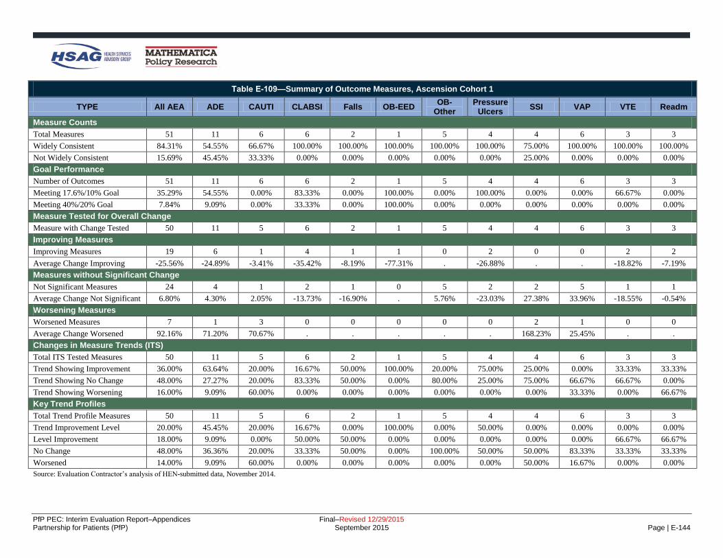
PfP PEC: Interim Evaluation Report–Appendices Final–Revised 12/29/2015 Partnership for Patients (PfP) September 2015 Page | E-144
Table E-109—Summary of Outcome Measures, Ascension Cohort 1
TYPE All AEA ADE CAUTI CLABSI Falls OB-EED OB-
Other Pressure
Ulcers SSI VAP VTE Readm
Measure Counts
Total Measures 51 11 6 6 2 1 5 4 4 6 3 3
Widely Consistent 84.31% 54.55% 66.67% 100.00% 100.00% 100.00% 100.00% 100.00% 75.00% 100.00% 100.00% 100.00%
Not Widely Consistent 15.69% 45.45% 33.33% 0.00% 0.00% 0.00% 0.00% 0.00% 25.00% 0.00% 0.00% 0.00%
Goal Performance
Number of Outcomes 51 11 6 6 2 1 5 4 4 6 3 3
Meeting 17.6%/10% Goal 35.29% 54.55% 0.00% 83.33% 0.00% 100.00% 0.00% 100.00% 0.00% 0.00% 66.67% 0.00%
Meeting 40%/20% Goal 7.84% 9.09% 0.00% 33.33% 0.00% 100.00% 0.00% 0.00% 0.00% 0.00% 0.00% 0.00%
Measure Tested for Overall Change
Measure with Change Tested 50 11 5 6 2 1 5 4 4 6 3 3
Improving Measures
Improving Measures 19 6 1 4 1 1 0 2 0 0 2 2
Average Change Improving -25.56% -24.89% -3.41% -35.42% -8.19% -77.31% . -26.88% . . -18.82% -7.19%
Measures without Significant Change
Not Significant Measures 24 4 1 2 1 0 5 2 2 5 1 1
Average Change Not Significant 6.80% 4.30% 2.05% -13.73% -16.90% . 5.76% -23.03% 27.38% 33.96% -18.55% -0.54%
Worsening Measures
Worsened Measures 7 1 3 0 0 0 0 0 2 1 0 0
Average Change Worsened 92.16% 71.20% 70.67% . . . . . 168.23% 25.45% . .
Changes in Measure Trends (ITS)
Total ITS Tested Measures 50 11 5 6 2 1 5 4 4 6 3 3
Trend Showing Improvement 36.00% 63.64% 20.00% 16.67% 50.00% 100.00% 20.00% 75.00% 25.00% 0.00% 33.33% 33.33%
Trend Showing No Change 48.00% 27.27% 20.00% 83.33% 50.00% 0.00% 80.00% 25.00% 75.00% 66.67% 66.67% 0.00%
Trend Showing Worsening 16.00% 9.09% 60.00% 0.00% 0.00% 0.00% 0.00% 0.00% 0.00% 33.33% 0.00% 66.67%
Key Trend Profiles
Total Trend Profile Measures 50 11 5 6 2 1 5 4 4 6 3 3
Trend Improvement Level 20.00% 45.45% 20.00% 16.67% 0.00% 100.00% 0.00% 50.00% 0.00% 0.00% 0.00% 0.00%
Level Improvement 18.00% 9.09% 0.00% 50.00% 50.00% 0.00% 0.00% 0.00% 0.00% 0.00% 66.67% 66.67%
No Change 48.00% 36.36% 20.00% 33.33% 50.00% 0.00% 100.00% 50.00% 50.00% 83.33% 33.33% 33.33%
Worsened 14.00% 9.09% 60.00% 0.00% 0.00% 0.00% 0.00% 0.00% 50.00% 16.67% 0.00% 0.00%
Source: Evaluation Contractor’s analysis of HEN-submitted data, November 2014.

PfP PEC: Interim Evaluation Report–Appendices Final–Revised 12/29/2015 Partnership for Patients (PfP) September 2015 Page | E-145
Table E-110—Summary of Outcome Measures, Ascension Cohort 2
TYPE All AEA ADE CAUTI CLABSI Falls OB-EED OB-
Other Pressure
Ulcers SSI VAP VTE Readm
Measure Counts
Total Measures 41 10 4 4 2 1 5 3 2 6 2 2
Widely Consistent 34.15% 20.00% 0.00% 50.00% 100.00% 0.00% 0.00% 0.00% 100.00% 100.00% 0.00% 0.00%
Not Widely Consistent 65.85% 80.00% 100.00% 50.00% 0.00% 100.00% 100.00% 100.00% 0.00% 0.00% 100.00% 100.00%
Goal Performance
Number of Outcomes 41 10 4 4 2 1 5 3 2 6 2 2
Meeting 17.6%/10% Goal 26.83% 20.00% 0.00% 75.00% 50.00% 100.00% 0.00% 33.33% 50.00% 0.00% 50.00% 50.00%
Meeting 40%/20% Goal 17.07% 20.00% 0.00% 50.00% 0.00% 100.00% 0.00% 33.33% 0.00% 0.00% 0.00% 50.00%
Measure Tested for Overall Change
Measure with Change Tested 41 10 4 4 2 1 5 3 2 6 2 2
Improving Measures
Improving Measures 6 3 0 2 0 0 0 0 0 0 0 1
Average Change Improving -39.24% -42.20% . -44.20% . . . . . . . -20.47%
Measures without Significant Change
Not Significant Measures 29 6 2 2 2 1 5 1 2 5 2 1
Average Change Not Significant 7.52% 15.14% 16.55% -20.74% -20.97% -72.73% 8.21% -100.00% 7.34% 63.24% -8.36% -4.86%
Worsening Measures
Worsened Measures 6 1 2 0 0 0 0 2 0 1 0 0
Average Change Worsened 95.44% 145.05% 15.29% . . . . 175.16% . 46.68% . .
Changes in Measure Trends (ITS)
Total ITS Tested Measures 38 7 4 4 2 1 5 3 2 6 2 2
Trend Showing Improvement 31.58% 0.00% 50.00% 25.00% 0.00% 0.00% 60.00% 100.00% 0.00% 16.67% 50.00% 50.00%
Trend Showing No Change 60.53% 100.00% 50.00% 75.00% 100.00% 100.00% 20.00% 0.00% 100.00% 66.67% 50.00% 0.00%
Trend Showing Worsening 7.89% 0.00% 0.00% 0.00% 0.00% 0.00% 20.00% 0.00% 0.00% 16.67% 0.00% 50.00%
Key Trend Profiles
Total Trend Profile Measures 38 7 4 4 2 1 5 3 2 6 2 2
Trend Improvement Level 5.26% 0.00% 0.00% 25.00% 0.00% 0.00% 0.00% 0.00% 0.00% 0.00% 0.00% 50.00%
Level Improvement 10.53% 42.86% 0.00% 25.00% 0.00% 0.00% 0.00% 0.00% 0.00% 0.00% 0.00% 0.00%
No Change 68.42% 42.86% 50.00% 50.00% 100.00% 100.00% 100.00% 33.33% 100.00% 83.33% 100.00% 50.00%
Worsened 15.79% 14.29% 50.00% 0.00% 0.00% 0.00% 0.00% 66.67% 0.00% 16.67% 0.00% 0.00%
Source: Evaluation Contractor’s analysis of HEN-submitted data, November 2014.

PfP PEC: Interim Evaluation Report–Appendices Final–Revised 12/29/2015 Partnership for Patients (PfP) September 2015 Page | E-146
Table E-111—Summary of Outcome Measures, Carolinas
Type All AEAs ADE CAUTI CLABSI Falls OB-EED OB-
Other Pressure
Ulcers SSI VAP VTE Readm
Measure Counts
Total Measures 48 3 6 6 5 1 5 6 6 4 3 3
Widely Consistent 83.33% 100.00% 83.33% 83.33% 60.00% 100.00% 100.00% 50.00% 100.00% 75.00% 100.00% 100.00%
Not Widely Consistent 16.67% 0.00% 16.67% 16.67% 40.00% 0.00% 0.00% 50.00% 0.00% 25.00% 0.00% 0.00%
Goal Performance
Number of Outcomes 48 3 6 6 5 1 5 6 6 4 3 3
Meeting 17.6%/10% Goal 45.83% 100.00% 33.33% 33.33% 80.00% 100.00% 80.00% 16.67% 33.33% 25.00% 33.33% 33.33%
Meeting 40%/20% Goal 20.83% 66.67% 16.67% 16.67% 0.00% 100.00% 40.00% 0.00% 33.33% 25.00% 0.00% 0.00%
Measure Tested for Overall Change
Measure with Change Tested 47 3 5 6 5 1 5 6 6 4 3 3
Improving Measures
Improving Measures 20 3 2 2 4 1 3 0 1 1 0 3
Average Change Improving -40.69% -38.07% -46.99% -42.73% -27.85% -72.28% -66.08% . -100.00% -8.00% . -10.08%
Measures without Significant Change
Not Significant Measures 25 0 3 4 1 0 2 6 4 2 3 0
Average Change Not Significant -1.30% . -2.68% 15.26% -32.71% . -17.49% 7.59% 0.03% -16.38% -10.29% .
Worsening Measures
Worsened Measures 2 0 0 0 0 0 0 0 1 1 0 0
Average Change Worsened 154.22% . . . . . . . 114.68% 193.76% . .
Changes in Measure Trends (ITS)
Total ITS Tested Measures 47 3 5 6 5 1 5 6 6 4 3 3
Trend Showing Improvement 21.28% 33.33% 60.00% 33.33% 20.00% 0.00% 0.00% 0.00% 33.33% 25.00% 0.00% 0.00%
Trend Showing No Change 61.70% 33.33% 40.00% 66.67% 20.00% 0.00% 60.00% 100.00% 66.67% 75.00% 100.00% 66.67%
Trend Showing Worsening 17.02% 33.33% 0.00% 0.00% 60.00% 100.00% 40.00% 0.00% 0.00% 0.00% 0.00% 33.33%
Key Trend Profiles
Total Trend Profile Measures 47 3 5 6 5 1 5 6 6 4 3 3
Trend Improvement Level 12.77% 33.33% 40.00% 16.67% 20.00% 0.00% 0.00% 0.00% 0.00% 25.00% 0.00% 0.00%
Level Improvement 29.79% 66.67% 0.00% 16.67% 60.00% 100.00% 60.00% 0.00% 16.67% 0.00% 0.00% 100.00%
No Change 53.19% 0.00% 60.00% 66.67% 20.00% 0.00% 40.00% 100.00% 66.67% 50.00% 100.00% 0.00%
Worsened 4.26% 0.00% 0.00% 0.00% 0.00% 0.00% 0.00% 0.00% 16.67% 25.00% 0.00% 0.00%
Source: Evaluation Contractor’s analysis of HEN-submitted data, November 2014.
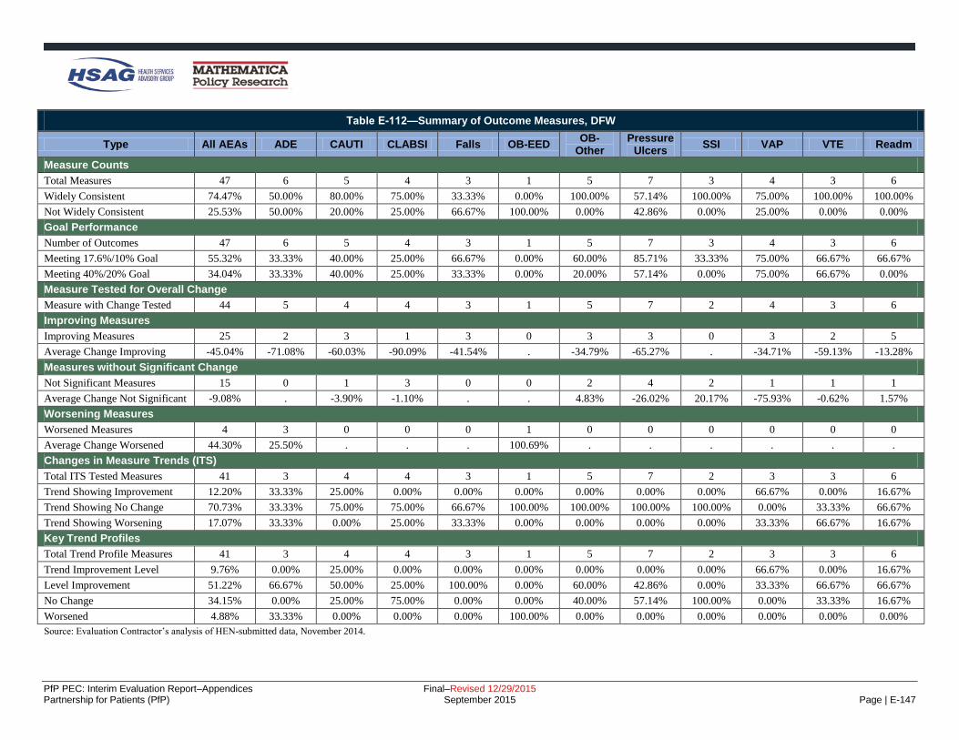
PfP PEC: Interim Evaluation Report–Appendices Final–Revised 12/29/2015 Partnership for Patients (PfP) September 2015 Page | E-147
Table E-112—Summary of Outcome Measures, DFW
Type All AEAs ADE CAUTI CLABSI Falls OB-EED OB-
Other Pressure
Ulcers SSI VAP VTE Readm
Measure Counts
Total Measures 47 6 5 4 3 1 5 7 3 4 3 6
Widely Consistent 74.47% 50.00% 80.00% 75.00% 33.33% 0.00% 100.00% 57.14% 100.00% 75.00% 100.00% 100.00%
Not Widely Consistent 25.53% 50.00% 20.00% 25.00% 66.67% 100.00% 0.00% 42.86% 0.00% 25.00% 0.00% 0.00%
Goal Performance
Number of Outcomes 47 6 5 4 3 1 5 7 3 4 3 6
Meeting 17.6%/10% Goal 55.32% 33.33% 40.00% 25.00% 66.67% 0.00% 60.00% 85.71% 33.33% 75.00% 66.67% 66.67%
Meeting 40%/20% Goal 34.04% 33.33% 40.00% 25.00% 33.33% 0.00% 20.00% 57.14% 0.00% 75.00% 66.67% 0.00%
Measure Tested for Overall Change
Measure with Change Tested 44 5 4 4 3 1 5 7 2 4 3 6
Improving Measures
Improving Measures 25 2 3 1 3 0 3 3 0 3 2 5
Average Change Improving -45.04% -71.08% -60.03% -90.09% -41.54% . -34.79% -65.27% . -34.71% -59.13% -13.28%
Measures without Significant Change
Not Significant Measures 15 0 1 3 0 0 2 4 2 1 1 1
Average Change Not Significant -9.08% . -3.90% -1.10% . . 4.83% -26.02% 20.17% -75.93% -0.62% 1.57%
Worsening Measures
Worsened Measures 4 3 0 0 0 1 0 0 0 0 0 0
Average Change Worsened 44.30% 25.50% . . . 100.69% . . . . . .
Changes in Measure Trends (ITS)
Total ITS Tested Measures 41 3 4 4 3 1 5 7 2 3 3 6
Trend Showing Improvement 12.20% 33.33% 25.00% 0.00% 0.00% 0.00% 0.00% 0.00% 0.00% 66.67% 0.00% 16.67%
Trend Showing No Change 70.73% 33.33% 75.00% 75.00% 66.67% 100.00% 100.00% 100.00% 100.00% 0.00% 33.33% 66.67%
Trend Showing Worsening 17.07% 33.33% 0.00% 25.00% 33.33% 0.00% 0.00% 0.00% 0.00% 33.33% 66.67% 16.67%
Key Trend Profiles
Total Trend Profile Measures 41 3 4 4 3 1 5 7 2 3 3 6
Trend Improvement Level 9.76% 0.00% 25.00% 0.00% 0.00% 0.00% 0.00% 0.00% 0.00% 66.67% 0.00% 16.67%
Level Improvement 51.22% 66.67% 50.00% 25.00% 100.00% 0.00% 60.00% 42.86% 0.00% 33.33% 66.67% 66.67%
No Change 34.15% 0.00% 25.00% 75.00% 0.00% 0.00% 40.00% 57.14% 100.00% 0.00% 33.33% 16.67%
Worsened 4.88% 33.33% 0.00% 0.00% 0.00% 100.00% 0.00% 0.00% 0.00% 0.00% 0.00% 0.00%
Source: Evaluation Contractor’s analysis of HEN-submitted data, November 2014.

PfP PEC: Interim Evaluation Report–Appendices Final–Revised 12/29/2015 Partnership for Patients (PfP) September 2015 Page | E-148
Table E-113—Summary of Outcome Measures, Dignity
Type All AEAs ADE CAUTI CLABSI Falls OB-EED OB-
Other Pressure
Ulcers SSI VAP VTE Readm
Measure Counts
Total Measures 39 4 4 4 3 1 4 5 4 5 3 2
Widely Consistent 92.31% 100.00% 100.00% 100.00% 100.00% 100.00% 100.00% 40.00% 100.00% 100.00% 100.00% 100.00%
Not Widely Consistent 7.69% 0.00% 0.00% 0.00% 0.00% 0.00% 0.00% 60.00% 0.00% 0.00% 0.00% 0.00%
Goal Performance
Number of Outcomes 39 4 4 4 3 1 4 5 4 5 3 2
Meeting 17.6%/10% Goal 41.03% 50.00% 25.00% 50.00% 66.67% 100.00% 25.00% 60.00% 25.00% 40.00% 33.33% 0.00%
Meeting 40%/20% Goal 20.51% 50.00% 0.00% 25.00% 0.00% 100.00% 0.00% 20.00% 25.00% 20.00% 33.33% 0.00%
Measure Tested for Overall Change
Measure with Change Tested 37 3 3 4 3 1 4 5 4 5 3 2
Improving Measures
Improving Measures 16 1 3 2 3 1 1 1 0 1 1 2
Average Change Improving -34.18% -74.20% -17.26% -47.65% -26.16% -98.47% -24.37% -42.66% . -53.53% -17.09% -5.51%
Measures without Significant Change
Not Significant Measures 20 2 0 1 0 0 3 4 4 4 2 0
Average Change Not Significant -5.20% -56.19% . -0.71% . . -1.71% -21.28% 9.00% 27.71% -23.70% .
Worsening Measures
Worsened Measures 1 0 0 1 0 0 0 0 0 0 0 0
Average Change Worsened 4.88% . . 4.88% . . . . . . . .
Changes in Measure Trends (ITS)
Total ITS Tested Measures 36 2 3 4 3 1 4 5 4 5 3 2
Trend Showing Improvement 8.33% 0.00% 0.00% 25.00% 0.00% 0.00% 0.00% 0.00% 0.00% 20.00% 0.00% 50.00%
Trend Showing No Change 63.89% 0.00% 66.67% 25.00% 66.67% 0.00% 100.00% 60.00% 100.00% 80.00% 100.00% 0.00%
Trend Showing Worsening 27.78% 100.00% 33.33% 50.00% 33.33% 100.00% 0.00% 40.00% 0.00% 0.00% 0.00% 50.00%
Key Trend Profiles
Total Trend Profile Measures 36 2 3 4 3 1 4 5 4 5 3 2
Trend Improvement Level 5.56% 0.00% 0.00% 0.00% 0.00% 0.00% 0.00% 0.00% 0.00% 20.00% 0.00% 50.00%
Level Improvement 38.89% 50.00% 100.00% 50.00% 100.00% 100.00% 25.00% 20.00% 0.00% 0.00% 33.33% 50.00%
No Change 52.78% 50.00% 0.00% 25.00% 0.00% 0.00% 75.00% 80.00% 100.00% 80.00% 66.67% 0.00%
Worsened 2.78% 0.00% 0.00% 25.00% 0.00% 0.00% 0.00% 0.00% 0.00% 0.00% 0.00% 0.00%
Source: Evaluation Contractor’s analysis of HEN-submitted data, November 2014.

PfP PEC: Interim Evaluation Report–Appendices Final–Revised 12/29/2015 Partnership for Patients (PfP) September 2015 Page | E-149
Table E-114—Summary of Outcome Measures, EHEN
Type All AEAs ADE CAUTI CLABSI Falls OB-EED OB-
Other Pressure
Ulcers SSI VAP VTE Readm
Measure Counts
Total Measures 55 5 8 7 5 1 7 6 9 3 2 2
Widely Consistent 72.73% 20.00% 87.50% 85.71% 40.00% 100.00% 85.71% 50.00% 100.00% 33.33% 100.00% 100.00%
Not Widely Consistent 27.27% 80.00% 12.50% 14.29% 60.00% 0.00% 14.29% 50.00% 0.00% 66.67% 0.00% 0.00%
Goal Performance
Number of Outcomes 55 5 8 7 5 1 7 6 9 3 2 2
Meeting 17.6%/10% Goal 40.00% 60.00% 37.50% 71.43% 0.00% 0.00% 14.29% 83.33% 33.33% 0.00% 100.00% 0.00%
Meeting 40%/20% Goal 10.91% 20.00% 0.00% 42.86% 0.00% 0.00% 0.00% 33.33% 0.00% 0.00% 0.00% 0.00%
Measure Tested for Overall Change
Measure with Change Tested 54 5 7 7 5 1 7 6 9 3 2 2
Improving Measures
Improving Measures 25 3 5 7 0 0 1 5 1 0 1 2
Average Change Improving -31.40% -31.95% -24.73% -30.91% . . -27.96% -52.96% -26.29% . -20.83% -4.64%
Measures without Significant Change
Not Significant Measures 20 1 2 0 3 0 3 1 7 2 1 0
Average Change Not Significant -2.49% -16.76% -8.15% . -1.92% . -5.38% -12.08% -5.10% 44.08% -35.24% .
Worsening Measures
Worsened Measures 9 1 0 0 2 1 3 0 1 1 0 0
Average Change Worsened 87.58% 119.48% . . 31.51% 383.26% 28.33% . 43.05% 94.42% . .
Changes in Measure Trends (ITS)
Total ITS Tested Measures 54 5 7 7 5 1 7 6 9 3 2 2
Trend Showing Improvement 16.67% 20.00% 14.29% 14.29% 20.00% 0.00% 14.29% 0.00% 22.22% 0.00% 50.00% 50.00%
Trend Showing No Change 66.67% 60.00% 57.14% 57.14% 60.00% 0.00% 71.43% 100.00% 77.78% 100.00% 50.00% 0.00%
Trend Showing Worsening 16.67% 20.00% 28.57% 28.57% 20.00% 100.00% 14.29% 0.00% 0.00% 0.00% 0.00% 50.00%
Key Trend Profiles
Total Trend Profile Measures 54 5 7 7 5 1 7 6 9 3 2 2
Trend Improvement Level 7.41% 0.00% 14.29% 14.29% 0.00% 0.00% 0.00% 0.00% 0.00% 0.00% 50.00% 50.00%
Level Improvement 38.89% 60.00% 57.14% 85.71% 0.00% 0.00% 14.29% 83.33% 11.11% 0.00% 0.00% 50.00%
No Change 37.04% 20.00% 28.57% 0.00% 60.00% 0.00% 42.86% 16.67% 77.78% 66.67% 50.00% 0.00%
Worsened 16.67% 20.00% 0.00% 0.00% 40.00% 100.00% 42.86% 0.00% 11.11% 33.33% 0.00% 0.00%
Source: Evaluation Contractor’s analysis of HEN-submitted data, November 2014.

PfP PEC: Interim Evaluation Report–Appendices Final–Revised 12/29/2015 Partnership for Patients (PfP) September 2015 Page | E-150
Table E-115—Summary of Outcome Measures, Georgia
Type All AEAs ADE CAUTI CLABSI Falls OB-EED OB-
Other Pressure
Ulcers SSI VAP VTE Readm
Measure Counts
Total Measures 57 9 10 9 4 1 3 6 7 3 2 3
Widely Consistent 52.63% 11.11% 40.00% 66.67% 50.00% 100.00% 100.00% 50.00% 42.86% 66.67% 100.00% 100.00%
Not Widely Consistent 47.37% 88.89% 60.00% 33.33% 50.00% 0.00% 0.00% 50.00% 57.14% 33.33% 0.00% 0.00%
Goal Performance
Number of Outcomes 57 9 10 9 4 1 3 6 7 3 2 3
Meeting 17.6%/10% Goal 40.35% 55.56% 30.00% 55.56% 25.00% 100.00% 0.00% 100.00% 0.00% 0.00% 100.00% 0.00%
Meeting 40%/20% Goal 17.54% 22.22% 10.00% 11.11% 0.00% 100.00% 0.00% 83.33% 0.00% 0.00% 0.00% 0.00%
Measure Tested for Overall Change
Measure with Change Tested 56 9 9 9 4 1 3 6 7 3 2 3
Improving Measures
Improving Measures 27 5 4 5 2 1 1 4 0 0 2 3
Average Change Improving -34.06% -38.72% -24.93% -32.77% -23.06% -97.56% -13.58% -59.14% . . -26.89% -4.97%
Measures without Significant Change
Not Significant Measures 20 2 2 4 1 0 2 2 6 1 0 0
Average Change Not Significant 10.64% 11.82% 7.78% 6.64% -12.28% . -10.14% -46.74% 24.98% 123.26% . .
Worsening Measures
Worsened Measures 9 2 3 0 1 0 0 0 1 2 0 0
Average Change Worsened 116.40% 167.07% 107.39% . 38.74% . . . 135.30% 108.64% . .
Changes in Measure Trends (ITS)
Total ITS Tested Measures 51 6 8 9 4 1 3 5 7 3 2 3
Trend Showing Improvement 19.61% 16.67% 37.50% 22.22% 0.00% 0.00% 0.00% 40.00% 0.00% 0.00% 100.00% 0.00%
Trend Showing No Change 62.75% 33.33% 50.00% 66.67% 75.00% 0.00% 100.00% 60.00% 85.71% 100.00% 0.00% 66.67%
Trend Showing Worsening 17.65% 50.00% 12.50% 11.11% 25.00% 100.00% 0.00% 0.00% 14.29% 0.00% 0.00% 33.33%
Key Trend Profiles
Total Trend Profile Measures 51 6 8 9 4 1 3 5 7 3 2 3
Trend Improvement Level 11.76% 0.00% 0.00% 22.22% 0.00% 0.00% 0.00% 40.00% 0.00% 0.00% 100.00% 0.00%
Level Improvement 31.37% 33.33% 37.50% 33.33% 50.00% 100.00% 33.33% 20.00% 0.00% 0.00% 0.00% 100.00%
No Change 39.22% 33.33% 25.00% 44.44% 25.00% 0.00% 66.67% 40.00% 85.71% 33.33% 0.00% 0.00%
Worsened 17.65% 33.33% 37.50% 0.00% 25.00% 0.00% 0.00% 0.00% 14.29% 66.67% 0.00% 0.00%
Source: Evaluation Contractor’s analysis of HEN-submitted data, November 2014.

PfP PEC: Interim Evaluation Report–Appendices Final–Revised 12/29/2015 Partnership for Patients (PfP) September 2015 Page | E-151
Table E-116—Summary of Outcome Measures, Iowa
Type All AEAs ADE CAUTI CLABSI Falls OB-EED OB-
Other Pressure
Ulcers SSI VAP VTE Readm
Measure Counts
Total Measures 50 6 5 5 5 1 7 6 6 4 3 2
Widely Consistent 46.00% 33.33% 20.00% 20.00% 60.00% 100.00% 100.00% 50.00% 0.00% 0.00% 100.00% 100.00%
Not Widely Consistent 54.00% 66.67% 80.00% 80.00% 40.00% 0.00% 0.00% 50.00% 100.00% 100.00% 0.00% 0.00%
Goal Performance
Number of Outcomes 50 6 5 5 5 1 7 6 6 4 3 2
Meeting 17.6%/10% Goal 30.00% 33.33% 0.00% 20.00% 0.00% 100.00% 42.86% 50.00% 50.00% 25.00% 33.33% 0.00%
Meeting 40%/20% Goal 26.00% 33.33% 0.00% 0.00% 0.00% 100.00% 42.86% 50.00% 33.33% 25.00% 33.33% 0.00%
Measure Tested for Overall Change
Measure with Change Tested 49 6 4 5 5 1 7 6 6 4 3 2
Improving Measures
Improving Measures 16 2 1 0 2 1 2 3 1 1 1 2
Average Change Improving -53.25% -70.78% -15.96% . -11.99% -95.31% -35.74% -85.64% -89.16% -100.00% -40.69% -8.47%
Measures without Significant Change
Not Significant Measures 30 2 3 5 3 0 5 3 5 2 2 0
Average Change Not Significant 2.19% -0.66% -0.39% 0.62% -4.19% . -19.46% 7.79% 2.20% 38.15% 32.09% .
Worsening Measures
Worsened Measures 3 2 0 0 0 0 0 0 0 1 0 0
Average Change Worsened 98.34% 147.19% . . . . . . . 0.65% . .
Changes in Measure Trends (ITS)
Total ITS Tested Measures 48 5 4 5 5 1 7 6 6 4 3 2
Trend Showing Improvement 27.08% 40.00% 25.00% 20.00% 20.00% 0.00% 28.57% 33.33% 0.00% 75.00% 0.00% 50.00%
Trend Showing No Change 56.25% 20.00% 75.00% 60.00% 60.00% 0.00% 71.43% 66.67% 83.33% 0.00% 100.00% 0.00%
Trend Showing Worsening 16.67% 40.00% 0.00% 20.00% 20.00% 100.00% 0.00% 0.00% 16.67% 25.00% 0.00% 50.00%
Key Trend Profiles
Total Trend Profile Measures 48 5 4 5 5 1 7 6 6 4 3 2
Trend Improvement Level 14.58% 0.00% 25.00% 0.00% 0.00% 0.00% 28.57% 33.33% 0.00% 25.00% 0.00% 50.00%
Level Improvement 18.75% 40.00% 0.00% 0.00% 40.00% 100.00% 0.00% 16.67% 16.67% 0.00% 33.33% 50.00%
No Change 60.42% 20.00% 75.00% 100.00% 60.00% 0.00% 71.43% 50.00% 83.33% 50.00% 66.67% 0.00%
Worsened 6.25% 40.00% 0.00% 0.00% 0.00% 0.00% 0.00% 0.00% 0.00% 25.00% 0.00% 0.00%
Source: Evaluation Contractor’s analysis of HEN-submitted data, November 2014.

PfP PEC: Interim Evaluation Report–Appendices Final–Revised 12/29/2015 Partnership for Patients (PfP) September 2015 Page | E-152
Table E-117—Summary of Outcome Measures, JCR Cohort 1
Type All AEAs ADE CAUTI CLABSI Falls OB-EED OB-
Other Pressure
Ulcers SSI VAP VTE Readm
Measure Counts
Total Measures 56 8 6 5 7 3 4 7 4 4 5 3
Widely Consistent 19.64% 0.00% 50.00% 40.00% 0.00% 0.00% 0.00% 14.29% 50.00% 0.00% 20.00% 66.67%
Not Widely Consistent 80.36% 100.00% 50.00% 60.00% 100.00% 100.00% 100.00% 85.71% 50.00% 100.00% 80.00% 33.33%
Goal Performance
Number of Outcomes 56 8 6 5 7 3 4 7 4 4 5 3
Meeting 17.6%/10% Goal 60.71% 75.00% 33.33% 40.00% 28.57% 100.00% 100.00% 100.00% 25.00% 50.00% 80.00% 33.33%
Meeting 40%/20% Goal 42.86% 62.50% 16.67% 0.00% 0.00% 100.00% 75.00% 100.00% 25.00% 25.00% 40.00% 33.33%
Measure Tested for Overall Change
Measure with Change Tested 55 8 5 5 7 3 4 7 4 4 5 3
Improving Measures
Improving Measures 21 4 2 2 1 2 1 3 1 1 2 2
Average Change Improving -60.02% -68.05% -19.21% -17.56% -30.63% -90.32% -76.39% -88.15% -73.07% -100.00% -50.66% -44.03%
Measures without Significant Change
Not Significant Measures 31 4 3 3 6 1 3 4 2 3 2 0
Average Change Not Significant -23.89% -26.16% -25.86% 13.57% 31.66% -100.00% -74.36% -100.00% 16.06% 9.00% -62.48% .
Worsening Measures
Worsened Measures 3 0 0 0 0 0 0 0 1 0 1 1
Average Change Worsened 129.91% . . . . . . . 376.39% . 0.89% 12.45%
Changes in Measure Trends (ITS)
Total ITS Tested Measures 52 7 5 5 7 2 4 6 4 4 5 3
Trend Showing Improvement 32.69% 42.86% 40.00% 20.00% 28.57% 100.00% 75.00% 16.67% 25.00% 25.00% 0.00% 33.33%
Trend Showing No Change 51.92% 57.14% 60.00% 80.00% 42.86% 0.00% 25.00% 50.00% 75.00% 50.00% 60.00% 33.33%
Trend Showing Worsening 15.38% 0.00% 0.00% 0.00% 28.57% 0.00% 0.00% 33.33% 0.00% 25.00% 40.00% 33.33%
Key Trend Profiles
Total Trend Profile Measures 52 7 5 5 7 2 4 6 4 4 5 3
Trend Improvement Level 17.31% 28.57% 20.00% 20.00% 0.00% 100.00% 25.00% 0.00% 0.00% 25.00% 0.00% 33.33%
Level Improvement 21.15% 14.29% 20.00% 20.00% 14.29% 0.00% 0.00% 50.00% 25.00% 0.00% 40.00% 33.33%
No Change 55.77% 57.14% 60.00% 60.00% 85.71% 0.00% 75.00% 50.00% 50.00% 75.00% 40.00% 0.00%
Worsened 5.77% 0.00% 0.00% 0.00% 0.00% 0.00% 0.00% 0.00% 25.00% 0.00% 20.00% 33.33%
Source: Evaluation Contractor’s analysis of HEN-submitted data, November 2014.

PfP PEC: Interim Evaluation Report–Appendices Final–Revised 12/29/2015 Partnership for Patients (PfP) September 2015 Page | E-153
Table E-118—Summary of Outcome Measures, JCR Cohort 2
Type All AEAs ADE CAUTI CLABSI Falls OB-EED OB-
Other Pressure
Ulcers SSI VAP VTE Readm
Measure Counts
Total Measures 30 4 3 3 4 3 1 3 3 2 2 2
Widely Consistent 0.00% 0.00% 0.00% 0.00% 0.00% 0.00% 0.00% 0.00% 0.00% 0.00% 0.00% 0.00%
Not Widely Consistent 100.00% 100.00% 100.00% 100.00% 100.00% 100.00% 100.00% 100.00% 100.00% 100.00% 100.00% 100.00%
Goal Performance
Number of Outcomes 30 4 3 3 4 3 1 3 3 2 2 2
Meeting 17.6%/10% Goal 60.00% 50.00% 66.67% 66.67% 75.00% 66.67% 0.00% 66.67% 66.67% 50.00% 0.00% 100.00%
Meeting 40%/20% Goal 46.67% 50.00% 33.33% 33.33% 50.00% 66.67% 0.00% 66.67% 66.67% 50.00% 0.00% 50.00%
Measure Tested for Overall Change
Measure of Change Tested 30 4 3 3 4 3 1 3 3 2 2 2
Improving Measures
Improving Measures 9 2 2 0 0 1 0 2 0 0 0 2
Average Change Improving -59.38% -71.70% -37.86% . . -100.00% . -84.97% . . . -22.68%
Measures without Significant Change
Not Significant Measures 21 2 1 3 4 2 1 1 3 2 2 0
Average Change Not Significant -12.51% -16.01% 0.88% -40.86% -41.12% 19.89% 0.92% 83.64% 2.61% -43.26% 4.94% .
Worsening Measures
Worsened Measures 0 0 0 0 0 0 0 0 0 0 0 0
Average Change Worsened . . . . . . . . . . . .
Changes in Measure Trends (ITS)
Total ITS Tested Measures 26 3 3 3 4 1 1 2 3 2 2 2
Trend Showing Improvement 11.54% 0.00% 0.00% 0.00% 50.00% 0.00% 0.00% 0.00% 0.00% 0.00% 50.00% 0.00%
Trend Showing No Change 73.08% 100.00% 66.67% 66.67% 25.00% 100.00% 100.00% 50.00% 100.00% 100.00% 50.00% 100.00%
Trend Showing Worsening 15.38% 0.00% 33.33% 33.33% 25.00% 0.00% 0.00% 50.00% 0.00% 0.00% 0.00% 0.00%
Key Trend Profiles
Total Trend Profile Measures 26 3 3 3 4 1 1 2 3 2 2 2
Trend Improvement Level 0.00% 0.00% 0.00% 0.00% 0.00% 0.00% 0.00% 0.00% 0.00% 0.00% 0.00% 0.00%
Level Improvement 30.77% 66.67% 66.67% 0.00% 0.00% 100.00% 0.00% 50.00% 0.00% 0.00% 0.00% 100.00%
No Change 69.23% 33.33% 33.33% 100.00% 100.00% 0.00% 100.00% 50.00% 100.00% 100.00% 100.00% 0.00%
Worsened 0.00% 0.00% 0.00% 0.00% 0.00% 0.00% 0.00% 0.00% 0.00% 0.00% 0.00% 0.00%
Source: Evaluation Contractor’s analysis of HEN-submitted data, November 2014.

PfP PEC: Interim Evaluation Report–Appendices Final–Revised 12/29/2015 Partnership for Patients (PfP) September 2015 Page | E-154
Table E-119—Summary of Outcome Measures, LifePoint
Type All AEAs ADE CAUTI CLABSI Falls OB-EED OB-
Other Pressure
Ulcers SSI VAP VTE Readm
Measure Counts
Total Measures 53 4 6 6 1 2 10 5 5 2 6 6
Widely Consistent 94.34% 75.00% 100.00% 83.33% 100.00% 100.00% 100.00% 100.00% 100.00% 100.00% 83.33% 100.00%
Not Widely Consistent 5.66% 25.00% 0.00% 16.67% 0.00% 0.00% 0.00% 0.00% 0.00% 0.00% 16.67% 0.00%
Goal Performance
Number of Outcomes 53 4 6 6 1 2 10 5 5 2 6 6
Meeting 17.6%/10% Goal 58.49% 75.00% 16.67% 50.00% 100.00% 100.00% 60.00% 100.00% 40.00% 50.00% 83.33% 33.33%
Meeting 40%/20% Goal 28.30% 25.00% 16.67% 0.00% 0.00% 50.00% 30.00% 80.00% 20.00% 50.00% 16.67% 33.33%
Measure Tested for Overall Change
Measure of Change Tested 52 4 5 6 1 2 10 5 5 2 6 6
Improving Measures
Improving Measures 23 3 2 0 1 1 5 4 0 1 3 3
Average Change Improving -43.06% -52.50% -34.95% . -30.69% -94.62% -37.70% -70.68% . -44.42% -28.08% -12.57%
Measures without Significant Change
Not Significant Measures 26 0 3 6 0 1 3 1 5 1 3 3
Average Change Not Significant 3.50% . 13.08% -2.76% . -30.62% -21.07% -32.35% 54.46% 25.61% -23.83% -10.62%
Worsening Measures
Worsened Measures 3 1 0 0 0 0 2 0 0 0 0 0
Average Change Worsened 81.92% 82.32% . . . . 81.72% . . . . .
Changes in Measure Trends (ITS)
Total ITS Tested Measures 50 4 5 6 1 1 10 5 5 2 5 6
Trend Showing Improvement 38.00% 50.00% 40.00% 0.00% 100.00% 100.00% 40.00% 20.00% 20.00% 100.00% 60.00% 33.33%
Trend Showing No Change 48.00% 25.00% 40.00% 83.33% 0.00% 0.00% 50.00% 40.00% 80.00% 0.00% 40.00% 50.00%
Trend Showing Worsening 14.00% 25.00% 20.00% 16.67% 0.00% 0.00% 10.00% 40.00% 0.00% 0.00% 0.00% 16.67%
Key Trend Profiles
Total Trend Profile Measures 50 4 5 6 1 1 10 5 5 2 5 6
Trend Improvement Level 22.00% 50.00% 0.00% 0.00% 100.00% 100.00% 20.00% 20.00% 0.00% 50.00% 60.00% 0.00%
Level Improvement 24.00% 25.00% 40.00% 0.00% 0.00% 0.00% 30.00% 60.00% 0.00% 0.00% 0.00% 50.00%
No Change 48.00% 0.00% 60.00% 100.00% 0.00% 0.00% 30.00% 20.00% 100.00% 50.00% 40.00% 50.00%
Worsened 6.00% 25.00% 0.00% 0.00% 0.00% 0.00% 20.00% 0.00% 0.00% 0.00% 0.00% 0.00%
Source: Evaluation Contractor’s analysis of HEN-submitted data, November 2014.

PfP PEC: Interim Evaluation Report–Appendices Final–Revised 12/29/2015 Partnership for Patients (PfP) September 2015 Page | E-155
Table E-120—Summary of Outcome Measures, Michigan Cohort 1
Type All AEAs ADE CAUTI CLABSI Falls OB-EED OB-
Other Pressure
Ulcers SSI VAP VTE Readm
Measure Counts
Total Measures 45 7 10 4 2 1 6 4 3 3 3 2
Widely Consistent 71.11% 28.57% 100.00% 100.00% 100.00% 100.00% 66.67% 50.00% 100.00% 0.00% 66.67% 100.00%
Not Widely Consistent 28.89% 71.43% 0.00% 0.00% 0.00% 0.00% 33.33% 50.00% 0.00% 100.00% 33.33% 0.00%
Goal Performance
Number of Outcomes 45 7 10 4 2 1 6 4 3 3 3 2
Meeting 17.6%/10% Goal 42.22% 14.29% 50.00% 50.00% 50.00% 0.00% 33.33% 50.00% 66.67% 66.67% 66.67% 0.00%
Meeting 40%/20% Goal 15.56% 0.00% 10.00% 0.00% 0.00% 0.00% 33.33% 25.00% 33.33% 33.33% 33.33% 0.00%
Measure Tested for Overall Change
Measure with Change Tested 44 7 9 4 2 1 6 4 3 3 3 2
Improving Measures
Improving Measures 15 2 4 2 1 0 0 2 0 2 1 1
Average Change Improving -28.62% -15.94% -31.86% -24.18% -28.25% . . -32.87% . -46.69% -30.68% -3.51%
Measures without Significant Changes
Not Significant Measures 22 2 5 2 1 0 4 1 3 1 2 1
Average Change Not Significant -11.24% 30.07% -9.45% -4.82% -11.65% . -28.51% 42.91% -28.01% -7.15% -37.94% -0.64%
Worsening Measures
Worsened Measures 7 3 0 0 0 1 2 1 0 0 0 0
Average Change Worsened 66.87% 15.38% . . . 134.56% 95.99% 95.42% . . . .
Changes in Measure Trends (ITS)
Total ITS Tested Measures 31 2 9 3 2 1 1 3 3 3 2 2
Trend Showing Improvement 41.94% 0.00% 55.56% 66.67% 0.00% 100.00% 100.00% 33.33% 33.33% 66.67% 0.00% 0.00%
Trend Showing No Change 45.16% 0.00% 33.33% 33.33% 100.00% 0.00% 0.00% 66.67% 66.67% 33.33% 100.00% 50.00%
Trend Showing Worsening 12.90% 100.00% 11.11% 0.00% 0.00% 0.00% 0.00% 0.00% 0.00% 0.00% 0.00% 50.00%
Key Trend Profiles
Total Trend Profile Measures 31 2 9 3 2 1 1 3 3 3 2 2
Trend Improvement Level 22.58% 0.00% 22.22% 66.67% 0.00% 0.00% 0.00% 33.33% 0.00% 66.67% 0.00% 0.00%
Level Improvement 25.81% 100.00% 22.22% 0.00% 50.00% 0.00% 0.00% 33.33% 0.00% 0.00% 50.00% 50.00%
No Change 48.39% 0.00% 55.56% 33.33% 50.00% 0.00% 100.00% 33.33% 100.00% 33.33% 50.00% 50.00%
Worsened 3.23% 0.00% 0.00% 0.00% 0.00% 100.00% 0.00% 0.00% 0.00% 0.00% 0.00% 0.00%
Source: Evaluation Contractor’s analysis of HEN-submitted data, November 2014.

PfP PEC: Interim Evaluation Report–Appendices Final–Revised 12/29/2015 Partnership for Patients (PfP) September 2015 Page | E-156
Table E-121—Summary of Outcome Measures, Michigan Cohort 2
Type All AEAs ADE CAUTI CLABSI Falls OB-EED OB-
Other Pressure
Ulcers SSI VAP VTE Readm
Measure Counts
Total Measures 29 5 8 2 2 1 3 3 1 2 1 1
Widely Consistent 27.59% 20.00% 0.00% 50.00% 0.00% 100.00% 0.00% 33.33% 0.00% 100.00% 100.00% 100.00%
Not Widely Consistent 72.41% 80.00% 100.00% 50.00% 100.00% 0.00% 100.00% 66.67% 100.00% 0.00% 0.00% 0.00%
Goal Performance
Number of Outcomes 29 5 8 2 2 1 3 3 1 2 1 1
Meeting 17.6%/10% Goal 48.28% 60.00% 62.50% 0.00% 50.00% 100.00% 33.33% 33.33% 0.00% 100.00% 0.00% 0.00%
Meeting 40%/20% Goal 34.48% 40.00% 50.00% 0.00% 50.00% 0.00% 0.00% 33.33% 0.00% 100.00% 0.00% 0.00%
Measure Tested for Overall Change
Measure with Change Tested 29 5 8 2 2 1 3 3 1 2 1 1
Improving Measures
Improving Measures 3 1 1 0 1 0 0 0 0 0 0 0
Average Change Improving -33.81% -49.84% -8.00% . -43.60% . . . . . . .
Measures without Significant Change
Not Significant Measures 23 3 7 2 1 1 2 3 0 2 1 1
Average Change Not Significant -8.01% 49.52% -49.23% 17.03% 11.51% -33.65% 107.99% -21.84% . -100.00% 47.78% 1.69%
Worsening Measures
Worsened Measures 3 1 0 0 0 0 1 0 1 0 0 0
Average Change Worsened 159.74% 34.23% . . . . 247.32% . 197.68% . . .
Changes in Measure Trends (ITS)
Total ITS Tested Measures 9 0 5 0 0 1 0 1 1 0 0 1
Trend Showing Improvement 55.56% . 80.00% . . 0.00% . 100.00% 0.00% . . 0.00%
Trend Showing No Change 33.33% . 20.00% . . 100.00% . 0.00% 100.00% . . 0.00%
Trend Showing Worsening 11.11% . 0.00% . . 0.00% . 0.00% 0.00% . . 100.00%
Key Trend Profiles
Total Trend Profile Measures 9 0 5 0 0 1 0 1 1 0 0 1
Trend Improvement Level 0.00% . 0.00% . . 0.00% . 0.00% 0.00% . . 0.00%
Level Improvement 11.11% . 20.00% . . 0.00% . 0.00% 0.00% . . 0.00%
No Change 77.78% . 80.00% . . 100.00% . 100.00% 0.00% . . 100.00%
Worsened 11.11% . 0.00% . . 0.00% . 0.00% 100.00% . . 0.00%
Source: Evaluation Contractor’s analysis of HEN-submitted data, November 2014.

PfP PEC: Interim Evaluation Report–Appendices Final–Revised 12/29/2015 Partnership for Patients (PfP) September 2015 Page | E-157
Table E-122—Summary of Outcome Measures, Minnesota
Type All AEAs ADE CAUTI CLABSI Falls OB-EED OB-
Other Pressure
Ulcers SSI VAP VTE Readm
Measure Counts
Total Measures 44 4 6 6 2 1 6 4 7 3 3 2
Widely Consistent 40.91% 25.00% 0.00% 33.33% 0.00% 0.00% 100.00% 75.00% 0.00% 33.33% 100.00% 100.00%
Not Widely Consistent 59.09% 75.00% 100.00% 66.67% 100.00% 100.00% 0.00% 25.00% 100.00% 66.67% 0.00% 0.00%
Goal Performance
Number of Outcomes 44 4 6 6 2 1 6 4 7 3 3 2
Meeting 17.6%/10% Goal 45.45% 25.00% 33.33% 66.67% 100.00% 100.00% 0.00% 75.00% 42.86% 66.67% 33.33% 50.00%
Meeting 40%/20% Goal 27.27% 25.00% 16.67% 33.33% 50.00% 100.00% 0.00% 50.00% 42.86% 33.33% 0.00% 0.00%
Measure Tested for Overall Change
Measure with Change Tested 43 4 5 6 2 1 6 4 7 3 3 2
Improving Measures
Improving Measures 15 2 2 3 2 1 1 1 0 0 1 2
Average Change Improving -35.65% -34.43% -25.40% -51.93% -30.31% -92.22% -16.54% -34.34% . . -35.34% -10.09%
Measures without Significant Change
Not Significant Measures 24 1 3 3 0 0 4 2 6 3 2 0
Average Change Not Significant -19.02% -4.87% -19.75% -14.09% . . 10.73% -84.73% -22.62% -25.96% -5.01% .
Worsening Measures
Worsened Measures 4 1 0 0 0 0 1 1 1 0 0 0
Average Change Worsened 77.87% 23.42% . . . . 10.74% 226.05% 51.25% . . .
Changes in Measure Trends (ITS)
Total ITS Tested Measures 34 1 4 6 2 0 4 4 7 1 3 2
Trend Showing Improvement 14.71% 100.00% 0.00% 0.00% 0.00% . 25.00% 0.00% 28.57% 0.00% 0.00% 50.00%
Trend Showing No Change 85.29% 0.00% 100.00% 100.00% 100.00% . 75.00% 100.00% 71.43% 100.00% 100.00% 50.00%
Trend Showing Worsening 0.00% 0.00% 0.00% 0.00% 0.00% . 0.00% 0.00% 0.00% 0.00% 0.00% 0.00%
Key Trend Profiles
Total Trend Profile Measures 34 1 4 6 2 0 4 4 7 1 3 2
Trend Improvement Level 8.82% 100.00% 0.00% 0.00% 0.00% . 25.00% 0.00% 0.00% 0.00% 0.00% 50.00%
Level Improvement 26.47% 0.00% 25.00% 50.00% 100.00% . 0.00% 25.00% 0.00% 0.00% 33.33% 50.00%
No Change 58.82% 0.00% 75.00% 50.00% 0.00% . 75.00% 50.00% 85.71% 100.00% 66.67% 0.00%
Worsened 5.88% 0.00% 0.00% 0.00% 0.00% . 0.00% 25.00% 14.29% 0.00% 0.00% 0.00%
Source: Evaluation Contractor’s analysis of HEN-submitted data, November 2014.
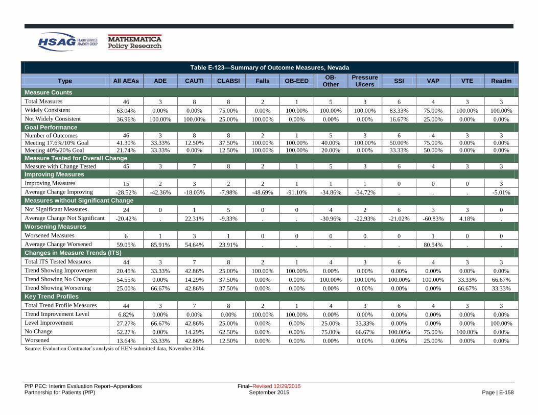
PfP PEC: Interim Evaluation Report–Appendices Final–Revised 12/29/2015 Partnership for Patients (PfP) September 2015 Page | E-158
Table E-123—Summary of Outcome Measures, Nevada
Type All AEAs ADE CAUTI CLABSI Falls OB-EED OB-
Other Pressure
Ulcers SSI VAP VTE Readm
Measure Counts
Total Measures 46 3 8 8 2 1 5 3 6 4 3 3
Widely Consistent 63.04% 0.00% 0.00% 75.00% 0.00% 100.00% 100.00% 100.00% 83.33% 75.00% 100.00% 100.00%
Not Widely Consistent 36.96% 100.00% 100.00% 25.00% 100.00% 0.00% 0.00% 0.00% 16.67% 25.00% 0.00% 0.00%
Goal Performance
Number of Outcomes 46 3 8 8 2 1 5 3 6 4 3 3
Meeting 17.6%/10% Goal 41.30% 33.33% 12.50% 37.50% 100.00% 100.00% 40.00% 100.00% 50.00% 75.00% 0.00% 0.00%
Meeting 40%/20% Goal 21.74% 33.33% 0.00% 12.50% 100.00% 100.00% 20.00% 0.00% 33.33% 50.00% 0.00% 0.00%
Measure Tested for Overall Change
Measure with Change Tested 45 3 7 8 2 1 5 3 6 4 3 3
Improving Measures
Improving Measures 15 2 3 2 2 1 1 1 0 0 0 3
Average Change Improving -28.52% -42.36% -18.03% -7.98% -48.69% -91.10% -34.86% -34.72% . . . -5.01%
Measures without Significant Change
Not Significant Measures 24 0 1 5 0 0 4 2 6 3 3 0
Average Change Not Significant -20.42% . 22.31% -9.33% . . -30.96% -22.93% -21.02% -60.83% 4.18% .
Worsening Measures
Worsened Measures 6 1 3 1 0 0 0 0 0 1 0 0
Average Change Worsened 59.05% 85.91% 54.64% 23.91% . . . . . 80.54% . .
Changes in Measure Trends (ITS)
Total ITS Tested Measures 44 3 7 8 2 1 4 3 6 4 3 3
Trend Showing Improvement 20.45% 33.33% 42.86% 25.00% 100.00% 100.00% 0.00% 0.00% 0.00% 0.00% 0.00% 0.00%
Trend Showing No Change 54.55% 0.00% 14.29% 37.50% 0.00% 0.00% 100.00% 100.00% 100.00% 100.00% 33.33% 66.67%
Trend Showing Worsening 25.00% 66.67% 42.86% 37.50% 0.00% 0.00% 0.00% 0.00% 0.00% 0.00% 66.67% 33.33%
Key Trend Profiles
Total Trend Profile Measures 44 3 7 8 2 1 4 3 6 4 3 3
Trend Improvement Level 6.82% 0.00% 0.00% 0.00% 100.00% 100.00% 0.00% 0.00% 0.00% 0.00% 0.00% 0.00%
Level Improvement 27.27% 66.67% 42.86% 25.00% 0.00% 0.00% 25.00% 33.33% 0.00% 0.00% 0.00% 100.00%
No Change 52.27% 0.00% 14.29% 62.50% 0.00% 0.00% 75.00% 66.67% 100.00% 75.00% 100.00% 0.00%
Worsened 13.64% 33.33% 42.86% 12.50% 0.00% 0.00% 0.00% 0.00% 0.00% 25.00% 0.00% 0.00%
Source: Evaluation Contractor’s analysis of HEN-submitted data, November 2014.

PfP PEC: Interim Evaluation Report–Appendices Final–Revised 12/29/2015 Partnership for Patients (PfP) September 2015 Page | E-159
Table E-124—Summary of Outcome Measures, New Jersey
Type All AEAs ADE CAUTI CLABSI Falls OB-EED OB-
Other Pressure
Ulcers SSI VAP VTE Readm
Measure Counts
Total Measures 50 9 5 5 4 1 6 6 5 5 2 2
Widely Consistent 84.00% 77.78% 80.00% 80.00% 100.00% 100.00% 100.00% 100.00% 100.00% 20.00% 100.00% 100.00%
Not Widely Consistent 16.00% 22.22% 20.00% 20.00% 0.00% 0.00% 0.00% 0.00% 0.00% 80.00% 0.00% 0.00%
Goal Performance
Number of Outcomes 50 9 5 5 4 1 6 6 5 5 2 2
Meeting 17.6%/10% Goal 38.00% 22.22% 40.00% 40.00% 0.00% 100.00% 0.00% 100.00% 20.00% 60.00% 50.00% 50.00%
Meeting 40%/20% Goal 10.00% 22.22% 0.00% 0.00% 0.00% 100.00% 0.00% 16.67% 20.00% 0.00% 0.00% 0.00%
Measure Tested for Overall Change
Measure with Change Tested 49 9 4 5 4 1 6 6 5 5 2 2
Improving Measures
Improving Measures 22 4 3 2 3 1 1 5 0 0 1 2
Average Change Improving -27.34% -35.65% -25.64% -22.30% -15.35% -55.28% -17.24% -35.13% . . -22.37% -10.40%
Measures without Significant Change
Not Significant Measures 22 5 1 3 1 0 3 1 3 4 1 0
Average Change Not Significant -9.36% 0.88% -0.97% -3.61% -6.37% . -9.08% -22.18% -10.60% -24.26% -13.88% .
Worsening Measures
Worsened Measures 5 0 0 0 0 0 2 0 2 1 0 0
Average Change Worsened 26.60% . . . . . 11.05% . 54.60% 1.71% . .
Changes in Measure Trends (ITS)
Total ITS Tested Measures 46 9 3 5 4 1 6 6 5 4 2 1
Trend Showing Improvement 2.17% 0.00% 0.00% 0.00% 0.00% 0.00% 16.67% 0.00% 0.00% 0.00% 0.00% 0.00%
Trend Showing No Change 84.78% 66.67% 100.00% 80.00% 100.00% 100.00% 83.33% 100.00% 80.00% 100.00% 100.00% 0.00%
Trend Showing Worsening 13.04% 33.33% 0.00% 20.00% 0.00% 0.00% 0.00% 0.00% 20.00% 0.00% 0.00% 100.00%
Key Trend Profiles
Total Trend Profile Measures 46 9 3 5 4 1 6 6 5 4 2 1
Trend Improvement Level 0.00% 0.00% 0.00% 0.00% 0.00% 0.00% 0.00% 0.00% 0.00% 0.00% 0.00% 0.00%
Level Improvement 43.48% 44.44% 66.67% 40.00% 75.00% 100.00% 16.67% 83.33% 0.00% 0.00% 50.00% 100.00%
No Change 45.65% 55.56% 33.33% 60.00% 25.00% 0.00% 50.00% 16.67% 60.00% 75.00% 50.00% 0.00%
Worsened 10.87% 0.00% 0.00% 0.00% 0.00% 0.00% 33.33% 0.00% 40.00% 25.00% 0.00% 0.00%
Source: Evaluation Contractor’s analysis of HEN-submitted data, November 2014.

PfP PEC: Interim Evaluation Report–Appendices Final–Revised 12/29/2015 Partnership for Patients (PfP) September 2015 Page | E-160
Table E-125—Summary of Outcome Measures, New York
Type All AEAs ADE CAUTI CLABSI Falls OB-EED OB-
Other Pressure
Ulcers SSI VAP VTE Readm
Measure Counts
Total Measures 72 6 11 10 6 3 5 5 12 7 4 3
Widely Consistent 55.56% 0.00% 27.27% 70.00% 66.67% 66.67% 60.00% 20.00% 83.33% 57.14% 75.00% 100.00%
Not Widely Consistent 44.44% 100.00% 72.73% 30.00% 33.33% 33.33% 40.00% 80.00% 16.67% 42.86% 25.00% 0.00%
Goal Performance
Number of Outcomes 72 6 11 10 6 3 5 5 12 7 4 3
Meeting 17.6%/10% Goal 41.67% 16.67% 27.27% 90.00% 0.00% 100.00% 20.00% 80.00% 25.00% 42.86% 25.00% 66.67%
Meeting 40%/20% Goal 19.44% 16.67% 0.00% 70.00% 0.00% 100.00% 0.00% 40.00% 0.00% 14.29% 0.00% 0.00%
Measure Tested for Overall Change
Measure with Change Tested 71 6 10 10 6 3 5 5 12 7 4 3
Improving Measures
Improving Measures 36 2 4 9 4 3 2 4 2 2 1 3
Average Change Improving -33.58% -25.12% -19.29% -42.38% -12.09% -86.74% -15.78% -42.06% -7.27% -64.95% -14.91% -10.85%
Measures without Significant Change
Not Significant Measures 24 2 1 1 2 0 3 1 6 5 3 0
Average Change Not Significant 0.90% -0.14% 2.49% 1.53% -4.19% . -2.21% -13.16% -9.11% 26.96% -11.35% .
Worsening Measures
Worsened Measures 11 2 5 0 0 0 0 0 4 0 0 0
Average Change Worsened 31.88% 8.00% 44.37% . . . . . 28.21% . . .
Cahnges in Measure Trends (ITS)
Total ITS Tested Measures 68 6 10 10 6 3 3 5 12 7 4 2
Trend Showing Improvement 29.41% 33.33% 80.00% 10.00% 16.67% 66.67% 0.00% 0.00% 16.67% 14.29% 25.00% 100.00%
Trend Showing No Change 51.47% 66.67% 10.00% 60.00% 83.33% 0.00% 100.00% 100.00% 50.00% 42.86% 50.00% 0.00%
Trend Showing Worsening 19.12% 0.00% 10.00% 30.00% 0.00% 33.33% 0.00% 0.00% 33.33% 42.86% 25.00% 0.00%
Key Trend Profiles
Total Trend Profile Measures 68 6 10 10 6 3 3 5 12 7 4 2
Trend Improvement Level 14.71% 16.67% 20.00% 10.00% 16.67% 66.67% 0.00% 0.00% 0.00% 14.29% 0.00% 100.00%
Level Improvement 33.82% 16.67% 20.00% 80.00% 50.00% 33.33% 0.00% 80.00% 16.67% 14.29% 25.00% 0.00%
No Change 35.29% 33.33% 10.00% 10.00% 33.33% 0.00% 100.00% 20.00% 50.00% 71.43% 75.00% 0.00%
Worsened 16.18% 33.33% 50.00% 0.00% 0.00% 0.00% 0.00% 0.00% 33.33% 0.00% 0.00% 0.00%
Source: Evaluation Contractor’s analysis of HEN-submitted data, November 2014.

PfP PEC: Interim Evaluation Report–Appendices Final–Revised 12/29/2015 Partnership for Patients (PfP) September 2015 Page | E-161
Table E-126—Summary of Outcome Measures, NoCVA
Type All AEAs ADE CAUTI CLABSI Falls OB-EED OB-
Other Pressure
Ulcers SSI VAP VTE Readm
Measure Counts
Total Measures 51 5 6 6 5 1 3 8 6 6 3 2
Widely Consistent 47.06% 0.00% 83.33% 50.00% 40.00% 100.00% 66.67% 25.00% 66.67% 16.67% 66.67% 100.00%
Not Widely Consistent 52.94% 100.00% 16.67% 50.00% 60.00% 0.00% 33.33% 75.00% 33.33% 83.33% 33.33% 0.00%
Goal Performance
Number of Outcomes 51 5 6 6 5 1 3 8 6 6 3 2
Meeting 17.6%/10% Goal 45.10% 20.00% 16.67% 66.67% 40.00% 100.00% 0.00% 75.00% 33.33% 50.00% 100.00% 0.00%
Meeting 40%/20% Goal 25.49% 20.00% 16.67% 33.33% 20.00% 100.00% 0.00% 50.00% 33.33% 16.67% 0.00% 0.00%
Measure Tested for Overall Changes
Measure with Change Tested 50 5 5 6 5 1 3 8 6 6 3 2
Improving Measures
Improving Measures 25 2 3 3 3 1 2 5 0 2 2 2
Average Change Improving -33.68% -35.41% -18.95% -40.28% -33.86% -73.58% -12.75% -45.67% . -53.99% -22.48% -5.72%
Measures without Significant Change
Not Significant Measures 20 2 0 2 2 0 1 3 6 3 1 0
Average Change Not Significant 0.22% 4.96% . -11.03% -5.39% . 29.63% -15.30% 2.51% 15.66% -18.36% .
Worsening Measures
Worsened Measures 5 1 2 1 0 0 0 0 0 1 0 0
Average Change Worsened 54.02% 154.27% 49.81% 1.47% . . . . . 14.74% . .
Changes in Measure Trends (ITS)
Total ITS Tested Measures 38 1 5 6 3 1 2 7 6 3 2 2
Trend Showing Improvement 7.89% 0.00% 0.00% 0.00% 0.00% 100.00% 0.00% 14.29% 0.00% 33.33% 0.00% 0.00%
Trend Showing No Change 84.21% 100.00% 100.00% 100.00% 66.67% 0.00% 100.00% 71.43% 100.00% 66.67% 100.00% 50.00%
Trend Showing Worsening 7.89% 0.00% 0.00% 0.00% 33.33% 0.00% 0.00% 14.29% 0.00% 0.00% 0.00% 50.00%
Key Trend Profiles
Total Trend Profile Measures 38 1 5 6 3 1 2 7 6 3 2 2
Trend Improvement Level 5.26% 0.00% 0.00% 0.00% 0.00% 100.00% 0.00% 14.29% 0.00% 0.00% 0.00% 0.00%
Level Improvement 50.00% 0.00% 60.00% 50.00% 66.67% 0.00% 100.00% 57.14% 0.00% 33.33% 100.00% 100.00%
No Change 31.58% 0.00% 0.00% 33.33% 33.33% 0.00% 0.00% 28.57% 100.00% 33.33% 0.00% 0.00%
Worsened 13.16% 100.00% 40.00% 16.67% 0.00% 0.00% 0.00% 0.00% 0.00% 33.33% 0.00% 0.00%
Source: Evaluation Contractor’s analysis of HEN-submitted data, November 2014.

PfP PEC: Interim Evaluation Report–Appendices Final–Revised 12/29/2015 Partnership for Patients (PfP) September 2015 Page | E-162
Table E-127—Summary of Outcome Measures, Ohio Children’s Cohort 1
Type All AEAs ADE CAUTI CLABSI Falls OB-EED OB-
Other Pressure
Ulcers SSI VAP VTE Readm
Measure Counts
Total Measures 34 2 5 5 4 2 3 7 2 2 2
Widely Consistent 82.35% 100.00% 60.00% 100.00% 75.00% 100.00% 100.00% 57.14% 100.00% 100.00% 100.00%
Not Widely Consistent 17.65% 0.00% 40.00% 0.00% 25.00% 0.00% 0.00% 42.86% 0.00% 0.00% 0.00%
Goal Performance
Number of Outcomes 34 2 5 5 4 2 3 7 2 2 2
Meeting 17.6%/10% Goal 44.12% 100.00% 20.00% 20.00% 50.00% 100.00% 0.00% 71.43% 100.00% 0.00% 0.00%
Meeting 40%/20% Goal 29.41% 100.00% 20.00% 0.00% 50.00% 100.00% 0.00% 14.29% 100.00% 0.00% 0.00%
Measure Tested for Overall Change
Measure with Change Tested 33 2 4 5 4 2 3 7 2 2 2
Improving Measures
Improving Measures 15 2 2 1 2 2 0 4 2 0 0
Average Change Improving -45.15% -44.50% -27.11% -6.30% -75.78% -57.29% . -42.12% -46.55% . .
Measures without Significant Change
Not Significant Measures 13 0 1 3 1 0 1 3 0 2 2
Average Change Not Significant 6.43% . -7.56% -11.63% -2.57% . 11.71% 34.10% . 2.27% 5.03%
Worsening Measures
Worsened Measures 5 0 1 1 1 0 2 0 0 0 0
Average Change Worsened 63.54% . 16.77% 5.98% 216.02% . 39.45% . . . .
Changes in Measure Trends (ITS)
Total ITS Tested Measures 33 2 4 5 4 2 3 7 2 2 2
Trend Showing Improvement 18.18% 0.00% 0.00% 20.00% 50.00% 50.00% 0.00% 0.00% 50.00% 0.00% 50.00%
Trend Showing No Change 60.61% 100.00% 25.00% 80.00% 0.00% 50.00% 66.67% 100.00% 50.00% 50.00% 50.00%
Trend Showing Worsening 21.21% 0.00% 75.00% 0.00% 50.00% 0.00% 33.33% 0.00% 0.00% 50.00% 0.00%
Key Trend Profiles
Total Trend Profile Measures 33 2 4 5 4 2 3 7 2 2 2
Trend Improvement Level 6.06% 0.00% 0.00% 0.00% 0.00% 50.00% 0.00% 0.00% 50.00% 0.00% 0.00%
Level Improvement 39.39% 100.00% 50.00% 20.00% 50.00% 50.00% 0.00% 57.14% 50.00% 0.00% 0.00%
No Change 39.39% 0.00% 25.00% 60.00% 25.00% 0.00% 33.33% 42.86% 0.00% 100.00% 100.00%
Worsened 15.15% 0.00% 25.00% 20.00% 25.00% 0.00% 66.67% 0.00% 0.00% 0.00% 0.00%
Source: Evaluation Contractor’s analysis of HEN-submitted data, November 2014.
Note: OB-EED does not apply to the Ohio Children’s HEN.

PfP PEC: Interim Evaluation Report–Appendices Final–Revised 12/29/2015 Partnership for Patients (PfP) September 2015 Page | E-163
Table E-128—Summary of Outcome Measures, Ohio Children’s Cohort 2
Type All AEAs ADE CAUTI CLABSI Falls OB-EED OB-
Other Pressure
Ulcers SSI VAP VTE Readm
Measure Counts
Total Measures 28 2 3 3 4 2 3 5 2 2 2
Widely Consistent 89.29% 100.00% 100.00% 100.00% 100.00% 50.00% 66.67% 80.00% 100.00% 100.00% 100.00%
Not Widely Consistent 10.71% 0.00% 0.00% 0.00% 0.00% 50.00% 33.33% 20.00% 0.00% 0.00% 0.00%
Goal Performance
Number of Outcomes 28 2 3 3 4 2 3 5 2 2 2
Meeting 17.6%/10% Goal 42.86% 100.00% 33.33% 33.33% 0.00% 50.00% 0.00% 100.00% 100.00% 0.00% 0.00%
Meeting 40%/20% Goal 14.29% 0.00% 0.00% 0.00% 0.00% 0.00% 0.00% 60.00% 50.00% 0.00% 0.00%
Measure Tested for Overall Change
Measure with Change Tested 28 2 3 3 4 2 3 5 2 2 2
Improving Measures
Improving Measures 13 1 1 2 0 1 0 4 2 0 2
Average Change Improving -29.88% -20.00% -26.76% -19.85% . -19.16% . -48.15% -38.89% . -6.24%
Measures without Significant Change
Not Significant Measures 9 1 1 0 4 1 0 1 0 1 0
Average Change Not Significant -5.19% -17.99% -7.14% . -4.26% -13.68% . -34.46% . 43.59% .
Worsening Measures
Worsened Measures 6 0 1 1 0 0 3 0 0 1 0
Average Change Worsened 51.08% . 22.89% 3.94% . . 67.24% . . 77.91% .
Changes in Measure Trends (ITS)
Total ITS Tested Measures 28 2 3 3 4 2 3 5 2 2 2
Trend Showing Improvement 50.00% 100.00% 33.33% 33.33% 25.00% 0.00% 100.00% 80.00% 0.00% 50.00% 50.00%
Trend Showing No Change 42.86% 0.00% 66.67% 66.67% 25.00% 100.00% 0.00% 20.00% 100.00% 50.00% 50.00%
Trend Showing Worsening 7.14% 0.00% 0.00% 0.00% 50.00% 0.00% 0.00% 0.00% 0.00% 0.00% 0.00%
Key Trend Profiles
Total Trend Profile Measures 28 2 3 3 4 2 3 5 2 2 2
Trend Improvement Level 17.86% 50.00% 0.00% 0.00% 0.00% 0.00% 0.00% 60.00% 0.00% 0.00% 50.00%
Level Improvement 28.57% 0.00% 33.33% 66.67% 0.00% 50.00% 0.00% 20.00% 100.00% 0.00% 50.00%
No Change 32.14% 50.00% 33.33% 0.00% 100.00% 50.00% 0.00% 20.00% 0.00% 50.00% 0.00%
Worsened 21.43% 0.00% 33.33% 33.33% 0.00% 0.00% 100.00% 0.00% 0.00% 50.00% 0.00%
Source: Evaluation Contractor’s analysis of HEN-submitted data, November 2014.
Note: OB-EED does not apply to the Ohio Children’s HEN.

PfP PEC: Interim Evaluation Report–Appendices Final–Revised 12/29/2015 Partnership for Patients (PfP) September 2015 Page | E-164
Table E-129—Summary of Outcome Measures, Ohio
Type All AEAs ADE CAUTI CLABSI Falls OB-EED OB-
Other Pressure
Ulcers SSI VAP VTE Readm
Measure Counts
Total Measures 50 4 7 7 3 2 5 6 5 6 3 2
Widely Consistent 56.00% 25.00% 71.43% 71.43% 0.00% 100.00% 60.00% 33.33% 80.00% 33.33% 66.67% 100.00%
Not Widely Consistent 44.00% 75.00% 28.57% 28.57% 100.00% 0.00% 40.00% 66.67% 20.00% 66.67% 33.33% 0.00%
Goal Performance
Number of Outcomes 50 4 7 7 3 2 5 6 5 6 3 2
Meeting 17.6%/10% Goal 48.00% 25.00% 14.29% 42.86% 33.33% 100.00% 40.00% 83.33% 60.00% 50.00% 100.00% 0.00%
Meeting 40%/20% Goal 28.00% 0.00% 0.00% 14.29% 33.33% 50.00% 0.00% 83.33% 40.00% 50.00% 33.33% 0.00%
Measure Tested for Overall Change
Measure with Change Tested 49 4 6 7 3 2 5 6 5 6 3 2
Improving Measures
Improving Measures 25 1 1 3 3 2 1 5 2 3 2 2
Average Change Improving -37.33% -29.30% -3.04% -19.81% -23.14% -40.14% -18.41% -51.18% -42.02% -70.32% -57.04% -4.16%
Measures without Significant Change
Not Significant Measures 22 2 5 4 0 0 4 1 3 2 1 0
Average Change Not Significant -5.81% -0.71% -10.24% -16.95% . . -5.11% -15.14% 9.09% 10.35% -19.72% .
Worsening Measures
Worsened Measures 2 1 0 0 0 0 0 0 0 1 0 0
Average Change Worsened 83.81% 73.46% . . . . . . . 94.16% . .
Changes in Measure Trends (ITS)
Total ITS Tested Measures 38 1 5 6 3 0 3 5 5 6 2 2
Trend Showing Improvement 23.68% 0.00% 20.00% 33.33% 33.33% . 0.00% 0.00% 20.00% 50.00% 0.00% 50.00%
Trend Showing No Change 60.53% 100.00% 60.00% 50.00% 66.67% . 33.33% 100.00% 80.00% 50.00% 50.00% 0.00%
Trend Showing Worsening 15.79% 0.00% 20.00% 16.67% 0.00% . 66.67% 0.00% 0.00% 0.00% 50.00% 50.00%
Key Trend Profiles
Total Trend Profile Measures 38 1 5 6 3 0 3 5 5 6 2 2
Trend Improvement Level 15.79% 0.00% 0.00% 16.67% 33.33% . 0.00% 0.00% 20.00% 33.33% 0.00% 50.00%
Level Improvement 39.47% 100.00% 20.00% 33.33% 66.67% . 33.33% 80.00% 20.00% 16.67% 50.00% 50.00%
No Change 42.11% 0.00% 80.00% 50.00% 0.00% . 66.67% 20.00% 60.00% 33.33% 50.00% 0.00%
Worsened 2.63% 0.00% 0.00% 0.00% 0.00% . 0.00% 0.00% 0.00% 16.67% 0.00% 0.00%
Source: Evaluation Contractor’s analysis of HEN-submitted data, November 2014.

PfP PEC: Interim Evaluation Report–Appendices Final–Revised 12/29/2015 Partnership for Patients (PfP) September 2015 Page | E-165
Table E-130—Summary of Outcome Measures, Pennsylvania
Type All AEAs ADE CAUTI CLABSI Falls OB-EED OB-
Other Pressure
Ulcers SSI VAP VTE Readm
Measure Counts
Total Measures 63 9 8 8 7 1 6 6 4 7 3 4
Widely Consistent 63.49% 55.56% 75.00% 50.00% 42.86% 100.00% 50.00% 33.33% 75.00% 85.71% 100.00% 100.00%
Not Widely Consistent 36.51% 44.44% 25.00% 50.00% 57.14% 0.00% 50.00% 66.67% 25.00% 14.29% 0.00% 0.00%
Goal Performance
Number of Outcomes 63 9 8 8 7 1 6 6 4 7 3 4
Meeting 17.6%/10% Goal 42.86% 55.56% 25.00% 37.50% 42.86% 100.00% 33.33% 83.33% 75.00% 14.29% 33.33% 25.00%
Meeting 40%/20% Goal 19.05% 22.22% 0.00% 0.00% 28.57% 100.00% 16.67% 16.67% 50.00% 14.29% 33.33% 25.00%
Measure Tested for Overall Change
Measure with Change Tested 61 8 7 8 7 1 6 6 4 7 3 4
Improving Measures
Improving Measures 29 3 2 5 5 1 1 4 2 1 2 3
Average Change Improving -33.54% -43.05% -22.38% -20.82% -28.00% -58.50% -43.28% -35.43% -51.07% -100.00% -36.74% -11.88%
Measures without Significant Change
Not Significant Measures 28 4 2 3 2 0 5 2 2 6 1 1
Average Change Not Significant -5.77% -13.46% -4.44% -12.66% -14.30% . 14.07% -13.21% -15.31% -6.37% -4.57% -2.88%
Worsening Measures
Worsened Measures 4 1 3 0 0 0 0 0 0 0 0 0
Average Change Worsened 25.99% 19.93% 28.01% . . . . . . . . .
Changes in Measure Trends (ITS)
Total ITS Tested Measures 41 5 6 7 3 0 5 6 4 1 2 2
Trend Showing Improvement 19.51% 0.00% 50.00% 57.14% 0.00% . 0.00% 0.00% 25.00% 0.00% 0.00% 0.00%
Trend Showing No Change 73.17% 100.00% 50.00% 42.86% 66.67% . 100.00% 100.00% 75.00% 100.00% 50.00% 50.00%
Trend Showing Worsening 7.32% 0.00% 0.00% 0.00% 33.33% . 0.00% 0.00% 0.00% 0.00% 50.00% 50.00%
Key Trend Profiles
Total Trend Profile Measures 41 5 6 7 3 0 5 6 4 1 2 2
Trend Improvement Level 14.63% 0.00% 33.33% 42.86% 0.00% . 0.00% 0.00% 25.00% 0.00% 0.00% 0.00%
Level Improvement 41.46% 40.00% 0.00% 28.57% 100.00% . 20.00% 66.67% 25.00% 100.00% 50.00% 100.00%
No Change 36.59% 60.00% 16.67% 28.57% 0.00% . 80.00% 33.33% 50.00% 0.00% 50.00% 0.00%
Worsened 7.32% 0.00% 50.00% 0.00% 0.00% . 0.00% 0.00% 0.00% 0.00% 0.00% 0.00%
Source: Evaluation Contractor’s analysis of HEN-submitted data, November 2014.

PfP PEC: Interim Evaluation Report–Appendices Final–Revised 12/29/2015 Partnership for Patients (PfP) September 2015 Page | E-166
Table E-131—Summary of Outcome Measures, Premier
Type All AEAs ADE CAUTI CLABSI Falls OB-EED OB-
Other Pressure
Ulcers SSI VAP VTE Readm
Measure Counts
Total Measures 54 4 6 7 4 1 4 7 7 8 4 2
Widely Consistent 53.70% 100.00% 50.00% 57.14% 50.00% 0.00% 100.00% 57.14% 71.43% 0.00% 50.00% 50.00%
Not Widely Consistent 46.30% 0.00% 50.00% 42.86% 50.00% 100.00% 0.00% 42.86% 28.57% 100.00% 50.00% 50.00%
Goal Performance
Number of Outcomes 54 4 6 7 4 1 4 7 7 8 4 2
Meeting 17.6%/10% Goal 33.33% 50.00% 16.67% 57.14% 0.00% 100.00% 25.00% 71.43% 0.00% 37.50% 25.00% 0.00%
Meeting 40%/20% Goal 9.26% 0.00% 0.00% 14.29% 0.00% 100.00% 0.00% 28.57% 0.00% 12.50% 0.00% 0.00%
Measure Tested for Overall Change
Measure with Change Tested 53 4 5 7 4 1 4 7 7 8 4 2
Improving Measures
Improving Measures 24 1 2 5 3 1 2 5 0 2 1 2
Average Change Improving -28.19% -27.09% -16.83% -24.68% -12.38% -69.70% -26.69% -39.64% . -41.82% -35.57% -7.43%
Measures without Significant Change
Not Significant Measures 20 3 3 2 1 0 0 2 5 1 3 0
Average Change Not Significant -6.76% -14.64% -2.16% 2.36% -9.52% . . -7.57% 0.85% -38.71% -10.14% .
Worsening Measures
Worsened Measures 9 0 0 0 0 0 2 0 2 5 0 0
Average Change Worsened 37.57% . . . . . 12.93% . 27.30% 51.53% . .
Changes in Measure Trends (ITS)
Total ITS Tested Measures 53 4 5 7 4 1 4 7 7 8 4 2
Trend Showing Improvement 20.75% 25.00% 40.00% 14.29% 25.00% 0.00% 50.00% 14.29% 0.00% 0.00% 25.00% 100.00%
Trend Showing No Change 56.60% 50.00% 40.00% 71.43% 75.00% 0.00% 50.00% 85.71% 42.86% 87.50% 0.00% 0.00%
Trend Showing Worsening 22.64% 25.00% 20.00% 14.29% 0.00% 100.00% 0.00% 0.00% 57.14% 12.50% 75.00% 0.00%
Key Trend Profiles
Total Trend Profile Measures 53 4 5 7 4 1 4 7 7 8 4 2
Trend Improvement Level 13.21% 25.00% 0.00% 14.29% 25.00% 0.00% 25.00% 14.29% 0.00% 0.00% 0.00% 100.00%
Level Improvement 32.08% 0.00% 40.00% 57.14% 50.00% 100.00% 25.00% 57.14% 0.00% 25.00% 25.00% 0.00%
No Change 37.74% 75.00% 60.00% 28.57% 25.00% 0.00% 0.00% 28.57% 71.43% 12.50% 75.00% 0.00%
Worsened 16.98% 0.00% 0.00% 0.00% 0.00% 0.00% 50.00% 0.00% 28.57% 62.50% 0.00% 0.00%
Source: Evaluation Contractor’s analysis of HEN-submitted data, November 2014.

PfP PEC: Interim Evaluation Report–Appendices Final–Revised 12/29/2015 Partnership for Patients (PfP) September 2015 Page | E-167
Table E-132—Summary of Outcome Measures, Tennessee
Type All AEAs ADE CAUTI CLABSI Falls OB-EED OB-
Other Pressure
Ulcers SSI VAP VTE Readm
Measure Counts
Total Measures 49 4 6 7 4 1 5 3 8 7 2 2
Widely Consistent 75.51% 0.00% 100.00% 85.71% 25.00% 100.00% 100.00% 66.67% 62.50% 100.00% 100.00% 100.00%
Not Widely Consistent 24.49% 100.00% 0.00% 14.29% 75.00% 0.00% 0.00% 33.33% 37.50% 0.00% 0.00% 0.00%
Goal Performance
Number of Outcomes 49 4 6 7 4 1 5 3 8 7 2 2
Meeting 17.6%/10% Goal 30.61% 25.00% 0.00% 14.29% 75.00% 100.00% 0.00% 66.67% 37.50% 42.86% 50.00% 0.00%
Meeting 40%/20% Goal 18.37% 25.00% 0.00% 14.29% 25.00% 100.00% 0.00% 66.67% 25.00% 14.29% 0.00% 0.00%
Measure Tested for Overall Change
Measure with Change Tested 48 4 5 7 4 1 5 3 8 7 2 2
Improving Measures
Improving Measures 17 1 1 4 2 1 0 1 1 3 1 2
Average Change Improving -32.39% -61.66% -4.75% -14.12% -39.34% -85.98% . -66.73% -66.61% -31.33% -25.97% -4.91%
Measures without Significant Change
Not Significant Measures 24 1 3 2 2 0 3 1 7 4 1 0
Average Change Not Significant -9.99% -4.27% 6.14% -10.92% -14.85% . 0.42% -64.69% -14.19% -7.83% -8.13% .
Worsening Measures
Worsened Measures 7 2 1 1 0 0 2 1 0 0 0 0
Average Change Worsened 84.14% 57.03% 5.72% 149.24% . . 26.11% 267.76% . . . .
Changes in Measure Trends (ITS)
Total ITS Tested Measures 27 2 3 4 3 1 0 1 4 7 1 1
Trend Showing Improvement 18.52% 50.00% 66.67% 0.00% 0.00% 0.00% . 0.00% 25.00% 14.29% 0.00% 0.00%
Trend Showing No Change 62.96% 50.00% 0.00% 50.00% 100.00% 0.00% . 100.00% 75.00% 85.71% 100.00% 0.00%
Trend Showing Worsening 18.52% 0.00% 33.33% 50.00% 0.00% 100.00% . 0.00% 0.00% 0.00% 0.00% 100.00%
Key Trend Profiles
Total Trend Profile Measures 27 2 3 4 3 1 0 1 4 7 1 1
Trend Improvement Level 11.11% 50.00% 0.00% 0.00% 0.00% 0.00% . 0.00% 25.00% 14.29% 0.00% 0.00%
Level Improvement 29.63% 0.00% 33.33% 50.00% 33.33% 100.00% . 0.00% 0.00% 28.57% 0.00% 100.00%
No Change 59.26% 50.00% 66.67% 50.00% 66.67% 0.00% . 100.00% 75.00% 57.14% 100.00% 0.00%
Worsened 0.00% 0.00% 0.00% 0.00% 0.00% 0.00% . 0.00% 0.00% 0.00% 0.00% 0.00%
Source: Evaluation Contractor’s analysis of HEN-submitted data, November 2014.

PfP PEC: Interim Evaluation Report–Appendices Final–Revised 12/29/2015 Partnership for Patients (PfP) September 2015 Page | E-168
Table E-133—Summary of Outcome Measures, TCQPS
Type All AEAs ADE CAUTI CLABSI Falls OB-EED OB-
Other Pressure
Ulcers SSI VAP VTE Readm
Measure Counts
Total Measures 45 6 6 6 7 3 4 4 2 3 3 1
Widely Consistent 40.00% 16.67% 50.00% 50.00% 14.29% 0.00% 75.00% 25.00% 100.00% 33.33% 66.67% 100.00%
Not Widely Consistent 60.00% 83.33% 50.00% 50.00% 85.71% 100.00% 25.00% 75.00% 0.00% 66.67% 33.33% 0.00%
Goal Performance
Number of Outcomes 45 6 6 6 7 3 4 4 2 3 3 1
Meeting 17.6%/10% Goal 44.44% 33.33% 16.67% 66.67% 14.29% 100.00% 50.00% 75.00% 0.00% 100.00% 33.33% 0.00%
Meeting 40%/20% Goal 20.00% 33.33% 0.00% 0.00% 0.00% 100.00% 25.00% 0.00% 0.00% 66.67% 33.33% 0.00%
Measure Tested for Overall Change
Measure with Change Tested 44 6 5 6 7 3 4 4 2 3 3 1
Improving Measures
Improving Measures 7 1 1 0 0 2 0 1 0 0 1 1
Average Change Improving -40.49% -56.50% -17.07% . . -64.10% . -35.95% . . -40.43% -5.24%
Measures without Significant Change
Not Significant Measures 35 5 3 5 7 1 4 3 2 3 2 0
Average Change Not Significant -9.92% 12.82% -11.10% -24.32% 0.76% -61.81% -30.73% -20.55% 71.92% -50.35% -4.15% .
Worsening Measures
Worsened Measures 2 0 1 1 0 0 0 0 0 0 0 0
Average Change Worsened 6.25% . 7.98% 4.53% . . . . . . . .
Changes in Measure Trends (ITS)
Total ITS Tested Measures 15 0 2 3 2 0 0 4 2 0 1 1
Trend Showing Improvement 0.00% . 0.00% 0.00% 0.00% . . 0.00% 0.00% . 0.00% 0.00%
Trend Showing No Change 93.33% . 100.00% 100.00% 100.00% . . 100.00% 100.00% . 100.00% 0.00%
Trend Showing Worsening 6.67% . 0.00% 0.00% 0.00% . . 0.00% 0.00% . 0.00% 100.00%
Key Trend Profiles
Total Trend Profile Measures 15 0 2 3 2 0 0 4 2 0 1 1
Trend Improvement Level 0.00% . 0.00% 0.00% 0.00% . . 0.00% 0.00% . 0.00% 0.00%
Level Improvement 20.00% . 0.00% 0.00% 0.00% . . 25.00% 0.00% . 100.00% 100.00%
No Change 80.00% . 100.00% 100.00% 100.00% . . 75.00% 100.00% . 0.00% 0.00%
Worsened 0.00% . 0.00% 0.00% 0.00% . . 0.00% 0.00% . 0.00% 0.00%
Source: Evaluation Contractor’s analysis of HEN-submitted data, November 2014.

PfP PEC: Interim Evaluation Report–Appendices Final–Revised 12/29/2015 Partnership for Patients (PfP) September 2015 Page | E-169
Table E-134—Summary of Outcome Measures, UHC
Type All AEAs ADE CAUTI CLABSI Falls OB-EED OB-
Other Pressure
Ulcers SSI VAP VTE Readm
Measure Counts
Total Measures 49 6 7 6 5 6 7 4 2 4 2
Widely Consistent 91.84% 100.00% 71.43% 83.33% 100.00% 100.00% 100.00% 100.00% 50.00% 100.00% 100.00%
Not Widely Consistent 8.16% 0.00% 28.57% 16.67% 0.00% 0.00% 0.00% 0.00% 50.00% 0.00% 0.00%
Goal Performance
Number of Outcomes 49 6 7 6 5 6 7 4 2 4 2
Meeting 17.6%/10% Goal 28.57% 0.00% 14.29% 33.33% 20.00% 16.67% 42.86% 50.00% 50.00% 75.00% 0.00%
Meeting 40%/20% Goal 4.08% 0.00% 0.00% 16.67% 0.00% 0.00% 0.00% 0.00% 0.00% 25.00% 0.00%
Measure Tested for Overall Change
Measure with Change Tested 45 6 6 6 3 6 6 4 2 4 2
Improving Measures
Improving Measures 26 3 3 4 2 3 3 1 1 4 2
Average Change Improving -17.69% -9.64% -12.32% -20.09% -19.78% -16.98% -20.58% -36.89% -24.20% -23.44% -3.27%
Measures without Significant Change
Not Significant Measures 12 0 1 2 1 2 3 2 1 0 0
Average Change Not Significant -4.20% . 0.53% -4.16% -2.06% -11.81% 1.03% -5.04% -9.92% . .
Worsening Measures
Worsened Measures 7 3 2 0 0 1 0 1 0 0 0
Average Change Worsened 16.48% 11.91% 23.61% . . 12.84% . 19.54% . . .
Changes in Measure Trends (ITS)
Total ITS Tested Measures 44 6 6 6 3 6 6 4 2 3 2
Trend Showing Improvement 13.64% 0.00% 33.33% 33.33% 33.33% 0.00% 0.00% 0.00% 50.00% 0.00% 0.00%
Trend Showing No Change 77.27% 83.33% 66.67% 66.67% 66.67% 83.33% 83.33% 75.00% 50.00% 100.00% 100.00%
Trend Showing Worsening 9.09% 16.67% 0.00% 0.00% 0.00% 16.67% 16.67% 25.00% 0.00% 0.00% 0.00%
Key Trend Profiles
Total Trend Profile Measures 44 6 6 6 3 6 6 4 2 3 2
Trend Improvement Level 11.36% 0.00% 16.67% 33.33% 33.33% 0.00% 0.00% 0.00% 50.00% 0.00% 0.00%
Level Improvement 45.45% 50.00% 33.33% 33.33% 33.33% 50.00% 50.00% 25.00% 0.00% 100.00% 100.00%
No Change 27.27% 0.00% 16.67% 33.33% 33.33% 33.33% 50.00% 50.00% 50.00% 0.00% 0.00%
Worsened 15.91% 50.00% 33.33% 0.00% 0.00% 16.67% 0.00% 25.00% 0.00% 0.00% 0.00%
Source: Evaluation Contractor’s analysis of HEN-submitted data, November 2014.
Note: OB-EED was excluded from this analysis due to mathematical inconsistencies in UHC’s reported data.

PfP PEC: Interim Evaluation Report–Appendices Final–Revised 12/29/2015 Partnership for Patients (PfP) September 2015 Page | E-170
Table E-135—Summary of Outcome Measures, VHA
Type All AEAs ADE CAUTI CLABSI Falls OB-EED OB-
Other Pressure
Ulcers SSI VAP VTE Readm
Measure Counts
Total Measures 54 7 5 5 6 2 6 7 3 5 4 4
Widely Consistent 22.22% 0.00% 60.00% 60.00% 0.00% 50.00% 0.00% 14.29% 66.67% 0.00% 25.00% 25.00%
Not Widely Consistent 77.78% 100.00% 40.00% 40.00% 100.00% 50.00% 100.00% 85.71% 33.33% 100.00% 75.00% 75.00%
Goal Performance
Number of Outcomes 54 7 5 5 6 2 6 7 3 5 4 4
Meeting 17.6%/10% Goal 38.89% 28.57% 0.00% 20.00% 50.00% 100.00% 16.67% 71.43% 0.00% 100.00% 0.00% 50.00%
Meeting 40%/20% Goal 22.22% 28.57% 0.00% 0.00% 16.67% 100.00% 16.67% 28.57% 0.00% 60.00% 0.00% 25.00%
Measure Tested for Overall Change
Measure with Change Tested 53 7 4 5 6 2 6 7 3 5 4 4
Improving Measures
Improving Measures 29 4 3 1 4 2 1 5 1 4 0 4
Average Change Improving -35.45% -39.94% -14.71% -25.31% -32.74% -62.64% -67.49% -40.67% -17.28% -50.00% . -13.59%
Measures without Significant Change
Not Significant Measures 19 1 1 4 1 0 4 2 2 1 3 0
Average Change Not Significant 0.64% -4.57% 3.38% 1.82% 8.64% . 3.08% 7.30% 12.37% -44.65% -3.22% .
Worsening Measures
Worsened Measures 5 2 0 0 1 0 1 0 0 0 1 0
Average Change Worsened 19.31% 14.44% . . 13.74% . 38.11% . . . 15.82% .
Changes in Measure Trends (ITS)
Total ITS Tested Measures 52 7 4 5 6 2 6 7 3 4 4 4
Trend Showing Improvement 23.08% 42.86% 0.00% 20.00% 50.00% 0.00% 16.67% 14.29% 0.00% 25.00% 25.00% 25.00%
Trend Showing No Change 61.54% 42.86% 100.00% 80.00% 33.33% 50.00% 66.67% 57.14% 66.67% 75.00% 50.00% 75.00%
Trend Showing Worsening 15.38% 14.29% 0.00% 0.00% 16.67% 50.00% 16.67% 28.57% 33.33% 0.00% 25.00% 0.00%
Key Trend Profiles
Total Trend Profile Measures 52 7 4 5 6 2 6 7 3 4 4 4
Trend Improvement Level 15.38% 28.57% 0.00% 0.00% 50.00% 0.00% 0.00% 14.29% 0.00% 25.00% 0.00% 25.00%
Level Improvement 38.46% 28.57% 75.00% 20.00% 16.67% 100.00% 16.67% 57.14% 33.33% 50.00% 0.00% 75.00%
No Change 36.54% 14.29% 25.00% 80.00% 16.67% 0.00% 66.67% 28.57% 66.67% 25.00% 75.00% 0.00%
Worsened 9.62% 28.57% 0.00% 0.00% 16.67% 0.00% 16.67% 0.00% 0.00% 0.00% 25.00% 0.00%
Source: Evaluation Contractor’s analysis of HEN-submitted data, November 2014.

PfP PEC: Interim Evaluation Report–Appendices Final–Revised 12/29/2015 Partnership for Patients (PfP) September 2015 Page | E-171
Table E-136—Summary of Outcome Measures, Washington
Type All AEAs ADE CAUTI CLABSI Falls OB-EED OB-
Other Pressure
Ulcers SSI VAP VTE Readm
Measure Counts
Total Measures 45 7 6 5 3 1 6 5 3 5 2 2
Widely Consistent 73.33% 14.29% 100.00% 100.00% 33.33% 100.00% 100.00% 40.00% 100.00% 80.00% 100.00% 100.00%
Not Widely Consistent 26.67% 85.71% 0.00% 0.00% 66.67% 0.00% 0.00% 60.00% 0.00% 20.00% 0.00% 0.00%
Goal Performance
Number of Outcomes 45 7 6 5 3 1 6 5 3 5 2 2
Meeting 17.6%/10% Goal 37.78% 42.86% 0.00% 20.00% 66.67% 100.00% 33.33% 80.00% 33.33% 20.00% 50.00% 50.00%
Meeting 40%/20% Goal 17.78% 14.29% 0.00% 0.00% 0.00% 100.00% 33.33% 40.00% 0.00% 20.00% 0.00% 50.00%
Measure Tested for Overall Change
Measure with Change Tested 44 7 5 5 3 1 6 5 3 5 2 2
Improving Measures
Improving Measures 17 3 1 1 2 1 2 2 1 1 1 2
Average Change Improving -36.56% -32.35% -6.49% -20.62% -25.22% -88.61% -57.67% -42.77% -19.58% -90.06% -19.28% -14.27%
Measures without Significant Change
Not Significant Measures 21 3 3 3 1 0 4 3 2 1 1 0
Average Change Not Significant 10.15% 79.58% -5.89% 3.79% -4.49% . -5.79% -21.20% 48.63% -13.86% -11.40% .
Worsening Measures
Worsened Measures 6 1 1 1 0 0 0 0 0 3 0 0
Average Change Worsened 142.80% 17.45% 3.88% 11.79% . . . . . 274.56% . .
Changes in Measure Trends (ITS)
Total ITS Tested Measures 30 0 3 4 3 1 6 5 3 1 2 2
Trend Showing Improvement 3.33% . 0.00% 0.00% 0.00% 0.00% 16.67% 0.00% 0.00% 0.00% 0.00% 0.00%
Trend Showing No Change 80.00% . 100.00% 0.00% 100.00% 100.00% 83.33% 100.00% 100.00% 100.00% 100.00% 50.00%
Trend Showing Worsening 16.67% . 0.00% 100.00% 0.00% 0.00% 0.00% 0.00% 0.00% 0.00% 0.00% 50.00%
Key Trend Profiles
Total Trend Profile Measures 30 0 3 4 3 1 6 5 3 1 2 2
Trend Improvement Level 3.33% . 0.00% 0.00% 0.00% 0.00% 16.67% 0.00% 0.00% 0.00% 0.00% 0.00%
Level Improvement 40.00% . 0.00% 25.00% 66.67% 100.00% 16.67% 40.00% 33.33% 100.00% 50.00% 100.00%
No Change 50.00% . 66.67% 50.00% 33.33% 0.00% 66.67% 60.00% 66.67% 0.00% 50.00% 0.00%
Worsened 6.67% . 33.33% 25.00% 0.00% 0.00% 0.00% 0.00% 0.00% 0.00% 0.00% 0.00%
Source: Evaluation Contractor’s analysis of HEN-submitted data, November 2014.

PfP PEC: Interim Evaluation Report–Appendices Final–Revised 12/29/2015 Partnership for Patients (PfP) September 2015 Page | E-172
Descriptive Statistics of Medicare Expenditures (Chapter 6)
Subgroup Results for Cost-Adverted Due to HEN-Alignment
While Hospital Engagement Network (HEN) alignment may not have affected expenditures overall, it is possible that
certain types of hospitals benefited more from the HEN programs. Small rural hospitals, for example, who have
limited resources to address quality improvement, may have benefitted more by being HEN aligned and having
access to up-to-date resources. The same may be true for non-teaching hospitals. The Evaluation Contractor tested if
the HEN alignment component of PfP had a significant effect on expenditures among particular subgroups of
hospitals.E-26
The findings indicate that HEN alignment did not affect Medicare expenditures across different hospital types. The
results of this subgroup analysis are presented in Table E-137 and Table E-138 for the 90- and 180-day outlook
periods, respectively. While there were several scattered estimated effects that are statistically significant, some are
favorable and some are not favorable to PfP, and there are no consistent patterns. It is consequently unlikely that
there is a plausible mechanism that would consistently generate the handful of scattered significant effects. Table
E-137 and Table E-138 show there are predominately no statistically significant effects of HEN alignment on
Medicare expenditures across the different subgroups of hospitals and types of expenditures.
E-26 To derive the difference-in-differences estimates, the same approach was taken as in the main analysis using all hospitals, but the estimates
were allowed to differ across subgroups in a pooled analysis.

PfP PEC: Interim Evaluation Report–Appendices Final–Revised 12/29/2015 Partnership for Patients (PfP) September 2015 Page | E-173
Table E-137—Estimated Impacts of HEN-Alignment on Expenditures within Subgroups of HENs Between 2011 and 2013 (90-Day Lookout Period)
Outcome
Total Expenditures
(SE)
Index Discharge
(SE)
Post-Discharge
(SE)
Post-Discharge Inpatient
(IP)
(SE)
Out-Patient
(SE)
Durable Medical
Equipment (DME)
(SE)
Home Health
(SE)
Skilled Nursing Facilities
(SNF)
(SE)
Hospice
(SE)
Professionals
(SE)
Hospital Type: Critical Access Hospital (CAH)
CAH -336.03
(294.09)
-50.87
(137.75)
-266.08
(212.07)
415.17
(305.00)
34.66
(74.46)
-4.31
(7.79)
-42.81
(54.36)
-426.81
(267.66)
5.20
(19.37)
-0.08
(3.31)
Non-CAH 73.00
(127.86)
-26.30
(80.42)
150.46
(89.45)
25.91
(51.70)
1.40
(13.31)
5.28
(3.41)
3.59
(16.33)
98.72
(53.92)
7.13
(8.44)
-1.62
(1.35)
Hospital Size
< 100 beds -352.29
(197.62)
-12.16
(96.18)
-319.73
(197.90)
28.05
(178.99)
1.52
(45.18)
-3.22
(6.57)
-16.06
(28.03)
-304.68
(159.99)
-1.94
(12.38)
2.64
(1.96)
100-199 Beds 291.15
(234.17)
-11.13
(160.84)
379.10**
(135.49)
57.64
(89.23)
16.21
(24.12)
2.03
(7.90)
39.05
(30.95)
252.35*
(115.69)
4.05
(11.46)
-0.18
(1.92)
200-399 Beds 129.67
(174.06)
-83.61
(154.83)
222.12
(116.19)
116.92
(64.97)
1.37
(25.12)
6.81
(5.84)
-10.31
(26.54)
78.33
(87.30)
7.46
(12.39)
-3.44
(1.92)
More than 400
Beds
-104.04
(291.06)
-15.10
(129.14)
25.07
(214.44)
-48.67
(120.44)
-2.31
(19.34)
7.26
(5.30)
-0.34
(29.83)
65.30
(91.57)
11.49
(16.77)
-1.20
(2.82)
Location
Rural -76.31
(185.28)
-36.41
(94.00)
-82.72
(141.07)
7.21
(71.01)
-13.58
(43.84)
0.82
(7.95)
-34.91
(27.11)
-136.97
(87.15)
-8.81
(20.08)
0.54
(1.73)
Urban 80.24
(144.26)
-0.14
(64.23)
190.93
(97.70)
54.15
(62.56)
6.99
(12.63)
6.01
(3.48)
10.83
(17.54)
126.97*
(61.25)
10.57
(8.19)
-2.05
(1.55)
Region
Northeast 330.34
(433.64)
-255.20
(236.74)
463.73
(267.72)
170.12
(211.87)
-19.93
(33.10)
-17.96**
(6.84)
-12.27
(34.36)
458.99*
(200.08)
19.19
(13.20)
0.60
(2.91)

PfP PEC: Interim Evaluation Report–Appendices Final–Revised 12/29/2015 Partnership for Patients (PfP) September 2015 Page | E-174
Table E-137—Estimated Impacts of HEN-Alignment on Expenditures within Subgroups of HENs Between 2011 and 2013 (90-Day Lookout Period)
Outcome
Total Expenditures
(SE)
Index Discharge
(SE)
Post-Discharge
(SE)
Post-Discharge Inpatient
(IP)
(SE)
Out-Patient
(SE)
Durable Medical
Equipment (DME)
(SE)
Home Health
(SE)
Skilled Nursing Facilities
(SNF)
(SE)
Hospice
(SE)
Professionals
(SE)
Midwest 35.07
(150.82)
-76.20
(147.85)
135.92
(103.84)
73.35
(65.00)
20.14
(25.25)
4.64
(4.35)
1.46
(25.44)
-46.09
(64.06)
0.59
(12.04)
-1.69
(2.84)
South 65.00
(202.62)
32.40
(72.03)
131.83
(153.81)
52.98
(96.34)
-0.78
(15.20)
6.71
(5.52)
1.59
(33.55)
62.10
(87.37)
20.48
(13.37)
-3.49**
(1.32)
West -114.51
(310.93)
14.76
(163.83)
-81.11
(210.39)
-61.48
(101.83)
-14.10
(42.11)
-0.78
(9.47)
-8.20
(31.06)
122.86
(157.38)
-10.55
(8.34)
1.41
(2.01)
Teaching
Teaching -51.69
(200.59)
-88.63
(131.38)
72.66
(143.85)
17.19
(79.61)
2.20
(17.72)
7.18
(3.85)
-3.15
(23.03)
37.39
(63.45)
7.16
(12.76)
-2.07
(2.15)
Non-Teaching 162.96
(123.23)
34.93
(62.98)
197.69*
(91.31)
73.41
(66.63)
5.88
(19.03)
2.33
(5.34)
6.39
(20.68)
100.61
(92.33)
6.65
(7.96)
-0.93
(1.17)
Ownership
Private (for-
profit)
309.14
(259.92)
115.65
(88.65)
154.92
(218.56)
-38.43
(129.99)
9.66
(20.63)
-8.50
(10.34)
8.68
(18.16)
115.04*
(58.56)
-1.15
(8.38)
0.70
(1.31)
Non-Government
(not-for-profit)
65.43
(132.74)
-51.14
(95.82)
159.71
(94.81)
87.28
(55.09)
2.61
(15.67)
7.83*
(3.67)
-8.24
(15.89)
47.88
(56.84)
11.85
(9.91)
-1.29
(1.59)
Government -250.72
(437.57)
-23.55
(191.59)
-69.11
(291.11)
-169.05
(151.12)
0.71
(30.82)
-5.84
(9.23)
36.81
(54.57)
159.09
(246.73)
-20.01*
(7.96)
-4.77*
(2.17)
HEN Type
System HEN 15.84
(172.43)
-101.08
(99.43)
169.91
(116.83)
9.83
(77.36)
21.40
(16.43)
1.15
(5.45)
-7.82
(19.99)
127.16
(65.27)
14.26
(9.63)
-1.44
(1.70)
Hospital
Association HEN
56.92
(129.52)
-35.90
(81.30)
145.59
(90.97)
16.39
(54.91)
-1.02
(14.23)
9.25**
(3.58)
11.36
(16.33)
97.93
(56.05)
7.66
(8.36)
-1.32
(1.34)

PfP PEC: Interim Evaluation Report–Appendices Final–Revised 12/29/2015 Partnership for Patients (PfP) September 2015 Page | E-175
Table E-137—Estimated Impacts of HEN-Alignment on Expenditures within Subgroups of HENs Between 2011 and 2013 (90-Day Lookout Period)
Outcome
Total Expenditures
(SE)
Index Discharge
(SE)
Post-Discharge
(SE)
Post-Discharge Inpatient
(IP)
(SE)
Out-Patient
(SE)
Durable Medical
Equipment (DME)
(SE)
Home Health
(SE)
Skilled Nursing Facilities
(SNF)
(SE)
Hospice
(SE)
Professionals
(SE)
Complex HEN 17.41
(132.47)
-33.80
(82.52)
103.85
(92.69)
60.57
(55.68)
-4.92
(14.33)
3.62
(3.65)
12.41
(16.58)
19.11
(58.08)
8.99
(8.38)
-1.15
(1.36)
Other HEN 66.82
(136.10)
-4.69
(87.06)
124.44
(91.45)
58.15
(56.15)
14.92
(14.83)
3.03
(3.89)
-16.22
(16.50)
57.45
(55.92)
4.13
(8.30)
-2.25
(1.34)
HEN Size
< 50 Hospitals 121.83
(190.73)
16.25
(122.80)
158.34
(117.29)
90.77
(79.64)
-8.53
(19.82)
-3.44
(5.99)
-8.96
(21.32)
78.85
(72.02)
5.75
(10.42)
-1.26
(1.58)
50-99 Hospitals 71.80
(138.30)
28.67
(89.29)
96.06
(92.48)
29.48
(57.01)
16.32
(14.78)
2.29
(3.89)
-11.97
(16.67)
51.03
(56.36)
6.06
(8.34)
-2.49
(1.36)
100-400
Hospitals
42.59
(129.41)
-67.30
(80.87)
162.72
(90.36)
34.06
(54.60)
4.80
(14.26)
8.99*
(3.61)
3.33
(16.27)
100.82
(55.62)
6.81
(8.30)
-1.36
(1.33)
> 1,000 Hospitals 17.41
(132.47)
-33.80
(82.52)
103.85
(92.69)
60.57
(55.69)
-4.92
(14.33)
3.62
(3.65)
12.41
(16.58)
19.11
(58.08)
8.99
(8.38)
-1.15
(1.36)
Source: The Evaluation Contractor’s analysis of Medicare inpatient claims data.
Notes: Each cell in the table contains the impact estimate on the outcome indicated in the column heading for the subgroup indicated in the row label. For all 10 outcomes, expenditures are price-adjusted and are expressed in
January 2010 dollars. Within each of the panels, each column corresponds to a separate difference-in-differences regression model using discharge-level data, with discharges weighted using propensity score–based weights.
The models control for patient demographics, patient risk factors, and hospital fixed effects and were calculated by using linear regression models. Appendix D provides the full list of controls included in the regression.
Robust standard errors (SEs), clustered by hospital, are in parenthesis below the impact estimate. The coefficient shows the average effect of HEN alignment in the 2013 period. Hospitals with missing subgroup information
that were included in the main impact analysis are not shown in this table. *Difference-in-differences treatment-comparison impact estimate significantly different from zero at the 0.05 level, two-tailed test. **Difference-in-differences treatment-comparison impact estimate significantly different from zero at the 0.01 level, two-tailed test.
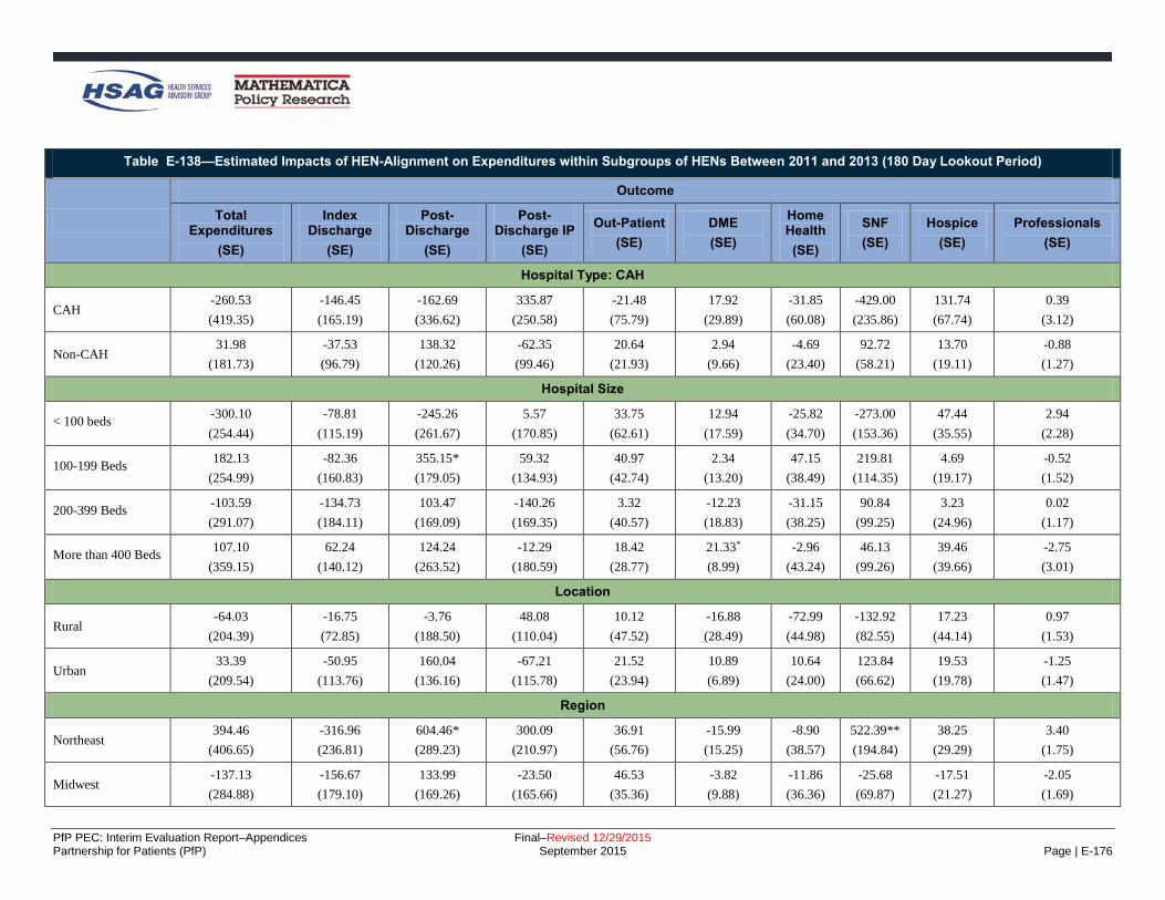
PfP PEC: Interim Evaluation Report–Appendices Final–Revised 12/29/2015 Partnership for Patients (PfP) September 2015 Page | E-176
Table E-138—Estimated Impacts of HEN-Alignment on Expenditures within Subgroups of HENs Between 2011 and 2013 (180 Day Lookout Period)
Outcome
Total Expenditures
(SE)
Index Discharge
(SE)
Post-Discharge
(SE)
Post-Discharge IP
(SE)
Out-Patient
(SE)
DME
(SE)
Home Health
(SE)
SNF
(SE)
Hospice
(SE)
Professionals
(SE)
Hospital Type: CAH
CAH -260.53
(419.35)
-146.45
(165.19)
-162.69
(336.62)
335.87
(250.58)
-21.48
(75.79)
17.92
(29.89)
-31.85
(60.08)
-429.00
(235.86)
131.74
(67.74)
0.39
(3.12)
Non-CAH 31.98
(181.73)
-37.53
(96.79)
138.32
(120.26)
-62.35
(99.46)
20.64
(21.93)
2.94
(9.66)
-4.69
(23.40)
92.72
(58.21)
13.70
(19.11)
-0.88
(1.27)
Hospital Size
< 100 beds -300.10
(254.44)
-78.81
(115.19)
-245.26
(261.67)
5.57
(170.85)
33.75
(62.61)
12.94
(17.59)
-25.82
(34.70)
-273.00
(153.36)
47.44
(35.55)
2.94
(2.28)
100-199 Beds 182.13
(254.99)
-82.36
(160.83)
355.15*
(179.05)
59.32
(134.93)
40.97
(42.74)
2.34
(13.20)
47.15
(38.49)
219.81
(114.35)
4.69
(19.17)
-0.52
(1.52)
200-399 Beds -103.59
(291.07)
-134.73
(184.11)
103.47
(169.09)
-140.26
(169.35)
3.32
(40.57)
-12.23
(18.83)
-31.15
(38.25)
90.84
(99.25)
3.23
(24.96)
0.02
(1.17)
More than 400 Beds 107.10
(359.15)
62.24
(140.12)
124.24
(263.52)
-12.29
(180.59)
18.42
(28.77)
21.33*
(8.99)
-2.96
(43.24)
46.13
(99.26)
39.46
(39.66)
-2.75
(3.01)
Location
Rural -64.03
(204.39)
-16.75
(72.85)
-3.76
(188.50)
48.08
(110.04)
10.12
(47.52)
-16.88
(28.49)
-72.99
(44.98)
-132.92
(82.55)
17.23
(44.14)
0.97
(1.53)
Urban 33.39
(209.54)
-50.95
(113.76)
160.04
(136.16)
-67.21
(115.78)
21.52
(23.94)
10.89
(6.89)
10.64
(24.00)
123.84
(66.62)
19.53
(19.78)
-1.25
(1.47)
Region
Northeast 394.46
(406.65)
-316.96
(236.81)
604.46*
(289.23)
300.09
(210.97)
36.91
(56.76)
-15.99
(15.25)
-8.90
(38.57)
522.39**
(194.84)
38.25
(29.29)
3.40
(1.75)
Midwest -137.13
(284.88)
-156.67
(179.10)
133.99
(169.26)
-23.50
(165.66)
46.53
(35.36)
-3.82
(9.88)
-11.86
(36.36)
-25.68
(69.87)
-17.51
(21.27)
-2.05
(1.69)
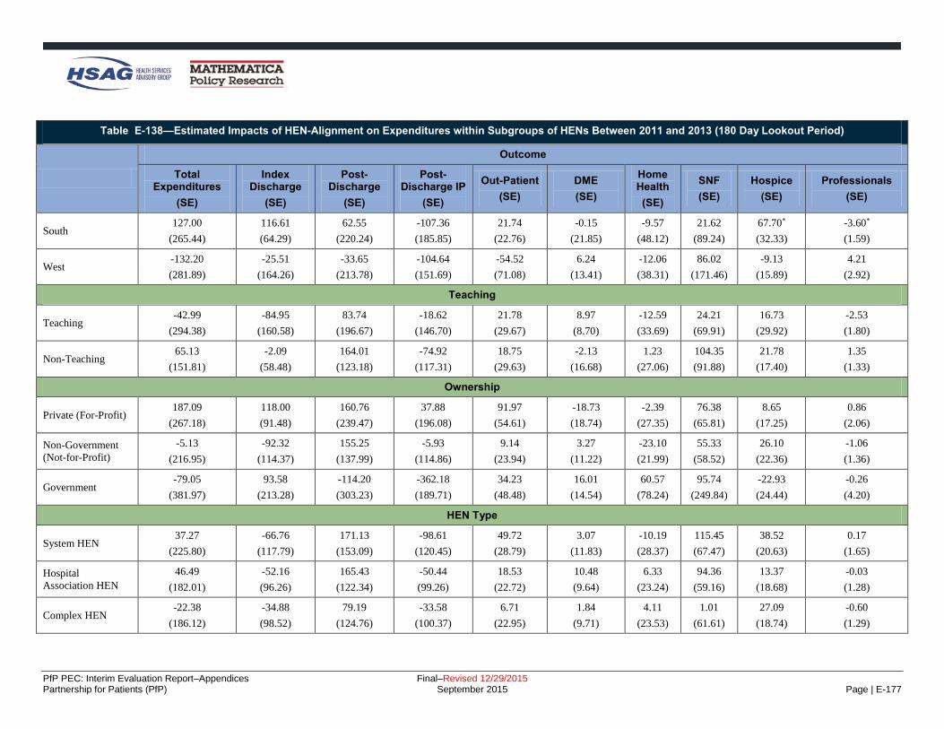
PfP PEC: Interim Evaluation Report–Appendices Final–Revised 12/29/2015 Partnership for Patients (PfP) September 2015 Page | E-177
Table E-138—Estimated Impacts of HEN-Alignment on Expenditures within Subgroups of HENs Between 2011 and 2013 (180 Day Lookout Period)
Outcome
Total Expenditures
(SE)
Index Discharge
(SE)
Post-Discharge
(SE)
Post-Discharge IP
(SE)
Out-Patient
(SE)
DME
(SE)
Home Health
(SE)
SNF
(SE)
Hospice
(SE)
Professionals
(SE)
South 127.00
(265.44)
116.61
(64.29)
62.55
(220.24)
-107.36
(185.85)
21.74
(22.76)
-0.15
(21.85)
-9.57
(48.12)
21.62
(89.24)
67.70*
(32.33)
-3.60*
(1.59)
West -132.20
(281.89)
-25.51
(164.26)
-33.65
(213.78)
-104.64
(151.69)
-54.52
(71.08)
6.24
(13.41)
-12.06
(38.31)
86.02
(171.46)
-9.13
(15.89)
4.21
(2.92)
Teaching
Teaching -42.99
(294.38)
-84.95
(160.58)
83.74
(196.67)
-18.62
(146.70)
21.78
(29.67)
8.97
(8.70)
-12.59
(33.69)
24.21
(69.91)
16.73
(29.92)
-2.53
(1.80)
Non-Teaching 65.13
(151.81)
-2.09
(58.48)
164.01
(123.18)
-74.92
(117.31)
18.75
(29.63)
-2.13
(16.68)
1.23
(27.06)
104.35
(91.88)
21.78
(17.40)
1.35
(1.33)
Ownership
Private (For-Profit) 187.09
(267.18)
118.00
(91.48)
160.76
(239.47)
37.88
(196.08)
91.97
(54.61)
-18.73
(18.74)
-2.39
(27.35)
76.38
(65.81)
8.65
(17.25)
0.86
(2.06)
Non-Government
(Not-for-Profit)
-5.13
(216.95)
-92.32
(114.37)
155.25
(137.99)
-5.93
(114.86)
9.14
(23.94)
3.27
(11.22)
-23.10
(21.99)
55.33
(58.52)
26.10
(22.36)
-1.06
(1.36)
Government -79.05
(381.97)
93.58
(213.28)
-114.20
(303.23)
-362.18
(189.71)
34.23
(48.48)
16.01
(14.54)
60.57
(78.24)
95.74
(249.84)
-22.93
(24.44)
-0.26
(4.20)
HEN Type
System HEN 37.27
(225.80)
-66.76
(117.79)
171.13
(153.09)
-98.61
(120.45)
49.72
(28.79)
3.07
(11.83)
-10.19
(28.37)
115.45
(67.47)
38.52
(20.63)
0.17
(1.65)
Hospital
Association HEN
46.49
(182.01)
-52.16
(96.26)
165.43
(122.34)
-50.44
(99.26)
18.53
(22.72)
10.48
(9.64)
6.33
(23.24)
94.36
(59.16)
13.37
(18.68)
-0.03
(1.28)
Complex HEN -22.38
(186.12)
-34.88
(98.52)
79.19
(124.76)
-33.58
(100.37)
6.71
(22.95)
1.84
(9.71)
4.11
(23.53)
1.01
(61.61)
27.09
(18.74)
-0.60
(1.29)

PfP PEC: Interim Evaluation Report–Appendices Final–Revised 12/29/2015 Partnership for Patients (PfP) September 2015 Page | E-178
Table E-138—Estimated Impacts of HEN-Alignment on Expenditures within Subgroups of HENs Between 2011 and 2013 (180 Day Lookout Period)
Outcome
Total Expenditures
(SE)
Index Discharge
(SE)
Post-Discharge
(SE)
Post-Discharge IP
(SE)
Out-Patient
(SE)
DME
(SE)
Home Health
(SE)
SNF
(SE)
Hospice
(SE)
Professionals
(SE)
Other HEN -2.88
(187.07)
-37.97
(101.28)
101.96
(123.18)
-46.79
(100.81)
30.66
(23.68)
-0.84
(10.04)
-28.23
(23.51)
60.68
(58.85)
15.68
(18.61)
-2.00
(1.27)
HEN size
< 50 Hospitals 92.42
(255.78)
-32.09
(137.60)
190.57
(168.08)
11.12
(130.42)
20.34
(36.56)
-15.05
(14.23)
-16.54
(30.38)
93.51
(81.77)
25.51
(22.05)
-0.21
(1.65)
50-99 Hospitals -4.86
(189.00)
-16.14
(102.62)
78.16
(125.39)
-48.91
(102.87)
27.94
(23.53)
1.34
(10.05)
-23.10
(23.76)
34.39
(59.31)
15.01
(18.65)
-1.26
(1.32)
100-400 Hospitals 32.57
(181.47)
-68.32
(96.35)
167.80
(120.85)
-61.68
(98.30)
26.55
(22.76)
8.85
(9.65)
-2.93
(23.14)
108.63
(58.44)
16.23
(18.62)
-0.84
(1.26)
> 1,000 Hospitals -22.38
(186.12)
-34.88
(98.52)
79.19
(124.76)
-33.58
(100.37)
6.71
(22.95)
1.84
(9.71)
4.11
(23.53)
1.01
(61.61)
27.09
(18.74)
-0.60
(1.29)
Source: The Evaluation Contractor’s analysis of Medicare inpatient claims data. Notes: Each cell in the table contains the impact estimate on the outcome indicated in the column heading for the subgroup indicated in the row label. For all 10 outcomes, expenditures are price-adjusted and are expressed in
January 2010 dollars. Within each of the panels, each column corresponds to a separate difference-in-differences regression model using discharge-level data, with discharges weighted using propensity score-based weights.
The models control for patient demographics, patient risk factors, and hospital fixed effects and were calculated by using linear regression models. Appendix D provides the full list of controls included in the regression.
Robust SEs, clustered by hospital, are in parenthesis below the impact estimate. The coefficient shows the average effect of HEN alignment in the 2013 period. Hospitals with missing subgroup information that were included
in the main impact analysis are not shown in this table. *Difference-in-differences treatment-comparison impact estimate significantly different from zero at the 0.05 level, two-tailed test. **Difference-in-differences treatment-comparison impact estimate significantly different from zero at the 0.01 level, two-tailed test.

PfP PEC: Interim Evaluation Report–Appendices Final–Revised 12/29/2015 Partnership for Patients (PfP) September 2015 Page | E-179
Table E-139 provides a breakdown of Medicare expenditures by year and HEN alignment status. It shows average
expenditures associated with an index discharge for the 90-day lookout and the 180-day lookout.
Table E-139—Mean Medicare Expenditures per Person, by Expenditure Type and Lookout Period, 2011 and 2013
Expenditure Type
HEN Non-HEN
2011 2013 2011 2013
90-Day 180-Day 90-Day 180-Day 90-Day 180-Day 90-Day 180-Day
Total Expenditures 20,600.20 24,542.55 20,899.09 24,528.03 21,014.08 25,067.45 21,403.88 25,192.16
Index Discharges 9,141.13 9,102.89 9,544.89 9,383.65 9,316.50 9,272.17 9,860.45 9,720.60
Post-Discharge 11,459.07 15,439.67 11,354.21 15,144.38 11,735.61 15,996.74 11,522.79 15,594.91
Post-Discharge Inpatient (IP) 5,489.32 7,403.24 5,437.31 7,241.61 5,529.53 7,392.86 5,458.42 7,317.43
Outpatient 1,234.82 2,118.55 1,341.54 2,264.48 1,269.23 2,186.33 1,396.96 2,348.30
Durable Medical Equipment 234.72 406.54 204.45 350.87 238.64 413.39 206.78 358.14
Home Health 991.65 1,405.58 983.89 1,375.48 984.29 1,421.16 980.99 1,404.88
Skilled Nursing Facilities (SNF) 3,232.77 3,719.66 3,113.61 3,531.45 3,531.31 4,083.52 3,293.21 3,750.62
Hospice 175.38 283.92 175.97 281.05 186.44 304.95 182.63 288.23
Professionals (i.e., Carrier) 100.41 102.17 97.43 99.44 97.67 99.55 96.62 97.91
Source: The Evaluation Contractor’s analyses of Medicare claims data.
Notes: Each row corresponds to a separate outcome using index discharge-level data, with discharges weighted by propensity-score based weights. For all ten
outcomes, expenditures are price-adjusted and are expressed in January 2010 dollars. Each cell shows the average per discharge expenditure for a given expenditure
category.
The trends from 2009 to 2013 by HEN-alignment status across expenditures, adjusting for patient and hospital
characteristics are shown in Figure E-11 to Figure E-16 (see Appendix D for the full list of controls). These figures
show that the changes over time for different expenditure categories are fairly similar between HEN and non-HEN
aligned hospitals in the sample period.

PfP PEC: Interim Evaluation Report–Appendices Final–Revised 12/29/2015 Partnership for Patients (PfP) September 2015 Page | E-180
Figure E-11—Trends of Total Expenditures by HEN Status (90 Days)
Source: The Evaluation Contractor’s analyses of Medicare claims data.
Notes: Adjusted for changes in Medicare fee-for-service (FFS) beneficiary demographics (age, sex, and race) over time and hospital
characteristics (American Hospital Association [AHA] survey data). Appendix B provides the full list of controls. The solid line shows
the adjusted rate for Medicare beneficiaries with index discharges at HEN-aligned facilities. The dashed line shows the Medicare
beneficiaries in the propensity score reweighted comparison group of non-aligned hospitals.
Figure E-12—Trends of Index Discharge Expenditures by HEN Status (90 Days)
Source: The Evaluation Contractor’s analyses of Medicare claims data.
Notes: Adjusted for changes in Medicare FFS beneficiary demographics (age, sex, and race) over time and hospital characteristics
(AHA survey data). Appendix B provides the full list of controls. The solid line shows the adjusted rate for Medicare beneficiaries with
index discharges at HEN-aligned facilities. The dashed line shows the Medicare beneficiaries in the propensity score reweighted
comparison group of non-aligned hospitals.

PfP PEC: Interim Evaluation Report–Appendices Final–Revised 12/29/2015 Partnership for Patients (PfP) September 2015 Page | E-181
Figure E-13—Trends of Total Post Discharge Expenditures by HEN Status (90 Days)
Source: The Evaluation Contractor’s analyses of Medicare claims data.
Notes: Adjusted for changes in Medicare FFS beneficiary demographics (age, sex, and race) over time and hospital characteristics (AHA
survey data). Appendix B provides the full list of controls. The solid line shows the adjusted rate for Medicare beneficiaries with index
discharges at HEN-aligned facilities. The dashed line shows the Medicare beneficiaries in the propensity score reweighted comparison
group of non-aligned hospitals.
Figure E-14—Trends of Total Expenditures by HEN Status (180 Days)
Source: The Evaluation Contractor’s analyses of Medicare claims data.
Notes: Adjusted for changes in Medicare FFS beneficiary demographics (age, sex, and race) over time and hospital characteristics
(AHA survey data). Appendix B provides the full list of controls. The solid line shows the adjusted rate for Medicare beneficiaries with
index discharges at HEN-aligned facilities. The dashed line shows the Medicare beneficiaries in the propensity score reweighted
comparison group of non-aligned hospitals.

PfP PEC: Interim Evaluation Report–Appendices Final–Revised 12/29/2015 Partnership for Patients (PfP) September 2015 Page | E-182
Figure E-15—Trends of Index Discharge Expenditures by HEN Status (180 Days)
Source: The Evaluation Contractor’s analyses of Medicare claims data.
Notes: Adjusted for changes in Medicare FFS beneficiary demographics (age, sex, and race) over time and hospital characteristics
(AHA survey data). Appendix B provides the full list of controls. The solid line shows the adjusted rate for Medicare beneficiaries with
index discharges at HEN-aligned facilities. The dashed line shows the Medicare beneficiaries in the propensity score reweighted
comparison group of non-aligned hospitals.
Figure E-16—Trends of Total Post Discharge Expenditures by HEN Status (180 Days)
Source: The Evaluation Contractor’s analyses of Medicare claims data.
Notes: Adjusted for changes in Medicare FFS beneficiary demographics (age, sex, and race) over time and hospital characteristics
(AHA survey data). Appendix B provides the full list of controls. The solid line shows the adjusted rate for Medicare beneficiaries with
index discharges at HEN-aligned facilities. The dashed line shows the Medicare beneficiaries in the propensity score reweighted
comparison group of non-aligned hospitals.

PfP PEC: Interim Evaluation Report–Appendices Final–Revised 12/29/2015 Partnership for Patients (PfP) September 2015 Page | E-183
Recommendation (Chapter 8)
Interventions to Reduce Readmissions
Hospital Engagement Networks (HENs) report that HEN-aligned hospitals are using a variety of interventions in their efforts to reduce readmissions, as
displayed in Table E-140.
Table E-140—Readmissions Interventions HENs Reported In Place in at Least 30 Percent of Their Hospitals
Intervention
AH
A/H
RE
T
Ascen
sio
n
Caro
lin
as
DF
W
Dig
nit
y
EH
EN
Geo
rgia
Inte
rmo
un
tain
Iow
a
JC
R
Lif
eP
oin
t
Mic
hig
an
Min
ne
so
ta
Nevad
a
New
Yo
rk*
New
Jers
ey
No
CV
A
Oh
io
Oh
io C
hild
ren
's
Pen
ns
ylv
an
ia
Pre
mie
r
TC
QP
S
Te
nn
essee
UH
C
VH
A
Wash
ing
ton
To
tals
Hospital Care Processes
Risk Assessment*
18
Risk assessment at admission—
LACE
11
Risk assessment at admission—
CORE, Yale
4
Other risk assessment
11
Physician assessment before discharge
5
Use of electronic health record
(EHR) to flag a patient who has been admitted to the hospital in
the past 30 days, to alert the
emergency department (ED) physician
8
Care Coordination* 24
Case management (care manager,
care transitions coordinator, etc.)
22

PfP PEC: Interim Evaluation Report–Appendices Final–Revised 12/29/2015 Partnership for Patients (PfP) September 2015 Page | E-184
Table E-140—Readmissions Interventions HENs Reported In Place in at Least 30 Percent of Their Hospitals
Intervention
AH
A/H
RE
T
Ascen
sio
n
Caro
lin
as
DF
W
Dig
nit
y
EH
EN
Geo
rgia
Inte
rmo
un
tain
Iow
a
JC
R
Lif
eP
oin
t
Mic
hig
an
Min
ne
so
ta
Nevad
a
New
Yo
rk*
New
Jers
ey
No
CV
A
Oh
io
Oh
io C
hild
ren
's
Pen
ns
ylv
an
ia
Pre
mie
r
TC
QP
S
Te
nn
essee
UH
C
VH
A
Wash
ing
ton
To
tals
Identify primary care provider
during stay
16
Provide patients’ primary care
providers with discharge summary
14
Hardwire communications when
patients are discharged to post-acute settings
11
Discharge Planning*
22
Interdisciplinary discharge
planning
17
Standardized discharge bundle
6
Use of the Centers for Medicare
& Medicaid Services (CMS)
patient discharge checklist
5
Use of Project RED tool
13
Medication Reconciliation*
18
Engagement of pharmacists in
medication reconciliation before discharge
a
13
Fill prescriptions for patient
before discharge
a
14
Staff Education*
3
Training nursing staff on pre-admission hand-offs
3

PfP PEC: Interim Evaluation Report–Appendices Final–Revised 12/29/2015 Partnership for Patients (PfP) September 2015 Page | E-185
Table E-140—Readmissions Interventions HENs Reported In Place in at Least 30 Percent of Their Hospitals
Intervention
AH
A/H
RE
T
Ascen
sio
n
Caro
lin
as
DF
W
Dig
nit
y
EH
EN
Geo
rgia
Inte
rmo
un
tain
Iow
a
JC
R
Lif
eP
oin
t
Mic
hig
an
Min
ne
so
ta
Nevad
a
New
Yo
rk*
New
Jers
ey
No
CV
A
Oh
io
Oh
io C
hild
ren
's
Pen
ns
ylv
an
ia
Pre
mie
r
TC
QP
S
Te
nn
essee
UH
C
VH
A
Wash
ing
ton
To
tals
Patient and Family Engagement (PFE)
PFE*
25
Patient education and teach‐back, may be targeted to certain
conditions, (e.g., congestive heart
failure [CHF], etc.)
24
Provide comprehensive written
discharge plan to the
patient/family
13
Patient advocate program to resolve challenges for patients
before discharge
7
Family engagement in discharge process
17
Family interview to assess
effective discharge communication
5
Information sharing with
caregivers when patient is
transferred
10
Creating a resource room to
allow for information sharing for
patients, families, and members of the medical community in
hospital area with high traffic
4
Palliative Care*
5
Roll out of Practitioner Orders
for Life-Sustaining Treatment
(POLST) to all healthcare
professionals in pre-hospital, acute care hospital and long-term
care settings
5

PfP PEC: Interim Evaluation Report–Appendices Final–Revised 12/29/2015 Partnership for Patients (PfP) September 2015 Page | E-186
Table E-140—Readmissions Interventions HENs Reported In Place in at Least 30 Percent of Their Hospitals
Intervention
AH
A/H
RE
T
Ascen
sio
n
Caro
lin
as
DF
W
Dig
nit
y
EH
EN
Geo
rgia
Inte
rmo
un
tain
Iow
a
JC
R
Lif
eP
oin
t
Mic
hig
an
Min
ne
so
ta
Nevad
a
New
Yo
rk*
New
Jers
ey
No
CV
A
Oh
io
Oh
io C
hild
ren
's
Pen
ns
ylv
an
ia
Pre
mie
r
TC
QP
S
Te
nn
essee
UH
C
VH
A
Wash
ing
ton
To
tals
Post-Discharge Follow-Up
Post-Discharge Follow-Up*
22
Call patients within 72 hours
following discharge
22
Post-discharge call center for patients
8
Schedule follow-up visit at
discharge
17
Visit patient/family at home within 24–48 hours post
discharge
6
Follow-up primary care visit within 72 hours of discharge
b
7
In-home remote monitoring of
patients
3
Other discharge planning and
follow-up
2
Care Transitions
Care Transitions Models* 15
Use of Care Transitions Intervention (CTI) ("Coleman
Model")
5
Use of Transitional Care Model
("Naylor Model")
1
Use of Better Outcomes for Older
Adults through Safe Transitions
(BOOST)
10

PfP PEC: Interim Evaluation Report–Appendices Final–Revised 12/29/2015 Partnership for Patients (PfP) September 2015 Page | E-187
Table E-140—Readmissions Interventions HENs Reported In Place in at Least 30 Percent of Their Hospitals
Intervention
AH
A/H
RE
T
Ascen
sio
n
Caro
lin
as
DF
W
Dig
nit
y
EH
EN
Geo
rgia
Inte
rmo
un
tain
Iow
a
JC
R
Lif
eP
oin
t
Mic
hig
an
Min
ne
so
ta
Nevad
a
New
Yo
rk*
New
Jers
ey
No
CV
A
Oh
io
Oh
io C
hild
ren
's
Pen
ns
ylv
an
ia
Pre
mie
r
TC
QP
S
Te
nn
essee
UH
C
VH
A
Wash
ing
ton
To
tals
Use of State Action on Avoidable
Rehospitalizations (STAAR) (IHI
initiative)
e
9
National Transitions of Care Coalition (NTOCC) bundle
3
Community Partners*
24
Creation and empowerment of cross-continuum community
transition teams
15
Participation in Community-
Based Care Transitions Program (CCTP)
11
Coordination with community-based physicians, Federally
Qualified Health Center (FQHC)
16
Coordination with home health
agencies
21
Coordination with senior centers,
social services
19
Coordination with long-term care facilities, skilled nursing facilities
(SNFs)
21
Other*
f
d
2
Source: HEN readmissions intervention tables submitted October 2013. Three HENs (DFW, Intermountain, and VHA) did not provide updated intervention tables; their interventions included are based on narrative
provided in their September and October 2013 monthly reports. aUse of online outpatient pharmacy medical reconciliation for transfer to nursing home, hospital assistance with filling medications for indigent, engage community pharmacist to assist with discharge medication education, hospital peer (MD, NP) to SNF peer (MD, NP) hand offs. bPay physician if they call patient and set up appointment within 48 hours. cRoot cause analysis with SNFs. dTimely handover communication. eAspect of the Institute for Healthcare Improvement (IHI) bundle “Improving Transitions to Reduce Readmissions: has been a focus since 2006. fRevised medication lists to include non-prescription and herbal medications and educate patients on their medications. *Total equals number of HENs reporting at least one intervention in the category.