promoting universal usability with multi-layer interface
TRANSCRIPT

Promoting Universal Usability with Multi-Layer Interface Design
Ben Shneiderman Department of Computer Science, Institute for Advanced Computer Studies, Human Computer Interaction Laboratory, and Institute for Systems Research
University of Maryland, College Park, MD 20742 USA [email protected]
ABSTRACT Increased interest in universal usability is causing some researchers to study advanced strategies for satisfying first-time as well as intermittent and expert users. This paper promotes the idea of multi-layer interface designs that enable first-time and novice users to begin with a limited set of features at layer 1. They can remain at layer 1, then move up to higher layers when needed or when they have time to learn further features. The arguments for and against multi-layer interfaces are presented with two example systems: a word processor with 8 layers and an interactive map with 3 layers. New research methods and directions are proposed.
Categories and Subject Descriptors H.5.2 User Interfaces
General Terms: Human factors
Keywords: Universal usability, graphical user interfaces, multi-layer interface, online help, first-time user, novice user
INTRODUCTION The growing interest in universal usability for information and communications technologies spans continents and crosses disciplines. The motivations include the legal requirements for providing access to disabled users, the market opportunities in reaching diverse consumers, and the practical necessities in serving users with slow and fast network connections, small and large displays, and fast and slow computers. Enthusiasm also comes from policy makers who see moral obligations in bridging digital divides, government agency heads who face the reality of developing digital services, and designers who deal with the complex issues of multi-lingual international product development. Lively activity in Europe under the leadership of key researchers such as Constantine Stephanidis [21] in Greece and Alan Newell [13] in the United Kingdom has produced broad interest and strong funding under the European Union’s 6th Framework Programme. Seven major conferences on User Interfaces for All (UI4ALL) and the new International Journal on Universal Access in the Information Society have generated a vigorous research community and large body of work. In North America, key people who lead
research groups on universal design and assistive devices include Gregg Vanderheiden ([26],[27]) and Neil Scott [15]. The Association for Computing Machinery (ACM) Conferences on Universal Usability (CUU) and on Assistive Technologies (ASSETS) have created substantial interest. While many of these efforts began with a focus on access for disabled users, the research naturally broadened to include elderly and young users, and then to users with slow network connections, small screens, no screens, and other limiting technologies. Elsewhere, the admirable inspirations for expanded interest for universal usability issues include the Brazilian government efforts to create an Information Society. The Indian ‘simputer’ project promises a simplified and rugged computer at low cost to enable millions of people to access the Internet. In Japan and Korea, consumer product designers are embedding basic functions in hardware buttons and using screen selections for advanced options including multi-language support. Many other activities in research and commercial practice can be cited as evidence of progress. Leading software and hardware manufacturers, such as Microsoft, Sun Microsystems, Adobe, AOL, and IBM, have initiatives to support universal usability. The further good news is that academic interest is growing, not just from human-computer interaction researchers, but also from a growing circle of related disciplines. Naturally, interest from business schools focuses on improving e-commerce and information systems, while medical informatics specialists also see opportunities in health support groups and healthcare information resources. Designers of voting machines were energized by the troubled balloting in Florida during the 2000 U.S. presidential election and privacy advocates recognize that more comprehensible user interfaces are necessary to ensure that all Internet users understand the implications of decisions about privacy policies. Other researchers who work in software engineering, information retrieval, novel input devices, consumer product development, etc. are increasingly aware of the need to think about universal usability. In spite of these hopeful signs, the sobering thought is that researchers and practitioners have a much work to reach the goal of universal usability. Current information and communications systems are just too hard for most people to use. A recent study reports that even for experienced users of common personal computers, approximately 45% of their time is wasted with frustrating experiences tied to confusing menus, indecipherable dialog boxes, and hard to find functions [5]. These add to the miseries brought by application crashes, network disruptions, and email spam/viruses. While techno-utopians believe that computing technology has steadily improved over four decades, the fact remains that it is too unreliable, too difficult to use, and too error prone. The demands and expectations of diverse users have grown faster than the quality of products.
Permission to make digital or hard copies of all or part of this work forpersonal or classroom use is granted without fee provided that copiesare not made or distributed for profit or commercial advantage and thatcopies bear this notice and the full citation on the first page. to copyotherwise, or republish, to post on servers or to redistribute to lists,requires prior specific permission and/or a fee. CUU’03, November 10-11, 2003, Vancouver, British Columbia, Canada. Copyright 2003 ACM 1-58113-701-X/03/0011…$5.00.
1

A second disturbing aspect, revealed by Internet usage data, is the inequity of access, often called the digital divide. In the United States, among low income and poorly educated users Internet usage is around 15% while among high income and well-educated users Internet usage is over 80% [12]. This digital divide is troubling. Similar gaps between men and women users, between younger and older users, and between urban and rural users have largely been eliminated, so it is now time to attend to the problems of the educationally and financially disadvantaged. Reduced costs will help somewhat, but improved design and more useful services will accelerate the adoption of beneficial information and communications technologies by larger numbers of citizens. These technologies are spreading around the world, and similar digital divides propagate new forms of inequity that further separate the haves from the have-nots. Designers can do more to accommodate the struggling first time user, the troubled novice, and the disenfranchised Internet dropout. Improving every user’s experience should become vital national and international goals. This problem is more than an ethical and moral concern, the strong argument on network externalities (each additional user makes the network more valuable for all) means that e-business adoption will be facilitated by more attention to universal usability. Secondly, progress in digital government services depends on accessibility to email and the World-Wide Web for every citizen ([1], [6]).
GRACEFUL EVOLUTIONARY PATHS FOR LEARNERS The goal of helping first-time and novice users has generated a large body of research and a variety of tutorial, online help, and user manual strategies. Common ways of helping first-time users are to choose simplifying options that limit the number of features, while making those features more comprehensible. Design strategies to reduce complexity for first-time and novice users have been proposed and demonstrated to be advantageous even in early systems. The training wheels concept, which prevents user errors by limiting actions, produces faster learning and more satisfied users [4]. However, widespread implementation of multi-layer designs is still an opportunity for designers who seek universal usability. Useful variations have been proposed in Carroll’s work on minimal manuals [3], Vassileta’s task-centered design [28], and Coutaz’s notions of plastic user interfaces [23]. Similar goals were addressed by those who worked on user-controlled adaptable, and machine controlled adaptive interfaces [9], although both approaches have had to deal with user desires for consistency, predictability, and control. In the growing domain of web design, concepts of user-controlled, personalized, and automatically customized web sites for e-commerce continue to be discussed. The strongest success has been in recommender systems that suggest books, music or films based on matches between an individual’s buying history (or preferences) and the aggregated patterns of purchase of all customers. Recommender and adaptive systems can also be used to provide suggestions about useful features in an interface. The need to manage complexity and provide some ordering of features or at least modularize feature sets is evident in some interface design features such as toolbars. For example, Microsoft Word has sixteen toolbars for feature sets (Standard, Formatting, Autotext, Clipboard, Control Toolbox, Database, Drawing, Forms,…), in addition to the Ruler and Document Map. The toolbar
menu begins with Standard and Formatting, followed by the others in alphabetical order, suggesting the primacy of these two. This modularity and suggestive ordering are useful, but many users are still overwhelmed by the choices and uncertain about which feature sets to explore first. Some designers propose automatically adaptive designs by which the software monitors user behavior and provides new user interface features and selected content. This idea may be effective for content in news sites and recommendations on e-commerce sites, but machine initiated changes to user interface features seem to be troubling to users. Even when users are prompted to approve of changes, they usually find system-initiated suggestions and interface changes to be distracting from their tasks. Predictable and controllable user interfaces seem strongly preferred. One reason for the slow adoption of evolutionary strategies may be that commercial sales are usually governed by the number of advanced features, rather than the learnability or efficacy for first-time and novice users. Indeed it is difficult to find metrics for the learnability of user interfaces or reports on the rate of adoption vs. dropped usage. One strategy to promote awareness of user successes and failures would be to pressure manufacturers to collect and make public the learning times, usage data, error rates, and help requests, so as to encourage comparisons across versions and competing products.
MULTI-LAYER INTERFACE DESIGNS This paper encourages increased research and development on multi-layer interface designs that give users control over the sets of features available at any moment. First-time and novice users can start at layer 1 and move on to higher layers at any time. Separating out the layers could enable users to learn features in a meaningful sequence, while limiting complexity of menus and help screens. Users could gain confidence and master layer 1, then move on to higher layers when needed or when they had time to learn. Careful organization of skills facilitates learning in many domains [4]. The ten levels in karate training are marked by ten colored belts from white for beginners to black for experts. There are also ten further layers within the black belt. What lessons could interface designers take from the Suzuki method for violin training, scuba diving courses, and foreign language instruction? Each of these have carefully designed steps or milestones to move novices along in their learning, sometimes with a ceremony to mark progress. Are there cognitive and motivational models of longitudinal learning? A notable success story in serving novice as well as expert web users is the use of basic and advanced features in search engines. First-time, novice, and many regular users are happy enough to just type keywords into a search box. The result sets come back quickly and users are often satisfied and well served by this simple approach. A small fraction of searches are conducted with the advanced interface that allows specification of linguistic requirements, AND/OR/NOT, the search scope, and result ordering. The National Library of Medicine’s PubMed interface for medical literature supports numerous features for advanced searchers. A well-executed variation of a two-layer interface is the National Cancer Institute web site that provides simplified information for patients and detailed treatment data for physicians. Other inspirational examples come from cell phones and mobile devices that provide common actions by physical buttons, menu selection for secondary actions, and dialog boxes for tertiary actions.
2

For more complex software, such as word processors, presentation tools, or graphics packages, the simple multi-layer designs are often implemented in professional and lite versions or home editions. However, even the reduced versions can be daunting to first-time and novice users. Another separation is often created by keeping the graphic user interface separate from programming tools. Examples of separate programming tools include scripting languages such as Macromedia’s Lingo, event-based object-oriented programming tools such as Visual Basic for Applications, or an Application Programming Interface (API). The idea of multiple layers was a success in the 1987 HyperCard package from Apple, which enabled novice users to merely read hyper-linked documents. As users became familiar with the interface, they could move to higher layers, enabling them to add buttons and links, then to author new documents, create graphics, and finally to write programs. A contemporary variant in a complex product is the layered design of Adobe Framemaker. A widespread success story for multi-layer designs is game software, which often present ever more complex challenges as users go to higher levels of play. Users are proud of the layers they reach and proudly announce their ascent to higher layers; employers could give bonuses or new job possibilities for those who reach higher levels. Microsoft had tried short and long menus in Windows 95, but abandoned them in favor of adaptive menus whose content changes automatically depending on usage, that is, rarely used features do not appear. Adaptive approaches are unpredictable forcing users to hunt for hidden menu items. User reaction has been largely negative. An alternative approach, user-adaptable menus, allows users to easily choose which items to include in their menus. A six-week study of 20 participants compared the automatically adaptive interface in Microsoft’s Word 2000 with a personally adaptable interface in which participants controlled what went into the shortened menus [11]. The results dramatically favor user control over menus. Multi-layer designs will need careful development and much usability testing to refine the concepts. Critics complain that the additional complexity of switching layers can overwhelm users, especially novices. They suggest that a linear sequence of features is difficult to identify, especially if users with different experience and needs must be accommodated. They caution that mature users adopt strongly different subsets of features. Other key issues include: how many layers? Should layers have names? Can users modify layers by including/excluding features? How can compatibility of output across layers be ensured? How should training be handled to encourage users to switch layers? Designers also need appropriate principles for design of the layers, including guidelines for multi-layer online help and error messages. Usability testing and user feedback will be essential in helping to refine the principles and develop a theoretical foundation based on appropriate cognitive learning models. Researchers in this area will have to develop novel methods to conduct longitudinal studies and automatically monitor user skill evolution. Variations on the multi-layer design idea may be helpful in accommodating existing products and coping with the needs of diverse learners. A visual representation of multi-layer design might clarify possibilities (Fig 1). Many current interfaces simply make all features available to users with little guidance about where to begin. They do offer some modularity by way of the pull-down menu groupings (Fig 1a) but provide little guidance about how to sequence learning. A multi-layer design (Fig 1b) provides a clear
sequence for learning and approximately equal numbers of features at each layer. However, some users and designers may find this basic approach to be too restrictive. One variation is to have a small first layer and then only a few more layers that contain many more features. This expanding multi-layer design is represented by Fig 1c. Another variation is to have just 2 or 3 thin layers followed by a modular design that allows users to choose whichever feature sets are relevant. This produces a mushroom-like representation shown in Fig 1d.
A Multi-Layer Design for a Word Processor To promote the idea of multi-layer interface design and encourage research, I offer this sketch of how it might be implemented for a word processor. Critics can refine these designs or make counterproposals. The user control for the layers might be a slider along one side of the display that goes from layers 1 to 8 (Fig 2a), with the default setting at layer 1. To keep all layer 1 actions visible, there would be no pull down menus, just a small set of buttons, such as Open, Save, Print, and Help. The Help button would produce a simple explanation of the system model (Fig 2b) Layer 1 (Getting started) permits safe exploration and therefore has no error messages. The [Show me!] buttons produce brief (5-30 seconds) animated demonstrations, with textual or spoken narration. Our studies have found that with practice these demonstrations are rapid to produce with screen capture tools such as Camtasia (Plaisant, Kang, and Shneiderman, 2003). Users liked the human voice, but high quality generated speech may also be effective. At layer 2 (Basic editing), users might get additional buttons for choosing fonts, editing commands such as cut/copy/paste, a ruler for margins and tabs, a status bar, and, of course, more Help topics, but still no error messages (Fig 2c). At layer 3 (Formatting), users might get pull-down menus with columns, paragraph controls, headers/footers, comments, and find/replace (Fig 2d). Since this is a big jump in complexity, the movement might be animated and some guidance about using pull-down menus could be provided. At layer 4 (Structures), users might get tables, borders, and frames. At layer 5 (Styles), users might be taken to tutorials to explain advanced features such as style or picture placement, and so on.
3

Fi
gure
2a:
Lay
er 1
has
typi
ng a
nd a
few
but
tons
.
Fi
gure
2b:
Lay
er 1
has
sim
ple
help
with
ani
mat
ed in
stru
ctio
n.
Fi
gure
2c:
Lay
er 2
has
add
ition
al b
utto
ns, f
onts
, rul
er, s
tatu
s bar
.
Fi
gure
2d:
Lay
er 3
has
pul
l-dow
n m
enus
with
mor
e fe
atur
es.
4
Names for advanced layers that describe usage might be helpful, such as scholarly tools, annotation, or book design. Another useful separation might be between features that effect the document (styles, coloring, figures,…) and those that control the interface (window management, toolbar customization, options,…). Layer design is the central consideration. Layers might be based on the usage patterns with current word processors, task-oriented complexity of documents produced (note, resume, newsletter, magazine, novel, thesis, encyclopedia), or the sequencing provided in popular training textbooks. One textbook offers a 36-chapter sequence while another has this 12-layer sequence [10]:
1. Getting started 2. Save and open documents 3. Change display of documents 4. Edit text 5. Format text 6. Format pages 7. Print documents 8. Work with multiple documents 9. Work with tables 10. Work with graphics 11. Mail merge 12. Word and Internet
Layers could be labeled by numbers, colors, or playful sequences such as animals (hummingbird, cat, dog, lamb, cow, elephant, whale) or plants (daisy, rose, sunflower, dogwood, birch, pine, sequoia). Customization of the layers will be necessary for specific communities such as legal professionals, where the need for features such as legal length paper and numbered lines would have to be moved to a lower layer. Similarly, medical professionals will need to be able to integrate images into text as a feature in a lower layer than other users. Such customization could lead to new products with additional features tuned to the needs of these professionals, or the customization could be like macros that are prepared by system administrators at each organization, and then disseminated widely along with a training guide or live instruction. Adopting a multi-layer design strategy would force an explicit discussion of the cognitive concepts and user models, possibly using the Object-Action Interface Model [20]. By making a hierarchy of task and interface objects and actions that correspond to each layer, the explicit model would become visible. This process could lead to clearer training programs and more constructive suggestions when users have difficulties. Error messages and instructional dialog boxes will be needed, but their design should be simplified and clarified by limiting terminology to the objects and actions for each layer.
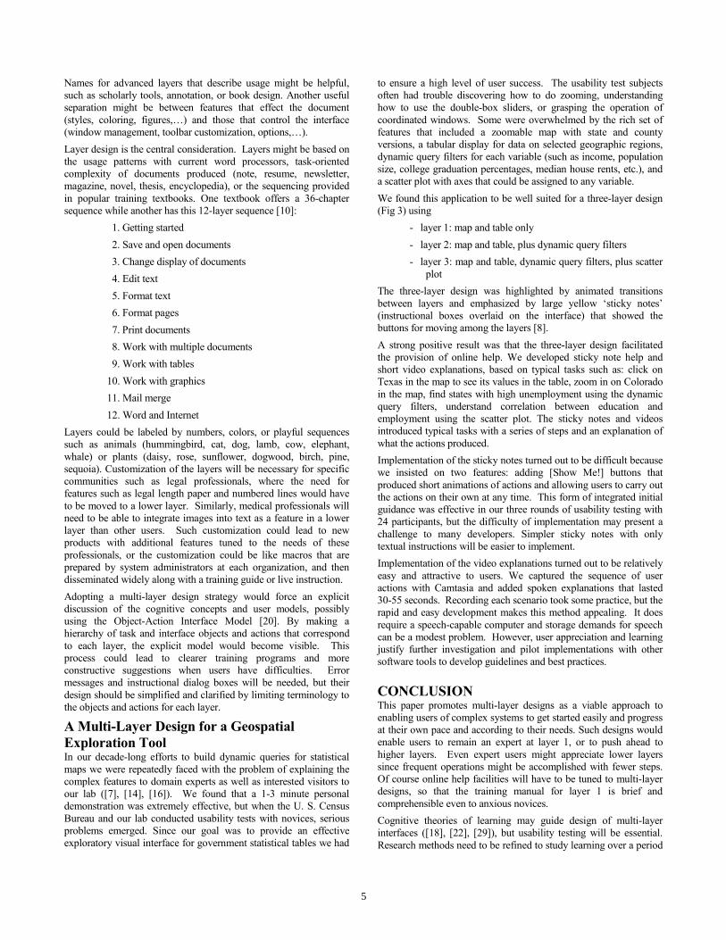
A Multi-Layer Design for a Geospatial Exploration Tool In our decade-long efforts to build dynamic queries for statistical maps we were repeatedly faced with the problem of explaining the complex features to domain experts as well as interested visitors to our lab ([7], [14], [16]). We found that a 1-3 minute personal demonstration was extremely effective, but when the U. S. Census Bureau and our lab conducted usability tests with novices, serious problems emerged. Since our goal was to provide an effective exploratory visual interface for government statistical tables we had
to ensure a high level of user success. The usability test subjects often had trouble discovering how to do zooming, understanding how to use the double-box sliders, or grasping the operation of coordinated windows. Some were overwhelmed by the rich set of features that included a zoomable map with state and county versions, a tabular display for data on selected geographic regions, dynamic query filters for each variable (such as income, population size, college graduation percentages, median house rents, etc.), and a scatter plot with axes that could be assigned to any variable. We found this application to be well suited for a three-layer design (Fig 3) using
- layer 1: map and table only - layer 2: map and table, plus dynamic query filters - layer 3: map and table, dynamic query filters, plus scatter
plot The three-layer design was highlighted by animated transitions between layers and emphasized by large yellow ‘sticky notes’ (instructional boxes overlaid on the interface) that showed the buttons for moving among the layers [8]. A strong positive result was that the three-layer design facilitated the provision of online help. We developed sticky note help and short video explanations, based on typical tasks such as: click on Texas in the map to see its values in the table, zoom in on Colorado in the map, find states with high unemployment using the dynamic query filters, understand correlation between education and employment using the scatter plot. The sticky notes and videos introduced typical tasks with a series of steps and an explanation of what the actions produced. Implementation of the sticky notes turned out to be difficult because we insisted on two features: adding [Show Me!] buttons that produced short animations of actions and allowing users to carry out the actions on their own at any time. This form of integrated initial guidance was effective in our three rounds of usability testing with 24 participants, but the difficulty of implementation may present a challenge to many developers. Simpler sticky notes with only textual instructions will be easier to implement. Implementation of the video explanations turned out to be relatively easy and attractive to users. We captured the sequence of user actions with Camtasia and added spoken explanations that lasted 30-55 seconds. Recording each scenario took some practice, but the rapid and easy development makes this method appealing. It does require a speech-capable computer and storage demands for speech can be a modest problem. However, user appreciation and learning justify further investigation and pilot implementations with other software tools to develop guidelines and best practices.
CONCLUSION This paper promotes multi-layer designs as a viable approach to enabling users of complex systems to get started easily and progress at their own pace and according to their needs. Such designs would enable users to remain an expert at layer 1, or to push ahead to higher layers. Even expert users might appreciate lower layers since frequent operations might be accomplished with fewer steps. Of course online help facilities will have to be tuned to multi-layer designs, so that the training manual for layer 1 is brief and comprehensible even to anxious novices. Cognitive theories of learning may guide design of multi-layer interfaces ([18], [22], [29]), but usability testing will be essential. Research methods need to be refined to study learning over a period
5

of days and weeks. Successful strategies may also be adopted by designers who must accommodate small and large screens, different levels of literacy, and different levels of domain knowledge. There is great promise in multi-layer interface design, but there are many difficulties in its implementation that must be overcome. It may be hard to define the layers in a way that accommodates a majority of users, and confusion about moving among layers could undermine its efficacy. Hiding advanced features is troubling to some designers, who are eager to show how many features they have included. However, as the importance of universal usability grows, the need to facilitate graceful evolution increases. Acknowledgements Catherine Plaisant developed the multi-layer design for Dynamap, with support from Hyunmo Kang. Thanks to Ben Bederson, Joelle Coutaz, Joanna McGrenere, and Jennifer Preece for comments on draft versions. Parts of this work were written for (Shneiderman, 2004). Thanks also to the organizers of the ACM Conference on Universal Usability 2004, for inviting this talk: Marilyn Tremaine, Vicki Hanson, and Alistair Edwards. This work is partially supported by National Science Foundation under the Digital Government Initiative EIA 0129978 (see also http://ils.unc.edu/govstat/) and the U.S. Census Bureau. REFERENCES 1. Anderson, R.H., Bikson, T., Law, S. A., and Mitchell, B. M.,
Universal access to e-mail: Feasibility and societal implications, The Rand Corporation, Santa Monica, CA (1995) http://www.rand.org/publications/MR/MR650/
2. Calvary, G., Coutaz, J., Thevenin, D., Limbourg, Q., Souchon, N., Bouillon, L., Florins, M., and Vanderdonckt, J., Plasticity of user interfaces: A revised reference framework, Proc. of TAMODIA Conference (2003).
3. Carroll, J.M., Minimalism beyond the Nurnberg Funnel, MIT Press, Cambridge, MA (1998).
4. Carroll, J. M. and Carrithers, C., Training wheels in a user interface, Comm. ACM 27, 8 (1984), 800-806.
5. Ceaparu, I., Lazar, J., Bessiere, K., Robinson, J., and Shneiderman, B., Determining causes and severity of end-user frustration, International Journal of Human-Computer Interaction, (2004).
6. Computer Science and Telecommunications Board (CSTB), National Research Council, More than Screen Deep: Toward an Every-Citizen Interface to the Nation's Information Infrastructure, National Academy Press, Washington, DC (1997).
7. Dang, G., North, C., Shneiderman, B., Dynamic queries and brushing on choropleth maps, Proc. International Conference on Information Visualization 2001, Available from IEEE Press (2001), 757-764.
8. Kang, H., Plaisant, C., and Shneiderman, B., New approaches to help users get started with visual interfaces: Multi-layered interfaces and Integrated Initial Guidance, Proc. of the Digital Government Research Conference, Boston, MA (May 2003).
9. Kobsa, A. and Stephanidis, C., Adaptable and adaptive information access for all users, including disabled and elderly people, Proc.2nd Workshop on Adaptive Hypertext and Hypermedia, ACM HYPERTEXT'98 (1998), http://wwwis.win.tue.nl/ah98/Kobsa.html
10. Maran, Ruth, MS Word 2000 Simplified, Maran Graphics (2001).
11. McGrenere, J., Baecker, R. M., and Booth, K. S., An evaluation of a multiple interface design solution for bloated software, Proc. CHI 2002 Conference: Human Factors in Computing Systems, ACM, New York (2002), 163-170.
12. National Telecommunications and Information Administration, U. S. Dept. of Commerce, October 2000, Falling Through the Net: Toward Digital Inclusion., Washington, DC, (Accessed on July 1, 2003) http://www.ntia.doc.gov/ntiahome/fttn00/contents00.html
13. Newell, A. F. and Gregor, P., Design for older and disabled people – where do we go from here?, Universal Access in the Information Society 2, 1 (Nov. 2002), 3-7.
14. Norman, K., Zhao, H., Shneiderman, B., and Golub, E., Dynamic query choropleth maps for information seeking and decision making, Proc. Human-Computer Interaction International, Lawrence Erlbaum Associates, Mahwah, NJ (June 2003).
15. Perry, J., Macken, E., Scott, N., and McKinley, J. L., Disability, inability and cyberspace, in Friedman, B. (Editor), Human Values and the Design of Technology, CSLI Publications & Cambridge University Press, Cambridge, UK (1997), 65-89.
16. Plaisant, C., Information Visualization and the Challenges of Universal Usability, in Dykes, J., MacEachren, A.M., and Kraak, M. J. (eds.), Exploring Geovisualization, Elsevier, Amsterdam (2004).
17. Plaisant, C., Kang, H., and Shneiderman, B., Helping users get started with visual interfaces: multi-layered interfaces, integrated initial guidance and video demonstrations, Proc. Human-Computer Interaction International, Lawrence Erlbaum Associates, Mahwah, NJ (2003).
18. Rieman, John, A field study of exploratory learning strategies, ACM Trans. on Computer–Human Interaction, 3, 3 (September 1996), 189–218.
19. Shneiderman, B., Universal usability: Pushing human-computer interaction research to empower every citizen, Communications of the ACM 43, 5 (May 2000), 84-91.
20. Shneiderman, B., Designing the User Interface: Strategies for Effective Human-Computer Interaction: Fourth Edition, Addison-Wesley, Reading, MA (2004).
21. Stephanidis, C. (Editor), User Interfaces for All: Concepts, Methods, and Tools, Lawrence Erlbaum Associates, Mahwah, NJ (2001), 728 pages.
22. Stieren C., The zen of minimalism, Proc 16th Annual International Conference on Computer Documentation, (September 1998), 103-112.
23. Thevenin, D. and Coutaz, J., Plasticity of user interfaces: Framework and research agenda. In Proceedings Interact 99, IFIP, IOS Press (1999), 110-117.
6

Fi
gure
3a:
Lay
er 1
has
map
and
tabl
e.
Fi
gure
3b:
Lay
er 2
has
map
, tab
le, a
nd sl
ider
s.
Fi
gure
3c:
Lay
er 3
has
map
, tab
le, s
lider
s, an
d sc
atte
rplo
t.
Figu
re 3
d: O
nlin
e de
mos
are
org
aniz
ed b
y la
yers
7

24. van der Meij, H. and Carroll, J. M., Principles and heuristics in designing minimalist instruction, Technical Communication (Second Quarter 1995), 243–261.
25. van der Meij, H. and Lazonder, A. W., Assessment of the minimalist approach to computer user documentation, Interacting with Computers 5, 4 (1993), 355–370.
26. Vanderheiden, G., Fundamental principles and priority setting for universal usability. Proc. ACM Conference on Universal Usability, ACM, New York (2000), 32-38.
27. Vanderheiden, G., Everyone interfaces, In Stephanidis, Constantine (Editor), User Interfaces for All: Concepts, Methods, and Tools, Lawrence Erlbaum Associates, Mahwah, NJ (2001), 115-133.
28. Vassileva, J., A task-centered approach for user modeling in a hypermedia office documentation system, In Brusilovsky, P., Kobsa, A., and Vassileva, J. (Editors), Adaptive Hypertext and Hypermedia, Kluwer Academic Publ., Dordrecht, The Netherlands (1998), 209-247.
29. Wiedenbeck, S. and Zila, P. L., Hands-on practice in learning to use software: a comparison of exercise, exploration, and combined formats, ACM Trans. on Computer-Human Interaction 4, 2 (1997), 169-196.
8