documentq1
TRANSCRIPT
In What ways does your media product use develop or challenge forms and
conventions of real media text
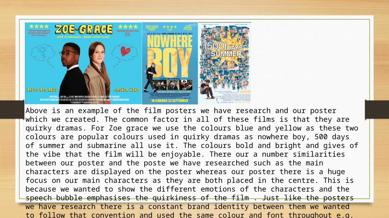
Above is an example of the film posters we have research and our poster which we created. The common factor in all of these films is that they are quirky dramas. For Zoe grace we use the colours blue and yellow as these two colours are popular colours used in quirky dramas as nowhere boy, 500 days of summer and submarine all use it. The colours bold and bright and gives of the vibe that the film will be enjoyable. There our a number similarities between our poster and the poste we have researched such as the main characters are displayed on the poster whereas our poster there is a huge focus on our main characters as they are both placed in the centre. This is because we wanted to show the different emotions of the characters and the speech bubble emphasises the quirkiness of the film . Just like the posters we have research there is a constant brand identity between them we wanted to follow that convention and used the same colour and font throughout e.g. main title and names of the actors. We also included reviews from newspapers to excited the audience just like nowhere boy as this a convention of a poster.
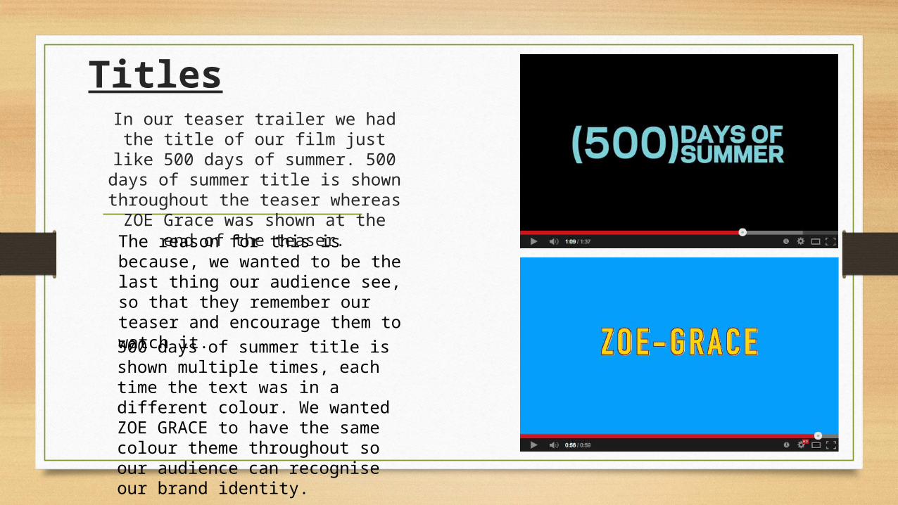
TitlesIn our teaser trailer we had the
title of our film just like 500 days of summer. 500 days of summer
title is shown throughout the teaser whereas ZOE Grace was shown at the end of the teaser.The reason for this is because, we wanted to be the last thing our audience see, so that they remember our teaser and encourage them to watch it.
500 days of summer title is shown multiple times, each time the text was in a different colour. We wanted ZOE GRACE to have the same colour theme throughout so our audience can recognise our brand identity.
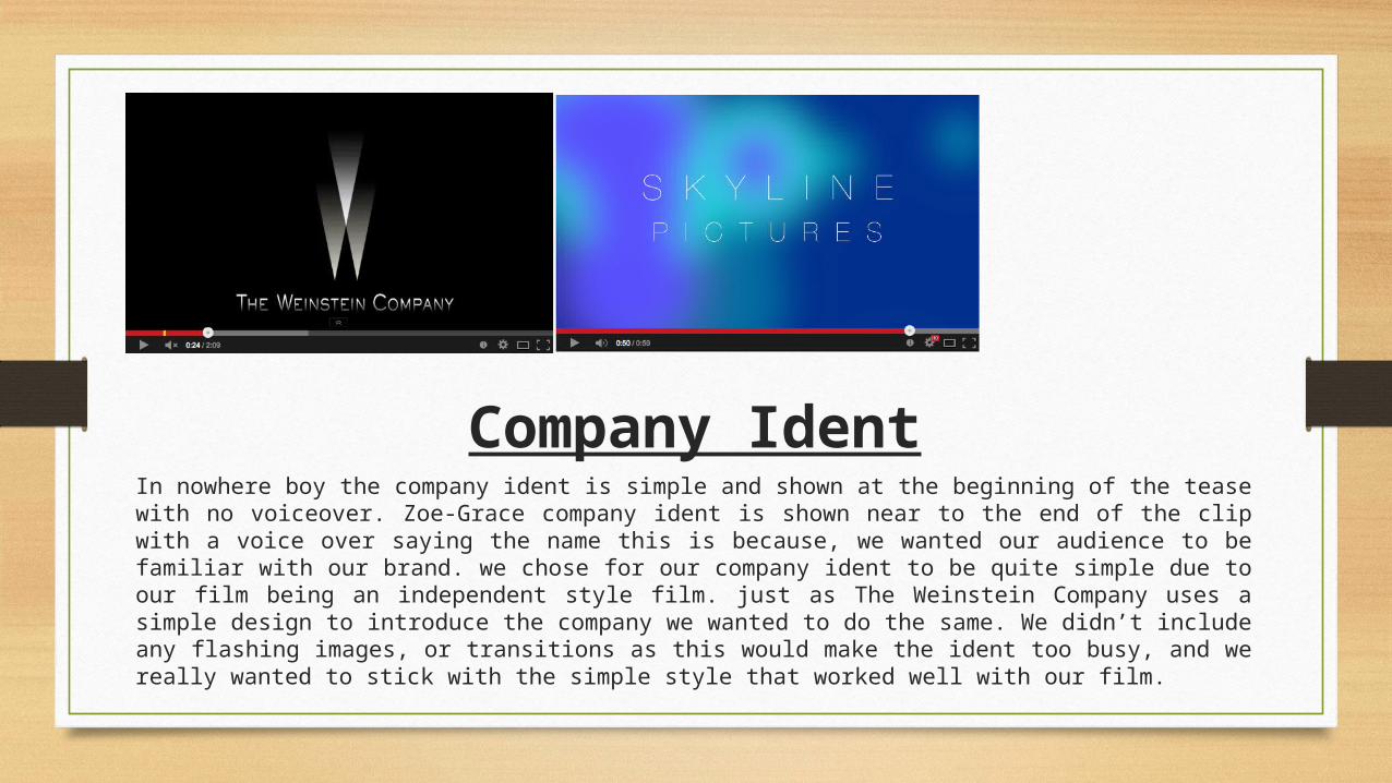
Company IdentIn nowhere boy the company ident is simple and shown at the beginning of the tease with no voiceover. Zoe-Grace company ident is shown near to the end of the clip with a voice over saying the name this is because, we wanted our audience to be familiar with our brand. we chose for our company ident to be quite simple due to our film being an independent style film. just as The Weinstein Company uses a simple design to introduce the company we wanted to do the same. We didn’t include any flashing images, or transitions as this would make the ident too busy, and we really wanted to stick with the simple style that worked well with our film.

During the planning of our teaser we looked at mainly nowhere boy submarine and 500 days of summer. From viewing the different teaser trailers we notice that submarine and 500 days of summer introduce the character with a medium shot behind them. We decided to implement this in our teaser trailer as it shows the emotions of the character by looking at their body language. The effect of the medium back shot it shows the personality of the character as they are sitting by themselves this portrays them of being quirky.
In 500 days of summer there is a close up shot of the two characters holding hands. We decided to implement this into our teaser towards the end, to reveal the situation of the characters and give a more insight about the storyline.
Our teaser trailer is 59 seconds long whereas generally teaser run between 40 and 90 seconds this suggest that our teaser is in line with the typical teaser convention.
Use of Shots
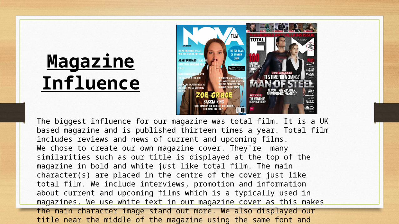
The biggest influence for our magazine was total film. It is a UK based magazine and is published thirteen times a year. Total film includes reviews and news of current and upcoming films. We chose to create our own magazine cover. They're many similarities such as our title is displayed at the top of the magazine in bold and white just like total film. The main character(s) are placed in the centre of the cover just like total film. We include interviews, promotion and information about current and upcoming films which is a typically used in magazines. We use white text in our magazine cover as this makes the main character image stand out more. We also displayed our title near the middle of the magazine using the same font and colour this is so that it is easier for the reader to recognise our brand identity.
Magazine Influence