quantitative skills 1: graphing. qualitative data is not numerical and is usually subjective....
TRANSCRIPT


• Qualitative data is not numerical and is usually subjective.
• Quantitative data is numerical and lends itself to statistical analysis.
Categories of data:
1.75 mL

• Discrete data has finite values, such as integers, or bucket categories such as “red” or “tall”.
• Continuous data has an infinite number of values and forms a continuum.
Quantitative data can be either discrete or continuous.

Which graph shows continuous data and which graph shows discrete data?
Graph A Graph B

One of the first steps in data analysis is to create graphical displays of the data. Visual
displays can make it easy to see patterns and can clarify how two variables affect
each other.

• Used when data on both scales of the graph (the x and y axes) are continuous.
• The dots indicate measurements that were actually made.
Line Graphs

Basic Traits of A Good Graph
1. A Good Title• A good title is one
that tells exactly what information the author is trying to present with the graph.
Relation Between Study Time and Score on a Biology Exam in 2011
-or-
Study Time vs. Score on a Biology Exam in 2011

2. Axes should be consistently numbered.
3. Axes should contain labels, including units.
Basic Traits of A Good Graph
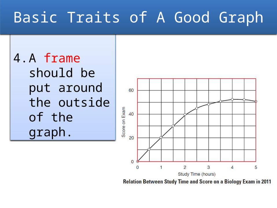
4. A frame should be put around the outside of the graph.
Basic Traits of A Good Graph
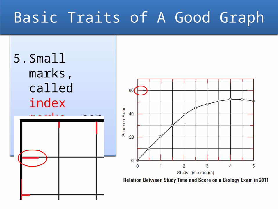
5. Small marks, called index marks, can be drawn in.
Basic Traits of A Good Graph

6. The independent variable is always shown on the x axis.
7. The dependent variable is always shown on the y axis.
Basic Traits of A Good Graph
DependentVariable
IndependentVariable

8. The line should not be extended to the origin if the data do not start there.
Basic Traits of A Good Graph

Extrapolation is a prediction of what the chart might look like beyond the measured
set of data. A broken line is used, indicating this a prediction and not data
actually collected.

The slope of a line indicates the rate at which the variables being graphed are
changing.
m =y y2 – y1
x x2 – x1
=
Slope = RiseRun

Positive Slope Negative Slope Zero Slope
Rate Increasing Rate Decreasing Constant Rate
Indicates some values
were skipped
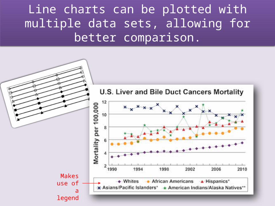
Line charts can be plotted with multiple data sets, allowing for better comparison.
Makes use of a legend

Effective graphs use statistics as an essential part of the display.
Statistics is the study of the collection, organization, analysis, interpretation
and presentation of data.

• Often, researchers want to know things about a population (N), but it may not be feasible to obtain data for every member of an entire population.
• A sample (n) is a smaller group of members of a population selected to represent the population. The sample must be random.
Population vs. Sample

Descriptive statistics and graphical displays allow us to estimate how well
sample data represent the true population.

If a sample is not collected randomly, it may not closely reflect the original
population. This is called sampling bias.

A normal distribution, also known as a “bell curve” or “normal curve”, can be
formed with continuous data.

The type of data being collected during an investigation should be determined
before performing the actual experiment. The type of data will determine the statistical analyses that can be used.

Three Types of Data:
• Parametric data: data that fit a normal curve
• Nonparametric data: data that do not fit a normal curve
• Frequency or count data: generated by counting

Normal or parametric data
• Measurement data that fit a normal curve or distribution.
• Data is continuous, generally in decimal form.
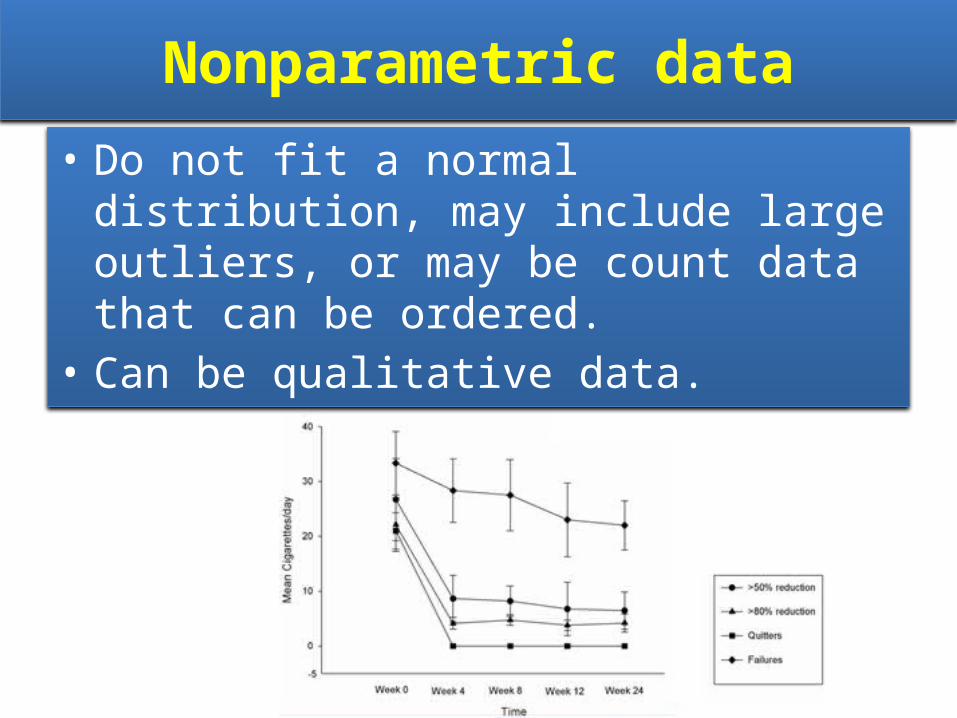
Nonparametric data
• Do not fit a normal distribution, may include large outliers, or may be count data that can be ordered.
• Can be qualitative data.

Frequency or count data
• Generated by counting how many of an item fit into a category.
• Can be data that are collected as percentages.

Two Types of Descriptive Statistics:
• Comparative statistics: compare variables
• Association statistics: look for correlations between variables

Comparative statistics compare phenomena, events, or populations (Is
A different from B?).
Parametric Data(normal data)
Nonparametric Data
Frequency Data
(counts)
Bar Graph Box-and-Whisker PlotBar Graph
orPie Chart

Association statistics look for associations between variables (How
are A and B correlated?).
Parametric Dataand
Nonparametric Data
Scatterplot

Types of graphs commonly used with the three data types and suggested
statistical tests:

Bar Graphs
• Used to visually compare two samples of categorical or count data.
• Are also used to visually compare the calculated means with error bars of normal data .
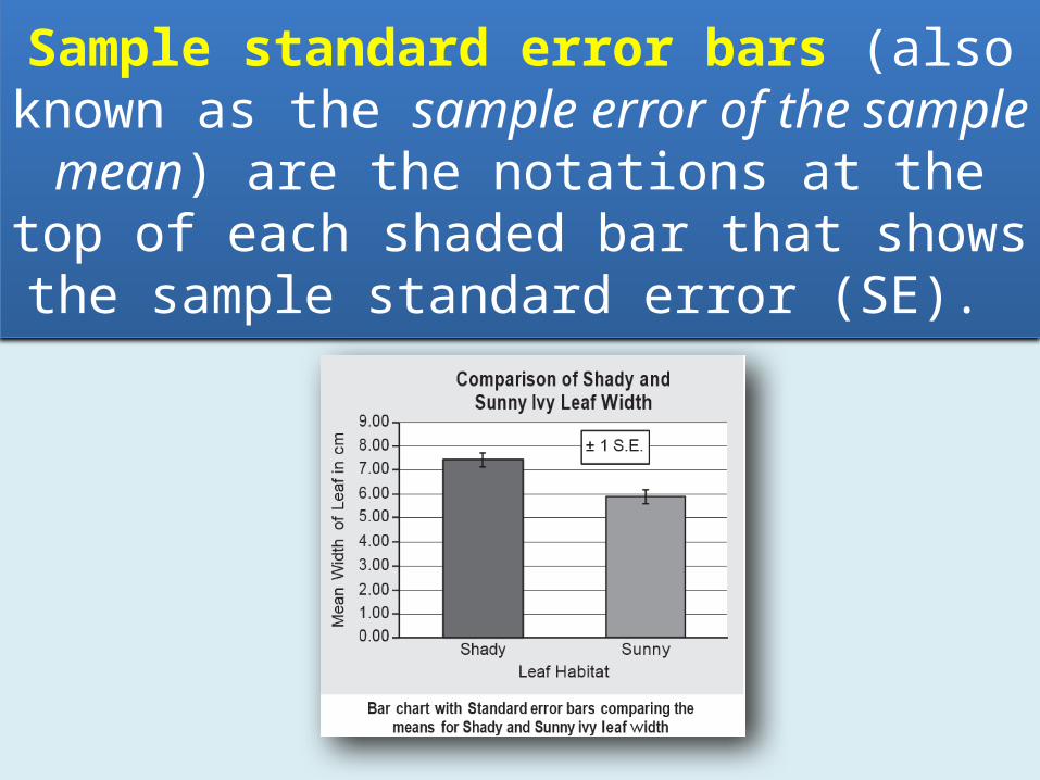
Sample standard error bars (also known as the sample error of the sample mean) are
the notations at the top of each shaded bar that shows the sample standard error (SE).

Scatterplots
• Used when comparing one measured variable against another.
• Used when looking for trends.

If the relationship is thought to be linear, a linear regression line or best fit line can be
plotted to help define the pattern.

Box-and-Whisker Plots
• Allow graphical comparison of two samples of nonparametric data (data that do not fit a normal distribution).

In a box-and-whisker graph, the ticks at the tops and bottoms of the vertical lines show the highest and
lowest values in the dataset, respectively. The top of each box shows the upper quartile, the bottom of
each box shows the lower quartile, and the horizontal line represents the median.

Histograms (Frequency Diagrams)
• Used to display the distribution of data, providing a representation of the central tendencies and the spread of data.

Creating a histogram requires setting up bins — uniform range intervals that cover
the entire range of the data. Then the number of measurements that fit in each
bin are counted and graphed.

If the data on a histogram show an approximate normal distribution, then
these are parametric data. If the data do not approximate a normal distribution
then they are nonparametric data.

References:
AP® BiologyInvestigative Labs:
An Inquiry-Based Approachand
AP® BiologyQuantitative Skills:
A Guide for Teachers