question 1
TRANSCRIPT
1. In what ways does your media product use, develop or challenge forms and conventions of real media products?
To successfully produce my magazine I have used many typical conventions of music magazines. I have used the Guttenberg design principle, as many other magazines rely on in order to lay out each page of my final product in order to successfully address the audience in a way that text and images are shown in a fixed manner.
The masthead of my magazine, as expected, is musically based. ‘Bassline’ representing the bassline of songs, while also suggesting the idea of importance and foundation in music. It is also playing on the phonetically identical word ‘baseline’ which further reflects this idea. The word is also sharp and easy to remember, which is perfect for a magazine, as other similar magazine also have short names, for example, Kerrang and Q.
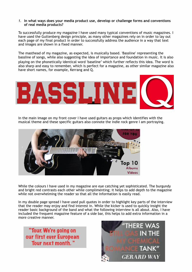
In the main image on my front cover I have used guitars as props which identifies with the musical theme and these specific guitars also connote the indie rock genre I am portraying.
While the colours I have used in my magazine are eye catching yet sophisticated. The burgundy and bright red contrasts each other while complimenting; it helps to add depth to the magazine while not overwhelming the reader so that all the information is easily read.
In my double page spread I have used pull quotes in order to highlight key parts of the interview that the reader may enjoy and find interest in. While the kicker is used to quickly insight the reader basic background of the band and what the following interview is all about. Also, I have included the frequent magazine feature of a side bar, this helps to add extra information in a more creative manner.

Another convention of magazines I have used is the inclusion of columns for the main body of text on my double page spread this allows for a consistent layout that in convenient and simple to read.