question 6
TRANSCRIPT

Question 6 – What have I learnt about new technologies from the
process of constructing this product?
What is Desktop Publishing (DTP)?
• Desktop Publishing (DTP) is the production of a printed media produced by a desktop computer using specialist software. This enables printed media to be produced cheaply by less people and in a shorter time frame.

Front Cover - PhotoshopThrough the production of my front cover for my college and music magazine, I have developed my understanding and skills in using photoshop as can be seen by the improvement in quality between my college and music magazine.
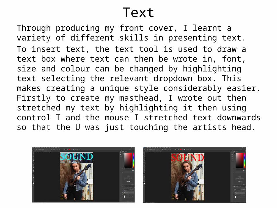
TextThrough producing my front cover, I learnt a variety of different skills in presenting text.To insert text, the text tool is used to draw a text box where text can then be wrote in, font, size and colour can be changed by highlighting text selecting the relevant dropdown box. This makes creating a unique style considerably easier. Firstly to create my masthead, I wrote out then stretched my text by highlighting it then using control T and the mouse I stretched text downwards so that the U was just touching the artists head.

TextTo make the subject of my main image stand out, I wanted to put my masthead behind her to create a 3D effect. I did this by duplicating the background into a second layer and moved it to the top, this meant I could use the eraser tool to erase the letters of my masthead back into the photo. I used the eraser tool to carefully rub out the letters so the bottom of the U was hidden behind the head, this was achieved by using a small brush (changeable In the top left) and by zooming in using the percentage in the bottom left.

Text
I then Bevel & Embossed my masthead so it stood out from the page, to attract the attention of the viewer. I did this by highlighting the text, then selecting layer, layer style, bevel and emboss, then selecting the depth I wanted to use. I also added a stroke to the masthead by selecting the stroke box, selecting 2mm, and selecting white for the colour of the stroke. This process is shown in more detail on the next slide.
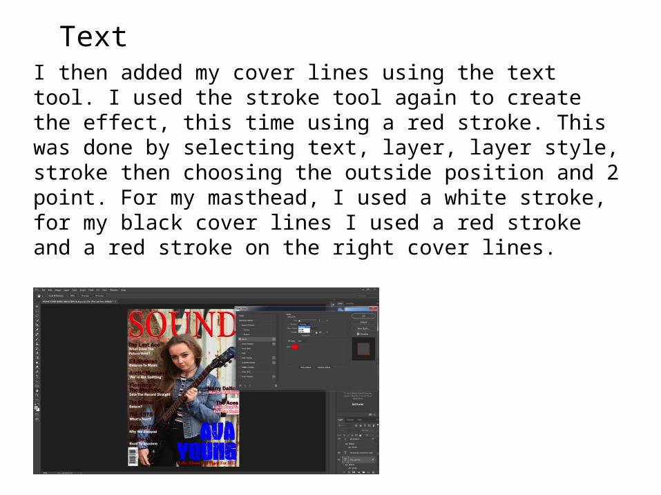
TextI then added my cover lines using the text tool. I used the stroke tool again to create the effect, this time using a red stroke. This was done by selecting text, layer, layer style, stroke then choosing the outside position and 2 point. For my masthead, I used a white stroke, for my black cover lines I used a red stroke and a red stroke on the right cover lines.
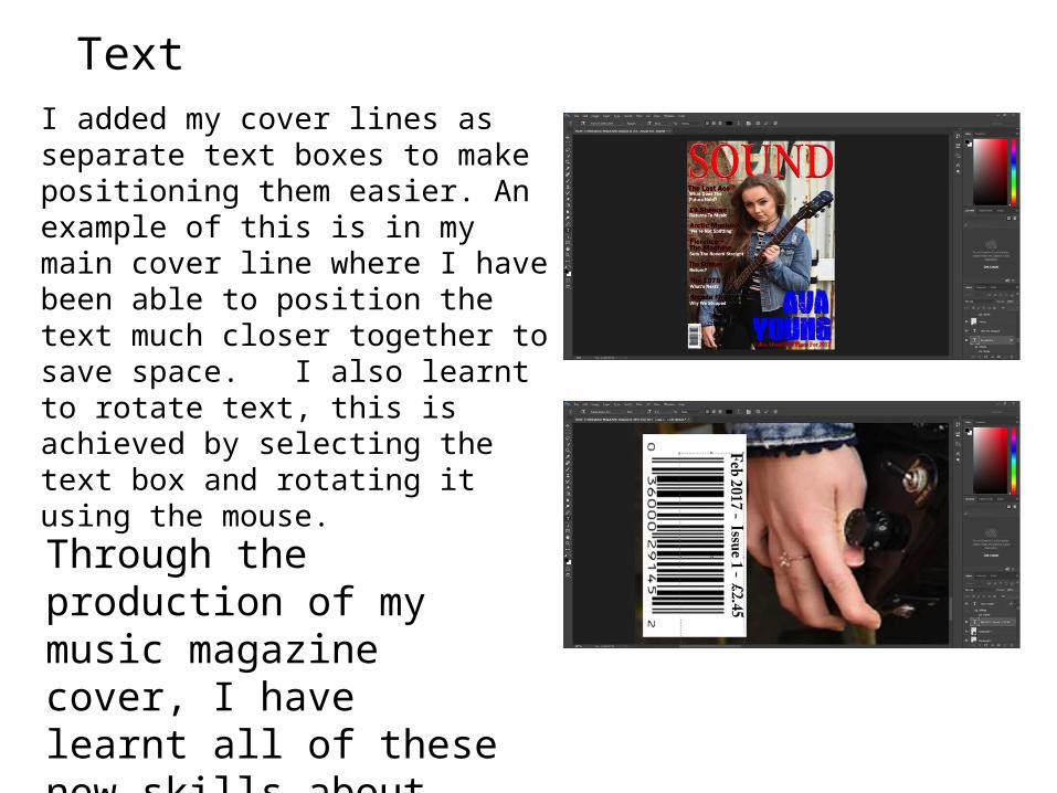
TextI added my cover lines as separate text boxes to make positioning them easier. An example of this is in my main cover line where I have been able to position the text much closer together to save space. I also learnt to rotate text, this is achieved by selecting the text box and rotating it using the mouse.Through the production of my music magazine cover, I have learnt all of these new skills about presenting text in photoshop.

ImagesFor my main image, I cropped in the image to reduce the amount of space above the head. This makes for a closer framing on the image. I also adjusted the shadows to brighten the image by using Image, adjustments, shadow/highlight and then adjusted the slider to lighten shadows in the image.I also added a barcode by saving it as an image, then dragging and dropping into Photoshop before pasting it onto my front cover and reducing it to scale using the arrow tool and the mouse to shrink it. I then added a rectangle and rotated text for price, issue number and date.
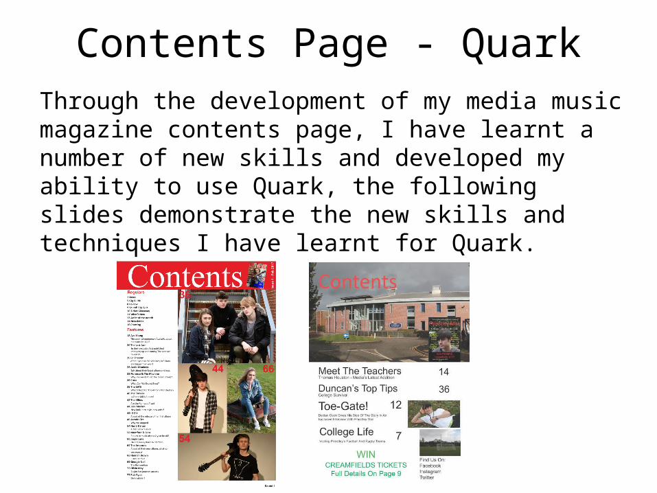
Contents Page - QuarkThrough the development of my media music magazine contents page, I have learnt a number of new skills and developed my ability to use Quark, the following slides demonstrate the new skills and techniques I have learnt for Quark.

I inserted a rectangle using the rectangle drawing tool and filled it red to create a red band at the top of the page to create an eye catching look. I then added text on top of this using the text tool to draw a text box onto the band. I then coloured the text white by highlighting and editing. I then added my front cover in the top corner using the image tool to draw a box, then selecting insert, picture, picture from file, and selecting the file. I then positioned the front cover so that it cropped the edges of the image off and just the front cover showed. I then rotated the image slightly by selecting and using the mouse to rotate. I then added the price in the top right, this was done by drawing a text box and rotating text using the mouse.

I then imported my images onto the contents page using the picture tool. I drew a box for the image, then imported my photo from the library. I also selected the Contents page text and selected bring to front, this meant I could put the photo further up without obscuring the contents page lettering. This was achieved by right clicking, selecting send and bring, and bring to front. I then continued to add the rest of my images using the same technique. The top and bottom images were both brought to the front, this meant I had a crisp line between my middle images. On my college magazine, I hadn’t discovered this feature and as a result my photos were poorly positioned. I also used guides to position images which helped in lining up my images. This meant my images looked far more professional.
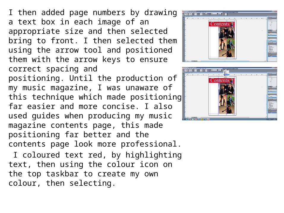
I then added page numbers by drawing a text box in each image of an appropriate size and then selected bring to front. I then selected them using the arrow tool and positioned them with the arrow keys to ensure correct spacing and positioning. Until the production of my music magazine, I was unaware of this technique which made positioning far easier and more concise. I also used guides when producing my music magazine contents page, this made positioning far better and the contents page look more professional. I coloured text red, by highlighting text, then using the colour icon on the top taskbar to create my own colour, then selecting.
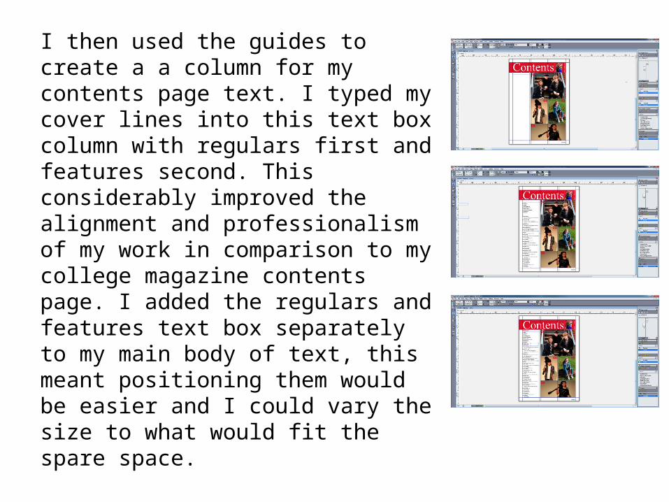
I then used the guides to create a a column for my contents page text. I typed my cover lines into this text box column with regulars first and features second. This considerably improved the alignment and professionalism of my work in comparison to my college magazine contents page. I added the regulars and features text box separately to my main body of text, this meant positioning them would be easier and I could vary the size to what would fit the spare space.

Double Page Spread – Quark
Through the development of my media music magazine double page spread, I have learnt a number of new skills and developed my ability to use Quark to produce a double page spread. The following slides demonstrate the new skills and techniques I have to produce this. When I produced my contents page, a number of skills and techniques were transferrable to my double page spread.

I inserted my image using the same method as on my contents page. I used the image drawing tool to create a box for the photo, I then imported the photo from my files and stretched it to fit the frame using the guides to help.

Through the production of my double page spread, I learned to format text to import it from word. This was done by drawing a text box (this being split into 2 columns), right clicking, import, text, select file, open.

I the added a drop cap at the start of my article to show where the beginning is for the reader. This was achieved by selecting the first paragraph, selecting left indent to 3 point and ticking the drop caps box.