r: learning by example lattice graphics - dave armstrong · r: learning by example lattice graphics...
TRANSCRIPT
R: Learning by ExampleLattice Graphics
Dave ArmstrongUniversity of Wisconsin – Milwaukee
Department of Political Science
e: [email protected]: http://www.quantoid.net/teachicpsr/rbyexample
Contents
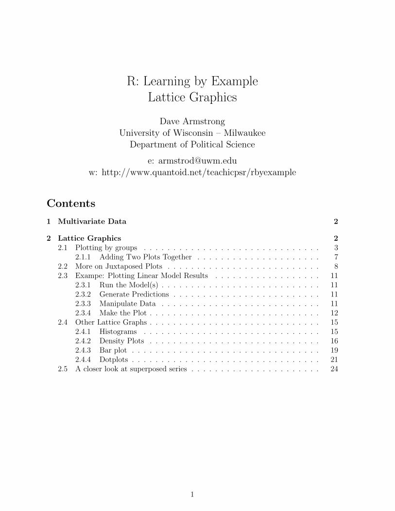
1 Multivariate Data 2
2 Lattice Graphics 22.1 Plotting by groups . . . . . . . . . . . . . . . . . . . . . . . . . . . . . . 3
2.1.1 Adding Two Plots Together . . . . . . . . . . . . . . . . . . . . . 72.2 More on Juxtaposed Plots . . . . . . . . . . . . . . . . . . . . . . . . . . 82.3 Exampe: Plotting Linear Model Results . . . . . . . . . . . . . . . . . . 11
2.3.1 Run the Model(s) . . . . . . . . . . . . . . . . . . . . . . . . . . . 112.3.2 Generate Predictions . . . . . . . . . . . . . . . . . . . . . . . . . 112.3.3 Manipulate Data . . . . . . . . . . . . . . . . . . . . . . . . . . . 112.3.4 Make the Plot . . . . . . . . . . . . . . . . . . . . . . . . . . . . . 12
2.4 Other Lattice Graphs . . . . . . . . . . . . . . . . . . . . . . . . . . . . . 152.4.1 Histograms . . . . . . . . . . . . . . . . . . . . . . . . . . . . . . 152.4.2 Density Plots . . . . . . . . . . . . . . . . . . . . . . . . . . . . . 162.4.3 Bar plot . . . . . . . . . . . . . . . . . . . . . . . . . . . . . . . . 192.4.4 Dotplots . . . . . . . . . . . . . . . . . . . . . . . . . . . . . . . . 21
2.5 A closer look at superposed series . . . . . . . . . . . . . . . . . . . . . . 24
1

1 Multivariate Data
There are lots of things we could mean by presenting multivariate data.
• Presenting the underlying structure in multivariate data (e.g., biplots).
• Interactive, high-dimensional visualization of the data themselves (e.g., GGobi,Linking and Brushing)
• Interacitve 3-d visualization (with rgl or similar).
• Trellis graphs for 2-d representations of multivariate data.
We obviously will not have time to talk about all of these things, given that we have 90minutes of lecture, but recognize that these are out there and we can talk about anythingyou want outside of class. Since the course is about presenting statistical results, it isthe last of these definitions of “multivariate data” which we will find most useful. Thesewill allow us to make the most of the time we have together and will permit the widestpossible range of possibilities in presenting multivariate data.
2 Lattice Graphics
While you can certainly make lattice graphs for the same types of data that we madetraditional graphics, the real strength of lattice graphs is with dependent data (i.e., dataorganized by group). Examples of this would be time-series cross-sectional data (e.g.,countries/states/individuals over time) or hierarchically structured data (e.g., studentswithin classrooms within schools). Lattice graphs perform a type of repeated calculation- they make the same plot for each group and present them all in a very nice-lookingdisplay.
The work-horse for lattice graphs is the command xyplot. This is the lattice analogto he plot command in the traditional graphics environment. To make the commandsavailable, you first have to load the lattice package:
> library(lattice)
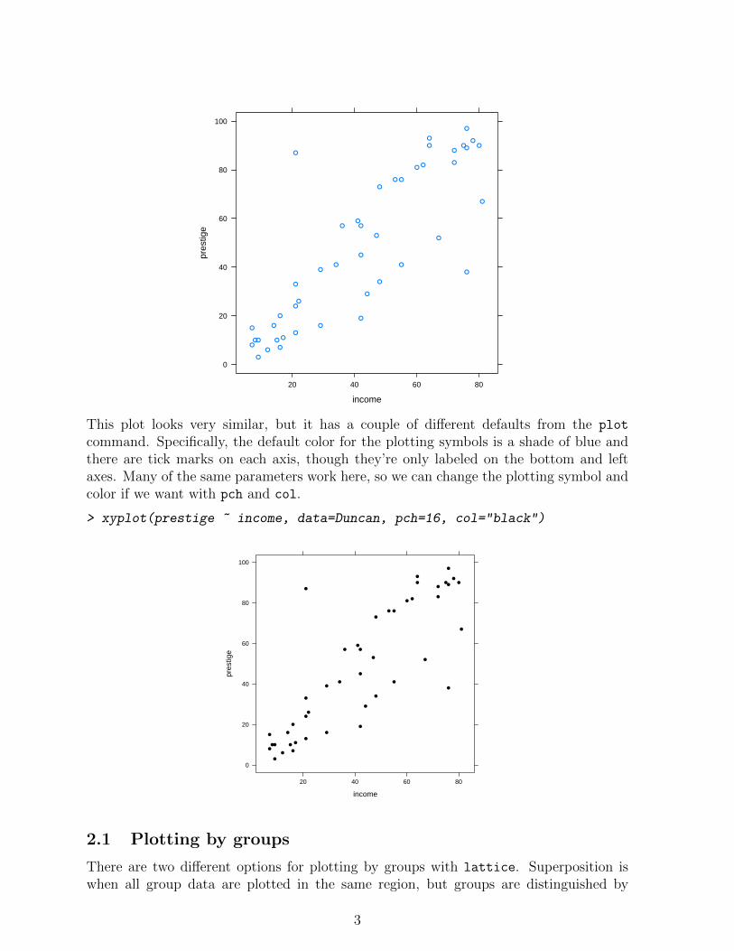
Now, let’s just make a scatterplot of income and prestige from the Duncan data.
> library(car)
> data(Duncan)
> xyplot(prestige ~ income, data=Duncan)
2
income
pres
tige
0
20
40
60
80
100
20 40 60 80
●●
●
●
●
●
●
●
●
●
●
●
●
●
●
●
●
●
●
●
●
●
●
●
●
●
●
●
●
●
●
●
●
●
●
●
●
●
●
●
●
●
●
●
●
This plot looks very similar, but it has a couple of different defaults from the plot
command. Specifically, the default color for the plotting symbols is a shade of blue andthere are tick marks on each axis, though they’re only labeled on the bottom and leftaxes. Many of the same parameters work here, so we can change the plotting symbol andcolor if we want with pch and col.
> xyplot(prestige ~ income, data=Duncan, pch=16, col="black")
income
pres
tige
0
20
40
60
80
100
20 40 60 80
●●
●
●
●
●
●
●
●
●
●
●
●
●
●
●
●
●
●
●
●
●
●
●
●
●
●
●
●
●
●
●
●
●
●
●
●
●
●
●
●
●
●
●
●
2.1 Plotting by groups
There are two different options for plotting by groups with lattice. Superposition iswhen all group data are plotted in the same region, but groups are distinguished by
3
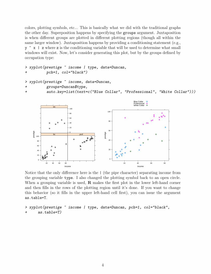
colors, plotting symbols, etc... This is basically what we did with the traditional graphsthe other day. Superposition happens by specifying the groups argument. Juxtapositionis when different groups are plotted in different plotting regions (though all within thesame larger window). Juxtaposition happens by providing a conditioning statement (e.g.,y ~ x | z where z is the conditioning variable that will be used to determine what smallwindows will exist. Now, let’s consider generating this plot, but by the groups defined byoccupation type:
> xyplot(prestige ~ income | type, data=Duncan,
+ pch=1, col="black")
> xyplot(prestige ~ income, data=Duncan,
+ groups=Duncan$type,
+ auto.key=list(text=c("Blue Collar", "Professional", "White Collar")))
income
pres
tige
0
20
40
60
80
100
20 40 60 80
●
●
●
●
●●
●●
●
●●
●●
●●
●
●●
●
●
●
bc
● ●
●
●
●●
●●●
●
●
●
●
●●
●
●
●
prof0
20
40
60
80
100
●
●●●
●
●
wc
income
pres
tige
0
20
40
60
80
100
20 40 60 80
●
●
●
●
●
●
●
●
●
●
●
●
●
●
●
●
●
●
●
●
●
● ●
●
●
●
●
●
●●
●
●
●
●
●
●
●
●
●
●
●●
●
●
●
Blue CollarProfessionalWhite Collar
●
●
●
Notice that the only difference here is the | (the pipe character) separating income fromthe grouping variable type. I also changed the plotting symbol back to an open circle.When a grouping variable is used, R makes the first plot in the lower left-hand cornerand then fills in the rows of the plotting region until it’s done. If you want to changethis behavior (so it fills in the upper left-hand cell first), you can issue the argumentas.table=T.
> xyplot(prestige ~ income | type, data=Duncan, pch=1, col="black",
+ as.table=T)
4
income
pres
tige
0
20
40
60
80
100
●
●
●
●
●●
●●
●
●●
●●
●●
●
●●
●
●
●
bc
20 40 60 80
● ●
●
●
●●
●●●
●
●
●
●
●●
●
●
●
prof
20 40 60 80
0
20
40
60
80
100
●
●●●
●
●
wc
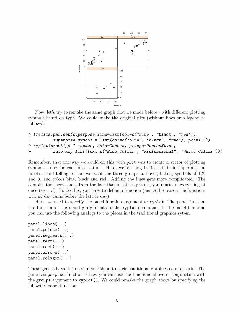
Now, let’s try to remake the same graph that we made before - with different plottingsymbols based on type. We could make the original plot (without lines or a legend asfollows):
> trellis.par.set(superpose.line=list(col=c("blue", "black", "red")),
+ superpose.symbol = list(col=c("blue", "black", "red"), pch=1:3))
> xyplot(prestige ~ income, data=Duncan, groups=Duncan$type,
+ auto.key=list(text=c("Blue Collar", "Professional", "White Collar")))
Remember, that one way we could do this with plot was to create a vector of plottingsymbols - one for each observation. Here, we’re using lattice’s built-in superpositionfunction and telling R that we want the three groups to have plotting symbols of 1,2,and 3, and colors blue, black and red. Adding the lines gets more complicated. Thecomplication here comes from the fact that in lattice graphs, you must do everything atonce (sort of). To do this, you have to define a function (hence the reason the function-writing day came before the lattice day).
Here, we need to specify the panel function argument to xyplot. The panel functionis a function of the x and y arguments to the xyplot command. In the panel function,you can use the following analogs to the pieces in the traditional graphics sytem.
panel.lines(...)
panel.points(...)
panel.segments(...)
panel.text(...)
panel.rect(...)
panel.arrows(...)
panel.polygon(...)
These generally work in a similar fashion to their traditional graphics counterparts. Thepanel.superpose function is how you can use the functions above in conjunction withthe groups argument to xyplot(). We could remake the graph above by specifying thefollowing panel function:
5
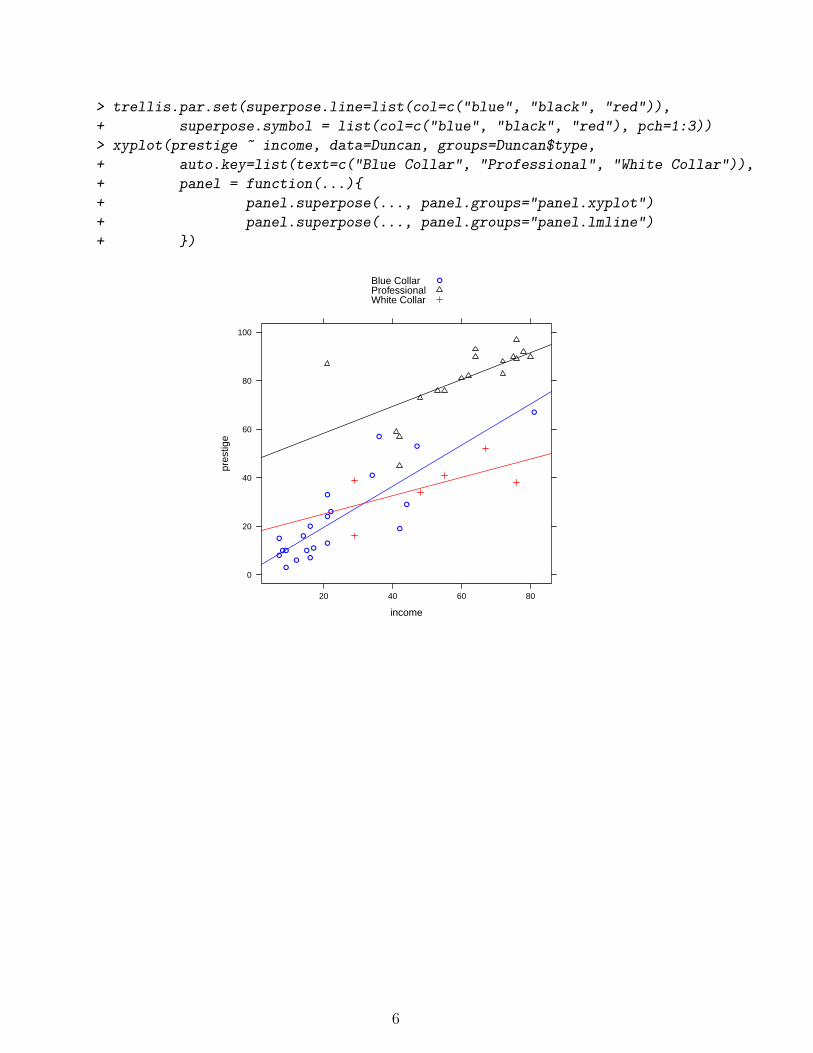
> trellis.par.set(superpose.line=list(col=c("blue", "black", "red")),
+ superpose.symbol = list(col=c("blue", "black", "red"), pch=1:3))
> xyplot(prestige ~ income, data=Duncan, groups=Duncan$type,
+ auto.key=list(text=c("Blue Collar", "Professional", "White Collar")),
+ panel = function(...){
+ panel.superpose(..., panel.groups="panel.xyplot")
+ panel.superpose(..., panel.groups="panel.lmline")
+ })
income
pres
tige
0
20
40
60
80
100
20 40 60 80
●
●
●
●
●
●
●
●
●
●
●
●
●
●
●
●
●
●
●
●
●
Blue CollarProfessionalWhite Collar
●
6
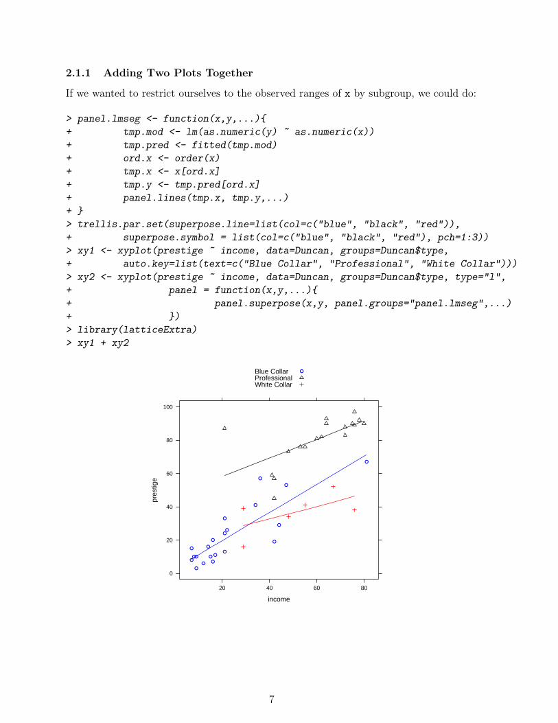
2.1.1 Adding Two Plots Together
If we wanted to restrict ourselves to the observed ranges of x by subgroup, we could do:
> panel.lmseg <- function(x,y,...){
+ tmp.mod <- lm(as.numeric(y) ~ as.numeric(x))
+ tmp.pred <- fitted(tmp.mod)
+ ord.x <- order(x)
+ tmp.x <- x[ord.x]
+ tmp.y <- tmp.pred[ord.x]
+ panel.lines(tmp.x, tmp.y,...)
+ }
> trellis.par.set(superpose.line=list(col=c("blue", "black", "red")),
+ superpose.symbol = list(col=c("blue", "black", "red"), pch=1:3))
> xy1 <- xyplot(prestige ~ income, data=Duncan, groups=Duncan$type,
+ auto.key=list(text=c("Blue Collar", "Professional", "White Collar")))
> xy2 <- xyplot(prestige ~ income, data=Duncan, groups=Duncan$type, type="l",
+ panel = function(x,y,...){
+ panel.superpose(x,y, panel.groups="panel.lmseg",...)
+ })
> library(latticeExtra)
> xy1 + xy2
income
pres
tige
0
20
40
60
80
100
20 40 60 80
●
●
●
●
●
●
●
●
●
●
●
●
●
●
●
●
●
●
●
●
●
Blue CollarProfessionalWhite Collar
●
7
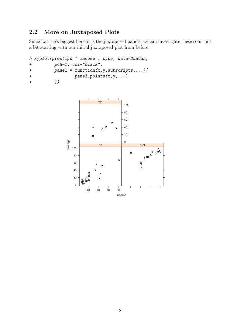
2.2 More on Juxtaposed Plots
Since Lattice’s biggest benefit is the juxtaposed panels, we can investigate these solutionsa bit starting with our initial juxtaposed plot from before.
> xyplot(prestige ~ income | type, data=Duncan,
+ pch=1, col="black",
+ panel = function(x,y,subscripts,...){
+ panel.points(x,y,...)
+ })
income
pres
tige
0
20
40
60
80
100
20 40 60 80
●
●
●
●
●●
●●
●
●●
●●
●●
●
●●
●
●
●
bc
● ●
●
●
●●
●●●
●
●
●
●
●●
●
●
●
prof0
20
40
60
80
100
●
●●●
●
●
wc
8

We could add a regression line in each panel by adding something to the panel function.
> old.levs <- levels(Duncan$type)
> levels(Duncan$type) <- c("Blue Collar", "Professional",
+ "White Collar")
> xyplot(prestige ~ income | type, data=Duncan,
+ pch=1, col="black", layout=c(3,1),
+ aspect=1, panel = function(x,y,subscripts,...){
+ panel.points(x,y,...)
+ panel.lmline(x,y,...)
+ })
> levels(Duncan$type) <- old.levs
income
pres
tige
0
20
40
60
80
100
20 40 60 80
●
●
●
●
●●
●●
●
●●
●●
●●
●
●●
●
●
●
Blue Collar
20 40 60 80
● ●
●
●
●●
●●●
●
●
●
●
●●
●
●
●
Professional
20 40 60 80
●
●●●
●
●
White Collar
We can also exert some finer control over multi-panel displays. This is where things geta little weird, though. The panel function tells R what to do in each panel for the variablesx and y by groups. So, let’s go back to the argument above. The panel.superpose()
function is a bit difficult to deal with sometimes, but by juxtaposing (rather than su-perposing) you often don’t have to worry about different plotting characters and thelike.
9
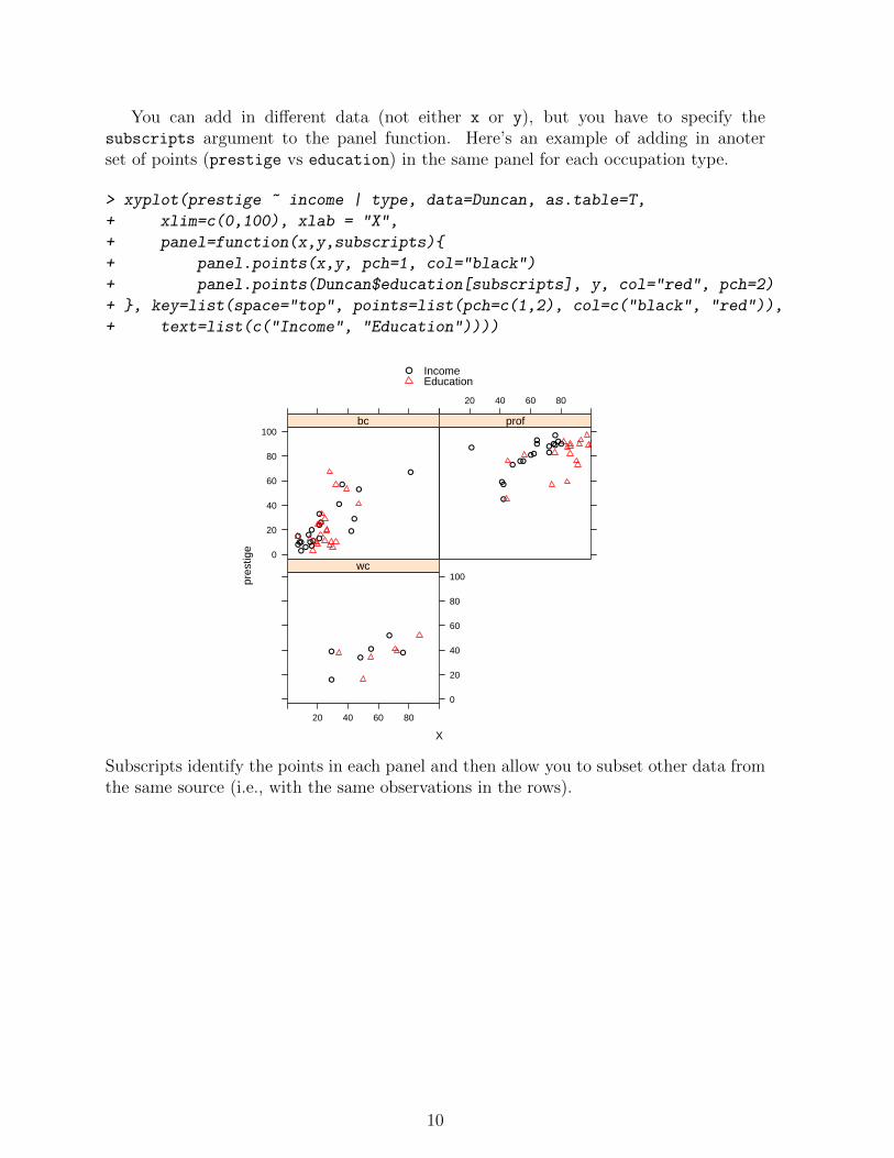
You can add in different data (not either x or y), but you have to specify thesubscripts argument to the panel function. Here’s an example of adding in anoterset of points (prestige vs education) in the same panel for each occupation type.
> xyplot(prestige ~ income | type, data=Duncan, as.table=T,
+ xlim=c(0,100), xlab = "X",
+ panel=function(x,y,subscripts){
+ panel.points(x,y, pch=1, col="black")
+ panel.points(Duncan$education[subscripts], y, col="red", pch=2)
+ }, key=list(space="top", points=list(pch=c(1,2), col=c("black", "red")),
+ text=list(c("Income", "Education"))))
X
pres
tige
0
20
40
60
80
100
●
●
●
●
●●
●●
●
●●
●●
●●
●
●●
●
●
●
bc
20 40 60 80
● ●
●
●
●●
●●●
●
●
●
●
●●
●
●
●
prof
20 40 60 80
0
20
40
60
80
100
●
●●●
●
●
wc
● IncomeEducation
Subscripts identify the points in each panel and then allow you to subset other data fromthe same source (i.e., with the same observations in the rows).
10

2.3 Exampe: Plotting Linear Model Results
This example will pull together a lot of pieces that we’ve worked with allowy. First, let’sfigure out the steps that we want to go through.
1. Run model(s) - here we’ll use 2 models.
2. Generate predictions changing one variable and holding all other variables constant.
3. Manipulate data to produce a data frame that can be plotted.
4. Make the plot.
2.3.1 Run the Model(s)
Here, we’ll estimate a model that is linear in income and one that has a polynomial fit inincome from the Duncan data.
> mod1 <- lm(prestige ~ income + education + type, data=Duncan)
> mod2 <- lm(prestige ~ poly(income, 3) + education + type, data=Duncan)
2.3.2 Generate Predictions
Now, we have to generate predictions based
> newdat <- data.frame(
+ income = seq(min(Duncan$income), max(Duncan$income), length=25),
+ education = mean(Duncan$education),
+ type = "bc"
+ )
> p1 <- as.data.frame(predict(mod1, newdata=newdat, interval="confidence"))
> p2 <- as.data.frame(predict(mod2, newdata=newdat, interval="confidence"))
2.3.3 Manipulate Data
Now, we have to take the two sets of predictions and make a single data frame.
> plot.dat <- as.data.frame(rbind(p1, p2))
Next, we need to identify which predictions are from which model. The first 25 arefrom model 1 and the second 25 are from model 2. We also need to add in the incomevariable for plotting.
> plot.dat$model <- rep(c("Model 1", "Model 2"), each=25)
> plot.dat$income <- rep(newdat$income, 2)
> rownames(plot.dat) <- NULL
11
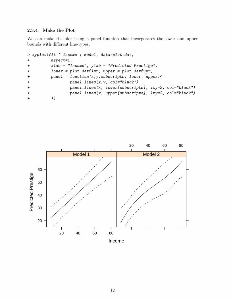
2.3.4 Make the Plot
We can make the plot using a panel function that incorporates the lower and upperbounds with different line-types.
> xyplot(fit ~ income | model, data=plot.dat,
+ aspect=1,
+ xlab = "Income", ylab = "Predicted Prestige",
+ lower = plot.dat$lwr, upper = plot.dat$upr,
+ panel = function(x,y,subscripts, lower, upper){
+ panel.lines(x,y, col="black")
+ panel.lines(x, lower[subscripts], lty=2, col="black")
+ panel.lines(x, upper[subscripts], lty=2, col="black")
+ })
Income
Pre
dict
ed P
rest
ige
20
30
40
50
60
20 40 60 80
Model 1
20 40 60 80
Model 2
12
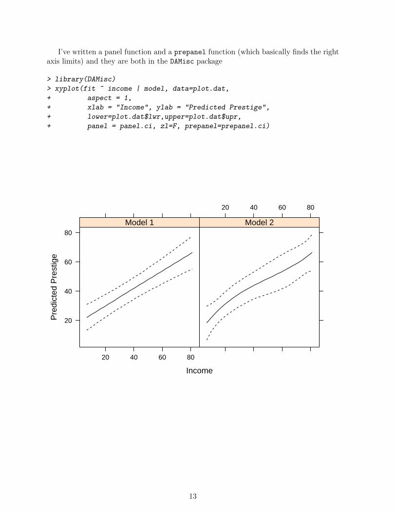
I’ve written a panel function and a prepanel function (which basically finds the rightaxis limits) and they are both in the DAMisc package
> library(DAMisc)
> xyplot(fit ~ income | model, data=plot.dat,
+ aspect = 1,
+ xlab = "Income", ylab = "Predicted Prestige",
+ lower=plot.dat$lwr,upper=plot.dat$upr,
+ panel = panel.ci, zl=F, prepanel=prepanel.ci)
Income
Pre
dict
ed P
rest
ige
20
40
60
80
20 40 60 80
Model 1
20 40 60 80
Model 2
13
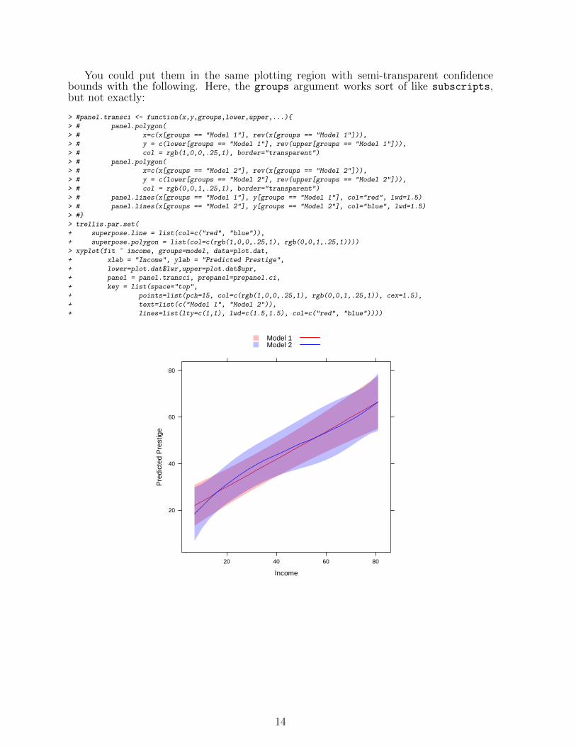
You could put them in the same plotting region with semi-transparent confidencebounds with the following. Here, the groups argument works sort of like subscripts,but not exactly:
> #panel.transci <- function(x,y,groups,lower,upper,...){
> # panel.polygon(
> # x=c(x[groups == "Model 1"], rev(x[groups == "Model 1"])),
> # y = c(lower[groups == "Model 1"], rev(upper[groups == "Model 1"])),
> # col = rgb(1,0,0,.25,1), border="transparent")
> # panel.polygon(
> # x=c(x[groups == "Model 2"], rev(x[groups == "Model 2"])),
> # y = c(lower[groups == "Model 2"], rev(upper[groups == "Model 2"])),
> # col = rgb(0,0,1,.25,1), border="transparent")
> # panel.lines(x[groups == "Model 1"], y[groups == "Model 1"], col="red", lwd=1.5)
> # panel.lines(x[groups == "Model 2"], y[groups == "Model 2"], col="blue", lwd=1.5)
> #}
> trellis.par.set(
+ superpose.line = list(col=c("red", "blue")),
+ superpose.polygon = list(col=c(rgb(1,0,0,.25,1), rgb(0,0,1,.25,1))))
> xyplot(fit ~ income, groups=model, data=plot.dat,
+ xlab = "Income", ylab = "Predicted Prestige",
+ lower=plot.dat$lwr,upper=plot.dat$upr,
+ panel = panel.transci, prepanel=prepanel.ci,
+ key = list(space="top",
+ points=list(pch=15, col=c(rgb(1,0,0,.25,1), rgb(0,0,1,.25,1)), cex=1.5),
+ text=list(c("Model 1", "Model 2")),
+ lines=list(lty=c(1,1), lwd=c(1.5,1.5), col=c("red", "blue"))))
Income
Pre
dict
ed P
rest
ige
20
40
60
80
20 40 60 80
Model 1Model 2
14
2.4 Other Lattice Graphs
Lattice has some other options, too. These are generally wrappers to xyplot, but theyhave different default behavior for different situations.
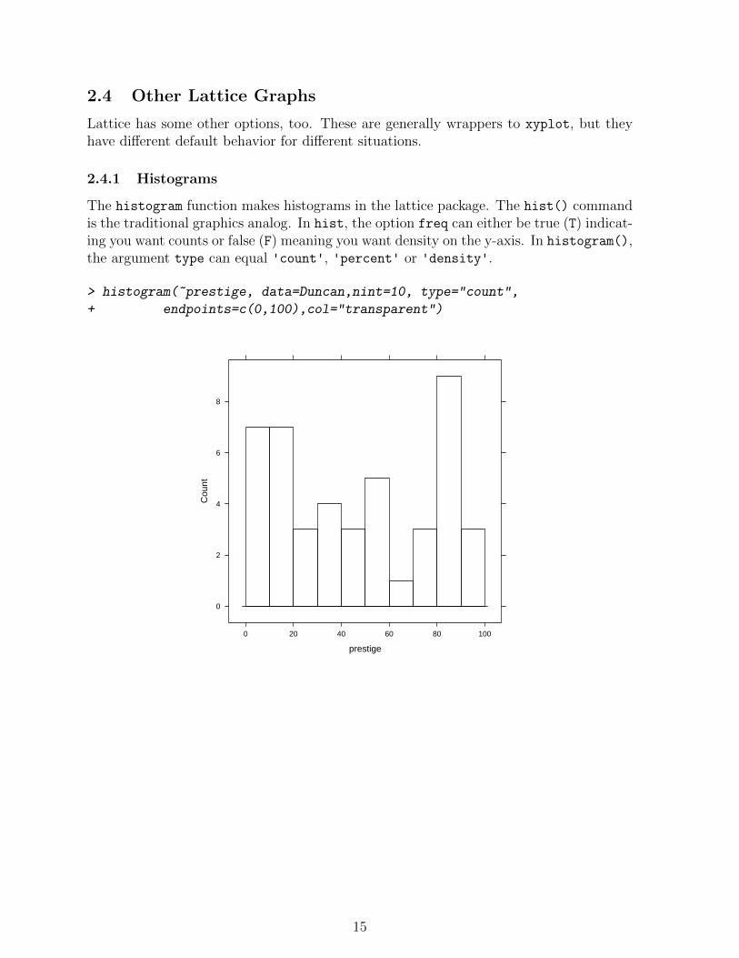
2.4.1 Histograms
The histogram function makes histograms in the lattice package. The hist() commandis the traditional graphics analog. In hist, the option freq can either be true (T) indicat-ing you want counts or false (F) meaning you want density on the y-axis. In histogram(),the argument type can equal 'count', 'percent' or 'density'.
> histogram(~prestige, data=Duncan,nint=10, type="count",
+ endpoints=c(0,100),col="transparent")
prestige
Cou
nt
0
2
4
6
8
0 20 40 60 80 100
15

2.4.2 Density Plots
We could also make density plots in a similar fashion using plot and the function density
or using densityplot from lattice.
> densityplot(~income, data=Duncan,
+ col = "black", plot.points=F)
income
Den
sity
0.000
0.005
0.010
0 50 100
16
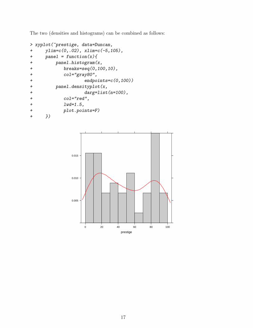
The two (densities and histograms) can be combined as follows:
> xyplot(~prestige, data=Duncan,
+ ylim=c(0,.02), xlim=c(-5,105),
+ panel = function(x){
+ panel.histogram(x,
+ breaks=seq(0,100,10),
+ col="gray80",
+ endpoints=c(0,100))
+ panel.densityplot(x,
+ darg=list(n=100),
+ col="red",
+ lwd=1.5,
+ plot.points=F)
+ })
prestige
0.005
0.010
0.015
0 20 40 60 80 100
17
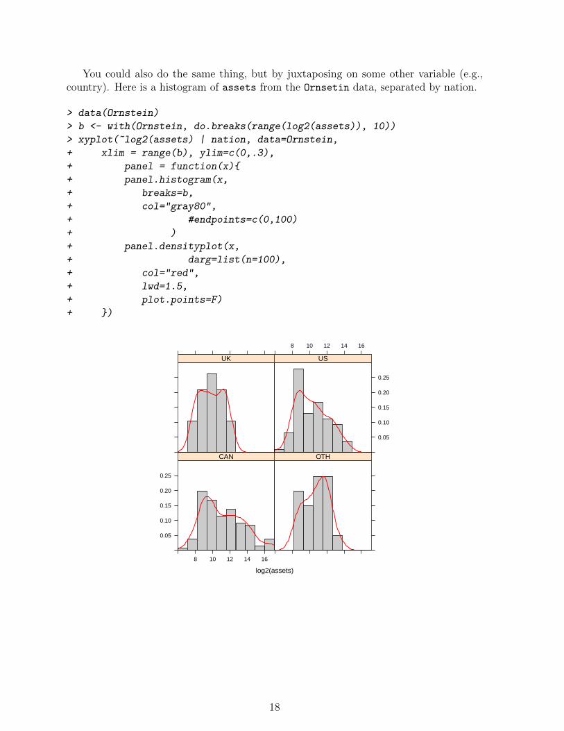
You could also do the same thing, but by juxtaposing on some other variable (e.g.,country). Here is a histogram of assets from the Ornsetin data, separated by nation.
> data(Ornstein)
> b <- with(Ornstein, do.breaks(range(log2(assets)), 10))
> xyplot(~log2(assets) | nation, data=Ornstein,
+ xlim = range(b), ylim=c(0,.3),
+ panel = function(x){
+ panel.histogram(x,
+ breaks=b,
+ col="gray80",
+ #endpoints=c(0,100)
+ )
+ panel.densityplot(x,
+ darg=list(n=100),
+ col="red",
+ lwd=1.5,
+ plot.points=F)
+ })
log2(assets)
0.05
0.10
0.15
0.20
0.25
8 10 12 14 16
CAN OTH
UK
8 10 12 14 16
0.05
0.10
0.15
0.20
0.25
US
18
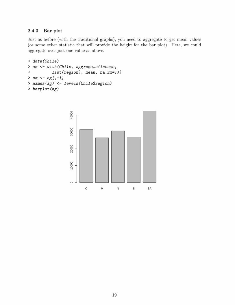
2.4.3 Bar plot
Just as before (with the traditional graphs), you need to aggregate to get mean values(or some other statistic that will provide the height for the bar plot). Here, we couldaggregate over just one value as above.
> data(Chile)
> ag <- with(Chile, aggregate(income,
+ list(region), mean, na.rm=T))
> ag <- ag[,-1]
> names(ag) <- levels(Chile$region)
> barplot(ag)
C M N S SA
010
000
2000
030
000
4000
0
19

You could also do side-by-side barplots by aggregating over two variables.
> ag <- with(Chile, aggregate(income,
+ list(region, education), mean, na.rm=T))
> agmat <- matrix(ag[,3], ncol=3, nrow=5)
> colnames(agmat) <- levels(Chile$education)
> rownames(agmat) <- levels(Chile$region)
> barplot(agmat, beside=T, legend.text=T)
P PS S
CMNSSA
020
000
4000
060
000
8000
0
20
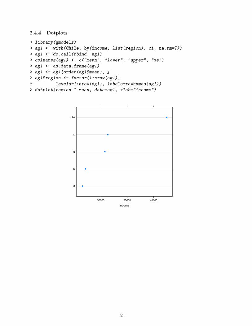
2.4.4 Dotplots
> library(gmodels)
> ag1 <- with(Chile, by(income, list(region), ci, na.rm=T))
> ag1 <- do.call(rbind, ag1)
> colnames(ag1) <- c("mean", "lower", "upper", "se")
> ag1 <- as.data.frame(ag1)
> ag1 <- ag1[order(ag1$mean), ]
> ag1$region <- factor(1:nrow(ag1),
+ levels=1:nrow(ag1), labels=rownames(ag1))
> dotplot(region ~ mean, data=ag1, xlab="income")
income
M
S
N
C
SA
30000 35000 40000
●
●
●
●
●
21
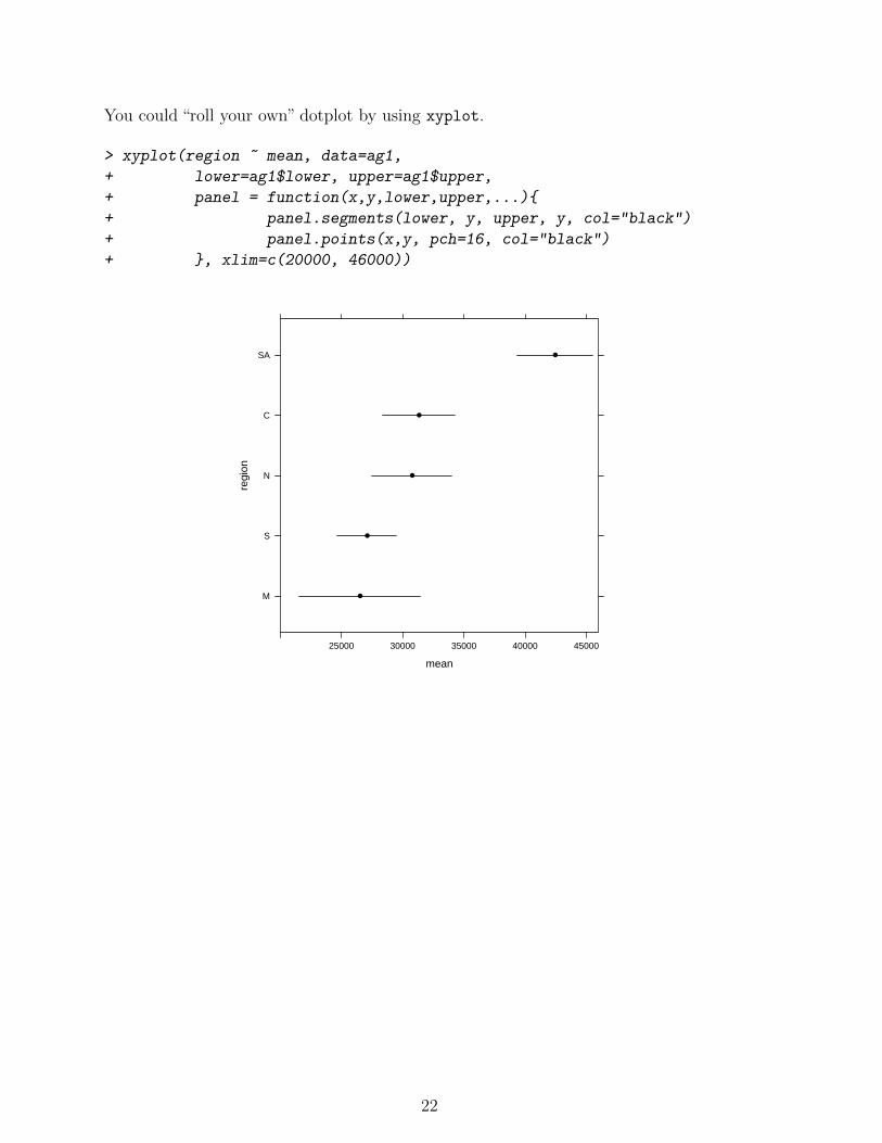
You could “roll your own” dotplot by using xyplot.
> xyplot(region ~ mean, data=ag1,
+ lower=ag1$lower, upper=ag1$upper,
+ panel = function(x,y,lower,upper,...){
+ panel.segments(lower, y, upper, y, col="black")
+ panel.points(x,y, pch=16, col="black")
+ }, xlim=c(20000, 46000))
mean
regi
on
M
S
N
C
SA
25000 30000 35000 40000 45000
●
●
●
●
●
22
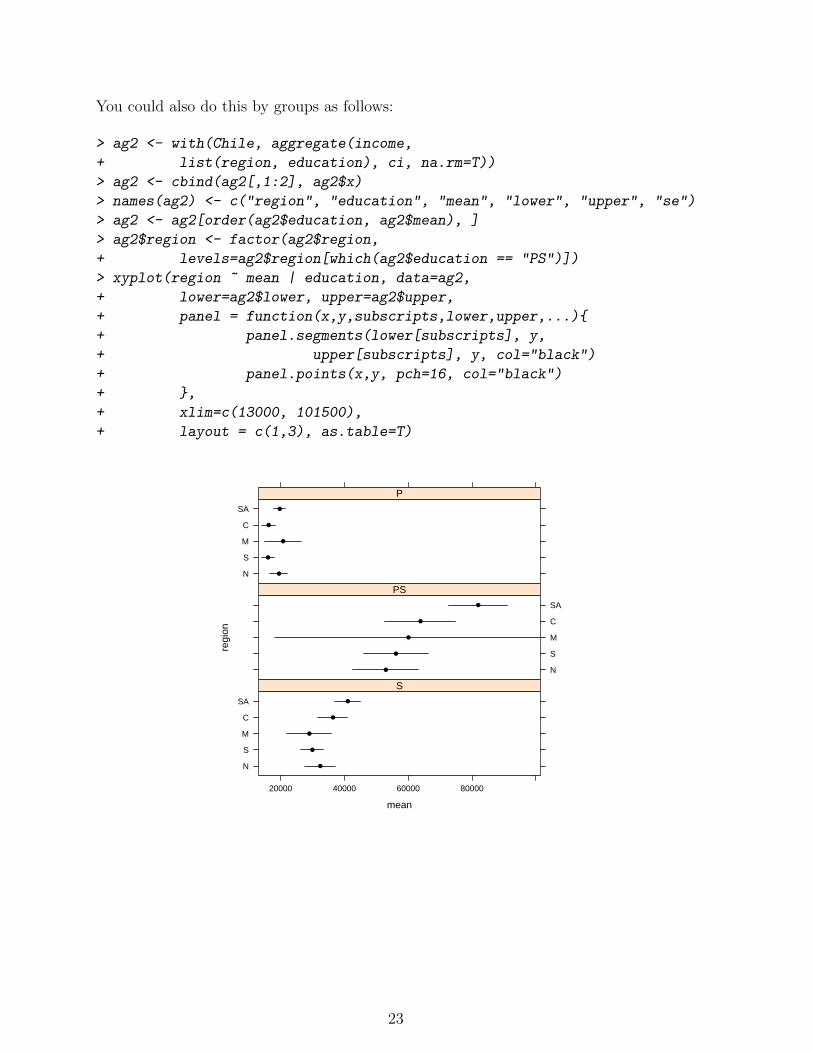
You could also do this by groups as follows:
> ag2 <- with(Chile, aggregate(income,
+ list(region, education), ci, na.rm=T))
> ag2 <- cbind(ag2[,1:2], ag2$x)
> names(ag2) <- c("region", "education", "mean", "lower", "upper", "se")
> ag2 <- ag2[order(ag2$education, ag2$mean), ]
> ag2$region <- factor(ag2$region,
+ levels=ag2$region[which(ag2$education == "PS")])
> xyplot(region ~ mean | education, data=ag2,
+ lower=ag2$lower, upper=ag2$upper,
+ panel = function(x,y,subscripts,lower,upper,...){
+ panel.segments(lower[subscripts], y,
+ upper[subscripts], y, col="black")
+ panel.points(x,y, pch=16, col="black")
+ },
+ xlim=c(13000, 101500),
+ layout = c(1,3), as.table=T)
mean
regi
on
N
S
M
C
SA
●
●
●
●
●
P
N
S
M
C
SA
●
●
●
●
●
PS
N
S
M
C
SA
20000 40000 60000 80000
●
●
●
●
●
S
23
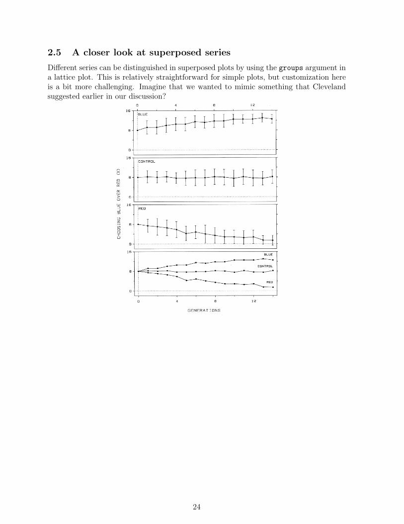
2.5 A closer look at superposed series
Different series can be distinguished in superposed plots by using the groups argument ina lattice plot. This is relatively straightforward for simple plots, but customization hereis a bit more challenging. Imagine that we wanted to mimic something that Clevelandsuggested earlier in our discussion?
°i __%.%M ~ ,A A AA k _V;% A <,%_ A yV>A 4..,A, _ AA A A A»~trt A. A __ A AA AAAAA _ A. M5 és U F¤‘RlN®lF*l...E$ (DF GRAPH CONSTRUCTIONs g iiU 4 8 1 2 2> AA A 15 .s ·AA%A ·AA 8 _{ ‘ i A EL . U . . I ...............................................................................................E ` It ‘ e 15 f ·gr :CUNTRD|.Yr » A I¤<AA ` > D ..; ................................................................................................1 FEDU . .> .......... , .... . .......... . ................................ . ...· . ·.·. . .·.·- · .·.·-·.-··· · ·I 5 ;- BLUEA—»' 1: .B — ·A REDgg; 1D ,..................A.......A.....................................A.AA.A........................0 4 8 12A Flgure 2.17 CLUTTER. The clutter of Flgure 2.16 has been ellmmated by. graphmg the data on juxtaposed panels. The bottom panel as mcluded sos A that the values of the three data sets can be more effectlvely compared.~A i agn-
24
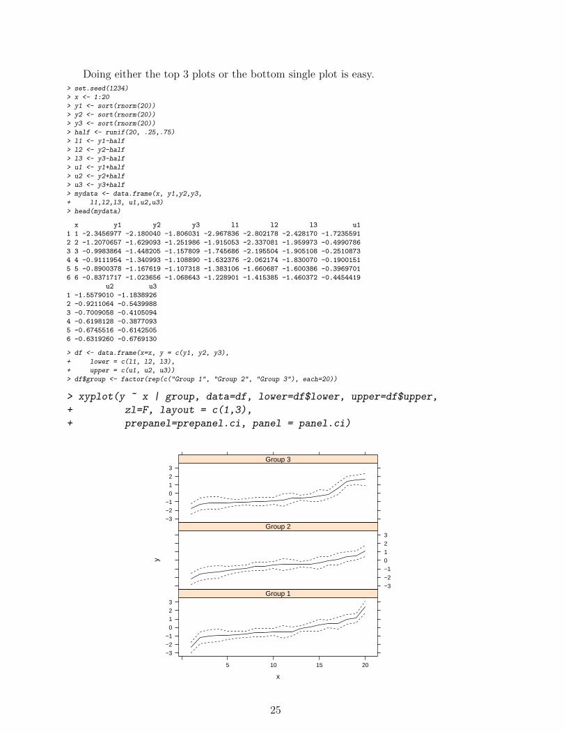
Doing either the top 3 plots or the bottom single plot is easy.> set.seed(1234)
> x <- 1:20
> y1 <- sort(rnorm(20))
> y2 <- sort(rnorm(20))
> y3 <- sort(rnorm(20))
> half <- runif(20, .25,.75)
> l1 <- y1-half
> l2 <- y2-half
> l3 <- y3-half
> u1 <- y1+half
> u2 <- y2+half
> u3 <- y3+half
> mydata <- data.frame(x, y1,y2,y3,
+ l1,l2,l3, u1,u2,u3)
> head(mydata)
x y1 y2 y3 l1 l2 l3 u1
1 1 -2.3456977 -2.180040 -1.806031 -2.967836 -2.802178 -2.428170 -1.7235591
2 2 -1.2070657 -1.629093 -1.251986 -1.915053 -2.337081 -1.959973 -0.4990786
3 3 -0.9983864 -1.448205 -1.157809 -1.745686 -2.195504 -1.905108 -0.2510873
4 4 -0.9111954 -1.340993 -1.108890 -1.632376 -2.062174 -1.830070 -0.1900151
5 5 -0.8900378 -1.167619 -1.107318 -1.383106 -1.660687 -1.600386 -0.3969701
6 6 -0.8371717 -1.023656 -1.068643 -1.228901 -1.415385 -1.460372 -0.4454419
u2 u3
1 -1.5579010 -1.1838926
2 -0.9211064 -0.5439988
3 -0.7009058 -0.4105094
4 -0.6198128 -0.3877093
5 -0.6745516 -0.6142505
6 -0.6319260 -0.6769130
> df <- data.frame(x=x, y = c(y1, y2, y3),
+ lower = c(l1, l2, l3),
+ upper = c(u1, u2, u3))
> df$group <- factor(rep(c("Group 1", "Group 2", "Group 3"), each=20))
> xyplot(y ~ x | group, data=df, lower=df$lower, upper=df$upper,
+ zl=F, layout = c(1,3),
+ prepanel=prepanel.ci, panel = panel.ci)
x
y
−3
−2
−1
0
1
2
3
5 10 15 20
Group 1−3
−2
−1
0
1
2
3Group 2
−3
−2
−1
0
1
2
3Group 3
25
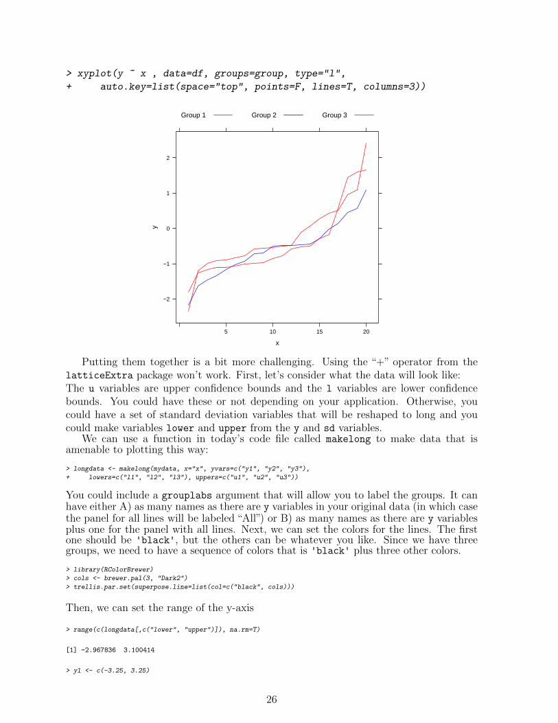
> xyplot(y ~ x , data=df, groups=group, type="l",
+ auto.key=list(space="top", points=F, lines=T, columns=3))
x
y
−2
−1
0
1
2
5 10 15 20
Group 1 Group 2 Group 3
Putting them together is a bit more challenging. Using the “+” operator from thelatticeExtra package won’t work. First, let’s consider what the data will look like:The u variables are upper confidence bounds and the l variables are lower confidencebounds. You could have these or not depending on your application. Otherwise, youcould have a set of standard deviation variables that will be reshaped to long and youcould make variables lower and upper from the y and sd variables.
We can use a function in today’s code file called makelong to make data that isamenable to plotting this way:
> longdata <- makelong(mydata, x="x", yvars=c("y1", "y2", "y3"),
+ lowers=c("l1", "l2", "l3"), uppers=c("u1", "u2", "u3"))
You could include a grouplabs argument that will allow you to label the groups. It canhave either A) as many names as there are y variables in your original data (in which casethe panel for all lines will be labeled “All”) or B) as many names as there are y variablesplus one for the panel with all lines. Next, we can set the colors for the lines. The firstone should be 'black', but the others can be whatever you like. Since we have threegroups, we need to have a sequence of colors that is 'black' plus three other colors.
> library(RColorBrewer)
> cols <- brewer.pal(3, "Dark2")
> trellis.par.set(superpose.line=list(col=c("black", cols)))
Then, we can set the range of the y-axis
> range(c(longdata[,c("lower", "upper")]), na.rm=T)
[1] -2.967836 3.100414
> yl <- c(-3.25, 3.25)
26
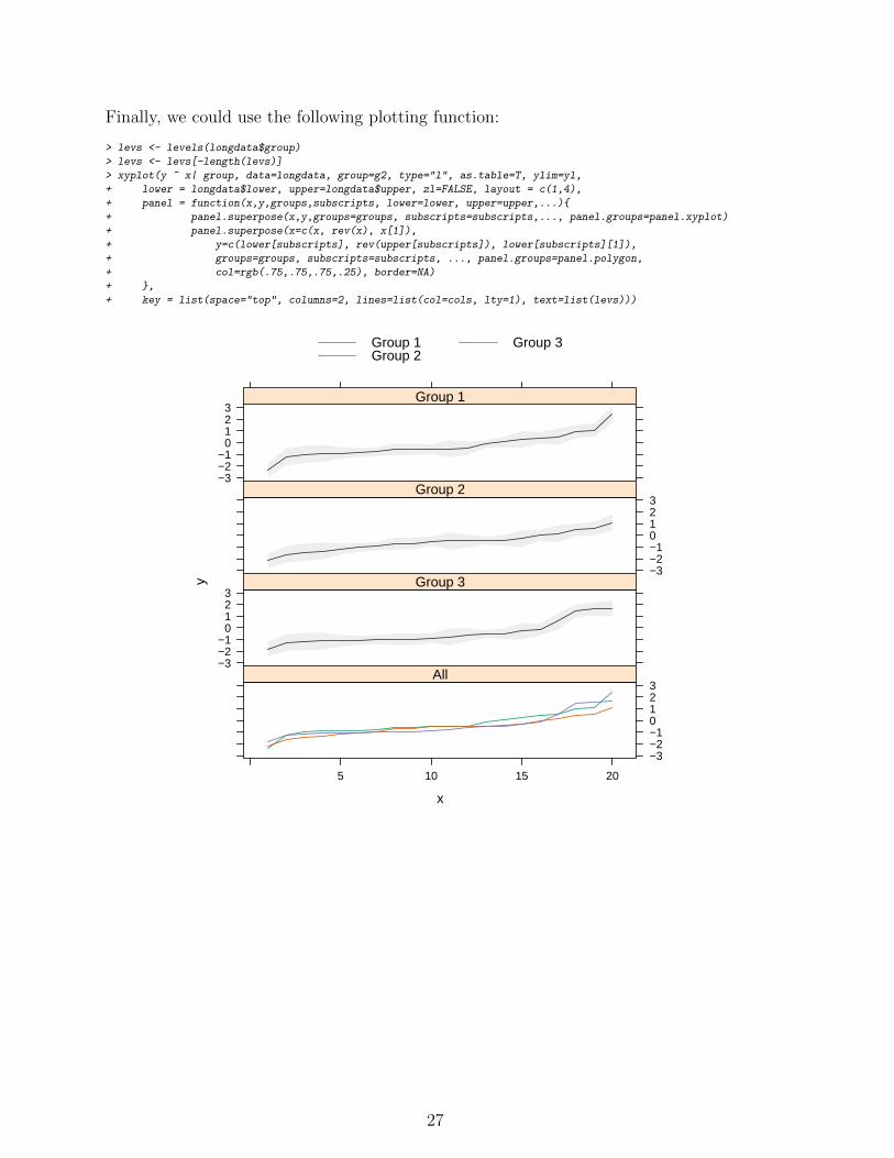
Finally, we could use the following plotting function:
> levs <- levels(longdata$group)
> levs <- levs[-length(levs)]
> xyplot(y ~ x| group, data=longdata, group=g2, type="l", as.table=T, ylim=yl,
+ lower = longdata$lower, upper=longdata$upper, zl=FALSE, layout = c(1,4),
+ panel = function(x,y,groups,subscripts, lower=lower, upper=upper,...){
+ panel.superpose(x,y,groups=groups, subscripts=subscripts,..., panel.groups=panel.xyplot)
+ panel.superpose(x=c(x, rev(x), x[1]),
+ y=c(lower[subscripts], rev(upper[subscripts]), lower[subscripts][1]),
+ groups=groups, subscripts=subscripts, ..., panel.groups=panel.polygon,
+ col=rgb(.75,.75,.75,.25), border=NA)
+ },
+ key = list(space="top", columns=2, lines=list(col=cols, lty=1), text=list(levs)))
x
y
−3−2−1
0123
Group 1
−3−2−10123
Group 2
−3−2−1
0123
Group 3
5 10 15 20
−3−2−10123
All
Group 1Group 2
Group 3
27