repor t to the congress medicare payment policy
TRANSCRIPT

REPORT TO THE CONGRESS
Medicare Payment Policy
M A R C H 2 0 2 0
425 I Street, NW • Suite 701 • Washington, DC 20001(202) 220-3700 • Fax: (202) 220-3759 • www.medpac.gov
Re
po
rt to
the
Co
ng
re
ss
: Me
dic
ar
e P
ay
me
nt P
olic
y
|M
ar
ch
20
20

The Medicare Payment Advisory Commission (MedPAC) is an independent congressional
agency established by the Balanced Budget Act of 1997 (P.L. 105–33) to advise the U.S.
Congress on issues affecting the Medicare program. In addition to advising the Congress on
payments to health plans participating in the Medicare Advantage program and providers in
Medicare’s traditional fee-for-service program, MedPAC is also tasked with analyzing access
to care, quality of care, and other issues affecting Medicare.
The Commission’s 17 members bring diverse expertise in the financing and delivery of health
care services. Commissioners are appointed to three-year terms (subject to renewal) by the
Comptroller General and serve part time. Appointments are staggered; the terms of five or six
Commissioners expire each year. The Commission is supported by an executive director and
a staff of analysts, who typically have backgrounds in economics, health policy, and public
health.
MedPAC meets publicly to discuss policy issues and formulate its recommendations to
the Congress. In the course of these meetings, Commissioners consider the results of staff
research, presentations by policy experts, and comments from interested parties. (Meeting
transcripts are available at www.medpac.gov.) Commission members and staff also seek input
on Medicare issues through frequent meetings with individuals interested in the program,
including staff from congressional committees and the Centers for Medicare & Medicaid
Services (CMS), health care researchers, health care providers, and beneficiary advocates.
Two reports—issued in March and June each year—are the primary outlets for Commission
recommendations. In addition to annual reports and occasional reports on subjects requested
by the Congress, MedPAC advises the Congress through other avenues, including comments
on reports and proposed regulations issued by the Secretary of the Department of Health and
Human Services, testimony, and briefings for congressional staff.

M A R C H 2 0 2 0
REPORT TO THE CONGRESS
Medicare Payment Policy
425 I Street, NW • Suite 701 • Washington, DC 20001(202) 220-3700 • Fax: (202) 220-3759 • www.medpac.gov


March 13, 2020
The Honorable Michael R. PencePresident of the SenateU.S. CapitolWashington, DC 20510
The Honorable Nancy PelosiSpeaker of the HouseU.S. House of RepresentativesU.S. CapitolRoom H-232 Washington, DC 20515
Dear Mr. President and Madam Speaker:
I am pleased to submit the Medicare Payment Advisory Commission’s March 2020 Report to the Congress: Medicare Payment Policy. This report fulfills the Commission’s legislative mandate to evaluate Medicare payment issues and make recommendations to the Congress.
The report contains 15 chapters:
• a chapter that provides a broader context for the report by documenting Medicare and total health care spending and their impacts on federal spending;
• a chapter that describes the Commission’s analytic framework for assessing payment adequacy;
• nine chapters that describe the Commission’s recommendations on fee-for-service (FFS) payment rate updates and related issues, including a congressional mandate to evaluate and report on the expansion of the hospital transfer policy to hospice;
• a chapter on improving Medicare payment for post-acute care;
• a chapter that updates the trends in enrollment, plan offerings, and payments in Medicare Advantage (MA) plans;
• a chapter that updates the trends in enrollment and plan offerings for plans that provide prescription drug coverage; and
• a chapter responding to a congressional request to report on consolidation and its effects in the health care sector.
In this report, we continue to make recommendations aimed at finding ways to provide high-quality care for Medicare beneficiaries while giving providers incentives to constrain their cost growth and thus help control program spending.
601 New Jersey Avenue, NW • Suite 9000Washington, DC 20001202-220-3700 • Fax: 202-220-3759www.medpac.gov
Glenn M. Hackbarth, J.D., ChairmanRobert A. Berenson, M.D., F.A.C.P., Vice ChairmanMark E. Miller, Ph.D., Executive Director
425 I Street, NW • Suite 701Washington, DC 20001202-220-3700 • Fax: 202-220-3759www.medpac.gov
Francis J. Crosson, M.D., ChairmanPaul B. Ginsburg, Ph.D., Vice ChairmanJames E. Mathews, Ph.D., Executive Director

In light of our payment adequacy analyses, we recommend positive payment updates in 2021 for three FFS payment systems (hospital, long-term care hospital, and dialysis); zero updates for four systems (physician, skilled nursing facility, hospice, and ambulatory surgical center); and negative updates for two systems (home health and inpatient rehabilitation facility). For two of these sectors, we include additional recommendations to improve payment accuracy by:
• requiring ambulatory surgical centers to report cost data and
• wage adjusting the hospice aggregate cap and reducing it by 20 percent.
In addition, in the Commission’s continuing effort to move payments from volume to value, we build on our recommendation last year to replace Medicare’s four current hospital quality programs with a single hospital value incentive program. Significantly, our hospital payment recommendation would provide hospitals with higher aggregate payments than they would receive under current law. However, these additional payments would not be distributed across the board but, instead, would be distributed based on the quality of care hospitals provide.
I hope you find this report useful as the Congress continues to grapple with the difficult task of controlling the growth of Medicare spending while preserving beneficiaries’ access to efficiently delivered, high-quality care and providing equitable payment for providers.
Sincerely,
Francis J. Crosson, M.D.
Enclosure

v Repo r t t o t h e Cong r e s s : Med i ca r e Paymen t P o l i c y | Ma r ch 2020
This report was prepared with the assistance of many people. Their support was key as the Commission considered policy issues and worked toward consensus on its recommendations.
Despite a heavy workload, staff members of the Centers for Medicare & Medicaid Services and the Department of Health and Human Services were particularly helpful during preparation of the report. We thank Carol Blackford, Kadie Derby, Stephen Heffler, Michele Hudson, John Kane, Christiane Labonte, Larry Liu, Hillary Loeffler, Cindy Massuda, Blake Pelzer, Monica Reed-Asante, Cheri Rice, Abigail Ryan, Patrick Sartini, Tiffany Swygert, Gift Tee, Donald Thompson, and David Vance.
The Commission also received valuable insights and assistance from others in government, industry, and the research community who generously offered their time and knowledge. They include Michael Bagel, Greg Berger, Cristina Boccuti, James Cosgrove, Juliette Cubanski,
William Dombi, Matthew Fiedler, Theresa Forster, Jane Galvin, Bruce Gans, David Gifford, Marc Hartstein, Jack Hoadley, Gretchen Jacobson, Joanna Kim, Lane Koenig, Kathleen Lester, Paul Masi, Jennifer McLaughlin, Kara Newbury, Daria Pelech, Judi Lund Person, Jennifer Podulka, Erika Rogan, Barry Smith, Sherry Smith, Steve Speil, Caroline Steinberg, Aaron Tripp, Cori Uccello, Chapin White, and Rebecca Yip.
Once again, the programmers at Social and Scientific Systems provided highly capable assistance to Commission staff. In particular, we appreciate the hard work of Michael Brown, Po-Lun Chou, John Crouch, Daksha Damera, Darya Leyzarovich, Sravani Mallela, Sanee Maphungphong, Shelley Mullins, Lorena Ortiz, Cindy Saiontz-Martinez, and Susan Tian.
Finally, the Commission wishes to thank Hannah Fein, Mary Gawlik, and Melissa Lux for their help in editing and producing this report. ■
Acknowledgments

vii Repo r t t o t h e Cong r e s s : Med i ca r e Paymen t P o l i c y | Ma r ch 2020
Acknowledgments . . . . . . . . . . . . . . . . . . . . . . . . . . . . . . . . . . . . . . . . . . . . . . . . . . . . . . . . . . . . . . . . . . . . . . . . . . . . . . . . . . . . . . . . . v
Executive summary . . . . . . . . . . . . . . . . . . . . . . . . . . . . . . . . . . . . . . . . . . . . . . . . . . . . . . . . . . . . . . . . . . . . . . . . . . . . . . . . . . . . . . .xiii
Chapters
1 Context for Medicare payment policy . . . . . . . . . . . . . . . . . . . . . . . . . . . . . . . . . . . . . . . . . . . . . . . . . . . . . . . . . . . . . . . . 3Introduction . . . . . . . . . . . . . . . . . . . . . . . . . . . . . . . . . . . . . . . . . . . . . . . . . . . . . . . . . . . . . . . . . . . . . . . . . . . . . . . . . . . . . . . . . . . . . . 9National health care spending. . . . . . . . . . . . . . . . . . . . . . . . . . . . . . . . . . . . . . . . . . . . . . . . . . . . . . . . . . . . . . . . . . . . . . . . . . . . . . . . 9Medicare spending . . . . . . . . . . . . . . . . . . . . . . . . . . . . . . . . . . . . . . . . . . . . . . . . . . . . . . . . . . . . . . . . . . . . . . . . . . . . . . . . . . . . . . . 14Medicare’s financing challenge . . . . . . . . . . . . . . . . . . . . . . . . . . . . . . . . . . . . . . . . . . . . . . . . . . . . . . . . . . . . . . . . . . . . . . . . . . . . . 19The impact of health care spending on state and family budgets. . . . . . . . . . . . . . . . . . . . . . . . . . . . . . . . . . . . . . . . . . . . . . . . . . . . 25Recent trends in morbidity, mortality, and life expectancy . . . . . . . . . . . . . . . . . . . . . . . . . . . . . . . . . . . . . . . . . . . . . . . . . . . . . . . . 28The next generation of Medicare beneficiaries . . . . . . . . . . . . . . . . . . . . . . . . . . . . . . . . . . . . . . . . . . . . . . . . . . . . . . . . . . . . . . . . . 35Evidence of inefficient health care spending . . . . . . . . . . . . . . . . . . . . . . . . . . . . . . . . . . . . . . . . . . . . . . . . . . . . . . . . . . . . . . . . . . . 36Conclusion. . . . . . . . . . . . . . . . . . . . . . . . . . . . . . . . . . . . . . . . . . . . . . . . . . . . . . . . . . . . . . . . . . . . . . . . . . . . . . . . . . . . . . . . . . . . . . 43
2 Assessing payment adequacy and updating payments in fee-for-service Medicare . . . . . . . . . . . . . . . 53Background . . . . . . . . . . . . . . . . . . . . . . . . . . . . . . . . . . . . . . . . . . . . . . . . . . . . . . . . . . . . . . . . . . . . . . . . . . . . . . . . . . . . . . . . . . . . 57Are Medicare payments adequate in 2020? . . . . . . . . . . . . . . . . . . . . . . . . . . . . . . . . . . . . . . . . . . . . . . . . . . . . . . . . . . . . . . . . . . . . 57What cost changes are expected in 2021? . . . . . . . . . . . . . . . . . . . . . . . . . . . . . . . . . . . . . . . . . . . . . . . . . . . . . . . . . . . . . . . . . . . . . 62How should Medicare payments change in 2021?. . . . . . . . . . . . . . . . . . . . . . . . . . . . . . . . . . . . . . . . . . . . . . . . . . . . . . . . . . . . . . . 62Payment adequacy in context . . . . . . . . . . . . . . . . . . . . . . . . . . . . . . . . . . . . . . . . . . . . . . . . . . . . . . . . . . . . . . . . . . . . . . . . . . . . . . . 64
3 Hospital inpatient and outpatient services . . . . . . . . . . . . . . . . . . . . . . . . . . . . . . . . . . . . . . . . . . . . . . . . . . . . . . . . . . 69Background . . . . . . . . . . . . . . . . . . . . . . . . . . . . . . . . . . . . . . . . . . . . . . . . . . . . . . . . . . . . . . . . . . . . . . . . . . . . . . . . . . . . . . . . . . . . 73Are Medicare payments adequate in 2020? . . . . . . . . . . . . . . . . . . . . . . . . . . . . . . . . . . . . . . . . . . . . . . . . . . . . . . . . . . . . . . . . . . . . 75How should Medicare payment rates change in 2021? . . . . . . . . . . . . . . . . . . . . . . . . . . . . . . . . . . . . . . . . . . . . . . . . . . . . . . . . . . . 94Mandated report preliminary results: Expanding the post-acute care transfer policy to hospice . . . . . . . . . . . . . . . . . . . . . . . . . . 96
4 Physician and other health professional services . . . . . . . . . . . . . . . . . . . . . . . . . . . . . . . . . . . . . . . . . . . . . . . . . .107Background . . . . . . . . . . . . . . . . . . . . . . . . . . . . . . . . . . . . . . . . . . . . . . . . . . . . . . . . . . . . . . . . . . . . . . . . . . . . . . . . . . . . . . . . . . . .111Are Medicare fee schedule payments adequate in 2020? . . . . . . . . . . . . . . . . . . . . . . . . . . . . . . . . . . . . . . . . . . . . . . . . . . . . . . . .111How should Medicare payments change in 2021? . . . . . . . . . . . . . . . . . . . . . . . . . . . . . . . . . . . . . . . . . . . . . . . . . . . . . . . . . . . .135
5 Ambulatory surgical center services . . . . . . . . . . . . . . . . . . . . . . . . . . . . . . . . . . . . . . . . . . . . . . . . . . . . . . . . . . . . . . . .143Background . . . . . . . . . . . . . . . . . . . . . . . . . . . . . . . . . . . . . . . . . . . . . . . . . . . . . . . . . . . . . . . . . . . . . . . . . . . . . . . . . . . . . . . . . . . .145Are Medicare payments adequate in 2020? . . . . . . . . . . . . . . . . . . . . . . . . . . . . . . . . . . . . . . . . . . . . . . . . . . . . . . . . . . . . . . . . . . .147How should Medicare payments change in 2021?. . . . . . . . . . . . . . . . . . . . . . . . . . . . . . . . . . . . . . . . . . . . . . . . . . . . . . . . . . . . . .158
6 Outpatient dialysis services. . . . . . . . . . . . . . . . . . . . . . . . . . . . . . . . . . . . . . . . . . . . . . . . . . . . . . . . . . . . . . . . . . . . . . . . .169Background . . . . . . . . . . . . . . . . . . . . . . . . . . . . . . . . . . . . . . . . . . . . . . . . . . . . . . . . . . . . . . . . . . . . . . . . . . . . . . . . . . . . . . . . . . . .171Are Medicare payments adequate in 2020? . . . . . . . . . . . . . . . . . . . . . . . . . . . . . . . . . . . . . . . . . . . . . . . . . . . . . . . . . . . . . . . . . . .176How should Medicare payments change in 2021?. . . . . . . . . . . . . . . . . . . . . . . . . . . . . . . . . . . . . . . . . . . . . . . . . . . . . . . . . . . . . .193Medicare’s efforts to improve management of late-stage chronic kidney disease and end-stage renal disease. . . . . . . . . . . . . . .193Factors affecting the use of home dialysis . . . . . . . . . . . . . . . . . . . . . . . . . . . . . . . . . . . . . . . . . . . . . . . . . . . . . . . . . . . . . . . . . . . .198
Table of contents

viii Tab l e o f c on t e n t s
7 Improving Medicare payment for post-acute care . . . . . . . . . . . . . . . . . . . . . . . . . . . . . . . . . . . . . . . . . . . . . . . . .211Medicare’s payments remain high and need to be aligned with the cost of care . . . . . . . . . . . . . . . . . . . . . . . . . . . . . . . . . . . . . .213Revisions to setting-specific post-acute care payment systems aim to increase the equity of Medicare’s payments . . . . . . . . . .214Revised setting-specific post-acute care payment systems align with an eventual unified payment system . . . . . . . . . . . . . . . . .215Post-acute care payment system designs rely on functional assessment data that can be influenced by providers’ financial considerations . . . . . . . . . . . . . . . . . . . . . . . . . . . . . . . . . . . . . . . . . . . . . . . . . . . . . . . . . . . . . . . . . . . . . . . . . .215
8 Skilled nursing facility services . . . . . . . . . . . . . . . . . . . . . . . . . . . . . . . . . . . . . . . . . . . . . . . . . . . . . . . . . . . . . . . . . . . . .219Background . . . . . . . . . . . . . . . . . . . . . . . . . . . . . . . . . . . . . . . . . . . . . . . . . . . . . . . . . . . . . . . . . . . . . . . . . . . . . . . . . . . . . . . . . . . .223Are Medicare payments adequate in 2020? . . . . . . . . . . . . . . . . . . . . . . . . . . . . . . . . . . . . . . . . . . . . . . . . . . . . . . . . . . . . . . . . . . .225How should Medicare payments change in 2021?. . . . . . . . . . . . . . . . . . . . . . . . . . . . . . . . . . . . . . . . . . . . . . . . . . . . . . . . . . . . . .240Medicaid trends . . . . . . . . . . . . . . . . . . . . . . . . . . . . . . . . . . . . . . . . . . . . . . . . . . . . . . . . . . . . . . . . . . . . . . . . . . . . . . . . . . . . . . . .241
9 Home health care services . . . . . . . . . . . . . . . . . . . . . . . . . . . . . . . . . . . . . . . . . . . . . . . . . . . . . . . . . . . . . . . . . . . . . . . . . .251Background . . . . . . . . . . . . . . . . . . . . . . . . . . . . . . . . . . . . . . . . . . . . . . . . . . . . . . . . . . . . . . . . . . . . . . . . . . . . . . . . . . . . . . . . . . . .255Are Medicare payments adequate in 2020? . . . . . . . . . . . . . . . . . . . . . . . . . . . . . . . . . . . . . . . . . . . . . . . . . . . . . . . . . . . . . . . . . . .259How should Medicare payments change in 2021?. . . . . . . . . . . . . . . . . . . . . . . . . . . . . . . . . . . . . . . . . . . . . . . . . . . . . . . . . . . . . .266
10 Inpatient rehabilitation facility services. . . . . . . . . . . . . . . . . . . . . . . . . . . . . . . . . . . . . . . . . . . . . . . . . . . . . . . . . . . . .273Background . . . . . . . . . . . . . . . . . . . . . . . . . . . . . . . . . . . . . . . . . . . . . . . . . . . . . . . . . . . . . . . . . . . . . . . . . . . . . . . . . . . . . . . . . . . .277Are Medicare payments adequate in 2020? . . . . . . . . . . . . . . . . . . . . . . . . . . . . . . . . . . . . . . . . . . . . . . . . . . . . . . . . . . . . . . . . . . .280How should Medicare payments change in 2021?. . . . . . . . . . . . . . . . . . . . . . . . . . . . . . . . . . . . . . . . . . . . . . . . . . . . . . . . . . . . . .291
11 Long-term care hospital services . . . . . . . . . . . . . . . . . . . . . . . . . . . . . . . . . . . . . . . . . . . . . . . . . . . . . . . . . . . . . . . . . . .299Background . . . . . . . . . . . . . . . . . . . . . . . . . . . . . . . . . . . . . . . . . . . . . . . . . . . . . . . . . . . . . . . . . . . . . . . . . . . . . . . . . . . . . . . . . . . .303Are Medicare payments adequate in 2020? . . . . . . . . . . . . . . . . . . . . . . . . . . . . . . . . . . . . . . . . . . . . . . . . . . . . . . . . . . . . . . . . . . .303How should Medicare’s payments change in 2021? . . . . . . . . . . . . . . . . . . . . . . . . . . . . . . . . . . . . . . . . . . . . . . . . . . . . . . . . . . . .316
12 Hospice services . . . . . . . . . . . . . . . . . . . . . . . . . . . . . . . . . . . . . . . . . . . . . . . . . . . . . . . . . . . . . . . . . . . . . . . . . . . . . . . . . . . .325Background . . . . . . . . . . . . . . . . . . . . . . . . . . . . . . . . . . . . . . . . . . . . . . . . . . . . . . . . . . . . . . . . . . . . . . . . . . . . . . . . . . . . . . . . . . . .329Are Medicare payments adequate in 2020? . . . . . . . . . . . . . . . . . . . . . . . . . . . . . . . . . . . . . . . . . . . . . . . . . . . . . . . . . . . . . . . . . . .332How should Medicare payments change in 2021?. . . . . . . . . . . . . . . . . . . . . . . . . . . . . . . . . . . . . . . . . . . . . . . . . . . . . . . . . . . . . .356
13 The Medicare Advantage program: Status report . . . . . . . . . . . . . . . . . . . . . . . . . . . . . . . . . . . . . . . . . . . . . . . . . .365Background . . . . . . . . . . . . . . . . . . . . . . . . . . . . . . . . . . . . . . . . . . . . . . . . . . . . . . . . . . . . . . . . . . . . . . . . . . . . . . . . . . . . . . . . . . . .371Trends in enrollment, plan availability, and payments . . . . . . . . . . . . . . . . . . . . . . . . . . . . . . . . . . . . . . . . . . . . . . . . . . . . . . . . . . .371Medicare Advantage encounter data. . . . . . . . . . . . . . . . . . . . . . . . . . . . . . . . . . . . . . . . . . . . . . . . . . . . . . . . . . . . . . . . . . . . . . . . .381Medicare Advantage risk adjustment and coding intensity . . . . . . . . . . . . . . . . . . . . . . . . . . . . . . . . . . . . . . . . . . . . . . . . . . . . . . .387Quality in Medicare Advantage is difficult to evaluate . . . . . . . . . . . . . . . . . . . . . . . . . . . . . . . . . . . . . . . . . . . . . . . . . . . . . . . . . .396Future direction of MA payment policy . . . . . . . . . . . . . . . . . . . . . . . . . . . . . . . . . . . . . . . . . . . . . . . . . . . . . . . . . . . . . . . . . . . . . .397
14 The Medicare prescription drug program (Part D): Status report. . . . . . . . . . . . . . . . . . . . . . . . . . . . . . . . . . .405Background . . . . . . . . . . . . . . . . . . . . . . . . . . . . . . . . . . . . . . . . . . . . . . . . . . . . . . . . . . . . . . . . . . . . . . . . . . . . . . . . . . . . . . . . . . . .409Enrollment and plan choices in 2019 and benefit offerings for 2020 . . . . . . . . . . . . . . . . . . . . . . . . . . . . . . . . . . . . . . . . . . . . . . .414Plan sponsors and their tools for managing benefits and spending . . . . . . . . . . . . . . . . . . . . . . . . . . . . . . . . . . . . . . . . . . . . . . . .423Drug pricing . . . . . . . . . . . . . . . . . . . . . . . . . . . . . . . . . . . . . . . . . . . . . . . . . . . . . . . . . . . . . . . . . . . . . . . . . . . . . . . . . . . . . . . . . . .428Program costs . . . . . . . . . . . . . . . . . . . . . . . . . . . . . . . . . . . . . . . . . . . . . . . . . . . . . . . . . . . . . . . . . . . . . . . . . . . . . . . . . . . . . . . . . .432Beneficiaries’ access to prescription drugs. . . . . . . . . . . . . . . . . . . . . . . . . . . . . . . . . . . . . . . . . . . . . . . . . . . . . . . . . . . . . . . . . . . .439Quality in Part D . . . . . . . . . . . . . . . . . . . . . . . . . . . . . . . . . . . . . . . . . . . . . . . . . . . . . . . . . . . . . . . . . . . . . . . . . . . . . . . . . . . . . . . .441

ix Repo r t t o t h e Cong r e s s : Med i ca r e Paymen t P o l i c y | Ma r ch 2020
15 Congressional request on health care provider consolidation . . . . . . . . . . . . . . . . . . . . . . . . . . . . . . . . . . . . .457Background: Request from the Energy and Commerce Committee . . . . . . . . . . . . . . . . . . . . . . . . . . . . . . . . . . . . . . . . . . . . . . . .461Recent trends in hospital consolidation and the impact of federal policy . . . . . . . . . . . . . . . . . . . . . . . . . . . . . . . . . . . . . . . . . . . .462Commercial prices are high in markets with high levels of hospital consolidation . . . . . . . . . . . . . . . . . . . . . . . . . . . . . . . . . . . .468Implications of hospital consolidation for hospitals’ costs and patients’ costs . . . . . . . . . . . . . . . . . . . . . . . . . . . . . . . . . . . . . . . .471Physician–hospital integration has increased Medicare payments for physician services . . . . . . . . . . . . . . . . . . . . . . . . . . . . . . .476No clear effect of hospital consolidation on beneficiary coinsurance for drugs or related services . . . . . . . . . . . . . . . . . . . . . . . .479Do 340B drug discounts create incentives for hospitals to choose more-expensive products? . . . . . . . . . . . . . . . . . . . . . . . . . . .482
Appendix
A Commissioners’ voting on recommendations. . . . . . . . . . . . . . . . . . . . . . . . . . . . . . . . . . . . . . . . . . . . . . . . . . . . . . 513
Acronyms . . . . . . . . . . . . . . . . . . . . . . . . . . . . . . . . . . . . . . . . . . . . . . . . . . . . . . . . . . . . . . . . . . . . . . . . . . . . . . . . . . . . . . . . . . . . . . . 519
More about MedPAC
Commission members. . . . . . . . . . . . . . . . . . . . . . . . . . . . . . . . . . . . . . . . . . . . . . . . . . . . . . . . . . . . . . . . . . . . . . . . . . . . . . . . . . . 525
Commissioners’ biographies . . . . . . . . . . . . . . . . . . . . . . . . . . . . . . . . . . . . . . . . . . . . . . . . . . . . . . . . . . . . . . . . . . . . . . . . . . . . 527
Commission staff . . . . . . . . . . . . . . . . . . . . . . . . . . . . . . . . . . . . . . . . . . . . . . . . . . . . . . . . . . . . . . . . . . . . . . . . . . . . . . . . . . . . . . . . 531


Executive summary


xiii Repo r t t o t h e Cong r e s s : Med i ca r e Paymen t P o l i c y | Ma r ch 2020
By law, the Medicare Payment Advisory Commission reports to the Congress each March on the Medicare fee-for-service (FFS) payment systems, the Medicare Advantage (MA) program, and the Medicare prescription drug program (Medicare Part D). In this year’s report, we:
• consider the context of the Medicare program in terms of the effects of its spending on the federal budget and its share of national gross domestic product (GDP).
• evaluate payment adequacy and make recommendations concerning Medicare FFS payment policy in 2021 for acute care hospital, physician and other health professional, ambulatory surgical center, outpatient dialysis facility, skilled nursing facility, home health care, inpatient rehabilitation facility, long-term care hospital, and hospice services.
• as mandated by the Congress, report on the expansion of the hospital post-acute care transfer policy to hospice.
• review the status of the MA program (Medicare Part C) through which beneficiaries can join private plans in lieu of traditional FFS Medicare.
• review the status of the Medicare program that provides prescription drug coverage (Medicare Part D).
• as requested by the Congress, report on health care provider consolidation and its effects on Medicare, its beneficiaries, and other aspects of the delivery system.
The goal of Medicare payment policy is to obtain good value for the program’s expenditures, which means maintaining beneficiaries’ access to high-quality services while encouraging efficient use of resources. Payment system incentives that promote the efficient delivery of care best serve the interests of the taxpayers and beneficiaries who finance Medicare through their taxes and premiums.
The Commission recognizes that managing updates and relative payment rates alone will not solve what have historically been fundamental problems with Medicare FFS payment systems—that providers are paid more when they deliver more services, often without regard to the value of those additional services, and that payment systems seldom include incentives for providers to
coordinate services across time and care settings. To address these problems directly, two approaches must be pursued. First, payment reforms need to be implemented more broadly, coordinated across settings, and pursued as expeditiously as possible. Second, delivery system reforms that have the potential to encourage high-quality care, better care transitions, and more efficient provision of care need to be enhanced and closely monitored, and successful models need to be adopted on a broad scale.
In the interim, it is imperative that the current FFS payment systems be managed carefully and continuously improved. Medicare is likely to continue using its current FFS payment systems for some years into the future. This fact alone makes unit prices—their overall level, the relative prices of different services in a sector, and the relative prices of the same service across sectors—of critical importance. Constraining unit price increases can create pressure on providers to control their own costs and to be more receptive to new payment methods and delivery system reforms.
For each recommendation, the Commission presents its rationale, the implications for beneficiaries and providers, and how spending for each recommendation would compare with expected spending under current law. The spending implications are presented as ranges over one-year and five-year periods. Unlike official budget estimates used to assess the impact of legislation, these estimates do not take into account the complete package of policy recommendations or the interactions among them. Although we include these budgetary implications, our recommendations are not driven by any single budget or financial performance target, but instead reflect our assessment of the payment rates needed to ensure adequate access to appropriate care balanced with ensuring the fiscal sustainability of the Medicare program.
In Appendix A, we list all recommendations and the Commissioners’ votes.
Context for Medicare payment policySustaining Medicare fiscal solvency is a growing and pressing challenge, as described in Chapter 1. Medicare’s Trustees estimate that the program’s Hospital Insurance Trust Fund—which is primarily funded through a payroll tax—will be depleted by 2026. One driver of Medicare’s
Executive summary

xiv Exe cu t i v e s umma r y
growing fiscal challenge is the declining number of workers per Medicare beneficiary—falling from 4.6 workers around the program’s inception to 3.0 in 2019 and projected to drop to 2.5 in the next 10 years.
Other parts of Medicare are funded through general tax revenues (and federal borrowing) and beneficiary premiums. As this spending grows, it increases deficits and the debt; assuming no other policy or legislative interventions, it also reduces the resources available to make investments that expand future economic output (e.g., investments in education, transportation, and research and development).
Increasing Medicare spending also strains beneficiaries’ household budgets. In 2019, Medicare Part B and Part D premiums and cost sharing consumed 23 percent of the average Social Security benefit, up from 7 percent in 1980.
Over the last 10 years, private health insurance spending per enrollee has grown faster than Medicare spending per enrollee. Per enrollee growth in spending on private health insurance was 4.3 percent annually from 2008 to 2018, despite the tools private plans have to constrain service use. By comparison, over that same period, Medicare spending per enrollee rose by 2.0 percent annually. Increasing prices were largely responsible for the growth in private insurance spending, which occurred despite a decline in service use. One key driver of the private sector’s growth in prices was provider market power (see Chapter 15). Hospitals and physician groups have increasingly consolidated, in part to gain leverage over insurers to negotiate higher payment rates. In contrast, Medicare has been able to control spending growth principally by setting prices.
However, there are limits on Medicare’s ability to set prices (e.g., Medicare does not set prices for drugs, and Medicare spending on drugs has grown more rapidly than other areas of spending). In addition, Medicare enrollment will continue to increase, and Medicare cannot directly control the volume of services. Hence, spending on the program is growing and is projected to constitute a growing share of the country’s GDP—3.6 percent in 2018, expected to grow to 4.7 percent by 2027.
Certain aspects of the Medicare program hamper its ability to achieve fiscal sustainability; however, the Commission has made numerous recommendations that, if implemented, could address these challenges and allow Medicare to improve payment accuracy and
equity. These include recommendations to better align Medicare payments with providers’ costs; make payments site neutral; increase payments to primary care providers; reduce incentives to treat certain types of patients and to furnish certain types of services; scrutinize claims more closely; encourage better integration with Medicaid; modify beneficiary cost sharing to incentivize high-value care; collect more complete and accurate MA data; and incentivize improving population-based outcomes, such as by implementing and improving value-based purchasing programs.
As Medicare consumes a growing share of the federal budget, the country’s GDP, and beneficiaries’ incomes, the Commission will continue to identify policy changes that could put Medicare spending on a more sustainable path, including through recommendations contained in this report and future reports to the Congress.
Assessing payment adequacy and updating payments in fee-for-service MedicareAs required by law, the Commission annually makes payment update recommendations for providers paid under FFS Medicare. An update is the amount (usually expressed as a percentage change) by which the base payment rate for all providers in a payment system is changed relative to the prior year. As explained in Chapter 2, to determine an update, we first assess the adequacy of Medicare payments for providers in the current year (2020) by considering beneficiaries’ access to care, the quality of care, providers’ access to capital, and how Medicare payments compare with providers’ costs. Next, we assess how those providers’ costs are likely to change in the year the update will take effect (the policy year, 2021). As part of the process, we examine whether payments will support the efficient delivery of services, consistent with our statutory mandate. Finally, we make a judgment about what, if any, update is needed.
This year, we consider recommendations in nine FFS sectors: acute care hospitals, physicians and other health professional services, ambulatory surgical centers, outpatient dialysis facilities, skilled nursing facilities, home health care agencies, inpatient rehabilitation facilities, long-term care hospitals, and hospices. Each year, the Commission looks at all available indicators of payment adequacy and reevaluates any assumptions from prior years, using the most recent data available to make sure our recommendations accurately reflect current conditions. We may also consider recommending changes

xv Repo r t t o t h e Cong r e s s : Med i ca r e Paymen t P o l i c y | Ma r ch 2020
that redistribute payments within a payment system to correct any biases that may make treating patients with certain conditions financially undesirable, make particular procedures unusually profitable, or otherwise result in inequity among providers. Finally, we may also make recommendations to improve program integrity.
Our recommendations, if enacted, could significantly change the revenues providers receive from Medicare. Payment rates that reflect the costs of relatively efficient providers help create fiscal pressure on all providers to control their costs. Furthermore, Medicare rates also have broader implications for health care spending because Medicare rates are used in setting payments for other government programs, states, and private health insurance.
The Commission also examines payment rates for services that can be provided in multiple settings. Medicare often pays different amounts for similar services across settings. Basing the payment on the rate in the most efficient setting would save money for Medicare, generally reduce cost sharing for beneficiaries, and reduce the financial incentive to provide services in the higher paid setting. However, putting into practice the principle of paying equitable rates for the same service across settings can be complex because it requires that the definition of the services and the characteristics of the beneficiaries be sufficiently similar across settings. For example, in March 2012, we recommended equalizing rates for evaluation and management office visits provided in hospital outpatient departments and physicians’ offices. In 2016, to make payments across all of the post-acute care payment settings comparable, the Commission recommended elements of a single prospective payment system (PPS) for all post-acute care (PAC) to replace the four independent PPSs in use today. Most recently, in 2018, we recommended blending setting-specific and unified post-acute care PPS relative weights to help transition to a unified system. The Commission will continue to analyze opportunities for applying this principle to other services and settings.
Hospital inpatient and outpatient services In 2018, the Medicare FFS program and its beneficiaries paid 4,700 short-term acute care hospitals $190 billion for inpatient and outpatient services, consisting of $121 billion for inpatient stays and $69 billion for outpatient services. Between 2017 and 2018, Medicare FFS payments to hospitals for inpatient and outpatient services increased by $6 billion (3.2 percent), even as the number
of Medicare FFS beneficiaries slightly declined. Over this period, payments for inpatient services rose by $1.3 billion (1.1 percent). Payments for outpatient services rose by $4.7 billion (7.4 percent), primarily due to rapid growth in Part B drug spending, a continued shift in the site of service billing from physician offices to hospital outpatient departments, and an increase in outpatient payment rates.
As described in Chapter 3, most of our payment adequacy indicators for hospital services are positive.
Beneficiaries’ access to care—Our payment adequacy indicators suggest Medicare FFS beneficiaries continue to have adequate access to hospital services. In 2018, the average hospital occupancy rate was 63.3 percent, suggesting that hospitals have excess inpatient capacity in most markets. Although 69 hospitals closed inpatient services in 2018 or 2019, on average the closest hospital was 13 miles away, suggesting most beneficiaries maintained access to emergency and inpatient care. Hospitals’ marginal profit on Medicare FFS beneficiaries was over 8 percent in 2018, indicating that hospitals with excess capacity continue to have a financial incentive to serve additional Medicare beneficiaries.
Quality of care—From 2016 to 2018, risk-adjusted hospital mortality and readmission rates improved slightly while patients’ overall rating of their experience during a hospital stay remained steady. In March 2019, the Commission recommended that the Congress replace Medicare’s current hospital quality programs with a single, outcome-focused quality-based payment program for hospitals—the hospital value incentive program (HVIP)—based on our principles for quality measurement.
Providers’ access to capital—On average, hospitals’ access to capital remains strong due to several years of high all-payer profit margins. The industry-wide all-payer margin was 6.8 percent in 2018, slightly below the all-time high of 7.1 percent in 2017. As a result, there has been significant hospital construction and strong bond offerings at relatively low interest rates.
Medicare payments and providers’ costs—In 2018, inpatient PPS (IPPS) hospitals’ aggregate Medicare margin was –9.3 percent, up slightly from –9.9 percent in 2017. The median Medicare margin for relatively efficient providers was about –2 percent. The improvement in the aggregate Medicare margin appears to be due to three factors. CMS overestimated input price inflation, hospitals limited their inpatient cost growth, and outpatient (Part B)

xvi Exe cu t i v e s umma r y
drug spending continued to rise rapidly, which can improve Medicare margins. Specifically, a feature of the 340B Drug Pricing Program can improve hospitals’ Medicare margins because hospital discounts on drugs obtained through the 340B program increase if drug prices grow at a faster rate than the consumer price index for urban consumers. Given our expectation of continued growth in reported case mix and increases in spending on Part B drugs (which have high profit margins in part due to the 340B program), we expect the aggregate Medicare margin to improve from –9.3 percent in 2018 to approximately –8 percent in 2020. The exact change in Medicare margins for 2020 will depend on whether cost growth is larger or smaller than hospitals’ payment rate growth on a case-mix-adjusted basis.
On the basis of these generally positive payment adequacy indicators, the Commission recommends that the Congress, for 2021, update the 2020 Medicare base payment rates for acute care hospitals by 2 percent and provide hospitals with an amount equal to the difference between the update recommendation and the amount specified in current law (projected to be 2.8 percent) through the Commission’s recommended hospital value incentive program (HVIP). Because of the elimination of the inpatient penalties in the current quality programs under HVIP, using current estimates, this recommendation would be expected to raise aggregate Medicare payments for hospitals by 3.3 percent, an amount higher than the projected update under current law.
Congressional request on expanding the post-acute care transfer policy to hospice
In Chapter 3, we also report on our preliminary results concerning the expansion of the post-acute care (PAC) transfer policy in the IPPS to hospice. Under the post-acute care transfer policy, when Medicare FFS beneficiaries with certain conditions and short inpatient stays are transferred to a post-acute care setting, the transferring hospital receives a per diem payment rather than the full IPPS amount. The Bipartisan Budget Act of 2018 expanded the IPPS PAC transfer policy to include hospital transfers to hospice beginning in fiscal year 2019 and mandates that the Commission evaluate and report on the effects of this policy change. Preliminary results from the first six months indicate that the policy change produced small savings without any significant changes in Medicare FFS beneficiaries’ timely access to hospice care.
Physician and other health professional servicesPhysicians and other health professionals deliver a wide range of services in a variety of settings. Medicare pays for clinician services using a fee schedule. In 2018, more than 1.2 million clinicians billed according to the fee schedule—including physicians, nurse practitioners, physician assistants, therapists, chiropractors, and other practitioners—and Medicare FFS spending on these services was $70.5 billion.
As described in Chapter 4, our payment adequacy indicators for clinician services are positive.
Beneficiaries’ access to care—Overall, beneficiary access to clinician services is stable and comparable with that for privately insured individuals. Consistent with prior years, most beneficiaries continue to report that they are able to find a new doctor without a problem, and the vast majority of beneficiaries report being satisfied with their care, having a usual source of care, and having no trouble accessing timely care. From 2013 to 2018, the number of clinicians billing the fee schedule grew faster than the number of Medicare beneficiaries, with a slight decrease in the number of primary care physicians more than offset by rapid growth in the number of advanced practice registered nurses and physician assistants. The number of clinician encounters per beneficiary increased modestly.
Quality of care—Patient experience scores have remained stable. However, geographic variation in FFS beneficiaries’ ambulatory care–sensitive hospitalizations and emergency department visits signals opportunities to improve the quality of ambulatory care.
Medicare payments and providers’ costs—Clinicians’ Medicare payments and input costs have continued to rise. Between 2017 and 2018, Medicare program and beneficiary spending for clinician services per beneficiary grew 2.3 percent, a higher growth rate than in prior years. In 2018, commercial payment rates for preferred provider organizations were 135 percent of Medicare FFS payment rates for clinician services. Physicians’ total compensation from all payers continued to rise, with median compensation increasing 18.6 percent between 2014 and 2018. However, median compensation in 2018 remained much lower for primary care physicians than for physicians in certain other specialties—continuing to raise concerns about the mispricing of fee schedule services and its impact on primary care. CMS projects that clinicians’

xvii Repo r t t o t h e Cong r e s s : Med i ca r e Paymen t P o l i c y | Ma r ch 2020
input costs—as measured by the Medicare Economic Index—will increase by 2.6 percent in 2021.
Under current law, there is no update to the Medicare fee schedule base payment rate for 2021. However, clinicians are eligible for performance-based payment adjustments ranging from plus or minus 7 percent, or they can receive an incentive payment worth 5 percent of their professional service payments if they participate in an advanced alternative payment model. On the basis of the positive payment adequacy indicators, the Commission recommends that, for 2021, the Congress update Medicare payment rates for physician and other health professional services by the amount determined under current law.
Ambulatory surgical center servicesAmbulatory surgical centers (ASCs) provide outpatient procedures to patients who do not require an overnight stay after the procedure. In 2018, over 5,700 ASCs certified by Medicare treated 3.5 million FFS Medicare beneficiaries, and Medicare program and beneficiary spending on FFS ASC services was $4.9 billion.
As described in Chapter 5, our payment adequacy indicators for ASC services are positive.
Beneficiaries’ access to care—Increasing growth in the supply of ASCs and the volume of ASC services indicates that Medicare FFS beneficiaries’ access to ASC services has generally been adequate. In 2018, the number of ASCs increased by 2.6 percent, faster than the 1.5 percent average annual growth rate from 2013 through 2017. Similarly, in 2018, the volume of ASC services increased by 2.2 percent, faster than the 1.5 percent average annual growth rate over the prior four years.
Quality of care—The first five years of ASC-reported quality data showed improvement in performance. However, CMS will be making several changes to the ASC Quality Reporting Program for 2019 and beyond. In addition, we remain concerned about the delayed use of Consumer Assessment of Healthcare Providers and Systems® measures and the lack of claims-based outcome measures that apply to all ASCs.
Providers’ access to capital—The continued growth in the number of ASCs and the extent to which hospital systems and others have incorporated ASCs into their business strategies indicate that ASCs’ access to capital has been adequate.
Medicare payments and providers’ costs—ASCs do not submit data on the cost of services they provide to Medicare beneficiaries; therefore, we cannot calculate a Medicare margin as we do for other provider types to help assess payment adequacy. Medicare FFS spending on ASC services per beneficiary increased by 7.4 percent in 2018, faster than the 4.9 percent average annual rate over the prior four years.
On the basis of these positive payment adequacy indicators, the Commission concludes that ASCs can continue to provide Medicare beneficiaries with access to ASC services and recommends no update to the payment rates for 2021. In addition, because the Commission believes cost data are vital for making informed decisions about updating ASC payment rates and for identifying an appropriate input price index for ASCs, the Commission continues to recommend that the Secretary of Health and Human Services collect cost data from ASCs without further delay.
Outpatient dialysis servicesOutpatient dialysis services are used to treat the majority of individuals with end-stage renal disease (ESRD). In 2018, approximately 7,400 dialysis facilities treated nearly 395,000 Medicare FFS beneficiaries with ESRD, and Medicare FFS spending was $12.7 billion.
As described in Chapter 6, our payment adequacy indicators for dialysis services are generally positive.
Beneficiaries’ access to care—Growth in the capacity of dialysis facilities and their continued financial incentive to treat additional Medicare FFS beneficiaries indicate that Medicare FFS beneficiaries’ access to dialysis services has been adequate. Between 2017 and 2018, the number of dialysis treatment stations grew faster than the number of FFS dialysis beneficiaries. Over this same time period, the growth in the number of Medicare FFS beneficiaries receiving dialysis matched the growth in the number of treatments furnished. Consistent with the goal of the ESRD PPS to incentivize providers to be more judicious about their provision of dialysis drugs included in the payment bundle, dialysis drug use continued to decline. In 2018, dialysis facilities’ marginal profit on Medicare FFS beneficiaries was 18 percent, indicating providers with excess capacity have an incentive to treat additional Medicare beneficiaries.

xviii Exe cu t i v e s umma r y
revised to increase the equity of Medicare payments and minimize PAC providers’ financial incentives to favor admitting beneficiaries with certain care needs over others. In the 2020 payment year, CMS overhauled the payment systems Medicare uses to pay HHAs and SNFs, consistent with past Commission recommendations. The dual payment-rate structure used to pay LTCHs, which began implementation in 2016, is having its intended effect of reducing the volume of lower acuity stays that could be treated in lower cost settings. These revisions to the setting-specific payment systems are directionally consistent with the changes providers will need to make under an eventual unified payment system for all PAC providers.
The changes made to the SNF and HHA payment systems are an improvement, but the systems continue to rely in part on patients’ functional status to adjust payments. The Commission has raised questions about the current state of functional assessment data and whether Medicare should rely on relatively subjective, provider-reported information to establish payments. Because patients of varying functional status have different resource needs and because change in functional status is generally viewed as a key quality metric of PAC, it is important to improve reporting of this information, which will be essential in a unified PAC PPS.
Skilled nursing facility servicesSkilled nursing facilities (SNFs) provide short-term skilled nursing and rehabilitation services to beneficiaries after a stay in an acute care hospital. In 2018, approximately 15,000 SNFs furnished 2.2 million Medicare-covered stays to 1.5 million Medicare FFS beneficiaries, and Medicare FFS spending on SNF services was $28.5 billion.
As described in Chapter 8, most of our payment adequacy indicators for SNF services are positive.
Beneficiaries’ access to care—Stability in the supply of SNFs and their continued financial incentive to treat additional Medicare FFS beneficiaries indicate that Medicare FFS beneficiaries’ access to SNF services has generally been adequate. The number of SNFs participating in the Medicare program has been stable; the vast majority of Medicare FFS beneficiaries live in a county with three or more SNFs or swing bed facilities (rural hospitals with beds that can serve as either SNF beds or acute care beds), and less than 1 percent live in a county without one. SNFs’ median occupancy rate
Quality of care—Between 2013 and 2018, rates of hospital readmission and mortality among Medicare FFS beneficiaries on dialysis remained steady and hospital rates declined, though the proportion using the emergency department increased. In addition, the share of beneficiaries using home dialysis, which is associated with better patient satisfaction, increased from 10 percent to 12 percent between 2013 and 2018.
Providers’ access to capital—Access to capital for dialysis providers continued to be strong. The number of facilities, particularly for-profit facilities, continued to increase. The two largest dialysis organizations have grown through acquisitions and mergers with midsize dialysis organizations.
Medicare payments and providers’ costs—Medicare’s payments to freestanding dialysis facilities have increased faster than their costs. In 2018, Medicare payment per dialysis treatment increased 11 percent while cost per treatment increased 7 percent. Freestanding dialysis facilities’ aggregate Medicare margin was 2.1 percent in 2018 and is projected to be 2.4 percent in 2020.
On the basis of the positive payment adequacy indicators, the Commission recommends that, for 2021, the Congress update the ESRD PPS base payment rate by the amount determined under current law (projected to be 2.0 percent).
Improving Medicare payment for post-acute carePost-acute care (PAC) providers offer important recuperation and rehabilitation services to Medicare beneficiaries. PAC providers include skilled nursing facilities (SNFs), home health agencies (HHAs), inpatient rehabilitation facilities (IRFs), and long-term care hospitals (LTCHs). In 2018, Medicare FFS spending on PAC services was $58.6 billion.
As discussed in Chapter 7, the Commission has recommended creating a unified PAC PPS that would accurately align payments with the costs of treating patients with different care needs and erase distinctions between settings. In the meantime, the individual settings’ PPSs must continue to be improved. As a first step, as the Commission has consistently recommended, payment rates need to be reduced in three of the PAC settings (SNFs, HHAs, and IRFs) to bring payments more in line with costs. As a second step, the relative payments within each payment system need to be

xix Repo r t t o t h e Cong r e s s : Med i ca r e Paymen t P o l i c y | Ma r ch 2020
2020 Medicare base payment rates for SNFs for 2021. While the level of payments indicates a reduction to payments is needed to more closely align aggregate payments and costs, the SNF industry is likely to undergo considerable changes as it adjusts to the redesigned PPS. Given the impending changes, the Commission will proceed cautiously in recommending reductions to payments. A zero update would begin to align payments with costs while exerting pressure on providers to keep their cost growth low.
Medicaid trends
As required by the Affordable Care Act of 2010, we report on trends in Medicaid use of and spending on nursing home services and nursing facilities’ non-Medicare (private-payer and Medicaid) margins. Medicaid finances most long-term care services provided in nursing homes and covers the copayments on SNF care for low-income Medicare beneficiaries (known as dual-eligible beneficiaries) who stay more than 20 days in a SNF.
In 2019, there was a small decrease in the supply of Medicaid-certified nursing facilities and in the projected Medicaid FFS spending on nursing home services, though CMS projects spending will increase slightly in 2020. In 2018, there was a small decrease in nursing facilities’ average total margin (from 0.6 percent to –0.3 percent) and non-Medicare margin (–2.4 percent to –3.0 percent).
Home health care servicesHome health agencies (HHAs) provide services to beneficiaries who are homebound and need skilled nursing or therapy. In 2018, over 11,500 HHAs participating in Medicare treated 3.4 million Medicare FFS beneficiaries, and Medicare FFS spending on home health care services was $17.9 billion.
As described in Chapter 9, our payment adequacy indicators for home health care services are generally positive.
Beneficiaries’ access to care—Medicare FFS beneficiaries’ access to home health care services has been adequate. In 2018, over 98 percent of beneficiaries lived in a ZIP code where at least one Medicare HHA operated, and 83 percent lived in a ZIP code with five or more HHAs. The number of HHAs has decreased 8.3 percent since 2013, including a 2.4 percent decrease in 2018. However, these decreases are small compared with the over 80 percent increase in HHAs that occurred between
declined slightly in 2018 but remained high at about 84 percent. Consistent with this slight decline in SNF occupancy, Medicare-covered SNF admissions per FFS beneficiary decreased by 3 percent in 2018, similar to the decrease in the number of hospital stays that lasted at least three days (a prerequisite for Medicare coverage of SNF services). Freestanding SNFs had an average marginal profit on Medicare FFS patients of 18 percent in 2018, indicating that freestanding SNFs with excess capacity have a financial incentive to treat additional Medicare FFS beneficiaries.
Quality of care—SNF quality measures have shown mixed performance since 2012, but rates of both SNF discharges to the community and hospital readmissions improved between 2017 and 2018.
Providers’ access to capital—SNFs’ access to capital was adequate in 2019 and is expected to remain so in 2020. While total margins for nursing homes—the parent organization of most SNFs—were slightly negative (–0.3) in 2018 for the first year since 2000, investment activities in long-term care remained robust. Any lending wariness reflects broad changes in post-acute care, not the adequacy of Medicare’s payments: Medicare remains a preferred payer of SNF services.
Medicare payments and providers’ costs—Consistently high average Medicare margins indicate that Medicare FFS payments have continued to substantially exceed freestanding SNFs’ average costs. In 2018, freestanding SNFs’ Medicare margins averaged 10.3 percent—the 19th year in a row that the average was above 10 percent—and are projected to be 10 percent in 2020. However, widely varying SNF margins illustrate why a revised PPS was needed. In October 2019, CMS substantially revised the SNF PPS, removing therapy as a payment adjuster and adding components and factors that better reflect differences in the clinical care needs of patients. The redesign is estimated to increase payments for medically complex patients and patients with high costs for nontherapy ancillary items (such as drugs). The redesign is consistent with the Commission’s previously recommended designs for the SNF PPS and a unified post-acute care PPS. The changes are likely to alter the mix of cases treated in SNFs, providers’ cost structures, and the relative costs of different types of stays.
On the basis of these positive payment adequacy indicators and the changes to the PPS, the Commission recommends that the Congress eliminate the update to the fiscal year

xx Exe cu t i v e s umma r y
service’s value as a substitute for more costly services, the Commission recommends a 7 percent reduction in home health payment rates for 2021.
Inpatient rehabilitation facility servicesInpatient rehabilitation facilities (IRFs) provide intensive rehabilitation services, such as physical and occupational therapy, rehabilitation nursing, speech–language pathology, and prosthetic and orthotic services to patients after illness, injury, or surgery. In 2018, the 1,170 IRFs that participated in the Medicare program provided 408,000 IRF stays to 364,000 Medicare FFS beneficiaries, and Medicare FFS spending on IRF care was $8 billion. On average, Medicare FFS beneficiaries accounted for about 59 percent of IRF stays.
As described in Chapter 10, our payment adequacy indicators for IRFs are generally positive.
Beneficiaries’ access to care—Relative stability in the supply of IRFs and their continued financial incentive to treat additional Medicare FFS beneficiaries indicate that Medicare FFS beneficiaries’ access to IRF services has remained adequate. In 2018, the average IRF occupancy rate remained at 66 percent, indicating that capacity is more than adequate to meet demand for IRF services. In addition, the number of Medicare IRF stays increased by 3.0 percent in 2018. IRFs’ marginal profits on Medicare patients also remained very high—averaging 20.1 percent for hospital-based IRFs and 40.8 percent for freestanding IRFs—indicating that IRFs with excess capacity have a financial incentive to treat additional Medicare beneficiaries.
Quality of care—Performance on most IRF quality measures was steady or improved between 2012 and 2018. However, IRFs varied widely in their performance on Medicare’s quality measures, such as rates of discharge to the community or a SNF.
Providers’ access to capital—Hospitals’ continued strong access to capital (as discussed in Chapter 3), the continued expansion of the major freestanding IRF chain, and freestanding IRFs’ high total margin of 10.7 percent indicate that IRFs generally continue to have good access to capital.
Medicare payments and providers’ costs—The aggregate Medicare margin for IRFs has grown steadily since 2010, indicating that Medicare FFS payments to IRFs continue
2002 and 2013, and the more recent slight decreases in supply have been concentrated in areas that experienced sharp increases in supply in prior years. Similarly, the volume of home health care episodes continued the slight decline that began in 2011, but these decreases were small compared with the 67 percent increase in episodes between 2002 and 2011. While home health care episodes have decreased slightly, freestanding HHAs’ marginal profit on Medicare patients in 2018 was 18 percent, indicating that freestanding HHAs have a financial incentive to treat additional Medicare beneficiaries.
Quality of care—The stability in the rate of home health patients who were hospitalized or received treatment in the emergency room between 2018 and prior years indicates that the quality of home health care services has remained stable. Measures of functional status, such as improvement in walking and transferring, increased in 2018; however, these measures should be interpreted cautiously because these measures are based on provider-reported data and could be affected by agency coding practices.
Providers’ access to capital—Access to capital is a less important indicator of Medicare payment adequacy for home health care because this sector is less capital intensive than other health care sectors. The major publicly traded for-profit home health companies had sufficient access to capital markets for their credit needs.
Medicare payments and providers’ costs—Consistently high Medicare margins indicate that payments under the home health PPS have substantially exceeded HHAs’ costs for more than a decade. Medicare margins for freestanding HHAs averaged 15.3 percent in 2018 and are projected to increase to 17 percent in 2020. Two factors have contributed to payments exceeding costs: Agencies have reduced episode costs by decreasing the number of visits provided, and cost growth in recent years has been lower than the annual payment updates for home health care. Consistent with the Commission’s prior recommendations, in 2020, CMS substantially revised the home health PPS, including removing therapy thresholds. CMS has projected that HHAs’ behavioral responses to the new policies will increase payments by 4.36 percent, and the agency has implemented an offsetting reduction. Given the high financial margins of HHAs, as well as the other positive indicators, additional reductions would be appropriate to better align Medicare’s payments with actual costs.
On the basis of these positive payment adequacy indicators and how overpayments diminish home health care

xxi Repo r t t o t h e Cong r e s s : Med i ca r e Paymen t P o l i c y | Ma r ch 2020
As described in Chapter 11, our payment adequacy indicators for LTCHs are generally positive or reflect expected changes under the new dual payment-rate structure.
Beneficiaries’ access to care—In 2018, the number of LTCHs decreased by 5.1 percent, continuing the decline following the implementation of the dual payment-rate structure. However, the average LTCH occupancy rate was 63 percent in 2018, suggesting that LTCHs have adequate capacity in the markets they serve. The number of LTCH cases decreased by about 10 percent. At the same time, LTCH’s marginal profit on Medicare patients averaged 16 percent across LTCHs in 2018, indicating that LTCHs with excess capacity have a financial incentive to treat additional Medicare beneficiaries.
Quality of care—Rates of non-risk-adjusted readmissions to acute care hospitals directly from LTCHs, death in the LTCH, and death within 30 days of discharge were consistent with prior years, indicating quality of LTCH services remained stable.
Providers’ access to capital—LTCHs have been altering their referral patterns in response to the dual payment-rate structure, which reduces payment for cases that do not meet the criteria specified in law. This transition, coupled with payment reductions to annual updates required by statute, have limited opportunities for growth in the near term and reduced the industry’s need for capital.
Medicare payments and providers’ costs—After the start of the transition to the dual-payment rate structure, average Medicare margins across all LTCHs initially fell to –2.2 percent in 2017 but then increased to –0.5 percent in 2018. However, for a cohort of LTCHs with a high share of cases that met the LTCH PPS criteria in 2018 (and thus admission patterns consistent with the goals of the dual payment-rate structure), the Medicare margin was 4.7 percent in 2018. We expect continued changes in LTCHs in response to the implementation of the dual payment-rate structure and project that average Medicare margins among the cohort of LTCHs with a high share of cases meeting the LTCH PPS criteria will be 3.7 percent in 2020.
On the basis of these payment adequacy indicators and in the context of recent changes in payment policy, the Commission recommends a 2 percent increase in LTCH payment rates for 2021. This update supports LTCHs in their provision of safe and effective care for Medicare
to exceed their costs. In 2018, the aggregate Medicare margin across all IRFs averaged 14.7 percent, with higher Medicare margins at freestanding IRFs (25.4 percent) than hospital-based IRFs (2.5 percent). Relatively efficient IRFs had higher aggregate Medicare margins than other IRFs: 17.8 percent in 2018. We project that costs will grow faster than payments in 2020 and thus the Medicare margin across all IRFs will decline slightly to 12.7 percent.
On the basis of these indicators, the Commission recommends a 5 percent reduction to the IRF payment rate for fiscal year 2021. In addition, the Commission reiterates its March 2016 recommendations that (1) the high-cost outlier pool be expanded to further redistribute payments in the IRF payment system and reduce the impact of misalignments between IRF payments and costs and (2) the Secretary conduct focused medical record review of IRFs that have unusual patterns of case mix and coding and conduct other research necessary to improve the accuracy of payments and protect program integrity.
Long-term care hospital servicesLong-term care hospitals (LTCHs) provide care to beneficiaries who need hospital-level care for relatively extended periods of time. To qualify as an LTCH for Medicare payment, a facility must meet Medicare’s conditions of participation for acute care hospitals and certain Medicare patients in the facility must have an average length of stay more than 25 days. In 2018, nearly 375 LTCHs participated in the Medicare program and provided about 102,000 LTCH stays to 92,000 Medicare FFS beneficiaries. Medicare FFS spending on LTCH services was $4.2 billion. On average, FFS beneficiaries accounted for about 60 percent of LTCH stays.
In fiscal year 2016, CMS began implementing a dual payment-rate structure for LTCHs that decreased payment rates for certain cases that do not meet criteria specified in the Pathway for SGR Reform Act of 2013. The phase-in of the dual payment-rate structure will be completed after the 2020 LTCH cost-reporting period. The extent to which LTCHs alter admission patterns for cases that meet the criteria and are thus paid the standard LTCH PPS rate will ultimately determine the industry’s financial performance under Medicare. We focus some analyses on a cohort of LTCHs with a high share (85 percent or more) of cases meeting the LTCH PPS criteria in 2018, consistent with the goals of the dual payment-rate policy. This cohort included 39 percent of LTCHs with valid cost reports in 2018.

xxii Exe cu t i v e s umma r y
Providers’ access to capital—Access to capital is a less important indicator of Medicare payment adequacy for hospice services because this sector is less capital intensive than most other health care sectors. However, continued growth in the number of for-profit providers and reports of strong investor interest in the sector indicate capital is available to these providers. Less is known about access to capital for nonprofit freestanding providers, for which capital may be more limited. Hospital-based and home health–based hospices have access to capital through their parent providers.
Medicare payments and providers’ costs—Consistently high average Medicare margins indicate that Medicare FFS payments to hospice providers continued to exceed hospices’ average costs. Hospices’ Medicare margin averaged 12.6 percent in 2017 (up from 10.9 percent in 2016) and is projected to remain stable in 2020.
In addition to indicators of hospice payment adequacy, Chapter 12 also discusses the hospice aggregate cap, which limits the total Medicare payments a hospice provider can receive in a year.
The aggregate cap functions as a mechanism to reduce payments to hospices with long stays and high margins. We estimate that 14 percent of hospices in 2017 exceeded the cap; those hospices had an average Medicare margin of 21 percent before and 13 percent after application of the cap. Those hospices also had high average lengths of stay and high live-discharge rates, and they were disproportionately for profit, freestanding, urban, small, and new entrants to the Medicare program. Because the hospice aggregate cap is not wage adjusted but Medicare payments are, the aggregate cap is more binding in some areas of the country than others. A policy to wage adjust and reduce the hospice aggregate cap would make the cap more equitable across providers and reduce payments for providers with the longest stays and high margins.
On the basis of these payment adequacy indicators and analysis of the hospice aggregate cap, the Commission recommends that the hospice payment rates in 2021 be held at their 2020 levels and that the hospice aggregate cap be wage adjusted and reduced by 20 percent.
The Medicare Advantage program: Status reportIn Chapter 13, as we do each year, the Commission provides a status report on the Medicare Advantage
beneficiaries meeting the criteria for payment at the standard LTCH prospective payment system rate.
Hospice servicesThe Medicare hospice benefit covers palliative and support services for beneficiaries who are terminally ill with a life expectancy of six months or less if the illness runs its normal course. When beneficiaries elect to enroll in the Medicare hospice benefit, they agree to forgo Medicare coverage for conventional treatment of their terminal illness and related conditions. In 2018, the 4,639 hospice providers that participated in the Medicare program treated more than 1.5 million Medicare beneficiaries (including more than half of decedents), and Medicare FFS spending on hospice services was $19.2 billion.
As described in Chapter 12, our payment adequacy indicators for hospice services are positive.
Beneficiaries’ access to care—In 2018, the number of hospice providers increased by 3.4 percent, due largely to growth in the number of for-profit hospices, continuing a more than decade-long trend of substantial market entry by for-profit providers. Hospice use among Medicare beneficiaries has also grown substantially in recent years, suggesting greater awareness of and access to hospice services. In 2018, the proportion of beneficiaries using hospice services at the end of life continued to grow, and length of stay among decedents increased. Use of hospice services increased across almost all demographic and beneficiary groups examined; however, rates of hospice use remained higher for White beneficiaries than for other beneficiaries. In 2017, hospices’ marginal profit on Medicare FFS beneficiaries averaged 16 percent, indicating that hospices with excess capacity have a financial incentive to treat additional Medicare beneficiaries.
Quality of care—Hospices’ performance on available process measures remained very high, although these measures are limited and are largely topped out. Scores on the Hospice Consumer Assessment of Healthcare Providers and Systems® were also stable in 2018. However, an Office of Inspector General analysis of data from state survey agencies and accrediting organizations identified 313 hospice providers as poor performers in 2016 due to at least one occurrence of a serious deficiency or severe and substantiated complaint that year.

xxiii Repo r t t o t h e Cong r e s s : Med i ca r e Paymen t P o l i c y | Ma r ch 2020
were enrolled in MA plans in 2019, up from 33 percent in 2018.
Plan availability—Access to MA plans remains high in 2020, with most Medicare beneficiaries having access to many plans. Overall, 99 percent of Medicare beneficiaries have access to an MA plan. On average, beneficiaries had access to 27 available plans in 2020, an increase from 23 plans in 2019. Compared with 2018, MA enrollment in 2019 was slightly more concentrated. The top 10 MA organizations (ranked by enrollment) had 76 percent of total enrollment in 2019, compared with 74 percent in 2018.
Plan payments—We estimate that 2020 MA benchmarks—the maximum amount Medicare will pay an MA plan to provide Part A and Part B benefits—will average 107 percent of FFS spending. (This estimate includes quality bonuses but does not fully adjust for coding intensity.) Benchmarks in 2020 are lower relative to FFS than in earlier years. Lower benchmarks have led to more competitive bids from plans: Bids have dropped from roughly 100 percent of FFS before the Affordable Care Act of 2010 to 88 percent of FFS in 2020. When a plan bids below the benchmark, its payment rate is its bid plus a share of the difference between its bid and the benchmark. We estimate that total Medicare payments to MA plans will average about 100 percent of FFS spending in 2020. Quality bonuses in 2020 will account for 2 percentage points to 3 percentage points of these payments. We estimate that uncorrected coding intensity would add 2 percentage points to 3 percentage points to these payments relative to FFS.
Encounter data—In 2012, CMS began collecting information about each encounter an MA enrollee has with a health care provider. MA plans are required to submit encounter data about all items and services provided to MA enrollees. Complete encounter data would be the best vehicle for learning about how, and how much, care is provided to the one-third of Medicare beneficiaries who receive their benefit through an MA plan.
The Commission has long been interested in using MA encounter data to gather information about MA plan practices and utilization that can then be used to inform Medicare policies. Nonetheless, we continue to find that encounter data lack completeness and accuracy, making them insufficient for most uses. The Commission reiterates the previous recommendation that CMS include
(MA) program. In 2019, the MA program included over 3,000 plan options offered by 184 organizations, enrolled over 22 million beneficiaries (34 percent of all Medicare beneficiaries), and paid MA plans an estimated $274 billion (not including Part D drug plan payments). To monitor program performance, we examine MA enrollment trends, plan availability for the coming year, and payments for MA plan enrollees relative to spending for FFS Medicare beneficiaries. We also provide updates on risk adjustment, risk coding practices, and quality in MA.
The MA program gives Medicare beneficiaries the option of receiving benefits from private plans rather than from the traditional FFS Medicare program. The Commission strongly supports the inclusion of private plans in the Medicare program; beneficiaries should be able to choose between the traditional FFS Medicare program and the alternative delivery systems that private plans provide. Because Medicare pays private plans a risk-adjusted per enrollee predetermined rate rather than a per service rate, plans have greater incentives than FFS providers to innovate and use care-management techniques to deliver more efficient care.
The Commission has emphasized the importance of imposing fiscal pressure on all providers of care to improve efficiency and reduce Medicare program costs and beneficiary premiums. For MA, the Commission previously recommended that payments be brought down from prior levels, which subsidized MA plans by providing payments above FFS rates, and be set so that the payment system does not favor either MA or the traditional FFS program. Legislation has reduced the inequity in Medicare spending between MA and FFS nationally; nevertheless, plans have received increased payments because of higher risk coding and quality bonus rules. With the legislated MA payment reductions over the past few years, plan bids and payments have fallen in relation to FFS spending while MA enrollment continues to grow. Plans have improved efficiencies, leading to more competitive bids that enable MA plans to continue to increase enrollment by offering extra benefits that beneficiaries find attractive, suggesting that further efficiencies are possible in MA.
Enrollment—Between November 2018 and November 2019, enrollment in MA plans grew by 10 percent—or 2.1 million enrollees—to 22.6 million enrollees. Among plan types, HMOs continued to enroll the most beneficiaries (14 million). About 34 percent of Medicare beneficiaries

xxiv Exe cu t i v e s umma r y
quality compares with quality in FFS Medicare is crucial. The ability to compare MA and FFS quality and to compare quality among MA plans is also important for beneficiaries. Recognizing that the current quality program is not achieving its intended purposes, the Commission continues to work on developing a new value incentive program for MA.
Future direction of MA payment policy—Many indicators point to an increasingly robust MA program, including growth in enrollment, increased plan offerings, and a historically high level of extra benefits. For the immediate future, the Commission is assessing an alternative model to evaluate MA plan quality at the local level and distribute quality-based bonuses. Over the longer term, the Commission will review benchmark policy to improve equity and efficiency in the MA program. In setting payment policy for FFS Medicare, the Commission consistently applies a level of fiscal pressure on providers to promote the efficient provision of care while maintaining beneficiary access to good quality care. However, given the level of overutilization in FFS and other factors, we cannot conclude that achieving payment parity between MA and FFS Medicare would leverage any efficiency from the MA program. We expect plans to be more efficient than FFS, an expectation consistent with the original incorporation of full-risk private plans in Medicare in 1982, when they were paid 95 percent of FFS payments. Therefore, the principle of equal treatment of the MA and FFS programs should expand to include equal levels of cost and quality pressure in the two programs.
The Medicare prescription drug program (Part D): Status reportIn 2019, Part D plans were the primary source of outpatient prescription drug coverage for 45.4 million Medicare beneficiaries. Medicare subsidizes about three-quarters of the cost of basic benefits. Part D also includes a low-income subsidy (LIS) that provides assistance with premiums and cost sharing to 12.7 million individuals with low income and assets. In 2018, Part D expenditures totaled $97.5 billion, of which enrollees paid $14.2 billion in plan premiums. In addition, enrollees paid cost sharing of $16.7 billion when filling their prescriptions.
As discussed in Chapter 14, Part D has been a success in many respects. It has improved beneficiaries’ access to prescription drugs. Enrollees’ average premiums for basic benefits have remained around $30 per month for
assessments of data completeness in plan performance metrics, implement a payment withhold as a financial incentive for plans to improve data completeness and accuracy, and require submissions of providers’ claims directly to Medicare administrative contractors if performance thresholds are not met.
Risk adjustment and coding intensity—Medicare payments to MA plans are enrollee specific, based on a plan’s payment rate and an enrollee’s risk score. Risk scores account for differences in expected medical expenditures and are based in part on diagnoses that providers code. Most claims in FFS Medicare are paid using procedure codes, which offer little incentive for providers to record more diagnosis codes than necessary to justify ordering a procedure. In contrast, MA plans have had a financial incentive to ensure that their providers record all possible diagnoses: higher enrollee risk scores result in higher payments to the plan.
Our updated analysis for 2018 shows that higher diagnosis coding intensity resulted in MA risk scores that were more than 8 percent higher than scores for similar FFS beneficiaries. By law, CMS makes a minimum across-the-board adjustment to MA risk scores to make them more consistent with FFS coding, and although CMS has the authority to impose a higher adjustment, the agency has never done so. In 2018, the adjustment reduced MA risk scores by 5.91 percent, leaving MA risk scores and payments about 2 percent to 3 percent higher than they would have been if MA enrollees had been treated in FFS Medicare. In 2019 and subsequent years, the minimum adjustment for coding intensity will be 5.9 percent until risk adjustment incorporates MA diagnostic, cost, and use data. The Commission previously recommended that MA risk adjustment exclude diagnoses collected from health risk assessments, use two years of diagnostic data, and apply an adjustment for any residual impact of coding intensity in order to improve equity across plans and eliminate the impact of differences between MA and FFS coding intensity.
Quality in MA—The Commission has previously reported its concerns with the MA star rating system and has recommended improvements. The current state of quality reporting in MA is such that the Commission can no longer provide an accurate description of the quality of care in MA. With one-third of the Medicare population enrolled in MA plans, good information on the quality of care MA enrollees receive and how that

xxv Repo r t t o t h e Cong r e s s : Med i ca r e Paymen t P o l i c y | Ma r ch 2020
cost for basic benefits decreased by 1 percent, as did the base beneficiary premium (to $32.74). In 2020, 244 premium-free PDPs are available to enrollees who receive the LIS, a 13 percent increase from 2019. All regions except for one have at least four PDPs for LIS enrollees at no premium.
Part D program costs—Between 2007 and 2018, Part D program spending increased from $46.2 billion to $83.4 billion—an average annual growth rate of 5.5 percent. Over the same period, Medicare’s reinsurance (which covers 80 percent of enrollees’ spending in the catastrophic phase of the benefit after rebates) grew at an average annual rate of 16 percent. As a result, the share of overall spending paid through Medicare’s reinsurance grew from 25 percent to 60 percent. Enrollees who incur spending high enough to reach the catastrophic phase of the benefit (high-cost enrollees) continued to drive Part D spending. In 2017, high-cost enrollees accounted for 59 percent of Part D spending, up from about 40 percent before 2011. In 2017, more than 378,000 enrollees filled a prescription for which a single claim was sufficient to meet the out-of-pocket threshold, up from just 33,000 in 2010.
Quality in Part D—In 2020, the average star rating among Part D plans increased somewhat for PDPs and remained about the same for MA–PDs. (However, the trend among MA–PD sponsors of consolidating contracts to achieve higher star ratings leads us to question the validity of MA–PD ratings and the comparison between PDPs and MA–PDs.) It is not clear that current quality metrics help beneficiaries to make informed choices among their plan options.
Congressional request on health care provider consolidationIn Chapter 15, we report on the effects of hospital mergers and physician–hospital consolidation as requested in 2018 by the chairman of the House Committee on Energy and Commerce. The topics are important given the long-term trend toward greater hospital consolidation and hospital acquisition of physician practices. By 2017, in most markets, a single hospital system accounted for more than 50 percent of inpatient admissions.
The literature indicates that hospitals with large market shares have the leverage to negotiate relatively high prices from commercial insurers. The rewards of market power alone could drive consolidation, but additional reasons
many years, and generic drugs now account for nearly 90 percent of the prescriptions filled. More than 8 in 10 Part D enrollees report they are satisfied with the program.
However, changes to Part D’s coverage gap and manufacturer discounts combined with the expanding role of high-cost medicines have eroded the program’s competitive incentives. Over time, a growing share of Medicare’s payments to plans have taken the form of cost-based reinsurance subsidies rather than capitated payments for the basic benefit. As of 2019, brand-drug manufacturers provide a 70 percent discount in the coverage gap (an increase from 50 percent provided between 2011 and 2018). This discount effectively makes the relative price of brand-name drugs cheaper than generics and decreases what plan sponsors must cover in benefits, blunting sponsors’ incentives to manage spending. A separate concern is that Part D’s LIS creates plan and beneficiary incentives that increase program costs. Although policymakers have taken steps to give plan sponsors new flexibility to manage drug spending, measures to increase the financial risk that sponsors bear (such as those recommended by the Commission in 2016) are needed so that plan sponsors have greater incentive to use the new management tools and keep Part D financially sustainable for beneficiaries and taxpayers.
Enrollment in 2019 and benefit offerings for 2020—In 2019, 74.1 percent of Medicare beneficiaries were enrolled in Part D plans. An additional 2.3 percent obtained drug coverage through employer-sponsored plans that received Medicare’s retiree drug subsidy. The remaining 23.6 percent were divided roughly equally between those who had creditable drug coverage from other sources and those with no coverage or coverage less generous than Part D.
Between 2007 and 2019, enrollment grew faster in Medicare Advantage–prescription drug plans (MA–PDs) compared with stand-alone prescription drug plans (PDPs). In 2019, 44 percent of enrollees were in MA–PDs compared with 30 percent in 2007. Over the same period, the LIS share fell from 39 percent to 28 percent.
For 2020, beneficiaries have a broad choice of plans. Compared with plan offerings in 2019, sponsors are offering 5 percent more PDPs, 16 percent more MA–PDs open to all beneficiaries, and 20 percent more MA–PDs tailored to specific populations (special needs plans). MA–PDs continue to be more likely than PDPs to offer enhanced benefits. For 2020, the total average estimated

xxvi Exe cu t i v e s umma r y
In contrast, government policies have played a role in encouraging hospital acquisition of physician practices. When hospitals acquire physician practices, it increases Medicare spending and beneficiary cost sharing due to the introduction of hospital facility fees for physician services that are provided in hospital outpatient departments. For some services, taxpayer and beneficiary costs can double when services are shifted to a physician office that is deemed part of a hospital outpatient department. The potential for facility fees from Medicare, combined with potential for higher commercial prices, encourages hospitals to acquire physician practices and physicians to become hospital employees.
The chairman of the House Committee on Energy and Commerce also asked the Commission to examine the incentives in the 340B Drug Pricing Program for hospitals to use more expensive Part B drugs. Due to the confidentiality of 340B prices, we could not directly address the question of whether 340B discounts create incentives for the selection of more-expensive products. Instead, we tested whether higher 340B market share is associated with greater average cancer drug spending in a market area. We specifically focused on cancer drugs because drugs used exclusively or largely for cancer treatment account for nearly three-quarters of Part B drug spending in the hospital outpatient setting.
Overall, we found evidence of an association between 340B market share and higher drug spending for some cancers between 2009 and 2017. Of the five cancer types we examined, our regression analysis for two cancer types (lung and prostate cancers) found that 340B market share had statistically significant effects of just over $300 per patient per month. Those 340B effects, however, were much smaller than the effects of the general trend in oncology spending. For example, between 2009 and 2017, cancer drug spending per beneficiary per month grew by more than $2,000 for patients with breast cancer, lung cancer, and leukemia/lymphoma. Given the relative size of the potential 340B effect, the overall effect on beneficiary cost sharing is likely to be modest and vary by beneficiaries’ supplemental coverage. ■
for hospital mergers could include potential efficiency gains from reducing excess capacity, relief from financial difficulties for hospitals seeking to be acquired, pursuit of greater bargaining leverage with suppliers of drugs and devices, and potential to increase care integration. Consistent with these incentives, hospitals have been consolidating into larger systems over several decades. Changes in federal policies have not materially altered the steady trend toward greater hospital consolidation over the past 30 years.
The effect of consolidation on hospital costs is not clear in theory or from our current analysis. Specifically, we found:
• Greater market power has a statistically significant association with higher profit margins on non-Medicare patients.
• Higher non-Medicare margins have a statistically significant association with higher standardized costs per discharge.
• The direct association between market power and standardized costs per discharge is statistically insignificant.
With respect to patient costs, commercially insured patients appear to pay higher prices for care and higher prices for insurance in consolidated markets. By contrast, Medicare patients are initially insulated from the effect of hospital mergers because Medicare sets prices for the hospital services administratively. However, an increasing differential between Medicare and commercial prices may create pressure to increase Medicare prices as well.
Changes in government policies also do not appear to be the main driving force behind consolidation of physician practices. Medicare pays the same rates to large and small physician practices, and other Medicare policies, such as policies to encourage the formation of accountable care organizations, appear to have played at most a small role in consolidation. The primary incentives for physicians to join larger practices appear to be the potential for higher commercial prices and the desire of younger physicians for a flexible lifestyle with fewer managerial and on-call duties.

Context for Medicare payment policy
C H A P T E R1


3 Repo r t t o t h e Cong r e s s : Med i ca r e Paymen t P o l i c y | Ma r ch 2020
Context for Medicare payment policy
1Chapter summary
Sustaining Medicare fiscal solvency will be challenging. Medicare’s Trustees
estimate that the program’s Hospital Insurance Trust Fund—which is
primarily funded through a payroll tax—will be depleted by 2026. In part, this
depletion will occur because the number of workers per Medicare beneficiary
has been declining—falling from 4.6 workers around the program’s inception
to 3.0 in 2019 and projected to drop to 2.5 in the next 10 years. To keep the
Trust Fund solvent over the next 25 years, the Trustees have advised that
either the Medicare payroll tax needs to be immediately raised from its current
rate of 2.9 percent to 3.7 percent or Part A spending needs to be immediately
reduced by 18 percent.
Other parts of Medicare are funded through general tax revenues (and federal
borrowing) and beneficiary premiums. As this spending grows, it increases
deficits and the debt; assuming no other policy or legislative interventions, it
also reduces the resources available to make investments that expand future
economic output (e.g., investments in education, transportation, and research
and development). In 2019, the country’s debt was equivalent to 78 percent of
our annual gross domestic product (GDP)—a higher share than at any point in
U.S. history, except briefly around World War II.
Increasing Medicare spending also strains beneficiaries’ household budgets.
In 2019, Medicare Part B and Part D premiums and cost sharing consumed
In this chapter
• National health care spending
• Medicare spending
• Medicare’s financing challenge
• The impact of health care spending on state and family budgets
• Recent trends in morbidity, mortality, and life expectancy
• The next generation of Medicare beneficiaries
• Evidence of inefficient health care spending
C H A P T E R

4 Con t e x t f o r Med i ca r e paymen t po l i c y
23 percent of the average Social Security benefit, up from 7 percent in 1980. The
Medicare Trustees estimate that within the next 20 years, these costs will consume
31 percent of the average Social Security benefit. (Social Security benefits account
for more than 60 percent of the income of the average senior and 100 percent of the
income of more than a fifth of seniors.)
Some types of health care costs have grown more rapidly than others. The
Commission has found that Medicare spending on drug and pharmacy services
(including those provided at health care facilities) has increased particularly fast—
growing from 20 percent of Medicare spending in 2007 to 23 percent in 2016. Not
including premiums paid by beneficiaries, Medicare spent $83 billion, or $1,820 per
beneficiary, on Part D drug coverage in 2018.
One of the most powerful ways Medicare controls spending growth is by setting
prices. Over the last 10 years, although Medicare spending per enrollee has grown,
private health insurance spending per enrollee has grown faster. Increasing prices
were largely responsible for private sector spending growth, which occurred despite
a decline in service use. One key driver of the private sector’s growth in prices
was provider market power (see Chapter 15). Hospitals and physician groups have
increasingly consolidated, in part to gain leverage over insurers in negotiating
higher payment rates. That consolidation contributed to per enrollee growth in
spending on private health insurance of 4.3 percent annually from 2008 to 2018.
By comparison, over that same period, Medicare spending per enrollee rose by 2.0
percent annually. This difference suggests that the effectiveness of the tools private
plans have to constrain service use has been counteracted by the higher prices plans
pay, relative to Medicare’s lower payment rates under its administered pricing
system.
Yet because of the aging of the population and increasing enrollment in Medicare,
spending on the program is growing—from 15 percent of federal spending in 2018
to an expected 17 percent by 2027. Medicare spending also constitutes a growing
share of the country’s GDP—3.6 percent in 2018 and expected to grow to 4.7
percent by 2027.
Certain aspects of the Medicare program hamper its ability to achieve fiscal
sustainability; however, the Commission has made numerous recommendations
that, if implemented, could address these challenges and allow Medicare to improve
payment accuracy and equity.

5 Repo r t t o t h e Cong r e s s : Med i ca r e Paymen t P o l i c y | Ma r ch 2020
MEDICARE CHALLENGE: Medicare’s payments for some types of
providers are excessive.
COMMISSION RECOMMENDATION: Better align Medicare payments with
providers’ costs, by freezing or reducing some providers’ payment rates through
the payment updates recommended in this report—estimated to save over $2
billion in 2021 and over $20 billion over the next five years. Also, create a market-
based approach to paying for Part B drugs that would permit vendors to negotiate
prices with drug manufacturers and would give providers opportunities to share in
savings.
MEDICARE CHALLENGE: Medicare pays higher prices in some care settings
than others—for the same service.
COMMISSION RECOMMENDATION: Make payments site neutral by reducing or
eliminating differences between hospital outpatient departments and physician
offices in payment rates for evaluation and management office visits and
selected other services. Eliminate differences in payment rates between inpatient
rehabilitation facilities and skilled nursing facilities for selected conditions.
MEDICARE CHALLENGE: Medicare undervalues primary care and
overvalues specialty care.
COMMISSION RECOMMENDATION: Improve the accuracy of payments and
increase payments to primary care providers by reducing the physician fee
schedule’s payments for overpriced services and establishing a prospective payment
per beneficiary for primary care practitioners, funded by reducing fees for non-
primary care services in the fee schedule.
MEDICARE CHALLENGE: Providers have financial incentives to selectively
treat some patients over others and to furnish certain types of services,
regardless of clinical value.
COMMISSION RECOMMENDATION: Increase the equity of Medicare’s payments
and reduce provider incentives to selectively admit certain types of patients by
establishing a unified prospective payment system for post-acute care that bases
payments on patient characteristics, not the setting where care is furnished or the
amount of services that are provided.

6 Con t e x t f o r Med i ca r e paymen t po l i c y
MEDICARE CHALLENGE: Medicare is required to pay providers’ claims,
regardless of clinical appropriateness.
COMMISSION RECOMMENDATION: Scrutinize claims more closely, in part by
reviewing home health agencies that exhibit unusual billing patterns and by
implementing new safeguards—such as a moratorium on new providers, prior
authorization, and suspension of prompt payment requirements—in areas that
appear to be high risk. Establish a prior authorization program for practitioners who
order a substantially greater number of advanced imaging services than their peers.
Develop national guidelines for outpatient therapy services and ground ambulance
transports, and implement payment edits based on these guidelines. Develop
national guidelines for coding hospital emergency department visits instead of
allowing hospitals to use their own internal guidelines.
MEDICARE CHALLENGE: Medicare coverage interacts with beneficiaries’
other coverage, sometimes resulting in fragmented care.
COMMISSION RECOMMENDATION: Encourage better integration with Medicaid
by requiring Medicare Advantage (MA) dual-eligible special needs plans to assume
clinical and financial responsibility for Medicare and Medicaid benefits.
MEDICARE CHALLENGE: Medicare’s benefit package does not protect
against high out-of-pocket costs, and many beneficiaries have limited
incentives to use care efficiently.
COMMISSION RECOMMENDATION: Modify beneficiary cost sharing to incentivize
high-value care, such as by replacing the current Part A and Part B fee-for-
service (FFS) benefit design with one that includes an out-of-pocket maximum,
deductibles, and copayments that could vary by type of service and provider or
be eliminated for high-value services. Discourage the purchase of Medigap plans
through an additional charge on supplemental insurance. Modify Part D low-income
subsidy copayments to encourage generic drugs, preferred multisource drugs, and
biosimilars.
MEDICARE CHALLENGE: Medicare Advantage data limitations prevent
study of utilization and program effectiveness.
COMMISSION RECOMMENDATION: Collect more complete and accurate MA data,
by giving robust feedback to MA plans on the completeness and accuracy of their
encounter data, withholding some payments from MA plans and allowing plans to

7 Repo r t t o t h e Cong r e s s : Med i ca r e Paymen t P o l i c y | Ma r ch 2020
earn back those payments if their encounter data meet thresholds for completeness
and accuracy, and, if necessary, requiring providers to submit MA encounter data
to Medicare administrative contractors as a means of ensuring more accurate
encounter data submissions.
MEDICARE CHALLENGE: FFS Medicare lacks strong incentives to improve
population-based outcomes and the coordination of care.
COMMISSION RECOMMENDATION: Incentivize improving population-based
outcomes by reducing payments to hospitals, skilled nursing facilities, and home
health agencies with relatively high hospital readmission rates—which could in
turn incentivize stronger coordination of care. Offer prospective care coordination
payments funded by reducing fees for non-primary care services. Improve value-
based programs for clinicians and hospitals by using a small set of population-
based outcome, patient experience, and value measures. Implement a value-based
purchasing program for ambulatory surgical center services.
As Medicare consumes a growing share of the federal budget, the country’s GDP,
and beneficiaries’ incomes, the Commission will continue to identify policy
changes that could put Medicare spending on a more sustainable path, including
through recommendations contained in this report and future reports to the
Congress. ■


9 Repo r t t o t h e Cong r e s s : Med i ca r e Paymen t P o l i c y | Ma r ch 2020
Introduction
Sustaining Medicare fiscal solvency will be challenging. Medicare’s Trustees estimate that Medicare’s Hospital Insurance Trust Fund—which funds Part A services, primarily through a payroll tax—will be depleted by 2026 (Boards of Trustees 2019). To keep the Trust Fund solvent over the next 25 years, the Trustees have advised that either the payroll tax needs to be immediately increased from its current rate of 2.9 percent to 3.7 percent or Part A spending needs to be immediately reduced by 18 percent (or $26.3 billion) (Boards of Trustees 2019).1 Such a spending reduction could be achieved by reducing Part A utilization by 18 percent or lowering Part A prices by 18 percent, or by implementing a combination of volume and price reductions (see Table 1-1, p. 23). Beyond Part A, spending on the overall Medicare program is growing—from 15 percent of federal spending in 2018 to an expected 17 percent by 2027 (Congressional Budget Office 2019a). Medicare spending also constitutes a growing share of the country’s gross domestic product (GDP)—from 3.6 percent in 2018 to an expected 4.7 percent by 2027 (Figure 1-1, p. 10). It is therefore important for policymakers to start considering more impactful changes to Medicare payment policy. The Commission will continue to engage in efforts to identify policy changes that could put Medicare spending on a more sustainable path, including through recommendations contained in this report and future reports to the Congress.
This chapter reviews the following key areas to help contextualize the Medicare payment policies discussed in the rest of this report:
• national health care spending;
• Medicare spending;
• Medicare’s financing challenge;
• the impact of health care spending on state and family budgets;
• recent trends in morbidity, mortality, and life expectancy;
• the next generation of Medicare beneficiaries; and
• evidence of inefficient health care spending.
This chapter also reviews the challenges that Medicare faces and summarizes some of the Commission’s recommendations that address those challenges.
National health care spending
Spending growthThe relationship between health care spending growth and the nation’s economic growth serves as a gauge for assessing spending trends. For decades, health care spending rose as a share of GDP. That general trend was true both for private health insurance spending and Medicare (Figure 1-1, p. 10). From 1975 to 2009, health care spending as a share of GDP more than doubled, from 7.9 percent to 17.2 percent ($133 billion to $2.5 trillion, respectively). Private health insurance spending as a share of GDP more than tripled over that period, from 1.8 percent to 5.7 percent ($31 billion to $828 billion). Medicare spending as a share of GDP also more than tripled over that period, from 1.0 percent to 3.5 percent ($16 billion to $499 billion, respectively). But in the recent past (from 2009 to 2013), the rate of increase in that share slowed. From 2009 through 2013, total health care, private health insurance, and Medicare spending as a share of GDP remained relatively constant. Then beginning in 2014, spending as a share of GDP for all three began rising again (Centers for Medicare & Medicaid Services 2017).
The slowdown from 2009 through 2013 in the rate of health care spending growth has not been fully explained. Contributing factors could include weak economic conditions, payment and delivery system reforms, lower Medicare payment rates for most types of providers as mandated by the Affordable Care Act of 2010 (ACA),2 and the increased use of generic drugs as top-selling brand drugs lost patent protection (Boards of Trustees 2016, Centers for Medicare & Medicaid Services 2015, Cutler and Sahni 2013, Holahan et al. 2017).3
Medicare actuaries estimate that after the slowdown period that ended in 2013, spending growth increased both for private health insurance and for Medicare (Martin et al. 2019). From 2013 through 2018, growth rates for private health insurance averaged 5.8 percent per year and for Medicare averaged 5.0 percent per year. In 2018, total health care spending reached $3.6 trillion and accounted for 17.7 percent of GDP (Centers for Medicare & Medicaid Services 2019b).

10 Con t e x t f o r Med i ca r e paymen t po l i c y
to reach 6.2 percent and 4.7 percent of GDP, respectively (Sisko et al. 2019).
Personal health care spendingTo better understand who is paying for health care, we examine a subset of total national health expenditures: personal health care spending, which includes all medical goods and services provided for an individual’s treatment and excludes spending on government public health activities (e.g., epidemiological surveillance and disease prevention programs); administration of private and public health insurance; and investments in medical research, equipment, and structures. In 2018, personal health care spending accounted for 84 percent of total health care
Over the next decade, Medicare actuaries project that growth in national health expenditures will be driven by “long-observed demographic and economic factors fundamental to the health sector” (Sisko et al. 2019). Spending growth is projected to be fastest for Medicare as enrollment continues to shift from private health insurance to Medicare because of the ongoing aging of the baby-boom generation into eligibility. Thus, growth rates for total health care spending will average 5.5 percent annually from 2018 to 2027, outpacing average growth in GDP by 0.8 percentage point (Sisko et al. 2019). By 2027, total health care spending as a share of GDP will grow to 19.4 percent (Sisko et al. 2019). In that year, private health insurance spending and Medicare spending are projected
Health care spending has grown as a share of GDP
Note: GDP (gross domestic product). First projected year is 2019. Beginning in 2014, private health insurance spending includes federal subsidies for both premiums and cost sharing for the health care exchanges created by the Affordable Care Act of 2010. Health care spending also includes the following expenditures (not shown): out-of-pocket spending; spending by other health insurance programs (the Children’s Health Insurance Program (CHIP), the Department of Veterans Affairs, and the Department of Defense); and other third-party payers and programs and public health activity (including Indian Health Service; Substance Abuse and Mental Health Services Administration; maternal and child health; school health; workers’ compensation; worksite health care; vocational rehabilitation; and other federal, state, and local programs).
Source: MedPAC analysis of National Health Expenditure Accounts from CMS, historical data released December 2019, projected data released February 2019.
Health care spending....Sh
are
of
GD
P (
in p
erce
nt)
Note: Note and Source are in InDesign.
Source:
0
5
10
15
20
25
202520152005199519851975
Notes about this graph:• Data is in the datasheet. Make updates in the datasheet.• I deleted the years from the x-axis and put in my own.• I had to manually draw tick marks and axis lines because they kept resetting when I changed any data.• The dashed line looked ok here, so I didn’t hand draw it.• I can’t delete the legend, so I’ll just have to crop it out in InDesign.• Use direct selection tool to select items for modification. Otherwise if you use the black selection tool, they will reset to graph default when you change the data.• Use paragraph styles (and object styles) to format.
FIGURE1-1
Private health insurance spending
Total health care spending
Medicaid spending
Medicare spending
Historical Projected
7.9%
19.4%
6.2%
4.7%
3.2%1.8%
0.8%1.0%
F IGURE1–1

11 Repo r t t o t h e Cong r e s s : Med i ca r e Paymen t P o l i c y | Ma r ch 2020
health insurance, Medicare, and Medicaid all increased. At the same time, Medicare has remained the single largest purchaser of health care in the United States (Centers for Medicare & Medicaid Services 2019b).4
Despite the decline in the share of health care spending paid directly out of pocket by individuals and the increase in the share of health care spending paid by private and public insurance, people generally have not experienced real declines in the share of health care costs they pay.
spending (Centers for Medicare & Medicaid Services 2019b).
Over the past four decades, total personal health care spending increased from $0.2 trillion to $3.1 trillion (Figure 1-2). During this period, out-of-pocket (OOP) spending (e.g., cost sharing, deductibles, and health care services not covered by insurance) as a share of total personal health care spending declined from 29 percent to 12 percent, while the shares accounted for by private
Out-of-pocket spending as a share of personal health care spending declined, while the share of spending by payers—private,
Medicare, and Medicaid—increased, 1978 and 2018
Note: DoD (Department of Defense), VA (Department of Veterans Affairs), B (billion), CHIP (Children’s Health Insurance Program). “Personal health care” is a subset of national health expenditures. It includes spending for all medical goods and services that are provided for the treatment of an individual and excludes other spending, such as government administration, the net cost of health insurance, public health, and investment. Spending is in nominal dollars. “Out-of-pocket” spending includes cost sharing for both privately and publicly insured individuals. Only the portion of premiums used to pay for benefits are included in the shares of each program (e.g., Medicare and private insurance) rather than in the out-of-pocket category. “Other third-party payers” includes work-site health care, other private revenues, Indian Health Service, workers’ compensation, general assistance, maternal and child health, vocational rehabilitation, other federal programs such as the Substance Abuse and Mental Health Services Administration, other state and local programs, and school health.
Source: MedPAC analysis of National Health Expenditure Accounts historical data from CMS, released December 2019.
1978Total = $0.2 trillion
Medicare population
Note: Note and Source are in InDesign.
Source:
FIGURE1-2
16%Medicare($26B)
11%Medicaid($18B)
5%DoD and VA
($8B)
27%Private health
insurance($45B)
29%Out of pocket
($48B)
12%Other third-party
payers($20B)
23%Medicare($697B)
17%Medicaid($533B)
4%CHIP, DoD, and VA
($132B)
35%Private health
insurance($1,079B)
12%Out of pocket
($376B)
9%Other third-party
payers($259B)
2018Total = $3.1 trillion
F IGURE1–2

12 Con t e x t f o r Med i ca r e paymen t po l i c y
CMS actuaries estimate that, in 2018, Medicare covered about 59 million people, Medicaid covered about 73 million people, private health insurance covered 201 million people, and 31 million people were uninsured (Hartman et al. 2020).
Some people have coverage from more than one source. For example, about 10 million people are dually enrolled in both Medicare and Medicaid (Boards of Trustees 2018).
One reason is that in the commonly defined health care spending categories, the premiums people pay (which have grown over time) are not included in the OOP category but, rather, in the private health insurance and Medicare categories. Second, people receive lower salaries and reduced benefits in exchange for employer-sponsored health insurance (Baicker and Chandra 2006, Burtless and Milusheva 2012, Gruber 2000).
Hospital care and physician and clinical services accounted for the largest shares of personal health care spending in 1978 and 2018
Note: CCR (continuing care retirement), B (billion). “Personal health care” is a subset of national health expenditures. It includes spending for all medical goods and services that are provided for the treatment of an individual and excludes other spending, such as government administration, the net cost of health insurance, public health, and investment. “Other health care” includes expenditures on nondurable medical products and other health, residential, and personal care. “Other professional” includes expenditures on dental and other professional services. “Nursing care and CCR facilities” includes nursing care facilities and continuing care retirement communities. “Hospital” includes all services provided in hospitals to patients: room and board, ancillary services such as operating room fees, inpatient and outpatient care, services of resident physicians, inpatient pharmacy, hospital-based nursing home care, hospital-based home health care, and fees for any other services billed by the hospital, such as hospice. “Physician and clinical services” includes services provided in physician offices, outpatient care centers, and in hospitals if the physician bills independently for those services, plus the portion of medical laboratory services that are billed independently by the laboratories.
Source: MedPAC analysis of National Health Expenditure Accounts historical data from CMS, released December 2019.
39%Hospital
($1,193B)
24%Physician and clinical services
($728B)
8%Other
professional($235B)
3%Home health
care($102B)
2%Durable medical
equipment($57B)
5%Nursing
careand CCRfacilities($171B)
8%Other
health care($255B)
1978Total = $0.2 trillion
XXXXX
Note: Note and Source are in InDesign.
Source:
FIGURE1-3
11%Retail
prescription drugs($344B)
46%Hospital($76B)
22%Physician and clinical services
($36B)
8%Other
professional($13B)
1%Home health
care($2B)
2%Durable medical
equipment($3B)
7%Nursing
care and CCRfacilities($12B)
8%Other
health care($13B)
6%Retail
prescription drugs($10B)
2018Total = $3.1 trillion
F IGURE1–3

13 Repo r t t o t h e Cong r e s s : Med i ca r e Paymen t P o l i c y | Ma r ch 2020
Medicaid pays for either a portion or all of the Medicare premium and OOP health care expenses for those enrollees who qualify for dual enrollment based on limited income and resources. Enrollees in public health insurance programs may also have private health insurance. For example, Medicare beneficiaries typically also have supplemental insurance sold by private companies to pay some of the health care costs that Medicare does not cover, such as copayments, coinsurance, and deductibles.
In 2018 as well as in 1978, the largest shares of personal health care spending were for hospital care and physician and clinical services (Figure 1-3).5 In 2018, hospital care accounted for 39 percent of spending ($1,193 billion), and physician and clinical services accounted for 24 percent ($728 billion). Smaller shares went to spending on retail prescription drugs (11 percent, or $344 billion), nursing care and continuing care retirement (CCR) facilities (5
percent, or $171 billion), and home health care services (3 percent, or $102 billion) (see text box on prescription drug spending trends). Between 1978 and 2018, the share of spending on hospital care declined (from 46 percent to 39 percent), while the share of spending for retail prescription drugs increased (from 6 percent to 11 percent) (Centers for Medicare & Medicaid Services 2019a).
In 2018, Medicare accounted for 23 percent of spending for personal health care services (Figure 1-2, p. 11), but its share varied by type of service, with a slightly higher share of spending on hospital care (25 percent) and retail prescription drugs (32 percent) and a much higher share of spending on home health services (39 percent) (Figure 1-4, p. 14). Medicare’s share of spending on nursing care facilities was smaller than Medicaid’s share because Medicare’s benefit pays for skilled nursing or rehabilitation services only, whereas Medicaid pays for
Prescription drug spending trends
Spending on prescription drugs has increased significantly compared with other sectors, nearly doubling as a share of personal health care
spending, from 6 percent in 1978 to 11 percent in 2018 (see Figure 1-3).
CMS’s Office of the Actuary projects that national spending on prescription drugs will grow faster than spending on other health care goods and services in the coming years—growing at an average annual rate of 5.9 percent from 2018 to 2027 (Centers for Medicare & Medicaid Services 2019a). The Office explains that “this trend primarily reflects faster anticipated growth in drug prices, which is attributable to a larger share of drug spending being accounted for by specialty drugs over the coming decade” (Cuckler et al. 2018). The American Academy of Actuaries attributes prescription drug spending growth to both price and utilization, specifically driven by “delays in introducing generics, higher cost inflation in the United States for pharmaceuticals relative to other nations, and the compensation of numerous stakeholders throughout the pharmacy supply chain” (Hanna and Uccello 2018).
In 2016, across all payers, retail drug spending made up 10 percent of national health expenditures (Martin et al. 2019). However, retail drugs made up a greater share of Medicare spending—14 percent. Medicare’s retail spending in 2016 reflects Part D program spending and prescription drugs billed separately under Part B.
The Commission developed estimates of Medicare drug spending that include not only retail drug spending, which is the typical metric used to describe the magnitude of drug spending, but also spending for drugs and pharmacy services used as inputs at health care facilities, which is not typically included in measures of drug spending. These estimates are based on Medicare cost reports, Medicare claims, and estimates of program spending from the Trustees reports. The Commission estimates that, in 2016, total drug and pharmacy services, including those provided at health care facilities, accounted for 23 percent of Medicare spending (excluding beneficiary cost sharing). That total share was 20 percent in 2007. ■

14 Con t e x t f o r Med i ca r e paymen t po l i c y
the Medicare Advantage (MA) program, and the Part D prescription drug program.
• Medicare’s traditional FFS program. In FFS, Medicare pays health care providers directly for health care goods and services furnished to Medicare beneficiaries at prices set through legislation and regulation. In 2018, Medicare spent $406 billion, or $10,524 per beneficiary in traditional FFS (Boards of Trustees 2018).6
• MA program. Beneficiaries can choose, as an alternative to FFS, to enroll in MA, which consists of private health plans that receive capitated payments (per enrollee payments) for providing health care coverage for enrollees. MA plans pay health care
custodial care (assistance with activities of daily living) provided in nursing homes for people with limited income and assets. Medicare’s share of spending varies for other service categories included in personal health care that are not shown in Figure 1-4, namely, other professional services; dental services; other health, residential, and personal care; and other nondurable medical products.
Medicare spending
Medicare spending can be divided into three program components: the traditional fee-for-service (FFS) program,
Medicare’s share of spending on personal health care varied by type of service, 2018
Note: CHIP (Children’s Health Insurance Program), B (billion). “Personal health care” is a subset of national health expenditures. It includes spending for all medical goods and services that are provided for the treatment of an individual and excludes other spending such as government administration, the net cost of health insurance, public health, and investment. “Hospital” includes all services provided in hospitals to patients: room and board, ancillary services such as operating room fees, inpatient and outpatient care, services of resident physicians, inpatient pharmacy, hospital-based nursing home care, hospital-based home health care, and fees for any other services billed by the hospital, such as hospice. “Physician and clinical” includes services provided in physician offices, outpatient care centers, and in hospitals if the physician bills independently for those services, plus the portion of medical laboratory services that are billed independently by the laboratories. “Nursing care facilities and continuing care retirement communities” includes freestanding facilities primarily engaged in providing inpatient nursing, rehabilitative, and continuous personal care services to persons requiring nursing care and continuing care retirement communities with on-site nursing care facilities. “Other” includes private health insurance, out-of-pocket spending, and other private and public spending. Other service categories included in personal health care that are not shown here include other professional services; dental services; other health, residential, and personal care; and other nondurable medical products. Components may not total 100 percent because of rounding.
Source: MedPAC analysis of National Health Expenditure Accounts from CMS, historical data released December 2019.
Medicare’s share....FIGURE1-4
Note: Note and Source are in InDesign.
Source:
Share
of
per
sonal h
ealth c
are
sp
endin
g (
in p
erce
nt)
0
10
20
30
40
50
60
70
80
90
100
Retail prescription
drugs ($335B)
Durable medical
equipment ($55B)
Nursing care and continuing care retirement facilities
($169B)
Home health ($102B)
Physician and clinical services
($726B)
Hospital ($1,192B)
17
25 23
58
35
39
25
11
32
57
15
16
69
23
48
30
11
65
OtherMedicaid and CHIPMedicare
F IGURE1–4

15 Repo r t t o t h e Cong r e s s : Med i ca r e Paymen t P o l i c y | Ma r ch 2020
growth was very slow across all three (Figure 1-5). More mixed trends emerged between 2014 and 2018. The lower growth rates were generally because of decreased use of health care services and restrained payment rate increases.
From 2013 to 2018, FFS per beneficiary spending growth averaged 1.9 percent annually. Part of this low growth reflects the ACA’s lowered payment rate updates in FFS for many types of providers (other than physicians). However, beginning in 2014, FFS spending gradually grew because of an increase in per beneficiary spending on a wide range of outpatient services, including services received in hospital outpatient departments and physician services.
providers for health care goods and services furnished to their enrollees at prices negotiated between the plans and providers. In 2018, Medicare spent $234 billion, or $10,949 per beneficiary in MA.
• Medicare Part D prescription drug program. Through Part D, beneficiaries can obtain subsidized prescription drug coverage by voluntarily purchasing insurance policies from private stand-alone drug plans or MA prescription drug plans. Medicare heavily subsidizes the premiums established by those plans. In 2018, Medicare spent $83 billion, net of Part D premiums (mostly paid by beneficiaries), or $1,820 per beneficiary in Part D.
Growth in per beneficiary spending tends to differ across the three program components. From 2011 to 2013,
Growth in per beneficiary Medicare spending differs across the three program components
Note: FFS (fee-for-service), MA (Medicare Advantage), B (billion). Spending is on an incurred basis. Part D spending excludes total premiums paid to Part D plans by enrollees. We calculate per beneficary spending by dividing total spending for each category reported in the Trustees report by the appropriate enrollment number (i.e., for Part A, Part B, or Part D) reported in the Trustees report.
Source: MedPAC analysis of data from the 2019 annual report of the Boards of Trustees of the Medicare trust funds.
Health care spending....Per
cent
change
in s
pen
din
g p
er b
enefi
ciary
Note: Note and Source are in InDesign.
Source:
–4
–2
0
2
4
6
8
10
201820172016201520142013201220112010
Notes about this graph:• Data is in the datasheet. Make updates in the datasheet.• I deleted the years from the x-axis and put in my own.• I had to manually draw tick marks and axis lines because they kept resetting when I changed any data.• The dashed line looked ok here, so I didn’t hand draw it.• I can’t delete the legend, so I’ll just have to crop it out in InDesign.• Use direct selection tool to select items for modification. Otherwise if you use the black selection tool, they will reset to graph default when you change the data.• Use paragraph styles (and object styles) to format.
FIGURE1-X
Percent change MA
Percent change FFS
Percent change Part D
MA $234B total spending $10,949 per beneficiary
FFS $406B total spending $10,524 per beneficiary
Part D $83B total spending $1,820 per beneficiary
F IGURE1–5

16 Con t e x t f o r Med i ca r e paymen t po l i c y
From 2013 to 2018, MA per beneficiary spending growth averaged 2.0 percent annually. Historically, Medicare generally has spent more for a beneficiary enrolled in MA than if that same beneficiary had been enrolled in FFS. To bring payments more in line with FFS, the ACA began lowering payments to plans in 2011. MA’s growth rate would therefore have been lower, but the ACA payment reductions were offset somewhat by quality bonus payments and plans’ increased coding of beneficiaries’ medical conditions (payments to MA plans are higher when beneficiaries have more medical conditions, all other things being equal).
Of the three program components, Part D per beneficiary spending growth has fluctuated the most over the past decade.7 From 2010 to 2012, average per beneficiary
spending growth slowed, in part due to the increase in low-priced generic drugs on the market and plans’ efforts to encourage beneficiaries to use generics and other low-priced drugs.
However, in both 2014 and 2015, spending growth per beneficiary in excess of 6 percent caused Part D spending to spike to $1,868 per beneficiary. Increased spending on high-priced specialty drugs to treat hepatitis C mainly accounts for this jump. After the high spending of 2015, the surge of hepatitis C drug spending tapered off while Part D enrollment continued to grow, which contributed to per Part D enrollee spending declining for two years and then growing to $1,820 by 2018 (Boards of Trustees 2019, Boards of Trustees 2018, Boards of Trustees 2017). The Medicare Trustees project
Per beneficiary FFS spending growth increased in most settings following the 2009–2013 slowdown in growth of health care spending, 2009–2018
Note: FFS (fee-for-service). We calculate per beneficiary spending by dividing total spending for each category reported in the Trustees report by the appropriate enrollment number (i.e., for Part A, Part B, or Part D) reported in the Trustees report. Outpatient hospital services and outpatient lab services are combined in the figure because a large portion of outpatient laboratory services were bundled into the outpatient prospective payment system effective January 1, 2014.
Source: MedPAC analysis of data from the 2019 annual report of the Boards of Trustees of the Medicare trust funds.
Cumulative change....FIGURE1-X
Note: Note and Source are in InDesign.
Source:
Ave
rage
annual p
erce
nt
change
–4
–2
0
2
4
6
8
10
Labs performed in physician offices and independent laboratories
Durable medical
equipment
HospiceHome health
Skilled nursing facility
Outpatient hospital and lab services
Physician fee schedule
Inpatient hospital
0.40.10.7
1.9
7.6
6.7
0.6
–0.5
–2.4
0.3
4.23.8
–3.3
–1.0
1.3
2.6
2009–2013 2013–2018
Average annual percent change for:
F IGURE1–6

17 Repo r t t o t h e Cong r e s s : Med i ca r e Paymen t P o l i c y | Ma r ch 2020
Cost Institute 2018, Health Care Cost Institute 2016, Health Care Cost Institute 2015). One key driver of the private sector’s higher prices was provider market power (Baker et al. 2014a, Baker et al. 2014b, Cooper et al. 2018, Gaynor and Town 2012, Medicare Payment Advisory Commission 2017a, Robinson and Miller 2014, Scheffler et al. 2018). Hospitals and physician groups have increasingly consolidated, in part to gain leverage over insurers in negotiating higher payment rates. That consolidation contributed to per enrollee growth in spending on private health insurance of 4.3 percent annually from 2008 to 2018. By comparison, over that same period, Medicare spending per enrollee increased by 2.0 percent annually (Centers for Medicare & Medicaid Services 2019b). This difference suggests that the effectiveness of the tools private plans have to constrain service use has been counteracted by the higher prices plans pay relative to the lower Medicare payment rates under the program’s administered pricing system.
On average, since 2009, commercial insurance prices have grown faster than Medicare’s prices (Health Care Cost Institute 2016, Medicare Payment Advisory Commission 2017a). The faster growth in provider prices contributed to HMO premiums for a single person growing by 41 percent and preferred provider organization premiums for a single person by 45 percent from 2009 to 2018 (Figure 1-7, p. 18).
To compare employer-sponsored plans’ premium growth with Medicare cost growth, we examined per capita spending for beneficiaries with FFS Medicare, including per capita spending on Part A, Part B, and Part D. Over the period from 2009 to 2018, combined Medicare per capita costs grew by about 15 percent. If FFS Medicare spending had followed growth in commercial pricing, Medicare costs would have grown substantially more.
Regulators and researchers have noted concerns about increased hospital consolidation and its effect on prices (Abelson 2018, Department of Justice and the Federal Trade Commission 1996, Federal Trade Commission 2016a, Federal Trade Commission 2016b). From 2003 to 2017, the share of hospital markets that were “super”-concentrated increased from 47 percent to 57 percent.8 Super-concentrated markets all have one dominant system with a majority of hospital discharges. A summary of the literature stated:
Mergers between rival hospitals are likely to raise the price of inpatient care and these effects are
the annual growth in per beneficiary Part D spending from 2019 to 2027 to remain higher than growth in other categories of spending, averaging 4.9 percent per year (Boards of Trustees 2019).
Figure 1-6 provides a more detailed look at FFS spending growth over the past decade. Generally, all settings experienced an increase in per beneficiary spending growth after the 2009 through 2013 slowdown; however, the impact was not uniform. Two settings experienced greater reductions in the later period. For physician fee schedule services, the average annual growth in per beneficiary spending slowed from 1.9 percent in the period from 2009 to 2013 to 0.4 percent in the period from 2013 to 2018. For skilled nursing facilities, the average annual growth in per beneficiary spending fell from 0.6 percent during the slowdown period to -0.5 percent in the later period.
Despite the recent slowing of growth rates, cumulative growth in per beneficiary FFS spending over the past decade has increased in a majority of settings and increased substantially in one setting. Per beneficiary spending on outpatient hospital and lab services grew more than three percentage points faster than per capita GDP. In contrast, during this time, per beneficiary spending on durable medical equipment fell by an average of 2.0 percent per year. That decline was primarily due to the phasing in of a competitive bidding program for durable medical equipment in which suppliers submit bids to provide services to beneficiaries.
Prior Commission reports have explored the relationship between inpatient, outpatient, and physician services and found that growth in outpatient services in part reflects hospitals purchasing freestanding physician practices and billing the latter’s services through the higher paying hospital outpatient prospective payment system (Martin et al. 2019, Medicare Payment Advisory Commission 2015, Medicare Payment Advisory Commission 2014, Medicare Payment Advisory Commission 2013, Medicare Payment Advisory Commission 2012).
Comparison of private sector and Medicare spending trends Over the past ten years, per enrollee spending on health care in the private sector grew (Centers for Medicare & Medicaid Services 2018b). Increased prices were largely responsible for spending growth, which occurred despite a decline in service use (Health Care

18 Con t e x t f o r Med i ca r e paymen t po l i c y
mergers. However, a more recent study using almost identical data suggests that mortality and readmission rates did not improve and patient satisfaction declined slightly after mergers (Beaulieu et al. 2020). In addition, a recent study of commercial hospital prices and consolidation found that prices tend to increase faster in markets where consolidation increased (Health Care Cost Institute 2019). A third study, by the California Healthcare Foundation, used a different source of prices (IBM Health MarketScan claims data) and found higher prices for hospital services in California markets with higher levels of concentration (California Healthcare Foundation 2019). In sum, while the literature is mixed, most of the literature suggests hospital consolidation is associated with higher prices.
Consolidation of clinician practices has also increased: A study of available data found a steady increase in the
larger in concentrated markets. The estimated magnitudes are heterogeneous and differ across market settings, hospitals, and insurers. (Gaynor et al. 2014)
While most of the literature suggests hospital systems with larger market shares are in a stronger bargaining position to negotiate higher prices, the hospital industry generally disputes the assertion that market power causes an increase in prices. For example, a recent study funded by the American Hospital Association (AHA) concluded that, after being acquired by another hospital or system, the acquired hospitals’ revenue per discharge fell by 3.5 percent and the hospitals’ costs per discharge fell by 2.3 percent on average (American Hospital Association 2019, Noether and May 2017). The AHA also asserts that readmission and mortality rates improved following
Premiums for employer-sponsored commercial insurance have grown more than twice as fast as Medicare costs, 2009–2018
Note: HMO (health maintenance organization), PPO (preferred provider organization), FFS (fee-for-service). Medicare spending is reported including the effects of the sequester, which reduced program spending for most benefits by 2 percent beginning in 2013.
Source: Employer-sponsored premium data from Kaiser Family Foundation surveys, 2009 through 2018. Medicare spending figures from MedPAC analysis of data from the 2019 annual report of the Boards of Trustees of the Medicare trust funds.
Title here....Per
cent
Note: Note and Source are in InDesign.
Source:
0
10
20
30
40
50
60
2018201720162015201420132012201120102009
Notes about this graph:• Data is in the datasheet. Make updates in the datasheet.• I deleted the years from the x-axis and put in my own.• I had to manually draw tick marks and axis lines because they kept resetting when I changed any data.• The dashed line looked ok here, so I didn’t hand draw it.• I can’t delete the legend, so I’ll just have to crop it out in InDesign.• Use direct selection tool to select items for modification. Otherwise if you use the black selection tool, they will reset to graph default when you change the data.• Use paragraph styles (and object styles) to format.
FIGURE1-XX
Employer-sponsored PPO premium growth for a single person
Employer-sponsored HMO premium growth for a single person
Medicare per capita FFS spending growth (Part A, Part B, Part D),including the sequester
F IGURE1–7

19 Repo r t t o t h e Cong r e s s : Med i ca r e Paymen t P o l i c y | Ma r ch 2020
hospitals (Medicare Payment Advisory Commission 2009, Stensland et al. 2010, White and Wu 2014).
Medicare spending projectionsWhat do these current trends portend for Medicare? The growth in Medicare’s per beneficiary spending has slowed from average annual rates of 5.6 percent and 7.0 percent in the 1990s and 2000s (respectively) to 1.5 percent over the past eight years (Figure 1-8, p. 20).
For the next 10 years, the Trustees and the Congressional Budget Office (CBO) project that growth in per beneficiary spending will be higher than the recent lows but lower than the historical highs, with an average annual growth rate of more than 5 percent (Boards of Trustees 2019, Congressional Budget Office 2019b).
At the same time, the aging of the baby-boom generation is continuing to boost enrollment. Since 2010, the enrollment growth rate rose from about 2 percent per year historically to almost 3 percent and is projected to continue growing faster than historical rates throughout the next decade. So, despite the slowdown in spending per beneficiary (relative to historical standards), growth in total spending over the next decade is projected by the Trustees and CBO to average 7.9 percent annually, which outpaces the projected average annual GDP growth of about 4.7 percent by more than 3 percentage points. At those rates, Medicare annual spending would rise from $711 billion in fiscal year 2018 to $1 trillion by fiscal year 2022 under the Trustees’ projection or by the following fiscal year under CBO’s projection (Figure 1-9, p. 21) (Boards of Trustees 2019, Congressional Budget Office 2019b).
Medicare’s financing challenge
The aging of the baby-boom generation will have a profound impact both on the Medicare program and on the taxpayers who support it. Workers pay for the Medicare program through payroll taxes and taxes that are deposited into the general fund of the Treasury. The number of workers per Medicare beneficiary has already declined from about 4.6 around the time of the program’s inception to 3.0 in 2019 (Figure 1-10, p. 22). Over the next decade, as Medicare enrollment surges, the number of workers per beneficiary is projected to decline further: by 2029,
number of mergers and acquisitions involving physician medical groups in recent years, with 62 such deals in 2014 versus 252 deals in 2018 (Irving Levin Associates Inc. 2019). The American Medical Association’s survey of physicians indicates that, over time, physicians have shifted from solo and small practices to larger practices (Kane 2015). The Government Accountability Office (GAO) found that, between 2007 and 2013, the number of physicians in “vertically consolidated” practices—hospital-acquired physician practices, physicians hired as salaried employees, or both—nearly doubled (Government Accountability Office 2015). In addition, the Federal Trade Commission observed that “providers increasingly pursue alternatives to traditional mergers such as affiliation arrangements, joint ventures, and partnerships, all of which could also have significant implications for competition” (Federal Trade Commission 2016b). After controlling for the level of horizontal concentration of physician services, three recent studies found that hospital–physician integration led to commercial price increases of 3 percent to 14 percent (Capps et al. 2018, Medicare Payment Advisory Commission 2017a, Neprash et al. 2015).
The Commission is concerned that market concentration effects will lead to higher Medicare spending if commercial prices are “imported” into Medicare. The Commission has tried to counteract these effects by recommending restrained payment updates and site-neutral payments (paying the same for a service regardless of the setting of care). Medicare beneficiaries have robust access to hospital and physician services in most markets. And with respect to hospital services, given the low occupancy rates and the positive marginal profits of taking a Medicare patient, access to care is unlikely to be of concern in the near term (Medicare Payment Advisory Commission 2017b).
Over time, private sector trends can influence Medicare trends. If the private sector is unable to constrain price growth, the profitability of caring for commercially insured patients will increase relative to the profitability of caring for Medicare beneficiaries. Eventually, the difference between commercial rates and Medicare rates will grow so large that more hospitals will have an incentive to focus primarily on patients with commercial insurance, which will exert pressure on the Medicare program to increase its payment rates. Thus, in the long term, Medicare beneficiaries’ access to care may in part depend on commercial payers restraining rates paid to
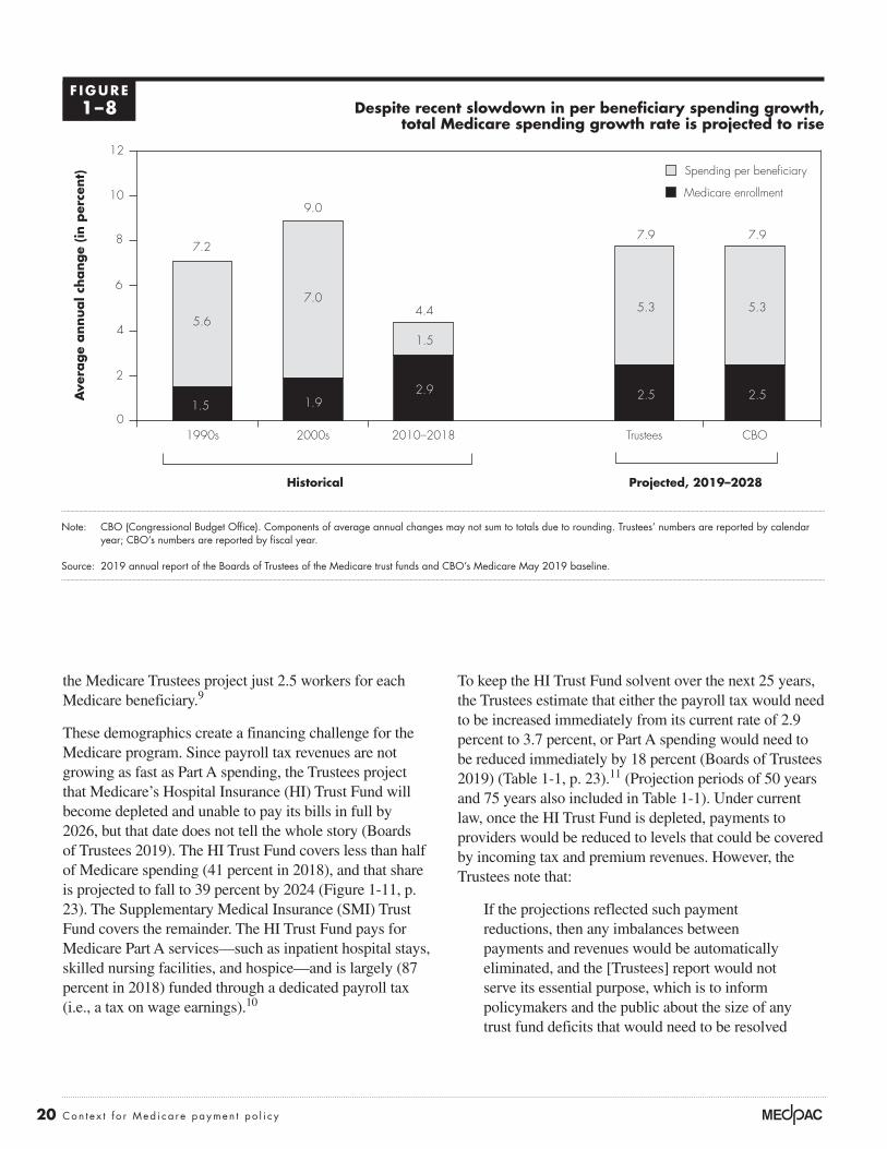
20 Con t e x t f o r Med i ca r e paymen t po l i c y
the Medicare Trustees project just 2.5 workers for each Medicare beneficiary.9
These demographics create a financing challenge for the Medicare program. Since payroll tax revenues are not growing as fast as Part A spending, the Trustees project that Medicare’s Hospital Insurance (HI) Trust Fund will become depleted and unable to pay its bills in full by 2026, but that date does not tell the whole story (Boards of Trustees 2019). The HI Trust Fund covers less than half of Medicare spending (41 percent in 2018), and that share is projected to fall to 39 percent by 2024 (Figure 1-11, p. 23). The Supplementary Medical Insurance (SMI) Trust Fund covers the remainder. The HI Trust Fund pays for Medicare Part A services—such as inpatient hospital stays, skilled nursing facilities, and hospice—and is largely (87 percent in 2018) funded through a dedicated payroll tax (i.e., a tax on wage earnings).10
To keep the HI Trust Fund solvent over the next 25 years, the Trustees estimate that either the payroll tax would need to be increased immediately from its current rate of 2.9 percent to 3.7 percent, or Part A spending would need to be reduced immediately by 18 percent (Boards of Trustees 2019) (Table 1-1, p. 23).11 (Projection periods of 50 years and 75 years also included in Table 1-1). Under current law, once the HI Trust Fund is depleted, payments to providers would be reduced to levels that could be covered by incoming tax and premium revenues. However, the Trustees note that:
If the projections reflected such payment reductions, then any imbalances between payments and revenues would be automatically eliminated, and the [Trustees] report would not serve its essential purpose, which is to inform policymakers and the public about the size of any trust fund deficits that would need to be resolved
Despite recent slowdown in per beneficiary spending growth, total Medicare spending growth rate is projected to rise
Note: CBO (Congressional Budget Office). Components of average annual changes may not sum to totals due to rounding. Trustees’ numbers are reported by calendar year; CBO’s numbers are reported by fiscal year.
Source: 2019 annual report of the Boards of Trustees of the Medicare trust funds and CBO’s Medicare May 2019 baseline.
Cumulative change....FIGURE1-X
Note: Note and Source are in InDesign.
Source:
Ave
rage
annual c
hange
(in p
erce
nt)
0
2
4
6
8
10
12
CBOTrustees2010–20182000s1990s
1.5
7.0
1.9
9.0
5.3
2.5
7.9
5.3
2.5
7.9
2.9
1.5
4.45.6
7.2
Historical Projected, 2019–2028
Medicare enrollment
Spending per beneficiary
F IGURE1–8

21 Repo r t t o t h e Cong r e s s : Med i ca r e Paymen t P o l i c y | Ma r ch 2020
to avert program insolvency. To date, lawmakers have never allowed the assets of the Medicare HI Trust Fund to become depleted. (Boards of Trustees 2018)
The rest of Medicare benefit spending is covered by SMI. It covers services under Part B (physician services and other ambulatory care received in hospital outpatient departments) and Part D (prescription drug coverage). SMI is a trust fund in name only; it is not funded through dedicated taxes like the HI Trust Fund is. Specifically, Part B and Part D are financed by premiums paid by beneficiaries (covering 25 percent of spending) and general tax revenues plus federal borrowing (covering 75 percent of spending), which are reset each year to match expected Part B and Part D spending.12
Since premiums and transfers are set to grow at the same rate as Part B and Part D spending, the SMI Trust Fund
is expected to remain solvent by construction. However, as SMI spending rises, premiums and transfers from the nation’s Treasury to the Medicare program also grow, increasing deficits, the debt, and the strain on household budgets both of workers and retirees, and—assuming no other policy or legislative interventions—reducing the resources available to make investments that expand future economic output (e.g., investments in education, transportation, and research and development).
For a more complete financial picture, consider the combined spending and sources of income from the two trust funds. The top line of Figure 1-12 (p. 24) depicts total Medicare spending as a share of GDP. The layers below the line represent Medicare’s three primary sources of income: payroll taxes, premiums paid by beneficiaries, and general revenue transfers. The white space below the total Medicare spending line in Figure 1-12 represents
Trustees and CBO project Medicare annual spending to more than double over the next decade
Note: CBO (Congressional Budget Office).
Source: 2019 annual report of the Boards of Trustees of the Medicare trust funds and CBO’s Medicare May 2019 baseline.
Health care spending....D
olla
rs (
in b
illio
ns)
Note: Note and Source are in InDesign.
Source:
0
200
400
600
800
1,000
1,200
1,400
1,600
1,800
20252020201520102005
Notes about this graph:• Data is in the datasheet. Make updates in the datasheet.• I deleted the years from the x-axis and put in my own.• I had to manually draw tick marks and axis lines because they kept resetting when I changed any data.• The dashed line looked ok here, so I didn’t hand draw it.• I can’t delete the legend, so I’ll just have to crop it out in InDesign.• Use direct selection tool to select items for modification. Otherwise if you use the black selection tool, they will reset to graph default when you change the data.• Use paragraph styles (and object styles) to format.
FIGURE1-X
Trustees
CBO
Historical Projected
Fiscal year
F IGURE1–9

22 Con t e x t f o r Med i ca r e paymen t po l i c y
Undeniably, the Part A deficit is a financing challenge, but so too is the large and growing share of Medicare spending funded through general revenues. General revenues account for 43 percent of Medicare funding today and, under current law, are projected to grow to 48 percent by 2030; notably, in this context, general revenues include both general tax revenue as well as federal borrowing since, with few exceptions, federal spending has exceeded federal revenues since the Great Depression.
The line at the top of Figure 1-13 (p. 25) represents total federal spending as a share of GDP; the line below spending represents total federal revenues. The difference between these two lines represents the budget deficit, which must be covered by federal borrowing. For most years over the past several decades, the federal government has spent more than it collects in revenues, increasing the federal debt to levels not seen since World War II. Federal revenues have remained relatively constant even though
the Part A deficit created when payroll taxes fall short of Part A spending. Figure 1-12 reflects projections in the Medicare Trustees report, which are based on current law with the exception of disregarding payment reductions that would result from the projected depletion of the HI Trust Fund. Under current law, payments to Part A providers would be reduced to levels that could be covered by incoming tax and premium revenues when the HI Trust Fund becomes depleted. Thus, as Medicare actuaries and others have observed, total Medicare spending would be shifted down from the total projected spending by an amount equal to the Part A deficit (Aaron 2015, Spitalnic 2016). As noted by the actuaries, if the projections reflected such payment reductions, any imbalances between payments and revenues would be automatically eliminated. To date, lawmakers have never allowed the assets of the Medicare HI Trust Fund to become depleted (Boards of Trustees 2019).
Medicare enrollment is rising while number of workers per HI beneficiary is declining
Note: HI (Hospital Insurance). Hospital Insurance is also known as Medicare Part A.
Source: 2019 annual report by the Boards of Trustees of the Medicare trust funds.
Title here....
Work
ers
per
HI ben
efici
ary
Note: Note and Source are in InDesign.
Source:
0
1
2
3
4
5
Number
20402030202020102000199019801970
Notes about this graph:• Data is in the datasheet. Make updates in the datasheet.• I deleted the years from the x-axis and put in my own.• I had to manually draw tick marks and axis lines because they kept resetting when I changed any data.• The dashed line looked ok here, so I didn’t hand draw it.• I can’t delete the legend, so I’ll just have to crop it out in InDesign.• Use direct selection tool to select items for modification. Otherwise if you use the black selection tool, they will reset to graph default when you change the data.• Use paragraph styles (and object styles) to format.
Med
icare
HI en
rollm
ent
(in m
illio
ns)
0
20
40
60
80
100
20402030202020102000199019801970
FIGUREX-X
Figure 1-10a. Medicare HI enrollment Figure 1-10b. Workers per HI beneficiary
Historical Projected Historical Projected
F IGURE1–10

23 Repo r t t o t h e Cong r e s s : Med i ca r e Paymen t P o l i c y | Ma r ch 2020
the federal government has taken responsibility for a broader array of services (e.g., Medicare Part D).
The layers below the top line in Figure 1-13 (p. 25) depict federal spending by program. Assuming no other policy or legislative interventions, spending on Medicare, Medicaid, the other major health programs, Social Security, and net interest payments are projected to reach 19 percent of the
nation’s economy by 2041 and, by themselves, will exceed total federal revenues.13
Moreover, the projection assumes that federal revenues will rise above 19 percent of GDP, above the historical average of 17 percent of GDP. The increase in revenues is projected to occur mainly because income is projected to grow more rapidly than inflation, pushing more income
The HI Trust Fund covers a declining share of total Medicare spending
Note: HI (Hospital Insurance). Hospital Insurance is also known as Medicare Part A. Figure reflects the Boards of Trustees’ intermediate assumptions. The rest of Medicare spending (Part B and Part D) is paid for through the Supplementary Medical Insurance Trust Fund.
Source: 2019 annual report of the Boards of Trustees of the Medicare trust funds.
Health care spending....H
I Tr
ust
Fund s
pen
din
g s
hare
of
tota
l Med
icare
spen
din
g (
in p
erce
nt)
Note: Note and Source are in InDesign.
Source:
0
10
20
30
40
50
60
2027202520232021201920172015201320112009
Notes about this graph:• Data is in the datasheet. Make updates in the datasheet.• I deleted the years from the x-axis and put in my own.• I had to manually draw tick marks and axis lines because they kept resetting when I changed any data.• The dashed line looked ok here, so I didn’t hand draw it.• I can’t delete the legend, so I’ll just have to crop it out in InDesign.• Use direct selection tool to select items for modification. Otherwise if you use the black selection tool, they will reset to graph default when you change the data.• Use paragraph styles (and object styles) to format.
FIGURE1-X
Historical Projected
47 47 46 4644 43
42 42 42 41 41 41 40 40 40 39 39 39 38
F IGURE1–11
T A B L E1–1 Increase in payroll tax or decrease in HI spending needed to
maintain HI Trust Fund solvency for specific time periods
To maintain HI Trust Fund solvency for: Increase 2.9 percent payroll tax to: Or decrease HI spending by:
25 years (2019–2043) 3.7% 18%50 years (2019–2068) 3.8 1975 years (2019–2093) 3.8 19
Note: HI (Hospital Insurance). Hospital Insurance is also known as Medicare Part A.
Source: MedPAC calculations based on Table III.B8 in the 2019 annual report of the Boards of Trustees of the Medicare trust funds.

24 Con t e x t f o r Med i ca r e paymen t po l i c y
Under baseline assumptions, which reflect current law, CBO projects the debt will reach 91 percent of GDP in 2028 and 144 percent of GDP by 2049. However, the CBO baseline assumes that per beneficiary spending for Medicare and Medicaid will increase more slowly in the future than it has during the past several decades. On the one hand, if per beneficiary spending growth were 1 percentage point higher than that of the baseline, the federal debt would be 198 percent of GDP by 2049. On the other hand, if per beneficiary spending growth were 1 percentage point lower, the federal debt would be 102 percent of GDP by 2049.
into higher inflation-indexed tax brackets over time. However, if federal revenues continue at their historical average of 17 percent of GDP, spending on these major programs and net interest payments would exceed total federal revenues even sooner.
With their reliance on general tax dollars and federal deficit spending, Medicare and the other major health care programs have a substantial effect on the federal debt. Debt equaled 35 percent of GDP at the end of 2007, when the economy entered the last recession (Figure 1-14, p. 26). In part because of the recession, the debt soared, reaching 78 percent of GDP in 2019—a higher share than at any point in U.S. history, except briefly around World War II.
General revenue is paying for a growing share of Medicare spending
Note: GDP (gross domestic product). These projections are based on the Trustees’ intermediate set of assumptions. “Tax on benefits” refers to the portion of income taxes that higher income individuals pay on Social Security benefits that is designated for Medicare. “State transfers” (often called the Part D “clawback”) refers to payments from the states to Medicare, required by the Medicare Prescription Drug, Improvement, and Modernization Act of 2003, for assuming primary responsibility for prescription drug spending. “Drug fees” refers to the fee imposed by the Affordable Care Act of 2010 on manufacturers and importers of brand-name prescription drugs. These fees are deposited in the Part B account of the Supplementary Medical Insurance Trust Fund.
Source: 2019 annual report of the Boards of Trustees of the Medicare trust funds.
Health care spending....Sh
are
of
GD
P (
in p
erce
nt)
Note: Note and Source are in InDesign.
Source:
0
1
2
3
4
5
6
7
207620662056204620362026201620061996198619761966
Notes about this graph:• Data is in the datasheet. Make updates in the datasheet.• I deleted the years from the x-axis and put in my own.• I had to manually draw tick marks and axis lines because they kept resetting when I changed any data.• The dashed line looked ok here, so I didn’t hand draw it.• I can’t delete the legend, so I’ll just have to crop it out in InDesign.• Use direct selection tool to select items for modification. Otherwise if you use the black selection tool, they will reset to graph default when you change the data.• Use paragraph styles (and object styles) to format.
FIGURE1-14
State transfers and drug fees
Part A deficit
General revenue transfers
Premiums
Tax on benefits
Payroll taxes
Historical Projected
Total Medicare spending
F IGURE1–12

25 Repo r t t o t h e Cong r e s s : Med i ca r e Paymen t P o l i c y | Ma r ch 2020
Health care spending and state budgetsStates and the federal government jointly finance Medicaid, a program that pays for health care services provided to people with low incomes. In fiscal year 2013, before the coverage expansions made by the ACA, monthly enrollment in Medicaid averaged almost 60 million people, and total spending was $455.6 billion, with the states paying 42 percent on average and the federal government paying the remainder (Centers for Medicare & Medicaid Services 2016). Medicaid spending accounted for an estimated 19.3 percent of state expenditures in that year (Centers for Medicare & Medicaid Services 2014).
The ACA gave states the option to expand Medicaid coverage—beginning in 2014—to nonelderly individuals
The impact of health care spending on state and family budgets
Part of the Commission’s mandate is to view Medicare in the context of the broader health care system. This section examines the effect of health care spending on state budgets and the budgets of individuals and families. States bear a significant share of Medicaid and other health care costs, so rising health care spending also has implications for state budgets. For individuals and families, increases in premiums and cost sharing have negated real income growth in the past decade. Likewise, premiums and cost sharing for Medicare beneficiaries are projected to grow faster than Social Security benefits, which make up a significant share of many beneficiaries’ income.
Spending on Medicare, other major health programs, Social Security, and net interest is projected to exceed total federal revenues by 2041
Note: GDP (gross domestic product), CHIP (Children’s Health Insurance Program).
Source: The 2019 Long-Term Budget Outlook (published June 2018) from the Congressional Budget Office.
Health care spending....Per
cent
of
GD
P
Note: Note and Source are in InDesign.
Source:
0
5
10
15
20
25
30
2049203920292019
Notes about this graph:• Data is in the datasheet. Make updates in the datasheet.• I deleted the years from the x-axis and put in my own.• I had to manually draw tick marks and axis lines because they kept resetting when I changed any data.• The dashed line looked ok here, so I didn’t hand draw it.• I can’t delete the legend, so I’ll just have to crop it out in InDesign.• Use direct selection tool to select items for modification. Otherwise if you use the black selection tool, they will reset to graph default when you change the data.• Use paragraph styles (and object styles) to format.
FIGURE1-14
Medicare
Medicaid, CHIP, and exchange subsidies
Net interest
All other
federal spending
Social Security
Total federal spending
Total federal revenues
Year 2041
F IGURE1–13

26 Con t e x t f o r Med i ca r e paymen t po l i c y
states’ share is projected to range between 37 percent and 38 percent).
The ACA also increased the payment amount primary care providers received for seeing Medicaid patients in 2013 and 2014 so that it equaled Medicare’s payment. This policy represented a significant increase in payments to providers since Medicaid primary care FFS payment rates averaged 59 percent of Medicare fee levels in 2012. The federal government incurred 100 percent of the cost of the payment increase. Even though the federal subsidies expired at the end of 2014, as of 2016, 19 states continued to pay primary care providers rates at least equal to Medicare (Zuckerman et al. 2017).
A provision also established under the ACA authority allows state demonstrations for beneficiaries dually eligible for Medicare and Medicaid (referred to as “dual
with total family income of less than 138 percent of the federal poverty threshold. States received full federal financing to cover this expansion population in 2014, phasing down to 90 percent federal financing by 2020.
CMS actuaries estimate that, by fiscal year 2017, monthly enrollment in Medicaid increased to cover about 74 million people, and total spending increased to more than $592 billion (Centers for Medicare & Medicaid Services 2018a). Because the federal government paid for 100 percent of the costs of newly eligible enrollees, the states’ share of all Medicaid expenditures decreased to 37 percent in 2015 and has remained at that level through 2017 (Centers for Medicare & Medicaid Services 2018a, Centers for Medicare & Medicaid Services 2016). Government actuaries project that the states’ share will remain lower than 40 percent over the next 10 years as more states expand coverage (from 2017 to 2026, the
Health care spending growth impacts future debt levels
Note: GDP (gross domestic product).
Source: The 2019 Long-Term Budget Outlook (published June 2019) from the Congressional Budget Office.
Health care spending....D
ebt
as
a s
hare
of
GD
P (
in p
erce
nt)
Note: Note and Source are in InDesign.
Source:
0
50
100
150
200
250
20442034202420142004
Notes about this graph:• Data is in the datasheet. Make updates in the datasheet.• I deleted the years from the x-axis and put in my own.• I had to manually draw tick marks and axis lines because they kept resetting when I changed any data.• The dashed line looked ok here, so I didn’t hand draw it.• I can’t delete the legend, so I’ll just have to crop it out in InDesign.• Use direct selection tool to select items for modification. Otherwise if you use the black selection tool, they will reset to graph default when you change the data.• Use paragraph styles (and object styles) to format.
FIGURE1-XX
Baseline
1 percentage point higher growth rate
1 percentage point lower growth rate
Historical Projected
F IGURE1–14

27 Repo r t t o t h e Cong r e s s : Med i ca r e Paymen t P o l i c y | Ma r ch 2020
care (Auerbach and Kellermann 2011). Additionally, for those covered by employer-sponsored health insurance, an increase in premiums results in lower wage growth because, through wage reductions, employers offset their increased costs of providing health insurance to their employees (Baicker and Chandra 2006, Gruber 2000). As health care spending increases, an increasing share of income from individuals and families is transferred to insurers, hospitals, physicians, and other providers of health care services.
In the past decade, per capita health care spending and premiums have grown nearly twice as fast as median household incomes and thus account for a greater share of income (Figure 1-15). In 2008, per capita personal health care spending was $6,612, accounting for 13 percent of median household income, which was $50,303. Insurance premiums for individuals and families were $4,704 and $12,680, respectively; family premiums accounted for
eligibles”). Under a financial alignment initiative, CMS has approved 14 demonstrations in 13 states, and 11 demonstrations are still in operation. Most demonstrations are scheduled to last for five to eight years, but some could be extended. Nearly 450,000 dual eligibles are currently enrolled in what is one of the largest demonstration projects that CMS has ever conducted related to dual-eligible beneficiaries. Most demonstrations (11 of 14) are testing a “capitated” model, using health plans known as Medicare–Medicaid Plans to provide all Medicare benefits and all or most Medicaid benefits to dual-eligible individuals (Medicare Payment Advisory Commission 2018).
Health care spending and individual and family budgets For individuals and families, growth in health care spending has meant higher health insurance premiums and a larger proportion of tax revenue devoted to health
Growth in health care spending and premiums outpaced growth in household income, 2008 and 2018
Note: Household income, health expenditures, and premiums are all measured in nominal dollars. Average premiums for individual and family coverage are for employer-sponsored health insurance and include contributions from workers and employers.
Source: MedPAC analysis of Census Bureau, Current Population Survey, Annual Social and Economic Supplements; National Health Expenditure Accounts from CMS; and Kaiser Family Foundation and Health Research & Educational Trust annual surveys of employer health benefits.
Medicare margins....D
olla
rsFIGUREX-X
Note: Note and Source are in InDesign.
Source:
Notes about this graph:• Data is in the datasheet. Make updates in the datasheet.• WATCH FOR GLITCHY RESETS WHEN YOU UPDATE DATA!!!!• The column totals were added manually.• I had to manually draw tick marks and axis lines because they kept resetting when I changed any data.• I can’t delete the legend, so I’ll just have to crop it out in InDesign.• Use direct selection tool to select items for modification. Otherwise if you use the black selection tool, they will reset to graph default when you change the data.• Use paragraph styles (and object styles) to format. • Data was from: R:\Groups\MGA\data book 2007\data book 2007 chp1
0
10,000
20,000
30,000
40,000
50,000
60,000
70,000
20182008
Median household income
Per capita personal health care expenditures
Average premium for individual coverageAverage premium for family coverage
$50,303
$63,179
$19,616$12,680
$6,612 $9,415 $6,896$4,704
F IGURE1–15
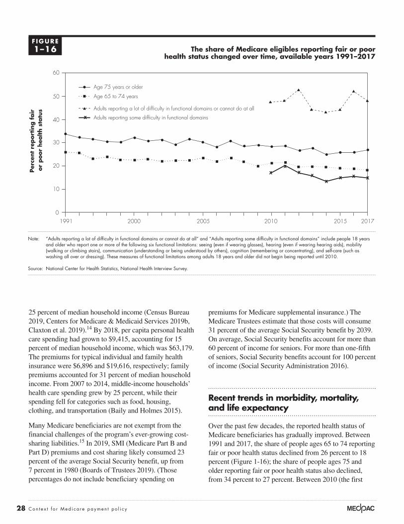
28 Con t e x t f o r Med i ca r e paymen t po l i c y
premiums for Medicare supplemental insurance.) The Medicare Trustees estimate that those costs will consume 31 percent of the average Social Security benefit by 2039. On average, Social Security benefits account for more than 60 percent of income for seniors. For more than one-fifth of seniors, Social Security benefits account for 100 percent of income (Social Security Administration 2016).
Recent trends in morbidity, mortality, and life expectancy
Over the past few decades, the reported health status of Medicare beneficiaries has gradually improved. Between 1991 and 2017, the share of people ages 65 to 74 reporting fair or poor health status declined from 26 percent to 18 percent (Figure 1-16); the share of people ages 75 and older reporting fair or poor health status also declined, from 34 percent to 27 percent. Between 2010 (the first
25 percent of median household income (Census Bureau 2019, Centers for Medicare & Medicaid Services 2019b, Claxton et al. 2019).14 By 2018, per capita personal health care spending had grown to $9,415, accounting for 15 percent of median household income, which was $63,179. The premiums for typical individual and family health insurance were $6,896 and $19,616, respectively; family premiums accounted for 31 percent of median household income. From 2007 to 2014, middle-income households’ health care spending grew by 25 percent, while their spending fell for categories such as food, housing, clothing, and transportation (Baily and Holmes 2015).
Many Medicare beneficiaries are not exempt from the financial challenges of the program’s ever-growing cost-sharing liabilities.15 In 2019, SMI (Medicare Part B and Part D) premiums and cost sharing likely consumed 23 percent of the average Social Security benefit, up from 7 percent in 1980 (Boards of Trustees 2019). (Those percentages do not include beneficiary spending on
The share of Medicare eligibles reporting fair or poor health status changed over time, available years 1991–2017
Note: “Adults reporting a lot of difficulty in functional domains or cannot do at all” and “Adults reporting some difficulty in functional domains” include people 18 years and older who report one or more of the following six functional limitations: seeing (even if wearing glasses), hearing (even if wearing hearing aids), mobility (walking or climbing stairs), communication (understanding or being understood by others), cognition (remembering or concentrating), and self-care (such as washing all over or dressing). These measures of functional limitations among adults 18 years and older did not begin being reported until 2010.
Source: National Center for Health Statistics, National Health Interview Survey.
Title here....
Per
cent
report
ing f
air
or
poor
hea
lth s
tatu
s
Note: Note and Source are in InDesign.
Source:
0
10
20
30
40
50
60
201720152010200520001991
Notes about this graph:• Data is in the datasheet. Make updates in the datasheet.• I deleted the years from the x-axis and put in my own.• I had to manually draw tick marks and axis lines because they kept resetting when I changed any data.• The dashed line looked ok here, so I didn’t hand draw it.• I can’t delete the legend, so I’ll just have to crop it out in InDesign.• Use direct selection tool to select items for modification. Otherwise if you use the black selection tool, they will reset to graph default when you change the data.• Use paragraph styles (and object styles) to format.
FIGURE1-XX
Age 75 years or older
Age 65 to 74 years
Adults reporting some difficulty in functional domains
Adults reporting a lot of difficulty in functional domains or cannot do at all
F IGURE1–16

29 Repo r t t o t h e Cong r e s s : Med i ca r e Paymen t P o l i c y | Ma r ch 2020
turn make it easier for people to afford to access health care. Between 1970 and 2018, the poverty rate among people ages 65 years and older fell, with the support of the Social Security program, from almost 25 percent to about 9.5 percent, potentially having a substantial effect on individual and population health for that age group (Figure 1-17). Between 1997 and 2018, the poverty rate for younger adults with disabilities has also declined, from 36 percent to 26 percent.
Although the reported health status of Medicare beneficiaries has improved, several recent studies have highlighted increasing morbidity and mortality among some populations of Americans, particularly middle-aged non-Hispanic Whites (see text box, p. 31).
Life expectancy by sex, race, and Hispanic originIn general—with some notable exceptions—life expectancy in the U.S. has been rising over the past century (although more slowly than in other Organisation
year the measure was reported) and 2017, among adults who report “some” difficulty in functional domains, the share reporting fair or poor health status declined slightly from 17 percent to 15 percent. However, among adults who report “a lot” of difficulty in functional domains or not being able to perform them at all, a higher share reported fair or poor health status: 48 percent in 2017, comparable to 47 percent in 2010.
Declines in the share of people reporting fair or poor health occurred despite rising shares of people ages 65 and older having chronic conditions such as diabetes, hypertension, and high cholesterol—perhaps because these increases have coincided with increases in the share of people who have such conditions under control (Federal Interagency Forum on Aging-Related Statistics 2016, National Center for Health Statistics 2015). (Comparable information for the Medicare population under age 65 is not readily available.)
One factor that may have contributed to improved health status over time is rising income levels, which could in
The poverty rate has fallen over time among people ages 65 years and older and adults with disabilities, available years 1970–2018
Note: Data on the poverty rate among people with disabilities has been reported for only eight years: 1997, 2000, 2010, 2014, 2015, 2016, 2017, and 2018.
Source: Data on income and poverty from the Census Bureau.
Title here....Pove
rty r
ate
(in
per
cent)
Note: Note and Source are in InDesign.
Source:
0
5
10
15
20
25
30
35
40
2015201020052000199519901985198019751970
Notes about this graph:• Data is in the datasheet. Make updates in the datasheet.• I deleted the years from the x-axis and put in my own.• I had to manually draw tick marks and axis lines because they kept resetting when I changed any data.• The dashed line looked ok here, so I didn’t hand draw it.• I can’t delete the legend, so I’ll just have to crop it out in InDesign.• Use direct selection tool to select items for modification. Otherwise if you use the black selection tool, they will reset to graph default when you change the data.• Use paragraph styles (and object styles) to format.
FIGURE1-XX
Disabled, 18 to 64 years
65 years and older
F IGURE1–17

30 Con t e x t f o r Med i ca r e paymen t po l i c y
over time, the general trend—that the Hispanic population has the longest life expectancy and non-Hispanic African Americans have the shortest—has persisted (Arias 2016).
Life expectancy by geographic areasLife expectancy in the United States varies based on an array of geographic characteristics, including urban and rural location and among states. A 2017 study by Zolot found a greater than 20-year difference in life expectancy by county and a trend that these geographic disparities have been growing over the past few decades (Zolot 2017). A 2014 study by Singh and Siahpush found that life expectancy was inversely related to levels of rurality and that rural African Americans and Whites had lower life expectancies than their urban counterparts (Singh and Siahpush 2014).17 From 2005 through 2009, those in large metropolitan areas had a life expectancy of 79.1 years compared with 76.9 years for those in small towns and 76.7 years for those in rural areas. Compared with their urban peers, people in rural areas had higher rates of both smoking and lung cancer, along with obesity. Additionally, rural residents on average had a lower median family income and higher poverty rate, and fewer had college degrees, which may contribute to the difference in life expectancy. Another study by Chetty and colleagues
for Economic Co-operation and Development (OECD) countries).16 This increasing longevity is influenced by a range of factors, including health behavior changes, greater disease prevention efforts, and advances in medical treatments. In 2017, average life expectancy at birth for an individual living in the U.S. was 78.6 years (Table 1-2). However, an individual’s life expectancy can vary significantly from this average based on certain characteristics, including race, sex, socioeconomic status, and geographic location. Variations have existed ever since official data have been collected. For example, in 2017, women on average had a longer life expectancy than men (81.1 years vs. 76.1 years, respectively) (Table 1-2). Though this longevity gap has lessened in recent years (data not shown), researchers speculate that these differences are caused by a combination of genetics, reductions in infections, and behavioral and lifestyle factors (Beltran-Sanchez et al. 2015).
Race and ethnicity are also associated with variations in life expectancy. The Hispanic population in the U.S. in 2017 had a higher life expectancy at birth (81.8 years) than the non-Hispanic White and African American populations, at 78.5 and 74.9 years, respectively (Table 1-2). Although these differences have shifted somewhat
T A B L E1–2 Life expectancy at birth, in years, by race/ethnicity and sex, 2008 to 2017
2008 2016 2017
Change 2008–2017 (in years)
Change 2016–2017 (in years)
All races and ethnicities, both sexes 78.2 78.7 78.6 0.4 –0.1White, not Hispanic, both sexes 78.4 78.6 78.5 0.1 –0.1African American, not Hispanic, both sexes 73.9 74.9 74.9 1.0 0Hispanic, both sexes 80.8 81.8 81.8 1.0 0
All races and ethnicities, female 80.6 81.1 81.1 0.5 0White, not Hispanic, female 80.7 81.0 81.0 0.3 0African American, not Hispanic, female 77.0 78.0 78.1 1.1 0.1Hispanic, female 83.3 84.3 84.3 1.0 0
All races and ethnicities, male 75.6 76.2 76.1 0.5 –0.1White, not Hispanic, male 76.0 76.2 76.1 0.1 –0.1African American, not Hispanic, male 70.5 71.6 71.5 1.0 –0.1Hispanic, male 78.0 79.1 79.1 1.1 0
Source: Centers for Disease Control and Prevention, National Center for Health Statistics, National Vital Statistics System.

31 Repo r t t o t h e Cong r e s s : Med i ca r e Paymen t P o l i c y | Ma r ch 2020
educated populations, high incomes, and high levels of government expenditures. Some potential explanations for these findings are that these areas may have public policies that improve health (e.g., smoking bans) or they may have greater funding for public services. However, the Commission’s research has found little difference between
exploring the association between life expectancy and income found that low-income individuals’ life expectancy varied substantially based on where they lived (Chetty et al. 2016). The study found that individuals in the lowest income quartile often lived longer and had more healthful behaviors if they resided in urban areas with highly
Increasing mortality and morbidity trends for particular populations
Several recent studies and news reports have highlighted aspects of increasing mortality and morbidity among some Americans (Arias
2016, Case and Deaton 2017, Case and Deaton 2015, Montez et al. 2016, Zolot 2017). These aspects include—for specific groups—decreases in life expectancy; increasing rates of suicide and deaths from drug poisonings; and troubling health indicators and behaviors, such as greater alcohol consumption, smoking, and obesity. These trends interact with longstanding underlying variations in life expectancy, mortality, and morbidity by sex, income, race and ethnicity, and geographic location. While researchers have applied diverse methods and reported various aspects of these trends, two key findings are (1) increases in mortality in groups of Whites, especially those with only a high school diploma or less, and (2) lower and decreasing life expectancy for residents of certain geographic areas.
One population that has experienced a recent increase in mortality is the middle-aged (45 to 54 years old) non-Hispanic White population (Case and Deaton 2015, Kochanek et al. 2015). An analysis by Case and Deaton found no similar mortality rate increase in other industrialized countries or in the non-Hispanic African American or Hispanic population of this age group (Case and Deaton 2015). Case and Deaton note that three causes of death have risen dramatically among this group in the past decade: suicides, intentional and unintentional poisonings, and chronic liver disease. Additionally, this group’s rise in midlife mortality is paralleled by increases in self-reported midlife morbidity and troubling health indicators and behaviors, such as increased alcohol consumption, smoking, and obesity. Case and Deaton’s findings
indicate that the increase in reports of poor health by this group has been matched by increasing reports of physical pain and psychological distress.
As with any population-level trend, the causes of increased midlife morbidity and mortality among non-Hispanic Whites are difficult to identify. A recent study found that varying inequalities in women’s mortality across states may be partially explained by macro-level socioeconomic and political factors—for example, policies that shape access to health care, use of tobacco, availability of affordable housing, children’s health care, and financial safety nets (Montez et al. 2016). Some researchers point to the availability of opioid drugs as a possible source of rising mortality rates. Increased reports of pain combined with the greater availability of opioid prescriptions for pain that began in the late 1990s have been widely noted, as well as the associated mortality (Rudd et al. 2016). Studies have also found that recent restrictions of opioid prescriptions may lead to unintended negative consequences such as increased use of heroin (Compton et al. 2016). There is concern that those affected by opioid and substance use in midlife include current Medicare beneficiaries under 65 and others who will age into Medicare in worse health than current beneficiaries. Researchers have found that patients with a diagnosed opioid dependency are high users of health care services, including office visits, lab tests, and related treatments (FAIR Health 2016). However, this use may be related to the underlying conditions for which opioids were used as much as the consequences of opioid abuse or related effects. Addiction is hard to treat, chronic pain is challenging to control, and these conditions appear to be potential problems among the next generation of Medicare beneficiaries. ■

32 Con t e x t f o r Med i ca r e paymen t po l i c y
Between 2008 and 2017, life expectancy at 65 (i.e., remaining years of life) increased for all groups (Table 1-3).
Life expectancy at age 65 has increased since the introduction of Medicare. Individuals who reached age 65 in 2017 had a remaining life expectancy of 19.4 years, compared with 15.1 years for this age group in 1970. However, these beneficiaries’ gains in longevity are outpaced by their peers’ gains in other OECD countries. From 1970 to 2017, U.S. life expectancy at age 65 improved by 4.3 years (Figure 1-18), compared with an average gain of 5.5 years for the 36 OECD countries.19 (Comparable information for the Medicare population under age 65 is not readily available.)
Leading causes of deathOver the past few decades, there has been little change in the leading causes of death in the United States, both for all Americans and those 65 and older (Table 1-4, p. 34, and Table 1-5, p. 34). Heart disease and cancer have remained the first and second leading causes of death, respectively, for both age groups for more than 75 years (Hoyert 2012, National Center for Health Statistics 2018). In each year between 1935 and 2017, three causes—heart disease, cancer, and stroke—remained among the five leading
rural and urban beneficiaries’ experience with access to care and amount of service use. With respect to quality of care, quality is similar for most types of providers in rural and urban areas; however, rural hospitals tend to have below-average rankings on mortality and some process measures (Medicare Payment Advisory Commission 2012).
A recent study by Montez and colleagues examined variation in women’s mortality rates across states (Montez et al. 2016).18 The study found that a state’s economic and social environment (e.g., welfare policies, tobacco tax rate, level of economic inequality) had a significant effect on women’s mortality rate. The researchers found that many of the states with the best economic and social indicators had some of the lowest mortality rates among women. The same correlation was not seen among males. These findings imply that geographic inequities in women’s mortality rates may not be fully explained just by women’s personal characteristics; rather, the influence of socioeconomic and political contexts must also be considered.
Life expectancy at age 65Recent decreases in life expectancy and increases in mortality are mostly isolated to the under-65 population.
T A B L E1–3 Life expectancy at age 65, in years, by race/ethnicity and sex, 2008 to 2017
2008 2016 2017
Change 2008–2017 (in years)
Change 2016–2017 (in years)
All races and ethnicities, both sexes 18.8 19.4 19.4 0.6 0White, not Hispanic, both sexes 18.8 19.4 19.3 0.5 –0.1African American, not Hispanic, both sexes 17.4 18.1 18.1 0.7 0Hispanic, both sexes 20.4 21.5 21.4 1.0 –0.1
All races and ethnicities, female 20.0 20.6 20.6 0.6 0White, not Hispanic, female 20.0 20.5 20.5 0.5 0African American, not Hispanic, female 18.8 19.5 19.5 0.7 0Hispanic, female 21.6 22.7 22.7 1.1 0
All races and ethnicities, male 17.4 18.1 18.1 0.7 0White, not Hispanic, male 17.4 18.0 18.0 0.6 0African American, not Hispanic, male 15.4 16.2 16.2 0.8 0Hispanic, male 18.7 19.8 19.7 1.0 –0.1
Source: Centers for Disease Control and Prevention, National Center for Health Statistics, National Vital Statistics System.

33 Repo r t t o t h e Cong r e s s : Med i ca r e Paymen t P o l i c y | Ma r ch 2020
all other developed countries (Organisation for Economic Co-operation and Development 2019). That said, it is important to note that health care use is not generally higher in the U.S. than in other countries; instead, the higher spending per person in the U.S. has been attributed to higher prices and higher administrative costs (Anderson et al. 2019, International Federation of Health Plans 2019, Papanicolas et al. 2018).
Some of the leading causes of death in the United States overlap with the most prevalent and most expensive chronic conditions among Medicare FFS beneficiaries (Table 1-6, p. 35). In Table 1-6, the Medicare total per capita spending amounts represent all Medicare spending for FFS beneficiaries with the specified condition (i.e., the spending cannot be attributed strictly to the specified
causes. Suicide was the 10th leading cause of death among all Americans in both 1980 and 2017.
Compared with other OECD countries, lower shares of deaths in the United States are caused by cancer and cerebrovascular diseases (e.g., stroke), while higher shares of deaths are caused by ischemic heart diseases; diseases of the respiratory system (e.g., chronic obstructive pulmonary diseases, influenza); diseases of the nervous system (e.g., Parkinson’s, Alzheimer’s); mental and behavioral disorders (e.g., dementia); endocrine, nutritional, and metabolic diseases (e.g., diabetes); diseases of the genitourinary system; and external causes of mortality (e.g., transport accidents, intentional self-harm, accidental poisonings). Many of these diseases are exacerbated by obesity, in which the United States leads
Life expectancy at age 65 is lower and increased less in the United States than in other OECD countries, 1970 and 2017
Note: OECD (Organisation for Economic Co-operation and Development). “OECD36” refers to the average of all 36 OECD countries. Selected OECD countries are shown. Early life expectancy figures for Italy, Canada, and Finland are as of 1971 rather than 1970. For Brazil, the recent life expectancy figure is as of 2015. Data are not available for 1970 for Brazil, Israel, and the Russian Federation.
Source: 2019 data on life expectancy at age 65 from the Organisation for Economic Co-operation and Development.
Medicare margins....Ye
ars
FIGUREX-X
Note: Note and Source are in InDesign.
Source:
Notes about this graph:• Data is in the datasheet. Make updates in the datasheet.• WATCH FOR GLITCHY RESETS WHEN YOU UPDATE DATA!!!!• The column totals were added manually.• I had to manually draw tick marks and axis lines because they kept resetting when I changed any data.• I can’t delete the legend, so I’ll just have to crop it out in InDesign.• Use direct selection tool to select items for modification. Otherwise if you use the black selection tool, they will reset to graph default when you change the data.• Use paragraph styles (and object styles) to format. • Data was from: R:\Groups\MGA\data book 2007\data book 2007 chp1
0
5
10
15
20
25
Russi
an Fe
derat
ionTur
key
Mex
ico
Polan
dBraz
il
United
Stat
es
Slove
nia
German
y
OEC
D36
United
King
dom
Austria
Finlan
d
Swed
en
Norway
Israe
lKo
rea
Canad
aIta
ly
Australi
aSp
ain
Switz
erlan
d
Franc
eJap
an
1970
2017
22.0 21.6 21.4 21.4 21.0 20.8 20.7 20.7 20.520.6 20.4 20.3 20.0 20.0 19.7 19.7 19.419.718.1 18.1 17.8
15.9
17.6
F IGURE1–18

34 Con t e x t f o r Med i ca r e paymen t po l i c y
T A B L E1–4 Leading causes of death, 1980 and 2017
Table 1-4a. Leading causes of death, 1980 Table 1-4b. Leading causes of death, 2017
Cause of deathShare of deaths Cause of death
Share of deaths
1. Heart disease 38.2% 1. Heart disease 23.0%2. Cancer 20.9 2. Cancer 21.33. Stroke 8.6 3. Unintentional injuries 6.04. Unintentional injuries 5.3 4. Chronic lower respiratory disease 5.75. Chronic lower respiratory diseases 2.8 5. Stroke 5.26. Pneumonia and influenza 2.7 6. Alzheimer’s disease 4.37. Diabetes mellitus 1.8 7. Diabetes mellitus 3.08. Chronic liver disease and cirrhosis 1.5 8. Pneumonia and influenza 2.09. Atherosclerosis 1.5 9. Nephritis, nephrotic syndrome, and nephrosis 1.810. Suicide 1.4 10. Suicide 1.7
Note: “Chronic lower respiratory diseases” was formerly known as “chronic obstructive pulmonary diseases.” Starting with 1999 data, the rules for selecting “chronic lower respiratory diseases” (CLRD) and “pneumonia” as the underlying cause of death changed, resulting in an increase in the number of deaths for CLRD and a decrease in the number of deaths for pneumonia. Therefore, trend data for these two causes of death should be interpreted with caution. Also, starting with 2011 data, the rules for selecting renal failure as the underlying cause of death were changed, affecting the number of deaths in the “nephritis, nephrotic syndrome, and nephrosis” and “diabetes mellitus” categories. The result is a decrease in the number of deaths attributed to nephritis, nephrotic syndrome, and nephrosis and an increase in the number of deaths attributed to diabetes mellitus. Therefore, trend data for these two causes of death should be interpreted with caution.
Source: Centers for Disease Control and Prevention, National Center for Health Statistics, National Vital Statistics System.
T A B L E1–5 Leading causes of death at age 65 and older, 1980 and 2017
Table 1-5a. Leading causes of death at age 65 and older, 1980
Table 1-5b. Leading causes of death at age 65 and older, 2017
Cause of deathShare of deaths Cause of death
Share of deaths
1. Heart disease 44.4% 1. Heart disease 25.1%2. Cancer 19.3 2. Cancer 20.73. Stroke 10.9 3. Chronic lower respiratory diseases 6.64. Pneumonia and influenza 3.4 4. Stroke 6.15. Chronic lower respiratory diseases 3.2 5. Alzheimer’s disease 5.86. Atherosclerosis 2.1 6. Diabetes mellitus 2.97. Diabetes mellitus 1.9 7. Unintentional injuries 2.78. Unintentional injuries 1.9 8. Pneumonia and influenza 2.39. Nephritis, nephrotic syndrome, and nephrosis 1.0 9. Nephritis, nephrotic syndrome, and nephrosis 2.010. Chronic liver disease and cirrhosis 0.7 10. Septicemia 1.5
Note: “Chronic lower respiratory diseases” was formerly known as “chronic obstructive pulmonary diseases.” Starting with 1999 data, the rules for selecting “chronic lower respiratory diseases” (CLRD) and “pneumonia” as the underlying cause of death changed, resulting in an increase in the number of deaths for CLRD and a decrease in the number of deaths for pneumonia. Therefore, trend data for these two causes of death should be interpreted with caution. Also, starting with 2011 data, the rules for selecting renal failure as the underlying cause of death were changed, affecting the number of deaths in the “nephritis, nephrotic syndrome, and nephrosis” and “diabetes mellitus” categories. The result is a decrease in the number of deaths attributed to nephritis, nephrotic syndrome, and nephrosis and an increase in the number of deaths attributed to diabetes mellitus. Therefore, trend data for these two causes of death should be interpreted with caution.
Source: Centers for Disease Control and Prevention, National Center for Health Statistics, National Vital Statistics System.

35 Repo r t t o t h e Cong r e s s : Med i ca r e Paymen t P o l i c y | Ma r ch 2020
obesity, evidence about the effects of weight loss on the health and health care spending of obese people is inconclusive at best (Congressional Budget Office 2015). Between 2007 and 2017, the percentage of nonelderly Medicare beneficiaries (who are eligible for the program due to disability) who have multiple chronic conditions has increased slightly. Meanwhile, the share of elderly Medicare beneficiaries with multiple chronic conditions has not meaningfully changed, remaining high throughout this period (Figure 1-19, p. 36).
The next generation of Medicare beneficiaries
By 2030, the entire baby-boom generation will be eligible for Medicare (Figure 1-20, p. 37).20 That year, Medicare is
condition because beneficiaries could have other health conditions that contribute to their total Medicare use and spending amounts).
It is unclear how the prevalence of these and other acute and chronic conditions contributes to Medicare spending trends in part because treatments for conditions are influenced by changes in technology and definitions of what constitutes disease shift over time. The Commission explored this question in 2007 and found upward pressure on Medicare costs because of a greater proportion of beneficiaries being treated for multiple chronic conditions (Medicare Payment Advisory Commission 2007). This increase reflected growth in the prevalence of obese beneficiaries, advances in technology for diagnosing and treating conditions, and changes in disease definitions. More recently, CBO found that, while ample evidence exists of increased health care spending associated with
T A B L E1–6 Selected chronic conditions by prevalence and total
per capita spending among Medicare FFS beneficiaries, 2017
Chronic condition
Prevalence among Medicare FFS beneficiaries
Total per capita spending for beneficiaries with the specified condition
Five chronic conditions most prevalent among Medicare FFS beneficiaries:
Hypertension 58.7% $14,997.92Hyperlipidemia 48.3 15,623.96Rheumatoid arthritis/osteoarthritis 34.2 16,414.08Diabetes mellitus 28.0 16,646.10Ischemic heart disease 27.8 20,384.57
Five chronic conditions with highest total per capita spending among Medicare FFS beneficiaries:
Stroke 3.9 33,485.39Heart failure 14.4 30,051.46COPD 12.1 26,394.90Hepatitis (chronic viral B and C) N/A 26,376.30Atrial fibrillation 8.7 26,210.35
Note: FFS (fee-for-service), COPD (chronic obstructive pulmonary disease), N/A (not available). Data include all Medicare beneficiaries who were eligible for or enrolled in Medicare on or after January 1, 2017. Period prevalence is calculated for these rates: beneficiaries with full or nearly full FFS coverage (i.e., 11 or 12 months of Medicare Part A and Part B (or coverage until time of death) and 1 month or less of HMO coverage) during the year who received treatment for the condition within the condition-specified look-back period (chronic conditions have a 1- to 3-year look-back period). Beneficiaries may be counted in more than one chronic condition category. The Medicare utilization and spending information presented above represents total Medicare FFS spending for beneficiaries with the condition. The information should not be used to attribute utilization or payments strictly to the specific condition selected because beneficiaries with any of the specific conditions presented may have had other health conditions that contributed to their Medicare utilization and spending amounts.
Source: 2019 data from the Chronic Conditions Warehouse from the Centers for Medicare & Medicaid Services.

36 Con t e x t f o r Med i ca r e paymen t po l i c y
the Medicare population will exert somewhat less pressure on spending in the very near term, at least on a per capita basis, and then pressure will increase again over the longer term.21
Evidence of inefficient health care spending
With few exceptions throughout modern history, health care spending in the United States has grown robustly, outpacing the growth in the economy. Even if Medicare’s recent low growth in per beneficiary spending is sustained, enrollment growth from the aging of the baby boomers will contribute to growth in total spending regardless. And yet, ever-increasing health care spending is not inevitable. There is strong evidence that a sizeable share of current
projected to have nearly 80 million beneficiaries—up from 60 million beneficiaries in 2018 (Figure 1-10a, p. 22)—almost 90 percent of whom will be of the baby-boom generation (Boards of Trustees 2019). These individuals will define the upcoming Medicare population in terms of age distribution, health status, health insurance experiences before Medicare enrollment, and financial security.
The Medicare population over the next 10 years will be relatively younger, as members of the baby-boom generation join and increase the number of beneficiaries in younger age categories (Figure 1-21, p. 38).
The share of the Medicare population ages 85 years or older is projected to decline slightly through 2025 and then grow as baby boomers continue to age (Boards of Trustees 2014, Census Bureau 2014). In 2013, per beneficiary spending for those ages 85 and older was about twice that of those ages 65 to 74. So, the changing age structure of
The prevalence of multiple chronic conditions is higher among elderly Medicare beneficiaries than non-elderly beneficiaries
Source: CMS administrative enrollment and claims data for Medicare beneficiaries enrolled in the fee-for-service program, available from the CMS Chronic Condition Data Warehouse, https://www.cms.gov/Research-Statistics-Data-and-Systems/Statistics-Trends-and-Reports/Chronic-Conditions/MCC_Main.
Title here....
Share
with m
ultip
le
chro
nic
conditio
ns
Note: Note and Source are in InDesign.
Source:
0
10
20
30
40
50
60
70
80
90
100
20172016201520142013201220112010200920082007
Notes about this graph:• Data is in the datasheet. Make updates in the datasheet.• I deleted the years from the x-axis and put in my own.• I had to manually draw tick marks and axis lines because they kept resetting when I changed any data.• The dashed line looked ok here, so I didn’t hand draw it.• I can’t delete the legend, so I’ll just have to crop it out in InDesign.• Use direct selection tool to select items for modification. Otherwise if you use the black selection tool, they will reset to graph default when you change the data.• Use paragraph styles (and object styles) to format.
FIGURE1-XX
Dual eligibles ages 65 and older
Non–dual eligibles ages 65 and older
Non–dual eligibles under age 65
Dual eligibles under age 65
F IGURE1–19

37 Repo r t t o t h e Cong r e s s : Med i ca r e Paymen t P o l i c y | Ma r ch 2020
poorly on indicators of efficiency, equity, and outcomes. According to a 2017 study by the Commonwealth Fund, the U.S. ranks last of 11 nations on 2 indicators of healthy lives—mortality amenable to health care and life expectancy at age 60 (Schneider et al. 2017).
The Commission’s approach to addressing spending inefficiencies in Medicare The Medicare program is a complex and fragmented system. It consists of multiple paths to entitlement; multiple types of coverage (Part A, Part B, Part C, and Part D); and different rules for different care settings. The Medicare program sets prices for thousands of services at different levels of aggregation (e.g., inpatient hospital payments are paid based on the stay, while physician payments are based on the service) and in different labor markets across the country. The program sets payment rates each year for at least nine health care settings or provider types: acute care hospitals, physician and other health professional services, home health agencies, skilled nursing facilities, long-term care facilities, hospice,
health care spending—both overall and by Medicare—is inefficient or unnecessary, providing an opportunity for policymakers to reduce spending, extend the life of the program, and reduce pressure on the federal budget.
Geographic variation within and outside United States indicates some share of spending is inefficient Research on Medicare spending shows that areas with higher spending or more intensive use of services do not necessarily have higher quality of care or improved patient outcomes (Fisher et al. 2003a, Fisher et al. 2003b). Measures of service use, adjusted for health status and standardized prices, also show considerable variation (Medicare Payment Advisory Commission 2011b). Services that have been widely recognized as low value continue to be performed regularly (Schwartz et al. 2014).
The United States spends more on health care than any other country in the world (both on a per capita basis and as a share of GDP), but studies consistently show it ranks
By 2030, the entire baby-boom generation will be eligible for Medicare
Source: Census Bureau, 2010 Census; 2017 National Population Projections, main series.
Title here....
Note: Note and Source are in InDesign.
Source:
Notes about this graph:• Data is in the datasheet. Make updates in the datasheet.• I deleted the years from the x-axis and put in my own.• I had to manually draw tick marks and axis lines because they kept resetting when I changed any data.• The dashed line looked ok here, so I didn’t hand draw it.• I can’t delete the legend, so I’ll just have to crop it out in InDesign.• Use direct selection tool to select items for modification. Otherwise if you use the black selection tool, they will reset to graph default when you change the data.• Use paragraph styles (and object styles) to format.
Age
0 20 40 60 80 100
0–5
5–24
25–44
45–64
65–84
85+
FIGUREX-X
Figure 1-21a: Population by age and sex: 2010
Baby-boom population
Population (in millions)
2
15
39 41
41 41
42
11 10
51
19
3
Male FemaleA
ge
0 20 40 60 80 100
0–5
5–24
25–44
45–64
65–84
85+
Figure 1-21b: Population by age and sex: 2030
Baby-boom population
Population (in millions)
5
24
31 32
39 38
41
11 10
39
29
3
Male Female
F IGURE1–20

38 Con t e x t f o r Med i ca r e paymen t po l i c y
8.1 percent of payments in Medicare Advantage were improper, as were 1.7 percent of payments to Part D plans (Department of Health and Human Services 2019b). Within FFS Medicare, some payment systems have higher improper payment rates than others: for example, the rate of improper payments for inpatient rehabilitation facilities was 41.5 percent; for durable medical equipment, prosthetics, orthotics, and supplies was 35.5 percent; and for home health services was 17.6 percent (Department of Health and Human Services 2019a).
In recent years, CMS has gained new authorities to exclude potentially fraudulent providers from the program and apply different levels of scrutiny to new providers based on their fraud potential. CMS has also further developed its ability to identify potentially fraudulent billing patterns. However, all of CMS’s activities in this area are constrained by resources and are subject to statutory requirements that limit its ability to use the same tools as private insurers to reduce fraud (Government Accountability Office 2013).
Beyond the general complexity of the program, several of Medicare’s specific features complicate efforts to achieve
inpatient rehabilitation facilities, ambulatory surgical centers, and end-stage renal disease dialysis facilities. In addition to the yearly rulemaking process involved in setting these rates, administrators oversee other parts of the program that operate on fee schedules (ambulances, outpatient lab facilities, federally qualified health centers) or on cost-based payment (critical access hospitals). Payment rates for Part C (Medicare Advantage) are set using plan bids relative to an administratively set benchmark, and Part D payments (prescription drug plans) are generally set by a competitive process. The Medicare program statute and rulemaking include a substantial number of exceptions, adjustments, and modifications to its general policies.
The complexity of the Medicare program makes it vulnerable to inappropriate care, waste, and fraud. GAO annually designates Medicare as a high-risk program because of its size, complexity, and susceptibility to mismanagement and improper payments (which include fraud and errors but not overuse of services) (Government Accountability Office 2019). In 2018, CMS estimated that 8.1 percent of payments in FFS Medicare and
The Medicare population will become younger as it expands, and then grow older as the baby boom generation ages
Source: Census Bureau, 2017 National Population Projections.
Title here....Per
cent
Note: Note and Source are in InDesign.
Source:
0
10
20
30
40
50
60
70
80
90
100
2060205520502045204020352030202520202016
Notes about this graph:• Data is in the datasheet. Make updates in the datasheet.• I deleted the years from the x-axis and put in my own.• I had to manually draw tick marks and axis lines because they kept resetting when I changed any data.• The dashed line looked ok here, so I didn’t hand draw it.• I can’t delete the legend, so I’ll just have to crop it out in InDesign.• Use direct selection tool to select items for modification. Otherwise if you use the black selection tool, they will reset to graph default when you change the data.• Use paragraph styles (and object styles) to format.
FIGURE1-XX
Ages 85 years and older
Ages 65 to 84 years
F IGURE1–21

39 Repo r t t o t h e Cong r e s s : Med i ca r e Paymen t P o l i c y | Ma r ch 2020
drugs, as of 2020, CMS conditioned the payment of a transitional drug add-on payment under the Part B end-stage renal disease prospective payment system on the availability of ASP data for the drug in question.)
• Implement an ASP inflation rebate as protection against the potential for rapid price increases by manufacturers.
• Use consolidated billing codes to pay for Part B products with a reference biologic and its associated biosimilars to spur price competition.
• June 2017—improve Part B drug payment in the long term by creating a voluntary market-based alternative to the current average sales price payment system: the Part B Drug Value Program (DVP). The DVP’s intent is to obtain lower prices for Part B drugs by permitting private vendors to use tools to negotiate prices with manufacturers and by improving incentives for provider efficiency through shared savings opportunities. The recommendation included the following elements:
• Medicare contracts with a small number of private vendors to negotiate prices for Part B drugs and biologicals.
• Vendors use tools including a formulary and, for products meeting selected criteria, binding arbitration.
• Providers purchase all DVP products at the price negotiated by their selected DVP vendor.
• Medicare pays providers the DVP-negotiated price and pays vendors an administrative fee, with opportunities for shared savings.
• Medicare payments under the DVP cannot exceed 100 percent of average sales price.
• March 2020—freeze or reduce some providers’ payment rates, as we recommend in this report (which would decrease federal Medicare spending by over $2 billion in 2021 and over $20 billion over the next five years).
MEDICARE CHALLENGE: Medicare pays higher prices in some care settings than others—for the same service. Because of the different payment systems used for different care settings, Medicare in some cases has
spending efficiencies and improve payment accuracy and equity. The following sections identify some of Medicare’s key challenges, along with Commission recommendations that would address them.
MEDICARE CHALLENGE: Medicare’s payments for some types of providers are excessive. Some types of providers enjoy especially high profits on services delivered to Medicare beneficiaries—suggesting some types of payments could be reduced without materially impacting the supply of providers willing to treat Medicare beneficiaries. For example, Medicare profit margins in 2018 were as high as 15.3 percent for freestanding home health agencies, 14.7 percent for inpatient rehabilitation facilities, 12.6 percent for hospice providers, and 10.3 percent for freestanding skilled nursing facilities. In addition, concern has existed about Medicare payment for Part B drugs furnished by hospitals that participate in the 340B Drug Pricing Program: Such hospitals qualify for deeply discounted prices from manufacturers, and historically, Medicare payments for Part B drugs have substantially exceeded 340B hospitals’ drug acquisition costs. The Commission is also concerned about the overall price Medicare Part B pays for drugs that are administered by infusion or injection in physicians’ offices and hospital outpatient departments, and the lack of price competition among drugs with similar health effects.
COMMISSION RECOMMENDATIONS: Better align Medicare payments with providers’ costs. The Commission has recommended that Medicare:
• March 2016—reduce payment rates for 340B hospitals’ separately payable 340B drugs by 10 percent of the average sales price (ASP), and direct these program savings to hospitals with high uncompensated care costs. (In 2018, CMS reduced payment rates for some Part B drugs furnished by 340B hospitals.)
• June 2017—improve Part B drug payment in the short term by spurring competition, protecting Medicare beneficiaries and taxpayers from substantial price increases over time for individual drug products, and improving the accuracy of CMS’s drug prices. The recommendation included the following elements:
• Improve ASP data reporting by requiring all manufacturers of Part B drugs to report ASP data and impose civil monetary penalties for failure to report. (Noting the Commission’s concerns about manufacturers not reporting ASP data for Part B

40 Con t e x t f o r Med i ca r e paymen t po l i c y
COMMISSION RECOMMENDATIONS: Improve the accuracy of payments and increase payments to primary care providers. The Commission has recommended that Medicare:
• October 2011—Regularly collect data from a cohort of efficient practices to establish more accurate relative value units (RVUs) for physician fee schedule services. Use this information to identify overpriced services and reduce their RVUs. Congress should also specify an annual numeric goal for RVU reductions. (This recommendation was partially implemented: The Congress specified an annual numeric goal for reductions to the RVUs of overpriced services.)
• March 2015—Establish a prospective payment per beneficiary for primary care practitioners, funded by reducing fees for non-primary care services in the fee schedule.
MEDICARE CHALLENGE: Providers have financial incentives to selectively treat some patients over others and to furnish certain types of services, regardless of clinical value. Another consequence of Medicare’s payment structure is its vulnerability to providers admitting patients with certain care needs because they are more profitable to treat than others. For example, until the skilled nursing facility and home health agency payment systems were revised, it was financially advantageous for providers to admit patients with rehabilitation care needs (and to furnish more, rather than less, therapy) and to avoid medically complex patients.
COMMISSION RECOMMENDATIONS: To reduce incentives to treat certain types of patients and to furnish certain types of services, the Commission recommended that Medicare:
• March 2008 (and subsequent years)—Revise the prospective payment system for skilled nursing facilities to reduce incentives to treat rehabilitation patients over medically complex patients. (This recommendation has been implemented.)
• March 2011 (and subsequent years)—Revise the prospective payment system for home health agencies to eliminate the use of the number of therapy visits as a factor in payment determination. (This recommendation has been implemented.)
• March 2016—Expand the inpatient rehabilitation facility outlier pool to redistribute payments more
different payment rates for the same or similar services. Under these circumstances, providers have an incentive to shift care to the more profitable setting, which leads to increased program spending and higher beneficiary cost sharing, often without any corresponding increase in quality.
COMMISSION RECOMMENDATIONS: Make payments site neutral. The Commission supports equalizing payments when the same services are delivered in different care settings, and we have made the following recommendations:
• March 2012 and March 2014—Reduce or eliminate differences between hospital outpatient departments (HOPDs) and physician offices in payment rates for evaluation and management office visits and selected other services. (This recommendation was partially implemented: The Congress required CMS to reduce payment rates for HOPD services provided at off-campus HOPDs that began billing Medicare on or after November 2, 2015.)
• March 2014—Set long-term care hospital base payment rates for non-chronically critically ill cases equal to those of acute care hospitals, and redistribute the savings to create additional inpatient outlier payments for chronically critically ill cases in inpatient prospective payment system hospitals. (In 2013, Congress directed CMS to pay the standard long-term care hospital payment rate for certain beneficiaries and lower payments for beneficiaries with lower severity illnesses.)
• March 2015—Eliminate the differences in payment rates between inpatient rehabilitation facilities and skilled nursing facilities for selected conditions.
MEDICARE CHALLENGE: Medicare undervalues primary care and overvalues specialty care. In the process of setting rates for thousands of services, certain services are undervalued relative to others, providing incorrect incentives for their use. For example, the Commission has raised concerns that the Medicare physician fee schedule overpays for services provided by clinicians in procedural specialties and underpays for services provided by clinicians in primary care specialties (Medicare Payment Advisory Commission 2011a). This imbalance results in significantly higher income for clinicians in procedural specialties relative to those in primary care specialties, contributing to a corresponding imbalance in the clinician supply.

41 Repo r t t o t h e Cong r e s s : Med i ca r e Paymen t P o l i c y | Ma r ch 2020
• June 2013—Promulgate national guidelines to more precisely define medical necessity requirements for ground ambulance transports and develop national edits for claims processors based on those guidelines. Identify geographic areas and ambulance suppliers and providers that display aberrant patterns of use and address clinically inappropriate use of ground transports that are non-emergency and require only basic life support.
• March 2016—Conduct focused medical record review of inpatient rehabilitation facilities that have unusual patterns of case mix and coding.
• June 2019—Develop and implement national guidelines for coding hospital emergency department visits, instead of allowing hospitals to use their own internal guidelines, which would give CMS a firmer foundation for assessing and auditing the coding behavior of hospitals.
MEDICARE CHALLENGE: Medicare coverage interacts with beneficiaries’ other coverage, sometimes resulting in fragmented care. While Medicare is the single largest payer in the health care sector, the policy signals from multiple payers can interact in ways that sometimes result in unintended consequences. For example, if a dual-eligible nursing home resident is hospitalized for three days, he or she would potentially qualify for a Medicare-covered skilled nursing facility stay, shifting responsibility from the state Medicaid program to the federal Medicare program. Other care for beneficiaries who are dually eligible for Medicare and Medicaid can also be fragmented.
COMMISSION RECOMMENDATION: Encourage better integration with Medicaid. The Commission has recommended that Medicare:
• March 2013—Require Medicare Advantage dual-eligible special needs plans to assume clinical and financial responsibility for Medicare and Medicaid benefits.
MEDICARE CHALLENGE: Medicare’s benefit package does not protect against high out-of-pocket (OOP) costs, and many beneficiaries have limited incentives to use care efficiently. Beneficiaries face differential cost sharing by service (for example, coinsurance for physician services is 20 percent, while home health has no coinsurance). In addition, the cost-
equitably, to ease the financial burden for facilities that have a relatively high share of costly cases.
• June 2016—Implement a unified prospective payment system for post-acute care (in place of the separate payment systems for skilled nursing facilities, home health agencies, inpatient rehabilitation facilities, and long-term care hospitals) that would base payments on patient characteristics, not the setting of care or the amount of therapy furnished to patients.
MEDICARE CHALLENGE: Medicare is required to pay providers’ claims, regardless of clinical appropriateness. In Medicare’s FFS program, providers can augment their revenue by increasing the volume of services they provide. The program’s lack of utilization management can lead to overuse of services because the program pays claims for care that is “reasonable and necessary” even if that care might be considered inappropriate for a given patient. Under Medicare’s statute, the FFS program generally covers services delivered by any provider who is willing to meet Medicare’s participation requirements. As a result, FFS Medicare does not have the authority to develop provider networks or to credential providers—tools that private payers (including Medicare Advantage plans) can use to reduce the potential for overutilization as well as fraud and abuse. In some cases, the FFS Medicare program even has difficulty removing providers or suppliers whose claims histories clearly demonstrate aberrant patterns of billing, care, or both.
COMMISSION RECOMMENDATIONS: Scrutinize claims more closely. The Commission has recommended that Medicare:
• March 2010—Review home health agencies that exhibit unusual billing patterns and implement new safeguards—such as a moratorium on new providers, prior authorization, and suspension of prompt payment requirements—in areas that appear to be high risk.
• June 2011—Establish a prior authorization program for practitioners who order a substantially greater number of advanced imaging services than their peers.
• June 2013—Develop national guidelines for physical, occupational, and speech therapy services and implement payment edits based on these guidelines to target implausible amounts of therapy. Also use existing authorities to target high-use geographic areas and aberrant providers.

42 Con t e x t f o r Med i ca r e paymen t po l i c y
• June 2019—give robust feedback to MA plans on the completeness and accuracy of their encounter data; withhold some payments from MA plans and allow plans to earn back those payments if their encounter data meet thresholds for completeness and accuracy; and, if necessary, require providers to submit MA encounter data to Medicare administrative contractors as a means of ensuring more accurate encounter data submissions.
MEDICARE CHALLENGE: FFS Medicare lacks strong incentives to improve population-based outcomes and the coordination of care. Some key challenges for the Medicare FFS program are that providers are usually paid more for providing more services, and lack strong incentives to improve population-based outcomes or the coordination of their patients’ care.
COMMISSION RECOMMENDATIONS: Incentivize improving population-based outcomes. The Commission has recommended holding providers accountable for hospital readmissions, which could in turn incentivize stronger coordination of care, by having Medicare:
• June 2008—Reduce payments to hospitals with relatively high readmission rates for select conditions, and allow gainsharing between hospitals and physicians.
• March 2012—Reduce payments to skilled nursing facilities with relatively high rates of rehospitalization.
• March 2014—Reduce payments to home health agencies with relatively high rates of hospital readmission.
As noted earlier, the Commission has also recommended new payments for care coordination:
• March 2015—Establish a prospective payment per beneficiary for primary care practitioners, funded by reducing fees for non-primary care services in the fee schedule.
The Commission has also recommended adopting value-based payment programs based on meaningful measures, through recommendations that Medicare:
• March 2012—Implement a value-based purchasing program for ambulatory surgical center services.
• March 2018—Eliminate the current Merit-based Incentive Payment System for Medicare FFS
sharing amounts, percentages, and deductibles vary by setting, and some services are not covered (for example, Medicare does not generally cover long-term care). Medicare Part A and Part B lack a cap on OOP costs (a feature that exists in Medicare Advantage plans and nearly all private insurance policies). In response, many beneficiaries purchase supplemental coverage that includes an OOP maximum. Most supplemental policies also substantially reduce or eliminate most of the beneficiary liability for coinsurance and deductibles, thereby blunting the impact of cost sharing. As a result, there is little incentive for many beneficiaries to be cost conscious—that is, to select only those services that are necessary and to choose providers who practice efficiently (Medicare Payment Advisory Commission 2012).
COMMISSION RECOMMENDATIONS: Modify beneficiary cost sharing to incentivize high-value care. The Commission has recommended that the Medicare program:
• June 2012—Replace the current Part A and Part B FFS benefit design with one that would include an OOP maximum, deductibles for Part A and Part B services, and copayments that could vary by type of service and provider or be eliminated for high-value services. The Commission also recommended discouraging the purchase of Medigap plans through an additional charge on supplemental insurance.
• March 2012 and June 2016—Modify the Part D low-income subsidy copayments to encourage the use of generic drugs, preferred multisource drugs, and biosimilars.
MEDICARE CHALLENGE: Medicare Advantage data limitations prevent study of utilization and program effectiveness. Having complete, detailed encounter data about the one-third of Medicare beneficiaries enrolled in MA plans could inform improvements to MA payment policy, provide a useful comparator with the FFS Medicare program, and generate new policy ideas that could be applied more broadly to the Medicare program. However, given the data errors and omissions that the Commission found in a recent analysis, we cannot use MA encounter data for such purposes at present.
COMMISSION RECOMMENDATION: Collect more complete and accurate MA data. The Commission has recommended that Medicare:

43 Repo r t t o t h e Cong r e s s : Med i ca r e Paymen t P o l i c y | Ma r ch 2020
Because of its size and because other payers use its payment methods, Medicare is an important influence on the nation’s health care delivery system and its evolution. Reciprocally, trends in the private health insurance market can influence whether Medicare’s payment reforms are ultimately successful. Because of this interaction between public and private payers, the alignment of incentives across payers is an important consideration for delivery system reforms.
Despite the relatively lower rates of spending growth recently experienced by Medicare, the program is projected to continue to absorb increasing amounts of federal revenue. Absent changes to current policy, other public investments such as education and infrastructure will be crowded out by high and growing levels of health care spending. State and federal budgets face continued fiscal pressure, effects intensified by health care spending trends. In light of strained federal, state, family, and individual budgets, the Medicare program must urgently pursue reforms that decrease spending and improve quality.
The goal of Medicare payment policy is to obtain good value for the program’s expenditures, which means maintaining beneficiaries’ access to high-quality services while encouraging efficient use of resources. Anything less does not serve the interests of the taxpayers and beneficiaries who finance Medicare through their taxes and premiums. To obtain good value, the Commission will continue to advocate for Medicare payment and delivery system reforms that have the potential to encourage high-quality care, better care transitions, and more efficient provision of care for all patients. ■
clinicians and replace it with a new voluntary value program in which clinicians in voluntary groups can qualify for a value payment based on their group’s performance on a set of population-based measures.
• March 2019—Replace Medicare’s current hospital quality programs with a new hospital value incentive program that:
• includes a small set of population-based outcome, patient experience, and value measures;
• scores all hospitals based on the same absolute and prospectively set performance targets; and
• accounts for differences in patients’ social risk factors by distributing payment adjustments through peer grouping.
Conclusion
The high and growing level of health care spending as a share of the economy means that—absent substantial changes in spending or the economy—an ever-increasing amount of the country’s economic activity and gain will be dedicated to purchasing health care. Medicare is the single largest payer in the health care sector and will expand with the aging of the baby-boom generation, greatly increasing program spending. Significant cross-sectional variation in use and spending, which does not correspond to better quality, raises concern that higher health care use and spending are not improving overall health and are putting beneficiaries at risk, both medically and financially.

44 Con t e x t f o r Med i ca r e paymen t po l i c y
1 Workers and their employers split the cost of the payroll tax (workers pay 1.45 percent and employers pay the remaining 1.45 percent). Meanwhile, self-employed people pay both the worker’s and the employer’s share of this tax, totaling 2.9 percent of their net earnings. High-income workers pay an additional 0.9 percent of their earnings above $200,000 for single workers or $250,000 for married couples filing joint income tax returns.
2 The “Affordable Care Act” refers to two pieces of legislation: the Patient Protection and Affordable Care Act (PPACA) enacted on March 23, 2010; and the Health Care and Education Reconciliation Act enacted on March 30, 2010, which amended PPACA.
3 Going forward, the Medicare Trustees project that opportunities for further generic use may diminish. Growth in the use and development of high-cost specialty drugs is beginning to overtake the moderating price influence of generics (Medicare Payment Advisory Commission 2016).
4 Figure 1-2 shows that the share of spending accounted for by private health insurance (35 percent in 2018) is greater than Medicare’s share (23 percent in 2018). However, in contrast to Medicare, private health insurance is not a single purchaser of health care; rather, it includes many payers, such as traditional managed care, self-insured health plans, and indemnity plans.
5 “Hospital” includes all services provided in hospitals to patients: room and board, ancillary services such as operating room fees, inpatient and outpatient care, services of resident physicians, inpatient pharmacy, hospital-based nursing home care, hospital-based home health care, and fees for any other services billed by the hospital, such as hospice. “Physician and clinical services” includes services provided in physician offices, outpatient care centers, and in hospitals, if the physician bills independently for those services, plus the portion of medical laboratories services that are billed independently by the laboratories.
6 The Trustees’ Report’s estimates of spending in the traditional FFS Medicare program include but do not break out spending on accountable care organizations, which have grown to represent a significant share of program spending.
7 The Commission’s calculations are based on aggregate Part D reimbursements to plans and employers on an incurred basis as shown in Table IV.B10 of the 2019 annual report of the Boards of Trustees of the Medicare trust funds. Per beneficiary spending excludes premium payments.
8 The most concentrated markets have a Herfindahl–Hirschman Index above 5,000, meaning in a market with two systems, one of the systems has more than a 50 percent market share; these have been referred to as “super concentrated” markets (Fulton et al. 2018).
9 The Medicare Trustees project enrollment and costs for each of the three categories of Medicare enrollees: aged, disabled, and end-stage renal disease (ESRD). While the numbers of under-65 and ESRD beneficiaries are projected to increase, this growth is outpaced by the influx of baby boomers turning 65. Aged beneficiaries accounted for about 83 percent of FFS enrollees in 2007, and their number is projected to grow to about 88 percent by 2026.
10 In addition to payroll taxes, the HI Trust Fund’s income derives from several sources, such as taxation of Social Security benefits (8 percent in 2018), interest earned on the trust fund investments (2 percent in 2018), and premiums collected from voluntary participants (1 percent in 2018).
11 Workers and their employers split the cost of the payroll tax (workers pay 1.45 percent and employers pay the remaining 1.45 percent). Meanwhile, self-employed people pay both the worker’s and the employer’s share of this tax, totaling 2.9 percent of their net earnings. High-income workers pay an additional 0.9 percent of their earnings above $200,000 for single workers or $250,000 for married couples filing joint income tax returns.
12 For Part D, the beneficiary premium share is based on 25.5 percent of the average cost of the basic benefit.
13 Other major health programs include Medicaid, the Children’s Health Insurance Program, and federal subsidies for the federal and state exchanges legislated under the ACA.
14 Household income, health expenditures, and premiums are all measured in nominal dollars.
15 In contrast, other beneficiaries receive financial assistance. Medicare beneficiaries with low income and assets have their premiums and, in some cases, their cost sharing paid for by Medicaid, and some others have retiree coverage or Medigap policies that cover cost sharing.
16 The National Center for Health Statistics defines life expectancy as the average number of years that a hypothetical group of infants would live at each attained age if the group were subject, throughout its lifetime, to the age-specific death rates prevailing in the actual population in a given year (Arias 2016).
Endnotes

45 Repo r t t o t h e Cong r e s s : Med i ca r e Paymen t P o l i c y | Ma r ch 2020
affordability), administrative efficiency (as reported by patients and doctors), and income-related disparities in access to care and quality (Schneider and Squires 2017).
20 Baby boomers are people born between the years 1946 and 1964.
21 For example, the Medicare Trustees estimate hospital inpatient admissions per beneficiary will decline through 2022 and begin increasing later in the projection period with the aging of the baby-boom population (Boards of Trustees 2014). CBO also projects comparatively slow growth in per beneficiary spending in part because of the influx of younger beneficiaries, who tend to use fewer health care services and therefore lower Medicare’s average spending per beneficiary (Congressional Budget Office 2015).
17 The authors noted limitations to their study: “Life expectancy estimates for Hispanics, Asian/Pacific Islanders, and American Indians/Alaska Natives should be interpreted with caution as vital statistics–based mortality rates for these groups tend to be underestimated by 5 percent, 7 percent, and 30 percent, respectively.”
18 The measures of life expectancy and mortality rate are not interchangeable. However, the two measures are closely related. The National Center for Health Statistics life expectancy estimate represents the average number of years of life remaining if a group of persons were to experience the mortality rates for that specific year of calculation over the course of their remaining life.
19 Researchers at the Commonwealth Fund attribute this difference to the effects of the U.S.’s poorer performance on access to care (measured in terms of timeliness and

46 Con t e x t f o r Med i ca r e paymen t po l i c y
Aaron, H. J. 2015. The myth behind America’s deficit. Washington, DC: The Brookings Institution.
Abelson, R. 2018. When hospitals merge to save money, patients often pay more. New York Times, November 14.
American Hospital Association. 2019. Hospital merger benefits: Views from hospital leaders and econometric analysis—An update. Washington, DC: AHA.
Anderson, G. F., P. Hussey, and V. Petrosyan. 2019. It’s still the prices, stupid: Why the US spends so much on health care, and a tribute to Uwe Reinhardt. Health Affairs 38, no. 1 (January): 87–95.
Arias, E. 2016. Changes in life expectancy by race and Hispanic origin in the United States, 2013–2014. NCHS data brief, no. 244. Hyattsville, MD: National Center for Health Statistics.
Auerbach, D. I., and A. L. Kellermann. 2011. A decade of health care cost growth has wiped out real income gains for an average US family. Health Affairs 30, no. 9 (September): 1630–1636.
Baicker, K., and A. Chandra. 2006. The labor market effects of rising health insurance premiums. Journal of Labor Economics 24, no. 3: 609–634.
Baily, M. N., and S. E. Holmes. 2015. Serving the best interests of retirement savers: Framing the issues. Washington, DC: The Brookings Institution.
Baker, L. C., M. K. Bundorf, and D. P. Kessler. 2014a. Vertical integration: Hospital ownership of physician practices is associated with higher prices and spending. Health Affairs 33, no. 5 (May): 756–763.
Baker, L. C., M. K. Bundorf, A. B. Royalty, et al. 2014b. Physician practice competition and prices paid by private insurers for office visits. JAMA 312, no. 16 (October 22–29): 1653–1662.
Beaulieu, N. D., L. S. Dafny, B. E. Landon, et al. 2020. Changes in quality of care after hospital mergers and acquisitions. New England Journal of Medicine 382 (January 2): 51–59.
Beltran-Sanchez, H., C. E. Finch, and E. M. Crimmins. 2015. Twentieth century surge of excess adult male mortality. Proceedings of the National Academy of Sciences of the United States of America 112, no. 29 (July 21): 8993–8998.
Boards of Trustees, Federal Hospital Insurance and Federal Supplementary Medical Insurance Trust Funds. 2019. 2019 annual report of the Boards of Trustees of the Federal Hospital Insurance and Federal Supplementary Insurance Trust Funds. Washington, DC: Boards of Trustees.
Boards of Trustees, Federal Hospital Insurance and Federal Supplementary Medical Insurance Trust Funds. 2018. 2018 annual report of the Boards of Trustees of the Federal Hospital Insurance and Federal Supplementary Insurance Trust Funds. Washington, DC: Boards of Trustees.
Boards of Trustees, Federal Hospital Insurance and Federal Supplementary Medical Insurance Trust Funds. 2017. 2017 annual report of the Boards of Trustees of the Federal Hospital Insurance and Federal Supplementary Insurance Trust Funds. Washington, DC: Boards of Trustees.
Boards of Trustees, Federal Hospital Insurance and Federal Supplementary Medical Insurance Trust Funds. 2016. 2016 annual report of the Boards of Trustees of the Federal Hospital Insurance and Federal Supplementary Insurance Trust Funds. Washington, DC: Boards of Trustees.
Boards of Trustees, Federal Hospital Insurance and Federal Supplementary Medical Insurance Trust Funds. 2014. 2014 annual report of the Boards of Trustees of the Federal Hospital Insurance and Federal Supplementary Insurance Trust Funds. Washington, DC: Boards of Trustees.
Burtless, G., and S. Milusheva. 2012. Effects of employer health costs on the trend and distribution of Social-Security-taxable wages. Washington, DC: The Brookings Institution.
California Healthcare Foundation. 2019. The sky’s the limit: Health care prices and market consolidation in California. Oakland, CA: CHCF.
Capps, C., D. Dranove, and C. Ody. 2018. The effect of hospital acquisitions of physician practices on prices and spending. Journal of Health Economics 59 (May): 139–152.
Case, A., and A. Deaton. 2017. Mortality and morbidity in the 21st century. Washington, DC: Brookings Institution.
Case, A., and A. Deaton. 2015. Rising morbidity and mortality in midlife among white non-Hispanic Americans in the 21st century. Proceedings of the National Academy of Sciences of the United States of America 112, no. 49 (December 8): 15078–15083.
References

47 Repo r t t o t h e Cong r e s s : Med i ca r e Paymen t P o l i c y | Ma r ch 2020
Centers for Medicare & Medicaid Services, Department of Health and Human Services. 2014. 2014 actuarial report on the financial outlook for Medicaid. Baltimore, MD: CMS.
Chetty, R., M. Stepner, S. Abraham, et al. 2016. The association between income and life expectancy in the United States, 2001–2014. JAMA 315, no. 16 (April 26): 1750–1766.
Claxton, G., M. Rae, A. Damico, et al. 2019. Employer health benefits: 2019 annual survey. San Francisco, CA: Kaiser Family Foundation. http://files.kff.org/attachment/Report-Employer-Health-Benefits-Annual-Survey-2019.
Compton, W. M., C. M. Jones, and G. T. Baldwin. 2016. Relationship between nonmedical prescription-opioid use and heroin use. New England Journal of Medicine 374 (January 14): 154–163.
Congressional Budget Office. 2019a. The budget and economic outlook: 2019 to 2029. Washington, DC: CBO.
Congressional Budget Office. 2019b. Medicare—CBO’s May 2019 baseline. Washington, DC: CBO.
Congressional Budget Office. 2015. The budget and economic outlook: 2015 to 2025. Washington, DC: CBO.
Cooper, Z., S. V. Craig, M. Gaynor, et al. 2018. The price ain’t right? Hospital prices and health spending on the privately insured. NBER working paper no. 21815. Cambridge, MA: National Bureau of Economic Research.
Cuckler, G. A., A. M. Sisko, J. A. Poisal, et al. 2018. National health expenditure projections, 2017–26: Despite uncertainty, fundamentals primarily drive spending growth. Health Affairs 37, no. 3 (March): 482–492.
Cutler, D. M., and N. R. Sahni. 2013. If slow rate of health care spending growth persists, projections may be off by $770 billion. Health Affairs 32, no. 5 (May): 841–850.
Department of Health and Human Services. 2019a. 2018 Medicare fee-for-service supplemental improper payment data. Washington, DC: HHS.
Department of Health and Human Services. 2019b. FY 2019 agency financial report. Washington, DC: HHS.
Department of Justice and the Federal Trade Commission. 1996. Statements of antitrust enforcement policy in health care. Washington, DC: DOJ/FTC. https://www.ftc.gov/sites/default/files/attachments/competition-policy-guidance/statements_of_antitrust_enforcement_policy_in_health_care_august_1996.pdf.
Census Bureau. 2019. Historical income tables: Households. https://www.census.gov/data/tables/time-series/demo/income-poverty/historical-income-households.html.
Census Bureau. 2014. National population projections: Downloadable files: Table 1. Projected population by single year of age, sex, race, and Hispanic origin for the United States, 2012 to 2060: Middle series. https://www.census.gov/data/tables/2014/demo/popproj/2014-summary-tables.html.
Centers for Medicare & Medicaid Services, Department of Health and Human Services. 2019a. National health expenditure data. https://www.cms.gov/research-statistics-data-and-systems/statistics-trends-and-reports/nationalhealthexpenddata/index.html.
Centers for Medicare & Medicaid Services, Department of Health and Human Services. 2019b. National health expenditures, 1960–2018 historical data. https://www.cms.gov/Research-Statistics-Data-and-Systems/Statistics-Trends-and-Reports/NationalHealthExpendData/NationalHealthAccountsHistorical.
Centers for Medicare & Medicaid Services, Department of Health and Human Services. 2018a. 2017 actuarial report on the financial outlook for Medicaid. Baltimore, MD: CMS. https://www.cms.gov/Research-Statistics-Data-and-Systems/Research/ActuarialStudies/Downloads/MedicaidReport2017.pdf.
Centers for Medicare & Medicaid Services, Department of Health and Human Services. 2018b. National health expenditures, 1960–2017 historical data. https://www.cms.gov/Research-Statistics-Data-and-Systems/Statistics-Trends-and-Reports/NationalHealthExpendData/NationalHealthAccountsHistorical.html.
Centers for Medicare & Medicaid Services, Department of Health and Human Services. 2017. National health expenditures, 1960–2016 historical data. http://www.cms.gov/ResearchStatistics-Data-and-Systems/Statistics-Trends-and-Reports/NationalHealthExpendData/NationalHealthAccountsHistorical.html.
Centers for Medicare & Medicaid Services, Department of Health and Human Services. 2016. 2016 actuarial report on the financial outlook for Medicaid. Baltimore, MD: CMS. https://www.cms.gov/Research-Statistics-Data-and-Systems/Research/ActuarialStudies/Downloads/MedicaidReport2016.pdf.
Centers for Medicare & Medicaid Services, Department of Health and Human Services. 2015. State level chronic conditions report: Medicare utilization and spending. https://www.cms.gov/Research-Statistics-Data-and-Systems/Statistics-Trends-and-Reports/Chronic-Conditions/MCC_Main.html.

48 Con t e x t f o r Med i ca r e paymen t po l i c y
Gruber, J. 2000. Health insurance and the labor market. In Handbook of Health Economics, vol. 1A, edited by A. J. Culyer and J. P. Newhouse. New York, NY: Elsevier.
Hanna, C., and C. Uccello. 2018. Prescription drug spending in the U.S. health care system: An actuarial perspective. Washington, DC: American Academy of Actuaries.
Hartman, M., A. B. Martin, J. Benson, et al. 2020. National health care spending in 2018: Growth driven by accelerations in Medicare and private insurance spending. Health Affairs 39, no. 1 (January): 8–17.
Health Care Cost Institute. 2019. Healthy Marketplace Index. https://www.healthcostinstitute.org/research/hmi/hmi-interactive.
Health Care Cost Institute. 2018. 2016 health care cost and utilization report. Washington, DC: HCCI.
Health Care Cost Institute. 2016. 2015 health care cost and utilization report. Washington, DC: HCCI.
Health Care Cost Institute. 2015. 2014 health care cost and utilization report. Washington, DC: HCCI.
Holahan, J., L. Blumberg, L. Clemans-Cope, et al. 2017. The evidence on recent health care spending growth and the impact of the Affordable Care Act. Washington, DC: Urban Institute.
Hoyert, D. L. 2012. 75 years of mortality in the United States, 1935–2010. NCHS data brief, no. 88. Hyattsville, MD: National Center for Health Statistics.
International Federation of Health Plans. 2019. 2017 comparative price report: International variation in medical and drug prices. London: IFHP. https://healthcostinstitute.org/images/pdfs/iFHP_Report_2017_191212.pdf.
Irving Levin Associates Inc. 2019. The health care services acquisition report: 25th edition. Norwalk, CT: Irving Levin Associates Inc.
Kane, C. K. 2015. Updated data on physician practice arrangements: Inching toward hospital ownership. Chicago, IL: American Medical Association.
Kochanek, K., R. N. Anderson, and E. Arias. 2015. Leading causes of death contributing to decrease in life expectancy gap between Black and White populations: United States, 1999–2013. Data brief, no. 218. Hyattsville, MD: National Center for Health Statistics.
Martin, A. B., M. Hartman, B. Washington, et al. 2019. National health spending in 2017: Growth slows to post-Great Recession rates; Share of GDP stabilizes. Health Affairs 38, no. 1 (January): 96–106.
FAIR Health. 2016. The opioid crisis among the privately insured. New York, NY: FAIR Health.
Federal Interagency Forum on Aging-Related Statistics. 2016. Older Americans 2016: Key indicators of well-being. Washington, DC: Government Printing Office.
Federal Trade Commission. 2016a. The accuracy of hospital merger screening methods. Working paper no. 326 Washington, DC: FTC. https://www.ftc.gov/system/files/documents/reports/accuracy-hospital-merger-screening-methods/rwp_326.pdf.
Federal Trade Commission. 2016b. Keynote address of FTC Chairwoman Edith Ramirez at the Antitrust in Healthcare Conference, May 12. https://www.ftc.gov/system/files/documents/public_statements/950143/160519antitrusthealthcarekeynote.pdf.
Fisher, E. S., D. E. Wennberg, T. A. Stukel, et al. 2003a. The implications of regional variations in Medicare spending. Part 1: The content, quality, and accessibility of care. Annals of Internal Medicine 138, no. 4 (February 18): 273–287.
Fisher, E. S., D. E. Wennberg, T. A. Stukel, et al. 2003b. The implications of regional variations in Medicare spending. Part 2: Health outcomes and satisfaction with care. Annals of Internal Medicine 138, no. 4 (February 18): 288–298.
Fulton, B., D. Arnold, and R. M. Scheffler. 2018. Market concentration variation of health care providers and health insurers in the United States. To the Point blog. Commonwealth Fund. July 30. https://www.commonwealthfund.org/blog/2018/variation-healthcare-provider-and-health-insurer-market-concentration.
Gaynor, M., K. Ho, and R. Town. 2014. The industrial organization of health care markets. NBER working paper no. 19800. Cambridge, MA: National Bureau of Economic Research.
Gaynor, M., and R. Town. 2012. The impact of hospital consolidation—Update. The Synthesis Project, policy brief no. 9. Princeton, NJ: Robert Wood Johnson Foundation.
Government Accountability Office. 2019. High risk series: Substantial efforts needed to achieve greater progress on high-risk areas. GAO–19–157SP. Washington, DC: GAO.
Government Accountability Office. 2015. Medicare: Increasing hospital–physician consolidation highlights need for payment reform. GAO-16-189. Washington, DC: GAO.
Government Accountability Office. 2013. High-risk series: An update. Washington, DC: GAO.

49 Repo r t t o t h e Cong r e s s : Med i ca r e Paymen t P o l i c y | Ma r ch 2020
National Center for Health Statistics, Department of Health and Human Services. 2015. Health, United States, 2014: With special feature on adults aged 55–64. Hyattsville, MD: NCHS.
Neprash, H. T., M. E. Chernew, A. L. Hicks, et al. 2015. Association of financial integration between physicians and hospitals with commercial health care prices. JAMA Internal Medicine 175, no. 12 (December): 1932–1939.
Noether, M., and S. May. 2017. Hospital merger benefits: Views from hospital leaders and econometric analysis. Boston, MA: Charles River Associates. https://www.aha.org/system/files/2018-04/Hospital-Merger-Full-Report-FINAL-1.pdf.
Organisation for Economic Co-operation and Development. 2019. OECD.Stat. Data and metadata for OECD countries and selected non-member economies. https://stats.oecd.org/Index.aspx?ThemeTreeId=9#.
Papanicolas, I., L. R. Woskie, and A. K. Jha. 2018. Health care spending in the United States and other high-income countries. JAMA 319, no. 10 (March 13): 1024–1039.
Robinson, J. C., and K. Miller. 2014. Total expenditures per patient in hospital-owned and physician-owned physician organizations in California. JAMA 312, no. 16 (October 22–29): 1663–1669.
Rudd, R. A., N. Aleshire, J. E. Zibbell, et al. 2016. Increases in drug and opioid overdose deaths—United States, 2000–2014. Morbidity and Mortality Weekly Report 64, no. 50 (January 1): 1378–1382.
Scheffler, R. M., D. R. Arnold, and C. M. Whaley. 2018. Consolidation trends in California’s health care system: Impacts on ACA premiums and outpatient visit prices. Health Affairs 37, no. 9 (September): 1409–1416.
Schneider, E., D. Sarnak, D. Squires, et al. 2017. Mirror, mirror 2017: International comparison reflects flaws and opportunities for better U.S. health care. New York, NY: The Commonwealth Fund.
Schneider, E. C., and D. Squires. 2017. From last to first: Could the U.S. health care system become the best in the world? New England Journal of Medicine 377 (September 7): 901–903.
Schwartz, A., B. Landon, A. Elshaug, et al. 2014. Measuring low-value care in Medicare. JAMA Internal Medicine 174, no. 7 (July): 1067–1076.
Medicare Payment Advisory Commission. 2018. Report to the Congress: Medicare and the health care delivery system. Washington, DC: MedPAC.
Medicare Payment Advisory Commission. 2017a. Report to the Congress: Medicare and the health care delivery system. Washington, DC: MedPAC.
Medicare Payment Advisory Commission. 2017b. Report to the Congress: Medicare payment policy. Washington, DC: MedPAC.
Medicare Payment Advisory Commission. 2016. Report to the Congress: Medicare and the health care delivery system. Washington, DC: MedPAC.
Medicare Payment Advisory Commission. 2015. Report to the Congress: Medicare payment policy. Washington, DC: MedPAC.
Medicare Payment Advisory Commission. 2014. Report to the Congress: Medicare and the health care delivery system. Washington, DC: MedPAC.
Medicare Payment Advisory Commission. 2013. Report to the Congress: Medicare payment policy. Washington, DC: MedPAC.
Medicare Payment Advisory Commission. 2012. Report to the Congress: Medicare and the health care delivery system. Washington, DC: MedPAC.
Medicare Payment Advisory Commission. 2011a. Moving forward from the sustainable growth rate (SGR) system. Letter to the Congress. October 14.
Medicare Payment Advisory Commission. 2011b. Report to the Congress: Regional variation in Medicare service use. Washington, DC: MedPAC.
Medicare Payment Advisory Commission. 2009. Report to the Congress: Medicare payment policy. Washington, DC: MedPAC.
Medicare Payment Advisory Commission. 2007. Report to the Congress: Promoting greater efficiency in Medicare. Washington, DC: MedPAC.
Montez, J. K., A. Zajacova, and M. D. Hayward. 2016. Explaining inequalities in women’s mortality between U.S. states. SSM Population Health 2 (December): 561–571.
National Center for Health Statistics, Centers for Disease Control and Prevention, Department of Health and Human Services. 2018. U.S. Small-area Life Expectancy Estimates Project: USALEEP. Hyattsville, MD: NCHS.

50 Con t e x t f o r Med i ca r e paymen t po l i c y
Stensland, J., Z. R. Gaumer, and M. E. Miller. 2010. Private-payer profits can induce negative Medicare margins. Health Affairs 29, no. 5 (May): 1045–1051.
White, C., and V. Y. Wu. 2014. How do hospitals cope with sustained slow growth in Medicare prices? Health Services Research 49, no. 1 (February): 11–31.
Zolot, J. 2017. U.S. life expectancy varies depending on county of birth. American Journal of Nursing 117, no. 8 (August): 15.
Zuckerman, S., L. Skopec, and M. Epstein. 2017. Medicaid physician fees after the ACA primary care fee bump. Washington, DC: Urban Institute.
Singh, G. K., and M. Siahpush. 2014. Widening rural–urban disparities in life expectancy, U.S., 1969–2009. American Journal of Preventative Medicine 46, no. 2 (February): e19–29.
Sisko, A. M., S. P. Keehan, J. A. Poisal, et al. 2019. National health expenditure projections, 2018–27: Economic and demographic trends drive spending and enrollment growth. Health Affairs 38, no. 3 (March): 491–501.
Social Security Administration. 2016. Income of the population 55 or older, 2014. Baltimore, MD: SSA. http://www.ssa.gov/policy/docs/statcomps/income_pop55/index.html.
Spitalnic, P. 2016. The 2016 Medicare trustees report: One year closer to IPAB cuts? Keynote address at Brookings Institution event at the Brookings Institution, June 23. https://www.brookings.edu/events/the-2016-medicare-trustees-report-one-year-closer-to-ipab-cuts/.

Assessing payment adequacy and updating payments in fee-for-service Medicare
C H A P T E R2


53 Repo r t t o t h e Cong r e s s : Med i ca r e Paymen t P o l i c y | Ma r ch 2020
Assessing payment adequacy and updating payments in fee-for-service Medicare
C H A P T E R 2Chapter summary
As required by law, the Commission annually makes payment update
recommendations for providers paid under fee-for-service (FFS) Medicare.
An update is the amount (usually expressed as a percentage change) by which
the base payment for all providers in a payment system is changed relative
to the prior year. To determine an update, we first assess the adequacy of
Medicare payments for providers in the current year (2020) by considering
beneficiaries’ access to care, the quality of care, providers’ access to capital,
and how Medicare payments compare with providers’ costs. Next, we assess
how those providers’ costs are likely to change in the year the update will take
effect (the policy year, 2021). As part of the process, we examine whether
payments will support the efficient delivery of services, consistent with our
statutory mandate. Finally, we make a judgment about what, if any, update is
needed. (The Commission also assesses Medicare payment systems for Part
C (Medicare Advantage) and Part D (drug coverage) in this report and makes
recommendations as appropriate. But because they are not FFS payment
systems, they are not part of the discussion in this chapter.)
This year, we consider recommendations in nine FFS sectors: acute care
hospitals, physicians and other health professional services, ambulatory
surgical centers, outpatient dialysis facilities, skilled nursing facilities,
home health care agencies, inpatient rehabilitation facilities, long-term care
In this chapter
• Are Medicare payments adequate in 2020?
• What cost changes are expected in 2021?
• How should Medicare payments change in 2021?
• Payment adequacy in context

54 As s e s s i ng paymen t adequacy and upda t i ng paymen t s i n f e e - f o r - s e r v i c e Med i ca r e
hospitals, and hospices. Each year, the Commission looks at all available indicators
of payment adequacy and reevaluates any assumptions from prior years, using the
most recent data available to make sure its recommendations accurately reflect
current conditions. We may also consider recommending changes that redistribute
payments within a payment system to correct any biases that may make treating
patients with certain conditions financially undesirable, make particular procedures
unusually profitable, or otherwise result in inequity among providers. Finally, we
may also make recommendations to improve program integrity.
Our recommendations, if enacted, could significantly change the revenues providers
receive from Medicare. Rates set to cover the costs of relatively efficient providers
help create fiscal pressure on all providers to control their costs. Furthermore,
Medicare rates also have broader implications for health care spending as Medicare
rates are used in setting payments for other government programs, states, and
private health insurance. For example, most Medicare Advantage (MA) plans pay
hospitals using rates that are often equal to Medicare FFS rates (Berenson et al.
2015, Maeda and Nelson 2017); the Department of Veterans Affairs has been setting
payment rates not to exceed FFS rates for most care provided in non-VA settings
(Department of Veterans Affairs 2019); the Medicaid program uses Medicare
rates when setting maximum supplemental “upper payment limit” Medicaid FFS
payments to hospitals (Medicaid and CHIP Payment and Access Commission 2019,
Medicaid and CHIP Payment and Access Commission 2016); and most recently,
Montana’s state employee health plan fixed its inpatient and outpatient hospital
payment rates to 234 percent of Medicare (Appleby 2018), and Washington has
proposed limiting rates to 160 percent of Medicare for insurers in its new “public
option,” which is expected to start in 2021 (Kliff 2019).
The Commission also examines payment rates for services that can be provided in
multiple settings. Medicare often pays different amounts for similar services across
settings. Basing the payment on the rate in the most efficient setting would save
money for Medicare, reduce cost sharing for beneficiaries, and reduce the financial
incentive to provide services in the higher paid setting. However, putting into
practice the principle of paying the same rate for the same service across settings
can be complex because it requires that the definition of the services and the
characteristics of the beneficiaries be sufficiently similar across settings. In March
2012, we recommended equalizing rates for evaluation and management office
visits provided in hospital outpatient departments and physicians’ offices (Medicare
Payment Advisory Commission 2012). In 2014, we extended that recommendation
to additional services provided in those two settings and recommended consistent
payment between acute care hospitals and long-term care hospitals for certain

55 Repo r t t o t h e Cong r e s s : Med i ca r e Paymen t P o l i c y | Ma r ch 2020
classes of patients (Medicare Payment Advisory Commission 2014). In the
Bipartisan Budget Act of 2015, the Congress made payment to outpatient
departments for certain services equal to the physician fee schedule rates for those
same services provided at any new outpatient off-campus location beginning in
2018.
In 2016, to make payments across all of the post-acute care payment settings
comparable, the Commission recommended elements of a single prospective
payment system (PPS) for all post-acute care to replace the four independent PPSs
in use today (the skilled nursing facility, inpatient rehabilitation facility, long-term
care hospital, and home health PPSs) (Medicare Payment Advisory Commission
2016). Most recently, in 2018, we recommended blending setting-specific and
unified post-acute care PPS relative weights to help transition to a unified system
(Medicare Payment Advisory Commission 2018). The Commission will continue to
analyze opportunities for applying this principle to other services and settings. ■


57 Repo r t t o t h e Cong r e s s : Med i ca r e Paymen t P o l i c y | Ma r ch 2020
Background
The goal of Medicare payment policy should be to obtain good value for the program’s expenditures, which means maintaining beneficiaries’ access to high-quality services while encouraging efficient use of resources. Anything less does not serve the interests of the taxpayers and beneficiaries who finance Medicare through their taxes and premiums. Steps toward this goal involve:
• setting the base payment rate (i.e., the payment for services of average complexity) at the right level;
• developing payment adjustments that accurately reflect market, service, and patient cost differences beyond providers’ control;
• adjusting payments for quality; and
• considering the need for annual payment updates and other policy changes.
To help determine the appropriate base payment rate for a given payment system in 2021, we first consider whether payments are adequate for relatively efficient providers in 2020. To inform the Commission’s judgment, we examine the most recent available data on beneficiaries’ access to care, the quality of care, and providers’ access to capital, as well as projected Medicare payments and providers’ costs for 2020. We then consider how providers’ costs will change in 2021. Taking these factors into account, we recommend how Medicare payments for the sector in aggregate should change for 2021.
Within a given level of funding for a sector, we may also consider changes in payment policy to improve relative payment accuracy across patients and procedures. Such changes are intended to improve equity among providers or access to care for beneficiaries and may also affect the distribution of payments among providers in a sector. For example, in 2018, the Commission recommended that CMS use a blend of the setting-specific relative weights and the unified post-acute care (PAC)–prospective payment system (PPS) relative weights for each of the four PAC settings to redistribute payments within each setting toward medically complex patients (Medicare Payment Advisory Commission 2018).
We also make recommendations to improve program integrity when needed. In some cases, our data analysis reveals problematic variation in service utilization across
geographic regions or providers. For example, in 2016, we recommended the Secretary closely examine the coding practices of certain inpatient rehabilitation facilities that appear to result in very high Medicare margins.
We compare our recommendations for updates and other policy changes for 2021 with the base payment rates specified in law to understand the implications for beneficiaries, providers, and the Medicare program. As has been the Commission’s policy in the past, we consider our recommendations each year in light of the most current data and, in general, recommend updates for a single year.
Are Medicare payments adequate in 2020?
The first part of the Commission’s approach to developing payment updates is to assess the adequacy of current Medicare payments. For each sector, we make a judgment by examining information on the following: beneficiaries’ access to care, quality of care, providers’ access to capital, and Medicare payments and providers’ costs for 2020.
Some measures focus on beneficiaries (e.g., access to care) and some focus on providers (e.g., the relationship between payments and costs). The direct relevance, availability, and quality of each type of information vary among sectors, and no single measure provides all the information needed for the Commission to judge payment adequacy. Ultimately, the Commission makes its recommendations considering all of these factors. Figure 2-1 (p. 58) shows our payment adequacy framework and an example of the kind of factors used (when they are available) for a sector.
Beneficiaries’ access to care Access to care is an important indicator of the willingness of providers to serve Medicare beneficiaries and the adequacy of Medicare payments. For example, poor access could indicate that Medicare payments are too low. However, factors unrelated to Medicare’s payment policies may also affect access to care. These factors include coverage policies, beneficiaries’ preferences, local market conditions, and supplemental insurance.
Access: Surveys
The measures we use to assess beneficiaries’ access to care depend on the availability and relevance of information

58 As s e s s i ng paymen t adequacy and upda t i ng paymen t s i n f e e - f o r - s e r v i c e Med i ca r e
in each sector. We use results from several surveys to assess the willingness of physicians and other health professionals to serve beneficiaries and beneficiaries’ opinions about their access to physician and other health professional services.
Access: Capacity and supply of providers
Rapid growth in the capacity of providers to furnish care may increase beneficiaries’ access and indicate that payments are more than adequate to cover providers’ costs. Changes in technology and practice patterns may also affect providers’ capacity. For example, less invasive procedures could be performed in outpatient settings, and lower priced equipment could be more easily purchased by providers, increasing the capacity to provide certain services.
Substantial increases in the number of providers may suggest that payments are more than adequate and in some instances could raise concerns about the value of the services being furnished. If Medicare is not the dominant payer for a given provider type (such as ambulatory surgical centers), changes in the number of providers may be influenced more by other payers and their demand for
services and thus may be difficult to relate to Medicare payments. When facilities close, we try to distinguish between closures that have serious implications for access to care in a community and those that may have resulted from excess capacity. For example, in 2016, Medicare’s payment rates for certain cases in long-term care hospitals (LTCHs) decreased significantly, and since then about 66 LTCHs closed—nearly 15 percent of LTCH facilities and beds. However, the closures primarily occurred in market areas with multiple LTCHs, and overall LTCH occupancy rates declined during the same time period—indicating adequate capacity.
Access: Volume of services
The volume of services can be an indirect indicator of beneficiary access to services. An increase in volume shows that beneficiaries are receiving more services and suggests sufficient access—although it does not necessarily demonstrate that the services are appropriate. Volume is also an indicator of payment adequacy; an increase in volume beyond what would be expected relative to the increase in the number of beneficiaries could suggest that Medicare’s payment rates are too high. Very
Payment adequacy framework
Note: Marginal profit = (Medicare payment – (total Medicare cost – fixed building and equipment cost)) / Medicare payment Overall Medicare margin = (Medicare payments – Medicare allowable costs) / Medicare payments
Source: MedPAC.
XXXXFIGUREX-X
Note and Source in InDesign
• Surveys• Capacity and supply• Volume of services• Marginal profit
Update recommendation for prospective payment system base rates
Beneficiaries’ access to care
• Mortality and readmission rates• Other clinical outcomes• Patient experience
Quality of care
• All-payer profitability• Bonds and construction• Mergers and acquisitions• Employment
Access to capital
• Payments and costs• Overall Medicare margins (all providers and efficient providers)• Projected overall Medicare margins
Medicare payments and providers’ costs
F IGURE2–1

59 Repo r t t o t h e Cong r e s s : Med i ca r e Paymen t P o l i c y | Ma r ch 2020
rapid increases in the volume of a service might even raise questions about program integrity or whether the definition of the corresponding benefit is too vague. Reductions in the volume of services can sometimes be a signal that revenues are inadequate for providers to continue operating or to provide the same level of service. Finally, rapid changes in volume between sectors whose services can be substituted for one another may suggest distortions in payment and raise questions about provider equity. For example, payment rates for evaluation and management (E&M) office visits are much higher in hospital outpatient departments (HOPDs) than in physicians’ offices, and over the last several years, the volume of those services in HOPDs has increased while the volume in physicians’ offices has decreased.
However, changes in the volume of services are not direct indicators of access; increases and decreases can be explained by other factors such as population changes, changes in disease prevalence among beneficiaries, technology, practice patterns, deliberate policy interventions, and beneficiaries’ preferences. For example, the number of Medicare beneficiaries in the traditional fee-for-service (FFS) program varies from year to year; therefore, we look at the volume of services per FFS beneficiary as well as the total volume of services. Explicit policy decisions can also influence volume. For example, during fiscal year 2016, CMS began phasing in a policy that lowers payments for certain LTCH cases. As a result, LTCHs—as expected—changed their admitting practices largely in response to the implementation of the policy, and the number of LTCH admissions decreased markedly.
Changes in the volume of physician services must be interpreted particularly cautiously. Evidence suggests that for discretionary services, volume may go up when payment rates go down—the so-called volume offset. Whether a volume offset phenomenon exists in other sectors depends on how discretionary the services are and on the ability of providers to influence beneficiaries’ demand for them. In addition, the volume of physician services, as measured by relative value units, cannot take into account the movement of services to the HOPD sector. Thus, we now calculate beneficiary encounters with physicians as an additional measure of volume.
Access: Marginal profit
Another factor we consider when evaluating access to care is whether providers have a financial incentive to expand the number of Medicare beneficiaries they serve.
In considering whether to treat a patient, a provider with excess capacity compares the marginal revenue it will receive (e.g., the Medicare payment) with its marginal costs—that is, the costs that vary with volume. If Medicare payments are larger than the marginal costs of treating an additional beneficiary, a provider has a financial incentive to increase its volume of Medicare patients. In contrast, if payments do not cover the marginal costs, the provider may have a disincentive to care for Medicare beneficiaries. We note, however, that in instances in which a sector does not have substantial excess capacity or in which Medicare composes a dominant share of a sector’s patients, marginal profit may be a less useful indicator of access to care.
Quality of careThe relationship between the quality of care and the adequacy of Medicare payment is not direct. Simply increasing payments through an update for all providers in a sector, regardless of their individual quality, is unlikely to influence the quality of care.
The Medicare program has begun to implement quality-based payment policies in a number of sectors; however, some issues have arisen. First, it is very difficult to differentiate quality performance among providers when the number of cases per provider is low. This issue has been particularly vexing in measuring quality performance for individual clinicians. Second, the Commission has been increasingly concerned that Medicare’s approach to quality measurement is flawed because it relies on too many clinical process measures. Many current process measures are weakly correlated with outcomes of interest such as mortality and readmissions, and most process measures focus on addressing the underuse of services, while the Commission believes that overuse and inappropriate use are also of concern. Third, reliance on provider-reported measures can create a burden on providers and can lead to biased reporting in response to strong financial incentives. As an example of the latter, since 2014, home health agencies reported improvements in provider-reported measures such as transferring and walking, even though more objective, claims-based outcome measures (such as the use of emergency department care and hospital admissions) have not improved or have worsened.
As an alternative approach, we have begun exploring the use of a small set of population-based outcome measures to assess and compare the performance of FFS Medicare, Medicare Advantage, and Medicare accountable care

60 As s e s s i ng paymen t adequacy and upda t i ng paymen t s i n f e e - f o r - s e r v i c e Med i ca r e
organizations within a local area. For example, in 2019, we recommended a hospital value incentive program be instituted that uses a small set of outcome, patient experience, and cost measures (Medicare Payment Advisory Commission 2019).
Providers’ access to capitalProviders must have access to capital to maintain and modernize their facilities and to improve their capability to deliver patient care. Widespread ability to access capital throughout a sector may reflect the adequacy of Medicare payments. Some sectors such as hospitals require large capital investments, and access to capital can be a useful indicator. Other sectors such as home health care do not need large capital investments, so access to capital is a more limited indicator. In some cases, a broader measure such as changes in employment may be a useful indicator of financial health within a sector. Similarly, in sectors where providers derive most of their payments from other payers (such as ambulatory surgical centers) or other lines of business, or when conditions in the credit markets are extreme, access to capital may be a limited indicator of the adequacy of Medicare payments.
One indicator of a sector’s access to capital is its all-payer profitability, reflecting income from all sources. We refer to this amount as the sector’s total margin, which is calculated as aggregate income, minus costs, divided by income. Total margins can inform our assessment of a sector’s overall financial condition and hence its access to capital.
Medicare payments and providers’ costs for 2020For most payment sectors, we estimate Medicare payments and providers’ costs for 2020 to inform our update recommendations for 2021. To maintain Medicare beneficiaries’ access to high-quality care while keeping financial pressure on providers to make better use of taxpayers’ and beneficiaries’ resources, we investigate whether payments are adequate to cover the costs of relatively efficient providers, where available data permit such providers to be defined.
Relatively efficient providers use fewer inputs to produce quality outputs. Efficiency could be increased by using the same inputs to produce a higher quality output or by using fewer inputs to produce the same quality output. The Commission follows two principles when selecting a set of efficient providers. First, the providers must do
relatively well on both cost and quality metrics. Second, the performance has to be consistent, meaning that the provider cannot have poor performance on any metric over the past three years. The Commission’s approach is to develop a set of criteria and then examine how many providers meet those criteria. It does not establish a set share of providers to be considered efficient and then define criteria to meet that pool size.
For providers that submit cost reports to CMS—acute care hospitals, skilled nursing facilities (SNFs), home health agencies, outpatient dialysis facilities, inpatient rehabilitation facilities (IRFs), LTCHs, and hospices—we estimate total Medicare-allowable costs and assess the relationship between Medicare’s payments and those costs. We typically express the relationship between payments and costs as a payment margin, which is calculated as aggregate Medicare payments for a sector, minus costs, divided by payments. By this measure, if costs increase faster than payments, margins will decrease.
In general, to estimate payments, we first apply the annual payment updates specified in law for 2019 and 2020 to our base data (2018 for most sectors). We then model the effects of other policy changes that will affect the level of payments in 2020. To estimate 2020 costs, we consider the rate of input price inflation or historical cost growth, and, as appropriate, we adjust for changes in the product (such as fewer visits per episode of home health care) and trends in key indicators (such as historical cost growth and the distribution of cost growth among providers).
Use of margins
In most cases, we assess Medicare margins for the services furnished in a single sector and covered by a specific payment system (e.g., SNF or home health services). However, in the case of hospitals, which often provide services that are paid for by multiple Medicare payment systems, our measures of payments and costs for an individual sector could become distorted because of the allocation of overhead costs or the presence of complementary services. For example, having a hospital-based SNF or IRF may allow a hospital to achieve shorter lengths of stay in its acute care units, thereby decreasing costs and increasing inpatient margins. For hospitals, we assess the adequacy of payments for the whole range of Medicare services they furnish—inpatient and outpatient (which together account for about 90 percent of Medicare payments to hospitals), SNF, home health, psychiatric, and rehabilitation services—and compute an overall Medicare

61 Repo r t t o t h e Cong r e s s : Med i ca r e Paymen t P o l i c y | Ma r ch 2020
hospital margin encompassing costs and payments for all the sectors. The hospital update recommendation in Chapter 3 applies to hospital inpatient and outpatient payments; the updates for other distinct units of the hospital, such as SNFs, are covered in separate chapters.
The adequacy of Medicare payments is assessed relative to the costs of treating Medicare beneficiaries, and the Commission’s recommendations address a sector’s Medicare payments, not total payments. We calculate a sector’s Medicare margin to determine whether total Medicare payments cover average providers’ costs for treating Medicare patients and to inform our judgment about payment adequacy. Margins will always be distributed around the average, and aggregate payment adequacy does not mean that every provider has a positive Medicare margin. To assess whether changes are needed in the distribution of payments, we calculate Medicare margins for certain subgroups of providers with unique roles in the health care system. For example, because location and teaching status enter into the payment formula, we calculate Medicare margins based on where hospitals are located (in urban or rural areas) and their teaching status (major teaching, other teaching, or nonteaching).
Multiple factors can contribute to changes in the Medicare margin, including changes in the efficiency of providers, changes in coding that may change case-mix adjustment, and other changes in the product (e.g., reduced lengths of stay at inpatient hospitals). Knowing whether these factors have contributed to margin changes may inform decisions about whether and how much to change payments.
In sectors where the data are available, the Commission makes a judgment when assessing the adequacy of payments relative to costs. No single standard governs this relationship for all sectors, and margins are only one indicator for determining payment adequacy. Moreover, although payments can be ascertained with some accuracy, there may be no “true” value for reported costs, which reflect accounting choices made by providers (such as allocations of costs to different services) and the relationship of service volume to capacity in a given year. Further, even if costs are accurately reported, they reflect strategic investment decisions of individual providers, and Medicare—as a prudent payer—may choose not to recognize some of these costs or may exert financial pressure on providers to encourage them to reduce their costs.
Appropriateness of current costs
Our assessment of the relationship between Medicare’s payments and providers’ costs is complicated by differences in providers’ efficiency, responses to changes in payment systems, product changes, and cost reporting accuracy. Measuring the appropriateness of costs is particularly difficult in new payment systems because changes in response to the incentives in the new system are to be expected. For example, the number and types of visits in a home health episode changed significantly after the home health PPS was introduced, although the payments were based on the older, higher level of use and costs. In other systems, coding may change. As an example, the hospital inpatient PPS introduced a new patient classification system in 2008 to improve payment accuracy. However, for a number of years after its implementation, it resulted in higher payments because provider coding became more detailed, making patient complexity appear higher—although the underlying patient complexity was largely unchanged. Any kind of rapid change in policy, technology, or product can make it difficult to measure costs per unit.
To assess whether reported costs reflect the costs of efficient providers, we examine recent trends in the average cost per unit, variation in standardized costs and cost growth, and evidence of change in the product. One issue Medicare faces is the extent to which private payers exert pressure on providers to constrain costs. If private payers do not exert pressure, providers’ costs will increase and, all other things being equal, margins on Medicare patients will decrease. Providers who are under pressure to constrain costs generally have managed to slow their growth in costs more than those who face less pressure (Medicare Payment Advisory Commission 2011, Robinson 2011, White and Wu 2014). Some have suggested that, in the hospital sector, costs are largely outside the control of hospitals and that hospitals shift costs onto private insurers to offset Medicare losses. This belief assumes that costs are immutable and not influenced by whether the hospital is under financial pressure. We find that costs do vary in response to financial pressure and that low margins on Medicare patients can result from a high cost structure that has developed in reaction to high private-payer rates. In other words, when providers (particularly not-for-profit providers) receive high payment rates from insurers, they face less pressure to keep their costs low, and so, all other things being equal, their Medicare margins are low because their costs are

62 As s e s s i ng paymen t adequacy and upda t i ng paymen t s i n f e e - f o r - s e r v i c e Med i ca r e
for inputs used to provide physician services. Forecasts of these indexes approximate how much providers’ costs would change in the coming year if the quality and mix of inputs they use to furnish care remained constant—that is, if there were no change in efficiency. Other factors may include the trend in actual cost growth, which could be used to inform our estimate if it differs significantly from the projected market basket.
How should Medicare payments change in 2021?
The Commission’s judgments about payment adequacy, forthcoming policy changes, and expected cost changes result in an update recommendation for each payment system. An update is the amount (usually expressed as a percentage change) by which the base payment for all providers in a payment system is changed relative to the prior year. In considering updates, the Commission makes its recommendations for 2021 relative to the 2020 base payment as defined in Medicare’s authorizing statute—Title XVIII of the Social Security Act. The Commission’s recommendations may call for an increase, a decrease, or no change from the 2020 base payment. For example, if the statutory base payment for a sector were $100 in 2020, an update recommendation of a 1 percent increase for a sector means that we are recommending that the base payment in 2021 for that sector be 1 percent greater, or $101. In the event that the Congress or the Secretary does not enact the Commission’s recommendation for a payment update, current law will continue to apply unless other actions are taken.
When our recommendations differ from current law, as they often do, the Congress and the Secretary of Health and Human Services would have to take action and change law or regulation to put them into effect. Each year, we look at all available indicators of payment adequacy and reevaluate prior-year assumptions using the most recent data available. The Commission does not start with any presumption that an update is needed or that any increase in costs should be automatically offset by a payment update. Instead, an update (which may be positive, zero, or negative) is warranted only if it is supported by the empirical data, in the judgment of the Commission.
In conjunction with the update recommendations, we may also make recommendations to improve payment accuracy that might in turn affect the distribution
high. (For-profit providers may prefer to keep costs low to maximize returns to stockholders and, indeed, often have higher Medicare margins than similar nonprofit providers.) Lack of pressure is more common in markets where a few providers dominate and have negotiating leverage over payers. This situation is becoming more common as providers continue to consolidate. In some sectors, Medicare itself could, and should, exert greater pressure on providers to reduce costs.
Variation in cost growth among a sector’s providers can give us insight into the range of performance that facilities can achieve. For example, if some providers’ costs grow more rapidly than others in a given sector, we might question whether those rapid increases are appropriate. Changes in product can also significantly affect unit costs. Returning to the example of home health services, one would expect that substantial reductions in the number of visits per 60-day home health episode would reduce costs per episode. If costs per episode instead were to increase while the number of visits were to decrease, one would question the appropriateness of the cost growth and not increase Medicare payments in response.
In summary, Medicare payment policy should not be designed simply to accommodate whatever level of cost growth a sector demonstrates. Cost growth can oscillate from year to year depending on factors such as economic conditions and relative market power. Payment policy should accommodate cost growth only after taking into account a broad set of payment adequacy indicators, including the current level of Medicare payments.
What cost changes are expected in 2021?
The second part of the Commission’s approach to developing payment update recommendations is to consider anticipated policy and cost changes in the next payment year. For each sector, we review evidence about the factors that are expected to affect providers’ costs. One factor is the change in input prices, as measured by the price index that CMS uses for that sector. (These indexes are estimated quarterly; we use the most recent estimate available when we do our analyses.) For facility providers, we start with the forecasted increase in an industry-specific index of national input prices, called a “market basket index.” For physician services, we start with a CMS-derived weighted average of price changes

63 Repo r t t o t h e Cong r e s s : Med i ca r e Paymen t P o l i c y | Ma r ch 2020
for Medicare and beneficiary savings if payment is set at the level applicable to the lowest priced setting in which the service can be safely performed. For example, under the current payment systems, a beneficiary can receive the same physician visit service in a hospital outpatient clinic or in a physician’s office. In fact, the same physician could see the same patient and provide the same service but, depending on whether the service is provided in an outpatient clinic or in a physician’s office, Medicare’s payment and the beneficiary’s coinsurance can differ by 80 percent or more.
In 2012, the Commission recommended equalizing payments for E&M office visits in the outpatient and physician office sectors. This service is comparable across the two settings. Our recommendation sets payment rates for E&M office visits both in the outpatient department and physician office sectors equal to those in the physician fee schedule, lowering both program spending and beneficiary liability (Medicare Payment Advisory Commission 2012). In 2014, we extended that principle to additional services for which payment rates in the outpatient PPS should be lowered to better match payment rates in the physician office setting (Medicare Payment Advisory Commission 2014). In the Bipartisan Budget Act of 2015, the Congress made payment for outpatient departments for the same services equal to the physician fee schedule rates for those services at any new outpatient off-campus clinic beginning in 2018. We also recommended consistent payment between acute care hospitals and long-term care hospitals for certain categories of patients, and the Congress enacted a similar reform in the Pathway to SGR Reform Act of 2013 (Medicare Payment Advisory Commission 2014). In 2016, we recommended elements of a unified PAC PPS that would make payments based on patients’ needs and characteristics, generally irrespective of the PAC entity that provides their care (Medicare Payment Advisory Commission 2016). The Commission will continue to study other services that are provided in multiple sites of care to find additional services for which the principle of the same payment for the same service can be applied.
Budgetary consequencesThe Medicare Prescription Drug, Improvement, and Modernization Act of 2003 requires the Commission to consider the budgetary consequences of our recommendations. Therefore, this report documents how spending for each recommendation would compare with expected spending under current law. We also assess
of payments among providers. These distributional changes are sometimes, but not always, budget neutral. Our recommendation to shift payment weights from therapy to medically complex PAC cases is one example of a distributional change that would affect providers differentially based on their patients’ characteristics.
The Commission, as it makes its update recommendations, may in some cases take into consideration payment differentials across sectors and make sure the relative update recommendations for the sectors do not exacerbate existing incentives to choose a site of care based on payment considerations. The difficulty of harmonizing payments across sectors to remove inappropriate incentives illustrates one weakness of FFS payment systems specific to each provider type and highlights the importance of moving beyond FFS to more global and patient-centric payment systems. As we continue to support moving Medicare payment systems toward those approaches, we will also continue to look for opportunities to rationalize payments for specific services across sectors to approximate paying the costs of the most efficient sector and lessen financial incentives that reward one sector over another. Our June 2016 report on a unified PAC PPS addressed these issues directly (Medicare Payment Advisory Commission 2016).
Equitable payment for the same service across settingsA beneficiary can sometimes receive a similar service in different settings. Depending on which setting the beneficiary or the treating clinician chooses, Medicare and the beneficiary may pay different amounts. For example, when leaving the hospital, patients with joint replacements requiring physical therapy might be discharged with home health care or outpatient therapy, or they might be discharged to a SNF or IRF, and Medicare payments (and beneficiary cost sharing) would differ widely as a result.
A core principle guiding the Commission is that Medicare should pay the same amount for the same service, even when it is provided in different settings. Putting this principle into practice requires that the definition of services in the settings and the characteristics of the patients be sufficiently similar. Where these conditions are not met, offsetting adjustments would have to be made to ensure comparability. Because Medicare’s payment systems were developed independently and have had different update trajectories, payments for similar services can vary widely. Such differences create opportunities

64 As s e s s i ng paymen t adequacy and upda t i ng paymen t s i n f e e - f o r - s e r v i c e Med i ca r e
In many past reports, the Commission has stated that Medicare should institute policies that improve the program’s value to beneficiaries and taxpayers. CMS is beginning to take such steps, and we discuss them in the sector-specific chapters that follow. Ultimately, increasing Medicare’s value to beneficiaries and taxpayers requires knowledge about the costs and health outcomes of services. Until more information about the comparative effectiveness of new and existing health care treatments and technologies is available, patients, providers, and the program will have difficulty determining what constitutes high-quality care and effective use of resources.
As we examine each of the payment systems, we also look for opportunities to develop policies that create incentives for providing high-quality care efficiently across providers and over time. Some of the current payment systems create strong incentives for increasing volume, and very few of these systems encourage providers to work together toward common goals. Alternative payment models are meant to stimulate delivery system reform toward more integrated and value-oriented health care systems and may address these issues. In the near term, the Commission will continue to closely examine a broad set of indicators, make sure there is consistent pressure on providers to control their costs, and set a demanding standard for determining which sectors qualify for a payment update each year. In the longer term, pressure on providers may cause them to increase their participation in alternative payment models. We will continue to contribute to the development of those models and to increase their efficacy. ■
the effects of our recommendations on beneficiaries and providers. Although we recognize budgetary consequences, our recommendations are not driven by any specific budget target, but instead reflect our assessment of the level of payment needed to provide adequate access to appropriate care.
Payment adequacy in context
As discussed in Chapter 1, it is essential to look at payment adequacy not only within the context of individual payment systems but also in terms of Medicare as a whole. The Commission is concerned by any increase in Medicare spending per beneficiary without a commensurate increase in value such as higher quality of care or improved health status. Growth in spending per beneficiary, combined with the aging of the baby boomers, will result in the Medicare program absorbing increasing shares of the gross domestic product and federal spending. Medicare’s rising costs are projected to exhaust the Hospital Insurance Trust Fund (which funds Medicare Part A) and significantly burden taxpayers. Therefore, moderating growth trends in Medicare spending per beneficiary is necessary and will require vigilance to be achieved. The financial future of Medicare prompts us to look at payment policy and ask what can be done to develop, implement, and refine payment systems to reward quality and efficient use of resources while improving payment equity.

65 Repo r t t o t h e Cong r e s s : Med i ca r e Paymen t P o l i c y | Ma r ch 2020
Appleby, J. 2018. ‘Holy cow’ moment changes how Montana’s state health plan does business. Kaiser Health News, June 20.
Berenson, R. A., J. H. Sunshine, D. Helms, et al. 2015. Why Medicare Advantage plans pay hospitals traditional Medicare prices. Health Affairs 34, no. 8 (August): 1289–1295.
Department of Veterans Affairs. 2019. Veterans Community Care Program. Federal Register 84, no. 108 (June 5): 26278–26310.
Kliff, S. 2019. The lessons of Washington state’s watered down ‘public option.’ New York Times, June 27.
Maeda, J., and L. Nelson. 2017. An analysis of private-sector prices for hospital admissions. Congressional Budget Office working paper 2017–02. Washington, DC: CBO.
Medicaid and CHIP Payment and Access Commission. 2019. Report to the Congress on Medicaid and CHIP. Chapter 2: Oversight of upper payment limit supplemental payments to hospitals. Washington, DC: MACPAC.
Medicaid and CHIP Payment and Access Commission. 2016. Report to Congress on Medicaid disproportionate share hospital payments. Washington, DC: MACPAC.
Medicare Payment Advisory Commission. 2019. Report to the Congress: Medicare payment policy. Washington, DC: MedPAC.
Medicare Payment Advisory Commission. 2018. Report to the Congress: Medicare payment policy. Washington, DC: MedPAC.
Medicare Payment Advisory Commission. 2016. Report to the Congress: Medicare and the health care delivery system. Washington, DC: MedPAC.
Medicare Payment Advisory Commission. 2014. Report to the Congress: Medicare payment policy. Washington, DC: MedPAC.
Medicare Payment Advisory Commission. 2012. Report to the Congress: Medicare payment policy. Washington, DC: MedPAC.
Medicare Payment Advisory Commission. 2011. Report to the Congress: Medicare payment policy. Washington, DC: MedPAC.
Robinson, J. 2011. Hospitals respond to Medicare payment shortfalls by both shifting costs and cutting them, based on market concentration. Health Affairs 30, no. 7 (July): 1265–1271.
White, C., and V. Y. Wu. 2014. How do hospitals cope with sustained slow growth in Medicare prices? Health Services Research 49, no. 1 (February): 11–31.
References


Hospital inpatient and outpatient services
C H A P T E R 3

R E C O M M E N D A T I O N
3 The Congress should: • for fiscal year 2021, update the fiscal year 2020 Medicare base payment rates for acute
care hospitals by 2 percent; and• provide hospitals with an amount equal to the difference between the update
recommendation and the amount specified in current law through the Commission’s recommended hospital value incentive program (HVIP).
COMMISSIONER VOTES: YES 17 • NO 0 • NOT VOTING 0 • ABSENT 0

69 Repo r t t o t h e Cong r e s s : Med i ca r e Paymen t P o l i c y | Ma r ch 2020
Hospital inpatient and outpatient services
Chapter summary
In 2018, the Medicare fee-for-service (FFS) program and its beneficiaries
paid 4,700 short-term acute care hospitals $190 billion for inpatient and
outpatient services, consisting of $121 billion for inpatient stays and $69
billion for outpatient services. Between 2017 and 2018, Medicare FFS
payments to hospitals for inpatient and outpatient services increased by $6
billion (3.2 percent), even as the number of Medicare FFS beneficiaries
declined. Over this period, payments for inpatient services rose by $1.3 billion
(1.1 percent), primarily due to a combination of a 1.1 percent increase in
inpatient prospective payment system (IPPS) base rates, a 1.8 percent increase
in reported case mix, and an offsetting 1.6 percent decrease in inpatient
stays per capita. Payments for outpatient services rose by $4.7 billion (7.4
percent), primarily due to rapid growth in Part B drug spending, a continued
shift in the site of service billing from physician offices to hospital outpatient
departments, and an increase in outpatient payment rates.
Assessment of payment adequacy
Most payment adequacy indicators (including access to care, quality of care,
and access to capital) are positive. Average Medicare margins continue to be
negative, although hospitals with excess capacity still have an incentive to see
Medicare beneficiaries, in part because Medicare payment rates were more than
8 percent above the variable costs associated with Medicare patients in 2018.
In this chapter
• Are Medicare payments adequate in 2020?
• How should Medicare payment rates change in 2021?
C H A P T E R 3

70 Hosp i t a l i n pa t i e n t a nd ou t pa t i e n t s e r v i c e s : A s s e s s i ng paymen t adequacy and upda t i ng paymen t s
Beneficiaries’ access to care—Access measures for hospital services include the
capacity and supply of providers, the volume of services, and providers’ marginal
profits. On net, these indicators suggest Medicare FFS beneficiaries continue to
have adequate access to hospital services.
• Capacity and supply of providers—In 2018, the average hospital occupancy
rate was 63.3 percent, suggesting that hospitals have excess inpatient capacity
in most markets. However, an increasing number of small hospitals struggling
with low occupancy closed their inpatient departments and ceased to operate
as full-service hospitals in 2018 and 2019. The average distance between the
69 hospitals that ceased inpatient services in 2018 or 2019 and the next nearest
hospital was 13 miles, indicating that most patients maintained reasonable
access to emergency and inpatient care. While closures of isolated hospitals are
rare, there may be a need for a policy that would preserve access to emergency
services in isolated communities where a full-service hospital is not viable
(such as the Commission’s June 2018 recommendation to allow isolated, rural
stand-alone emergency departments).
• Volume of services—In 2018, inpatient stays per beneficiary fell by 1.6 percent
while outpatient services per beneficiary rose by 0.7 percent. We continue to
see volume shifting from small rural hospitals to larger urban facilities, from
physician offices to hospital outpatient departments, and from inpatient to
outpatient hospital settings.
• Marginal profit—Because Medicare payments exceed the marginal cost of
providing services, hospitals with excess capacity have a financial incentive to
serve Medicare beneficiaries. Marginal profits were over 8 percent on average
in 2018.
Quality of care—From 2016 to 2018, risk-adjusted hospital mortality and
readmission rates improved slightly. Patients’ overall rating of their experience
during a hospital stay has remained steady from 2016 to 2018. Hospital quality is
improving at a slower pace than in the earlier years of the hospital quality incentive
programs, which could indicate in part that easily achievable quality improvements
have already occurred, signaling a need to redesign the hospital quality incentive
programs. In March 2019, the Commission recommended that the Congress replace
Medicare’s current hospital quality programs with a single, outcome-focused,
quality-based payment program for hospitals—the hospital value incentive program
(HVIP)—based on our principles for quality measurement.
Providers’ access to capital—On average, hospitals’ access to capital remains
strong due to several years of relatively high all-payer profit margins. This access

71 Repo r t t o t h e Cong r e s s : Med i ca r e Paymen t P o l i c y | Ma r ch 2020
is reflected in significant hospital construction and strong bond offerings at
relatively low interest rates. The industry-wide all-payer margin was 6.8 percent in
2018, slightly below the all-time high of 7.1 percent in 2017. For-profit hospitals
had a particularly strong year in 2018, with an all-payer margin of 11.3 percent,
representing the highest level over the past two decades. While most hospitals
had strong margins, some hospitals struggled with low occupancy and all-payer
losses (as evidenced by increased closures), suggesting a divergence in financial
performance.
Medicare payments and providers’ costs—In 2018, IPPS hospitals’ aggregate
Medicare margin was −9.3 percent, up slightly from –9.9 percent in 2017. The
median Medicare margin for relatively efficient providers was about –2 percent.
The 0.6 percentage point improvement in the aggregate Medicare margin from 2017
to 2018 appears to be due to three factors. First, CMS overestimated input price
inflation by 0.2 percent. Because hospitals’ payment rate updates are based in part
on projected increases in a market basket of inputs, overestimates of price inflation
caused payments to grow faster than costs. Second, hospitals limited their inpatient
cost growth to about the rate of input price inflation, despite reporting a 1.8 percent
increase in case mix. The shift in reported case mix toward more cases that pay
higher rates, without an inflation-adjusted increase in costs per case, suggests
more extensive coding of diagnoses, improvements in efficiency, or both. Third,
outpatient (Part B) drug spending continued to rise rapidly, which can improve
Medicare margins. Specifically, a feature of the 340B Drug Pricing Program can
improve hospitals’ Medicare margins because hospital discounts on drugs obtained
through the 340B program increase if drug prices grow at a faster rate than the
consumer price index for urban consumers.
Given our expectation of continued growth in reported case mix and increases
in spending on Part B drugs (which have higher profit margins in part due to the
340B program), we expect the aggregate Medicare margin to improve from –9.3
percent in 2018 to approximately –8 percent in 2020. The exact change in Medicare
margins for 2020 will depend on whether cost growth is larger or smaller than
hospitals’ payment rate growth on a case-mix-adjusted basis.
How should payment rates change in 2021?
Under current law, Medicare FFS hospital base payment rates are projected to
increase by about 2.8 percent in 2021. This increase is the largest since 2009 and
reflects the elimination of certain budgetary reductions in hospital updates that
caused lower updates from 2010 to 2019 as part of the Affordable Care Act of
2010. For 2021, the Commission recommends that the Congress, for 2021, update

72 Hosp i t a l i n pa t i e n t a nd ou t pa t i e n t s e r v i c e s : A s s e s s i ng paymen t adequacy and upda t i ng paymen t s
Medicare inpatient and outpatient payment rates by 2 percent. This payment update
recommendation is based on indicators of beneficiaries’ access to hospital care,
hospitals’ access to capital, hospital quality, and the relationship between Medicare
payments and hospital costs. The difference between the update recommendation
of 2.0 percent and the amount specified in current law (an estimated 0.8 percent of
inpatient and outpatient payments) should be used to increase payments through
the HVIP that the Commission recommended in 2019. These additional dollars
would flow primarily to hospitals that do relatively well on quality and episode cost
metrics. These recommendations would raise hospital payments by increasing the
base payment rates and the average rewards hospitals receive under the proposed
HVIP. On net, the 2.0 percent update, the expected increase in the inpatient HVIP
rewards (0.8 percent), and the elimination of the inpatient penalties in the current
quality programs (equal to 0.5 percent of all payments) would be expected to
raise aggregate payments by an average of 3.3 percent. If the Commission’s
recommendation is not enacted, then the current law update would hold (projected
to be 2.8 percent under the most recent CMS projection for hospital input price
inflation).
Mandated report: Expanding the post-acute care transfer policy to hospice, preliminary results
Under the post-acute care transfer policy, when Medicare FFS beneficiaries with
certain conditions have short inpatient stays and are transferred to a post-acute care
setting, the transferring hospital receives a per diem payment rather than the full
IPPS amount. The Bipartisan Budget Act of 2018 expanded the IPPS post-acute
care transfer policy to include hospital transfers to hospice beginning in fiscal year
2019 and mandated that the Commission evaluate and report on the effects of this
policy change.
Preliminary results from the first six months indicate that the policy change
produced small program savings without any significant changes in Medicare FFS
beneficiaries’ timely access to hospice care. ■

73 Repo r t t o t h e Cong r e s s : Med i ca r e Paymen t P o l i c y | Ma r ch 2020
Background
Medicare payments to short-term acute care hospitals In 2018, the Medicare fee-for-service (FFS) program and its beneficiaries paid 4,700 short-term acute care hospitals $190 billion for inpatient and outpatient services, consisting of $121 billion for inpatient stays and $69 billion for outpatient services (Table 3-1).1 Between 2017 and 2018, Medicare payments to hospitals for inpatient and outpatient services increased by $6 billion, or 3.2 percent, which was a percentage point lower than the average growth between 2014 and 2017. Over this time period (2017 to 2018), payments for FFS beneficiaries’ inpatient stays rose 1.1 percent ($1.3 billion), reflecting increases in payments per inpatient stay (3 percent) and declines in inpatient stays per capita (1.6 percent) and FFS Part A beneficiary enrollment (0.3 percent). Payments for FFS beneficiaries’ use of outpatient services rose 7.4
percent ($4.7 billion), driven by increases in payments per outpatient service (7.6 percent) and services per capita (0.7 percent), and a decline in FFS Part B beneficiary enrollment (0.9 percent).2
How Medicare sets hospital payment ratesUntil 1984, Medicare FFS payments to short-term acute care hospitals were based on their cost of providing care. Currently, Medicare FFS payments to most hospitals for inpatient and outpatient services are determined by the inpatient and outpatient prospective payment systems, in which rates are set prospectively and largely do not depend on individual hospitals’ costs. One rationale for ending cost-based payments was to increase the incentive for hospitals to control their costs. Therefore, while Medicare continues to adjust payment rates for factors outside of hospitals’ control (such as regional wage rates or patient characteristics), Medicare does not pay hospitals more for having high costs relative to neighboring hospitals with similar patients. Indeed, as we have demonstrated in
T A B L E3–1 Inpatient and outpatient Medicare FFS payments to
short-term acute care hospitals have continued to grow
2014 2015 2016 2017 2018
Percent change
Average annual 2014– 2017
Annual 2017–2018
Cumulative 2014– 2018
Payments (in billions of dollars)
Inpatient and outpatient $162.6 $169.2 $177.1 $183.7 $189.6 4.2% 3.2% 16.6%Inpatient stays 109.8 112.5 116.8 119.4 120.6 2.8 1.1 9.8Outpatient services 52.7 56.6 60.3 64.3 69.0 6.8 7.4 30.8
Payments per FFS beneficiary (in thousands of dollars)
Inpatient stays 2.9 3.0 3.0 3.1 3.2 2.1 1.4 7.8Outpatient services 1.6 1.7 1.8 1.9 2.1 6.1 8.4 32.1
Note: FFS (fee-for-service). Analysis includes short-term acute care hospitals in the U.S. (exclusive of territories). “Payments” refers to Medicare FFS payment rates (including any applicable beneficiary cost-sharing responsibilities) on claims at time of payment and reflect sequestration reductions in effect since April 2013. The table does not include Medicare FFS supplemental payments or payments for hospital-based providers. “Year” refers to fiscal year, except for rows related to outpatient services, which refer to calendar year. Percent change columns were calculated on unrounded data, and “average” refers to compound annual growth rate.
Source: MedPAC analysis of Medicare Provider Analysis and Review files, outpatient claims, and enrollment data.

74 Hosp i t a l i n pa t i e n t a nd ou t pa t i e n t s e r v i c e s : A s s e s s i ng paymen t adequacy and upda t i ng paymen t s
previous years’ payment analyses, hospitals with higher costs are often those under less pressure to constrain costs. At the same time, Medicare does not pay more to hospitals with low costs because low costs are their own reward in a prospective payment system.
Medicare FFS payments to short-term acute care hospitals fall into three main categories:
• payments for FFS beneficiaries’ inpatient stays, which for most hospitals are determined by per stay rates under the inpatient prospective payment system (IPPS);
• payments for FFS beneficiaries’ outpatient services, which for most hospitals are determined by per service rates under the outpatient prospective payment system (OPPS); and
• supplemental payments not tied to specific services or FFS beneficiaries (such as payments for uncompensated care, direct graduate medical education, and indirect medical education payments for Medicare Advantage (MA) beneficiaries’ use of hospital services), which are determined by special payment policies under the IPPS.
Inpatient prospective payment system
Medicare’s IPPS primarily pays acute care hospitals a predetermined amount per stay. The IPPS per stay payments are derived through a series of adjustments applied to separate operating and capital base payment rates, which are updated annually. The adjustments to base rates include those for geographic factors, case mix (the expected relative costliness of inpatient treatment for patients with similar clinical conditions), and certain hospital characteristics (such as teaching hospital status or disproportionate share hospital status for serving a disproportionate share of low-income patients). There are additional special payments for new technologies, extraordinarily high cost cases, and certain rural hospitals, as well as quality incentives and penalties. In addition, certain costs of inpatient services—primarily organ acquisition costs—are excluded from the IPPS per stay rates and reimbursed on a cost basis. While the IPPS sets payments primarily per stay, it also sets rates for certain forms of hospital support not tied to the provision of specific services, most notably payments for uncompensated care and direct costs of graduate medical education.3
Outpatient prospective payment system
The unit of payment in the OPPS consists of a primary service and ancillary items that are packaged with the primary service. Examples of primary services include emergency department visits, computed tomography scans, and surgical procedures. The OPPS pays a predetermined amount for each primary service. CMS classifies the services into ambulatory payment classifications (APCs) on the basis of clinical and cost similarity. For each APC, CMS determines a base payment rate that is based on the geometric mean cost that hospitals incur when providing the services in the APC. CMS derives payments to hospitals by adjusting the base payment rate for each service provided for geographic differences in input prices. The OPPS also has special payments for new technologies, designed for situations in which individual services cost the hospital much more than the base payment, and for certain hospital types (such as being 1 of 11 cancer centers, a children’s hospital, or a rural sole community hospital). The OPPS also pays separately for drugs that have costs that exceed a threshold, corneal tissue acquisition, and blood and blood products.4
Other payment systems for special groups of short-term acute care hospitals
While Medicare FFS payments to most short-term acute care hospitals are determined by the IPPS and OPPS, some are exempt from one or both prospective payment systems and are paid under different methodologies:
• 1,350 small hospitals designated as critical access hospitals, for which inpatient and outpatient payment rates are made based on hospitals’ allowable costs;
• 47 hospitals in Maryland, for which inpatient and, more recently, outpatient rates are set using a global budget construct under a state waiver;
• 55 children’s hospitals and 11 cancer hospitals, for which inpatient payment rates are 100 percent of their costs of care, while outpatient payments are determined by the OPPS (with special payment adjustments); and
• 31 Indian Health Service hospitals, for which inpatient payment rates are determined by the IPPS, while outpatient payments rates are 100 percent of their costs of care.

75 Repo r t t o t h e Cong r e s s : Med i ca r e Paymen t P o l i c y | Ma r ch 2020
Links between Medicare FFS payment rates to hospitals and those used by other parts of Medicare and other payers Increasingly, Medicare FFS hospital payment rates are used as a rate-setting benchmark. Any update to the Medicare base payment rates will affect not only FFS and MA payment rates but also many other payers.
Specifically, with regard to Medicare FFS payments to short-term acute care hospitals, links to other parts of the Medicare program and other payers include:
• MA plan hospital payment rates. Most MA plans pay hospitals using rates that are equal to Medicare FFS rates (Berenson et al. 2015, Maeda and Nelson 2017).
• Department of Veterans Affairs payment rates to community hospitals and other providers. Since 2011, the Department of Veterans Affairs (VA) has been setting payment rates for most care—including hospital care—provided in non-VA settings not to exceed FFS rates, citing Medicare as the federal health care industry standard (Department of Veterans Affairs 2019).5
• Upper limit on hospital rates for Medicaid beneficiaries and low-income uninsured. The Medicaid program also uses Medicare rates when setting maximum supplemental “upper payment limit” Medicaid FFS payments to hospitals. States can make supplemental payments to hospitals to make up the difference between the Medicaid FFS payments and the Medicare limit; states reported $13 billion in such payments in 2017 (Medicaid and CHIP Payment and Access Commission 2019). The rates that uninsured individuals pay are also often benchmarked to Medicare due to limits on rates charged to low-income uninsured individuals that were enacted in the Affordable Care Act of 2010 (ACA).
• Commercial hospital rates. Most recently, Montana’s state employee health plan fixed its inpatient and outpatient hospital payment rates to 234 percent of Medicare (Appleby 2018). The state of Washington has proposed limiting rates paid by insurers in its new “public option” (expected to start in 2021) at 160 percent of Medicare (Kliff 2019). Colorado is also discussing a “public option” that would limit what a variety of health care providers (including hospitals) could charge insurers, applying a multiplier
to Medicare payment rates for each hospital (Colorado Division of Insurance 2019a).6
Are Medicare payments adequate in 2020?
To judge whether Medicare payments in 2020 are adequate for relatively efficient hospitals, we examine several indicators of payment adequacy. We consider:
• beneficiaries’ access to hospital care;
• quality of hospital care;
• hospital’s access to capital; and
• the relationship of Medicare’s payments to hospitals’ costs for both average and relatively efficient hospitals.
Most of our payment adequacy indicators for hospitals are positive, but 2018 Medicare margins remained negative for most hospitals and were about –2 percent for relatively efficient providers.
Beneficiaries’ access to care remained good; excess inpatient capacity persisted To evaluate access to care, we examined the availability of hospital services to Medicare beneficiaries by analyzing the capacity and supply of hospitals, the volume of hospital services per capita, growth in outpatient spending, and hospitals’ marginal profit on Medicare FFS beneficiaries. Medicare beneficiaries’ access to hospital services remained good, in part because excess inpatient capacity persisted in most markets.
Hospitals continued to have excess capacity
Hospitals continued to have significant excess capacity. Between 2017 and 2018, aggregate occupancy rates of all acute inpatient beds increased slightly from 62.5 percent to 63.3 percent. The degree of excess inpatient capacity was higher at rural hospitals. In 2018, the aggregate occupancy rate of urban hospitals was 66.8 percent, while the average occupancy rate of rural hospitals was 41.1 percent. Since 2013, hospital occupancy rates have been slowly increasing from 60.2 percent to 63.3 percent, primarily driven by reductions in available inpatient beds. Given excess inpatient capacity, some hospitals have

76 Hosp i t a l i n pa t i e n t a nd ou t pa t i e n t s e r v i c e s : A s s e s s i ng paymen t adequacy and upda t i ng paymen t s
sought to reduce their inpatient capacity and replace it with outpatient capacity (Barclays 2018, Goldberg 2018, Japsen 2018).
Hospital closures increased in 2018 and 2019
While hospital closures are still relatively rare events, there was an increase in the number of closures in recent years, without a corresponding increase in openings (Figure 3-1). In fiscal years 2018 and 2019, a total of 69 hospitals closed—ceased providing inpatient services—nearly twice the number in the prior 2 years. These 69 hospitals tended to be smaller (43 had 100 or fewer beds) and urban (39 of the 69 were in urban areas),7 have low inpatient occupancy rates (approximately 25 percent, on average), and have poor profitability (all-payer margin of –17 percent, on average, in the year before closure). The 11 critical access hospitals that closed had slightly positive Medicare margins, but had –13 percent all-payer margins due to losses on their non-Medicare business. In
comparison, over fiscal years 2018 and 2019, 23 hospitals opened, slightly more than the 18 that opened in the prior two years. The 23 hospitals that opened in 2018 and 2019 were small (all had 100 or fewer beds), and all but 1 were located in urban areas.
A majority of the hospitals that closed between fiscal years 2018 and 2019 cited financial reasons as a driving factor of closure. Accordingly, several of the hospitals that closed during the two-year period filed for bankruptcy before their closure. Six of the hospitals that closed in 2019 were managed by the same company, EmpowerHMS, which was involved in a controversial billing scheme.8 These six hospitals were on the brink of closure in prior years, but were kept open for a short period after being acquired. Nonfinancial reasons for closures included consolidation, environmental factors (e.g., destruction due to the Camp Fire in California), and failure to meet Medicare conditions of participation.
The number of hospitals that ceased inpatient service increased in 2018 and 2019
Note: Hospital “closures” are defined as cessation of Medicare beneficiaries’ access to inpatient services at a short-term acute care hospital or critical access hospital in the U.S. (exclusive of territories). Hospital “openings” are defined as gain of Medicare beneficiaries’ access to inpatient services. The figure does not include the relocation of inpatient services from one hospital to another under common ownership within 10 miles, nor does it include hospitals that both opened and closed within a 5-year time period. Years reported are fiscal years.
Source: MedPAC analysis of the CMS Provider of Services file, internet searches, and personal communication with the Department of Health and Human Services Office of Rural Health Policy.
Title here....N
um
ber
of
hosp
itals
Note: Note and Source are in InDesign.
Source:
0
10
20
30
40
50
20192018201720162015
Notes about this graph:• Data is in the datasheet. Make updates in the datasheet.• I deleted the years from the x-axis and put in my own.• I had to manually draw tick marks and axis lines because they kept resetting when I changed any data.• The dashed line looked ok here, so I didn’t hand draw it.• I can’t delete the legend, so I’ll just have to crop it out in InDesign.• Use direct selection tool to select items for modification. Otherwise if you use the black selection tool, they will reset to graph default when you change the data.• Use paragraph styles (and object styles) to format.
FIGURE1-XX
OpeningsClosures
12
810
12
23
11
46
1621
28
F IGURE3–1

77 Repo r t t o t h e Cong r e s s : Med i ca r e Paymen t P o l i c y | Ma r ch 2020
Rural hospitals often face the greatest challenges with declining admissions, with half of critical access hospitals having fewer than 325 admissions in 2017. These declining admissions in part reflect a decline in the population in some areas and a decline in inpatient use generally. But rural beneficiaries increasingly bypass their rural hospitals to seek care at urban hospitals. In 2010, 40 percent of rural beneficiaries’ hospital admissions were in urban hospitals; by 2018, this share grew to 48 percent of their admissions.
The effect of recent hospital closures on beneficiaries’ access varied. The average distance from the 69 hospitals that closed in 2018 and 2019 to the nearest hospital was about 13 miles, and nearly one-third of the closures were within 5 miles of the nearest hospital, suggesting most beneficiaries maintained reasonable access to emergency and inpatient care in their region. In addition, about 40 percent of the former hospital locations still offer some services, such as urgent care or clinic services.
Furthermore, some of the hospitals that closed are working to reopen, including the one closure that was more than 35 miles away from the nearest hospital. While closures of isolated hospitals are rare, there may be a need for a policy that would preserve access to emergency services in cases where a full-service hospital is not viable (such as the Commission’s June 2018 recommendation to allow isolated, rural, stand-alone emergency departments) (Medicare Payment Advisory Commission 2018).
Inpatient stays per capita have declined slowly in recent years
Between 2017 and 2018, inpatient stays per 1,000 Medicare FFS beneficiaries decreased 1.6 percent to 250 (Table 3-2). While a reversal from the slight increase observed between 2016 and 2017, the decrease in inpatient stays per Medicare FFS beneficiary between 2017 and 2018 is consistent with the longer-term trend of a slowing decline in inpatient stays per capita.
T A B L E3–2 Inpatient stays per capita have decreased at a slowing rate,
with larger decreases at critical access and rural hospitals
Stays per 1,000 FFS beneficiaries Percent change
2010 2011 2012 2013 2014 2015 2016 2017 2018
Average annual 2010– 2017
Annual 2017–2018
Cumulative 2010– 2018
Total 306 301 282 272 259 260 253 254 250 –2.7% –1.6% –18.6%
By type of short-term acute care hospital
IPPS (andMaryland) 295 290 272 262 250 251 244 245 241 –2.6 –1.6 –18.3Critical access 11 11 10 9 8 9 8 8 8 –4.5 –2.1 –29.1
By locationUrban 262 259 244 236 226 227 222 222 219 –2.3 –1.5 –16.5Rural 44 42 38 36 33 33 31 31 30 –4.8 –2.1 –30.8
Note: FFS (fee-for-service), IPPS (inpatient prospective payment system). Analysis includes short-term acute care hospitals in the U.S. (exclusive of territories). The type of short-term acute care hospital components do not sum to the total because cancer and children’s hospitals are not shown. “Urban” is defined as located in a core-based statistical area. Average percentage change is calculated as the compound average growth rate. Percentage changes were calculated on unrounded data.
Source: MedPAC analysis of Medicare Provider Analysis and Review claims and enrollment data.

78 Hosp i t a l i n pa t i e n t a nd ou t pa t i e n t s e r v i c e s : A s s e s s i ng paymen t adequacy and upda t i ng paymen t s
The share of one-day stays increased 3.8 percent between 2017 and 2018, while the shares of two-day stays held steady and stays of three or more days decreased—both consistent with the trend beginning in 2015. As the Commission has previously noted, growth in the number of one-day stays could be due to the reduced likelihood that CMS’s recovery audit contractors (RACs) will deny payment for one-day stays. In 2015, CMS ceased patient status reviews (which previously resulted in challenges to one-day stay claims.) The result was that from 2014 to 2015, claims challenged by the RACs as overpayments fell by 91 percent (Centers for Medicare & Medicaid Services 2015).
Between 2017 and 2018, the share of medical stays rose 0.3 percent while the share of surgical stays fell 0.7
The magnitude of the decrease in inpatient stays per capita varied across types of hospitals, with larger declines at critical access hospitals and rural hospitals (Table 3-2, p. 77). Between 2017 and 2018, the number of inpatient stays per capita fell 2.1 percent at rural hospitals, compared with 1.5 percent at urban hospitals.
Share of one-day stays and discharges to post-acute care have increased
The types of Medicare FFS inpatient stays have also shifted. Growth in the share of one-day stays continues to be notable. We also observed increases between 2017 and 2018 in the share of discharges to post-acute care or hospice (Table 3-3).
T A B L E3–3 Share of short stays increased starting in 2015, while discharges to
post-acute care and hospice have consistently increased since 2010
Share of FFS inpatient stays Percent change
2010 2011 2012 2013 2014 2015 2016 2017 2018
Average annual 2010– 2017
Annual 2017–2018
Cumulative 2010– 2018
By length of stay
1 day 13.7% 13.3% 12.7% 12.4% 11.6% 11.6% 12.3% 12.9% 13.4% –0.8% 3.8% –2.1%2 days 16.1 16.2 16.4 16.4 17.2 17.6 18.1 18.4 18.4 1.9 0.0 13.93+ days 70.2 70.6 70.9 71.3 71.1 70.8 69.7 68.7 68.2 –0.3 –0.7 –2.8
By category of stay
Medical 72.4 73.1 73.1 73.2 72.6 73.1 71.0 71.8 72.0 –0.1 0.3 –0.6Surgical 27.6 26.9 26.9 26.8 27.4 26.9 29.0 28.2 28.0 0.3 –0.7 1.7
By discharge destination
Home under self-care 48.9 48.1 47.7 46.5 45.6 45.2 45.4 45.0 44.8 –1.2 –0.5 –8.3Post-acute care 40.5 41.1 41.4 42.5 43.3 43.6 43.6 43.9 44.0 1.2 0.2 8.6Hospice 2.3 2.5 2.7 2.8 2.9 3.0 3.0 3.1 3.2 4.2 3.0 37.5Died 3.4 3.4 3.3 3.4 3.3 3.4 3.3 3.2 3.2 –0.8 0.2 –5.5
Note: FFS (fee-for-service). Analysis includes short-term acute care hospitals in the U.S. (exclusive of territories). Discharge destination components do not sum to 100 percent because beneficiaries discharged to other destinations are not shown. Years refer to fiscal years. Average percentage change is calculated as the compound average growth rate. Percentage changes were calculated on unrounded data.
Source: MedPAC analysis of Medicare Provider Analysis and Review claims.

79 Repo r t t o t h e Cong r e s s : Med i ca r e Paymen t P o l i c y | Ma r ch 2020
percent, bringing both closer to levels before an atypical spike in inpatient surgeries in 2016. The decrease in the share of surgical stays was driven by a 7.8 percent decrease between 2017 and 2018 in the most common surgical stay—major joint replacement of a lower extremity without major comorbidities or complications (data not shown). The decline in inpatient lower extremity joint replacements was more than offset by 69,000 joint replacements in the outpatient hospital setting, which were covered by Medicare starting in 2018.
Between 2017 and 2018, the share of stays in which the Medicare FFS beneficiary was discharged home under self-care fell 0.5 percent while the share discharged to post-acute care and hospice rose 0.2 percent and 3.0 percent, respectively—each consistent with trends since 2010. In conjunction with the decline in inpatient stays per capita, these trends could reflect in part a shift of care for less severe conditions to outpatient settings, with the remaining inpatient stays consisting of sicker patients. However, it also reflects increased use of hospice care in end-of-life planning. (See text box for preliminary results regarding the expansion of the post-acute care transfer policy to hospice, pp. 96–99.)
Growth in outpatient hospital services reflects shifts of services to hospital outpatient departments
In 2018, hospital outpatient services per beneficiary increased by 0.7 percent. Consistent with prior years, this growth reflects increases in:
• the shift of clinic visits, drug administration, and other services from physician offices to hospital outpatient departments (HOPDs) as hospitals have acquired physician practices and
• the shift of complex surgical procedures from inpatient to outpatient settings.
Continued growth in outpatient volume over several years suggests Medicare beneficiaries have adequate access to outpatient care.
Clinic, drug administration, and other services have continued to shift from physician offices to HOPDs, with corresponding increases in hospital outpatient spending A large source of growth in HOPD volume and spending on hospital outpatient services has been due to a shift from (relatively lower cost) physician offices to (relatively higher cost) HOPDs. From 2012 to 2018, the volume of clinic visits and drug administration (especially for
chemotherapy drugs) rose substantially in the hospital outpatient setting, while the volume of these services fell in freestanding physician offices. Over this period, the volume of OPPS clinic visits rose 37 percent (from 710 per 1,000 FFS beneficiaries to 963 per 1,000 FFS beneficiaries), and OPPS chemotherapy administration rose 53 percent (from 90 per 1,000 FFS beneficiaries to 136 per 1,000 FFS beneficiaries). At the same time, the volume of physician office visits in freestanding offices fell 2.0 percent (from 6,704 per 1,000 FFS beneficiaries to 6,497 per 1,000 FFS beneficiaries), and chemotherapy administration fell 16.6 percent (from 166 per 1,000 FFS beneficiaries to 137 per 1,000 FFS beneficiaries).
Most recently, from 2017 to 2018, the volume of clinic visits grew 2.6 percent in HOPDs, while Medicare spending on these visits rose by 8.4 percent. The volume of chemotherapy administration grew 5.6 percent in HOPDs and Medicare spending rose 10.8 percent. In contrast, the volume of office visits and chemotherapy administration provided in freestanding offices dropped 1.4 percent and 1.6 percent, respectively.
The shift of some complex services from the inpatient to the outpatient setting has increased OPPS volume, with corresponding increases in OPPS spending Growth in relatively complex services—such as knee replacement; endovascular procedures; and removal, replacement, or insertion of defibrillator systems or pulse generators—suggests that some of the growth in OPPS volume and spending is from services migrating from the (relatively higher cost) inpatient to the (relatively lower cost) outpatient setting. For example, from 2012 to 2018, spending on the services in APC 5464 (Level 4 neurostimulator and related procedures) increased 174 percent and from 2017 to 2018, by 18.3 percent.
Hospitals with excess capacity continue to have a financial incentive to serve Medicare beneficiaries
Another measure of access is whether providers have a financial incentive to expand the number of Medicare beneficiaries they serve. This measure examines whether Medicare payments cover the variable cost of treating an additional Medicare patient, meaning the costs that vary with volume over a one-year period of time. On average, based on data from hospital cost reports, the marginal profit on Medicare FFS beneficiaries across hospital service lines was over 8 percent in 2018.9 An 8 percent marginal profit assumes that all labor costs are variable over a one-year time frame. To the extent that some labor costs are fixed, the marginal profit would be higher.

80 Hosp i t a l i n pa t i e n t a nd ou t pa t i e n t s e r v i c e s : A s s e s s i ng paymen t adequacy and upda t i ng paymen t s
Because hospitals would be expected to generate over 8 percent profit on a marginal increase in Medicare volume, hospitals with excess capacity have a financial incentive to serve more Medicare beneficiaries.
Quality of care improved modestlyThe quality of hospital care has modestly improved in recent years, and at least part of this improvement appears to be due to financial incentives from Medicare quality incentive programs included in the IPPS. In 2020, hospitals’ performance on quality metrics has the potential to increase a hospital’s IPPS payments by as much as 3.0 percent and to lower payments by as much as about 5.5 percent. Three payment adjustments are responsible for these rewards and penalties: the Hospital Readmission Reduction Program (HRRP) (which can reduce payments up to 3.0 percent), the Hospital Value-Based Purchasing Program (which can raise a hospital’s payments by as much as 3.0 percent or lower them by as much as 1.5 percent), and the Hospital-Acquired Condition Reduction Program (which can reduce a hospital’s payments by 1 percent for 25 percent of hospitals). These programs do not apply to outpatient payments. In 2020, almost a quarter of hospitals will see a net increase in payments (averaging about $113,000), and a little less than three-quarters will see a net decrease in payments (averaging about $457,000) under the combined effect of these programs. On net, we estimate that these three programs will lower Medicare payments by about $917 million in 2020, equivalent to about 0.8 percent of Medicare’s IPPS payments.
Key measures of quality have improved slightly or remained stable
Over the past few years, mortality rates, readmission rates, and patient experience measures have improved slightly or remained stable. However, hospital quality is
improving at a slower pace than in the earlier years of the hospital quality incentive programs, which could reflect in part that the easier quality improvements have been made and signal a need to redesign the hospital incentive programs. In March 2019, the Commission recommended that the Congress replace Medicare’s current hospital quality programs with a single, outcome-focused, quality-based payment program for hospitals—the hospital value incentive program (HVIP)—based on our principles for quality measurement (see text box on the HVIP design, p. 94).
Risk-adjusted mortality rates improved From 2016 to 2018, risk-adjusted mortality rates declined by 0.6 percentage point, including a 0.3 percentage point decline in 2018 (Table 3-4). Over the three-year period, unadjusted mortality rates were relatively constant, but expected mortality increased because beneficiaries admitted in recent years tended to have more comorbidities and thus a higher risk of mortality. Other studies have found similar improvements for condition-specific mortality and overall readmissions in earlier years (Hines 2015, Krumholz 2015, Medicare Payment Advisory Commission 2018). The combination of a decline in risk-adjusted readmissions and a decline in risk-adjusted hospital mortality is evidence of modestly improving quality.
Risk-adjusted readmission rates improved slightly The Congress enacted the HRRP in 2010, and since that time, readmission rates have fallen. In our recent analysis of the HRRP, we found that the program gave hospitals an incentive to reduce inappropriate readmissions (Medicare Payment Advisory Commission 2018). Our updated analysis of readmission rates across all conditions for beneficiaries over age 65 found that between 2016 and 2018, the unadjusted unplanned readmission rate increased
T A B L E3–4 Risk-adjusted 30-day postdischarge mortality rates have declined
Mortality rate 2016 2017 2018
Unadjusted mortality 8.4% 8.4% 8.5%Risk-adjusted mortality 6.7 6.4 6.1
Source: MedPAC analysis of Medicare claims files for Medicare fee-for-service beneficiaries ages 65 and older.

81 Repo r t t o t h e Cong r e s s : Med i ca r e Paymen t P o l i c y | Ma r ch 2020
slightly by 0.2 percentage point, from 15.6 percent to 15.8 percent (Table 3-5). However, once risk adjusted, these rates declined from 14.0 percent in 2016 to 13.7 percent.
Patient experience measure results remained stable Patient-reported experiences with their care during inpatient stays remained stable from 2016 to 2018. Hospitals collect Hospital Consumer Assessment of Healthcare Providers and Systems® (H–CAHPS®) surveys from a sample of admitted patients, which CMS uses to calculate results for 10 measures of patient experience.10 The H–CAHPS measures key components of quality by assessing whether something that should happen during a hospital stay (such as clear communication) actually happened or how often it happened. In 2018, communication with nurses, communication with doctors, and receipt of discharge information had the highest scores, with over 80 percent of surveyed patients answering with the most positive response. From 2016 to 2018, the share of patients rating their overall hospital experience a 9 or 10 on a 10-point scale has remained stable at 73 percent. In 2018, the care transitions measure result remained low, with only 53 percent of surveyed patients responding with “Strongly Agree” that they understood their care when they left the hospital.
Hospitals’ access to capital remained strongHospitals’ access to capital remained strong because of several years of relatively high all-payer profit margins and is reflected in significant hospital construction and strong bond offerings at relatively low interest rates.
Total (all-payer) profitability remained strong
Hospitals’ access to capital for expansions and acquisitions is largely dependent on their total (all-payer) profitability. In 2017, Medicare represented about one-third of all-
payer revenues and 45 percent of all admissions, while commercially insured patients represented more than 40 percent of patient revenues and generated almost all of the operating profits for a typical hospital.11 All-payer margins remained strong because the growth of private payer rates continues to rise faster than costs (Health Care Cost Institute 2018). After many years of strong commercial profit margin growth, operating margins (which exclude investment income) rose to 6.4 percent in 2015. Since 2015, operating margins consistently have been about 6 percent. In 2018, total margins (which include investment income) were 6.8 percent, near the all-time high of 7.1 percent in 2017 (Figure 3-2, p. 82). Total margins (which include all payers and investment income) continue to vary across hospital types. For example, in 2018 and consistently over the past decade, for-profit hospitals had a higher total margin (11.3 percent) compared with nonprofit hospitals (6.4 percent) (data not shown). The all-payer profit margin for for-profit hospitals was the highest we have recorded over the last two decades. The strong all-payer margins allow hospitals to access capital markets.
Other measures of all-payer profitability also remained strong. Cash flow—as measured by earnings before interest, taxes, depreciation, and amortization—has remained steady and strong for the decade, between 10 percent and 11 percent. Financial ratings agencies consistently reported that most hospitals’ operating and cash flow margins improved in 2018, reversing a multiyear decline and highlighting continued stability in the hospital sector (Fitch Ratings 2019, Lancaster Pollard 2019, S&P Global Ratings 2019).
Mergers and acquisitions have continued
Hospitals and hospital systems have continued to expand through acquisition. In 2018, 257 individual hospitals
T A B L E3–5 Trends in unadjusted and risk-adjusted rates of readmissions across all conditions
Type of readmission 2016 2017 2018
Unadjusted unplanned readmissions 15.6% 15.7% 15.8%Risk-adjusted unplanned readmissions 14.0 13.8 13.7
Source: MedPAC analysis of Medicare claims files for Medicare fee-for-service beneficiaries ages 65 and older.

82 Hosp i t a l i n pa t i e n t a nd ou t pa t i e n t s e r v i c e s : A s s e s s i ng paymen t adequacy and upda t i ng paymen t s
were acquired in 79 transactions. The number of acquired hospitals was up from 2017’s 216 acquisitions, but roughly consistent with the number of acquisitions in 2016 and 2015 (241 and 267, respectively). Of the 257 acquired hospitals, 65 percent were in single-facility deals while 35 percent were in multi-facility deals. Acquisitions tended to involve either large hospitals merging with or being acquired by larger health systems or small hospitals joining together to form regional health systems.
Despite declining Medicare margins, all-payer hospital profitability has grown
Some industry stakeholders have posited that low Medicare margins are a driver of mergers and acquisitions as hospitals seek to maintain their profitability by increasing efficiency and increasing their ability to extract higher payments from commercial payers. If a decline in Medicare margins were the cause of mergers, we would see consolidation after a period of low Medicare profitability and the mergers bringing overall profits up
just to the minimum level needed to provide high-quality care. This reasoning can be stated as the low profits cause most mergers hypothesis. An alternative hypothesis is that mergers cause high profits, which would be the case if hospitals merge to improve profits even when they are not forced to by low Medicare profit margins. Under this scenario, we would see higher profits during periods of greater consolidation. Consistent with this hypothesis, data over the past 30 years suggest that hospital profits were highest in the decade of highest industry concentration. For example, during the first decade of data we examined (1989 to 1998), Medicare margins averaged 3.6 percent and were similar to all-payer margins (4.2 percent). Despite comparable Medicare and all-payer margins, this period was marked by hospital consolidation and acquisition of physician practices. During the subsequent decade (1999 to 2009), Medicare profit margins declined while hospitals’ all-payer margins remained steady; hospital consolidation continued. By the most recent
Hospitals’ all-payer financial performance remains strong
Note: EBITDA (earnings before interest, taxes, depreciation, and amortization). A margin is calculated as payments minus costs, divided by payments. Analysis includes inpatient prospective payment system hospitals in the U.S. with complete cost reports and non-outlier cost per stay data.
Source: MedPAC analysis of Medicare hospital cost report data.
Title here....M
arg
in (
in p
erce
nt)
Note: Note and Source are in InDesign.
Source:
0
2
4
6
8
10
12
14
20182017201620152014
Notes about this graph:• Data is in the datasheet. Make updates in the datasheet.• I deleted the years from the x-axis and put in my own.• I had to manually draw tick marks and axis lines because they kept resetting when I changed any data.• The dashed line looked ok here, so I didn’t hand draw it.• I can’t delete the legend, so I’ll just have to crop it out in InDesign.• Use direct selection tool to select items for modification. Otherwise if you use the black selection tool, they will reset to graph default when you change the data.• Use paragraph styles (and object styles) to format.
FIGURE1-XX
Operating marginTotal all-payer marginEBITDA margin
6.06.4
5.9
6.56.9
5.9
7.17.1
10.810.6
10.2 10.3
6.1
6.8
10.6
F IGURE3–2
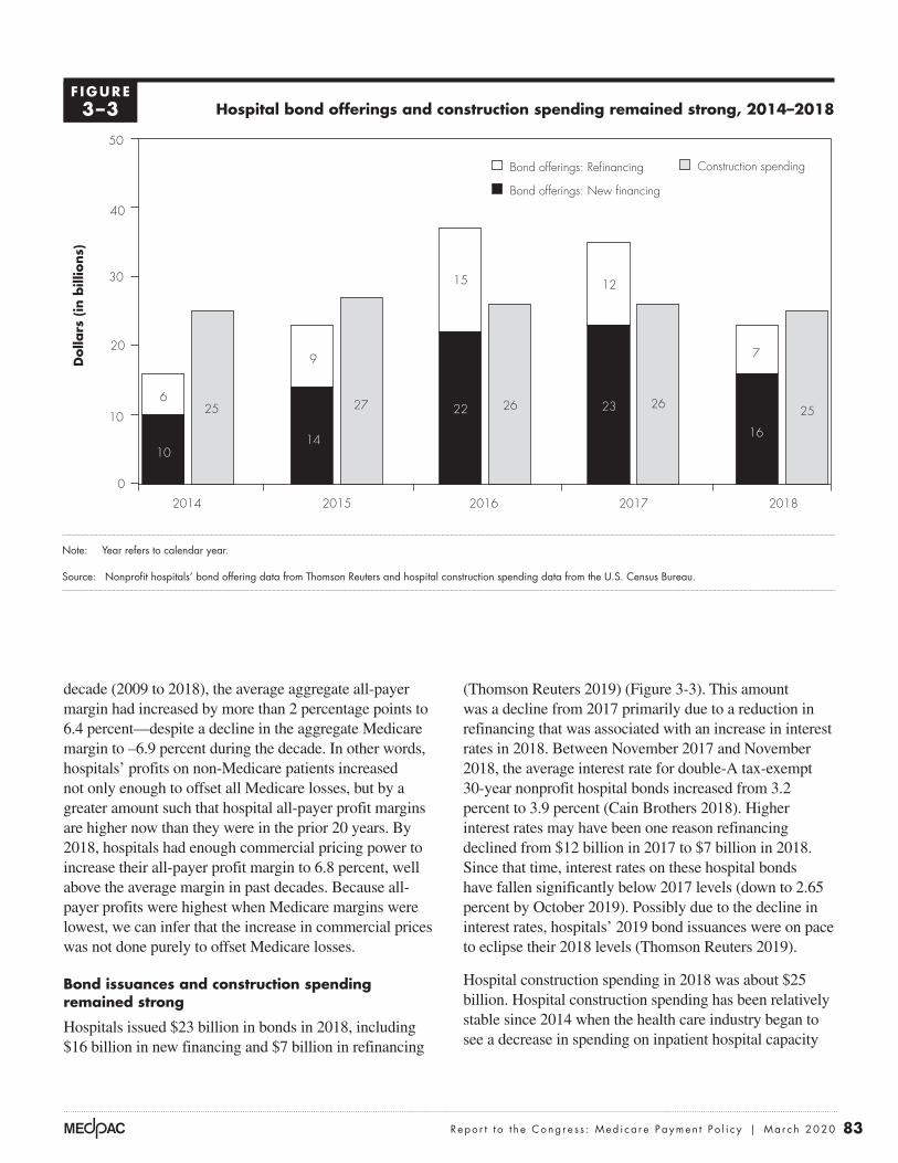
83 Repo r t t o t h e Cong r e s s : Med i ca r e Paymen t P o l i c y | Ma r ch 2020
(Thomson Reuters 2019) (Figure 3-3). This amount was a decline from 2017 primarily due to a reduction in refinancing that was associated with an increase in interest rates in 2018. Between November 2017 and November 2018, the average interest rate for double-A tax-exempt 30-year nonprofit hospital bonds increased from 3.2 percent to 3.9 percent (Cain Brothers 2018). Higher interest rates may have been one reason refinancing declined from $12 billion in 2017 to $7 billion in 2018. Since that time, interest rates on these hospital bonds have fallen significantly below 2017 levels (down to 2.65 percent by October 2019). Possibly due to the decline in interest rates, hospitals’ 2019 bond issuances were on pace to eclipse their 2018 levels (Thomson Reuters 2019).
Hospital construction spending in 2018 was about $25 billion. Hospital construction spending has been relatively stable since 2014 when the health care industry began to see a decrease in spending on inpatient hospital capacity
decade (2009 to 2018), the average aggregate all-payer margin had increased by more than 2 percentage points to 6.4 percent—despite a decline in the aggregate Medicare margin to –6.9 percent during the decade. In other words, hospitals’ profits on non-Medicare patients increased not only enough to offset all Medicare losses, but by a greater amount such that hospital all-payer profit margins are higher now than they were in the prior 20 years. By 2018, hospitals had enough commercial pricing power to increase their all-payer profit margin to 6.8 percent, well above the average margin in past decades. Because all-payer profits were highest when Medicare margins were lowest, we can infer that the increase in commercial prices was not done purely to offset Medicare losses.
Bond issuances and construction spending remained strong
Hospitals issued $23 billion in bonds in 2018, including $16 billion in new financing and $7 billion in refinancing
Hospital bond offerings and construction spending remained strong, 2014–2018
Note: Year refers to calendar year.
Source: Nonprofit hospitals’ bond offering data from Thomson Reuters and hospital construction spending data from the U.S. Census Bureau.
More hospitals opened...D
olla
rs (
in b
illio
ns)
FIGURE3-X
Note: Note and Source are in InDesign.
Source:
Notes about this graph:• Data is in the datasheet. Make updates in the datasheet.• WATCH FOR GLITCHY RESETS WHEN YOU UPDATE DATA!!!!• The column totals were added manually.• I had to manually draw tick marks and axis lines because they kept resetting when I changed any data.• I can’t delete the legend, so I’ll just have to crop it out in InDesign.• Use direct selection tool to select items for modification. Otherwise if you use the black selection tool, they will reset to graph default when you change the data.• Use paragraph styles (and object styles) to format. • Data was from: R:\Groups\MGA\data book 2007\data book 2007 chp1
Bond offerings: Refinancing Construction spending
Bond offerings: New financing
0
10
20
30
40
50
20182017201620152014
9
14
27
12
23 26 25
7
16
6
10
25
15
22 26
F IGURE3–3

84 Hosp i t a l i n pa t i e n t a nd ou t pa t i e n t s e r v i c e s : A s s e s s i ng paymen t adequacy and upda t i ng paymen t s
Medicare IPPS payments per inpatient stay grew faster than IPPS hospitals’ costs per stay between 2017 and 2018
Changes in Medicare inpatient hospital payments per discharge under the IPPS depend primarily on three factors: (1) annual updates to base payment rates, (2) changes in reported patient case mix (a measure of relative patient complexity), and (3) policy changes that are not implemented in a budget-neutral manner.
Between 2017 and 2018, Medicare IPPS payments per inpatient stay increased 2.9 percent, to approximately $12,500. This increase was slightly higher than the average annual change between 2014 and 2018 of 2.8 percent. The 2.9 percent increase resulted from:
• a 1.1 percent rise in inpatient operating and capital IPPS base rates12 and
• a 1.8 percent rise in reported inpatient case mix at IPPS hospitals.
Growth in IPPS hospitals’ costs per inpatient stay was less than combined growth of inpatient case mix and input prices Between 2017 and 2018, IPPS hospitals’ costs per stay grew 2.5 percent (Table 3-6). This increase resulted from growth in input prices (2.4 percent) and reported inpatient case mix (1.8 percent), combined with offsetting increases in productivity and coding practices
(Census Bureau 2019). This trend is in part due to health systems focusing on lower cost outpatient facilities and renovations to existing facilities (Conn 2017).
Hospital employment increased
Between October 2014 and August 2019, the number of individuals employed by hospitals grew from 4.4 million to 4.8 million, an increase of 8.1 percent—slower than in the rest of the health care sector (10.3 percent), but faster than the economy as a whole (7.7 percent) (Bureau of Labor Statistics 2018b).
Hospitals have increased employment for certain high-skill health occupational categories. From 2016 to 2018, the number of physicians employed by hospitals increased 11.1 percent but varied by type of physician (Bureau of Labor Statistics 2018a). The number of registered nurses employed by hospitals rose 2.9 percent during this period, while the number of nurse practitioners employed by hospitals rose 11.6 percent. Hospitals also increased the number of physician assistants employed by 16.4 percent and pharmacists by 5.2 percent over the same period.
Medicare payments and providers’ costs Overall Medicare margins at IPPS hospitals improved modestly in 2018, driven in part by costs per inpatient stay growing more slowly than Medicare payments per stay and by rapid increases in outpatient drug revenues.
T A B L E3–6 Inpatient costs per stay continued to grow more slowly than
the sum of inpatient case mix and input prices
Annual percentage change Average of annual changes,
2013–20182013–2014 2014–2015 2015–2016 2016–2017 2017–2018
Inpatient costs per stay 2.3% 2.3% 4.0% 1.8% 2.5% 2.6%
Inpatient case mix 2.0 0.7 3.4 0.7 1.8 1.7
Inpatient input prices 1.8 1.6 1.7 2.5 2.4 2.0
Note: Analysis includes hospitals paid under the inpatient prospective payment system (IPPS) in the U.S. with complete cost reports and non-outlier cost per stay data. Inpatient case mix is adjusted for transfers to other facilities. Inpatient input price inflation is calculated as change in four-quarter moving averages of the inpatient operating and capital market baskets, weighted by IPPS base rates. The average of annual changes is the arithmetic average.
Source: MedPAC analysis of cost reports, Medicare Provider Analysis and Review claims, and CMS market basket data as of the 3nd quarter of 2019.

85 Repo r t t o t h e Cong r e s s : Med i ca r e Paymen t P o l i c y | Ma r ch 2020
nursing labor) and ancillary services (Table 3-7). Ancillary services made up about half of inpatient cost growth. Growth in cost for implantable devices and medical supplies grew slightly faster than the overall increase in cost per discharge, which made up a combined 16 percent of total hospital costs in 2018 (Table 3-7). Other categories of ancillary services grew faster but accounted for a lower share of hospital costs. For example, costs for cardiac catheterization, dialysis, and observation services grew more quickly than overall cost growth; however, because each of these services accounts for about 1 percent of total Medicare costs, their effect on the increase in cost per discharge was relatively small.
We did not include a separate estimate of drug costs per discharge in Table 3-7 because such estimates from year
(which lower case-mix-adjusted cost growth). The growth in costs per stay between 2017 and 2018 was higher than the growth between 2016 and 2017 (which represented the smallest increase in two decades) but lower than the increase between 2015 and 2016 (which was abnormally high due to an unusual one-year shift in services toward inpatient surgeries). We do not know to what extent the 1.8 percent increase in reported case mix reflects more intensive coding and to what extent it reflects true increases in patient complexity. What we do know is that case-mix-adjusted spending grew more slowly than input costs, suggesting that hospitals coded patients more extensively, improved productivity, or both.
Growth in IPPS hospitals’ costs per stay The 2.5 percent increase in costs per inpatient stay from 2017 to 2018 (Table 3-6) reflects a modest growth in routine costs (e.g.,
T A B L E3–7 Growth in costs per inpatient stay from 2017 to 2018 reflects
modest growth in routine and ancillary services
Cost categoryCosts and changes
in cost per dischargePercent change
2017–2018
Share of total Medicare costs
2018
2017 inpatient cost per discharge $13,616
Categories comprising growth in inpatient costs per discharge from 2017 to 2018
Routine (e.g., room, nursing) $139 3% 33%
Special care (e.g., intensive care) 34 2 11
Ancillary 172 2 56Operating room 27 2 8Cardiac catheterization 8 5 1Lab 17 2 5Respiratory therapy 7 2 2Medical supplies 20 3 6Implantable devices 33 3 10Dialysis 7 7 1Emergency 18 5 3Observation 7 8 1All other 30 0 19
2018 inpatient cost per discharge $13,961 2.5
Note: Analysis includes hospitals paid under the inpatient prospective payment system in the U.S. with complete cost reports and non-outlier cost per stay data for each year 2015 through 2018. Components may not sum to total due to rounding.
Source: MedPAC analysis of cost report data from CMS.

86 Hosp i t a l i n pa t i e n t a nd ou t pa t i e n t s e r v i c e s : A s s e s s i ng paymen t adequacy and upda t i ng paymen t s
comorbidities and complications that increase payment rates. These shifts within DRGs collectively raised case mix by 0.7 percent and likely resulted from more intensive coding. In addition, certain shifts across DRGs also likely reflect changes in coding practices rather than the changes in patient severity. For example, between 2017 and 2018, the share of Medicare FFS inpatients hospitalized for pneumonia rose 36 percent while the share hospitalized for chronic obstructive pulmonary disease (COPD) fell 27 percent, coinciding with a change in COPD coding instructions (Archibald 2017, Johnson 2017).14
Growth in inpatient input prices was lower than forecast Between 2017 and 2018, hospital inpatient operating and capital input prices increased 2.4 percent, driven by low economy-wide inflation and slow wage growth. The increases in the hospital inpatient operating and capital market baskets between 2017 and 2018 were primarily the result of changes in the main components of the inpatient operating market basket:
• a 2.1 percent increase in compensation costs for hospital workers (costs that constituted 56 percent of the inpatient operating market basket);
• a 2.4 percent increase in costs of other labor and non–labor related services (costs that constituted 23 percent of the market basket); and
• a 3.4 percent increase in products (costs that constituted 17 percent of the market basket), including a 6.1 percent increase in pharmaceuticals.
The actual increase in hospital input prices, 2.5 percent, was lower than what CMS forecast at the time of the 2018 IPPS final rule, 2.7 percent, which was the estimate used in setting payment rates. While CMS makes a forecast error adjustment for the inpatient capital PPS, it does not correct for any forecasting error in setting inpatient operating payment rate updates, which account for a larger share of inpatient spending. This forecast contributed to higher inpatient margins for IPPS hospitals.
The forecast error for hospital input prices was not unique to 2018: Actual inflation in hospital input prices has consistently been lower than what CMS forecast at the time of the IPPS final rules. For example, in every year from 2014 through 2019, hospitals’ actual input price inflation was lower than CMS’s forecast, with the difference averaging roughly 0.5 percentage point per year.
to year are imprecise due to two unique factors in hospital pharmacy cost accounting. First, discounts under the 340B Drug Pricing Program apply to outpatient drugs but not inpatient drugs, which can result in biasing downward the cost of inpatient drugs by reducing the cost-to-charge ratio for all drugs in the hospitals’ cost centers for pharmacy.13 Second, markups differ among drugs. Although the markup percentage is smaller on high-cost drugs, the expansion of new high-cost Part B drugs could cause an increase in the cost-to-charge ratio for the pharmacy cost center and cause an upward bias in cost estimates for inpatient drugs. It is not clear the degree to which the two potential biases offset each other. Given these limitations, we examined changes in unadjusted charges per inpatient stay. From 2017 to 2018, charges for inpatient drugs per discharge remained flat. This lack of cost growth in the inpatient setting is in stark contrast to the outpatient sector, where charges for drugs increased almost 20 percent. In 2018, the increase in outpatient Part B drug spending was much lower than in prior years at 7.5 percent (relative to 18.2 percent in 2017) largely due to CMS’s policy of reducing payments for non-pass-through 340B drugs from average sales price (ASP) + 6 percent to ASP – 22.5 percent. The reduction in payments for 340B drugs was offset by raising payments for other HOPD services.
Growth in IPPS hospitals’ case mix reflects both increased patient severity and coding practices From 2017 to 2018, the reported resource needs for Medicare FFS inpatients at IPPS hospitals (or case-mix index (CMI)) increased 1.8 percent. The CMI increase likely reflects both changes in patient severity and changes in coding practices.
Some trends are consistent with an increase in patient severity. For example, the overall decline in inpatient stays per capita and growth in the share of inpatient stays discharged to post-acute care and hospice, as well as the increase in volume at ambulatory surgical centers (see Chapter 5), all suggest that Medicare FFS beneficiaries with less severe conditions are receiving care in non-inpatient settings, resulting in higher patient severity among the remaining inpatient cases.
However, because growth in inpatient costs per discharge between 2017 and 2018 was close to inpatient input price inflation, a significant portion of the increase in reported CMI likely reflects changes in coding practices. In particular, reported patient severity increased for many diagnosis related groups (DRGs) between 2017 and 2018, with a greater share of patients coded as having

87 Repo r t t o t h e Cong r e s s : Med i ca r e Paymen t P o l i c y | Ma r ch 2020
(13.6 percent per year, on average) (Table 3-8).16 This rise resulted from a shift in the payment for the drugs from the physician fee schedule (when administered in a freestanding office) to the OPPS (when administered in the hospital) and an increase in outpatient spending on drugs in general.
The growth in spending on Part B drugs is due to price increases, increased use of existing drugs, and, to a lesser extent, the introduction of new, expensive cancer drugs. From 2012 to 2018, about 79 percent of the increase in spending on separately payable drugs was for those that treat cancer.17 During that period, OPPS spending on cancer drugs increased from $4.1 billion to $9.5 billion.
The shift of clinic visits, drug administration, and other services to HOPDs has increased spending and beneficiary cost sharing without evidence of improved quality The second largest source of outpatient spending growth was the shift of clinic visits, drug administration, and other services from physician offices to HOPDs. From 2012 to 2018, OPPS spending for clinic visits increased from $1.9 billion to $3.7 billion, an increase of 96 percent. Over the same period, spending for chemotherapy administration rose from $0.4 billion to $0.8 billion, an increase of 104 percent (Table 3-8).
The shift of clinic visits and chemotherapy administration from physician offices to HOPDs is important because
Outpatient spending growth driven by Part B drug spending and shift of services from physician offices to HOPDs
From 2012 to 2018, Medicare spending for hospital outpatient services grew at an annual rate of 7.2 percent. Contributing to this growth were increases in:
• the costs of drugs, especially for the treatment of cancer;
• spending associated with higher payments for clinic visits and other services that shifted from physician offices to HOPDs as hospitals acquired physician practices and increased their employment of physicians; and
• complex surgical procedures that often involve prosthetics or medical devices and that migrated from the inpatient setting.15
Outpatient spending growth driven by Part B drugs The largest source of OPPS spending growth has been Part B drugs, which include those that have pass-through status (drugs that are new to the market) and those that are not pass through but are separately payable under the OPPS. From 2012 to 2018, OPPS spending for these drugs increased from $6.0 billion to $12.9 billion, an increase of 115 percent
T A B L E3–8 Growth in Medicare payments for hospital outpatient department services driven
by separately payable drugs and a shift from physician offices, 2012–2018
Service or item
Spending (in billions) Percent
change 2012–2018 Driver of growth2012 2018
Drugs $6.0 $12.9 115% High-cost drugs, increased volume,
shift from physician offices
Clinic visits 1.9 3.7 96 Shift from physician offices
Chemotherapy administration 0.4 0.8 104 Shift from physician offices
Total 43.2 65.5 52
Note: Spending includes both program outlays and beneficiary coinsurance under the outpatient prospective payment system (OPPS). Part B drugs separately payable under the OPPS include pass-through drugs and drugs that are separately payable but do not have pass-through status. Outpatient spending is computed on the calendar year.
Source: MedPAC analysis of 2012 and 2018 hospital outpatient standard analytic claims files and data from the CMS Office of the Actuary.

88 Hosp i t a l i n pa t i e n t a nd ou t pa t i e n t s e r v i c e s : A s s e s s i ng paymen t adequacy and upda t i ng paymen t s
it increases Medicare program spending and beneficiary cost sharing without any evidence of improved quality. Medicare payment rates for the same or similar services are generally higher in HOPDs than in freestanding offices. For example, we estimate that the Medicare program spent $2.2 billion more in 2018 than it would have if payment rates for clinic visits in HOPDs were the same as physician office rates. In addition, beneficiaries’ cost sharing was $550 million more in 2018 than it would have been under physician office rates.
However, Section 603 of the Bipartisan Budget Act (BBA) of 2015 has begun to have a small effect on the differences in payments between HOPDs and physician offices for clinic visits. Under BBA of 2015 provisions, CMS has implemented lower OPPS payment rates for services provided in some hospitals’ off-campus provider-based departments. CMS intends for the lower OPPS rates to approximate the rates paid in physician offices under the Medicare physician fee schedule (PFS), on average. For 2017 and 2018, the effects of this policy were limited and had a small effect on spending under the OPPS because the policy originally applied only to new off-campus HOPDs. The BBA of 2015 allows off-campus HOPDs that were billing under the OPPS to continue to bill at the higher HOPD rates. However, CMS expanded this policy in 2019 so that hospitals must bill clinic visits provided in all off-campus HOPDs at the lower OPPS rate that approximates the PFS rate. This policy will likely substantially reduce OPPS spending for clinic visits in the current year.18
Growth in Part B drug spending improved hospital profitability
Hospitals can generate profits on their sales of separately payable drugs, which include pass-through drugs and separately payable non-pass-through drugs, to Medicare beneficiaries. The profitability is most pronounced for hospitals that participate in the 340B Drug Pricing Program, which offers certain hospitals substantial discounts on drug acquisition costs.
The discount for each drug obtained through the 340B program is based on a ceiling price. The ceiling price is the maximum allowed amount a manufacturer can charge 340B hospitals. The formula for the ceiling price is the average manufacturer price (AMP) for a drug less a unit rebate amount (URA). For brand drugs, the URA includes a percentage rebate and, if the product’s price has risen faster than inflation, an inflation rebate. For
brand products, the percentage rebate is the greater of 23.1 percent of AMP or the difference between AMP and the best price. The inflation rebate is the difference between AMP and what AMP would have been if AMP had risen at the same rate as the consumer price index for all urban consumers (CPI–U) between a base year and the current period. The URA is less for generic drugs. The discount for each drug is the URA.
Due to these discounts, separately payable drugs are typically profitable for 340B hospitals, even after CMS’s decision to decrease the payment rates for separately payable non-pass-through drugs obtained through the 340B program from ASP + 6 percent in 2017 to ASP – 22.5 percent in 2018. One reason that hospitals’ acquisition price can be more than 22.5 percent below the ASP is the adjustment in the 340B pricing formula that occurs if drug price inflation exceeds the CPI–U. The faster drug companies raise their prices, the faster the 340B discounts grow. As a result, prices 340B hospitals pay manufacturers can decline when the average sales price (across all buyers) increases. Information is limited, but analyses by the Congressional Budget Office and the Office of Inspector General suggest the inflation adjustment in the 340B program substantially reduces 340B drug ceiling prices (Congressional Budget Office 2014, Government Accountability Office 2015, Office of Inspector General 2015).
The discounts hospitals receive on the 340B program improve outpatient margins in two ways. First, the payments hospitals receive for 340B drugs (even at ASP – 22.5 percent) are higher than the drug’s discounted acquisition cost under the 340B program (and these discounts are growing). Second, CMS redistributes the reduced spending that results from the ASP – 22.5 percent payment rates for some 340B drugs to all other APCs by increasing the “conversion factor,” which amounts to boosting the payment rate on all other outpatient services. The net result is that CMS increased the OPPS conversion factor in 2018 by 4.8 percent. Most of this increase was to maintain budget neutrality; that is, CMS raised the base payment rates for OPPS services to offset a substantial drop in the payment rates for separately payable non-pass-through drugs obtained through the 340B program.
The complexity of services provided under the OPPS—measured by the increase in the average relative weight among the services provided—also rose (2.5 percent). The combination of strong drug spending growth (7.5 percent),

89 Repo r t t o t h e Cong r e s s : Med i ca r e Paymen t P o l i c y | Ma r ch 2020
From 2017 to 2018, the overall Medicare margin rose to –9.3 percent, as a result of three factors. First, CMS overestimated input price inflation by 0.2 percent. Because hospitals’ payment rate updates are based in part on projected increases in a market basket of inputs, overestimates of price inflation caused payments to grow faster than costs. Second, hospitals limited their inpatient cost growth to about the rate of input price inflation, despite reporting a 1.8 percent increase in case mix. The shift in reported case mix toward higher paying cases without an inflation-adjusted increase in costs per case suggests a combination of more extensive coding of diagnoses, improvements in efficiency, or both. Third, outpatient (Part B) drug spending continues to rise rapidly, which can improve Medicare margins. Specifically, certain hospitals benefit because of the discounts they receive on drugs obtained through the 340B program if drug prices rise at a faster rate than the CPI–U.
the effect of the 340B discounts on drug acquisition costs, the effect on the conversion factor, and the increased weight of outpatient services contributed to hospitals’ improving Medicare margins between 2017 and 2018.
Trend in the overall Medicare margin
From 2010 to 2013, the overall Medicare margin, defined as Medicare payments minus the allowable costs of treating Medicare patients divided by Medicare payments, held relatively steady, going from –4.9 to –5.0 percent (Figure 3-4).19,20 However, from 2014 to 2017, the Medicare margin dropped from –5.6 percent to –9.9 percent. This decline was not unexpected given several payment adjustments required by statute, including reductions to the annual payment update, adjustments for documentation and coding improvement, lower incentive payments for the adoption of electronic health records, and lower uncompensated care payments that corresponded with increases in the insured population.
Overall Medicare margin increased slightly from 2017 to 2018
Note: A margin is calculated as payments minus costs, divided by payments; margins are based on Medicare-allowable costs. Analysis includes inpatient prospective payment system hospitals in the U.S. with complete cost reports and non-outlier cost per stay data. “Overall Medicare margin” refers to an aggregate Medicare margin across all hospital service lines.
Source: MedPAC analysis of Medicare cost reports from CMS.
Title here....O
vera
ll M
edic
are
marg
in (
in p
erce
nt)
Note: Note and Source are in InDesign.
Source:
–12
–10
–8
–6
–4
–2
0
2
201820172016201520142013201220112010
Notes about this graph:• Data is in the datasheet. Make updates in the datasheet.• I deleted the years from the x-axis and put in my own.• I had to manually draw tick marks and axis lines because they kept resetting when I changed any data.• The dashed line looked ok here, so I didn’t hand draw it.• I can’t delete the legend, so I’ll just have to crop it out in InDesign.• Use direct selection tool to select items for modification. Otherwise if you use the black selection tool, they will reset to graph default when you change the data.• Use paragraph styles (and object styles) to format.
FIGURE1-XX
–9.3
–4.9–5.7 –5.4
–5.0–5.6
–7.6
–9.7 –9.9
F IGURE3–4

90 Hosp i t a l i n pa t i e n t a nd ou t pa t i e n t s e r v i c e s : A s s e s s i ng paymen t adequacy and upda t i ng paymen t s
percent aggregate Medicare margin for nonprofit hospitals (Table 3-9). Much of this differential reflects lower outpatient costs at for-profit hospitals. In 2018, hospitals that treated the highest shares of low-income patients (high DSH) had a –8.3 percent aggregate Medicare margin. In contrast, hospitals treating the lowest share of low-income patients (no DSH) had the lowest aggregate Medicare margin (–14.7 percent). The difference in Medicare margins was attributable in part to the DSH adjustments and uncompensated care payments received by hospitals (data not shown). In addition, hospitals with high shares of Medicare and Medicaid patients tend to have more pressure to control costs and therefore tend to have lower costs per discharge.
Fiscal pressure constrains costs
Hospitals under financial pressure tend to have lower costs. To illustrate this tendency, we compare hospitals under low and high financial pressure in the analysis below. In addition to financial pressure affecting the level of costs, the literature shows that changes in Medicare rates can affect the rate of cost growth. Hospitals that
Medicare margins by hospital type, 2018
In 2018, rural IPPS hospitals (excluding critical access hospitals) had a –6.6 percent overall aggregate Medicare margin, which was 3.0 percentage points higher than the −9.6 percent aggregate margin for urban hospitals (Table 3-9). Major teaching hospitals (i.e., hospitals with a high resident-to-bed ratio) had an aggregate Medicare margin of –9.6 percent while other teaching hospitals (i.e., hospitals with a resident-to-bed ratio less than 0.25) had an aggregate Medicare margin of –7.5 percent. Since 2017, the other teaching hospitals have had higher margins than hospitals classified as major teaching primarily due to comparatively lower levels of cost growth. Nonteaching hospitals had a lower aggregate Medicare margin than either category of teaching hospital, in large part because teaching hospitals receive extra payments through the indirect medical education adjustment, and most qualify for disproportionate share hospital (DSH) adjustments and uncompensated care payments.
In 2018, for-profit hospitals had the highest aggregate Medicare margin (–0.9 percent), well above the –10.6
T A B L E3–9 Overall Medicare margins varied by hospital type
Hospital group 2014 2015 2016 2017 2018
All hospitals (excluding CAHs) –5.6% –7.6% –9.7% –9.9% –9.3%
Urban –5.8 –7.9 –9.9 –10.0 –9.6Rural
Excluding CAHs –3.5 –4.9 –7.5 –8.2 –6.6Including CAHs –1.9 –3.2 –5.4 –5.9 –4.9
Nonprofit –7.1 –9.1 –11.1 –11.0 –10.6For profit 0.8 –1.3 –2.1 –2.6 –0.9
Major teaching –3.7 –6.3 –8.5 –9.0 –9.6Other teaching –5.0 –6.3 –8.6 –8.2 –7.5Nonteaching –7.7 –9.9 –11.7 –12.2 –10.9
High DSH –2.3 –4.6 –7.2 –8.1 –8.3Moderate-to-low DSH –6.4 –8.1 –10.0 –9.9 –9.1No DSH –13.3 –15.3 –15.7 –16.4 –14.7
Note: CAH (critical access hospital), DSH (disproportionate share [hospital]). Analysis includes inpatient prospective payment system hospitals in the U.S. with complete cost reports and non-outlier cost per stay data. A margin is calculated as payments minus costs, divided by payments; margins are based on Medicare-allowable costs. “High DSH” includes hospitals with the highest DSH adjustment percentages (top quartile). “Moderate-to-low DSH” includes hospitals with DSH adjustment percentages that exceed zero but are not included in the highest quartile. Overall Medicare margin refers to an aggregate Medicare margin across all hospital service lines. “Major teaching” hospitals are defined by a ratio of interns and residents to beds of at least 0.25. “Other teaching” hospitals have a ratio below 0.25 but greater than 0. “Nonteaching” hospitals have a ratio of 0.
Source: MedPAC analysis of Medicare cost reports, Medicare Provider Analysis and Review files, and impact files from CMS.

91 Repo r t t o t h e Cong r e s s : Med i ca r e Paymen t P o l i c y | Ma r ch 2020
price growth did not cause hospitals to increase prices negotiated with commercial insurers. Instead, they found lower Medicare prices led to lower cost growth (White 2013). Similar findings have been reported by others (Clemens and Gottlieb 2017, Frakt 2015). A recent study examined how hospitals responded when they received a large increase in their wage index through Section 508 of the Medicare Modernization Act. The study found that the hospitals that received higher Medicare payments through the 508 program “treated more patients, increased payroll, hired nurses, added new technology, raised CEO pay, and ultimately increased their spending by over $100 million annually” (Cooper et al. 2017). One exception to the literature is a recent working paper that finds faster price growth at hospitals that were penalized under the HRRP; however, the authors caution it is not definitive evidence of cost shifting (Darden et al. 2019). The implication of these studies is that constraining Medicare prices should help constrain hospital costs.
Relatively efficient hospitals
The Commission follows two principles when identifying a set of efficient providers. First, the providers must do relatively well on cost and quality metrics. Second, the performance has to be consistent, meaning that the provider cannot have poor performance on any metric over the past three years. In the hospital sector, the variables we use to identify relatively efficient hospitals are risk-adjusted all-condition mortality, risk-adjusted potentially preventable readmissions, and standardized inpatient Medicare costs per case. Our assessment of efficiency is not in absolute terms, but rather, relative to a comparison group of other IPPS hospitals.21
Categorizing hospitals as relatively efficient We assigned hospitals to the relatively efficient group or the control group according to each hospital’s performance relative to the national median on a set of risk-adjusted cost and quality metrics for the period 2015 to 2017.22 We then examined the performance of the two hospital groups in fiscal year 2018.
Hospitals were identified as relatively efficient if they met four criteria in each year from 2015 to 2017:
• Risk-adjusted mortality rates were among the best two-thirds of all hospitals.
• Risk-adjusted readmission rates were among the best two-thirds of all hospitals.
receive larger increases in Medicare payment rates tend to have larger cost increases. To determine the association between financial pressure and costs, we grouped hospitals into three levels of financial pressure from private payers: high, medium, and low, based on their median non-Medicare profit margins and other factors from 2013 to 2017. For these years, the hospitals under high pressure historically had non-Medicare profit margins of less than 1 percent, while the low-pressure hospitals had non-Medicare profit margins of more than 5 percent. We found that hospitals under high pressure during the five-year period ended up with lower standardized Medicare costs per discharge in 2018 than hospitals under low levels of financial pressure. For more details on our analytic methods, see our earlier analysis of payment adequacy (Medicare Payment Advisory Commission 2011).
The following are key findings from our analysis of financial pressure on hospitals:
• High pressure equals low cost. The 24 percent of hospitals under the most financial pressure had median standardized Medicare costs per case that were 4 percent lower than the national median for the 2,734 IPPS hospitals with available data. Because of their lower Medicare costs, hospitals under pressure had only slight losses on Medicare (–1 percent margin in 2018 and –2 percent margin in 2017). These hospitals tended to have slightly higher shares of patients paying at government rates (48 percent of inpatient days were attributed to Medicare and Medicaid FFS patients).
• Low pressure equals high cost. The 63 percent of hospitals under a low level of financial pressure had median standardized Medicare costs per case that were 2 percent above the national median. Because of higher costs, they generated a median Medicare profit margin of –10 percent in 2018, about 2 percentage points below the national median. These hospitals tended to have a slightly smaller share of patients paying at government rates (44 percent of inpatient days were attributed to Medicare and Medicaid FFS patients).
Another way to examine the relationship between financial pressure and costs is to see how changes in Medicare prices affect changes in costs. For example, White and Wu found that hospitals that received higher Medicare payment increases resulting from policy changes tended to have higher cost growth (White and Wu 2014). Contrary to “cost-shift” theory, they also found that lower Medicare

92 Hosp i t a l i n pa t i e n t a nd ou t pa t i e n t s e r v i c e s : A s s e s s i ng paymen t adequacy and upda t i ng paymen t s
for this methodology and the details of computing the various measures are discussed in our March 2011 report (Medicare Payment Advisory Commission 2011). As a secondary check on hospital quality, we also require that at least 60 percent of the hospital’s patients rated the hospital a 9 or 10 on a 10-point scale (in the year before the performance period).23
Examining performance of relatively efficient and other hospitals from 2015 to 2017 Of the 1,878 hospitals that met our screening criteria during the 2015 to 2017 period, 266 (14 percent) were found to be relatively efficient.24 We examined the performance of relatively efficient hospitals on three measures by reporting the group’s
• Standardized costs per discharge were among the best two-thirds of all hospitals.
• Risk-adjusted mortality or standardized costs per discharge were among the best one-third of all hospitals.
The objective was to identify a sample of hospitals that consistently performed at an above-average level on at least one measure (cost or quality) and that always performed reasonably well on all measures. Because we screen out hospitals that have few Medicaid patients or have poor performance in a single year, our methodology does not seek to identify all efficient hospitals, only a subsample of relatively efficient hospitals. The rationale
T A B L E3–10 Performance of relatively efficient hospitals
Type of hospital
Relative performance measureRelatively efficient,
2015–2017Other
hospitals
Number of hospitals 266 1,612 Share of hospitals 14% 86%
Historical performance, 2015–2017 (share of national median)Risk-adjusted:
All-condition 30-day mortality rates 90% 102%Potentially preventable readmission rates 93 102Standardized Medicare costs per discharge 91 102
Performance metrics, 2018 (share of national median)Risk-adjusted:
All-condition 30-day mortality rates 90% 101%Potentially preventable readmission rates 93 101Standardized Medicare costs per discharge 92 102
Share of patients rating the hospital a 9 or 10 (out of 10) 73 70
Median, 2018:Overall Medicare margin –2% –8%Non-Medicare margin 9 9Total (all-payer) margin 7 5Share of patients for whom Medicaid is the primary payer 7 8
Note: Relative measures are the median for the group as a share of the median of all hospitals. Per case costs are standardized for area wage rates, case-mix severity, prevalence of outlier and transfer cases, interest expense, low-income shares, and teaching intensity. We removed hospitals with low Medicaid patient loads (the bottom 10 percent of hospitals) and hospitals in markets with high service use (top 10 percent of hospitals) because of concerns that socioeconomic conditions and aggressive treatment patterns can influence unit costs and risk-adjusted quality metrics.
Source: MedPAC analysis of Medicare cost report and claims-based quality data.

93 Repo r t t o t h e Cong r e s s : Med i ca r e Paymen t P o l i c y | Ma r ch 2020
How would current-law changes for 2019, 2020, and 2021 affect hospitals’ Medicare payments and beneficiaries’ access?We project Medicare margins for 2020 based on margins in 2018 and policy changes that took place in 2019 and 2020.
The 2019 update for inpatient (IPPS) operating and outpatient (OPPS) base payment rates was 1.35 percent. In 2020, the annual update is 2.6 percent for both inpatient and outpatient services, substantially higher than in prior years due to the end of a series of payment reductions that were enacted as part of the ACA in 2010 (Table 3-11).26 Other changes in payment policy are largely offsetting, bringing the net increase in IPPS hospitals’ Medicare payment rates to about 4 percent between 2018 and 2020.
We expect cost growth per discharge of about 2.5 percent per year in 2019 and 2020, about equal to the rate of growth from 2017 to 2018. However, we also expect case mix to continue to grow. In the past, we have underestimated the increase in hospital case mix and thus we did not foresee the improvement in hospital margins that occurred in 2018.
Given our expectation of continued case-mix growth and continued profit margin benefits related to spending on Part B drugs with 340B discounts, we expect hospitals’ aggregate Medicare margin to improve from –9.3 percent in 2018 to approximately –8 percent in 2020. We also expect the efficient providers’ Medicare margins to be between break even and slightly negative. The exact
median performance divided by the median for the set of hospitals in our analysis (Table 3-10). The median efficient hospital’s relative risk-adjusted 30-day mortality rate for the 3-year assessment period was 90 percent of the national median, meaning that the 30-day mortality rate for the efficient group was 10 percent below (that is, better than) the national median. The median readmission rate for the efficient group was 7 percent below the national median. The standardized Medicare cost per discharge for the efficient group was 9 percent lower than the national median. These relatively efficient hospitals were spread across the country and had a diverse set of characteristics, but they were more likely to be larger nonprofit hospitals because those hospitals tend to have better performance on the quality metrics we analyzed. The efficient group has a share of Medicaid patients similar to other hospitals.25 For a more complete description of the methodology and other characteristics of relatively efficient providers, see online Appendix 3-B from our 2016 report to the Congress, available at http://www.medpac.gov.
Historically strong performers had lower mortality and costs in 2018 Lower costs allowed the relatively efficient hospitals to generate better Medicare margins. In 2018, the median hospital in the efficient group had a Medicare margin of –2 percent while the median hospital in the comparison group had a Medicare margin of −8 percent (Table 3-10). The relatively efficient group also continued to perform better on quality metrics, with risk-adjusted mortality equal to 90 percent of the national median and risk-adjusted readmissions equal to 93 percent of the national median (Table 3-10).
T A B L E3–11 Current law updates to IPPS and OPPS payment rates
2018 2019 2020 2021*
Inpatient operating market basket 2.7% 2.9% 3.0% 3.2%Productivity –0.6 –0.8 –0.4 –0.4Other statutory update reductions –0.75 –0.75 0.0 0.0
Annual update 1.35 1.35 2.6 2.8
Note: IPPS (inpatient prospective payment system), OPPS (outpatient prospective payment system). In addition to the annual update shown in the table, the inpatient operating base rate is also subject to other statutory and budget-neutrality adjustments not shown; separate updates to inpatient capital base rates also not shown.
*Based on forecasts as of third quarter of 2019; forecast used to set actual update will be revised to use most recent economic data at the time the final rule for fiscal year 2021 is published in August 2020.
Source: MedPAC analysis of IPPS final rules, CMS market basket data and multifactor productivity data as of the third quarter of 2019.

94 Hosp i t a l i n pa t i e n t a nd ou t pa t i e n t s e r v i c e s : A s s e s s i ng paymen t adequacy and upda t i ng paymen t s
care, hospitals’ access to capital, hospital quality, and the relationship between Medicare payments and hospital costs. As discussed in our March 2019 report to the Congress, the Commission has recommended a new hospital value incentive program (HVIP) that aligns with the Commission’s principles for quality measurement and would replace existing quality incentive programs (see text box on the HVIP). The following recommendation would increase hospital payments by raising the base payment rate and the average rewards hospitals receive under the proposed Medicare HVIP.
change in Medicare margins for 2020 will depend on whether cost growth exceeds hospitals’ payment rate growth on a case-mix-adjusted basis.
How should Medicare payment rates change in 2021?
The Commission’s update recommendation for 2021 is based on indicators of beneficiaries’ access to hospital
The Commission’s standing recommendation to replace current hospital quality programs with a new hospital value incentive program
The Commission asserts that quality measurement should be patient oriented, encourage coordination, and promote delivery system
change. In March 2019, the Commission recommended that the Congress replace Medicare’s current hospital quality programs with a single, outcome-focused, quality-based payment program for hospitals—the hospital value incentive program (HVIP)—based on our principles for quality measurement. Consistent with the Commission’s principles, the HVIP links payment to quality of care to reward hospitals for providing high-quality care to beneficiaries while maintaining low episode costs.
Initially, the HVIP can incorporate existing quality measure domains such as readmissions, mortality, spending, patient experience, and hospital-acquired conditions (or infection rates). By using existing measures on which hospitals are already evaluated, assuming equal weighting of the measure domains, the HVIP raises the weight of mortality and patient experience and lowers the weight of readmissions and infection rates compared with current quality programs. In line with the Commission’s principles, the HVIP uses clear, prospectively set performance standards to translate hospital performance on these quality measures to a reward or a penalty.
According to the Commission’s principles, adjusting measure results for social risk factors can mask disparities in clinical performance. Accordingly,
the HVIP accounts for differences in providers’ patient populations by incorporating a peer-grouping methodology in which quality-based payments are distributed to hospitals separated into 10 peer groups, defined by the share of beneficiaries with full dual eligibility for Medicare and Medicaid (treated as a proxy for income). The HVIP redistributes pools of dollars to hospitals in the peer groups based on their quality performance. The pools of dollars are funded by a payment withhold from all hospitals in the peer group (e.g., 5 percent) and a portion of the current-law hospital payment update.
Under the Commission’s HVIP model, the grouping of hospitals into peer groups that serve similar populations makes payment adjustments more equitable than existing quality payment programs. As a result, we expect that under the HVIP, large urban hospitals and major teaching hospitals would, on average, receive rewards rather than the penalties they receive under current programs. Rural and nonteaching hospitals, on average, would receive higher rewards than large urban and major teaching hospitals. Relatively efficient providers also would receive more of a reward from the HVIP compared with other hospitals. All groups receive higher payments on average due to removing penalties in the current program and adding funds to the HVIP. In addition, all hospitals would benefit from the streamlined reporting and the HVIP’s lower burden of data collection. ■

95 Repo r t t o t h e Cong r e s s : Med i ca r e Paymen t P o l i c y | Ma r ch 2020
and would produce more equitable results compared with the existing quality payment programs. The HVIP, as a single program, would eliminate the complexity of overlapping program requirements, would focus on outcomes, and would promote the coordination of care. It would also align with the Commission’s principles for quality measurement by setting absolute value targets and using peer grouping to account for differences in provider populations. Under peer grouping in our HVIP model, differences in payment adjustments were reduced among providers serving populations with varying social risk factors.
I M P L I C A T I O N S 3
Spending
• Current law is expected to increase payment rates by 2.8 percent (a 3.2 percent market basket less a 0.4 percent productivity adjustment). The recommended update of 2.0 percent with an increase in quality incentive payments would result in total hospital payments that are equal to current law. In addition, eliminating the current readmissions penalty program and hospital-acquired condition penalty would remove these penalties from hospital payment rates and thus increase spending by between $750 million and $2 billion in 2021 and by $5 billion to $10 billion over five years. On net, hospital payment rates would be expected to increase by an average of 3.3 percent. If the Commission’s recommendation is not enacted, then the current law update would hold (projected to be 2.8 percent under the most recent CMS projection for hospital input price inflation).
Beneficiary and provider
• We do not expect the recommendation, relative to current law, to materially affect beneficiaries’ access to care or providers’ willingness to treat Medicare beneficiaries relative to current law. Beneficiaries may benefit from hospitals’ enhanced incentives to improve the quality of care they provide and work with providers outside the hospital to lower cost and improve outcomes.
• The recommendation would also reduce the reporting burden on providers and, relative to current law, make payment adjustments more equitable among hospitals that serve populations with different social risk factors. ■
R E C O M M E N D A T I O N 3
The Congress should:
• for fiscal year 2021, update the fiscal year 2020 Medicare base payment rates for acute care hospitals by 2 percent; and
• provide hospitals with an amount equal to the difference between the update recommendation and the amount specified in current law through the Commission’s recommended hospital value incentive program (HVIP).
R A T I O N A L E 3
Our payment adequacy indicators for 2018 show that beneficiaries had good access to care, hospitals maintained strong access to capital markets, and hospital quality improved, despite negative Medicare margins for most providers. Looking forward, we expect beneficiaries’ access to care to remain adequate, given hospitals’ modest occupancy rates, and hospitals to have good access to capital. Although the aggregate Medicare profit margin is expected to remain negative, it should improve slightly. This combination of payment adequacy indicators suggests a need to find a balance between maintaining program solvency and keeping pressure on hospitals to constrain costs and the desire to have the program pay the full cost of delivering care efficiently. Given our payment adequacy indicators, an update of 2 percent coupled with enhanced payments for hospitals with strong performance under the Commission’s recommended HVIP (equal to the difference between the current-law update and 2 percent, currently 0.8 percent less the penalties in the current quality programs) would be high enough to maintain beneficiaries’ access to care and move payment rates close to the cost of delivering high-quality care efficiently. The 2019 HVIP recommendation is described in the text box. The 2 percent update (rather than current law) would also limit growth in the differential between rates paid for physician office visits on a hospital campus and rates paid to freestanding physician offices. We expect the combination of a 2 percent update and the replacement of existing quality incentives (which reduce hospitals’ Medicare payments in aggregate) with the new HVIP (which would increase Medicare payments in aggregate) would cause hospital Medicare margins to improve from 2020 to 2021, given expected levels of cost growth.
A single quality payment program for hospitals, such as our HVIP model, would be simpler to administer

96 Hosp i t a l i n pa t i e n t a nd ou t pa t i e n t s e r v i c e s : A s s e s s i ng paymen t adequacy and upda t i ng paymen t s
Mandated report preliminary results: Expanding the post-acute care transfer policy to hospice
The Bipartisan Budget Act (BBA) of 2018 expanded the inpatient prospective payment system (IPPS) post-acute care (PAC) transfer
policy to apply to hospital transfers to hospice beginning fiscal year 2019. The BBA of 2018 mandates that the Commission evaluate and report on the effects of this policy change. The Commission is required to provide preliminary results by March 15, 2020, and submit a report to the Congress by March 15, 2021.
The PAC transfer policy
Under the PAC transfer policy, some short inpatient stays that are discharged to a PAC setting receive a reduced payment. Short stays are defined as lengths of stay that are more than one day below the geometric mean length of stay for a given diagnosis under Medicare’s classification system—Medicare severity–diagnosis related groups (MS–DRGs). Short stays for certain DRGs that are discharged to a PAC setting receive a reduced payment. The PAC transfer policy applies to a subset of MS–DRGs that have a relatively high prevalence of short stays followed by discharge to post-acute care. In fiscal year 2019, the post-acute transfer policy applied to 279 of 761 MS–DRGs. The PAC transfer policy applies to discharges from IPPS hospitals to long-term care hospitals, critical access hospitals, inpatient psychiatric facilities, inpatient rehabilitation facilities, skilled nursing facilities, and home health agencies. As of October 2018, it also applies to discharges to hospice.
For short stays in eligible MS–DRGs that are followed by PAC, payment for IPPS hospitals is calculated by taking the full MS–DRG payment amount and dividing it by the geometric mean length of stay for the MS–DRG. The IPPS hospital generally receives a payment that is equal to double the per diem rate for the first day of the stay plus a per diem payment for each additional day of the stay, with the total payment not to exceed the full MS–DRG payment amount. A special payment formula exists—with a higher first-day payment amount—for a small subset of MS–DRGs that have disproportionately high first-day costs.
Mandated report
The BBA of 2018 requires that the Commission evaluate the effects of the expansion of the PAC transfer policy to hospice on:
• the number of discharges of hospital inpatients to hospice,
• the length of stays of patients in an inpatient hospital setting who are discharged to hospice,
• Medicare spending, and
• any other areas determined appropriate by the Commission.
In conducting the evaluation, the Commission is to consider factors such as whether the timely access to hospice care by patients admitted to a hospital has been affected through changes to hospital policies or behaviors made as a result of this policy.
Preliminary results of evaluation
In the first half of fiscal year 2019, the expansion of the PAC transfer policy to hospice resulted in a reduction in payments to IPPS hospitals of under $200 million.
In the first two quarters of experience under the new policy, we do not observe significant changes in timely access to hospice care by hospital inpatients. Discharges to hospice among hospital inpatients appear to have increased slightly in this period, consistent with historical trends of increasing hospice use. Lengths of stay for hospital inpatients discharged to hospice oscillated before the policy change, making it difficult to interpret quarter-to-quarter changes in lengths of stay. In the first two quarters of fiscal year 2019, lengths of stay for inpatients discharged to hospice were within the range observed in prior quarters.
Number of discharges of hospital inpatients to hospice The share of hospital inpatients discharged to hospice has increased or remained stable in the first two quarters of fiscal year 2019, consistent with historical trends (Figure 3-5). Among inpatients in medical MS–
(continued next page)

97 Repo r t t o t h e Cong r e s s : Med i ca r e Paymen t P o l i c y | Ma r ch 2020
Mandated report preliminary results: Expanding the post-acute care transfer policy to hospice (cont.)
DRGs, discharges to hospice appear to have increased very slightly in 2019, both for those MS–DRGs that are subject to the transfer policy and for those that are not subject to it. For surgical DRGs, the share of patients discharged to hospice has remained stable both for MS–DRGs that are and are not subject to the transfer policy.
Hospice length of stay The mandate directs the Commission to examine hospital length of stay for patients discharged to hospice to determine whether it has changed in response to the transfer policy. Under the PAC transfer policy, when patients are discharged to a setting subject to the policy, the hospital receives a reduced payment only if the patient’s hospital length of stay is equal to or less than the short-stay threshold (defined as one day less than the geometric mean length of stay for the MS–DRG). One way a hospital
could theoretically avoid the reduced payment for a patient transferred to hospice would be to keep the patient in the hospital until the length of stay exceeds the short-stay threshold. However, it is also possible that the PAC transfer policy does not play a significant role in discharge decisions for hospice patients. The decision to refer a patient to hospice and the timing of a patient’s hospice election is complex and influenced by many factors, including the patient’s condition, providers’ communication with the patient and family about the patient’s prognosis, the patient’s and family’s understanding of the prognosis, and preferences for conventional care versus palliative care.
To examine whether hospital length of stay has changed with the expansion of the transfer policy, we analyzed inpatient length of stay for patients discharged to
Share of hospital inpatients discharged to hospice by type of DRG and whether the DRG is subject to the PAC transfer policy, first quarter 2015 to second quarter 2019
Note: DRG (diagnosis related group), PAC (post-acute care), Q (quarter). Data are displayed by fiscal year and quarter. Data include inpatient prospective payment system hospitals only.
Source: MedPAC analysis of Medicare claims data.
Title here....
Share
dis
charg
ed t
o
hosp
ice
(in p
erce
nt)
Note: Note and Source are in InDesign.
Source:
0
1
2
3
4
5
6
2019Q2
2019Q1
2018Q4
2018Q3
2018Q2
2018Q1
2017Q4
2017Q3
2017Q2
2017Q1
2016Q4
2016Q3
2016Q2
2016Q1
2015Q4
2015Q3
2015Q2
2015Q1
Notes about this graph:• Data is in the datasheet. Make updates in the datasheet.• I deleted the years from the x-axis and put in my own.• I had to manually draw tick marks and axis lines because they kept resetting when I changed any data.• The dashed line looked ok here, so I didn’t hand draw it.• I can’t delete the legend, so I’ll just have to crop it out in InDesign.• Use direct selection tool to select items for modification. Otherwise if you use the black selection tool, they will reset to graph default when you change the data.• Use paragraph styles (and object styles) to format.
FIGURE1-XX
Medical DRGs (subject to PAC transfer policy)
Surgical DRGs (subject to PAC transfer policy)
Surgical DRGs (not subject to PAC transfer policy)
Medical DRGs (not subject to PAC transfer policy)
Expansion of PAC transfer policy to hospice
F IGURE3–5
(continued next page)

98 Hosp i t a l i n pa t i e n t a nd ou t pa t i e n t s e r v i c e s : A s s e s s i ng paymen t adequacy and upda t i ng paymen t s
Mandated report preliminary results: Expanding the post-acute care transfer policy to hospice (cont.)
hospice and calculated the share of those patients with inpatient stays longer than the short-stay threshold (which we refer to as “long” inpatient stays). If the expansion of the transfer policy to hospice were resulting in hospice patients staying in the hospital longer, we would expect the share of patients with long inpatient stays to increase.
Overall, the data on inpatient length of stay do not indicate significant changes in timely access to hospice care in the first two quarters of fiscal year 2019. Figures 3-6 and 3-7 show the share of patients transferred to hospice with long inpatient stays for medical and surgical MS–DRGs, respectively. In general, the share of inpatients discharged to hospice with long inpatient stays oscillates over time, which suggests that caution should be taken in interpreting any quarter-to-quarter
(continued next page)
Share of Medicare inpatients discharged from medical MS–DRGs to hospice with inpatient lengths of stays greater than the
short-stay threshold, first quarter 2015 to second quarter 2019
Note: MS–DRG (Medicare severity–diagnosis related group), PAC (post-acute care), Q (quarter). Data are displayed by fiscal year and quarter. Data include inpatient prospective payment system hospitals only.
Source: MedPAC analysis of Medicare claims data.
Title here....
Share
dis
charg
ed t
o
hosp
ice
(in p
erce
nt)
Note: Note and Source are in InDesign.
Source:
60
65
70
75
80
2019Q2
2019Q1
2018Q4
2018Q3
2018Q2
2018Q1
2017Q4
2017Q3
2017Q2
2017Q1
2016Q4
2016Q3
2016Q2
2016Q1
2015Q4
2015Q3
2015Q2
2015Q1
Notes about this graph:• Data is in the datasheet. Make updates in the datasheet.• I deleted the years from the x-axis and put in my own.• I had to manually draw tick marks and axis lines because they kept resetting when I changed any data.• The dashed line looked ok here, so I didn’t hand draw it.• I can’t delete the legend, so I’ll just have to crop it out in InDesign.• Use direct selection tool to select items for modification. Otherwise if you use the black selection tool, they will reset to graph default when you change the data.• Use paragraph styles (and object styles) to format.
FIGURE1-XX
Medical DRGs (subject to PAC transfer policy)
Medical DRGs (not subject to PAC transfer policy)
Expansion of PAC transfer policy to hospice
F IGURE3–6

99 Repo r t t o t h e Cong r e s s : Med i ca r e Paymen t P o l i c y | Ma r ch 2020
Mandated report preliminary results: Expanding the post-acute care transfer policy to hospice (cont.)
changes. For medical MS–DRGs that are subject to the transfer policy, the share of inpatients discharged to hospice who had long inpatient stays was 68.6 percent in the second quarter 2019, up from fourth quarter 2018 (66.7 percent) but similar to second quarter 2018 (68.5 percent) (Figure 3-6). For surgical MS–DRGs that are subject to the transfer policy, the share of inpatients discharged to hospice who have long inpatient stays appears to have increased slightly between fourth quarter 2018 and second quarter 2019, but the second
quarter 2019 level remains within the historical range (Figure 3-7).
These preliminary results reflect experience with the first two quarters of the new policy. As with any analysis of early data, caution should be taken in generalizing from these results. Our evaluation report due in March 2021 will provide an assessment of experience over the first one and one-half years of the policy. ■
Share of Medicare inpatients discharged from surgical MS–DRGs to hospice with inpatient lengths of stay greater than the
short-stay threshold, first quarter 2015 to second quarter 2019
Note: MS–DRG (Medicare severity–diagnosis related group), PAC (post-acute care), Q (quarter). Data are displayed by fiscal year and quarter. Data include inpatient prospective payment system hospitals only.
Source: MedPAC analysis of Medicare claims data.
Title here....
Share
dis
charg
ed t
o
hosp
ice
(in p
erce
nt)
Note: Note and Source are in InDesign.
Source:
60
65
70
75
80
85
90
2019Q2
2019Q1
2018Q4
2018Q3
2018Q2
2018Q1
2017Q4
2017Q3
2017Q2
2017Q1
2016Q4
2016Q3
2016Q2
2016Q1
2015Q4
2015Q3
2015Q2
2015Q1
Notes about this graph:• Data is in the datasheet. Make updates in the datasheet.• I deleted the years from the x-axis and put in my own.• I had to manually draw tick marks and axis lines because they kept resetting when I changed any data.• The dashed line looked ok here, so I didn’t hand draw it.• I can’t delete the legend, so I’ll just have to crop it out in InDesign.• Use direct selection tool to select items for modification. Otherwise if you use the black selection tool, they will reset to graph default when you change the data.• Use paragraph styles (and object styles) to format.
FIGURE1-XX
Surgical DRGs (subject to PAC transfer policy)
Surgical DRGs (not subject to PAC transfer policy)
Expansion of PAC transfer policy to hospice
F IGURE3–7

100 Hosp i t a l i n pa t i e n t a nd ou t pa t i e n t s e r v i c e s : A s s e s s i ng paymen t adequacy and upda t i ng paymen t s
1 Short-term acute care hospitals provide inpatient and outpatient medical care for acute medical conditions or injuries. In this chapter, we use the term “hospitals” to refer to short-term acute care hospitals in the U.S. that participated in the Medicare program (excluding those in territories). Other types of hospitals include inpatient rehabilitation facilities (Chapter 10), long-term care hospitals (Chapter 11), and inpatient psychiatric facilities. By participating in the Medicare program, hospitals agree to accept Medicare FFS payment rates as payment in full for services provided to Medicare FFS beneficiaries. Hospitals receive the Medicare payment rate from a combination of payments from the Medicare program (which pays the rate minus beneficiary cost-sharing responsibilities) and from beneficiaries or their supplemental insurance.
The $190 billion includes only Medicare FFS payments for inpatient and outpatient services provided to FFS beneficiaries. Hospitals may also receive supplemental payments from the Medicare FFS program that are not tied to specific services (such as uncompensated care and direct graduate medical education payments) or that are tied to services provided to Medicare Advantage beneficiaries, as well as Medicare FFS payments for hospital-based providers (such as in-hospital post-acute care providers).
2 The decrease in Part A and Part B FFS beneficiaries reflects the shift of beneficiary enrollment toward Medicare Advantage plans. The greater decline in Part B could indicate that more baby boomers continue to work and delay signing up for Part B.
3 For more details on the IPPS, see the Hospital Acute Inpatient Services Payment System document in our Payment Basics series at http://medpac.gov/docs/default-source/payment-basics/medpac_payment_basics_19_hospital_final_v2_sec.pdf?sfvrsn=0.
4 For more details on the OPPS, see the Outpatient Hospital Services Payment System in our Payment Basics series at http://www.medpac.gov/docs/default-source/payment-basics/medpac_payment_basics_19_opd_final_sec.pdf?sfvrsn=0.
5 In 2019, the Department of Veterans Affairs finalized regulations to implement the new Veterans Community Care program under the MISSION Act. This rule maintains payment rates for most care at non-VA facilities not to exceed Medicare FFS rates, but includes exceptions, such as allowing higher rates in highly rural areas and clarifying that reference Medicare rates include those for critical access hospitals (Department of Veterans Affairs 2019).
6 Originally, Colorado had proposed rates in a range of 175 percent to 225 percent of Medicare. The current proposal has delayed setting rates and instead proposed that “hospital reimbursement rates be set through a public and transparent formula that ensures sustainability and helps to stabilize our rural hospitals, while preventing the price inflation currently taking place in some markets. This formula would be applied on a hospital-by-hospital basis, resulting in reimbursement rates that can be expressed as a percentage of Medicare...” (Colorado Division of Insurance 2019b).
7 We defined urban areas as those included within a core-based statistical area (CBSA). Rural areas were defined as those outside of a CBSA.
8 EmpowerHMS owned or managed 18 struggling, rural hospital facilities across 8 states. After attempting to make the hospitals profitable through a lab-billing venture, 12 of the hospitals entered bankruptcy and 8 closed between 2015 and 2019 (Ostrov and Weber 2019).
9 If we approximate marginal cost as total Medicare costs minus fixed building and capital costs (interest, depreciation, hazard insurance, equipment, plant maintenance, utilities, and operating costs), then marginal profit can be calculated as follows: Marginal profit = (payments for Medicare services – (total Medicare costs – fixed building and capital costs)) / payments for Medicare services. This comparison is a lower bound on the marginal profit estimate because we do not consider any potential labor costs that are fixed. Using a cost-accounting approach, we find that about 20 percent of hospital costs are fixed over a one-year time frame, resulting in a marginal profit of over 8 percent. In our March 2015 report to the Congress, we also took an econometric approach to estimating hospitals’ marginal costs and found that fixed costs (over a one-year time frame) were about 20 percent of overall costs for medium and large hospitals. This finding is similar to findings in some earlier literature (Bamezai and Melnick 2006, Gaynor and Anderson 1995, Pauly and Wilson 1986). Small hospitals tend to have a lower share of costs that are variable and thus have higher marginal profits. Our 20 percent estimate of fixed costs at large hospitals also matches the 20 percent figure used by CMS for the IPPS outlier policy. For a discussion of our econometric results and the literature on hospital marginal costs, see the online appendix to Chapter 3 of our 2015 report, available at http://www.medpac.gov (Medicare Payment Advisory Commission 2015).
10 CAHPS is a registered trademark of the Agency for Healthcare Research and Quality.
Endnotes

101 Repo r t t o t h e Cong r e s s : Med i ca r e Paymen t P o l i c y | Ma r ch 2020
11 Between 2010 and 2017, the Medicare share of hospital admissions rose from 42 percent to 45 percent. However, during that period, Medicare prices rose more slowly than commercial prices and revenues increased from the newly insured. As a result, Medicare’s share of all hospital revenues remained at 33 percent.
12 The 1.1 percent increase was driven by the 1.0 percent increase in the operating base payment rate, to $5,572.53. This IPPS operating rate increase was the sum of three updates: a 1.35 percent annual update (a 2.7 percent market basket update, less a 0.6 percentage point productivity adjustment and a 0.75 percentage point reduction required by the Affordable Care Act of 2010); a 0.46 percent increase due to reducing a temporary adjustment for documentation and coding; and a 0.78 percent decrease due to budget neutrality and other adjustments (including the expiration of 0.6 percent increase for the two-midnight rule). The capital base rate increased 1.6 percent, to $453.95, mainly reflecting the 1.3 percent capital market basket update.
13 The 340B Drug Pricing Program allows certain hospitals and other health care providers to obtain discounted prices on prescription drugs and biologics other than vaccines from drug manufacturers.
14 Beginning October 1, 2017, the coding instructions for COPD changed from “use additional code to identify the infection” to “code also used to identify the infection.” This instructional note allows codes to choose between assigning the principle diagnosis to COPD or to an infection (pneumonia).
15 Also, from 2013 to 2014, outpatient spending rose substantially (from $46.5 billion to $52.7 billion) due, in part, to CMS’s decision to include most clinical laboratory tests in the OPPS packaged payment rates, whereas these tests had previously been paid under the clinical laboratory fee schedule.
16 The increase of 13.6 percent is artificially low because it factors in a reduction in prices for 340B drugs from ASP + 6 percent to ASP – 22.5 percent in 2018. The reduction in prices paid for 340B drugs in 2018 did not cause an overall reduction in Medicare spending because CMS increased payment rates for all other Part B services to keep the 340B reduction budget neutral.
17 Six cancer drugs account for most of the increase in OPPS spending on Part B drugs in 2017 and 2018: pembrolizumab, daratumumab, nivolumab, durvalumab, denosumab, and eculizumab. From 2017 to 2018, payments to hospitals under the OPPS for these drugs grew by about $860 million.
18 The American Hospital Association challenged in court the policy CMS implemented in 2019 to reduce the payment
rate for all clinic visits provided in off-campus HOPDs at the lower OPPS rate. The result of the challenge is that the U.S. District Court for the District of Columbia vacated the policy for 2019. CMS is working to ensure that the 2019 claims affected by the policy are paid consistent with the court’s order. However, CMS does not believe that it is appropriate to change the policy at this time, which includes a two-year phase-in of reducing the OPPS payment rates to the lower OPPS rates for all clinic visits provided in off-campus HOPDs. On December 12, 2019, the Department of Health and Human Services filed notices of appeal in the U.S. District Court for the District of Columbia.
19 In analyzing hospital margins, we compute an overall (aggregate) Medicare margin restricted to IPPS hospitals in the U.S. with complete cost reports and non-outlier costs per stay data, as well as a second analysis that also includes critical access hospitals. We exclude from our analysis hospitals in Maryland, which are paid under a statewide all-payer prospective payment system rather than the IPPS, and other short-term acute care hospitals that are not paid under the IPPS, including cancer hospitals and children’s hospitals.
20 We report the overall Medicare margin across service lines because no hospital service line is a purely independent business. For example, we find that operating any in-hospital post-acute care provider improves the profitability of acute inpatient care services because such a provider allows a hospital to safely discharge patients sooner from their acute care beds, thus reducing the cost of the inpatient stay. The overall Medicare margin also takes into account revenues that are not included in the service-line payments for inpatient and outpatient care. These revenues, beginning in fiscal year 2014, include Medicare payments for uncompensated care. Excluding these Medicare revenues would understate Medicare payments to hospitals. Another benefit of focusing on overall Medicare margins is that we can avoid the challenges of precisely allocating overhead and administrative costs among the different service lines. The services included in the overall Medicare margin are Medicare’s acute inpatient, outpatient, graduate medical education, skilled nursing facility (including swing beds), hospital-based home health care, inpatient psychiatric, and inpatient rehabilitation services.
21 The objective of this analysis is to find a subset of the relatively efficient hospitals rather than to identify all efficient hospitals. For example, we exclude small hospitals with under 500 discharges from our analysis, not because we know they are inefficient, but because we have an insufficient volume of claims to know whether or not they performed at a relatively efficient level.
22 We use medians rather than means to limit the influence of outliers on our set of efficient providers.

102 Hosp i t a l i n pa t i e n t a nd ou t pa t i e n t s e r v i c e s : A s s e s s i ng paymen t adequacy and upda t i ng paymen t s
23 While H–CAHPS and similar patient satisfaction surveys have the limitation of being subjective, we add it as another way to screen out low-value providers because it has the advantage of not being dependent on coding.
24 The 1,878 hospitals that met our screening criteria had levels of profitability similar to the overall hospital population. However, these hospitals tended to be larger than the average hospital for two reasons. First, we excluded hospitals with fewer than 500 discharges due to instability in their costs and quality indicators. Second, we excluded critical access hospitals due to their different cost accounting rules.
25 The efficient hospitals’ shares of Medicaid discharges ranged from 4.0 percent at the 25th percentile to 13.6 percent at the 75th percentile compared with an interquartile range of 4.2 percent to 13.9 percent for the other group of hospitals.
26 The ACA required reductions in the inpatient market basket update for fiscal years 2010 through 2019. Inpatient capital rates are updated through a separate process and market basket. The annual update to the inpatient capital base rate was 1.4 percent in 2019, 1.5 percent in 2020, and is estimated to be 1.6 percent in 2021. The net change in inpatient operating and capital base rates include the annual update as well as statutory adjustments for coding and budget-neutrality adjustments. For example, the net update to inpatient operating base rates in 2018 was 1.0 percent.

103 Repo r t t o t h e Cong r e s s : Med i ca r e Paymen t P o l i c y | Ma r ch 2020
Appleby, J. 2018. “Holy cow” moment changes how Montana’s state health plan does business. Kaiser Health News, June 20.
Archibald, L. 2017. Q&A: Coding guidelines for COPD and pneumonia. ACDIS blog. March 23. http://blogs.hcpro.com/acdis.
Bamezai, A., and G. Melnick. 2006. Marginal cost of emergency department outpatient visits: An update using California data. Medical Care 44, no. 9 (September): 835–841.
Barclays. 2018. Health care services: Initiating coverage of hospital sector. August 14.
Berenson, R. A., J. H. Sunshine, D. Helms, et al. 2015. Why Medicare Advantage plans pay hospitals traditional Medicare prices. Health Affairs 34, no. 8 (August): 1289–1295.
Bureau of Labor Statistics, Department of Labor. 2018a. May 2017 national occupational employment and wage estimates United States. http://www.bls.gov/oes/.
Bureau of Labor Statistics. 2018b. National current employment statistics, October 2018. https://www.bls.gov/ces/data.htm.
Cain Brothers. 2018. Industry Insights. November 20.
Census Bureau. 2019. Value of construction put in place at a glance. https://www.census.gov/construction/c30/c30index.html.
Centers for Medicare & Medicaid Services, Department of Health and Human Services. 2015. Recovery auditing in Medicare fee-for-service for fiscal year 2015. Baltimore, MD: CMS. https://www.cms.gov/Research-Statistics-Data-and-Systems/Monitoring-Programs/Medicare-FFS-Compliance-Programs/Recovery-Audit-Program/Downloads/FY2015-Medicare-FFS-RAC-Report-to-Congress.pdf.
Clemens, J., and J. Gottlieb. 2017. In the shadow of a giant: Medicare’s influence on private physician payments. Journal of Political Economy 125, no. 1 (February): 1–39.
Colorado Division of Insurance. 2019a. Draft report for Colorado’s state coverage option. Denver, CO: Colorado Division of Insurance. https://www.colorado.gov/pacific/sites/default/files/HB19-1004%20Draft%20Report%20Colorado%20State%20Coverage%20Option%20and%20Appendix.pdf.
Colorado Division of Insurance. 2019b. Final report for Colorado’s public option. Denver, CO: Colorado Division of Insurance. https://www.colorado.gov/pacific/dora/proposal-state-option-health-care-coverage.
Congressional Budget Office. 2014. Competition and the cost of Medicare’s prescription drug program. Washington, DC: CBO.
Conn, J. 2017. Consumers fueling outpatient construction. Modern Healthcare, March.
Cooper, Z., A. Kowalski, E. Powell, et al. 2017. Politics, hospital behavior, and health care spending. NBER working paper no. 23748. Cambridge, MA: National Bureau of Economic Research.
Darden, M., I. McCarthy, and E. Barrette. 2019. Who pays in pay for performance? Evidence from hospital pricing. NBER working paper no. 24304. Cambridge, MA: National Bureau of Economic Research.
Department of Veterans Affairs, 2019. Veterans Community Care Program. Federal Register 84, no. 108 (June 5): 26278–26310.
Fitch Ratings. 2019. 2019 median ratios for nonprofit hospitals and healthcare systems. September 3.
Frakt, A. 2015. Hospitals are wrong about shifting costs to private insurers. New York Times, March 23.
Gaynor, M., and G. F. Anderson. 1995. Uncertain demand, the structure of hospital costs, and the cost of empty hospital beds. Journal of Health Economics 14, no. 3 (August): 291–317.
Goldberg, S. 2018. As it scopes out its post-merger identity, Amita looks beyond hospitals. Modern Healthcare, October 29.
Government Accountability Office. 2015. Medicare Part B drugs: Action needed to reduce financial incentives to prescribe 340B drugs at participating hospitals. Washington, DC: GAO.
Health Care Cost Institute. 2018. 2016 health care cost and utilization report. Washington, DC: HCCI.
Hines, A. 2015. Trends in observed adult inpatient mortality for high-volume conditions, 2002–2012. Washington, DC: Agency for Healthcare Research and Quality.
Japsen, B. 2018. Tenet Healthcare signals outpatient acquisitions ahead amid value-based care push. Modern Healthcare, February 27.
Johnson, L. M. 2017. COPD, sepsis among conditions creating coding dilemmas in new AHA coding clinic. https://protect2.fireeye.com/url?k=32dc0373-6e890a60-32dc324c-0cc47adb5650-cd10ec81192c90aa&u=https://www.icd10monitor.com/copd-sepsis-among-conditions-creating-coding-dilemmas-in-new-aha-coding-clinic.
References

104 Hosp i t a l i n pa t i e n t a nd ou t pa t i e n t s e r v i c e s : A s s e s s i ng paymen t adequacy and upda t i ng paymen t s
Ostrov, B. F., and L. Weber. 2019. The collapse of a hospital empire—And towns left in the wreckage. Kaiser Health News, August 20. https://khn.org/news/rural-hospital-empire-collapse-missouri-town-fallout-jorge-a-perez-empowerhms/.
Pauly, M. V., and P. Wilson. 1986. Hospital output forecasts and the cost of empty hospital beds. Health Services Research 21, no. 3 (August): 403–428.
S&P Global Ratings. 2019. U.S. not-for-profit acute health care ratios: 2018 medians show operating margin improvement but are otherwise stable. September 4. https://www.spglobal.com/ratings/en/research/articles/190904-u-s-not-for-profit-acute-health-care-ratios-2018-medians-show-operating-margin-improvement-but-are-otherwise-sta-11125555.
Thomson Reuters. 2019. Hospital municipal bond issuances: As of August 20, 2019. https://www.refinitiv.com/en/products/sdc-platinum-financial-securities.html.
White, C. 2013. Contrary to cost-shift theory, lower Medicare hospital payment rates for inpatient care lead to lower private payment rates. Health Affairs 32, no. 5 (May): 935–943.
White, C., and V. Y. Wu. 2014. How do hospitals cope with sustained slow growth in Medicare prices? Health Services Research 49, no. 1 (February): 11–31.
Kliff, S. 2019. The lessons of Washington state’s watered down “public option.” New York Times, June 27.
Krumholz, H. 2015. Mortality, hospitalizations, and expenditures for the Medicare population aged 65 years or older 1999–2013. JAMA: 355–365.
Lancaster Pollard. 2019. Hospital rating agency update: Margin improvement driven by focus on efficiency, outlook still challenged. https://www.lancasterpollard.com/the-capital-issue/hospital-rating-agency-update-2019/.
Maeda, J., and L. Nelson. 2017. An analysis of private-sector prices for hospital admissions. Congressional Budget Office working paper 2017–02. Washington, DC: CBO.
Medicaid and CHIP Payment and Access Commission. 2019. Report to the Congress on Medicaid and CHIP. Chapter 2: Oversight of upper payment limit supplemental payments to hospitals. Washington, DC: MACPAC.
Medicare Payment Advisory Commission. 2018. Report to the Congress: Medicare and the health care delivery system. Washington, DC: MedPAC.
Medicare Payment Advisory Commission. 2015. Report to the Congress: Medicare payment policy. Washington, DC: MedPAC.
Medicare Payment Advisory Commission. 2011. Report to the Congress: Medicare payment policy. Washington, DC: MedPAC.
Office of Inspector General. 2015. Examining the 340B Drug Pricing Program. Testimony of Ann Maxwell, Assistant Inspector General, Office of Evaluation and Inspections, Office of Inspector General, Department of Health and Human Services, before the Subcommittee on Health, Committee on Energy and Commerce, U.S. House of Representatives. March 5.

Physician and other health professional services
C H A P T E R 4

R E C O M M E N D A T I O N
4 For calendar year 2021, the Congress should update the calendar year 2020 Medicare payment rates for physician and other health professional services by the amount determined under current law.
COMMISSIONER VOTES: YES 16 • NO 0 • NOT VOTING 0 • ABSENT 1

107 Repo r t t o t h e Cong r e s s : Med i ca r e Paymen t P o l i c y | Ma r ch 2020
Physician and other health professional services
Chapter summary
Physicians and other health professionals deliver a wide range of services—
including office visits, surgical procedures, and diagnostic and therapeutic
services—in a variety of settings. In 2018, Medicare paid $70.5 billion for
clinician services, accounting for 17 percent of fee-for-service (FFS) Medicare
benefit spending. Medicare pays for clinician services using a fee schedule.
In the same year, more than 1.2 million clinicians billed according to the
fee schedule, including physicians, nurse practitioners, physician assistants,
therapists, chiropractors, and other practitioners.
Under current law, there is no update to the conversion factor (a fixed dollar
amount) for Medicare’s fee schedule for 2021. However, clinicians are
eligible for performance-based payment adjustments ranging from –7 percent
to +7 percent or can receive an incentive payment worth 5 percent of their
professional services payments if they participate in an advanced alternative
payment model.
Assessment of payment adequacy
To assess the adequacy of current payment rates for clinicians, we assess
beneficiaries’ access to care, the quality of their care, and providers’ payments
and costs.
In this chapter
• Are Medicare fee schedule payments adequate in 2020?
• How should Medicare payments change in 2021?
C H A P T E R 4

108 Phy s i c i a n and o t h e r h ea l t h p r o f e s s i o na l s e r v i c e s : A s s e s s i ng paymen t adequacy and upda t i ng paymen t s
Beneficiaries’ access to care—Overall, beneficiary access to clinician services is
comparable with prior years.
• Beneficiaries report relatively good access to care. Most beneficiaries
continue to report that they are able to find a new doctor without a problem.
A small number of beneficiaries report more difficulty, with a higher share
reporting problems obtaining a new primary care doctor than reporting
problems obtaining a new specialist. The vast majority of beneficiaries report
being satisfied with their care, describe using an appropriate usual source of
care, and report no trouble accessing timely care.
• The supply of clinicians continues to grow. Growth in the number of
clinicians billing under the fee schedule outpaced Medicare beneficiary growth
from 2013 to 2018. However, during this time, the mix of clinicians changed:
The number of primary care physicians decreased slightly, while the number
of advanced practice registered nurses and physician assistants grew rapidly.
The share of providers billing Medicare who are enrolled in Medicare’s
participating provider program—meaning they accept fee schedule amounts as
payment in full—remains very high.
• The number of clinician encounters per beneficiary is growing. The number
of clinician encounters per beneficiary increased modestly over time, with
faster growth from 2017 to 2018 (1.5 percent) compared with the average
annual growth rate from 2013 to 2017 (0.9 percent). Growth rates varied by
specialty and type of provider. From 2017 to 2018, the number of encounters
per beneficiary with primary care physicians declined by 2.7 percent, while
encounters per beneficiary with advanced practice registered nurses and
physician assistants increased by 10.8 percent. These findings suggest that
beneficiaries are able to access care even though different clinicians may be
furnishing it.
Quality of care—Patient experience scores in FFS Medicare remain stable.
Geographic variation in FFS beneficiaries’ ambulatory care–sensitive
hospitalizations and emergency department visits signals opportunities to improve
the quality of ambulatory care.
Medicare payments and providers’ costs—Clinicians’ Medicare payments and
input costs continue to rise.
• Medicare payments per beneficiary are growing. Between 2017 and 2018,
Medicare FFS allowed charges for clinician services (including beneficiary
cost-sharing) per beneficiary grew 2.3 percent, a higher growth rate than in
prior years. Among broad service categories, growth rates between 2017 and

109 Repo r t t o t h e Cong r e s s : Med i ca r e Paymen t P o l i c y | Ma r ch 2020
2018 were 1.9 percent for evaluation and management services, 2.4 percent
for imaging services, 2.7 percent for major procedures, 3.5 percent for other
procedures, 2.4 percent for tests, and 1.3 percent for anesthesia services.
• Commercial payment rates continue to be higher than Medicare payment
rates. In 2018, commercial payment rates for preferred provider organizations
were 135 percent of Medicare FFS rates for clinician services, compared with
134 percent in 2017. The growth of commercial prices could be a result of
increased consolidation of physician practices, which gives physicians greater
leverage to negotiate higher prices with commercial plans.
• Physician compensation is rising. From 2014 to 2018, median physician
compensation from all payers grew by 18.6 percent. However, median
compensation in 2018 remains much lower for primary care physicians than
for physicians in certain other specialties, such as radiology and nonsurgical,
procedural specialties—continuing to raise concerns about the mispricing of fee
schedule services and its impact on primary care.
• Clinicians’ input costs are growing. The Medicare Economic Index—which
measures input costs—grew by 1.7 percent in 2018. CMS currently projects
that it will increase by 1.7 percent in 2019, 2.4 percent in 2020, and 2.6 percent
in 2021.
How should payment rates change in 2021?
The Commission’s analyses suggest that Medicare’s payments for physicians
and other health professionals are adequate. The Medicare Access and CHIP
Reauthorization Act of 2015 mandates no update for clinicians for 2021. The
Commission recommends that the Congress update the 2021 Medicare payment
rates for physician and other health professional services by the amount determined
under current law. ■


111 Repo r t t o t h e Cong r e s s : Med i ca r e Paymen t P o l i c y | Ma r ch 2020
Background
Physicians and other health professionals billing under Medicare’s fee schedule deliver a wide range of services—including office visits, surgical procedures, and diagnostic and therapeutic services—in a variety of settings. The Medicare program paid $70.5 billion for clinician services in 2018, or 17 percent of spending in Medicare’s traditional fee-for-service (FFS) program (Boards of Trustees 2019). In 2018, more than 1.2 million clinicians, including physicians, nurse practitioners, physician assistants, therapists, chiropractors, and other practitioners, billed the fee schedule for at least one beneficiary.
Medicare uses a fee schedule to pay for clinician services, which consists of about 8,000 services and their payment rates. In determining payment rates for each service, CMS considers the amount of clinician work required to provide a service, expenses related to maintaining a practice, and professional liability insurance costs. These three factors are adjusted for variation in the input prices in different markets, and the sum is multiplied by the fee schedule’s conversion factor (a fixed dollar amount) to produce a total payment amount.1 The conversion factor is $36.09 in 2020, up slightly from $36.04 in 2019.
The Medicare Access and CHIP Reauthorization Act of 2015 (MACRA) established a set of updates for clinicians billing under the fee schedule. MACRA established two paths: (1) a payment path for clinicians who participate in advanced alternative payment models (A–APMs), such as the Comprehensive Primary Care Plus (CPC+) model or certain accountable care organization (ACO) models, and (2) the Merit-based Incentive Payment System (MIPS) for other clinicians (Table 4-1). For 2021, there is no statutory update for clinicians. However, clinicians qualifying for the A–APM incentive payment will receive a payment worth 5 percent of their professional services payments in a lump sum. Clinicians remaining in MIPS can receive payment adjustments of –7 percent to +7 percent (or higher) in 2021, based on performance.
Are Medicare fee schedule payments adequate in 2020?
We assess payment adequacy by reviewing beneficiaries’ access to care (including beneficiaries’ reports of their experience accessing care, growth in the supply of clinicians, and growth in the number of clinician
T A B L E4–1 Clinicians are eligible for performance-based payment adjustments and
incentive payments but not updates to their base payments from 2020 to 2025
2020 2021 2022 2023 2024 20252026
and later
A–APM cliniciansUpdate 0% 0% 0% 0% 0% 0% 0.75%
APM bonus 5% 5% 5% 5% 5% N/A N/A
Other cliniciansUpdate 0% 0% 0% 0% 0% 0% 0.25%
Potential MIPS adjustments
(–5% to
+5%)
(–7% to
+7%)
(–9% to
+9%)
(–9% to
+9%)
(–9% to
+9%)
(–9% to
+9%)
(–9% to
+9%)
Note: A–APM (advanced alternative payment model), N/A (not applicable), MIPS (Merit-based Incentive Payment System). The annual change to the conversion factor (a fixed dollar amount) for Medicare’s fee schedule is based on the statutory payment update and an adjustment to ensure that changes to the fee schedule’s work relative value units are budget neutral. The 5 percent incentive payment for A–APM participation expires after 2024. The basic MIPS adjustments are budget neutral; an additional $500 million per year from 2019 to 2024 is available for exceptional performance under MIPS.
Source: Medicare Access and CHIP Reauthorization Act of 2015 and Bipartisan Budget Act of 2018, www.congress.gov.

112 Phy s i c i a n and o t h e r h ea l t h p r o f e s s i o na l s e r v i c e s : A s s e s s i ng paymen t adequacy and upda t i ng paymen t s
encounters per beneficiary). We also assess the quality of beneficiaries’ care (including patient experience measures and rates of ambulatory care–sensitive hospitalizations and emergency department visits). Finally, we assess Medicare payments and providers’ costs (including growth in Medicare payments per beneficiary, the ratio of commercial payment rates to Medicare’s rates for clinician services, growth in physician compensation from all payers, and the change in input costs for clinician services). Overall, most indicators are positive and show no significant change from prior years.
Beneficiaries’ access to careBeneficiaries’ access to care is largely comparable with (or in some cases, better than) access for privately insured individuals. Most beneficiaries report no difficulty accessing care, the number of clinicians billing under the fee schedule is growing faster than beneficiary enrollment in Medicare, and the number of clinician encounters per beneficiary is growing.
Beneficiaries report relatively good access to care
Overall, findings from the surveys and focus groups we use to assess Medicare beneficiaries’ access to care (see text box) are consistent with one another and similar to prior years. The vast majority of beneficiaries report being satisfied with their care and not experiencing any trouble accessing care.
Medicare beneficiaries’ overall satisfaction with care is higher than satisfaction among privately insured patients In our 2019 telephone survey, a higher share of Medicare beneficiaries reported that they were very or somewhat satisfied with the overall quality of their care (87 percent) compared with those who have private insurance (80 percent) (Table 4-2). Similarly, CMS’s Medicare Current Beneficiary Survey (MCBS) found that, in 2017, 93 percent of Medicare beneficiaries were satisfied or very satisfied with the overall quality of the care they received in the past year.
Beneficiary surveys and focus groups used to assess access to care
We used three data sources to assess beneficiaries’ reported access to timely, appropriate care:
• The Commission sponsored a telephone survey of approximately 4,000 Medicare beneficiaries ages 65 and over and 4,000 privately insured individuals ages 50 to 64. The goal in surveying these two populations is to assess whether access concerns reported by Medicare beneficiaries are unique to the Medicare population or are part of trends in the broader health care delivery system. This year’s survey was fielded from April through October of 2019.
• We analyzed 2017 findings from CMS’s Medicare Current Beneficiary Survey (MCBS), which is a nationally representative in-person survey of 14,000 Medicare beneficiaries. Findings from
the MCBS are not as recent as those from the Commission’s survey, but the data are more comprehensive. Therefore, we use the MCBS to confirm and supplement the trends we observe in our phone survey. The MCBS’s large sample—which includes both aged and disabled beneficiaries and beneficiaries in fee-for-service Medicare and Medicare Advantage—allows us to examine differences among numerous subgroups of beneficiaries.
• The Commission conducted focus groups in markets around the country to gain an in-depth understanding of beneficiary and provider experiences with the Medicare program. This year, we conducted six focus groups of Medicare beneficiaries in three markets. We also conducted focus groups with primary care and specialist physicians in those locations. ■

113 Repo r t t o t h e Cong r e s s : Med i ca r e Paymen t P o l i c y | Ma r ch 2020
Most beneficiaries report that they are able to see a doctor when they need to Most beneficiaries report that they are able to see a doctor when they need to for both routine care and for care related to an illness or injury. In the beneficiary focus groups we conducted, most beneficiaries reported that they were able to access their primary care provider on a timely basis. In our 2019 telephone survey, 72 percent of Medicare beneficiaries reported that they never had to wait longer than they wanted for routine care, and 80 percent reported the same for illness or injury care (Table 4-3, p. 114). Medicare beneficiaries’ ability to obtain either type of care when needed was statistically no different compared with privately insured individuals (the comparable rates for privately insured individuals were 74 percent for routine care and 81 percent for illness or injury care).
The MCBS found that a majority (55 percent) of beneficiaries got their last appointment with a doctor in less than 10 days. About a quarter of beneficiaries reported getting a same-day appointment, while another quarter reported waiting more than three weeks for their last appointment (Figure 4-1, p. 115).2 We note that long waits for appointments do not necessarily mean beneficiaries are experiencing access problems because physicians sometimes instruct patients to schedule a follow-up appointment for several months from the time of their last appointment.
According to the MCBS, Medicare beneficiaries waited longer for visits with specialists than for visits with primary care providers. Among beneficiaries whose last doctor’s appointment was with a primary care provider, 45 percent were seen within three days, while only 32 percent of beneficiaries seeing a specialist were seen that quickly. In addition, 30 percent of beneficiaries seeing a specialist waited more than three weeks for their last appointment, while only 24 percent of beneficiaries seeing a primary care provider waited that long. This finding is consistent with reports from our focus groups at which beneficiaries generally responded that they could access their primary care provider that day or within a few days, but some reported longer wait times to access some specialty care, including psychiatry, urology, gynecology, and dermatology. The vast majority (94 percent) of beneficiaries reported that appointments themselves were long enough, according to the MCBS.
Beneficiaries report little difficulty accessing care The MCBS found that 92 percent of beneficiaries reported no trouble accessing care in 2017. Among the 7 percent of
beneficiaries who reported trouble accessing care, the cost of care was the most commonly cited barrier to care; of this subset of beneficiaries, 27 percent cited cost. Thus, on net, only 2 percent of total respondents reported that the cost of care was a barrier to access. Among the 7 percent of beneficiaries who reported trouble accessing care, only 6 percent of this subset said the trouble stemmed from providers not accepting Medicare—translating to only 0.4 percent of total respondents who encountered a provider that did not accept Medicare.
Our telephone survey asks respondents whether, when they are looking for a new doctor, they are able to find one without difficulty. Most beneficiaries reported that they were able to find a new doctor without a problem. However, consistent with prior years, beneficiaries looking for a new doctor generally reported more problems finding one when seeking a new primary care doctor than when seeking a new specialist (Table 4-3, p. 114). Specifically, among those looking, 85 percent of beneficiaries had no problem finding a specialist and 72 percent of beneficiaries had no problem finding a primary care doctor. This pattern of greater difficulty among Medicare beneficiaries in finding a new primary care doctor relative to finding a specialist is consistent with prior years, other surveys, and our beneficiary focus groups.
In addition, because relatively few beneficiaries were looking for a new physician and most of those looking
T A B L E4–2 More Medicare beneficiaries are
satisfied with the overall quality of their care in the past 12 months than
are privately insured individuals, 2019
Medicare (ages 65
and older)
Private insurance
(ages 50–64)
Very satisfied 68% 59%Somewhat satisfied 19 22Somewhat dissatisfied 3 3Very dissatisfied 1 2
Note: Table excludes the following responses: “Did not receive health care in past 12 months,” “Don’t know,” and “Refused.” It does not include Medicare beneficiaries under the age of 65. Components may not sum to 100 percent due to rounding and excluded data.
Source: MedPAC-sponsored telephone survey conducted in 2019.

114 Phy s i c i a n and o t h e r h ea l t h p r o f e s s i o na l s e r v i c e s : A s s e s s i ng paymen t adequacy and upda t i ng paymen t s
T A B L E4–3 Most aged Medicare beneficiaries and older privately insured
individuals had good access to physician care, 2015–2019
Medicare (ages 65 and older)
Private insurance (ages 50–64)
Survey question 2015 2016 2017 2018 2019 2015 2016 2017 2018 2019
Unwanted delay in getting an appointment: Among those who needed an appointment in the past 12 months, “How often did you have to wait longer than you wanted to get a doctor’s appointment?”
For routine careNever 72%a 68%b 73%a 70%ab 72% 69%ab 67%b 69%ab 64%ab 74%Sometimes 19a 22 20a 20a 20 23ab 23b 22ab 26ab 19Usually 4b 4b 3 5b 3 4 5 4 5 4Always 3 3 3 3a 3 3 4b 3 4ab 3
For illness or injuryNever 82a 79a 80a 79a 80 77ab 75ab 76ab 74ab 81Sometimes 13a 16a 15a 15a 14 17ab 19ab 18ab 19ab 15Usually 3 2a 2 2 2 3 3ab 2 3b 2Always 2 2a 1a 2 2 2 3ab 2a 2 1
Not accessing a doctor for medical problems: “During the past 12 months, did you have any health problem or condition about which you think you should have seen a doctor or other medical person, but did not?”
Share answering “Yes” 11 11a 11b 11ab 9 12b 12ab 12b 14ab 10
Looking for a new doctor: “In the past 12 months, have you tried to get a new...?” (Share answering “Yes”) Primary care doctor 7a 8a 9a 10b 8 9a 10a 11ab 10 9Specialist 16 18 17a 19ab 17 18b 18b 20ab 21ab 15
Getting a new physician: Among those who tried to get an appointment with a new primary care physician or a specialist in the past 12 months, “How much of a problem was it finding a primary care doctor/specialist who would treat you? Was it…”
Primary care physician
No problem 67 64 69a 71 72a 63 63 59a 67 62a
Share of total insurance group 4.7 5.1 6.2 7.1b 5.5 5.7 6.1 6.5 6.7 b 5.4
Small problem 18 15 13 13 13a 18 16 18 16 20 a
Share of total insurance group 1.2 1.2 1.2a 1.3 1.0a 1.7 1.5 2.0a 1.6 1.7 a
Big problem 14 20 14a 14 14 17 20 22a 16 17Share of total insurance group 1.0 1.6 1.3a 1.4 1.1 1.5 1.9 2.4ab 1.7 1.5
SpecialistNo problem 87a 82 83 84 85a 82a 79 81 80 79a
Share of total insurance group 14.2 14.7 14.1 16.1 14.2a 14.8b 14.4b 16.2b 17.1b 12.0a
Small problem 7 10b 11b 7 6a 8 9 11 9 11a
Share of total insurance group 1.1 1.8b 1.9b 1.4 1.1 1.5 1.6 2.2 2.0 1.7
Big problem 6 8a 5ab 8 8 9 11a 8a 10 9Share of total insurance group 1.0a 1.4 0.9a 1.5 1.4 1.7a 2.0 1.6a 2.0 1.4
Note: Components may not sum to 100 because of rounding and because the table excludes the following responses: “Don’t know” and “Refused.” Sample sizes for each group (Medicare and privately insured) are approximately 4,000. Sample sizes for individual questions varied. Survey includes beneficiaries enrolled in fee-for-service Medicare or Medicare Advantage and excludes beneficiaries under the age of 65.
a Statistically significant difference between the Medicare and privately insured groups in the given year (at a 95 percent confidence level).
b Statistically significant difference from 2019 within the same insurance category (at a 95 percent confidence level).
Source: MedPAC-sponsored telephone surveys conducted from 2015 to 2019.

115 Repo r t t o t h e Cong r e s s : Med i ca r e Paymen t P o l i c y | Ma r ch 2020
them compared with 62 percent among individuals ages 50–64 with private insurance (Table 4-3).
Minority beneficiaries reported more difficulty receiving care as soon as they wanted and higher rates of forgoing care Consistent with general trends in poorer access to health care among racial and ethnic minority groups, we continue to find through the Commission’s telephone survey that Medicare beneficiaries who belong to racial or ethnic minority groups are more likely to face difficulties finding a new physician and to wait longer than they want for care compared with White beneficiaries.3 For example, among those looking for a new specialist, a higher share of minority Medicare beneficiaries reported that they had a big problem finding a new one compared with non-Hispanic White beneficiaries (16 percent vs. 7 percent) (Table 4-4, p. 116). A similar pattern (of more difficulty
had no problem finding one, the share of Medicare beneficiaries who had a problem finding a new physician was very small. About 8 percent of Medicare beneficiaries were looking for a new primary care doctor, and of those looking, 14 percent reported a big problem—meaning that, on net, only 1.1 percent of beneficiaries reported a big problem. In addition, about 17 percent of beneficiaries were looking for a new specialist doctor; of those looking, 8 percent reported a big problem—meaning that, on net, only 1.4 percent of beneficiaries reported a big problem.
Relative to individuals with private insurance, Medicare beneficiaries continue to be less likely to report problems finding a new doctor. For example, among those who tried to get an appointment with a new primary care doctor in the last 12 months, 72 percent of Medicare beneficiaries said they had no problem finding a doctor who would treat
A majority of beneficiaries waited less than 10 days for their last doctor’s appointment
Note: In addition, 3 percent of beneficiaries reported that they “don’t know” how long they waited for their last doctor’s appointment, and a response to this question could not be ascertained from another 0.2 percent of respondents. This question was asked of noninstitutionalized beneficiaries with a doctor’s appointment in the past year. Percentages do not sum to total due to rounding.
Source: MedPAC analysis of CMS’s 2017 Medicare Current Beneficiary Survey.
Freestanding Medicare margins....Sh
are
of
ben
efici
ari
es (
in p
erce
nt)
FIGURE4-X
Note: Note and Source are in InDesign.
Source:
Notes about this graph:• Data is in the datasheet. Make updates in the datasheet.• WATCH FOR GLITCHY RESETS WHEN YOU UPDATE DATA!!!!• The column totals were added manually.• I had to manually draw tick marks and axis lines because they kept resetting when I changed any data.• I can’t delete the legend, so I’ll just have to crop it out in InDesign.• Use direct selection tool to select items for modification. Otherwise if you use the black selection tool, they will reset to graph default when you change the data.• Use paragraph styles (and object styles) to format. • Data was from: R:\Groups\MGA\data book 2007\data book 2007 chp1
0
5
10
15
20
25
30
Over 3 weeks
19 to 21 days
16 to 18 days
13 to 15 days
10 to 12 days
7 to 9 days
4 to 6 days
1 to 3 days
0 days (no wait)
4
1
24
55% waited less than 10 days
14
0
27
1211
4
F IGURE4–1

116 Phy s i c i a n and o t h e r h ea l t h p r o f e s s i o na l s e r v i c e s : A s s e s s i ng paymen t adequacy and upda t i ng paymen t s
T A B L E4–4 Medicare beneficiaries had similar access to physicians compared with privately insured
individuals, but minorities in both groups reported problems more frequently, 2019
Medicare (ages 65 and older)
Private insurance (ages 50–64)
Survey question All White Minority All White Minority
Unwanted delay in getting an appointment: Among those who needed an appointment in the past 12 months, “How often did you have to wait longer than you wanted to get a doctor’s appointment?”
For routine careNever 72% 74%b 68%b 74% 76%b 68%b
Sometimes 20 19 22 19 18b 22b
Usually 3 3 3a 4 3b 6ab
Always 3 2 3 3 2 3
For illness or injury Never 80 82b 76b 81 83b 77b
Sometimes 14 13b 18b 15 14b 18b
Usually 2 2 3 2 2 2Always 2 2 1 1 1b 3b
Not accessing a doctor for medical problems: “During the past 12 months, did you have any health problem or condition about which you think you should have seen a doctor or other medical person, but did not?”
Share answering “Yes” 9 9 11 10 9b 12b
Looking for a new doctor: “In the past 12 months, have you tried to get a new...?” (Share answering “Yes”)
Primary care physician 8 8 8 9 9 9Specialist 17 18b 14b 15 16 13
Getting a new physician: Among those who tried to get an appointment with a new primary care physician or a specialist in the past 12 months, “How much of a problem was it finding a primary care doctor/specialist who would treat you? Was it…”
Primary care physician
No problem 72a 74 66 62a 65 56Share of total insurance group, by race 5.5 5.6 5.3 5.4 5.6 5.2
Small problem 13a 12 14 20a 19 23Share of total insurance group, by race 1.0a 0.9 1.1 1.7a 1.6 2.1
Big problem 14 12 20 17 16 20Share of total insurance group, by race 1.1 0.9 1.6 1.5 1.4 1.9
Specialist
No problem 85a 88ab 75b 79a 81ab 72b
Share of total insurance group, by race 14.2a 15.4ab 10.4b 12.0a 12.7ab 9.4b
Small problem 6a 6 9 11a 9b 18b
Share of total insurance group, by race 1.1 1.0 1.3 1.7 1.5 2.3
Big problem 8 7b 16b 9 9 10Share of total insurance group, by race 1.4 1.1 2.2 1.4 1.4 1.3
Note: Components may not sum to 100 because of rounding and because the table excludes the following responses: “Don’t know” and “Refused.” Respondents who did not report race or ethnicity were not included in “White” or “Minority” results, but were included in “All” results. “White” in the table refers to non-Hispanic White respondents. Sample sizes for each group (Medicare and privately insured) were approximately 4,000 in 2019. Sample sizes for individual questions varied. Survey includes beneficiaries enrolled in fee-for-service Medicare or Medicare Advantage and excludes beneficiaries under the age of 65.a Statistically significant difference between the Medicare and privately insured populations in the given year (at a 95 percent confidence level). b Statistically significant difference by race within the same insurance category in the given year (at a 95 percent confidence level).
Source: MedPAC-sponsored telephone survey conducted in 2019.

117 Repo r t t o t h e Cong r e s s : Med i ca r e Paymen t P o l i c y | Ma r ch 2020
beneficiaries experiencing an unwanted delay in getting an appointment for routine care or for an illness or injury. The MCBS also found no meaningful differences between urban and rural beneficiaries’ access to care.
Nearly all beneficiaries have a regular source of care, with more use of nurse practitioners and physician assistants in rural areas In 2019, nearly all beneficiaries—94 percent—in the Commission’s telephone survey reported that they had a regular source of primary care (data not shown). This finding is consistent with the MCBS data: 92 percent of beneficiaries reported having a usual source of care. Among Medicare beneficiaries with a usual source of care, the MCBS found that the vast majority used appropriate care settings as their usual source of care; only 1 percent used a hospital emergency room or an urgent care clinic as their usual source of care.
among minorities finding a specialist) existed for privately insured individuals.
Similar trends were observed in CMS’s MCBS. Larger shares of most racial and ethnic minorities reported having trouble accessing care than non-Hispanic White beneficiaries, and all minorities reported higher rates of delaying care due to cost than non-Hispanic White beneficiaries (Figure 4-2). (Both of these questions ask about accessing care in general and are not specific to accessing clinician care.)
No meaningful differences in access between urban and rural beneficiaries Similar to prior years, the Commission’s telephone survey showed no substantive differences in access between urban and rural beneficiaries (Table 4-5, p. 118). For example, there was no significant difference between the share of urban and rural
Higher shares of racial and ethnic minority beneficiaries reported trouble accessing care and delaying care due to cost than White beneficiaries, 2017
Note: Figure excludes institutionalized beneficiaries.
Source: MedPAC analysis of CMS’s 2017 Medicare Current Beneficiary Survey.
Freestanding Medicare margins....Sh
are
of
ben
efici
ari
es (
in p
erce
nt)
FIGURE4-X
Note: Note and Source are in InDesign.
Source:
Notes about this graph:• Data is in the datasheet. Make updates in the datasheet.• WATCH FOR GLITCHY RESETS WHEN YOU UPDATE DATA!!!!• The column totals were added manually.• I had to manually draw tick marks and axis lines because they kept resetting when I changed any data.• I can’t delete the legend, so I’ll just have to crop it out in InDesign.• Use direct selection tool to select items for modification. Otherwise if you use the black selection tool, they will reset to graph default when you change the data.• Use paragraph styles (and object styles) to format. • Data was from: R:\Groups\MGA\data book 2007\data book 2007 chp1
0
5
10
15
20
More than one race
Native Hawaiian/ Pacific Islander
American Indian/ Alaska Native
African American
HispanicAsianWhite (non-Hispanic)
10
7 7
910
1213
16 16
12
1415
11
17Experienced trouble accessing care
Delayed care due to cost
F IGURE4–2

118 Phy s i c i a n and o t h e r h ea l t h p r o f e s s i o na l s e r v i c e s : A s s e s s i ng paymen t adequacy and upda t i ng paymen t s
T A B L E4–5 Access to physician care for Medicare beneficiaries was similar to or slightly
better than access for privately insured individuals, urban and rural areas, 2019
Medicare (ages 65 and older)
Private insurance (ages 50–64)
Survey question All Urban Rural All Urban Rural
Unwanted delay in getting an appointment: Among those who needed an appointment in the past 12 months, “How often did you have to wait longer than you wanted to get a doctor’s appointment?”
For routine careNever 72% 74% 70% 74% 74% 76%Sometimes 20 20 21 19 19 17Usually 3 3a 4 4 4a 3Always 3 3 2 3 2 3
For illness or injuryNever 80 80 80 81 81 82Sometimes 14 14 12 15 15 13Usually 2 2 2 2 2 2Always 2 2 2 1 1 2
Not accessing a doctor for medical problems: “During the past 12 months, did you have any health problem or condition about which you think you should have seen a doctor or other medical person, but did not?”(Share answering “Yes”) 9 10b 7ab
10 9b 12ab
Looking for a new primary care physician: “In the past 12 months, have you tried to get a new...?” (Share answering “Yes”)Primary care physician 8 8 6 9 8 9Specialist 17 17 19a 15 15 13a
Getting a new physician: Among those who tried to get an appointment with a new primary care physician or a specialist in the past 12 months, “How much of a problem was it finding a primary care doctor/specialist who would treat you? Was it…”
Primary care physicianNo problem 72a 69 68 62a 64 63
Share of total insurance group, by area 5.5 5.3 4.2 5.4 5.1 5.6
Small problem 13a 14 13 20a 19 17Share of total insurance group, by area 1.0a 1.1 0.8 1.7a 1.5 1.6
Big problem 14 15 18 17 16 20Share of total insurance group, by area 1.1 1.2 1.1 1.5 1.3 1.8
SpecialistNo problem 85a 86a 92a 79a 80a 78a
Share of total insurance group, by area 14.2a 14.6a 17.3a 12.0a 12.2a 10.1a
Small problem 6a 6 4 11a 10 11Share of total insurance group, by area 1.1 1.1 0.6 1.7 1.6 1.3
Big problem 8 8 4 9 10 11Share of total insurance group, by area 1.4 1.3 0.8 1.4 1.5 1.3
Note: Components may not sum to 100 because of rounding and because the table excludes the following responses: “Don’t know” and “Refused.” Sample sizes for each group (Medicare and privately insured) were approximately 4,000 in 2019. Sample sizes for individual questions varied. Survey includes beneficiaries enrolled in fee-for-service Medicare or Medicare Advantage and excludes beneficiaries under the age of 65. The Commission uses the Census Bureau definitions of “urban” and “rural.” The Census Bureau classifies as “urban” all territory, population, and housing units located within an urbanized area (UA) or an urban cluster (UC). It delineates UA and UC boundaries to encompass densely settled territory, which consists of core census block groups or blocks that have a population density of at least 1,000 people per square mile, and surrounding census blocks that have an overall density of at least 500 people per square mile. In addition, under certain conditions, less densely settled territory may be part of each UA or UC. The Census Bureau’s classification of “rural” consists of all territory, population, and housing units located outside of UAs and UCs.
a Statistically significant difference between the Medicare and privately insured populations in a given year (at a 95 percent confidence level). b Statistically significant difference by area type within the same insurance category in a given year (at a 95 percent confidence level). Source: MedPAC-sponsored telephone survey conducted in 2019.

119 Repo r t t o t h e Cong r e s s : Med i ca r e Paymen t P o l i c y | Ma r ch 2020
In our beneficiary focus groups, nearly all beneficiaries reported a regular source of primary care, including physicians, nurse practitioners (NPs), or physician assistants (PAs). In the Commission’s telephone survey, more than 40 percent of beneficiaries responded that they saw an NP or PA for at least some of their primary care. Similar to prior years, rural beneficiaries were more likely than urban beneficiaries to report seeing NPs and PAs for all or most of their primary care.
Growth in the supply of clinicians billing Medicare has outpaced enrollment growth, but the mix of clinicians is changing
From 2013 to 2018, the number of clinicians billing Medicare under the fee schedule grew faster than the Medicare population. However, the mix of clinicians has changed over time.
We limited our analysis of clinicians to those who billed Medicare for more than 15 beneficiaries in a given year. This minimum threshold helps us to (1) better measure
clinicians who substantially participate in Medicare and are therefore likely critical to ensuring beneficiary access to care and (2) avoid year-to-year variability in clinician counts (e.g., physicians entering and exiting our analysis because they billed for one or two beneficiaries in one year but no beneficiaries the following year).4
Using the 15-beneficiary threshold, from 2013 to 2018, we found that the number of clinicians billing Medicare grew from about 861,000 to 1,012,000 (Table 4-6). Over the same period, the total number of clinicians per 1,000 beneficiaries increased from 17.9 to 18.5.5
While the number of clinicians billing Medicare has increased, trends varied by type and specialty of clinicians. From 2013 to 2016, the number of primary care physicians billing the fee schedule increased modestly, but declined in 2017 and 2018. On net, these changes resulted in about 1,000 fewer primary care physicians billing Medicare in 2018 compared with 2013. In contrast, the number of advanced practice registered nurses (APRNs) and PAs billing Medicare increased rapidly; from 2013 to
T A B L E4–6 The number of clinicians billing under the fee schedule has increased,
but the mix of clinicians has changed, 2013–2018
Year
Number (in thousands) Number per 1,000 beneficiaries
Physicians
APRNs and PAs
Other practitioners Total
Physicians
APRNs and PAs
Other practitioners Total
Primary care
specialtiesOther
specialties
Primary care
specialtiesOther
specialties
2013 140 426 146 148 861 2.9 8.9 3.1 3.1 17.9
2014 141 432 161 152 886 2.9 8.8 3.2 3.1 17.9
2015 141 439 178 157 915 2.8 8.7 3.5 3.1 18.0
2016 141 447 198 162 948 2.7 8.6 3.8 3.1 18.2
2017 140 455 218 168 981 2.6 8.5 4.1 3.1 18.4
2018 139 461 237 177 1,012 2.6 8.5 4.3 3.2 18.5
Note: APRN (advanced practice registered nurse), PA (physician assistant). “Primary care specialties” include family medicine, internal medicine, pediatric medicine, and geriatric medicine, with an adjustment to exclude hospitalists (see text box on identifying hospitalists, pp. 120–121). Hospitalists are counted in “other specialties.” “Other practitioners” include clinicians such as physical therapists, psychologists, social workers, and podiatrists. The number of clinicians billing Medicare includes those with a caseload of more than 15 beneficiaries in the year. Beneficiary counts used to calculate clinicians per 1,000 beneficiaries include those enrolled in Part B in fee-for-service or Medicare Advantage based on the assumption that clinicians generally furnish services to beneficiaries in both programs. Numbers vary from those that appeared in prior reports due to changes in how hospitalists are counted and other technical changes. Numbers exclude nonperson providers such as clinical laboratories and independent diagnostic testing facilities.
Source: MedPAC analysis of Medicare claims data for 100 percent of beneficiaries and the 2019 annual report of the Boards of Trustees of the Medicare trust funds.

120 Phy s i c i a n and o t h e r h ea l t h p r o f e s s i o na l s e r v i c e s : A s s e s s i ng paymen t adequacy and upda t i ng paymen t s
2018, the number of APRNs and PAs grew from about 146,000 to 237,000. The number of specialist physicians and other practitioners, such as physical therapists and podiatrists, who billed Medicare increased modestly. (The methodology used to calculate the numbers in Table 4-6 differs from previous years. See the text box for more information.)
Most clinicians who bill Medicare are participating providers
In 2018, 97 percent of clinicians billing under the fee schedule were participating providers. Participating providers agree to take assignment for all claims, which means that they accept the fee schedule amount (which includes Medicare’s payment plus beneficiary cost sharing) as payment in full. Nonparticipating providers
Identifying hospitalists in Medicare claims data
Hospitalists are physicians whose primary focus is the general medical care of hospitalized patients. Organized hospitalist programs first
emerged in the mid-1990s. Under these programs, hospitalists cared for patients instead of primary care physicians rounding in hospitals to see their admitted patients. The number of hospitalists in the U.S. has grown rapidly. According to one estimate, from 2010 to 2016, the number of hospitalists in the United States grew from about 30,000 to over 50,000 (Wachter and Goldman 2016).
In the second quarter of 2017, CMS established a new specialty code for hospitalists. Before that, hospitalists billed Medicare under some other self-selected specialty. Historically, the Commission defined primary care physicians as those who billed a plurality of their fee schedule allowed charges under one of four specialties—internal medicine, family medicine, geriatrics, or pediatrics—and included all other physicians in the “other specialties” category. Because nearly all hospitalists historically billed under the internal medicine or family medicine specialties, the Commission’s methodology has, in prior years, counted many hospitalists as primary care physicians.
While some hospitalists may provide primary care services, including them in the count of primary care physicians is problematic because the care they furnish generally does not meet the criteria that are commonly used to define primary care. Primary care
is commonly defined in the literature as including five core elements: first-contact accessibility, continuity over time, comprehensiveness of care, accountability for the whole person, and coordination of care across providers and settings (O’Malley et al. 2015). The services hospitalists furnish generally do not meet all five of these criteria. For example, hospitalists usually do not serve as the first contact point for patients and do not provide longitudinal care.
The Commission used the introduction of the hospitalist specialty code in 2017 to more fully understand the billing patterns of hospitalists and to establish a methodology to retrospectively identify hospitalists in claims data and exclude them from our count of primary care physicians. We found, based on the billing patterns of all self-identified hospitalists from the fourth quarter of 2017 (about 8,000 physicians):
• of those who billed Medicare in 2016, about 96 percent billed under the internal medicine (88 percent) or family medicine (9 percent) specialties;
• nearly all (99 percent) of the allowed charges billed by self-identified hospitalists were for evaluation and management (E&M) services;
• nearly all (95 percent) of the allowed charges billed by self-identified hospitalists were in the hospital
(continued next page)

121 Repo r t t o t h e Cong r e s s : Med i ca r e Paymen t P o l i c y | Ma r ch 2020
can choose whether to take assignment for their claims on a claim-by-claim basis. Nonparticipating providers who take assignment on a claim receive 95 percent of the fee schedule amount. Nonparticipating providers who do not take assignment on a claim may “balance bill” beneficiaries up to 109.25 percent of the fee schedule amount.8 While balance billing is allowed, clinicians rarely balance bill beneficiaries for fee schedule services;
in 2018, 99.6 percent of fee schedule claims were paid on assignment.
Clinicians can also sign up as an opt-out provider if they wish to bill beneficiaries for services directly, outside of the Medicare benefit. The 25,000 clinicians who had chosen to opt out of Medicare as of October 2019 were concentrated in the specialties of behavioral health (40
Identifying hospitalists in Medicare claims data (cont.)
inpatient (85 percent) or hospital outpatient (11 percent) settings; and
• a large majority (91 percent) of the allowed charges billed by hospitalists in the hospital outpatient setting were for hospital observation services.
Based on the billing patterns of self-identified hospitalists in the last quarter of 2017, we defined a set of criteria to identify hospitalists in Medicare claims data for the years before physicians could self-identify as hospitalists and before the hospitalist specialty code is fully adopted by physicians. Specifically, we consider physicians to be hospitalists in a given year if they meet any one of these three criteria:
• billed a plurality of their allowed charges under the hospitalist specialty;
• billed a plurality of their allowed charges as a primary care physician, 75 percent or more of all their allowed charges for E&M services, and 75 percent or more of their allowed charges for E&M services in the hospital inpatient setting;6 or
• billed a plurality of their allowed charges as a primary care physician, 75 percent or more of all their allowed charges for E&M services, 50 percent to 75 percent of their allowed charges for E&M services in the hospital inpatient setting, and 90 percent or more of their allowed charges for E&M services in the hospital inpatient setting or for hospital observation care.
Using this methodology, we found that the number of hospitalists billing Medicare increased substantially over time. For example, from 2013 to 2018, the total number of hospitalists who billed Medicare for at least one beneficiary increased from about 40,000 to 51,000. We also found that, even after the introduction of the new hospitalist specialty code in 2017, most hospitalists continued to bill under other specialties. For example, in 2018, we found that only about 12,000 physicians billed a plurality of their allowed charges as a hospitalist. Other researchers have also noted the slow uptake of the new specialty code (Flansbaum et al. 2020).
CMS’s introduction of the new specialty code for hospitalists has enabled easier identification of these clinicians and, in turn, has allowed the Commission to more accurately identify primary care physicians. Nonetheless, because full uptake of the new hospitalist specialty code will likely take several years, the Commission will continue to analyze trends in the number of physicians billing the program using the methodology we developed to identify hospitalists. While any claims-based count of hospitalists is necessarily an approximation, netting out the fast-growing hospitalist specialty from our historical counts of primary care physicians reveals slower growth (or slight declines) in the number of primary care physicians billing the fee schedule.7 The Commission has a long-standing concern about the future pipeline of primary care physicians and will continue to monitor beneficiaries’ access to primary care. ■

122 Phy s i c i a n and o t h e r h ea l t h p r o f e s s i o na l s e r v i c e s : A s s e s s i ng paymen t adequacy and upda t i ng paymen t s
encounters per beneficiary increased from 20.8 to 21.6, an average annual increase of 0.9 percent (Table 4-7). From 2017 to 2018, the number of encounters per beneficiary increased from 21.6 to 21.9, an increase of 1.5 percent.
Growth rates in the number of encounters per beneficiary varied by specialty and type of provider From 2017 to 2018, the number of encounters per beneficiary with primary care physicians declined by about 2.7 percent (Table 4-7). Over the same period, the number of encounters per beneficiary with APRNs or PAs increased by about 10.8 percent, the number of encounters with specialist physicians (who account for a majority of all encounters) increased slightly (0.7 percent), and encounters with other practitioners (e.g., physical therapists) increased moderately (3.5 percent). The changes from 2017 to 2018 are part of a longer-term trend. For example, from 2013 to 2017, we also found declines in encounters per beneficiary with primary care physicians, rapid growth in encounters with APRNs or PAs, and slow or moderate growth in encounters with all other clinicians.
The decline in beneficiary encounters with primary care physicians occurred across a broad range of services. For example, from 2013 to 2018, the average annual change in the number of encounters per beneficiary with primary
percent of clinicians who opted out),9 oral health (30 percent),10 and primary care (11 percent)11 (Centers for Medicare & Medicaid Services 2018a). The number of clinicians who opted out in 2019 was comparable with the number who did so in 2018.
Total number of clinician encounters per beneficiary grew faster from 2017 to 2018 than in recent years
We use encounters between beneficiaries and clinicians as another measure of access to care (see text box on pp. 124–125). Encounters are a measure of entry into the health care system. Entry can be a first step toward timely use of services (Office of Disease Prevention and Health Promotion 2019).
We developed a claims-based definition of encounters.12 Clinicians submit a claim when they furnish one or more services to a Medicare FFS beneficiary. For example, if a physician billed for an evaluation and management (E&M) visit and an X-ray on the same claim, we would count that as one encounter.
We found that the number of encounters per FFS beneficiary increased modestly over time, with faster growth from 2017 to 2018 than in recent years. Specifically, from 2013 to 2017, the number of total
T A B L E4–7 Total encounters per beneficiary increased, but mix of
clinicians furnishing care changed from 2013 to 2018
Specialty category
Encounters per beneficiaryPercent change in
encounters per beneficiary
2013 2017 2018Average annual
(2013–2017) 2017–2018
Total (all clinicians) 20.8 21.6 21.9 0.9% 1.5%
Primary care physicians 4.1 3.7 3.6 –3.0 –2.7Specialists 12.5 12.7 12.8 0.3 0.7APRNs/PAs 1.3 2.0 2.2 11.6 10.8Other practitioners 2.8 3.2 3.3 2.7 3.5
Note: APRN (advanced practice registered nurse), PA (physician assistant). We define “encounters” as unique combinations of beneficiary identification numbers, claim identification numbers (for paid claims), and national provider identifiers of the clinicians who billed for the services. Figures do not account for “incident to” billing, meaning, for example, that encounters with APRNs/PAs that are billed under Medicare’s “incident to” rules are included in the physician totals. We use the number of fee-for-service beneficiaries enrolled in Part B to define encounters per beneficiary.
Source: MedPAC analysis of Medicare claims data for 100 percent of beneficiaries and the 2019 annual report of the Boards of Trustees of the Medicare trust funds.

123 Repo r t t o t h e Cong r e s s : Med i ca r e Paymen t P o l i c y | Ma r ch 2020
One likely factor in the decrease in encounters with primary care physicians is the increasing prevalence of APRNs and PAs. While only a portion of APRNs and PAs work in primary care, our analysis found that the decline in beneficiary encounters with primary care physicians coincided with a dramatic rise in encounters with APRNs or PAs, suggesting that these clinicians increasingly furnish some services once performed by physicians.14 These findings could also help explain why the Commission’s annual telephone survey has not indicated a decline in access to primary care, even though encounters with primary care physicians declined substantially; beneficiaries are still able to access care, but different clinicians may be furnishing it.
Encounters per beneficiary grew across service types Examining beneficiary encounters by service type, we found that encounters grew modestly, with some differences across categories. From 2017 to 2018, the number of E&M encounters per beneficiary provided by all clinicians rose 1.2 percent, from 12.8 to 13.0 (Table 4-8). Over the same time period, imaging encounters grew the slowest (0.7 percent), and encounters involving
care physicians for E&M services, other procedures, imaging services, and tests was –2.3 percent, –3.3 percent, –4.2 percent, and –5.5 percent, respectively (data not shown).13
The decline in beneficiary encounters with primary care physicians was driven mostly by a decline in the number of encounters per beneficiary rather than a decline in the number of beneficiaries with at least one encounter. From 2013 to 2018, while the total number of primary care physician encounters decreased by more than 13 percent, the number of beneficiaries who had at least one encounter with a primary care physician fell by less than 3 percent (data not shown).
Further, recent research has documented that similar decreases in encounters with primary care physicians also have occurred among the commercially insured population (Ganguli et al. 2019). This trend suggests that primary care physicians are not filling their patient panels with commercially insured patients in lieu of Medicare beneficiaries. Rather, the consistent declines across patient populations suggest that more systematic changes in primary care encounters are occurring.
T A B L E4–8 Encounters grew modestly across all service types, 2013–2018
Type of service
Encounters per beneficiaryPercent change in
encounters per beneficiary
2013 2017 2018Average annual
(2013–2017) 2017–2018
Total (all services) 20.8 21.6 21.9 0.9% 1.5%
Evaluation and management 12.4 12.8 13.0 0.9 1.2Major procedures 0.2 0.2 0.2 0.3 1.5Other procedures 4.2 4.5 4.7 2.0 2.8Imaging 3.9 4.0 4.1 0.7 0.7Tests 2.1 2.1 2.1 0.2 0.9Anesthesia 0.5 0.5 0.5 3.1 2.7
Note: We define “encounters” as unique combinations of beneficiary identification numbers, claim identification numbers (for paid claims), and national provider identifiers of the clinicians who billed for the services. We use the number of fee-for-service beneficiaries enrolled in Part B to define encounters per beneficiary. Values by type of service do not sum to the total because encounters that include multiple service types are counted separately for each type of service but counted only once for the total. For example, if an imaging service and a test were billed in the same encounter, we count that as one encounter for imaging and one for tests (for a total of two encounters), but we count the services as one encounter for the total row.
Source: MedPAC analysis of Medicare claims data for 100 percent of beneficiaries and the 2019 annual report of the Boards of Trustees of the Medicare trust funds.

124 Phy s i c i a n and o t h e r h ea l t h p r o f e s s i o na l s e r v i c e s : A s s e s s i ng paymen t adequacy and upda t i ng paymen t s
ambulatory care–sensitive (ACS) hospitalizations and emergency department visits.15 This approach is consistent with the Commission’s principle that Medicare’s quality incentive programs should use a small set of population-based outcome, patient experience, and value measures to assess the quality of care across different populations, such as beneficiaries enrolled in Medicare Advantage (MA) plans, ACOs, and FFS in defined market areas as well as those cared for by particular hospitals, groups of clinicians, and other providers (Medicare Payment Advisory Commission 2018a). By contrast, CMS primarily measures the performance of clinicians in the Merit-based Incentive Payment System (MIPS) using clinician-reported and clinician-attested individual quality measures and clinician attestation of participation in
a procedure other than a major procedure (i.e., “other” procedures) grew most rapidly (2.8 percent). Other procedures include skin procedures and various forms of outpatient therapy (physical therapy, occupational therapy, and speech language pathology). With the exception of anesthesia services, growth in encounters per beneficiary from 2017 to 2018 was similar to or faster than the average annual growth rate from 2013 to 2017.
Quality of care We assess the quality of the ambulatory care environment for Medicare FFS beneficiaries using patient experience measures (measured using the Consumer Assessment of Healthcare Providers and Systems® (CAHPS®) survey) and population-based outcome measures assessing
Changes to how the Commission uses claims-based measures of service use as part of its assessment of payment adequacy
Historically, the Commission measured changes in service use as changes in the number of services (i.e., counts of services on claims)
and changes in the complexity or intensity of services (e.g., substituting a computed tomography (CT) scan for an X-ray increases the intensity of care). While this methodology provided insight into the drivers of increased spending (e.g., more services or an increase in service intensity), one key disadvantage was that it was sensitive to shifts in the site of service. For example, in 2019, when a CT of the head (Healthcare Common Procedure Coding System code 70450) was performed in a hospital outpatient department instead of a physician office, the number of relative value units (RVUs) (a measure of intensity) billed under the fee schedule was 63 percent lower because of the way Medicare treats physician practice expense payments when clinicians provide services in hospital outpatient departments.
Because many services once billed in physician offices have shifted (and continue to shift) to hospital
outpatient departments, relying on RVUs to measure service use has translated into apparent negative volume trends for many categories of services in the Commission’s annual assessments. While these shifts have important ramifications for total Medicare spending (because Medicare pays more overall for services performed in hospitals than physician offices), they also confound our ability to measure volume trends. For example, if volume declined for a particular category of services, the trend could be driven by actual reductions in service use or a shift to hospital outpatient departments. (The Commission discussed this issue extensively in its June 2019 report to the Congress (Medicare Payment Advisory Commission 2019).)
Because of these issues, the Commission now calculates new measures of service use to more clearly differentiate access and spending trends. To inform our assessment of beneficiary access to care, we now calculate beneficiary encounters with clinicians. We define encounters as unique combinations of beneficiary identification numbers, claim identification
(continued next page)

125 Repo r t t o t h e Cong r e s s : Med i ca r e Paymen t P o l i c y | Ma r ch 2020
of care because they assess whether something that should happen in a health care setting (such as clear communication with a provider) actually happened or how often it happened. When patients have a better experience, they are more likely to adhere to treatments, return for follow-up appointments, and engage with the health care system by seeking appropriate care.
CMS annually fields a CAHPS survey among a subset of FFS beneficiaries. The questions on the survey relate to the beneficiary’s experience of care with Medicare and their FFS providers. Overall, how Medicare FFS beneficiaries rated their health care quality and reported their ability to get care quickly was generally stable between 2014 and 2018 (Table 4-10, p. 128).
certain activities (see text box for second-year results of MIPS, pp. 126–127).
Patient experience scores remain stable
The Agency for Healthcare Research and Quality’s CAHPS survey initiative develops a variety of standardized patient surveys that ask well-tested questions using a consistent methodology across a large sample of respondents. CAHPS surveys generate standardized and validated measures of patient experience that enable health care providers, purchasers, and policymakers to track, compare, and improve patients’ experiences in different health care settings. CAHPS surveys measure a key component of quality
Changes to how the Commission uses claims-based measures of service use as part of its assessment of payment adequacy (cont.)
numbers (for paid claims), and national provider identifiers of the clinicians who billed for the services. Our measure of encounters is less sensitive to shifts in the settings where services are furnished than our old measure of RVUs. For example, we count an office visit as one encounter regardless of whether it takes place in a physician office or hospital outpatient department.
Data on the number of encounters per beneficiary help the Commission assess whether there has been a change in beneficiary access to care. Interpreted together with other indicators, such as those derived from the Commission’s telephone survey and data on the number of clinicians billing the fee schedule, growth in the number of encounters provides perspective on the frequency of beneficiary interactions with clinicians and thus measures clinicians’ willingness to furnish services to Medicare beneficiaries.
Our other two measures—changes in units of service and allowed charges (which includes beneficiary
and program spending)—are critical to understand spending trends but are less useful as indicators of access. Units of service, for example, are influenced not just by changes in service use but also by the way services are defined (e.g., bundling of multiple billing codes into one). Therefore, we use growth in units of service and allowed charges to aid our understanding of spending trends. When analyzed by type of service, our analysis shows which services contribute the most to growth in total spending. Moreover, when compared with each other, growth in units of service and allowed charges can indicate the need for further investigation. For example, if units of service grow more slowly than allowed charges for a particular type of service, further analysis would show whether spending has changed because of a change in service mix (e.g., a shift within the type of service from services with lower RVUs to ones with higher RVUs). By contrast, if units of service and allowed charges increase at similar rates (after accounting for any updates to the conversion factor), growth in spending is likely due to growth in the number of services. ■

126 Phy s i c i a n and o t h e r h ea l t h p r o f e s s i o na l s e r v i c e s : A s s e s s i ng paymen t adequacy and upda t i ng paymen t s
Medicare’s Quality Payment Program: Year 2 results
In 2019 and 2020, about a million clinicians will receive additional payments from Medicare, in the form of either positive adjustments to their
payment rates under the Merit-based Incentive Payment System (MIPS) or advanced alternative payment model (A–APM) incentive payments. MIPS adjustments (which can be positive or negative) are based on clinician performance in four areas: quality; promoting interoperability (formerly “meaningful use” of electronic health records); improvement activities; and cost. Clinicians are exempt from MIPS and instead receive an annual incentive payment worth 5 percent of their Medicare professional services payments if they substantially participate in an A–APM. Together, MIPS and A–APM incentive payments are known as Medicare’s Quality Payment Program.
MIPS payment adjustments are based on clinician performance from two years prior (e.g., in 2020, adjustments are based on clinicians’ 2018 performance). In 2020, about 890,000 clinicians are subject to MIPS. Of these clinicians, about 97 percent are receiving a positive adjustment (Table 4-9)—up from the 93 percent in 2019 (data not shown). About
2 percent are receiving a negative adjustment (Table 4-9)—down from 5 percent in 2019 (data not shown) (Centers for Medicare & Medicaid Services 2020a, Centers for Medicare & Medicaid Services 2020b, Centers for Medicare & Medicaid Services 2019b). CMS has set low performance thresholds in the initial years of MIPS: Clinicians needed only 3 points out of 100 to avoid a negative payment adjustment in the first year of MIPS and needed only 15 points in the second year. That being said, the median clinician score ended up being well above these thresholds in both years—at 89 points and 99.6 points, respectively.
By law, positive adjustments (which are budget neutral and offset by negative payment adjustments) can reach as high as 5 percent for top-performing MIPS clinicians in 2020; an additional $500 million is also available to distribute to clinicians with “exceptional” performance (and is not budget neutral). In 2020, actual positive MIPS adjustments are as high as 0.2 percent, and the additional “exceptional” performance adjustment brings the maximum MIPS payment adjustment to 1.68 percent. These adjustments are smaller than the maximum adjustment legally allowed because only 2
(continued next page)
T A B L E4–9 The vast majority (97 percent) of clinicians subject to
MIPS are receiving a positive payment adjustment in 2020
Percentage of clinicians subject to MIPS Payment adjustment
Clinicians subject to MIPSAbove the “exceptional” performance threshold 84% +0.21% to +1.68%Above the performance threshold 13 >0% to +0.20%At the performance threshold 0 0%Below the performance threshold 2 –5% to <0%
Note: MIPS (Merit-based Incentive Payment System). Components do not sum to 100 percent due to rounding.
Source: Centers for Medicare & Medicaid Services. 2020. 2018 Quality Payment Program (QPP) performance results. January 6. https://www.cms.gov/blog/2018-quality-payment-program-qpp-performance-results.

127 Repo r t t o t h e Cong r e s s : Med i ca r e Paymen t P o l i c y | Ma r ch 2020
Medicare’s Quality Payment Program: Year 2 results (cont.)
percent of eligible clinicians are receiving a negative adjustment in 2020, so a relatively small amount of funds are available to distribute to the 97 percent of eligible clinicians qualifying for positive adjustments. This phenomenon was also observed in 2019, when positive payment adjustments were legally allowed to reach as high as 4 percent, but in actuality reached only 0.2 percent; the additional $500 million available for “exceptional” performance brought the maximum MIPS adjustment in 2019 to 1.88 percent (Centers for Medicare & Medicaid Services 2018b).
About 183,000 clinicians are exempt from MIPS in 2020 because they participated in an A–APM in 2018, and instead receive a 5 percent incentive payment. This number is nearly double the number of clinicians in A–APMs in the prior year (99,000) (Centers for Medicare & Medicaid Services 2019b).
CMS has estimated that another 540,000 clinicians are exempt from MIPS in 2020 because they fell under CMS’s low-volume threshold in 2018—meaning they
did not bill more than $90,000 in Medicare Part B covered professional services or did not see more than 200 Part B patients that year (Centers for Medicare & Medicaid Services 2017).
In March 2018, the Commission recommended eliminating MIPS, because it is based on predecessor programs that have generally not been successful, exempts many clinicians, allows clinicians to choose which quality measures are used to assess their performance, and imposes a significant reporting burden on clinicians. In addition, MIPS adjustments will be small in the program’s early years, then arbitrary and possibly very large in later years, creating financial uncertainty for clinicians. In place of MIPS, the Commission has recommended a Voluntary Value Program in which clinicians could elect to be measured as part of a group, and clinicians in those groups could qualify for a value payment based on their group’s performance on a set of population-based measures (Medicare Payment Advisory Commission 2018b). ■
bacterial pneumonia, cellulitis). Although payers often examine total hospital utilization or measures of total spending in cost containment efforts, identification of potentially avoidable hospital admissions or ED visits for ACS conditions can offer more useful insights into the quality of care provided to beneficiaries in a market area and may inform quality improvement initiatives in Medicare.
We find variation in the distribution of risk-standardized rates of avoidable hospitalizations and ED visits per 1,000 FFS beneficiaries for the Dartmouth-defined hospital service areas (HSAs), which signals opportunities to improve the quality of FFS ambulatory care (Table 4-11, p. 129).16 The HSA at the 90th percentile of ACS hospitalizations had a rate that was 1.9 times the HSA
Measures of ambulatory care–sensitive hospitalizations and emergency department visits signal opportunities for improvement
The Commission has discussed the use of two claims-based outcome measures—ACS hospitalizations and emergency department (ED) visits—to compare quality of care within and across different populations (e.g., FFS Medicare in different local market areas), given the adverse impact on beneficiaries and high cost of these events. (These measures were not designed to assess the quality of individual clinicians.) Conceptually, an ACS hospitalization or ED visit refers to hospital use that could have been prevented with appropriate, high-quality, and timely care in ambulatory care settings. Two categories of ACS conditions are included in the measures: chronic (e.g., diabetes, asthma, hypertension) and acute (e.g.,

128 Phy s i c i a n and o t h e r h ea l t h p r o f e s s i o na l s e r v i c e s : A s s e s s i ng paymen t adequacy and upda t i ng paymen t s
compensation across specialties. The fourth measure assesses the change in input prices for clinician services using the Medicare Economic Index (MEI).
We found that allowed charges per beneficiary for clinician services between 2017 and 2018 grew 2.3 percent, a higher growth rate than in prior years. In 2018, commercial payment rates for PPOs were 135 percent of Medicare FFS rates for clinician services, compared with 134 percent in 2017. From 2014 to 2018, median physician compensation from all payers grew by 18.6 percent, but median compensation in 2018 remains much lower for primary care physicians than for physicians in certain other specialties, such as radiology and nonsurgical, procedural specialties. Meanwhile, the MEI increased by 1.7 percent in 2018, and CMS projects that it will increase by 2.6 percent in 2021.
Allowed charges grew faster from 2017 to 2018 than in recent years
The allowed charges for a clinician service are the payment amount specified for a given service under the physician fee schedule multiplied by the units of the service billed by clinicians. Allowed charges are the total payments a provider receives (including beneficiary cost sharing) and are a function of the fee schedule’s RVUs, the fee schedule’s conversion factor, and other payment
at the 10th percentile. The HSA at the 90th percentile of ACS ED visits had a rate that was 2.4 times the HSA in the 10th percentile. Relatively poor performance on a local market’s ACS hospitalization and ED visit measures can identify opportunities for improvement in those ambulatory care systems, while relatively good performance on the measures can identify best practices for ambulatory care systems.
The Commission plans to continue to refine a set of population-based outcome measures—such as readmissions and ACS hospitalizations and ED visits—that Medicare can calculate using administrative data and use to compare quality across Medicare populations.
Medicare payments and providers’ costsBecause clinicians do not report their costs to the Medicare program, we use other measures to assess Medicare payments to clinicians and the projected increase in clinicians’ costs. The first measure is growth in Medicare FFS allowed charges (payments to providers, including beneficiary cost sharing) for fee schedule services. The second measure is how commercial rates paid by preferred provider organizations (PPOs) for clinician services compare with Medicare’s rates. The third measure examines growth in all-payer physician compensation and compares
T A B L E4–10 Medicare FFS CAHPS® performance rates, 2014–2018
CAHPS composite measure 2014 2015 2016 2017 2018
Getting needed care and seeing specialists 86% 85% 84% 84% 83%
Getting appointments and care quickly 76 75 77 77 77
Care coordination (e.g., personal doctor always or usually discusses medication, has relevant medical records, helps with managing care) 86 85 86 86 85
Rating of health plan (FFS Medicare) 84 82 84 83 83
Rating of health care quality 86 86 85 85 85
Note: FFS (fee-for-service), CAHPS® (Consumer Assessment of Healthcare Providers and Systems®). Questions in rows 1 to 3 have responses of “Never,” “Sometimes,” “Usually,” and “Always.” CMS converts these to a linear mean score on a 0 to 100 scale. Questions in rows 4 and 5 have responses of 1 to 10 (which CMS converts to a linear mean score on a 0 to 100 scale). “Plan” in the fourth row refers to the Medicare FFS program.
Source: FFS CAHPS mean scores provided by CMS.

129 Repo r t t o t h e Cong r e s s : Med i ca r e Paymen t P o l i c y | Ma r ch 2020
1.9 percent for E&M services, 2.4 percent for imaging services, 2.7 percent for major procedures, 3.5 percent for other procedures, 2.4 percent for tests, and 1.3 percent for anesthesia services. Growth in allowed charges from 2017 to 2018 was faster than the average annual growth rates from 2013 to 2017 for all services (combined) and for each broad service category except anesthesia.
Subcategories of services sometimes experienced more rapid growth in allowed charges than the broad service category. For example, from 2017 to 2018, growth in the other procedures category was 3.5 percent, but growth in the subcategory of physical, occupational, and speech therapy was 8.8 percent.
Among the service subcategories, care management/coordination had the highest rate of growth in allowed charges: 33.7 percent per year from 2013 to 2017 and 12.4 percent from 2017 to 2018. CMS created new billing codes for transitional care management (TCM) in 2013 and chronic care management (CCM) in 2015 and 2017.17 The CCM and TCM services accounted for most of the growth in allowed charges for care management/coordination from 2017 to 2018, increasing by 27.4 percent and 14.5 percent, respectively (data not shown). At the same time, the allowed charges for other care management/coordination services (e.g., physician certification and recertification of home health care, home health care supervision, and hospice care supervision)
adjustments such as those determined by geographic practice cost indexes.
We used claims data from 2013, 2017, and 2018 to analyze changes in allowed charges for the services furnished by clinicians billing under Medicare’s fee schedule. We grouped individual service codes into broad service categories that are clinically meaningful (e.g., E&M, major procedures). Most broad service categories contain multiple subcategories of similar services (e.g., E&M includes office/outpatient services, hospital inpatient services, and other subcategories).
We also present changes in units of service per beneficiary. A difference between a change in allowed charges and a change in units of service means that one of the factors influencing allowed charges—other than units of service—has changed. For example, if providers substitute higher-RVU computed tomography (CT) scans for lower-RVU X-rays, the allowed charges for imaging services would increase at a higher rate than would units of service. However, we recommend caution in interpreting such data. Evidence indicates that decreases in allowed charges could be related to the movement of services from freestanding offices to hospitals (see text box, p. 131).
Between 2017 and 2018, across all services, allowed charges per beneficiary grew by 2.3 percent (Table 4-12, p. 130). Among broad service categories, growth rates were
T A B L E4–11 Distribution of risk-standardized ambulatory care–sensitive
hospitalizations and emergency department visits rates across hospital service areas signals opportunities for improvement, 2018
Risk-standardized rate per 1,000 FFS beneficiaries
10th percentile
(high performing)50th
percentile
90th percentile
(low performing)
Ratio of 90th to 10th
percentile
Ambulatory care–sensitive hospitalizations 36.1 50.2 68 1.9Ambulatory care–sensitive ED visits 64.4 102.3 154.6 2.4
Note: FFS (fee-for-service), ED (emergency department). Lower rates are better. To measure population-based outcomes for FFS beneficiaries, we calculated the risk-standardized rates of admissions and ED visits tied to a set of acute and chronic conditions per 1,000 FFS beneficiaries in hospital service areas (HSAs). There are about 3,400 Dartmouth-defined HSAs. The average FFS population in each HSA is about 10,000 beneficiaries. We excluded any HSA with fewer than 1,000 FFS beneficiaries.
Source: MedPAC analysis of Medicare claims data for 100 percent of beneficiaries.

130 Phy s i c i a n and o t h e r h ea l t h p r o f e s s i o na l s e r v i c e s : A s s e s s i ng paymen t adequacy and upda t i ng paymen t s
T A B L E4–12 Allowed charges per beneficiary continued to grow, 2013–2018
Type of service
Change in units of service per beneficiary
Change in allowed charges per beneficiary Share
of 2018 allowed charges
Average annual 2013–2017 2017–2018
Average annual 2013–2017 2017–2018
All services 0.7% 1.9% 1.1% 2.3% 100.0%
Evaluation and management 0.5 1.1 1.5 1.9 50.4Office/outpatient services 0.5 0.8 1.4 1.9 25.6Hospital inpatient services –1.4 –0.7 –0.1 0.5 10.8Emergency department services 0.6 –2.0 2.3 –1.4 3.0Nursing facility services 0.9 3.2 2.2 4.2 2.9Ophthalmological services –0.1 1.1 0.0 3.8 2.8Behavioral health services 2.3 2.6 5.0 5.0 1.9Critical care services 1.9 2.2 2.6 2.1 1.4Care management/coordination 27.0 23.6 33.7 12.4 0.9Observation care services 5.0 3.3 6.1 4.2 0.7Home services –1.4 –1.1 –1.4 –0.4 0.3
Imaging –0.3 1.3 0.3 2.4 11.0Standard X-ray –2.1 0.5 –1.3 1.5 3.1Ultrasound 0.2 1.2 1.9 1.4 2.9CT 4.1 3.8 3.7 4.7 2.0Nuclear –2.5 –2.0 –0.2 2.6 1.3MRI 2.4 2.1 –3.6 2.0 1.3
Major procedures –0.1 1.8 1.7 2.7 7.5Musculoskeletal 0.3 3.4 1.4 3.5 2.8Vascular 0.4 –1.4 8.7 4.8 1.4Cardiovascular 1.2 1.9 1.8 1.9 1.0Other organ systems –0.8 2.1 –0.1 1.3 0.9Digestive/gastrointestinal –2.5 –0.6 –1.8 –0.3 0.8Skin 0.2 0.9 –0.3 1.7 0.5Eye –0.6 0.4 –4.5 0.8 0.2
Other procedures 2.6 3.7 0.6 3.5 22.6Skin 1.6 1.3 1.0 3.5 4.4Physical, occupational, and speech therapy 7.3 7.9 7.8 8.8 4.0Musculoskeletal 0.2 1.3 2.0 2.7 2.5Eye 1.6 3.5 –0.1 2.8 2.4Radiation oncology –0.8 1.8 –1.2 3.3 2.0Other organ systems 1.0 1.9 1.4 2.7 1.7Digestive/gastrointestinal –0.5 0.7 –3.8 0.8 1.3Dialysis –1.7 –0.7 0.5 1.3 1.1Vascular –5.5 0.6 –4.8 3.8 1.0Chiropractic –1.9 0.8 0.7 2.6 0.8Chemotherapy administration –3.4 –0.9 –4.3 3.6 0.5Injections and infusions: non-oncologic –1.7 –1.7 –2.5 –13.0 0.4
Tests 0.3 1.3 0.1 2.4 5.1Anatomic pathology –0.4 2.1 –1.5 1.9 2.2Cardiography 0.2 1.5 3.1 6.4 1.3Neurologic 0.0 1.2 0.8 2.4 0.9
Anesthesia 3.2 2.7 1.4 1.3 2.9
Note: CT (computed tomography), MRI (magnetic resonance imaging). Some low-spending categories are not shown but are included in the calculations. We use the number of fee-for-service beneficiaries enrolled in Part B to define allowed charges per beneficiary.
Source: MedPAC analysis of claims data for 100 percent of Medicare fee-for-service beneficiaries.

131 Repo r t t o t h e Cong r e s s : Med i ca r e Paymen t P o l i c y | Ma r ch 2020
and infusions (Table 4-12). This decrease was greater than the 1.7 percent decrease in units of service. The difference is explained by a 19.4 percent decrease in RVUs implemented by CMS in 2018 for the most frequently billed service (which includes certain therapeutic, prophylactic, and diagnostic injections and infusions) in this category.
increased at a somewhat slower rate (4.1 percent) (data not shown). Although care management/coordination experienced high growth, it accounted for less than 1 percent of total fee schedule spending in 2018.
From 2017 to 2018, a few types of services experienced decreases in allowed charges. For example, the largest decrease (13.0 percent) was for nononcologic injections
Shifts in billing from freestanding offices to hospitals reduce fee schedule–allowed charges but raise overall Medicare spending
Growth in allowed charges is sensitive to shifts in the site of care. Medicare makes both a physician fee schedule payment and a facility
payment when a service is provided in a hospital outpatient department (HOPD). However, the program makes only a fee schedule payment when a service is furnished in a freestanding office. In 2019, for example, a common evaluation and management (E&M) office visit (Healthcare Common Procedure Coding System code 99213) had an average nonfacility (freestanding office) fee schedule payment rate of $75. By contrast, the average fee schedule payment rate for the visit when provided in an HOPD was $52, and the facility payment to the HOPD was $116 (for a combined payment of $168).18 Thus, the shift of office visits from freestanding offices to HOPDs reduces the allowed charge billed under the fee schedule (from $75 to $52) but increases the total Medicare payment amount (from $75 to $168).
In recent years, there has been a trend toward billing for some services in hospitals instead of freestanding offices. From 2012 to 2018, for example, the number of E&M office visits performed in HOPDs grew by 37 percent, compared with a 2 percent decline in physician offices. During the same period, the number of chemotherapy administration services delivered in HOPDs grew 53 percent, while the number provided in physician offices declined 17 percent. This change in the billed setting increases overall Medicare program spending and beneficiary cost sharing because Medicare generally pays more for the same or similar services in HOPDs than in freestanding offices (Medicare Payment Advisory Commission
2014, Medicare Payment Advisory Commission 2013, Medicare Payment Advisory Commission 2012). For example, we estimate that in 2018, the Medicare program spent $2.2 billion more than it would have if payment rates for office visits in HOPDs were the same as freestanding office rates. In addition, in the same year, beneficiaries’ cost sharing was $550 million more than it would have been had payment rates been the same in both settings.
To address the increased spending that results when services shift from freestanding offices to HOPDs, the Commission has recommended adjusting payment rates in the outpatient prospective payment system (OPPS) so that Medicare pays the same amount for E&M office/outpatient visits in freestanding offices and HOPDs (Medicare Payment Advisory Commission 2012). As of 2019, Medicare pays a comparable amount for E&M office/outpatient visits in freestanding offices and off-campus HOPDs; however, Medicare continues to pay a higher amount for these visits when provided in on-campus HOPDs.19 The Commission also has recommended adjusting OPPS rates for services in ambulatory payment classification (APC) groups that meet certain criteria so that payment rates are equal or more closely aligned between HOPDs and freestanding offices (Medicare Payment Advisory Commission 2014).20 APCs that meet these criteria are those that are unlikely to have costs associated with operating an emergency department, do not have extra costs associated with higher patient complexity in HOPDs, and include services that are frequently performed in physicians’ offices (which indicates that these services are likely safe and appropriate to provide in a physician’s office). ■

132 Phy s i c i a n and o t h e r h ea l t h p r o f e s s i o na l s e r v i c e s : A s s e s s i ng paymen t adequacy and upda t i ng paymen t s
equal to Medicare’s rate. These findings indicate that the ratio of commercial rates to Medicare rates for physician services vary based on practice size and physician–hospital consolidation because larger practices can obtain higher prices from commercial payers than smaller practices can.
In addition to varying within markets, evidence suggests that commercial prices for physician services vary widely across markets. A study by the Congressional Budget Office (CBO) using data from 2014 found that the average ratio of commercial prices to Medicare FFS prices for 20 common physician services was at least 70 percent higher in the most costly market than in the least costly market (Congressional Budget Office 2018).
The CBO study found much less variation in the average ratio of Medicare Advantage (MA) prices to Medicare FFS prices across and within markets. MA plans paid much lower prices than commercial plans for the 20 services examined in the study, and the median MA prices for these services were almost the same as the median Medicare FFS prices. These results suggest that MA plans—but not commercial plans—can benchmark their prices to Medicare FFS rates. The similar payment rates may partly explain why CMS’s MCBS found no meaningful difference in access to care for beneficiaries in MA compared with FFS Medicare.22
Compensation is much higher for certain specialties than for primary care
To examine compensation received from all payers by physicians, we analyzed 2018 data from SullivanCotter’s Physician Compensation and Productivity Survey. Median compensation across all specialties grew rapidly—by 18.6 percent—from 2014 to 2018 and was $302,000 in 2018.
Compensation was much higher for some specialties than others. Specialties with the highest median compensation were radiology ($448,000); nonsurgical, procedural specialties ($428,000); and surgical specialties ($426,000) (Figure 4-3).23 Median compensation for radiology was 85 percent higher than median compensation for primary care ($243,000), and median compensation for nonsurgical, procedural specialties was 77 percent higher than that of primary care. Psychiatry—which is in the nonsurgical, nonprocedural group—had median compensation of $244,000, slightly higher than that of primary care physicians.24 A previous Commission analysis using data from the Medical Group Management Association (MGMA) showed that such disparities also
Commercial PPO payment rates remain higher than Medicare payment rates for clinician services
In 2018, commercial payment rates for PPOs for clinician services were 135 percent of Medicare’s FFS payment rates, compared with 134 percent in 2017.21 In 2011, commercial rates were 122 percent of Medicare rates. The ratio in 2018 varied by type of service. For example, commercial rates were 128 percent of Medicare rates for E&M office visits for established patients but 169 percent of Medicare rates for coronary artery bypass graft surgery. This analysis uses data on paid claims for PPO members of a large national insurer that covers a wide geographic area across the U.S. The payments reflect the insurer’s allowed amount (including allowed cost sharing). The data exclude any remaining balance billing and payments made outside of the claims process, such as bonuses or risk-sharing payments.
The gap between commercial rates and Medicare rates has grown in recent years as commercial rates have risen while Medicare rates have remained relatively stable. The growth of commercial prices could be a result of greater consolidation of physician practices and increased physician employment by hospitals, which give providers more leverage to negotiate higher prices with commercial plans (see Chapter 15 in this report on health care provider consolidation issues and 340B incentives). In recent years, an increasing number of physicians have joined larger groups, hospitals, and health systems. For example, between 2009 and 2014, the share of physicians working in practices with more than 50 physicians grew from 16 percent to 22 percent (Medicare Payment Advisory Commission 2017). A recent survey found that, from 2012 to 2018, the share of physicians who worked for hospitals increased from 29 percent to 35 percent (Kane 2019).
Studies show that commercial prices for physician services are higher in markets with larger physician practices and in markets with greater physician–hospital consolidation (Baker et al. 2014, Clemens and Gottlieb 2017, Neprash et al. 2015). Our own research found that independent practices with larger market shares and hospital-owned practices received higher commercial prices for E&M visits than other practices in their market (Medicare Payment Advisory Commission 2017). For example, independent practices with a large market share of E&M visits received an average commercial price for an E&M visit that was 141 percent of the Medicare FFS rate. By contrast, the average commercial price received by the smallest independent practices for an E&M visit was about

133 Repo r t t o t h e Cong r e s s : Med i ca r e Paymen t P o l i c y | Ma r ch 2020
Medicare’s fee schedule (i.e., the plan paid prices that were a constant mark-up over Medicare’s prices) (Clemens et al. 2017). Therefore, physician compensation from all payers probably reflects the underpricing of ambulatory E&M visits relative to other services, such as procedures, in Medicare’s fee schedule (Medicare Payment Advisory Commission 2018a).27 Ambulatory E&M visits make up a large share of the services provided by primary care clinicians and certain other specialties (e.g., psychiatry, endocrinology, and rheumatology). The underpricing of these services in the fee schedule contributes to an income disparity between primary care physicians and certain specialists, which could influence the pipeline of primary care physicians.
CMS recently finalized a proposal to substantially increase the work RVUs for E&M office/outpatient visits—the
existed when compensation was observed on an hourly basis, thus accounting for variations in hours worked per week.25 From 2014 to 2018, median compensation for primary care physicians increased by 17.6 percent, slower than nonsurgical, nonprocedural specialties (20.4 percent) and nonsurgical, procedural specialties (18.4 percent), but faster than surgical specialties (16.1 percent) and radiology (12.8 percent) (data not shown).26
Physician compensation from all payers reflects the structure of Medicare’s fee schedule because many private insurers use a system of RVUs that is similar to Medicare’s RVUs but negotiate a conversion factor (a fixed dollar amount) that is different from Medicare’s (Congressional Budget Office 2018). According to a study of a large health plan, between 70 percent and 80 percent of the prices for specific services were benchmarked to
Disparities in physician compensation were widest when comparing primary care physicians with surgeons, nonsurgical proceduralists, and radiologists, 2018
Note: Figure includes all physicians who reported their annual compensation in the survey (n = 81,851). The primary care group includes family medicine, internal medicine, and general pediatrics. The nonsurgical, nonprocedural group includes psychiatry, emergency medicine, endocrinology, hospital medicine, nephrology, neurology, physical medicine, rheumatology, and other internal medicine/pediatrics. The nonsurgical, procedural group includes cardiology, dermatology, gastroenterology, pulmonary medicine, and hematology/oncology.
Source: SullivanCotter’s Physician Compensation and Productivity Survey, 2019.
Freestanding Medicare margins....M
edia
n a
nnual c
om
pen
sation
(in t
housa
nds
of
dolla
rs)
FIGURE4-X
Note: Note and Source are in InDesign.
Source:
Notes about this graph:• Data is in the datasheet. Make updates in the datasheet.• WATCH FOR GLITCHY RESETS WHEN YOU UPDATE DATA!!!!• The column totals were added manually.• I had to manually draw tick marks and axis lines because they kept resetting when I changed any data.• I can’t delete the legend, so I’ll just have to crop it out in InDesign.• Use direct selection tool to select items for modification. Otherwise if you use the black selection tool, they will reset to graph default when you change the data.• Use paragraph styles (and object styles) to format. • Data was from: R:\Groups\MGA\data book 2007\data book 2007 chp1
0
100
200
300
400
500
RadiologyNonsurgical, procedural
SurgicalNonsurgical, nonprocedural
Primary careAll
302
243
285
426 428448
F IGURE4–3

134 Phy s i c i a n and o t h e r h ea l t h p r o f e s s i o na l s e r v i c e s : A s s e s s i ng paymen t adequacy and upda t i ng paymen t s
set RVUs and that the Congress establish a per beneficiary payment for primary care practitioners (see text box on the Commission’s primary care payment recommendations).
Input costs for clinicians are projected to increase from 2020 to 2021
The Medicare Economic Index (MEI) measures the average annual price change in the market basket of inputs used by clinicians to furnish services (Centers for Medicare & Medicaid Services 2013). It is adjusted for economy-wide productivity growth. The MEI is comprised of two main categories: (1) physicians’ compensation and (2) physicians’ practice expenses (e.g., compensation for nonphysician staff, capital, and professional liability insurance). The index’s cost categories and cost weights (each category’s share of total costs) are based on data on physicians’ expenses from 2006, which raises questions
most common type of ambulatory E&M visits; these changes will take effect in 2021 (Centers for Medicare & Medicaid Services 2019a). For example, the work RVUs for a Level 3 E&M visit for an established patient (Healthcare Common Procedure Coding System code 99213) will increase from 0.97 to 1.30 (34 percent). CMS will announce the final payment rates for E&M office/outpatient visits (which are a function of the conversion factor and the RVUs for clinician work, practice expense, and professional liability insurance) in the physician fee schedule final rule for 2021. Although increasing the work RVUs for E&M office/outpatient visits is an important first step to address the long-term devaluation of these services, CMS still needs to improve the overall accuracy of the fee schedule and further rebalance the fee schedule toward primary care. The Commission has previously recommended that CMS collect accurate, timely data to
Previous Commission recommendations to improve the accuracy of prices for clinician services and establish a per beneficiary payment for primary care clinicians
The Commission has a long-standing concern that ambulatory evaluation and management (E&M) services, which make up a large share of the
services provided by primary care clinicians and certain other specialties (e.g., psychiatry, endocrinology, and rheumatology), are underpriced in the fee schedule for clinician services compared with other services, such as procedures (Medicare Payment Advisory Commission 2018a). Ambulatory E&M services include office visits, hospital outpatient department visits, nursing facility visits, and home visits.
In 2011, the Commission recommended that CMS use a streamlined method to regularly collect data—including service volume and work time—from a cohort of efficient practices to establish more-accurate work and practice expense RVUs (Medicare Payment Advisory Commission 2011a, Medicare Payment Advisory Commission 2011b). These data should be used to calculate the amount of time that a clinician worked over the course of a week or month and
compare it with the time estimates in the fee schedule for all of the services that the clinician billed over the same period. If the fee schedule’s time estimates exceed the actual time worked, this finding could indicate that the time estimates—and, hence, the work RVUs—are too high. CMS could use this approach to identify groups of services that are likely overpriced, carefully review those services, and adjust the work RVUs accordingly.
Practice expense RVUs—which account for the cost of operating a practice—are partly based on data from a survey of total practice costs incurred by nearly all specialty groups. Because this survey was conducted in 2007 and 2008, practice expense RVUs probably do not reflect current practice costs. CMS has not developed a strategy for updating practice cost data. However, CMS could regularly collect data on total practice costs along with data on service volume and work time from a cohort of efficient practices, as the Commission
(continued next page)

135 Repo r t t o t h e Cong r e s s : Med i ca r e Paymen t P o l i c y | Ma r ch 2020
access to services, the quality of their care, and Medicare payments and providers’ costs. We find that, on the basis of these indicators, payments appear adequate.
On measures of access to clinician services, the Commission continues to find that beneficiaries’ access to care appears generally stable. Overall, Medicare beneficiaries generally have comparable or slightly better access to clinician services than privately insured individuals ages 50 to 64. The vast majority of beneficiaries report that they are satisfied with their care, use an appropriate usual source of care, and do not have trouble accessing timely care. Growth in the number of clinicians billing the program outpaced beneficiary growth from 2013 to 2018, but the mix of clinicians changed. The number of primary care physicians decreased slightly while the number of APRNs and PAs grew rapidly. The share of clinicians who bill Medicare as a participating provider remains very high. The number of clinician
about the continued accuracy of the MEI. However, CMS lacks a reliable, ongoing source of data to update the MEI. In 2011, the Commission recommended that CMS regularly collect data from a cohort of efficient practices to establish more-accurate work and practice expense RVUs. As part of this data collection, CMS could gather information on physicians’ practice costs to update the MEI. The MEI increased by 1.7 percent in 2018. CMS’s forecasted growth for the MEI (as of the third quarter of 2019) is 1.7 percent in 2019, 2.4 percent in 2020, and 2.6 percent in 2021. These projections are subject to change.
How should Medicare payments change in 2021?
The Commission’s deliberations on payment adequacy for clinicians are informed by data assessing beneficiaries’
Previous Commission recommendations to improve the accuracy of prices for clinician services and establish a per beneficiary payment for primary care clinicians (cont.)
recommended in 2011 (Medicare Payment Advisory Commission 2011a).
In addition to concern about the mispricing of ambulatory E&M services, the Commission believes that the fee schedule—with its orientation toward discrete services that have a definite beginning and end—is not well designed to support primary care, which requires ongoing care coordination for a panel of patients. Consequently, in 2015 the Commission recommended that the Congress establish a per beneficiary payment for primary care clinicians to replace the expired Primary Care Incentive Payment (PCIP) program, which provided a 10 percent bonus payment on fee schedule payments for certain E&M visits provided by primary care clinicians (Medicare Payment Advisory Commission 2015). A monthly payment based on the total amount of PCIP payments in 2015 ($686 million) would initially amount to about $2.35 per beneficiary.28
The Commission recommended that the additional payments to primary care clinicians be in the form of a per beneficiary payment to move away from the approach of paying separately for each discrete service. The payment would provide funds to support the investment in infrastructure and staff that facilitate care management and care coordination. Funding for the per beneficiary payment would come from reducing payment rates for all services in the fee schedule other than ambulatory E&M visits provided by any clinician. This method of funding would be budget neutral and would help rebalance the fee schedule toward primary care clinicians.
In the future, the Commission plans to explore new ways of paying primary care clinicians. As part of this work, we plan to examine payment models for primary care clinicians that use a population-based approach, such as the Comprehensive Primary Care Plus model and the Primary Care First model developed by CMS’s Center for Medicare & Medicaid Innovation. ■

136 Phy s i c i a n and o t h e r h ea l t h p r o f e s s i o na l s e r v i c e s : A s s e s s i ng paymen t adequacy and upda t i ng paymen t s
• maintaining beneficiary access to physician and other health professional services;
• minimizing the burden on taxpayers and beneficiaries, who finance the Medicare program; and
• ensuring adequate payments for the efficient provision of services.
In balancing these objectives with the overall findings that payments appear adequate, the Commission recommends no update for 2021, consistent with current law.
R E C O M M E N D A T I O N 4
For calendar year 2021, the Congress should update the calendar year 2020 Medicare payment rates for physician and other health professional services by the amount determined under current law.
R A T I O N A L E 4
Overall, access to clinician services for Medicare beneficiaries appears stable and comparable with that for privately insured individuals. Other measures of payment adequacy are stable and consistent with prior years. Therefore, the Commission does not see a reason to diverge from the current-law policy of no update for 2021.
I M P L I C A T I O N S 4
Spending
• No change as compared with current law.
Beneficiary and provider
• The Commission’s recommendation of the current-law update should not affect beneficiaries’ access to care or providers’ willingness and ability to furnish care. ■
encounters per beneficiary increased modestly over time, with faster growth from 2017 to 2018 (1.5 percent) compared with the average annual growth rate from 2013 to 2017 (0.9 percent). The number of encounters with primary care physicians declined while encounters with APRNs and PAs grew dramatically.
In terms of quality, patient experience scores in FFS Medicare remain stable, and geographic variation in ACS hospitalizations and ED visits signals opportunities to improve the quality of FFS ambulatory care.
Medicare FFS allowed charges for clinician services grew faster from 2017 to 2018 than in prior years. From 2017 to 2018, across all services, allowed charges per beneficiary grew by 2.3 percent. Among broad service categories, growth rates were 1.9 percent for E&M services, 2.4 percent for imaging services, 2.7 percent for major procedures, 3.5 percent for other procedures, 2.4 percent for tests, and 1.3 percent for anesthesia services. In 2018, commercial payment rates for PPOs were 135 percent of Medicare’s FFS payment rates for clinician services, compared with 134 percent in 2017. Median physician compensation from all payers grew rapidly from 2014 to 2018, although compensation was much lower for primary care physicians than for physicians in certain other specialties in 2018. As of the third quarter of 2019, input prices for clinicians were projected to increase by 2.6 percent in 2021.
MACRA established a set of statutory updates for clinicians, including no statutory update for calendar year 2021. In recommending an update for physicians and other health professionals, the Commission balanced the following objectives:

137 Repo r t t o t h e Cong r e s s : Med i ca r e Paymen t P o l i c y | Ma r ch 2020
1 For further information, see the Commission’s Payment Basics: Physician and Other Health Professional Payment System at http://medpac.gov/docs/default-source/payment-basics/medpac_payment_basics_19_physician_final_sec.pdf?sfvrsn=0.
2 In 2017, the MCBS began asking a larger subset of respondents about more types of doctor’s appointments than in prior years. As a result, these 2017 results are not comparable with prior years.
3 In this section, the category White refers to White persons not of Hispanic origin. See the U.S. Census Bureau’s “Explanation of Race and Hispanic Origin Categories” at https://www.census.gov/population/estimates/rho.txt.
4 A substantial number of clinicians billed for 15 or fewer beneficiaries in a given year, but they accounted for a small share of services and allowed charges. For example, in 2018, about 17 percent of clinicians who billed the fee schedule billed for 15 or fewer beneficiaries, but these clinicians billed for less than 1 percent of total allowed charges.
5 We used the number of total Part B beneficiaries, including those in FFS Medicare and Medicare Advantage, to calculate the ratio of physicians and other health professionals per 1,000 beneficiaries because we assume that clinicians generally furnish services to beneficiaries covered under both programs.
6 Nearly all the physicians the Commission considers to be primary care physicians have specialties of family medicine or internal medicine, which are the same two specialties under which nearly all hospitalists previously billed. The Commission’s definition of primary care physicians also includes pediatricians and geriatricians. We allowed physicians with these specialties to be considered hospitalists under our methodology because, while small in number, we observed in the claims data that some of these clinicians appeared to be practicing as hospitalists. Further, including them in our definition did not pose an undue risk of falsely classifying nonhospitalists as hospitalists, as is the case for many hospital-based specialist physicians.
7 While excluding hospitalists from our historical counts of primary care physicians reveals slower growth (or slight declines) in the number of primary care physicians billing under the fee schedule, the remaining primary care physicians could have become more efficient over time (e.g., by focusing exclusively on their outpatient practice instead of splitting time between their outpatient practice and a hospital). One study found that primary care physicians who relied on
hospitalists for more than three-quarters of their hospitalized patients performed an extra 8.8 office visits per week on average, which was equivalent to a 10 percent increase in productivity (Park and Jones 2015). Despite possible efficiency gains, the decline in encounters with primary care physicians documented in this chapter suggests the efficiency gains were modest (e.g., because most primary care physicians already exclusively focused on their outpatient practice during our study period) or other trends outweighed any efficiency gains.
8 In such scenarios, the beneficiary is billed 20 percent cost sharing for 95 percent of the fee schedule amount, plus the difference between 95 percent of the fee schedule amount and the total amount billed by the provider (which can reach up to 109.25 percent of the fee schedule amount).
9 The behavioral health clinicians referenced here are psychiatrists, clinical psychologists, and clinical social workers.
10 The oral health professionals referenced here are dentists, oral surgeons, and maxillofacial surgeons.
11 The primary care specialties referenced here are family medicine, internal medicine, and pediatric medicine. If additional specialties are included (i.e., obstetrics and gynecology, general medicine, general practice, and preventative medicine), the share of opt-out clinicians who practice primary care is 16 percent.
12 Specifically, we define encounters as unique combinations of beneficiary identification numbers, claim identification numbers (for paid claims), and national provider identifiers (NPIs) of the clinicians who billed for the services. We tested alternative definitions of encounters (e.g., unique combinations of date of service, beneficiary, and performing NPI) to determine the extent to which our definition was sensitive to different specifications. Our results for alternative definitions of encounters were substantially similar to the results presented in this chapter.
13 Primary care physicians billed for very few services classified as “major procedures” or “anesthesia.”
14 In 2018, about 26 percent of PAs worked in primary care (National Commission on Certification of Physician Assistants 2019). While estimates of the share of NPs (the largest subgroup of APRNs) who work in primary care vary, one national survey and another study that relied on the specialties of the professionals with whom nurse practitioners worked found that roughly half practiced in primary care
Endnotes

138 Phy s i c i a n and o t h e r h ea l t h p r o f e s s i o na l s e r v i c e s : A s s e s s i ng paymen t adequacy and upda t i ng paymen t s
(Agency for Healthcare Research and Quality 2011, Health Resources & Services Administration 2014). In 2019, the Commission recommended that the Secretary collect better information on the specialties in which APRNs and PAs practice (Medicare Payment Advisory Commission 2019).
15 CAHPS is a registered trademark of the Agency for Healthcare Research and Quality.
16 There are about 3,400 Dartmouth-defined HSAs—a collection of ZIP codes whose residents receive most of their hospitalizations from the hospitals in that area.
17 In 2016, CMS also established a billing code for monthly enhanced oncology services for the Oncology Care Model (OCM). From 2017 to 2018, allowed charges for OCM grew by 1.2 percent.
18 When this type of visit is provided in an HOPD, it is billed as Healthcare Common Procedure Coding System code G0463. We used the hospital outpatient prospective payment system rate for the HOPD payment.
19 Section 603 of the Bipartisan Budget Act of 2015 prohibits HOPDs that began billing under the OPPS on or after November 2, 2015, and are located off a hospital campus from billing under the OPPS after January 1, 2017. In 2018, the facility payment rate for services provided at these off-campus HOPDs was equal to 40 percent of the rate under the OPPS. On-campus HOPDs, off-campus HOPDs that began billing before November 2, 2015, and dedicated emergency departments are permitted to continue billing under the OPPS. However, as of 2019, Medicare pays all off-campus HOPDs (regardless of when they began billing under the OPPS) an amount equal to 40 percent of the OPPS rate for office/outpatient E&M visits. This change is the subject of ongoing litigation and, for 2019, CMS is retrospectively reprocessing claims for certain off-campus facilities at the higher OPPS rate.
20 For the OPPS, CMS classifies services into APC groups on the basis of clinical and cost similarity; all services within an APC group have the same payment rate.
21 Our analysis excludes anesthesia services.
22 We compared responses by MA enrollees and Medicare FFS beneficiaries to a number of MCBS questions related to
access to care (e.g., whether beneficiaries had a usual source of care, whether they thought their provider spent enough time with them, how satisfied they were with the overall quality of their health care). There was little to no difference in their responses to these questions.
23 The nonsurgical, procedural specialties in the analysis are cardiology, dermatology, gastroenterology, pulmonary medicine, and hematology/oncology.
24 In addition to psychiatry, the nonsurgical, nonprocedural group includes emergency medicine, endocrinology, hospital medicine, nephrology, neurology, physical medicine, rheumatology, and other internal medicine/pediatrics. The primary care specialties in the analysis are family medicine, internal medicine, and general pediatrics.
25 To account for differences among specialties in hours worked per week, an earlier analysis based on MGMA data from 2007 included comparisons of hourly compensation. Hourly compensation for nonsurgical, procedural specialties and radiology was more than double the hourly compensation rate for primary care.
26 To control for annual changes in survey respondents, we based the percent changes on a cohort analysis in which the sample was restricted to physicians who were present in both the 2014 and 2018 data.
27 Ambulatory E&M services include office visits, hospital outpatient department visits, visits to patients in certain other settings such as nursing facilities, and home visits.
28 We estimate, based on claims data from 2015, that primary care clinicians would receive per beneficiary payments for 127 beneficiaries, on average.

139 Repo r t t o t h e Cong r e s s : Med i ca r e Paymen t P o l i c y | Ma r ch 2020
Agency for Healthcare Research and Quality. 2011. Primary care workforce facts and stats, no. 2: The number of nurse practitioners and physician assistants practicing primary care in the United States. Rockville, MD: AHRQ. https://www.ahrq.gov/sites/default/files/publications/files/pcwork2.pdf.
Baker, L. C., M. K. Bundorf, A. B. Royalty, et al. 2014. Physician practice competition and prices paid by private insurers for office visits. JAMA 312, no. 16 (October 22−29): 1653−1662.
Boards of Trustees, Federal Hospital Insurance and Federal Supplementary Medical Insurance Trust Funds. 2019. 2019 annual report of the Boards of Trustees of the Federal Hospital Insurance and Federal Supplementary Medical Insurance Trust Funds. Washington, DC: Boards of Trustees.
Centers for Medicare & Medicaid Services, Department of Health and Human Services. 2020a. 2018 Quality Payment Program (QPP) performance results. CMS blog. January 6. https://www.cms.gov/blog/2018-quality-payment-program-qpp-performance-results.
Centers for Medicare & Medicaid Services, Department of Health and Human Services. 2020b. 2018 Quality Payment Program performance year data: At a glance. http://www.cms.gov.
Centers for Medicare & Medicaid Services, Department of Health and Human Services. 2019a. Medicare program; CY 2020 revisions to payment policies under the physician fee schedule and other changes to Part B payment policies; Medicare Shared Savings Program requirements; Medicaid Promoting Interoperability Program requirements for eligible professionals; establishment of an ambulance data collection system; updates to the Quality Payment Program; Medicare enrollment of opioid treatment programs and enhancements to provider enrollment regulations concerning improper prescribing and patient harm; and amendments to physician self-referral law advisory opinion regulations final rule; and coding and payment for evaluation and management, observation and provision of self-administered esketamine. Interim final rule. Federal Register 84, no. 221 (November 15): 62568–63563.
Centers for Medicare & Medicaid Services, Department of Health and Human Services. 2019b. Quality Payment Program releases 2017 Physician Compare data and sees increases in clinician participation rates and success for 2018. CMS blog. July 11. https://www.cms.gov/blog/quality-payment-program-releases-2017-physician-compare-data-and-sees-increases-clinician.
Centers for Medicare & Medicaid Services, Department of Health and Human Services. 2018a. Opt out affidavits. https://data.cms.gov/Medicare-Enrollment/Opt-Out-Affidavits/7yuw-754z.
Centers for Medicare & Medicaid Services, Department of Health and Human Services. 2018b. Quality Payment Program (QPP) year 1 performance results. CMS blog. November 8. https://www.cms.gov/blog/quality-payment-program-qpp-year-1-performance-results.
Centers for Medicare & Medicaid Services, Department of Health and Human Services. 2017. Medicare program; CY 2018 updates to the Quality Payment Program; and Quality Payment Program: Extreme and uncontrollable circumstance policy for the transition year. Final rule with comment period. Federal Register 82, no. 220 (November 16): 53568–54229.
Centers for Medicare & Medicaid Services, Department of Health and Human Services. 2013. Medicare program; revisions to payment policies under the physician fee schedule, clinical laboratory fee schedule & other revisions to Part B for CY 2014. Final rule with comment period. Federal Register 78, no. 237 (December 10): 74229–74823.
Clemens, J., and J. Gottlieb. 2017. In the shadow of a giant: Medicare’s influence on private physician payments. Journal of Political Economy 125, no. 1 (February): 1–39.
Clemens, J., J. D. Gottlieb, and T. L. Molnar. 2017. Do health insurers innovate? Evidence from the anatomy of physician payments. Journal of Health Economics 55 (September): 153–167.
Congressional Budget Office. 2018. An analysis of private-sector prices for physicians’ services. Working paper 2018–01. Washington, DC: CBO.
Flansbaum, B., L. Leykum, and J. Lapps. 2020. Hospital medicine has a specialty code. Is the memo still in the mail? Journal of Hospital Medicine 15 (February): 91–93.
Ganguli, I., T. H. Lee, and A. Mehrotra. 2019. Evidence and implications behind a national decline in primary care visits. Journal of General Internal Medicine 34, no. 10 (October): 2260–2263.
Health Resources & Services Administration, Department of Health and Human Services. 2014. Highlights from the 2012 National Sample Survey of Nurse Practitioners. Rockville, MD: HRSA. https://bhw.hrsa.gov/sites/default/files/bhw/nchwa/npsurveyhighlights.pdf.
References

140 Phy s i c i a n and o t h e r h ea l t h p r o f e s s i o na l s e r v i c e s : A s s e s s i ng paymen t adequacy and upda t i ng paymen t s
Medicare Payment Advisory Commission. 2011b. Report to the Congress: Medicare and the health care delivery system. Washington, DC: MedPAC.
National Commission on Certification of Physician Assistants. 2019. 2018 statistical profile of certified physician assistants: Annual report. Johns Creek, GA: NCCPA.
Neprash, H. T., M. E. Chernew, A. L. Hicks, et al. 2015. Association of financial integration between physicians and hospitals with commercial health care prices. JAMA Internal Medicine 175, no. 12 (December): 1932–1939.
Office of Disease Prevention and Health Promotion, Department of Health and Human Services. 2019. Access to health services. https://www.healthypeople.gov/2020/topics-objectives/topic/Access-to-Health-Services.
O’Malley, A. S., E. C. Rich, A. Maccarone, et al. 2015. Disentangling the linkage of primary care features to patient outcomes: A review of current literature, data sources, and measurement needs. Journal of General Internal Medicine 30 Supplement 3 (August): S576–585.
Park, J., and K. Jones. 2015. Use of hospitalists and office-based primary care physicians’ productivity. Journal of General Internal Medicine 30, no. 5 (May): 572–581.
Wachter, R. M., and L. Goldman. 2016. Zero to 50,000—The 20th anniversary of the hospitalist. New England Journal of Medicine 375, no. 11 (September 15): 1009–1011.
Kane, C. 2019. Policy research perspectives: Updated data on physician practice arrangements: For the first time, fewer physicians are owners than employees. Chicago, IL: American Medical Association.
Medicare Payment Advisory Commission. 2019. Report to the Congress: Medicare and the health care delivery system. Washington, DC: MedPAC.
Medicare Payment Advisory Commission. 2018a. Report to the Congress: Medicare and the health care delivery system. Washington, DC: MedPAC.
Medicare Payment Advisory Commission. 2018b. Report to the Congress: Medicare payment policy. Washington, DC: MedPAC.
Medicare Payment Advisory Commission. 2017. Report to the Congress: Medicare and the health care delivery system. Washington, DC: MedPAC.
Medicare Payment Advisory Commission. 2015. Report to the Congress: Medicare payment policy. Washington, DC: MedPAC.
Medicare Payment Advisory Commission. 2014. Report to the Congress: Medicare payment policy. Washington, DC: MedPAC.
Medicare Payment Advisory Commission. 2013. Report to the Congress: Medicare and the health care delivery system. Washington, DC: MedPAC.
Medicare Payment Advisory Commission. 2012. Report to the Congress: Medicare payment policy. Washington, DC: MedPAC.
Medicare Payment Advisory Commission. 2011a. Moving forward from the sustainable growth rate (SGR) system. Letter to the Congress. October 14. http://www.medpac.gov/docs/default-source/comment-letters/10142011_MedPAC_SGR_letter.pdf.

Ambulatory surgical center services
C H A P T E R5

R E C O M M E N D A T I O N S
5-1 The Secretary should require ambulatory surgical centers to report cost data. COMMISSIONER VOTES: YES 17 • NO 0 • NOT VOTING 0 • ABSENT 0
. . . . . . . . . . . . . . . . . . . . . . . . . . . . . . . . . . . . . . . . . . . . . . . . . . . . . . . . . . . . . . . . . . . . . . . . . . . .
5-2 For calendar year 2021, in the absence of cost report data, the Congress should eliminate the update to the calendar year 2020 Medicare conversion factor for ambulatory surgical centers.
COMMISSIONER VOTES: YES 17 • NO 0 • NOT VOTING 0 • ABSENT 0

143 Repo r t t o t h e Cong r e s s : Med i ca r e Paymen t P o l i c y | Ma r ch 2020
Ambulatory surgical center services
Chapter summary
Ambulatory surgical centers (ASCs) provide outpatient procedures to patients
who do not require an overnight stay after the procedure. In 2018, the 5,717
ASCs certified by Medicare treated 3.5 million fee-for-service (FFS) Medicare
beneficiaries. Medicare program and beneficiary spending on ASC services
was about $4.9 billion.
Assessment of payment adequacy
Our results indicate that beneficiaries’ access to ASC services is adequate. The
available indicators of payment adequacy for ASC services, discussed below,
are positive.
Beneficiaries’ access to care—Our analysis of facility supply and volume
of services indicates that beneficiaries’ access to ASC services has generally
been adequate.
• Capacity and supply of providers—From 2013 to 2017, the number of
ASCs increased by an average annual rate of 1.5 percent. In 2018, the
number of ASCs increased 2.6 percent. Most new ASCs in 2018 (93
percent) were for-profit facilities.
• Volume of services—From 2013 through 2017, the volume of services per
beneficiary increased by an average annual rate of 1.5 percent. In 2018,
volume increased by 2.2 percent.
In this chapter
• Are Medicare payments adequate in 2020?
• How should Medicare payments change in 2021?
C H A P T E R 5

144 Ambu l a t o r y s u r g i ca l c e n t e r s e r v i c e s : A s s e s s i ng paymen t adequacy and upda t i ng paymen t s
Quality of care—The first five years of ASC-reported quality data show
improvement in performance. Among the nine quality measures for which data were
available through 2017, performance among the ASCs that reported data improved
for most measures. CMS will be making several changes to the ASC Quality
Reporting Program for 2019 and beyond. However, we remain concerned about
the delayed use of Consumer Assessment of Healthcare Providers and Systems®
measures and the lack of claims-based outcomes measures that apply to all ASCs.
For example, CMS could add measures targeting the frequency of ASC patients
receiving hospital care after ASC discharge.
Providers’ access to capital—Because the number of ASCs has continued to
increase and hospital systems and others have significantly incorporated ASCs into
their business strategies, access to capital appears to be adequate.
Medicare payments and providers’ costs—From 2013 through 2017, Medicare
payments for ASC services per FFS beneficiary increased by an average annual
rate of 4.9 percent. However, in 2018, growth in these payments increased by 7.4
percent. ASCs do not submit data on the cost of services they provide to Medicare
beneficiaries. Therefore, we cannot calculate a Medicare margin as we do for other
provider types to help assess payment adequacy.
The Commission believes cost data are vital for making informed decisions about
updating ASC payment rates and for identifying an appropriate input price index
for ASCs. Therefore, the Commission continues to recommend that the Secretary
of Health and Human Services collect cost data from ASCs without further delay.
Also, in the absence of cost report data, the Commission concludes that the positive
payment adequacy measures indicate that ASCs can continue to provide Medicare
beneficiaries with access to ASC services with no update to the payment rates for
2021. ■

145 Repo r t t o t h e Cong r e s s : Med i ca r e Paymen t P o l i c y | Ma r ch 2020
Background
An ambulatory surgical center (ASC) is a distinct entity that primarily provides outpatient surgical procedures to patients who do not require an overnight stay after the procedure. In addition to ASCs, hospital outpatient departments (HOPDs) and, in some cases, physicians’ offices are locations where providers perform outpatient surgical procedures.
Since 1982, Medicare has covered and paid for surgical procedures provided in ASCs. Medicare covers surgical procedures represented in about 3,500 Healthcare Common Procedure Coding System (HCPCS) codes under the ASC payment system. However, ASC volume for services covered under Medicare is concentrated in a relatively small number of HCPCS codes. For example, in 2018, 28 HCPCS codes accounted for 75 percent of the ASC volume for surgical services provided to Medicare beneficiaries. For procedures performed in an ASC, Medicare makes two payments: one to the facility through the ASC payment system and the other to the physician for his or her professional services through the payment system for physicians and other health professionals known as the physician fee schedule (PFS). According to surveys, most ASCs have partial or complete physician ownership (Ambulatory Surgery Center Association 2017, Leapfrog 2019). Physicians who perform surgeries in ASCs they own receive a share of the ASC’s facility payment in addition to payment for their professional services. To receive payments from Medicare, ASCs must meet Medicare’s conditions of coverage, which specify standards for administration of anesthesia, quality evaluation, operating and recovery rooms, medical staff, nursing services, and other aspects of care.
Medicare pays ASCs for a bundle of facility services and items—such as nursing, recovery care, anesthetics, and supplies—through a system that is linked primarily to the outpatient prospective payment system (OPPS), which Medicare uses to set payment rates for most services provided in HOPDs. The ASC payment system is also partly linked to the PFS. A more detailed description of the ASC payment system can be found online at http://www.medpac.gov/docs/default-source/payment-basics/medpac_payment_basics_19_asc_final_sec.pdf?sfvrsn=0.
For most covered procedures, payment rates in the ASC payment system are the product of a relative weight and a conversion factor. The ASC relative weight, which indicates a procedure’s resource intensity relative to other
procedures, is based on its relative weight under the OPPS. Although CMS links the ASC payment system to the OPPS, payment rates for all services covered under both systems are lower in ASCs for two reasons. First, CMS makes proportional adjustments to the relative weights of the OPPS because ASCs provide a different mix of services. Without a proportional adjustment to OPPS relative weights, Medicare program spending for ASC services would not be budget neutral from one year to the next. In 2020, this adjustment results in ASC relative weights that are 14.5 percent lower than the relative weights in the OPPS. Second, for most procedures covered under the ASC system, the payment rate is the product of its relative weight and an ASC conversion factor, set at $47.75 for 2020, which is lower than the OPPS conversion factor of $80.78 for 2020.
The ASC conversion factor is lower than the OPPS conversion factor because it started at a lower level in 2008 and (until 2019) has been updated at a lower rate than the OPPS conversion factor. CMS set the initial ASC conversion factor in 2008 such that total payments to ASCs under the revised payment system would equal what they would have been under the pre-2008 ASC payment system. From 2010 through 2018, CMS updated the ASC conversion factor based on the consumer price index for all urban consumers (CPI–U), while it used the hospital market basket (MB) index to update the OPPS conversion factor. The CPI–U has generally been lower than the hospital MB index. Therefore, before 2019, the ASC conversion factor was updated by smaller percentages than the OPPS conversion factor.
In a change of regulatory policy, CMS has instituted a policy of updating the ASC conversion factor using the hospital MB index from 2019 through 2023. Under this change, the updates to the ASC conversion factor will align with the updates to the OPPS conversion factor.
We are concerned that neither the CPI–U nor the hospital MB index reflects ASCs’ cost structure (see text box, p. 161). The Commission has recommended that CMS collect cost data from ASCs to identify a price index that would be an appropriate proxy for ASC costs (Medicare Payment Advisory Commission 2010). However, the ASC industry has opposed the collection of cost data for this purpose (Ambulatory Surgery Center Association 2012), and CMS does not yet collect these data. In 2018, CMS requested comments from stakeholders on whether the Secretary should collect cost data from ASCs to use in determining ASC payment rates. Representatives

146 Ambu l a t o r y s u r g i ca l c e n t e r s e r v i c e s : A s s e s s i ng paymen t adequacy and upda t i ng paymen t s
provide office-based procedures in ASCs receive a separate payment under the PFS (the full facility payment rate).
The ASC payment system somewhat parallels the OPPS in terms of which ancillary items are paid separately and which are packaged into the payment of the associated surgical procedure. However, the connection between the ASC payment system and the OPPS has been declining as CMS has increased the number of services in comprehensive ambulatory payment classifications (C–APCs) in the OPPS, while CMS has not implemented C–APCs in the ASC system. C–APCs combine all hospital outpatient services reported on a claim that are covered under Medicare Part B into a single payment, with a few exceptions. CMS has not implemented C–APCs in the ASC system, stating that the system of processing ASC claims does not allow for the type of packaging of ancillary items necessary to create C–APCs. Therefore, the payment bundles for services in the C–APCs under the OPPS have greater packaging of ancillary items than the same services under the ASC payment system. Consequently, a disconnect exists between OPPS payment rates and ASC payment rates for the services that are in C–APCs under the OPPS, and this disconnect has grown over time as CMS has substantially expanded the number of C–APCs. Currently, about 72 percent of HCPCS codes for surgical procedures that are covered under the ASC payment system are in C–APCs under the OPPS. These procedures constituted 42 percent of ASC surgical volume in 2018. The Commission supports the use of C–APCs in
of individual ASCs provided comments that generally opposed a policy that would require ASCs to submit formal cost reports, but were willing to complete surveys on the condition that they would not be administratively burdensome (Centers for Medicare & Medicaid Services 2017). The Commission asserts, however, that all other institutional providers submit at least abbreviated versions of cost reports to CMS, including small entities such as hospices and home health agencies. Moreover, ASCs in Pennsylvania submit revenue and cost data each year to the Pennsylvania Health Care Cost Containment Council, so it is clear that submission of cost data is feasible for ASCs. Indeed, submitting revenue and cost data does not appear to adversely affect ASC participation, as in Pennsylvania there were six more ASCs in 2018 than in 2017.
CMS uses a different method from the one described above to determine payment rates for “office-based” procedures, which are procedures that are predominantly performed in physicians’ offices and were first covered under the ASC payment system in 2008 or later. Payment for office-based procedures is the lesser of the amount derived from the standard ASC method or the practice expense portion of the PFS rate that applies when the service is provided in a physician’s office (the nonfacility practice expense, which covers the equipment, supplies, nonphysician staff, and overhead costs of a service).1 CMS set this limit on the rate for office-based procedures to prevent migration of these services from physicians’ offices to ASCs for financial reasons. Physicians who
T A B L E5–1 Number of ASCs grew, 2013–2018
Type of ASC 2013 2017 2018
Average annual percent change
2013–2017 2017–2018
Total 5,253 5,571 5,717 1.5% 2.6%New 179 215 224 N/A N/A
Closed or merged 120 94 78 N/A N/A
Note: ASC (ambulatory surgical center), N/A (not applicable). The average annual percentage change data for the “new” and “closed or merged” categories are shown as “N/A” because they are outside the purpose of this table, which is to show the growth in the total number of ASCs.
Source: MedPAC analysis of Provider of Services file from CMS, 2019.

147 Repo r t t o t h e Cong r e s s : Med i ca r e Paymen t P o l i c y | Ma r ch 2020
the OPPS and encourages CMS to implement them in the ASC payment system because the greater packaging of ancillary items that occurs with C–APCs gives providers an incentive to furnish care more efficiently.
Although we do not have recent ASC cost data that would allow us to quantify cost differences between settings, some evidence suggests that ASCs are a lower cost setting than HOPDs. The Government Accountability Office (GAO) compared ASC cost data from 2004 with HOPD costs and found that costs were, on average, lower in ASCs than in HOPDs (Government Accountability Office 2006).2 In addition, studies that used data from the National Survey of Ambulatory Surgery found that the average time for ambulatory surgical visits for Medicare patients was 25 percent to 39 percent lower in ASCs than in HOPDs, which likely contributes to lower costs in ASCs (Hair et al. 2012, Munnich and Parente 2014). An additional study using data from a facility that has both an ASC and a hospital found that surgeries took 17 percent less time in the ASC (Trentman et al. 2010). The 2010 Trentman study and the 2014 Munnich study estimated less time savings in ASCs than did the 2014 Hair study, likely because Trentman and Munnich accounted for differences in health status between patients treated in ASCs and those treated in HOPDs, while Hair did not. Beneficiaries who are sicker may require more time to treat. We have found that, on average, beneficiaries receiving surgical services in HOPDs are not as healthy as beneficiaries receiving those services in ASCs, as indicated by risk scores from the CMS hierarchical condition categories risk adjustment model.
Are Medicare payments adequate in 2020?
To address whether payments for the current year (2020) are adequate to cover the costs of efficient providers and how much payments should change in the coming year (2021), we examine several measures of payment adequacy. We evaluate beneficiaries’ access to care by examining the supply of ASC facilities and changes over time in the volume of services provided, providers’ access to capital, and changes in ASC revenue from the Medicare program. However, our assessment of quality of care (another measure of payment adequacy) is limited and does not fully represent quality in ASCs. Our available indicators of payment adequacy are positive.
Beneficiaries’ access to care: Supply of ASCs and volume of services indicate adequate access Beneficiaries have adequate access to care in ASCs. The number of ASC facilities has increased, and the volume of services provided to Medicare beneficiaries in ASCs also has increased. Access to ASCs may be beneficial to patients and physicians compared with HOPDs, the provider type most similar to ASCs. For patients, ASCs can offer more convenient locations, shorter waiting times, and easier scheduling relative to HOPDs. ASCs offer physicians more control over their work environment and specialized staff. In addition, Medicare’s payment rates and beneficiaries’ cost sharing are lower in ASCs than in HOPDs. However, these same qualities could lead to overuse of surgical procedures.
Capacity and supply of providers: Number of ASCs is increasing
From 2017 to 2018, the number of ASCs increased 2.6 percent to 5,717 ASCs (Table 5-1). This annual growth rate was faster than growth in the period from 2013 to 2017, when the number of ASCs increased, on average, 1.5 percent per year. In 2018, the number of new ASCs increased by 224, while 78 ASCs closed or merged with other facilities. The number of ASCs that closed or merged has declined each year from 2013 to 2018 and has been lower than the number of new ASCs each year. Finally, the number of ASCs that billed Medicare for at least one surgical service in 2018 was 5,063 (data not shown).
Two factors likely account for the slower growth from 2013 to 2017. First, from 2013 to 2016, to expand their outpatient surgery capacity, many hospitals acquired ASCs and made them hospital departments or developed new surgery centers that were part of the hospital. This approach limited the number of new freestanding ASCs (Jacobson 2014, Kochman 2014, Levingston 2014, Moody 2014, Sowa 2014). Hospitals’ decisions to increase their outpatient surgery capacity may have been influenced by the higher rates Medicare pays for ambulatory surgical services provided in HOPDs relative to ASCs (in 2020, Medicare’s rates are 98 percent higher in HOPDs than in ASCs). Second, during this period, the share of physicians employed by hospitals increased while the share in independent practice decreased (American Medical Association 2019, Berenson et al. 2012, Mathews 2012, Medicare Payment Advisory Commission 2013a, Merritt Hawkins 2014, Physicians Advocacy Institute 2019).

148 Ambu l a t o r y s u r g i ca l c e n t e r s e r v i c e s : A s s e s s i ng paymen t adequacy and upda t i ng paymen t s
In general, these physicians are more likely to provide ambulatory procedures in the hospitals that employ them than in freestanding ASCs.
The relatively higher growth from 2017 to 2018 likely resulted from a change in payment policy for newly acquired ASCs under which hospital systems, such as Tenet and HCA, continued investments in outpatient surgical capacity. Hospital systems that acquire ASCs have the option of maintaining the facility as an ASC or converting it to an off-campus provider-based department (PBD) of a hospital (most likely an outpatient surgery department). However, in response to provisions in section 603 of the Bipartisan Budget Act of 2015, CMS in 2017 aligned payment rates for newly acquired facilities established as off-campus PBDs with PFS payment rates, which are typically lower than ASC rates. Therefore, beginning in 2017, there has been little incentive for a hospital system to acquire an ASC and convert it to an off-campus PBD. Instead, it is now more financially beneficial to maintain the facility as an ASC.
The number of operating rooms (ORs) in ASCs is also growing. In 2018, there were nearly 17,400 ORs in ASCs, or an average of 3.0 per facility. From 2013 to 2017, the total number of ASC ORs increased 0.9 percent per year, a slower rate than the growth in the number of ASCs over the same period (1.5 percent per year). However, from 2017 to 2018, the number of ORs in ASCs increased
by about 2.6 percent, the same as the growth rate in the number of ASCs during this period, which suggests the size of ASCs decreased from 2013 to 2017 but stayed at the same level from 2017 to 2018.
Consistent with previous years, most ASCs in 2018 were for profit (94.6 percent) and located in urban areas (93.3 percent) (Table 5-2). In contrast, 78.5 percent of HOPDs were in urban areas in 2018 (data not shown). ASCs that were new in 2018 were still likely to be for profit, but compared with existing ASCs, new ASCs were more likely to be nonprofit and urban (including urban and suburban areas). Beneficiaries who do not live near an ASC can obtain ambulatory surgical services in HOPDs and, in some cases, physicians’ offices. Beneficiaries who live in rural areas can travel to urban areas to receive care in ASCs.
Geographic distribution of ASCs is uneven
In addition to ASCs locating more in urban than rural areas, the concentration of ASCs varies widely among states. In 2018, Maryland had the most ASCs per Medicare beneficiary (38 ASCs per 100,000 Part B beneficiaries), followed by Georgia, Alaska, and Wyoming (18 to 23 ASCs per 100,000 beneficiaries) (Figure 5-1). Kentucky, the District of Columbia, Alabama, West Virginia, and Vermont had the fewest ASCs per beneficiary (fewer than 4 ASCs per 100,000 beneficiaries). Availability in Vermont was especially low, with less than 1 ASC per 100,000 beneficiaries and only 1 ASC in the entire state.3
Even though beneficiaries can largely receive the same services in HOPDs if an ASC is not located near them, the small number of ASCs in some states and rural areas raises concerns about beneficiaries’ access to ambulatory surgical services in the context of site-neutral payments between ASCs and HOPDs. In its 2013 report, the Commission identified surgical services that are viable for site-neutral payments between the ASC payment system and the OPPS (Medicare Payment Advisory Commission 2013a). The impact of site-neutral payments between ASCs and HOPDs would be to lower payment for some services in HOPDs. Hospitals could respond by reducing the extent to which they provide these services. In areas that have low ASC concentration, site-neutral payments could make it more difficult for beneficiaries to access ambulatory surgical services.
We found that rural beneficiaries—defined as those who live outside metropolitan statistical areas (MSAs)—are less likely to receive care in an ASC than are urban
T A B L E5–2 Most ASCs are for profit and urban
Type of ASC
ASCs that were:
Open in 2013
Open in 2018
New in 2018
For profit 94.5% 94.6% 93.3%Nonprofit 3.6 3.7 6.3Government 1.9 1.7 0.4
Urban 92.6 93.3 98.2Rural 7.4 6.7 1.8
Note: ASC (ambulatory surgical center). Source: MedPAC analysis of Provider of Services file from CMS, 2019.

149 Repo r t t o t h e Cong r e s s : Med i ca r e Paymen t P o l i c y | Ma r ch 2020
beneficiaries—defined as those living in an MSA. In 2018, 7.2 percent of rural beneficiaries received care in an ASC versus 10.6 percent of urban beneficiaries.
Specialization of ASCs largely unchanged, some growth in pain management
In 2018, the majority of ASCs that billed Medicare specialized in a single clinical area, of which gastroenterology (21 percent of ASCs) and ophthalmology (21 percent of ASCs) were the most common. Overall, in 2018, 65 percent of ASCs were single-specialty facilities and 35 percent were multispecialty facilities, providing services in more than one clinical specialty (Table 5-3, p. 150).4 The most common multispecialty ASCs focused on two specialties; in 2018, those ASCs specialized in pain management and either ophthalmology or orthopedic services (6 percent of all ASCs). From 2015 to 2018,
ASCs specializing in pain management services grew most rapidly.
Continued growth in the number of ASCs suggests that Medicare’s payment rates have been adequate. Other factors also have likely influenced the long-term growth in the number of ASCs:
• Changes in clinical practice and health care technology have expanded the provision of surgical procedures in ambulatory settings. There is potential for this trend to continue as momentum grows for knee and hip arthroplasty (knee and hip replacement) to be done in ambulatory settings.
• ASCs can offer patients greater convenience than HOPDs, such as the ability to schedule surgery more quickly.
Number of ASCs per beneficiary varies widely by state, 2018
Note: ASC (ambulatory surgical center).
Source: MedPAC analysis of CMS Provider of Services file for 2019.
Freestanding Medicare margins....N
um
ber
of
ASC
s per
100,0
00 b
enefi
ciari
esFIGUREX-X
Note: Note and Source are in InDesign.
Source:
Notes about this graph:• Data is in the datasheet. Make updates in the datasheet.• WATCH FOR GLITCHY RESETS WHEN YOU UPDATE DATA!!!!• The column totals were added manually.• I had to manually draw tick marks and axis lines because they kept resetting when I changed any data.• I can’t delete the legend, so I’ll just have to crop it out in InDesign.• Use direct selection tool to select items for modification. Otherwise if you use the black selection tool, they will reset to graph default when you change the data.• Use paragraph styles (and object styles) to format. • Data was from: R:\Groups\MGA\data book 2007\data book 2007 chp1
0
5
10
15
20
25
30
35
40
VTWV
ALDC
KYVA
IANY
MANM
MEMI
RIIL
OKNC
SCWI
CTMN
MTOH
MOHI
PASD
FLLA
NHAR
INTN
ORND
TXUT
DEMS
KSCA
AZCO
NEWA
NVID
NJWY
AKGA
MD
State
F IGURE5–1

150 Ambu l a t o r y s u r g i ca l c e n t e r s e r v i c e s : A s s e s s i ng paymen t adequacy and upda t i ng paymen t s
• For most procedures covered under the ASC payment system, beneficiaries’ coinsurance is lower in ASCs than in HOPDs.5
• Physicians have greater autonomy in ASCs than in HOPDs, which enables them to design customized surgical environments and hire specialized staff.
• Physicians who invest in ASCs and perform surgeries on their patients in those ASCs can increase their revenue by receiving a share of ASC facility payments. The federal anti-self-referral law (also
known as the Stark Law) does not apply to ASC services.
• Because physicians are able to perform more procedures in ASCs than in HOPDs in the same amount of time, they can earn more revenue from professional fees.
• Increased interest across the health care industry in value-based care and the provision of care in lower cost settings has increased the strategic investment interest of hospital systems, insurers, and private equity firms in ASCs (Barclays 2018, Japsen 2018).
T A B L E5–3 Specialization of ASCs billing Medicare in 2015 and 2018
Type of ASC
2015 2018
Number of ASCs
Share of all ASCs
Number of ASCs
Share of all ASCs
Single specialty 2,878 61% 3,277 65%Gastroenterology 1,027 22 1,071 21Ophthalmology 1,020 22 1,046 21Pain management 355 8 612 12Dermatology 191 4 197 4Urology 124 3 127 3Podiatry 95 2 87 2Orthopedics/musculoskeletal 23 0 33 1Respiratory 16 0 26 1OB/GYN 9 0 14 0Cardiology 10 0 55 0Neurology 5 0 4 0Other 3 0 5 0
Multispecialty 1,802 38 1,784 35More than 2 specialties 1,421 30 1,313 26Pain management and either ophthalmology or orthopedics 221 5 292 6Gastroenterology and ophthalmology 160 3 179 4
Total 4,680 100 5,061 100
Note: ASC (ambulatory surgical center), OB/GYN (obstetrics and gynecology). A “single-specialty ASC” is defined as one with more than 67 percent of its Medicare claims in one clinical specialty. A “multispecialty ASC” is defined as one with less than 67 percent of its Medicare claims in one clinical specialty. ASCs included in this analysis are limited to those in the 50 states and the District of Columbia with a paid Medicare claim in 2018. Columns containing the share of all ASCs may not sum to 100 percent due to rounding.
Source: MedPAC analysis of Medicare carrier file claims, 2018.

151 Repo r t t o t h e Cong r e s s : Med i ca r e Paymen t P o l i c y | Ma r ch 2020
Number of beneficiaries treated and volume of services per beneficiary increased from 2017 to 2018
The volume of ASC surgical procedures per FFS beneficiary increased from 2017 to 2018. Also, the number of FFS beneficiaries treated in ASCs and the volume of ASC surgical services per FFS beneficiary increased from 2017 to 2018. Because ASC services are covered under Part B, we limited our analysis to FFS beneficiaries who have Part B coverage. The volume of services per 1,000 FFS beneficiaries increased by an average of 1.5 percent per year from 2013 through 2017 and increased by 2.2 percent in 2018 (Table 5-4).
In addition, from 2013 through 2017, the number of FFS beneficiaries who received ASC services grew by an average 0.8 percent per year and by 0.9 percent in 2018 (data not shown). Also, the number of services per beneficiary receiving care in ASCs from 2013 through 2017 increased at an average annual rate of 0.9 percent and by 0.4 percent in 2018 (data not shown).
Services that have historically contributed the most to overall ASC volume continued to be a large share of the total in 2018. For example, the HCPCS code for cataract removal with intraocular lens insertion (HCPCS 66984) had the highest volume in both 2013 and 2018, accounting for 19.1 percent of the total in 2013 and 18.8 percent in 2018. Moreover, 19 of the 20 most frequently provided HCPCS codes in 2013 were among the 20 most frequently provided in 2018 (Table 5-5, p. 152). These services made up about 71 percent of ASC Medicare volume in 2013 and 70 percent in 2018.
A potential concern about the services most frequently provided in ASCs is the extent to which they are unnecessary or low value, such as spinal injections and other pain management services (Pinto et al. 2012). We have found that pain management services grew robustly from 2013 to 2018. Table 5-5 shows that during that period, strong growth occurred for injecting foramen epidural into either the lumbar or sacral area, injecting the paravertebral facet joint in the lumbar or sacral area, injecting an anesthetic into the sacroiliac joint, and destruction of nerves in the lumbar or sacral facet joint. Moreover, the volume of insertion or replacement of spinal neurostimulators increased sharply from about 2,100 in 2013 to 11,300 in 2018 (data not shown).
Volume of outpatient surgical procedures increased by similar percentages in ASCs and HOPDs in 2018
In 2018, volume per FFS beneficiary of surgical procedures covered under the ASC payment system increased by 2.2 percent in ASCs and by 2.0 percent in HOPDs. From 2013 through 2017, average annual growth in volume per FFS beneficiary of surgical services covered by the ASC payment system was 1.5 percent in ASCs compared with 0.3 percent in HOPDs.
Maintaining or expanding access to ASCs can be beneficial for patients and Medicare
Maintaining beneficiaries’ access to ASCs has some benefits because services provided in this setting are less costly to Medicare and beneficiaries than services delivered in HOPDs.6 Medicare payment rates for surgical services performed in HOPDs are almost twice as high
T A B L E5–4 Volume of ASC services per FFS beneficiary increased in 2018
2013 2017 2018
Average annual change
2013–2017 2017–2018
Volume of services (in millions) 6.0 6.5 6.6 1.8% 1.4%Volume per 1,000 FFS beneficiaries 182.3 193.3 197.6 1.5 2.2
Note: ASC (ambulatory surgical center), FFS (fee-for-service). The volume of services for 2013 and 2017 have been modified to reflect the volume of services covered under the ASC payment system in 2018 that was provided in those years. The amounts in the percent change columns were calculated before rounding, so some of the percent change values are not computable from the rounded figures.
Source: MedPAC analysis of physician/supplier standard analytic files from CMS, 2013–2018.

152 Ambu l a t o r y s u r g i ca l c e n t e r s e r v i c e s : A s s e s s i ng paymen t adequacy and upda t i ng paymen t s
as in ASCs. For example, the payment rate in 2020 for cataract surgery with intraocular lens insertion (the service most frequently provided in ASCs) is $2,022 in HOPDs compared with $1,013 in ASCs. The lower payment rate in ASCs for this service has been financially beneficial to Medicare and beneficiaries. Other studies similarly find that ASCs are less costly than HOPDs in the Medicare and non-Medicare context and that price growth at ASCs has been slower than price growth at HOPDs (Carey 2015, Robinson et al. 2015).
Medicare program spending and overall beneficiary cost sharing could be reduced if medical professionals provide more surgical services in ASCs than HOPDs or
if Medicare reduces HOPD payment rates to the level of ASC payment rates. This issue is pertinent to the ASC sector because among even the most frequently provided services in ASCs, a substantial volume is provided in HOPDs. For example, medical professionals performed 421,000 Medicare-covered cataract surgeries with intraocular lens insertion in HOPDs in 2018, which was 25 percent of the total volume for this service.
However, most ASCs have some degree of physician ownership, and as owners of a business, these physicians have an incentive to perform more surgical services than if they provided outpatient surgery only in HOPDs they do not own. It is not clear whether the physician owners
T A B L E5–5 The 20 most frequently provided ASC services
in 2018 were similar to those provided in 2013
Surgical service
2013 2018
Percent of volume Rank
Percent of volume Rank
Cataract surgery w/ IOL insert, 1 stage 19.1% 1 18.8% 1Upper GI endoscopy, biopsy 8.7 2 7.9 2Colonoscopy and biopsy 6.6 3 6.9 3Lesion removal colonoscopy (snare technique) 5.2 4 6.2 4After cataract laser surgery 4.5 5 4.2 6Inject foramen epidural: lumbar, sacral 4.2 6 4.6 5Injection spine: lumbar, sacral (caudal) 3.5 7 2.7 8Diagnostic colonoscopy 2.8 8 1.7 10Inject paravertebral: lumbar, sacral 2.6 9 3.4 7Colorectal screen, high-risk individual 2.1 10 2.1 9Colorectal screen, not high-risk individual 2.0 11 1.7 11Cataract surgery, complex 1.6 12 1.4 14Upper GI endoscopy, diagnosis 1.2 13 0.9 18Revision of upper eyelid 1.1 14 0.9 19Injection procedure for sacroiliac joint, anesthetic 1.1 15 1.4 13Inject spine, cervical or thoracic 1.0 16 1.0 17Cystoscopy 1.0 17 1.0 16Lesion remove colonoscopy, hot biopsy forceps 0.9 18 0.5 30Destroy lumbar/sacral facet joint 0.9 19 1.7 12Inject paravertebral: cervical or thoracic 0.8 20 1.1 15
Total 71.1 70.0
Note: ASC (ambulatory surgical center), IOL (intraocular lens), GI (gastrointestinal). In both percentage columns, the numbers do not add to the “Total” because of rounding.
Source: MedPAC analysis of physician/supplier standard analytic files from 2013 and 2018.

153 Repo r t t o t h e Cong r e s s : Med i ca r e Paymen t P o l i c y | Ma r ch 2020
of ASCs act on this incentive, but studies offer limited evidence that physicians who have an ownership stake in an ASC perform a higher volume of certain procedures than physicians who do not (Hollingsworth et al. 2010, Mitchell 2010, Strope et al. 2009).
Other studies suggest that the presence of an ASC in a market is associated with a higher volume of outpatient surgical procedures (Hollenbeck et al. 2015, Hollenbeck et al. 2014, Hollingsworth et al. 2011, Koenig and Gu 2013). Although none of these studies assessed the appropriateness of the additional procedures, they suggest that the presence of ASCs might increase overall surgical volume. Based on the results of these studies, it is plausible that reductions in Medicare spending due to lower payment rates for ASCs relative to HOPDs could be partially offset by a higher overall number of surgical procedures.
Research suggests that, in addition to the ASC sector, physician ownership has increased use in other health care sectors. Studies found that physician ownership of advanced imaging equipment has resulted in higher use of that equipment relative to physician nonowners (Hughes et al. 2011, Hughes et al. 2010, Shreibati and Baker 2011). However, another study refuted those results, finding that physician ownership of advanced imaging equipment had no effect on use of that equipment (Ohsfeldt et al. 2015). In addition, a study of physician-owned cardiac hospitals suggests that markets that had at least one of these hospitals had slightly higher growth rates in profitable cardiac surgeries relative to markets that did not have one of these hospitals (Stensland and Winter 2006).
Another setting that has a substantial overlap of services with ASCs is physician offices. In general, Medicare payment rates are higher in ASCs than in physician offices for the same procedure. Services that are frequently provided in both ASCs and physician offices include cystoscopy, pain management, and, to a lesser extent, cataract procedures. Cystoscopy is performed much more frequently in offices than in ASCs, pain management is about equally common in these two settings, and cataract procedures are done more frequently in ASCs than in offices.
Quality of care: ASC-reported quality data demonstrate modest improvementASC-reported quality data demonstrated modest improvement in recent years. CMS established the ASC
Quality Reporting (ASCQR) Program in 2012 (Centers for Medicare & Medicaid Services 2011). Under this system, ASCs that do not successfully submit quality measurement data have their payment update for that year reduced by 2 percentage points. Actual performance on these quality measures does not affect an ASC’s payments; CMS requires ASCs only to submit the data to receive a full update. The Commission has recommended a value-based purchasing program for ASCs that would reward high-performing providers and penalize low-performing providers (see text box, p. 156).
The quality measures for which ASCs submit data continue to evolve. In the last two years, CMS made several revisions to the initial ASCQR measure set, which resulted in CMS measuring ASC quality based on nine measures (plus one voluntary measure) for 2020 and six measures (plus one voluntary measure) for 2022 (Table 5-6, p. 154). In recent years, CMS has chosen to discontinue or delay several measures that were considered “topped out” (meaning full or nearly full compliance with these measures has been reached), demonstrated less utility, or were not ready for use, including the discontinuation of the current adverse event measures (ASC–1 through ASC–4) and the delay of measures of patient experience.7 For 2022, CMS will implement two new claims-based measures: beneficiaries’ visits to a hospital subsequent to an ASC orthopedic or urology procedure, respectively (ASC–17 and ASC–18).
Results from reported ASC quality data
Data reported by ASCs for five years (2013 to 2017) suggest improvement in ASC quality of care. Among the nine quality measures for which CMS made data available in 2017, performance improved for most measures. For the four adverse event measures, the data show consistently low levels of these events in each of the five years and gradual improvement (Table 5-7, p. 155). Specifically, the share of ASCs reporting zero adverse events increased over time. For example, from 2013 to 2017, the share of ASCs without any patient burns increased from 88 percent to 93 percent, and the share of ASCs without any patient falls increased from 91 percent to 95 percent (data not shown).
In addition to the adverse events measures, other ASCQR measures demonstrated improvement. For example, from 2014 to 2017, the share of ASCs reporting their staff received influenza vaccinations (ASC–8) increased from 74 percent to 78 percent. Also, measures of

154 Ambu l a t o r y s u r g i ca l c e n t e r s e r v i c e s : A s s e s s i ng paymen t adequacy and upda t i ng paymen t s
We also compared the performance of ASCs with the performance of HOPDs in 2017 on the four measures from the ASCQR Program (ASC–9, ASC–10, ASC–11, and ASC–12) that match with measures in the Hospital Outpatient Quality Reporting Program (OQR) (OP–29, OP–30, OP–31, and OP–32) (the data from the OQR are not shown). The data indicate that ASCs performed about the same or better, on average, on two measures:
the surveillance and follow-up of patients treated for certain gastroenterology or cataract surgeries and the hospitalization rate within seven days of colonoscopy improved and had generally high levels of performance. Although room for improvement exists for five of these other measures (ASC–8, ASC–9, ASC–10, ASC–11, and ASC–12), these data appear to be trending in a positive direction.8
T A B L E5–6 Quality measures used in the ASC Quality Reporting Program
Description of quality measure
Required in:
2020 2022
ASC–1: Patient burn Yesa No
ASC–2: Patient fall Yesa No
ASC–3: Wrong site, wrong side, wrong patient, wrong procedure, wrong implant Yesa No
ASC–4: Hospital transfer/admission Yesa No
ASC–9: Endoscopy/polyp surveillance: Appropriate follow-up interval for normal colonoscopy in average-risk patients Yes Yes
ASC–10: Endoscopy/polyp surveillance: Colonoscopy interval for patients with a history of adenomatous polyps—avoid inappropriate use Yesb No
ASC–11: Cataracts: Improvement in patient’s visual function within 90 days following cataract surgery Voluntary Voluntary
ASC–12: Facility seven-day risk standardized hospital visit rate after outpatient colonoscopy Yes Yes
ASC–13: Normothermia outcome: Percentage of patients under anesthesia who are normothermic within 15 minutes of arrival in the post-anesthesia care unit Yes Yes
ASC–14: Unplanned anterior vitrectomy: Percentage of cataract surgery patients who have an unplanned removal of the vitreous Yes Yes
ASC–15: Five patient experience measures from the Outpatient and Ambulatory Survey Consumer Assessment of Healthcare Providers and Systems (CAHPS®):
ASC–15a: About facilities and staff
ASC–15b: Communication about procedure
ASC–15c: Preparation for discharge and recovery
ASC–15d: Overall rating of facility
ASC–15e: Recommendation of facility Noc No
ASC–17: Hospital visits after orthopedic ASC procedures Nod Yes
ASC–18: Hospital visits after urology ASC procedures Nod Yes
Note: ASC (ambulatory surgical center). aRetained in the ASC Quality Reporting (ASCQR) Program, but data collection is suspended by CMS starting in 2019. bDiscontinued by CMS from the ASCQR Program beginning in 2021. cCMS has delayed the implementation of this measure indefinitely. dCMS will require this measure in 2022.
Source: Final rule for outpatient prospective payment system and ambulatory surgical center payment system for 2020.

155 Repo r t t o t h e Cong r e s s : Med i ca r e Paymen t P o l i c y | Ma r ch 2020
The Commission commends CMS on its decisions to discontinue a measure in 2021 (ASC–10: Endoscopy/polyp surveillance, colonoscopy interval for patients with a history of adenomatous polyps) because cost of collection exceeds the benefit and for adding the two claims-based unplanned hospitalization measures for 2022. However, the Commission maintains concern about three issues related to the ASCQR Program:
• The four ASCQR measures that are claims based and measure clinical outcomes (ASC–12, ASC–17, ASC–18, and ASC–19) may exclude many services provided at ASCs. Therefore, CMS could improve the ASCQR Program by including more claims-based measures that assess clinical outcomes that apply to the various specialties practiced at ASCs. CMS has made an improvement on this issue by adding a measure for payment determination in 2024, ASC–19: Facility-level seven-day hospital visits after general surgery procedures performed at ASCs. The general
share of patients with vision improvement 90 days after cataract surgery (96 percent in ASCs versus 95 percent in HOPDs) and 7-day risk-standardized hospital visit rate after outpatient colonoscopy (1.2 percent in ASCs versus 1.5 percent in HOPDs). Conversely, HOPDs performed better on two measures: share of average-risk patients with appropriate endoscopy/polyp surveillance (87 percent in HOPDs vs. 83 percent in ASCs) and share of patients with polyp history with appropriate endoscopy/polyp surveillance (91 percent in HOPDs versus 81 percent in ASCs).
CMS should continue to refine ASC quality measures
The Commission asserts CMS should continue to improve the ASCQR Program by moving toward more CMS-calculated claims-based outcome measures that apply to all ASCs. In addition, CMS should synchronize ASCQR measures with measures included in the hospital OQR to facilitate comparisons between ASCs and HOPDs.
T A B L E5–7 ASC quality measure levels, 2013–2017
ASC quality measure
Mean percent among ASCs
2013 2014 2015 2016 2017
ASC–1: Share of patients suffering burns 0.36% 0.25% 0.18% 0.18% 0.18%
ASC–2: Share of patients suffering falls 0.15 0.10 0.11 0.08 0.08
ASC–3: Share of patients suffering a “wrong” event 0.03 0.03 0.03 0.02 0.02
ASC–4: Share of patients transferred to a hospital 0.51 0.45 0.39 0.36 0.35
ASC–8: Share of ASC staff receiving an influenza vaccination 74 75 77 78
ASC–9: Share of average risk patients with appropriate endoscopy/polyp surveillance 76 80 81 83
ASC–10: Share of patients with polyp history with appropriate endoscopy/polyp surveillance 79 79 80 81
ASC–11: Share of patients with vision improvement 90 days after cataract surgery 96 96 96
ASC–12: 7-day risk standardized hospital visit rate after outpatient colonoscopy* 1.3 1.2
Note: ASC (ambulatory surgical center). For measures ASC–1, ASC–2, ASC–3, and ASC–4, we removed from this analysis ASCs that reported that more than 100 percent of patients had one of these events.
*CMS reports this measure as the rate per 1,000 colonoscopies, but we report this measure as a percentage (the rate per 100 colonoscopies).
Source: Medicare Hospital Compare data for ASCs, 2013–2017.

156 Ambu l a t o r y s u r g i ca l c e n t e r s e r v i c e s : A s s e s s i ng paymen t adequacy and upda t i ng paymen t s
quality programs include patient experience (Medicare Payment Advisory Commission 2018b). CAHPS is the only survey in the ASCQR Program that queries patients about their experience.
• ASCQR measures should be further synchronized with OQR measures to facilitate comparison across ASCs and HOPDs. For 2021, the ASCQR and the OQR possess four common quality measures that pertain to cataract procedures, colonoscopy procedures, and patient assessments. CMS should consider further expanding the overlap of the ASCQR and OQR, relying either on measures of general surgical procedures or measures of specific
surgery procedures included in this measure are abdominal, alimentary tract, skin/soft tissue, wound, and varicose vein stripping. We applaud CMS’s decision to add this measure to the ASCQR. However, the procedures included in this measure accounted for just 3.3 percent of all ASC surgical procedures provided to FFS Medicare patients in 2018, so CMS may need to add more measures to further address this issue.
• CMS’s delay of the Consumer Assessment of Healthcare Providers and Systems® (CAHPS®) patient experience survey quality data excludes an important part of assessing quality of care.10 Among the Commission’s quality measurement principles is that
Creating a value-based purchasing program for ambulatory surgical centers
In 2012, the Commission recommended that the Congress authorize and CMS implement a value-based purchasing (VBP) program for ambulatory
surgical centers (ASCs). A VBP program would reward high-performing providers and penalize low-performing providers (Medicare Payment Advisory Commission 2012).9
CMS established a quality reporting program for ASCs in 2012. However, Medicare payments to ASCs are not adjusted based on how they perform on quality measures, only on whether they report the measures. The Commission believes that high-performing ASCs should be rewarded and low-performing facilities should be penalized through the payment system.
Consistent with the Commission’s overall position on Medicare quality measurement, an ASC VBP program should incorporate measures that are patient oriented, encourage coordination across providers and time, and promote change in the delivery system. The ASC VBP program should include outcomes, patient experience, and value measures (which would address services that are costly but of low value). Also, quality measurement should not be burdensome for providers. ASCs can choose to use more granular measures to manage their own quality improvement.
An ASC VBP program should give rewards based on clear, absolute, and prospectively set performance targets (as opposed to “tournament models,” which require that some providers gain while others lose). The Medicare program should take into account, as necessary, differences in a provider’s population, including social risk factors. Because adjusting results for social risk factors can mask disparities in clinical performance, Medicare should account for social risk factors by directly adjusting payment through peer grouping, under which benchmarks for achievement are group specific, and each provider is compared with its peers (defined as providers whose patient populations are similar in terms of their social risk factors). In addition, funding for VBP incentive payments should come from existing Medicare spending for ASC services. Initially, funding for the incentive payments should be set at 1 percent to 2 percent of aggregate ASC payments. The size of this pool should be expanded gradually as more measures are developed and ASCs become more familiar with the program. (Our March 2016 report to the Congress provides more detail about our recommendation to CMS about an ASC VBP program (Medicare Payment Advisory Commission 2016).) ■

157 Repo r t t o t h e Cong r e s s : Med i ca r e Paymen t P o l i c y | Ma r ch 2020
follow-up care, CMS could consider claims-based measures that assess appropriateness. For example, current American Cancer Society guidelines state that patients over the age of 85 should no longer receive colorectal cancer screening (American Cancer Society 2018). Using these guidelines, a new measure could identify ASCs’ share of colonoscopy cases for beneficiaries over age 85. CMS could consider similar appropriateness measures for certain procedures that have become more common in ASCs in recent years or for which concerns about appropriate use have been suggested, such as spinal injections or certain orthopedic procedures.
Department of Health and Human Services will publicly report ASC-specific patient safety data
In response to the expanding scope of ASC services and the desire of ASCs to compare their performance with other ASCs, the Department of Health and Human Services, through the Agency for Healthcare Research and Quality (AHRQ), will collect and publicly report survey data on ASC-specific patient safety culture (Agency for Healthcare Research and Quality 2018, Dickson 2018a, Dickson 2018b). Similar to their hospital safety survey data, AHRQ will collect survey data from ASC staff regarding their perceptions of safety culture in their workplace. AHRQ will report this information on its website in a format permitting the individual identification of ASCs. AHRQ asserts that these data can be used by ASCs to improve their practices and by the public to inform decisions about where to receive care (Agency for Healthcare Research and Quality 2018).
ASCs’ access to capital: Growth in number of ASCs suggests adequate accessOwners of ASCs require capital to establish new facilities and upgrade existing ones. The change in the number of ASCs is the best available indicator of ASCs’ ability to obtain capital. The number of ASCs increased in 2018 by 2.6 percent, faster than in previous years (Table 5-1, p. 146). However, Medicare accounts for a small share—perhaps 20 percent—of ASCs’ overall revenue, so factors other than Medicare payments may have a larger effect on access to capital for this sector (Medical Group Management Association 2009).
From 2015 through 2017, hospital systems, private equity firms, and insurers made a number of acquisitions of and investments in businesses that own and operate
surgical procedures common to both settings. For example, CMS could consider implementing OQR measure OP–36 (the number of hospital visits after any outpatient surgery) within the ASCQR, or implementing ASCQR measures ASC–17 and ASC–18 (the number of hospital visits following orthopedic and urology procedures, respectively) within the OQR. In addition, the aforementioned delay in implementing the CAHPS patient experience measures affects both the ASCQR and OQR and impedes the comparison of ASCs and HOPDs.
CMS should develop other quality measures
Because of the concerns cited above and the potential value of clinical outcome measures that apply to all ASCs, we believe CMS could consider developing new ASC quality measures covering any or all of the three following areas:
• The number of Medicare beneficiaries discharged from ASCs who have subsequent unplanned hospital visits. CMS has already begun to implement these measures for certain specialties through ASC–12, ASC–17, ASC–18, and ASC–19, but CMS has not developed these measures for some specialty areas or individual procedures that are common to ASCs such as pain management.
• Surgical site infections (SSIs) occurring at ASCs for the ASCQR Program. Researchers have found that lapses in infection control were common among a sample of ASCs in three states (Schaefer et al. 2010). The Hospital Inpatient Quality Reporting Program includes an SSI measure that applies primarily to inpatient procedures. Although CMS has considered an SSI measure for ASCs in the past, it has yet to implement one (Centers for Medicare & Medicaid Services 2011). In general, an SSI measure could be used to track infection rates for ASCs and identify quality improvement opportunities for ambulatory surgeries conducted in HOPDs and ASCs. In addition, measuring SSI rates could encourage providers to collaborate and better coordinate care for ambulatory surgery patients.
• Specialty-specific clinical guidelines to assess the appropriateness of specific services provided in ASCs. While the ASCQR currently includes two ASC-reported colonoscopy measures that assess appropriate

158 Ambu l a t o r y s u r g i ca l c e n t e r s e r v i c e s : A s s e s s i ng paymen t adequacy and upda t i ng paymen t s
by 7.4 percent in 2018 (Table 5-8). The increase in 2018 reflects a 1.2 percent increase in the ASC conversion factor, a 2.2 percent increase in per capita volume, a 4.4 percent increase in the average relative weight of ASC services, and a –0.4 percent effect from some frequently used drugs and devices being moved from separately payable status in 2017 to packaged status in 2018, plus a change in the use of some separately payable drugs. The high growth in the average relative weight (4.4 percent) was driven by increased volume of high-cost procedures, such as implantation of spinal neurostimulators, which may have resulted in lower volume for relatively low-cost injections for pain management.
How should Medicare payments change in 2021?
Our analysis indicates that the number of ASCs has increased, beneficiaries’ use of ASCs has increased, and access to capital has been adequate. Measures of ASC quality indicate improvement, although we have identified areas for improvement in ASC quality measurement. Our information for assessing payment adequacy, however, is limited because Medicare does not require ASCs to submit cost data, unlike other types of facilities. Since 2010, the Commission has recommended that the Congress require ASCs to submit cost data (Medicare Payment Advisory Commission 2010).
Cost data would enable the Commission to examine the growth of ASCs’ costs over time and analyze Medicare payments relative to the costs of efficient providers,
ASCs. More recently, these acquisitions and investments have slowed. Nevertheless, these organizations that have acquired ASCs continue to hold them and have continued to acquire more. For example, United Surgical Partners—which is largely owned by Tenet Healthcare Corporation—increased the number of ASCs under its control from 247 in 2017 to 255 in 2018. Also, Surgical Care Affiliates—which is owned by Optum—increased the number of ASCs that it holds from 190 to 210.
Finally, data from the annual analysis of Pennsylvania’s ASCs, conducted by the Pennsylvania Health Care Cost Containment Council (PHC4), indicate that ASCs are very profitable. PHC4 found that ASCs in Pennsylvania had an average total margin of 24 percent in 2018 (Pennsylvania Health Care Cost Containment Council 2019).11
Although the various entities noted above appear to have adequate access to capital, we caution that these companies have ownership in a small share of the more than 5,700 ASCs. Consequently, the experience of these entities collectively may not reflect that of the entire ASC sector.
Medicare payments: Payments have steadily increased In 2018, ASCs received $4.9 billion in Medicare payments and beneficiaries’ cost sharing (Table 5-8). We estimate that spending by the Medicare program was $3.9 billion and beneficiary cost sharing was $1.0 billion (data not shown).
Spending per FFS beneficiary increased by an average annual rate of 4.9 percent from 2013 through 2017 and
T A B L E5–8 Medicare payments to ASCs grew, 2013–2018
2013 2017 2018
Average annual change
2013–2017 2017–2018
Medicare payments (in billions of dollars) $3.7 $4.6 $4.9 5.2% 6.4%Medicare payments per FFS beneficiary $113 $136 $146 4.9 7.4
Note: ASC (ambulatory surgical center), FFS (fee-for-service). “Medicare payments” includes program spending and beneficiary cost sharing for ASC facility services. Payments include spending for new-technology intraocular lenses.
Source: MedPAC analysis of data from the Office of the Actuary at CMS and data from physician/supplier standard analytic files.

159 Repo r t t o t h e Cong r e s s : Med i ca r e Paymen t P o l i c y | Ma r ch 2020
definitions. The Commission does not believe that a streamlined process for collecting cost data would place a large burden on ASCs. After all, individual taxpayers are able to complete and submit lengthy income tax forms. Therefore, the Commission sees no reason why ASCs cannot submit at least minimal cost data.
For the Commission to determine the relationship between Medicare payments and the costs of efficient ASCs, ASCs would optimally submit the following information:
• total costs for the facility;
• Medicare unallowable costs, such as entertainment, promotion, and bad debt;
• the costs of clinical staff who bill Medicare separately, such as anesthesiologists and clinical nurse anesthetists (these costs would be excluded from the facility’s costs because Medicare pays these clinicians separately);
• total charges across all payers and charges for Medicare patients (CMS could allocate total facility costs to Medicare based on Medicare’s proportion of total charges); and
• total Medicare payments.
In addition, CMS would need to collect data on specific cost categories to determine an appropriate input price index for ASCs. For example, CMS would need data on the share of ASCs’ costs related to employee compensation, medical supplies, medical equipment, building expenses, and other professional expenses (such as legal, accounting, and billing services). CMS could use this information to examine ASCs’ cost structure and determine whether an existing Medicare price index is an appropriate proxy for ASC costs or whether an ASC-specific market basket should be developed.
CMS used the CPI–U to update the ASC conversion factor from 2010 through 2018. Using the CPI–U, CMS increased the ASC conversion factor by 0.3 percent in 2016, 1.9 percent in 2017, and 1.2 percent in 2018. However, CMS has indicated that the CPI–U does not reflect ASCs’ input costs.
CMS made a significant regulatory change and decided to use the hospital market basket (MB) as the basis for updating the ASC conversion factor for a five-year period—2019 through 2023. In 2019, CMS used the
which would help inform our decisions about the ASC update. Cost data also are needed to examine whether an alternative input price index would be an appropriate proxy for ASC costs. As discussed in the text box on the ASC market basket index (p. 161), the Commission has previously expressed concern that the price index CMS used to update the ASC conversion factor from 2010 through 2018 (the CPI–U) likely does not reflect ASCs’ cost structure (Medicare Payment Advisory Commission 2010). Also, the price index that CMS plans to use to update the ASC conversion factor from 2019 through 2023—the hospital market basket—does not reflect ASCs’ cost structure.
CMS has concluded that it needs data on ASC input costs but to date has not required ASCs to submit cost data (Centers for Medicare & Medicaid Services 2012). However, CMS requested public comment on whether the agency should collect cost data from ASCs for use in determining ASC payment rates. ASC representatives commented that they oppose a requirement for ASCs to submit formal cost reports but expressed willingness to complete surveys if doing so is not administratively burdensome (Centers for Medicare & Medicaid Services 2017).
We contend it is feasible for ASCs to provide cost information. All other facility providers submit cost data to CMS. Indeed, ASCs in Pennsylvania submit cost and revenue data annually to a state agency that uses the data to estimate margins for those ASCs (Pennsylvania Health Care Cost Containment Council 2019). We recognize that ASCs are generally small facilities that may have limited resources for collecting cost data. However, such businesses typically keep records of their costs for filing taxes and other purposes, and other facility providers that are typically small, such as home health agencies and hospices, furnish cost data to CMS.
To minimize the burden on CMS and ASCs, CMS should create a streamlined process for ASCs to track and submit a limited amount of cost data. As it did in 1986 and 1994, CMS could annually conduct a survey of a random sample of ASCs, with mandatory response. CMS could also streamline ASC cost reporting by annually collecting a set of cost variables from all ASCs that is more limited than what is collected through formal cost reports, which would require less time for ASCs to complete. Alternatively, CMS could require ASCs to submit cost data from their existing cost accounting systems, provided the definitions of their reported cost variables are consistent with CMS’s

160 Ambu l a t o r y s u r g i ca l c e n t e r s e r v i c e s : A s s e s s i ng paymen t adequacy and upda t i ng paymen t s
the ASC and hospital cost structures are not identical because ASCs tend to be single specialty and for profit, and they are not required to comply with the Emergency Medical Treatment and Labor Act. The Commission concurs with these observations and adds that, relative to hospitals, ASCs are more urban, serve a different mix of patients, have a much higher share of expenses related to medical supplies and drugs, and have a smaller share of employee compensation costs.
The Commission asserts that CMS should forgo the five-year period to assess the feasibility of ASC cost reporting and instead use its authority and resources to act quickly in gathering ASC cost data. ASCs are profitable organizations, and the number of ASCs and the volume of services continue to grow. Therefore, we believe it is unnecessary for CMS to spend five years assessing the feasibility of collecting cost data from ASCs.
RecommendationIn evaluating a need for an update to the ASC conversion factor for 2021, the Commission balanced the following objectives:
• maintain beneficiaries’ access to ASC services;
• pay providers adequately;
• maintain the sustainability of the Medicare program by appropriately restraining spending on ASC services;
• keep providers under financial pressure to constrain costs; and
• require ASCs to submit cost data.
In balancing these goals, the Commission concludes that the ASC update for 2021 should be eliminated and that the Secretary should collect cost data from ASCs.
R E C O M M E N D A T I O N 5 - 1
The Secretary should require ambulatory surgical centers to report cost data.
R E C O M M E N D A T I O N 5 - 2
For calendar year 2021, in the absence of cost report data, the Congress should eliminate the update to the calendar year 2020 Medicare conversion factor for ambulatory surgical centers.
hospital MB to increase the ASC conversion factor by 2.1 percent. For 2020, the update to the ASC conversion factor is 2.6 percent, which is based on a projected 3.0 percent increase in the hospital MB minus a 0.4 percent reduction for multifactor productivity growth, as mandated by the Affordable Care Act of 2010. CMS based its decision to use the hospital MB in place of the CPI–U on concerns that the differences in payment rates between the ASC payment system and the OPPS has caused a shift of care from ASCs to HOPDs. CMS believes that using the same update mechanism for both ASCs and HOPDs could “encourage the migration of services from the hospital setting to the ASC setting and increase the presence of ASCs in health care markets or geographic areas where previously there were none or few, thus promoting better beneficiary access to care” (Centers for Medicare & Medicaid Services 2018). However, the growth in surgical volume per FFS beneficiary was higher in ASCs than in HOPDs in both 2017 and 2018, which suggests that services may have been shifting from HOPDs to ASCs without use of the hospital MB to update payments. This relatively high growth in ASCs may have been due to the provision in Section 603 of the Bipartisan Budget Act of 2015, which largely requires that ASCs acquired by hospitals will be paid at the relatively low payment rates in the PFS if the hospitals convert them to off-campus outpatient departments, while they would continue to be paid at the ASC rates if the hospitals keep them as ASCs.
During the five-year period of using the hospital MB, CMS states that it will:
• assess whether there is a migration of services from hospitals to ASCs and
• assess the possibility of working with stakeholders to collect cost data from ASCs in a minimally burdensome manner and could propose a plan to collect cost data (Centers for Medicare & Medicaid Services 2018).
Beginning with the Commission’s March 2010 report to the Congress, the Commission has stated for several years in comment letters and in published reports that the CPI–U does not likely reflect the current input costs of ASCs (Medicare Payment Advisory Commission 2010). However, the Commission does not support using the hospital MB index as an interim method for updating the ASC conversion factor because this index also does not accurately reflect ASCs’ costs (Medicare Payment Advisory Commission 2018a). CMS acknowledges that

161 Repo r t t o t h e Cong r e s s : Med i ca r e Paymen t P o l i c y | Ma r ch 2020
We see no reason why ASCs should not be able to submit cost data. CMS collects cost data from all other institutional providers participating in the Medicare program. To date, the ASC industry has asserted that ASCs are small operations that lack the capacity and accounting expertise to enable them to complete cost reports. However, some of the sectors from which CMS collects cost data are predominantly small providers. Therefore, any ASC should be able to compile and submit a minimum set of cost data. Also, while the majority
R A T I O N A L E 5 - 1 A N D 5 - 2
The Commission has persistently recommended that the Secretary collect cost data from ASCs. Cost data would enable CMS and the Commission to examine the growth of ASCs’ costs over time and evaluate Medicare payments relative to the costs of an efficient provider, which would help inform decisions about the ASC payment update. Cost data are also needed to evaluate whether an alternative input price index would be an appropriate proxy for ASC costs.
Revisiting the ASC market basket index
From 2010 through 2018, CMS used the consumer price index for all urban consumers (CPI–U) as the market basket to update the conversion
factor in the ambulatory surgical center (ASC) payment system. Because of our concern that the CPI–U likely does not reflect ASCs’ cost structure, the Commission examined in 2010 whether an alternative market basket index would better measure changes in ASCs’ input costs (Medicare Payment Advisory Commission 2010). Using data from a Government Accountability Office (GAO) survey of ASC costs in 2004, we compared the distribution of ASC costs with the distribution of hospital and physician practice costs. We found that ASCs’ cost structure is different from that of hospitals and physician offices. ASCs have a much higher share of expenses for medical supplies and drugs than the other two settings, a much smaller share of employee compensation costs than hospitals, and a smaller share of all other costs (such as rent and capital costs) than physician offices. For more detail about our methods and findings, see Chapter 2C of our March 2010 report to the Congress (Medicare Payment Advisory Commission 2010).
Since our 2010 analysis, CMS has considered whether the hospital market basket or the practice expense component of the Medicare Economic Index (MEI) is a better proxy for ASC costs than the CPI–U (Centers for Medicare & Medicaid Services 2012). Most recently, CMS has decided to use the hospital market basket
(MB) as the basis for updating ASC payment rates from 2019 through 2023 (Centers for Medicare & Medicaid Services 2018). However, because of differences between the ASC and hospital cost structures, we find that the hospital MB is not an appropriate market basket for ASCs.
The ASC cost data from GAO used in our comparative analysis are 15 years old and do not contain information on several types of costs. Therefore, the Commission has recommended several times that the Congress require ASCs to submit new cost data to CMS (Medicare Payment Advisory Commission 2019, Medicare Payment Advisory Commission 2018c, Medicare Payment Advisory Commission 2015, Medicare Payment Advisory Commission 2014, Medicare Payment Advisory Commission 2013b, Medicare Payment Advisory Commission 2012, Medicare Payment Advisory Commission 2011b, Medicare Payment Advisory Commission 2010). In each of the last seven years, the Commission recommended eliminating the update to the ASC conversion factor, meaning the ASC conversion factor would not change from the previous year. CMS should use cost data to examine whether an existing Medicare price index is an appropriate proxy for ASC costs or an ASC-specific market basket should be developed. A new ASC MB could include the same types of costs that appear in the hospital MB or MEI but with different cost weights that reflect ASCs’ unique cost structure. ■

162 Ambu l a t o r y s u r g i ca l c e n t e r s e r v i c e s : A s s e s s i ng paymen t adequacy and upda t i ng paymen t s
I M P L I C A T I O N S 5 - 1 A N D 5 - 2
Spending
• The Secretary has the authority to update the ASC conversion factor and has decided to use the hospital MB index as the basis for updating the conversion factor from 2019 through 2023 (Centers for Medicare & Medicaid Services 2018). The Affordable Care Act of 2010 requires that the update factor be reduced by a multifactor productivity measure. The currently projected hospital MB index increase for 2021 is 3.2 percent, and the forecast of productivity growth for 2021 is 0.4 percent, resulting in a projected update of 2.8 percent to the conversion factor for 2021. Relative to current Medicare law, our recommendations would decrease federal spending by between $50 million to $250 million in the first year and by less than $1 billion over five years.
Beneficiary and provider
• Because of the growth in the number of ASCs and the increase in ASCs’ revenue from Medicare, we do not anticipate that these recommendations will diminish beneficiaries’ access to ASC services or providers’ willingness or ability to provide those services.
• ASCs may incur some minimal administrative costs to track and submit cost data, but we believe cost accounting is standard practice in the ASC industry, and ASCs should be able to draw cost data from that source. ■
of the ASC industry consists of freestanding facilities, hospital corporations and other large health care entities have entered the ASC industry in recent years and have the capacity and expertise to complete cost reports. CMS could limit the scope of the cost reporting system to minimize administrative burden on ASCs and the program. In addition, to implement this change, CMS should make cost reporting a condition of ASC participation in the Medicare program.
On the basis of our payment adequacy indicators, the importance of maintaining financial pressure on providers to constrain costs, and the absence of cost report data, we believe that the ASC conversion factor should not be increased for 2021. That is, the 2021 conversion factor in the ASC payment system should be the same as the conversion factor in 2020. Though we do not have cost data, and we have reservations about the measures used within the ASCQR Program, the indicators of payment adequacy for which we have information are positive: The volume of ASC services per beneficiary increased in 2018, the complexity of ASC services provided increased, and the number of ASCs increased. Also, ASCs appear to have adequate access to capital, ASC quality of care data have trended positive, and Medicare payments to ASCs have continued to grow.

163 Repo r t t o t h e Cong r e s s : Med i ca r e Paymen t P o l i c y | Ma r ch 2020
1 CMS determines the payment rates in the ASC system independently from the payment rates in the PFS. Therefore, it is possible for an office-based procedure to have its payment rate based on the standard method in one year and on the PFS nonfacility rate the next year, or vice versa.
2 GAO surveyed a random sample of 600 ASCs to obtain cost data from 2004. They received reliable cost data from 290 facilities.
3 State certificate-of-need (CON) laws for ASCs appear to affect the number of ASCs in the state. Twenty-seven states and the District of Columbia have CON laws for ASCs. Nine of the 10 states with the fewest ASCs per capita have a CON law in place, while only 5 of the 10 states that have the most ASCs per capita have CON laws. Among these five states, Maryland and Georgia have exceptions in their CON requirements that make it easier to establish new ASCs.
4 We define single-specialty ASCs as those with more than 67 percent of their Medicare claims in one clinical specialty. We define multispecialty ASCs as those with less than 67 percent of their Medicare claims in one clinical specialty.
5 By statute, coinsurance for a service paid under the OPPS cannot exceed the hospital inpatient deductible ($1,408 in 2020). The ASC payment system does not have the same limitation on coinsurance; for a small share of HCPCS codes covered under the ASC payment system, the ASC coinsurance exceeds the inpatient deductible. In these instances, the ASC coinsurance exceeds the OPPS coinsurance.
6 Cost sharing is lower under the ASC payment system for 96.7 percent of HCPCS codes that are covered under the ASC payment system.
7 Rather than a full discontinuation of measures ASC–1 through ASC–4, CMS has decided to suspend these four measures. Suspension means that ASCs are no longer required to report data on these measures, but CMS will retain them in the ASCQR Program for possible future use. Patient experience will be assessed using the Consumer Assessment of Healthcare Providers and Systems® (CAHPS®) survey measures, but implementation of CAHPS measures has been delayed.
8 We did not include data for ASC–6 (safe surgery checklist) because ASC response rates were low, which we assume to be related to CMS discontinuing the measure for 2018.
9 The Commission also described its principles for a VBP program for ASCs in a letter to the Congress commenting on the Secretary’s report to the Congress on a VBP program for ASCs (Medicare Payment Advisory Commission 2011a).
10 CAHPS is a registered trademark of the Agency for Healthcare Research and Quality, a U.S. government agency.
11 The margins for ASCs have important differences from the margins in other sectors such as hospitals. In particular, the cost data used to determine margins for most ASCs do not include compensation for physician owners or the taxes paid on that compensation.
Endnotes

164 Ambu l a t o r y s u r g i ca l c e n t e r s e r v i c e s : A s s e s s i ng paymen t adequacy and upda t i ng paymen t s
Agency for Healthcare Research and Quality. 2018. Ambulatory surgery center survey on patient safety culture database. https://www.ahrq.gov/sops/quality-patient-safety/patientsafetyculture/asc/index.html.
Ambulatory Surgery Center Association. 2017. Benefits of physician ownership. http://www.ascassociation.org/advancingsurgicalcare/asc/benefitsofphysicianownership.
Ambulatory Surgery Center Association. 2012. Letter from William Prentice, Chief Executive Officer, to Marilyn Tavenner, Acting Administrator of the Centers for Medicare & Medicaid Services, regarding CMS–1589–P: Medicare program; proposed changes to the ambulatory surgical center payment system and CY 2013 payment rates. September 4.
American Cancer Society. 2018. American Cancer Society guideline for colorectal cancer screening. https://www.cancer.org/cancer/colon-rectal-cancer/detection-diagnosis-staging/acs-recommendations.html#written_by.
American Medical Association. 2019. Updated data on physician practice arrangements: For the first time, fewer physicians are owners than employees. Chicago, IL: AMA. https://www.ama-assn.org/system/files/2019-07/prp-fewer-owners-benchmark-survey-2018.pdf.
Barclays. 2018. Health care services: Initiating coverage of hospital sector. August 14.
Berenson, R. A., P. B. Ginsburg, J. B. Christianson, et al. 2012. The growing power of some providers to win steep payment increases from insurers suggests policy remedies may be needed. Health Affairs 31, no. 5 (May): 973–981.
Carey, K. 2015. Price increases were much lower in ambulatory surgery centers than hospital outpatient departments in 2007–12. Health Affairs 34, no. 10 (October 1): 1738–1744.
Centers for Medicare & Medicaid Services, Department of Health and Human Services. 2018. Medicare program: Changes to hospital outpatient prospective payment and ambulatory surgical center payment systems and quality reporting programs. Final rule. Federal Register 83, no. 225 (November 21): 58818–59179.
Centers for Medicare & Medicaid Services, Department of Health and Human Services. 2017. Medicare program: Hospital outpatient prospective payment and ambulatory surgical center payment systems and quality reporting programs. Final rule. Federal Register 82, no. 217 (November 13): 52356–52637.
Centers for Medicare & Medicaid Services, Department of Health and Human Services. 2016. Medicare program: Hospital outpatient prospective payment and ambulatory surgical center payment systems and quality reporting programs; organ procurement organization reporting and communication; transplant outcome measures and documentation requirements; electronic health record (EHR) incentive programs; payment to nonexcepted off-campus provider-based department of a hospital; hospital value-based purchasing (VBP) program; establishment of payment rates under the Medicare physician fee schedule for nonexcepted items and services furnished by an off-campus provider-based department of a hospital. Final rule. Federal Register 81, no. 219 (November 14): 79562–79892.
Centers for Medicare & Medicaid Services, Department of Health and Human Services. 2012. Medicare and Medicaid programs: Hospital outpatient prospective payment and ambulatory surgical center payment systems and quality reporting programs; electronic reporting pilot; inpatient rehabilitation facilities quality reporting program; revision to quality improvement organization regulations. Final rule. Federal Register 77, no. 221 (November 15): 68210–68565.
Centers for Medicare & Medicaid Services, Department of Health and Human Services. 2011. Medicare and Medicaid programs: Hospital outpatient prospective payment; ambulatory surgical center payment; hospital value-based purchasing program; physician self-referral; and patient notification requirements in provider agreements. Final rule. Federal Register 76, no. 230 (November 30): 74122–74584.
Dickson, V. 2018a. HHS proposes new ambulatory surgery center safety database. Modern Healthcare, July 11.
Dickson, V. 2018b. White House OKs ambulatory surgery center safety database. Modern Healthcare, September 17.
Government Accountability Office. 2006. Medicare: Payment for ambulatory surgical centers should be based on the hospital outpatient payment system. Washington, DC: GAO.
Hair, B., P. Hussey, and B. Wynn. 2012. A comparison of ambulatory perioperative times in hospitals and freestanding centers. American Journal of Surgery 204, no. 1 (July): 23–27.
Hollenbeck, B. K., R. L. Dunn, A. M. Suskind, et al. 2015. Ambulatory surgery centers and their intended effects on outpatient surgery. Health Services Research 50, no. 5 (October): 1491–1507.
References

165 Repo r t t o t h e Cong r e s s : Med i ca r e Paymen t P o l i c y | Ma r ch 2020
Medicare Payment Advisory Commission. 2019. Report to the Congress: Medicare payment policy. Washington, DC: MedPAC.
Medicare Payment Advisory Commission. 2018a. Comment letter on CMS’s 2019 proposed rule for the hospital outpatient and ambulatory surgical center payment systems, September 21. http://www.medpac.gov/docs/default-source/comment-letters/09212018_opps_asc_2019_medpac_comment_v2_sec.pdf?sfvrsn=0.
Medicare Payment Advisory Commission. 2018b. Report to the Congress: Medicare and the health care delivery system. Washington, DC: MedPAC.
Medicare Payment Advisory Commission. 2018c. Report to the Congress: Medicare payment policy. Washington, DC: MedPAC.
Medicare Payment Advisory Commission. 2016. Report to the Congress: Medicare payment policy. Washington, DC: MedPAC.
Medicare Payment Advisory Commission. 2015. Report to the Congress: Medicare payment policy. Washington, DC: MedPAC.
Medicare Payment Advisory Commission. 2014. Report to the Congress: Medicare payment policy. Washington, DC: MedPAC.
Medicare Payment Advisory Commission. 2013a. Report to the Congress: Medicare and the health care delivery system. Washington, DC: MedPAC.
Medicare Payment Advisory Commission. 2013b. Report to the Congress: Medicare payment policy. Washington, DC: MedPAC.
Medicare Payment Advisory Commission. 2012. Report to the Congress: Medicare payment policy. Washington, DC: MedPAC.
Medicare Payment Advisory Commission. 2011a. MedPAC comment letter on the Department of Health and Human Services’ Report to the Congress: Medicare Ambulatory Surgical Center Value-Based Purchasing Implementation Plan, August 30.
Medicare Payment Advisory Commission. 2011b. Report to the Congress: Medicare payment policy. Washington, DC: MedPAC.
Medicare Payment Advisory Commission. 2010. Report to the Congress: Medicare payment policy. Washington, DC: MedPAC.
Merritt Hawkins. 2014. Survey of 20,000 U.S. Physicians: 80% of doctors are over-extended or at full-capacity. Dallas, TX: Merritt Hawkins. https://physiciansfoundation.org/wp-content/uploads/2017/12/2014_Physicians_Foundation_Biennial_Physician_Survey_Report.pdf.
Hollenbeck, B. K., R. L. Dunn, A. M. Suskind, et al. 2014. Ambulatory surgery centers and outpatient procedure use among Medicare beneficiaries. Medical Care 52, no. 10 (October): 926–931.
Hollingsworth, J. M., S. L. Krein, Z. Ye, et al. 2011. Opening of ambulatory surgery centers and procedure use in elderly patients: Data from Florida. Archives of Surgery 146, no. 2 (February): 187–193.
Hollingsworth, J. M., Z. Ye, S. A. Strope, et al. 2010. Physician-ownership of ambulatory surgery centers linked to higher volume of surgeries. Health Affairs 29, no. 4 (April): 683–689.
Hughes, D. R., M. Bhargavan, and J. H. Sunshine. 2010. Imaging self-referral associated with higher costs and limited impact on duration of illness. Health Affairs 29, no. 12 (December): 2244–2251.
Hughes, D. R., J. H. Sunshine, M. Bhargavan, et al. 2011. Physician self-referral for imaging and the cost of chronic care for Medicare beneficiaries. Medical Care 49, no. 9 (September): 857–864.
Jacobson, G. 2014. Tenet CEO Trevor Fetter sees big growth in outpatient centers. Dallas News, November 4.
Japsen, B. 2018. Tenet Healthcare signals outpatient acquisitions ahead amid value-based care push. Modern Healthcare, February 27.
Kochman, B. 2014. Montefiore Medical Center opens 12-story bedless outpatient center in the Bronx. New York Daily News, November 10.
Koenig, L., and Q. Gu. 2013. Growth of ambulatory surgical centers, surgery volume, and savings to Medicare. American Journal of Gastroenterology 108: 10–15.
Leapfrog. 2019. Same-day surgery in the U.S.: Findings of two inaugural Leapfrog surveys, 2019. Washington, DC: Leapfrog. https://www.leapfroggroup.org/sites/default/files/Files/NationalReport_Final.pdf.
Levingston, C. 2014. Premier Health buys Middletown surgery center. Journal-News, September 18.
Mathews, A. W. 2012. Same doctor visit, double the cost: Insurers say rates can surge after hospitals buy private physician practices; Medicare spending rises, too. Wall Street Journal, August 27.
Medical Group Management Association. 2009. Ambulatory surgery center performance survey: 2009 report based on 2008 data. Washington, DC: MGMA.

166 Ambu l a t o r y s u r g i ca l c e n t e r s e r v i c e s : A s s e s s i ng paymen t adequacy and upda t i ng paymen t s
Robinson, J. C., T. Brown, and C. Whaley. 2015. Reference-based benefit design changes consumers’ choices and employers’ payments for ambulatory surgery. Health Affairs 34, no. 3 (March 1): 415–422.
Schaefer, M. K., M. Jhung, M. Dahl, et al. 2010. Infection control assessment of ambulatory surgical centers. Journal of the American Medical Association 303, no. 22 (June 9): 2273–2279.
Shreibati, J. B., and L. C. Baker. 2011. The relationship between low back magnetic resonance imaging, surgery, and spending: Impact of physician self-referral status. Health Services Research 46, no. 5 (October): 1362–1381.
Sowa, T. 2014. Providence medical center in Spokane Valley nearly ready for patients. The Spokesman-Review, April 12.
Stensland, J., and A. Winter. 2006. Do physician-owned cardiac hospitals increase utilization? Health Affairs 25, no. 1 (January–February): 119–129.
Strope, S. A., S. Daignault, J. M. Hollingsworth, et al. 2009. Physician ownership of ambulatory surgery centers and practice patterns for urological surgery: Evidence from the state of Florida. Medical Care 47, no. 4 (April): 403–410.
Trentman, T. L., J. T. Mueller, R. J. Gray, et al. 2010. Outpatient surgery performed in an ambulatory surgery center versus a hospital: Comparison of perioperative time intervals. American Journal of Surgery 200, no. 1 (July): 64–67.
Mitchell, J. M. 2010. Effect of physician ownership of specialty hospitals and ambulatory surgery centers on frequency of use of outpatient orthopedic surgery. Archives of Surgery 145, no. 8 (August): 732–738.
Moody, E. 2014. Beaufort Memorial Hospital becomes full owner of Surgery Center of Beaufort. The State, December 2.
Munnich, E. L., and S. T. Parente. 2014. Procedures take less time at ambulatory surgery centers, keeping costs down and ability to meet demand up. Health Affairs 33, no. 5 (May): 764–769.
Ohsfeldt, R. L., P. Li, and J. E. Schneider. 2015. In-office magnetic resonance imaging (MRI) equipment ownership and MRI volume among Medicare patients in orthopedic practices. Health Economics Review 5, no. 1 (December): 31.
Pennsylvania Health Care Cost Containment Council. 2019. Financial analysis 2018: Volume 2, ambulatory surgery centers. Harrisburg, PA: PHC4.
Physicians Advocacy Institute. 2019. Updated physician practice acquisition study: National and regional changes in physician employment, 2012–2018. http://www.physiciansadvocacyinstitute.org/Portals/0/assets/docs/021919-Avalere-PAI-Physician-Employment-Trends-Study-2018-Update.pdf?ver=2019-02-19-162735-117.
Pinto, R. Z., C. G. Maher, M. L. Ferreira, et al. 2012. Epidural corticosteroid injections in the management of sciatica: A systematic review and meta-analysis. Annals of Internal Medicine 157, no. 12 (December 18): 865–877.

Outpatient dialysis services
C H A P T E R6

R E C O M M E N D A T I O N
6 For calendar year 2021, the Congress should update the calendar year 2020 Medicare end-stage renal disease prospective payment system base rate by the amount determined under current law.
COMMISSIONER VOTES: YES 16 • NO 0 • NOT VOTING 0 • ABSENT 1

169 Repo r t t o t h e Cong r e s s : Med i ca r e Paymen t P o l i c y | Ma r ch 2020
Outpatient dialysis services
Chapter summary
Outpatient dialysis services are used to treat the majority of individuals with
end-stage renal disease (ESRD). In 2018, nearly 395,000 beneficiaries with
ESRD on dialysis were covered under fee-for-service (FFS) Medicare and
received dialysis from approximately 7,400 dialysis facilities. Since 2011,
Medicare has paid for outpatient dialysis services based on a prospective
payment system (PPS) bundle that includes certain dialysis drugs and ESRD-
related clinical laboratory tests that were previously paid separately. In 2018,
Medicare expenditures for outpatient dialysis services were $12.7 billion,
an 11 percent increase compared with 2017 expenditures. Nearly all of the
growth in spending is due to payments for two drugs that qualified in 2018
for the ESRD PPS’s transitional drug add-on payment adjustment (TDAPA).
Without these TDAPA payments, dialysis spending would have increased
at 0.5 percent, a rate similar to the growth seen between 2016 and 2017 (0.4
percent).
Assessment of payment adequacy
Our payment adequacy indicators for outpatient dialysis services are generally
positive.
Beneficiaries’ access to care—Measures of the capacity and supply of
providers, beneficiaries’ ability to obtain care, and changes in the volume of
services suggest payments are adequate.
In this chapter
• Are Medicare payments adequate in 2020?
• How should Medicare payments change in 2021?
• Medicare’s efforts to improve management of late-stage chronic kidney disease and end-stage renal disease
• Factors affecting the use of home dialysis
C H A P T E R 6

170 Ou tpa t i e n t d i a l y s i s s e r v i c e s : A s s e s s i ng paymen t adequacy and upda t i ng paymen t s
• Capacity and supply of providers—Dialysis facilities appear to have the
capacity to meet demand. Between 2017 and 2018, the number of dialysis
treatment stations grew faster than the number of FFS dialysis beneficiaries.
• Volume of services—Between 2017 and 2018, growth in the number of FFS
dialysis beneficiaries matches growth in the total number of treatments. At
the same time, dialysis drug use (including erythropoiesis-stimulating agents,
which are used in anemia management) continued to decline, but at a slower
rate than during the initial years of the ESRD PPS (2011 and 2012). The
ESRD PPS created an incentive for providers to be more judicious about their
provision of dialysis drugs that are included in the payment bundle.
• Marginal profit—The 18 percent marginal profit in 2018 suggests that dialysis
providers have a financial incentive to continue to serve Medicare beneficiaries.
Quality of care—Between 2013 and 2018, hospitalization rates declined, though
the proportion of FFS dialysis beneficiaries using the emergency department
increased. Rates of hospital readmission and mortality remained steady. Between
2013 and 2018, the share of beneficiaries using home dialysis, which is associated
with better patient satisfaction, increased from 10 percent to 12 percent.
Providers’ access to capital—Information from investment analysts suggests
that access to capital for dialysis providers continues to be strong. The number of
facilities, particularly for-profit facilities, continues to increase. Under the ESRD
PPS, the two largest dialysis organizations have grown through acquisitions and
mergers with midsized dialysis organizations.
Medicare payments and providers’ costs—Our analysis of Medicare payments
and costs is based on 2017 and 2018 claims and cost report data submitted to CMS
by freestanding dialysis facilities, which provided 96 percent of all FFS dialysis
treatments in 2018. During this period, cost per treatment increased by 7 percent,
while Medicare payment per treatment increased by 11 percent. We estimate that
the aggregate Medicare margin was 2.1 percent in 2018, and the 2020 Medicare
margin is projected to be 2.4 percent.
How should payment rates change in 2021?
Under current law, the Medicare FFS base payment rate for dialysis services is
projected to increase by 2.0 percent. Given that most of our indicators of payment
adequacy are positive, the update recommendation is that for 2021, the Congress
should update the ESRD PPS base rate by the amount determined under current
law. ■

171 Repo r t t o t h e Cong r e s s : Med i ca r e Paymen t P o l i c y | Ma r ch 2020
Background
End-stage renal disease (ESRD) is the last stage of chronic kidney disease and is characterized by permanent irreversible kidney failure. Patients with ESRD include those who are treated with dialysis—a process that removes wastes and fluid from the body—and those who have a functioning kidney transplant. Because of the limited number of kidneys available for transplantation and the variation in patients’ suitability for transplantation, about 70 percent of ESRD patients undergo maintenance dialysis (see text box on dialysis treatment choices). Patients receive additional items and services related to their dialysis treatments, including dialysis drugs and biologics to treat conditions such as anemia and bone disease resulting from the loss of kidney function.
In 2018, nearly 395,000 ESRD beneficiaries on dialysis were covered under fee-for-service (FFS) Medicare and
received dialysis from about 7,400 dialysis facilities.1 Since 2011, Medicare has been paying facilities using a prospective payment system (PPS) bundle that includes dialysis drugs (for which facilities previously received separate payments) and services for which other Medicare providers (such as clinical laboratories) previously received separate payments.2 In 2018, Part B spending for Medicare-covered outpatient dialysis services was $12.7 billion. This total includes payments of $1.2 billion paid for the two dialysis drugs classified as calcimimetics—Sensipar (cinacalcet) and Parsabiv (etelcalcetide)—that qualified, beginning in 2018, for Part B transitional drug add-on payment adjustments (TDAPAs) under the ESRD PPS. In addition, Part D payments for dialysis drugs that were not yet included in the PPS in 2017—multiple phosphate binders—totaled nearly $1.4 billion (the most recent data available). As of December 2019, the calcimimetics’ add-on payment is the first and only TDAPA that CMS has implemented under the ESRD PPS.
Dialysis treatment choices
Dialysis replaces the filtering function of the kidneys when they fail. The two types of dialysis—hemodialysis and peritoneal dialysis
(PD)—remove waste products from the bloodstream differently. For each of these two dialysis types, patients may select various protocols.
Most dialysis patients travel to a treatment facility to undergo hemodialysis three times per week, although patients can also undergo hemodialysis at home. Hemodialysis uses an artificial membrane encased in a dialyzer to filter the patient’s blood. Because of recent clinical findings, there is increased interest in more frequent hemodialysis, administered five or more times per week while the patient sleeps, and short (two to three hours per treatment) daily dialysis administered during the day. Research also has increased interest in the use of “every-other-day” hemodialysis; reducing the two-day gap in thrice-weekly hemodialysis could be linked to improved outcomes. As of January 2020, the Agency for Healthcare Research and Quality has not issued its final report about the effects of more frequent or longer hemodialysis on end-stage renal disease patients’ clinical outcomes and quality of life.
PD, the most common form of home dialysis, uses the lining of the abdomen (peritoneum) as a filter to clear wastes and extra fluid and is usually performed independently in the patient’s home or workplace five to seven days a week. During treatments, a cleansing fluid (dialysate) is infused into the patient’s abdomen through a catheter. This infusion process (an exchange) is done either manually (continuous ambulatory peritoneal dialysis) or using a machine (automated peritoneal dialysis).
Each dialysis method has advantages and disadvantages; no one method is best for everyone. People choose a particular dialysis method for many reasons, including quality of life, patients’ awareness of different treatment methods and personal preferences, and physician training and recommendations. The use of home dialysis has grown since 2009, a trend that has continued under the dialysis prospective payment system. Some patients switch methods when their conditions or needs change. Although most patients still undergo in-center dialysis, home dialysis remains a viable option for many patients because of such advantages as increased patient satisfaction, better health-related quality of life, and fewer transportation challenges compared with in-center dialysis. ■

172 Ou tpa t i e n t d i a l y s i s s e r v i c e s : A s s e s s i ng paymen t adequacy and upda t i ng paymen t s
Most dialysis beneficiaries have FFS coverage. The statute currently prohibits individuals with ESRD from enrolling in Medicare Advantage (MA) plans. However, beneficiaries who were enrolled in a managed care plan before receiving an ESRD diagnosis can remain in the plan after they are diagnosed. In addition, Medicare permits ESRD beneficiaries with a functioning kidney transplant to enroll in MA. In 2018, about 21 percent of ESRD beneficiaries were enrolled in MA plans; by comparison, roughly one-third of Medicare beneficiaries were enrolled in MA plans. In 2000, the Commission recommended that the Congress lift the prohibition on ESRD beneficiaries enrolling in MA (Medicare Payment Advisory Commission 2000). The 21st Century Cures Act allows ESRD beneficiaries to enroll in MA beginning in 2021.
Although they cannot currently enroll in MA plans, dialysis beneficiaries residing in selected geographic areas have access to ESRD special needs plans (SNPs), a type of chronic condition SNP (C–SNP). As of October 2019, few dialysis beneficiaries—about 5,400—were enrolled in 10 ESRD SNPs operated by 8 managed care organizations in 6 states (California, Connecticut, Nevada, New Jersey, Texas, and Virginia).4 The Commission recommended that Medicare maintain C–SNPs for beneficiaries with ESRD, HIV/AIDs, or chronic and disabling mental health conditions (Medicare Payment Advisory Commission 2013).
In 2018, about 90 percent of FFS dialysis beneficiaries were enrolled in Part D or had other sources of creditable drug coverage. About 10 percent of FFS dialysis beneficiaries in 2018 had either no Part D coverage or coverage less generous than Part D’s standard benefit. About 70 percent of FFS dialysis beneficiaries with Part D coverage received the low-income subsidy (LIS) in 2018. By contrast, among all Part D enrollees in FFS Medicare, 28 percent received the LIS in 2018.
Compared with all other Medicare FFS beneficiaries, FFS dialysis beneficiaries are disproportionately younger, male, and African American (Table 6-1). In 2018, 76 percent of FFS dialysis beneficiaries were younger than 75 years old, 56 percent were male, and 35 percent were African American. By comparison, of all FFS Medicare beneficiaries, 66 percent were younger than 75 years old, 47 percent were male, and 10 percent were African American. A greater share of dialysis beneficiaries resided in urban areas compared with all FFS beneficiaries
Characteristics of fee-for-service dialysis beneficiaries, 2018The 1972 amendments to the Social Security Act extended Medicare benefits to people with ESRD, including those under age 65. For an individual with ESRD to qualify for Medicare, he or she must be fully or currently insured under the Social Security or Railroad Retirement program or be the spouse or dependent child of an eligible beneficiary.3
T A B L E6–1 FFS dialysis beneficiaries are
disproportionately younger, male, and African American compared with
all Medicare FFS beneficiaries, 2018
Percent of FFS:
Dialysis beneficiaries
All other beneficiaries
AgeUnder 45 years 10% 4%45–64 years 38 1265–74 years 28 5075–84 years 18 2385+ years 6 11
SexMale 56 47Female 44 53
RaceWhite 47 81African American 35 10Hispanic 8 3Asian 4 2All others 6 5
Residence, by type of countyUrban 83 79Micropolitan 10 11Rural, adjacent to urban 5 5Rural, not adjacent to urban 2 3Frontier 1 1
Note: FFS (fee-for-service). Beneficiary location reflects the beneficiary’s county of residence in one of four categories (urban, micropolitan, rural adjacent to urban, and rural nonadjacent to urban) based on an aggregation of the urban influence codes. Frontier counties have six or fewer people per square mile. Components may not sum to 100 percent due to rounding.
Source: Data compiled by MedPAC from enrollment data and claims submitted by dialysis facilities to CMS.

173 Repo r t t o t h e Cong r e s s : Med i ca r e Paymen t P o l i c y | Ma r ch 2020
(83 percent vs. 79 percent, respectively). FFS dialysis beneficiaries were more likely to be dually eligible for Medicaid and Medicare, compared with all Medicare FFS beneficiaries (48 percent vs. 17 percent, respectively; data not shown).
The adjusted rate of new ESRD cases (or incidence rate) (which includes patients of all types of health coverage who initiate dialysis or receive a kidney transplant) rose sharply in the 1980s and 1990s, leveled off in the early 2000s, and has declined slightly since its peak in 2006. Between 2007 and 2017 (most recent year of data available), the adjusted incidence rate decreased by 1 percent per year, from 376 per million people to 341 per million people (the lowest incidence rate since 1998) (United States Renal Data System 2019).5 We estimate that in 2018, about 84,000 FFS beneficiaries were new to dialysis, and about half (46 percent) were under age 65 and thus entitled to Medicare based on ESRD (with or without disability).6
Better primary care management of the risk factors for chronic kidney disease (CKD)— particularly hypertension and diabetes, which together are the primary causes of roughly 7 of 10 new ESRD cases—can help prevent or delay the illness’s onset. Payers and dialysis providers are testing interventions among CKD patients to improve their clinical outcomes (e.g., by reducing hospitalizations), prevent or slow kidney disease progression, and increase their preparedness for ESRD (e.g., by educating patients about treatment alternatives, including transplantation and home dialysis). The Centers for Medicare & Medicaid Innovation (CMMI) has sponsored several models to manage the care of individuals with late-stage CKD and with ESRD (these models are described at the end of the chapter (pp. 193–198)). The Commission has long argued that primary care services are undervalued in Medicare’s fee schedule and has made recommendations to support primary care, which in turn could support better management of kidney disease risk factors.
Since 2011, Medicare has paid for dialysis services under the ESRD PPS To treat ESRD, dialysis beneficiaries receive care from two principal providers: (1) the clinicians (typically nephrologists) who prescribe and manage the provision of dialysis and establish the beneficiary’s plan of care; and (2) facilities that provide dialysis treatments in a dialysis center or support and supervise the care of beneficiaries on home dialysis. Medicare uses different methods to
pay for ESRD clinician and facility services. Clinicians receive a monthly capitated payment established in the Part B physician fee schedule for outpatient dialysis–related management services (which includes managing the dialysis prescription and prescribing dialysis drugs), which varies based on the number of visits per month, the beneficiary’s age (adults vs. pediatric patients under 20 years of age), and whether the beneficiary receives dialysis in a facility or at home.7 While our work in this report focuses on Medicare’s payments to facilities, it is important to recognize that facilities and clinicians collaborate to care for dialysis beneficiaries. One acknowledgment of the need for collaboration is Medicare’s Comprehensive ESRD Care Model, a shared savings program that began in October 2015, involving facilities and nephrologists.
To improve provider efficiency, in 2011 Medicare began a PPS for outpatient dialysis services that expanded the prospective payment bundle to add (1) Part B dialysis drugs, laboratory tests, and other ESRD items and services that were previously billable separately and (2) Part D dialysis oral drugs—including calcimimetics and phosphate binders. Clinicians use drugs in these two therapeutic classes to manage mineral bone disorders, a complication of advanced CKD. Statutory provisions delayed the inclusion of dialysis oral-only drugs under the ESRD PPS until 2025.
Under the outpatient ESRD PPS, the unit of payment is a single dialysis treatment. For adult dialysis beneficiaries (18 years or older), the base payment rate does not differ by type of dialysis—in-center dialysis versus home dialysis—but rather by patient-level characteristics (age, body measurement characteristics, onset of dialysis, and selected acute and chronic comorbidities) and facility-level factors (low treatment volume, rural location, and local input prices).8 Medicare pays facilities furnishing dialysis treatments in the facility or in a patient’s home for up to three treatments per week, unless there is documented medical justification for more than three weekly treatments. The Commission’s Payment Basics provides more information about Medicare’s method of paying for outpatient dialysis services (available at http://www.medpac.gov/docs/default-source/payment-basics/medpac_payment_basics_19_dialysis_final_sec.pdf?sfvrsn=0).
Since it was implemented in 2011, the outpatient ESRD PPS has undergone several significant changes. In 2014, CMS rebased the base payment rate, as mandated by the

174 Ou tpa t i e n t d i a l y s i s s e r v i c e s : A s s e s s i ng paymen t adequacy and upda t i ng paymen t s
Since 2012, outpatient dialysis payments are linked to the quality of care that facilities provide under the ESRD Quality Incentive Program (QIP). Under statutory provisions, the maximum payment reduction that CMS can apply to any facility is 2 percent. In 2019, the QIP assessed quality using:
• clinical measures that assess dialysis adequacy, vascular access among hemodialysis beneficiaries, hospital readmission rates, blood transfusion rates, presence of hypercalcemia, bloodstream infections among hemodialysis beneficiaries, and the quality of care that in-center hemodialysis beneficiaries report that they receive from their nephrologist and dialysis facility; and
• process measures that assess whether dialysis facilities report on pain assessment, clinical depression screening, anemia management, bone mineral metabolism, and disease management; the influenza vaccination among their health care personnel; and infection events (reported to the Centers for Disease Control and Prevention’s National Healthcare Safety Network).
In 2019, of the 6,800 facilities with a QIP performance score, 73 percent had no payment reduction, 18 percent had their Medicare outpatient dialysis payments reduced by 0.5 percent, 6 percent had payments reduced by 1.0 percent, 2 percent of facilities had payments reduced by 1.5 percent, and 1 percent of facilities had payments reduced by the maximum, 2 percent. About 260 facilities lacked a QIP performance score (because they did not meet the minimum data requirements necessary to calculate a score) and thus had no payment reduction in 2019.
In addition to the QIP, since 2015 CMS uses a second measurement system, the dialysis star ratings system, to assess the quality of care furnished by dialysis facilities. This second measurement system, which CMS established through a subregulatory process, assigns each facility from 1 to 5 stars; more stars mean that a dialysis facility performs better on quality compared with all other facilities. In its comment letter to CMS, the Commission questioned why CMS finds a second quality system necessary for dialysis facilities (Medicare Payment Advisory Commission 2014a). We also raised concerns that beneficiaries and their families might be confused if a facility’s star rating and QIP scores diverge, which could
American Taxpayer Relief Act of 2012, to account for the decline in dialysis drug use under the ESRD PPS.9 In 2016, the agency recalibrated and redefined the patient-level and facility-level payment adjusters that are used to calculated each patient’s adjusted payment per treatment.10
In addition, in 2016 CMS established a drug designation process (as mandated by the Protecting Access to Medicare Act of 2014) for determining when ESRD-related oral-only drugs—calcimimetics and phosphate binders—are no longer oral only and therefore must be paid under the ESRD PPS. Under the process, once the Food and Drug Administration (FDA) approves an equivalent injectable product (or other non-oral forms), the agency pays facilities for both the oral and non-oral products under a TDAPA until sufficient claims data (at least two years’ worth) for rate-setting analysis are available; thereafter, these drugs (calcimimetics and phosphate binders) will be included in the outpatient dialysis prospective payment bundle.11 With the 2017 approval by the FDA of an injectable calcimimetic, CMS has paid, as of 2018, for both the oral and injectable forms under the ESRD PPS using a TDAPA based on each product’s average sales price (ASP). Calcimimetics are the only drugs to have gone through the ESRD drug designation process to date. 2020 is the third year that CMS uses a TDAPA policy to pay for calcimimetics. The agency has not set forth the methods of the rate-setting analysis that will incorporate calcimimetics into the payment bundle.
The drug designation process that CMS established in 2016 also implemented a process for including new ESRD-related injectable and intravenous drugs into the prospective payment bundle, if the new ESRD-related injectable drug does not fit into 1 of 11 ESRD-related functional categories. (Functional categories are similar to therapeutic classes of drugs.) Such drugs are eligible for a TDAPA for at least two years, until sufficient rate-setting data are available. When the TDAPA period ends, CMS includes the drug in the prospective payment bundle (by adding a new functional category or modifying an existing one) and adjusts the PPS base rate, if appropriate, to reflect changes to the functional categories.12 As described in the text box on transitional add-on payment adjustments for new dialysis technologies, beginning in 2020 CMS will revise the drug designation process and expand the TDAPA for new ESRD-related drugs and will introduce a transitional add-on payment for new and innovative equipment and supplies (TPNIES).

175 Repo r t t o t h e Cong r e s s : Med i ca r e Paymen t P o l i c y | Ma r ch 2020
Expanded transitional add-on payment adjustments for new dialysis technologies begins in 2020
Beginning in 2020, certain new dialysis drugs (that are not generics) will be eligible for an expanded transitional drug add-on
payment adjustment (TDAPA), and some new dialysis equipment and supplies will be eligible for a
transitional add-on payment for new and innovative equipment and supplies (TPNIES) (Table 6-2).
Under the expanded TDAPA policy, the agency includes a payment adjustment in addition to the base
(continued next page)
T A B L E6–2 Summary of add-on payment policies for new technology—
drugs, biologics, equipment, and supplies—to the ESRD PPS in 2020
Oral-only ESRD drugs and their
injectable equivalent (calcimimetics and phosphate binders)
New ESRD-related injectable drugs that: New ESRD-related
equipment and supplies
designated as a renal
dialysis service
Do not fit into an existing
ESRD PPS functional category
Fit into an existing
ESRD PPS functional category
Name of add-on payment TDAPA TDAPA TDAPA TPNIES
Year add-on payment began
2018 (for calcimimetics)a
2016 (no products eligible for TDAPA through 2019)
2020 2020
Is a substantial clinical improvement standard used?
No No Noc Yes
Payment rate of add-on ASPb ASPb ASP MACs will use manufacturers’
invoices and other sources of prices
Length of add-on payment period
At least two years (until sufficient rate-setting
data are available)
At least two years (until sufficient rate-setting
data are available)
Two calendar years Two calendar years
Is the new technology included in the PPS payment bundle at the end of the add-on payment period?
Yes Yes Yes Yes
Is the PPS base rate updated at the end of add-on payment period?d
Yes Yes No No
Note: ESRD (end-stage renal disease), PPS (prospective payment system), TDAPA (transitional drug-add-on payment policy), TPNIES (transitional add-on payment for new and innovative equipment and supplies), ASP (average sales price), MAC (Medicare administrative contractor). aPhosphate binders will be paid through a TDAPA in 2025, or earlier if the Food and Drug Administration approves an injectable formulation.
bIn 2016, CMS set payment based on 106 percent of each drug’s ASP. As of 2020, CMS will set payment based on 100 percent of each drug’s ASP. cCMS excludes certain new drugs from receiving a TDAPA according to the pathway and classification code that the Food and Drug Administration
assigns to drugs in its approval process. New drugs that are not eligible for a TDAPA include generic drugs (approved under Section 505(j) of the Federal Food, Drug, and Cosmetic Act), new drugs approved for a new dosage form (assigned New Drug Classification Type 3), and new drugs approved for a new formulation (assigned New Drug Classification Type 5). dAccording to CMS, a new dialysis drug that is not considered included in the ESRD PPS base rate is paid the TDAPA until sufficient claims data for rate-setting analysis for the new drug is available, but not for less than two years. After the payment of the TDAPA, the ESRD PPS base rate will be modified, if appropriate, to account for the new renal dialysis drug or biological in the ESRD PPS bundled payment.
Source: MedPAC analysis of final ESRD payment rules for 2016, 2019, and 2020.

176 Ou tpa t i e n t d i a l y s i s s e r v i c e s : A s s e s s i ng paymen t adequacy and upda t i ng paymen t s
linking payment to quality. The PPS is designed to create incentives for facilities to provide services more efficiently by reducing previous incentives, inherent in the former payment method, to overuse drugs.
Are Medicare payments adequate in 2020?
To address whether payments for 2020 are adequate to cover the costs that efficient providers incur and how much providers’ costs should change in the update year (2021),
occur because the measurement systems use different methods and measures to calculate a facility’s performance score.16
The establishment of the ESRD PPS in 2011 and the QIP in 2012 were mandated by the Medicare Improvements for Patients and Providers Act of 2008 and based on the Commission’s recommendation to modernize the outpatient dialysis payment system (Medicare Payment Advisory Commission 2001). We contended that Medicare could provide incentives for the efficient delivery of quality care by broadening the payment bundle existing at the time (to include commonly furnished drugs and services that providers formerly billed separately) and by
Expanded transitional add-on payment adjustments for new dialysis technologies begins in 2020 (cont.)
rate that pays facilities for certain new dialysis drugs and biologics, including biosimilars, that the Food and Drug Administration (FDA) approves on or after January 1, 2020, and that fall into 1 of the 11 functional categories of products that define the drugs included in the end-stage renal disease (ESRD) prospective payment bundle since 2011.13 Based on FDA drug approval pathways, the expanded TDAPA policy includes new molecular entities, drugs with a new active ingredient, and biosimilars, among others. The expanded TDAPA policy will not apply to new generic drugs and certain other drugs.14 The TDAPA will apply for two years, with payment set at each drug’s average sales price. After two years, CMS will include the drug in the prospective payment system (PPS) payment bundle without any change to the base rate. The drug designation and TDAPA process that CMS established in 2016 for a new dialysis drug that does not fit into 1 of the existing 11 functional categories is unchanged.
Under the TPNIES policy, the agency includes a payment adjustment in addition to the base rate that pays facilities separately for certain new and innovative renal dialysis equipment and supplies under the ESRD PPS. ESRD-related equipment or supplies will be eligible for the TPNIES if the item:
• is new, defined as granted marketing authorization by the FDA on or after January 1, 2020,
• has applied for a Healthcare Common Procedure Coding System billing code,
• is not a capital-related asset,15 and
• is truly innovative, defined as meeting the substantial clinical improvement criteria that are based on the same criteria used to determine eligibility for the new technology add-on payment under the inpatient PPS.
Specifically, CMS considers a technology innovative if it represents an advance that substantially improves, relative to technologies previously available, the diagnosis or treatment of Medicare beneficiaries. The TPNIES will apply for two calendar years; thereafter, the product will be included in the PPS payment bundle without any change to the base rate. The TPNIES payment will be based on 65 percent of the price established by the Medicare administrative contractors using information from sources that include the invoice amount, facility charges for the item net of discounts and rebates and payment amounts determined by other payers.
(continued next page)

177 Repo r t t o t h e Cong r e s s : Med i ca r e Paymen t P o l i c y | Ma r ch 2020
we examine several indicators of payment adequacy. We assess beneficiaries’ access to care by examining the capacity of dialysis facilities and changes over time in the volume of services provided. We also examine quality of care, providers’ access to capital, and the relationship between Medicare’s payments and facilities’ costs. Most of our payment adequacy indicators for dialysis services are positive.
Beneficiaries’ access to care: Indicators continue to be favorableOur analysis of access indicators—including the capacity of providers to meet beneficiary demand, changes in
the volume of services, and the marginal profitability of Medicare dialysis beneficiaries under the PPS—shows that beneficiaries’ access to care remains favorable.
Capacity has kept pace with patient demand
Growth in the number of dialysis facilities and treatment stations alongside growth in dialysis beneficiaries suggests that, between 2013 and 2018, provider capacity kept up with demand for care. During that period, the number of facilities and their capacity to provide care—as measured by in-center dialysis treatment stations—each increased by 4 percent annually (Table 6-3, p. 178). By contrast, between 2013 and 2018, the number of FFS
Expanded transitional add-on payment adjustments for new dialysis technologies begins in 2020 (cont.)
Under current policy, beneficiaries appear to have good access to new dialysis products. For example, in 2015, nearly one-quarter of dialysis beneficiaries received epoetin beta, which was introduced to the U.S. market in that year. In our comment letters regarding the TDAPA and TPNIES policies, the Commission said that it is important to maintain the structure of the ESRD PPS and not create policies that would unbundle services covered under the PPS or create incentives that encourage high launch prices of new drugs and other technologies. Specific to the TDAPA proposal, we strongly urged CMS not to proceed with its proposal to apply the policy to new renal dialysis drugs that fit into a functional category (including composite rate drugs, which have never been paid separately by Medicare) and urged the agency to withdraw the proposal (Medicare Payment Advisory Commission 2018a).17 We asserted that if CMS decided to proceed with both the TDAPA and TPNIES policies, several modifications to the proposal would be necessary, at a minimum:
CMS should require the new product to be an advance in medical technology that substantially improves beneficiaries’ outcomes relative to technologies in the PPS payment bundle. In the final TDAPA policy, CMS elected not to include this modification, stating
that (1) its final policy will provide an opportunity for new drugs to compete with other similar drugs in the market, which could result in lower prices for all drugs, and (2) the effectiveness of drugs can depend on age, gender, race, genetic predisposition, and comorbidities (Centers for Medicare & Medicaid Services 2018).
CMS should not make duplicative payments for a new technology (new drugs that fall within an existing functional category and new equipment and supplies) by paying under the TDAPA or TPNIES for two years and paying for products and items with a similar purpose or use that is already paid under the ESRD PPS base rate. For example, the agency could reduce the TDAPA amount to reflect the amount already included in the base rate. In addition, CMS could consider paying a reduced share of the estimated incremental cost of the new drug as a way to share risk with dialysis providers and provide some disincentive for the establishment of high launch prices. CMS elected not to include these modifications to the TDAPA or TPNIES final policies, stating that the policy is temporary and not duplicative because, at the end of the two-year period, there is no additional money added to the base rate for those drugs that fall within an existing functional category (Centers for Medicare & Medicaid Services 2018). ■

178 Ou tpa t i e n t d i a l y s i s s e r v i c e s : A s s e s s i ng paymen t adequacy and upda t i ng paymen t s
Providers of outpatient dialysis services In 2018, there were roughly 7,400 dialysis facilities in the U.S. that furnished about 45.5 million Medicare-paid treatments to FFS dialysis beneficiaries. FFS Medicare accounted for about 60 percent of all treatments furnished in 2018.18 According to CMS facility survey data, since the late 1980s, for-profit, freestanding facilities have provided the majority of dialysis treatments. In 2018, freestanding facilities furnished 96 percent of FFS treatments, and for-profit facilities furnished 88 percent (Table 6-3). In 2018, the capacity of facilities in urban and rural areas was generally consistent with where FFS dialysis beneficiaries lived.
dialysis beneficiaries grew 1 percent annually (data not shown). In the same period, capacity at facilities that were freestanding and for profit each grew by 4 percent per year, while capacity at facilities that were hospital based decreased by 4 percent per year and capacity at nonprofit facilities grew by less than 1 percent per year. Between 2013 and 2018, capacity at urban facilities grew 4 percent per year, while capacity at all rural facilities grew at 2 percent per year. Between 2017 and 2018, total dialysis capacity grew by 6 percent, while the number of FFS dialysis beneficiaries grew more slowly (by 0.2 percent, data not shown). The Commission intends to develop a measure assessing facilities’ capacity to furnish home dialysis in the future.
T A B L E6–3 Increasing number and capacity of freestanding,
for-profit, and largest dialysis organizations
2018 Average annual percent change
Total number of FFS
treatments (in millions)
Total number
of facilities
Total number of
stations
Mean number
of stations
Number of facilities
Number of stations
2013–2018
2017–2018
2013–2018
2017–2018
All 45.5 7,441 130,300 18 4% 5% 4% 6%
Percent of total
Freestanding 96% 95% 96% 18 5 6 4 7Hospital based 4 5 4 14 –4 –6 –4 –3
Urban 86 83 86 18 5 6 4 7Micropolitan 10 11 9 16 2 3 2 4Rural, adjacent to urban 3 4 3 14 2 2 2 4Rural, not adjacent to urban 1 2 2 11 2 –2 2 –1Frontier 0.2 0.5 0.3 10 1 0 1 7
For profit 88 88 89 18 5 5 4 6Nonprofit 12 12 11 17 –0.4 2 0.3 5
Two largest dialysis organizations 75 74 75 18 5 6 5 7All others 25 26 25 17 2 1 2 3
Note: FFS (fee-for-service). Provider location reflects the county where the provider is located in one of four categories (urban, micropolitan, rural adjacent to urban, and rural nonadjacent to urban) based on an aggregation of the urban influence codes. Frontier counties have six or fewer people per square mile. Components may not sum to 100 percent due to rounding.
Source: Compiled by MedPAC from the Dialysis Compare database from CMS and claims submitted by dialysis facilities to CMS.

179 Repo r t t o t h e Cong r e s s : Med i ca r e Paymen t P o l i c y | Ma r ch 2020
Two large dialysis organizations (LDOs)—Fresenius Medical Care and DaVita—dominate the dialysis industry. In 2018, these LDOs accounted for three-quarters of facilities and Medicare treatments. In addition to operating most dialysis facilities, the two LDOs are each vertically integrated. Both organizations operate an ESRD-related laboratory, a pharmacy, and one or more centers that provide vascular access services; they provide ESRD-related disease management services; and they operate dialysis facilities internationally. One LDO manufactures, acquires, licenses, and distributes dialysis-related pharmaceutical products (e.g., phosphate binders and iron replacement products); is the leading supplier of dialysis products (such as hemodialysis machines and dialyzers) to other dialysis companies; and operates a Phase I–IV drug and device clinical development company that focuses on the clinical development of new renal therapies.
Types of facilities that closed and their effect on beneficiaries’ access to care Each year, we examine the types of facilities that closed and whether certain groups of Medicare dialysis beneficiaries are disproportionately affected by facility closures. Using facilities’ claims submitted to CMS and CMS’s Dialysis Compare database and provider of service file, we compare the characteristics of beneficiaries treated by facilities that closed in 2017 with beneficiaries treated at facilities that provided dialysis in 2017 and 2018.
Between 2017 and 2018, the number of dialysis treatment stations—a measure of providers’ capacity—increased by 6 percent (Table 6-3). There was a net increase in the number of facilities that were freestanding and located in both urban and rural areas. Compared with facilities that treated beneficiaries in both years, facilities that closed in 2017 (70 facilities) were more likely to be hospital based, nonprofit, and smaller (as measured by the number of dialysis treatment stations), which is consistent with long-term trends in the supply of dialysis providers.
According to our analysis, few dialysis FFS beneficiaries (roughly 2,500 individuals) were affected by facility closures in 2017. Our analysis found that beneficiary groups who were disproportionately affected included beneficiaries who were African American and younger (under the age of 65 years), which is consistent with last year’s findings (Medicare Payment Advisory Commission 2019). However, less than 1 percent of FFS beneficiaries in these two groups were affected by facility closures. Our analysis of claims data suggests that beneficiaries affected by these closures obtained care elsewhere.
Volume of services
To assess changes in the volume of dialysis services, we examined recent trends in the number of dialysis treatments provided to beneficiaries and in the use of injectable drugs administered during dialysis.
Trends in number of dialysis treatments provided Between 2017 and 2018, there was little change in the number of FFS dialysis beneficiaries (0.4 percent) and total Medicare-covered dialysis treatments (45.3 million treatments in 2017 and 45.5 million treatments in 2018). The number of dialysis treatments per beneficiary remained steady at 115.19 Over the most recent five-year period for which we have data (2013 to 2018), the number of FFS dialysis beneficiaries and total dialysis treatments each increased by 1 percent per year, while the number of treatments per beneficiary slightly declined from 116 to 115.
Use of most dialysis drugs in the outpatient ESRD PPS bundle has declined with no sustained negative changes in beneficiaries’ outcomes Under the ESRD payment method used before 2011, dialysis drugs were paid according to the number of units of the drug administered: In other words, the more units of a drug provided, the higher the Medicare payment. The ESRD PPS increased the incentive for providers to be more judicious in providing dialysis drugs included in the payment bundle. When CMS broadened the payment bundle in 2011 to include ESRD-related drugs that were separately billable under the prior payment method, the agency set the PPS payment rate based on a per treatment basis using claims data from 2007. In 2014, to account for the decline in dialysis drug use under the ESRD PPS, the statute required that CMS rebase the PPS base rate by comparing drug use in 2007 with such use in 2012. Consequently, we examined changes between 2007 and 2018 (the most current year for which complete data are available) in the use per treatment for the leading dialysis drugs and aggregated them into four therapeutic classes—erythropoiesis-stimulating agents (ESAs), iron agents, vitamin D agents, and antibiotics.20
As shown in Table 6-4 (p. 180), between 2017 and 2018, per treatment drug use increased for only four products—epoetin beta, ferric carboxymaltose, iron sucrose, and daptomycin. However, use of all dialysis drugs available between 2010 and 2018 declined except for two products: darbepoetin alfa and doxercalciferol. The increased use of these drugs is linked to increased price competition within the ESA and vitamin D classes.

180 Ou tpa t i e n t d i a l y s i s s e r v i c e s : A s s e s s i ng paymen t adequacy and upda t i ng paymen t s
As shown in Figure 6-1, most of the decline in the per treatment use of dialysis drugs—which is estimated by multiplying drug units per treatment reported on CMS claims by each drug’s 2019 average sales price (i.e., holding price constant)—occurred in the early years of the PPS (implemented in 2011).21 For example, between 2010 and 2012, use per treatment across all therapeutic classes declined by 23 percent per year. Most of this decline was due to declining ESA use, which also fell by 23 percent per year during the same period. For ESAs, some of this decline may also have stemmed from clinical evidence showing that higher doses of these drugs led to increased risk of morbidity and mortality, which resulted in the FDA changing the ESA label in 2011. Between 2017 and 2018,
holding price constant, the use of all dialysis drugs in the four classes declined by 4 percent. Although the ESRD PPS impacted use of certain ESRD-related services, particularly the provision of drugs paid under the bundle, CMS has concluded that the agency’s claims-based monitoring program has revealed no sustained negative changes in beneficiary health status between 2011 and 2018 (Centers for Medicare & Medicaid Services 2019).
Prior Commission analysis showed that the outpatient ESRD PPS increased price competition within the ESA and vitamin D therapeutic classes. For example, our analysis of ESA utilization since 2013 shows that dialysis facilities and nephrologists switched beneficiaries from epoetin alfa to darbepoetin alfa or epoetin beta. In at
T A B L E6–4 Use per treatment of dialysis drugs has declined under the outpatient ESRD PPS
Dialysis drug
Mean units per treatmenta Aggregate percent change
2010 2017 2018 2010–2018 2017–2018
ESAsEpoetin alfa 5,214 1,269 1,239 –76% –2%Darbepoetin alfa 1.26 2.2 1.6 28 –26Epoetin betab N/A 3.2 3.9 N/A 22
Iron agentsSodium ferric gluconate 0.15 0.1 0.1 –41 –20
Iron sucrose 16.0 12.4 12.6 –21 1Ferumoxytol 0.8 0.007 0.004 –99 –42Ferric carboxymaltosec N/A 0.0001 0.0001 N/A 40
Vitamin D agentsParicalcitol 2.3 0.3 0.3 –88 –10Doxercalciferol 0.9 1.3 1.3 49 –3Calcitriol 0.13 0.05 0.03 –76 –34
AntibioticsDaptomycin 0.22 0.1 0.1 –51 17Vancomycin 0.02 0.01 0.01 –49 –13
Other drugsLevocarnitine 0.010 0.001 0.001 –91 –27Alteplase 0.020 0.002 0.002 –89 –4
Note: ESRD (end-stage renal disease), PPS (prospective payment system), ESA (erythropoiesis-stimulating agent), N/A (not applicable). Individual units per treatment are rounded; the aggregate percentage change is calculated using unrounded units per treatment.
aEach drug is reported using its own drug units. bEpoetin beta was introduced to the U.S. market in 2015. cFerric carboxymaltose was introduced to the U.S. market in 2014.
Source: MedPAC analysis of claims submitted by dialysis facilities to CMS.

181 Repo r t t o t h e Cong r e s s : Med i ca r e Paymen t P o l i c y | Ma r ch 2020
Use of dialysis drugs paid under the TDAPA Our analysis of dialysis drug use also examines beneficiaries’ use of the calcimimetics paid for under the TDAPA policy—Sensipar (cinacalcet) (the oral product) and Parsabiv (etelcalcetide) (the injectable product). Before 2018, Medicare covered the oral calcimimetic Sensipar under Part D. After the FDA approved the injectable calcimimetic Parsabiv in 2017, Medicare began to pay for both products under the ESRD PPS (Medicare Part B) in 2018. Under the TDAPA in 2018 and 2019, CMS paid facilities 106 percent of each drug’s ASP. In 2020, CMS reduced payment to 100 percent of each drug’s ASP.23 CMS will include both products in the PPS bundle once the agency has sufficient utilization claims data for a rate-setting analysis.
least one situation, switching was an explicit goal: One of the LDOs announced its intent to have more than 70 percent of the company’s ESA patients (110,000 patients) switched to epoetin beta (from epoetin alfa) by the end of the first quarter of 2016 (Reuters 2016).22 According to several sources, the LDO reduced its total ESA costs by switching beneficiaries to epoetin beta (Reuters 2016, Seeking Alpha 2016). A midsized chain recently announced that between 85 percent and 90 percent of its facilities will have switched to epoetin beta by the end of 2018 (Seeking Alpha 2018). With the FDA approval of a biosimilar for epoetin alfa in 2018, competition among ESA products could increase (and ESA costs for facilities could drop further) in the future (Pfizer 2018).
Use of dialysis drugs in the payment bundle has declined under the outpatient ESRD PPS
Note: ESRD (end-stage renal disease), PPS (prospective payment system), ESA (erythropoiesis-stimulating agent). To estimate drug use by therapeutic class, we hold the price of each drug constant and multiply drug units reported on claims in a given year by 2019 average sales price. The dialysis drugs in this analysis are all included under the outpatient ESRD PPS bundle and paid under the base payment rate. That is, included drugs are those that Medicare paid dialysis facilities separately prior to the ESRD PPS or in one of the 11 functional categories of drugs included in the ESRD PPS bundle. Drugs included are epoetin alfa, epoetin beta, darbepoetin (ESAs (erythropoietin stimulating agents)); iron sucrose, sodium ferric gluconate, ferumoxytol, ferric carboxymaltose (iron agents); calcitriol, doxercalciferol, paricalcitol (vitamin D agents); daptomycin, vancomycin, alteplase, levocarnitine (all other drugs).
Source: MedPAC analysis of 100 percent claims submitted by dialysis facilities to CMS.
Medicare margins....Es
tim
ate
d p
er t
reatm
ent
use
(in 2
019 d
olla
rs)
FIGUREX-X
Note: Note and Source are in InDesign.
Source:
Notes about this graph:• Data is in the datasheet. Make updates in the datasheet.• WATCH FOR GLITCHY RESETS WHEN YOU UPDATE DATA!!!!• The column totals were added manually.• I had to manually draw tick marks and axis lines because they kept resetting when I changed any data.• I can’t delete the legend, so I’ll just have to crop it out in InDesign.• Use direct selection tool to select items for modification. Otherwise if you use the black selection tool, they will reset to graph default when you change the data.• Use paragraph styles (and object styles) to format. • Data was from: R:\Groups\MGA\data book 2007\data book 2007 chp1
0
10
20
30
40
50
60
70
80
90
100
201820172016201520142013201220112010200920082007
Other drugs
Vitamin D agents
Iron agents
ESAs
F IGURE6–1

182 Ou tpa t i e n t d i a l y s i s s e r v i c e s : A s s e s s i ng paymen t adequacy and upda t i ng paymen t s
For dialysis facilities, Medicare payments exceed marginal costs by 18 percent, a positive indicator of patient access because it means facilities with available capacity have an incentive to treat Medicare beneficiaries.
Quality of care Our analysis focuses on changes in quality indicators—including mortality and morbidity, process measures that assess dialysis adequacy and anemia management, and treatment utilization (including home dialysis and kidney transplantation rates). The analysis, except where indicated, is based on the Commission’s analysis of Medicare FFS enrollment and claims data and CMS’s monthly monitoring data for dialysis beneficiaries between 2013 and 2018.
For the most recent five-year period that data are available, rates of hospitalization declined while emergency department (ED) use rose. Mortality remained relatively steady. Use of home dialysis increased. However, home dialysis growth slowed between 2014 and 2017, partly because of a shortage of the solutions needed for the predominant home method, peritoneal dialysis (PD).
In assessing quality, we also examine the multiple factors that affect access to kidney transplantation. This procedure is widely regarded as a better ESRD treatment option than dialysis in terms of patients’ clinical and quality of life outcomes and Medicare spending, but demand far outstrips supply.
Use of calcimimetics has grown under both the Part B and Part D programs (Table 6-5). Under Part D (between 2013 and 2017), spending per capita increased rapidly, by 20 percent per year.24 In 2018, the first year of coverage under Part B, spending grew slightly more slowly at 17 percent. The number of dialysis beneficiaries receiving a calcimimetic has grown under both Part B and Part D. Between 2013 and 2018, the share of beneficiaries with at least one claim for a calcimimetic increased from 23 percent to 28 percent. Use of Sensipar (cinacalcet), the only calcimimetic available in each year between 2013 and 2018, has remained relatively constant, with mean units per dialysis treatment ranging from 21 units (milligrams) to 24 units over this five-year period.
Dialysis marginal profitability suggests incentive to serve Medicare beneficiaries Another measure of access is whether providers have a financial incentive to expand the number of Medicare beneficiaries they serve. In considering whether to treat a patient, a provider with excess capacity compares the marginal revenue it will receive (i.e., the Medicare payment) with its marginal costs—that is, the costs that vary with volume. If Medicare payments are larger than the marginal costs of treating an additional beneficiary, a provider has a financial incentive to increase its volume of Medicare patients. In contrast, if payments do not cover the marginal costs, the provider may have a disincentive to care for Medicare beneficiaries.25
T A B L E6–5 Use of calcimimetics has increased between 2013 and 2018
2013 2017 2018
Average annual percent change
2013–2017 under Part D
2017–2018 under Part B and Part D
Spending per treatment $11 $22 $26 20% 17%Share of calcimimetic users 23% 26% 28%Sensipar units per treatment 21 24 22 4% –11%
Note: Calcimimetics are Sensipar (cinacalcet) (oral form) and Parsibiv (etelcalcetide) (injectable form). Units per treatment is only reported for Sensipar (cinacalcet), the only calcimimetic available in each year between 2013 and 2018. Parts B and D spending per treatment is calculated by dividing total spending in each year by the total number of Part B dialysis treatments furnished by dialysis facilities to Medicare beneficiaries. The percent change is calculated using unrounded numbers.
Source: MedPAC analysis of Medicare claims submitted by dialysis facilities to CMS.

183 Repo r t t o t h e Cong r e s s : Med i ca r e Paymen t P o l i c y | Ma r ch 2020
to 12 percent per month. Rates of mortality during this period remained relatively unchanged at 1.5 percent of beneficiaries per month.
Beneficiaries’ fluid management is related to factors such as the adequacy of the dialysis procedure and dietary management. According to the Commission’s analysis, between 2013 and 2018, from 97 percent to 98 percent of hemodialysis beneficiaries and from 91 percent to 93 percent of PD beneficiaries received adequate dialysis, defined as having enough waste removed from their blood. Between 2013 and 2018, the share of dialysis beneficiaries diagnosed with dehydration declined slightly, while the share of beneficiaries diagnosed with fluid overload increased.
Process and health outcome measures reflect the change in anemia management under the PPS. Anemia is measured by a blood test to check the level of hemoglobin, the protein that carries oxygen in red blood cells. Median hemoglobin levels fell during the initial years of the ESRD PPS; since 2014, levels have remained steady at 10.5 g/dL. Figure 6-2 shows that the proportion of dialysis beneficiaries with higher hemoglobin levels
Quality under the ESRD PPS
Between 2013 and 2018, through the Commission’s analysis of claims data, mean all-cause hospital stays per beneficiary slightly declined from 1.6 admissions per beneficiary to 1.5 admissions per beneficiary, respectively. This finding is consistent with the trend of declining inpatient admissions for all Medicare FFS beneficiaries during this period. U.S. Renal Data System (USRDS) data show that dialysis patients are most frequently hospitalized for cardiovascular conditions and infections (United States Renal Data System 2018). Between 2013 and 2018, CMS’s monitoring data for cardiovascular outcomes among dialysis beneficiaries show that monthly hospitalization rates for stroke and acute myocardial infarction remained steady while heart failure hospitalizations declined until 2013 and then increased.26 USRDS data show that rates of hospitalization due to infection declined during the most recent five-year period of available data (2011 to 2016). Between 2013 and 2018, 30-day readmission rates remained relatively steady at 22 percent of admissions, while the proportion of dialysis beneficiaries who used the ED on an outpatient basis increased from an average of 11 percent per month
F IGURE6–2 Changes in hemoglobin levels under the ESRD PPS
Note: ESRD (end-stage renal disease), PPS (prospective payment system), g/dL (grams per deciliter).
Source: MedPAC analysis of Medicare claims submitted by dialysis facilities.
Share
of
dia
lysi
s ben
efici
ari
esex
per
ienci
ng o
utc
om
e (in p
erce
nt)
Title hereFIGUREx-x
0
10
20
30
40
50
60
70
80
January 2018
January 2017
January 2016
January 2015
January 2014
January 2013
January 2012
January 2011
January 2010
Notes about this graph:• Data is in the datasheet. Make updates in the datasheet.• I had to force return the items on the x-axis. They will reflow if I update the data.• I had to manually draw tick marks and axis lines because they kept resetting when I changed any data.• Use direct selection tool to select items for modification. Otherwise if you use the black selection tool, they will reset to graph default when you change the data.• Use paragraph styles (and object styles) to format.
Note: Note and Source in InDesign.
Hemoglobin level at or exceeding12 g/dL
Hemoglobin level under 10 g/dLHemoglobin level 10–12 g/dL

184 Ou tpa t i e n t d i a l y s i s s e r v i c e s : A s s e s s i ng paymen t adequacy and upda t i ng paymen t s
promote delivery system change and that Medicare quality incentive programs should use a small set of population-based measures (e.g., outcomes, patient experience, value) to assess quality of care across settings and populations (Medicare Payment Advisory Commission 2018b).
Access to home dialysis
Researchers have shown that the ESRD PPS is associated with an overall increase in the use of home dialysis (Lin et al. 2017). The share of beneficiaries dialyzing at home increased from a monthly average of nearly 10 percent in January 2013 to 11.6 percent in December 2018 (Figure 6-3). In aggregate, home dialysis use increased from 10 percent of all dialysis beneficiaries to 12 percent during this five-year period. While we are encouraged by this increase, differences by race persist: African Americans are less likely to use home methods. According to the Commission’s analysis, African Americans account for 26 percent of home dialysis beneficiaries compared with 35 percent of all dialysis beneficiaries. Researchers have shown that under the ESRD PPS, racial and ethnic differences in beginning home dialysis decreased over
declined, and the proportion with lower hemoglobin levels increased (which is generally associated with lower ESA use). During the initial years of the ESRD PPS, blood transfusion rates increased (from 2.7 percent per month to 3.4 percent per month). However, since 2013, the proportion of beneficiaries receiving a blood transfusion declined (from 3.3 percent per month to 2.2 per month).27
As discussed in our June 2014 report, clinical process measures can exacerbate the incentives in FFS to overprovide and overuse services (Medicare Payment Advisory Commission 2014b). For example, before 2011, targeting higher hemoglobin levels was associated with higher ESA use among dialysis beneficiaries. In addition, some clinical process measures are only weakly correlated with better health outcomes. A given hemoglobin level could reflect adequate anemia management for one patient, whereas the same level in a different patient could lead to a different response. Focusing on clinical outcomes, such as rates of stroke, is a better indicator of anemia management in the dialysis population. The Commission recently stated that quality measurement should be patient oriented, encourage coordination, and
F IGURE6–3 Home dialysis use has increased under the ESRD PPS
Note: ESRD (end-stage renal disease), PPS (prospective payment system).
Source: MedPAC analysis of Medicare claims submitted by dialysis facilities to CMS.
Share
of
ben
efici
ari
esdia
lyzi
ng a
t hom
e (in p
erce
nt)
Title hereFIGUREx-x
8
10
12
January 2018
January 2017
January 2016
January 2015
January 2014
January 2013
January 2012
January 2011
Notes about this graph:• Data is in the datasheet. Make updates in the datasheet.• I had to force return the items on the x-axis. They will reflow if I update the data.• I had to manually draw tick marks and axis lines because they kept resetting when I changed any data.• Use direct selection tool to select items for modification. Otherwise if you use the black selection tool, they will reset to graph default when you change the data.• Use paragraph styles (and object styles) to format.
Note: Note and Source in InDesign.

185 Repo r t t o t h e Cong r e s s : Med i ca r e Paymen t P o l i c y | Ma r ch 2020
based on the provider’s history of growth during the first six months of 2014 (Seaborg 2015). Although manufacturing steps have been taken to increase the supply of PD solutions, as of December 2019, the FDA’s website indicates that a shortage of solutions continues to exist but that PD solutions are either “available to current customers by allocation” or “available”(Food and Drug Administration 2019).
With respect to their clinical outcomes, it is challenging to measure differences in mortality and hospitalization between home dialysis patients and in-center dialysis patients because the clinical and demographic characteristics of the two patient populations differ; for example, in-center dialysis patients tend to be older, sicker (i.e., have greater levels of baseline comorbidities), and less likely to have received pre-ESRD nephrology care compared with home dialysis patients.
A review of the numerous observational studies comparing outcomes associated with PD (primarily furnished at home) compared with hemodialysis (primarily furnished in center) shows mixed results; that is, neither dialysis modality has consistently been shown to confer a clear benefit to patient survival. For example, Wong and colleagues found that among all incident patients, PD was associated with a lower risk for death among patients younger than 65 years compared with hemodialysis (Wong et al. 2018). However, after excluding incident patients deemed to be ineligible for PD, the modalities were associated with similar survival regardless of age. Data from the USRDS (which is based on 100 percent Medicare FFS data) show that, between 2011 and 2016, the most recent five-year period for which national data are publicly available, rates of mortality and inpatient hospital admission were lower among PD patients compared with hemodialysis patients (United States Renal Data System 2018). However, these data are adjusted only for differences in patient age, sex, race, ethnicity, primary cause of ESRD, and how long a patient has been on dialysis; the data do not account for other factors that can explain differences between use of in-center and home dialysis, such as access to nephrology care before ESRD diagnosis and the appropriateness of home dialysis for a given patient.
CMS does not require the collection of quality of life data for dialysis beneficiaries. Although the In-Center Dialysis CAHPS® (Consumer Assessment of Healthcare Providers and Systems®), which measures patients’ perspectives on
time from 2005 to 2013, although between 2011 and 2013 (under the ESRD PPS), African Americans were still less likely to use home dialysis as their initial modality compared with other groups (Whites, Asians, and Hispanics) (Shen et al. 2019).
Researchers have identified many factors that affect the use of home dialysis, including both clinical (patients’ other health problems and prior nephrology care) and nonclinical (e.g., patients’ social circumstances and knowledge about treatment options and physician’s training and preference). Facility factors, such as unused in-center capacity or additional in-center shifts and dialysis facility’s staff experience, can also affect use of home dialysis (Walker et al. 2010). Some beneficiaries report that they were never informed about their options. At the end of the chapter (pp. 198–201), we provide an overview of the factors that affect use of home dialysis and factors associated with discontinuation of home dialysis for some patients.
However, some clinical and nonclinical factors affecting home dialysis use are not immutable. For example, between 2008 and 2018, under an integrated care delivery system (Kaiser Permanente Northern California), peritoneal dialysis use among new dialysis patients more than doubled, from 15 percent to 34 percent. To augment the use of home dialysis, the health care system implemented a multidisciplinary, system-wide approach that increased patient and family education, educated health care professionals about the importance of PD, adopted operational improvements, monitored outcomes, and shared best practices with staff (Pravoverov et al. 2019).
Since 2014, one nonclinical factor—the availability of solutions needed to perform peritoneal dialysis—may have affected the growth in home dialysis. Beginning around September 2014, growth in the use of PD, the predominant home method, slowed because of a shortage of solutions needed to perform this type of dialysis. Between 2014 and 2018, the total number of home dialysis patients increased by 3 percent per year; by contrast, between 2012 and 2014, the total number of home patients increased by 7 percent per year. The supply shortage resulted from the product’s leading manufacturer (Baxter) experiencing increased PD demand and limited manufacturing capacity (Baxter 2014, Neumann 2014). Because of the shortage, beginning in August 2014, the manufacturer gave each dialysis provider an allocation of supply for new patients

186 Ou tpa t i e n t d i a l y s i s s e r v i c e s : A s s e s s i ng paymen t adequacy and upda t i ng paymen t s
dialysis care, is a component of the ESRD QIP, currently no data are available for home patients (because there is no available home dialysis CAHPS survey). The Commission intends to analyze the changes over time in in-center beneficiaries’ perceptions of dialysis care in the next cycle.
Access to kidney transplantation
Kidney transplantation is widely regarded as a better ESRD treatment option than dialysis in terms of patients’ clinical and quality of life outcomes. In addition, transplantation results in lower Medicare spending. In 2016, average Medicare spending for patients who had a functioning kidney transplant was less than a third of the spending for dialysis patients ($25,942 vs. $89,367) (United States Renal Data System 2018). However, demand for kidney transplantation exceeds supply. Besides donation rates, factors that affect access to kidney transplantation include the clinical allocation process; patients’ health literacy, clinical characteristics, and preferences; the availability of education for patients; clinician referral for transplant evaluation at a transplant center; and transplant center policies.
Between 2013 and 2018, according to the Organ Procurement and Transplantation Network, the number of kidney transplants increased by 5 percent per year to
21,167 (Table 6-6). In 2018, African Americans were less likely than White patients to receive kidney transplants despite their fourfold greater likelihood of developing ESRD; however, between 2013 and 2018, the number of African Americans receiving a transplant grew by 6 percent per year (to 5,556 individuals, data not shown). According to Ephraim and colleagues, the lower rates of kidney transplantation for African Americans compared with other groups have been associated with multiple factors, including immunological incompatibility with deceased donor kidneys, lower rates of referral for transplantation, lower rates of cadaver kidney donation, and lack of knowledge and suboptimal discussions about kidney transplantation among recipients, their families, and health care providers (Ephraim et al. 2012).
A new kidney allocation system implemented in 2014 by the United Network for Organ Sharing led to a narrowing of the disparities in national kidney transplant rates among Whites, African Americans, and Hispanics on the transplant waitlist, according to a new analysis (Melanson et al. 2017). Under the new system, the starting point for calculating waiting time was changed from the date the patient was put on the waiting list to the earlier of either that date or the date the patient started regular dialysis treatments. The new system led to a substantial increase in the kidney transplant rate for African Americans and Hispanics in the months after implementation and a decrease in the rate of kidney transplantation for Whites.
Education efforts directed at patients can be effective in encouraging them to make an informed decision about their treatment, including home dialysis, in-center dialysis, kidney transplantation, and conservative care. For example, a recent review of educational interventions found a strong association between patient-targeted dialysis modality education and choosing and receiving PD (Devoe et al. 2016). An augmented nurse care management program that targeted persons with late-stage chronic kidney disease (CKD) resulted in a statistically significant reduction in the number of hospitalizations during the intervention period and, for those who required renal replacement therapy, higher use of PD or a preemptive kidney transplant (Fishbane et al. 2017).
In 2010, to help inform beneficiaries diagnosed with Stage 4 CKD (the disease stage before ESRD) about their treatment options and managing the disease and related comorbidities, the Medicare Improvements for Patients and Providers Act of 2008 (MIPPA) established
T A B L E6–6 Between 2013 and 2018,
the number of kidney transplants increased, and African Americans,
Hispanics, and Asian Americans accounted for an increasing share
2013 2018
Total transplants 16,896 21,167
Share of live donors 34% 30%
Share of transplants, by race:Whites 51 46African Americans 25 26Hispanics 16 19Asians 6 7Others 2 2
Source: Organ Procurement and Transplantation Network 2019.

187 Repo r t t o t h e Cong r e s s : Med i ca r e Paymen t P o l i c y | Ma r ch 2020
million shares of its common stock (for a total cost of $1.2 billion excluding fees and expenses related to the buy-back), to replenish its balance sheet for future share repurchases and acquisitions, and for other general corporate purposes.
• Dialyze Direct LLC completed its acquisition of Affiliated Dialysis Centers LLC, an established dialysis provider in the Midwest, making Dialyze Direct the largest provider of staff-assisted home hemodialysis services in skilled nursing facilities in the U.S. A long-term care company, Signature HealthCARE, is collaborating with Dialyze Direct to provide on-site hemodialysis for dialysis patients who reside in short-term, long-term, and rehabilitation facilities.
Another indicator of the relatively good access to capital is that during the past decade several companies—both small and large—have entered the renal care field aiming to improve treatment of individuals with CKD and ESRD, including Outset Medical (in 2010), Cricket Health (in 2015), Somatus (in 2016), and CVS Health (in 2018).
In addition to private sector investment in renal care, in 2018, a public–private partnership between the U.S. Department of Health and Human Services and the American Society of Nephrology was initiated to accelerate innovation in the prevention, diagnosis, and treatment of kidney diseases. This initiative—referred to as the Kidney Innovation Accelerator (KidneyX)—has committed $2,265,000 in prize money for “KidneyX: Redesign Dialysis,” a competition that challenges the public to develop better treatment options for patients with kidney failure. This competition is the first in a planned series of KidneyX prize competitions designed to develop innovative solutions that can prevent, diagnose, or treat kidney diseases.
In public financial filings, the two LDOs (Fresenius Medical Care and DaVita) reported generally positive financial performance related to their dialysis business for 2019, including improvements in productivity and revenue growth—that is, growth achieved apart from mergers and acquisitions. In addition, since 2010, the two LDOs have grown through large acquisitions of and mergers with other dialysis facilities and other health care organizations. For example, during this period, both of the largest dialysis organizations acquired midsized for-profit organizations: DaVita acquired Purity and Renal Ventures, and Fresenius Medical Care acquired Liberty Dialysis.
Medicare payment for of up to six sessions of kidney disease education (KDE) per beneficiary. Since its implementation, relatively few beneficiaries have been provided KDE services. The number of beneficiaries receiving such services has declined by 2 percent per year to about 3,250 in 2018. In 2018, Medicare KDE spending was roughly $400,000.28
According to the Government Accountability Office, payment limitations on the providers who can furnish KDE services and the beneficiaries who are eligible might constrain the service’s use (Government Accountability Office 2015). MIPPA specified the categories of providers who can furnish KDE services—physicians, physician assistants, nurse practitioners, clinical nurse specialists, and certain providers of services in rural areas.29 MIPPA also specified that beneficiaries with Stage 4 CKD are eligible for the benefit. Some stakeholders contend that other categories of beneficiaries, including those with Stage 5 CKD (i.e., ESRD) who have not started dialysis as well as individuals who have already initiated hemodialysis, might also benefit from Medicare KDE coverage.
Providers’ access to capital: Growth trends indicate access is adequateProviders need access to capital to improve their equipment and open new facilities so they can accommodate the growing number of patients requiring dialysis. The two LDOs as well as other renal companies appear to have had adequate access to capital. For example, in 2018 and 2019:
• CVS Health initiated a pivotal clinical trial to demonstrate the safety and efficacy of a new home hemodialysis device in support of a planned FDA submission to obtain market clearance.
• Fresenius Medical Care invested in BioIntelliSense, a company developing a remote, continuous health monitoring data platform, which provides predictive analytics, clinical insights, and real-time data through medical-grade sensors. According to Fresenius Medical Care, this investment is intended to improve monitoring, treatment, and outcomes for patients with kidney disease.
• DaVita entered into a $5.5 billion senior secured credit agreement with several financial institutions. The company plans to use the proceeds from the secured credit agreement to fund its repurchasing of 21.8

188 Ou tpa t i e n t d i a l y s i s s e r v i c e s : A s s e s s i ng paymen t adequacy and upda t i ng paymen t s
TDAPA grew by 0.5 percent, a rate similar to the growth seen between 2016 and 2017. In addition to the 2018 Part B TDAPA payments, other factors affecting spending growth include a statutory update (of 0.3 percent) to the base dialysis payment rate in 2018 and the number of dialysis treatments per beneficiary holding steady in 2017 and 2018.
Beginning in 2017, dialysis facilities are able to furnish dialysis to beneficiaries with acute kidney injury (AKI), as mandated by the Trade Preferences Extension Act of 2015. AKI is the sudden loss of kidney function typically caused by an event that leads to kidney malfunction, such as dehydration, blood loss from major surgery or injury, or the use of medicines. By contrast, CKD is usually caused by a long-term disease, such as hypertension or diabetes, that slowly damages the kidneys and reduces their function over time. AKI is more commonly reversible than late-stage CKD.
In 2017, Medicare spending for outpatient dialysis services for beneficiaries with AKI was nearly $40 million, and in 2018, AKI spending increased to $58 million. Medicare pays facilities the ESRD PPS base rate adjusted by the PPS wage index for the treatment of beneficiaries with AKI.30 Medicare spending for treatment of AKI by dialysis facilities is not included in the Commission’s analysis of Medicare’s payments and costs for dialysis facilities.
Comparing spending for ESRD drugs paid under the ESRD PPS with spending under Part D
Under the ESRD PPS, the use of dialysis drugs included in the PPS payment bundle declined. By contrast during this period, the use (as measured by Medicare spending) of Part D dialysis drugs that are not yet included in the PPS payment bundle increased. In 2017—the most recent year for which Part D data are available—Part D spending for two categories of dialysis drugs (calcimimetics and phosphate binders) totaled $2.4 billion, an aggregate increase of nearly 90 percent since 2013 (Table 6-7). In addition, between 2013 and 2017, Part D spending for dialysis drugs grew more rapidly than spending for all other Part D drugs prescribed to dialysis beneficiaries (90 percent vs. 44 percent) (data not shown). In 2017, spending for Part D dialysis drugs constituted 60 percent of dialysis beneficiaries’ gross Part D spending. Medicare spending for dialysis drugs under Part D is not included in the Commission’s Medicare analysis of dialysis facilities’ financial performance under the ESRD PPS.
Another positive indicator of the dialysis sector’s strong access to capital is its all-payer margin. Using cost report data submitted by freestanding dialysis facilities to CMS, we estimate that the 2018 all-payer margin was roughly 20 percent. In their financial documents, dialysis providers reported that FFS Medicare payment rates were significantly lower than commercial rates (DaVita 2018).
An issue facing the dialysis industry is a new law enacted in California in October 2019 that requires dialysis providers to charge Medicare rates to commercial health plans for dialysis treatments furnished to patients who obtain insurance premium assistance from third-party organizations, such as the American Kidney Fund. The law also requires providers to disclose to health care plans which patients are receiving premium assistance from third-party payers. The law is intended to address the encouragement of patients to enroll in commercial insurance coverage for the financial benefit of the provider and the rapid increase of provider-funded groups that pay health insurance premiums in California’s individual and group health insurance markets on behalf of individuals with very high-cost conditions. In December 2019, a federal court in California granted a preliminary injunction to prevent the law from taking effect pending the outcome of a lawsuit that asserted several constitutional challenges associated with the law.
In general, current growth trends among dialysis providers indicate that the dialysis industry is attractive to for-profit facilities and investors.
Medicare payments and providers’ costsEach year, we examine the relationship between Medicare’s payments and providers’ costs as part of our assessment of payment adequacy. To make this assessment, we reviewed Medicare expenditures for outpatient dialysis services in 2018 and examined trends in spending under the PPS. We also reviewed evidence regarding providers’ costs under the PPS.
Medicare payments for outpatient dialysis services
In 2018, Medicare spending for outpatient dialysis services was $12.7 billion, an increase of 11 percent compared with 2017. Per capita spending increased by 10 percent to $32,000 in 2018. Nearly all of this growth in spending is due to Medicare Part B TDAPA payments for two calcimimetics, which equaled $1.2 billion in 2018. Between 2017 and 2018, dialysis spending outside of the

189 Repo r t t o t h e Cong r e s s : Med i ca r e Paymen t P o l i c y | Ma r ch 2020
providers would incur in furnishing high-quality care. For this analysis, we use 2017 and 2018 cost reports and claims submitted to CMS by freestanding dialysis facilities. For those years, we look at the growth in the cost per treatment and how total treatment volume affects that cost.
Cost growth under the PPS Between 2017 and 2018, the cost per treatment increased by 7 percent, from nearly $248 per treatment to about $267 per treatment, a higher pace of growth than in previous recent years. Cost per treatment increased primarily due to Medicare’s coverage of calcimimetics under the TDAPA that began in 2018. We estimate, based on cost reports submitted by freestanding dialysis facilities, that calcimimetics accounted for about 6 percent of the cost per treatment (at roughly $15 per treatment) in 2018.31 Excluding providers’ estimated costs of calcimimetics, we estimate that the cost per treatment would have increased by about 1.4 percent between 2017 and 2018, a growth rate in line with trends in the growth in cost per treatment seen in prior years. For example, between 2016 and 2017, cost per treatment increased by 2 percent.
Between 2017 and 2018, the cost per treatment for ESAs and lab costs declined by 8 percent and 5 percent, respectively. These cost categories accounted for 8 percent
Based on results of a multicenter prospective, randomized placebo-controlled trial (published after FDA approval), some clinicians concluded that the routine use of the calcimimetic cinacalcet may not be warranted (Palmer et al. 2013). This trial found that cinacalcet did not significantly reduce the risk of death or nonfatal cardiovascular events in patients with moderate to severe secondary hyperparathyroidism undergoing dialysis (Chertow et al. 2012). The FDA approved both calcimimetics based on a surrogate measure (the level of parathyroid hormone, which, if elevated, may contribute to bone and cardiovascular disorders), not based on clinical outcomes (e.g., risk of cardiovascular events).
Including phosphate binders covered under Part D in the ESRD PPS bundle may lead to better management of drug therapy and improve beneficiaries’ access to these medications since some beneficiaries lack Part D coverage or have coverage less generous than the Part D standard benefit.
Providers’ costs for outpatient dialysis services under the ESRD PPS
To assess the appropriateness of costs for dialysis services paid for under the ESRD PPS, we examine whether aggregate dialysis facility costs reflect costs that efficient
T A B L E6–7 Spending for calcimimetics and phosphate binders, 2013–2018
Medicare spending (in billions) Aggregate spending growth
2013 2017 20182013–2017
under Part DUnder Part D in 2017 and Part B in 2018
CalcimimeticsUnder Part D $0.5 $1.0 * 116%Under Part B * * $1.2 17%
Phosphate bindersUnder Part D $0.8 $1.4 ** 74 **
Note: Under statute, oral phosphate binders will be covered under Part D until 2025 unless the Food and Drug Administration approves a non-oral equivalent of the drug prior to 2025, in which case the oral and non-oral formaulations will be covered under the Part B end-stage renal disease (ESRD) prospective payment system (PPS). The aggreate spending growth is calculated using unrounded numbers. *Before 2018, Medicare paid for calcimimetics for dialysis beneficiaries under Part D. Beginning in 2018, Medicare paid for calcimimetics for dialysis beneficiaries under the Part B ESRD PPS.
**2018 Part D claims data are not availble for analysis; thus, Part D spending for phosphate binders is not yet available.
Source: MedPAC analysis of Medicare claims submitted by dialysis facilities to CMS.

190 Ou tpa t i e n t d i a l y s i s s e r v i c e s : A s s e s s i ng paymen t adequacy and upda t i ng paymen t s
• Composite rate drugs, which accounted for a very small dollar amount of the total cost per treatment (about 0.5 percent), increased by about 20 percent.
Variation in cost growth across freestanding dialysis facilities shows that some facilities were able to hold their cost growth well below that of others. For example, between 2017 and 2018, per treatment costs increased by 1 percent for facilities in the 25th percentile of cost growth compared with 12 percent for facilities in the 75th percentile.
The extent to which some of the variation in costs among facilities results from differences in the accuracy of facilities’ reported data is unknown. We have found substantial variation, under the ESRD PPS, in the level of selected cost categories reported by the five largest dialysis organizations. For example, in 2018, the cost per treatment for administrative and general services differed by roughly $20 per treatment among these organizations. We anticipate that CMS’s audit of a representative sample of facilities’ ESRD cost reports will examine their accuracy. In the final rule for the calendar year 2019 ESRD PPS, CMS said that the audit process is complete and the audit staff are reviewing the findings. Consistent with our 2014 recommendation, the Protecting Access to Medicare Act of 2014 funded CMS to audit a representative sample of ESRD facility cost reports.32
Cost per treatment is correlated with facility service volume Cost per treatment is correlated with the total number of treatments a facility provides. To examine this relationship, we adjusted the cost per treatment to remove differences in the cost of labor across areas and included all treatments regardless of payer. Our analysis showed, in each year from 2011 through 2018, a statistically significant relationship between total treatments and cost per treatment (correlation coefficient equaled –0.5) (Figure 6-4). That is, the greater the facility’s service volume, the lower its costs per treatment. Facilities that qualified for increased Medicare payment due to low volume had substantially higher cost per treatment for capital as well as administrative and general services compared with all other facilities.
Trend in the aggregate Medicare margin for freestanding dialysis facilities
The Commission assesses current payments and costs for dialysis services for freestanding dialysis facilities by comparing Medicare’s payments with facilities’ Medicare-
and about 1 percent, respectively, of the total cost of treatment in 2018. The decline in cost per treatment for ESAs and lab services somewhat offset increases in the other cost categories:
• Administrative and general expenses and capital costs, which accounted for 24 percent and 17 percent of the cost per treatment, respectively, increased by 1 percent and 2 percent, respectively.
• Labor costs, which accounted for about 32 percent of the cost per treatment, increased by 3 percent.
• Supply costs, which accounted for 11 percent increased by 5 percent.
F IGURE6–4 Higher volume dialysis
facilities have lower cost per treatment, 2011–2018
Note: Cost per treatment is adjusted to remove differences in the cost of labor. Dialysis treatments include those paid for by all sources (not just Medicare-paid treatments). The increase in cost per treatment in 2018 is due to Medicare’s coverage of calcimimetics in the end-stage renal disease prospective payment system.
Source: MedPAC analysis of cost reports submitted by freestanding dialysis facilities to CMS and the end-stage renal disease wage index files.
Adju
sted
med
ian c
ost
per
tre
atm
ent
(in d
olla
rs)
Reduction in drug...FIGURE6-5
200
220
240
260
280
300
320
340
360
3802018
2017
2015
2011
≥30,
000
25,0
00–2
9,99
9
20,0
00–2
4,99
9
15,0
00–1
9,99
9
10,0
00–1
4,99
9
9,00
0–9,
999
8,00
0–8,
999
7,00
0–7,
999
6,00
0–6,
999
5,00
0–5,
999
4,00
0–4,
999
3,00
0–3,
999
<3,0
00
Notes about this graph:• Data is in the datasheet. Make updates in the datasheet.• I had to force return the items on the x-axis. They will reflow if I update the data.• I had to manually draw tick marks and axis lines because they kept resetting when I changed any data.• Use direct selection tool to select items for modification. Otherwise if you use the black selection tool, they will reset to graph default when you change the data.• Use paragraph styles (and object styles) to format.
Note: Note and Source in InDesign.
2011201520172018
Number of dialysis treatments

191 Repo r t t o t h e Cong r e s s : Med i ca r e Paymen t P o l i c y | Ma r ch 2020
by 1.25 percent in 2016 and 2017, and by 1.0 percent in 2018.33
Between 2017 and 2018, the aggregate Medicare margin increased due to the profitability of the calcimimetics paid under the TDAPA policy. We estimate that the aggregate Medicare margin in 2018 was 2.1 percent. Excluding calcimimetics payments and costs, we estimate that the 2018 aggregate Medicare margin would have been about –2 percent.
Medicare margin by type of freestanding facility in 2018
Aggregate Medicare margins in 2018 decidedly varied by treatment volume; facilities in the lowest volume quintile had margins at or below –19 percent, while facilities in the top volume quintile had margins of nearly 9 percent or higher (Table 6-8, p. 192). Urban facilities had higher margins than rural facilities (2.8 percent vs. –2.8 percent). Total treatment volume accounted for much of the
allowable costs. The latest and most complete data available on payments and costs are from 2018.
Under the ESRD PPS, dialysis facilities’ financial performance under Medicare has varied due to statutory and regulatory changes and the use and profitability of certain dialysis drugs (Figure 6-5). During the initial years of the ESRD PPS, the aggregate Medicare margin increased, particularly because of declining use of dialysis drugs between 2011 and 2012 (Table 6-4, p. 180). Between 2014 and 2017, facilities’ financial performance under Medicare reversed, with the aggregate Medicare margin declining from 2.1 percent to –1.1 percent. This decline was not unexpected given the payment adjustments required by statute. To reflect more current use of dialysis drugs, the American Taxpayer Act of 2012 required that CMS rebase the base payment rate effective 2014, and the Protecting Access to Medicare Act of 2014 lowered the statutory updates (based on the ESRD market basket offset by a productivity adjustment) to 0 percent in 2015, and
Aggregate Medicare margin changed in response to payment policies
Note: ESRD (end-stage renal disease), PPS (prospective payment system), TDAPA (transitional drug add-on payment adjustment).
Source: Compiled by MedPAC from cost reports and claims submitted by facilities to CMS and the Dialysis Compare database.
Medicare margins....A
ggre
gate
Med
icare
marg
in(in p
erce
nt)
FIGUREX-X
Note: Note and Source are in InDesign.
Source:
Notes about this graph:• Data is in the datasheet. Make updates in the datasheet.• WATCH FOR GLITCHY RESETS WHEN YOU UPDATE DATA!!!!• The column totals were added manually.• I had to manually draw tick marks and axis lines because they kept resetting when I changed any data.• I can’t delete the legend, so I’ll just have to crop it out in InDesign.• Use direct selection tool to select items for modification. Otherwise if you use the black selection tool, they will reset to graph default when you change the data.• Use paragraph styles (and object styles) to format. • Data was from: R:\Groups\MGA\data book 2007\data book 2007 chp1
–2
–1
0
1
2
3
4
5
6
20182017201620152014201320122011
Initial years of ESRD PPS Rebasing phased in TDAPA
F IGURE6–5

192 Ou tpa t i e n t d i a l y s i s s e r v i c e s : A s s e s s i ng paymen t adequacy and upda t i ng paymen t s
would better target low-volume, geographically isolated facilities.
Projecting the Medicare margin for 2020
The aggregate Medicare margin for 2020 is projected to be 2.4 percent, greater than the 2017 Medicare margin (2.1 percent). This projection considers providers’ historical cost growth and the following policy changes that went into effect between 2017 (the year of our most recent margin estimates) and 2019:
• In 2019 and 2020, the statutory dialysis base payment rate (based on the ESRD market basket offset by a productivity adjustment) will increase by 1.3 percent and 1.7 percent respectively.
• For 2019 and 2020, CMS estimates that payments will be reduced by 0.15 percent and 0.35 percent, respectively, due to the ESRD QIP.
• Other regulatory changes implemented by CMS are expected to result in higher payments by about 0.3 percent in 2019 (due to refining the outlier payment policy) and lower payments by 0.1 percent in 2020 (due to the combined effect of lowering of payment for calcimimetics from ASP + 6 percent to ASP + 0 percent and refining the outlier payment policy).
difference in margins between urban and rural facilities. Urban dialysis facilities are larger on average than rural facilities in the number of treatment stations and total treatments provided. For example, in 2018, urban facilities averaged nearly 12,000 treatments, while rural facilities averaged about 7,800 treatments (data not shown). And, as shown in Figure 6-4 (p. 190), higher volume facilities have lower cost per treatment.
The Commission is concerned about the gap in the Medicare margin between urban and rural facilities. Although some rural facilities have benefited from the ESRD PPS’s 23.9 percent low-volume adjustment and 0.8 percent rural adjustment, the Commission has stated that neither adjustment targets low-volume, geographically isolated facilities that are critical to beneficiary access (Medicare Payment Advisory Commission 2016, Medicare Payment Advisory Commission 2015, Medicare Payment Advisory Commission 2014a). In addition, the design of the low-volume adjustment provides facilities with an adverse incentive to restrict their service provision to avoid reaching 4,000 treatments, the threshold that CMS defines as low volume (Government Accountability Office 2013). The Commission intends to continue to monitor the adequacy of Medicare’s payments for rural and urban facilities and will consider alternative approaches that
T A B L E6–8 Medicare margins in 2018 varied by type of freestanding dialysis facility
Provider typeMedicare margin
Percent of freestanding
dialysis facilities
Percent of freestanding
dialysis facility treatments
All 2.1% 100% 100%
Urban 2.8 83 88Rural –2.8 17 12
Treatment volume (quintile)Lowest –19.3 20 7Second –8.0 20 12Third –0.1 20 17Fourth 4.2 20 24Highest 8.7 20 39
Note: Components may not sum to 100 percent due to rounding.
Source: Compiled by MedPAC from cost reports and outpatient claims submitted by facilities to CMS and the Dialysis Compare database.

193 Repo r t t o t h e Cong r e s s : Med i ca r e Paymen t P o l i c y | Ma r ch 2020
R A T I O N A L E 6
Most of our indicators of payment adequacy are positive, including beneficiaries’ access to care, the supply and capacity of providers, volume of services, quality of care, and access to capital. Providers have become more efficient in the use of dialysis drugs under the PPS. The Medicare margin was 2.1 percent in 2018 and is projected to be 2.4 percent in 2020. The 18 percent marginal profit is a positive indicator of beneficiary access.
I M P L I C A T I O N S 6
Spending
• In 2021, the statute sets the payment update at the market basket, net of the productivity adjustment. The Commission’s recommendation would have no effect on federal program spending relative to the statutory update.
Beneficiary and provider
• We expect beneficiaries to continue to have good access to outpatient dialysis care. Relative to current law, this recommendation will have no effect on reasonably efficient providers’ willingness and ability to care for Medicare beneficiaries.
Medicare’s efforts to improve management of late-stage chronic kidney disease and end-stage renal disease
The goals of care for patients with CKD are to delay progression to ESRD, reduce complications, educate patients about their treatment options for ESRD, and to ensure a timely transition to transplantation or dialysis, while optimizing patients’ independence (Levin et al. 2014). Models designed by the Center for Medicare & Medicaid Innovation (CMMI)—including the Comprehensive ESRD Care Initiative and several voluntary models—aim to improve the quality of care and lower Medicare spending for individuals with late-stage CKD and for individuals with ESRD.
The Comprehensive ESRD Care Model The relatively high resource use by dialysis beneficiaries, particularly rates of hospital admissions and hospital readmissions, suggests that further improvements in quality are needed and that some dialysis beneficiaries might benefit from better care coordination. Under the
• New factors that are not included in the projection: the positive effect on margin due to calcimimetics, the potential positive effect of other drugs paid for under the TDAPA and new equipment and items paid for under the TPNIES policy.
How should Medicare payments change in 2021?
Under current law, the update to the outpatient dialysis payment base rate for 2021 is equal to the ESRD market basket index, less an adjustment for productivity (currently estimated at 0.4 percent). Based on CMS’s latest forecast of changes in the ESRD market basket costs for calendar year 2021 (2.4 percent), the update to the 2021 payment rate would be 2.0 percent. In addition to this statutory provision, the ESRD Quality Incentive Program is expected to decrease total payments by 0.38 percent in 2021. And beginning in 2020:
• In addition to the base payment rate, Medicare includes a payment adjustment under the ESRD PPS that pays dialysis facilities for certain new drugs and biologics based on the product’s average sales price for a two-year period. This policy will likely increase Medicare payments relative to facilities’ costs because CMS will not offset the ESRD PPS base rate (even for new drugs that fall into 1 of the 11 functional categories that are already included in the payment bundle).
• In addition to the base payment rate, Medicare includes a payment adjustment under the ESRD PPS that pays dialysis facilities for new and innovative equipment and supplies based on the product’s invoice price for a two-year period. This policy may raise Medicare payments relative to facilities’ costs because CMS will not offset the ESRD PPS base rate.
The evidence on payment adequacy suggests that outpatient dialysis payments are adequate. It appears that facilities have become more efficient under the PPS, as measured by declining use of most injectable dialysis drugs.
R E C O M M E N D A T I O N 6
For calendar year 2021, the Congress should update the calendar year 2020 Medicare end-stage renal disease prospective payment system base rate by the amount determined under current law.

194 Ou tpa t i e n t d i a l y s i s s e r v i c e s : A s s e s s i ng paymen t adequacy and upda t i ng paymen t s
experienced an aggregate net loss. The ESCOs that participated in PY 1 were more likely to produce savings in PY 2 relative to a spending benchmark than ESCOs that first participated in the model in PY 2.
• In the CEC Model’s first PY (October 2015 to December 2016), 12 of the 13 ESCOs produced enough savings compared with their benchmark to earn shared savings payments (Centers for Medicare & Medicaid Services 2017). These payments ranged from $1 million to $12 million and totaled $51 million. Quality in PY 1 was essentially pay for reporting; thus, all the ESCOs received a 100 percent score for quality. In total, the first year of the demonstration saved 1.7 percent relative to a spending benchmark.
• In the CEC Model’s second performance year (2017), 24 of the 37 ESCOs produced enough savings compared with their benchmark to earn shared savings payments, ranging from about $400,000 to $13 million and totaling $63 million. Six of the 37 ESCOs incurred financial losses that exceeded their medical loss rate; under the model, these organizations are accountable to CMS for a portion of their losses. Quality scores in PY 2 for the ESCOs that participated in PY 1 averaged 81 percent and ranged from 76 percent to 92 percent. Quality scores for the ESCOs new to the CEC Model in PY 2 were pay for reporting; thus, these ESCO received a 100 percent score for quality. In total, the second year of the demonstration saved 1.3 percent relative to a spending benchmark.
Overall, during the first two performance years, the CEC Model resulted in improvements in delivery and quality of dialysis care and reductions in acute care utilization, including hospital inpatient admissions, and Medicare spending relative to the comparison group (Marrufo et al. 2019). By contrast, the use of home dialysis and rate of mortality remained unchanged. According to CMS’s contractor, in the CEC Model’s first two years, there was a statistically significant decline of $68 million in aggregate or $114 per beneficiary per month. In PY 2, these results were primarily driven by ESCOs that participated in both years of the model. Both payment years saw a statistically significant decline in spending for acute inpatient services and post-acute care services (Table 6-9). The share of beneficiaries with at least one ED visit or readmission decreased. Additionally, ESCOs reported interventions to improve dialysis adherence, which resulted in an increase
authority of CMMI, the first round of the Comprehensive ESRD Care (CEC) Model began October 1, 2015, and will continue through December 31, 2020. The model is testing whether a new payment model implemented in FFS Medicare can improve the outcomes of dialysis beneficiaries as well as lower their Medicare per capita spending. A second round of the CEC Model began on January 1, 2017. CMS has no current plans for another round of solicitation.
Under this five-year initiative, ESRD Seamless Care Organizations (ESCOs)—which are like accountable care organizations (ACOs) but are specific to the dialysis population—consist of at least one dialysis facility and one nephrologist and are held accountable for the clinical and financial (Part A and Part B) outcomes of prospectively matched dialysis beneficiaries. Of the 13 ESCOs participating in the first round, 12 are operated by Dialysis Clinic Inc., DaVita, and Fresenius Medical Care, all of which CMS designated as large because each organization operates more than 200 dialysis facilities; 1 ESCO is operated by Rogosin Institute, which CMS designated as small because the company operates fewer than 200 dialysis facilities. For the second performance round, 24 additional ESCOs joined the model. Of the 37 participating ESCOs in the second round, 33 are operated by large organizations while 4 are operated by small organizations—Rogosin, Centers for Dialysis Care, Atlantic Dialysis, and Northwest Kidney Centers. By the second performance year (PY), enrollment in the CEC Model was 40,000 beneficiaries (roughly 10 percent of all FFS dialysis beneficiaries).
Most participants in the CEC Model’s first and second rounds were held to two-sided risk-based payment. (Under two-sided risk, the provider is at financial risk if specified goals are not achieved but is rewarded if the goals are met. Under one-sided risk, the provider is not penalized financially if goals are not met but does share in the gains.) In the CEC Model’s first round, Dialysis Clinic Inc., DaVita, and Fresenius Medical Care—the ESCOs that CMS considers large—were held to two-sided risk-based payment, while Rogosin Institute, a small dialysis organization, was held to one-sided risk-based payment. In the model’s second round, small dialysis organizations were given the option to be held to two-sided risk; all but 1 of the 37 ESCOs were held to two-sided risk-based payment.
The first two years of the CEC Model produced savings relative to a spending benchmark. However, when taking into account shared savings payments to ESCOs, Medicare

195 Repo r t t o t h e Cong r e s s : Med i ca r e Paymen t P o l i c y | Ma r ch 2020
differences were small in magnitude and judged not to be clinically meaningful. The CEC beneficiaries and comparator beneficiaries not enrolled in the model did not differ in terms of the overall burden of kidney disease in their life or their reported mental health, and there were no differences in mortality rates or use of home dialysis.
For beneficiaries with ESRD, the CEC Model performed better than ACOs (Marrufo et al. 2019).34 The CEC Model resulted in statistically significant reductions in Part A and Part B spending and utilization (hospitalizations and ED visits), while primary care ACOs resulted in no statistically significant reductions. Neither model resulted in affecting quality, as measured by the use of fistulas and catheters for hemodialysis beneficiaries.
in the number of dialysis treatments and dialysis spending but a decrease in spending for hospitalizations associated with dialysis complications. However, the contractor also reported that when taking into account shared savings payments to the ESCOs, Medicare experienced aggregate net losses of $46 million.
Beneficiary quality of life in the second performance year, as measured by the Kidney Disease Quality of Life–36 survey, remained largely unchanged (Marrufo et al. 2019). Compared with ESRD beneficiaries not participating in the model, CEC beneficiaries were slightly less likely to be bothered by the kidney disease symptoms or report limitations due to their physical health. Although statistically significant, CMS’s contractor said that the
T A B L E6–9 In performance years 1 and 2, ESRD CEC Model improved some quality
and health care utilization measures
Measure
Findings across performance years 1 and 2
Decreased Increased
Dialysis care Catheter use Dialysis sessions
Coordination of care beyond dialysis Opiod overuse Office visits
HbA1C tests Dilated eye exams
Lipid testing Phosphate binder adherence
Hospitalization and ED visits Hospitalizations ED visits
Readmissions Hospitalizations for ESRD complications
Medicare spending Total A and B spending* Acute inpatient services
Office visits PAC services
Hospitalizations for ESRD complications
Home health visits Dialysis services
Note: ESRD (end-stage renal disease), CEC (Comprehensive ESRD Care), ED (emergency department), PAC (post-acute care). All measures are statistically significant with p-values < 0.10. CMS’s contractor used a difference-in-differences approach to estimate the impact of the CEC on outcomes and spending relative to a comparison group. This statistical method quantifies the impact of an intervention—the CEC model—by comparing changes in risk-adjusted outcomes for CEC beneficiaries, before and after implementation of the intervention compared to changes in outcomes for similar beneficiaries in a comparison group. *Marrufo and colleagues (2019) concluded that when taking into account shared savings payments to the ESRD Seamless Care Organizations, Medicare experienced aggregate net losses of $46 million.
Source: Marrufo et al. 2019.

196 Ou tpa t i e n t d i a l y s i s s e r v i c e s : A s s e s s i ng paymen t adequacy and upda t i ng paymen t s
the ESRD PPS (for facilities) and Part B physician fee schedule (for clinicians); Medicare will not adjust their payments using the HDPA or the PPA.
CMS randomly assigns the 306 HRRs in the United States into treatment groups (those participating in the ETC Model) and control groups. CMS believes that random assignment will account for relevant differences in the measurement.
The PPA will have the largest effect on program spending of any ETC Model component. Over the course of the model, CMS estimates that the PPA will reduce Medicare payments to facilities by $220 million and to managing clinicians by $8 million and the HDPA will increase Medicare payments to facilities by $39 million and to managing clinicians by $4 million. On net, by means of the PPA and HDPA adjustments, Medicare spending to participants (dialysis facilities and managing clinicians) will be reduced by $185 million over the 6.5-year model.
In a comment letter to the agency, the Commission raised significant methodological issues about the payment model, including the reliability of the outcome measures (home dialysis and transplant measures), the comparison-to-control-group benchmarks and scoring method, and the risk adjustment method.35 In addition, we raised concerns about the alignment of incentives for participants. For example, for midsized and large dialysis organizations that will likely operate facilities assigned to the treatment group in some HRRs and the control group in other HRRs, the design of the model (i.e., the set of financial incentives) could put these providers in the awkward position of exerting additional effort to increase home dialysis rates in treatment HRRs and maintaining a status quo level of effort in control HRRs. These diverging incentives could affect organizational decisions such as the opening or closing facilities, the location of home dialysis programs, and a myriad of other decisions about the allocation of organizational resources. These concerns also apply to transplant rate measurement.
Consequently, we urged CMS not to implement the ETC and instead to implement an approach similar to CMMI’s CEC Model that could (1) provide a holistic approach to the care of beneficiaries with CKD, who often have multiple comorbidities in addition to kidney disease; and (2) hold both dialysis facilities and managing clinicians jointly accountable for the outcomes (quality, utilization, and financing) of beneficiaries with CKD, including rates of home dialysis and transplantation. Kidney transplant
Proposed ESRD Treatment Choices ModelWith the CEC Model scheduled to end on December 31, 2020, CMS proposed a mandatory payment model, the ESRD Treatment Choices (ETC) Model, that would begin January 1, 2020, and end June 2026. The ETC Model would test whether financial incentives result in increased home dialysis use and kidney transplantation among adult ESRD beneficiaries. The mandatory model would include ESRD facilities and managing clinicians (typically nephrologists who receive a monthly capitated payment (MCP) established in the Part B physician fee schedule for outpatient dialysis–related management services). Payments to participants in the model would be adjusted upward or downward based on their home dialysis and kidney transplant rates.
Under this model, CMS selects participants—ESRD facilities and managing clinicians—according to their location in geographic areas (306 hospital referral regions (HRRs)) that themselves are randomly selected, stratified by region, so as to account for approximately half of adult ESRD beneficiaries in the 50 states and the District of Columbia. CMS applies the following two payment adjustments to participants’ base payment rate:
• The home dialysis payment adjustment (HDPA) increases the managing clinician’s MCP rate for home dialysis patients and the ESRD facility’s base rate for home dialysis treatments under the ESRD PPS by 3 percent in 2020, 2 percent in 2021, and 1 percent in 2022.
• The performance payment adjustment (PPA) will apply to payments for all dialysis treatments beginning June 30, 2021; could be either positive or negative for a participant but would be net negative across all participants (asymmetric); and would be applied to each participant’s base payment rate. The PPA will be determined by comparing each participant’s rate of home dialysis and kidney transplant to a benchmark (calculated based on the rates of home dialysis and kidney transplantation for a control group ESRD facilities and managing clinicians not included in the ETC Model). For managing clinicians only, the rate of kidney transplant will include both dialysis beneficiaries who receive a transplant as well as beneficiaries with advanced CKD (and not yet on dialysis) who receive a transplant.
Dialysis facilities and managing clinicians not selected as participants in the ETC will continue to be paid under

197 Repo r t t o t h e Cong r e s s : Med i ca r e Paymen t P o l i c y | Ma r ch 2020
quality of care for FFS beneficiaries). Participating nephrologists will receive adjusted capitated payments for managing beneficiaries with CKD Stages 4 and 5 (with and without ESRD). KCEs must provide services to a minimum of 1,000 aligned Medicare beneficiaries with CKD Stages 4 or 5 and 350 ESRD beneficiaries during each performance year. There is no requirement for a minimum number of aligned transplant beneficiaries. The KCE will select a total cost of care accountability framework, and their payments under the model will be adjusted based on their performance on quality measures. KCE participants can choose to be in the graduated option, the first year of which is modeled on the one-sided risk track in the CEC Model, or the professional option or the global option, both of which are based on options of the Direct Contracting model. Each option will use the same benchmark process, based on the prospective benchmark calculation used in the Direct Contracting model. The CKCC options will be A–APMs beginning in 2021, with the exception of the first level of the graduated option.
In both CKCC options, CMS will pay participants a quarterly capitation payment, which combines payment for several different outpatient evaluation and management codes and other care management codes. In addition, participants will be paid an adjusted monthly capitation payment for managing dialysis care for beneficiaries receiving dialysis and are eligible for a bonus payment for every aligned beneficiary who receives a kidney transplant and does not return to dialysis. KCEs will also have shared savings/shared losses payments based on the option of the model they choose to participate in.
Completed model to improve care of CKD beneficiariesEarlier efforts to improve late-stage CKD include CMMI’s three-year cooperative agreement in 2014 with Northwell Health to implement the Healthy Transitions program for adults with late-stage CKD (with an estimated glomerular filtration rate of less than 30 ml/min), which aimed to
• better prepare patients for ESRD care by improving patient education and shared decision-making,
• increase the share of patients who select home dialysis or a preemptive kidney transplant,
• increase the rate of arteriovenous fistulas,
• increase patients’ quality of life scores, and
centers, a key participant in the transplant process, should also be considered for participation in such a model. As of January 2020, CMS has not finalized the ETC in the rulemaking process.
CMMIs newly released voluntary models for CKD and ESRDIn 2019, CMMI announced the Kidney Care Choices (KCC) Model to align incentives for providers who treat patients with late-stage CKD through dialysis, transplantation, or end-of-life care. CMMI hopes to improve beneficiaries’ overall quality of care during this treatment period and reduce the costs of care associated with kidney disease. The model has two sets of options for providers: the Kidney Care First (KCF) option and the Comprehensive Kidney Care Contracting (CKCC) options. The KCC Model will have an implementation period occurring in 2020, and the performance period will begin on January 1, 2021. The performance period will go through December 31, 2023, with the option for a one-year or two-year extension period.
KCF will pay nephrologists and nephrology practices adjusted monthly and quarterly capitated payments for managing beneficiaries with late stage CKD through dialysis, transplantation, or end of life care. The capitated payment that participants receive will be adjusted, up or down, based on their performance on quality and utilization measures. The performance-based adjustment could increase a participant’s revenue by up to 30 percent of its combined monthly and quarterly payments or reduce that revenue by as much as 20 percent of those payments. In addition, participating practices will receive a bonus payment for every patient aligned to them who receives a kidney transplant. During each performance year, KCF practices must provide care to a minimum of 500 (aligned) beneficiaries with late stage CKD and 200 (aligned) ESRD beneficiaries. This model is designed to mirror the basic design of the Primary Care First model. KCF is expected to be an advanced alternative payment model (A–APM) beginning in 2021.
CKCC involves nephrologists and nephrology practices partnering with transplant providers, and possibly partnering with dialysis facilities and other providers and suppliers, to form Kidney Contracting Entities (KCEs). This model is designed to build off of the CEC Model and the Direct Contracting model (a set of voluntary payment model options that CMMI will implement with the goal of reducing expenditures and preserving or enhancing

198 Ou tpa t i e n t d i a l y s i s s e r v i c e s : A s s e s s i ng paymen t adequacy and upda t i ng paymen t s
artery disease, heart failure, and peripheral vascular disease—and institutionalized patients. Heaf reported that about one-fifth of dialysis patients are not suitable for PD because of abdominal problems, physical disabilities, or psychological problems (such as dementia) (Heaf 2004).
Social circumstances
Social circumstances also influence the choice of dialysis method. Home patients, sometimes with the help of a caretaker, must be willing and able to conduct their own dialysis. For PD, the patient must be able to maintain the sterility of a catheter and conduct nighttime treatments that fill the patient’s abdomen with approximately two liters of fluid. Both types of home dialysis usually require patients to operate a medical device in their home and monitor certain clinical signs during or after treatment. A patient’s home needs to support the proper functioning of this device, which could include a stable electric current, a water purification process, or a place to store large quantities of dialysis supplies (e.g., peritoneal dialysate). Some patients feel comfortable with the process of home dialysis, others prefer not to have medical equipment in their home, and some prefer the social aspect of in-center treatment. Even patients and caregivers who are comfortable with the process can become “burned out” on home dialysis and frequently switch to in-center hemodialysis.
Prior nephrology care
A patients’ nephrology care before dialysis may influence the dialysis treatment they receive. Recent research has found that nephrology care before ESRD increased the use of home dialysis (Gillespie et al. 2015, Lin et al. 2017). Likewise, an earlier Commission analysis showed that 2.3 percent of patients who saw a nephrologist when starting dialysis treatment chose PD compared with 5.8 percent of patients who saw a nephrologist more than 12 months before the start of dialysis (Medicare Payment Advisory Commission 2004).
Nephrology training
Nephrologist training of home dialysis modalities varies widely across academic medical centers and contributes to a population of nephrologists that includes both champions for the use of home dialysis and those who are not comfortable prescribing and monitoring home dialysis for any patients. According to Blake, some nephrologists may perceive that, compared with PD, it is easier to initiate ESRD patients on hemodialysis, it requires less effort to
• generate savings to Medicare (e.g., by reducing hospitalizations and emergency department visits).
CMS’s contractor concluded that the health system was successful in implementing its program (e.g., effectively delivered the intervention by using nurse case managers). However, due to too few treatment beneficiaries, the contactor does not anticipate being able to conduct a rigorous impact analysis of this program (Schneider and Lines 2018).
Factors affecting the use of home dialysis
There is no best dialysis method for all patients. Each method—in-center hemodialysis, home hemodialysis, and home peritoneal dialysis (PD)—offers advantages and disadvantages. USRDS data for 2017 (the most current year available) shows that 88 percent of dialysis patients used in-center hemodialysis, 10 percent used PD, and 2 percent used home hemodialysis. General consensus suggests that established provider infrastructure would support a home dialysis population of at least 20 percent in the U.S. (Burkart et al. 2017). Whether a patient is treated with home dialysis is affected by clinical factors (e.g., the patient’s other health problems) and nonclinical factors (e.g., physician training).36
Clinical and nonclinical factors affect the use of home dialysisMany factors—patient’s health and social circumstances, care before the start of dialysis, where the patient lives, physician preferences—influence the selection of one type of treatment over another. Our list of factors is not comprehensive but provides some context for understanding how the various Medicare policies could affect the coverage and payment of home dialysis services.
Patients’ characteristics
Patients’ characteristics influence the choice of dialysis method. Among newly diagnosed patients, Lin and colleagues found that being older, male, or African American decreased the likelihood of home dialysis. Patients living in more affluent areas, areas with a lower share of people who are unemployed, and rural areas were more likely to use home dialysis (Lin et al. 2017). These researchers also reported lower home dialysis use among patients with comorbidities—including diabetes, coronary

199 Repo r t t o t h e Cong r e s s : Med i ca r e Paymen t P o l i c y | Ma r ch 2020
and other entities that bill Medicare to annually report the ownership share of each physician who directly or indirectly owns an interest in the entity (excluding owners of publicly traded stock) and that the Secretary should post this information on a searchable public website (Medicare Payment Advisory Commission 2009). Berns and colleagues concluded that there is a “striking lack of transparency” regarding joint venture arrangements that currently exist since patients cannot find out whether nephrologists referring them to a dialysis facility have financial incentives to do so (Berns et al. 2018).
Dialysis facilities’ staff experience
The education and experience of dialysis facilities’ staff can affect patients’ knowledge and perception of home dialysis. According to Golper and colleagues, inexperienced staff might present negative views about home dialysis, which could be minimized by educating all clinical providers about home dialysis (Golper et al. 2011).
Other factors
As of 2014, manufacturers have not produced enough dialysate, the solution used in PD, to meet demand, which has limited recent growth in the use of PD. In addition, according to Burkart and colleagues, delay in the initial certification of new dialysis facilities is a barrier to developing home dialysis programs (Burkart et al. 2017).
Clinical and nonclinical factors affect patients’ retention on home dialysis As with a patient’s decision regarding their modality of dialysis treatment, both clinical and nonclinical factors affect the success (i.e., retention) of home dialysis. Switching from home to in-center dialysis is an important contributor to the relatively low rate of home dialysis. While there are no publicly available data to determine the rate of retention across all home dialysis patients, a review of the literature suggests that within the first year of home dialysis, discontinuation is reported to occur at rates of roughly between 20 percent to 25 percent (Seshasai et al. 2016, Weinhandl et al. 2018).
Demographic and socioeconomic factors influence patients’ retention on home dialysis. Patients who are older, male, and African American are more likely to discontinue home dialysis (Chidambaram et al. 2011, Shen et al. 2013). Other related factors associated with higher rates of discontinuation are low levels of education, disabilities, unemployment, Medicaid status, and poor
manage them, and the influence over the patient is greater (Blake 2009). In addition, some nephrologists prefer having in-center patients seen thrice weekly by facility staff (Blake 2009).
Most physicians believe that PD is underused in the U.S. (Mendelssohn et al. 2001). Initiatives by professional societies to provide home dialysis–specific education for physicians have the potential to increase home dialysis use (Burkart et al. 2017, Lin et al. 2017).
Providers’ incentive to furnish in-center dialysis
Historically, economics influenced the use of home dialysis versus in-center care. The rapid growth in the number of dialysis facilities throughout the 1990s and 2000s created an incentive to direct patients to treatment in centers so that facilities would operate at capacity. Rubin and colleagues concluded that financial incentives may encourage clinicians to choose hemodialysis because, once substantial investment in a facility has been made, the marginal costs of treating an additional patient are likely lower for a new hemodialysis patient than for a new PD patient (Rubin et al. 2004). That is, a dialysis facility with an in-center hemodialysis unit incurs fixed costs whether its in-center capacity is utilized at half capacity or full capacity.
In addition, some physicians have entered into joint ventures with dialysis organizations. For example, in its 2018 10-K filing with the Securities and Exchange Commission, DaVita reported that the company’s joint ventures with physicians represented approximately 25 percent of the company’s net dialysis and related lab services revenues in the U.S. (DaVita 2019). Other dialysis organizations, including Fresenius Medical Care, American Renal Associates, and U.S. Renal Care, also establish joint ventures with physicians. Joint ventures allow participating partners to share in the management, profits, and losses (Berns et al. 2018). There is concern that joint ventures between physicians and dialysis companies leads to financial incentives for participating physicians, which could inappropriately influence decisions about patient care (Berns et al. 2018). Under federal disclosure requirements, a dialysis facility must report certain ownership information to CMS and its state survey agency but is not required to disclose such information to their patients, researchers, or members of the public (Centers for Medicare & Medicaid Services 2008, 42 CFR 494.180(j)). In 2009, the Commission recommended that the Congress require all hospitals

200 Ou tpa t i e n t d i a l y s i s s e r v i c e s : A s s e s s i ng paymen t adequacy and upda t i ng paymen t s
dialysis providers the incentive to encourage the use of home dialysis. The agency’s cost analysis showed that PD costs were 11 percent lower than hemodialysis costs (Centers for Medicare & Medicaid Services 2009).37 Lin and colleagues concluded that the ESRD PPS was associated with a large increase in home dialysis use among newly diagnosed patients starting dialysis between 2006 and 2013 (Lin et al. 2017). The researchers reported an absolute increase in home dialysis use of 5.8 percent among the Medicare population.38
The increase in home dialysis use is partly associated with the inclusion of dialysis drugs in the PPS’s payment bundle. The profitability of dialysis drugs before the PPS (when Medicare paid facilities based on the number of units of each drug administered to a beneficiary) may have given some providers an incentive to furnish in-center dialysis instead of home dialysis because in-center patients on average used more dialysis drugs per treatment than home dialysis patients.
According to the Government Accountability Office (GAO), the dialysis PPS likely gives facilities financial incentives to provide home dialysis. However, these incentives may have a limited impact in the short term because expanding the provision of in-center hemodialysis at a facility increases that facility’s Medicare margin more than if the facility expanded the provision of home dialysis (Government Accountability Office 2015). Based on 2012 Medicare cost reports, GAO found an additional patient-year of in-center hemodialysis increased the margin by 0.15 percentage point compared with an increased margin of 0.08 percentage point for an additional patient-year of PD. An additional patient-year of home hemodialysis had no statistically significant effect on the margin (Government Accountability Office 2015).
Dialysis facility add-on payment for training a home dialysis patient
For beneficiaries who transition to home dialysis after at least 120 days of in-center hemodialysis, Medicare pays an additional amount for each treatment to cover the cost of training the patient to conduct dialysis. The number of training add-on payments is capped at 15 for peritoneal dialysis and 25 for home hemodialysis. CMS computes the training add -on payment adjustment by using the national average hourly wage for nurses from the Bureau of Labor Statistics. The payment accounts for nursing time for each training treatment that is furnished and is adjusted by the geographic area wage index.
social or familial support systems, including lack of a care partner (Chidambaram et al. 2011, Shen et al. 2013, Young et al. 2012). Other patient-level reasons for a modality change from home to in-center dialysis include a patient’s inability to cope, loss of social support, nonadherence, and patient choice (Pauly et al. 2019).
Patients’ retention on home dialysis can also be linked to clinical reasons. Some researchers have found that patients with diabetes have an increased risk of discontinuing home dialysis, while patients who were listed for a kidney transplant at the time of home dialysis initiation reduced the risk of discontinuation (Seshasai et al. 2016).
A patient’s success with home dialysis is also affected by system-related factors, including the referring physician’s volume of home dialysis patients, the physician’s treatment experience, and the dialysis practice’s size and experience with home dialysis (Shen et al. 2013). Practices with greater volumes of patients using home dialysis and physicians with more experience treating patients with home dialysis increase a patient’s rate of success with the modality. Modality-specific factors also affect patients’ retention on home dialysis. Clinical complications of the modality that have been identified as reasons for patients on PD to switch to hemodialysis include peritonitis, other infections, inadequate dialysis, ultrafiltration failure, and catheter malfunction. For home hemodialysis, each additional day of dialysis treatment per week over a baseline of three treatments has been found to increase patients’ discontinuation of home dialysis (Pauly et al. 2019).
Medicare policies that affect the payment of home dialysis servicesRecently published research found that the ESRD PPS was associated with an overall increase in the use of home dialysis (Lin et al. 2017). Other Medicare policies affect the payment of home dialysis services, including the add-on payment to the base dialysis payment rate for providing home dialysis training services and payment for physicians caring for dialysis beneficiaries.
Dialysis facility payment for dialysis treatment bundle
Medicare pays dialysis facilities the same amount whether a patient uses in-center hemodialysis or home dialysis. When CMS established the ESRD PPS in 2011, the agency stated that its decision to set a single payment rate for adults, regardless of the dialysis type, would give

201 Repo r t t o t h e Cong r e s s : Med i ca r e Paymen t P o l i c y | Ma r ch 2020
include monitoring clinical data, adjusting medications, or determining whether dialysis treatment is adequate. For in-center patients, the monthly amount varies by the number of visits a physician or clinical assistants make to a beneficiary—one visit, two to three visits, or four or more visits—and most patients receive four visits per month (Government Accountability Office 2015). For home patients, only one face-to-face visit is required per month. For adult home patients (20 years of age or older), the monthly payment rate is set comparable to the rate for two to three in-center visits, an amount that is roughly $50 less than the rate for four in-center visits.
GAO concluded that Medicare’s monthly physician payment policy may give physicians a disincentive for prescribing home dialysis. Based on 2013 Medicare fee schedule data, GAO found that the payment rate for managing adult home patients was lower than the average payment and maximum payment for managing adult in-center patients (Government Accountability Office 2015).
Paying for more than three treatments per week
Currently, Medicare’s payment rate is based on a regimen of three dialysis treatments per week. The Medicare Benefit Policy Manual states that (1) the usual pattern of hemodialysis consists of three treatments weekly, and these treatments are covered routinely; (2) PD sessions are covered routinely at the same frequency as hemodialysis; and (3) Medicare’s administrative contractors shall consider requiring medical justification in instances that exceed this frequency. CMS has also stated that the choice of dialysis modalities requiring more than three treatments per week—including short frequent hemodialysis and every-other-day hemodialysis—does not constitute medical justification. Currently, several Medicare administrative contractors have each issued local coverage determinations on the conditions that would constitute medical justification. ■
Lin and colleagues found that the training add-on adjustment was not associated with additional increases in home dialysis use. Specifically, the researchers reported that although home dialysis use grew under the training add-on, it was not associated with any increases beyond what was predicted under the PPS (Lin et al. 2017).
Some stakeholders have raised concerns about the adequacy of training payments (Centers for Medicare & Medicaid Services 2016, Centers for Medicare & Medicaid Services 2013). In response to public comments, CMS increased the training add-on payment rate in a budget-neutral manner in 2014 and 2017. The increased rate in 2017 (from $50.16 per treatment to $95.57 per training treatment) reflects an updated national mean wage for registered nurses and a modified assumption that the number of training hours provided is equal to the treatment time. In our comment letter to CMS about this change in payment, the Commission suggested that CMS first collect reliable data on the cost of providing home dialysis training and then reassess the need to adjust the training add-on payment amount (Medicare Payment Advisory Commission 2016). GAO noted that CMS lacks reliable data on the cost of training and lacks consistent data on the staff time required to provide home dialysis training (Government Accountability Office 2015).
During the first 120 days of dialysis, Medicare pays an additional amount for each treatment for all patients (i.e., both in-center and home patients) to cover clinical and educational costs, which can be higher for a new dialysis patient. For patients who are trained to conduct home dialysis during this period, Medicare makes no additional training payment.
Physician payment for managing dialysis treatment
Medicare pays nephrologists a monthly amount for each beneficiary to manage dialysis treatment, which can

202 Ou tpa t i e n t d i a l y s i s s e r v i c e s : A s s e s s i ng paymen t adequacy and upda t i ng paymen t s
1 In this chapter, the term beneficiaries refers to individuals covered by Medicare, and patients refers to all individuals who have ESRD.
2 In this chapter, the term drugs refers to both drugs and biologics.
3 Generally, individuals are fully insured under Social Security if they have 40 credits of covered employment (i.e., the individual is employed in a job that pays Social Security taxes). Individuals are currently insured under Social Security if they have a minimum of six credits of covered employment in the three years before ESRD diagnosis.
4 Between October 2018 and October 2019, enrollment in and the number of ESRD SNPs declined. As of October 2018, about 5,600 dialysis beneficiaries were enrolled in 15 ESRD SNPs operated by 6 managed care organizations in 9 states (Arizona, California, Colorado, Illinois, Nevada, New Jersey, New York, North Carolina, and Texas).
5 Incidence data are adjusted for age, sex, and race.
6 For individuals entitled to Medicare based on ESRD, Medicare coverage does not begin until the fourth month after the start of dialysis, unless the individual had a kidney transplant or began training for self-care, including dialyzing at home.
7 Under the Bipartisan Budget Act of 2018, beginning January 2019, clinicians who manage home dialysis beneficiaries can furnish their visits through telehealth (rather than in person). Beneficiaries are required to receive a face-to-face visit for the first three months of home dialysis and once every three months thereafter.
8 For pediatric dialysis beneficiaries (younger than 18 years), the base rate is adjusted for age and type of dialysis.
9 The Commission’s March 2014 report to the Congress provides more information about the rebasing of the dialysis base payment rate (available at http://medpac.gov/docs/default-source/reports/mar14_ch06.pdf?sfvrsn=0).
10 More information about these payment changes can be found in the Commission’s March 2016 report to the Congress (available at http://www.medpac.gov/docs/default-source/payment-basics/medpac_payment_basics_17_dialysis_finald8a311adfa9c665e80adff00009edf9c.pdf?sfvrsn=0). The Commission’s methodological concerns about these patient-level and facility-level refinements can be found in our
comment letter to CMS (available at http://medpac.gov/docs/default-source/comment-letters/medpac-comment-on-cms-s-proposed-rule-on-the-end-stage-renal-disease-prospective-payment-system-and-.pdf?sfvrsn=0).
11 According to CMS, these products qualify for a TDAPA because the base dialysis payment rate has not yet accounted for their costs.
12 Under the drug designation process established in 2016, new injectable drugs used to treat or manage a condition that fit into an existing ESRD-related functional category are considered in the PPS payment bundle and thus not eligible for a TDAPA. CMS expanded the drugs eligible for a TDAPA beginning in 2020.
13 Currently, drugs and biologics reported on dialysis facility claims are categorized into 1 of the following 11 functional categories: access management, anemia management, bone and mineral metabolism, cellular management, antiemetic, anti-infective, antipruritic, anxiolytic, excess fluid management, fluid and electrolyte management, and pain management.
14 New drugs not eligible for a TDAPA in 2020 include generic drugs, which the FDA approves under Section 505(j) of the Federal Food, Drug, and Cosmetic Act, and drugs approved for a new dosage form (e.g., pill size, time-release forms, chewable or effervescent pills; new drugs approved for a new formulation (e.g., new inactive ingredient); new drugs approved that were previously marketed without a new drug application (NDA); and new drugs approved that changed from prescription to over-the-counter availability. CMS will identify these drugs using the NDA classification code that the FDA assigns to an NDA.
15 CMS defines a capital-related asset as an asset that a provider has an economic interest in through ownership (as set forth in the Provider Reimbursement Manual, Chapter 1, Section 104.1). The agency includes the following items as examples of capital-related assets: dialysis machines, water purification systems, and systems designed to clean dialysis filters for reuse.
16 For example, a Commission analysis found that in 2017, 30 percent of facilities assigned only 1 star did not have a QIP payment reduction in that payment year. Conversely, nearly 10 percent of facilities assigned 4 or 5 stars had some QIP payment reduction. The correlation coefficient between a facility’s star rating and QIP score was 0.36, which means there is a positive but somewhat weak correlation between the two quality programs.
Endnotes

203 Repo r t t o t h e Cong r e s s : Med i ca r e Paymen t P o l i c y | Ma r ch 2020
26 According to CMS, the increasing cumulative share of beneficiaries with heart failure beginning in 2015 could be associated with the issuance of local coverage determinations in that year by CMS’s contractors that required certain conditions, including heart failure, to be reported on dialysis facility claims for Medicare to cover dialysis treatments exceeding thrice weekly (Centers for Medicare & Medicaid Services 2018).
27 Blood transfusions are of concern to patients because they (1) carry a small risk of transmitting blood-borne infections to the patient, (2) may cause some patients to develop a reaction, and (3) are costly and inconvenient for patients. Blood transfusions are of particular concern for patients seeking kidney transplantation because they increase a patient’s alloantigen sensitization, which can require a patient to wait to receive a transplant.
28 This analysis used 100 percent of 2013 through 2018 carrier and outpatient claims submitted for KDE services.
29 MIPPA does not permit other providers (such as registered nurses, social workers, and dieticians) or dialysis facilities to bill for KDE services.
30 In addition, for beneficiaries with AKI, Medicare pays dialysis facilities separately for drugs, biologicals, and laboratory services that are not renal dialysis services.
31 Freestanding dialysis facility cost reports do not collect the cost of calcimimetics separately from other injectable drugs. To estimate providers’ cost of calcimimetics, we determined the difference between 2017 and 2018 in the cost per treatment for other injectable drugs (that are neither ESAs nor composite-rate drugs). Between 2014 and 2017, the cost per treatment for other injectable drugs declined by 13 percent per year.
32 Given the vertical integration of the outpatient dialysis sector, such an audit could assess the reporting of costs by facilities for services purchased by a related organization. Under current regulation, if a provider obtains services from an organization that is owned or controlled by the owner of the provider, reimbursable cost should include the costs for these items at the cost to the supplying organization. However, if the price in the open market for comparable services is lower than the cost to the supplier, the allowable cost to the provider may not exceed the market price.
33 As a result of rebasing, in 2014, CMS reduced the base payment rate by $8.16 to $239.02.
17 The Commission’s comment letters on the revisions to the TDAPA policy and the new TPNIES policy can be found at http://www.medpac.gov/docs/default-source/comment-letters/08312018_esrd_cy2019_dme_medpac_comment_v2_sec.pdf?sfvrsn=0 and http://www.medpac.gov/docs/default-source/comment-letters/09202019_esrd_cy2020_medpac_comment_v2_sec.pdf?sfvrsn=0.
18 Based on the Commission’s analysis of Medicare and total treatments reported by freestanding facilities on cost reports submitted to CMS.
19 Treatments are non-annualized, meaning that the calculation does not account for each beneficiary’s length of dialysis in a given year.
20 These drug classes accounted for nearly all dialysis drug spending (about 97 percent) in 2010, the year before the start of the new payment method.
21 To measure changes in the use of drugs in the payment bundle, we combine drugs within therapeutic classes by multiplying the number of drug units reported on claims in a given year by each drug’s 2019 average sales price. By holding the price constant, we account for the different billing units assigned to a given drug.
22 The FDA approved epoetin beta under the biologics license application process, not under the biosimilar process.
23 According to CMS, the agency decreased the TDAPA payment for calcimimetics from ASP plus 6 percent to ASP because (1) facilities have had sufficient opportunity to address any administrative complexities and overhead costs associated with the provision of calcimimetics; and (2) the agency needs to take into account the financial burden that increased payments place on beneficiaries and Medicare.
24 Part D spending per dialysis treatment for 2013 and 2017 is calculated by dividing total spending for dialysis drugs by the total number of Part B dialysis treatments furnished by dialysis facilities to Medicare beneficiaries with and without Part D.
25 If we approximate marginal cost as total Medicare costs minus fixed building and equipment costs, then marginal profit can be calculated as follows: Marginal profit = (payments for Medicare services – (total Medicare costs – fixed building and equipment costs)) / Medicare payments. This comparison is a lower bound on the marginal profit because we do not consider any potential labor costs that are fixed.

204 Ou tpa t i e n t d i a l y s i s s e r v i c e s : A s s e s s i ng paymen t adequacy and upda t i ng paymen t s
36 Our discussion of these factors is based on a review of the published literature and a Commission-convened panel of clinicians who treat home dialysis patients and a patient representative (details of which can be found at http://medpac.gov/docs/default-source/reports/mar13_ch06_appendix.pdf?sfvrsn=0).
37 CMS determined differences in the cost per treatment between hemodialysis and peritoneal dialysis based on cost reports that facilities submitted to the agency between 2004 and 2006.
38 The researchers found statistically similar increases in home dialysis use in the newly diagnosed Medicare and non-Medicare populations, indicating significant spill-over effects on non-Medicare patients (Lin et al. 2017).
34 Analysis is based on a difference-in-differences analysis that compared outcomes across ESRD beneficiaries newly aligned to a CEC model or ACO provider or were in FFS. ACO providers included Pioneer; Shared Savings Program Tracks 1, 2, and 3; and Next Generation ACO. Compared with the pre-model period, spending for ESRD beneficiaries in the first year of the CEC Model decreased by $110 per beneficiary per month, and the likelihood of having ED visits and inpatient admissions decreased by about 5 percent.
35 The Commission’s comment letter can be found at http://www.medpac.gov/docs/default-source/comment-letters/09032019_specialtycaremodels_medpac_comment_v2_sec.pdf?sfvrsn=0.

205 Repo r t t o t h e Cong r e s s : Med i ca r e Paymen t P o l i c y | Ma r ch 2020
Baxter. 2014. Letter from Richard Marritt, Region Head and General Manager, US and Canada. July 28. http://www.homebybaxter.com/Documents/USMP%20MG2%2014-0093i_Customer%20Letter%20(Update)_FINAL.pdf.
Berns, J. S., A. Glickman, and M. S. McCoy. 2018. Dialysis-facility joint-venture ownership—Hidden conflicts of interest. New England Journal of Medicine 379, no. 14 (October 4): 1295–1297.
Blake, P. 2009. Proliferation of hemodialysis units and declining peritoneal dialysis use: An international trend. American Journal of Kidney Diseases 54, no. 2 (August): 194–196.
Burkart, J., M. Schreiber, J. L. Hymes, et al. 2017. Peritoneal dialysis growth in the U.S. encounters unexpected hurdles. Nephrology News & Issues, February 23.
Centers for Medicare & Medicaid Services, Department of Health and Human Services. 2019. ESRD prospective payment system claims-based monitoring program. Baltimore, MD: CMS.
Centers for Medicare & Medicaid Services, Department of Health and Human Services. 2018. Medicare program; end-stage renal disease prospective payment system, payment for renal dialysis services furnished to individuals with acute kidney injury, end-stage renal disease quality incentive program, durable medical equipment, prosthetics, orthotics and supplies (DMEPOS) competitive bidding program (CBP) and fee schedule amounts, and technical amendments to correct existing regulations related to the CBP for certain DMEPOS. Final rule. Federal Register 83, no. 220 (November 14): 56922–57073.
Centers for Medicare & Medicaid Services, Department of Health and Human Services. 2017. Medicare Comprehensive End Stage Renal Disease Care Model performance year 1 (Oct 2015–Dec 2016) results. https://innovation.cms.gov/Files/x/cec-fncl-py1.pdf.
Centers for Medicare & Medicaid Services, Department of Health and Human Services. 2016. Medicare program; end-stage renal disease prospective payment system, coverage and payment for renal dialysis services furnished to individuals with acute kidney injury, end-stage renal disease quality incentive program, durable medical equipment, prosthetics, orthotics and supplies competitive bidding program bid surety bonds, state licensure and appeals process for breach of contract actions, durable medical equipment, prosthetics, orthotics and supplies competitive bidding program and fee schedule adjustments, access to care issues for durable medical equipment; and the comprehensive end-stage renal disease care model. Final rule. Federal Register 81, no. 214 (November 4): 77834–77969.
Centers for Medicare & Medicaid Services, Department of Health and Human Services. 2013. Medicare program: End-stage renal disease prospective payment system; quality incentive program; and durable medical equipment, prosthetics, orthotics, and supplies. Final rule. Federal Register 78, no. 231 (December 2): 72155–72253.
Centers for Medicare & Medicaid Services, Department of Health and Human Services. 2009. Medicare programs; end-stage renal disease prospective payment system. Proposed rule. Federal Register 74, no. 187 (September 29): 49922–50102.
Centers for Medicare & Medicaid Services, Department of Health and Human Services. 2008. Medicare program; conditions for coverage for end-stage renal disease facilities. Final rule. Federal Register 73, no. 73 (April 15): 20369–20484.
Chertow, G. M., G. A. Block, R. Correa-Rotter, et al. 2012. Effect of cinacalcet on cardiovascular disease in patients undergoing dialysis. New England Journal of Medicine 367, no. 26 (December 27): 2482–2494.
Chidambaram, M., J. M. Bargman, R. R. Quinn, et al. 2011. Patient and physician predictors of peritoneal dialysis technique failure: A population based, retrospective cohort study. Peritoneal Dialysis International 31, no. 5 (September–October): 565–573.
DaVita. 2019. Annual report pursuant to section 13 or 15(d) of the Securities Exchange Act of 1934 for the fiscal year ended December 31, 2018.
DaVita. 2018. Annual report pursuant to section 13 or 15(d) of the Securities Exchange Act of 1934 for the fiscal year ended December 31, 2017. February 23.
Devoe, D. J., B. Wong, M. T. James, et al. 2016. Patient education and peritoneal dialysis modality selection: A systematic review and meta-analysis. American Journal of Kidney Diseases 68, no. 3 (September): 422–433.
Ephraim, P. L., N. R. Powe, H. Rabb, et al. 2012. The providing resources to enhance African American patients’ readiness to make decisions about kidney disease (PREPARED) study: protocol of a randomized controlled trial. BMC Nephrology 13: 135.
Fishbane, S., S. Agoritsas, A. Bellucci, et al. 2017. Augmented nurse care management in CKD Stages 4 to 5: A randomized trial. American Journal of Kidney Diseases 70, no. 4 (October): 498–505.
References

206 Ou tpa t i e n t d i a l y s i s s e r v i c e s : A s s e s s i ng paymen t adequacy and upda t i ng paymen t s
Food and Drug Administration. 2019. FDA drug shortages. https://www.accessdata.fda.gov/scripts/drugshortages/dsp_ActiveIngredientDetails.cfm?AI=Peritoneal%20Dialysis%20Solutions&st=c.
Gillespie, B. W., H. Morgenstern, E. Hedgeman, et al. 2015. Nephrology care prior to end-stage renal disease and outcomes among new ESRD patients in the USA. Clinical Kidney Journal 8, no. 6 (December): 772–780.
Golper, T. A., A. B. Saxena, B. Piraino, et al. 2011. Systematic barriers to the effective delivery of home dialysis in the United States: A report from the Public Policy/Advocacy Committee of the North American Chapter of the International Society for Peritoneal Dialysis. American Journal of Kidney Diseases 58, no. 6 (December): 879–885.
Government Accountability Office. 2015. End-stage renal disease: Medicare payment refinements could promote increased use of home dialysis. Washington, DC: GAO.
Government Accountability Office. 2013. End-stage renal disease: CMS should improve design and strengthen monitoring of low-volume adjustment. Report 13–287. Washington, DC: GAO.
Heaf, J. 2004. Underutilization of peritoneal dialysis. Journal of the American Medical Association 291, no. 6 (February 11): 740–742.
Levin, A., S. Steven, A. Selina, et al. 2014. Canadian chronic kidney disease clinics: A national survey of structure, function and models of care. Canadian Journal of Kidney Health and Disease 1, no. 20: 1–10.
Lin, E., X. S. Cheng, K. K. Chin, et al. 2017. Home dialysis in the prospective payment system era. Journal of the American Society of Nephrology 28, no. 10 (October): 2993–3004.
Marrufo, G., B. Negrusa, and D. Ullman. 2019. Comprehensive end-stage renal disease care (CEC) model. Performance year 2 annual evaluation. Washington, DC: The Lewin Group.
Medicare Payment Advisory Commission. 2019. Report to the Congress: Medicare payment policy. Washington, DC: MedPAC.
Medicare Payment Advisory Commission. 2018a. Comment letter to CMS on the end-stage renal disease prospective payment system and Quality Incentive Program proposed rule, August 31.
Medicare Payment Advisory Commission. 2018b. Report to the Congress: Medicare and the health care delivery system. Washington, DC: MedPAC.
Medicare Payment Advisory Commission. 2016. Comment letter on CMS’s proposed rule on the ESRD prospective payment system, July 29.
Medicare Payment Advisory Commission. 2015. Comment letter to CMS on the ESRD prospective payment system and the ESRD Quality Incentive Program, August 6.
Medicare Payment Advisory Commission. 2014a. Comment letter to CMS on the end-stage renal disease prospective payment system and quality incentive program proposed rule, August 15.
Medicare Payment Advisory Commission. 2014b. Report to the Congress: Medicare and the health care delivery system. Washington, DC: MedPAC.
Medicare Payment Advisory Commission. 2013. Report to the Congress: Medicare payment policy. Washington, DC: MedPAC.
Medicare Payment Advisory Commission. 2009. Report to the Congress: Medicare payment policy. Washington, DC: MedPAC.
Medicare Payment Advisory Commission. 2004. Report to the Congress: New approaches in Medicare. Washington, DC: MedPAC.
Medicare Payment Advisory Commission. 2001. Report to the Congress: Medicare payment policy. Washington, DC: MedPAC.
Medicare Payment Advisory Commission. 2000. Report to the Congress: Medicare payment policy. Washington, DC: MedPAC.
Melanson, T. A., J. M. Hockenberry, L. Plantinga, et al. 2017. New kidney allocation system associated with increased rates of transplants among Black And Hispanic patients. Health Affairs 36, no. 6 (June 1): 1078–1085.
Mendelssohn, D. C., S. R. Mullaney, B. Jung, et al. 2001. What do American nephrologists think about dialysis modality selection? American Journal of Kidney Diseases 37, no. 1 (January): 22–29.
Neumann, M. 2014. Baxter, FMC sign supply agreement; ISPD ‘deeply concerned’ about PD fluid shortage. Nephrology News & Issues, September 3.
Palmer, S. C., I. Nistor, J. C. Craig, et al. 2013. Cinacalcet in patients with chronic kidney disease: A cumulative meta-analysis of randomized controlled trials. PLoS Medicine 10, no. 4: e1001436.
Pauly, R. P., R. J. Rosychuk, I. Usman, et al. 2019. Technique failure in a multicenter Canadian home hemodialysis cohort. American Journal of Kidney Diseases 73, no. 2 (February): 230–239.

207 Repo r t t o t h e Cong r e s s : Med i ca r e Paymen t P o l i c y | Ma r ch 2020
Pfizer. 2018. Pfizer’s biosimilar Retacrit® (epoetin alfa-epbx) approved by U.S. FDA. Press release. https://www.pfizer.com/news/press-release/press-release-detail/pfizer_s_biosimilar_retacrit_epoetin_alfa_epbx_approved_by_u_s_fda.
Pravoverov, L. V., S. Zheng, R. Parikh, et al. 2019. Trends associated with large-scale expansion of peritoneal dialysis within an integrated care delivery model. JAMA Internal Medicine (September 9).
Reuters. 2016. FMC aims for 110,000 U.S. patients to be on Mircera in first-quarter. February 24. http://www.reuters.com/article/us-fresenius-medi-results-mircera-idUSKCN0VX11F.
Rubin, H. R., N. E. Fink, L. C. Plantinga, et al. 2004. Patient ratings of dialysis care with peritoneal dialysis vs hemodialysis. Journal of the American Medical Association 291, no. 6 (February 11): 697–703.
Schneider, C., and L. Lines, National Institute of Diabetes and Digestive and Kidney Diseases. 2018. HCIA round two evaluation: Northwell Health. Cambridge, MA: Mathematica Policy Research.
Seaborg, E. 2015. Peritoneal dialysis fluid shortage disrupted growth of popular therapy. Kidney News, March.
Seeking Alpha. 2018. American Renal Associates (ARA) CEO, Joe Carlucci on Q3 2018 results—Earnings call transcript. https://seekingalpha.com/article/4220467-american-renal-associates-ara-ceo-joe-carlucci-q3-2018-results-earnings-call-transcript?part=single.
Seeking Alpha. 2016. Fresenius Medical Care AG & Co. KGaA (FMS) Rice Powell on Q4 2015 results—Earnings call transcript. February 24. https://seekingalpha.com/article/3926506-fresenius-medical-care-ag-and-co-kgaa-fms-rice-powell-q4-2015-results-earnings-call.
Seshasai, R. K., N. Mitra, C. M. Chaknos, et al. 2016. Factors associated with discontinuation of home hemodialysis. American Journal of Kidney Diseases 67, no. 4 (April): 629–637.
Shen, J. I., K. F. Erickson, L. Chen, et al. 2019. Expanded prospective payment system and use of and outcomes with home dialysis by race and ethnicity in the United States. Clinical Journal of the American Society of Nephrology 14, no. 8 (August 7): 1200–1212.
Shen, J. I., A. A. Mitani, A. B. Saxena, et al. 2013. Determinants of peritoneal dialysis technique failure in incident US patients. Peritoneal Dialysis International 33, no. 2 (March–April): 155–166.
United States Renal Data System, National Institute of Diabetes and Digestive and Kidney Diseases. 2019. USRDS 2019 annual data report. Bethesda, MD: NIDDK.
United States Renal Data System, National Institute of Diabetes and Digestive and Kidney Diseases. 2018. USRDS 2018 annual data report. Bethesda, MD: NIDDK.
Walker, D. R., G. W. Inglese, J. A. Sloand, et al. 2010. Dialysis facility and patient characteristics associated with utilization of home dialysis. Clinical Journal of the American Society of Nephrology 5, no. 9 (September): 1649–1654.
Weinhandl, E., K. Kubisiak, D. Ray, et al. 2018. Trends in the rate of conversion from peritoneal dialysis to hemodialysis. Presentation at Kidney Week. https://www.asn-online.org/education/kidneyweek/2018/program-abstract.aspx?controlId=3015296.
Wong, B., P. Ravani, M. J. Oliver, et al. 2018. Comparison of patient survival between hemodialysis and peritoneal dialysis among patients eligible for both modalities. American Journal of Kidney Diseases 71, no. 3 (March): 344–351.
Young, B. A., C. Chan, C. Blagg, et al. 2012. How to overcome barriers and establish a successful home HD program. Clinical Journal of the American Society of Nephrology 7, no. 12 (December): 2023–2032.


Improving Medicare payment for post-acute care
C H A P T E R7


211 Repo r t t o t h e Cong r e s s : Med i ca r e Paymen t P o l i c y | Ma r ch 2020
Improving Medicare payment for post-acute care
Chapter summary
Post-acute care (PAC) providers offer important recuperation and
rehabilitation services to Medicare beneficiaries, about half of whom had a
prior hospital stay. PAC providers include skilled nursing facilities (SNFs),
home health agencies (HHAs), inpatient rehabilitation facilities (IRFs), and
long-term care hospitals (LTCHs). In 2018, fee-for-service (FFS) program
spending on PAC services totaled $58.6 billion.
The Commission has two broad goals in making payment recommendations.
First, the Commission makes recommendations to update payment rates to
ensure that aggregate payments are sufficient to preserve beneficiary access
to and quality of care, while protecting taxpayers and the program’s long-run
sustainability. For more than a decade, Medicare payments for three of the
PAC settings (SNFs, HHAs, and IRFs) have been high relative to the cost to
treat beneficiaries, and the Commission has, in turn, annually recommended
lowering or maintaining the base payment rates.
Second, the Commission makes recommendations to revise payment
systems so that program payments are aligned with the costs of treating
patients with different care needs. For rate year 2020, CMS overhauled the
payment systems Medicare uses to pay HHAs and SNFs, consistent with past
Commission recommendations. The dual payment-rate structure used to pay
LTCHs, which began implementation in 2016, is having its intended effect
In this chapter
• Medicare’s payments remain high and need to be aligned with the cost of care
• Revisions to setting-specific post-acute care payment systems aim to increase the equity of Medicare’s payments
• Revised setting-specific post-acute care payment systems align with an eventual unified payment system
• Post-acute care payment system designs rely on functional assessment data that can be influenced by providers’ financial considerations
C H A P T E R 7

212 Imp r o v i ng Med i ca r e paymen t f o r po s t - a c u t e ca r e
of reducing the volume of lower acuity stays that could be treated in lower cost
settings. These revisions to the setting-specific payment systems are directionally
consistent with the changes providers will need to make under an eventual unified
payment system for all PAC providers. The Commission will monitor provider
responses and consider future recommendations if warranted.
The changes made to the SNF and HHA payment systems will bring much-needed
reform, but the systems continue to rely in part on patients’ functional status to
adjust payments. The Commission has raised questions about the current state of
functional assessment data and whether Medicare should rely on the relatively
subjective, provider-reported information to establish payments. Because patients
of varying functional status have different resource needs and because change in
functional status is generally viewed as a key quality metric of PAC, it is important
to improve the consistency of reporting this information. ■

213 Repo r t t o t h e Cong r e s s : Med i ca r e Paymen t P o l i c y | Ma r ch 2020
Medicare’s payments remain high and need to be aligned with the cost of care
For more than a decade, aggregate Medicare payments for three of the post-acute care (PAC) settings have been high relative to the cost to treat beneficiaries (Figure 7-1). Medicare margins for home health agencies (HHAs) and skilled nursing facilities (SNFs) have been especially high, even after rebasing and productivity and other payment adjustments mandated by the Congress. Over the past 11 years, Medicare margins in HHAs and SNFs averaged over 14 percent. Close behind, inpatient rehabilitation facility (IRF) margins averaged 11.5 percent over the same time period. The aggregate Medicare margin increased substantially soon after each setting’s prospective payment system (PPS) was implemented, indicating that the initial base rates for each setting were set too high and that providers rapidly adjusted to the new payment rules. The
aggregate margin for long-term care hospitals (LTCHs) has been considerably lower, though higher for a cohort of providers with at least 85 percent of stays in 2017 and 2018 that met the criteria implemented in 2016 to qualify to receive payment under the LTCH PPS.
Because the level of program payments for PAC has been high relative to the cost of treating beneficiaries, the Commission has recommended lowering or eliminating the update to the base rate payments for many years. For HHAs, SNFs, and IRFs, the Commission has recommended reductions or no updates (a 0 percent update) to the base rates each year since 2008. In some years, the Commission made a multiyear recommendation that included no update to payment rates in one year and reductions in subsequent years. Yet during this period, without congressional action, SNF, IRF, and LTCH payments were increased due to statutory updates. For HHAs, the Affordable Care Act of 2010 mandated a four-year rebasing of payments but the reductions were offset
Aggregate Medicare margins have remained high for most post-acute care providers
Note: HHA (home health agency), SNF (skilled nursing facility), IRF (inpatient rehabilitation facility), LTCH (long-term care hospital). Medicare margin is calculated as (Medicare payments – Medicare costs) / Medicare payments. The Pathway to SGR Reform Act of 2013 established separate payment methodologies in cases that qualify as LTCH discharges and cases that do not. “LTCHs with ≥85% qualifying cases” refers to a cohort of LTCHs defined by their share of Medicare stays that meet the criteria specified in the Pathway for SGR Reform Act of 2013 for payment under the LTCH prospective payment system (PPS) in 2018. The hospitals in this cohort may or may not have had more than 85 percent of Medicare fee-for-service cases meeting the criteria in prior years. We did not separately calculate margins for LTCHs with a high share of cases meeting the criteria for payment under the LTCH PPS before 2012.
Source: MedPAC analysis of Medicare cost reports from CMS, 2008–2018.
Title here....
Med
icare
marg
in (
in p
erce
nt)
Note: Note and Source are in InDesign.
Source:
–5
0
5
10
15
20
25
20182017201620152014201320122011201020092008
Notes about this graph:• Data is in the datasheet. Make updates in the datasheet.• I deleted the years from the x-axis and put in my own.• I had to manually draw tick marks and axis lines because they kept resetting when I changed any data.• The dashed line looked ok here, so I didn’t hand draw it.• I can’t delete the legend, so I’ll just have to crop it out in InDesign.• Use direct selection tool to select items for modification. Otherwise if you use the black selection tool, they will reset to graph default when you change the data.• Use paragraph styles (and object styles) to format.
FIGURE1-XX
IRFSNFHHA
LTCHLTCH with ≥85% qualifying cases
F IGURE7–1

214 Imp r o v i ng Med i ca r e paymen t f o r po s t - a c u t e ca r e
they admit and their current practice patterns. CMS estimates that had the revised SNF PPS been in place in 2017, payments to nonprofit SNFs and hospital-based SNFs would have increased 2.9 percent and 16.7 percent, respectively (Centers for Medicare & Medicaid Services 2018). Similarly, CMS estimated that the changes to the HHA PPS will increase 2020 payments to facility-based providers and nonprofit providers by 3.7 percent and 2.8 percent, respectively (Centers for Medicare & Medicaid Services 2019). All else being equal, these changes will narrow the substantial differences in Medicare margins between nonprofit and for-profit providers and between hospital-based and freestanding providers. However, differences in Medicare margins between providers are likely to remain due to differences in economies of scale, cost growth, level of costs, and coding practices.
Although LTCHs were intended to serve very sick patients, until 2016, the lack of meaningful criteria for admission resulted in admissions of less-complex patients who could be cared for appropriately in other, lower cost settings. The Commission and CMS had long been concerned that caring for lower acuity patients in LTCHs increased spending without demonstrable improvements in quality or outcomes. Beginning in 2016, under a “dual payment-rate structure,” certain LTCH cases continue to qualify for the higher LTCH PPS rate (“cases meeting the LTCH PPS criteria”), while cases that do not are paid lower rates. Even the partially phased-in dual payment-rate structure (through 2019) had its intended effect. From 2015 through 2018, the number of LTCH cases dropped by 22 percent, due largely to a decline in cases that did not meet the criteria. Over the same period, the aggregate share of cases that met the LTCH PPS criteria rose from about 55 percent to 70 percent.
As SNFs, HHAs, and LTCHs make changes to their practices, the Commission will continue to monitor beneficiary access, quality of care, and provider financial performance and will consider future recommendations if warranted. If patient mixes, service provision, and cost structures change, payments for case-mix groups will need to be recalibrated and the level of payments will need to be changed to keep payments aligned with the cost of care.
Currently, no major revisions to the payment system for IRFs are anticipated. However, differences in financial performance across IRFs suggest that patient selection contributes to provider profitability. Our prior work found that IRFs with the highest margins had higher shares of
by updates to payment rates. Consequently, payments to HHAs were not realigned with providers’ costs.
This year, the Commission continues its focus on aligning payments with the cost of care while protecting the long-run sustainability of the program. In the Commission’s judgment, the recommended updates to SNFs, HHAs, and IRFs—no update to base payments for SNFs and reductions to base payments to HHAs and IRFs—would lower program payments without impairing access for beneficiaries.
Revisions to setting-specific post-acute care payment systems aim to increase the equity of Medicare’s payments
The HHA and SNF PPSs have resulted in relatively high payments for rehabilitation care and relatively low payments for medically complex care, which, in turn, has favored the admission of beneficiaries with therapy care needs over other beneficiaries. To redistribute payments more equitably between therapy and medically complex care, the Commission recommended redesigns of the SNF and HHA payment systems (in 2008 and 2011, respectively), which together dictate payments for 79 percent of Medicare PAC. In October 2019, CMS implemented major revisions to the SNF PPS and began implementing substantial changes to the HHA PPS in January 2020. Both overhauls will bring much-needed reforms to the PPSs. Payments will be based on patients’ clinical and other characteristics, not on the amount of therapy they receive. Both redesigns are consistent with the Commission’s recommended changes and seek to rebalance payments between therapy cases and medically complex cases. For example, under the revised SNF PPS, CMS estimated that payments in 2017 would have decreased over 8 percent for high-cost therapy cases and would have increased over 20 percent for patients who had high drug costs or require ventilator or tracheostomy care, bringing payments more in line with the resource costs of caring for these patients (Centers for Medicare & Medicaid Services 2018). By increasing the equity of program payments, providers will have less financial incentive to favor admitting beneficiaries with certain care needs over other beneficiaries.
The changes to the payment systems will affect some providers more than others based on the mix of patients

215 Repo r t t o t h e Cong r e s s : Med i ca r e Paymen t P o l i c y | Ma r ch 2020
nonstroke neurologic conditions (including neuromuscular disorders such as amyotrophic lateral sclerosis or muscular dystrophy), lower shares of stroke patients, and fewer stroke patients with paralysis. The Commission intends to explore the differences in relative profitability across types of cases treated in IRFs and, if warranted, consider refinements to the IRF PPS.
Revised setting-specific post-acute care payment systems align with an eventual unified payment system
The recent revisions to the setting-specific payment systems align with the changes that providers would need to make to be successful under a unified PAC payment system. As a result, when a PAC PPS is implemented, its effects on payments are likely to be smaller than had it been implemented before these setting-specific overhauls because much of the redistribution of payments from rehabilitation care to care for medically complex conditions, and the concurrent changes in provider practice patterns, will have already occurred under the revised SNF and HHA PPSs. In addition, LTCHs will have decreased their share of lower acuity patients so that the average payments established for these patients under a unified payment system will have a smaller impact on these providers. The Commission views these shifts as necessary and desirable for two reasons. First, beneficiaries with differing care needs will have equal access to PAC. Second, the program will more closely align its payments with the cost of care both within and across PAC settings.
The Commission has discussed the need for aligned regulatory requirements under a PAC PPS so that PAC providers face the same set of requirements and the costs associated with meeting them. Under the two-tiered regulatory structure discussed by the Commission, all PAC providers would be required to meet one set of conditions to establish basic competencies to treat the typical PAC patient. Providers opting to treat patients with specialized or very high care needs (such as treating patients who require ventilator support) would be required to meet a second tier of requirements that would vary by specialized care need. This approach may encourage providers to specialize in the mix of services they furnish and effectively create regional referral centers for select services, which could increase the quality of care beneficiaries receive.
Post-acute care payment system designs rely on functional assessment data that can be influenced by providers’ financial considerations
The changes made to the SNF and HHA payment systems will bring much needed reform, but the payment systems continue to rely on provider-reported patients’ functional status to adjust payments, as does the IRF payment system. In June 2019, the Commission raised questions about the providers’ self-reported functional assessment data. Because this information affects payments and the calculation of certain quality metrics, providers have an incentive to report the information in ways that raise payments and appear to improve performance. The Commission has found that the same beneficiary discharged from one PAC setting and admitted directly to another PAC setting received substantially different functional assessment scores in each setting and that the differences consistently were biased toward higher payments and higher quality improvement. There were also large differences between assessment items (such as the ability to walk) used for payment and those used for quality improvement. The large differences and apparent bias in the reporting suggested these data must be improved to reliably capture meaningful differences among patients.
Past experience with PAC providers responding to payment incentives raises questions about the reliability of functional assessment data for establishing payments. Although other administrative data (such as diagnoses) used to adjust payments are provider reported and therefore vulnerable to misreporting, the patient assessment information is particularly subjective and more difficult to audit. Further, even if the data were to appear consistent, Medicare may not want to base its payments on the reporting of a factor of care that is so firmly in a provider’s control yet so difficult to verify or audit. But because patients of varying functional status require different resources and the change in functional status is an important health outcome, improving the quality of functional status data is key to paying appropriately for this care and gauging health outcomes. ■

216 Imp r o v i ng Med i ca r e paymen t f o r po s t - a c u t e ca r e
Centers for Medicare & Medicaid Services, Department of Health and Human Services. 2019. Medicare and Medicaid programs; CY 2020 home health prospective payment system rate update; home health value-based purchasing model; home health quality reporting requirements; and home infusion therapy requirements. Final rule. Federal Register 84, no. 217 (November 8): 60478–60646.
Centers for Medicare & Medicaid Services, Department of Health and Human Services. 2018. Medicare program; prospective payment system and consolidated billing for skilled nursing facilities (SNF) final rule for FY 2019, SNF Value-Based Purchasing Program, and SNF Quality Reporting Program. Proposed rule. Federal Register 83, no. 153 (August 8): 39162–39290.
References

Skilled nursing facility services
C H A P T E R8

R E C O M M E N D A T I O N
8 For fiscal year 2021, the Congress should eliminate the update to the fiscal year 2020 Medicare base payment rates for skilled nursing facilities.
COMMISSIONER VOTES: YES 17 • NO 0 • NOT VOTING 0 • ABSENT 0

219 Repo r t t o t h e Cong r e s s : Med i ca r e Paymen t P o l i c y | Ma r ch 2020
Skilled nursing facility services
Chapter summary
In skilled nursing facilities (SNFs), Medicare covers short-term skilled
nursing and rehabilitation services to beneficiaries after a stay in an acute
care hospital. In 2018, about 15,000 SNFs furnished 2.2 million Medicare-
covered stays to 1.5 million fee-for-service (FFS) beneficiaries (4 percent of
Medicare’s FFS beneficiaries). Medicare FFS spending on SNF services was
$28.5 billion in 2018, 1 percent less than in 2017.
Assessment of payment adequacy
To examine the adequacy of Medicare’s FFS payments, we analyze
beneficiaries’ access to care (including the supply of providers and volume of
services), quality of care, provider access to capital, and Medicare payments
in relation to providers’ costs to treat Medicare FFS beneficiaries. Most
indicators of the adequacy of Medicare’s payments are positive.
Beneficiaries’ access to care—Access to SNF services remains adequate for
most beneficiaries.
• Capacity and supply of providers—The number of SNFs participating
in the Medicare program has been stable. The vast majority (88 percent)
of beneficiaries live in a county with three or more SNFs or swing bed
facilities (rural hospitals with beds that can serve as either SNF beds or
acute care beds), and less than 1 percent live in a county without one.
In this chapter
• Are Medicare payments adequate in 2020?
• How should Medicare payments change in 2021?
• Medicaid trends
C H A P T E R 8
220 Sk i l l e d n u r s i ng f a c i l i t y s e r v i c e s : A s s e s s i ng paymen t adequacy and upda t i ng paymen t s
Between 2017 and 2018, the median occupancy rate declined slightly but
remained high (about 84 percent).
• Volume of services—Medicare-covered admissions per FFS beneficiary
decreased 3 percent between 2017 and 2018, consistent with a decrease in the
number of admissions for hospital stays that last at least three days (required for
Medicare coverage). Lengths of stay also declined slightly. Both contributed to
fewer covered days in 2018 compared with 2017.
• Marginal profit—An indicator of whether freestanding SNFs have an incentive
to treat more Medicare beneficiaries—marginal profit—averaged about 18
percent for freestanding facilities in 2018.
Quality of care—Between 2017 and 2018, discharge to community and
readmission rates improved. However, over a longer period, SNF quality measures
have shown mixed performance. Since 2012, the average rates of discharge to the
community and hospital readmission during the SNF stay improved, while the rate
of readmissions after the SNF stay worsened.
Providers’ access to capital—Because most SNFs are part of nursing homes, we
examine nursing homes’ access to capital. For the first year since 2000, the total
margin (a measure of the total financial performance across all payers and lines
of business) was slightly negative in 2018 (–0.3 percent). Access to capital was
adequate in 2019 and is expected to remain so in 2020. Any lending wariness
reflects broad changes in post-acute care, not the adequacy of Medicare’s payments.
Medicare is regarded as a preferred payer of SNF services.
Medicare payments and providers’ costs—Medicare’s FFS spending in 2018
decreased 1 percent to $28.5 billion. In 2018, the average Medicare margin for
freestanding SNFs was 10.3 percent—the 19th year in a row that the average was
above 10 percent. Margins varied greatly across facilities, reflecting differences in
costs and shortcomings in the SNF prospective payment system (PPS) that favored
treating rehabilitation patients over medically complex patients.
In October 2019, CMS substantially revised the SNF PPS, removing therapy as a
payment adjuster and adding components and factors that better reflect differences
in the clinical care needs of patients. The redesign is estimated to increase payments
for medically complex patients and patients with high costs for nontherapy ancillary
items (such as drugs). The redesign is consistent with the Commission’s previously
recommended designs for the SNF PPS and a unified post-acute care PPS. The
changes are likely to alter the mix of cases treated in SNFs, providers’ cost
structures, and the relative costs of different types of stays.
221 Repo r t t o t h e Cong r e s s : Med i ca r e Paymen t P o l i c y | Ma r ch 2020
In 2018, the level of FFS payments continued to be well above the cost to treat
Medicare beneficiaries. Several factors indicate that the aggregate level of
Medicare’s FFS payments remains too high. First, since 2000, the average Medicare
margin has been above 10 percent; the marginal profit in 2018 was even higher,
suggesting that facilities with available beds have an incentive to admit Medicare
patients. Second, Medicare Advantage (managed care) payment rates to SNFs,
considered attractive by many SNFs, are much lower than the program’s FFS
payments. The differences between beneficiaries enrolled in Medicare Advantage
and FFS who used SNF services in 2018 would not explain the large difference in
payments. Costs varied widely for reasons unrelated to case mix and wages. Finally,
the very high Medicare margin (16.9 percent) for efficient SNFs—those providers
with relatively low costs and high quality—is further evidence that Medicare
continues to overpay for SNF care.
Considering these factors, the recommendation states that the Congress should
eliminate the update to the fiscal year 2020 Medicare base payment rates for SNFs.
While the level of payments indicates a reduction to payments is needed to more
closely align aggregate payments and costs, the SNF industry is likely to undergo
considerable changes as it adjusts to the redesigned PPS. Given the impending
changes, the Commission will proceed cautiously in recommending reductions to
payments. A zero update would begin to align payments with costs while exerting
pressure on providers to keep their cost growth low.
Medicaid trends
As required by the Affordable Care Act of 2010, we report on Medicaid use and
spending and non-Medicare (private-payer and Medicaid) margins. Medicaid
finances most long-term care services provided in nursing homes but also covers
the copayments on SNF care for low-income Medicare beneficiaries (known as
dual-eligible beneficiaries) who stay more than 20 days in a SNF. Between 2018
and 2019, the number of Medicaid-certified facilities declined almost 1 percent, to
14,889. CMS projects that total FFS spending on nursing home services declined
between 2018 and 2019 but will increase slightly between 2019 and 2020.
In 2018, the average total margin—reflecting all payers (including managed
care, Medicaid, Medicare, and private insurers) and all lines of business (such
as skilled and long-term care, hospice, ancillary services, home health care, and
investment income)—was –0.3 percent, down from 2017 (0.6 percent). The average
non-Medicare margin (which includes all payers and all lines of business except
Medicare FFS SNF services) was –3.0 percent, down from –2.4 percent in 2017. ■


223 Repo r t t o t h e Cong r e s s : Med i ca r e Paymen t P o l i c y | Ma r ch 2020
Background
Skilled nursing facilities (SNFs) provide short-term skilled nursing care and rehabilitation services such as physical and occupational therapy and speech–language pathology services. Examples of SNF patients include beneficiaries recovering from surgical procedures such as hip and knee replacements or from medical conditions such as stroke and pneumonia.1 In 2018, almost 1.5 million Medicare fee-for-service (FFS) beneficiaries (4 percent of Medicare Part A FFS beneficiaries) used SNF services at least once; program spending on SNF services was $28.5 billion (about 7 percent of FFS spending) (Boards of Trustees 2019, Office of the Actuary 2019b). Medicare’s median payment per day was $487, and its median payment per stay was $18,247. In 2018, one-fifth of hospitalized beneficiaries were discharged to SNFs.
Medicare covers up to 100 days of SNF care per spell of illness after a medically necessary inpatient hospital stay of at least 3 days.2 For beneficiaries who qualify for a covered stay, Medicare pays 100 percent of the payment for the first 20 days of the spell of illness. Beginning with day 21, beneficiaries are responsible for copayments through day 100 of the covered stay. For fiscal year 2020, the copayment is $176 per day.
The term skilled nursing facility refers to a provider that meets Medicare requirements for Part A coverage.3 Most SNFs (more than 90 percent) are dually certified as SNFs and nursing homes (which typically provide less intensive, long-term care services). Thus, a facility that provides skilled care often also provides long-term care services that Medicare does not cover. The less intensive long-term care services typically make up the bulk of a facility’s business, and Medicaid pays for the majority of this care.
The mix of facilities where beneficiaries receive skilled nursing care has shifted over time toward freestanding and for-profit facilities. In 2018, almost all facilities were freestanding (96 percent), and they accounted for an even larger share of revenue (97 percent) than other types of facilities (Table 8-1). Hospital-based SNFs made up a small share of facilities, stays, and spending (4 percent or less). For-profit facilities accounted for 71 percent of all SNFs and 74 percent of revenues.
Freestanding SNFs vary by size. In 2018, while the median SNF had 100 beds, the largest facilities (those at the 90th percentile or higher) had least 174 beds and the smallest facilities (those at or below the 10th percentile) had 50 beds or fewer. The typical nonprofit facility and rural facility were smaller (the median sizes were 87 beds and 85 beds, respectively) than for-profit facilities and urban facilities (the median sizes were 102 beds and 110 beds, respectively). In 2018, the majority (61 percent) of small
T A B L E8–1 Freestanding SNFs and for-profit SNFs accounted for the majority
of facilities, Medicare stays, and Medicare spending, 2018
Type of SNF Facilities Medicare-covered stays Medicare spending
Total number 15,042 2,191,246 $25.4 billion
Freestanding 96% 96% 97%Hospital based 4 4 3
Urban 73 84 85Rural 27 16 15
For profit 71 71 74Nonprofit 23 25 22Government 6 4 4
Note: SNF (skilled nursing facility). The spending amount included here is lower than that reported by the Office of the Actuary, and the count of SNFs is slightly lower than what is reported in CMS’s Survey and Certification Providing Data Quickly system.
Source: MedPAC analysis of the Provider of Services and Medicare Provider Analysis and Review files for 2018.

224 Sk i l l e d n u r s i ng f a c i l i t y s e r v i c e s : A s s e s s i ng paymen t adequacy and upda t i ng paymen t s
SNFs (50 or fewer beds) were located in metropolitan areas and 39 percent were located in nonmetropolitan areas. Four percent were located in the most rural counties (not in or adjacent to metropolitan or micropolitan areas, Urban Influence Codes 11 and 12). A small share (less than 4 percent) of the small facilities were located in frontier areas (counties with six or fewer persons per square mile).
Medicare FFS–covered SNF days typically account for a small share of a facility’s total patient days but a disproportionately larger share of the facility’s revenues. In freestanding facilities in 2018, Medicare’s median share of facility days was 10 percent but 18 percent of facility revenue, a decline from 2010 when FFS Medicare accounted for 23 percent of facility revenue (data not shown). The decrease in the FFS Medicare share of revenues reflects the growth in Medicare Advantage (MA) enrollment. Between 2017 and 2018, MA enrollment increased almost 8 percent while FFS Part A enrollment decreased slightly (–0.3 percent).
The five most common hospital conditions of patients referred to SNFs for post-acute care are septicemia, joint replacement, heart failure and shock, hip and femur procedures (except major joint replacement), and pneumonia. Compared with other beneficiaries, SNF users are older; more frail; and disproportionately female, disabled, living in an institution, and dually eligible for Medicare and Medicaid (Medicare Payment Advisory Commission 2013). In 2019, CMS implemented a final rule requiring hospitals to provide beneficiaries at discharge with information about the quality of SNFs that may help them make more informed decisions about where to get this care (Centers for Medicare & Medicaid Services 2019a).
Revised SNF prospective payment system implemented October 1, 2019Medicare uses a prospective payment system (PPS) to pay SNFs for each day of service.4 Information gathered from a standardized patient assessment instrument—the Minimum Data Set—is used to classify patients into case-mix categories. By statute, the payment system makes payments for each day of care (not the entire stay), thus undermining the prospective nature of the design and allowing providers to have some control over how much Medicare will pay them for their services.
Until October 2019, the original SNF PPS design was criticized for encouraging the provision of excessive
rehabilitation therapy services and not accurately targeting payments for nontherapy ancillary (NTA) items such as drugs (Government Accountability Office 2002, Government Accountability Office 1999, White et al. 2002). The payment system resulted in providers having a financial incentive to select which patients they would admit and furnishing therapy services of questionable value. Since 2013, the Justice Department has settled about 20 cases involving allegations of improperly billing for intensive therapy services that were not reasonably or medically necessary.5 The Commission and the Office of Inspector General called for a redesign that would vary payments based on patient characteristics rather than the amount of therapy furnished (Medicare Payment Advisory Commission 2008, Office of Inspector General 2015).
On October 1, 2019, CMS implemented the Patient-Driven Payment Model (PDPM), which makes substantial changes to the payment system that consider many aspects of a patient’s condition in establishing payments. Six components—nursing, physical therapy, occupational therapy, speech–language pathology, NTA items, and room and board—are summed to establish a daily payment.6 Except for the room and board component (which is uniform for every day of care), each component has its own case-mix factors that capture the key patient characteristics driving that component’s costs. For example, the primary reason for treatment and functional status are used to adjust payments for physical and occupational therapy, while a patient’s comorbidities and special treatments adjust the payments for NTA services. Depending on the component, the following information from the patient assessments is used to adjust payments: the primary reason for treatment, prior surgery, comorbidities, functional status, cognitive status, swallowing and nutritional status, depression, and special treatments (such as ventilator care). To reflect the declining costs incurred for physical and occupational therapies and NTA services over the course of a stay, the payments for these components are lower for days later in the stay. Group and concurrent therapies together are limited to 25 percent of total therapy minutes so that individual therapy remains the dominant modality.
CMS estimates that the PDPM will redistribute payments from patients assigned to the highest rehabilitation case-mix groups to medical patients, patients with high NTA costs, and patients requiring tracheostomy or ventilator services (Centers for Medicare & Medicaid Services 2018). CMS noted that the redesigned SNF PPS will

225 Repo r t t o t h e Cong r e s s : Med i ca r e Paymen t P o l i c y | Ma r ch 2020
align the payment system closer to an eventual transition to a unified post-acute care (PAC) PPS. The revisions are expected to change provider behavior. Without therapy incentives in place, providers may be more willing to admit a broader mix of patients. After one month, one market analyst reported that SNFs were already taking higher acuity patients who otherwise may have gone to inpatient rehabilitation facilities or long-term care hospitals (Valiquette et al. 2019b). Leading up to the implementation of the PDPM, many providers increased the clinical training of their staffs and educated themselves about the case-mix factors that affect payments so that their coding and assessments were complete and accurate.
Under the PDPM, facilities’ case mix, service provision, and cost structures are likely to change. To keep payments aligned with the cost of care, CMS may need to recalibrate the relative weights of the case-mix groups. In addition, though intended to be budget neutral, the new payment system may result in higher aggregate payments, depending on provider behavior, in which case CMS may make an across-the-board reduction to the level of payments. CMS plans to monitor numerous provider responses to the new payment system, including the coding of the primary reasons for treatment, comorbidities, and cognitive function; the minutes of therapy furnished (and the mixes of modalities); and changes in quality measures.
The changes to the SNF PPS could have a broader impact beyond Medicare-covered stays. Similar to current practice, some managed care plans will adopt the revised case-mix system, while others will not (Spanko 2019). In states that adopt the new case-mix system for their Medicaid payments, the PDPM could affect the upper payment limit calculations and their case-mix determinations. To facilitate those states using some version of the now-retired payment system, CMS will continue to report the older case-mix groups and develop an optional assessment that some states will need to calculate their Medicaid payments. These transitional accommodations will be available for fiscal year 2020.
Are Medicare payments adequate in 2020?
To examine the adequacy of Medicare’s FFS payments, we analyze beneficiaries’ access to care (including the
supply of providers and volume of services), quality of care, providers’ access to capital, Medicare FFS payments in relation to costs to treat Medicare beneficiaries, and changes in payments and costs. We also compare the performance of SNFs that have relatively high Medicare margins and those with low Medicare margins, and we compare relatively efficient SNFs with other SNFs.
Beneficiaries’ access to care: Access is stable for most beneficiaries We do not have direct measures of access to care in part because the need for SNF care, as opposed to the need for a different PAC service or none at all, is not well defined. Instead, we consider the supply and capacity of providers and evaluate changes in service volume. We also assess whether providers have a financial incentive to expand the number of Medicare beneficiaries they serve.
The SNF industry is highly fragmented and characterized by independent providers and local and regional chains. Of the 50 largest operators, most are privately held. In 2018, the 25 largest nursing home chains in the country operated about 19 percent of all facilities (IQVIA Institute for Human Data Science 2018). One study of chains found that new entrants tended to locate in the same state but not in the same markets in which the chains already have holdings (Hirth et al. 2019). Single operators make up about 40 percent of the industry, small (often regional or religious) operators make up about one-quarter of facilities, and the remaining third is run by large chains (Ritchie and Johnson 2017).
The number of SNFs participating in the Medicare program in 2019 was fairly stable at 15,249. Of the 46 new facilities, the majority were for profit, and of the 113 terminations as of November 2019 (less than 1 percent of SNFs), most closed at their own initiative. The count of terminations is greater than the count at the same point in 2018. According to trade press, facilities have closed as the result of several factors: the reportedly low Medicaid rates, lower payment rates paid by MA plans and their lower use of SNFs, and the overexpansion of the SNF supply (in states that do not have certificate-of-need laws). Terminations will affect access to SNF care for those beneficiaries who live in a county with few options, further limited by a closure. In 2018, 88 percent of beneficiaries lived in counties with three or more SNFs or swing bed facilities (rural hospitals with beds that can serve as either SNF beds or acute care beds). Another 11 percent lived in counties with one or two SNFs or swing bed facilities.

226 Sk i l l e d n u r s i ng f a c i l i t y s e r v i c e s : A s s e s s i ng paymen t adequacy and upda t i ng paymen t s
percent). Between 2017 and 2018, SNF admissions per 1,000 FFS beneficiaries decreased over 3 percent (Table 8-2) (Centers for Medicare & Medicaid Services 2019b). We examine service use for only FFS beneficiaries because the CMS data on users, days, and admissions do not include service use by beneficiaries enrolled in MA plans. Covered days per admission also declined slightly to 25 days. The combination of fewer admissions and shorter stays resulted in 3.9 percent fewer days per 1,000 beneficiaries. Since 2010, admissions of FFS beneficiaries have declined over 14 percent, and covered days per admission dropped almost 21 percent.
The decline in SNF admissions is tied to the decline (–2.3 percent) in per capita FFS inpatient hospital stays that were three days or longer—one of the factors needed to qualify beneficiaries for Medicare coverage of SNF care. The use of observation stays (during which a patient is observed and treated but not admitted to the hospital) by hospitals is another contributing factor to lower SNF use. Because a three-day hospital stay is required for Medicare coverage, some beneficiaries not meeting this requirement may continue to receive care that is not covered by Medicare or be discharged home.
To a smaller extent, the declines in FFS SNF use also reflect a growing presence of alternative payment models, such as accountable care organizations (ACOs) and bundled payment demonstrations that create financial incentives for entities to lower their spending and use of services. ACOs have had a small impact on slowing the growth in Medicare spending, in part by referring fewer beneficiaries to institutional PAC and shortening stays
Median occupancy rates for freestanding SNFs declined between 2017 and 2018 but remained high (84 percent) in 2018. The median occupancy rate in 2018 for rural facilities was lower than that of urban facilities (80 percent compared with 85 percent), while the median occupancy rate for nonprofit facilities was higher than that of for-profit facilities (87 percent compared with 84 percent). There is wide variation in occupancy rates. One-quarter of freestanding facilities had occupancy rates at or below 72 percent, while another quarter had rates 91 percent or higher. Occupancy rates were high for one-quarter of small facilities (20 to 50 beds) and large facilities (100 to 199 beds), and for the most rural and the most urban facilities (defined using Urban Influence Codes).7 Among the most rural facilities, one-quarter of small facilities had occupancy rates of at least 89 percent, while one-quarter of large facilities had occupancy rates of at least 94 percent. Among the most urban facilities, large and small facilities had occupancy rates of at least 91 percent. By state, median occupancy rates ranged from 64 percent (Utah) to 94 percent (New York and West Virginia). Of the nine states with median occupancy rates at or above 90 percent, seven of them have certificate-of-need laws limiting industry expansion. Given the relatively high occupancy rates in many facilities, a bed may not be available in the market when a beneficiary is seeking placement, particularly if he or she requires special services.
Between 2017 and 2018, SNF admissions decreased and stays shortened
In 2018, 4.0 percent of FFS beneficiaries used SNF services, a small decline from 2017 (when it was 4.2
T A B L E8–2 SNF admissions and days continued to decline in 2018
Volume measure 2010 2013 2016 2017 2018
Percent change
2010–2018
Percent change
2017–2018
Covered admissions per 1,000 FFS beneficiaries 73.0 69.3 65.9 64.6 62.5 –14.4% –3.3%Covered days per 1,000 FFS beneficiaries 1,972 1,872 1,693 1,623 1,559 –20.9 –3.9Covered days per admission 27.1 27.0 25.7 25.1 25.0 –7.7 –0.4
Note: SNF (skilled nursing facility), FFS (fee-for-service). “FFS beneficiaries” includes users and non-users of SNF services. Data include 50 states and the District of Columbia.
Source: Centers for Medicare & Medicaid Services 2019b.

227 Repo r t t o t h e Cong r e s s : Med i ca r e Paymen t P o l i c y | Ma r ch 2020
in SNFs (McWilliams et al. 2017, Medicare Payment Advisory Commission 2019a). Studies of CMS’s mandatory Comprehensive Care Joint Replacement bundling initiative and the voluntary Bundled Payments for Care Improvement (BPCI) demonstrations found that participants referred a smaller share of beneficiaries discharged from hospitals to institutional PAC and shortened those PAC (predominantly SNF) stays (Barnett et al. 2019, Dummit et al. 2018a, Dummit et al. 2018b, Finkelstein et al. 2018). Somewhat surprisingly, BPCI participants do not appear to have changed their referral patterns by narrowing their networks or increasing their referrals to high-quality SNFs (Joynt Maddox et al. 2019, Zhu et al. 2019).
Some SNFs report negative experiences with managed care organizations and ACOs. A survey of 184 chief financial officers found that two-thirds reported moderate or significant negative impacts from managed care plans, including reduced volume, higher administrative burden, denied claims following initial approval, and difficulty collecting payments (Ziegler 2019). Although there was initial enthusiasm for ACOs, some SNFs now acknowledge that the volume has not materialized, they are expected to meet length-of-stay goals that are not tailored to the patient, and the SNFs do not share in the savings ACOs achieve (Flynn 2019).
Service mix underscores a key reason the SNF PPS design was changed
Since the PPS was implemented, providers responded to the incentives to furnish enough therapy to classify days into rehabilitation case-mix groups and, within those groups, into the highest payment groups. For example, between 2002 and 2018, the share of days classified into rehabilitation case-mix groups in freestanding facilities increased from 78 percent to 95 percent; days assigned to special care, clinically complex, and extensive services made up the other 5 percent of days. During the same period, the share of intensive therapy days (days assigned to the ultra-high and very high groups) as a share of total days rose from 27 percent to 84 percent. Differences across facilities in the amount of therapy they provided narrowed over time as all providers assigned an increasing share of days to intensive rehabilitation case-mix groups.
More recently, growth in therapy intensification has slowed (or perhaps topped out). Between 2014 and 2018, the amount of intensive therapy furnished to beneficiaries increased 4 percent. During this period, though the
average SNF user was slightly younger (by a year), the average risk score increased 15 percent (indicating more comorbidities), and patients were less able to perform activities of daily living (ADLs). The average Barthel index, a composite measure of a person’s ability to perform ADLs, decreased 2 percent, indicating less ability to perform ADLs. For the 10 ADLs we examined, the changes in the shares of SNF users requiring the most help were mixed: 4 measures showed more disability, and 6 showed less disability.8
Though access does not appear to be an issue in general, industry representatives and patient advocates report that some providers were reluctant to admit patients with high NTA costs (such as those who need expensive antibiotics, complex wound care, or ventilator and hemodialysis care). Hospital-based units were disproportionately represented in the group of SNFs with the highest shares (defined as the top quartile) of medically complex admissions. While making up 4 percent of facilities, hospital-based SNFs made up 7.4 percent of the SNFs with the highest shares (the top quartile) of medically complex admissions. The new payment system design should improve access for these patients because payments will increase for patients with high NTA care needs by an estimated 27 percent (Centers for Medicare & Medicaid Services 2018). Still, providers may continue to avoid patients who are likely to require long stays and exhaust their Medicare benefits because a facility’s daily payments decline if the patient becomes eligible for Medicaid or the stay results in bad debt.
Marginal profit: A measure of the attractiveness of Medicare patients
Another measure of access is whether providers have a financial incentive to expand the number of Medicare beneficiaries they serve. In considering whether to treat a patient, a provider with excess capacity compares the marginal revenue it will receive (i.e., the Medicare payment) with its marginal costs—that is, the costs that vary with volume. If Medicare payments are larger than the marginal costs of treating an additional beneficiary, a provider has a financial incentive to increase its volume of Medicare patients. In contrast, if payments do not cover the marginal costs, the provider may have a disincentive to care for Medicare beneficiaries.9 Among providers with available data, the marginal profit in 2018 was about 18 percent. Because Medicare payments far exceed facilities’ marginal costs, facilities with available beds have an

228 Sk i l l e d n u r s i ng f a c i l i t y s e r v i c e s : A s s e s s i ng paymen t adequacy and upda t i ng paymen t s
Between 2012 and 2018, the average risk-adjusted rate of potentially avoidable readmissions during the SNF stay improved, declining from 11.4 percent in 2012 to 10.6 percent in 2018 (Table 8-3). However, the rates of potentially avoidable readmissions during the 30 days after discharge from the SNF have varied more. Between 2012 and 2017, this postdischarge rate worsened (it increased from 5.7 percent to 6.1 percent) but more recently (between 2017 and 2018) has improved (it declined to 5.9 percent).
There is a low correlation between the during-stay readmission rates and the readmission rates during the 30 days after discharge from the SNF (0.14, which was statistically significant given the sample sizes), confirming that the measures capture different dimensions of quality. Since 2012, SNF outcome-based measures show mixed results.
As part of the Protecting Access to Medicare Act of 2014, the Congress enacted a SNF value-based purchasing (VBP) policy that uses one measure—readmissions for any cause within 30 days of discharge from the preceding hospital stay.12 The VBP program began adjusting payments to providers in October 2018. The VBP program withholds 2 percent of payments; of the withheld amount, 60 percent will be returned to providers as incentive payments and 40 percent will be retained as program savings. In the second year, among the SNFs that had sufficient data to calculate performance scores, the program lowered payments to the majority (77 percent). These SNFs did not earn some portion of the amount withheld, and 39 percent of all SNFs did not earn back any portion of the 2 percent withheld. The remaining 23 percent of SNFs saw their payments increase; that is, they earned back at least the amount withheld. Two percent of facilities earned the maximum incentive payment (3.1 percent). Many facilities (16 percent) did not have sufficient case counts (at least 25) to have performance scores calculated. The second-year results indicate slightly worse performance compared with year 1 results, when 73 percent of facilities experienced payment reductions and about one-fifth did not earn back any portion of the amount withheld. However, among facilities that gained, those with the best performance in year 2 saw increases of 3.1 percent compared with 1.6 percent in year 1.
In addition to the single VBP measure, the SNF quality reporting program includes 11 other measures. The
incentive to admit Medicare patients, also signifying a positive indicator of patient access.
Quality of care: Measures indicate general improvement The Commission tracks three broad categories of SNF quality indicators: risk-adjusted rates of discharge to the community, hospital readmission, and change in functional status during the SNF stay (the methodology for calculating the measures is fully described in the Commission’s March 2019 report to the Congress (Medicare Payment Advisory Commission 2019c)). We use these measures because they reflect the goals of most beneficiaries: to return home, avoid a readmission, and improve or maintain function. The readmission rate during the SNF stay measures how well the SNF detects, monitors, and furnishes adequate care to prevent readmissions. The postdischarge measure indicates how well facilities prepare beneficiaries and their caregivers for safe and appropriate transitions to the next health care setting (or home). Given the evidence that the function information is inconsistently reported by providers, the Commission has less confidence that the function measures reflect actual differences in maintaining or improving patient function (Medicare Payment Advisory Commission 2019b).
Between 2017 and 2018, the rates of discharge to community and readmissions show improvement. However, over a longer period, SNF performance was more mixed. Since 2012, the average rates of discharge to the community and readmissions during SNF stays improved, but the rate of readmissions during the 30 days after discharge got worse, while the two measures of change in function were essentially the same over this period.
Recent performance shows improvement in rates of community discharge and readmissions, but longer term trends are more mixed
The average risk-adjusted rates of discharge to the community have steadily improved since 2012 and reached 41.4 percent in 2018, up from 35.7 percent in 2012 (Table 8-3).10
We separately measure potentially avoidable readmissions that occur during the SNF stay and those that occur within 30 days of discharge from the SNF because they measure different aspects of care—care furnished by the SNF and the SNF handoff to the next setting (or home).11
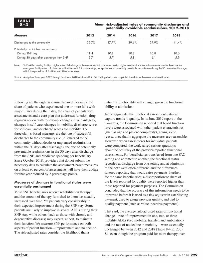
229 Repo r t t o t h e Cong r e s s : Med i ca r e Paymen t P o l i c y | Ma r ch 2020
patient’s functionality will change, given the functional ability at admission.
In the aggregate, the functional assessment data can capture trends in quality. In its June 2019 report to the Congress, the Commission reported that broad function levels were associated with other patient characteristics (such as age and patient complexity), giving some reassurance that in aggregate the measures are reasonable. However, when assessments for individual patients were compared, the work raised serious questions about the accuracy of the provider-reported functional assessments. For beneficiaries transferred from one PAC setting and admitted to another, the functional status recorded at discharge from one setting and at admission to the next were often different, and the differences favored reporting that would raise payments. Further, for the same beneficiaries, a disproportionate share of the levels reported for quality were reported higher than those reported for payment purposes. The Commission concluded that the accuracy of this information needs to be improved before it is used as a risk adjuster in establishing payment, used to gauge provider quality, and tied to quality payment (such as value incentive payments).
That said, the average risk-adjusted rates of functional change—rate of improvement in one, two, or three mobility ADLs (bed mobility, transfer, and ambulation) and the rate of no decline in mobility—were essentially unchanged between 2012 and 2018 (Table 8-4, p. 230). So, even though the program paid for more therapy over
following are the eight assessment-based measures: the share of patients who experienced one or more falls with major injury during their stay, the share of patients with assessments and a care plan that addresses function, drug regimen review with follow-up, changes in skin integrity, changes in self-care, changes in mobility, discharge scores for self-care, and discharge scores for mobility. The three claims-based measures are the rate of successful discharges to the community (i.e., discharged to the community without deaths or unplanned readmissions within the 30 days after discharge), the rate of potentially preventable readmissions in the 30 days after discharge from the SNF, and Medicare spending per beneficiary. Since October 2018, providers that do not submit the necessary data to calculate the assessment-based measures on at least 80 percent of assessments will have their update for that year reduced by 2 percentage points.
Measures of changes in functional status were essentially unchanged
Most SNF beneficiaries receive rehabilitation therapy, and the amount of therapy furnished to them has steadily increased over time. Yet patients vary considerably in their expected improvement during the SNF stay. Some patients are likely to improve in several ADLs during their SNF stay, while others (such as those with chronic and degenerative diseases) may expect, at best, to maintain their function. We measure SNF performance on both aspects of patient function—improvement and no decline. The risk-adjusted rates consider the likelihood that a
T A B L E8–3 Mean risk-adjusted rates of community discharge and
potentially avoidable readmissions, 2012–2018
Measure 2012 2014 2016 2017 2018
Discharged to the community 35.7% 37.7% 39.6% 39.9% 41.4%
Potentially avoidable readmissions:During SNF stay 11.4 10.8 10.8 10.8 10.6During 30 days after discharge from SNF 5.7 5.7 5.8 6.1 5.9
Note: SNF (skilled nursing facility). Higher rates of discharge to the community indicate better quality. Higher readmission rates indicate worse quality. Rates are the average of facility rates calculated for all facilities with 25 or more stays, except the rate of potentially avoidable readmissions during the 30 days after discharge, which is reported for all facilities with 20 or more stays.
Source: Analysis of fiscal year 2012 through fiscal year 2018 Minimum Data Set and inpatient acute hospital claims data for fee-for-service beneficiaries.

230 Sk i l l e d n u r s i ng f a c i l i t y s e r v i c e s : A s s e s s i ng paymen t adequacy and upda t i ng paymen t s
this period (the share of days assigned to the highest rehabilitation case-mix groups increased), the therapy did not translate into notably different functional outcomes.
Large variation in rates of community discharge and readmissions indicates considerable room for improvement
Considerable variation exists across the industry in performance on the quality measures we track. We found one-quarter of facilities in 2018 had risk-adjusted community discharge rates at or below 33.0 percent, whereas the best performing quarter of facilities had rates of 50.7 percent or higher (higher rates are better) (Table 8-5). Similar variation was seen in readmissions during the SNF stay: The worst performing quartile had rates at or above 13.2 percent, whereas the best quartile had rates at or below 7.5 percent (lower readmission rates are better). Finally, rates of readmission in the 30 days after discharge from the SNF varied most—a twofold difference between the 25th percentile and the 75th percentile. The amount of variation across and within the groups suggests considerable room for improvement, all else being equal.
Consistent with prior years, there were differences in discharge and readmission rates by ownership and provider type. In 2018, nonprofit SNFs had higher average rates of community discharges and fewer readmissions (that is, better rates) during the SNF stay and after discharge compared with for-profit facilities. The nonprofit SNFs had community discharge rates that were 9 percent higher (44.4 percent compared with 40.7 percent for for-profit facilities), during-stay readmission rates that were 15 percent lower (9.3 percent compared with 11.0 for for-profit facilities), and after-stay readmission rates that were 9 percent lower
(5.5 percent compared with 6.0 percent for for-profit facilities). By provider type, compared with freestanding facilities, hospital-based SNFs had, on average, higher rates of discharge to the community (12 percent higher), lower during-stay readmission rates (29 percent lower), and lower after-stay readmission rates (15 percent lower).
Medicare is increasingly focused on measuring the value of the care it purchases. In addition to implementing a VBP program in October 2018, CMS has a Nursing Home Compare website that displays comparative information about SNFs and nursing homes to help beneficiaries select a provider. As part of its star ratings, CMS now separately calculates one of the three component ratings (the quality rating) for short stays. The short-stay measures include improvement in function, use of antipsychotic medications, new or worse pressure ulcers, readmissions, emergency room visits, and successful discharge home. The quality rating is part of a facility’s overall star rating, which incorporates the facility’s performance on its health inspection, its staffing ratios, and quality measures for the short and long stays. As a result, the star rating does not entirely reflect the quality of care furnished to Medicare-covered short-stay patients. Separate overall star ratings for short- and long-stay care and an improved search function on the website would enable consumers to get more meaningful information on the care that is being sought.
Providers’ access to capital was adequate in 2019 The vast majority of SNFs are part of a larger nursing facility entity. Therefore, in assessing SNFs’ access to capital, we look at the availability of capital for nursing
T A B L E8–4 Mean risk-adjusted functional outcomes in SNFs
were essentially unchanged between 2012 and 2018
Composite measure 2012 2014 2016 2017 2018
Rate of improvement in one or more mobility ADLs 43.6% 43.5% 43.6% 44.0% 43.9%
Rate of no decline in mobility 87.2 87.1 87.1 87.1 87.2
Note: SNF (skilled nursing facility), ADL (activity of daily living). The three mobility ADLs include bed mobility, transfer, and ambulation. The rate of mobility improvement refers to the average rates of improvement in bed mobility, transfer, and ambulation, weighted by the number of stays included in each measure. Stays with improvement in one, two, or three of these ADLs are counted in the improvement measure. The rate of stays with no decline in mobility is the share of stays with no decline in any of the three mobility ADLs. Rates are the mean of facility rates and are calculated for all facilities with 25 or more stays.
Source: Analysis of fiscal year 2012 through fiscal year 2018 Minimum Data Set data.

231 Repo r t t o t h e Cong r e s s : Med i ca r e Paymen t P o l i c y | Ma r ch 2020
homes. Medicare makes up a minority share of most nursing homes’ revenues. With restrictions placed on bed supply in many states (35 states plus the District of Columbia have certificate-of-need laws that regulate nursing home bed supply), capital is most often used to update facilities rather than expand capacity.
Access to capital was “robust” in 2019 (Connole 2019). In 2019, of all health care sectors, long-term care had the most mergers and acquisitions (Herschman et al. 2019). In the second quarter of 2019, long-term care deals made up 41 percent of the health care activity and 28 percent of the dollars associated with them (PricewaterhouseCoopers 2019). Despite the overall sector’s declining volume, investors are “positive” on the sector (Valiquette et al. 2019a). With sufficient buyer interest, the price per bed has remained stable (Irving Levin Associates Inc. 2019).
Activity in the capital markets reflects several factors. First, some national companies continued to exit markets to focus their holdings in select states. Given the state-specific regulatory and reimbursement requirements and the hospital referrals needed, regional knowledge is seen as key to a successful business. Assets sold by larger chains were picked up by smaller regional or local operators. At least one company shed its assets in states where it had few homes and then expanded its holdings in core states with significant volume. At the other end of the scale, small chains and single-property operators were purchased
by larger regional chains with economies of scale and organizational backing to face a more complex operating environment. Real estate investment trusts continued to right-size their holdings that created opportunities for other investors (Wilson et al. 2019). Transactions (sales, receiverships, and foreclosures) reflected a variety of struggles, including low Medicaid payment rates and updates, costly contractual rent obligations, and the decline in the much-needed high-payment Medicare FFS volume to remain financially viable.
The aggregate total margin for nursing homes (reflecting all lines of business and all patients) was slightly negative (–0.3 percent), after having been modestly positive (ranging from 0.6 percent and 3.8 percent) since 2001. Because a “total margin” includes the Medicaid-funded long-term care (the nursing home portion of the business), the overall financial performance of this setting is heavily influenced by state policies regarding the level of Medicaid payments and the ease of entry into a market (e.g., whether there is a requirement for a certificate of need).
Some investors eye the slim total margins, declining occupancy rates, and increasing share of revenues from payers with lower rates and opt to pare back their investments or avoid the sector altogether. Other investors view the industry as remarkably stable, having the advantage of demographic trends and being a lower cost
T A B L E8–5 SNF quality measures varied considerably across SNFs, 2018
Quality measure
Risk-adjusted rates
Mean25th
percentile75th
percentile
Ratio of 75th to 25th
percentile
Discharged to the community 41.4% 33.0% 50.7% 1.5Potentially avoidable readmissions during SNF stay 10.6 7.5 13.2 1.8Potentially avoidable readmissions within 30 days after discharge from SNF 5.9 3.7 7.7 2.1
Note: SNF (skilled nursing facility). Higher rates of discharge to community indicate better quality. Higher readmission rates indicate worse quality. Rates are the average of facility rates and are calculated for all facilities with 25 or more stays, except the rates of potentially avoidable readmissions during the 30 days after discharge, which are reported for all facilities with 20 or more stays.
Source: Analysis of fiscal year 2018 Minimum Data Set and inpatient acute hospital data.

232 Sk i l l e d n u r s i ng f a c i l i t y s e r v i c e s : A s s e s s i ng paymen t adequacy and upda t i ng paymen t s
alternative to other institutional PAC. Any reluctance to invest in this setting does not reflect the adequacy of Medicare’s FFS SNF payments; Medicare remains a preferred payer.
The Department of Housing and Urban Development (HUD) continues to be an important lending source for this sector. Section 232 loans help finance nursing homes by providing lenders with protection against losses if borrowers default on their mortgage loans. In fiscal year 2019, HUD financed 288 projects, with the insured amount totaling $3.7 billion (Department of Housing and Urban Development 2019). Though fewer projects were financed in 2019 compared with 2018, the average mortgage amount increased. In 2019, defaults by some homes guaranteed by HUD prompted critics to underscore the importance of adequate oversight of the homes it insures (Goldstein and Geleloff 2019).
The nursing home industry is increasingly dividing into providers that can treat posthospital and medically complex patients and providers that cannot. The transition from FFS to alternative payment models (including ACOs
and bundled payments) and VBP requires SNFs to achieve good outcomes and communicate that performance to potential partners (hospitals and health systems) to secure volume. While some facilities had already started to develop and market their “niche” clinical capabilities to hospitals, the revised SNF payment system is likely to reinforce the divide between facilities that are able to adapt to the changes required and the facilities that are not. Some small solo operators may opt to stop participating in the Medicare program or to sell rather than transition to a more complex model of care. If providers stop participating in the Medicare program, beneficiaries, particularly those in rural areas, may have to go to a facility that is not their first choice or to one that is farther away from their residence. Decisions about exiting the Medicare program do not reflect the adequacy of Medicare’s payments; Medicare’s payments are well above providers’ costs and higher than those made by other payers.
Investors are generally cautiously optimistic about the overall ability of the sector to respond to the revised SNF payment system (Valiquette et al. 2019a, Wilson et al. 2019). The new payment system may spark mergers and acquisitions because providers that cannot adjust to the new design and its requirements will create opportunities for buyers (Wilson et al. 2019).
Because Medicaid payments are lower than Medicare FFS payments, some representatives in the industry argue that high Medicare payments are needed to subsidize losses on Medicaid. The Commission does not support this policy for several reasons (see text box on not subsidizing other payments). It should be noted that while Medicare’s payments are higher than Medicaid’s, the programs pay for different levels of care. Medicare pays for skilled services posthospitalization; Medicaid generally covers long-term care. (For dually eligible beneficiaries, Medicaid also pays for the copayments that begin on day 21 of a SNF stay and for any skilled care for beneficiaries who have exhausted their Part A coverage.) While some long-term care residents have complex care needs, the average resident does not. The average differences in the level of care are captured by the relative weights for the average Medicare beneficiary and Medicaid resident. The average therapy relative weight for a Medicare-covered beneficiary was nine times higher than the relative weight for a Medicaid-covered resident (White and Zheng 2018). The average nursing relative weight was 40 percent higher for a Medicare-covered beneficiary compared with a Medicaid-covered resident.
F IGURE8–1 After declining since 2015, FFS
program spending on SNF services is expected to increase in 2019 and 2020
Note: FFS (fee-for-service), SNF (skilled nursing facility). Fiscal year spending is shown. Data for 2019 and 2020 are estimates.
Source: Office of the Actuary 2019b.
Overpayments...FIGUREX-X
Notes about this graph:• I did this all manually, since it has two axes.
Note: Note and Source in InDesign.
Pro
gra
m s
pen
din
g (
in b
illio
ns)
Ave
rage
spen
din
g p
er F
FS b
enefi
ciary
$25
$35
$15
$10
$30
$20
$5
$900
$800
$700
$600
$400
$500
$300
$200
$100
$0$0
20042006
2016 20202018
20082010
20122014
Average spending perFFS beneficiaryFFS program spending(in billions)
0
5
10
15
20
25
30
35
0
100
200
300
400
500
600
700
800
900

233 Repo r t t o t h e Cong r e s s : Med i ca r e Paymen t P o l i c y | Ma r ch 2020
Trends in FFS spending and cost growth
In fiscal year 2018, Medicare FFS spending for SNF services was $28.5 billion, about 1 percent lower than in 2017 (Figure 8-1) (Office of the Actuary 2019b). Between 2004 and 2010, program spending increased an average of almost 8 percent a year. In 2011, program spending was unusually high because rates for the new case-mix classification system included an adjustment that was too large for the mix of therapy modalities (i.e., individual versus group or concurrent) assumed in setting the rates. The industry took advantage of the new policies by quickly shifting its mix of modalities, and spending increased by over 19 percent in 2011. To correct for the excessive payment, CMS revised the adjustment downward in 2012, and total payments declined over 12 percent in 2012. Since 2013, program spending has changed little. The Office of the Actuary estimates that FFS spending will increase in 2019 and 2020 (Figure 8-1). On a per FFS beneficiary basis, spending in 2018 was $745, a small decrease from 2017 ($752).
Medicare payments and providers’ costs: Medicare margins remained high in 2018In 2018, the aggregate Medicare margin for freestanding SNFs was 10.3 percent. Margins for individual facilities continue to vary depending on the facility’s share of intensive therapy days, size, and cost per day. High-margin SNFs had higher shares of intensive therapy days and lower average costs per day compared with low-margin SNFs. Differences by ownership were considerable, with for-profit facilities having much higher Medicare margins than nonprofit facilities. The 959 (or 8 percent) freestanding facilities defined as relatively efficient—providers with consistently low costs and higher quality care, in relative terms—had Medicare margins of 16.9 percent, indicating Medicare overpays freestanding facilities for this care. Some MA plans’ payment rates were considerably lower than Medicare’s FFS payment rates, and the disparity is unlikely to be explained by differences in patient mix.
Medicare’s skilled nursing facility payments should not subsidize payments from Medicaid or other payers
Medicare payments to SNFs, which are financed by taxpayer contributions to the Part A Trust Fund, effectively subsidize
payments from other payers, most notably Medicaid. High Medicare payments also likely subsidize payments from private payers. Industry representatives contend that this subsidization should continue. The Commission believes such cross-subsidization is poor policy for several reasons. First, it results in poorly targeted subsidies. Facilities with high shares of Medicare beneficiary days receive the most in “subsidies” from higher Medicare payments, while facilities with low shares of Medicare beneficiary days—presumably the facilities with the greatest financial need—receive the smallest subsidies.
In addition, Medicare’s subsidization does not differentiate among states with relatively high and low
Medicaid payments. If Medicare raises or maintains its high payment levels, states could be encouraged to further reduce their Medicaid payments and, in turn, create pressure to raise Medicare rates even more. Further, these higher Medicare payments could also further encourage providers to select patients based on payer source or rehospitalize dual-eligible patients to qualify them for a Medicare-covered, higher payment stay. Finally, Medicare’s high payments represent a subsidy from trust fund dollars (and taxpayer support) of the low payments made by states and private payers. Moreover, maintaining or raising Medicare’s payments would exert additional fiscal pressure on the already fiscally strapped program. If the Congress wishes to financially support certain nursing facilities (such as those with high Medicaid shares) efficiently, it could do so through a separate, targeted policy. ■

234 Sk i l l e d n u r s i ng f a c i l i t y s e r v i c e s : A s s e s s i ng paymen t adequacy and upda t i ng paymen t s
grown over time. The higher costs for nonprofit facilities partly reflect their smaller size, so they generally cannot achieve the same economies of scale. In 2018, compared with for-profit facilities, the median nonprofit facility was smaller (87 beds compared with 102 beds) and had a lower average daily census (71 compared with 81).
SNF Medicare margins remain high
The Medicare margin is a key measure of the adequacy of the program’s payments because it compares Medicare’s FFS payments with providers’ costs to treat FFS beneficiaries. In 2018, the aggregate Medicare margin for freestanding SNFs was 10.3 percent, down from 11.3 percent in 2017. Even with this decline, it was the 19th consecutive year of Medicare margins above 10 percent (Figure 8-2). Medicare margins declined because costs per day increased 2.7 percent, while payment rates were increased by 1.0 as required by the Medicare Access and
Between 2017 and 2018, aggregate costs per day grew 2.7 percent, slightly higher than the market basket (2.6 percent). Costs increased more quickly for nonprofit SNFs compared with for-profit SNFs (3.6 percent compared with 2.4 percent, respectively). Cumulatively since 2013, the industry kept the growth in the average cost per day below the market basket (11.5 percent compared with the market basket of 12.4 percent). Over the same period, nonprofit SNFs had higher cost growth (for total, routine, ancillary, and administrative costs) compared with for-profit SNFs (for example, total costs increased 15.7 percent for nonprofit facilities compared with 10.2 percent for for-profit SNFs). In addition to higher cost growth, nonprofit facilities had higher average costs per day in 2018 for all broad cost categories (total, routine, ancillary, and administration)—the average cost per day was 11 percent higher—than the cost per day in for-profit facilities. Differences in the level of cost per day by ownership have
Aggregate freestanding SNF Medicare margins have been above 10 percent since 2000
Note: SNF (skilled nursing facility). Medicare margin is calculated as the sum of Medicare payments minus the sum of Medicare’s costs, divided by Medicare payments.
Source: MedPAC analysis of freestanding SNF cost reports, 2000–2018.
Freestanding Medicare margins....M
edic
are
marg
in (
in p
erce
nt)
FIGUREX-X
Note: Note and Source are in InDesign.
Source:
Notes about this graph:• Data is in the datasheet. Make updates in the datasheet.• WATCH FOR GLITCHY RESETS WHEN YOU UPDATE DATA!!!!• The column totals were added manually.• I had to manually draw tick marks and axis lines because they kept resetting when I changed any data.• I can’t delete the legend, so I’ll just have to crop it out in InDesign.• Use direct selection tool to select items for modification. Otherwise if you use the black selection tool, they will reset to graph default when you change the data.• Use paragraph styles (and object styles) to format. • Data was from: R:\Groups\MGA\data book 2007\data book 2007 chp1
0
5
10
15
20
25
2018201720162015201420132012201120102009200820072006200520042003200220012000
11.010.1
17.7 17.5
13.813.1 12.8
14.7
16.718.0
19.4
21.3
14.113.1 12.8 12.6
11.6 11.310.3
F IGURE8–2

235 Repo r t t o t h e Cong r e s s : Med i ca r e Paymen t P o l i c y | Ma r ch 2020
for revenues, nonprofits had somewhat lower shares of the more profitable ultra-high and very high therapy days compared with for-profit facilities (84 percent compared with 85 percent, respectively) and shorter stays, both lowering revenue (data not shown).
CHIP Reauthorization Act of 2015. With changes in case mix, payments per day increased 1.5 percent.
In 2018, hospital-based facilities (3 percent of program spending on SNFs) continued to have extremely negative Medicare margins (–63 percent), in part because of the higher cost per day reported by hospitals. However, hospital administrators consider their SNF units in the context of the hospital’s overall financial performance and mission. Hospitals with SNFs can lower their inpatient lengths of stay by transferring patients to their SNF beds, thus making inpatient beds available to treat additional inpatient admissions.
Widely varying SNF Medicare margins illustrate why a revised PPS was needed
The wide variation in Medicare margins illustrates why a revised PPS design was needed. In 2018, one-quarter of freestanding SNFs had Medicare margins of 19.7 percent or higher, while another quarter of freestanding SNFs had margins of –0.7 percent or lower (Table 8-6). Providers’ case mix played a key role in shaping Medicare margins. In 2018, facilities with high shares of intensive therapy days had Medicare margins that averaged 9 percentage points higher than facilities with low shares of these days (12.3 percent compared with 3.1 percent). Facilities that treated low shares of medically complex days had higher margins than those with high shares (11.9 percent compared with 8.0 percent).
Medicare margins also reflect the economies of scale that larger SNFs are able to achieve. Small (20 to 50 beds) and low-volume facilities (bottom quintile of total facility days) had low average Medicare margins (–2.1 percent and –0.8 percent, respectively) compared with large and high-volume facilities (11.7 percent and 12.8 percent, respectively). SNFs with the lowest cost per day (SNFs in the bottom 25th percentile) had Medicare margins that were more than 20 percentage points higher than SNFs with the highest cost per day (SNFs in the top 25th percentile).
Since 2006, for-profit facilities’ Medicare margins have averaged about 10 percentage points higher than nonprofit facilities’ margins. In 2018, the difference was 12.5 points. The disparity reflects differences in facilities’ mix of patients, costs, size, and service provision. Nonprofit facilities on average have higher costs per day (about 11 percent higher), in part because they are smaller and had higher cost growth compared with for-profit facilities. As
T A B L E8–6 Variation in freestanding SNF
Medicare margins reflects the mix of cases, cost per day, and
economies of scale, 2018
Provider groupMedicare margin
All providers 10.3%
For profit 13.0Nonprofit 0.5
Rural 8.2Urban 10.7Frontier 2.9
25th percentile of Medicare margins –0.775th percentile of Medicare margins 19.7
Intensive therapy: High share of days 12.3Intensive therapy: Low share of days 3.1
Medically complex: High share of days 8.0Medically complex: Low share of days 11.9
Small (20–50 beds) –2.1Large (100–199 beds) 11.7
Cost per day: High –1.4Cost per day: Low 22.1
Cost per discharge: High 8.6Cost per discharge: Low 11.5
Facility volume: Highest fifth 12.8Facility volume: Lowest fifth –0.8
Note: SNF (skilled nursing facility). The margins are aggregates for the facilities included in the group. “Intensive therapy” days are those classified in the ultra-high and very high rehabilitation case-mix groups. “Low” is defined as facilities in the lowest 25th percentile; “high” is defined as facilities in the highest 25th percentile. “Frontier” refers to SNFs located in counties with six or fewer people per square mile. Facility volume includes all facility days.
Source: MedPAC analysis of 2018 freestanding SNF Medicare cost reports.

236 Sk i l l e d n u r s i ng f a c i l i t y s e r v i c e s : A s s e s s i ng paymen t adequacy and upda t i ng paymen t s
and had higher occupancy rates than lower margin facilities. Somewhat surprisingly, high-margin facilities had larger shares of dual-eligible beneficiaries, minority beneficiaries, and Medicaid days. It is possible that, given their larger Medicaid mix (and the lower payments typically made by Medicaid), these facilities keep their costs lower, which contributes to their higher Medicare margins.
The highest margin freestanding SNFs (those in the top quartile of the distribution of Medicare margins) appear to pursue both cost and revenue strategies (Table 8-7). Compared with lower margin SNFs (those in the bottom quartile), high-margin SNFs had considerably lower standardized daily total, routine, and ancillary costs and lower cost per discharge. Economies of scale play a role; high-margin SNFs had higher daily censuses on average
T A B L E8–7 Cost and revenue differences explain variation in
Medicare margins for freestanding SNFs in 2018
Characteristic
SNFs in the top margin
quartile
SNFs in the bottom margin
quartile
Ratio of SNFs in the top margin quartile
to SNFs in the bottom margin quartile
Cost measures Standardized cost per day $278 $410 0.68
Standardized ancillary cost per day $118 $167 0.70Standardized routine cost per day $157 $230 0.68
Standardized cost per discharge $11,392 $14,506 0.79Average daily census (patients) 88 65 1.34Occupancy rate (in percent) 86% 83% 1.04
Revenue measuresMedicare payment per day $530 $458 1.16Medicare payment per discharge $22,554 $15,730 1.43Medicare length of stay (days) 41 34 1.20Share of days in intensive therapy 89% 81% 1.10Share of medically complex days 3% 3% 1.00Medicare share of facility revenue 22% 12% 1.83Medicaid share of days 66% 57% 1.16
Patient characteristicsCase-mix index 1.42 1.32 1.08Share dual-eligible beneficiaries 51% 36% 1.42Share minority beneficiaries 15% 5% 3.00Share very old beneficiaries 26% 33% 0.79
Facility mixShare for profit 85% 55% N/AShare urban 81% 70% N/A
Note: SNF (skilled nursing facility), N/A (not applicable). Values shown are medians for the quartile. Top margin quartile SNFs (n = 3,318) were in the top 25 percent of the distribution of Medicare margins. Bottom margin quartile SNFs (n = 3,318) were in the bottom 25 percent of the distribution of Medicare margins. “Standardized cost” refers to Medicare costs adjusted for differences in area wages and the case mix (using the nursing component’s relative weights) of Medicare beneficiaries. “Intensive therapy” days are days classified in ultra-high and very high rehabilitation case-mix groups. “Medically complex” includes days assigned to clinically complex and special care case-mix groups. “Very old beneficiaries” are 85 years and older. Figures in the first two columns are rounded, but ratios were calculated on unrounded data.
Source: MedPAC analysis of freestanding 2018 SNF cost reports and claims.

237 Repo r t t o t h e Cong r e s s : Med i ca r e Paymen t P o l i c y | Ma r ch 2020
set of criteria and then examine how many providers meet them. It does not establish a set share (for example, 10 percent) of providers to be considered efficient and then define criteria to meet that pool size.
To identify efficient SNFs, we examined the performance of freestanding SNFs with consistent cost and quality performance. To measure costs, we looked at costs per day that were adjusted for differences in area wages and case mix. The quality measures were risk-adjusted rates of community discharge and potentially avoidable readmissions during the SNF stay.
Our analyses found that many SNFs (959, or 8 percent of the 11,551 facilities included in this analysis) had relatively low costs and provided relatively good quality care. Compared with other SNFs in 2018, relatively
Relatively efficient SNFs illustrate Medicare’s payments are too high
The Commission is required by the Medicare Prescription Drug, Improvement, and Modernization Act of 2003 to consider the costs associated with efficient providers. The analysis informs the Commission’s update discussion by examining the adequacy of payments for those providers that perform relatively well on cost and quality measures.
The Commission follows two principles when selecting a set of efficient providers. First, the providers must do relatively well on both cost and quality metrics (see text box on identifying relatively efficient SNFs). Second, performance has to be consistent, meaning that the provider cannot have poor performance on any metric in any of three consecutive years preceding the year under evaluation. The Commission’s approach is to develop a
Identifying relatively efficient skilled nursing facilities
We defined relatively efficient skilled nursing facilities (SNFs) as those with relatively low costs per day and good quality of care
for three years in a row, 2015 through 2017. The cost per day was calculated using cost report data and was adjusted for differences in case mix (using the nursing component relative weights) and area wages. To assess quality, we examined risk-adjusted rates of community discharge and potentially avoidable readmissions that occurred during the SNF stay. Only facilities with at least 25 stays were included in the quality measures. To be included in the relatively efficient group, a SNF had to be in the best third of the distribution of at least one measure and not in the bottom third of any measure for three consecutive years. Another criterion was that SNFs not be part of CMS’s Special Focus Facility Initiative for any portion of time covered by the definition (2015 through 2017), which excluded five facilities from the pool of efficient providers.13
We found that 8 percent (959 of the 11,551 facilities that had all of the data items required for this analysis) provided relatively low-cost, high-quality
care. Relatively efficient facilities were more likely to be urban and for profit. Efficient SNFs were geographically dispersed (located in 44 states), though the states without an efficient SNF tended to be predominantly rural (Alaska, Maine, Montana, North Dakota, South Dakota, and West Virginia, plus the District of Columbia).
The method we used to assess performance attempts to limit incorrect conclusions about performance based on poor data. Using three years to categorize SNFs as efficient (rather than just one year) avoids categorizing providers based on random variation or on one “unusual” year. In addition, by first assigning a SNF to a group and then examining the group’s performance in the next year, we avoid having a facility’s poor data affect both its own categorization and the assessment of the group’s performance. Thus, a SNF’s erroneous data could result in its inaccurate assignment to a group, but because the group’s performance is assessed with data from later years, these “bad” data would not directly affect the assessment of the group’s performance. ■

238 Sk i l l e d n u r s i ng f a c i l i t y s e r v i c e s : A s s e s s i ng paymen t adequacy and upda t i ng paymen t s
to lower its payments to more closely align them with the costs of care.
Similar to high-margin SNFs, relatively efficient SNFs appear to pursue cost and revenue strategies. On the cost side, relatively efficient SNFs achieved greater economies of scale, with a higher daily census compared with other facilities (98 compared with 78, respectively) and higher occupancy rates (88 percent versus 84 percent). Because the relatively efficient providers were also higher quality, their volume could reflect their success in attracting
efficient SNFs had community discharge rates that were 27 percent higher and readmission rates that were 15 percent lower (Table 8-8). Standardized costs per day were 8 percent lower than for other SNFs. The aggregate Medicare margin for relatively efficient SNFs was high (16.9 percent), indicating that although these providers were relatively low cost and achieved relatively high quality, the Medicare program could get better value for its purchase if its payments were lower. The high margin for these providers underscores the need for the program
T A B L E8–8 Financial performance of relatively efficient freestanding SNFs is a
combination of lower cost per day and higher revenues per day
Type of SNFRatio of relatively
efficient to other SNFsPerformance in 2018 Relatively efficient Other SNFs
Community discharge rate 52% 41% 1.27Readmission rate 9% 10% 0.85
Standardized cost per day $304 $331 0.92Standardized cost per discharge $9,042 $12,444 0.73Medicare revenue per day $530 $482 1.10Medicare margin 16.9% 9.9%Total margin 2.0% 0.26%
Facility case-mix index 1.44 1.36 1.06Medicare average length of stay 30 days 37 days 0.80Occupancy rate 88% 84% 1.04Average daily census 98 78 1.26
Share ultra-high therapy days 69% 56% 1.22Share medically complex days 4% 4% 1.00
Medicaid share of facility days 58% 63% 0.93
Share urban 85% 68% N/AShare for profit 79% 67% N/AShare nonprofit 16% 21% N/A
Note: SNF (skilled nursing facility), N/A (not applicable). The number of freestanding facilities included in the analysis was 11,551, of which 959 (or 8 percent) of SNFs were identified as “relatively efficient” based on their cost per day and two quality measures (community discharge and readmission rates) between 2015 and 2017. Relatively efficient SNFs were those in the best third of the distribution for one measure and not in the worst third for any measure in each of three years and were not a facility under “special focus” by CMS. Costs per day and per discharge were standardized for differences in case mix (using the nursing component relative weights) and wages. Quality measures were rates of risk-adjusted community discharge and readmission during the SNF stay for patients with potentially avoidable conditions. Quality measures were calculated for all facilities with at least 25 stays. “Ultra-high therapy days” include days assigned to ultra-high case-mix groups. “Medically complex days” includes days assigned to clinically complex and special care case-mix groups. The table shows the medians for the measure. The median total margins for relatively efficient and other SNFs were positive, although the aggregate total margin for all freestanding SNFs was –-0.3 percent. Figures in the first two columns are rounded, but ratios were calculated on unrounded data.
Source: MedPAC analysis of quality measures and Medicare cost report data for 2015–2018.

239 Repo r t t o t h e Cong r e s s : Med i ca r e Paymen t P o l i c y | Ma r ch 2020
Investment Center for Seniors Housing & Care, a nonprofit organization that supports access and choice for seniors’ housing and care, including nursing homes and assisted living. It found that for the 1,389 SNF properties included in its sample, FFS payments per day were 22 percent higher than MA rates (National Investment Center for Seniors Housing & Care 2019).
We compared the patient characteristics of beneficiaries enrolled in FFS and MA plans in 2018 and found the differences are unlikely to explain the magnitude of the differences between FFS payments and payments typically made by MA plans.14 Compared with FFS beneficiaries, MA enrollees were slightly older (by a year) and had slightly higher Barthel scores (about two points, indicating slightly more independence), and lower risk scores (4 percent lower, indicating fewer comorbidities). The considerably lower MA payments indicate that some facilities accept much lower payments to treat MA enrollees who may not be much different in terms of case mix from FFS beneficiaries. Some publicly traded post-acute care firms with SNF holdings report seeking managed care patients as a business strategy, indicating that the MA rates are attractive.
Payments and costs for 2020To project the aggregate fiscal year 2020 Medicare margin for freestanding SNFs, the Commission considers the relationship between SNF costs and Medicare payments in 2018 as a starting point. To estimate costs for 2019 and 2020, we assumed a cost growth for freestanding
admissions. On the revenue side, relatively efficient providers had higher shares of the most intensive therapy days, which raised their daily Medicare payments relative to all SNFs. They also had lower Medicaid shares, which improved their total financial performance; efficient providers’ total margin was 2.0 percent compared with 0.26 percent for other SNFs. Relatively efficient facilities had more complex case mixes (driven in part by higher therapy intensity) and shorter stays.
FFS payments for SNF care are considerably higher than MA payments for three publicly traded nursing home companies
Another indicator that Medicare’s payments under the SNF PPS are too high is the comparison of Medicare FFS and MA payments. (We use “MA” as shorthand for all managed care payments since MA makes up the majority of rates reported as “managed care payments.”) We compared Medicare FFS and MA payments for three companies with SNF holdings for which such information was publicly available. For these companies, Medicare’s FFS payments averaged 21 percent higher than MA rates (Table 8-9). We do not know whether the lower average daily payment by MA plans reflects differences in service intensity (for example, fewer intensive therapy days), lower payments for the same service, or some combination. We also do not know how these rates compare with rates paid to other SNF chains and independent facilities. It is possible that companies with SNF holdings differ in their ability to negotiate high payment rates from MA plans. However, similar differences in payments were reported by the National
T A B L E8–9 Comparison of Medicare fee-for-service and managed care
daily payments in 2019 to three companies
Company
Medicare payment
Ratio of FFS to MA paymentFFS Managed care (MA)
Diversicare $458 $394 1.16Ensign Group 616 466 1.32
Genesis HealthCare 526 456 1.15
Note: FFS (fee-for-service), MA (Medicare Advantage). MA makes up the majority of managed care payments. The Genesis rate is reported as “insurance,” which includes managed care but excludes Medicaid managed care and private pay.
Source: Third quarter 10–Q 2019 reports available at each company’s website.

240 Sk i l l e d n u r s i ng f a c i l i t y s e r v i c e s : A s s e s s i ng paymen t adequacy and upda t i ng paymen t s
the mix of cases, and the relative costs of different types of stays. Thus, behavioral responses will dictate whether CMS will need to take future action to rebase and recalibrate payments to keep them aligned with the cost of care.
Regarding the level of payments, indicators of the adequacy of Medicare’s payments are positive. The aggregate Medicare margin for SNFs has been above 10 percent since 2000 and is expected to remain above 10 percent in 2020. In 2018, the marginal profit was 18.7 percent, indicating facilities with an available bed have an incentive to admit Medicare patients. Relatively efficient SNFs had a median Medicare margin of 16.9 percent, further evidence that the level of payments is too high relative to the cost of care. Furthermore, FFS payments were considerably higher than the MA payments made to some SNFs, suggesting that some facilities are willing to accept much lower rates than FFS payments to treat Medicare beneficiaries. These findings show that the PPS continues to exert too little pressure on providers to keep their costs low.
R E C O M M E N D A T I O N 8
For fiscal year 2021, the Congress should eliminate the update to the fiscal year 2020 Medicare base payment rates for skilled nursing facilities.
R A T I O N A L E 8
The aggregate Medicare margin in 2018 was 10.3 percent and is expected to remain above 10 percent in 2020, indicating that the current level of Medicare’s payment rates is more than adequate to accommodate cost growth and provide care to Medicare beneficiaries without an update to the base rate. Current law will increase base payments by a projected 2.6 percent (the market basket net of productivity) in fiscal year 2021.
While the level of Medicare’s payments indicates that a reduction to payments (i.e., not simply maintaining payment rates at current levels) is needed to align aggregate payments to aggregate costs, we expect the SNF industry to undergo considerable changes as it adjusts to the redesigned PPS. Given the potential changes, the Commission will proceed cautiously in considering recommendations to lower payments to more closely align them to costs. A zero update would begin to align payments with costs while exerting pressure on providers to keep their cost growth low. The Commission
SNFs equal to the average for the past five years (which was slightly below the average market basket) and no behavioral changes. While the cost growth between 2017 and 2018 was slightly higher than the market basket, we have no reason to assume this pace of growth will continue. Over the past five years, SNFs held their cost growth below market basket for three years and exceeded it in two. Taking a five-year average is a reasonable approach to projecting costs in fiscal years 2019 and 2020. For 2020, we lowered costs by CMS’s estimate of the net savings to providers associated with the implementation of the new payment system. Providers are required to conduct fewer patient assessments (that lowers providers’ costs) but collect more assessment items to comply with the quality reporting requirements (that slightly increases providers’ costs).
To estimate 2019 payments, we assumed payments in 2018 would increase in 2019 by 2.4 percent, as required by the Balanced Budget Act of 2018. We also reduced 2019 payments by the portion of the VBP withhold that was retained as program savings. For 2020, we assumed payments would also increase by 2.4 percent, the market minus productivity, as required by law.
We expect margins to decrease slightly in 2019 due to the program savings from the SNF VBP that will lower providers’ revenues in 2019, but to increase slightly in 2020 because the update (2.4 percent) will be higher than estimated cost growth. The projected Medicare margin for 2020 is 10 percent.
How should Medicare payments change in 2021?
In considering how payments should change for 2021, we note that costs are estimated to increase 3.0 percent that year. The update to payments in 2021 is estimated to be lower because the productivity adjustment will lower the market basket update by an estimated 0.4 percent, for a net update of 2.6 percent. The change in Medicare margins will depend, in part, on whether cost growth exceeds the growth in payments on a case-mix-adjusted basis.
In fiscal year 2020, CMS implemented substantial changes to the SNF PPS. While CMS estimated the redesign to be budget neutral, provider responses to the new PPS may alter total program spending and facilities’ cost structures,

241 Repo r t t o t h e Cong r e s s : Med i ca r e Paymen t P o l i c y | Ma r ch 2020
spending trends for Medicaid and financial performance for non-Medicare payers. Medicaid revenues and costs are not reported in the Medicare cost reports. In a joint publication with the Medicaid and CHIP Payment Access Commission, we report on characteristics, service use, and spending for dual-eligible beneficiaries (Medicare Payment Advisory Commission and the Medicaid and CHIP Payment and Access Commission 2018).
Medicaid covers nursing home (long-term) care and a portion of the skilled nursing care furnished to beneficiaries who are dually eligible for Medicaid and Medicare. Medicaid pays the Medicare copayments required of dual-eligible beneficiaries that begin on day 21 of a SNF stay and for any skilled care for beneficiaries who exhaust their Part A coverage (that is, if their Part A stay exceeds 100 days). Medicaid also pays for long-term care services that Medicare does not cover.
Count of Medicaid-certified nursing homesBetween 2018 and 2019, the number of nursing facilities certified as Medicaid providers declined almost 1 percent to 14,889, similar to the decline of Medicare providers (Table 8-10). The number of nursing homes certified as Medicaid providers that terminated their participation in the Medicaid program varied by state. (We do not know whether the providers that terminated participation in the Medicaid program remained open but no longer accepted Medicaid patients, closed, or were purchased by another entity and remained open.) Of the 14,845 Medicaid nursing homes active in January 2019, about 1 percent of providers had terminated as of mid-October 2019,
will monitor beneficiary access, quality of care, and providers’ financial performance and will consider future recommendations based on the sector’s responses to the new payment system.
I M P L I C A T I O N S 8
Spending
• Relative to current law, this recommendation would lower program spending by between $750 million and $2 billion for fiscal year 2021 and by between $5 billion and $10 billion over five years. Program savings would occur because current law requires market basket increases for 2021 that would raise program spending relative to spending that would occur if payment rates remained at the 2020 levels.
Beneficiary and provider
• We do not expect this recommendation to have adverse effects on beneficiaries’ access to care. Given the current level of payments, we also do not expect the recommendation to affect providers’ willingness or ability to care for Medicare beneficiaries.
Medicaid trends
Section 2801 of the Affordable Care Act of 2010 requires the Commission to examine spending, use, and financial performance trends in the Medicaid program for providers with a significant portion of revenues or services associated with Medicaid. We report on nursing home
T A B L E8–10 The number of nursing homes treating Medicaid
enrollees declined slightly from 2018 to 2019
2014 2016 2018 2019
Average annual percent change
2016–2018 2018–2019
Number of facilities 15,084 15,057 15,007 14,889 –0.33% –0.79%
Note: The 2019 number is through mid-October of that year; it does not include data from the full calendar year. Counts include dually certified skilled nursing facilities/nursing facilities, distinct-part skilled nursing facilities/nursing facilities, and nursing facilities.
Source: Certification and Survey Provider Enhanced Reporting on CMS’s Survey and Certification Providing Data Quickly system, 2014–2019.
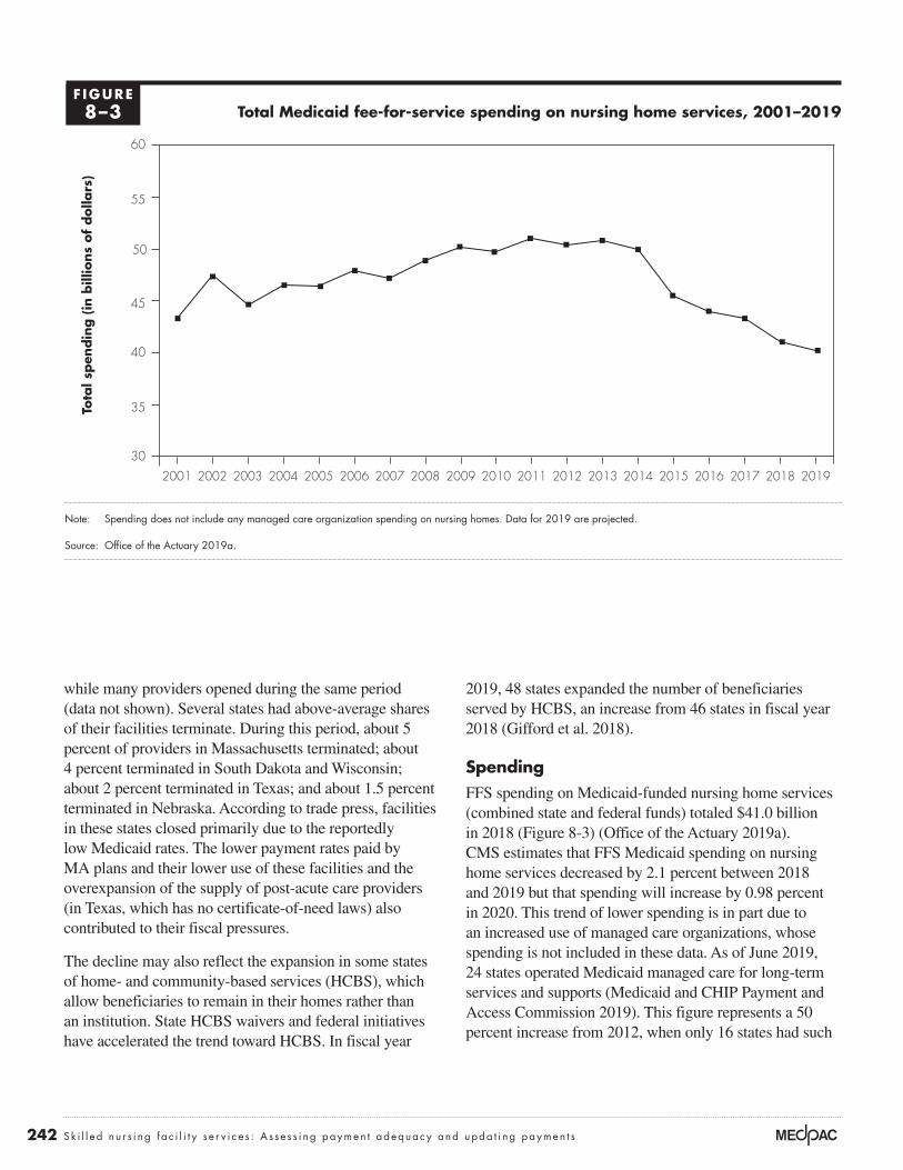
242 Sk i l l e d n u r s i ng f a c i l i t y s e r v i c e s : A s s e s s i ng paymen t adequacy and upda t i ng paymen t s
2019, 48 states expanded the number of beneficiaries served by HCBS, an increase from 46 states in fiscal year 2018 (Gifford et al. 2018).
SpendingFFS spending on Medicaid-funded nursing home services (combined state and federal funds) totaled $41.0 billion in 2018 (Figure 8-3) (Office of the Actuary 2019a). CMS estimates that FFS Medicaid spending on nursing home services decreased by 2.1 percent between 2018 and 2019 but that spending will increase by 0.98 percent in 2020. This trend of lower spending is in part due to an increased use of managed care organizations, whose spending is not included in these data. As of June 2019, 24 states operated Medicaid managed care for long-term services and supports (Medicaid and CHIP Payment and Access Commission 2019). This figure represents a 50 percent increase from 2012, when only 16 states had such
while many providers opened during the same period (data not shown). Several states had above-average shares of their facilities terminate. During this period, about 5 percent of providers in Massachusetts terminated; about 4 percent terminated in South Dakota and Wisconsin; about 2 percent terminated in Texas; and about 1.5 percent terminated in Nebraska. According to trade press, facilities in these states closed primarily due to the reportedly low Medicaid rates. The lower payment rates paid by MA plans and their lower use of these facilities and the overexpansion of the supply of post-acute care providers (in Texas, which has no certificate-of-need laws) also contributed to their fiscal pressures.
The decline may also reflect the expansion in some states of home- and community-based services (HCBS), which allow beneficiaries to remain in their homes rather than an institution. State HCBS waivers and federal initiatives have accelerated the trend toward HCBS. In fiscal year
Total Medicaid fee-for-service spending on nursing home services, 2001–2019
Note: Spending does not include any managed care organization spending on nursing homes. Data for 2019 are projected.
Source: Office of the Actuary 2019a.
Title here....To
tal s
pen
din
g (
in b
illio
ns
of
dolla
rs)
Note: Note and Source are in InDesign.
Source:
30
35
40
45
50
55
60
2019201820172016201520142013201220112010200920082007200620052004200320022001
Notes about this graph:• Data is in the datasheet. Make updates in the datasheet.• I deleted the years from the x-axis and put in my own.• I had to manually draw tick marks and axis lines because they kept resetting when I changed any data.• The dashed line looked ok here, so I didn’t hand draw it.• I can’t delete the legend, so I’ll just have to crop it out in InDesign.• Use direct selection tool to select items for modification. Otherwise if you use the black selection tool, they will reset to graph default when you change the data.• Use paragraph styles (and object styles) to format.
FIGURE1-XXF IGURE8–3

243 Repo r t t o t h e Cong r e s s : Med i ca r e Paymen t P o l i c y | Ma r ch 2020
Total and non-Medicare margins in nursing homes Total margins reflect all payers (including all fee-for-service and managed care funds from Medicare, Medicaid, and private insurers across all lines of business (for example, nursing home care, hospice care, ancillary services, home health care, and investment income). In 2018, the aggregate total margin was –0.3 percent, the first year since 2000 that the total margin was negative (Table 8-11; only most recent years shown). In the past 19 years, the total margin has ranged from 0.6 percent to 3.8 percent (not all data shown).
Total margins in 2018 varied considerably: The median was 0.3 percent, while the total margins at the 25th and 75th percentiles were –5.9 percent and 5.0 percent, respectively (data not shown). Total margins have declined since 2013, reflecting several factors: the impact of reductions to Medicare payments mandated by congressional action, the growing share of facilities’ payments by MA plans (whose payments are lower than Medicare’s FFS payments), the lower volume of high-payment Medicare FFS patients, and lower average occupancy rates (thus raising the average cost per day). Beneficiaries receiving skilled nursing services were increasingly enrolled in alternative payment models (including bundled payments and ACOs) and MA plans, which have shorter stays or avoid this setting entirely.
Non-Medicare margins reflect the profitability of all services except FFS Medicare–covered SNF services. The aggregate non-Medicare margin in 2018 was –3.0 percent, lower than in 2017 (Table 8-11). Non-Medicare margins also varied considerably: 25 percent of facilities had non-Medicare margins of –10.8 percent or lower
programs (Lewis et al. 2018). Year-to-year changes in spending have been variable, increasing in some years and decreasing in others, with overall spending in 2019 below what it was in 2001. The large decreases in FFS Medicaid spending beginning in 2015 reflect increased enrollment in Medicaid managed care.
Analysis of Medicaid rate-setting trends found that 10 states restricted (froze or reduced) rates paid to nursing homes in 2019, while 40 states and the District of Columbia increased rates (Gifford et al. 2019). More states increased rates to nursing homes than in 2018 (only 34 states raised rates in 2018, while 17 states restricted rates) (Gifford et al. 2018). Furthermore, the National Investment Center for Seniors Housing & Care reported that Medicaid revenue per day has been increasing steadily since 2011 (National Investment Center for Seniors Housing & Care 2019). Rates will likely stay the same in 2020; 40 states and the District of Columbia have indicated that they will increase nursing home rates. Eight states plan to restrict rates in 2020 (Gifford et al. 2019).
States continue to use provider taxes to raise federal matching funds. In fiscal year 2019, 44 states and the District of Columbia levied provider taxes on nursing homes to increase federal matching funds (Gifford et al. 2019).15 The augmented federal funding may be split with the nursing homes.
The majority of states (33 plus the District of Columbia) have expanded their Medicaid programs since the passage of the Affordable Care Act of 2010. Three more states (Idaho, Nebraska, and Utah) passed initiatives to expand their Medicaid programs in November 2018; however, these have not been approved by CMS thus far.
T A B L E8–11 Total margins continued to decline and were slightly negative in 2018
Type of margin 2013 2014 2015 2016 2017 2018
Total margin 1.9% 1.9% 1.6% 0.7% 0.6% –0.3%Non-Medicare margin –1.8 –1.5 –2.1 –2.4 –2.4 –3.0
Note: SNF (skilled nursing facility). “Total margin” includes the revenues and costs associated with all payers and all lines of business. “Non-Medicare margin” includes the revenues and costs associated with Medicaid and private payers for all lines of business.
Source: MedPAC analysis of Medicare freestanding SNF cost reports for 2013 to 2018.

244 Sk i l l e d n u r s i ng f a c i l i t y s e r v i c e s : A s s e s s i ng paymen t adequacy and upda t i ng paymen t s
reported that Medicaid revenue per patient day increased 2.7 percent in 2019 but that rates may not cover the cost of care in some states (National Investment Center for Seniors Housing & Care 2019). ■
and 25 percent of facilities had non-Medicare margins of 3.4 percent or higher. This variation reflects, in large part, differences in states’ Medicaid payment rates. The National Investment Center for Seniors Housing & Care

245 Repo r t t o t h e Cong r e s s : Med i ca r e Paymen t P o l i c y | Ma r ch 2020
1 Throughout this chapter, beneficiary refers to an individual whose SNF stay coverage is paid for by Medicare (Part A). Some beneficiaries who no longer qualify for SNF Medicare coverage remain in the facility to receive long-term care services, which are not covered by Medicare. During long-term care stays, beneficiaries may receive care such as physician services, outpatient therapy services, and prescription drugs that are paid for separately under the Part B and Part D benefits. Services furnished outside the Part A–covered stay are not paid under the SNF prospective payment system and are not considered in this chapter. Except where specifically noted, this chapter examines FFS Medicare spending and service use and excludes services and spending for SNF services furnished to beneficiaries enrolled in Medicare Advantage plans. Some beneficiaries also qualify for Medicaid and are referred to as “dual-eligible beneficiaries.”
2 A spell of illness ends when there has been a period of 60 consecutive days during which the beneficiary was an inpatient of neither a hospital nor a SNF. Coverage for another 100 days does not begin until a beneficiary has not had hospital care or skilled care in a SNF for 60 consecutive days. Observation days and emergency room stays do not count toward the three-day hospital stay requirement.
3 For services to be covered, the SNF must meet Medicare’s requirements of participation and agree to accept Medicare’s payment rates. Medicare’s requirements relate to many aspects of staffing and care delivery, such as requiring a registered nurse in the facility for 8 consecutive hours per day and licensed nurse coverage 24 hours a day, providing physical and occupational therapy services and speech–language pathology services as delineated in each patient’s plan of care, and providing or arranging for physician services 24 hours a day in case of an emergency.
4 The program pays separately for some services, including certain chemotherapy drugs, certain customized prosthetics, certain ambulance services, and radioisotope services.
5 The Justice Department’s cases alleged that the defendants engaged in one or more of the following strategies: falsely reporting the minutes of therapy delivered, furnishing services that were medically unnecessary given the patient’s clinical care needs, discouraging therapists from providing services beyond the minimum threshold minutes for a given case-mix group, pressuring therapists and patients to complete planned minutes of care even when patients were sick or declined to participate in therapy, or presumptively assigning patients to the highest rehabilitation case-mix group regardless of each patient’s individual care needs.
6 The SNF Payment Basics is available at http://medpac.gov/-documents-/payment-basics.
7 The most rural facilities and the most urban facilities were defined using the Urban Influence Codes developed by the Department of Agriculture. The most rural facilities are those located in counties that are noncore, nonadjacent to a metropolitan or micropolitan area and do not contain a town of at least 2,500 residents (Urban Influence Code 12). The most urban facilities are those located in counties with a large metropolitan areas of at least one million residents (Urban Influence Code 1).
8 The shares of SNF users requiring the most assistance decreased for transferring, eating, performing personal hygiene, toileting, dressing, and bed mobility; the shares of patients requiring the most assistance increased for patients with bowel incontinence and urinary incontinence and requiring help walking in the corridor and bathing.
9 If we approximate marginal cost as total Medicare costs minus fixed building and equipment costs, then marginal profit can be calculated as follows:
Marginal profit = (payments for Medicare services – (total Medicare costs – fixed building and equipment costs)) / Medicare payments
This comparison is a lower bound on the marginal profit because we do not consider any potential labor costs that are fixed.
10 The Commission’s measure of discharge to community captures a key goal of many beneficiaries: to go home. It measures the share of beneficiaries discharged home from a SNF. In contrast, CMS’s quality reporting measure gauges the share of beneficiaries who were discharged home, did not have an unplanned readmission within 31 days of discharge, and remained alive. We include beneficiaries who reside in a nursing home because the nursing home is effectively their “community.”
11 The readmission measures count patients whose primary diagnosis for readmission was considered potentially avoidable; that is, the development of the conditions leading to the hospital admission typically could have been managed with appropriate care to avoid the hospitalization. The potentially avoidable conditions include congestive heart failure, electrolyte imbalance/dehydration, respiratory infection, septicemia, urinary tract or kidney infection, hypoglycemia and diabetic complications, anticoagulant
Endnotes

246 Sk i l l e d n u r s i ng f a c i l i t y s e r v i c e s : A s s e s s i ng paymen t adequacy and upda t i ng paymen t s
13 The Special Focus Facility Initiative is a program to stimulate improvements in the quality of care at nursing homes with a history of serious quality problems. The initiative targets homes with a pattern over three years of more frequent and more serious problems (including harm or injury to residents) detected in their annual facility surveys. Facilities that improve and maintain those improvements can “graduate” from the program. Providers that do not improve face civil monetary penalties (fines) and eventual termination from Medicare and Medicaid.
14 We compared the assessments conducted at the beginning of stays (the “day 5” assessment). MA plans are not required to submit these assessments, and we cannot determine what share of plans submits them or the possible bias in the assessments that are submitted.
15 A provider tax works as follows: A state taxes all nursing homes and uses the collected amount to help finance the state’s share of Medicaid funds. The provider tax increases the state’s contribution, which, in turn, raises the federal matching funds. The augmented federal funds more than cover the cost of the provider tax revenue, which is returned to providers. The provider tax is limited to 6 percent of net patient revenues.
complications, fractures and musculoskeletal injuries, acute delirium, adverse drug reactions, cellulitis/wound infection, pressure ulcers, and blood pressure management. We do not use CMS’s measure (readmissions that occur within 30 days of discharge from the hospital) because it can include readmissions that occur while the patient is in the SNF and those that occur after discharge. By conflating the two dimensions of care, the measure is less actionable.
12 CMS’s VBP readmission measure differs from the Commission’s measures that separately track readmissions during the SNF stay and readmissions that occur within 30 days after discharge. By including readmissions that occur within 30 days of discharge from the hospital, CMS’s measure can include readmissions that occur during the SNF stay and after discharge, depending on the length of the SNF stay. For short SNF stays, CMS’s measure includes readmissions after discharge from the SNF but still within 30 days of discharge from the hospital stay. For long SNF stays, the measure includes only readmissions that occur within the first 30 days of the SNF stay (assuming an immediate transfer from the hospital) and misses readmissions that occur later in the SNF stay.

247 Repo r t t o t h e Cong r e s s : Med i ca r e Paymen t P o l i c y | Ma r ch 2020
Barnett, M., A. Wilcock, J. M. McWilliams, et al. 2019. Two-year evaluation of mandatory bundled payments for joint replacement. New England Journal of Medicine 380, no. 3 (January 17): 252–262.
Boards of Trustees, Federal Hospital Insurance and Federal Supplementary Medical Insurance Trust Funds. 2019. 2019 annual report of the Boards of Trustees of the Federal Hospital Insurance and Federal Supplementary Insurance Trust Funds. Washington, DC: Boards of Trustees.
Centers for Medicare & Medicaid Services, Department of Health and Human Services. 2019a. Medicare and Medicaid programs; revisions to requirements for discharge planning for hospitals, critical access hospitals, and home health agencies, and hospital and critical access hospital changes to promote innovation, flexibility, and improvement in patient care. Proposed rule. Federal Register 84, no. 189 (September 30): 51836–51884.
Centers for Medicare & Medicaid Services, Office of Information Products and Data Analytics, Department of Health and Human Services. 2019b. Personal communication with Maria Diacogiannis, November 6.
Centers for Medicare & Medicaid Services, Department of Health and Human Services. 2018. Medicare program; prospective payment system and consolidated billing for skilled nursing facilities (SNF) final rule for FY 2019, SNF Value-Based Purchasing Program, and SNF Quality Reporting Program. Proposed rule. Federal Register 83, no. 153 (August 8): 39162–39290.
Connole, P. 2019. Landscape for financing remains on firm ground, demand robust. Provider, September.
Department of Housing and Urban Development. 2019. FY 2019 summary statistics. https://www.hud.gov/federal_housing_administration/healthcare_facilities/residential_care.
Dummit, L., G. Marrufo, J. Marshall, et al. 2018a. CMS Bundled Payments for Care Improvement Initiative Models 2–4: Year 5 evaluation & monitoring annual report. Falls Church, VA: The Lewin Group.
Dummit, L., K. Smathers, O. J. Bright, et al. 2018b. CMS Comprehensive Care for Joint Replacement Model: Performance year 1 evaluation report. Report prepared by the Lewin Group for the Centers for Medicare & Medicaid Services. Falls Church, VA: The Lewin Group.
Finkelstein, A., Y. Ji, N. Mahoney, et al. 2018. Mandatory Medicare bundled payment program for lower extremity joint replacement and discharge to institutional post-acute care: Interim analysis of the first year of a 5-year randomized trial. Journal of the American Medical Association 320, no. 9 (September 4): 892–900.
Flynn, M. 2019. Confessions of a skilled nursing operator: “ACOs have been a disaster for SNFs.” Skilled Nursing News, June 23.
Gifford, K., E. Ellis, B. C. Edwards, et al. 2018. States focus on quality and outcomes amid waiver changes: Results from a 50-state Medicaid budget survey for state fiscal years 2018 and 2019. Prepared by staff from Health Management Associates and the Kaiser Commission on Medicaid and the Uninsured/Kaiser Family Foundation. Menlo Park, CA: Kaiser Family Foundation.
Gifford, K., E. Ellis, A. Lashbrook, et al. 2019. A view from the states: Key Medicaid policy changes. Washington, DC: Kaiser Family Foundation/National Association of Medical Directors.
Goldstein, M., and R. Geleloff. 2019. Dozens of nursing homes with HUD-backed mortgages have “serious deficiencies.” New York Times, June 24.
Government Accountability Office. 2002. Skilled nursing facilities: Providers have responded to Medicare payment system by changing practices. GAO–02–841. Washington, DC: GAO.
Government Accountability Office. 1999. Skilled nursing facilities: Medicare payments need to better account for nontherapy ancillary cost variation. GAO/HEHS–99–185. Washington, DC: GAO.
Herschman, G. W., Y. Shtern, H. Torres, et al. 2019. Insight: Long-term care continues to lead health care M & A activity. Bloomberg Health Law and Business News, July 25.
Hirth, R. A., Q. Zheng, D. C. Grabowski, et al. 2019. The effects of chains on the measurement of competition in the nursing home industry. Medical Care Research and Review 76, no. 3 (June): 315–336.
IQVIA Institute for Human Data Science. 2018. U.S. nursing home market summary. Parsippany, NJ: IQVIA.
Irving Levin Associates Inc. 2019. Skilled nursing values hold steady. https://seniorcare.levinassociates.com/2019/10/24.
Joynt Maddox, K. E., E. J. Orav, J. Zheng, et al. 2019. Post-acute care after joint replacement in Medicare’s Bundled Payments for
References

248 Sk i l l e d n u r s i ng f a c i l i t y s e r v i c e s : A s s e s s i ng paymen t adequacy and upda t i ng paymen t s
Department of Health and Human Servivces. 2019b. Personal communication of author with James Hardesty, October 24.
PricewaterhouseCoopers. 2019. US health services. Deal Insights Q2 2019. Deal Search Online and Health Care M & A News. July. https://www.pwc.com/us/en/industries/health-services/pdf/pwc-us-health-services-deals-insights-q2-2019.pdf.
Ritchie, W., and D. Johnson. 2017. Skilled nursing facilities and REITs: A symbiotic relationship facing significant disruption. Cain Brothers’ Comments, April 28.
Spanko, A. 2019. Each Medicare Advantage plan can treat PDPM differently—and SNFs’ mileage will vary. Skilled Nursing News, October 1.
Valiquette, S., M. McCarthy, A. Mok, et al. 2019a. 3Q19 preview: HC REITS and senior housing operators. Barclays U.S. Health Care Services. Equity research. October 14.
Valiquette, S., M. McCarthy, A. Mok, et al. 2019b. Sabra health Care REIT, Inc., Post-call: PDPM off to a good start. Barclays U.S. Health Care Services. Equity research. October 31.
White, A., and Q. Zheng. 2018. Differences in resident case-mix between Medicare and non-Medicare nursing home residents. Report prepared by staff from Abt Associates for the Medicare Payment Advisory Commission. Washington, DC: MedPAC.
White, C., S. D. Pizer, and A. J. White. 2002. Assessing the RUG–III resident classification system for skilled nursing facilities. Health Care Financing Review 24, no. 2 (Winter): 7–15.
Wilson, W. C., L. Wong-Hammond, C. Elliott, et al. 2019. The capital issue. Featured article, September 16. https://www.lancasterpollard.com/the-capital-issue/seniors-housing-question-and-answer/.
Zhu, J. M., A. Navathe, Y. Yuan, et al. 2019. Medicare’s bundled payment model did not change skilled nursing facility discharge patterns. American Journal of Managed Care 25, no. 7 (July): 329–334.
Ziegler. 2019. Post-acute activity. Ziegler CFO Hotline. Chicago, IL: Ziegler. August. https://www.ziegler.com/z-media/4515/ziegler-cfo-hotline-report-august-2019-post-acute-activity-final.pdf.
Care Improvement Initiative. Journal of the American Geriatrics Society 67, no. 5 (May): 1027–1035.
Lewis, E., S. Eiken, A. Amos, et al. 2018. The growth of managed long-term services and supports (MLTSS) programs: A 2017 update. Ann Arbor, MI: Truven Health Analytics.
McWilliams, J. M., L. G. Gilstrap, D. G. Stevenson, et al. 2017. Changes in postacute care in the Medicare Shared Savings Program. JAMA Internal Medicine 177, no. 4 (April 1): 518–526.
Medicaid and CHIP Payment and Access Commission. 2019. Managed long-term services and supports. https://www.macpac.gov/subtopic/managed-long-term-services-and-supports/.
Medicare Payment Advisory Commission. 2019a. Post-acute care spending under the Medicare Shared Savings Program. Presentation at the Commission’s November public meeting. http://www.medpac.gov/.
Medicare Payment Advisory Commission. 2019b. Report to the Congress: Medicare and the health care delivery system. Washington, DC: MedPAC.
Medicare Payment Advisory Commission. 2019c. Report to the Congress: Medicare payment policy. Washington, DC: MedPAC.
Medicare Payment Advisory Commission. 2013. Report to the Congress: Medicare payment policy. Washington, DC: MedPAC.
Medicare Payment Advisory Commission. 2008. Report to the Congress: Reforming the delivery system. Washington, DC: MedPAC.
Medicare Payment Advisory Commission and the Medicaid and CHIP Payment and Access Commission. 2018. Data book: Beneficiaries dually eligible for Medicare and Medicaid. Washington, DC: MedPAC/MACPAC.
National Investment Center for Seniors Housing & Care. 2019. Skilled nursing data report. Annapolis, MD: National Investment Center for Seniors Housing & Care. http://info.nic.org/skilled_data_report_pr.
Office of Inspector General, Department of Health and Human Services. 2015. The Medicare payment system for skilled nursing facilities needs to be reevaluated. Report no. OEI–02–13–00610. Washington, DC: OIG.
Office of the Actuary, Centers for Medicare & Medicaid Services, Department of Health and Human Servivces. 2019a. Personal communication of author with Christopher Truffer. October 23.
Office of the Actuary, Centers for Medicare & Medicaid Services,

Home health care services
C H A P T E R9

R E C O M M E N D A T I O N
9 For calendar year 2021, the Congress should reduce the calendar year 2020 Medicare base payment rate for home health agencies by 7 percent.
COMMISSIONER VOTES: YES 17 • NO 0 • NOT VOTING 0 • ABSENT 0

251 Repo r t t o t h e Cong r e s s : Med i ca r e Paymen t P o l i c y | Ma r ch 2020
Home health care services
Chapter summary
Home health agencies (HHAs) provide services to beneficiaries who are
homebound and need skilled nursing or therapy. In 2018, about 3.4 million
Medicare fee-for-service beneficiaries received care, and the program spent
$17.9 billion on home health care services. In that year, over 11,500 HHAs
participated in Medicare.
Assessment of payment adequacy
The indicators of payment adequacy for home health care are generally
positive.
Beneficiaries’ access to care—Access to home health care is adequate: Over
98 percent of beneficiaries lived in a ZIP code where at least one Medicare
HHA operated in 2018, and 83 percent lived in a ZIP code with five or more
HHAs.
• Capacity and supply of providers—Between 2017 and 2018, the number
of HHAs declined by 2.4 percent, and the supply of HHAs has declined
8.3 percent since 2013. However, the decline follows a long period of
growth in supply. From 2002 to 2013, the number of HHAs increased by
over 80 percent. The decline since 2013 was concentrated in areas that
experienced sharp increases in supply in prior years.
In this chapter
• Are Medicare payments adequate in 2020?
• How should Medicare payments change in 2021?
C H A P T E R 9

252 Home hea l t h c a r e s e r v i c e s : A s s e s s i ng paymen t adequacy and upda t i ng paymen t s
• Volume of services—Between 2017 and 2018, the number of 60-day episodes
declined by 1.2 percent, continuing a slight decline that began in 2011.
However, from 2002 to 2011, home health utilization increased substantially,
with the number of episodes rising 67 percent and episodes per home health
user climbing from 1.6 to 2.0 episodes. In 2018, episodes not preceded by a
hospitalization account for 66 percent of episodes. Between 2002 and 2011,
the share of home health volume these episodes accounted for increased from
about 50 percent to 67 percent in 2011 and has accounted for about two-thirds
of annual home health volume since then.
• Marginal profit—In 2018, freestanding HHAs’ marginal profit—that is, the
rate at which Medicare payments exceed providers’ marginal cost—was 18
percent, suggesting a significant financial incentive for HHAs to increase their
volume of Medicare patients.
Quality of care—In 2018, the rate of home health patients who were hospitalized
or received treatment in the emergency room did not change significantly, similar to
the trend in prior years, while measures of functional status, such as improvement in
walking and transferring, increased. However, the functional status measures should
be interpreted cautiously because these measures are based on provider-reported
data and could be affected by agency coding practices.
Providers’ access to capital—Access to capital is a less important indicator of
Medicare payment adequacy for home health care because this sector is less capital
intensive than other health care sectors. The major publicly traded for-profit home
health companies had sufficient access to capital markets for their credit needs.
Medicare payments and providers’ costs—In 2018, Medicare spending for home
health care increased by 0.5 percent to $17.9 billion. For more than a decade,
payments under the home health prospective payment system have consistently and
substantially exceeded costs. Between 2002 and 2017, spending increased by over
87 percent. In 2018, Medicare margins for freestanding agencies averaged 15.3
percent. The projected margin for 2020 is 17 percent. Two factors have contributed
to payments exceeding costs: Agencies have reduced episode costs by decreasing
the number of visits provided, and cost growth in recent years has been lower than
the annual payment updates for home health care.
How should payments change in 2021?
Our review of payment adequacy for Medicare home health service indicates
that access is more than adequate in most areas and that Medicare payments are
substantially in excess of costs. On the basis of these findings, the Commission
has concluded that home health payments should be reduced by 7 percent in
253 Repo r t t o t h e Cong r e s s : Med i ca r e Paymen t P o l i c y | Ma r ch 2020
2021. Home health care can be a high-value benefit when it is appropriately and
efficiently delivered. Medicare beneficiaries often prefer to receive care at home
instead of in institutional settings, and home health care can be provided at lower
costs than institutional care. However, Medicare’s payments for home health
services are too high, and these overpayments diminish the service’s value as a
substitute for more costly services.
The Bipartisan Budget Act of 2018 requires that the policy changes implemented
in 2020 be budget neutral and provides CMS with the authority to adjust payments
from 2020 through 2026 to maintain budget neutrality. For 2020, CMS has
projected that HHAs’ behavioral responses to the new policies will increase
payments by 4.36 percent, and the agency has implemented an offsetting reduction.
Although necessary as an offset, this reduction does not reflect any assessment of
the adequacy of Medicare’s payments. Given the high financial margins of HHAs,
as well as the other positive indicators, additional reductions in 2020 would be
appropriate to better align Medicare’s payments with actual costs. ■


255 Repo r t t o t h e Cong r e s s : Med i ca r e Paymen t P o l i c y | Ma r ch 2020
Background
Medicare home health care consists of skilled nursing, physical therapy, occupational therapy, speech therapy, aide services, and medical social work provided to beneficiaries in their homes. To be eligible for Medicare’s home health benefit, beneficiaries must need part-time (fewer than eight hours per day) or intermittent skilled care to treat their illnesses or injuries and must be unable to leave their homes without considerable effort. In contrast to coverage for skilled nursing facility services, Medicare does not require a preceding hospital stay to qualify for home health care. Also, unlike for most services, Medicare does not require copayments or a deductible for home health services. In 2018, about 3.4 million Medicare beneficiaries received home care, and the program spent $17.9 billion on home health services.
Medicare requires that a physician certify a patient’s eligibility for home health care and that a patient receiving services be under the care of a physician. In 2011, Medicare implemented a requirement that a beneficiary have a face-to-face encounter with the physician ordering home health care. The encounter must take place in the 90 days preceding or 30 days following the initiation of home health care. An encounter with a nonphysician practitioner or through telehealth services may be used to satisfy the requirement.1
Historically, Medicare has paid for home health care in 60-day episodes. Payments for an episode were adjusted to account for a patient’s clinical and functional characteristics and the number of therapy visits provided in the episode. In
2020, Medicare implemented major changes to the home health prospective payment system (PPS), including a new 30-day unit of payment (see text box, pp. 256–257). If beneficiaries need additional covered home health services at the end of an initial 30-day episode, another episode commences. The analysis in this chapter relies on data from 2018 and earlier years, reflecting trends under the 60-day unit of payment in effect during this period. (An overview of the home health prospective payment system is available at http://medpac.gov/docs/default-source/payment-basics/medpac_payment_basics_19_hha_final_sec.pdf?sfvrsn=0.) Coverage for additional episodes generally has the same requirements as the initial episode (i.e., the beneficiary must be homebound and need skilled care).
Medicare has always overpaid for home health services under the PPSPayments for home health care have substantially exceeded costs since Medicare established the PPS. In 2001, the first full year of the PPS, average Medicare margins for freestanding HHAs equaled 23 percent.2 The high margins in the first year suggest that the PPS established a base rate well in excess of costs. Indeed, the base rate assumed that the average number of visits per episode between 1998 and 2001 would decline about 15 percent; instead, the actual decline was about 32 percent (Table 9-1). Between 2001 and 2017, the number of visits per episode continued to decline, falling an additional 17 percent. The average number of therapy services per episode increased, but this increase was more than offset by the decline in visits per episode for all other service types (nursing, home health aide, and medical social services). In addition, HHAs were able to hold the
T A B L E9–1 Medicare visits per episode before and after the implementation of the PPS
Visits per episode Percent change in visits per episode
1998 2001 2017 2018 1998–2001 2001–2017 2017–2018
Skilled nursing 14.1 10.5 8.4 8.2 –25% –20% –2%Therapy (physical, occupational,
and speech–language pathology)3.8 5.2 7.7 8.0 39 48 4
Home health aide 13.4 5.5 1.6 1.4 –59 –71 –12Medical social services 0.3 0.2 0.1 0.1 –36 –50 > –0.1
Total 31.6 21.4 17.8 17.8 –32 –17 > 0.01
Note: PPS (prospective payment system). The PPS was implemented in October 2000. Data exclude low-utilization episodes. Percent change columns were calculated on unrounded data.
Source: MedPAC analysis of home health standard analytic file from CMS.

256 Home hea l t h c a r e s e r v i c e s : A s s e s s i ng paymen t adequacy and upda t i ng paymen t s
Major changes to the home health prospective payment system in 2020
The Bipartisan Budget Act of 2018 requires CMS to implement two major changes to the home health prospective payment system (PPS) in
2020: a new 30-day unit of payment in place of the current 60-day unit and the elimination of the number of therapy visits as a factor in the payment system.3 These changes follow several years of analysis by the Commission and CMS to identify possible reforms to the home health PPS. The elimination of the therapy thresholds is consistent with a recommendation we first made in 2011 and reiterated in subsequent reports (Medicare Payment Advisory Commission 2017, Medicare Payment Advisory Commission 2016, Medicare Payment Advisory Commission 2011).
Historically, Medicare’s home health payment system had a series of nine payment thresholds that increased payment as the number of therapy visits in an episode increased; in effect, providing more therapy visits increased payments. Such an adjustment encouraged agencies to consider financial incentives when providing therapy services. The Commission has noted that home health agencies (HHAs) appear to adjust their services to maximize financial results under these thresholds (Medicare Payment Advisory Commission 2011). An investigation by the U.S. Senate Committee on Finance found that many agencies were targeting therapy services based on financial incentives, and the committee called for Medicare to move away from using therapy as a payment factor (U.S. Senate Committee on Finance 2011). Eliminating the thresholds mitigates these adverse incentives in the home health PPS.
CMS implemented a new case-mix system, the Patient-Driven Groupings Model (PDGM), in 2020. The PDGM categorizes episodes into 432 payment groups based on the following characteristics:
• Episode timing—Newly initiated home health services (those with no prior home health services) are classified as “early,” while episodes that follow an initial 30-day period are classified as “late.” For example, if a beneficiary had 4 consecutive 30-day home health episodes, the first 30-day period is classified as early, while
the 3 subsequent 30-day periods are classified as late 30-day periods. Though the unit of payment moves to a 30-day episode, beneficiaries receiving home health care will continue to be assessed for payment purposes at the beginning of care and at the beginning of each subsequent 60-day period of service. Episodes occurring more than 60 days after the end of a previous home health episode are classified as “early.”
• Referral source—This category assigns episodes to payment groups based on the services provided before the beginning of home health care. Early episodes that are preceded by a stay at an inpatient hospital, long-term care hospital, inpatient rehabilitation facility, or skilled nursing facility are classified as “institutional” episodes. Early episodes that are not preceded by these services are classified as community-admitted episodes. Later episodes are classified as institutional if they are preceded by a hospital stay.
• Clinical category—The new system creates 12 clinical categories. Five of the categories are based on patients’ reported care needs: need for musculoskeletal rehabilitation, neurological/stroke rehabilitation, wound care, behavioral health care, and complex care. The other seven categories focus on providing beneficiaries with medication management, teaching, and assessment for surgical aftercare, for cardiac and circulatory conditions, for endocrine conditions, for infectious diseases, for respiratory conditions, for gastrointestinal and genitourinary conditions, or for other conditions.
• Functional/cognitive level—Similar to the existing system, the PDGM classifies patients’ cognitive and physical functioning using information from the Outcomes Assessment Information Set (OASIS) home health patient assessment.
• Presence of comorbidities—The PDGM adjusts payment for commonly occurring comorbidities in home health care and includes a three-tiered adjustment for selected comorbidities.
(continued next page)

257 Repo r t t o t h e Cong r e s s : Med i ca r e Paymen t P o l i c y | Ma r ch 2020
rate of episode cost growth below 1 percent in many years, lower than the rate of inflation assumed in the home health payment update. Consequently, HHAs were able to garner extremely high average payments relative to the cost of services provided. Between 2001 and 2017, freestanding HHA margins averaged 16.3 percent (Figure 9-1, p. 258).
In 2010, the Commission recommended that Medicare lower home health payments to make them more consistent with costs, a policy referred to as payment rebasing. The Affordable Care Act of 2010 (ACA) included a rebasing policy intended to lower payments from 2014 to 2017. However, the ACA offset the annual
Major changes to the home health prospective payment system in 2020 (cont.)
Similar to the system in effect before 2020, low-use episodes with relatively few visits in an episode will be paid on a per visit basis. The threshold for the low utilization payment adjustment (LUPA) will vary from two to six visits, depending on the payment group to which an episode has been assigned. Episodes at or above the threshold will receive the full case-mix-adjusted 30-day payment under the PDGM. CMS estimated the PDGM’s likely impact in the 2020 home health payment rule:
• Payments in 2020 increase by 2.8 percent for nonprofit agencies and 3.7 percent for facility-based HHAs.
• Payments fall by 0.3 percent for freestanding agencies and by 1.1 percent for for-profit HHAs.
• HHAs in urban areas see a 0.5 percent payment decrease, while those in rural areas see a 3.4 percent increase.
• Payments rise for smaller providers and fall for larger providers. For example, payments increase by 1.9 percent for the 2,841 HHAs with fewer than 100 episodes in annual volume and drop 0.2 percent for larger HHAs (those with more than a 1,000 episodes a year).
For beneficiaries, the new system increases payments for episodes that need relatively more nursing care and decreases payments for episodes with relatively more therapy visits. Other elements, such as the new system’s clinical groupings, also redistribute payment across cases. For a given agency, the mix of patients across these different categories determines the PDGM’s overall impact. The estimates listed above reflect CMS’s estimate of the net impact of all the PDGM changes by provider characteristics.
These estimates assume that the number of visits and the types of visits beneficiaries receive do not change. However, the experience of past payment changes suggests that HHAs will alter at least some of the services they provide as a result of the PDGM. For example, in 2008, CMS implemented revisions to the case-mix system that increased payments for two classes of episodes: those with fewer than 10 therapy visits and episodes with more than 13 therapy visits. The new system also lowered payments for episodes with 10 to 13 therapy visits in an episode. In the first year of the change, the share of therapy episodes with 10 to 13 therapy visits dropped by about one-third. Conversely, the share of episodes with six to nine visits increased by 30 percent in 2008. Episodes with 14 or more therapy visits increased by 27 percent. In effect, episodes with higher payment under the revision significantly increased in volume, while those with lower payment decreased. The immediate change in utilization demonstrates that home health providers can quickly adjust services when Medicare modifies its payment systems.
Under the PDGM, agencies that provide high numbers of therapy visits will have an incentive to reduce these services since the model lowers payment for many of these episodes. Conversely, HHAs will receive relatively higher payments for patients who require mostly nursing services and could increase services provided for these episodes. CMS’s payment policy for 2020 assumes that HHAs will increase the number of visits for episodes that are close to a LUPA threshold, raising aggregate payments. Ensuring that Medicare beneficiaries have access to needed care will continue to be a priority, and the Commission will monitor these changes to understand their impact on access for beneficiaries and the quality of care. ■

258 Home hea l t h c a r e s e r v i c e s : A s s e s s i ng paymen t adequacy and upda t i ng paymen t s
in the home even though they are capable of leaving home for medical care, which most home health users do (Wolff et al. 2008). Medicare requires that home health services be delivered under a plan of care established by a physician, but it is not clear how engaged physicians are in the delivery of home health care. Medicare does not provide any incentives for beneficiaries or providers to consider alternatives to home health care, such as outpatient services. Beneficiaries who meet program coverage requirements can receive an unlimited number of home health episodes and face no cost sharing. In addition, the program relies on HHAs and physicians to follow program requirements for determining beneficiary needs, but evidence from prior years suggests that they do not consistently follow Medicare’s standards (Cheh et al. 2007, Department of Health and Human Services 2018, Office of Inspector General 2001). Concerns about ensuring the appropriate use of home health episodes not preceded by a hospitalization led the Commission to recommend a copayment for these episodes (Medicare Payment Advisory Commission 2011).
rebasing adjustment by the market basket–based payment update for each. As a result, rebasing did not significantly lower home health payment rates. The average payment per episode in 2017, the final year of the ACA rebasing policy, was 5 percent higher than the average payment per episode for 2013, the year before the rebasing adjustments were implemented. Home health margins throughout this period exceeded 10 percent.
Ensuring appropriate use of home health care is challengingPolicymakers have long struggled to define the role of the home health benefit in Medicare (Benjamin 1993). From the outset, there was a concern that setting a narrow policy could result in beneficiaries using other, more expensive services, while a policy that was too broad could lead to wasteful or ineffective use of the home health benefit (Feder and Lambrew 1996). Medicare relies on the skilled care and homebound requirements as primary determinants of home health eligibility, but these broad coverage criteria permit beneficiaries to receive services
Medicare margins of freestanding home health agencies remained high between 2001 and 2017
Source: Medicare cost reports.
Medicare margins....M
edic
are
marg
in (
in p
erce
nt)
FIGUREX-X
Note: Note and Source are in InDesign.
Source:
Notes about this graph:• Data is in the datasheet. Make updates in the datasheet.• WATCH FOR GLITCHY RESETS WHEN YOU UPDATE DATA!!!!• The column totals were added manually.• I had to manually draw tick marks and axis lines because they kept resetting when I changed any data.• I can’t delete the legend, so I’ll just have to crop it out in InDesign.• Use direct selection tool to select items for modification. Otherwise if you use the black selection tool, they will reset to graph default when you change the data.• Use paragraph styles (and object styles) to format. • Data was from: R:\Groups\MGA\data book 2007\data book 2007 chp1
0
5
10
15
20
25
20172016201520142013201220112010200920082007200620052004200320022001
F IGURE9–1
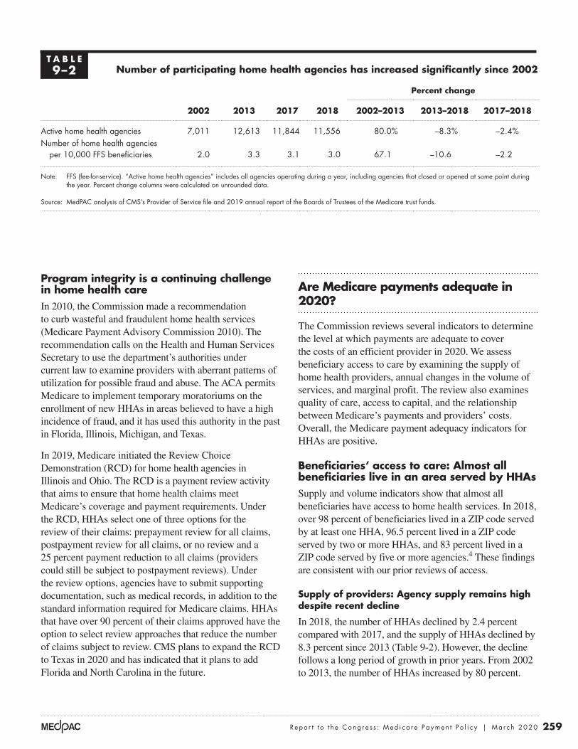
259 Repo r t t o t h e Cong r e s s : Med i ca r e Paymen t P o l i c y | Ma r ch 2020
Program integrity is a continuing challenge in home health careIn 2010, the Commission made a recommendation to curb wasteful and fraudulent home health services (Medicare Payment Advisory Commission 2010). The recommendation calls on the Health and Human Services Secretary to use the department’s authorities under current law to examine providers with aberrant patterns of utilization for possible fraud and abuse. The ACA permits Medicare to implement temporary moratoriums on the enrollment of new HHAs in areas believed to have a high incidence of fraud, and it has used this authority in the past in Florida, Illinois, Michigan, and Texas.
In 2019, Medicare initiated the Review Choice Demonstration (RCD) for home health agencies in Illinois and Ohio. The RCD is a payment review activity that aims to ensure that home health claims meet Medicare’s coverage and payment requirements. Under the RCD, HHAs select one of three options for the review of their claims: prepayment review for all claims, postpayment review for all claims, or no review and a 25 percent payment reduction to all claims (providers could still be subject to postpayment reviews). Under the review options, agencies have to submit supporting documentation, such as medical records, in addition to the standard information required for Medicare claims. HHAs that have over 90 percent of their claims approved have the option to select review approaches that reduce the number of claims subject to review. CMS plans to expand the RCD to Texas in 2020 and has indicated that it plans to add Florida and North Carolina in the future.
Are Medicare payments adequate in 2020?
The Commission reviews several indicators to determine the level at which payments are adequate to cover the costs of an efficient provider in 2020. We assess beneficiary access to care by examining the supply of home health providers, annual changes in the volume of services, and marginal profit. The review also examines quality of care, access to capital, and the relationship between Medicare’s payments and providers’ costs. Overall, the Medicare payment adequacy indicators for HHAs are positive.
Beneficiaries’ access to care: Almost all beneficiaries live in an area served by HHAs Supply and volume indicators show that almost all beneficiaries have access to home health services. In 2018, over 98 percent of beneficiaries lived in a ZIP code served by at least one HHA, 96.5 percent lived in a ZIP code served by two or more HHAs, and 83 percent lived in a ZIP code served by five or more agencies.4 These findings are consistent with our prior reviews of access.
Supply of providers: Agency supply remains high despite recent decline
In 2018, the number of HHAs declined by 2.4 percent compared with 2017, and the supply of HHAs declined by 8.3 percent since 2013 (Table 9-2). However, the decline follows a long period of growth in prior years. From 2002 to 2013, the number of HHAs increased by 80 percent.
T A B L E9–2 Number of participating home health agencies has increased significantly since 2002
Percent change
2002 2013 2017 2018 2002–2013 2013–2018 2017–2018
Active home health agencies 7,011 12,613 11,844 11,556 80.0% –8.3% –2.4%Number of home health agencies
per 10,000 FFS beneficiaries 2.0 3.3 3.1 3.0 67.1 –10.6 –2.2
Note: FFS (fee-for-service). “Active home health agencies” includes all agencies operating during a year, including agencies that closed or opened at some point during the year. Percent change columns were calculated on unrounded data.
Source: MedPAC analysis of CMS’s Provider of Service file and 2019 annual report of the Boards of Trustees of the Medicare trust funds.

260 Home hea l t h c a r e s e r v i c e s : A s s e s s i ng paymen t adequacy and upda t i ng paymen t s
facility, HHAs can adjust their service areas as local conditions change. Even the number of employees may not be an effective metric because HHAs can use contract staff to meet their patients’ needs.
Episode volume declined slightly in 2018
Episode volume in 2018 declined by 1.2 percent (Table 9-3). This decline is part of a trend that began after 2011, but this period of decline was preceded by a period of rapid growth. Between 2002 and 2011, total episodes increased by 67 percent, from 4.1 million episodes to 6.8 million episodes.
The decline in home health utilization since 2011 reflects changes in both the demand for home health services and the supply of HHAs. From 2011 to 2018, the number of hospital discharges, a common source of referrals, declined by 13 percent, suggesting that demand for posthospital care using home health services has not increased in Medicare FFS since 2011. In addition, several actions have been taken to curb fraud, waste, and abuse in Medicare home health care.
The decline in episode volume since 2011 has not been uniform across the country. Since 2011, Florida, Illinois,
The decline since 2013 was concentrated in areas that experienced sharp increases in supply in prior years.
The decline in 2018 was concentrated in Florida and Texas, states that experienced higher than average increases in supply in prior years. These states have been targeted by a myriad of antifraud measures, including criminal investigations and moratoriums on the entry of new HHAs. The number of HHAs exiting the program has increased in recent years in these states, and moratoriums have likely stopped the entry of new HHAs. Even with declines in these states, however, the supply of HHAs in the two states is more than double the supply of HHAs that were available in 2001, with supply exceeding 3,200 HHAs in 2018. These two states average 6.2 agencies per 10,000 Medicare fee-for-service (FFS) beneficiaries, well above the national average.
The supply of HHAs varies significantly among states. In 2018, Texas averaged 8.4 HHAs per 10,000 FFS beneficiaries, while New Jersey averaged less than one HHA per 10,000 FFS beneficiaries. The extreme variation demonstrates that the number of providers is a limited measure of capacity because HHAs can vary in size. Also, because home health care is not provided in a medical
T A B L E9–3 Fee-for-service home health care services have increased significantly since 2002
Percent change
2002 2011 2016 2017 20182002–2011
2011–2018
2017–2018
Home health users (in millions) 2.5 3.4 3.5 3.4 3.4 36.9% –1.9% –0.6%
Share of beneficiaries using home health care 7.2% 9.4% 8.9% 8.8% 8.8% 31.1 –7.2 –0.4
Episodes (in millions): 4.1 6.8 6.6 6.4 6.3 67.0 –8.2 –1.2Per home health user 1.6 2.0 1.9 1.9 1.9 22.0 –6.4 –0.6Per FFS beneficiary 0.12 0.19 0.17 0.16 0.16 60.0 –13.2 –0.9
Payments (in billions) $9.5 $18.3 $18.1 $17.8 $17.9 92.3 –2.2 0.5Per home health user 3,783 5,312 5,234 5,242 5,303 40.5 –0.2 1.2Per home health episode 2,645 2,916 2,996 3,039 3,089 10.3 5.9 1.6
Note: FFS (fee-for-service). Percent change is calculated on numbers that have not been rounded; payment per episode excludes low-utilization payment adjustment cases.
Source: MedPAC analysis of home health standard analytical file.

261 Repo r t t o t h e Cong r e s s : Med i ca r e Paymen t P o l i c y | Ma r ch 2020
episode unit of payment in PPS encourages more service (more episodes per beneficiary). The use of home health care for longer periods raises concerns that home health care, in some instances, serves more as a long-term care benefit. These concerns are similar to those in the mid-1990s that led to major program integrity activities and payment reductions.
The rise in the average number of episodes per home health user since 2002 (which plateaued in 2011) coincides with a relative shift away from home health care admission following a hospitalization or institutional post-acute care (PAC) service. Between 2001 and 2011, episodes not preceded by a hospitalization or institutional PAC stay increased by about 127 percent, while episodes preceded by a prior PAC stay or hospitalization increased by 14.8 percent (Table 9-4). Between 2011 to 2018, the volume of episodes not preceded by a hospital or institutional PAC stay dropped by 10.3 percent, while in the same period, episodes preceded by a hospitalization or PAC stay dropped by less than 1 percent. However, this decrease did not significantly change the share of episodes not preceded by inpatient or institutional PAC, which in 2018 accounted for 66 percent of episodes.
Louisiana, Tennessee, and Texas (the five states with the fastest growing episode volume before 2011) have seen a decline of about 28 percent. However, utilization in these five states had more than doubled between 2002 and 2011, higher than in most other areas. The remaining 44 states experienced aggregate growth of 4.2 percent from 2011 to 2018, though there was a range of increases and declines across these states. This geographic variation emphasizes that many areas continued to see growth despite the overall drop in episode volume since 2011. Among the 44 states, growth in California between 2011 and 2018 accounted for a significant share of the increase, with episode volume rising by 42 percent, or almost 188,000 episodes.
Home health care periods of service have increased in length and shifted in focus to episodes not preceded by a hospitalization
Between 2002 and 2011, the average number of episodes per user increased from 1.6 to 2.0 episodes per user (Table 9-3), though the average number of episodes declined slightly from 2011 to 2018. The increase in episodes in the 2002 to 2011 period coincides with Medicare’s PPS incentives that encourage additional volume: The per
T A B L E9–4 Home health episodes not preceded by hospitalization or
PAC stay increased at a higher rate than other episodes
Episodes Cumulative percent change
2001 2011 2018 2001–2011 2011–2018
Number of episodes preceded by a hospitalization or PAC stay (in millions) 1.9 2.2 2.1 14.8% –0.5%
Number of episodes not preceded by a hospitalization or PAC stay (in millions) 2.1 4.6 4.2 127.4 –10.3
Share of episodes not preceded by a hospitalization or PAC stay 53% 67% 66% 26 –2.7
Total (in millions) 3.9 6.8 6.3 74.0 –7.8
Note: PAC (post-acute care). “Episodes preceded by a hospitalization or PAC stay” indicates the episode occurred fewer than 15 days after a stay in a hospital (including a long-term care hospital), skilled nursing facility, or inpatient rehabilitation facility. “Episodes not preceded by a hospitalization or PAC stay” indicates that there was no hospitalization or PAC stay in the 15 days before the episode began. Numbers may not sum to totals due to rounding. Percent change columns were calculated on unrounded data.
Source: Home health standard analytical file and Medicare Provider and Analysis Review file for 2001, 2011, and 2018.

262 Home hea l t h c a r e s e r v i c e s : A s s e s s i ng paymen t adequacy and upda t i ng paymen t s
Marginal profits
Another factor we consider when evaluating access to care is whether providers have any financial incentive to expand the number of Medicare beneficiaries they serve. In considering whether to treat a patient, a provider with excess capacity compares the marginal revenue it will receive (i.e., the Medicare payment) with its marginal costs—that is, the costs that vary with volume. If Medicare payments are larger than the marginal costs of treating an additional beneficiary, a provider has a financial incentive to increase its volume of Medicare patients. In contrast, if payments do not cover the marginal costs, the provider may have a disincentive to care for Medicare beneficiaries.5 In 2018, the marginal profit, on average, for freestanding HHAs was 18 percent. This substantial marginal profit indicates that these HHAs have a strong incentive to serve Medicare beneficiaries. While current trends may not indicate rising home health service volume, the high marginal profit in the home health PPS indicates that HHAs have an incentive to serve more patients.
Quality of care: Divergent trends between claims-based and provider-reported measuresHome health quality remained mostly unchanged in 2018 relative to the prior year on two measures of adverse events: The share of patients who utilized emergency care was 12.8 percent, and the share of home health patients hospitalized within 60 days of home health admission was 15.4 percent (Table 9-5). Rates of these events have not changed significantly since 2014. Outcome data for these two adverse event measures are collected from Medicare claims; they do not rely on information collected by HHAs.
The performance of HHAs on these claims-based measures contrasts with the performance on some quality measures derived from HHA-reported data. For example, HHAs report data on patient functional status at admission and discharge from home health care. These data are used to report the share of patients who have improvement in walking and the share of patients with improvement in transferring at the end of their home health stays (Table 9-5). The rates for these measures have improved every year. The disparity between the claims-based measures and the HHA-reported measures raises concern about the accuracy of the latter data.
A comparison of trends between 2014 and 2018 for the claims-based adverse event measures and the agency-reported function measures illustrates these concerns. The rates of patient functional improvement for transferring and walking rose substantially, increasing 22 percentage points and 16 percentage points, respectively, over the five-year period. However, the adverse event rates have not changed significantly. The higher rates of improvement for the functional measures may reflect agency coding practices and should be interpreted cautiously. It is not clear whether the different trends for these two sets of indicators reflect HHAs’ improvement in quality or the nature of the data collected.
Notably, functional improvement data are collected only for beneficiaries who do not have their home health care stays terminated by a hospitalization, which means that beneficiaries included in the measure may be healthier and more likely to have positive outcomes. The functional data may not accurately reflect the experience of many patients
T A B L E9–5 Average home health agency performance on select quality measures
2014 2015 2016 2017 2018
During an episode, the share of an agency’s beneficiaries who:Used emergency department care 12.0% 12.2% 12.1% 12.7% 12.8%Had to be admitted to the hospital 15.4 15.5 16.2 15.4 15.4
Share of an agency’s beneficiaries who improved in:Transferring 55% 59% 65% 72% 77%Walking 61 63 69 74 77
Note: All data are for fee-for-service beneficiaries only and are risk adjusted for differences in patient condition among home health patients.
Source: MedPAC analysis of data provided by the University of Colorado.

263 Repo r t t o t h e Cong r e s s : Med i ca r e Paymen t P o l i c y | Ma r ch 2020
not subject to provider coding, including patient experience and Medicare spending and utilization, showed either no or mixed improvement under the VBP program, raising doubts about the assessment-based improvements.
Providers’ access to capital: Access to capital for expansion is adequateIn 2018, the overall (all-payer) margins for freestanding HHAs averaged 4.3 percent, indicating that many HHAs yield positive financial results that should appeal to capital markets. HHAs are not as capital intensive as other providers because they do not require extensive physical infrastructure, and most are too small to attract interest from capital markets. Few HHAs access capital through publicly traded shares or through public debt such as issuance of bonds.
Information on publicly traded home health care companies provides some insight into access to capital, but it has limitations. Publicly traded companies may have other lines of business in addition to Medicare home health care, such as hospice, Medicaid-covered services, and private-duty nursing. Also, publicly traded companies are a small portion of the total number of HHAs in the industry. However, since they are the largest corporate entities in home health care, they can provide some insight about the industry’s financial status.
Analysis of for-profit companies indicates that these companies had adequate access to capital. The largest publicly traded for-profit company, Amedisys Incorporated, acquired several new businesses in 2018 and 2019, including a $340 million acquisition of a hospice business (Amedisys 2019). Encompass Health added 23 new home health locations in 2018 (Encompass Health 2019). LHC Group acquired seven new home health agencies and a hospice agency in 2018 (LHC Group 2019). These acquisitions or expansions indicate that large for-profit companies have adequate access to capital for both operating costs and acquiring new assets. Anticipation of the implementation of the Patient-Driven Groupings Model (PDGM) in 2020 could slow acquisition efforts because some companies want to observe how this change affects agency financial performance before attempting to acquire additional HHAs.
Medicare payments and providers’ costs: Payments rose while cost per episode remained low in 2018In 2018, average Medicare payments per episode increased by 1.7 percent for freestanding HHAs. Meanwhile, low or
because of agency coding practices and the omission of some patients.
In its June 2019 report to the Congress, the Commission reported that broad function levels were associated with other patient characteristics, such as age and patient complexity, giving us some reassurance that, in aggregate, the measures may be reasonable (Medicare Payment Advisory Commission 2019). However, when comparing assessments for individual patients, the work raised serious questions about the accuracy of the provider-reported functional assessments. For beneficiaries transferred from one PAC setting and admitted to another, the functional status recorded at discharge from one setting and at admission to the next were often different, and the differences favored reporting that would raise payments. Further, for the same beneficiaries, a disproportionate share of the levels reported for quality were reported higher than those reported for payment-related items. The Commission concluded that the accuracy of this information needs to be improved before it is used as a risk adjuster in establishing payment, a gauge of provider quality, and a link to quality payment (such as value incentive payments).
Similar questions about the accuracy of the function data were raised in the evaluation of the first year of the home health value-based purchasing (VBP) program. A CMS evaluation contractor described similar trends in performance scores that indicated providers had responded to quality-reporting and VBP incentives (Pozniak et al. 2018). After the introduction of the CMS star ratings program for home health, all HHAs showed improvement in the provider-reported patient assessment–based measures (such as improvements in walking). However, larger improvements were observed among HHAs in states with mandatory participation in the VBP.
The contractor noted that the underlying subjectivity of the patient assessments and the VBP program incentives influence how HHAs assess and record patient status, such that reported “improvements” in quality scores did not necessarily reflect real improvements in quality. The prevalence of patient conditions was relatively stable over time, leading the contractor to conclude that improvements cited in provider-reported outcomes were at least in part due to changes in coding practices. The evaluator acknowledged that providers’ coding could be a combination of increased accuracy (resulting from provider training, for example) and reporting lower patient functional status at admission (recording a patient’s status as worse than it was). The evaluator also found that performance on other measures

264 Home hea l t h c a r e s e r v i c e s : A s s e s s i ng paymen t adequacy and upda t i ng paymen t s
the economies of scale possible for larger operations. For example, HHAs in the bottom quintile of episode volume had margins of 7.8 percent, while HHAs in the top quintile had margins of 17.3 percent.
The Commission includes hospital-based HHAs in its calculation of acute care hospitals’ Medicare margins because these agencies operate in the financial context of hospital operations. In 2018, margins for hospital-based HHAs were –16.6 (data not shown). The lower margins of hospital-based HHAs are attributable chiefly to their higher costs, some of which are a result of overhead costs allocated to the HHA from its parent hospital. Hospital-based HHAs help their parent institutions financially if they can shorten inpatient stays, lowering expenses in the most costly setting.
Relatively efficient HHAs provided similar services compared with other HHAs
The Commission is required by the Medicare Prescription Drug, Improvement, and Modernization Act of 2003 to
no cost growth has been typical for home health care, and in some years, cost per episode has declined. In 2018, the average cost per episode increased by 1 percent, slightly greater than the annual decrease of about 0.5 percent for the last five years. The ability of freestanding HHAs to keep costs low in most years has contributed to their high margins under the Medicare PPS. In 2018, Medicare accounted for about 57 percent of revenue for freestanding HHAs.
Medicare margins for freestanding HHAs remained high in 2018
In 2018, HHA Medicare margins in aggregate were 15.3 percent for freestanding HHAs (Table 9-6).6 For these HHAs, the aggregate Medicare margins varied from 1.2 percent for those at the 25th percentile of the margin distribution to 24.0 percent for those at the 75th percentile (not shown in Table 9-6). For-profit HHAs had higher margins than nonprofit HHAs, and urban HHAs had slightly higher margins than rural HHAs. Agencies with higher volume had better financial results, likely reflecting
T A B L E9–6 Medicare margins for freestanding home health agencies, 2017 and 2018
Medicare margin Share of home health
agencies, 2018Share of
episodes, 20182017 2018
All 15.2% 15.3% 100% 100%
GeographyMajority urban 15.8 15.6 84 84Majority rural 13.4 13.8 16 16
Type of ownershipFor profit 16.4 16.8 89 80Nonprofit 10.9 9.9 11 20
Volume quintileFirst (smallest) 7.4 7.8 20 3Second 9.8 9.3 20 7Third 11.5 11.9 20 11Fourth 13.6 13.9 20 19Fifth (largest) 17.0 17.3 20 60
Note: Home health agencies were classified as majority urban if they provided more than 50 percent of episodes to beneficiaries in urban counties and were classified as majority rural if they provided more than 50 percent of episodes to beneficiaries in rural counties.
Source: MedPAC analysis of home health cost report files from CMS.

265 Repo r t t o t h e Cong r e s s : Med i ca r e Paymen t P o l i c y | Ma r ch 2020
evaluation. The Commission’s approach is to develop a set of criteria and then examine how many providers meet them. It does not establish a set share (for example, 10 percent) of providers to be considered efficient and then define criteria to meet that pool size.
To identify efficient HHAs, we examined the quality and cost efficiency of freestanding HHAs to identify a cohort that demonstrated better performance on these metrics relative to its peers (Table 9-7). The cost measure was on a per episode basis, adjusted for risk (patient’s health status)
consider the costs associated with efficient providers. The analysis informs the Commission’s update discussion by examining the adequacy of payments for those providers that perform relatively well on cost and quality measures.
The Commission follows two principles when selecting a set of efficient providers. First, the providers must do relatively well on both cost and quality metrics. Second, performance has to be consistent, meaning that the provider cannot have poor performance on any metric in any of three consecutive years preceding the year under
T A B L E9–7 Performance of relatively efficient home health agencies in 2017
Provider characteristicsAll providers in analysis
Relatively efficient providers
All other providers
Number of home health agencies 4,122 295 3,827Share that are for profit 89% 88% 89%
Median:
Medicare margin 15.6% 23.1% 15.0%Hospitalization during first 60 days of stay (percent) 15.5% 14.4% 15.6%Cost per episode $2,427 $2,122 $2,457
Patient severity case-mix index* 0.99 1.02 0.99
Visits per episode
Average visits per episode 16.4 15.3 16.5
Share of visits by type
Skilled nursing visits 47% 47% 47%
Aide visits 8% 7% 8%
MSS visits 1% 1% 1%
Therapy visits 44% 45% 44%
Number of 60-day episodes
Median 519 712 511
Mean 942 1,430 905
Share of episodes
Low-use episode 8% 9% 8%
Outlier episode 3% 3% 3%
Share of episodes provided to rural beneficiaries 23% 15% 24%
Note: MSS (medical social services). Sample includes freestanding agencies with complete data for three consecutive years (2014–2016). A home health agency is classified as relatively efficient if it is in the best third of performance for quality or cost and is not in the bottom third of either measure for three consecutive years. Low-use episodes are those with 4 or fewer visits in a 60-day episode. Outlier episodes are those that receive a very high number of visits and qualify for outlier payments. *The case-mix model is based on the approach indicated in Simulation and Analysis of an Alternative Medicare Home Health Payment System Not Based on Number of Therapy Visits, by Douglas Wissoker and Bowen Garrett of the Urban Institute, August 2015.
Source: Medicare cost reports and standard analytic file.

266 Home hea l t h c a r e s e r v i c e s : A s s e s s i ng paymen t adequacy and upda t i ng paymen t s
CMS has estimated that a combination of coding and utilization changes by HHAs in response to the PDGM will increase payments by 4.36 percent in 2020. Statute requires that the PDGM be implemented in a budget-neutral manner, and consequently CMS has included a payment reduction of 4.36 percent in 2020. Our margin estimate for 2020 assumes that payment increases as CMS expects in 2020. Payment history under the home health PPS demonstrates that HHAs change coding, utilization, and the mix of services provided in reaction to new payment incentives. For example, when CMS implemented revisions to the home health case-mix system in 2008, subsequent analysis found that behavioral responses unrelated to patient severity caused payments to increase by 4 percent in that year—despite having increased only 1 percent per year, on average, between 2001 and 2007. CMS continued to find nominal increases in case mix unrelated to patient severity in later years and reduced payments by an average of 1.8 percent a year from 2008 through 2017 to account for this trend. CMS’s projected increase in payments of 4.36 percent due to the PDGM is consistent with this prior experience, and we include it in our margin estimate for 2020.
How should Medicare payments change in 2021?
Our review of payment adequacy for Medicare home health service indicates that access is more than adequate in most areas and that Medicare payments are substantially in excess of costs. On the basis of these findings, the Commission has concluded that home health payments should be significantly reduced.
Home health care can be a high-value benefit when it is appropriately and efficiently delivered. Medicare beneficiaries often prefer to receive care at home instead of in institutional settings, and home health care can be provided at lower costs than institutional care. However, Medicare’s payments for home health services are too high, and these overpayments diminish the service’s value as a substitute for more costly services. There are also indications that utilization under fee-for-service Medicare is not always efficient, as suggested by the broad geographic variation in the use of the benefit. In another example, a recent analysis of home health care utilization in the Medicare’s Shared Savings Program found that the volume of community-admitted home health episodes
and local wages; the quality measures were risk-adjusted rates of hospitalizations and improvement in walking. Our approach categorized an HHA as relatively efficient if it was in the best performing third on at least one measure (low cost per episode, a low hospitalization rate, or a high rate of beneficiaries showing improvement in walking) and was not in the worst performing third of any of these measures for three consecutive years (2014 to 2016). About 7 percent of freestanding HHAs met these criteria in this period.
In 2017, relatively efficient agencies compared with other HHAs had a median margin that was 8 percentage points higher, a median hospitalization rate that was 1.2 percentage points lower, and a median cost per episode that was 14 percent lower. Relatively efficient HHAs provided more episodes but 1.2 fewer visits per episode. The mix of nursing, therapy, aide, and social services visits did not differ significantly between relatively efficient and other HHAs. Our measure of case-mix severity did not differ significantly between relatively efficient providers and other HHAs. Efficient providers tended to provide a smaller share of episodes in rural areas.
The Commission projects that Medicare margins will remain high in 2020In modeling 2020 payments and costs, we incorporate policy changes that will go into effect between the year of our most recent data, 2018, and the year for which we are making the margin projection, 2020. The major changes are:
• a 2.2 percent payment update for 2019,
• a 0.1 percent increase in payments due to CMS lowering the outlier payment threshold to increase payments,
• assumed nominal case-mix growth of 0.5 percent in 2019,
• a 1.5 percent payment update for 2020,
• assumed case-mix growth of 4.36 percent for 2020, which is offset by a 4.36 payment reduction CMS has implemented in 2020,
• rural add-on for 2018 and 2019, and
• assumed episode cost growth of 0.75 percent per year.
On the basis of these policies and assumptions, the Commission projects a margin of 17.0 percent in 2020.

267 Repo r t t o t h e Cong r e s s : Med i ca r e Paymen t P o l i c y | Ma r ch 2020
increased at a lower rate for accountable care organization (ACO) beneficiaries relative to a matched comparison group (McWilliams et al. 2017). The lower rate of volume growth suggests that ACOs reduced the utilization of these services relative to the non-ACO population.
The Bipartisan Budget Act of 2018 requires that the policy changes implemented in 2020 be budget neutral and provides CMS with the authority to adjust payments from 2020 through 2026 to maintain budget neutrality. For 2020, CMS has projected that HHAs’ behavioral responses to the new policies will increase payments by 4.36 percent, and the agency implemented an offsetting reduction. Although necessary as an offset, this reduction does not reflect any assessment of the adequacy of Medicare’s payments. In fact, further reductions are necessary to better align payments with the costs of services.
R E C O M M E N D A T I O N 9
For calendar year 2021, the Congress should reduce the calendar year 2020 Medicare base payment rate for home health agencies by 7 percent.
R A T I O N A L E 9
An immediate reduction of 7 percent in 2021 would represent a significant action to address the magnitude of
the overpayments embedded in Medicare’s rates. However, this reduction would likely be inadequate to align Medicare payments with providers’ actual costs. In past years, the Commission has recommended that payments be rebased in the year after a 5 percent reduction, but this recommendation is complicated by the changes to home health payment set for 2021. The mix of services and number of visits provided in an episode will likely change under these policies, and the payment rate set under a rebasing policy should reflect the mix and level of services HHAs provide under the new payment policies.
I M P L I C A T I O N S 9
Spending
• The payment reductions would lower payments relative to current law by $750 million to $2 billion in 2021 and by over $10 billion over five years.
Beneficiary and provider
• Beneficiaries’ access to care should not be affected. Lowering payments should not affect providers’ willingness to deliver appropriate home health care. ■

268 Home hea l t h c a r e s e r v i c e s : A s s e s s i ng paymen t adequacy and upda t i ng paymen t s
1 The requirement may also be satisfied by an encounter with a nurse practitioner, certified nurse midwife, or physician assistant.
2 Freestanding providers accounted for about 90 percent of the episodes provided in 2018.
3 Prior to 2020, Medicare paid for home health care in 60-day episodes.
4 As of November 2019, our measure of access is based on data collected and maintained as part of CMS’s Home Health Compare database. The service areas listed are postal ZIP codes where an HHA has provided services in the past 12 months. This definition may overestimate access because HHAs need not serve the entire ZIP code to be counted as serving it. At the same time, the definition may understate access if HHAs are willing to serve a ZIP code but did not receive a request in the previous 12 months. The analysis excludes beneficiaries with unknown ZIP codes.
5 If we approximate marginal cost as total Medicare costs minus fixed building and equipment costs, then marginal profit can be calculated as follows: Marginal profit = (Medicare payments – (total Medicare costs – fixed costs)) / Medicare payment
This comparison is a lower bound on the marginal profit because we do not consider any potential labor costs that are fixed.
6 Freestanding agencies accounted for about 90 percent of home health episodes in 2018.
Endnotes

269 Repo r t t o t h e Cong r e s s : Med i ca r e Paymen t P o l i c y | Ma r ch 2020
Amedisys. 2019. Annual report (Form 10–K) for fiscal year ending December 31, 2018. Filing submitted to the Securities and Exchange Commission.
Benjamin, A. E. 1993. An historical perspective on home care policy. Milbank Quarterly 71, no. 1: 129–166.
Cheh, V., N. Duda, B. L. Carlson, et al. 2007. Evaluation of the Home Health Independence Demonstration: Barriers to a successful experiment were multifaceted and difficult policy issues remain. Prepared for the Centers for Medicare & Medicaid Services. Princeton, NJ: Mathematica Policy Research Inc. October.
Department of Health and Human Services. 2018. 2017 Medicare fee-for-service supplemental improper payment data. Washington, DC: HHS.
Encompass Health. 2019. Annual report 2018. Birmingham, AL: Encompass Health.
Feder, J., and J. Lambrew. 1996. Why Medicare matters to people who need long-term care. Health Care Financing Review 18, no. 2 (Winter): 99–112.
LHC Group. 2019. Annual report (Form 10–K) for fiscal year ending December 31, 2018. Filing submitted to the Securities and Exchange Commission.
McWilliams, J. M., L. G. Gilstrap, D. G. Stevenson, et al. 2017. Changes in postacute care in the Medicare Shared Savings Program. JAMA Internal Medicine 177, no. 4 (April 1): 518–526.
Medicare Payment Advisory Commission. 2019. Report to the Congress: Medicare and the health care delivery system. Washington, DC: MedPAC.
Medicare Payment Advisory Commission. 2017. Report to the Congress: Medicare payment policy. Washington, DC: MedPAC.
Medicare Payment Advisory Commission. 2016. Report to the Congress: Medicare payment policy. Washington, DC: MedPAC.
Medicare Payment Advisory Commission. 2011. Report to the Congress: Medicare payment policy. Washington, DC: MedPAC.
Medicare Payment Advisory Commission. 2010. Report to the Congress: Medicare payment policy. Washington, DC: MedPAC.
Office of Inspector General, Department of Health and Human Services. 2001. The physician’s role in Medicare’s home health services. OEI–02–00–00620. Washington, DC: OIG.
Pozniak, A., M. Turenne, P. Mukhopadhyay, et al. 2018. Evaluation of the home health value based purchasing (HHVBP) model: First annual report. Report prepared for the Centers for Medicare & Medicaid Services (CMS) Center for Medicare & Medicaid Innovation (CMMI) by the Arbor Research Collaborative for Health. Washington, DC: CMMI. https://innovation.cms.gov/Files/reports/hhvbp-first-annual-rpt.pdf.
U.S. Senate Committee on Finance. 2011. Staff report on home health and the Medicare therapy threshold. Washington, DC: Government Printing Office.
Wolff, J., A. Meadow, C. Weiss, et al. 2008. Medicare home health and the role of physicians. Presentation at Academy Health, Medicare and Post-Acute Care. June 8.
References


Inpatient rehabilitation facility services
C H A P T E R 10

R E C O M M E N D A T I O N
10 For fiscal year 2021, the Congress should reduce the fiscal year 2020 Medicare base payment rate for inpatient rehabilitation facilities by 5 percent.
COMMISSIONER VOTES: YES 17 • NO 0 • NOT VOTING 0 • ABSENT 0
. . . . . . . . . . . . . . . . . . . . . . . . . . . . . . . . . . . . . . . . . . . . . . . . . . . . . . . . . . . . . . . . . . . . . . . . . . . .
(Additionally, the Commission reiterates its March 2016 recommendations on the inpatient rehabilitation facility prospective payment system. See text box, p. 281.)

273 Repo r t t o t h e Cong r e s s : Med i ca r e Paymen t P o l i c y | Ma r ch 2020
Inpatient rehabilitation facility services
Chapter summary
Inpatient rehabilitation facilities (IRFs) provide intensive rehabilitation
services to patients after illness, injury, or surgery. Rehabilitation programs are
supervised by rehabilitation physicians and include services such as physical
and occupational therapy, rehabilitation nursing, speech–language pathology,
and prosthetic and orthotic services. In 2018, Medicare spent $8 billion on
IRF care provided to fee-for-service (FFS) beneficiaries in about 1,170 IRFs
nationwide. About 364,000 beneficiaries had 408,000 IRF stays. On average,
the Medicare FFS program accounted for about 59 percent of IRF discharges.
Assessment of payment adequacy
Our indicators of Medicare payment adequacy for IRFs are positive.
Beneficiaries’ access to care—Our analysis of IRF supply and volume of
services provided and IRFs’ marginal profit under Medicare’s IRF prospective
payment system suggest that access remains adequate.
• Capacity and supply of providers—After declining for several years, the
number of IRFs increased in 2014 and continued to grow through 2016,
reaching 1,188 facilities nationwide. In 2017, however, the number of
IRFs declined slightly, to 1,178 facilities. This trend continued in 2018,
declining to 1,170 facilities. Over time, the number of hospital-based and
nonprofit IRFs has fallen, while the number of freestanding and for-profit
In this chapter
• Are Medicare payments adequate in 2020?
• How should Medicare payments change in 2021?
C H A P T E R 10

274 I n pa t i e n t r e hab i l i t a t i o n f a c i l i t y s e r v i c e s : A s s e s s i ng paymen t adequacy and upda t i ng paymen t s
IRFs has increased. In 2018, the average IRF occupancy rate remained at 66
percent, indicating that capacity is more than adequate to meet demand for IRF
services.
• Volume of services—From 2017 to 2018, the number of Medicare FFS cases
increased 3.0 percent, growing to about 408,000 cases after having experienced
a stagnant period from 2016 to 2017.
• Marginal profit—The marginal profit, an indicator of whether IRFs with
excess capacity have an incentive to treat more Medicare beneficiaries, was
20.1 percent for hospital-based IRFs and 40.8 percent for freestanding IRFs—a
very positive indicator of patient access.
Quality of care—The Commission tracks three broad categories of IRF quality
indicators: rates of discharge to the community and to skilled nursing facilities, rates
of readmission to an acute care hospital, and risk-adjusted facility-level change in
patients’ functional and cognitive status during the IRF stay. Most measures were
steady or improved between 2012 and 2018.
Providers’ access to capital—The parent institutions of hospital-based IRFs
continue to have good access to capital. The major freestanding IRF chain, which
accounted for almost half of freestanding IRFs in 2018 and about 31 percent
Medicare IRF discharges, also has good access to capital. This assessment is
reflected in the chain’s continued expansion. We were not able to determine the
ability of other freestanding facilities to raise capital. IRFs’ access to capital in large
part depends on their total (all-payer) profitability, and in 2018, the total margin for
freestanding IRFs averaged 10.7 percent.
Medicare payments and providers’ costs—The aggregate Medicare margin for
IRFs has grown steadily since 2010. In the three-year period between 2016 and
2018, the aggregate IRF Medicare margin remained above 13 percent, and in 2018,
stood at 14.7 percent. Also in 2018, Medicare margins in freestanding IRFs were
25.4 percent. In 2018, hospital-based IRF margins increased slightly to 2.5 percent.
Growth in IRFs’ costs historically has been low. However, from 2019 to 2020, we
anticipate costs in IRFs will grow faster than payments since updates in those years
were constrained to 1.35 percent and 2.5 percent, respectively. For 2020, we project
an aggregate Medicare margin of 12.7 percent.
The Commission continues to examine the financial performance of relatively
efficient IRFs. Our analysis found that relatively efficient IRFs performed better on
quality metrics and had costs 18 percent lower than other IRFs. Relatively efficient
IRFs were on average larger and had higher occupancy rates, contributing to greater

275 Repo r t t o t h e Cong r e s s : Med i ca r e Paymen t P o l i c y | Ma r ch 2020
economies of scale and lower costs. Freestanding and for-profit facilities were more
likely to be in the relatively efficient group.
How should payment rates change in 2021?
On the basis of these factors, the Commission recommends a 5 percent reduction
to the IRF payment rate for fiscal year 2021. In addition, the Commission reiterates
its March 2016 recommendations that (1) the high-cost outlier pool be expanded
to further redistribute payments in the IRF payment system and reduce the impact
of misalignments between IRF payments and costs and (2) the Secretary conduct
focused medical record review of IRFs that have unusual patterns of case mix and
coding and conduct other research necessary to improve the accuracy of payments
and protect program integrity. ■


277 Repo r t t o t h e Cong r e s s : Med i ca r e Paymen t P o l i c y | Ma r ch 2020
Background
After illness, injury, or surgery, some patients need intensive inpatient rehabilitative care, including physical, occupational, and speech therapy. Such services can be provided in inpatient rehabilitation facilities (IRFs).1 IRFs must be focused primarily on treating conditions that typically require intensive rehabilitation, among other requirements. IRFs can be freestanding facilities or specialized units within acute care hospitals. To qualify for a covered IRF stay, a beneficiary must be able to tolerate and benefit from intensive therapy and must have a condition that requires frequent and face-to-face supervision by a rehabilitation physician. Other patient admission criteria also apply. In 2018, Medicare spent $8 billion on IRF care provided in about 1,170 IRFs nationwide. About 364,000 beneficiaries had almost 408,000 IRF stays. On average, Medicare fee-for-service (FFS) beneficiaries accounted for about 59 percent of IRF discharges.
Since January 2002, Medicare has paid IRFs under a per discharge prospective payment system (PPS).2 Under the IRF PPS, Medicare patients are assigned to case-mix groups (CMGs) based on the patient’s primary reason for inpatient rehabilitation, age, and level of motor and cognitive function. Within each CMG, patients are further categorized into one of four tiers based on the presence of certain comorbidities that have been found to increase the cost of care. The IRF PPS also has outlier payments for patients who are extraordinarily costly.
Medicare facility requirements for IRFsTo qualify as an IRF for Medicare payment, facilities must meet the Medicare conditions of participation for acute care hospitals. They must also:
• have a preadmission screening process to determine that each prospective patient is likely to benefit significantly from an intensive inpatient rehabilitation program;
• ensure that the patient receives close medical supervision and must provide—through qualified personnel—rehabilitation nursing, physical therapy, occupational therapy, and, as needed, speech–language pathology and psychological (including neuropsychological) services, social services, and orthotic and prosthetic services;
• have a medical director of rehabilitation with training or experience in rehabilitation who provides services in the facility on a full-time basis for freestanding IRFs or at least 20 hours per week for hospital-based IRF units;
• use a coordinated interdisciplinary team led by a rehabilitation physician that includes a rehabilitation nurse, a social worker or case manager, and a licensed therapist from each therapy discipline involved in the patient’s treatment;
• have a plan of treatment for each patient that is established, reviewed, and revised as needed by a physician in consultation with other professional personnel who provide services to the patient; and
• meet the compliance threshold, which requires that no less than 60 percent of patients admitted to an IRF have as a primary diagnosis or comorbidity at least 1 of 13 conditions specified by CMS.3 The intent of the compliance threshold is to distinguish IRFs from acute care hospitals. If an IRF does not meet the compliance threshold, Medicare pays for all its cases on the basis of the inpatient hospital PPS rather than the IRF PPS.
Medicare coverage criteria for beneficiariesMedicare applies additional criteria that govern whether IRF services are covered for an individual Medicare beneficiary. For an IRF claim to be considered reasonable and necessary, the patient must be reasonably expected to meet the following requirements at admission:
• The patient requires active and ongoing therapy in at least two modalities, one of which must be physical or occupational therapy.
• The patient can actively participate in and benefit from intensive therapy that most typically consists of three hours of therapy a day at least five days a week.
• The patient is sufficiently stable at the time of admission to actively participate in the intensive rehabilitation program.
• The patient requires supervision by a rehabilitation physician. This requirement is satisfied by face-to-face physician visits with a patient at least three days a week.
• The patient requires an intensive and coordinated interdisciplinary team approach to the delivery of rehabilitative care.
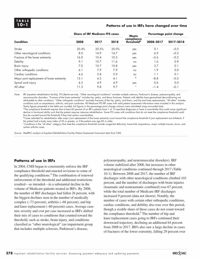
278 I n pa t i e n t r e hab i l i t a t i o n f a c i l i t y s e r v i c e s : A s s e s s i ng paymen t adequacy and upda t i ng paymen t s
polyneuropathy, and neuromuscular disorders). IRF volume stabilized after 2008, but increases in other neurological conditions continued through 2017 (Table 10-1). Between 2008 and 2017, the number of IRF discharges with other neurological conditions climbed 103 percent, and the number of discharges with brain injuries (traumatic and nontraumatic combined) rose 67 percent, while the total number of Medicare IRF discharges increased 9 percent (data not shown). Notably, the number of cases with certain other orthopedic conditions, cardiac conditions, and debility also rose over this period, though a sizable share of these cases do not count toward the compliance threshold.5 The number of hip and knee replacement cases going to IRFs continued their downward trajectory, declining an additional 64 percent from 2008 to 2017. IRFs also saw a large decline in cases of fractures of the lower extremity, falling 29 percent over
Patterns of use in IRFsIn 2004, CMS began to consistently enforce the IRF compliance threshold and enacted revisions to some of the qualifying conditions.4 The combination of renewed enforcement of the threshold and additional restrictions resulted—as intended—in a substantial decline in the volume of Medicare patients treated in IRFs. By 2008, the number of IRF discharges had fallen 26 percent, with the biggest declines seen in the number of medically complex (–73 percent), arthritis (–68 percent), and hip and knee replacement (–60 percent) cases. Average case-mix severity and cost per case increased as IRFs shifted their mix of cases to conditions that counted toward the threshold, such as stroke, brain injury, and conditions classified as “other neurological” (an impairment group that includes multiple sclerosis, Parkinson’s disease,
T A B L E10–1 Patterns of use in IRFs have changed over time
Share of IRF Medicare FFS casesMeets
compliance thresholda
Percentage point change
Condition 2008 2017 2018 2008–2017 2017–2018
Stroke 20.4% 20.5% 20.0% yes 0.1 –0.5Other neurological conditions 8.0 14.9 14.7 yes 6.9 –0.2Fracture of the lower extremity 16.0 10.4 10.3 yes –5.6 –0.2Debility 9.1 10.7 11.6 no 1.6 0.9Brain injury 7.0 10.7 10.8 yes 3.7 0.1Other orthopedic conditions 6.1 7.9 7.9 no 1.9 0.0Cardiac conditions 4.6 5.8 5.9 no 1.1 0.1Major joint replacement of lower extremity 13.1 4.3 4.1 b –8.8 –0.2Spinal cord injury 4.3 4.9 4.9 yes 0.6 0.0All other 11.3 9.8 9.7 c –1.4 –0.1
Note: IRF (inpatient rehabilitation facility), FFS (fee-for-service). “Other neurological conditions” includes multiple sclerosis, Parkinson’s disease, polyneuropathy, and neuromuscular disorders. “Fracture of the lower extremity” includes hip, pelvis, and femur fractures. Patients with debility have generalized deconditioning not attributable to other conditions. “Other orthopedic conditions” excludes fractures of the hip, pelvis, and femur, and hip and knee replacements. “All other” includes conditions such as amputations, arthritis, and pain syndrome. All Medicare FFS IRF cases with valid patient assessment information were included in this analysis. Yearly figures presented in the table are rounded, but figures in the percentage point change columns were calculated using unrounded data.
a The compliance threshold requires that at least 60 percent of an IRF’s patients have 1 of 13 specified diagnoses or have a comorbidity that could cause significant decline in functional ability such that the patient requires intensive rehabilitation. Some FFS cases with conditions that do not meet the compliance threshold could thus be counted toward the threshold if they had certain comorbidities.
b Cases admitted for rehabilitation after major joint replacement of the lower extremity count toward the compliance threshold if joint replacement was bilateral, if the patient had a body mass index of 50 or greater, or if the patient was age 85 or older.
c Conditions in the “all other” category that meet the compliance threshold include congenital deformity, lower-limb amputations, major multiple trauma, burns, and certain arthritis cases.
Source: MedPAC analysis of Inpatient Rehabilitation Facility–Patient Assessment Instrument data from CMS.

279 Repo r t t o t h e Cong r e s s : Med i ca r e Paymen t P o l i c y | Ma r ch 2020
the same period, even though they counted toward the compliance threshold (data not shown). Between 2017 and 2018, we observed disproportionate growth in the number of cases with debility. The share of these cases rose from 10.7 percent to 11.6 percent of FFS IRF cases (Table 10-1).
From to 2012 to 2016, the CMS Comprehensive Error Rate Testing (CERT) program, which evaluates a sample of claims to determine that they were paid properly under Medicare coverage, coding, and billing rules found that the error rate for IRFs spiked from 9 percent to 62 percent. IRFs’ error rate accounted for 11 percent of the overall Medicare FFS improper payment rate in 2016 (Centers for Medicare & Medicaid Services 2016). In September 2018, the Office of Inspector General (OIG) released a follow-up report indicating that many IRF stays did not comply with all Medicare coverage and documentation requirements for reasonable and necessary care. OIG’s analysis found that only 45 of a random sample of 220 stays met the requirements (Office of Inspector General 2018). Though some in the industry have questioned these reports, the OIG’s and CERT program’s findings raise concern regarding efficient internal controls and oversight of IRF documentation and indicate that the enforcement of such criteria is not sufficient.
The distribution of case types differs by type of IRF (Table 10-2). For example, in 2018, only 16 percent of cases in freestanding for-profit IRFs were admitted for rehabilitation following a stroke, compared with 26 percent of cases in hospital-based nonprofit IRFs. Likewise, 20 percent of cases in freestanding for-profit IRFs were admitted with other neurological conditions, twice the share admitted to hospital-based nonprofit IRFs. Cases with other orthopedic conditions also made up a higher share of cases in freestanding for-profit facilities than in all other IRFs. By contrast, the share of cases with brain injury or debility was similar across IRF types.
High-margin IRFs have a different mix of casesA previous Commission analysis of differences in the mix of cases across IRFs suggested that patient selection contributes to provider profitability (Medicare Payment Advisory Commission 2016). We found that IRFs with the highest margins in 2013 had a higher share of other neurological cases and a lower share of stroke cases.6 Further, we observed differences in the types of stroke and other neurological conditions admitted to high-margin and low-margin IRFs. Stroke cases in the highest margin IRFs were two-and-a-half times more likely than those in the lowest margin IRFs to have no paralysis. Likewise, other neurological cases in the highest margin IRFs were
T A B L E10–2 Mix of Medicare FFS IRF cases differed by provider type, selected conditions, 2018
Freestanding Hospital based
Condition For profit Nonprofit For profit Nonprofit
Stroke 16% 26% 19% 26%Other neurological conditions 20 8 12 10Fracture of the lower extremity 9 8 14 11Debility 12 10 13 11Brain injury 10 13 11 11Other orthopedic conditions 10 6 6 6
Note: FFS (fee-for-service), IRF (inpatient rehabilitation facility). “Other neurological conditions” includes multiple sclerosis, Parkinson’s disease, polyneuropathy, and neuromuscular disorders. “Fracture of the lower extremity” includes hip, pelvis, and femur fractures. Patients with debility have generalized deconditioning not attributable to other conditions. “Other orthopedic conditions” excludes fractures of the hip, pelvis, and femur, and hip and knee replacements. All Medicare FFS IRF cases with valid patient assessment information were included in this analysis.
Source: MedPAC analysis of Inpatient Rehabilitation Facility–Patient Assessment Instrument data from CMS.

280 I n pa t i e n t r e hab i l i t a t i o n f a c i l i t y s e r v i c e s : A s s e s s i ng paymen t adequacy and upda t i ng paymen t s
almost three times more likely than those in the lowest margin IRFs to have a neuromuscular disorder (such as amyotrophic lateral sclerosis or muscular dystrophy) as opposed to neurological conditions such as multiple sclerosis or Parkinson’s disease.
As noted in our March 2016 report to the Congress, these findings suggest that, under the IRF PPS, some case types are more profitable than others. The Commission plans to assess variation in costs among the IRF CMGs and differences in relative profitability across CMGs in future analyses. It is necessary to identify and reduce variation in costs among CMGs and properly calibrate payments with costs for each group to avoid overpayments and reduce financial incentives for providers to admit certain types of cases and avoid others. In the short term, the Commission has recommended that the Secretary effect changes to reduce potential misalignments between IRF payments and costs by redistributing payments in the IRF PPS through the high-cost outlier pool (see text box on March 2016 recommendations). Expanding the outlier pool would increase outlier payments for the costliest cases, easing the financial burden for IRFs that have a relatively high share of these cases.
Data suggest patients not assessed uniformly across IRFsA previous Commission analysis of acute care hospital claims data and data from the Inpatient Rehabilitation Facility–Patient Assessment Instrument (IRF–PAI), while not definitive, strongly suggests that IRFs differ in their assessment of patients’ motor and cognitive function, raising more generalized concerns about patient assessment data (Medicare Payment Advisory Commission 2016).
Overall, when we compared patients in high-margin and low-margin IRFs, we found that patients in high-margin IRFs were less severely ill and resource intensive during the acute care hospitalization that preceded the IRF stay:
• Patients in high-margin IRFs had, on average, a lower case-mix index in the acute care hospital as well as a lower level of severity of illness and a shorter length of stay.
• Patients in high-margin IRFs were less likely to have been high-cost outliers in the acute care hospital or to have spent four or more days in the hospital intensive care or coronary care unit.
But once patients were admitted to and assessed by the IRF, the average patient profile changed, with patients treated in high-margin IRFs appearing to be more disabled than those in low-margin IRFs (as measured by motor impairment scores assigned by IRFs). This pattern persisted across case types.
As noted in our March 2016 report to the Congress, the consistent finding that high-margin IRFs have patients who are, on average, less severely ill in the acute care hospital but appear more functionally disabled upon assessment in the IRF suggests that assessment and scoring practices contribute to greater profitability in some IRFs, especially given the comparatively low level of costs and cost growth observed in high-margin facilities. If providers differ in their assessment and scoring of patients’ motor and cognitive function, payments will not be properly aligned with patients’ resource needs. Some IRFs will receive payments that are too high relative to the costs incurred in treating their patients, while other IRFs will receive payments that are too low.
These findings led the Commission to recommend that CMS ensure payment accuracy and help improve program integrity by reviewing medical records and conducting other research as necessary (see text box on March 2016 recommendations). Recently, as described in the June 2019 report to the Congress, the Commission found that provider-reported patient functional assessment data are inconsistent and discussed strategies to improve the assessments, including improving the monitoring of provider-reported assessments (i.e., audit program to follow up on aberrant results).
Are Medicare payments adequate in 2020?
To assess whether payments for fiscal year 2020 are adequate to cover the costs providers incur and how much providers’ costs are expected to change in the coming year (2021), we examine several indicators of payment adequacy. Specifically, we assess beneficiaries’ access to care by examining the capacity and supply of IRFs and changes over time in the volume of services provided, quality of care, providers’ access to capital, and the relationship between Medicare payments and providers’ costs.

281 Repo r t t o t h e Cong r e s s : Med i ca r e Paymen t P o l i c y | Ma r ch 2020
The Commission reiterates its March 2016 recommendations on the IRF prospective payment system
Recommendation 9-2The Secretary should conduct focused medical record review of inpatient rehabilitation facilities that have unusual patterns of case mix and coding.
Rationale 9-2The Commission’s finding that high-margin inpatient rehabilitation facilities (IRFs) have patients who are, on average, less severely ill in the acute care hospital but appear more functionally disabled in the IRF suggests the possibility that coding practices contribute to greater profitability in some IRFs. Providers may differ in their assessment of patients’ motor and cognitive function, resulting in payments for some IRFs that are too high relative to the costs incurred in treating their patients. To improve the accuracy of payments and protect program integrity, CMS should review medical records merged with IRF patient assessment data, reassess inter-rater reliability across IRFs, and conduct other research as necessary. Because medical record review is resource intensive, CMS should begin by focusing on providers that have an atypical mix of cases, such as a high concentration of neuromuscular disorders and stroke cases without paralysis, and on providers that have anomalous patterns of coding, such as wide discrepancies in their patients’ levels of severity as coded in the acute care hospital compared with that coded in the IRF. However, system-wide assessment of payment accuracy is also needed.
Implications 9-2
Spending
• Implementing this recommendation could result in changes to the payment system that would be budget neutral but could also reduce Medicare’s spending on IRF services if CMS were to make payment adjustments to account for assessment and coding differences across providers or for coding changes that do not reflect real case-mix change. CMS would incur some administrative expenses to conduct these activities.
Beneficiary and provider
• We do not expect this recommendation to have adverse effects on Medicare beneficiaries with respect to access to care or out-of-pocket spending or on providers’ willingness and ability to care for Medicare beneficiaries.
Recommendation 9-3The Secretary should expand the inpatient rehabilitation facility outlier pool to redistribute payments more equitably across cases and providers.
Rationale 9-3The Commission’s finding that high-margin IRFs may be selecting certain types of cases suggests that some case-mix groups (CMGs) may be more profitable than others. At the same time, our finding that IRFs may differ in their assessments of patients’ motor and cognitive function suggests that the IRF CMGs may not be adequately capturing differences in patient acuity and costs across cases and providers. The potential for financial loss may therefore be greater for some providers than for others. Expanding the outlier pool would increase outlier payments for the most costly cases, easing the financial burden for IRFs that have a relatively high share of these cases.
Implications 9-3
Spending
• This recommendation would be implemented in a budget-neutral manner and should not have an overall impact on spending.
Beneficiary and provider
• We do not expect this recommendation to have adverse effects on Medicare beneficiaries with respect to access to care or out-of-pocket spending. This recommendation may relieve the financial pressure on some providers and may improve equity among providers by diminishing the effects of inaccurate coding. ■

282 I n pa t i e n t r e hab i l i t a t i o n f a c i l i t y s e r v i c e s : A s s e s s i ng paymen t adequacy and upda t i ng paymen t s
Beneficiaries’ access to care: IRF supply and service volume suggest sufficient accessWe have no direct indicator of beneficiaries’ access to IRF care. Although there are criteria for admission to an IRF, it is not clear when IRF care is necessary or beneficial for a given patient or when another, potentially lower cost post-acute care (PAC) provider (such as a skilled nursing facility (SNF)) could provide appropriate care. The absence of IRFs in some areas of the country makes it particularly difficult to assess the need for IRF care since beneficiaries in areas without IRFs presumably receive similar services in other settings. Nevertheless, our analysis of IRF supply and volume of services provided suggests that capacity remains adequate to meet demand. Moreover, the marginal profit, an indicator of whether IRFs with excess capacity have an incentive to treat more Medicare beneficiaries, was robust for both freestanding and hospital-based IRFs, thus providing a very positive indicator of patient access.
Number of IRFs and occupancy rates suggest adequate capacity and supply
After a small decline in 2013, the number of IRFs increased in 2014 and continued to grow through 2016
to 1,188 facilities nationwide (Table 10-3). Then in 2017, the number of IRFs fell 0.8 percent to 1,178 facilities. This trend continued in 2018, decreasing to 1,170 facilities. However, IRFs are not the sole provider of rehabilitation services in communities; SNFs also provide rehabilitation services in an institutional setting, and home health agencies, comprehensive outpatient rehabilitation facilities, and independent therapy providers furnish care at home or on an outpatient basis. Given the number and distribution of these other rehabilitation therapy providers, it is unlikely that areas exist where IRFs are the only provider of rehabilitation therapy services available to Medicare beneficiaries. Additionally, even with the overall decline in the number of IRF facilities, the number of freestanding and for-profit facilities continues to grow. Between 2013 and 2017, the number of hospital-based IRFs fell by 0.5 percent and the number of nonprofit IRFs fell by 0.8 percent, while the number of freestanding IRFs and for-profit IRFs rose by 3.5 percent and 5.0 percent, respectively.
In 2018, about 75 percent of IRFs were distinct units in acute care hospitals; the rest were freestanding facilities.
T A B L E10–3 The number of for-profit and freestanding IRFs continued to grow in 2018
Type of IRF
Share of Medicare
FFS discharges
2018
Number of IRFsAverage
annual change
2013 2014 2015 2016 2017 20182013– 2017
2017– 2018
All IRFs 100% 1,161 1,177 1,182 1,188 1,178 1,170 0.4% –0.7%
Urban 93 977 1,013 1,020 1,026 1,019 1,014 1.1 –0.5Rural 7 184 164 162 162 159 156 –3.6 –1.9
Freestanding 53 243 251 262 273 279 290 3.5 3.9Hospital based 47 918 926 920 915 899 880 –0.5 –2.1
Nonprofit 37 677 681 681 676 655 642 –0.8 –2.0For profit 56 322 338 352 370 392 400 5.0 2.0Government 7 155 149 138 133 125 121 –5.2 –3.2
Note: IRF (inpatient rehabilitation facility), FFS (fee-for-service). The number of facilities are for the calendar year. The large decline in the number of rural IRFs between 2013 and 2014 was due primarily to changes in the core-based statistical areas, as defined by the Office of Management and Budget, which determine whether geographic areas are considered urban or rural. Because of these changes, 19 IRFs that were previously considered rural are now designated urban. Ownership components may not sum to totals due to missing data.
Source: MedPAC analysis of Provider of Services data and Medicare Provider Analysis and Review data from CMS.

283 Repo r t t o t h e Cong r e s s : Med i ca r e Paymen t P o l i c y | Ma r ch 2020
However, because hospital-based units have, on average, fewer beds and a lower share of Medicare discharges, they accounted for only 47 percent of Medicare discharges. Overall, 34 percent of IRFs were for-profit entities. Freestanding IRFs were far more likely to be for profit than were hospital-based IRFs (78 percent vs. 19 percent; data not shown). In 2018, 56 percent of Medicare discharges were from for-profit facilities.
In 2018, 35 IRFs closed; almost all were hospital-based units. At the same time, 27 new IRFs opened. Slightly more than half of the new IRFs were hospital-based units. Of the new hospital-based units, about a third were for-profit; of the new freestanding facilities, a majority were for profit. Acute care hospitals find that IRF units can help reduce inpatient lengths of stay. Previous Commission analyses have found that hospitals with IRF units have higher inpatient margins than hospitals without such units (Medicare Payment Advisory Commission 2015).
In 2018, the average IRF occupancy rate slightly increased to 66 percent. Occupancy rates remain higher in freestanding IRFs (69 percent); however, in 2018, the occupancy rates in hospital-based IRFs increased by 2 percentage points (63 percent vs. 61 percent in 2017). These rates suggest that capacity is more than adequate to meet demand for IRF services.
IRF Medicare volume increased in 2018
As previously reported, after CMS renewed its enforcement of the compliance threshold in 2004, IRF volume declined substantially between 2004 to 2008 (Medicare Payment Advisory Commission 2019). At that point, volume began to increase slowly, rising each year (Table 10-4). After a stagnant period from 2016 to 2017, the number of Medicare FFS cases increased 3.0 percent, growing to about 408,000 cases in 2018.
In 2018, the number of IRF cases per 10,000 FFS beneficiaries grew to 105.7, up 2.9 percent from the previous year. Relatively few Medicare beneficiaries use IRF services because, to qualify for Medicare coverage, IRF patients must be able to tolerate and benefit from rehabilitation therapy that is intensive, which is usually interpreted to mean at least three hours of therapy a day for at least five days a week. Yet, compared with all Medicare beneficiaries, those admitted to IRFs in 2018 were disproportionately over age 85 (data not shown).
With the increase in the number of IRF cases per FFS beneficiary, FFS Medicare’s share of IRF discharges rose slightly to 59 percent of total discharges as the volume of IRF cases across all payers also increased in 2018 (data not shown).
T A B L E10–4 The number of IRF cases per FFS beneficiary increased in 2018
Average annual change
2010 2015 2016 2017 2018 2010–2018 2017–2018
Number of cases 365,095 393,475 396,247 396,294 408,038 1.4% 3.0%
Cases per 10,000 FFS beneficiaries 101.3 103.4 103.2 102.7 105.7 0.5 2.9
Payment per case $16,814 $18,527 $18,931 $19,481 $20,124 2.3 3.3
ALOS (in days) 13.1 12.7 12.7 12.7 12.7 –-0.4 –-0.6
Users 330,774 354,343 355,390 354,618 363,753 1.2 2.6
Note: IRF (inpatient rehabilitation facility), FFS (fee-for-service), ALOS (average length of stay). The number of cases presented differs from past reports due to a change in methodology. Yearly figures presented in the table are rounded, but the percent change columns were calculated using unrounded data.
Source: MedPAC analysis of Medicare Provider Analysis and Review data from CMS.

284 I n pa t i e n t r e hab i l i t a t i o n f a c i l i t y s e r v i c e s : A s s e s s i ng paymen t adequacy and upda t i ng paymen t s
facility-level change in functional and cognitive status during the IRF stay, rates of discharge to the community and to SNFs, and rates of readmission to an acute care hospital. (For a detailed discussion of the methodology underlying the Commission’s quality measures, see our March 2019 report to the Congress.) During this period, most measures were steady or improved.
Risk-adjusted rates of potentially avoidable rehospitalization, discharge to the community, and discharge to SNF
Avoidable rehospitalizations expose beneficiaries to hospital-acquired infections, increase the number of transitions between settings (which are disruptive to patients), and can result in medical errors (such as medication errors). In addition, they unnecessarily increase Medicare spending. The Commission’s rates of rehospitalization during the IRF stay and during the 30 days after discharge are risk adjusted and reflect those readmissions that are potentially avoidable with adequate care in the IRF setting (Kramer et al. 2015).8 The measure of rehospitalization in the 30 days after discharge reflects in part how well facilities prepare beneficiaries and their caregivers for safe and appropriate transitions to the home or the next health care setting. Because IRFs are also hospitals, the rate of rehospitalization should ideally be low. Between 2014 and 2018, the national average rate
Marginal profit provides incentive to treat more Medicare beneficiaries
Another measure of access is whether providers have a financial incentive to expand the number of Medicare beneficiaries they serve. In considering whether to treat a patient, a provider with excess capacity compares the marginal revenue it will receive (i.e., the Medicare payment) with its marginal costs—that is, the costs that vary with volume. If Medicare payments are larger than the marginal costs of treating an additional beneficiary, a provider has a financial incentive to increase its volume of Medicare patients. In contrast, if payments do not cover the marginal costs, the provider could have a disincentive to care for Medicare beneficiaries. Given the difference in financial performance across IRFs, we examined freestanding and hospital-based IRFs’ marginal profit to assess whether both types of providers have a financial incentive to increase the number of Medicare beneficiaries they serve.7 We found that Medicare payments exceed marginal costs by a substantial amount—20 percent for hospital-based IRFs and 41 percent for freestanding IRFs—suggesting that IRFs with available beds have a strong incentive to admit Medicare patients.
Quality of care: Steady or improved for most measuresBetween 2012 and 2018, the Commission tracked three broad categories of IRF quality indicators: risk-adjusted
T A B L E10–5 Risk-adjusted quality indicators for IRFs held
steady or improved slightly from 2012 to 2018
Measure 2012 2014 2015 2016 2017 2018
Potentially avoidable rehospitalizations during IRF stay 2.8% 2.7% 2.6% 2.7% 2.7% 2.6%Discharged to a SNF 6.7% 6.9% 6.9% 6.7% 6.7% 6.6%Discharged to the community 74.4% 75.3% 75.1% 76.0% 76.0% 76.4%Potentially avoidable rehospitalizations during
30 days after discharge from IRF 5.0% 4.8% 4.4% 4.8% 4.8% 4.8%
Motor FIM™ gain (in points) 22.1 22.9 23.1 23.7 24.0 24.3Cognitive FIM™ gain (in points) 3.5 3.7 3.8 3.9 3.9 4.0
Note: IRF (inpatient rehabilitation facility), SNF (skilled nursing facility), FIM™ (Functional Independence Measure™). High rates of discharge to the community indicate better quality. High rates of rehospitalization and discharge to SNF indicate worse quality. Rates are the average of facility rates and calculated for all facilities with 25 or more Medicare fee-for-service stays. The motor FIM measures the level of disability in motor functioning on a 91-point scale. The cognitive FIM measures the level of cognitive impairment on a 35-point scale. FIM gain is calculated as the FIM score at discharge minus the FIM score at admission. Higher FIM gain indicates more improvement. Mean FIM gain averages the change of all facilities with 25 or more Medicare fee-for-service stays.
Source: MedPAC analysis of Inpatient Rehabilitation Facility–Patient Assessment Instrument data from CMS.

285 Repo r t t o t h e Cong r e s s : Med i ca r e Paymen t P o l i c y | Ma r ch 2020
of risk-adjusted potentially avoidable rehospitalizations during the IRF stay was about 2.7 percent (Table 10-5). Meanwhile, between 2012 and 2018, the rate of risk-adjusted potentially avoidable rehospitalization within 30 days after discharge from an IRF declined from 5.0 percent to 4.4 percent in 2015, then rose to 4.8 percent in 2018 (a slight improvement since 2012).
We also examined rates of discharge to the community and to SNFs. We found that between 2012 and 2018, the national average for the risk-adjusted community discharge rate increased from 74.4 percent to 76.4 percent.9 (Higher rates are better.) Between 2012 and 2015, the national average for the risk-adjusted rate of discharge to SNFs increased from 6.7 percent to 6.9 percent, but subsequently declined to 6.6 percent in 2018. (Lower rates are better.)
Change in functional status during IRF stay
The Commission also considers functional status at admission and discharge, measured using the motor and cognitive scores on the IRF–PAI. In its June 2019 report to the Congress, the Commission reported that broad function levels were associated with other patient characteristics, such as age and patient complexity, giving us some reassurance that in aggregate the measures may be reasonable. However, when comparing assessments for individual patients, the work raised serious questions about the accuracy of the provider-reported functional assessments. For beneficiaries transferred from one PAC setting and admitted to another, the functional status recorded at discharge from one setting and at admission to the next were often different, and the differences favored reporting that would raise payments. Further, for the same beneficiaries, a disproportionate share of the levels reported for quality were reported higher than those reported for payment-related items. The Commission concluded that the accuracy of this information needs to be improved before it is used to adjust payment (including value-based payment) and to gauge individual providers’ quality.
The IRF–PAI incorporates the 18-item Functional Independence MeasureTM (FIMTM) scale to assess the level of disability in motor and cognitive functioning and the burden of care for a patient’s caregivers (Deutsch et al. 2005). Scores for each of the 18 FIM items can be summed to calculate a motor score (based on 13 FIM items) and a cognitive score (based on 5 FIM items). The
motor score at discharge can range from 13 to 91, while the cognitive score can range from 5 to 35, with higher scores indicating greater functional independence. To measure observed improvement in motor function and cognition, we subtracted the respective FIM scores at admission from the FIM scores at discharge to calculate FIM motor and cognitive gains (Kramer et al. 2015). A larger number indicates more improvement in motor function and cognition between admission and discharge.
In 2018, the mean gain (positive change) in the motor FIM score during an IRF stay was 24.3, and the mean gain for the cognitive FIM score was 4.0 (Table 10-5). From 2012 to 2018, the average risk-adjusted gain in IRF patients’ motor and cognitive FIM scores (as assigned by IRFs) increased about 10 percent and 14 percent, respectively. However, changes in motor function and cognition must be interpreted with caution due to the subjective nature of the measures.
Variation in quality measures across IRFs
IRFs varied widely in their performance on Medicare’s quality measures (Table 10-6, p. 286). In 2018, the best performing quartile of IRFs had a risk-adjusted rate of discharge to a SNF that was 4.1 percent or lower, less than half the rate of the worst performing quartile. (A lower rate of discharge to a SNF is better.) Risk-adjusted rates of discharge to the community varied as well: The best performing quartile of IRFs had a community discharge rate 6 percentage points higher (79.3 percent or higher) than the worst performing quartile. (A higher rate of discharge to the community is better.) Rehospitalization rates also varied: The best performing quartile had risk-adjusted rates of potentially avoidable rehospitalization during the IRF stay that were at half the rate of the worst performing quartile, with a rate of 1.7 percent or below. (A lower rate of readmissions is better.) IRF providers need to continue to prioritize the quality of care to ensure that all beneficiaries are receiving equitable care. The variation in performance among IRF providers suggests that disparity in the quality of care is an area that needs improvement, even for measures with low rates.
Providers’ access to capital: IRFs appear to have adequate access to capitalMore than three-quarters of IRF providers are hospital-based units that would access any necessary capital through their parent institutions. Overall, as detailed in the hospital chapter, hospitals’ access to capital remained

286 I n pa t i e n t r e hab i l i t a t i o n f a c i l i t y s e r v i c e s : A s s e s s i ng paymen t adequacy and upda t i ng paymen t s
strong in 2018, although bond issuances decreased, in part due to higher interest rates relative to 2017. Since 2018, interest rates on these hospital bonds have fallen below 2017 levels, while 2019 bond issuances were on pace to eclipse their 2018 levels (Thomson Reuters 2019). Hospital construction spending in 2018 was about $25 billion, which has been relatively stable since 2014 when the health care industry began to see a decrease in spending on inpatient hospital capacity (Census Bureau 2019). This trend is in part due to health systems focusing on lower cost outpatient facilities and renovations of existing facilities (Conn 2017).
Market analysts indicate that the IRF industry’s largest chain, Encompass Health (formerly HealthSouth)—which owned almost half of freestanding IRFs in 2018 and accounted for over 30 percent of all Medicare IRF discharges—has good access to capital. This assessment is reflected in the chain’s continued expansion. Analysts note that Encompass Health traditionally has prioritized building new facilities over acquiring existing facilities, which allows the company to maintain control over facility size, layout, and amenities. Approximately one in three U.S. patients receiving inpatient rehabilitative care receives it through an Encompass Health rehabilitation hospital (Encompass Health 2019a). In 2018, the company
opened two new facilities and four more in 2019, with three additional facilities scheduled to open in 2020. The new facilities are frequently joint ventures with acute care hospitals (Encompass Health 2019b). As part of a vertical integration strategy, the company has acquired home health agencies and hospice providers to expand its PAC business and drive more effective collaboration between its rehabilitation facilities and home health agencies.
Most other freestanding IRFs are independent or local chains with a limited number of facilities. The extent to which these providers have access to capital is less clear.
IRFs’ access to capital depends in large part on their total (all-payer) profitability. In 2018, total margins for freestanding IRFs remained healthy, with an aggregate margin of 10.7 percent, up 0.3 percentage point from 2017. Profitability varied by ownership. In 2018, for-profit IRFs had an aggregate total margin of 13.2 percent compared with 5.5 percent for nonprofit IRFs. Data are not available to calculate total margins for hospital-based IRFs. However, in 2018, hospitals’ aggregate total margins across all lines of service for hospitals with and without IRF units were similar, at 6.8 percent and 6.7 percent, respectively.
T A B L E10–6 Performance on risk-adjusted quality measures varied across IRFs in 2018
Measure
Risk-adjusted rate Ratio of best to worst
performing quartileMean
Worst performing
quartile
Best performing
quartile
Potentially avoidable rehospitalizations during IRF stay 2.6% 3.4% 1.7% 0.50Discharged to a SNF 6.6% 8.5% 4.1% 0.48Discharged to the community 76.4% 73.4% 79.3% 1.08Potentially avoidable rehospitalizations during 30 days after discharge from IRF 4.8% 6.0% 3.6% 0.60
Motor FIM™ gain 24.3 21.6 27.0 1.25Cognitive FIM gain 4.0 3.0 4.8 1.59
Note: IRF (inpatient rehabilitation facility), SNF (skilled nursing facility), FIM™ (Functional Independence Measure™). High rates of discharge to the community indicate better quality. High rates of rehospitalization and discharge to SNF indicate worse quality. Mean rates are calculated for all facilities with 25 or more Medicare fee-for-service stays. The motor FIM measures the level of disability in motor functioning on a 91-point scale. The cognitive FIM measures the level of cognitive impairment on a 35-point scale. FIM gain is calculated as the FIM score at discharge minus the FIM score at admission. Higher FIM gain indicates more improvement.
Source: MedPAC analysis of Inpatient Rehabilitation Facility–Patient Assessment Instrument data from CMS.

287 Repo r t t o t h e Cong r e s s : Med i ca r e Paymen t P o l i c y | Ma r ch 2020
Medicare payments and providers’ costs: Medicare margins remained high in 2018Aggregate Medicare margins grew steadily between 2010 and 2015 and increased again in 2017 to 13.9 percent (Table 10-7). In 2018, aggregate margins continued to rise to 14.7 percent.10 Between 2015 and 2018, Medicare margins in freestanding IRFs fell slightly from a peak of 26.6 percent to 25.4 percent. Hospital-based IRF margins were comparatively low at 2.5 percent in 2018, but one-quarter of hospital-based IRFs had Medicare margins greater than 13 percent (data not shown), indicating that many hospitals can manage their IRF units profitably.
Trends in spending and cost growth
The Office of the Actuary estimates that Medicare FFS spending for IRF services in fiscal year 2018 was $8.0 billion (Figure 10-1, p. 288). Program spending has been growing, on average, more than 3 percent per year since 2010. A combination of increases in the number of Medicare beneficiaries receiving care in IRFs (average growth of 1.2 percent per year) and payment increases averaging 3.7 percent per year contributed to this growth in spending.
Since 2010, payments have been growing faster than costs (Figure 10-2, p. 289). From 2010 to 2015, the cumulative
T A B L E10–7 Aggregate IRF Medicare margins increased in 2018
Type of IRF
Share of Medicare
discharges, 2018
Margins
2008 2010 2012 2014 2015 2016 2017 2018
All IRFs 100% 9.4% 8.6% 11.2% 12.2% 13.9% 13.3% 13.9% 14.7%
Hospital based 47 3.8 –0.5 0.6 0.7 2.1 0.8 1.5 2.5Freestanding 53 18.2 21.4 23.9 25.2 26.6 25.8 25.6 25.4
Nonprofit 37 5.3 2.1 2.0 1.7 3.4 1.5 2.1 2.4For profit 56 16.9 19.6 23.0 23.9 25.1 24.5 24.1 24.6Government 7 N/A N/A N/A N/A N/A N/A N/A N/A
Urban 93 9.6 9.0 11.5 12.6 14.3 13.6 14.2 15.0Rural 7 7.2 4.7 6.6 6.4 8.6 9.1 8.2 9.8
Number of beds1 to 10 2 –4.9 –10.3 –6.9 –11.0 –7.5 –10.1 –11.0 –5.511 to 24 20 1.3 –3.3 –1.3 –0.3 –0.4 –0.4 0.7 2.225 to 64 48 10.0 10.6 12.2 14.0 16.0 15.0 15.8 17.065 or more 30 17.4 17.5 21.0 20.6 23.0 22.4 21.9 21.1
Medicare FFS share<50% 19 6.0 –0.4 –0.2 0.6 1.8 1.1 1.8 3.350% to 75% 57 9.8 9.1 11.1 12.8 15.7 15.0 15.1 15.7>75% 24 10.4 14.9 19.5 19.5 19.8 19.7 22.0 23.3
Note: IRF (inpatient rehabilitation facility), N/A (not applicable). Government-owned facilities operate in a different financial context from other facilities, so their margins are not necessarily comparable. Their margins are not presented separately here, although they are included in the margins for other groups (e.g., “all IRFs”), where applicable. Percentages may not sum to 100 due to rounding.
Source: MedPAC analysis of cost report data from CMS.

288 I n pa t i e n t r e hab i l i t a t i o n f a c i l i t y s e r v i c e s : A s s e s s i ng paymen t adequacy and upda t i ng paymen t s
for costs. In 2018, per case payments continued to grow faster than costs (1.5 percentage points compared with 0.8 percentage points), resulting in an aggregate IRF margin of 14.7 percent. From 2015 through 2018, aggregate Medicare margins for IRFs remained above 13 percent (Table 10-7, p. 287).
Aggregate Medicare margins are high but vary widely
Financial performance varied across IRFs. In 2018, the aggregate margin for freestanding IRFs (which accounted for 53 percent of Medicare discharges from IRFs) was 25.4 percent; hospital-based IRFs had an aggregate margin of 2.5 percent (Table 10-7, p. 287). Margins varied by ownership as well, with for-profit IRFs having a substantially higher aggregate Medicare margin in 2018 than nonprofit IRFs (24.6 percent vs. 2.4 percent). (Hospital-based IRFs are far more likely than freestanding
growth in cost per discharge was 6.1 percent, an average of just 1.2 percent per year. The cumulative growth in cost per discharge for freestanding for-profit IRFs was especially slow over this period, at just 1.1 percent (data not shown). In contrast, payments per discharge grew more rapidly than costs, climbing a cumulative 11.8 percent over this period (an average of 2.4 percent per year) and 12.0 percent for freestanding for-profit IRFs (latter figure not shown). These differences in per case cost and payment growth led to a steady rise between 2010 and 2015 in aggregate Medicare margins, which climbed from 8.6 percent to 13.9 percent (Table 10-7, p. 287).
Between 2015 and 2016, cost growth outpaced payment growth for the first time since 2009, climbing 3.6 percentage points, the fastest rate of cost growth since 2008. However, from 2016 to 2017, payments per discharge again increased faster than costs, growing by 3.4 percentage points compared with 2.5 percentage points
Program spending for IRF services has grown steadily since 2010
Note: IRF (inpatient rehabilitation facility).
Source: Office of the Actuary 2019.
Medicare margins....D
olla
rs (
in b
illio
ns)
FIGUREX-X
Note: Note and Source are in InDesign.
Source:
Notes about this graph:• Data is in the datasheet. Make updates in the datasheet.• WATCH FOR GLITCHY RESETS WHEN YOU UPDATE DATA!!!!• The column totals were added manually.• I had to manually draw tick marks and axis lines because they kept resetting when I changed any data.• I can’t delete the legend, so I’ll just have to crop it out in InDesign.• Use direct selection tool to select items for modification. Otherwise if you use the black selection tool, they will reset to graph default when you change the data.• Use paragraph styles (and object styles) to format. • Data was from: R:\Groups\MGA\data book 2007\data book 2007 chp1
0
1
2
3
4
5
6
7
8
9
201820172016201520142013201220112010
6.16.3
6.66.8
7.17.4
7.7 7.8 8.0
F IGURE10–1

289 Repo r t t o t h e Cong r e s s : Med i ca r e Paymen t P o l i c y | Ma r ch 2020
disparity in unit costs. But even nonprofit freestanding IRFs had a median standardized cost per discharge that was 9.1 percent lower than that of hospital-based IRFs (data not shown). Previous Commission analysis of underlying cost components found that hospital-based IRFs had higher costs than freestanding IRFs across all cost categories, with the biggest difference manifesting in routine costs (Medicare Payment Advisory Commission 2015).
Nevertheless, one-quarter of hospital-based IRFs had Medicare margins greater than 13 percent, indicating that many hospitals can manage their IRF units profitably. Further, despite comparatively low average margins in hospital-based IRFs, evidence suggests that these units make a positive financial contribution to their parent hospitals. For example, aggregate inpatient Medicare margins for hospitals are consistently higher for hospitals with IRF units versus hospitals without (1.4 percentage
IRFs to be nonprofit.) Among freestanding IRFs, nonprofit facilities (which accounted for 6 percent of Medicare discharges from IRFs) had an aggregate margin of 9.6 percent (data not shown). Freestanding for-profit IRFs (which accounted for 47 percent of Medicare discharges from IRFs) had an aggregate margin of 27.9 percent (data not shown). Among hospital-based IRFs, the aggregate margin for nonprofit units (which accounted for 30 percent of Medicare discharges from IRFs) was 0.8 percent, compared with 9.3 percent for for-profit units (which accounted for 10 percent of Medicare discharges from IRFs; data not shown).
Higher unit costs were the primary driver of differences in financial performance between freestanding and hospital-based IRFs. Freestanding IRFs had a median standardized cost per discharge that was 26 percent lower than that of hospital-based IRFs ($12,105 vs. $16,391, respectively). Hospital-based IRFs are far more likely than freestanding IRFs to be nonprofit, which could contribute to the
IRFs’ payments per discharge increased cumulatively more than costs, 2010–2018
Note: IRF (inpatient rehabilitation facility). Percent changes are calculated based on consistent two-year cohorts.
Source: MedPAC analysis of Medicare cost report data from CMS.
Title here....Cum
ula
tive
per
cent
change
Note: Note and Source are in InDesign.
Source:
0
5
10
15
20
25
2017–20182016–20172015–20162014–20152013–20142012–20132011–20122010–2011
Notes about this graph:• Data is in the datasheet. Make updates in the datasheet.• I deleted the years from the x-axis and put in my own.• I had to manually draw tick marks and axis lines because they kept resetting when I changed any data.• The dashed line looked ok here, so I didn’t hand draw it.• I can’t delete the legend, so I’ll just have to crop it out in InDesign.• Use direct selection tool to select items for modification. Otherwise if you use the black selection tool, they will reset to graph default when you change the data.• Use paragraph styles (and object styles) to format.
FIGURE1-XX
Payment per discharge
Cost per discharge
2.4
1.2
5.1
6.7
8.6
11.8
14.7
18.1
19.6
2.5 3.44.8
6.1
9.7
12.213.0
F IGURE10–2

290 I n pa t i e n t r e hab i l i t a t i o n f a c i l i t y s e r v i c e s : A s s e s s i ng paymen t adequacy and upda t i ng paymen t s
(30.0 percent) far outstripped that of for-profit facilities (7.4 percent).
Hospital-based IRFs have a different mix of patients There are marked differences in hospital-based and freestanding IRFs’ mix of cases. In 2018, hospital-based IRFs compared with freestanding IRFs admitted a larger share of patients with stroke as the primary reason for rehabilitation (24 percent vs. 17 percent). Similarly, freestanding IRFs compared with hospital-based IRFs admitted larger shares of cases with certain other neurological conditions (19 percent vs. 10 percent) and certain other orthopedic conditions (10 percent vs. 6 percent). Notably, the impairment groups of other neurological and other orthopedic conditions encompass a broader range of conditions than do other impairment groups. This clinical heterogeneity can allow favorable selection of patients within these groups based on their likely costs of care. Cases with other neurological conditions also count toward the compliance threshold, so IRFs with higher shares of these cases can more easily meet the requirements of the 60 percent rule while keeping down costs. Further, some case types may be more profitable than others, resulting in higher margins for facilities that admit larger shares of those cases. The Commission plans to examine the relative profitability of the IRF case-mix groups in a future analysis.
Hospital-based IRF facilities in 2018 accounted for 45 percent of the Medicare FFS discharges. In general, hospital-based IRFs have a much larger share of cases with extraordinarily high costs. In 2018, 14 percent of hospital-based IRF cases qualified for high-cost outlier payments, compared with 3 percent of freestanding IRF cases. Indeed, 82 percent of Medicare’s IRF outlier payments were made to hospital-based facilities. Though these payments diminish losses per case for such outliers, they do not completely cover the costs. It is not clear whether the large number of outlier cases in hospital-based IRFs stems from differences in efficiency, unmeasured case complexity, or both.
Hospital-based IRFs appear to assess their patients differently Historically, evidence suggests that assessments of patients’ motor and cognitive function are not reliably consistent across IRFs. Some in the industry have postulated that hospital-based IRFs devote less time to training assessment staff and verifying the accuracy of assessments, resulting in less reliable measures of patients’ motor and cognitive function in hospital-based IRFs.
points higher in 2018). Aggregate overall Medicare margins for hospitals with IRF units were 2.4 percentage points higher for 2018.
Margins also varied by facility size. In 2018, the aggregate Medicare margin for IRFs with 10 or fewer beds was –5.5 percent, compared with 21.1 percent for IRFs with 65 or more beds (Table 10-7, p. 287). These differences are in large measure due to differences in economies of scale leading to higher costs in smaller facilities. The median standardized cost for IRFs with fewer than 10 beds was 48 percent higher than for IRFs with 65 or more beds ($18,822 compared with $12,687; data not shown). Smaller facilities also tend to have lower occupancy rates than large facilities (54 percent compared with 74 percent in 2018), also contributing to differences in costs.
Medicare margins tended to rise as the share of Medicare patients increased. The aggregate Medicare margin in 2018 was 3.3 percent for IRFs in which less than half of discharges were covered by FFS Medicare, compared with 23.3 percent for IRFs in which more than three-quarters of discharges were covered by FFS Medicare (Table 10-7, p. 287). The positive correlation between Medicare share and Medicare margin indicates that Medicare’s payments to IRFs are higher than those of other payers. Further, the high aggregate Medicare margin in IRFs with high Medicare shares indicates that Medicare payments substantially exceed the costs of caring for beneficiaries.
Numerous factors contribute to lower margins in hospital-based IRFs
Several factors account for the disparity in margins between hospital-based and freestanding IRFs, including differences in economies of scale (as described above), stringency of cost control, service mix, and patient mix. Differences in IRFs’ assessment of patients’ motor function and cognition likely also play a role.
Hospital-based IRFs may be less stringent in cost control Hospital-based IRFs appear to be less stringent in their cost control. Between 2010 and 2018, costs per case for hospital-based IRFs grew 18.9 percent, compared with 10.1 percent for freestanding IRFs. Notably, hospital-based IRFs are far less likely than freestanding IRFs to be for profit and therefore less likely to be focused on controlling costs to maximize returns to investors. We see this effect among freestanding IRFs, where the cumulative increase in costs per case from 2010 to 2018 for nonprofits

291 Repo r t t o t h e Cong r e s s : Med i ca r e Paymen t P o l i c y | Ma r ch 2020
efficient group, although they accounted for over a third (about 37 percent) of this group.
Previous Commission analyses suggest that assessment and scoring practices contribute to greater profitability in some IRFs (Medicare Payment Advisory Commission 2016). The results of the efficient provider analysis must therefore be interpreted with caution due to the subjective nature of the function measures used to categorize patients and their direct association with Medicare payment and profitability.
How should Medicare payments change in 2021?
To estimate 2020 payments, costs, and margins with 2018 data, the Commission considers policy changes effective in 2019 and 2020. The changes that affect our estimate of the 2020 margin include:
• changes to the high-cost outlier amount in 2019, which lowered payments by 0.1 percentage point, and
• an update of 2.5 percent in 2020 based on an IRF market basket increase of 2.9 percent and an offsetting multifactor productivity adjustment of 0.4 percent.
Historically, cost growth in this sector has been at or below market basket levels, though between 2015 and 2016, cost growth exceeded the market basket. We use a three-year historical average to estimate cost growth in 2019 and 2020.
Considering these assumptions, we project an aggregate Medicare margin of 12.7 percent for IRFs in 2020.
For fiscal years 2009 through 2017, the Commission recommended a 0 percent update to the IRF payment rate. In its calculations for fiscal year 2019, however, as the aggregate margin neared historic highs, the Commission recommended in its March 2018 and March 2019 reports that the Congress reduce IRF payment rates by 5 percent. Because our recommendations were not enacted and because, in the absence of legislative action, CMS is required by statute to apply an adjusted market basket increase, payments have continued to rise. From 2010 to 2015, the cumulative growth in payments per discharge exceeded cost growth—which remained well below market basket levels. In 2016, however, the gap between
Others assert that some freestanding IRFs aggressively assess their patients in a way that maximizes payment. To the extent that hospital-based IRFs consistently assess their patients as less disabled than do their freestanding counterparts, for whatever reason, their payments—and margins—will be systematically lower.
Efficient-provider analysis
The Commission is required by the Medicare Prescription Drug, Improvement, and Modernization Act of 2003 to consider the costs associated with efficient providers. The Commission follows two principles when selecting a set of efficient providers. First, the providers must do relatively well on both cost and quality metrics. Second, the performance has to be consistent, meaning that the provider cannot have poor performance on any metric in any of three consecutive years preceding the year under evaluation. The Commission’s approach is to develop a set of criteria and then examine how many providers meet them. It does not establish a set share (for example, 10 percent) of providers to be considered efficient and then define criteria to meet that pool size. (For a more detailed discussion of the Commission’s methodology, see our March 2019 report to the Congress: http://medpac.gov/docs/default-source/reports/mar19_medpac_ch10_sec.pdf?sfvrsn=0.)
Our analysis finds that relatively efficient IRFs had lower rates of rehospitalization and discharge to SNFs than other IRFs. While payment rates to all IRFs were similar, standardized costs per discharge for this group were 18 percent lower, leading to a large difference in the median Medicare margin, which was 17.8 percent for the relatively efficient group compared with 1.1 percent for other IRFs (Table 10-8, p. 292).
Relatively efficient IRFs were on average larger and had higher occupancy rates compared with other IRFs, leading to greater economies of scale. The mix of cases also differed somewhat between the relatively efficient and other IRFs. Relatively efficient IRFs had a higher average case-mix index and more cases with other neurological conditions, but smaller shares of stroke cases compared with other IRFs.
Although all types of facilities were represented in the relatively efficient group of IRFs, they were much more likely to be freestanding, for profit, or both. Hospital-based nonprofit IRFs were less likely to be in the relatively

292 I n pa t i e n t r e hab i l i t a t i o n f a c i l i t y s e r v i c e s : A s s e s s i ng paymen t adequacy and upda t i ng paymen t s
continue to increase in fiscal year 2021 by an estimated 2.7 percent, the largest payment rate update in the past decade.
Reducing the payment rate for IRFs would better align Medicare payments with the costs of IRF care. The Commission also continues to believe that the high-cost outlier pool should be expanded, as previously recommended in 2016, to further redistribute payments within the IRF PPS and reduce the impact of potential
payments and costs narrowed somewhat as per case cost growth exceeded payment growth for the first time since 2008. As a result, the aggregate margin in 2016 declined but remained high. In 2017 and 2018, payments again increased faster than costs, raising margins to 13.9 and 14.7 percent, respectively. These high aggregate margins indicate that aggregate Medicare payments continue to substantially exceed the costs of caring for beneficiaries in IRFs. Absent congressional action, payments to IRFs will
T A B L E10–8 Characteristics of relatively efficient providers, 2018
Performance in 2018
Type of IRFRatio of
relatively efficient to other IRFs
Relatively efficient IRFs Other IRFs
Quality measures:Rehospitalization rate 2.3% 2.6% 0.86
Discharge to SNF rate 4.8% 6.6% 0.73
Cost and payment measures:Payment per discharge $20,734 $20,627 1.01
Standardized cost per discharge $13,391 $16,392 0.82
Medicare margin 17.8% 1.1% N/A
Facility characteristics:
Facility case-mix index 1.33 1.28 1.04
Length of stay (in days) 12.4 12.6 0.99
Occupancy rate 69% 63% 1.09
Number of beds 30 23 1.30
Share of discharges for:
Stroke 19.0% 23.5% 0.81
Other neurological conditions 10.0% 6.9% 1.45
Share of facilities:
Freestanding 41.0% 21.8% N/A
For profit 51.6% 31.9% N/A
Hospital-based nonprofit 37.3% 54.1% N/A
Note: IRF (inpatient rehabilitation facility), SNF (skilled nursing facility), N/A (not applicable). All data are medians unless otherwise indicated. IRFs were identified as “relatively efficient” based on a cost measure (costs per discharge) and two quality measures (rates of readmission and discharge to SNFs) between 2015 and 2017. Relatively efficient IRFs were those in the best third of the distribution for one measure and not in the worst third for any measure in each of the three years. Costs per discharge were standardized for differences in area wages; mix of cases; and prevalence of high-cost outliers, short-stay outliers, and transfer cases. Quality measures were calculated for all facilities with 25 or more fee-for-service stays. “Rehospitalization rate” refers to potentially avoidable rehospitalizations during the IRF stay. High rates of rehospitalization and discharge to SNF indicate worse quality. “Other neurological conditions” includes multiple sclerosis, Parkinson’s disease, polyneuropathy, and neuromuscular disorders.
Source: MedPAC analysis of Medicare cost report data, Medicare Provider Analysis and Review data, and Inpatient Rehabilitation Facility–Patient Assessment Instrument data from CMS for 2015 to 2018.

293 Repo r t t o t h e Cong r e s s : Med i ca r e Paymen t P o l i c y | Ma r ch 2020
payments toward hospital-based and nonprofit facilities in the short term.
R E C O M M E N D A T I O N 1 0
For fiscal year 2021, the Congress should reduce the fiscal year 2020 Medicare base payment rate for inpatient rehabilitation facilities by 5 percent.
R A T I O N A L E 1 0
The combination of low historical cost growth and increasing average payments has resulted in overpayments to IRFs. The high aggregate margin in 2018 and our projected margin for 2020 indicate that Medicare payments substantially exceed the costs of caring for beneficiaries. This excess contributes to Medicare’s long-run sustainability challenges. For every fiscal year since 2009, the Commission has recommended that the update to the IRF payment rate be eliminated or that the payment rate be reduced. However, CMS has been required by statute to apply an adjusted market basket increase each year. Between 2010 and 2018, the cumulative increase in payments per case for all IRFs was 19.6 percent, while costs per case rose 13.0 percent, a difference of more than 6 percentage points. Reducing the payment rate for IRFs by 5 percent would better align Medicare payments with the costs of IRF care.
I M P L I C A T I O N S 1 0
Spending
• The payment update for IRFs in fiscal year 2021 consists of a forecasted 3.1 percent market basket update and a forecasted –0.4 percent productivity adjustment of the market basket update.11 Relative to current law, this recommendation would decrease Medicare spending by between $750 million and $2 billion in 2021 and by between $5 billion and $10 billion over five years.
Beneficiary and provider
• We do not expect this combination of recommendations to have an adverse effect on either Medicare beneficiaries’ access to care or out-of-pocket spending. This recommendation could increase financial pressure on some providers. We expect relatively efficient providers will continue to be willing and able to care for Medicare beneficiaries. ■
misalignments between IRF payments and costs. Currently, the outlier pool is set at 3 percent of total IRF payments. Expanding the outlier pool would increase outlier payments for the costliest cases, ameliorating the financial burden for IRFs that have a relatively high share of these cases. The expanded outlier pool would be funded by an offset to the national base payment amount, which would further reduce all case-mix group (CMG) payment rates by the same percentage across the board. As noted in our March 2016 and March 2017 reports to the Congress, expanding the outlier pool could increase payments for providers who are less efficient as well as for providers whose patients’ acuity is not well captured by the case-mix system. Nevertheless, because of concerns about the accuracy of Medicare’s payments for resource-intensive cases, the Commission maintains that an expanded outlier pool is warranted in the near term. Over the longer term, however, CMS must ensure the accuracy of Medicare’s payments by determining that IRFs’ assessment and scoring consistently reflect patients’ level of disability. Research is also needed to assess variation in costs within the IRF CMGs and differences in relative profitability across CMGs. In the future, CMS could enact payment system reforms that necessitate reassessment of IRF outlier payments and adjustments to the outlier pool, including a return to a smaller pool.
The Commission also reiterates its March 2016 recommendation that the Secretary conduct focused medical record review of IRFs that have unusual patterns of case mix and coding and conduct other research necessary to improve the accuracy of payments and protect program integrity. With the shift to using the Quality Reporting Program (QRP) functional measures to classify cases into CMGs, it is important that CMS conduct focused medical reviews to ensure consistency in reporting across providers using the new measures.
The Commission estimates that reducing the payment rate for IRFs by 5 percent and expanding the outlier pool from 3 percent to 5 percent would decrease total payments to IRFs by 5 percent. We estimate the combined effect of reducing the payment rate for IRFs by 5 percent and expanding the outlier pool would decrease aggregate payments to freestanding IRFs by 6.0 percent, to hospital-based IRFs by 4.1 percent, to for-profit IRFs by 6.0 percent, and to nonprofit IRFs by 4.3 percent. Changes being made by the Secretary to the CMGs by using the QRP functional measures in place of the FIM, though budget neutral, could result in some small shift in

294 I n pa t i e n t r e hab i l i t a t i o n f a c i l i t y s e r v i c e s : A s s e s s i ng paymen t adequacy and upda t i ng paymen t s
1 More frequently, Medicare beneficiaries receive inpatient rehabilitation services in skilled nursing facilities (SNFs), in part because there are many more SNFs than IRFs nationwide.
2 More information about the prospective payment system for IRFs is available at http://medpac.gov/docs/default-source/payment-basics/medpac_payment_basics_19_irf_final_sec.pdf?sfvrsn=0.
3 The 13 conditions are stroke; spinal cord injury; congenital deformity; amputation of a lower limb; major multiple trauma; hip fracture; brain injury; certain other neurological conditions (multiple sclerosis, Parkinson’s disease, cerebral palsy, and neuromuscular disorders); burns; 3 arthritis conditions for which appropriate, aggressive, and sustained outpatient therapy has failed; and hip or knee replacement when it is bilateral, the patient’s body mass index is greater than or equal to 50, or the patient is age 85 or older.
4 CMS’s major revisions to the compliance threshold policy in 2004 were to (1) increase the number of conditions that count toward the threshold from 10 to 13 and (2) revise the qualifying criteria of major joint replacement—a condition that was commonly treated in IRFs at that time—such that only a certain subset of patients with that condition would count toward the compliance threshold.
5 Other orthopedic conditions, cardiac conditions, and debility are not among the 13 conditions that count toward the compliance threshold, but such cases may count if they have specified comorbidities.
6 This analysis of FFS IRF claims and assessment data from 2013 excluded cases that were not preceded by an acute care hospital stay within 30 days of the IRF admission.
7 If we approximate marginal cost as total Medicare cost minus fixed building and equipment cost, then:
Marginal profit = (payments for Medicare services – (total Medicare costs – fixed building and equipment costs)) / Medicare payments.
8 The potentially avoidable readmissions we measure are respiratory-related illness (pneumonia, influenza, bronchitis, chronic obstructive pulmonary disease, and asthma); sepsis; congestive heart failure; fractures or fall with a major injury; urinary tract or kidney infection; blood pressure management; electrolyte imbalance; anticoagulant therapy complications; diabetes-related complications; cellulitis or wound infection; pressure ulcer; medication error or adverse drug reaction; and delirium.
9 Our measure of community discharge does not give IRFs credit for discharging a Medicare beneficiary to the community if the beneficiary is subsequently readmitted to an acute care hospital within 30 days of the IRF discharge.
10 In this analysis, Medicare margins were calculated as (Medicare payments – Medicare costs) / Medicare payments.
11 This market basket forecast was made in the third quarter of 2019. When setting the update for fiscal year 2021, CMS will use the most recent forecast available at that time, which may differ from the number we report here.
Endnotes

295 Repo r t t o t h e Cong r e s s : Med i ca r e Paymen t P o l i c y | Ma r ch 2020
Census Bureau. 2019. Value of construction put in place survey at a glance. https://www.census.gov/construction/c30/c30index.html.
Centers for Medicare & Medicaid Services, Department of Health and Human Services. 2016. Medicare fee-for-service 2016 improper payments report. https://www.cms.gov/Research-Statistics-Data-and-Systems/Monitoring-Programs/Medicare-FFS-Compliance-Programs/CERT/CERT-Reports.html.
Conn, J. 2017. Consumers fueling outpatient construction. Modern Healthcare. March.
Deutsch, A., C. V. Granger, R. C. Fiedler, et al. 2005. Outcomes and reimbursement of inpatient rehabilitation facilities and subacute rehabilitation programs for Medicare beneficiaries with hip fracture. Medical Care 43, no. 9 (September): 892–901.
Encompass Health. 2019a. About Encompass Health: Quick company facts. https://newsroom.encompasshealth.com/about/.
Encompass Health. 2019b. Annual report (Form 10-K) for fiscal year ending December 31, 2018. Filing submitted to the Securities and Exchange Commission. February 27.
Kramer, A., M. Lin, R. Fish, et al. 2015. Development of inpatient rehabilitation facility quality measures: Potentially avoidable readmissions, community discharge, and functional improvement. Report prepared for the Medicare Payment Advisory Commission. Washington, DC: MedPAC.
Medicare Payment Advisory Commission. 2019. Report to the Congress: Medicare payment policy. Washington, DC: MedPAC.
Medicare Payment Advisory Commission. 2016. Report to the Congress: Medicare payment policy. Washington, DC: MedPAC.
Medicare Payment Advisory Commission. 2015. Report to the Congress: Medicare payment policy. Washington, DC: MedPAC.
Office of Inspector General, Department of Health and Human Services. 2018. Many inpatient rehabilitation facility stays did not meet Medicare coverage and documentation requirements. A–01–15–00500. Washington, DC: OIG.
Office of the Actuary, Medicare and Medicaid Cost Estimates Group, Centers for Medicare & Medicaid Services, Department of Health and Human Services. 2019. Personal communication of author with James Hardesty.
Thomson Reuters. 2019. Hospital municipal bond issuances: As of August 20, 2019. https://www.refinitiv.com/en/products/sdc-platinum-financial-securities.html.
References


Long-term care hospital services
C H A P T E R11

R E C O M M E N D A T I O N
11 For fiscal year 2021, the Secretary should increase the fiscal year 2020 Medicare base payment rates for long-term care hospitals by 2 percent.
COMMISSIONER VOTES: YES 17 • NO 0 • NOT VOTING 0 • ABSENT 0

299 Repo r t t o t h e Cong r e s s : Med i ca r e Paymen t P o l i c y | Ma r ch 2020
Long-term care hospital services
Chapter summary
Long-term care hospitals (LTCHs) provide care to beneficiaries who need
hospital-level care for relatively extended periods of time. To qualify as an
LTCH for Medicare payment, a facility must meet Medicare’s conditions of
participation for acute care hospitals, and certain Medicare patients in the
facility must have an average length of stay of more than 25 days. In 2018, the
374 LTCHs that participated in the Medicare program provided about 102,000
LTCH stays to 92,000 Medicare fee-for-service (FFS) beneficiaries, and
Medicare FFS spending on LTCH services was $4.2 billion. On average, FFS
beneficiaries accounted for about 60 percent of LTCH stays.
In fiscal year 2016, CMS began implementing a dual payment-rate structure
for LTCHs that decreased payment rates for certain cases that do not meet
criteria specified in the Pathway for SGR Reform Act of 2013. The phase-in
of the dual payment-rate structure will be completed after the 2020 LTCH
cost reporting period. The extent to which LTCHs alter admission patterns for
cases that meet the criteria and are thus paid the standard LTCH prospective
payment system (PPS) rate will ultimately determine the industry’s financial
performance under Medicare. We focus some analyses on a cohort of LTCHs
with a high share (85 percent or more) of cases meeting the LTCH PPS criteria
in 2018, consistent with the goals of the dual payment-rate policy. This cohort
consisted of about 39 percent of LTCHs in 2018.
In this chapter
• Are Medicare payments adequate in 2020?
• How should Medicare payments change in 2021?
C H A P T E R 11

300 L o ng - t e r m ca r e ho sp i t a l s e r v i c e s : A s s e s s i ng paymen t adequacy and upda t i ng paymen t s
Assessment of payment adequacy
Beneficiaries’ access to care—We consider the capacity and supply of LTCH
providers and changes over time in the volume of services they furnish. We expect
reductions in these metrics because of the implementation of the new dual payment-
rate structure that began in fiscal year 2016, as mandated by the Pathway for SGR
Reform Act of 2013.
• Capacity and supply of providers—The number of LTCHs began to decrease in
2013, but the decline has been more rapid since the implementation of the dual
payment-rate structure. We estimate that from 2017 through 2018, the number
of LTCH facilities decreased by 5.1 percent, while the number of LTCH beds
decreased by 7.2 percent. However, the average LTCH occupancy rate was 63
percent in 2018, suggesting that LTCHs have adequate capacity in the markets
they serve.
• Volume of services—From 2016 to 2018, the number of LTCH cases decreased
by about 10 percent each year, continuing a five-year trend downward that
began in 2013.
• Marginal profit—In 2018, marginal profit, an indicator of whether LTCHs with
excess capacity have an incentive to admit Medicare patients, averaged about
16 percent across LTCHs, a 2 percentage point increase from 2017. For LTCHs
with a high share (85 percent or more) of cases meeting the LTCH PPS criteria
specified in the Pathway for SGR Reform Act of 2013, marginal profit totaled
18 percent, also about 2 percentage points higher than in 2017.
Quality of care—Consistent with prior years, non-risk-adjusted rates of
readmissions to acute care hospitals directly from LTCHs, mortality in the LTCH,
and mortality within 30 days of discharge were stable across all LTCH cases. These
findings indicate that quality of LTCH services remained stable in 2018.
Providers’ access to capital—LTCHs have been altering their referral patterns in
response to the dual payment-rate structure, which reduces payment for cases that
do not meet the criteria specified in law. This transition, coupled with payment
reductions to annual updates required by statute, have limited opportunities for
growth in the near term and reduced the industry’s need for capital.
Medicare payments and providers’ costs—From 2012 through 2015, Medicare
payments increased, but more slowly than provider costs. Payments per case
remained stable from 2015 through 2016, resulting in an aggregate 2016 Medicare
margin of 3.9 percent across all cases. The first year that all LTCHs began
transitioning to the dual payment-rate structure was 2017, prompting aggregate

301 Repo r t t o t h e Cong r e s s : Med i ca r e Paymen t P o l i c y | Ma r ch 2020
Medicare margins to fall to –2.2 percent. In 2018, the aggregate Medicare margin
increased by 1.7 percentage points to –0.5 percent. The extent to which each
facility admits cases that meet the LTCH PPS criteria directly impacts the Medicare
payments it receives and can affect the costs incurred in providing care. However,
for a cohort of LTCHs with a high share of cases that met the criteria (and thus
admission patterns consistent with the goals of the dual payment-rate structure),
the Medicare margin remained positive. Indeed, in 2018, the cohort of LTCHs
with 85 percent or more of Medicare cases that met the criteria had a Medicare
margin of 4.7 percent. We expect continued changes in LTCHs in response to
the implementation of the dual payment-rate structure. We project that LTCHs’
aggregate Medicare margin for facilities with more than 85 percent of Medicare
discharges that meet the LTCH PPS criteria will be 3.7 percent in 2020.
How should payment rates change in 2021?
On the basis of the payment adequacy indicators, and in the context of recent
changes in payment policy, our recommendation for fiscal year 2021 would increase
the 2020 LTCH payment rate by 2 percent. This update supports LTCHs in their
provision of safe and effective care for Medicare beneficiaries meeting the LTCH
PPS criteria for payment at the standard LTCH PPS rate. ■


303 Repo r t t o t h e Cong r e s s : Med i ca r e Paymen t P o l i c y | Ma r ch 2020
Background
Patients with chronic critical illness—those who exhibit metabolic, endocrine, physiologic, and immunologic abnormalities that result in profound debilitation and often ongoing respiratory failure—frequently need hospital-level care for extended periods. Some of these patients are treated in long-term care hospitals (LTCHs). These facilities can be freestanding or colocated with other hospitals as hospitals within hospitals or satellites. To qualify as an LTCH for Medicare payment, a facility must meet Medicare’s conditions of participation for short-term acute care hospitals (ACHs), and certain Medicare patients in the facility must have an average length of stay of more than 25 days.1 In 2018, LTCHs had an average Medicare length of stay of 26.6 days; by comparison, the average Medicare length of stay in ACHs was less than 5 days. That year, Medicare spent $4.2 billion on care provided in LTCHs nationwide (Office of the Actuary 2019). About 92,000 Medicare fee-for-service (FFS) beneficiaries had roughly 102,000 LTCH stays. On average, these beneficiaries accounted for about 60 percent of LTCHs’ stays.
Since October 2002, Medicare has paid LTCHs prospective per discharge rates based primarily on the patient’s diagnosis and the facility’s wage index. Under this prospective payment system (PPS), LTCH payment rates are based on the Medicare severity long-term care diagnosis related group (MS–LTC–DRG) patient classification system, which groups patients primarily according to diagnoses and procedures. MS–LTC–DRGs include the same groupings used in ACHs paid under the inpatient PPS (IPPS) but have relative weights specific to certain LTCH patients that reflect the average relative costliness of cases in the group compared with that of the average LTCH case. The LTCH PPS has outlier payments for patients who are extraordinarily costly.2 The LTCH PPS pays differently for short-stay outlier cases (patients with shorter-than-average lengths of stay), reflecting CMS’s contention that Medicare should adjust payment rates for patients with relatively short stays to reflect the reduced costs of caring for them.3
LTCHs are not distributed uniformly across the country and are primarily located in urban areas. Due in part to state certificate-of-need programs that prevent or limit the opening of certain types of health care facilities in some states, there is wide variation in LTCH concentration across urban areas, underscoring the fact that some
medically complex patients can be treated appropriately in other settings.
In fiscal year 2016, CMS began phasing in a payment change for LTCH cases that do not meet certain criteria specified in the Pathway for SGR Reform Act of 2013 (see text box on the implementation of the long-term care hospital dual payment-rate structure, pp. 304–306).4 Under this new dual payment-rate structure, Medicare cases are paid the standard LTCH PPS rate if the patient had an immediately preceding ACH stay that included 3 or more days in an intensive care unit (ICU) or if the patient received mechanical ventilation services for at least 96 hours in the LTCH. These cases are referred to as “cases meeting the LTCH PPS criteria.” LTCH cases not meeting the LTCH PPS criteria receive a “site-neutral” rate based on the lesser of an IPPS-comparable amount or 100 percent of the cost for the case. For the first four years of implementation, cases that do not meet the criteria receive payment of 50 percent of the standard LTCH PPS rate and 50 percent of the site-neutral rate. Given LTCHs’ varying cost reporting periods, the Commission expects fiscal year 2021 to be the first full year in which this policy is completely phased in. However, since 2017, data include the partial phase-in of the dual payment-rate structure across all LTCHs.
Because the impact of the dual payment-rate structure is expected to be substantial, we focus some analyses on LTCHs that have a high share of cases that meet the LTCH PPS criteria, consistent with the goals of the dual payment-rate structure, which creates a financial incentive for LTCHs to predominantly admit Medicare cases that meet the criteria. We define this subgroup of LTCHs as a cohort of LTCHs with more than 85 percent of their Medicare cases meeting the LTCH PPS criteria in 2018. This cohort represents 39 percent of all LTCHs.5
Are Medicare payments adequate in 2020?
To address whether payments for 2020 are adequate to cover the costs that LTCHs incur in furnishing services to Medicare beneficiaries, we examine several indicators of payment adequacy. Specifically, we assess beneficiaries’ access to care (by examining the capacity and supply of LTCH providers, changes over time in the volume of services furnished, and providers’ willingness to admit

304 L o ng - t e r m ca r e ho sp i t a l s e r v i c e s : A s s e s s i ng paymen t adequacy and upda t i ng paymen t s
Medicare beneficiaries), quality of care, providers’ access to capital, and the relationship between Medicare payments and providers’ costs.
Beneficiaries’ access to care: Expected reductions in supply and volume continue, without affecting access to careLTCHs historically have constituted about 1 percent of post-acute care (PAC) use; however, this share varies substantially across ACH diagnoses and by the need for invasive mechanical ventilation. In 2017, almost all PAC users requiring mechanical ventilation were treated in LTCHs (Medicare Payment Advisory Commission
2019). While changes in the overall capacity and supply of LTCHs and in the volume of services they furnish might typically suggest declining access to care, we fully expected reductions in these metrics following the implementation of the dual payment-rate structure that began in fiscal year 2016.
Capacity and supply of providers: Number of LTCHs began to decrease in 2013
The Medicare, Medicaid, and SCHIP Extension Act of 2007 (MMSEA) and subsequent legislation imposed a limited moratorium on new LTCHs and new beds in existing LTCHs from December 29, 2007, through
Implementation of the long-term care hospital dual payment-rate structure
The Pathway for SGR Reform Act of 2013 mandated changes to the long-term care hospital (LTCH) prospective payment system
(PPS), including limiting the standard LTCH PPS payment rate to cases that spent at least three days in an intensive care unit (ICU) during an immediately preceding acute care hospital (ACH) stay or to stays that received an LTCH principal diagnosis indicating prolonged mechanical ventilation. In March 2014, the Commission recommended that the LTCH payment system be reformed to better align payments for both chronically critically ill (CCI) cases and cases not meeting that definition across LTCH and ACH settings.
Defining an LTCH patient
For almost two decades, given the variation in LTCH use across the country and the relatively high cost of providing care to Medicare beneficiaries in LTCHs, policymakers and researchers alike have attempted to define the type of patient most appropriate for the LTCH setting. Recent research using data from 2012 showed that, after adjusting for case mix, about half of the variation in LTCH use is explained by patient factors, including the presence of a tracheostomy. This research found that the remaining variation in LTCH use is explained by regional and hospital factors, including the proximity of the ACH from which the
beneficiary is being discharged to the nearest LTCH (Makam et al. 2018).
Definition of the most medically complex patients who might be the most appropriate for LTCH-level care has been elusive. Some clinicians have described CCI patients as exhibiting metabolic, endocrine, physiologic, and immunologic abnormalities that result in profound debilitation and often ongoing respiratory failure (Nierman and Nelson 2002). Many of these abnormalities and debilities in hospital patients are not readily identifiable using available administrative data. However, the research literature is consistent in describing such patients as having long ACH stays with heavy use of intensive care services. Another study defined LTCH-appropriate patients as ventilator-dependent with major comorbidities, patients who have multiple organ failures, and patients with septicemia and other complex infections (Dalton et al. 2012).
Analysis of findings from the Post-Acute Care Payment Reform Demonstration, which tested the use of a standardized patient assessment tool in various post-acute care settings, revealed meaningful differences in the intensity of nursing care and nutritional, rehabilitation, and physician services between LTCH users and other post-acute care (PAC) users. Length of
(continued next page)

305 Repo r t t o t h e Cong r e s s : Med i ca r e Paymen t P o l i c y | Ma r ch 2020
December 28, 2012. During that time, new LTCHs were able to enter the Medicare program only if they met specific exceptions to the moratorium.6 The Pathway for SGR Reform Act of 2013 and subsequent legislation implemented a new moratorium from April 1, 2014, through September 30, 2017.7
The number of LTCHs decreased considerably in the later years of the moratorium. Since peaking in 2012 (data not shown), the number of LTCHs decreased by more than 11 percent, from 421 to 374.8 From 2017 to 2018, the number of LTCHs decreased by 5.1 percent, with a 15.5 percent reduction in the number of nonprofit LTCHs (Table 11-1,
p. 307). Cost report data indicate that the number of LTCH beds nationwide decreased about 2.1 percent annually from 2012 through 2017 and by 7.2 percent from 2017 to 2018 (data not shown). In 2018, 80 percent of LTCHs were for profit (an increase from the historical trend), and 95 percent were located in urban areas (consistent with historical trends).
Since the implementation of the dual payment-rate structure began in fiscal year 2016 and through fiscal year 2019, 66 LTCHs have closed, representing over 15 percent of both LTCH facilities and beds. The closures occurred primarily in market areas with multiple LTCHs. From
Implementation of the long-term care hospital dual payment-rate structure (cont.)
time in an ICU during an immediately preceding ACH stay was a distinguishing characteristic of patients who used LTCHs as opposed to patients who used only skilled nursing facilities, inpatient rehabilitation facilities, or care provided by home health agencies. PAC episodes that had a preceding ACH ICU stay of seven days or more were found only among LTCH users (Gage et al. 2011).
Historically, LTCH care was commonly used also for other, less acutely ill, patients. These patients may require lengthy hospitalizations and subsequent PAC, but they do not have (or no longer have) intensive nursing care needs (Centers for Medicare & Medicaid Services 2013). Research has shown that caring for these lower acuity patients in LTCHs increases Medicare expenditures without demonstrable improvements in quality of care or outcomes (Koenig et al. 2015).
Commission recommendation for long-term care hospitals
The Commission has maintained that LTCHs should serve only the most medically complex patients and has determined that the best available proxy for intensive resource needs in LTCH patients is ICU length of stay during an immediately preceding ACH stay.
The Commission has also long held that payments to providers should be properly aligned with patients’ service needs. Further, subject to risk differentials, payment for the same services should be comparable regardless of where the services are provided.
The Commission recommended that the Congress limit standard LTCH PPS payments to cases that spent eight or more days in an ICU during an immediately preceding ACH stay (Medicare Payment Advisory Commission 2014). The Commission’s analysis of inpatient prospective payment system (IPPS) claims data found that cases with eight or more days in an ICU accounted for about 6 percent of Medicare’s IPPS stays and had a geometric mean cost per discharge that was four times that of IPPS cases with seven or fewer ICU days. Further, these cases were concentrated in a small number of Medicare severity–diagnosis related groups that correspond with descriptions of LTCH patients provided by critical care clinicians (Dalton et al. 2012).
Setting the ICU length of stay threshold for CCI cases at eight days captures a large share of LTCH cases requiring prolonged mechanical ventilation—a service specialty of many LTCHs. However, the Commission was concerned that LTCH care could be appropriate for some patients requiring mechanical ventilation even if they did not spend eight or more days in an ICU during
(continued next page)

306 L o ng - t e r m ca r e ho sp i t a l s e r v i c e s : A s s e s s i ng paymen t adequacy and upda t i ng paymen t s
Implementation of the long-term care hospital dual payment-rate structure (cont.)
an immediately preceding ACH stay. The Commission therefore recommended that patients requiring prolonged ventilation care qualify for CCI status. For LTCH cases that did not spend eight or more days in an ICU during an immediately preceding ACH stay, the Commission recommended that the Secretary of Health and Human Services set the payment rates equal to those of ACHs. The Commission recommended that savings from this policy be used to create additional inpatient outlier payments for CCI cases in IPPS hospitals.
Congressionally mandated patient-level criteria
The Pathway for SGR Reform Act of 2013 established “site-neutral” payments for certain cases in LTCHs, beginning in fiscal year 2016. Under the law, the LTCH PPS payment rate applies only to qualifying LTCH stays (cases that meet the criteria) that had an ACH stay immediately preceding LTCH admission and for which either:
• the ACH stay included at least 3 days in an intensive care unit or
• the discharge was assigned to the Medicare severity long-term care diagnosis related group (MS–LTC–DRG) based on the receipt of mechanical ventilation services for at least 96 hours.
All other LTCH stays (cases that do not meet the criteria)—including stays assigned to psychiatric
or rehabilitation MS–LTC–DRGs, regardless of intensive care unit use—are paid a site-neutral amount (an amount based on the lower of Medicare’s IPPS payments or 100 percent of the costs of the case). These site-neutral payments are being phased in over a four-year period. In cost reporting periods starting fiscal year 2016, cases that do not meet the criteria receive a blended rate of one-half the standard LTCH PPS payment and one-half the site-neutral payment. In cost reporting periods starting on or after October 1, 2019, these cases receive 100 percent of the site-neutral payment rate. Given LTCHs’ varying cost reporting periods, the Commission expects fiscal year 2021 to be the first full year in which this policy is completely phased in.
Congressionally mandated facility-level criteria
To qualify as an LTCH for Medicare payment, a facility must meet Medicare’s hospital conditions of participation, and certain Medicare patients in the facility must have an average length of stay of more than 25 days. The Pathway for SGR Reform Act of 2013 loosens these criteria such that, beginning in fiscal year 2016, CMS calculates the LTCH average length of stay only for Medicare fee-for-service cases that are not paid the site-neutral rate. However, the Pathway for SGR Reform Act of 2013 requires that, for cost reporting periods starting on or after October 1, 2019, at least half of an LTCH’s cases meet the criteria to continue to be paid the standard LTCH PPS rate. ■
October 2015 through September 2019, 70 percent of areas with an LTCH closure had at least one other LTCH in it.9 In the remaining areas, the next closest LTCH was within about two driving hours of the LTCH that closed. In aggregate, during their last year of operation, LTCHs that closed had a lower share of Medicare stays that met the LTCH PPS criteria, lower occupancy rate, and higher standardized cost per case.
Before the start of the dual payment-rate structure, aggregate occupancy rates for LTCHs remained largely unchanged at 66 percent. Historically, occupancy rates
at for-profit LTCHs had been 1 percentage point to 2 percentage points higher than those at nonprofit LTCHs. However, in 2018, occupancy rates for all LTCHs dropped to 63 percent, and the difference between occupancy rates at for-profit and nonprofit LTCHs widened. Similar to 2017, in 2018, for-profit LTCHs had an occupancy rate of 64 percent compared with 59 percent at nonprofit LTCHs. In 2018, LTCHs with a high share of Medicare cases meeting the LTCH PPS criteria had a higher aggregate occupancy rate than all LTCHs (69 percent), consistent with 2017.

307 Repo r t t o t h e Cong r e s s : Med i ca r e Paymen t P o l i c y | Ma r ch 2020
Volume of services: Number of LTCH users decreased
Medicare FFS beneficiaries’ use of LTCH services declined after the implementation of the new dual payment-rate structure that began in fiscal year 2016, similar to LTCHs’ response to prior policy changes. For example, following a moratorium on new facilities and new beds in existing facilities, from 2012 through 2015, the number of LTCH cases per capita decreased by 3.0 percent annually. From 2015 to 2016, as the new dual payment-rate structure was implemented, LTCH cases per 10,000 FFS beneficiaries further dropped by 5.7 percent annually. From 2016 to 2018, LTCH cases per 10,000 beneficiaries dropped by 7.3 percent and 11.9 percent per year, respectively (Table 11-2, p. 308). These decreases occurred, in part, because LTCHs changed their admitting practices to admit fewer cases that do not meet the criteria in order to be eligible to be paid the standard LTCH PPS rate. Payment per case also decreased since the start of the dual payment-rate structure because of reductions in payment for cases not meeting the LTCH PPS criteria.
However, since 2015, the share of Medicare cases in LTCHs meeting the LTCH PPS criteria increased by 15 percentage points to 70 percent in 2018, driven primarily by a reduction in the volume of cases not meeting the LTCH PPS criteria (data not shown). Indeed, since the dual payment-rate structure began in 2016, the total number of LTCH cases meeting the LTCH PPS criteria has remained stable (Table 11-3, p. 309). Similarly, from 2016 through 2018, controlling for changes in the number of FFS beneficiaries, we found the number of LTCH cases meeting the LTCH PPS criteria also remained fairly stable.
In 2018, Medicare FFS beneficiaries accounted for 60 percent of LTCH stays and just under half of patient days in aggregate, representing a slight decline in the share of Medicare FFS stays and patient days following a period of relative stability since 2010. In 2018, dual-eligible beneficiaries (enrolled in both Medicare and Medicaid) accounted for about 45 percent of FFS Medicare days in LTCHs (data not shown).
T A B L E11–1 The number of LTCHs continued to decrease in 2018
Congressionally imposed
moratoriuma
2018
Average annual change
Type of LTCH 2015b 2016 2017 2016–2018 2017–2018
LTCHs paid under the LTCH PPSc 412 411 394 374 –4.5% –5.1%
LTCHs with valid cost reports 392 407 398 368 –4.9 –7.5
Urban 373 389 378 349 –5.3 –7.7Rural 19 18 20 19 –2.7 –5.0
Nonprofit 66 71 71 60 –8.1 –15.5For profit 309 320 312 294 –4.1 –5.8Government 17 16 15 14 –6.5 –6.7
Note: LTCH (long-term care hospital), PPS (prospective payment system). aThe Medicare, Medicaid, and SCHIP Extension Act of 2007 and subsequent legislation imposed a moratorium on new LTCHs and new LTCH beds in existing
facilities from December 29, 2007, through December 29, 2012. The Pathway for SGR Reform Act of 2013 and subsequent legislation implemented a new moratorium from April 1, 2014, through September 30, 2017. bData from 2015 should not be compared with subsequent years because of an anomalous number of facilities that underwent changes in the cost reporting period.
cData for hospitals paid under the LTCH PPS are from the Provider of Services file, based on the applicable fiscal year. The count of hospitals with valid cost reports is based on the cost reporting period for each hospital that most aligns with the fiscal year; however, this timing contributes to differences between the two facility counts.
Source: MedPAC analysis of cost report data and the Medicare Provider of Services file from CMS.

308 L o ng - t e r m ca r e ho sp i t a l s e r v i c e s : A s s e s s i ng paymen t adequacy and upda t i ng paymen t s
made up 76 percent of stays (Table 11-4, p. 310). In 2018, the top two MS–LTC–DRGs, pulmonary edema and respiratory failure and respiratory system diagnosis with ventilator support, accounted for 42 percent of stays at the cohort of LTCHs with more than 85 percent of their Medicare cases meeting the LTCH PPS criteria. The same two MS–LTC–DRGs accounted for 31 percent of stays across all LTCHs (data not shown). Further, more than half of the cases for the cohort of LTCHs with a high share of cases meeting the LTCH PPS criteria involved MS–LTC–DRGs that were respiratory conditions or involved prolonged mechanical ventilation.
Financial incentives to serve Medicare beneficiaries across LTCHs
Another measure of access is whether providers have a financial incentive to expand the number of Medicare beneficiaries they serve. In considering whether to treat a patient, a provider with excess capacity compares the marginal revenue it will receive (i.e., the Medicare payment) with its marginal costs—that is, the costs that vary with volume. If Medicare payments are larger than the marginal costs of treating an additional beneficiary, a provider with sufficient capacity has a financial incentive to increase its volume of Medicare patients. In contrast, if payments do not cover the marginal costs, the provider could have a disincentive to care for Medicare beneficiaries.11
Compared with all Medicare beneficiaries, those admitted to LTCHs are disproportionately disabled (under age 65), over age 85, or diagnosed with end-stage renal disease. They are also more likely to be African American. The higher rate of LTCH use by African American beneficiaries may be due to the concentration of LTCHs in areas of the country with larger African American populations (Dalton et al. 2012, Kahn et al. 2010). Another contributing factor may be a greater incidence of critical illness in this population (Mayr et al. 2010). At the same time, African American Medicare beneficiaries may be more likely to opt for LTCH care since they are less likely than White beneficiaries to elect hospice care (Medicare Payment Advisory Commission 2017a).
LTCH patient stays are concentrated in a relatively small number of diagnosis groups. In fiscal year 2018, the top 20 LTCH diagnoses made up 65 percent of LTCH stays. The most frequently occurring diagnosis was pulmonary edema and respiratory failure (MS–LTC–DRG 189). Forty percent of LTCH cases were diagnoses that included respiratory conditions, an increase from before the implementation of the dual payment-rate structure.10
Patient MS–LTC–DRGs become even more concentrated when we consider cases from the cohort of LTCHs with the highest share of cases (85 percent or more) meeting the LTCH PPS criteria for the standard LTCH PPS rate in 2017. For these LTCHs, the top 20 MS–LTC–DRGs
T A B L E11–2 After peaking in 2012, the number of Medicare
LTCH cases and users continued to decrease
Average annual change
2012 2015 2016 2017 20182012–2015
2015–2016
2016–2017
2017–2018
Cases 140,463 131,129 125,586 116,424 102,288 –2.3% –4.2% –7.3% –12.1%
Cases per 10,000 FFS beneficiaries 37.7 34.4 32.5 30.1 26.5 –3.0 –5.7 –7.3 –11.9
Payment per case $39,493 $40,719 $40,656 $38,253 $40,105 1.0 –0.2 –5.9 4.8
Average length of stay (in days) 26.2 26.6 26.8 26.3 26.6 0.4 1.0 –2.2 1.2
Note: LTCH (long-term care hospital), FFS (fee-for-service). Percent change columns were calculated on unrounded data.
Source: MedPAC analysis of Medicare Provider Analysis and Review data from CMS and the annual reports of the Boards of Trustees of the Medicare trust funds.

309 Repo r t t o t h e Cong r e s s : Med i ca r e Paymen t P o l i c y | Ma r ch 2020
In 2018, the average LTCH marginal profit on Medicare FFS cases was about 16 percent, a 2 percentage point increase from 2017. This increase followed an almost 5 percentage point decrease from 2016 because of industry-wide changes in response to the implementation of the dual payment-rate structure. For LTCHs with a high share of Medicare cases meeting the LTCH PPS criteria, marginal profit in 2018 was about 18 percent, also 2 percentage points higher than 2017. Both statistics suggest that LTCHs with available beds continue to have a financial incentive to increase their occupancy rates with Medicare FFS beneficiaries who meet the LTCH PPS criteria, representing a positive indicator of access.
Quality of care: Meaningful measures becoming available; trends for unadjusted indicators remain stableHistorically, the Commission has assessed aggregate quality of care trends by examining three claims-calculated measures: ACH readmissions directly from LTCHs, unadjusted in-facility mortality rates, and mortality within 30 days postdischarge. LTCHs began reporting a limited set of quality measures to CMS in fiscal year 2013, and CMS recently started publicly reporting some risk-adjusted quality measures for LTCHs that we use to examine quality.
Aggregate unadjusted quality measures
For this report, we continued to analyze unadjusted readmission and mortality rates for Medicare FFS LTCH cases from 2015 through 2018. Not unexpectedly, given differences in patient diagnoses and severity, the unadjusted rates of readmissions to ACHs and mortality rates (both in the facility and 30 days postdischarge) varied depending on whether the case met the LTCH PPS criteria, but the rates were stable over time (Figure 11-1, p. 311). However, because these measures were not risk adjusted—that is, patient characteristics were not taken into account when calculating rates—trends may be muted or exaggerated over time by changes in patient mix.
In 2018, for cases meeting the LTCH PPS criteria, 10 percent were readmitted to the ACH directly from the LTCH, 16 percent died in the LTCH, and 13 percent died within 30 days of discharge from the LTCH. Thus, combined, almost 30 percent of LTCH cases meeting the LTCH PPS criteria in 2018 died in the LTCH or within 30 days of discharge. By comparison, cases not meeting the LTCH PPS criteria had lower rates of readmission and mortality, largely due to a lack of risk adjustment in these measures.
For cases meeting the LTCH PPS criteria, the unadjusted readmission and mortality rates varied markedly by
T A B L E11–3 The number of Medicare FFS LTCH cases meeting the LTCH PPS criteria
remained stable, while the share of cases continued to increase, 2016–2018
Percent change
2016 2017 2018 2016–2017 2017–2018
Cases meeting the LTCH PPS criteria 72,318 74,666 71,916 3.2% –3.7%Share of all LTCH cases 58% 64% 70%
Cases per 10,000 FFS beneficiaries 18.7 19.3 18.6 3.2 –3.4
Payment per case $46,223 $46,127 $46,789 –0.2 1.4
Length of stay (in days) 27.9 27.9 28.0 –0.1 0.4
Note: FFS (fee-for-service), LTCH (long-term care hospital), PPS (prospective payment system). “Cases meeting the LTCH PPS criteria” refers to Medicare stays that meet the criteria specified in the Pathway for SGR Reform Act of 2013 for payment under the LTCH PPS.
Source: MedPAC analysis of Medicare Provider Analysis and Review data from CMS and the annual reports of the Boards of Trustees of the Medicare trust funds.

310 L o ng - t e r m ca r e ho sp i t a l s e r v i c e s : A s s e s s i ng paymen t adequacy and upda t i ng paymen t s
ventilation died in the LTCH or within 30 days of discharge.
Adjusted measures for quality reporting
Medicare’s LTCH Quality Reporting Program (QRP) for fiscal year 2019 includes 15 measures. CMS currently reports some of these measures on its LTCH Compare website, which is updated quarterly. The data elements needed to calculate the LTCH quality measures are collected from three sources: a patient assessment instrument called the Continuity Assessment Record and Evaluation (CARE) Data Set, the Centers for Disease
respiratory diagnosis group (Table 11-5, p. 312). For example, among patients with a principal diagnosis of septicemia with prolonged ventilator support with major complication or comorbidity (MCC) (MS–LTC–DRG 870), 36 percent died in the LTCH and another 14 percent died within 30 days of discharge. By comparison, among patients with a primary diagnosis of chronic obstructive pulmonary disease with MCC (MS–LTC–DRG 190), 8 percent died in the LTCH and another 13 percent died within 30 days of discharge. Overall, 33 percent of patients meeting the LTCH PPS criteria with a diagnosis related to respiratory illness or prolonged use of mechanical
T A B L E11–4 The top 20 MS–LTC–DRGs made up three-quarters of 2018 Medicare FFS
stays at LTCHs with a high share of stays meeting the LTCH PPS criteria
MS–LTC–DRG Description Discharges
Share of stays
189 Pulmonary edema and respiratory failure 8,507 22.6%207 Respiratory system diagnosis with ventilator support 96+ hours 7,211 19.2871 Septicemia without ventilator support 96+ hours with MCC 2,133 5.7208 Respiratory system diagnosis with ventilator support ≤ 96 hours 1,413 3.8166 Other respiratory system OR procedures with MCC 1,057 2.8949 Aftercare with CC/MCC 930 2.54 Tracheostomy with ventilator support 96+ hours or primary diagnosis except face, mouth and neck
without major OR procedure 838 2.2682 Renal failure with MCC 746 2.0177 Respiratory infections and inflammations with MCC 718 1.9981 Extensive OR procedure unrelated to principal diagnosis with MCC 680 1.8291 Heart failure and shock with MCC 572 1.5592 Skin ulcers with MCC 535 1.4862 Postoperative and post-traumatic infections with MCC 519 1.4314 Other circulatory system diagnoses with MCC 494 1.3870 Septicemia with ventilator support 96+ hours with MCC 490 1.3559 Aftercare, musculoskeletal system and connective tissue with MCC 472 1.3539 Osteomyelitis with MCC 450 1.2919 Complications of treatment with MCC 450 1.2853 Infectious and parasitic disease with OR procedure with MCC 301 0.8570 Skin debridement with MCC 179 0.5
Top 20 MS–LTC–DRGs 28,695 76.3
Note: MS–LTC–DRG (Medicare severity long-term care diagnosis related group), FFS (fee-for-service), LTCH (long-term care hospital), PPS (prospective payment system), MCC (major complication or comorbidity), OR (operating room), CC (complication or comorbidity). MS–LTC–DRGs are the case-mix system for LTCH facilities. The sum of column components may not equal the stated total due to rounding.
Source: MedPAC analysis of Medicare Provider Analysis and Review data from CMS.

311 Repo r t t o t h e Cong r e s s : Med i ca r e Paymen t P o l i c y | Ma r ch 2020
11-6, p. 313). For example, in 2017 the rate of CAUTI was about 2 percent lower than expected (standardized rate of 0.98), and the 2018 rate was 13 percent lower than expected (standardized rate of 0.87). We urge caution in interpreting the precise ratios and changes since 2016 because some LTCHs are better than others at reliably reporting infections. We will continue to monitor trends in the rates of these measures as well as newly adopted measures as they become available for analysis.
Providers’ access to capital: Implementation of LTCH dual payment-rate structure slows investment Access to capital allows LTCHs to maintain, modernize, and expand their facilities. If LTCHs were unable to access capital, it might in part reflect problems with the adequacy of Medicare payments since Medicare accounts for about half of LTCH total revenues. However, in prior
Control and Prevention’s internet-based surveillance system (National Healthcare Safety Network), and Medicare claims data. CMS has published two or more years of outcome data for several outcome measures, including rates of catheter-associated urinary tract infection (CAUTI), central line–associated blood stream infection (CLABSI), methicillin-resistant Staphylococcus aureus (MRSA) infection, Clostridium difficile infection (CDI), and 30-day all-cause unplanned readmissions. For several measures, CMS compares each facility’s risk-adjusted rate with the national rate.
The standardized infection ratios of the hospital-onset infections including CAUTI, CLABSI, MRSA, and CDI continued to be lower than expected (less than 1.0, using a measure of the share of actual cases observed with the infection compared with the expected number of cases after adjusting for certain risk factors) (Table
Rates of unadjusted LTCH quality measures for Medicare FFS beneficiaries remain stable
Note: LTCH (long-term care hospital), FFS (fee-for-service), PPS (prospective payment system). “Cases meeting the LTCH PPS criteria” refers to Medicare stays that meet the criteria specified in the Pathway for SGR Reform Act of 2013 to qualify for payment under the LTCH PPS. “Cases not meeting the LTCH PPS criteria” refers to Medicare stays that do not meet the criteria specified in the Pathway for SGR Reform Act of 2013.
Source: MedPAC analysis of Medicare Provider Analysis and Review and enrollment data from CMS.
Cumulative change....FIGUREX-X
Note: Note and Source are in InDesign.
Source:
Per
cent
of
case
s
0
10
20
30
40
50
20182017201620152018201720162015
Cases meeting the LTCH PPS criteria Cases not meeting the LTCH PPS criteria
Mortality within 30 days of discharge
In-LTCH mortality
Readmissions13%
17%
10%
13%
16%
10%
13%
16%
10%
13%
16%
10%
9%
8%
7%
9%
7%
7%
9%
6%
7%
9%
6%
7%
F IGURE11–1

312 L o ng - t e r m ca r e ho sp i t a l s e r v i c e s : A s s e s s i ng paymen t adequacy and upda t i ng paymen t s
years, the level of capital investment likely reflected more about uncertainty regarding changes to regulations and legislation governing LTCHs than about Medicare payment rates. Although the Pathway for SGR Reform Act of 2013 provided more long-term regulatory certainty for the industry compared with prior years, concerns about the industry’s ability to comply with the new patient criteria have resulted in low levels of capital investment.
The LTCH industry has been positioning itself for the changing payment environment. Strategies have included diversifying service lines and shifting portfolios over the last several years through closures and sales (Kindred Healthcare 2017, Kindred Healthcare 2015, Select Medical 2017, Select Medical 2015). Many of these sales and closures occurred in markets with substantial competition from other LTCHs. In 2018, one of the two largest publicly traded LTCH chains, Kindred Healthcare, was acquired by Humana and two private equity firms (Kindred Healthcare 2018). In late 2018, a smaller
LTCH chain, Promise Healthcare, filed for bankruptcy and has since sold or closed most of its LTCHs (Ellison 2018a). Three companies have purchased the hospitals, including KPC Health, a for-profit health care venture, Select Medical (another LTCH chain), and Lexmark Holdings LLC (Ellison 2018b, Kindred Healthcare 2019, Mosbrucker 2019).
LTCHs’ access to capital largely depends on their total (all-payer) profitability. From 2012 through 2015, the LTCH all-payer margin remained stable at about 4 percent. However, in 2016 and 2017, as the implementation of the dual payment-rate structure began, LTCHs’ all-payer margin dropped to 3.1 percent and then to 0.2 percent, respectively. In 2018, the phase-in of the dual payment-rate structure continued. While, on average, facilities increased the share of patients meeting the LTCH PPS criteria, 30 percent of cases, on average, did not meet the criteria and thus received a reduced payment rate.
T A B L E11–5 Among Medicare FFS LTCH cases meeting the LTCH PPS criteria, rates
of unadjusted quality measures varied across diagnoses related to respiratory illness or using prolonged mechanical ventilation, 2018
MS–LTC–DRG Description
Readmission rate
In-LTCH mortality
rate
30-day post
discharge mortality
rate
Total mortality (in LTCH
plus 30 days
post discharge)
4 Tracheostomy with ventilator support 96+ hours or primary diagnosis except face, mouth and neck without major OR procedure
6% 28% 14% 41%
166 Other respiratory system OR procedures with MCC 12 23 16 39177 Respiratory infections and inflammations with MCC 6 11 16 28189 Pulmonary edema and respiratory failure 8 16 14 29190 Chronic obstructive pulmonary disease with MCC 4 8 13 21207 Respiratory system diagnosis with ventilator support 96+ hours 11 22 13 35208 Respiratory system diagnosis with ventilator support ≤96 hours 23 34 15 49870 Septicemia with ventilator support 96+ hours with MCC 11 36 14 50
Total diagnoses related to respiratory illness or prolonged use of mechanical ventilation
10 20 14 33
Note: FFS (fee-for-service), LTCH (long-term care hospital), PPS (prospective payment system), MS–LTC–DRG (Medicare severity long-term care diagnosis related group), OR (operating room), MCC (major complication or comorbidity). “Cases meeting the LTCH PPS criteria” refers to Medicare stays that meet the criteria specified in the Pathway for SGR Reform Act of 2013 for payment under the LTCH PPS. A higher rate of readmission and in-LTCH mortality is expected for cases grouped in MS–LTC–DRG 208 since it is defined in part by the length of time mechanical ventilation is received. Components may not sum to total due to rounding.
Source: MedPAC analysis of Medicare Provider Analysis and Review and enrollment data from CMS.

313 Repo r t t o t h e Cong r e s s : Med i ca r e Paymen t P o l i c y | Ma r ch 2020
payment associated with the implementation of the dual payment-rate structure, Medicare margins across LTCHs fell to –2.2 percent in 2017. In 2018, the aggregate LTCH Medicare margin increased by 1.7 percentage points to –0.5 percent. However, LTCH profitability in 2018 relied on the extent to which LTCHs admitted Medicare cases that met the LTCH PPS criteria. The cohort of LTCHs with more than 85 percent of cases meeting the LTCH PPS criteria in 2018 had a Medicare margin of 4.7 percent (Table 11-8, p. 315).
Reductions in Medicare payments per LTCH stay result from the dual payment-rate structure
Medicare FFS payment per LTCH stay grew rapidly following the implementation of the LTCH PPS starting in fiscal year 2003, but growth in these payments slowed over time. From 2012 through 2015, payment per stay grew at 1.3 percent annually. However, from 2015 to 2016, payment growth per stay was flat, a function of CMS beginning to phase in the dual payment-rate structure. In 2017, the dual payment-rate structure was 50 percent phased in for all LTCHs, resulting in a 7.3 percent reduction in average Medicare FFS payment per LTCH stay. From 2017 through 2018, Medicare payment per LTCH stay increased by 3.6 percent.
Starting in 2016, trends in the payment per stay began to diverge between the cohort of LTCHs with more than 85 percent of stays meeting the LTCH PPS criteria and LTCHs with a lower share of stays meeting the criteria.
Between 2015 and 2018, the share of Medicare revenue also fell, from almost 50 percent to about 42 percent of total LTCH revenue, largely due to a reduction in the number of Medicare cases. Even in light of declining volume, in 2018, LTCHs focused on more profitable cases, and the aggregate all-payer LTCH margin increased by 2 percentage points to 2.2 percent.
The Commission expects continued industry contraction, limited need for capital, and limited growth opportunities until after the LTCH dual payment-rate structure becomes fully implemented and LTCHs adjust their admission patterns and cost structures to align with the new payment incentives. Because Medicare pays less for certain cases, LTCHs with a higher share of cases meeting the LTCH PPS criteria will have stronger financial performance. The cohort of LTCHs with more than 85 percent of their Medicare cases meeting the LTCH PPS criteria in 2018 had an aggregate all-payer margin of 4.5 percent in 2018, up 1.0 percentage point from 2017.
Medicare’s payments and providers’ costs: Payment growth exceeded cost growth in 2018From the start of Medicare’s LTCH PPS until 2012, LTCHs, in aggregate, held cost growth below payment growth. After 2012, however, Medicare payments increased more slowly than provider costs, resulting in the aggregate Medicare margin decreasing to 3.9 percent in 2016 (Table 11-7, p. 314). Because of reductions in
T A B L E11–6 Aggregate rates of infection in LTCHs were lower than expected, 2016–2018
Standardized infection ratio
Measure 2016 2017 2018
Catheter-associated urinary tract infection 0.94 0.98 0.87Central line–associated bloodstream infection 0.94 0.87 0.90Methicillin-resistant Staphylococcus aureus infection N/A 0.90 0.83Clostridium difficile infection N/A 0.79 0.68
Note: LTCH (long-term care hospital), N/A (not available). “Standardized infection ratio” is a measure of the share of actual cases observed with the infection compared with the expected number of cases after adjusting for certain risk factors. A ratio of 1.0 indicates the rate is equal to what was expected, below 1.0 indicates the rate is lower than expected, and above 1.0 indicates the rate is higher than expected.
Source: CMS LTCH Compare website.

314 L o ng - t e r m ca r e ho sp i t a l s e r v i c e s : A s s e s s i ng paymen t adequacy and upda t i ng paymen t s
the dual payment-rate structure. In 2018, cost growth increased by 2.7 percent, reflecting an increase in case mix and patient acuity associated with treating the higher severity cases meeting the LTCH PPS criteria.
By comparison, cost growth remained robust for LTCHs with a high share of Medicare FFS cases meeting the LTCH PPS criteria. For these LTCHs, cost per case increased 5.3 percent from 2015 to 2016 and 3.4 percent from 2016 to 2017, a 10-year high across this cohort of LTCHs. These increases in costs were expected, given the increase in case mix and patient acuity associated with treating the higher severity cases meeting the LTCH PPS criteria. For this group of LTCHs, the share of aggregate cases meeting the criteria grew by 28 percentage points between 2015 and 2018 (from 66 percent of cases meeting the criteria in 2015 to nearly 87 percent of cases in 2017 and 94 percent in 2018). Given that the largest increase in cases meeting the criteria occurred before 2018, it is not surprising that cost growth for LTCHs with a high share of Medicare FFS cases meeting the LTCH PPS criteria slowed to about 1 percent in 2018.
Aggregate LTCH Medicare margins increased in 2018
LTCH Medicare margins peaked in 2012 at 7.6 percent. In 2013, 2014, and 2015, CMS began implementing a downward payment adjustment intended to bring LTCH payments more in line with what would have been spent
From 2012 through 2015, before the implementation of the dual payment-rate structure, payment per stay grew by 1.3 percent annually, on average, for both cohorts of LTCHs. However, beginning in 2016, the trend in payments per stay diverged. From 2016 to 2018, payments per stay grew 2.3 percent per year for the cohort of LTCHs with more than 85 percent of stays meeting the LTCH PPS criteria compared with –1.2 percent for LTCHs with a lower share of stays meeting the criteria. This divergence is likely due to increases in case mix associated with the higher share of Medicare beneficiaries meeting the criteria in these facilities.
In aggregate, LTCHs’ costs per stay increased from 2017 to 2018
From 2012 through 2015, LTCH cost per case increased by about 2 percent per year across all LTCHs. During this time, cost per case also increased by about 2 percent per year for the cohort of LTCHs with a high share of Medicare beneficiaries who met the LTCH PPS criteria in 2018. However, after the phase-in of the dual payment-rate structure began, growth in cost per discharge slowed to 1.3 percent in aggregate, between 2015 and 2016, the slowest growth since 2011. In 2017, on average, LTCHs actually reduced costs per discharge by 0.9 percent. This reduction in costs likely resulted from changes in LTCH cost structures, including reductions in length of stay for beneficiaries not meeting the LTCH PPS criteria under
T A B L E11–7 From 2017 to 2018, the aggregate LTCH Medicare margin increased
Type of LTCHShare of
stays
Medicare margin
2012 2015 2016 2017 2018
All 100% 7.6% 4.7% 3.9% –2.2% –0.5%
Urban 95 7.7 4.7* 4.0 –1.9 –0.2Rural** 5 3.4 3.5* –0.2 –13.6 –9.5
Nonprofit 14 –0.2 –5.9 –5.7 –13.0 –11.7For profit 84 9.3 6.5 5.5 –0.3 1.3
Note: LTCH (long-term care hospital). The type of ownership components does not sum to 100 percent of cases because government-owned facilities, accounting for 2 percent of stays, operate in a different financial context from other facilities; thus, their margins are not shown separately.
*CMS adopted new core-based statistical area codes for LTCHs beginning fiscal year 2015; this change reclassified several facilities as urban that had previously been classified as rural, and therefore the margins across categories of urban and rural of facilities before 2015 should not be compared.
**In 2018, the rural hospital margin is based on the performance of 19 LTCHs. Changes in any one rural facility could substantially affect the aggregate margin we reported.
Source: MedPAC analysis of Medicare cost report data from CMS.

315 Repo r t t o t h e Cong r e s s : Med i ca r e Paymen t P o l i c y | Ma r ch 2020
under the previous payment method (as mandated by the Medicare, Medicaid, and SCHIP Balanced Budget Refinement Act of 1999), decreasing the standard federal payment rate by about 3.75 percent in total. Because of these adjustments, by 2015, the aggregate LTCH margin fell to 4.7 percent (Table 11-7).
In 2016, as the phase-in of the dual payment-rate structure began, the aggregate LTCH margin fell further to 3.9 percent, primarily because of decreases in Medicare payment for stays not meeting the LTCH PPS criteria. From 2016 through 2018, although there was a 15 percentage point shift toward cases that met the criteria (from 55 percent to 70 percent), LTCHs in aggregate received lower payments for 30 percent of cases. In 2018, the increase in payments exceeded increases in costs, thus raising the aggregate Medicare margin by 1.7 percentage points to –0.5 percent.
Consistent with prior years, financial performance in 2018 varied across LTCHs. For-profit LTCHs (which accounted for more than three-quarters of all LTCHs and 84 percent of LTCH stays) had the highest aggregate Medicare margin at 1.3 percent (Table 11-7). The aggregate margin for nonprofit LTCHs (which accounted for less than 20 percent of LTCH facilities and 14 percent of LTCH stays) was –11.7 percent.
Since 2015, the Commission has calculated a case-level margin for Medicare cases meeting the LTCH PPS criteria using claims data combined with cost-to-charge ratios
for each LTCH, as opposed to aggregate cost report data. Using this methodology, the Medicare margin for cases meeting the LTCH PPS criteria declined between 2015 and 2016 from 6.8 percent to 6.3 percent (data not shown). In 2017, the margin for cases meeting the LTCH PPS criteria declined by half a percentage point to 5.8 percent, where it remained in 2018 (data not shown). Because cases that meet the criteria are generally more profitable under the dual payment-rate structure than those that do not, we expect stronger financial performance under Medicare for LTCHs that treat higher shares of these cases. Indeed, the cohort of LTCHs with more than 85 percent of Medicare cases meeting the LTCH PPS criteria have historically had higher margins, in part due to the high case mix and relatively high profitability of Medicare cases admitted. In 2018, the aggregate Medicare margin for these LTCHs was 4.7 percent, a 2.0 percentage point increase from 2017 (Table 11-8).
Consistent with LTCHs’ financial performance in aggregate, differences exist by facility ownership even across LTCHs with a high share of cases meeting the LTCH PPS criteria (Table 11-8). From 2017 to 2018, although cost per case increased four times more rapidly at nonprofit facilities with a high share of cases that met the criteria than at their for-profit counterparts (3.7 percent compared with 0.9 percent), payment per case also increased (data not shown), resulting in a 2.8 percentage point increase in the Medicare margin (from –8.4 percent to –5.6 percent). In 2018, margins at for-profit LTCHs
T A B L E11–8 Across a cohort of LTCHs with more than 85 percent of cases meeting
the LTCH PPS criteria in 2018, Medicare margins increased in 2018
Type of LTCHShare of all
Medicare FFS stays
Medicare margin
2012 2015 2016 2017 2018
All 37% 10.4% 6.6% 5.6% 2.7% 4.7%
Nonprofit 12 1.0 0.9 –1.7 –8.4 –5.6For profit 86 11.8 7.5 6.6 4.3 6.2
Note: LTCH (long-term care hospital), PPS (prospective payment system), FFS (fee-for-service). “Cohort of LTCHs with more than 85 percent of cases meeting the LTCH PPS criteria in 2018” refers to a cohort of LTCHs defined by their share of Medicare stays that meet the criteria specified in the Pathway for SGR Reform Act of 2013 for payment under the LTCH PPS in 2018. The hospitals in this cohort may or may not have had more than 85 percent of Medicare fee-for-service cases meeting the criteria in prior years. The type of ownership components does not sum to 100 percent of cases because government-owned facilities, accounting for 2 percent of stays, operate in a different financial context from other facilities; thus, their margins are not shown separately.
Source: MedPAC analysis of Medicare cost report data from CMS.

316 L o ng - t e r m ca r e ho sp i t a l s e r v i c e s : A s s e s s i ng paymen t adequacy and upda t i ng paymen t s
percentiles of Medicare margins).13 More than half of the LTCHs with the highest Medicare margins in 2018 also had more than 85 percent of their Medicare FFS cases meeting the LTCH PPS criteria compared with only 19 percent of LTCHs with the lowest Medicare margins in 2018; therefore, many of the attributes of the highest margin facilities overlapped with those of LTCHs with a high share of cases meeting the LTCH PPS criteria. High-margin LTCHs had a higher average case mix (1.25) than low-margin LTCHs (1.14) (Table 11-9). This case mix, in part, reflects the share of Medicare cases meeting the LTCH PPS criteria and has been increasing since the dual payment-rate structure was implemented. In 2018, 73 percent of Medicare cases in high-margin LTCHs met the criteria compared with 60 percent in low-margin LTCHs. Occupancy rates also tracked closely with financial performance: High-margin LTCHs had an average occupancy rate of 70 percent compared with an average of 53 percent at low-margin LTCHs.
After accounting for differences in case mix and local market input price levels, low-margin LTCHs had standardized costs per discharge that were almost 50 percent higher than high-margin LTCHs ($39,373 vs. $26,837, respectively). Payments per discharge were substantially lower for low-margin LTCHs. Outlier payments comprised a larger share of total payments to low-margin LTCHs compared with high-margin LTCHs (15 percent compared with 5 percent) (data not shown). When these outlier payments were removed from total payments, we found that the standard payment per discharge for low-margin LTCHs was 15 percent lower than that for high-margin LTCHs ($32,245 vs. $38,033, respectively).
Given the relatively low occupancy and low share of stays meeting the LTCH PPS criteria and the relatively high costs, it will be difficult for many of these low-margin LTCHs to increase their occupancy rates and concurrently transition to a higher share of cases meeting the LTCH PPS criteria as the dual payment-rate structure is implemented.
How should Medicare’s payments change in 2021?
To estimate LTCH payments, costs, and margins for 2020, we consider the cohort of LTCHs with a high
with a high share of Medicare cases meeting the LTCH PPS criteria increased by about 2 percentage points to 6.2 percent.12
High-margin LTCHs focused on cases meeting the LTCH PPS criteria
In 2018, both higher costs per stay and lower payments per stay were the primary drivers of differences in financial performance between LTCHs with the lowest and highest Medicare margins (those in the bottom and top 25th
T A B L E11–9 LTCHs in the top quartile of Medicare
margins in 2018 had lower costs, higher payments, and a higher share
of cases meeting LTCH PPS criteria
Characteristics
High- margin quartile
Low- margin quartile
Mean margin 16.6% –30.3%
Mean total stays per facility (all payers) 488 412
Medicare patient share 62% 56%
Occupancy rate 70% 53%Mean CMI 1.25 1.14
Mean per discharge:Standardized costs $26,837 $39,373Standard Medicare payment* 38,033 32,245High-cost outlier payments 2,147 5,655
Share of:Cases meeting the LTCH PPS criteria 73% 60%
LTCHs that are for profit 91 69
Note: LTCH (long-term care hospital), PPS (prospective payment system), CMI (case-mix index). Figures presented include only established LTCHs—those that filed valid cost reports in both 2017 and 2018. High-margin-quartile LTCHs were in the top 25 percent of the distribution of Medicare margins. Low-margin-quartile LTCHs were in the bottom 25 percent of the distribution of Medicare margins. Standardized costs have been adjusted for differences in case mix and area wages. Case-mix indexes have been adjusted for differences in short-stay outliers across facilities. “Cases meeting the LTCH PPS criteria” refers to Medicare stays that meet the criteria specified in the Pathway for SGR Reform Act of 2013 for payment under the LTCH PPS. Government providers were excluded.
*Excludes outlier payments.
Source: MedPAC analysis of LTCH cost reports and Medicare Provider Analysis and Review data from CMS.

317 Repo r t t o t h e Cong r e s s : Med i ca r e Paymen t P o l i c y | Ma r ch 2020
and LTCHs continue to increase their Medicare admissions of cases that meet the criteria. However, once an LTCH has reached a threshold of such cases, we expect changes in cost will stabilize and reflect levels consistent with those before the implementation of the dual payment-rate structure. From 2013 through 2015, annual cost growth in LTCHs with a high share of cases meeting the LTCH PPS criteria in 2018 was about 2 percent. This annual cost growth was also consistent across LTCHs in aggregate from 2013 through 2015, regardless of the share of Medicare cases that met the criteria in 2017. As such, and based on historical trends, we assume cost growth per discharge will equal about 2 percent per year.
Our projection of the LTCH Medicare margin for fiscal year 2020 focuses on the cohort of LTCHs with more than 85 percent of Medicare cases meeting the LTCH PPS criteria. Nearly 40 percent of LTCHs meet the 85 percent threshold, which aligns with the goals of the dual payment-rate structure—encouraging LTCHs to admit the most medically complex cases requiring specialized services. We calculated a 2018 margin of 4.7 percent for these LTCHs. Using a three-year historical average of cost growth from 2013 through 2015, prior to the implementation of the dual payment-rate structure (about 2 percent), we project that for facilities with more than 85 percent of Medicare cases that meet the criteria, the aggregate margin will decrease to 3.7 percent in 2020. The decrease in margin is driven by the 2019 payment update being reduced by an ACA-mandated additional factor of 0.75 percent. However, in 2020, based on the 2.5 percent payment update, we expect that the margin will begin to increase, albeit not to the 2018 level.
The extent to which LTCHs transition their admissions to cases that meet the LTCH PPS criteria will influence their financial performance under Medicare. We expect growth in payment to accompany growth in costs associated with the increased severity of illness in cases meeting the criteria. However, the extent to which this growth occurs depends on the degree of behavioral response from the industry. We project that LTCHs that admit a lower share of cases meeting the LTCH PPS criteria will have a negative Medicare margin in 2020, while those that admit a higher share of cases meeting the LTCH PPS criteria will have a margin higher than our projection.
The 2021 payment update for cases meeting the LTCH PPS criteria is expected to equal the projected LTCH market basket of 3.2 percent, less an adjustment for
share of cases meeting the LTCH PPS criteria specified in the Pathway for SGR Reform Act of 2013—that is, those LTCHs with 85 percent or more of Medicare cases meeting the criteria in 2018. Considering only this cohort of LTCHs is consistent with the goals of the dual payment-rate policy. Additionally, the payment update applies to cases meeting the criteria for payment under the LTCH PPS. The LTCH payment update is not applied to cases not meeting the criteria (those paid the site-neutral rate). We base this projection on margins in 2018 and policy changes in 2019 and 2020. Those payment changes that affect our estimate of the 2020 margin include:
• a market basket increase of 2.9 percent for fiscal year 2019, offset by reductions required by the Affordable Care Act of 2010 (ACA), totaling 1.55 percentage points, for a net update of 1.35 percent;14
• a market basket increase of 2.9 percent for fiscal year 2020, less the required multifactor productivity adjustment of 0.4 percent, for a net update of 2.5 percent; and
• budget-neutrality adjustments for the elimination of the 25 percent rule.15
The net result is that from 2018 to 2020, payment rates will increase by about 3.4 percent for cases that meet the LTCH PPS criteria.
Given the implementation of the dual payment-rate structure, changes in cost will depend on the extent to which LTCHs focus on Medicare cases that meet the LTCH PPS criteria. These cases tend to have a higher severity of illness than other cases; thus, as the share of these cases increases in LTCHs, LTCH costs are also expected to increase. From 2016 to 2017, costs per case in LTCHs with a high share of Medicare cases that met the LTCH PPS criteria grew by 3.1 percent, in large part due to increases in the share of Medicare cases meeting the LTCH PPS criteria. For this group of LTCHs, the share of cases meeting the LTCH PPS criteria grew by 32 percentage points in aggregate, from 66 percent of cases meeting the LTCH PPS criteria in 2015 to nearly 87 percent of cases in 2017 and up to 94 percent in 2018. Given that the largest increase in cases meeting the LTCH PPS criteria occurred prior to 2018, it is not surprising that cost growth slowed to about 1 percent in 2018.
We continue to expect significant changes in LTCHs’ costs as the dual payment-rate structure is fully implemented

318 L o ng - t e r m ca r e ho sp i t a l s e r v i c e s : A s s e s s i ng paymen t adequacy and upda t i ng paymen t s
are able to operate under current payment rates. However, we estimate that the Medicare margin will decline from 4.7 percent to 3.7 percent for these facilities in 2020. While we continue to expect LTCHs to quickly respond to the new payment incentives, based on historical trends, we also expect to see increases in cost growth in 2019 and 2020 as the new payment structure continues to be implemented. Because of these factors, an update of 2 percent is appropriate given the shift in the industry toward higher acuity patients and the Commission’s desire to support LTCHs that have a high share of cases meeting the LTCH PPS criteria, while maintaining financial pressure on an industry that historically has been highly responsive to changes in payment policy.
I M P L I C A T I O N S 1 1
Spending
• This recommendation would decrease federal program spending relative to the expected payment update by less than $50 million in 2021 and by less than $1 billion over five years.
Beneficiary and provider
• This recommendation is not expected to have adverse effects on Medicare beneficiaries’ access to care. This recommendation is not expected to affect providers’ willingness or ability to furnish care for cases that meet the LTCH PPS criteria. ■
productivity of 0.4 percent. Currently, the net expected update is 2.8 percent, but that amount may change by the time CMS calculates the final 2021 update. By 2021, the phase-in of the dual payment-rate structure will be complete and cases not meeting the LTCH PPS criteria will no longer receive a blended payment rate. In addition, LTCHs will be required to meet a 50 percent threshold of Medicare cases that meet the LTCH PPS criteria in order to be paid the standard LTCH PPS rate.
On the basis of these indicators, the Commission concludes that a positive payment update is necessary to support LTCHs focused on a high share of cases meeting the LTCH PPS criteria and to ensure that Medicare beneficiaries maintain access to safe and effective LTCH care.
R E C O M M E N D A T I O N 1 1
For fiscal year 2021, the Secretary should increase the fiscal year 2020 Medicare base payment rates for long-term care hospitals by 2 percent.
R A T I O N A L E 1 1
Most of our payment adequacy measures are positive or reflect expected changes under the new dual payment-rate structure, and the aggregate Medicare margin for LTCHs with a high share of cases that meet the LTCH PPS criteria for 2018 was positive, indicating that LTCHs

319 Repo r t t o t h e Cong r e s s : Med i ca r e Paymen t P o l i c y | Ma r ch 2020
1 The Medicare, Medicaid, and SCHIP Extension Act of 2007 also requires LTCHs to have a patient review process that screens patients to ensure appropriateness of admission and continued stay, physician on-site availability on a daily basis, and interdisciplinary treatment teams of health care professionals. The Pathway for SGR Reform Act of 2013 specifies that, beginning in fiscal year 2020, at least half of an LTCH’s cases meet the criteria to continue to be paid the standard LTCH PPS rate.
2 High-cost outlier cases are identified by comparing their costs with a threshold that is the MS–LTC–DRG payment for the case plus a fixed loss amount ($27,381 in 2018). Medicare pays 80 percent of the LTCH’s costs above the threshold. In fiscal year 2018, high-cost outlier payments were made for about 15 percent of LTCH cases. The prevalence of high-cost outlier cases varied by LTCH ownership. About 13 percent of cases in for-profit LTCHs were high-cost outliers compared with 20 percent of cases in nonprofit LTCHs. Historically, some case types have been far more likely to be high-cost outliers than others. For example, almost a quarter of cases assigned to MS–LTC–DRG 4 (tracheostomy with prolonged mechanical ventilation) qualify to receive high-cost outlier payments each year.
3 More information on the prospective payment system for LTCHs is available at http://medpac.gov/docs/default-source/payment-basics/medpac_payment_basics_19_ltch_final_v2_sec.pdf?sfvrsn=0.
4 Not all LTCHs’ cost reporting start dates are the same; implementation of the dual payment-rate structure began for LTCHs over the course of fiscal year 2016.
5 The 85 percent threshold originated from conversations with industry representatives and stakeholders as a reasonable goal for financial stability under Medicare. We update this cohort annually to reflect changes in the industry over time; therefore, time series analyses presented on this cohort are not necessarily comparable across reports.
6 MMSEA and subsequent legislation allowed exceptions to the moratorium for (1) LTCHs that began their qualifying period (demonstrating an average Medicare length of stay greater than 25 days) on or before December 29, 2007; (2) entities that had a binding or written agreement with an unrelated party for the construction, renovation, lease, or demolition of an LTCH, with at least 10 percent of the estimated cost of the project already expended on or before December 29, 2007; (3) entities that had obtained a state certificate of need on or before December 29, 2007; (4) existing LTCHs that had
obtained a certificate of need for an increase in beds issued on or after April 1, 2005, and before December 29, 2007; and (5) LTCHs that were in a state with only one other LTCH and that sought to increase beds after the closure or decrease in the number of beds of the state’s other LTCH.
7 The Pathway for SGR Reform Act of 2013, as amended by the Protecting Access to Medicare Act of 2014, allowed exceptions to the moratorium for (1) LTCHs that began their qualifying period (demonstrating an average Medicare length of stay greater than 25 days) on or before April 1, 2014; (2) entities that had a binding or written agreement with an unrelated party for the construction, renovation, lease, or demolition of an LTCH, with at least 10 percent of the estimated cost of the project already expended on or before April 1, 2014; and (3) entities that had obtained a state certificate of need on or before April 1, 2014.
8 The Medicare Provider of Services (POS) file is one data source for determining LTCH supply. The POS file includes a larger number of facilities than is found in the cost report file. The cost report file provides a more conservative estimate of total capacity because some LTCHs may not yet have filed a cost report for the applicable year when we completed our analysis, while others may have been exempt from filing cost reports because of low Medicare volume or because they were paid under an all-inclusive rate. However, POS data can overstate the total number of LTCHs because some facilities that close are not be immediately removed from the file.
9 We define MedPAC areas as metropolitan statistical areas within a state or rest-of-state nonmetropolitan areas, depending on where beneficiaries reside (Medicare Payment Advisory Commission 2017b).
10 The following MS–LTC–DRGs are considered related to respiratory illness or prolonged use of mechanical ventilation: MS–LTC–DRG 4, tracheostomy with ventilator support 96+ hours or primary diagnosis except face, mouth and neck without major operating room (OR) procedure; MS–LTC–DRG 166, other respiratory system OR procedures with major complication or comorbidity (MCC); MS–LTC–DRG 177, respiratory infections and inflammations with MCC; MS–LTC–DRG 189, pulmonary edema and respiratory failure; MS–LTC–DRG 207, respiratory system diagnosis with ventilator support 96+ hours; MS–LTC–DRG 208, respiratory system diagnosis with ventilator support ≤96 hours; MS–LTC–DRG 870, septicemia with prolonged ventilator support with MCC.
Endnotes

320 L o ng - t e r m ca r e ho sp i t a l s e r v i c e s : A s s e s s i ng paymen t adequacy and upda t i ng paymen t s
14 The 2019 payment update equaled the LTCH PPS market basket increase, projected to be 2.9 percent, less the required multifactor productivity adjustment of 0.8 percentage point and less the required 0.75 percentage point reduction.
15 CMS established the “25-percent threshold rule” to set a limit on the share of cases that can be admitted to an LTCH from certain referring ACHs and reduce payment for some LTCHs with cases that exceed the threshold. Although the policy was intended to create disincentives for LTCHs to admit a large share of their patients from a single ACH, it was never fully implemented. In its final 2019 payment rule, CMS eliminated the 25-percent threshold rule.
11 If we approximate marginal cost as total Medicare costs minus fixed building and equipment costs, then marginal profit can be calculated as follows: (payments for Medicare services – (total Medicare costs – fixed building and equipment costs)) / Medicare payments. This comparison is a lower bound on the marginal profit because we do not consider any potential labor costs that are fixed.
12 Only one rural facility had more than 85 percent of its Medicare cases meeting the LTCH PPS criteria in 2018; therefore, we did not consider a breakdown of margins by urban–rural location to be meaningful.
13 Many new LTCHs operate at a loss for a period after opening. For this analysis of high-margin and low-margin LTCHs, we examined only LTCHs that submitted valid cost reports in both 2017 and 2018. We excluded government-owned LTCHs because they operate in a different financial context than other LTCHs, making their financial performance not comparable.

321 Repo r t t o t h e Cong r e s s : Med i ca r e Paymen t P o l i c y | Ma r ch 2020
Centers for Medicare & Medicaid Services, Department of Health and Human Services. 2013. Medicare program; hospital inpatient prospective payment systems for acute care hospitals and the long term care hospital prospective payment system and proposed fiscal year 2014 rates; quality reporting requirements for specific providers; hospital conditions of participation; Medicare program; FY 2014 hospice wage index and payment rate update; hospice quality reporting requirements; and updates on payment reform. Proposed rules. Federal Register 78, no. 91 (May 10): 27486–27823.
Dalton, K., D. Kennell, S. Bernard, et al. 2012. Determining medical necessity and appropriateness of care for Medicare long-term care hospitals (LTCHs): Report on site visits to IPPS critical care services and LTCHs. Prepared under contract by Kennell and Associates, Inc., and Research Triangle International for the Centers for Medicare & Medicaid Services. Baltimore, MD: CMS.
Ellison, A. 2018a. Operator of 14 long-term care hospitals files for bankruptcy. Becker’s Hospital Review, November 6.
Ellison, A. 2018b. Promise Healthcare accuses former CEO of interfering in hospital deal. Becker’s Hospital Review, November 12.
Gage, B., L. Smith, M. Morley, et al. 2011. Post-Acute Care Payment Reform Demonstration: Report. Prepared under contract to the Centers for Medicare & Medicaid Services. Baltimore, MD: CMS. http://www.cms.gov/Research-Statistics-Data-and-Systems/Statistics-Trends-and-Reports/Reports/Research-Reports-Items/PAC_Payment_Reform_Demo_Final.html.
Kahn, J. M., N. M. Benson, D. Appleby, et al. 2010. Long-term acute care hospital utilization after critical illness. Journal of the American Medical Association 303, no. 22 (June 9): 2253–2259.
Kindred Healthcare. 2019. Kindred Healthcare acquires Promise Hospital in Los Angeles. News release. May 2. https://www.kindredhealthcare.com/news/2019/05/02/kindred-healthcare-acquires-promise-hospital-in-los-angeles.
Kindred Healthcare. 2018. Humana, together with TPG Capital and Welsh, Carson, Anderson & Stowe, announce completion of the acquisition of Kindred Healthcare, Inc. News release. July 2. https://www.kindredhealthcare.com/news/2018/07/02/humana-together-tpg-capital-and-welsh-carson-anderson-stowe.
Kindred Healthcare. 2017. Kindred Healthcare reports third quarter 2017 results. News release. November 6. https://www.businesswire.com/news/home/20171106006447/en/Kindred-Healthcare-Reports-Quarter-2017-Results.
Kindred Healthcare. 2015. Kindred Healthcare reports third quarter 2015 results. News release. November 4. https://www.businesswire.com/news/home/20151104006724/en/Kindred-Healthcare-Reports-Quarter-2015-Results.
Koenig, L., B. Demiralp, J. Saavoss, et al. 2015. The role of long-term acute care hospitals in treating the critically ill and medically complex: An analysis of nonventilator patients. Medical Care 53, no. 7 (July): 582–590.
Makam, A. N., O. K. Nguyen, L. Xuan, et al. 2018. Factors associated with variation in long-term acute care hospital vs skilled nursing facility use among hospitalized older adults. JAMA Internal Medicine 178, no. 3 (March 1): 399–405.
Mayr, F. B., S. Yende, W. T. Linde-Zwirble, et al. 2010. Infection rate and acute organ dysfunction risk as explanations for racial differences in severe sepsis. Journal of the American Medical Association 303, no. 24 (June 23): 2495–2503.
Medicare Payment Advisory Commission. 2019. Report to the Congress: Medicare and the health care delivery system. Washington, DC: MedPAC.
Medicare Payment Advisory Commission. 2017a. Report to the Congress: Medicare payment policy. Washington, DC: MedPAC.
Medicare Payment Advisory Commission. 2017b. Report to the Congress: Regional variation in Medicare Part A, Part B, and Part D spending and service use. Washington, DC: MedPAC.
Medicare Payment Advisory Commission. 2014. Report to the Congress: Medicare payment policy. Washington, DC: MedPAC.
Mosbrucker, K. 2019. Promise Hospitals in Baton Rouge sold to California company. The Advocate, May 29.
Nierman, D. M., and J. E. Nelson. 2002. Chronic critical illness. Critical Care Clinics 18, no. 4: xi–xii.
Office of the Actuary, Medicare and Medicaid Cost Estimates Group, Centers for Medicare & Medicaid Services, Department of Health and Human Services. 2019. Personal communication of author with Elliott Weinstein, Medicare and Medicaid Cost Estimates Group, April 23.
Select Medical. 2017. Select Medical Holdings Corporation announces results for its third quarter ended September 30, 2017.
Select Medical. 2015. Q3 2015 Select Medical Holdings Corporation earnings conference call, October 30.
References


Hospice services
C H A P T E R12

R E C O M M E N D A T I O N
12 The Congress should:• for fiscal year 2021, eliminate the update to the fiscal year 2020 Medicare base
payment rates for hospice and• wage adjust and reduce the hospice aggregate cap by 20 percent.
COMMISSIONER VOTES: YES 17 • NO 0 • NOT VOTING 0 • ABSENT 0

325 Repo r t t o t h e Cong r e s s : Med i ca r e Paymen t P o l i c y | Ma r ch 2020
Hospice services
Chapter summary
The Medicare hospice benefit covers palliative and support services for
beneficiaries who are terminally ill with a life expectancy of six months or
less if the illness runs its normal course. When beneficiaries elect to enroll
in the Medicare hospice benefit, they agree to forgo Medicare coverage for
conventional treatment of their terminal illness and related conditions. In
2018, more than 1.5 million Medicare beneficiaries (including more than half
of decedents) received hospice services from 4,639 providers, and Medicare
hospice expenditures totaled $19.2 billion.
Assessment of payment adequacy
The indicators of payment adequacy for hospices—beneficiary access to care,
quality of care, provider access to capital, and Medicare payments relative to
providers’ costs—are positive.
Beneficiaries’ access to care—Hospice use among Medicare beneficiaries
has grown substantially in recent years, suggesting greater awareness of and
access to hospice services. In 2018, hospice use increased across almost all
demographic and beneficiary groups examined. However, rates of hospice use
remained higher for White beneficiaries than for other beneficiaries.
• Capacity and supply of providers—In 2018, the number of hospice
providers increased by 3.4 percent, due largely to growth in the number
In this chapter
• Are Medicare payments adequate in 2020?
• How should Medicare payments change in 2021?
C H A P T E R 12

326 Hosp i c e s e r v i c e s : A s s e s s i ng paymen t adequacy and upda t i ng paymen t s
of for-profit hospices, continuing a more than decade-long trend of substantial
market entry by for-profit providers.
• Volume of services—In 2018, the proportion of beneficiaries using hospice
services at the end of life continued to grow, and length of stay among
decedents increased. Between 2017 and 2018, the share of Medicare decedents
who used hospice rose from 50.0 percent to 50.7 percent; the average length of
stay among decedents rose from 88.1 days to 89.6 days; and median length of
stay was stable at 17 or 18 days.
• Marginal profit—For hospice providers, Medicare payments exceeded
marginal costs by roughly 16 percent in 2017. This rate of marginal profit
suggests that providers have an incentive to treat Medicare patients and is a
positive indicator of patient access.
Quality of care—Limited quality data are available for hospice providers. In
2018, hospices’ performance on seven quality measures related to processes of
care at hospice admission was very high, but the measures mostly appear to be
topped out (defined as scores so high and unvarying that meaningful distinctions
and improvement in performance can no longer be made). Scores on the Hospice
Consumer Assessment of Healthcare Providers and Systems® were also stable
in 2018. However, Office of Inspector General analysis of data from state survey
agencies and accrediting organizations identified 313 hospice providers as poor
performers in 2016 due to at least one occurrence of a serious deficiency or severe
and substantiated complaint that year.
Providers’ access to capital—Hospices are not as capital intensive as some other
provider types because they do not require extensive physical infrastructure.
Continued growth in the number of for-profit providers (4 percent increase in 2018)
and reports of strong investor interest in the sector suggest capital is available to
these providers. Less is known about access to capital for nonprofit freestanding
providers, for which capital may be more limited. Hospital-based and home health–
based hospices have access to capital through their parent providers.
Medicare payments and providers’ costs—The aggregate 2017 Medicare margin,
which is an indicator of the adequacy of Medicare payments relative to providers’
costs, was 12.6 percent, up from 10.9 percent in 2016. The projected Medicare
margin for 2020 is 12.6 percent.
In addition to indicators of hospice payment adequacy, this chapter identifies
changes to the hospice aggregate cap. The cap limits the total payments a hospice
provider can receive in a year in aggregate. If a provider’s total payments exceed the

327 Repo r t t o t h e Cong r e s s : Med i ca r e Paymen t P o l i c y | Ma r ch 2020
number of patients treated multiplied by the cap amount, the provider must repay
the excess to the Medicare program.
The aggregate cap functions as a mechanism that reduces payments to hospices
with long stays and high margins. In 2017, an estimated 14 percent of hospices
exceeded the cap and their aggregate Medicare margin was 21 percent before and
13 percent after application of the cap. These above-cap hospices had high average
lengths of stay and high live discharge rates and were disproportionately for profit,
freestanding, urban, small, and new entrants to the Medicare program. Because
the hospice aggregate cap is not waged-adjusted but Medicare payments are wage-
adjusted, the aggregate cap is stricter in some areas of the country than others. A
policy to wage-adjust and reduce the hospice aggregate cap would make the cap
more equitable across providers and focus payment reductions on providers with
high margins.
The Commission has concluded, based on positive indicators of payment adequacy
and strong margins, that aggregate payments are more than sufficient to cover
providers’ costs. The Commission’s recommendation is that the hospice payment
rates in 2021 be held at their 2020 levels and that the hospice aggregate cap be wage
adjusted and reduced by 20 percent to focus payment reductions on providers with
disproportionately long stays and high margins. ■


329 Repo r t t o t h e Cong r e s s : Med i ca r e Paymen t P o l i c y | Ma r ch 2020
Background
Medicare began offering the hospice benefit in 1983, pursuant to the Tax Equity and Fiscal Responsibility Act of 1982 (TEFRA). The benefit covers palliative and support services for beneficiaries who are terminally ill, with a medical prognosis indicating that the individual’s life expectancy is six months or less if the illness runs its normal course. A broad set of services is included, such as nursing care; physician services; counseling and social worker services; hospice aide (also referred to as home health aide) and homemaker services; short-term hospice inpatient care (including respite care); drugs and biologics for symptom control; supplies; home medical equipment; physical, occupational, and speech therapy; bereavement services for the patient’s family; and other services for palliation of the terminal illness and related conditions. Most commonly, hospice care is provided in patients’ homes, but hospice services are also provided in nursing facilities, assisted living facilities, hospice facilities, and hospitals. In 2018, more than 1.5 million Medicare beneficiaries received hospice services, and Medicare expenditures totaled about $19.2 billion.
Beneficiaries receive the Medicare hospice benefit only if they choose to; if they do, they agree to forgo Medicare coverage for conventional treatment of the terminal illness and related conditions outside of the hospice benefit. Medicare continues to cover items and services unrelated to the terminal illness and related conditions. For each person admitted to a hospice program, a written plan of care must be established and maintained by an interdisciplinary group (which must include a hospice physician, registered nurse, social worker, and pastoral or other counselor) in consultation with the patient’s attending physician, if there is one. The plan of care must identify the services to be provided (including management of discomfort and symptom relief) and describe the scope and frequency of services needed to meet the patient’s and family’s needs.
The Medicare hospice benefit is arranged into defined benefit periods. The first hospice benefit period is 90 days. For a beneficiary to elect hospice initially, two physicians—a hospice physician and the beneficiary’s attending physician, if any—are generally required to certify that the beneficiary has a life expectancy of six months or less if the illness runs its normal course.1 If the patient’s terminal illness continues to engender the
likelihood of death within 6 months, the hospice physician can recertify the patient for another 90 days and for an unlimited number of 60-day periods after that, as long as he or she remains eligible.2 Beneficiaries can disenroll from hospice at any time (referred to as “revoking hospice”) and can later reelect hospice as long as the beneficiary meets the eligibility criteria.
Since 2000, hospice spending has grown substantially, increasing at a rapid rate between 2000 and 2012, remaining flat between 2012 and 2014, and growing again between 2014 and 2018. Between 2000 and 2012, Medicare spending for hospice care increased more than 400 percent, from $2.9 billion to $15.1 billion. That spending increase was driven by greater numbers of beneficiaries electing hospice and by growth in length of stay for patients with the longest stays. Occurring simultaneously since 2000 has been a substantial increase in the number of for-profit providers.3 Between 2012 and 2014, Medicare spending for hospice services was flat at about $15.1 billion each year. Between 2014 and 2018, Medicare hospice spending increased on average 6.3 percent per year. Spending growth during this period reflects an increase in the number of beneficiaries using hospice care and in the Medicare base payment rate, as well as a modest increase in average length of stay. Medicare is the largest payer of hospice services, covering about 90 percent of hospice patient days in 2017.
Medicare payment for hospice servicesThe Medicare program pays a daily rate to hospice providers. The hospice provider assumes all financial risk for costs and services associated with care for the patient’s terminal illness and related conditions. The hospice provider receives payment for every day a patient is enrolled, regardless of whether the hospice staff visited the patient or otherwise provided a service each day. This payment design is intended to encompass not only the cost of visits but also other costs a hospice incurs for palliation and management of the terminal condition and related conditions, such as on-call services, care planning, drugs, medical equipment, supplies, patient transportation between sites of care that are specified in the plan of care, and short-term hospice inpatient care.
Payments are made according to a fee schedule that has four levels of care: routine home care (RHC), continuous home care (CHC), inpatient respite care (IRC), and general inpatient care (GIP) (Table 12-1, p. 330). The four levels are distinguished by the location and intensity of

330 Hosp i c e s e r v i c e s : A s s e s s i ng paymen t adequacy and upda t i ng paymen t s
the services provided. RHC is the most common level of hospice care, accounting for about 98 percent of Medicare-covered hospice days in 2018. The other levels of care are available to manage needs in certain situations. GIP is provided in a facility on a short-term basis to manage symptoms that cannot be managed in another setting. CHC is intended to manage a short-term symptom crisis in the home and involves eight or more hours of care per day, mostly nursing. IRC is care in a facility for up to five days to provide a break for an informal caregiver. Unless a hospice provides CHC, IRC, or GIP on any given day, it is paid at the RHC rate. The level of care can vary throughout a patient’s hospice stay as the patient’s needs change. Daily payment rates for hospice are adjusted to account for geographic differences in wage rates.
In January 2016, CMS implemented reforms to the hospice payment system that represented the first changes to the payment structure since the benefit’s inception in 1983. Formerly, RHC was paid at a single, uniform daily rate. Now, Medicare pays two per diem rates for RHC—a higher rate for the first 60 days of a hospice episode and a lower rate for days 61 and beyond ($195 and $154 per
day, respectively, in 2020) (Table 12-1). Also beginning January 2016, Medicare pays an additional amount ($58 in 2020) per hour for registered nurse and social worker visits that occur during the last seven days of life (up to four hours per day) for patients receiving RHC.
The new RHC payment structure was intended to better align payments with the costs of providing hospice care throughout an episode. Hospices tend to provide more services at the beginning and end of an episode and fewer in the middle. As a result, under a flat per diem, long stays are more profitable than short stays. The Commission expressed concern that this misalignment of the payment system led to a number of issues (e.g., making the payment system vulnerable to patient selection; spurring some providers to pursue revenue-generation strategies, such as enrolling patients likely to have long stays who may not meet the eligibility criteria; and generating wide variation in profit margins across providers based on the length of stay) (Medicare Payment Advisory Commission 2015b, Medicare Payment Advisory Commission 2009). In March 2009, the Commission recommended that Medicare move away
T A B L E12–1 Medicare hospice payment categories and rates
Category Description
Base payment rate,
FY 2020
Share of hospice
days, 2018
Routine home care* Home care provided on a typical day: Days 1–60 $195 per day 31.2%Home care provided on a typical day: Days 61+ $154 per day 67.0
Continuous home care Home care provided during periods of patient crisis $58 per hour 0.2
Inpatient respite care Inpatient care for a short period to provide respite for primary caregiver $450 per day 0.3
General inpatient care Inpatient care to treat symptoms that cannot be managed in another setting $1,021 per day 1.2
Note: FY (fiscal year). Payment rates are rounded in the table to the nearest dollar. The routine home care payment rate has two levels: one for the first 60 days of hospice care and one for days 61 and beyond. If there is a break in hospice care that is more than 60 days, the day count resets to 1 when the patient re-enters hospice. Payment for continuous home care (CHC) is an hourly rate (about $58 per hour, with a maximum payment per day equal to about $1,396) for care delivered during periods of crisis if care is provided in the home for 8 or more hours within a 24-hour period beginning at midnight. In addition, a nurse must deliver more than half of the hours of this care to qualify for CHC-level payment. The above rates apply to providers that met the requirements for the hospice quality reporting program and received a full annual update. Providers that do not meet the quality reporting requirements receive slightly lower rates based on a 2 percentage point reduction to the annual update. The percentages may not sum to 100 percent due to rounding.
*In addition to the daily rate, Medicare pays $58 per hour for registered nurse and social worker visits (up to four hours per day) that occur during the last seven days of life for beneficiaries receiving routine home care.
Source: Centers for Medicare & Medicaid Services, Department of Health and Human Services. 2019. Update to hospice payment rates, hospice cap, hospice wage index, and the hospice pricer for FY 2020. Manual System Pub 100–04 Medicare Claims Processing, Transmittal 4363, August 16.

331 Repo r t t o t h e Cong r e s s : Med i ca r e Paymen t P o l i c y | Ma r ch 2020
from the flat per diem to one that is higher at the beginning and end of an episode and lower in the intervening period. The RHC payment structure that CMS implemented in 2016 modestly moves in this direction.
Beginning fiscal year 2020, CMS has rebased the payment rates for the three higher intensity, less frequently provided levels of hospice care (CHC, IRC, GIP). To better align payments with the costs for these three levels of care, CMS increased the CHC payment rates by 40 percent, the IRC rate by 156 percent, and the GIP rate by 35 percent from their 2019 levels. To offset the projected increase in spending, the payment rates for RHC in fiscal year 2020 were reduced slightly (by 2.7 percent, which, when offset by the annual payment update, resulted in a net reduction of less than 1 percent). Although CMS estimated that the RHC payment rates exceeded costs by 18 percent to 19 percent in 2019, the statute requires that any rebalancing of the payment rates be budget neutral. Because RHC accounts for about 98 percent of hospice days, only a small decrease in the RHC rates was needed to offset the increases for the three less frequent levels of care.
Hospice payment rates are updated annually by the inpatient hospital market basket index. Beginning fiscal year 2013, the market basket index has been reduced by a productivity adjustment, as required by the Affordable Care Act of 2010 (ACA). An additional 0.3 percentage point reduction to the market basket update was required in fiscal years 2013 to 2017 and in 2019. The Medicare Access and CHIP Reauthorization Act of 2015 modified the hospice update amount for fiscal year 2018, setting it at 1 percent for that fiscal year. Beginning in fiscal year 2014, hospices that do not report quality data receive a 2 percentage point reduction in their annual payment update.
Beneficiary cost sharing for hospice services is minimal. Prescription drugs and inpatient respite care are the only services potentially subject to cost sharing. Hospices can but are not required to charge coinsurance of 5 percent for each prescription provided outside the inpatient setting (not to exceed $5) and for inpatient respite care (not to exceed the inpatient hospital deductible). (For a more complete description of the hospice payment system, see http://www.medpac.gov/docs/default-source/payment-basics/medpac_payment_basics_19_hospice_final_sec.pdf?sfvrsn=0.)
Medicare hospice payment limits (“caps”)The hospice benefit was included in Medicare to give beneficiaries a choice in their end-of-life care, allowing
them to forgo conventional treatment (often in inpatient settings) and die at home, with family, according to their personal preferences. The hospice benefit offers beneficiaries the option of a holistic end-of-life care model focused on symptom management, psychosocial supports, and quality of life.
When the hospice benefit was included in TEFRA, it was presumed that the new benefit would be a less costly alternative to conventional end-of-life care (Government Accountability Office 2004, Hoyer 2007). Since that time, studies have been mixed on whether hospice has saved the Medicare program money in the aggregate compared with conventional care. Studies show that beneficiaries who elect hospice incur less Medicare spending in the last one or two months of life than comparable beneficiaries who do not, but also that Medicare spending for beneficiaries is higher for hospice enrollees than for nonenrollees in the earlier months before death. In essence, a hospice’s net reduction in Medicare spending decreases the longer the patient is enrolled, and beneficiaries with long hospice stays tend to incur higher Medicare spending than those who do not elect hospice (Medicare Payment Advisory Commission 2008). Research by a Commission contractor examined the literature and conducted a new market-level analysis of hospices’ effect on Medicare expenditures. That study found that while hospice produces savings for some beneficiaries, such as those with cancer, overall, hospice has not reduced net Medicare program spending and may have even increased net spending because of very long stays among some hospice enrollees (Direct Research 2015).
When the Congress established the hospice benefit, it included two limitations, or “caps,” on payments to hospices in an effort to make cost savings more likely. The first cap limits the share of inpatient care days that a hospice can provide to 20 percent of its total Medicare patient care days. This cap is rarely exceeded; any inpatient days provided in excess of the cap are paid at the RHC payment rate.
The second, more visible cap limits the aggregate Medicare payments that an individual hospice can receive. This aggregate cap was established in statute when the hospice benefit was created and was intended to meet budget-neutrality requirements and generate savings compared with conventional care. The cap was initially intended to approximate 40 percent of the estimated cost of conventional care for cancer patients in the last 6 months of life (Plotzke et al. 2015). In the first year, the

332 Hosp i c e s e r v i c e s : A s s e s s i ng paymen t adequacy and upda t i ng paymen t s
cap was set at $6,500, and it has been increased annually by a measure of inflation.4 The hospice cap is the only significant fiscal constraint on the growth of program expenditures for hospice care (Hoyer 2007).
Under the cap, if a hospice’s total Medicare payments exceed its total number of Medicare beneficiaries served multiplied by the cap amount ($29,965 in 2020), it must repay the excess to the program.5 This cap is not applied individually to the payments received for each beneficiary, but rather to the total payments across all Medicare patients served by the hospice in the cap year. It is important to note that the cap is not a limit on Medicare’s coverage of hospice services for patients. Rather, it limits how much Medicare will pay a hospice provider in the aggregate for its patient population. After the year ends, Medicare totals all its payments to the provider, and if that amount exceeds the number of beneficiaries multiplied by the aggregate cap amount, Medicare requires the hospice to repay the excess to the Medicare program.6 In 2017, we estimate that the share of hospices that exceeded the cap was 14 percent.
Are Medicare payments adequate in 2020?
To address whether payments in 2020 are adequate to cover the costs of the efficient delivery of care and how much providers’ payments should change in the coming year (2021), we examine several indicators of payment adequacy. Specifically, we assess beneficiaries’ access to care by examining the capacity and supply of hospice providers, changes over time in the volume of services provided, quality of care, providers’ access to capital, and the relationship between Medicare’s payments and providers’ costs. Overall, the Medicare payment adequacy indicators for hospice providers are positive.
Beneficiaries’ access to care: Indicators continue to be favorable Our analysis of access indicators—including trends in the supply of providers, utilization of hospice services, and marginal profit—shows that beneficiaries’ access to care remains favorable.
T A B L E12–2 Increase in total number of hospices driven by growth in for-profit providers
Average annual percent change
Percent change
2017–2018Category 2000 2007 2016 2017 2018 2000–2007 2007–2017
All hospices 2,255 3,250 4,382 4,488 4,639 5.4% 3.3% 3.4%
For profit 672 1,676 2,940 3,097 3,226 13.9 6.3 4.2Nonprofit 1,324 1,337 1,275 1,230 1,248 0.1 –0.8 1.5Government 257 237 167 160 158 –1.2 –3.9 –1.3
Freestanding 1,069 2,103 3,369 3,519 3,674 10.1 5.3 4.4Hospital based 785 683 501 471 454 –2.0 –3.6 –3.6Home health based 378 443 487 475 466 2.3 0.7 –1.9SNF based 22 21 25 22 22 –0.7 0.5 0.0
Urban 1,455 2,237 3,474 3,603 3,736 6.6 4.9 3.7Rural 757 965 901 879 869 3.5 –0.9 –1.1
Note: SNF (skilled nursing facility). Some categories do not sum to total because of missing data for some providers. The rural and urban definitions used in this chart are based on updated definitions of the core-based statistical areas (which rely on data from the 2010 census).
Source: MedPAC analysis of Medicare cost reports, Medicare Provider of Services file, and the 100 percent hospice claims standard analytical file from CMS.

333 Repo r t t o t h e Cong r e s s : Med i ca r e Paymen t P o l i c y | Ma r ch 2020
Capacity and supply of providers: Supply of hospices continues to grow, driven by growth in for-profit providers
In 2018, 4,639 hospices provided care to Medicare beneficiaries, a 3.4 percent increase from the prior year, continuing more than 10 years of growth in the number of hospices providing care to Medicare beneficiaries (Table 12-2). For-profit hospices accounted for most of the net increase in the number of hospices. Between 2017 and 2018, the number of for-profit hospices increased by 4.2 percent, while the number of nonprofit hospices increased 1.5 percent and government-owned hospices declined by 1.3 percent. As of 2018, about 70 percent of hospices were for-profit, 27 percent were nonprofit, and 3 percent were government owned.
Between 2017 and 2018, freestanding hospices (which are highly correlated with for-profit ownership status) accounted for all of the net increase in the number of providers (Table 12-2). During this period, the number of freestanding providers increased by 4.4 percent, while the number of hospital-based hospices and home health–based hospices declined by 3.6 percent and 1.9 percent, respectively.7 The number of skilled nursing facility (SNF)–based hospices is very small and was unchanged in 2018. As of 2018, about 80 percent of hospices were freestanding, 10 percent were hospital based, 10 percent were home health based, and less than 1 percent were SNF based.
Overall, the supply of hospices increased substantially between 2000 and 2018 in both urban and rural areas. The number of rural hospices has declined since its peak in 2007, with a decline of about 1 percent in 2018 (Table 12-2). As of 2018, 81 percent of hospices were in urban areas and 19 percent were in rural areas. The number of hospices in rural areas is not necessarily reflective of hospice access for rural beneficiaries for several reasons. A count of the number of rural hospices does not capture the size of those hospice providers, their capacity to serve patients, or the size of their service area. Furthermore, a count of rural hospices does not take into account hospices with offices in urban areas that also provide services in rural areas. While the number of rural hospices has declined in the last several years, the share of rural decedents using hospice grew over this same period.
Most of the growth in the number of hospices in 2018 was concentrated in two states—California and Texas. Between 2017 and 2018, California gained 96 hospices and Texas
gained 36 hospices, continuing the trend in recent years of substantial market entry by hospice providers in these two states. Since 2013, on average California has gained roughly 100 hospices each year, and Texas has gained 35 hospices each year. In 2018, some states saw the number of hospice providers decline, although these changes were generally modest. The four states (Georgia, Pennsylvania, South Carolina, and Utah) with the largest decline in the number of providers in 2018 experienced stable or increased hospice use rates among decedents.
The number of hospice providers is not necessarily an indicator of beneficiary access to hospice. The supply of providers—as measured by the number of hospices per 10,000 Medicare decedents—varies substantially across states. In the past, we have concluded that there is no relationship between the supply of hospice providers and the rate of hospice use across states (Medicare Payment Advisory Commission 2010).
Share of decedents using hospice continues to increase
In 2018, hospice use among Medicare beneficiaries increased, continuing the trend of a growing proportion of beneficiaries using hospice services at the end of life.8 Of the Medicare beneficiaries who died that year, 50.7 percent used hospice, up from 50.0 percent in 2017 and 22.9 percent in 2000 (Table 12-3, p. 334). Hospice use varied in 2018 by beneficiary characteristics—enrollment in traditional fee-for-service (FFS) Medicare or Medicare Advantage (MA); Medicare-only beneficiaries and beneficiaries dually eligible for Medicare and Medicaid; age, race, and sex; and urban or rural residence—but increased in all of these groups (except for beneficiaries ages 65–74, for whom the rate was stable).
Hospice use is higher among decedents in MA than in FFS, but the gap has been closing. In 2018, about 50 percent of Medicare FFS decedents and 53 percent of MA decedents used hospice. MA plans do not provide hospice services. Once a beneficiary in an MA plan elects hospice care, the beneficiary receives hospice services through a provider paid by Medicare FFS. In March 2014, the Commission urged that this policy be changed, recommending that hospice be included in the MA benefits package (Medicare Payment Advisory Commission 2014).9
Hospice use varies by other beneficiary characteristics. In 2018, a smaller proportion of Medicare decedents who

334 Hosp i c e s e r v i c e s : A s s e s s i ng paymen t adequacy and upda t i ng paymen t s
prevalent among those age 85 and older (about 30 percent vs. 61 percent, respectively). Female beneficiaries were also more likely than male beneficiaries to use hospice, which partly reflects the longer average life span for women and greater hospice use among older beneficiaries.
were dually eligible for Medicare and Medicaid used hospice compared with the rest of Medicare decedents (46 percent and 52 percent, respectively). Hospice use was least prevalent among Medicare decedents under age 65 (who are also likely to be dually eligible) and most
T A B L E12–3 Use of hospice continues to increase
Share of Medicare decedents who used hospice
2000 2015 2016 2017 2018
Average annual percentage
point change 2000–2017
Percentage point change 2017–2018
All beneficiaries 22.9% 48.2% 49.3% 50.0% 50.7% 1.6 0.7
FFS beneficiaries 21.5 47.1 48.3 49.0 49.7 1.6 0.7MA beneficiaries 30.9 50.9 51.7 52.3 52.8 1.3 0.5
Dual eligibles 17.5 42.9 43.9 44.8 45.6 1.6 0.8Non–dual eligible (Medicare only) 24.5 49.8 51.0 51.7 52.4 1.6 0.7
Age< 65 17.0 29.1 29.3 29.6 30.0 0.7 0.465–74 25.4 40.5 40.8 41.0 41.0 0.9 0.075–84 24.2 49.1 50.4 50.9 51.5 1.6 0.685+ 21.4 56.9 59.0 60.1 61.4 2.3 1.3
Race/ethnicityWhite 23.8 50.1 51.4 52.2 53.0 1.7 0.8 African American 17.0 37.9 38.5 39.2 39.4 1.3 0.2 Hispanic 21.1 41.6 42.6 42.6 43.3 1.3 0.7Asian American 15.2 35.1 35.7 36.7 37.8 1.3 1.1North American Native 13.0 34.7 35.4 36.0 37.3 1.4 1.3
SexMale 22.4 44.0 44.9 45.5 46.1 1.4 0.6Female 23.3 52.0 53.4 54.2 55.1 1.8 0.9
Beneficiary countyUrban 24.2 49.3 50.4 51.0 51.6 1.6 0.6Micropolitan 18.3 44.5 45.9 46.9 47.9 1.7 1.0Rural, adjacent to urban 17.5 44.1 45.4 46.6 47.5 1.7 0.9Rural, nonadjacent to urban 15.0 38.4 39.9 41.2 42.3 1.5 1.1Frontier 13.1 33.2 33.4 34.1 36.1 1.2 2.0
Note: FFS (fee-for-service), MA (Medicare Advantage). Beneficiary location reflects the beneficiary’s county of residence in one of four categories (urban, micropolitan, rural adjacent to urban, or rural nonadjacent to urban) based on an aggregation of the urban influence codes. This table uses the 2013 urban influence code definition. The frontier category is defined as population density equal to or less than six people per square mile and overlaps with the beneficiary county of residence categories. Yearly figures presented in the table are rounded, but figures in the percentage point change columns were calculated using unrounded data. Hospice use rates for 2015 through 2018 are based on the Medicare Beneficiary Database obtained from CMS in October 2019. Hospice use rates for 2015, 2016, and 2017 differ from those published in prior reports because they were based on an earlier version of the Medicare Beneficiary Database obtained from CMS. CMS has revised the hospice election information for some beneficiaries in the Medicare Beneficiary Database.
Source: MedPAC analysis of data from the denominator file and the Medicare Beneficiary Database from CMS.

335 Repo r t t o t h e Cong r e s s : Med i ca r e Paymen t P o l i c y | Ma r ch 2020
One driver of increased hospice use over the past decades has been growing use by patients with noncancer diagnoses, owing to increased recognition that hospice can care for such patients. At the same time, beneficiaries with these terminal conditions tend to have longer hospice stays, which have historically been more profitable than shorter stays under Medicare’s hospice payment system. In 2018, 74 percent of Medicare beneficiaries who used hospice had a noncancer diagnosis, similar to 2017 and up from 48 percent in 2000 (data not shown). As of 2018, the most common noncancer primary diagnoses reported among hospice beneficiaries were heart and circulatory disorders (28 percent) and neurological conditions (23 percent).
Volume of services: Hospice use and length of stay increased in 2018
In 2018, the number of Medicare beneficiaries receiving hospice services continued to increase. About 1.55 million beneficiaries used hospice services, up 3.9 percent from about 1.49 million in 2017 (Table 12-4). Between 2017 and 2018, the number of hospice days furnished to Medicare beneficiaries also increased about 7 percent, from about 106 million days to about 114 million days.
Hospice use also varies by racial and ethnic group (Table 12-3). As of 2018, Medicare hospice use was highest among White decedents, followed by Hispanic, African American, Asian American, and North American Native decedents, in that order. Hospice use grew across all these groups between 2017 and 2018. Overall since 2000, hospice use has grown substantially for all racial and ethnic groups, but differences in use rates persist across these groups. The reasons for these differences are not fully understood. Researchers have cited a number of possible factors, such as cultural or religious beliefs, preferences for end-of-life care, socioeconomic factors, disparities in access to care or information about hospice, and mistrust of the medical system (Barnato et al. 2009, Cohen 2008, Crawley et al. 2000).
Hospice use is higher for urban than rural beneficiaries, although use has grown across all area categories (Table 12-3).10 In 2018, the share of decedents residing in urban counties who used hospice was about 52 percent; in micropolitan counties and rural counties adjacent to urban counties, 48 percent; in rural nonadjacent counties, 42 percent; and in frontier counties, 36 percent. Utilization rates for beneficiaries residing in all these areas increased in 2018.
T A B L E12–4 Hospice utilization and spending increased in 2018
Category 2000 2016 2017 2018
Average annual change, 2000–2016
Change, 2016–2017
Change, 2017–2018
Total spending (in billions) $2.9 $16.8 $17.9 $19.2 11.6% 6.4% 7.4%
Number of hospice users (in millions) 0.534 1.427 1.493 1.551 6.3% 4.6% 3.9%
Number of hospice days for all hospice beneficiaries (in millions) 25.8 101.2 106.3 113.5 8.9% 5.1% 6.8%
Average length of stay among decedents (in days) 53.5 87.0 88.1 89.6 3.1% 1.3% 1.7%
Median length of stay among decedents (in days) 17 17 17 18 0 days 0 days 1 day
Note: Average length of stay is calculated for decedents who were using hospice at the time of death or before death and reflects the total number of days the decedent was enrolled in the Medicare hospice benefit during his or her lifetime. Total spending, number of hospice users, number of hospice days, and average length of stay displayed in the table are rounded; the percentage change for number of users and total spending is calculated using unrounded data. Length of stay data for 2016, 2017, and 2018 are based on the Medicare Beneficiary Database obtained from CMS in October 2019. Length of stay figures for 2016 and 2017 differ from those published in prior reports because they were based on an earlier version of the Medicare Beneficiary Database obtained from CMS. CMS has revised the hospice election information for some beneficiaries in the Medicare Beneficiary Database
Source: MedPAC analysis of the denominator file, the Medicare Beneficiary Database, and the 100 percent hospice claims standard analytical file from CMS.

336 Hosp i c e s e r v i c e s : A s s e s s i ng paymen t adequacy and upda t i ng paymen t s
During that period, the mix of hospice days by level of care shifted slightly, with the share of days accounted for by RHC edging upward.11
Between 2017 and 2018, hospice average length of stay among decedents increased from 88.1 days to 89.6 days and median length of stay was 18 days, up slightly from 17 days in 2017 (Table 12-4, p. 335). Length of stay for the shortest stays remained stable (2 days at the 10th percentile and 5 days at the 25th percentile) while it increased for longer stays (from 78 days to 81 days at the 75th percentile and from 248 days to 253 days at the 90th percentile) (Figure 12-1).
Since 2000, growth in hospice length of stay has largely been the result of increased length of stay among patients
with the longest stays, while short stays have changed little. Hospice length of stay at the 90th percentile grew substantially between 2000 and 2010—from 141 days to 240 days—and has grown modestly since then, reaching 253 days in 2018. In contrast, since 2000, the median length of stay has remained at 17 or 18 days; the 25th percentile, at 5 or 6 days; and the 10th percentile, at 2 or 3 days.
Hospice length of stay is generally similar for hospice decedents in FFS Medicare and MA. Average length of stay for decedents was 90.2 days for FFS beneficiaries and 88.5 days for MA beneficiaries. The most significant difference is that very long stays in hospice are slightly shorter for beneficiaries in MA than for those in FFS
Length of stay among hospice patients with the longest stays increased slightly in 2018
Note: Length-of-stay data for 2016, 2017, and 2018 are based on the Medicare Beneficiary Database obtained from CMS in October 2019. Some length-of-stay figures for 2016 and 2017 differ from those published in prior reports because they were based on an earlier version of the Medicare Beneficiary Database obtained from CMS. Length of stay is calculated for decedents who were using hospice at the time of death or before death and reflects the total number of days the decedent was enrolled in the Medicare hospice benefit during his or her lifetime.
Source: MedPAC analysis of the Medicare Beneficiary Database from CMS.
Hospice...Le
ngth
of
stay (
in d
ays)
FIGURE11-x
Note: Note and Source are in InDesign.
Source:
Notes about this graph:• Data is in the datasheet. Make updates in the datasheet.• WATCH FOR GLITCHY RESETS WHEN YOU UPDATE DATA!!!!• The column totals were added manually.• I had to manually draw tick marks and axis lines because they kept resetting when I changed any data.• I can’t delete the legend, so I’ll just have to crop it out in InDesign.• Use direct selection tool to select items for modification. Otherwise if you use the black selection tool, they will reset to graph default when you change the data.• Use paragraph styles (and object styles) to format. • Data was from: R:\Groups\MGA\data book 2007\data book 2007 chp1
2000
2010
2016
2017
2018
0
50
100
150
200
250
300
90th75th50th25th10th
100%
Percentile
F IGURE12–1

337 Repo r t t o t h e Cong r e s s : Med i ca r e Paymen t P o l i c y | Ma r ch 2020
(249 days for MA beneficiaries compared with 255 days for FFS beneficiaries at the 90th percentile of stays as of 2018). Among beneficiaries with short stays, MA beneficiaries have slightly longer stays than FFS beneficiaries (i.e., median length of stay of 18 days and 17 days, respectively).
With growing use of hospice, rates of patients dying in the hospital have declined, but evidence is mixed on the extent to which the decline has been accompanied by a reduction in the overall intensity of care in the last months of life. Teno and colleagues (2018) found that between 2000 and 2015, the share of Medicare FFS decedents ages 65 and older dying in the hospital declined (from 32.6 percent to 19.8 percent). In addition, some indicators of intensity of care rose at the beginning of the 2000 to 2015 window but fell in later years, with a net overall decrease by 2015. For example, between 2000 and 2015, the share of beneficiaries with 3 or more hospitalizations in the last 90 days of life and the share with multiple hospitalizations for infections or dehydration in the last 120 days of life declined. At the same time, the study found that other indicators of intensity of care have increased. For example, the share of beneficiaries receiving treatment in an intensive care unit during the last month of life increased between 2000 and 2009 (from 24.3 percent to 29.2 percent) and has changed little between 2009 and 2015. The share of beneficiaries with a hospitalization in the last 90 days of life increased between 2000 and 2005; it has declined since then but remains higher in 2015 than it was in 2000. This increase in the intensity of some aspects of end-of-life care may in part reflect referrals to hospice occurring in only the last few days of life for some beneficiaries.
The Commission has previously expressed concern about very short hospice stays. More than one-quarter of hospice decedents enroll in hospice only in the last week of life, a length of stay that is commonly thought to be of less benefit to patients than enrolling somewhat earlier. Very short hospice stays occur across a wide range of diagnoses (Table 12-5, p. 338). These very short stays stem largely from factors unrelated to the Medicare hospice payment system: Some physicians are reluctant to have conversations about hospice or tend to delay such discussions until death is imminent; some patients and families have difficulty accepting a terminal prognosis; and financial incentives in the FFS system encourage increased volume of clinical services (compared with palliative care) (Medicare Payment Advisory Commission
2009). In addition, some analysts point to the requirement that beneficiaries forgo intensive conventional care to enroll in hospice as a factor that contributes to deferring hospice care, resulting in short hospice stays.
A number of initiatives seek to address concerns about potentially late hospice enrollments and the quality of end-of-life care more generally. CMS launched a demonstration program (called the Medicare Care Choices Model (MCCM)) that permits certain FFS beneficiaries who are eligible for hospice (but not enrolled in the Medicare hospice benefit) to enroll in the demonstration and receive palliative and supportive care from a hospice provider while continuing to receive “curative” care from other providers.12 Since 2016, under the physician fee schedule, Medicare has paid for advance care planning conversations between a beneficiary and his or her physician and for advanced practice registered nurse or physician assistant care. (For additional information on early experience with the MCCM and the advance care planning visits, see our March 2019 report.) In March 2014, the Commission recommended that hospice be included in the MA benefits package, which would give plans greater incentives to develop and test new models aimed at improving end-of-life care and care for beneficiaries with advanced illnesses (Medicare Payment Advisory Commission 2014). Accountable care organizations (ACOs)—which are accountable for a defined Medicare population’s total spending, including end-of-life care and hospice—have been seen as entities that could have opportunities to improve end-of-life care and potentially reduce costs by facilitating beneficiaries receiving end-of-life care that is consistent with their preferences. Research examining the effect of ACOs on patterns of end-of-life care and hospice use are nascent, but findings to date suggest the effects are modest (Gilstrap et al. 2018).
The Commission has also expressed concern about very long hospice stays. In 2018, Medicare spent about $11 billion, more than half of hospice spending that year, on patients with stays exceeding 180 days (Table 12-6, p. 339). About $3.8 billion of that spending was on additional hospice care for patients who had already received at least one year of hospice services. Although the 2016 changes to the payment structure for RHC reduced payments for long stays and increased payments for short stays to some extent, patients with long stays continue to account for a large share of hospice spending.

338 Hosp i c e s e r v i c e s : A s s e s s i ng paymen t adequacy and upda t i ng paymen t s
Hospice lengths of stay vary by observable patient characteristics, such as patient diagnosis and location, which permit providers to focus on patients likely to have long (more profitable) stays if they wish to do so (Table 12-5). For example, Medicare decedents in 2018 with neurological conditions and chronic obstructive pulmonary disease had substantially higher average lengths of stay (151 days and 119 days, respectively) compared with decedents with cancer (53 days). In addition, length of stay varies by the setting in which care is provided. In
2018, average length of stay was higher among Medicare decedents whose main care setting was an assisted living facility (ALF) (155 days) or a nursing facility (106 days) compared with home (93 days) (Table 12-5). In particular, hospice patients in ALFs had markedly longer stays compared with other settings, even for the same diagnosis, which warrants further monitoring and investigation in CMS’s medical review efforts. These patterns of differences in length of stay by diagnosis and location of care have persisted over many years.
T A B L E12–5 Hospice length of stay among decedents by
beneficiary and hospice characteristics, 2018
Characteristic
Average length of stay
(in days)
Percentile of length of stay
10th 25th 50th 75th 90th
BeneficiaryDiagnosis
Cancer 53 3 6 17 51 128Neurological conditions 151 4 9 38 174 445Heart/circulatory 97 2 5 17 90 288COPD 119 2 6 28 132 350Other 56 2 3 8 39 156
Main location of careHome 93 4 9 26 89 245Nursing facility 106 3 6 21 99 310Assisted living facility 155 5 13 54 192 438
HospiceHospice ownership
For profit 110 3 6 23 104 321Nonprofit 68 2 4 13 58 186
Type of hospiceFreestanding 92 2 5 18 83 263Home health based 70 2 5 15 61 191Hospital based 57 2 4 12 50 153
Note: COPD (chronic obstructive pulmonary disease). Length of stay is calculated for Medicare beneficiaries who died in 2018 and used hospice that year and reflects the total number of days the decedent was enrolled in the Medicare hospice benefit during his or her lifetime. “Main location” is where the beneficiary spent the largest share of his or her days while enrolled in hospice. “Diagnosis” reflects primary diagnosis on the beneficiary’s last hospice claim. In this report, length of stay by hospice ownership status is based on hospices’ ownership designation from the Medicare cost report. Prior reports used hospice ownership status from the Provider of Services file.
Source: MedPAC analysis of the 100 percent hospice claims standard analytical file, the Medicare Beneficiary Database, Medicare hospice cost reports, and Medicare Provider of Services file from CMS.

339 Repo r t t o t h e Cong r e s s : Med i ca r e Paymen t P o l i c y | Ma r ch 2020
of hospices over the cap are based on the Commission’s analysis and are intended to approximate, but may not be identical to, those of the CMS claims processing contractors due to differences in available data and methodology.13
As shown in Table 12-8 (p. 341), above-cap hospices have fewer average patients per year than below-cap hospices and are more likely to be for-profit, freestanding, recent entrants to the Medicare program, and located in urban areas. Above-cap hospices have substantially longer stays than below-cap hospices, even for patients with similar diagnoses (Table 12-8). Above-cap hospices also have substantially higher rates of discharging patients alive than other hospices. As the Commission has noted in past reports, these length of stay and live-discharge patterns suggest that above-cap hospices are admitting patients who do not meet the hospice eligibility criteria, which merits further investigation by the Office of Inspector General (OIG) and CMS.
With the variation in practice patterns across hospices and concerns about potential for some hospices to focus on patients likely to have long stays and high profitability, the Commission has advocated over the years for a targeted
Lengths of stay vary by type of provider ownership as well as by patient characteristics (Table 12-5). In 2018, average length of stay was substantially longer among for-profit hospices than among nonprofit hospices (110 days compared with 68 days). The reason for longer length of stay among for-profit hospices has two components: (1) for-profit hospices have more patients with diagnoses that tend to have longer stays, and (2) for-profit hospice beneficiaries have longer stays for all diagnoses than beneficiaries who receive care from nonprofit hospices. For example, among decedents with a neurological diagnosis, average length of stay was 176 days in for-profit hospices and 121 days in nonprofits (data not shown). Underlying this difference between for-profit and nonprofit hospices’ average length of stay for neurological decedents is variation in length of stay for patients with the longest stays. For example, the 90th percentile length of stay for neurological decedents was substantially higher in for-profit hospices (518 days) compared with nonprofits (356 days) (data not shown).
Several factors may contribute to some providers treating more patients with very long stays than other providers. Given the uncertainty associated with predicting life expectancy, some variation across providers in length of stay due to random variation across providers is expected; however, persistent differences in length of stay over time for individual providers suggest additional factors are at work. Since long stays in hospice are more profitable than short stays, financial incentives likely play a role in why some providers treat more patients with very long stays than other providers. Where providers seek referral sources may contribute to length of stay differences. For example, beneficiaries who reside in assisted living facilities tend to have longer stays than beneficiaries who reside in other settings, even for the same diagnosis. It is also possible that some providers may have different interpretations of the hospice eligibility criteria, which could result in some providers admitting patients before other providers would consider them eligible for the hospice benefit.
Among the hospices with very long stays are those that exceed the hospice aggregate cap. In 2017, we estimate that about 14.0 percent of hospices exceeded the aggregate payment cap, a small increase from the prior year (12.7 percent in 2016) (Table 12-7, p. 340). On average, above-cap hospices exceeded the cap by about $273,000 in 2017 (an amount equivalent to about 13 percent of pre-cap payments to these providers on average). The average amount by which above-cap hospices exceed the aggregate cap has been decreasing over time. All historical estimates
T A B L E12–6 More than half of Medicare hospice
spending in 2018 was for patients with stays exceeding 180 days
Medicare hospice spending,
2018 (in billions)
All hospice users in 2018 $19.2
Beneficiaries with LOS > 180 days 11.1Days 1–180 3.8Days 181–365 3.5Days 366+ 3.8
Beneficiaries with LOS ≤ 180 days 8.2
Note: LOS (length of stay). “LOS” indicates the beneficiary’s lifetime LOS as of the end of 2018 (or at the time of discharge in 2018 if the beneficiary was not enrolled in hospice at the end of 2018). All spending presented in the chart occurred only in 2018. Components may not sum to total because of rounding.
Source: MedPAC analysis of the 100 percent hospice claims standard analytical file and the common Medicare enrollment file from CMS.

340 Hosp i c e s e r v i c e s : A s s e s s i ng paymen t adequacy and upda t i ng paymen t s
for certain visits in the last days of life. The purpose of these additional payments is to compensate hospices for the higher patient need and visit intensity in the last days of life. Under the new payment system, the hospice provider is eligible for additional payments for registered nurse and social worker visits that occur during the last seven days of life for patients receiving RHC. These payments are in addition to the base payment that the hospice receives for each day of care. These visits are paid at an hourly rate (up to four hours per day) as a means of targeting the payments toward those hospices that provide more visits in the last days of life.
We estimate that, in 2018, Medicare paid hospice providers roughly $140 million for registered nurse and social worker visits in the last seven days of life. We examined the frequency and length of visits that occurred in the last days of life between 2015 and 2018 to see whether they changed over the first three years of the new payment system. The prevalence and length of visits in the last days of life changed very modestly between 2015 and 2018 (Table 12-9, p. 342). In that period, overall, a modest increase in nurse visit frequency offset a modest decrease in the length of these visits, with the average visit time per day remaining about 44 minutes (2.94 fifteen-minute increments). Social worker visits in the last days of life were less frequent and changed minimally during this period. Overall, these data continue to suggest that the additional payments for certain visits during the last seven
approach to auditing hospice providers, focusing the most resources on providers for which such scrutiny is warranted. In March 2009, the Commission recommended that CMS conduct medical reviews of all hospice stays exceeding 180 days among those hospice providers for which these long stays exceeded a specified share of the provider’s caseload. Similarly, in this report and prior reports, the Commission has expressed concern about very long hospice stays in ALFs among some hospice providers and long stays and high live-discharge rates among above-cap hospices. The Commission has suggested that more program integrity scrutiny is warranted in those areas.
Another targeted auditing approach that could be considered would focus on providers that receive a high share of their payments for hospice patients before the last year of life. As discussed in detail in our March 2017 report, the share of payments hospice providers receive for a beneficiary’s care before the last year of life varies across providers. A provider with an unusually high share of payments derived from care furnished to patients earlier in the disease trajectory—for example, before the last year of life—could signal questionable admitting practices and warrant further program integrity scrutiny of those providers (Medicare Payment Advisory Commission 2017).
Visits in the last days of life
One feature of the new hospice payment system implemented in 2016 is that it provides additional payment
T A B L E12–7 Hospices that exceeded Medicare’s annual payment cap, selected cap years
2002 2014 2015 2016 2017
Estimated share of hospices exceeding the cap 2.6% 12.1% 12.3% 12.7% 14.0%
Average payments over the cap per hospice exceeding it (in thousands) $470 $370 $316 $295 $273
Payments over the cap as share of overall Medicare hospice spending 0.6% 1.2% 1.0% 1.0% 1.0%
Total Medicare hospice spending in the cap year* (in billions) $4.4 $15.0 $15.7 $16.7 $16.2
Note: The aggregate cap statistics reflect the Commission’s estimates and may differ from the CMS claims processing contractors. Our estimates for 2014 to 2017 assume all hospices use the proportional methodology and rely on claims data through 14 months after the end of each cap year (with the exception of 2017, which used 15 months). The claims processing contractors may reopen the hospice cap calculation for up to three years; the reopening process and timing may vary across contractors. To illustrate the potential effect of reopening, we reestimated cap overpayments for 2014 and 2015 using 38 months of claims data after the end of each cap year. With 38 months of data, the estimated share of hospices exceeding the cap increased by roughly 1 percentage point, and the average payments over the cap per hospice exceeding the cap increased by roughly $20,000 in both 2014 and 2015. *Spending in cap year 2017 reflects an 11-month period from November 1, 2016, to Sept 30, 2017. For years before 2017, the cap year was defined as the period beginning November 1 and ending October 31 of the following year. Total spending for 2002 reflects the fiscal year.
Source: MedPAC analysis of 100 percent hospice claims standard analytical file, Medicare hospice cost reports, and Medicare Provider of Services file from CMS. Data on total spending are from the CMS Office of the Actuary or MedPAC estimates.

341 Repo r t t o t h e Cong r e s s : Med i ca r e Paymen t P o l i c y | Ma r ch 2020
vary with volume. If Medicare payments are larger than the marginal costs of treating an additional beneficiary, a provider has a financial incentive to increase its volume of Medicare patients. In contrast, if payments do not cover the marginal costs, the provider may have a disincentive to care for Medicare beneficiaries.14 For hospice providers, we find that Medicare payments in 2017 exceeded marginal costs by roughly 16 percent, suggesting that providers had an incentive to treat Medicare patients. This profit margin is thus a positive indicator of patient access.
days of life have led to little change in the overall amount of time spent furnishing visits to patients at the end of life.
Marginal profit as a measure of access
Another measure of access is whether providers have a financial incentive to expand the number of Medicare beneficiaries they serve. In considering whether to treat a patient, a provider with excess capacity compares the marginal revenue it will receive (i.e., the Medicare payment) with its marginal costs—that is, the costs that
T A B L E12–8 Characteristics of above-cap and below-cap hospices, 2017
Above-cap hospices Below-cap hospices
Average number of patients per year 114 362
Share of hospices by:Date of entry into Medicare program
Pre-2000 5% 41%2000–2009 23% 28%2010 onward 72% 32%
Provider characteristicsUrban 94% 78%For profit 99% 64%Freestanding 97% 75%
Share of patients by diagnosisCancer 15% 27%Neurological 33% 23%Heart/circulatory 35% 28%COPD 6% 5%Other 10% 17%
Average lifetime length of stay for patients through 2017 (in days; all patients—not limited to decedents)
Cancer 133 75Neurological 363 230Heart/circulatory 284 157COPD 302 183Other 207 92
Share of patients discharged alive 38% 16%
Note: COPD (chronic obstructive pulmonary disease). Data on average length of stay reflects lifetime length of stay as of the end of 2017 for all patients who received care during 2017, including patients who were discharged deceased, discharged alive, or remained a patient.
Source: MedPAC analysis of 100 percent hospice claims standard analytical file, Medicare hospice cost reports, Medicare Provider of Services file from CMS, and Medicare Beneficiary Database.

342 Hosp i c e s e r v i c e s : A s s e s s i ng paymen t adequacy and upda t i ng paymen t s
notable that an OIG analysis of data from state survey agencies and accrediting organizations identified 313 hospice providers as poor performers in 2016 due to at least one occurrence of a serious deficiency or severe and substantiated complaint that year.
Hospice performance on process measures
Since July 2014, hospices have been required to report data on seven process measures that address important aspects of care for patients newly admitted to hospice, using a reporting tool called the Hospice Item Set. These measures focus on pain screening, pain assessment, dyspnea screening, dyspnea treatment, documentation of treatment preferences, addressing beliefs and values if desired by the patient, and provision of a bowel regimen for patients treated with an opioid. CMS now also has a composite measure that reflects the share of admitted patients for whom the hospice performed all seven activities appropriately (or performed appropriately all the activities relevant to the patient).
Hospices’ performance on seven quality measures related to processes of care at hospice admission is very high for almost all measures. For six of the seven process measures in 2018, the 25th percentile score was 96 percent or higher, and the 75th percentile score was 100 percent on those same measures. In other words, for those six measures, at least 75 percent of hospices
Quality of care: Data on hospice quality are limited CMS has had a hospice quality reporting program underway for several years, but data on hospice quality are limited. Hospices that do not report quality data receive a 2 percentage point reduction in their annual payment update. Since 2017, Hospice Compare has included seven measures that seek to gauge whether appropriate processes of care occurred at hospice admission. Most hospices scored very high on six of the seven quality measures, which is positive but limits the utility of these measures to differentiate performance across providers. A composite measure of these seven process measures shows some variation in performance across providers, but as performance continues to improve, the measure is likely to become topped out (defined as scores so high and unvarying that meaningful distinctions and improvement in performance can no longer be made). Scores on the Hospice Consumer Assessment of Healthcare Providers and Systems® (CAHPS®)—which is a survey of bereaved family members of hospice patients—were stable in the most recent data. In 2019, Hospice Compare added a new process measure on the share of decedents who received a visit in the last three days of life from a registered nurse, physician, nurse practitioner, or physician assistant. This measure shows some variation across providers and may be helpful in differentiating performance. It is also
T A B L E12–9 Provision of nurse and social worker visits
during the last seven days of life has been stable
2015 2016 2017 2018
Nurse visits in last 7 days of lifeAverage number of visits per day 0.59 0.61 0.63 0.64Average length of each visit (in 15-minute increments) 5.00 4.84 4.66 4.56Average visit time per day (in 15-minute increments) 2.96 2.95 2.92 2.94
Social worker visits in last 7 days of lifeAverage number of visits per day 0.09 0.09 0.10 0.10Average length of visits (in 15-minute increments) 4.22 4.30 4.00 4.02Average visit time per day (in 15-minute increments) 0.37 0.40 0.40 0.41
Note: Nurse visits include both registered nurse (RN) and licensed practical nurse (LPN) visits. Although the new payment system makes additional payments only for RN (not LPN) visits in the last days of life, we have included both types of visits in this chart because data specific to RNs are not available for 2015. “Average visit time per day” is calculated as the average number of visits per day multiplied by the average length of each visit. Due to rounding, this product may not precisely match the value shown in the table.
Source: MedPAC analysis of 100 percent hospice claims standard analytical file data from CMS.

343 Repo r t t o t h e Cong r e s s : Med i ca r e Paymen t P o l i c y | Ma r ch 2020
burdensome for providers. Therefore, in our view, CMS should retire process measures that are topped out and weakly correlated with health outcomes of importance to beneficiaries and the program.
In 2019, for the first time, Hospice Compare included a measure of the share of hospice decedents who received at least one registered nurse, physician, nurse practitioner, or physician assistant visit in the last three days of life. Providers’ performance on this measure shows some variation and potential room for improvement among some providers. Providers’ scores range from 80.7 percent at the 25th percentile to 89.5 percent at the 50th percentile to 94.8 percent at the 75th percentile (Table 12-10).
Hospice performance on the Consumer Assessment of Healthcare Providers and Systems® hospice survey
The Hospice Quality Reporting Program requires hospice providers to participate in a CAHPS hospice survey (except for hospices with fewer than 50 decedents whose caregivers are survey eligible). The survey gathers information from the patient’s informal caregiver (typically a family member) after the patient’s death.15 The survey addresses aspects of hospice care that are thought to be important to patients and for which informal
performed the process appropriately 96 percent or more of the time and at least 25 percent of hospices performed the process appropriately 100 percent of the time (Table 12-10). Performance on the pain assessment measure—which indicates the share of patients who received a comprehensive pain assessment within one day of screening positive for pain—was slightly lower, with a 25th percentile score of 90.0 percent. The composite measure of the seven process measures showed the most variation, ranging from scores of 83.3 percent at the 25th percentile to 97.3 percent at the 75th percentile. Between 2017 and 2018, performance on the seven process measures and the composite measure improved for those hospices with relatively low scores because the 25th percentile for all measures increased slightly.
Although the high scores and continued improvement on these seven quality measures are encouraging, the Commission has several concerns about these measures. Because they are process measures, it is uncertain how much they affect quality from the perspective of patients and families. Almost all of these measures are topped out. According to the Commission’s principles, Medicare quality programs should include population-based measures, such as outcomes, patient experience, and value, and quality measurement should not be unduly
T A B L E12–10 Scores on the seven hospice process measures are mostly topped out, 2018
Measures of processes of care at admission
2018 provider percentile scores on process measures
25th 50th 75th
Treatment preferences 99.7% 100.0% 100.0%Beliefs and values 97.6 99.5 100.0Dyspnea screening 98.5 99.7 100.0Dyspnea treatment 96.2 98.6 100.0Pain screening 96.7 98.9 100.0Pain assessment 90.0 96.7 99.4Bowel regimen 96.5 99.1 100.0
Composite of all 7 measures 83.3 92.2 97.3
Visits in the last 3 days of life 80.7 89.5 94.8
Note: For the seven process measures related to care at admission, the numbers in the chart refer to the share of times a hospice appropriately performed a process measure at admission (among patients for whom the process measure was relevant). The composite of all seven process measures represents the share of patients for whom the hospice appropriately performed all seven process measures (or all of the subset of process measures relevant to the patient) at admission.
Source: MedPAC analysis of Hospice Item Set data from CMS.

344 Hosp i c e s e r v i c e s : A s s e s s i ng paymen t adequacy and upda t i ng paymen t s
necessarily expect a provider furnishing high-quality care to receive positive scores from 100 percent of caregivers. Nonetheless, the variation in CAHPS scores across providers suggests that opportunities for improvement exist.
A recent Government Accountability Office (GAO) study examined hospices’ performance on the Hospice Item Set process measures and the CAHPS survey, focusing on differences by type of ownership (Government Accountability Office 2019). In general, GAO found that average scores were similar for for-profit and nonprofit providers. However, GAO analyzed the 10 percent of providers with the lowest scores on these quality measures and found that for-profit providers accounted for a disproportionate share of the lowest scoring decile.
Another source of information on quality comes from an OIG report examining data from state survey agencies and accrediting organizations on deficiencies and complaints for hospice providers (Office of Inspector General 2019). OIG found serious deficiencies or severe complaints among a small group of providers, and more common deficiencies in compliance with regulatory requirements among a broader set of providers. (OIG used the term serious deficiency to refer to a condition-level deficiency, meaning “a hospice violates one or more standards and the hospice’s capacity to furnish adequate care is substantially limited or adversely affects the health and safety of patients.”) Over the five years from 2012 to
caregivers are positioned to provide information. In particular, the survey collects information on how the hospice performed in the following areas: communicating, providing timely care, treating patients with respect, providing emotional support, providing help for symptom management, providing information on medication side effects, and training family or other informal caregivers in the home setting.
In the aggregate, hospices’ performance on the CAHPS survey was stable in the most recent period (2017 to 2018) compared with the prior period (2016 to 2017) (Table 12-11).16 From 2017 to 2018, CAHPS scores were highest on measures related to providing emotional support and treating patients with respect (on average about 90 percent of caregivers chose the most positive response in those areas). Scores were lowest in the areas of providing help for pain and symptoms, providing timely care, and training caregivers (on average 75 percent to 78 percent of caregivers chose the most positive response in those areas). In terms of an overall assessment of the hospice provider, about 81 percent of caregivers rated the hospice a 9 or 10 on a 10-point scale, and about 84 percent would definitely recommend the hospice to others on average. While average hospice CAHPS scores have been steady, we lack an absolute benchmark for performance on these measures to judge how much potential room for improvement remains. Although 100 percent is theoretically a benchmark for performance, we would not
T A B L E12–11 Scores on hospice CAHPS® quality measures, January 2017 to December 2018
National average
25th percentile
50th percentile
75th percentile
Providing emotional support 90 88 90 92Caregiver rates hospice 9 or 10 81 77 81 85Caregiver recommends hospice 84 81 85 89Treating patients with respect 91 88 91 93Help for pain and symptoms 75 71 75 79Hospice team communication 81 77 81 84Providing timely help 78 74 78 83Caregiver training 75 71 76 80
Note: CAHPS® (Consumer Assessment of Healthcare Providers and Systems®). These scores reflect the share of respondents who reported the “top box”—meaning the most positive survey response. The national average score is across providers. The percentile scores reflect provider-level performance data.
Source: MedPAC analysis of Hospice Compare CAHPS data from CMS for period January 2017–December 2018.

345 Repo r t t o t h e Cong r e s s : Med i ca r e Paymen t P o l i c y | Ma r ch 2020
(Table 12-12, p. 346) and has changed little since 2016. Hospice providers report the reason for live discharge on claims. In 2018, beneficiary revocation and beneficiary not terminally ill were the most common reasons for live discharge, accounting for 6.6 percent and 6.3 percent, respectively, of all discharges that year. Between 2017 and 2018, the mix of reasons reported for live discharge changed modestly. The share of discharges due to beneficiary revocation, transferring hospices, and moving out of area increased slightly, while the share of discharges due to the beneficiary not being terminally ill declined slightly.
Live-discharge rates vary by patient diagnosis. In 2018, the rate was higher for hospice beneficiaries with heart and circulatory conditions (20 percent), neurological conditions (21 percent), and chronic obstructive pulmonary disease (25 percent) than for those with cancer (12 percent) or other diagnoses (14 percent) (data not shown). The diagnoses that tend to have higher live-discharge rates are the same diagnoses that tend to have longer stays (lengths of stay by diagnosis are shown in Table 12-5, p. 338).
Some providers have unusually high live-discharge rates. In 2018, among providers with more than 30 discharges, the median live-discharge rate was about 18 percent, but 10 percent of providers had live-discharge rates in excess of 42 percent (Table 12-12, p. 346). Hospices with very high live-discharge rates are disproportionately for-profit and recent entrants to the Medicare program (entered in 2010 or after) and have an above-average prevalence of exceeding the aggregate payment cap. Small hospices as a group also have substantially higher live-discharge rates than larger hospices. In 2018, the aggregate live-discharge rate was 44 percent for hospices with 30 or fewer discharges (data not shown).
Our analysis focuses on the broadest measure of live discharges, including live discharges that are initiated by the hospice (because the beneficiary is no longer terminally ill or because the beneficiary is discharged for cause) and live discharges that are initiated by the beneficiary (because the beneficiary revokes his or her hospice enrollment, transfers hospice providers, or moves out of the area). Some stakeholders argue that live discharges initiated by the beneficiary—such as when the beneficiary revokes his or her hospice enrollment—should not be included in a live-discharge measure because, some stakeholders assert, these discharges reflect beneficiary
2016, OIG found that 80 percent of hospices had at least one deficiency and 20 percent of hospices had at least one serious deficiency. Most common deficiencies were failure to meet certain care planning requirements, lack of supervision of aide services, and deficiencies related to patient assessments. OIG also found that one-third of hospice providers had at least one complaint filed against them over the five-year period. OIG identified a group of 313 hospice providers as poor performers in 2016, defined as providers that had at least one serious deficiency or one substantiated severe complaint that year. Most of the 313 poor performers had prior deficiencies or complaints, and 40 of these providers had at least one prior serious deficiency or substantiated severe complaint.
With quality measurement in general, it has been the Commission’s principle that outcome measures are preferable to process measures. Although outcome measures for hospice are particularly challenging, the Commission believes outcome measures such as patient-reported pain and other symptom-management measures merit further exploration. Rate of live discharge is another measure that in some ways could be considered an outcome measure. Hospice providers are expected to have some rate of live discharges because some patients change their mind about using the hospice benefit and disenroll from hospice or their condition improves and they no longer meet the hospice eligibility criteria. However, providers with substantially higher rates of live discharge than their peers could signal a potential problem with quality of care or program integrity. An unusually high rate of live discharges could indicate that a hospice provider is not meeting the needs of patients and families or is admitting patients who do not meet the eligibility criteria.
Live discharges occur for patients with short and long stays. In our June 2013 report, we conducted an analysis of patients discharged alive in 2010 and followed them through the next year. Among patients discharged alive, 18 percent were discharged after a stay of 14 days or less, 22 percent after a 15-day to 60-day stay, 32 percent after a 61-day to 180-day stay, and 29 percent after a stay greater than 180 days (Medicare Payment Advisory Commission 2013). Patients discharged alive after a long hospice stay were more likely to be alive 180 days after discharge and to have lower average Medicare spending per day after hospice discharge than those discharged after a short hospice stay.17
In 2018, the aggregate rate of live discharge (that is, live discharges as a share of all discharges) was 17.0 percent

346 Hosp i c e s e r v i c e s : A s s e s s i ng paymen t adequacy and upda t i ng paymen t s
built their own inpatient units, which require significant capital). Overall, access to capital for hospices appears adequate, given the continued entry of for-profit providers into the Medicare program.
In 2018, the number of for-profit providers grew by about 4 percent, indicating that capital is accessible to these providers. In addition, publicly traded hospice companies reported positive financial indicators in their fall 2019 filings, with favorable growth in volume (admissions and average daily census) and net revenues. According to financial reports, the hospice sector continues to garner substantial investment interest in 2019. For example, a private equity firm recently announced an agreement to purchase a large, national hospice chain. Several publicly traded hospice firms have expressed interest in acquiring additional hospice providers. It is also notable that CMS’s changes to the hospice payment system in 2016 have generally been viewed as modest, and some analysts have indicated that the hospice sector is viewed more
preferences and are not in the hospice’s control. Because beneficiaries may choose to revoke hospice for a variety of reasons, which in some cases are related to the hospice provider’s business practices or quality of care, we include revocations in our analysis. A CMS contractor, Abt Associates, found that rates of live discharge—both beneficiary revocations and discharges because beneficiaries are no longer terminally ill—increase as hospice providers approach or surpass the aggregate cap (Plotzke et al. 2015). The contractor report suggested this pattern may reflect hospice-encouraged revocations or inappropriate live discharges and merit further investigation.
Providers’ access to capital: Hospices have good access to capitalHospices in general are not as capital intensive as other provider types because they do not require extensive physical infrastructure (although some hospices have
T A B L E12–12 Rates of hospice live discharge and reported reason for discharge, 2016–2018
Category 2016 2017 2018
Live discharges as a share of all discharges,by reason for live discharge
All live discharges 16.9% 16.7% 17.0%No longer terminally ill 6.8 6.5 6.3Beneficiary revocation 6.4 6.4 6.6Transferred hospice providers 2.1 2.1 2.2Moved out of service area 1.2 1.4 1.6Discharged for cause 0.3 0.3 0.3
Providers’ overall rate of live discharge as a shareof all discharges, by percentile (for providers with more than 30 discharges)
10th percentile 8.6% 8.5% 8.5%25th percentile 11.8 12.2 12.050th percentile 17.6 18.1 17.975th percentile 26.7 27.1 27.890th percentile 40.8 41.4 42.5
Note: Percentages may not sum to total due to rounding. “All discharges” includes patients discharged alive or deceased.
Source: MedPAC analysis of the 100 percent hospice claims standard analytical file, Medicare hospice cost reports, and Medicare Provider of Services file from CMS.

347 Repo r t t o t h e Cong r e s s : Med i ca r e Paymen t P o l i c y | Ma r ch 2020
Many factors contribute to variation in hospice costs across providers. One factor is length of stay. Hospices with longer stays have lower costs per day on average. Freestanding and for-profit hospices have substantially longer stays than other hospices and as a result have lower costs per day (Table 12-5, p. 338, and Table 12-13). Another factor that contributes to cost differences across providers relates to overhead costs. Included in the costs of provider-based hospices are overhead costs allocated from the parent provider, which contributes to provider-based hospices’ higher costs compared with freestanding providers. The Commission maintains that payment policy should focus on the efficient delivery of services and that if freestanding hospices are able to provide high-quality care at a lower cost than provider-based hospices, payment rates should be set accordingly; the higher costs of provider-based hospices should not be a reason for increasing Medicare payment rates.
Table 12-14 (p. 348) presents estimates of hospice costs by level of care for freestanding and provider-based hospices in 2017. As expected, costs vary by level of care. The
favorably by some investors than the home health sector (Famakinwa 2019).
Among nonprofit freestanding providers, less is known about access to capital, which may be limited. Hospital-based and home health–based nonprofit hospices have access to capital through their parent providers, which currently appear to have adequate access to capital in both sectors.
A provider’s total margin—which reflects how its total revenues compare with its total costs for all lines of business and all payers—can influence a provider’s ability to obtain access to capital. Irregularities in how some hospices report data on their total revenues and total expenses on the cost report prevent us from calculating a reliable estimate of total margins for hospices. Among hospice payers, however, Medicare accounts for about 90 percent of hospice days, and hospices’ Medicare margins are strong.
Medicare payments and providers’ costsAs part of our assessment of payment adequacy, we examine the relationship between Medicare payments and providers’ costs by considering whether current costs approximate what providers are expected to spend on the efficient delivery of high-quality care. Medicare margins illuminate the relationship between Medicare payments and providers’ costs. Specifically, we examined margins through the 2017 cost reporting year, the latest period for which complete cost report and claims data are available.18 To understand the variation in margins across providers, we also examined the variation in costs per day across providers.
Hospice costs
Hospice costs per day vary substantially by type of provider (Table 12-13), which is one reason for differences in hospice margins across provider types. In 2017, hospice costs per day across all hospice providers were about $148 on average, a slight decrease from $149 in the previous year.19 Some of this decline is accounted for by a shift in the mix of hospice days, with the share of days accounted for by RHC (the lowest cost level of care) increasing in 2017.20,21 Freestanding hospices had lower costs per day than provider-based hospices (i.e., home health–based hospices and hospital-based hospices). For-profit, above-cap, and rural hospices also had lower average costs per day than their respective counterparts.22
T A B L E12–13 Total hospice costs per day varied
by type of provider, 2017
Average total cost per day
All hospices $148
Freestanding 142Home health based 158Hospital based 210
For profit 128Nonprofit 178
Above cap 130Below cap 149
Urban 149Rural 138
Note: Data reflect aggregate costs per day for all types of hospice care combined (routine home care, continuous home care, general inpatient care, and inpatient respite care) for all payers. Data are not adjusted for differences in case mix or wages across hospices.
Source: MedPAC analysis of Medicare hospice cost reports and Medicare Provider of Services file from CMS.

348 Hosp i c e s e r v i c e s : A s s e s s i ng paymen t adequacy and upda t i ng paymen t s
to 2017 exclude overpayments to above-cap hospices and are calculated based on Medicare-allowable, reimbursable costs consistent with our approach in other Medicare sectors.24
We excluded nonreimbursable bereavement costs from our margin calculations. The statute requires that hospices offer bereavement services to family members of their deceased Medicare patients (Section 1861(dd)(2)(A)(i) of the Social Security Act); however, the statute prohibits Medicare payment for these services (Section 1814(i)(1)(A)). Hospices report the costs associated with bereavement services on the Medicare cost report in a nonreimbursable cost center. If we included bereavement costs from the cost report in our margin estimate, it would reduce the 2017 aggregate Medicare margin by at most 1.3 percentage points. This figure likely overestimates the bereavement costs associated with Medicare hospice patients because, in addition to bereavement costs associated with hospice patients, the estimate could include the costs of community bereavement services offered to the family and friends of decedents who were not enrolled in hospice. Also, some hospices fund bereavement services through donations. Hospice revenues from donations are not included in our margin calculations.
We also exclude nonreimbursable volunteer costs from our margin calculations. As discussed in our March
average cost per day is lowest for RHC, the typical level of hospice care, and is higher for the more specialized levels of care. In 2017, the payment rates by level of care were out of balance relative to estimated costs. RHC, which accounts for the vast majority of days in hospice, had an average cost per day of $130, while the payment rate averaged $163 per day (Table 12-14). Medicare’s payment rate for the other three less frequently provided levels of care was lower than the average and median costs per day for providers. For example, in 2017, the estimated cost per day for general inpatient care was $924 on average and $847 at the median, compared with a payment rate of $735. The fiscal year 2020 rebasing has raised the payment rates for CHC, IRC, and GIP substantially to address the gap between estimated costs and payment rates seen in Table 12-14. The fiscal year 2020 payment rate for RHC was reduced slightly (2.72 percent) to maintain budget neutrality, but it remains substantially above estimated cost.
Hospice margins
In 2017, the aggregate Medicare margin for hospice providers was 12.6 percent, reaching its highest level in more than 10 years, 1.7 percentage points greater than in 2016 (10.9 percent) (Table 12-15).23 In 2017, Medicare margins varied widely across individual hospice providers: –4.6 percent at the 25th percentile, 12.6 percent at the 50th percentile, and 25.6 percent at the 75th percentile (data not shown). Our estimates of Medicare margins from 2011
T A B L E12–14 Hospice costs and payment rates by level of care, 2017
Category
2017 cost per day*FY 2017
payment rate per day*
Share of days 2017Average
25th percentile
50th percentile
75th percentile
Routine home care $130 $108 $129 $158 $163 98.1%General inpatient care 924 528 847 1,220 735 1.4Inpatient respite care 518 218 315 528 171 0.3Continuous home care* (dollars per hour) 49 20 51 89 40 0.2
Note: FY (fiscal year). Medicare payment rates and costs are rounded to the nearest dollar. The routine home care (RHC) payment rate per day in 2017 reflects an average of the two RHC payment rates weighted by the share of days accounted for by each. *Cost estimates and payment rates reflect dollars per day except for continuous home care, which is dollars per hour.
Source: MedPAC analysis of Medicare hospice cost reports, 100 percent hospice claims data, and Provider of Services file from CMS.

349 Repo r t t o t h e Cong r e s s : Med i ca r e Paymen t P o l i c y | Ma r ch 2020
Hospice margins vary by provider characteristics, such as type of hospice (freestanding or provider based), type of ownership (for profit or nonprofit), patient volume, and urban or rural location (Table 12-15). In 2017, freestanding hospices had higher margins (15.3 percent) than home health–based or hospital-based hospices (8.0 percent and –13.8 percent, respectively) (Table 12-15). Provider-based hospices typically have lower margins than freestanding hospices for several reasons, including their shorter stays and the allocation of overhead costs from the parent provider to the provider-based hospice. In 2017, the aggregate Medicare margin was considerably higher for for-profit hospices (20.2 percent) than for nonprofit
2012 report, the statute requires Medicare hospice providers to use some volunteers in the provision of hospice care. Costs associated with recruiting and training volunteers are generally included in our margin calculations because they are reported in reimbursable cost centers. The only volunteer costs that would be excluded from our margins are those associated with nonreimbursable cost centers. It is unknown what costs are included in the volunteer nonreimbursable cost center. If nonreimbursable volunteer costs were included in our margin calculation, it would reduce the aggregate Medicare margin by 0.3 percentage point.
T A B L E12–15 Hospice Medicare margins by selected characteristics, 2011–2017
Category
Share of hospices
2017 2011 2012 2013 2014 2015 2016 2017
All 100% 8.7% 10.0% 8.5% 8.2% 9.9% 10.9% 12.6%
Freestanding 78 11.8 13.3 12.0 11.6 13.8 14.0 15.3Home health based 11 6.1 5.5 2.5 3.5 3.3 6.2 8.0Hospital based 10 –17.0 –17.1 –17.4 –20.8 –23.8 –16.7 –13.8
For profit 69 14.5 15.9 15.0 15.3 17.8 17.9 20.2Nonprofit 27 2.6 3.7 0.8 –0.4 0.0 2.2 2.5
Urban 80 9.0 10.3 8.8 8.7 10.4 11.4 12.9Rural 20 5.2 7.3 5.9 3.3 4.8 6.3 8.8
Patient volume (quintile)Lowest 20 –3.8 –2.3 –0.4 –4.9 –5.3 –2.2 –1.0Second 20 2.7 5.8 5.9 2.0 4.3 6.6 8.1Third 20 7.6 9.7 9.3 9.8 10.7 11.5 15.1Fourth 20 9.3 11.1 10.6 9.9 13.0 13.1 14.5Highest 20 9.6 10.5 8.2 8.4 9.9 11.0 12.4
Below cap 86.0 8.9 10.3 8.6 8.4 9.9 10.7 12.5Above cap (excluding cap overpayments) 14.0 4.1 5.2 7.0 6.0 9.8 12.6 13.0Above cap (including cap overpayments) 14.0 18.4 21.3 20.1 18.8 21.4 20.2 21.2
Note: Margins for all provider categories exclude overpayments to above-cap hospices, except where specifically indicated. Margins are calculated based on Medicare-allowable, reimbursable costs. In this report, margin by hospice ownership status is based on hospices’ ownership designation from the Medicare cost report. Prior reports used hospice ownership status from the Provider of Services file. As a result, margins by ownership status in this report may differ from those published in prior reports. The rural and urban definitions used in this chart are based on updated definitions of the core-based statistical areas (which rely on data from the 2010 census). Percentages may not sum to 100 due to omitted categories.
Source: MedPAC analysis of Medicare hospice cost reports, 100 percent hospice claims standard analytical file, and Medicare Provider of Services file from CMS.

350 Hosp i c e s e r v i c e s : A s s e s s i ng paymen t adequacy and upda t i ng paymen t s
the share of their patients’ stays exceeding 180 days, the average margin ranged from –4.5 percent for hospices in the lowest quintile to 22.1 percent for hospices in the second highest quintile (Table 12-16). Hospices in the quintile with the greatest share of their patients exceeding 180 days had a 17.8 percent average margin after the return of cap overpayments, but without the hospice aggregate cap, these providers’ margins would have averaged 21 percent (latter figure not shown in table).
Hospices with a large share of patients in nursing facilities and assisted living facilities (ALFs) also have higher margins than other hospices (Table 12-17). For example, in 2017, the 50 percent of hospices with the highest share of patients residing in nursing facilities had a margin of roughly 16 percent compared with a 9 percent margin for providers with fewer nursing facility patients. For the half of providers with the largest share of patients residing in ALFs, the margin was about 16 percent compared with a margin of about 7 percent for other hospices. Some of the difference in margins among hospices with different concentrations of nursing facility and ALF patients was driven by differences in their patients’ diagnostic profile and length of stay. However, hospices may find caring for patients in facilities more profitable than caring for patients at home for reasons in addition to length of stay. As discussed in our June 2013 report, there may be efficiencies in treating hospice patients in a centralized location in terms of mileage costs and staff travel time, as well as facilities serving as referral sources for new patients. Nursing facilities can also be a more efficient setting for hospices to provide care because of the overlap in responsibilities between the hospice and the nursing facility. Analyses in our June 2013 report suggest that a reduction to the RHC payment rate for patients in nursing facilities may be warranted because of this overlap (Medicare Payment Advisory Commission 2013).
Our 2017 margin estimates reflect hospices’ financial performance in the second year of the new payment system, which began in January 2016. CMS’s payment reforms—which move away from a single base rate for RHC to a two-tiered base rate and provide additional payments for certain visits in the last seven days of life—were expected to modestly reduce the variation in profitability across hospices. In fact, between 2015 and 2016, the variation in profitability across providers by length of stay narrowed. When providers were grouped based on the share of their patients’ stays exceeding 180 days, in 2015 there was a 29 percentage point spread in
hospices (2.5 percent). The margin for freestanding nonprofit hospices was higher (5.7 percent) than the margin for nonprofit hospices overall (data not shown). Generally, hospices’ margins vary by the provider’s volume; hospices with more patients have higher margins on average. Hospices in urban areas have a higher overall aggregate Medicare margin (12.9 percent) than those in rural areas (8.8 percent). The difference between rural and urban margins could partly reflect differences in volume.
In 2017, above-cap hospices had favorable margins even after the return of overpayments. Above-cap hospices had a margin of about 21.2 percent before the return of overpayments but had a margin of 13.0 percent after the return of overpayments, which was slightly higher than below-cap hospices’ margin, 12.5 percent.
Hospice profitability is closely related to length of stay. Hospices with longer stays have higher margins. For example, in an analysis of hospice providers based on
T A B L E12–16 Hospice Medicare margins
by length of stay, 2017
Hospice characteristicMedicare margin
Average length of stay Lowest quintile –3.7%Second quintile 7.4Third quintile 16.5Fourth quintile 21.0Highest quintile 19.2
Share of stays >180 daysLowest quintile –4.5Second quintile 7.0Third quintile 17.1Fourth quintile 22.1Highest quintile 17.8
Note: Margins for all provider categories exclude overpayments to above-cap hospices. Margins are calculated based on Medicare-allowable, reimbursable costs.
Source: MedPAC analysis of Medicare hospice cost reports, Medicare Beneficiary Database, 100 percent hospice claims standard analytical file, and Medicare Provider of Services file from CMS.

351 Repo r t t o t h e Cong r e s s : Med i ca r e Paymen t P o l i c y | Ma r ch 2020
exceeded the cap compared with 9 percent of hospice providers with an average wage index less than 1.0. Wage adjustment of the cap would make the cap more equitable across providers by making the cap equivalent to the same amount of hospice days across all areas of the country (see text box (p. 357) for more details on the aggregate cap and wage adjustment).
Although the original intent of the aggregate cap was to ensure that the legislation establishing the hospice benefit generated savings, today the aggregate cap essentially functions as a mechanism to return excess payments to the Medicare program from providers with disproportionately long stays that would otherwise have very high margins. Lowering the hospice cap would further reduce these excess payments and generate savings for taxpayers and the Part A Trust Fund.
Over the years, the Commission has been concerned that the high profitability associated with long stays in hospice may be spurring some providers to enter the hospice field with revenue-generation strategies. Because some diagnoses are associated with longer stays than others, providers that wish to do so can select patients with conditions likely to have long, profitable stays. The aggregate cap currently provides a limit on the extent to
margin between the lowest length of stay quintile (–8.9 percent) and the second highest length of stay quintile (20.4 percent). In 2017, the difference in margins narrowed slightly to about 22 percentage points (as shown in Table 12-16). As the Commission noted in its comment letter on the 2016 hospice proposed rule, the initial changes to the hospice payment system are projected to be modest and leave room for additional changes in future years based on further data and experience (Medicare Payment Advisory Commission 2015a).
Projecting margins for 2020
To project the aggregate Medicare margin for 2020, we model the policy changes that went into effect between 2017 (the year of our most recent margin estimates) and 2020. The policies include updates of 1.0 percent in 2018, 1.8 percent in 2019, and 2.6 percent in 2020. The update for 2018 was statutorily specified at 1 percent in the Medicare Access and CHIP Reauthorization Act of 2015. The updates for 2019 and 2020 reflect the market basket update and a productivity adjustment and, for 2019, an additional legislated adjustment of –0.3 percentage point. We also assume a rate of cost growth that is consistent with historical rates of cost growth among hospice providers. Taking these factors into account, for 2020, we project an aggregate Medicare margin for hospices of 12.6 percent. This margin projection excludes nonreimbursable costs associated with bereavement services and volunteers (which, if included, would reduce the aggregate margin by at most 1.3 percentage points and 0.3 percentage point, respectively).
Policy to modify the hospice aggregate capA policy to wage adjust and reduce the aggregate cap would make the aggregate cap more equitable across providers and focus payment reductions on providers with disproportionately long stays and high margins.
Medicare payments to hospice providers are wage adjusted, but the hospice aggregate cap is not. As a result, the hospice cap is stricter in some areas of the country than in others. To illustrate, a hospice provider in 2017 serving patients in an area with a low wage index of 0.86 could have an average length of stay for RHC of 204 days before exceeding the cap. In contrast, a hospice provider serving patients in an area with a high wage index of 1.16 could have an average length of stay for RHC of just 147 days before exceeding the cap.25 In 2017, about 25 percent of hospices with an average wage index greater than 1.0
T A B L E12–17 Hospice Medicare margins by
providers’ share of patients residing in facilities, 2017
Hospice characteristicMedicare margin
Share of patients in nursing facilitiesLowest half 9.3%Highest half 15.7
Share of patients in assisted living facilitiesLowest half 7.4Highest half 15.6
Note: Margins for all provider categories exclude overpayments to above-cap hospices. Margins are calculated based on Medicare-allowable, reimbursable costs.
Source: MedPAC analysis of Medicare hospice cost reports, Medicare Beneficiary Database, 100 percent hospice claims standard analytical file, and Medicare Provider of Services file from CMS.

352 Hosp i c e s e r v i c e s : A s s e s s i ng paymen t adequacy and upda t i ng paymen t s
Simulating the effects of a policy to wage adjust and reduce the hospice cap
Using 2017 claims data, we simulated the effect of a policy to wage adjust the aggregate cap and reduce it by 20 percent. To simulate the effect of this policy to modify the cap, we started with our actual 2017 estimates of Medicare payments and number of providers exceeding the cap. Because CMS’s fiscal year 2020 rebasing of the payment rates by level of care is not reflected in the 2017 data, we first simulated the effect that rebasing would have had on Medicare payments in 2017 if such a policy had been in effect that year. After simulating the effect of rebasing, we simulated the effect of wage adjusting and reducing the cap by 20 percent. It is important to note that these simulations are illustrative and use historical data (without any projections or behavioral assumptions).
Under a policy to wage adjust and reduce the cap, the share of hospices exceeding the cap is estimated to increase. We estimate that the overall share of hospices exceeding the cap in 2017 would change from 14 percent (the estimated actual rate) to 13 percent under CMS’s fiscal year 2020 rebasing policy to 26 percent under the policy to wage adjust and reduce the cap (Table 12-18).27 These estimates are based on constant 2017 utilization data. Although we are not able to incorporate potential behavioral changes in our simulation, it is possible that some providers might respond to cap changes by adjusting their admissions practices to remain under the cap.
In the simulation, the increase in the share of hospices exceeding the cap occurs among hospice providers with the longest stays. Under the modified cap policy, roughly one-third of for-profit and freestanding providers, which tend to have a higher prevalence of patients with long stays, are estimated to exceed the cap; by contrast, estimates of exceeding the cap for nonprofit hospices, home health–based hospices, and hospital-based hospices are significantly lower, at 3 percent, 9 percent, and 1 percent, respectively (Table 12-18). In addition, the estimated shares of hospices exceeding the cap would increase for both urban and rural providers—the former from the current level of 16 percent to 29 percent and the latter from 4 percent to 14 percent.
Despite these estimated increases in shares of hospices exceeding the cap, a sizable share of providers across various types of hospices would remain substantially below the cap. Figure 12-2 (p. 354) displays provider
which a hospice provider can earn substantial profits by focusing on very long stay patients. A policy to reduce the cap would potentially further limit that type of business model.
Pairing a policy to reduce the cap amount with a policy to wage adjust the cap would have some additional benefits. Wage adjusting the cap would result in the cap rising for providers serving high wage index areas. A reduction to the cap amount could help stem the potential incentives for some providers in high wage index areas to respond to wage adjustment by changing their admitting practices in ways that lead to more very long hospices stays.
The appropriate level for the hospice cap is a policy judgment. The aggregate cap in 2020 is equivalent to the amount that Medicare pays for a routine home care stay of about 179 days (assuming a wage index of 1.0). Some stakeholders may argue that the aggregate cap should be pegged to a dollar amount equivalent to 180 days of care since the hospice benefit eligibility criteria is a life expectancy of 6 months or less if a terminal disease runs its normal course. However, because the cap is applied in the aggregate across the provider’s entire patient population (including both short and long stays) and not at the individual level, 180 days is not necessarily the appropriate benchmark. Many hospice patients have short stays. Hospice length of stay among decedents was 2 days at the 10th percentile, 5 days at the 25th percentile and 18 days at the 50th percentile in 2017. Because a provider’s short stays offset its longer stays in the cap calculation, it is possible for providers to furnish very long stays to a portion of their caseload without exceeding the cap. For example, consider a hypothetical hospice with a wage index of 1.0 whose patients received only RHC. In cap year 2020, if half of that hospice’s patients each had a length of stay of 30 days, the other half could have an average length of stay of up to 335 days before that provider would have exceeded the 2020 cap.26 The length of stay patterns in this hypothetical example are much longer than typical for the hospice population (both for patients with short and long stays), so this example demonstrates the extent to which hospices that exceed the cap have outlier utilization patterns. In the prior hypothetical example, if the hospice cap was reduced by 20 percent, a hospice provider with a wage index of 1.0 could have half of its patients with 30-day stays and the other half with an average stay of 257 days before the provider would exceed the reduced aggregate cap amount.

353 Repo r t t o t h e Cong r e s s : Med i ca r e Paymen t P o l i c y | Ma r ch 2020
payments away from providers with higher margins and toward providers with lower margins. Provider groups estimated to experience a reduction in payments are those that on average provide disproportionately more days of RHC and fewer days of the other three levels of care. For example, rebasing is estimated to increase payment for nonprofit (1.3 percent) and hospital-based hospices (1.0 percent) and reduce payments for hospices that are for profit (–1.1 percent), home health based (–0.3 percent), or rural (–0.9 percent).
We estimate in our simulation that the policy to modify the aggregate cap would have reduced aggregate Medicare program payments in 2017 by about 2.8 percent (assuming no changes in utilization). The reductions in payments would occur among a subset of providers with disproportionately long stays and high margins. For example, our simulation finds that the cap policy change would reduce payments for hospices in the top two length-of-stay quintiles (about –4 percent in the 4th quintile and –14 percent in the 5th (highest) quintile), while payments for other hospices would remain largely unchanged (Table 12-19, p. 355). The effects of the cap policy by
payments as a share of the modified aggregate cap. Under the modified cap policy, if a provider’s payments as a share of the modified cap is less than 100 percent, the provider remains below the cap. Across all providers, our simulation finds that about half of hospices would be at least 25 percent below the cap under the modified cap policy (i.e., payments as a share of the modified cap being less than or equal to 75 percent). A large share of nonprofit and rural hospices would be at least 25 percent or more below the cap (roughly 87 percent and 70 percent of these providers, respectively). Although for-profit hospices have the highest prevalence of exceeding the aggregate cap, nearly one-third of for-profit hospices are estimated to be at least 25 percent below the cap under the simulated cap policy change.
Table 12-19 (p. 355) presents our simulation of how rebasing and the policy to wage adjust and reduce the cap would have affected Medicare payments to providers in 2017. Overall, CMS’s fiscal year 2020 rebasing is designed to have no aggregate effect on payments to providers; however, it does redistribute revenues across providers. Rebasing is expected to modestly shift
T A B L E12–18 Simulated share of providers exceeding the aggregate cap in 2017
under rebasing and a policy to modify the aggregate cap
Share of providers exceeding the cap, 2017
Actual
Simulated with CMS’s FY 2020 rebasing
Simulated with rebasing and policy to wage adjust
and reduce cap
All 14% 13% 26%
Freestanding 17 16 32Home health based 5 4 9Hospital based 0 0 1
For profit 20 18 37Nonprofit 1 1 3
Urban 16 15 29Rural 4 3 14
Note: FY (fiscal year). This analysis, using 2017 data, simulates the effect of rebasing and policy to wage adjust and reduce the cap by 20 percent. The simulation assumes no changes in utilization in response to the policy. “Actual” refers to the Commission’s estimate of the share of hospices that exceeded the cap in 2017.
Source: MedPAC analysis of Medicare claims data for hospice providers.

354 Hosp i c e s e r v i c e s : A s s e s s i ng paymen t adequacy and upda t i ng paymen t s
Many hospices would remain substantially below the cap under the modified cap policy
Note: The figure simulates the amount that providers would have been above or below the cap in 2017 under rebasing and the policy to wage adjust and reduce the aggregate cap by 20 percent. This simulation assumes no changes in utilization in response to the policy changes. New providers that enter Medicare after the start of the cap year do not have cap overpayments calculated until the following cap year and are not included in this chart.
Source: MedPAC analysis of Medicare claims data for hospice providers.
Cumulative change....FIGURE1-X
Share
of
hosp
ices
(in
per
cent)
0
10
20
30
40
50
201%+175%–200%
151%–175%
126%–150%
101%–125%
76%–100%
51%–75%
26%–50%
≤25%
Provider payments as a share of modified cap
All hospices
Current cap
Modified cap
0
10
20
30
40
50
201%
+
175%
–200
%
151%
–175
%
126%
–150
%
101%
–125
%
76%–1
00%
51%–7
5%
26%–5
0%≤25
%
Nonprofit hospices
Current cap
Modified cap
0
10
20
30
40
50
201%
+
175%
–200
%
151%
–175
%
126%
–150
%
101%
–125
%
76%–1
00%
51%–7
5%
26%–5
0%≤25
%
For-profit hospices
Current cap
Modified cap
0
10
20
30
40
50Rural hospices
Current cap
Modified cap
0
10
20
30
40
50
201%
+
175%
–200
%
151%
–175
%
126%
–150
%
101%
–125
%
76%–1
00%
51%–7
5%
26%–5
0%≤25
%
201%
+
175%
–200
%
151%
–175
%
126%
–150
%
101%
–125
%
76%–1
00%
51%–7
5%
26%–5
0%≤25
%
Urban hospices
Current cap
Modified cap
F IGURE12–2

355 Repo r t t o t h e Cong r e s s : Med i ca r e Paymen t P o l i c y | Ma r ch 2020
in 2017, with payments exceeding costs by roughly 20 percent to 30 percent, and would experience payment declines under the cap policy modification, as seen in Table 12-20 (p. 356). Table 12-20 also shows that rural providers with fewer long-stay patients and lower margins (e.g., providers in the two lowest length of stay quintiles) would see no change in their payments under the policy to modify the cap.
Under the modified cap policy, we expect that beneficiaries would continue to have good access to hospice care since many providers would remain substantially below the cap, and some others would likely respond by adjusting their average length of stay to remain under the cap. There are different ways hospice
category of hospice provider depends on the prevalence of providers in each category with disproportionately long stays. Per category, for-profit and freestanding hospices are estimated to experience reduced payments under the policy to modify the cap, while payments to nonprofit and hospital-based providers (the two groups with the lowest margins) would be unchanged.
Both urban and rural providers as groups are estimated to experience reduced payments under the cap policy modification; however, these payment reductions would occur among the subset of urban and rural providers with disproportionately long stays and high margins. For example, both urban and rural providers in the two highest length of stay quintiles had substantial profit margins
T A B L E12–19 Simulated effect of rebasing and policy to modify the
hospice aggregate cap on hospice payments
Percentage change in 2017 Medicare payments
Simulation of CMS’s FY 2020
rebasing
Simulation of policy to wage adjust
and reduce cap
All 0.0% –2.8%
Freestanding –0.1 –3.2Home health based –0.3 –0.9Hospital based 1.0 0.0
For profit –1.1 –4.8Nonprofit 1.3 –0.1
Urban 0.0 –2.7Rural –0.9 –3.1
Share of stays >180 daysLowest quintile 2.4 0.0Second quintile 1.1 0.0Third quintile –0.8 –0.1Fourth quintile –1.3 –4.0Highest quintile –1.6 –13.6
Note: FY (fiscal year). This analysis, using 2017 data, simulates the effect of rebasing and policy to wage adjust and reduce the cap by 20 percent. The simulation assumes no changes in utilization in response to the policy. The figures reported here by ownership are based on the hospice ownership designation in the Medicare cost report.
Source: MedPAC analysis of Medicare claims and cost report data for hospice providers.

356 Hosp i c e s e r v i c e s : A s s e s s i ng paymen t adequacy and upda t i ng paymen t s
providers’ costs and that the payment rates in 2021 should be held at their 2020 levels. In addition, the Commission has concluded that aggregate payments should be reduced by wage adjusting and reducing the hospice aggregate cap, an approach that focuses payment reductions on providers with the longest stay and high margins.
R E C O M M E N D A T I O N 1 2
The Congress should:
• for fiscal year 2021, eliminate the update to the fiscal year 2020 Medicare base payment rates for hospice and
• wage adjust and reduce the hospice aggregate cap by 20 percent.
R A T I O N A L E 1 2
Our indicators of access to care are positive, and there are signs that the aggregate level of payment for hospice care exceeds the level needed to furnish high-quality care to beneficiaries. The number of providers, number of beneficiaries enrolled in hospice, days of hospice care, and average length of stay increased in 2018. The rate of marginal profit was 16 percent in 2017. As the number of for-profit providers increased by 4 percent in 2019, access to capital appears strong. The aggregate Medicare
providers with disproportionately long stays could respond to a policy to reduce the cap. They could adjust their mix of patients to reflect the broader hospice population and adjust the timing for their admissions to ensure that patients they admit meet the hospice eligibility criteria. There is evidence suggesting that some hospices are inappropriately using live discharges as a way to limit their cap liabilities. CMS and the Office of Inspector General should monitor this type of behavior under current policy and any changes under a policy to reduce the cap. In addition, there could be merit in considering a payment penalty for hospices with unusually high rates of live discharges, something the Commission intends to work on in the next year.
How should Medicare payments change in 2021?
The indicators of payment adequacy for hospices—beneficiary access to care, quality of care, provider access to capital, and Medicare payments relative to providers’ costs—are positive. The Commission has concluded that aggregate payments are more than sufficient to cover
T A B L E12–20 Simulated effect of rebasing and policy to modify the aggregate
cap on 2017 payment-to-cost ratios for urban and rural hospices
Providers grouped by share of stays greater than 180 days
2017 payment-to-cost ratios
Urban providers Rural providers
Actual
Simulated with CMS’s FY 2020 rebasing
Simulated with rebasing and policy to wage adjust
and reduce cap Actual
Simulated with CMS’s FY 2020 rebasing
Simulated with rebasing and policy to wage adjust
and reduce cap
Lowest quintile 0.97 0.99 0.99 0.90 0.91 0.91Second quintile 1.08 1.09 1.09 1.03 1.03 1.03Third quintile 1.21 1.20 1.20 1.19 1.17 1.17Fourth quintile 1.29 1.28 1.22 1.23 1.21 1.18Highest quintile 1.21 1.19 1.03 1.26 1.24 1.02
Note: FY (fiscal year). This analysis, using 2017 data, simulates the effect of rebasing and policy to wage adjust and reduce the cap by 20 percent. The simulation assumes no changes in utilization in response to the policy. “Actual” refers to the Commission’s estimates of the payment-to-cost ratios that occurred in 2017.
Source: MedPAC analysis of Medicare claims and cost report data for hospice providers.

357 Repo r t t o t h e Cong r e s s : Med i ca r e Paymen t P o l i c y | Ma r ch 2020
Wage adjustment of the aggregate cap
In general, we observe higher rates of exceeding the cap among providers serving patients in areas with higher wage indexes. In 2017, we estimate that about 25 percent of hospices with a wage index ratio greater than 1.0 exceeded the cap compared with 9 percent of hospice providers with a wage index ratio less than 1.0. While a higher wage index ratio may make it more likely that some providers exceed the cap, most providers with relatively high wage index ratios do not. For example, in 2017, among the 10 percent of hospices with the highest wage index ratios, we estimate that about 29 percent exceeded the cap and 71 percent did not.
Wage adjusting the cap would make the cap more equitable across providers. A policy to wage adjust the aggregate could work as follows: For each provider, Medicare could calculate the provider’s wage index ratio and adjust the aggregate cap accordingly.
Wage index ratio = Provider’s actual payments in cap year / amount that provider’s payments would have been without wage adjustment
Wage-adjusted cap for a particular provider = National cap × wage index ratio for the provider
The cap calculation would otherwise work the same as it does today. If the provider’s payments in the cap year exceeded the wage-adjusted cap multiplied by the number of beneficiaries served, the provider would repay the excess to the government. ■
Because hospice payments are wage adjusted but the aggregate cap is not, the cap is effectively stricter in some areas of the country than in
others. In cap year 2017, the hospice aggregate cap was $28,405 for all hospice providers. To illustrate, in an area of the country with a wage index of 1.0, the 2017 aggregate cap was equivalent to an average length of stay for routine health care (RHC) of 173 days.28 The cap would equate to a higher average length of stay for RHC in areas with a lower wage index and a lower average length of stay for RHC in areas with a higher wage index. To measure the effect of wage adjustment on a provider’s payments, we calculated the ratio of a provider’s actual total payments to what that provider’s total payments would have been without wage adjustment. We refer to this ratio as the wage index ratio. As shown in Table 12-21, for the 10 percent of hospices with the lowest wage index ratios, wage adjustment reduced their payments by at least 14 percent and the hospice cap equated to an average length of stay for RHC of 204 days or more. In contrast, for the 10 percent of providers with the highest wage index ratios, wage adjustment raised their payments by at least 16 percent and resulted in the hospice cap equating to an average length of stay for RHC of 147 days or less, meaning that providers with similar utilization patterns could exceed the cap in one area of the country but not in another due to wage index differences.
T A B L E12–21 The hospice cap is stricter in areas with a higher wage index
Provider percentile of wage index ratio Wage index ratio
Average number of RHC days the hospice cap is equivalent to in an area
with the specified wage index ratio
10th percentile (lowest) 0.86 20425th percentile 0.89 19750th percentile 0.95 18375th percentile 1.03 16890th percentile (highest) 1.16 147
Note: RHC (routine home care). Medicare payments to hospice providers are wage adjusted based on the location of the patient reported by the hospice on each claim. The “wage index ratio” refers to the ratio of wage-adjusted payments to payments without wage adjustment and is calculated across all of a provider’s patients and reflects the average effect of wage adjustment on that provider’s payments. The “average number of RHC days the hospice cap is equivalent to” is calculated assuming the hospice provides only RHC and all care falls within a single cap year; the calculation does not incorporate the sequester or service intensity adjustment payments in the last seven days of life.
Source: MedPAC analysis of Medicare claims data for hospice providers.

358 Hosp i c e s e r v i c e s : A s s e s s i ng paymen t adequacy and upda t i ng paymen t s
I M P L I C A T I O N S 1 2
Spending
• Under current law, hospices are projected to receive an update in fiscal year 2021 equal to 2.8 percent (based on a projected market basket of 3.2 percent and a projected productivity adjustment of –0.4 percent). Our recommendation would decrease federal program spending relative to the statutory update by between $750 million and $2 billion over one year and between $5 billion and $10 billion over five years.
Beneficiary and provider
• We do not expect this recommendation to have an adverse effect on beneficiaries’ access to care. This recommendation is not expected to affect providers’ willingness or ability to care for Medicare beneficiaries. ■
margin in 2017 reached 12.6 percent—a 1.7 percentage point increase from the prior year. The projected 2020 margin is 12.6 percent. Given the margin in the industry and our other positive payment adequacy indicators, we anticipate that the aggregate level of payments could be reduced and would still be sufficient to cover providers’ costs. In light of the differential financial performance across providers, the Commission has developed a two-part recommendation that would keep the payment rates unchanged in 2021 at the 2020 levels for all providers, while modifying the aggregate cap to focus payment reductions on providers with disproportionately long stays and high margins. The recommendation would also wage adjust the aggregate cap to make it more equitable across providers. This recommendation would bring aggregate payments closer to costs, would lead to savings for taxpayers, and would be consistent with the Commission’s principle that it is incumbent on Medicare to maintain financial pressure on providers to constrain costs.

359 Repo r t t o t h e Cong r e s s : Med i ca r e Paymen t P o l i c y | Ma r ch 2020
1 If a beneficiary does not have an attending physician, the beneficiary can initially elect hospice based on the certification of the hospice physician alone.
2 When first established under TEFRA, the Medicare hospice benefit limited coverage to 210 days of hospice care. The Medicare Catastrophic Coverage Repeal Act of 1989 and the Balanced Budget Act of 1997 eased this limit.
3 In 2000, 30 percent of hospice providers were for profit, 59 percent were nonprofit, and 11 percent were government owned. As of 2018, about 70 percent of hospices were for profit, 27 percent were nonprofit, and 3 percent were government owned.
4 The aggregate cap increased annually by the rate of growth in the consumer price index for all urban consumers for medical care through 2016. In accord with the Improving Medicare Post-Acute Care Transformation Act of 2014, the aggregate cap is updated annually by the same factor as the hospice payment rates (market basket net of productivity and other adjustments) from 2017 through 2025.
5 The 2020 cap year is aligned with the federal fiscal year (October 1, 2019, to September 30, 2020). Payments for the cap year reflect the sum of payments to a provider for services furnished in that year. The beneficiary count starts with the number of beneficiaries treated by the hospice in the cap year. If a beneficiary receives care from more than one hospice and/or in more than one cap year, that beneficiary is generally represented as a fraction in the beneficiary count of the cap calculation. In general, the fraction is calculated based on a proportional methodology and reflects the number of days of hospice care in a cap year the beneficiary received from that hospice as a percent of all days of hospice care received by that beneficiary from all hospices in all years. Because the fraction a beneficiary represents in a prior year’s cap calculation may change going forward as that beneficiary continues to receive hospice care in subsequent cap years, the CMS contractors may revisit the cap calculation for a past cap year to update the beneficiary count and collect additional overpayments. Some hospices have elected an alternate methodology for handling the beneficiary count when a patient receives care in more than one cap year—called the streamlined methodology. For a detailed description of the two methodologies for the beneficiary count and when they are applicable, see our March 2012 report (Medicare Payment Advisory Commission 2012).
6 When the CMS claims processing contractor calculates cap overpayments for the most recent cap year, the contractor may
also reopen the cap calculation for a hospice provider for a prior year to adjust the prior year’s beneficiary count to more accurately take into account beneficiaries who continued to receive hospice beyond the end of that cap year (as described in more detail in endnote 5).
7 Type of hospice reflects the type of cost report filed (a hospice files a freestanding hospice cost report or is included in the cost report of a hospital, home health agency, or skilled nursing facility). The type of cost report does not necessarily reflect where patients receive care. For example, all hospice types may serve some nursing facility patients.
8 Statistics on hospice use rates and length of stay for 2015 through 2018 are based on the Medicare Beneficiary Database obtained from CMS in October 2019. These statistics for 2015, 2016, and 2017 may differ from those published in prior reports because the prior statistics were based on an earlier version of the Medicare Beneficiary Database obtained from CMS. CMS has revised the hospice election information for some beneficiaries in the Medicare Beneficiary Database. The revised data do not change the conclusion in past reports that hospice use among decedents and average length of stay continue to increase.
9 As part of its Value-Based Insurance Design models in MA, the CMS Innovation Center has released a request for applications for MA plans to test the inclusion of the hospice benefit in MA beginning calendar year 2021.
10 Our hospice analyses in this report that break out data for rural and urban beneficiaries or rural and urban providers are based on core-based statistical area definitions (which rely on the 2010 census) or are based on the 2013 urban influence codes.
11 Between 2017 and 2018, the share of days accounted for by RHC increased slightly from 98.1 percent to 98.2 percent because the number of RHC days increased 7 percent, while the number of GIP and CHC days declined (4 percent and 1 percent, respectively). The number of IRC days also increased, about 8 percent, but IRC is an infrequently used level of care, so it remained about 0.3 percent of days in 2018.
12 The term curative care is often used interchangeably with conventional care to describe treatments intended to be disease modifying.
13 The estimates of hospices over the cap are based on the Commission’s analysis. While the estimates are intended to approximate those of the CMS claims processing contractors, differences in available data and methodology have the
Endnotes

360 Hosp i c e s e r v i c e s : A s s e s s i ng paymen t adequacy and upda t i ng paymen t s
potential to lead to different estimates. For example, we calculate the share of hospices exceeding the cap and the amount of overpayments for each above-cap hospice using claims data through December of the following year. In other words, we rely on claims data through 14 months after the close of each cap year for years 2014 through 2016 and 15 months after the close of the cap year for 2017 (because, beginning cap year 2017, the close of the cap year shifts from October 31 to September 30). Our method differs from that of the claims processing contractors in that they make an initial calculation with earlier data but then may reopen the cap calculation for up to three years. An additional difference between our estimates and those of the CMS contractors relates to the alternative cap methodology that CMS established in the hospice final rule for 2012 (Centers for Medicare & Medicaid Services 2011). Based on that regulation, for cap years before 2012, hospices that challenged the cap methodology in court or made an administrative appeal had their cap payments calculated from the challenged year going forward using a new, alternative methodology. For cap years from 2012 onward, all hospices have their cap liability calculated using the alternative methodology unless they elect to remain with the original method. For estimation purposes, we assume that the CMS contractors used the alternative methodology for cap year 2012 onward. Estimates for cap years 2011 and earlier assumed that the original cap methodology was used.
14 If we approximate marginal cost as total Medicare costs minus fixed building and equipment costs, then marginal profit can be calculated as follows: Marginal profit = (payments for Medicare services – (total Medicare costs – fixed building and equipment costs)) / Medicare payments. This comparison is a lower bound on the marginal profit because we do not consider any potential labor costs that are fixed.
15 The response rate for hospice CAHPS in the most recent period from January 2017 through December 2018 was 32 percent (https://www.hospicecahpssurvey.org/en/scoring-and-analysis).
16 Hospice CAHPS data are available for rolling two-year periods.
17 In total, 43 percent of all beneficiaries discharged alive in 2010 were still alive one year after discharge. (Of these beneficiaries, almost one-third returned to hospice care during the year.) These beneficiaries spent an average of 213 days in hospice before their first discharge, with Medicare hospice payments for these first episodes totaling $1.2 billion. (Medicare Payment Advisory Commission 2013).
18 We present margins for 2017 because our margin estimates exclude cap overpayments to providers. To calculate this exclusion accurately, we need the next year’s claims data (i.e., the 2017 cap overpayment calculation requires 2018 claims data).
19 The cost per day calculation reflects aggregate costs for all types of hospice care (routine home, continuous home, general inpatient, and inpatient respite care). “Days” reflects the total number of days for which the hospice is responsible for care of its patients, regardless of whether the patient received a visit on a particular day. The cost per day estimates are not adjusted for differences in case mix or wages across hospices and are based on data for all patients, regardless of payer.
20 Between 2016 and 2017, the share of days accounted for by routine home care (RHC) rose slightly from 98.0 percent to 98.1 percent, while the share of days accounted for by general inpatient care (GIP) and continuous home care (CHC) dropped from 1.7 percent to 1.6 percent. Because there are substantial cost differences between the lower cost RHC and the higher cost GIP and CHC levels of care, these small shifts in the mix of days contribute to the decline in cost per day between 2016 and 2017.
21 Several other factors could have also contributed to the decline in total cost per day, such as the increase in average length of stay and the increase in the share of revenues accounted for by freestanding providers (which have lower costs than provider-based hospices).
22 The mix of days by level of care varies slightly by type of provider and ownership. RHC, the lowest cost level of care, accounted for 98.1 percent of hospice days overall in 2017. By type of provider, the share of days accounted for by RHC was about 98 percent for freestanding and home health–based hospices and about 97 percent of days for hospital-based hospice. By ownership, the share of days accounted for by RHC was about 99 percent for for-profit hospices and 97 percent for nonprofit hospices.
23 The aggregate Medicare margin is calculated as follows: ((sum of total Medicare payments to all providers) – (sum of total Medicare costs of all providers)) / (sum of total Medicare payments to all providers). Estimates of total Medicare costs come from providers’ cost reports. Estimates of Medicare payments and cap overpayments are based on Medicare claims data.
24 Hospices that exceed the Medicare aggregate cap are required to repay the excess to Medicare. We do not consider the overpayments to be part of hospice revenues in our margin calculation.

361 Repo r t t o t h e Cong r e s s : Med i ca r e Paymen t P o l i c y | Ma r ch 2020
25 For illustrative purposes, these examples assume that the hospice provides only RHC and that all care falls within a single cap year; they also do not incorporate the sequester or service intensity adjustment payments in the last seven days of life.
26 This hypothetical example involves a hospice that provided only RHC to its patients. The aggregate cap equates to a smaller number of days for the other, more intense, highly paid levels of care. However, the three other levels of care are typically furnished only for a short period, so the general principle that providers have room within the cap to furnish very long stays to some patients without exceeding the cap applies to providers that furnish the three higher intensity levels of care as well. In addition, this example involves beneficiaries who receive hospice care entirely within a cap year. When beneficiaries receive hospice care across multiple cap years, methodologies exist to apportion the hospice cap amount for the beneficiary across cap years. In that situation, the average length of stay that results in a hospice exceeding the cap varies and depends on several factors, such as how many beneficiaries receive care entirely within the cap year versus multiple cap years and what share of a beneficiary’s hospice days occur in only the cap year versus within other cap years.
27 The share of hospices exceeding the cap declines slightly under rebasing. The driver of this decrease is the modest reduction to the RHC rates that occurs with rebasing, which results in some providers that were slightly over the cap in 2017 moving under the cap in a rebasing scenario. Under the policy to wage adjust and reduce the cap by 20 percent, we estimate that 97 percent of hospices would experience a decline in the hospice aggregate cap. An estimated 3 percent of hospices (those in the highest wage index areas) would see an increase in their hospice aggregate cap because the increase in the cap resulting from wage adjustment would more than offset the 20 percent reduction to the cap.
28 Beginning in fiscal year 2020, due to the modest reduction in the payment rates for RHC associated with rebasing the payment rates by level of care, the hospice cap would be equivalent to 179 days of RHC for a provider with a wage index of 1.0.

362 Hosp i c e s e r v i c e s : A s s e s s i ng paymen t adequacy and upda t i ng paymen t s
Barnato, A. E., D. L. Anthony, J. Skinner, et al. 2009. Racial and ethnic differences in preferences for end-of-life treatment. Journal of General Internal Medicine 24, no. 6 (June): 695–701.
Centers for Medicare & Medicaid Services, Department of Health and Human Services. 2011. Medicare program; hospice wage index for fiscal year 2012. Notice of CMS ruling. Federal Register 76, no. 89 (May 9): 26731–26735.
Cohen, L. L. 2008. Racial/ethnic disparities in hospice care: A systematic review. Journal of Palliative Medicine 11, no. 5 (June): 763–768.
Crawley, L., R. Payne, J. Bolden, et al. 2000. Palliative and end-of-life care in the African American community. Journal of the American Medical Association 284, no. 19 (November 15): 2518–2521.
Direct Research. 2015. Spending in the last year of life and the impact of hospice on Medicare outlays (updated August 2015). Report prepared by Direct Research for the Medicare Payment Advisory Commission. Washington, DC: Medicare Payment Advisory Commission.
Famakinwa, J. 2019. Home health M&A activity steady in 2019, as hospice deals spike. Home Health Care News, December 3. https://homehealthcarenews.com/2019/12/home-health-ma-activity-steady-in-2019-as-hospice-deals-spike/.
Gilstrap, L. G., H. A. Huskamp, D. G. Stevenson, et al. 2018. Changes in end-of-life care in the Medicare Shared Savings Program. Health Affairs 37, no. 10 (October): 1693–1700.
Government Accountability Office. 2019. Medicare hospice care: Opportunities exist to strengthen CMS oversight of hospice providers. GAO–20–10. Washington, DC: GAO.
Government Accountability Office. 2004. Medicare hospice care: Modifications to payment methodology may be warranted. GAO–05–42. Washington, DC: GAO.
Hoyer, T. 2007. The future of hospice. Caring, November 6–8.
Medicare Payment Advisory Commission. 2017. Report to the Congress: Medicare payment policy. Washington, DC: MedPAC.
Medicare Payment Advisory Commission. 2015a. Comment letter to CMS on the hospice wage index and payment rate update and hospice quality report requirements proposed rule, June 2.
Medicare Payment Advisory Commission. 2015b. Report to the Congress: Medicare payment policy. Washington, DC: MedPAC.
Medicare Payment Advisory Commission. 2014. Report to the Congress: Medicare payment policy. Washington, DC: MedPAC.
Medicare Payment Advisory Commission. 2013. Report to the Congress: Medicare and the health care delivery system. Washington, DC: MedPAC.
Medicare Payment Advisory Commission. 2012. Report to the Congress: Medicare payment policy. Washington, DC: MedPAC.
Medicare Payment Advisory Commission. 2010. Report to the Congress: Medicare payment policy. Washington, DC: MedPAC.
Medicare Payment Advisory Commission. 2009. Report to the Congress: Medicare payment policy. Washington, DC: MedPAC.
Medicare Payment Advisory Commission. 2008. Report to the Congress: Reforming the delivery system. Washington, DC: MedPAC.
Office of Inspector General, Department of Health and Human Services. 2019. Hospice deficiencies pose risks to Medicare beneficiaries. OEI–02–17–00020. Washington, DC: OIG.
Plotzke, M., T. J. Christian, E. Axelrod, et al. 2015. Medicare hospice payment reform: Analysis of how the Medicare hospice benefit is used. Report prepared for the Centers for Medicare & Medicaid Services. Cambridge, MA: Abt Associates.
Teno, J. M., P. Gozalo, A. N. Trivedi, et al. 2018. Site of death, place of care, and health care transitions among US Medicare beneficiaries, 2000–2015. Journal of the American Medical Association 320, no. 3 (July 17): 264-271.
References

The Medicare Advantage program: Status report
C H A P T E R13


365 Repo r t t o t h e Cong r e s s : Med i ca r e Paymen t P o l i c y | Ma r ch 2020
The Medicare Advantage program: Status report
C H A P T E R 13Chapter summary
Each year, the Commission provides a status report on the Medicare
Advantage (MA) program. In 2019, the MA program included over 3,000 plan
options offered by 184 organizations, enrolled over 22 million beneficiaries
(34 percent of all Medicare beneficiaries), and paid MA plans an estimated
$274 billion (not including Part D drug plan payments). To monitor program
performance, we examine MA enrollment trends, plan availability for the
coming year, and payments for MA plan enrollees relative to spending for
fee-for-service (FFS) Medicare beneficiaries. We also provide updates on risk
adjustment, risk coding practices, and quality in MA.
The MA program gives Medicare beneficiaries the option of receiving
benefits from private plans rather than from the traditional FFS Medicare
program. The Commission strongly supports the inclusion of private plans
in the Medicare program; beneficiaries should be able to choose between the
traditional FFS Medicare program and the alternative delivery systems that
private plans provide. Because Medicare pays private plans a predetermined
rate, risk adjusted per enrollee, rather than a per service rate, plans have
greater incentives than FFS providers to innovate and use care-management
techniques to deliver more efficient care.
The Commission has emphasized the importance of imposing fiscal
pressure on all providers of care to improve efficiency and reduce Medicare
In this chapter
• Trends in enrollment, plan availability, and payments
• Medicare Advantage encounter data
• Medicare Advantage risk adjustment and coding intensity
• Quality in Medicare Advantage is difficult to evaluate
• Future direction of MA payment policy

366 The Medicare Advan tage program: S ta tus repor t
program costs and beneficiary premiums. For MA, the Commission previously
recommended that payments be brought down from prior levels, which subsidized
MA plans by providing payments above FFS rates, and that they be set so that
the payment system does not favor either MA or the traditional FFS program.
Legislation has reduced the inequity in Medicare spending between MA and
FFS nationally; nevertheless, plans have received increased payments because
of higher risk coding and quality bonus rules. With the legislated MA payment
reductions over the past few years, plan bids and payments have fallen in relation
to FFS spending while MA enrollment continues to grow. Plans have improved
efficiencies, leading to more competitive bids that enable MA plans to continue
to increase enrollment by offering extra benefits that beneficiaries find attractive,
suggesting that further efficiencies are possible in MA.
Enrollment—Between November 2018 and November 2019, enrollment in MA
plans grew by 10 percent—or 2.1 million enrollees—to 22.6 million enrollees.
About 34 percent of Medicare beneficiaries were enrolled in MA plans in 2019, up
from 33 percent in 2018. Among plan types, HMOs continued to enroll the most
beneficiaries (14.1 million), with 21 percent of all Medicare beneficiaries in HMOs
in 2019. During this period, enrollment in local preferred provider organizations
(PPOs) grew by 22 percent, regional PPO enrollment decreased by 8 percent, and
private fee-for-service (PFFS) enrollment decreased by 26 percent. Special needs
plan enrollment grew by 13 percent, and employer group enrollment grew by 6
percent.
Plan availability—Access to MA plans remains high in 2020, with most Medicare
beneficiaries having access to many plans. Almost all beneficiaries have had access
to some type of MA plan since 2006, and HMOs and local PPOs have become
more widely available in the past few years. Nearly all Medicare beneficiaries (98
percent) have an HMO or local PPO plan operating in their county of residence.
Regional PPOs are available to 73 percent of beneficiaries. Thirty-six percent
of beneficiaries have access to PFFS plans. Overall, 99 percent of Medicare
beneficiaries have access to an MA plan. On average, beneficiaries in 2020 have 27
available plans, an increase from 23 in 2019.
An analysis of the MA program’s market structure shows that, compared with 2018,
MA enrollment in 2019 is slightly more concentrated. The top 10 MA organizations
(ranked by enrollment) had 76 percent of total enrollment in 2019, compared with
74 percent in 2018. Enrollment is more concentrated in nonmetropolitan areas,
where the top two companies have 55 percent of plan enrollment, compared with 43
percent in metropolitan areas.

367 Repo r t t o t h e Cong r e s s : Med i ca r e Paymen t P o l i c y | Ma r ch 2020
Plan payments—Using the 2020 plan bid data, before adjusting fully for coding
intensity, we estimate that 2020 MA benchmarks (including quality bonuses)—the
maximum amount Medicare will pay an MA plan to provide Part A and Part B
benefits—will average 107 percent of FFS spending. (Excluding quality bonuses,
we project that base benchmarks will average 103 percent of FFS spending in
2020.) Benchmarks in 2020 are lower relative to FFS than in earlier years. Lower
benchmarks have led to more competitive bids from plans: Bids have dropped from
roughly 100 percent of FFS before the Affordable Care Act of 2010 to 88 percent
of FFS in 2020. For 2020, about 82 percent of plans, accounting for 87 percent of
projected MA enrollment, have bids below FFS spending. When a plan bids below
the benchmark, its payment rate is its bid plus a share of the difference between
its bid and the benchmark. We estimate that total Medicare payments to MA plans
will average about 100 percent of FFS spending in 2020. Quality bonuses in 2020
will account for 2 percentage points to 3 percentage points of these payments.
We estimate that uncorrected coding intensity would add 2 percentage points to 3
percentage points to these payments relative to FFS.
Encounter data—MA program policies currently rely on a large amount of plan
information collected for a specific purpose (e.g., bid information, diagnostic
information, quality data). Much of this information is summarized from plans’
internal utilization data. In 2012, CMS began collecting detailed information
about each encounter an MA enrollee has with a health care provider. MA plans
are required to submit encounter data about all items and services provided to
MA enrollees. Detailed and complete encounter data would be the best vehicle for
learning about how, and how much, care is provided to the one-third of Medicare
beneficiaries who receive their benefits through an MA plan.
The Commission has long been interested in using MA encounter data to gather
information about MA plan practices and utilization that can then be used to
inform Medicare policies, by improving MA payment policy, providing a useful
comparator with the FFS Medicare program, or generating new policy ideas that
could be applied across the entire Medicare program. However, we previously
found that the encounter data submitted for 2014 and 2015 (preliminary) lacked
completeness and accuracy, making them insufficient for these purposes. The
Commission recommended that, given the value of complete encounter data, CMS
should include assessments of data completeness in plan performance metrics,
implement a payment withhold as a financial incentive for plans to improve data
completeness and accuracy, and require submissions of providers’ claims directly to
Medicare administrative contractors if performance thresholds are not met.

368 The Medicare Advan tage program: S ta tus repor t
We have updated our assessment of encounter data completeness using encounter
data for 2015 (final), 2016, and 2017 dates of service. Although the encounter
data have improved incrementally, we continue to find that encounter data
are insufficiently complete for most uses. We plan to continue tracking the
completeness of encounter data and the share of MA contracts with sufficiently
complete encounter data in future years.
Risk adjustment and coding intensity—Medicare payments to MA plans are
enrollee specific, based on a plan’s payment rate and an enrollee’s risk score. Risk
scores account for differences in expected medical expenditures and are based in
part on diagnoses that providers code. Most claims in FFS Medicare are paid using
procedure codes, which offer little incentive for providers to record more diagnosis
codes than necessary to justify ordering a procedure. In contrast, MA plans have
had a financial incentive, since the current risk adjustment model was introduced, to
ensure that their providers record all possible diagnoses: Higher enrollee risk scores
result in higher payments to the plan.
Our updated analysis for 2018 shows that higher diagnosis coding intensity resulted
in MA risk scores that were more than 8 percent higher than scores for similar
FFS beneficiaries. This estimate is higher than the prior year due to faster MA risk
score growth relative to FFS risk score growth, which, except for 2016 and 2017,
has been the norm since 2007. By law, CMS makes a minimum across-the-board
adjustment to MA risk scores to make them more consistent with FFS coding, and
although CMS has the authority to impose a higher adjustment, the agency has
never done so. In 2018, the adjustment reduced MA risk scores by 5.91 percent,
leaving MA risk scores and payments about 2 percent to 3 percent higher than
they would have been if MA enrollees had been treated in FFS Medicare. In 2019
and subsequent years, the minimum adjustment for coding intensity will be 5.9
percent until risk adjustment incorporates MA diagnostic, cost, and use data. The
Commission previously recommended that MA risk adjustment exclude diagnoses
collected from health risk assessments, use two years of diagnostic data, and apply
an adjustment for any residual impact of coding intensity in order to improve equity
across plans and eliminate the impact of differences between MA and FFS coding
intensity.
Quality in MA—The Commission has previously reported its concerns with the
MA star rating system and recommended improvements. The current state of
quality reporting in MA is such that the Commission can no longer provide an
accurate description of the quality of care in MA. With one-third of the Medicare
population enrolled in MA plans, good information on the quality of care MA
enrollees receive and how that quality compares with quality in FFS Medicare is

369 Repo r t t o t h e Cong r e s s : Med i ca r e Paymen t P o l i c y | Ma r ch 2020
necessary for proper evaluation. The ability to compare MA and FFS quality and to
compare quality among MA plans is also important for beneficiaries. Recognizing
that the current quality program, though costly to Medicare, is not achieving its
intended purposes, the Commission continues to work on developing a new value
incentive program for MA.
Future direction of MA payment policy—Many indicators point to an increasingly
robust MA program, including growth in enrollment, increased plan offerings,
and a historically high level of extra benefits; however, some policies are deeply
flawed and are in need of immediate improvement. For the immediate future,
the Commission is assessing an alternative model to evaluate MA plan quality
at the local level and distribute quality-based bonuses. Over the longer term, the
Commission will review MA benchmark policy to improve equity and efficiency in
the MA program.
On average across the nation, MA payments are about 2 percent higher than
expected FFS expenditures for similar beneficiaries. In setting payment policy in
the FFS sector, the Commission consistently applies a level of fiscal pressure on
providers to promote the efficient provision of care while maintaining beneficiary
access to good quality care. FFS payment policies can affect MA payments
through the benchmarks, which are based on local FFS expenditure levels. Relying
on fiscal pressure only in the FFS sector means that currently all savings to the
program that come from MA must be generated through FFS spending reductions.
However, given the level of overutilization in FFS and other factors not discussed
in this chapter—the volume-inducing effects of traditional FFS, compounded
by Medigap’s effect of insulating beneficiaries from true health care costs, and
inappropriate spending owing to fraud and waste—we cannot conclude that
achieving payment parity between MA and FFS Medicare would leverage any
efficiency from the MA program. Consistent with the original incorporation of
full-risk private plans in Medicare in 1982, in which private plans would be paid
95 percent of FFS payments, we expect plans to be more efficient than FFS. In the
future, the principle of equal treatment of the MA and FFS programs will need to
include equal levels of cost and quality pressure in the two programs. ■


371 Repo r t t o t h e Cong r e s s : Med i ca r e Paymen t P o l i c y | Ma r ch 2020
encourage efficiency and innovation, MA plans need to face some degree of financial pressure similar to what the Commission recommends for providers in the traditional FFS program. One method of achieving equal financial pressure is to link private plans’ payments more closely to FFS Medicare costs within the same market by modifying MA benchmarks. Alternatively, equal financial pressure can be achieved by establishing a government contribution that is equally available for enrollment in either FFS Medicare or an MA plan. The Commission will continue to monitor plan payments and performance and begin to develop policies to further improve the efficiencies of MA.
Each year, the Commission provides a status report on the MA program. To monitor program performance, we examine MA enrollment trends, plan availability for the coming year, and payments for MA plan enrollees relative to spending for FFS Medicare beneficiaries. We also provide updates on risk adjustment, risk coding practices, and current quality indicators in MA.
Trends in enrollment, plan availability, and payments
In contrast to traditional FFS Medicare, beneficiaries in MA enroll in private health plans. Medicare pays plans a fixed rate per enrollee rather than FFS Medicare’s fixed rate per service.
Types of MA plansOur analysis of the MA program uses the most recent data available and reports results by plan type. The analysis does not cover non-MA private plan options that may be available to some beneficiaries, such as cost plans. The MA plan types are:
• HMOs and local preferred provider organizations (PPOs)—These plans have provider networks and, if they choose, can use tools such as selective contracting and utilization management to coordinate and manage care and control service use. They can choose individual counties to serve and can vary their premiums and benefits across counties. These two plan types are classified as coordinated care plans (CCPs).
• Regional PPOs—These plans are required to offer a uniform benefit package and premium across CMS-
Background
The Medicare Advantage (MA) program allows Medicare beneficiaries enrolled in both Part A and Part B to receive benefits from private plans rather than from the traditional fee-for-service (FFS) program. In 2019, the MA program included over 3,000 plan options offered by 184 organizations, enrolled over 22 million beneficiaries (34 percent of all Medicare beneficiaries), and paid MA plans an estimated $274 billion (not including Part D drug plan payments). The Commission supports including private plans in the Medicare program because they allow beneficiaries to choose between FFS Medicare and alternative delivery systems that private plans can provide. Plans often have flexibility in payment methods, including the ability to negotiate with individual providers, use care-management techniques that fill potential gaps in care delivery (e.g., programs focused on preventing avoidable hospital readmissions), and develop robust information systems that can potentially provide timely feedback to providers. Plans also can provide incentives for beneficiaries to seek care from more efficient providers and give beneficiaries more predictable cost sharing; one trade-off is that choice of providers in plan networks is more limited than in FFS Medicare.
By contrast, traditional FFS Medicare has lower administrative costs and offers beneficiaries an unconstrained choice of health care providers, but it lacks incentives to coordinate care and is limited in its ability to make care delivery more efficient. Because private plans and traditional FFS Medicare have structural aspects that appeal to different segments of the Medicare population, we favor providing a choice between private MA plans and traditional FFS Medicare that does not unduly favor one component of the program over the other through Medicare’s payment systems or its monitoring and enforcement efforts.
Efficient MA plans can capitalize on their administrative flexibility to provide better value to beneficiaries who enroll in those plans. However, some of the extra benefits that MA plans provide their enrollees result from payments that would have been lower under FFS Medicare for similar beneficiaries, in some parts of the country. Thus, some of those benefits are subsidized by higher government spending and higher beneficiary Part B premiums (including the premiums for enrollees in traditional FFS Medicare) at a time when Medicare and its beneficiaries are under increasing financial stress. To

372 The Medicare Advan tage program: S ta tus repor t
How Medicare pays MA plansPlan payment rates are determined by the MA plan bid—which represents the dollar amount that the plan estimates will cover the Part A and Part B benefit package for a beneficiary of average health status—and the benchmark for the county in which the beneficiary resides, which is based on local FFS spending and is the maximum amount of Medicare payment set by law for an MA plan to provide Part A and Part B benefits. (Medicare also pays plans for providing the Part D drug benefit, but Medicare’s Part D payments are determined through the Part D bidding process, and most, but not all, plans include the Part D benefit.) Plans with higher quality ratings are rewarded with a higher benchmark. The benchmark that is compared with an individual plan’s bid is a plan-specific risk-adjusted average, weighted by the plan’s projected enrollment from counties in its service area. If a plan’s bid is above the benchmark, its MA payment rate is equal to the benchmark and enrollees have to pay a premium (in addition to the usual Part B premium) equal to the difference. If a plan’s bid is below the benchmark, its payment rate is its bid plus a share (between 50 percent and 70 percent, depending on a plan’s quality ratings) of the difference between the plan’s bid and the benchmark. The beneficiary pays no additional premium to the plan for Part A and Part B benefits (but continues to be responsible for payment of the Medicare Part B premium and may pay premiums to the plan for additional benefits). The added payment based on the difference between the bid and the benchmark is referred to as the rebate. Plans must use the rebate to provide additional benefits to enrollees in the form of lower cost sharing, lower premiums, or supplemental benefits. Plans can also devote some of the rebate to administration costs and margins. Plans may also choose to include additional supplemental benefits in their packages and charge premiums to cover those additional benefits. (A more detailed description of the MA program payment system can be found at http://medpac.gov/docs/default-source/payment-basics/medpac_payment_basics_19_ma_final_sec.pdf?sfvrsn=0.)
MA plan enrollment continued to grow faster than total Medicare beneficiary growth in 2019Between November 2018 and November 2019, enrollment in MA plans grew by 10 percent—or 2.1 million enrollees—to 22.6 million enrollees (compared with lower growth in the same period for the total Medicare
designated regions made up of one or more states. Regional PPOs have more flexible provider network requirements than local PPOs. Regional PPOs are also classified as CCPs.
• Private FFS (PFFS) plans—These plans may or may not use provider networks, depending on where they operate. The Medicare Improvements for Patients and Providers Act of 2008 mandated that, in areas with two or more network MA plans, PFFS plans have provider networks. Therefore, PFFS plans have to either locate in areas with fewer than two network plans or operate as network-based PFFS plans. Congress anticipated that the legislation would reduce the availability of and enrollment in these plans that did not manage care as efficiently as their HMO and PPO competitors.
• Medicare Medical Savings Account (MSA) plans—MSA plans are a combination of a high-deductible plan and a medical savings account. The plan is paid the full MA benchmark and places a deposit into the member’s account that the member can use to help meet the plan deducible on Medicare services. In 2019, they were available in 14 states with a total enrollment of about 7,000 beneficiaries. However, because enrollment has been limited (beneficiaries dually eligible for Medicare and Medicaid are not eligible to enroll in MSA plans) and because the plans do not bid, we do not include them in our analyses.
Two additional plan classifications cut across plan types: special needs plans (SNPs) and employer group plans. SNPs offer benefit packages tailored to specific populations (those beneficiaries who are dually eligible for Medicare and Medicaid, require an institutional level of care, or have certain chronic conditions). SNPs must be CCPs. Employer group plans are available only to Medicare beneficiaries who are members of employer or union groups that contract with those plans. SNPs are included in our plan data, with the exception of plan availability figures because these plans are not available to all beneficiaries. For more detailed information on SNPs, see our March 2013 report (Medicare Payment Advisory Commission 2013). As we recommended in an earlier report, employer plans no longer submit bids (since 2016), so we have only enrollment data for them. Therefore, they are not included in our access and payment analyses. For more detailed information on employer plans, see our March 2015 report (Medicare Payment Advisory Commission 2015).

373 Repo r t t o t h e Cong r e s s : Med i ca r e Paymen t P o l i c y | Ma r ch 2020
enrollment in regional PPOs and PFFS plans dropped by 8 percent and 26 percent, respectively (Table 13-1). In 2019, SNP enrollment grew by 13 percent, and employer group enrollment grew by 6 percent.
Enrollment patterns differ in urban and rural areas. Over a third of urban beneficiaries are enrolled in MA compared with less than a quarter of beneficiaries residing in rural counties. In 2019, about 37 percent of rural MA enrollees were in HMO plans compared with about 67 percent of urban enrollees (not shown in Table 13-1). By contrast, 2 percent of rural enrollees were in PFFS plans compared with less than 1 percent of urban enrollees.
The share of Medicare beneficiaries enrolled in MA plans in 2019 varied widely by geography. In some metropolitan
population and for FFS enrollment). During this period, MA enrollment rose from 33 percent (data not shown) to 34 percent of all Medicare beneficiaries (Table 13-1). The Commission’s previous work suggests that, although some beneficiaries enroll in MA immediately upon becoming eligible, most MA enrollees initially enroll in FFS Medicare and subsequently move to MA. For more on enrollment patterns, see our March 2015 report (Medicare Payment Advisory Commission 2015).
Among plan types, although enrollment grew more slowly from 2018 to 2019 in HMOs (7 percent) than in local PPOs (22 percent), HMOs continued to enroll the most beneficiaries (14 million) in 2019, with 21 percent of all Medicare beneficiaries in HMOs. Between 2018 and 2019,
T A B L E13–1 MA plan enrollment continued rapid growth in 2019
MA enrollment (in millions)Percent change in enrollment
2019 MA enrollment as a share of total MedicareNovember 2018 November 2019
Total 20.5 22.6 10% 34%
Plan typeCCP 20.3 22.5 11 32
HMO 13.1 14.1 7 21Local PPO 5.9 7.2 22 11Regional PPO 1.4 1.2 –8 2
PFFS 0.1 0.1 –26 <1
Restricted availability plans included in totals above
SNPs* 2.8 3.2 13 5Employer group* 4.2 4.5 6 7
Urban/ruralShare of Medicare population in MA
Urban 17.9 19.4 8 36Rural 2.5 3.2 26 23
Note: MA (Medicare Advantage), CCP (coordinated care plan), HMO (health maintenance organization), PPO (preferred provider organization), PFFS (private fee-for-service), SNP (special needs plan). CCPs include HMO, local PPO, and regional PPO plans. Rural areas include counties designated as micropolitan counties and counties that are neither metropolitan nor micropolitan as defined by the Office of Management and Budget. Urban areas include metropolitan counties. The sum of column components may not equal the stated total due to rounding.
*SNPs and employer group plans have restricted availability. Their enrollment is included in the statistics by plan type and location. We present them separately to provide a more complete picture of the MA program.
Source: MedPAC analysis of CMS enrollment files.

374 The Medicare Advan tage program: S ta tus repor t
of availability have improved for 2020. While almost all beneficiaries have had access to some type of MA plan since 2006, local CCPs have become more widely available in the past few years (Table 13-2). In 2020, 98 percent of Medicare beneficiaries have an HMO or local PPO plan (local CCP) operating in their county of residence, up from 97 percent in 2019. Regional PPOs are available to 73 percent of beneficiaries in 2020, nearly the same as in 2019. Access to PFFS plans in 2020 is lower, available to 36 percent of beneficiaries, down from 38 percent in 2019. Overall, 99 percent of Medicare beneficiaries have access to an MA plan, and 99 percent have access to a CCP (total CCP data not shown in Table 13-2), similar to 2019.
The availability of SNPs improved across types of special needs population served. In 2020, 90 percent of beneficiaries reside in areas where SNPs serve beneficiaries who are dually eligible for Medicare and Medicaid (up from 89 percent in 2019), 52 percent live where SNPs serve beneficiaries with chronic conditions
areas, less than 1 percent of Medicare beneficiaries were enrolled in MA plans. For example, in Anchorage, AK, where only employer group plans are available, 1 percent of beneficiaries were enrolled in MA. In other areas (Miami, FL; Pittsburgh, PA; Buffalo and Rochester, NY; and several areas in Puerto Rico), MA enrollment was 60 percent or more.
MA enrollment growth in 2019 continued a trend that started in 2003. Since 2003, overall enrollment has more than tripled (Figure 13-1, which begins with 2007). Trends vary by plan type. HMOs have grown steadily each year since 2003, but growth in other plan types has been more variable.
Plan availability for 2020Every year, we assess plan availability and projected enrollment for the coming year based on the bid data that plans submit to CMS. We find that access to MA plans remains high in 2020, with most Medicare beneficiaries having access to many plans. Some measures
Medicare Advantage enrollment, 2007–2019
Note: PFFS (private fee-for-service), PPO (preferred provider organization), HMO (health maintenance organization).
Source: MedPAC analysis of CMS enrollment files.
Cumulative change....FIGUREX-X
Note: Note and Source are in InDesign.
Source:
Enro
llees
(in
mill
ions)
0
5
10
15
20
25
2019201820172016201520142013201220112010200920082007
PFFSRegional PPOs
HMOsLocal PPOs
F IGURE13–1

375 Repo r t t o t h e Cong r e s s : Med i ca r e Paymen t P o l i c y | Ma r ch 2020
For 2020, rebates (which can include allocations to plan administration and profit margin) for nonemployer, non-SNP plans will average $122 per enrollee per month (nearly $1,500 annually per enrollee). Notwithstanding MA plans being subject to the Affordable Care Act of 2010 (ACA) insurer fees in 2020 but not 2019, the average total rebates are 14 percent ($15 per enrollee per month) higher than in 2019 and are the highest in the program’s history. Plans project that $60 per enrollee per month (49 percent) of rebates will go toward reductions in cost sharing for Medicare services.1 (Among the allocated $60 per enrollee per month for cost sharing, administrative expenses and margin account for 11 percent and 3 percent, respectively.) Plans project that $22 per enrollee per month (18 percent) of rebates will be used for Part A and Part B supplemental benefits, which often include at least some
(up from 47 percent in 2019), and 67 percent live where SNPs serve institutionalized beneficiaries (up from 63 percent in 2019). Overall, 94 percent of beneficiaries reside in counties served by at least one type of SNP (data not shown).
In 2020, 93 percent of Medicare beneficiaries have access to at least one MA plan that includes Part D drug coverage and charges no premium (beyond the Medicare Part B premium), up from 90 percent in 2019 (Table 13-2). About 60 percent of nonemployer, non-SNP MA enrollment is projected to be in these zero-premium plans (data not shown). Also in 2020, 77 percent of beneficiaries have access to plans that offer some reduction in the Part B premium, up from 63 percent in 2019, but only 4 percent of 2020 enrollment was projected to be in these premium-reduction plans (data not shown).
T A B L E13–2 Access to Medicare Advantage plans remains high
Type of plan
Share of Medicare beneficiaries with access to at least one MA plan, by type
2016 2017 2018 2019 2020
Any MA plan 99% 99% 99% 99% 99%
Local CCP 96 95 96 97 98Regional PPO 73 74 74 74 73PFFS 47 45 41 38 36
Special needs plansDual eligible 83 86 86 89 90Chronic condition 54 44 47 47 52Institutional 50 52 56 63 67
Zero-premium plan with drug coverage 81 81 84 90 93
Average number of choicesCounty weighted 9 10 10 13 15Beneficiary weighted 18 18 20 23 27
Average monthly rebate for nonemployer, non-SNP plans $81 $89 $95 $107 $122
Note: MA (Medicare Advantage), CCP (coordinated care plan), PPO (preferred provider organization), PFFS (private fee-for-service), SNP (special needs plan). “Local CCP” includes HMO and local PPO plans. These figures exclude employer-only plans. Special needs plans are included in the three special needs plan rows but excluded from all other rows. A zero-premium plan with drug coverage includes Part D coverage and has no premium beyond the Part B premium. “County weighted” means that each county is weighted the same and the measure is the average number of choices per county. “Beneficiary weighted” means that each county is weighted by the number of beneficiaries in the county. The plan rebate is the per beneficiary per month amount that the plan is offering as premium-free extra benefits.
Source: MedPAC analysis of CMS bid data and population reports.

376 The Medicare Advan tage program: S ta tus repor t
in 2019 has 27 available plans, an increase from 23 plans in 2019. In most counties, many MA plans are available to beneficiaries. For example, in 2020, beneficiaries in 30 counties—including 15 in Ohio and 10 in Pennsylvania—can choose from at least 50 plans. Beneficiaries in another 95 counties, including the major markets of Cincinnati, Cleveland, Los Angeles, Miami, New York City, and California’s Orange County, have at least 40 plan choices. At the other end of the spectrum, more than 240 counties, representing 1 percent of beneficiaries, have no MA plans available (Medical Savings Account plans and SNPs are not included in general availability measures); however, some of these beneficiaries have the option of joining cost plans (another managed care option under Medicare).4
2020 benchmarks, bids, and payments relative to FFS spendingUsing plans’ bid projections, we compare the Medicare program’s projected MA spending with projected FFS spending on a like set of FFS beneficiaries with similar geographic and risk profiles. We calculate and present
coverage for services such as dental, vision, fitness, or hearing services. On a more limited basis, some plans have started using rebates for supplemental benefits intended to help address social determinants of health.2,3 (Among the allocated $22 per enrollee per month for supplemental benefits, administrative expenses and margin account for 12 percent and 4 percent, respectively.) Other uses of rebate dollars are for reductions in Part D premiums (13 percent of projected rebates), Part D supplemental benefits (18 percent of projected rebates), and reduction in Part B premiums (2 percent of projected rebates); MA plans cannot allocate administrative expenses or margin to these categories of benefits.
The average number of plans available in a county increased, and the number of counties without any plans decreased. On average, 15 plans are available in each county in 2020, up from 13 in 2019 (Table 13-2, p. 375). Plan availability can also be calculated weighted by the number of beneficiaries living in the county to give a sense of the number of plan choices available to the average beneficiary. Under that calculation, the average beneficiary
T A B L E13–3 Projected benchmarks, bids, and payments as a share
of fee-for-service expenditures for 2020, by plan type
Plan type
Share of FFS spending in 2020
Benchmarks Bids Payments
All MA plans 107%* 88%* 100%*HMO 107 87 100Local PPO 109 94 104Regional PPO 105 91 97PFFS 106 105 105
Restricted availability plans included in totals above SNP 107 90 100
*Values would be increased by 2 to 3 percentage points if coding intensity were to be reflected fully using our most recent estimate (i.e., payments for all MA plans would average 102 percent to 103 percent of FFS spending if the coding differences were fully reflected).
Note: FFS (fee-for-service), MA (Medicare Advantage), HMO (health maintenance organization), PPO (preferred provider organization), PFFS (private fee-for-service), SNP (special needs plan). Benchmarks are the maximum Medicare program payments for MA plans and incorporate plan quality bonuses. We estimate FFS spending by county using the 2020 MA rate book. We removed spending related to the remaining double payment for indirect medical education payments made to teaching hospitals. *All numbers in this table have been risk adjusted and reflect quality bonuses, but they have not been adjusted for coding intensity differences between MA and FFS that exceed the statutory minimum adjustment.
Source: MedPAC analysis of data from CMS on plan bids, enrollment, benchmarks, and fee-for-service expenditures.

377 Repo r t t o t h e Cong r e s s : Med i ca r e Paymen t P o l i c y | Ma r ch 2020
In the past, we recommended that CMS pay employer plans differently because the employer bids were not usually submitted for a competitive purpose, while the bids for other plans are submitted to compete for enrollment. For more details on employer plans and our recommendation, see our March 2014 report (Medicare Payment Advisory Commission 2014). As we recommended, CMS no longer pays the employer plans based on their bids, but instead pays them based on the bidding behavior of the nonemployer plans. As a result, we expect that payments to employer plans will look somewhat like the payments to the plans in our analysis.
How Medicare calculates MA benchmarksUnder the ACA, each county’s benchmark, excluding quality bonuses, equals a certain share (ranging from 95 percent to 115 percent, subject to caps) of the average per capita FFS Medicare spending for the county’s beneficiaries.5 Each county’s benchmark, excluding quality bonuses, is determined by organizing the counties into quartiles based on their FFS spending. Each quartile contains 785 or 786 counties. Low-FFS-spending counties have benchmarks higher than their county’s FFS spending level to help attract plans, and high-FFS-spending counties have benchmarks lower than FFS to generate Medicare savings. Counties (excluding the territories) are assigned to quartiles based on average FFS spending; the highest spending quartile of counties has benchmarks set at 95 percent of local FFS spending. The next highest spending quartile of counties has benchmarks set at 100 percent of FFS spending, followed by the third-highest quartile set at 107.5 percent of FFS spending. The lowest spending quartile has benchmarks set at 115 percent of local FFS spending. (U.S. territories are treated like counties in this low-spending quartile.) Counties can move among quartiles from year to year and in doing so receive a blended quartile factor; for example, a county moving from the 100 percent quartile in 2018 to the 107.5 percent quartile in 2019 would have a blended rate of 103.75 percent.
By statute, plans awarded quality bonuses have benchmarks that are 5 percent higher than the standard county benchmarks (subject to benchmark growth caps); in certain counties, plans can receive a double bonus, and their benchmarks are 10 percent higher than the standard benchmarks.6 Unlike nearly all of Medicare’s FFS quality incentive programs, these quality bonuses are not budget neutral but are instead financed by added program dollars.
three sets of percentages: the benchmarks relative to projected FFS spending, the bids relative to projected FFS spending, and the resulting payments to MA plans relative to projected FFS spending. Benchmarks are set each April for the following year. Plans submit their bids in June and incorporate the recently released benchmarks. Benchmarks reflect FFS spending estimates for 2020 made by CMS actuaries at the time the benchmarks were published in April 2019.
The bid data mask the impact of differences in MA and FFS diagnostic coding, which inflate overall bids, benchmarks, and payments to MA plans by 2 percentage points to 3 percentage points. However, using the bid data allows for subgroup comparisons, such as by MA plan type shown in Table 13-3. Ignoring the impact of unaddressed coding differences, we estimate that for 2020, overall MA benchmarks including quality bonuses will average 107 percent, overall MA bids will average 88 percent, and overall payments will average 100 percent of FFS spending (Table 13-3). The benchmarks and payments are unchanged from 2019, while the bids are down from 89 percent of FFS (data not shown). Quality bonuses add about 2 to 3 percentage points to payments as a percentage of FFS spending.
The ratio of MA plan payments to FFS spending for 2020 varies by plan type (Table 13-3). For example, HMOs as a group bid an average of 87 percent of FFS spending, yet payments for HMO enrollees are estimated to average 100 percent of FFS spending because of benchmarks averaging 107 percent of FFS spending. Local PPOs’ bids average 94 percent of FFS spending, and PFFS plans have average bids of 105 percent of FFS spending. As a result, payments for local PPO and PFFS enrollees are estimated to be 104 percent and 105 percent of FFS spending, respectively. Payments for beneficiaries enrolled in regional PPOs average 97 percent of FFS because of the regional PPOs’ relatively low benchmarks.
We analyzed bids and payments to SNPs separately because these plans are available only to subpopulations of Medicare beneficiaries, and bidding behavior can differ from that of other plan types. In the past, SNPs’ bids and payments tended to be slightly higher (relative to FFS spending) than payments to the other nonemployer MA plans. In the two most recent years in aggregate, however, SNP bids are slightly higher than other MA plans, but their payments are similar to the average plan.

378 The Medicare Advan tage program: S ta tus repor t
for service areas with different ranges of FFS spending. Each of the four FFS ranges covers the bids of at least 540 plans that include at least 3.7 million projected enrollees. As expected, plans bid higher (relative to FFS) in areas with relatively low FFS spending and bid lower (relative to FFS) where FFS spending is relatively high. However, even most plans in service areas with the lowest FFS spending—less than $857 per month on average—bid less than the FFS spending level for 2020 (Figure 13-2). In plan service areas averaging $857 or more per month in FFS spending, most plans are likely to bid far below the FFS level. This finding suggests that, geographically, plan costs do not vary as much as FFS spending. As benchmarks have declined over the past few years, plans serving areas with benchmarks set at 115 percent of FFS spending (the lowest spending quartile, corresponding to areas with benchmarks below $857 per month in 2020) have been bidding below FFS far more frequently. The median bid for areas in this quartile has declined from 1.11 times FFS in 2013 to 0.97 times FFS in 2020. However, the increased efficiency of plan bids in these areas, which were presumed to be the most challenging for MA plans to compete in, have not translated to Medicare savings. For 2020, Medicare is still paying an average of 110 percent of FFS spending in these areas because the benchmarks average 117 percent of FFS when quality bonuses are included.
MA marginsThe continued growth in MA enrollment, the ability of MA plans to bid well below FFS expenditure levels, and
The Commission’s original conception of a quality incentive program for MA plans was a system that would be budget neutral and financed with a small percentage of plan payments (Medicare Payment Advisory Commission 2012, Medicare Payment Advisory Commission 2004). A budget-neutral system is consistent with the Commission’s principle of providing equal treatment of private MA plans and traditional FFS Medicare (Medicare Payment Advisory Commission 2019b).
Variation in MA bids and paymentsIn 2020, benchmarks are lower relative to FFS than in earlier years. Declining benchmarks have exerted fiscal pressure and have led to more competitive bids from plans. Before the ACA (in 2010), benchmarks averaged about 112 percent of FFS and the bids averaged 100 percent of FFS. In 2020, about 82 percent of plans bid to provide Part A and Part B benefits for less than what the FFS Medicare program would spend to provide these benefits (Table 13-4). These plans are projected to enroll about 87 percent of MA enrollees, excluding those in employer group and SNP plans. About 4 percent of MA enrollees are projected to enroll in plans that bid lower than 70 percent of FFS spending; 2 percent are projected to enroll in plans that bid more than 110 percent of FFS spending.
Although plan bids average less than FFS spending, payments for these plans’ enrollees can often exceed FFS spending because the benchmarks (including the quality bonuses) can be high relative to their area’s FFS spending. Figure 13-2 shows how plans bid relative to FFS
T A B L E13–4 Distribution of 2020 MA bids relative to FFS
Bid-to-FFS ratio Share of bids Share of projected MA enrollment
Less than 0.7 4% 4%0.7 to 0.8 13 180.8 to 0.9 30 330.9 to 1.0 35 331.0 to 1.1 14 11More than 1.1 4 2
Note: MA (Medicare Advantage), FFS (fee-for-service). Employer group plans and special needs plans are not included. Ratios do not account for unaddressed coding intensity differences. Totals may not sum to 100 percent due to rounding.
Source: MedPAC analysis of data from CMS on plan bids, enrollment, benchmarks, and FFS expenditures.

379 Repo r t t o t h e Cong r e s s : Med i ca r e Paymen t P o l i c y | Ma r ch 2020
All-Inclusive Care for the Elderly, and medical savings account plans.
We estimate that if we were to include Part D drug plan margins, doing so would raise the average MA plan margin by approximately 0.5 percent; and if employer plan data were available, the margin levels may be higher. The absence of data on employer plans—20 percent of MA enrollment in 2018—limits our ability to determine the average margin level in the MA sector. For prior years, when employer plans were included in the bid data, we found that employer plan margins were higher than the margins of other MA plans (Medicare Payment Advisory Commission 2016). Our last estimate of margins that
plans’ ability to provide generous extra benefits point to continued strong financial health in the MA sector. Margins for MA sponsors have remained stable. The most recent data available, from 2018, show that MA plans reported margins that average 1.9 percent; however, after removing 20 outlier contracts that reported greater medical expenses than their stated plan revenues for that year (i.e., contracts reporting insufficient revenue to cover benefits and no revenue to cover administrative expenses), MA margins averaged 3.3 percent.7 This figure excludes Part D—for which we do not have 2018 data—and the following plan categories that do not submit bids: employer group plans, the Medicare–Medicaid demonstration plans, cost-reimbursed plans, Program of
Medicare Advantage bids in relation to FFS spending levels, 2020
Note: FFS (fee-for-service), MA (Medicare Advantage). This figure is based on 3,380 plan bids and excludes employer group plans, special needs plans, and plans in the territories. Ratios do not account for unaddressed coding intensity differences.
Source: MedPAC analysis of MA bid and FFS expenditure data from CMS.
MA bids...FIGURE13-2
Note: Note and Source are in InDesign.
Source:
Notes about this graph:• Data is in the datasheet. Make updates in the datasheet.• WATCH FOR GLITCHY RESETS WHEN YOU UPDATE DATA!!!!• The column totals were added manually.• I had to manually draw tick marks and axis lines because they kept resetting when I changed any data.• I can’t delete the legend, so I’ll just have to crop it out in InDesign.• Use direct selection tool to select items for modification. Otherwise if you use the black selection tool, they will reset to graph default when you change the data.• Use paragraph styles (and object styles) to format.
MA
bid
s in
rel
ation t
o F
FS s
pen
din
g le
vels
$987+$910–$986$857–$909$650–$856
First (lowest)FFS-spending (115%) quartile
0.60
0.80
1.00
0.70
0.90
1.10
1.20
Average monthly FFS spending per beneficiary in a given service area (in dollars)
1.03
0.97
0.92
0.96
0.92
0.88 0.89
0.84
0.80
75th percentile
Median25th percentile
0.84
0.78
0.74
SecondFFS-spending (107.5%) quartile
ThirdFFS-spending (100%) quartile
Fourth (highest)FFS-spending (95%) quartile
F IGURE13–2

380 The Medicare Advan tage program: S ta tus repor t
of the ACA insurer fees in 2018 but not 2017. In 2018, the insurer fees represented about 1.5 percent of total revenue.
All categories of SNPs had positive margins in 2018. Dual-eligible SNPs (D–SNPs), for Medicare–Medicaid dual-eligible beneficiaries, had margins of 6.6 percent. SNPs for enrollees with certain chronic conditions (C–SNPs) had margins of 8.1 percent. Institutional SNPs (I–SNPs) had margins of 9.6 percent. The 2018 profit margin among nonprofit D–SNPs was 3.0 percent.
Market structure of the Medicare Advantage programThe MA market has become more concentrated over the years, particularly after 2011. In 2007, the top 4 organizations had 45 percent of MA enrollment, and the top 10 had 61 percent of total enrollment. At the beginning of 2011, the year before the effective date of
included Part D and employer group plans was calculated on 2013 data. In that analysis, we found that overall plan margins were 4.2 percent.
Margins vary by plan tax status. In the 2018 data, nonprofit plans reported a margin of 0.7 percent; for-profit entities reported a pretax margin of 4.0 percent.8 As noted in our March 2018 report to the Congress, the large difference in margins (3.3 percentage points) between for-profit and nonprofit entities could reflect that bid data do not include employer group plans (Medicare Payment Advisory Commission 2018b). Given the relatively high margins of employer group plans in prior years, including these plans may particularly increase MA margins for nonprofit plans whose overall MA business is disproportionately more reliant on employer group plans. Further, for-profit entities’ MA plan margins are slightly lower in 2018 because MA plans were subject to payment
T A B L E13–5 Share of Medicare Advantage enrollment by parent organization, October 2019
Metropolitan areas Nonmetropolitan areas
Parent organization
Share of total MA enrollment in
metropolitan counties Parent organization
Share of total MA enrollment in nonmetropolitan
counties
UnitedHealth Group Inc. 26% UnitedHealth Group Inc. 29%Humana Inc. 17 Humana Inc. 26CVS Health Corporation 10 CVS Health Corporation 10Kaiser Foundation Health Plan Inc. 8 Anthem Inc. 4Anthem Inc. 5 Blue Cross Blue Shield of Michigan 3WellCare Health Plans Inc. 2 WellCare Health Plans Inc. 2Blue Cross Blue Shield of Michigan 2 BlueCross BlueShield of Tennessee 2CIGNA 2 Geisinger Health 1InnovaCare Inc. 1 CIGNA 1Centene Corporation 1 UPMC Health System 1
Total, top 10 organizations 76 Total, top 10 organizations 80
Note: MA (Medicare Advantage). Includes only Medicare Advantage plans (coordinated care plans, private fee-for-service, and Medicare Savings Account plans). Excluded are cost-reimbursed plans and Medicare–Medicaid demonstration plans. The nonmetropolitan counties include those designated as micropolitan counties and counties that are neither metropolitan nor micropolitan as defined by the Office of Management and Budget. Components may not sum to totals due to rounding.
Source: MedPAC analysis of CMS monthly enrollment reports, October 2019 (which excludes enrollment for contracts where an organization has fewer than 11 enrollees), and Census data on county designations.

381 Repo r t t o t h e Cong r e s s : Med i ca r e Paymen t P o l i c y | Ma r ch 2020
Medicare Advantage encounter data
In 2012, CMS began collecting detailed information about each encounter an MA enrollee has with a health care provider. MA plans are required to submit information about all items and services provided to MA enrollees. Our June 2019 report to the Congress gives greater detail about the encounter data submission and screening process, feedback provided to plans about submitted data, potential uses of encounter data, and our assessment of encounter data completeness and accuracy (Medicare Payment Advisory Commission 2019a).
The Commission has long been interested in using MA encounter data to gather information about MA plan practices and utilization that can then be used to inform Medicare policies, either by informing improvements to MA payment policy, providing a useful comparator with the FFS Medicare program, or generating new policy ideas that could be applied across the entire Medicare program. However, we found the encounter data submitted for 2014 and 2015 (preliminary) lacked completeness and accuracy, making them insufficient for these purposes (Medicare Payment Advisory Commission 2019a). Complete and accurate encounter data could replace several data submissions (often summarized from plans’ internal utilization data), the use of FFS data for MA risk adjustment, and other provider submissions
ACA payment changes, the shares remained essentially the same at 46 percent and 60 percent, respectively. In 2018, the top 4 organizations had 59 percent of enrollment (and increased to 62 percent in 2019), and the top 10 organizations had 74 percent of total enrollment, which increased slightly to 76 percent in 2019.
There are differences between metropolitan and nonmetropolitan areas (Table 13-5). In metropolitan areas in 2019, the top 2 organizations had 43 percent of the 19.3 million MA enrollees residing in these areas (1 percentage point higher than in 2018; data not shown). In nonmetropolitan areas, the top 2 organizations accounted for over half the enrollment (55 percent of the 3.2 million MA enrollees residing in these areas, unchanged from 2018).
Another way of looking at the market structure and level of competition in the MA program is to determine the number of parent organizations offering MA options in markets across the country. In 2019, 97 percent of Medicare beneficiaries resided in a county where at least three companies offered MA plans to individual Medicare beneficiaries (Table 13-6), compared with 92 percent in 2017. Thus, although the MA market is relatively concentrated by some measures, most beneficiaries reside in geographic areas where multiple companies offer MA options.
T A B L E13–6 Distribution of population by number of MA parent
organizations operating in the county, October 2019
Number of MA parent organizations in county
As share of total Medicare population
As share of MA enrollment
None 2% <0.1%1 1 0.12 1 0.23 3 14 7 65 or more 87 92
Note: MA (Medicare Advantage). Excludes plans offered only to employer group–sponsored retirees. Components may not total 100 percent due to rounding. The less than 0.1 percent of MA enrollees residing in areas with no MA organizations are “out-of-area” enrollees whose recorded address is outside of the designated service area of their plan.
Source: MedPAC analysis of CMS enrollment reports.

382 The Medicare Advan tage program: S ta tus repor t
• home health services—Outcome and Assessment Information Set (OASIS)
• skilled nursing stays—Minimum Data Set (MDS)
MedPAR data on inpatient stays are collected from information-only claims (i.e., a “no-pay” copy of an MA claim that is submitted to Medicare) that hospitals are required to submit for MA enrollee stays. The dialysis risk adjustment indicator is triggered when a dialysis facility submits a medical evidence form to CMS indicating that a patient has begun dialysis. OASIS assessment data are collected for all Medicare beneficiaries and submitted to CMS by home health agencies at the start of an episode and at several points afterward. MDS assessment data are collected and submitted to CMS by skilled nursing facilities (SNFs) within 14 days of admission for MA enrollees.9
Although some of these data sources are themselves incomplete—limiting how comprehensively we can assess encounter data—that incompleteness does not diminish findings that records are missing from encounter data. Each comparison data source provides evidence of services that were provided to MA enrollees, and CMS requires encounter records to be submitted for these enrollees and services. To the extent that the comparison data source is itself incomplete, these records either may appear only in the encounter data or may be missing from both the encounter and comparison data. When comparing two incomplete data sets, we can only identify a lower bound on the extent of the actual incompleteness of each. Moreover, we cannot compare the majority of physician and outpatient hospital encounter data with an external data source because there is no available alternative source of physician and outpatient hospital utilization information for MA enrollees.
Our comparisons test only whether there are encounter data corresponding to the MA services identified in external data sources. For all of the comparisons, we began by determining whether the same enrollee appears in the encounter data and comparison data set. For inpatient admissions, we also matched by date of service. Because the initial comparisons demonstrated a lack of completeness, we did not proceed to analyze subsequent questions, such as whether the records matched in terms of performing physician and diagnosis or procedure codes, among other included data elements. To ensure that encounter data are sufficiently complete and accurate to
used to implement Medicare policies. Such data could also provide more rigorous oversight for the one-third of Medicare beneficiaries receiving their benefit through an MA plan and greater assurance that the $274 billion of taxpayer money paid to MA plans is spent appropriately.
Through discussion leading to our June 2019 chapter on encounter data, the Commission concluded that encounter data are promising and the value of complete and accurate encounter data to the program will be significant; thus, they should continue to be collected (Medicare Payment Advisory Commission 2019a). The Commission recommended the following:
The Congress should direct the Secretary to establish thresholds for the completeness and accuracy of Medicare Advantage (MA) encounter data and:
• rigorously evaluate MA organizations’ submitted data and provide robust feedback;
• concurrently apply a payment withhold and provide refunds to MA organizations that meet thresholds; and
• institute a mechanism for direct submission of provider claims to Medicare administrative contractors
• as a voluntary option for all MA organizations that prefer this method
• starting in 2024, for MA organizations that fail to meet thresholds or for all MA organizations if program-wide thresholds are not achieved.
MA encounter data validationWhen plans submit encounter data, CMS performs automated front-end checks before accepting each record. Errors or problems cause the system to reject the submission, which means no record will appear in the encounter data files unless the plan resubmits the data. If encounters are not present in the data files, we are unable to tell whether that absence is a result of the plan not submitting or the system not accepting the record.
One set of our analyses compared encounter data for certain service types with external sources (collected from sources other than MA plans) of MA service use:
• inpatient stays—Medicare Provider Analysis and Review (MedPAR) file
• dialysis services—risk adjustment indicator

383 Repo r t t o t h e Cong r e s s : Med i ca r e Paymen t P o l i c y | Ma r ch 2020
information-only claims records to Medicare administrative contractors (MACs) for all MA inpatient stays so CMS can include these records in the MedPAR file. Hospitals that receive DSH and GME payments have a financial incentive to submit complete information about MA enrollees. The only incentive for other hospitals to submit information-only claims is to meet program requirements.
Figure 13-3 shows that between 2014 and 2015, the share of inpatient stays reported in MedPAR with a matching encounter record increased from 73 percent to 82 percent but remained roughly constant in 2016 and 2017 at 81 percent. Although encounter data completeness improved over the period we analyzed, nearly 800,000 inpatient stays reported in MedPAR were missing in encounter data in 2017.
compare MA with FFS, a full validation analysis would need to assess additional important data elements.
In our initial analysis (included in Chapter 7 of our June 2019 report), we excluded contracts that are not required to submit encounter data. For the analysis presented here, we include only HMO and PPO contracts (representing more than 99 percent of MA plan enrollment), so some numbers may differ from those originally reported in the June 2019 chapter on encounter data.
Comparison of inpatient stays with MedPAR
The MedPAR file contains information about inpatient hospital stays and is used to calculate disproportionate share hospital (DSH) and graduate medical education (GME) payments. Hospitals are required to submit
Inpatient stays reported in MedPAR and encounter data* and share of MedPAR-recorded stays with matching encounter record, 2014 to 2017
Note: MedPAR (Medicare Provider Analysis and Review). An “inpatient stay” record is defined as a unique beneficiary identification number, admission date, and discharge date combination. Includes HMO and preferred provider organization contracts only. *Encounter data include encounter records and chart review records. Chart review records can either be associated with and provide additional information about an encounter record or be unlinked to any encounter records.
Source: MedPAC analysis of CMS data.
Cumulative change....FIGUREX-X
Note: Note and Source are in InDesign.
Source:
Num
ber
of
inpatien
t st
ays
(in m
illio
ns)
0
1
2
3
4
5
6
EncounterMedPAREncounterMedPAREncounterMedPAREncounterMedPAR
2014 2015 2016 2017
Matching MedPAR and encounter records
MedPAR record only
Encounter record only
73%
82% 81%81%
Percent values indicate the share of inpatient stays reported in MedPAR with a matching record in encounter data.
F IGURE13–3

384 The Medicare Advan tage program: S ta tus repor t
home health users are identified in encounter data than in OASIS data, demonstrating that the ability to assess completeness of home health encounter data is limited by the incompleteness of OASIS data. Despite this limitation, the OASIS data identify nearly 180,000 home health users that are missing from the encounter data.
Comparison of skilled nursing facility use with MDS
SNFs are required to submit an MDS assessment to CMS for all Medicare beneficiaries within the first 14 days of a SNF stay, and—for beneficiaries with SNF episodes that are of sufficient duration—quarterly and annual assessments are also required.10 However, MDS assessments are not required to be sent to MA plans and generally do not affect payment from the plan. We compared MA enrollees who had an MDS assessment
Comparison of home health use with OASIS
Home health agencies are required to submit an OASIS assessment to CMS for all Medicare beneficiaries at the start of a home health episode and at several points thereafter. However, OASIS assessments are not required to be sent to MA plans and generally do not affect payment from the plan. We compared MA enrollees with an OASIS assessment to MA enrollees with a home health encounter record during the calendar year. This analysis assesses only whether a beneficiary identifier was found in both data sources for the year.
Figure 13-4 shows that the share of home health users identified through OASIS assessments who also had a home health encounter record during the year rose between 2014 and 2017 from 45 percent to 82 percent. Figure 13-4 also highlights that for 2017, many more
Home health users reported in OASIS and encounter data* and share of OASIS-recorded users with an encounter record, 2014 to 2017
Note: OASIS (Outcome and Assessment Information Set). Includes HMO and preferred provider organization contracts only. *Encounter data include encounter records and chart review records. Chart review records can either be associated with and provide additional information about an encounter record or be unlinked to any encounter records.
Source: MedPAC analysis of CMS data.
Cumulative change....FIGUREX-X
Note: Note and Source are in InDesign.
Source:
Num
ber
of
hom
e hea
lth u
sers
(in m
illio
ns)
0.0
0.2
0.4
0.6
0.8
1.0
1.2
1.4
1.6
1.8
EncounterOASISEncounterOASISEncounterOASISEncounterOASIS
2014 2015 2016 2017
Matching OASIS and encounter records
OASIS record only
Encounter record only
45%
75% 77%82%
Percent values indicate the share of beneficiaries with an OASIS assessment who also had a home health encounter record during the year.
F IGURE13–4

385 Repo r t t o t h e Cong r e s s : Med i ca r e Paymen t P o l i c y | Ma r ch 2020
Comparison of dialysis users with risk adjustment indicator data
Dialysis facilities submit a medical evidence form to CMS when a patient with end-stage renal disease begins dialysis. The form triggers an indicator, which, for MA enrollees, results in Medicare’s payment being based on the dialysis risk adjustment model. For each calendar year, we compared MA enrollees with the dialysis indicator to MA enrollees with a dialysis encounter record. This analysis assesses only whether a beneficiary identifier was found in both data sources for the year.
Figure 13-6 (p. 386) shows that the proportion of MA enrollees with the dialysis indicator (i.e., a dialysis medical evidence form submitted to CMS) who also had at least one dialysis encounter grew between 2014 and 2017 from 89 percent to 94 percent. The dialysis indicator
with enrollees who had a SNF encounter record during the calendar year. This analysis assesses only whether a beneficiary identifier was found in both data sources for the year and excludes MA enrollees who are eligible for full Medicaid benefits.11
We would expect more enrollees to have a SNF encounter record than an MDS assessment because MA enrollees with a SNF stay of less than 14 days may not have an MDS assessment. However, Figure 13-5 shows that fewer MA enrollees had a SNF encounter record than an MDS assessment during each calendar year. Between 2014 and 2017, the share of SNF users in MDS data who also had a SNF encounter record increased from 52 percent to 76 percent, but these findings also show that there were nearly 140,000 SNF users without any SNF encounter records.
SNF users without full Medicaid eligibility reported in MDS and encounter data* and share of MDS-recorded users with an encounter record, 2014 to 2017
Note: SNF (skilled nursing facility), MDS (Minimum Data Set). Includes HMO and preferred provider organization contracts only. *Encounter data include encounter records and chart review records. Chart review records can either be associated with and provide additional information about an encounter record or be unlinked to any encounter records.
Source: MedPAC analysis of CMS data.
Cumulative change....FIGUREX-X
Note: Note and Source are in InDesign.
Source:
Num
ber
of
SNF
use
rs(in m
illio
ns)
0.0
0.1
0.2
0.3
0.4
0.5
0.6
0.7
0.8
EncounterMDSEncounterMDSEncounterMDSEncounterMDS
2014 2015 2016 2017
Matching MDS and encounter records
MDS record only
Encounter record only
52%
75% 72%76%
Percent values indicate the share of beneficiaries with an MDS assessment who also had a SNF encounter record during the year.
F IGURE13–5
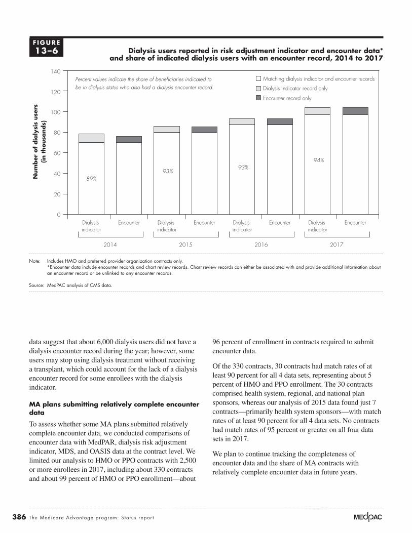
386 The Medicare Advan tage program: S ta tus repor t
96 percent of enrollment in contracts required to submit encounter data.
Of the 330 contracts, 30 contracts had match rates of at least 90 percent for all 4 data sets, representing about 5 percent of HMO and PPO enrollment. The 30 contracts comprised health system, regional, and national plan sponsors, whereas our analysis of 2015 data found just 7 contracts—primarily health system sponsors—with match rates of at least 90 percent for all 4 data sets. No contracts had match rates of 95 percent or greater on all four data sets in 2017.
We plan to continue tracking the completeness of encounter data and the share of MA contracts with relatively complete encounter data in future years.
data suggest that about 6,000 dialysis users did not have a dialysis encounter record during the year; however, some users may stop using dialysis treatment without receiving a transplant, which could account for the lack of a dialysis encounter record for some enrollees with the dialysis indicator.
MA plans submitting relatively complete encounter data
To assess whether some MA plans submitted relatively complete encounter data, we conducted comparisons of encounter data with MedPAR, dialysis risk adjustment indicator, MDS, and OASIS data at the contract level. We limited our analysis to HMO or PPO contracts with 2,500 or more enrollees in 2017, including about 330 contracts and about 99 percent of HMO or PPO enrollment—about
Dialysis users reported in risk adjustment indicator and encounter data* and share of indicated dialysis users with an encounter record, 2014 to 2017
Note: Includes HMO and preferred provider organization contracts only. *Encounter data include encounter records and chart review records. Chart review records can either be associated with and provide additional information about an encounter record or be unlinked to any encounter records.
Source: MedPAC analysis of CMS data.
Cumulative change....FIGUREX-X
Note: Note and Source are in InDesign.
Source:
Num
ber
of
dia
lysi
s use
rs(in t
housa
nds)
0
20
40
60
80
100
120
140
EncounterDialysis indicator
EncounterDialysis indicator
EncounterDialysis indicator
EncounterDialysis indicator
2014 2015 2016 2017
Matching dialysis indicator and encounter records
Dialysis indicator record only
Encounter record only
89%93%
93%94%
Percent values indicate the share of beneficiaries indicated to be in dialysis status who also had a dialysis encounter record.
F IGURE13–6

387 Repo r t t o t h e Cong r e s s : Med i ca r e Paymen t P o l i c y | Ma r ch 2020
value coefficients for all components identified for that enrollee.13 Although the actual dollar amount a plan will receive for newly identifying a particular HCC depends on several additional factors, we consider a simplified example using average FFS Medicare spending to show of how coding additional HCCs increases payment to a plan. To illustrate, the annual Medicare payment to the MA organization in 2018 for an 84-year-old male who was not eligible for Medicaid (demographic component valued at $5,707) with diabetes without complication (HCC 19, valued at $1,058) would have been $6,765, the sum of the two model components. Documenting each additional HCC for that enrollee can significantly increase the Medicare payment. If the same 84-year-old male with diabetes were also found to have vascular disease (HCC 108, valued at $3,031), the Medicare payment to the MA organization would increase from $6,765 to $9,796. The payment per MA enrollee for most HCCs when identified is between $1,000 and $5,000, although some HCCs increase payment by $10,000 or more.
In addition to the direct increase in payment rates, plans benefit from coding more comprehensively by gaining an advantage through the determination of extra benefits. Plans that can offer extra benefits of greater value may attract more new enrollees. How diagnostic coding affects the determination of extra benefits is a function of the bidding rules. There are two steps in the bidding process that involve risk adjustment and the determination of extra benefits. In the first step, a plan states its revenue need—its bid—for providing the Medicare Part A and Part B benefit, based on its expected enrolled population, and determines a risk score for the expected population. The second step compares the bid with a benchmark, which is adjusted by the risk score for the plan’s expected population so that the comparison is based on a population with equivalent health status. If the bid is higher than the risk-adjusted benchmark, beneficiaries pay the difference in the form of a premium.14 When the bid is below the risk-adjusted benchmark, the plan receives part of the difference as a rebate that is used to provide extra benefits to beneficiaries. The size of the rebate (or the value of extra benefits) is a share of the difference between the bid and risk-adjusted benchmark.
Plans that put more effort into documenting all diagnosis codes, increasing their average risk score relative to other plans, can inflate the risk-adjusted benchmark used to determine the size of their rebate when compared with
Medicare Advantage risk adjustment and coding intensity
Medicare payments to MA plans are adjusted to account for differences in beneficiary medical costs through the CMS hierarchical condition category (CMS–HCC) model. The model uses demographic information (e.g., age, sex, Medicaid enrollment, and disability status) and certain diagnoses grouped into HCCs to calculate a risk score for each enrollee. Higher risk scores generate higher payments for beneficiaries with higher expected expenditures and vice versa. CMS designed this risk adjustment model to maximize its ability to predict annual medical expenditures for Medicare beneficiaries, with some constraints. Therefore, in developing the model, CMS used statistical analyses to select certain HCCs for inclusion in the model based on each HCC’s ability to predict annual Medicare expenditures, ensuring that the diagnostic categories included in the model were clinically meaningful and specific enough to minimize opportunities for gaming or discretionary coding (Pope et al. 2004). CMS applies additional criteria to ensure the validity and reliability of the model’s diagnostic data. To be used in determining payment to MA plans, (1) diagnoses must appear on a claim from a hospital inpatient stay, a hospital outpatient visit, or a face-to-face visit with a physician or other health care professional, and (2) diagnoses must be supported by evidence in the patient’s medical record.12
Diagnostic data in the CMS–HCC model are used prospectively, meaning that diagnoses collected during one calendar year are used to predict Medicare costs for the following calendar year. A particular diagnosis code needs to be submitted only once during the data collection year for the related HCC to be counted in an enrollee’s risk score in the following payment year. Multiple submissions of the same diagnosis code and submissions of different diagnosis codes that are grouped in the same HCC do not affect an enrollee’s risk score.
Each demographic and HCC component in the risk adjustment model has a coefficient that represents the expected medical expenditures associated with that component. These coefficients are estimated based on FFS Medicare claims data such that all Medicare spending in a year is distributed among the model components. Medicare payment for a particular MA enrollee is approximately equal to the sum of the dollar-

388 The Medicare Advan tage program: S ta tus repor t
coding variation, with several contracts having risk scores inflated by 15 percent or 20 percent above FFS due to coding practices (see Figure 13-10, p. 394).
MA plans submit diagnostic information to CMS in two ways: (1) through the Risk Adjustment Processing System (RAPS), for which plans submit the minimum information necessary to identify which HCCs apply to each enrollee, and (2) through the encounter data system (EDS), for which MA plans submit detailed information about each health care encounter an enrollee has with a Medicare provider. CMS initially used RAPS to calculate risk scores, but in 2016, it began a transition to use encounters as the source of diagnostic information by generating two risk scores, one based on RAPS data and one based on EDS data.15 Figure 13-7 shows the use of encounter data for risk adjustment since 2016. In that year, payment was based on a blend of the RAPS risk score (90 percent) and the EDS risk score (10 percent). In 2017, CMS increased the portion of the payment based on EDS risk scores to 25 percent and stated an intention to continue to increase the use of EDS until 2020 (dashed line in Figure 13-7), when payment would be fully based on EDS risk scores. However, for 2018, CMS reduced the portion of the payment based on EDS risk scores to 15 percent.
For 2019, CMS noted that inpatient encounter record submissions were low relative to inpatient RAPS
their bid. Table 13-7 illustrates this effect, using three hypothetical plans that have the same cost of care for their set of enrollees, at $900 per month. Although all three plans have actual costs of $900 per month, Plans A and Z have an expected risk score below 1.0 (at 0.97), and Plan B has an expected risk score of 1.03. All three plans have bids below the risk-adjusted benchmark and must provide extra benefits funded by rebates. Because Plan B has a higher risk score, its rebate is larger than Plan A and it can offer enrollees more benefits: $38 per month more in extra benefits ($53 minus $15). If Plan B has inflated its risk score through greater diagnostic coding effort and its risk score otherwise would be the same as that of Plan A and Plan Z, Plan B will have an unfair competitive advantage. The higher risk score also gives Plan B, which has only 3.5 stars, an advantage over bonus-level Plan Z; Plan B has a higher total rebate amount: $7 more. Thus, by increasing its risk score from 0.97 to 1.03, Plan B will be able to offer a level of extra benefits that is of more value than that provided through quality bonuses. Thus, differences in coding practices can more than offset the effect of MA quality bonuses and can have significant consequences for MA payment policy.
In the example illustrated in Table 13-7, plans have a risk score difference of 6 percentage points that reflects only coding practices. The Commission’s analysis of MA coding practices suggests that there is a far wider range of
T A B L E13–7 Illustrative example: Differences in plan risk scores affect the level of extra benefits
Plan
Bid: Monthly cost of care for expected
population
Risk score of expected
population
MA benchmark for the county
for an average-risk population
(+5% for bonus plan)
Risk-adjusted benchmark for this plan (benchmark multiplied by
risk score)
Rebate base (risk-
adjusted benchmark
less cost of care)
Share of base for rebates
Value of extra benefits (rebate amount)
Nonbonus plansPlan A (3.5 stars) $900 0.97 $952 $924 $24 65% $15Plan B (3.5 stars) 900 1.03 952 981 81 65 53
Bonus planPlan Z (4 stars) 900 0.97 1,000 970 70 65 46
Note: MA (Medicare Advantage). An average-risk population has a risk score of 1.0. This example assumes that the actual cost of care for the expected population is $900 for each of the three plans and that Plan B’s risk score of 1.03 is inflated due to greater diagnostic coding effort.

389 Repo r t t o t h e Cong r e s s : Med i ca r e Paymen t P o l i c y | Ma r ch 2020
comparison with data for 2016 and 2017 and found similar results. For 2017, we found that:
• many more inpatient stays were reported in RAPS (6.6 million) than in MedPAR (4.3 million) or encounter data (4.7 million); however,
• a disproportionate share of inpatient stays reported in RAPS data (about 20 percent) had the same admission and discharge date compared with MedPAR data (about 2 percent) and encounter data (about 1 percent).
Because of the large number of “inpatient stays” reported in RAPS data with the same admission and discharge date, we compared these stays with physician visits and outpatient hospital visits reported in encounter data. We found that, of the 1.3 million same-day discharge stays reported in 2017 RAPS data, 92 percent had the same beneficiary identifier, admission date, and discharge date as a physician or outpatient hospital visit reported in encounter data.
submissions and therefore based 25 percent of risk scores on pooled encounter data and inpatient RAPS data, with the remaining 75 percent of risk scores based on RAPS data alone. For 2020, CMS will base 50 percent of risk scores on pooled encounter data and inpatient RAPS data and 50 percent on RAPS data alone.
Given CMS’s concern about the difference in inpatient stays submitted in encounter and RAPS data, we compared MA inpatient stays (defined using unique beneficiary identifier, admission date, and submission date) reported in encounter, RAPS, and MedPAR data. MedPAR data include copies of claims (i.e., “no-pay” claims) that hospitals submit directly to CMS, generally at the same time the hospital submits a claim to an MA plan for payment.16 In our June 2019 chapter on MA encounter data completeness, we reported the results of this comparison using 2015 RAPS and MedPAR data and preliminary 2015 encounter data (Medicare Payment Advisory Commission 2019a). We have since updated this
Use of encounter data for MA risk scores, 2016–2021
Note: MA (Medicare Advantage). *For 2019 and 2020, and proposed for 2021, CMS will add inpatient Risk Adjustment Processing System data to encounter data, making the true proportion of risk scores based on encounter data less than the percentage noted in the figure.
Source: CMS announcement of MA rates.
Title here....Per
cent
Note: Note and Source are in InDesign.
Source:
0
10
20
30
40
50
60
70
80
90
100
202120202019201820172016
Notes about this graph:• Data is in the datasheet. Make updates in the datasheet.• I deleted the years from the x-axis and put in my own.• I had to manually draw tick marks and axis lines because they kept resetting when I changed any data.• The dashed line looked ok here, so I didn’t hand draw it.• I can’t delete the legend, so I’ll just have to crop it out in InDesign.• Use direct selection tool to select items for modification. Otherwise if you use the black selection tool, they will reset to graph default when you change the data.• Use paragraph styles (and object styles) to format.
FIGURE1-XX
CMS’s 2017 proposal to fully phase inencounter data for risk adjustment by 2020
Portion of encounter data used for payment
10%
25%
25%*
50%*
75%*
75%
100% 100%
15%
50%
F IGURE13–7

390 The Medicare Advan tage program: S ta tus repor t
through 2013. We built cohorts of beneficiaries who spent their first full calendar year of Medicare and all subsequent years through 2013 in the same program, either FFS or MA. For example, one cohort pair consisted of those beneficiaries who joined FFS Medicare during 2006 and then either (1) remained exclusively in FFS through 2013 or (2) switched into MA in January 2007 and remained in MA through 2013. We also examined five similar pairs of cohorts for beneficiaries whose first full years in Medicare were 2008 through 2012. Beneficiaries were assessed starting with their first full year of Medicare enrollment so that the subsequent differences in the risk score growth between the cohort pairs could be attributed to differences in coding.
Figure 13-8 shows how average MA risk scores changed relative to the change in average FFS risk scores for all pairs of cohorts. From year 1 to year 2, average MA risk scores increased by about 6 percent more than FFS across all cohorts. For all subsequent years, average MA risk scores continued to increase more than FFS by about 1.5 percent across all cohorts.
Higher payments to MA plans due to differences in coding intensity in MA and FFS Medicare are the result of a failure in risk adjustment policy—the assumption that diagnoses are documented with the same intensity in FFS Medicare (where little incentive exists) and in MA (where significant incentive exists). MA plans that document additional diagnoses for their enrollees (relative to FFS Medicare) are properly reacting to incentives when those diagnoses are accurate and properly supported by medical evidence. MA plans also may report inaccurate diagnoses for the purpose of receiving unwarranted payments, but such improper reporting should be constrained by risk adjustment data validation audits.
We have discovered several mechanisms that MA plans can properly use to document diagnoses for MA enrollees that do not exist in FFS Medicare. These mechanisms highlight ways MA plans have generated much higher coding intensity than FFS Medicare. MA plans often identify enrollees with missing HCCs by using past information for an enrollee (e.g., electronic health records, claims, or risk score data) when it is available, or by using prescription drug data to identify enrollees with likely diagnoses (e.g., a prescription for insulin likely indicates a diabetes diagnosis). Then plans need to ensure that all diagnoses are appropriately documented in the current year. Passive mechanisms leading to documentation
We concluded that the RAPS provider type indicator field (identifying a record as from an inpatient hospital, outpatient hospital, or physician visit) likely does not accurately identify inpatient hospital stays. In 2019 and 2020, CMS pooled inpatient RAPS data with encounter data to rectify their concern that fewer inpatient stays were reported in encounter data relative to RAPS data. However, our results provide evidence that the number of inpatient stays reported in RAPS is inaccurate and is too high (i.e., we believe many “inpatient stays” reported in RAPS with admission and discharge on the same day represent physician office or outpatient hospital visits that were incorrectly reported as an “inpatient stay”). Therefore, CMS should not supplement encounter data with inpatient RAPS data when using blended risk scores. In doing so, CMS unnecessarily slows the transition to using encounter data for MA risk adjustment.
Differences in MA and FFS Medicare diagnostic codingIn the CMS–HCC risk adjustment model, CMS uses FFS Medicare claims data to estimate the size of the model coefficients. As a result, the model calculates an expected spending amount based on FFS Medicare costs and diagnostic coding patterns. Most diagnoses are reported through physician and outpatient claims, which in FFS Medicare tend to be paid based on procedure codes and provide little incentive to document diagnoses for FFS beneficiaries.17 If certain diagnoses are not reported on FFS claims, the cost of treating those conditions is attributed to other components in the model, causing the coefficients overall to be inflated above the value they would have if the diagnoses had been reported. It is necessary for MA payment accuracy that diagnoses be coded with the same intensity in FFS Medicare and MA, meaning that if all diagnoses reported in one program would also be reported in the other program, coefficients would not be inflated. However, when MA plans submit more diagnoses for a particular beneficiary than would have been documented in FFS Medicare, the program spends more for that beneficiary in MA than it would have if the beneficiary were in FFS. We have found that because of the financial incentives for MAs to code as many diagnoses as possible, coding intensity is higher in MA than in FFS Medicare, whose structure lacks such incentives, and payments to MA plans are thus higher than intended.
In one analysis, we tested whether beneficiary risk scores grew faster in MA than in FFS, using data from 2007

391 Repo r t t o t h e Cong r e s s : Med i ca r e Paymen t P o l i c y | Ma r ch 2020
payments (Medicare Payment Advisory Commission 2018b).
Policies to address the impact of coding differences A series of congressional mandates has required CMS to reduce MA risk scores as a way of addressing the impact of coding differences. Because of the mandates, CMS reduced MA risk scores by 3.41 percent in each year from 2010 through 2013. Starting in 2014, the mandates specified a minimum reduction of about 4.9 percent, which increased gradually to about 5.9 percent in 2018, where it will remain until CMS estimates a risk adjustment model using MA cost and use data. CMS reduced MA risk scores by the minimum amount required by law for 2014 through 2019 (i.e., larger reductions would have been allowed).
CMS took an additional step to help control the increased coding intensity in MA by phasing in a new CMS–HCC model that removes some diagnoses suspected of being more aggressively coded by MA plans (e.g., lower severity
are driven by greater diagnostic information sharing, such as plan and provider relationships that allow plans greater access to electronic medical record diagnostic information (e.g., staff-model HMOs) and the use of capitated contracts through which physicians are paid a risk-adjusted sum, thereby passing the coding incentives on to physicians with direct access to medical records and diagnostic information. In addition, plans actively collect diagnoses through health risk assessments, chart reviews of earlier provider encounters, and pay-for-coding programs in which plans pay doctors to complete patient assessment forms that confirm diagnoses that have not yet been documented. While these efforts can be used to improve care management, some companies offering services to collect diagnostic information use language that targets enrollees based on a lack of documentation rather than a clinical need. Our March 2018 report to the Congress describes the passive and plan-initiated mechanisms that we believe contribute to higher rates of diagnosis documentation in MA, resulting in higher
Average MA risk scores grew fastest relative to average FFS risk scores in the first cohort year, for all enrollment cohorts 2007 through 2013
Note: MA (Medicare Advantage), FFS (fee-for-service). Analysis includes six MA and FFS cohort pairs ending in 2013 and starting in 2007 through 2012.
Source: MedPAC analysis of CMS enrollment and risk score files.
Title here....Cum
ula
tive
per
cent
dif
fere
nce
bet
wee
n M
A r
isk
sco
res
and F
FS r
isk
sco
res
Note: Note and Source are in InDesign.
Source:
0
2
4
6
8
10
12
14
Year 7Year 6Year 5Year 4Year 3Year 2Year 1
Notes about this graph:• Data is in the datasheet. Make updates in the datasheet.• I deleted the years from the x-axis and put in my own.• I had to manually draw tick marks and axis lines because they kept resetting when I changed any data.• The dashed line looked ok here, so I didn’t hand draw it.• I can’t delete the legend, so I’ll just have to crop it out in InDesign.• Use direct selection tool to select items for modification. Otherwise if you use the black selection tool, they will reset to graph default when you change the data.• Use paragraph styles (and object styles) to format.
FIGURE1-XX
F IGURE13–8

392 The Medicare Advan tage program: S ta tus repor t
risk scores, partial dual enrollees make up a larger share of dual enrollees in MA than in FFS Medicare, causing the overall risk scores for MA enrollees enrolled in Medicaid to be inflated under the old model. CMS began differentiating between MA enrollees with full Medicaid and partial Medicaid enrollment in 2017 by using separate models that more accurately determined risk scores for partial benefit and full benefit Medicaid enrollees.19 We found that the model introduced in 2017 reduced MA risk scores by almost 1 percentage point by more accurately determining risk scores for subgroups of beneficiaries, particularly partial dual and full dual enrollees.
Coding differences increased payments to MA plans by about $6 billion in 2018To assess the overall impact of coding differences on payments to MA plans for a given year, we built retrospective cohorts of beneficiaries enrolled in either FFS or MA for all of 2018. We tracked each beneficiary
kidney disease and polyneuropathy). Our analysis suggests that the new CMS–HCC model makes MA risk scores more similar to FFS scores by reducing them 2 percentage points to 2.5 percentage points relative to the old model. The new model was phased in during 2014 and 2015, and MA payments were based entirely on the new model in 2016.
Before 2017, the HCC model accounted for dual enrollment in Medicare and Medicaid with a set of variables that increased payment for such enrollees. This approach treated MA enrollees with partial Medicaid and MA enrollees with full Medicaid enrollment as a single group; however, enrollees with full Medicaid benefits have Medicare spending that is significantly higher than enrollees with partial Medicaid benefits. As a result, risk scores under the old model were systematically too low for full dual enrollees and too high for partial dual enrollees.18 In addition to the inaccuracy in individual
Impact of coding intensity on MA risk scores was larger than coding adjustment, 2013–2018
Note: MA (Medicare Advantage), FFS (fee-for-service), CMS–HCC (CMS–hierarchical condition category). All estimates account for any differences in age and sex between MA and FFS populations. A blend of two model versions was used for payment in 2014 and 2015.
Source: MedPAC analysis of CMS enrollment and risk score files.
Title here....Im
pact
as
a p
erce
nt
above
FFS
Note: Note and Source are in InDesign.
Source:
0
1
2
3
4
5
6
7
8
9
10
11
201820172016201520142013
Notes about this graph:• Data is in the datasheet. Make updates in the datasheet.• I deleted the years from the x-axis and put in my own.• I had to manually draw tick marks and axis lines because they kept resetting when I changed any data.• The dashed line looked ok here, so I didn’t hand draw it.• I can’t delete the legend, so I’ll just have to crop it out in InDesign.• Use direct selection tool to select items for modification. Otherwise if you use the black selection tool, they will reset to graph default when you change the data.• Use paragraph styles (and object styles) to format.
FIGURE1-XX
Impact on MA risk scores used for payment
CMS–HCC version 2014–2016CMS–HCC version 2013–2015
CMS–HCC version 2017–2018
Coding adjustment applied to MA risk scores
Portion of coding intensity impact not accounted for by payment policies
F IGURE13–9

393 Repo r t t o t h e Cong r e s s : Med i ca r e Paymen t P o l i c y | Ma r ch 2020
the overall impact of coding intensity on MA risk scores by 1 percentage point to 1.5 percentage points in each year. Between 2015 and 2017, MA risk scores continued to increase at about the same rate as in prior years, but FFS risk scores grew at a faster rate.20 On net, relative risk score growth rates added very little to the impact of coding intensity between 2015 and 2017. Between 2017 and 2018, MA risk score growth again outpaced FFS risk score growth, adding about 1 percentage point to the overall impact of coding intensity.
Encounter data as a source of diagnostic information
Starting in 2016, CMS blended risk scores based on encounter data with risk scores based on RAPS data. We found that encounter-based and RAPS-based risk scores converged and were the same for about 92 percent of MA enrollees in 2016, 93 percent in 2017, and 95 percent in 2018.21 However, for enrollees with different encounter-based and RAPS- based risk scores, the RAPS score tends to be higher.
Overall, encounter-based risk scores were about 1 percent lower than RAPS-based risk scores in 2018. Because encounter-based risk scores increased relative to RAPS-based risk scores, and the use of encounter-based risk scores was slightly phased out in 2018 (see Figure 13-7, p. 389), the use of encounter data increased the overall impact of coding intensity by about 0.1 percentage point in 2018. For 2019, CMS applied 25 percent weight to risk scores using encounter data, supplemented with inpatient RAPS data, as the source of diagnoses.22 The remaining 75 percent of risk scores were based on diagnoses in RAPS data.
Overall impact of MA coding intensityWe found that MA risk scores for 2018 were about 8 percent higher than for a comparable FFS population. The increase from our 2017 estimate of 7 percent is the net of faster MA risk score growth (1.0 percentage point) and increasing the use of encounter data for risk scores (0.1 percentage point). Relative to FFS Medicare, we found that because of coding intensity, MA risk scores in 2018 were between 2 percent and 3 percent higher than CMS’s adjustment for coding intensity (which was 5.91 percent in 2018). In other words, after accounting for all coding adjustments, payments to MA plans in 2018 were between 2 percent and 3 percent higher than Medicare payments would have been if MA enrollees had been treated in FFS
backward for as long as they were continuously enrolled in the same program (FFS or MA) or as far back as 2007. Our analysis calculates differences in risk score growth by comparing FFS and MA cohorts with the same years of enrollment (e.g., 2007 through 2018, 2008 through 2018), adjusting for differences in age and sex.
Figure 13-9 shows the impact of differences in coding intensity on MA risk scores relative to FFS for payment years 2013 through 2018 and the size of the coding intensity adjustment (the amount by which CMS reduced MA risk scores to account for coding intensity) in each year. The figure shows the impact of coding intensity that was not accounted for by payment policies and resulted in the additional Medicare spending for beneficiaries enrolled in MA (relative to the amount Medicare would have spent if the same beneficiaries had been enrolled in FFS Medicare). Three different versions of the CMS–HCC risk model were used for payment over this period. A blend of two of these model versions was used for payment in 2014 and 2015.
From 2017 to 2018, the impact of coding intensity on MA risk scores rose from about 7 percent to over 8 percent largely because MA risk scores grew faster than FFS risk scores. Changes in the use of encounter data raised 2018 MA risk scores by a small amount. Three factors influenced the impact of coding intensity over the 2013 to 2018 period: changes to the risk score model used for payment, changes in MA risk score growth relative to FFS risk score growth, and the addition of encounter data as a source of diagnostic information.
Changes in the risk model
Our analysis has found that newer versions of the CMS–HCC model have been less susceptible to diagnostic coding differences between MA and FFS. Figure 13-9 shows that the version phased in over 2014 to 2016, removing certain diagnoses with large differences in MA and FFS coding rates, reduced the impact of coding differences by 2 percentage points to 2.5 percentage points when fully phased in. The version introduced in 2017, adding separate aged/disabled and Medicaid enrollment status segments, reduced the impact of coding differences by almost 1 percentage point. No changes to the risk model were implemented in 2018.
Relative risk score growth rates
Between 2013 and 2015, our analysis shows that MA risk score growth outpaced FFS risk score growth, increasing

394 The Medicare Advan tage program: S ta tus repor t
thereby capturing the coding impact for each contract’s 2018 payments. Figure 13-10 illustrates the variation across contracts with more than 2,500 enrollees in 2018 relative to FFS in their local service area.23 Our finding that coding intensity varies across MA contracts is consistent with other research (Geruso and Layton 2015, Kronick and Welch 2014). Given this variation, CMS’s across-the-board adjustment for coding intensity, which reduces all MA risk scores by the same amount, generates inequity across contracts by disadvantaging plans with lower coding intensity and allowing other plans to retain a significant amount of revenue from higher coding intensity.
Commission’s prior recommendation on coding intensity
The Commission’s long-standing position is that Medicare payment policies should not unduly favor MA or FFS Medicare. Excess payments to MA plans may benefit
Medicare and generated about $6 billion in additional payments to MA plans. The magnitude of these findings is consistent with other research showing that the impact of coding differences on MA risk scores is larger than CMS’s adjustment for coding (Congressional Budget Office 2017, Geruso and Layton 2015, Government Accountability Office 2013, Hayford and Burns 2018, Kronick and Welch 2014).
Variation in coding intensity across MA contracts
For 2018, we continued to find that nearly all MA contracts had risk scores that were higher than FFS scores and that the impact of coding intensity across MA contracts varied widely. This finding is based on a similar analysis we conducted of coding differences, but the change in risk score for each MA beneficiary was attributed to the contract (excluding contracts in the Program of All-Inclusive Care for the Elderly and SNPs) in which the beneficiary was enrolled in 2018,
Cumulative MA risk score growth varied across contracts relative to local FFS, 2018
Note: MA (Medicare Advantage), FFS (fee-for-service). MA contracts with enrollment below 2,500 (representing about 1 percent of total MA enrollment), contracts for the Program of All-Inclusive Care for the Elderly, and special needs plans are not included.
Source: MedPAC analysis of CMS enrollment and risk score files.
Title here....2018 c
um
ula
tive
ris
k s
core
gro
wth
(in
per
cent)
Note: Note and Source are in InDesign.
Source:
–20
–10
0
10
20
30
40
50
Notes about this graph:• Data is in the datasheet. Make updates in the datasheet.• I deleted the years from the x-axis and put in my own.• I had to manually draw tick marks and axis lines because they kept resetting when I changed any data.• The dashed line looked ok here, so I didn’t hand draw it.• I can’t delete the legend, so I’ll just have to crop it out in InDesign.• Use direct selection tool to select items for modification. Otherwise if you use the black selection tool, they will reset to graph default when you change the data.• Use paragraph styles (and object styles) to format.
FIGURE1-XX
MA contracts with more than 2,500 enrollees (ranked by risk score growth)
2018 coding adjustment (5.91%)
Penalized by 2018 coding adjustment Overpaid despite 2018 coding adjustment
F IGURE13–10

395 Repo r t t o t h e Cong r e s s : Med i ca r e Paymen t P o l i c y | Ma r ch 2020
percentage points relative to FFS Medicare and thus would address roughly half of the impact of coding differences.
One approach to implementing the Commission’s recommendation to adjust for any remaining coding intensity differences uses a method that would also improve equity across MA contracts. The method would group contracts into categories of high, medium, and low coding intensity and apply a coding intensity adjustment based on each group’s average level of coding intensity. CMS has used a similar approach to select MA contracts for risk adjustment data validation (RADV) audits.24 While this policy would leave some inequity within each group of contracts, overall inequity would be reduced. CMS could consider using a greater number of groups to further refine the equity of the overall adjustment.
Risk adjustment data validationMedicare payments to MA plans are based, in part, on diagnostic data that plans submit to CMS. Program rules state that, to be used for payment, diagnoses submitted for risk adjustment must result from a hospital inpatient stay, hospital outpatient visit, or a face-to-face visit with a physician or other health care professional; diagnoses also must be supported by evidence in the patient’s medical record. For both RAPS and encounter data, MA plan leadership signs an attestation that risk adjustment criteria are applied correctly and submitted data are accurate. However, only for encounter data does CMS independently verify that diagnoses result from a hospital inpatient stay, hospital outpatient visit, or a face-to-face visit with a physician or other health care professional. The use of encounter data significantly improves oversight of payment data and offers the opportunity to ensure their validity before payments are made to MA plans. CMS must conduct RADV audits of both encounter and RAPS data to ensure that diagnoses are supported by the medical record, but RADV audits of RAPS data must also check whether diagnoses are made during an encounter with an appropriate type of provider.
RADV audits determine whether an MA plan was overpaid due to invalid data and calculate an overpayment amount to recover from the plan. CMS audits roughly 5 percent of MA contracts per year (about 30 contracts in early audit years) and uses a sample of 201 enrollees who had at least 1 HCC reported and met certain other criteria.25 The sample includes 67 randomly selected enrollees from each of three strata (low, medium, and high) defined by beneficiaries’ risk scores. For each
enrollees in the MA program (when used to increase the value of extra benefits offered rather than increase profits) but cost taxpayers more than if these enrollees were covered in FFS Medicare. Further, additional payments to MA plans increase fiscal pressure on the depleting Hospital Insurance (Part A) Trust Fund as well as on the taxpayers and on the state Medicaid programs and beneficiaries who pay premiums to finance the Part B program.
In our March 2016 report to the Congress, the Commission recommended a multipronged approach that would fully account for the impact of coding differences and would improve the equity of the adjustment across MA contracts. The recommendation, which would replace the current coding intensity adjustment, had three parts:
• develop a risk adjustment model that uses two years of FFS and MA diagnostic data;
• exclude diagnoses that are documented only on health risk assessments (HRAs) from either FFS or MA; and then
• apply a coding adjustment that fully and equitably accounts for the remaining differences in coding between FFS Medicare and MA plans.
Using two years of diagnostic data would improve the accuracy of both FFS and MA HCC information and would reduce year-to-year variation in documentation. The 21st Century Cures Act codifies the Secretary’s authority to use two years of diagnostic data in MA risk adjustment, stating that, for 2019 and subsequent years, “the Secretary may use at least two years of diagnosis data.” Removing diagnoses documented through only HRAs would mean that a diagnosis had to be treated in order to count in risk adjustment calculations. Diagnoses that were both documented on an assessment and treated would continue to count toward risk adjustment. However, of the HCCs documented on HRAs in MA, about 30 percent were not treated during the year compared with about 6 percent of diagnoses documented on HRAs in FFS.
Implementing these two policies would result in a more equitable adjustment across MA contracts than the current across-the-board adjustment because they target coding differences more effectively. Our analysis suggests that the combined effect of using two years of diagnostic data and excluding diagnoses from HRAs would effectively reduce MA risk scores by roughly 3 percentage points to 5

396 The Medicare Advan tage program: S ta tus repor t
data from MA plans cannot be overstated. So far, the main use of encounter data has been as a source of diagnoses for risk adjustment. Given the more robust review process upon submission of encounter data, the return of hundreds of millions of dollars in overpayments resulting from unsupported diagnoses in RAPS data, and the continued convergence of RAPS and encounter-based risk scores, we believe CMS should move as soon as possible to discontinue the collection of RAPS data and rely only on encounter data for risk adjustment.
For 2020, CMS will use encounter data along with inpatient RAPS data as the source of diagnoses for a new version of the risk adjustment model, which will be the basis for 50 percent of MA payments. This version of the model incorporates changes that, by statute, must be fully implemented for 2022 payment. We believe CMS should maintain the use of encounter data for the new version of the model, resulting in using only encounter data for risk adjustment by 2022. However, due to inaccuracy of the provider type indicator in RAPS data, CMS should not supplement encounter data with any RAPS data for use with the new model. A swift transition to using only encounter data for risk scores would be consistent with the Commission’s support for increasing incentives for plans to submit complete encounter data, which could serve multiple purposes. For example, using encounter data as the basis for measuring MA plan quality would allow for consistent quality measurement between MA and FFS and would provide an additional incentive for MA plans to submit complete encounter data.
Quality in Medicare Advantage is difficult to evaluate
Beginning in 2012, the law established a quality bonus program (QBP) that ranks MA plans based on a 5-star system and provides bonuses to plans rated 5 stars or higher. The 5-star system, which predates the QBP, is also the basis of information that beneficiaries receive about MA plan quality through the Medicare.gov Plan Finder website. Over the years, the Commission has discussed the flaws in the 5-star system and the QBP and the continuing erosion of the reliability of data on the quality of MA plans (Medicare Payment Advisory Commission 2019a, Medicare Payment Advisory Commission 2018a). The current state of quality reporting in MA is such that the Commission’s yearly updates on MA can no longer
beneficiary, the audit calculates a payment error rate, defined as the portion of the beneficiary’s HCC-based payment that was not based on valid data. Beneficiary payment error rates can be offset if any additional HCCs are found that were not submitted for payment but were supported by the beneficiary’s medical record.26 For the initial round of audits of 2007 data, CMS recovered overpayments for only beneficiaries in the sample of 201 enrollees. For subsequent audits, CMS is proposing to recover overpayments for the entire contract (of eligible enrollees) by extrapolating the payment error rates for the sampled enrollees. For extrapolation, a contract’s payment error rate would be set at the lower 99th percent confidence interval of beneficiary-level error rates in the sample. If the contract payment error rate is greater than zero, the overpayment recovery amount would be the payment error rate at that confidence interval multiplied by the total payment for eligible enrollees in the contract.27
RADV audits of MA contracts have been limited so far. Audits of 2007 RAPS data identified diagnoses that did not meet risk adjustment criteria and determined that average overpayment rates were well over 10 percent for most contracts under audit (Schulte 2016). CMS recovered $13.7 million in overpayments from audits of 37 contracts, based on overpayments only for the 7,437 beneficiaries included in the sample of beneficiaries for the contracts under audit (Centers for Medicare & Medicaid Services 2017). No audits were conducted for payment years 2008 through 2010. For audits of 2011, 2012, and 2013 payment years, CMS stated that it expects to recoup about $650 million in overpayments based on the extrapolation method (Centers for Medicare & Medicaid Services 2018). CMS has proposed additional RADV audits focused on specific HCCs rather than whole contracts; however, CMS has not identified the scope of such audits or stated when they would begin. Audits of 2014 and 2015 data are in progress.
In reviewing the RADV audit process, government analysts noted that RADV audits are tasked with recouping billions of dollars in improper payments to MA plans based on RAPS data, but their report found a host of shortcomings with the audits, including that the audits should be more targeted at contracts with a higher likelihood of overpayments (Government Accountability Office 2016).
Increase the use of encounter data for risk adjustmentTo ensure payment accuracy for the MA population, the importance of collecting complete and accurate encounter

397 Repo r t t o t h e Cong r e s s : Med i ca r e Paymen t P o l i c y | Ma r ch 2020
measures should be calculated or administered largely by CMS, preferably with data that are already being reported, such as claims and encounter data.
• Evaluation of quality at the local market level to provide beneficiaries with information about the quality of care in their local area and provide MA plans incentives to improve the quality of care provided in every geographic area.
• Quality measurement against a continuous scale of performance that clearly provides the incentive to improve quality at every level.
• Accounting for differences in enrollees’ social risk factors by stratifying plan enrollment into groups of beneficiaries with similar social risk factors so that plans with higher shares of enrollees with social risk factors are not disadvantaged in their ability to receive quality-based payments, while actual differences in the quality of care are not masked.
• Application of budget-neutral financing so that the MA quality system is more consistent with Medicare’s FFS quality payment programs, which are either budget neutral (financed by reducing payments per unit of service) or produce program savings because they involve penalties.
Future direction of MA payment policy
Many indicators point to an increasingly robust MA program, including growth in enrollment, increased plan offerings, and a historically high level of extra benefits. The Commission remains committed to including private plans in the Medicare program and allowing beneficiaries to choose between the traditional FFS Medicare program and the alternative delivery systems that private plans often provide; however, some policies are deeply flawed and in need of immediate improvement.
For the immediate future, the Commission is assessing an alternative model to evaluate MA plan quality at the local level and distribute quality-based bonuses. Over the longer term, the Commission will review benchmark policy to improve equity and efficiency in the MA program. The Commission has standing recommendations to (1) account for continued coding differences between MA and FFS and address those differences in a complete and equitable way (Medicare Payment Advisory Commission 2016), and
provide an accurate description of the quality of care in MA. The Commission’s March 2019 report to the Congress contains a detailed discussion of the difficulty of evaluating the quality of care within the MA sector and changes in MA quality from one year to the next (Medicare Payment Advisory Commission 2019b).
With one-third of the Medicare population enrolled in MA plans, good information on the quality of care MA enrollees receive and how that quality compares with quality in FFS Medicare, including in accountable care organizations (ACOs), is necessary for proper evaluation. MA plans have a number of management tools that are not available in FFS but permit plans to improve the quality of care for their enrollees—tools such as selective contracting, care management, information systems shared across providers, and utilization management that can prevent overutilization of potentially harmful care. We would therefore expect quality in MA to be better than in FFS, but a lack of sufficient data severely limits any definitive comparisons. Comparative assessments could help in evaluating MA performance and changes in performance over time, in evaluating payment policy in MA, and in determining the adequacy and appropriateness of the standards applied to MA plans (for example, by using quality results as an indirect measure of network adequacy in MA plans). The ability to compare MA and FFS quality, and to compare quality across MA plans, is also important for beneficiaries. Choosing between MA and FFS is a threshold choice that beneficiaries make before getting to the step of deciding among available MA plans.
A new MA value incentive program Recognizing that the QBP is flawed, that quality in MA is currently difficult to evaluate, and that a costly program is not achieving its intended purposes, it is essential that the Medicare program evaluate MA plan performance and link payment to the quality of care plans provide. In the June 2019 report to the Congress, the Commission discussed ways to apply the Commission’s quality principles to the MA program through a value incentive program (Medicare Payment Advisory Commission 2019a). The Commission is continuing work to model a value incentive program that incorporates the following key features:
• Use of a small set of population-based outcomes and patient/enrollee experience measures that, where practical, should align across all Medicare-accountable entities and providers, including MA plans and ACOs. To avoid undue burden on providers,

398 The Medicare Advan tage program: S ta tus repor t
spending—even in areas where sponsors might have found it challenging to operate successful plans, such as in low-FFS-spending areas where MA benchmarks are at 115 percent of FFS. Further, the value of extra benefits offered to MA enrollees—now equal to approximately $1,450 annually per enrollee, or 13 percent of the basic benefit—has reached a historic high for the fourth consecutive year.
On average across the nation, MA payments are about 2 percent higher than FFS expenditure levels. However, given the level of overutilization in FFS and other factors not discussed in this chapter—the volume-inducing effects of traditional FFS, Medigap’s effect of insulating beneficiaries from the financial impact of their utilization, and inappropriate spending owing to fraud and waste—we cannot conclude that achieving payment parity between MA and FFS Medicare would leverage any efficiency from the MA program. Consistent with the original incorporation of full-risk private plans in Medicare (through the Tax Equity and Fiscal Responsibility Act of 1982), in which private plans would be paid 95 percent of FFS payments, we expect plans to be more efficient than FFS. In the future, the principle of equal treatment of the MA and FFS programs will need to include equal levels of cost and quality pressure in the two programs. ■
(2) ensure the completeness and accuracy of encounter data as a means to improve the MA payment system, to serve as a source of quality data, and to facilitate comparisons with FFS (Medicare Payment Advisory Commission 2019a). Through reforms to the MA payment system, the Commission aims to better focus the program on the beneficiaries it serves and on ways to harness plan efficiency to improve Medicare’s long-term financial sustainability.
In setting payment policy in the FFS sector, the Commission consistently applies a level of fiscal pressure on providers to promote the efficient provision of care while maintaining beneficiary access to high-quality care. FFS payment policies of that nature can affect MA payments through the benchmarks, which are based on FFS expenditure levels. Relying on fiscal pressure only in the FFS sector means that savings to the program that come from MA must be generated indirectly through FFS spending reductions. The ACA-instituted payment reforms reduced MA program payments, causing some concern about whether MA would continue to grow and attract Medicare beneficiaries. However, this substantial fiscal pressure did not have the negative effect that some had predicted. Instead, bids have fallen in relation to FFS

399 Repo r t t o t h e Cong r e s s : Med i ca r e Paymen t P o l i c y | Ma r ch 2020
1 CMS estimates that the 2020 monthly actuarial value of Medicare deductibles and coinsurance for a beneficiary without end-stage renal disease is $165 (CMS 2020 MA Announcement). The Commission has previously summarized the evidence on the effects of cost sharing on Medicare spending and recommended an additional charge on supplemental insurance (Medicare Payment Advisory Commission 2012) and commissioned a study finding higher Medicare spending for beneficiaries with Medigap coverage (Hogan 2009).
2 Beginning in 2019, CMS relaxed one of the criteria for eligible supplemental benefits—that the benefit be primarily health related—to include items and services that are used to diagnose, compensate for physical impairments, ameliorate the functional/psychological impact of injuries or health conditions, or reduce avoidable emergency and health care utilization. A supplemental benefit is not primarily health related if it is an item or service that is solely or primarily used for cosmetic, comfort, or general use or for social determinant purposes.
The degree of projected spending for new types of supplemental benefits is not available in plan bid data. However, a recent report from Duke University found that, in 2020, relatively few MA plans have expanded their package of supplemental benefits to target beneficiaries with serious illness (Crook 2019). Only 7 percent of MA plans offered supplemental benefits in one of the following five categories: adult day care, palliative care, non-opioid pain management, in-home support services, or caregiver support.
3 New types of supplemental benefits may relate to different benefit flexibility.
4 Beneficiaries in some parts of the country have access to Section 1876 cost-reimbursed HMOs. Such plans arrange for the full range of Medicare services. They receive reasonable cost reimbursement for Part B physician and supplier services, but the Medicare program directly pays providers for inpatient and outpatient institutional services. Enrollees of cost plans are not locked into the plan and can receive any out-of-network services and have them paid by the Medicare program. The statute calls for the phasing out of cost plans in areas in which there are at least two competing MA CCPs that meet a minimum enrollment requirement. The cost plans are expected to transition to MA plans, and some have already begun the transition.
5 FFS spending is calculated for all Medicare beneficiaries, which include those with both Part A and Part B coverage
and those with only Part A or Part B. In our March 2017 report to the Congress, we recommended that CMS change the calculation to include the FFS spending for only those beneficiaries with both Part A and Part B.
6 Our March 2016 report to the Congress provides more detail on double-bonus counties and benchmark growth caps. In that report, we recommended eliminating the double bonuses as well as the benchmark growth caps, which limited the benchmarks in many counties.
7 Margins are calculated as the remainder of payments to the plan after accounting for all other costs, including all medical expenses, salaries, bonuses, beneficiary incentive payments, and all administrative costs. We identified outliers at the contract level to account for plans that may be subsidized by other plans (i.e., product pairing) within the same service area. Most of the outlier contracts we identified reported negative margins in the bid data for consecutive years. One plan sponsor consistently reports margins well above 100 percent, and this sponsor accounts for most of the beneficiaries excluded in the outlier contracts. These contracts are likely atypical because CMS requires MA plans with negative margins to submit a business plan to achieve profitability and expects MA plans to meet or exceed the year-by-year margin targets in the business plan.
8 All margin estimates in the remainder of this section exclude outlier contracts.
9 MDS assessment data are collected within 14 days of admission and at other points for traditional FFS Medicare beneficiaries.
10 Additional MDS assessments are required for beneficiaries enrolled in FFS Medicare.
11 MDS assessments are also required for Medicaid-covered nursing home stays. By excluding MA enrollees who are eligible for full Medicaid benefits from the analysis, we could be reasonably certain that non-Medicaid MA enrollees with an MDS assessment should also have a SNF encounter record.
12 Other possible sources of diagnostic information—such as encounters for home health services, skilled nursing, ambulatory surgery, durable medical equipment, lab and imaging tests, and hospice services—are not used to determine payment through the risk adjustment model for several reasons: (1) Adding diagnoses from these sources does not improve the model’s ability to predict medical expenditures; (2) there are concerns about the reliability of diagnoses from providers with less clinical training (e.g.,
Endnotes

400 The Medicare Advan tage program: S ta tus repor t
home health and durable medical equipment); and (3) there is a high proportion of rule-out diagnoses (e.g., lab and imaging tests).
13 The actual dollar amount a plan will receive for coding a new HCC depends on several additional factors, including the version of the HCC model applied for a beneficiary and factors that affect a plan’s base rate. Dollar-value coefficients are standardized relative to average FFS spending before being applied to each plan’s base rate. Different versions of the HCC model account for disability status and status as partially, fully, or not eligible for Medicaid, as well as enrollees who lack a full calendar year of diagnostic data, are institutionalized, or have end-stage renal disease. A plan’s base rate varies according to the plan’s bid and the local area’s benchmark.
14 In this case, the premium amount is determined based on the normalized, or non-risk-adjusted, bid and benchmark difference. However, greater coding intensity reduces the normalized bid, thereby reducing the premium that beneficiaries pay to Medicare. To the extent that higher coding intensity reduces premium amounts, Medicare is not reimbursed for the full amount intended by the payment policy.
15 In 2015, CMS combined RAPS data and encounter data for risk adjustment, meaning that plans were paid for HCCs identified through at least one of the two data sources submitted to CMS.
16 The copy of the claim sent to CMS is used in calculating various payment adjustments for hospitals.
17 The share of FFS Medicare payments that flow through accountable care organizations and other advanced payment models is increasing and has the potential to increase diagnostic coding incentives in FFS Medicare, but we have yet to see an effect on our analysis.
18 Partial Medicaid enrollment generally provides premium and cost-sharing assistance for Medicare benefits, while full Medicaid enrollment also covers additional services not covered in the Medicare benefit.
19 The 2017 model also determines Medicaid enrollment status on a monthly basis during the payment year, which improves the accuracy of payment for these enrollees. The model has separate segments based on aged or disabled status, combined with no, partial, or full Medicaid enrollment status.
20 FFS risk score growth matched MA risk score growth between 2015 and 2016 for the first time since the full implementation of the HCC model in 2007. Risk score growth between 2015 and 2016 was affected by the transition from
International Classification of Diseases (ICD)–9 to ICD–10 diagnosis codes. MA risk scores were still higher than FFS risk scores for comparable beneficiaries (because of prior differences in coding rates). CMS’s calculation of the risk score normalization factor, which functions to keep the average FFS risk score at 1.0 in each year, showed evidence of faster FFS risk score growth in 2016 and 2017 relative to prior years.
21 CMS identifies diagnoses from physician visits using a different method for RAPS and encounter data. The two methods of filtering physician claims for use in risk adjustment were intended to produce equivalent results, but it is possible that RAPS-based and encounter-based risk scores would not be equivalent because of the different methods of filtering physician claims.
22 CMS observed that encounter data inpatient submissions were low compared to corresponding RAPS inpatient submissions, and therefore supplemented encounter data with inpatient RAPS data to calculate risk scores. However, we believe a large number (1.5 million in 2015) of physician office visits and outpatient hospital visits have been inaccurately reported as “inpatient stays” in RAPS data. Therefore, we believe CMS should not supplement encounter data with inpatient RAPS data to adjust for the discrepancy between the two data sources.
23 About 1 percent of MA enrollees are in a contract with fewer than 2,500 enrollees.
24 For RADV audits in 2011, CMS grouped all contracts into high, medium, and low levels of coding intensity and selected 20 high-level, 5 medium-level, and 5 low-level contracts at random.
25 Other criteria include Part B enrollment for the full data collection year, continuous enrollment in the contract for the full data collection year and January of the payment year, and no end-stage renal disease or hospice status.
26 Additional HCCs that were not submitted for payment but were supported in one of up to five medical records submitted through the audit can offset beneficiary payment error rates but will not result in additional payments to the MA plan. MA plans are required to submit diagnoses for payment.
27 CMS proposed this method of determining overpayment recovery amounts in 2018 but has not yet issued a final rule (Centers for Medicare & Medicaid Services 2018).

401 Repo r t t o t h e Cong r e s s : Med i ca r e Paymen t P o l i c y | Ma r ch 2020
Centers for Medicare & Medicaid Services, Department of Health and Human Services. 2018. Medicare and Medicaid programs; policy and technical changes to the Medicare Advantage, Medicare Prescription Drug Benefit, Program of All-Iinclusive Care for the Elderly (PACE), Medicaid fee-for-service, and Medicaid managed care programs for years 2020 and 2021. Proposed rule. Federal Register 83, no. 212 (November 1): 54982–55088.
Centers for Medicare & Medicaid Services, Department of Health and Human Services. 2017. Medicare Advantage risk adjustment data validation audits fact sheet, June 1. https://www.cms.gov/Research-Statistics-Data-and-Systems/Monitoring-Programs/Medicare-Risk-Adjustment-Data-Validation-Program/Resources.html.
Congressional Budget Office. 2017. Effects of Medicare Advantage enrollment on beneficiary risk scores. Working paper 2017–08. Washington, DC: CBO.
Crook, H. 2019. Improving serious illness care in Medicare Advantage: New regulatory flexibility for supplemental benefits. Durham, NC: Duke Margolis Center for Health Policy/Robert Wood Johnson Foundation.
Geruso, M., and T. Layton. 2015. Upcoding: Evidence from Medicare on squishy risk adjustment. NBER working paper no. 21222. Cambridge, MA: National Bureau of Economic Research.
Government Accountability Office. 2016. Fundamental improvements needed in CMS’s effort to recover substantial amounts of improper payments. GAO–16–76. Washington, DC: GAO.
Government Accountability Office. 2013. Medicare Advantage: Substantial excess payments underscore need for CMS to improve accuracy of risk score adjustments. Washington, DC: GAO.
Hayford, T. B., and A. L. Burns. 2018. Medicare Advantage enrollment and beneficiary risk scores: Difference-in-differences analyses show increases for all enrollees on account of market-wide changes. Inquiry 55 (January–December): 46958018788640.
Hogan, C. 2009. Exploring the effects of secondary insurance on Medicare spending for the elderly. A study conducted by staff from Direct Research LLC for MedPAC. Washington, DC: MedPAC.
Kronick, R., and W. P. Welch. 2014. Measuring coding intensity in the Medicare Advantage program. Medicare & Medicaid Research Review 4, no. 2.
Medicare Payment Advisory Commission. 2019a. Report to the Congress: Medicare and the health care delivery system. Washington, DC: MedPAC.
Medicare Payment Advisory Commission. 2019b. Report to the Congress: Medicare payment policy. Washington, DC: MedPAC.
Medicare Payment Advisory Commission. 2018a. Comment letter on request for comments on the CMS advance notice of methodological changes for calendar year (CY) 2019 for Medicare Advantage (MA) CMS–HCC risk adjustment model, capitation rates, Part C and Part D payment policies and 2019 draft call letter, February 23.
Medicare Payment Advisory Commission. 2018b. Report to the Congress: Medicare payment policy. Washington, DC: MedPAC.
Medicare Payment Advisory Commission. 2016. Report to the Congress: Medicare payment policy. Washington, DC: MedPAC.
Medicare Payment Advisory Commission. 2015. Report to the Congress: Medicare payment policy. Washington, DC: MedPAC.
Medicare Payment Advisory Commission. 2014. Report to the Congress: Medicare payment policy. Washington, DC: MedPAC.
Medicare Payment Advisory Commission. 2013. Report to the Congress: Medicare payment policy. Washington, DC: MedPAC.
Medicare Payment Advisory Commission. 2012. Report to the Congress: Medicare payment policy. Washington, DC: MedPAC.
Medicare Payment Advisory Commission. 2004. Report to the Congress: Medicare payment policy. Washington, DC: MedPAC.
Pope, G. C., J. Kautter, R. P. Ellis, et al. 2004. Risk adjustment of Medicare capitation payments using the CMS–HCC model. Health Care Financing Review 25, no. 4 (Summer): 119–141.
Schulte, F. 2016. Medicare Advantage audits reveal pervasive overcharges. https://www.publicintegrity.org/2016/08/29/20148/medicare-advantage-audits-reveal-pervasive-overcharges.
References


The Medicare prescription drug program (Part D):
Status report
C H A P T E R14


405 Repo r t t o t h e Cong r e s s : Med i ca r e Paymen t P o l i c y | Ma r ch 2020
The Medicare prescription drug program (Part D): Status report
C H A P T E R 14Chapter summary
In 2019, Part D plans were the primary source of outpatient prescription drug
coverage for 45.4 million Medicare beneficiaries. Medicare subsidizes about
three-quarters of the cost of basic benefits. Part D also includes a low-income
subsidy (LIS) that provides assistance with premiums and cost sharing to 12.7
million individuals with low income and assets. In 2018, Part D expenditures
totaled $97.5 billion, accounting for about 13 percent of Medicare spending.
Enrollees paid $14.2 billion of that amount in plan premiums, in addition to
$16.7 billion in cost sharing.
Part D has been a success in many respects. It has improved beneficiaries’
access to prescription drugs. Generic drugs now account for nearly 90 percent
of the prescriptions filled. Enrollees’ average premiums for basic benefits have
remained around $30 per month for many years. More than 8 in 10 Part D
enrollees report they are satisfied with the program.
However, changes to Part D’s coverage gap and manufacturer discounts
combined with the expanding role of high-cost medicines have eroded the
program’s competitive incentives. Over time, a growing share of Medicare’s
payments to plans have taken the form of cost-based reinsurance subsidies
rather than capitated payments. This trend is exacerbated by a pipeline of new
products that are likely to have high costs because patients who use high-
priced drugs are more likely to reach Part D’s catastrophic phase, in which
In this chapter
• Enrollment and plan choices in 2019 and benefit offerings for 2020
• Plan sponsors and their tools for managing benefits and spending
• Drug pricing
• Program costs
• Beneficiaries’ access to prescription drugs
• Quality in Part D

406 The Medicare presc r ip t ion drug program (Par t D ) : S ta tus repor t
Medicare pays for 80 percent of spending through reinsurance. As of 2019, brand-
drug manufacturers provide a 70 percent discount in the coverage gap (an increase
from 50 percent provided between 2011 and 2018). This discount effectively makes
the relative price of brands cheaper and decreases what plan sponsors must cover
in benefits, blunting sponsors’ incentives to manage spending. A separate concern
is that the design of Part D’s basic benefit combined with the LIS creates plan and
beneficiary incentives that increase program costs.
Policymakers have taken steps to give plan sponsors new flexibilities to manage
drug spending. For example, CMS now allows for certain midyear formulary
changes without prior approval, and Medicare Advantage–Prescription Drug plans
(MA–PDs) can use step therapy—a type of management tool that begins treatment
with the most preferred drug therapy and progresses to other therapies only if
necessary—for Part B drugs under certain circumstances. However, other measures
to increase the financial risk that sponsors bear (such as those recommended by the
Commission in 2016) are also needed so that plan sponsors have greater incentive
to use the new management tools and keep Part D financially sustainable for
beneficiaries and taxpayers.
Enrollment in 2019 and benefit offerings for 2020—In 2019, 74.1 percent of
Medicare beneficiaries were enrolled in Part D plans. An additional 2.3 percent
obtained drug coverage through employer-sponsored plans that received Medicare’s
retiree drug subsidy. The remaining 23.6 percent were divided roughly equally
between those who had creditable drug coverage from other sources and those with
no coverage or coverage less generous than Part D.
Between 2007 and 2019, enrollment grew faster in MA–PDs compared with stand-
alone prescription drug plans (PDPs). In 2019, 44 percent of enrollees were in
MA–PDs compared with 30 percent in 2007. Over the same period, the number
of enrollees who received the LIS grew more slowly than for the other Part D
enrollees, and the LIS share fell from 39 percent to 28 percent.
For 2020, beneficiaries have a broad choice of plans. Compared with plan offerings
in 2019, sponsors are offering 5 percent more PDPs, 16 percent more MA–PDs
open to all beneficiaries, and 20 percent more MA–PDs tailored to specific
populations (special needs plans). MA–PDs continue to be more likely than
PDPs to offer enhanced benefits. Most beneficiaries are in plans with a five-tiered
formulary that uses differential cost sharing between preferred and nonpreferred
drugs, as well as a specialty tier for high-cost drugs. Most plans use coinsurance for
some formulary tiers rather than copayments. For 2020, the total average estimated
cost for basic benefits decreased by 1 percent, and the $32.74 base beneficiary

407 Repo r t t o t h e Cong r e s s : Med i ca r e Paymen t P o l i c y | Ma r ch 2020
premium also reflected a 1 percent drop from 2019. However, individual plans’
premiums can vary substantially. In 2020, 244 premium-free PDPs are available to
enrollees who receive the LIS, a 13 percent increase from 2019. Apart from 1 region
(Ohio), all regions have at least 4 and as many as 12 PDPs at no premium for LIS
enrollees.
Part D program costs—Between 2007 and 2018, Part D program spending
increased from $46.2 billion to $83.4 billion (average annual growth of 5.5 percent).
Medicare’s reinsurance continues to be the fastest growing component of program
spending, at an annual average rate of 16 percent. Between 2007 and 2018, the
portion of the benefits paid to plans through capitated direct subsidy fell from 56
percent to 19 percent, while the portion paid through Medicare’s reinsurance (which
is cost based) grew from 25 percent to 60 percent. Enrollees who incur spending
high enough to reach the catastrophic phase of the benefit (high-cost enrollees)
continued to drive Part D spending. In 2017, high-cost enrollees accounted for 59
percent of Part D spending, up from about 40 percent before 2011. Among high-
cost enrollees, nearly all growth in spending was due to increases in the average
price per prescription filled (reflecting both price inflation and changes in the mix of
drugs used). In 2017, more than 378,000 enrollees filled a prescription for which a
single claim was sufficient to meet the out-of-pocket threshold, up from just 33,000
in 2010. Enrollees without the LIS were more likely to have such a claim, reflecting
the fact that they tend to use different drug classes than do LIS enrollees.
Quality in Part D—In 2020, the average star rating among Part D plans increased
somewhat for PDPs and remained about the same for MA–PDs. However, the trend
among MA–PD sponsors of consolidating contracts to achieve higher star ratings
leads us to question the validity of MA–PD ratings and the comparison between
PDPs and MA–PDs. It is not clear that current quality metrics help beneficiaries
to make informed choices among their plan options. In the past, the Commission
has expressed concerns about the effectiveness of plans’ medication therapy
management (MTM) programs to improve the quality of pharmaceutical care
due to the lack of financial incentives for sponsors of stand-alone PDPs. In 2017,
CMS implemented the enhanced MTM program that rewards PDPs for reducing
medical spending. Initial results indicate that the majority of participating plans
successfully reduced medical spending by 2 percent or more, qualifying them for
a higher premium subsidy. CMS notes that these results are based on a comparison
of plans’ spending relative to benchmark spending and are not the results from an
independent evaluation of the model. We are encouraged by the initial results and
look forward to learning about the characteristics of MTM programs that enabled
PDPs to improve pharmaceutical care and health outcomes for beneficiaries. ■


409 Repo r t t o t h e Cong r e s s : Med i ca r e Paymen t P o l i c y | Ma r ch 2020
A growing proportion of total Part D drug spending is attributable to the relatively few enrollees who reach the catastrophic phase. Going forward, a pipeline of new high-cost biopharmaceutical products will continue the trend. Policymakers are taking steps to give plan sponsors new flexibilities to manage Part D benefits. However, the Part D benefit also needs to be restructured to provide plan sponsors with stronger incentives to use the new management tools.
Part D’s approachMedicare’s payment system for Part D is different from payment systems under Part A and Part B. In Part D, Medicare pays competing private plans to deliver drug benefits to enrollees. Instead of setting prices administratively, Medicare’s payments are based on bids submitted by plan sponsors. Part D pays for drug benefits whether beneficiaries enroll in a PDP or an MA−PD.
Part D plan sponsors compete to attract enrollees through low premiums, but sponsors do not set their premiums directly. Instead, sponsors submit bids to CMS that represent their revenue requirements (including administrative costs and profit) for delivering basic benefits to an enrollee of average health. CMS then calculates a nationwide enrollment-weighted average among all the bid submissions. From this average, enrollees pay a portion as a base beneficiary premium ($33.19 in 2019) plus (or minus) any difference between their plan’s bid and the nationwide average bid (Medicare Payment Advisory Commission 2019b). If enrollees pick a plan that includes supplemental coverage, the enrollee must pay the full price for the additional coverage (i.e., Medicare does not subsidize it). This approach is designed to give sponsors the incentive to control enrollees’ spending so that they can bid low and keep premiums attractive. At the same time, sponsors must balance this incentive with beneficiaries’ desire to have access to medications. A plan with a very limited number of covered drugs might not attract enrollees.
A second avenue of competition involves keeping plan premiums at or below regional LIS benchmarks. Part D’s bidding process determines the maximum premium amount Medicare will pay on behalf of LIS enrollees. This amount is calculated separately for each of the 34 Part D geographic regions as the average premium among plans with basic benefits, weighted by each plan’s LIS enrollment in the previous year. The formula ensures that
Background
Each year, the Commission provides a status report on Part D that examines several performance indicators: enrollment, plan benefit offerings, market structure, drug pricing, program costs, beneficiaries’ access to medications, and quality. In 2019, Part D plans were the primary source of outpatient prescription drug coverage for 45.4 million Medicare beneficiaries. For enrollees, Medicare subsidizes about three-quarters of the cost of basic benefits, defined as Part D’s standard benefit, or benefits with the same average value. Part D also includes a low-income subsidy (LIS) that pays for much of the premiums and cost sharing on behalf of individuals with low income and assets—12.7 million in 2019. In 2018, Part D expenditures totaled $97.5 billion on an incurred basis, accounting for about 13 percent of Medicare spending (Boards of Trustees 2019). Part D enrollees paid $14.2 billion of that amount in plan premiums, in addition to $16.7 billion in cost sharing.
In several ways, Part D has been a success. Since 2006 when it began, the program has improved Medicare beneficiaries’ access to prescription drugs; from 2006 to 2018, the share with Part D or drug coverage at least as generous as Part D increased from 75 percent to 88 percent. Stand-alone prescription drug plans (PDPs) and Medicare Advantage−Prescription Drug plans (MA−PDs) are available in every region of the country. Nearly 90 percent of Part D prescriptions filled are for generic drugs, which tend to have lower prices and cost sharing than brand-name drugs. Enrollees’ average premiums for basic benefits have remained around $30 per month for many years, and more than 8 in 10 Part D enrollees report they are satisfied with the program and with their plan (Medicare Today 2019).
However, changes to Part D’s benefit design combined with recent trends in prescription drug spending may be eroding plans’ incentives for cost control. Initially, most of Medicare’s subsidies to Part D plans took the form of fixed-dollar payments per enrollee, giving plan sponsors strong incentives to manage benefit spending. Over time, a growing share of Part D subsidies have taken the form of cost-based reimbursements to plans. This trend results from higher drug prices that increase Medicare’s liability for the 80 percent reinsurance the program pays to plans as an increasing number of enrollees reach the benefit’s threshold on out-of-pocket (OOP) spending.

410 The Medicare presc r ip t ion drug program (Par t D ) : S ta tus repor t
in beneficiaries’ average drug expenses (Table 14-1). (In practice, the defined standard benefit is used primarily to set the average value of basic benefits that plan sponsors must offer under actuarially equivalent benefit structures.) For 2020, the defined standard benefit includes a $435 deductible and 25 percent coinsurance until the enrollee reaches an OOP threshold. Historically, the standard benefit has included a benefit phase known as the coverage gap or donut hole, with higher cost sharing between an initial coverage limit and the OOP threshold. Although enrollees no longer face higher cost sharing in the coverage gap, Part D plans continue to identify whether a prescription is filled in the coverage-gap phase because manufacturers of brand-name drugs provide a discount (described on the next page) to Part D enrollees (excluding LIS enrollees) who have more than $4,020 in cumulative drug spending until the individual reaches $6,350 in combined OOP spending plus brand discounts. Above this OOP threshold, enrollees pay the greater of 5 percent coinsurance or $3.60 to $8.95 per prescription. By law, individuals who receive Part D’s LIS pay zero or nominal cost sharing. In 2020, most individuals receiving the LIS pay between $0 and $3.60 for generic drugs and between $0 and $8.95 for brand-name drugs below the OOP threshold. Above the OOP threshold, LIS enrollees pay zero cost sharing.
at least one stand-alone PDP in each region is available to LIS enrollees at no premium.
This approach to setting Part D’s LIS premium subsidy was also intended to provide incentives for plan sponsors to control drug spending and bid low. Each year, there is some turnover in benchmark plans—those that qualify as premium free for LIS enrollees. If LIS enrollees are in a PDP with a premium that will exceed the benchmark and have not chosen a plan other than their assigned PDP, CMS reassigns them randomly to a new benchmark PDP.1 If sponsors bid at or near the benchmark, they can gain or maintain market share for LIS enrollees without having to incur marketing expenses.2 However, over the years many LIS enrollees have chosen a plan themselves and are no longer eligible for reassignment. Many of the plans offered by certain large plan sponsors have kept their benchmark status from year to year. In October 2019, CMS expected to reassign randomly only about 100,000 beneficiaries for benefit year 2020—less than 1 percent of LIS enrollees enrolled in PDPs (Liu 2019).
The drug benefitMedicare law describes a defined standard Part D basic benefit. Each year, most of the standard benefit’s parameters change at the same rate as the annual change
T A B L E14–1 Parameters of the defined standard benefit increase over time
2006 2019 2020
Average annual
growth rate 2006–2020
Deductible $250.00 $415.00 $435.00 4.0%Initial coverage limit 2,250.00 3,820.00 4,020.00 4.2Annual out-of-pocket spending threshold 3,600.00 5,100.00a 6,350.00a 4.1Total covered drug spending at annual out-of-pocket threshold 5,100.00 8,139.54b 9,719.38b 4.7Minimum cost sharing above annual out-of-pocket threshold:c
Copayment for generic/preferred multisource drugs 2.00 3.40 3.60 4.3Copayment for other prescription drugs 5.00 8.50 8.95 4.2
Note: aThe amount for 2020 is much higher than that for 2019 because the 2019 amount was restrained by a provision in law that limited increases in the out-of-pocket threshold between 2014 and 2019. In 2020, the out-of-pocket threshold reverts to what it otherwise would have been had CMS increased it by the same factor as other benefit parameters (i.e., annual growth in Part D spending per enrollee). Although Part D’s out-of-pocket threshold increased significantly in 2020, effects of the increase on beneficiaries are somewhat limited by the fact that manufacturers provide a 70 percent discount on brand-name drugs in the coverage-gap phase, which counts as beneficiary spending toward the threshold. bAn individual’s total covered drug spending at the annual out-of-pocket threshold depends on the mix of brand and generic drugs filled in the coverage gap. The amounts for 2019 and 2020 are estimated by CMS for an individual with an average mix of drugs who does not receive Part D’s low-income subsidy and who has no other supplemental coverage. cEnrollees pay the greater of either the amounts shown or 5 percent coinsurance.
Source: Centers for Medicare & Medicaid Services 2019.

411 Repo r t t o t h e Cong r e s s : Med i ca r e Paymen t P o l i c y | Ma r ch 2020
The Affordable Care Act of 2010 (ACA) called for gradually lowering cost sharing in the coverage gap from 100 percent to 25 percent by 2020. To finance much of this expansion of benefits without directly raising enrollee premiums and program spending, the ACA required manufacturers of brand-name drugs, as a condition of Part D coverage beginning in 2011, to provide enrollees (excluding LIS enrollees) with a 50 percent discount on prescriptions filled during the coverage-gap phase, as seen in Figure 14-1. As a result, in 2011, cost sharing in the coverage gap for brand prescriptions immediately fell from 100 percent to 50 percent. The law also directed that the manufacturers’ discount be counted as OOP spending for calculating the “true OOP” threshold. That change lowered OOP costs for some enrollees but also increased the number of enrollees who reached the OOP threshold above which Medicare pays 80 percent of spending through reinsurance.
The Bipartisan Budget Act (BBA) of 2018 changed Part D to phase out the coverage gap more quickly by increasing the manufacturers’ discount from 50 percent to 70 percent, as seen in Figure 14-1 (p. 412). In 2020, enrollees pay a consistent 25 percent cost sharing for brand-name and generic drugs between the deductible and the OOP threshold. However, many plans that use copayments for prescriptions filled during the initial coverage phase charge coinsurance once the enrollee reaches the coverage-gap phase of the benefit.
No changes to Part D’s coverage gap for low-income subsidy enrollees
Today, the Part D benefit design for LIS enrollees is different from that of the other Part D enrollees, and the sources of financing for prescriptions filled in the coverage gap differ (Figure 14-2, p. 413). Under law, Medicare’s low-income cost-sharing subsidy pays for 100 percent of most LIS enrollees’ costs during the coverage-gap phase minus their nominal copayments.4 Manufacturers of brand-name drugs are not required to pay any discount for LIS enrollees during the coverage gap, and plan sponsors are not liable for covered benefits in the coverage-gap phase until the LIS enrollee reaches the OOP threshold. In contrast, for enrollees without the LIS, manufacturers of brand-name drugs and plan sponsors are responsible for financing Part D benefits for prescriptions filled in the coverage-gap phase.
In the Commission’s March 2017 report, we highlighted how Part D’s unique benefit design, Medicare’s cost-based reinsurance payments, and plan sponsors’ focus on premium competition can affect incentives regarding
Most plan sponsors structure their basic benefits in ways that differ from the defined standard benefit, such as setting the deductible lower than $435 or using tiered copayments rather than coinsurance. Plans may also encourage use of lower cost medicines by not applying a deductible when a prescription is filled with certain preferred generics. However, those alternative benefit structures must meet requirements for actuarial equivalence, demonstrating that they have the same average basic-benefit value as the defined standard benefit for a beneficiary of average health. CMS also sets maximum cost-sharing amounts for drug tiers to ensure that a sponsor’s plan design is not discriminatory.3 Once a sponsor offers a PDP with basic benefits in a region, it can also offer up to two “enhanced” PDPs that combine basic benefits with supplemental coverage. For 2020, estimated OOP costs in a sponsor’s basic and enhanced plans must differ by at least $22 per month. CMS no longer requires plan sponsors to maintain a meaningful difference in OOP costs between two enhanced PDPs.
Changes to Part D’s coverage gap for enrollees without low-income subsidies
The policymakers who designed Part D wanted to provide both basic coverage for most enrollees who have relatively low drug spending and some catastrophic protection for enrollees with high drug costs. For this reason, the defined standard basic benefit initially covers 75 percent of drug spending above the deductible and all but 5 percent coinsurance once an enrollee reaches the OOP threshold. That threshold is known as “true OOP” because it excludes cost sharing paid on behalf of a beneficiary by most sources of supplemental coverage, such as employer-sponsored policies and enhanced plan benefits.
However, Part D’s designers also needed to keep program costs within an agreed-on spending target (Blum 2009). For this reason, before 2011, enrollees with spending that exceeded the initial coverage limit were responsible for paying a prescription’s full price at the pharmacy in the coverage gap. That is, the enrollee’s cost sharing rose from 25 percent in the initial coverage phase to 100 percent until he or she reached the OOP threshold (Figure 14-1, p. 412). A number of studies suggested that higher cost sharing in the coverage gap decreased rates of medication adherence, primarily for brand-name drugs (Fung et al. 2010, Yu et al. 2016, Zhang et al. 2013, Zhang et al. 2009). Compared with commercial insurance, Part D’s benefit structure was unusual because of the coverage gap.

412 The Medicare presc r ip t ion drug program (Par t D ) : S ta tus repor t
can increase beneficiary cost sharing as well as Medicare spending for reinsurance and low-income cost-sharing subsidies. At the same time, manufacturers may find that, for some products, higher prices allow them to offer larger rebates than their competitors’ rebates and gain market share through favorable formulary placement. In this sense, Part D’s benefit design can contribute to the inflationary trend in drug pricing.
The Commission’s recommendations for improving Part DIn its June 2016 report to the Congress, the Commission recommended certain changes to the Part D program
which drugs a plan covers on its formulary (Medicare Payment Advisory Commission 2017). In the coverage-gap phase, plan sponsors bear just 5 percent liability on brand-name drugs for enrollees without the LIS and 0 percent for LIS enrollees. Likewise, above Part D’s OOP threshold, plan sponsors are responsible for only 15 percent of benefit spending for enrollees both with and without the LIS. Yet in both of those benefit phases, plan sponsors obtain rebates on brand-name prescriptions which, at times, may be larger than the plan’s benefit liability. Thus, Part D’s benefit design can create incentives for sponsors to include certain high-cost, high-rebate drugs on their formulary over others. Such behavior, in turn,
Part D’s defined standard benefit for enrollees without the LIS has changed over time to include a 70 percent manufacturers’ discount on brand-name drugs in the coverage gap
Note: LIS (low-income subsidy). “Gross drug spending” refers to amounts paid at the pharmacy before postsale rebates and discounts. The coverage-gap phase (between the initial coverage limit and out-of-pocket (OOP) threshold) is depicted as it would apply to brand-name drugs for an enrollee who does not receive Part D’s LIS. Exclusive of LIS enrollees, enrollees’ cost-sharing for generic drugs in the coverage gap was 100 percent in 2006, 93 percent in 2011, and 25 percent in 2020. The amount of drug spending at which an enrollee reaches the OOP threshold depends on the mix of brand-name and generic prescriptions the enrollee fills in the coverage gap.
Source: MedPAC depiction of Part D benefit structure as set by law.
50% 50%
70%
Note: In InDesign.
Updating...FIGUREX-X
Initialcoverage limit
Out-of-pocket threshold
Deductible
Coveragegap
Indiv
idual e
nro
llee’
s gro
ss d
rug s
pen
din
g
$0
$2,000
$4,000
$6,000
$8,000
$10,000
$12,000
2006 20202011
100%
75%75%
75%
80%
80%
80%
Manufacturer discount
Plan liabilityMedicare reinsurance
Enrollee cost sharing
For MedPAC commissioners only. Do not cite, circulate or reproduce. DRAFT 1/17/20
Data are preliminary and subject to change.
The Affordable Care Act of 2010 (ACA) called for gradually lowering cost sharing in the
coverage gap from 100 percent to 25 percent by 2020. To finance much of this expansion of
benefits without directly raising enrollee premiums and program spending, the ACA required
manufacturers of brand-name drugs, as a condition of Part D coverage, to provide enrollees
$0
$2,000
$4,000
$6,000
$8,000
$10,000
$12,000
2006 2011 2020
80%
80%
80%
75%75%
75%
100%
50% 50%
70%
Deductible
Ini tial coverage l imit
Out-of-pocket threshold
Coveragegap
Enrol lee cost sharing
Plan liability
Brand manufacturer discount
Medicare reinsurance
Indi
vidu
alen
rolle
e's gr
oss d
rug s
pend
ing
MEDPAC DRAFT
Do not
cite,
circu
late,
or rep
roduc
e
F IGURE14–1

413 Repo r t t o t h e Cong r e s s : Med i ca r e Paymen t P o l i c y | Ma r ch 2020
percent. While Medicare reduced its reinsurance, the program would make larger capitated payments to plan sponsors. Medicare’s subsidy of basic benefits would remain unchanged at 74.5 percent, but sponsors would receive more of that subsidy through capitated payments instead of open-ended reinsurance (i.e., plan sponsors would submit higher bids and lower estimates for the expected reinsurance costs). Under such a change, Part D’s risk adjusters would become more important as a tool for counterbalancing plan incentives for favorable risk selection. CMS would need to take steps to recalibrate the
(Medicare Payment Advisory Commission 2016a). To address the concern about growth in Medicare’s reinsurance payments, one set of changes would give plan sponsors greater financial incentives to manage the benefits of enrollees who reach Part D’s catastrophic phase (referred to as high-cost enrollees). Over a transition period, Medicare would significantly lower the amount of reinsurance it pays plans, from 80 percent of spending above the OOP threshold to 20 percent, and the insurance risk that plan sponsors shoulder for catastrophic spending would rise commensurately, from 15 percent to 80
Part D’s basic benefit is different for beneficiaries with and without the LIS, 2020
Note: LIS (low-income subsidy), LICS (low-income cost-sharing subsidy). LICS pays for most or all cost-sharing liabilities for LIS enrollees. LIS enrollees pay nominal copayments (set in law) until they reach the out-of-pocket threshold.
Source: MedPAC depiction of Part D benefit structure as set by law.
25%
75%25% 75%
Generics:75% plan
Brand drugs:5% plan
70% manufacturer
80%Reinsurance
80%Reinsurance
Note: In InDesign.
Updating...FIGUREX-X
Initial coverage limit
Out-of-pocket threshold
Deductible
Coverage gap
Indiv
idual e
nro
llee’
s annual g
ross
dru
g s
pen
din
g
$0
$5,000
$10,000
$15,000
$20,000
$25,000
$30,000
$35,000
LIS benefit Non–LIS benefit
Blend of plan liability andmanufacturer discount
Plan liability Medicare (reinsurance/LICS)Enrollee cost sharing
LICS
F IGURE14–2

414 The Medicare presc r ip t ion drug program (Par t D ) : S ta tus repor t
the recommended improvements would also direct the Secretary of Health and Human Services to modify LIS copayments for certain drug classes.
In 2016, the Congressional Budget Office estimated that the combined effects of the Commission’s recommendations would lead to one-year program savings of more than $2 billion relative to baseline spending and to more than $10 billion in savings over five years.
The Commission’s 2016 recommendations would give plan sponsors greater financial incentives to include lower priced drugs on their formularies. Because plan sponsors would be responsible for a greater share of insurance risk in the catastrophic phase, the recommendations would reduce the financial benefits of including high-price, highly rebated products on their formularies. Part D enrollees would also benefit from lower cost sharing if they chose to use lower priced drugs. To the extent that sponsors move away from preferring high-price, highly rebated products, there may be some effect on manufacturers’ pricing strategies. However, any effect of our 2016 recommendations on pricing would be indirect, and our recommendations would not address our concern about the structure of the LIS benefit. For this reason, the Commission has begun examining further changes to Part D’s benefit design (Medicare Payment Advisory Commission 2019c).
Enrollment and plan choices in 2019 and benefit offerings for 2020
Over time, a growing proportion of Medicare beneficiaries has enrolled in Part D. An important reason is a shift in enrollment from retiree drug plans to Part D plans set up for employer groups. Enrollment has grown faster in MA–PDs compared with stand-alone PDPs. In 2020, plan sponsors are offering 5 percent more PDPs, 16 percent more general MA–PDs, and 20 percent more MA–PDs tailored to specific populations (special needs plans, or SNPs) than in 2019.
In 2019, over three-quarters of Medicare beneficiaries were in Part D plans or employer plans that received the retiree drug subsidyIn 2019, 45.4 million individuals—74.1 percent of Medicare’s total enrollment—were enrolled in Part D plans (Table 14-2). That share is up from 54 percent of
risk adjustment system. At the same time, sponsors would be given greater flexibility to use formulary tools.5 The combination of these changes would create incentives for plan sponsors to better manage drug spending and would provide them with more tools to do so.
Other parts of the Commission’s recommendations would exclude manufacturer discounts on brand-name drugs from counting as enrollees’ true OOP spending, but would also provide greater insurance protection to enrollees without the LIS by eliminating cost sharing above the OOP threshold (although some enrollees would incur higher OOP costs than they do today). To the extent that the adoption of the Commission’s set of recommendations results in net program savings, the Congress could consider enhancing protections for enrollees without the LIS who face high cost-sharing burdens. Because Part D’s nominal cost-sharing amounts provide little financial incentive for LIS enrollees to use lower cost products,
T A B L E14–2 More than three-quarters of
Medicare enrollees received drug coverage through Part D, 2019
Beneficiaries
In millions
Share of Medicare
enrollment
Medicare enrollment 61.3 100%
Part D enrollment*In Part D plans 45.4 74.1In plans receiving RDS 1.4 2.3
Total Part D 46.8 76.4**
Note: RDS (retiree drug subsidy). Part D plan enrollment figures are based on enrollment as of April 1, 2019. *Excludes federal government and military retirees covered by either the Federal Employees Health Benefits Program or the TRICARE for Life program.
**The remaining 23.6 percent of beneficiaries not enrolled in Part D are divided equally between those who receive comparable drug coverage through other sources (such as the Federal Employees’ Health Benefits Program, TRICARE for Life, and the Department of Veterans Affairs) and those who had no drug coverage or had coverage less generous than Part D.
Source: MedPAC based on Table IV.B7 and Table V.B3 of Boards of Trustees 2019 and CMS Part D enrollment data as of April 1, 2019.

415 Repo r t t o t h e Cong r e s s : Med i ca r e Paymen t P o l i c y | Ma r ch 2020
plans that receive the RDS to Part D plans established for their retirees. By 2013, 17 percent of Part D enrollees were enrolled in EGWPs (see text box on employer groups in Part D, pp. 416–417).
By 2019, among all Part D plans (including EGWPs), 44 percent of Part D enrollees were in MA−PDs compared with 30 percent in 2007 (Table 14-3). This trend in MA−PD enrollment is consistent generally with more rapid growth in Medicare Advantage (MA) enrollment compared with traditional fee-for-service (FFS) Medicare. Over the period from 2007 to 2019, among non-employer plans, MA−PDs grew an average 9 percent annually compared with 2 percent in PDPs.
In 2019, 12.7 million beneficiaries with income at or below 150 percent of the federal poverty level (28 percent of Part D enrollees) received the LIS. Of these individuals,
Medicare beneficiaries in 2007 (data not shown). An additional 2.3 percent of beneficiaries obtained drug coverage through employer-sponsored plans that received Medicare’s retiree drug subsidy (RDS) for serving as the primary provider. The remaining 23.6 percent of Medicare beneficiaries were divided roughly equally between those who had creditable drug coverage from other sources and those with no coverage or coverage less generous than Part D.
The share of Medicare beneficiaries covered under Part D has grown over time, with faster growth in MA−PD enrollment (including SNPs) and in employer group waiver plans (EGWPs), which are Part D plans established for Medicare-eligible retirees of certain employers. EGWPs can take the form of PDPs or MA−PDs. Enrollment in EGWPs grew by an annual average of 12 percent, reflecting the shift from employers operating
T A B L E14–3 Part D enrollment trends by plan type, 2007–2019
2007 2013 2018 2019
Average annual growth rate 2007–2019
Total Part D enrollment (in millions) 24.2 35.4 43.9 45.4 5%Share of Medicare beneficiaries 54% 67% 73% 74% N/A
Enrollment by type (in millions)
PDP 16.9 22.5 25.4 25.5 3MA−PD 7.2 12.9 18.5 20.0 9
Share in MA−PD 30% 36% 42% 44% N/A
Non-employer plan enrolleesPDP 16.2 18.1 20.8 20.8 2MA−PD 6.2 11.4 16.1 17.6 9Subtotal 22.4 29.4 36.9 38.4 5
Share in MA−PD 28% 39% 44% 46% N/A
EGWPs (PDP and MA−PD) 1.8 6.0 6.9 7.1 12
Share in EGWP 7% 17% 16% 16% N/A
Note: N/A (not applicable), PDP (prescription drug plan), MA−PD (Medicare Advantage−Prescription Drug [plan]), EGWP (employer group waiver plan). Totals may not sum due to rounding. Figures based on enrollment as of April 1 of each year with the exception of 2007 (as of July 1, 2007).
Source: MedPAC based on Part D enrollment data and Table IV.B7 and Table V.B3 of Boards of Trustees 2019.

416 The Medicare presc r ip t ion drug program (Par t D ) : S ta tus repor t
Employer groups in Part D
There are several ways in which the Part D program subsidizes employers’ pharmacy benefits for their retirees who are Medicare
beneficiaries. At the start of Part D, the most popular approach was through Medicare’s retiree drug subsidy (RDS). Under the RDS, if an employer agrees to provide primary drug coverage to retirees with an average benefit value equal to or greater than Part D’s defined standard benefit (“creditable coverage”), Medicare provides a tax-free subsidy to the employer for 28 percent of each eligible retiree’s drug costs that fall within a specified range of spending. In 2007, Part D paid $3.9 billion through the RDS to former employers of 7.1 million Medicare beneficiaries.
However, by 2019, RDS payments fell to just $0.8 billion toward the prescription coverage of 1.4 million retirees and dependents.
Over the same period that the RDS declined, employer group waiver plans (EGWPs) expanded, covering 16 percent of Part D enrollees (7.1 million) by 2019 (see Table 14-3, p. 415). EGWPs are sponsored by employers that contract directly with CMS or on a group basis with an insurer or pharmacy benefit manager to administer the Part D benefit. They differ from employer plans that receive the RDS in that Medicare Part D is the primary payer rather than the employer. The employer typically provides secondary
(continued next page)
T A B L E14–4 Comparison of EGWPs and other Part D plans, 2018
EGWPs Other Part D plans All Part D plans
Enrollment (in millions) 6.9 36.9 43.9Share of total 16% 84% 100%
Share of category’s enrollment:
LIS enrollees 2% 34% 28%PDP enrollees 67% 56% 58%High-cost enrollees 5% 9% 8%
Gross Part D spending (in billions of dollars) $28.4 $139.7 $168.1Share of total 17% 83% 100%
Share of category’s enrollment:Below the OOP threshold 78% 55% 59%Above the OOP threshold 22% 44% 41%
Coverage-gap discounts (in billions of dollars) $3.1 $3.8 $6.9Share of total 45% 55% 100%
Average annual gross spending per enrollee $4,095 $3,783 $3,832
Note: EGWP (employer group waiver plan), LIS (low-income subsidy), PDP (prescription drug plan), OOP (out-of-pocket). “High-cost enrollees” are those with OOP spending high enough to reach the catastrophic phase. Gross Part D spending reflects prescription spending at the pharmacy before postsale rebates and discounts. Components may not sum to totals due to rounding.
Source: MedPAC based on Part D enrollment and prescription drug event Tap data.

417 Repo r t t o t h e Cong r e s s : Med i ca r e Paymen t P o l i c y | Ma r ch 2020
American, Hispanic, or Asian; and over four times more likely to be under age 65 (Medicare Payment Advisory Commission 2018).
Between 2007 and 2019, enrollment growth for Part D enrollees who did not receive the LIS was faster (7 percent per year) than for LIS enrollees (3 percent per year) (data not shown). The faster growth in enrollment
8 million were eligible for both Medicare and full Medicaid benefits. The remainder qualified either because they received benefits through the Medicare Savings Programs or Supplemental Security Income program or because they were eligible after they applied directly to the Social Security Administration. Compared with the majority of Part D enrollees, LIS enrollees are more likely to be female; more than twice as likely to be African
Employer groups in Part D (cont.)
coverage that supplements the defined standard benefit. EGWPs must follow many of the same regulations as other Part D plans, such as having their formularies approved by CMS. However, one key difference is they do not submit bids. Instead, Medicare pays EGWPs a direct subsidy based on the national average of bids from Part D plans with open enrollment.6 EGWPs receive Medicare’s reinsurance for enrollees who reach the out-of-pocket threshold and low-income subsidies for qualifying beneficiaries. EGWPs are not eligible for risk-corridor payments.7
The shift from the RDS to becoming a Part D plan reflects changes in law and regulation that made EGWPs more financially attractive to many employers. In 2010, the Affordable Care Act (ACA) altered the tax treatment of drug expenses covered by the RDS and increased the generosity of the standard Part D benefit by gradually eliminating the coverage gap. Under the ACA, employers still receive the RDS tax free, but after 2013, they could no longer deduct drug expenses for which they received the subsidy as a cost of doing business. However, they can still deduct prescription drug (and other health) expenses not covered by the subsidy. The ACA also requires manufacturers of brand-name drugs to provide sizable discounts (initially 50 percent, today 70 percent) for Part D enrollees in the coverage gap, including EGWP enrollees. That discount is not available under the RDS (Angeloni and Margiott 2016, Express Scripts 2015). CMS guidance permits EGWPs to apply the manufacturers’ discount to coverage-gap spending before applying the employer’s supplemental coverage, thereby reducing the employer’s cost of providing wraparound benefits
(Centers for Medicare & Medicaid Services 2013, Centers for Medicare & Medicaid Services 2010).8
In 2018, EGWPs accounted for 6.9 million, or 16 percent, of Part D enrollees and 17 percent of gross Part D spending (Table 14-4). EGWPs have distinctly different characteristics from other Part D plans. In 2018, only 2 percent of EGWP enrollees received the low-income subsidy, compared with 34 percent of enrollees in other plans. Two-thirds of EGWP enrollees were in stand-alone prescription drug plans rather than Medicare Advantage–Prescription Drug plans, compared with 56 percent of other Part D enrollees. EGWP plans tend to offer more generous benefits that supplements the standard Part D benefit and may charge enrollees different premiums for the same plan. Their formularies tend to use fewer tiers than other plans, and EGWP enrollees use mail-order pharmacies more extensively. Because of their wraparound benefits, EGWP enrollees had annual average spending that was higher than spending by enrollees in other plans in 2018. However, under Part D’s “true out-of-pocket” provision, supplemental benefits such as those provided by EGWPs do not count toward an enrollee’s out-of-pocket threshold. For this reason, EGWP enrollees with spending beyond the initial coverage phase tend to stay in the coverage gap longer than would an enrollee without supplemental coverage. In 2018, less than 5 percent of EGWP enrollees reached Part D’s catastrophic phase compared with 9 percent in other Part D plans. Because disproportionately more EGWP enrollees reached the coverage gap, 45 percent of all manufacturer discounts on brand-name drugs provided in Part D accrued to the 16 percent of enrollees in EGWPs. ■
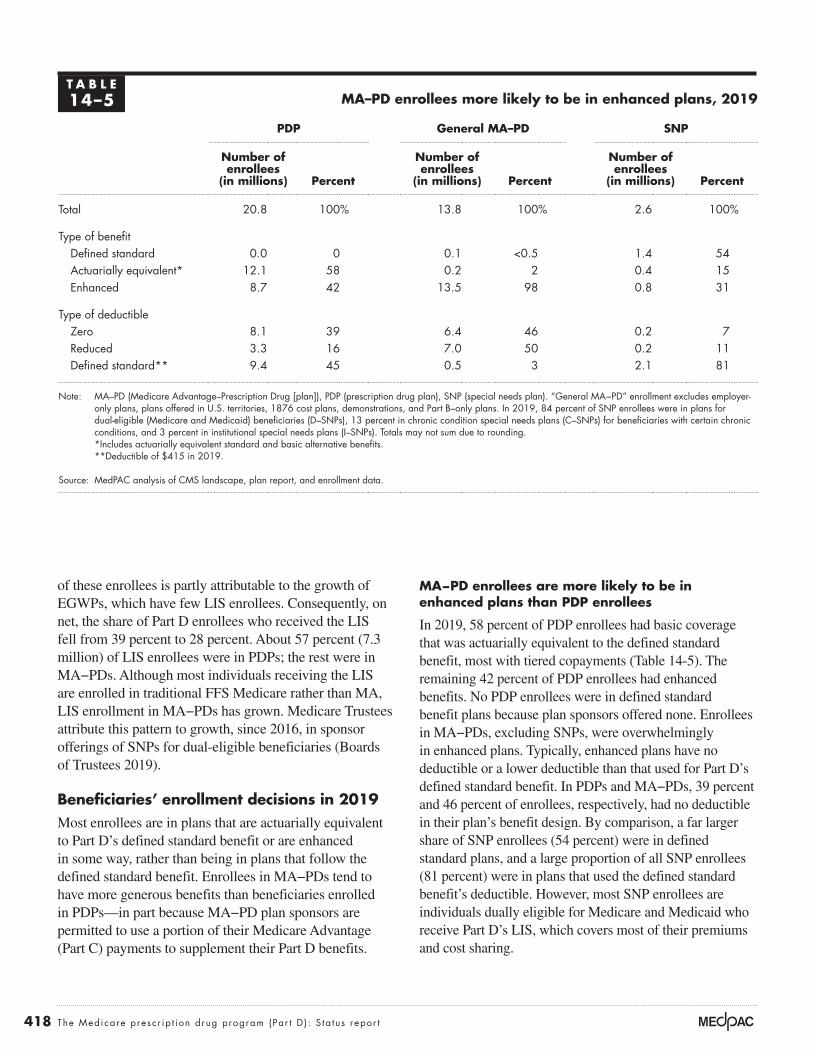
418 The Medicare presc r ip t ion drug program (Par t D ) : S ta tus repor t
MA−PD enrollees are more likely to be in enhanced plans than PDP enrollees
In 2019, 58 percent of PDP enrollees had basic coverage that was actuarially equivalent to the defined standard benefit, most with tiered copayments (Table 14-5). The remaining 42 percent of PDP enrollees had enhanced benefits. No PDP enrollees were in defined standard benefit plans because plan sponsors offered none. Enrollees in MA−PDs, excluding SNPs, were overwhelmingly in enhanced plans. Typically, enhanced plans have no deductible or a lower deductible than that used for Part D’s defined standard benefit. In PDPs and MA−PDs, 39 percent and 46 percent of enrollees, respectively, had no deductible in their plan’s benefit design. By comparison, a far larger share of SNP enrollees (54 percent) were in defined standard plans, and a large proportion of all SNP enrollees (81 percent) were in plans that used the defined standard benefit’s deductible. However, most SNP enrollees are individuals dually eligible for Medicare and Medicaid who receive Part D’s LIS, which covers most of their premiums and cost sharing.
of these enrollees is partly attributable to the growth of EGWPs, which have few LIS enrollees. Consequently, on net, the share of Part D enrollees who received the LIS fell from 39 percent to 28 percent. About 57 percent (7.3 million) of LIS enrollees were in PDPs; the rest were in MA−PDs. Although most individuals receiving the LIS are enrolled in traditional FFS Medicare rather than MA, LIS enrollment in MA−PDs has grown. Medicare Trustees attribute this pattern to growth, since 2016, in sponsor offerings of SNPs for dual-eligible beneficiaries (Boards of Trustees 2019).
Beneficiaries’ enrollment decisions in 2019Most enrollees are in plans that are actuarially equivalent to Part D’s defined standard benefit or are enhanced in some way, rather than being in plans that follow the defined standard benefit. Enrollees in MA−PDs tend to have more generous benefits than beneficiaries enrolled in PDPs—in part because MA−PD plan sponsors are permitted to use a portion of their Medicare Advantage (Part C) payments to supplement their Part D benefits.
T A B L E14–5 MA–PD enrollees more likely to be in enhanced plans, 2019
PDP General MA–PD SNP
Number of enrollees
(in millions) Percent
Number of enrollees
(in millions) Percent
Number of enrollees
(in millions) Percent
Total 20.8 100% 13.8 100% 2.6 100%
Type of benefitDefined standard 0.0 0 0.1 <0.5 1.4 54Actuarially equivalent* 12.1 58 0.2 2 0.4 15Enhanced 8.7 42 13.5 98 0.8 31
Type of deductible Zero 8.1 39 6.4 46 0.2 7Reduced 3.3 16 7.0 50 0.2 11Defined standard** 9.4 45 0.5 3 2.1 81
Note: MA–PD (Medicare Advantage–Prescription Drug [plan]), PDP (prescription drug plan), SNP (special needs plan). “General MA−PD” enrollment excludes employer-only plans, plans offered in U.S. territories, 1876 cost plans, demonstrations, and Part B–only plans. In 2019, 84 percent of SNP enrollees were in plans for dual-eligible (Medicare and Medicaid) beneficiaries (D–SNPs), 13 percent in chronic condition special needs plans (C–SNPs) for beneficiaries with certain chronic conditions, and 3 percent in institutional special needs plans (I–SNPs). Totals may not sum due to rounding.
*Includes actuarially equivalent standard and basic alternative benefits. **Deductible of $415 in 2019.
Source: MedPAC analysis of CMS landscape, plan report, and enrollment data.

419 Repo r t t o t h e Cong r e s s : Med i ca r e Paymen t P o l i c y | Ma r ch 2020
depending on income (Centers for Medicare & Medicaid Services 2019h).
Second, individuals enrolling in Part D outside their initial enrollment period must have proof that they had drug coverage as generous as the standard benefit under Part D (i.e., “creditable coverage”) to avoid the late enrollment penalty (LEP) that would be added to their premiums for the duration of their Part D enrollment. The LEP amount depends on the length of time an individual goes without creditable coverage and is calculated by multiplying 1 percent of the base beneficiary premium by the number of full, uncovered months an individual was eligible but was not enrolled in a Part D plan and went without other creditable coverage. As of October 2019, 2.1 million Part D enrollees paid the LEP (Liu 2019).
Benefit offerings for 2020Beneficiaries are encouraged to reexamine plan options each year during an annual open enrollment period that runs from October 15 until December 7. In addition to changes in plan availability and premiums, most plans make some changes to their benefit offerings—such as deductible amounts and plan formularies—that can affect access to medications and beneficiaries’ OOP costs. CMS operates an online decision-support tool (Medicare Plan Finder) to help beneficiaries evaluate plan options. The agency updated the tool before the open enrollment season for 2020, but the new version met some criticisms.
Beneficiaries have more plan options in 2020
For 2020, plan sponsors are offering 948 PDPs, 2,799 general MA−PDs, and 832 SNPs—5 percent, 16 percent, and 20 percent more plans, respectively, than in 2019. In recent years, plan sponsors have offered more enhanced PDPs that include supplemental drug coverage, likely motivated by a change in CMS’s “meaningful difference” policy. In prior years, when a PDP sponsor offered two enhanced plans in a region, it was required to design benefit packages that had a specified difference between the plans’ estimated OOP costs. CMS discontinued that requirement for 2019 (Centers for Medicare & Medicaid Services 2018b).11 Rapid growth in MA−PD offerings likely reflects interest among plan sponsors in gaining a share of MA’s expanding enrollment. At the same time, some MA−PD sponsors have expanded their SNP offerings, particularly for beneficiaries who are dually eligible for Medicare and Medicaid.
Under the MA payment system, MA−PD plan sponsors may use a portion of their Part C payments to supplement Part D drug benefits (e.g., by lowering deductibles) or to lower Part D premiums.9 For 2020, MA−PD sponsors have applied on average nearly $35 per month (28 percent) of their Part C rebate dollars to Part D benefits. Of that amount, 43 percent is used to lower Part D premiums and the rest is used for supplemental drug benefits.
Average enrollee premiums decreased in 2019
Despite significant growth in catastrophic benefits, average premiums for basic Part D benefits have remained low, partly due to the effects of Medicare’s reinsurance subsidy, which has offset benefit spending that would otherwise have increased enrollee premiums.10 Growth in manufacturer rebates and postsale pharmacy fees, the increase in the coverage-gap discount for brand-name drugs, and the entry of relatively large cohorts of younger enrollees into Part D are other reasons that average premiums have remained stable. In 2019, monthly beneficiary premiums averaged about $29 across all types of plans (basic and enhanced), a 7 percent decline from the prior year. Average premiums have remained around $30 per month since 2010. However, underlying that average is wide variation in premiums, from $0 for many MA−PDs to $156 per month for one PDP offering enhanced coverage.
On average, prescription drug premiums were lower for beneficiaries enrolled in MA−PDs compared with those enrolled in PDPs, in part reflecting plan sponsors’ use of Part C rebate dollars. In 2019, the average monthly premium for an MA−PD enrollee was $16, with an additional $17 of premium costs paid through Part C rebates (Medicare Payment Advisory Commission 2019a). By comparison, PDP enrollees paid an average premium of $40 per month.
Two other factors affect the premium amounts enrollees pay. First, higher income individuals have a lower federal subsidy of their Part D benefits. As of October 2019, 3.5 million enrollees (7.6 percent) were subject to the income-related premium (Liu 2019). As with the income-related premium for Part B, higher Part D premiums apply to individuals with an annual adjusted gross income greater than $87,000 and to couples with an adjusted gross income greater than $174,000. A beneficiary whose income exceeds these levels pays a monthly adjustment amount in addition to their Part D plan premium. For 2020, adjustments range from $12.20 to $76.40 per month,

420 The Medicare presc r ip t ion drug program (Par t D ) : S ta tus repor t
By comparison, SNPs (i.e., MA−PDs designed for certain groups of beneficiaries) are much more likely to use the defined standard benefit (34 percent of SNPs) or the same deductible amount as in the standard benefit (64 percent of SNPs). In 2020, 63 percent of SNPs are designed for beneficiaries who are dually eligible for Medicare and Medicaid, 19 percent for individuals who have certain chronic conditions, and 18 percent for institutionalized beneficiaries (data not shown).
Varied changes in plan premiums and cost sharing
For 2020, CMS calculated that Part D’s base beneficiary premium—enrollees’ share of the monthly national average expected cost for basic benefits—was $32.74, a 1 percent decrease from $33.19 in 2019. However, premiums for individual Part D plans can vary substantially from the base beneficiary premium because they reflect any difference between the sponsor’s bid and the national average bid, as well as any enhanced (supplemental) benefits the plan offers.
In each of the nation’s 34 PDP regions, beneficiaries continue to have broad choice. Options range from 24 PDPs in Alaska to 32 PDPs in California, along with MA−PDs in most areas. The number of MA plans available to a beneficiary varies by the county of residence, with an average county having 27 MA plans (when weighted by Medicare population). A small number of counties have no MA plans available.12
MA–PDs that are open to all enrollees (general MA–PDs) are much more likely to offer more generous coverage than PDPs. For example, in 2020, 96 percent of MA−PDs include enhanced coverage beyond basic benefits, compared with 60 percent of PDPs (Table 14-6). Among plans with basic benefits, the 2020 marketplace includes no PDPs and just 2 percent of MA–PDs (excluding SNPs) with the standard benefit design. A larger share of MA–PDs than PDPs charges no deductible (48 percent vs. 14 percent, respectively), and 69 percent of PDPs use the same $435 deductible as Part D’s defined standard benefit.
T A B L E14–6 Comparison of PDP, general MA−PD, and SNP offerings, 2020
PDP General MA–PD SNP
Number of plans Percent
Number of plans Percent
Number of plans Percent
Total 948 100% 2,799 100% 832 100%
Type of benefitDefined standard 0 0 43 2 286 34Actuarially equivalent* 382 40 81 3 106 13Enhanced 566 60 2,675 96 440 53
Type of deductible Zero 133 14 1,349 48 156 19Reduced 161 17 1,244 44 140 17Defined standard** 654 69 206 7 536 64
Note: PDP (prescription drug plan), MA–PD (Medicare Advantage–Prescription Drug [plan]), SNP (special needs plan). The PDPs described here exclude employer-only plans and plans offered in U.S. territories. MA−PD plans exclude employer-only plans, plans offered in U.S. territories, 1876 cost plans, demonstrations, and Part B-only plans. SNP plans exclude U.S. territories. Among SNPs for 2020, 520 are for beneficiaries dually eligible for Medicare and Medicaid, 162 are for beneficiaries with certain chronic conditions, and 150 are for institutionalized beneficiaries. Totals may not sum due to rounding.
*Includes actuarially equivalent standard and basic alternative benefits. **Deductible of $435 in 2020.
Source: MedPAC analysis of CMS landscape and plan report data.

421 Repo r t t o t h e Cong r e s s : Med i ca r e Paymen t P o l i c y | Ma r ch 2020
their premiums more than doubled unless they changed plans.13 In 2018, WellCare acquired Aetna’s PDPs.14 For 2020, enrollees who remained in a divested plan (such as WellCare Medicare Rx Select or WellCare Medicare Rx Value Plus) saw average monthly premiums increase by 20 percent or more. Premiums for United HealthCare’s AARP MedicareRx Walgreens PDP increased by 23 percent for 2020. However, other basic PDPs such as SilverScript Choice, AARP MedicareRx Saver Plus, and WellCare Classic each saw average premiums decline for 2020.
The top 10 PDPs (ranked by 2019 enrollment) tend to use five-tiered formularies with differential cost sharing among drugs listed on preferred generic, other generic, preferred brand, and nonpreferred drug tiers, as well as a specialty tier for high-cost drugs. Although cost-sharing requirements in Part D plans have generally risen over time, for 2020, PDPs with the highest enrollment held
The 10 stand-alone PDPs with the highest enrollment in 2019 experienced a mixture of premium increases and decreases in 2020. Across all PDPs weighted by their 2019 enrollment, the average projected premium for 2020 rose to $42 from $39 per month (Table 14-7). However, the final average change in PDP premiums could be lower because the $3 per month (7 percent) projected increase does not reflect movement of enrollees to plans with lower premiums.
Although the top 10 PDPs experienced an average monthly premium increase of about $2, plan sponsors revised some of their offerings, and annual changes to premiums for individual plans varied. For 2020, Humana combined an enhanced PDP that had relatively low premiums in 2019 with another plan that had much higher premiums into Humana Premier Rx. For beneficiaries who had been enrolled in the lower premium plan,
T A B L E14–7 Change in 2020 premiums for PDPs with the highest 2019 enrollment
Plan name in 2020Benefit type
2019 enrollment (in millions)
Weighted average monthly premiuma
2019 premium
Projected 2020 premium
Percent change
SilverScript Choice Basic 4.4 $31 $29 –7%Humana Premier Rxb Enhanced 2.6 N/A 57 N/AAARP MedicareRx Preferred Enhanced 2.2 75 79 6Humana Basic Rxc Basic 1.6 31 31 0AARP MedicareRx Saver Plus Basic 1.3 34 32 –4WellCare Medicare Rx Saverd Basic 1.2 29 31 6WellCare Classic Basic 1.0 32 29 –9AARP MedicareRx Walgreens Enhanced 0.7 28 34 23WellCare Medicare Rx Selectd Enhanced 0.7 17 21 23WellCare Medicare Rx Value Plusd Enhanced 0.5 60 72 20
Top 10 PDPs 16.1 40 42 6
All PDPs 20.5 39 42 7
Note: PDP (prescription drug plan), N/A (not available). Components may not sum to stated totals due to rounding. aThese data reflect the average of all PDPs offered under the same plan name in each region of the country, weighted by 2019 enrollment. The projected weighted average premium for 2020 does not reflect any enrollment switching among plans. Percent changes calculated before rounding.
bReflects the combination of two plans offered in 2019—Humana Walmart Rx (at an average monthly premium of $28) and Humana Enhanced (at an average premium of $76).
cRenamed from Humana Preferred Rx in 2019. dWellCare purchased Aetna’s PDPs in 2018 and rebranded them under WellCare with otherwise the same plan name for 2020.
Source: Cubanski and Damico 2019.

422 The Medicare presc r ip t ion drug program (Par t D ) : S ta tus repor t
to year, even in the face of premium and cost-sharing increases. Some individuals may simply be satisfied with their plan, or the time costs associated with searching for information to compare plans may not be worth the potential savings. Others may be overwhelmed by the complexity of the task of comparing options.
Much of the published literature on Part D suggests that when beneficiaries select a plan, they often make suboptimal choices, and the complexity and broad availability of plan options may lead to consumer inertia (Abaluck and Gruber 2016, Cummings et al. 2009, Zhou and Zhang 2012). Other literature suggests that in the presence of such inertia, premiums for Part D plans that have been on the market for longer periods of time tend to rise (Ho et al. 2017, Marzilli Ericson 2014).
Research has found that in the early years of Part D, about 13 percent of enrollees without the LIS switched plans during any given open enrollment period (Hoadley et al. 2013, Suzuki 2013). A more recent study of these enrollees had similar results: Over the period from 2007 to 2016, 6 percent to 11 percent of MA−PD enrollees and 10 percent to 13 percent of PDP enrollees switched plans in any given year (Koma et al. 2019). Over Part D’s first four or five years, researchers estimated that 30 percent to 50 percent of PDP enrollees changed plans at least once (Hoadley et al. 2013, Ketcham et al. 2015). PDP enrollees who faced relatively large premium increases (such as $20 per month) were more likely to switch plans, but most individuals with large premium increases remained in the same plan (Hoadley et al. 2013).
Displaying plan options in a clear manner could help Part D enrollees evaluate whether it is worthwhile to switch plans. CMS has operated a decision-support tool, Medicare Plan Finder (www.medicare.gov), for many years to serve this function.17 Plan Finder allows beneficiaries to enter their personal list of prescription medications and select among local pharmacies in their ZIP code. The tool then displays PDP or MA–PD options for the beneficiary to compare and evaluate in more detail, such as by looking at plan premiums, whether each plan’s formulary covers the individual’s medications, and estimated cost-sharing amounts. It also contains direct links so that beneficiaries can enroll in their selected plan. However, beneficiary advocates have criticized Plan Finder for adding to confusion rather than helping to overcome choice overload. For example, Plan Finder has been criticized for using language that is not user friendly,
steady or lowered generic copays: Median copays are zero for preferred generics and $3 for prescriptions filled from the other-generics tier (Cubanski and Damico 2019). In 2020, the top 10 PDPs had a mix of cost-sharing increases and decreases for preferred brand-name drugs.
Over time, many plan sponsors have moved from charging copayments (predetermined fixed amounts) to coinsurance for certain tiers. For 2020, the top 10 PDPs shown in Table 14-7 (p. 421) all use coinsurance for medications on nonpreferred drug tiers, charging 32 percent to 50 percent of each prescription’s negotiated price (Cubanski and Damico 2019). By charging enrollees a percentage of the price of their prescriptions rather than a flat copayment, some of manufacturers’ price increases are reflected in beneficiaries’ cost sharing. One reason for the move to coinsurance is that some plan sponsors have combined certain brand and generic drugs on the same cost-sharing tier, such as a single tier for all nonpreferred drugs. When the same tier includes both low-priced and high-priced drugs, plan sponsors may find it difficult to set a copayment amount that provides a comparable average benefit.
Greater numbers of benchmark PDPs
Compared with 2019 levels, the number of PDPs available to LIS enrollees at no premium (“benchmark PDPs”) in 2020 increased by 13 percent to 244 plans.15 In one region, Ohio, the number of benchmark PDPs dropped from seven in 2019 to two for 2020. However, all other regions have at least 4 benchmark PDPs available, while the Arizona region has 12 such PDPs. The number of benchmark PDPs in Florida expanded from two in 2019 to four for 2020.
About 1.3 million LIS enrollees (18 percent of LIS enrollees in PDPs) were enrolled in plans in 2019 that, in 2020, have premiums higher than regional benchmarks (Cubanski and Damico 2019). However, many of those enrollees paid a premium in 2019, meaning they selected a plan rather than accepting Medicare’s random assignment to a benchmark plan. Once an LIS enrollee selects a plan, the enrollee is no longer eligible for reassignment.16 For 2020, CMS estimated that the agency randomly reassigned only about 100,000 individuals to new plans (Liu 2019).
Updated Medicare Plan Finder
Part D’s competitive design presumes that enrollees review their options periodically and are willing to switch plans when a competitor offers a better alternative. However, many Part D enrollees remain in the same plan from year

423 Repo r t t o t h e Cong r e s s : Med i ca r e Paymen t P o l i c y | Ma r ch 2020
networks—for their Medicare and non-Medicare businesses. The market structure of plan sponsors has consolidated and become more vertically integrated. By law, the Medicare program is prohibited from becoming involved in negotiations among sponsors, drug manufacturers, and pharmacies.
Concentrated enrollment among plan sponsorsPlan sponsors and their PBMs exert bargaining leverage with drug manufacturers and pharmacies by winning large market shares of enrollees and by influencing the market shares of drug products through their formularies and tiered cost sharing. High enrollment levels can also provide sponsors with economies of scale that lower other costs.
Although plan sponsors’ organizational structures differ, the general trend in recent years has been toward more vertical integration among managed care organizations, PBMs, and pharmacies. Most of the largest sponsors are insurers whose core business function has been to offer commercial and MA health plans with combined medical and pharmacy benefits. However, because more than 60 percent of Medicare beneficiaries are in traditional FFS Medicare, if they choose to enroll in Part D, they obtain benefits through stand-alone PDPs. For this reason, PDPs remain an important market opportunity, and insurers serving as MA sponsors also offer PDPs in many regions. Recently, two major PDP sponsors with core business models that focused on pharmacy benefit management and dispensing merged with major health plans.18
Combined, the two largest plan sponsors, UnitedHealth Group and Humana, have accounted for about 40 percent of the Part D market each year since 2007. Over time, other sponsors have expanded their enrollment and market shares. In 2019, the top seven organizations ranked by enrollment and a group of Blue Cross and Blue Shield companies that collectively own or are serviced by Prime Therapeutics (a PBM) together accounted for 85 percent of Part D enrollment. In 2007, those same organizations accounted for 61 percent of enrollment.
Enrollment in PDPs is highly concentrated among a small number of plan sponsors. Nationally, in 2019, the top five PDP sponsors—CVS Health, UnitedHealth Group, Humana, WellCare, and Cigna (including its subsidiary Express Scripts)—collectively enrolled 90 percent of beneficiaries in PDPs (Figure 14-3, p. 424). Enrollment
making it difficult to find information about preferred cost-sharing pharmacies, and for ambiguity in the meaning of star ratings, among other issues (Clear Choices Campaign and National Council on Aging 2018, Government Accountability Office 2019). Until recently, Plan Finder sorted the beneficiary’s plan options from lowest to highest total cost (i.e., premiums plus cost sharing) side by side with considerable detail about cost-sharing requirements. One recent experiment showed that beneficiaries would be better able to select lower cost plans if total cost was displayed alone, or total cost side by side with premiums and total cost sharing, rather than more complicated financial details (McGarry et al. 2018).
In 2019, CMS introduced a new version of Plan Finder that reduced some of the previous version’s complexity. Beneficiaries can use the redesigned version on smartphones and tablets as well as desktop computers. If a Part D enrollee chooses to enter his or her Medicare ID number, Plan Finder now autoloads their list of medications based on past claims. It also includes a webchat option for additional support. Despite these improvements, the new version of Plan Finder met immediate criticism because, unlike the previous version, it displays plan options ranked by lowest to highest premiums rather than by total costs. CMS subsequently added a prompt to encourage beneficiaries to sort plans by total cost but did not revert to sorting by total cost as the tool’s default display (McGarry et al. 2019). CMS may provide beneficiaries with a special enrollment period if they had problems with Plan Finder and felt they had inaccurate information for their enrollment decision (Alonso-Zalvidar 2019).
Plan sponsors and their tools for managing benefits and spending
Nearly 300 organizations sponsor Part D plans. In addition to insuring outpatient drug benefits, plan sponsors carry out marketing, enrollment, customer support, claims processing, coverage determinations, and exceptions and appeals processes. Sponsors also either contract with a pharmacy benefit manager (PBM) or perform those functions themselves through an in-house PBM. Most sponsoring organizations also operate health plans or manage pharmacy benefits for commercial clients, and they use a similar set of approaches—involving formularies, manufacturer rebates, and pharmacy

424 The Medicare presc r ip t ion drug program (Par t D ) : S ta tus repor t
Most large sponsors also offer EGWPs, and the market for EGWPs is highly concentrated. In 2019, the top five sponsors of EGWPs—Cigna, UnitedHealth Group, CVS Health, Kaiser Permanente, and Humana—accounted for 82 percent of EGWP enrollment.
Tools for managing benefits and spendingOver the first decade of Part D, the use of pharmacy management tools and the fortuitous timing of patent expirations led to the expanded use of generics. By 2017, 88 percent of prescriptions filled by Part D enrollees were for generics, compared with 61 percent in 2007. Today, generic substitutions in both Part D and among commercial populations may have reached a
among beneficiaries in FFS Medicare who receive Part D’s LIS is also concentrated. PDPs offered by those same five companies accounted for 95 percent of LIS beneficiaries enrolled in PDPs (data not shown).19
MA−PD enrollment is less concentrated than that for PDPs. As shown in Figure 14-3, the top five MA−PD sponsors in 2019 enrolled 65 percent of MA−PD enrollees. Similarly, 62 percent of LIS beneficiaries in MA−PDs were enrolled in plans offered by the same top five sponsors (data not shown). In addition to large, vertically integrated health plans, MA plan sponsors include a broader variety of companies, such as smaller regional organizations, religiously affiliated groups, and integrated delivery systems.
PDP enrollment is more concentrated than MA–PD enrollment among a small number of plan sponsors, 2019
Note: PDP (prescription drug plan), MA–PD (Medicare Advantage–Prescription Drug [plan]). Market shares are based on Part D enrollment, including employer group waiver plans. Components may not sum to totals due to rounding. *Prime Therapeutics is a pharmacy benefits manager that, in 2019, served 18 Blue Cross/Blue Shield plans.
Source: MedPAC based on enrollment data from CMS.
PDP enrollment = 25.5 million
Medicare population
Note: Note and Source are in InDesign.
Source:
FIGUREX-X
24%CVS Health
20%UnitedHealth
Group
17%Humana
1%Anthem
2%Rite Aid
4%Other parent
organizations
8%CVS Health
13%Cigna
16%WellCare
3%Blues
that usePrime
Therapeutics*
MA–PD enrollment = 20.0 million
27%UnitedHealth
Group
18%Humana
1%InnovaCare
8%Kaiser
22%Other parentorganizations
5%Anthem
3%WellCare
2%Cigna
2%Centene
3%Blues that use Prime
Therapeutics*
F IGURE14–3
425 Repo r t t o t h e Cong r e s s : Med i ca r e Paymen t P o l i c y | Ma r ch 2020
process of deciding whether to approve its bid. For most drug classes, plans must cover at least two distinct drugs that are not therapeutically equivalent or bioequivalent, as well as “all or substantially all drugs” in six protected classes—anticonvulsants, antidepressants, antipsychotics, immunosuppressants, antiretrovirals, and antineoplastics.
Within those constraints, plan sponsors have tightened formularies modestly in recent years. Similarly, the use of utilization management tools in Part D has grown. Sponsors apply such tools for drugs that are expensive, potentially risky, or subject to abuse, misuse, and experimental use. These tools are also intended to encourage the use of lower cost therapies.
Manufacturers use rebates to provide discounts on brand-name drugs that are individualized for different purchasers, including Part D plan sponsors. In classes that have competing drug therapies, sponsors and their PBMs negotiate with brand manufacturers for rebates that are paid after a prescription has been filled. Generally, manufacturers pay larger rebates when a sponsor positions a drug on its formulary in a way that increases the likelihood that the manufacturer will win market share over competitors. For example, a manufacturer might pay a base rebate for including the product on a plan’s formulary but might pay larger rebates if the drug is on a preferred tier or if prior authorization requirements are waived. Producers of brand-name drugs with no therapeutic substitutes may not provide any rebates. One recent Milliman analysis of 2016 data provided by a group of Part D plan sponsors found that only 36 percent of brand-name drugs had more than nominal manufacturer rebates (Johnson et al. 2018). In recent years, payers and PBMs have also negotiated “price-protection” provisions under which the manufacturer agrees to rebate a drug’s midyear price increases above a specified threshold.
Data on manufacturers’ rebate amounts for individual drugs are highly proprietary. The Milliman study found that as a share of point of sale (POS) prices, rebates were largest (averaging 39 percent) in drug classes in which brand-name drugs competed directly with one another or when the brand drug faced competition from three or more generics (34 percent). The share of a drug product’s POS price rebated to PBMs and payers can be high when there are close substitutes in the product’s drug class. For example, across all payers for Sanofi’s insulin product Lantus, the implied rebate—the share of gross drug sales offset by rebates and other discounts—grew from around
saturation point.20 Instead, for their commercial clients, plan sponsors focus increasingly on managing the use of specialty drugs and biologics for conditions such as cancer, HIV, hepatitis C, rheumatoid arthritis, and multiple sclerosis. Spending for specialty drugs used by Part D enrollees is also expanding quickly. Many of these treatments are self-injectable products. Dispensing certain specialty drugs can raise challenging logistical issues, and patients who take them may require closer clinical management. Specialty drugs also have very high prices, with annual costs of treatment per person reaching tens of thousands of dollars or more.
Sponsors use several general approaches to manage pharmacy benefits for both commercial and Part D plans. However, law and regulations limit how sponsors may manage their Part D populations compared with how the same organizations manage their commercial populations. Recently, policymakers have taken steps to expand the management tools available to Part D plan sponsors. This year, CMS’s Center for Medicare & Medicaid Innovation launched a demonstration program called the Part D Payment Modernization Model that provides “new incentives for plans, patients, and providers to choose drugs with lower list prices to address rising federal reinsurance subsidy costs in Part D” (Centers for Medicare & Medicaid Services 2019j).21 To date, however, there have been no large-scale changes to risk-sharing provisions that would give plan sponsors financial incentives to fully use those new tools in practice as they may do with their commercial population.
Formulary management and manufacturer rebates
Formularies remain plan sponsors’ most important tool for managing drug benefits. Sponsors decide which drugs to list on their formulary, which cost-sharing tier is appropriate for each drug, and whether a drug will be subject to forms of utilization management—quantity limits, step therapy, and prior authorization. Those decisions require that plan sponsors strike a balance between providing access to medications while encouraging enrollees to use preferred therapies. Greater flexibility to use such tools also affects plan sponsors’ bargaining leverage with manufacturers over rebates.
CMS requires plan sponsors to cover the types of drugs most commonly needed by Part D enrollees as recognized in national treatment guidelines, and the agency reviews each plan’s formulary as part of the

426 The Medicare presc r ip t ion drug program (Par t D ) : S ta tus repor t
2020, 95 percent of PDPs use preferred cost-sharing pharmacies compared with 92 percent of PDPs in 2019 (Fein 2019c). The strategy of designating certain “preferred cost-sharing pharmacies” has the potential to lower costs for Medicare and enrollees if it encourages enrollees to fill prescriptions at pharmacies that, for example, may be more effective at encouraging generic drug use. Differences between cost sharing at preferred pharmacies and other network pharmacies can vary substantially among plans (Medicare Payment Advisory Commission 2016b).
Tiered networks have been controversial because of past concerns that some enrollees do not have adequate access to preferred pharmacies with lower cost sharing. In addition, if LIS enrollees have less opportunity to use preferred pharmacy networks, the tiered network strategy could lead to higher Medicare spending because Medicare pays for most or all of LIS enrollees’ cost sharing. Out of these concerns, CMS guidance permits plans to offer lower cost sharing at preferred pharmacies only if the approach does not raise Medicare payments (Centers for Medicare & Medicaid Services 2015a, Centers for Medicare & Medicaid Services 2014b).
Although Part D plan sponsors cannot set up exclusive pharmacy networks, they can include other network contract terms that try to achieve the same aims—terms that have largely led to postsale payments from pharmacies to plans. The terms can include fees that are a condition for participating as a preferred cost-sharing pharmacy, periodic payment reconciliations related to drug reimbursement rates, or performance-based fees that are assessed on quality measures (Fein 2016).24 While participants in preferred networks gain more prescription volume, the pharmacies are essentially agreeing to lower and less predictable reimbursements from plans, which for some pharmacies has made participation in plan sponsors’ preferred networks much less desirable. For example, in 2020, fewer independent pharmacies are participating in PDP preferred cost-sharing networks (Fein 2019a).
According to CMS, pharmacy price concessions and fees grew dramatically between 2013 and 2017, from $229 million to $4 billion (Centers for Medicare & Medicaid Services 2018e). Critics point out that Part D enrollees pay coinsurance at the pharmacy before such fees are assessed, which means those cost-sharing amounts are too high.
10 percent in 2009 to about 60 percent by the second quarter of 2016 due to heightened competition among insulins (Indianapolis Business Journal 2016).
Medicare policy can affect rebates. The Part D requirement to cover all protected-class drugs likely reduces plan sponsors’ bargaining leverage with manufacturers; rebates are less easily obtained and smaller, on average, for brand-name drugs in protected classes. In the Milliman study, out of 124 brand-name drugs in protected classes, only 16 received rebates, and among those drugs, rebates averaged 14 percent of POS prices compared with 30 percent for all brand-name drugs (Johnson et al. 2018).
Formularies have been an effective tool for encouraging beneficiaries to use certain drugs over others. However, the Commission is concerned that in Part D, plan sponsors’ relatively small liability for spending in the coverage gap and catastrophic phases, combined with Medicare’s reinsurance subsidies and manufacturers’ rebates, can affect plans’ formulary decisions in ways that may be at odds with beneficiary and program interests. For some drugs, plan sponsors have incentives to give preferable formulary placement to high-price, high-rebate products over alternatives with lower list prices.22 In turn, enrollees who are charged coinsurance pay more in cost sharing, and Medicare reinsurance and low-income cost-sharing subsidies are higher.
Pharmacy networks and postsale fees
Plan sponsors try to encourage enrollees to use pharmacies that dispense prescriptions at lower cost. For example, in the commercial insurance sector, enrollees in some (non-Medicare) employer plans are required to fill prescriptions within an exclusive network of retail pharmacies, refill prescriptions by mail rather than through retail pharmacies, and fill prescriptions with a 90-day rather than a 30-day supply.
Part D law and CMS guidance limit plan sponsors’ ability to use those approaches. Most notably, plan sponsors must permit within their networks any pharmacy that is willing to accept the sponsors’ terms and conditions; that is, plan sponsors cannot use exclusive pharmacy contracts.23 Plan sponsors must also demonstrate that their network of pharmacies meets access standards.
Sponsors can, however, designate a subset of network pharmacies that offer preferred (lower) cost sharing. In

427 Repo r t t o t h e Cong r e s s : Med i ca r e Paymen t P o l i c y | Ma r ch 2020
Recent regulatory issues in Part DIn 2018, CMS made several regulatory changes designed to make the tools that plan sponsors use in Part D more like those already available for managing pharmacy benefits in commercial populations. Consistent with the Commission’s 2016 recommendation to streamline CMS’s process for reviewing formulary changes, the agency now permits plan sponsors to add a newly approved generic to their formularies and remove or change the tier status of a therapeutically equivalent brand-name drug at any point during the benefit year without prior approval. CMS also allows plan sponsors to use different utilization management requirements for a drug depending on a patient’s indication, and plans may limit on-formulary coverage of certain drugs by indication (Centers for Medicare & Medicaid Services 2018c, Centers for Medicare & Medicaid Services 2018d). MA–PDs may now use step therapy to manage Part B drugs: Sponsors can require enrollees to try a drug covered under either Part B or Part D before using a Part B therapy for the same indication (Centers for Medicare & Medicaid Services 2018a).
In 2019, the Department of Health and Human Services (HHS) and CMS withdrew from consideration other major regulatory proposals. Most notably, HHS’s Office of Inspector General (OIG) had proposed removing the safe-harbor protection that manufacturers’ rebates receive from liability under the federal anti-kickback statute. In its place, OIG proposed permitting rebate arrangements between Part D plans, their PBMs, and manufacturers only if the full rebate amount was reflected in prescription prices at the point of sale.27 Drug manufacturers and certain patient assistance groups supported OIG’s proposal on the grounds that it would reduce beneficiary cost sharing on rebated drugs. However, other organizations raised concerns that the regulatory change would lead to higher Part D premiums for all enrollees and raise Medicare program spending. Ultimately, HHS withdrew the proposal.
A second regulatory proposal that CMS withdrew in 2019 relates to Part D’s protected classes. CMS proposed allowing sponsors to use prior authorization and step therapy more broadly to determine whether use of a drug was for a protected-class indication (Centers for Medicare & Medicaid Services 2019i). Under the proposal, plan sponsors would have been able to exclude a protected-class drug from a formulary if (1) the drug was a new
Specialty pharmacies
Commercial plan sponsors often try to dispense high-cost specialty drugs through an exclusive network of specialty pharmacies. All of the largest insurers and PBMs own specialty pharmacies, and most encourage their clients to dispense exclusively through that company. In Part D, plan sponsors cannot set up a narrower network of specialty pharmacies. With a few exceptions, Part D’s convenient-access standards apply to the dispensing of all types of drugs, including specialty drugs.25 As with general retail pharmacies, some Part D plan sponsors include terms in their contracts with specialty pharmacies that include postsale price concessions and fees.
Most specialty pharmacies fill prescriptions through home delivery or deliveries to a convenient location. Specialty pharmacies can help ensure that patients meet specific clinical criteria through plans’ prior authorization processes before dispensing prescriptions. They can also reduce waste by, for example, initially dispensing a 7-day or 15-day supply and observing the patient for side effects, treatment effectiveness, and adherence before providing a 30-day supply. Specialty pharmacies also play a role in patient education, monitoring, and data reporting. They often employ nurses to provide counseling by telephone about side effects and to monitor adherence. Some specialty pharmacies also facilitate outreach to patient assistance programs.26
A variety of ownership types have evolved to dispense specialty drugs, including insurers, wholesalers, hospital systems, pharmacy chains, independent specialty pharmacies, and prescriber practices. Recently, however, the industry has grown more vertically integrated—dominated by specialty pharmacies owned by PBMs and health plans (Fein 2019b). Although most manufacturers do not own specialty pharmacies, drug makers pay fees to specialty pharmacies and have contracts that limit which ones may dispense their drug. For some specialty pharmacies, these relationships can result in financial incentives that are aligned with drug manufacturers. However, in a vertically integrated entity, a specialty pharmacy’s incentives more closely align with those of its affiliated PBM and health plan. Lack of transparency into postsale discounts and fees received by specialty pharmacies means we are unable to assess how different ownership arrangements may affect Medicare’s spending for Part D drugs.

428 The Medicare presc r ip t ion drug program (Par t D ) : S ta tus repor t
recently, POS prices have grown aggressively. Because POS prices affect beneficiary cost sharing and the rate at which beneficiaries reach Part D’s catastrophic phase, prices paid at the pharmacy are an important indicator of Part D’s costs. At the same time, net drug prices affect the premiums that are paid by Part D enrollees and subsidized by the Medicare program. Although the Commission does not have data on rebates for individual drugs, Medicare Trustees report that average rebates have grown significantly (Boards of Trustees 2019).28 Because rebates have grown even faster than POS prices, there has been a widening divergence between gross and net drug prices. Over time, Medicare and beneficiaries have paid an increasing share of drug costs net of rebates.
Prices paid at the point of saleTo examine growth in POS prices, the Commission contracted with Acumen LLC to construct a series of volume-weighted price indexes that reflect total amounts paid to pharmacies for Part D prescriptions, including ingredient costs and dispensing fees.
In 2018, modest price growth overall, but strong increases in brand prices
Overall, prices for Part D drugs and biologics grew modestly in 2018. Measured by individual national drug codes (NDCs) and excluding retrospective rebates and pharmacy discounts, annual increases averaged 3.4 percent (Table 14-8).29 Growth in the overall Part D index is influenced heavily by pricing for single-source brand-name drugs. Our index for brand prices grew at double-digit rates in most years until 2015, when growth decelerated to mid-to-high single-digit rates. In 2018, the index for single-source brand-name drugs grew by 6.9 percent.
Use of generic drugs tends to provide significant savings to beneficiaries and the Medicare program. On average, prices of generics can be 75 percent to 90 percent lower than their brand-name counterparts (Government Accountability Office 2016). Generics enter the market at substantially lower prices than the brand-name drugs they replace, and generic prices tend to decline over time with entry of additional producers (Dave et al. 2017a, QuintilesIMS Institute 2016). In recent years, certain generic medications have experienced sharp price increases, primarily due to decreases in market competition (Berndt et al. 2017). There have also been allegations that certain generic prices have been artificially high due to price fixing among some suppliers (Bartz and
formulation of an existing single-source drug or biological product, regardless of whether the older formulation remained on the market, or (2) the price of the drug increased beyond a certain threshold over a specified period. These exceptions from the protected-class policy would not have superseded sponsors’ obligation to cover two distinct drugs in each drug class. Following stakeholder concerns and opposition to the proposed policy, CMS chose not to finalize the provisions (Centers for Medicare & Medicaid Services 2019i). Instead, CMS codified existing policy under which plan sponsors are permitted to apply prior authorization or step therapy only for beneficiaries initiating therapy (i.e., new starts) in five of the six protected classes. For antiretrovirals, no prior authorization or step therapy is allowed at all.
Drug pricing
Growth in gross or POS prices—prices at the pharmacy counter—has been the focus of much recent attention. Most Part D enrollees primarily use generic drugs, and many (but not all) generic prices remain low. However, enrollees without the LIS who use brand-name drugs often feel the effects of rising POS prices when they pay coinsurance.
As policymakers have debated what to do about drug price growth, they have examined not only the market power of manufacturers in setting and raising prices but also the drug supply and distribution chains and benefits management. At all levels, there are incentives that drive prices higher because payments for pharmaceuticals or services provided in conjunction with drug distribution are often based on a percentage of prices (Diplomat Specialty Pharmacy 2017, Fein 2018, Feldman 2018, Garthwaite and Morton 2017). Manufacturers have shifted their development pipelines toward higher cost drugs and biologics, products that may not have direct therapeutic competitors. Meanwhile, some participants in the drug supply chain have tended to rely on drug price inflation for revenue growth (Cahn 2017, Fein 2017, Lopez 2016, Sell 2015). These factors combined with the increasing market concentration of supply chain participants have, over time, put upward pressure on both POS prices and rebates.
While some analysts contend that growth in prices net of rebates is the primary measure of importance, changes in POS and net prices are both important to monitor. Until

429 Repo r t t o t h e Cong r e s s : Med i ca r e Paymen t P o l i c y | Ma r ch 2020
(Table 14-8). Over the same period, prices of biologics grew by a cumulative 257 percent (data not shown). Competitive tactics among manufacturers, regulatory hurdles, and slow acceptance among providers have so far worked to thwart entry of and price competition from biosimilars in Part D (see text box on lack of biosimilar competition, pp. 430–431).
In general, the extent to which a manufacturer can raise the price of its product depends on market dynamics, such as whether there are generics or brand alternatives, and on the regulatory environment in which it operates (Borges dos Santos et al. 2019). One example of how regulations can affect pricing power in Part D is the protected-class policy that requires plan sponsors to include on their formularies “all or substantially all” drugs in six categories. CMS has noted that the inability of plan sponsors to manage drugs in protected classes has “allowed the pharmaceutical industry to command high prices on protected class drugs in Part D” (Azar and Verma 2018).
In four of the six protected classes, prices of brand-name drugs have grown more rapidly than the overall average for single-source brand-name drugs (Figure 14-4, p. 432). Between 2006 and 2018, prices of brand antipsychotics grew by 286 percent, while prices of brand anticonvulsants and antidepressants more than quadrupled. Prices of
Chiacu 2019). Nevertheless, between 2006 and 2018, prices of most generic drugs generally declined (Dave et al. 2017b, Schondelmeyer and Purvis 2019).
Consistent with this general trend, our index of generic prices has declined since the start of the Part D program and fell by 9.1 percent in 2018 (Table 14-8). In that same year, generic prices were a cumulative 83 percent below the index value observed in 2006.
When measured by an index that reflects both brand-name drugs and generic substitution, Part D prices increased by 1.7 percent in 2018—a higher rate of growth than rates observed between 2015 and 2017 (Table 14-8).30 Although brand-name drugs accounted for only about 13 percent of prescriptions in 2018, brand-name drugs made up 80 percent of all Part D spending. As a result, price increases for brand-name drugs overwhelmed the effects of using lower priced generics.
Manufacturers’ ability to raise prices varies across therapeutic classes
Over the past decade, prices have grown rapidly for brand-name drugs and biologics that have few competing therapies. Between 2007 and 2018, prices of single-source brand-name products that have no generic or biosimilar substitutes (but that may have generic alternatives in the same therapeutic class) grew by a cumulative 236 percent
T A B L E14–8 Price increases for brand-name drugs continue to
overwhelm the effects of using lower priced generics
Average annual change in Part D price indexes (December over December)
Cumulative change
2006–20182006–2015 2015–2017 2018
All drugs and biologics 5.8% 4.1% 3.4% 86%
Single-source brand-name drugs 11.1 8.0 6.9 236
Generic drugs –12.9 –11.0 –9.1 –83
After accounting for generic substitution 1.4 0.7 1.7 14
Note: Prices are measured by chain-weighted Fisher price indexes.
Source: Acumen LLC analysis for MedPAC.

430 The Medicare presc r ip t ion drug program (Par t D ) : S ta tus repor t
Manufacturers may have greater ability to raise prices of protected-class drugs when these medications are used widely by beneficiaries who receive Part D’s LIS. Part D plans that include larger percentages of LIS enrollees have incentives to keep their premium below the regional LIS benchmark and, for MA–PDs, avoid having to use Part C rebate dollars to pay for Part D premiums. Nevertheless, because Medicare’s LIS pays for most of the enrollees’ OOP costs, plan sponsors do not bear the effects of price increases as much as they might otherwise, and they may
certain brand-name drugs in protected classes sometimes continue to grow aggressively even after the entry of generic competition. For example, between 2013 and 2017, the average price of Wellbutrin XL (bupropion XL), an antidepressant with about a dozen generic competitors, grew by over 40 percent per year on average (Centers for Medicare & Medicaid Services 2019g). Between 2013 and 2017, the average annual spending per patient taking Wellbutrin XL increased from about $2,700 to over $14,000.
Lack of biosimilar competition in Part D
Biologics are medicines derived from living organisms, such as human insulin, recombinant hormones, growth factors, and monoclonal
antibodies. Because biologics are injected or infused into the patient and often require individualized dosing, many are administered in clinician offices or hospital outpatient departments and covered under Part B. However, an increasing number of biologics are expected to be self-injectable, dispensed through pharmacies, and paid under Part D. Whether covered under Part B or Part D, most biologics have very high prices.
Biosimilars are follow-on products to an originator biologic. They are analogous to generics in the sense that they compete with the originator product on price once the originator’s period of market protection has expired. As with generics, use of biosimilars may be an important means for improving access to medicines and restraining growth in Medicare spending through lower prices. However, unlike generics, due to their molecular complexity and the effects of differing production processes, biosimilars are not exact chemical replicas of the originator biologic. As of January 2020, the Food and Drug Administration (FDA) had approved 26 biosimilars, 19 of which are provider administered and fall under Part B.31
Federal law provides for two designations: biosimilar or interchangeable biosimilar.32 An interchangeable
designation has additional importance for Part D medicines because pharmacists may substitute the interchangeable biosimilar for the originator biologic without the prescriber’s intervention. In addition, some state laws require not only interchangeability but also other measures, such as prescriber and patient notification, before a pharmacy can automatically substitute a biosimilar (Cauchi 2016, Stevenson 2015).
None of the seven FDA-approved biosimilars that would fall under Part D has yet been launched in the U.S. The seven are biosimilars to two originator biologics—Enbrel (made by Amgen) and Humira (made by AbbVie).33 Although not used for all the same indications, both products are self-administered treatments for autoimmune diseases such as rheumatoid arthritis. In 2017, they had Part D sales of $1.8 billion and $2.6 billion, respectively (Centers for Medicare & Medicaid Services 2019g). In recent years, manufacturers of the two treatments have increased their list prices in lockstep, and both have extended their market protection by amassing patents (Ross 2018).34 Because producers of biosimilars need to challenge the patents before launching in the United States, building a “patent thicket” effectively fends off price competition.35 Rather than fight extensively in court, some biosimilar producers have made agreements with manufacturers of originator products to delay entry. For example, in return for earlier entry into Europe, AbbVie signed agreements with the
(continued next page)

431 Repo r t t o t h e Cong r e s s : Med i ca r e Paymen t P o l i c y | Ma r ch 2020
for disproportionate shares of prescriptions in 13 of the top 15 therapeutic classes used by all Part D enrollees (Table 14-9, p. 433). Most notably, LIS enrollees filled 75 percent of antipsychotic prescriptions in Part D, 53 percent of anticonvulsants, 51 percent of multiple sclerosis agents, and 49 percent of prescriptions for the antiviral class, agents for asthma and chronic obstructive pulmonary disease, and narcotic analgesics. While the differences between rates of generic dispensing between LIS enrollees and enrollees without the LIS vary by therapeutic class, LIS enrollees tended to use fewer generics.
have less incentive to thwart or avoid the increases. In some cases, higher prices can even provide a financial advantage to the plan in the form of higher rebates. In addition, manufacturers face little to no resistance from LIS patients when they raise the prices of their products.
Average prices of drugs used by LIS enrollees grew more rapidly than for other Part D enrollees
LIS enrollees tend to use a different mix of drugs than other Part D enrollees do. Although they make up 28 percent of all Part D enrollees, in 2017, LIS beneficiaries accounted
Lack of biosimilar competition in Part D (cont.)
producers of biosimilars to Humira that delay their launches in the U.S. until 2023 (Watral 2019).
Once launched, biosimilars might not gain market share quickly if prescribers and patients have apprehensions about using the new products. Because small changes to manufacturing processes can alter the structure of biologics, manufacturers of originator biologics argue that the immunogenicity of biosimilars could differ from originators.36 They contend that expensive clinical testing is the only way to evaluate differences between the effects of biosimilars and originator products in patients (Biotechnology Innovation Organization 2016). The FDA’s designation of interchangeability is due, in part, to such concerns. However, biosimilar producers counter that even for a given originator product, changes in the manufacturing process can alter the final structure and function of therapeutic proteins (Madsen 2016, Stevenson 2015). Moreover, countries in the European Union have been using biosimilars about a decade longer than the U.S., and their use has led to substantial savings and no safety recalls (Scott Morton et al. 2016).
FDA naming conventions may be a regulatory hurdle that hinders acceptance of biosimilars. As part of the product’s nonproprietary name, biosimilars are randomly assigned a four-letter suffix to identify the manufacturer. For example, Amgen’s product Amjevita (an approved biosimilar for Humira) has the name
adalimumab-atto. The Federal Trade Commission (FTC) opposes the use of a suffix because it “may cause physicians to believe mistakenly that the products necessarily have clinically meaningful differences” and could reduce competition among biologics with the same active ingredient (Jex 2016). The FTC also argues that unique naming is not necessary because products can be tracked by alternative mechanisms such as national drug codes.
General conservatism about switching patients to a biosimilar has led to a pricing tactic known as a “rebate trap” (Hakim and Ross 2017). Specifically, manufacturers of originator products may withhold rebates on their biologic if a pharmacy benefit manager (PBM) or payer places a competing biosimilar on its formulary. Even if the biosimilar’s producer offers a large rebate, the fact that prescribers are generally unwilling to switch patients from one product to the other means that the biosimilar producer could potentially gain market share only for new patients. However, PBMs and payers are likely unwilling to include a biosimilar on their formulary if it means losing rebates for the originator product’s larger patient population. Under a similar pricing tactic, originator manufacturers tie their willingness to provide rebates across their portfolio of drugs to the exclusion of biosimilars from a plan’s formulary (Balto 2018). ■

432 The Medicare presc r ip t ion drug program (Par t D ) : S ta tus repor t
incentives they face also play a role. Because LIS cost sharing is limited to nominal copays (or zero for some beneficiaries), plan sponsors have less ability to encourage LIS enrollees to use generic drugs or preferred brand-name drugs.
Program costs
The costs of providing Part D benefits are shared by Medicare and its enrollees. Medicare pays plan sponsors two major subsidies on behalf of each enrollee in their plans:
Price indexes that separately reflect the mix of drugs used by LIS enrollees and enrollees without the LIS show that over time, prescriptions filled by LIS enrollees experienced more rapid price growth (Figure 14-5, p. 434). In 2010, the market basket of medicines taken by LIS enrollees had an index value that was just 4 percentage points higher than that of enrollees without the LIS. However, by 2018, the difference grew to 21 percentage points, which likely reflects use of medications that are subject to less price competition as well as greater use of brand-name drugs rather than generics. While there may be clinical reasons for some LIS enrollees to use brand-name drugs rather than generics, the limited financial
Prices of brand-name drugs in four of the six protected classes grew faster than overall prices of single-source brand-name drugs
Note: Chain-weighted Fisher price indexes. Prices are measured at the individual national drug codes that reflect total amounts paid to pharmacies (i.e., they do not reflect rebates or discounts from manufacturers and pharmacies).
Source: Acumen LLC analysis for MedPAC.
Mixed success...
Cum
ula
tive
gro
wth
(in
per
cent)
0
50
100
150
200
250
300
350
400
Notes about this graph:• Data is in the datasheet. Make updates in the datasheet.• I deleted the years from the x-axis and put in my own.• I had to manually draw tick marks and axis lines because they kept resetting when I changed any data.• I changed the lines with a pattern by applying graphic styles from from the ‘figure styles’ library.• For lines with a pattern (e.g., dotted lines in a line graph), you may have to copy the line from the graph, overlay it on a different layer, join it, then make the line in the actual graph a stroke of none. Otherwise, the pattern resets from every line point and makes it funky. • I can’t delete the Illustrator legend, so I’ll just have to crop it out in InDesign. • Use direct selection tool to select items for modification. Otherwise if you use the black selection tool, they will reset to graph default when you change the data.• Use paragraph styles (and object styles) to format.
Jan
FIGURE14-X
20072006
Jan
2008
Jan
2009
Jan Jan Jan Jan Jan Jan Jan Jan JanJan
2010 2011 2012 2013 2014 2015
363%
286%
261%
339%
236%
Antidepressants
Antineoplastics
Antipsychotics
All single-source brand-name drugs
Anticonvulsants
2016 2017 2018
F IGURE14–4

433 Repo r t t o t h e Cong r e s s : Med i ca r e Paymen t P o l i c y | Ma r ch 2020
or profits through risk corridors if actual benefit spending, excluding reinsurance, is much higher or lower than the plan sponsor anticipated in its bid.
Beneficiary premiums are designed to cover the remaining 25.5 percent of the expected cost of basic benefits. In addition to monthly premiums, Part D enrollees also pay any cost sharing required by plan sponsors or, in the case of LIS enrollees, cost-sharing amounts set in law. (Part D’s low-income cost-sharing subsidy pays for the difference between cost sharing set by plan sponsors and the nominal amounts set in law.)
Trends in program subsidies and costsBetween 2007 and 2018, program spending (including expenditures for the RDS) rose from $46.2 billion to $83.4 billion (Table 14-10, p. 435), or an average 5.5 percent per year. In 2018, Medicare paid $13.1 billion for direct subsidies, $40.9 billion for individual reinsurance, $28.6 billion for the LIS, and $0.8 billion for the RDS.
• Direct subsidy—A monthly prospective amount set as a share of the national average bid for Part D basic benefits, adjusted for the risk of the individual enrollee.
• Reinsurance—Reimbursement to plans for 80 percent of drug spending above an enrollee’s annual OOP threshold (the catastrophic phase of the benefit). Plans receive prospective payments for reinsurance that are reconciled with actual spending (net of postsale rebates and discounts) for each enrollee who reached the OOP threshold after the end of the benefit year.
Combined, the direct subsidy and expected reinsurance payments aim to cover 74.5 percent of the expected cost of basic benefits. Today, a much larger share of Medicare’s payments takes the form of reinsurance (cost-based reimbursement) rather than the direct subsidy (capitated payments). In addition to reinsurance, Medicare shares financial risk with plan sponsors by risk adjusting direct-subsidy payments to reflect the expected costliness of a plan’s enrollees and by limiting each plan’s overall losses
T A B L E14–9 LIS enrollees accounted for a disproportionate share of prescriptions
in top therapeutic classes and tended to use fewer generics, 2017
Top 15 drug classes ranked by spending
Spending (in billions)
Prescriptions (in millions) LIS share
Generic dispensing rate (in percent)
LIS Without LIS
Diabetic therapy $23.3 155.4 39% 53% 71%Asthma/COPD therapy agents 11.0 64.9 49 26 33Antivirals 10.4 9.9 49 45 83Antineoplastic—systemic enzyme inhibitors 8.1 0.8 30 13 9Anticoagulants 6.8 41.6 30 52 51Analgesic, anti-inflammatory—non-narcotic 6.6 42.3 41 95 97Antihyperlipidemics 5.5 241.2 27 96 97Antipsychotics (neuroleptics) 5.5 30.9 75 88 97Anticonvulsants 5.4 90.8 53 89 93Antihypertensive therapy agents 5.0 240.2 28 99 99Antineoplastic—immunomodulators 4.0 0.3 22 1 <1Analgesics—narcotic 3.4 77.6 49 96 97Peptic ulcer therapy 3.0 118.4 40 93 98Calcium and bone metabolism regulators 2.7 20.7 35 79 93Multiple sclerosis agent—others 2.6 0.4 51 1 1
Note: LIS (low-income subsidy), COPD (chronic obstructive pulmonary disease).
Source: MedPAC analysis based on Part D prescription drug event data.

434 The Medicare presc r ip t ion drug program (Par t D ) : S ta tus repor t
by the ACA to close the coverage gap also contributed to reinsurance growth. Between 2010 and 2015, Part D experienced a double-digit increase in the number of enrollees without the LIS who reached the catastrophic phase, and Medicare spending for reinsurance grew correspondingly.
Medicare’s reinsurance payments grew at a slower pace in 2016 and 2017 but ticked up in 2018. Unlike the period from 2010 to 2015, in 2016 and 2017, reinsurance grew annually at a more moderate 6.4 percent, due largely to deceleration in spending for hepatitis C drugs (Boards of Trustees 2019). In 2018, higher spending for specialty drugs led to 8.8 percent growth in reinsurance.
Medicare payments for individual reinsurance have grown faster than other components of Part D spending. Between 2007 and 2018, reinsurance payments rose at an average annual rate of 16.0 percent, compared with a decline of 2.6 percent per year for the capitated direct subsidy payments (Table 14-10).
Compared with Medicare spending for reinsurance at the start of the program, growth accelerated between 2010 and 2015 due to a combination of factors. POS prices grew rapidly for brand-name drugs, and launch prices for new medicines were extremely high (Hartman et al. 2018). Rapid growth in POS prices and the high take-up of new high-priced hepatitis C treatments resulted in more enrollees reaching the OOP threshold. Changes made
Prices of drugs used by enrollees with the LIS, on average, grew more rapidly than for other enrollees, 2006–2018
Note: LIS (low-income subsidy). Chain-weighted Fisher price indexes. Prices are measured at the individual national drug codes that reflect total amounts paid to pharmacies (i.e., they do not reflect rebates or discounts from manufacturers and pharmacies).
Source: Acumen LLC analysis for MedPAC.
Mixed success...
Cum
ula
tive
gro
wth
(in
per
cent)
0
10
20
30
40
50
60
70
80
90
100
Notes about this graph:• Data is in the datasheet. Make updates in the datasheet.• I deleted the years from the x-axis and put in my own.• I had to manually draw tick marks and axis lines because they kept resetting when I changed any data.• I changed the lines with a pattern by applying graphic styles from from the ‘figure styles’ library.• For lines with a pattern (e.g., dotted lines in a line graph), you may have to copy the line from the graph, overlay it on a different layer, join it, then make the line in the actual graph a stroke of none. Otherwise, the pattern resets from every line point and makes it funky. • I can’t delete the Illustrator legend, so I’ll just have to crop it out in InDesign. • Use direct selection tool to select items for modification. Otherwise if you use the black selection tool, they will reset to graph default when you change the data.• Use paragraph styles (and object styles) to format.
Jan
FIGURE14-X
20072006
Jan
2008
Jan
2009
Jan Jan Jan Jan Jan Jan Jan Jan JanJan
2010 2011 2012 2013 2014 2015
97%
76%
Non–LIS beneficiaries
LIS beneficiaries
2016 2017 2018
21percentage
point difference
F IGURE14–5

435 Repo r t t o t h e Cong r e s s : Med i ca r e Paymen t P o l i c y | Ma r ch 2020
Correspondingly, the portion for which plans are at risk (direct subsidy payments plus enrollee premiums) accounted for only 40 percent of benefit costs in 2018, down from 75 percent in 2007. The portion paid through Medicare’s reinsurance subsidies (for which taxpayers are at risk) grew from 25 percent to 60 percent over the same period.
High-cost enrollees drive overall Part D spending growth
In 2017, 3.6 million (8 percent) of Part D enrollees had spending high enough to reach the catastrophic phase of the benefit, thus defining them as high-cost enrollees (Table 14-11, p. 437). Between 2010 and 2017, the number of high-cost enrollees rose at an annual rate of 6 percent, compared with 1 percent annually before 2010. After 2010, the share of high-cost enrollees without the LIS grew more rapidly than the share with the LIS—15 percent versus 4 percent annually. Nevertheless, in 2017, LIS enrollees accounted for 71 percent of high-cost enrollees (calculated on unrounded numbers).
Aggregate spending for high-cost enrollees (i.e., including catastrophic and noncatastrophic spending) grew from
Taxpayers bear increasing share of the risk for Part D spending
In 2018, premiums paid by Part D enrollees for basic benefits (not including the premiums paid by Medicare on behalf of LIS enrollees) totaled $14.2 billion. That amount has grown by an average of 12 percent per year since 2007, reflecting primarily growth in enrollment and some increase in benefit costs.
Despite significant growth in catastrophic benefits, average premiums for basic Part D benefits have remained low, in part because Medicare’s reinsurance subsidy has offset benefit spending that would otherwise have increased plan premiums.37 In nearly every year since 2007, the portion of basic benefits paid through enrollee premiums has been below the 25.5 percent objective specified in law (Figure 14-6, p. 436).
Insurance risk provides an incentive for plan sponsors to offer attractive benefits while managing their enrollees’ spending through formularies and other tools. However, data from CMS’s Office of the Actuary show that between 2007 and 2018, the portion of the average basic benefit paid to plans through Medicare’s capitated direct subsidy fell from 56 percent to 19 percent (Figure 14-6, p. 436).
T A B L E14–10 Medicare’s reimbursement amounts for Part D
Average annual
growth rate 2007–20182007 2010 2014 2015 2016 2017 2018
Reimbursement amount (in billions):Direct subsidy* $17.6 $19.6 $18.5 $18.1 $17.1 $14.6 $13.1 –2.6%Reinsurance 8.0 11.2 27.2 33.2 35.5 37.6 40.9 16.0
Subtotal, basic benefits 25.6 30.8 45.7 51.3 52.6 52.2 54.0 7.0
Low-income subsidy 16.7 21.1 24.3 25.6 26.4 27.3 28.6 5.0Retiree drug subsidy 3.9 3.9 1.3 1.1 1.0 0.9 0.8 –13.4
Total Part D 46.2 55.8 71.3 78.0 80.0 80.4 83.4 5.5
Enrollee premiums** 4.1 6.7 10.5 11.5 12.7 14.0 14.2 12.0
Note: The numbers presented reflect reconciliation. *Net of risk-sharing payments using Part D’s risk corridors. **For basic benefits, excluding low-income premium subsidies.
Source: MedPAC analysis based on Table IV.B10 of the 2019 annual report of the Boards of Trustees of the Medicare trust funds.

436 The Medicare presc r ip t ion drug program (Par t D ) : S ta tus repor t
Between 2010 and 2017, the average price per standardized, 30-day prescription for high-cost enrollees grew at an annual rate of 9.4 percent, while the number of prescriptions filled per enrollee per month grew by just 0.3 percent. This pattern is in stark contrast to enrollees who did not reach the OOP threshold. The average price of their prescriptions fell 2.9 percent annually, while the number of prescriptions they used grew by 1.3 percent annually.
High-cost enrollees tend to use more brand-name drugs. For example, in 2017, their average generic dispensing rate was just under 75 percent, or about 13 percentage points below the overall Part D average. Some of this difference reflects situations in which brand-name
about 40 percent of Part D spending before 2011 to 59 percent in 2017 (data not shown). That growth reflects a nearly 10 percent annual increase in per capita spending for high-cost enrollees compared with an annual 1.6 percent decrease in per capita spending between 2010 and 2017 for enrollees who did not reach the OOP threshold.
Most spending growth for high-cost enrollees was due to higher prices
Rapid growth in the average price of prescriptions filled by high-cost enrollees explains most of the overall growth in their spending. That growth reflects inflation of the existing products’ prices, greater availability of higher priced drugs and biologics, and other changes in the mix of medications prescribed.
Taxpayers bear increasing share of the risk for Part D benefit spending, 2007–2018
Note: Figures represent the Commission’s estimate of average values for incurred basic benefits net of risk corridor payments. “Portion of benefit for which plans are at risk” is calculated as the sum of the share paid through direct subsidy and the share paid through enrollee premiums. “Enrollee premiums” includes amounts paid by Medicare on behalf of beneficiaries who receive Part D’s low-income subsidy.
Source: MedPAC based on Part D aggregate payment data from CMS Office of the Actuary.
Mixed success...Per
cent
of
ave
rage
valu
e of
Part
D b
asi
c ben
efit
0
10
20
30
40
50
60
70
80
90
100
201820172016201520142013201220112010200920082007
Notes about this graph:• Data is in the datasheet. Make updates in the datasheet.• I deleted the years from the x-axis and put in my own.• I had to manually draw tick marks and axis lines because they kept resetting when I changed any data.• I changed the lines with a pattern by applying graphic styles from from the ‘figure styles’ library.• For lines with a pattern (e.g., dotted lines in a line graph), you may have to copy the line from the graph, overlay it on a different layer, join it, then make the line in the actual graph a stroke of none. Otherwise, the pattern resets from every line point and makes it funky. • I can’t delete the Illustrator legend, so I’ll just have to crop it out in InDesign. • Use direct selection tool to select items for modification. Otherwise if you use the black selection tool, they will reset to graph default when you change the data.• Use paragraph styles (and object styles) to format.
FIGURE14-X
Share paid through Medicare's direct subsidy to plans
Share paid through enrollee premiums
Portion of benefit for which plans are at risk
Share paid through Medicare reinsuranceto plans (taxpayers at risk)
75%
56%
40%
19%
60%
25%
F IGURE14–6

437 Repo r t t o t h e Cong r e s s : Med i ca r e Paymen t P o l i c y | Ma r ch 2020
without the LIS compared with 113 percent for LIS enrollees. By 2017, high-cost enrollees without the LIS had spending of $32,597 per year compared with $22,318 per year for those with the LIS.
In 2017, more than 378,000 enrollees (1 in 10 high-cost enrollees) had a single prescription that was sufficient to meet the out-of-pocket threshold, up from just 33,000 in 2010.38 Among high-cost enrollees without the LIS, about 19 percent had such a prescription, compared with nearly 7 percent of high-cost LIS enrollees.
Differences in spending patterns are largely attributable to differences in the drug classes used by the two groups. One study found that, in 2015, enrollees without the LIS were more likely to use drugs to treat cancer, multiple sclerosis, rheumatoid arthritis, and pulmonary hypertension, while LIS enrollees were more likely to use medications for mental health, diabetes, HIV/AIDS, and pain (Trish et al. 2018). Hepatitis C treatments represented a considerable portion of spending for both groups. Our own analysis corroborates these patterns. In 2017, among high-cost enrollees, spending on cancer drugs accounted for over 28 percent of spending by enrollees without the LIS, compared with under 7 percent for LIS enrollees. Drugs to treat mental health conditions, on the other hand, accounted for nearly 13 percent of spending for high-cost
medications are the dominant standard of care within a therapeutic class. However, we have consistently found that high-cost enrollees tend to use more brand-name drugs, even in classes with generic alternatives (Medicare Payment Advisory Commission 2016a). For example, in 2016, nearly a quarter of high-cost LIS enrollees filled prescriptions for Nexium, a proton pump inhibitor in a therapeutic class with generic alternatives and over-the-counter products.
Part D’s cost-sharing subsidy for LIS beneficiaries likely increases their propensity to use brand-name medications when generics are available. While the subsidy helps beneficiaries afford medications, it also minimizes or eliminates the financial incentives plans create to encourage use of lower cost drugs. Part of the Commission’s June 2016 recommendation would moderately change LIS cost sharing to encourage the use of lower cost alternatives when they are available.
Patterns of spending differ between high-cost enrollees with and without the LIS
Among high-cost enrollees, patterns of drug spending differ between enrollees with and without the LIS; specifically, spending for enrollees without the LIS has grown faster. Between 2007 and 2017, average annual spending rose a cumulative 218 percent for enrollees
T A B L E14–11 Part D enrollees reaching the benefit’s catastrophic phase, 2007–2017
Average annual growth rate
2007 2010 2012 2014 2015 2016 20172007– 2010
2010– 2017
In millionsLIS 1.9 2.0 2.1 2.5 2.6 2.6 2.6 1% 4%Without LIS 0.4 0.4 0.5 0.9 1.0 1.1 1.0 –2 15
All 2.3 2.4 2.6 3.4 3.6 3.6 3.6 1 6
Share of all Part D enrollees 8.8% 7.9% 7.7% 8.6% 8.7% 8.3% 8.0% N/A N/A
Note: LIS (low-income subsidy), N/A (not applicable). Growth rates were calculated using figures before rounding was applied. Components may not sum to stated totals due to rounding.
Source: Enrollee counts from 2007 are based on published figures from CMS. Enrollee counts from 2010 to 2017 are based on MedPAC analysis of Part D prescription drug event data.

438 The Medicare presc r ip t ion drug program (Par t D ) : S ta tus repor t
without the LIS averaged between $1,546 and $2,236 (6 percent to 7 percent of the total annual costs of those medications). For all medications, 50 percent or more of OOP costs were incurred in the catastrophic phase of the benefit. Manufacturers paid, on average, between $789 and $1,053 in coverage-gap discounts (amounts are calculated as an average per high-cost enrollee who used the medications shown in the table). These discounts, on average, offset about one-third of enrollees’ total cost-sharing liability.
High-cost LIS enrollees pay much lower cost sharing out of pocket than those without the LIS. In 2017, average annual OOP spending for high-cost LIS enrollees for the selected medications averaged between $5 and $51 because Part D’s LIS pays nearly all of the cost-sharing liability on their behalf. Medicare’s low-income cost-
LIS enrollees, compared with less than 3 percent for high-cost enrollees without the LIS.
Drug classes used more heavily by high-cost enrollees without the LIS tended to have higher prices than the drug classes used more heavily by high-cost LIS enrollees (Table 14-12). For example, in 2017, the annual cost of drugs to treat cancers such as multiple myeloma and leukemia, which were used more heavily by high-cost enrollees without the LIS, averaged over $30,000 per person. With some exceptions such as treatments for hepatitis C and anti-inflammatory drugs, medicines used by larger numbers of LIS enrollees tended to have lower annual costs per beneficiary.
For selected medications used to treat prevalent conditions, annual cost-sharing amounts paid by high-cost enrollees
T A B L E14–12 Examples of drugs used by high-cost enrollees
for the treatment of prevalent conditions, 2017
Aggregate amount (in billions) Average per beneficiary
Gross spending
Manufacturer gap discount
Annual cost
Annual total OOP
cost
Annual OOP cost in catastrophic
phaseManufacturer gap discount
High-cost enrollees without LISRevlimid (multiple myeloma) $2.5 $0.06 $39,222 $2,236 $1,387 $974Imbruvica (leukemia) 1.1 0.03 32,246 2,027 1,143 991Ibrance (breast cancer) 0.9 0.03 32,200 2,036 1,092 1,053Copaxone (multiple sclerosis) 0.8 0.03 21,532 1,546 795 789
Low-income cost-sharing
subsidy
High-cost LIS enrolleesHarvoni (hepatitis C) $1.7 N/A $44,796 $51 $21 $4,274Humira Pen (inflammatory conditions) 1.2 N/A 17,052 7 1 2,213Lyrica (anticonvulsant) 1.1 N/A 1,191 7 0 402Lantus SoloStar (insulin) 0.9 N/A 1,138 7 0 378Latuda (antipsychotic) 0.9 N/A 2,655 5 0 764
Note: OOP (out-of-pocket), LIS (low-income subsidy), N/A (not applicable). A beneficiary is classified as “LIS” if that individual received Part D’s LIS at some point during the year.
Source: MedPAC analysis of Part D prescription drug event data and denominator file from CMS.

439 Repo r t t o t h e Cong r e s s : Med i ca r e Paymen t P o l i c y | Ma r ch 2020
Beneficiaries’ access to prescription drugs
The overarching goal for the Part D program is to provide Medicare beneficiaries with good access to clinically appropriate medications while remaining financially sustainable to taxpayers. That goal involves finding a balance between managing medication therapies to encourage adherence to drugs with good therapeutic value while being judicious about whether the overall number and mix of medicines prescribed is beneficial to a particular patient (Medicare Payment Advisory Commission 2016a). Formulary management is the most important tool used by plan sponsors to strike this balance.
Greater flexibility to use formulary tools could help plan sponsors manage spending while ensuring that prescribed medicines are safe and appropriate for the patient, potentially reducing overuse and misuse. However, for some Part D enrollees, those same tools could potentially limit access to needed medications. To ensure access, CMS reviews each plan’s formulary to check that it includes medicines in a wide range of therapeutic classes used by the Medicare population and applies utilization management tools in appropriate ways. Further, Part D law requires sponsors to have a transition process to ensure that new enrollees, as well as current members whose drugs are no longer covered or are subject to new restrictions, have access to the medicines they have already been taking.41 Medicare also requires plan sponsors to establish a process for coverage determination and appeals.
For some enrollees, certain structural factors in Part D lead to coverage denials at the pharmacy or delays in filling prescriptions (Office of Inspector General 2019). Even with plan notifications and online information, prescribers and beneficiaries can become confused about whether a plan covers certain medicines when formularies change from year to year. CMS requires plan sponsors to make coverage determinations in a relatively short time frame; otherwise, the request is automatically denied and advanced to the plans’ redetermination or appeals processes. There are limits as to what available data can tell us about how well Part D’s exceptions and appeals processes work. A more constructive approach toward ensuring appropriate access would be to provide enrollees and prescribers with real-time information about formulary coverage and utilization management
sharing subsidy paid $378 to $4,274 for the selected medications (Table 14-12), accounting for between 10 percent and about one-third of each medication’s total cost.
Use of higher cost drugs poses challenges for Part DFood and Drug Administration approvals of innovative medicines in the last few years have included an increasing number of biologics and specialty drugs, with new medicines focused on treatments for a range of cancers, viral infections, and autoimmune diseases, among other categories (Blair and Cox 2016, Frey 2017).39 Many of these new entrants command higher prices than existing therapies and generally have few or no lower cost alternatives.
This shift in biopharmaceutical research and development has resulted in a rapid growth in the use of higher cost specialty drugs and biologics. Between 2007 and 2017, gross Part D spending for specialty-tier drugs (which, by definition, have high prices) grew an average 27 percent per year (Medicare Payment Advisory Commission 2019c).40 (While some of the growth in spending for specialty-tier drugs may be attributable to increased use of specialty tiers by plan sponsors, the pipeline effects are likely larger since most sponsors had a formulary that included a specialty tier by 2008, and nearly all plan sponsors had a specialty tier by 2010.) As a result, in 2017, specialty-tier drugs accounted for 25 percent of gross spending in Part D, up from about 6 percent to 7 percent before 2010.
Drugs with very high prices pose a challenge for Part D because most of their costs fall in the catastrophic phase of the benefit, where Medicare takes most of the insurance risk. Coinsurance on high-priced medicines is increasingly burdensome for both enrollees with and without the LIS, but Medicare (and thus taxpayers) pays most or all of the cost-sharing liability for LIS enrollees.
To ensure that the Part D program remains affordable for enrollees and taxpayers, there is an urgent need to address the current risk-sharing structure to better align plan incentives with those of Medicare and its Part D enrollees. The Commission’s recommendations to alter how plans are paid—through larger capitated payments and less open-ended reinsurance, combined with greater flexibility to use formulary tools—would strengthen plan sponsors’ incentives to manage drug spending for high-cost enrollees.

440 The Medicare presc r ip t ion drug program (Par t D ) : S ta tus repor t
step therapy (Centers for Medicare & Medicaid Services 2019c, Office of Inspector General 2019). Of those reported rejections, 8.1 million claims proceeded to a plan coverage determination and more than 70 percent were ultimately approved. Plan sponsors approved 5.3 million (65 percent) of the requests and denied 2.8 million (35 percent) (Office of Inspector General 2019).43 About 745,000 of the denied determinations were subsequently appealed or sent on automatically for plan redetermination, and sponsors overturned nearly 539,000 (73 percent) of their own drug coverage denials.
Currently, the IRE reports information about cases in the IRE step of the appeals process to CMS, which uses these data for measures in Part D plans’ star ratings. In 2017, nearly 35,000 cases (less than 5 percent of redeterminations) were appealed or automatically forwarded to an IRE (Office of Inspector General 2019). In 2018, the number of cases appealed or forwarded to an IRE was much lower—less than 29,000 (Centers for Medicare & Medicaid Services 2019k). CMS has noted gaps in data on IRE appeals, but when data were reported and validated, the IRE agreed with the plans’ redetermination decisions most of the time. Going forward, the agency has decided to discontinue use of these data in star ratings as of 2022 due to concerns about data reliability (Centers for Medicare & Medicaid Services 2019d).
In past years, CMS analyzed pharmacy rejections data to see whether sponsors administered formularies and transition policies in ways consistent with Part D requirements and displayed the results on CMS.gov. However, as of 2019, sponsors are no longer required to submit rejected pharmacy claims unless under audit. The agency contends that by 2018, failure rates were low: Only 3 percent of contracts exceeded CMS’s threshold of noncompliance for transition fills, and 1 percent exceeded its formulary administration threshold. CMS also considered the reporting requirement burdensome to plans and duplicative of audits (Centers for Medicare & Medicaid Services 2019d).44 OIG notes, however, that a sponsor would need to reject more than one in five pharmacy claims inappropriately to reach the threshold that CMS used to evaluate formulary administration (Office of Inspector General 2019). OIG found that 17 percent of Part D contracts had at least one inappropriate rejection in 2017.
CMS audits a selection of sponsoring organizations each year for compliance with program requirements,
requirements in ways that fit into providers’ workflow at the point of prescribing.
Part D’s exceptions and appeals processPart D’s exceptions and appeals process begins when an enrollee’s prescription is rejected at the pharmacy because the drug is not listed on his or her plan’s formulary or because more information is needed from the prescriber under the plan’s utilization management requirements. Pharmacies must provide the enrollee with written information on how to obtain a detailed notice from his or her plan about the reason the benefit was denied and the right to appeal. The enrollee must contact the plan for the basis of the denial and engage his or her prescriber to initiate a request for a coverage determination with supporting justification from the prescriber.
Part D requires quicker adjudication times than for most medical benefits covered by Medicare Advantage plans: Sponsors must make coverage determination and exception decisions within 72 hours of a request or within 24 hours for expedited requests. The adjudication time frame begins at the point the plan receives a formulary or tiering exceptions request. If the initial exceptions request does not include the necessary supporting statement, the plan has up to 14 calendar days to obtain the information. If the plan does not receive a supporting statement within 14 calendar days, it must notify the enrollee of its decision within 72 hours (24 hours for expedited cases) from the end of the 14 calendar days. If the enrollee is dissatisfied with the outcome of those steps, he or she may appeal the decision to an independent review entity (IRE) and then to higher levels of appeal.
Until recently, CMS required Part D plan sponsors to report data on rejected pharmacy claims. However, that information provides only limited insight into the exceptions and coverage determination process because counts of pharmacy claims and rejections often contain duplicate records.42 Moreover, data are not available on what happens once a plan rejects a claim—whether the beneficiary was ultimately able to fill the original prescription and whether he or she paid cash for the original drug, took home an alternative therapy, or abandoned the prescription.
With those limitations in mind, CMS data show that in 2017, 83.8 million (3.5 percent) of 2.4 billion Part D transactions were rejected at the pharmacy because the drug was not on the plan’s formulary or because of plan requirements for prior authorization, quantity limits, or

441 Repo r t t o t h e Cong r e s s : Med i ca r e Paymen t P o l i c y | Ma r ch 2020
have ongoing concerns about the effectiveness of plans’ MTM programs. In 2017, CMS began a new, enhanced MTM model.
Measuring plan performanceCMS collects Part D quality and performance data at the contract level from several sources—the Consumer Assessment of Health Providers and Systems® (CAHPS®) survey, agency monitoring of plans, data furnished by plan sponsors, and claims information (Centers for Medicare & Medicaid Services 2019f). Selected performance measures are available on the Plan Finder at www.medicare.gov to help beneficiaries evaluate their plan options during Part D’s annual open enrollment period. The lowest rated plans are flagged to caution beneficiaries about choosing those plans. The highest rated plans can enroll beneficiaries outside the annual open enrollment period. In addition, for MA−PDs, Part D performance data affect the MA program’s overall plan ratings used to determine the amount of bonus payment.
For 2020, Part D plan ratings are based on up to 14 metrics that measure plan performance on intermediate outcomes, patient experience and access, and process (Centers for Medicare & Medicaid Services 2019f). Intermediate outcome measures (four metrics, including adherence to selected classes of medications) typically each receive a weight of 3, but one (statin use in persons with diabetes) received a weight of one because it was a new measure. The seven measures related to patient experience and access (e.g., CAHPS survey results on ease with which plan members get needed medicines) each receive a weight of 1.5. Two process measures (pertaining to drug price accuracy and medication management) receive a weight of 1.0. Finally, drug plan quality improvement, a measure reflecting changes in drug plans’ performance from one year to the next, is assigned the highest weight, which is 5 (Centers for Medicare & Medicaid Services 2019b). Most MA−PDs are rated on up to 47 measures that assess the quality of plan services provided under the MA program, including 14 measures used to assess the quality of prescription drug (Part D) services provided. PDPs are evaluated only on scores for the 14 Part D measures.
CMS aggregates individual scores for each measure on the Plan Finder in a 5-star system; a 5-star rating reflects excellent performance, and 1 star reflects poor performance. Among PDPs, the average star rating for 2020 (weighted by 2019 enrollment) increased to 3.50 from 3.34 a year earlier (Centers for Medicare &
ultimately covering most plan sponsors over its several-year work cycle. Because the agency had already audited most larger plans previously, in 2018, two-thirds of audited sponsors had 15,000 or fewer enrollees (Centers for Medicare & Medicaid Services 2019a). Compared with audits conducted in 2017, sponsors’ audit performances were better for formulary and benefit administration, but slightly worse for coverage determinations, appeals, and grievances.
Rather than relying on the exceptions and appeals process, a better approach would be to resolve questions about coverage with electronic tools such as real-time benefit check (RTBC) and electronic prior authorization (ePA). These tools could reduce the need for appeals and increase the likelihood that beneficiaries receive an appropriate medicine in a timely manner. If built into the prescriber’s workflow, standardized approaches to ePA and automated coverage determinations could also save patients and providers significant time and resources and speed up delivery of care (American Medical Association–convened workgroup of 17 state and specialty medical societies 2019). In 2019, CMS finalized a rule requiring Part D sponsors to implement one or more RTBC tools capable of integrating with at least one prescriber’s electronic health record system by January 1, 2021 (Centers for Medicare & Medicaid Services 2019i). However, the extent to which this requirement increases the use of RTBCs in Part D will depend on the degree to which clinicians—who face no requirements under this rule—adopt them when prescribing for their Medicare patients.
Quality in Part D
CMS collects quality and performance data to monitor sponsors’ operations. A subset of data is used to rate plans in a 5-star system, from which CMS determines MA quality bonus payments. (Although both MA−PDs and stand-alone PDPs are evaluated for quality with star ratings, only MA−PDs are eligible for quality bonus payments in the Part C payment system.) Quality data are also made available to the public to help beneficiaries evaluate their plan options during Part D’s annual open enrollment period. CMS also requires plan sponsors to carry out medication therapy management (MTM) programs to improve the quality of pharmaceutical care for high-risk beneficiaries. Although the Commission supports CMS’s goal of improving medication management, we

442 The Medicare presc r ip t ion drug program (Par t D ) : S ta tus repor t
Medication therapy management programsPart D plans are required to implement MTM programs to optimize therapeutic outcomes and reduce adverse drug events through improved medication use among beneficiaries who have multiple chronic conditions, take multiple medications, and are likely to have drug spending that exceeds an annual cost threshold ($4,255 for 2020).
Plan sponsors are required to enroll, with opt-out provisions, all eligible enrollees in their MTM programs. At a minimum, MTM programs must offer a comprehensive medication review (CMR) at least annually and a targeted medication review (TMR) at least quarterly for ongoing monitoring and follow-up of any medication-related issues.46 CMS has changed the criteria for MTM programs over time to broaden eligibility. Our earlier review of MTM programs revealed wide variations in eligibility criteria and the kinds of interventions provided to enrollees (Medicare Payment Advisory Commission 2009). Today, plan sponsors can no longer set narrower eligibility criteria than requiring beneficiaries to have more than three chronic conditions or use more than eight medications (Centers for Medicare & Medicaid Services 2019e).
In focus groups convened for the Commission in 2017, the physicians we spoke with were more aware of plans’ medication management efforts, particularly the CMRs, compared with previous years (Summer et al. 2017). Some physicians reported receiving notices stemming from CMRs. A couple of primary care doctors gave examples of cases in which an insurer had caught polypharmacy problems. Multiple physicians talked about the importance of care coordinators for medication reconciliation after a hospital stay.
At the same time, we continue to be concerned that sponsors of stand-alone PDPs do not have financial incentives to engage in MTM or other activities that, for example, reduce unnecessary medical expenditures. CMS’s analysis of the data found lower rates of medication reviews among MTM enrollees in PDPs compared with those in MA–PDs. Further, the effectiveness of the current MTM services in improving the quality of overall patient care is unclear (Centers for Medicare & Medicaid Services 2015b, Marrufo et al. 2013).
In 2017, CMS implemented an enhanced MTM model to test whether payment incentives and greater regulatory flexibility in designing MTM programs would lead to
Medicaid Services 2019b). About 42 percent of PDP enrollees (based on 2019 enrollment) are in 2020 contracts (covering one or more plans) with 3.5 stars, and another 28 percent are in contracts with 4 or more stars. Among MA−PDs offered for 2020, the average star rating increased to 4.16 from 4.06 for 2019. Based on 2019 enrollment, CMS estimated that 81 percent of MA–PD enrollees were in contracts rated 4 or more stars for 2020. However, the MA–PD results are averaged across a much broader set of measures than the 14 metrics specific to Part D services. When comparing just Part D measures, MA–PDs had higher values than PDPs on 10 of the 14 measures. Nevertheless, as we noted in our chapter about the MA program, the trend among MA–PD sponsors of consolidating contracts to achieve higher star ratings leads us to question the validity of the ratings and the comparison between PDPs and MA–PDs.45
Star ratings are intended to provide useful information when enrollees are choosing among plan options with similar costs or when plan sponsors are evaluating certain areas for improvement. However, none of the beneficiaries who participated in the Commission’s 2017 focus groups mentioned using Medicare’s star ratings as information for choosing a health plan (Summer et al. 2017). Instead, beneficiaries tended to consult with insurance brokers, friends, or family.
The Commission supports the use of quality measurements that are patient oriented, encourage coordination across providers, and promote positive change in the delivery system. Because the provision of prescription drug services is different from the provision of medical services, quality measures currently used for Part D may not help beneficiaries make informed choices among plan options.
For example, three intermediate outcome measures rate plans based on member adherence to select classes of medications. Because outcome measures are weighted more heavily than patient access and process measures, the three adherence measures have a disproportionate impact on plan ratings. However, for prospective enrollees, medication adherence of current members is not likely an important factor when choosing among plan options. Additionally, plans are not in the best position to assess whether the prescribed medications were clinically appropriate. At the same time, measuring plans on member adherence to medications could encourage plans to structure benefits in a way to provide better access.

443 Repo r t t o t h e Cong r e s s : Med i ca r e Paymen t P o l i c y | Ma r ch 2020
According to CMS, in 2018 (the second performance year), among the 22 participating plans:
• 14 plans (64 percent) reduced medical spending by 2 percent or more;
• 6 plans (27 percent) reduced medical spending by less than 2 percent; and
• 2 plans (9 percent) increased medical spending.
As a result, half of the participating plans will receive a higher premium subsidy (an additional $2 per member per month) in 2020. Forthcoming evaluation reports will provide more thorough estimates of the model’s effects.
We are encouraged by the initial performance results. The Commission is generally supportive of providing Part D plan sponsors with regulatory flexibility combined with appropriate financial incentives to improve the pharmaceutical services provided under the program. We hope to learn from the forthcoming evaluation reports about the characteristics of MTM programs and the kinds of intervention strategies that have been effective in improving pharmaceutical care and health outcomes for beneficiaries, as well as how (and which specific) MTM services improve health outcomes and lower medical spending. ■
“improved therapeutic outcomes, while reducing net Medicare expenditures” (Center for Medicare & Medicaid Innovation 2015). Six Part D sponsors operating 22 PDPs in 5 regions of the country are participating in the enhanced MTM model over a 5-year period that began on January 1, 2017.47
In November 2018, CMS released the performance results for 2017, the first year of the enhanced MTM model (Centers for Medicare & Medicaid Services 2018f). However, CMS notes that these results are based on a comparison of plans’ spending relative to benchmark spending and are not results from an independent evaluation of the model. CMS estimates that, in 2017, expected FFS (Part A and Part B) spending for the 1.7 million beneficiaries enrolled in participating plans was reduced by approximately $325 million (net of the cost of the enhanced MTM programs). Participating plans that achieve a spending reduction of at least 2 percent qualify for a performance payment in the form of an increased beneficiary premium subsidy in a subsequent year. During the second year of the model (2018), more plans were eligible to receive the performance-based payments. CMS estimates that, across all plans participating in the model, Part D expenditures were $684 million (3.5 percent) lower than the anticipated benchmark. This reduction is net of the added cost of the enhanced MTM programs. CMS expects that both enrollment and savings increased in 2019.

444 The Medicare presc r ip t ion drug program (Par t D ) : S ta tus repor t
1 Instead of accepting the new assignment, LIS enrollees may choose a plan themselves. However, if their selected plan has a premium higher than the benchmark, the LIS enrollee must pay the difference between the plan’s premium and the benchmark amount. In 2019, 1 million LIS enrollees (8 percent) paid some of their plan’s premium, averaging $24 per month (Cubanski et al. 2019). Once LIS enrollees select a plan themselves, CMS no longer reassigns them to a new plan. Instead, the agency sends beneficiaries letters about premium-free plan options.
2 Under CMS’s de minimis policy, plan sponsors may voluntarily waive the portion of the monthly adjusted basic beneficiary premium that is above the LIS benchmark for a subsidy-eligible individual, up to a de minimis amount. The de minimis amount for 2020 is $2.
3 For example, in 2020, generic tiers must have a per prescription copayment of $20 or less or charge coinsurance of 25 percent or less in the benefit phase between the deductible and the initial coverage limit. Plans may not use copayments of more than $100 or coinsurance higher than 50 percent for drugs on nonpreferred tiers (Centers for Medicare & Medicaid Services 2019d).
4 Part D’s low-income subsidy (LIS) has two components: low-income premium subsidies and low-income cost-sharing subsidies. The latter makes up more than 85 percent of combined LIS spending.
5 The Commission recommended removing protected status from two of the six drug classes for which plan sponsors must now cover all drugs on their formularies (antidepressants and immunosuppressants for transplant rejection), streamlining the process for formulary changes, requiring prescribers to provide supporting justifications with more clinical rigor when applying for exceptions, and permitting plans sponsors to use selected tools to manage specialty drug costs while maintaining appropriate access to needed medications.
6 Specifically, the EGWP direct subsidy is calculated as the Part D national average monthly bid amount adjusted by each enrollee’s risk score minus the national base beneficiary premium.
7 If a plan’s benefit spending, excluding reinsurance, is substantially higher or lower than the plan sponsor anticipated in its bid, Medicare limits each plan’s overall losses or profits through risk corridors.
8 However, CMS also clarified rules for adjudicating EGWP claims that straddle the coverage gap and the out-of-pocket
threshold in a way that delays the point at which the beneficiary reaches the catastrophic phase, which reduced the amount of discount EGWPs receive relative to the previous method of adjudicating claims (Angeloni and Margiott 2016).
9 A portion of the difference between an MA plan’s payment benchmark and its bid for providing Part A and Part B services is referred to as “MA rebate dollars.” Plan sponsors can use MA rebate dollars to supplement benefits or lower Part D or MA premiums.
10 After the end of each benefit year, CMS reconciles what plans expected to receive in reinsurance subsidies from Medicare with reinsurance due based on 80 percent of their enrollees’ actual catastrophic spending net of rebates. On net, Medicare has made additional payments to plans for individual reinsurance at reconciliation in nearly every year through 2017, meaning that actual costs were higher than plans’ expected reinsurance costs that were used to calculate enrollee premiums. These additional payments effectively result in a higher overall Medicare subsidy rate than the 74.5 percent target set in law (see discussion on Medicare’s subsidy rate on p. 435).
11 However, the agency maintained a meaningful-difference requirement between a sponsor’s basic and enhanced benefit packages.
12 Most MA plans are MA−PDs, offering combined medical and outpatient drug benefits. However, a small share of MA plans (including Medicare Savings Account plans) do not offer prescription drug coverage.
13 In 2019, Humana Walmart Rx had an average monthly premium of $28, while the Humana Enhanced plan’s premium averaged $76. For 2020, enrollees in Humana Premier Rx pay an average of about $57 per month.
14 Aetna agreed to sell its PDP business to obtain regulatory approval of CVS Health’s purchase of Aetna.
15 That number includes 51 plans that had premiums within $2 of their regional LIS threshold. The plan sponsors chose to waive the “de minimus” premium amount so that LIS enrollees would pay no premium in those plans.
16 An LIS enrollee who is no longer eligible for reassignment may select another plan during the year, including during the annual open enrollment period. In 2010, among LIS enrollees who were not eligible for reassignment by CMS and whose plans lost benchmark status for 2010, 14 percent voluntarily switched plans during the annual enrollment period (Hoadley et al. 2015).
Endnotes

445 Repo r t t o t h e Cong r e s s : Med i ca r e Paymen t P o l i c y | Ma r ch 2020
and reduce enrollees’ premiums and OOP spending (Holtz-Eakin 2014). To the extent that beneficiaries select plans with tiered networks and use preferred pharmacies that are more efficient, the approach may also lower Medicare spending (Kaczmarek et al. 2013).
25 Plan sponsors cannot restrict access to a subset of network pharmacies unless dispensing a drug requires “extraordinary specialty handling, provider coordination, or patient education that cannot be met by a network pharmacy” (Centers for Medicare & Medicaid Services 2011). An exception is made if a manufacturer uses a limited distribution network. In this situation, the Part D enrollee would be able to fill that prescription at only one of the designated specialty pharmacies.
26 Part D enrollees can apply to bona fide independent charity patient assistance programs (PAPs) for help with cost sharing. Pharmaceutical manufacturers can provide cash donations to independent charity PAPs without invoking anti-kickback concerns if the charity is structured properly. Guidance from the Department of Health and Human Services Office of Inspector General (OIG) states that independent charity PAPs must provide assistance to broad rather than narrow disease groups, manufacturers must not exert direct or indirect control over the charity, and the PAP must not limit assistance to a subset of available products (Office of Inspector General 2014). The Internal Revenue Service is investigating the relationship between certain patient assistance charities and several major pharmaceutical manufacturers (Sagonowsky 2017). OIG has rescinded its advisory opinion for at least one major PAP on the grounds that the PAP did not fully disclose all relevant facts in OIG’s investigation (Office of Inspector General 2018).
27 This provision would have applied also to Medicaid managed care plans. Additionally, the proposal would have required that manufacturers’ payments to PBMs take the form of flat fees that reflect the fair market value for services rather than a share of sales or sales based on volume.
28 Using plan sponsors’ assumptions about rebates from their 2019 bids, the Medicare Trustees estimated that direct and indirect remuneration (DIR)—consisting predominantly of manufacturers’ rebates, but also pharmacy concessions after the point of sale—amounted to 27.3 percent of total drug costs (averaged across all drugs, including those for which plans do not receive any rebates) (Boards of Trustees 2019). This amount is a significant increase from DIR of about 9.6 percent in 2007, and even from 2015, when the intensified competition in the hepatitis C drug market resulted in higher DIR (18.2 percent) than expected.
17 Medicare Plan Finder also provides information about FFS Medicare, Medigap supplemental policy options, and Part A and Part B coverage provided through Medicare Advantage plans.
18 In 2018, Cigna’s purchase of Express Scripts was finalized. Regulators approved CVS Health’s merger with Aetna in 2019 after Aetna agreed to divest its PDPs, which it sold to WellCare.
19 Once a sponsor has a sizable number of LIS enrollees, its bid can influence LIS benchmarks because the benchmarks are calculated as a regional average premium weighted by LIS enrollment. At the same time, should the sponsor miss a regional benchmark by bidding too high, it would stand to lose potentially sizable numbers of LIS enrollees and market share.
20 Generic substitution can lead to substantial savings. By one estimate, if Part D enrollees had substituted generics for brand-name drugs that have the same active ingredient, the Medicare program and beneficiaries would have saved $2.8 billion in 2016 (Assistant Secretary for Planning and Evaluation 2018).
21 Participating plan sponsors are eligible for performance-based payments based on realized savings (or costs) relative to a predetermined benchmark. Few details about the arrangements are available publicly at this point.
22 For example, a recent study examined 57 PDP formularies offered in the Part D marketplace in 2016. Researchers found that for drugs that had both brand and generic versions available (multisource drugs), 72 percent of the formularies placed at least one branded drug on a lower cost-sharing tier than the generic. Thirty percent of the formularies placed fewer utilization management requirements on at least one of the branded products than its generic version (Socal et al. 2019).
23 Some pharmacies choose not to contract with certain plans because they do not like the terms and conditions the plans offer. Plan sponsors are not obligated to cover prescriptions at an out-of-network pharmacy, except under certain circumstances.
24 Critics contend that the way in which plan sponsors and their PBMs calculate these postsale payments, known as pharmacy direct and indirect remuneration (DIR) fees, is not transparent and that plan sponsors ignore or understate DIR fees when preparing Part D bids, leading to enrollee premiums that are too high (National Community Pharmacists Association 2016). PBMs and sponsors that support the use of pharmacy DIR fees counter that they encourage greater use of generics
446 The Medicare presc r ip t ion drug program (Par t D ) : S ta tus repor t
small-molecule drugs must list all patents related to the drug in the FDA’s Orange Book. This requirement defines the scope of patent litigation for generic applicants as they decide when to launch products. Because of the intricacies of manufacturing biologics, there is no parallel requirement for manufacturers of originator biologics. Instead, biologics law lays out a so-called patent dance—a procedure with strict sequencing and timing that involves an exchange of information between the originator’s sponsor and the biosimilar applicant to identify patents that might be infringed (Chen et al. 2017).
36 The propensity of a therapeutic protein product to generate an immune response to itself or to related proteins is called immunogenicity. As in the case of vaccines, some immune responses are intentional. Others are not, and although many are benign, reactions can be clinically significant and range from loss of efficacy to anaphylaxis to neutralization of the body’s own endogenous proteins. Both patient-specific factors and product-specific factors can affect immunogenicity.
37 Growth in manufacturer rebates and postsale pharmacy fees, the increase in the coverage-gap discount for brand-name drugs, and the entry of relatively large cohorts of younger enrollees into Part D are other reasons that average premiums have remained stable.
38 Examples of medications in which a single claim was sufficient to reach the catastrophic phase of the benefit include newer antivirals for the treatment of hepatitis C, antineoplastics, and certain medications used for the treatment of pulmonary hypertension.
39 Although there is no consistent definition of specialty drugs, they tend to be characterized as high cost, are used to treat a rare condition, require special handling, are provided by a limited distribution network, or require ongoing clinical assessment. Most biologics are a subset of specialty drugs (American Journal of Managed Care 2013).
40 These figures are based on the Acumen analysis for the Commission of Part D prescription drug event data. Beginning in 2007, CMS began setting a cost threshold per month ($670 since 2017) for drug and biological products that may be placed on a specialty tier. A specialty-tier drug is identified based on a plan’s placement of a product on its specialty tier. Which products are placed on a specialty tier varies across plans. Typically, plans charge enrollees coinsurance of 25 percent to 33 percent for products placed on specialty tiers.
29 An individual NDC uniquely identifies the drug’s labeler, drug, dosage form, strength, and package size.
30 For this index, Acumen grouped NDCs that are pharmaceutically identical, aggregating prices across drug trade names, manufacturers, and package sizes. As a result, brand-name drugs are grouped with their generics if they exist, and this price index more closely reflects the degree to which market share has moved between the two.
31 Under a separate regulatory pathway that uses a new drug application approach, the FDA has also approved follow-on biologics reimbursable under Part D such as Basaglar, a recombinant human insulin analog similar to Lantus.
32 According to the FDA, a biosimilar product is “highly similar to the reference product notwithstanding minor differences in clinically inactive components” and “there are no clinically meaningful differences between the biological product and the reference product in terms of the safety, purity, and potency of the product” (Food and Drug Administration 2015). An interchangeable product is an approved biosimilar that (1) can be expected to produce the same clinical result as the reference product in any given patient and (2) has no higher risk than the reference product in terms of safety or diminished efficacy when the patient switches between the biosimilar and the reference product. To demonstrate interchangeability, applicants must show that the product can be expected to produce the same clinical result as the originator biologic for all of the originator’s licensed conditions of use. In many cases, the FDA expects to see evidence from additional clinical studies on variation in treatment effectiveness when patients switch between therapies, as well as additional studies of immunogenicity. However, the FDA acknowledged recently that because the structure of insulin molecules is well understood, approval of follow-on insulins would require lower regulatory hurdles for an interchangeable designation than other types of biosimilars (Food and Drug Administration 2019). The European Medicines Agency, which evaluates and monitors pharmaceuticals for use in the European Union, grants designations only of biosimilarity rather than interchangeability (substitutability).
33 Enbrel was approved and launched in 1998. Humira was approved in 2002 and launched in 2003.
34 For example, 247 patent applications have been filed for Humira in the U.S. and 57 for Enbrel (I-MAK 2017a, I-MAK 2017b).
35 Relative to generic drugs, the process for resolving patent litigation around biologics is more complex. Under the law that guides generic entry, manufacturers of brand-name,

447 Repo r t t o t h e Cong r e s s : Med i ca r e Paymen t P o l i c y | Ma r ch 2020
46 CMRs must include an interactive person-to-person or telehealth consultation performed by a pharmacist or other qualified provider and a written summary of the review that includes a medication list and action plan, if any, provided to beneficiaries in CMS’s standardized format. A TMR is distinct from a CMR because it is focused on specific medication-related problems, actual or potential. A TMR can be conducted person to person or be system generated, and interventions can be delivered by mail or faxed to the beneficiary or the prescriber, as appropriate (Centers for Medicare & Medicaid Services 2014a).
47 CMS is testing the Enhanced Medication Therapy Management model in five Part D regions: Region 7 (Virginia), Region 11 (Florida), Region 21 (Louisiana), Region 25 (Iowa, Minnesota, Montana, Nebraska, North Dakota, South Dakota, Wyoming), and Region 28 (Arizona). CMS selected these regions based on variation in market competition and other characteristics, such as variation in Part A and Part B spending. CMS also wants to generate results that can be compared across regions and that are (in aggregate) broadly representative of national market characteristics (Centers for Medicare & Medicaid Services 2018f).
41 The transition fill is a temporary one-time supply provided within the first 90 days of coverage in a new plan or the new contract year for existing enrollees.
42 Claims processing between pharmacies and PBMs is highly automated. Duplicates can arise, for example, when a physician writes multiple prescriptions to test the beneficiary’s plan coverage or when a pharmacist submits a claim multiple times while waiting for an approval decision (Office of Inspector General 2019).
43 The numbers of coverage determinations and appeals exclude cases that were dismissed or withdrawn.
44 The agency still evaluates some contracts annually to see whether the formularies posted on plan websites are consistent with agency-approved formularies. CMS also continues to monitor the timeliness of coverage determinations and redeterminations by plan sponsors.
45 As noted in Chapter 13, a recent legislative change has made it more difficult for plan sponsors to benefit from consolidating plans that have lower star ratings with another plan that has a higher star rating. However, consolidations that took place prior to the law change may continue to benefit plan sponsors.

448 The Medicare presc r ip t ion drug program (Par t D ) : S ta tus repor t
Abaluck, J., and J. Gruber. 2016. Evolving choice inconsistencies in choice of prescription drug insurance. American Economic Review 106, no. 8 (August): 2145–2184.
Alonso-Zalvidar, R. 2019. Senators urge Medicare to allow seniors a drug plan do-over. Associated Press, December 6. https://apnews.com/cc5929b3212fdb58345a3bde97532e5c.
American Journal of Managed Care. 2013. The growing cost of specialty pharmacy: Is it sustainable? Published online February 18. https://www.ajmc.com/payer-perspectives/0218/the-growing-cost-of-specialty-pharmacyis-it-sustainable.
American Medical Association–convened workgroup of 17 state and specialty medical societies. 2019. Prior authorization and utilization management reform principles. https://www.ama-assn.org/practice-management/sustainability/prior-authorization-reform-initiatives.
Angeloni, M., and T. Margiott. 2016. The evolving group retiree pharmacy benefits landscape. Hartford, CT: Milliman. http://us.milliman.com/insight/2018/Restructuring-the-Medicare-Part-D-benefit-with-capped-beneficiary-spending/.
Assistant Secretary for Planning and Evaluation, Department of Health and Human Services. 2018. Data point: Savings available under full generic substitution of multiple source brand drugs in Medicare Part D. Washington, DC: ASPE.
Azar, A., and S. Verma. 2018. Proposed changes to lower drug prices in Medicare Advantage and Part D. Centers for Medicare & Medicaid Services blog. November 26. https://www.cms.gov/blog/proposed-changes-lower-drug-prices-medicare-advantage-and-part-d.
Balto, D. 2018. Drug “rebate walls” should be dismantled by the FTC’s antitrust arm. STAT, December 4.
Bartz, D., and D. Chiacu. 2019. U.S. states accuse Teva, other drugmakers, of price-fixing: Lawsuit. Reuters, May 11.
Berndt, E., R. Conti, and S. Murphy. 2017. The landscape of US generic prescription drug markets, 2004–2016. NBER working paper no. 23640. Cambridge, MA: National Bureau of Economic Research.
Biotechnology Innovation Organization. 2016. Why is patient safety a concern in the biosimilars debate? Washington, DC: BIO.
Blair, W., and C. Cox. 2016. Current landscape of antiviral drug discovery. F1000Research 5 (February 22): 1–7.
Blum, J. 2009. A history of creating the Medicare prescription drug benefit: Striking compromises, avoiding past mistakes, and minding budgetary constraint. Washington, DC: Avalere Health LLC.
Boards of Trustees, Federal Hospital Insurance and Federal Supplementary Medical Insurance Trust Funds. 2019. 2019 annual report of the Boards of Trustees of the Federal Hospital Insurance and Federal Supplementary Insurance Trust Funds. Washington, DC: Boards of Trustees.
Borges dos Santos, M. A., L. L. dos Santos Dias, C. D. B. Santos Pinto, et al. 2019. Factors influencing pharmaceutical pricing: A scoping review of academic literature in health science. Journal of Pharmacy Policy and Practice 12: 24.
Cahn, L. 2017. Hey, Amazon: As a pharmacy benefit manager, you could create real competition for drug prices. STAT, November 15.
Cauchi, R. 2016. State laws and legislation related to biologic medications and substitution of biosimilars. Washington, DC: National Council of State Legislatures. http://www.ncsl.org/research/health/state-laws-and-legislation-related-to-biologic-medications-and-substitution-of-biosimilars.aspx.
Center for Medicare & Medicaid Innovation, Department of Health and Human Services. 2015. Announcement of Part D Enhanced Medication Therapy Management Model Test. https://innovation.cms.gov/Files/x/mtm-announcement.pdf.
Centers for Medicare & Medicaid Services, Department of Health and Human Services. 2019a. 2018 Part C and Part D program audit and enforcement report. Baltimore, MD: CMS.
Centers for Medicare & Medicaid Services, Department of Health and Human Services. 2019b. 2020 Part C and D plan ratings. Fact sheet.
Centers for Medicare & Medicaid Services, Department of Health and Human Services. 2019c. Analysis of calendar year 2017 Medicare Part D reporting requirements data. Baltimore, MD: CMS.
Centers for Medicare & Medicaid Services, Department of Health and Human Services. 2019d. Announcement of calendar year (CY) 2020 Medicare Advantage capitation rates and Medicare Advantage and Part D payment policies and final call letter. April 1.
References

449 Repo r t t o t h e Cong r e s s : Med i ca r e Paymen t P o l i c y | Ma r ch 2020
Centers for Medicare & Medicaid Services, Department of Health and Human Services. 2018d. Memo to all Medicare Part D sponsors regarding indication-based utilization management, July 25.
Centers for Medicare & Medicaid Services, Department of Health and Human Services. 2018e. Modernizing Part D and Medicare Advantage to lower drug prices and reduce out-of-pocket expenses. Proposed rule. Federal Register 83, no. 231 (November 30): 62153–62201.
Centers for Medicare & Medicaid Services, Department of Health and Human Services. 2018f. Part D Enhanced Medication Therapy Management Model: First year performance based payment results. Fact sheet. https://innovation.cms.gov/Files/x/mtm-firstyrresults-fs.pdf.
Centers for Medicare & Medicaid Services, Department of Health and Human Services. 2015a. Announcement of calendar year (CY) 2016 Medicare Advantage capitation rates and Medicare Advantage and Part D payment policies and final call letter. Note from Sean Cavanaugh, Deputy Administrator, Centers for Medicare & Medicaid Services, and Jennifer Lazio, Director, Parts C & D Actuarial Group, Office of the Actuary, to Medicare Advantage organizations, prescription drug plan sponsors, and other interested parties, April 6. http://www.cms.gov/Medicare/Health-Plans/MedicareAdvtgSpecRateStats/Downloads/Announcement2016.pdf.
Centers for Medicare & Medicaid Services, Department of Health and Human Services. 2015b. Part D Enhanced Medication Therapy Management Model. Fact sheet. https://www.cms.gov/Newsroom/MediaReleaseDatabase/Fact-sheets/2015-Fact-sheets-items/2015-09-28.html.
Centers for Medicare & Medicaid Services, Department of Health and Human Services. 2014a. CY 2015 Medication Therapy Management Program guidance and submission instructions. Memo from Jennifer R. Shapiro, MPH, Acting Deputy Director, Medicare Drug Benefit and C & D Data Group. May 7.
Centers for Medicare & Medicaid Services, Department of Health and Human Services. 2014b. Medicare program; contract year 2015 policy and technical changes to the Medicare Advantage and the Medicare prescription drug benefit programs. Proposed rule. Federal Register 79, no. 7 (January 10): 1918–2073.
Centers for Medicare & Medicaid Services, Department of Health and Human Services. 2013. Announcement of calendar year (CY) 2014 Medicare Advantage capitation rates and Medicare Advantage and Part D payment policies. Note from Jonathan D. Blum, deputy administrator, Center for Medicare, and Paul Spitalnic, director, Parts C & D Actuarial Group, Office of the Actuary, to Medicare Advantage organizations, prescription drug plan sponsors, and other interested parties. April 1.
Centers for Medicare & Medicaid Services, Department of Health and Human Services. 2019e. CY 2020 Medication Therapy Management Program guidance and submission instructions. Baltimore, MD: CMS.
Centers for Medicare & Medicaid Services, Department of Health and Human Services. 2019f. Medicare 2020 Part C & D star rating technical notes. November 8.
Centers for Medicare & Medicaid Services, Department of Health and Human Services. 2019g. Medicare Part D drug spending and data dashboard. https://www.cms.gov/Research-Statistics-Data-and-Systems/Statistics-Trends-and-Reports/Information-on-Prescription-Drugs/MedicarePartD.
Centers for Medicare & Medicaid Services, Department of Health and Human Services. 2019h. Memo to all Medicare Advantage organizations and Medicare prescription drug plan sponsors regarding 2020 Part D income-related monthly premium adjustment. September 27.
Centers for Medicare & Medicaid Services, Department of Health and Human Services. 2019i. Modernizing Part D and Medicare Advantage and the Medicare prescription drug benefit programs to lower drug prices and reduce out-of-pocket expenses. Final rule. Federal Register 84, no. 100 (May 23): 23832–23884.
Centers for Medicare & Medicaid Services, Department of Health and Human Services. 2019j. Part D Payment Modernization Model. Fact sheet. January 18. https://www.cms.gov/newsroom/fact-sheets/part-d-payment-modernization-model-fact-sheet.
Centers for Medicare & Medicaid Services, Department of Health and Human Services. 2019k. Part D reconsideration appeals data 2018. Fact sheet. https://www.cms.gov/Medicare/Appeals-and-Grievances/MedPrescriptDrugApplGriev/Reconsiderations.
Centers for Medicare & Medicaid Services, Department of Health and Human Services. 2018a. Medicare Advantage prior authorization and step therapy for Part B drugs. Fact sheet. August 7. https://www.cms.gov/newsroom/fact-sheets/medicare-advantage-prior-authorization-and-step-therapy-part-b-drugs.
Centers for Medicare & Medicaid Services, Department of Health and Human Services. 2018b. Medicare program; contract year 2019 policy and technical changes to the Medicare Advantage, Medicare cost plan, Medicare fee-for-service, the Medicare prescription drug benefit programs, and the PACE program. Final rule. Federal Register 83, no. 73 (April 16): 16440–16757.
Centers for Medicare & Medicaid Services, Department of Health and Human Services. 2018c. Memo to all Medicare Part D sponsors regarding indication-based formulary design beginning in contract year (CY) 2020, August 29.

450 The Medicare presc r ip t ion drug program (Par t D ) : S ta tus repor t
Fein, A. 2019a. Even more independents avoid 2020 Part D preferred pharmacy networks. Drug Channels blog. October 29. https://www.drugchannels.net/2019/10/even-more-independents-avoid-2020-part.html.
Fein, A. 2019b. Insurers + PBMs + Specialty pharmacies + providers: Will vertical consolidation disrupt drug channels in 2020? Drug Channels blog. December 12. https://www.drugchannels.net/2019/12/insurers-pbms-specialty-pharmacies.html.
Fein, A. 2019c. Preferred pharmacy networks rebound in 2020 Medicare Part D plans: Details on WellCare, CVS Health, Humana, Cigna, and more. Drug Channels blog. October 22. https://www.drugchannels.net/2019/10/preferred-pharmacy-networks-rebound-in.html#more.
Fein, A. 2018. Building a new drug wholesaler compensation model: What happens as brand inflation slows? Drug Channels blog. July 24. https://www.drugchannels.net/2018/07/building-new-drug-wholesaler.html.
Fein, A. 2017. McKesson’s profit shortfall: How wholesalers benefit from rising drug list prices. Drug Channels blog. January 26. http://www.drugchannels.net/2017/12/the-cvs-aetna-deal-five-industry-and.html#more.
Fein, A. 2016. Behind Diplomat Pharmacy’s plunge: A primer on DIR Fees in Medicare Part D. Drug Channels blog. November 8. http://www.drugchannels.net/2016/11/behind-diplomat-pharmacys-plunge-primer.html.
Feldman, R. 2018. Perverse incentives: Why everyone prefers high drug prices—Except for those who pay the bills. https://papers.ssrn.com/sol3/papers.cfm?abstract_id=3162432.
Food and Drug Administration. 2019. Clinical immunogenicity considerations for biosimilar and interchangeable insulin products: Draft guidance for industry. https://www.fda.gov/regulatory-information/search-fda-guidance-documents/clinical-immunogenicity-considerations-biosimilar-and-interchangeable-insulin-products.
Food and Drug Administration. 2015. Scientific considerations in demonstrating biosimilarity to a reference product. Silver Spring, MD: FDA (April). http://www.fda.gov/downloads/Drugs/GuidanceComplianceRegulatoryInformation/Guidances/UCM397017.pdf.
Frey, P. 2017. CDER New Drugs Program: 2017 update. Presentation during the Food and Drug Administration/Centers for Medicare & Medicaid Services Summit, December 5. https://www.fda.gov/downloads/AboutFDA/CentersOffices/OfficeofMedicalProductsandTobacco/CDER/UCM587690.pdf.
Centers for Medicare & Medicaid Services, Department of Health and Human Services. 2011. Prescription Drug Benefit Manual. Chapter 5: Benefits and beneficiary protections. Baltimore, MD: CMS. http://www.cms.gov/Medicare/Prescription-Drug-Coverage/PrescriptionDrugCovContra/Downloads/MemoPDBManualChapter5_093011.pdf.
Centers for Medicare & Medicaid Services, Department of Health and Human Services. 2010. Medicare Coverage Gap Discount Program beginning in 2011: Additional guidance concerning Part D supplemental benefits, employer group waiver plans, platino plans, and subrogation claims. June 2.
Chen, B., Y. T. Yang, and C. L. Bennett. 2017. Challenges to biosimilar substitution. Journal of the American Medical Association 318, no. 12 (September 26): 1186.
Clear Choices Campaign and National Council on Aging. 2018. Modernizing Medicare Plan Finder: Evaluating and improving Medicare’s online comparison shopping experience. Washington, DC: NCOA and Clear Choices Campaign.
Cubanski, J., and A. Damico. 2019. Medicare Part D: A first look at prescription drug plans in 2020. Issue brief. Washington, DC: Kaiser Family Foundation.
Cubanski, J., A. Damico, and T. Neuman. 2019. 10 things to know about Medicare Part D coverage and cost in 2019. Washington, DC: Kaiser Family Foundation.
Cummings, J. R., T. Rice, and Y. Hanoch. 2009. Who thinks that Part D is too complicated? Survey results on the Medicare prescription drug benefit. Medical Care Research and Review 66, no. 1 (February): 97–115.
Dave, C. V., A. Hartzema, and A. S. Kesselheim. 2017a. Prices of generic drugs associated with numbers of manufacturers. New England Journal of Medicine 377, no. 26 (December 28): 2597–2598.
Dave, C. V., A. S. Kesselheim, E. R. Fox, et al. 2017b. High generic drug prices and market competition: A retrospective cohort study. Annals of Internal Medicine 167, no. 3 (August 1): 145–151.
Diplomat Specialty Pharmacy. 2017. JP Morgan Healthcare Conference investor presentation, January. http://s21.q4cdn.com/406493826/files/doc_presentations/2017/jan/DSP-Investor-Deck-JP-Morgan-January-2017-FINAL2.pdf.
Express Scripts. 2015. The changing face of employer-sponsored retiree prescription drug benefits. St. Louis, MO: Express Scripts.

451 Repo r t t o t h e Cong r e s s : Med i ca r e Paymen t P o l i c y | Ma r ch 2020
I-MAK. 2017b. Overpatented, overpriced: Special Humira edition. http://www.i-mak.org/wp-content/uploads/2018/09/i-mak.humira.report.final_.0917.pdf.
Indianapolis Business Journal. 2016. Analysis: Diabetes drug price war likely to claim more casualties. September 30. http://www.ibj.com/articles/60623-analysis-diabetes-drug-price-war-likely-to-claim-more-casualties.
Jex, E. 2016. Federal Trade Commission perspective on the importance of biosimilar competition. Presentation before the Generic Pharmaceutical Association Biosimilars Council. September 7.
Johnson, N., C. Mills, and M. Kridgen. 2018. Prescription drug rebates and Part D drug costs. Milliman report prepared for America’s Health Insurance Plans. Seattle, WA: Milliman.
Kaczmarek, S., A. Sheldon, and D. Liner. 2013. The impact of preferred pharmacy networks on federal Medicare Part D costs, 2014–2023. Windsor, CT: Milliman.
Ketcham, J., C. Lucarelli, and C. Powers. 2015. Paying attention or paying too much in Medicare Part D. American Economic Review 105, no. 1: 204–233.
Koma, W., J. Cubanski, G. Jacobson, et al. 2019. No itch to switch: Few Medicare beneficiaries switch plans during the open enrollment period. Washington, DC: Kaiser Family Foundation.
Liu, D. L., Centers for Medicare & Medicaid Services, Office of the Actuary. 2019. Personal email communication with author, December 2.
Lopez, L. 2016. These companies you’ve never heard of are about to incite another massive drug price outrage. Business Insider, September 12.
Madsen, S. 2016. Biosimilars: Myths and realities in the European experience. Presentation at the St. Petersburg Oncology Forum. June 23. https://www.youtube.com/watch?v=ZbiZrT7hxrU&feature=youtu.be&a.
Marrufo, G., A. Dixit, D. Perlroth, et al. 2013. Medication therapy management in a chronically ill population: Interim report. Prepared for the Centers for Medicare & Medicaid Services by Acumen, LLC. Contract HHSM–500–2011–00012I/TOT0001. Baltimore, MD: CMS.
Marzilli Ericson, K. 2014. Consumer inertia and firm pricing in the Medicare Part D prescription drug insurance exchange. American Economic Journal: Economic Policy 6, no. 1: 38–64.
Fung, V., C. M. Mangione, J. Huang, et al. 2010. Falling into the coverage gap: Part D drug costs and adherence for Medicare Advantage prescription drug plan beneficiaries with diabetes. Health Services Research 45, no. 2 (April): 355–375.
Garthwaite, C., and F. Morton. 2017. Perverse market incentives encourage high prescription drug prices. ProMarket blog. November 1. https://promarket.org/perverse-market-incentives-encourage-high-prescription-drug-prices/.
Government Accountability Office. 2019. Medicare Plan Finder: Usability problems and incomplete information create challenges for beneficiaries comparing coverage options. GAO–19–627. Washington, DC: GAO.
Government Accountability Office. 2016. Generic drugs under Medicare: Part D generic drug prices declined overall, but some had extraordinary price increases. GAO–16–706. Washington, DC: GAO.
Hakim, A., and J. S. Ross. 2017. Obstacles to the adoption of biosimilars for chronic diseases. Journal of the American Medical Association 317, no. 21 (June 6): 2163–2164.
Hartman, M., A. B. Martin, N. Espinosa, et al. 2018. National health care spending in 2016: Spending and enrollment growth slow after initial coverage expansions. Health Affairs 37, no. 1 (January): 101377hlthaff20171299.
Ho, K., J. Hogan, and F. Scott Morton. 2017. The impact of consumer inattention on insurer pricing in the Medicare Part D program. RAND Journal of Economics 48, no. 4: 877–905.
Hoadley, J., E. Hargrave, L. Summer, et al. 2013. To switch or not to switch: Are Medicare beneficiaries switching drug plans to save money? Issue brief. Washington, DC: Kaiser Family Foundation.
Hoadley, J., L. Summer, E. Hargrave, et al. 2015. To switch or be switched: Examining changes in drug plan enrollment among Medicare Part D low-income subsidy enrollees. Washington, DC: Kaiser Family Foundation. http://kff.org/medicare/report/to-switch-or-be-switched-examining-changes-in-drug-plan-enrollment-among-medicare-part-d-low-income-subsidy-enrollees/.
Holtz-Eakin, D. 2014. CMS is at it again . . . increasing Rx costs for seniors. American Action Forum Insight. https://www.americanactionforum.org/insight/cms-is-at-it-again-increasing-rx-costs-for-seniors/#ixzz4TftJKC4m.
I-MAK. 2017a. Overpatented, overpriced: Special Enbrel edition. http://www.i-mak.org/wp-content/uploads/2018/12/i-mak.enbrel.report-2018-11-30F.pdf.

452 The Medicare presc r ip t ion drug program (Par t D ) : S ta tus repor t
Office of Inspector General, Department of Health and Human Services. 2018. Letter from Gregory E. Demske, Chief Counsel of HHS OIG to James C. Stansel, Executive VP and Chief Counsel of PhRMA. https://oig.hhs.gov/compliance/alerts/guidance/stansel-letter.pdf.
Office of Inspector General, Department of Health and Human Services. 2014. Supplemental special advisory bulletin: Independent charity patient assistance programs. Federal Register 79, no. 104 (May 30): 31120–31123.
QuintilesIMS Institute. 2016. Price declines after branded medicines lose exclusivity in the U.S. Parsippany, NJ: QuintilesIMS Institute.
Ross, C. 2018. Extraordinary tactics, perverse incentives: Makers of top-selling drugs hike prices in lockstep, and patients bear the cost. STAT, November 14. https://www.statnews.com/2018/11/14/humira-abbvie-amgen-enbrel-price-hikes-biosimilars/.
Sagonowsky, E. 2017. IRS investigates patient charity as a possible ‘conduit’ for Big Pharma sales. Fierce Pharma, June 29. https://www.fiercepharma.com/pharma/irs-probes-whether-patient-charity-acted-as-a-conduit-for-big-pharma.
Schondelmeyer, S., and L. Purvis. 2019. Trends in retail prices of generic prescription drugs widely used by older Americans: 2017 year-end update. Washington, DC: AARP.
Scott Morton, F., A. Stern, and S. Stern. 2016. The impact of the entry of biosimilars: Evidence from Europe. Harvard Business School working paper 16–141. Cambridge, MA: Harvard Business School. http://www.fda.gov/downloads/Drugs/GuidanceComplianceRegulatoryInformation/Guidances/UCM397017.pdf.
Sell, D. 2015. Expect higher prices for generic drugs, says drug wholesaler. Philadelphia Inquirer, September 17.
Socal, M. P., G. Bai, and G. F. Anderson. 2019. Favorable formulary placement of branded drugs in Medicare prescription drug plans when generics are available. JAMA Internal Medicine 179, no. 6 (June 1): 832–833.
Stevenson, J. G. 2015. Clinical data and regulatory issues of biosimilar products. American Journal of Managed Care 21, no. 16 Supplement (December): s320–330.
Summer, L., E. Hargrave, M. Hertel, et al. 2017. Final report: Beneficiary and provider perspectives on Medicare and other issues: Findings from 2017 focus groups in Richmond, Seattle, and Indianapolis. Study conducted by staff from NORC at the University of Chicago for the Medicare Payment Advisory Commission. Washington, DC: MedPAC.
McGarry, B., N. Maestas, and D. Grabowski. 2019. Assessing the redesigned Plan Finder tool: Room for improvement. Health Affairs blog. November 8. https://www.healthaffairs.org/do/10.1377/hblog20191106.803045/full/.
McGarry, B. E., N. Maestas, and D. C. Grabowski. 2018. Simplifying the Medicare Plan Finder tool could help older adults choose lower-cost Part D plans. Health Affairs 37, no. 8 (August): 1290–1297.
Medicare Payment Advisory Commission. 2019a. A data book: Health care spending and the Medicare program. Washington, DC: MedPAC.
Medicare Payment Advisory Commission. 2019b. Payment basics: Part D payment system. Washington, DC: MedPAC.
Medicare Payment Advisory Commission. 2019c. Report to the Congress: Medicare and the health care delivery system. Washington, DC: MedPAC.
Medicare Payment Advisory Commission. 2018. A data book: Health care spending and the Medicare program. Washington, DC: MedPAC.
Medicare Payment Advisory Commission. 2017. Report to the Congress: Medicare payment policy. Washington, DC: MedPAC.
Medicare Payment Advisory Commission. 2016a. Report to the Congress: Medicare and the health care delivery system. Washington, DC: MedPAC.
Medicare Payment Advisory Commission. 2016b. Report to the Congress: Medicare payment policy. Washington, DC: MedPAC.
Medicare Payment Advisory Commission. 2009. Report to the Congress: Medicare payment policy. Washington, DC: MedPAC.
Medicare Today. 2019. Nearly 9 in 10 seniors are satisfied with Medicare Part D. http://medicaretoday.org/wp-content/uploads/2019/08/8.5.2019-Senior-Satisfaction-Survey-Fact-Sheet.pdf.
National Community Pharmacists Association. 2016. Letter to Dr. Francis Crosson, Chair, Medicare Payment Advisory Commission, regarding Medicare Part D considerations for March 3–4, 2016, MedPAC meeting. February 29.
Office of Inspector General, Department of Health and Human Services. 2019. Some Medicare Part D beneficiaries face avoidable extra steps that can delay or prevent access to prescribed drugs. OEI–09–16–00411. Washington, DC: OIG.

453 Repo r t t o t h e Cong r e s s : Med i ca r e Paymen t P o l i c y | Ma r ch 2020
Zhang, Y., S. H. Baik, and J. R. Lave. 2013. Effects of Medicare Part D coverage gap on medication adherence. American Journal of Managed Care 19, no. 6 (June 1): e214–224.
Zhang, Y., J. M. Donohue, J. P. Newhouse, et al. 2009. The effects of the coverage gap on drug spending: A closer look at Medicare Part D. Health Affairs 28, no. 2 (March–April): w317–325.
Zhou, C., and Y. Zhang. 2012. The vast majority of Medicare Part D beneficiaries still don’t choose the cheapest plans that meet their medication needs. Health Affairs 31, no. 10 (October): 2259–2265.
Suzuki, S. 2013. Do Part D enrollees switch plans?: Prevalence and potential factors affecting their decisions. Unpublished manuscript submitted to Medical Care Research and Review on August 28, 2013. Manuscript ID number MCRR–2013–0120–DT.
Trish, E., J. Xu, and G. Joyce. 2018. Growing number of unsubsidized Part D beneficiaries with catastrophic spending suggests need for an out-of-pocket cap. Health Affairs 37, no. 7 (July): 1048–1056.
Watral, D. 2019. AbbVie says Humira’s many patents is no antitrust violation. Law 360, October 15. https://www.kirkland.com/news/in-the-news/2019/10/abbvie-says-humiras-many-patents-is-no-antitrust-v.
Yu, Y. F., L. R. Hearld, H. Qu, et al. 2016. Association of Part D coverage gap with COPD medication adherence. American Journal of Managed Care 22, no. 8 (August 1): e275–282.


Congressional request on health care
provider consolidation
C H A P T E R15


457 Repo r t t o t h e Cong r e s s : Med i ca r e Paymen t P o l i c y | Ma r ch 2020
Congressional request on health care provider consolidation
Chapter summary
In 2018, the chairman of the Committee on Energy and Commerce asked
the Commission to report on the effects of hospital mergers and physician–
hospital consolidation. The topics are important given the long-term trend
toward greater hospital consolidation and hospital acquisition of physician
practices. By 2017, in most markets, a single hospital system accounted for
more than 50 percent of inpatient admissions.
The literature indicates that hospitals with large market shares have the
leverage to negotiate relatively high prices from commercial insurers. The
rewards of market power alone could drive consolidation, but additional
reasons for hospital mergers include potential efficiency gains from
eliminating excess capacity, relief from financial difficulties for hospitals
seeking to be acquired, pursuit of greater bargaining leverage with suppliers of
drugs and devices, and potential to increase care integration. Consistent with
these incentives, hospitals have been consolidating into larger systems over
several decades. Changes in federal policies have not materially altered the
steady trend toward greater hospital consolidation over the past 30 years.
Similarly, changes in government policies do not appear to be the main
driving force behind consolidation of physician practices. Medicare pays
the same rates to large and small physician practices, and other Medicare
policies—such as policies to encourage the formation of accountable care
In this chapter
• Recent trends in hospital consolidation and the impact of federal policy
• Commercial prices are high in markets with high levels of hospital consolidation
• Implications of hospital consolidation for hospitals’ costs and patients’ costs
• Physician–hospital integration has increased Medicare payments for physician services
• No clear effect of hospital consolidation on beneficiary coinsurance for drugs or related services
• Do 340B drug discounts create incentives for hospitals to choose more-expensive products?
C H A P T E R 15

458 Cong r e s s i o na l r eque s t o n h ea l t h c a r e p r o v i d e r c on so l i da t i o n
organizations—appear to have played at most a small role in consolidation. The
primary incentives for physicians to join larger practices appear to be the potential
for higher commercial prices and the desire of younger physicians for a flexible
lifestyle with fewer managerial and on-call duties. In addition, as physician-office
technology becomes more expensive, operating small practices grows more costly.
In contrast, government policies have played a role in encouraging hospital
acquisition of physician practices. For example, when hospitals acquire physician
practices, Medicare payments increase due to facility fees that Medicare pays for
physician services when they are integrated into a hospital’s outpatient department.
The potential for facility fees from Medicare and higher commercial prices
encourages hospitals to acquire physician practices and have physicians become
hospital employees.
The chairman of the Committee on Energy and Commerce also asked the
Commission to examine the incentives in the 340B Drug Pricing Program for
hospitals to use more-expensive Part B drugs. Hospitals participating in the 340B
program are generally nonprofit and have higher shares of low-income patients, and
they receive substantial discounts from drug companies on hospital-administered
drugs covered by Medicare Part B. Because 340B price data were not available
to the Commission, we could not directly address the question of whether 340B
discounts create incentives for the selection of more-expensive products. Instead,
we tested whether higher 340B market share is associated with greater average
cancer drug spending in a market area. We specifically focused on cancer because
drugs used exclusively or largely for cancer treatment account for nearly three-
quarters of Part B drug spending in the hospital outpatient setting.
Committee questions and our responses
What are recent trends in hospital consolidation, and to what degree have recent
federal policies accelerated consolidation?
Hospitals have been consolidating for decades. By 2017, in most markets, a single
hospital system had more than a 50 percent market share of discharges. The primary
incentives for mergers are to achieve higher prices from commercial payers and
possibly to gain efficiencies. Changes in federal policies could have some small
effect on mergers, but changes in Medicare payment rates, in health information
technology incentives, and in overall hospital profitability have all occurred without
materially altering the 30-year trend toward greater hospital consolidation. We
infer from this experience that federal policies have not been the primary driving

459 Repo r t t o t h e Cong r e s s : Med i ca r e Paymen t P o l i c y | Ma r ch 2020
force behind hospitals merging with other hospitals. However, we find that federal
policies do create incentives for physician–hospital integration.
Do markets with higher levels of hospital consolidation have higher commercial
prices than markets with lower levels of hospital consolidation?
The effect of consolidation on prices varies from study to study and market to
market, but most studies find consolidation leads to higher commercial prices.
What are the implications of hospital consolidation on hospitals’ costs and on
patients’ costs?
The effect of consolidation on hospitals’ costs is not clear in theory or from
our current analysis. From a theoretical standpoint, the merger of two hospitals
could initially create some efficiencies and bargaining power with suppliers. But
over time, higher prices from commercial payers could loosen hospitals’ budget
constraints and lead to higher cost growth, thus offsetting any efficiency gains.
With respect to market power, pricing, and hospitals’ costs, we found the following:
• Greater market power has a statistically significant association with higher
profit margins on non-Medicare patients.
• Higher non-Medicare margins have a statistically significant association with
higher standardized costs per discharge.
• The direct association between market power and standardized costs per
discharge is statistically insignificant.
The lack of statistical significance between market power and standardized costs
could reflect limitations of our measures of market power. There may be a need
to use smaller market areas than the whole core-based statistical areas we used
to determine the full effect of market power on costs. Another limitation is that
certain expenditures do not show up in our measure of inpatient costs per discharge.
These include spending by hospitals with higher profit margins on acquisition or
subsidization of physician practices.
With respect to patients’ care costs, commercially insured patients appear to pay
higher prices for care and higher prices for insurance in consolidated markets. By
contrast, Medicare patients are initially insulated from the effect of hospital mergers
because Medicare sets prices for hospital services administratively. However,
an increasing differential between Medicare and commercial prices may create
pressure to increase Medicare prices as well.

460 Cong r e s s i o na l r eque s t o n h ea l t h c a r e p r o v i d e r c on so l i da t i o n
How has integration between physicians and hospitals affected Medicare
payments for physician services?
Physician–hospital integration, specifically hospital acquisition of physician
practices, has caused an increase in Medicare spending and beneficiary cost sharing
due to the introduction of hospital facility fees for physician office services that are
provided in hospital outpatient departments. Taxpayer and beneficiary costs can
double when certain services are provided in a physician office that is deemed part
of a hospital outpatient department.
Do markets with higher levels of hospital consolidation result in similarly situated
Medicare beneficiaries facing higher spending for drugs or other treatments or
services?
Because Medicare sets prices for Part B drugs, hospital consolidation has a limited
effect on Medicare drug spending and on beneficiary coinsurance.
Under the 340B program, hospitals can acquire outpatient drugs at a substantial
discount, leading to high profit margins on drugs for 340B hospitals, which has
contributed to hospitals acquiring physician practices. Can the availability of
340B drug discounts create incentives for hospitals to choose more-expensive
products in some cases? If so, what would be the impact on Medicare patients’
cost sharing for such drugs in such cases?
Overall, we found evidence of an association between 340B market share and
higher drug spending for some cancers between 2009 and 2017. Of the five cancer
types we examined, our regression analysis for two cancer types (lung and prostate
cancers) found that 340B market share had statistically significant effects of just
over $300 per patient per month. Because spending for lung cancer is higher than
that for prostate cancer, the effect is greater in percentage terms for prostate cancer
than for lung cancer (28 percent vs. 11 percent, respectively). Those 340B effects,
however, were much smaller than the effects of the general trend in oncology
spending, which reflects both the effect of rising prices and shifts in the mix of
drugs, including the launch of new products with higher prices. For example,
between 2009 and 2017, cancer drug spending per month grew by more than
$2,000 for patients with breast cancer, lung cancer, and leukemia/lymphoma. Given
the relative size of the potential 340B effect, the overall effect on beneficiary cost
sharing is likely to be modest and vary by beneficiaries’ supplemental coverage. ■

461 Repo r t t o t h e Cong r e s s : Med i ca r e Paymen t P o l i c y | Ma r ch 2020
Background: Request from the Energy and Commerce Committee
In August 2018, the chairman of the Committee on Energy and Commerce asked the Commission to study the effects of hospital consolidation and physician–hospital integration. Specifically, the Committee asked the Commission to address the following issues:
• Describe recent trends in hospital consolidation and to what degree current federal policies may accelerate consolidation.
• Do markets with higher levels of hospital consolidation have higher commercial prices than markets with lower levels of hospital consolidation?
• What are the implications of hospital consolidation on hospitals’ costs and patients’ costs?
• How has integration between physicians and hospitals affected Medicare payments for physician services?
• Do markets with higher levels of hospital consolidation result in similarly situated Medicare beneficiaries facing higher spending for drugs or other treatments or services?
• Under the 340B program, hospitals can acquire outpatient drugs at a substantial discount, leading to high profit margins on drugs for 340B hospitals, which has contributed to hospitals acquiring physician practices. Can the availability of 340B drug discounts create incentives for hospitals to choose more-expensive products in some cases? If so, what would be the impact on Medicare patients’ cost sharing for such drugs in such cases?
In answering these questions, it is important to differentiate types of consolidation. Horizontal consolidation refers to mergers of businesses that operate in a similar position along the production process. For example, a merger of Ford and General Motors would be horizontal consolidation since both produce automobiles. By contrast, vertical consolidation (or vertical integration) refers to mergers of organizations that operate at different points along the production process. For example, a merger of Ford and U.S. Steel would be vertical integration since U.S. Steel produces some of the materials that Ford uses to manufacture cars. In health care, a hospital merging with another hospital and
a physician group merging with another physician group are both examples of horizontal consolidation; a hospital purchasing a physician practice is an example of vertical integration. Different types of consolidation historically have had different effects on prices paid for services.
To address the Committee’s questions, we relied on the health economics literature to evaluate how horizontal consolidation and vertical integration affect prices. However, the literature lacks data on how providers’ cost structures shift in the long run when they have market power. Therefore, we conducted our own analysis of how hospital inpatient costs per discharge are related to the market power of providers and insurers.
In addition to consolidation, we were asked to investigate the effects of the 340B program on Part B drug spending. Because a large and growing share of Part B drug spending is for cancer drugs, we evaluated the nationwide growth in cancer drug spending for specific types of cancer and whether average cancer drug spending in a market increased as the share of chemotherapy patients treated by 340B hospitals (as a measure of 340B hospitals’ market share) increased.
Horizontal hospital consolidation and horizontal physician-practice consolidation In the health care context, horizontal consolidation refers to hospitals (or hospital systems) merging with other hospitals (or hospital systems) or physician practices merging with other physician practices. If a hospital system already owns one physician practice and purchases a second physician practice, that is also considered horizontal consolidation because the hospital system’s share of physicians increased. In general, the courts have been more concerned about the effect of horizontal consolidation on prices than vertical integration (Department of Justice and the Federal Trade Commission 1996, U.S. District Court for the District of Idaho 2014).
Physician–hospital vertical integrationPhysicians are increasingly becoming employees of hospitals. This vertical integration could, in part, be driven by a desire of new physicians to be employees rather than entrepreneurs, but it could also partially stem from financial incentives in the Medicare and commercial payment systems (Medicare Payment Advisory Commission 2017a). In our June 2017 report to the Congress, we concluded that through 2014:

462 Cong r e s s i o na l r eque s t o n h ea l t h c a r e p r o v i d e r c on so l i da t i o n
• Many physicians joined larger groups, hospitals, and health systems, often without moving the location of their practice, suggesting the delivery of services may not have changed materially.
• When a physician practice integrates with a hospital outpatient department, both commercial prices and Medicare prices (defined here as physician payment plus facility fees) increase.
• Higher prices create an opportunity for both hospitals and physicians to profit when hospitals purchase physician practices, regardless of whether efficiency improves.
While physicians increasingly are hospital employees, the potential remains for additional acquisitions of physician practices. We found that in 2014, 39 percent of physicians were affiliated with a health system or hospital, 23 percent were affiliated with a group practice (but not with a health system or hospital), 16 percent were solo practitioners, and 22 percent were categorized as “other” (Medicare Payment Advisory Commission 2017b).
Insurer–provider vertical integration The effect of insurer–provider integration on costs and competitiveness with traditional insurers is less clear. Some vertically integrated organizations have been profitable and have strong reputations (e.g., Scott and White, Kaiser), but in other cases, integrated entities with strong reputations (e.g., Mayo Clinic) have divested their insurance organizations. In the case of Medicare, beneficiaries have increasingly joined Medicare Advantage (MA) plans, some of which integrate care of patients within a group or staff model HMO, while other MA plans have fee-for-service (FFS) contracts with unaffiliated providers.
Regarding consolidation of insurance and provider functions, our June 2017 report to the Congress found no dispositive evidence in the literature that integrated insurer–provider entities led to lower insurance premiums (Frakt et al. 2013, Medicare Payment Advisory Commission 2017a). Similarly, Burns and colleagues, in their broad 2013 review of the literature on horizontally and vertically integrated delivery models, concluded, “there continues to be an extremely thin evidentiary basis for recommending any particular approach” (Burns et al. 2013).
Recently, insurers have started to purchase physician practices (without owning hospitals) in a new form of vertical integration (UnitedHealth Group 2019). As of 2019, UnitedHealth was reported to have approximately 50,000 employed or affiliated physicians (Dyrda 2019). In addition, some providers have started their own insurance products (Kacik 2017). It is not clear whether these types of vertical integration will be more successful than past efforts to merge insurers and providers.
Recent trends in hospital consolidation and the impact of federal policy
Hospitals have been consolidating for decades. By 2017, in most markets, a single hospital system had more than a 50 percent market share of discharges. Plausible factors driving consolidation include the potential for higher commercial prices, efficiency gains, financial difficulties at acquired hospitals, and the acquirers’ desire to grow their organization. Research suggests only 20 percent of acquired facilities were under financial stress (National Institute for Health Care Management 2019). Once a hospital market becomes heavily concentrated, new competitors rarely enter.
While changes in federal policies may have some small effect on mergers, changes in Medicare payment rates, changes in health information technology incentives, and changes in overall hospital profitability have all occurred without materially altering the steady 30-year trend toward greater hospital consolidation. Therefore, it appears that federal policies have not been the primary driving force behind hospital mergers.
Examining hospital concentrationTo respond to the congressional inquiry, we examined trends in hospital consolidation and insurer consolidation. To examine hospital consolidation, we assessed each hospital system’s market share in each core-based statistical area (CBSA) using the American Hospital Association’s (AHA’s) system membership identification.1 As described by Cohen and colleagues, this information can be used to identify horizontally integrated hospitals as it “tracks hospitals’ membership in a diversified single hospital or multihospital health care system” (Cohen et al. 2017). The AHA data describe a hospital system as “two

463 Repo r t t o t h e Cong r e s s : Med i ca r e Paymen t P o l i c y | Ma r ch 2020
or more hospitals owned, leased, sponsored, or contract managed by a central organization” (American Hospital Association 2019a).
Market concentration is traditionally computed using the Herfindahl–Hirschman Index (HHI). The HHI is calculated by squaring the market share of each entity competing in the market and summing the results. The index approaches zero when a market is occupied by a large number of firms of relatively equal size and reaches its maximum of 10,000 points when a market is controlled by a single firm. The HHI increases both as the number of firms in the market decreases and as the disparity in size among those firms increases.
Using Department of Justice (DOJ) guidelines, markets with an HHI below 1,500 are considered unconcentrated; those with an HHI between 1,500 and 2,500 are considered moderately concentrated; and those above 2,500 are considered highly concentrated (Department of Justice and the Federal Trade Commission 2010). By 2017, 90 percent of hospital markets would be deemed highly concentrated by Federal Trade Commission (FTC)
standards. The most concentrated markets have an HHI above 5,000, meaning in a market with two systems, one of the systems has more than a 50 percent market share; these markets have been referred to as “super concentrated” (Fulton et al. 2018). The growth in hospital market concentration has continued steadily over the years. From 2003 to 2017, the share of CBSAs with a super-concentrated hospital market increased from 47 percent to 57 percent (Figure 15-1).
Hospital market power has grown over time
Our analysis compares the 2017 hospital profits and costs in the 57 percent of CBSAs with an HHI above 5,000 to the profits and costs in other, less competitive markets.
Of the 154 CBSAs with super-concentrated hospital markets in 2003, all but 10 had an HHI of over 5,000 in 2017 (Table 15-1, p. 464). Even among the 10 where the HHI dipped below 5,000, only 1 saw its concentration decline below an HHI of 4,000. However, that one case is not due to the entrance of one or more new hospital systems; instead, it is due to a redrawing of the CBSA
The share of CBSAs with ”super-concentrated” hospital markets has increased since 2003
Note: CBSA (core-based statistical area), HHI (Herfindahl–Hirschman Index).
Source: MedPAC analysis of hospital systems’ market share data from Medicare costs reports and from the American Hospital Association Annual Survey of Hospitals.
Cumulative change....FIGURE1-X
Note: Note and Source are in InDesign.
Source:
Share
of
CBSA
s (in p
erce
nt)
0
10
20
30
40
50
60
70
201720102003
47
535050
57
43
CBSAs that are “super concentrated” (HHI > 5,000)
CBSAs of other concentrations (HHI ≤ 5,000)
F IGURE15–1

464 Cong r e s s i o na l r eque s t o n h ea l t h c a r e p r o v i d e r c on so l i da t i o n
Modest changes in antitrust enforcement had a minimal impact on consolidation Researchers and other observers have reported growth in health care consolidation over the past 35 years. Relatively little change has occurred in antitrust policy and in FTC challenges of hospital mergers as a response to growing consolidation. For example, in 1984, a review of hospital mergers in the 1970s and 1980s stated, “growing concern has been expressed about the skyrocketing rate at which health care expenditures have increased. Some believe that part of the cause for these rapidly increasing costs is the lack of competition in the health care sector, particularly in the hospital and physician services” (Miles 1984). Another study concluded: “Stricter antimerger enforcement in the hospital industry may be one governmental response to the larger problem of rampant inflation in health care costs” (Schramm and Renn 1984). Similarly, a review of the consolidation literature from 1988 stated that, given concerns over market power leading to higher prices for hospital services, there was a need for antitrust enforcement and “close scrutiny of hospital mergers” (Baker 1988). Since then, hospitals have continued to merge, resulting in lower levels of competition, but there has been little corresponding change in antitrust regulation. In 2019, a group of researchers found hospital consolidation led to higher hospital prices and higher insurance premiums. They concluded that “these findings help underscore the importance of exploring
boundaries that brought additional hospitals into a new, larger CBSA. Hospital consolidation appears to be a trend that is not easily reversed once started. It may be very difficult to unwind mergers and create more competition in markets, especially in markets where one system employs most physicians and controls most hospital beds.
Insurer market power has also grownAlong with increased hospital market power over time, insurer market power has also increased, with a consolidation of market share in fewer insurers. Figure 15-2 illustrates that by 2017, 21 of the 51 regions (states plus the District of Columbia) had super-concentrated group insurance markets (group insurance markets as defined here excludes Medicaid managed care and Medicare Advantage plans).
The potential for insurers to enter a highly consolidated market appears to be slightly greater than the potential for providers because large provider systems have started their own insurance products or partnered with insurers outside their markets. For example, a large health care system in one state could set up its own insurance company or contract with an insurer in another state to conduct their back-room insurance operations. Thus, in contrast to trends in hospital consolidation, there are examples of insurer market power declining in North Dakota and South Dakota, where providers have started their own insurance products.
T A B L E15–1 Hospital consolidation has primarily been in one direction
CBSAs with “super” hospital concentration in 2017
(HHI > 5,000)Other CBSAs in 2017
(HHI ≤ 5,000) Total
CBSAs with “super” hospital concentration in 2003 (HHI > 5,000)
45%(n = 144)
3%(n = 10)
48%(n = 154)
Other CBSAs in 2003 (HHI ≤ 5,000)
11%(n = 36)
40%(n = 128)
52%(n = 164)
Total 57%(n = 180)
43%(n = 138)
Note: CBSA (core-based statistical area), HHI (Herfindahl–Hirschman Index). An HHI of over 5,000 indicates a “super-concentrated” market. Components may not sum to totals because of rounding.
Source: MedPAC analysis of hospital systems’ market share data from Medicare costs reports and from the American Hospital Association Annual Survey of Hospitals.

465 Repo r t t o t h e Cong r e s s : Med i ca r e Paymen t P o l i c y | Ma r ch 2020
year, and hospital markets continue to become more consolidated (Capps 2019).
Most hospital markets are now highly concentrated. With respect to the potential to unwind long-standing mergers, industry observers have concluded that it is often just too difficult to “unscramble the eggs” after hospitals have merged (Dafny 2014). It is also difficult for new hospitals to enter markets, especially in markets where physicians are already employees of existing hospital systems. Therefore, though improvements in FTC and DOJ enforcement of antitrust laws can slow the pace of consolidation, it is unlikely they will be able to stop or reverse the trend toward increasing hospital market power.
Changes in Medicare policy have not driven horizontal hospital consolidation Because Medicare’s hospital payment rates are set administratively, market dominance, which is pertinent to price negotiation between commercial payers and
antitrust policy and other efforts that may reduce hospital concentration and help keep Marketplace premiums affordable” (Boozary et al. 2019). The calls in 1984 and 2019 for FTC enforcement highlight how little change there has been in observers’ concerns.
The recent history of FTC enforcement was summarized by Capps, who divided efforts by the FTC and DOJ into three decades (Capps 2019). Capps reported that, in the 1990s, the DOJ and FTC lost several challenges to hospital mergers—in part due to the courts adopting broad geographic markets for determining competition. In the 2000s, Capps identified few challenges of mergers, but the academic research shifted to focus on examining increases in hospital leverage in negotiations with insurers, even in small markets. During the 2010s, the FTC won several challenges of hospital consolidation using new definitions of markets. However, the FTC challenged only 2 percent to 3 percent of mergers each
Insurer consolidation by state has increased since 2003
Note: A state with a “dominant insurer” is defined as a state with a Herfindahl–Hirschman Index exceeding 5,000 in the group insurance market.
Source: MedPAC analysis of insurers’ market shares based on data from the National Association of Insurance Commissioners.
Cumulative change....FIGURE1-X
Note: Note and Source are in InDesign.
Source:
Num
ber
of
state
s (p
lus
DC)
0
10
20
30
40
50
201720102003
11
40
16
35
21
30
With one dominant insurer
With no dominant insurer
F IGURE15–2

466 Cong r e s s i o na l r eque s t o n h ea l t h c a r e p r o v i d e r c on so l i da t i o n
than anticipated from 2008 through 2010. Subsequently, in 2011, CMS began to slowly reduce the payment update to account for this excess payment growth. At the same time, the Health Information Technology for Economic and Clinical Health Act, which was part of the American Recovery and Reinvestment Act of 2009, created a program that provided hospitals with payments for the adoption and meaningful use of health information technology (electronic health records). From 2011 through 2016, CMS provided nearly $25 billion in incentive payments to eligible hospitals (https://www.cms.gov/Regulations-and-Guidance/Legislation/EHRIncentivePrograms/Downloads/October2018_MedicareEHRIncentivePayments.pdf). In addition, in 2010, the ACA, in combination with the Health Care and Education Reconciliation Act, reduced payments to hospitals through reductions to the annual payment
providers, is not a factor in Medicare’s hospital payments to hospitals. Thus, if Medicare policies were driving increased hospital consolidation, it would have to be through a mechanism other than hospital payment rates. When we examined the implementation of three major policies affecting Medicare payment (the adoption of Medicare severity–diagnosis related groups (MS–DRGs), incentive payments for adopting health information technology, and a series of payment reductions mandated in the Affordable Care Act of 2010 (ACA)), we found that none of them materially affected the trajectory of increasing hospital consolidation.
Specifically, in 2008, CMS’s adoption of the new payment classifications for hospitals, MS–DRGs, increased payments due to dramatic changes in hospitals’ coding and documentation of patients’ diagnoses at admission. In response, Medicare payments grew more rapidly
The share of “super-concentrated” CBSAs has consistently increased over time
Note: CBSA (core-based statistical area), MS–DRGs (Medicare severity–diagnosis related group), HITECH (Heath Information Technology for Economic and Clinical Health), ACA (Affordable Care Act of 2010), HHI (Herfindahl–Hirschman Index). An HHI of over 5,000 indicates a “super-concentrated” market.
Source: MedPAC analysis of hospital systems’ market share data from Medicare cost reports and from the American Hospital Association Annual Survey of Hospitals.
Cumulative change....FIGURE1-X
Note: Note and Source are in InDesign.
Source:
Share
of
“super
-conce
ntr
ate
d”
CBSA
s (H
HI > 5
,000)
0
5
10
15
20
25
30
35
40
45
50
55
60
65
2017201520132011200920072005
MS–DRGsintroducedin 2008
HITECHAct of 2009
ACA reductions
F IGURE15–3

467 Repo r t t o t h e Cong r e s s : Med i ca r e Paymen t P o l i c y | Ma r ch 2020
update and other programs that resulted in payment reductions (e.g., the readmission penalty program and changes to the disproportionate share hospital payments) while also increasing the share of insured individuals. The largest reductions to hospitals’ payment updates occurred in 2017, 2018, and 2019. While changes in federal policies may have some small effect on mergers, changes in Medicare payment rates and changes in health information technology incentives have all occurred without materially altering the long-term trend of greater hospital consolidation (Figure 15-3).
Regarding other Medicare policies (those not involving payment rates), some have expressed a concern that the enactment of accountable care organizations (ACOs) for Medicare in 2010 could have given hospitals an incentive to merge into larger entities that can absorb more risk. ACOs are organizations that agree to be held accountable for beneficiaries’ total Part A and Part B spending. While it is plausible that ACOs create an incentive for hospitals to merge into larger risk-bearing entities, the evidence on whether this type of merger is occurring is mixed. One recent study concluded that ACOs had no effect on consolidation, and the other concluded that there was a small effect (Kanter et al. 2019, Neprash et al. 2017).
Other federal payment policy changes could affect the organization of hospitals to a small degree. For example, hospitals can consolidate their oncology business within a hospital that qualifies for discounts on oncology drugs
through the 340B Drug Pricing Program. But these policies in general would have a greater effect on vertical consolidation with physicians than on horizontal hospital consolidation.
Therefore, it appears that individual federal policies have not had a large enough effect to change the long-term trajectory of hospitals merging into larger hospital systems. However, as we discuss later, federal policy does create some incentives for hospitals to integrate with physician practices.
Hospital profits were higher in years with higher levels of hospital consolidation While the steady trend toward greater consolidation shown in Figure 15-3 did not appear to be altered by the three major policy shifts, some argue that the long-term trend in consolidation is associated with a long-term decline in Medicare margins. Lower Medicare margins could put financial pressure on hospitals to consolidate and raise commercial prices. While individual hospitals under financial strain may consolidate, this hypothesis does not account for most mergers (National Institute for Health Care Management 2019). In fact, the period with the highest level of hospital consolidation (the last 10 years) was also a period with relatively high total (all-payer) profit margins. We illustrate this trend by examining 30 years of Medicare and all-payer profitability (Table 15-2). We find that in the 1990s, Medicare profitability was relatively high and all-payer
T A B L E15–2 Aggregate hospital Medicare and total (all-payer) profit margins
during three decades of provider consolidation
Decade
Average margin
Medicare All payer
1989–1998 3.8% 4.8%1999–2008 –0.7 4.12009–2018 –6.9 6.4
Note: The reported Medicare margins in the first decade reflect inpatient margins. Inpatient margins were the key to Medicare profitability at that time given that they were the largest source of revenue and outpatient services were paid based on costs before 2000. In the last two decades, margins primarily reflect hospital profitability on inpatient and outpatient services.
Source: MedPAC analysis of cost report data.

468 Cong r e s s i o na l r eque s t o n h ea l t h c a r e p r o v i d e r c on so l i da t i o n
2019). These commercial prices are also high relative to costs; data from the AHA indicate that prices charged to commercial insurers are more than 50 percent above hospitals’ costs (on average), indicating hospitals’ market power to negotiate prices at this level (Medicare Payment Advisory Commission 2019a). Other studies note high commercial prices, but emphasize that prices for identical services can vary by more than 300 percent in the same market (Medicare Payment Advisory Commission 2017a, White and Whaley 2019). While it is clear that commercial prices are high and highly variable, researchers and industry representatives disagree as to why this variation exists.
Hospitals have long stated that they charge high prices to commercial insurers because Medicare and Medicaid prices are too low. The AHA stated that in 2017, Medicare and Medicaid payment rates on average were equal to 87 percent of costs (American Hospital Association 2019c). Hospitals contend they are forced to extract high profits from commercial patients to offset the losses on Medicare and Medicaid patients. This contention is referred to as the “cost-shift” hypothesis, wherein hospitals are forced to shift costs onto commercially insured patients (Fox 2008, Frakt 2015b). The cost-shift hypothesis has two key assumptions:
• Revenues do not affect costs. Under the complete cost-shifting hypothesis, if Medicare reduces a hospital’s revenue by $1 million, the hospital will have to increase commercial revenue by $1 million. The assumption is that the hospital will not be able to reduce costs because costs will be the same whether or not the hospital has the additional $1 million of Medicare revenue. In contrast, if revenues affected costs, it could be argued that hospitals could respond to Medicare’s lower price increases by constraining costs rather than requiring higher price increases from commercial insurers.
• Hospitals will negotiate prices only up to the point necessary to provide high-quality care. That is, they will use their market power only when necessary, which implies that hospitals will use their market power to negotiate higher commercial price increases when Medicare prices fall, but hospitals will agree to lower commercial price increases if Medicare prices increase significantly or if the hospital’s profits are high. Cost shifting requires that the hospital hold some
profitability was moderate. During that decade, there was significant hospital consolidation and a significant number of purchases of physician practices (Burns and Wholey 2000, Capps and Dranove 2004, Dranove and Lindrooth 2003, Mark et al. 1998). During the next decade (the 2000s), hospitals roughly broke even on Medicare patients on average while total margins were moderate; consolidation continued (Capps 2019, Capps et al. 2015). In the most recent decade, consolidation continued with a very different margin picture. Medicare margins were clearly negative, but commercial profits increased enough to create record-high all-payer margins. By 2018, the aggregate total margin was 6.8 percent (close to the record high of 7.2 percent in 2013). For-profit hospitals had a 2018 all-payer profit margin of 11.3 percent, the highest we have ever recorded. Taken together, the data show that the decade of the highest hospital profit margins was also the decade of greatest hospital consolidation. Given that profit margins were near 30-year highs during the past 10 years, the recent wave of consolidation does not appear to be due to financial pressure on the industry.
Commercial prices are high in markets with high levels of hospital consolidation
The preponderance of the research suggests that hospital consolidation leads to higher prices for commercially insured patients. However, hospital market power is just one factor that affects prices. The literature also suggests that insurer market power can lead to lower hospital prices for commercially insured patients (though these savings may not flow through to lower insurance premiums). The combination of these two findings implies that through negotiations, hospitals generally seek to increase negotiated rates while insurers generally prefer to pay lower commercial rates.
High rates paid by commercial insurers primarily reflect traditional price discrimination rather than cost shifting Commercial insurers pay hospitals relatively high prices on average, and these prices vary widely, depending on negotiations between hospitals and insurers. Commercial prices are often more than double international prices and double Medicare prices (Anderson et al. 2019, Maeda and Nelson 2017, Medicare Payment Advisory Commission 2019c, Squires 2012, White and Whaley

469 Repo r t t o t h e Cong r e s s : Med i ca r e Paymen t P o l i c y | Ma r ch 2020
Commission 1996, Federal Trade Commission 2016a, Federal Trade Commission 2016b). A summary of older hospital merger literature states: “The magnitude of price increases when hospitals merge in concentrated markets is typically quite large, most exceeding 20 percent” (Gaynor and Town 2012b). In later work, Gaynor, Ho, and Town summarize the literature as follows: “Mergers between rival hospitals are likely to raise the price of inpatient care and these effects are larger in concentrated markets. The estimated magnitudes are heterogeneous and differ across market settings, hospitals, and insurers” (Gaynor et al. 2014). While the magnitude of the price increase associated with consolidation varies by study, most studies find consolidation leads to higher provider prices and higher premiums for private insurance (Boozary et al. 2019, Town et al. 2007).
The hospital industry generally disputes the assertion that market power causes an increase in prices. For example, a recent AHA-funded study concludes that, after being acquired by another hospital or system, the acquired hospitals’ revenue per discharge fell by 3.5 percent and the hospitals’ costs per discharge fell by 2.3 percent on average (American Hospital Association 2019b, Noether and May 2017). The AHA findings imply that the hospital mergers caused hospitals to improve efficiency and that the hospital chose to pass on 100 percent or more of those efficiencies on to insurers in the form of lower prices (at least in the short run). However, the AHA study has two major limitations. First, it does not use data on actual prices paid by commercial insurers; rather it creates a proxy for hospital prices by dividing hospitals’ operating revenue (from Medicare cost reports) by adjusted admissions. But this price proxy (revenue per adjusted admission) could be affected by a number of factors: change in payer mix (e.g., fewer commercially insured patients); coding changes (e.g., more complete coding); changes in service mix (e.g., some complex surgeries may have shifted to the acquiring hospital); or changes in commercial prices. Second, the study looks only at short-term effects of mergers on revenue per discharge, which may be limited by agreements to cap price increases in order to obtain regulatory approval for mergers. Over the longer term, greater effects may be observed. Two peer-reviewed studies of mergers in the 1980s and 1990s also look at short-term price effects using a similar proxy for private sector prices. Their results are somewhat similar to the AHA findings, with mergers being followed by price decreases in some markets, but flat or increased prices in
market power in reserve that it uses only when it needs to increase rates due to financial difficulties.
To test whether hospital income affects costs, we annually look to see if hospitals with high commercial profits have higher costs per discharge. We have found that nonprofit hospitals with high non-Medicare profits consistently have higher costs per adjusted discharge, but that for-profit hospitals with high profits on non-Medicare cases have lower costs per discharge (Medicare Payment Advisory Commission 2019c). This finding suggests that—at least for nonprofit hospitals—how much a hospital spends per discharge is affected by how much money a hospital has available to spend.
Several other studies have tested whether commercial prices and hospital costs change when Medicare or Medicaid rates change. With respect to Medicare, the literature finds no or little cost shifting and concludes higher Medicare rates lead primarily to higher hospital expenditures with a smaller effect (or no effect) on commercial price growth (Cooper et al. 2017, Frakt 2015b, White 2013, Zwanziger and Bamezai 2006). In the case of Medicaid, Wagner examined markets in which individuals shifted from commercial insurance to Medicaid coverage. The cost-shift theory predicts an increase in charges and prices, but Wagner found a slowdown in charge growth, suggesting “hospitals are not employing cost-shifting strategies as they claim” (Wagner 2016).2 One exception to the literature is a recent working paper that finds faster price growth at hospitals that were penalized under the Hospital Readmissions Reduction Program; however, the authors caution that it is not definitive evidence of cost shifting (Darden et al. 2019). Taken as a whole, the literature suggests that when Medicare or Medicaid revenues increase, hospitals still aim to negotiate larger, rather than smaller, rate increases from commercial insurers. The higher prices charged to commercial insurers therefore appear to primarily (though maybe not fully) reflect traditional price discrimination, where hospitals negotiate higher rates in situations where they have more market power. A comparison of the cost-shift and price discrimination arguments and their implications is attached as Appendix 15-A (pp. 497–499) to this chapter.
Most studies find that hospital consolidation leads to higher commercial pricesThe effects of consolidation have received significant attention from the FTC, academics, and the press (Abelson 2018, Department of Justice and the Federal Trade

470 Cong r e s s i o na l r eque s t o n h ea l t h c a r e p r o v i d e r c on so l i da t i o n
less-competitive markets (Connor et al. 1997, Spang et al. 2001). A more recent study avoids the limitation of the price proxy by using actual price data from commercial claims in the Health Care Cost Institute data set. That study finds that hospital prices were 12 percent higher in monopoly markets than those markets with four or more competing hospitals and that mergers of hospitals in the same market raised prices by an average of 6 percent (Cooper et al. 2018). Another recent analysis finds that prices tend to increase faster in markets where consolidation increased (Health Care Cost Institute 2019). The most recent study from the California Healthcare Foundation uses a different source of prices (IBM Health MarketScan claims data); it finds higher prices of hospital services in California markets with higher levels of concentration (California Healthcare Foundation 2019).
Taken together, the preponderance of evidence suggests that hospital consolidation leads to higher prices. These findings imply that hospitals seek higher prices from insurers and will get them when they have greater bargaining power.
Insurer market power may lower hospital prices, but savings do not necessarily result in lower premiums for commercially insured patientsInsurer market power also appears to affect the prices insurers pay for physician and hospital services. In the physician market, Roberts and colleagues found that insurers with market shares over 15 percent paid prices for physician office visits that were, on average, 21 percent lower than prices paid by insurers with market share less than 5 percent (Roberts et al. 2017). Similarly, Scheffler and Arnold found insurers with larger market shares pay lower rates to hospitals (Scheffler and Arnold 2017). However, greater insurer concentration does not necessarily lead to lower premiums because higher profits could remain with the insurer (California Healthcare Foundation 2019, Trish and Herring 2015). A recent study found that hospital and insurer concentration both increase premiums in the ACA marketplace, but the effect of hospital concentration was generally larger than insurer concentration (Boozary et al. 2019). A California-specific study also found both hospital and insurer concentration associated with an increase in ACA premiums but found the insurer concentration had a larger effect (California Healthcare Foundation 2019).
Another question in the literature is whether insurers will act as traditional monopsonists and restrict the volume of hospital services demanded. However, it appears that insurers use their market power to directly negotiate lower hospital prices rather than use their market power to constrict the volume of services provided to patients (Bates and Santerre 2008, Feldman and Wholey 2001).
Examples of differences in insurer and provider market power
We can see how differences in the market power of hospitals and insurers can lead to different price levels. Under three scenarios, we see how hospitals can receive lower prices or obtain higher prices, depending on whether hospitals or insurers are dominant in the market:
• Low hospital market power. Hospitals have little market power over MA plans because Medicare regulations allow MA plans to pay FFS rates if the hospital is out of network (Berenson et al. 2015). This policy and other factors have led to hospital prices for MA enrollees that are roughly equal to Medicare FFS prices (Maeda and Nelson 2017).
• High insurer market power. A 2005 Government Accountability Office study found that in some markets, such as Alabama, where a single insurer had a high share of the market, hospitals tended to receive below-average rates from the insurer (Government Accountability Office 2005).
• High hospital market power. Cooper and colleagues estimated the average monopolist hospital system obtains 12 percent higher rates than the average hospital (Cooper et al. 2018).
Market power may have greater long-term than short-term effects The effect of hospital market power may differ in the short versus long term. For example, a 2004 study of hospital mergers from 1998 to 2000 found that the mergers resulted in modestly above-average price increases in the year following the merger in three of four markets studied, with the model predicting price changes in the 0 percent to 10 percent range (Capps and Dranove 2004). In contrast, a more recent study found that from 2004 to 2013, prices paid to California hospitals that were part of large systems grew substantially faster (113 percent) than the rate of growth at other California hospitals (70 percent). This suggests that hospitals do not immediately use all of their market power. Prices may not increase in the short term for

471 Repo r t t o t h e Cong r e s s : Med i ca r e Paymen t P o l i c y | Ma r ch 2020
However, in our analysis of CBSAs, we do not find a direct statistically significant association between “super-concentrated” hospital markets and costs per discharge, which could in part reflect the imprecision of our market power variables (e.g., calculating hospital HHI at the CBSA level). It could also reflect noise in the two-stage transmission of market power to costs, where the first stage is how market power affects commercial prices and profits and the second stage is how profits affect costs (Figure 15-4). We also examined the relationship between a continuous indicator of market power (the HHI) and costs on the hospital level. We did not find a statistically significant relationship at the hospital level of analysis.
Theoretical ways that market power could affect costsTheoretical arguments have been offered on both sides as to whether hospital mergers increase or lower costs. On the one hand, hospital mergers could produce some efficiencies that could result in lower hospital costs. For example, hospitals could gain greater leverage with suppliers and pay lower prices for supplies, gain leverage over employees that results in slower wage
several reasons: The acquired hospital may have multiyear contracts, the hospital system may have agreed to price limits as a condition of merger, it may want to avoid public (or board member) backlash over large immediate price increases, and negotiations may be psychologically “anchored” to prior-year prices (Kahneman 2011). This anchoring could limit price increases to a growth rate only slightly higher than it would be in a competitive market, though those higher price increases could continue for many years.
Implications of hospital consolidation for hospitals’ costs and patients’ costs
The literature and our data suggest that hospitals in systems with larger market shares tend to have higher profit margins on non-Medicare patients. We also find that higher profit margins on non-Medicare patients are associated with higher costs per Medicare discharge. In other words, nonprofit hospitals that make more money on non-Medicare patients tend to spend more per discharge on their Medicare patients.
How consolidation could, theoretically, affect hospital costs
XXXXFIGUREX-X
Note and Source in InDesign
Greater hospital consolidation
Mechanism that may increase costs: • Leverage over insurers, leading to: • Higher non-Medicare profits • Looser budget constraints • Less financial pressure to constrain hospital costs per discharge
Mechanisms that may lower costs: • Leverage over suppliers • Leverage over employees • Economies of scale and scope
Net effect on hospital costs per discharge
F IGURE15–4

472 Cong r e s s i o na l r eque s t o n h ea l t h c a r e p r o v i d e r c on so l i da t i o n
those of the AHA study) that concluded mergers had no effect on mortality or readmissions three years after the merger (Beaulieu et al. 2020). However, the AHRQ study did find a decline in patient satisfaction following hospital mergers, primarily when hospitals were acquired by a system with poor patient satisfaction at other hospitals (Beaulieu et al. 2020). Because the literature is mixed, we cannot make a definitive conclusion about the effect of mergers on the quality of care other than to say the effect is not large enough to result in consistent findings across studies.
Some older studies looking at short-term effects of mergers on hospitals’ costs found small savings (at least in the short run). For example, some studies of data from the 1980s and 1990s have argued that consolidation can reduce the acquired hospital’s costs (Spang et al. 2001). However, these savings appear to be limited to cases in which one hospital closed as opposed to having merged with a system (Cutler and Scott Morton 2013, Dranove and Lindrooth 2003). A recent working paper by Craig, Grennan, and Swanson found that the average acquired hospital saw a 1.9 percent decrease in input costs with no change in costs for the acquiring hospital (Craig et al. 2019). These savings appear to be driven by obtaining lower prices on “physician preference items” such as implantable devices. Schmitt examined mergers from 2000 to 2010 and estimated a 4 percent to 7 percent reduction in costs at the acquired hospital (Schmitt 2017). The previously cited AHA-funded study found a 3.5 percent reduction in costs per adjusted discharge (American Hospital Association 2019b). In contrast, an evaluation of 81 acquisitions from 2000 to 2010 in which a multihospital system acquired a hospital in a different market found no cost savings (Lewis and Pflum 2017). On balance, the studies found some evidence of slight short-term reductions in costs after a hospital is acquired. However, short-term savings may be eliminated over the long term if hospitals obtain higher payment rates from insurers and those higher revenues cause hospital costs to increase.
CBSA market concentration is associated with profits on non-Medicare patientsWe used a broad measure of hospital markets (CBSA-level HHI for hospital systems) and a broad measure of insurer concentration (state-level insurer HHI). The objective was to see whether hospitals that have more market power relative to insurers have higher profits on their commercial
growth, or could merge two low-volume departments to reduce excess capacity. There could also be managerial efficiencies or lower capital costs. We would expect these effects to occur in the first few years after a merger.
On the other hand, mergers may lead to higher costs, which could occur if hospitals’ revenues affect hospital spending. Hospitals may be able to negotiate higher prices with insurers for decades after a merger. The additional market power may cause negotiated prices to be slightly higher than they would have been for many years in the absence of market power, which could create higher profits on hospitals’ commercial patients over a period of time. When nonprofit hospitals achieve higher profits on their non-Medicare patients, they tend to spend that money on hospital operations, resulting in higher costs per discharge (Medicare Payment Advisory Commission 2019c).
Figure 15-4 (p. 471) shows how market power can affect hospital costs in several ways.
The literature on the effects of consolidation on quality and costA key question is whether the pursuit of consolidation is justified by either improved quality or efficiency gains (lower hospital costs) of merged hospitals. To date, researchers are skeptical that consolidation is a necessary or sufficient condition for high-quality care or low costs of care (Federal Trade Commission 2016b, Frakt 2015a, Garthwaite 2019, Gaynor and Town 2012a, Tsai and Jha 2014).
With respect to quality, older studies that examined mortality from heart attacks and strokes have failed to show benefits from horizontal consolidation (Ho and Hamilton 2000, Kessler and McClellan 2000). However, others have emphasized how consolidating some complex surgeries in one location could improve outcomes (Cutler and Sahni 2013). This conclusion contrasts with the earlier finding from Kessler and McClellan that concluded that Medicare patients’ risk-adjusted one-year mortality for heart attacks was significantly higher in more concentrated markets. More recently, an AHA-funded study of 611 hospital acquisitions from 2009 to 2017 concluded that risk-adjusted readmissions and mortality rates declined faster through 2017 for hospitals that were acquired by another hospital (American Hospital Association 2019b). In contrast with the AHA study, the Agency for Healthcare Research and Quality (AHRQ) funded a study of mergers between 2009 and 2013 (using data sources similar to

473 Repo r t t o t h e Cong r e s s : Med i ca r e Paymen t P o l i c y | Ma r ch 2020
the CBSA-level HHI and a hospital’s non-Medicare margins (correlation = 0.08, p < 0.01). One caveat is that this approach does not account for differences in market power among hospitals within a market. We found a slightly larger correlation between individual hospitals’ market share and their non-Medicare margins (correlation = 0.12, p < 0.01). The use of non-Medicare margins serves to focus more clearly on commercially insured patients, but all-payer margins show similar results. Monopolist hospitals had an average all-payer profit margin that was 1.2 percentage points higher than the average in markets with lower or moderate levels of concentration in 2017 (data not shown). While statistically significant, the differences are modest. The combination of our data and the literature suggest that hospital systems’ market share is modestly associated with profit margins on non-Medicare patients.
We caution that our measures of market power are imprecise and measured at the CBSA level. Within each CBSA, we would expect prices and profits to be higher at hospitals with higher market shares than at hospitals with lower market shares. To account for this difference, the non-Medicare margin is a weighted average of the margins in the market. In addition, our analysis does not adjust for a hospital’s unique factors, such as a hospital’s location within the CBSA (e.g., in a high-income neighborhood) or the hospital’s reputation, which could also affect the prices received by the hospital.
business. Because our data do not specifically break out commercial profit margins, we examined profits on hospitals’ non-Medicare service lines (which combines commercial, Medicaid, and other patients). This imprecise measure likely understates the magnitude of market power on commercial profits alone, but we are limited to the data we have on Medicare’s hospital costs reports.
On a CBSA level, we found that hospitals tend to have higher profits on non-Medicare patients in consolidated markets. Hospitals in markets with an HHI of 5,000 or less had a median non-Medicare margin of 10.0 percent, while hospitals in super-concentrated markets—defined as having an HHI of more than 5,000—had a median margin of 11.4 percent (Table 15-3). However, we found no difference across markets with high or low levels of hospital concentration in CBSAs with super concentration of insurers. The differences among the four quadrants of Table 15-3 are not statistically significant when adjusting for multiple comparisons using a Tukey mean separation test.
To corroborate the indications in Table 15-3, we also examined the correlation between market power and profit margins on a hospital level using one of two continuous measures: a CBSA-level HHI or an individual hospital’s inpatient discharges within the CBSA. When looking at average effects across all levels of insurer power, we found a small but statistically significant association between
T A B L E15–3 Median hospital non-Medicare profit margin by the CBSA’s
level of hospital and insurer market power, 2017
Other hospital concentration (HHI ≤ 5,000)
“Super” hospital concentration (HHI > 5,000) Total
Other insurer concentration (HHI ≤ 5,000)
9.3%(n = 123)
11.1%(n = 150)
10.1%(n = 273)
”Super” insurer concentration(HHI > 5,000)
11.9%(n = 50)
11.9%(n = 78)
11.9% (n = 128)
Total 10.0%(n = 173)
11.4%(n = 228)
Note: CBSA (core-based statistical area), HHI (Herfindahl–Hirschman Index). The “non-Medicare profit margin” refers to the difference between non-Medicare revenue and non-Medicare costs divided by revenue for all services other than Medicare. The number of observations in each row and column are shown in parentheses. An HHI of over 5,000 indicates a “super-concentrated” market.
Source: MedPAC analyses of Medicare cost reports.

474 Cong r e s s i o na l r eque s t o n h ea l t h c a r e p r o v i d e r c on so l i da t i o n
Their costs are slightly higher, although the difference is not statistically significant. In contrast, Table 15-5 shows slightly lower costs in super-concentrated insurer markets, but again the difference is not statistically significant. We also tested the relationship between an individual hospital’s market share (a continuous variable) and its costs and did not find any statistically significant relationship between the HHI and costs (data not shown).
Given some evidence that market concentration is correlated with higher non-Medicare margins and higher non-Medicare margins are correlated with higher costs (at least for nonprofit hospitals), we would expect higher costs in markets with greater hospital concentration. However, we find only a slight and not statistically significant relationship, which could indicate that our CBSA measures of hospital market power are too imprecise to meaningfully track a hospital’s specific market power and inpatient costs. Another possibility is that the effect of additional non-Medicare revenue on Medicare costs is somewhat diluted by hospital spending on non-inpatient services. For example, any portion of the revenue hospitals receive from high prices on hospital services that is used to acquire or subsidize physician practices would not show up in measures of inpatient costs.
In addition, our analyses of standardized costs are adjusted for local wage costs and volume of services. When hospitals generate higher profits, they can both expand their service volume and negotiate higher compensation for employees (Cooper et al. 2017). If market power
Higher non-Medicare profits are associated with higher costs per discharge
The correlation between non-Medicare profits and costs per discharge is statistically significant at the hospital level. In a previous analysis we found that, on average, hospitals with high non-Medicare margins had costs that were above the national median in 2017, and those with low non-Medicare margins had costs that were lower than the national average (Medicare Payment Advisory Commission 2019c).3
Among urban hospitals examined for this study, the difference in the median standardized costs between those with high and low non-Medicare margins was $639 per discharge, meaning those with stronger non-Medicare profits had costs that were about 5 percent higher on average (Table 15-4).4 The differences are statistically significant.
Long-term effects of market power on costs To examine how market power can affect costs over the long run, we examined standardized costs per discharge in markets with different levels of provider and insurer market power. Standard economic theory would posit that hospitals with strong market power would be employers with strong market power over employees and therefore would have lower wages. However, hospitals with more market power may also have higher revenues and thus less pressure to constrain costs. In fact, hospital systems in super-concentrated markets do not have lower costs.
T A B L E15–4 Median hospital inpatient standardized costs per discharge
by level of non-Medicare profit margins, 2017
Level of non-Medicare margins
Low Medium High National
Median standardized cost per discharge $11,556(n = 407)
$11,852(n = 217)
$12,195(n = 1,185)
$12,007(n = 1,809)
Note: Costs have been adjusted for differences in local labor rates using relative wage data from the Bureau of Labor Statistics. Relative costs are based on all hospitals, but only metropolitan core-based statistical areas are in included in the analysis. Low levels of non-Medicare profit margin were defined as hospitals with 1 percent or lower median non-Medicare margins from 2011 to 2016. Non-Medicare margins equal the sum of net profit (or loss) on private-payer, Medicaid, self-pay, and charity cases, as well as nonpatient revenues and costs. Those hospitals with high non-Medicare margins had a non-Medicare margin over 5 percent during those years.
Source: MedPAC analysis of data from Medicare cost reports from CMS.
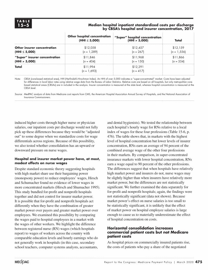
475 Repo r t t o t h e Cong r e s s : Med i ca r e Paymen t P o l i c y | Ma r ch 2020
and dental hygienists). We tested the relationship between each hospital’s hourly wage for RNs relative to a local index of wages for these four professions (Table 15-6, p. 476). The table shows that, in markets with the highest level of hospital concentration but lower levels of insurer concentration, RNs earn an average of 94 percent of the combined average wage of the other four professions in their markets. By comparison, in super-concentrated insurance markets with lower hospital concentration, RNs earn a wage equal to 90 percent of the other professions. The differences suggest that when hospitals have relatively high market power and insurers do not, nurse wages may be slightly higher than when insurers have relatively more market power, but the differences are not statistically significant. We further examined the data separately for for-profit and nonprofit hospitals; again, the findings were not statistically significant (data not shown). Because market power’s effect on nurse salaries is too small to be statistically significant, it is unlikely that the effect of market power on hospital employee salaries is large enough to cause us to materially underestimate the effect of hospital concentration on costs.
Horizontal consolidation increases commercial patient costs but not Medicare patient costsAs hospital prices on commercially insured patients rise, the costs of patients who pay a share of the negotiated
induced higher costs through higher nurse or physician salaries, our inpatient costs per discharge would not fully pick up these differences because they would be “adjusted out” to some degree when we standardize costs for wage differentials across regions. Because of this possibility, we also tested whether consolidation has an upward or downward pressure on nurse wages.
Hospital and insurer market power have, at most, modest effects on nurse wages
Despite standard economic theory suggesting hospitals with high market share use their bargaining power (monopsony power) to reduce employees’ wages, Hirsch and Schumacher found no evidence of lower wages in more concentrated markets (Hirsch and Shumacher 1995). This study bundled for-profit and nonprofit hospitals together and did not control for insurer market power. It is possible that for-profit and nonprofit hospitals act differently when they have the combination of greater market power over payers and greater market power over employees. We examined this possibility by comparing the wages paid to hospital employees in a market with the wages of other workers. We highlight the difference between registered nurse (RN) wages (which hospitals report) to wages of workers across the country with comparable education levels and hourly earnings who do not generally work in hospitals (in this case, secondary school teachers, computer systems analysts, accountants,
T A B L E15–5 Median hospital inpatient standardized costs per discharge
by CBSA’s hospital and insurer concentration, 2017
Other hospital concentration (HHI ≤ 5,000)
“Super” hospital concentration (HHI > 5,000) Total
Other insurer concentration (HHI ≤ 5,000)
$12,058(n = 1,289)
$12,457(n = 267)
$12,159(n = 1,556)
”Super” insurer concentration(HHI > 5,000)
$11,846(n = 404)
$11,968(n = 150)
$11,866(n = 554)
Total $11,994(n = 1,693)
$12,291(n = 417)
Note: CBSA (core-based statistical area), HHI (Herfindahl–Hirschman Index). An HHI of over 5,000 indicates a “super-concentrated” market. Costs have been adjusted for differences in local labor rates using relative wage data from the Bureau of Labor Statistics. Relative costs are based on all hospitals, but only metropolitan core-based statistical areas (CBSAs) are in included in the analysis. Insurer concentration is measured at the state level, whereas hospital concentration is measured at the CBSA level.
Source: MedPAC analysis of data from Medicare cost reports from CMS, the American Hospital Association Annual Survey of Hospitals, and the National Association of Insurance Commissioners.

476 Cong r e s s i o na l r eque s t o n h ea l t h c a r e p r o v i d e r c on so l i da t i o n
has increased in recent years. The literature suggests that the net results of increases in hospital–physician integration have been higher physician prices, higher spending for commercial payers, and higher spending for Medicare.
One of the key reasons that hospital–physician integration leads to higher prices is that Medicare pays more for the same service when it is performed in hospital outpatient departments (HOPDs) than it does if performed in a physician’s office. Paying higher prices based on setting distorts competition. The result is that markets may gravitate toward a particular delivery model (in this case, a vertically integrated one) not because that model is the most efficient at delivering high-quality care, but because it generates higher revenues. If payment rates were aligned across sites of service, hospitals and physicians would integrate only when doing so generated efficiencies.
Hospital–physician integration has increasedVertical integration between hospitals and physicians increased over the last few decades and has continued to increase in recent years. Researchers have documented increasing levels of hospital–physician integration over a long period of time (Post et al. 2018). More recently, one survey found that, from 2012 to 2018, the share of physicians who worked for hospitals increased from 29 percent to 35 percent (Kane 2019).
rate as coinsurance will rise in proportion. In contrast, under Medicare’s prospective payment systems for hospital inpatient and outpatient services, beneficiaries are protected from changes in hospital market power.
An exception is in critical access hospitals (CAHs). Medicare patients in CAHs pay coinsurance equal to 20 percent of charges, not prices. The Medicare program pays these hospitals their costs, less patient coinsurance. The result is that as charges increase, patient coinsurance increases, and program payments become a smaller share of total payments. As noted in our 2012 report to the Congress, CAHs’ charge-based coinsurance can result in patients paying most of the cost of their care in CAHs (Medicare Payment Advisory Commission 2012a). We are not aware of any studies that examine whether CAHs increase charges when they are acquired by a system as opposed to being controlled by a local board of directors.
Physician–hospital integration has increased Medicare payments for physician services
We define physician practices as vertically integrated if a hospital owns the practice or a hospital directly employs its physicians.5 Using this definition, vertical integration
T A B L E15–6 Median ratio of hospital nurse wages to the average wage of comparable
professions by CBSA’s level of provider and insurer market power, 2016
Other hospital concentration (HHI ≤ 5,000)
“Super” hospital concentration (HHI > 5,000) Total
Other insurer concentration (HHI ≤ 5,000)
0.93(n = 114)
0.94(n = 143)
0.93(n = 257)
”Super” insurer concentration(HHI > 5,000)
0.90(n = 50)
0.93(n = 69)
0.92(n = 119)
Total 0.91(n = 162)
0.93(n = 212)
Note: CBSA (core-based statistical area), HHI (Herfindahl–Hirschman Index). An HHI of over 5,000 indicates a “super-concentrated” market. The data reflect the average registered nurse (RN) wage at a hospital in the market in relation to the average wage in the metropolitan statistical area for secondary teachers, accountants, computer systems analysts, and dental hygienists. Each wage is standardized. For example, if RNs earn an average of $95,000 and the other four professions earn an average of $100,000, the table would report a value of 0.95, indicating that nurses are paid 95 percent of what we would expect, given wages of the other four professions in that same market.
Source: MedPAC analysis of data from the Bureau of Labor Statistics, occupation mix survey data from CMS, Medicare cost reports from CMS, the American Hospital Association Annual Survey of Hospitals, and the National Association of Insurance Commissioners.

477 Repo r t t o t h e Cong r e s s : Med i ca r e Paymen t P o l i c y | Ma r ch 2020
Much of the increase in vertical integration is likely driven by hospitals directly hiring individual physicians or acquisitions of small physician practices. One study found that most of the growth of very large physician groups (which may be physician owned or hospital owned) was due to direct hiring of physicians or acquisitions of practices that had 10 or fewer physicians (Capps et al. 2017).While the acquisition of large physician groups might garner more media attention, direct hiring and small acquisitions are important because:
• Younger physicians increasingly prefer employment to becoming a partner in a practice. Direct hiring of these physicians can result in a greater concentration of physicians in hospital systems (Merritt Hawkins 2019).
• In 2018, nearly 57 percent of physicians worked in practices of 10 or fewer physicians, so the pool of potential acquisition targets often consists of small group practices (Kane 2019).
The fact that small acquisitions and direct hiring contribute to increases in vertical integration makes federal antitrust enforcement more difficult. First, some researchers have suggested that hiring new physicians likely falls outside the purview of antitrust laws, and, by itself, each small acquisition likely has a correspondingly small effect on market competitiveness (Capps et al. 2017). Second, many acquisitions of physician practices are too small to require the parties to notify the Federal Trade Commission before the transaction occurs; in 2019, the acquisition must have been valued at $90 million or more to trigger this notification requirement (Federal Trade Commission 2019). Third, even to the extent that federal authorities are aware of the acquisition, they have limited resources to challenge the very large number of small transactions.
Hospital–physician integration increases prices and total spending Researchers have consistently found that increases in hospital–physician integration lead to higher prices (the professional fee plus the facility fee) for physician visits by Medicare and commercially insured patients.6 Increases in hospital–physician integration can lead to higher prices in two ways. First, hospital acquisitions of physician practices can consolidate physician services into large hospital-owned practices (a form of horizontal physician consolidation). For example, if a hospital that employs 25 percent of the physicians in a market acquires a practice that employs an additional 25 percent of physicians, the
resultant entity (with 50 percent of the physician market) will likely be able to negotiate higher commercial prices because of its dominant market position (Medicare Payment Advisory Commission 2017a). Second, the literature shows that increases in hospital–physician integration further increase prices for physician services beyond what can be explained by increases in horizontal concentration alone. For example, after controlling for the level of horizontal concentration of physician services, three recent studies found that hospital–physician integration led to commercial price increases of 3 percent to 14 percent (Capps et al. 2018, Medicare Payment Advisory Commission 2017a, Neprash et al. 2015).
Hospital–physician integration also increases the price for physician services for Medicare because of site-of-service differentials. Medicare often pays more for the same service when it is billed in an HOPD instead of a physician office. Once physicians are acquired by a hospital, Medicare has historically allowed them to bill as an outpatient department of the acquiring hospital.7 The Commission has repeatedly found that these site-of-service differentials increase Medicare and beneficiary spending by billions of dollars a year. While FFS Medicare often pays for services performed in HOPDs at a higher rate as a matter of policy, other insurers are not required to follow this convention. However, in practice, some do. One study found that nearly half of the commercial price increase that occurred after hospitals acquired physicians was due to site-of-service differentials (Capps et al. 2018).
The higher prices that result from hospital–physician integration have not been offset by a lower volume of services. One of the theoretical benefits of vertical integration is improved coordination, which could translate into avoiding unnecessary or duplicative services. However, the literature suggests that hospital–physician integration does not have a substantial effect on hospital or physician volume (Baker et al. 2014, Cuellar and Gertler 2006, Neprash et al. 2015). Therefore, the net result is that growth in hospital–physician integration leads to higher total spending because prices increase without countervailing efficiencies (Capps et al. 2018, Robinson and Miller 2014).
Maryland’s system of paying hospitals under global budgets provides an interesting exception to the traditional incentives in the Medicare FFS program. Because Maryland hospitals operate under global budgets, shifting patients from physician offices to hospital outpatient departments does not necessarily increase hospital

478 Cong r e s s i o na l r eque s t o n h ea l t h c a r e p r o v i d e r c on so l i da t i o n
increased under the OPPS (Table 15-7). Over this period, the volume of OPPS clinic visits increased by 37 percent and chemotherapy administration by 53 percent. At the same time, the volume of physician visits in freestanding offices decreased by 2.0 percent, and chemotherapy administration by 16.6 percent.
It is difficult to know precisely how much the shift in billing of these services from the PFS to the OPPS has increased Medicare spending because many ancillary items that are paid separately under the PFS are packaged into the payment rate of a primary service under the OPPS. Nevertheless, we are certain that this shift has increased Medicare spending.
In a previous report, the Commission identified a number of services for which the packaging of ancillary items into the payment rates is minimal (Medicare Payment Advisory Commission 2014). Because of the minimal packaging, we can more easily compare the PFS and OPPS payment rates for these services. We found that, on average, the OPPS payment rates were 43 percent higher than the PFS payment rates for the services in these ambulatory payment classifications.8
To address the increased spending that results from the shift in billing from the PFS to the OPPS, the Commission has recommended adjusting OPPS payment rates for office visits so that Medicare payment is the same in freestanding physician offices and HOPDs (Medicare Payment Advisory Commission 2012b). The Commission has also recommended adjusting OPPS payment rates for
revenues. Compared with beneficiaries in the rest of the country, we found that beneficiaries in Maryland had a lower share of their office visits performed in hospitals and that the shift of office visits to hospitals has been slower in Maryland. This observation further suggests that hospital facility fees (which increase hospitals’ revenues in states other than Maryland) may partially be driving the movement of services to hospitals in the other 49 states (see text box on shifting office visits to hospitals under Maryland’s global-budget system, pp. 480–481).
Medicare pays higher rates for services in outpatient departments than in physician offices
As hospitals have integrated physician offices through acquisition, the billing of services has shifted from the physician fee schedule (PFS) to the outpatient prospective payment system (OPPS). Payment rates for the same service are usually higher under the OPPS relative to the PFS. For example, in 2019 the payment rates for a midlevel (Level 4) office visit for an established patient were $110.28 if done in an office and $195.86 if done in an HOPD.
Medicare payments increase as services shift from physician offices to hospitals
The integration of hospitals and physician practices has substantially shifted the billing from the PFS to the OPPS for four service categories: chemotherapy administration, echocardiography, cardiac imaging, and office visits. From 2012 to 2018, the billing of these services under the PFS decreased (substantially in some categories) and
T A B L E15–7 Volume of services for chemotherapy administration, echocardiography, cardiac
imaging, and office visits shifted from physician offices to hospitals, 2012–2018
Service
HOPD Physician office
Millions of servicesPercent change
Millions of servicesPercent change2012 2018 2012 2018
Chemotherapy administration 3.0 4.5 53.3% 5.5 4.5 –16.6%Echocardiography 1.7 2.3 33.8 3.1 3.0 –4.8Cardiac imaging 0.86 0.86 0.0 1.27 0.94 –26.3Office visits 23.4 32.0 37.0 220.6 216.0 –2.0
Note: HOPD (hospital outpatient department). Volume is measured as aggregate totals for fee-for-service Medicare patients. “Physician office” refers to being paid under the physician fee schedule.
Source: MedPAC analysis of standard analytic claims files from 2012 and 2018.

479 Repo r t t o t h e Cong r e s s : Med i ca r e Paymen t P o l i c y | Ma r ch 2020
Because not every type of vertical integration appears to improve quality, the Commission has recommended paying for quality directly and setting rates for nonemergency HOPD services that can be provided in physician offices equal to the rates paid in physician offices (Medicare Payment Advisory Commission 2015). Under our recommendation, hospitals would still have an incentive to vertically integrate when it improves quality (to receive quality bonuses), but hospitals would no longer have a financial incentive under Medicare (charging facility fees) to vertically integrate if the integration does not generate some quality or cost improvements.
No clear effect of hospital consolidation on beneficiary coinsurance for drugs or related services
Horizontal hospital consolidation is unlikely to significantly affect Medicare beneficiaries’ coinsurance for drugs. However, Medicare beneficiaries’ cost sharing for certain drugs and for drug administration can be affected when hospitals purchase physician practices and shift services to the hospital campus.
Medicare pays similar payment rates for drugs in the PFS and the OPPS. Legislation has established payment rates for drugs billed under the PFS at average sales price (ASP) + 6 percent. Likewise, legislation has established payment rates for drugs that have pass-through status under the OPPS at ASP + 6 percent. Finally, CMS has chosen to pay for drugs that have separately payable status (but not pass-through status) under the OPPS at a rate of ASP + 6 percent if hospitals do not obtain them through the 340B Drug Pricing Program and at a rate of ASP – 22.5 percent if hospitals obtain them through the 340B program. Therefore, beneficiaries’ cost sharing is 28.5 percentage points lower for non-pass-through drugs when hospitals obtain them through the 340B program. The effect of vertical integration on coinsurance for drugs is usually limited to situations in which the physician practice is acquired by a 340B hospital and the drug being prescribed qualifies for the 340B discount.9
While vertical integration reduces coinsurance associated with the Medicare payment for certain drugs in some limited circumstances, it increases coinsurance associated with the payment for drug administration. The cost to beneficiaries for drug administration is usually higher when billed under the OPPS than under the PFS,
a selected set of other services so that payment rates are equal or more closely aligned across these two settings (Medicare Payment Advisory Commission 2014).
Hospital–physician integration alters referral patterns and has an indeterminate effect on qualityPhysicians who are vertically integrated with hospitals have substantially different referral patterns compared with other physicians. Vertically integrated physicians tend to refer a greater share of their patients to hospital-based facilities, in general, and particularly to the hospital that employs them. One study found that patients were more likely to choose a high-cost, low-quality hospital when their physician is employed by that hospital (Baker et al. 2016). Other studies found that vertically integrated physicians were more likely to refer patients for hospital-based MRI scans compared with other physicians. After their practices were acquired by hospitals, physicians began billing more services in the hospital setting (and fewer in the office setting) and reducing their activities at other hospitals (Chernew et al. 2018, Koch et al. 2017).
These referral and admission patterns suggest that one motivation for hospitals’ acquisition of physician practices is to ensure a steady stream of referrals. This referral pipeline can make it more difficult for competitors to enter the market. If a hospital employs the dominant share of local physicians, new competitors would not only have to build a new hospital but also bring in a sufficient number of physicians to supply patients to the hospital. For this reason, vertical integration can affect the degree of horizontal competition.
Vertical integration and quality
Whether the shift of ambulatory care toward hospital outpatient departments has created better quality of care or lower internal costs is not known conclusively. However, most studies on hospital–physician integration show ambiguous or no effects on quality (Post et al. 2018). For example, one study found that hospital acquisition of physician practices had little effect on a range of beneficiary health outcomes, such as mortality, acute circulatory conditions, and diabetes complications (Koch et al. 2019). Another recent study found vertical integration had a limited effect on quality metrics reported by CMS (Short and Ho 2019). While there are particular vertically integrated entities that score very high on quality (e.g., Mayo Clinic), it is not clear that vertical integration in general improves outcomes.

480 Cong r e s s i o na l r eque s t o n h ea l t h c a r e p r o v i d e r c on so l i da t i o n
Shift of office visits to hospitals slowed modestly after Maryland implemented global budgets in 2014
In 2014, all Maryland hospitals began operating under all-payer global budgets. These global budgets covered nearly all hospital inpatient and
outpatient services, but excluded services outside of hospitals, such as physician and post-acute care services.10
Global budgets operated as total spending targets for hospitals in Maryland. If a hospital was on track to exceed its global budget in a given year, the payment rates it received for services were lowered to not exceed the global spending target. Therefore, Maryland hospitals whose volume increased rapidly could face payment rate cuts in order to keep their total spending under their global budget; alternatively, hospital payment rates could increase if volume decreased. Therefore, Maryland hospitals operating under global budgets had an incentive to shift services to settings outside of hospitals, such as physician offices. In contrast, hospitals operating under Medicare’s standard fee-for-service (FFS) payment systems have a strong incentive to shift services into hospitals because Medicare often pays far more for the same service when performed in a hospital instead of a physician office.
To analyze the extent to which these differing incentives have resulted in shifts in the settings where services were delivered, we analyzed the share of evaluation and management (E&M) office visits performed in hospital outpatient departments (HOPDs) in Maryland compared with the rest of the country, using Medicare FFS claims.11 We analyzed data from 2009 through 2018 to establish utilization patterns before and after global budgets were implemented in Maryland in 2014.
We found that the implementation of global budgets in Maryland in 2014 appeared to modestly slow the shift of office visits to HOPDs compared with the rest of the country (Figure 15-5). Before global budgets were implemented (2009 to 2013), the share of office visits performed in HOPDs among beneficiaries who lived in Maryland increased from 3.6 percent to 5.8 percent, an increase of about 0.5 percentage point a year. After
global budgets were implemented, the share of office visits performed in HOPDs rose about 0.1 percentage point a year from 2014 to 2018. While the shift to HOPDs in the rest of the country was faster both before and after 2014, the difference between Maryland and the rest of the country was larger after global budgets were implemented. These different trends suggest global budgets may have modestly slowed the shift of services to HOPDs and resulted in a widening gap between the share of office visits performed in HOPDs in Maryland compared with the rest of the country.
While the implementation of global budgets in Maryland appears to have modestly slowed the shift of office visits to HOPDs, these data should be interpreted with caution for several reasons.
First, the shift of office visits to HOPDs in Maryland was slower than the rest of the country even before the state implemented global budgets, suggesting that patterns of care in Maryland could be systematically different from patterns in the rest of the country for reasons other than global budgets. Even before global budgets, Maryland set all-payer rates for each hospital, which were substantially above standard Medicare FFS rates but lower than prevailing private-payer rates. The state updated these payment amounts annually to account for factors such as inflation and demographic changes. However, during the early part of our study period (2009 to 2013), the state implemented a volume adjustment methodology that paid hospitals a rate equal to 85 percent of their standard rate for volume growth above a baseline (Murray and Berenson 2015). The fact that hospitals were not fully reimbursed for excess volume growth could have reduced the incentive for hospitals to shift E&M services to hospitals.
Second, while the shift to HOPDs was slower in Maryland compared with the rest of the country, the share of office visits performed in HOPDs varied substantially across the country, and several states had lower shares of office visits performed in HOPDs compared with Maryland. In 2018, the share of office visits performed in HOPDs ranged from 3.5 percent
(continued next page)

481 Repo r t t o t h e Cong r e s s : Med i ca r e Paymen t P o l i c y | Ma r ch 2020
in a freestanding office and $298 when performed in an HOPD. Beneficiary coinsurance is $30 higher for administration in the hospital (($298 – $145) × 0.20). In aggregate, beneficiary cost sharing under the OPPS is much lower for drug administration services than for the
irrespective of the drug’s pass-through status or whether the hospital obtains the drug through the 340B program. For example, the method of administering chemotherapy that has the highest Medicare spending under the OPPS has a Medicare payment rate of $145 when performed
Shift of office visits to hospitals slowed modestly after Maryland implemented global budgets in 2014 (cont.)
in Nevada to 57.9 percent in Vermont. Among the 50 states and the District of Columbia, Maryland ranked 41st in the share of office visits performed in HOPDs before global budgets (2013); a few years after global budgets were implemented (2018), the state ranked 44th. However, several states—including Florida, Georgia, Nevada, New Jersey, and South Carolina—had a lower share of office visits performed in HOPDs
(in 2018) and a smaller shift of services to HOPDs over our study period (2009 to 2018) compared with Maryland. These data suggest that Maryland’s global budgets may have modestly slowed the shift of services to HOPDs but also suggest that finding appropriate comparison areas is important given the substantial heterogeneity in trends across the country. ■
Growth in the share of E&M office visits performed in HOPDs slowed modestly after Maryland hospitals transitioned to global budgets
Note: E&M (evaluation and management), HOPD (hospital outpatient department). E&M office visits include Healthcare Common Procedure Coding System codes 99201–99205 and 99211–99215. While most Maryland hospitals began operating under global budgets in 2014, 10 rural hospitals operated under global budgets before 2014. We re-ran our analysis after excluding areas served by these hospitals, and the results were similar to those presented in the figure.
Source: MedPAC analysis of the 100 percent carrier file.
Title here....
Share
of
offi
ce v
isits
per
form
ed in
HO
PD
s
Note: Note and Source are in InDesign.
Source:
0
2
4
6
8
10
12
14
2018201720162015201420132012201120102009
Notes about this graph:• Data is in the datasheet. Make updates in the datasheet.• I deleted the years from the x-axis and put in my own.• I had to manually draw tick marks and axis lines because they kept resetting when I changed any data.• The dashed line looked ok here, so I didn’t hand draw it.• I can’t delete the legend, so I’ll just have to crop it out in InDesign.• Use direct selection tool to select items for modification. Otherwise if you use the black selection tool, they will reset to graph default when you change the data.• Use paragraph styles (and object styles) to format.
FIGURE1-XX
MarylandRest of U.S. Maryland hospitals transition
to global budgets
6.4
3.64.2
4.65.3
5.8 6.0 6.0 6.3 6.3 6.47.3
7.98.8
9.710.5
10.911.4
12.411.9
F IGURE15–5

482 Cong r e s s i o na l r eque s t o n h ea l t h c a r e p r o v i d e r c on so l i da t i o n
determine whether 340B discounts create incentives for the selection of more-expensive products, we examine whether the Medicare program and beneficiaries receiving chemotherapy incur higher overall cancer drug costs when treated by 340B hospitals compared with other providers. Our analysis looks only at spending per chemotherapy user and does not examine whether the 340B program creates incentives for providers to initiate chemotherapy treatment on new patients more often than they otherwise would. Determining any effects of 340B on initiation of chemotherapy versus other types of cancer treatment is outside the scope of this study. Our analysis focuses on cancer drug spending because drugs used exclusively or largely for cancer treatment account for a large share (73 percent) of Part B drug spending in HOPDs.
To measure the effect of 340B participation on combined Medicare Part B and Part D cancer drug spending, we conducted both descriptive analyses and regression analyses of cancer drug spending for five types of cancer: breast, colorectal, prostate, lung, and leukemia/lymphoma. Our analysis shows that 340B hospitals differ in characteristics from other providers treating chemotherapy patients. For example, 340B hospitals tend to be larger and are more likely to be teaching hospitals. They are also more likely to treat low-income, younger (under age 65), and disabled beneficiaries compared with other oncology providers. Unadjusted for these differences, patients treated by 340B hospitals had consistently higher average cancer drug spending than patients treated by other hospitals for each of the five types of cancer we examined. Other explanations for higher spending could exist, including differences in patient mix and hospital characteristics that are difficult to fully account for with a hospital-level analysis. Comparing cancer drug spending for 340B hospitals with physician offices, spending patterns were mixed, with neither setting having consistently higher average drug spending across the five cancer types.
To isolate the effects of the 340B program on cancer drug spending from the effects of the difference in patient characteristics across settings, we conducted regression analyses to examine the relationship between average cancer drug spending and the share of chemotherapy patients treated by 340B hospitals (340B market share) at the market level over time. Although we do not have detailed data on cancer stage or other, more-granular clinical data, our market-level approach helps control for differences in clinical characteristics between patients treated by 340B hospitals and other providers. Overall,
drugs ($0.5 billion coinsurance for drug administration cost sharing and $2.2 billion coinsurance for drug price cost sharing in 2018).
It should be noted that most beneficiaries have supplemental coverage that substantially reduces or eliminates beneficiaries’ out-of-pocket spending for coinsurance. However, higher cost sharing paid by supplemental plans can result in higher premiums.
Do 340B drug discounts create incentives for hospitals to choose more-expensive products?
Hospitals participating in the 340B program are generally nonprofit and have high shares of low-income patients, and they receive substantial discounts from drug companies on hospital-administered drugs covered by Medicare Part B. In light of hospital consolidation and acquisition of physician practices by hospitals that participate in the 340B Drug Discount Program, questions have been raised regarding whether the substantial discounts that 340B hospitals receive through the program give their clinicians an incentive to choose more-expensive products than they otherwise would absent the 340B program.
There are several ways the 340B program might influence prescribing patterns. Some have theorized that substantial margins from the 340B program affect prescribing choices and favor high-priced drugs. Given that the availability of 340B discounts has historically made a wide range of drugs profitable for 340B hospitals, another way that the 340B program could have influenced spending is by potentially encouraging providers to prescribe more products than they otherwise would.
The extent to which expensive drugs have offered 340B providers greater margins than less-expensive products remains an open question. Because 340B prices are not publicly available, we are unable to calculate the margin 340B providers earn when treating a Medicare patient with a particular product. However, analysis by the Office of Inspector General (OIG) provides examples of the margin available to 340B providers on a few de-identified Part B drugs, which suggests that in some, but not all, cases, higher priced drugs have greater margins than lower priced drugs.
While the Commission does not have information on 340B discounts at the individual product level to

483 Repo r t t o t h e Cong r e s s : Med i ca r e Paymen t P o l i c y | Ma r ch 2020
discounts (23 percent or more for brand-name drugs) from drug companies on hospital-administered drugs covered by Medicare Part B. In addition, some 340B hospitals receive discounts on retail pharmacy drugs covered by Medicare Part D that are dispensed by the hospital’s in-house pharmacy or by outside pharmacies with which the hospital contracts.
Several types of hospitals, as well as certain clinics (e.g., federally qualified health centers and Ryan White grantees), may enroll in the 340B program. To participate in the 340B program, a provider must register with the Health Resources & Services Administration (HRSA), be approved by the agency, and follow program requirements. Eligible hospitals include disproportionate share (DSH) hospitals, rural referral centers, sole community hospitals, children’s hospitals, freestanding cancer hospitals, and critical access hospitals (CAHs). Each type of eligible hospital (with the exception of CAHs) must have a minimum DSH adjustment percentage, which is based on the share of a hospital’s inpatients who are Medicaid and low-income Medicare patients. Only hospitals with nonprofit, state government, or local government ownership are eligible for the 340B program. In addition, nonprofit hospitals must meet additional eligibility criteria (such as having contracts with a state or local government to provide services to low-income patients who are not eligible for Medicare or Medicaid). According to HRSA, the intent of the 340B program is to allow certain providers to stretch scarce federal resources as far as possible to provide more care to more patients (Health Resources and Services Administration 2014). For a detailed discussion of the 340B program, see our May 2015 report on the 340B program, available at http://www.medpac.gov.
Drug manufacturers are required to sell outpatient drugs to 340B hospitals for discounted prices that are no higher than the 340B ceiling price. The 340B ceiling price is based on a statutory formula. Specifically, the ceiling price is the drug’s average manufacturer price (AMP) less a unit rebate amount (URA). For brand drugs, the URA includes a basic rebate and, if the product’s price has risen faster than inflation, an inflation rebate. The basic rebate for brand products is the greater of 23.1 percent of AMP or the difference between AMP and best price. The inflation rebate is the difference between AMP and what AMP would have been if it had risen at the same rate as the consumer price index for urban consumers between a base year and the current period. The URA is less for generic drugs (13 percent of AMP and, beginning in 2017,
we found evidence of an association between higher 340B market share and higher drug spending for some cancers. Of the five cancer types, our regression analysis for two cancer types (lung and prostate cancers) found that 340B market share had statistically significant effects of just over $300 per patient month. Because spending for lung cancer is higher than that for prostate cancer, the effect is greater in percentage terms for prostate cancer than for lung cancer (28 percent vs. 11 percent, respectively). Those 340B effects, however, were much smaller than the effects of the general increase in oncology spending, which reflects both the effect of rising prices and shifts in the mix of drugs, including the launch of new products with higher prices. For example, between 2009 and 2017, cancer drug spending grew by more than $2,000 per patient month for patients with breast cancer, lung cancer, and leukemia/lymphoma.
The findings of our analysis are limited to the five types of cancers examined and are not generalizable to other cancers or to other (noncancer) conditions. Any relationship that exists today between the 340B program and Medicare’s spending will likely change with the evolution of standard treatments and entries of new therapies. Finally, we note that beginning in 2018, Medicare lowered some payment rates for Part B drugs furnished by 340B hospitals, and our data do not incorporate this policy change.12
Given our findings on the relative size of the 340B effect for some cancers, the overall effect of 340B on Part B cost sharing is also likely be modest and vary by beneficiaries’ supplemental coverage. Beginning in 2018, Medicare’s payment rate for certain Part B drugs provided at 340B hospitals is less than the payment rate at other hospitals and physician offices, so, potentially, Part B cost sharing after 2017 could be lower for patients treated by 340B hospitals compared with patients treated in other settings. With respect to Part D drugs, any potential effect of 340B on beneficiary cost sharing is likely to be mixed. Beneficiaries who receive the low-income subsidy (LIS) pay nominal cost sharing and are likely to be unaffected. Other Part D beneficiaries could face higher Part D cost sharing if 340B is associated with higher spending, but it would depend on the plan’s formulary and cost-sharing structure.
Background on the 340B program and Medicare payment for Part B drugsUnder the 340B Drug Pricing Program, nonprofit hospitals with high shares of Medicaid and low-income Medicare patients who participate in the program receive substantial

484 Cong r e s s i o na l r eque s t o n h ea l t h c a r e p r o v i d e r c on so l i da t i o n
Potential effects of 340B discounts before 2018
Before 2018, Medicare paid ASP + 6 percent for separately payable Part B drugs furnished by 340B hospitals, and 340B hospitals earned substantial margins on a wide range of Part B drugs furnished to Medicare beneficiaries. Consequently, the 340B program created potential incentives for 340B hospitals to use more drugs and to select more-profitable drugs. However, the extent to which higher priced products offered 340B hospitals greater profit margins than lower priced products is not clear. More-expensive drugs may have resulted in higher margins for 340B hospitals than less-expensive drugs in some, but not all, situations. Literature to date suggests that drug spending in 340B hospitals is generally higher than in other hospitals, although most studies have not generally controlled for differences in patient mix across hospitals.
OIG study shows that, historically, 340B hospitals have earned substantial margins on Part B drugs, with margins varying across drug products OIG conducted a study comparing actual 340B ceiling prices with Medicare payment rates for individual drugs and found that 340B hospitals earned a substantial margin on Part B drugs (Office of Inspector General 2015). Specifically, OIG found that 2013 Medicare payments to 340B entities
an inflation rebate if AMP has risen faster than inflation). HRSA calculates the 340B ceiling prices and discloses the prices to 340B entities, but not to the public.
Medicare pays providers for Part B drugs administered in outpatient hospitals and physician offices based on the manufacturer’s reported average sales price (ASP). Until 2018, hospitals that received 340B discounts on Part B drugs were paid the same rate by Medicare—generally ASP + 6 percent—as hospitals that did not receive these discounts.13 Since 2018, Medicare pays 340B hospitals ASP – 22.5 percent for Part B drugs obtained at 340B prices, with the exception of pass-through drugs, which continue to be paid ASP + 6 percent for the two to three years they receive pass-through status.
Although payment for Part D drugs works differently from payment for Part B drugs, some hospitals receive 340B discounts on Part D drugs dispensed by in-house pharmacies or contract pharmacies. Most contract pharmacies are retail pharmacies that receive fees and/or a portion of the spread between insurers’ payments to the pharmacy and the 340B discounted prices. Entities with 340B status can retain the difference between a contract pharmacy’s reimbursement and the entity’s 340B acquisition cost (Fein 2016).14
T A B L E15–8 340B hospitals’ margins on Part B drugs in 2013 varied
substantially by product, according to OIG
Comparison of Medicare payment amount and 340B ceiling price Number of products Share of products
Medicare payment rate exceeds 340B ceiling price by:Less than 25% 79 19%25% to 49% 149 3550% to 79% 53 1380% to 100% 22 5More than 100% 95 23
Medicare payment rate is less than 340B ceiling price 22 5
All 420 100
Note: OIG (Office of Inspector General). Source: OIG report on Part B payments for 340B purchased drugs. https://oig.hhs.gov/oei/reports/oei-12-14-00030.asp.

485 Repo r t t o t h e Cong r e s s : Med i ca r e Paymen t P o l i c y | Ma r ch 2020
hospital than the lower priced product because of the 23.1 percent basic rebate. However, because the ceiling price also incorporates an inflation rebate, it is possible a lower priced brand product that experienced substantial inflation could have been more profitable for a 340B hospital than a higher priced brand product.16 Similarly, the best-price provision of the basic rebate could theoretically result in a lower priced product having a higher margin than a higher priced product if the lower priced product had a substantial best-price discount. In contrast, if a provider was choosing between a high-priced brand product and a different, lower priced generic drug, we would generally expect a greater margin on the brand drug than the generic drug.17
OIG’s analysis of Medicare payment rates and 340B ceiling prices for five cancer drugs in 2013 demonstrates the varied relationship between price and margin. Among the five products, the product with the highest Medicare payment amount (Drug 5) had the greatest margin (Table 15-9). However, sometimes products with lower Medicare payment amounts had greater margins than products with higher Medicare payment amounts. For example, Drug 2 had a lower Medicare payment amount than Drug 1 ($18,506 vs. $20,517, respectively) but a greater margin ($9,238 vs. $5,749, respectively). In the case of these five drugs, whether there were financial incentives to use products with higher or lower Medicare payment rates would depend on which, if any, of these products were therapeutic alternatives for one another. The OIG report does not provide information on the names of the products or whether they were alternatives for one another.
for Part B drugs exceeded the 340B ceiling price by 58 percent, meaning that Medicare paid 340B entities $3.5 billion for Part B drugs while the 340B ceiling price for these drugs was $2.2 billion, yielding a margin of $1.3 billion in 2013.15
The OIG study also found that margins on 340B drugs varied across products. For a sample of 420 Part B drugs, OIG found that Medicare’s payments in 2013 exceeded the ceiling prices for 95 percent of the drugs. Of the products examined, the amount by which payments exceeded costs ranged from less than 25 percent to more than 100 percent (Table 15-8). The varied margin across products likely reflects several factors, such as the difference in the basic rebate of 23.1 percent for brands and 13 percent for generics as well as variation in the size of the inflation rebate across brand products. It is also possible that some brand products could have had a basic rebate in excess of 23.1 percent due to the best-price provision of the brand rebate formula (because the basic rebate for brand products is the greater of 23.1 percent of AMP or the difference between AMP and best price).
Historically, when Medicare paid 340B hospitals ASP + 6 percent for drugs, higher priced products may have been more profitable for 340B hospitals than lower priced products in some, but not all, situations, depending on the relative size of the basic rebate and inflation rebate for the comparable products. All else being equal, if a provider was choosing among brand products, a higher priced product would yield a higher margin for the 340B
T A B L E15–9 OIG study demonstrates that higher-priced drugs in some but
not all cases offered 340B providers higher margins, 2013
2013
MarginMedicare payment amount 340B ceiling price
Drug 1 $20,517 $14,768 $5,749Drug 2 18,506 9,268 9,238Drug 3 22,573 13,411 9,162Drug 4 20,044 8,914 11,130Drug 5 27,207 13,871 13,336
Note: OIG (Office of Inspector General). OIG analysis of five high-expenditure cancer drugs as of 2013. Source: Office of Inspector General, Department of Health and Human Services. 2015. Part B payments for 340B-purchased drugs. Washington, DC: OIG.

486 Cong r e s s i o na l r eque s t o n h ea l t h c a r e p r o v i d e r c on so l i da t i o n
patients’ health status nor hospitals’ teaching status accounted for differences in outpatient drug spending between 340B hospitals and the other hospitals. A limitation of this study was that commercial drug prices were imputed based on Medicare drug pricing and the overall difference in prices across all drugs between commercial and Medicare pricing.
• Blalock examined Medicare drug spending in the 12 months before and after 379 DSH hospitals started to participate in the 340B program, between 2009 and 2016 (Blalock 2018). Per beneficiary outpatient drug spending increased by 32 percent among the newly enrolled 340B hospitals compared with spending growth of 13 percent among beneficiaries treated during the same period at a control group of other hospitals. A limitation of this study is that it included only beneficiaries treated at a given 340B hospital before and after the hospital’s enrollment in the program. In addition, the study did not control for differences in the conditions treated at 340B hospitals and other facilities.
• Dobson and colleagues found that 340B DSH hospitals incur higher drug spending compared to non-340B hospitals due to the type of patients they treat and the characteristics of the facilities they operate (Dobson et al. 2017). Accounting for differing patient and facility characteristics using propensity score matching (that matched 340B hospitals to non-340B hospitals based on patients’ and hospitals’ characteristics), Part B spending per beneficiary in 2013 was 15 percent greater at 340B DSH hospitals than at non-340B hospitals ($3,204 versus $2,794). However, because 58 percent of the 340B DSH hospitals that could not be matched to non-340B hospitals were therefore excluded from the analysis, a limitation of this study is that it may not be generalized to all 340B DSH hospitals.
• Desai and McWilliams concluded that 340B eligibility was associated with greater Medicare outpatient drug use (as measured by Part B drug claims billed per year and hospitals’ annual Medicare payments for Part B drugs) for drugs furnished by clinicians specializing in hematology-oncology and ophthalmology but not rheumatology (Desai and McWilliams 2018).18 A limitation of this study is that the authors excluded hospitals with DSH percentages that were within 1 percentage point of the eligibility threshold.
340B discounts may have provided incentives to use more-expensive drugs As demonstrated by the OIG analysis, when 340B hospitals were paid ASP + 6 percent for Part B drugs, higher priced drugs may have offered providers greater margins than lower priced drugs in some, but not all, situations. To the extent that 340B hospitals received a greater margin on higher priced products compared with lower priced therapeutic alternatives, the 340B program may have created incentives for the use of higher priced products.
Although the OIG study is the only one to look at actual 340B hospital profitability at the individual drug level for Medicare patients, several other studies have looked at differences in Part B drug spending for patients treated at 340B hospitals and other hospitals.
A descriptive analysis by the Government Accountability Office (GAO) found that among DSH hospitals, those that participated in the 340B program had higher Part B oncology drug spending per cancer patient in 2008 and 2012 compared with other DSH hospitals (Government Accountability Office 2015). For example, GAO found that in 2012, Part B cancer drug spending per patient was about $7,800 in 340B DSH hospitals compared with $5,432 in other DSH hospitals. GAO concluded that these differences in spending levels were not explained by differences in risk scores or teaching status.
The peer-reviewed studies and white papers that have examined differences in drug spending between 340B hospitals and other hospitals have generally found increased drug use by 340B hospitals compared with the other hospitals. However, our literature review did not find any studies that examined how the type of cancer, drug mix, or retail pharmacy drug use contributes to differences in drug spending between 340B and other hospitals.
• Hunter and colleagues aimed to replicate the GAO study but focused on the commercially insured population (Hunter et al. 2018). The researchers found that, in 2015, average per patient spending for commercial patients on outpatient drugs at 340B DSH hospitals was between 2.6 and 2.9 times the average spending for commercial patients at other hospitals. However, the difference in average drug spending for oncology drugs was less pronounced than for all drugs. Average per patient drug spending for outpatient oncology drugs at 340B DSH hospitals was 1.1 to 1.3 times the average spending at other hospitals. Neither

487 Repo r t t o t h e Cong r e s s : Med i ca r e Paymen t P o l i c y | Ma r ch 2020
first two to three years on the market. Thus, the policy change increases the relative profitability of newer, more-expensive pass-through products paid at ASP + 6 percent over existing products without pass-through status paid ASP – 22.5 percent.
Analysis of the relationship between the 340B program and cancer drug spendingAn important question raised by the GAO study is what is driving the differences in oncology drug spending between 340B and other hospitals. It could be that the 340B program induces participating hospitals to prescribe more drugs or higher priced drugs. Alternatively, it could be that 340B providers compared with others serve a different mix of patients who need a different mix of drugs (e.g., because of a different mix of diseases or different severity level). In fact, 340B providers have some characteristics that are different from the average hospital—they are larger and more likely to be major teaching hospitals—suggesting higher spending may be driven at least in part by differences in patient mix.
To determine whether the 340B program induces hospitals to furnish more-expensive drugs, we evaluated whether Medicare payments for chemotherapy and supportive drugs are higher among cancer patients treated by 340B hospitals compared with patients treated by other providers. Our analysis has two parts. First, we provide descriptive statistics comparing 340B hospitals and other hospitals and oncology patients served across the different settings. Second, we conducted a regression analysis focusing on the market-level impact of higher 340B market share (defined as the share of chemotherapy patients in a market treated at 340B entities) on cancer drug spending using metropolitan statistical areas (MSAs) as the unit of analysis. We contracted with Acumen LLC to provide assistance with relevant clinical information on chemotherapy drug and supportive therapies used for the treatment of cancer and to conduct the data analysis. One unique aspect of this study is that it combines Part B and Part D spending for cancer drugs. Another unique aspect of this study is that it examines cancer drug spending by type of cancer to better account for differences in patients’ clinical characteristics.
The study population was limited to FFS beneficiaries with a cancer diagnosis who received at least one Part B provider-administered chemotherapy drug during the year of analysis.20 Since these cancer patients may have received both provider-administered drugs (covered under Part B)
• Jung and colleagues concluded that 340B eligibility was not associated with increased cancer drug spending in markets that newly gained a 340B hospital between 2010 and 2013 compared with markets with no 340B hospitals during this period (Jung et al. 2018). Similar to the Commission’s approach, Jung and colleagues focused on only Medicare beneficiaries with cancer and controlled for market and year fixed effects using a linear regression model. However, this study did not differentiate by type of cancer, did not include spending for Part D drugs, and included critical access hospitals (which are not paid under the OPPS).
Some studies have examined whether the 340B program is expanding in ways that could maximize participants’ ability to generate profits from the program’s drug discounts. For example, Conti and Bach found that affiliated outpatient clinics associated with DSH hospitals participating in the 340B program after 2004 were more likely to be located in communities with lower poverty and uninsured levels and higher median and mean household income compared with outpatient clinics participating in the program before 2004 (Conti and Bach 2014). Similarly, Nikpay and colleagues found that compared with hospitals that began participating in 340B since 2004, earlier participants tended to be larger, disproportionately public, academic, and located in counties with lower income levels and higher levels of uninsured patients (Nikpay et al. 2018).
Potential effects of 340B discounts from 2018 onward
Beginning in 2018, Medicare lowered its payment rates to 340B hospitals for separately payable Part B drugs without pass-through status to ASP – 22.5 percent. This reduced payment rate roughly eliminates the margin 340B hospitals had been earning from the 23.1 percent basic rebate on brand non-pass-through products, but 340B hospitals will continue to earn a margin on non-pass-through drugs that receive an inflation rebate (which for some products may be a substantial rebate).19 Among competing brand products without pass-through status, the payment reduction to ASP – 22.5 percent decreases, but does not necessarily eliminate, any margin advantage that may have previously existed for higher priced products over lower priced products. The lower payment rates do not apply to new drugs with pass-through status, which will continue to be paid ASP + 6 percent for the
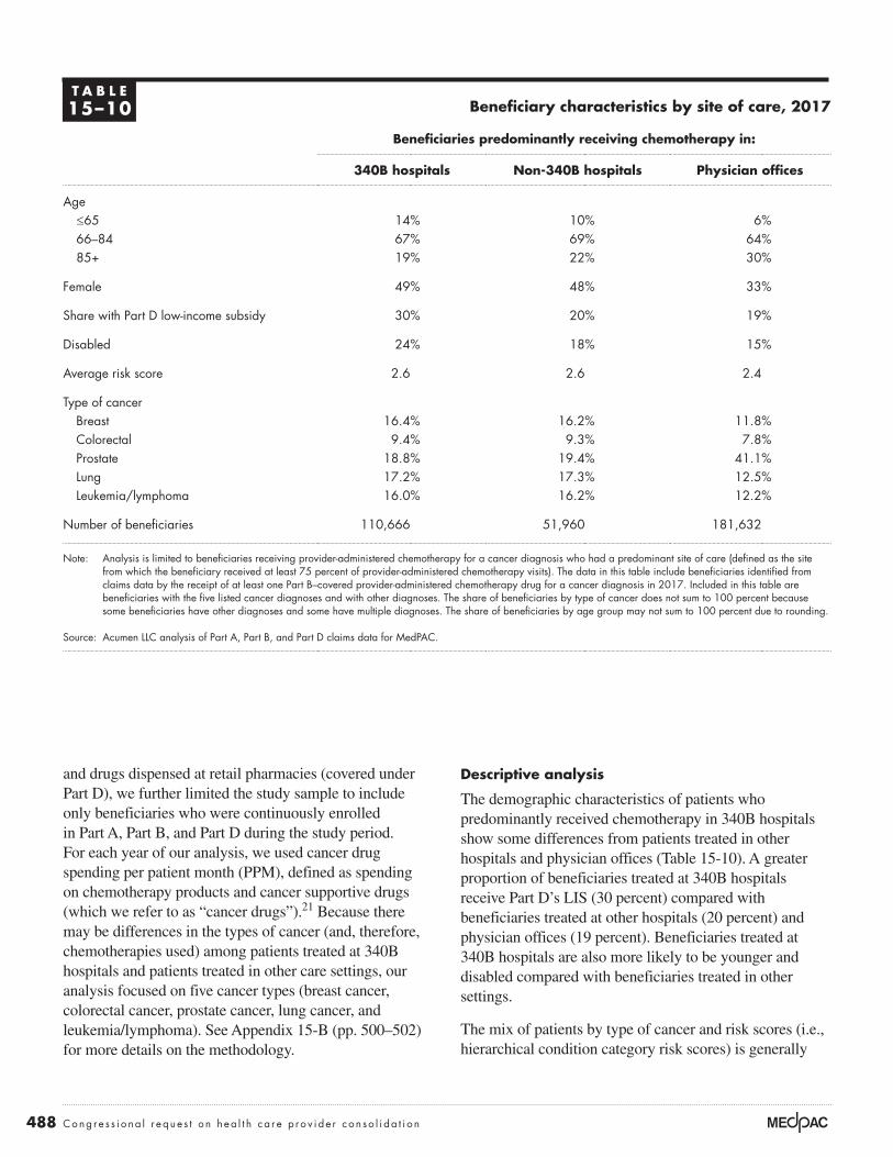
488 Cong r e s s i o na l r eque s t o n h ea l t h c a r e p r o v i d e r c on so l i da t i o n
Descriptive analysis
The demographic characteristics of patients who predominantly received chemotherapy in 340B hospitals show some differences from patients treated in other hospitals and physician offices (Table 15-10). A greater proportion of beneficiaries treated at 340B hospitals receive Part D’s LIS (30 percent) compared with beneficiaries treated at other hospitals (20 percent) and physician offices (19 percent). Beneficiaries treated at 340B hospitals are also more likely to be younger and disabled compared with beneficiaries treated in other settings.
The mix of patients by type of cancer and risk scores (i.e., hierarchical condition category risk scores) is generally
and drugs dispensed at retail pharmacies (covered under Part D), we further limited the study sample to include only beneficiaries who were continuously enrolled in Part A, Part B, and Part D during the study period. For each year of our analysis, we used cancer drug spending per patient month (PPM), defined as spending on chemotherapy products and cancer supportive drugs (which we refer to as “cancer drugs”).21 Because there may be differences in the types of cancer (and, therefore, chemotherapies used) among patients treated at 340B hospitals and patients treated in other care settings, our analysis focused on five cancer types (breast cancer, colorectal cancer, prostate cancer, lung cancer, and leukemia/lymphoma). See Appendix 15-B (pp. 500–502) for more details on the methodology.
T A B L E15–10 Beneficiary characteristics by site of care, 2017
Beneficiaries predominantly receiving chemotherapy in:
340B hospitals Non-340B hospitals Physician offices
Age≤65 14% 10% 6%66–84 67% 69% 64%85+ 19% 22% 30%
Female 49% 48% 33%
Share with Part D low-income subsidy 30% 20% 19%
Disabled 24% 18% 15%
Average risk score 2.6 2.6 2.4
Type of cancerBreast 16.4% 16.2% 11.8%Colorectal 9.4% 9.3% 7.8%Prostate 18.8% 19.4% 41.1%Lung 17.2% 17.3% 12.5%Leukemia/lymphoma 16.0% 16.2% 12.2%
Number of beneficiaries 110,666 51,960 181,632
Note: Analysis is limited to beneficiaries receiving provider-administered chemotherapy for a cancer diagnosis who had a predominant site of care (defined as the site from which the beneficiary received at least 75 percent of provider-administered chemotherapy visits). The data in this table include beneficiaries identified from claims data by the receipt of at least one Part B–covered provider-administered chemotherapy drug for a cancer diagnosis in 2017. Included in this table are beneficiaries with the five listed cancer diagnoses and with other diagnoses. The share of beneficiaries by type of cancer does not sum to 100 percent because some beneficiaries have other diagnoses and some have multiple diagnoses. The share of beneficiaries by age group may not sum to 100 percent due to rounding.
Source: Acumen LLC analysis of Part A, Part B, and Part D claims data for MedPAC.

489 Repo r t t o t h e Cong r e s s : Med i ca r e Paymen t P o l i c y | Ma r ch 2020
cancer examined, cancer drug spending ranged from $1,784 PPM for prostate cancer patients to $5,156 PPM for leukemia/lymphoma patients in 2017. Part D spending accounted for nearly one-quarter of chemotherapy and supportive drug spending, with its role varying by type of cancer (data not shown). The Part D share of total cancer drug spending ranged from 8 percent for lung cancer to 47 percent for prostate cancer. Spending on cancer drugs increased substantially between 2013 and 2017, with the greatest percentage increases for breast, prostate, and lung cancer (62 percent to 75 percent) and somewhat lower for colorectal cancer (21 percent) and leukemia/lymphoma (35 percent).
Overall, in 2017, average cancer drug spending PPM was higher at 340B hospitals than at other settings when patients with all cancer diagnoses were grouped together.22 However, for patients grouped with the same diagnosis, no uniform pattern existed for which site had higher costs (Table 15-12, p. 490). For all diagnoses combined, average spending PPM was higher for patients at 340B hospitals ($4,113) than at other hospitals ($3,920) and physician offices ($3,015). However, when patients were grouped by diagnoses, we found that patients treated at 340B hospitals had the highest spending for three cancers (colorectal, prostate, and leukemia/lymphoma) and at physician offices for two cancers (breast and lung), although the differences were generally modest. Compared with physician offices, average spending by cancer type at 340B hospitals
similar between 340B hospitals and other hospitals but differs from the mix at physician offices (Table 15-10). The average risk score is similar for 340B and other hospitals’ chemotherapy patients and is slightly higher than for patients treated in physician offices. The share of patients with the five types of cancer examined is similar between 340B hospitals and other hospitals, but chemotherapy patients treated in the physician office setting are much more likely to have prostate cancer than those treated at hospitals.
Hospitals that participate in the 340B program tend to be larger than other hospitals and are more likely to be teaching hospitals (data not shown). Among 340B hospitals in 2017, about 54 percent of providers were teaching hospitals (20 percent major teaching and 34 percent other teaching) compared with 36 percent for non-340B hospitals (7 percent major teaching and 29 percent other teaching). In 2017, the average 340B hospital furnished Part B–covered chemotherapy to 122 Medicare FFS patients (for whom that hospital was the predominant site of chemotherapy administration) compared with 50 patients for the average non-340B hospital.
Overall, spending on chemotherapy and supportive drugs varies by type of cancer (Table 15-11). On average, in 2017, combined Part B and Part D spending on chemotherapy and supportive drugs was $3,495 PPM. Focusing on beneficiaries with one of the five types of
T A B L E15–11 Cancer drug spending varies by diagnosis and has been increasing substantially
Cancer diagnosis
Part B and Part D cancer drug spending per patient month
2013 2017Percent change
2013–2017
All* $2,234 $3,495 56%Breast 2,939 4,781 63Colorectal 2,766 3,350 21Prostate 1,101 1,784 62Lung 2,886 5,045 75Leukemia/lymphoma 3,806 5,156 35
Note: *”All” cancer includes a broad set of cancer types in addition to the five specific cancer types shown. Source: Acumen LLC analysis of Part A, Part B, and Part D claims data for MedPAC.

490 Cong r e s s i o na l r eque s t o n h ea l t h c a r e p r o v i d e r c on so l i da t i o n
PPM by cancer type at 340B hospitals ranging from 2 percent to 5 percent higher than other hospitals.
One factor that contributes to differences in average cancer drug spending PPM is patient age: higher for younger patients compared with older patients. For example, patients under age 65 generally had higher spending per patient month than patients 65 and over (Table 15-12).
generally ranged from 1 percent lower to 7 percent higher than at physician offices (with the exception of prostate cancer, where average spending is substantially lower in physician offices because of a different mix of drugs). If we focused only on patients treated at hospitals, those treated at 340B hospitals had consistently higher cancer drug spending than those treated at other hospitals for the five types of cancer examined, with average spending
T A B L E15–12 The site of care with the highest cancer drug spending
per patient month varied by type of cancer, 2017
Cancer diagnosis and beneficiary age
Average Part B and Part D cancer drug spending per patient month by predominant site of care
340B hospital Non-340B hospital Physician office setting
All diagnoses*All ages $4,113 $3,920 $3,015Age <65 4,819 4,844 4,518Age ≥65 4,001 3,818 2,921
Breast cancerAll ages 4,794 4,629 4,812Age <65 5,411 5,305 5,488Age ≥65 4,658 4,510 4,725
Colorectal cancerAll ages 3,416 3,289 3,322Age <65 3,826 3,483 4,014Age ≥65 3,333 3,262 3,251
Prostate cancerAll ages 2,547 2,438 1,471Age <65 2,964 2,861 1,834Age ≥65 2,529 2,426 1,463
Lung cancerAll ages 5,041 4,933 5,076Age <65 5,050 4,883 5,055 Age ≥65 5,040 4,939 5,079
Leukemia/lymphomaAll ages 5,356 5,114 5,008Age <65 6,154 6,017 5,758Age ≥65 5,242 5,033 4,961
Note: “Predominant site of care” refers to the site (a 340B hospital, a non-340B hospital, or the physician office setting) where the beneficiary received at least 75 percent of provider-administered chemotherapy visits. Beneficiaries without a predominant site of care were excluded from the analysis. All of a beneficiary’s spending on Part B and Part D chemotherapy and supportive drugs is attributed to the predominant site of care, regardless of where the care took place.
*The “all diagnoses” label includes a broad set of cancer types in addition to the five cancer types shown. Source: Acumen LLC analysis of Part A, Part B, and Part D claims data for MedPAC.

491 Repo r t t o t h e Cong r e s s : Med i ca r e Paymen t P o l i c y | Ma r ch 2020
However, among new 340B hospitals alone, we found no clear evidence of increased spending on cancer drugs attributable to the hospitals’ 340B status.
Our analysis focused on a subset of hospitals that gained 340B status between 2013 and 2017 compared with other hospitals. We included all hospitals paid under the OPPS and patients treated for cancer in both 2013 and 2017 (2017 was the most recent year of data available at the time analysis was conducted).23 For each of the five types of cancer, among the hospitals in our analysis, roughly 11 percent gained 340B status between 2013 and 2017, about half were 340B participants in both 2013 and 2017 (“always 340B”), and another one-third did not participate in 340B in any of the years of the study period (“never 340B”) (a very small share of providers lost their 340B status during the period; data not shown) (Table 15-13).
Since younger patients make up a higher share of patients at 340B hospitals than at other hospitals and physician offices, this factor could contribute to spending differences across the settings. However, when patients in the same age category were compared, patients at 340B hospitals generally had higher spending than patients at other hospitals (Table 15-12).
Among new 340B hospitals, no clear evidence of changes in spending as a result of 340B status
Our comparison of the hospital-level data suggests that 340B hospitals, on average, have higher cancer drug spending compared with other hospitals and that some of the difference may be related to the differences in hospital characteristics (such as the teaching status) and patients’ demographic characteristics (such as age).
T A B L E15–13 Hospitals that changed their 340B status compared
with those with no status change between 2013 and 2017
Type of cancer
All* Breast Colorectal Prostate LungLeukemia/lymphoma
Total number of hospitals 1,853 1,204 1,116 1,213 1,184 1,216
Share of hospitals by 340B statusGained 340B status 11.1% 11.0% 10.8% 10.6% 11.4% 10.8%Always 340B 43.8 52.9 54.3 51.6 52.9 51.2Never 340B 43.1 34.5 33.2 35.9 34.0 36.0
2017 average cancer drug spending per patient month
Gained 340B status $3,898 $4,616 $3,346 $2,426 $4,808 $5,341Always 340B 4,081 4,743 3,306 2,491 4,926 5,281Never 340B 3,780 4,624 3,248 2,259 4,872 4,955
Increase in average cancer drug spending per patient month between 2013 and 2017
Gained 340B status 51% 57% 26% 53% 66% 39%Always 340B 54 60 19 45 82 39Never 340B 49 58 20 46 73 27
Note: Analysis is limited to hospitals that furnished chemotherapy and were paid under Medicare’s outpatient prospective payment system (OPPS) and were operating within the 50 states and the District of Columbia. Hospitals that were paid on a cost basis or at a rate that differs from Medicare’s OPPS rate were also excluded. *”All” includes a broad set of cancer types in addition to the five cancer types shown. “Share of hospitals by 340B status” does not sum to 100 percent because the table excludes the small share of hospitals that lost 340B status during the period.
Source: Acumen LLC analysis of Part A, Part B, and Part D claims data for MedPAC.

492 Cong r e s s i o na l r eque s t o n h ea l t h c a r e p r o v i d e r c on so l i da t i o n
While we do not find evidence of changes in hospitals’ prescribing behaviors after gaining 340B status, we note a few caveats. Only 11 percent of hospitals gained 340B status between 2013 and 2017. For most cancer types, that translates to about 130 hospitals. In addition to the relatively small number of hospitals, it is not clear how quickly hospitals and their clinicians change their prescribing, if at all, in response to changes in financial incentives for individual drug products. Depending on the timing of the conversion to a 340B hospital, our data may not capture the full impact of the 340B program on Medicare’s cancer drug spending.
MSA-level analysis suggests higher 340B market share is associated with higher drug spending for some cancers
A key question raised by any analysis comparing cancer drug spending for patients treated by 340B hospitals with those treated by other providers is whether differences in patients’ clinical characteristics may be driving the results. In our analysis, although we have information on patients’ cancer type, we do not have more-granular clinical information (e.g., stage of cancer, cancer subtype, or genomic markers) that may affect the cancer drug regimen that is appropriate for a given patient. One way to address concerns about possible differences in patient clinical characteristics by type of provider is to employ a market-level, rather than provider-level, analysis. With a market-level approach, we can look at the association between the share of patients treated in a market by 340B providers and average cancer drug spending PPM in the market (with average drug spending calculated across all cancer patients in the market regardless of whether they were treated by 340B hospitals or other providers). This market-level approach overcomes concerns present in hospital-level analyses about possible differences in patient mix between 340B hospitals and other providers affecting the results. For example, if it were true that patients with certain clinical characteristics that required higher priced drugs were shifted from physicians’ offices to 340B hospitals, but these patients received the same drugs at the 340B hospitals as they would have received at physicians’ offices, a hospital-level analysis would incorrectly suggest in this scenario that the 340B program increases drug spending, whereas a market-level analysis would not.
Our market-level analysis focuses on the effect of the 340B program on average cancer drug spending PPM at the MSA level using a linear regression model with a fixed effect for each of the over 300 MSAs. The MSA
The characteristics of hospitals that newly gained 340B status fell somewhere between that of existing 340B hospitals and non-340B hospitals. For example, the average cancer patient census at the newly 340B hospitals was greater than at non-340B hospitals but below that of the 340B hospitals. Both new and existing 340B hospitals were more likely to be teaching hospitals than non-340B hospitals, but existing 340B hospitals were more likely to have major teaching status compared with new 340B hospitals.
About 80 percent of the newly 340B hospitals were located in states that, as of 2013, had expanded Medicaid coverage under the Affordable Care Act of 2010.24 That share is higher than the overall share in the Medicaid expansion states (about 60 percent of hospitals), suggesting that Medicaid coverage expansion may have increased the DSH percentage for some hospitals and increased the likelihood that they met the 340B eligibility criteria.
In general, hospitals that gained 340B status, on average, had cancer drug spending that was similar to other hospitals and they experienced spending growth that did not consistently differ from those of other hospitals. In 2013 and 2017, always-340B hospitals tended to have higher cancer drug spending than never-340B hospitals, while hospitals that gained 340B status tended to have spending that was somewhere in between spending for never-340B and always-340B hospitals. However, the differences were relatively small in both years. For example, in 2017, average cancer drug spending for breast cancer patients ranged from $4,624 PPM for never-340B hospitals to $4,743 PPM for always-340B hospitals, or a difference of about 3 percent (Table 15-13, p. 491).
Average cancer drug spending increased for all hospitals, regardless of their 340B status, between 2013 and 2017. The incremental increases for hospitals that gained 340B status showed no clear pattern relative to other hospitals. For example, the increase in spending among hospitals that gained 340B status was lower than at other hospitals for breast and lung cancers, while it was higher than at other hospitals for colorectal and prostate cancers. For patients with leukemia/lymphoma, the increase in spending for hospitals that gained 340B status was comparable with always-340B hospitals (39 percent) and higher than never-340B hospitals (27 percent).

493 Repo r t t o t h e Cong r e s s : Med i ca r e Paymen t P o l i c y | Ma r ch 2020
In both cases, the 340B program was associated with higher cancer drug spending, by $310 PPM for prostate cancer and $313 PPM for lung cancer, on average.29 Because average monthly drug spending for lung cancer ($2,886 PPM in 2013) is 2.6 times that of prostate cancer ($1,101 PPM in 2013), the 340B effect for prostate cancer spending is greater (about 28 percent) than for lung cancer spending (about 11 percent) (see Table 15-11, p. 489, for average drug spending by cancer type).30 The 340B program effects were all positive and similar in magnitude, but they were not statistically significant at a 0.05 level for the other three cancer types.31
Another notable finding is that the variable measuring the extent of hospital–physician integration (i.e., hospital acquisition of physician practices) in a given market (“share of beneficiaries treated at HOPDs” in Table 15-14 (p. 494)) was not statistically significant in all five models. This finding suggests that the general trend toward more hospital–physician integration did not affect cancer drug spending for the five cancers we examined.
The general increase in oncology drug spending over time (represented by the year variables in Table 15-14, p. 494) was statistically significant. For example, between 2009 and 2017, average cancer drug spending for patients with leukemia/lymphoma rose by $2,362 PPM, about a 90 percent increase since 2009 (Table 15-14). Being age 65 or younger was significantly correlated with higher cancer drug spending for breast cancer ($2,668 PPM increase in spending), colorectal cancer ($1,270 PPM), and prostate cancer ($1,527 PPM) and for leukemia/lymphoma ($1,220 PPM). The correlation likely reflects the use of more aggressive cancer treatments with younger patients, which may be less clinically appropriate in older patients (i.e., patients age 80 or older). Finally, Part D’s LIS status was associated with lower cancer drug spending for patients with lung cancer and leukemia/lymphoma (–$831 and –$950, respectively). This last finding is somewhat counterintuitive. In a separate sensitivity analysis, we found that Part D chemotherapy drug spending was positively correlated with the share of LIS beneficiaries in a region, while that was not the case for Part B chemotherapy drugs (data not shown). Because Part B cancer drug spending is typically 3 to 11 times the amount spent on Part D cancer drugs, the effects of LIS share on combined Part B and Part D cancer spending mostly reflects the effects of Part B spending.32 Because LIS beneficiaries are more likely to be younger (under age 65) and female, the negative coefficients could be due to these other demographic variables that have statistically
fixed effects allow us to observe the changes in the 340B market share (defined as the share of chemotherapy patients treated by 340B entities) within each MSA over time. This analysis measured the effects of 340B market share using five years of data (2009, 2011, 2013, 2015, and 2017), controlling for general trends in oncology drug spending and other systematic differences across MSAs. With this approach, the estimated impact of 340B status is derived entirely from the within-MSA variation in 340B market share and cancer drug costs. If 340B providers were influenced by financial incentives and prescribed higher priced or more products, we would expect to see cancer drug spending in a market increase as the share of chemotherapy patients treated by 340B providers in that market increased.
Data for the MSA-level analysis included cancer patients treated by physician practices in addition to those treated at 340B and non-340B hospitals.25,26 This broader market-level analysis allowed us to gauge whether growth of the 340B program through hospitals’ acquisition of physician practices led to the region’s higher cancer drug spending. (When a hospital acquires a physician office, that office becomes part of the outpatient department of the acquiring hospital.) Our goal was to separate the changes in cancer drug spending attributable to expansion of 340B market share from the effects of general increase in hospital market share. To make this distinction, we included two variables in our regression model: share of patients treated by 340B hospitals and share of patients treated by outpatient hospitals of any kind.
The analysis consisted of six regression models: one model for all cancer patients and five separate models that limited the analysis to individual types of cancer patients (breast cancer, colorectal cancer, prostate cancer, lung cancer, and leukemia/lymphoma patients). Because cancer drug spending varies widely across cancer types, any measured effects from an all-cancer model would be confounded by the differences in the mix of cancer patients.27 While results for an all-cancer model are similar to individual cancer results, our discussion of the findings focuses on the five cancer patient types. All models controlled for differences across MSAs in demographic characteristics, such as gender, age, and whether an individual received Part D’s LIS.28
We found a statistically significant and positive relationship between the 340B market share and cancer drug spending for prostate cancer and lung cancer (Table 15-14, p. 494). (We used a significance level of p ≤ 0.05.)

494 Cong r e s s i o na l r eque s t o n h ea l t h c a r e p r o v i d e r c on so l i da t i o n
the type of cancer and chemotherapies that are available. In the case of lung cancer, higher spending at 340B entities was driven by higher costs per Part B drug administered. A closer examination of drug products used in the two settings showed that spending for the newer immuno-oncology products could account for some of the higher per administration costs. Both the share of patients receiving certain high-cost immune-oncology products and spending on those products per user was slightly higher for patients treated at 340B entities compared with other entities.
significant and positive effects on spending (Medicare Payment Advisory Commission 2019a).
The 340B discount program may have an effect on some cancer drug spendingOur MSA regression shows that 340B hospitals have higher cancer drug spending for two types cancer, independent of any difference in patient mix among 340B hospitals and other providers. The reason for higher spending among patients treated at 340B entities appears to be specific to
T A B L E15–14 MSA-level analysis finds 340B program effects for lung cancer
and prostate cancer spending but not for other cancers
Type of cancer
Breast Colorectal Prostate LungLeukemia/lymphoma
Number of beneficiaries (in 2017) 48,451 29,604 106,596 51,231 49,004
Adjusted R-squareda 0.61 0.06 0.50 0.65 0.61
Variables340B market shareb,c $256 $330 $310g $313g $262
340B effect as a share of 2013 spendingd 9% 12% 28% 11% 7%
Change in average cancer drug spending relative to 2009
2011 $35 $176g $164g $173g $617g
2013 371g –91 552g 357g 1,200g
2015 1,007g 1 986g 772g 1,640g
2017 2,069g 271g 1,105g 2,410g 2,362g
MSA-level beneficiary characteristics Share of beneficiaries treated at HOPDse – $163 – $427 $202 – $181 – $282 Share of beneficiaries with LIS – $208 – $432 – $174 – $831g – $950g
Share of beneficiaries under age 65 2,668g 1,270g 1,527g 679 1,220g
Share of beneficiaries ages 65–79 1,039g 1,746g 512g 388 420 Share female 1,944g 223 N/A 499g 634g
Share with less than 548 days since 1st diagnosisf 266 –750g –260 –215 1,119g
Note: MSA (metropolitan statistical area), HOPD (hospital outpatient department), LIS (low-income subsidy), N/A (not applicable). We used MSA-level data that consisted of between 1,677 and 1,709 MSA–year combinations. Dollar amounts reflect effect on spending per patient month. aR-squared is adjusted for clustering (MSA fixed effects). bShare of cancer patients who received chemotherapy from a 340B hospital in each respective MSA for each year.
cThe p-values for breast cancer and leukemia/lymphoma were both between 0.05 and 0.10, meaning they would have met the statistical significance test at the 0.10 level. The p-value for colorectal cancer was 0.1099.
dPercentage by which spending at 340B hospitals exceeds that of non-340B hospitals (see also endnote 29). eThis variable measures the effects of the general trend toward more hospital–physician integration on cancer drug spending.
fThis variable is a proxy for recent cancer diagnosis as opposed to patients who had been diagnosed less recently. gDenotes statistical significance at the 0.05 level.
Source: Acumen LLC analysis of 100 percent Part A, Part B, and Part D claims data for MedPAC.

495 Repo r t t o t h e Cong r e s s : Med i ca r e Paymen t P o l i c y | Ma r ch 2020
to be mixed. Beneficiaries who receive Part D’s LIS pay nominal cost sharing and are likely to be unaffected. Other Part D beneficiaries could face higher Part D cost sharing if the 340B program is associated with higher spending, but it would depend on the plan’s formulary and cost-sharing structure.
In summary, the Commission examined whether the 340B program induces hospitals to furnish more-expensive cancer drugs, using a regression analysis that focused on the market-level impact of higher 340B market share on cancer drug spending at the MSA level. Overall, we found evidence, between 2009 and 2017, of an association between 340B market share and higher drug spending for some cancers. Of the five cancer types we examined, our regression analysis for two cancer types (lung and prostate cancers) found that 340B market share had statistically significant effects of just over $300 PPM. Those 340B effects, however, were much smaller than the effects of the general increase in oncology drug spending, which reflects both the effect of rising prices and shifts in the mix of drugs, including the launch of new products with higher prices. For example, between 2009 and 2017, cancer drug spending per month grew by more than $2,000 PPM for patients with breast cancer, lung cancer, and leukemia/lymphoma. Given our findings on the relative size of the 340B effect for some cancers, the overall effect on beneficiary cost sharing is likely to be modest and vary by beneficiaries’ supplemental coverage.
The Commission’s market-level regression analysis augments prior research on the effects of the 340B program by examining:
• cancer drug spending by type of cancer to account for patients’ clinical characteristics and
• all Medicare-covered prescription spending, including both Part B and Part D utilization and spending data in the analysis.
In addition, the market-level approach that we used helps address unobserved clinical characteristics (such as information on the cancer stage since these data are not generally available).
This analysis has several caveats. Because 340B ceiling price data were not available to the Commission, we did not examine whether drug profitability affected providers’ prescribing patterns. The analysis was limited to examining 340B effects on cancer drug spending for the five common cancer types (breast, colorectal,
However, we cannot conclude that the use of higher priced products for lung cancer was driven by 340B discounts because higher prices are not necessarily associated with higher 340B discounts.
For prostate cancer drugs, an analysis of the underlying data suggests that spending for both Part B and Part D drugs likely contributed to our findings that Medicare spending at 340B entities is higher than spending at non-340B entities. For example, we found that unit costs at 340B entities were higher for both Part B and Part D drugs, reflecting differences in the mix of drugs used. In addition, we found a somewhat higher number of Part D drugs prescribed by clinicians at 340B entities compared with those at other entities (8.1 prescriptions vs. 7.5 prescriptions per patient). However, unlike in our regression analysis, because our analysis of the underlying data on number of prescriptions and price per unit does not control for patient mix, we cannot conclusively determine the role of 340B discounts in explaining the greater number of Part D prescriptions for prostate cancer patients treated by 340B hospitals. For example, 340B entities have a higher share of younger patients (under 65) and higher share of patients who receive Part D’s LIS compared with other entities, allowing for more aggressive cancer treatments (in the case of younger patients) or for patients to be more adherent to prescribed medications, as the LIS eliminates nearly all cost-sharing liabilities for Part D drugs.
Effects of the 340B discount program on Medicare patients’ cost sharing has likely been small overall and variedGiven our findings on the relative size of the 340B effect for some cancers, the overall effect of 340B on Part B cost sharing is likely modest and varied across patients. Because Medicare beneficiaries are liable for 20 percent of Part B drug costs, if the 340B program led to higher Part B drug spending, it would translate into higher Part B cost-sharing liability. In addition, to the extent that beneficiaries have supplemental coverage through Medigap, employer-sponsored supplemental coverage, or Medicaid, they are protected from increases in cost sharing (although higher spending can affect supplemental premiums). Beginning in 2018, Medicare’s payment rate for certain Part B drugs provided at 340B hospitals is less than the payment rate at other hospitals and physician offices, so, potentially, Part B cost sharing could be lower for patients treated at 340B hospitals compared with patients treated after 2017 in other settings. With respect to Part D drugs, any effect of 340B status on beneficiary cost sharing is likely

496 Cong r e s s i o na l r eque s t o n h ea l t h c a r e p r o v i d e r c on so l i da t i o n
2012 to 2018, the number of outpatient hospital-based E&M visits increased by 37 percent, compared with a 2 percent decline in physician office–based E&M visits. At the same time, the number of chemotherapy administration services per beneficiary delivered in HOPDs grew by 53 percent, while the number provided in physician offices declined 17 percent. The migration to the HOPD increases overall Medicare program spending and beneficiary cost sharing because Medicare generally pays more for the same or similar nondrug services in HOPDs than in freestanding offices. ■
leukemia/lymphoma, lung, and prostate) identified in CMS’s Medicare Beneficiary Survey File (MBSF). The MBSF does not report on the diagnosis of other common cancer types, such as bladder, kidney, liver, pancreatic, and thyroid cancer and melanoma.
Our study does not address whether 340B status affects spending for other (nondrug) cancer-related services, such as chemotherapy infusion, radiation therapy, imaging, diagnostic testing, and laboratory testing. In addition, we did not address the migration of nondrug services—including evaluation and management (E&M) visits—from physicians’ offices to HOPDs. For example, from

Traditional price discrimination or cost shifting?
15-AA P P E N D I X

498 Cong r e s s i o na l r eque s t o n h ea l t h c a r e p r o v i d e r c on so l i da t i o n
presents a summary of the evidence in the literature. In general, the literature supports the proposition that the difference in commercial prices and Medicare prices is due primarily to traditional price discrimination, and cost shifting has only a small or no role in the setting of prices. There are no studies suggesting that when Medicare raises its rates to a particular provider, that provider reduces prices it negotiates with insurers. There is also very limited evidence that insurers will materially increase their negotiated rates when Medicare prices decline for a particular hospital. ■
On average, commercial hospital prices are almost double Medicare hospital prices, although the reason for this is controversial. In general, the academic research suggests that hospitals engage in traditional price discrimination in areas where they have the market power to negotiate higher rates charged to insurers. In contrast, some industry representatives assert that cost shifting is responsible, arguing that providers charge higher rates only to commercially insured patients to offset low Medicare rates. Table 15-A1 contrasts the expected findings on market power and hospital costs under the price discrimination versus cost-shifting theories and

499 Repo r t t o t h e Cong r e s s : Med i ca r e Paymen t P o l i c y | Ma r ch 2020
T A B L E15–A1 Price discrimination or cost shifting?
Traditional price- discrimination model
Complete cost- shifting model The evidence
Fundamental theory as to why hospitals’ commercial prices tend to exceed Medicare prices
All hospitals prefer to charge higher rather than lower rates. They negotiate higher rates from payers when they have strong negotiating leverage. Negotiated prices vary based on the relative market power of the hospital and the insurer.
Because Medicare and Medicaid rates are below costs, hospitals are forced to charge high rates to commercial patients. When hospitals are in good shape financially (and not forced to raise commercial prices), they will not try to maximize profit and will want to “leave money on the table” when negotiating.
The literature is more supportive of traditional price discrimination than cost shifting (Frakt 2015b).
Will hospitals have high all-payer profit margins?
It depends. Those with strong market power will have higher prices and higher margins.
No. Hospitals want only enough funds to provide high-quality care.
Some hospitals have high all-payer profit margins. Average all-payer margins from 2015 to 2017 exceeded 10 percent for 25 percent of hospitals and exceeded 17 percent for 10 percent of hospitals.
Does revenue affect expenditures?
Maybe. Nonprofit hospitals with more money may spend more money per discharge. Costs are not necessarily exogenous.
No. Hospitals will only spend what is needed for operations.
Nonprofit hospitals with higher non-Medicare profits have higher standardized costs (Medicare Payment Advisory Commission 2019).
Will commercial prices vary widely?
Prices may vary widely depending on provider and insurer market power.
Price differences should be modest and reflect only the different needs of providers.
Prices vary widely (RAND 2019).
If Medicare rates go up, will providers negotiate lower rates from insurers?
No Yes No. Higher Medicare revenues appear to result in higher spending rather than reductions in prices negotiated with insurers (Cooper et al. 2017).
Will hospital market power lead to higher commercial prices?
Yes No effect Most literature says it leads to higher prices (Cooper et al. 2018).
Will insurer market power lead to lower hospital prices?
Yes No clear effect. Hospitals will only ask for the minimum needed.
Most literature suggests insurers with more market power pay lower rates, all else equal(Scheffler and Arnold 2017).

Details on methodology used in the 340B analysis
15-BA P P E N D I X

501 Repo r t t o t h e Cong r e s s : Med i ca r e Paymen t P o l i c y | Ma r ch 2020
• Acumen LLC constructed a list of chemotherapy drugs and cancer supportive drugs. Because some drugs have multiple uses, we required Part B–covered drugs included in the analysis to have a cancer diagnosis on the claim. Part D drug claims do not have a diagnosis code, so they were not subject to this requirement. (See endnote 21 for more details on how we identified chemotherapy and supportive drugs.)
• For beneficiaries who met the study inclusion criteria, we identified all Part B and Part D spending on chemotherapy and supportive drugs and we attributed that spending for the beneficiary to the predominant location of care (including spending that did not occur at that location).
• For beneficiaries receiving provider-administered chemotherapy during the study year, we included all 12 months of the beneficiary’s data, with a few exceptions. For beneficiaries who did not receive provider-administered chemotherapy in the prior year, we included a partial year of data beginning the first month the beneficiary received chemotherapy for a cancer diagnosis. For beneficiaries who died during the study year, we excluded the remaining calendar months of the study year after death.
• The descriptive and MSA analyses excluded chemotherapy furnished at critical access hospitals and in territories and areas outside the U.S. The descriptive analysis comparing hospitals that recently joined the 340B program with other hospitals also excluded Maryland hospitals.
Spending measures
• For Part B drugs, we included Medicare program payments and beneficiary cost sharing. For Part B–covered drugs furnished by outpatient hospitals that are packaged and not separately payable, we estimated the cost of those drugs using the rates paid in the physician office setting or, where not available, other pricing benchmarks.
• For Part D drugs, we included gross drug costs (not net of rebates) as our measure of spending.
Included beneficiaries
• Analysis focuses on beneficiaries who received at least one Part B–covered provider-administered chemotherapy drug for a cancer diagnosis during the year of analysis.
• We restricted the analysis to beneficiaries who had a predominant location of care.
• For descriptive analysis, only beneficiaries who received at least 75 percent of their chemotherapy administration visits at a particular hospital or in the physician office setting were included.
• For the metropolitan statistical area (MSA) analysis, only beneficiaries who received at least 75 percent of their chemotherapy administration visits (regardless of setting) in a particular MSA were included. Beneficiaries who predominantly received chemotherapy in non-MSA rural areas were excluded.
• We restricted the analysis to fee-for-service (FFS) beneficiaries with continuous Part A, Part B, and Part D enrollment in the year of analysis.
• In the population of cancer patients identified with the above criteria, we identified subgroups of patients with certain types of cancer based on data from the Medicare Beneficiary Summary File (MBSF). The five cancers we identified with these data were breast, colorectal, prostate, lung, and leukemia/lymphoma.
• Descriptive statistics in the study referring to “all” beneficiaries receiving chemotherapy include beneficiaries with one of the five cancer diagnoses as identified by the MBSF and beneficiaries with other cancers (identified from claims data by the receipt of at least one Part B–covered provider-administered chemotherapy drug for a cancer diagnosis in the year of analysis, but not having one of the five cancer diagnoses indicated in the MBSF).
Included spending
• The study includes spending on chemotherapy and cancer supportive drugs covered by Medicare Part B and Part D for beneficiaries meeting the inclusion criteria.

502 Cong r e s s i o na l r eque s t o n h ea l t h c a r e p r o v i d e r c on so l i da t i o n
• Independent variables were:
• MSA
• year
• share of cancer patients in MSA who received some chemotherapy from a 340B hospital
• Other control variables—share of cancer patients in MSA who:
• received some chemotherapy from outpatient hospitals
• received the Part D low-income subsidy
• were under age 65, ages 65 to 79, or ages 80 and over
• were recently diagnosed (i.e., diagnosed in the study year or in the six months preceding the study year)
• were female ■
Regression analysis
• We used a fixed-effects regression model using panel data to examine whether cancer drug spending per beneficiary per month increased in an MSA as the share of patients treated by 340B hospitals in that MSA increased.
• The dependent variable was average cancer drug spending per patient month in the MSA for patients with one of five particular types of cancer.
• We conducted regressions for each of the five cancer types.
• We used ordinary least squares regressions:
• Panel data for five years (2009, 2011, 2013, 2015, 2017)
• One observation per MSA per year

503 Repo r t t o t h e Cong r e s s : Med i ca r e Paymen t P o l i c y | Ma r ch 2020
1 We measured consolidation using metropolitan areas as a proxy for markets, as has been done elsewhere in the literature (Fulton et al. 2018). An alternative definition of markets are hospital referral regions (HRRs), which include urban areas and their surrounding rural areas from which they obtain referrals (Cutler and Scott Morton 2013). Using 2011 data, Cutler and Scott Morton found that, on average, the largest system in an HRR had a 42 percent market share, which is slightly lower than our results due to using older data and considering rural hospitals outside the CBSA as competitors to the urban hospitals. In contrast with nationwide studies that compute the Herfindahl–Hirschman Index (HHI) for CBSAs or HRRs, litigants contesting a specific merger between two hospitals evaluate how much a particular merger would affect hospital pricing power for selected services (Gaynor and Pflum 2017). It is not practical to examine all combinations of hospitals in this way when looking at national trends in consolidation. Therefore, the national studies tend to use CBSAs or HRRs and compute HHIs for those areas.
2 However, the Wagner study is weaker than the other studies because it uses change in charges rather than data on actual prices paid.
3 A high non-Medicare margin was defined as having a median non-Medicare margin greater than 5 percent in the prior five years. Nonprofit hospitals with high non-Medicare profits had 5 percent higher inpatient costs per discharge in 2017. In contrast, for-profit hospitals with high non-Medicare profits continued to have inpatient costs that averaged 4 percent below the national median, suggesting that for-profit hospitals with high non-Medicare profit margins tend to retain the funds as higher profits for shareholders rather than increase inpatient spending. In contrast, nonprofit hospitals appear to spend a larger share of any increases in commercial revenue than for-profit hospitals.
4 Standardized costs are equal to costs per discharge adjusted for case mix, wage index, outliers, transfer cases, interest expense, and the empirically estimated effect of teaching and low-income Medicare patients on costs per discharge. We adjust for interest expense to prevent hospitals that fund their capital costs with equity from looking more efficient than those that fund capital costs with debt.
5 We focus on financial arrangements between physicians and hospitals to define vertical integration because we have less evidence about other aspects of integration, such as clinical integration.
6 Researchers have also examined the effect of hospital–physician integration on hospital prices; this topic is beyond the scope of this work.
7 The Bipartisan Budget Act of 2015 prohibited providers who began billing under the outpatient prospective payment system (OPPS) on or after November 2, 2015, and are located off a hospital campus from billing under the OPPS after January 1, 2017. CMS implemented additional restrictions on billing for certain evaluation and management services in off-campus HOPDs, but these additional restrictions are subject to an ongoing court challenge.
8 The OPPS payment rates relative to the PFS payment rates differ widely among these ambulatory payment classifications.
9 One exception is that coinsurance for Part B drugs administered in OPPS hospitals is limited to the hospital inpatient deductible ($1,364 in 2019). Therefore, coinsurance for Part B drugs in non-340B OPPS hospitals and for Part B pass-through drugs in 340B hospitals could also be less than in physicians’ offices for a drug costing more than $6,820 per administration.
10 In 2019, Maryland implemented the Total Cost of Care Model, which sets a per capita limit on Medicare total cost of care in Maryland. This new model includes global budgets for hospitals; it also includes efforts to address care furnished outside of hospitals through the Care Redesign Program and the Maryland Primary Care Program.
11 Throughout our study period, nearly all E&M office visits were performed in just two settings—physician offices and HOPDs—in both Maryland and the rest of the U.S. Specifically, in 2018, about 98 percent of office visits were performed in these two settings in both Maryland and the rest of the U.S.
12 CMS’s policy beginning in 2018 to reduce payment rates for Part B drugs in 340B hospitals has been subject to legal challenges from hospital groups, and those challenges remain pending.
13 Before 2013, the payment rate for separately payable drugs without pass-through status in outpatient hospitals was less than ASP + 6 percent in some years (e.g., ASP + 4 percent from 2009 to 2010 and in 2012 and ASP + 5 percent in 2011).
14 The financial arrangements between a contract pharmacy and the 340B entity can be complex, involving a software vendor that verifies patients’ eligibility for the 340B discounts and a wholesaler mechanism for chargebacks that ensures
Endnotes

504 Cong r e s s i o na l r eque s t o n h ea l t h c a r e p r o v i d e r c on so l i da t i o n
However, the 2015 OIG report showed some products with spreads between Medicare’s payment rate (ASP + 6 percent) and the 340B ceiling price in 2013 that were well in excess of the amount that would be expected if a product was only receiving a 23.1 percent basic rebate.
20 Our study period includes five years of data (2009, 2011, 2013, 2015, and 2017). For the hospital-level analysis, we examined data for 2013 and 2017.
21 Clinicians from Acumen LLC developed a list of chemotherapy and supportive drugs for inclusion in the analysis. For chemotherapy drugs, Acumen relied on the list of chemotherapy drugs in CMS’s Oncology Care Model. To develop a list of supportive drugs, Acumen reviewed various resources on supportive drugs for the treatment of cancer patients such as those from the National Cancer Institute, Canadian Cancer Society, and RAND (Oncology Model Design Report). The types of products that we considered supportive drugs are those used to treat the following conditions or symptoms, or that fall into the following categories: anemia, anorexia/cachexia, cytokine release syndrome, diarrhea/constipation, mucositis, nausea and vomiting, neuroendocrine side effects, neutropenia, pain, specific drug toxicity, thrombocytopenia, and tumor lysis syndrome. For beneficiaries to be included in the study, they must have received a provider-administered Part B chemotherapy drug in the year of analysis, with a cancer diagnosis present on that claim. For beneficiaries who meet this criterion, we included all Part B and Part D chemotherapy and supportive drug spending, with the requirement that a cancer diagnosis must also be present on the claim for any Part B drug included in the analysis. Part D drug claims do not have diagnosis information, so we could not include this requirement.
22 For the descriptive analysis comparing beneficiaries receiving care in different settings, we only included beneficiaries who received at least 75 percent of their chemotherapy administration visits in a 340B hospital, a non-340B hospital, or the physician office setting. We attributed all of a beneficiary’s cancer drug spending to the predominant location of care. About 8 percent of beneficiaries who received chemotherapy in a hospital and who otherwise met the study inclusion criteria were excluded from the analysis due to this requirement. Of the remaining beneficiaries who received chemotherapy in a hospital, more than 97 percent received about 100 percent of their chemotherapy administrations in a single hospital.
23 Specifically, the analysis excluded hospitals that are paid on a cost basis or at a rate that differs from Medicare’s OPPS rate (i.e., critical access hospitals, cancer hospitals, Maryland hospitals, Indian Health Service hospitals, rural health clinics, and federally qualified health centers). We also excluded hospitals operating outside the 50 states and the District of Columbia.
340B discounted prices are applied to the pharmacy claims of 340B-eligible patients. The profits of 340B hospitals are reduced by fees paid to contract pharmacies and the software vendor.
15 Of the $3.5 billion in Part B drug payments made to Medicare providers, hospital outpatient departments accounted for the vast majority ($3.2 billion). The remaining $0.3 billion in payments were made to other types of providers (e.g., hemophilia clinics) that are eligible for the 340B program.
16 In general, the inflation rebate can result in the margin on a lower priced drug being greater than the margin on a higher priced drug. However, if the price difference between the lower priced and higher priced drug is very large, there can be situations where it is never possible for the margin on the lower priced drug to be greater than the margin on the higher priced drug. For example, assuming 340B providers are paid ASP + 6 percent for drugs, if a lower priced drug’s AMP is 73 percent or more below the AMP of the higher priced drugs, the higher priced drug will always yield a greater margin than the lower priced drug if we assume ASP equals AMP. (Although AMP and ASP are not usually equal, they are often relatively similar. OIG found that in 2011, the difference between ASP and AMP was 3 percent at the median, with ASP generally lower than AMP (Office of Inspector General 2013)).
17 Brand drugs are generally expected to offer providers a greater rebate than generics because the ceiling price incorporates a larger basic rebate for brand drugs (23.1 percent) than generic drugs (13 percent) and because low-priced drugs are packaged into the payment rate for other services and not separately paid under the OPPS.
18 Across all three specialties, there was a statistically significant positive relationship between treatment in hospital-owned settings and Part B drug use (spending and the number of claims for Part B drugs); a not statistically significant positive relationship between treatment in the physician office setting and Part B drug use; and a not statistically significant positive relationship between treatment across hospital-owned and physician office settings and Part B drug use (Desai and McWilliams 2018). According to the researchers, these findings, taken together, suggest that at least part of the increase in drug provision in the hospital setting might represent a shift from the physician office setting to the hospital setting. Because the analysis was not sufficiently powered, the authors did not reject the possibility of a meaningful effect of the 340B program on total drug use in communities served by eligible hospitals.
19 We do not have access to 340B ceiling price data to calculate the margin that 340B hospitals earn under the ASP – 22.5 percent payment rates for particular products or overall.

505 Repo r t t o t h e Cong r e s s : Med i ca r e Paymen t P o l i c y | Ma r ch 2020
28 To adjust for differences in patients’ income across MSAs, we used the share of individuals who received Part D’s low-income subsidy, which includes all individuals who are dually eligible for both Medicare and Medicaid.
29 The estimated effect applies to the average cancer drug spending at the MSA level, after accounting for effects of other variables in the model, including the growth in cancer drug spending between 2009 and 2017. As a result, the 340B effect represents an average effect for all five years included in the model. The coefficient of $300 means that, if all patients in an MSA received their cancer drugs at 340B hospitals, the average cancer drug spending in an MSA would be higher by $300 per patient per month than if all patients in an MSA received their cancer drugs at non-340B hospitals.
30 The estimated effects in terms of percent are sensitive to the specific year and characteristics chosen to calculate average cancer drug spending. We used the midpoint of the study period (2013) to illustrate the effects in percentage terms. The estimated effects would be a larger percentage if average spending for earlier years (i.e., 2009 or 2011) were used, and vice versa.
31 P-values for breast cancer and leukemia and lymphoma were both less than 0.10, meaning they would have met the statistical significance test at the 0.10 level. The p-value for colorectal cancer was 0.1099.
32 The exception is prostate cancer drugs, where spending for Part B and Part D drugs differed by less than $300 in both 2013 and 2017.
24 There were 20 states that had not expanded Medicaid coverage as of 2013 (Commonwealth Fund 2013).
25 For the MSA analysis, only beneficiaries who received at least 75 percent of their chemotherapy administration visits (regardless of setting) in a single MSA were included in the analysis. About 3 percent of beneficiaries who otherwise met the study inclusion criteria were excluded from the analysis due to this requirement. Of the remaining beneficiaries, about 98 percent received about 100 percent their chemotherapy administrations in the MSA to which they were attributed. Beneficiaries who predominantly received chemotherapy in non-MSA rural areas were excluded from the analysis.
26 Across MSAs, the extent to which 340B plays a role in the growth in the number of Medicare cancer patients treated by HOPDs, varies. Between 2009 and 2017, 16 percent of MSAs experienced no growth in the number of Medicare cancer patients treated at HOPDs. For 41 percent of MSAs, 340B hospitals accounted for all of the growth in cancer patients treated by HOPDs; for another 20 percent of MSAs, 340B hospitals accounted for more than half of HOPD growth; and for the remaining 22 percent of MSAs, HOPD growth was mostly or entirely driven by non-340B hospitals. (These percentages do not sum to 100 percent due to rounding.)
27 While we were able to control for the five cancer types we identified based on the Medicare Beneficiary Summary File (MBSF), the data for all cancer patients included a broader set of cancer types. However, given the time and data constraints, our analysis mostly focused on the five cancer types reported in the MBSF.

506 Cong r e s s i o na l r eque s t o n h ea l t h c a r e p r o v i d e r c on so l i da t i o n
Abelson, R. 2018. When hospitals merge to save money, patients often pay more. New York Times, November 14.
American Hospital Association. 2019a. AHA annual survey database: Reference guide, fiscal year 2018. Washington, DC: AHA.
American Hospital Association. 2019b. Hospital merger benefits: Views from hospital leaders and econometric analysis—An update. Washington, DC: AHA.
American Hospital Association. 2019c. Underpayment by Medicare and Medicaid: Fact sheet. https://www.aha.org/system/files/2019-01/underpayment-by-medicare-medicaid-fact-sheet-jan-2019.pdf.
Anderson, G. F., P. Hussey, and V. Petrosyan. 2019. It’s still the prices, stupid: Why the US spends so much on health care, and a tribute to Uwe Reinhardt. Health Affairs 38, no. 1 (January): 87–95.
Baker, J. 1988. The antitrust analysis of hospital mergers and the transformation of the hospital industry. Law and Contemporary Problems 51: 93–164.
Baker, L. C., M. K. Bundorf, and D. P. Kessler. 2016. The effect of hospital/physician integration on hospital choice. Journal of Health Economics 50 (December): 1–8.
Baker, L. C., M. K. Bundorf, and D. P. Kessler. 2014. Vertical integration: Hospital ownership of physician practices is associated with higher prices and spending. Health Affairs 33, no. 5 (May): 756–763.
Bates, L. J., and R. E. Santerre. 2008. Do health insurers possess monopsony power in the hospital services industry? International Journal of Health Care Finance and Economics 8, no. 1 (March): 1–11.
Beaulieu, N. D., L. S. Dafny, B. E. Landon, et al. 2020. Changes in quality of care after hospital mergers and acquisitions. New England Journal of Medicine 382, no. 1 (January 2): 51–59.
Berenson, R. A., J. H. Sunshine, D. Helms, et al. 2015. Why Medicare Advantage plans pay hospitals traditional Medicare prices. Health Affairs 34, no. 8 (August): 1289–1295.
Blalock, S. 2018. Increases in Part B drug utilization at enrolling 340B hospitals. Emeryville, CA: Berkeley Research Group.
Boozary, A. S., Y. Feyman, U. E. Reinhardt, et al. 2019. The association between hospital concentration and insurance premiums in ACA Marketplaces. Health Affairs 38, no. 4 (April): 668–674.
Burns, L. R., J. C. Goldsmith, and A. Sen. 2013. Horizontal and vertical integration of physicians: A tale of two tails. Advances in Health Care Management 15: 39–117.
Burns, L. R., and D. R. Wholey. 2000. Responding to a consolidating healthcare system: Options for physician organizations. In Advances in Health Care Management, vol. 1. New York, NY: Elsevier.
California Healthcare Foundation. 2019. The sky’s the limit: Health care prices and market consolidation in California. Oakland, CA: CHCF.
Capps, C. 2019. Testimony by Cory S. Capps, Partner, Bates White Economic Consulting before the Senate Judiciary Committee Subcommittee on Antitrust, Competition Policy, and Consumer Rights. June 12. https://www.judiciary.senate.gov/imo/media/doc/Capps%20Testimony.pdf.
Capps, C., and D. Dranove. 2004. Hospital consolidation and negotiated PPO prices. Health Affairs 23, no. 2 (March–April): 175–181.
Capps, C., D. Dranove, and C. Ody. 2018. The effect of hospital acquisitions of physician practices on prices and spending. Journal of Health Economics 59 (May): 139–152.
Capps, C., D. Dranove, and C. Ody. 2017. Physician practice consolidation driven by small acquisitions, So antitrust agencies have few tools to intervene. Health Affairs 36, no. 9 (September 1): 1556–1563.
Capps, C., D. Dranove, and C. Ody. 2015. The effect of hospital acquisitions of physician practices on prices and spending. Working paper. Evanston, IL: Institute for Policy Research, Northwestern University.
Capps, C., L. Kmitch, Z. Zabinski, et al. 2019. The continuing saga of hospital merger enforcement. Antitrust Law Journal 82, no. 2: 441–492.
Chernew, M., Z. Cooper, E. Larsen-Hallock, et al. 2018. Are health care services shoppable? Evidence from the consumption of lower-limb MRI scans. NBER working paper. Cambridge, MA: National Bureau of Economic Research.
References

507 Repo r t t o t h e Cong r e s s : Med i ca r e Paymen t P o l i c y | Ma r ch 2020
Department of Justice and the Federal Trade Commission. 2010. Horizontal merger guideline. Washington, DC: DOJ/FTC. https://www.justice.gov/atr/horizontal-merger-guidelines-08192010#5c.
Department of Justice and the Federal Trade Commission. 1996. Statements of antitrust enforcement policy in health care. Washington, DC: DOJ/FTC. https://www.ftc.gov/sites/default/files/attachments/competition-policy-guidance/statements_of_antitrust_enforcement_policy_in_health_care_august_1996.pdf.
Desai, S., and J. M. McWilliams. 2018. Consequences of the 340B Drug Pricing Program. New England Journal of Medicine 378, no. 6 (February 8): 539–548.
Dobson, A., K. Murray, and E. DaVanzo. 2017. Financial challenges faced by 340B disproportionate share hospitals in treating low-income patients. Vienna, VA: Dobson DaVanzo & Associates LLC.
Dranove, D., and R. Lindrooth. 2003. Hospital consolidation and costs: Another look at the evidence. Journal of Health Economics 22, no. 6 (November): 983–997.
Dyrda, L. 2019. Optum has 50,000 employed, affiliated physicians and a vision for the future. Becker’s ASC Review, September 17.
Federal Trade Commission. 2019. FTC announces annual update of size of transaction thresholds for premerger notification filings and interlocking directorates. https://www.ftc.gov/news-events/press-releases/2019/02/ftc-announces-annual-update-size-transaction-thresholds-premerger.
Federal Trade Commission. 2016a. The accuracy of hospital merger screening methods. Working paper no. 326 Washington, DC: FTC. https://www.ftc.gov/sites/default/files/attachments/competition-policy-guidance/statements_of_antitrust_enforcement_policy_in_health_care_august_1996.pdf.
Federal Trade Commission. 2016b. Keynote address of FTC Chairwoman Edith Ramirez at the Antitrust in Healthcare Conference, May 12. https://www.ftc.gov/system/files/documents/public_statements/950143/160519antitrusthealthcarekeynote.pdf.
Fein, A. 2016. Challenges for managed care from 340B contract pharmacies. Journal of Managed Care & Specialty Pharmacy 22, no. 3 (March): 197–203.
Feldman, R., and D. Wholey. 2001. Do HMOs have monopsony power? International Journal of Health Care Finance and Economics 1, no. 1 (March): 7–22.
Cohen, G. R., D. J. Jones, J. Heeringa, et al. 2017. Leveraging diverse data sources to identify and describe U.S. health care delivery systems. eGEMS 5, no. 3 (December 15): 9.
Commonwealth Fund. 2013. New state-by-state analysis: States rejecting Medicaid expansion under the Affordable Care Act are costing their taxpayers billions. News release. December 5. https://www.commonwealthfund.org/sites/default/files/documents/___media_files_news_news_releases_2013_dec_glied_medicaid_release_final.pdf.
Connor, R. A., R. D. Feldman, B. E. Dowd, et al. 1997. Which types of hospital mergers save consumers money? Health Affairs 16, no. 6 (November–December): 62–74.
Conti, R. M., and P. B. Bach. 2014. The 340B drug discount program: hospitals generate profits by expanding to reach more affluent communities. Health Affairs 33, no. 10 (October): 1786–1792.
Cooper, Z., S. V. Craig, M. Gaynor, et al. 2018. That price ain’t right? Hospital prices and health spending on the privately insured. NBER working paper no. 21815. Cambridge, MA: National Bureau of Economic Research.
Cooper, Z., A. Kowalski, E. Powell, et al. 2017. Politics, hospital behavior, and health care spending. NBER working paper no. 23748. Cambridge, MA: National Bureau of Economic Research.
Craig, S., M. Grennan, and A. Swanson. 2019. Mergers and marginal costs: New evidence on hospital buyer power. https://papers.ssrn.com/sol3/papers.cfm?abstract_id=3232902.
Cuellar, A. E., and P. J. Gertler. 2006. Strategic integration of hospitals and physicians. Journal of Health Economics 25, no. 1 (January): 1–28.
Cutler, D. M., and N. R. Sahni. 2013. If slow rate of health care spending growth persists, projections may be off by $770 billion. Health Affairs 32, no. 5 (May): 841–850.
Cutler, D. M., and F. Scott Morton. 2013. Hospitals, market share, and consolidation. Journal of the American Medical Association 310, no. 18 (November 13): 1964–1970.
Dafny, L. 2014. Hospital industry consolidation—Still more to come? New England Journal of Medicine 370, no. 3 (January 16): 198–199.
Darden, M., I. McCarthy, and E. Barrette. 2019. Who pays in pay for performance? Evidence from hospital pricing. NBER working paper no. 24304. Cambridge, MA: National Bureau of Economic Research.

508 Cong r e s s i o na l r eque s t o n h ea l t h c a r e p r o v i d e r c on so l i da t i o n
Government Accountability Office. 2005. Federal Employees Health Benefits Program: Competition and other factors linked to wide variation in health care prices. GAO–05–856. Washington, DC: GAO.
Health Care Cost Institute. 2019. Healthy Marketplace Index. https://www.healthcostinstitute.org/research/hmi/hmi-interactive.
Health Resources and Services Administration, Department of Health and Human Services. 2014. Interpretive rule: Implementation of the exclusion of orphan drugs for certain covered entities under the 340B program. Rockville, MD: HRSA.
Hirsch, B., and E. J. Schumacher. 1995. Monopsony power and relative wages in the labor market for nurses. Journal of Health Economics 14, no. 4 (October): 443–476.
Ho, V., and B. H. Hamilton. 2000. Hospital mergers and acquisitions: Does market consolidation harm patients? Journal of Health Economics 19, no. 5 (September): 767–791.
Hunter, M., J. Gomberg, and C. Kim. 2018. Commercial payers spend more at hospital outpatient drugs at 340B participating hospitals. Chicago, IL: Milliman, Inc.
Jung, J., W. Y. Xu, and Y. Kalidindi. 2018. Impact of the 340B Drug Pricing Program on cancer care site and spending in Medicare. Health Services Research 53, no. 5 (October): 3528–3548.
Kacik, A. 2017. Antitrust regulators challenge Sanford Health’s N.D. physician group merger. Modern Healthcare, June 23.
Kahneman, D. 2011. Thinking, fast and slow. New York: Farrar, Straus and Giroux.
Kane, C. 2019. Policy research perspectives: Updated data on physician practice arrangements: For the first time, fewer physicians are owners than employees. Chicago, IL: American Medical Association.
Kanter, G. P., D. Polsky, and R. M. Werner. 2019. Changes in physician consolidation with the spread of accountable care organizations. Health Affairs 38, no. 11 (November): 1936–1943.
Kessler, D. P., and M. B. McClellan. 2000. Is hospital competition socially wasteful? The Quarterly Journal of Economics 115, no. 2: 577–615
Koch, T., B. W. Wendling, and N. Wilson. 2019. The effects of physician and hospital integration on Medicare beneficiaries’ health outcomes. FTC working paper. Washington, DC: Federal Trade Commission. https://www.ftc.gov/reports/effects-physician-hospital-integration-medicare-beneficiaries-health-outcomes.
Fox, W. 2008. Medicare and Medicaid cost shifting. Testimony before the Subcommittee on Health, Committee on Energy and Commerce, U.S. House of Representatives. 110th Cong., 2nd sess. September 18.
Frakt, A. B. 2015a. Hospital consolidation isn’t the key to lowering costs and raising quality. Journal of American Medical Association 313, no. 4 (January 27): 345.
Frakt, A. 2015b. Hospitals are wrong about shifting costs to private insurers. New York Times, March 23.
Frakt, A. B., S. D. Pizer, and R. Feldman. 2013. Plan–provider integration, premiums, and quality in the Medicare Advantage market. Health Services Research 48, no. 6 Pt 1 (December): 1996–2013.
Fulton, B., D. Arnold, and R. M. Scheffler. 2018. Market concentration variation of health care providers and health insurers in the United States. To the Point blog. Commonwealth Fund. July 30. https://www.commonwealthfund.org/blog/2018/variation-healthcare-provider-and-health-insurer-market-concentration.
Garthwaite, C. 2019. Testimony by Craig Garthwaite, Associate Professor of Strategy, Herman Smith Research Professor in Hospital and Health Services Management, Director of the Program on Healthcare at Kellogg (HCAK) at the Kellogg School of Management at Northwestern University before the Senate Judiciary Committee Subcommittee on Antitrust, Competition Policy, and Consumer Rights. June 19. https://www.judiciary.senate.gov/imo/media/doc/Garthwaite%20Testimony.pdf.
Gaynor, M., K. Ho, and R. Town. 2014. The industrial organization of health care markets. NBER working paper no. 19800. Cambridge, MA: National Bureau of Economic Research.
Gaynor, M., and K. Pflum. 2017. Getting market definition right: Hospital merger cases and beyond. Boston, MA: Competition Policy International. https://www.competitionpolicyinternational.com/wp-content/uploads/2017/07/CPI-Gaynor-Pflum.pdf.
Gaynor, M., and R. Town. 2012a. Competition in health care markets. In Handbook of Health Economics, vol. 2. T. McGuire, M. Pauly, and P. Pita Boras, eds. Amsterdam: Elsevier.
Gaynor, M., and R. Town. 2012b. The impact of hospital consolidation—Update. The Synthesis Project, policy brief no. 9. Princeton, NJ: Robert Wood Johnson Foundation.
Government Accountability Office. 2015. Medicare Part B drugs: Action needed to reduce financial incentives to prescribe 340B drugs at participating hospitals. GAO–15–442. Washington, DC: GAO.

509 Repo r t t o t h e Cong r e s s : Med i ca r e Paymen t P o l i c y | Ma r ch 2020
Miles, J. J. 1984. Hospital mergers and the antitrust laws: An overview. Antitrust Bulletin 29: 253.
Murray, R., and R. Berenson. 2015. Hospital rate setting revisited. Washington, DC: Urban Institute.
National Institute for Health Care Management. 2019. Hospital consolidation: Trends, impacts & outlook. https://www.nihcm.org/categories/chart_story/hospital-consolidation-trends-impacts-outlook.
Neprash, H. T., M. E. Chernew, A. L. Hicks, et al. 2015. Association of financial integration between physicians and hospitals with commercial health care prices. JAMA Internal Medicine 175, no. 12 (December): 1932–1939.
Neprash, H. T., M. Chernew, and J. M. McWilliams. 2017. Little evidence exists to support the expectation that providers would consolidate to enter new payment models. Health Affairs 36, no. 2 (February): 346–354.
Nikpay, S., M. Buntin, and R. M. Conti. 2018. Diversity of participants in the 340B Drug Pricing Program for US hospitals. JAMA Internal Medicine 178, no. 8 (August 1): 1124–1127.
Noether, M., and S. May. 2017. Hospital merger benefits: Views from hospital leaders and econometric analysis. Working paper no. 326 Boston, MA: Charles River Associates. https://www.ftc.gov/sites/default/files/attachments/competition-policy-guidance/statements_of_antitrust_enforcement_policy_in_health_care_august_1996.pdf.
Office of Inspector General, Department of Health and Human Services. 2015. Part B payments for 340B-purchased drugs. Washington, DC: OIG.
Office of Inspector General, Department of Health and Human Services. 2013. Comparison of average sales prices and average manufacturer prices: An overview of 2011. OEI–03–12–00670. Washington, DC: OIG.
Post, B., T. Buchmueller, and A. M. Ryan. 2018. Vertical integration of hospitals and physicians: Economic theory and empirical evidence on spending and quality. Medical Care Research and Review 75, no. 4 (August): 399–433.
Roberts, E. T., M. E. Chernew, and J. M. McWilliams. 2017. Market share matters: Evidence of insurer and provider bargaining over prices. Health Affairs 36, no. 1 (January 1): 141–148.
Robinson, J. C., and K. Miller. 2014. Total expenditures per patient in hospital-owned and physician-owned physician organizations in California. Journal of the American Medical Association 312, no. 16 (October 22–29): 1663–1669.
Koch, T. G., B. W. Wendling, and N. E. Wilson. 2017. How vertical integration affects the quantity and cost of care for Medicare beneficiaries. Journal of Health Economics 52 (March): 19–32.
Lewis, M., and K. Pflum. 2017. Hospital systems and bargaining power: Evidence from out-of-market acquisitions. RAND Journal of Economics 48, no. 3 (Fall): 579–610.
Maeda, J., and L. Nelson. 2017. An analysis of private-sector prices for hospital admissions. Congressional Budget Office working paper 2017-02. Washington, DC: CBO.
Mark, T. L., W. N. Evans, C. L. Schur, et al. 1998. Hospital-physician arrangements and hospital financial performance. Medical Care 36, no. 1 (January): 67–78.
Medicare Payment Advisory Commission. 2019a. A data book: Health care spending and the Medicare program. Washington, DC: MedPAC.
Medicare Payment Advisory Commission. 2019b. Report to the Congress: Medicare and the health care delivery system. Washington, DC: MedPAC.
Medicare Payment Advisory Commission. 2019c. Report to the Congress: Medicare payment policy. Washington, DC: MedPAC.
Medicare Payment Advisory Commission. 2017a. Report to the Congress: Medicare and the health care delivery system. Washington, DC: MedPAC.
Medicare Payment Advisory Commission. 2017b. Report to the Congress: Medicare payment policy. Washington, DC: MedPAC.
Medicare Payment Advisory Commission. 2015. Report to the Congress: Medicare payment policy. Washington, DC: MedPAC.
Medicare Payment Advisory Commission. 2014. Report to the Congress: Medicare and the health care delivery system. Washington, DC: MedPAC.
Medicare Payment Advisory Commission. 2012a. Report to the Congress: Medicare and the health care delivery system. Washington, DC: MedPAC.
Medicare Payment Advisory Commission. 2012b. Report to the Congress: Medicare payment policy. Washington, DC: MedPAC.
Medicare Payment Advisory Commission. 2005. Report to the Congress: Issues in a modernized Medicare program. Washington, DC: MedPAC.
Merritt Hawkins. 2019. 2019 survey: Final-year medical residents. Dallas, TX: Merritt Hawkins.

510 Cong r e s s i o na l r eque s t o n h ea l t h c a r e p r o v i d e r c on so l i da t i o n
Tsai, T. C., and A. K. Jha. 2014. Hospital consolidation, competition, and quality: Is bigger necessarily better? Journal of the American Medical Association 312, no. 1 (July 2): 29–30.
UnitedHealth Group. 2019. Optum completes acquisition of DaVita Medical Group from DaVita. Press release. https://www.unitedhealthgroup.com/newsroom/2019/2019-06-19-optum-davita-medical-acquisition.html.
United States District Court for the District of Idaho. 2014. Saint Alphonsus v. St. Lukes’s Health System, Ltd. (case no. 1:12–CV–00560–BLW). Federal Trade Commission, State of Idaho v. St. Luke’s Health System, Ltd.; Saltzer Medical Group, P.A. (case no. 1:13–CV–00116–BLW). Findings of fact and conclusions of law.
Wagner, K. L. 2016. Shock, but no shift: Hospitals’ responses to changes in patient insurance mix. Journal of Health Economics 49 (September): 46–58.
White, C. 2013. Contrary to cost-shift theory, lower Medicare hospital payment rates for inpatient care lead to lower private payment rates. Health Affairs 32, no. 5 (May): 935–943.
White, C., and C. Whaley. 2019. Prices paid to hospitals by private health plans are high relative to Medicare and vary widely. Santa Monica, CA: RAND Corporation.
Zwanziger, J., and A. Bamezai. 2006. Evidence of cost shifting in California hospitals. Health Affairs 25, no. 1 (January–February): 197–203.
Scheffler, R. M., and D. R. Arnold. 2017. Insurer market power lowers prices in numerous concentrated provider markets. Health Affairs 36, no. 9 (September 1): 1539–1546.
Schmitt, M. 2017. Do hospital mergers reduce costs? Journal of Health Economics 52 (March): 74–94.
Schramm, C. J., and S. C. Renn. 1984. Hospital mergers, market concentration and the Herfindahl–Hirschman Index. Emory Law Journal 33: 869.
Short, M. N., and V. Ho. 2019. Weighing the effects of vertical integration versus market concentration on hospital quality. Medical Care Research and Review (February 9): 1077558719828938.
Spang, H. R., G. J. Bazzoli, and R. J. Arnould. 2001. Hospital mergers and savings for consumers: Exploring new evidence. Health Affairs 20, no. 4 (July–August): 150–158.
Squires, D. A. 2012. Explaining high health care spending in the United States: An international comparison of supply, utilization, prices, and quality. Issue brief. New York: The Commonwealth Fund.
Town, R. J., D. R. Wholey, R. D. Feldman, et al. 2007. Hospital consolidation and racial/income disparities in health insurance coverage. Health Affairs 26, no. 4 (July–August): 1170–1180.
Trish, E. E., and B. J. Herring. 2015. How do health insurer market concentration and bargaining power with hospitals affect health insurance premiums? Journal of Health Economics 42 (July): 104–114.

AA P P E N D I X
Commissioners' voting on recommendations


513 Repo r t t o t h e Cong r e s s : Med i ca r e Paymen t P o l i c y | Ma r ch 2020
In the Medicare, Medicaid, and SCHIP Benefits Improvement and Protection Act of 2000, the Congress required MedPAC to call for individual Commissioner votes on each recommendation and to document the voting record in its report. The information below satisfies that mandate.
Chapter 1: Context for Medicare payment policy
No recommendations
Chapter 2: Assessing payment adequacy and updating payments in fee-for-service Medicare
No recommendations
Chapter 3: Hospital inpatient and outpatient services
The Congress should:
• for fiscal year 2021, update the fiscal year 2020 Medicare base payment rates for acute care hospitals by 2 percent; and
• provide hospitals with an amount equal to the difference between the update recommendation and the amount specified in current law through the Commission’s recommended hospital value incentive program (HVIP).
Yes: Buto, Casalino, Crosson, DeBusk, DeSalvo, M. Ginsburg, P. Ginsburg, Grabowski, Jaffery, Navathe, Perlin, Pyenson, Ryu, Safran, Thomas, Thompson, Wang
Chapter 4: Physician and other health professional services
For calendar year 2021, the Congress should update the calendar year 2020 Medicare payment rates for physician and other health professional services by the amount determined under current law.
Yes: Buto, Casalino, Crosson, DeBusk, DeSalvo, M. Ginsburg, P. Ginsburg, Grabowski, Jaffery, Navathe, Perlin, Pyenson, Ryu, Thomas, Thompson, Wang
Absent: Safran
AA P P E N D I X
Commissioners’ voting on recommendations

514 Comm i s s i o ne r s ' v o t i n g on r e commenda t i o n s
Chapter 5: Ambulatory surgical center services
5-1 The Secretary should require ambulatory surgical centers to report cost data.
Yes: Buto, Casalino, Crosson, DeBusk, DeSalvo, M. Ginsburg, P. Ginsburg, Grabowski, Jaffery, Navathe, Perlin, Pyenson, Ryu, Safran, Thomas, Thompson, Wang
5-2 For calendar year 2021, in the absence of cost report data, the Congress should eliminate the update to the calendar year 2020 Medicare conversion factor for ambulatory surgical centers.
Yes: Buto, Casalino, Crosson, DeBusk, DeSalvo, M. Ginsburg, P. Ginsburg, Grabowski, Jaffery, Navathe, Perlin, Pyenson, Ryu, Safran, Thomas, Thompson, Wang
Chapter 6: Outpatient dialysis services
For calendar year 2021, the Congress should update the calendar year 2020 Medicare end-stage renal disease prospective payment system base rate by the amount determined under current law.
Yes: Buto, Casalino, Crosson, DeBusk, DeSalvo, M. Ginsburg, P. Ginsburg, Grabowski, Jaffery, Navathe, Perlin, Pyenson, Ryu, Thomas, Thompson, Wang
Absent: Safran
Chapter 7: Improving Medicare payment for post-acute care
No recommendations
Chapter 8: Skilled nursing facility services
For fiscal year 2021, the Congress should eliminate the update to the fiscal year 2020 Medicare base payment rates for skilled nursing facilities.
Yes: Buto, Casalino, Crosson, DeBusk, DeSalvo, M. Ginsburg, P. Ginsburg, Grabowski, Jaffery, Navathe, Perlin, Pyenson, Ryu, Safran, Thomas, Thompson, Wang
Chapter 9: Home health care services
For calendar year 2021, the Congress should reduce the calendar year 2020 Medicare base payment rate for home health agencies by 7 percent.
Yes: Buto, Casalino, Crosson, DeBusk, DeSalvo, M. Ginsburg, P. Ginsburg, Grabowski, Jaffery, Navathe, Perlin, Pyenson, Ryu, Safran, Thomas, Thompson, Wang

515 Repo r t t o t h e Cong r e s s : Med i ca r e Paymen t P o l i c y | Ma r ch 2020
Chapter 10: Inpatient rehabilitation facility services
For fiscal year 2021, the Congress should reduce the fiscal year 2020 Medicare base payment rate for inpatient rehabilitation facilities by 5 percent.
Yes: Buto, Casalino, Crosson, DeBusk, DeSalvo, M. Ginsburg, P. Ginsburg, Grabowski, Jaffery, Navathe, Perlin, Pyenson, Ryu, Safran, Thomas, Thompson, Wang
Additionally, the Commission reiterates its March 2016 recommendations on the inpatient rehabilitation facility prospective payment system. See text box, p. 281.
Chapter 11: Long-term care hospital services
For fiscal year 2021, the Secretary should increase the fiscal year 2020 Medicare base payment rates for long-term care hospitals by 2 percent.
Yes: Buto, Casalino, Crosson, DeBusk, DeSalvo, M. Ginsburg, P. Ginsburg, Grabowski, Jaffery, Navathe, Perlin, Pyenson, Ryu, Safran, Thomas, Thompson, Wang
Chapter 12: Hospice services
The Congress should:
• for fiscal year 2021, eliminate the update to the fiscal year 2020 Medicare base payment rates for hospice and
• wage adjust and reduce the hospice aggregate cap by 20 percent.
Yes: Buto, Casalino, Crosson, DeBusk, DeSalvo, M. Ginsburg, P. Ginsburg, Grabowski, Jaffery, Navathe, Perlin, Pyenson, Ryu, Safran, Thomas, Thompson, Wang
Chapter 13: The Medicare Advantage program: Status report
No recommendations
Chapter 14: The Medicare prescription drug program (Part D): Status report
No recommendations
Chapter 15: Congressional request on health care provider consolidation
No recommendations


Acronyms


519 Repo r t t o t h e Cong r e s s : Med i ca r e Paymen t P o l i c y | Ma r ch 2020
AAGR average annual growth rate
A–APM advanced alternative payment model
ACA Affordable Care Act of 2010
ACH acute care hospital
ACO accountable care organization
ACS ambulatory care–sensitive
ADL activity of daily living
AHA American Hospital Association
AHRQ Agency for Healthcare Research and Quality
AKI acute kidney injury
ALF assisted living facility
ALOS average length of stay
ALS amyotrophic lateral sclerosis
AMP average manufacturer price
APC ambulatory payment classification
APR–DRG all-patient refined–diagnosis related group
APRN advanced practice registered nurse
ASC ambulatory surgical center
ASCQR ASC Quality Reporting
ASP average sales price
B billion
BBA Bipartisan Budget Act
BPCI Bundled Payments for Care Improvement
CAH critical access hospital
CAHPS® Consumer Assessment of Healthcare Providers and Systems®
C–APC comprehensive ambulatory payment classification
CARE Continuity Assessment Record and Evaluation
CAUTI catheter-associated urinary tract infection
CBO Congressional Budget Office
CBSA core-based statistical area
CC complication or comorbidity
CCI chronically critically ill
CCJR Comprehensive Care for Joint Replacement
CCM chronic care management
CCP coordinated care plan
CCR continuing care retirement
CDC Centers for Disease Control and Prevention
CDI Clostridium difficile infection
CEC Comprehensive ESRD Care
Acronyms
CERT Comprehensive Error Rate Testing
CHC continuous home care
CHIP Children’s Health Insurance Program
CKCC Comprehensive Kidney Care Contracting
CKD chronic kidney disease
CLABSI central line–associated bloodstream infection
CLRD chronic lower respiratory diseases
CMG case-mix group
CMI case-mix index
CMMI Center for Medicare & Medicaid Innovation
CMR comprehensive medication review
CMS Centers for Medicare & Medicaid Services
CMS–HCC CMS hierarchical condition category
CON certificate of need
COPD chronic obstructive pulmonary disease
CPC+ Comprehensive Primary Care Plus
CPI–U consumer price index for all urban consumers
C–SNP chronic condition special needs plan
CT computed tomography
CY calendar year
DCI Dialysis Clinic Inc.
DIR direct and indirect remuneration
DME durable medical equipment
DMEPOS durable medical equipment, prosthetics, orthotics, and supplies
DoD Department of Defense
DOJ Department of Justice
DRG diagnosis related group
DSH disproportionate share hospital
D–SNP dual-eligible special needs plan
DVP Drug Value Program
E&M evaluation and management
EBITDA earnings before interest, taxes, depreciation, and amortization
ED emergency department
EDS Encounter Data System
eGFR estimated glomerular filtration rate
EGWP employer group waiver plan
ePA electronic prior authorization
ESA erythropoiesis-stimulating agent
ESCO ESRD Seamless Care Organization

520 Ac ronyms
IRF inpatient rehabilitation facility
IRF–PAI Inpatient Rehabilitation Facility–Patient Assessment Instrument
I–SNP institutional special needs plan
IT information technology
KCC Kidney Care Choices
KCE Kidney Contracting Entity
KCF Kidney Care First
KDE kidney disease education
KidneyX Kidney Innovation Accelerator
LDO large dialysis organization
LEP late enrollment penalty
LICS low-income cost-sharing subsidy
LIS low-income [drug] subsidy
LOS length of stay
LPN licensed practical nurse
LTCH long-term care hospital
LUPA low utilization payment adjustment
MA Medicare Advantage
MAC Medicare administrative contractor
MACRA Medicare Access and CHIP Reauthorization Act of 2015
MA–PD Medicare Advantage–Prescription Drug [plan]
MB market basket
MBSF Medicare Beneficiary Survey File
MCBS Medicare Current Beneficiary Survey
MCC major complication or comorbidity
MCCM Medicare Care Choices Model
MCP monthly capitated payment
MDS Minimum Data Set
MedPAC Medicare Payment Advisory Commission
MedPAR Medicare Provider Analysis and Review
MEI Medicare Economic Index
MGMA Medical Group Management Association
MIPPA Medicare Improvements for Patients and Providers Act of 2008
MIPS Merit-based Incentive Payment System
MMSEA Medicare, Medicaid, and SCHIP Extension Act of 2007
MMTA medication management, teaching, and assessment
MOC model of care
MRI magnetic resonance imaging
MRSA methicillin-resistant Staphylococcus aureus
ESRD end-stage renal disease
ETC ESRD Treatment Choices
FDA Food and Drug Administration
FFS fee-for-service
FIDE–SNP fully integrated dual-eligible special needs plan
FIMTM Functional Independence MeasureTM
FTC Federal Trade Commission
FY fiscal year
GAO Government Accountability Office
GDP gross domestic product
GIP general inpatient care
GME graduate medical education
HAC hospital-acquired condition
H–CAHPS® Hospital Consumer Assessment of Healthcare Providers and Systems®
HCBS home- and community-based services
HCC hierarchical condition category
HCPCS Healthcare Common Procedure Coding System
HDPA home dialysis payment adjustment
HEDIS® Healthcare Effectiveness Data and Information Set®
HHA home health agency
HHI Herfindahl–Hirschman Index
HHS Department of Health and Human Services
HI Hospital Insurance (Medicare Part A)
HITECH Heath Information Technology for Economic and Clinical Health
HIV human immunodeficiency virus
HMO health maintenance organization
HOPD hospital outpatient department
HOS Health Outcomes Survey
HRA health risk assessment
HRR hospital referral region
HRRP Hospital Readmissions Reduction Program
HRSA Health Resources and Services Administration
HSA hospital service area
HUD Department of Housing and Urban Development
HVIP hospital value incentive program
ICD implantable cardioverter-defibrillator
ICD International Classification of Diseases
ICU intensive care unit
IPPS inpatient prospective payment system
IRC inpatient respite care
IRE independent review entity

521 Repo r t t o t h e Cong r e s s : Med i ca r e Paymen t P o l i c y | Ma r ch 2020
PFS physician fee schedule
PHC4 Pennsylvania Health Care Cost Containment Council
PLI professional liability insurance
POS point of sale
POS Provider of Services
PPA performance payment adjustment
PPM per patient month
PPO preferred provider organization
PPR potentially preventable readmission
PPS prospective payment system
PY performance year
QBP Quality Bonus Program
QI qualifying individual
QIP Quality Incentive Program
QMB qualified Medicare beneficiary
QRP Quality Reporting Program
RA rheumatoid arthritis
RAC recovery audit contractor
RADV risk adjustment data validation
RAPS Risk Adjustment Processing System
RCD Review Choice Demonstration
RDS retiree drug subsidy
RHC routine home care
RN registered nurse
RTBC real-time benefit check
RUG resource utilization group
RVU relative value unit
SGR sustainable growth rate
SMI Supplementary Medical Insurance (Medicare Part B)
SNF skilled nursing facility
SNP special needs plan
SOI severity of illness
SSI surgical site infection
SSI Supplemental Security Income
SSO short-stay outlier
T trillion
TCM transitional care management
TDAPA transitional drug add-on payment adjustment
TEFRA Tax Equity and Fiscal Responsibility Act of 1982
TMR targeted medication review
MSA metropolitan statistical area
MSA Medical Savings Account
MS–DRG Medicare severity–diagnosis related group
MS–LTC–DRG Medicare severity long-term care diagnosis related group
MSS medical social services
MTM medication therapy management
N/A not applicable
N/A not available
NCQA National Committee for Quality Assurance
NDA new drug application
NDC national drug code
NHSN National Healthcare Safety Network
NP nurse practitioner
NPI national provider identifier
NTA nontherapy ancillary
OASIS Outcome and Assessment Information Set
OB/GYN obstetrics and gynecology
OCED off-campus emergency department
OCM Oncology Care Model
OECD Organisation for Economic Co-operation and Development
OIG Office of Inspector General
ONC Office of the National Coordinator for Health Information Technology
OOP out-of-pocket
OP outpatient
OPPS outpatient prospective payment system
OQR Outpatient Quality Reporting
OR operating room
PA physician assistant
PAC post-acute care
PACE Program of All-Inclusive Care for the Elderly
PAC–PRD Post-Acute Care Payment Reform Demonstration
PAMA Protecting Access to Medicare Act of 2014
PAP patient assistance program
PBD provider-based department
PBM pharmacy benefit manager
PCIP Primary Care Incentive Payment
PD peritoneal dialysis
PDGM Patient-Driven Groupings Model
PDP prescription drug plan
PDPM patient-driven payment model
PFFS private fee-for-service

522 Ac ronyms
USRDS United States Renal Data System
VA Department of Veterans Affairs
VBP value-based purchasing
VSSO very short-stay outlier
WAC wholesale acquisition cost
TPNIES transitional add-on payment for new and innovative equipment and supplies
UA urbanized area
UC urban cluster
URA unit rebate amount

More about MedPAC


525 Repo r t t o t h e Cong r e s s : Med i ca r e Paymen t P o l i c y | Ma r ch 2020
Commission members
Francis J. Crosson, M.D., chairmanLos Altos, CA
Paul B. Ginsburg, Ph.D., vice chairmanBrookings InstitutionWashington, DC
Term expires April 2022
Lawrence Casalino, M.D., Ph.D.Weill Cornell Department of Healthcare Policy and ResearchNew York, NY
Brian DeBusk, Ph.D.DeRoyal IndustriesPowell, TN
Paul B. Ginsburg, Ph.D.
Amol Navathe, M.D., Ph.D.University of Pennsylvania School of MedicinePhiladelphia, PA
Bruce Pyenson, F.S.A., M.A.A.A.Milliman Inc.New York, NY
Pat Wang, J.D.HealthfirstNew York, NY
Term expires April 2020
Kathy Buto, M.P.A.Arlington, VA
Francis J. Crosson, M.D.
David Grabowski, Ph.D.Harvard Medical SchoolBoston, MA
Dana Gelb Safran, Sc.D.HavenBoston, MA
Warner Thomas, M.B.A.Ochsner Health SystemNew Orleans, LA
Term expires April 2021
Karen DeSalvo, M.D., M.P.H., M.Sc.Google HealthPalo Alto, CA
Marjorie Ginsburg, B.S.N., M.P.H.Sacramento, CA
Jonathan Jaffery, M.D., M.S., M.M.M.University of Wisconsin School of Medicine and Public HealthMadison, WI
Jonathan Perlin, M.D., Ph.D., M.S.H.A.HCA HealthcareNashville, TN
Jaewon Ryu, M.D., J.D.Geisinger Health SystemDanville, PA
Susan Thompson, M.S., B.S.N.UnityPoint HealthWest Des Moines, IA


527 Repo r t t o t h e Cong r e s s : Med i ca r e Paymen t P o l i c y | Ma r ch 2020
Commissioners’ biographies
Kathy Buto, M.P.A., is an independent consultant and an expert in U.S. and international health policy. She serves on the Healthcare Leadership Council of the Healthcare Financial Management Association and as a venture adviser to Incube Labs LLC. She also serves on the board of the Arlington Free Clinic and as a member of Women of Impact, a women’s health care leadership group. Her previous positions include vice president of global health policy at Johnson & Johnson, senior health adviser at the Congressional Budget Office, deputy director of the Center for Health Plans and Providers at the Health Care Financing Administration (now the Centers for Medicare & Medicaid Services), and deputy executive secretary for health at the Department of Health and Human Services. Ms. Buto received her master’s in public administration from Harvard University.
Lawrence Casalino, M.D., Ph.D., is the Livingston Professor of Public Health and chief of the division of Healthcare Policy and Economics in the Weill Cornell Department of Healthcare Policy and Research in New York, NY. His research primarily focuses on physicians, the organization of the health care delivery system, and payment and regulatory policies that impact physicians and the delivery system as well as patients. Among other appointments, Dr. Casalino served as a senior advisor to the director of the Agency for Healthcare Research and Quality. He currently serves on the Congressional Budget Office’s Board of Health Advisors. Dr. Casalino was a primary care physician in private practice for 20 years. He received his M.D. from the University of California, San Francisco, and his Ph.D. in health services research from the University of California, Berkeley.
Francis J. Crosson, M.D., spent 35 years as a physician and physician executive at Kaiser Permanente. In 1997, he founded and then for 10 years led the Permanente Federation LLC, the national umbrella organization for the physician half of Kaiser Permanente. Later he served as senior fellow at the Kaiser Permanente Institute for Health Policy and director of public policy for The Permanente Medical Group. From July 2012 through October 2014, he was group vice president of the American Medical Association in Chicago, IL, where he oversaw work related to physician practice satisfaction, efficiency, and sustainability. He previously served on MedPAC from 2004 to 2010, including as vice chair from 2009 to
2010. Dr. Crosson received his medical degree from the Georgetown University School of Medicine.
Brian DeBusk, Ph.D., is chief executive officer of DeRoyal Industries in Powell, TN, which operates in the surgical, orthopedic, wound care, and health care information technology markets. He also serves as vice chairman of Lincoln Memorial University in rural Tennessee, which includes graduate medical education programs for physicians, physician assistants, nurse practitioners, and nurses. Dr. DeBusk’s prior employment includes General Electric, Inobis, and Pace Energy Systems. He has served on the faculty of both the University of Tennessee and Lincoln Memorial University, teaching classes in information technology and business strategy. Dr. DeBusk holds a Ph.D. in electrical engineering from Vanderbilt University and a master of business administration from Emory University.
Karen DeSalvo, M.D., M.P.H., MSc., is chief health officer at Google Health. She also is an adjunct professor of medicine and population health at the Dell Medical School at the University of Texas at Austin and co-convener of the National Alliance to Impact the Social Determinants of Health. She is also president of the Society of General Internal Medicine and serves on the board of directors for Welltower. Before joining the University of Texas, Dr. DeSalvo was dually appointed as the acting assistant secretary for health and the national coordinator for health information technology at the Department of Health and Human Services. She has also served as the New Orleans health commissioner and as vice dean for community affairs and health policy at Tulane School of Medicine. Dr. DeSalvo received her medical and public health degrees from Tulane University School of Medicine, where she also completed her residency and fellowship in internal medicine. She has a master’s degree in clinical epidemiology from the Harvard School of Public Health.
Marjorie Ginsburg, B.S.N., M.P.H., is the founding executive director of the Center for Healthcare Decisions Inc., which she ran from 1994 to mid-2016. In that role, she was responsible for the design, implementation, and evaluation of projects and programs that fostered civic engagement around health policy issues that affected individuals and society at large. Among the policy issues Ms. Ginsburg studied were end-of-life care, health
528 Comm i s s i o ne r s ' b i og raph i e s
the University of Wisconsin School of Medicine and Public Health and the University of Southern California Marshall School of Business.
Amol Navathe, M.D., Ph.D., is codirector of the Healthcare Transformation Institute and associate director of the Center for Health Incentives and Behavioral Economics in the Department of Medical Ethics and Health Policy at the University of Pennsylvania’s School of Medicine. He is also an assistant professor at Penn and staff physician at the Corporal Michael J. Crescenz VA Medical Center in Philadelphia, PA. Dr. Navathe’s research group designs, tests, and evaluates payment models for national insurers and state Blue Cross Blue Shield plans. He leads the American Hospital Association’s national bundled payment collaborative to disseminate evidence-based best practices. Among other appointments, Dr. Navathe was formerly a managing director, Healthcare Value Transformation, at Navigant. Dr. Navathe received his M.D. from the University of Pennsylvania and his Ph.D. in Health Care Management and Economics from the Wharton School at the University of Pennsylvania.
Jonathan Perlin, M.D., Ph.D., M.S.H.A., is the president of clinical services and chief medical officer of HCA Healthcare in Nashville, TN. In that role, he has leadership responsibility for clinical services and improving performance at HCA’s hospitals and other sites of service. Before joining HCA, Dr. Perlin was Under Secretary for Health in the U.S. Department of Veterans Affairs. Dr. Perlin is a member of the National Academy of Medicine and has faculty appointments at Vanderbilt University and Virginia Commonwealth University. Dr. Perlin received his Ph.D. in pharmacology and his medical degree from the Medical College of Virginia at Virginia Commonwealth University, where he also completed his residency training in internal medicine.
Bruce Pyenson, F.S.A., M.A.A.A., is principal and consulting actuary at Milliman Inc. in New York, NY. His work has focused on diverse aspects of health care and insurance, including recent work related to alternative payment models for accountable care organizations, such as shared savings, as well as financial modeling of therapeutic interventions. He has co-authored publications on such topics as the cost-effectiveness of lung cancer screening, pandemic influenza, and site-of-service cost differences for chemotherapy. Mr. Pyenson is a fellow of the Society of Actuaries and a member of the American
plan benefits design, and strategies to reduce overuse of unnecessary medical care. Ms. Ginsburg currently volunteers as a Medicare counselor with California’s State Health Insurance Assistance Program (called the Health Insurance Counseling and Advocacy Program) in Sacramento, CA.
Paul B. Ginsburg, Ph.D., is the Leonard Schaeffer Chair in Health Policy Studies at the Brookings Institution in Washington, DC, and professor of health policy at the University of Southern California, where he is affiliated with the USC Schaeffer Center for Health Policy and Economics. He directs the USC-Brookings Schaeffer Initiative for Health Policy. Prior positions include founder and president of the Center for Studying Health System Change, founding executive director of the Physician Payment Review Commission, senior economist at RAND, and deputy assistant director at the Congressional Budget Office. Dr. Ginsburg earned his doctorate in economics from Harvard University.
David Grabowski, Ph.D., is a professor in the Department of Health Care Policy at Harvard Medical School in Boston, MA. His research primarily focuses on the economics of aging, with an emphasis on post-acute and long-term care financing, organization, and delivery of services. Dr. Grabowski served as a member of several CMS technical expert panels related to home health and skilled nursing facility payment and quality. He serves on the editorial board of several journals, including the American Journal of Health Economics. Dr. Grabowski received his Ph.D. in public policy from the Irving B. Harris School of Public Policy at the University of Chicago.
Jonathan Jaffery, M.D., M.S., M.M.M., is a professor of medicine at the University of Wisconsin School of Medicine and Public Health. Dr. Jaffery serves as senior vice president/chief population health officer at UW Health and as president of UW Health ACO Inc., where he is responsible for the overall development, coordination, and implementation of the population health strategy. A board-certified nephrologist, Dr. Jaffery holds a B.A. in Russian literature from the University of Michigan and an M.D. from The Ohio State University College of Medicine. He completed an internal medicine residency and nephrology fellowship at the University of Vermont. A former Robert Wood Johnson Foundation Health Policy Fellow and chief medical officer for the Wisconsin State Medicaid program, Dr. Jaffery has graduate degrees from

529 Repo r t t o t h e Cong r e s s : Med i ca r e Paymen t P o l i c y | Ma r ch 2020
one of the largest accredited non-university-based graduate medical education programs in the United States. It is also one of the largest Medicare risk contractors in the region and offers an accountable care organization for Medicare. Mr. Thomas’s prior positions include chief operating officer of Ochsner Health System, vice president of managed care and network development at the Southern New Hampshire Medical Center, and senior auditor and consultant at Ernst & Young. He received his master of business administration from Boston University Graduate School of Management.
Susan Thompson, M.S., B.S.N., is senior vice president of integration and optimization with UnityPoint Health, an integrated delivery system serving Iowa, central and western Illinois, and central Wisconsin. Ms. Thompson is also the chief executive officer of UnityPoint Health Accountable Care LC, an Iowa limited liability company that brings together a diverse group of health care providers including hospitals, employed and independent physicians, and other providers, as well as other health initiatives. Previously, she was president and chief executive officer of UnityPoint Health–Fort Dodge, which serves a predominantly rural and aging population and includes a sole community hospital, a primary care and multispecialty physician group, management contracts with five critical access hospitals throughout the region, and a Pioneer Accountable Care Organization. She also served in successive clinical and management positions at Trinity Regional Medical Center, as intensive care staff nurse, director of quality systems, assistant director of patient-focused care, chief information officer, chief operating officer, and chief executive officer. Ms. Thompson obtained her B.S. in nursing and her M.S. in health services management from Clarkson College in Omaha, NE.
Pat Wang, J.D., is president and chief executive officer of Healthfirst in New York, NY. Healthfirst is a not-for-profit provider-sponsored health plan that serves Medicare enrollees, including those who are eligible for low-income subsidies and those who are dually eligible for Medicare and Medicaid. Healthfirst incorporates a value-based payment model that aligns incentives with hospital and physician partners. Ms. Wang previously served as senior vice president of finance and managed care for the Greater New York Hospital Association. She received her law degree cum laude from the New York University School of Law.
Academy of Actuaries. He is adjunct clinical associate professor of New York University’s College of Global Public Health.
Jaewon Ryu, M.D., J.D., is the president and CEO for Geisinger, an integrated health care system headquartered in Danville, PA, that comprises hospitals, employed providers, a health plan, a medical school, and research and innovation centers. He previously served as president of integrated care delivery at Humana and held leadership roles at the University of Illinois Hospital & Health Sciences System and at Kaiser Permanente. Dr. Ryu received his undergraduate education at Yale University and his medical and law degrees from the University of Chicago, after which he completed his residency training in emergency medicine at Harbor-UCLA Medical Center.
Dana Gelb Safran, Sc.D., is head of measurement for Haven, the health care venture formed by Amazon, Berkshire Hathaway, and JPMorgan Chase. In that role, she is part of the organization’s core leadership team and is responsible for applying data, analytics, and measurement to optimize the venture’s success. Dr. Safran was previously chief performance measurement and improvement officer at Blue Cross Blue Shield of Massachusetts (BCBSMA). As an architect of the BCBSMA Alternative Quality Contract and the leader responsible for its unique use of behavioral economics and payer-provider collaboration to reduce cost while improving quality, Dr. Safran is widely recognized as having contributed to the national push toward value-based payment. Before joining BCBSMA, she led a research institute at Tufts University School of Medicine dedicated to developing patient-reported measures of health and health care quality. She remains on the faculty at Tufts and serves on a number of state and national advisory bodies related to health care quality and affordability. She earned her master’s and doctor of science degrees from the Harvard School of Public Health.
Warner Thomas, M.B.A., is president and CEO of the Ochsner Health System in New Orleans, LA. He oversees a network of 40 owned, managed, and affiliated hospitals and specialty hospitals, more than 100 health and urgent care centers, and more than 4,500 employed and affiliated physicians. Ochsner is the only Louisiana hospital recognized by U.S. News & World Report as a “Best Hospital” across three specialty categories caring for patients from all 50 states and more than 60 countries worldwide each year. The Ochsner Health System operates

531 Repo r t t o t h e Cong r e s s : Med i ca r e Paymen t P o l i c y | Ma r ch 2020
Commission staff
James E. Mathews, Ph.D.Executive director
Dana K. Kelley, M.P.A.Deputy director
Analytic staff
Alison Binkowski, M.P.H, M.I.A.
Rachel Burton, M.P.P.
Carol Carter, Ph.D.
Evan Christman, M.P.Aff.
David V. Glass, M.S.
Scott Harrison, Ph.D.
Andy Johnson, Ph.D.
Kim Neuman, M.A.
Brian O’Donnell, M.P.P.
Nancy Ray, M.S.
Eric Rollins, M.P.P.
Luis Serna, M.S.
Rachel Schmidt, Ph.D.
Jeffrey Stensland, Ph.D.
Shinobu Suzuki, M.A.
Ledia Tabor, M.P.H.
Jamila Torain, Ph.D., M.P.H.
Ariel Winter, M.P.P.
Daniel Zabinski, Ph.D.
Research assistants
Sam Bickel-Barlow
Carolyn San Soucie
Assistant director
Stephanie Cameron, Sc.M.
Special assistant
Molly Morein
Chief financial officer
Mary Beth Spittel
Production manager
Tina Jennings, MTESL
Administrative staff
Wylene Carlyle
Timothy Gulley
Cynthia Wilson


REPORT TO THE CONGRESS
Medicare Payment Policy
M A R C H 2 0 2 0
425 I Street, NW • Suite 701 • Washington, DC 20001(202) 220-3700 • Fax: (202) 220-3759 • www.medpac.gov
Re
po
rt to
the
Co
ng
re
ss
: Me
dic
ar
e P
ay
me
nt P
olic
y
| M
ar
ch
20
20