report of servay
TRANSCRIPT

A report on investigate the survey of packaging design in set of chocolate
Chuah Zi Liang
30 April 2015

Acknowledgments
“ I would like to thank my supervisor, Mr. Gary Goh for the valuable advice and support the has given me in the writing of this report. I would also like to thank my teachers, Ms. Leong and Ms. Elaine for their encouragement and guidance. My deepest thanks go to my parent, my love, and friend, understanding and support.
Summary/Abstract
This study was to investigate the survey of packaging design in set of chocolate. It was requested by Mrs.Leong. It was requested on 30 April 2015. The investigation was done by Chuah Zi Liang. The main findings were all of the people agree with that images used in packaging design of chocolate related with the flavor of fruit. Beside that, concept of Go Green in rate of most likely to support the reuse idea, and are agree easy to carry or bring out, it will safe more time to hanging and easily. But, typography design on my packaging of chocolate was not in perfect enough to use yet, need to improve. It was concluded that our information arrangement of packaging is clearly to see and easy to get the information meaning. All the layout in color and packaging design of chocolate related with the flavor of fruit, it was neutral likely for all the responses. The recommendations are that concept of Go Green should be using because easy to carry or bring out, it will safe more time to hang easily.

Contents Page
Section…………………………………………………………….....Page Number
1. Introduction ------------------------------------------------------------------------------------- 12. Literature Review ----------------------------------------------------------------------------- 1
2.1 Six Principle of good packaging design -------------------------------------------- 23. Methodology ----------------------------------------------------------------------------------- 34. Findings ----------------------------------------------------------------------------------------- 45. Conclusions ----------------------------------------------------------------------------------- 136. Appendices ---------------------------------------------------------------------------------- 147. Bibliography ----------------------------------------------------------------------------------- 15
List of Figures
8. Figure 4.1 Bar Chart of Question 1 ------------------------------------------------------- 49. Figure 4.2 Bar Chart of Question 2 ------------------------------------------------------- 510. Figure 4.3 Bar Chart of Question 3-------------------------------------------------------- 611. Figure 4.4 Bar Chart of Question 4-------------------------------------------------------- 712. Figure 4.5 Bar Chart of Question 5-------------------------------------------------------- 813. Figure 4.6 Bar Chart of Question 6-------------------------------------------------------- 914. Figure 4.7 Bar Chart of Question 7-------------------------------------------------------- 1015. Figure 4.8 Bar Chart of Question 8-------------------------------------------------------- 1116. Figure 4.9 Bar Chart of Question 9-------------------------------------------------------- 12

CHAPTER 1 : Introduction
This report has been written to show the analysis of Packaging Design in Set of Chocolate. It was requested by Mrs. Leong, my Multimedia Research and Innovation. It was requested on 30 April 2015. The objective of this report is to survey of Packaging Design in Set of Chocolate.
CHAPTER 2 : Literature Review
The area of investigation has been commented on by Willis Harlow Shapley 1917-2005, Tom Goss 1991, Ian Simpson 1955, Helen Hudson 1980, Diane Sward 1950, Diana Lim 1987, who are in agreement that Chocolate & confectionary Packaging. However, they have different opinions on chocolate packaging design style.
Willis Harlow Shapley who are agree that the definitions, concepts, elements of chocolate packaging design, and others relevance of past research and findings that are interrelated and relevant to this research will be discussed. “Spread the joy. Don't just eat chocolate. Study it! ”,said by Willis Harlow Shapley.
Tom Goss has agree the motivation to know how far of chocolate products gives the good impression especially through study its good taste and esthetic packaging design. “For the packages, bright colors relevant to the product categories were chosen to provide maximum impact on the store shelves”, said by Tom Goss.
Ian Simpson has agree that colors play an important rule on packaging design to attract customers‟ attention and create impact effectively. The bright colors were preferred and need to communicate the product categories with consumers. “Equally, illustration can be used to express a mood or feeling. In terms of packaging, illustration can show off a product to its best advantage, while still talking the truth”, Ian Simpson.
Helen Hudson has agree colors, illustration can be used as an approach to catch the attention of consumers due to the aesthetic packaging design. The first impression especially on illustration can attract people willing to buy it due to their feelings and demand factors. “Looks are so deceptive that people should be done up like food packages with the ingredients clearly labeled”, Helen Hudson.
Diane Sward has agree the food packages need to provide ingredients or nutrition facts and clearly labeled to concern about consumers healthy and safety. Thus, enough information provided can make consumers willing to try the product. “Writing the words (copy) for your promotional pieces first will make design concepts easy to achieve and help you synthesize your ideas”, Diane Sward.
Six principles of good packaging design
1. Simplicity
It’s a rare person who enjoys being in a supermarket–it’s often cold, crowded, and visually stressful. So any brand that keeps its message simple, without bombarding us with proclamations, may entice us to reach for it. Supermarket brands can learn from premium food companies such as Simon Johnson, which strips its narrative down to the essentials, creating calm on the shelf. Visually quieting the noise with a simple design is one way to help your product stand out.
2. Honesty
No one actually believes that all olive oil comes from some idyllic Tuscan farm, or that a loaf of bread is hand-kneaded by a German baker, despite what the packaging tells us. We all suspend our disbelief, knowing deep down that we are being “spun.” A brand such as Another Bloody Water, however, speaks in a way that grabs our attention. The brand rises above the spin by giving its audience credit for being in on the joke, which instantly disarms us and makes us feel wiser for buying in. In a largely hyped-up or even dishonest environment truth can be revolutionary.
3. Personality
Packaging with a unique personality isn’t just nice to have, it’s essential. It’s the fundamental difference between brand and private label, between emotion and function. Personality has the potential to show what’s unique about a brand, and yet this critical aspect is often ignored. Legibility, shelf shout, and flavour differentiation take precedence, leaving us with an overwhelming amount of boring messages. An unexpected feature–a clever twist in the logo or a little wit in the back-of-pack information–can change the way we relate to not only the product but also the brand. Handled creatively, personality can make it possible to actually like the “person” that is a particular brand.
4. Practicality
Who hasn’t been driven to the point of bad manners and near physical exhaustion with a stubborn blister pack? Or cursed aloud as a bag of rice grains exploded across the kitchen floor? Structural packaging that drives the user to frustration doesn’t exactly encourage repurchase or foster long-standing loyalty. On the other hand, innovations like pump spray balsamic vinegar bottles, zip lock resalable bags, and screw-cap wine bottles that demonstrate an understanding of our day-to-day experiences with a product often provide a tangible reason to appreciate the brand.

5. Sustainability
In the current environmentally conscious climate we feel guilty about throwing away a plastic bottle and recognize wastefulness when removing the third layer of wrapping from a new kitchen appliance. We welcome recyclable materials such as glass and paper, and are happy to have less material waste to throw in the bin. Refillable packaging is another way to reduce the amount of waste we produce. Reusable laundry liquid bottles and rice container refills provide a new sense of efficiency. In times past we left our milk bottles out for collection. Reuse is not exactly a new idea–it’s simply an old method with new values. Additionally, refillable packaging is not only efficient, it also maintains a visible brand presence in the pantry at home. Sustainable packaging provides a sense of satisfaction that comes from acting responsibly through our purchasing decisions.
6. Authenticity
New products and brands enter the market at a dizzying rate. Finding brands that have stayed true over time or remind us of lasting quality create a level of comfort and reassurance. Of course, well-established brands can draw on their heritage to deliver authenticity–brands like Coca-Cola with its familiar red-and-white logotype or Tiffany’s classic blue boxes. But authenticity can be true of modern brands as well. Aesop’s signature tinted brown bottles and a consistent two-color aesthetic reflect its beautiful products. Brands that maintain integrity can foster a genuine feeling of value.
We tend to take well-designed packaging for granted–and in a way we should. Packaging should be effortless–consumers shouldn’t need instructions to open a box, and we shouldn’t have to think twice about throwing it into the recycling bin. If packaging requires minimal effort and leaves a positive impression, the relationship with a brand can be more meaningful and pleasurable. It can even earn a bit of appreciation.
CHAPTER 3 : Methodology (also called the ‘Method’ or ‘Procedure’ )
45 respondents, chosen by the method of quantitative were surveyed from 10 June 2015 to 11 June 2015.The statistics were analyzed using an online survey test because easy find out customer respond or feedback. Besides that, also easy to solve the time and the money to get all the answer and solve the product problem in a short time.

Chapter 4: Findings
4.1 : Question 1
Figure 4.1 : Bar Chart of Question 1
This figure above shown that 65.91% of girl more likely this packaging of chocolate than 34.09% of boy. This is because most of the respondents are girl, that why they like to eat chocolate more than boy.

4.2 : Question 2
Figure 4.2 : Bar Chart Question 2
This figure shown that 55.56% of 13-21 years old respondents more higher than others, 5-12 yeas old have 4.44%, 22-30 years old have33.33%, 31-45 years old have 4.44%, other have 2.22%. This is because more of the respondents are in 13-21 years old , that why the age between that age more like to eat the chocolate then other age.
4.3 : Question 3
Figure 4.3 : Bar Chart of Question 3
This figure shown that 77.27% of respondents answer YES and 22.73% was answer NO. This is because more of the respondents are agree with the images used in packaging design of chocolate related with the flavor of fruit, that why image given was match to the flavor of fruit by people when see it.

4.4 : Question 4
Figure 4.4 : Bar Chart of Question 4
This figure above shown that 35.56% of respondents was given Neutral, 26.67% of respondents given somewhat likely, 22.22% respondents given very likely, 8.89% of respondents given somewhat likely, and 6.67% of respondents was dislike. This is because my 4 characters used in this packaging design was totally match the fruit chocolate difference type.

4.5 : Question 5
Figure 4.5 : Bar Chart of Question 5
This figure above shown that 37.78% of respondents was given Neutral, 28.89% of respondents given somewhat likely, 20.00% respondents given very likely, 6.67% of respondents given somewhat likely, and 6.67% of respondents was dislike. This is because typography design on my packaging was totally bring it out the quality of the chocolate packaging.

4.6 : Question 6
Figure 4.6 : Bar Chart of Question 6
This figure above shown that the rate number 2 is the most higher then other which is score 4.00, rate number 1 is score 3.81, rate number 3 score in 3.19, rate number 4 is score 2.33, rate number 5 score in 1.69. This is because the concept of Go Green in rate number 2 is the most likely to support the reuse idea.

4.7 : Question 7
Figure 4.7 : Do you agree that the structure of this packaging will more convenient such as easy to carry or bring out?
This figure above shown that 78.57% of the respondents was agree to this concept, and 21.43% was disagree the concept. This is because more of the respondents are agree easy to carry or bring out, it will safe more time to hanging and easily,

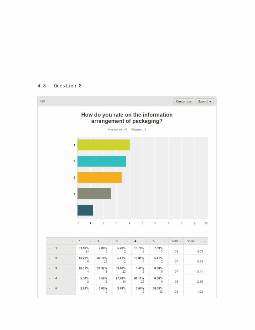
4.8 : Question 8
Figure 4.8 : How do you rate on this information arrangement of packaging?
This figure above shown that the rate number 1 is the most higher then other which is score 4.03, rate number 2 is score3.37, rate number 3 score in 3.41, rate number 4 is score 2.56, rate number 5 score in 1.22. This is because our information arrangement of packaging is clearly to see and easy to get the information meaning.

4.9 : Question 9
Figure 4.9 : Bar Chart of Question 9
This figure above shown that the respondents given the highest of very good in 40.00%, 26.67% people in good, 22.22% in excellent, fair in 6.67% and 4.44% in poor. This is because our information arrangement of packaging is clearly to see and easy to give out the information meaning to the people.

CHAPTER 5 : Conclusions
The main conclusion that can be drawn is therefore that most of respondents agree with images used in packaging design of chocolate related with the flavor of fruit. Besides that, concept of Go Green in rate of most likely to support the reuse idea, and are agree easy to carry or bring out. In the light of this, it is recommended that concept of Go Green should be use because easy to carry or bring out. Other than that, I recommend that typography design on my packaging of chocolate should be change. It is not perfect enough to use yet, should be improve.

Appendices
Sample Survey Form
Results of Statistical Analysis

References
Diana Lim. Chocolate & confectionary Packaging. Retrieved May 23, 2015, from https://www.pinterest.com/dianaelee/chocolate-confectionary-packaging/
Irene Rubio. New Packaging & Branding. Retrieved May 28, 2015, from https://www.pinterest.com/irubiobaeza/packaging/
MILLER. World Market Chocolate-Wine Pairing Chocolate. Retrieved May 10, 2015, from http://wearemiller.com/work/pairings-chocolate-chocolate-packaging-design/
Nicole. PACKAGE DESIGN EXTRAORDINAIRE, TYPOGRAPHY JUNKIE. Retrieved May 11, 2015, from http://paperroo.com/chocolate-dream/
Navson. New Packaging & Branding for Mooch Chocolate Milk. Retrieved May 11, 2015, from http://www.designhappy.co.uk/new-packaging-for-mooch-chocolate-milk/