responsive navigation patterns | نویگیشن در طراحی ریسپانسیو
TRANSCRIPT
Responsive Navigation Patterns
دهندهارائهحسینیانمحسن
hosseinianimohsenet
Responsive Navigation Patterns

Users have a goal and are on a mission.

The vehicle that takes users where
they want to go
Responsive Navigationis more than oneContent, Context orComponent

Priority Lists for Content and FunctionalityClient’s View vs User’s View

The content is for everyone:Content ParityYou don’t have to show all content or navigation options at once, but they should remain accessible on every device.
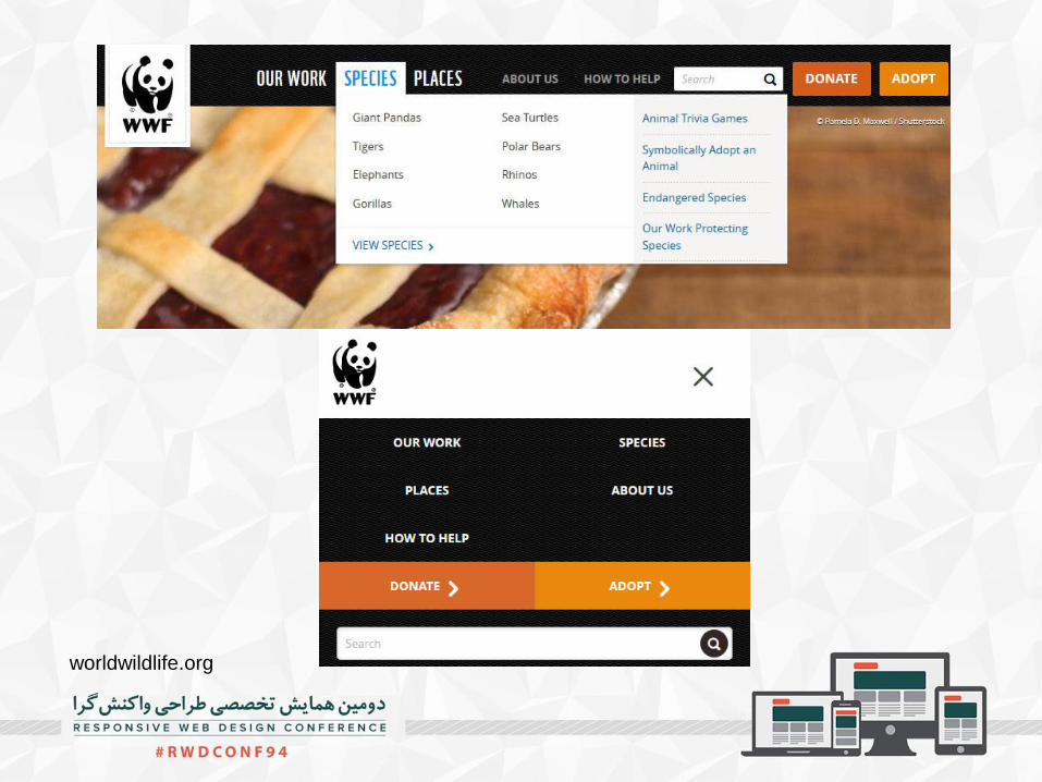
worldwildlife.org

kiwibank.co.nz

Priorities matter and thinking about them up front can often go quite a long way to help establish a consistent,
GOOD USER EXPERIENCE

Show when you can and hide when you can’t
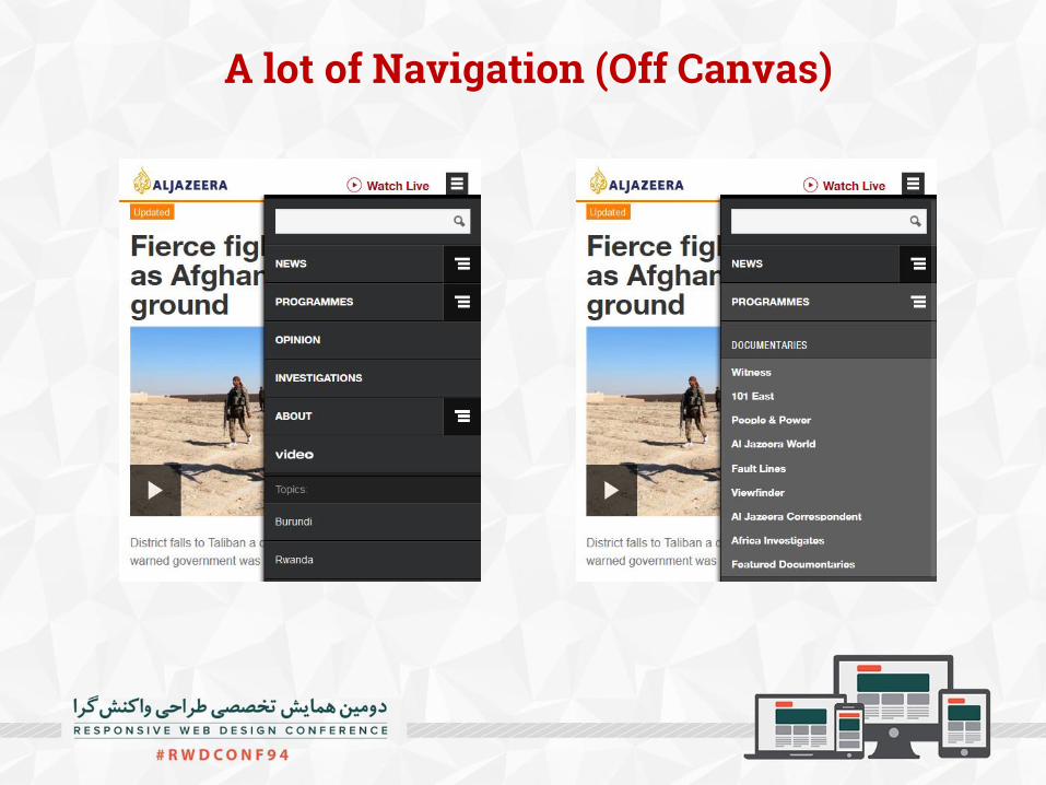
A lot of Navigation (Off Canvas)

Off Canvas (Shopping Cart)

Off Canvas (Filters)

Off Canvas (Page History)


www.mitsubishi-motors.com.au
Skip to Footer

Select Menu

Hamburger
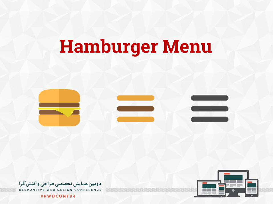
Hamburger Menu

Do people understand the hamburger icon used for
mobile navigation menus?
Luke Wroblewski

The three line icon is used for many things

Google Material Guidelines

Space is scarce on mobile. Minimal navigation gives a clean look. It’s a designer’s dream. Designers are sometimes more focused on
trends than logic. It’s built into everything now. (Bootstrap,
Foundation ,…) Unsexy news travels slowly
Why are designer using them?

Information scentUser look for words like cost, price, rates, fees, etc.
Client: “What if the user wants to see the pricing?”
Designer: “Oh, they can just click the menu icon and then click ‘Pricing.’ Easy!”
This hamburger smells like…nothing

Out of Sight, Out of Mind
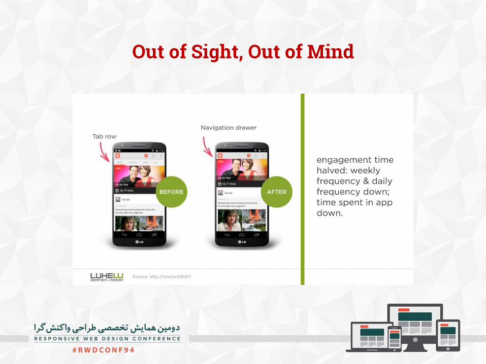
Out of Sight, Out of Mind
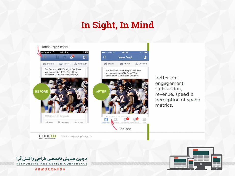
In Sight, In Mind

In Sight, In Mind


Visitors Conversions Results
12.684 308 7
12.660 347 +12,9%
12.900 331 +5,7%
13.017 246 -22.2%
What about variations on the hamburger?A/B Testing Hamburger Icon
http://exisweb.net/mobile-menu-abtest

Understanding by age group
http://www.catalystnyc.com/2015/02/navigating-mobile-hamburger-menu-anyone-get/

This is not your
grandma’snavigation.

The problem wasn’t that users were confused by the hamburger menu, but rather that there was never a compelling reason to click it in the first place.

But I have too many menu items!

The stronger information scent would work far better than a hamburger menu
But I have too many menu items!

Okay, so what do we do instead?

Okay, so what do we do instead?

Don’t use hamburger menu on Desktop view,when you have a lot of space!
squarespace.com
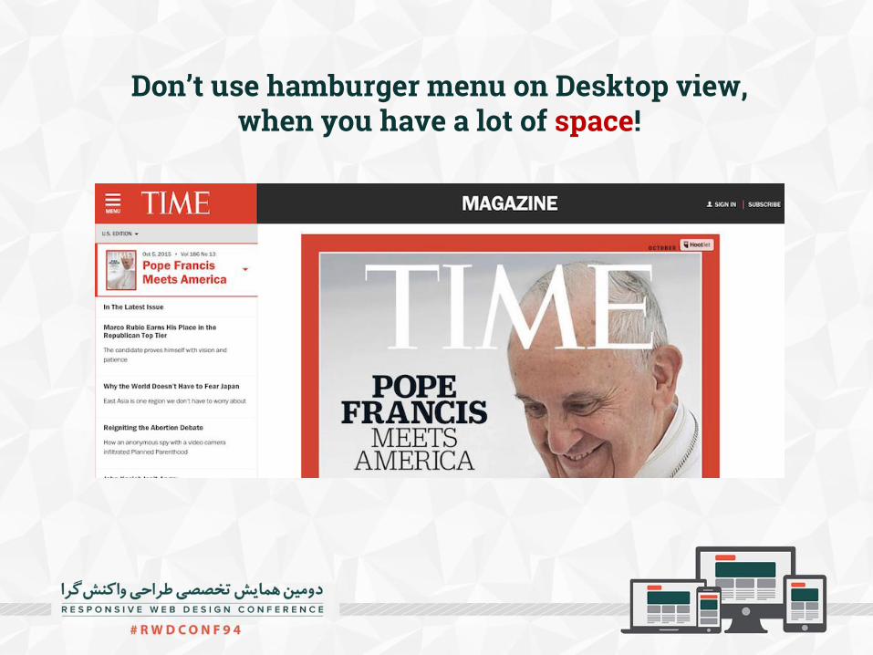
Don’t use hamburger menu on Desktop view,when you have a lot of space!

A navigation system must be simple. Without exception.
Users should always know their current place in the site. (Use breadcrumbs)
The navigation system remains consistent. Use Label if you should use hamburger
menu! Use Down/Up Arrow for Menu Label.
The Principles of Web Navigation

Use Back/Close button
The Principles of Web Navigation

The Principles of Web NavigationOccupy menu items with only one function

The Principles of Web NavigationDirect entry into sublevels / Auto Scroll to sublevels
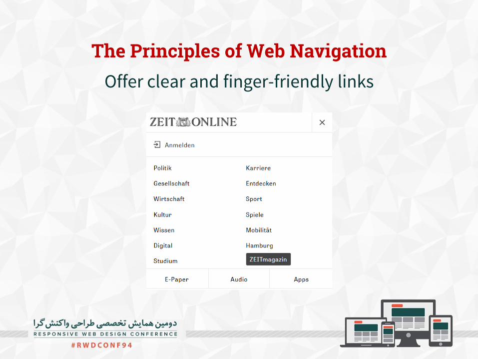
The Principles of Web NavigationOffer clear and finger-friendly links
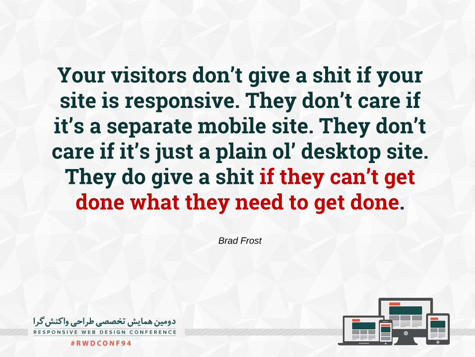
Your visitors don’t give a shit if your site is responsive. They don’t care if
it’s a separate mobile site. They don’t care if it’s just a plain ol’ desktop site.
They do give a shit if they can’t getdone what they need to get done.
Brad Frost

Designing for Humansnot Devices.

Design the Priority
not the Layout!Ethan Marcotte
