responsive navigation patterns, ux and guidelines
TRANSCRIPT

Responsive Navigation Patterns
UX and
Guidelines@webinterface
UX Congress 2015

PETER ROZEKWork by ecx.io (Digital Agency)
SKILLS: UX
Usability Accessibility
Frontend
@webinterface

Users have a goal and are on a mission.
@webinterface

Focus
@webinterface

@webinterface
Responsive Navigation is more than one Content, Context or Component.

@webinterface
49% use there Mobilephone everyday and everytime.

Paradigm change in the interaction.
@webinterface

http://www.digibarn.com/collections/screenshots/xerox-star-8010/@webinterface

@webinterface

@webinterface http://www.ubergizmo.com/2007/05/palm-unveils-new-bluetooth-keyboard/

@webinterface
2007

@webinterface
2010

Detachment of the GUI with their desktop metaphors.
@webinterface

@webinterface
See, point and clickGUI
To intuit usableNUI

@webinterface
Desktop metaphorGUI
StraightNUI

NUI:
@webinterface
Usability = Time saving

@webinterface
Responsive Navigation is the intersection from GUI and NUI.

Usability problems?
@webinterface

52% Users have a bad experience
57,9% Sites are confusing
36,4% Not usable
(Quelle: BVDW 2013)
@webinterface http://www.bvdw.org/

Help your users
@webinterface
love there usersbecause there arepeople

@webinterface
Respect

Design the Priority
@webinterface

„Don’t make me think.“Steve Krug
@webinterface

@webinterface
Using follow identify
false
true

Responsive Navigation Patterns…… Eierlegende Wollmilchsau?
Bildnachweis: de.wikipedia.org@webinterface

Hamburger Icon
@webinterface

@webinterface

„Do people understand the hamburger icon used for mobile navigation menus?“Luke Wroblewski, @lukew
@webinterface

A/B Testing Hamburger Icon
http://exisweb.net/mobile-menu-abtest@webinterface
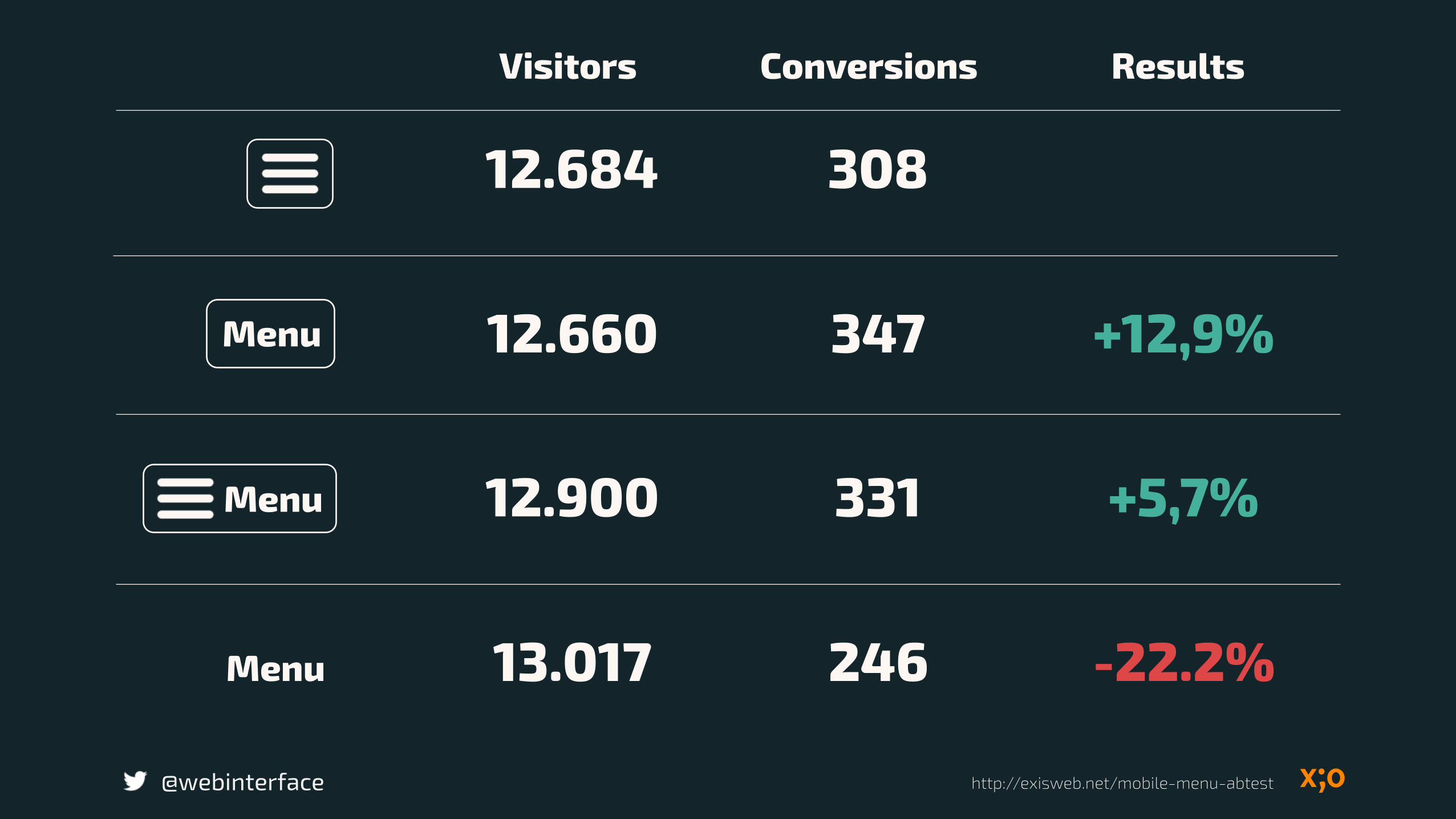
12.684 308
12.660 347 +12,9%
12.900 331 +5,7%
13.017 246 -22.2%
Visitors Conversions Results
Menu
Menu
Menu
http://exisweb.net/mobile-menu-abtest@webinterface

Understood Did not understand
@webinterface
80,6 % 19,4 %
52,4 % 47,6 %
18-44
45-62
Understanding by age group
http://www.catalystnyc.com/2015/02/navigating-mobile-hamburger-menu-anyone-get/

@webinterface
This is not your grandma’s navigation.
http://onelshortofnormal.com/2013/01/26/grandmas-got-a-sassy-new-hairdo/

@webinterface
There is a different between simplicity and readability.

Pro and Cons Hamburger Icon
Understanding by age group
@webinterface
Using follow identify
Potential conflicts with other system
objects

Off-Canvas Menu
@webinterface

Complex pages with many navigation levels.
ConsNot capture the entire
screen
@webinterface
ProNavigation in deeper
levels

Guidelines
@webinterface

Perceivable
@webinterface

To group basic essentials of the navigation conformable, coherent and clear.
@webinterface https://www.otto.de/

@webinterface
Position of the search field coherent and clear.
https://www.jab.de/group/

@webinterface https://www.jab.de/group/

Avoid opposition to another navigation icons.
@webinterface

@webinterface

Accounting For Touch
@webinterface

@webinterface

Close Button
@webinterface

Operable
@webinterface

Occupy menu items with only one function.
@webinterface

By complex navigation Direct entry into sublevels
@webinterface https://www.otto.de/

@webinterface

@webinterface https://www.jab.de/group/

Help your users: Auto scroll to sublevels.
@webinterface https://www.otto.de/

Offer clear and finger-friendly links.
@webinterface http://www.zeit.de/index

Delay
@webinterface

@webinterface

@webinterface

Web Accessibility Standards
@webinterface
Keyboard focusable and operable
Clear indication a focus
Works without Javascript

@webinterface
UI, Data continuity and Layout Adaptability
Coherence

Make sure that the content structure of navigation should be the same and accessible in multiple places.
@webinterface

Clear and visual hierarchy
@webinterface https://www.otto.de/

@webinterface

@webinterface

Adapt your design to the space available.
@webinterface

@webinterface
Some designs works on all screen sizes.
http://www.zeit.de/index
Content continuity
Fluidity
@webinterface

Prioritize your content
@webinterface

Show high priority content at the top.
@webinterface http://www.worldwildlife.org/

Guidance notes
„visibility“
@webinterface


Breadcrumb for quick orientation
@webinterface https://www.jab.de/group/

@webinterface

Headings should be clearly, visible and address the content.
@webinterface

Future continuity
@webinterface

Progressive enhancement
@webinterface
Web Standards
Web Accessibility

@webinterface
Resumé

The vehicle that takes users where they want to go.
@webinterface

@webinterface
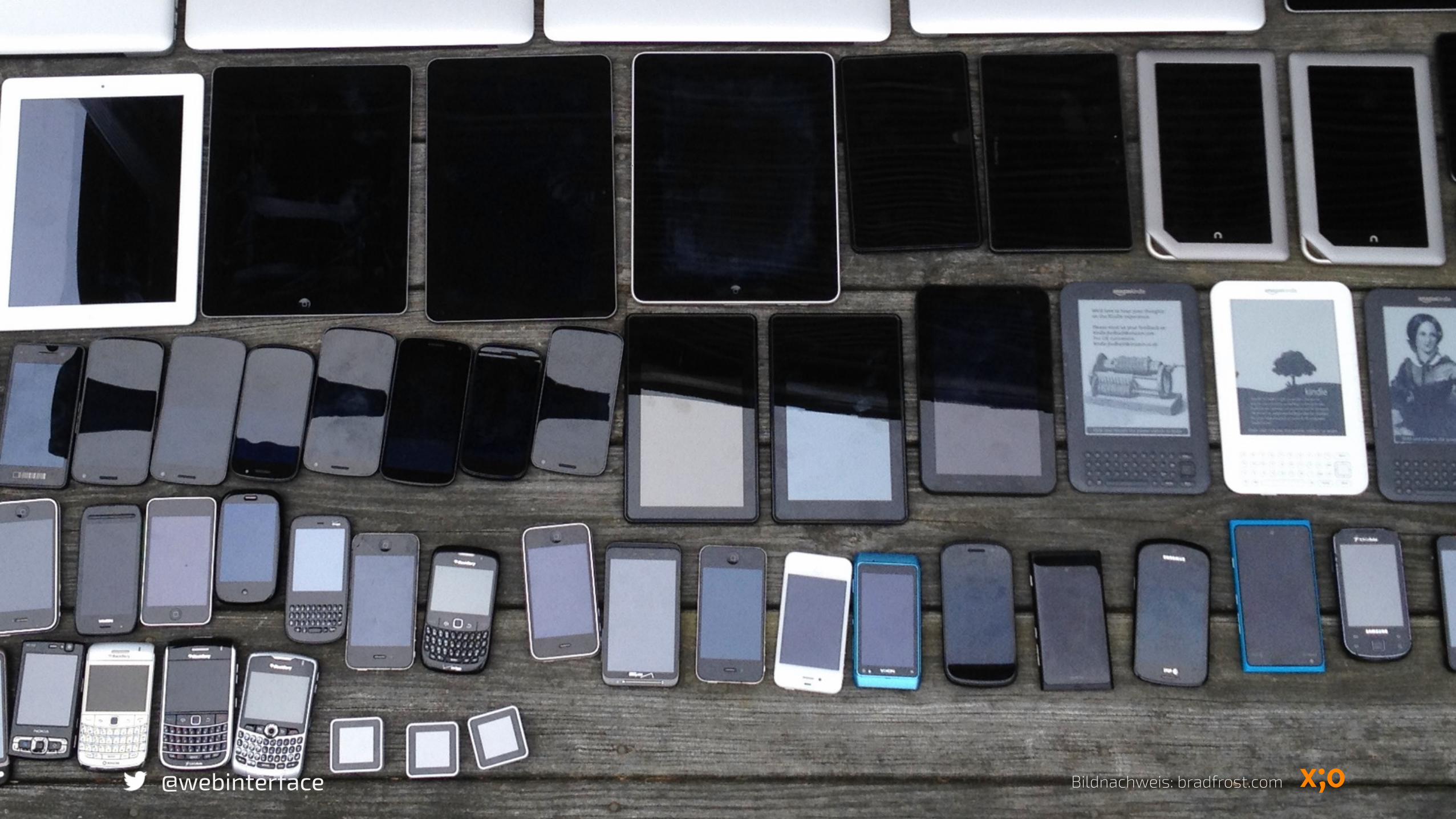
Brad Frost
https://www.youtube.com/watch?v=nE0CRMm59BY
„Your visitors don’t give a shit if your site is responsive. They don’t care if it’s a separate mobile site. They don’t care if it’s just a plain ol’ desktop site. They do give a shit if they can’t get done what they need to get done.“

Designing forHumansnot Devices.
@webinterface

Design the interaction behaviors not the devices!
@webinterface

„Design the Priority not the Layout!“
@webinterface
Ethan Marcotte

Meta principle Fluid experience
@webinterface

BuildMeasureLearn
@webinterface

Thanks
@webinterface
…dear Ellen

[email protected]@webinterface