responsive website design
TRANSCRIPT
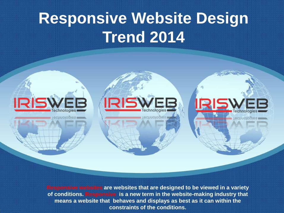
Responsive Website Design
Trend 2014
Responsive websites are websites that are designed to be viewed in a variety
of conditions. Responsive is a new term in the website-making industry that
means a website that behaves and displays as best as it can within the
constraints of the conditions.
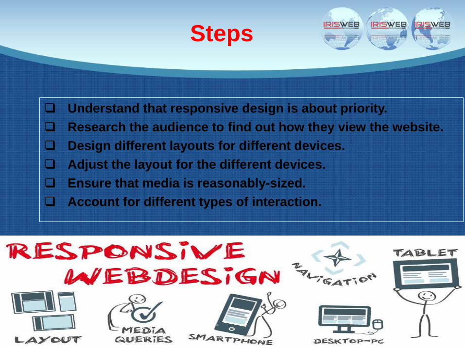
Steps
Understand that responsive design is about priority.
Research the audience to find out how they view the website.
Design different layouts for different devices.
Adjust the layout for the different devices.
Ensure that media is reasonably-sized.
Account for different types of interaction.
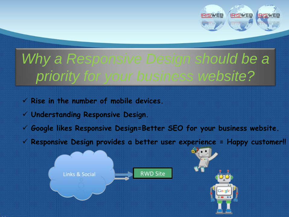
Why a Responsive Design should be a
priority for your business website?
Rise in the number of mobile devices.
Understanding Responsive Design.
Google likes Responsive Design=Better SEO for your business website.
Responsive Design provides a better user experience = Happy customer!!
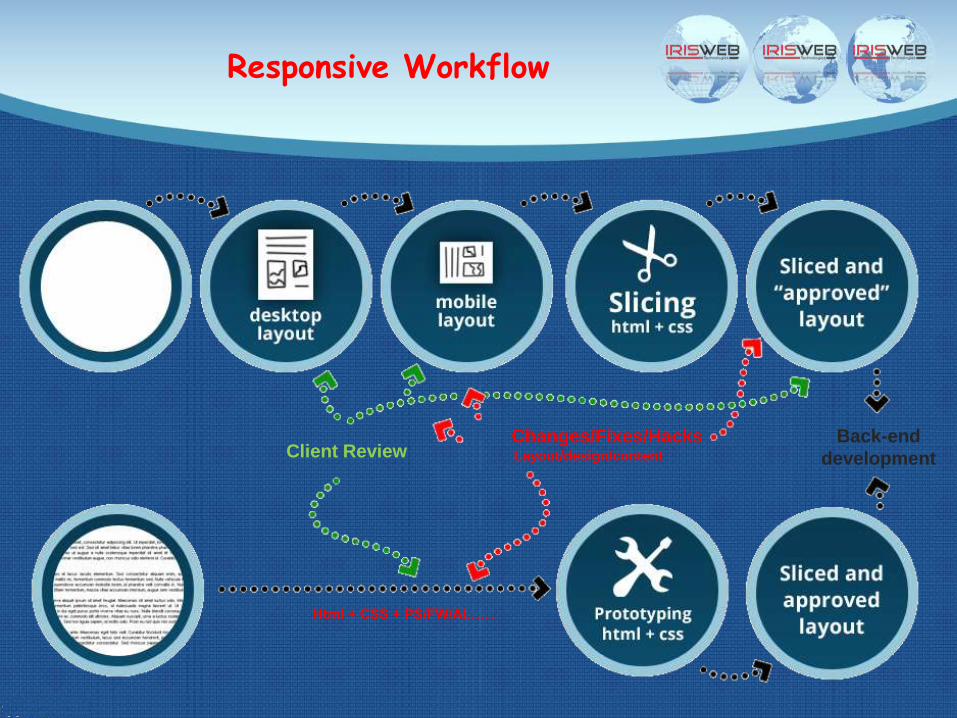
Responsive Workflow
Client ReviewChanges/Fixes/HacksLayout/design/content
Back-end
development
Html + CSS + PS/FW/AI……

In past, the only way to access a website was a
computer desktop. With the increase in
number of mobile phones, the web developers
initially started developing mobile websites.
But, do you know that having just a specific
mobile website is not enough anymore? There
is a huge increase in the usage of multiple
mobile devices; a website needs to be
optimized for smart phones, tablets, desktops,
gaming console browsers and big screen TVs
etc.
Rise in the number of mobile devices
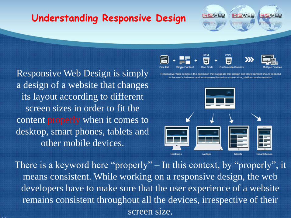
Understanding Responsive Design
Responsive Web Design is simply
a design of a website that changes
its layout according to different
screen sizes in order to fit the
content properly when it comes to
desktop, smart phones, tablets and
other mobile devices.
There is a keyword here “properly” – In this context, by “properly”, it
means consistent. While working on a responsive design, the web
developers have to make sure that the user experience of a website
remains consistent throughout all the devices, irrespective of their
screen size.
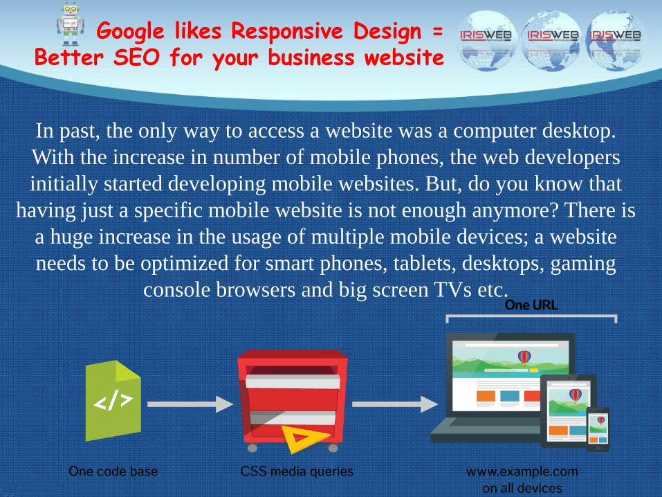
Google likes Responsive Design = Better SEO for your business website
In past, the only way to access a website was a computer desktop.
With the increase in number of mobile phones, the web developers
initially started developing mobile websites. But, do you know that
having just a specific mobile website is not enough anymore? There is
a huge increase in the usage of multiple mobile devices; a website
needs to be optimized for smart phones, tablets, desktops, gaming
console browsers and big screen TVs etc.
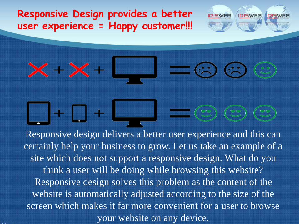
Responsive Design provides a better user experience = Happy customer!!!
Responsive design delivers a better user experience and this can
certainly help your business to grow. Let us take an example of a
site which does not support a responsive design. What do you
think a user will be doing while browsing this website?
Responsive design solves this problem as the content of the
website is automatically adjusted according to the size of the
screen which makes it far more convenient for a user to browse
your website on any device.
IRIS Web TechnologiesPlot No. 26/1, Level-1,
Industrial Area phase-II,
Chandigarh-160002Website: www.iriswebtech.com
E-Mail: [email protected]
Contact Us