romero_10.4.1
DESCRIPTION
Children Fitness NutritionTRANSCRIPT

VIP Fitness Nutrition Center
“Be Fit Be Healthy”

Designer’s NoteVip fitness nutrition center "“fit kids program“"
This project book will deliver a clear understanding of the design process for the “Fit Kids Program”. It will guide the audience into knowing the brand and how it was developed. The idea of “Fit Kids” started because of the great obesity issue that is currently happening in Puerto Rico. Fit Kids is a program that will allow families to develop a healthy lifestyle by encouraging parents and children to be fit and healthy. The reason thisprogram involves parents is because they are the main tool that can lead the child into this lifestyle.
2

1.0 Brand Research
2.0 Creative Process
3.0 Brand Standard
4.0 Design Solution
Brief Overview 6Client Project Brief 7Swot Analysis 12
Moodboard 14Logo Development 17Design Research 18
Logo Standards 22Taglines / Textures & Patterns 25 Colors & Fonts 26
Campaign Deliverable 30Infographic 36References 37
3

1.0
Brand Research
4

Brief Overview 6
Client Project Brief 7
Swot Analysis 12
5

Brief Overview
Vip Fitness Nutrition Center created a program within thecompany named “Fit Kids”. This program guides parents and children into how they can develop a healthy lifestyle. This idea started because of the great obesity issue in the island of Puerto Rico. This program will provide parents with tools to fight obesity and will benefit families especially children by allowing them to achieve and maintain a healthy weight, boost self-esteem and confidence.
6

Client Project Brief
Project Synopsis:
Vip Fitness Nutrition Center was founded by Francisco Rosa a Puerto Rican personal trainer known by training artists from the entertainment industry in the island. This company offers a small fitness program for children which could be highly improved. By improving this program this facility could become the first family oriented fitness cente in Puerto Rico.The focus is reinventing the program and families into being healhty and fit.
7

Client Project Brief
Primary Products:
Fitness ProgramNutrition ProgramEducate on Health
Competitors:
The Little Gym of GuaynaboYMCA - Seasonal Fitness Program
Unique Selling pROPOSITION:
- Work with the health and fitness of childrenin a fun energetic place.- Encourage self-confidence and high self-esteem to children.
8

Client Project Brief
Vision:
To gain parent’s trust and be able to guide children intro fighting obesity and other health conditions caused by the lack of good nutrition and exercise. The expected result is to have enrolled by the end of the first year at least 45-50% of the children living at least 15 mile radius from the facility.
Goals:
- Create awareness on child’s obesity and encourage parents to take action.- Encourage parents to share a healthy lifestyle with their children.- Allow parents to be incolved in a physical activity after work while still being able to spend time with their child
9

Client Project Brief
Image Criteria:
The message that I want to portray through visual communication is using images that present happy and energetic children enjoying physical activities and good nutrition. Also, images that represent why its is important to develop a healthy lifestyle. The majority of images will consist of parents and children because this campaign is created to benefit both.
Taglines:
- Be Fit Be Healthy- Feel Alive- Everyone Can Make a Difference- Challenging is Fun
10

Client Project Brief
Target Audience:
Parents ages 24-50Male / FemaleMarried / SingleHousehold 2 or moreAnnueal Income 15,000 - unlimitedChildren 4 - 12Elementary SchoolsPediatricians
11

SWOT aNALYSIS
- Work With Latest Exercise Equipment
- Artist are trained at the facility
- Located in one of the most prestigious areas in
Puerto Rico
- Reward Club
- Affordable Membership
- 24/7 Hours of Operation
-First to offer an extensive fitness program
for children
- Increase client membership
- Firtst family oriented gym
- Health specialists and trainers are introduced to
this new program
- Incentive program for employees
Strengths
Opportunities
12

- Focuses mainly on fitness for adults
- Do not have equipment for children
- Trainers are experienced to work with
adults only
- Majority of members are single or have
no kids
- Expensive rent facility
Weaknesses
-Parents no having interest on their child’s health and fitness- Unmotivated instructors because of low pay rate- Not being able to fund the needed equipment for the children- Fast food and no exercise routine may seem easier- Slow market growth
Threats
Strengths
Opportunities
SWOT aNALYSIS
13

2.0
Creative Process
14

Moodboards 16 Logo Development 17
Design Research 18
15

Moodboards
This moodboard consists of bold colors that attract the viewer’s eye. The images used to create the moodboard that served as inspiration to create the logo portray a joyful and energetic feeling. The only way to attract children into being part of this program is by presenting it as a fun and exciting experience. (Johnson, B., 2007)
For this moodboard I used elements that represented the health and care of a per-son’s body. I wanted to use the hearbeat as a symbol of life and wellness. I de-cided to use the combination of neutral , warm and cool colors to create a balance that portrayed trust, calmness and energy. (Faux Filled Dream, 2011)
This moodboard consists of nutritious eating and shows the reaction of how children should react to this eating habit. The combination of the chosen colorssymbolizes organic, freshness, knowledge and balance.
16

Logo development
VIP Fitness Nutrition Center
The logo needed to promote happiness and freedom. The idea started to evolve when thinking about nutrition and fitness together. The pear represents the nutritional aspect from the campaign while the smile and the hands in the air represent excitement, happiness and physical activity. This is a combination mark consisiting of both im-age and text allowing the logo to be memorable and easy to associate with the brand.
Fit Kids Promotion
Comapny’s Logo
Logo Concept
Final Logo
17

Design Research
According to ( Service Design Tools, 2009) “A moodboard is a visual composition of picture and materials that propose an atmosphere by giving the generic perception of it.” This products targeted to parents and children this is why I used visual elements that included the target audience in order to allow them to visualize themselves experiencing the product.
According to (The Impact Group,2008), “Color is everywhere and conveys a message even if we don’t realize it.” The reason I chosecolors such as blue, orange, mustard yellow and lime green is becausewarm colors represent happiness, energy and stimulation of mental activity. The cool color such as blue gives clarity of thought and heals emotions.
18

Design Research
For this campaign I used visual elements that presented parentssupporting theri child to be active and fit. This helps the child to be supported and creates a positive self-esteem. For the design’s layout I used line quality that consists of vertical, horizontal and circular lines. By using different kinds of line quality you are able to add motion and visual interest to your design.
Physical activity can lead to a more active and sociable lifestyle. It may result in positive engagion in positive relationships and high-self esteem. When you develop a habit during your childhoodthere exists a possibility that it may last through adulthood. (Goodway & Robinson, 2006).
19

3.0
Brand Standards
20

Logo Standards 22
Taglines/ Textures / Images 25
Colors / Fonts 26
21

Logo Standards
This is the original version and should be used at all times unless space restrictions applies.
When not having sufficient space to use the original version this may be the only option available.
Stacked Version Horizontal Version
Clear Space
To allow the logo to be efficiently legible it is important to leave a clear space around it. No text or image should be placed within the area the logo is placed.
22

Logo Color Variation
Black & White Full Color
The logo is presented in two simple color variations black and white which could be used when having printing orbudget restraints.This type of logo should be printed on white background
The full color should be used in every media asset used to promote and present the campaign’s message in order to allow the audeince
23

Logo Dont’s
Skew or Stretch
Rotate or Flip
24

Tagline/ Patterns & Textures
The fonts used for the taglines were chosen based on the mes-sage being presented through the tagline. The first tagline offers encouragement and hope and this is why it was chosen a thin and x-height font to emphasize the length of letters f and l which in the term line quality is considered to represent a vertical structure meaning reaching beyond human reach. The other taglines pres-ent a strong mood this is why a bolder font was used.
feel alive
Be Fit BE HEALTHY Make a Difference Be Healthy
Challenging is Fun
Everyone can Make a Difference
These two visual elements are the texture and pattern used for some media deliverables in the campaign.The first one waschosen because of its child’s friendly design. It portrays the feeling as if a child had used a chalk or market to design it.The second one is the pattern designed consisting of the colors of the campaign and has different shaped squares which is one the basic shapes that children learned. Different shapes represent different people and different personalities but at the end they all come to together to form one community.
25

Colors
RGB 236 34 39
CMYK0 87 83 0
RGB 28 211 162
CMYK54 0 42 0
RGB 114 44 253
CMYK66 52 0 0
RGB 38 59 231
CMYK89 62 0 0
RGB 246 146 32
CMYK0 37 85 1
RGB 178 236 93
CMYK27 0 69 0
26

Child's Play Brady Bunch Remastered Myriad Pro Star Avnenue Chunky Monkey
Fonts
1. The fonts that have been chosen for this campaign 2. provide different variations and perspective based 3. on the promotional product that the audience is 4. experiencing. The fonts Child’s Play and Brady Bunch 5. Remastered give the fun and child friendly mood to the
brand and product. While the font Myriad Pro which is 6. used to state the facts and information that will educate the
audience on the campaign presents an x-height body which allows the audience to efficiently read and understand what is being presented.
27

4.0
Design Solution
28

Campaign Deliverables 30
Infographic 36 References 37
29

Campaign Deliverables
The Website was created to offer an user-friendly experience. It provides the campaign’s information and how it can be implemented in today’s families.The chosen visual elements represent the brand and create a connection with other media assets.The mobile application was created to allow the audience to access our campaign at any time anywhere. It offers videos and games that offer the young one a fun experience from what to expect from this campaign.
Website
Mobile App
30

Mobile App
Campaign Deliverables
Brochures provide basic information about the campaign.These will help create curiosity on the audience of how this program could benefit their family’s lifestyle. These brochures consist of the same visual elements from the other media assetsin order to allow the audience to create memory of the brand. The difference between these brochures is that one is tri-fold and the other one is one simple page. Both contains the same amount of information.
Brochures
31

Campaign Deliverables
Social Media allows our audience to be connected 24/7 to our campaign. It is a tool that allows the company to get to know the audience. Promoting the campaign through social media allows more people to be reached in addition to the target audience.
Social Media
32

Campaign Deliverables
The expo booth allows the company to educate the audience about the campaign personally. The campaign is presented at different events and locations. This allows the campaign to expand and be recognized outside Puerto Rico. The audience is able to be invited to participate in activities and learn about the purpose and benefits from this campaign by visiting the booth.
33

Campaign Deliverables
Television
Television is a great media asset because it allows the campaign to reach a worldwide target audience. An interview will be conducted at prime time at a local news station to present the audience with this exciting campaign. Also, a commercial promotingthe campaign will be aired at least five times a day.Everyone from the youngest to the oldest will be able to know about the campaign by watching television.
34

Campaign Deliverables
pROMOTIONAL iTEMS
Everybody loves free stuff. This is why these promotional items will be given away at no cost. The items consist of the logo and taglines that represent our brand in order to create a brand statement. These items will be given to people who visit our booths, to those who subscribe to our e-mail list and those who decide to participate in this program.
35
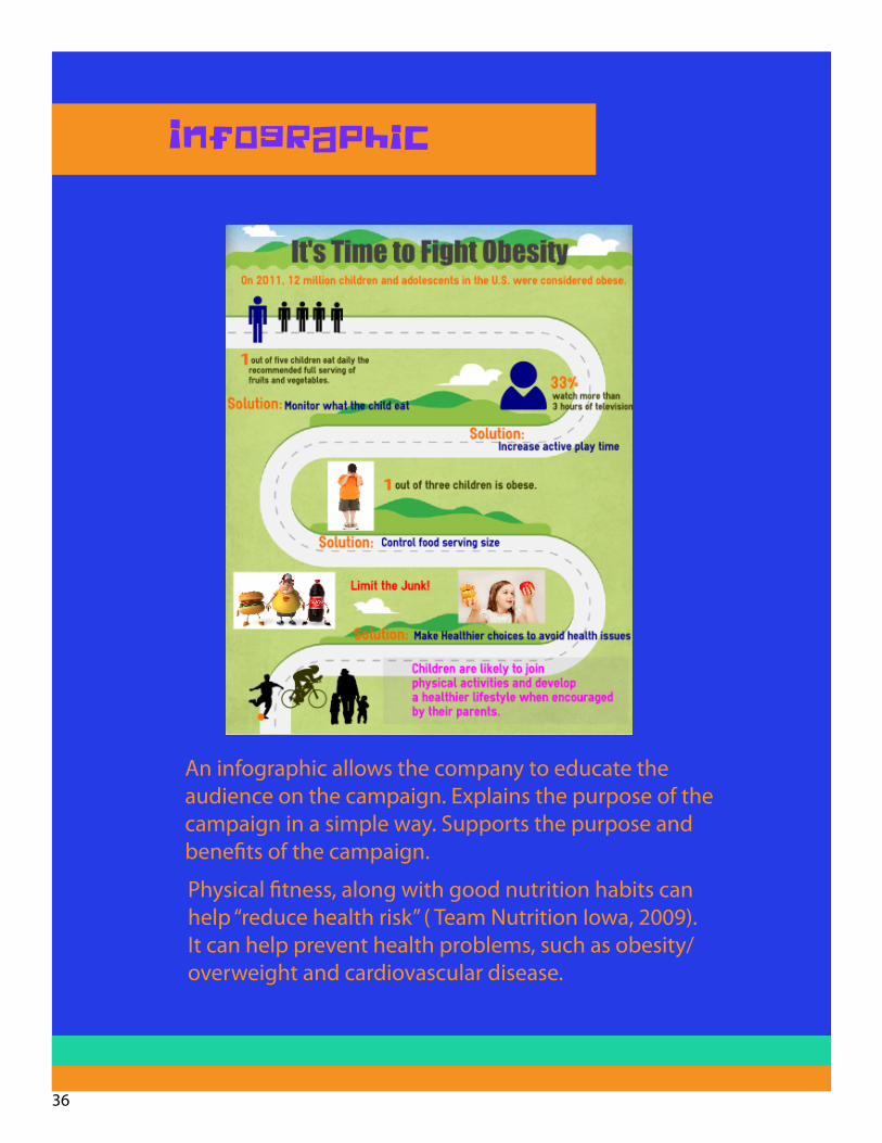
Infographic
Physical fitness, along with good nutrition habits can help “reduce health risk” ( Team Nutrition Iowa, 2009). It can help prevent health problems, such as obesity/overweight and cardiovascular disease.
An infographic allows the company to educate theaudience on the campaign. Explains the purpose of the campaign in a simple way. Supports the purpose and benefits of the campaign.
36

References
Bradley, S. (2010). The Meaning Of Shapes: Developing Visual GrammRetrieved on April 25, 2013 from http://www.vanseodesign.com/web-design/visual-grammar-shapes/
Canadian Fitness and Lifestyle Research Institute. (2012). Parental Involvement in Children’s Physical Activity. Retrieved on April 25, 2013, from http://www.cflri.ca/media/node//files/pam2005_sec6.pdf
Evans, K. (2012). How Do Bright Colors Appeal to Kids? Retrieved on April 25,2013, from http://www.ehow.com/how-does_5476948_do-bright-colors-appeal-kids.html#ixzz276UjPoZe
Faux Filled Dreams. (2011). Psychology of Neutral Colors. Retrieved on April 25, 2013, from http://www.fauxfilleddreams.com/article-neutral-psyc.htm
Goodway, J. D., & Robinson, L. E. (2006, March). SKIPing toward an active start: Promoting physi-cal activity in preschoolers. Beyond the Journal: Young Children on the Web. Retrieved April 25, 2013 from http://www.journal.naeyc.org/btj/200605/GoodwayBTJ.asp
Johnson, B. (2007). Meaning of Colors in Designing. Retrieved on April 25, 2013, from http://www.logoinn.net/meaning-of-colors-in-designing/
Parkinson, M. (2012). The Power of Visual Communication.Retrieved on April 25, 2013, from http://www.billiondollargraphics.com/infographics.html
Service Design Tools.(2009). Tool Moodboard. Retrieved on April 25, 2013, fromhttp://www.servicedesigntools.org/tools/17
The Impact Group.(2008). The Importance of Colors in Design. Retrieved on April 25, 2013, from http://impacttheconversation.wordpress.com/2008/06/09/the-
Team Nutrition Iowa. (2009). Physical Activities and Healthy Snacks for Young Children. Retrieved April 25,2013 from http://healthymeals.nal.usda.gov/hsmrs/Iowa/Physical_Activities_%20Healthy_Snacks.pdf
WebDesignDepot. (2010). A Review of Consistent Designs on the Web. Retrieved on April 25, 2013 from http://www.webdesignerdepot.com/2010/02/a-review-of-consistent-designs-on-the-web/
37

38