rough stuff #2
DESCRIPTION
In ROUGH STUFF #2, editor (and top pro inker) BOB McLEOD spotlights more NEVER-BEFORE PUBLISHED penciled pages, preliminary sketches, detailed layouts, and unused inked versions of art from throughout comics history! There's an interview with PAUL GULACY, andt lengthy galleries of work by fan-favorite artists FRANK BRUNNER, JERRY ORDWAY, and MATT WAGNER, who contribute commentaries on pencils, sketches, and more from some of their most beloved comics series—discussing what went right and wrong with it, and giving background information to put it all into historical perspective. Also: A pencil art spotlight on BRIAN APTHORP! A retrospective art gallery on the late comics legend ALEX TOTH! Plus: Before-and-after comparisons revealing how images changed from initial concept to published version, a look at oddball penciler/inker combinations, and more, all behind a new GULACY “Hex” cover!TRANSCRIPT
FRA
NK BRUNNERJERR
Y ORDWAY
BRIAN APTHORP
MATT WAGNER
P R E S E N T S
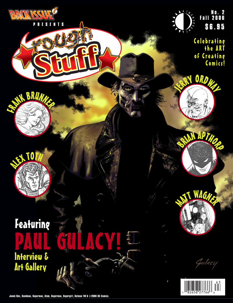
N o . 2F a l l 2 0 0 6
$ 6 . 9 5
C e l e b r a t i n gt h e A R T
o f C r e a t i n gC o m i c s !
Jonah Hex, Sandman, Superman, Atom, Superman, Supergirl, Batman TM & ©2006 DC Comics.
FeaturingFeaturing
PAUL GULACY!PAUL GULACY!Interview &Art Gallery
ALEX TOTH
1 82658 27766 6
63
OCTOBER 2006 • ROUGH STUFF 1
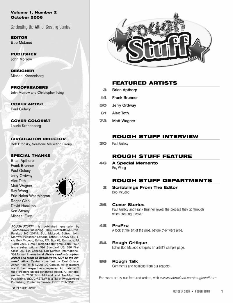
Volume 1, Number 2October 2006
Celebrating the ART of Creating Comics!
EDITORBob McLeod
PUBLISHERJohn Morrow
DESIGNERMichael Kronenberg
PROOFREADERSJohn Morrow and Christopher Irving
COVER ARTISTPaul Gulacy
COVER COLORISTLaurie Kronenberg
CIRCULATION DIRECTORBob Brodsky, Seastone Marketing Group
SPECIAL THANKSBrian ApthorpFrank BrunnerPaul GulacyJerry OrdwayAlex TothMatt WagnerRay WongEric Nolen-WeathingtonRoger ClarkDavid HamiltonKen SteacyMichael Eury
ROUGH STUFF™ is published quarterly byTwoMorrows Publishing, 10407 Bedfordtown Drive,Raleigh, NC 27614. Bob McLeod, Editor. JohnMorrow, Publisher. Editorial Office: ROUGH STUFF,c/o Bob McLeod, Editor, P.O. Box 63, Emmaus, PA10849-2203. E-mail: [email protected]. Four-issue subscriptions: $24 Standard US, $36 FirstClass US, $44 Canada, $48 Surface International,$64 Airmail International. Please send subscriptionorders and funds to TwoMorrows, NOT to the edi-torial office. Central cover art by Paul Gulacy.Jonah Hex TM & ©2006 DC Comics. All charactersare © their respective companies. All material ©their creators unless otherwise noted. All editorialmatter © 2006 Bob McLeod and TwoMorrowsPublishing. ROUGH STUFF is a TM of TwoMorrowsPublishing. Printed in Canada. FIRST PRINTING.
FEATURED ARTISTS3 Brian Apthorp
14 Frank Brunner
50 Jerry Ordway
61 Alex Toth
73 Matt Wagner
ROUGH STUFF INTERVIEW30 Paul Gulacy
ROUGH STUFF FEATURE46 A Special Memento
Ray Wong
ROUGH STUFF DEPARTMENTS2 Scribblings From The Editor
Bob McLeod
26 Cover StoriesPaul Gulacy and Frank Brunner reveal the process they go throughwhen creating a cover.
48 PreProA look at the art of the pros, before they were pros.
84 Rough CritiqueEditor Bob McLeod critiques an artist’s sample page.
86 Rough TalkComments and opinions from our readers.
For more art by our featured artists, visit www.bobmcleod.com/roughstuff.htm
ISSN 1931-9231
OCTOBER 2006 • ROUGH STUFF 3
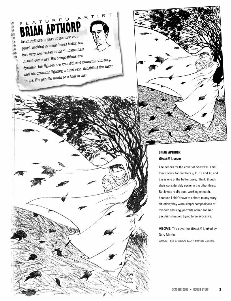
BRIAN APTHORPBrian Apthorp is part of the new van-
guard working in comic books today, but
he’s very well rooted in the fundamentals
of good comic art. His compositions are
dynamic, his figures are graceful and powerful and sexy,
and his dramatic lighting is first-rate, delighting the inker
in me. His pencils would be a ball to ink!
F E A T U R E D A R T I S T
BRIAN APTHORP:
Ghost #11, cover
The pencils for the cover of Ghost #11. I did
four covers, for numbers 9, 11, 13 and 17, and
this is one of the better ones, I think, though
she’s considerably sexier in the other three.
But it was really cool, working on each,
because I didn’t have to adhere to any story
situation; they were simply compositions of
my own devising, portraits of her and her
peculiar situation, trying to be evocative.
ABOVE: The cover for Ghost #11, inked by
Gary Martin.
GHOST TM & ©2006 Dark Horse Comics.
4 ROUGH STUFF • OCTOBER 2006
BRIAN
APTH
ORP
BRIAN APTHORP:
Dreaming Special:
Trial and Error, pg. 28
This is from The
Dreaming Special:
Trial and Error, writ-
ten by Len Wein, for
Vertigo from some-
time in the late ‘90s.
It was inked by Scott
Hampton, one of my
favorite artists and
persons, and I am
proud of it, basically.
Another of those
‘phantasmagoria’
pages, looking like
Victorian wallpaper,
I suppose—but it
was depicting the
magic world of the
Dreaming, and
again, the ol’
reliance on the
colorist to separate
a bit, down the line.
DREAMING TM &
©2006 DC Comics/
Vertigo
OCTOBER 2006 • ROUGH STUFF 5
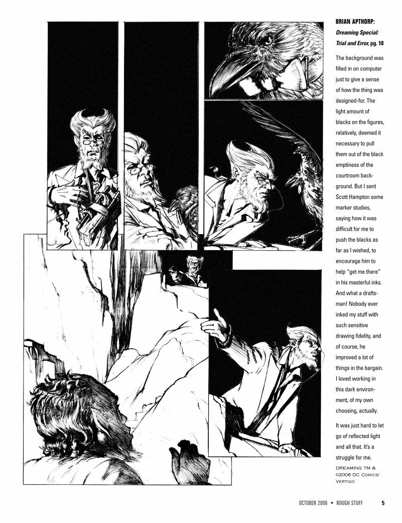
BRIAN APTHORP:
Dreaming Special:
Trial and Error, pg. 18
The background was
filled in on computer
just to give a sense
of how the thing was
designed-for. The
light amount of
blacks on the figures,
relatively, deemed it
necessary to pull
them out of the black
emptiness of the
courtroom back-
ground. But I sent
Scott Hampton some
marker studies,
saying how it was
difficult for me to
push the blacks as
far as I wished, to
encourage him to
help “get me there”
in his masterful inks.
And what a drafts-
man! Nobody ever
inked my stuff with
such sensitive
drawing fidelity, and
of course, he
improved a lot of
things in the bargain.
I loved working in
this dark environ-
ment, of my own
choosing, actually.
It was just hard to let
go of reflected light
and all that. It’s a
struggle for me.
DREAMING TM &
©2006 DC Comics/
Vertigo
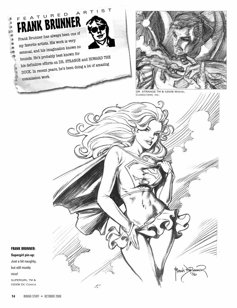
FRANK BRUNNERFrank Brunner has always been one of
my favorite artists. His work is very
sensual, and his imagination knows no
bounds. He’s probably best known for
his definitive efforts on DR. STRANGE and HOWARD THE
DUCK. In recent years, he’s been doing a lot of amazing
commission work.
F E A T U R E D A R T I S T
14 ROUGH STUFF • OCTOBER 2006
FRANK BRUNNER:
Supergirl pin-up:
Just a bit naughty,
but still mostly
nice!
SUPERGIRL TM &
©2006 DC Comics
DR. STRANGE TM & ©2006 MarvelCharacters, Inc.
OCTOBER 2006 • ROUGH STUFF 15
FRAN
KBRU
NNER
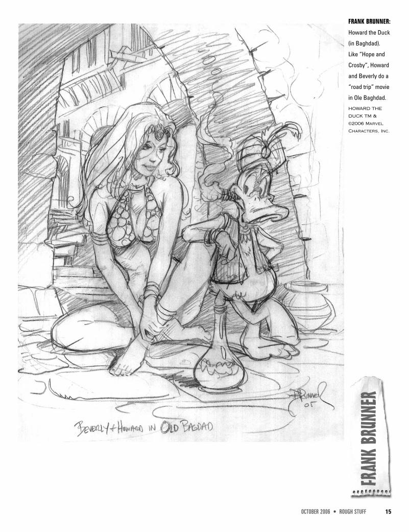
FRANK BRUNNER:
Howard the Duck
(in Baghdad).
Like “Hope and
Crosby”, Howard
and Beverly do a
“road trip” movie
in Ole Baghdad.
HOWARD THE
DUCK TM &
©2006 Marvel
Characters, Inc.
16 ROUGH STUFF • OCTOBER 2006
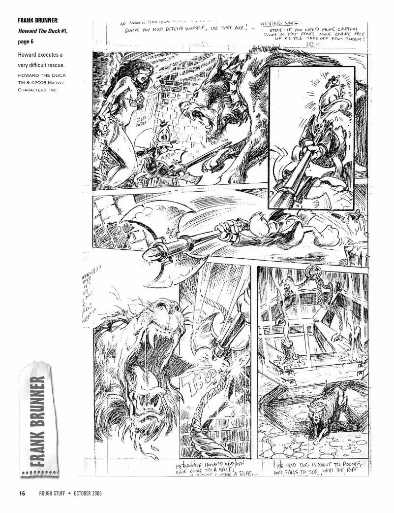
FRANK BRUNNER:
Howard The Duck #1,
page 6
Howard executes a
very difficult rescue.
HOWARD THE DUCK
TM & ©2006 Marvel
Characters, Inc.
FRAN
KBRU
NNER
26 ROUGH STUFF • OCTOBER 2006
COVER STORIES
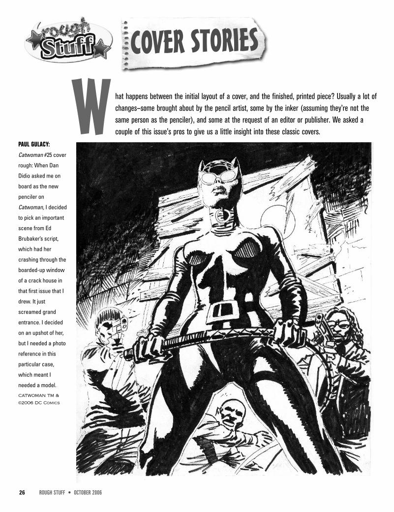
W hat happens between the initial layout of a cover, and the finished, printed piece? Usually a lot ofchanges—some brought about by the pencil artist, some by the inker (assuming they’re not thesame person as the penciler), and some at the request of an editor or publisher. We asked acouple of this issue’s pros to give us a little insight into these classic covers.
PAUL GULACY:
Catwoman #25 cover
rough: When Dan
Didio asked me on
board as the new
penciler on
Catwoman, I decided
to pick an important
scene from Ed
Brubaker’s script,
which had her
crashing through the
boarded-up window
of a crack house in
that first issue that I
drew. It just
screamed grand
entrance. I decided
on an upshot of her,
but I needed a photo
reference in this
particular case,
which meant I
needed a model.
CATWOMAN TM &
©2006 DC Comics
OCTOBER 2006 • ROUGH STUFF 27
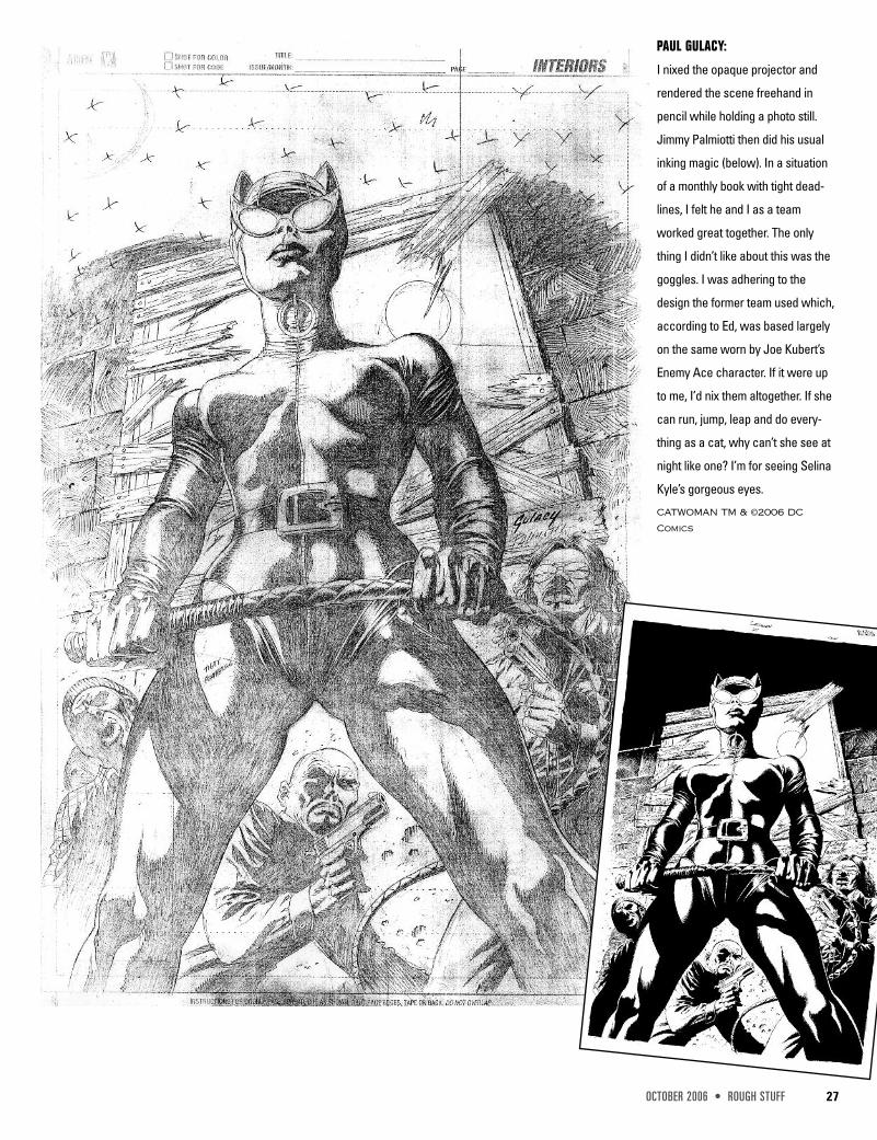
PAUL GULACY:
I nixed the opaque projector and
rendered the scene freehand in
pencil while holding a photo still.
Jimmy Palmiotti then did his usual
inking magic (below). In a situation
of a monthly book with tight dead-
lines, I felt he and I as a team
worked great together. The only
thing I didn’t like about this was the
goggles. I was adhering to the
design the former team used which,
according to Ed, was based largely
on the same worn by Joe Kubert’s
Enemy Ace character. If it were up
to me, I’d nix them altogether. If she
can run, jump, leap and do every-
thing as a cat, why can’t she see at
night like one? I’m for seeing Selina
Kyle’s gorgeous eyes.
CATWOMAN TM & ©2006 DC
Comics
30 ROUGH STUFF • OCTOBER 2006
INTERVIEW
PAUL GULACYBy Michael Kronenberg
F or over thirty years Paul Gulacy has continued to be a creative force in the comic book industry. He
has worked for every major publisher and has been associated with some of comics’ most memo-
rable characters and titles. To thrive as long as he has in an industry as grueling and sometimes
cruel as comics has been not only his ability as an artist and storyteller, but tantamount to his skills as a survivor.
Numerous times over the years a Gulacy art job would hang on the balance of which inker was selected for his
pencils. There have been some outstanding embellishers he has been partnered with—Dan Adkins, Terry Austin, and
Jimmy Palmiotti to name a few—but too many times he has been mismatched and his idiosyncratic style has been lost.
With the release this month of Jonah Hex #12, Gulacy embarks on a new venture with his art: inking his pencils.
“…you never saw me doing my owncovers when I was on Master of Kung Fu,because I just got under the wire on thedeadline and there was no time to let medo the cover. Knowing that, I decided tomake the slash page the cover.”
“I never get tired of it. It’s what I do. It’smy outlet for self-expression. MarlonBrando once said in an interview, ‘Nevergive 100 percent, and hold back somereserve.’ You can’t come in with the bigguns every time. You pace it.”
“…I almost completely go straight on theboard with pens and brushes over pencillines that only I can decipher. I can finish abook in four to five weeks, pencils and inks.My deal with the editors is that I’ll be happyto patch in any mistakes if need be.”
SH
AN
G-C
HITM
&©2006
Marvel
Ch
aracters,In
c.,
BATM
AN
,H
EX
TM
&©2006
DC
Com
ics.
32 ROUGH STUFF • OCTOBER 2006
Icaught up with Paul while in the middle of his Hex assignment. Among other
things we discussed why he can now meet his deadlines penciling and ink-
ing, Master of Kung Fu’s legacy, Daniel Craig as the new James Bond, a
Gulacy top ten movie list, and his upcoming projects.
MICHAEL KRONENBERG: What has changed most inthe comic book industry since you started?PAUL GULACY: The immense amount of talent nowworking in this business is overwhelming; there must bethousands of people and hundreds oftitles to choose from; the entireworld knows who the X-Men are;creators own their properties;Hollywood now banks on hugebox office hits and profitsbased on comic book charac-ters. It’s all moving very quicklyand don’t ask me what thefuture holds, because Idon’t have a clue.
KRONENBERG:
Starting with the newissue of Jonah Hex, youwill begin inking your-self. How did this comeabout and why?GULACY: Itstarted
when Jimmy Palmiotti was buried in work and couldn’t fin-ish the last seven pages of JSA: Classified #13. So,Mike Carlin asked me if I could wrap it up. I hadn’t inkedmyself for a long time, probably years outside of covers,so this was a good opportunity to hone my skills.
It was a blessing, because it wasn’t so much some-thing I wanted to do as something I needed to do—notonly a good career move, but personally, very spirituallyuplifting, and Jimmy totally understands that. In fact,Jimmy encouraged me to ink Hex. He said, “Go ahead,show ’em what you got, dude.”
KRONENBERG: How has inking impacted your schedule?GULACY: It’s not a problem because I almost completelygo straight on the board with pens and brushes over pencillines that only I can decipher. I can finish a book in four tofive weeks, pencils and inks. My deal with the editors is thatI’ll be happy to patch in any mistakes if need be.
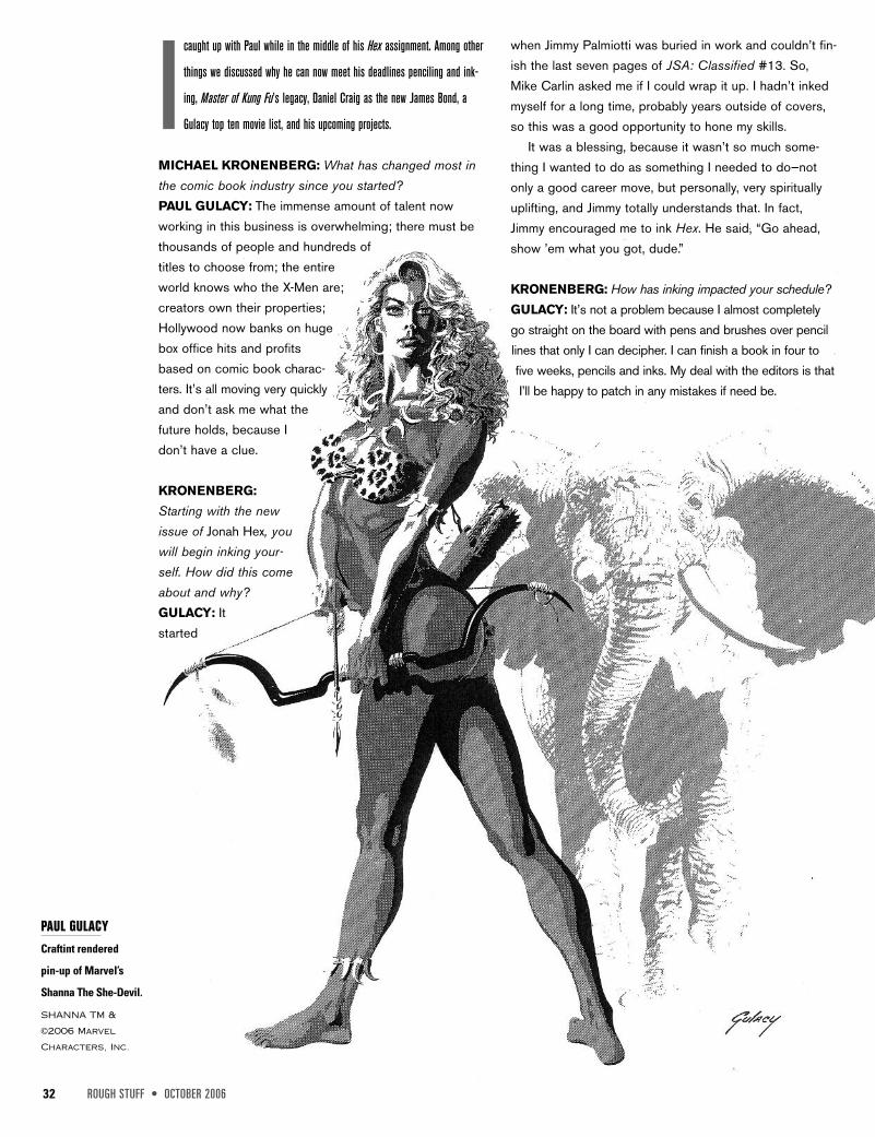
PAUL GULACYCraftint rendered
pin-up of Marvel’s
Shanna The She-Devil.
SHANNA TM &
©2006 Marvel
Characters, Inc.
OCTOBER 2006 • ROUGH STUFF 33
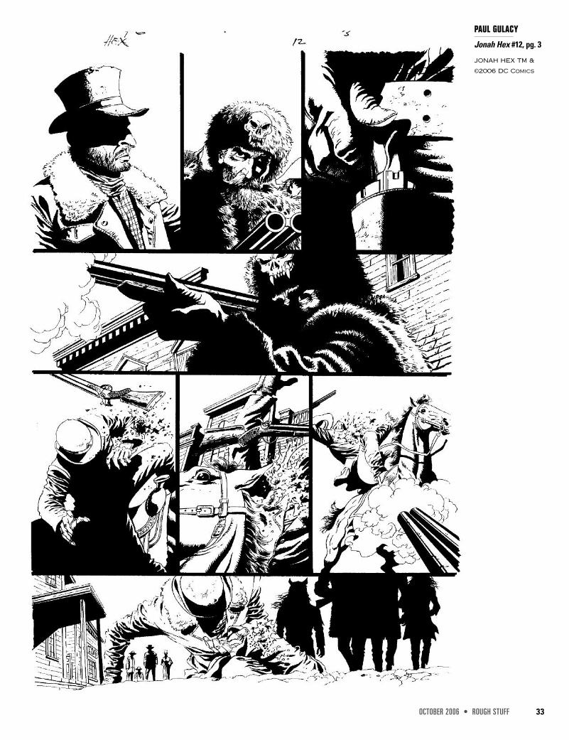
PAUL GULACY
Jonah Hex #12, pg. 3
JONAH HEX TM &
©2006 DC Comics
46 ROUGH STUFF • OCTOBER 2006
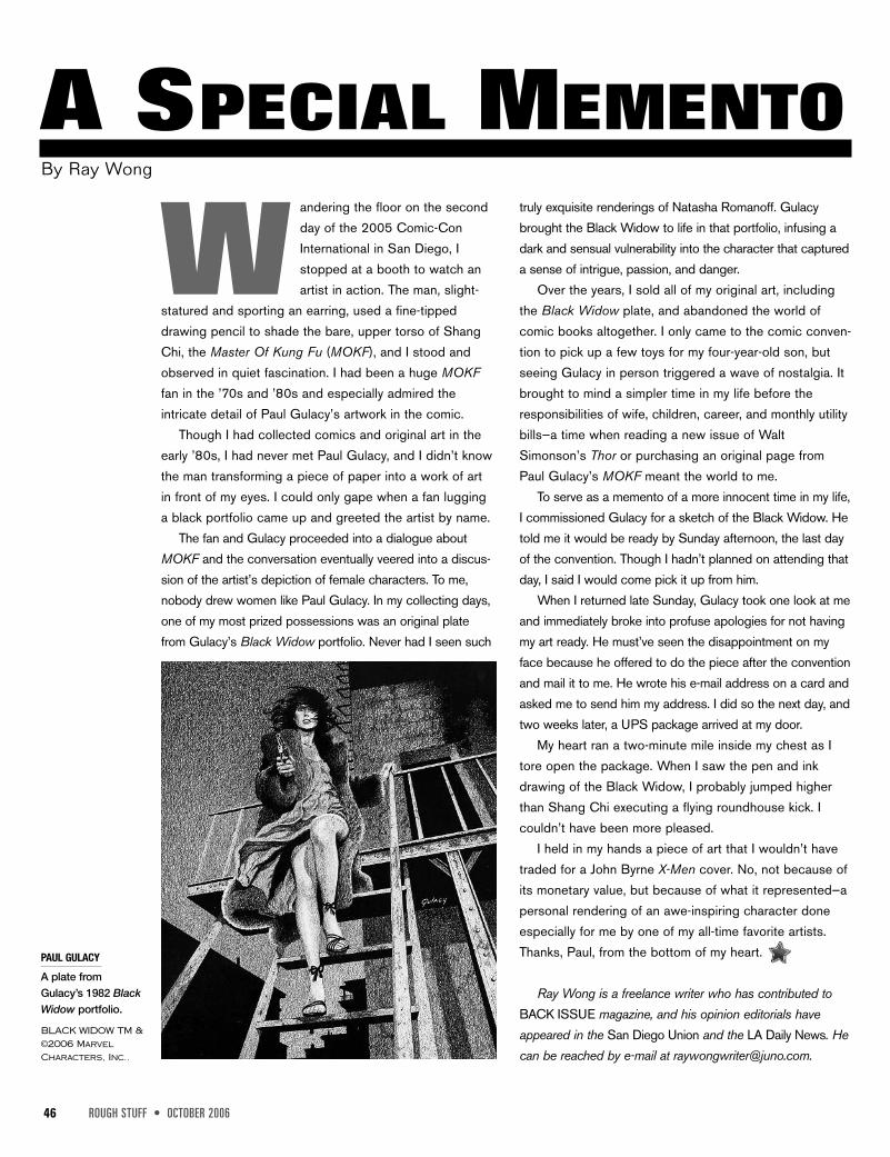
Wandering the floor on the secondday of the 2005 Comic-ConInternational in San Diego, Istopped at a booth to watch anartist in action. The man, slight-
statured and sporting an earring, used a fine-tippeddrawing pencil to shade the bare, upper torso of ShangChi, the Master Of Kung Fu (MOKF), and I stood andobserved in quiet fascination. I had been a huge MOKFfan in the ’70s and ’80s and especially admired theintricate detail of Paul Gulacy’s artwork in the comic.
Though I had collected comics and original art in theearly ’80s, I had never met Paul Gulacy, and I didn’t knowthe man transforming a piece of paper into a work of artin front of my eyes. I could only gape when a fan lugginga black portfolio came up and greeted the artist by name.
The fan and Gulacy proceeded into a dialogue aboutMOKF and the conversation eventually veered into a discus-sion of the artist’s depiction of female characters. To me,nobody drew women like Paul Gulacy. In my collecting days,one of my most prized possessions was an original platefrom Gulacy’s Black Widow portfolio. Never had I seen such
truly exquisite renderings of Natasha Romanoff. Gulacybrought the Black Widow to life in that portfolio, infusing adark and sensual vulnerability into the character that captureda sense of intrigue, passion, and danger.
Over the years, I sold all of my original art, includingthe Black Widow plate, and abandoned the world ofcomic books altogether. I only came to the comic conven-tion to pick up a few toys for my four-year-old son, butseeing Gulacy in person triggered a wave of nostalgia. Itbrought to mind a simpler time in my life before theresponsibilities of wife, children, career, and monthly utilitybills—a time when reading a new issue of WaltSimonson’s Thor or purchasing an original page fromPaul Gulacy’s MOKF meant the world to me.
To serve as a memento of a more innocent time in my life,I commissioned Gulacy for a sketch of the Black Widow. Hetold me it would be ready by Sunday afternoon, the last dayof the convention. Though I hadn’t planned on attending thatday, I said I would come pick it up from him.
When I returned late Sunday, Gulacy took one look at meand immediately broke into profuse apologies for not havingmy art ready. He must’ve seen the disappointment on myface because he offered to do the piece after the conventionand mail it to me. He wrote his e-mail address on a card andasked me to send him my address. I did so the next day, andtwo weeks later, a UPS package arrived at my door.
My heart ran a two-minute mile inside my chest as Itore open the package. When I saw the pen and inkdrawing of the Black Widow, I probably jumped higherthan Shang Chi executing a flying roundhouse kick. Icouldn’t have been more pleased.
I held in my hands a piece of art that I wouldn’t havetraded for a John Byrne X-Men cover. No, not because ofits monetary value, but because of what it represented—apersonal rendering of an awe-inspiring character doneespecially for me by one of my all-time favorite artists.Thanks, Paul, from the bottom of my heart.
Ray Wong is a freelance writer who has contributed toBACK ISSUE magazine, and his opinion editorials haveappeared in the San Diego Union and the LA Daily News. Hecan be reached by e-mail at [email protected].
A SPECIAL MEMENTOBy Ray Wong
PAUL GULACY
A plate fromGulacy’s 1982 BlackWidow portfolio.
BLACK WIDOW TM &©2006 MarvelCharacters, Inc..
48 ROUGH STUFF • OCTOBER 2006
PRE-PRO
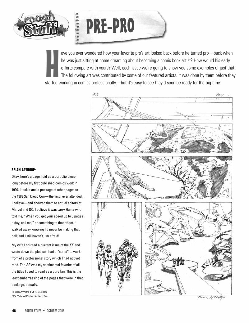
H ave you ever wondered how your favorite pro’s art looked back before he turned pro—back whenhe was just sitting at home dreaming about becoming a comic book artist? How would his earlyefforts compare with yours? Well, each issue we’re going to show you some examples of just that!The following art was contributed by some of our featured artists. It was done by them before they
started working in comics professionally—but it’s easy to see they’d soon be ready for the big time!
BRIAN APTHORP:
Okay, here’s a page I did as a portfolio piece,
long before my first published comics work in
1990. I took it and a package of other pages to
the 1983 San Diego Con— the first I ever attended,
I believe—and showed them to actual editors at
Marvel and DC. I believe it was Larry Hama who
told me, “When you get your speed up to 3 pages
a day, call me,” or something to that effect. I
walked away knowing I’d never be making that
call; and I still haven’t, I’m afraid!
My wife Lori read a current issue of the F.F. and
wrote down the plot, so I had a “script” to work
from of a professional story which I had not yet
read. The F.F. was my sentimental favorite of all
the titles I used to read as a pure fan. This is the
least embarrassing of the pages that were in that
package, actually.
Characters TM & ©2006Marvel Characters, Inc..
50 ROUGH STUFF • OCTOBER 2006
JERRY ORDWAYJerry Ordway can do everything. He
writes, he draws, he inks, he paints, and
he’s incredibly prolific as well. With all
that talent, you’d think his ego would be
too large to fit into a room, but he’s actually incredibly
humble, and a very nice guy. He’s my favorite Superman
artist, and it was an honor for me to work on ACTION
COMICS while he was doing the Superman title.
F E A T U R E D A R T I S T
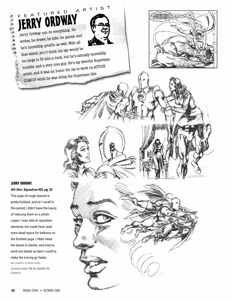
JERRY ORDWAY:
All-Star Squadron #23, pg. 23
This page of rough layouts is
pretty finished, and as I recall in
this period, I didn’t have the luxury
of reducing them on a photo-
copier. I was able to reposition
elements, but could have used
more dead space for balloons on
the finished page. I often inked
the layout in marker, and tried to
work out details as best I could to
make the tracing go faster.Art courtesy of Steve Lipsky
Characters TM & ©2006 DC
Comics
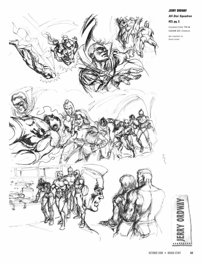
OCTOBER 2006 • ROUGH STUFF 51
JERRY
ORDW
AY
JERRY ORDWAY
All-Star Squadron
#23, pg. 2.
Characters TM &
©2006 DC Comics
Art courtesy ofSteve Lipsky
52 ROUGH STUFF • OCTOBER 2006
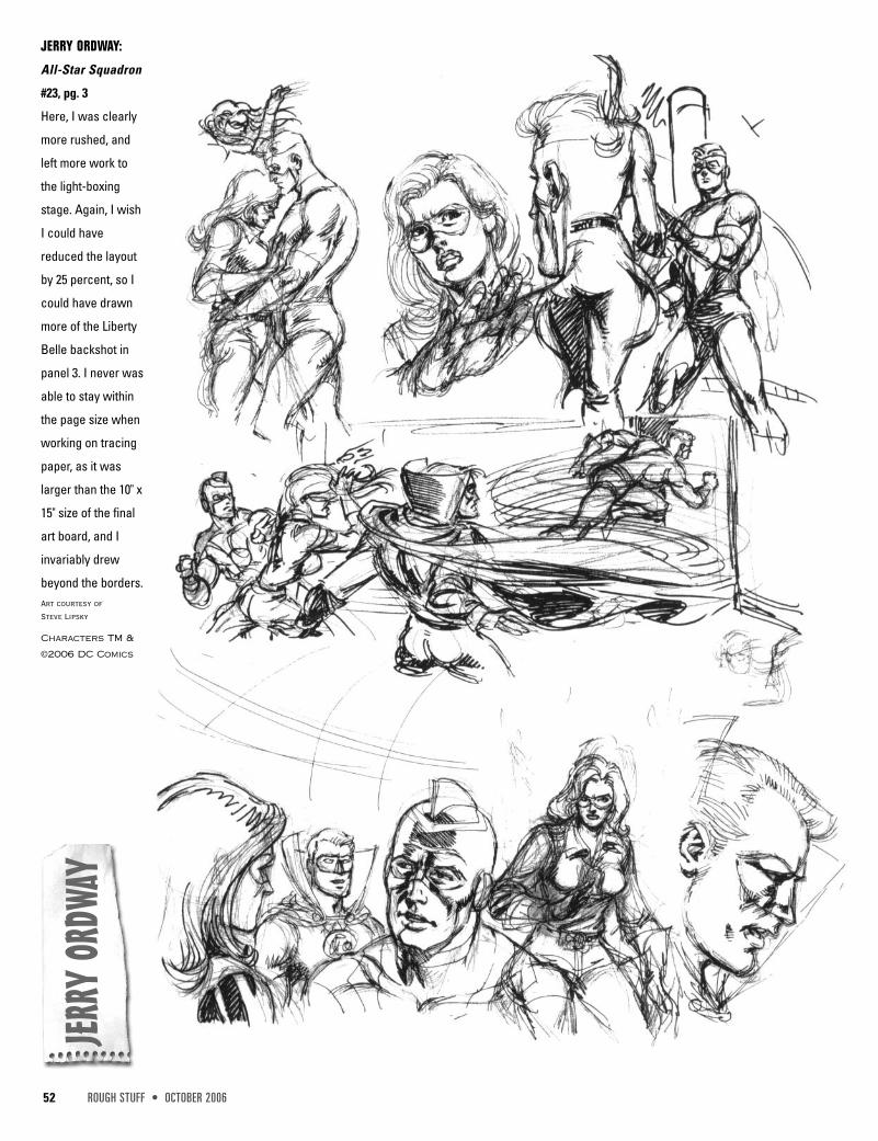
JERRY ORDWAY:
All-Star Squadron
#23, pg. 3
Here, I was clearly
more rushed, and
left more work to
the light-boxing
stage. Again, I wish
I could have
reduced the layout
by 25 percent, so I
could have drawn
more of the Liberty
Belle backshot in
panel 3. I never was
able to stay within
the page size when
working on tracing
paper, as it was
larger than the 10" x
15" size of the final
art board, and I
invariably drew
beyond the borders.Art courtesy ofSteve Lipsky
Characters TM &
©2006 DC Comics
JERRY
ORDW
AY
OCTOBER 2006 • ROUGH STUFF 61
The legendary Alex Toth, who unfortu-
nately passed away earlier this year, was
admired by every artist I know. His
expert sense of design and composition
were unparalleled. His art is difficult
for some fans to appreciate, because he
didn’t use a lot of rendering. He pared his art down to just
what was necessary and nothing more; not out of laziness,
but for maximum effect.
F E A T U R E D A R T I S T
ALEX TOTH
ALEX TOTH
These were
character
designs
of the
Fantastic Four in
costume for the
1960s animated TV
show. Notice the use of
heavy black shadowing
on the Thing. Toth was
known for his good use
of blacks, but here I
suspect he was also
looking to avoid drawing
all of those bother-
some bricks.
Alex Toth was an artist’s artist. He was highly
respected for the simplicity of his designs.
Diagonal shapes make a drawing more interest-
ing than verticals and horizontals, and he was a
master at using diagonals. He also was expert
at placing blacks to create well-balanced
designs. He had a uniquely playful style of visual story-
telling that was always fun to see, but his forté was not
superheroes. While his work could be very dynamic, he
was more interested in black-and-white design and story-
telling than in Kirbyesque superheroes. But even as he
struggled with the long underwear guys, his brilliance
shines through in these pages. He worked in animation as
well as comic books, and we have a sampling of both.
Alex Toth art comments by Bob McLeod
Fantastic Four TM & ©2006 Marvel Characters, Inc.
62 ROUGH STUFF • OCTOBER 2006
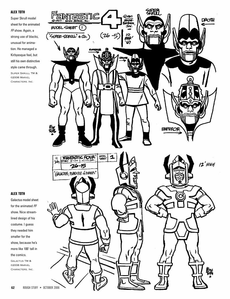
ALEX TOTH
Super Skrull model
sheet for the animated
FF show. Again, a
strong use of blacks,
unusual for anima-
tion. He managed a
Kirbyesque feel, but
still his own distinctive
style came through.
Super Skrull TM &
©2006 Marvel
Characters, Inc.
ALEX TOTH
Galactus model sheet
for the animated FF
show. Nice stream-
lined design of his
costume. I guess
they needed him
smaller for the
show, because he’s
more like 100' tall in
the comics.
Galactus TM &
©2006 Marvel
Characters, Inc.
64 ROUGH STUFF • OCTOBER 2006
ALEX
TOTH
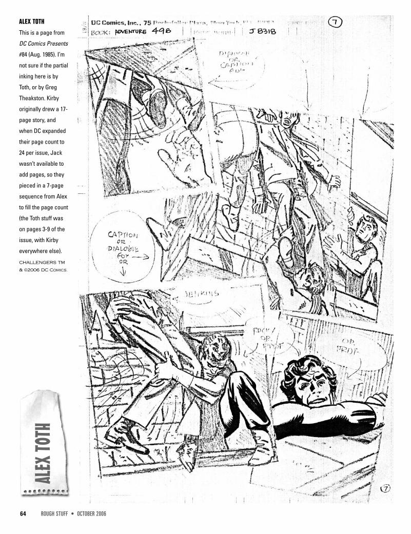
ALEX TOTH
This is a page from
DC Comics Presents
#84 (Aug. 1985). I’m
not sure if the partial
inking here is by
Toth, or by Greg
Theakston. Kirby
originally drew a 17-
page story, and
when DC expanded
their page count to
24 per issue, Jack
wasn’t available to
add pages, so they
pieced in a 7-page
sequence from Alex
to fill the page count
(the Toth stuff was
on pages 3-9 of the
issue, with Kirby
everywhere else).
CHALLENGERS TM
& ©2006 DC Comics.
OCTOBER 2006 • ROUGH STUFF 73
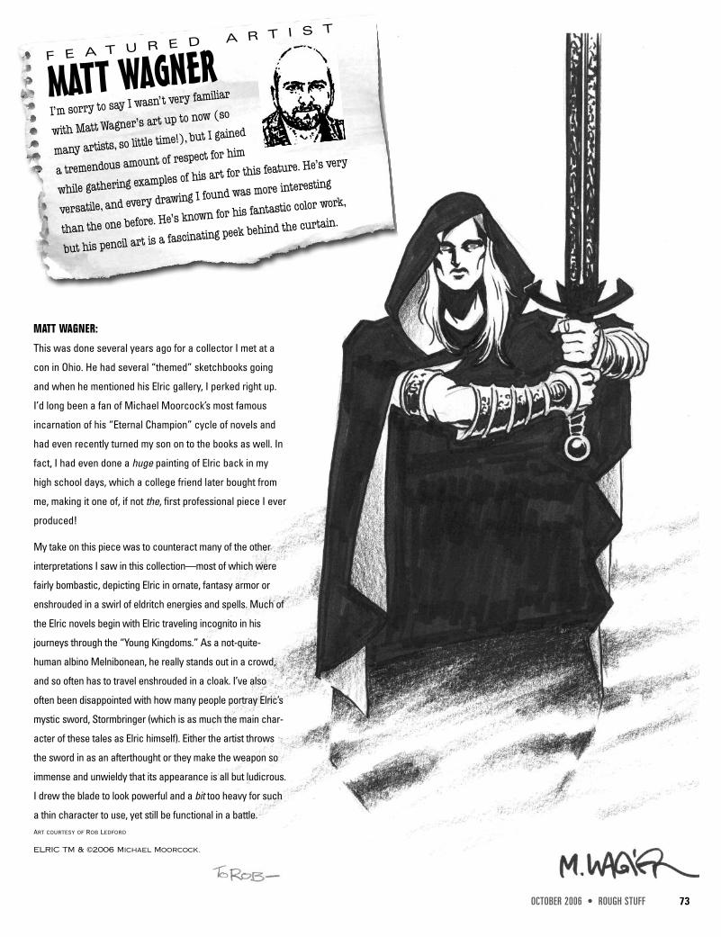
MATT WAGNERI’m sorry to say I wasn’t very familiar
with Matt Wagner’s art up to now (so
many artists, so little time!), but I gained
a tremendous amount of respect for him
while gathering examples of his art for this feature. He’s very
versatile, and every drawing I found was more interesting
than the one before. He’s known for his fantastic color work,
but his pencil art is a fascinating peek behind the curtain.
F E A T U R E D A R T I S T
MATT WAGNER:
This was done several years ago for a collector I met at a
con in Ohio. He had several “themed” sketchbooks going
and when he mentioned his Elric gallery, I perked right up.
I’d long been a fan of Michael Moorcock’s most famous
incarnation of his “Eternal Champion” cycle of novels and
had even recently turned my son on to the books as well. In
fact, I had even done a huge painting of Elric back in my
high school days, which a college friend later bought from
me, making it one of, if not the, first professional piece I ever
produced!
My take on this piece was to counteract many of the other
interpretations I saw in this collection—most of which were
fairly bombastic, depicting Elric in ornate, fantasy armor or
enshrouded in a swirl of eldritch energies and spells. Much of
the Elric novels begin with Elric traveling incognito in his
journeys through the “Young Kingdoms.” As a not-quite-
human albino Melnibonean, he really stands out in a crowd,
and so often has to travel enshrouded in a cloak. I’ve also
often been disappointed with how many people portray Elric’s
mystic sword, Stormbringer (which is as much the main char-
acter of these tales as Elric himself). Either the artist throws
the sword in as an afterthought or they make the weapon so
immense and unwieldy that its appearance is all but ludicrous.
I drew the blade to look powerful and a bit too heavy for such
a thin character to use, yet still be functional in a battle.Art courtesy of Rob Ledford
ELRIC TM & ©2006 Michael Moorcock.
74 ROUGH STUFF • OCTOBER 2006
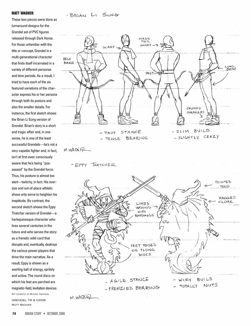
MATT WAGNER:These two pieces were done as
turnaround designs for the
Grendel set of PVC figures
released through Dark Horse.
For those unfamiliar with the
title or concept, Grendel is a
multi-generational character
that finds itself incarnated in a
variety of different personas
and time periods. As a result, I
tried to have each of the six
featured variations of the char-
acter express his or her persona
through both its posture and
also the smaller details. For
instance, the first sketch shows
the Brian Li Sung version of
Grendel. Brian’s story is a short
and tragic affair and, in one
sense, he is one of the least
successful Grendels—he’s not a
very capable fighter and, in fact,
isn’t at first even consciously
aware that he’s being “pos-
sessed” by the Grendel force.
Thus, his posture is almost too
alert—twitchy, in fact. His over-
size and out-of-place athletic
shoes only serve to heighten his
ineptitude. By contrast, the
second sketch shows the Eppy
Thatcher version of Grendel—a
harlequinesque character who
lives several centuries in the
future and who serves the story
as a frenetic wild-card that
disrupts and, eventually, destroys
the various power-players that
drive the main narrative. As a
result, Eppy is shown as a
swirling ball of energy, spritely
and active. The round discs on
which his feet are perched are
magnetic-field, levitation devices.Art courtesy of Michael Farineau
GRENDEL TM & ©2006
Matt Wagner.
OCTOBER 2006 • ROUGH STUFF 75
MATT WAGNER
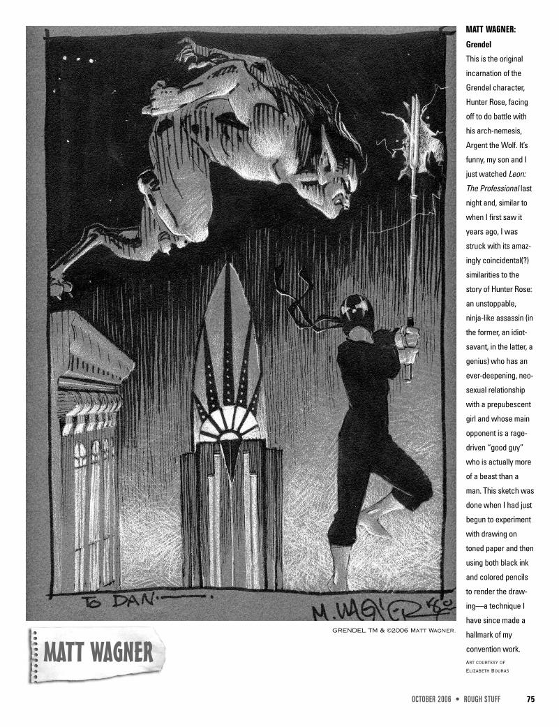
MATT WAGNER:
Grendel
This is the original
incarnation of the
Grendel character,
Hunter Rose, facing
off to do battle with
his arch-nemesis,
Argent the Wolf. It’s
funny, my son and I
just watched Leon:
The Professional last
night and, similar to
when I first saw it
years ago, I was
struck with its amaz-
ingly coincidental(?)
similarities to the
story of Hunter Rose:
an unstoppable,
ninja-like assassin (in
the former, an idiot-
savant, in the latter, a
genius) who has an
ever-deepening, neo-
sexual relationship
with a prepubescent
girl and whose main
opponent is a rage-
driven “good guy”
who is actually more
of a beast than a
man. This sketch was
done when I had just
begun to experiment
with drawing on
toned paper and then
using both black ink
and colored pencils
to render the draw-
ing—a technique I
have since made a
hallmark of my
convention work.Art courtesy ofElizabeth Bouras
GRENDEL TM & ©2006 Matt Wagner.
84 ROUGH STUFF • OCTOBER 2006
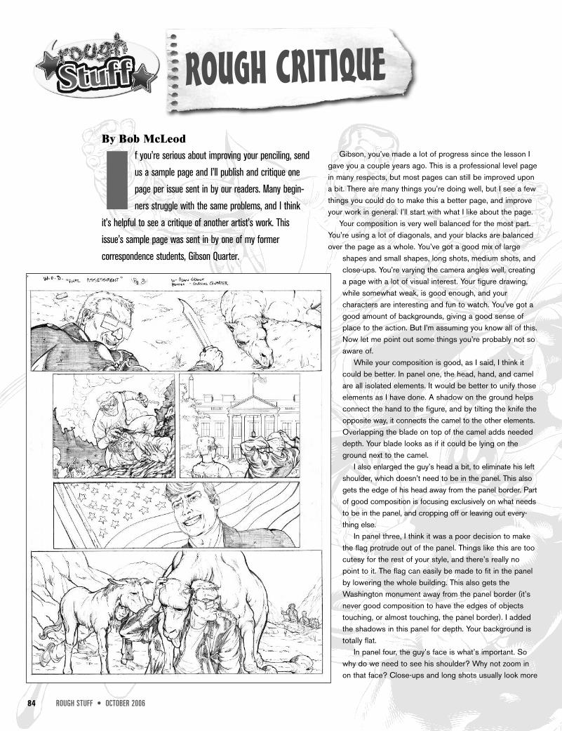
ROUGH CRITIQUEBy Bob McLeod
I f you’re serious about improving your penciling, sendus a sample page and I’ll publish and critique onepage per issue sent in by our readers. Many begin-ners struggle with the same problems, and I think
it’s helpful to see a critique of another artist’s work. Thisissue’s sample page was sent in by one of my formercorrespondence students, Gibson Quarter.
Gibson, you’ve made a lot of progress since the lesson Igave you a couple years ago. This is a professional level pagein many respects, but most pages can still be improved upona bit. There are many things you’re doing well, but I see a fewthings you could do to make this a better page, and improveyour work in general. I’ll start with what I like about the page.
Your composition is very well balanced for the most part.You’re using a lot of diagonals, and your blacks are balancedover the page as a whole. You’ve got a good mix of large
shapes and small shapes, long shots, medium shots, andclose-ups. You’re varying the camera angles well, creatinga page with a lot of visual interest. Your figure drawing,while somewhat weak, is good enough, and yourcharacters are interesting and fun to watch. You’ve got agood amount of backgrounds, giving a good sense ofplace to the action. But I’m assuming you know all of this.Now let me point out some things you’re probably not soaware of.
While your composition is good, as I said, I think itcould be better. In panel one, the head, hand, and camelare all isolated elements. It would be better to unify thoseelements as I have done. A shadow on the ground helpsconnect the hand to the figure, and by tilting the knife theopposite way, it connects the camel to the other elements.Overlapping the blade on top of the camel adds neededdepth. Your blade looks as if it could be lying on theground next to the camel.
I also enlarged the guy’s head a bit, to eliminate his leftshoulder, which doesn’t need to be in the panel. This alsogets the edge of his head away from the panel border. Partof good composition is focusing exclusively on what needsto be in the panel, and cropping off or leaving out every-thing else.
In panel three, I think it was a poor decision to makethe flag protrude out of the panel. Things like this are toocutesy for the rest of your style, and there’s really nopoint to it. The flag can easily be made to fit in the panelby lowering the whole building. This also gets theWashington monument away from the panel border (it’snever good composition to have the edges of objectstouching, or almost touching, the panel border). I addedthe shadows in this panel for depth. Your background istotally flat.
In panel four, the guy’s face is what’s important. Sowhy do we need to see his shoulder? Why not zoom inon that face? Close-ups and long shots usually look more