sample portfolio user experience · management personnel deliverables : u.s., ... power generation...
TRANSCRIPT

JAN ARVANETES
474 Sandalwood Drive
Bay Village, Ohio 44140
m.817.691.0667 | h.440.331.4393
SAMPLE PORTFOLIO user experience
This portfolio incorporates selected samples of my work using a variety of research and design methodologies for: : Cummins, Inc. : Domino’s Pizza : TracFone Wireless : Citizen’s Bank : Sunglass Retailer* : New York-based Grocery Chain*
*Confidentiality agreement requires name to be withheld.

Page 2 of 32
JAN ARVANETES – sample portfolio continued
CUMMINS: CUSTOMER SERVICE SYSTEM (2015 – 2017)
Client
Cummins, Inc.
Industry
Diesel engine, filtration, and power
generation product design,
manufacturing, and distribution
DESIGN CHALLENGE
Bring together 5+ independent
applications into a seamless,
end-to-end engine service
experience.
User Groups
Dealers and Distributors Worldwide –
Service Writers, Service Technicians,
Warranty Administrators, and
management personnel
Deliverables
: U.S., China, and Columbia contextual
inquiry – results report and
recommendations
: Domestic 3x3 iterative design and
usability testing – multiple paper
prototype options, test plan and
artifacts, findings and
recommendations report
: Remote international usability testing
– test plan and artifacts, findings and
recommendations report
: Single Axure wireframe set depicting
the recommended workflow and user
interface
Timeline
: Contextual Inquiry – 3 months
: 3x3 Iterative Design and Usability
Testing – 2 months
: Detail Design (Customer intake and
service event) – 9 months including
launch
: Detail Design (Warranty claims) –
10 months : Usability Testing and Refinements
(Warranty claims) – 3 weeks
While performing contextual inquiry on one of Cummins’ diagnostic applications (INSITE), it became obvious
that Cummins had a serious usability issue with its customer service products. All applications and online
resources were running as separate products instead of as a single system. This forced users to enter an
incredible amount of the same information repeatedly during a single service job. With this report and other
customer feedback, management secured funding for an end-to-end service and warranty claims system in
2015.
Engaging a user-centered approach to the design, my team and I, first performed contextual inquiry in the
U.S., China, and Columbia at 12 dealer and distributor locations. After analysis, we then engaged internal
stakeholders to work with us in concept workshops and created multiple approaches to the design solution. I
developed paper prototypes of the three strongest and most unique concepts and we facilitated 3x3 iterative
design and usability testing in multiple U.S. cities. We then refined the concepts into a single design wireframe
set using Axure.
While working through detail design with the independent internal teams that managed the existing
applications, we also performed remote international and in-person U.S. usability tests to ensure that the
system met end-user and business needs. I created paper and interactive prototypes using Axure for these
activities and managed the overall wireframe set for development. I was contracted again to assist the front-
end developers in a transitioning Agile environment.
The initial release, which included service intake, diagnostics, and repair, launched to 200 Cummins
distributors in 2016 with plans to release to the remaining 400 distributors and over 6,700 dealers in 2017. In
early 2016, I was again contracted to design the remainder of the system, which included the warranty claims
process. This required consolidating two separate applications into one process flow. I worked independently
with representatives from both applications for approximately 10 months. Before development was scheduled
to begin, I convinced management to allow me to perform final usability testing at four U.S. dealer locations to
ensure there were no show-stopping usability issues. The workflow and concept was on track and it allowed
our team to make additional refinements based on end-user feedback.
A walk-through of the system is available on YouTube at: www.youtube.com/watch?v=yap7c3jUoLw&t=14s
The following pages represent a sample of the overall Customer Service System reports and wireframe set.
Additional projects for Cummins included:
: Power Generation Dealer Portal (2015) – created usability strategy for improving the Siebel ‘out-of-the-box’
design for Cummins Power Systems dealers integrating UX best practices and user feedback. Facilitated
two usability tests, three conference room pilot sessions with customers, and provided multiple
recommendation reports.
: INSITE Contextual Inquiry (2014) – facilitated contextual inquiry at ten U.S. locations to improve the
usability of the service diagnostic application.
: User Experience at Cummins (2014) – added further methodology content and refined the overall design
of the existing user experience team capabilities presentation.
: Global Warranty Systems (2014) – refined the existing user experience strategy that was put in place by a
development-focused team to incorporate more early-on, direct end-user feedback.

Page 3 of 32
JAN ARVANETES – sample portfolio continued
CUMMINS: CUSTOMER SERVICE SYSTEM (2015 - 2017)
Samples from Contextual Inquiry Reports Cummins INSITE Diagnostic Application
Cummins Service System

Page 4 of 32
JAN ARVANETES – sample portfolio continued
CUMMINS: CUSTOMER SERVICE SYSTEM (2015 - 2017)
3x3 Iterative Design and Usability Test Report

Page 5 of 32
JAN ARVANETES – sample portfolio continued
CUMMINS: CUSTOMER SERVICE SYSTEM (2015 - 2017)
3x3 Iterative Design and Usability Test Report

Page 6 of 32
JAN ARVANETES – sample portfolio continued
CUMMINS: CUSTOMER SERVICE SYSTEM (2015 - 2017)
Final Wireframe for Responsive Design
A walk-through of the system is available on YouTube at: www.youtube.com/watch?v=yap7c3jUoLw&t=14s
Role-based Home Pages

Page 7 of 32
JAN ARVANETES – sample portfolio continued
CUMMINS: CUSTOMER SERVICE SYSTEM (2015 - 2017)
Customer Intake – Side-by-side Responsive Solution

Page 8 of 32
JAN ARVANETES – sample portfolio continued
CUMMINS: CUSTOMER SERVICE SYSTEM (2015 - 2017)
Diagnosis & Repair – Side-by-side Responsive Solution

Page 9 of 32
JAN ARVANETES – sample portfolio continued
CUMMINS: CUSTOMER SERVICE SYSTEM (2015 - 2017)
Warranty Claim Creation

Page 10 of 32
JAN ARVANETES – sample portfolio continued
DOMINO’S PIZZA: DOMINOS.COM PIZZA PROFILE and EASY ORDER (2013)
Client
Domino’s Pizza
Industry
Franchised pizza restaurant chain
DESIGN CHALLENGE
Improve the overall user
experience of Dominos.com
Easy Order.
User Groups
Domino’s three key U.S. online
consumer groups:
: Loyal customers
: Value-oriented customers
: Speed-oriented customers
Deliverables
: Traditional lab-based and remote
usability design testing
: Test plan and artifacts, findings and
design recommendations report
Timeline
7 weeks
Domino’s had added functionality to their consumer site that saved the last five online orders placed by
customers with an account profile. This functionality enabled users to designate one order as an “Easy Order”
allowing them to reorder a saved order as-is, or use it as the starting point for a new order.
Domino’s wanted to understand how the new functionality affected current online customers including:
: Which elements help or hinder placing an order
: Which elements of the new functionality are the most appealing and therefore should be promoted to
consumers
: Opportunities for improving the user’s online ordering experience which can ultimately lead to more orders
and additional revenue
I planned and facilitated lab-based and remote (via web-based chat) usability tests with 24 total users. After
performing data analysis, I created design solutions and presented to Domino’s internal team and
management. Domino’s implemented much of the recommendations presented – most of which are still in
place today.
The following pages represent a sample of the overall report and design recommendations.

Page 11 of 32
JAN ARVANETES – sample portfolio continued
DOMINO’S PIZZA: DOMINOS.COM PIZZA PROFILE and EASY ORDER (2013)
Samples from Usability Test and Design Recommendations Reports Study Design and Background Interviews
Detailed Findings and Design Recommendations

Page 12 of 32
JAN ARVANETES – sample portfolio continued
TRACFONE WIRELESS: SMALL BUSINESS PLANS (2013)
Client
TracFone Wireless – International pre-
paid telecommunications provider
Industry
Telecommunications
DESIGN CHALLENGE
Establish a new brand that
targets small business owners
looking to consolidate, reduce,
and streamline their fleets’
mobile needs and expenses.
Create an easy-to-use online
experience using the
WebSphere eCommerce
Madison starter store while
maintaining ‘out-of-the-box’
functionality with limited
customization.
User Groups
Small business owners and their
buyer admins
Deliverables
Initial creative sketch and Axure-based
wireframe set of recommendations using
existing research and out-of-the-box
functionality
Timeline
15 weeks
Due to immediate time-to-market requirements, upfront user research was limited to what could be gathered
through business, marketing, and technology stakeholder interviews, which I facilitated or participated in.
Working directly with the client, I determined business and general brand requirements within a two-week
period. While the marketing team engaged in naming and visual identity activities, I created a full working set of
wireframes recommending a general brand approach, a reduced work flow, and content recommendations for:
: Product and service browsing and comparison
: Required product and service cross-sell for enabling add-to-cart
: Checkout and account creation
: Integration of existing portal systems
The following pages depict sample concept sketches and wireframe screens I produced of the recommended
user experience.

Page 13 of 32
JAN ARVANETES – sample portfolio continued
TRACFONE WIRELESS: SMALL BUSINESS PLANS (2013)
Home Page Concept and Wireframe
Owners & Buyer Admins Research the company Register / Log in Shop & compare Purchase Track activity
Employees Activate phones Leverage online support
TASKS to ACCOMMODATE

Page 14 of 32
JAN ARVANETES – sample portfolio continued
TRACFONE WIRELESS: SMALL BUSINESS PLANS (2013)
Plans Landing Page

Page 15 of 32
JAN ARVANETES – sample portfolio continued
TRACFONE WIRELESS: SMALL BUSINESS PLANS (2013)
Product Detail Page

Page 16 of 32
JAN ARVANETES – sample portfolio continued
CITIZENS BANK: PERSONAL CHECKING PRODUCT PLANS (2012)
Client
Citizens Bank – Personal Banking
Industry
Financial Services
DESIGN CHALLENGE
Introduce a new product line
targeted to consumers that
incents them to sign up. Plans
include Value Plan, Security
Plan, and a Combined Plan
offering rewards, discounts, and
services for a monthly fee.
User Groups
Online banking consumers
Deliverables
Visio wireframes depicting the full
experience. The technical team
developed an interactive prototype for
usability testing.
Timeline
10 weeks
Citizens Bank, like many other financial institutions at the time, was looking for ways to provide consumer
incentives that combine with their existing checking products. The business developed a series of products
including:
: Value Plan – discounts, cash back, and purchase protection for a monthly fee
: Secure Plan – credit monitoring, internet surveillance, card and document registration, and fraud
resolution for a monthly fee
: Combined Plan – the Value and Secure Plans at a reduced monthly rate
Working with a small team and iterating with the client, I designed the work flow, interaction designs, and layout
in Visio wireframe format. Over the course of one week, the prototype was usability tested at Bentley University
in Boston. Working closely with the researcher and a visual design team in New York, recommendations from
the usability test that were accepted by the client were included in the final design to enhance the overall
experience.
Although sign-up on the site was initially high, the products were eventually phased out. However, the microsite
was recognized by the Horizon Interactive Awards and Interactive Media Awards:
: 2011 Horizon Interactive Awards – Gold: Consumer Information (websites); Silver: Animation (websites);
Bronze: Training and Instructional (video)
: 2012 IMA (Interactive Media Awards) – Best in Class Award

Page 17 of 32
JAN ARVANETES – sample portfolio continued
CITIZENS BANK: PERSONAL CHECKING PRODUCT PLANS (2012)
Introduction Video

Page 18 of 32
JAN ARVANETES – sample portfolio continued
CITIZENS BANK: PERSONAL CHECKING PRODUCT PLANS (2012)
Value Plan Landing Page (with overlay quick guide)

Page 19 of 32
JAN ARVANETES – sample portfolio continued
CITIZENS BANK: PERSONAL CHECKING PRODUCT PLANS (2012)
Value Plan (with user inputs depicting total value and average comparisons)

Page 20 of 32
JAN ARVANETES – sample portfolio continued
CITIZENS BANK: PERSONAL CHECKING PRODUCT PLANS (2012)
Secure Plan (with user inputs depicting level of protection)

Page 21 of 32
JAN ARVANETES – sample portfolio continued
CITIZENS BANK: PERSONAL CHECKING PRODUCT PLANS (2012)
Combined Plan (with collective value and level of protection)

Page 22 of 32
JAN ARVANETES – sample portfolio continued
SUNGLASS RETAILER: IN-STORE PURCHASING EXPERIENCE (2013)
Client
Leading retailer of designer and high-
performance sun eyewear
Industry
Consumer Retail
DESIGN CHALLENGE
Refine the WebSphere Madison
eCommerce starter store to
accommodate the iPad platform
while maintaining ‘out-of-the-box’
functionality with bare minimum
customization.
User Groups
U.S. and Canadian In-store
Sales Associates
Deliverable
Create Axure-based wireframe
recommendations using existing
research and out-of-the-box functionality.
Timeline
2 weeks
Initial UX strategy recommendations were made to conduct in-store contextual inquiry and interviews with
sales associates. The goal was to observe the sales process and determine the prioritization of user tasks as
they relate to customer needs. The client opted to conduct its own in-store interviews and determined business
requirements using the existing consumer-facing site.
Provided with this research and marketing insight gained through client stakeholder interviews that I
participated in, I provided UX consultation on the in-store experience including:
: ways to increase customer trust when associates gather private information
: security recommendations for reducing iPad theft
: accessibility needs for in-store customers
I then worked with a two-person team to establish a general user task flow and determined an assumed entry
point for the iPad. While this is to be developed using website functionality, its primary use is to complete a
sale when a customer’s preferred product is not available in the store. Therefore, the overall user experience
was to look and feel like a customized application to reduce associate time-on-task (currently 15 minutes) and
discourage the consumer from purchasing products themselves online.
Leveraging the existing WebSphere desktop functionality, taxonomy, and catalog assets, I designed the initial
set of wireframes in order for a sales associate to complete a sale by:
: pulling critical functionality forward – search and navigation categories
: reducing the content and steps required for guest checkout in order to minimize taps
: refining terminology to better meet the associate and consumers’ mental model for checkout
: redesigning the layout to accommodate iPad-specific interactions and horizontal / vertical formatting without
the use of responsive design
The following pages depict sample screens of the existing out-of-the-box application (‘before’) and the
recommended design in wireframe form.

Page 23 of 32
JAN ARVANETES – sample portfolio continued
SUNGLASS RETAILER: IN-STORE PURCHASING EXPERIENCE (2013)
“Before” – WebSphere Out-of-the-Box Home Page
Products | Search
Sign In

Page 24 of 32
JAN ARVANETES – sample portfolio continued
SUNGLASS RETAILER: IN-STORE PURCHASING EXPERIENCE (2013)
Home Page (with large targets for navigation and immediate access to search)

Page 25 of 32
JAN ARVANETES – sample portfolio continued
SUNGLASS RETAILER: IN-STORE PURCHASING EXPERIENCE (2013)
Category Landing Page (with larger imagery, removal of ‘quick view’ feature, immediate add-to-cart functionality, reduced scrolling in left navigation)

Page 26 of 32
JAN ARVANETES – sample portfolio continued
SUNGLASS RETAILER: IN-STORE PURCHASING EXPERIENCE (2013)
Compare Products Page (with larger imagery, immediate add-to-cart functionality, reduced scrolling through sticky navigation, and a side-by-side comparison layout)

Page 27 of 32
JAN ARVANETES – sample portfolio continued
SUNGLASS RETAILER: IN-STORE PURCHASING EXPERIENCE (2013)
Checkout Process (simplified layout, larger imagery, more intuitive terminology, and clear presentation of process steps)

Page 28 of 32
JAN ARVANETES – sample portfolio continued
CITIZENS BANK: COMPARE PERSONAL CHECKING ACCOUNT PRODUCTS (2012)
Client
Citizens Bank – Personal Banking
Industry
Telecommunications
DESIGN CHALLENGE
Refine the consumer task flow
for comparing checking accounts
and increase online account
sign-up. The existing work flow
was cumbersome and unintuitive
forcing users through multiple
paths within the site often
resulting in page abandonment.
User Groups
Online banking consumers
Deliverables
Using Axure, a series of three design
approaches were created for iterative
design and usability testing. Final
deliverables included a refined wireframe
set and content structure
recommendations.
Timeline
5 weeks
As the UX lead to the account, I worked closely with multiple areas of the personal and small business brands.
The general strategy that had been taken in the past was to design and develop only two options and
determine final use through A/B testing of the site.
After several months of working directly with the account team and the client, I was able to persuade them to
conduct upfront user research through low-fidelity (paper) prototyping coupled with iterative design usability
testing. This was the first time that Citizens Bank engaged in this type of user research. By engaging users, we
refined the content structure in the way that users envisioned the information versus the hierarchy that client
stakeholders considered important.
I designed three approaches with the client team in paper wireframe format. Over the course of one week, the
concepts were usability tested at Bentley University in Boston and redesigned onsite the following day of each
test day (3 test days, 6 users per day). Concepts were combined, narrowed, and retested to arrive at a single
layout and content strategy for writing and development.
The design approach was integrated across both the personal and small business banking areas of the site.
Page 29 of 32
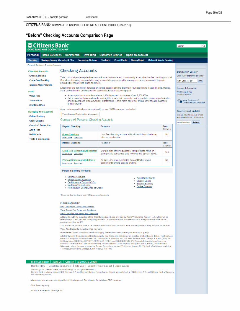
JAN ARVANETES – sample portfolio continued
CITIZENS BANK: COMPARE PERSONAL CHECKING ACCOUNT PRODUCTS (2012)
“Before” Checking Accounts Comparison Page

Page 30 of 32
JAN ARVANETES – sample portfolio continued
CITIZENS BANK: COMPARE PERSONAL CHECKING ACCOUNT PRODUCTS (2012)
New Checking Accounts Comparison Page

Page 31 of 32
JAN ARVANETES – sample portfolio continued
NEW YORK-BASED GROCERY CHAIN: NEW CLIENT PROPOSAL (2013)
Client
New York-based grocery chain
Industry
Consumer Retail
DESIGN CHALLENGE
The client was looking for a new
interactive agency to recommend and
launch new best-in-class services.
User Groups
Online consumers
Deliverables
Single Axure wireframe depicting
possible future offerings.
Timeline
1 week
Working with a small business development team, I brainstormed concepts and researched technologies that
could be applied to the retailer’s business.
Concepts included:
: Recipes and Meals. Using the Kit and Bundling SKU features available in IBM WebSphere, create recipes
and meals that could be grouped together allowing the shopper to add individual ingredients to their
shopping list or online cart. Recipes could be ‘reshuffled’ by the user – either using the mobile app or the site
- to create new meal suggestions.
: Store “Traffic Reports.” Using geo-fencing technology or recorded entry-way use, the number of shoppers
in a store could be determined at any given time. This data could then be presented to shoppers via the
mobile app or site. Through historical analysis, shoppers could be given a suggested time when the store is
expected to be less busy. This would allow the store’s specialty employees (their cheesemonger, wine
steward, butcher, etc.) to be more readily available to provide more personalized service – a key brand goal.
: List Mapping to Store Layouts. Assuming most users add items to their shopping list by recipes, as they
remember needs, or by specific rooms in their house, lists are generally not prioritized to match a store’s
layout – produce, dry goods, pharmacy, etc. Users could reorder their lists to map to a store’s layout and
save their preferred store in their profile.
: My Current Panty. Using the mobile app, users could scan the bar codes of items already in their pantry
and find recipes and meals that could be made using existing ingredients. As well, users could add to their
shopping list or cart any remaining items needed to create a new recipe.
: Personalized Profiles. As a user shops, create a profile for them based on possible dietary needs such as
gluten-free, vegan, and food allergies. Users could confirm system assumptions as well as build upon their
profile to include additional personal attributes such as “weekend foodie,” “cheese lover,” “guerilla gourmet,”
etc. This allowed the site to provide alerts, recommendations, recipes and more based on their household
size, level of expertise, and sense of adventure in trying new foods.
: In-Store Scanning. Using the mobile app, users could scan a product’s bar code or fresh ingredient QR
code to view related allergy alerts, source of origin, and recipe / meal suggestions. The user could then add
the item to their shopping list to buy later or if purchased, the item could then be added to their Current
Pantry and My Products.
: Food Adventures. The site could provide customers with weekly meal suggestions tailored to meet their
profile settings and offer them a chance to discover new culinary options – Breakfast in Japan, BBQ’ing in
Brazil, Movie Night, and Theme Parties.
: Cooking Challenges. Customers could participate in key ingredient challenges with a countdown to final
entry time. Users could upload their own recipes and photos. Winning recipes could then be featured and
added to the overall database of ingredients, recipes and meals. Other users could participate through
reviews, additions/adjustments to recipes and social media postings.
I created the following single wireframe to depict the integration of the concepts on the site’s home page for a
walk-through with the potential client.

Page 32 of 32
JAN ARVANETES – sample portfolio continued
NEW YORK-BASED GROCERY CHAIN: NEW CLIENT PROPOSAL (2013) Conceptual Home Page