sample - ready-ed publications | teaching resources · pdf fileballoon faces 24-25 ... sample....
TRANSCRIPT

Sample
3
Contents
Teachers’ Notes 4 Handy Hints 5National Curriculum Links 6Colour 7Techniques Explained 8How To Use This Book 9
Beach Umbrella 10-12Chameleon 13-15 Banana Sundae 16-18Life Cycle 19-21 Don’t Bully Me 22-23Balloon Faces 24-25The Swimming Fish 26-28Monsters 29-31Hot Air Balloons 32-33Tissue Box 34-36Bug On A Leaf 37-39Finger-Bugs 40-41Throw The Ball 42-43Guitar 44-46I Won’t Get Burnt 47-49Caterpillar 50-51Clown 52-54 Smile! 55-57Day And Night 58-61Blending Practice 62-63Shading Practice 64-65Texture Practice 66-67
Assessment Sheet 68
Sample

4
Teachers’ NotesArt Ideas For Primary Teachers 1 is part of a two book series. This book is designed for lower primary students and the second book is written for upper primary students. As a casual teacher myself I have created both books to assist teachers, including casual teachers, by providing them with easy to follow and practical art ideas. The ideas in this book are interesting and provide students with the opportunity to be creative, expressive and imaginative - three requirements of the new National Art Curriculum. Many of the art activities can be integrated into other key learning areas, which is hugely beneficial in today’s busy classroom. Topics such as bullying, healthy eating and the life cycles of animals can all be examined in some detail when producing the artworks. All artworks featured in this book utilise materials that are readily available in schools, which is advantageous for casual teachers and busy classroom teachers.
Art in the primary school classroom can be a daunting experience for some teachers who lack confidence or extensive knowledge of art and its processes. I have created these art ideas to assist such teachers and hopefully to promote positive and productive art experiences for both the teachers and the students. I remember my love for primary school art was fostered when I was testing the Bug On A Leaf activity (see pages 37-39). The students were enthusiastic and genuinely loved the art experience (they also had green paint in their hair which made me, and them smile!!!). There is nothing more pleasurable than watching a class of happy, enthusiastic students working busily on a successful art activity. Hopefully these art activities will assist you in this delightful experience.
The art activities in this book will not only help teachers to provide stimulating lessons for their students but they can be used to cater for all levels of artistic abilities. For example, for students with obvious artistic ability, minimal assistance can be given and creativity promoted. For students experiencing difficulty in creating an artwork, it may be beneficial to provide the blackline master templates attached to some of the lessons or give them some assistance to increase their confidence so that they can produce a piece of work that they are happy with. Modifying the lessons can help create a positive environment which is imperative to artistic learning processes. The activities in this book can also be altered in their degree of difficulty by using a different medium or technique, such as substituting pastels for pencils. The lessons can be modified to cater for the abilities of the students and the teachers.
The most important thing to remember is that art should be a pleasurable and positive experience for all involved, and this book has been written to help teachers achieve this.
Sample
7
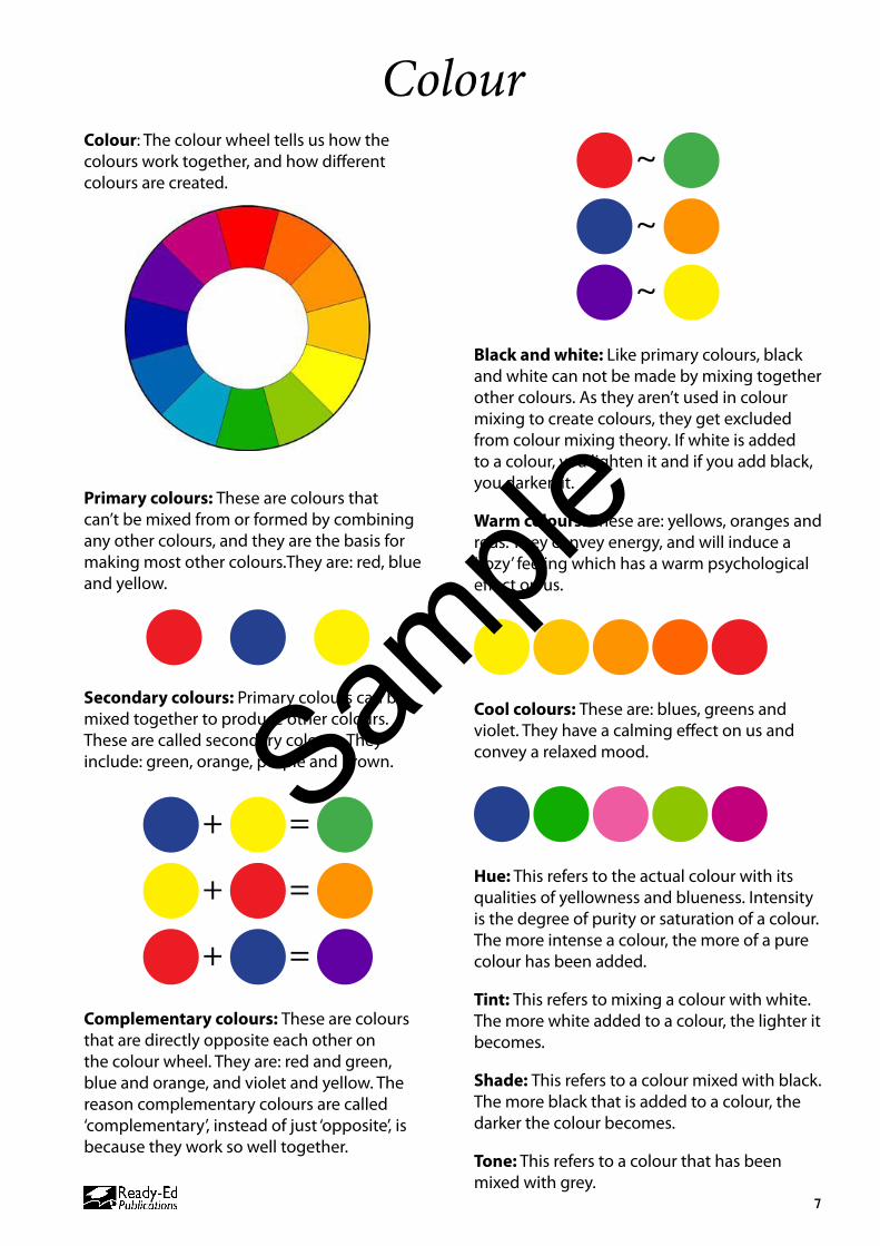
ColourColour: The colour wheel tells us how the colours work together, and how different colours are created.
Primary colours: These are colours that can’t be mixed from or formed by combining any other colours, and they are the basis for making most other colours.They are: red, blue and yellow.
Secondary colours: Primary colours can be mixed together to produce other colours. These are called secondary colours. They include: green, orange, purple and brown.
+ =
+ =
+ =
Complementary colours: These are colours that are directly opposite each other on the colour wheel. They are: red and green, blue and orange, and violet and yellow. The reason complementary colours are called ‘complementary’, instead of just ‘opposite’, is because they work so well together.
~
~
~
Black and white: Like primary colours, black and white can not be made by mixing together other colours. As they aren’t used in colour mixing to create colours, they get excluded from colour mixing theory. If white is added to a colour, you lighten it and if you add black, you darken it.
Warm colours: These are: yellows, oranges and reds. They convey energy, and will induce a ‘cozy’ feeling which has a warm psychological effect on us.
Cool colours: These are: blues, greens and violet. They have a calming effect on us and convey a relaxed mood.
Hue: This refers to the actual colour with its qualities of yellowness and blueness. Intensity is the degree of purity or saturation of a colour. The more intense a colour, the more of a pure colour has been added.
Tint: This refers to mixing a colour with white. The more white added to a colour, the lighter it becomes.
Shade: This refers to a colour mixed with black. The more black that is added to a colour, the darker the colour becomes.
Tone: This refers to a colour that has been mixed with grey.
Sample

8
Techniques Explained 2Blending (see pages 62-63)The technique of blending involves creating an area between two colours where they gradually mix. There is a gentle transition from one colour to the other. To blend colours when painting you start with the first colour. As you move along the area, you add a small amount of the second colour. Gradually you add more of the second colour, so that the ratio of this paint is higher than the first colour used. In the example right, the two colours being blended are black and white. If black is the first colour used, a small amount of white is added to the black, while the paint is still wet. More and more white is added until the final colour is white.
Shading (see pages 64-65)Shading is a technique used to make a subject look solid and three-dimensional and therefore more ‘realistic’. To give a subject depth, an artist needs to think about the pattern of light. Where an object is being hit by light, the shade of the colour used will be light. Similarly where there is less light or a shadow, the shade of the colour will be darker. In the example of the panda (see image right) there is a shadow under the jaw-line and nose. A shadow is present because the nose and jaw are in front of the rest of the body. The shadow area is created by adding a little black to the colour, known as shading.
Texture (see pages 66-67)
Texture is the surface quality or ‘feel’ of an object. In artistic terms, texture is referred to as ‘simulated texture’ where the artist attempts to portray how an object would feel if it could be touched. Texture can be created via brushstrokes, e.g. using smooth brushstrokes, dabbing of the brush, flicking motions, etc. Texture can also be created by other means such as manipulating the median used. An example may be using a substance such as sand to create a rough textured effect in the artwork.
Holding A Paint BrushTo achieve precise effects and good control when painting, a paint brush should be held in the same way that you would hold a pencil or pen, with fingers close to the painting end of the brush (the bristles). The wrist is used to move the brush to gain fine control. For looser strokes the whole arm can be used, not just the wrist. It is better to move the brush in different directions instead of just left to right. A paint brush can also be held by wrapping the whole hand around it. With the palm up, rest the brush handle across the fingers and wrap the fingers and thumb around it. The thumb should be pointing upwards. Use the whole arm and shoulder when using this method to move the brush.
Activity – Blending. Page 62.
Activity – Texture. Page 66.
Sample
10
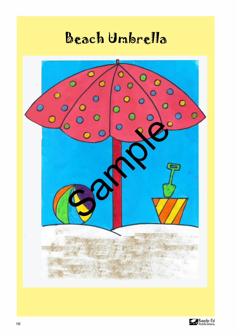
Beach Umbrella
Sample
11
Beach Umbrella
Coloured pastels �
Scissors �
Sand �
Dye �
Glue �
White A4 paper �
BLM (see page 12) �
Paint brush �
Materials �
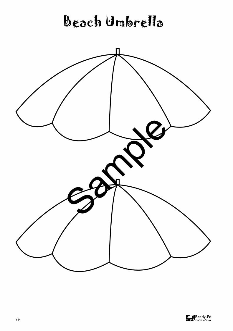
Aim Of Lesson: To create a ‘realistic’ beach scene while exploring the concept of sun safety.
Duration � 1-2 x 60 minute lessons
Discussion �Discuss the sun and the •effects of sunburn on the body.Discuss sun safety and •sun protection methods (keeping out of the sun, using shade, sun-cream, clothing, sunglasses).What objects might we find •at the beach? (Umbrellas, bucket and spade, sandcastles, boogey boards, towels, bags, balls.)What are some methods •that we could use to make our picture look ‘realistic’? (Texture techniques: rubbing crayons on a rough surface to convey the texture of sand, using flowing lines with paint to portray sand, using real sand.)What colours would we use •in a beach scene?
Method �Draw a line near the bottom of the page to show where 1. the sand begins and ends. Leave enough room at the bottom of the page for a decent amount of real sand to be added. Draw an umbrella pole emerging from the sand. 2. Add objects seen at the beach, e.g. ball, bucket, spade, 3. towel, etc. above the sand line. On a separate piece of paper draw the top of the 4. umbrella and decorate it with small circles or patterns. Use the BLM on page 12 if desired.Colour the objects on the sand line, the umbrella pole 5. and the patterns/circles on the umbrella with pastels.Paint the background of the picture with blue dye, 6. being careful not to paint the sand area.Cut out the umbrella top and colour around the patterns 7. with dye. When the background is dry, glue the umbrella top onto the pole.Put glue onto the bottom area and sprinkle on a handful 8. of sand. Lift the page to clear away any excess sand.
Summary And Reflection Questions �Why is it important to stay out of the sun? What can you do to •protect yourself from the sun?
What do you think about when you look at your completed •artwork?
What did you do in your artwork to make it look realistic?•
Sample
12
Beach Umbrella
Sample
37
Bug On A Leaf
Sample
38
Bug On A Leaf
Pastels or crayons �
Glue �
Paint brush �
Coloured dye/wash �
Scissors �
Water and water �containers
Green paint �
Plain paper �
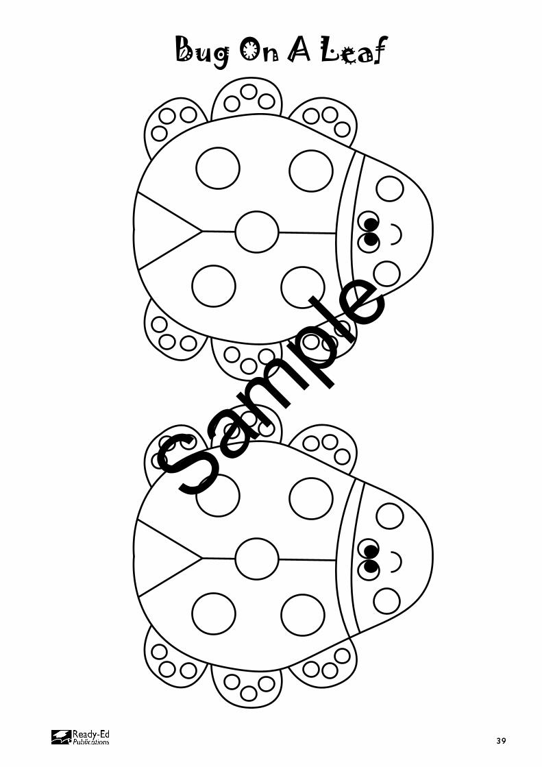
BLM (see page 39) �
Lead pencil �
Materials �
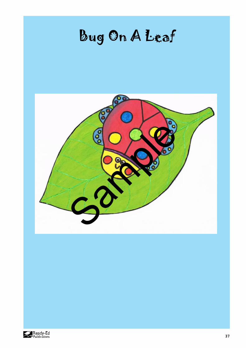
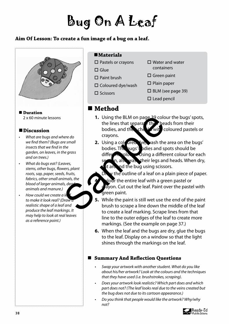
Aim Of Lesson: To create a fun image of a bug on a leaf.
Duration � 2 x 60 minute lessons
Discussion �What are bugs and where do •we find them? (Bugs are small insects that we find in the garden, on leaves, in the grass and on trees.)What do bugs eat? (Leaves, •stems, other bugs, flowers, plant roots, sap, paper, seeds, fruits, fabrics, other small animals, the blood of larger animals, dead animals and manure.)How could we create a leaf •to make it look real? (Draw a realistic shape of a leaf and produce the leaf markings. It may help to look at real leaves as a reference point.)
Method �Using the BLM on page 39 colour the bugs’ spots, 1. the lines that separate their heads from their bodies, and their cheeks with coloured pastels or crayons. Using a coloured dye, wash the area on the bugs’ 2. bodies. The bugs’ bodies and spots should be different colours. Using a different colour for each section, also wash their legs and heads. When dry, cut around the bug using scissors.Draw the outline of a leaf on a plain piece of paper.3. Colour the entire leaf with a green pastel or 4. crayon. Cut out the leaf. Paint over the pastel with green paint.While the paint is still wet use the end of the paint 5. brush to scrape a line down the middle of the leaf to create a leaf marking. Scrape lines from that line to the outer edges of the leaf to create more markings. (See the example on page 37.)When the leaf and the bugs are dry, glue the bugs 6. to the leaf. Display on a window so that the light shines through the markings on the leaf.
Summary And Reflection Questions �Swap your artwork with another student. What do you like •about his/her artwork? Look at the colours and the techniques that they have used (i.e. brushstrokes, scraping).Does your artwork look realistic? Which part does and which •part does not? (The leaf looks real due to the veins created but the bug does not due to its cartoon appearance.)Do you think that people would like the artwork? Why/why •not?
Sample
39
Bug On A Leaf
Sample