screen – hollywood actresses - home | dulwich … andy warhol in the factory, 1964, courtesy of...
TRANSCRIPT


Factory Party, August 31 1965, Courtesy of Getty Images
‘It was the perfect time to think Silver. Silver was the future, it was spacey – the astronauts…and silver was also the past – the Silver Screen – Hollywood actresses photographed in silver sets. And maybe more than anything else, Silver was narcissism – mirrors were backed with silver’
Andy Warhol
4
We are proud to continue our relationship with Dulwich Picture Gallery with the presentation of Andy Warhol: The Portfolios, from the Bank of America Collection. Through its creative and innovative exhibition programme, this pre-eminent gallery enriches and revitalises the local community and at the same time, makes an invaluable contribution to international culture.
This exhibition has been made possible through our Art in Our Communities® programme, an initiative that enables museums and galleries around the world to borrow exhibitions at no cost, helping them to generate vital revenue. Since its launch in 2008, more than 50 exhibitions have been loaned around the world.
Art in Our Communities® is just one strand in our company’s multi-tiered Arts and Culture programme. Built around three main pillars: Enable, Share and Preserve, the programme supports a wide range of organisations, from community-based outreach and education projects to world
-class arts institutions. We also provide grants through our unique Art Conservation Project, for the restoration of art works and artefacts with important cultural and historical value.
Bank of America Merrill Lynch is one of the leading corporate supporters of the arts, supporting more than 5,000 non-profit arts organisations worldwide. Our commitment is borne out of a responsibility to engage individuals, organisations, communities and cultures in creative ways, so as to build mutual respect and understanding. We are therefore delighted to work with London’s oldest public gallery to celebrate one of the world’s most popular and influential artists.
We would like to thank Dulwich Picture Gallery for affording us this exciting opportunity, and we hope that you enjoy this exhibition.
Rena DeSisto Global Arts and Culture ExecutiveBank of America Merrill Lynch
FOREWORD Andy Warhol was arguably one of the most significant and influential artists of the second half of the 20th century. The art that he called ‘pop’ challenged and teased the art establishment, because it embraced commercialism, made ‘high art’ out of the banal and saw beauty and value in the ‘disposable’ imagery of the marketplace. Ironic, iconic, superficially lightweight, profoundly subversive while remaining resolutely on the surface of things, his works achieve seemingly effortlessly one of the most difficult and important characteristics of any great artist: they couldn’t be by anyone else.
This is the second exhibition at Dulwich to be generated by the Bank of America’s Art in Our Communities® programme, following 2010’s The Wyeth Family, and just the latest manifestation of a relationship that has supported not only exhibitions, but also education and conservation at Dulwich Picture Gallery. Two more different institutions could hardly be imagined, and yet the relationship reflects some basic shared
values; notably a belief in the power of art to change lives for the better, and in a commitment to extending that opportunity as far out into the community as possible.
I am grateful to Rena DeSisto, Allen Blevins, Emma Baudey and Mary Edith Alexander for their continuing support – as always it has been a pleasure to work with them. I am also grateful to Lillian Lambrechts, Head Curator and Senior Vice President, Bank of America, and to Richard Lloyd, Head of Prints Department, Christie’s, London, who has contributed a most interesting essay in this leaflet.
A third, separate, charitable group supports us in everything we do, this exhibition being no exception: the remarkable Friends of Dulwich Picture Gallery; and in this case they are joined by the American Friends of Dulwich Picture Gallery. My very sincere thanks to them for all their support.
Ian A.C. Dejardin The Sackler Director Dulwich Picture Gallery
INTRODUCTION The canon of western art includes many artists who made prints as well as paintings, and who considered each to be of equal value. A few of these are even household names, such as Albrecht Dürer with woodcut and engraving, Rembrandt van Rijn with etching and Henri de Toulouse-Lautrec with lithography. Looking back, we have little difficulty distinguishing between their paintings and prints because, generally speaking, paintings are unique objects, painted on canvas, whereas prints are made using various techniques, and printed on paper in multiple impressions. This rough and ready distinction has held true for hundreds of years and proved extremely useful to academics, collectors, curators and authors of exhibition guides. And then along came Andy Warhol (1928–1987).
Warhol, to a greater extent than almost any other artist, ignored the rules and blurred the distinction between these two categories. His paintings and prints cannot be distinguished on the basis of technique because he used the same one – screenprinting – for both. The idea of unique versus multiple also comes unstuck because his paintings were frequently produced in series of almost identical
‘Andy’s prints and paintings are exactly the same thing’ Henry Geldzahler (1935–1994)
canvases, and many of his prints exist in unique impressions. In general terms, Warhol’s prints are defined as screenprints on paper which were intended to be produced in multiple, identical impressions. For the most part these print portfolios were numbered in series, and usually signed.
Warhol began making prints in 1962, almost as soon as he learned how to screenprint photographs, and for five years, in what was commonly referred to by those who frequented it as the ‘Silver Factory’, Warhol staged various ad-hoc group projects (Birmingham Race Riot being an example). But printmaking really began in earnest with the foundation of his printmaking company – Factory Additions, in 1967. Initially he used it to reprise his early successes, such as Campbell’s Soup, Marilyn and Flowers, but as this side of his output developed he began trying out ideas in printmaking before venturing onto canvas. The Bank of America Collection showcases the multifarious aspects of his long printmaking career, and contains many of the most important portfolios, and most significant images, produced by Andy Warhol.
6

OPPOSITE: Andy Warhol in The Factory, 1964, Courtesy of Bob Adelman
‘I come from nowhere’ Andy Warhol
ROOM 1: A MAN FROM NOWHERE Andy Warhol was born in Pittsburgh, Pennsylvania, in 1928. He was the third son of Andrej and Julia Warhola, working-class emigrants from a small village in north eastern Slovakia. Devout and conservative, they settled in a poor, working-class suburb of Pittsburgh, then a grim, industrial city built on steel.
Although in later life Andy tried hard to cover his tracks concerning his family and background, his parents were a profound influence on his character. Andrej passed on a resolute work ethic. Despite working in low paid, manual jobs all his life he managed to save enough to fund his son’s college education by the time he died, when Andy was thirteen. His mother, so he believed, gave him his creative streak, together with a calculating intelligence – characterised by one writer as ‘peasant cunning’. If his hardscrabble upbringing wasn’t enough to contend with, during his youth Andy also suffered from attacks of Sydenham Chorea, also known as St Vitus’ Dance, a disease of the central nervous system. His subsequent skin problems are often attributed to this disease: his skin became blotchy and lost pigmentation. Both conditions had profound long-term psychological effects. His painful self-consciousness led to problems forming close relationships and ultimately triggered the careful construction of a cool, detached persona to hide behind.
Warhol showed early artistic talent and studied commercial art at the School of Fine Arts at Carnegie Institute of Technology in Pittsburgh. Graduating in 1949,
he moved to New York to begin a career in commercial illustration. The timing of the move could hardly have been better; America was rich, and getting richer. The fifties and early sixties saw the birth of a new consumerism – industry and technology boomed, and a huge array of consumer goods were produced for the largest new generation in American history. Countless new companies vied to distinguish their products from their competitors’ and by 1960 advertising had turned into a $12bn a year business. Much of this advertising spend went to the numerous magazines such as Harper’s Bazaar and Esquire, and here Andy excelled. It was a highly competitive field that rewarded those who could stand out from the crowd. Andy responded by not only working around the clock, but by consciously becoming ‘Andy Warhol’. And it worked; within a few years he was the most successful commercial artist in the business.
There was no exact moment when he transformed himself into a fine artist, but it is pretty clear that he brought the desire with him from Pittsburgh. Almost as soon as Warhol arrived in the city he began pursuing his goal. As an artist Warhol decided to insult good taste, not gratify it. He took his subjects from the lower reaches of mass culture: comic books, tabloid newspapers and body-building ads.
Pop Art emerged as a movement in the mid-1950s in Britain and in the late 1950s in the United States. By emphasising the banal and kitsch, it took aim at the elitist culture in art, which in the late fifties included giants of Abstract Expressionism such as Jackson Pollock and Willem de Kooning. With his background and training, Warhol was uniquely placed to take advantage of the Pop boom. To him, the art world, with its galleries, dealers and collectors, was just as commercial as Madison Avenue.
Andy Warhol will be tied forever more to the image of a Campbell’s Soup can. So iconic is it that one would expect it to be the product of intense soul-searching or a moment of epiphany. The reality is more mundane, but also very instructive. The truth behind the soup cans is that he simply asked around.
At the beginning of the 1960s, as Pop gathered pace, Warhol pestered his friends for ideas, including the young gallery owner, Muriel Latow. She first demanded payment (the cheque for $50 she made Andy write has survived), and then replied by asking him what he liked and disliked. Warhol said that he disliked grocery shopping, since he was always being sent on errands by his mother. “Which thing in particular?” she asked. “Campbell’s soup.” His mother made it for lunch every day for years. “Which ones?” “All of them.” “So,” said Latow, “why not paint them all?”
The result was his famous deadpan presentation of a ubiquitous consumer product in an art gallery, blurring the line between art and commerce, chiming with his view that galleries were like supermarkets.
In August 1962 Marilyn Monroe was found dead in her bedroom, an apparent suicide. The next day Warhol scoured movie memorabilia shops across the city looking for just the right image to commemorate her. The photo he came up with is one from the early 1950s, taken when her studio was promoting her as a temptress. The first Marilyn silkscreen appeared a week later. The portfolio
‘… the wrong thing in the right space’
10

shows one image at a time, but in different colour combinations, or ‘flavours’. The saturated hues transformed Marilyn’s face into even more of a fiction than the carefully crafted publicity still from which it was derived.
Warhol always knew how to pick useful friends, and from 1961 to 1966 he got close to Henry Geldzahler, art historian, critic and curator of contemporary and modern art. During this period Henry provided crucial input, including the famous suggestion that it was ‘time for a little death’. The proposition sparked the seminal Death and Disaster series, 1962–64, featuring appropriated images of real-life car crashes, race riots and suicides. Birmingham Race Riot, based on a photograph featured in Life magazine, is an important work in Warhol’s oeuvre, and one which signalled the future direction of his prints in its combined use of photography and silkscreen. It demonstrated Warhol’s uncanny ability to select imagery capable of conveying extraordinary content.
Geldzahler made another pivotal intervention in the Warhol story in spring 1964. According to Geldzahler, ‘I looked around the studio and it was all Marilyn and disasters and death. And I said, “Andy, maybe it’s enough death now.” He said “What do you mean?” I said, “Well, how about this?” I opened a magazine to four flowers.’ The magazine was the June 1964 issue of Modern Photography. Warhol took the photograph of seven hibiscus flowers, cropped it down to four, and then had one of his Factory assistants run the image repeatedly through an early Photostat machine, to flatten the image ready for printing. The Flowers project was born.
ABOvE: At Gristedes supermarket, New York, 1962, Courtesy of Bob AdelmanBElOW: Andy Warhol and his assistant Gerard Malanga, printing Campbell’s soup cans, 1964, Courtesy of Ugo MulasRIGhT: Andy Warhol, New England Clam Chowder from Campbell’s Soup II, 1969, Portfolio of ten screenprints on paper, Bank of America Collection 12

ROOM 2: ‘lEt’s pRiNt it!’ For a technique that seems decidedly modern, screenprinting has a surprisingly long history. Like much printmaking technology, it was developed in ancient China to print textiles. At its simplest, it involves stretching a piece of fine mesh (traditionally silk) across a simple wooden frame, forming a tray with the mesh at the base. A line of thick, viscous ink is poured inside one edge of the frame, and then wiped across the mesh with a rubber blade. The ink seeps through the mesh, onto the paper or fabric below, leaving behind a flat, intense layer of ink. To produce an image, the artist has to block out areas of the screen that they do not want to print, leaving open mesh in areas they do. This is done with anything from paper cut-outs to screen mediums and emulsions.
In practice, screenprinting is simple, cheap to use and surprisingly adaptable. It is very democratic, lending itself to small-scale production; and its speed means it can be used in commercial packaging. If that was all, screenprinting would simply be another graphic technique. But there was one final twist – it can be used to print photographs. For Warhol manual virtuosity now no longer mattered and making art became a series of mental decisions, the most crucial of which was choosing the right source image for others to reproduce.
A pivotal figure in Warhol’s printmaking enterprise was Rupert Jasen Smith. In the late 1970s he began helping out with print projects. The two became an extremely productive, close-knit team, Andy focusing on the concept of an image, Rupert on its execution. His influence soon became apparent. He employed a new range of stylistic devices including collage and superimposed drawing, to create prints that were aesthetically and conceptually complex.
Grapes D.D. are particularly interesting. ‘D.D.’ stands for diamond dust, a medium that was applied to the surface while the ink was still wet. This was the first time Warhol used diamond dust in prints. The late 1970s also saw a return to still-life subjects in his printmaking; Space Fruit: Still lifes are prime examples of this genre.
Warhol’s prints became increasingly colourful, using intense shades of scarlet, plum, brilliant blues and greens, various gradations of brown, orange and yellow. His brilliance as a colourist is clearly shown in vesuvius, executed in a series of no fewer than 57 unique colour variations.
14
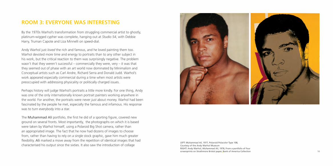
ROOM 3: EvERyONE WAs iNtEREstiNg By the 1970s Warhol’s transformation from struggling commercial artist to ghostly, platinum-wigged cypher was complete, hanging out at Studio 54, with Debbie Harry, Truman Capote and Liza Minnelli on speed-dial.
Andy Warhol just loved the rich and famous, and he loved painting them too. Warhol devoted more time and energy to portraits than to any other subject in his work, but the critical reaction to them was surprisingly negative. The problem wasn’t that they weren’t successful – commercially they were, very – it was that they seemed out of phase with an art world now dominated by Minimalism and Conceptual artists such as Carl Andre, Richard Serra and Donald Judd. Warhol’s work appeared especially commercial during a time when most artists were preoccupied with addressing physicality or politically charged issues.
Perhaps history will judge Warhol’s portraits a little more kindly. For one thing, Andy was one of the only internationally known portrait painters working anywhere in the world. For another, the portraits were never just about money. Warhol had been fascinated by the people he met, especially the famous and infamous. His response was to turn everybody into a star.
The Muhammad Ali portfolio, the first he did of a sporting figure, covered new ground on several fronts. Most importantly, the photographs on which it is based were taken by Warhol himself, using a Polaroid Big Shot camera, rather than an appropriated image. The fact that he now had dozens of images to choose from, rather than having to rely on a single stock graphic, gave him much greater flexibility. Ali marked a move away from the repetition of identical images that had characterised his output since the sixties. It also saw the introduction of collage
lEFT: Muhammad Ali, 1977, Polaroid Polacolor Type 108, Courtesy of the Andy Warhol MuseumRIGhT: Andy Warhol, Muhammad Ali, 1978, From a portfolio of four screenprints on Strathmore Bristol paper, Bank of America Collection 16
elements, updating an effect achieved in the cut-outs of Henri Matisse and Fernand Léger earlier in the century. Hand-drawn lines were also added to this photographic / collage composite to accentuate Ali’s movements.
‘Is there anything you want me to do? What do you want me to do?’ By 1980 the Factory was at its final New York location. With each move it had become ever larger, more professional, and certainly a more business-orientated outfit. The anarchic, free-flowing nature of the previous Factories, with all sorts of strange types and characters drifting in and out, was consigned to history. Things had been getting progressively more serious since the near-fatal shooting of Warhol by Valerie Solanas in 1968, but it was with the growing influence of Fred Hughes, Warhol’s business manager, that things became decidedly corporate.
Warhol continued to scan the horizon for new ideas, and Ronald Feldman, who had taken over the space once occupied by the Stable Gallery (the location of a landmark Warhol show in 1962) was identified as someone who might provide them. The first fruit of this relationship was the Ten Portraits of Jews of the Twentieth Century portfolio. The genesis of the idea came about when an émigré Israeli artist Sasha Harari discussed Warhol’s portrait of Golda Meir with Feldman, and they came up with a whole series of Jewish portraits. Feldman duly called the Factory.
Warhol used stock images of ten eminent Jews from the worlds of literature, film, philosophy, music, medicine, law and science, enhancing each one with collage and hand-drawn elements.
This series ushered in new ways of dealing with unique prints. In earlier portfolios, such as Marilyn and Flowers, Warhol had taken a single image, printed it in a myriad of colour combinations, and then selected the ten he liked best for publication. But what to do with the ones not chosen? With Ten Portraits, a new procedure was developed to accommodate such proofs. He called these unused, unique images ‘trial proofs’ and published them too. Virtually every print project developed after this point contained trial proofs.
18

ROOM 4: tHE MytH OF ANdy WARHOl Warhol’s association with Feldman continued successfully throughout the 1980s, and between them they created the Myths and Endangered Species portfolios, two of the most popular series Warhol produced.
For Myths, Warhol again took his own photographs, this time using costumed models, with the exception of Margaret Hamilton, who reprised her role as The Wicked Witch of the West. He used stock images for Superman and Mickey Mouse (the first time he used this Disney character). Not surprisingly Warhol also inserted himself into Myths, with a self-portrait disguised as the star of the popular radio show, The Shadow.
The third portfolio, Endangered Species, extended Smith’s energetic use of hi-glow colours and bold outlines. Using only stock photographs, the ten images constitute some of the most memorable of his later work.
Andy Mouse (opposite), by Keith Haring (1958–1990), demonstrates a neat conflation: Haring treated Warhol as part of American culture by superimposing his face onto Mickey Mouse’s body. As a young artist who referenced the New York urban graffiti scene, he knew Warhol well and they talked frequently from the time they met in 1983 until Warhol’s death in 1987.
Whilst Warhol was instrumental in taking mass-market imagery into the rarefied world of high-culture and museums, he most decidedly did not want to overturn the existing order. He might have turned museums into supermarkets, but he had no intention of selling his art at supermarket prices. Haring, however, took Pop to its logical conclusion. At Warhol’s prompting in 1986 Haring decided to open his ‘Pop Shop’ of signature mass-market memorabilia, taking Warhol’s Factory to the street.
20
EvENTS
Exhibition lectureA detailed look at Andy Warhol’s printmaking with Richard lloydThursday 21 June, 12.30 – 1.30pmTickets: £10 (£8 Friends)
late Night viewingThursday 13 September, 5 – 9pmCome and enjoy the exhibition, live music and a glass of wine
Visit www.dulwichpicturegallery.org.ukfor more information and to book
PREvIOUS PAGE: Keith haring, Andy Mouse, 1986, From a portfolio of four screenprints on paper, Bank of America CollectionRIGhT: Andy Warhol, Flowers,1970, From a portfolio of ten screenprints on paper, Bank of America Collection
INFORMATION Andy Warhol: The PortfoliosBank of America Collection20 June – 16 September 2012
Opening hoursTuesday – Friday 10am – 5pmSaturday and Sunday 11am – 5pm
This guide is available in large print
Exhibition curated by Lillian LambrechtsEssay by Richard Lloyd, Christie’s LondonLeaflet design by Sara Jones
This exhibition has been made possible by the provision of insurance through the Government Indemnity Scheme. Dulwich Picture Gallery would like to thank HM Government for providing Government Indemnity and the Department for Culture, Media and Sport and Arts Council England for arranging this indemnity.
Watch the exhibition videos
CREDITS p.2 Photo: Fred W. McDarrah, Image 83962674 © Getty Imagesp.8, p.12 above © Bob Adelmanp.12 below Photo: Ugo Mulas © Ugo Mulas heirs. All rights reserved.p.12 right, p.16, p.20, p.22 © The Andy Warhol Foundation for the visual Arts / Artist Rights Society (ARCS), New York / DACS, london 2012p.19 © Keith haring Foundation
Media Partner
Made possible by
Supported by