sdg index and dashboards report 2017 global … index and dashboards report 2017 global...
TRANSCRIPT

SDG Index and Dashboards Report 2017
Global R
esponsibilities
Global ResponsibilitiesInternational spillovers in achieving the goals
Metadata

July 2017
Bertelsmann Stiftung and Sustainable Development Solutions Network The views expressed in this report do not reflect the views of any organization, agency or programme of the United Nations. It has been prepared by a team of independent experts of the SDSN Secretariat and the Bertelsmann Stiftung.
The SDG Index and Dashboards 2017 report has been prepared with the extensive advice and consultation of the SDSN Leadership Council members. Members of the Leadership Council serve in their personal capacities, so the opinions expressed in this paper may not reflect the opinions of their host institutions. Members are not necessarily in agreement with every detail of this report.
The metadata should be cited as Sachs, J., Schmidt-Traub, G., Kroll, C., Durand-Delacre, D. and Teksoz, K. (2017): SDG Index and Dashboards Report 2017 - Metadata. Bertelsmann Stiftung and Sustainable Development Solutions Network (SDSN), Gütersloh and New York.
SDG Index and Dashboards 2017 - Metadata
The SDG Index and Dashboards comprise 99 indicators, of which 83 are included in the global SDG Index and Dashboards covering 157 countries. An additional 16 indicators are used in the augmented SDG Index and Dashboards for OECD countries.
Indicators are ordered by SDG, as presented in the table on the next page, which is a reproduction of Table 1 in Part 2 of the report.
The report, as well as the SDG Index and Dashboards database can be downloaded in Excel and Stata formats at www.sdgindex.org.
This metadata provides the following information for each indicator:
• The source of the indicator, including a link to the download page. • A short indicator description. For additional information, please refer to the source. • The indicator’s coverage of 193 United Nations member states or of the 35 OECD countries
(for “OECD-only” indicators). • The latest years for which the data are available, i.e. the range of years used in the SDG
Index and Dashboards database. • The unit of the indicator. • If the indicator is included in the global SDG Index and/or the SDG Index for OECD countries. • Whether the indicator measures a “spillover effect”. • How the indicator relates to the official UNSTATS database of SDG indicators using one of
three categories: o “Exact match”: The indicator is the same as an official SDG Indicator. o “Closely aligned”: The indicator is closely related, but not identical to an official SDG
Indicator. o “Not in UNSTATS database”: The indicator measures an issue not covered in the list
of official indicators. • The bounds used to normalize the data for the indicator on a scale from 0 to 100 and the
method for determining the upper bound. • The thresholds used to determine the color rating in the SDG Dashboards.
For more information on the methodologies for computing the SDG Index and Dashboards please refer to the methodological annex (Part 2 of the report).
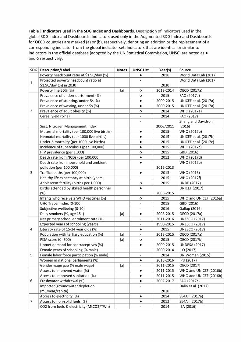
Table | Indicators used in the SDG Index and Dashboards. Description of indicators used in the global SDG Index and Dashboards. Indicators used only in the Augmented SDG Index and Dashboards for OECD countries are marked (a) or (b), respectively, denoting an addition or the replacement of a corresponding indicator from the global indicator set. Indicators that are identical or similar to indicators in the official database (adopted by the UN Statistical Commission, UNSC) are noted as ● and ○ respectively.
SDG Description/Label Notes UNSC List Year(s) Source
1
Poverty headcount ratio at $1.90/day (%) ● 2016 World Data Lab (2017) Projected poverty headcount ratio at $1.90/day (%) in 2030
- 2030
World Data Lab (2017)
Poverty line 50% (%) [a] ○ 2012-2014 OECD (2017a)
2
Prevalence of undernourishment (%) ○ 2015 FAO (2017a) Prevalence of stunting, under-5s (%) ● 2000-2015 UNICEF et al. (2017a) Prevalence of wasting, under-5s (%) ● 2000-2015 UNICEF et al. (2017a) Prevalence of adult obesity (%) ○ 2014 WHO (2017a) Cereal yield (t/ha) - 2014 FAO (2017)
Sust. Nitrogen Management Index -
2006/2011 Zhang and Davidson (2016)
3
Maternal mortality (per 100,000 live births) ● 2015 WHO (2017b) Neonatal mortality (per 1000 live births) ● 2015 UNICEF et al. (2017b) Under-5 mortality (per 1000 live births) ● 2015 UNICEF et al. (2017c) Incidence of tuberculosis (per 100,000) ● 2015 WHO (2017c) HIV prevalence (per 1,000) ○ 2015 GBD (2016) Death rate from NCDs (per 100,000) ● 2012 WHO (2017d) Death rate from household and ambient pollution (per 100,000)
● 2012-2013
WHO (2017e)
Traffic deaths (per 100,000) ● 2013 WHO (2016) Healthy life expectancy at birth (years) - 2015 WHO (2017f) Adolescent fertility (births per 1,000) ○ 2015 UNDP (2017) Births attended by skilled health personnel (%)
● 2006-2015
UNICEF (2017)
Infants who receive 2 WHO vaccines (%) ○ 2015 WHO and UNICEF (2016a) UHC Tracer Index (0-100) - 2015 GBD (2016) Subjective wellbeing (0-10) - 2016 Gallup (2016) Daily smokers (%, age 15+) [a] ● 2008-2015 OECD (2017a)
4
Net primary school enrolment rate (%) - 2011-2016 UNESCO (2017) Expected years of schooling (years) - 1990-2015 UNESCO (2017) Literacy rate of 15-24 year olds (%) ● 2015 UNESCO (2017) Population with tertiary education (%) [a] - 2013-2015 OECD (2017a) PISA score (0 -600) [a] ○ 2015 OECD (2017b)
5
Unmet demand for contraceptives (%) ● 2000-2015 UNDESA (2017) Female years of schooling (% male) - 2000-2014 ILO (2017) Female labor force participation (% male) - 2014 UN Women (2015) Women in national parliaments (%) ● 2015-2016 IPU (2017) Gender wage gap (% male wage) [a] - 2011-2015 OECD (2017)
6
Access to improved water (%) ● 2011-2015 WHO and UNICEF (2016b) Access to improved sanitation (%) ● 2011-2015 WHO and UNICEF (2016b) Freshwater withdrawal (%) ● 2002-2017 FAO (2017c) Imported groundwater depletion (m3/year/capita)
- 2010
Dalin et al. (2017)
7 Access to electricity (%) ● 2014 SE4All (2017a) Access to non-solid fuels (%) ● 2012 SE4All (2017b) CO2 from fuels & electricity (MtCO2/TWh) - 2014 IEA (2016)
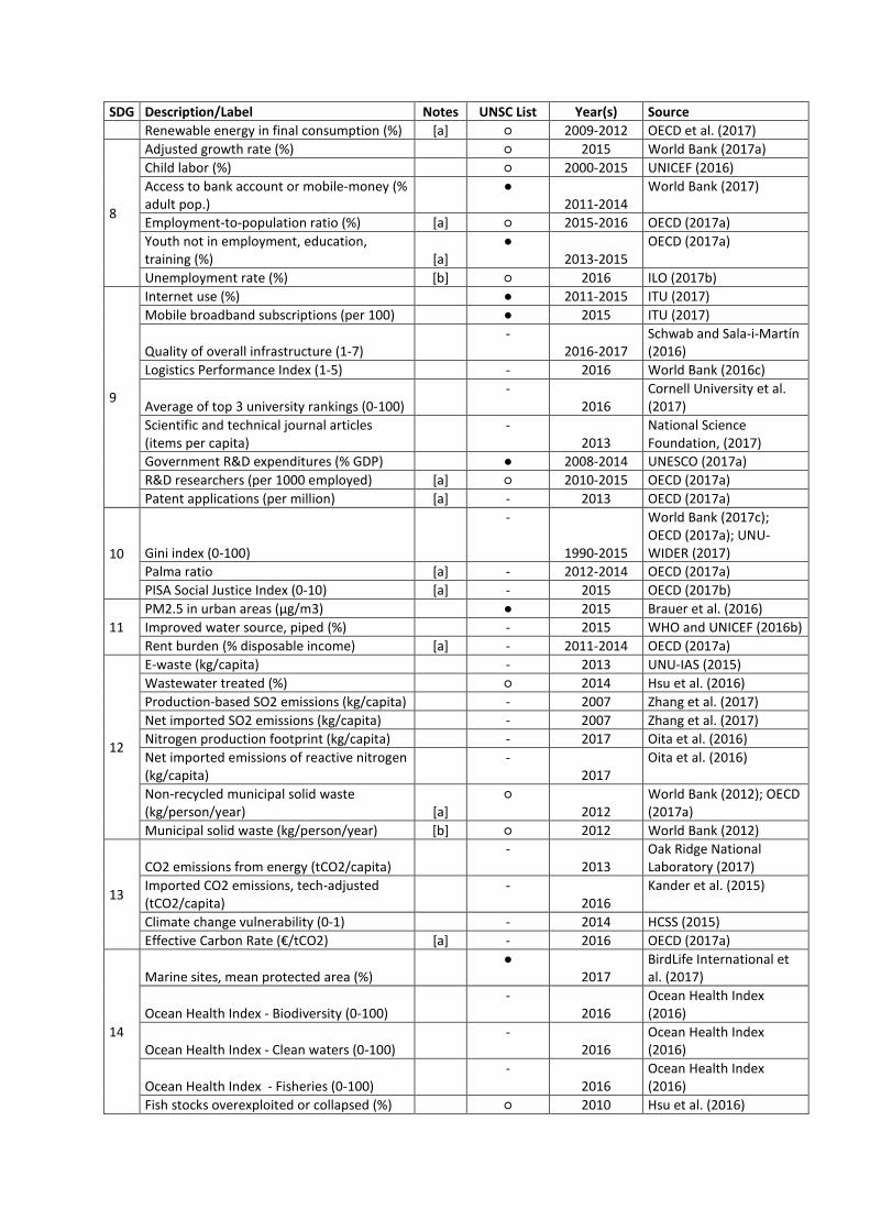
SDG Description/Label Notes UNSC List Year(s) Source Renewable energy in final consumption (%) [a] ○ 2009-2012 OECD et al. (2017)
8
Adjusted growth rate (%) ○ 2015 World Bank (2017a) Child labor (%) ○ 2000-2015 UNICEF (2016) Access to bank account or mobile-money (% adult pop.)
● 2011-2014
World Bank (2017)
Employment-to-population ratio (%) [a] ○ 2015-2016 OECD (2017a) Youth not in employment, education, training (%) [a]
● 2013-2015
OECD (2017a)
Unemployment rate (%) [b] ○ 2016 ILO (2017b)
9
Internet use (%) ● 2011-2015 ITU (2017) Mobile broadband subscriptions (per 100) ● 2015 ITU (2017)
Quality of overall infrastructure (1-7) -
2016-2017 Schwab and Sala-i-Martín (2016)
Logistics Performance Index (1-5) - 2016 World Bank (2016c)
Average of top 3 university rankings (0-100) -
2016 Cornell University et al. (2017)
Scientific and technical journal articles (items per capita)
- 2013
National Science Foundation, (2017)
Government R&D expenditures (% GDP) ● 2008-2014 UNESCO (2017a) R&D researchers (per 1000 employed) [a] ○ 2010-2015 OECD (2017a) Patent applications (per million) [a] - 2013 OECD (2017a)
10 Gini index (0-100)
-
1990-2015
World Bank (2017c); OECD (2017a); UNU-WIDER (2017)
Palma ratio [a] - 2012-2014 OECD (2017a) PISA Social Justice Index (0-10) [a] - 2015 OECD (2017b)
11 PM2.5 in urban areas (μg/m3) ● 2015 Brauer et al. (2016) Improved water source, piped (%) - 2015 WHO and UNICEF (2016b) Rent burden (% disposable income) [a] - 2011-2014 OECD (2017a)
12
E-waste (kg/capita) - 2013 UNU-IAS (2015) Wastewater treated (%) ○ 2014 Hsu et al. (2016) Production-based SO2 emissions (kg/capita) - 2007 Zhang et al. (2017) Net imported SO2 emissions (kg/capita) - 2007 Zhang et al. (2017) Nitrogen production footprint (kg/capita) - 2017 Oita et al. (2016) Net imported emissions of reactive nitrogen (kg/capita)
- 2017
Oita et al. (2016)
Non-recycled municipal solid waste (kg/person/year) [a]
○ 2012
World Bank (2012); OECD (2017a)
Municipal solid waste (kg/person/year) [b] ○ 2012 World Bank (2012)
13
CO2 emissions from energy (tCO2/capita) -
2013 Oak Ridge National Laboratory (2017)
Imported CO2 emissions, tech-adjusted (tCO2/capita)
- 2016
Kander et al. (2015)
Climate change vulnerability (0-1) - 2014 HCSS (2015) Effective Carbon Rate (€/tCO2) [a] - 2016 OECD (2017a)
14
Marine sites, mean protected area (%) ●
2017 BirdLife International et al. (2017)
Ocean Health Index - Biodiversity (0-100) -
2016 Ocean Health Index (2016)
Ocean Health Index - Clean waters (0-100) -
2016 Ocean Health Index (2016)
Ocean Health Index - Fisheries (0-100) -
2016 Ocean Health Index (2016)
Fish stocks overexploited or collapsed (%) ○ 2010 Hsu et al. (2016)

SDG Description/Label Notes UNSC List Year(s) Source
15
Terrestrial sites, mean protected area (%) ●
2017 BirdLife International et al. (2017)
Freshwater sites, mean protected area (%) ●
2017 BirdLife International et al. (2017)
Red List Index of species survival (0-1) ●
2017 IUCN and BirdLife International (2017)
Annual change in forest area (%) ○ 2014 Hsu et al. (2016) Imported biodiversity impacts (species/million people)
- 2016
Chaudhary and Kastner (2016)
16
Homicides (per 100,000) ● 2010-2014 UNODC (2016) Prison population (per 100,000) ○ 2014-2015 ICPR (2016) Feel safe walking at night (%) ● 2016 Gallup (2016)
Government efficiency (1-7) -
2016-2017 Schwab and Sala-i-Martín (2016)
Property rights (1-7) -
2016-2017 Schwab and Sala-i-Martín (2016)
Registered births (%) ● 2010-2015 UNICEF (2016b)
Corruption Perception Index (0-100) ○
2016 Transparency International (2016)
Slavery Score (0-100) -
2016 Walk Free Foundation (2016)
Conventional weapons exports (US$m per 100,000 people)
- 2014
SIPRI (2017)
17
Health and Education spending (% GDP) -
2009-2015 UNESCO (2017b); WHO (2017g)
Official development assistance (% GNI) ● 2015 OECD (2017a) Tax revenue (% GDP) ● 2009-2015 World Bank (2017c) Tax Haven Score (best 0-5 worst) - 2016 Oxfam (2016)
Secrecy Score (best 0-100 worst) [a] -
2015 Tax Justice Network (2015)

Poverty headcount ratio at $1.90/day (% population)
Source World Data Lab, 2017. World Poverty Clock. World Data Lab. Available at http://worldpoverty.io/
Indicator Description Estimated proportion of each country's population that in 2016 are living under the poverty threshold of US$ 1.90 a day. Estimated using historical estimates of the income distribution, projections of population changes by age and educational attainment, and GDP projections.
Country coverage (of 193 UN Member states)
181
Latest data (years) 2016
Units % population
Uses in the SDG Index and Dashboards
Included in the Global SDG Index & Dashboards yes Included in the SDG Index & Dashboards for OECD countries yes Measures a spillover effect no Relation to official SDG Indicators Exact match
Bounds for normalization thresholds in SDG Dashboards
Bound/Threshold Value Upper bound (“best score” = 100) 0% Green color band <=2% Yellow color band 2% < x <= 7.35% Orange color band 7.35% < x <= 12.7% Red color band >12.7% Lower bound (“worst score” = 0) 72.6%
Source: Authors’ analysis
The upper bound was set in line with the SDG Target.

Projected poverty headcount ratio at $1.90/day in 2030 (% population)
Source World Data Lab, 2017. World Poverty Clock. World Data Lab. Available at http://worldpoverty.io/
Indicator Description Estimated proportion of the population that will be living under the poverty threshold of US$ 1.90 a day in 2030. Estimated using historical estimates of the income distribution, projections of population changes by age and educational attainment, and GDP projections.
Country coverage (of 193 UN Member states)
181
Latest data (years) 2030 (projected)
Units % population
Uses in the SDG Index and Dashboards
Included in the Global SDG Index & Dashboards yes Included in the SDG Index & Dashboards for OECD countries yes Measures a spillover effect no Relation to official SDG Indicators Not in UNSTATS database
Bounds for normalization thresholds in SDG Dashboards
Bound/Threshold Value Upper bound (“best score” = 100) 0% Green color band <=1% Yellow color band 1% < x <= 2% Orange color band 2% < x <= 3% Red color band >3% Lower bound (“worst score” = 0) 66.9%
Source: Authors’ analysis
The upper bound was set in line with the SDG Target.

Poverty rate after taxes and transfers, Poverty line 50% (% population)
Source OECD, 2017. OECD Statistics. Organisation for Economic Cooperation and Development, Paris. Available at http://stats.oecd.org/.
Indicator Description Relative poverty is measured as the share of the population whose incomes fall below half the median disposable income for the entire population. The income threshold for relative poverty changes over time with changes in median disposable income.
Country coverage (of 193 UN Member states)
36
Latest data (years) 2012-2014
Units % population
Uses in the SDG Index and Dashboards
Included in the Global SDG Index & Dashboards no Included in the SDG Index & Dashboards for OECD countries yes Measures a spillover effect no Relation to official SDG Indicators Closely aligned
Bounds for normalization thresholds in SDG Dashboards
Bound/Threshold Value Upper bound (“best score” = 100) 6.8% Green color band <=10% Yellow color band 10% < x <= 12.5% Orange color band 12.5% < x <= 15% Red color band >15% Lower bound (“worst score” = 0) 18.6%
Source: Authors’ analysis
The upper bound was set using the average of 5 best performers for the indicator.

Prevalence of undernourishment (% population)
Source FAO, 2017. Cereal yield (kg per hectare). Food and Agriculture Organization, Rome. Available at http://data.worldbank.org/indicator/AG.YLD.CREL.KG
Indicator Description The percentage of the population whose food intake is insufficient to meet dietary energy requirements for minimum one year. Dietary energy requirements are defined as the amount of dietary energy required by an individual to maintain body functions, health and normal activity.
Country coverage (of 193 UN Member states)
162
Latest data (years) 2015
Units % population
Uses in the SDG Index and Dashboards
Included in the Global SDG Index & Dashboards yes Included in the SDG Index & Dashboards for OECD countries yes Measures a spillover effect no Relation to official SDG Indicators Closely aligned
Bounds for normalization thresholds in SDG Dashboards
Bound/Threshold Value Upper bound (“best score” = 100) 0% Green color band <=7.5% Yellow color band 7.5% < x <= 11.25% Orange color band 11.25% < x <= 15% Red color band >15% Lower bound (“worst score” = 0) 42.3%
Source: Authors’ analysis
The upper bound was set in line with the SDG Target.
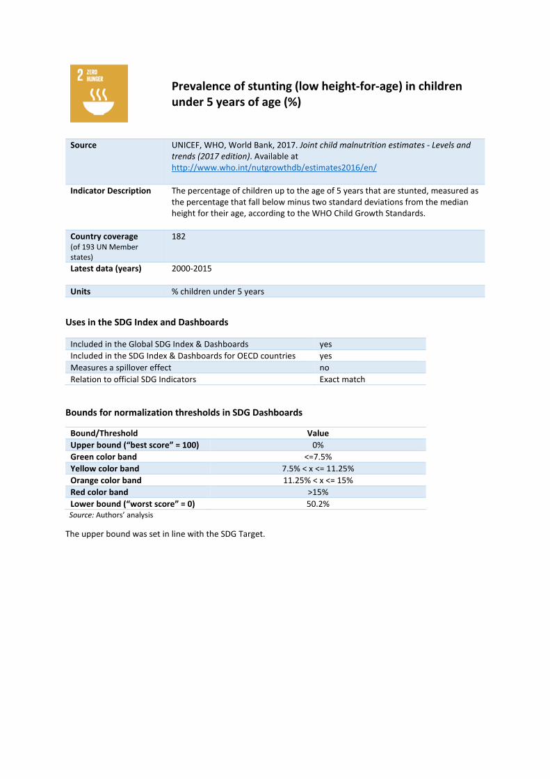
Prevalence of stunting (low height-for-age) in children under 5 years of age (%)
Source UNICEF, WHO, World Bank, 2017. Joint child malnutrition estimates - Levels and trends (2017 edition). Available at http://www.who.int/nutgrowthdb/estimates2016/en/
Indicator Description The percentage of children up to the age of 5 years that are stunted, measured as the percentage that fall below minus two standard deviations from the median height for their age, according to the WHO Child Growth Standards.
Country coverage (of 193 UN Member states)
182
Latest data (years) 2000-2015
Units % children under 5 years
Uses in the SDG Index and Dashboards
Included in the Global SDG Index & Dashboards yes Included in the SDG Index & Dashboards for OECD countries yes Measures a spillover effect no Relation to official SDG Indicators Exact match
Bounds for normalization thresholds in SDG Dashboards
Bound/Threshold Value Upper bound (“best score” = 100) 0% Green color band <=7.5% Yellow color band 7.5% < x <= 11.25% Orange color band 11.25% < x <= 15% Red color band >15% Lower bound (“worst score” = 0) 50.2%
Source: Authors’ analysis
The upper bound was set in line with the SDG Target.

Prevalence of wasting in children under 5 years of age (%)
Source UNICEF, WHO, World Bank, 2017. Joint child malnutrition estimates - Levels and trends (2017 edition). Available at http://www.who.int/nutgrowthdb/estimates2016/en/
Indicator Description The percentage of children up to the age of 5 years whose weight fall below minus two standard deviations from the median weight for their age, according to the WHO Child Growth Standards.
Country coverage (of 193 UN Member states)
181
Latest data (years) 2000-2015
Units % children under 5 years
Uses in the SDG Index and Dashboards
Included in the Global SDG Index & Dashboards yes Included in the SDG Index & Dashboards for OECD countries yes Measures a spillover effect no Relation to official SDG Indicators Exact match
Bounds for normalization thresholds in SDG Dashboards
Bound/Threshold Value Upper bound (“best score” = 100) 0% Green color band <=5% Yellow color band 5% < x <= 7.5% Orange color band 7.5% < x <= 10% Red color band >10% Lower bound (“worst score” = 0) 16.3%
Source: Authors’ analysis
The upper bound was set in line with the SDG Target.

Prevalence of obesity, BMI ≥ 30 (% adult population)
Source WHO, 2017. GHO Obesity (body mass index >= 30) (age- standardized estimate). World Health Organization, Geneva. Available at http://apps.who.int/gho/data/view.main.CTRY2450A?lang=en
Indicator Description The percentage of the adult population that has a body mass index (BMI) of 30kg/m2 or higher, based on measured height and weight.
Country coverage (of 193 UN Member states)
189
Latest data (years) 2014
Units % adult population
Uses in the SDG Index and Dashboards
Included in the Global SDG Index & Dashboards yes Included in the SDG Index & Dashboards for OECD countries yes Measures a spillover effect no Relation to official SDG Indicators Closely aligned
Bounds for normalization thresholds in SDG Dashboards
Bound/Threshold Value Upper bound (“best score” = 100) 2.8% Green color band <=10% Yellow color band 10% < x <= 17.5% Orange color band 17.5% < x <= 25% Red color band >25% Lower bound (“worst score” = 0) 35.1%
Source: Authors’ analysis
The upper bound was set using the average of 5 best performers for the indicator.

Cereal yield (t/ha)
Source FAO, 2017. Prevalence of undernourishment (% of population). Food and Agriculture Organization, Rome. Available at http://data.worldbank.org/indicator/SN.ITK.DEFC.ZS
Indicator Description Cereal yield, measured as tonnes per hectare of harvested land. Production data on cereals relate to crops harvested for dry grain only and excludes crops harvested for hay or green for food, feed, or silage and those used for grazing.
Country coverage (of 193 UN Member states)
175
Latest data (years) 2014
Units t/ha
Uses in the SDG Index and Dashboards
Included in the Global SDG Index & Dashboards yes Included in the SDG Index & Dashboards for OECD countries yes Measures a spillover effect no Relation to official SDG Indicators Not in UNSTATS database
Bounds for normalization thresholds in SDG Dashboards
Bound/Threshold Value Upper bound (“best score” = 100) 13.7 Green color band >=2.5 Yellow color band 2.5 > x >= 2 Orange color band 2 > x >= 1.5 Red color band <1.5 Lower bound (“worst score” = 0) 0.6
Source: Authors’ analysis
The upper bound was set using the average of 5 best performers for the indicator.

Sustainable Nitrogen Management Index
Source Zhang, X., Davidson, E., 2016. Sustainable Nitrogen Management Index (SNMI). University of Maryland Center for Environmental Science. Available at www.sdgindex.org
Indicator Description The Sustainable Nitrogen Management Index (SNMI) is a one-dimensional ranking score that combines two efficiency measures in crop production: Nitrogen Use Efficiency (NUE) and land use efficiency (crop yield).
Country coverage (of 193 UN Member states)
136
Latest data (years) 2006/2011
Units scale 0 to 1
Uses in the SDG Index and Dashboards
Included in the Global SDG Index & Dashboards yes Included in the SDG Index & Dashboards for OECD countries yes Measures a spillover effect no Relation to official SDG Indicators Not in UNSTATS database
Bounds for normalization thresholds in SDG Dashboards
Bound/Threshold Value Upper bound (“best score” = 100) 0 Green color band <=0.3 Yellow color band 0.3 < x <= 0.5 Orange color band 0.5 < x <= 0.7 Red color band >0.7 Lower bound (“worst score” = 0) 1.2
Source: Authors’ analysis
The upper bound was set using the technical or scientific optimum for the indicator.

Maternal mortality rate (per 100,000 live births)
Source WHO, 2017. Maternal mortality ratio (modeled estimate, per 100,000 live births). World Health Organization, Geneva. Available at http://data.worldbank.org/indicator/SH.STA.MMRT
Indicator Description The estimated number of women, between the age of 15-49, who die from pregnancy-related causes while pregnant, or within 42 days of termination of pregnancy, per 100,000 live births.
Country coverage (of 193 UN Member states)
181
Latest data (years) 2015
Units per 1,000 live births
Uses in the SDG Index and Dashboards
Included in the Global SDG Index & Dashboards yes Included in the SDG Index & Dashboards for OECD countries yes Measures a spillover effect no Relation to official SDG Indicators Exact match
Bounds for normalization thresholds in SDG Dashboards
Bound/Threshold Value Upper bound (“best score” = 100) 3.4 Green color band <=70 Yellow color band 70 < x <= 105 Orange color band 105 < x <= 140 Red color band >140 Lower bound (“worst score” = 0) 814
Source: Authors’ analysis
The upper bound was set using the average of 5 best performers for the indicator.
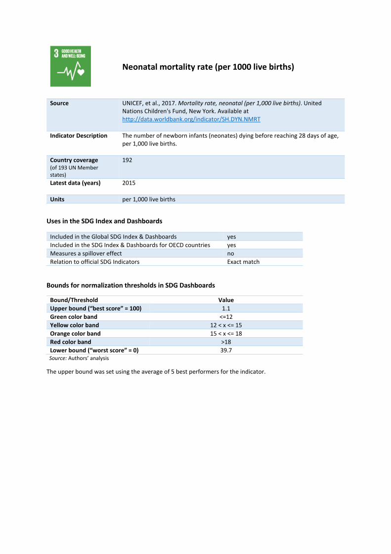
Neonatal mortality rate (per 1000 live births)
Source UNICEF, et al., 2017. Mortality rate, neonatal (per 1,000 live births). United Nations Children's Fund, New York. Available at http://data.worldbank.org/indicator/SH.DYN.NMRT
Indicator Description The number of newborn infants (neonates) dying before reaching 28 days of age, per 1,000 live births.
Country coverage (of 193 UN Member states)
192
Latest data (years) 2015
Units per 1,000 live births
Uses in the SDG Index and Dashboards
Included in the Global SDG Index & Dashboards yes Included in the SDG Index & Dashboards for OECD countries yes Measures a spillover effect no Relation to official SDG Indicators Exact match
Bounds for normalization thresholds in SDG Dashboards
Bound/Threshold Value Upper bound (“best score” = 100) 1.1 Green color band <=12 Yellow color band 12 < x <= 15 Orange color band 15 < x <= 18 Red color band >18 Lower bound (“worst score” = 0) 39.7
Source: Authors’ analysis
The upper bound was set using the average of 5 best performers for the indicator.

Mortality rate, under-5 (per 1,000 live births)
Source UNICEF, et al,, 2017. Mortality rate, under-5 (per 1,000 live births). United Nations Children's Fund, New York. Available at http://data.worldbank.org/indicator/SH.DYN.MORT
Indicator Description The probability that a newborn baby will die before reaching age five, if subject to age-specific mortality rates of the specified year, per 1,000 live births.
Country coverage (of 193 UN Member states)
192
Latest data (years) 2015
Units per 1,000 live births
Uses in the SDG Index and Dashboards
Included in the Global SDG Index & Dashboards yes Included in the SDG Index & Dashboards for OECD countries yes Measures a spillover effect no Relation to official SDG Indicators Exact match
Bounds for normalization thresholds in SDG Dashboards
Bound/Threshold Value Upper bound (“best score” = 100) 2.6 Green color band <=25 Yellow color band 25 < x <= 37.5 Orange color band 37.5 < x <= 50 Red color band >50 Lower bound (“worst score” = 0) 130.1
Source: Authors’ analysis
The upper bound was set using the average of 5 best performers for the indicator.

Incidence of tuberculosis (per 100,000 people)
Source WHO, 2017. Incidence of tuberculosis (per 100,000 people). World Health Organization, Geneva. Available at http://data.worldbank.org/indicator/SH.TBS.INCD
Indicator Description The estimated rate of new and relapse cases of tuberculosis in a given year, expressed per 100,000 people. All forms of tuberculosis are included, including cases of people living with HIV.
Country coverage (of 193 UN Member states)
192
Latest data (years) 2015
Units per 100,000 people
Uses in the SDG Index and Dashboards
Included in the Global SDG Index & Dashboards yes Included in the SDG Index & Dashboards for OECD countries yes Measures a spillover effect no Relation to official SDG Indicators Exact match
Bounds for normalization thresholds in SDG Dashboards
Bound/Threshold Value Upper bound (“best score” = 100) 3.6 Green color band <=10 Yellow color band 10 < x <= 42.5 Orange color band 42.5 < x <= 75 Red color band >75 Lower bound (“worst score” = 0) 561
Source: Authors’ analysis
The upper bound was set using the average of 5 best performers for the indicator.

HIV prevalence (per 1,000)
Source GBD, 2016. Measuring the health-related Sustainable Development Goals in 188 countries: a baseline analysis from the Global Burden of Disease Study 2015. The Lancet, 388, pp. 1813–1850. Available at http://www.aidsinfoonline.org/devinfo/libraries/aspx/Home.aspx
Indicator Description The estimated prevalance of people living with HIV, per thousand people. The estimates are modelled using population-based surveys, where available, and HIV prevalence studies in countries with low-level HIV epidemics where transmission largely occurs among key population groups.
Country coverage (of 193 UN Member states)
186
Latest data (years) 2015
Units per 1,000 people
Uses in the SDG Index and Dashboards
Included in the Global SDG Index & Dashboards yes Included in the SDG Index & Dashboards for OECD countries yes Measures a spillover effect no Relation to official SDG Indicators Closely aligned
Bounds for normalization thresholds in SDG Dashboards
Bound/Threshold Value Upper bound (“best score” = 100) 0 Green color band <=0.2 Yellow color band 0.2 < x <= 0.6 Orange color band 0.6 < x <= 1 Red color band >1 Lower bound (“worst score” = 0) 16.5
Source: Authors’ analysis
The upper bound was set using the average of 5 best performers for the indicator.
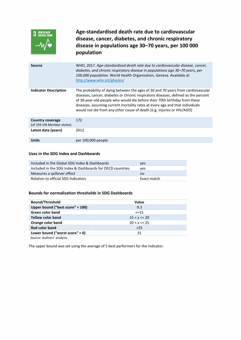
Age-standardised death rate due to cardiovascular disease, cancer, diabetes, and chronic respiratory disease in populations age 30–70 years, per 100 000 population
Source WHO, 2017. Age-standardised death rate due to cardiovascular disease, cancer, diabetes, and chronic respiratory disease in populations age 30–70 years, per 100,000 population. World Health Organization, Geneva. Available at http://www.who.int/gho/en/
Indicator Description The probability of dying between the ages of 30 and 70 years from cardiovascular diseases, cancer, diabetes or chronic respiratory diseases, defined as the percent of 30-year-old-people who would die before their 70th birthday from these diseases, assuming current mortality rates at every age and that individuals would not die from any other cause of death (e.g. injuries or HIV/AIDS)
Country coverage (of 193 UN Member states)
172
Latest data (years) 2012
Units per 100,000 people
Uses in the SDG Index and Dashboards
Included in the Global SDG Index & Dashboards yes Included in the SDG Index & Dashboards for OECD countries yes Measures a spillover effect no Relation to official SDG Indicators Exact match
Bounds for normalization thresholds in SDG Dashboards
Bound/Threshold Value Upper bound (“best score” = 100) 9.3 Green color band <=15 Yellow color band 15 < x <= 20 Orange color band 20 < x <= 25 Red color band >25 Lower bound (“worst score” = 0) 31
Source: Authors’ analysis
The upper bound was set using the average of 5 best performers for the indicator.

Age-standardised death rate attributable to household air pollution and ambient air pollution, per 100 000 population
Source WHO, 2017. Age-standardised death rate attributable to household air pollution and ambient air pollution, per 100,000 population. World Health Organization, Geneva. Available at http://www.who.int/gho/phe/en/
Indicator Description Mortality rate that is attributable to the joint effects of fuels used for cooking indoors and ambient outdoor air pollution. Calculated as number of deaths divided by the total population.
Country coverage (of 193 UN Member states)
190
Latest data (years) 2012-2013
Units per 100,000 people
Uses in the SDG Index and Dashboards
Included in the Global SDG Index & Dashboards yes Included in the SDG Index & Dashboards for OECD countries yes Measures a spillover effect no Relation to official SDG Indicators Exact match
Bounds for normalization thresholds in SDG Dashboards
Bound/Threshold Value Upper bound (“best score” = 100) 0 Green color band <=25 Yellow color band 25 < x <= 50 Orange color band 50 < x <= 75 Red color band >75 Lower bound (“worst score” = 0) 368.8
Source: Authors’ analysis
The upper bound was set using the average of 5 best performers for the indicator.
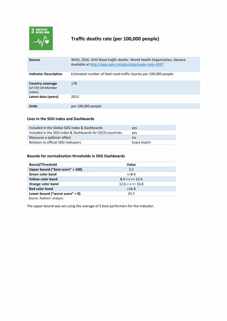
Traffic deaths rate (per 100,000 people)
Source WHO, 2016. GHO Road traffic deaths. World Health Organization, Geneva. Available at http://apps.who.int/gho/data/node.main.A997
Indicator Description Estimated number of fatal road traffic injuries per 100,000 people.
Country coverage (of 193 UN Member states)
178
Latest data (years) 2013
Units per 100,000 people
Uses in the SDG Index and Dashboards
Included in the Global SDG Index & Dashboards yes Included in the SDG Index & Dashboards for OECD countries yes Measures a spillover effect no Relation to official SDG Indicators Exact match
Bounds for normalization thresholds in SDG Dashboards
Bound/Threshold Value Upper bound (“best score” = 100) 3.2 Green color band <=8.4 Yellow color band 8.4 < x <= 12.6 Orange color band 12.6 < x <= 16.8 Red color band >16.8 Lower bound (“worst score” = 0) 33.7
Source: Authors’ analysis
The upper bound was set using the average of 5 best performers for the indicator.
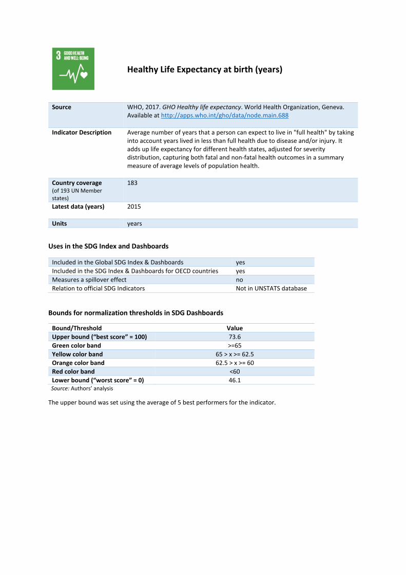
Healthy Life Expectancy at birth (years)
Source WHO, 2017. GHO Healthy life expectancy. World Health Organization, Geneva. Available at http://apps.who.int/gho/data/node.main.688
Indicator Description Average number of years that a person can expect to live in "full health" by taking into account years lived in less than full health due to disease and/or injury. It adds up life expectancy for different health states, adjusted for severity distribution, capturing both fatal and non-fatal health outcomes in a summary measure of average levels of population health.
Country coverage (of 193 UN Member states)
183
Latest data (years) 2015
Units years
Uses in the SDG Index and Dashboards
Included in the Global SDG Index & Dashboards yes Included in the SDG Index & Dashboards for OECD countries yes Measures a spillover effect no Relation to official SDG Indicators Not in UNSTATS database
Bounds for normalization thresholds in SDG Dashboards
Bound/Threshold Value Upper bound (“best score” = 100) 73.6 Green color band >=65 Yellow color band 65 > x >= 62.5 Orange color band 62.5 > x >= 60 Red color band <60 Lower bound (“worst score” = 0) 46.1
Source: Authors’ analysis
The upper bound was set using the average of 5 best performers for the indicator.

Adolescent fertility rate (births per 1,000 women ages 15-19)
Source UNDP, 2017. Adolescent fertility rate (births per 1,000 women ages 15-19). United Nations Development Programme, New York. Available at http://data.worldbank.org/indicator/SP.ADO.TFRT
Indicator Description The number of births per 1,000 by women between the age of 15-19.
Country coverage (of 193 UN Member states)
183
Latest data (years) 2015
Units births/1,000 women ages 15-19
Uses in the SDG Index and Dashboards
Included in the Global SDG Index & Dashboards yes Included in the SDG Index & Dashboards for OECD countries yes Measures a spillover effect no Relation to official SDG Indicators Closely aligned
Bounds for normalization thresholds in SDG Dashboards
Bound/Threshold Value Upper bound (“best score” = 100) 2.5 Green color band <=25 Yellow color band 25 < x <= 37.5 Orange color band 37.5 < x <= 50 Red color band >50 Lower bound (“worst score” = 0) 139.6
Source: Authors’ analysis
The upper bound was set using the average of 5 best performers for the indicator.

Proportion of births attended by skilled health personnel
Source UNICEF, 2017. Proportion of births attended by skilled health personnel. United Nations Children's Fund, New York. Available at http://data.worldbank.org/indicator/SH.STA.BRTC.ZS
Indicator Description The percentage of births attended by personnel trained to give the necessary supervision, care, and advice to women during pregnancy, labor, and the postpartum period; to conduct deliveries on their own; and to care for newborns.
Country coverage (of 193 UN Member states)
161
Latest data (years) 2006-2015
Units %
Uses in the SDG Index and Dashboards
Included in the Global SDG Index & Dashboards yes Included in the SDG Index & Dashboards for OECD countries yes Measures a spillover effect no Relation to official SDG Indicators Exact match
Bounds for normalization thresholds in SDG Dashboards
Bound/Threshold Value Upper bound (“best score” = 100) 100% Green color band >=98% Yellow color band 98% > x >= 94% Orange color band 94% > x >= 90% Red color band <90% Lower bound (“worst score” = 0) 23.1%
Source: Authors’ analysis
The upper bound was set consistent with the principle of leaving no one behind

Percentage of surviving infants who received 2 WHO-recommended vaccines (%)
Source WHO, UNICEF, 2016. Immunization Coverage. World Health Organization and United Nations Children's Fund, Geneva and New York. Available at http://data.unicef.org/topic/child-health/immunization/
Indicator Description Estimated national routine immunisation coverage of infants, expressed as the percentage of surviving infants children under the age of 12 months who received two WHO-recommended vaccines (DTP and measles).
Country coverage (of 193 UN Member states)
192
Latest data (years) 2015
Units % infants
Uses in the SDG Index and Dashboards
Included in the Global SDG Index & Dashboards yes Included in the SDG Index & Dashboards for OECD countries yes Measures a spillover effect no Relation to official SDG Indicators Closely aligned
Bounds for normalization thresholds in SDG Dashboards
Bound/Threshold Value Upper bound (“best score” = 100) 100% Green color band >=90% Yellow color band 90% > x >= 85% Orange color band 85% > x >= 80% Red color band <80% Lower bound (“worst score” = 0) 42%
Source: Authors’ analysis
The upper bound was set consistent with the principle of leaving no one behind

Universal Health Coverage Tracer Index (0-100)
Source GBD, 2016. Measuring the health-related Sustainable Development Goals in 188 countries: a baseline analysis from the Global Burden of Disease Study 2015. The Lancet, 388, pp. 1813–1850. Available at http://ghdx.healthdata.org/gbd-2015
Indicator Description Summary measure of coverage of essential health services, computed for each country by averaging service-coverage values across 16 tracer indicators on (i) reproductive, maternal, newborn and child health; (ii) infectious diseases; (iii) non-communicable diseases; and (iv) service capacity and access, and health security.
Country coverage (of 193 UN Member states)
186
Latest data (years) 2015
Units %
Uses in the SDG Index and Dashboards
Included in the Global SDG Index & Dashboards yes Included in the SDG Index & Dashboards for OECD countries yes Measures a spillover effect no Relation to official SDG Indicators Not in UNSTATS database
Bounds for normalization thresholds in SDG Dashboards
Bound/Threshold Value Upper bound (“best score” = 100) 100% Green color band >=80% Yellow color band 80% > x >= 70% Orange color band 70% > x >= 60% Red color band <60% Lower bound (“worst score” = 0) 38.2%
Source: Authors’ analysis
The upper bound was set using the average of 5 best performers for the indicator.

Subjective Wellbeing (average ladder score, 0-10)
Source Gallup, 2016. Gallup World Poll. Gallup. Available at https://analytics.gallup.com/SignIn/Default.aspx
Indicator Description Subjective self-evaluation of life, where respondents are asked to evaluate where they feel they stand on a ladder where 0 represents the worst possible life and 10 the best possible life.
Country coverage (of 193 UN Member states)
136
Latest data (years) 2016
Units scale 0 to 10
Uses in the SDG Index and Dashboards
Included in the Global SDG Index & Dashboards yes Included in the SDG Index & Dashboards for OECD countries yes Measures a spillover effect no Relation to official SDG Indicators Not in UNSTATS database
Bounds for normalization thresholds in SDG Dashboards
Bound/Threshold Value Upper bound (“best score” = 100) 7.6 Green color band >=6 Yellow color band 6 > x >= 5.5 Orange color band 5.5 > x >= 5 Red color band <5 Lower bound (“worst score” = 0) 3.3
Source: Authors’ analysis
The upper bound was set using the average of 5 best performers for the indicator.

Daily smokers (% population age 15+)
Source OECD, 2017. OECD Statistics. Organisation for Economic Cooperation and Development, Paris. Available at http://stats.oecd.org/.
Indicator Description The percentage of the population aged 15 years and older who are reported to smoke daily.
Country coverage (of 193 UN Member states)
44
Latest data (years) 2008-2015
Units % population age 15+
Uses in the SDG Index and Dashboards
Included in the Global SDG Index & Dashboards no Included in the SDG Index & Dashboards for OECD countries yes Measures a spillover effect no Relation to official SDG Indicators Exact match
Bounds for normalization thresholds in SDG Dashboards
Bound/Threshold Value Upper bound (“best score” = 100) 10.7% Green color band <=20% Yellow color band 20% < x <= 22.5% Orange color band 22.5% < x <= 25% Red color band >25% Lower bound (“worst score” = 0) 29.8%
Source: Authors’ analysis
The upper bound was set using the average of 5 best performers for the indicator.
Net primary enrolment rate (%)
Source UNESCO, 2017. UIS.Stat. United Nations Educational, Scientific and Cultural Organization, Paris. Available at http://data.uis.unesco.org/
Indicator Description The percentage of children of the official school age population who are enrolled in primary education.
Country coverage (of 193 UN Member states)
159
Latest data (years) 2011-2016
Units %
Uses in the SDG Index and Dashboards
Included in the Global SDG Index & Dashboards yes Included in the SDG Index & Dashboards for OECD countries yes Measures a spillover effect no Relation to official SDG Indicators Not in UNSTATS database
Bounds for normalization thresholds in SDG Dashboards
Bound/Threshold Value Upper bound (“best score” = 100) 100% Green color band >=98% Yellow color band 98% > x >= 89% Orange color band 89% > x >= 80% Red color band <80% Lower bound (“worst score” = 0) 53.8%
Source: Authors’ analysis
The upper bound was set in line with the SDG Target.

Expected years of schooling (years)
Source UNESCO, 2017. UIS.Stat. United Nations Educational, Scientific and Cultural Organization, Paris. Available at http://data.uis.unesco.org/
Indicator Description Number of years of schooling that a child of school entrance age can expect to receive if prevailing patterns of age-specific enrolment rates persist throughout her/his life.
Country coverage (of 193 UN Member states)
186
Latest data (years) 1990-2015
Units years
Uses in the SDG Index and Dashboards
Included in the Global SDG Index & Dashboards yes Included in the SDG Index & Dashboards for OECD countries yes Measures a spillover effect no Relation to official SDG Indicators Not in UNSTATS database
Bounds for normalization thresholds in SDG Dashboards
Bound/Threshold Value Upper bound (“best score” = 100) 13.2 Green color band >=12 Yellow color band 12 > x >= 11 Orange color band 11 > x >= 10 Red color band <10 Lower bound (“worst score” = 0) 2.3
Source: Authors’ analysis
The upper bound was set using the average of 5 best performers for the indicator.

Literacy rate of 15-24 year olds, both sexes (%)
Source UNESCO, 2017. UIS.Stat. United Nations Educational, Scientific and Cultural Organization, Paris. Available at http://data.uis.unesco.org/
Indicator Description The percentage of youth, aged between 15-24 years old, who can both read and write a short simple statement on everyday life with understanding.
Country coverage (of 193 UN Member states)
149
Latest data (years) 2015
Units % 15-24 years old
Uses in the SDG Index and Dashboards
Included in the Global SDG Index & Dashboards yes Included in the SDG Index & Dashboards for OECD countries yes Measures a spillover effect no Relation to official SDG Indicators Exact match
Bounds for normalization thresholds in SDG Dashboards
Bound/Threshold Value Upper bound (“best score” = 100) 100% Green color band >=95% Yellow color band 95% > x >= 90% Orange color band 90% > x >= 85% Red color band <85% Lower bound (“worst score” = 0) 45.2%
Source: Authors’ analysis
The upper bound was set consistent with the principle of leaving no one behind

Population age 25-64 with tertiary education (%)
Source OECD, 2017. OECD Statistics. Organisation for Economic Cooperation and Development, Paris. Available at http://stats.oecd.org/.
Indicator Description The percentage of the population, aged between 25-64 years old, who have completed tertiary education.
Country coverage (of 193 UN Member states)
35
Latest data (years) 2013-2015
Units % population age 25 - 64
Uses in the SDG Index and Dashboards
Included in the Global SDG Index & Dashboards no Included in the SDG Index & Dashboards for OECD countries yes Measures a spillover effect no Relation to official SDG Indicators Not in UNSTATS database
Bounds for normalization thresholds in SDG Dashboards
Bound/Threshold Value Upper bound (“best score” = 100) 48.7% Green color band >=25% Yellow color band 25% > x >= 20% Orange color band 20% > x >= 15% Red color band <15% Lower bound (“worst score” = 0) 16.3%
Source: Authors’ analysis
The upper bound was set using the average of 5 best performers for the indicator.

PISA score (0 -600)
Source OECD, 2017. PISA Database. Organization for Economic Cooperation and Development, Paris. Available at http://pisadataexplorer.oecd.org/ide/idepisa/dataset.aspx.
Indicator Description National scores in the Programme for International Student Assessment (PISA), an internationally standardised assessment that is administered to 15-year-olds in schools. It assesses how far students near the end of compulsory education have acquired some of the knowledge and skills that are essential for full participation in society.
Country coverage (of 193 UN Member states)
35
Latest data (years) 2015
Units Score 0 to 600
Uses in the SDG Index and Dashboards
Included in the Global SDG Index & Dashboards no Included in the SDG Index & Dashboards for OECD countries yes Measures a spillover effect no Relation to official SDG Indicators Closely aligned
Bounds for normalization thresholds in SDG Dashboards
Bound/Threshold Value Upper bound (“best score” = 100) 523.7 Green color band >=493 Yellow color band 493 > x >= 446.5 Orange color band 446.5 > x >= 400 Red color band <400 Lower bound (“worst score” = 0) 415.7
Source: Authors’ analysis
The upper bound was set using the average of 5 best performers for the indicator.

Estimated demand for contraception that is unmet (% women married or in union, ages 15-49)
Source UNDESA, 2017. Family Planning – Model. United Nations Department of Economic and Social Affairs, New York. Available at http://www.un.org/en/development/desa/population/theme/family- planning/cp_model.shtml
Indicator Description The percentage of women of reproductive age, either married or in a union, who have an unmet need for family planning. Women with an unmet need are considered to be those who want to stop or delay childbearing but are not using any method of contraception.
Country coverage (of 193 UN Member states)
183
Latest data (years) 2000-2015
Units % women age 15-49
Uses in the SDG Index and Dashboards
Included in the Global SDG Index & Dashboards yes Included in the SDG Index & Dashboards for OECD countries yes Measures a spillover effect no Relation to official SDG Indicators Exact match
Bounds for normalization thresholds in SDG Dashboards
Bound/Threshold Value Upper bound (“best score” = 100) 0% Green color band <=20% Yellow color band 20% < x <= 35% Orange color band 35% < x <= 50% Red color band >50% Lower bound (“worst score” = 0) 85.8%
Source: Authors’ analysis
The upper bound was set consistent with the principle of leaving no one behind
Ratio of female to male mean years of schooling of population age 25 and above
Source UN Women, 2015. Progress of the World’s Women 2015- 2016: Transforming Economies, Realizing Rights. United Nations Entity for Gender Equality and the Empowerment of Women, New York. Available at http://progress.unwomen.org/en/2015/pdf/UNW_progressreport.pdf
Indicator Description The number of years of schooling that a female child of school entrance age can expect to receive divided by the number of years of schooling a male child can expect to receive, assuming that prevailing patterns of age-specific enrolment rates persist throughout their life.
Country coverage (of 193 UN Member states)
167
Latest data (years) 2000-2014
Units % population age 25+
Uses in the SDG Index and Dashboards
Included in the Global SDG Index & Dashboards yes Included in the SDG Index & Dashboards for OECD countries yes Measures a spillover effect no Relation to official SDG Indicators Not in UNSTATS database
Bounds for normalization thresholds in SDG Dashboards
Bound/Threshold Value Upper bound (“best score” = 100) 100% Green color band >=98% Yellow color band 98% > x >= 86.5% Orange color band 86.5% > x >= 75% Red color band <75% Lower bound (“worst score” = 0) 41.8%
Source: Authors’ analysis
The upper bound was set in line with the SDG Target.

Ratio of female to male labour force participation rate
Source ILO, 2017. Labor force participation rate, total (% of total population ages 15+) (modeled ILO estimate). International Labour Organization, Geneva. Available at http://data.worldbank.org/indicator/SL.TLF.CACT.ZS
Indicator Description The proportion of the female population aged 15 years and older that is economically active, divided by the same proportion for men.
Country coverage (of 193 UN Member states)
177
Latest data (years) 2014
Units % female to male ratio
Uses in the SDG Index and Dashboards
Included in the Global SDG Index & Dashboards yes Included in the SDG Index & Dashboards for OECD countries yes Measures a spillover effect no Relation to official SDG Indicators Not in UNSTATS database
Bounds for normalization thresholds in SDG Dashboards
Bound/Threshold Value Upper bound (“best score” = 100) 100% Green color band >=70% Yellow color band 70% > x >= 60% Orange color band 60% > x >= 50% Red color band <50% Lower bound (“worst score” = 0) 21.5%
Source: Authors’ analysis
The upper bound was set in line with the SDG Target.

Proportion of seats held by women in national parliaments (%)
Source IPU, 2017. Proportion of seats held by women in national parliaments (%). Inter-Parliamentary Union, Geneva. Available at http://data.worldbank.org/indicator/SG.GEN.PARL.ZS
Indicator Description The number of seats held by women in single or lower chambers of national parliaments, expressed as a percentage of all occupied seats. Seats refer to the number of parliamentary mandates, or the number of members of parliament.
Country coverage (of 193 UN Member states)
193
Latest data (years) 2015-2016
Units %
Uses in the SDG Index and Dashboards
Included in the Global SDG Index & Dashboards yes Included in the SDG Index & Dashboards for OECD countries yes Measures a spillover effect no Relation to official SDG Indicators Exact match
Bounds for normalization thresholds in SDG Dashboards
Bound/Threshold Value Upper bound (“best score” = 100) 50% Green color band >=40% Yellow color band 40% > x >= 30% Orange color band 30% > x >= 20% Red color band <20% Lower bound (“worst score” = 0) 1.2%
Source: Authors’ analysis
The upper bound was set in line with the SDG Target.
Gender wage gap (Total, % male median wage)
Source OECD, 2017. OECD Statistics. Organisation for Economic Cooperation and Development, Paris. Available at http://stats.oecd.org/.
Indicator Description The difference between male and female median wages of full-time employees and those self-employed, divided by the male median wage.
Country coverage (of 193 UN Member states)
38
Latest data (years) 2011-2015
Units % median male wage
Uses in the SDG Index and Dashboards
Included in the Global SDG Index & Dashboards no Included in the SDG Index & Dashboards for OECD countries yes Measures a spillover effect no Relation to official SDG Indicators Not in UNSTATS database
Bounds for normalization thresholds in SDG Dashboards
Bound/Threshold Value Upper bound (“best score” = 100) 0% Green color band <=7.5% Yellow color band 7.5% < x <= 11.25% Orange color band 11.25% < x <= 15% Red color band >15% Lower bound (“worst score” = 0) 36.7%
Source: Authors’ analysis
The upper bound was set in line with the SDG Target.

Access to improved water source (% population)
Source WHO, UNICEF, 2016. WHO / UNICEF Joint Monitoring Programme: Data & estimates. World Health Organization and United Nations Children's Fund, Geneva and New York. Available at http://www.wssinfo.org/data-estimates/
Indicator Description The percentage of the total population, both urban and rural, with access to an improved water source. An "improved" drinking-water source is one that, by the nature of its construction and when properly used, adequately protects the source from outside contamination.
Country coverage (of 193 UN Member states)
187
Latest data (years) 2011-2015
Units % population
Uses in the SDG Index and Dashboards
Included in the Global SDG Index & Dashboards yes Included in the SDG Index & Dashboards for OECD countries yes Measures a spillover effect no Relation to official SDG Indicators Exact match
Bounds for normalization thresholds in SDG Dashboards
Bound/Threshold Value Upper bound (“best score” = 100) 100% Green color band >=98% Yellow color band 98% > x >= 89% Orange color band 89% > x >= 80% Red color band <80% Lower bound (“worst score” = 0) 50.8%
Source: Authors’ analysis
The upper bound was set consistent with the principle of leaving no one behind

Access to improved sanitation facilities (% population)
Source WHO, UNICEF, 2016. WHO / UNICEF Joint Monitoring Programme: Data & estimates. World Health Organization and United Nations Children's Fund, Geneva and New York. Available at http://www.wssinfo.org/data-estimates/
Indicator Description The percentage of the total population, both urban and rural, using improved sanitation facilities, which are facilities that are likely to ensure hygienic separation of human excreta from human contact. They include flush/pour flush (to piped sewer system, septic tank, pit latrine), ventilated improved pit (VIP) latrine, pit latrine with slab, and composting toilet.
Country coverage (of 193 UN Member states)
185
Latest data (years) 2011-2015
Units % population
Uses in the SDG Index and Dashboards
Included in the Global SDG Index & Dashboards yes Included in the SDG Index & Dashboards for OECD countries yes Measures a spillover effect no Relation to official SDG Indicators Exact match
Bounds for normalization thresholds in SDG Dashboards
Bound/Threshold Value Upper bound (“best score” = 100) 100% Green color band >=95% Yellow color band 95% > x >= 85% Orange color band 85% > x >= 75% Red color band <75% Lower bound (“worst score” = 0) 12%
Source: Authors’ analysis
The upper bound was set consistent with the principle of leaving no one behind.

Freshwater withdrawal as % total renewable water resources
Source FAO, 2017. AQUASTAT. Food and Agriculture Organization, Rome. Available at http://www.fao.org/nr/water/aquastat/data/query/index.html?lang=en
Indicator Description Total renewable freshwater withdrawals, not counting evaporation losses from storage basins, divided by the total available renewable water resource. Withdrawals include both surface water withdrawal and groundwater withdrawal.
Country coverage (of 193 UN Member states)
173
Latest data (years) 2002-2017
Units % total renewable water resources
Uses in the SDG Index and Dashboards
Included in the Global SDG Index & Dashboards yes Included in the SDG Index & Dashboards for OECD countries yes Measures a spillover effect no Relation to official SDG Indicators Exact match
Bounds for normalization thresholds in SDG Dashboards
Bound/Threshold Value Upper bound (“best score” = 100) 12.5% Green color band <=25% Yellow color band 25% < x <= 50% Orange color band 50% < x <= 75% Red color band >75% Lower bound (“worst score” = 0) 100%
Source: Authors’ analysis
The upper bound was set using the technical or scientific optimum for the indicator.

Imported groundwater depletion (m3/year/capita)
Source Dalin, C., et al., 2017. Groundwater depletion embedded in international food trade. Nature, 543, pp. 700–704. Available at https://www.nature.com/nature/journal/v543/n7647/full/nature21403.html
Indicator Description Imports of groundwater depletion embedded in international crop trade. Estimates are based on a combination of global, crop-specific estimates of non-renewable groundwater abstraction and international food trade data.
Country coverage (of 193 UN Member states)
170
Latest data (years) 2010
Units m3/year/capita
Uses in the SDG Index and Dashboards
Included in the Global SDG Index & Dashboards yes Included in the SDG Index & Dashboards for OECD countries yes Measures a spillover effect yes Relation to official SDG Indicators Not in UNSTATS database
Bounds for normalization thresholds in SDG Dashboards
Bound/Threshold Value Upper bound (“best score” = 100) 0.1 Green color band <=5 Yellow color band 5 < x <= 12.5 Orange color band 12.5 < x <= 20 Red color band >20 Lower bound (“worst score” = 0) 42.6
Source: Authors’ analysis
The upper bound was set using the average of 5 best performers for the indicator.

Access to electricity (% population)
Source SE4All, 2017. Access to electricity (% of population). Sustainable Energy for All. Available at http://data.worldbank.org/indicator/EG.ELC.ACCS.ZS
Indicator Description The percentage of the total population who has access to electricity.
Country coverage (of 193 UN Member states)
193
Latest data (years) 2014
Units % population
Uses in the SDG Index and Dashboards
Included in the Global SDG Index & Dashboards yes Included in the SDG Index & Dashboards for OECD countries yes Measures a spillover effect no Relation to official SDG Indicators Exact match
Bounds for normalization thresholds in SDG Dashboards
Bound/Threshold Value Upper bound (“best score” = 100) 100% Green color band >=98% Yellow color band 98% > x >= 89% Orange color band 89% > x >= 80% Red color band <80% Lower bound (“worst score” = 0) 9.1%
Source: Authors’ analysis
The upper bound was set consistent with the principle of leaving no one behind.
Access to non-solid fuels (% population)
Source SE4All, 2017. Access to non-solid fuel (% of population). Sustainable Energy for All. Available at http://data.worldbank.org/indicator/EG.NSF.ACCS.ZS
Indicator Description The percentage of the total population who has access to non-solid fuels for cooking.
Country coverage (of 193 UN Member states)
191
Latest data (years) 2012
Units % population
Uses in the SDG Index and Dashboards
Included in the Global SDG Index & Dashboards yes Included in the SDG Index & Dashboards for OECD countries yes Measures a spillover effect no Relation to official SDG Indicators Exact match
Bounds for normalization thresholds in SDG Dashboards
Bound/Threshold Value Upper bound (“best score” = 100) 100% Green color band >=85% Yellow color band 85% > x >= 67.5% Orange color band 67.5% > x >= 50% Red color band <50% Lower bound (“worst score” = 0) 2%
Source: Authors’ analysis
The upper bound was set consistent with the principle of leaving no one behind.

CO2 emissions from fuel combustion / electricity output (MtCO2/TWh)
Source IEA, 2016. CO2 Emissions From Fuel Combustion (2016 Edition). International Energy Agency, Paris. Available at https://www.iea.org/publications/freepublications/publication/co2-emissions-from-fuel-combustion-highlights-2016.html
Indicator Description A measure of the carbon intensity of energy production, calculated by dividing CO2 emissions from the combustion of fuel by electricity output.
Country coverage (of 193 UN Member states)
137
Latest data (years) 2014
Units MtCO2/TwH
Uses in the SDG Index and Dashboards
Included in the Global SDG Index & Dashboards yes Included in the SDG Index & Dashboards for OECD countries yes Measures a spillover effect no Relation to official SDG Indicators Not in UNSTATS database
Bounds for normalization thresholds in SDG Dashboards
Bound/Threshold Value Upper bound (“best score” = 100) 0 Green color band <=1 Yellow color band 1 < x <= 1.25 Orange color band 1.25 < x <= 1.5 Red color band >1.5 Lower bound (“worst score” = 0) 3.3
Source: Authors’ analysis
The upper bound was set using the technical or scientific optimum for the indicator.

Share of renewable energy in total final energy consumption (%)
Source OECD, IEA, World Bank, 2017. Renewable energy consumption (% of total final energy consumption). Available at http://data.worldbank.org/indicator/EG.FEC.RNEW.ZS
Indicator Description The share of renewable energy consumption in the total final energy consumption.
Country coverage (of 193 UN Member states)
177
Latest data (years) 2009-2012
Units %
Uses in the SDG Index and Dashboards
Included in the Global SDG Index & Dashboards no Included in the SDG Index & Dashboards for OECD countries yes Measures a spillover effect no Relation to official SDG Indicators Closely aligned
Bounds for normalization thresholds in SDG Dashboards
Bound/Threshold Value Upper bound (“best score” = 100) 94.2% Green color band >=20% Yellow color band 20% > x >= 15% Orange color band 15% > x >= 10% Red color band <10% Lower bound (“worst score” = 0) 0.3%
Source: Authors’ analysis
The upper bound was set using the average of 5 best performers for the indicator.
Adjusted GDP Growth (%)
Source World Bank, 2017. GDP per capita, PPP (constant 2011 international $). World Bank, Washington, D.C. Available at http://data.worldbank.org/indicator/NY.GDP.PCAP.PP.KD
Indicator Description The growth rate of GDP adjusted to income levels (where rich countries are expected to grow less) and expressed relative to the US growth performance. GDP is the sum of gross value added by all resident producers in the economy, plus any product taxes and minus any subsidies not included in the value of the products.
Country coverage (of 193 UN Member states)
162
Latest data (years) 2015
Units %
Uses in the SDG Index and Dashboards
Included in the Global SDG Index & Dashboards yes Included in the SDG Index & Dashboards for OECD countries yes Measures a spillover effect no Relation to official SDG Indicators Closely aligned
Bounds for normalization thresholds in SDG Dashboards
Bound/Threshold Value Upper bound (“best score” = 100) 9.1% Green color band >=0% Yellow color band 0% > x >= -1% Orange color band -1% > x >= -2% Red color band <-2% Lower bound (“worst score” = 0) -14.7%
Source: Authors’ analysis
The upper bound was set using the average of 5 best performers for the indicator.
Percentage of children 5–14 years old involved in child labour
Source UNICEF, 2016. Child Labour. United Nations Children's Fund, New York. Available at http://data.unicef.org/topic/child-protection/child-labour/
Indicator Description The percentage of children, between the age of 5-14 years old, involved in child labour at the time of the survey. A child is considered to be involved in child labour under the following conditions: (a) children 5–11 years old who, during the reference week, did at least one hour of economic activity or at least 28 hours of household chores, or (b) children 12–14 years old who, during the reference week, did at least 14 hours of economic activity or at least 28 hours of household chores.
Country coverage (of 193 UN Member states)
162
Latest data (years) 2000-2015
Units % 5-14 years old
Uses in the SDG Index and Dashboards
Included in the Global SDG Index & Dashboards yes Included in the SDG Index & Dashboards for OECD countries yes Measures a spillover effect no Relation to official SDG Indicators Closely aligned
Bounds for normalization thresholds in SDG Dashboards
Bound/Threshold Value Upper bound (“best score” = 100) 0% Green color band <=2% Yellow color band 2% < x <= 6% Orange color band 6% < x <= 10% Red color band >10% Lower bound (“worst score” = 0) 39.3%
Source: Authors’ analysis
The upper bound was set consistent with the principle of leaving no one behind.
Adults (15 years and older) with an account at a bank or other financial institution or with a mobile-money-service provider (%)
Source World Bank, 2017. Global Findex Database. World Bank, Washington, D.C. Available at http://www.worldbank.org/globalfindex
Indicator Description The percentage of adults, 15 years and older, who report having an account (by themselves or with someone else) at a bank or another type of financial institution, or who have personally used a mobile money service within the past 12 months.
Country coverage (of 193 UN Member states)
151
Latest data (years) 2011-2014
Units % population age 15+
Uses in the SDG Index and Dashboards
Included in the Global SDG Index & Dashboards yes Included in the SDG Index & Dashboards for OECD countries yes Measures a spillover effect no Relation to official SDG Indicators Exact match
Bounds for normalization thresholds in SDG Dashboards
Bound/Threshold Value Upper bound (“best score” = 100) 100% Green color band >=80% Yellow color band 80% > x >= 65% Orange color band 65% > x >= 50% Red color band <50% Lower bound (“worst score” = 0) 8%
Source: Authors’ analysis
The upper bound was set using the technical or scientific optimum for the indicator.

Employment-to-Population ratio (%)
Source OECD, 2017. OECD Statistics. Organisation for Economic Cooperation and Development, Paris. Available at http://stats.oecd.org/.
Indicator Description The ratio of the employed to the working age population. Employed people are those aged 15 or older who were in paid employment or self-employed during a specified period. The working age population refers to people aged 15 to 64.
Country coverage (of 193 UN Member states)
37
Latest data (years) 2015-2016
Units %
Uses in the SDG Index and Dashboards
Included in the Global SDG Index & Dashboards no Included in the SDG Index & Dashboards for OECD countries yes Measures a spillover effect no Relation to official SDG Indicators Closely aligned
Bounds for normalization thresholds in SDG Dashboards
Bound/Threshold Value Upper bound (“best score” = 100) 76.1% Green color band >=60% Yellow color band 60% > x >= 55% Orange color band 55% > x >= 50% Red color band <50% Lower bound (“worst score” = 0) 43.7%
Source: Authors’ analysis
The upper bound was set using the average of 5 best performers for the indicator.

Youth not in employment, education or training (NEET)
Source OECD, 2017. OECD Statistics. Organisation for Economic Cooperation and Development, Paris. Available at http://stats.oecd.org/.
Indicator Description The percentage of young people who are not in employment, education or training (NEET). Education includes part-time or full-time education, but exclude those in non-formal education and in educational activities of very short duration. Employment is defined according to the ILO Guidelines and covers all those who have been in paid work for at least one hour in the reference week or were temporarily absent from such work.
Country coverage (of 193 UN Member states)
40
Latest data (years) 2013-2015
Units % 15-24 years old
Uses in the SDG Index and Dashboards
Included in the Global SDG Index & Dashboards no Included in the SDG Index & Dashboards for OECD countries yes Measures a spillover effect no Relation to official SDG Indicators Exact match
Bounds for normalization thresholds in SDG Dashboards
Bound/Threshold Value Upper bound (“best score” = 100) 8.7% Green color band <=10% Yellow color band 10% < x <= 12.5% Orange color band 12.5% < x <= 15% Red color band >15% Lower bound (“worst score” = 0) 28.8%
Source: Authors’ analysis
The upper bound was set using the average of 5 best performers for the indicator.

Unemployment rate (% total labor force)
Source ILO, 2017. Unemployment, total (% of total labor force) (modeled ILO estimate). International Labour Organization, Geneva. Available at http://data.worldbank.org/indicator/SL.UEM.TOTL.ZS
Indicator Description The share of the labor force that is without work but is available and actively seeking employment. The indicator reflects the inability of an economy to generate employment for those persons who want to work but are not doing so.
Country coverage (of 193 UN Member states)
177
Latest data (years) 2016
Units % total labor force
Uses in the SDG Index and Dashboards
Included in the Global SDG Index & Dashboards yes Included in the SDG Index & Dashboards for OECD countries no Measures a spillover effect no Relation to official SDG Indicators Closely aligned
Bounds for normalization thresholds in SDG Dashboards
Bound/Threshold Value Upper bound (“best score” = 100) 0.5% Green color band <=5% Yellow color band 5% < x <= 7.5% Orange color band 7.5% < x <= 10% Red color band >10% Lower bound (“worst score” = 0) 25.9%
Source: Authors’ analysis
The upper bound was set using the average of 5 best performers for the indicator.

Proportion of the population using the internet (%)
Source ITU, 2017. World Telecommunication/ICT Indicators database. International Telecommunication Union, Geneva. Available at http://www.itu.int/en/ITU-D/Statistics/Pages/publications/wtid.aspx
Indicator Description The percentage of the total population who used the internet from any location in the last three months. Access could be via a fixed or mobile network.
Country coverage (of 193 UN Member states)
192
Latest data (years) 2011-2015
Units % population
Uses in the SDG Index and Dashboards
Included in the Global SDG Index & Dashboards yes Included in the SDG Index & Dashboards for OECD countries yes Measures a spillover effect no Relation to official SDG Indicators Exact match
Bounds for normalization thresholds in SDG Dashboards
Bound/Threshold Value Upper bound (“best score” = 100) 100% Green color band >=80% Yellow color band 80% > x >= 65% Orange color band 65% > x >= 50% Red color band <50% Lower bound (“worst score” = 0) 2.2%
Source: Authors’ analysis
The upper bound was set consistent with the principle of leaving no one behind.
Mobile broadband subscriptions (per 100 inhabitants)
Source ITU, 2017. World Telecommunication/ICT Indicators database. International Telecommunication Union, Geneva. Available at http://www.itu.int/en/ITU-D/Statistics/Pages/publications/wtid.aspx
Indicator Description The number of subscriptions to mobile cellular networks with access to data communications (e.g. the Internet) at broadband downstream speeds, per 100 people.
Country coverage (of 193 UN Member states)
178
Latest data (years) 2015
Units per 100 inhabitants
Uses in the SDG Index and Dashboards
Included in the Global SDG Index & Dashboards yes Included in the SDG Index & Dashboards for OECD countries yes Measures a spillover effect no Relation to official SDG Indicators Exact match
Bounds for normalization thresholds in SDG Dashboards
Bound/Threshold Value Upper bound (“best score” = 100) 100% Green color band >=75% Yellow color band 75% > x >= 57.5% Orange color band 57.5% > x >= 40% Red color band <40% Lower bound (“worst score” = 0) 1.4%
Source: Authors’ analysis
The upper bound was set consistent with the principle of leaving no one behind.

Quality of overall infrastructure (1= extremely underdeveloped; 7= extensive and efficient by international standards)
Source Schwab, K., Sala-i-Martín, X., 2016. The Global Competitiveness Report 2016–2017. World Economic Forum, Geneva. Available at http://reports.weforum.org/global-competitiveness-index/downloads/
Indicator Description The qualitative assessment of a country's infrastructure such as telephony, transport and energy. Based on survey respondents' assessment of the general infrastructures on a scale from 1 (extremely underdeveloped) to 7 (extensive and efficient by international standards).
Country coverage (of 193 UN Member states)
149
Latest data (years) 2016-2017
Units scale 1 to 7
Uses in the SDG Index and Dashboards
Included in the Global SDG Index & Dashboards yes Included in the SDG Index & Dashboards for OECD countries yes Measures a spillover effect no Relation to official SDG Indicators Not in UNSTATS database
Bounds for normalization thresholds in SDG Dashboards
Bound/Threshold Value Upper bound (“best score” = 100) 6.3 Green color band >=4.5 Yellow color band 4.5 > x >= 3.75 Orange color band 3.75 > x >= 3 Red color band <3 Lower bound (“worst score” = 0) 1.9
Source: Authors’ analysis
The upper bound was set using the average of 5 best performers for the indicator.

Logistics performance index: Quality of trade and transport-related infrastructure (1=low to 5=high)
Source World Bank, 2016. Logistics Performance Index (LPI). World Bank, Washington, D.C. Available at http://lpi.worldbank.org/international/global
Indicator Description Survey-based average assessment of the quality of trade and transport related infrastructure, e.g. ports, roads, railroads and information technology, on a scale from 1 (worst) to 5 (best).
Country coverage (of 193 UN Member states)
165
Latest data (years) 2016
Units scale 1 to 5
Uses in the SDG Index and Dashboards
Included in the Global SDG Index & Dashboards yes Included in the SDG Index & Dashboards for OECD countries yes Measures a spillover effect no Relation to official SDG Indicators Not in UNSTATS database
Bounds for normalization thresholds in SDG Dashboards
Bound/Threshold Value Upper bound (“best score” = 100) 4.2 Green color band >=3 Yellow color band 3 > x >= 2.5 Orange color band 2.5 > x >= 2 Red color band <2 Lower bound (“worst score” = 0) 1.9
Source: Authors’ analysis
The upper bound was set using the average of 5 best performers for the indicator.

QS University Ranking, Average score of top 3 universities (0-100)
Source Cornell University, INSEAD, WIPO, 2017. The Global Innovation Index 2017: Innovation Feeding the World. Cornell SC Johnson College of Business, INSEAD and WIPO, Ithaca, Fontainebleau and Geneva. Available at https://www.globalinnovationindex.org/analysis-indicator
Indicator Description The average score of the top three universities in each country that are listed in the Quacquarelli Symonds (QS) University Ranking of the global top 700 universities, expressed as 0-100. Calculated as the sum of the top three scores, divided by three, thus implying a score of zero for universities not on the list.
Country coverage (of 193 UN Member states)
172
Latest data (years) 2016
Units scale 0 to 100
Uses in the SDG Index and Dashboards
Included in the Global SDG Index & Dashboards yes Included in the SDG Index & Dashboards for OECD countries yes Measures a spillover effect no Relation to official SDG Indicators Not in UNSTATS database
Bounds for normalization thresholds in SDG Dashboards
Bound/Threshold Value Upper bound (“best score” = 100) 91 Green color band >=20 Yellow color band 20 > x >= 10 Orange color band 10 > x >= 0 Red color band <0 Lower bound (“worst score” = 0) 0
Source: Authors’ analysis
The upper bound was set using the average of 5 best performers for the indicator.

Number of scientific and technical journal articles (per 1000)
Source National Science Foundation, 2017. Scientific and Technical Journal Articles. National Science Foundation, Arlington, VA. Available at http://data.worldbank.org/indicator/IP.JRN.ARTC.SC
Indicator Description The number of scientific and technical journal articles published, that are covered by the Science Citation Index (SCI) or the Social Sciences Citation Index (SSCI). Articles are counted and assigned to a country based on the institutional address(es) listed in the article. The data are reported per capita.
Country coverage (of 193 UN Member states)
190
Latest data (years) 2013
Units items/billion PPP$ GDP
Uses in the SDG Index and Dashboards
Included in the Global SDG Index & Dashboards yes Included in the SDG Index & Dashboards for OECD countries yes Measures a spillover effect no Relation to official SDG Indicators Not in UNSTATS database
Bounds for normalization thresholds in SDG Dashboards
Bound/Threshold Value Upper bound (“best score” = 100) 2.2 Green color band >=0.5 Yellow color band 0.5 > x >= 0.3 Orange color band 0.3 > x >= 0.1 Red color band <0.1 Lower bound (“worst score” = 0) 0
Source: Authors’ analysis
The upper bound was set using the average of 5 best performers for the indicator.

Research and development expenditure (% GDP)
Source UNESCO, 2017. UIS.Stat. United Nations Educational, Scientific and Cultural Organization, Paris. Available at http://data.uis.unesco.org/
Indicator Description Gross domestic expenditure on scientific research and experimental development (R&D) expressed as a percentage of Gross Domestic Product (GDP).
Country coverage (of 193 UN Member states)
148
Latest data (years) 2008-2014
Units % GDP
Uses in the SDG Index and Dashboards
Included in the Global SDG Index & Dashboards yes Included in the SDG Index & Dashboards for OECD countries yes Measures a spillover effect no Relation to official SDG Indicators Exact match
Bounds for normalization thresholds in SDG Dashboards
Bound/Threshold Value Upper bound (“best score” = 100) 3.7% Green color band >=1.5% Yellow color band 1.5% > x >= 1.25% Orange color band 1.25% > x >= 1% Red color band <1% Lower bound (“worst score” = 0) 0%
Source: Authors’ analysis
The upper bound was set using the average of 5 best performers for the indicator.
Research and development researchers (per 1000 employed)
Source OECD, 2017. OECD Statistics. Organisation for Economic Cooperation and Development, Paris. Available at http://stats.oecd.org/.
Indicator Description The number of researchers per thousand employed people. Researchers are professionals engaged in the conception or creation of new knowledge, products, processes, methods and systems, as well as in the management of the projects concerned
Country coverage (of 193 UN Member states)
41
Latest data (years) 2010-2015
Units per 1,000 people employed
Uses in the SDG Index and Dashboards
Included in the Global SDG Index & Dashboards no Included in the SDG Index & Dashboards for OECD countries yes Measures a spillover effect no Relation to official SDG Indicators Closely aligned
Bounds for normalization thresholds in SDG Dashboards
Bound/Threshold Value Upper bound (“best score” = 100) 15.1 Green color band >=8 Yellow color band 8 > x >= 7.5 Orange color band 7.5 > x >= 7 Red color band <7 Lower bound (“worst score” = 0) 0.6
Source: Authors’ analysis
The upper bound was set using the average of 5 best performers for the indicator.
Patent applications filed under the PCT in the inventor's country of residence (per million population)
Source OECD, 2017. OECD Statistics. Organisation for Economic Cooperation and Development, Paris. Available at http://stats.oecd.org/.
Indicator Description The number of patent applications filed through the Patent Cooperation Treaty (PCT) procedure, or with a national patent office, for exclusive rights for an invention, per million people.
Country coverage (of 193 UN Member states)
53
Latest data (years) 2013
Units per 1,000 000 population
Uses in the SDG Index and Dashboards
Included in the Global SDG Index & Dashboards no Included in the SDG Index & Dashboards for OECD countries yes Measures a spillover effect no Relation to official SDG Indicators Not in UNSTATS database
Bounds for normalization thresholds in SDG Dashboards
Bound/Threshold Value Upper bound (“best score” = 100) 94 Green color band >=20 Yellow color band 20 > x >= 15 Orange color band 15 > x >= 10 Red color band <10 Lower bound (“worst score” = 0) 0.2
Source: Authors’ analysis
The upper bound was set using the average of 5 best performers for the indicator.

Gini index (0-100)
Source World Bank, 2017. GINI index (World Bank estimate). World Bank, Washington, D.C. Available at http://data.worldbank.org/indicator/SI.POV.GINI & OECD, 2017. OECD Statistics. Organisation for Economic Cooperation and Development, Paris. Available at http://stats.oecd.org/. & UNU-WIDER, 2017. WIID – World Income Inequality Database. UN University World Institute for Development Economics Research, Helsinki. Available at https://www.wider.unu.edu/project/wiid-world-income-inequality-database
Indicator Description The extent to which the distribution of income among individuals or households within an economy deviates from a perfectly equal distribution. It is based on a comparison between the cumulative percentages of total income received and the cumulative number of recipients. A Gini index of 0 represents perfect equality, while an index of 100 implies perfect inequality.
Country coverage (of 193 UN Member states)
161
Latest data (years) 1990-2015
Units scale 0 to 100
Uses in the SDG Index and Dashboards
Included in the Global SDG Index & Dashboards yes Included in the SDG Index & Dashboards for OECD countries yes Measures a spillover effect no Relation to official SDG Indicators Not in UNSTATS database
Bounds for normalization thresholds in SDG Dashboards
Bound/Threshold Value Upper bound (“best score” = 100) 25.6 Green color band <=30 Yellow color band 30 < x <= 35 Orange color band 35 < x <= 40 Red color band >40 Lower bound (“worst score” = 0) 60.5
Source: Authors’ analysis
The upper bound was set using the average of 5 best performers for the indicator.

Palma ratio
Source OECD, 2017. OECD Statistics. Organisation for Economic Cooperation and Development, Paris. Available at http://stats.oecd.org/.
Indicator Description The share of all income received by the 10% people with highest disposable income divided by the share of all income received by the 40% people with the lowest disposable income.
Country coverage (of 193 UN Member states)
36
Latest data (years) 2012-2014
Units %
Uses in the SDG Index and Dashboards
Included in the Global SDG Index & Dashboards no Included in the SDG Index & Dashboards for OECD countries yes Measures a spillover effect no Relation to official SDG Indicators Not in UNSTATS database
Bounds for normalization thresholds in SDG Dashboards
Bound/Threshold Value Upper bound (“best score” = 100) 0.9% Green color band <=1% Yellow color band 1% < x <= 1.15% Orange color band 1.15% < x <= 1.3% Red color band >1.3% Lower bound (“worst score” = 0) 2.6%
Source: Authors’ analysis
The upper bound was set using the average of 5 best performers for the indicator.
PISA Social Justice Index (0-10)
Source OECD, 2017. PISA Database. Organization for Economic Cooperation and Development, Paris. Available at http://pisadataexplorer.oecd.org/ide/idepisa/dataset.aspx
Indicator Description The Social Justice Index reflects how inequalities in socioeconomic background affect student’ learning sucess. It is estimated as the product of the strength of the relationship between reading/science/mathematics performance and the economic, social, and cultural status (ESCS); and the slope of the socioeconomic gradient for reading/mathematics/science.
Country coverage (of 193 UN Member states)
41
Latest data (years) 2015
Units scale 0 to 10
Uses in the SDG Index and Dashboards
Included in the Global SDG Index & Dashboards no Included in the SDG Index & Dashboards for OECD countries yes Measures a spillover effect no Relation to official SDG Indicators Not in UNSTATS database
Bounds for normalization thresholds in SDG Dashboards
Bound/Threshold Value Upper bound (“best score” = 100) 8.4 Green color band >=5.6 Yellow color band 5.6 > x >= 4.8 Orange color band 4.8 > x >= 4 Red color band <4 Lower bound (“worst score” = 0) 2
Source: Authors’ analysis
The upper bound was set using the average of 5 best performers for the indicator.

Annual mean concentration of particulate matter of less than 2.5 microns of diameter (PM2.5) in urban areas (μg/m3)
Source Brauer et al., 2016. PM2.5 air pollution, mean annual exposure (micrograms per cubic meter). World Bank, Washington D.C. Available at http://datos.bancomundial.org/indicador/EN.ATM.PM25.MC.M3
Indicator Description Air pollution measured as the population-weighted mean annual concentration of PM2.5 for the urban population in a country. PM2.5 is suspended particles measuring less than 2.5 microns in aerodynamic diameter, which are capable of penetrating deep into the respiratory tract and can cause severe health damage.
Country coverage (of 193 UN Member states)
186
Latest data (years) 2015
Units µg/m3
Uses in the SDG Index and Dashboards
Included in the Global SDG Index & Dashboards yes Included in the SDG Index & Dashboards for OECD countries yes Measures a spillover effect no Relation to official SDG Indicators Exact match
Bounds for normalization thresholds in SDG Dashboards
Bound/Threshold Value Upper bound (“best score” = 100) 6.3 Green color band <=10 Yellow color band 10 < x <= 17.5 Orange color band 17.5 < x <= 25 Red color band >25 Lower bound (“worst score” = 0) 87
Source: Authors’ analysis
The upper bound was set using the average of 5 best performers for the indicator.

Improved water source, piped (% urban population with access)
Source WHO, UNICEF, 2016. WHO / UNICEF Joint Monitoring Programme: Data & estimates. World Health Organization and United Nations Children's Fund, Geneva and New York Available at http://www.wssinfo.org/data-estimates/
Indicator Description The percentage of the urban population with access to improved drinking water piped on premises. An "improved" drinking-water source is one that, by the nature of its construction and when properly used, adequately protects the source from outside contamination, particularly faecal matter.
Country coverage (of 193 UN Member states)
174
Latest data (years) 2015
Units % urban population
Uses in the SDG Index and Dashboards
Included in the Global SDG Index & Dashboards yes Included in the SDG Index & Dashboards for OECD countries yes Measures a spillover effect no Relation to official SDG Indicators Not in UNSTATS database
Bounds for normalization thresholds in SDG Dashboards
Bound/Threshold Value Upper bound (“best score” = 100) 100% Green color band >=98% Yellow color band 98% > x >= 86.5% Orange color band 86.5% > x >= 75% Red color band <75% Lower bound (“worst score” = 0) 6.1%
Source: Authors’ analysis
The upper bound was set consistent with the principle of leaving no one behind.
Median of the rent burden (private market and subsidized rent) as a share of disposable income (%)
Source OECD, 2017. OECD Statistics. Organisation for Economic Cooperation and Development, Paris. Available at http://stats.oecd.org/.
Indicator Description The median value of the rent burden, both private market and subsidized rent, as a share of disposable income, in percentages.
Country coverage (of 193 UN Member states)
31
Latest data (years) 2011-2014
Units %
Uses in the SDG Index and Dashboards
Included in the Global SDG Index & Dashboards no Included in the SDG Index & Dashboards for OECD countries yes Measures a spillover effect no Relation to official SDG Indicators Not in UNSTATS database
Bounds for normalization thresholds in SDG Dashboards
Bound/Threshold Value Upper bound (“best score” = 100) 13.4% Green color band <=20% Yellow color band 20% < x <= 25% Orange color band 25% < x <= 30% Red color band >30% Lower bound (“worst score” = 0) 32.1%
Source: Authors’ analysis
The upper bound was set using the average of 5 best performers for the indicator.

E-waste generated (kg/capita)
Source UNU-IAS, 2015. The Global E-Waste Monitor 2014: Quantities, Flows and Resources. United Nations University, IAS – SCYCLE, Bonn, Germany. Available at http://i.unu.edu/media/unu.edu/news/52624/UNU-1stGlobal-E-Waste-Monitor-2014-small.pdf
Indicator Description Waste from electrical and electronic equipment that is generated, expressed in kilos per capita. Estimated based on figures for domestic production, imports and exports of electronic products, as well as product lifespan data.
Country coverage (of 193 UN Member states)
181
Latest data (years) 2013
Units kg/capita
Uses in the SDG Index and Dashboards
Included in the Global SDG Index & Dashboards yes Included in the SDG Index & Dashboards for OECD countries yes Measures a spillover effect no Relation to official SDG Indicators Not in UNSTATS database
Bounds for normalization thresholds in SDG Dashboards
Bound/Threshold Value Upper bound (“best score” = 100) 0.2 Green color band <=5 Yellow color band 5 < x <= 7.5 Orange color band 7.5 < x <= 10 Red color band >10 Lower bound (“worst score” = 0) 23.5
Source: Authors’ analysis
The upper bound was set using the average of 5 best performers for the indicator.

Percentage of anthropogenic wastewater that receives treatment (%)
Source Hsu, A., et al., 2016. The 2016 Environmental Performance Index. Yale Center for Environmental Law and Policy, New Haven, CT. Available at http://epi.yale.edu/.
Indicator Description The percentage of collected, generated, or produced wastewater that is treated, normalized by the population connected to centralized wastewater treatment facilities. Scores were calculated by multiplying the wastewater treatment summary values, based on decadal averages, with the sewerage connection values to arrive at an overall total percentage of wastewater treated.
Country coverage (of 193 UN Member states)
166
Latest data (years) 2014
Units %
Uses in the SDG Index and Dashboards
Included in the Global SDG Index & Dashboards yes Included in the SDG Index & Dashboards for OECD countries yes Measures a spillover effect no Relation to official SDG Indicators Closely aligned
Bounds for normalization thresholds in SDG Dashboards
Bound/Threshold Value Upper bound (“best score” = 100) 100% Green color band >=50% Yellow color band 50% > x >= 32.5% Orange color band 32.5% > x >= 15% Red color band <15% Lower bound (“worst score” = 0) 0%
Source: Authors’ analysis
The upper bound was set using the technical or scientific optimum for the indicator.
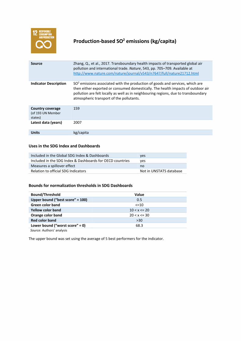
Production-based SO2 emissions (kg/capita)
Source Zhang, Q., et al., 2017. Transboundary health impacts of transported global air pollution and international trade. Nature, 543, pp. 705–709. Available at http://www.nature.com/nature/journal/v543/n7647/full/nature21712.html
Indicator Description SO2 emissions associated with the production of goods and services, which are then either exported or consumed domestically. The health impacts of outdoor air pollution are felt locally as well as in neighbouring regions, due to transboundary atmospheric transport of the pollutants.
Country coverage (of 193 UN Member states)
159
Latest data (years) 2007
Units kg/capita
Uses in the SDG Index and Dashboards
Included in the Global SDG Index & Dashboards yes Included in the SDG Index & Dashboards for OECD countries yes Measures a spillover effect no Relation to official SDG Indicators Not in UNSTATS database
Bounds for normalization thresholds in SDG Dashboards
Bound/Threshold Value Upper bound (“best score” = 100) 0.5 Green color band <=10 Yellow color band 10 < x <= 20 Orange color band 20 < x <= 30 Red color band >30 Lower bound (“worst score” = 0) 68.3
Source: Authors’ analysis
The upper bound was set using the average of 5 best performers for the indicator.

Net imported SO2 emissions (kg/capita)
Source Zhang, Q., et al., 2017. Transboundary health impacts of transported global air pollution and international trade. Nature, 543, pp. 705–709. Available at http://www.nature.com/nature/journal/v543/n7647/full/nature21712.html
Indicator Description Net imports of SO2 emissions associated with the trade in goods and services. These have severe health impacts and are a significant cause of premature mortality worldwide. Trade in goods mean that health impacts of air pollution occur far away from the point of consumption.
Country coverage (of 193 UN Member states)
187
Latest data (years) 2007
Units kg/capita
Uses in the SDG Index and Dashboards
Included in the Global SDG Index & Dashboards yes Included in the SDG Index & Dashboards for OECD countries yes Measures a spillover effect yes Relation to official SDG Indicators Not in UNSTATS database
Bounds for normalization thresholds in SDG Dashboards
Bound/Threshold Value Upper bound (“best score” = 100) 0 Green color band <=1 Yellow color band 1 < x <= 8 Orange color band 8 < x <= 15 Red color band >15 Lower bound (“worst score” = 0) 30.1
Source: Authors’ analysis
The upper bound was set using the average of 5 best performers for the indicator.

Reactive nitrogen production footprint (kg/capita)
Source Oita, A., et al., 2016. Substantial nitrogen pollution embedded in international trade. Nat. Geosci., 9, pp. 111–115. Available at https://www.nature.com/ngeo/journal/v9/n2/full/ngeo2635.html
Indicator Description Reactive nitrogen emitted during the production of commodities, which are then either exported or consumed domestically. Reactive nitrogen corresponds to emissions of ammonia, nitrogen oxides and nitrous oxide to the atmosphere, and of reactive nitrogen potentially exportable to water bodies, all of which can be harmful to human health and the environment.
Country coverage (of 193 UN Member states)
146
Latest data (years) 2017
Units kg/capita
Uses in the SDG Index and Dashboards
Included in the Global SDG Index & Dashboards yes Included in the SDG Index & Dashboards for OECD countries yes Measures a spillover effect no Relation to official SDG Indicators Not in UNSTATS database
Bounds for normalization thresholds in SDG Dashboards
Bound/Threshold Value Upper bound (“best score” = 100) 2.3 Green color band <=8 Yellow color band 8 < x <= 29 Orange color band 29 < x <= 50 Red color band >50 Lower bound (“worst score” = 0) 86.5
Source: Authors’ analysis
The upper bound was set using the average of 5 best performers for the indicator.

Net imported emissions of reactive nitrogen (kg/capita)
Source Oita, A., et al., 2016. Substantial nitrogen pollution embedded in international trade. Nat. Geosci., 9, pp. 111–115. Available at https://www.nature.com/ngeo/journal/v9/n2/full/ngeo2635.html
Indicator Description Net imports of reactive nitrogen emitted during the production of commodities. Reactive nitrogen corresponds here to emissions of ammonia, nitrogen oxides and nitrous oxide to the atmosphere, and of reactive nitrogen potentially exportable to water bodies, all of which can be harmful to human health and the environment.
Country coverage (of 193 UN Member states)
128
Latest data (years) 2017
Units kg/capita
Uses in the SDG Index and Dashboards
Included in the Global SDG Index & Dashboards yes Included in the SDG Index & Dashboards for OECD countries yes Measures a spillover effect yes Relation to official SDG Indicators Not in UNSTATS database
Bounds for normalization thresholds in SDG Dashboards
Bound/Threshold Value Upper bound (“best score” = 100) 0 Green color band <=1.5 Yellow color band 1.5 < x <= 75.75 Orange color band 75.75 < x <= 150 Red color band >150 Lower bound (“worst score” = 0) 432.4
Source: Authors’ analysis
The upper bound was set using the average of 5 best performers for the indicator.

Non-Recycled Municipal Solid Waste (MSW in kg/person/year times recycling rate)
Source World Bank, 2012. What a Waste: A Global Review of Solid Waste Management (No. 15), Urban Development Series - Knowledge Papers. World Bank, Washington D.C. Available at http://siteresources.worldbank.org/INTURBANDEVELOPMENT/Resources/336387-1334852610766/AnnexJ.pdf & OECD, 2017. OECD Statistics. Organisation for Economic Cooperation and Development, Paris. Available at http://stats.oecd.org/.
Indicator Description The annual amounts of municipal solid waste (MSW), including household waste, that is not recycled, expressed in kilogram per capita.
Country coverage (of 193 UN Member states)
32
Latest data (years) 2012
Units kg/capita
Uses in the SDG Index and Dashboards
Included in the Global SDG Index & Dashboards no Included in the SDG Index & Dashboards for OECD countries yes Measures a spillover effect no Relation to official SDG Indicators Closely aligned
Bounds for normalization thresholds in SDG Dashboards
Bound/Threshold Value Upper bound (“best score” = 100) 0.8 Green color band <=1 Yellow color band 1 < x <= 1.25 Orange color band 1.25 < x <= 1.5 Red color band >1.5 Lower bound (“worst score” = 0) 2.4
Source: Authors’ analysis
The upper bound was set using the average of 5 best performers for the indicator.

Municipal Solid Waste (kg/year/capita)
Source World Bank, 2012. What a Waste: A Global Review of Solid Waste Management (No. 15), Urban Development Series - Knowledge Papers. World Bank, Washington D.C. Available at http://siteresources.worldbank.org/INTURBANDEVELOPMENT/Resources/336387-1334852610766/AnnexJ.pdf
Indicator Description The annual amount of waste collected by or on behalf of municipal authorities and disposed of through the waste management system, expressed in kilogram per capita. Waste from agriculture and from industries are not included.
Country coverage (of 193 UN Member states)
159
Latest data (years) 2012
Units kg/capita
Uses in the SDG Index and Dashboards
Included in the Global SDG Index & Dashboards yes Included in the SDG Index & Dashboards for OECD countries no Measures a spillover effect no Relation to official SDG Indicators Closely aligned
Bounds for normalization thresholds in SDG Dashboards
Bound/Threshold Value Upper bound (“best score” = 100) 0.1 Green color band <=1 Yellow color band 1 < x <= 1.5 Orange color band 1.5 < x <= 2 Red color band >2 Lower bound (“worst score” = 0) 3.7
Source: Authors’ analysis
The upper bound was set using the average of 5 best performers for the indicator.
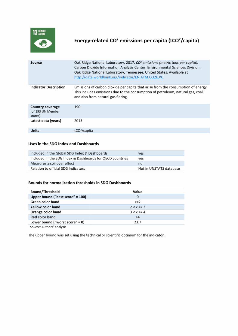
Energy-related CO2 emissions per capita (tCO2/capita)
Source Oak Ridge National Laboratory, 2017. CO2 emissions (metric tons per capita). Carbon Dioxide Information Analysis Center, Environmental Sciences Division, Oak Ridge National Laboratory, Tennessee, United States. Available at http://data.worldbank.org/indicator/EN.ATM.CO2E.PC
Indicator Description Emissions of carbon dioxide per capita that arise from the consumption of energy. This includes emissions due to the consumption of petroleum, natural gas, coal, and also from natural gas flaring.
Country coverage (of 193 UN Member states)
190
Latest data (years) 2013
Units tCO2/capita
Uses in the SDG Index and Dashboards
Included in the Global SDG Index & Dashboards yes Included in the SDG Index & Dashboards for OECD countries yes Measures a spillover effect no Relation to official SDG Indicators Not in UNSTATS database
Bounds for normalization thresholds in SDG Dashboards
Bound/Threshold Value Upper bound (“best score” = 100) 0 Green color band <=2 Yellow color band 2 < x <= 3 Orange color band 3 < x <= 4 Red color band >4 Lower bound (“worst score” = 0) 23.7
Source: Authors’ analysis
The upper bound was set using the technical or scientific optimum for the indicator.
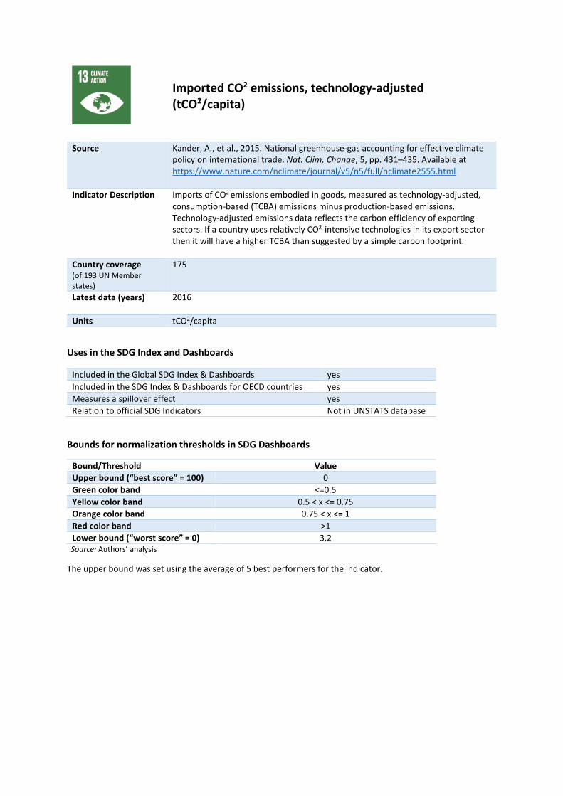
Imported CO2 emissions, technology-adjusted (tCO2/capita)
Source Kander, A., et al., 2015. National greenhouse-gas accounting for effective climate policy on international trade. Nat. Clim. Change, 5, pp. 431–435. Available at https://www.nature.com/nclimate/journal/v5/n5/full/nclimate2555.html
Indicator Description Imports of CO2 emissions embodied in goods, measured as technology-adjusted, consumption-based (TCBA) emissions minus production-based emissions. Technology-adjusted emissions data reflects the carbon efficiency of exporting sectors. If a country uses relatively CO2-intensive technologies in its export sector then it will have a higher TCBA than suggested by a simple carbon footprint.
Country coverage (of 193 UN Member states)
175
Latest data (years) 2016
Units tCO2/capita
Uses in the SDG Index and Dashboards
Included in the Global SDG Index & Dashboards yes Included in the SDG Index & Dashboards for OECD countries yes Measures a spillover effect yes Relation to official SDG Indicators Not in UNSTATS database
Bounds for normalization thresholds in SDG Dashboards
Bound/Threshold Value Upper bound (“best score” = 100) 0 Green color band <=0.5 Yellow color band 0.5 < x <= 0.75 Orange color band 0.75 < x <= 1 Red color band >1 Lower bound (“worst score” = 0) 3.2
Source: Authors’ analysis
The upper bound was set using the average of 5 best performers for the indicator.

Climate Change Vulnerability Index
Source HCSS, 2015. Climate change vulnerability monitor. The Hague Centre for Strategic Studies, The Hague. Available at http://projects.hcss.nl/monitor/70/
Indicator Description Country coverage (of 193 UN Member states)
158
Latest data (years) 2014
Units %
Uses in the SDG Index and Dashboards
Included in the Global SDG Index & Dashboards yes Included in the SDG Index & Dashboards for OECD countries yes Measures a spillover effect no Relation to official SDG Indicators Not in UNSTATS database
Bounds for normalization thresholds in SDG Dashboards
Bound/Threshold Value Upper bound (“best score” = 100) 0% Green color band <=0.1% Yellow color band 0.1% < x <= 0.15% Orange color band 0.15% < x <= 0.2% Red color band >0.2% Lower bound (“worst score” = 0) 0.4%
Source: Authors’ analysis
The upper bound was set using the technical or scientific optimum for the indicator.

Effective Carbon Rate from all non-road energy, excluding emissions from biomass (€/tCO2)
Source OECD, 2017. OECD Statistics. Organisation for Economic Cooperation and Development, Paris. Available at http://stats.oecd.org/.
Indicator Description Average effective carbon rates, the price of carbon emissions resulting from taxes and emissions trading systems, excluding CO2 emissions from biomass.
Country coverage (of 193 UN Member states)
41
Latest data (years) 2016
Units €/tCO2
Uses in the SDG Index and Dashboards
Included in the Global SDG Index & Dashboards no Included in the SDG Index & Dashboards for OECD countries yes Measures a spillover effect no Relation to official SDG Indicators Not in UNSTATS database
Bounds for normalization thresholds in SDG Dashboards
Bound/Threshold Value Upper bound (“best score” = 100) 100 Green color band >=70 Yellow color band 70 > x >= 50 Orange color band 50 > x >= 30 Red color band <30 Lower bound (“worst score” = 0) -0.1
Source: Authors’ analysis
The upper bound was set using the technical or scientific optimum for the indicator.

Mean area that is protected in marine sites important to biodiversity (%)
Source BirdLife International, IUCN, UNEP-WCMC, 2017. Resources and Data. BirdLife International, International Union for Conservation of Nature and United Nations Environment Programme - World Conservation Monitoring Center. Available at https://unstats.un.org/sdgs/indicators/database/?indicator=14.5.1
Indicator Description The mean percentage area of marine Key Biodiversity Areas (sites that are important for the global persistence of marine biodiversity) that is covered by protected areas.
Country coverage (of 193 UN Member states)
134
Latest data (years) 2017
Units %
Uses in the SDG Index and Dashboards
Included in the Global SDG Index & Dashboards yes Included in the SDG Index & Dashboards for OECD countries yes Measures a spillover effect no Relation to official SDG Indicators Exact match
Bounds for normalization thresholds in SDG Dashboards
Bound/Threshold Value Upper bound (“best score” = 100) 100% Green color band >=50% Yellow color band 50% > x >= 30% Orange color band 30% > x >= 10% Red color band <10% Lower bound (“worst score” = 0) 0%
Source: Authors’ analysis
The upper bound was set using the technical or scientific optimum for the indicator.
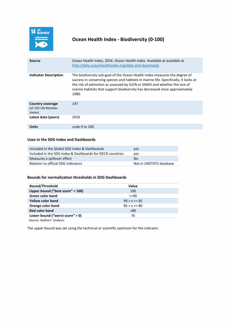
Ocean Health Index - Biodiversity (0-100)
Source Ocean Health Index, 2016. Ocean Health Index. Available at available at http://data.oceanhealthindex.org/data-and-downloads
Indicator Description The biodiversity sub-goal of the Ocean Health Index measures the degree of success in conserving species and habitats in marine life. Specifically, it looks at the risk of extinction as assessed by IUCN or GMAS and whether the size of marine habitats that support biodiversity has decreased since approximately 1980.
Country coverage (of 193 UN Member states)
147
Latest data (years) 2016
Units scale 0 to 100
Uses in the SDG Index and Dashboards
Included in the Global SDG Index & Dashboards yes Included in the SDG Index & Dashboards for OECD countries yes Measures a spillover effect No Relation to official SDG Indicators Not in UNSTATS database
Bounds for normalization thresholds in SDG Dashboards
Bound/Threshold Value Upper bound (“best score” = 100) 100 Green color band >=90 Yellow color band 90 > x >= 85 Orange color band 85 > x >= 80 Red color band <80 Lower bound (“worst score” = 0) 76
Source: Authors’ analysis
The upper bound was set using the technical or scientific optimum for the indicator.

Ocean Health Index - Clean Waters (0-100)
Source Ocean Health Index, 2016. Ocean Health Index. Available at available at http://data.oceanhealthindex.org/data-and-downloads
Indicator Description The clean waters sub-goal of the Ocean Health Index measures to what degree marine waters under national jurisdictions have been contaminated by chemicals, excessive nutrients (eutrophication), human pathogens or trash.
Country coverage (of 193 UN Member states)
147
Latest data (years) 2016
Units scale 0 to 100
Uses in the SDG Index and Dashboards
Included in the Global SDG Index & Dashboards yes Included in the SDG Index & Dashboards for OECD countries yes Measures a spillover effect no Relation to official SDG Indicators Not in UNSTATS database
Bounds for normalization thresholds in SDG Dashboards
Bound/Threshold Value Upper bound (“best score” = 100) 100 Green color band >=70 Yellow color band 70 > x >= 65 Orange color band 65 > x >= 60 Red color band <60 Lower bound (“worst score” = 0) 28.6
Source: Authors’ analysis
The upper bound was set using the technical or scientific optimum for the indicator.

Ocean Health Index - Fisheries (0-100)
Source Ocean Health Index, 2016. Ocean Health Index. Available at available at http://data.oceanhealthindex.org/data-and-downloads
Indicator Description The fisheries sub-goal of the Ocean Health Index measures the sustainability of fishing activities. It is calculated based on the population biomass (the live weight of fish in the ocean) and compared to the biomass that can deliver the stock's maximum sustainable yield, penalizing overfishing and underfishing (with half the penalty of overfishing).
Country coverage (of 193 UN Member states)
147
Latest data (years) 2016
Units scale 0 to 100
Uses in the SDG Index and Dashboards
Included in the Global SDG Index & Dashboards yes Included in the SDG Index & Dashboards for OECD countries yes Measures a spillover effect no Relation to official SDG Indicators Not in UNSTATS database
Bounds for normalization thresholds in SDG Dashboards
Bound/Threshold Value Upper bound (“best score” = 100) 100 Green color band >=70 Yellow color band 70 > x >= 65 Orange color band 65 > x >= 60 Red color band <60 Lower bound (“worst score” = 0) 19.7
Source: Authors’ analysis
The upper bound was set using the technical or scientific optimum for the indicator.

Percentage of Fish Stocks overexploited or collapsed by EEZ (%)
Source Hsu, A., et al., 2016. The 2016 Environmental Performance Index. Yale Center for Environmental Law and Policy, New Haven, CT. Available at http://epi.yale.edu/.
Indicator Description The percentage of a country’s total catch, within its exclusive economic zone (EEZ), that is comprised of species that are overexploited or collapsed, weighted by the quality of fish catch data.
Country coverage (of 193 UN Member states)
112
Latest data (years) 2010
Units %
Uses in the SDG Index and Dashboards
Included in the Global SDG Index & Dashboards yes Included in the SDG Index & Dashboards for OECD countries yes Measures a spillover effect no Relation to official SDG Indicators Closely aligned
Bounds for normalization thresholds in SDG Dashboards
Bound/Threshold Value Upper bound (“best score” = 100) 0% Green color band <=25% Yellow color band 25% < x <= 37.5% Orange color band 37.5% < x <= 50% Red color band >50% Lower bound (“worst score” = 0) 90.7%
Source: Authors’ analysis
The upper bound was set using the technical or scientific optimum for the indicator.

Mean area that is protected in terrestrial sites important to biodiversity (%)
Source BirdLife International, IUCN, UNEP-WCMC, 2017. Resources and Data. BirdLife International, International Union for Conservation of Nature and United Nations Environment Programme - World Conservation Monitoring Center. Available at https://unstats.un.org/sdgs/indicators/database/?indicator=15.1.2
Indicator Description The mean percentage area of terrestrial Key Biodiversity Areas (sites that are important for the global persistence of biodiversity) that is covered by protected areas.
Country coverage (of 193 UN Member states)
188
Latest data (years) 2017
Units %
Uses in the SDG Index and Dashboards
Included in the Global SDG Index & Dashboards yes Included in the SDG Index & Dashboards for OECD countries yes Measures a spillover effect no Relation to official SDG Indicators Exact match
Bounds for normalization thresholds in SDG Dashboards
Bound/Threshold Value Upper bound (“best score” = 100) 100% Green color band >=50% Yellow color band 50% > x >= 30% Orange color band 30% > x >= 10% Red color band <10% Lower bound (“worst score” = 0) 4.6%
Source: Authors’ analysis
The upper bound was set using the technical or scientific optimum for the indicator.

Mean area that is protected in freshwater sites important to biodiversity (%)
Source BirdLife International, IUCN, UNEP-WCMC, 2017. Resources and Data. BirdLife International, International Union for Conservation of Nature and United Nations Environment Programme - World Conservation Monitoring Center. Available at https://unstats.un.org/sdgs/indicators/database/?indicator=15.1.2
Indicator Description The mean percentage area of freshwater Key Biodiversity Areas (sites that are important for the global persistence of biodiversity) that is covered by protected areas.
Country coverage (of 193 UN Member states)
136
Latest data (years) 2017
Units %
Uses in the SDG Index and Dashboards
Included in the Global SDG Index & Dashboards yes Included in the SDG Index & Dashboards for OECD countries yes Measures a spillover effect no Relation to official SDG Indicators Exact match
Bounds for normalization thresholds in SDG Dashboards
Bound/Threshold Value Upper bound (“best score” = 100) 100% Green color band >=50% Yellow color band 50% > x >= 30% Orange color band 30% > x >= 10% Red color band <10% Lower bound (“worst score” = 0) 0%
Source: Authors’ analysis
The upper bound was set using the technical or scientific optimum for the indicator.
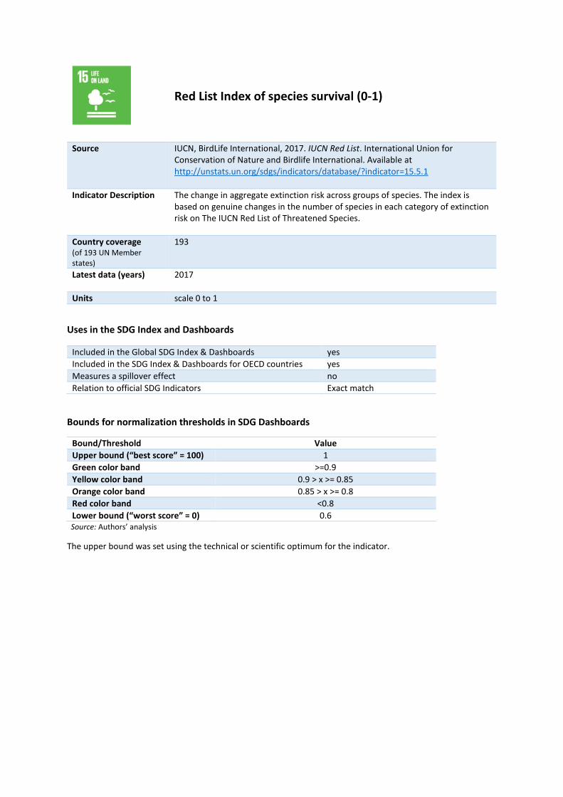
Red List Index of species survival (0-1)
Source IUCN, BirdLife International, 2017. IUCN Red List. International Union for Conservation of Nature and Birdlife International. Available at http://unstats.un.org/sdgs/indicators/database/?indicator=15.5.1
Indicator Description The change in aggregate extinction risk across groups of species. The index is based on genuine changes in the number of species in each category of extinction risk on The IUCN Red List of Threatened Species.
Country coverage (of 193 UN Member states)
193
Latest data (years) 2017
Units scale 0 to 1
Uses in the SDG Index and Dashboards
Included in the Global SDG Index & Dashboards yes Included in the SDG Index & Dashboards for OECD countries yes Measures a spillover effect no Relation to official SDG Indicators Exact match
Bounds for normalization thresholds in SDG Dashboards
Bound/Threshold Value Upper bound (“best score” = 100) 1 Green color band >=0.9 Yellow color band 0.9 > x >= 0.85 Orange color band 0.85 > x >= 0.8 Red color band <0.8 Lower bound (“worst score” = 0) 0.6
Source: Authors’ analysis
The upper bound was set using the technical or scientific optimum for the indicator.

Annual change in forest area (%)
Source Hsu, A., et al., 2016. The 2016 Environmental Performance Index. Yale Center for Environmental Law and Policy, New Haven, CT. Available at http://epi.yale.edu/.
Indicator Description Total area of tree loss from 2000 to 2014, in areas with a minimum of 30% canopy cover, benchmarked against the country’s tree cover baseline extent in 2000.
Country coverage (of 193 UN Member states)
120
Latest data (years) 2014
Units %
Uses in the SDG Index and Dashboards
Included in the Global SDG Index & Dashboards yes Included in the SDG Index & Dashboards for OECD countries yes Measures a spillover effect no Relation to official SDG Indicators Closely aligned
Bounds for normalization thresholds in SDG Dashboards
Bound/Threshold Value Upper bound (“best score” = 100) 0.6% Green color band <=3% Yellow color band 3% < x <= 4.5% Orange color band 4.5% < x <= 6% Red color band >6% Lower bound (“worst score” = 0) 18.4%
Source: Authors’ analysis
The upper bound was set using the average of 5 best performers for the indicator.
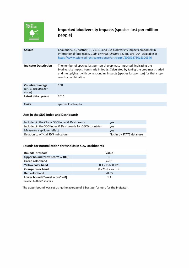
Imported biodiversity impacts (species lost per million people)
Source Chaudhary, A., Kastner, T., 2016. Land use biodiversity impacts embodied in international food trade. Glob. Environ. Change 38, pp. 195–204. Available at https://www.sciencedirect.com/science/article/pii/S0959378016300346
Indicator Description The number of species lost per ton of crop mass imported, indicating the biodiversity impact from trade in foods. Calculated by taking the crop mass traded and multiplying it with corresponding impacts (species lost per ton) for that crop-country combination.
Country coverage (of 193 UN Member states)
158
Latest data (years) 2016
Units species lost/capita
Uses in the SDG Index and Dashboards
Included in the Global SDG Index & Dashboards yes Included in the SDG Index & Dashboards for OECD countries yes Measures a spillover effect yes Relation to official SDG Indicators Not in UNSTATS database
Bounds for normalization thresholds in SDG Dashboards
Bound/Threshold Value Upper bound (“best score” = 100) 0 Green color band <=0.1 Yellow color band 0.1 < x <= 0.225 Orange color band 0.225 < x <= 0.35 Red color band >0.35 Lower bound (“worst score” = 0) 1.1
Source: Authors’ analysis
The upper bound was set using the average of 5 best performers for the indicator.

Homicides (per 100,000 people)
Source UNODC, 2016. Global Study on Homicides. United Nations Office on Drugs and Crime, Vienna. Available at https://data.unodc.org/#state:1
Indicator Description The number of intentional homicides per 100,000 people. Intentional homicides are estimates of unlawful homicides purposely inflicted as a result of domestic disputes, interpersonal violence, violent conflicts over land resources, intergang violence over turf or control, and predatory violence and killing by armed groups. Intentional homicide does not include all intentional killing; e.g. killing in armed conflict.
Country coverage (of 193 UN Member states)
191
Latest data (years) 2010-2014
Units per 100,000 people
Uses in the SDG Index and Dashboards
Included in the Global SDG Index & Dashboards yes Included in the SDG Index & Dashboards for OECD countries yes Measures a spillover effect no Relation to official SDG Indicators Exact match
Bounds for normalization thresholds in SDG Dashboards
Bound/Threshold Value Upper bound (“best score” = 100) 0.3 Green color band <=1.5 Yellow color band 1.5 < x <= 2.25 Orange color band 2.25 < x <= 3 Red color band >3 Lower bound (“worst score” = 0) 38
Source: Authors’ analysis
The upper bound was set using the average of 5 best performers for the indicator.

Prison population (per 100,000 people)
Source ICPR, 2016. World Prison Population List 11th Edition. Institute for Criminal Policy Research. Available at http://www.prisonstudies.org/sites/default/files/resources/downloads/world_prison_population_list_11th_edition_0.pdf
Indicator Description
Number of adult and juvenile prisoners (including pre-trial detainees, unless otherwise noted in the dataset), expressed per 100,000 people.
Country coverage (of 193 UN Member states)
189
Latest data (years)
2014-2015
Units per 100,000 people
Uses in the SDG Index and Dashboards
Included in the Global SDG Index & Dashboards yes Included in the SDG Index & Dashboards for OECD countries yes Measures a spillover effect no Relation to official SDG Indicators Closely aligned
Bounds for normalization thresholds in SDG Dashboards
Bound/Threshold Value Upper bound (“best score” = 100) 25 Green color band <=100 Yellow color band 100 < x <= 150 Orange color band 150 < x <= 200 Red color band >200 Lower bound (“worst score” = 0) 475
Source: Authors’ analysis
The upper bound was set using the average of 5 best performers for the indicator.
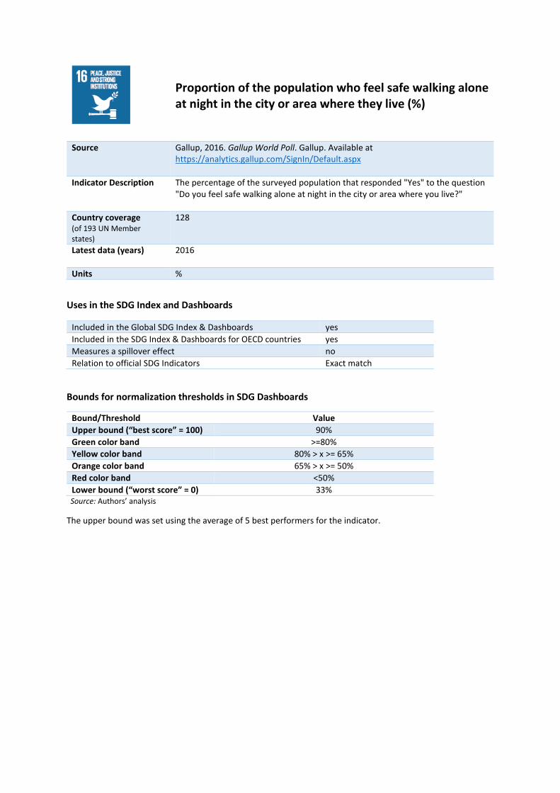
Proportion of the population who feel safe walking alone at night in the city or area where they live (%)
Source Gallup, 2016. Gallup World Poll. Gallup. Available at https://analytics.gallup.com/SignIn/Default.aspx
Indicator Description The percentage of the surveyed population that responded "Yes" to the question "Do you feel safe walking alone at night in the city or area where you live?"
Country coverage (of 193 UN Member states)
128
Latest data (years) 2016
Units %
Uses in the SDG Index and Dashboards
Included in the Global SDG Index & Dashboards yes Included in the SDG Index & Dashboards for OECD countries yes Measures a spillover effect no Relation to official SDG Indicators Exact match
Bounds for normalization thresholds in SDG Dashboards
Bound/Threshold Value Upper bound (“best score” = 100) 90% Green color band >=80% Yellow color band 80% > x >= 65% Orange color band 65% > x >= 50% Red color band <50% Lower bound (“worst score” = 0) 33%
Source: Authors’ analysis
The upper bound was set using the average of 5 best performers for the indicator.

Government Efficiency (1-7)
Source Schwab, K., Sala-i-Martín, X., 2016. The Global Competitiveness Report 2016–2017. World Economic Forum, Geneva. Available at http://reports.weforum.org/global-competitiveness-index/downloads/
Indicator Description Survey-based assessment of government efficiency, on a scale from 1 (worst) to 7 (best). The indicator reports respondents' qualitative assessment of government efficiency, an aggregate measure based on respondents answers to several questions on the wastefulness of government spending: i.e. the burden of government regulation, the efficiency of the legal framework in settling disputes and challenging regulations, and the transparency of government policymaking.
Country coverage (of 193 UN Member states)
149
Latest data (years) 2016-2017
Units scale 1 to 7
Uses in the SDG Index and Dashboards
Included in the Global SDG Index & Dashboards yes Included in the SDG Index & Dashboards for OECD countries yes Measures a spillover effect no Relation to official SDG Indicators Not in UNSTATS database
Bounds for normalization thresholds in SDG Dashboards
Bound/Threshold Value Upper bound (“best score” = 100) 5.6 Green color band >=4.5 Yellow color band 4.5 > x >= 3.75 Orange color band 3.75 > x >= 3 Red color band <3 Lower bound (“worst score” = 0) 2.4
Source: Authors’ analysis
The upper bound was set using the average of 5 best performers for the indicator.

Property Rights (1-7)
Source Schwab, K., Sala-i-Martín, X., 2016. The Global Competitiveness Report 2016–2017. World Economic Forum, Geneva. Available at http://reports.weforum.org/global-competitiveness-index/downloads/
Indicator Description Survey-based assessment of protection of property rights, on a scale from 1 (worst) to 7 (best). The indicator reports respondents' qualitative assessment of government efficiency, an aggregate measure based on respondents answers to several questions on the protection of property rights and intellectual property rights protection.
Country coverage (of 193 UN Member states)
149
Latest data (years) 2016-2017
Units scale 1 to 7
Uses in the SDG Index and Dashboards
Included in the Global SDG Index & Dashboards yes Included in the SDG Index & Dashboards for OECD countries yes Measures a spillover effect no Relation to official SDG Indicators Not in UNSTATS database
Bounds for normalization thresholds in SDG Dashboards
Bound/Threshold Value Upper bound (“best score” = 100) 6.3 Green color band >=4.5 Yellow color band 4.5 > x >= 3.75 Orange color band 3.75 > x >= 3 Red color band <3 Lower bound (“worst score” = 0) 2.5
Source: Authors’ analysis
The upper bound was set using the average of 5 best performers for the indicator.
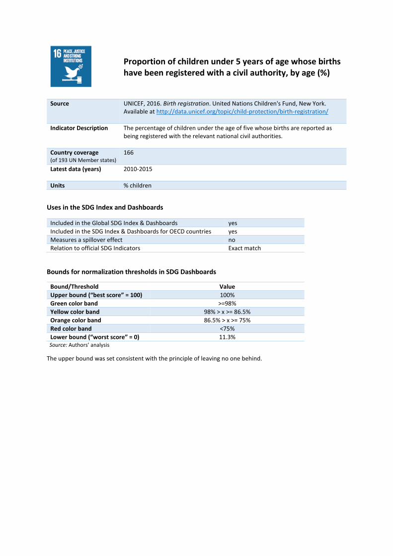
Proportion of children under 5 years of age whose births have been registered with a civil authority, by age (%)
Source UNICEF, 2016. Birth registration. United Nations Children's Fund, New York. Available at http://data.unicef.org/topic/child-protection/birth-registration/
Indicator Description The percentage of children under the age of five whose births are reported as being registered with the relevant national civil authorities.
Country coverage (of 193 UN Member states)
166
Latest data (years) 2010-2015
Units % children
Uses in the SDG Index and Dashboards
Included in the Global SDG Index & Dashboards yes Included in the SDG Index & Dashboards for OECD countries yes Measures a spillover effect no Relation to official SDG Indicators Exact match
Bounds for normalization thresholds in SDG Dashboards
Bound/Threshold Value Upper bound (“best score” = 100) 100% Green color band >=98% Yellow color band 98% > x >= 86.5% Orange color band 86.5% > x >= 75% Red color band <75% Lower bound (“worst score” = 0) 11.3%
Source: Authors’ analysis
The upper bound was set consistent with the principle of leaving no one behind.

Corruption Perception Index (0-100)
Source Transparency International, 2016. Corruption Perceptions Index 2016. Transparency International, Berlin. Available at https://www.transparency.org/cpi2016
Indicator Description The perceived levels of public sector corruption, on a scale from 0 (highest level of percieved corruption) to 100 (lowest level of percieved corruption). The CPI aggregates data from a number of different sources that provide perceptions of business people and country experts.
Country coverage (of 193 UN Member states)
170
Latest data (years) 2016
Units scale 0 to 100
Uses in the SDG Index and Dashboards
Included in the Global SDG Index & Dashboards yes Included in the SDG Index & Dashboards for OECD countries yes Measures a spillover effect no Relation to official SDG Indicators Closely aligned
Bounds for normalization thresholds in SDG Dashboards
Bound/Threshold Value Upper bound (“best score” = 100) 88.6 Green color band >=60 Yellow color band 60 > x >= 50 Orange color band 50 > x >= 40 Red color band <40 Lower bound (“worst score” = 0) 13
Source: Authors’ analysis
The upper bound was set using the average of 5 best performers for the indicator.

Slavery score (0-100)
Source Walk Free Foundation, 2016. Global Slavery Index 2016. Walk Free Foundation, Broadway Nedlands, Australia. Available at https://www.globalslaveryindex.org/
Indicator Description Based on the Global Slavery Index (GSI), the score reflects a set of measures about the number of people in modern slavery, the steps governments are taking to respond to it, and the factors that make individuals vulnerable. It is calculated based on standardised surveys and Multiple Systems Estimation (MSE), and several indicators measuring vulnerability and government responses.
Country coverage (of 193 UN Member states)
164
Latest data (years) 2016
Units scale 0 to 100
Uses in the SDG Index and Dashboards
Included in the Global SDG Index & Dashboards yes Included in the SDG Index & Dashboards for OECD countries yes Measures a spillover effect no Relation to official SDG Indicators Not in UNSTATS database
Bounds for normalization thresholds in SDG Dashboards
Bound/Threshold Value Upper bound (“best score” = 100) 100 Green color band >=80 Yellow color band 80 > x >= 65 Orange color band 65 > x >= 50 Red color band <50 Lower bound (“worst score” = 0) 0
Source: Authors’ analysis
The upper bound was set consistent with the principle of leaving no one behind.

Transfers of major conventional weapons (exports) (constant 1990 US$ million per 100,000 people)
Source SIPRI, 2017. SIPRI Arms Transfers Database. Stockholm International Peace Research Institute, Stockholm. Available at https://www.sipri.org/databases/armstransfers.
Indicator Description The volume of major conventional weapons exported, expressed in constant 1990 US$ millions per 100 000 people. It is calculated based on the trend-indicator value, which is based on the known unit production cost of a core set of weapons, and does not reflect the financial value of the exports. Small arms, light weapons, ammunition and other support material are not included.
Country coverage (of 193 UN Member states)
193
Latest data (years) 2014
Units constant 1990 US$ million,/100,000 people
Uses in the SDG Index and Dashboards
Included in the Global SDG Index & Dashboards yes Included in the SDG Index & Dashboards for OECD countries yes Measures a spillover effect yes Relation to official SDG Indicators Not in UNSTATS database
Bounds for normalization thresholds in SDG Dashboards
Bound/Threshold Value Upper bound (“best score” = 100) 0 Green color band <=1 Yellow color band 1 < x <= 25.5 Orange color band 25.5 < x <= 50 Red color band >50 Lower bound (“worst score” = 0) 171.1
Source: Authors’ analysis
The upper bound was set using the technical or scientific optimum for the indicator.

Government Health and Education spending (% GDP)
Source UNESCO, 2017. Government expenditure on education. United Nations Educational, Scientific and Cultural Organization, Paris. Available at http://data.worldbank.org/indicator/SE.XPD.TOTL.GD.ZS & WHO, 2017. World Health Expenditure Database. World Health Organization, Geneva. Available at http://apps.who.int/nha/database
Indicator Description Total general (local, regional and central) government expenditure on health and education (current, capital, and transfers), expressed as a percentage of GDP.
Country coverage (of 193 UN Member states)
149
Latest data (years) 2009-2015
Units % GDP
Uses in the SDG Index and Dashboards
Included in the Global SDG Index & Dashboards yes Included in the SDG Index & Dashboards for OECD countries yes Measures a spillover effect no Relation to official SDG Indicators Not in UNSTATS database
Bounds for normalization thresholds in SDG Dashboards
Bound/Threshold Value Upper bound (“best score” = 100) 20.7% Green color band >=16% Yellow color band 16% > x >= 12% Orange color band 12% > x >= 8% Red color band <8% Lower bound (“worst score” = 0) 5.1%
Source: Authors’ analysis
The upper bound was set using the average of 5 best performers for the indicator.
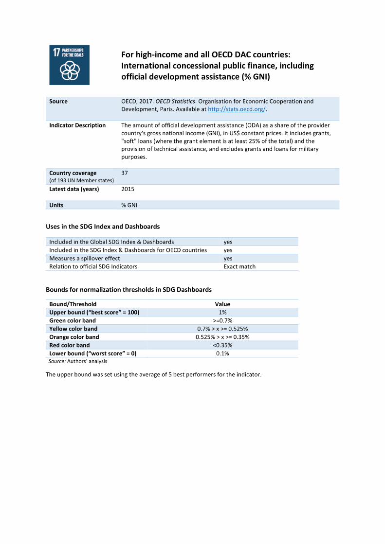
For high-income and all OECD DAC countries: International concessional public finance, including official development assistance (% GNI)
Source OECD, 2017. OECD Statistics. Organisation for Economic Cooperation and Development, Paris. Available at http://stats.oecd.org/.
Indicator Description The amount of official development assistance (ODA) as a share of the provider country's gross national income (GNI), in US$ constant prices. It includes grants, "soft" loans (where the grant element is at least 25% of the total) and the provision of technical assistance, and excludes grants and loans for military purposes.
Country coverage (of 193 UN Member states)
37
Latest data (years) 2015
Units % GNI
Uses in the SDG Index and Dashboards
Included in the Global SDG Index & Dashboards yes Included in the SDG Index & Dashboards for OECD countries yes Measures a spillover effect yes Relation to official SDG Indicators Exact match
Bounds for normalization thresholds in SDG Dashboards
Bound/Threshold Value Upper bound (“best score” = 100) 1% Green color band >=0.7% Yellow color band 0.7% > x >= 0.525% Orange color band 0.525% > x >= 0.35% Red color band <0.35% Lower bound (“worst score” = 0) 0.1%
Source: Authors’ analysis
The upper bound was set using the average of 5 best performers for the indicator.

For all other countries: Tax revenue (% GDP)
Source World Bank, 2017. Tax revenue (% of GDP). World Bank, Washington, D.C. Available at http://data.worldbank.org/indicator/GC.TAX.TOTL.GD.ZS
Indicator Description The percentage share of tax revenues in a country's gross domestic product (GDP). Tax revenues are seen as compulsory transfers to the central government for public purposes, excluding certain transfers such as fines, penalties and most social security contributions. Refunds and corrections of erroneously collected tax revenue are treated as negative revenue.
Country coverage (of 193 UN Member states)
96
Latest data (years) 2009-2015
Units % GDP
Uses in the SDG Index and Dashboards
Included in the Global SDG Index & Dashboards yes Included in the SDG Index & Dashboards for OECD countries yes Measures a spillover effect no Relation to official SDG Indicators Exact match
Bounds for normalization thresholds in SDG Dashboards
Bound/Threshold Value Upper bound (“best score” = 100) 30.4% Green color band >=25% Yellow color band 25% > x >= 20% Orange color band 20% > x >= 15% Red color band <15% Lower bound (“worst score” = 0) 1.2%
Source: Authors’ analysis
The upper bound was set using the average of 5 best performers for the indicator after exclusion of outliers.
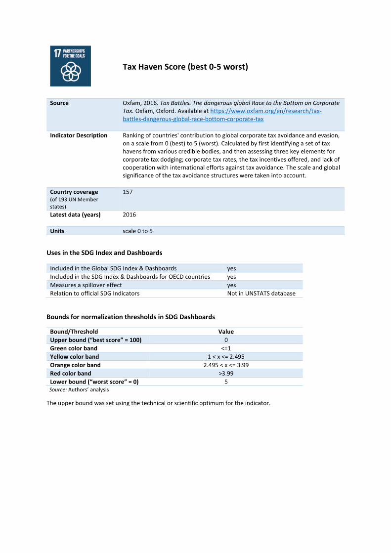
Tax Haven Score (best 0-5 worst)
Source Oxfam, 2016. Tax Battles. The dangerous global Race to the Bottom on Corporate Tax. Oxfam, Oxford. Available at https://www.oxfam.org/en/research/tax-battles-dangerous-global-race-bottom-corporate-tax
Indicator Description Ranking of countries' contribution to global corporate tax avoidance and evasion, on a scale from 0 (best) to 5 (worst). Calculated by first identifying a set of tax havens from various credible bodies, and then assessing three key elements for corporate tax dodging; corporate tax rates, the tax incentives offered, and lack of cooperation with international efforts against tax avoidance. The scale and global significance of the tax avoidance structures were taken into account.
Country coverage (of 193 UN Member states)
157
Latest data (years) 2016
Units scale 0 to 5
Uses in the SDG Index and Dashboards
Included in the Global SDG Index & Dashboards yes Included in the SDG Index & Dashboards for OECD countries yes Measures a spillover effect yes Relation to official SDG Indicators Not in UNSTATS database
Bounds for normalization thresholds in SDG Dashboards
Bound/Threshold Value Upper bound (“best score” = 100) 0 Green color band <=1 Yellow color band 1 < x <= 2.495 Orange color band 2.495 < x <= 3.99 Red color band >3.99 Lower bound (“worst score” = 0) 5
Source: Authors’ analysis
The upper bound was set using the technical or scientific optimum for the indicator.

Financial Secrecy Score (best 0-100 worst)
Source Tax Justice Network, 2015. Financial Secrecy Index 2015. Tax Justice Network, London. Available at http://www.financialsecrecyindex.com/introduction/fsi-2015-results
Indicator Description The Index measures the contribution of each jurisdiction to financial secrecy, on a scale from 0 (best) to 100 (worst). It is calculated using qualitative data to prepare a secrecy score for each jurisdiction, and quantitative data to create a global scale weighting for each jurisdiction according to its share of offshore financial services activity in the global total.
Country coverage (of 193 UN Member states)
35
Latest data (years) 2015
Units scale 0 to 100
Uses in the SDG Index and Dashboards
Included in the Global SDG Index & Dashboards no Included in the SDG Index & Dashboards for OECD countries yes Measures a spillover effect yes Relation to official SDG Indicators Not in UNSTATS database
Bounds for normalization thresholds in SDG Dashboards
Bound/Threshold Value Upper bound (“best score” = 100) 32.8 Green color band <=40 Yellow color band 40 < x <= 45 Orange color band 45 < x <= 50 Red color band >50 Lower bound (“worst score” = 0) 72.6
Source: Authors’ analysis
The upper bound was set using the average of 5 best performers for the indicator.

SD
G Index and D
ashboards Report 2017
G20 edition