section usage guidelines - central washington …cwcpga.com/pdf/pgalogoguidelines.pdfmetallic gold...
TRANSCRIPT

INTRODUCTION 01
PGA SECTION GUIDELINES

TAB
LE
OF
CO
NT
EN
TSPGA SECTION GUIDELINES
If You Need Help 1
Introduction 2
The PGA Section Logo 4
Clear Space and Minimum Size 6
Logo Colors 7
Color Variations 8
Typography 9
PGA Section Letterhead 13
Envelope & Business Card 14

1
IF YOU NEED HELP
We’ve tried to make this PGA Graphics Standards Manual as simple for you to navigate and reference as possible. However, we do realize that questions and uncertainty may arise.
The manual itself may answer many of the questions regarding implementation. However, if you or a vendor have a question or need help in the design of an item not shown in the manual, please contact:
PGA Membership DepartmentThe PGA of America100 Avenue of the ChampionsPO Box 109601Palm Beach Gardens, FL 33401-9601T: (800) 474-2776
For your convenience and expediency, your PGA Section logo can be downloaded directly to your computer. See the Logo Guidelines section on SMS for instructions.

2
In order for our identity to sustain its inherent value and to continue to communicate an image that has long been accepted and believed in by all as the industry leader, these guidelines must be implemented with care, consistency and good design judgment. Correct usage of our logo goes a long way in protecting our identity and conveying the pride we all have in our Association.
While we endorse imagination in many aspects of the PGA Professional’s business, we will require conformity and compliance with the policies, procedures and guidelines presented here.
This can be accomplished only by using this graphics standards manual as your reference guide. Thank you in advance for your support of this very important Association program.
Changes, deviations, modifications, alterations or any departures from these standards will cause a breakdown in the continuity and consistency of the
image we are trying to maintain. With that in mind, the information in this section is to be regarded as rule rather than guidelines.
To ensure that the Section logo never varies in appearance or proportion, it should be reproduced only from camera-ready artwork or a digital file supplied by the PGA Creative Services Department. Our mark must always be displayed without alteration and in accordance with the carefully established rules described in this guide. Under no circumstances is the symbol to be redrawn, re-proportioned, or modified in any manner. This is the symbol that reflects the professionalism, pride, history and prosperity of The PGA of America. It is important that it be treated with due respect.
The Section logo and identifying type were designed to combine the tradition of the Association with the contemporary and forward-looking aspects of the individual Sections.
INTRODUCTION

3
The Section name must appear underneath the PGA logo. It is always left justified to the PGA logo and is typed in Gotham Book.
The Section name as well as the space between the PGA logo and the Section name is equal to the height of the PGA letters in the seal.
Section Name
THE PGA SECTION LOGO

4
Whenever the Section logo is applied, it must always be clearly visible in order to be instantly recognizable. To guarantee its legibility and impact, the Section logo should never appear in PGA of America communications without the minimum clear space surrounding it. The minimum clear space is equal to the height of the PGA letters in the Seal in the Section logo’s reproduced size, as shown here. This clear space isolates the logo from competing graphic elements such as copy, photography, or background patterns that may divert attention from it.
The PGA of America Section logo retains its visual strength in a wide range of sizes. However, because of the detail inherent in the Seal, there are sizes in which the signature ceases to be clearly legible and its impact is diminished.
To accurately reproduce The PGA of America logo, use the following guide:
• The minimum size of the logo is determined by the height of The PGA of America Seal. The minimum size is .5 inches from top to bottom. Never reproduce the signature smaller than this size.
0.5"
Clearspace
Minimum Size
CLEAR SPACE AND mINImUm SIzE

5
The Section logo should appear in Gold and Blue, although other variations are allowed when necessary (see Color Variations). It is important to note that the exact specifications for these colors have changed slightly:
• PGA of America Gold is equivalent to PANTONE 872 C or PANTONE 872 U
• PGA of America Blue is equivalent to PANTONE 533 C or PANTONE 539 U
The chart on this page identifies the exact color formulations for 4-color printing (CMYK) and on-screen use (RGB).
Our primary Gold and Blue colors can also be used as accent colors in communications.
When reproducing our identity, always match the PANTONE colors defined here. When printing on uncoated paper stock, use the uncoated PANTONE numbers as colors can sometimes change significantly.
LOGO COLORS
PANTONE 533 C, 539 U
C95 m72 Y15 K62
R37 G50 B85
PANTONE 872 C, 872 U
C20 m30 Y70 K15
R180 G151 B90
LOGO COLORS
The colors shown in manual have not been evaluated by Pantone, Inc. for accuracy and may not match the PANTONE color standards. Refer to the PANTONE Matching System for accurate representation of these colors. PANTONE® is a registered trademark of PANTONE, Inc.

6
COLOR vARIATIONS
Our logo is most powerful when it is reproduced in PGA Gold and Blue. However, to accommodate communications where the 2-color logo cannot be properly reproduced or applied, several color variations are available, including:• Two-color logo with reverse PGA letters• One-color Gold logo• Reverse logo• One-color Black logo
These color variations should only be used when the two-color Gold and Blue version cannot be reproduced accurately or legibly.
Here are two ways to determine if another colorvariation should be used:
• If the layout uses a dark color or photographic background, the two-color logo with reverse letters or reverse logo should be used.;
• If multi-color printing is unavailable, the one-color Gold, one-color black, or reverse logo should be used.
When using one of these alternate color variations, observe the same clear space and minimum size requirements specified for the two-color logo.
Metallic Gold Foil Metallic Gold foil may be used in the more formal presentations of the logo. The foil-stamp process is one in which may differ from vendor to vendor. While shades of gold foil may vary it is important to strive for the nearest match to PANTONE 872.

7
Using a consistent typeface throughout ourcommunications creates a proprietary look. Two typefaces have been selected for The PGA of America – Gotham and Hoefler Text.
Gotham is a modern, sans-serif face that is geometric and precise. It evokes the exacting nature of the game. Because it is bold, Gotham should be used in headlines, captions, and primary messaging. Gotham is available in several weights including Black, Bold, Medium, and Book.
Hoefler Text has been chosen for use in body text.Its classic and highly legible character reflects theheritage of the game and complements Gotham.Never use Hoefler in headlines or primary messaging.
For communications such as letters, standard typefaces such as Arial can replace Gotham and Times Roman can replace Hoefler.
Gotham BookabcdefghijklmnopqrstuvwxyzaBCdeFGhijklMNopqrStuvwxyz0123456789@#$%<>?!+=-{}[]: ;
Gotham mediumabcdefghijklmnopqrstuvwxyzABCDEFGHIjKLmNOPqRSTUvwxYz0123456789@#$%<>?!+=-{}[]: ;
Gotham BoldabcdefghijklmnopqrstuvwxyzaBcdefGhijklmnopqrstuvwxyz0123456789@#$%<>?!+=-{}[]:;
Gotham BlackabcdefghijklmnopqrstuvwxyzaBcdefGhijklmnopqrstuvwxyz0123456789@#$%<>?!+=-{}[]:;
Hoefler Text Regularabcd efghi jklmnopqrstuvwxyzA BC DEFGHIjKLMNOPqRSTUVWxYz0123456789@#$%<>?!+=- { } [ ] : ;
TYPOGRAPHY
8
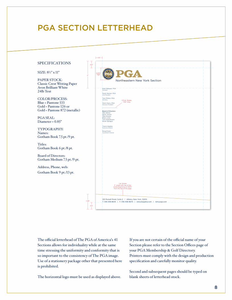
The offi cial letterhead of The PGA of America’s 41 Sections allows for individuality while at the same time stressing the uniformity and conformity that is so important to the consistency of The PGA image. Use of a stationery package other that presented here is prohibited.
The horizontal logo must be used as displayed above.
PGA SECTION LETTERHEAD
If you are not certain of the offi cial name of your Section please refer to the Section Offi ces page of your PGA Membership & Golf Directory.Printers must comply with the design and production specifi cation and carefully monitor quality.
Second and subsequent pages should be typed on blank sheets of letterhead stock.
SPECIFICATIONS
SIzE: 81⁄2” x 11”
PAPER STOCK:Classic Crest Writing Paper Avon Brilliant White 24lb Text
COLOR/PROCESS:Blue = Pantone 533Gold = Pantone 126 orGold = Pantone 872 (metallic)
PGA SEAL:Diameter = 0.85”
TYPOGRAPHY:Names: Gotham Book 7.5 pt./9 pt.
Titles: Gotham Book 6 pt./8 pt.
Board of Directors: Gotham Medium 7.5 pt./9 pt.
Address, Phone, web: Gotham Book 9 pt./13 pt.
0.5 pt. Stroke 1.125” long
120 russell road, Suite 2 | albany, New york, 12205t: 518-438-8645 | F: 518-438-8670 | [email protected] | neny.pga.com
Noel Gebauer, pGapresident
Scott warren, pGavice president
tom philion, pGaSecretary
Glenn davis, pGahonorary president
Board of DirectorsMike Behan Steve jensen Mike kuceraBrian lowe tom oppedisanoderek Sprague
tracie heighesexecutive director
doug evanstournament director
2”
1.125”
0.5”
0.875”high
0.5”
1 pt. Stroke 5˚ angle with top of the
stroke beginning at 9.875” from the top of the page
0.5”

9
120 russell road, Suite 2albany, New york, 12205
0.9375” 0.5”high
0.125”
0.25”
0.375”“The Experts in the Game and Business of Golf”
ENvELOPE AND BUSINESS CARD
The business card is the most direct, personal and widely used vehicle of your PGA Section’s image. They must communicate The PGA of America’s values of competence, professionalism, quality and attention to detail.
Because of this, it is highly important that printers must comply with the approved design and production specifi cation and monitor quality carefully.
0.125”
1”0.6”high
0.125”
0.125” 0.125”
darrel Bock, pGapGa professional
executive director
6630 Bear dance road, Suite 200 | larkspur, Co 80118t: (555) 555-5555 | C: (555) 555-5555 | F: (555) 555-5555
[email protected] | colorado.pga.com
BuSiNeSS Card SpeCiFiCatioNS
size: 31⁄2” x 2”
paper stock:Classic Crest writing paper avon Brilliant white | 80lb Cover
color/process:Blue = pantone 533Gold = pantone 872 (metallic)
pGa seal:diameter = 0.6”
typoGraphy:Name:Gotham Bold 9 pt./11 pt.
Titles:Gotham Book 6 pt./8 pt.
Section Name (above address)Gotham Bold 7.5 pt./8.5 pt.
Address, Phone, web:Gotham Book 6 pt./9 pt.
eNvelope SpeCiFiCatioNS
size: Standard size #10
paper stock:Classic Crest writing paper avon Brilliant white
color/process:Blue = pantone 533Gold = pantone 872 (metallic)
pGa seal:diameter = 0.6”
typoGraphy:Address: Gotham Book 6 pt./9 pt.
Tagline “The Experts in the Game and Business of Golf”: Gotham Book italic 9 pt./9 pt.
The PGA Sections standard envelope for business correspondence is a #10 size that matches the letterhead in color and specifi cations. It can be reproduced as a two-color or one-color item as shown.
“The Experts in the Game and Business of Golf”“The Experts in the Game and Business of Golf”“The Experts in the Game and Business of Golf”“The Experts in the Game and Business of Golf”“The Experts in the Game and Business of Golf”
120 russell road, Suite 2
albany, New york, 12205
“The Experts in the Game and Business of Golf”
“The Experts in the Game and Business of Golf”