segregated city - martin prosperity institutemartinprosperity.org/media/segregated city.pdf ·...
TRANSCRIPT

SEGREGATED CITYThe Geography of Economic
Segregation in America’s Metros
Cities

The Martin Prosperity Institute, housed at the University of Toronto’s Rotman School of Management, explores the requisite underpinnings of a democratic capitalist economy that generate prosperity that is both robustly growing and broadly experienced.
Richard Florida is the Director of the Cities Project at the MPI, where he and his colleagues are working to influence public debate and public policy. Rich is focused on the critical factors that make city re- gions the driving force of economic development and prosperity in the twenty-first century.

Richard FloridaCharlotta Mellander
SEGREGATED CITYThe Geography of Economic
Segregation in America’s Metros


5 Table of Contents
Table of Contents
1. Executive Summary 8
2. Introduction 10
3. Mapping Economic Segregation 12 3.1 Income Segregation 12
3.1.1 Segregation of the Poor 12
3.1.2 Segregation of the Wealthy 16
3.1.3 The Geography of Overall Income Segregation 20
3.2 Educational Segregation 25
3.2.1 Segregation of the Less Educated 25
3.2.2 Segregation of the Highly Educated 29
3.2.3 The Geography of Overall Educational Segregation 33
3.3 Occupational Segregation 36
3.3.1 Creative Class Segregation 37
3.3.2 Service Class Segregation 40
3.3.3 Working Class Segregation 43
3.3.4 The Geography of Overall Occupational Segregation 46
3.4 How do different types of economic segregation compare? 51
3.5 The Overall Economic Segregation Index 54
4. What kinds of metros are more segregated than others? 58 4.1 Size and Density 58
4.2 Wealth and Affluence 58
4.3 Knowledge-Based Economies 62
4.4 Housing Costs 66
4.5 How We Get to Work 68
4.6 Political Orientation 69
4.7 Race 70
4.8 Inequality 73
5. Conclusion 76
6. Appendix 79
7. References 82
6 Segregated City
Table of Exhibits
Exhibit 1 Segregation of the Poor 13
Exhibit 1.1 Large Metros where the Poor are Most Segregated 14
Exhibit 1.2 Metros where the Poor are Most Segregated 15
Exhibit 1.3 Large Metros where the Poor are Least Segregated 15
Exhibit 1.4 Metros where the Poor are Most Segregated 16
Exhibit 2 Segregation of the Wealthy 17
Exhibit 2.1 Large Metros where the Wealthy are Most Segregated 18
Exhibit 2.2 Metros where the Wealthy are Most Segregated 18
Exhibit 2.3 Large Metros where the Wealthy are Least Segregated 19
Exhibit 2.4 Metros where the Wealthy are Least Segregated 20
Exhibit 3 Overall Income Segregation 22
Exhibit 3.1 Large Metros with the Highest Levels of Income Segregation 23
Exhibit 3.2 Metros with the Highest Levels of Income Segregation 23
Exhibit 3.3 Large Metros with the Lowest Levels of Income Segregation 24
Exhibit 3.4 Metros with the Lowest Levels of Income Segregation 24
Exhibit 4 Segregation of the Less Educated (without a high school degree) 26
Exhibit 4.1 Large Metros where those without a High School Degree are Most Segregated 27
Exhibit 4.2 Metros where those without a High School Degree are Most Segregated 27
Exhibit 4.3 Large Metros where those without a High School Degree are Least Segregated 28
Exhibit 4.4 Metros where those without a High School Degree are Least Segregated 28
Exhibit 5 Segregation of the Highly Educated (College Grads) 30
Exhibit 5.1 Large Metros where College Grads are Most Segregated 31
Exhibit 5.2 Metros where College Grads are Most Segregated 31
Exhibit 5.3 Large Metros where College Grads are Least Segregated 32
Exhibit 5.4 Metros where College Grads are Least Segregated 32
Exhibit 6 Overall Educational Segregation 33
Exhibit 6.1 Large Metros with the Highest Levels of Overall Educational Segregation 34
Exhibit 6.2 Metros with the Highest Levels of Overall Educational Segregation 34
Exhibit 6.3 Large Metros with the Lowest Levels of Overall Educational Segregation 35
Exhibit 6.4 Metros with the Lowest Levels of Overall Educational Segregation 35
Exhibit 7 Segregation of the Creative Class 37
Exhibit 7.1 Large Metros where the Creative Class is Most Segregated 38
Exhibit 7.2 Metros where the Creative Class is Most Segregated 38
Exhibit 7.3 Large Metros where the Creative Class is Least Segregated 39
Exhibit 7.4 Metros where the Creative Class is Least Segregated 39

7 Table of Exhibits
Exhibit 8 Segregation of the Service Class 41
Exhibit 8.1 Large Metros where the Service Class is Most Segregated 42
Exhibit 8.2 Metros where the Service Class is Most Segregated 42
Exhibit 8.3 Large Metros where the Service Class is Least Segregated 43
Exhibit 8.4 Metros where the Service Class is Least Segregated 43
Exhibit 9 Segregation of the Working Class 44
Exhibit 9.1 Large Metros where the Working Class is Most Segregated 45
Exhibit 9.2 Metros where the Working Class is Most Segregated 45
Exhibit 9.3 Large Metros where the Working Class is Least Segregated 46
Exhibit 9.4 Metros where the Working Class is Least Segregated 47
Exhibit 10 Overall Occupational Segregation 48
Exhibit 10.1 Large Metros where the Working Class is Most Segregated 49
Exhibit 10.2 Metros where the Working Class is Most Segregated 49
Exhibit 10.3 Large Metros where the Working Class is Least Segregated 50
Exhibit 10.4 Metros where the Working Class is Least Segregated 50
Exhibit 11 Correlates for the Various Types of Economic Segregation 52
Exhibit 12 Values for Mean, Lowest, and Highest Levels of Economic Segregation 53
Exhibit 13 Correlates for the Various Segregation Indexes 54
Exhibit 14 Overall Economic Segregation Index 55
Exhibit 14.1 Large Metros with the Highest Levels of Overall Economic Segregation 56
Exhibit 14.2 Metros with the Highest Levels of Overall Economic Segregation 56
Exhibit 14.3 Large Metros with the Lowest Levels of Overall Economic Segregation 57
Exhibit 14.4 Metros with the Lowest Levels of Overall Economic Segregation 57
Exhibit 15 Overall Economic Segregation Index and Population 59
Exhibit 16 Overall Economic Segregation Index and Density 59
Exhibit 17 Correlates for Population Size and Density 60
Exhibit 18 Correlates for Income, Wages, and Economic Output per Capita 61
Exhibit 19 Overall Economic Segregation Index and College Grads 62
Exhibit 20 Overall Economic Segregation Index and Creative Class 63
Exhibit 21 Overall Economic Segregation Index and High-Tech 63
Exhibit 22 Correlates for College Grads, Creative Class, and High-Tech Industry 64
Exhibit 23 Overall Economic Segregation Index and Working Class 65
Exhibit 24 Correlates for Industrial Economic Structures: Unionization and Working Class Share 66
Exhibit 25 Correlates for Housing Costs 67
Exhibit 26 Correlates for Transit and Drive to Work Alone 68
Exhibit 27 Correlates for Liberal and Conservative Politics 69
Exhibit 28 Overall Economic Segregation Index and White 71
Exhibit 29 Overall Economic Segregation Index and Black 71
Exhibit 30 Correlates for Race 72
Exhibit 31 Overall Economic Segregation Index and Income Inequality 73
Exhibit 32 Overall Economic Segregation Index and Wage Inequality 74
Exhibit 33 Correlates for Inequality 75

8
1. Executive Summary
Americans have become increasingly sorted over the past couple of decades by income, education, and class. A large body of research has focused on the dual migrations of more affluent and skilled people and the less advantaged across the United States. Increasingly, Amer-icans are sorting not just between cities and metro areas, but within them as well.
This study examines the geography of economic segregation in Amer-ica. While most previous studies of economic segregation have gen-erally focused on income, this report examines three dimensions of economic segregation: by income, education, and occupation. It de-velops individual and combined measures of income, educational, and occupational segregation, as well as an Overall Economic Segregation Index, and maps them across the more than 70,000 Census tracts that make up America’s 350-plus metros. In addition, it examines the key economic, social, and demographic factors that are associated with them. Its key findings are as follows.
Segregated City
9
The following metros have the highest and low-est levels of economic segregation:
• Tallahassee and Trenton have the highest lev-els of overall economic segregation in the U.S., followed by Austin, Tucson, San Anto-nio, Houston, Ann Arbor, Bridgeport, and Los Angeles.
• Four of the ten most segregated large U.S. metros, those with populations of one million or more, are in Texas: Austin, San Antonio, Houston, and Dallas. Almost all of the most segregated smaller metros are college towns.
• Among large metros, New York, Dallas, Phil-adelphia, Chicago, and Memphis also exhibit high degrees of economic segregation.
• The metros with the lowest levels of econom-ic segregation are mainly medium-sized and smaller. There are more than 200 small and medium-sized metros with levels of overall segregation that are less than even the least segregated of the 51 large metros. The ten least segregated metros all have 300,000 peo-ple or less.
• The least segregated large metros include Orlando, Portland, Minneapolis-St. Paul, Providence, and Virginia Beach. Rustbelt met-ros like Cincinnati, Rochester, Buffalo, and Pittsburgh also have relatively low levels of economic segregation.
The three types of segregation—income, edu-cational, and occupational—are related to one another in the following ways:
• All three types of segregation—income, edu-cational, and occupational—are associated with one another. If a metro is segregated on one dimension, it increases the likelihood of it being segregated on the others.
• Of the three main types of segregation, income segregation is the most marked, followed by educational and occupational segregation.
• Economic segregation appears to be con-ditioned by the location decisions of more advantaged groups. The creative class is more
segregated than either the working class or service class. College grads are more segre-gated than those who did not graduate from high school. The wealthy are more segregated than the poor—indeed they are the most seg-regated of all, and by a considerable margin.
The following social, demographic and eco-nomic factors are associated with economic segregation:
• Economic segregation is positively associated with population size and density. It is also pos-itively correlated to two other sets of factors that follow from metro size and density: how people commute to work and the breakdown of liberal versus conservative voters.
• Economic segregation tends to be more inten-sive in high-tech, knowledge-based metros. It is positively correlated with high-tech industry, the creative class share of the work-force, and the share of college grads. In addi-tion, it is associated with two key indicators of diversity, the share of the population that is gay or foreign-born, which tend to coin-cide with larger, denser and more knowl-edge-based metros.
• Economic segregation is connected to the overall affluence of metros, with positive cor-relations to average metro wages, income, and economic output per capita.
• Race factors in as well. Economic segregation is positively associated with the share of popu-lation that is black, Latino, or Asian, and neg-atively associated with the share that is white.
• Economic segregation is associated with income inequality and even more so than with wage inequality. Its effects appear to com-pound those of economic inequality and may well be more socially and economically dele-terious than inequality alone.
It is not just that the economic divide in Amer-ica has grown wider; it’s that the rich and poor effectively occupy different worlds, even when they live in the same cities and metros.
Chapter 1

10 Segregated City
2. Introduction
Economic inequality has been apparent within cities since ancient times. Indeed, it was Plato, in The Republic, who wrote that: “any city, however small, is in fact divided into two, one the city of the poor, the other of the rich.” 1
America has long been divided between rich and poor. But the gap has been widening. As The Economist’s Ryan Avent has noted, “income gaps between metropolitan areas are simply staggering. Personal in-come per person in the San Francisco metropolitan area (the rich-est large metro) is $66,591. In Riverside (the poorest large metro), income per person is less than half that at $31,900. Taking smaller metros the difference is bigger; Bridgeport, Connecticut’s personal income per person is $81,068, to $22,400 in McAllen, Texas. So one way America defuses its inequality problem is by separating the rich from the poor by hundreds of miles.” 2
These divides are also growing within cities and regions—where the rich and poor are increasingly geographically separated as well. A 2012 report by the Pew Research Center found that the segregation of upper- and lower-income households had risen in 27 of America’s 30 largest metros.3

11 Chapter 2
A large number of studies have documented the sharp rise in the inequality of nations over the past several decades.4 Other studies have doc-umented the worsening geography of inequality across U.S. cities and metros.5 But if cities and urban areas have always been unequal, eco-nomic segregation—the geographical sorting of people by income, education, and socio-eco-nomic class—has been growing.6
Most studies of economic segregation focus on income.7 But sociologists have long noted the intersection and interplay of three factors in the shaping of socio-economic status and class posi-tion: income, education, and occupation.8 This report seeks to add to our understanding of the geography of economic segregation by provid-ing an empirical examination of all three of its core dimensions.
Our measures of segregation compare the dis-tribution of different groups of people in met-ro neighborhoods to the rest of the population. We introduce seven individual and combined measures of income, educational, and occupa-tional segregation, and an Overall Economic Segregation Index. The individual indexes are based on the Index of Dissimilarity developed by sociologists Douglas Massey and Nancy Den-ton, which compares the spatial distribution of a selected group of people with all others in that location,9 and they are calculated across the more than 70,000 census tracts that make up America’s 350-plus metros.10 (The Appen-dix provides more detail on our measures, vari-ables, and methods.)
This report begins with detailed maps that track the geography for each of the individual and combined measures of income, education-al, and occupational segregation. The metros with the highest levels of segregation are shad-ed dark purple; blue indicates moderate levels of segregation; and light blue, lower levels of
segregation. We then compare these various types of segregation, identifying the types that are more or less severe. After that, we intro-duce an Overall Economic Segregation Index, a composite measure based on the three main types of segregation.
This report also explores the key economic, so-cial, and demographic factors that bear on eco-nomic segregation, summarizing the key find-ings of our correlation analysis. (We note that correlation does not imply causality; it simply points to associations between variables.) The concluding section summarizes the key findings and discusses their implications.

12 Segregated City
3. Mapping Economic Segregation
This section presents the seven individual and combined measures for income, educational, and occupational segregation and maps them across U.S. metros.
3.1 Income SegregationWe begin with the geography of income seg-regation in America. We first examine the segregation of poverty—the extent to which poor people live in neighborhoods where the majority of residents are poor. We then turn to the segregation of the wealthy—the extent to which rich people live in neighbor-hoods with other rich people. After this, we combine the two measures in an overall index of income segregation.
3.1.1 Segregation of the PoorPoverty in America is an enormous problem. According to the United States Census Bureau, 15 percent of Americans or 46.5 million peo-ple lived below the poverty line in 2012.11 And those poor are increasingly segregated and iso-lated. As Cornell University’s Kendra Bischoff and Sean Reardon of Stanford University note, “the proportion of [poor] families in poor neigh-borhoods doubled from 8 percent to 18 percent between 1970 and 2009 and the trend shows no signs of abating.” 12
Poverty is not just a lack of money. In his clas-sic book The Truly Disadvantaged, William Julius Wilson called attention to the deleterious social effects that accompany spatial concentration of poverty, which “include the kinds of ecologi-cal niches that the residents of these neighbor-
hoods occupy in terms of access to jobs and job networks, availability of marriageable partners, involvement in quality schools, and exposure to conventional role models.” 13 The Harvard sociologist Robert Sampson highlights the enduring effects that accompany concentrat-ed poverty, noting that: “the stigmatization heaped on poor neighborhoods and the grind-ing poverty of its residents are corrosive,” lead-ing ultimately to “greater ‘moral cynicism’ and alienation from key institutions,” setting in mo-tion a “cycle of decline.” 14
We define poverty according to the Census definition15 of $11,485 for a single person and $23,000 for a family of four.
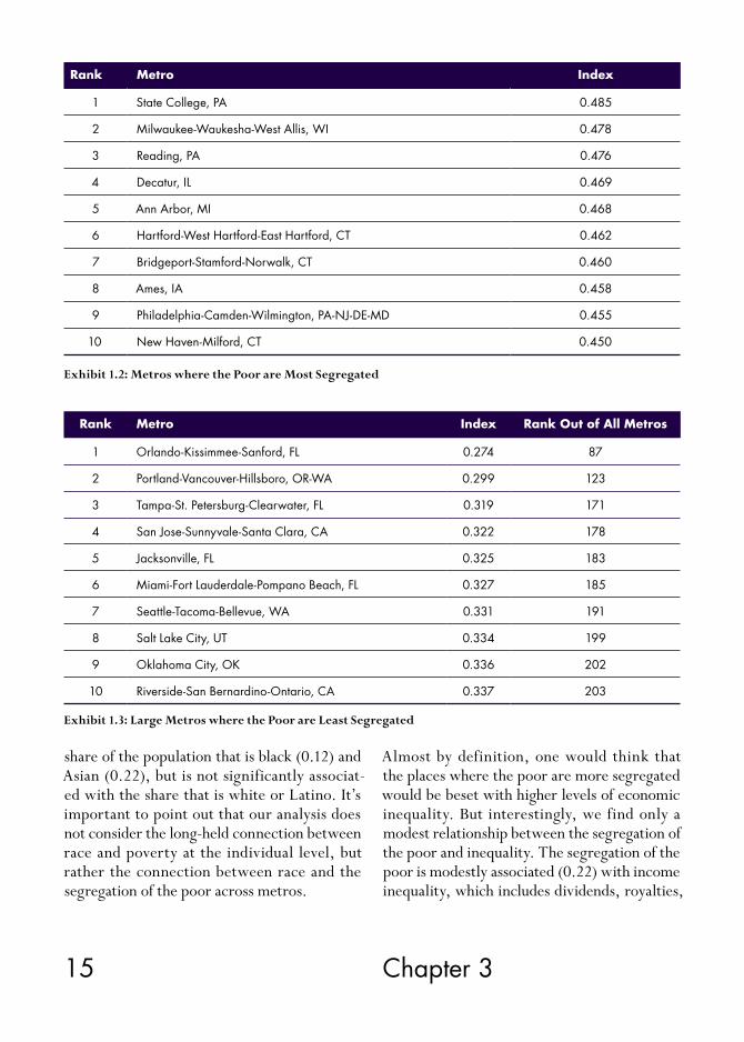
Exhibit 1 maps the segregation of the poor across U.S. metros. It is important to remember that we are not measuring the extent of poverty per se, but the extent to which the poor are geo-graphically separated and segregated from more affluent populations. A metro can have high lev-els of poverty but relatively low levels of pover-ty segregation if the poor are evenly spread and mixed in with the broader population.
Exhibit 1.1 shows the ten largest metros—those with one million or more people—where the poor face the highest and lowest levels of segregation.
The large metros where the poor are most segregated are mainly in the Midwest and the Northeast. Milwaukee is first, followed by Hartford, Philadelphia, Cleveland, and Detroit.

13 Chapter 3
New York, Buffalo, Denver, Baltimore, and Memphis round out the top ten. With the sig-nificant exceptions of New York and Denver, most of these are Rustbelt metros that have been hard hit by deindustrialization. Having seen outmigration of their wealthy and middle class populations, the “back to the city” move-ment has mostly passed them by.
When we look across all 350-plus U.S. met-ros, the picture changes somewhat. Seven of the ten most segregated metros are small and medium-sized (see Exhibit 1.2). Only three large metros—Milwaukee, Philadelphia, and Hart-ford—remain on this list. Many of these small-er metros are college towns. State College, Pennsylvania (home to Penn State) has the high-
est level of poverty segregation in the country; Ann Arbor (University of Michigan) ranks fifth; Ames, Iowa (Iowa State) eighth, and New Hav-en (Yale University) is tenth. Madison, Wiscon-sin (University of Wisconsin); Boulder, Colo-rado (University of Colorado); Iowa City, Iowa (University of Iowa); and Champaign-Urbana, Illinois (University of Illinois) all register rela-tively high levels of poverty segregation as well. All of these communities suffer from the classic town-gown split, as university faculty, students, and administrative staff cluster around campuses and the rest of the city is left to service work-ers. Often this pattern of economic segregation has been exacerbated by university expansion efforts that encroached upon and displaced urban neighborhoods.
Exhibit 1: Segregation of the Poor

14 Segregated City
The large metros where the poor are the least segregated (Exhibit 1.3) are divided between Sunbelt service and tourism-based economies and four metros with substantial tech sectors—San Jose, in the heart of Silicon Valley, Seattle, Portland, Oregon, and Salt Lake City. Four of the ten metros with the lowest levels of poverty segregation are in Florida—Orlando, Tampa, Miami, and Jacksonville. Other large metros with relatively low levels of poverty segrega-tion include Los Angeles, ranked 228th overall; Atlanta, 204th; and Houston, 241st.
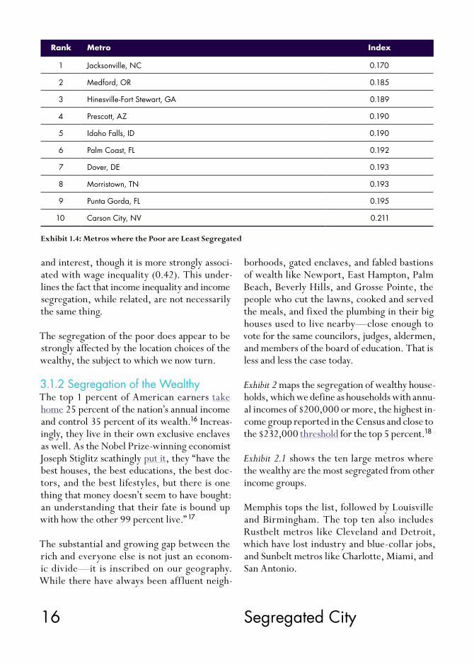
When the list is extended to include all metros, the metros with the least poverty segregation are all small (Exhibit 1.4). In fact, there are 86 smaller and medium-sized metros where the poor are less segregated than in the least seg-regated of the 51 large metros. Jacksonville, North Carolina has the lowest level of poverty segregation in the country, followed by Med-ford, Oregon; Hinesville-Fort Stewart, Geor-gia; and Prescott, Arizona. But, what are the factors that bear on the segregation of the poor across metros?
The poor face higher levels of segregation in larger, denser metros. The segregation of the poor is closely associated with density (0.54) and population size (0.43).
The segregation of the poor is more pronounced in more affluent metros. The segregation of the poor is associated with key markers of regional development like income (0.40), wages (0.46), and economic output per capita (0.34). Though San Jose, Seattle, Portland, and Salt Lake City are obvious exceptions, the poor also face greater levels of segregation in more advanced, knowledge-based metros. The segregation of the poor is positively associated with human capital (0.51), and creative class (0.48). This likely reflects the fact that size, density, afflu-ence, and knowledge-based economies all tend to go together. That said, the segregation of the poor is more modestly correlated with housing costs (0.29).
The association between race and the segre-gation of the poor across America’s metros is weaker than one might think. The segregation of the poor is positively associated with the
Rank Metro Index Rank Out of All Metros
1 Milwaukee-Waukesha-West Allis, WI 0.478 2
2 Hartford-West Hartford-East Hartford, CT 0.462 6
3 Philadelphia-Camden-Wilmington, PA-NJ-DE-MD 0.455 9
4 Cleveland-Elyria-Mentor, OH 0.435 15
5 Detroit-Warren-Livonia, MI 0.433 16
6 New York-Northern New Jersey-Long Island, NY-NJ-PA 0.428 20
7 Buffalo-Niagara Falls, NY 0.416 28
8 Denver-Aurora-Broomfield, CO 0.413 30
9 Baltimore-Towson, MD 0.413 33
10 Memphis, TN-MS-AR 0.410 34
Exhibit 1.1: Large Metros where the Poor are Most Segregated
15 Chapter 3
Exhibit 1.2: Metros where the Poor are Most Segregated
Rank Metro Index
1 State College, PA 0.485
2 Milwaukee-Waukesha-West Allis, WI 0.478
3 Reading, PA 0.476
4 Decatur, IL 0.469
5 Ann Arbor, MI 0.468
6 Hartford-West Hartford-East Hartford, CT 0.462
7 Bridgeport-Stamford-Norwalk, CT 0.460
8 Ames, IA 0.458
9 Philadelphia-Camden-Wilmington, PA-NJ-DE-MD 0.455
10 New Haven-Milford, CT 0.450
Exhibit 1.3: Large Metros where the Poor are Least Segregated
Rank Metro Index Rank Out of All Metros
1 Orlando-Kissimmee-Sanford, FL 0.274 87
2 Portland-Vancouver-Hillsboro, OR-WA 0.299 123
3 Tampa-St. Petersburg-Clearwater, FL 0.319 171
4 San Jose-Sunnyvale-Santa Clara, CA 0.322 178
5 Jacksonville, FL 0.325 183
6 Miami-Fort Lauderdale-Pompano Beach, FL 0.327 185
7 Seattle-Tacoma-Bellevue, WA 0.331 191
8 Salt Lake City, UT 0.334 199
9 Oklahoma City, OK 0.336 202
10 Riverside-San Bernardino-Ontario, CA 0.337 203
share of the population that is black (0.12) and Asian (0.22), but is not significantly associat-ed with the share that is white or Latino. It’s important to point out that our analysis does not consider the long-held connection between race and poverty at the individual level, but rather the connection between race and the segregation of the poor across metros.
Almost by definition, one would think that the places where the poor are more segregated would be beset with higher levels of economic inequality. But interestingly, we find only a modest relationship between the segregation of the poor and inequality. The segregation of the poor is modestly associated (0.22) with income inequality, which includes dividends, royalties,
16 Segregated City
and interest, though it is more strongly associ-ated with wage inequality (0.42). This under-lines the fact that income inequality and income segregation, while related, are not necessarily the same thing.
The segregation of the poor does appear to be strongly affected by the location choices of the wealthy, the subject to which we now turn.
3.1.2 Segregation of the WealthyThe top 1 percent of American earners take home 25 percent of the nation’s annual income and control 35 percent of its wealth.16 Increas-ingly, they live in their own exclusive enclaves as well. As the Nobel Prize-winning economist Joseph Stiglitz scathingly put it, they “have the best houses, the best educations, the best doc-tors, and the best lifestyles, but there is one thing that money doesn’t seem to have bought: an understanding that their fate is bound up with how the other 99 percent live.” 17
The substantial and growing gap between the rich and everyone else is not just an econom-ic divide—it is inscribed on our geography. While there have always been aff luent neigh-
Exhibit 1.4: Metros where the Poor are Least Segregated
Rank Metro Index
1 Jacksonville, NC 0.170
2 Medford, OR 0.185
3 Hinesville-Fort Stewart, GA 0.189
4 Prescott, AZ 0.190
5 Idaho Falls, ID 0.190
6 Palm Coast, FL 0.192
7 Dover, DE 0.193
8 Morristown, TN 0.193
9 Punta Gorda, FL 0.195
10 Carson City, NV 0.211
borhoods, gated enclaves, and fabled bastions of wealth like Newport, East Hampton, Palm Beach, Beverly Hills, and Grosse Pointe, the people who cut the lawns, cooked and served the meals, and fixed the plumbing in their big houses used to live nearby—close enough to vote for the same councilors, judges, aldermen, and members of the board of education. That is less and less the case today.
Exhibit 2 maps the segregation of wealthy house-holds, which we define as households with annu-al incomes of $200,000 or more, the highest in-come group reported in the Census and close to the $232,000 threshold for the top 5 percent.18
Exhibit 2.1 shows the ten large metros where the wealthy are the most segregated from other income groups.
Memphis tops the list, followed by Louisville and Birmingham. The top ten also includes Rustbelt metros like Cleveland and Detroit, which have lost industry and blue-collar jobs, and Sunbelt metros like Charlotte, Miami, and San Antonio.

17 Chapter 3
When we extend the list to include all metros (Exhibit 2.2), a number of smaller and medium- sized metros rise to the top. In fact, smaller metros take the top four spots and account for six of the ten most wealth-segregated metros. Laredo, Texas ranks first, followed by Jack-son, Tennessee; El Paso, Texas; and Great Falls, Montana. Memphis is fifth, with Tucson, Ari-zona and Columbus, Georgia sixth and seventh. Birmingham, Louisville, and San Antonio drop to eighth, ninth, and tenth respectively. Sioux City, Iowa (11th); Tallahassee, Florida (12th); Toledo (14th) and Akron, Ohio (18th); Fresno, California (15th); Brownsville, Texas (16th); Las Cruces, New Mexico (19th); Reno, Neva-da (20th); Spartanburg, South Carolina (21st); Augusta, Georgia (22nd), and Mansfield, Ohio
(24th) also number among America’s 25 most segregated metros on this score.
Interestingly, the large metros where the wealthy are least segregated (Exhibit 2.3) are mainly on the East and West Coasts and include some of America’s leading high-tech knowl-edge centers, which have some of the highest income levels in the nation. San Jose is the met-ro where the wealthy are the least segregated from other segments of the population, fol-lowed by nearby San Francisco, Washington, D.C., Seattle, Hartford, Boston, Providence, Portland, Oregon, Minneapolis-St. Paul, and Sacramento. The relatively high wages that knowledge and professional workers receive enable them to share some neighborhoods with
Exhibit 2: Segregation of the Wealthy

18 Segregated City
the super-wealthy, even though the gap between rich and poor may be substantial in these places.
Though it might seem counterintuitive that the wealthy would be less segregated in these met-ros, it may simply reflect the fact that a larger number of households in these metros are at or above the $200,000 income cutoff for the wealthy (the highest cut-off in the Census data),
so a larger share of this population ends up being distributed across tracts in similar con-centrations to other groups, instead of concen-trating in just a few tracts. If the income cutoff were higher, we would likely see greater seg-regation of the truly rich. As it stands, there appears to be more mixing of higher-income professional and knowledge workers alongside the super wealthy in these metros.
Exhibit 2.2: Metros where the Wealthy are Most Segregated
Exhibit 2.1: Large Metros where the Wealthy are Most Segregated
Rank Metro Index Rank Out of All Metros
1 Memphis, TN-MS-AR 0.582 5
2 Birmingham-Hoover, AL 0.576 8
3 Louisville-Jefferson County, KY-IN 0.575 9
4 San Antonio-New Braunfels, TX 0.567 10
5 Cleveland-Elyria-Mentor, OH 0.560 13
6 Detroit-Warren-Livonia, MI 0.552 17
7 Nashville-Davidson-Murfreesboro-Franklin, TN 0.549 23
8 Columbus, OH 0.547 25
9 Charlotte-Gastonia-Rock Hill, NC-SC 0.541 29
10 Miami-Fort Lauderdale-Pompano Beach, FL 0.540 31
Rank Metro Index
1 Laredo, TX 0.646
2 Jackson, TN 0.617
3 El Paso, TX 0.611
4 Great Falls, MT 0.601
5 Memphis, TN-MS-AR 0.582
6 Tucson, AZ 0.581
7 Columbus, GA-AL 0.578
8 Birmingham-Hoover, AL 0.576
9 Louisville-Jefferson County, KY-IN 0.575
10 San Antonio, TX 0.567

19 Chapter 3
In general, the wealthy are less segregated in smaller metros (Exhibit 2.4). There are 44 smaller and medium-sized metros that have lower levels of wealth segregation than San Jose and more than a hundred with lower levels than San Francisco. The metros with the very lowest levels of wealth segregation are all smaller, such as Barnstable Town on Cape Cod in Massachu-setts, which has the lowest level of wealth seg-regation in the country, Warner Robins, Geor-gia; Fond du Lac, Wisconsin; St. George, Utah; and Kingston, New York.
But what are the underlying factors that are associated with the geographic segregation of the wealthy?
It might seem reasonable to presume that the overall aff luence and economic status of a metro would have some bearing on how seg-regated its wealthy are, but that is not what we find. In fact, the segregation of the wealthy is weakly and negatively associated with per cap-ita incomes across metros (with a correlation of -0.15), and not statistically associated with average wages or economic output per capita. This is less of a mystery than it seems. As not-
ed above, this may reflect the fact that profes-sionals and knowledge workers earn enough in those places to live in neighborhoods alongside the truly rich.
In contrast to almost every other type of seg-regation we examine here, the segregation of the wealthy is not statistically associated with either the wealth of metros (income, wages or economic output) or with key indicators of the transition to more knowledge-driven econo-mies (the share of adults that are college grads or the share of the workforce in the creative class), though it is modestly associated with the concentration of high-tech industry (0.26).
The segregation of the wealthy is greater in larger metro areas (with a correlation of 0.38 to population size), though the correlation to density is considerably weaker (0.17).
The geographic segregation of the wealthy overlaps long standing racial cleavages. The wealthy are less segregated in metros where white people make up a greater share of the total population (with a negative correlation of -0.29). And they are more segregated in metros
Exhibit 2.3: Large Metros where the Wealthy are Least Segregated
Rank Metro Index Rank Out of All Metros
1 San Jose-Sunnyvale-Santa Clara, CA 0.378 45
2 San Francisco-Oakland-Fremont, CA 0.418 106
3 Washington-Arlington-Alexandria, DC-VA-MD-WV 0.428 119
4 Seattle-Tacoma-Bellevue, WA 0.430 124
5 Hartford-West Hartford-East Hartford, CT 0.431 125
6 Boston-Cambridge-Quincy, MA-NH 0.440 144
7 Providence-New Bedford-Fall River, RI-MA 0.447 150
8 Portland-Vancouver-Hillsboro, OR-WA 0.460 179
9 Minneapolis-St. Paul-Bloomington, MN-WI 0.461 180
10 Sacramento-Arden-Arcade-Roseville, CA 0.462 181

20 Segregated City
that have higher shares of black residents (with an even higher positive correlation of 0.34). The segregation of the wealthy is more mod-estly associated with the share that is Latino (0.15); there is no statistical correlation with the share that is Asian.
The segregation of the wealthy is modestly re-lated to income inequality (0.31), though less so to wage inequality (0.22). Part of this may be due to the simple numerical fact that the popu-lation we are considering here is already a very exclusive group of people, roughly one percent of the population by definition.
It is worth noting that the economic segregation of the wealthy is more marked than the segre-gation of the poor. It is in fact the most severe of any of the types of segregation we examined. The mean or average metro scores 0.456 on the segregation of the wealthy compared to 0.324 for the segregation of the poor and even lower values for the other types of economic segrega-tion we discuss below.
It is not so much the size of the gap between
the rich and poor that drives segregation as the ability of the super-wealthy to isolate and wall themselves off from the less well-to-do. The Harvard political philosopher Michael Sandel has dubbed this phenomenon the “skyboxifica-tion” of American life.19
3.1.3 The Geography of Overall Income SegregationWe now turn to overall income segregation, using an index that combines the segregation ranks for both the poor and the wealthy into a single measure. While the two measures above capture the levels of segregation in metros for each group, this combined index shows the relative segregation of each metro as compared to all the other metros included in the study. Exhibit 3 maps the geography of overall income segregation.
Exhibit 3.1 lists the ten large metro areas with the highest levels of overall income segregation. Cleveland comes in first, followed by Detroit, Memphis, Milwaukee, and Columbus, Ohio. Philadelphia, Phoenix, Buffalo, Kansas City,
Exhibit 2.4: Metros where the Wealthy are Least Segregated
Rank Metro Index
1 Barnstable Town, MA 0.283
2 Warner Robins, GA 0.305
3 Fond du Lac, WI 0.308
4 Madera, CA 0.309
5 Lewiston, ID-WA 0.312
6 St. George, UT 0.314
7 Jefferson City, MO 0.317
8 Sherman-Denison, TX 0.318
9 Kingston, NY 0.318
10 Monroe, MI 0.321
21 Chapter 3
and Nashville round out the top ten. These are mainly Rustbelt metros which have experi-enced considerable white flight and deindustri-alization and which have not experienced a back to the city movement.
When we include all metros in our rankings (Exhibit 3.2), Tallahassee rises to the top spot, Cleveland and Detroit fall to second and third, and Akron, Reno, Toledo, and Tucson enter the top ten.
Exhibit 3.3 shows the large metros with the low-est levels of overall income segregation. Knowl-edge-based, high-tech metros like Washington, D.C., Seattle, Portland, San Francisco, San Di-ego, and San Jose are among the ten least segre-gated large metros by income. Boston (ranked 238th) and Los Angeles (283rd) also have rela-tively low levels of overall income segregation. This likely reflects the lower levels for segrega-tion of the wealthy based on the income cutoff of $200,000 as discussed above. It is also worth noting that that the segregation of poverty re-mains considerable in many of them.
When the list is extended to include all met-ros (Exhibit 3.4), the ones with the lowest levels of overall income segregation turn out to be smaller. 85 smaller and medium-sized metros have lower levels of income segregation than the least segregated large metro. Fond du Lac, Wisconsin has the lowest level of income seg-regation of any metro in the country, followed by Wenatchee, Washington; St George, Utah; Glens Falls, New York; and Prescott, Arizona.
Overall, we find income segregation to be the highest in older Rustbelt metros. These find-ings are in line with other research. In their detailed study of income segregation, Reardon and Bischoff conclude that: “Most of the metros that experienced large increases in segregation from 1970–2007 were in the Northeast or the
Rustbelt. The long-term increases in income segregation in these metropolitan areas may have been fuelled by both the growth of the suburbs in many of these places and by the ris-ing income inequality that accompanied the de-cline of the manufacturing sector in the Rust-belt and the mill towns of the Northeast.” 20
But what factors bear on the geography of over-all income segregation?
Overall income segregation is greater in larger, denser regions. It is positively associated with population size (0.53) and density (0.44).
Overall income segregation is somewhat associ-ated with more advanced knowledge-based met-ros. It is modestly associated with both the share of adults who are college graduates (0.30) and the share of the workforce in the creative class (0.35) and even more so with the concentration of high-tech industry (0.48). Though some of the biggest and most important tech centers—San Jose, Seattle, and San Francisco—have relatively low levels of overall income segrega-tion, these metros appear to be exceptions to a general rule. Across all metros, overall income segregation remains associated with the clus-tering and concentration of high-tech industry, knowledge, and talent.
Race factors in as well. Overall income segre-gation is higher in metros where black people make up a larger share of the population (with a positive correlation of 0.30) and lower in met-ros where white people make up a larger share (-0.25). However it is not statistically associated with the share of people who are Latino, Asian, or foreign-born.
Overall income segregation is higher in metros that are more unequal. It is positively associated with wage inequality (0.40) and more modestly so with income inequality (0.32).

22 Segregated City
Exhibit 3: Overall Income Segregation
Economic segregation is not just about income; it reflects and drives our deeper class divisions. The following sections cover education and oc-cupation, which figure into the equation as well.

23 Chapter 3
Exhibit 3.1: Large Metros with the Highest Levels of Income Segregation
Rank Metro Index Rank Out of All Metros
1 Cleveland-Elyria-Mentor, OH 0.964 2
2 Detroit-Warren-Livonia, MI 0.957 3
3 Memphis, TN-MS-AR 0.948 4
4 Milwaukee-Waukesha-West Allis, WI 0.935 5
5 Columbus, OH 0.912 8
6 Philadelphia-Camden-Wilmington, PA-NJ-DE-MD 0.887 11
7 Phoenix-Mesa-Scottsdale, AZ 0.882 12
8 Buffalo-Niagara Falls, NY 0.864 16
9 Kansas City, MO-KS 0.861 17
10 Nashville-Davidson-Murfreesboro-Franklin, TN 0.858 19
Exhibit 3.2: Metros with the Highest Levesl of Income Segregation
Rank Metro Index
1 Tallahassee, FL 0.968
2 Cleveland-Elyria-Mentor, OH 0.964
3 Detroit-Warren-Livonia, MI 0.957
4 Memphis, TN-MS-AR 0.948
5 Milwaukee-Waukesha-West Allis, WI 0.935
6 Akron, OH 0.933
7 Reno-Sparks, NV 0.921
8 Columbus, OH 0.912
9 Toledo, OH 0.904
10 Tucson, AZ 0.900

24 Segregated City
Exhibit 3.3: Large Metros with the Lowest Levels of Income Segregation
Exhibit 3.4: Metros with the Lowest Levels of Income Segregation
Rank Metro Index Rank Out of All Metros
1 San Jose-Sunnyvale-Santa Clara, CA 0.311 86
2 Portland-Vancouver-Beaverton, OR-WA 0.421 134
3 Seattle-Tacoma-Bellevue, WA 0.439 146
4 Orlando-Kissimmee, FL 0.447 151
5 San Francisco-Oakland-Fremont, CA 0.485 166
6 Sacramento-Arden-Arcade-Roseville, CA 0.563 211
7 Washington-Arlington-Alexandria, DC-VA-MD-WV 0.579 214
8 San Diego-Carlsbad-San Marcos, CA 0.586 218
9 Riverside-San Bernardino-Ontario, CA 0.589 222
10 Las Vegas-Paradise, NV 0.617 234
Rank Metro Index
1 Fond du Lac, WI 0.036
2 Wenatchee, WA 0.042
3 St. George, UT 0.054
4 Glens Falls, NY 0.057
5 Prescott, AZ 0.058
6 Longview, TX 0.075
7 Monroe, MI 0.077
8 Fairbanks, AK 0.088
9 Bend, OR 0.091
10 Dover, DE 0.095

25 Chapter 3
3.2 Educational SegregationEducation is a key factor in economic success, whether of individuals, nations, or cities. Econ-omists have long noted a close correlation be-tween educational attainment or human capital and economic success.21 Jane Jacobs and Rob-ert Lucas showed how the clustering of peo-ple in cities drives innovation and economic growth.22 Harvard economist Edward Glaes-er and his collaborators have documented the growing divergence of educated populations across U.S. cities and metro regions, a process Florida dubbed “the means migration.” 23
But while the dynamics of talent clustering across cities and metro areas has been closely examined, there are fewer studies of the ways that educational groups sort and segregate within them.
To get at this, we examine the educational seg-regation of two groups: the less educated, those who did not complete high school, and the highly educated, those with a college degree and above. We then develop a composite index of overall educational segregation to determine which metros are the most segregated in terms of education.
3.2.1 Segregation of the Less EducatedExhibit 4 maps the segregation of the less edu-cated, which we measure as the share of adults who did not complete high school.
Exhibit 4.1 shows the large metros where those without a high school degree are the most seg-regated. The pattern here is quite a bit different from income segregation. In contrast to income segregation, where Rustbelt metros were the most segregated, all ten of the metros where the less educated are most segregated are in the Sunbelt and the West. In fact, eight of the ten are either in Texas or California. Austin tops the list, followed by Denver, Los Angeles,
Phoenix, and Dallas. San Diego, San Antonio, Houston, San Francisco, and San Jose round out the top ten. Interestingly, a number of met-ros on this list—San Francisco, San Jose, and San Diego among them—have relatively low levels of overall income segregation and espe-cially of segregation of the wealthy.
When we include all metros in our rankings (Exhibit 4.2), two college towns—Santa Cruz and Boulder—rise to the very top of the list. This again ref lects the long-standing town-gown divide in educational attainment. Salinas and Oxnard, California and Tucson, Arizona, another college town, also enter the top ten. Sunbelt metros again dominate this list.
Exhibit 4.3 lists the ten large metros where those without high school degrees are the least seg-regated. In contrast to the pattern for income segregation, a series of Rustbelt metros are the least segregated on this score. Pittsburgh tops the list, followed by Orlando, Louisville, Buffalo, and Tampa. New Orleans, St. Louis, Cincinnati, Virginia Beach, and Portland round out the top ten. This is a mix of older industri-al metros and tourist and service-based metros in the Sunbelt. Detroit also exhibits a relatively low level of educational segregation, ranking 244th of all metros. The low level of educa-tional segregation in the Rustbelt likely stems from the legacy of its once relatively high wage, but low skill, working class neighborhoods as well as its relatively low housing costs.
When the list is extended to include all metros (Exhibit 4.4), smaller ones rise to the top. There are 117 smaller and medium-sized metros with lower levels of educational segregation than the least segregated of the 51 large metros.
We now turn to the factors that are associated with the segregation of the less educated.

26 Segregated City
Exhibit 4: Segregation of the Less Educated (without a high school degree)
Less educated groups face higher degrees of segregation in larger, denser metros. Educa-tional segregation is positively correlated with both density (0.63) and population size (0.58). As noted above, housing costs tend to be higher in larger, denser metros and the segregation of the less educated is significantly associated with housing costs (0.52).
The less educated also face higher levels of seg-regation in more aff luent, knowledge-based metros. The segregation of non-high school grads is positively associated with income (0.37), wages (0.54), and economic output (0.41). It is strongly associated with both the share of adults who are college graduates (0.47) and the share of the workforce in the creative
class (0.48), and even more so with the concen-tration of high-tech industry (0.58). While the pattern for individual metros differs, these find-ings are similar to those for income segregation. The segregation of the less educated is also asso-ciated with two measures of diversity: the share of population that is foreign-born (0.57) and gay (0.52), two factors that are also associated with larger, more aff luent, more knowledge- based metros.
The segregation of the less educated is negatively associated with the share of the workforce in the blue-collar working class (-0.39). As noted above, a large working class means relatively well-paying jobs for less educated people. The segregation of the less educated is positively

27 Chapter 3
associated with wage inequality (0.58), though less so with income inequality (0.36).
Race plays a role in predictable but also in less obvious ways. The segregation of the less edu-cated is negatively associated with the share of the population that is white (-0.42). Converse-ly it is positively associated with the share of the population that is Latino (0.46) and Asian
(0.36). But it is not statistically associated with the share of population that is black.
This observation doesn’t contradict the long- documented fact that black people have less ac-cess to better schools and lower overall levels of education. It simply means that there is no con-nection between the share of black residents in a metro and the segregation of the less educated
Exhibit 4.1: Large Metros where those without a High School Degree are Most Segregated
Exhibit 4.2: Metros where those without a High School Degree are Most Segregated
Rank Metro Index Rank Out of All Metros
1 Austin-Round Rock-San Marcos, TX 0.451 4
2 Denver-Aurora-Broomfield, CO 0.446 6
3 Los Angeles-Long Beach-Santa Ana, CA 0.442 7
4 Phoenix-Mesa-Glendale, AZ 0.428 8
5 Dallas-Fort Worth-Arlington, TX 0.428 9
6 San Diego-Carlsbad-San Marcos, CA 0.412 11
7 San Antonio-New Braunfels, TX 0.406 14
8 Houston-Sugar Land-Baytown, TX 0.398 18
9 San Francisco-Oakland-Fremont, CA 0.395 20
10 San Jose-Sunnyvale-Santa Clara, CA 0.393 21
Rank Metro Index
1 Santa Cruz-Watsonville, CA 0.503
2 Boulder, CO 0.456
3 Salinas, CA 0.455
4 Austin-Round Rock-San Marcos, TX 0.451
5 Oxnard-Thousand Oaks-Ventura, CA 0.449
6 Denver-Aurora-Broomfield, CO 0.446
7 Los Angeles-Long Beach-Santa Ana, CA 0.442
8 Phoenix-Mesa-Glendale, AZ 0.428
9 Dallas-Fort Worth-Arlington, TX 0.428
10 Tucson, AZ 0.421

28 Segregated City
Exhibit 4.3: Large Metros where those without a High School Degree are Least Segregated
Exhibit 4.4: Metros where those without a High School Degree are Least Segregated
Rank Metro Index Rank Out of All Metros
1 Pittsburgh, PA 0.244 118
2 Orlando-Kissimmee-Sanford, FL 0.255 142
3 Louisville-Jefferson County, KY-IN 0.281 199
4 Buffalo-Niagara Falls, NY 0.284 202
5 Tampa-St. Petersburg-Clearwater, FL 0.287 208
6 New Orleans-Metairie-Kenner, LA 0.287 210
7 St. Louis, MO-IL 0.291 217
8 Cincinnati-Middletown, OH-KY-IN 0.294 219
9 Virginia Beach-Norfolk-Newport News, VA-NC 0.301 229
10 Portland-Vancouver-Hillsboro, OR-WA 0.303 238
Rank Metro Index
1 Lewiston, ID-WA 0.102
2 Palm Coast, FL 0.103
3 Fond du Lac, WI 0.122
4 Williamsport, PA 0.136
5 Coeur d’Alene, ID 0.141
6 Danville, VA 0.145
7 Altoona, PA 0.150
8 Huntington-Ashland, WV-KY-OH 0.155
9 Hagerstown-Martinsburg, MD-WV 0.157
10 Morristown, TN 0.160
overall. It also does not mean that Asians and Latinos are more segregated than black people, just that less educated groups are more segre-gated in metros where shares of Latinos and Asians are higher.
It’s also worth pointing out that white people make up more than 50 percent of the popula-
tions of 350 out of the 359 metros covered. In 233 metros they make up more than 75 percent of the population and in 50 metros they make up 90 percent or more. Black people made up the majority in only one U.S. metro in 2010, while their share was less than 5 percent in 143 metros. Places with higher shares of black peo-ple and Latinos have also faced higher levels

29 Chapter 3
of income inequality than places with higher shares of white people, and this may be a re-flection of that.
It is important to remember that this study ex-amines the associations between geographic segregation in metros by income, education, and occupation and the shares of various racial and ethnic groups within those metros. It does not consider whether those places are more or less segregated along racial and ethnic lines.
We now turn to the flip side of educational segre-gation—the segregation of the highly educated.
3.2.2 Segregation of Highly EducatedExhibit 5 maps the geographic segregation of the highly educated, which we measure as the share of adults who have completed college.
Exhibit 5.1 shows the ten large metros where college graduates are the most segregated.
They are mainly in the Sunbelt, with Birming-ham, Alabama topping the list. The rest of the top ten includes Houston, Los Angeles, Colum-bus, Memphis, San Antonio, Louisville, Dallas, Charlotte, and Chicago.
When we look at the pattern across all 350 plus U.S. metros (Exhibit 5.2), a number of smaller and medium-sized metros rise to the very top, especially college towns. State College, Penn-sylvania (home of Penn State University) has the highest level of human capital segregation of any metro in the country. Salinas, California is second; Trenton-Ewing, New Jersey (home of Princeton University) is third; Bloomington, Indiana (home of the University of Indiana) is fourth; and College-Station-Bryan, Texas (Tex-as A&M) is fifth. Birmingham, Alabama falls to sixth; Houston is seventh; Los Angeles eighth; and Columbus, Ohio (Ohio State University) drops to ninth. Blacksburg, Virginia (Virginia Tech) is now tenth overall. The highly educat-
ed are also quite segregated in college towns like Durham-Chapel Hill (University of North Carolina and Duke), Tucson (University of Ar-izona), Tallahassee (Florida State), Gainesville (University of Florida), Morgantown (West Virginia University), Athens (University of Georgia); and Auburn, Alabama (Auburn Uni-versity). Here again we see the divide between professors, doctors, researchers, and adminis-trators and the low skill workers who provide the colleges with basic services.
The large metros where highly educated peo-ple are the least segregated (Exhibit 5.3) include Orlando, Tampa, Miami, and Las Vegas in the Sunbelt as well as such northern cities as Providence, Hartford, Minneapolis-St. Paul, Rochester, and Buffalo. The highly educated are more modestly segregated in several larger, knowledge-based metros, including Portland (246th), Pittsburgh (257th), Boston (274th), San Jose (305th), and Seattle (296th).
When smaller metros are included (Exhibit 5.4), the picture changes. There are 165 small and medium-sized metros where college grads are less segregated than in the least segregated of the 51 large metros. St. George, Utah has the lowest level of human capital segregation of all, followed by Lewiston, Idaho; Sherman, Texas; Fond du Lac, Wisconsin; Elizabethtown, Ken-tucky; Mankato, Minnesota; Great Falls, Mon-tana; Joplin, Missouri; and Barnstable, Massa-chusetts on Cape Cod.
So what factors are associated with greater or lesser levels of geographic segregation of the highly educated?
For all of the disparities between town and gown in college towns, the segregation of highly educated people is greatest in larger, denser metros. The geographic segregation of the highly educated is modestly associated with density (0.39) and population size (0.54).

30 Segregated City
Despite the long established connection be-tween education, or human capital, and income, we find the segregation of the highly educated to be only weakly associated with income (0.15), though it is more closely associated with wages (0.34) and economic output per capita (0.34).
The segregation of the highly educated is more pronounced in high-tech, knowledge-based re-gions. It is correlated with the concentration of high-tech industry (0.50) and the creative class (0.42) but less so with the share of adults that are college grads (0.32). These patterns mir-ror those we have seen for the segregation of the less educated as well as for income segre-gation. The segregation of college grads is also
positively associated with two measures of di-versity, the proportion of the population that is gay (0.39) and foreign-born (0.33), factors that are also associated with larger, more affluent, more knowledge-based economies. Converse-ly, it is modestly negatively correlated with the working class (-0.25).
The segregation of the highly educated is con-nected to race. It is positively associated with the share that is black (0.34), Latino (0.25), and Asian (0.24) and negatively associated with the share that is white (-0.45). This is a different pattern than the segregation of the less educated and more in line with what we would expect.
Exhibit 5: Segregation of the Highly Educated (College Grads)

31 Chapter 3
The segregation of the highly educated is high-er in metros with greater levels of economic inequality (0.58) and wage inequality (0.55).
Unlike the segregation of the poor and the uneducated, which reflects a lack of options,
the more highly educated have the means to separate themselves; they self-segregate by choice. But those choices limit and constrain the options open to the less educated. To get at that connection, we now turn to our measure of overall educational segregation.
Exhibit 5.1: Large Metros where College Grads are Most Segregated
Exhibit 5.2: Metros where College Grads are Most Segregated
Rank Metro Index Rank Out of All Metros
1 Birmingham-Hoover, AL 0.424 6
2 Houston-Sugar Land-Baytown, TX 0.419 7
3 Los Angeles-Long Beach-Santa Ana, CA 0.406 8
4 Columbus, OH 0.403 9
5 Memphis, TN-MS-AR 0.399 11
6 San Antonio-New Braunfels, TX 0.395 12
7 Louisville-Jefferson County, KY-IN 0.388 16
8 Dallas-Fort Worth-Arlington, TX 0.387 17
9 Charlotte-Gastonia-Rock Hill, NC-SC 0.384 20
10 Chicago-Joliet-Naperville, IL-IN-WI 0.380 23
Rank Metro Index
1 State College, PA 0.441
2 Salinas, CA 0.435
3 Trenton-Ewing, NJ 0.431
4 Bloomington, IN 0.429
5 College Station-Bryan, TX 0.426
6 Birmingham-Hoover, AL 0.424
7 Houston-Sugar Land-Baytown, TX 0.419
8 Los Angeles-Long Beach-Santa Ana, CA 0.406
9 Columbus, OH 0.403
10 Blacksburg-Christiansburg-Radford, VA 0.399

32 Segregated City
Exhibit 5.3: Large Metros where College Grads are Least Segregated
Exhibit 5.4: Metros where College Grads are Least Segregated
Rank Metro Index Rank Out of All Metros
1 Orlando-Kissimmee-Sanford, FL 0.281 166
2 Virginia Beach-Norfolk-Newport News, VA-NC 0.284 171
3 Las Vegas-Paradise, NV 0.288 178
4 Providence-New Bedford-Fall River, RI-MA 0.290 184
5 Hartford-West Hartford-East Hartford, CT 0.294 195
6 Minneapolis-St. Paul-Bloomington, MN-WI 0.297 201
7 Tampa-St. Petersburg-Clearwater, FL 0.300 205
8 Rochester, NY 0.316 235
9 Miami-Fort Lauderdale-Pompano Beach, FL 0.316 236
10 Buffalo-Niagara Falls, NY 0.317 237
Rank Metro Index
1 St. George, UT 0.139
2 Lewiston, ID-WA 0.141
3 Sherman-Denison, TX 0.155
4 Fond du Lac, WI 0.167
5 Elizabethtown, KY 0.169
6 Great Falls, MT 0.171
7 Joplin, MO 0.174
8 Barnstable Town, MA 0.174
9 Monroe, MI 0.174
10 Missoula, MT 0.175
33 Chapter 3
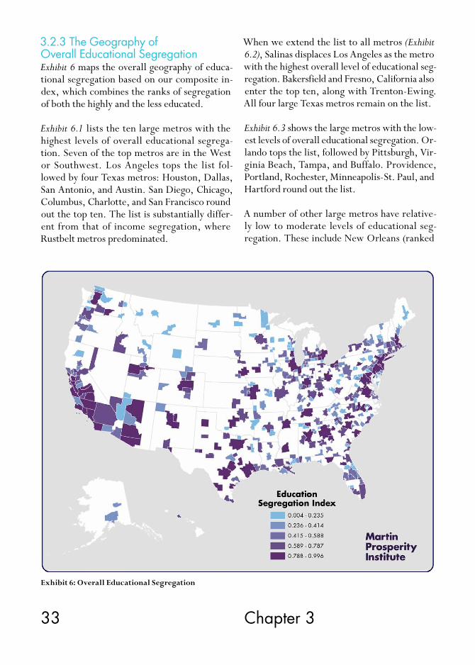
3.2.3 The Geography of Overall Educational SegregationExhibit 6 maps the overall geography of educa-tional segregation based on our composite in-dex, which combines the ranks of segregation of both the highly and the less educated.
Exhibit 6.1 lists the ten large metros with the highest levels of overall educational segrega-tion. Seven of the top metros are in the West or Southwest. Los Angeles tops the list fol-lowed by four Texas metros: Houston, Dallas, San Antonio, and Austin. San Diego, Chicago, Columbus, Charlotte, and San Francisco round out the top ten. The list is substantially differ-ent from that of income segregation, where Rustbelt metros predominated.
When we extend the list to all metros (Exhibit 6.2), Salinas displaces Los Angeles as the metro with the highest overall level of educational seg-regation. Bakersfield and Fresno, California also enter the top ten, along with Trenton-Ewing. All four large Texas metros remain on the list.
Exhibit 6.3 shows the large metros with the low-est levels of overall educational segregation. Or-lando tops the list, followed by Pittsburgh, Vir-ginia Beach, Tampa, and Buffalo. Providence, Portland, Rochester, Minneapolis-St. Paul, and Hartford round out the list.
A number of other large metros have relative-ly low to moderate levels of educational seg-regation. These include New Orleans (ranked
Exhibit 6: Overall Educational Segregation

34 Segregated City
256th overall), Las Vegas (262nd) as well as Mi-ami (282nd) and Detroit (291st).
Once again, the picture changes when smaller metros are included. In addition to the top ten metros listed in Exhibit 6.4, there are 149 other small and medium-sized metros that have lower levels of educational segregation than the least segregated of the 51 large metros.
Our correlation analysis backs this up. We find overall educational segregation to be greater in larger, denser metros. It is positively associated with density (0.56) and even more so with pop-ulation size (0.62).
Overall educational segregation is also greater in more high-tech, knowledge-based regions. Our overall measure of educational segregation
Exhibit 6.1: Large Metros with the Highest Levels of Overall Educational Segregation
Exhibit 6.2: Metros with the Highest Levels of Overall Educational Segregation
Rank Metro Index Rank Out of All Metros
1 Los Angeles-Long Beach-Santa Ana, CA 0.982 2
2 Houston-Sugar Land-Baytown, TX 0.968 3
3 Dallas-Fort Worth-Arlington, TX 0.967 4
3 San Antonio, TX 0.967 4
5 Austin-Round Rock, TX 0.955 7
6 San Diego-Carlsbad-San Marcos, CA 0.937 10
7 Chicago-Naperville-Joliet, IL-IN-WI 0.932 11
8 Columbus, OH 0.922 15
9 Charlotte-Gastonia-Concord, NC-SC 0.908 19
10 San Francisco-Oakland-Fremont, CA 0.907 20
Rank Metro Index
1 Salinas, CA 0.996
2 Los Angeles-Long Beach-Santa Ana, CA 0.982
3 Houston-Sugar Land-Baytown, TX 0.968
4 Dallas-Fort Worth-Arlington, TX 0.967
4 San Antonio, TX 0.967
6 Trenton-Ewing, NJ 0.961
7 Austin-Round Rock, TX 0.955
7 Bakersfield, CA 0.955
9 Fresno, CA 0.950
10 San Diego-Carlsbad-San Marcos, CA 0.937

35 Chapter 3
is positively associated with both the share of the work force in the creative class (0.50) and even more so with the concentration of high-tech industry (0.59). Educational segregation is also higher in metros where immigrants and gay people make up greater shares of the popu-lation (both correlations are 0.48), factors that are associated with larger, more knowledge- based metros.
Even though education correlates closely with income, overall educational segregation is only modestly associated with regional income (0.28), though it is more closely correlated with both wages (0.47) and economic output per person (0.41).
Educational segregation is connected to race. It is lower in metros where white people make up
Exhibit 6.3: Large Metros with the Lowest Levels of Overall Educational Segregation
Exhibit 6.4: Metros with the Lowest Levels of Overall Educational Segregation
Rank Metro Index Rank Out of All Metros
1 Orlando-Kissimmee, FL 0.429 150
2 Pittsburgh, PA 0.522 187
3 Virginia Beach-Norfolk-Newport News, VA-NC 0.557 201
4 Tampa-St. Petersburg-Clearwater, FL 0.575 211
5 Buffalo-Niagara Falls, NY 0.611 223
6 Providence-New Bedford-Fall River, RI-MA 0.631 229
7 Portland-Vancouver-Beaverton, OR-WA 0.674 246
8 Rochester, NY 0.677 248
9 Minneapolis-St. Paul-Bloomington, MN-WI 0.687 251
10 Hartford-West Hartford-East Hartford, CT 0.688 252
Rank Metro Index
1 Lewiston, ID-WA 0.004
2 Fond du Lac, WI 0.010
3 Elizabethtown, KY 0.026
4 Hagerstown-Martinsburg, MD-WV 0.035
5 Monroe, MI 0.036
5 Williamsport, PA 0.036
7 Joplin, MO 0.039
8 St. George, UT 0.042
9 Coeur d’Alene, ID 0.045
10 Sheboygan, WI 0.047
36 Segregated City
a greater share of the population (-0.48) and it is higher (though more modestly correlat-ed) in metros where black people (0.23), Lati-nos (0.38), and Asians (0.32) make up greater shares of the population.
Educational segregation is also associated with higher levels of inequality. Overall educational segregation is closely associated with income inequality (0.51) and even more so with wage inequality (0.61).
While the most segregated metros by income and education differ, the general pattern is the same: Both types of segregation are greater in larger, denser, more knowledge-based metros.
Education is the most important economic as-set a person can have. Growing up in an area with good schools and low dropout rates is a huge benefit but it is one that is increasingly available to the affluent alone. Underfunded, over-crowded schools and a lack of positive role models are neighborhood effects that com-pound and perpetuate the cycle of disadvantage.
A third component of socio-economic class is occupation. In the next section, we examine the extent to which the different occupational groups or classes are geographically segregated.
3.3 Occupational SegregationThe kind of work a person does stands along-side income and education as a key marker of socio-economic class. America has seen wide-spread deindustrialization and the decline of its once dominant blue-collar working class as its labor market has bifurcated into high-skill, high-pay jobs that turn on technology, ideas, and cre-ativity, and low-skill, low-pay service work.
In this section, we examine the segregation of the three major occupational classes—the cre-ative class of knowledge workers, the even faster
growing but lower-paid service class, and the declining blue-collar working class.
3.3.1 Creative Class SegregationWe begin with the creative class, which makes up about a third of the U.S. workforce.24 Its 40 million plus members work in occupations spanning computer science and mathematics; architecture, engineering; life, physical, and social science; education, training, and library science; arts and design, entertainment, sports, and media; and management, business and fi-nance, law, sales management, healthcare, and education. Creative class workers earn an aver-age of $70,000 per year, accounting for roughly half of all U.S. wages.25
Exhibit 7 maps the segregation of the creative class across U.S. metros.
There is substantial overlap between this map and the map of college grads above. This makes sense as both reflect concentrations of talent and skill, though it should be remembered that the two are not identical. While roughly nine in ten college grads hold creative class jobs, just 60 per-cent of the creative class are college graduates.26
Exhibit 7.1 shows the large metros where the creative class is most segregated. Los Angeles is in first place, followed by Houston, San Jose, San Francisco, New York, Austin, San Antonio, San Diego, and Chicago. While older Rustbelt metros topped the list for income segrega-tion and sprawling Sunbelt metros dominated where educational segregation was concerned, the metros where the creative class is most seg-regated tend to be large and knowledge-based. Four of the ten are in Texas.
When we expand the list to include all metros (Exhibit 7.2), a number of smaller ones also show substantial levels of segregation. Trenton-Ewing (which includes Princeton University) rises to

37 Chapter 3
second place, and Salinas is the third most high-ly segregated metro in the country on this score. Houston falls to fourth overall, while San Jose moves to fifth.
Two smaller metros in California’s San Joaquin Valley, Hanford-Corcoran and Bakersfield- Delano, rank sixth and seventh. San Francisco, Dallas, and New York drop to eighth, ninth, and tenth overall.
The creative class is also highly segregated in col-lege towns like Ann Arbor, Durham-Chapel Hill, Tucson, Gainesville, and College Station, where educated residents are also highly segregated. The two kinds of segregation are closely correlat-ed with one another (with a correlation of 0.89).
As seen in Exhibit 7.3, Minneapolis-St. Paul is the large metro where the creative class is least segregated, followed by Rochester, Buffalo, Cincinnati, Providence, Milwaukee, and Hart-ford. Jacksonville, Tampa, and Virginia Beach round out the top ten.
When the list is extended to include all metros (Exhibit 7.4), the metros where the creative class is least segregated all turn out to be small. In fact, there are more than 161 smaller and me-dium-sized metros where the creative class is less segregated than it is in the least segregat-ed large metro. Many of these smaller places, especially in the Northeast and the Midwest, are struggling manufacturing cities, where the creative class comprises a relatively small share
Exhibit 7: Segregation of the Creative Class

38 Segregated City
of the workforce. Mankato, Minnesota has the lowest level of creative class segregation in the country, followed by Lewiston-Auburn, Maine; St. Cloud, Minnesota; Joplin, Missouri; and Rome, Georgia.
But what factors are associated with higher and lower levels of creative class segregation?
Creative class segregation is closely correlated with population (0.60) and density (0.56). The segregation of the creative class is also positive-ly associated with the share of residents using transit to get to work (0.42), another indicator of greater density and connectivity. The geo-graphic segregation of the creative class is some-what higher in metros where housing prices eat
Exhibit 7.1: Large Metros where the Creative Class is Most Segregated
Exhibit 7.2: Metros where the Creative Class is Most Segregated
Rank Metro Index Rank Out of All Metros
1 Los Angeles-Long Beach-Santa Ana, CA 0.344 1
2 Houston-Sugar Land-Baytown, TX 0.327 4
3 San Jose-Sunnyvale-Santa Clara, CA 0.310 5
4 San Francisco-Oakland-Fremont, CA 0.301 8
5 New York-Northern New Jersey-Long Island, NY-NJ-PA 0.300 9
6 Dallas-Fort Worth-Arlington, TX 0.294 10
7 Austin-Round Rock-San Marcos, TX 0.284 15
8 San Antonio-New Braunfels, TX 0.284 16
9 San Diego-Carlsbad-San Marcos, CA 0.282 17
10 Chicago-Joliet-Naperville, IL-IN-WI 0.281 18
Rank Metro Index
1 Los Angeles-Long Beach-Santa Ana, CA 0.344
2 Trenton-Ewing, NJ 0.336
3 Salinas, CA 0.335
4 Houston-Sugar Land-Baytown, TX 0.327
5 San Jose-Sunnyvale-Santa Clara, CA 0.310
6 Hanford-Corcoran, CA 0.308
7 Bakersfield, CA 0.305
8 San Francisco-Oakland-Fremont, CA 0.301
9 New York-Northern New Jersey-Long Island, NY-NJ-PA 0.300
10 Dallas-Fort Worth-Arlington, TX 0.294

39 Chapter 3
up greater shares of household incomes (with a correlation of 0.28).
Not surprisingly, creative class segregation goes along with the wealth and affluence of regions. The segregation of the creative class is positively associated with average wages (0.48), but less so with economic output per person (0.35) and
per capita income (0.24). Creative class segre- gation is higher in metros with larger concen-trations of high-tech industry (0.55). The cre-ative class is also more segregated in metros with higher percentages of foreign-born resi-dents (0.59) and gay residents (0.52).
As with other forms of economic segregation,
Exhibit 7.3: Large Metros where the Creative Class is Least Segregated
Exhibit 7.4: Metros where the Creative Class is Least Segregated
Rank Metro Index Rank Out of All Metros
1 Minneapolis-St. Paul-Bloomington, MN-WI 0.200 162
2 Rochester, NY 0.214 199
3 Buffalo-Niagara Falls, NY 0.216 206
4 Cincinnati-Middletown, OH-KY-IN 0.221 216
5 Providence-New Bedford-Fall River, RI-MA 0.222 220
6 Milwaukee-Waukesha-West Allis, WI 0.222 222
7 Hartford-West Hartford-East Hartford, CT 0.222 224
8 Jacksonville, FL 0.223 226
9 Tampa-St. Petersburg-Clearwater, FL 0.225 236
10 Virginia Beach-Norfolk-Newport News, VA-NC 0.226 239
Rank Metro Index
1 Lewiston-Auburn, ME 0.111
2 St. Cloud, MN 0.117
3 Joplin, MO 0.119
4 Rome, GA 0.120
5 Bay City, MI 0.122
6 Wausau, WI 0.123
7 St. George, UT 0.124
8 Elizabethtown, KY 0.125
9 Missoula, MT 0.125
10 Hinesville-Fort Stewart, GA 0.125

40 Segregated City
the segregation of the creative class is bound up with long standing racial cleavages. Cre-ative class segregation is higher in metros where black people make up a greater share of the population (0.22), and even more so with shares of population that are Latino (0.45) and Asian (0.37). Creative class segregation is lower in metros where white people make up a great-er share of the population (-0.51).
The segregation of the creative class is connect-ed to the level of income inequality (0.48) and even more so to wage inequality (0.58). The bigger the gap between the rich and the poor, and the bigger the split between high-paid knowledge and low-wage service work, the greater the segregation of the classes tends to be. Here again, we see that while individual metros score differently on each measure, the underlying factors that bear on the different types of economic segregation are similar.
Creative class workers have the most skills and the most education, and they earn the highest wages. When they are concentrated in their own enclaves, they magnetize resources, ame-nities, and investments away from less-advan-taged neighborhoods.
3.3.2 Service Class SegregationWith sixty million plus members, the service class is the largest occupational class, encom-passing 46 percent of the U.S. workforce. Its members toil in the fastest growing but lowest paid job categories in the United States, such as food preparation and service, retail sales, and personal care, earning an average of $30,000 per year, less than half of what the members of the creative class earn.27
Exhibit 8 maps the segregation of the service class across the United States.
Exhibit 8.1 lists the large metros where the
service class is most segregated. It reads like a who’s who of large knowledge-based metros. San Jose tops the list and Washington, D.C. is second, followed by San Francisco, New York, and Boston. Philadelphia, Baltimore, San Diego, Austin, and Los Angeles complete the top ten.
When the list is extended to include all met-ros (Exhibit 8.2), it’s striking how many college towns come to the fore. Ithaca (Cornell), Ann Arbor (University of Michigan), Trenton-Ew-ing (Princeton), Gainesville (University of Florida), and Tallahassee (Florida State) are in the top five. San Jose, in the heart of Silicon Valley, remains in the top ten, as do Wash-ington, D.C. and San Francisco, both with very high creative class shares. Interestingly, Atlantic City makes the list, despite its very high share of service employment.
Exhibit 8.2 lists the large metros where the service class is least segregated. Salt Lake City takes the top spot, followed by Minneapolis-St. Paul, Riverside, Kansas City, and Cincinna-ti. Charlotte, Portland, Milwaukee, St. Louis, and Jacksonville round out the list. Other large metros with relatively low levels of service class segregation include Phoenix, which ranks 220th, Oklahoma City (204th), Dallas (203rd) and Atlanta (173rd).
When the list is extended to include all metros (Exhibit 8.4), five of the top ten least segregated are in Michigan and Wisconsin.
But what economic and demographic factors are associated with the segregation of the ser-vice class?
The segregation of the service class tracks the size and density of regions, though less so than for the creative class. Service class segregation is pos-itively associated with density (0.39) and more modestly with the size of population (0.28).

41 Chapter 3
The service class faces higher levels of segrega-tion in more affluent metros, but here again the correlations are more modest than for the cre-ative class. The segregation of the service class is only modestly associated with income (0.33) and economic output per person (0.33), but more so with wages (0.41). It is only modestly associated with housing costs (0.30).
The segregation of the service class is more strongly associated with key markers of knowl-edge-based regions, especially the share of adults who are college graduates (0.46) and the share of the workforce in the creative class (0.47). Conversely, the segregation of the ser-vice class is negatively associated with the share of the workforce in the working class (-0.46).
The segregation of the service class is higher in more diverse metros. It is positively associated with the share of population that is gay (0.42) and more modestly associated with the share that is foreign-born (0.26).
Race plays a modest role in the segregation of the service class. Service class segregation is most closely associated with the share of population that is Asian (0.36) and it is more modestly associated with the share that is black (0.17). It is modestly negatively associated with the share that is white (-0.28). It is not statis-tically associated with the share that is Latino.
The segregation of the service class is greater in metros with higher levels of socio-economic
Exhibit 8: Segregation of the Service Class

42 Segregated City
inequality. It is modestly associated with in-come inequality (0.35) and more so with wage inequality (0.41).
It is important to remember that service class segregation is more reflective of the residential choices of the creative class than those of the
service class itself, whose members live where they can afford to. It’s also important to re-member that the majority of American workers belong to the service class, which has absorbed many formerly blue-collar workers. The rise of the service class goes along with the decline of the working class, which we turn to next.
Exhibit 8.1: Large Metros where the Service Class is Most Segregated
Exhibit 8.2: Metros where the Service Class is Most Segregated
Rank Metro Index Rank Out of All Metros
1 San Jose-Sunnyvale-Santa Clara, CA 0.185 6
2 Washington-Arlington-Alexandria, DC-VA-MD-WV 0.181 7
3 San Francisco-Oakland-Fremont, CA 0.178 9
4 New York-Northern New Jersey-Long Island, NY-NJ-PA 0.176 11
5 Boston-Cambridge-Quincy, MA-NH 0.161 18
6 Philadelphia-Camden-Wilmington, PA-NJ-DE-MD 0.158 19
7 Baltimore-Towson, MD 0.154 24
8 San Diego-Carlsbad-San Marcos, CA 0.150 29
9 Austin-Round Rock-San Marcos, TX 0.149 33
10 Los Angeles-Long Beach-Santa Ana, CA 0.142 49
Rank Metro Index
1 Ithaca, NY 0.225
2 Ann Arbor, MI 0.202
3 Trenton-Ewing, NJ 0.197
4 Gainesville, FL 0.194
5 Tallahassee, FL 0.192
6 San Jose-Sunnyvale-Santa Clara, CA 0.185
7 Washington-Arlington-Alexandria, DC-VA-MD-WV 0.181
8 Salinas, CA 0.180
9 San Francisco-Oakland-Fremont, CA 0.178
10 Atlantic City-Hammonton, NJ 0.176

43 Chapter 3
3.3.3 Working Class SegregationThe past several decades have been marked by the steady decline of the working class. The working class made up 21 percent of the work-force in 2011—down substantially from 40 per-cent in 1970. It spans not just factory produc-tion but installation, maintenance and repair, transportation, and construction occupations.
Exhibit 8.3: Large Metros where the Service Class is Least Segregated
Exhibit 8.4: Metros where the Service Class is Least Segregated
Rank Metro Index Rank Out of All Metros
1 Salt Lake City, UT 0.093 36
2 Minneapolis-St. Paul-Bloomington, MN-WI 0.104 75
3 Riverside-San Bernardino-Ontario, CA 0.110 111
4 Kansas City, MO-KS 0.113 127
5 Cincinnati-Middletown, OH-KY-IN 0.114 138
6 Charlotte-Gastonia-Rock Hill, NC-SC 0.115 142
7 Portland-Vancouver-Hillsboro, OR-WA 0.117 163
8 Milwaukee-Waukesha-West Allis, WI 0.117 165
9 St. Louis, MO-IL 0.117 167
10 Jacksonville, FL 0.117 170
Rank Metro Index
1 Fond du Lac, WI 0.059
2 Muskegon-Norton Shores, MI 0.067
3 Hot Springs, AR 0.069
4 Sheboygan, WI 0.072
5 Odessa, TX 0.072
6 El Centro, CA 0.075
7 Ogden-Clearfield, UT 0.076
8 Battle Creek, MI 0.078
9 Monroe, MI 0.079
10 Casper, WY 0.080
Its members average roughly $37,000 a year in salary and wages.28
Exhibit 9 maps the segregation of the working class across the United States.
Exhibit 9.1 lists the large metros where the work-ing class is most segregated. This list includes

44 Segregated City
centers of the idea economy (Austin, Wash-ington, D.C., San Francisco, San Jose, Raleigh- Cary, and Charlotte) and one beacon of the knowledge-energy economy (Houston).29
When the list is expanded to all metros (Exhibit 9.2), Los Angeles and Austin remain in first and second places, but a number of college towns come to the fore: Durham-Chapel Hill (Duke and the University of North Carolina). Bloomington (University of Indiana), Ann Ar-bor (University of Michigan), and Blacksburg (Virginia Tech).
Exhibit 9.3 lists the large metros where the working class is least segregated. Hartford comes in first, followed by Providence, Buffalo, Virginia Beach, and Orlando. Milwaukee, New
Orleans, Rochester, Las Vegas, and Cincinna-ti round out the list. Other large metros with relatively low levels of working class segrega-tion include Tampa, which ranks 290th, Jack-sonville (271st), Detroit (268th), and Cleveland (261st).
When the list is extended to include all metros (Exhibit 9.4), smaller places like Kokomo, Indiana; Madera-Chowchilla, California; Wenatchee, Washington; Racine, Wisconsin; and Lewis-ton, Idaho rise to the fore. All in all, there are more than 185 small and medium-sized metros where the working class is less segregated than the least segregated of the 51 large metros.
But what broader factors bear on the segrega-tion of the working class?
Exhibit 9: Segregation of the Working Class
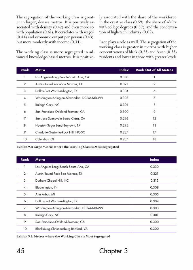
45 Chapter 3
The segregation of the working class is great-er in larger, denser metros. It is positively as-sociated with density (0.42) and even more so with population (0.61). It correlates with wages (0.44) and economic output per person (0.43), but more modestly with income (0.34).
The working class is more segregated in ad-vanced knowledge-based metros. It is positive-
ly associated with the share of the workforce in the creative class (0.59), the share of adults with college degrees (0.57), and the concentra-tion of high-tech industry (0.65).
Race plays a role as well. The segregation of the working class is greater in metros with higher concentrations of black (0.23) and Asian (0.33) residents and lower in those with greater levels
Exhibit 9.1: Large Metros where the Working Class is Most Segregated
Exhibit 9.2: Metros where the Working Class is Most Segregated
Rank Metro Index Rank Out of All Metros
1 Los Angeles-Long Beach-Santa Ana, CA 0.330 1
2 Austin-Round Rock-San Marcos, TX 0.321 2
3 Dallas-Fort Worth-Arlington, TX 0.304 6
4 Washington-Arlington-Alexandria, DC-VA-MD-WV 0.303 7
5 Raleigh-Cary, NC 0.301 8
6 San Francisco-Oakland-Fremont, CA 0.300 9
7 San Jose-Sunnyvale-Santa Clara, CA 0.296 12
8 Houston-Sugar Land-Baytown, TX 0.295 13
9 Charlotte-Gastonia-Rock Hill, NC-SC 0.287 17
10 Columbus, OH 0.287 18
Rank Metro Index
1 Los Angeles-Long Beach-Santa Ana, CA 0.330
2 Austin-Round Rock-San Marcos, TX 0.321
3 Durham-Chapel Hill, NC 0.315
4 Bloomington, IN 0.308
5 Ann Arbor, MI 0.305
6 Dallas-Fort Worth-Arlington, TX 0.304
7 Washington-Arlington-Alexandria, DC-VA-MD-WV 0.303
8 Raleigh-Cary, NC 0.301
9 San Francisco-Oakland-Fremont, CA 0.300
10 Blacksburg-Christiansburg-Radford, VA 0.300

46 Segregated City
of white residents (-0.32). Working class seg-regation is also greater in more diverse metros, being positively associated with both the share of population that is foreign-born (0.34) and gay (0.46).
The segregation of the working class is also greater in metros with higher levels of inequal-ity. It is positively associated with both income (0.50) and wage inequality (0.63).
Having considered each of the major socio- economic classes, we now look at occupational segregation overall.
Exhibit 9.3: Large Metros where the Working Class is Least Segregated
Rank Metro Index Rank Out of All Metros
1 Hartford-West Hartford-East Hartford, CT 0.195 186
2 Providence-New Bedford-Fall River, RI-MA 0.196 189
3 Buffalo-Niagara Falls, NY 0.202 203
4 Virginia Beach-Norfolk-Newport News, VA-NC 0.209 223
5 Orlando-Kissimmee-Sanford, FL 0.215 239
6 Milwaukee-Waukesha-West Allis, WI 0.220 248
7 New Orleans-Metairie-Kenner, LA 0.223 253
8 Rochester, NY 0.223 255
9 Las Vegas-Paradise, NV 0.223 256
10 Cincinnati-Middletown, OH-KY-IN 0.224 257
3.3.4 The Geography of Overall Occupational SegregationOur measure of overall occupational segrega-tion combines the three separate measures of creative, service, and working class residential segregation into a single index. If the individual measures chart the extent to which the mem-bers of one occupational class or another pre-dominate within individual census tracts, the overall measure captures the extent to which the members of the three classes are segregated from one another.
Exhibit 10 maps the geography of over-all occu-pational segregation across the United States.
Exhibit 10.1 shows the large metros with the highest levels of overall occupational segre-gation. Not surprisingly, knowledge and tech hubs top the list. San Jose has the highest level of occupational segregation, followed by San Francisco, Washington, D.C., and Austin. Los Angeles, New York, Houston, San Diego, San Antonio, and Columbus, Ohio round out the top ten. This pattern is quite a bit different than for income segregation, where Rustbelt metros

47 Chapter 3
predominate, or educational segregation, where Sunbelt metros were at the top. Three of the ten most segregated metros are in Texas.
When we extend the list to all metros (Exhibit 10.2), Trenton-Ewing jumps to first place. The college towns of Ann Arbor and Durham-Chap-el Hill also join the top ten. Here again we see the effects of the town-gown divide.
Exhibit 10.3 lists the large metros with the low-est levels of occupational segregation. The least segregated is Minneapolis-St. Paul. The list in-cludes older industrial metros like Cincinnati, Milwaukee, Rochester, and Buffalo, as well as Sunbelt metros like Salt Lake City, Jacksonville, Portland, and Virginia Beach. Other large met-ros with relatively low levels of occupational segregation are Orlando (272nd), Kansas City (265th), and St. Louis (242nd).
Again, the places with the lowest levels of occu-pational segregation are all small metros. More than 163 small and medium-sized metros have lower levels of overall occupational segregation than the least segregated of the 51 large metros.
Exhibit 9.4: Metros where the Working Class is Least Segregated
Rank Metro Index
1 Kokomo, IN 0.085
2 Madera-Chowchilla, CA 0.088
3 Wenatchee-East Wenatchee, WA 0.098
4 Racine, WI 0.102
5 Lewiston, ID-WA 0.106
6 Fond du Lac, WI 0.108
7 Hot Springs, AR 0.113
8 Grand Junction, CO 0.115
9 Mount Vernon-Anacortes, WA 0.117
10 Michigan City-La Porte, IN 0.118
But what underlying factors bear on the broad patterns of occupational segregation?
As we saw with the individual measures for occupational and almost every other type of economic segregation, size matters. Overall occupational segregation is positively correlat-ed with density (0.52) and even more strongly with population size (0.60). Since larger metros tend to attract more knowledge work, they ex-perience a more intensive polarization of skills.
Overall occupational segregation is greater in wealthier, more affluent regions. It is correlat-ed with average wages (0.48), economic output per person (0.41), and somewhat less so with per capita income (0.32). Occupational segre-gation is also modestly associated with median monthly housing costs (0.34).
Occupational segregation is bound up with the transition from the manufacturing to the creative economy. The three major classes are more separated in metros with larger concen-trations of the creative class (0.55) and college grads (0.50), and even more so in those with

48 Segregated City
larger concentrations of high-tech industry (0.60). Occupational segregation is also greater in more diverse metros—those with higher percentages of foreign-born (0.42) and gay res-idents (0.51).
Occupational segregation is lower in metros with greater shares of the working class (-0.43). It is not statistically associated with the shares of service class.
Occupational segregation is bound up with long standing racial cleavages, though the cor-relations are generally modest. It is higher in metros where black people (0.26) and Latinos (0.24) make up greater shares of the population,
and even more so with the share of population that is Asian (0.36). Conversely, occupational segregation is lower in metros where white residents make up a greater share of the popu-lation and the magnitude of the correlation is larger (-0.42).
Occupational segregation is positively associat-ed with the level of income inequality (0.53) and even more so with wage inequality (0.63).
Again, despite the differences in the ranks of in-dividual metros, there are broad commonalities in the factors underpinning the various types of economic segregation.
Exhibit 10: Overall Occupational Segregation

49 Chapter 3
As with educational and income segregation, occupational segregation appears to be more closely related to the locational choices of the affluent. The well-paid members of the creative class are both more mobile and have more dis-cretion about where they choose to live than the members of the other two classes—and they mostly choose to cluster together. The
mean segregation score for the creative class across all U.S. metros is 0.206 compared to 0.196 for the working class and 0.120 for the service class.
The previous sections have examined the geog-raphy and levels of income, educational, and occupational segregation. In the next section,
Exhibit 10.1: Large Metros with the Highest Levels of Overall Occupational Segregation
Exhibit 10.2: Metros with the Highest Levels of Overall Occupational Segregation
Rank Metro Index
1 Trenton-Ewing, NJ 0.988
2 San Jose-Sunnyvale-Santa Clara, CA 0.981
3 San Francisco-Oakland-Fremont, CA 0.979
4 Washington-Arlington-Alexandria, DC-VA-MD-WV 0.971
5 Ann Arbor, MI 0.968
6 Durham, NC 0.964
7 Austin-Round Rock, TX 0.956
8 Los Angeles-Long Beach-Santa Ana, CA 0.955
9 New York-Northern New Jersey-Long Island, NY-NJ-PA 0.953
10 Bridgeport-Stamford-Norwalk, CT 0.946
Rank Metro Index Rank Out of All Metros
1 San Jose-Sunnyvale-Santa Clara, CA 0.981 2
2 San Francisco-Oakland-Fremont, CA 0.979 3
3 Washington-Arlington-Alexandria, DC-VA-MD-WV 0.971 4
4 Austin-Round Rock, TX 0.956 7
5 Los Angeles-Long Beach-Santa Ana, CA 0.955 8
6 New York-Northern New Jersey-Long Island, NY-NJ-PA 0.953 9
7 Houston-Sugar Land-Baytown, TX 0.936 13
8 San Diego-Carlsbad-San Marcos, CA 0.924 14
9 San Antonio, TX 0.918 15
10 Columbus, OH 0.904 16

50 Segregated City
we compare them to one another, examining to what extent they correlate with one another, which is to say, whether higher levels of one kind of segregation increase the likelihood that others will be higher as well.
Exhibit 10.4: Metros with the Lowest Levels of Overall Occupational Segregation
Exhibit 10.3: Large Metros with the Lowest Levels of Overall Occupational Segregation
Rank Metro Index Rank Out of All Metros
1 Minneapolis-St. Paul-Bloomington, MN-WI 0.464 164
2 Cincinnati-Middletown, OH-KY-IN 0.567 199
3 Providence-New Bedford-Fall River, RI-MA 0.577 204
4 Salt Lake City, UT 0.579 206
5 Milwaukee-Waukesha-West Allis, WI 0.590 214
6 Rochester, NY 0.594 216
7 Buffalo-Niagara Falls, NY 0.608 222
8 Jacksonville, FL 0.619 231
9 Portland-Vancouver-Beaverton, OR-WA 0.626 233
10 Virginia Beach-Norfolk-Newport News, VA-NC 0.636 238
Rank Metro Index
1 Racine, WI 0.036
2 Fond du Lac, WI 0.038
2 Monroe, MI 0.038
4 Bay City, MI 0.056
5 Hot Springs, AR 0.059
6 Lewiston, ID-WA 0.068
7 Elkhart-Goshen, IN 0.072
8 Lewiston-Auburn, ME 0.074
9 Farmington, NM 0.084
10 Hagerstown-Martinsburg, MD-WV 0.084
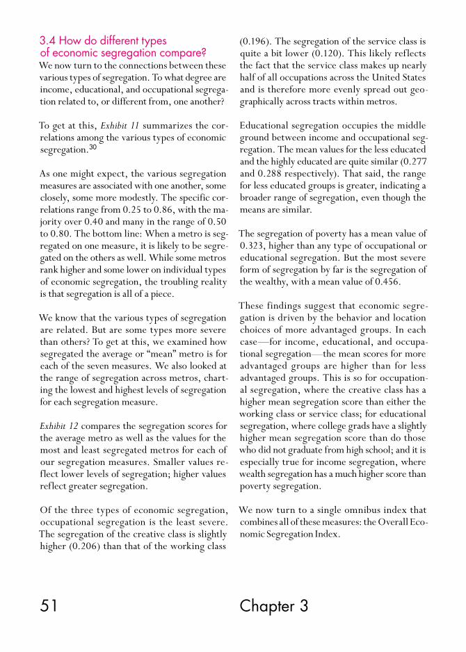
51 Chapter 3
3.4 How do different types of economic segregation compare?We now turn to the connections between these various types of segregation. To what degree are income, educational, and occupational segrega-tion related to, or different from, one another?
To get at this, Exhibit 11 summarizes the cor-relations among the various types of economic segregation.30
As one might expect, the various segregation measures are associated with one another, some closely, some more modestly. The specific cor-relations range from 0.25 to 0.86, with the ma-jority over 0.40 and many in the range of 0.50 to 0.80. The bottom line: When a metro is seg-regated on one measure, it is likely to be segre-gated on the others as well. While some metros rank higher and some lower on individual types of economic segregation, the troubling reality is that segregation is all of a piece.
We know that the various types of segregation are related. But are some types more severe than others? To get at this, we examined how segregated the average or “mean” metro is for each of the seven measures. We also looked at the range of segregation across metros, chart-ing the lowest and highest levels of segregation for each segregation measure.
Exhibit 12 compares the segregation scores for the average metro as well as the values for the most and least segregated metros for each of our segregation measures. Smaller values re-flect lower levels of segregation; higher values reflect greater segregation.
Of the three types of economic segregation, occupational segregation is the least severe. The segregation of the creative class is slightly higher (0.206) than that of the working class
(0.196). The segregation of the service class is quite a bit lower (0.120). This likely reflects the fact that the service class makes up nearly half of all occupations across the United States and is therefore more evenly spread out geo-graphically across tracts within metros.
Educational segregation occupies the middle ground between income and occupational seg-regation. The mean values for the less educated and the highly educated are quite similar (0.277 and 0.288 respectively). That said, the range for less educated groups is greater, indicating a broader range of segregation, even though the means are similar.
The segregation of poverty has a mean value of 0.323, higher than any type of occupational or educational segregation. But the most severe form of segregation by far is the segregation of the wealthy, with a mean value of 0.456.
These findings suggest that economic segre-gation is driven by the behavior and location choices of more advantaged groups. In each case—for income, educational, and occupa-tional segregation—the mean scores for more advantaged groups are higher than for less advantaged groups. This is so for occupation-al segregation, where the creative class has a higher mean segregation score than either the working class or service class; for educational segregation, where college grads have a slightly higher mean segregation score than do those who did not graduate from high school; and it is especially true for income segregation, where wealth segregation has a much higher score than poverty segregation.
We now turn to a single omnibus index that combines all of these measures: the Overall Eco-nomic Segregation Index.

52
Educa
tion
0.25**
0.52**0.35**
0.65**0.61**
0.41**
0.86**
0.73**0.46**
0.73**
0.73**0.86**
0.77**0.51**
0.45**
0.53**
0.600.400.200.00 0.80 1.00
0.43**0.22**
0.41**0.47**
0.46**
0.78**0.61**
0.41**0.46**
0.47**0.78**
0.65**0.55**
0.48**
0.25**0.35**
0.55**0.41**
0.22**0.51**
0.52**0.48**
0.46**0.43**
0.45**
Poor
Wealthy
Did Not CompleteHigh School
College Grad
Working Class
Occ
up
ation
Inco
me
Service Class
Creative Class
** indicates significance at the 1 percent level.
Poverty Wealth Did Not Complete High School
Working Class Service Class Creative Class
College Grad
Exhibit 11: Correlates for the Various Types of Economic Segregation
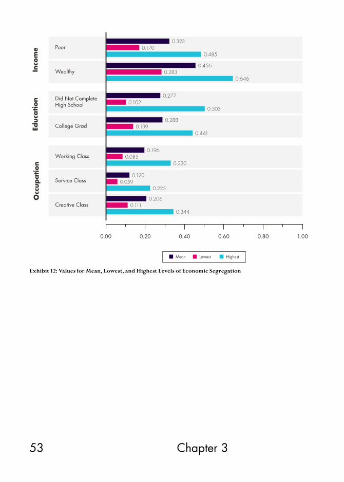
53 Chapter 3
0.200.00 0.80 1.000.600.40
Occ
up
ation
Educa
tion
Inco
me Poor
Wealthy
Did Not CompleteHigh School
College Grad
Working Class
Service Class
Creative Class
Mean Lowest Highest
0.323
0.4850.170
0.456
0.6460.283
0.277
0.5030.102
0.288
0.4410.139
0.196
0.3300.085
0.120
0.2250.059
0.206
0.3440.111
Exhibit 12: Values for Mean, Lowest, and Highest Levels of Economic Segregation

54 Segregated City
Exhibit 13: Correlates for the Various Segregation Indexes
0.00 0.60 0.80 1.000.400.20
0.94**
** indicates significance at the 1 percent level.
Overall Economic Segregation Index
Occupational Segregation
Educational Segregation
Income Segregation
0.68**0.65**
0.83**
0.68**0.85**
0.65**0.85**
0.95**
0.83**0.94**0.95**
0.86**
0.74**
0.81**
0.82**
Income Segregation Educational Segregation
Overall Economic Segregation Index Reardon and Bishoff Family Income Segregation
Occupational Segregation
3.5 The Overall Economic Segregation IndexThe Overall Economic Segregation Index is based on the ranks of all seven measures of in-come, educational, and occupational segrega-tion that were discussed above (see the Appendix for more detail on this).
Exhibit 13 shows the correlations between the Overall Economic Segregation Index and the three major indexes of income, educational, and occupational segregation. All are fairly closely correlated with it as well as with one another (with correlations ranging from 0.65 to 0.94). We also examined the correlations between our measures and a commonly cited measure of family income segregation by Reardon and Bi-schoff. Even though their study covers only the
largest 117 metropolitan areas, those with more than 500,000 people, the correlations are again considerable, ranging from 0.74 to 0.86.31
Exhibit 14 maps the Overall Economic Segrega-tion Index across the U.S. metros.
Exhibit 14.1 lists the ten large metros with the highest values on the Overall Economic Segre-gation Index. Austin is first, followed by Colum-bus, San Antonio, Houston, and Los Angeles. New York, Dallas, Philadelphia, Chicago, and Memphis round out the top ten. America’s six largest metros are on the list. Four of the most segregated large metros are in Texas.
A number of college towns rise to the top when we expand the list to cover all metros (Exhibit
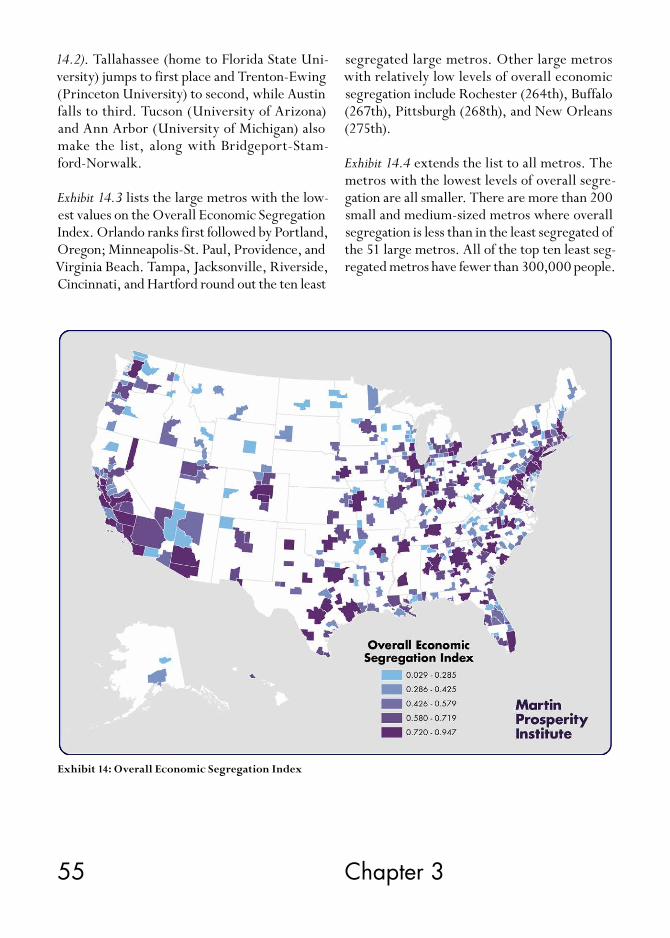
55 Chapter 3
14.2). Tallahassee (home to Florida State Uni-versity) jumps to first place and Trenton-Ewing (Princeton University) to second, while Austin falls to third. Tucson (University of Arizona) and Ann Arbor (University of Michigan) also make the list, along with Bridgeport-Stam-ford-Norwalk.
Exhibit 14.3 lists the large metros with the low-est values on the Overall Economic Segregation Index. Orlando ranks first followed by Portland, Oregon; Minneapolis-St. Paul, Providence, and Virginia Beach. Tampa, Jacksonville, Riverside, Cincinnati, and Hartford round out the ten least
segregated large metros. Other large metros with relatively low levels of overall economic segregation include Rochester (264th), Buffalo (267th), Pittsburgh (268th), and New Orleans (275th).
Exhibit 14.4 extends the list to all metros. The metros with the lowest levels of overall segre-gation are all smaller. There are more than 200 small and medium-sized metros where overall segregation is less than in the least segregated of the 51 large metros. All of the top ten least seg-regated metros have fewer than 300,000 people.
Exhibit 14: Overall Economic Segregation Index
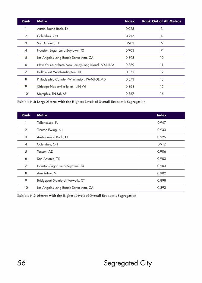
56 Segregated City
Exhibit 14.1: Large Metros with the Highest Levels of Overall Economic Segregation
Exhibit 14.2: Metros with the Highest Levels of Overall Economic Segregation
Rank Metro Index Rank Out of All Metros
1 Austin-Round Rock, TX 0.925 3
2 Columbus, OH 0.912 4
3 San Antonio, TX 0.903 6
4 Houston-Sugar Land-Baytown, TX 0.903 7
5 Los Angeles-Long Beach-Santa Ana, CA 0.893 10
6 New York-Northern New Jersey-Long Island, NY-NJ-PA 0.889 11
7 Dallas-Fort Worth-Arlington, TX 0.875 12
8 Philadelphia-Camden-Wilmington, PA-NJ-DE-MD 0.873 13
9 Chicago-Naperville-Joliet, IL-IN-WI 0.868 15
10 Memphis, TN-MS-AR 0.867 16
Rank Metro Index
1 Tallahassee, FL 0.947
2 Trenton-Ewing, NJ 0.933
3 Austin-Round Rock, TX 0.925
4 Columbus, OH 0.912
5 Tucson, AZ 0.906
6 San Antonio, TX 0.903
7 Houston-Sugar Land-Baytown, TX 0.903
8 Ann Arbor, MI 0.902
9 Bridgeport-Stamford-Norwalk, CT 0.898
10 Los Angeles-Long Beach-Santa Ana, CA 0.893

57 Chapter 3
Exhibit 14.3: Large Metros with the Lowest Levels of Overall Economic Segregation
Exhibit 14.4: Metros with the Lowest Levels of Overall Economic Segregation
Rank Metro Index Rank Out of All Metros
1 Orlando-Kissimmee, FL 0.548 203
2 Portland-Vancouver-Beaverton, OR-WA 0.581 217
3 Minneapolis-St. Paul-Bloomington, MN-WI 0.596 223
4 Providence-New Bedford-Fall River, RI-MA 0.611 233
5 Virginia Beach-Norfolk-Newport News, VA-NC 0.634 239
6 Tampa-St. Petersburg-Clearwater, FL 0.646 244
7 Jacksonville, FL 0.649 246
8 Riverside-San Bernardino-Ontario, CA 0.672 256
9 Cincinnati-Middletown, OH-KY-IN 0.673 259
10 Hartford-West Hartford-East Hartford, CT 0.674 260
Rank Metro Index
1 Fond du Lac, WI 0.029
2 Monroe, MI 0.049
3 St. George, UT 0.074
4 Lewiston, ID-WA 0.075
5 Dover, DE 0.089
6 Coeur d’Alene, ID 0.097
7 Morristown, TN 0.099
8 Bay City, MI 0.113
9 Sherman-Denison, TX 0.115
10 Hagerstown-Martinsburg, MD-WV 0.116

58 Segregated City
4.1 Size and DensityThe Overall Economic Segregation Index is closely associated with the size (0.64) and den-sity (0.56) of metros (Exhibit 15, 16, and 17). The correlations across all measures are posi-tive and significant, with many in the 0.5s and 0.6s. Economic segregation clearly appears to be a feature of larger, denser metros.
We have seen which metros have the highest and lowest levels of overall economic segregation. We know that being segregated along one di-mension increases the likelihood that a metro will be segregated along others. And we have seen that the geography of income segregation is more severe than either educational or occupational segregation.
We now turn to the underlying factors and characteristics of metros that are associated with higher or lower levels of overall economic segregation.
4. What kinds of metros are more segregated than others?
4.2 Wealth and AffluenceEconomic segregation is related to the wealth and aff luence of metros (see Exhibit 18). The Overall Economic Segregation Index is positive-ly associated with wages (0.46) and economic output per capita (0.41), and somewhat less so with per capita income (0.29). These factors play a bigger role for occupational and educa-tional segregation than for income segregation. The correlations are mainly positive and signif-icant, with many in the high to mid-0.4s. The big exception is the segregation of the wealthy, where the correlations are either not significant or mildly negative and significant.

59 Chapter 4
10.000 12.000 14.000 16.000 18.000
0.000
0.200
0.400
0.600
0.800
1.000O
vera
ll Ec
onom
ic S
egre
gation Index
Population*
*Note: Logged
AustinSan JoseBirminghamTallahassee
TrentonAnn ArborGainesville
Memphis
ColumbusSan AntonioLos AngelesNew York
San FranciscoBostonOrlandoRiversideMinneapolis
BarnstableKingsportHickory
MonroeHagerstown
MuncieIthaca
ElkhartDover
St. GeorgeFond du Lac
6.000 7.000 8.000 9.000 10.000 11.000
Density*
0.000
0.200
0.400
0.600
0.800
1.000
Ove
rall
Econom
ic S
egre
gation Index
*Note: Population Weighted
Austin
BostonLos Angeles
Brunswick
ColumbusTallahassee
MemphisDurham
CharlotteNashville
BirminghamJacksonMaconAlbany
San FranciscoNew York
San Jose
ProvidencePortland
LewistonBismarckSheboyganFargoEl Centro
CasperBay City
Fond du Lac
Exhibit 15: Overall Economic Segregation Index and Population
Exhibit 16: Overall Economic Segregation Index and Density
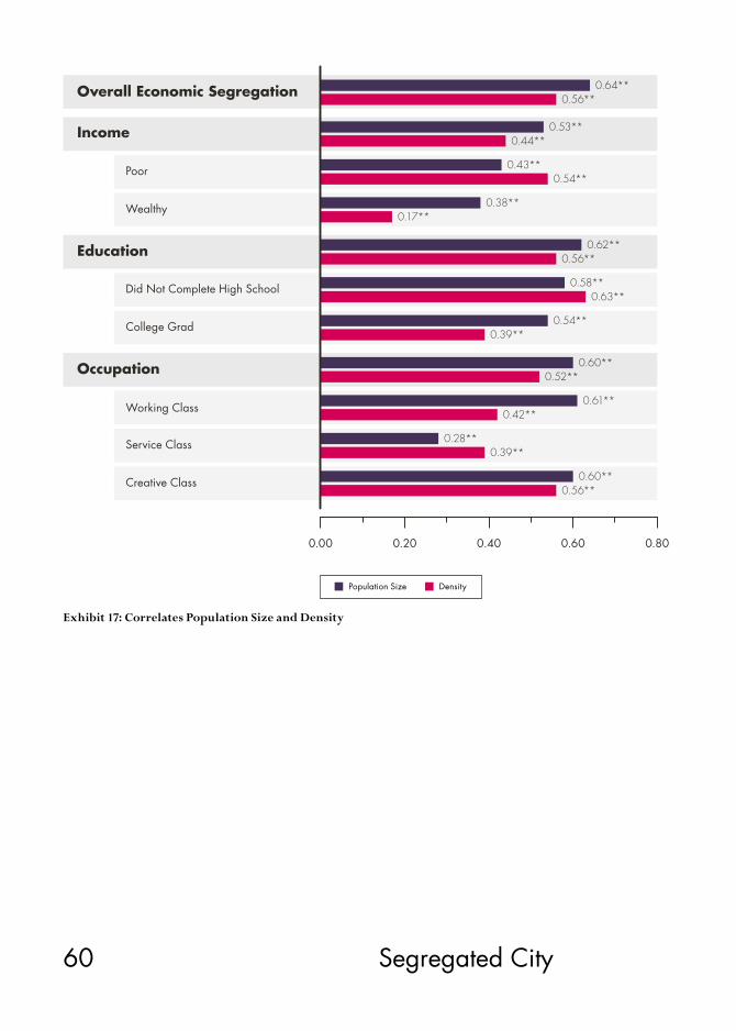
60 Segregated City
0.00 0.60 0.800.400.20
0.64**
0.53**0.44**
0.43**0.54**
0.38**0.17**
0.62**
0.58**0.63**
0.54**
0.52**
0.61**0.42**
0.28**
0.39**
0.39**
0.60**
0.60**
0.56**
0.56**
0.56**
Working Class
College Grad
Did Not Complete High School
Wealthy
Poor
Service Class
Creative Class
Occupation
Education
Income
Overall Economic Segregation
Population Size Density
Exhibit 17: Correlates Population Size and Density

61 Chapter 4
Exhibit 18: Correlates for Income, Wages, and Economic Output per Capita
0.0−0.20 0.800.400.20 0.60
Working Class
College Grad
Did Not Complete High School
Wealthy
Poor
Service Class
Creative Class
Occupation
Education
Income
Overall Economic Segregation
Income Wages Economic Output per Capita
0.29**0.46**
0.41**
0.16**0.25**
0.27**
0.40**0.46**
0.34**
−0.15−0.08
0.08
0.28**0.47**
0.41**
0.37**0.54**
0.41**
0.15**0.34**0.34**
0.32**0.48**
0.41**
0.34**0.44**
0.43**
0.33**0.41**
0.33**
0.24**0.48**
0.35**
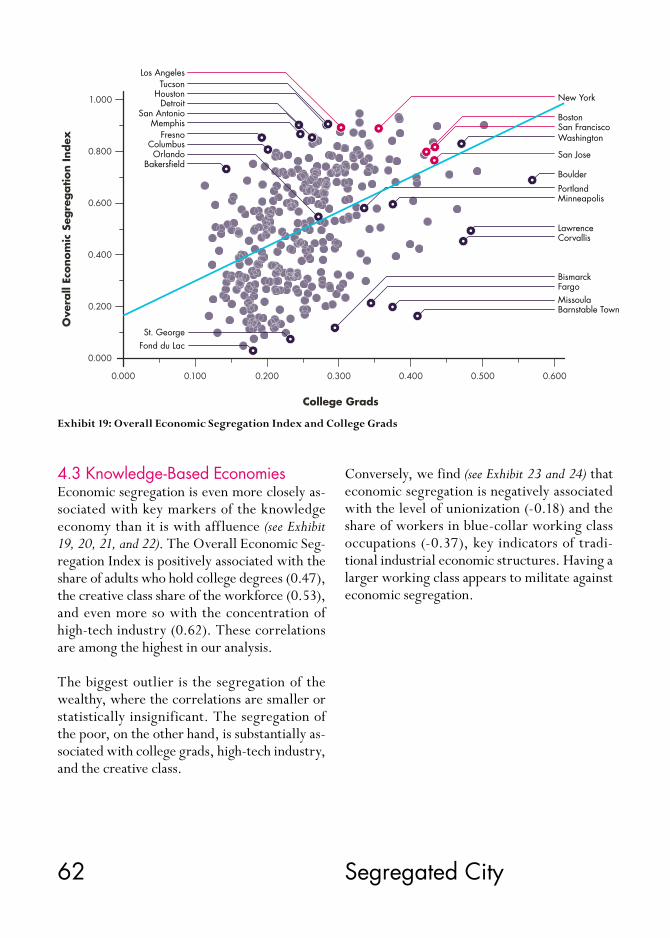
62 Segregated City
4.3 Knowledge-Based EconomiesEconomic segregation is even more closely as-sociated with key markers of the knowledge economy than it is with affluence (see Exhibit 19, 20, 21, and 22). The Overall Economic Seg-regation Index is positively associated with the share of adults who hold college degrees (0.47), the creative class share of the workforce (0.53), and even more so with the concentration of high-tech industry (0.62). These correlations are among the highest in our analysis.
The biggest outlier is the segregation of the wealthy, where the correlations are smaller or statistically insignificant. The segregation of the poor, on the other hand, is substantially as-sociated with college grads, high-tech industry, and the creative class.
Exhibit 19: Overall Economic Segregation Index and College Grads
0.000 0.100 0.200 0.300 0.400 0.500 0.600
0.000
0.200
0.400
0.600
0.800
1.000
Ove
rall
Econom
ic S
egre
gation Index
College Grads
New York
BostonSan FranciscoWashington
San Jose
Boulder
PortlandMinneapolis
LawrenceCorvallis
BismarckFargoMissoulaBarnstable Town
Los AngelesTucson
HoustonDetroit
San AntonioMemphis
FresnoColumbusOrlando
Bakersfield
St. GeorgeFond du Lac
Conversely, we find (see Exhibit 23 and 24) that economic segregation is negatively associated with the level of unionization (-0.18) and the share of workers in blue-collar working class occupations (-0.37), key indicators of tradi-tional industrial economic structures. Having a larger working class appears to militate against economic segregation.

63 Chapter 4
0.000 0.100 0.200 0.300 0.400 0.500
0.000
0.200
0.400
0.600
0.800
1.000
Ove
rall
Econom
ic S
egre
gation Index
Creative Class
Los AngelesNew YorkSan FranciscoBostonWashingtonSan Jose
HartfordPortlandMinneapolis
Olympia
Jefferson CityRomeBismarckDover
AustinColumbus
HoustonSan Antonio
MemphisReno
FresnoSalinas
TuscaloosaLaredo
Las VegasNaples
-8.000 -6.000 -4.000 -2.000 0.000 2.000 4.000
0.600
1.000
0.200
0.400
0.800
High-Tech*
Ove
rall
Econom
ic S
egre
gation Index
*Note: Logged
Fond du LacMonroe
Idaho Falls
Hanford
LaredoMuncieAthensMacon
LouisvilleMemphisRichmond
BirminghamTallahassee
Nashville
Salt Lake City
San Jose
HartfordRochesterJacksonvilleProvidence
BostonSan FranciscoLos AngelesNew York
Exhibit 20: Overall Economic Segregation Index and Creative Class
Exhibit 21: Overall Economic Segregation Index and High-Tech

64 Segregated City
Exhibit 22: Correlates for College Grads, Creative Class, and High-Tech Industry
0.48**0.47**
−0.04
0.0−0.20 0.60 0.800.400.20
Occupation
Education
Income
Overall Economic Segregation
Poor
Wealthy
Did Not Complete High School
College Grad
Working Class
Service Class
Creative Class
0.47**0.53**
0.62**
0.30**0.35**
0.48**
0.51**
College Grads Creative Class HIgh-Tech Industry
0.06
0.43**
0.26**
0.50**0.59**
0.47**0.48**
0.58**
0.32**0.42**
0.50**
0.50**0.55**
0.60**
0.57**0.59**
0.65**
0.46**0.47**
0.34**
0.31**0.42**
0.55**
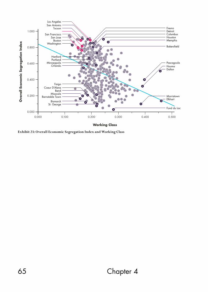
65 Chapter 4
0.000 0.100 0.200 0.300 0.400 0.500
0.000
0.200
0.400
0.600
0.800
1.000
Ove
rall
Econom
ic S
egre
gation Index
Working Class
Fond du LacSt. George
BismarckElkhartMorristown
DaltonHoumaPascagoula
Bakersfield
MemphisHoustonColumbusDetroitFresno
Barnstable TownMissoula
BendCoeur D’Alene
Fargo
OrlandoMinneapolis
PortlandHanford
WashingtonBoston
San JoseSan Francisco
TucsonSan AntonioLos Angeles
Exhibit 23: Overall Economic Segregation Index and Working Class

66 Segregated City
−0.60−0.80 0.00 0.20−0.20−0.40
Occupation
Education
Income
Overall Economic Segregation
Poor
Wealthy
Did Not Complete High School
College Grad
Working Class
Service Class
Creative Class
0.08
−0.18**−0.37**
−0.14*−0.18**
−0.21**
−0.30**−0.06
−0.17**−0.35**
−0.10−0.39**
−0.19**−0.25**
−0.018**−0.43**
−0.25**−0.35**
−0.03−0.46**
−0.12−0.32**
Unionization Working Class Share
Exhibit 24: Correlates for Industrial Economic Structures: Unionization and Working Class Share
4.4 Housing CostsMany point to gentrification and the rising real estate values that go along with it as a key factor in the displacement and isolation of lower income groups.
Interestingly enough, we find only modest as-sociations between median housing costs and overall economic segregation (see Exhibit 25). There is a modest correlation between median housing costs and the Overall Economic Seg-
regation Index (0.31) and an even weaker one between housing costs as a share of income and overall economic segregation (0.17).
Housing costs appear to play a greater role in occupational and educational segregation than in income segregation, where the correlations are insignificant. This result again seems to be driven by the relationship between housing costs and the segregation of the wealthy, which is negative. Housing costs are modestly associ-
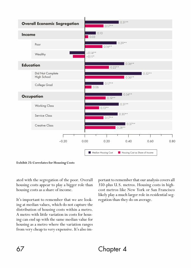
67 Chapter 4
Exhibit 25: Correlates for Housing Costs
0.00−0.20 0.60 0.800.400.20
Occupation
Education
Income
Overall Economic Segregation
Poor
Wealthy
Did Not CompleteHigh School
College Grad
Working Class
Service Class
Creative Class
Median Housing Cost Housing Cost as Share of Income
0.31**0.17**
0.100.03
0.29**0.16**
−0.14**−0.11*
0.36**0.22**
0.52**0.36**
0.17**0.06
0.34**0.19**
0.31**0.13**
0.30**0.17**
0.37**0.28**
ated with the segregation of the poor. Overall housing costs appear to play a bigger role than housing costs as a share of income.
It’s important to remember that we are look-ing at median values, which do not capture the distribution of housing costs within a metro. A metro with little variation in costs for hous-ing can end up with the same median value for housing as a metro where the variation ranges from very cheap to very expensive. It’s also im-
portant to remember that our analysis covers all 350-plus U.S. metros. Housing costs in high-cost metros like New York or San Francisco likely play a much larger role in residential seg-regation than they do on average.
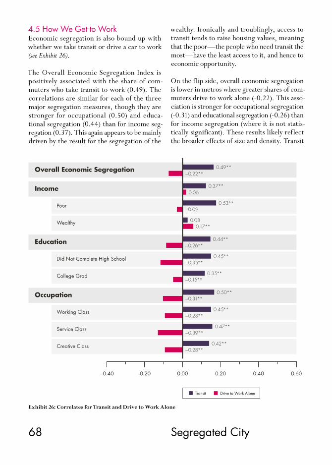
68 Segregated City
4.5 How We Get to WorkEconomic segregation is also bound up with whether we take transit or drive a car to work (see Exhibit 26).
The Overall Economic Segregation Index is positively associated with the share of com-muters who take transit to work (0.49). The correlations are similar for each of the three major segregation measures, though they are stronger for occupational (0.50) and educa-tional segregation (0.44) than for income seg-regation (0.37). This again appears to be mainly driven by the result for the segregation of the
-0.20−0.40 0.40 0.600.200.00
0.49**−0.22**
0.37**0.06
0.53**−0.09
0.080.17**
0.44**−0.26**
0.45**−0.35**
0.35**−0.15**
0.50**
0.45**
0.47**
0.42**
−0.31**
−0.28**
−0.39**
−0.28**
Education
Poor
Wealthy
Did Not Complete High School
College Grad
Working Class
Occupation
Overall Economic Segregation
Income
Service Class
Creative Class
Transit Drive to Work Alone
Exhibit 26: Correlates for Transit and Drive to Work Alone
wealthy. Ironically and troublingly, access to transit tends to raise housing values, meaning that the poor—the people who need transit the most—have the least access to it, and hence to economic opportunity.
On the flip side, overall economic segregation is lower in metros where greater shares of com-muters drive to work alone (-0.22). This asso-ciation is stronger for occupational segregation (-0.31) and educational segregation (-0.26) than for income segregation (where it is not statis-tically significant). These results likely reflect the broader effects of size and density. Transit

69 Chapter 4
is associated with larger denser regions; com-muters are more likely to drive to work alone in smaller and more sprawling metros.
4.6 Political OrientationEconomic segregation is connected to the long-standing divisions between conservative and liberal places—but not in the way that lib-erals and conservatives might suppose (see Ex-hibit 27). The Overall Economic Segregation Index is positively associated with liberalism, measured by the share of voters who cast their ballots for Obama in 2012 (0.32) and it is neg-atively associated with conservatism, measured
by the share that voted for Romney (-0.31). The correlations are relatively similar for all the ma-jor segregation measures, though once again the associations for the segregation of the wealthy are statistically insignificant.
This also likely reflects the broader effects of size and density. Larger, more diverse, and more knowledge-based metros tend to lean lib-eral. And liberal politics are closely associated with density. According to one analysis, metros reach a tipping point where they turn from lib-eral to conservative at a density of roughly 700 to 800 people per square mile.32
Exhibit 27: Correlates for Liberal and Conservative Politics
0.32**
Education
Poor
Wealthy
Did Not Complete High School
College Grad
Working Class
Occupation
Overall Economic Segregation
Income
Service Class
Creative Class
−0.40 0.20 0.40 0.600.00-0.20
Liberal (Obama Votes) Conservative (Romney Votes)
0.24**
0.34**
0.06
0.27**
0.28**
0.24**
0.34**
0.27**
0.36**
0.30**
−0.31**
−0.23**
−0.34**
−0.05
−0.27**
−0.29**
−0.23**
−0.33**
−0.27**
−0.36**
−0.29**
70 Segregated City
4.7 RaceRace remains a key marker of stratification in American society. A broad body of studies doc-uments the connection between race, poverty, and segregation.33 NYU sociologist Patrick Sharkey points out that “two-thirds of black children who were raised in the poorest quar-ter of U.S. neighborhoods a generation ago now raise their own children in similarly poor neigh-borhoods. About half of all black families have lived in the poorest American neighborhoods over the last two generations, compared to just 7 percent of white families.” 34
Economic segregation and race are correlated, as we have seen (Exhibit 28, 29, and 30). The Overall Economic Segregation Index is nega-tively associated with the share of residents that are white (-0.43) and positively associated with the shares that are black (0.29), Latino (0.24) and Asian (0.30). Generally speaking, race plays a relatively larger role in educational and occupational segregation than income segre-gation, with the exception of black population shares. The share of the population that is black is positively related to all three main types of economic segregation. It is slightly more closely related to income segregation, though the dif-ferences are modest.
The Latino share of population is also positively related to all three types of segregation, though it is not statistically associated with the segre-gation of poverty or of the service class. The Asian share of the population is positively relat-ed to educational and occupational segregation, but is not statistically associated with income segregation. This again reflects the effect of the segregation of the wealthy.
Conversely, the share of the population that is white is negatively associated with all three types of economic segregation—income, edu-cational, and occupational segregation, though it appears to play a larger role in educational and occupational separation than in income segregation. It has a weak relationship to the segregation of the poor, where it is statistically insignificant.
Generally speaking, our findings suggest that the white share of the population plays a rela-tively greater role in economic segregation than the shares of racial and ethnic minorities.

71 Chapter 4
20.0 40.0 60.0 80.0 100.0
0.000
0.200
0.400
0.600
0.800
1.000
Ove
rall
Econom
ic S
egre
gation Index
Percent White
DoverGoldsboro
El CentroOrlando
FarmingtonHinesville
Pine BluffVallejo
Virginia Beach
ClevelandNashville
State College
RiversideNew Orleans
Atlanta
San JoseSan Francisco
Los AngelesNew York
MuncieBostonDenverColumbusSan AntonioBridgeportAnn ArborTucsonAustin
0.00 10.00 20.00 30.00 40.00 50.00 60.00
0.000
0.200
0.400
0.600
0.800
1.000
Ove
rall
Econom
ic S
egre
gation Index
Percent Black
Fond du LacMonroeDover
GoldsboroLongviewDanville
Pine BluffPortlandMinneapolisSan JoseRenoPhoenixOrlandoBostonJacksonville
AlbanyNew OrleansJacksonAtlanta
New YorkColumbus
San Francisco
Ann ArborBridgeportDenverLos AngelesFresnoAustinSan AntonioTucson
Exhibit 28: Overall Economic Segregation Index and White
Exhibit 29: Overall Economic Segregation Index and Black

72
-0.40-0.60 0.20 0.40 0.600.00-0.20
Occupation
Education
Income
Overall Economic Segregation
Poor
Wealthy
Did Not Complete High School
College Grad
Working Class
Service Class
Creative Class
0.24**0.29**
White Black Latino Asian
0.090.02
0.30**
0.30**
0.22**
0.12*
0.15**0.34**
0.32**0.38**
0.23**
0.36**0.46**
0.06
0.24**0.25**
0.34**
0.36**0.24**
0.26**
0.33**0.11*
0.23**
0.36**0.06
0.17**
0.37**0.45**
0.22**
−0.43**
−0.25**
−0.09
−0.10
−0.07
−0.29**
−0.48**
−0.42**
−0.45**
−0.42**
−0.32**
−0.28**
−0.51**
Exhibit 30: Correlates for Race
Segregated City

73 Chapter 4
0.35 0.40 0.45 0.50 0.55
0.000
0.200
0.400
0.600
0.800
1.000
Ove
rall
Econom
ic S
egre
gation Index
Income Inequality
Rome
MissoulaHot SpringsLongviewKingsportBarnstable TownMorristown
OrlandoProvidenceTampa
New OrleansMiamiBostonSan FranciscoBridgeportNew YorkLos AngelesTucsonSan Antonio
KennewickColorado Springs
SpringfieldWashington
San JosePhoenix
ColumbusAustin
Ann Arbor
Exhibit 31: Overall Economic Segregation Index and Income Inequality
4.8 InequalityOne might think that metros with higher lev-els of economic inequality would also be beset with higher levels of economic segregation, almost by definition.
Our analysis confirms that inequality and eco-nomic segregation are related (see Exhibit 31, 32, and 33). The Overall Economic Segregation Index is positively associated with income in-equality (0.52) and even more so with wage inequality (0.62). The correlations between in-equality and the various measures of economic segregation are positive and range from a low of around 0.20 to a high of more than 0.60. The majority of correlations fall into the range of the
high 0.40s to 0.50. Once again, the correlations are higher for educational and occupational seg-regation than for income segregation.
While income inequality and residential segre-gation do go together, it is important to remem-ber that they are not the same thing. As Reardon and Bischoff note, “although income inequality is a necessary condition for income segregation, it is not sufficient.” 35 A city or metro might be quite unequal but not particularly segregated if lower and upper income groups are distributed evenly across neighborhoods. Likewise, a city or metro could be highly segregated but rela-tively equal if its different economic groups re-side in different neighborhoods.

74 Segregated City
0.200 0.250 0.300 0.350 0.400 0.450 0.500 0.550
0.000
0.200
0.400
0.600
0.800
1.000
Ove
rall
Econom
ic S
egre
gation Index
Wage Inequality
Hot SpringsBay CityIdaho FallsWarner Robins
OrlandoProvidenceMinneapolisBoulderCollege StationSan JoseHuntsville
AtlantaSan FranciscoNew YorkLos AngelesBoston
GreeleyHanford
DoverBismarck
Rome
TuscaloosaLas Vegas
ChampaignLouisville
DetroitMemphis
Tallahassee
Exhibit 32: Overall Economic Segregation Index and Wage Inequality

75 Chapter 4
Exhibit 33: Correlates for Inequality
0.52**0.62**
Education
Poor
Wealthy
Did Not Complete High School
College Grad
Working Class
Occupation
Overall Economic Segregation
Income
Service Class
Creative Class
Income Inequality Wage Inequality
0.00 0.60 0.800.400.20
0.32**0.40**
0.22**0.42**
0.31**0.22**
0.51**0.61**
0.36**
0.56**
0.53**0.63**
0.63**0.50**
0.35**0.41**
0.48**
0.58**
0.58**
0.58**

76 Segregated City
5. Conclusion
This report has mapped measures of economic segregation spanning income, education, and occupation; developed an overall index of eco-nomic segregation which combines all three; and examined the key factors associated with economic segregation across U.S. metros.
Our key findings with regard to the geography of economic segregation are as follows.
• Older Rustbelt metros top the list on income segregation. More sprawling Sunbelt metros top the list on educational segregation. And larger and more knowledge-based metros top the list on occupational segregation.
• While larger metros generally experience higher levels of economic segregation, two medium-sized ones—Tallahassee and Tren-ton—register the highest levels of overall economic segregation in the country.
• Among large metros, Los Angeles, Austin, Houston, New York, Dallas, Philadelphia, Chicago, and Memphis face high degrees of segregation.
• Four Texas metros—Austin, San Antonio, Houston, and Dallas—rank among the ten most segregated large metros. Most of the higher-ranking smaller metros are college towns.
• The metros with the lowest levels of overall economic segregation are mainly smaller and medium-sized ones. There are more than 200 small and medium-sized metros where over-all segregation is less than in the least segre-gated of the 51 large metros. All ten of the least segregated metros in the country have 300,000 people or less.
• The least segregated large metros include Orlando, Portland, Minneapolis-St. Paul, Providence, and Virginia Beach. Rustbelt metros like Cincinnati, Rochester, Buffalo, and Pittsburgh also have relatively low levels of overall economic segregation.
When we compare the types of economic seg-regation to one another we find that:
• All three types of segregation—income, edu-cational, and occupational—are associated with one another. If a metro is segregated on one dimension, it increases the likelihood that it is segregated on the others.
• Economic segregation appears to be condi-tioned by the behavior and location choices of more advantaged groups. The creative class is more segregated than either the working class or service class. College grads are more segregated than those who did not finish high school. The wealthy are more segregated than the poor—indeed they are the most segre-gated of all and by a considerable margin. These more advantaged groups have the resources to isolate themselves from less advantaged groups.
This last finding is in line with other research on the subject. A Pew study found that the population of high-income residents living in high-income neighborhoods or tracts doubled between 1980 and 2010 compared to the pop-ulation of low-income households living in low-income neighborhoods, which grew by just 5 percentage points over the same period.36 Or as Reardon and Bischoff note, “During the last
77 Chapter 5
four decades, the isolation of the rich has been consistently greater than the isolation of the poor.” 37
Even though different metros stand out on different types of economic segregation, our correlation analysis reveals that the same un-derlying economic and demographic factors are associated with each of the major types of segre-gation and with economic segregation overall.
• Economic segregation is associated with the size and density of metros. The correlations for each are among the highest in our analysis. It is also related to two other sets of factors that follow from metro size and density: the way that people commute to work and the break- down of liberal versus conservative voters.
• Economic segregation is connected to the overall wealth and affluence of metros, with positive correlations to wages, economic out-put per capita, and income.
• Economic segregation tends to be higher in knowledge-based metros, with positive cor-relations to high-tech industry, the creative class, and college grads. These correlations are among the very highest in our analysis.
• Economic segregation is also associated with two key indicators of diversity—the share of the population that is gay or foreign-born—which tend to coincide with larger, denser, and more knowledge-based metros.
• Economic segregation is related to race. It is positively associated with the share of the population that is black, Latino, or Asian, and negatively associated with the share that is white. Economic segregation is more close-ly associated with the share that is white than with others, which suggests that it is driven by the locational patterns and decisions of those at the top of the socio-economic order.
• Economic segregation is closely connected to income inequality and even more so with wage inequality.
Segregation and inequality appear to compound and exacerbate each other’s effects. Research by economist Rebecca Diamond has shown that high-skill, high-pay workers derive additional advantages from living in safer neighborhoods with better schools, better health care, and a wider range of services and amenities.38 The inequality of overall “well-being” that they en-joy is 20 percent higher than the simple wage gap between college and high school grads can account for.
Conversely, less advantaged communities suffer not just from a lack of economic resources but from related neighborhood effects like higher rates of crime and drop-outs, infant mortali-ty, and chronic disease. NYU’s Sharkey argues that disadvantaged groups are literally “stuck in place,” pointing out that “neighborhood in-equality is multigenerational, something that is passed down from parents to children in the same way that genetic background and financial wealth are transmitted across generations.” 39
A widely cited 2014 study by researchers at Harvard and the University of California at Berkeley examined how racial segregation, fam-ily structure, school quality, and social capital affected lower income children’s ability to move up the economic ladder, based on a sample of more than 40 million children born between 1980 and 1991 and their parents.40 Economic segregation was negatively associated with abso-lute upward mobility, the ability of low-income children to move up the economic ladder, and positively associated with relative mobility, the gap between low and high-income children.
As family-supporting manufacturing jobs have disappeared, so have America’s once middle- income neighborhoods. In 1970, roughly two-thirds (65 percent) of Americans lived in neigh-borhoods that could be described as middle in-come; today that number is just slightly more than four in ten (42 percent), according to

78 Segregated City
Bischoff and Reardon.41 Over the same time span, the proportion of families living in afflu-ent neighborhoods rose from 7 to 15 percent and the share living in poor neighborhoods in-creased from 8 to 18 percent. Income segrega-tion grew in nearly nine in ten U.S metros with populations over 500,000.
A decade or so ago, Bill Bishop noted how tal-ented and educated people were concentrating more in some places than others, a tendency he dubbed “the big sort.” 42 The big sort has now become an even bigger sort. America’s cities and metropolitan areas have cleaved into clusters
of wealth, college education, and highly-paid knowledge-based occupations that are juxta-posed to concentrations of poverty, low levels of education, and poorly-paid service occupations.
Where cities and neighborhoods once mixed different kinds of people together, they are now becoming more homogenous and segregated by income, education, and occupation. Separating across these three key dimensions of socio-eco-nomic class, this bigger sort threatens to under-mine the essential role that cities have played as incubators of innovation, creativity, and eco-nomic progress.

79 Appendix
6. Appendix
6.1 Variables, Data, and MethodologyThis section presents our variables, data, and methodology. The data cover the more than 70,000 U.S. tracts across all 359 U.S. metro-politan regions.
6.1.1 Segregation MeasuresOur key measures of economic segregation are as follows:
Income Segregation• Segregation of the Poor: This covers households
below the poverty level in 2010. • Segregation of the Wealthy: This covers house-
holds with an income above $200,000, the highest income group reported by tract by the Census in 2010.
• Overall Income Segregation: This combines the two measures above into a single index. All data are from the 2010 U.S. Census.43
Educational Segregation• Segregation of Non-High School Grads: This mea-
sures the residential segregation of adults with less than a high school degree.
• Segregation of College Grads: This measures the segregation of adults with a college degree or more.
• Overall Educational Segregation: This combines the two educational measures into a single index. All data are from the 2010 U.S. Census.
Occupational Segregation• Creative Class Segregation: This measures the
residential segregation of the creative class. • Service Class Segregation: This measures the res-
idential segregation of individuals who hold low-skill, low-pay service jobs.
• Working Class Segregation: This measures the residential segregation of the blue collar work- ing class.
• Overall Occupational Segregation: This is an index of the three occupational segregation measures above. All data are from the 2010 American Community Survey.
Overall Economic Segregation IndexThis index combines the rank of the seven in-come, education, and occupation measures into an index of overall economic segregation.
6.1.2 How We Define and Measure SegregationThe seven individual indexes are all calculated based on the Index of Dissimilarity.44 Devel-oped by sociologists Douglas Massey and Nancy Denton, it compares the distribution of a se-lected group of people with all others in that lo-cation. The more evenly distributed a group is compared to the rest of the population, the low-er the level of segregation. This Dissimilarity Index ranges from 0 to 1, where 0 reflects no segregation and 1 reflects complete segregation.
The Dissimilarity Index, D, can be expressed as:
where xi is the number of individuals in our selected group in tract i, X is the number of the selected group in the metropolitan area, yi is the number of “others” in the Census tract, and Y is the corresponding number in the metropol-itan area. N is the number of Census tracts in the metropolitan area. D gives a value to the

80 Segregated City
degree to which our selected group is differ-ently distributed across Census tracts within the metropolitan area, compared to all others. D ranges from 0 to 1, where 0 denotes minimum spatial segregation and 1 the maximum segre-gation. The more evenly distributed a group is compared to the rest of the population, the low-er the level of segregation.
The combined measures of income segregation, educational segregation, and occupational seg-regation as well as the Overall Economic Seg-regation Index are created by combining rank-ings on each of these individual indexes. Thus, we no longer can interpret the index value as 0 equal to no segregation and 1 equal to complete segregation. These combined index values cre-ate a relative measure where the highest index value indicates the most segregated metro.
6.1.3 Economic, Social, and Demographic VariablesWe also examine the relationships between economic segregation and the following demo-graphic, economic, and social variables.
Income per Capita: Average income per capita from the 2010 American Community Survey (ACS).45
Wages: Average metro wage level from the Unit-ed States Bureau of Labor Statistics (BLS) for the year 2010.46
Economic Output per capita: Based on Gross Re-gional Product per capita, data are from Unit-ed States Bureau of Economic Analysis (BEA) for 2010.47
College Grads: The share of adults with a college degree or more from the 2010 ACS.48
Creative Class: The regional share of employment in the following occupational groups: computer
science and mathematics; architecture, engi-neering; life, physical, and social science; ed-ucation, training, and library science; arts and design work, entertainment, sports, and media; and professional and knowledge work occupa-tions in management, business and finance, law, sales management, healthcare, and education. This is based on 2010 data from the BLS.49
Working Class: The regional share of employment in manufacturing, construction and extraction, installation, maintenance and repair, pro-duction, transportation and material moving occupations. Also based on 2010 data from the BLS.50
Service Class: The regional share of employment in low-skill, low-wage service class jobs includ-ing: food preparation and food-service-related occupations, building and grounds cleaning and maintenance, personal care and service, low-end sales, office and administrative support, community and social services, and protective services. Also based on 2010 BLS data.51
High-Tech Industry: Based on the Tech-Pole Index developed by Ross Devol of the Milken Insti-tute,52 which measures the percentage of total economic output that comes from high-tech-nology industries compared to the nationwide percentage of high-technology industrial output as a percentage of total U.S. high-technology industrial output. These data are from the Cen-sus County Business Patterns for 2010.53
Unionization: The share of the employed work-ers that are union members. From the Current Population Survey available at http://unionstats.com for the year 2010.54
Median Housing Costs: We include two measures: median monthly housing costs and housing costs as a share of household income, both from the 2010 ACS.55

81 Appendix
Population Size: Metro population based on 2010 ACS. A logged version is used for the correla-tion analysis.
Density: This is “population-weighted density” based on distance from the city center or city hall. This comes from the United States Census and is for the year 2010.56
Transit: The share of the population that uses public transportation to get to work, from the 2010 ACS.57
Drive to Work Alone: The share of population that drives to work alone, a proxy for sprawl, also from the 2010 ACS.58
Race: We measure four major racial groups per the 2010 ACS: the share of population that is white, black, Asian, and Hispanic.59
Foreign-Born: The percentage of population that is foreign-born, from the 2010 ACS.60
Gay Index: A location quotient for the concentra-tion of gay and lesbian households from the ACS for the years 2005–2009.61
Liberal or Conservative: The share of metro voters who voted for Obama versus Romney in 2012. The metro data are compiled from county level figures published in The Guardian.62
Inequality: Income inequality is based on the con-ventional Gini Coefficient measure and is from the 2010 ACS. Wage Inequality is calculated based on the Theil index, an entropy measure that captures differences in wage between the three major occupational classes from the 2010 BLS.63

82 Segregated City
7. References
1 Plato, The Republic and Other Works, New York: Anchor Books, 1973, p. 111.
2 Ryan Avent, “Inequality: Does Anyone Care about Distribution?,” The Economist: Free Exchange, May 1, 2014, http://www.economist.com/blogs/freeexchange/2014/05/inequality.
3 Paul Taylor and Richard Fry, The Rise of Residential Segregation by Income, Washington, D.C.: Pew Research Center, 2012, http://www.pewsocialtrends.org/files/2012/08/Rise-of-Residential-Income-Segrega-tion-2012.2.pdf.
4 See, for example, Thomas Piketty, Capital in the Twenty-First Century, Cambridge, MA: Belknap Press, 2014, http://www.hup.harvard.edu/catalog.php?isbn=9780674430006; Edward L. Glaeser, Matt Resseger, and Kristina Tobio, “Inequality in Cities,” Journal of Regional Science, 49, 4, 2009, pp. 617–46, http://doi.wiley.com/10.1111/j.1467-9787.2009.00627.x; Nathaniel Baum-Snow and Ronni Pavan, “In-equality and City Size,” Cambridge, MA: National Bureau of Economic Research, 2011, http://www.econ.brown.edu/fac/Nathaniel_Baum-Snow/ineq_citysize.pdf; David Card and John E. DiNardo, “Skill Biased Technological Change and Rising Wage Inequality: Some Problems and Puzzles,” Cambridge, MA: National Bureau of Economic Research, 2002, http://www.nber.org/papers/w8769;
Joseph E. Stiglitz, The Price of Inequal-ity, New York: W. W. Norton & Com-pany, 2013, http://www.amazon.ca/The-Price-Inequality-Divided-Endan-gers-ebook/dp/B007MKCQ30.
5 Richard Florida and Charlotta Mellander, “The Geography of Inequality: Difference and Determi-nants of Wage and Income Inequality across U.S. Metros,” Regional Studies, Forthcoming, 2014, http://rsa.tand-fonline.com/doi/pdf/10.1080/00343404.2014.884275.
6 See, Kendra Bischoff and Sean F. Reardon, Residential Segregation by Income, 1970–2009, New York: Russell Sage Foundation, 2013, http://www.s4.brown.edu/us2010/Data/Report/report10162013.pdf; Bill Bish-op, The Big Sort: Why the Clustering of Like-Minded America Is Tearing Us Apart, Boston, MA: Mariner Books, 2009, http://books.google.ca/books/about/The_Big_Sort.html?id=mbjOZTx9u_cC&redir_esc=y; Sean F. Reardon and Kendra Bischoff, Growth in the Residential Segregation of Families by Income, 1970–2009, Russell Sage Foundation, 2011, http://www.s4.brown.edu/us2010/Data/Report/report111111.pdf; Taylor and Fry, 2012.
7 See, Alan J. Abramson, Mitchell S. Tobin, and Matthew R. Vander-Goot, “The Changing Geography of Metropolitan Opportunity: The Seg-regation of the Poor in U.S. Metropol-itan Areas,” Housing Policy Debate, 6, 1, 1995, pp. 45–72, http://content.
knowledgeplex.org/kp2/img/cache/kp/1118.pdf; Paul A. Jargowsky, “Take the Money and Run: Economic Segregation in U.S. Metropolitan Ar-eas,” American Sociological Review, 61, 6, 1996, pp. 984–98, http://www.jstor.org/stable/2096304; Tara Watson, Gerald Carlino, and Ingrid Gould Ellen, “Metropolitan Growth, Inequality, and Neighborhood Seg-regation by Income,” Brookings-Whar-ton Papers on Urban Affairs, 2006, pp. 1–52, http://www.jstor.org/sta-ble/25067427; Rebecca Yang and Paul A. Jargowsky, “Suburban Devel-opment and Economic Segregation in the 1990s,” Journal of Urban Affairs, 28, 3, 2006, pp. 253–73, http://onlinelibrary.wiley.com/doi/10.1111/j.1467-9906.2006.00291.x/abstract.
8 See, for example, Annette Lareau and Dalton Conley (eds). Social Class: How Does It Work?, New York: Russell Sage Foundation, 2008; Kim A. Weeden and David B. Grusky, “The Case for a New Class Map,” American Journal of Sociolo-gy, 111, 1, 2005, pp. 141–212; Erik Olin Wright, Classes, London: Verso, 1985; and Class Counts: Comparative Studies in Class Analysis, Cambridge: Cambridge University Press, 1997, http://www.ssc.wisc.edu/~wright/selected-published-writings.htm.
9 See, Douglas S. Massey and Nancy A. Denton, “The Dimensions of Residential Segregation,” Social Forces, 67, 2, 1988, p. 281, http://www.jstor.org/stable/2579183?orig-

83 References
in=crossref; Douglas S. Massey and Nancy A. Denton, “Hypersegregation in U.S. Metropolitan Areas: Black and Hispanic Segregation along Five Di-mensions,” Demography, 26, 3, 1989, pp. 373–91, http://www.jstor.org/stable/2061599; Douglas S. Massey, American Apartheid: Segregation and the Making of the Underclass, Cam-bridge, MA: Harvard University Press, 1993. John Iceland, Daniel H. Wein-berg, and Erika Steinmetz, Racial and Ethnic Residential Segregation in the United States: 1980–2000, Washing-ton, DC: United States Census Bureau, 2002, https://www.census.gov/hhes/www/housing/housing_patterns/pdf/massey.pdf.
10 United States Census Bureau, “Geographic Terms and Concepts – Census Tract,” United States Census Bureau, Geography, December 6, 2012, http://www.census.gov/geo/reference/gtc/gtc_ct.html.
11 United States Census Bureau, “About Poverty – Highlights,” Ac-cessed March 20, 2014, https://www.census.gov/hhes/www/pover-ty/about/overview/index.html.
12 Bischoff and Reardon, 2013.
13 William Julius Wilson, The Truly Disadvantaged: The Inner City, the Underclass, and Public Policy, Chicago: University of Chicago Press, 1987, http://press.uchicago.edu/ucp/books/book/chicago/T/bo13375722.html.
14 Robert J. Sampson, Great Amer-ican City: Chicago and the Enduring Neighborhood Effect, Chicago: Uni-versity of Chicago Press, 2012, http://www.press.uchicago.edu/ucp/books/book/chicago/G/bo5514383.html.
15 United States Census Bureau, “How the Census Bureau Measures
Poverty,” accessed March 20, 2014, http://www.census.gov/hhes/ www/poverty/about/overview/ measure.html.
16 G. William Domhoff, “Who Rules America: Wealth, Income, and Power,” February 2013, http://www2.ucsc.edu/whorulesamerica/power/wealth.html.
17 Joseph E. Stiglitz, “Of the 1%, by the 1%, for the 1%,” Vanity Fair, May 2011, http://www.vanityfair.com/society/features/2011/05/top-one-percent-201105.
18 Dylan Matthews, “Does Your Family Make over $232,000? Congrats, You’re in the Top 5 Percent,” Wonkblog, September 17, 2013, http://www.washingtonpost.com/blogs/wonkblog/wp/2013/09/17/does-your-family-make-over-232000-congrats-youre-in-the-top-5-percent/.
19 Michael Sandel, “What Money Can’t Buy: The Skyboxification of American Life,” Huffpost Politics, April 20, 2012, http://www.huffingtonpost.com/michael-sandel/what-money-cant-buy_b_1442128.html.
20 Reardon and Bischoff, 2011, p. 20.
21 See, Robert J. Barro, “Eco-nomic Growth in a Cross Section of Countries,” The Quarterly Journal of Economics, 106, 2, 1991, pp. 407 –443, http://qje.oxfordjournals.org/content/106/2/407.abstract; Barro, Determinants of Economic Growth: A Cross-Country Empirical Study, Cambridge, MA: MIT Press, 1997; Richard Florida, The Rise of the Cre-ative Class: And How It’s Transform-ing Work, Leisure, Community and Everyday Life, New York: Basic Books, 2002. Edward L. Glaeser and David C. Maré, “Cities and Skills,” Journal
of Labor Economics, 19, 2, 2001, http://papers.ssrn.com/sol3/papers.cfm?abstract_id=920975; Glaeser and Mathew G. Resseger, “The Complementarity Between Cities and Skills,” Cambridge, MA: National Bureau of Economic Research, 2009, http://scholar.harvard.edu/files/glaeser/files/the_complementari-ty_between_cities_and_skills.pdf; Glaeser and Albert Saiz, “The Rise of the Skilled City,” National Bureau of Economic Research, 2003, http://www.nber.org/papers/w10191; James E. Rauch, “Productivity Gains from Geographic Concentration of Human Capital: Evidence from Cities,” Journal of Urban Economics, 34, 3, 1993, pp. 380–400, http://www.sciencedirect.com/science/article/pii/S0094119083710429.
22 See, Jane Jacobs, The Economy of Cities, New York: Vintage, 1969. Also, Robert E. Lucas, “On the Me-chanics of Economic Development,” Journal of Monetary Economics, 22, 1, 1988, pp. 3–42, http://www.sciencedirect.com/science/article/pii/0304393288901687.
23 Richard Florida, “Where the Brains Are,” The Atlantic, October 2006, http://www.theatlantic.com/magazine/archive/2006/10/where-the-brains-are/305202/. Also see, Christopher R. Berry and Edward L. Glaeser, “The Divergence of Human Capital Levels across Cities,” Papers in Regional Science, 84, 3, 2005, pp. 407–44, http://onlinelibrary.wiley.com/doi/10.1111/j.1435-5957.2005.00047.x/abstract.
24 Richard Florida, The Rise of the Creative Class: Revisited, New York: Basic Books, 2012, http://books.google.ca/books/about/The_Rise_of_the_Creative_Class.html?id=H-d52xAomqVwC&redir_esc=y.

84 Segregated City
25 Florida, 2012.
26 Florida, 2012.
27 Florida, 2012.
28 Florida, 2012.
29 Richard Florida, “The Boom Towns and Ghost Towns of the New Economy,” The Atlantic, September 18, 2013, http://www.theatlantic.com/magazine/archive/2013/10/the-boom-towns-and-ghost-towns-of-the-new-economy/309460/.
30 These are expressed as Massey-Denton segregation indexes. The Appendix provides additional information on how we calculate the various segregation measures.
31 Bischoff and Reardon, 2013.
32 See, Richard Florida, “Amer-ica’s Most Sprawling Cities Are Also the Most Republican,” The Atlantic Cities, April 10, 2014, http://www.theatlanticcities.com/jobs-and-economy/2014/04/amer-icas-most-sprawling-cities-are-al-so-most-republican/8832/; Florida, “What Republicans Are Really Up Against: Population Density,” The Atlantic Cities, November 26, 2012, http://www.theatlanticcities.com/politics/2012/11/what-republi-cans-are-really-against-popula-tion-density/3953/.
33 See, Sampson, 2012; Patrick Sharkey, Stuck in Place: Urban Neighborhoods and the End of Progress toward Racial Equality, Chicago: The University of Chicago Press, 2013, http://press.uchicago.edu/ucp/books/book/chicago/S/bo14365260.html; William J. Wilson, The Declining Significance of Race: Blacks and Changing American Institutions, 2012,
http://press.uchicago.edu/ucp/books/book/chicago/D/bo13375516.html; Wilson, 1987; Gregory D. Squires, Larry Ben-nett, Kathleen McCourt, and Philip Nyden, Chicago: Race, Class, and the Response to Urban Decline, Philadelphia: Temple University Press, 1989; Loïc Wacquant and William J. Wilson, “The Cost of Racial and Class Exclusion in the Inner City,” The Annals of the American Acade-my of Political and Social Science, 501, 1, 1989, pp. 8–25, http://ann.sagepub.com/content/501/1/8; Douglas S. Massey, Andrew B. Gross, and Kumiko Shibuya, “Migration, Segregation, and the Geographic Concentration of Poverty,” American Sociological Review, 59, 3, 1994, pp. 425–45, http://www.jstor.org/sta-ble/2095942.
34 Richard Florida, “The Persistent Geography of Disadvantage,” The Atlantic Cities, July 25, 2013, http://www.theatlanticcities.com/neighbor-hoods/2013/07/persistent-geogra-phy-disadvantage/6231/.
35 Bischoff and Reardon, 2013, p.18
36 Taylor and Fry, 2012.
37 Bischoff and Reardon, 2013.
38 Rebecca Diamond, “The Deter-minants and Welfare Implications of U.S. Workers Diverging Location Choices by Skill: 1980–2000,” Harvard University, Department of Economics, December 12, 2012, http://www.gsb.stanford.edu/sites/default/files/documents/rdiamond_jmp.pdf.
39 See, Sharkey, 2013; Richard Florida, “The Persistent Geography of Disadvantage.”
40 See, Raj Chetty, Nathaniel Hen-dren, Patrick Kline, and Emmanuel Saez, Where Is the Land of Oppor-tunity? The Geography of Intergener-ational Mobility in the United States, Cambridge, MA: National Bureau of Economic Research, 2014, http://obs.rc.fas.harvard.edu/chetty/mobil-ity_geo.pdf. The study also identifies several other factors—including family structure, racial segregation, commute time, school quality, income inequality and income levels, family structure and social capital—that play substantial roles in limiting upward mobility in America.
41 Bischoff and Reardon, 2013.
42 Bishop, 2008.
43 United States Census Bureau, 2010 American Community Survey 3-year Estimates, 2011. For further information see United States Census Bureau, American Community Survey and Puerto Rico Community Survey: 2010 Subject Definitions, 2012, http://www.census.gov/acs/www/Downloads/data_documentation/SubjectDefinitions/2010_ACSSubject-Definitions.pdf.
44 Iceland, Weinberg, and Stein-metz, 2002.
45 United States Census Bureau, American Community Survey and Puerto Rico Community Survey: 2010 Subject Definitions, 2012, http://www.census.gov/acs/www/Downloads/data_documentation/SubjectDefinitions/2010_ACSSubject-Definitions.pdf.
46 United States Bureau of Labor Statistics, “National Compensation Survey - Wages,” September 16, 2011, http://www.bls.gov/ncs/ocs/compub.htm.

85 References
47 United States Bureau of Economic Analysis, “Regional Data - GDP & Personal Income,” http://www.bea.gov/iTable/ iTable.cfm?reqid=70&step=1&isuri=1&acr dn=2#reqid=70&step=6&isu-ri=1&7001=2
48 United States Census Bureau, 2010 American Community Survey 3-year Estimates, 2011. For further information see United States Census Bureau, American Community Survey and Puerto Rico Community Survey: 2010 Subject Definitions, 2012, http://www.census.gov/acs/www/Downloads/data_documentation/SubjectDefinitions/2010_ACSSubject-Definitions.pdf.
49 United States Bureau of Labor Statistics, “May 2010 Metro-politan and Nonmetropolitan Area Occupational Employment and Wage Estimates,” June 21, 2011, http://www.bls.gov/oes/2010/ may/oessrcma.htm.
50 United States Bureau of Labor Statistics, 2011.
51 United States Bureau of Labor Statistics, 2011.
52 Ross C. DeVol, Perry Wong, John Catapano, and Greg Robit-shek, America’s High-Tech Economy: Growth, Development, and Risks for Metropolitan Areas, Santa Monica, CA: Milken Institute, 1999.
53 United States Census Bureau, “County Business Patterns: About the Data,” 2014, https://www.census.gov/econ/cbp/overview.htm.
54 Barry T. Hirsch and David A. MacPherson, “Union Membership and Coverage Database from the CPS,” UnionStats.com, 2014, http://unionstats.com/.
55 United States Census Bureau, 2011.
56 Steven G. Wilson et al., Patterns of Metropolitan and Micropolitan Pop-ulation Change: 2000 to 2010, 2010 Census Special Reports (Washington, DC: United States Census Bureau, September 2012), http://www.census.gov/prod/cen2010/reports/c2010sr-01.pdf.
57 United States Census Bureau, 2011.
58 United States Census Bureau, 2011.
59 United States Census Bureau, 2011.
60 United States Census Bureau, 2011.
61 United States Census Bureau, 2011.
62 “Full U.S. 2012 Election County-Level Results to Download,” DataBlog - The Guardian, http://www.theguardian.com/news/dat-ablog/2012/nov/07/us-2012-elec-tion-county-results-download.
63 Henri Theil, Economics and Information Theory, Amsterdam: North-Holland Publishing Company, 1967; United States Bureau of Labor Statistics, “May 2010 Metropolitan and Nonmetropolitan Area Occupa-tional Employment and Wage Estimates,” June 21, 2011, http://www.bls.gov/oes/2010/may/oessrc-ma.htm.

Martin Prosperity InstituteRotman School of ManagementUniversity of Toronto105 St. George St., Ste. 9000Toronto, ON M5S 3E6
w martinprosperity.orge [email protected] 416.946.7300f 416.946.7606
© February 2015ISBN 978-1-928162-01-8