simple energy brand book
TRANSCRIPT

BRAND BOOK

TABLE OF CONTENTSBrand ArchitecturePositioningMissionVision
VisualsPrincipal CharacteristicsLogoTypographyColor PaletteIconographyCustomer PhotosProduct Photos
ResourcesMicrosoft Office Templates
SIMPLE ENERGY BRAND BOOK

BRAND ARCHITECTURE

POSITIONINGWhat you do and for whom
Describes in clear terms (no marketing language) what you do. Makes clear your target market, what problems they face and how your company solves it.
MISSIONWhat you do and why
Similar to your positioning statement but with marketing language. Describes the company, what it does and its overall intention (its reason for existence). Supports the vision and communicates how you’re going to get there.
POSITIONINGWhere you’re headed
Where you want to be in 5-10 years Includes reason for being, core values and BHAG (big hairy audacious goal)
Establishes company standards and provide focus on a set goal.
SIMPLE ENERGY BRAND BOOK
4

SIMPLE ENERGY’S POSITIONINGWhat we do for whom
Software as a service (SaaS) company providing utilities the best motivational and engagement tools to deliver energy savings and customer satisfaction to help them meet growing regulatory and customer demands.
In short:Deliver energy savings for utilities by engaging and motivating their users through dynamic and personal digital communications.
SIMPLE ENERGY BRAND BOOK
5

SIMPLE ENERGY’S MISSIONWhat we do and why we do it
We motivate people to save energy.
We use data science, behavioral psychology, and energy analytics to build software that makes saving energy social, fun, and simple. We do this to create a more sustainable future.
SIMPLE ENERGY BRAND BOOK
6

SIMPLE ENERGY’S VISIONWhere we’re headed
In 10 years, we will be the largest provider of energy-related goods, services, and software in the world.
In 10 years, we will reduce energy consumption by X% in the US and be an irreplaceable partner for utilities.
SIMPLE ENERGY BRAND BOOK
7

VISUALS

PRINCIPLE CHARACTERISTICS
All visuals should reflect the established identity of the Simple Energy Brand:
• Simple• Approachable• Professional• Dynamic• New
SIMPLE ENERGY BRAND BOOK
9

LOGO

THE LOGO
LOGO MARK
Avoid white circle on dark gray or black. It looks like Sparky is howling at the moon.
FONT: Smythe Sans Light
All Simple Energy logos can be found at:Dropbox (Simple Energy)/Design/Simple Energy Collateral/Branding/Logos
-OR-https://brandfolder.com/simpleenergy
SIMPLE ENERGY BRAND BOOK
11

LOGO DOs & DON’Ts
DO use ample space around the logoSurround the logo with a lot of white space so it can breathe. Use a white background whenever possible.
DON’T place the logo on top of busy photosHighly contrasted/textured photos can make the logo hard to read.
DON’T rotate the logoThe logo should always remain horizontal.
DON’T add drop shadows to the logoAll designs should look as “flat” as possible, within reason.
SIMPLE ENERGY BRAND BOOK
12
www.SimpleEnergy.com
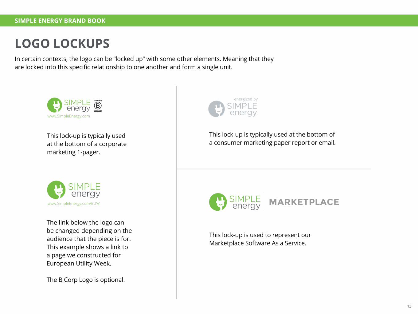
LOGO LOCKUPSIn certain contexts, the logo can be “locked up” with some other elements. Meaning that they are locked into this specific relationship to one another and form a single unit.
This lock-up is typically used at the bottom of a corporate marketing 1-pager.
The link below the logo can be changed depending on the audience that the piece is for. This example shows a link to a page we constructed for European Utility Week.
The B Corp Logo is optional.
This lock-up is used to represent our Marketplace Software As a Service.
This lock-up is typically used at the bottom of a consumer marketing paper report or email.
www.SimpleEnergy.com/EUW
SIMPLE ENERGY BRAND BOOK
13
TYPOGRAPHY

TYPOGRAPHY
80% Opacity, Multiply
THIS IS A HEADLINE, OPEN SANS BOLD 22/24, ALL CAPSThis is an introduction paragraph, or larger option for body copy over all. 11/13
This is a subhead, Open Sans Bold 11/12THIS IS A SMALL TITLE, OPEN SANS BOLD 9/12, ALL CAPSThis is a body paragraph, Open Sans Regular 9/12
• These are bullets, Open Sans Regular 9/13 and 9/19
• The top line of the bulleted list should have a line height of 19 pts. The remaining lines in the paragraph should have a line height of 13 pts. This creates more space between bullets.
This is a callout, Open Sans Light Italic 13/17
This is a secondary callout, Open Sans Light Italic 9/13
This is a call to action, or CTA. Open Sans Light 20/22
*This is fine print, Open Sans Regular, 5/6
Used to introduce the overall piece
Used to introduce the overall piece, or for the whole peice for content-light pieces
Used to introduce the sectionUsed to describe the paragraph, flow chart, or graph following
Bullets are used for a list of points/items
Use custom spacing
Used to highlight the main idea
An option for a more subtle callout
Inspire your customers to take action. Period at the end, always.
This is used for citations. Should always be at the bottom.
“This is a customer testimonial. Open Sans Italic 12/14”
–This is the person who said it, a real Simple Energy user Open Sans Regular 12/14
When starting from scratch, copy & paste the paragraph above into new, standard sized InDesign documents. Paragraph styles
will populate automatically.
SIMPLE ENERGY BRAND BOOK
15

COLOR PALETTES

PRIMARY COLOR PALETTE
BODY TEXT PRIMARY SUPPORTING TEXTHEADER TEXT PRIMARY PRIMARY BACKGROUNDSECONDARY BACKGROUND
RGB0, 0, 0
HEX#000000
CMYK78, 68, 67, 90
RGB83, 86, 92
HEX#53555c
CMYK67, 58, 50, 28
RGB169, 170, 173
HEX#a9aaac
CMYK35, 28, 27, 0
RGB247, 246, 247
HEX#f6f5f7
CMYK2, 2, 1, 0
RGB255, 255, 255
HEX#ffffff
CMYK0, 0, 0, 0
PRIMARY ACCENT
CMYK59, 0, 99, 0
PANTONE376
RGB177, 192, 68
HEX#75bf44
SIMPLE ENERGY BRAND BOOK
17
SECONDARY COLOR PALETTE
RGB194, 28, 77
HEX#c11c4c
CMYK18, 100, 62, 5
RGB247, 148, 28
HEX#f7941c
CMYK0, 50, 100, 0
RGB255, 194, 13
HEX#ffc20d
CMYK0, 25, 100, 0
RGB140, 48, 130
HEX#8c3082
CMYK50, 95, 13, 0
RGB38, 176, 222
HEX#26afdd
CMYK70, 10, 5, 0
RGB23, 87, 148
HEX#165693
CMYK88, 64, 22, 4
RGB117, 191, 68
HEX#75bf44
CMYK59, 0, 99, 0
PANTONE376
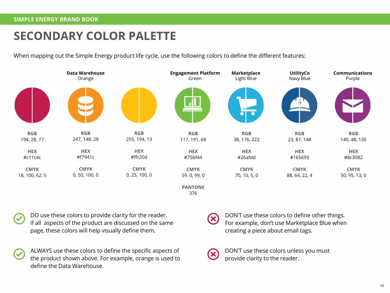
ALWAYS use these colors to define the specific aspects of the product shown above. For example, orange is used to define the Data Warehouse.
DO use these colors to provide clarity for the reader. If all aspects of the product are discussed on the same page, these colors will help visually define them.
DON’T use these colors to define other things. For example, don’t use Marketplace Blue when creating a piece about email tags.
DON’T use these colors unless you must provide clarity to the reader.
UtilityCoNavy Blue
Engagement PlatformGreen
Data WarehouseOrange
MarketplaceLight Blue
CommunicationsPurple
When mapping out the Simple Energy product life cycle, use the following colors to define the different features:
SIMPLE ENERGY BRAND BOOK
18

COMMUNICATING PRODUCT FLOW THROUGH COLOR
SIMPLE ENERGY BRAND BOOK
19

COLOR HIERARCHY
Use this as reference as to what colors should be most dominant in any given piece.
SIMPLE ENERGY BRAND BOOK
20

RGB156, 3, 31
HEX#9b021e
CMYK25, 100, 95, 20
RGB194, 28, 77
HEX#c11c4c
CMYK18, 100, 62, 5
RGB237, 82, 130
HEX#ed5182
CMYK0, 83, 23, 0
RGB255, 145, 191
HEX#ff91bf
CMYK0, 55, 0, 0
RGB255, 194, 105
HEX#ffc168
CMYK0, 26, 67, 0
RGB247, 148, 28
HEX#f7931c
CMYK0, 50, 100, 0
RGB224, 105, 5
HEX#e06805
CMYK8, 70, 100, 0
RGB196, 79, 0
HEX#c44f00
CMYK15, 80, 100, 5
RGB255, 217, 117
HEX#ffd875
CMYK0, 14, 65, 0
RGB255, 194, 13
HEX#ffc10c
CMYK0, 25, 100, 0
RGB204, 140, 10
HEX#cc8c0a
CMYK20, 45, 100, 0
RGB166, 155, 5
HEX#a56805
CMYK28, 60, 100, 15
RGB199, 235, 163
HEX#c6eaa3
CMYK20, 0, 45, 0
RGB148, 201, 102
HEX#a
CMYK45, 0, 78, 0
RGB117, 191, 69
HEX#75bf44
CMYK59, 0, 99, 0
PANTONE376
RGB74, 148, 61
HEX#49933d
CMYK75, 20, 100, 5
RGB140, 240, 255
HEX#8cefff
CMYK30, 0, 0, 0
RGB79, 212, 245
HEX#4fd3f4
CMYK50, 0, 4, 0
RGB38, 176, 222
HEX#26afdd
CMYK70, 10, 5, 0
RGB5, 120, 173
HEX#0577ad
CMYK88, 47, 12, 0
RGB97, 173, 227
HEX#60ade2
CMYK60, 20, 0, 0
RGB51, 130, 194
HEX#3382c1
CMYK80, 42, 1, 0
RGB23, 87, 148
HEX#165693
CMYK88, 64, 22, 4
RGB3, 56, 94
HEX#02385e
CMYK100, 80, 38, 28
RGB232, 158, 232
HEX#e89ee8
CMYK11, 40, 0, 0
RGB189, 107, 186
HEX#bc6bba
CMYK28, 68, 0, 0
RGB140, 48, 130
HEX#8c3082
CMYK50, 95, 13, 0
RGB105, 10, 102
HEX#680a66
CMYK65, 100, 25, 10
DATA COLOR PALETTE: CHARTS & GRAPHS ONLY
DON’T use these colors for icons, typography, etc.
DO use this palette for charts and graphs
DO use color to define different aspects of the product using guidelines from previous page if applicable. (Use green and gray as much as possible, for example.)
SIMPLE ENERGY BRAND BOOK
21

ICONOGRAPHY
ICONS: HOW TO DESIGN
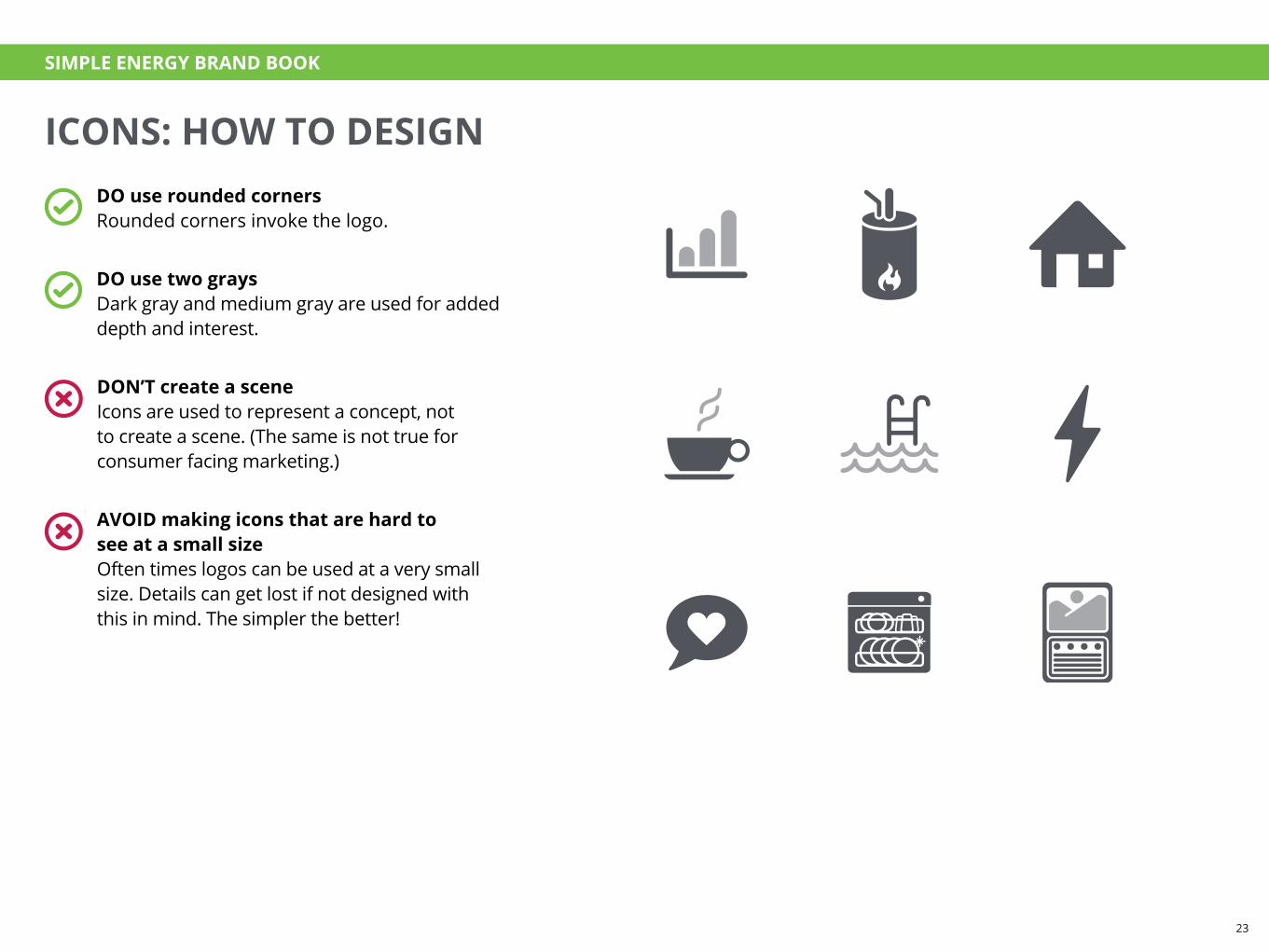
AVOID making icons that are hard to see at a small sizeOften times logos can be used at a very small size. Details can get lost if not designed with this in mind. The simpler the better!
DON’T create a sceneIcons are used to represent a concept, not to create a scene. (The same is not true for consumer facing marketing.)
DO use rounded cornersRounded corners invoke the logo.
DO use two graysDark gray and medium gray are used for added depth and interest.
SIMPLE ENERGY BRAND BOOK
23

ICONS: HOW USEIcons can be placed within circles to generate visual interest if the piece calls for it. The icons should be all white. There should be plenty of negative space surrounding the icon. Please refer to the color guidelines to ensure appropriate color usage.
SIMPLE ENERGY BRAND BOOK
24

IMAGERY

CUSTOMER PHOTOGRAPHYImages should evoke refreshing, hopeful feelings.
DO use a full bleedOften times when photography is included, it is full bleed.
DO crop the blue circleWhen including quotes, be sure to partially crop the blue circle.
BUILDING CUSTOMER RELATIONSHIPS IS GOOD BUSINESS
“My attitude toward my utility fundamentally changed: now I feel like they are with us, instead of against us.”
–Linda H., a real Simple Energy customer
SIMPLE ENERGY BRAND BOOK
26

PRODUCT PHOTOGRAPHYWhen creating product photos, there are two methods:
• Placeit shots, where the screenshot is placed within a photograph.
• In a device, where the screenshot is more straightforward.
DON’T lieWhile it’s okay to adjust designs to be more readable, do not add features that do not exist.
DO be selective about which photo to useWhen possible, choose photographs where the screen is easy to read. Make sure the context of the image matches the context of our customers and the product.
DO adjust the design to be readableIf needed, create a “marketing version” of a web design that is adjusted for maximum readability.
Flat device templates can be found here:Dropbox (Simple Energy)/Design/Design Assets/Templates
Placeit shots can be created on www.placeit.net-OR-
Dropbox (Simple Energy)/Design/Design Assets/Product Photos (placeit)
SIMPLE ENERGY BRAND BOOK
27

RESOURCES
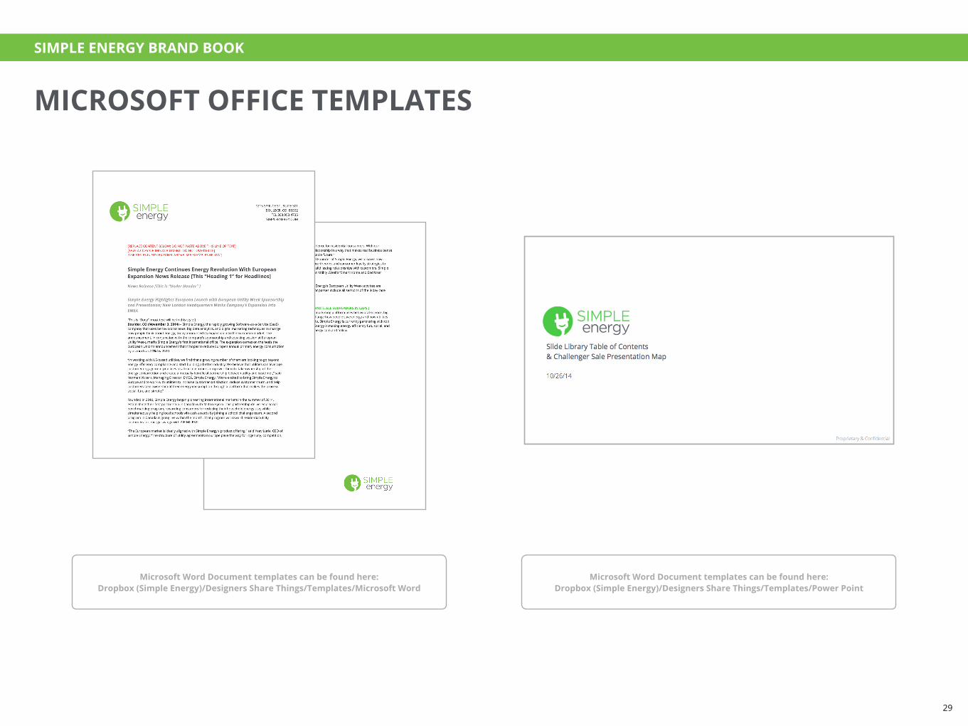
MICROSOFT OFFICE TEMPLATES
Microsoft Word Document templates can be found here:Dropbox (Simple Energy)/Designers Share Things/Templates/Microsoft Word
Microsoft Word Document templates can be found here:Dropbox (Simple Energy)/Designers Share Things/Templates/Power Point
SIMPLE ENERGY BRAND BOOK
29