sistemas de grelhas — pdf de ph
TRANSCRIPT

Swiss Graphic Style
International Graphic Style
Grid Systems
Grotesk Fonts
Grid Systems / 2
Os anos 1920 – 1930
Os pioneiros:
Jan Tschichold,
Herbert Bayer
Piet Zvart,
Ballmer, etc.
Grid Systems / 3
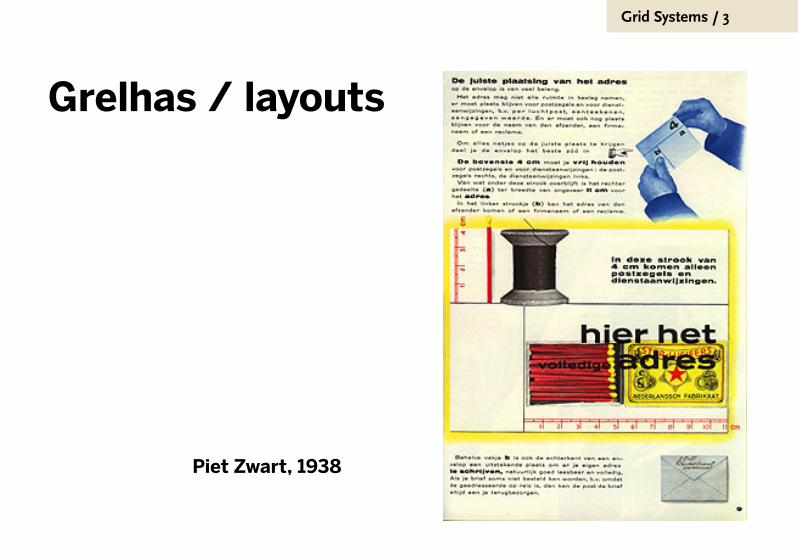
Grelhas / layouts
Piet Zwart, 1938
Grid Systems / 4
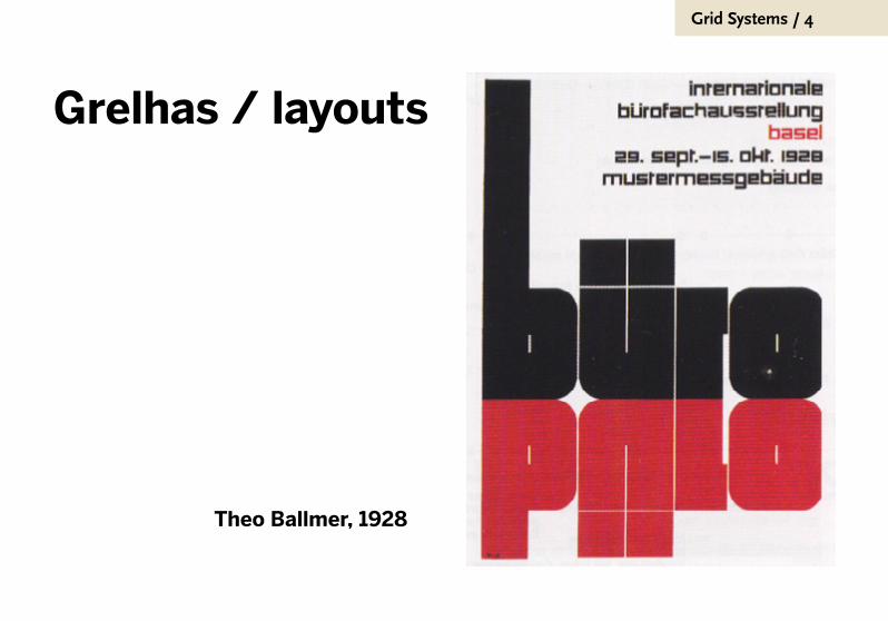
Grelhas / layouts
Theo Ballmer, 1928

Grid Systems / 5
Jan Tschichold,
1930
Grid Systems / 6
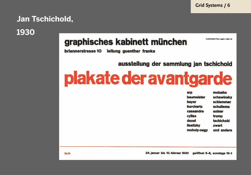
Jan Tschichold,
1930

Grid Systems / 7
Grelhas / layouts
Jan Tschichold, 1937

Grid Systems / 8
Grelhas / layouts
Jan
Tschichold,
1930

Grid Systems / 9
Grelhas / layouts
Jan
Tschichold,
1930

Grid Systems / 10
Escola Suíça,
pós-guerra
globalismo
internacional
neutral
não regional
não nacional
Lufthansa
BMW
Farmaceuticos
Bancos

Grid Systems / 11
Akzidenz-Grotesk (1900)
Helvetica / Univers / Frutiger (50-60)
As fontes grotescas

Grid Systems / 12
akzidenzAlemanha, 1900
www.tipografos.net/tipos/
Grid Systems / 13
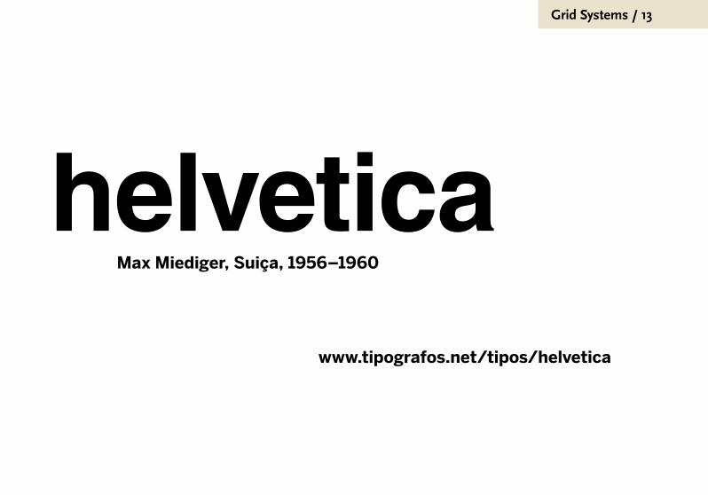
helveticaMax Miediger, Suiça, 1956–1960
www.tipografos.net/tipos/helvetica

Grid Systems / 14
logo da AIGA, fonte Helvetica

Grid Systems / 15
Grid Systems / 16
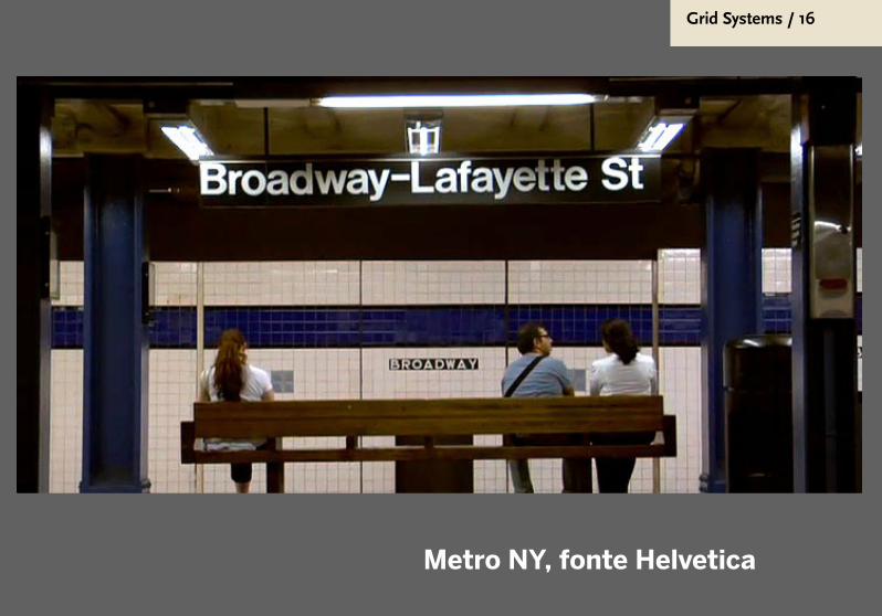
Metro NY, fonte Helvetica

Grid Systems / 17

Grid Systems / 18

Grid Systems / 19
universAutor: o suíço Adrian Frutiger, França,
1950/1951 até 1956
www.tipografos.net/tipos/univers

Grid Systems / 20
frutigerwww.tipografos.net/tipos/frutiger
Grid Systems / 21
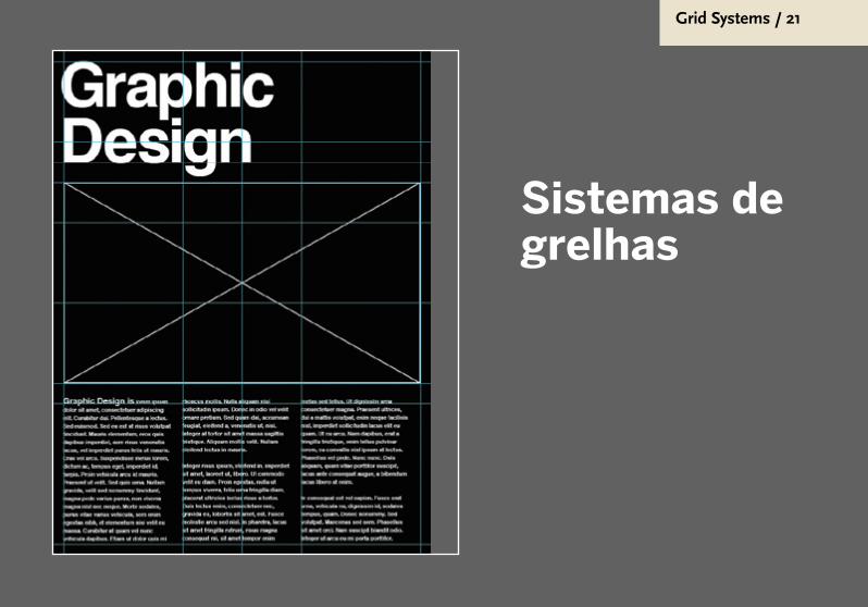
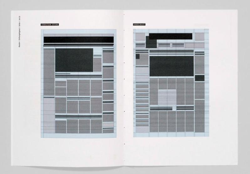
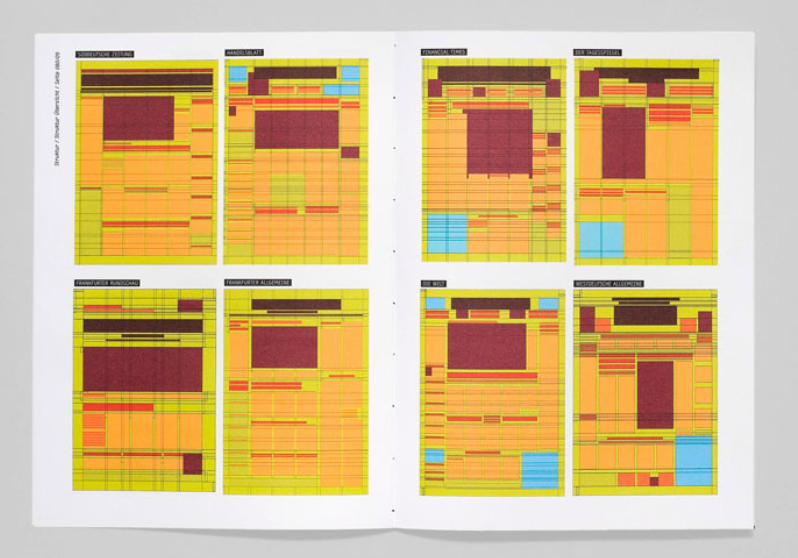
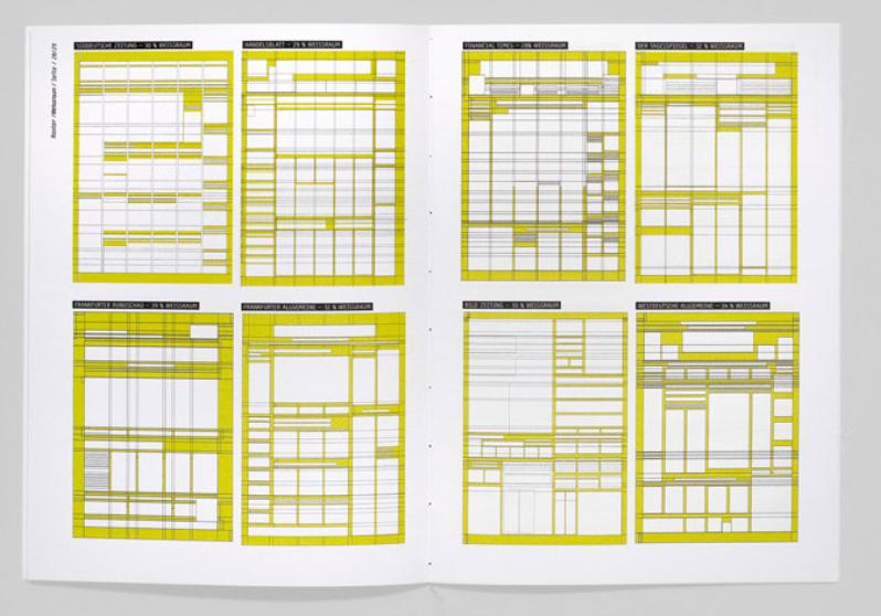
Sistemas de grelhas
Grid Systems / 22
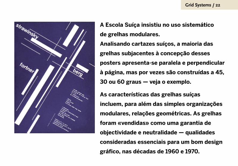
A Escola Suíça insistiu no uso sistemático
de grelhas modulares.
Analisando cartazes suíços, a maioria das
grelhas subjacentes à concepção desses
posters apresenta-se paralela e perpendicular
à página, mas por vezes são construídas a 45,
30 ou 60 graus — veja o exemplo.
As características das grelhas suíças
incluem, para além das simples organizações
modulares, relações geométricas. As grelhas
foram «vendidas» como uma garantia de
objectividade e neutralidade — qualidades
consideradas essenciais para um bom design
gráfico, nas décadas de 1960 e 1970.
Grid Systems / 23
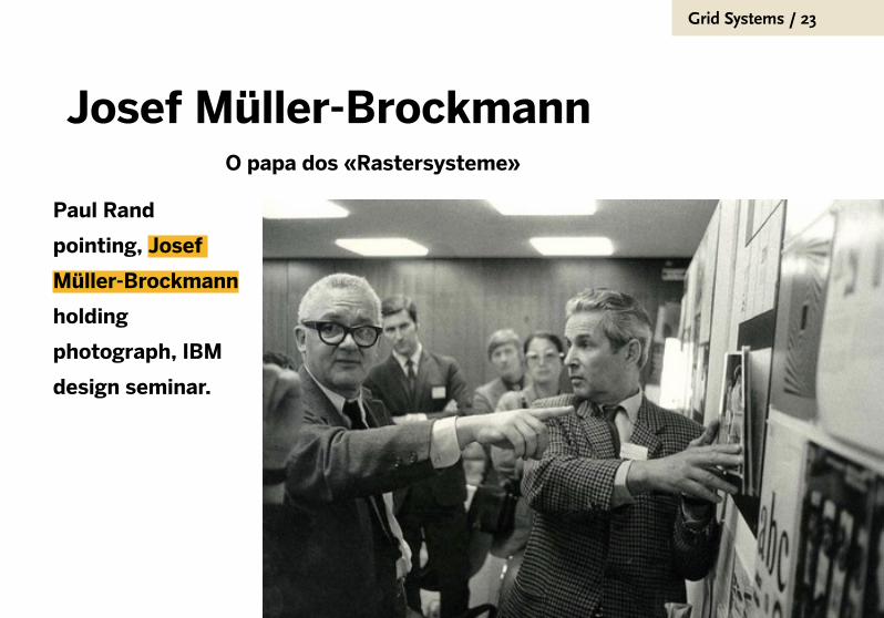
Josef Müller-Brockmann
Paul Rand
pointing, Josef
Müller-Brockmann
holding
photograph, IBM
design seminar.
O papa dos «Rastersysteme»

Grid Systems / 24
Grid Systems / 25
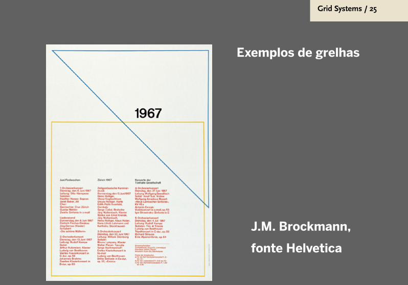
J.M. Brockmann,
fonte Helvetica
Exemplos de grelhas
Grid Systems / 26
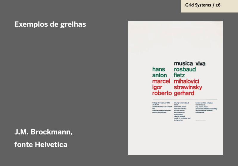
Exemplos de grelhas
J.M. Brockmann,
fonte Helvetica

Grid Systems / 27
Grid Systems / 28
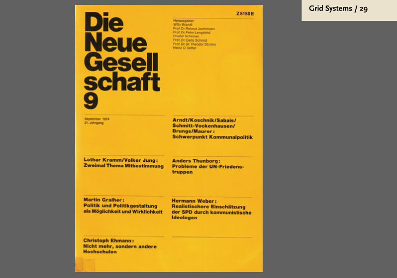
Grid Systems / 29

Grid Systems / 30
Vignelli
Grid Systems / 31
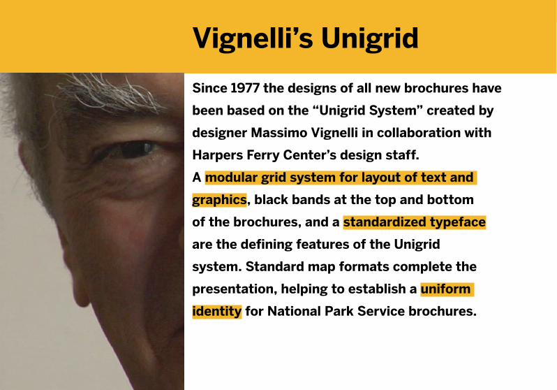
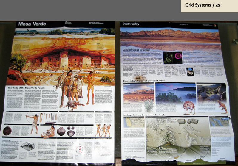
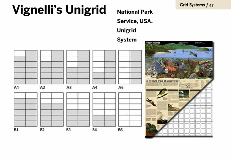
Vignelli’s Unigrid
Since 1977 the designs of all new brochures have
been based on the “Unigrid System” created by
designer Massimo Vignelli in collaboration with
Harpers Ferry Center’s design staff.
A modular grid system for layout of text and
graphics, black bands at the top and bottom
of the brochures, and a standardized typeface
are the defining features of the Unigrid
system. Standard map formats complete the
presentation, helping to establish a uniform
identity for National Park Service brochures.

Grid Systems / 32

Grid Systems / 33
Grid Systems / 34
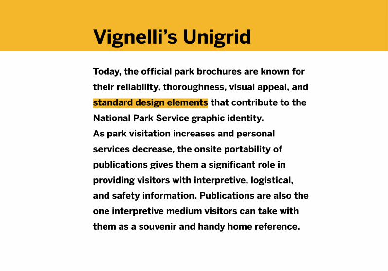
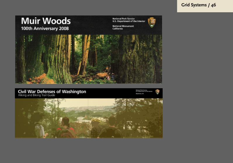
Vignelli’s Unigrid
Today, the official park brochures are known for
their reliability, thoroughness, visual appeal, and
standard design elements that contribute to the
National Park Service graphic identity.
As park visitation increases and personal
services decrease, the onsite portability of
publications gives them a significant role in
providing visitors with interpretive, logistical,
and safety information. Publications are also the
one interpretive medium visitors can take with
them as a souvenir and handy home reference.
Grid Systems / 35
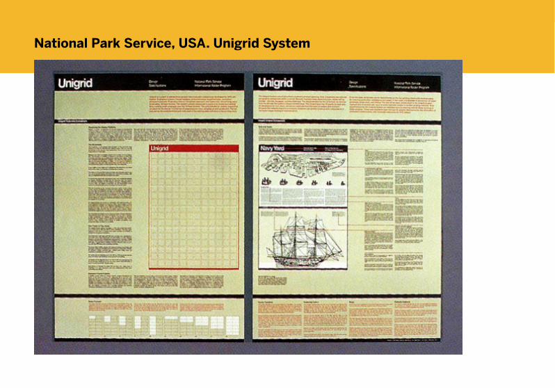
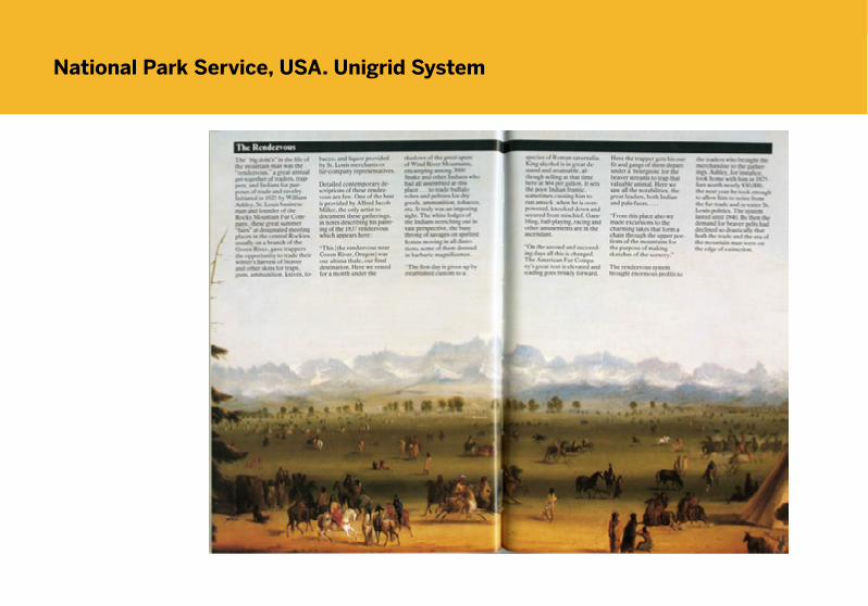
National Park Service, USA. Unigrid System
Grid Systems / 36
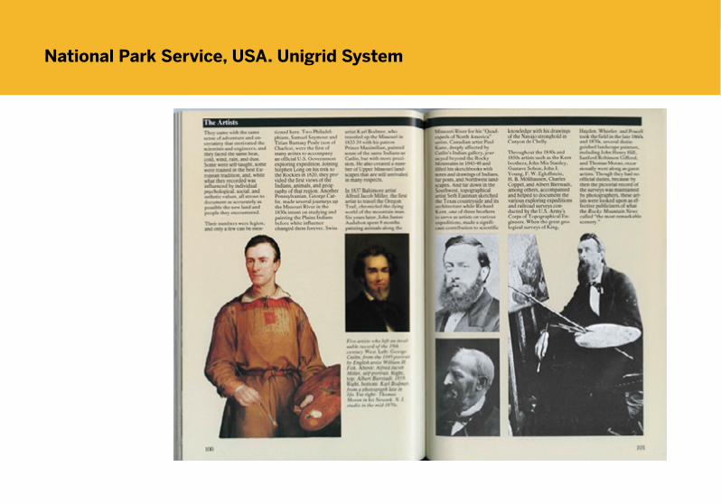
National Park Service, USA. Unigrid System

Grid Systems / 37
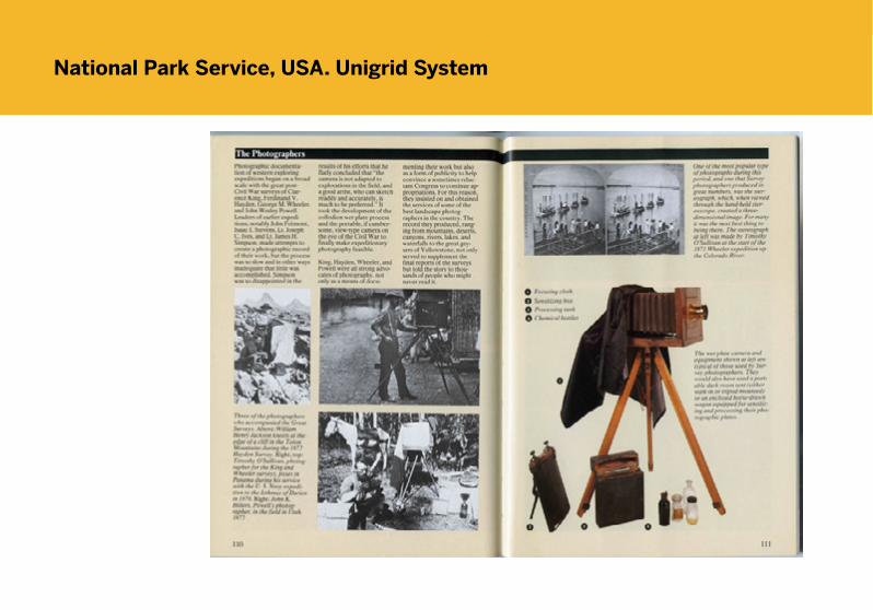
National Park Service, USA. Unigrid System
Grid Systems / 38
National Park Service, USA. Unigrid System
Grid Systems / 39
National Park Service, USA. Unigrid System
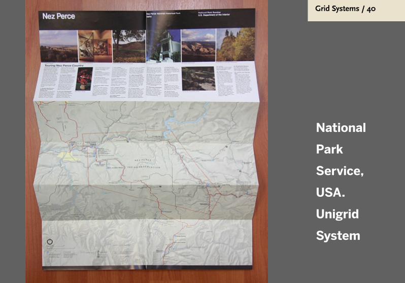
Grid Systems / 40
National
Park
Service,
USA.
Unigrid
System

Grid Systems / 41
National
Park
Service,
USA.
Unigrid
System
Grid Systems / 42

Grid Systems / 43
National Park Service U.S. Department of the Interior, “Fort Clatsop brochure from the National Park Service,” in Nehalem Valley Historical Society Online Archive

Grid Systems / 44

Grid Systems / 45
Grid Systems / 46
Grid Systems / 47
Vignelli’s Unigrid National Park
Service, USA.
Unigrid
System

Grid Systems / 48
How to use the new standard NPS typefaces
National Park ServiceU.S. Department of the Interior
Selected versions of the Frutiger typeface:
Frutiger Roman
ABCDEFGHIJKLMNOPQRSTUVWXYZabcdefghijklmnopqrstuvwxyz0123456789Frutiger Bold
ABCDEFGHIJKLMNOPQRSTUVWXYZabcdefghijklmnopqrstuvwxyz0123456789
Selected versions of the NPS Rawlinson typeface:
NPS Rawlinson
ABCDEFGHIJKLMNOPQRSTUVWXYZabcdefghijklmnopqrstuvwxyz0123456789 0123456789
NPS Rawlinson Bold
ABCDEFGHIJKLMNOPQRSTUVWXYZabcdefghijklmnopqrstuvwxyz0123456789 0123456789
Using NPS Rawlinson
■ Use NPS Rawlinson for titles and subtitles. Itscustom qualities are well-suited to NPS products and enhance the NPS graphic designstandards.
■ Use NPS Rawlinson for lengthy text settings.Serif typefaces are generally easier to read inlong bodies of text.
■ Do not use Rawlinson for identity-related titlessuch as park names or agency and departmen-tal identification. Identity-related typographyshould be set in Frutiger Bold.
■ Do not use Rawlinson at very small sizes incomplicated applications such as maps and dia-gram labels.
Using Frutiger
■ Frutiger should be used for all identity-related information such as park names and agencyand departmental titles, especially when usedin the black band.
■ Frutiger should be used for short typographicelements, such as captions and sidebars. It maybe used in longer text settings, but careful con-sideration should be given to ensure legibility.
■ Frutiger should be used when very small sizesare required in complicated applications suchas maps and diagram labels.
Typography is fundamental to graphic design standards.Using consistent typefaces ensures that the public willreadily recognize National Park Service products. TheUnigrid publication system introduced in the 1970s provides a solid foundation for extending consistenttypographic standards to other NPS products.
The new NPS graphic design standards introduce twotypefaces for all NPS graphics: the serif face, NPSRawlinson, and a complementary sans-serif face,Frutiger. NPS Rawlinson was designed specifically for theNational Park Service. Its full range of weights, italics, and
condensed versions makes it suitable for applicationsranging from signs and exhibits to publications and maps.
New NPS sign standards feature NPS Roadway, a variation of NPS Rawlinson optimized for reading at a distance.
Frutiger replaces the type family (Helvetica) previouslyused in many NPS applications. Its open letter formsmake it more readable on signs and maps. Its clean, modern forms complement NPS Rawlinson.
NPS graphic design standards technical series: Number 1

Grid Systems / 49
Text line style
Flush left, ragged right text settings are recommended formost all NPS materials. With a flush left, ragged right setting,normal word spacing is ensured.
Upper and lower case
Avoid the use of all capital letters.All-capital text settings may slowreading speed by as much as 13percent and take up to 30 percentmore space.
Leading
Leading is the amount of spacebetween lines of type. Addingspace between lines helps toimprove legibility of smaller textsizes and longer line lengths.Typically 2 points of leading isappropriate for most text settings.
Paragraphs
For certain texts (brochures, bul-letins, websites, etc.) paragraphsmay be distinguished by skippingone line. For others (books andother lengthy texts) indentationsare more appropriate.
Line length
Text lines that are too long inhibitreadability. The total number ofletters and spaces per line shouldbe between 40 and 70. Lines thatare too long often cause the sameline to be read twice.
Bolds and italics
Bolds and italics should be used only to provide emphasis. Lengthyamounts of text in either stylereduce legibility.
Contrast
Anything that reduces contrastreduces legibility. Text over a tintor color background will decreaselegibility and should be used withdiscretion. Lengthy amounts of textreversed out of a black backgroundcan cause eye strain.
Some basic guidelines to typesetting
Type that is set flush left distributesexcess space at the end of the lines,resulting in an irregular pattern thatenhances ease in reading. Type setjustified, centered, or flush right maybe more difficult to read.
Type that is set flush left distributesexcess space at the end of the linesresulting in an irregular pattern thatenhances ease in reading. Type set jus-tified, centered, or flush right may bemore difficult to read.
We read words by their shapes.
The shapes of all-capital settings
provide fewer shape clues than
upper- and lower-case settings.
WE READ WORDS BY THEIR SHAPES.
THE SHAPES OF ALL-CAPITAL SETTINGS
PROVIDE FEWER SHAPE CLUES THAN
UPPER- AND LOWER-CASE SETTINGS.
Even smaller text settings can be mademore legible by adding the properamount of space between the lines oftype. Longer lines of type also requiremore space to make them easier toread.
Even smaller text settings can be mademore legible by adding the properamount of space between the lines oftype. Longer lines of type also requiremore space to make them easier toread.Tightly set lines tire the eyes andare more confusing to the reader.
Long lines of type can be difficult to read, especially when the lines are very close together. Short column width,increased leading, and flush left alignment can all help to improve the legibility of the text. Long lines of typecan be difficult to read, especially when the lines are very close together. Short column width, increased lead-ing, and flush left alignment can all help to improve the legibility of the text. Long lines of type can be difficultto read, especially when the lines are very close together. Short column width, increased leading, and flush leftalignment can all help to improve the legibility of the text. Long lines of type can be difficult to read, especial-ly when the lines are very close together. Short column width, increased leading, and flush left alignment canall help to improve the legibility of the text.
The use of bold type in lengthytext settings should be avoided.Bold text takes up more room andoften creates legibility problems.Limited use of bold text is an effec-tive means of providing emphasis.
The use of italic type in lengthy text set-tings should be avoided. Italic texttakes up less room than regular text,but often creates legibility problems.Overuse of italics defeats its purpose.
Paragraph indentation should be usedin long text settings to clearly indicate thebeginning of a new paragraph.
The amount of indentation usuallyequals the height of the type size. 8 pt.type is indented 8 pts., for example
For most typographic settings,a complete line return can be used toseparate paragraphs.
This uses more space, but results in more clear alignment and organiza-tion.
Use care when setting lengthy amounts of text over colored or tinted backgrounds.Generally, anything that reduces contrast reduces legibility. Also, body copy reversedout of black or a strong color may cause annoying visual “noise” that reduces legibility.
Use care when setting lengthy amounts of text over colored or tinted backgrounds.Generally, anything that reduces contrast reduces legibility. Also, body copy reversedout of black or a strong color may cause annoying visual “noise” that reduces legibility.
10% 20% 35% 60%
nps_type_standards.
pdf:2

Grid Systems / 50
Grid Systems / 51
48
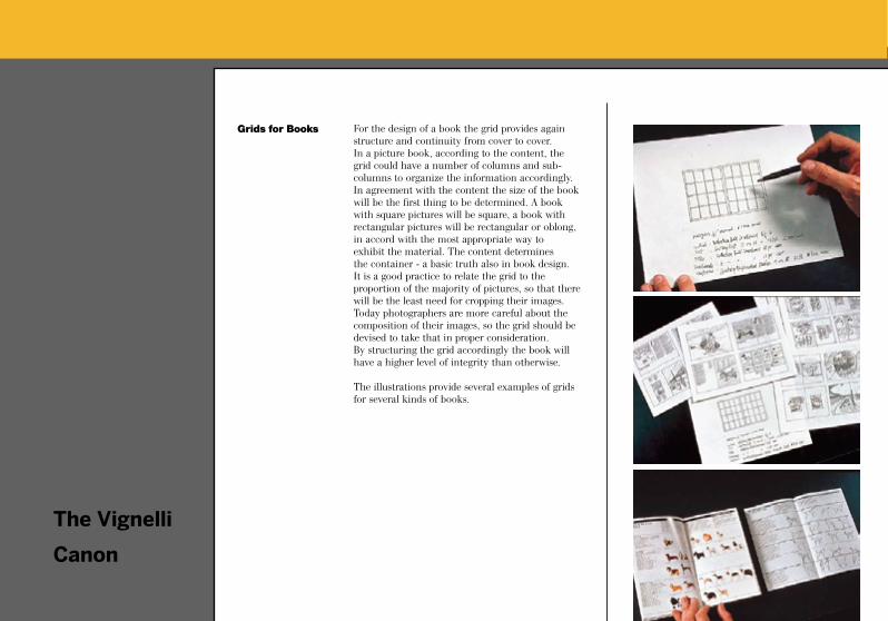
For the design of a book the grid provides again structure and continuity from cover to cover. In a picture book, according to the content, the grid could have a number of columns and sub-columns to organize the information accordingly. In agreement with the content the size of the book will be the first thing to be determined. A book with square pictures will be square, a book with rectangular pictures will be rectangular or oblong, in accord with the most appropriate way to exhibit the material. The content determines the container - a basic truth also in book design.It is a good practice to relate the grid to the proportion of the majority of pictures, so that there will be the least need for cropping their images. Today photographers are more careful about the composition of their images, so the grid should be devised to take that in proper consideration. By structuring the grid accordingly the book will have a higher level of integrity than otherwise.
The illustrations provide several examples of grids for several kinds of books.
Grids for Books
The Vignelli
Canon
Grid Systems / 52
Sistemas de Grelha (como fazer)

Grid Systems / 53
A finalidade das grelhas
O layouter, o paginador, o designer gráfico, o
fotógrafo, o projectista de exposições,
usam grelhas. Grelhas são ferramentas
para desenvolver soluções da disposição de
conteúdos em duas ou três dimensões.
A divisão do espaço é o aspecto
determinante para justificar a utilização
de grelhas reguladoras das proporções
e determinando as posições de todos os
objectos gráficos.
Grid Systems / 54
The grid is a system for organizing elements on
a page. Taking into account the nature of the
content and size of the page, the area is divided
up into (generally even) segments against which
everything is aligned. Grids are especially useful in
creating a consistent layout system for multi-page
layouts like a book or Web site, but are also helpful
in creating harmonious compositions for a single
piece such as a poster.
Grid Systems / 55
Ordenamento do espaço
Ao ordenar as superfícies e espaços através das
retículas de uma grelha, o designer gráfico vai dispor
os seus textos, tabelas, fotografias, ilustrações e
diagramas segundo critérios considerados «objectivos
e funcionais».
Os elementos textuais e/ou pictóricos são
apresentados em tamanhos pré-definidos pela grelha.
O tamanho dos diversos elementos é determinado
segundo a sua importância para o conjunto de temas
apresentados.

Grid Systems / 56
Ordem racional
A incorporação de todos os elementos gráficos nas retículas
de um sistema de grelhas põe em evidência um sentido de
planificação, inteligibilidade e clareza, gerando a ideia de
ordem racional no design.
Esta ordem aumentará a credibilidade da informação e
despertará confiança — pelo menos, segundo os adeptos da
utilização de grelhas.

Grid Systems / 57
Hierarquia de conteúdos
A informação hierarquisada
com títulos, subtítulos, textos, ilustrações, imagens e
legendas, todos eles dispostos na grelha de forma racional e
metódica,
será não somente lida mais rápida e facilmente,
mas também melhor entendida e retida na memória.

Grid Systems / 58
Hierarquia de conteúdos
= arquitectura de informação
A informação precisa de uma estrutura gráfica, para a tornar
inteligivél ao leitor. Desde que existe comunicação gráfica,
existe uma arquitectura de informação.
Escrever por linhas é uma das formas mais básicas para
organizar informação textual.

Grid Systems / 59
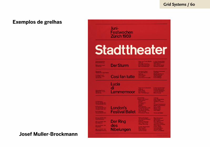
Exemplos de grelhas simples,
para cartazes
Grid Systems / 60
Exemplos de grelhas
Josef Muller-Brockmann

Grid Systems / 61
Exemplos de grelhas
Josef Muller-Brockmann
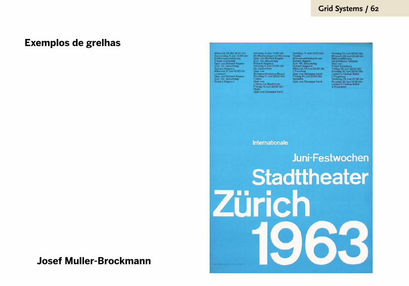
Grid Systems / 62
Exemplos de grelhas
Josef Muller-Brockmann

Grid Systems / 63
Exemplos de grelhas
Josef Muller-Brockmann

Grid Systems / 64
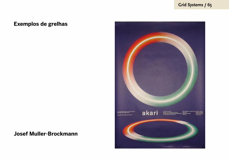
Exemplos de grelhas
Josef Muller-Brockmann
Grid Systems / 65
Exemplos de grelhas
Josef Muller-Brockmann

Grid Systems / 66
Exemplos de grelhas
Josef Muller-Brockmann
Como tudo na vida, também se pode exagerar a importância da grelha. Os suíços ultrapassaram os limites do bom senso criativo, para fazer dos «grid systems» uma autêntica religião do design.
Como as próprias fontes que usavam, que também eram construídas em sistemas de grelha, a obsessão pelos alinhamentos e pelos módulos abafava a criatividade na ânsia de modular e estruturar.
Grid Systems / 67
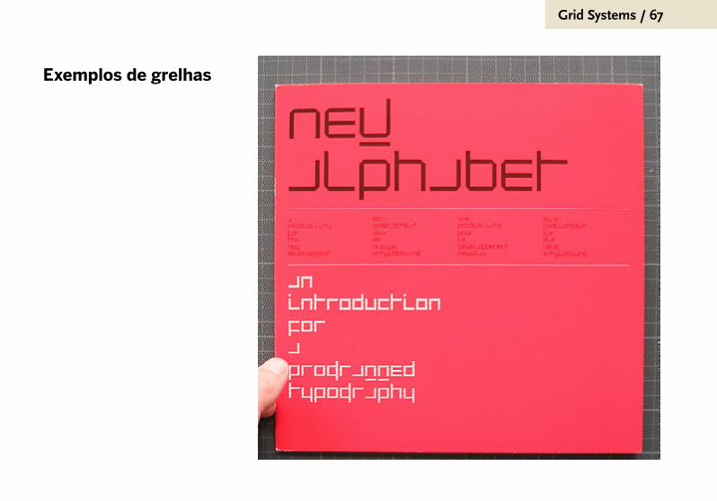
Exemplos de grelhas
Grid Systems / 68
Grid Systems / 69
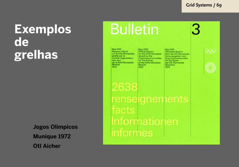
Exemplos de grelhas
Jogos Olimpicos
Munique 1972
Otl Aicher
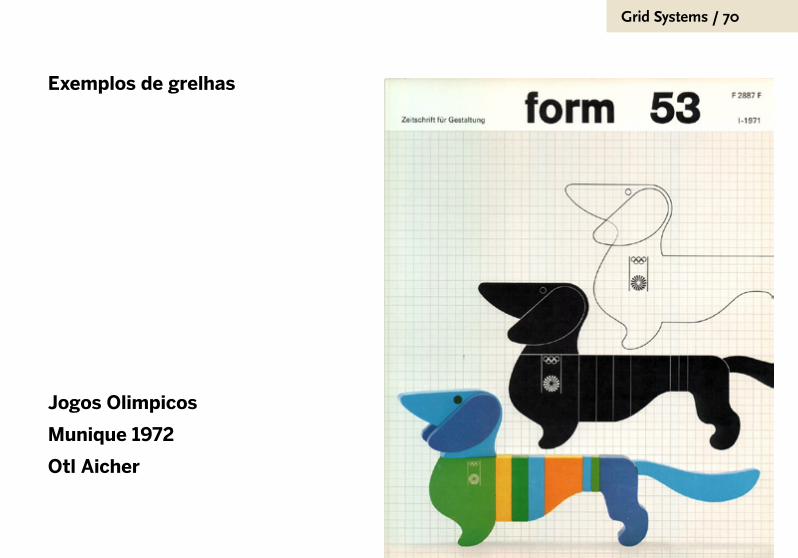
Grid Systems / 70
Exemplos de grelhas
Jogos Olimpicos
Munique 1972
Otl Aicher

Grid Systems / 71
Exemplos de grelhas
Jogos Olimpicos
Munique 1972
Otl Aicher
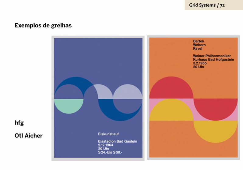
Grid Systems / 72
Exemplos de grelhas
hfg
Otl Aicher
Grid Systems / 73
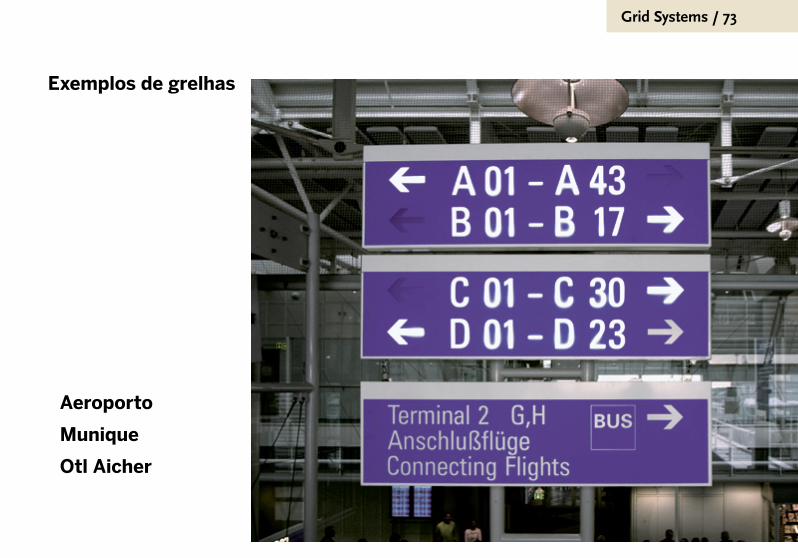
Exemplos de grelhas
Aeroporto
Munique
Otl Aicher

Grid Systems / 74
Como conceber uma grelha

Grid Systems / 75
Funcionalidade padrão
Um sistema de grelha deve ser a estrutura que permita o
alinhamento e enquadramento de todos os elementos que
façam parte de uma dada publicação: titulo, subtítulos,
textos corridos, tabelas, imagens, etc.
Basicamente servirá para estruturar o documento completo:
a página inicial,
os inícios dos capítulos/módulos,
as páginas onde domina o texto,
as páginas apenas preenchidas com imagens,
as páginas de conteúdo misto.

Grid Systems / 76
Limites
Muitas vezes, a grelha atinge tal complexidade, que
acaba por negar e contradizer a sua própria função.
Não são raros os exemplos em que se percebe que
o uso das subdivisões presentes na grelha é tão
subjectivo, que nos perguntamos porque é que o
designer se deu a trabalho de usar as proporções ditas
ideais para criar uma imensidade de compartimentos
para a página.

Grid Systems / 77
Imagem de Antonio Carusone. Este designer nova-iorquino devotou um web-site ao culto da grelha, do design suíço, do minimalismo e a temas afins. Consulte online em www.aisleone.net

?

Grid Systems / 80
A construção de uma grelha não é aleatória!
A construção de uma grelha está baseada em valores
tradicionais, empíricos. Veja, nos próximos exemplos:
documentos antigos.
Ponto de partida: o texto
O texto corrido é o ponto de partida para a construção de
uma grelha. A largura da coluna define o número de colunas.

Grid Systems / 81
Quem disse que
foram os graphic
designers do
século xx que
inventaram o layout
moderno?

Grid Systems / 82

Grid Systems / 83
Quem disse que
foram os graphic
designers do
século xx que
inventaram o layout
moderno?
Grid Systems / 84
Ponto de partida: a mancha gráfica
Na construção de uma grelha, o designer começa
sempre por definir a área útil, a mancha gráfica.
É nesta zona que serão posicionados textos, imagens,
tabelas, infografias e demais elementos.
A definição da mancha gráfica implica necessáriamente a
definição das margens, que são as zonas que delimitam a
mancha gráfica.
Grid Systems / 85
Divisão da mancha gráfica
A definição da mancha gráfica continua com a
implementação de n colunas, separadas por goteiras.
Nas seguintes páginas, alguma variantes comuns.

Manuscript grid
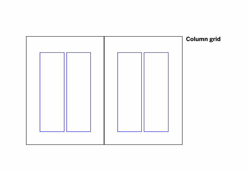
Column grid
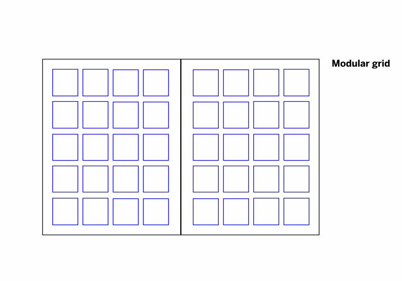
Modular grid

Modular grid

InDesign
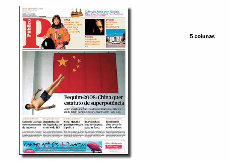
5 colunas

5 colunas

Grid Systems / 95
Grid Systems / 96

Grid Systems / 97
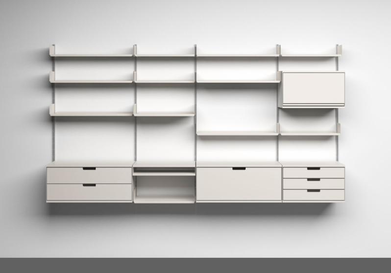
Sistemas de grelhas /
interiores /
3D

Grid Systems / 98

Grid Systems / 99
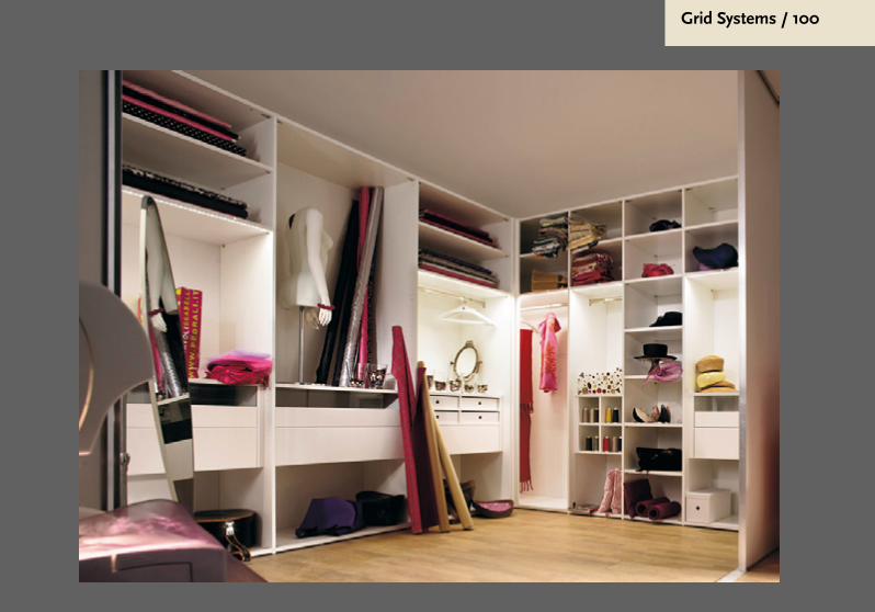
Grid Systems / 100

Grid Systems / 101
Designed and produced
by Jannuzzi Sm
ith.P
rinted by Balding+
Mansell
on Munken P
olar, 130gsm
.

Dieter Rams, Vitsoe

Grid Systems / 103
Grid Systems / 104
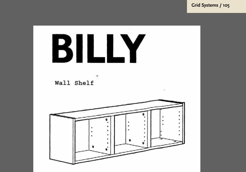
Grid Systems / 105
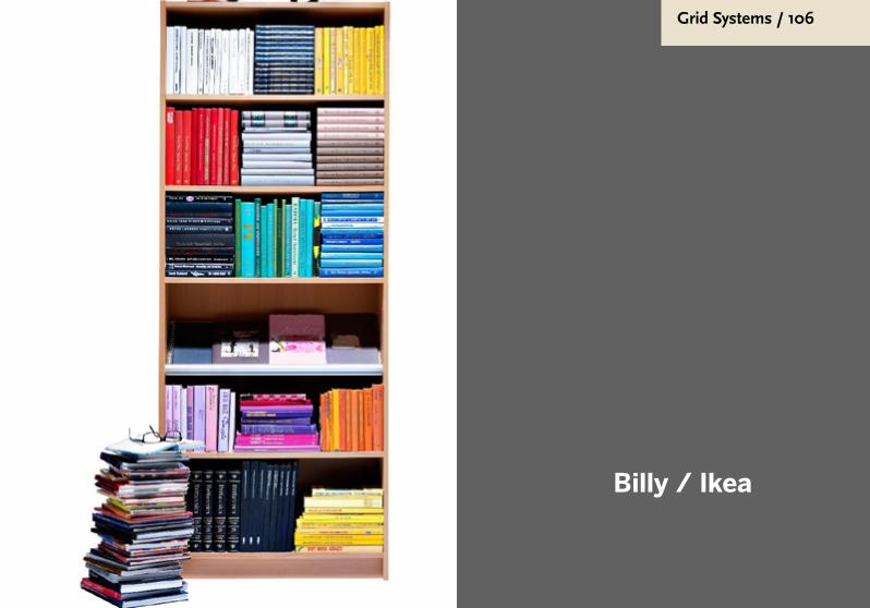
Grid Systems / 106
Billy / Ikea
Grid Systems / 107
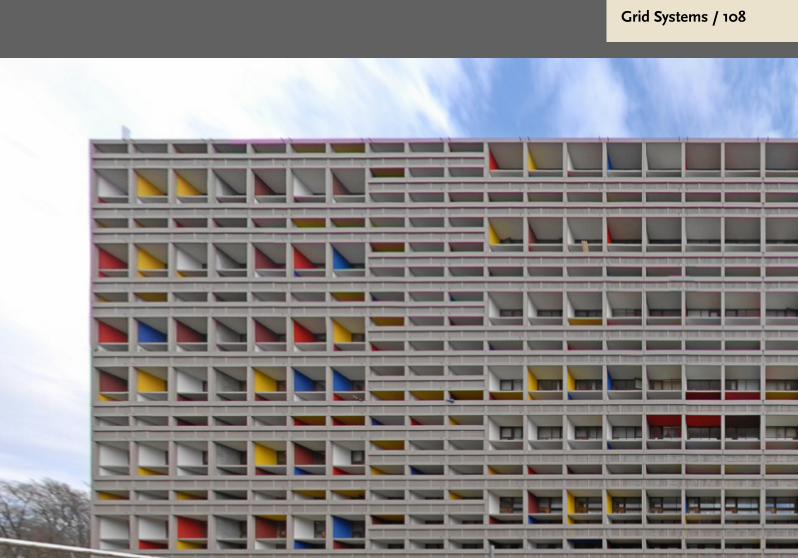
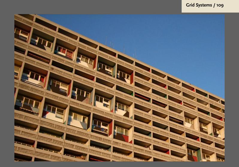
Sistemas de grelhas / Arquitectura
Grid Systems / 108
Grid Systems / 109
Grid Systems / 110
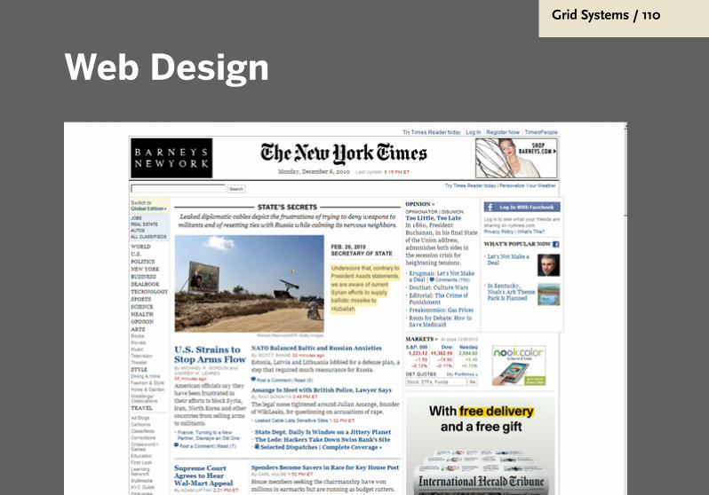
Web Design

Grid Systems / 111
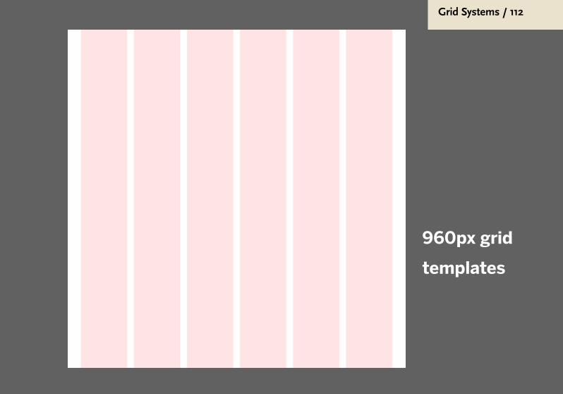
Grid Systems / 112
960px grid
templates

Grid Systems / 113
960px grid
templates

Grid Systems / 114
960px grid
templates

Grid Systems / 115
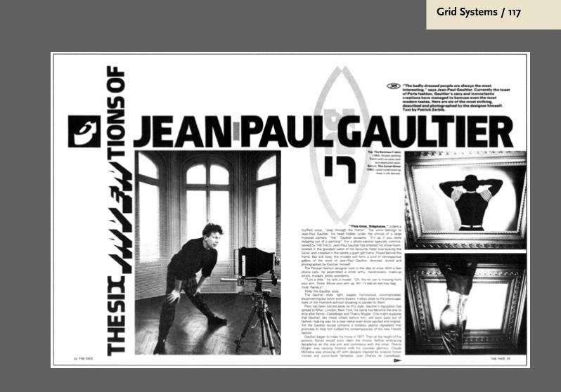
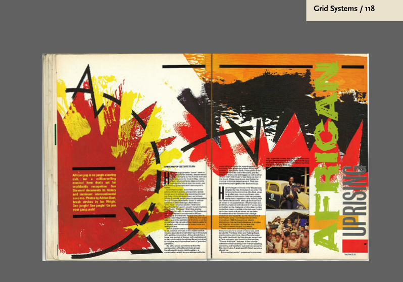
Breaking the grid
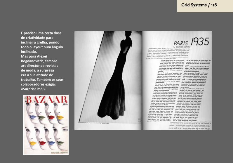
Grid Systems / 116
É preciso uma certa dose de criatividade para inclinar a grelha, pondo todo o layout num ângulo inclinado. Mas para Alexei Bogdanovitch, famoso art director de revistas de moda, a surpresa era a sua atitude de trabalho. Também os seus colaboradores exigia: «Surprise me!»
Grid Systems / 117
Grid Systems / 118
Grid Systems / 119
Bibliografia
Samara, Timothy. Making and Breaking
the grid: A Graphic Design Layout
workshop, RockPort, 2002, tradução:
Diseñar con y sin retícula, Barcelona,
Gustavo Gili, 2004, 208 páginas.
Grid Systems / 120
© visubooks paulo heitlinger
Para uso exclusivo dos estudantes da ULP, em 2010/2011/2012. Todos os direitos reservados pelos autores.