slide makeover #80: shifting breakdown of segments totalling 100%
TRANSCRIPT

Slide Makeover
Video Podcast #80:
Shifting breakdown of
segments totaling 100%
Based on the ideas in
“Present It So They Get It”
by Dave Paradi
www.PresentItSoTheyGetIt.com
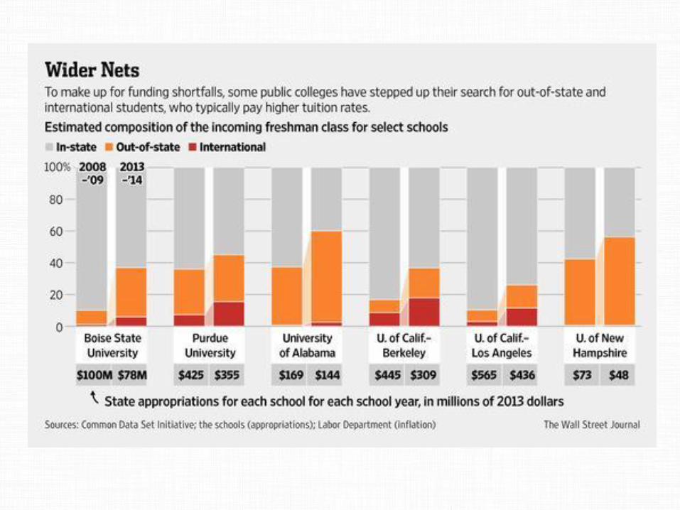
A stacked column graph is
commonly used to show how
different segments add to a total of
100%. When the breakdown
changes over time, side by side
stacked columns are used. Here is
a typical example …
Stacked column graphs are difficult
for people to understand because
the segments don’t always start in
the same spot. Here’s what I am
talking about …
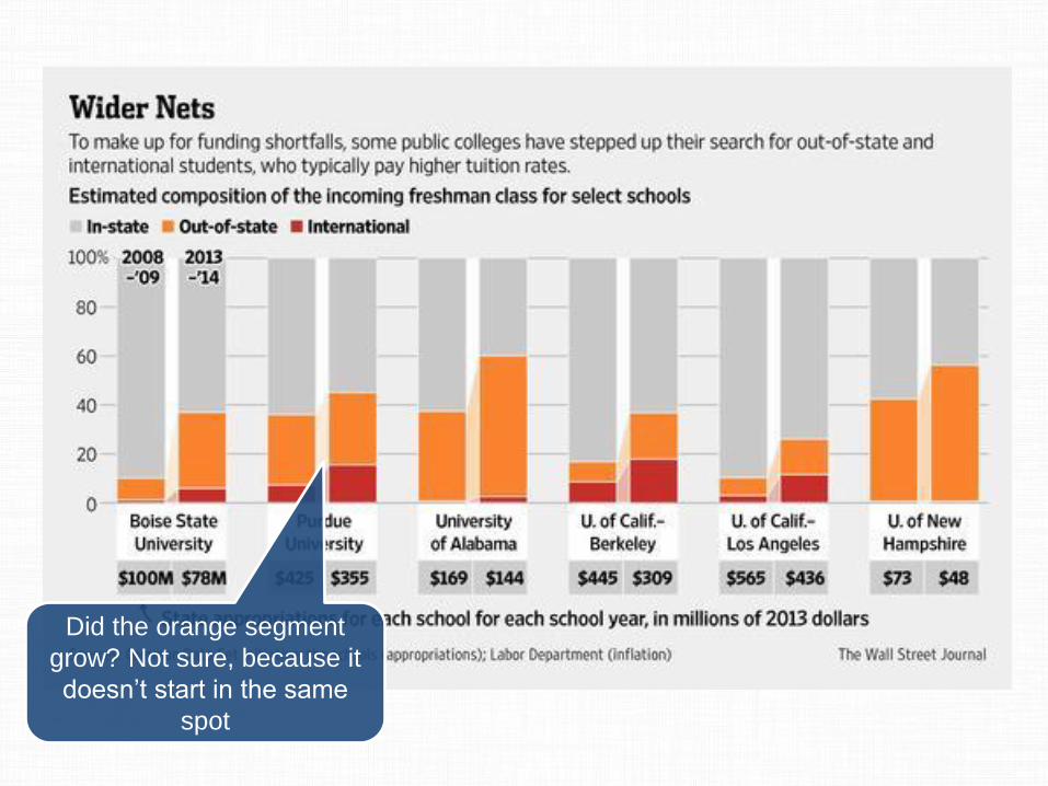
Did the orange segment
grow? Not sure, because it
doesn’t start in the same
spot
A better approach is to use a
diverging stacked bar chart. It is a
long name for a visual, but it can
be very useful for this situation.
Here’s what I turned the original
graph into.
90
63
64
56
63
41
2008-9
2013-14
2008-9
2013-14
2008-9
2013-14
International Out of state
Boise State
University
Purdue
University
University
of Alabama
In state
83
62
90
74
58
44
2008-9
2013-14
2008-9
2013-14
2008-9
2013-14
U of Calif -
Berkeley
U of Calif –
Los Angeles
U of New
Hampshire
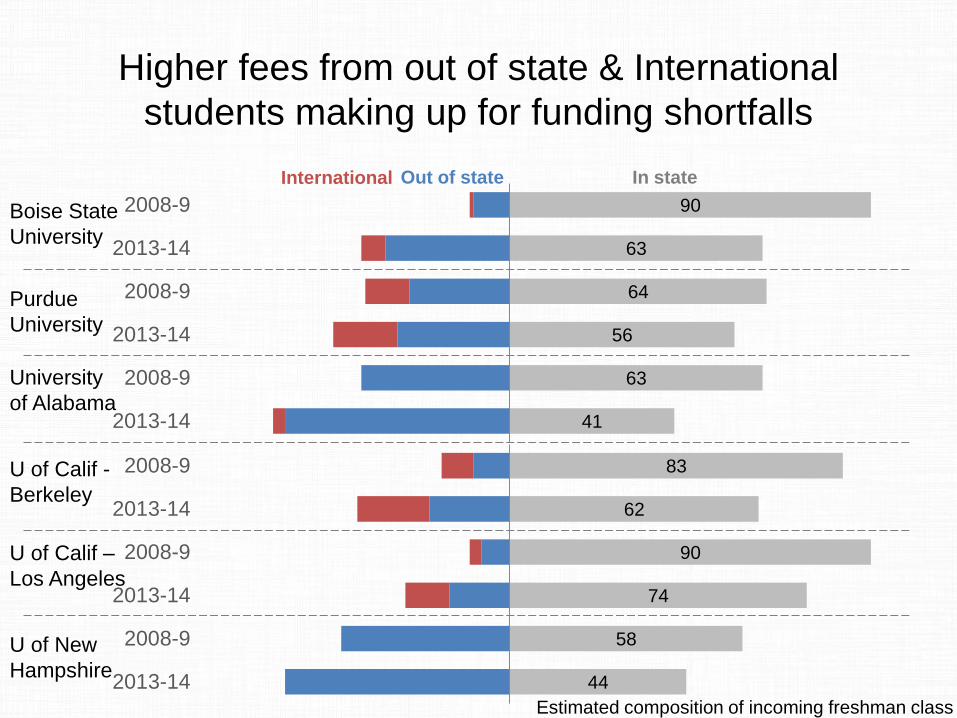
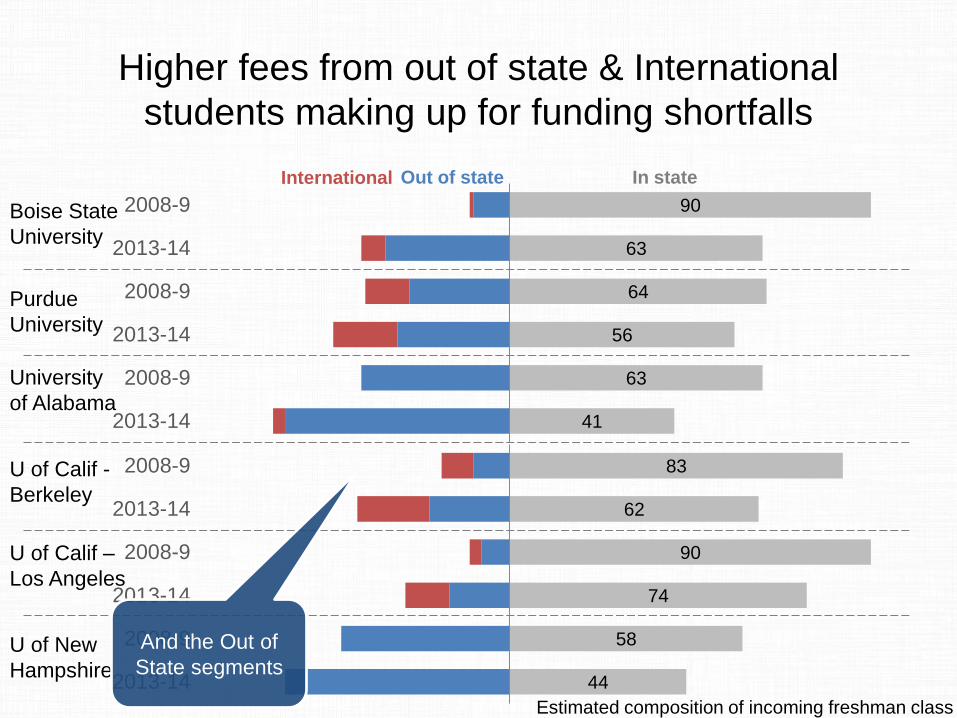
Higher fees from out of state & International
students making up for funding shortfalls
Estimated composition of incoming freshman class
By having the data go each
direction from a baseline, you can
more easily see the changes in
each group of data.
90
63
64
56
63
41
2008-9
2013-14
2008-9
2013-14
2008-9
2013-14
International Out of state
Boise State
University
Purdue
University
University
of Alabama
In state
83
62
90
74
58
44
2008-9
2013-14
2008-9
2013-14
2008-9
2013-14
U of Calif -
Berkeley
U of Calif –
Los Angeles
U of New
Hampshire
Higher fees from out of state & International
students making up for funding shortfalls
Estimated composition of incoming freshman class
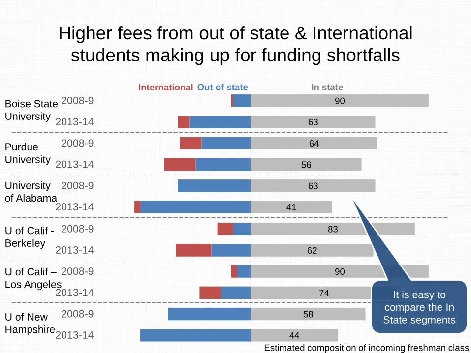
It is easy to
compare the In
State segments
90
63
64
56
63
41
2008-9
2013-14
2008-9
2013-14
2008-9
2013-14
International Out of state
Boise State
University
Purdue
University
University
of Alabama
In state
83
62
90
74
58
44
2008-9
2013-14
2008-9
2013-14
2008-9
2013-14
U of Calif -
Berkeley
U of Calif –
Los Angeles
U of New
Hampshire
Higher fees from out of state & International
students making up for funding shortfalls
Estimated composition of incoming freshman class
And the Out of
State segments

It may look complicated to create
this type of graph, but it really isn’t
that hard. It uses the stacked bar
chart built in to Excel or
PowerPoint.
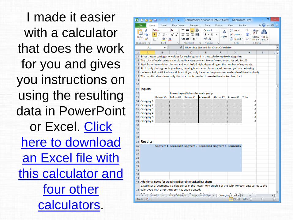
I made it easier
with a calculator
that does the work
for you and gives
you instructions on
using the resulting
data in PowerPoint
or Excel. Click
here to download
an Excel file with
this calculator and
four other
calculators.
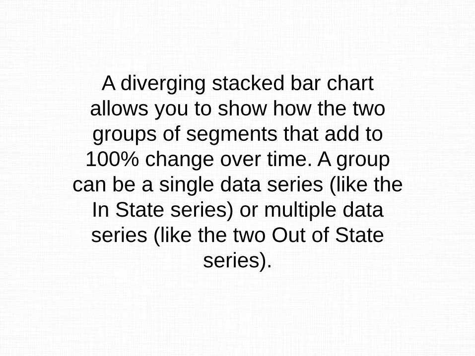
A diverging stacked bar chart
allows you to show how the two
groups of segments that add to
100% change over time. A group
can be a single data series (like the
In State series) or multiple data
series (like the two Out of State
series).
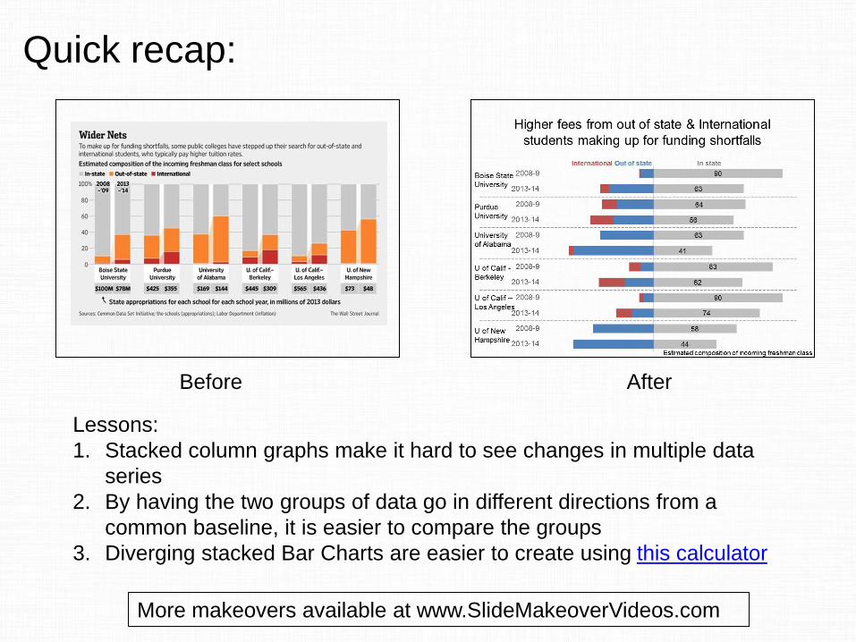
Before After
Lessons:
1. Stacked column graphs make it hard to see changes in multiple data
series
2. By having the two groups of data go in different directions from a
common baseline, it is easier to compare the groups
3. Diverging stacked Bar Charts are easier to create using this calculator
Quick recap:
More makeovers available at www.SlideMakeoverVideos.com

If you would like me to help
your team create presentations
that have a clear message with
focused content and effective
visuals, get in touch:
P: 905-510-4911
W: www.ThinkOutsideTheSlide.com