souped | preliminary logo development
DESCRIPTION
A preliminary logo development booklet that details the initial sketch process, rough digital rendering, and design execution of logos for Souped, LLCTRANSCRIPT

souped preliminary logo development
phone 1.(800). 7.lavish e- m ail [email protected] website www.lavishmedia.com
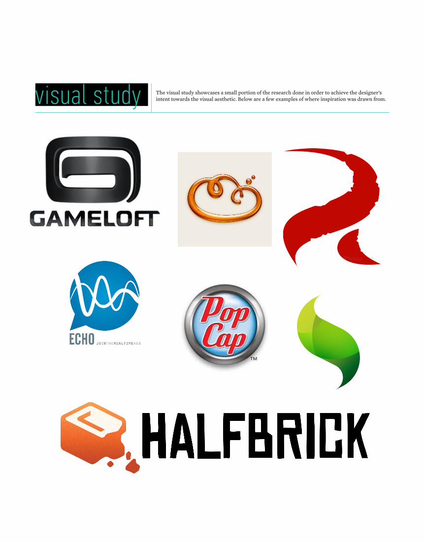
visual study The visual study showcases a small portion of the research done in order to achieve the designer’s intent towards the visual aesthetic. Below are a few examples of where inspiration was drawn from.

logo concept A
Concept A “Block Logo”
The development of the initial sketch for this concept came from the idea of blue printing the process of any kind of mobile application development. However, rather than using a bland, typical, and flat approach of applying a standard blue print grid, this design opts to manipulate sections of a blue print to create building blocks. These blocks come together to form a 3-dimensional optical illusion in the form of an “S” through shape placement and color shading.

logo concept B
Concept B “Button Logo”
This sketch opts for using the univeral iOS app icon to house a “Souped Up” button represented by a circular shape with a “glowing” S on the center. The concept here was to visually explain the idea that a simple push of a button is all it takes to ignites app enhancement. In the digital translation of the sketches, the “S” emits a glow of several colors to show the power of souped up apps.

logo concept C
Concept C “Warp Logo”
Here the use of abstract imagery is applied so as not to pidgeon hole the company into one genre of app development. In the initial sketches, the idea was to have an iOS app icon look warped to form an “S”, both through the actual shapes and the negative space between them. As you can see in the rough digital translation, the concept of “warping” an app is maintained, as is the stylized “S” created in the white space between the two warps.
logo concept D
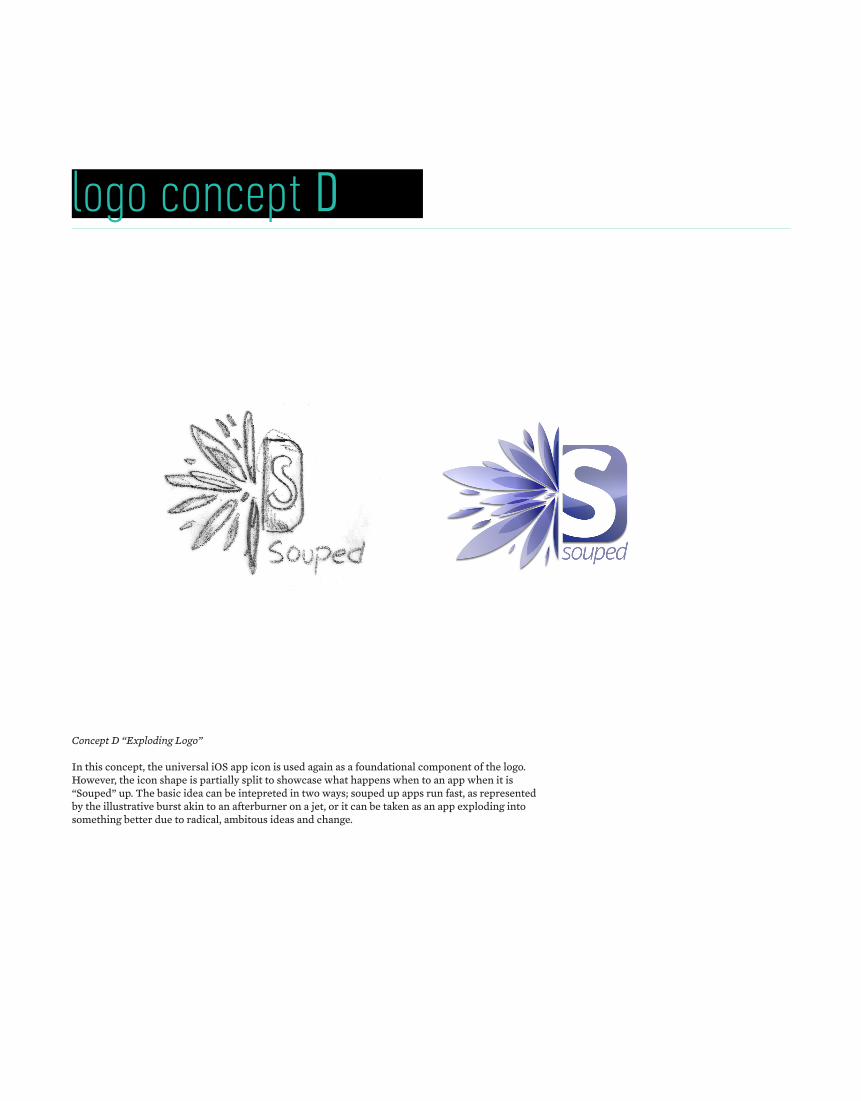
Concept D “Exploding Logo”
In this concept, the universal iOS app icon is used again as a foundational component of the logo. However, the icon shape is partially split to showcase what happens when to an app when it is “Souped” up. The basic idea can be intepreted in two ways; souped up apps run fast, as represented by the illustrative burst akin to an afterburner on a jet, or it can be taken as an app exploding into something better due to radical, ambitous ideas and change.
logo concept E
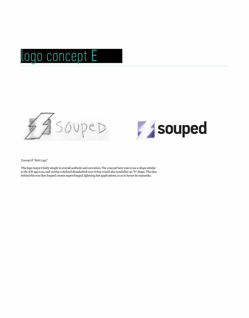
Concept E “Bolt Logo”
This logo keeps it fairly simple in overall aesthetic and execution. The concept here was to use a shape similar to the iOS app icon, and overlay a stylized thunderbolt over it that would also symbolize an “S” shape. The idea behind this was that Souped creates supercharged, lightning fast applications, so as to honor its namesake.

designer notesPlease keep in mind these are rough conceptual sketches and preliminary digital renders, only meant to be used as a guide for further development. The final representation and implementation of these potential concepts might look slightly different.
That said, each of these concepts represents a different direction aestehetically, but they all share the same design philosophy in terms of execution and brand represenation. The use of simple and visually appealing imagery, typography, and color is an effective way to have Souped be instantly recognizable across the various mobile app store platforms out there today, such as:
Once a suitable concept is chosen, I’ll refine the digital illustration process in tandem with proper typesetting the font and finalizing the color application. An e-mail to confirm the second phase of logo development has started will be sent as soon as I receive confirmation on the chosen design.

phone 1.(800). 7.lavish e- m ail [email protected] website www.lavishmedia.com