state of the state: infant mortality in indiana of the state: infant mortality in indiana jerome...
TRANSCRIPT

State of the State:
Infant Mortality in Indiana
Jerome Adams, MD, MPH
State Health Commissioner
Indiana State Department of Health

International Infant Mortality Rates
2010
6.1
5.7
5.5
5.3
5.0
4.2
4.1
3.9
3.8
3.8
3.8
3.8
3.7
3.6
3.6
3.4
3.4
3.4
3.2
3.2
2.8
2.7
2.5
2.5
2.3
2.3
0.0 1.0 2.0 3.0 4.0 5.0 6.0 7.0
United States
Slovakia
New Zealand
Hungary
Poland
United Kingdom
Australia
Austria
Greece
Ireland
Netherlands
Switzerland
Israel
Belgium
France
Denmark
Germany
Italy
Korea
Spain
Norway
Czech Republic
Portugal
Sweden
Finland
Japan
Rate per 1,000 live births
Source: Indiana State Department of Health, Maternal & Child Health Epidemiology Division [October 26, 2015]
Original Source: CDC/NCHS, linked birth/infant death data set (U.S. data); and OECD 2014 (all other data). Data are available from http://www.oecd.org

Infant Mortality Rates
United States, 2013 4.1
4
9.6
5
0.00
2.00
4.00
6.00
8.00
10.00
12.00Io
wa
Mass
achuse
tts
Verm
ont
New
Jers
ey
Wash
ingto
n
Wyom
ing
Conneti
cut
Califo
rnia
New
York
Ore
gon
Min
neso
ta
Colo
rado
Uta
h
Ari
zona
Nebra
ska
Nevada
New
Mexic
o
Ala
ska
Idaho
New
Ham
psh
ire
Monta
na
Texas
Illinois
Nort
h D
akota
Flo
rida
Vir
gin
a
Wis
consi
n
Dela
ware
Kentu
cky
Kansa
s
Rhode Isl
and
Mis
souri
Haw
aii
South
Dakota
Mary
land
Pennsy
lvania
Dis
tric
t of
Colu
mbia
Tenness
ee
Okla
hom
a
South
Caro
lina
Georg
ia
Nort
h C
aro
lina
Main
e
Mic
hig
an
India
na
Ohio
West
Vir
gin
ia
Ark
ansa
s
Ala
bam
a
Louis
iana
Mis
siss
ippi
Rate
per
1,0
00 liv
e b
irth
s
Source: Indiana State Department of Health, Maternal & Child Health Epidemiology Division [October 26, 2015]
Original Source: CDC/NCHS, National Vital Statistics Report “Deaths: Final Data for 2013”, Volume 64, Number 2
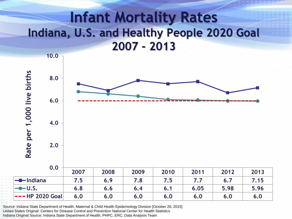
Infant Mortality Rates Indiana, U.S. and Healthy People 2020 Goal
2007 - 2013
2007 2008 2009 2010 2011 2012 2013
Indiana 7.5 6.9 7.8 7.5 7.7 6.7 7.15
U.S. 6.8 6.6 6.4 6.1 6.05 5.98 5.96
HP 2020 Goal 6.0 6.0 6.0 6.0 6.0 6.0 6.0
0.0
2.0
4.0
6.0
8.0
10.0
Rate
per
1,0
00 liv
e b
irth
s
Source: Indiana State Department of Health, Maternal & Child Health Epidemiology Division [October 26, 2015]
United States Original: Centers for Disease Control and Prevention National Center for Health Statistics
Indiana Original Source: Indiana State Department of Health, PHPC, ERC, Data Analysis Team

Infant Mortality Rates
County Level, All Races
2009 - 2013
HIGHEST Infant Mortality
Rates in State
• Adams, 9.9
• Henry, 9.8
• Montgomery, 9.7
• Grant, 9.5
• Marion, 9.5
• Daviess,9.5
• Cass, 9.2
• Bartholomew, 9.1
• LaPorte, 8.6
• Lake, 8.5
• St. Joseph, 8.2
Source: Indiana State Department of Health, Maternal & Child Health Epidemiology Division [October 26, 2015]
Indiana Original Source: Indiana State Department of Health, PHPC, ERC, Data Analysis Team

Infant Mortality Rates by Zip Code
2009 – 2013 Combined, All Races *Zip codes with the highest Infant Mortality Rate for the 5 years
among zip codes that had at least 20 infant deaths.
Zip
Code County
# Total Infant
Deaths
Infant
Mortality Rate
46806 Allen 37 15.3
46312 Lake 39 15.1
46218 Marion 36 14.7
46201 Marion 44 14.6
46208 Marion 22 14.5
46226 Marion 50 14.4
46953 Grant 20 13.7
46203 Marion 42 12.2
46222 Marion 38 11.6
46205 Marion 28 11.6
Source: Indiana State Department of Health, Maternal & Child Health Epidemiology Division [October 26, 2015]
Indiana Original Source: Indiana State Department of Health, PHPC, ERC, Data Analysis Team

Infant Mortality Rates by Race
Indiana
2002 - 2013
7.6 7.4 8.1 8.0 7.9 7.5 6.9
7.8 7.5 7.7
6.7 7.1
6.5 6.4 6.9 6.9 6.4 6.5
5.5
6.4 6.0 6.9
5.5 5.8
15.6 15.9 17.1 16.9
18.1
15.7 14.9
16.1 14.7
12.3
14.5
15.3
0.0
2.0
4.0
6.0
8.0
10.0
12.0
14.0
16.0
18.0
20.0
2002 2003 2004 2005 2006 2007 2008 2009 2010 2011 2012 2013
Rate
per
1,0
00 liv
e b
irth
s
Indiana Whites Blacks Healthy People 2020
Source: Indiana State Department of Health, Maternal & Child Health Epidemiology Division [October 26, 2015]
Indiana Original Source: Indiana State Department of Health, PHPC, ERC, Data Analysis Team

Infant Mortality Rates by Ethnicity
Indiana
2002 - 2013
2002 2003 2004 2005 2006 2007 2008 2009 2010 2011 2012 2013
Indiana 7.6 7.4 8.1 8.0 7.9 7.5 6.9 7.8 7.5 7.7 6.7 7.15
Non-Hispanic 7.6 7.6 8.0 8.0 8.1 7.6 6.8 7.8 7.4 7.8 6.6 7.2
Hispanic 8.0 5.6 9.0 8.1 5.2 6.8 7.8 7.4 8.6 7.4 8.1 7.3
Healthy People 2020 Goal 6.0 6.0 6.0 6.0 6.0 6.0 6.0 6.0 6.0 6.0 6.0 6.0
0.0
1.0
2.0
3.0
4.0
5.0
6.0
7.0
8.0
9.0
10.0
Rate
per
1,0
00 liv
e b
irth
s
Note: Hispanic ethnicity can be of any race.
Source: Indiana State Department of Health, Maternal & Child Health Epidemiology Division [October 26, 2015] Indiana Original Source: Indiana State Department of Health, PHPC, ERC, Data Analysis Team

Infant Mortality Rates
County Level, by Race
2009 - 2013 Black Infant Mortality
• Worst counties for combined years:
– Allen County
• (Black IMR = 19.9)
– St. Joseph County
• (Black IMR = 16.5)
– Marion County
• (Black IMR = 14.4)
– Lake County
• (Black IMR = 12.8)
• These 4 counties account for nearly
80% of all the black infant deaths
in Indiana between 2009 and 2013
Source: Indiana State Department of Health, Maternal & Child Health Epidemiology Division [October 26, 2015]
Indiana Original Source: Indiana State Department of Health, PHPC, ERC, Data Analysis Team

Infant Mortality Rates by Zip Code
2009 – 2013 Combined, by Race *Zip codes with the highest Infant Mortality Rate for the 5 years
among zip codes that had at least 20 infant deaths for each race.
Zip
Code County
# Total
White
Infant
Deaths
White
Infant
Mortality
Rate
46112 Hendricks 21 10.7
46203 Marion 28 10.3
46368 Porter 20 10.1
46350 LaPorte 21 8.7
46227 Marion 28 8.1
Source: Indiana State Department of Health, Maternal & Child Health Epidemiology Division [October 26, 2015]
Indiana Original Source: Indiana State Department of Health, PHPC, ERC, Data Analysis Team
Zip
Code County
# Total
Black
Infant
Deaths
Black
Infant
Mortality
Rate
46312 Lake 33 26.6
46201 Marion 22 26.1
46806 Allen 29 25.6
46226 Marion 40 18.9
46222 Marion 22 17.7
46205 Marion 22 16.7
46218 Marion 30 16.2
46235 Marion 22 11.3
Zip Codes with Worst
White Infant Mortality
Zip Codes with Worst
Black Infant Mortality

CAUSES OF INFANT MORTALITY
IN INDIANA
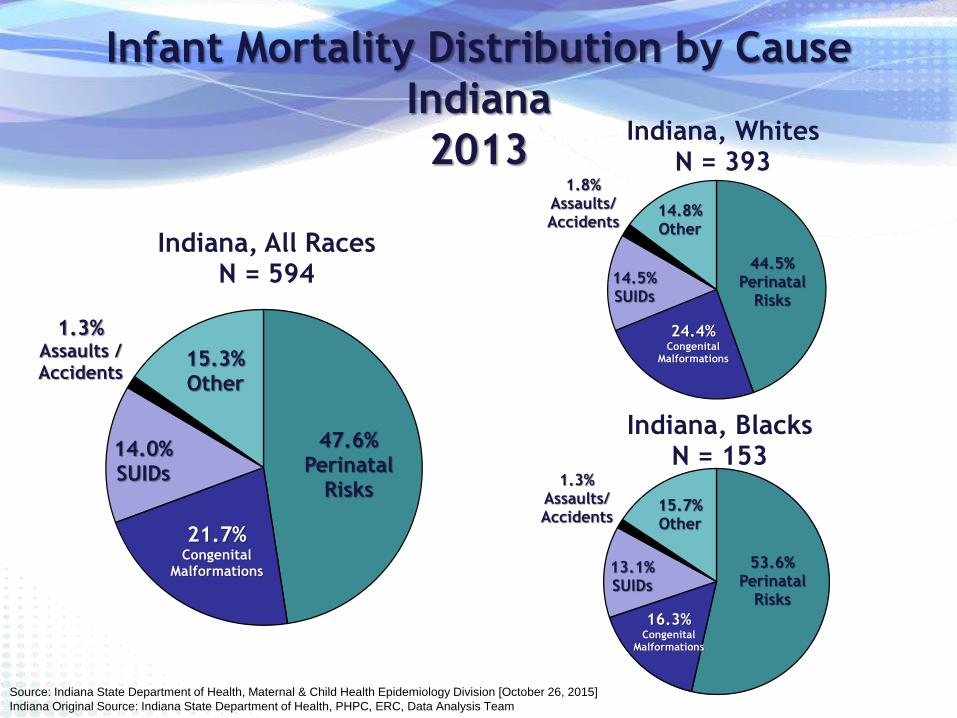
Infant Mortality Distribution by Cause
Indiana
2013
47.6% Perinatal
Risks
21.7% Congenital
Malformations
14.0% SUIDs
1.3% Assaults / Accidents
15.3% Other
Indiana, All Races N = 594
Source: Indiana State Department of Health, Maternal & Child Health Epidemiology Division [October 26, 2015]
Indiana Original Source: Indiana State Department of Health, PHPC, ERC, Data Analysis Team
44.5% Perinatal
Risks
24.4% Congenital
Malformations
14.5% SUIDs
1.8% Assaults/ Accidents
14.8% Other
Indiana, Whites N = 393
53.6% Perinatal
Risks
16.3% Congenital
Malformations
13.1% SUIDs
1.3% Assaults/ Accidents
15.7% Other
Indiana, Blacks N = 153

Factors Contributing to
Infant Mortality in Indiana • Obesity (ISDH #2 Priority)
– If woman is obese = 25% chance of delivering premature infant
– If woman is morbidly obese = 33% chance of delivering premature infant
– Indiana is 9th most obese state in U.S.
• Smoking (ISDH #3 Priority)
– 15.7% of mothers smoke during pregnancy (TWICE the U.S. average)
– 25.9% of mothers on Medicaid smoke
– Indiana has 7th worst smoking rate among pregnant women in U.S.
– Indiana has 12th highest smoking rate overall in U.S.
• Limited Prenatal Care
– Only 67.4% of mothers receive prenatal care during the 1st trimester
• Unsafe Sleep Practices
– 14.0% of infant deaths in 2013 can be attributed to SUIDs

31.5% 31.2%
37.9%
0.0
5.0
10.0
15.0
20.0
25.0
30.0
35.0
40.0
Obese
Perc
ent
IN Non-Hispanic Whites Non-Hispanic Blacks
Percent of Women Ages 18-44 Who
are Obese (BMI >= 30)
Indiana, 2014
Source: Indiana State Department of Health, Division of Nutrition and Physical Activity , BRFSS 2014 [October 26, 2015]
HP2020 = 30.5%
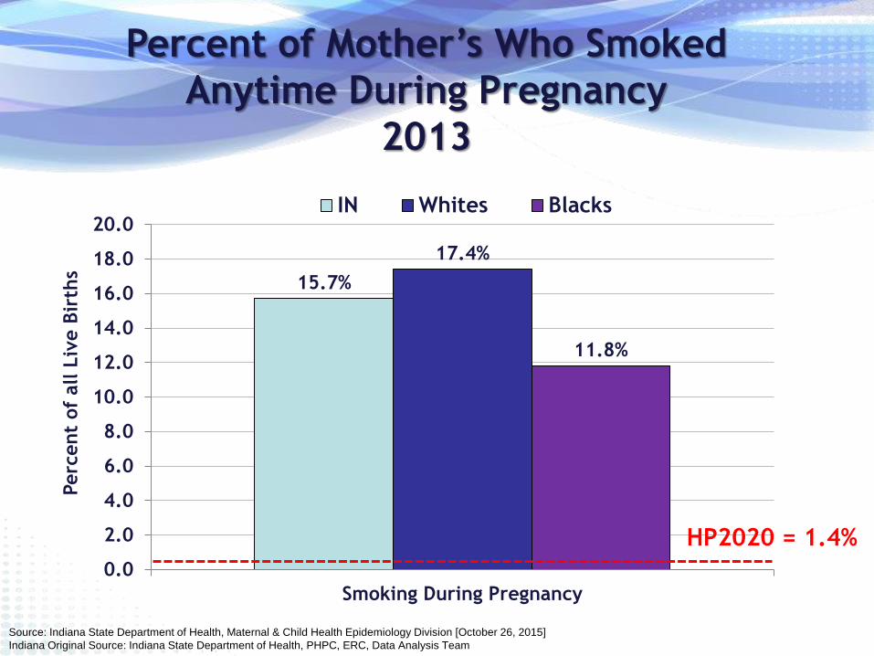
15.7%
17.4%
11.8%
0.0
2.0
4.0
6.0
8.0
10.0
12.0
14.0
16.0
18.0
20.0
Smoking During Pregnancy
Perc
ent
of
all L
ive B
irth
s
IN Whites Blacks
Percent of Mother’s Who Smoked
Anytime During Pregnancy
2013
Source: Indiana State Department of Health, Maternal & Child Health Epidemiology Division [October 26, 2015]
Indiana Original Source: Indiana State Department of Health, PHPC, ERC, Data Analysis Team
HP2020 = 1.4%

Percent of Mother’s Who Smoked Anytime
During Pregnancy, by Race
3 Worst Counties
2013
Source: Indiana State Department of Health, Maternal & Child Health Epidemiology Division [October 26, 2015]
Indiana Original Source: Indiana State Department of Health, PHPC, ERC, Data Analysis Team
Whites Blacks 33.0% 32.9% 32.3%
0.0
5.0
10.0
15.0
20.0
25.0
30.0
35.0
Crawford Scott Owen
Perc
ent
of
all L
ive B
irth
s
Indiana = 17.4%
25.0%
22.9% 22.6%
0.0
5.0
10.0
15.0
20.0
25.0
30.0
35.0
Grant Vanderburgh Madison
Perc
ent
of
all L
ive B
irth
s
Indiana = 11.8%

67.4% 69.9%
56.8%
0.0
10.0
20.0
30.0
40.0
50.0
60.0
70.0
80.0
Early Prenatal Care
Perc
ent
of
all L
ive B
irth
s
IN Whites Blacks
Percent of Mother’s Who Received
Prenatal Care in the 1st Trimester
2013
Source: Indiana State Department of Health, Maternal & Child Health Epidemiology Division [October 26, 2015]
Indiana Original Source: Indiana State Department of Health, PHPC, ERC, Data Analysis Team
HP2020 = 77.9%

% Women Receiving PNC 1st Trimester
Indiana, by Race
2009 - 2013
66.1 68.5 68.1 68.4 67.4
68.5 70.7
70.3 70.7 69.9
53.1 56.0 56.1 57.4 56.8
0.0
10.0
20.0
30.0
40.0
50.0
60.0
70.0
80.0
2009 2010 2011 2012 2013
Percent of all live births
Indiana Whites Blacks
Source: Indiana State Department of Health, Maternal & Child Health Epidemiology Division [October 26, 2015]
Indiana Original Source: Indiana State Department of Health, PHPC, ERC, Data Analysis Team

Percent of Mother’s Who Received Prenatal
Care in the 1st Trimester, by Race
Worst Counties 2013
Source: Indiana State Department of Health, Maternal & Child Health Epidemiology Division [October 26, 2015]
Indiana Original Source: Indiana State Department of Health, PHPC, ERC, Data Analysis Team
Whites Blacks
44.4% 39.2%
36.2%
0.0
10.0
20.0
30.0
40.0
50.0
60.0
70.0
LaGrange Adams Kosciusko
Perc
ent
of
all L
ive B
irth
s
Indiana = 69.9%
48.8% 48.8%
42.0% 40.8%
0.0
10.0
20.0
30.0
40.0
50.0
60.0
70.0
St. Joseph Grant Floyd Allen
Perc
ent
of
all L
ive B
irth
s Indiana = 56.8%

Closing the Disparity Gap
• If Indiana brought it’s Black infant mortality rate
(15.3 in 2013) down to the State’s infant
mortality rate of 7.15, 82 additional black
infants would have lived to see their first
birthday.
• If Indiana’s Black infant mortality rate were the
same as the white infant mortality rate (5.8), 96
additional black infants would have lived to see
their first birthday.

Closing the Disparity Gap
• If the counties with the worst infant mortality
rates lowered their combined infant mortality
rate to Indiana’s rate, 253 babies in those 11
counties would have lived to see their first
birthday.
• If the 10 zip codes with the worst infant mortality
rates would lower the rate to Indiana’s, 165
additional babies born in those areas would have
survived.