statgraphics centurion version 18 additions ... - adalta.it enhancements.pdf · 6 the main issue is...
TRANSCRIPT

1
STATGRAPHICS CENTURION VERSION 18
Additions and Enhancements
Revised: 7/25/2017 2:26 PM
This document describes new features added to Version 18 of Statgraphics Centurion. It
includes 30 new procedures and significant enhancements to many existing procedures.
For detailed information about each feature, consult the PDF references indicated
(accessible under Help – Procedure Documentation on the main menu.)
Table of Contents
Data Management and User Interface ................................................................................. 3
Big Data .......................................................................................................................... 3
Create Data and Code Columns ...................................................................................... 8
Data Types ...................................................................................................................... 9
Graphics Profile Designer ............................................................................................. 10
Operators ....................................................................................................................... 11
R - Installation and Configuration ................................................................................ 12
Repeat Analysis For ...................................................................................................... 13
Replace Censored Values ............................................................................................. 14
System Preferences ....................................................................................................... 15
Changes to Existing Analyses ........................................................................................... 18
Bivariate Density Statlet ............................................................................................... 18
Box-and-Whisker Plots ................................................................................................. 19
Capability Analysis for Variable Data .......................................................................... 20
Design of Experiments Wizard: Definitive Screening Designs .................................... 21
Forecasting and Automatic Forecasting........................................................................ 22
General Linear Models ................................................................................................. 23
Monte Carlo Simulation – ARIMA Model Simulation ................................................ 24
Monte Carlo Simulation – General Simulation Models ............................................... 25
Multivariate Capability Analysis .................................................................................. 26
Multiple Sample Comparison ....................................................................................... 27
Oneway ANOVA .......................................................................................................... 28
Piechart/Donut Chart .................................................................................................... 29

2
Simple Regression, Polynomial Regression, Box-Cox Transformations, and
Calibration Models........................................................................................................ 30
Subset Analysis ............................................................................................................. 31
Surface and Contour Plots ............................................................................................ 32
Tabulation ..................................................................................................................... 33
X-bar and R Charts ....................................................................................................... 34
New Statistical Analyses................................................................................................... 35
Attribute Capability Analysis Statlet ............................................................................ 35
Capability Control Chart Design Statlet ....................................................................... 36
Capability Control Charts for Attributes....................................................................... 37
Capability Control Charts for Variables ....................................................................... 38
Classification and Regression Trees (CART) ............................................................... 39
Demographic Map Visualizer (Locations).................................................................... 40
Diamond Plot ................................................................................................................ 41
Distribution Fitting (Arbitrarily Censored Data) .......................................................... 42
Equivalence and Noninferiority Tests (Comparing Mean to Target) ........................... 43
Equivalence and Noninferiority Tests (Comparing Paired Samples) ........................... 44
Equivalence and Noninferiority Tests (Comparing Two Means) ................................. 45
Equivalence and Noninferiority Tests (2x2 Crossover Study) ..................................... 46
Heat Map ....................................................................................................................... 47
Likert Plot ..................................................................................................................... 48
Multidimensional Scaling ............................................................................................. 49
Multiple Diamond Plot ................................................................................................. 50
Multiple Violin Plot Statlet ........................................................................................... 51
Multivariate Normal Random Numbers ....................................................................... 52
Multivariate Normality Test ......................................................................................... 53
Multivariate Tolerance Limits ...................................................................................... 54
Orthogonal Regression.................................................................................................. 55
Population Pyramid Statlet ........................................................................................... 56
Sunflower Plot .............................................................................................................. 57
Text Mining .................................................................................................................. 58
Time Series Baseline Plot ............................................................................................. 59
Tornado and Butterfly Plots .......................................................................................... 60
Trivariate Density Statlet .............................................................................................. 61
Violin Plot Statlet .......................................................................................................... 62

3
Wind Rose Statlet ......................................................................................................... 63
X-13ARIMA-SEATS Seasonal Adjustment................................................................. 64
Data Management and User Interface
Big Data
To handle big data, a special file type called a Statgraphics Big Data file has been
developed. These files have the extension .sgb rather than .sgd. They differ in 2 important
ways from standard Statgraphics data files:
1. They store numeric data in binary format rather than as text. This avoids the step
of converting each data value to a number when it is read into the program.
2. Data is stored column-by-column rather than row-by-row. This dramatically
reduces execution time when individual columns are read into memory.
Using SGB files, Statgraphics Centurion is capable of analyzing data sets consisting of
many millions of records and a large number of columns.
Creating a Big Data SGB File
In order to analyze big data, the data must be placed in an SGB file. This may be done in
either of 2 ways:
1. If the data is not too big, it may be possible to read it into the Statgraphics
DataBook using the usual methods. One may then select File – Save As – Save
Data File As from the main menu and select SG Centurion Big Data File
(.sgb).
2. Convert a text file directly to a Statgraphics SGB file by selecting File – Big
Data - Create Big Data SGB File from the main menu.
To convert the text to an SGB file, information about each field must be entered:

4
The field information may be extracted from the text file or copies from a datasheet.
Modifying SGB Files
Statgraphics SGB files cannot be modified using the data editor. However, changes can
be made to the existing data by selecting File – Big Data - Modify Big Data SGB File.

5
Combining Big Data Files
2 big data SGB files with identical variable structure may be combined into a single file
by selecting File – Big Data – Combine Big Data SGB Files from the main Statgraphics
Centurion menu.
Calculations and Graphs
There is a new page on the Preferences dialog box that controls several issues pertinent
the analysis of Big Data:

6
The main issue is that plots that consist of many point symbols take a long time to
produce (as much as 7 seconds per million points). Consequently, the system is set up by
default to same time in 2 ways:
1. By not plotting points symbols when the panes containing the graphs are not
maximized when the number of points is very large.
2. By displaying Hexagon Plots instead of standard scatterplots for very large data
sets.
A typical hexagon plot is shown below, which shows a plot calculated from nearly 7
million points:

7
In this display, the X-Y region is divided into a grid of hexagonal bins. The number of
observations in each bin is then calculated. If a bin contains more than a specified number
of points, a shaded hexagon is plotted instead of the point symbols. The opacity of the
hexagon is related to the relative number of points in the associated hexagonal region.

8
Create Data and Code Columns
This new selection under Edit on the main menu converts multiple data columns into a
pair of data and code columns for use in procedures such as Multifactor ANOVA. For
example, suppose you had 4 columns named A, B, C and D with 10 rows in each. This
selection will combine the data into a single column with 40 rows and create a
corresponding code column with either “A”, “B”, “C”, or “D”. The main dialog box for
the procedure is shown below.
Reference: Edit Menu

9
Data Types
Two new data types have been added to the program:
1. Censored numeric – allows for the entry of censored numeric data. Valid entries
are strings such as “<0.1” for left-censoring, “>10” for right-censoring, and
“[0.1,10]” for interval censoring.
2. Currency – this is a special data type such similar to percentage. Data may be
entered as monetary amounts such as “$9.99” or as a number such as “9.99”
without the currency symbol. If added without the symbol, it will be added
automatically. When defining the column, the symbol may be selected from a
choice of a preceding “$”, a preceding “€”, a following “ €”, a preceding “£”, or a
preceding “¥”.
Reference: Edit Menu

10
Graphics Profile Designer
Added 2 new text size for identifying points on a graph and for labeling contour levels.
Reference: Graphics Options
Top Title
Subtitle
0 0.2 0.4 0.6 0.8 1(X 10000)
X-Axis Title
0
0.2
0.4
0.6
0.8
1(X 10000)
Y-A
xis
Tit
le
Legend TitleTextTextTextTextText
Labels
SnapStat text
User text
Point labels
Contour labels

11
Operators
Several new operators have been added to the program for use in Statgraphics
expressions:
1. DAY – extracts the day of the month from a date variable.
2. DAYOFYEAR– calculates number of days in year up to date specified.
3. DAYOFMONTH – calculates number of days in month up to date specified.
4. DAYOFWEEK– calculates number of days in week up to date specified.
5. GAMMA – returns the value of the gamma function.
6. HOUR – extracts hour from a date-time variable.
7. ISMISSING – returns 1 for each missing value and 0 for each non-missing value.
8. ISNOTMISSING– returns 0 for each missing value and 1 for each non-missing
value.
9. LNGAMMA– returns the value of the loggamma function.
10. MINUTE– extracts hour from a date-time variable.
11. MOD – finds remainder after dividing one number by another.
12. MONTH – extracts month from a date variable.
13. POWER – raises numeric values to a power.
14. QUARTER – extracts quarter from a date variable.
15. SECOND– extracts second from a date-time variable.
16. SIGN – returns -1, 0 or 1 depending on sign of numeric value.
17. YEAR – extracts year from a date variable.
Reference: STATGRAPHICS Operators.

12
R - Installation and Configuration
This new menu item assists users in setting up R and the libraries required to use the
Statgraphics/R interface. It also sets the maximum number of seconds that Statgraphics
will wait for R to respond to a request.
Reference: R – Installation and Configuration

13
Repeat Analysis For
This new selection under Edit on the main menu lets you run an existing analysis on a
selected set of other variables. A new window is generated for each variable. The main
dialog box for the procedure is shown below.
Reference: Edit Menu

14
Replace Censored Values
This new selection under Edit on the main menu lets you replace any censored values in a
column defined as type Censored numeric with specific data values. For example, the
dialog box below specifies replacement values for 3 entries: “<1”, “<2”, and “>5”.
Replacement of censored values is necessary in order to use analyses that are not
designed to handle censored data.
Reference: Edit Menu
15
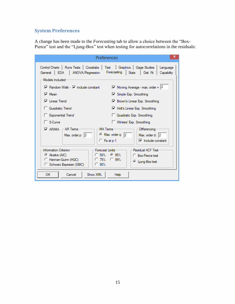
System Preferences
A change has been made to the Forecasting tab to allow a choice between the “Box-
Pierce” test and the “Ljung-Box” test when testing for autocorrelations in the residuals:
16
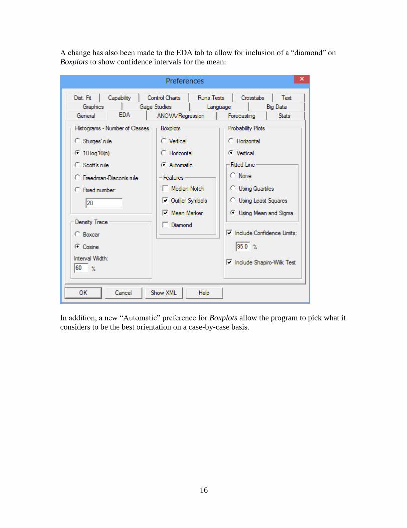
A change has also been made to the EDA tab to allow for inclusion of a “diamond” on
Boxplots to show confidence intervals for the mean:
In addition, a new “Automatic” preference for Boxplots allow the program to pick what it
considers to be the best orientation on a case-by-case basis.

17
Finally, a change has been made to the Dist. Fit tab to specify the minimum frequency for
a class when performing a chi-square test below which it will be combined with adjacent
classes. Valid entries are integers between 1 and 10.
Reference: Preferences

18
Changes to Existing Analyses
Bivariate Density Statlet
Reference: Bivariate Density Statlet

19
Box-and-Whisker Plots
A new feature has been added to all box-and-whisker plots. It adds a diamond to the plot
covering the range of a 100(1-)% confidence interval for the mean. The change has
been made in the following procedures:
a. Box-and-Whisker Plots (One Sample)
b. Box-and-Whisker Plots (Multiple Samples)
c. Multiple Sample Comparison
d. Multiple Variable Analysis
e. One Variable Analysis
f. Oneway ANOVA
g. Two Sample Comparison
h. Paired Sample Comparison
i. Subset Analysis
j. Rowwise Statistics
k. Matrix Plot
l. Outlier Identification
m. Monte Carlo Simulation (General Simulation Models)
n. Monte Carlo Simulation (Random Number Generation)
o. Item Reliability Analysis
p. Gage Studies (Average and Range Method)
q. Gage Studies (ANOVA Method)
r. Gage Studies (Range Method)
Reference: Box-and-Whisker Plot
0
1
Box-and-Whisker Plot
20 25 30 35 40 45 50
MPG Highway
Do
mesti
c

20
Capability Analysis for Variable Data
The Analysis Options dialog box has been changed to allow the selection of the method
for analyzing the short-term sigma:
The default value is determined from the system preferences.
An option has also been added to find the best-fitting Johnson curve. Johnson curves are
available with all possible combinations of skewness and kurtosis.
Reference: Capability Analysis (Variable Data)

21
Design of Experiments Wizard: Definitive Screening Designs
A new type of experimental design has been added to the Design of Experiments Wizard.
Called Definitive Screening Designs, these designs are small designs capable of
estimating models involving both linear and quadratic effects, although second-order
interactions are partially confounded with themselves and with quadratic effects. In
addition, designs for 6 or more factors collapse into designs which can estimate the full
second-order model (including interactions) for any 3 factors.
DSDs may be constructed for any combination of continuous and 2-level categorical
factors where the total number of factors is between 4 and 16. Both blocked and
unblocked designs are available. They appear on the list of screening designs during the
Select Design step.
Reference: DOE Wizard – Definitive Screening Designs

22
Forecasting and Automatic Forecasting
The Ljung-Box test replaces the Box-Pierce test when testing for autocorrelation
remaining in the residuals. The Ljung-Box test has been shown to have superior
performance.
Model Comparison Key:
RMSE = Root Mean Squared Error
RUNS = Test for excessive runs up and down
RUNM = Test for excessive runs above and below median
AUTO = Ljung-Box test for excessive autocorrelation
MEAN = Test for difference in mean 1st half to 2nd half
VAR = Test for difference in variance 1st half to 2nd half
OK = not significant (p >= 0.05)
* = marginally significant (0.01 < p <= 0.05)
** = significant (0.001 < p <= 0.01)
*** = highly significant (p <= 0.001)
If desired, users can switch back to the Box-Pierce test using the Forecasting tab on the
Preferences dialog box.
Reference: Forecasting

23
General Linear Models
The following changes have been made:
1. The interaction plot now displays interaction between one categorical factor and
one quantitative factor.
2. Contour plots label each contour.
Reference: General Linear Models
Interaction Plot
1600 2100 2600 3100 3600 4100 4600
Weight
20
25
30
35
40
45
50
MP
G H
igh
way
Drive Trainall-wheel drivefront-wheel driverear-wheel drive
Contours of Estimated Response Surface
Drive Train=all-wheel drive
1600 2100 2600 3100 3600 4100 4600
Weight
0
50
100
150
200
250
300
Ho
rsep
ow
er
MPG Highway5.010.015.020.025.030.035.040.045.0
10.0
15.0
20.0
25.030.0
35.0
40.0

24
Monte Carlo Simulation – ARIMA Model Simulation
A new data input dialog box has been added that may be used to set the starting values
for the time series:
Starting values: optional data to be used to set the starting values. The simulated data is
assumed to begin immediately after the end of this data.
Time indices: optional values indicating the time at which each of the starting values was
recorded. If supplied, these values will be used to scale the plot of the simulated data.
Select: optional subset selection.
If no starting values are supplied, the simulation will generate random starting values by
simulating twice as much data as requested and discarding the first half.
The previous data input dialog box has been moved to Analysis Options.

25
Monte Carlo Simulation – General Simulation Models
A new graph has been added, called a “Sensitivity Tornado Plot”:
It shows the effect of each input variable on a response when it is changed over a
specified percentage of its probability distribution, with all other variables held at their
median values. The variables are sorted from top to bottom in order of their overall
effect.
Task11
Task8
Task1
Task12
Task5
Task9
Task4
Task2
Task10
Task3
Task6
Task7
Sensitivity Tornado Plot
153 155 157 159 161 163
Total time
At 5.0%At 95.0%

26
Multivariate Capability Analysis
Several new features were added to this procedure:
1. Confidence intervals may now for calculated for multivariate capability indices
using bootstrapping.
2. Multivariate tolerance limits may be calculated using either of 2 approaches:
a. Simultaneous limits for each variable using a Bonferroni approach.
b. Exact elliptical tolerance regions based on Monte Carlo methods.
3. A table lists the normalized squared distance of each multivariate observation
from the centroid of the variables.
Reference: Multivariate Capability Analysis
Multivariate Tolerance Region
95% Confidence; 99% Coverage
-3 1 5 9 13 17
Small
-2
1
4
7
10
13
Larg
e
10.0
10.0

27
Multiple Sample Comparison
The following changes have been made:
1. The Analysis Options dialog box now gives the option to treat factor levels as
numeric. This improves the display of numeric factors in tables and graphs.
2. A diamond may be added to the multiple box-and-whisker plot showing
confidence intervals for each level mean.
Reference: Multiple Sample Comparison
Box-and-Whisker Plot
10
15
20
25
30
35
40
45
50
55
60
MP
G H
igh
way
0 2 4 6 8 10
Cylinders

28
Oneway ANOVA
The following changes have been made:
3. The Analysis Options dialog box now gives the option to treat factor levels as
numeric. This improves the display of numeric factors in tables and graphs.
4. A diamond may be added to the multiple box-and-whisker plot showing
confidence intervals for each level mean.
Reference: One-Way ANOVA
Box-and-Whisker Plot
20 25 30 35 40 45 50
MPG Highway
0
2
4
6
8
10
Passen
gers

29
Piechart/Donut Chart This menu item was renamed and a donut chart added as an alternative to the piechart.
The donut chart is similar to the piechart except that the center is removed.
Reference: Piechart
48.21%
44.93%
6.86%
Donut chart for Respondents
RespondentsBushKerryUndecided

30
Simple Regression, Polynomial Regression, Box-Cox Transformations, and Calibration Models
A new feature has been added to the Plot of Fitted Model that shades the area between
the prediction and confidence limits.
Reference: Simple Regression
Plot of Fitted Model
chlorine = sqrt(0.131783 + 0.895725/weeks)
0 10 20 30 40 50
weeks
0.38
0.4
0.42
0.44
0.46
0.48
0.5
ch
lori
ne

31
Subset Analysis
Several new features were added to this procedure:
1. A table of percentiles may now be created for each level of the code variable.
2. A plot of the percentiles by code level may be created.
3. A diamond may be added to the multiple box-and-whisker plot showing
confidence intervals for each level mean.
4. Axis scaling has been improved for numeric codes.
Reference: Subset Analysis
Type
Percentile Plot
20
25
30
35
40
45
50
MP
G H
igh
way
Compact Large Midsize Small Sporty Van
99%95%90%75%50%25%10%5%1%
32
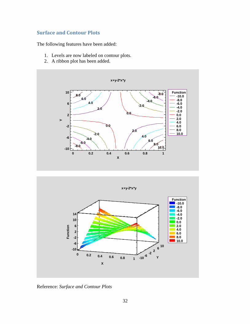
Surface and Contour Plots
The following features have been added:
1. Levels are now labeled on contour plots.
2. A ribbon plot has been added.
Reference: Surface and Contour Plots
-8.0
-8.0
-6.0
-6.0
-4.0
-4.0
-2.0
-2.0
0.0
0.0
2.0
2.0
4.0
4.0
6.0
6.0
8.0
8.010.0
8.010.010.0
x+y-2*x*y
0 0.2 0.4 0.6 0.8 1
X
-10
-6
-2
2
6
10
Y
Function-10.0-8.0-6.0-4.0-2.00.02.04.06.08.010.0
x+y-2*x*y
0 0.2 0.4 0.6 0.8 1
X
-10-6
-22
610
Y
-10
-6
-2
2
6
10
14
Fu
ncti
on
Function-10.0-8.0-6.0-4.0-2.00.02.04.06.08.010.0

33
Tabulation
An option has been added to create a donut chart. It is similar to a piechart except that the
center is missing.
Reference: Tabulation
17.20%
11.83%
23.66%
22.58%
15.05%
9.68%
Donut chart for TypeType
CompactLargeMidsizeSmallSportyVan

34
X-bar and R Charts
In earlier versions, these charts were limited to a maximum subgroup size of n = 100.
That limitation has been removed.
Reference: X-bar and R charts
9.974
10.184
9.763
X-bar Chart for X
0 4 8 12 16 20
Subgroup
9.7
9.8
9.9
10
10.1
10.2
X-b
ar
average subgroup size: 200

35
New Statistical Analyses
Attribute Capability Analysis Statlet
This Statlet performs a capability analysis based on attribute data. The data may consist
of either the number of nonconforming items in a sample or the total number of
nonconformities if an item can have more than one nonconformity. The analysis is based
on either the binomial or the Poisson distribution.
The Statlet will calculate:
1. Parameter estimates and confidence limits or upper confidence bounds.
2. Capability indices (at both the best estimate and the upper bound).
3. DPM (defects per million).
The analysis may be based on either a classical or Bayesian approach.
Reference: Attribute Capability Analysis Statlet

36
Capability Control Chart Design Statlet
This new Statlet assists analysts in determining how large samples should be when
constructing capability control charts. Capability control charts monitor processes which
have been shown to be stable and capable of producing results that yield small numbers
of nonconformities.
Capability control charts may be constructed for::
1. The short-term capability index Cp.
2. The long-term capability index Pp.
3. The short-term capability index Cpk.
4. The long-term capability index Ppk.
5. The proportion of nonconforming items.
6. The rate of nonconformities.
Reference: Capability Control Chart Design Statlet

37
Capability Control Charts for Attributes
This procedure constructs Phase II statistical process control charts for monitoring either
the proportion of nonconforming items or the rate of nonconformities in a process. Given
a process that is deemed to be capable of satisfying stated requirements based on the
analysis of attribute data, these charts monitor continued compliance with those
requirements.
Reference: Capability Control Charts for Attributes
5.0000
13.0000
Capability Control Chart for Count
0 20 40 60 80 100
Sample
0
3
6
9
12
15
Co
un
t

38
Capability Control Charts for Variables
This procedure constructs Phase II statistical process control charts for monitoring
capability indices such as Cp and Cpk. Given a process that is deemed to be capable of
satisfying stated requirements based on the analysis of variable data, these charts monitor
continued compliance with those requirements.
Reference: Capability Control Charts for Variables
2.0000
2.7060
1.2647
Capability Control Chart for Cpk
11/1/2016 11/11/2016 11/21/2016 12/1/2016
Date
1.2
1.6
2
2.4
2.8
Cp
k

39
Classification and Regression Trees (CART)
The Classification and Regression Trees procedure implements a machine-learning
process to predict observations from data. It creates models of 2 forms:
1. Classification models that divide observations into groups based on their observed
characteristics.
2. Regression models that predict the value of a dependent variable.
The models are constructed by creating a tree, each node of which corresponds to a
binary decision. Given a particular observations, one travels down the branches of the
tree until a terminating leaf is found. Each leaf of the tree is associated with a predicted
class or value.
Observations are typically divided into three sets:
1. A training set which is used to construct the tree.
2. A validation set for which the actual classification or value is known, which can
be used to validate the model.
3. A prediction set for which the actual classification or value is not known but for
which predictions are desired.
The dependent variable may be either categorical or quantitative, as may the predictor
variables. The calculations are performed by the “tree” package in R.
Reference: Classification and Regression Trees
Species
Petal.length<2.45
setosaPetal.w idth<1.75
Petal.length<4.95
Sepal.length<5.15
versicolorversicolor
virginica
Petal.length<4.95
virginica virginica

40
Demographic Map Visualizer (Locations)
This new Statlet is designed to illustrate changes in location statistics over time. Given
data at each of k locations during p time periods, the program generates a dynamic
display that illustrates how the data have changed at each location. Typical applications
include plotting:
1. Population and other demographic measurements.
2. Unemployment indices, housing starts, and other economic indices.
3. Environmental statistics.
The data at each location is drawn using a bubble whose size is proportional to the
observed data value. As time changes, the analyst can follow changes in the data at each
location. Various options are offered for smoothing the data and for dealing with missing
values.
Reference: Demographic Map Visualizer (Locations)

41
Diamond Plot
The Diamond Plot procedure creates a plot for a single quantitative variable showing the
n sample observations together with a confidence interval for the population mean.
Reference: Diamond Plot
14 24 34 44 54 64
MPG Highway
Sample size: 93
Average: 29.09
Standard deviation: 5.33
Minimum: 20.00
Maximum: 50.00
Diamond Plot
95% confidence interval for mean: [27.99, 30.18]

42
Distribution Fitting (Arbitrarily Censored Data)
The Distribution Fitting (Arbitrarily Censored Data) procedure analyzes data in
which one or more observations are not known exactly. In particular, observations may
be:
1. Left-censored: known to be less than a stated value.
2. Right-censored: known to be greater than a stated value.
3. Interval censored: known to fall within a stated interval.
The procedure calculates summary statistics, fits distributions, creates graphs, and
calculates a nonparametric estimate of the survival function.
Reference: Distribution Fitting (Arbitrarily Censored Data)
Survival Function
Normal:Mean=40.351,Std. Dev.=26.6547
0 20 40 60 80 100
days
0
0.2
0.4
0.6
0.8
1
Su
rviv
or
Fu
ncti
on
NormalKMT95% KMT limits

43
Equivalence and Noninferiority Tests (Comparing Mean to Target)
This procedure tests whether the mean of a sample obtained from a single population may
be considered to be equivalent to a target value. A mean is considered to be “equivalent”
if it falls within a specified interval surrounding that target value. Unlike standard
hypothesis tests which are designed to prove that a mean is significantly different than a
specified value, equivalence tests are designed to prove that the mean is essentially
equivalent to the target.
The procedure may also be used to demonstrate noninferiority. A sample is considered to
be “noninferior” if the difference between the mean and the target value is no greater than
(or no less than) a specified value. This situation corresponds to a one-sided test of
equivalence.
Reference: Equivalence and Noninferiority Tests (Comparing Mean to Target)
A
B
C
750.0LEL: 725.0 UEL: 775.0
Equivalence Test - alpha = 5%
720 740 760 780 800
Mean

44
Equivalence and Noninferiority Tests (Comparing Paired Samples)
This procedure tests whether the means of 2 samples may be considered equivalent,
assuming that the data in the 2 samples consist of matched pairs. Two samples are
considered to be “equivalent” if the difference between their respective means falls
within some specified interval surrounding 0. Unlike standard hypothesis tests which are
designed to prove superiority of one method over another, equivalence tests are designed
to prove that two methods have essentially the same mean.
The procedure may also be used to demonstrate noninferiority. Two samples are
considered to be “noninferior” if the difference between their respective means is no
greater than (or no less than) a specified value. This situation corresponds to a one-sided
test of equivalence.
Reference: Equivalence and Noninferiority Tests (Comparing Paired Samples)
Equivalence Test - alpha = 5%
-47 -27 -7 13 33
Difference Between Means
Method A v Method B
Method A v Method C
Method B v Method C
0.0LEL: -25.0 UEL: 25.0

45
Equivalence and Noninferiority Tests (Comparing Two Means)
This procedure tests whether the means of 2 samples may be considered equivalent. Two
samples are considered to be “equivalent” if the difference between their respective
means falls within some specified interval surrounding 0. Unlike standard hypothesis
tests which are designed to prove superiority of one method over another, equivalence
tests are designed to prove that two methods have essentially the same mean.
The procedure may also be used to demonstrate noninferiority. Two samples are
considered to be “noninferior” if the difference between their respective means is no
greater than (or no less than) a specified value. This situation corresponds to a one-sided
test of equivalence.
Reference: Equivalence and Noninferiority Tests (Comparing Two Means)
A v B
A v C
B v C
0.0LEL: -25.0 UEL: 25.0
Equivalence Test - alpha = 5%
-48 -28 -8 12 32
Difference Between Means

46
Equivalence and Noninferiority Tests (2x2 Crossover Study)
This procedure is used to demonstrate the equivalence of 2 treatments based on a 2x2
crossover study. In such a study, subjects are randomly assigned to 2 sequences. In one
sequence, treatment #1 is applied first, followed by treatment #2. In the other sequence,
treatment #2 is applied first followed by treatment #1. We wish to demonstrate
equivalence between the means of the 2 treatments.
The procedure may also be used to demonstrate noninferiority. Two samples are
considered to be “noninferior” if the difference between their respective means is no
greater than (or no less than) a specified value. This situation corresponds to a one-sided
test of equivalence.
Reference: Equivalence and Noninferiority Tests (2x2 Crossover Study)
LEL: -8.25594 UEL: 8.25594
UEL: 0.437973
Equivalence Test - alpha = 5%
test - reference
-9 -6 -3 0 3 6 9
Difference Between Means

47
Heat Map
The Heat Map procedure shows the distribution of a quantitative variable over all
combinations of 2 categorical factors. If one of the 2 factors represents time, then the
evolution of the variable can be easily viewed using the map. A gradient color scale is
used to represent values of the quantitative variable.
Reference: Heat Map
AlaskaAlabamaArkansas
ArizonaCaliforniaColorado
ConnecticutDelaware
FloridaGeorgia
HawaiiIowa
IdahoIllinois
IndianaKansas
KentuckyLouisiana
MassachusettsMaryland
MaineMichigan
MinnesotaMissouri
MississippiMontana
North CarolinaNorth Dakota
NebraskaNew Hampshire
New JerseyNew Mexico
NevadaNew York
OhioOklahoma
OregonPennsylvaniaRhode Island
South CarolinaSouth Dakota
TennesseeTexasUtah
VirginiaVermont
District of ColumbiaW ashington
W isconsinW est Virginia
W yoming
1965
1966
1967
1968
1969
1970
1971
1972
1973
1974
1975
1976
1977
1978
1979
1980
1981
1982
1983
1984
1985
1986
1987
1988
1989
1990
1991
1992
1993
1994
1995
1996
1997
1998
1999
2000
2001
2002
2003
2004
2005
2006
2007
2008
2009
2010
Heat Map for Total Crime Rate
0.02500.05000.07500.010000.0

48
Likert Plot
The Likert Plot procedure analyzes data recorded on a Likert scale. Likert scales are
commonly used in survey research to record user responses to a statement. A typical 5-
level Likert scale might code user responses according to:
1 = Strongly disagree
2 = Disagree
3 = No opinion
4 = Agree
5 = Strongly agree
This analysis calculates summary statistics and displays the results using a diverging
stacked barchart.
Reference: Likert Plot
Employment sector: Academic
Employment sector: Private consultant
Employment sector: Business and industry
Employment sector: Government
Employment sector: Other
Race: Asian
Race: W hite
Race: Other
Race: Black or African American
Education: Master's and Above
Education: Associate's and Bachelor's
Gender: Male
Gender: Female
Is your primary position professionally challenging?
-100 -60 -20 20 60 100
Likert Plot
Strongly disagree
DisagreeNo OpinionAgreeStrongly Agree

49
Multidimensional Scaling
The Multidimensional Scaling procedure is designed to display multivariate data in a
low-dimensional space. Given an n by n matrix of distances between each pair of n
multivariate observations, the procedure searches for a low-dimensional representation of
those observations that preserves the distances between them as well as possible. The
primary output is a map of the points in that low-dimensional space (usually 2 or 3
dimensions).
Input to the procedure may be either:
1. An n by n matrix of distances or “dissimilarities”.
2. An n by p matrix of observations for p variables, from which a distance matrix
may be constructed.
The calculations are performed by R using the “cmdscale” and “isoMDS” functions.
Reference: Multidimensional Scaling
Australia
Austria
Belgium
Canada
Denmark
France Germany
Iceland
Ireland
Italy
Japan
Korea
Mexico Netherlands
Norway
Portugal
Spain
Sweden
Switzerland
Turkey
United KingdomUnited States
2D Coordinate Plot
Number of dimensions=3
-4 -2 0 2 4 6 8
Coordinate 1
-2.2
-1.2
-0.2
0.8
1.8
2.8
Co
ord
inate
2

50
Multiple Diamond Plot
The Diamond Plot procedure creates a plot for two or more samples showing the sample
observations together with confidence intervals for their respective population means.
Reference: Multiple Diamond Plot
14 24 34 44 54 64
MPG Highway
Diamond Plot by Type
Compact
Large
Midsize
Small
Sporty
Van

51
Multiple Violin Plot Statlet
The Multiple Violin Plot Statlet displays data for 2 or more quantitative samples using a
combination of a box-and-whisker plot and a nonparametric density estimator. It is very
useful for visualizing the shape of the probability density function for the populations
from which the data came.
Reference: Multiple Violin Plot Statlet
52
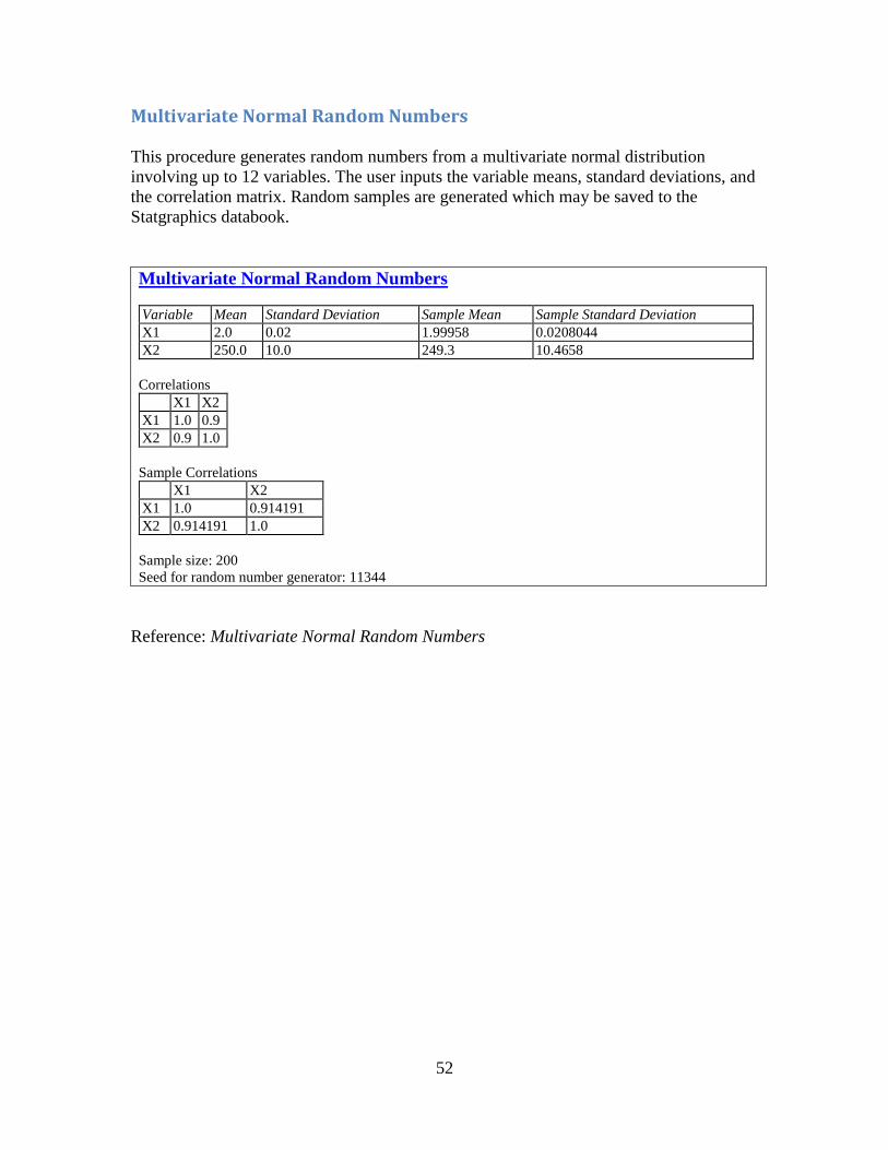
Multivariate Normal Random Numbers
This procedure generates random numbers from a multivariate normal distribution
involving up to 12 variables. The user inputs the variable means, standard deviations, and
the correlation matrix. Random samples are generated which may be saved to the
Statgraphics databook.
Multivariate Normal Random Numbers
Variable Mean Standard Deviation Sample Mean Sample Standard Deviation
X1 2.0 0.02 1.99958 0.0208044
X2 250.0 10.0 249.3 10.4658
Correlations
X1 X2
X1 1.0 0.9
X2 0.9 1.0
Sample Correlations
X1 X2
X1 1.0 0.914191
X2 0.914191 1.0
Sample size: 200
Seed for random number generator: 11344
Reference: Multivariate Normal Random Numbers

53
Multivariate Normality Test
This procedure tests whether a set of random variables could reasonably have come from
a multivariate normal distribution. It includes Royston’s H test and tests based on a chi-
square plot of the squared distances of each observation from the sample centroid.
Multivariate Normality Test Data variables:
stiffness (psi)
bending strength (psi)
Mean Standard deviation
stiffness 1860.5 352.214
bending strength 8354.13 1867.17
Sample Correlations
stiffness bending strength
stiffness 1.0 0.549872
bending strength 0.549872 1.0
Number of observations = 30
Goodness-of-Fit Test
Test Statistic P-Value
Shapiro-Wilk W - stiffness 0.975 0.6798
Shapiro-Wilk W - bending strength 0.976 0.6980
Royston's H 0.325 0.8545
Reference: Multivariate Normality Test
Chi-Square Plot
with 95% K-S limits
0 2 4 6 8 10
squared distance
0
0.2
0.4
0.6
0.8
1
CD
F
A-D = 0.339P-value > .25

54
Multivariate Tolerance Limits
The Multivariate Tolerance Limits procedure creates statistical tolerance limits for data
consisting of more than one variable. It includes a tolerance region that bounds a selected
p% of the population with 100(1-)% confidence. It also includes joint simultaneous
tolerance limits for each of the variables using a Bonferroni approach. The data are
assumed to be a random sample from a multivariate normal distribution. Multivariate
tolerance limits are often compared to specifications for multiple variables to determine
whether or not most of the population is within spec.
Reference: Multivariate Tolerance Limits
Multivariate Tolerance Region
95% Confidence; 90% Coverage
1000 1400 1800 2200 2600 3000
X1
800
1200
1600
2000
2400
2800
X2

55
Orthogonal Regression
The Orthogonal Regression procedure is designed to construct a statistical model
describing the impact of a single quantitative factor X on a dependent variable Y, when
both X and Y are observed with error. Any of 27 linear and nonlinear models may be fit.
Tests are run to determine the statistical significance of the model. The fitted model may
be plotted with confidence limits and/or prediction limits. Residuals may also be plotted
and unusual observations identified.
Reference: Orthogonal Regression
Plot of Fitted Model
August hens = 1.71535 + 0.691903*Spring hens
6.6 7.6 8.6 9.6 10.6 11.6 12.6
Spring hens
6
7
8
9
10
11
Au
gu
st
hen
s
Orthogonal fitLS Y vs XLS X vs Y

56
Population Pyramid Statlet
The Population Pyramid Statlet is designed to compare the distribution of population
counts (or similar values) between 2 groups. It may be used to display that distribution at
a single point in time, or it may show changes over time in a dynamic manner. In the
latter case, various options are offered for smoothing the data and for dealing with
missing values.
Reference: Population Pyramid Statlet

57
Sunflower Plot
The Sunflower Plot Statlet is used to display an X-Y scatterplot when the number of
observations is large. To avoid the problem of overplotting point symbols with large
amounts of data, glyphs in the shape of sunflowers are used to display the number of
observations in small regions of the X-Y space.
Reference: Sunflower Plot

58
Text Mining
The Text Mining procedure analyzes one or more text columns or documents to
determine how frequently various words are used.
The calculations are performed by the “tm” package in R. To run the procedure, R must
be installed on your computer together with the tm, wordcloud, and RColorBrewer
packages.
The main output of this procedure is an identification of those words that occur most
frequently. Both tabular and graphical summaries are provided.
Reference: Text Mining

59
Time Series Baseline Plot
This procedure plots a time series in sequential order, identifying points that are beyond
lower and/or upper limits. It is widely used to plot monthly data such as the Oceanic Niño
Index.
Reference: Time Series Baseline Plot
Strong El Niño
Strong La Niña
Oceanic Niño Index
1/1950 1/1960 1/1970 1/1980 1/1990 1/2000 1/2010 1/2020
Month
-3
-2
-1
0
1
2
3
ON
I

60
Tornado and Butterfly Plots
The Tornado and Butterfly Plots procedure creates two similar plots that compare 2
samples of attribute data. Each plot consists of 2 sets of bars that show the frequency
distribution of each sample over a set of categories. The only difference between the plots
is where the labels are placed.
Reference: Tornado and Butterfly Plots
Carson
Bush
Kasich
Rubio
Cruz
Trump
2%
2%
6%
15%
21%
45%
5%
5%
6%
22%
16%
34%
Men Women
50.0% 30.0% 10.0% 10.0% 30.0% 50.0%
Tornado Plot
Carson
Bush
Kasich
Rubio
Cruz
Trump
2%
2%
6%
15%
21%
45%
5%
5%
6%
22%
16%
34%
Men Women
Butterfly Plot

61
Trivariate Density Statlet
The Trivariate Density Statlet displays the estimated density function for 3 columns of
numeric data. It does so using either a 3-dimensional contour plot or a 3-dimensional
mesh plot. The joint distribution of the 3 variables may either be assumed to be
multivariate normal or be estimated using a nonparametric approach.
Reference: Trivariate Density Statlet
62
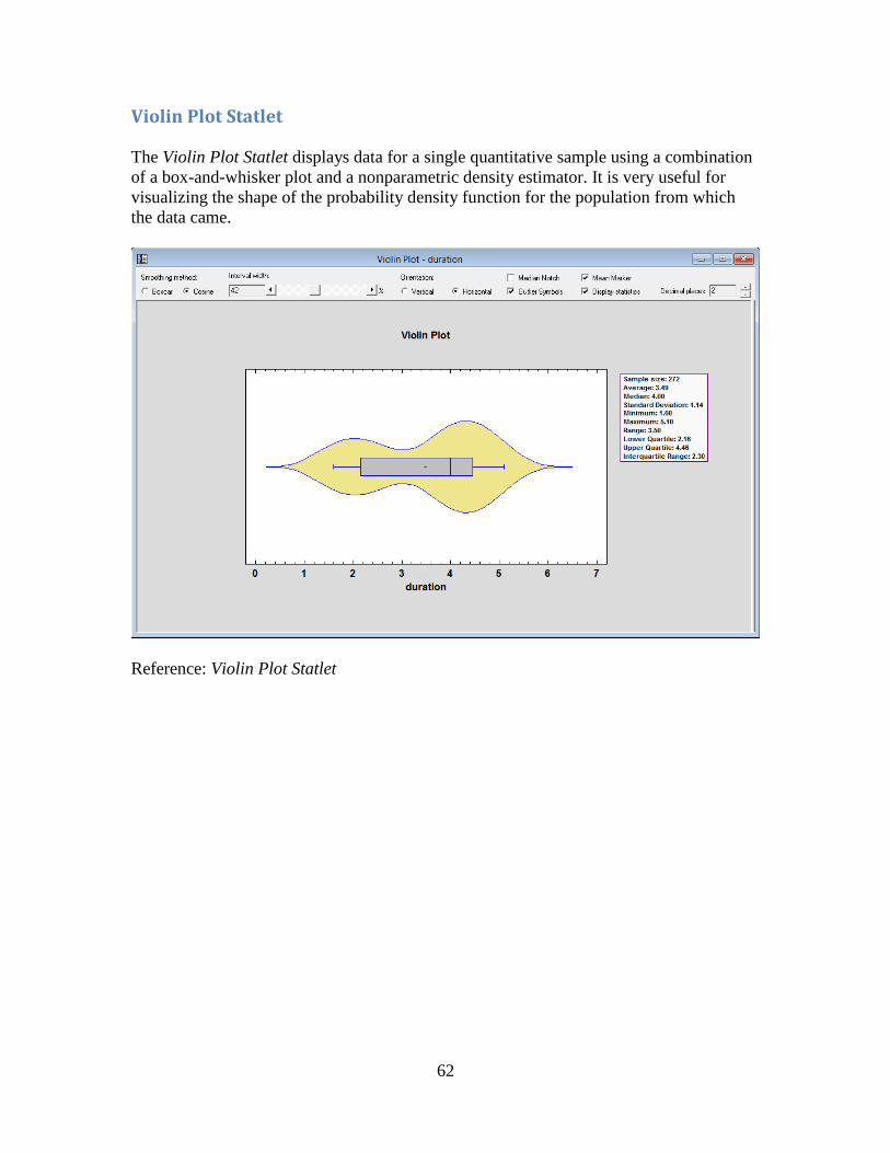
Violin Plot Statlet
The Violin Plot Statlet displays data for a single quantitative sample using a combination
of a box-and-whisker plot and a nonparametric density estimator. It is very useful for
visualizing the shape of the probability density function for the population from which
the data came.
Reference: Violin Plot Statlet

63
Wind Rose Statlet
The Wind Rose Statlet displays data on a circular plot, depicting the frequency
distribution of variables such as wind speed and direction. It may be used to display the
distribution at a single point in time, or it may show changes over time in a dynamic
manner.
Reference: Wind Rose Statlet

64
X-13ARIMA-SEATS Seasonal Adjustment
This procedure performs a seasonal adjustment of time series data using the procedure
currently employed by the United States Census Bureau. As part of the procedure, the
time series is decomposed into 3 components:
1. a trend-cycle component
2. a seasonal component
3. an irregular component
Each component may be plotted separately or saved, together with the seasonally
adjusted data.
The seasonal adjustment calculations are performed by the “seasonal” package in R.
Reference: Seasonal Adjustment using X-13ARIMA-SEATS
Seasonally Adjusted Data Plot for Traffic
1/68 1/71 1/74 1/77 1/80 1/83
Month
77
82
87
92
97
102
107
seaso
nall
y a
dju
ste
d