style sheets for print and mobile media types supplemental material
TRANSCRIPT

Style Sheets for Print and Mobile Media Types
Supplemental Material
Sources Printing and Mobile:
Murach’s HTML, XHTML,and CSS; Anne Boehm, Chapter 12: How to work with print media and mobile devices.
Printing:http://webdesign.about.com/cs/css/a/aa042103a.htm
Printing: http://www.webdesignerdepot.com/2010/01/10-tips-for-better-print-style-sheets/
Mobile: http://www.alistapart.com/articles/return-of-the-mobile-stylesheet

Media-Based Style Sheets
Up until now we have used CSS style sheets to display Web pages on a computer screen
Style sheets can also be created and used for printing a Web page
Mobile devices can also recognize style sheets

Identifying Media Type Use the HTML <link> element
and the media attribute to provide media type
Some values for media types: all – All device types screen – computer screen print- printed pages and print preview handheld- mobile phones and PDAs projection- projection devices

Example of <link> for Printing The print.css style sheet should
contain print-friendly styling for the page
<link rel=“stylesheet” media=“print” href=“print.css” >

Media type within Style Sheet If you want to use a style sheet for
more than one media type, can create rule sets/groups within the CSS Define rule set with @ symbol Ex. @print{ } or @handheld{ }
Any style rules within the set apply only for that media type
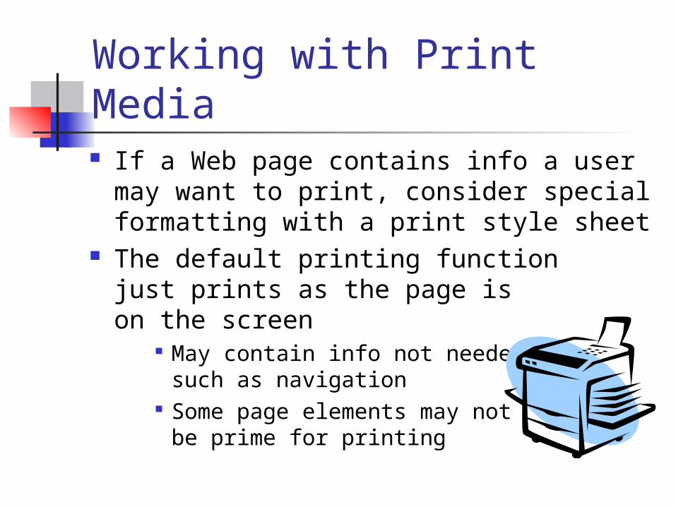
Working with Print Media If a Web page contains info a user may
want to print, consider special formatting with a print style sheet
The default printing functionjust prints as the page ison the screen
May contain info not neededsuch as navigation
Some page elements may not be prime for printing
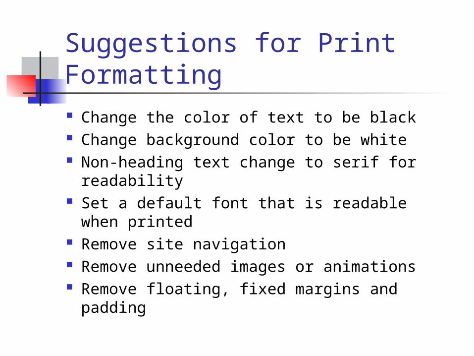
Suggestions for Print Formatting Change the color of text to be black Change background color to be white Non-heading text change to serif for
readability Set a default font that is readable
when printed Remove site navigation Remove unneeded images or animations Remove floating, fixed margins and padding

Widows and Orphans A widow is a stray line from a
previous page appears at the top of a page
An orphan is a stray line or heading is left at the bottom of a page
Web pages on the screen don’t have these issues because the user can just scroll
On the printed page, widows and orphans should be prevented Example of a Widow

CSS Properties for PrintingCSS Property Description and Values
display Determines how to display an element, values: block, inline and none.
visibility Determines if an element is visible, values: visible and hidden.
page-break-before
Page break allowed before element’s box, values: always, auto, avoid
page-break-after Page break allowed after element’s box, values: always, auto and avoid
page-break-inside*
Page break allowed inside element’s box: values: auto and avoid
widows* Integer value, minimum number of lines of element that can be printed at the top of page
orphans* Integer value, minimum number of lines of element that can be printed at the bottom of page
* Not supported by most browsers

Page Layout and Printing If layout has one column, printing the page
is not a problem For two or three column layout,
need to decide if you want column printed Navigation column usually not printed,
use display:none for id selector Printed columns: remove float property and
set width: 100% Set body margin as in margin: .25in

Printing Links and Link URLs Make links more visible For links in the content areas, include the actual
href attribute after the link
#content a:link:after, #content a:visited:after { content: " (" attr(href) ") "; font-size: 90%; }
a:link, a:visited { color: red; background: transparent; font-weight: bold; text-decoration: underline; }
Stronger Styling of Links Show Link URLs After

Printing your Web Page When you think you have your print style
sheet finished, view the page in Print Preview to make sure: Run your page, choose File->Print Preview
command from the browser menu To actually print a page:
choose File ->Print from the browser menu Can also use JavaScript to print the page
when a button is clicked: onclick=“window.print();return false;”

Working with Mobile Devices Many mobile devices are
in use today Because their screen sizes are
much smaller, Web pages designed to display on full computer screen can be difficulty on mobile devices
Web developers can provide pages specifically for mobile devices

5 Methods to Provide Web Pages for Mobile Devices
1. Define CSS style sheets for mobile devices Many new mobile browsers don’t recognize
handheld media type CSS3 media queries give more control in style
sheet for media types, not widely supported yet
2. Include link to mobile version of site Most large commercial sites do this
3. Use JavaScript to detect mobile devices and redirect to mobile site
Not all phones recognize JavaScript

5 Methods to Provide Web Pages for Mobile Devices (cont.)
4. Use server-side scripting language to detect mobile device and redirect
PHP, ASP.Net or other server-side language used to detect mobile device
So many types of mobile browsers, hard to detect all types
5. Use Wireless Universal Resource File (WURFL) to detect mobile device
An XML configuration file contains info on mobile devices and features, must be updated frequently
Needs an Application Programming Interface (API) and appropriate language to interact
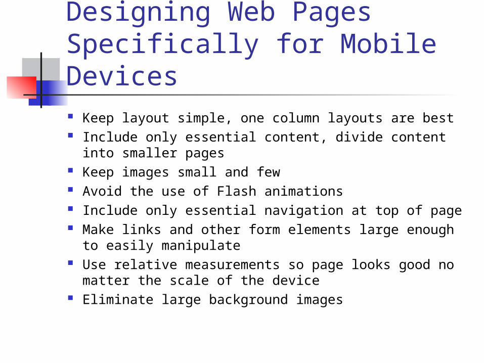
Designing Web Pages Specifically for Mobile Devices Keep layout simple, one column layouts are best Include only essential content, divide content into
smaller pages Keep images small and few Avoid the use of Flash animations Include only essential navigation at top of page Make links and other form elements large enough to
easily manipulate Use relative measurements so page looks good no
matter the scale of the device Eliminate large background images

Using Mobile Style Sheets Option
Most new mobile browsers as part of their “full web” focus ignore handheld style sheets and read only screen style sheet
Older mobile browsers read only handheld style sheets
Some mobile browsers read handheld if there is one, but will default to screen style sheet
Some read both handheld and screen style sheets

CSS3 Media Queries These can be used in the <link> tag
to target a specific class of mobile device
The media query contains two parts: a media type The actual query enclosed in ( ),
containing a particular media feature to inspect, followed by the target value
<link rel=“stylesheet” type=“text/css” media=“screen and (max-device-width: 480px) href=“core.css”>

Media Queries in CSS file Can also include CSS3 media
queries in the CSS style sheet
Use an @media rule
As part of an @import directive:
@media screen and (max-device-width: 480px) {
.column { float: none; } }
@import url(“handheld.css") only screen and (max-device-width: 480px);

Best Mobile Coverage ??? Define a style sheet screen.css for PC
use Define a style sheet antiscreen.css to
cancel any non-mobile friendly effects set in the screen.css
Tie these two style sheets together into a core.css style sheet@import url("screen.css");
@import url("antiscreen.css") handheld; @import url("antiscreen.css") only screen and (max-device-width:480px);

Best Mobile Coverage (cont.)
Next, create a special mobile-friendly handheld.css style sheet specifically designed for mobile
Finally, link the suggested style sheets in your document as follows:
<link rel="stylesheet" href="core.css" media="screen"/> <link rel="stylesheet" href="handheld.css" media="handheld, only screen and (max-device-width:480px)"/>

How Mobile Devices will Respond Mobile browsers that can read handheld style
sheets will never see the problem CSS properties in the screen.css
Mobile devices that read screen and handheld style sheets or media queries will not be affected by problem CSS in the screen.css because the antiscreen.css will cancel these
Finally, PC browsers will ignore both antiscreen.css and handheld.css and use screen.css.

The antiscreen.css Begin with your screen.css
Set widths to be 100% which allows for fluid content wrapping within the window
Remove unnecessary margins Remove floated columns to help prevent
horizontal scrolling Eliminate non-necessary content with
display:none Remove large background images a:hover not supported on mobile, add an
a:active pseudo-class to achieve this

Clickable Phone Numbers If phone numbers appear in your content,
it would be user-friendly to allow clicked phone number
Modify you page content to allow for this:
On screen style sheet set phone-link class to disable the link in the screen.css, then enable it again in mobile style sheets
<a href="tel:15032084566" class="phone-link“ >(503) 208-4566</a>
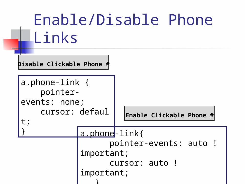
Enable/Disable Phone Links
a.phone-link { pointer-events: none; cursor: default;}
a.phone-link{ pointer-events: auto !important; cursor: auto !important; }
Disable Clickable Phone #
Enable Clickable Phone #

Using Mobile Device Emulators
Nokia and Sony Emulator http://mtld.mobi/
emulator.php Enter the URL
Iphone Simulator http://
www.testiphone.com/ Enter the URL on the
simulated phone
CSS for Media Types Summary
Use the media type in the <link> tag to include media specific style sheets
Creating a print-friendly style sheet is relatively painless with media=“print”
Mobile devices are so varied, not one solution can be used to present Web pages Combination of mobile style sheets and
CSS3 media queries can target most mobile devices
Test with Print Preview and Mobile Emulators