svg - riptutorial.cominline svg allows svg markup, written within html, to generate graphics in the...
TRANSCRIPT

SVG
#svg

Table of Contents
About 1
Chapter 1: Getting started with SVG 2
Remarks 2
Versions 2
Examples 3
Inline SVG 3
SVG as an 3
SVG as a background image 4
Chapter 2: Animation 5
Remarks 5
Examples 5
h31 5
h32 5
Chapter 3: Circle 6
Parameters 6
Remarks 6
Examples 6
Draw a black circle without fill 6
Chapter 4: clipPath 8
Parameters 8
Remarks 8
Examples 8
Clipping to a circle path 8
Chapter 5: Colors 9
Examples 9
Named colors - use predefined names for fill and stroke attributes 9
RGB Colors Using Hexadecimal Notation 9
RGB colors with functional notation - integer values or percentages 9
The currentColor keyword 9
Chapter 6: Creating fonts 11

Introduction 11
Remarks 11
Converters 11
Examples 11
a simple font 11
font picking 12
ascent, descent and baseline 12
Chapter 7: defs 14
Syntax 14
Parameters 14
Remarks 14
Examples 14
Basic example 14
Chapter 8: Ellipse 16
Parameters 16
Examples 16
Simple yellow ellipse 16
Chapter 9: Filters 17
Syntax 17
Parameters 17
Remarks 18
Examples 20
Blur Filters: feGaussian Blur (basic) 20
Blur Filters: feGaussianBlur (x-axis and y-axis blur set separately) 20
Blur Filters: feGaussianBlur with hard edges & 100% Opacity 21
Blur Filters: Box Blur 21
Blur Filters: Bokeh Blur (3 layers, clipped) 22
Shadow Filters: Basic Dropshadow 24
Shadow Filters: Inner Glow 24
Shadow Filters: Complex Dropshadow (Contoured, Noisy, Shaped) 24
Color Manipulation Filters: Basic Greyscale 25
Color Manipulation Filters: Greyscale (Green Channel Only) 26

Color Manipulation Filters: Monotone 27
Blur Filters: Focus Blur (Gaussian) 27
Color Manipulation Filters: Posterizing 28
Blur Filters: Highlight Blur 28
Chapter 10: Gradients 30
Parameters 30
Remarks 30
Examples 31
linearGradient 31
radialGradient 31
Chapter 11: Line 32
Parameters 32
Remarks 32
Examples 32
Draw a cross using diagonal red lines 32
Dashed line drawing with stroke-dasharray 33
Different examples of stroke-dasharray: 33
Line cap alternatives using stroke-linecap 34
Chapter 12: marker 35
Syntax 35
Parameters 35
Remarks 35
Examples 36
Basic marker 36
Effects of alternate values for refX, refY and orient 36
Effects of alternative values for markerUnits, markerWidth, markerHeight 38
Start, mid and end markers on line, polyline, polygon and path elements 39
Chapter 13: mask 42
Introduction 42
Remarks 42
Examples 42
basic mask 42

complex example with text and shapes 42
semi transparency 43
a mask with a gradient 43
Chapter 14: Paths 44
Introduction 44
Parameters 44
Remarks 45
Examples 45
Draw a diagonal blue line using the L path command 45
Draw a horizontal orange line using the H drawing command 45
Draw a red cross using l (relative line) path commands 46
Draw a vertical green line using the V path command 46
Chapter 15: Patterns 48
Parameters 48
Remarks 48
Examples 48
Example pattern with objectBoundingBox units 48
Pattern coverage with combinations of patternUnits and patternContentUnits 48
patternTransform examples 50
Chapter 16: pointer-events 52
Introduction 52
Examples 52
none 52
fill 52
Chapter 17: Polyline 53
Syntax 53
Parameters 53
Examples 53
SVG including a polyline 53
Polylines with alternative linejoins, linecaps and miterlimits 53
Chapter 18: Rectangle 56
Parameters 56

Remarks 56
Examples 56
Draw a black rectangle without fill 56
Draw a black rectangle with yellow fill and rounded corners 57
Chapter 19: Scripting 58
Remarks 58
Replacing pathSegList and other SVGPathSeg usage 58
Replacing getTransformToElement() 58
Examples 58
Creating an Element 58
Reading/Writing Attributes 60
Simple Numeric Attributes 60
Transformations 60
Dragging SVG Elements 61
Chapter 20: switch 63
Remarks 63
Examples 63
Alternate viewing depending on the user's language 63
Chapter 21: Text 64
Parameters 64
Remarks 64
Examples 64
Draw text 64
Super- and subscript 65
Rotate text 65
Individual Letter Positioning With Arrays of X & Y Values 65
Chapter 22: The SVG element 66
Examples 66
viewBox 66
preserveAspectRatio 66
preserveAspectRatio - meet and slice attributes 67
Chapter 23: Transformation 69

Remarks 69
Examples 69
translate 69
scale 70
rotate 70
skewX, skewY 71
matrix 71
Multiple transformations 72
Chapter 24: Transformation 73
Syntax 73
Examples 73
Applying Transformations 73
Transformation functions 73
Translate 73
Scale 73
Rotate 74
Chapter 25: use 75
Parameters 75
Remarks 75
Examples 75
Using an Icon 75
Credits 77

About
You can share this PDF with anyone you feel could benefit from it, downloaded the latest version from: svg
It is an unofficial and free SVG ebook created for educational purposes. All the content is extracted from Stack Overflow Documentation, which is written by many hardworking individuals at Stack Overflow. It is neither affiliated with Stack Overflow nor official SVG.
The content is released under Creative Commons BY-SA, and the list of contributors to each chapter are provided in the credits section at the end of this book. Images may be copyright of their respective owners unless otherwise specified. All trademarks and registered trademarks are the property of their respective company owners.
Use the content presented in this book at your own risk; it is not guaranteed to be correct nor accurate, please send your feedback and corrections to [email protected]
https://riptutorial.com/ 1

Chapter 1: Getting started with SVG
Remarks
Scalable Vector Graphics (SVG) is a W3C standard for drawing vector images.
Here is a simple standalone SVG file:
<svg xmlns="http://www.w3.org/2000/svg"> <circle cx="50" cy="50" r="25" fill="blue"/> </svg>
SVG can also be embedded in HTML, in which case the xmlns attribute is not required.
Other graphical elements are:
<line>•<ellipse>•<path>•<polygon> and <polyline>•<text> including child elements such as <tspan> and <textPath>•
CSS is used for styling although not all CSS properties apply to SVG and SVG itself defines some specific properties such as fill and stroke that are not used elsewhere.
Shapes can be filled with gradients or patterns and additional raster effects can be achieved using filters.
Clipping is available by using the above graphical elements as clip paths.
Regarding versions of the W3C SVG standard:
The current version is SVG 1.1 (Second Edition)•The W3C are currently working on a draft of SVG 2•
Versions
Version Release Date
1.0 2001-09-04
1.1 First edition 2003-01-14
1.2 Tiny 2008-12-22
1.1 Second edition 2011-08-16
https://riptutorial.com/ 2

Examples
Inline SVG
Inline SVG allows SVG markup, written within HTML, to generate graphics in the browser.
When using SVG inline, a DOCTYPE is not strictly required. Instead just the <svg> opening and closing tags together with either a viewBox or width and height attributes will suffice:
<svg width="100%" height="100%"> <!-- SVG elements go here --> </svg>
The <svg> fragment above acts as both a container and a structural element. This fragment establishes its own coordinate system.
Below is an example of rendering an SVG fragment with some content. It will produce a rectangle with "Hello World!" text within it.
<svg width="50%" viewBox="0 0 10 10"> <rect x="1" y="1" width="5" height="3" fill="teal" /> <text x="2" y="2" font-family="Palatino, Georgia, serif" font-size="3%" font-weight="bold" fill="white">Hello World!</text> </svg>
Result:
SVG as an
You can render the contents of an SVG file as an image within an HTML document using an <img> tag. For example:
https://riptutorial.com/ 3

<img src="my_svg_file.svg" alt="Image description">
The dimensions of the image will, by default, display according to the width and height properties specified in the SVG file referenced in the src attribute.
It's worth noting various limitations inherent in this approach:
Browser support, whilst good, doesn't include Internet Explorer 8 and earlier versions, nor Android 2.3 and earlier versions.
•
You can't style the individual elements contained within the SVG file using CSS which is external to the SVG file. All CSS must be within the image file itself.
•
JavaScript won't run.•The image must be complete in a single file. For example, if the SVG file contains raster images then those internal images must be encoded as data URLs.
•
SVG as a background image
You can display an SVG file within an HTML document, by specifying it as a background image in CSS. For example:
.element { background-size: 100px 100px; background: url(my_svg_file.svg); height: 100px; width: 100px; }
If the dimensions specified in your SVG file are larger than the dimensions of your HTML element, it may be desirable to specify the background-size property, to scale the SVG to fit within its element.
As with using SVG as an <img>, it's worth noting some limitations with this approach:
Browser support doesn't include Internet Explorer 8 and earlier versions, nor Android 2.3 and earlier versions.
•
You can't style the individual elements contained within the SVG file using CSS which is external to the SVG file. All CSS must be within the image file itself.
•
Read Getting started with SVG online: https://riptutorial.com/svg/topic/963/getting-started-with-svg
https://riptutorial.com/ 4

Chapter 2: Animation
Remarks
SMIL animation via the <animate> element is currently (July 2016) supported in major browsers with the exception of Microsoft browsers. There is a library (fakeSMIL) which can be used as a polyfill for Microsoft compatibility.
Chrome 45 deprecated SMIL in favor of CSS animations and forthcoming Web animations declarative animation syntax, which unfortunately, is only partially implemented in current browsers. But the Chrome developers recently suspended their intent (see this StackOverflow answer)
Examples
<svg xmlns="http://www.w3.org/2000/svg" xmlns:xlink="http://www.w3.org/1999/xlink"> <rect x="50" y="50" height="100" width="100" stroke="black" fill="yellow"> <animate attributeType="XML" attributeName="height" begin="0s" dur="10s" from="100" to="200" repeatCount="indefinite" /> </rect> </svg>
<svg xmlns="http://www.w3.org/2000/svg" xmlns:xlink="http://www.w3.org/1999/xlink"> <rect x="50" y="50" height="100" width="100" stroke="black" fill="yellow"> <animateTransform attributeType="XML" attributeName="transform" type="rotate" begin="0s" dur="10s" from="0" to="360" repeatCount="indefinite" /> </rect> </svg>
Read Animation online: https://riptutorial.com/svg/topic/3260/animation
https://riptutorial.com/ 5

Chapter 3: Circle
Parameters
Parameters Details
cx x-coordinate of center of circle.
cy y-coordinate of center of circle.
r Radius of circle.
stroke Colour of circle border.
fill Colour inside circle border.
Remarks
Detailed information on the SVG 'circle' element can be found in the W3C Recommendation for SVG.
Examples
Draw a black circle without fill
The cx and cy values designate the location of the center of the circle.•The r attribute specifies the size of the radius of the circle.•
<svg xmlns="http://www.w3.org/2000/svg" xmlns:xlink="http://www.w3.org/1999/xlink"> <circle cx="40" cy="40" r="30" stroke="black" fill="none" /> </svg>
Result:
https://riptutorial.com/ 6

Read Circle online: https://riptutorial.com/svg/topic/1559/circle
https://riptutorial.com/ 7

Chapter 4: clipPath
Parameters
Parameter Description
clipPathUnitsthe coordinate system of the pattern contents either objectBoundingBox or userSpaceOnUse
Remarks
Related W3C Recommendation informations
Examples
Clipping to a circle path
<svg xmlns="http://www.w3.org/2000/svg" viewBox="0 0 100 100" xmlns:xlink="http://www.w3.org/1999/xlink"> <defs> <clipPath id="circleClip"> <circle cx="50" cy="60" r="20" /> </clipPath> </defs> <image width="100" height="100" style="clip-path:url(#circleClip)" xlink:href="https://cdn.sstatic.net/Sites/stackoverflow/company/img/logos/so/so-icon.png" /> </svg>
Original logo Logo after clipping
Read clipPath online: https://riptutorial.com/svg/topic/4840/clippath
https://riptutorial.com/ 8
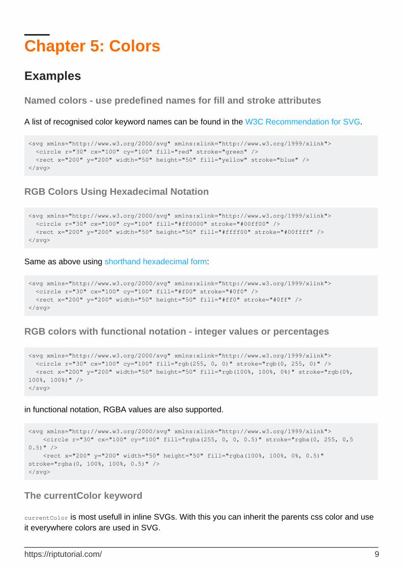
Chapter 5: Colors
Examples
Named colors - use predefined names for fill and stroke attributes
A list of recognised color keyword names can be found in the W3C Recommendation for SVG.
<svg xmlns="http://www.w3.org/2000/svg" xmlns:xlink="http://www.w3.org/1999/xlink"> <circle r="30" cx="100" cy="100" fill="red" stroke="green" /> <rect x="200" y="200" width="50" height="50" fill="yellow" stroke="blue" /> </svg>
RGB Colors Using Hexadecimal Notation
<svg xmlns="http://www.w3.org/2000/svg" xmlns:xlink="http://www.w3.org/1999/xlink"> <circle r="30" cx="100" cy="100" fill="#ff0000" stroke="#00ff00" /> <rect x="200" y="200" width="50" height="50" fill="#ffff00" stroke="#00ffff" /> </svg>
Same as above using shorthand hexadecimal form:
<svg xmlns="http://www.w3.org/2000/svg" xmlns:xlink="http://www.w3.org/1999/xlink"> <circle r="30" cx="100" cy="100" fill="#f00" stroke="#0f0" /> <rect x="200" y="200" width="50" height="50" fill="#ff0" stroke="#0ff" /> </svg>
RGB colors with functional notation - integer values or percentages
<svg xmlns="http://www.w3.org/2000/svg" xmlns:xlink="http://www.w3.org/1999/xlink"> <circle r="30" cx="100" cy="100" fill="rgb(255, 0, 0)" stroke="rgb(0, 255, 0)" /> <rect x="200" y="200" width="50" height="50" fill="rgb(100%, 100%, 0%)" stroke="rgb(0%, 100%, 100%)" /> </svg>
in functional notation, RGBA values are also supported.
<svg xmlns="http://www.w3.org/2000/svg" xmlns:xlink="http://www.w3.org/1999/xlink"> <circle r="30" cx="100" cy="100" fill="rgba(255, 0, 0, 0.5)" stroke="rgba(0, 255, 0,5 0.5)" /> <rect x="200" y="200" width="50" height="50" fill="rgba(100%, 100%, 0%, 0.5)" stroke="rgba(0, 100%, 100%, 0.5)" /> </svg>
The currentColor keyword
currentColor is most usefull in inline SVGs. With this you can inherit the parents css color and use it everywhere colors are used in SVG.
https://riptutorial.com/ 9

In this example the first circle uses the text color as fill color, and the second circle uses it as the stroke color.
<html> <head> div{color:green} </head> <body> <div> some Text <svg width="2em" height="1em" viewBox="0 0 200 100"> <circle cx="50" cy="50" r="45" fill="currentColor"/> <circle cx="150" cy="50" r="45" fill="none" stroke-width=5 stroke="currentColor"/> </svg> </div> </body> </html>
Read Colors online: https://riptutorial.com/svg/topic/2463/colors
https://riptutorial.com/ 10

Chapter 6: Creating fonts
Introduction
SVG Fonts are not directly supported by Browsers any more. Still they are very convenient for programmatically generating fonts such as symbol fonts or barcode fonts. There are many tools out there that allow you to convert svg fonts to any other font format.
Remarks
Here is a list of tools you can use with SVG fonts.
Converters
https://github.com/fontello/svg2ttf•
Examples
a simple font
A simple example of an svg font. A few things to note here:
the coordinate system of the glyphs is in opposition to the usual coordinate system in svg. the y axis points upwards. The point 0,0 is in the lower right corner.
•
All paths in a font must be drawn counter clockwise.•In most tools only the d attribute of the glyph element is supported. Child elements won't work, though they are technically allowed.
•
<svg xmlns="http://www.w3.org/2000/svg"> <font id = "myFont" horiz-adv-x = "1000" vert-origin-x = "0" vert-origin-y = "0" > <font-face font-family = "myFont" font-weight = "normal" units-per-em = "1000"> <font-face-src> <font-face-name name="myFont"/> </font-face-src> </font-face>` <glyph unicode="a" d="M0 0 H1000 L500 1000z M200 200 L500 800 L800 200z" /> <glyph unicode="b" d="M0 0 H1000 L500 1000z M200 200 L500 800 L800 200z" /> </font> </svg>
If you have wider or narrower glyphs, just change the horiz-adv-x on the glyph element itself.
https://riptutorial.com/ 11

<glyph unicode="a" horiz-adv-x="512" d="M0 0 H1000 L500 1000z M200 200 L500 800 L800 200z" />
font picking
the unicode property is used for later glyph selection. You can use simple letters or unicode codepoints as well as ligatures (combination of letters or unicode codepoints)
unicode="abc"•unicode="ab"•unicode="abab"•unicode="a"•unicode="b"•
glyphs are always selected by first match, so do have all ligatures before any single character.
unicode codepoints can be written in decimal { or in hexadecimal  notation.
ascent, descent and baseline
the units-per-em property is one of the most important font properties. It's used to give any value of any other property any meaning.
the CSS2 font spec has a nice definition of the em sqare:
Certain values, such as width metrics, are expressed in units that are relative to an abstract square whose height is the intended distance between lines of type in the same type size
the default baseline is at 0 in the em square. for line-height calculation and alignement purposes the two prperties ascent and descent are of most importance.
Ascent is the maximum distance from the baseline to the highest point of your largest glyph. Usaually that is 1em, so the value you gave for units-per-em.
Descent is the maximum distance from the baseline to the lowest point in any glyph of your font.
Here is a font with glyphs rendering a line at the lowest and highest point as well as at the baseline.
<svg xmlns="http://www.w3.org/2000/svg" viewBox="0 0 1000 1000"> <font id = "myFont" horiz-adv-x = "1000" vert-origin-x = "0" vert-origin-y = "0" > <font-face font-family = "myFont" font-weight = "normal" units-per-em = "1000" descent="500" ascent="1000"> <font-face-src>
https://riptutorial.com/ 12

<font-face-name name="myFont"/> </font-face-src> </font-face>` <glyph unicode = "a" d = "M0 900h1000v100h-1000z" /> <glyph unicode = "b" d = "M0 0h1000v100h-1000z" /> <glyph unicode = "c" d = "M0 -500h1000v100h-1000z" /> </font> </svg>
Ascent and descent are used to determine the line-height. Units-per-em and baseline are used to determine the position and size relative to other fonts used..
Read Creating fonts online: https://riptutorial.com/svg/topic/8147/creating-fonts
https://riptutorial.com/ 13

Chapter 7: defs
Syntax
<defs> ... defined elements ... </defs>•
Parameters
Parameter Details
defs The defs element has no parameters
Remarks
The <defs> element is used as a container element for elements that are intended to be used solely by reference and not rendered directly. Elements that would normally be rendered (e.g. <rect>, <circle>) that are declared inside a <defs> block are treated as if their style included display:none.
Although it's not strictly necessary, the SVG spec. recommends putting all gradient, filter, pattern, mask, symbol, and marker definitions within a defs block.
Examples
Basic example
<svg width="400px" height="400px"> <defs> <rect id="defrect" fill="blue" fill-opacity=".5" x="50" y="50" width="100" height="100"/> </defs> <rect fill="red" x="20" y="20" width="80" height="80"/> <use xlink:href="#defrect"/> <use xlink:href="#defrect" x="50" y="60"/> </svg>
Result
https://riptutorial.com/ 14

Read defs online: https://riptutorial.com/svg/topic/5592/defs
https://riptutorial.com/ 15
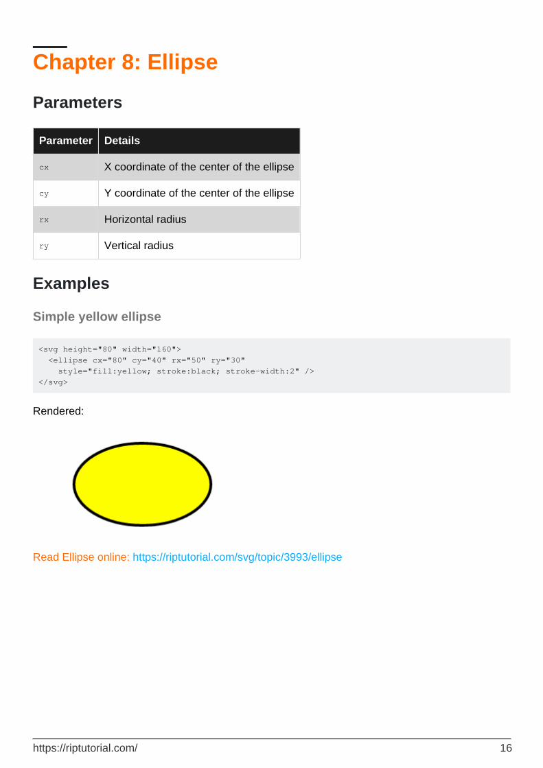
Chapter 8: Ellipse
Parameters
Parameter Details
cx X coordinate of the center of the ellipse
cy Y coordinate of the center of the ellipse
rx Horizontal radius
ry Vertical radius
Examples
Simple yellow ellipse
<svg height="80" width="160"> <ellipse cx="80" cy="40" rx="50" ry="30" style="fill:yellow; stroke:black; stroke-width:2" /> </svg>
Rendered:
Read Ellipse online: https://riptutorial.com/svg/topic/3993/ellipse
https://riptutorial.com/ 16

Chapter 9: Filters
Syntax
Filter declaration: <filter id="filter-id"> ...list of child primitives ... </filter>•Apply filter via SVG attribute: <elementname filter="url(#filter-id)" ... />•Apply filter via CSS property: (-prefix-)filter: url("#filter-id");•
Parameters
Element attributes
Details
Filter region
The filter element may optionally define the position, dimensions, resolution, and units for the output of a filter effect. The position and dimensions of a filter may be specified using the following parameters: x, y, width, height. The default values are not intuitive and are: x: -10% y: -10% width: 120% height: 120%
Filter resolution
The filterRes attribute is an optional attribute in SVG 1.1 that can be used to specify the resolution at which the filter is processed. This attribute had uneven support and is now deprecated in current browsers.
Filter units
By default, the units and coordinate system for the filter effects region (x,y,width,height) of a filter element are set relative to the bounding box of the element referencing the filter. In SVG terms, this is called the "objectBoundingBox". When we write x="50%" it means "set the starting x position of the filter region at the left side of the bounding box of the referencing element + 50% of the width of the element". But you may also specify the units and coordinates explicitly by setting the filterUnits property. The two alternatives are "objectBoundingBox" (the default which we're just described) or "userSpaceOnUse". userSpaceOnUse sets the filter units and the coordinate system to the canvas of the referencing element, or in SVG terms, the "userSpaceOnUse".
Primitive Units
In addition to the unit system for the filter itself, you may also specify the unit system that the filter's child filter primitives will use via the primitiveUnits attribute. Once again, the choice is between userSpaceOnUse and objectBoundingBox. These affect the 0,0 coordinates and the unit values for the filter primitives in the same way as for filterUnits.
Color Space
The default color space for SVG filters is linearRGB. The optional color-interpolation-filters attribute can be set to sRGB to change the color space to the more conventional sRGB space.
https://riptutorial.com/ 17
Remarks
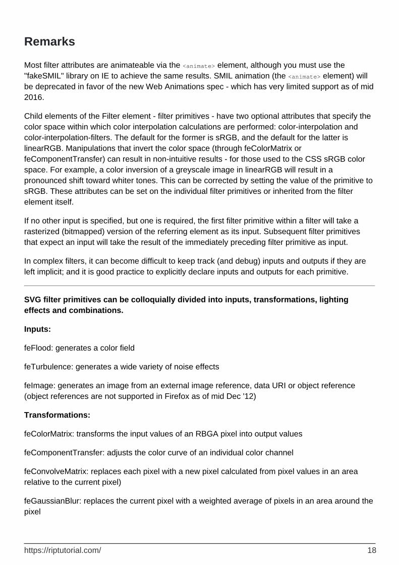
Most filter attributes are animateable via the <animate> element, although you must use the "fakeSMIL" library on IE to achieve the same results. SMIL animation (the <animate> element) will be deprecated in favor of the new Web Animations spec - which has very limited support as of mid 2016.
Child elements of the Filter element - filter primitives - have two optional attributes that specify the color space within which color interpolation calculations are performed: color-interpolation and color-interpolation-filters. The default for the former is sRGB, and the default for the latter is linearRGB. Manipulations that invert the color space (through feColorMatrix or feComponentTransfer) can result in non-intuitive results - for those used to the CSS sRGB color space. For example, a color inversion of a greyscale image in linearRGB will result in a pronounced shift toward whiter tones. This can be corrected by setting the value of the primitive to sRGB. These attributes can be set on the individual filter primitives or inherited from the filter element itself.
If no other input is specified, but one is required, the first filter primitive within a filter will take a rasterized (bitmapped) version of the referring element as its input. Subsequent filter primitives that expect an input will take the result of the immediately preceding filter primitive as input.
In complex filters, it can become difficult to keep track (and debug) inputs and outputs if they are left implicit; and it is good practice to explicitly declare inputs and outputs for each primitive.
SVG filter primitives can be colloquially divided into inputs, transformations, lighting effects and combinations.
Inputs:
feFlood: generates a color field
feTurbulence: generates a wide variety of noise effects
feImage: generates an image from an external image reference, data URI or object reference (object references are not supported in Firefox as of mid Dec '12)
Transformations:
feColorMatrix: transforms the input values of an RBGA pixel into output values
feComponentTransfer: adjusts the color curve of an individual color channel
feConvolveMatrix: replaces each pixel with a new pixel calculated from pixel values in an area relative to the current pixel)
feGaussianBlur: replaces the current pixel with a weighted average of pixels in an area around the pixel
https://riptutorial.com/ 18

feDisplacementMap: moves each pixel from its current position based on the R,G or B values from another input graphic.
feMorphology: replaces each pixel with a new pixel calculated from the maximum or minimum value of all pixels in a rectangular area around that pixel.
feOffset: moves the input from its current position
Lighting Effects:
feSpecularLighting: provides a "shiny" 2D or pseudo-3D lighting effect
feDiffuseLighting: provides a "matte" 2D or pseudo-3D lighting effect
feDistantLight: provides a distant light source for specular or diffuse lighting
feSpotLight: provides a conic section light source for specular or diffuse lighting
fePointLight: provides a point light source for specular or diffuse lighting
Combinations:
feMerge: creates a simple over composite from multiple inputs (including previous filter inputs)
feBlend: blends multiple inputs using mixing rules
feComposite: combines multiple inputs using set combination rules, taking into account alpha values.
feTile: tiles input to create a repeating pattern
Other Notes
Although SVG is a vector graphics technology, it is important to emphasize that SVG Filters perform pixel-level operations on all inputs (including SVG shapes) and produce rasterized (bitmapped) outputs at a specified level of resolution. Applying a 10x scale transform (for example) on an plain SVG curve that has been filtered at normal screen resolution will produce pixelated edges since the anti-aliasing of the original graphic has been converted to pixels by the filter and scaled up. (It is unclear whether this is spec compliant or just a limitation of current implementations)
Remember that SVG is XML when you write filters, so all tags must be closed and many properties and attributes are required to be specified explicitly or the filter will not execute.
A filter element is never rendered directly. It is only referenced using the filter property on the element to which the filter is applied. Note that the display property does not apply to the filter element and elements are not directly rendered even if the display property is set to a value other than "none". Conversely, filter elements are available for referencing even when thedisplay property on the filterelement or any of its ancestors is set to "none".
https://riptutorial.com/ 19

SVG filters can be referenced via a CSS Filter, although as of mid 2016, only a subset of primitives are supported via this mechanism, and this mechanism is not supported in Microsoft browsers.
Examples
Blur Filters: feGaussian Blur (basic)
<svg width="900px" height="400px" viewBox="0 0 900 400"> <defs> <filter id="basicGaussian"> <feGaussianBlur stdDeviation="5"/> </filter> </defs> <image xlink:href="https://upload.wikimedia.org/wikipedia/commons/a/af/Fruit_Stall_in_Barcelona_Market.jpg"x="20px" y="20px" width="300px" height="200px" preserveAspectRatio="xMinYMin meet" /> <image filter="url(#basicGaussian)" xlink:href="https://upload.wikimedia.org/wikipedia/commons/a/af/Fruit_Stall_in_Barcelona_Market.jpg"x="340px" y="20px" width="300px" height="200px" preserveAspectRatio="xMinYMin meet"/> </svg>
(Source image by Daderot at Wikimedia Commons)
Blur Filters: feGaussianBlur (x-axis and y-axis blur set separately)
<svg width="900px" height="400px" viewBox="0 0 900 400"> <defs> <filter id="xAxisGaussian"> <feGaussianBlur stdDeviation="5 0"/> </filter> </defs> <image xlink:href="https://upload.wikimedia.org/wikipedia/commons/a/af/Fruit_Stall_in_Barcelona_Market.jpg"x="20px" y="20px" width="300px" height="200px" preserveAspectRatio="xMinYMin meet" /> <image filter="url(#xAxisGaussian)" xlink:href="https://upload.wikimedia.org/wikipedia/commons/a/af/Fruit_Stall_in_Barcelona_Market.jpg"x="340px" y="20px" width="300px" height="200px" preserveAspectRatio="xMinYMin meet"/> </svg>
https://riptutorial.com/ 20

(Source image by Daderot at Wikimedia Commons)
Blur Filters: feGaussianBlur with hard edges & 100% Opacity
<svg width="900px" height="400px" viewBox="900 400"> <defs> <filter id="GaussianHardEdge" x="0%" y="0%" width="100%" height="100%"> <feGaussianBlur stdDeviation="5"/> <feComponentTransfer> <feFuncA type="table" tableValues="1 1"/> </feComponentTransfer> </filter> </defs> <image xlink:href="https://upload.wikimedia.org/wikipedia/commons/a/af/Fruit_Stall_in_Barcelona_Market.jpg"x="20px" y="20px" width="300px" height="200px" preserveAspectRatio="xMinYMin meet" /> <image filter="url(#GaussianHardEdge)" xlink:href="https://upload.wikimedia.org/wikipedia/commons/a/af/Fruit_Stall_in_Barcelona_Market.jpg"x="340px" y="20px" width="300px" height="200px" preserveAspectRatio="xMinYMin meet"/> </svg>
(Source image by Daderot at Wikimedia Commons)
Blur Filters: Box Blur
<svg width="900px" height="400px" viewBox="900 400"> <defs> <filter id="GaussianHardEdge" > <feConvolveMatrix order="3" kernelMatrix=" 1 1 1 1 1 1 1 1 1"/>
https://riptutorial.com/ 21

</filter> </defs> <image xlink:href="https://upload.wikimedia.org/wikipedia/commons/a/af/Fruit_Stall_in_Barcelona_Market.jpg"x="20px" y="20px" width="300px" height="200px" preserveAspectRatio="xMinYMin meet" /> <image filter="url(#GaussianHardEdge)" xlink:href="https://upload.wikimedia.org/wikipedia/commons/a/af/Fruit_Stall_in_Barcelona_Market.jpg"x="340px" y="20px" width="300px" height="200px" preserveAspectRatio="xMinYMin meet"/> </svg>
(Source image by Daderot at Wikimedia Commons)
Blur Filters: Bokeh Blur (3 layers, clipped)
<svg width="900px" height="400px" viewBox="0 0 900 400"> <defs> <filter id="BokehBlur" color-interpolation-filters="sRGB"> <feGaussianBlur stdDeviation="2" result="blurSource"/> <feColorMatrix type="luminanceToAlpha"/> <feComponentTransfer result="brightness-mask" > <feFuncA type="discrete" tableValues="0 0 0 1 1"/> </feComponentTransfer> <!--bokeh Layer 1 --> <feTurbulence type="fractalNoise" seed="1" baseFrequency=".67" numOctaves="3"/> <feColorMatrix type="luminanceToAlpha"/> <feComponentTransfer> <feFuncA type="discrete" tableValues="0 0 0 1"/> </feComponentTransfer> <feComposite operator="in" in="brightness-mask"/> <feComposite operator="in" in="blurSource"/> <feMorphology operator="dilate" radius="5"/> <feGaussianBlur stdDeviation="8"/> <feColorMatrix type="matrix" values="1 0 0 0 0 0 1 0 0 0 0 0 1 0 0 0 0 0 9 0" /> <feComponentTransfer result="bokeh1"> <feFuncA type="linear" slope=".5" /> </feComponentTransfer> <!--bokeh Layer 2 --> <feTurbulence type="fractalNoise" seed="49" baseFrequency=".67" numOctaves="3"/>
https://riptutorial.com/ 22

<feColorMatrix type="luminanceToAlpha"/> <feComponentTransfer> <feFuncA type="discrete" tableValues="0 0 0 1"/> </feComponentTransfer> <feComposite operator="in" in="brightness-mask"/> <feComposite operator="in" in="blurSource"/> <feMorphology operator="dilate" radius="10"/> <feGaussianBlur stdDeviation="12"/> <feColorMatrix type="matrix" values="1 0 0 0 0 0 1 0 0 0 0 0 1 0 0 0 0 0 15 0" /> <feComponentTransfer result="bokeh2"> <feFuncA type="linear" slope=".3" /> </feComponentTransfer> <!--bokeh Layer 3 --> <feTurbulence type="fractalNoise" seed="44" baseFrequency=".67" numOctaves="3"/> <feColorMatrix type="luminanceToAlpha"/> <feComponentTransfer> <feFuncA type="discrete" tableValues="0 0 0 1"/> </feComponentTransfer> <feComposite operator="in" in="brightness-mask"/> <feComposite operator="in" in="blurSource"/> <feMorphology operator="dilate" radius="10"/> <feGaussianBlur stdDeviation="18"/> <feColorMatrix type="matrix" values="1 0 0 0 0 0 1 0 0 0 0 0 1 0 0 0 0 0 15 0" /> <feComponentTransfer result="bokeh3"> <feFuncA type="linear" slope=".2" /> </feComponentTransfer> <!--Merge --> <feBlend mode="multiply" in="bokeh3" in2="bokeh2"/> <feBlend mode="lighten" in2="bokeh1"/> <feMorphology operator="erode" radius="0" result="bokeh"/> <feGaussianBlur stdDeviation="9" in="SourceGraphic"/> <feComposite operator="over" in="bokeh"/> <feComposite operator="in" in2="SourceGraphic"/> </filter> </defs> <image xlink:href="https://upload.wikimedia.org/wikipedia/commons/a/af/Fruit_Stall_in_Barcelona_Market.jpg"x="20px" y="20px" width="300px" height="200px" preserveAspectRatio="xMinYMin meet" /> <image filter="url(#BokehBlur)" xlink:href="https://upload.wikimedia.org/wikipedia/commons/a/af/Fruit_Stall_in_Barcelona_Market.jpg"x="340px" y="20px" width="300px" height="200px" preserveAspectRatio="xMinYMin meet"/> </svg>
https://riptutorial.com/ 23

(Source image by Daderot at Wikimedia Commons)
Shadow Filters: Basic Dropshadow
<svg width="800px" height="600px"> <defs> <filter id="drop-shadow"> <feGaussianBlur in="SourceAlpha" stdDeviation="4"/> <feOffset dx="5" dy="5" result="offsetblur"/> <feFlood flood-color="red"/> <feComposite in2="offsetblur" operator="in"/> <feMerge> <feMergeNode/> <feMergeNode in="SourceGraphic"/> </feMerge> </filter> </defs> <text filter="url(#drop-shadow)" x="30" y="100" font-size="80">SVG Filters</text> </svg>
Shadow Filters: Inner Glow
<svg width="800px" height="600px"> <defs> <filter id="inner-glow"> <feFlood flood-color="red"/> <feComposite in2="SourceAlpha" operator="out"/> <feGaussianBlur stdDeviation="2" result="blur"/> <feComposite operator="atop" in2="SourceGraphic"/> </filter> </defs> <text filter="url(#inner-glow)" x="30" y="100" font-size="80" font-family="Sans-Serif" font-weight="bold">SVG Filters</text> </svg>
Shadow Filters: Complex Dropshadow (Contoured, Noisy, Shaped)
<svg width="800px" height="600px"> <defs>
https://riptutorial.com/ 24

<filter id="complex-shadow" color-interpolation-filters="sRGB" x="-50%" y="-50%" height="200%" width="200%"> <!-- Take source alpha, offset it by angle/distance and blur it by size --> <feOffset id="offset" in="SourceAlpha" dx="11" dy="6" result="SA-offset"/> <feGaussianBlur id="blur" in="SA-offset" stdDeviation="4" result="SA-o-blur"/> <!-- Apply a contour by using a color curve transform on the alpha and clipping the result to the input --> <feComponentTransfer in="SA-o-blur" result="SA-o-b-contIN"> <feFuncA id="contour" type="table" tableValues="0 1 .3 .1 0.05 .1 .3 1 "/> </feComponentTransfer> <feComposite operator="in" in="SA-o-blur" in2="SA-o-b-contIN" result="SA-o-b-cont"/> <!-- Adjust the spread by multiplying alpha by a constant factor --> <feComponentTransfer in="SA-o-b-cont" result="SA-o-b-c-sprd"> <feFuncA id="spread-ctrl" type="linear" slope="2.8"/> </feComponentTransfer> <!-- Adjust color and opacity by adding fixed offsets and an opacity multiplier --> <feColorMatrix id="recolor" in="SA-o-b-c-sprd" type="matrix" values="0 0 0 0 0.945 0 0 0 0 0.137 0 0 0 0 0.137 0 0 0 0.49 0" result="SA-o-b-c-s-recolor"/> <!-- Generate a grainy noise input with baseFrequency between approx .5 to 2.0. And add the noise with k1 and k2 multipliers that sum to 1 --> <feTurbulence result="fNoise" type="fractalNoise" numOctaves="6" baseFrequency="1.98"/> <feColorMatrix in="fNoise" type="matrix" values="1 0 0 0 0 0 1 0 0 0 0 0 1 0 0 0 0 0 7 -3" result="clipNoise"/> <feComposite id="noisemix" operator="arithmetic" in="SA-o-b-c-s-recolor" in2="clipNoise" k1="0.67" k2="0.33" result="SA-o-b-c-s-r-mix"/> <!-- Merge the shadow with the original --> <feMerge> <feMergeNode in="SA-o-b-c-s-r-mix"/> <feMergeNode in="SourceGraphic"/> </feMerge> </filter> </defs> <text filter="url(#complex-shadow)" x="30" y="100" font-size="80" font-family="Sans-Serif" font-weight="bold">SVG Filters</text> </svg>
Color Manipulation Filters: Basic Greyscale
<svg width="800px" height="600px"> <defs> <filter id="greyscale"> <feColorMatrix type="matrix" values="0.2126 0.7152 0.0722 0 0 0.2126 0.7152 0.0722 0 0 0.2126 0.7152 0.0722 0 0 0 0 0 1 0"/> </filter> </defs>
https://riptutorial.com/ 25

<image xlink:href="https://upload.wikimedia.org/wikipedia/commons/a/af/Fruit_Stall_in_Barcelona_Market.jpg"x="20px" y="20px" width="300px" height="200px" preserveAspectRatio="xMinYMin meet" /> <image filter="url(#greyscale)" xlink:href="https://upload.wikimedia.org/wikipedia/commons/a/af/Fruit_Stall_in_Barcelona_Market.jpg"x="340px" y="20px" width="300px" height="200px" preserveAspectRatio="xMinYMin meet"/> </svg>
(Source image by Daderot at Wikimedia Commons)
Color Manipulation Filters: Greyscale (Green Channel Only)
<svg width="800px" height="600px"> <defs> <filter id="greyscale"> <feColorMatrix type="matrix" values="0 1 0 0 0 0 1 0 0 0 0 1 0 0 0 0 0 0 1 0"/> </filter> </defs> <image xlink:href="https://upload.wikimedia.org/wikipedia/commons/a/af/Fruit_Stall_in_Barcelona_Market.jpg"x="20px" y="20px" width="300px" height="200px" preserveAspectRatio="xMinYMin meet" /> <image filter="url(#greyscale)" xlink:href="https://upload.wikimedia.org/wikipedia/commons/a/af/Fruit_Stall_in_Barcelona_Market.jpg"x="340px" y="20px" width="300px" height="200px" preserveAspectRatio="xMinYMin meet"/> </svg>
(Source image by Daderot at Wikimedia Commons)
https://riptutorial.com/ 26

Color Manipulation Filters: Monotone
<svg width="800px" height="600px"> <defs> <filter id="greyscale"> <feColorMatrix type="matrix" values=".2 .2 .2 0 0 .6 .6 .6 0 0 .2 .2 .2 0 0 0 0 0 1 0"/> </filter> </defs> <image xlink:href="https://upload.wikimedia.org/wikipedia/commons/a/af/Fruit_Stall_in_Barcelona_Market.jpg"x="20px" y="20px" width="300px" height="200px" preserveAspectRatio="xMinYMin meet" /> <image filter="url(#greyscale)" xlink:href="https://upload.wikimedia.org/wikipedia/commons/a/af/Fruit_Stall_in_Barcelona_Market.jpg"x="340px" y="20px" width="300px" height="200px" preserveAspectRatio="xMinYMin meet"/> </svg>
(Source image by Daderot at Wikimedia Commons)
Blur Filters: Focus Blur (Gaussian)
<svg width="800px" height="600px"> <defs> <filter id="focus-blur" > <feDiffuseLighting result = "diffOut" diffuseConstant = "1" lighting-color="white"> <feSpotLight id="spotlight" x = "500" y = "100" z = "150" pointsAtX = "500" pointsAtY = "100" pointsAtZ = "0" specularExponent ="12" limitingConeAngle="70"/> </feDiffuseLighting> <feColorMatrix in="diffOut" result="alphaMap" type="luminanceToAlpha"/> <feComponentTransfer in="alphaMap" result="invertlight"> <feFuncA type="table" tableValues="1 0 0"/> </feComponentTransfer> <feGaussianBlur in="invertlight" result="featherspot" stdDeviation="5"/> <feComposite operator="xor" result="infocus" in2="SourceGraphic" in="featherspot"/> <feGaussianBlur in="SourceGraphic" result="outfocus" stdDeviation="2"/> <feComposite operator="over" in="infocus" in2="outfocus"/> <feComposite operator="in" in2="SourceGraphic"/> </filter> </defs>
https://riptutorial.com/ 27

<image xlink:href="https://upload.wikimedia.org/wikipedia/commons/a/af/Fruit_Stall_in_Barcelona_Market.jpg"x="20px" y="20px" width="300px" height="200px" preserveAspectRatio="xMinYMin meet" /> <image filter="url(#focus-blur)" xlink:href="https://upload.wikimedia.org/wikipedia/commons/a/af/Fruit_Stall_in_Barcelona_Market.jpg"x="340px" y="20px" width="300px" height="200px" preserveAspectRatio="xMinYMin meet"/> </svg>
(Source image by Daderot at Wikimedia Commons)
Color Manipulation Filters: Posterizing
<svg width="800px" height="600px" > <defs> <filter id="posterize" color-interpolation-filters="sRGB"> <feComponentTransfer> <feFuncR type="discrete" tableValues="0 0.25 0.75 1.0"/> <feFuncG type="discrete" tableValues="0 0.25 0.75 1.0"/> <feFuncB type="discrete" tableValues="0 0.25 0.75 1.0"/> </feComponentTransfer> </filter> </defs> <image xlink:href="https://upload.wikimedia.org/wikipedia/commons/4/42/Andy_Warhol_1975.jpg" x="20px" y="20px" width="300px" height="600px" preserveAspectRatio="xMinYMin meet" /> <image filter="url(#posterize)" xlink:href="https://upload.wikimedia.org/wikipedia/commons/4/42/Andy_Warhol_1975.jpg" x="340px" y="20px" width="300px" height="600px" preserveAspectRatio="xMinYMin meet"/> </svg>
Blur Filters: Highlight Blur
This filter selects only the high luminance areas of a source graphic, blurs the contents and composites the blurred content on top of the original.
<svg width="800px" height="600px"> <defs> <filter id="highlightblur" color-interpolation-filters="sRGB"> <feColorMatrix type="luminanceToAlpha" in="SourceGraphic" result="lumMap"/> <feComponentTransfer in="lumMap" result="highlightMask"> <feFuncA type="discrete" tableValues="0 0 0 0 0 0 0 1"/> </feComponentTransfer>
https://riptutorial.com/ 28

<feComposite operator="in" in="SourceGraphic" in2="highlightMask" result="highlights"/> <feGaussianBlur in="highlights" stdDeviation="3" result="highBlur"/> <feComposite operator="over" in="highBlur" in2="SourceGraphic" result="final"/> </filter> </defs> <image filter="url(#highlightblur)" x="0" y="-40" width="780" height="600" preserveAspectRatio="true" xlink:href="http://i554.photobucket.com/albums/jj424/allbowerpower/Christmas%202009/ChristmasTablesetting016b.jpg" /> </svg>
Read Filters online: https://riptutorial.com/svg/topic/3262/filters
https://riptutorial.com/ 29

Chapter 10: Gradients
Parameters
common definition
gradientUnitsthe coordinate system of the gradient attributes. Either objectBoundingBox or userSpaceOnUse
gradientTransform the transform to apply to the gradient contents
spreadMethoddefines what happens outside the gradient boundaries. Either pad, reflect or repeat
xlink:href link to another gradient which provides attributes or content
------ ------
Linear Gradient Definition
------ ------
x1 defines the gradient vector
x2 see x1
y1 see x1
y2 see x1
------ ------
Radial Gradient Definition
------ ------
cx the x coordinate of the outer gradient centre
cy the y coordinate of the outer gradient centre
r the outer radius of the gradient. The location of a 100% stop
fx the x coordinate of the inner gradient centre. The location of a 0% stop
fy the y location of the inner gradient centre. The location of a 0% stop
Remarks
https://riptutorial.com/ 30

SVG is case sensitive so remember to use a capital G in the middle.
Examples
linearGradient
<svg> <defs> <linearGradient id='g' y1="100%" x2="100%"> <stop offset='0%' stop-color='yellow' /> <stop offset='100%' stop-color='green' /> </linearGradient> </defs> <rect width='100%' height='100%' fill='url(#g)'/> </svg>
radialGradient
<svg> <defs> <radialGradient id="g"> <stop offset="10%" stop-color="green" /> <stop offset="90%" stop-color="white" /> </radialGradient> </defs> <rect width='100%' height='100%' fill='url(#g)'/> </svg>
Read Gradients online: https://riptutorial.com/svg/topic/3346/gradients
https://riptutorial.com/ 31

Chapter 11: Line
Parameters
Attribute Description
x1 Horizontal position of start of line.
y1 Vertical position of start of line.
x2 Horizontal position of end of line.
y2 Vertical position of end of line.
stroke Color of line.
stroke-width Width of line.
stroke-opacity Opacity of line.
stroke-dasharray Dash pattern for the line
stroke-linecap How line ends render
Remarks
Detailed information on the SVG 'line' element can be found in the W3C Recommendation for SVG.
Examples
Draw a cross using diagonal red lines
<svg xmlns="http://www.w3.org/2000/svg" xmlns:xlink="http://www.w3.org/1999/xlink"> <line x1="10" y1="10" x2="100" y2="100" stroke="red" stroke-width="10" /> <line x1="100" y1="10" x2="10" y2="100" stroke="red" stroke-width="10" /> </svg>
Result:
https://riptutorial.com/ 32

Dashed line drawing with stroke-dasharray
<svg width="400px" height="400px" xmlns="http://www.w3.org/2000/svg" xmlns:xlink="http://www.w3.org/1999/xlink"> <line x1="10" y1="10" x2="300" y2="10" stroke="red" stroke-width="10" stroke-dasharray="20,2,5,2"/> </svg>
Result
Different examples of stroke-dasharray:
<svg width="200" height="200" viewBox="0 0 200 200" version="1.1" xmlns="http://www.w3.org/2000/svg"> <line stroke-dasharray="5, 5" x1="10" y1="10" x2="190" y2="10" /> <line stroke-dasharray="5, 10" x1="10" y1="30" x2="190" y2="30" /> <line stroke-dasharray="10, 5" x1="10" y1="50" x2="190" y2="50" /> <line stroke-dasharray="5, 1" x1="10" y1="70" x2="190" y2="70" /> <line stroke-dasharray="1, 5" x1="10" y1="90" x2="190" y2="90" /> <line stroke-dasharray="0.9" x1="10" y1="110" x2="190" y2="110" /> <line stroke-dasharray="15, 10, 5" x1="10" y1="130" x2="190" y2="130" /> <line stroke-dasharray="15, 10, 5, 10" x1="10" y1="150" x2="190" y2="150" /> <line stroke-dasharray="15, 10, 5, 10, 15" x1="10" y1="170" x2="190" y2="170" /> <line stroke-dasharray="5, 5, 1, 5" x1="10" y1="190" x2="190" y2="190" /> <style><![CDATA[ line{ stroke: red; stroke-width: 2; } ]]></style> </svg>
Result:
https://riptutorial.com/ 33

Line cap alternatives using stroke-linecap
<svg width="600px" height="400px" xmlns="http://www.w3.org/2000/svg" xmlns:xlink="http://www.w3.org/1999/xlink"> <line x1="10" y1="20" x2="300" y2="20" stroke="red" stroke-width="20" stroke-linecap="butt"/> <text x="320" y="20">stroke-linecap="butt" (default)</text> <line x1="10" y1="70" x2="300" y2="70" stroke="red" stroke-width="20" stroke-linecap="round"/> <text x="320" y="70">stroke-linecap="round"</text> <line x1="10" y1="120" x2="300" y2="120" stroke="red" stroke-width="20" stroke-linecap="square"/> <text x="320" y="120">stroke-linecap="square"</text> </svg>
Result
Read Line online: https://riptutorial.com/svg/topic/3034/line
https://riptutorial.com/ 34

Chapter 12: marker
Syntax
<marker viewBox="x y width height" refX="xoffset" refY="yoffset" orient="orientation" ... optional parameters>
•
...elements drawing the marker...•</marker>•<elementname marker-start="url(#markerid)"/> applies a marker to the start of an element•<elementname marker-mid="url(#markerid)"/> applies a marker to the middle of a segment of an element
•
<elementname marker-end="url(#markerid)"/> applies a marker to the end of an element•Markers can be applied to the <line>, <polyline>, <polygon> and <path> elements•
Parameters
Parameter Details
viewBox Specifies the unit system for the elements that draw the marker
refXDistance the x axis of the coordinate system for drawing the marker should be offset from the default drawing point. Defaults to 0.
refYDistance the y axis of the coordinate system for drawing the marker should be offset from the default drawing point. Defaults to 0.
orient
Values are auto or angle in degrees and specifies the rotation applied to the marker. It is applied after all other coordinate adjustments are made (viewBox, preserveAspectRaio and refX, refY). Defaults to 0. Calculation of the angle for auto is complex - see the SVG spec for details.
markerUnits strokeWidth or userSpaceOnUse. Defaults to strokeWidth.
markerWidth Width of the marker in markerUnits. Defaults to 3.
markerHeight Height of the marker in markerUnits. Defaults to 3
Remarks
Scripting: rendered marker elements are not exposed in the DOM, so it is impossible to adjust properties or elements for specific rendered markers (although it's completely possible to script the defined marker element).
The overflow property of the marker element is automatically set to hidden. This is what clips any drawing that overflows the marker tile. This can be explicitly set to visible in CSS. As of July 2016,
https://riptutorial.com/ 35

Chrome does not support markers with overflow: visible - but a workaround is to set a filter on the marker element - which seems to disable the overflow clipping.
Filters can be applied to elements within a marker. Although not explicitly permitted in the spec, filters also seem to work when specified on the marker element itself.
For more details on the marker element, please see the marker section in the SVG 1.1 spec.
Examples
Basic marker
This is an example of an end marker specified with a minimal number of parameters. Note that the stroke color of the original element is not inherited by the marker.
<svg width="800px" height="600px"> <defs> <marker id="examplemarker" viewBox="0 0 10 10" refX="0" refY="5" orient="auto"> <path d="M 0 0 L 10 5 L 0 10 z" /> </marker> </defs> <line x1="20" y1="20" x2="300" y2="300" stroke-width="8" stroke="blue" marker-end="url(#examplemarker)" /> </svg>
Effects of alternate values for refX, refY and orient
The axis offsets for drawing the marker that are specified by refX and refY are applied before the rotation specified by the orient parameter. Below you can see the effects of various combinations
https://riptutorial.com/ 36

of orient and refX, refY to illustrate this.
<svg width="800px" height="600px"> <defs> <marker id="marker1" viewBox="0 0 10 10" refX="0" refY="5" orient="auto" > <path d="M 0 0 L 10 5 L 0 10 z" /> </marker> <marker id="marker2" viewBox="0 0 10 10" refX="0" refY="0" orient="0" > <path d="M 0 0 L 10 5 L 0 10 z" /> </marker> <marker id="marker3" viewBox="0 0 10 10" refX="20" refY="20" orient="0" > <path d="M 0 0 L 10 5 L 0 10 z" /> </marker> <marker id="marker4" viewBox="0 0 10 10" refX="20" refY="20" orient="180" > <path d="M 0 0 L 10 5 L 0 10 z" /> </marker> </defs> <line x1="20" y1="20" x2="100" y2="100" stroke-width="8" stroke="blue" marker-end="url(#marker1)" /> <text x="20" y="150"> refX,Y (0,5) orient (auto) </text> <line x1="220" y1="20" x2="300" y2="100" stroke-width="8" stroke="blue" marker-end="url(#marker2)" /> <text x="220" y="150"> refX,Y (0,0) orient (0) </text> <line x1="20" y1="220" x2="100" y2="300" stroke-width="8" stroke="blue" marker-end="url(#marker3)" /> <text x="20" y="390"> refX,Y (20,20) orient (0) </text> <line x1="220" y1="220" x2="300" y2="300" stroke-width="8" stroke="blue" marker-end="url(#marker4)" /> <text x="220" y="390"> refX,Y (20,20) orient (180) </text> </svg>
https://riptutorial.com/ 37

Effects of alternative values for markerUnits, markerWidth, markerHeight
The default for drawing markers is to use the stroke width of the calling element, but you can explicitly specify that markers be drawn using the unit system for the element the marker is being applied to by specifying markerUnits="userSpaceOnUse". Markers are drawn into a 3x3 markerUnits box (3 strokewidths if markerUnits are not specified). But the width and height of the box can be explicitly specified with markerHeight and markerWidth. See below for the effects of various combinations of markerUnits, markerHeight and markerWidth.
<svg width="800px" height="600px"> <defs> <marker id="marker1" viewBox="0 0 10 10" refX="0" refY="5" orient="auto" markerUnits="strokeWidth" markerWidth="1" markerHeight="1"> <path d="M 0 0 L 10 5 L 0 10 z" /> </marker> <marker id="marker2" viewBox="0 0 10 10" refX="0" refY="5" orient="auto" markerUnits="strokeWidth" markerWidth="4" markerHeight="4"> <path d="M 0 0 L 10 5 L 0 10 z" /> </marker> <marker id="marker3" viewBox="0 0 10 10" refX="0" refY="5" orient="auto" markerUnits="userSpaceOnUse" markerWidth="15" markerHeight="15"> <path d="M 0 0 L 10 5 L 0 10 z" /> </marker> <marker id="marker4" viewBox="0 0 10 10" refX="0" refY="5" orient="auto" markerUnits="userSpaceOnUse" markerWidth="30" markerHeight="30"> <path d="M 0 0 L 10 5 L 0 10 z" /> </marker>
https://riptutorial.com/ 38
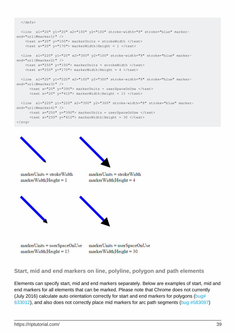
</defs> <line x1="20" y1="20" x2="100" y2="100" stroke-width="8" stroke="blue" marker-end="url(#marker1)" /> <text x="20" y="150"> markerUnits = strokeWidth </text> <text x="20" y="170"> markerWidth|Height = 1 </text> <line x1="220" y1="20" x2="300" y2="100" stroke-width="8" stroke="blue" marker-end="url(#marker2)" /> <text x="250" y="150"> markerUnits = strokeWidth </text> <text x="250" y="170"> markerWidth|Height = 4 </text> <line x1="20" y1="220" x2="100" y2="300" stroke-width="8" stroke="blue" marker-end="url(#marker3)" /> <text x="20" y="390"> markerUnits = userSpaceOnUse </text> <text x="20" y="410"> markerWidth|Height = 15 </text> <line x1="220" y1="220" x2="300" y2="300" stroke-width="8" stroke="blue" marker-end="url(#marker4)" /> <text x="250" y="390"> markerUnits = userSpaceOnUse </text> <text x="250" y="410"> markerWidth|Height = 30 </text> </svg>
Start, mid and end markers on line, polyline, polygon and path elements
Elements can specify start, mid and end markers separately. Below are examples of start, mid and end markers for all elements that can be marked. Please note that Chrome does not currently (July 2016) calculate auto orientation correctly for start and end markers for polygons (bug# 633012), and also does not correctly place mid markers for arc path segments (bug #583097)
https://riptutorial.com/ 39

<svg width="800px" height="600px"> <defs> <marker id="red-chevron" viewBox="0 0 10 10" refX="5" refY="5" orient="auto" > <path d="M 0 0 L 10 5 L 0 10" fill="none" stroke="red" /> </marker> <marker id="black-arrow" viewBox="0 0 10 10" refX="0" refY="5" orient="auto"> <path d="M 0 0 L 10 5 L 0 10 z" /> </marker> <marker id="red-circle" viewBox="0 0 10 10" refX="5" refY="5" orient="auto" > <circle fill="red" cx="5" cy="5" r="5" /> </marker> </defs> <line x1="20" y1="20" x2="100" y2="100" stroke-width="8" stroke="blue" marker-start="url(#red-chevron)" marker-end="url(#black-arrow)" marker-mid="url(#red-circle)" /> <text x="20" y="150"> line: marker-mid not applied</text> <polyline points="220,20 300,100 400,20" fill="none" stroke-width="8" stroke="blue" marker-start="url(#red-chevron)" marker-end="url(#black-arrow)" marker-mid="url(#red-circle)" /> <text x="250" y="150"> polyline </text> <polygon points="20,190 100,200 150,300 100,350 20,260" marker-start="url(#red-chevron)" marker-end="url(#black-arrow)" marker-mid="url(#red-circle)" fill="none" stroke-width="5" stroke="black" /> <text x="20" y="390"> polygon: end/start overlap </text> <path d="M250,350 l 25,-25 a15,5 -16 0,1 10,-15 l 20,-5 a15,10 -16 0,1 10,-15 l 20,-5 a15,25 -16 0,1 10,-15 l 20,-5 a15,35 -16 0,1 10,-15 l 20,-5" fill="none" stroke="green" stroke-width="2" marker-start="url(#red-chevron)" marker-end="url(#black-arrow)" marker-mid="url(#red-circle)" /> <text x="250" y="390"> path with arc segments </text> </svg>
https://riptutorial.com/ 40

Read marker online: https://riptutorial.com/svg/topic/4839/marker
https://riptutorial.com/ 41

Chapter 13: mask
Introduction
The mask element allows you to "clip" with soft edges. You can compose masks from multible elements including text. Everything of a mask that is white will be completely opaque. Everything that is black will be completely transparent. Values between white and black will be semi transparent.
Remarks
Be aware that masks are a computational expensive operation. The calculation needs to be made for every pixel in the area of the mask. So keep the area of your mask as small as possible.
Examples
basic mask
A green rect with a round hole in the middle showing the image background underneth.
<svg viewBox="0 0 100 100" xmlns="http://www.w3.org/2000/svg" xmlns:xlink="http://www.w3.org/1999/xlink"> <mask id="myMask"> <rect x="0" y="0" width="100" height="100" fill="white"/> <circle cx="50" cy="50" r="45" fill="black"/> </mask> <image xlink:href="https://cdn.pixabay.com/photo/2013/04/06/05/06/ship-100978_960_720.jpg" width="100" height="100"/> <rect x="0" y="0" width="100" height="100" fill="green" mask="url(#myMask)"/> </svg>
complex example with text and shapes
A green rect with a complex mask applied to it showing the background image.
<svg viewBox="0 0 100 100" xmlns="http://www.w3.org/2000/svg" xmlns:xlink="http://www.w3.org/1999/xlink"> <mask id="myMask0"> <circle cx="50" cy="50" r="30" fill="white"/> </mask> <mask id="myMask"> <rect x="0" y="0" width="100" height="100" fill="white"/> <text x="5" y="60" font-size="40">Mask</text> <circle cx="50" cy="50" r="30" fill="black"/> <text x="5" y="60" font-size="40" mask="url(#myMask0)" fill="white">Mask</text> </mask> <image xlink:href="https://cdn.pixabay.com/photo/2013/04/06/05/06/ship-100978_960_720.jpg" width="100" height="100"/> <rect x="0" y="0" width="100" height="100" fill="green" mask="url(#myMask)"/>
https://riptutorial.com/ 42

</svg>
semi transparency
a green rect (again...) with 4 holes created using 4 greyscale values resulting in 4 different opacities.
<svg viewBox="0 0 100 100" xmlns="http://www.w3.org/2000/svg" xmlns:xlink="http://www.w3.org/1999/xlink"> <mask id="myMask"> <rect x="0" y="0" width="100" height="100" fill="white"/> <circle cx="25" cy="25" r="20" fill="black"/> <circle cx="75" cy="25" r="20" fill="#333"/> <circle cx="25" cy="75" r="20" fill="#666"/> <circle cx="75" cy="75" r="20" fill="#999"/> </mask> <image xlink:href="https://cdn.pixabay.com/photo/2013/04/06/05/06/ship-100978_960_720.jpg" width="100" height="100"/> <rect x="0" y="0" width="100" height="100" fill="green" mask="url(#myMask)"/> </svg>
a mask with a gradient
A green rect with a hole in the middle, with soft edges.
<svg viewBox="0 0 100 100" xmlns="http://www.w3.org/2000/svg" xmlns:xlink="http://www.w3.org/1999/xlink"> <radialGradient id="rg"> <stop offset="0" stop-color="black"/> <stop offset="1" stop-color="white"/> </radialGradient> <mask id="myMask"> <rect x="0" y="0" width="100" height="100" fill="white"/> <circle cx="50" cy="50" r="45" fill="url(#rg)"/> </mask> <image xlink:href="https://cdn.pixabay.com/photo/2013/04/06/05/06/ship-100978_960_720.jpg" width="100" height="100"/> <rect x="0" y="0" width="100" height="100" fill="green" mask="url(#myMask)"/> </svg>
Read mask online: https://riptutorial.com/svg/topic/8143/mask
https://riptutorial.com/ 43

Chapter 14: Paths
Introduction
Paths are the most flexible element of SVG. A path is a series of cubic or quadratic Bezier curves, arranged in connected splines. A path may be open or closed into a loop, or it may be complex with several sub-components. If a path is not simple, the fill rule is important in deciding which areas are inside or outside of the path.
Paths will normally be generated by automatic editors. Typically quadratic paths are used for fonts, and cubic paths for illustrations.
Parameters
Attributes / parameters
Description
dDefines a sequence of drawing commands that create the shape. e.g. d="M 50,60 L50,60". Uppercase drawing commands designate absolute coordinates. Lowercase drawing commands designate relative coordinates.
(...) Drawing Commands
m/M Move current drawing position to XY d="M XY"
l/L Draw a line to X,Y d="L XY"
v/V Draw a vertical line to Y d="V Y"
h/H Draw a horizontal line to X d="H X"
a/A
Draw an arc to X,Y with an implied radius of Rx and Ry and a rotation specified by X-axis-rotation. The large arc and sweep flags select which of the 4 possible arcs that satisfy these constraints should be drawn. d="A Rx Ry X-axis-rotation(degrees) large-arc-flag (0/1) sweep-flag(0/1) X,Y".
q/Q Draw quadratic bezier curve to X,Y using control point X1Y1 d="X1Y1 X Y"
t/TDraw a shorthand quadratic bezier curve (the control point is calculated as a reflection of the control point of the previous q/Q drawing command through the current drawing position)
c/CDraw a cubic bezier curve to X,Y using control points X1,Y1 and X2,Y2 d="C X1Y1, X2Y2, XY"
Draw a shorthand cubic bezier curve (first control point is calculated as a s/S
https://riptutorial.com/ 44

Attributes / parameters
Description
reflection of the second control point of the previous c/C drawing command through the current drawing position).
- z/ZClose the path by drawing a line to start of path (or pathsegment if another z has been used previously)
(...) (end of list)
pathLength(Optional) Allows the author to specify a nominal pathLength which will be used for calibration in other calculations, for example for text along a path
Stroke Parameters
common among to all shape and drawing elements
stroke Color of path
stroke-width Width of path
Remarks
Detailed information on the SVG path element can be found in the W3C Recommendation for SVG.
Examples
Draw a diagonal blue line using the L path command
<svg xmlns="http://www.w3.org/2000/svg" xmlns:xlink="http://www.w3.org/1999/xlink"> <path d="M 10,10 L 100,50" stroke="blue" stroke-width="5" /> </svg>
Result:
Draw a horizontal orange line using the H drawing command
https://riptutorial.com/ 45

<svg xmlns="http://www.w3.org/2000/svg" xmlns:xlink="http://www.w3.org/1999/xlink"> <path d="M 10,10 H 200" stroke="orange" stroke-width="5" /> </svg>
Result:
Draw a red cross using l (relative line) path commands
<svg xmlns="http://www.w3.org/2000/svg" xmlns:xlink="http://www.w3.org/1999/xlink"> <path d="M 10,10 l 90,90 M 100,10 l -90,90" stroke="red" stroke-width="10" /> </svg>
Result:
Draw a vertical green line using the V path command
<svg xmlns="http://www.w3.org/2000/svg" xmlns:xlink="http://www.w3.org/1999/xlink"> <path d="M 10,10 V 200" stroke="green" stroke-width="5" /> </svg>
Result:
https://riptutorial.com/ 46

Read Paths online: https://riptutorial.com/svg/topic/2397/paths
https://riptutorial.com/ 47

Chapter 15: Patterns
Parameters
parameter description
patternUnitsthe coordinate system of the pattern attributes either objectBoundingBox (default) or userSpaceOnUse
patternContentUnitsthe coordinate system of the pattern contents either objectBoundingBox or userSpaceOnUse(default)
patternTransform the transform to apply to the pattern contents
x the x offset of the pattern (default is zero)
y the y offset of the pattern (default is zero)
width the width of the pattern (required)
height the height of the pattern (required)
xlink:href link to another pattern that provides some attributes or content
preserveAspectRatio whether the aspect ratio of the pattern should be preserved
Remarks
By default, the pattern will be tiled by setting the middle of the pattern unit at the top left corner of the shape.
Examples
Example pattern with objectBoundingBox units
<svg width="400" height="400"> <defs> <pattern id="pattern1" width="0.2" height="0.2" patternUnits="objectBoundingBox"> <circle cx="10" cy="10" r="10" fill="#0000ff" /> </pattern> </defs> <rect x="10" y="10" width="100" height="100" stroke="black" fill="url(#pattern1)"/> </svg>
Pattern coverage with combinations of patternUnits and patternContentUnits
https://riptutorial.com/ 48

SVG Patterns behave significantly differently than CSS background images when filling equivalent shapes. This can lead to significant surprises for new-comers to SVG. Below are examples of a pattern defined in all possible combinations of patternUnits and patternContentUnits - showing how these settings affect fill behavior.
<svg width="800px" height="800px"> <defs> <pattern id="pattern1" x="0" y="0" width="0.2" height="0.2" patternUnits="objectBoundingBox" patternContentUnits="userSpaceOnUse"> <circle cx="10" cy="10" r="10" fill="blue" /> </pattern> <pattern id="pattern2" x="10" y="10" width="20" height="20" patternUnits="userSpaceOnUse" patternContentUnits="objectBoundingBox"> <circle cx=".1" cy=".1" r="0.1" fill="blue" /> </pattern> <pattern id="pattern3" x="10" y="10" width="20" height="20" patternUnits="userSpaceOnUse" patternContentUnits="userSpaceOnUse"> <circle cx="10" cy="10" r="10" fill="blue" /> </pattern> <pattern id="pattern4" x="0" y="0" width="0.2" height="0.2" patternUnits="objectBoundingBox" patternContentUnits="objectBoundingBox">
https://riptutorial.com/ 49

<circle cx=".1" cy=".1" r="0.1" fill="blue" /> </pattern> </defs> <rect x="10" y="10" width="100" height="100" stroke="black" fill="url(#pattern1)"/> <rect x="150" y="10" width="200" height="150" stroke="black" fill="url(#pattern1)"/> <text x="10" y="200">patternUnits="objectBoundingBox" (20% of shape)</text> <text x="10" y="220">patternContentUnits="userSpaceOnUse" (20px circle) </text> <text x="10" y="240" stroke="blue" stroke-width="1">(Units used by default)</text> <rect x="10" y="310" width="100" height="100" stroke="black" fill="url(#pattern3)"/> <rect x="150" y="310" width="200" height="150" stroke="black" fill="url(#pattern3)"/> <text x="10" y="500">patternUnits="userSpaceOnUse" (10px square box)</text> <text x="10" y="520">patternContentUnits="userSpaceOnUse" (20px circle) </text> <rect x="410" y="10" width="100" height="100" stroke="black" fill="url(#pattern2)"/> <rect x="550" y="10" width="200" height="150" stroke="black" fill="url(#pattern2)"/> <text x="410" y="200">patternUnits="userSpaceOnUse" (10px square box)</text> <text x="410" y="220">patternContentUnits="objectBoundingBox"(radius="10%") </text> <rect x="410" y="310" width="100" height="100" stroke="black" fill="url(#pattern4)"/> <rect x="550" y="310" width="200" height="150" stroke="black" fill="url(#pattern4)"/> <text x="410" y="500">patternUnits="objectBoundingBox" (20% of shape)</text> <text x="410" y="520">patternContentUnits="objectBoundingBox"(radius="10%") </text> </svg>
patternTransform examples
<svg width="800px" height="800px"> <defs> <pattern id="pattern1" x="0" y="0" width="0.2" height="0.2" > <circle cx="10" cy="10" r="10" fill="blue" /> </pattern> <pattern id="pattern2" x="0" y="0" width="0.2" height="0.2" patternTransform="scale(1.5)"> <circle cx="10" cy="10" r="10" fill="blue" /> </pattern> <pattern id="pattern3" x="0" y="0" width="0.2" height="0.2" patternTransform="skewX(45)"> <circle cx="10" cy="10" r="10" fill="blue" /> </pattern> <pattern id="pattern4" x="0" y="0" width="0.2" height="0.2" patternTransform="matrix(1.5,-.70,.10,1.1,-30,10)"> <circle cx="10" cy="10" r="10" fill="blue" /> </pattern> </defs> <rect x="10" y="10" width="100" height="100" stroke="black" fill="url(#pattern1)"/> <rect x="150" y="10" width="200" height="150" stroke="black" fill="url(#pattern1)"/> <text x="10" y="200">Original</text> <rect x="410" y="10" width="100" height="100" stroke="black" fill="url(#pattern2)"/> <rect x="550" y="10" width="200" height="150" stroke="black" fill="url(#pattern2)"/> <text x="410" y="200">patternTransform="scale(1.5)"</text>
https://riptutorial.com/ 50

<rect x="10" y="310" width="100" height="100" stroke="black" fill="url(#pattern3)"/> <rect x="150" y="310" width="200" height="150" stroke="black" fill="url(#pattern3)"/> <text x="10" y="500">patternTransform="skewX(45)"</text> <rect x="410" y="310" width="100" height="100" stroke="black" fill="url(#pattern4)"/> <rect x="550" y="310" width="200" height="150" stroke="black" fill="url(#pattern4)"/> <text x="410" y="500">patternUnits="matrix(1.5,-.70,.10,1.1,-30,10)"</text> </svg>
Read Patterns online: https://riptutorial.com/svg/topic/3251/patterns
https://riptutorial.com/ 51
Chapter 16: pointer-events
Introduction
With the pointer-events property, you can control wich part of your drawing will react to pointer events.
Examples
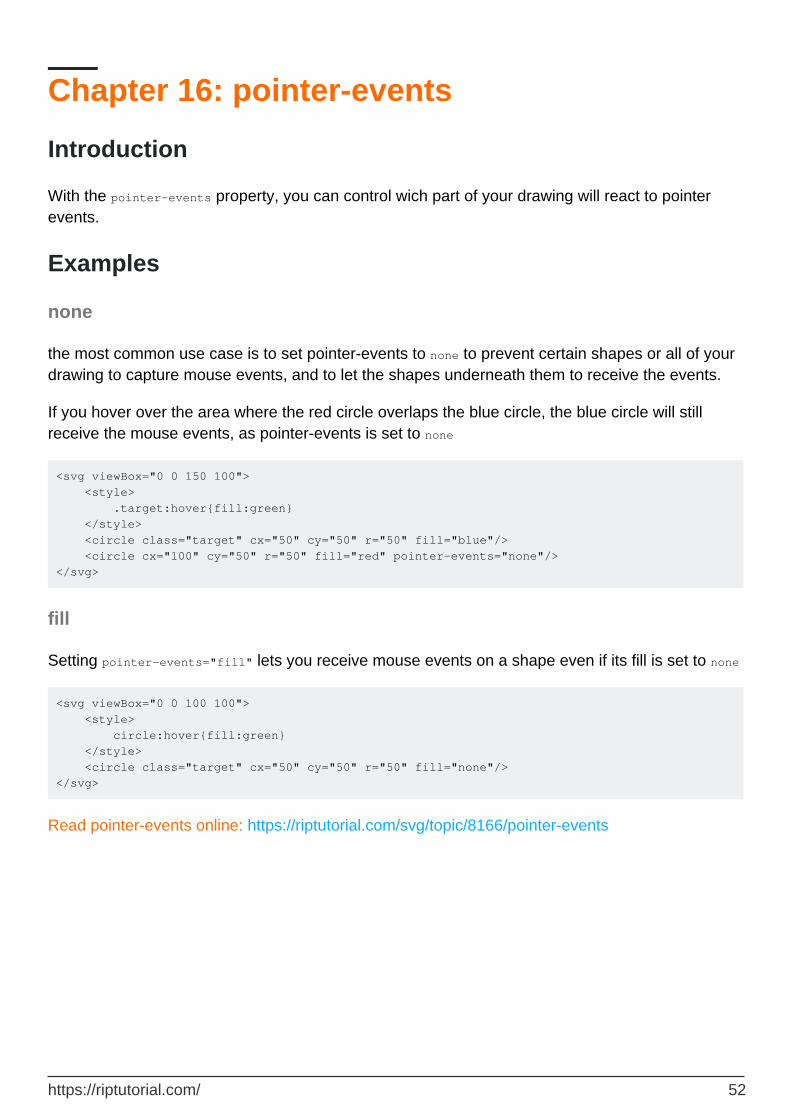
none
the most common use case is to set pointer-events to none to prevent certain shapes or all of your drawing to capture mouse events, and to let the shapes underneath them to receive the events.
If you hover over the area where the red circle overlaps the blue circle, the blue circle will still receive the mouse events, as pointer-events is set to none
<svg viewBox="0 0 150 100"> <style> .target:hover{fill:green} </style> <circle class="target" cx="50" cy="50" r="50" fill="blue"/> <circle cx="100" cy="50" r="50" fill="red" pointer-events="none"/> </svg>
fill
Setting pointer-events="fill" lets you receive mouse events on a shape even if its fill is set to none
<svg viewBox="0 0 100 100"> <style> circle:hover{fill:green} </style> <circle class="target" cx="50" cy="50" r="50" fill="none"/> </svg>
Read pointer-events online: https://riptutorial.com/svg/topic/8166/pointer-events
https://riptutorial.com/ 52

Chapter 17: Polyline
Syntax
<polyline points="10,5 25,15 20,10" />•
Parameters
Parameter Details
pointsThe points attribute defines a list of points. Each point is defined by a x and a y coordinate in the user coordinate system.
stroke-width Width of stroke
stroke-opacity
Opacity of stroke
stroke-dasharray
(Optional) Specifies the dash pattern for the stroke
stroke-linecap
(Optional) Specifies whether line end should be flush, round or squared off ("butt" (default)/"round"/"square")
stroke-linejoin
(Optional) Specifies how line segments should be joined - mitered, rounded or beveled ("miter" (default)/"round"/"bevel")
stroke-miterlimit
(Optional) Specifies the maximum dimension of a miter. Mitered joins that exceed this limit are converted to a bevel join. Default="4"
Examples
SVG including a polyline
<svg xmlns="http://www.w3.org/2000/svg" version="1.1"> <polyline points="10,5 25,15 20,10" /> </svg>
Polylines with alternative linejoins, linecaps and miterlimits
<svg width="600px" height="600px" xmlns="http://www.w3.org/2000/svg" xmlns:xlink="http://www.w3.org/1999/xlink"> <polyline points="10,10,50,40,80,30,120,90,130,10,180,50,250,100,300,10" fill="none" stroke="red" stroke-width="10" />
https://riptutorial.com/ 53

<text x="320" y="20">Default drawing stroke</text> <g transform="translate(0,150)"> <polyline points="10,10,50,40,80,30,120,90,130,10,180,50,250,100,300,10" fill="none" stroke="red" stroke-width="10" stroke-linecap="butt" stroke-linejoin="miter" stroke-miterlimit="2"/> <text x="320" y="20">stroke-linecap="butt" (default)</text> <text x="320" y="40">stroke-linejoin="miter"(default)</text> <text x="320" y="60">stroke-miterlimit="2"</text> </g> <g transform="translate(0,300)"> <polyline points="10,10,50,40,80,30,120,90,130,10,180,50,250,100,300,10" fill="none" stroke="red" stroke-width="10" stroke-linecap="round" stroke-linejoin="round" /> <text x="320" y="20">stroke-linecap="round" </text> <text x="320" y="40">stroke-linejoin="round" </text> </g> <g transform="translate(0,450)"> <polyline points="10,10,50,40,80,30,120,90,130,10,180,50,250,100,300,10" fill="none" stroke="red" stroke-width="10" stroke-linecap="square" stroke-linejoin="bevel"/> <text x="320" y="20">stroke-linecap="square"</text> <text x="320" y="40">stroke-linejoin="bevel"</text> </g> </svg>
Result
https://riptutorial.com/ 54

Read Polyline online: https://riptutorial.com/svg/topic/3842/polyline
https://riptutorial.com/ 55

Chapter 18: Rectangle
Parameters
Attribute Description
x Horizontal position of rectangle from left margin.
y Vertical position of rectangle from top margin.
width Width of rectangle.
height Height of rectangle.
rx Horizontal radius of ellipse used to round corners of rectangle
ry Vertical radius of ellipse used to round corners of rectangle
stroke Colour of rectangle border.
stroke-width Width of rectangle border.
fill Colour inside rectangle border.
Remarks
Detailed information on the SVG 'rect' element can be found in the W3C Recommendation for SVG.
Examples
Draw a black rectangle without fill
<svg xmlns="http://www.w3.org/2000/svg" xmlns:xlink="http://www.w3.org/1999/xlink"> <rect x="10" y="10" width="50" height="100" stroke="black" stroke-width="5" fill="none" /> </svg>
Result:
https://riptutorial.com/ 56

Draw a black rectangle with yellow fill and rounded corners
The width and height attributes designate the dimensions of the rectangle. These values are in pixels by default
•
The fill value sets the color for the rectangle. If no value for fill is specified, black is used by default
•
<svg xmlns="http://www.w3.org/2000/svg" xmlns:xlink="http://www.w3.org/1999/xlink"> <rect x="10" y="10" width="50" height="100" rx="10" ry="10" stroke="black" stroke-width="5" fill="yellow" /> </svg>
Result:
Read Rectangle online: https://riptutorial.com/svg/topic/2993/rectangle
https://riptutorial.com/ 57

Chapter 19: Scripting
Remarks
Scripting SVG using the native DOM interfaces is currently (2016) in a state of slight change. The current SVG standard (1.1) is implemented well by most major web browsers. However, as the SVG 2.0 standard is under development, some browsers have begun to remove SVG 1.1 features that will be obsolete in 2.0. You can see a full list of proposed changes from SVG 1.1 to SVG 2.0 in Appendix L of SVG 2.0.
Replacing pathSegList and other SVGPathSeg usage
In SVG 1.1 <path> elements are defined to have a pathSegList property that gives access to a native representation of all path commands. Google Chrome v48 removed this property at the end of 2015, in preparation for a proposed replacement in SVG 2.0. Until SVG 2.0 support is added, you must use a polyfill to either get the 1.1 functionality back, or to implement the proposed 2.0 API.
Replacing getTransformToElement()
Chrome v48 also removed the SVGGraphicsElement.getTransformToElement() method. A simple polyfill exists to implement the old method.
Examples
Creating an Element
The simplest way to understand creating and modifying SVG elements is to operate on the elements using the DOM Level 2 Core interfaces, as you would with HTML or XML.
It is imperative that the elements created from JavaScript are created in the same namespace declared in the SVG element - in this example: "http://www.w3.org/2000/svg". However, almost all attributes of SVG elements are not in any namespace. You must not place them in the SVG namespace.
Here we demonstrate SVG hosted inside of HTML, as this is a common case:
<!doctype HTML> <html><title>Creating an Element</title> <body> <svg xmlns="http://www.w3.org/2000/svg" width="100%" height="100%" viewBox="0 0 400 300"></svg> <script> var svgNS = "http://www.w3.org/2000/svg";
https://riptutorial.com/ 58

// Create a circle element (not part of the DOM yet) var circle = document.createElementNS(svgNS,'circle'); // Creates a <circle/> circle.setAttribute('fill','red'); // Note: NOT setAttributeNS() circle.setAttribute('cx',150); // setAttribute turns 150 into a string circle.setAttribute('cy','80'); // using a string works, too circle.setAttribute('r',35); // give the circle a radius so we can see it // Now, add the circle to the SVG document so we can see it var svg = document.querySelector('svg'); // the root <svg> element svg.appendChild(circle); </script> </body></html>
There are a few attributes that need to be created in a particular namespace. They are the ones listed with colons in their names in the SVG Attribute Index. Specifically, they are: xlink:actuate, xlink:arcrole, xlink:href, xlink:role, xlink:show, xlink:title, xlink:type, xml:base, xml:lang, and xml:space. Set these attributes using setAttributeNS():
var svgNS = "http://www.w3.org/2000/svg"; var xlinkNS = "http://www.w3.org/1999/xlink"; var img = document.createElementNS( svgNS, 'image' ); img.setAttributeNS( xlinkNS, 'href', 'my.png' );
If you are creating elements often, particularly with many attributes, a helper function like the following can save you typing, avoid mistakes, and make your code easier to read:
<!doctype HTML> <html><title>Creating an Element</title> <body> <svg xmlns="http://www.w3.org/2000/svg"></svg> <script> var svg = document.querySelector('svg'); var circle = createOn( svg, 'circle', {fill:'red', cx:150, cy:80, r:35} ); // Create an SVG element on another node with a set of attributes. // Attributes with colons in the name (e.g. 'xlink:href') will automatically // find the appropriate namespace URI from the SVG element. // Optionally specify text to create as a child node, for example // createOn(someGroup,'text',{x:100,'text-anchor':'middle'},"Hello World!"); function createOn(parentEl,name,attrs,text){ var doc=parentEl.ownerDocument, svg=parentEl; while (svg && svg.tagName!='svg') svg=svg.parentNode; var el = doc.createElementNS(svg.namespaceURI,name); for (var a in attrs){ if (!attrs.hasOwnProperty(a)) continue; var p = a.split(':'); if (p[1]) el.setAttributeNS(svg.getAttribute('xmlns:'+p[0]),p[1],attrs[a]); else el.setAttribute(a,attrs[a]); } if (text) el.appendChild(doc.createTextNode(text)); return parentEl.appendChild(el); } </script> </body></html>
https://riptutorial.com/ 59

Reading/Writing Attributes
You can use either DOM Level 2 Core methods getAttribute(), getAttributeNS(), setAttribute(), and setAttributeNS() to read and write values from SVG elements, or you can use custom properties and methods specified in the SVG 1.1 IDL (Interface Definition Language).
Simple Numeric Attributes
For example, if you have an SVG circle element:
<circle id="circ" cx="10" cy="20" r="15" />
you can either use DOM methods to read and write the attributes:
var circ = document.querySelector('#circ'); var x = circ.getAttribute('cx') * 1; // Use *1 to convert from string to number value circ.setAttribute('cy', 25);
...or you can use the custom cx, cy, and r properties defined for SVGCircleElement. Note that these are not direct numbers, but instead—as with many accessors in SVG 1.1—they allow for access to animated values. These properties are of type SVGAnimatedLength. Disregarding animation and length units, you can use such attributes like:
var x = circ.cx.baseVal.value; // this is a number, not a string circ.cy.baseVal.value = 25;
Transformations
SVG groups may be used to move, rotate, scale, and otherwise transform multiple graphical elements as a whole. (For details on SVG translations, see Chapter 7). Here is a group that makes a smiley face that you can adjust the size, rotation, and placement of by adjusting the transform:
<g id="smiley" transform="translate(120,120) scale(5) rotate(30)"> <circle r="20" fill="yellow" stroke-width="2"/> <path fill="none" d="M-10,5 a 5 3 0 0 0 20,0" stroke-width="2"/> <circle cx="-6" cy="-5" r="2" fill="#000"/> <circle cx="6" cy="-5" r="2" fill="#000"/> </g>
Using script to adjust the scale of this via DOM methods requires manipulating the entire transform attribute as a string:
var face = document.querySelector('#smiley'); // Find the full string value of the attribute var xform = face.getAttribute('transform'); // Use a Regular Expression to replace the existing scale with 'scale(3)' xform = xform.replace( /scale\s*\([^)]+\)/, 'scale(3)' );
https://riptutorial.com/ 60

// Set the attribute to the new string. face.setAttribute('transform',xform);
With the SVG DOM one can traverse the specific transforms in the list, find the desired one, and modify the values:
var face = document.querySelector('#smiley'); // Get the SVGTransformList, ignoring animation var xforms = face.transform.baseVal; // Find the scale transform (pretending we don't know its index) for (var i=0; i<xforms.numberOfItems; ++i){ // Get this part as an SVGTransform var xform = xforms.getItem(i); if (xform.type == SVGTransform.SVG_TRANSFORM_SCALE){ // Set the scale; both X and Y scales are required xform.setScale(3,3); break; } }
For traversing and manipulating the number of transforms, see SVGTransformList.•For manipulating individual transforms, see SVGTransform.•
Dragging SVG Elements
Using the mouse to drag an SVG element (or group of elements) can be accomplished by:
Adding mousedown handler to starts the drag: adding a translation on the element to use during dragging (if needed), tracking mousemove events, and adding a mouseup handler to end the drag.
1.
During mousemove, transforming the position of the mouse from screen coordinates into the local coordinates for the object you are dragging, and update the translation accordingly.
2.
During mouseup, removing the mousemove and mouseup handlers.3.
// Makes an element in an SVG document draggable. // Fires custom `dragstart`, `drag`, and `dragend` events on the // element with the `detail` property of the event carrying XY // coordinates for the location of the element. function makeDraggable(el){ if (!el) return console.error('makeDraggable() needs an element'); var svg = el; while (svg && svg.tagName!='svg') svg=svg.parentNode; if (!svg) return console.error(el,'must be inside an SVG wrapper'); var pt=svg.createSVGPoint(), doc=svg.ownerDocument; var root = doc.rootElement || doc.body || svg; var xlate, txStartX, txStartY, mouseStart; var xforms = el.transform.baseVal; el.addEventListener('mousedown',startMove,false); function startMove(evt){
https://riptutorial.com/ 61

// We listen for mousemove/up on the root-most // element in case the mouse is not over el. root.addEventListener('mousemove',handleMove,false); root.addEventListener('mouseup', finishMove,false); // Ensure that the first transform is a translate() xlate = xforms.numberOfItems>0 && xforms.getItem(0); if (!xlate || xlate.type != SVGTransform.SVG_TRANSFORM_TRANSLATE){ xlate = xforms.createSVGTransformFromMatrix( svg.createSVGMatrix() ); xforms.insertItemBefore( xlate, 0 ); } txStartX=xlate.matrix.e; txStartY=xlate.matrix.f; mouseStart = inElementSpace(evt); fireEvent('dragstart'); } function handleMove(evt){ var point = inElementSpace(evt); xlate.setTranslate( txStartX + point.x - mouseStart.x, txStartY + point.y - mouseStart.y ); fireEvent('drag'); } function finishMove(evt){ root.removeEventListener('mousemove',handleMove,false); root.removeEventListener('mouseup', finishMove,false); fireEvent('dragend'); } function fireEvent(eventName){ var event = new Event(eventName); event.detail = { x:xlate.matrix.e, y:xlate.matrix.f }; return el.dispatchEvent(event); } // Convert mouse position from screen space to coordinates of el function inElementSpace(evt){ pt.x=evt.clientX; pt.y=evt.clientY; return pt.matrixTransform(el.parentNode.getScreenCTM().inverse()); } }
Read Scripting online: https://riptutorial.com/svg/topic/5021/scripting
https://riptutorial.com/ 62

Chapter 20: switch
Remarks
<switch> is a conditional processing attribute. It doesn't prevent elements from being referenced by other elements. In our case, <switch> evaluates the systemLanguage value on its direct child elements that matches the user's language. Once is found, the child is rendered and the other children will be bypassed.
If the systemLanguage is not specified, the child will be displayed, allowing us specifying a fallback.
Related W3C Recommendation informations
Examples
Alternate viewing depending on the user's language
<svg xmlns="http://www.w3.org/2000/svg"> <switch> <text systemLanguage="en-UK" x="10" y="10">UK English</text> <text systemLanguage="fr" x="10" y="10">Français</text> <text systemLanguage="ru" x="10" y="10">Русский</text> <text x="10" y="20">English</text> <!-- fallback (if none of the languages match) --> </switch> </svg>
Read switch online: https://riptutorial.com/svg/topic/4702/switch
https://riptutorial.com/ 63

Chapter 21: Text
Parameters
<text> Details
x The x position of the text.
y The y position of the text.
dx Relative shift in x position.
dy Relative shift in y position.
rotate Specifies the angular displacement for text glyphs.
textLength Fits the text into the given length.
lengthAdjustSpecifies whether just kerning or kerning & glyphs are compressed/stretched to fit text into textLength specified. Values: spacing or spacingAndGlyphs
--Parameters common to all text chunking elements (text, tref, textPath, tspan)
text-anchor Specifies horizontal alignment. Values: start, middle, end.
baseline-shift
Shifts text baseline based on either values provided by the font table for superscript or subscript positioning (sub, super) or by a positive or negative % or length. Values: sub, super, %, or length.
Remarks
baseline-shift is not supported by the most current versions of Firefox and Microsoft browsers as of July 2016.
Examples
Draw text
<svg xmlns="http://www.w3.org/2000/svg"> <text x="40" y="60" font-size="28">Hello World!</text> </svg>
The x and y coordinate specifies the position of the bottom-left corner of the text (unless text-anchor has been modified).
https://riptutorial.com/ 64

Super- and subscript
Using the baseline-shift parameter, you can specify super- or subscript. But this is not supported by all major browsers.
<svg xmlns="http://www.w3.org/2000/svg"> <text x="10" y="20">x<tspan baseline-shift="super">2</tspan></text> <text x="10" y="60">f<tspan baseline-shift="sub">x</tspan></text> </svg>
For a cross-browser solution, you can use dy, dx and relative font size.
<svg xmlns="http://www.w3.org/2000/svg"> <text x="10" y="40">x<tspan dy="-7" font-size=".7em">2</tspan></text> <text x="10" y="80">f<tspan dy="3" font-size=".7em">x</tspan></text> </svg>
Rotate text
The rotate property rotates each character by the specified angle.
<svg xmlns="http://www.w3.org/2000/svg"> <text x="10" y="20" rotate="30">Each character is rotated</text> </svg>
To rotate the whole text element, you have to use the transform property.
<svg xmlns="http://www.w3.org/2000/svg"> <text transform="translate(10, 60) rotate(30)">The whole text is rotated</text> </svg>
Individual Letter Positioning With Arrays of X & Y Values
<svg width="400px" height="200px"> <text x="1em, 2em, 3em, 4em, 5em" y="3em, 4em, 5em"> Individually Spaced Text </text> </svg>
The Text element supports individual placement of letters by accepting an array of values for x and y.
Read Text online: https://riptutorial.com/svg/topic/3033/text
https://riptutorial.com/ 65

Chapter 22: The SVG element
Examples
viewBox
The viewBox attribute defines the coordinate system for an <svg> element. This allows you to easily change the size and relative proportion of an SVG graphic without having to adjust the position and dimensions of every individual drawn element.
<!-- stretches a small icon to 60px square --> <svg viewBox="0 0 16 16" height="60px" width="60px"> <path d="M16 6.216l-6.095-.02L7.98.38 6.095 6.196 0 6.215h.02l4.912 3.57-1.904 5.834h.02l4.972-3.59 4.932 3.59-1.904-5.815L16 6.215" /> </svg>
That code looks like this:
Without the viewBox, it looks like this:
preserveAspectRatio
preserveAspectRatio is an attribute that indicates whether the image should be scaled uniformly. This attribute only works if the <svg> element also has a viewBox.
The default value is xMidYMid, which maintains the aspect ratio and centers the path inside the SVG container:
<!-- when not included `preserveAspectRatio` defaults to `xMidYMid` --> <svg viewBox="0 0 16 16" height="60" width="120"> <path d="M16 6.216l-6.095-.02L7.98.38 6.095 6.196 0 6.215h.02l4.912 3.57-1.904 5.834h.02l4.972-3.59 4.932 3.59-1.904-5.815L16 6.215" /> </svg>
https://riptutorial.com/ 66
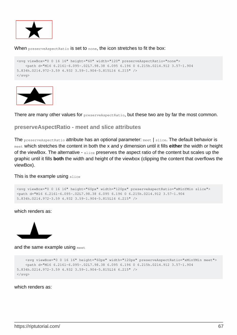
When preserveAspectRatio is set to none, the icon stretches to fit the box:
<svg viewBox="0 0 16 16" height="60" width="120" preserveAspectRatio="none"> <path d="M16 6.216l-6.095-.02L7.98.38 6.095 6.196 0 6.215h.02l4.912 3.57-1.904 5.834h.02l4.972-3.59 4.932 3.59-1.904-5.815L16 6.215" /> </svg>
There are many other values for preserveAspectRatio, but these two are by far the most common.
preserveAspectRatio - meet and slice attributes
The preserveAspectRatio attribute has an optional parameter: meet | slice. The default behavior is meet which stretches the content in both the x and y dimension until it fills either the width or height of the viewBox. The alternative - slice preserves the aspect ratio of the content but scales up the graphic until it fills both the width and height of the viewbox (clipping the content that overflows the viewBox).
This is the example using slice
<svg viewBox="0 0 16 16" height="60px" width="120px" preserveAspectRatio="xMinYMin slice"> <path d="M16 6.216l-6.095-.02L7.98.38 6.095 6.196 0 6.215h.02l4.912 3.57-1.904 5.834h.02l4.972-3.59 4.932 3.59-1.904-5.815L16 6.215" />
which renders as:
and the same example using meet
<svg viewBox="0 0 16 16" height="60px" width="120px" preserveAspectRatio="xMinYMin meet"> <path d="M16 6.216l-6.095-.02L7.98.38 6.095 6.196 0 6.215h.02l4.912 3.57-1.904 5.834h.02l4.972-3.59 4.932 3.59-1.904-5.815L16 6.215" /> </svg>
which renders as:
https://riptutorial.com/ 67

Read The SVG element online: https://riptutorial.com/svg/topic/6923/the-svg-element
https://riptutorial.com/ 68

Chapter 23: Transformation
Remarks
Graphic elements can be altered by adding a transform attribute.
<svg xmlns="http://www.w3.org/2000/svg"> <rect x="0" y="0" width="30" height="30" transform="translate(10, 10)" /> </svg>
Instead of the top left origin being rendered at coordinates (0, 0), it will be shown down and right, from point (10, 10).
Whole groups of elements can be transformed together, and transformations can add to one another.
<svg xmlns="http://www.w3.org/2000/svg"> <g transform="rotate(45)"> <rect x="0" y="0" width="30" height="30" /> <circle cx="5" cy="5" r="5" transform="scale(3)" /> </g> </svg>
First, every point of the circle will be scaled with the factor 3 in relation to the origin, bringing the center of the circle to the middle of the rectangle at (15, 15) and its radius to 15. Then, the rectangle and the circle will be rotated together by 45 degrees clockwise around the origin.
Examples
translate
Move a rectangle 10 units to the right and 20 units down:
<svg xmlns="http://www.w3.org/2000/svg"> <rect x="0" y="0" width="30" height="30" transform="translate(10, 20)" /> </svg>
Move it 0 units horizontally and 20 units up:
<svg xmlns="http://www.w3.org/2000/svg"> <rect x="0" y="20" width="30" height="30" transform="translate(0, -20)" /> </svg>
Move it 10 units to the left and 0 units vertically:
<svg xmlns="http://www.w3.org/2000/svg"> <rect x="10" y="0" width="30" height="30" transform="translate(-10)" />
https://riptutorial.com/ 69

</svg>
scale
Scale a rectangle horizontally by factor 2 and vertically by factor 0.5:
<svg xmlns="http://www.w3.org/2000/svg"> <rect x="10" y="10" width="40" height="40" transform="scale(2, 0.5)" /> </svg>
The result is equivalent to
<svg xmlns="http://www.w3.org/2000/svg"> <rect x="20" y="5" width="80" height="20" /> </svg>
Mirror a rectangle horizontally:
<svg xmlns="http://www.w3.org/2000/svg"> <rect x="0" y="0" width="20" height="40" transform="scale(-1, 1)" /> </svg>
Scale does operate in relation to the origin, so this is equivalent to
<svg xmlns="http://www.w3.org/2000/svg"> <rect x="-20" y="0" width="20" height="40" /> </svg>
rotate
Rotate a polygon clockwise by 90 degrees around the origin:
<svg xmlns="http://www.w3.org/2000/svg"> <polygon points="0,0 30,0 15,20" transform="rotate(90)" /> </svg>
The result is equivalent to
<svg xmlns="http://www.w3.org/2000/svg"> <polygon points="0,0 0,30 -20,15" /> </svg>
The center of rotation may be given explicitely:
<svg xmlns="http://www.w3.org/2000/svg"> <polygon points="0,0 30,0 15,20" transform="rotate(90, 15, 15)" /> </svg>
The result is equivalent to
https://riptutorial.com/ 70

<svg xmlns="http://www.w3.org/2000/svg"> <polygon points="30,0 30,30 10,15" /> </svg>
skewX, skewY
skew a polygon horizontally by 45 degrees:
<svg xmlns="http://www.w3.org/2000/svg"> <polygon points="0,0 30,0 30,30 0,30" transform="skewX(45)" /> </svg>
The result is equivalent to
<svg xmlns="http://www.w3.org/2000/svg"> <polygon points="0,0 30,0 60,30 30,30" /> </svg>
x values are computed as x + y * tan(angle), y values remain unchanged
skew a polygon vertically by 30 degrees:
<svg xmlns="http://www.w3.org/2000/svg"> <polygon points="0,0 30,0 30,30 0,30" transform="skewY(30)" /> </svg>
The result is equivalent to (allowing for rounding)
<svg xmlns="http://www.w3.org/2000/svg"> <polygon points="0,0 30,17.32 30,47.32 0,30" /> </svg>
x values remain unchanged, y values are computed as y + x * tan(angle)
matrix
Apply a transformation matrix to a polygon:
<svg xmlns="http://www.w3.org/2000/svg"> <polygon points="0,0 30,0 30,30 0,30" transform="matrix(1,0.6,-1.2,1,40,10)" /> </svg>
Every point (x,y) will be transformed by applying matrix(a, b, c, d, e, f) like this:
┌ x_new ┐ ┌ a c e ┐ * ┌ x_old ┐ ┌ x_old * a + y_old * c + e ┐ └ y_new ┘ = └ b d f ┘ │ y_old │ = └ x_old * b + y_old * d + f ┘ └ 1 ┘
The result is equivalent to
https://riptutorial.com/ 71

<svg xmlns="http://www.w3.org/2000/svg"> <polygon points="40,10 70,28 34,58 4,40" /> </svg>
Multiple transformations
Transformations can be concatenated and are applied right to left
Rotate a rectangle by 90 degrees and then move it down by 20 units and to the right by 20 units:
<svg xmlns="http://www.w3.org/2000/svg"> <rect x="-10" y="-20" width="20" height="40" transform="translate(20 20) rotate(90)" /> </svg>
The result is equivalent to
<svg xmlns="http://www.w3.org/2000/svg"> <rect x="0" y="10" width="40" height="20" /> </svg>
Read Transformation online: https://riptutorial.com/svg/topic/3249/transformation
https://riptutorial.com/ 72

Chapter 24: Transformation
Syntax
transform="[functions]*"•translate(x[,y])•rotate(θ[,x,y])•scale(x[,y])•skewX(θ)•
skewY(θ)•matrix(a,b,c,d,e,f)•
Examples
Applying Transformations
Transformations can be applied to elements by adding a transform attribute:
<circle cx="0" cy="0" r="50" transform="translate(50,50)"/>
Or to groups of elements enclosed in <g> tags:
<g transform="translate(50,50)"> <circle cx="0" cy="0" r="50"/> <circle cx="0" cy="0" r="25" fill="white"/> </g>
More transformations can be applied to the same element by adding them separated by spaces:
<circle cx="0" cy="0" r="50" transform="translate(50,50) scale(.5)"/>
Transformation functions
Translate
translate moves graphics along specified vectors:
<circle cx="0" cy="0" r="50" transform="translate(50,50)"/>
The first value is the x translation, and the second the y. If the y is omitted, it will default to 0.
Scale
https://riptutorial.com/ 73

scale resizes elements by specified ratios:
<circle cx="50" cy="50" r="25" transform="scale(.5,2)"/>
Like translate, the arguments are x, then y. However, in scale, if the y is omitted, it will default to the value of x; in other words, it scales the element without changing the aspect ratio.
Rotate
rotate rotates elements by specified angles.
<!-- <rect> used for this example because circles can't be rotated --> <rect width="100" height="5" transform="rotate(90,50,50)"/>
The first value is the angle, in degrees. The transformation is applied clockwise. The other two values represent the point to be rotated around, defaulting to the origin.
Read Transformation online: https://riptutorial.com/svg/topic/7100/transformation
https://riptutorial.com/ 74

Chapter 25: use
Parameters
Parameter Details
x x-axis coordinate of the upper left corner
y y-axis coordinate of the upper left corner
width width of the <use> element
height height of the <use> element
xlink:hrefresource identifier (refers to the ID of another element) SVG 2 proposes to deprecate this and replace it with a simple href attribute
Remarks
Details can be found in the W3C Recommendation for SVG as well as the new Candidate Recommendation for SVG2
Examples
Using an Icon
The <use> element is often used for reuseable icons, in collaboration with the <symbol> element. That looks like this:
<svg> <symbol viewBox="0 0 16 16" id="icon-star"> <path d="M16 6.216l-6.095-.02L7.98.38 6.095 6.196 0 6.215h.02l4.912 3.57-1.904 5.834h.02l4.972-3.59 4.932 3.59-1.904-5.815L16 6.215" /> </symbol> </svg>
And the <use> element:
<svg> <use xlink:href="#icon-star"/> </svg>
The <use> element copies the <symbol> and displays it. You can also override the styles on the <symbol> on individual <use> elements, e.g.
<style>
https://riptutorial.com/ 75

.red { fill: red; } </style> <svg> <use class="red" xlink:href="#icon-star"/> </svg>
Read use online: https://riptutorial.com/svg/topic/6904/use
https://riptutorial.com/ 76

Credits
S. No
Chapters Contributors
1Getting started with SVG
almcd, Community, Robert Longson, Timothy Miller, uruloke, w5m, web-tiki
2 Animation Joachim Schirrmacher, Michael Mullany
3 Circle almcd, Kake_Fisk, w5m
4 clipPath Danny_ds, lodz
5 ColorsDanny_ds, Holger Will, Joachim Schirrmacher, Michael Mullany, w5m
6 Creating fonts Holger Will
7 defs Michael Mullany
8 Ellipse adius
9 Filters Anko, Michael Mullany, RamenChef
10 Gradients Robert Longson
11 Line Deni Spasovski, Michael Mullany, w5m
12 marker Michael Mullany
13 mask Holger Will
14 Paths Malcolm McLean, Michael Mullany, w5m
15 Patterns Michael Mullany, Robert Longson
16 pointer-events Holger Will
17 Polyline adius, Michael Mullany
18 Rectangle almcd, w5m
19 Scripting Michael Mullany, Phrogz
20 switch lodz
21 Text Kake_Fisk, Michael Mullany
https://riptutorial.com/ 77

22 The SVG element Michael Mullany, Timothy Miller
23 Transformation ccprog, Michael Mullany, Stephen Leppik
24 use Robert Longson, Timothy Miller
https://riptutorial.com/ 78