technical notes - world health organization
TRANSCRIPT

TECHNICAL NOTES
Health Equity Assessment Toolkit Plus (HEAT Plus)
UPLOAD DATABASE EDITION, VERSION 4.0
ii
© Copyright World Health Organization, 2016–2021.
Disclaimer
Your use of these materials is subject to the Terms of Use and Software Licence agreement – see
Readme file, pop-up window or License tab under About in HEAT Plus – and by using these materials
you affirm that you have read, and will comply with, the terms of those documents.
Suggested Citation
Health Equity Assessment Toolkit Plus (HEAT Plus): Software for exploring and comparing health
inequalities in countries. Upload database edition. Version 4.0. Geneva, World Health Organization,
2021.

iii
Contents
1 Introduction 1
2 Disaggregated data 3
2.1 Indicators ....................................................................................................................... 3
2.2 Dimensions of inequality ................................................................................................. 4
3 Summary measures 6
3.1 Absolute concentration index (ACI) .................................................................................. 8
3.2 Between-group standard deviation (BGSD) ....................................................................... 9
3.3 Between-group variance (BGV) ...................................................................................... 11
3.4 Coefficient of variation (COV) ........................................................................................ 12
3.5 Difference (D) .............................................................................................................. 13
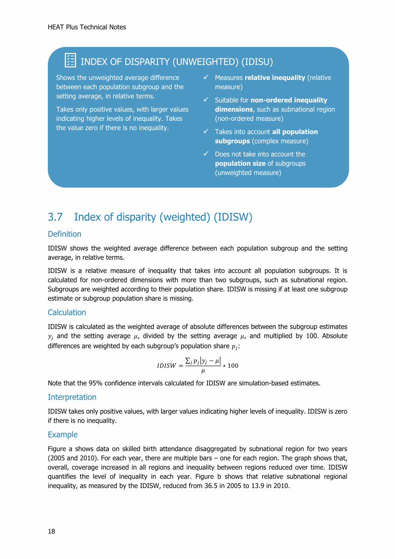
3.6 Index of disparity (unweighted) (IDISU)......................................................................... 17
3.7 Index of disparity (weighted) (IDISW) ........................................................................... 18
3.8 Mean difference from best performing subgroup (unweighted) (MDBU) ........................... 20
3.9 Mean difference from best performing subgroup (weighted) (MDBW) .............................. 21
3.10 Mean difference from mean (unweighted) (MDMU) ......................................................... 23
3.11 Mean difference from mean (weighted) (MDMW) ............................................................ 24
3.12 Mean log deviation (MLD) ............................................................................................. 26
3.13 Population attributable fraction (PAF) ............................................................................. 27
3.14 Population attributable risk (PAR) .................................................................................. 29
3.15 Ratio (R) ...................................................................................................................... 31
3.16 Relative concentration index (RCI) ................................................................................. 35
3.17 Relative index of inequality (RII) .................................................................................... 36
3.18 Slope index of inequality (SII) ....................................................................................... 38
3.19 Theil index (TI) ............................................................................................................. 40
Annex 42
Annex 1 Summary measures: overview .................................................................................. 42

iv
Tables
Table 1 Calculation of the Difference (D) in HEAT Plus .................................................................. 14
Table 2 Calculation of the Population Attributable Risk (PAR) in HEAT Plus ..................................... 30 Table 3 Calculation of the Ratio (R) in HEAT Plus .......................................................................... 32
Figures
Figure 1 Quick guide: which summary measure can I use for my analysis? ....................................... 7
1 Introduction
1
1 Introduction
Equity is at the heart of the United Nations 2030 Agenda for Sustainable Development, which aims to
“leave no one behind”. This commitment is reflected throughout the 17 Sustainable Development Goals
(SDGs) that Member States have pledged to achieve by 2030. Monitoring inequalities is essential for
achieving equity: it allows identifying vulnerable population subgroups that are being left behind and
helps inform equity-oriented policies, programmes and practices that can close existing gaps. With a
strong commitment to achieving equity in health, the World Health Organization (WHO) has developed
a number of tools and resources to build and strengthen capacity for health inequality monitoring,
including the Health Equity Assessment Toolkit.
The Health Equity Assessment Toolkit is a free and open-source software application that facilitates
the assessment of within-country inequalities, i.e. differences that exist between population subgroups
within a country. Through innovative and interactive data visualizations, the toolkit makes it easy to
analyse and communicate data about inequalities. Disaggregated data and summary measures are
visualized in a variety of graphs, maps and tables that can be customized according to your needs.
Results can be exported to communicate findings to different audiences and inform evidence-based
decision making.
The toolkit is available in two editions:
HEAT (built-in database edition), which contains the WHO Health Equity Monitor database
HEAT Plus (upload database edition), which allows users to upload their own datasets
While HEAT was developed specifically for assessing inequalities in health, HEAT Plus is designed to be
fully flexible: you can upload your own data and undertake equity assessments for any indicator and
inequality dimension, in any setting of interest (at global, regional, national and subnational levels).
Together, HEAT and HEAT Plus are powerful tools that help make data about inequalities accessible
and bring key messages to decision-makers to tackle inequities and achieve the SDGs.
These HEAT Plus technical notes accompany the upload database edition of the toolkit and provide
detailed information about the data presented in HEAT Plus, including the disaggregated data (Section
2) and the summary measures of inequality (Section 3). Following a general introduction to
disaggregated data, Section 2 provides details about the types and characteristics of indicators and
inequality dimensions (Sections 2.1 and 2.2). Section 3 first gives a general overview of summary
measures and then lists detailed information about the 19 summary measures calculated in HEAT Plus
(Sections 3.1–3.19). For each summary measure, information about the definition, calculation, and
interpretation are provided; examples illustrate the use and interpretation of each summary measure.
A summary table of all summary measures is available in Annex 1. Throughout the technical notes, blue
boxes highlight links to further resources and summarize the most salient points of each section. Green
boxes provide hands-on tips for using HEAT Plus.
You may want to read these technical notes sequentially and in its entirety, or consult different sections
as required. You are also encouraged to consult the other documents that accompany HEAT Plus,
including the user manual, which provide detailed information about the features and functionalities of
HEAT Plus. Moreover, you may want to supplement these resources with materials that provide further
information on the theoretical and/or practical steps of (health) inequality monitoring, such as the
WHO’s Handbook on health inequality monitoring and National health inequality monitoring: a step-by-

2
step manual. Many resources are publicly available through the WHO Health Equity Monitor, and
although with a focus on health, the approaches may be applied to any topic.
LINKS
• WHO Health Equity Monitor
• Health Equity Assessment Toolkit (HEAT and HEAT Plus)

2 Disaggregated data
3
2 Disaggregated data
Assessing within-country inequalities requires the use of data that are disaggregated according to
relevant dimensions of inequality. Disaggregated data break down overall averages, revealing
differences between different population subgroups. They are useful to identify patterns of inequality
in a population and vulnerable subgroups that are being left behind.
Two types of data are required for calculating disaggregated data: data about “indicators” that describe
an individual’s experience and data about “dimensions of inequality” that allow populations to be
organized into subgroups according to their demographic, socioeconomic and/or geographic
characteristics.
The following two sections provide more information about indicators (Section 2.1) and inequality
dimensions (Section 2.2).
2.1 Indicators
There are different types of indicators, which may be reported at different scales. Differentiating
between the different indicator types and scales is important as these characteristics have
implications for the calculation of summary measures (see Section 3).
Indicators can be divided into favourable and adverse indicators. Favourable indicators measure
desirable events that are promoted through public action. For example, health intervention indicators
such as antenatal care coverage and desirable health outcome indicators such as life expectancy are
favourable indicators. For these indicators, the ultimate goal is to achieve a maximum level, either in
health intervention coverage or health outcome (for example, complete coverage of antenatal care or
the highest possible life expectancy). Adverse indicators, on the other hand, measure undesirable
events, that are to be reduced or eliminated through public action. Undesirable health outcome
indicators, such as stunting prevalence in children aged less than five years or under-five mortality rate,
are examples of adverse indicators. Here, the ultimate goal is to achieve a minimum level in health
outcome (for example, a stunting prevalence or mortality rate of zero).
DISAGGREGATED DATA
✓ Disaggregated data are data on indicators disaggregated by relevant dimensions of
inequality (demographic, socioeconomic or geographic factors)
HANDS ON
HEAT Plus allows you to upload your own datasets of disaggregated data. Datasets have to
be in a specific format and stored as comma separated values (csv) or Microsoft Excel (xls or
xlsx) files in order to be uploaded to HEAT Plus. The HEAT Plus Template illustrates the
required structure. The HEAT Plus Validation Tool helps you prepare your data according
to the template. Please refer to the user manual for further information.

HEAT Plus Technical Notes
4
Furthermore, indicators can be reported at different indicator scales. For example, while total fertility
rate is usually reported as the number of births per woman (indicator scale = 1), coverage of skilled
birth attendance is reported as a percentage (indicator scale = 100) and neonatal mortality rate is
reported as the number of deaths per 1000 live births (indicator scale = 1000).
2.2 Dimensions of inequality
There are different types of inequality dimensions with different characteristics. It is
important to take these characteristics into account as they have implications for the calculation of
summary measures, too (see Section 3).
At the most basic level, dimensions of inequality can be divided into binary dimensions, i.e.
dimensions that compare the situation in two population subgroups (e.g. females and males), versus
dimensions that look at the situation in more than two population subgroups (e.g. economic
status quintiles).
In the case of dimensions with more than two population subgroups it is possible to differentiate
between dimensions with ordered subgroups and non-ordered subgroups. Ordered dimensions have
subgroups with an inherent positioning and can be ranked. For example, education has an inherent
ordering of subgroups in the sense that those with less education unequivocally have less of something
compared to those with more education. Non-ordered dimensions, by contrast, have subgroups that
are not based on criteria that can be logically ranked. Subnational regions are an example of non-
ordered groupings.
For ordered dimensions, subgroups can be ranked from the most-disadvantaged to the most-
advantaged subgroup. The subgroup order defines the rank of each subgroup. For example, if
education is categorized in three subgroups (no education, primary school, and secondary school or
higher), then subgroups may be ranked from no education (most-disadvantaged subgroup) to
secondary school or higher (most-advantaged subgroup).
INDICATORS
✓ Indicators describe an individual’s experience
✓ Different indicators have different characteristics
o Favourable indicators measure desirable events, while adverse indicators
measure undesirable events
o Indicators are reported at different indicator scales
HANDS ON
In the HEAT Plus Template you must provide information about the indicator type (favourable
vs. adverse) and the indicator scale for each indicator by filling in the variables
‘favourable_indicator’ and ‘indicator_scale’. Please refer to the FAQs in the user manual or the
template legend for instructions on how to correctly fill in these variables.

2 Disaggregated data
5
For binary and non-ordered dimensions, while it is not possible to rank subgroups, it is possible to
identify a reference subgroup, that serves as a benchmark. For example, for subnational regions,
the region with the capital city may be selected as the reference subgroup in order to compare the
situation in all other regions with the situation in the capital city.
DIMENSIONS OF INEQUALITY
✓ Dimensions of inequality allow populations to be organized into subgroups according
to their demographic, socioeconomic, and/or geographic characteristics
✓ Different inequality dimensions have different characteristics
o Dimensions may have 2 subgroups (binary dimensions) or >2 subgroups
o Dimensions with >2 subgroups may be ordered or non-ordered: ordered
dimensions have subgroups with an inherent positioning, while subgroups of
non-ordered dimensions cannot be ranked
o Subgroups of ordered dimensions have a specific subgroup order
o For non-ordered dimensions, one subgroup may be identified as a reference
subgroup
HANDS ON
In the HEAT Plus template you must provide information about the dimension type (ordered
vs. non-ordered), subgroup order and reference subgroup by filling in the variables
‘orderd_dimension’, ‘subgroup_order’ and ‘reference_subgroup”’ Please refer to the FAQs in
the user manual or the template legend for instructions on how to correctly fill in these
variables.

HEAT Plus Technical Notes
6
3 Summary measures
Summary measures build on disaggregated data and present the level of inequality across multiple
population subgroups in a single numerical figure. They are useful to compare the situation between
different indicators and inequality dimensions and assess changes in inequality over time.
Many different summary measures exist, each with different strengths and weaknesses. Knowing the
characteristics of the different summary measures is important so that you can decide which summary
measure is suitable for the analysis and interpret results correctly.
Summary measures of inequality can be divided into absolute measures and relative measures. For a
given indicator, absolute inequality measures indicate the magnitude of difference between
subgroups. They retain the same unit as the indicator.1 Relative inequality measures, on the other
hand, show proportional differences among subgroups and have no unit.
Furthermore, summary measures may be weighted or unweighted. Weighted measures take into
account the population size of each subgroup, while unweighted measures treat each subgroup as
equally sized. Importantly, simple measures are always unweighted and complex measures may be
weighted or unweighted.
Simple measures make pairwise comparisons between two subgroups, such as the most and least
wealthy. They can be calculated for all indicators and dimensions of inequality. The characteristics of
the indicator and dimension determine which two subgroups are compared to assess inequality.
Contrary to simple measures, complex measures make use of data from all subgroups to assess
inequality. They can be calculated for all indicators, but they can only be calculated for dimensions with
more than two subgroups.2
Complex measures can further be divided into ordered complex measures and non-ordered complex
measures of inequality. Ordered measures can only be calculated for dimensions with more than two
subgroups that have a natural ordering. Here, the calculation is also influenced by the type of indicator
(favourable vs. adverse). Non-ordered measures are only calculated for dimensions with more than
two subgroups that have no natural ordering.3
HEAT Plus enables the assessment of inequalities using up to 19 different summary measures of
inequality, which are calculated based on the uploaded datasets of disaggregated data. The following
sections give detailed information about the definition, calculation and interpretation of each summary
measure. Examples are provided to illustrate how each summary measure can be used and interpreted.
Annex 1 provides an overview the 19 summary measures currently available in HEAT Plus along with
their basic characteristics, formulas and interpretation. Figure 1 presents a quick guide (in the form of
a decision tree) on which summary measure(s) to use for your analysis.
1 One exception to this is the between-group variance (BGV), which takes the squared unit of the indicator. 2 Exceptions to this are the population attributable risk (PAR) and the population attributable fraction (PAF), which can be calculated for all dimensions of inequality. 3 Non-ordered complex measures could also be calculated for ordered dimensions, however, in practice, they are not used for such dimensions and are therefore only reported for non-ordered dimensions.

3 Summary measures
7
Figure 1 Quick guide: which summary measure can I use for my analysis?

HEAT Plus Technical Notes
8
3.1 Absolute concentration index (ACI)
Definition
ACI shows the gradient across population subgroups, on an absolute scale. It indicates the extent to
which an indicator is concentrated among disadvantaged or advantaged subgroups.
ACI is an absolute measure of inequality that takes into account all population subgroups. It is calculated
for ordered dimensions with more than two subgroups, such as economic status. Subgroups are
weighted according to their population share. ACI is missing if at least one subgroup estimate or
subgroup population share is missing.
Calculation
The calculation of ACI is based on a ranking of the whole population from the most-disadvantaged
subgroup (at rank 0) to the most-advantaged subgroup (at rank 1), which is inferred from the ranking
and size of the subgroups. The relative rank of each subgroup is calculated as: 𝑋𝑗 = ∑ 𝑝𝑗 − 0.5𝑝𝑗𝑗 . Based
on this ranking, ACI can be calculated as:
𝐴𝐶𝐼 =∑𝑝𝑗(2𝑋𝑗 − 1)𝑦𝑗𝑗
where 𝑦𝑗 indicates the estimate for subgroup j, 𝑝𝑗 the population share of subgroup j and 𝑋𝑗 the relative
rank of subgroup j.
Interpretation
If there is no inequality, ACI takes the value zero. Positive values indicate a concentration of the
indicator among the advantaged, while negative values indicate a concentration of the indicator among
the disadvantaged. The larger the absolute value of ACI, the higher the level of inequality.
SUMMARY MEASURES
✓ Summary measures build on disaggregated data and present the level of inequality
across multiple population subgroups in a single numerical figure
✓ Different summary measures have different characteristics
o Absolute measures assess absolute differences; Relative measures capture
proportional differences between subgroups
o Weighted measures take into account the population size of each subgroup;
Unweighted measures treat each subgroup as equally sized
o Simple measures compare the situation between two subgroups; Complex
measures consider all subgroups
o Ordered measures are calculated for ordered inequality dimensions with >2
subgroups; Non-ordered measures are calculated for non-ordered inequality
dimensions with >2 subgroups

3 Summary measures
9
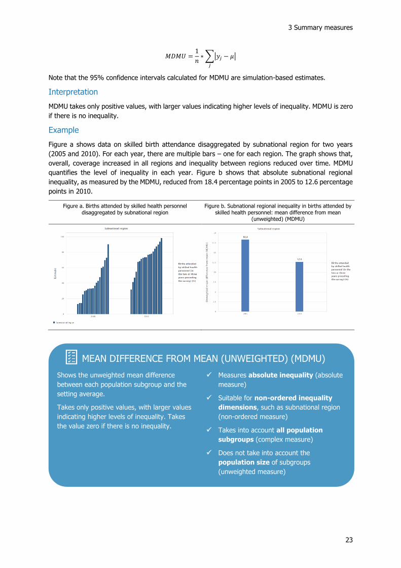
Example
Figure a shows data on skilled birth attendance disaggregated by economic status for two years (2005
and 2010). For each year, there are five bars – one for each wealth quintile. The graph shows that,
overall, coverage increased in all quintiles and inequality between quintiles reduced over time. ACI
quantifies the level of inequality in each year. Figure b shows that absolute economic-related inequality,
as measured by the ACI, reduced from 13.2 percentage points in 2005 to 8.4 percentage points in
2010.
Figure a. Births attended by skilled health personnel disaggregated by economic status
Figure b. Economic-related inequality in births attended by skilled health personnel: absolute concentration index (ACI)
3.2 Between-group standard deviation (BGSD)
Definition
BGSD is an absolute measure of inequality that takes into account all population subgroups. It is
calculated for non-ordered dimensions with more than two subgroups, such as subnational region.
Subgroups are weighted according to their population share. BGSD is missing if at least one subgroup
estimate or subgroup population share is missing.
ABSOLUTE CONCENTRATION INDEX (ACI)
Measures the extent to which an indicator is
concentrated among disadvantaged or
advantaged population subgroups.
Takes the value zero if there is no inequality.
Positive values indicate a concentration among
advantaged, negative values among
disadvantaged subgroups. The larger the
absolute value, the higher the level of
inequality.
✓ Measures absolute inequality (absolute
measure)
✓ Suitable for ordered inequality
dimensions, such as economic status
(ordered measure)
✓ Takes into account all population
subgroups (complex measure)
✓ Takes into account the population size
of subgroups (weighted measure)

HEAT Plus Technical Notes
10
Calculation
BGSD is calculated as the square root of the weighted average of squared differences between the
subgroup estimates 𝑦𝑗 and the setting average 𝜇. Squared differences are weighted by each subgroup’s
population share 𝑝𝑗:
𝐵𝐺𝑆𝐷 = √∑𝑝𝑗(𝑦𝑗 − 𝜇)2
𝑗
Interpretation
BGSD takes only positive values, with larger values indicating higher levels of inequality. BGSD is zero
if there is no inequality. BGSD is more sensitive to outlier estimates as it gives more weight to the
estimates that are further from the setting average.
Example
Figure a shows data on skilled birth attendance disaggregated by subnational region for two years
(2005 and 2010). For each year, there are multiple bars – one for each region. The graph shows that,
overall, coverage increased in all regions and inequality between regions reduced over time. BGSD
quantifies the level of inequality in each year. Figure b shows that absolute subnational regional
inequality, as measured by the BGSD, reduced from 20.5 percentage points in 2005 to 14.7 percentage
points in 2010.
Figure a. Births attended by skilled health personnel disaggregated by subnational region
Figure b. Subnational regional inequality in births attended by skilled health personnel: between-group standard deviation
(BGSD)

3 Summary measures
11
3.3 Between-group variance (BGV)
Definition
BGV is an absolute measure of inequality that takes into account all population subgroups. It is
calculated for non-ordered dimensions with more than two subgroups, such as subnational region.
Subgroups are weighted according to their population share. BGV is missing if at least one subgroup
estimate or subgroup population share is missing.
Calculation
BGV is calculated as the weighted average of squared differences between the subgroup estimates 𝑦𝑗
and the setting average 𝜇. Squared differences are weighted by each subgroup’s population share 𝑝𝑗:
𝐵𝐺𝑉 =∑𝑝𝑗(𝑦𝑗 − 𝜇)2
𝑗
Interpretation
BGV takes only positive values with larger values indicating higher levels of inequality. BGV is zero if
there is no inequality. BGV is more sensitive to outlier estimates as it gives more weight to the estimates
that are further from the setting average.
Example
Figure a shows data on skilled birth attendance disaggregated by subnational region for two years
(2005 and 2010). For each year, there are multiple bars – one for each region. The graph shows that,
overall, coverage increased in all regions and inequality between regions reduced over time. BGV
quantifies the level of inequality in each year. Figure b shows that absolute subnational regional
inequality, as measured by the BGV, reduced from 421.7 squared percentage points in 2005 to 214.8
squared percentage points in 2010.
BETWEEN-GROUP STANDARD DEVIATION (BGSD)
Measures the square root of the weighted
average of squared differences between each
population subgroup and the setting average.
Takes only positive values, with larger values
indicating higher levels of inequality. Takes
the value zero if there is no inequality.
✓ Measures absolute inequality (absolute
measure)
✓ Suitable for non-ordered inequality
dimensions, such as subnational region
(non-ordered measure)
✓ Takes into account all population
subgroups (complex measure)
✓ Takes into account the population size
of subgroups (weighted measure)

HEAT Plus Technical Notes
12
Figure a. Births attended by skilled health personnel disaggregated by subnational region
Figure b. Subnational regional inequality in births attended by skilled health personnel: between-group variance (BGV)
3.4 Coefficient of variation (COV)
Definition
COV is a relative measure of inequality that takes into account all population subgroups. It is calculated
for non-ordered dimensions with more than two subgroups, such as subnational region. Subgroups are
weighted according to their population share. COV is missing if at least one subgroup estimate or
subgroup population share is missing.
Calculation
COV is calculated by dividing the between-group standard deviation (BGSD) by the setting average 𝜇
and multiplying the fraction by 100:
𝐶𝑂𝑉 =𝐵𝐺𝑆𝐷
𝜇∗ 100
Interpretation
COV takes only positive values, with larger values indicating higher levels of inequality. COV is zero if
there is no inequality.
BETWEEN-GROUP VARIANCE (BGV)
Measures the weighted average of squared
differences between each population subgroup
and the setting average.
Takes only positive values, with larger values
indicating higher levels of inequality. Takes
the value zero if there is no inequality.
✓ Measures absolute inequality (absolute
measure)
✓ Suitable for non-ordered inequality
dimensions, such as subnational region
(non-ordered measure)
✓ Takes into account all population
subgroups (complex measure)
✓ Takes into account the population size
of subgroups (weighted measure)

3 Summary measures
13
Example
Figure a shows data on skilled birth attendance disaggregated by subnational region for two years
(2005 and 2010). For each year, there are multiple bars – one for each region. The graph shows that,
overall, coverage increased in all regions and inequality between regions reduced over time. COV
quantifies the level of inequality in each year. Figure b shows that relative subnational regional
inequality, as measured by the COV, reduced from 38.7% in 2005 to 13.3% in 2010.
Figure a. Births attended by skilled health personnel disaggregated by subnational region
Figure b. Subnational inequality in births attended by skilled health personnel: coefficient of variation (COV)
3.5 Difference (D)
Definition
D is an absolute measure of inequality that shows the difference between two population subgroups.
It is calculated for all inequality dimensions, provided that subgroup estimates are available for the two
subgroups used in the calculation of D.
Calculation
D is calculated as the difference between two population subgroups:
𝐷 = 𝑦ℎ𝑖𝑔ℎ − 𝑦𝑙𝑜𝑤
COEFFICIENT OF VARIATION (COV)
Measures the square root of the weighted
average of squared differences between each
population subgroup and the setting average
(the between-group standard deviation) as a
fraction of the setting average.
Takes only positive values, with larger values
indicating higher levels of inequality. Takes
the value zero if there is no inequality.
✓ Measures relative inequality (relative
measure)
✓ Suitable for non-ordered inequality
dimensions, such as subnational region
(non-ordered measure)
✓ Takes into account all population
subgroups (complex measure)
✓ Takes into account the population size
of subgroups (weighted measure)

HEAT Plus Technical Notes
14
Note that the selection of 𝑦ℎ𝑖𝑔ℎ and 𝑦𝑙𝑜𝑤 depends on the characteristics of the inequality dimension and
the type of indicator, for which D is calculated. Table 1 provides an overview of the calculation of D in
HEAT Plus.
Table 1 Calculation of the Difference (D) in HEAT Plus
Indicator type
Dimension type Reference subgroup selected?
Favourable indicator Adverse indicator
Binary dimension Yes Reference group – Other group Other group – Reference group
No Highest – Lowest Highest – Lowest
Ordered dimension N/A Most-advantaged – Most-disadvantaged Most-disadvantaged – Most-advantaged
Non-ordered dimension
Yes Reference group – Other group (that
maximizes the difference) Other group (that maximizes the difference) – Reference group
No Highest – Lowest Highest – Lowest
Interpretation
If there is no inequality, D takes the value zero. Greater absolute values indicate higher levels of
inequality.
Example
Figure a shows data on skilled birth attendance disaggregated by economic status for two years (2005
and 2010). For each year, there are five bars – one for each wealth quintile. The graph shows that,
overall, coverage increased in all quintiles and inequality between quintiles reduced over time. The
difference quantifies the level of inequality in each year. Figure b shows that the difference between
quintile 5 and quintile 1 reduced from 70.0 percentage points in 2005 to 41.0 percentage points in
2010.
Figure a. Births attended by skilled health personnel disaggregated by economic status
Figure b. Economic-related inequality in births attended by skilled health personnel: difference (D)
Figure c shows data on skilled birth attendance disaggregated by subnational region for two years
(2005 and 2010). For each year, there are multiple bars – one for each region. The graph shows that,
overall, coverage increased in all regions and inequality between regions reduced over time. The
difference quantifies the level of inequality in each year. Figure d shows that the difference between

3 Summary measures
15
the best and the worst performing region reduced from 77.1 percentage points in 2005 to 66.5
percentage points in 2010.
Figure c. Births attended by skilled health personnel disaggregated by subnational region
Figure d. Subnational regional inequality in births attended by skilled health personnel: difference (D)
Other difference measures
In addition to the difference measure described above, variations of the difference are calculated for
non-ordered inequality dimensions with many subgroups, such as subnational region. The following
difference measures are calculated for
• Dimensions with more than 30 subgroups:
o Difference between percentile 80 and percentile 20. The difference between
percentile 80 and percentile 20 is calculated by identifying the subgroups that correspond
to percentiles 20 and 80 and subtracting the estimate for percentile 20 from the estimate
for percentile 80: 𝐷𝑝80𝑝20 = 𝑦𝑝80 − 𝑦𝑝20
o Difference between mean estimates in quintile 5 and quintile 1. The difference
between mean estimates in quintile 5 and quintile 1 is calculated by dividing subgroups
into quintiles, determining the mean estimate for each quintile and subtracting the mean
estimate in quintile 1 from the mean estimate in quintile 5: 𝐷𝑞5𝑞1 = 𝑦𝑞5 − 𝑦𝑞1
• Dimensions with more than 60 subgroups:
o Difference between percentile 90 and percentile 10. The difference between
percentile 90 and percentile 10 is calculated by identifying the subgroups that correspond
to percentiles 10 and 90 and subtracting the estimate for percentile 10 from the estimate
for percentile 90: 𝐷𝑝90𝑝10 = 𝑦𝑝90 − 𝑦𝑝10
o Difference between mean estimates in decile 10 and decile 1. The difference
between mean estimates in decile 10 and decile 1 is calculated by dividing subgroups into
deciles, determining the mean estimate for each decile and subtracting the mean estimate
in decile 1 from the mean estimate in decile 10: 𝐷𝑑10𝑑1 = 𝑦𝑑10 − 𝑦𝑑1
• Dimensions with more than 100 subgroups:
o Difference between percentile 95 and percentile 5. The difference between
percentile 95 and percentile 5 is calculated by identifying the subgroups that correspond
to percentiles 5 and 95 and subtracting the estimate for percentile 5 from the estimate for
percentile 95: 𝐷𝑝95𝑝5 = 𝑦𝑝95 − 𝑦𝑝5

HEAT Plus Technical Notes
16
o Difference between mean estimates in the top 5% and the bottom 5%. The
difference between mean estimates in the top 5% and the bottom 5% is calculated by
dividing subgroups into vigintiles, determining the mean estimate for each vigintile and
subtracting the mean estimate in the bottom 5% from the mean estimate in the top 5%:
𝐷𝑣20𝑣1 = 𝑦𝑣20 − 𝑦𝑣1
For dimensions with many subgroups, these measures may be a more accurate reflection of the level
of inequality than measuring the range between the maximum and minimum values using the (range)
difference, as they avoid using possible outlier values. They are displayed in the ‘Summary measures’
tab of the selection menu for horizontal bar graphs showing disaggregated data under the ‘Explore
inequality’ component of the tool.
Difference (D)
Measures the difference between two
population subgroups.
Takes the value zero if there is no inequality.
For favourable indicators, positive values
indicate a concentration among the
advantaged and negative values among the
disadvantaged subgroup. For adverse
indicators, it’s the other way around: positive
values indicate a concentration among the
disadvantaged and negative values among the
advantaged subgroup. The larger the absolute
value, the higher the level of inequality.
Other difference measures are calculated for
non-ordered inequality dimensions with many
subgroups. These measures avoid using
possible outlier values.
✓ Measures absolute inequality (absolute
measure)
✓ Suitable for all inequality dimensions
✓ Takes into account two population
subgroups (simple measure)
✓ Does not take into account the
population size of subgroups
(unweighted measure)

3 Summary measures
17
3.6 Index of disparity (unweighted) (IDISU)
Definition
IDISU shows the unweighted average difference between each population subgroup and the setting
average, in relative terms.
IDISU is a relative measure of inequality that takes into account all population subgroups. It is
calculated for non-ordered dimensions with more than two subgroups, such as subnational region.
IDISU is missing if at least one subgroup estimate or subgroup population share is missing.4
Calculation
IDISU is calculated as the average of absolute differences between the subgroup estimates 𝑦𝑗 and the
setting average 𝜇, divided by the number of subgroups 𝑛 and the setting average 𝜇, and multiplied by
100:
𝐼𝐷𝐼𝑆𝑈 =
1𝑛∗ ∑ |𝑦𝑗 − 𝜇|𝑗
𝜇∗ 100
Note that the 95% confidence intervals calculated for IDISU are simulation-based estimates.
Interpretation
IDISU takes only positive values, with larger values indicating higher levels of inequality. IDISU is zero
if there is no inequality.
Example
Figure a shows data on skilled birth attendance disaggregated by subnational region for two years
(2005 and 2010). For each year, there are multiple bars – one for each region. The graph shows that,
overall, coverage increased in all regions and inequality between regions reduced over time. IDISU
quantifies the level of inequality in each year. Figure b shows that relative subnational regional
inequality, as measured by the IDISU, reduced from 39.2 in 2005 to 16.7 in 2010.
Figure a. Births attended by skilled health personnel disaggregated by subnational region
Figure b. Subnational inequality in births attended by skilled health personnel: index of disparity (unweighted) (IDISU)
4 While IDISU is an unweighted measure, the setting average is calculated as the weighted average of subgroup estimates. Subgroups are weighted by their population share. Therefore, if any subgroup population share is missing, the setting average, and hence IDISU, cannot be calculated.
HEAT Plus Technical Notes
18
3.7 Index of disparity (weighted) (IDISW)
Definition
IDISW shows the weighted average difference between each population subgroup and the setting
average, in relative terms.
IDISW is a relative measure of inequality that takes into account all population subgroups. It is
calculated for non-ordered dimensions with more than two subgroups, such as subnational region.
Subgroups are weighted according to their population share. IDISW is missing if at least one subgroup
estimate or subgroup population share is missing.
Calculation
IDISW is calculated as the weighted average of absolute differences between the subgroup estimates
𝑦𝑗 and the setting average 𝜇, divided by the setting average 𝜇, and multiplied by 100. Absolute
differences are weighted by each subgroup’s population share 𝑝𝑗:
𝐼𝐷𝐼𝑆𝑊 =∑ 𝑝𝑗|𝑦𝑗 − 𝜇|𝑗
𝜇∗ 100
Note that the 95% confidence intervals calculated for IDISW are simulation-based estimates.
Interpretation
IDISW takes only positive values, with larger values indicating higher levels of inequality. IDISW is zero
if there is no inequality.
Example
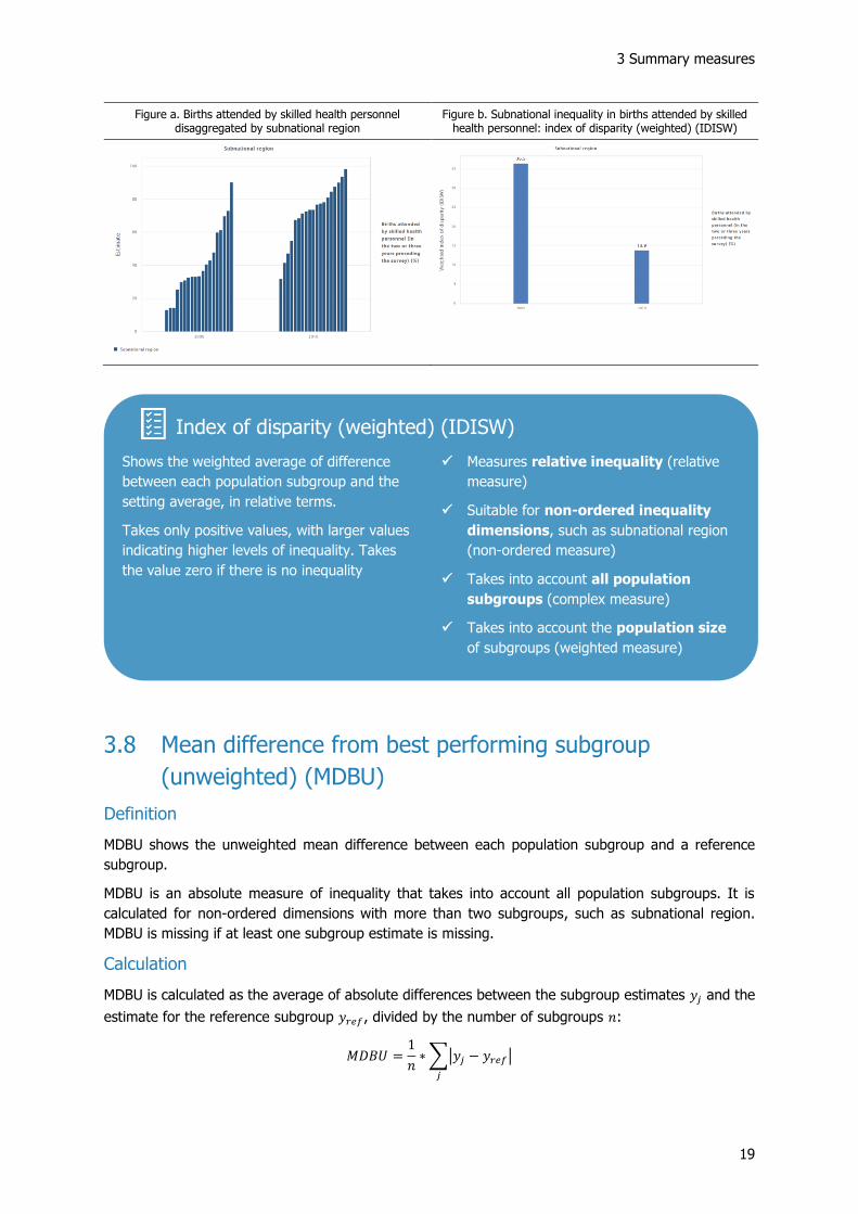
Figure a shows data on skilled birth attendance disaggregated by subnational region for two years
(2005 and 2010). For each year, there are multiple bars – one for each region. The graph shows that,
overall, coverage increased in all regions and inequality between regions reduced over time. IDISW
quantifies the level of inequality in each year. Figure b shows that relative subnational regional
inequality, as measured by the IDISW, reduced from 36.5 in 2005 to 13.9 in 2010.
INDEX OF DISPARITY (UNWEIGHTED) (IDISU)
Shows the unweighted average difference
between each population subgroup and the
setting average, in relative terms.
Takes only positive values, with larger values
indicating higher levels of inequality. Takes
the value zero if there is no inequality.
✓ Measures relative inequality (relative
measure)
✓ Suitable for non-ordered inequality
dimensions, such as subnational region
(non-ordered measure)
✓ Takes into account all population
subgroups (complex measure)
✓ Does not take into account the
population size of subgroups
(unweighted measure)
3 Summary measures
19
Figure a. Births attended by skilled health personnel disaggregated by subnational region
Figure b. Subnational inequality in births attended by skilled health personnel: index of disparity (weighted) (IDISW)
3.8 Mean difference from best performing subgroup
(unweighted) (MDBU)
Definition
MDBU shows the unweighted mean difference between each population subgroup and a reference
subgroup.
MDBU is an absolute measure of inequality that takes into account all population subgroups. It is
calculated for non-ordered dimensions with more than two subgroups, such as subnational region.
MDBU is missing if at least one subgroup estimate is missing.
Calculation
MDBU is calculated as the average of absolute differences between the subgroup estimates 𝑦𝑗 and the
estimate for the reference subgroup 𝑦𝑟𝑒𝑓, divided by the number of subgroups 𝑛:
𝑀𝐷𝐵𝑈 =1
𝑛∗∑|𝑦𝑗 − 𝑦𝑟𝑒𝑓|
𝑗
Index of disparity (weighted) (IDISW)
Shows the weighted average of difference
between each population subgroup and the
setting average, in relative terms.
Takes only positive values, with larger values
indicating higher levels of inequality. Takes
the value zero if there is no inequality
✓ Measures relative inequality (relative
measure)
✓ Suitable for non-ordered inequality
dimensions, such as subnational region
(non-ordered measure)
✓ Takes into account all population
subgroups (complex measure)
✓ Takes into account the population size
of subgroups (weighted measure)

HEAT Plus Technical Notes
20
𝑦𝑟𝑒𝑓 refers to the subgroup with the highest estimate in the case of favourable indicators and to the
subgroup with the lowest estimate in the case of adverse indicators.
Note that the 95% confidence intervals calculated for MDBU are simulation-based estimates.
Interpretation
MDBU takes only positive values, with larger values indicating higher levels of inequality. MDBU is zero
if there is no inequality.
Example
Figure a shows data on skilled birth attendance disaggregated by subnational region for two years
(2005 and 2010). For each year, there are multiple bars – one for each region. The graph shows that,
overall, coverage increased in all regions and inequality between regions reduced over time. MDBU
quantifies the level of inequality in each year. Figure b shows that absolute subnational regional
inequality, as measured by the MDBU, reduced from 49.0 percentage points in 2005 to 26.2 percentage
points in 2010.
Figure a. Births attended by skilled health personnel disaggregated by subnational region
Figure b. Subnational regional inequality in births attended by skilled health personnel: mean difference from best
performing subgroup (unweighted) (MDBU)
MEAN DIFFERENCE FROM BEST PERFORMING SUBGROUP
(UNWEIGHTED) (MDBU)
Shows the unweighted mean difference
between each population subgroup and a
reference subgroup.
Takes only positive values, with larger values
indicating higher levels of inequality. Takes
the value zero if there is no inequality
✓ Measures absolute inequality (absolute
measure)
✓ Suitable for non-ordered inequality
dimensions, such as subnational region
(non-ordered measure)
✓ Takes into account all population
subgroups (complex measure)
✓ Does not take into account the
population size of subgroups
(unweighted measure)

3 Summary measures
21
3.9 Mean difference from best performing subgroup
(weighted) (MDBW)
Definition
MDBW shows the weighted mean difference between each population subgroup and a reference
subgroup.
MDBW is an absolute measure of inequality that takes into account all population subgroups. It is
calculated for non-ordered dimensions with more than two subgroups, such as subnational region.
Subgroups are weighted according to their population share. MDBW is missing if at least one subgroup
estimate or subgroup population share is missing.
Calculation
MDBW is calculated as the weighted average of absolute differences between the subgroup estimates
𝑦𝑗 and the estimate for the reference subgroup 𝑦𝑟𝑒𝑓. Absolute differences are weighted by each
subgroup’s population share 𝑝𝑗:
𝑀𝐷𝐵𝑊 =∑𝑝𝑗|𝑦𝑗 − 𝑦𝑟𝑒𝑓|
𝑗
𝑦𝑟𝑒𝑓 refers to the subgroup with the highest estimate in the case of favourable indicators and to the
subgroup with the lowest estimate in the case of adverse indicators.
Note that the 95% confidence intervals calculated for MDBW are simulation-based estimates.
Interpretation
MDBW takes only positive values, with larger values indicating higher levels of inequality. MDBW is zero
if there is no inequality.
Example
Figure a shows data on skilled birth attendance disaggregated by subnational region for two years
(2005 and 2010). For each year, there are multiple bars – one for each region. The graph shows that,
overall, coverage increased in all regions and inequality between regions reduced over time. MDBW
quantifies the level of inequality in each year. Figure b shows that absolute subnational regional
inequality, as measured by the MDBW, reduced from 43.4 percentage points in 2005 to 22.4 percentage
points in 2010.

HEAT Plus Technical Notes
22
Figure a. Births attended by skilled health personnel disaggregated by subnational region
Figure b. Subnational inequality in births attended by skilled health personnel: mean difference from best performing
subgroup (weighted) (MDBW)
3.10 Mean difference from mean (unweighted) (MDMU)
Definition
MDMU shows the unweighted mean difference between each subgroup and the setting average.
MDMU is an absolute measure of inequality that takes into account all population subgroups. It is
calculated for non-ordered dimensions with more than two subgroups, such as subnational region.
MDMU is missing if at least one subgroup estimate or subgroup population share is missing.5
Calculation
MDMU is calculated as the average of absolute differences between the subgroup estimates 𝑦𝑗 and the
setting average 𝜇, divided by the number of subgroups 𝑛:
5 While MDMU is an unweighted measure, the setting average is calculated as the weighted average of subgroup estimates. Subgroups are weighted by their population share. Therefore, if any subgroup population share is missing, the setting average, and hence MDMU, cannot be calculated.
MEAN DIFFERENCE FROM BEST PERFORMING SUBGROUP
(WEIGHTED) (MDBW)
Shows the weighted mean difference between
each population subgroup and a reference
subgroup.
Takes only positive values, with larger values
indicating higher levels of inequality. Takes
the value zero if there is no inequality
✓ Measures absolute inequality (absolute
measure)
✓ Suitable for non-ordered inequality
dimensions, such as subnational region
(non-ordered measure)
✓ Takes into account all population
subgroups (complex measure)
✓ Takes into account the population size
of subgroups (weighted measure)
3 Summary measures
23
𝑀𝐷𝑀𝑈 =1
𝑛∗∑|𝑦𝑗 − 𝜇|
𝑗
Note that the 95% confidence intervals calculated for MDMU are simulation-based estimates.
Interpretation
MDMU takes only positive values, with larger values indicating higher levels of inequality. MDMU is zero
if there is no inequality.
Example
Figure a shows data on skilled birth attendance disaggregated by subnational region for two years
(2005 and 2010). For each year, there are multiple bars – one for each region. The graph shows that,
overall, coverage increased in all regions and inequality between regions reduced over time. MDMU
quantifies the level of inequality in each year. Figure b shows that absolute subnational regional
inequality, as measured by the MDMU, reduced from 18.4 percentage points in 2005 to 12.6 percentage
points in 2010.
Figure a. Births attended by skilled health personnel disaggregated by subnational region
Figure b. Subnational regional inequality in births attended by skilled health personnel: mean difference from mean
(unweighted) (MDMU)
MEAN DIFFERENCE FROM MEAN (UNWEIGHTED) (MDMU)
Shows the unweighted mean difference
between each population subgroup and the
setting average.
Takes only positive values, with larger values
indicating higher levels of inequality. Takes
the value zero if there is no inequality.
✓ Measures absolute inequality (absolute
measure)
✓ Suitable for non-ordered inequality
dimensions, such as subnational region
(non-ordered measure)
✓ Takes into account all population
subgroups (complex measure)
✓ Does not take into account the
population size of subgroups
(unweighted measure)

HEAT Plus Technical Notes
24
3.11 Mean difference from mean (weighted) (MDMW)
Definition
MDMW shows the weighted mean difference between each population subgroup and the setting
average.
MDMW is an absolute measure of inequality that takes into account all population subgroups. It is
calculated for non-ordered dimensions with more than two subgroups, such as subnational region.
Subgroups are weighted according to their population share. MDMW is missing if at least one subgroup
estimate or subgroup population share is missing.
Calculation
MDMW is calculated as the weighted average of absolute differences between the subgroup estimates
𝑦𝑗 and the setting average 𝜇. Absolute differences are weighted by each subgroup’s population share
𝑝𝑗:
𝑀𝐷𝑀𝑊 =∑𝑝𝑗|𝑦𝑗 − 𝜇|
𝑗
Note that the 95% confidence intervals calculated for MDMW are simulation-based estimates.
Interpretation
MDMW takes only positive values, with larger values indicating higher levels of inequality. MDMW is
zero if there is no inequality.
Example
Figure a shows data on skilled birth attendance disaggregated by subnational region for two years
(2005 and 2010). For each year, there are multiple bars – one for each region. The graph shows that,
overall, coverage increased in all regions and inequality between regions reduced over time. MDMW
quantifies the level of inequality in each year. Figure b shows that absolute subnational regional
inequality, as measured by the MDMW, reduced from 17.1 percentage points in 2005 to 10.5 percentage
points in 2010.
Figure a. Births attended by skilled health personnel disaggregated by subnational region
Figure b. Subnational inequality in births attended by skilled health personnel: mean difference from mean (weighted)
(MDMW)
3 Summary measures
25
3.12 Mean log deviation (MLD)
Definition
MLD is a relative measure of inequality that takes into account all population subgroups. It is calculated
for non-ordered dimensions with more than two subgroups, such as subnational region. Subgroups are
weighted according to their population share. MLD is missing if at least one subgroup estimate or
subgroup population share is missing.
Calculation
MLD is calculated as the sum of products between the negative natural logarithm of the share of the
indicator of each subgroup (−ln (𝑦𝑗
𝜇)) and the population share of each subgroup (𝑝𝑗). MLD may be
more easily readable when multiplied by 1000:
MLD =∑𝑝𝑗(− ln (𝑦𝑗
𝜇))
𝑗
∗ 1000
where 𝑦𝑗 indicates the estimate for subgroup j, 𝑝𝑗 the population share of subgroup j and 𝜇 the setting
average.
Interpretation
If there is no inequality, MLD takes the value zero. Greater absolute values indicate higher levels of
inequality. MLD is more sensitive to differences further from the setting average (by the use of the
logarithm).
Example
Figure a shows data on skilled birth attendance disaggregated by subnational region for two years
(2005 and 2010). For each year, there are multiple bars – one for each region. The graph shows that,
overall, coverage increased in all regions and inequality between regions reduced over time. MLD
quantifies the level of inequality in each year. Figure b shows that relative subnational regional
inequality, as measured by the MLD, reduced from 101.0 in 2005 to 23.2 in 2010.
MEAN DIFFERENCE FROM MEAN (WEIGHTED) (MDMW)
Shows the weighted mean difference between
each population subgroup and the setting
average.
Takes only positive values, with larger values
indicating higher levels of inequality. Takes
the value zero if there is no inequality
✓ Measures absolute inequality (absolute
measure)
✓ Suitable for non-ordered inequality
dimensions, such as subnational region
(non-ordered measure)
✓ Takes into account all population
subgroups (complex measure)
✓ Takes into account the population size
of subgroups (weighted measure)

HEAT Plus Technical Notes
26
Figure a. Births attended by skilled health personnel disaggregated by subnational region
Figure b. Subnational inequality in births attended by skilled health personnel: mean log deviation (MLD)
3.13 Population attributable fraction (PAF)
Definition
PAF shows the potential for improvement in setting average of an indicator, in relative terms, that could
be achieved if all population subgroups had the same level of the indicator as a reference group.
PAF is a relative measure of inequality that takes into account all population subgroups. It is calculated
for all inequality dimensions, provided that all subgroup estimates and subgroup population shares are
available.
Calculation
PAF is calculated by dividing the population attributable risk (PAR) by the setting average 𝜇 and
multiplying the fraction by 100:
𝑃𝐴𝐹 =𝑃𝐴𝑅
𝜇∗ 100
MEAN LOG DEVIATION (MLD)
Measures the sum of products between the
negative natural logarithm of the share of the
indicator of each subgroup and the population
share of each subgroup.
Takes the value zero if there is no inequality.
The larger the absolute value, the higher the
level of inequality.
✓ Measures relative inequality (relative
measure)
✓ Suitable for non-ordered inequality
dimensions, such as subnational region
(non-ordered measure)
✓ Takes into account all population
subgroups (complex measure)
✓ Takes into account the population size
of subgroups (weighted measure)
3 Summary measures
27
Interpretation
PAF takes positive values for favourable indicators and negative values for adverse indicators. The
larger the absolute value of PAF, the larger the level of inequality. PAF is zero if no further improvement
can be achieved, i.e. if all subgroups have reached the same level of the indicator as the reference
subgroup.
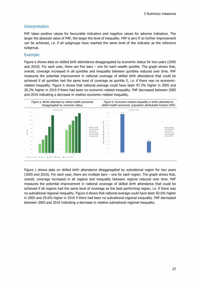
Example
Figure a shows data on skilled birth attendance disaggregated by economic status for two years (2005
and 2010). For each year, there are five bars – one for each wealth quintile. The graph shows that,
overall, coverage increased in all quintiles and inequality between quintiles reduced over time. PAF
measures the potential improvement in national coverage of skilled birth attendance that could be
achieved if all quintiles had the same level of coverage as quintile 5, i.e. if there was no economic-
related inequality. Figure b shows that national average could have been 97.3% higher in 2005 and
28.3% higher in 2010 if there had been no economic-related inequality. PAF decreased between 2005
and 2010 indicating a decrease in relative economic-related inequality.
Figure a. Births attended by skilled health personnel disaggregated by economic status
Figure b. Economic-related inequality in births attended by skilled health personnel: population attributable fraction (PAF)
Figure c shows data on skilled birth attendance disaggregated by subnational region for two years
(2005 and 2010). For each year, there are multiple bars – one for each region. The graph shows that,
overall, coverage increased in all regions and inequality between regions reduced over time. PAF
measures the potential improvement in national coverage of skilled birth attendance that could be
achieved if all regions had the same level of coverage as the best performing region, i.e. if there was
no subnational regional inequality. Figure d shows that national average could have been 92.6% higher
in 2005 and 29.6% higher in 2010 if there had been no subnational regional inequality. PAF decreased
between 2005 and 2010 indicating a decrease in relative subnational regional inequality.

HEAT Plus Technical Notes
28
Figure a. Births attended by skilled health personnel disaggregated by subnational region
Figure b. Subnational inequality in births attended by skilled health personnel: population attributable fraction (PAF)
3.14 Population attributable risk (PAR)
Definition
PAR shows the potential for improvement in setting average that could be achieved if all population
subgroups had the same level of the indicator as a reference group.
PAR is an absolute measure of inequality that takes into account all population subgroups. It is
calculated for all inequality dimensions, provided that all subgroup estimates and subgroup population
shares are available.
Calculation
PAR is calculated as the difference between the estimate for the reference subgroup 𝑦𝑟𝑒𝑓 and the
setting average μ:
𝑃𝐴𝑅 = 𝑦𝑟𝑒𝑓 − 𝜇
POPULATION ATTRIBUTABLE FRACTION (PAF)
Shows the potential for improvement in
setting average, in relative terms, that could
be achieved if all population subgroups had
the same level of the indicator as a reference
group.
Takes the value zero if there is no inequality /
no further improvement can be achieved.
Takes positive values for favourable indicators
and negative values for adverse indicators.
The larger the absolute value, the higher the
level of inequality.
✓ Measures relative inequality (relative
measure)
✓ Suitable for all inequality dimensions
✓ Takes into account all population
subgroups
✓ Takes into account the population size
of subgroups (weighted measure)

3 Summary measures
29
Note that the reference subgroup 𝑦𝑟𝑒𝑓 depends on the characteristics of the inequality dimension and
indicator type, for which PAR is calculated. Table 2 provides an overview of the calculation of PAR in
HEAT Plus.
Table 2 Calculation of the Population Attributable Risk (PAR) in HEAT Plus
Indicator type
Dimension type Reference subgroup selected?
Favourable indicator Adverse indicator
Binary dimension Yes Reference group – 𝜇 Reference group – 𝜇
No Highest – 𝜇 Lowest – 𝜇
Ordered dimension N/A Most-advantaged – 𝜇 Most-advantaged – 𝜇
Non-ordered dimension
Yes Reference group – 𝜇 Reference group – 𝜇
No Highest – 𝜇 Lowest – 𝜇
Interpretation
PAR takes positive values for favourable indicators and negative values for adverse indicators. The
larger the absolute value of PAR, the higher the level of inequality. PAR is zero if no further improvement
can be achieved, i.e. if all subgroups have reached the same level of the indicator as the reference
subgroup.
Example
Figure a shows data on skilled birth attendance disaggregated by economic status for two years (2005
and 2010). For each year, there are five bars – one for each wealth quintile. The graph shows that,
overall, coverage increased in all quintiles and inequality between quintiles reduced over time. PAR
measures the potential improvement in setting coverage of skilled birth attendance that could be
achieved if all quintiles had the same level of coverage as quintile 5, i.e. if there was no economic-
related inequality. Figure b shows that setting average could have been 45.6 percentage points higher
in 2005 and 21.4 percentage points higher in 2010 if there had been no economic-related inequality.
PAR decreased between 2005 and 2010 indicating a decrease in absolute economic-related inequality.
Figure a. Births attended by skilled health personnel disaggregated by economic status
Figure b. Economic-related inequality in births attended by skilled health personnel: population attributable risk (PAR)

HEAT Plus Technical Notes
30
Figure c shows data on skilled birth attendance disaggregated by subnational region for two years
(2005 and 2010). For each year, there are multiple bars – one for each region. The graph shows that,
overall, coverage increased in all regions and inequality between regions reduced over time. PAR
measures the potential improvement in setting coverage of skilled birth attendance that could be
achieved if all regions had the same level of coverage as the best performing region, i.e. if there was
no subnational regional inequality. Figure d shows that setting average could have been 43.4
percentage points higher in 2005 and 22.4 percentage points higher in 2010 if there had been no
subnational regional inequality. PAR decreased between 2005 and 2010 indicating a decrease in
absolute subnational regional inequality.
Figure c. Births attended by skilled health personnel disaggregated by subnational region
Figure d. Subnational regional inequality in births attended by skilled health personnel: population attributable risk (PAR)
3.15 Ratio (R)
Definition
R is a relative measure of inequality that shows the ratio of two population subgroups. It is calculated
for all inequality dimensions, provided that subgroup estimates are available for the two subgroups
used in the calculation of R.
POPULATION ATTRIBUTABLE RISK (PAR)
Shows the potential for improvement in
setting average that could be achieved if all
population subgroups had the same level of
the indicator as a reference group.
Takes the value zero if there is no inequality /
no further improvement can be achieved.
Takes positive values for favourable indicators
and negative values for adverse indicators.
The larger the absolute value, the higher the
level of inequality.
✓ Measures absolute inequality (absolute
measure)
✓ Suitable for all inequality dimensions
✓ Takes into account all population
subgroups
✓ Takes into account the population size
of subgroups (weighted measure)
3 Summary measures
31
Calculation
R is calculated as the ratio of two subgroups:
𝑅 = 𝑦ℎ𝑖𝑔ℎ 𝑦𝑙𝑜𝑤⁄
Note that the selection of 𝑦ℎ𝑖𝑔ℎ and 𝑦𝑙𝑜𝑤 depends on the characteristics of the inequality dimension and
the type of indicator, for which R is calculated. Table 3 provides an overview of the calculation of R in
HEAT Plus.
Table 3 Calculation of the Ratio (R) in HEAT Plus
Indicator type
Dimension type Reference subgroup selected?
Favourable indicator Adverse indicator
Binary dimension Yes Reference group / Other group Other group / Reference group
No Highest / Lowest Highest / Lowest
Ordered dimension N/A Most-advantaged / Most-disadvantaged Most-disadvantaged / Most-advantaged
Non-ordered dimension
Yes Reference group /
Other group (that maximizes the ratio) Other group (that maximizes the ratio) /
Reference group
No Highest / Lowest Highest / Lowest
R is calculated for all dimensions of inequality. In the case of binary and non-ordered dimensions, R is
missing if at least one subgroup estimate is missing. In the case of ordered dimensions, R is missing if
the estimates for the most-advantaged and/or most-disadvantaged subgroup are missing.
Interpretation
If there is no inequality, R takes the value one. R takes only positive values. The further the value of R
from one, the higher the level of inequality.
Note that R is displayed on a logarithmic scale. R values are intrinsically asymmetric: a ratio of one (no
inequality) is halfway between a ratio of 0.5 (the denominator subgroup having half the value of the
numerator subgroup) and a ratio of 2.0 (the denominator subgroup having double the value of the
numerator subgroup). On a regular axis, R values would be concentrated at the lower end of the scale,
with a few very large outlier values at the upper end of the scale. On a logarithmic axis, these values
are equally spaced, making them easier to read and interpret.
Example
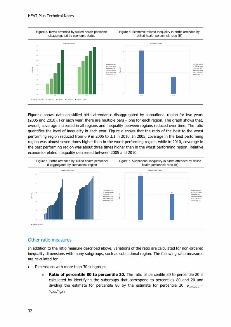
Figure a shows data on skilled birth attendance disaggregated by economic status for two years (2005
and 2010). For each year, there are five bars – one for each wealth quintile. The graph shows that,
overall, coverage increased in all quintiles and inequality between quintiles reduced over time. The ratio
quantifies the level of inequality in each year. Figure b shows that the ratio of quintile 5 to quintile 1
reduced from 4.1 in 2005 to 1.7 in 2010. In 2005, coverage in quintile 5 was about four times higher
than in quintile 1, while in 2010, coverage in quintile 5 was less than two times higher than in quintile
1. Relative economic-related inequality decreased between 2005 and 2010.
HEAT Plus Technical Notes
32
Figure a. Births attended by skilled health personnel disaggregated by economic status
Figure b. Economic-related inequality in births attended by skilled health personnel: ratio (R)
Figure c shows data on skilled birth attendance disaggregated by subnational region for two years
(2005 and 2010). For each year, there are multiple bars – one for each region. The graph shows that,
overall, coverage increased in all regions and inequality between regions reduced over time. The ratio
quantifies the level of inequality in each year. Figure d shows that the ratio of the best to the worst
performing region reduced from 6.9 in 2005 to 3.1 in 2010. In 2005, coverage in the best performing
region was almost seven times higher than in the worst performing region, while in 2010, coverage in
the best performing region was about three times higher than in the worst performing region. Relative
economic-related inequality decreased between 2005 and 2010.
Figure a. Births attended by skilled health personnel disaggregated by subnational region
Figure b. Subnational inequality in births attended by skilled health personnel: ratio (R)
Other ratio measures
In addition to the ratio measure described above, variations of the ratio are calculated for non-ordered
inequality dimensions with many subgroups, such as subnational region. The following ratio measures
are calculated for
• Dimensions with more than 30 subgroups:
o Ratio of percentile 80 to percentile 20. The ratio of percentile 80 to percentile 20 is
calculated by identifying the subgroups that correspond to percentiles 80 and 20 and
dividing the estimate for percentile 80 by the estimate for percentile 20: 𝑅𝑝80𝑝20 =
𝑦𝑝80 𝑦𝑝20⁄

3 Summary measures
33
o Ratio of mean estimates in quintile 5 to quintile 1. The ratio of mean estimates in
quintile 5 and quintile 1 is calculated by dividing subgroups into quintiles, determining the
mean estimate for each quintile and dividing the mean estimate in quintile 5 by the mean
estimate in quintile 1: 𝑅𝑞5𝑞1 = 𝑦𝑞5 𝑦𝑞1⁄
• Dimensions with more than 60 subgroups:
o Ratio of percentile 90 to percentile 10. The ratio of percentile 90 to percentile 10 is
calculated by identifying the subgroups that correspond to percentiles 90 and 10 and
dividing the estimate for percentile 90 by the estimate for percentile 10: 𝑅𝑝90𝑝10 =
𝑦𝑝90 𝑦𝑝10⁄
o Ratio of mean estimates in decile 10 to decile 1. The ratio of mean estimates in
decile 10 to decile 1 is calculated by dividing subgroups into deciles, determining the mean
estimate for each decile and dividing the mean estimate in decile 10 by the mean estimate
in decile 1: 𝑅𝑑10𝑑1 = 𝑦𝑑10 𝑦𝑑1⁄
• Dimensions with more than 100 subgroups:
o Ratio of percentile 95 to percentile 5. The ratio of percentile 95 to percentile 5 is
calculated by identifying the subgroups that correspond to percentiles 95 and 5 and dividing
the estimate for percentile 95 by the estimate for percentile 5: 𝑅𝑝95𝑝5 = 𝑦𝑝95 𝑦𝑝5⁄
o Ratio of mean estimates in the top 5% to the bottom 5%. The ratio of mean
estimates in the top 5% to the bottom 5% is calculated by dividing subgroups into
vigintiles, determining the mean estimate for each vigintile and dividing the mean estimate
in the top 5% by the mean estimate in the bottom 5%: 𝑅𝑣20𝑣1 = 𝑦𝑣20 𝑦𝑣1⁄
For dimensions with many subgroups, these measures may be a more accurate reflection of the level
of inequality than measuring the ratio of the maximum and minimum values using the (range) ratio, as
they avoid using possible outlier values. They are displayed in the ‘Summary measures’ tab of the
selection menu for horizontal bar graphs showing disaggregated data under the ‘Explore inequality’
component of the tool.
HEAT Plus Technical Notes
34
3.16 Relative concentration index (RCI)
Definition
RCI shows the gradient across population subgroups, on a relative scale. It indicates the extent to
which an indicator is concentrated among disadvantaged or advantaged subgroups.
RCI is a relative measure of inequality that takes into account all population subgroups. It is calculated
for ordered dimensions with more than two subgroups, such as economic status. Subgroups are
weighted according to their population share. RCI is missing if at least one subgroup estimate or
subgroup population share is missing.
Calculation
RCI is calculated by dividing the absolute concentration index (ACI) by the setting average 𝜇 and
multiplying the fraction by 100:
𝑅𝐶𝐼 =𝐴𝐶𝐼
𝜇∗ 100
Interpretation
RCI is bounded between -100 and +100 and takes the value zero if there is no inequality. Positive
values indicate a concentration of the indicator among the advantaged, while negative values indicate
a concentration of the indicator among the disadvantaged. The greater the absolute value of RCI, the
higher the level of inequality.
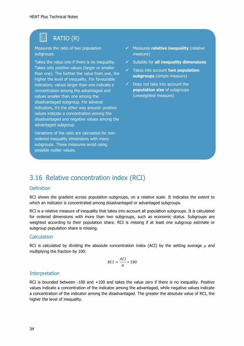
RATIO (R)
Measures the ratio of two population
subgroups.
Takes the value one if there is no inequality.
Takes only positive values (larger or smaller
than one). The further the value from one, the
higher the level of inequality. For favourable
indicators, values larger than one indicate a
concentration among the advantaged and
values smaller than one among the
disadvantaged subgroup. For adverse
indicators, it’s the other way around: positive
values indicate a concentration among the
disadvantaged and negative values among the
advantaged subgroup.
Variations of the ratio are calculated for non-
ordered inequality dimensions with many
subgroups. These measures avoid using
possible outlier values.
✓ Measures relative inequality (relative
measure)
✓ Suitable for all inequality dimensions
✓ Takes into account two population
subgroups (simple measure)
✓ Does not take into account the
population size of subgroups
(unweighted measure)

3 Summary measures
35
Example
Figure a shows data on skilled birth attendance disaggregated by economic status for two years (2005
and 2010). For each year, there are five bars – one for each wealth quintile. The graph shows that,
overall, coverage increased in all quintiles and inequality between quintiles reduced over time. RCI
quantifies the level of inequality in each year. Figure b shows that relative economic-related inequality,
as measured by the RCI, reduced from 28.2 in 2005 to 11.1 in 2010.
Figure a. Births attended by skilled health personnel disaggregated by economic status
Figure b. Economic-related inequality in births attended by skilled health personnel: relative concentration index (RCI)
3.17 Relative index of inequality (RII)
Definition
RII represents the ratio of estimated values of an indicator of the most-advantaged to the most-
disadvantaged (or vice versa for adverse indicators), while taking into account all the other subgroups
– using an appropriate regression model.
RII is a relative measure of inequality that takes into account all population subgroups. It is calculated
for ordered dimensions with more than two subgroups, such as economic status. Subgroups are
RELATIVE CONCENTRATION INDEX (RCI)
Measures the extent to which an indicator is
concentrated among disadvantaged or
advantaged population subgroups, in relative
terms.
Takes the value zero if there is no inequality.
Takes values between -100 and +100. Positive
values indicate a concentration among
advantaged, negative values among
disadvantaged subgroups. The larger the
absolute value, the higher the level of
inequality.
✓ Measures relative inequality (relative
measure)
✓ Suitable for ordered inequality
dimensions, such as economic status
(ordered measure)
✓ Takes into account all population
subgroups (complex measure)
✓ Takes into account the population size
of subgroups (weighted measure)

HEAT Plus Technical Notes
36
weighted according to their population share. RII is missing if at least one subgroup estimate or
subgroup population share is missing.
Calculation
To calculate RII, a weighted sample of the whole population is ranked from the most-disadvantaged
subgroup (at rank 0) to the most-advantaged subgroup (at rank 1). This ranking is weighted,
accounting for the proportional distribution of the population within each subgroup. The population of
each subgroup is then considered in terms of its range in the cumulative population distribution, and
the midpoint of this range. According to the definition currently used in HEAT, the indicator of interest
is then regressed against this midpoint value using a generalized linear model with logit link, and the
predicted values of the indicator are calculated for the two extremes (rank 1 and rank 0).
For favourable indicators, the ratio of the estimated values at rank 1 (𝑣1) to rank 0 (𝑣0) (covering
the entire distribution) generates the RII value:
𝑅𝐼𝐼 = 𝑣1 𝑣0⁄
For adverse indicators, the calculation is reversed and the RII value is calculated as the ratio of the
estimated values at rank 0 (𝑣0) to rank 1 (𝑣1) (covering the entire distribution):
𝑅𝐼𝐼 = 𝑣0 𝑣1⁄
Interpretation
If there is no inequality, RII takes the value one. RII takes only positive values. The further the value
of RII from one, the higher the level of inequality. For favourable indicators, values larger than one
indicate a concentration of the indicator among the advantaged and values smaller than one indicate a
concentration of the indicator among the disadvantaged. For adverse indicators, values larger than one
indicate a concentration of the indicator among the disadvantaged and values smaller than one indicate
a concentration of the indicator among the advantaged.
Note that RII is displayed on a logarithmic scale. RII values are intrinsically asymmetric: a ratio of one
(no inequality) is halfway between a ratio of 0.5 (the denominator subgroup having half the value of
the numerator subgroup) and a ratio of 2.0 (the denominator subgroup having double the value of the
numerator subgroup). On a regular axis, RII values would be concentrated at the lower end of the
scale, with a few very large outlier values at the upper end of the scale. On a logarithmic axis, these
values are equally spaced, making them easier to read and interpret.
Example
Figure a shows data on skilled birth attendance disaggregated by economic status for two years (2005
and 2010). For each year, there are five bars – one for each wealth quintile. The graph shows that,
overall, coverage increased in all quintiles and inequality between quintiles reduced over time. RII
quantifies the level of inequality in each year. Figure b shows that relative economic-related inequality,
as measured by the RII, reduced from 7.7 in 2005 to 2.2 in 2010. In 2005, coverage in quintile 5 was
nearly 8 times higher than in quintile 1, but this reduced to coverage in quintile 5 being just over twice
as high than in quintile 1 in 2010.

3 Summary measures
37
Figure a. Births attended by skilled health personnel disaggregated by economic status
Figure b. Economic-related inequality in births attended by skilled health personnel: relative index of inequality (RII)
3.18 Slope index of inequality (SII)
Definition
SII represents the difference in estimated values of an indicator between the most-advantaged and
most-disadvantaged (or vice versa for adverse indicators), while taking into consideration all the other
subgroups – using an appropriate regression model.
SII is an absolute measure of inequality that takes into account all population subgroups. It is calculated
for ordered dimensions with more than two subgroups, such as economic status. Subgroups are
weighted according to their population share. SII is missing if at least one subgroup estimate or
subgroup population share is missing.
RELATIVE INDEX OF INEQUALITY (RII)
Represents the ratio of estimated values of an
indicator of the most-advantaged to the most-
disadvantaged (or vice versa for adverse
indicators), while taking into account all other
subgroups.
Takes the value one if there is no inequality.
Takes only positive values (larger or smaller
than one). The further the value from one, the
higher the level of inequality. For favourable
indicators, values larger than one indicate a
concentration among the advantaged and
values smaller than one among the
disadvantaged. For adverse indicators, it’s the
other way around: positive values indicate a
concentration among the disadvantaged and
negative values among the advantaged.
✓ Measures relative inequality (relative
measure)
✓ Suitable for ordered inequality
dimensions, such as economic status
(ordered measure)
✓ Takes into account all population
subgroups (complex measure)
✓ Takes into account the population size
of subgroups (weighted measure)

HEAT Plus Technical Notes
38
Calculation
To calculate SII, a weighted sample of the whole population is ranked from the most-disadvantaged
subgroup (at rank 0) to the most-advantaged subgroup (at rank 1). This ranking is weighted,
accounting for the proportional distribution of the population within each subgroup. The population of
each subgroup is then considered in terms of its range in the cumulative population distribution, and
the midpoint of this range. According to the definition currently used in HEAT, the indicator of interest
is then regressed against this midpoint value using a generalized linear model with logit link, and the
predicted values of the indicator are calculated for the two extremes (rank 1 and rank 0).
For favourable indicators, the difference between the estimated values at rank 1 (𝑣1) and rank 0
(𝑣0) (covering the entire distribution) generates the SII value:
𝑆𝐼𝐼 = 𝑣1 − 𝑣0
For adverse indicators, the calculation is reversed and the SII value is calculated as the difference
between the estimated values at rank 0 (𝑣0) and rank 1 (𝑣1) (covering the entire distribution):
𝑆𝐼𝐼 = 𝑣0 − 𝑣1
Interpretation
If there is no inequality, SII takes the value zero. Greater absolute values indicate higher levels of
inequality. For favourable indicators, positive values indicate a concentration of the indicator among
the advantaged and negative values indicate a concentration of the indicator among the disadvantaged.
For adverse indicators, positive values indicate a concentration of the indicator among the
disadvantaged and negative values indicate a concentration of the indicator among the advantaged.
Example
Figure a shows data on skilled birth attendance disaggregated by economic status for two years (2005
and 2010). For each year, there are five bars – one for each wealth quintile. The graph shows that,
overall, coverage increased in all quintiles and inequality between quintiles reduced over time. SII
quantifies the level of inequality in each year. Figure b shows that absolute economic-related inequality,
as measured by the SII, reduced from 74.3 percentage points in 2005 to 52.6 percentage points in
2010.
Figure a. Births attended by skilled health personnel disaggregated by economic status
Figure b. Economic-related inequality in births attended by skilled health personnel: slope index of inequality (SII)

3 Summary measures
39
3.19 Theil index (TI)
Definition
TI is a relative measure of inequality that takes into account all population subgroups. It is calculated
for non-ordered dimensions with more than two subgroups, such as subnational region. Subgroups are
weighted according to their population share. TI is missing if at least one subgroup estimate or
subgroup population share is missing.
Calculation
TI is calculated as the sum of products of the natural logarithm of the share of the indicator of each
subgroup (ln𝑦𝑗
𝜇), the share of the indicator of each subgroup (
𝑦𝑗
𝜇) and the population share of each
subgroup (𝑝𝑗). TI may be more easily interpreted when multiplied by 1000:
𝑇𝐼 =∑𝑝𝑗𝑦𝑗
𝜇ln𝑦𝑗
𝜇𝑗
∗ 1000
where 𝑦𝑗 indicates the estimate for subgroup j, 𝑝𝑗 the population share of subgroup j and 𝜇 the setting
average.
Interpretation
If there is no inequality, TI takes the value zero. Greater absolute values indicate higher levels of
inequality. TI is more sensitive to differences further from the setting average (by the use of the
logarithm).
Example
Figure a shows data on skilled birth attendance disaggregated by subnational region for two years
(2005 and 2010). For each year, there are multiple bars – one for each region. The graph shows that,
overall, coverage increased in all regions and inequality between regions reduced over time. TI
SLOPE INDEX OF INEQUALITY (SII)
Represents the difference in estimated values
of an indicator between the most-advantaged
and the most-disadvantaged (or vice versa for
adverse indicators), while taking into account
all other subgroups.
Takes the value zero if there is no inequality.
For favourable indicators, positive values
indicate a concentration among the
advantaged and negative values among the
disadvantaged. For adverse indicators, it’s the
other way around: positive values indicate a
concentration among the disadvantaged and
negative values among the advantaged. The
larger the absolute value, the higher the level
of inequality.
✓ Measures absolute inequality (absolute
measure)
✓ Suitable for ordered inequality
dimensions, such as economic status
(ordered measure)
✓ Takes into account all population
subgroups (complex measure)
✓ Takes into account the population size
of subgroups (weighted measure)

HEAT Plus Technical Notes
40
quantifies the level of inequality in each year. Figure b shows that relative subnational regional
inequality, as measured by the TI, reduced from 94.6 in 2005 to 20.5 in 2010. In 2010, the level of
inequality was one fifth of the level in 2005.
Figure a. Births attended by skilled health personnel disaggregated by subnational region
Figure b. Subnational inequality in births attended by skilled health personnel: theil index (TI)
THEIL INDEX (TI)
Measures the sum of products of the natural
logarithm of the share of the indicator of each
subgroup, the share of the indicator of each
subgroup and the population share of each
subgroup
Takes the value zero if there is no inequality.
The larger the absolute value, the higher the
level of inequality.
✓ Measures relative inequality (relative
measure)
✓ Suitable for non-ordered inequality
dimensions, such as subnational region
(non-ordered measure)
✓ Takes into account all population
subgroups (complex measure)
✓ Takes into account the population size
of subgroups (weighted measure)
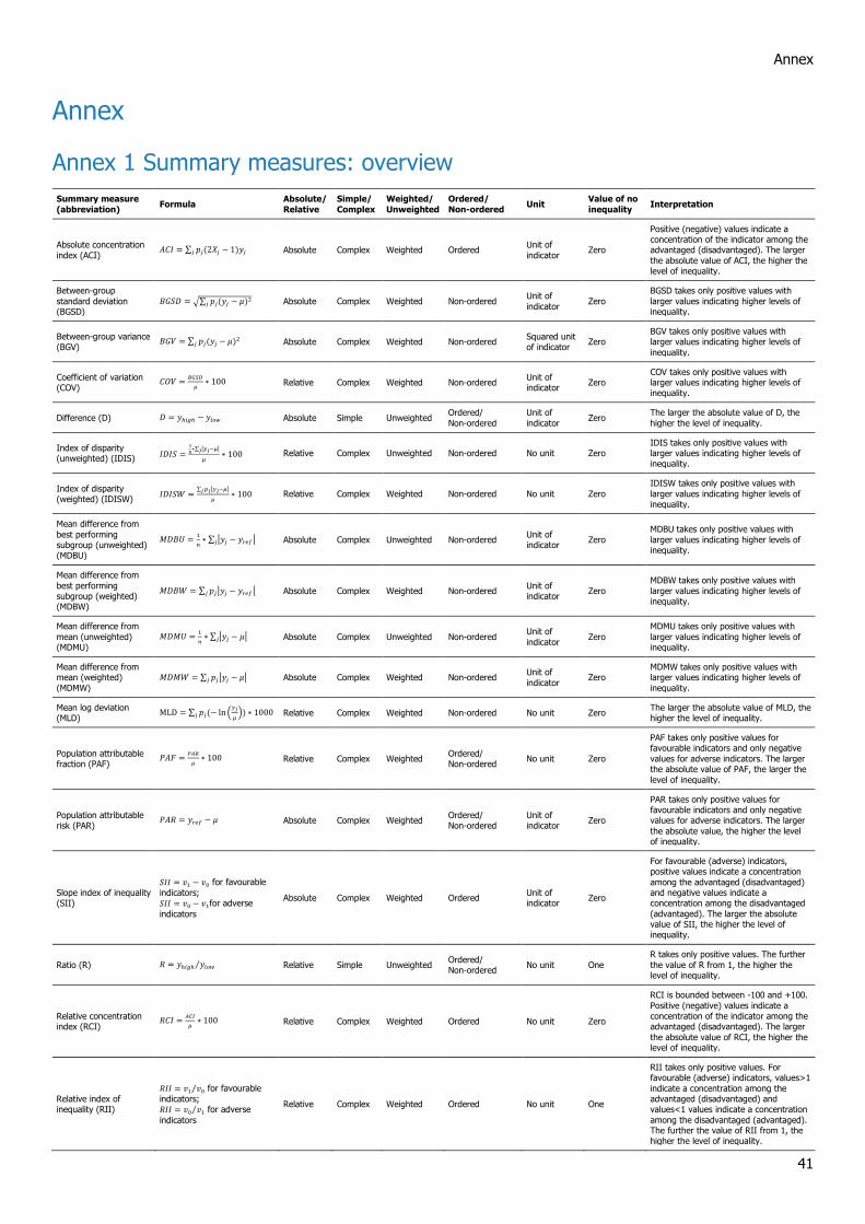
Annex
41
Annex
Annex 1 Summary measures: overview
Summary measure
(abbreviation) Formula
Absolute/
Relative
Simple/
Complex
Weighted/
Unweighted
Ordered/
Non-ordered Unit
Value of no
inequality Interpretation
Absolute concentration
index (ACI) 𝐴𝐶𝐼 = ∑ 𝑝𝑗(2𝑋𝑗 − 1)𝑦𝑗𝑗 Absolute Complex Weighted Ordered
Unit of
indicator Zero
Positive (negative) values indicate a concentration of the indicator among the advantaged (disadvantaged). The larger
the absolute value of ACI, the higher the level of inequality.
Between-group
standard deviation (BGSD)
𝐵𝐺𝑆𝐷 = √∑ 𝑝𝑗(𝑦𝑗 − 𝜇)2𝑗 Absolute Complex Weighted Non-ordered Unit of
indicator Zero
BGSD takes only positive values with
larger values indicating higher levels of inequality.
Between-group variance (BGV)
𝐵𝐺𝑉 = ∑ 𝑝𝑗(𝑦𝑗 − 𝜇)2𝑗 Absolute Complex Weighted Non-ordered Squared unit of indicator
Zero BGV takes only positive values with larger values indicating higher levels of
inequality.
Coefficient of variation (COV)
𝐶𝑂𝑉 =𝐵𝐺𝑆𝐷
𝜇∗ 100 Relative Complex Weighted Non-ordered
Unit of indicator
Zero COV takes only positive values with larger values indicating higher levels of inequality.
Difference (D) 𝐷 = 𝑦ℎ𝑖𝑔ℎ − 𝑦𝑙𝑜𝑤 Absolute Simple Unweighted Ordered/
Non-ordered
Unit of
indicator Zero
The larger the absolute value of D, the
higher the level of inequality.
Index of disparity (unweighted) (IDIS)
𝐼𝐷𝐼𝑆 =1
𝑛∗∑ |𝑦𝑗−𝜇|𝑗
𝜇∗ 100 Relative Complex Unweighted Non-ordered No unit Zero
IDIS takes only positive values with larger values indicating higher levels of inequality.
Index of disparity (weighted) (IDISW)
𝐼𝐷𝐼𝑆𝑊 =∑ 𝑝𝑗|𝑦𝑗−𝜇|𝑗
𝜇∗ 100 Relative Complex Weighted Non-ordered No unit Zero
IDISW takes only positive values with
larger values indicating higher levels of inequality.
Mean difference from
best performing subgroup (unweighted) (MDBU)
𝑀𝐷𝐵𝑈 =1
𝑛∗ ∑ |𝑦𝑗 − 𝑦𝑟𝑒𝑓|𝑗 Absolute Complex Unweighted Non-ordered
Unit of indicator
Zero
MDBU takes only positive values with
larger values indicating higher levels of inequality.
Mean difference from
best performing subgroup (weighted) (MDBW)
𝑀𝐷𝐵𝑊 = ∑ 𝑝𝑗|𝑦𝑗 − 𝑦𝑟𝑒𝑓|𝑗 Absolute Complex Weighted Non-ordered Unit of indicator
Zero
MDBW takes only positive values with
larger values indicating higher levels of inequality.
Mean difference from
mean (unweighted) (MDMU)
𝑀𝐷𝑀𝑈 =1
𝑛∗ ∑ |𝑦𝑗 − 𝜇|𝑗 Absolute Complex Unweighted Non-ordered
Unit of
indicator Zero
MDMU takes only positive values with
larger values indicating higher levels of inequality.
Mean difference from mean (weighted)
(MDMW)
𝑀𝐷𝑀𝑊 = ∑ 𝑝𝑗|𝑦𝑗 − 𝜇|𝑗 Absolute Complex Weighted Non-ordered Unit of
indicator Zero
MDMW takes only positive values with larger values indicating higher levels of
inequality.
Mean log deviation (MLD)
MLD = ∑ 𝑝𝑗(− ln(𝑦𝑗
𝜇))𝑗 ∗ 1000 Relative Complex Weighted Non-ordered No unit Zero
The larger the absolute value of MLD, the higher the level of inequality.
Population attributable fraction (PAF)
𝑃𝐴𝐹 =𝑃𝐴𝑅
𝜇∗ 100 Relative Complex Weighted
Ordered/ Non-ordered
No unit Zero
PAF takes only positive values for favourable indicators and only negative
values for adverse indicators. The larger the absolute value of PAF, the larger the
level of inequality.
Population attributable risk (PAR)
𝑃𝐴𝑅 = 𝑦𝑟𝑒𝑓 − 𝜇 Absolute Complex Weighted Ordered/ Non-ordered
Unit of indicator
Zero
PAR takes only positive values for favourable indicators and only negative values for adverse indicators. The larger
the absolute value, the higher the level of inequality.
Slope index of inequality (SII)
𝑆𝐼𝐼 = 𝑣1 − 𝑣0 for favourable
indicators; 𝑆𝐼𝐼 = 𝑣0 − 𝑣1for adverse
indicators
Absolute Complex Weighted Ordered Unit of indicator
Zero
For favourable (adverse) indicators, positive values indicate a concentration
among the advantaged (disadvantaged) and negative values indicate a concentration among the disadvantaged
(advantaged). The larger the absolute value of SII, the higher the level of inequality.
Ratio (R) 𝑅 = 𝑦ℎ𝑖𝑔ℎ 𝑦𝑙𝑜𝑤⁄ Relative Simple Unweighted Ordered/ Non-ordered
No unit One
R takes only positive values. The further
the value of R from 1, the higher the level of inequality.
Relative concentration index (RCI)
𝑅𝐶𝐼 =𝐴𝐶𝐼
𝜇∗ 100 Relative Complex Weighted Ordered No unit Zero
RCI is bounded between -100 and +100.
Positive (negative) values indicate a concentration of the indicator among the advantaged (disadvantaged). The larger
the absolute value of RCI, the higher the level of inequality.
Relative index of inequality (RII)
𝑅𝐼𝐼 = 𝑣1 𝑣0⁄ for favourable
indicators; 𝑅𝐼𝐼 = 𝑣0 𝑣1⁄ for adverse
indicators
Relative Complex Weighted Ordered No unit One
RII takes only positive values. For favourable (adverse) indicators, values>1
indicate a concentration among the advantaged (disadvantaged) and values<1 values indicate a concentration
among the disadvantaged (advantaged). The further the value of RII from 1, the higher the level of inequality.
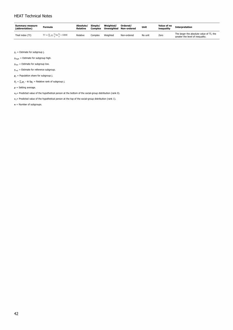
HEAT Technical Notes
42
Summary measure (abbreviation)
Formula Absolute/ Relative
Simple/ Complex
Weighted/ Unweighted
Ordered/ Non-ordered
Unit Value of no inequality
Interpretation
Theil index (TI) 𝑇𝐼 = ∑ 𝑝𝑗𝑦𝑗
𝜇ln
𝑦𝑗
𝜇𝑗 ∗ 1000 Relative Complex Weighted Non-ordered No unit Zero The larger the absolute value of TI, the
greater the level of inequality.
𝒚𝒋 = Estimate for subgroup j.
𝒚𝒉𝒊𝒈𝒉 = Estimate for subgroup high.
𝒚𝒍𝒐𝒘 = Estimate for subgroup low.
𝒚𝒓𝒆𝒇 = Estimate for reference subgroup.
𝒑𝒋 = Population share for subgroup j.
𝑿𝒋 = ∑ 𝒑𝒋 − 𝟎. 𝟓𝒑𝒋𝒋 = Relative rank of subgroup j.
𝝁 = Setting average.
𝒗𝟎= Predicted value of the hypothetical person at the bottom of the social-group distribution (rank 0).
𝒗𝟏= Predicted value of the hypothetical person at the top of the social-group distribution (rank 1).
𝒏 = Number of subgroups.

Annex
43