technology and motivation to exercise: data display
TRANSCRIPT

Technology and Motivation to Exercise: Data Display Formats, Progress Feedback,
and Strength of Commitment for Personal Fitness
Honors Thesis
Presented in Partial Fulfillment of the Requirements for the Bachelor of Science in
Business Administration Degree with Honors Research Distinction in the Max M. Fisher
College of Business of The Ohio State University
By
Xu Weng
Undergraduate Program in Business Administration
The Ohio State University
2016
Thesis Committee:
Dr. Curtis P. Haugtvedt, Advisor
Bettina Bair
Dr. Patricia M. West

Copyrighted by
Xu Weng
2016

ii
Abstract
The purpose of this study, inspired by observations of the increased use of data-driven
fitness activity trackers, is to measure how using different methods to display the same
set of data influences perceptions of its value: understanding of the data, informative
value of the display, and motivation to take action or change behavior. Previous research
predominantly focuses on the effectiveness of wearables, not their displays. For this
study, data was collected from 273 respondents: an approximately equal number of males
and females ranging in age from 18 to 72 (average age of 31) from OSU undergraduates
and Amazon’s Mechanical Turk. Participants evaluated different charts, tables, and
graphs created from the same data set: 2 line graphs, 2 bar graphs, 1 pie chart, 1 table, 1
radar graph, and 3 visual displays. Questions assessed interpretation and understanding of
the material as well as personal perception of the informational and motivational value of
the displays. Respondents ranked motivational power of the displays in the following
order (most to least): visual display, table, pie chart, line graph. Need for Cognition was
included, and both those in the top 25% and the bottom 25% answered a context question
more accurately using a table than a line graph despite looking at the table for less time.
Respondents rated display characteristics related to data and information more important
than appearance-related characteristics. Display format does influence the severity of
inferences people deduce from data, and how meaningful they find the information to be.
These results can be applied to the health and medical fields in general by providing
insight into data display formats that are more likely to promote healthy diets, exercise,
and other regimes such as medical prescription adherence.

iii
Acknowledgments
I would like to express my sincere gratitude to the members of my thesis committee. First
and foremost, my advisor, Dr. Curtis P. Haugtvedt, has been instrumental in helping me
conceive the premise of this research as well as organizing the logistics. I am grateful that
he helped me formulate a research question based on the experiences and observations I
acquired over the summer of 2015 working as a technological advisory intern for Ernst
and Young (EY) in Los Angeles. My responsibilities included training employees on
self-service reporting platforms that I had helped develop and test, and I noticed that
some reports and their displays were consistently easier for the employees to understand.
Curt encouraged me to use my knowledge of creating different display formats to
actually test this observation, and with his prior research in persuasive technology we
were able to quantify the results. I would also like to thank Professor Bettina Bair for
graciously agreeing to serve on the committee. As my Software I instructor in the autumn
of 2015, she is one of the most helpful and clear instructors I have ever had throughout
my college career. I highly respect her as an academic and individual, and I am excited to
share my research with someone who has a more technical-based viewpoint. I have spent
nearly as much time in the College of Engineering as I have at Fisher, so I am happy to
have the engineering community represented. Finally, I would like to extend my thanks
to Dr. Patricia West, who introduced me to all of the resources for research that I would
have struggled to understand on my own. She extended the same opportunities to me as
she did with her Honors Contract students, and I was not disadvantaged in any way.
Thank you all!

iv
Vita
2008-2012 ......................................................Gahanna Lincoln High School
2012-2016 ......................................................B.S. Business, The Ohio State University
Fields of Study
Major Field: Management Information Systems
Minor Field: Computer Information Sciences

v
Table of Contents
Abstract ............................................................................................................................... ii
Acknowledgments.............................................................................................................. iii
Vita ..................................................................................................................................... iv
Fields of Study ................................................................................................................... iv
List of Tables .................................................................................................................... vii
List of Figures .................................................................................................................. viii
Chapter 1: Background and Prior Research ....................................................................... 1
Chapter 2: Methods and Procedures .................................................................................. 6
Research Design .............................................................................................................. 6
Participant Sample......................................................................................................... 10
Instrumentation and Measurement ................................................................................ 12
Data Analysis ................................................................................................................ 13
Chapter 3: Results ............................................................................................................ 16
Display Ratings ............................................................................................................. 16
Statistical Significance .................................................................................................. 21
Need for Cognition ........................................................................................................ 28
Qualitative Study Observations and Feedback.............................................................. 29

vi
Chapter 4: Discussion and Conclusion ............................................................................ 33
Interpretation ................................................................................................................. 33
Implications ................................................................................................................... 37
Limitations .................................................................................................................... 39
Opportunities for Future Research ................................................................................ 41
References ......................................................................................................................... 43
Appendix A: Survey Questions ........................................................................................ 45
Appendix B: Survey Responses ........................................................................................ 82

vii
List of Tables
Table 1. Participant details for the qualitative Fitbit study ............................................... 12
Table 2. Statistical significance (t-Tests) for perceived consistency in balancing calories
........................................................................................................................................... 21
Table 3. Statistical significance (t-Tests) for perceived level of motivational power ..... 23
Table 4. Statistical significance (t-Tests) for perceived level of informativeness ............ 25
Table 5. Statistical significance (t-Tests) for perceived level of meaningfulness ............ 26
Table 6. Statistical significance (t-Tests) for perceived importance of display
characteristics ................................................................................................................... 27
Table 7. Accuracy rate by Need for Cognition ................................................................ 28

viii
List of Figures
Figure 1. Different ways in which progress data is displayed on fitness activity trackers
and their apps ...................................................................................................................... 2
Figure 2. Data displays used in the survey ......................................................................... 7
Figure 3. Self-reported educational levels of Mechanical Turk workers in 2015 ............ 11
Figure 4. Self-reported fields of study of Mechanical Turk workers in 2015 .................. 11
Figure 5. Perceived consistency in balancing calories ...................................................... 16
Figure 6. Perceived level of motivational power .............................................................. 18
Figure 7. Perceived informativeness and meaningfulness ................................................ 19
Figure 8. Perceived importance of display characteristics ................................................ 20

1
Chapter 1: Background and Prior Research
Observations of the increased use of data-driven fitness activity trackers inspired
this study. Even though it is a novel technology, Fitbits are shown to be an accurate,
reliable, and efficient tool for tracking physical activity through mobile devices and a
growing number of digital apps (Diaz, 2015). The inclusion of internet technology in the
Fitbit offers a significant advantage over traditional tracking devices such as pedometers
because it is able to integrate with internet-delivered fitness interventions, which are
shown to be effective in producing small changes in physical activity (Tully, 2014).
Since 1950, sedentary jobs have increased 83% and less than 20% of jobs are
considered physically active (“The Price of Inactivity,” 2015). In contrast, wearables are
expected to grow at a compound annual rate of 35% over the next five years from 2015,
and fitness bands and other miscellaneous devices account for 36% of the wearable
device market with 33 million units shipped this past year (“The Wearables Report,”
2015). In an increasingly fast-paced society, consumers are compensating for not having
time to exercise by incorporating more physical activity into their daily routines (Tully,
2014).
Due to Fitbits still being a relatively new technology, the majority of current
published research only focuses on whether or not Fitbits and other fitness activity
trackers are effective in promoting healthier lifestyles. They do not test to see if some
display formats induce more of an impact or emotional response than others. This study
seeks to determine if the level of effectiveness in using fitness activity trackers can vary

2
based on the format in which people’s progress data is shown. Specifically, format is
defined as different types of charts and graphs that display data.
Using different methods to display the same set of data may influence people’s
perception of its value: understanding of the data, informativeness of the display, and
motivation to take action or change behavior. Some displays from current fitness activity
trackers are shown below; these trackers typically visualize a user’s physical activity,
calorie intake and expenditure, sleep patterns, and progress towards a certain goal.
Figure 1: Different ways in which progress data is displayed on fitness activity trackers
and their apps; the graphics shown here are pulled from the dashboards of the Fitbit
Force, Fitbit Charge, and Apple smartwatch.
Though not applied to fitness activity trackers specifically, prior research has
shown that how information is displayed does influence how it is perceived. In a 2012
literature study by Hildon, Allwood, and Black titled the “Impact of format and content
of visual display data on comprehension, choice and preference,” the researchers found
that the nature of data processing in humans is less dependent on the type of information

3
displayed and more dependent on how it is displayed. They found that tables and
pictographs are better understood than bar charts despite the latter usually being more
preferred, and that numerical tables are more effective than graphs overall. Having more
visual elements in a display, such as icons, makes the graphic more user-friendly than
numbers but could lead to inaccurate inferences and understanding (Hildon, 2012).
In 2013, Agostinelli et al. conducted an experimental study testing the effects of
different presentations on data interpretation for hospital ward reports involving 105
medical doctors and healthcare professionals from five Italian hospitals. The participants
were shown 4 different data display formats created from the same data set of a hospital
ward and asked to give their opinions on readability, familiarity, pleasantness, and level
of understanding. More than 84% of the subjects said tables are easiest to interpret, most
suitable for the data, and more pleasant to look at than the other formats. The radar
format had the lowest rating in nearly every category. The researchers concluded that the
choice of a graphical format influences the understanding of data and that
misinterpretation of a format could have an impact on health decision making
(Agostinelli, 2013).
The clarity of tables is further substantiated by a 2012 study by Dolan, Qian, and
Veazie that surveyed 279 members of an online survey panel and asked them to evaluate
five different data presentation formats: table, bar chart, risk scale, frequency design, and
icon array. Participants’ judgements when using tables, flow charts, and icon arrays were
all significantly more accurate and consistent than when they used risk scales and bar
charts, and the most clearly perceived format was the table (Dolan, 2012). Despite the

4
table format consistently ranking highly among multiple studies evaluating different data
displays, the actual interfaces used on fitness activity trackers tend to be more visual.
In a 2015 study by Grierson, Corney, and Hatcher, 16 university students were
asked to search for trends among data sets and given access to visualization software. The
researchers found that visualization methods enabled users to achieve similar accuracy
for data mining in less time when compared to traditional text-based searching. This is
because visual environments make data mining more intuitive, and users prefer a more
visual experience (Grierson, 2015). In a similar study by Garcia-Retamero and Hoffrage
in 2013, they found that visual aids improve accuracy of data interpretation (Garcia-
Retamero, 2013). A study by Chapman in 2014 about the power of imagery also found
that visuals are more motivating than text for changing behavior, and a 2008 study by
Ratwani about thinking graphically found that graphics reduce the number of processing
cycles individuals go through to answer questions based on displays (Chapman, 2014;
Ratwani, 2008).
In terms of ideal characteristics for data displays, a 2013 study conducted by
Braseth and Oritsland found that it is best to adhere to simplistic designs and avoid
adding unnecessary graphics in order to reduce visual complexity. Display graphs should
be information-rich, and visual saliency should match data importance. Color can aid
understanding because the extensive use of grey scale and dull colors can cause
readability problems. The researchers concluded that an effective display should provide
a concise characterization of a situation as a whole that can be recognized quickly at a
glance (Braseth, 2013). Another research study by Padilla et al. in 2015 about the

5
influence of different graphical displays on non-expert decision making found that people
are more likely to choose display formats that have less perceived uncertainty, which
usually involves more information about the data itself (Padilla, 2015).
Given the findings in prior research that support the idea of different data display
formats possessing varying levels of influence upon people, I seek to apply this to fitness
specifically. Can some types of data displays be more effective at promoting a healthier
lifestyle than others? My research will test the following hypothesis: the format in which
data is displayed can influence people’s perception of its value, including their
interpretation and understanding of the data, how useful or motivating they find the
display to be, and their personal reaction to what is shown. This hypothesis will be
applied in the context of personal fitness and health-related behaviors.

6
Chapter 2: Methods and Procedures
Research Design
To test the hypothesis, which states that the way in which data is displayed
influences understanding of the information and the perception of its value, I generated
10 different data displays from the same data set showing weekly calorie intake versus
expenditure. It is important to emphasize that only one data set was used so that
differences in data interpretation can be measured; if multiple data sets were used, the
displays would not be consistent. I created the data set by using the RANDBETWEEN
(lower bound, upper bound) function in Microsoft Excel to generate random values for
calorie intake and expenditure every day for a week. The lower and upper bounds of the
sample data were specified as 1,000 and 2,000 calories, respectively. The data displays
consist of different types of charts and graphs, including standard options found in Excel
and also visual formats modeled after actual interfaces used by fitness activity trackers
such as the Fitbit Flex, Fitbit Charge, and Apple Smartwatch. The exact displays I created
are shown in Figure 2 on the following page.

7
Figure 2: Data displays used in the survey, from top to bottom (all showing calorie
intake vs expenditure): line graphs, bar graphs, pie chart and radar graph, visual display
(speedometer) and visual display (list), visual display (seesaw) and table.

8
I created an 81 question survey using OSU Qualtrics. Participation in the survey
was entirely voluntary and respondents could exit the survey at any time or skip any
questions without penalty. The questions consisted of a mix between timed accuracy
tests, personal perceptions of informational and motivational value, and preference
rankings. For the timed accuracy tests, respondents were asked to view a page with no
other content aside from a display and told to advance the page when they were ready.
There was no time limit to how long they could stay on the page. When they were ready
to move on and advance the page, the following page asked “Based on the data from the
previous [type of display], which day of the week was the amount of calories burned
more than the amount of calories eaten?” The timed accuracy test was used to test a line
graph against a table showing the exact same data set and followed with the exact same
follow-up question, to see if people interpreted the displays differently and how much
they understood what was being shown. Other questions concerning data interpretation
and perceived motivational power included:
“The following graph represents the calorie consumption and expenditure for
a person over a 1 week period. On a scale of 0 (not at all consistent) to 10
(very consistent), how consistent would you say this person is in balancing the
amount of calories they’ve eaten vs the amount of calories they’ve burned?”
“Please rate the 3 displays based on their ability to motivate you to eat
healthier or exercise more, from 0 (not at all motivating) to 10 (very
motivating).”

9
Respondents were also asked to evaluate themselves according to the Need for
Cognition Scale (NFC), which is a personality variable reflecting the extent to which
individuals are inclined towards effortful cognitive activities. In other words, it is an
assessment instrument that quantitatively measures the tendency for an individual to
engage in and enjoy thinking. Respondents are asked to indicate the extent to which a
statement is characteristic of them, from 1 (extremely uncharacteristic of me) to 5
(extremely characteristic of me). Sample statements included:
“I prefer complex to simple problems”
“I like to have the responsibility of handling a situation that requires a lot of
thinking”
“Thinking is not my idea of fun” (reverse scored)
At the end of the survey, there were optional questions about sex, age, and weight.
I explicitly specified that these questions were optional and that respondents were not
required to answer these questions to advance and complete the survey. The answers
given by the respondents who voluntary answered these questions were then used to
calculate their BMI (body mass index).
I also conducted a small, one-week long qualitative study in which four
participants were give Fitbit Flexes and asked to send daily updates of their usage. The
updates consisted of just their feedback, impressions, and general thoughts about the
device. At the start of the study, I met with each of participants in person to give them the
Fitbit and observe the setup process. As a qualitative study, no quantitative data was
recorded throughout the duration of the study. The purpose of this additional short study

10
was to see how people unfamiliar with fitness activity trackers responded to a Fitbit and
its display interfaces. The four participants consisted of two undergraduate students and
two staff members. I reached out to the staff members directly to see if they were
interested in participating. To recruit the students, I posted on my personal social media
asking for respondents. All of the participants voluntarily contributed to the study. They
sent me their daily updates via email.
Participant Sample
The survey had 273 total respondents who started and completed the survey. To
solicit participation for the survey, my advisor Curt emailed the professors of
undergraduate courses at Fisher throughout December 2015 asking them to send the
survey link to their students. 133 students completed the survey via this method.
In January 2016, I created a HIT request on Amazon’s Mechanical Turk and
received 140 responses. Approximately 90% of Mechanical Turk workers in 2015
reported that they possess degrees in higher education. Of those that have degrees, the
majority of them declared business as their field of study (Brissey, 2015). Figures 3 and 4
on the following page show the education distribution of workers on Mechanical Turk.

11
Figure 3: Self-reported educational levels of Mechanical Turk workers in 2015.
Figure 4: Self-reported fields of study of Mechanical Turk workers in 2015.
Out of those who chose to answer the bio-demographic questions in the survey,
the average age of the aggregate participant pool is 31, with a min of 18 and max of 72.
The distribution of males versus females is approximately equal, with 134 males and 122
females. The average height of the respondents is 5’5” with a min of 4’7” and max of
6’5”, and the average weight is 165 pounds with a min of 100 and max of 319. The
average BMI of the respondents is 26.84, with a min of 17.16 and a max of 49.59.

12
For the qualitative study, the participants consisted of two undergraduate students
and two staff members. The first student is 22, female, majoring in microbiology and
environmental science, and self-described as “not tech-savvy.” The second student is 21,
male, majoring in computer science and engineering, and self-described as “tech-savvy.”
Both of the staff members work in the Fisher College of Business; the first staff member
is in his late 20s and self-described as “tech-savvy” whereas the second is in her late 30s
and self-described as “not at all tech-savvy.” For both the students and the staff members,
the two individuals in each group were counterparts to each other in terms of being
proficient with technology. The purpose to having counterparts is to see if there is a
difference in how the individuals react to their Fitbits given their self-professed level of
technology proficiency. Table 1 below lists the details for each participant.
Undergraduate Student Staff Member
Not tech-savvy Female, 22, Microbiology and
Environmental Science
Female, 30s, Fisher College
of Business
Tech-savvy Male, 21, Computer Science
and Engineering
Male, 20s, Fisher College of
Business
Table 1: Participant details for the qualitative Fitbit study.
Instrumentation and Measurement
The Qualtrics survey platform was used to create and house the survey. The
survey predominantly used sliders for respondents to rate the different displays (usually
on a scale from 0 to 10 with accuracy to the tenths places), but also included multiple
choice questions, check-boxes, and comment sections. The different displays were

13
imported as pictures and either placed on the same page as the rating questions or
preceding questions (as was the case for the timed accuracy tests). Most of the
respondents’ answers were measured numerically using the slider scale, but also
qualitatively for the classification and selection questions.
For the qualitative study, I asked each of the participants to email me daily
updates of their thoughts about the device. I did not ask them specific questions because I
wanted to get their natural reactions to their new device. Whatever they sent me was
whatever they wanted or was willing to contribute. In the initial setup process when I first
gave them their Fitbits, I asked them to disregard my presence and just set up their Fitbit
as though I was not there. This study involved pure observation and personal feedback,
no quantitative data. I then compiled the daily updates by person and identified
interesting observations and feedback.
Data Analysis
Once the data from the respondents was collected for the survey, it was exported
from the Qualtrics platform into a CSV (Comma Separated Values) file for analysis in
Microsoft Excel. The individual ratings for different display formats, in terms of their
perceived informative, motivational, and preferred value, were averaged across all
respondents. These individual ratings mainly composed the questions involving sliders.
For the multiple choice questions, the number of selections per answer choice was
counted. For example, in the timed accuracy questions involving the table and line graph
I counted the number of “correct” responses (the number of people who picked the right

14
choice) and the number of “incorrect” responses (the number of people who picked the
other choices). The survey was also set to record the amount of time respondents spent on
the page for the timed accuracy questions involving the table and line graph, which timed
in seconds how long each individual spent looking at each display before advancing to
the next page (there was no time limit for how long they could stay on each page). In
order to determine whether or not the differences in ratings between the data display
types were actually statistically significant or just due to randomness, I ran multiple t-
Tests in Microsoft Excel assuming unequal variance.
To score the answers for the Need for Cognition scale, I scored each respondent’s
individual choices to create a numerical sum for each person. A higher total score in
Need for Cognition indicates a greater need for cognition for the individual. Only those
who answered every question for the scale were summed. For example, if a respondent
answered only half of the questions for Need for Cognition, I did not include his score in
the analysis because it was incomplete. Both the bottom 25% and the top 25% of scores
for Need for Cognition were sectioned out for analysis.
Those who voluntary chose to input their height and weight, in inches and pounds
respectively, were used to calculate BMI. The average, max, and min BMI values among
all the respondents were also calculated. The average, max, and min ages of the
respondents was calculated for those who voluntary specified it. The number of
respondents per gender was counted. This was all done to get a better idea of who was
taking the survey in aggregate form, not to individually identify the respondents.

15
For the qualitative study, I looked over my notes from observing each participant
setting up their Fitbit as well as the daily updates they sent me and extracted interesting
feedback or trends that I observed.

16
Chapter 3: Results
Display Ratings
The following figures show how respondents perceived each of the displays.
Some of the survey questions asked them to imagine that the data represented their
personal fitness progress, whereas other questions told them the data was about an
unspecified person. Nevertheless, all of the displays were generated from the same data
set using the process previously mentioned.
Figure 5: Perceived consistency in balancing calories.
Figure 5 shows an average of the ratings respondents gave for each data display
when asked how consistent the person whose data is shown was in balancing calorie
Consistency in balancing calories
Visual display (speedometer) 6.1743
Bar graph (calorie intake vs expenditure) 5.9056
Visual display (seesaw) 5.1142
Radar graph (calorie intake vs expenditure) 4.7752
Bar graph (calorie difference) 3.2504

17
intake versus expenditure over a one week period. The respondents were asked to rate
each display on a scale of 0 (not at all consistent) to 10 (very consistent), and their ratings
were averaged. A higher average rating signifies that the respondents interpreted the
calories to be more consistently balanced in the display. For example, when they viewed
the visual display resembling a speedometer they said that the person did a better job of
balancing calories eaten and calories burned (6.1743) as opposed to when they viewed
the bar graph with columns showing calorie intake and expenditure graphed side-by-side
for every day of the week (5.9056). They believed that the person was least consistent in
balancing calories when shown the bar graph with only one column per day showing that
day’s calorie difference (3.2504).

18
Figure 6: Perceived level of motivational power.
Figure 6 averages the ratings of the respondents when asked to evaluate how
motivational each data display was in getting them to eat healthier or exercise more. They
were asked to imagine that they were trying to lose weight, shown a display, and then
asked how motivational the display was on a scale from 0 (not at all motivating) to 10
(very motivating). A higher average rating signifies that the respondents found the
display to have more motivational power. For example, they found the visual display
resembling a speedometer to be the most motivating (6.9981) in terms of getting them to
eat healthier or exercise more if they had the goal to lose weight. Interestingly, all three
visual displays received the highest average ratings for motivational power whereas both
types of line graphs received the lowest ratings. The table received a relatively high
Perceived level of motivation
Visual display (speedometer) 6.9981
Visual display (seesaw) 6.6731
Visual display (list of intake, expenditure, difference) 6.6726
Table (calorie intake, expenditure, difference) 6.6504
Pie chart (calorie intake vs expenditure) 6.0864
Line graph (calorie intake vs expenditure) 5.4303
Line graph (calorie difference) 4.8835

19
rating as well (6.6504). It should be noted that Figure 5 shows that people perceived the
speedometer display to have been the most consistent in balancing calories, yet Figure 6
shows that people also believed it to have the highest motivational power. This is
interesting because one would assume that a higher consistency means a better job of
keeping to the stated fitness goal of balancing calories, yet respondents found visual
displays to be the most motivating in adopting more healthy habits.
Figure 7: Perceived informativeness and meaningfulness.
Figure 7 shows the average ratings for perceived informativeness and
meaningfulness for the different types of data displays. Respondents were asked in two
separate questions to rate how informative and meaningful they found each display to be,
Data display ranking Informativeness Meaningfulness
Table 8.0784 7.9519
Visual display 7.2672 7.1036
Bar graph 7.0800 7.0179
Pie chart 6.6012 6.6763
Line graph 6.2084 6.4738

20
from 0 (not at all informative/meaningful) to 10 (very informative/meaningful). As
shown, the table display type received the highest average rating and is perceived to be
both the most informative (8.0784) and the most meaningful (7.9519) followed by visual
display. Line graphs, which previously received the lowest ratings for motivational
power, also received the lowest averages for both informativeness (6.2084) and
meaningfulness (6.4738). Bar graphs, which previously ranked relatively highly in
consistency, ranked in the middle.
Figure 8: Perceived importance of display characteristics.
Figure 8 shows the average ratings for what respondents find most important in a
display. They were asked to rate how important they find each characteristic to be in a
Perceived importance of characteristics
Clear 8.8726
Informative 8.8004
Portable 6.8161
Aesthetically pleasing 6.7907
Colorful 5.6212

21
data display from 0 (not at all important) to 10 (very important). As shown, respondents
rated clarity (8.8726) and informativeness (8.8004) most highly. Characteristics related to
the appearance of a display, such as whether or not it is aesthetically pleasing (6.7907)
and colorful (5.6212), were rated least important. In general, characteristics about the
content of a display (clarity and informativeness) were rated higher than characteristics
pertaining to its appearance (aesthetics and color). Portability ranked in the middle
(6.8161) but has a rating closer to the two lower-ranked, appearance-related
characteristics.
Statistical Significance
Table 2: Statistical significance (t-Tests) for perceived consistency in balancing calories.
t-Test: Two-Sample Assuming Unequal Variances t-Test: Two-Sample Assuming Unequal Variances
Variable 1 Variable 2 Variable 1 Variable 2
Mean 6.1743494 5.9055762 Mean 6.174349 3.250390625
Variance 4.5128844 4.3894091 Variance 4.512884 3.641490043
Observations 269 269 Observations 269 256
Hypothesized Mean Difference 0 Hypothesized Mean Difference 0
df 536 df 521
t Stat 1.4774446 t Stat 16.60668
P(T<=t) one-tail 0.0700719 P(T<=t) one-tail 2.56E-50
t Critical one-tail 1.6477014 t Critical one-tail 1.647784
P(T<=t) two-tail 0.1401438 P(T<=t) two-tail 5.12E-50
t Critical two-tail 1.9643997 t Critical two-tail 1.964528
t-Test: Two-Sample Assuming Unequal Variances t-Test: Two-Sample Assuming Unequal Variances
Variable 1 Variable 2 Variable 1 Variable 2
Mean 5.9055762 3.2503906 Mean 6.174349 5.114176245
Variance 4.3894091 3.64149 Variance 4.512884 4.3937598
Observations 269 256 Observations 269 261
Hypothesized Mean Difference 0 Hypothesized Mean Difference 0
df 522 df 528
t Stat 15.193072 t Stat 5.782785
P(T<=t) one-tail 9.793E-44 P(T<=t) one-tail 6.29E-09
t Critical one-tail 1.6477779 t Critical one-tail 1.647745
P(T<=t) two-tail 1.959E-43 P(T<=t) two-tail 1.26E-08
t Critical two-tail 1.9645189 t Critical two-tail 1.964467
Visual (Speedometer) vs Bar Graph (Calorie Intake vs Expenditure) Visual (Speedometer) vs Bar Graph (Calorie Difference)
Bar Graph (Calorie Intake vs Expenditure) vs Bar Graph (Difference) Visual (Speedometer) vs Visual (Seesaw)

22
As shown in table 2, in order to test whether or not the differences in perceived
consistency for balancing calories between the different data displays is statistically
significant or just due to randomness, I ran several t-Tests with an alpha value of 0.05
(95% confidence interval) for two samples assuming unequal variances to match the
displays with each other. The null hypothesis is that “there is no difference in perceived
consistency between the different display formats” whereas the alternate hypothesis is
that “there is a statistically significant difference between the displays.” The general rule
for t-Tests is that if the t Stat larger than the t Critical value, then the null hypothesis can
be rejected and the results are statistically significant.
As shown, the difference between the two highest-rated displays formats, the
visual speedometer display and the bar graph comparing calorie intake versus
expenditure, is not statistically significant because t Stat (1.4774) is not larger than t
Critical (1.6477). The perceived consistency between the highest-rated display and the
lowest-rated display, the visual speedometer and the bar graph showing just calorie
difference, is statistically significant because t Stat (16.6067) is greater than t Critical
(1.6478). There is also a meaningful difference between the two bar graph formats when
compared to each other (t Stat of 15.1931 vs t Critical of 1.6478); likewise the two visual
display formats also possess statistically significant differences when compared to each
other in perceived consistency (t Stat of 5.7828 vs t Critical of 1.6477). In any case where
the comparison is statistically significant, the null hypothesis (that there is no difference
between the different display formats) is rejected.

23
Table 3: Statistical significance (t-Tests) for perceived level of motivational power.
As shown in table 3, in testing statistical significance for differences in the
perceived level of motivational power for each data display format I found that the
difference between the highest-rated display of the visual speedometer and the lowest-
rated display of the line graph showing calorie difference is indeed meaningfully
significant (t Stat of 10.0787 vs t Critical of 1.6478). The difference between the highest-
t-Test: Two-Sample Assuming Unequal Variances t-Test: Two-Sample Assuming Unequal Variances
Variable 1 Variable 2 Variable 1 Variable 2
Mean 6.998141264 4.8835249 Mean 6.672556 6.65037594
Variance 5.791302502 5.87022753 Variance 5.690301 4.456471556
Observations 269 261 Observations 266 266
Hypothesized Mean Difference 0 Hypothesized Mean Difference 0
df 527 df 522
t Stat 10.07871338 t Stat 0.113566
P(T<=t) one-tail 2.88682E-22 P(T<=t) one-tail 0.454813
t Critical one-tail 1.64775015 t Critical one-tail 1.647778
P(T<=t) two-tail 5.77364E-22 P(T<=t) two-tail 0.909626
t Critical two-tail 1.964475628 t Critical two-tail 1.964519
t-Test: Two-Sample Assuming Unequal Variances t-Test: Two-Sample Assuming Unequal Variances
Variable 1 Variable 2 Variable 1 Variable 2
Mean 6.998141264 6.65037594 Mean 6.650376 6.086415094
Variance 5.791302502 4.45647156 Variance 4.456472 4.657996569
Observations 269 266 Observations 266 265
Hypothesized Mean Difference 0 Hypothesized Mean Difference 0
df 526 df 529
t Stat 1.777400238 t Stat 3.043727
P(T<=t) one-tail 0.038040075 P(T<=t) one-tail 0.001226
t Critical one-tail 1.647755666 t Critical one-tail 1.647739
P(T<=t) two-tail 0.07608015 P(T<=t) two-tail 0.002453
t Critical two-tail 1.964484225 t Critical two-tail 1.964459
t-Test: Two-Sample Assuming Unequal Variances t-Test: Two-Sample Assuming Unequal Variances
Variable 1 Variable 2 Variable 1 Variable 2
Mean 6.086415094 5.4302682 Mean 5.430268 4.883524904
Variance 4.657996569 4.86211877 Variance 4.862119 5.870227527
Observations 265 261 Observations 261 261
Hypothesized Mean Difference 0 Hypothesized Mean Difference 0
df 523 df 515
t Stat 3.448338463 t Stat 2.696227
P(T<=t) one-tail 0.000304763 P(T<=t) one-tail 0.003621
t Critical one-tail 1.647772343 t Critical one-tail 1.647818
P(T<=t) two-tail 0.000609525 P(T<=t) two-tail 0.007243
t Critical two-tail 1.964510213 t Critical two-tail 1.964581
Visual Display (Speedometer) vs Line Graph (Calorie Difference) Visual Display (List) vs Table
Visual Display (Speedometer) vs Table Table vs Pie Chart (Calorie Intake vs Expenditure)
Pie Chart vs Line Graph (Calorie Intake vs Expenditure) Line Graph (Calorie Intake vs Expenditure) vs Line Graph (Calorie Difference)

24
rated visual display and the table is statistically significant (t Stat of 1.7774 vs t Critical
of 1.6478), but the difference between the lowest-rated visual display and the table is not
(t Stat of 0.1136 vs t Critical of 1.6478). There is a meaningful difference between the
table and the pie chart (t Stat of 3.0437 vs t Critical of 1.6477) and also between the pie
chart and the higher-rated line graph (t Stat of 3.4483 vs t Critical of 1.6478). Although
both of the line graphs ranked lowest for their perceived level of motivational power, the
difference between them is actually statistically significant (t Stat of 2.6962 and t Critical
of 1.6478).

25
Table 4: Statistical significance (t-Tests) for perceived level of informativeness.
As shown in table 4, in analyzing the statistical significance of respondents’
answers to how informative they consider each type of data display format to be I found
that every display format is meaningfully different from the one following it in ranking
except for the visual display and bar graph (t Stat of 1.2045 vs t Critical of 1.6480). Thus,
the ratings for the table versus visual display, bar graph versus pie chart, and pie chart
versus line graph are all statistically significant.
t-Test: Two-Sample Assuming Unequal Variances t-Test: Two-Sample Assuming Unequal Variances
Variable 1 Variable 2 Variable 1 Variable 2
Mean 8.078378 7.2671937 Mean 7.267193676 7.08
Variance 3.844492 3.5853084 Variance 3.585308363 2.5457008
Observations 259 253 Observations 253 255
Hypothesized Mean Difference 0 Hypothesized Mean Difference 0
df 510 df 491
t Stat 4.762227 t Stat 1.204463845
P(T<=t) one-tail 1.25E-06 P(T<=t) one-tail 0.114495307
t Critical one-tail 1.647847 t Critical one-tail 1.647962926
P(T<=t) two-tail 2.5E-06 P(T<=t) two-tail 0.228990615
t Critical two-tail 1.964626 t Critical two-tail 1.964807223
t-Test: Two-Sample Assuming Unequal Variances t-Test: Two-Sample Assuming Unequal Variances
Variable 1 Variable 2 Variable 1 Variable 2
Mean 7.08 6.6011719 Mean 6.601171875 6.2084291
Variance 2.545701 5.4479594 Variance 5.447959406 4.4473133
Observations 255 256 Observations 256 261
Hypothesized Mean Difference 0 Hypothesized Mean Difference 0
df 451 df 508
t Stat 2.708044 t Stat 2.006282106
P(T<=t) one-tail 0.003513 P(T<=t) one-tail 0.022677862
t Critical one-tail 1.648239 t Critical one-tail 1.647858683
P(T<=t) two-tail 0.007025 P(T<=t) two-tail 0.045355725
t Critical two-tail 1.965238 t Critical two-tail 1.964644767
Table vs Visual Display Visual Display vs Bar Graph
Bar Graph vs Pie Chart Pie Chart vs Line Graph

26
Table 5: Statistical significance (t-Tests) for perceived level of meaningfulness.
As shown in table 5, the ratings for the perceived meaningfulness of a table
compared to a visual display, which were the first and second-highest rated, are
statistically significant (t Stat of 5.0242 vs t Critical of 1.6479). The ratings for a bar
chart compared to a pie chart are also meaningfully different (t Stat of 2.0120 vs t Critical
of 1.6481). A visual display compared to a bar chart is not meaningfully significant (t
Stat of 0.5531 vs t Critical of 1.6480), and neither is a pie chart compared to a line graph
(t Stat of 1.0724 vs t Critical of 1.6478).
t-Test: Two-Sample Assuming Unequal Variances t-Test: Two-Sample Assuming Unequal Variances
Variable 1 Variable 2 Variable 1 Variable 2
Mean 7.951938 7.1035714 Mean 7.103571429 7.017899
Variance 3.696202 3.5747681 Variance 3.574768071 2.519757
Observations 258 252 Observations 252 257
Hypothesized Mean Difference 0 Hypothesized Mean Difference 0
df 508 df 489
t Stat 5.024236 t Stat 0.553128466
P(T<=t) one-tail 3.51E-07 P(T<=t) one-tail 0.290214113
t Critical one-tail 1.647859 t Critical one-tail 1.647975667
P(T<=t) two-tail 7.01E-07 P(T<=t) two-tail 0.580428226
t Critical two-tail 1.964645 t Critical two-tail 1.96482708
t-Test: Two-Sample Assuming Unequal Variances t-Test: Two-Sample Assuming Unequal Variances
Variable 1 Variable 2 Variable 1 Variable 2
Mean 7.017899 6.6762646 Mean 6.676264591 6.473846
Variance 2.519757 4.8899422 Variance 4.889942242 4.316765
Observations 257 257 Observations 257 260
Hypothesized Mean Difference 0 Hypothesized Mean Difference 0
df 464 df 512
t Stat 2.011999 t Stat 1.072364504
P(T<=t) one-tail 0.022399 P(T<=t) one-tail 0.142030765
t Critical one-tail 1.648144 t Critical one-tail 1.647835164
P(T<=t) two-tail 0.044798 P(T<=t) two-tail 0.28406153
t Critical two-tail 1.96509 t Critical two-tail 1.964608113
Table vs Visual Display Visual Display vs Bar Chart
Bar Chart vs Pie Chart Pie Chart vs Line Graph

27
Table 6: Statistical significance (t-Tests) for perceived importance of display
characteristics.
As shown in table 6, the difference between ratings for clarity and
informativeness, the two top-rated characteristics, is not statistically significant (t Stat of
0.6341 vs t Critical of 1.6478). Neither is the difference between portability and pleasing
aesthetics (t Stat of 0.1227 vs t Critical of 1.6478). The difference between
informativeness and portability is more pronounced, however, and statistically significant
t-Test: Two-Sample Assuming Unequal Variances t-Test: Two-Sample Assuming Unequal Variances
Variable 1 Variable 2 Variable 1 Variable 2
Mean 8.87258687 8.800386 Mean 8.8003861 6.816078
Variance 1.77478824 1.582752 Variance 1.58275179 5.348284
Observations 259 259 Observations 259 255
Hypothesized Mean Difference 0 Hypothesized Mean Difference 0
df 514 df 391
t Stat 0.63413413 t Stat 12.0572208
P(T<=t) one-tail 0.2631377 P(T<=t) one-tail 5.5503E-29
t Critical one-tail 1.64782354 t Critical one-tail 1.64876004
P(T<=t) two-tail 0.5262754 P(T<=t) two-tail 1.1101E-28
t Critical two-tail 1.96459 t Critical two-tail 1.96604968
t-Test: Two-Sample Assuming Unequal Variances t-Test: Two-Sample Assuming Unequal Variances
Variable 1 Variable 2 Variable 1 Variable 2
Mean 6.81607843 6.790698 Mean 6.79069767 5.621176
Variance 5.34828377 5.622481 Variance 5.62248122 7.931046
Observations 255 258 Observations 258 255
Hypothesized Mean Difference 0 Hypothesized Mean Difference 0
df 511 df 495
t Stat 0.12273095 t Stat 5.08512938
P(T<=t) one-tail 0.4511842 P(T<=t) one-tail 2.6105E-07
t Critical one-tail 1.64784101 t Critical one-tail 1.64793775
P(T<=t) two-tail 0.9023684 P(T<=t) two-tail 5.221E-07
t Critical two-tail 1.96461722 t Critical two-tail 1.96476799
Clear vs Informative Informative vs Portable
Portable vs Aesthetically Pleasing Aesthetically Pleasing vs Colorful

28
(t Stat of 12.0572 vs t Critical of 1.6488). Ratings for an aesthetically pleasing
appearance and colorfulness are also meaningfully different (t Stat of 5.0851 vs t Critical
of 1.6479).
Need for Cognition
Table 7: Accuracy rate by Need for Cognition.
Table 7 shows the results of the timed accuracy tests, juxtaposing the line graph
and table, broken up by Need for Cognition. I first determined the respondents with the
lowest total scores for Need for Cognition (those who ranked in the bottom 25%) and the
highest (those who ranked in the top 25%). I then counted how many of them answered
the accuracy questions correctly as well as the average amount of time they spent looking
at each display. Respondents who ranked in the bottom 25% for Need for Cognition spent
an average of 106.89 seconds looking at the line graph before advancing to the next page,
and 52% of these same people correctly answered the subsequent question about the
information shown in the display. For the table, they spent an average of 45.01 seconds

29
looking at the display before advancing the page and 75% answered the question
correctly. In contrast, those who ranked in the top 25% for Need for Cognition spent an
average of 49.67 seconds looking at the line graph with a 64% accuracy rate, and 27.34
seconds looking at the table with an 88% accuracy rate. Even though the top 25% have
lower average amount of time spent and higher accuracy rates for both the line graph and
table, both the bottom 25% and the top 25% consistently spent less time looking at the
table than the line graph yet answered more accurately for the table.
Qualitative Study Observations and Feedback
For the qualitative study, I noticed some interesting observations as each
participant was setting up their Fitbit device:
The two participants who declared they were not tech-savvy picked up and
analyzed the instruction booklet first upon opening the box, whereas the two tech-
savvy participants immediately began to fiddle with the device itself
The two non tech-savvy participants completed the setup process faster than the
other two because they immediately and thoroughly followed the instructions,
whereas the tech-savvy two took longer because they wanted to figure out how to
set up and use the device themselves without reading the instructions but failed to
do so
All of the participants expressed confusion at what some of the accessories were
that came with the Fitbit, even after they followed the setup instructions

30
Once all participants finished setting up their devices, they expressed surprise at
how easy it was to do so
The non tech-savvy student and the tech-savvy staff member both said that the
interface is very user-friendly and easy to understand
The tech-savvy student said that he would have preferred to have been able to set
up the device without the internet or the use of his phone, and wondered how
people who do not own a smartphone would be able to do so (the setup process
involves downloading an application on a smartphone)
The non tech-savvy staff member said that although being more familiar with
technology likely would have made the setup process faster, she believed that the
instructions and interface were so easy to understand already that she had no
problem setting it up
In regards to their general updates for the week, I extracted some interesting feedback
per person about their thoughts on the device and its usage:
Non tech-savvy student:
“The dashboard is very self-explanatory and the interface is easy to navigate”
“The app on the phone and the online dashboard are both extremely easy to learn
and understand”

31
“The Fitbit continues to be a high tech reminder of my meal plan, weight goal,
and overall health…though my diet is pretty good, the Fitbit has me constantly
thinking of ways to better it”
“Because I log my water intake on the Fitbit, I am more aware of how much water
I am drinking, and have tried to increase my water consumption due to the
extremely small amounts that I consume…I had no idea that I was drinking such a
small amount until I had to physically log my water intake via the Fitbit”
“I continue to find ways of improving my diet and overall health”
Tech-savvy student:
“I checked it every couple of hours to see how far I walked after the app gave me
a goal of steps per day”
“It gave me a notification when I reached a certain percentage of my steps per day
goal…that was encouraging”
“I decided not to take the bus to get to my next class…instead, I walked there”
“I check the Fitbit app multiple times in one day to get an update on my progress”
“The Fitbit was simple to set up and incorporate into my everyday life, and I came
to the conclusion that I need to change some important things in my life to help
ensure my health”
Non tech-savvy staff member:
“It’s a visual accountability tool which is really nice”

32
“I am now cognizant of how many steps I walk per day and try to reach my daily
goal before bed”
“The device is user-friendly and has more capabilities than I currently
understand”
“It is a reminder to me to step up my activity, especially activity that increases my
heart rate”
“It has been really fun to see my progress…I am certain that I am NOT using it to
its full potential”
Tech-savvy staff member:
“I have noticed that I am checking my progress very often as it’s really interesting
to see how far I got on any particular daily goal…this has definitely made me
want to be more active during the day, and in fact yesterday I decided to take a
walk around campus during lunch and to only use the stairs just so I could track
my progress”
“When I saw that I had not reached my goal of 10,000 steps for the day, it made
me want to make up the difference the next day, and I think I honestly only
wanted to go running because I had my Fitbit…I don’t typically run when it’s
snowing and really windy”
“I see a general trend of an increase in my daily activity compared to activity
levels from previous days”

33
“Now that I have multiple days that have been tracked, I find myself even more
determined to be more active than the previous day…my overall physical activity
has definitely increased each day”
“I definitely see me taking full advantage of my Fitbit and trying to use all of the
features that are available to improve my overall wellbeing”
Chapter 4: Discussion and Conclusion
Interpretation
Based on the numerical averages, counts, totals, and statistical analyses, I have
made several conclusions in regards to how the format in which data is displayed can
influence people’s perception of its value.
A table is the most informative and meaningful data display format. In the timed
accuracy tests, both respondents who ranked in the bottom 25% for Need for Cognition
and those who ranked in the top 25% found the table easier to understand; they took less
time to view the table yet answered more accurately. This goes to show that in this study
the table was easier to understand regardless of how deeply people analyzed it. This
aligns with Dolan’s research where the table format was consistently understood more
accurately among study participants (Dolan, 2012). The table was rated highest in terms
of informativeness, and its average rating is statistically significant from the second-
ranked format of visual display. The table was also rated highest in terms of
meaningfulness, and its average rating is statistically significant from the second-ranked
format of visual display. This supports Agostinelli’s prior research finding that tables are
the easiest to interpret and understand out of all data presentation types, as well as

34
Hildon’s research findings that specify tables are more effective than other graphs
(Agostinelli, 2013; Hildon, 2012).
Line graphs are perceived as the least informative and motivating type of display.
Both types of line graphs used in the survey received the lowest scores for perceived
level of motivation, which were statistically significant from its closest-ranked format,
the pie chart. The difference between ratings for informativeness between line graphs and
pie charts was also statistically significant. The ratings for meaningfulness between line
graphs and pie charts, however, are not statistically different
How data is displayed does influence the severity of conclusions people deduce
from it, even when the data itself is unchanged (such as all the displays being created
from the same data set). Respondents perceived a visual data display, the speedometer, as
showing more consistency in balancing calorie intake versus expenditure. The perceived
level of consistency even varies between displays of the same format, as shown by the
fact that the differences in ratings between the two bar graphs as well as between the two
visual displays are both statistically significant. The ratings for the highest-rated visual
display for perceived motivational power, the speedometer, are statistically significant
from the ratings for the table; the lowest-rated visual display, the list, is not statistically
significant from the table. Thus, the table is a strong display format that rivals visual
displays. In terms of raw averages, all three visual displays ranked at the top for
motivational power. This supports Grierson’s conclusions that people prefer a more
visual experience when data mining, as well as Agostinelli’s research that states health
decisions can be impacted by display format (Grierson, 2015; Agostinelli, 2013).

35
Chapman’s hypothesis that visuals are more motivating than text in terms of changing
personal behavior is also supported by the fact that all three visual displays possessed the
highest raw data ratings (Chapman, 2014).
Respondents find content-related characteristics more important in data displays
than appearance-related characteristics. In terms of raw averages, clarity and
informativeness ranked at the top for perceived importance of data display characteristics
and the difference between their ratings is not statistically significant. Clarity and
informativeness can be attributed to characteristics related to the data or in understanding
the data itself. Portability, however, is attributed to how mobile the display is and how
easily it can be transferred or used among different devices. The difference in ratings
between portability and informativeness, which is ranked lower than clarity, is
statistically significant. The difference between portability and pleasing aesthetics,
however, is not statistically significant. Aesthetically pleasing and colorful are
characteristics attributed to the appearance of the display, and emphasizes how it looks
rather than how easily it can be understood. Interestingly, the difference in ratings
between aesthetically pleasing and colorful is meaningful. The divisions in statistical
significance seem to mean that respondents find different content-related characteristics,
such as clarity and informativeness, roughly equally important and more important than
portability. Portability is roughly equally important as aesthetics, which is more
important than how colorful a display is. This supports Braseth’s research that states
effective displays should be information-rich and centered on the data (Braseth, 2013).
Interestingly, Braseth also finds that color is important for readability but in this study

36
colorfulness is ranked lowest in importance. This may be because his study contained
more elements of appearance-related characteristics and so color ranked highly among
these design characteristics, whereas the characteristics I used were more high-level and
not as specific for each type. My results also support Padilla’s study, which found that
people prefer display formats associated with less uncertainty by having more
information about the data itself (Padilla, 2015).
Overall, my study supports my hypothesis and aligns with prior research that
states the method in which data is displayed can influence people’s perception of its
value. I attempted to apply this hypothesis to fitness specifically by asking questions
related to motivation, understanding, and accuracy for exercise and other healthful habits.
As shown in my findings, some data display formats are not statistically significant from
others. In fact, some types are quite similar in terms of how easy to understand or
motivating they are. These types received similar ratings and ranked closely to each
other. In general, however, there is always at least a meaningful difference between the
top-rated display type and the lowest-rated display type for each value-based variable.
Tables and visual displays consistently ranked highest in the value-based variables I
examined (informativeness, meaningfulness, motivational power). What I believe to be
my most compelling finding is that both the bottom 25% and the top 25% for Need for
Cognition performed better on the accuracy test when shown the table. This concludes
that the table truly is easier to understand, and not just for the people who like to spend
more time thinking about a problem in-depth. As mentioned by Braseth in his research,

37
an effective data display should present the data in a way that it can be recognized and
interpreted relatively easily at a glance (Braseth, 2013).
From the feedback received in the qualitative study, it can be concluded that
fitness activity trackers and devices like the Fitbit do possess a relatively significant
influence in getting people to make better fitness choices. For example, all four
participants wrote that they made a change to their daily routines as a result of acquiring a
Fitbit. The non tech-savvy student improved her diet, and her tech-savvy counterpart took
less public transportation in order to be more active. The non tech-savvy staff member
tried to reach her daily step goal before bed, and her tech-savvy counterpart only went for
a run in unfavorable weather in order to reach his daily step goal. These are all changes
that occurred within only one week, and all the participants said they were happy to be
more informed about their daily fitness and consumption habits. Both of the non tech-
savvy participants expressed surprise at how user-friendly and easy-to-navigate the
dashboard and interfaces were. Although their tech-savvy counterparts did not explicitly
state how easy to use the device and its mobile and online applications were, likely
because they are more familiar with technology in general and are able to use most of it
easily already, they did mention that they tracked their individual progress multiple times
throughout the day and that the device was easy to incorporate into their daily lives.
Implications
Although my study is certainly not comprehensive in terms of determining which
data types are the most informative, meaningful, and motivational, these findings can

38
nevertheless be applied to inducing more healthful behaviors. Even if the differences in
motivational power between data types is not as pronounced or statistically significant in
real-life as they are in this study, if the continued use of one data display format
encourages even an infinitesimal change in behavior for the better then it is worth using.
Choosing to view fitness progress using a visual display (top-rated in motivational
power) as opposed to a line graph (lowest-rated) would probably not induce significantly
more exercise at any one time, but it may increase fitness in small amounts every day that
will add up and contribute to better health. I believe this is because the better understood
the data is, the more willing a person is to make a change. For example, if a person does
not really understand what their current fitness progress looks like then they cannot make
an informed decision for how to improve.
This research can help makers of fitness activity trackers and other health-related
gadgets improve the effectiveness of their devices in getting people to reach their goals.
Users of fitness activity trackers can be shown their progress in a certain format by
default that has been proven to be the easiest to understand. Users of other health-related
gadgets can also receive their feedback in a certain format that has more motivational
power in getting them to stick to a regime, such as prescription adherence. Overall, the
impact of encouraging people to make better decisions by choosing certain display
formats over others to track health may be small at any one time, but I believe it can build
up to a sustained improvement.
Although the additional Fitbit study is qualitative and the results cannot be truly
quantified, from observations and feedback alone it can be seen that fitness activity

39
trackers do possess a sizable influence on fitness habits. Within a span of only one week,
all four participants expressed that they were more motivated to be active every day in
order to meet their specified goals. One of them also willingly changed her diet once she
became aware of the types of food and the amount of water she consumed each day. With
the workforce becoming increasingly sedentary and societal culture getting more fast-
paced, people are relying on such devices to regulate their health habits and keep them
informed about their physical activity levels and diet. The impact that owning a Fitbit had
on these four individuals shows that it is important to make such devices as effective as
possible, because at least in this study such devices definitely made an impact and was
the main tool the participants used to keep track of their daily health. The progress they
were shown each day was a significant motivator for them to be more active, eat
healthier, or drink more water. With the growing adoption rate of wearables, people will
increasingly begin to rely on these devices and their displays for progress feedback so it
is important to continuously improve them in order to create even more positive benefits.
Limitations
There are certain limitations to this study that need to be addressed. First, the
majority of the respondents to the survey is higher-educated and may not be
representative of the general population. For example, even though I sectioned out the
bottom 25% and top 25% of Need for Cognition scores, these scores may already be
higher than average. This applies to the general ratings as well. I do not know how people
with varying levels of education will interpret the displays and the questions. It may be

40
that those with some higher-education tend to already prefer certain display formats over
others due to exposure or preconceived bias.
Second, this study would have been more effective if I were able to randomly
assign different versions of the survey to respondents. Instead of having respondents
answer several similar questions but with different displays, I could have one type of
display assigned to a respondent and another type to a separate respondent. I could then
compare the ratings for the displays at the end.
Third, I would have liked to conduct an experiment using Fitness activity trackers
and testing motivational power by providing actual feedback about personal fitness
progress instead of just administering a survey and asking for motivation ratings directly.
I structured each question around fitness, such as asking participants to rate motivation in
terms of exercising more or eating healthier, but conducting a quantifiable experiment
would have resulted in more compelling and natural responses for motivational power.
The qualitative study offered valuable genuine feedback about Fitbit use, but it was not
quantitative and did not distinguish between different data display formats for progress; it
only focused on the device and its interface as a whole.
Lastly, not every data display format is represented in the survey. For each value-
based variable (informativeness, meaningfulness, motivational power), I chose displays
that were representative of significant differences based on personal perception, prior
research, and the actual interfaces found on fitness devices. Due to space constraints and
wanting to keep the survey to a reasonable length, I could not compare all of the different
types of displays to each other in every portion of the study. For example, although the

41
radar graph was included in testing for consistency I did not ask respondents to rate its
motivational power. This is because radar graphs are not usually found on device
interfaces, so I only chose displays that are popularly used for tracking fitness progress.
Opportunities for Future Research
Future research on this topic could more comprehensively test different data
display formats. There are numerous variations for how data can be displayed, and the
most informative or motivating format may not be one that was included in my study. To
address the aforementioned limitations in my research, I believe it would be more
compelling to conduct an experimental study involving quantifiable fitness data. Instead
of asking respondents to rate how motivating each display is, the experiment could
simply deduce it by alternating the format in which progress is shown to participants and
monitoring how they react. For example, one week a participant is shown his progress in
a table and the next week he is given a bar graph. The researcher would then monitor how
his fitness patterns change from week to week.
I think using a more diverse population would be best as well. It would be
interesting to see how different groups of people with varying backgrounds and education
levels respond to the different display formats. Finally, similar research could be
conducted in other medical or health-related fields to see if motivational power varies by
the type of activity. For example, would the preferred display format change if the
respondents were asked to ingest medicine as opposed to exercising? This would be
interesting to analyze because exercise and healthy eating are seen as voluntary positive

42
behaviors, whereas other health-related regimes are not fully-voluntary and might even
be perceived as unpleasant.

43
References
Agostinelli, A., Specchia, M. L., Liguori, G., Parlato, A., Siliquini, R., Nante, N., & ... La
Torre, G. (2013). Data display format and hospital ward reports: Effects of
different presentations on data interpretation. European Journal Of Public Health,
23(1), 82-86. doi:10.1093/eurpub/ckr205
Braseth, A. O., & Øritsland, T. A. (2013). Visualizing complex processes on large screen
displays: Design principles based on the Information Rich Design concept.
Displays, 34(3), 215-222. doi:10.1016/j.displa.2013.05.002
Brissey, G. (2015, August 14). The High Skills Potential of the Crowd. Retrieved April 4,
2016, from https://zcrowd.com/education-high-skills-crowdsourcing/
Chapman, M. V., Hall, W. J., Colby, R., & Sisler, L. A. (2014). How images work: An
analysis of a visual intervention used to facilitate a difficult conversation and
promote understanding. Qualitative Social Work: Research And Practice, 13(4),
456-476. doi:10.1177/1473325013496597
Diaz, K. M., Krupka, D. J., Chang, M. J., Peacock, J., Yao, M., Goldsmith, J., Schwartz, J.
E.,Davidson, K. W. (April 15, 2015). Fitbit®: An accurate and reliable device for
wireless physical activity tracking. International Journal of Cardiology, 185.
Dolan, J. G., Qian, F., & Veazie, P. J. (2012). How well do commonly used data
presentation formats support comparative effectiveness evaluations?. Medical
Decision Making, 32(6), 840-850. doi:10.1177/0272989X12445284
Garcia-Retamero, R., & Hoffrage, U. (2013). Visual representation of statistical
information improves diagnostic inferences in doctors and their patients. Social
Science & Medicine, 8327-33. doi:10.1016/j.socscimed.2013.01.034
Grierson, H. J., Corney, J. R., & Hatcher, G. D. (2015). Using visual representations for
the searching and browsing of large, complex, multimedia data sets. International
Journal Of Information Management, 35(2), 244-252.
doi:10.1016/j.ijinfomgt.2014.12.003
Hildon, Z., Allwood, D., & Black, N. (2012). Impact of format and content of visual
display of data on comprehension, choice and preference: a systematic review.
International Journal For Quality In Health Care, 24(1), 55-64.
doi:10.1093/intqhc/mzr072
Padilla, L. M., Hansen, G., Ruginski, I. T., Kramer, H. S., Thompson, W. B., & Creem-

44
Regehr, S. H. (2015). The influence of different graphical displays on nonexpert
decision making under uncertainty. Journal Of Experimental Psychology:
Applied, 21(1), 37-46. doi:10.1037/xap0000037
Ratwani, Raj M.; Trafton, J. Gregory; Boehm-Davis, Deborah A.
Journal of Experimental Psychology: Applied, Vol 14(1), Mar 2008, 36-49.
http://dx.doi.org.proxy.lib.ohio-state.edu/10.1037/1076-898X.14.1.36
The Price of Inactivity. (2015, July 31). Retrieved from
http://www.heart.org/HEARTORG/GettingHealthy/PhysicalActivity/FitnessBasics/The-
Price-of-Inactivity_UCM_307974_Article.jsp
The Wearables Report: Growth trends, consumer attitudes, and why smartwatches will
dominate. (2015, May 21). Retrieved from http://www.businessinsider.com/the-
wearable-computing-market-report-2014-10
Thinking graphically: Connecting vision and cognition during graph comprehension.
Ratwani, Raj M.; Trafton, J. Gregory; Boehm-Davis, Deborah A.
Journal of Experimental Psychology: Applied, Vol 14(1), Mar 2008, 36-49.
http://dx.doi.org.proxy.lib.ohio-state.edu/10.1037/1076-898X.14.1.36
Tully, M. A., McBride, C., Heron, L., Allen, W., & Hunter, R. F. (2014). The validation
of Fibit ZipTM physical activity monitor as a measure of free-living physical
activity. BMC Research Notes, 7(1), 1237-1247. doi:10.1186/1756-0500-7-952

45
Appendix A: Survey Questions
Cover page:
Title of the study: Technology and motivation to exercise: Data display formats,
progress feedback, and strength of commitment for personal fitness
Thank you for taking this survey. The survey is composed of questions about data
displays, and the focus is on your personal opinion. The purpose of the research is to
determine whether or not the ways in which data is displayed influences people’s
perception of its value; value is defined as how informative, motivational, and persuasive
the data is perceived to be. You will be asked to rate the informational and motivational
value of different charts and graphs showing the same fitness information. As you view
each display, please take sufficient time to understand what it is showing. Take as long as
you need on each question. When you are ready to advance, click the red ">>" button
along the bottom right of the page. You will not be able to go back to previous pages
so do not click the back button on your browser. Your participation is entirely
voluntary and you may exit the survey at any time or skip any questions without penalty
or loss of benefits otherwise entitled. There are 81 questions and the survey should take
around 20 minutes to complete. Your answers will be stored on a work computer owned
by the Fisher College of Business, and only the survey administrator will have access to
the survey results. The survey administrator will take all precautions to keep the survey
results private and confidential, such as only storing the data on a Fisher computer that
requires login. By advancing to the next page, you are giving consent for your answers to
be used in the research analysis. Thank you for your participation and please email

46
[email protected] for any questions or comments. For questions about your rights as a
participant in this study or to discuss other study-related concerns or complaints with
someone who is not part of the research team, you may contact Ms. Sandra Meadows in
the Office of Responsible Research Practices at 1-800-678-6251 or [email protected].

47
Q1 The following graph represents the calorie consumption and expenditure for a person
over a 1 week period. Take as long as you need to review the graph, and move on to the
next page when you are ready.
Q1 Based on the data from the previous graph, which day of the week was the amount of
calories burned more than the amount of calories eaten?
Monday (1)
Tuesday (2)
Wednesday (3)
Thursday (4)
Friday (5)
Saturday (6)
Sunday (7)

48
Q2 The following graph represents the calorie consumption and expenditure for a person
over a 1 week period.
Q2 On a scale of 0 (not at all consistent) to 10 (very consistent), how consistent would
you say this person is in balancing the amount of calories they've eaten vs the amount of
calories they've burned?
______ Drag the slider (1)

49
Q3 The following graphic represents the total amount of calories eaten vs the total
amount of calories burned over a 1 week period.
Q3 On a scale of 0 (not at all balanced) to 10 (very balanced) how balanced do you
consider the total calorie consumption vs expenditure to be?
______ Drag the slider (1)

50
Q4 The following graph represents the calorie consumption and expenditure for a person
over a 1 week period.
Q4 On a scale of 0 (not at all consistent) to 10 (very consistent), how consistent would
you say this person is in balancing the amount of calories they've eaten vs the amount of
calories they've burned?
______ Drag the slider (1)

51
Q5 Imagine that you are trying to lose weight, and the following graphs represent the first
week of your progress by showing the amount of calories you've eaten vs the amount of
calories you've burned. On a scale of 0 (negative) to 10 (positive) please rate your
personal reaction to each graph.
Q5 Graph 1
Q5
______ Reaction to graph 1 (1)

52
Q6
Q6
______ Reaction to graph 2 (1)
Q7
Q7
______ Reaction to graph 3 (1)

53
Q8 Imagine that after looking at the graphs, your goal for the next week is to burn more
calories than you eat. On a scale of 0 (not at all motivating) to 10 (very motivating),
please rate how motivating you find each graph to be in getting you to eat healthier or
exercise more.
Q8
Q8
______ Reaction to graph 1 (1)

54
Q9
Q9
______ Reaction to graph 2 (1)
Q10
Q10
______ Reaction to graph 3 (1)

55
Q11 Imagine that after looking at the graphs, your goal for the next week is to burn more
calories than you eat. On a scale of 0 (not at all easy to understand) to 10 (very easy to
understand), please rate how easy to understand you consider each graph to be.
Q11
Q11
______ Reaction to graph 1 (1)

56
Q12
Q12
______ Reaction to graph 2 (1)
Q13
Q13
______ Reaction to graph 3 (1)

57
Q14 Imagine that after looking at the graphs, your goal for the next week is to burn more
calories than you eat. On a scale of 0 (not at all informative) to 10 (very informative),
please rate how informative you consider each graph to be.
Q14
Q14
______ Reaction to graph 1 (1)

58
Q15
Q15
______ Reaction to graph 2 (1)
Q16
Q16
______ Reaction to graph 3 (1)

59
Q17 Imagine that after looking at the graphs, your goal for the next week is to burn more
calories than you eat. On a scale of 0 (not at all preferred) to 10 (very preferred), please
rate each of the displays based on your personal preference for tracking (I.E. if you were
using them to track your health).
Q17
Q17
______ Reaction to graph 1 (1)

60
Q18
Q18
______ Reaction to graph 2 (1)
Q19
Q19
______ Reaction to graph 3 (1)

61
Q20 Imagine that you also receive the following graph which represents the total amount
of calories eaten vs the total amount of calories burned over the one week period.
Q20
Q20 If you were attempting to balance the amount of calories eaten vs the amount of
calories burned, on a scale of 0 (not at all successful) to 10 (very successful) how
successful would you say you have been?
______ Drag the slider (1)

62
Q21 On a scale of 0 (not at all balanced) to 10 (very balanced), how balanced do you
consider the amount of calories eaten vs the amount of calories burned shown in the
graph below?
Q21
______ Drag the slider (1)

63
Q22 The following table represents the calorie consumption and expenditure for a person
over a 1 week period. Take as long as you need to review the table, and move on to the
next page when you are ready.
Q22 Based on the data from the previous table, which day of the week was the amount of
calories burned more than the amount of calories eaten?
Monday (1)
Tuesday (2)
Wednesday (3)
Thursday (4)
Friday (5)
Saturday (6)
Sunday (7)

64
Q23 The following displays represent the total amount of calories eaten vs the total
amount of calories burned within a week.
Q23 Display 1
Q23 Display 2

65
Q23 Display 3
Q23 Please rate the 3 displays based on clarity and ease of understanding, from 0 (not at
all easy to understand) to 10 (very easy to understand).
______ Display 1 (1)
______ Display 2 (2)
______ Display 3 (3)

66
Q24 The following displays represent the total amount of calories eaten vs the total
amount of calories burned within a week.
Q24 Display 1
Q24 Display 2

67
Q24 Display 3
Q24 Please rate the 3 displays based on their ability to motivate you to eat healthier or
exercise more, from 0 (not at all motivating) to 10 (very motivating).
______ Display 1 (1)
______ Display 2 (2)
______ Display 3 (3)

68
Q25 The following displays represent the total amount of calories eaten vs the total
amount of calories burned within a week.
Q25 Display 1
Q25 Display 2
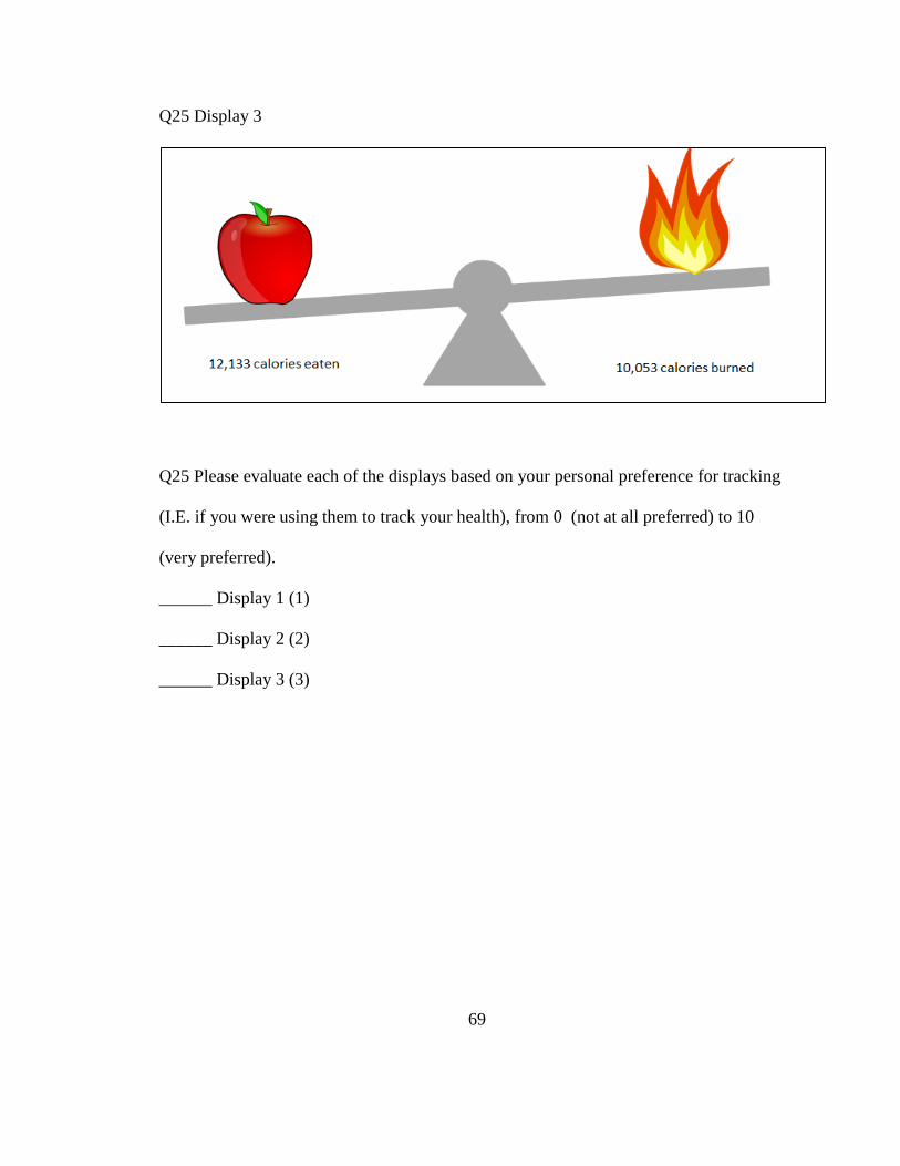
69
Q25 Display 3
Q25 Please evaluate each of the displays based on your personal preference for tracking
(I.E. if you were using them to track your health), from 0 (not at all preferred) to 10
(very preferred).
______ Display 1 (1)
______ Display 2 (2)
______ Display 3 (3)

70
Q26 Please review the graphics below.
Q26 Graphic 1
Q26 Graphic 2

71
Q26 How informative do you find each graphic, from 0 (not at all informative) to 10
(very informative)?
______ Graphic 1 (1)
______ Graphic 2 (2)
Q27 Which graphic do you prefer as a progress tracker?
Graphic 1 (1)
Graphic 2 (2)

72
Q28 Please review the graphics below.
Q28 Graphic 1
Q28 Graphic 2

73
Q28 If you were monitoring your progress via a desktop or laptop computer, which
graphic would you prefer?
Graphic 1 (1)
Graphic 2 (2)
Q29 If you were monitoring your progress via a mobile device (phones, tablets, etc.) with
a smaller screen, which graphic would you prefer?
Graphic 1 (1)
Graphic 2 (2)
Q30 If you were monitoring your progress via a wearable fitness tracker (Fitbit, Apple
Watch, etc) with a small screen which graphic would you prefer?
Graphic 1 (1)
Graphic 2 (2)

74
Q31 Imagine this table represents the amount of calories you ate vs the amount of
calories you burned in 1 week.
Q31 Based on the data in the table, to what extent do you feel motivated to eat healthier
or exercise more?
______ Drag the slider (1)
Q32 Please describe why you chose your particular rating.

75
Q33 Please review the graphics below.
Q33 Graphic 1
Q33 Graphic 2

76
Q33 How informative do you find each graphic, from 0 (not at all informative) to 10
(very informative)?
______ Graphic 1 (1)
______ Graphic 2 (2)
Q34 Which graphic do you prefer as a progress tracker?
Graphic 1 (1)
Graphic 2 (2)

77
Q35 Please review the graphics below.
Q35 Graphic 1
Q35 Graphic 2

78
Q35 If you were monitoring your progress via a desktop computer or laptop, which
graphic would you prefer?
Graphic 1 (1)
Graphic 2 (2)
Q36 If you were monitoring your progress via a mobile device (phones, tablets, etc.) with
a smaller screen, which graphic would you prefer?
Graphic 1 (1)
Graphic 2 (2)
Q37 If you were monitoring your progress via a wearable fitness tracker (Fitbit, Apple
Watch, etc) which graphic would you prefer?
Graphic 1 (1)
Graphic 2 (2)
Q38 Please rate how informative you find each data display to be, from 0 (not at all
informative) to 10 (very informative). Choose "Not Applicable" if you are unsure what
the data type looks like.
Q38 Drag the sliders
______ Bar chart (1)
______ Line graph (2)
______ Pie graph (3)
______ Table (4)
______ Visual display (5)

79
Q39 Which of the following data displays have you previously encountered outside of
this survey? Select all that apply.
Bar chart (1)
Line graph (2)
Pie graph (3)
Table (4)
Visual display (5)
Q40 Which data display type do you encounter the most often?
Bar chart (1)
Line graph (2)
Pie graph (3)
Table (4)
Visual display (5)
Other (please specify) (6) ____________________
Q41 Please rate how meaningful you find each data display type in terms of content and
layout from 0 (not at all meaningful) to 10 (very meaningful). Choose "Not Applicable"
if you are unsure what the data type looks like.
______ Bar chart (1)
______ Line graph (2)
______ Pie graph (3)
______ Table (4)
______ Visual display (5)

80
Q42 Please rate how important you find each characteristic in a data display from 0 (not
at all important) to 10 (very important).
Q42 Drag the sliders
______ Informative (1)
______ Aesthetically pleasing (2)
______ Clear and easy to understand (3)
______ Portable (able to display correctly on multiple devices) (4)
______ Colorful (5)
Q43 Based on your personal opinion, how many data sets do you believe were used to
make the graphs, tables, and other displays used in this survey?
1 (1)
2 (2)
3 (3)
4 (4)
5 (5)
More than 5 (6)
Q44 What device are you using to take this survey?
Desktop computer (1)
Laptop computer (2)
Mobile tablet (i.e. Apple iPad) (3)
Mobile phone (4)
Other (please specify) (5) ____________________

81
Q45 Which devices have you owned or used? Please select all that apply. (Note: testing a
device for a short period of time, such as in a retail store, does not count as "used").
Apple Watch (1)
FitBit (2)
Pedometer (3)
Other smartwatch (4)
Other physical activity tracker (please specify) (5) ____________________
Q46 Optional Please write any comments you have about the survey.

82
Appendix B: Survey Responses
Initial Report Last Modified: 02/15/2016
Filter By: Report Subgroup
1. Timing # Answer Average Value Standard Deviation
1 First Click 9.62 67.83
2 Last Click 10.82 68.17
3 #QuestionText,
TimingPageSubmit# 60.95 208.55
4 #QuestionText,
TimingClickCount# 0.39 1.04
2. Based on the data from the previous graph, which day of the
week was the amount of calories burned more than the amount
of calories eaten? # Answer
Response %
1 Monday
8 3%
2 Tuesday
7 2%
3 Wednesday
19 7%
4 Thursday
24 9%
5 Friday
157 56%
6 Saturday
61 22%
7 Sunday
5 2%
Total 281 100%
Statistic Value
Min Value 1
Max Value 7
Mean 4.84
Variance 1.30
Standard Deviation 1.14
Total Responses 281

83
3. Timing # Answer Average Value Standard Deviation
1 First Click 14.04 16.62
2 Last Click 15.30 17.44
3 #QuestionText,
TimingPageSubmit# 18.06 19.17
4 #QuestionText,
TimingClickCount# 1.30 1.27
4. On a scale of 0 (not at all consistent) to 10 (very consistent),
how consistent would you say this person is in balancing the
amount of calories they've eaten vs the amount of calories
they've burned?
# Answer Min Value Max Value Average
Value Standard Deviation
Responses
1 Drag the
slider 0.00 10.00 5.93 2.09 277
5. On a scale of 0 (not at all balanced) to 10 (very balanced) how
balanced do you consider the total calorie consumption vs
expenditure to be?
# Answer Min Value Max Value Average
Value Standard Deviation
Responses
1 Drag the
slider 0.00 9.50 5.17 2.11 269

84
6. On a scale of 0 (not at all consistent) to 10 (very consistent),
how consistent would you say this person is in balancing the
amount of calories they've eaten vs the amount of calories
they've burned?
# Answer Min Value Max Value Average
Value Standard Deviation
Responses
1 Drag the
slider 0.00 8.50 3.26 1.92 263
7.
# Answer Min Value Max Value Average
Value Standard Deviation
Responses
1 Reaction
to graph 1 0.20 9.30 4.29 2.02 261
8.
# Answer Min Value Max Value Average
Value Standard Deviation
Responses
1 Reaction
to graph 2 0.00 10.00 5.30 2.21 271
9.
# Answer Min Value Max Value Average
Value Standard Deviation
Responses
1 Reaction
to graph 3 0.00 9.30 3.85 1.90 276
10.
# Answer Min Value Max Value Average
Value Standard Deviation
Responses
1 Reaction
to graph 1 0.00 10.00 5.42 2.20 269

85
11.
# Answer Min Value Max Value Average
Value Standard Deviation
Responses
1 Reaction
to graph 2 0.00 10.00 6.11 2.15 273
12.
# Answer Min Value Max Value Average
Value Standard Deviation
Responses
1 Reaction
to graph 3 0.00 10.00 4.87 2.41 269
13. If you were attempting to balance the amount of calories
eaten vs the amount of calories burned, on a scale of 0 (not at all
successful) to 10 (very successful) how successful would you say
you have been?
# Answer Min Value Max Value Average
Value Standard Deviation
Responses
1 Drag the
slider 0.00 10.00 6.21 2.13 277
14.
# Answer Min Value Max Value Average
Value Standard Deviation
Responses
1 Drag the
slider 0.00 10.00 4.78 1.90 273

86
15. Timing # Answer Average Value Standard Deviation
1 First Click 2.25 12.08
2 Last Click 3.12 13.52
3 #QuestionText,
TimingPageSubmit# 34.27 84.25
4 #QuestionText,
TimingClickCount# 0.29 0.69
16. Based on the data from the previous table, which day of the
week was the amount of calories burned more than the amount
of calories eaten? # Answer
Response %
1 Monday
4 1%
2 Tuesday
4 1%
3 Wednesday
13 5%
4 Thursday
21 7%
5 Friday
223 79%
6 Saturday
13 5%
7 Sunday
3 1%
Total 281 100%
Statistic Value
Min Value 1
Max Value 7
Mean 4.80
Variance 0.67
Standard Deviation 0.82
Total Responses 281

87
17. Timing # Answer Average Value Standard Deviation
1 First Click 9.30 15.81
2 Last Click 9.95 16.36
3 #QuestionText,
TimingPageSubmit# 12.33 22.58
4 #QuestionText,
TimingClickCount# 1.15 0.50
18. Please rate the 3 displays based on clarity and ease of
understanding, from 0 (not at all easy to understand) to 10 (very
easy to understand).
# Answer Min Value Max Value Average
Value Standard Deviation
Responses
1 Display 1 0.00 10.00 7.22 2.21 281
2 Display 2 0.00 10.00 7.82 2.09 279
3 Display 3 0.00 10.00 7.19 2.12 277
19. Please rate the 3 displays based on their ability to motivate
you to eat healthier or exercise more, from 0 (not at all
motivating) to 10 (very motivating).
# Answer Min Value Max Value Average
Value Standard Deviation
Responses
1 Display 1 0.00 10.00 7.02 2.40 276
2 Display 2 0.00 10.00 6.73 2.39 273
3 Display 3 0.00 10.00 6.72 2.21 275

88
20. Please evaluate each of the displays based on your personal
preference for tracking (I.E. if you were using them to track your
health), from 0 (not at all preferred) to 10 (very preferred).
# Answer Min Value Max Value Average
Value Standard Deviation
Responses
1 Display 1 0.00 10.00 6.76 2.76 268
2 Display 2 0.00 10.00 7.01 2.58 272
3 Display 3 0.00 10.00 5.86 2.61 265
21. How informative do you find each graphic, from 0 (not at all
informative) to 10 (very informative)?
# Answer Min Value Max Value Average
Value Standard Deviation
Responses
1 Graphic 1 2.30 10.00 8.71 1.72 272
2 Graphic 2 1.40 10.00 7.10 2.05 262
22. Which graphic do you prefer as a progress tracker? # Answer
Response %
1 Graphic 1
192 71%
2 Graphic 2
80 29%
Total 272 100%
Statistic Value
Min Value 1
Max Value 2
Mean 1.29
Variance 0.21
Standard Deviation 0.46
Total Responses 272

89
23. If you were monitoring your progress via a desktop or laptop
computer, which graphic would you prefer? # Answer
Response % 1 Graphic 1
218 80%
2 Graphic 2
55 20%
Total 273 100%
Statistic Value
Min Value 1
Max Value 2
Mean 1.20
Variance 0.16
Standard Deviation 0.40
Total Responses 273
24. If you were monitoring your progress via a mobile device
(phones, tablets, etc.) with a smaller screen, which graphic
would you prefer? # Answer
Response % 1 Graphic 1
79 29%
2 Graphic 2
194 71%
Total 273 100%
Statistic Value
Min Value 1
Max Value 2
Mean 1.71
Variance 0.21
Standard Deviation 0.45
Total Responses 273

90
25. If you were monitoring your progress via a wearable fitness
tracker (Fitbit, Apple Watch, etc) with a small screen which
graphic would you prefer? # Answer
Response %
1 Graphic 1
46 17%
2 Graphic 2
226 83%
Total 272 100%
Statistic Value
Min Value 1
Max Value 2
Mean 1.83
Variance 0.14
Standard Deviation 0.38
Total Responses 272
26. Based on the data in the table, to what extent do you feel
motivated to eat healthier or exercise more?
# Answer Min Value Max Value Average
Value Standard Deviation
Responses
1 Drag the
slider 0.00 10.00 6.65 2.13 273

91
27. Please describe why you chose your particular rating. Text Response
I like the amount of detail that can be gained from this graphic but a more visual
representation of calories in and out might be more motivating.
Information is specfic and clear, but there's too much information and makes people dont
want to look at it.
This graph shows exact numbers, so you can actually track your progress using sufficient
data.
I like how the table has the columns that show the individual numbers of calories
consumed and calories burned then the actual difference between the two so one can see
right away the amount
Seeing the positive and negative numbers on the far right help me to understand if I've
exceeded my goal or come in under. I find the exact numbers very motivating, as I try to
lower it every day.
I felt that looking at this chart made me more motivated because it is breaking down how
many calories you have eaten and burned per day and also showing the difference. I think
that this graphic is the easiest to read and understand which also makes it easy to feel
more motivated because seeing a negative sign means you burned more calories than you
ate which is a sign of weight lose eventually!
This graph does a great job of breaking it down to specific day, which would help greatly
in realizing when your diet is successful versus when it is not
I can see how I'm doing everyday and compare the days
It's comprehensive
I see that the differences are a majority positive, showing that I have been eating more
than I have been burning, so I am motivated to exercise more and make it so all of the
differences are negative and I am eating less than I am burning. One way to motivate me
more would be to have the positive number differences be in red, which is bad and not
the goal of weight loss or healthy eating, and make a zero and negative number difference
green, because this is the healthy zone.
I am someone who focuses on what I eat a lot so seeing exactly how many calories I am
away from even is very helpful and helps me feel motivated knowing how close I am.
I would be more motivated if I knew the average percentage that we're expected to burn
off to be more healthy
I like being able to analyze exact numbers and calculate what I need to do to eat better
and assess meal plans per day. What did I eat Friday? What excercising is the most
effective for calorie burning? Etc.
It can track daily calories eaten and burned, so I can compare in daily basis. Calorie
actually depends on how much activity I do and how much foods I ate and it changes in
daily. So, I can track where the high calorie comes from and why I cannot lose weights
by looking back what I did and what I ate on each day.
The data displayed in the chart is somewhat hard to understand. I have to browse through
numerous set of data to track how well i am doing, and the data does not seems to make
sense.
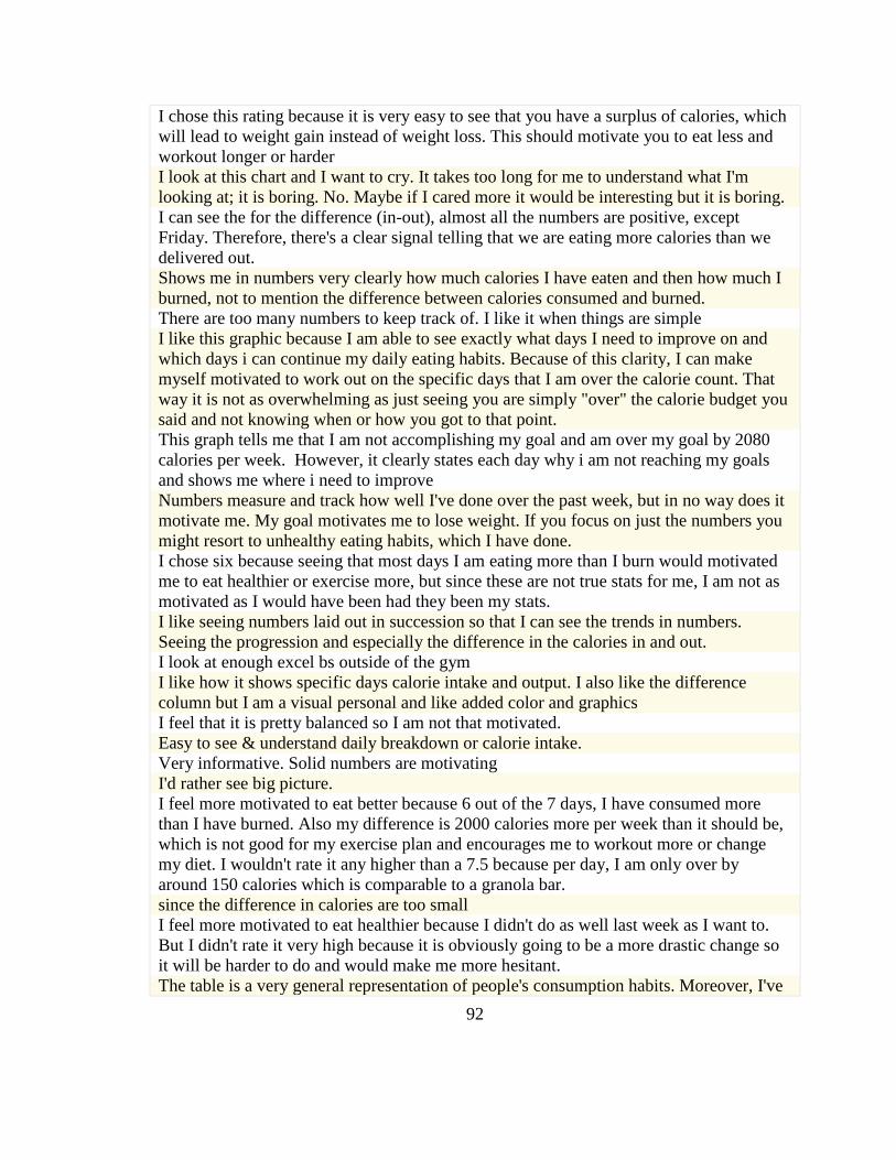
92
I chose this rating because it is very easy to see that you have a surplus of calories, which
will lead to weight gain instead of weight loss. This should motivate you to eat less and
workout longer or harder
I look at this chart and I want to cry. It takes too long for me to understand what I'm
looking at; it is boring. No. Maybe if I cared more it would be interesting but it is boring.
I can see the for the difference (in-out), almost all the numbers are positive, except
Friday. Therefore, there's a clear signal telling that we are eating more calories than we
delivered out.
Shows me in numbers very clearly how much calories I have eaten and then how much I
burned, not to mention the difference between calories consumed and burned.
There are too many numbers to keep track of. I like it when things are simple
I like this graphic because I am able to see exactly what days I need to improve on and
which days i can continue my daily eating habits. Because of this clarity, I can make
myself motivated to work out on the specific days that I am over the calorie count. That
way it is not as overwhelming as just seeing you are simply "over" the calorie budget you
said and not knowing when or how you got to that point.
This graph tells me that I am not accomplishing my goal and am over my goal by 2080
calories per week. However, it clearly states each day why i am not reaching my goals
and shows me where i need to improve
Numbers measure and track how well I've done over the past week, but in no way does it
motivate me. My goal motivates me to lose weight. If you focus on just the numbers you
might resort to unhealthy eating habits, which I have done.
I chose six because seeing that most days I am eating more than I burn would motivated
me to eat healthier or exercise more, but since these are not true stats for me, I am not as
motivated as I would have been had they been my stats.
I like seeing numbers laid out in succession so that I can see the trends in numbers.
Seeing the progression and especially the difference in the calories in and out.
I look at enough excel bs outside of the gym
I like how it shows specific days calorie intake and output. I also like the difference
column but I am a visual personal and like added color and graphics
I feel that it is pretty balanced so I am not that motivated.
Easy to see & understand daily breakdown or calorie intake.
Very informative. Solid numbers are motivating
I'd rather see big picture.
I feel more motivated to eat better because 6 out of the 7 days, I have consumed more
than I have burned. Also my difference is 2000 calories more per week than it should be,
which is not good for my exercise plan and encourages me to workout more or change
my diet. I wouldn't rate it any higher than a 7.5 because per day, I am only over by
around 150 calories which is comparable to a granola bar.
since the difference in calories are too small
I feel more motivated to eat healthier because I didn't do as well last week as I want to.
But I didn't rate it very high because it is obviously going to be a more drastic change so
it will be harder to do and would make me more hesitant.
The table is a very general representation of people's consumption habits. Moreover, I've

93
been looking at it in the context of a survey "simulation", and so have not been personally
applying it to my life at all. Thus I am not greatly motivated by it.
I like that this chart shows you your different calories in a clear, linear way, and the days
of the week are very comparable. Since its easy to compare, it makes me want to feel
proud of myself each day of the week. However, since it is a little boring to look at it, its
not quite as motivating as it could be.
Not very motivated because the table is just a wall of numbers and kind of intimidating,
despite how informative it is.
This graph really shows that I eat a lot more calories on the weekends, which is to be
expected. In order to lose weight, you need a calorie deficit so I would be motivated to
work out harder and eat better because according to the data, you won't be losing much
weight, if any at all and you might even be gaining weight.
Just knowing calorie intake is not a motivating factor for me
Gives a detailed breakdown. More details means I can make a better decision.
It's really informative and detailed, but it takes some thought to comprehend. It also
doesn't give any goals or anything. I think if it displayed having a goal of zero or lower
and then how far off you were from that goal then it would be more motivating. Also, it's
very dull.
Although this is the most informational of the options so far it doesn't necessarily
motivate me to work out
The graphic just does not appeal to me or light any sort of motivation in me to do better.
With so much information available its overwhelming.
It is a lot of numbers to try to comprehend so I don't feel as motivated.
The amount of data is a bit overwhelming and makes it seem like it will be difficult to eat
healthier and exercise more.
Only one day is in a deficit
Poor visual. Not motivating
It is just data. There really isn't anything that would motivate me.
You are given the difference in calories, this causes me to think, "Oh, another hour or so
of cardio would have given me a deficit for the day."
Because out of all the graphs, it is the most informative. It gives the amount of extra
calories I'm taking in versus burning. In essence, I have precise numbers so I know which
days I need to work on more in order to see results in weight loss.
Informational
because the calories gained clearly outweigh the calories burned
I would be more motivated to eat healthier because I can see that every day except Friday
I go over on calories eaten vs. burned. Doing this every week, would make me gain
weight. These numbers open my eyes to each day, and make me think why Friday is so
low compared to others.
I am slightly motivated to exercise more. It is easier to identify the days in which calories
eaten are far greater than the calories burned. It is easier to track, but the visually
appealing graphics also contribute to motivation.
I chose an 8 because I like seeing the details of my goals and then I find it easier to
understand where I am going wrong. Also it motivates me more to do better the next

94
week if I have a concrete number each day to compare my current progress.
I would be able to see that I am taking in more calories than I am burning 6/7 days per
week
Knowing exactly what I'm doing every day would motivate me more.
It gives information on a day to day basis and is more descriptive in that way. It is
missing if each daily nutritional requirements were met though as eating healthier
involves more than just calories. You can be unhealthy and eat unhealthy even when
eating less calories. Overall, though the graph shows that there is not a calorie deficit,
which would be motivating and also motivating to help be more conscious of eating
habits.
because the such high calorie intakes makes me want to lose weight
The calorie difference is not huge so I would not feel the need to exercise.
Seeing the exact numbers would motivate me to get my diet in balance.
It's very informative and I am able to see my caloric intake, but I have to work harder to
figure out how to improve.
When you see the specifics you know the details to keep you motivated
I can see specifically how each day is affecting my overall calorie intake and workout
schedule
The graph overall indicates the calories burned are not greater than calories consumed. If
I was trying to lose weight to be healthier this is pretty informative. However, it is
missing nutritional information and if those requirements were met or not. Eating healthy
means more than just calories consumed, but if proper nutrients are taken in. You can still
lose weight and consume less calories than burned and still be unhealthy. Overall, for
weight loss it is pretty motivating.
this table is too limited. when manipulating weight it is very important to not only look at
calorie consumption but also where those calories are coming from. protein calories take
a very different role than the calories you get from MC Donalds fries. In my own
experience i find it much more useful to watch things like proteins fats and carbs as
opposed to just looking at calories because that tends to work better when on a cut.
I think this table is really good for gathering information and tracking how you're doing
but it's layout doesn't necessarily motivate me to want to do more than I'm already doing.
I would want at least 2-3 more days to be a negative difference.
This chart appears too bland, and nothing really jumps out at me.
I feel like it allows for a more daily goal.
Based on the data, I feel quite motivated to eat healthier and exercise; something I have
been planning to do for a while. However, although there is data and graphs, I still have
some lazy reservations about it; hence my rating of 7.8
At first glance it's just a bunch of numbers in a table. In a way, it's hard to be motivated
enough to even look through all the numbers and analyze what they all mean, let alone be
motivated to get healthy. I would prefer something quick-hitting and in my face.
Seeing the amount of calories I am eating makes me want to monitor it more
Too much information.
I feel like this is a good ratio of intake to calories burned
I chose the rating because it provides a lot of information, but also overwhelms me. If i

95
was to use that table, I may lose sense of what I'm looking for.
The calorie difference per day is not very large. So I feel I don't need to do much more
Just numbers. Not too exciting, not motivating
I'm in the middle. You are not eating that many calories during the week and your body
needs calories so this would not motivate me too much
There is no target for where I should be but I do see that I am over eating so I need to
control that.
I should essentially burn all or more calories than I ate in order to lose weight, but only
holding on to about 2000 of my week's calorie count doesn't seem too bad. I chose a 7
because I should burn more, but I'm also proud of my progress.
the image is just numbers, very boring, not exciting, its informative but not motivating
I feel more motivated because I am able to see where I am during the week and what days
I need to focus on my calorie intake and exercise regimen more.
I think this table is motivating because you can tell that the goal is not unattainable. You
are within reach and that would make me want to work harder because as a former athlete
and competitor you don't stop until you "win"
I think by seeing the individual days it helps you pen point what days you want to work
harder on burning calories.
I would be motivated to see a lower number for my differential. I, personally, think I
would like being able to see the numbers and see how many calories I'm consuming in
comparison to how many I am burning. I chose a very high rating in accordance.
I can keep track of my calorie intake and expenditure day by day, which encourage me to
live healthy everyday
I see that I was able to have negative calories one day and that motivates me to try and do
the same thing more often. Also, I see how I have to opportunity to make my calorie
difference more consistent and reduce weekend binge eating.
I think it is helpful to see how much you consume v. eat but is too much to look at
I like lots of data to help me in determining my stance. This table lays out each day's
calorie intake and amount burned. It allows me to see what days need to be worked on
and which days I can keep the status quo.
It motivates me by showing me how my intake and output varies, so it motivates me to
exercise more on certain days.
i feel more motivated by seeing the numbers
Its hard to read
i can see that one day was very good for me and try to make more good days like that one
next week
Having numbers for the whole week lets me see how I have been doing and motivates me
to make changes to improve these results.
Seeing the actual numbers and my progress would motivate me a little but I think I would
still want more information or at least the ability to input more.
2000 calories over is almost a pound...and if I were trying to lose weight, that's not good.
This graph makes it very easy to see my progress and work that I am doing. It is
motivational when I see I am having good results
I just don't know if the bare bone facts would be enough to motivate me.

96
The data table does not motivate me to be healthier because it is very bland to look at,
and a little hard to understand what the numbers mean.
I chose this rating because this graph shows me the days where I didn't do as well and I
can see where I can improve.
Statistic Value
Total Responses 258
28. How informative do you find each graphic, from 0 (not at all
informative) to 10 (very informative)?
# Answer Min Value Max Value Average
Value Standard Deviation
Responses
1 Graphic 1 0.00 10.00 6.62 2.31 265
2 Graphic 2 1.30 10.00 7.28 1.77 267
29. Which graphic do you prefer as a progress tracker? # Answer
Response %
1 Graphic 1
129 48%
2 Graphic 2
141 52%
Total 270 100%
Statistic Value
Min Value 1
Max Value 2
Mean 1.52
Variance 0.25
Standard Deviation 0.50
Total Responses 270

97
30. If you were monitoring your progress via a desktop
computer or laptop, which graphic would you prefer? # Answer
Response % 1 Graphic 1
132 49%
2 Graphic 2
139 51%
Total 271 100%
Statistic Value
Min Value 1
Max Value 2
Mean 1.51
Variance 0.25
Standard Deviation 0.50
Total Responses 271
31. If you were monitoring your progress via a mobile device
(phones, tablets, etc.) with a smaller screen, which graphic
would you prefer? # Answer
Response % 1 Graphic 1
119 44%
2 Graphic 2
153 56%
Total 272 100%
Statistic Value
Min Value 1
Max Value 2
Mean 1.56
Variance 0.25
Standard Deviation 0.50
Total Responses 272

98
32. If you were monitoring your progress via a wearable fitness
tracker (Fitbit, Apple Watch, etc) which graphic would you
prefer? # Answer
Response %
1 Graphic 1
121 44%
2 Graphic 2
151 56%
Total 272 100%
Statistic Value
Min Value 1
Max Value 2
Mean 1.56
Variance 0.25
Standard Deviation 0.50
Total Responses 272
33. Drag the sliders
# Answer Min Value Max Value Average
Value Standard Deviation
Responses
1 Bar chart 1.70 10.00 7.05 1.61 262
2 Line graph 0.00 10.00 6.19 2.10 268
3 Pie graph 0.00 10.00 6.61 2.34 263
4 Table 0.00 10.00 8.08 1.98 266
5 Visual
display 0.00 10.00 7.28 1.89 260
34. Which of the following data displays have you previously
encountered outside of this survey? Select all that apply. # Answer
Response %
1 Bar chart
211 79%
2 Line graph
206 77%
3 Pie graph
224 84%
4 Table
219 82%
5 Visual
display
192 72%

99
Statistic Value
Min Value 1
Max Value 5
Total Responses 267
35. Which data display type do you encounter the most often? # Answer
Response % 1 Bar chart
69 26%
2 Line graph
51 19%
3 Pie graph
47 18%
4 Table
56 21%
5 Visual
display
42 16%
6
Other
(please
specify)
3 1%
Total 268 100%
Other (please specify)
scatter plot
idk
unsure
Statistic Value
Min Value 1
Max Value 6
Mean 2.85
Variance 2.14
Standard Deviation 1.46
Total Responses 268

100
36. Please rate how meaningful you find each data display type
in terms of content and layout from 0 (not at all meaningful) to
10 (very meaningful). Choose "Not Applicable" if you are unsure
what the data type looks like.
# Answer Min Value Max Value Average
Value Standard Deviation
Responses
1 Bar chart 1.20 10.00 7.00 1.60 264
2 Line graph 0.00 10.00 6.47 2.09 267
3 Pie graph 0.00 10.00 6.69 2.20 264
4 Table 0.00 10.00 7.96 1.92 265
5 Visual
display 0.00 10.00 7.10 1.90 259
37. Drag the sliders
# Answer Min Value Max Value Average
Value Standard Deviation
Responses
1 Informative 5.10 10.00 8.80 1.27 266
2 Aesthetically
pleasing 0.00 10.00 6.80 2.36 265
3
Clear and
easy to
understand
3.80 10.00 8.88 1.33 266
4
Portable
(able to
display
correctly on
multiple
devices)
0.00 10.00 6.84 2.30 262
5 Colorful 0.00 10.00 5.63 2.82 262

101
38. Based on your personal opinion, how many data sets do you
believe were used to make the graphs, tables, and other displays
used in this survey? # Answer
Response %
1 1
127 47%
2 2
28 10%
3 3
24 9%
4 4
23 9%
5 5
20 7%
6 More than
5
48 18%
Total 270 100%
Statistic Value
Min Value 1
Max Value 6
Mean 2.72
Variance 3.90
Standard Deviation 1.98
Total Responses 270

102
39.
# Answer Min Value Max Value Average
Value Standard Deviation
Responses
1
I consider
how things
might be in
the future,
and try to
influence
those
things with
my day to
day
behavior
1.00 7.00 5.39 1.17 268
2
Often I
engage in a
particular
behavior in
order to
achieve
outcomes
that may
not result
for many
years
1.00 7.00 4.94 1.35 268
3
I only act
to satisfy
immediate
concerns,
figuring
the future
will take
care of
itself
1.00 7.00 3.27 1.63 262
4
My
behavior is
only
influenced
by the
immediate
(i.e. a
matter of
days or
1.00 7.00 3.12 1.48 264
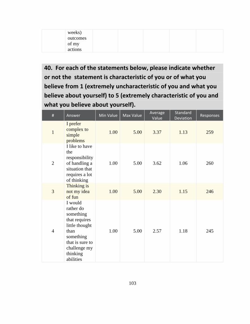
103
weeks)
outcomes
of my
actions
40. For each of the statements below, please indicate whether
or not the statement is characteristic of you or of what you
believe from 1 (extremely uncharacteristic of you and what you
believe about yourself) to 5 (extremely characteristic of you and
what you believe about yourself).
# Answer Min Value Max Value Average
Value Standard Deviation
Responses
1
I prefer
complex to
simple
problems
1.00 5.00 3.37 1.13 259
2
I like to have
the
responsibility
of handling a
situation that
requires a lot
of thinking
1.00 5.00 3.62 1.06 260
3
Thinking is
not my idea
of fun
1.00 5.00 2.30 1.15 246
4
I would
rather do
something
that requires
little thought
than
something
that is sure to
challenge my
thinking
abilities
1.00 5.00 2.57 1.18 245

104
41. What device are you using to take this survey? # Answer
Response %
1 Desktop
computer
105 40%
2 Laptop
computer
135 51%
3
Mobile
tablet (i.e.
Apple iPad)
5 2%
4 Mobile
phone
18 7%
5
Other
(please
specify)
1 0%
Total 264 100%
Other (please specify)
Statistic Value
Min Value 1
Max Value 5
Mean 1.77
Variance 0.67
Standard Deviation 0.82
Total Responses 264

105
42. Which devices have you owned or used? Please select all
that apply. (Note: testing a device for a short period of time,
such as in a retail store, does not count as "used"). # Answer
Response %
1 Apple Watch
19 12%
2 FitBit
42 27%
3 Pedometer
77 49%
4 Other
smartwatch
18 12%
5
Other
physical
activity
tracker
(please
specify)
26 17%

106
Other physical activity tracker (please specify)
none
App on my phone
Garmin GPS Running Watch
MyFitnessPal App and iphone motion sensor pedometer
My Fitness Pal
none
iPhone health app
Fitness app
none
Health App on Iphone
fitness app on cell
Mobile Application
none
none
Jawbone UP24, UP2, and UP3
na
Apple Apps (ie - Nike Running App)
step calculator
N/A
Garmin GPS Watch
body bug
none
Weight machine
heart rate monitor
smartphone app (Samsung S-Health)
Statistic Value
Min Value 1
Max Value 5
Total Responses 156
43. Please identify your gender. # Answer
Response %
1 Male
139 53%
2 Female
124 47%
Total 263 100%

107
Statistic Value
Min Value 1
Max Value 2
Mean 1.47
Variance 0.25
Standard Deviation 0.50
Total Responses 263

108
44. Please enter your age. Text Response
21
21
23
21
22
21
21
21
22
23
21
21
22
22
22
21
21
21
21
21
26
22
22
21
20
22
21
22
21
22
22
22
21
21
24
21
20
22
21
22
20

109
21
21
21
21
22
22
21
22
21
26
22
21
21
22
22
22
23
24
23
22
21
21
20
20
24
21
21
20
21
20
20
21
20
21
22
20
19
21
21
21
22
23
20
19

110
21
22
22
21
21
22
22
31
26
30
55
25
25
33
27
62
Statistic Value
Total Responses 263

111
45. Optional Please enter your height in feet and inches (I.E.: 5 ft 2 in)
Please enter your weight in pounds (I.E.: 120)
5 ft 3 in 135
5 ft 12 in 128
5ft 1 in 110
5 ft 7 in 130
5 ft 5 in 120
5 ft 3 in 120
6 ft 165
5ft 3in 140
6ft 173
5'9 185
5ft 10 in 150
6 ft 1 in 175
5 ft 4 in 165
5ft 3 in 101
5ft 8in 165
6ft 0 in 185
5ft 8.5in 155
5 ft 5 in 140
5ft 6 in 140
5 ft 6 in 183
5 10 190
5 ft 11in 159
5 ft 11 in 155
5'9 159
5 ft 9 in 155
5 ft 6.5 in 121
5 ft 2 in 125
6'2" 185
5 ft 6 in 145
5 ft 3 in 108
5 ft 5 in 125
5 ft 1 in 100
5 ft 7 in 140
5 ft 7 128
5 ft 10 in 167
6ft 240
5ft 4in 130
5 ft 3 in 118
5 ft in 155
5 ft 6 in 115

112
6 ft 0 in 215
5 ft 8 in
5 ft 8 in 140
5ft 11 in
5 ft 7in 225
5 ft 6 in 180
5ft 11in 149
5ft 2in 152
5 ft 8 in 150
5 ft 6 in 123
6 ft 2 in 170
5 ft 2 in 103
5 ft 10 in 220
6 ft 3 in 165
5 ft 7 in 120
5 ft 10 in 146
5 ft 9 in 170
5 ft 2 103
5ft 7in 145
5 ft 3 in 105
5 ft 7 in 140
5 ft 4 in 150
6 ft 6 in 180
5 ft 10 in 160
5ft 6in 135
5 ft 4 in 128
5'10" 170
5 ft 10 in 150
5ft 11in 160
5 ft 6 in 170
6 ft 6 in 185
5 ft 7 in 140
5'9 180
5 ft 6 in 125 lbs
5 ft 4 in 145
5'5 145
5 ft 1 in 120
5 ft 10 150
5 ft 5 in 150
5ft 2in 112
5 ft 8 in 135
5 ft 4 in 115
5ft 10in 254
5 9 190

113
6 ft 0 in 175
5 ft 3in 140
5 4
5 ft 9 in 190
5 ft 8 in 138
5 ft 10 in 185
5ft 4in 122
5ft 7in 168
5 ft 5 in 140
6 ft 0 260
5 ft 5 in 175
5 ft 4 in 128
5 FT 4 INCHES 135
6
5 ft 8 in 130
5 ft 11 in 158
5 ft 9 in 148
Statistic Value
Total Responses 222
46.
# Answer Min Value Max Value Average
Value Standard Deviation
Responses
1 Reaction
to graph 1 0.00 10.00 6.80 2.42 272
47.
# Answer Min Value Max Value Average
Value Standard Deviation
Responses
1 Reaction
to graph 2 0.00 10.00 8.17 2.27 275

114
48.
# Answer Min Value Max Value Average
Value Standard Deviation
Responses
1 Reaction
to graph 3 0.00 10.00 4.83 2.75 270
49.
# Answer Min Value Max Value Average
Value Standard Deviation
Responses
1 Reaction
to graph 1 1.50 10.00 7.36 1.94 270
50.
# Answer Min Value Max Value Average
Value Standard Deviation
Responses
1 Reaction
to graph 2 0.00 10.00 6.45 2.71 273
51.
# Answer Min Value Max Value Average
Value Standard Deviation
Responses
1 Reaction
to graph 3 0.00 10.00 5.60 2.36 272
52.
# Answer Min Value Max Value Average
Value Standard Deviation
Responses
1 Reaction
to graph 1 0.00 10.00 6.76 2.65 272

115
53.
# Answer Min Value Max Value Average
Value Standard Deviation
Responses
1 Reaction
to graph 2 0.00 10.00 6.49 2.79 272
54.
# Answer Min Value Max Value Average
Value Standard Deviation
Responses
1 Reaction
to graph 3 0.00 10.00 4.37 2.78 269

116
55.
# Answer Min Value Max Value Average
Value Standard Deviation
Responses
5
My
convenience
is a big factor
in the
decisions I
make or the
actions I take
1.00 7.00 4.56 1.53 265
6
I am willing
to sacrifice
my
immediate
happiness or
well-being in
order to
achieve
future
outcomes
1.00 7.00 5.11 1.34 265
7
I think it is
important to
take
warnings
about
negative
outcomes
seriously
even if the
negative
outcome will
not occur for
many years
1.00 7.00 5.38 1.32 265
8
I think it is
more
important to
perform a
behavior
with
important
distant
consequences
than a
1.00 7.00 4.78 1.35 263

117
behavior
with less
important
immediate
consequences

118
56.
# Answer Min Value Max Value Average
Value Standard Deviation
Responses
9
I generally
ignore
warnings
about
possible
future
problems
because I
think the
problems
will be
resolved
before they
reach crisis
level
1.00 7.00 2.90 1.55 250
10
I think that
sacrificing
now is
usually
unnecessary
since future
outcomes
can be dealt
with at a
later time
1.00 7.00 2.91 1.52 258
11
I only act to
satisfy
immediate
concerns,
figuring
that I will
take care of
future
problems
that may
occur at a
later date
1.00 7.00 2.96 1.54 256
12
Since my
day to day
work has
1.00 7.00 3.72 1.55 260

119
specific
outcomes,
it is more
important
to me than
behavior
that has
distant
outcomes
57.
# Answer Min Value Max Value Average
Value Standard Deviation
Responses
13
When I make
a decision, I
think about
how it might
affect me in
the future
1.00 7.00 5.60 1.17 265
14
My behavior
is generally
influenced by
future
consequences
1.00 7.00 5.24 1.20 265

120
58.
# Answer Min Value Max Value Average
Value Standard Deviation
Responses
5
I try to
anticipate
and avoid
situations
where there
is a likely
chance I
will have to
think in
depth about
something
1.00 5.00 2.37 1.15 244
6
I find
satisfaction
in
deliberating
hard and
for long
hours
1.00 5.00 3.35 1.14 253
7
I only think
as hard as I
have to
1.00 5.00 2.55 1.19 251
8
I prefer to
think about
small daily
projects to
long term
ones
1.00 5.00 2.83 1.09 254

121
59.
# Answer Min Value Max Value Average
Value Standard Deviation
Responses
9
I like tasks
that
require
little
thought
once I’ve
learned
them
1.00 5.00 2.92 1.20 249
10
The idea
of relying
on thought
to make
my way to
the top
appeals to
me
1.00 5.00 3.68 1.05 258
11
I really
enjoy a
task that
involves
coming up
with new
solutions
to
problems
1.00 5.00 3.74 1.03 258
12
Learning
new ways
to think
doesn’t
excite me
very much
1.00 5.00 2.17 1.14 241
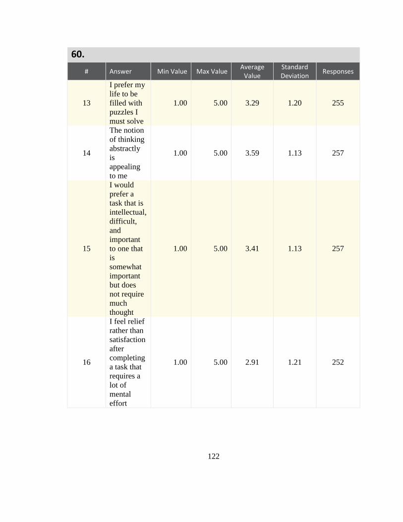
122
60.
# Answer Min Value Max Value Average
Value Standard Deviation
Responses
13
I prefer my
life to be
filled with
puzzles I
must solve
1.00 5.00 3.29 1.20 255
14
The notion
of thinking
abstractly
is
appealing
to me
1.00 5.00 3.59 1.13 257
15
I would
prefer a
task that is
intellectual,
difficult,
and
important
to one that
is
somewhat
important
but does
not require
much
thought
1.00 5.00 3.41 1.13 257
16
I feel relief
rather than
satisfaction
after
completing
a task that
requires a
lot of
mental
effort
1.00 5.00 2.91 1.21 252

123
61.
# Answer Min Value Max Value Average
Value Standard Deviation
Responses
17
It’s enough
for me that
something
gets the job
done; I
don’t care
how or why
it works
1.00 5.00 2.39 1.16 248
18
I usually
end up
deliberating
about
issues even
when they
do not
affect me
personally
1.00 5.00 3.40 1.15 257

124
62. Optional Please write any comments you have about the
survey. Text Response Some of the questions in the end about thinking about future consequences or whether i
like thinking abstractly etc, depended on the situation/how long i had been working on
said problem/solution and was at the point i just wanted to find any solution to the
problem
Sabatalo.2 Survey was very long, I started to lose my attention span around 2/3 of the
way through which I feel could be detrimental to your results if enough people feel the
same way.
This survey is interesting but feel somewhat too long.
Hope this helps!
Good survey. Qualtrics is p cool. Good luck analyzing data. Are you using SPSS? Good
luck.
very long
This survey was too long- trim the fat (ha ha see that pun?) but seriously some of those
questions did not seem necessary
Aughenbaugh.1 = dot number
Interesting survey. I believe you are trying to figure out the best way to present tracked
fitness data to help better motivate people to exercise.
I did not like having to answer the same question just worded differently three times.
none
so repetitive it hurtsssssss
none
just a couple things, as a college student, unless this is your target audience, there will be
a bias. also this is not a simple random sample so there is going to be selection bias there
as well. convenience sampling never gives the whole picture, and is often inaccurate. the
other thing is that calories in vs out is a naive picture, its very important where the
calories come from, and as an avid weightlifter, and someone who use to wrestle, calories
are a very naive way to track weight loss/gain progress. its very important to track
proteins, carbs, fats, ect....
Way to long
I like that it make me think. It was ironic especially since the end of the survey asked me
about thinking. I would be interested in knowing what you are using this data for.
Thought the line graph labeling could have been better worded!
Very long and in depth. Perhaps a warning at the beginning would be helpful for time-
constrained people
none
none
N/A
Thanks!
This survey is WAY UNDERPAID! Shame on you!!!!!!!!!!!!!!!!!!!!!!!!!
Everything was very straightforward. I liked seeing the different methods of displaying

125
this kind of information. My worker ID is A22KRF782ELLB0 if it's needed.
none
It was an interesting survey.
It was actually very interesting
Took too much time to complete.
It was way, way too long for the compensation. Not fair at all.
Its really a nice and unique survey about data displays. Thank you.
None
none
enjoyed survey was engaging/interesting and informative thank you for opportunity to
participate
its long
nice study
nothing
no comments, thank you
I Love Your Survey. Thank You.
No issues or confusion. Thanks.
none
Thanks!
I hope some incorrect answers on some of the questions does not disqualify me. I think
on the first question, i may have stated the incorrect day. I did answer the questions
honestly and did not rush. I thought the survey was very interesting! Interesting ways to
display the same info. Thank you. Bill
Thank you!
none
Interesting.
none
thanks
none
thanks
none
Colorful and interesting survey. Thanks. All the best.
It was ayt
Interesting survey
best survey
n/a
good Charts for health
Thank you
None
Interesting survey. I like it.
interesting charts
The lively graphics really brought the survey to life.
Good one little long but informative
All the displays were pretty bad and the the methods were questionable. What you should

126
have done is randomly assign a particular display and asked people to make decisions
based on the information provided, not simply ask which they thought seemed clear.
None, but thanks for asking.
The survey is interesting...Thank you
I have not used any fitness tracking devices.
I thought a page or two to complete the survey but it comes page after page.. anyways I
decided to take it and I completed it I am satisfied
Please apply a generous bonus to my payment. Today is my 37th birthday. Thank you.
none
I enjoyed participating.
no
Asking questions about graphs without showing me the graph on the same page results in
my guessing. I think that's probably counter to what you're working towards. Also,
thanks for the work.
Thank you for the opportunity to assist you.
its very nice job
good survey
Statistic Value
Total Responses 75