textually analysing music magazines
TRANSCRIPT

TEXTUALLY ANALYSING MUSIC MAGAZINES
HARRY JONES

INTRODUCTION
The genre of music in which I have chosen to analyse is ‘pop’. This is so that I have a wide range of material within this genre to work from. For this genre of music I am looking for certain aspects of the magazine, which will show the audience that the subject of the magazine is pop. These characteristics include; bright colours, informal typography (e.g. sans serif) and images of ‘famous icons’ used within this specific genre of music. I will analyse two different magazines, which will include analysing the front cover, contents page and double page spreads.

MAGAZINE COVER 1: BILLBOARD.

The first front cover I have chosen to
analyse is from ‘Billboard’ magazine this is a
well known music platform for artists to sell
any upcoming or already released albums
or singles. As you can see this magazine has
used the iconic sign of Katy Perry this is
image is key for this magazine to show the
target audience what is in this edition of the
magazine, Katy Perry is an icon in pop
culture currently therefore the target
audience can clearly see what the main
feature in the magazine includes. The
masthead on this magazine is a symbolic
sign the use of the font ‘sans serif’ giving the
audience a sense of informality however
this magazine cover has contradicted itself
as it then uses the font ‘serif’ to write Katy
Perry’s name.

This may be a design idea that as ‘serif’ is used mostly for
formal issues and magazines. Therefore billboard magazine
could be showing the audience that Katy Perry is a very
influential and respected as an artist and as a person
therefor they have presented her name in a format which is
otherwise used in formal magazines. Both of these types of
font to show an audience a name of something is a clear
symbolic sign therefore both of these names have to
culturally learned so in this case the masthead would be
learned and recognised by buyers and users of this brand
and the name Katy Perry would be culturally learned by
Katy Perry’s fans and audience members of her music.
Finally an example of an indexical sign for this magazine is
the cover lines this is because they are showing the reader
what the magazine is about before showing them the
contents page evidence of this is the layout of the front
cover as a lot of the text is bunched together in blocks as
the information is laid out.

OPPOSITIONAL READER For this magazine an oppositional reader may notice what
Katy Perry is wearing and decode that because as she is
wearing floral, this gives an impression of camouflage
which the oppositional reader may understand that she
may have something to hide from the audience she also
has her arms close to her body which gives the impression
that she is enclosing herself away from the reader
therefore she gives the impression that she is hiding
something. Also within the cover line underneath her
name it says “inside the court of the new queen of pop”
this would give the oppositional reader the impression that
within this statement the magazine is subliminally telling
the audience that she has had a bad past and may still
have secrets, this links to court as topical issues are raised
which may have a bad impact on others.
MAGAZINE 1

MAGAZINE 1PREFERRED READER
The preferred reader of this magazine would understand
that this magazine is trying to promote Katy Perry. This is
because they have used the colour background of pink,
pink is a colour generally used when something is good
and sweet this magazine portrays Katy Perry in a kind
and sweet light this is also backed up by what Katy Perry
is wearing, this is a floral dress with larger flowers
attached to it. This shows that Katy Perry is a sweet and
innocent person the preferred reader would see this
because flowers usually symbolise peace and kindness
therefore a preferred reader would see this and
understand that the magazine is showing off Katy Perry
to be a kind innocent person.

MAGAZINE 2

The second magazine I have decided to analyse is Q
magazine which features Cheryl Fernandez (formerly
Cheryl Cole) this image is a great example of a iconic
sign this is because Cheryl is a celebrity which people
will know and recognise, especially the audience of this
specific magazine. This gives the audience a glimpse of
what is in the magazine. The next feature on this
magazine is the masthead; the name Q is shown as a
symbolic sign this is because not only does the
audience and readers of this magazine know what this
magazine is about other cultures in which this magazine
is referred to will also know what this magazine is about,
another key feature of this masthead is that it is in the
typography setting of ‘serif’ this is a formal type of font
therefore this magazine is perhaps aimed at older
audiences perhaps aged (18-25) this is an age range
where the audience is more likely to listen to the music
which is featured within this magazine.
Therefore another reason for this masthead to be a
symbolic sign is that anyone within this age range could
possibly know what this magazine is about.
The last sign on this magazine is an indexical sign this is
shown by the cover line “three words, Cheryl (Cole)
ROCKS” this shows the audience quite literally that Cheryl
could perhaps be expanding her music into rock this also
shows the audience that Cheryl doesn’t just want to be
known for doing pop music this could also be interpreted
that Cheryl has already made it within the pop genre
therefore she is now trying to make a debut in the rock
genre to “make it big”.

OPPOSITIONAL READER
MAGAZINE 2
For this magazine an oppositional reader may
understand and come to the conclusion that
this magazine is showing that Cheryl is trying to
show herself to a male audience in particular
as she is being sexually provocative as she is
licking a ring on her finger which could be
shown as a sexual innuendo she also is in quite
a dark background giving an illusion that she is
mysterious, this would also make an
oppositional reader that Cheryl wants to show
herself to the male audience in a provocative
way.

PREFERRED READERMAGAZINE 2
The preferred reader of this magazine will
understand that this magazine is trying to help
Cheryl in getting a wider audience and showing
them that Cheryl is a versatile artist who should
not only liked by younger audiences but also
liked by older as well. The preferred reader will
also acknowledge that this magazine has shown
Cheryl in this provocative way to show an older
audience that her music is more mature and not
suitable for younger audiences.

COMPARISON The comparison between these two front covers is that
magazine one is portraying Katy Perry in a kind and
sweet manner because she is an icon of pop and her
music is widely appreciated by a younger audience
however in magazine 2 the magazine I portraying Cheryl
in provocative manner as she wants to expand her
audience profile and become more of an adults artist
instead of a younger audiences artist. This shows how a
magazine can portray a celebrity however they want just
by using lighting, costume and style of camera shot in
which they use they can also show this difference in what
colours that they use. For example the colours pink and
yellow give the impression of transparency and likeness
however the colours black and red give a dark and
mysterious vibe this impacts the readers reaction to each
specific magazine.
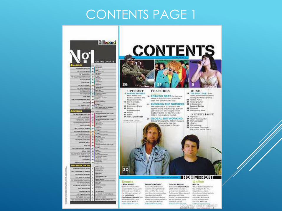
CONTENTS PAGE 1

This is the first of two contents pages from which I will
analyse. This magazine is from an edition of the infamous
billboard magazine, an indexical sign on which this
magazine included is the images which are all included on
the contents page these images have numbers included
onto the bottom left corner of each image these numbers
represent and show the audience what page this refers to.
Also included on this contents page is an iconic sign the
masthead billboard uses a range of colours on this page
therefore giving equality to all suggesting that this company
is an advocate of equality of all races and/or other issues
which are not equal in comparison to the ‘normality’ of day
to day life. This is also an example of a symbolic sign, this is
because a reader of this magazine will only be able to
confirm this as the little tricks of this magazine and the
subliminal messages which this company has embedded
within the content of the page.

CONTENTS PAGE 1
OPPOSITIONAL READER
An oppositional reader would see this contents page
and analyse it to see whether the magazine has
included material which could come across negative
to the reader. In this magazine an oppositional reader
would notice the images and decode what the lady is
wearing in the right picture near the top of the page
they would see that this lady is wearing a bra/corset this
would show how the magazine is promoting music to
be sexy and provocative and not about the talent and
presentability of that individual artist.

CONTENTS PAGE 1
PREFERRED READER
A preferred reader of this magazine would see
how the image of the lady shows how this
magazine focuses more on talent and not what
costume that individual is wearing, in this instant
the preferred reader will see how that this lady is
very talented and successful within her career
therefore she has been featured and that no
matter how she is dressed the magazine has
decided to show this image because it show that
she is talented enough to be featured within the
magazine.
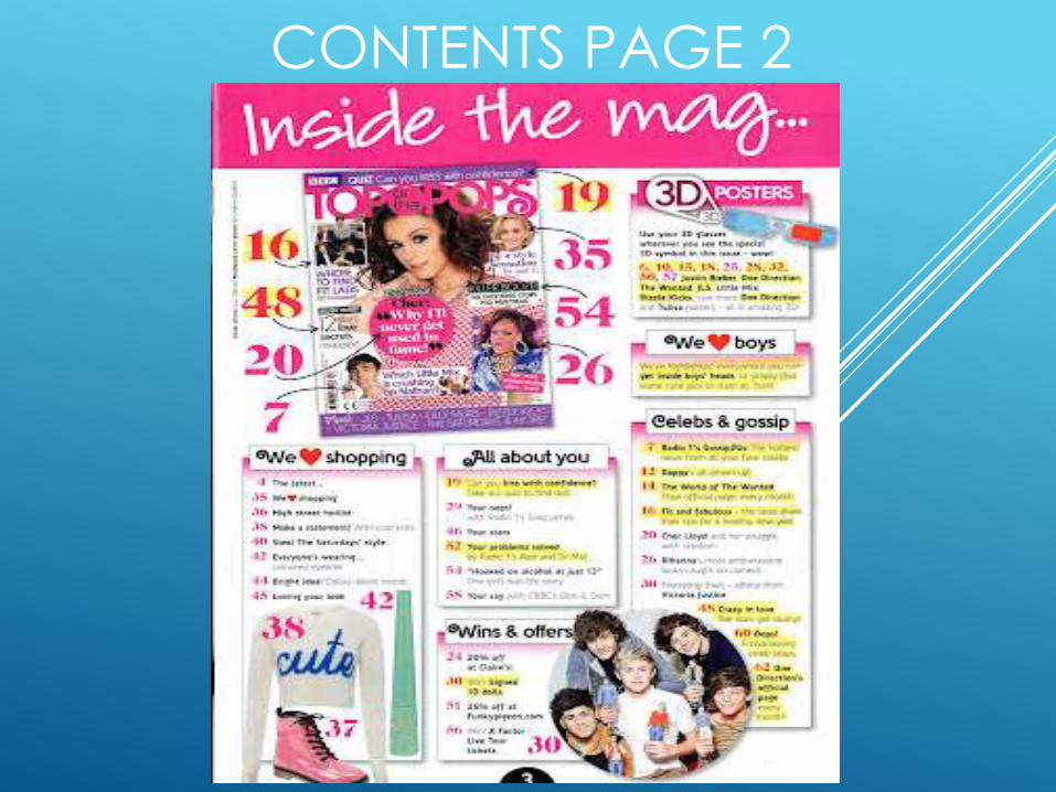
CONTENTS PAGE 2
This is the second contents page I have decided to
analyse. On this contents page an example of an
indexical sign included is the images of a jumper, eye
liner and a pink shoe all represent the category of
fashion which is included within the magazine, this
shows the reader what may be included in this section,
this gives the reader an opportunity to see whether they
like the fashion items to continue reading in the
magazine. An example of an iconic sign is the main
image on this page this image shows the cover of the
magazine and describes where you can find each
segment on the cover within the magazine. Finally an
example of a symbolic sign on this magzine contents
page.
CONTENTS PAGE 2
OPPOSITIONAL READER
The oppositional reader will see this contents page and
acknowledge that perhaps this magazine is trying to tell
the reader what to wear as it shows certain images of
items of clothing therefore the oppositional reader will see
that this is perhaps a subliminal way of telling the reader
that they must buy these items of clothing because they
appear in the magazine. An oppositional reader may
also pick out that this contents page is trying to turn the
reader into the stereotype audience for this magazine as
it is showing them what they should be reading and
giving them lifestyle tips on what they should and
shouldn’t be doing therefore turning that reader into
more of a stereotype for this magazine.

CONTENTS PAGE 2
PREFERRED READER
The preferred reader of this magazine will see
that the magazine is trying to please the target
audience and trying to include issues and
topics in which the reader will want to see
within the magazine, they will also see that the
magazine is trying to give the reader tips on
what to wear to keep ‘fashionable’ and giving
suggestions on music that they may be
interested in because they read this specific
magazine.

COMPARISONThe comparison between these two contents pages
can be shown in the layout and colours in which
provoke the readers views and emotions on these
pages, in contents page 1 the design of the page is a
plain and informative layout which gives the impression
that this magazine is for a more mature audience
however in contents page 2 the layout is spread out
and narrative therefore it suggests that this magazine is
specifically aimed at a younger audience. The colour
scheme in both of these contents pages also show me
that these are aimed at two completely different
audiences for example in the first contents page they
have used colours like white and blue therefore this
magazine has been produced for an audience with an
age range of 18 – 24 and contents page 2 has used
pinks and yellows showing me that this magazine is
aimed at younger people aged 7 – 12.

DOUBLE PAGE SPREAD 1

This is the first of two double page spreads of which I
have chosen to analyse, in this double page spread an
example of a symbolic/arbitrary sign is the large ‘L’ on the
right hand side of the double page spread, this is a
design which ‘Q’ magazine uses on most double page
spreads to show the reader that it is a Lady Gaga article
on the two pages this design has to be learned from
reading the magazine for a long period of time because
first time reader will not understand why a big bold letter
‘L’ is covering the whole page. An example of an iconic
sign is the image of Lady Gaga, this is good example of
this sign as it is a clear indicator to the audience what the
article is about and gives the reader a glimpse of what
they can possibly expect from the magazine double
page article. Finally a good example of an indexical
symbol is shown by the costume in which Lady Gaga is
wearing, she is wearing what seems to be a fashion item
known as a ‘choker’…

This is a fashionable item which is usually worn around the
neck to give the illusion that the wearer is ‘choking’
however in this image Gaga is wearing many of the
chokers in a dress style which may give the impression that
she could be being ‘choked’ by the media or that she is
being choked by her own body and that she cant fully
express herself because the industry wont let her and they
seem to be restricting her. This is a good sign of an iconic
sign because it gives the reader food for thought as to
why she is wearing what she is and will make the reader
want to know why she is, which may be featured within
the article.

DOUBLE PAGE SPREAD 1
OPPOSITIONAL READER
An oppositional reader may look at this double page
spread and notice what Miss Gaga is wearing and think
that she isn’t wearing anything to show that she is a
‘naughty girl’ and that she is being purposely provocative
to attract attention for herself. They may then read into
the article and see that she is further attracting attention
because she wants to be a queen of pop and she wants
to show of on her outrageous behaviour and that she is
telling a younger audience that it is ok to behave in a
disgraceful manner and be rude and show your body as if
you were worthless.
DOUBLE PAGE SPREAD 1
PREFERRED READERA preferred reader will see this article and notice from the
picture that Miss Gaga is trying to show that she wants to be
free however because of her costume which looks like
chains she is trapped and restricted and cant be fully free,
they may also see that she isn’t wearing many clothes
because she is trying to show the reader how she is so close
to being ‘fully free’ however due to the ‘chain’ like costume
she isn’t fully free and that there is one barrier that stands
between her and freedom. The reader then will read the
article and see how her behaviour could possibly be her
trying to break free and that her outrageousness is her way
of showing to her audience that she wants to be free and
how she wants to break away from society and be different
therefore breaking free from this world where everyone has
to live in certain boundaries of behaviour and attitude.

DOUBLE PAGE SPREAD 2

This is the second double page spread in which I will be
analysing in this spread there are many different signs
included within the pages however the first one I will be
analysing is a symbolic sign this is shown through the
editors choice to use one colour as a background so that
the reader didn’t get distracted from the article this is a
symbolic sign because the reader has to be
knowledgeable on the layout choices of the magazine.
The next sign that I will analyse is a iconic sign, this is shown
through the image of Nicki Minaj this is iconic as Miss Minaj
is a well known pop artist who is currently doing very well
in the music charts therefore lots of people will know who
she is. Finally an example of an indexical sign of this
double page spread is Nicki Minaj’s costume in which she
is wearing this suggests that she is trying to camoflauge
back into society as she may believe that her ‘fame’ has
reached a pinnacle point and that she feels she could
step down from the limelight slightly.

DOUBLE PAGE SPREAD 2
OPPOSITIONAL READER
For this magazine an oppositional readers view of this
double page spread can be expressed by Nicki Minaj’s
outfit on this article and how she is wearing a tight small
body suit which is yet again provocative to audiences,
also the may pick out how she is wearing a ring which
reads the word ‘ICON’ an oppositional reader my think
that she is trying too hard to become an pop icon and
that she is making a fool of herself just to become a 1 hit
wonder and to vanish into the world of ‘celebrity’ and
slowly become a ‘z’ list celebrity just to earn a bit of
money. Finally the oppositional reader may notice how
Miss Minaj has a facial expression of a hypnotist trying to
make the reader become entranced to help her become
this ‘icon’ she so badly wants to become.

DOUBLE PAGE SPREAD 2
PREFERRED READER
A preferred reader will look at this and see how she is
wearing a zebra striped suit which could show that she
wants to fit in therefore she is trying to camouflage
herself so that she can perhaps be accepted by
society. Instead of the reader noticing the icon ring they
believe that Miss Minaj doesn’t want to be an icon
which can also be shown by her facial expressions and
how she doesn’t perhaps class herself as an icon and
more that she sees herself as someone who enjoys
doing music and likes getting recognised for it.

COMPARISON
The comparison between these two double page
spreads shows how double page 1 portrays Gaga in a
provocative and misunderstood manner however in
double page 2 it portrays Nicki Minaj in a reserved and
also misunderstood manner. This shows how different
publications can have the same portrayal of a celebrity
but have completely different methods of showing that
view. In double page 1 the typography used is formal
showing that the article is more for an older more
sophisticated audience but in double page 2 the
typography used is quite informal therefore the article is
aimed at a younger and more relateable audience.