the art element of color - yarnworker.com
TRANSCRIPT
The Art Element of Color

Color Theory
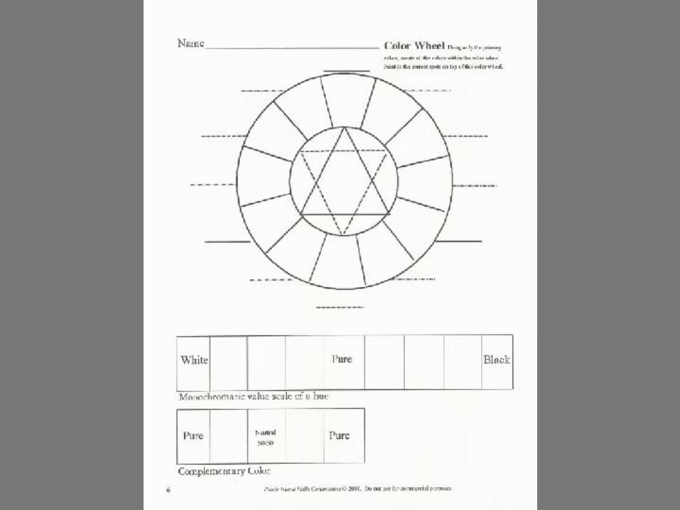
The color wheel is the basic tool for
understanding how colors work together.

Why is the color wheel important?
*Different colors attract the viewers *Color leads the eye of the viewer to objects in a work of art *It creates different emotional responses.
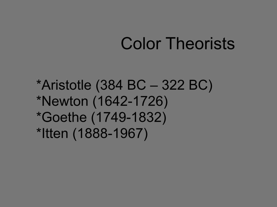
Color Theorists
*Aristotle (384 BC – 322 BC) *Newton (1642-1726) *Goethe (1749-1832) *Itten (1888-1967)

Colorists and Theory
AristotleAristotle: 7 color scale
Aristotle had claimed that yellow, red, violet, green and blue fit between white and black in a 7-color scale

Newton’s facts about color:a. Color is perceived by our brain through our eyes
b. In light, all colors mixed together results in white
c. Each color has different wavelength.
d. Additive color-using light
e. Subtractive color-using paint
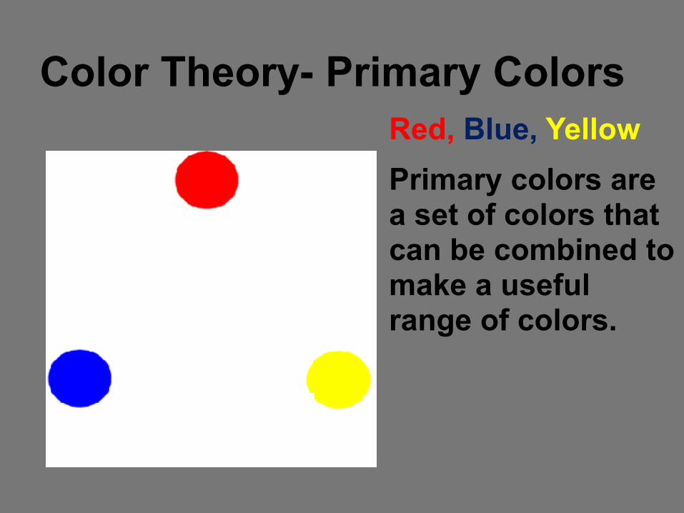
Color Theory- Primary Colors
Red, Blue, Yellow Primary colors are a set of colors that can be combined to make a useful range of colors.
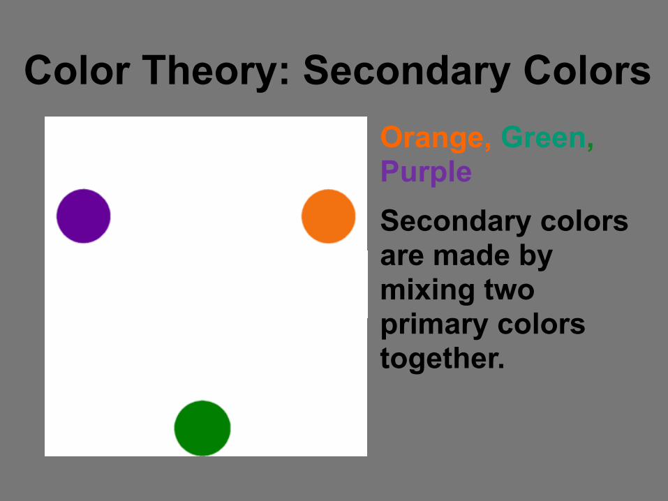
Color Theory: Secondary Colors Orange, Green, Purple Secondary colors are made by mixing two primary colors together.
Color Theory: Intermediate/Tertiary
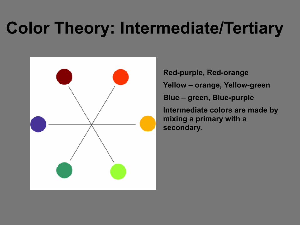
Red-purple, Red-orange Yellow – orange, Yellow-green Blue – green, Blue-purple Intermediate colors are made by mixing a primary with a secondary.

Color Schemes
*An arrangement of colors based upon a color system (the color
wheel) that is then applied to an illustration, design or work of art.
Color Theory :Temperature
- -
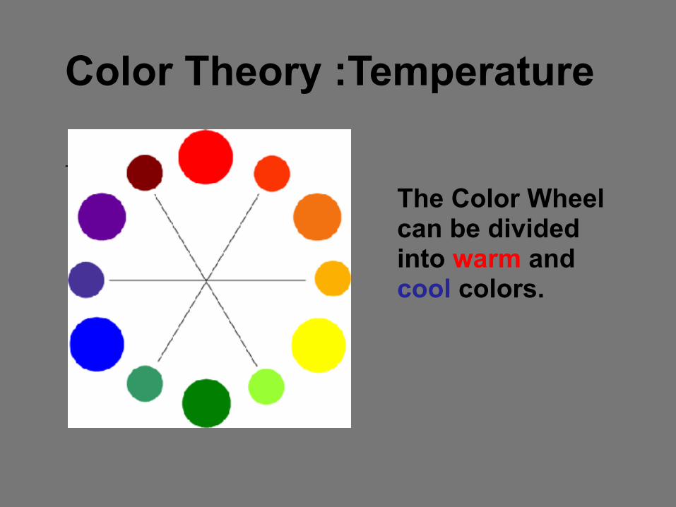
The Color Wheel can be divided into warm and cool colors.

Color Theory: Warm Colors
• Warm colors are vivid and energetic and tend to advance in space.
• Fire and Sun Reds, Yellows, and Oranges.
• Warm colors tend to advance in space.

Color Theory : Cool Colors
- - • Cool colors give an impression of calm, and create a soothing impression.
• Cold like ice or sad blues, purple night sky's and cool green grass.
• Cool colors tend to recede in space.
Color Theory: Neutral Colors
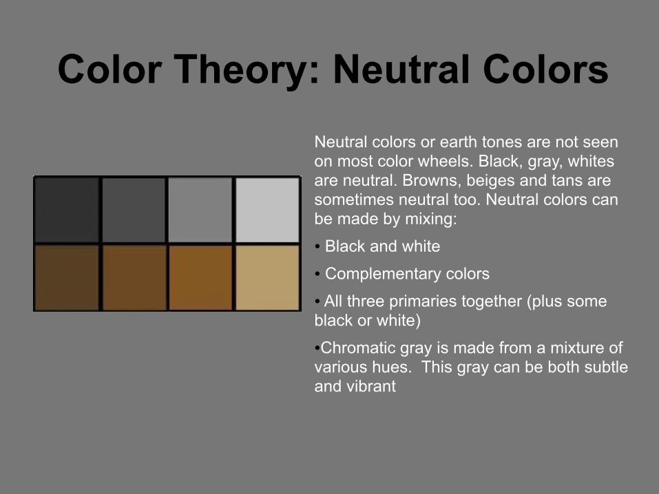
Neutral colors or earth tones are not seen on most color wheels. Black, gray, whites are neutral. Browns, beiges and tans are sometimes neutral too. Neutral colors can be made by mixing: ● Black and white ● Complementary colors ● All three primaries together (plus some black or white) ●Chromatic gray is made from a mixture of various hues. This gray can be both subtle and vibrant
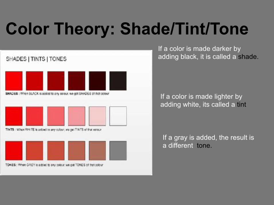
Color Theory: Shade/Tint/Tone If a color is made darker by adding black, it is called a shade.
If a color is made lighter by adding white, its called a tint
If a gray is added, the result is a different tone.

Color Theory: Monochromatic
Uses shades or tints from the same hue

Color Theory: Value
Value refers to the range of a color, from the lightest to the darkest.
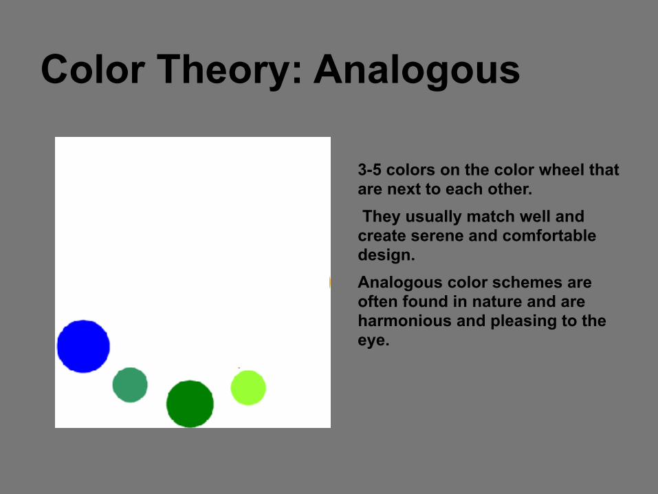
Color Theory: Analogous
3-5 colors on the color wheel that are next to each other. They usually match well and create serene and comfortable design. Analogous color schemes are often found in nature and are harmonious and pleasing to the eye.

Color Theory: Complementary
Red and Green Colors that are opposite from each other on the color wheel. Complementary color schemes are tricky to use in large doses, but work well when you want something to stand out. Mixing Red and Green are closest in value and produce an “agitation” when placed side by side.

Color Theory: Complementary Yellow and Purple Mixing complementary colors lowers intensity and produces a wide range of browns
Mixing yellow and purple creates the widest value range
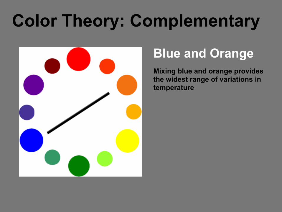
Color Theory: Complementary
Blue and Orange Mixing blue and orange provides the widest range of variations in temperature
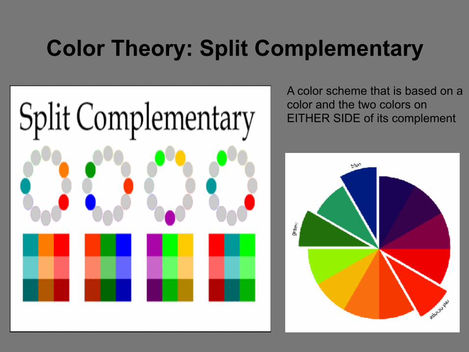
Color Theory: Split Complementary
A color scheme that is based on a color and the two colors on EITHER SIDE of its complement
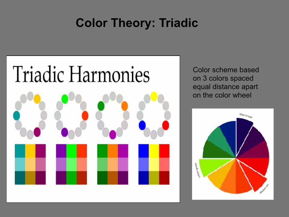
Color Theory: Triadic
Color scheme based on 3 colors spaced equal distance apart on the color wheel
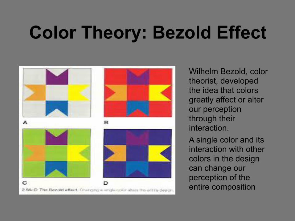
Color Theory: Bezold Effect
Wilhelm Bezold, color theorist, developed the idea that colors greatly affect or alter our perception through their interaction. A single color and its interaction with other colors in the design can change our perception of the entire composition
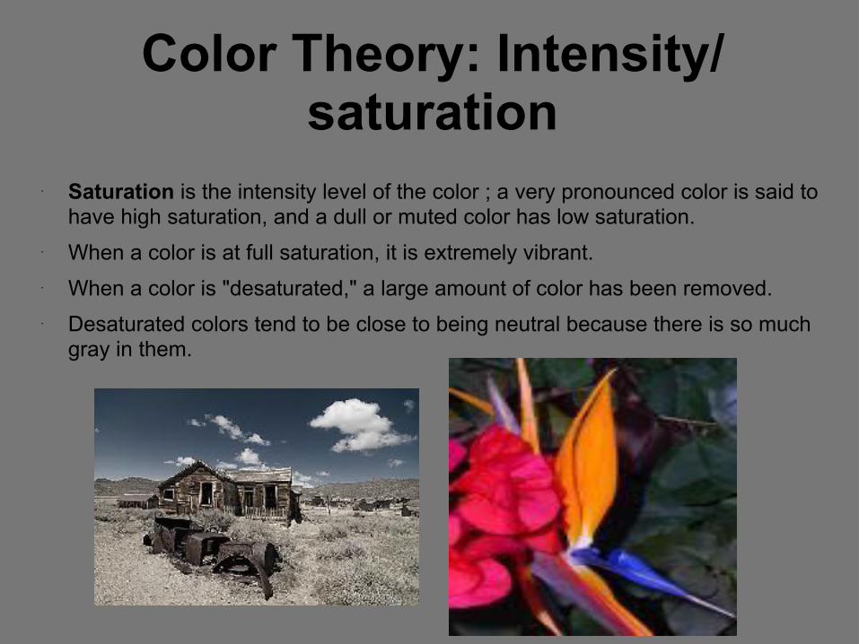
Color Theory: Intensity/saturation
• Saturation is the intensity level of the color ; a very pronounced color is said to have high saturation, and a dull or muted color has low saturation.
• When a color is at full saturation, it is extremely vibrant. • When a color is "desaturated," a large amount of color has been removed. • Desaturated colors tend to be close to being neutral because there is so much
gray in them.

3 Basic Qualities of color
*Hue – color name (red, green, blue, etc.)
*Value- Lightness or darkness of a color *Intensity- refers to the purity of a color (also called saturation and chroma)

Color Schemes: Examples

1 Describe this artwork.
●Primary ●Secondary ●Warm ●Cool ●Analogous ●Complementary ●Monochromatic/ Value ●Neutrals ●Tints, Shades, Tones
11
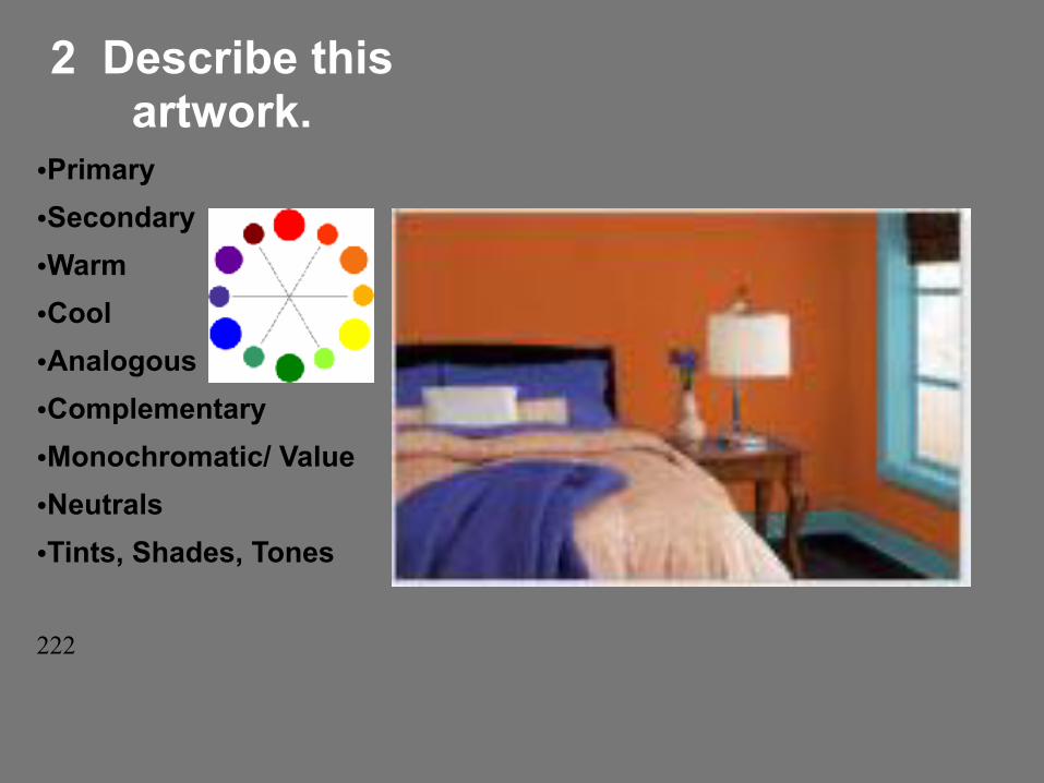
2 Describe this artwork.
●Primary ●Secondary ●Warm ●Cool ●Analogous ●Complementary ●Monochromatic/ Value ●Neutrals ●Tints, Shades, Tones
222
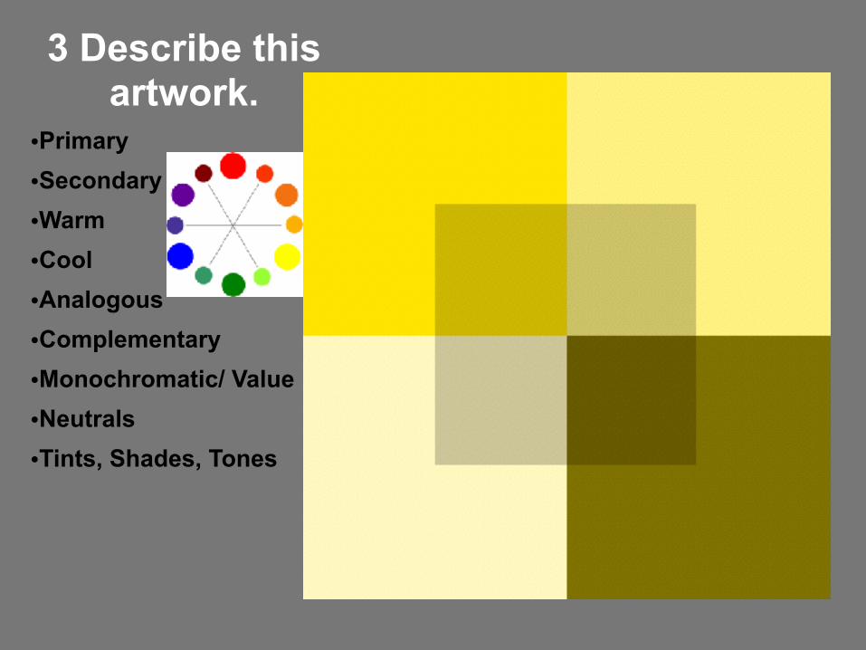
3 Describe this artwork.
●Primary ●Secondary ●Warm ●Cool ●Analogous ●Complementary ●Monochromatic/ Value ●Neutrals ●Tints, Shades, Tones
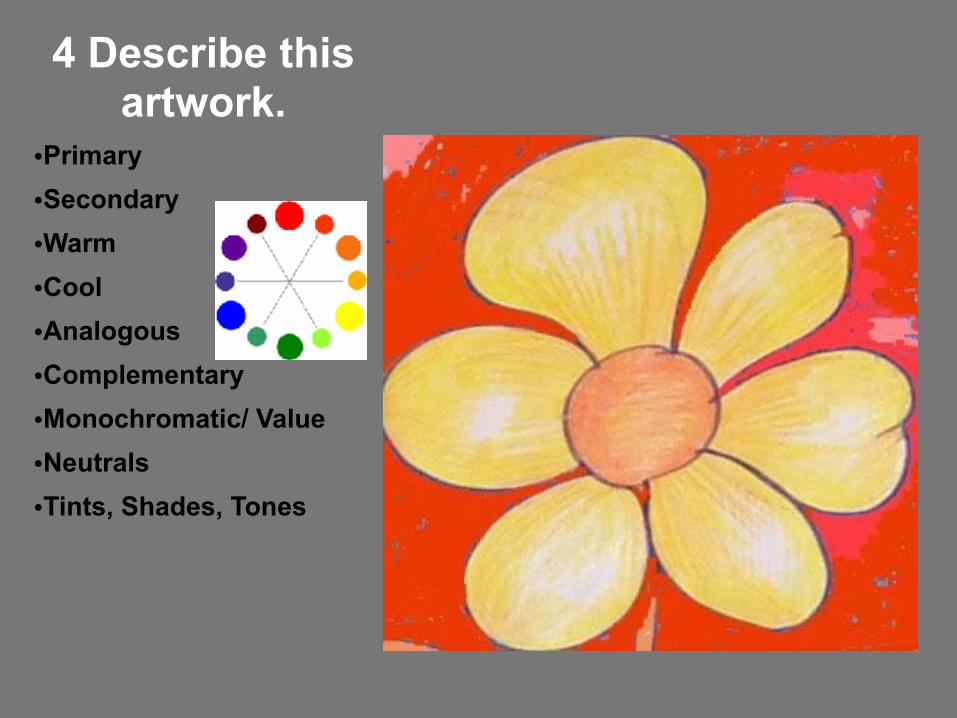
4 Describe this artwork.
●Primary ●Secondary ●Warm ●Cool ●Analogous ●Complementary ●Monochromatic/ Value ●Neutrals ●Tints, Shades, Tones

5 Describe this artwork.
●Primary ●Secondary ●Warm ●Cool ●Analogous ●Complementary ●Monochromatic/ Value ●Neutrals ●Tints, Shades, Tones

6 Describe this artwork.
●Primary ●Secondary ●Warm ●Cool ●Analogous ●Complementary ●Monochromatic/ Value ●Neutrals ●Tints, Shades, Tones
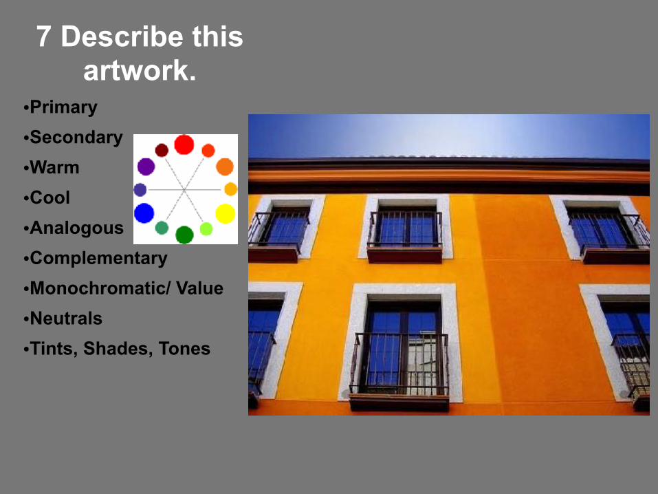
7 Describe this artwork.
●Primary ●Secondary ●Warm ●Cool ●Analogous ●Complementary ●Monochromatic/ Value ●Neutrals ●Tints, Shades, Tones
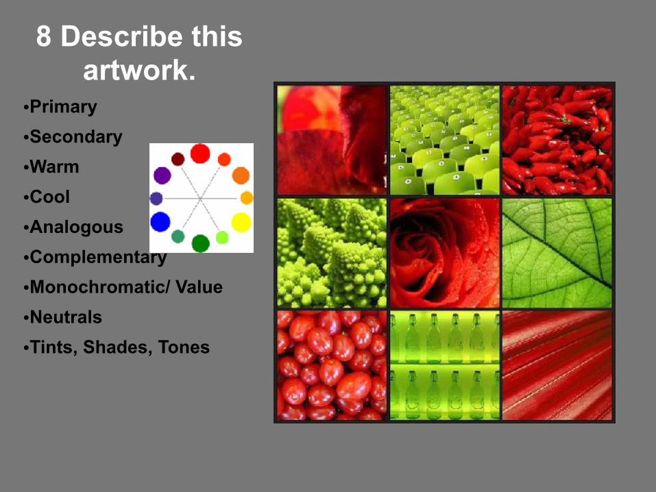
8 Describe this artwork.
●Primary ●Secondary ●Warm ●Cool ●Analogous ●Complementary ●Monochromatic/ Value ●Neutrals ●Tints, Shades, Tones

9 Describe this artwork.
●Primary ●Secondary ●Warm ●Cool ●Analogous ●Complementary ●Monochromatic/ Value ●Neutrals ●Tints, Shades, Tones
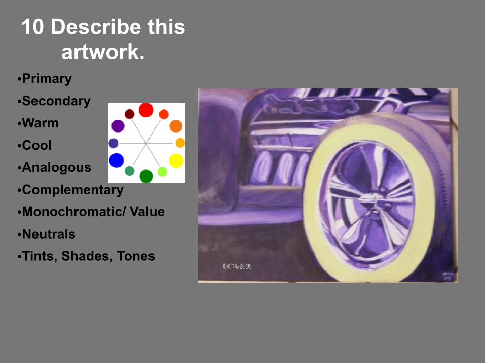
10 Describe this artwork.
●Primary ●Secondary ●Warm ●Cool ●Analogous ●Complementary ●Monochromatic/ Value ●Neutrals ●Tints, Shades, Tones

11 Describe this artwork.
●Primary ●Secondary ●Warm ●Cool ●Analogous ●Complementary ●Monochromatic/ Value ●Neutrals ●Tints, Shades, Tones

12 Describe this artwork.
●Primary ●Secondary ●Warm ●Cool ●Analogous ●Complementary ●Monochromatic/ Value ●Neutrals ●Tints, Shades, Tones

13 Describe this artwork.
●Primary ●Secondary ●Warm ●Cool ●Analogous ●Complementary ●Monochromatic/ Value ●Neutrals ●Tints, Shades, Tones
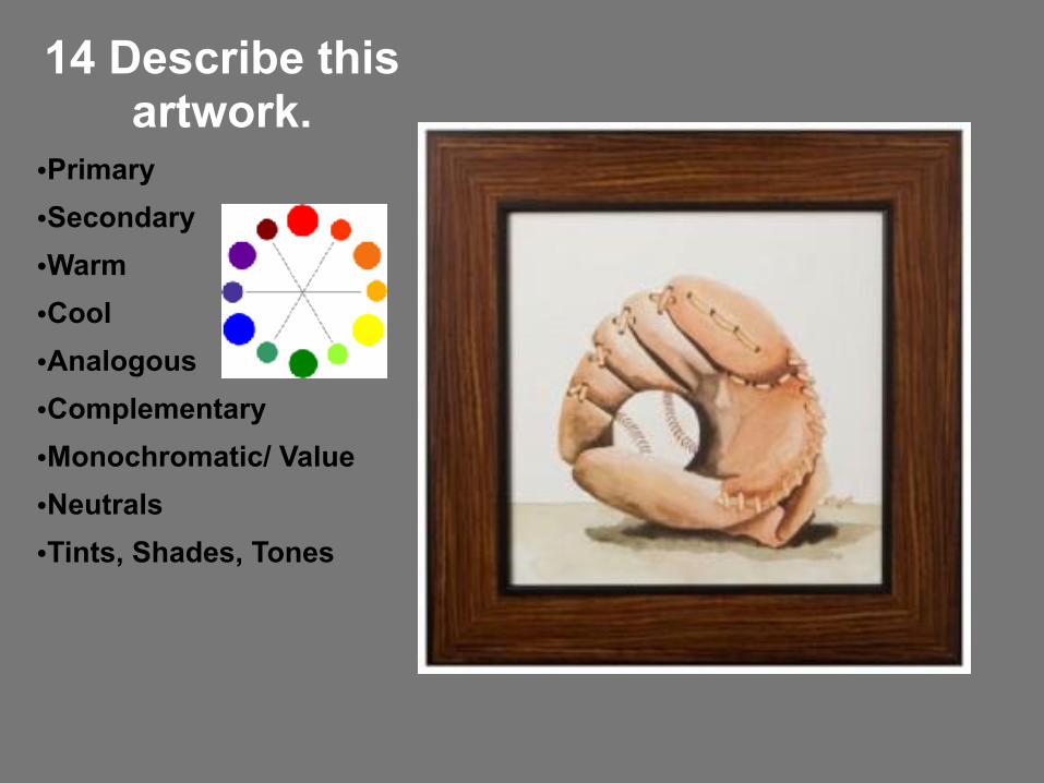
14 Describe this artwork.
●Primary ●Secondary ●Warm ●Cool ●Analogous ●Complementary ●Monochromatic/ Value ●Neutrals ●Tints, Shades, Tones

15 Describe this artwork.
●Primary ●Secondary ●Warm ●Cool ●Analogous ●Complementary ●Monochromatic/ Value ●Neutrals ●Tints, Shades, Tones
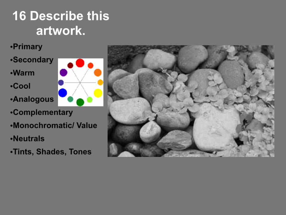
16 Describe this artwork.
●Primary ●Secondary ●Warm ●Cool ●Analogous ●Complementary ●Monochromatic/ Value ●Neutrals ●Tints, Shades, Tones

Common Task Worksheet